Best Acupuncture Websites of 2026 (30 Real-World Examples)
Acupuncture website examples that explain the practice and the first visit
A useful acupuncture website gives a visitor enough practical information to understand the clinic before making an appointment. These 30 examples compare practitioner introductions, treatment-room imagery, fees, access details and appointment handoffs across independent and community practices.
Start with the questions a newcomer can reasonably answer online: where the clinic is, who works there, what the appointment process involves and where administrative questions belong. Clear language matters more than a catalogue of unfamiliar techniques. Photography should make the actual practice tangible rather than imply a promised personal result.
This guide evaluates website design and public information. It does not establish whether acupuncture is appropriate for an individual or verify the clinical claims made by a featured practice. Keep service descriptions within an approved scope and direct personal care questions to qualified professionals.
Before the examples
What makes good acupuncture website design in 2026?
Introduce a real practitioner
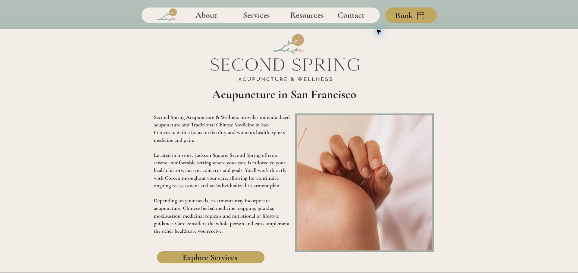
Second Spring makes its practitioner and San Francisco setting specific. Names, actual premises and practical location details give a small clinic substance without a large corporate directory. Keep professional credentials accurately labeled and separate from claims about results.
Make the first step understandable
Explain whether the visitor is requesting a time, purchasing an initial visit or opening an external scheduling service. State who confirms a request and where questions about fees or suitability should go before collecting detailed information.
Publish the practical conditions
Fees, cancellation rules, community-clinic arrangements and access information affect the visit. Give them maintained destinations with a clear relationship to the booking action. An attractive room photograph cannot answer a question about stairs, parking or appointment duration.
Keep the reading experience calm
Soft colors can support a welcoming identity, but pale text, oversized imagery and multiple overlays can make ordinary tasks harder. Check the address, fee explanation and contact route at narrow widths and with larger text.
The collection · 30 examples
30 acupuncture websites worth studying
Compare these practices by the job their pages do: introducing a solo clinician, explaining a community model, describing fees or preparing someone for a first visit. The useful design lesson may be on a supporting page rather than the homepage.
Second Spring uses a cream background, sage accents and a rounded navigation bar to give a small practice a coherent identity. The opening text identifies San Francisco, names the practitioner relationship and separates the two main areas of focus without forcing visitors into a long list of conditions. A framed treatment photograph supports the introduction, while a gold booking control remains visually distinct. Farther down, the site links to office policies, a neighborhood guide and parking information, connecting the brand story to a real visit. The desktop text is relatively small and the opening is paragraph-heavy, so more concise lead copy would help scanning. Its strongest quality is the combination of a personal practice description and specific resources for getting there.
What you can learn
Build the small-practice homepage around who the visitor will see, the main service choices and the practical resources needed for a first visit.
Pros
Two main specialties provide a manageable choice.
Policies, neighborhood information and parking have dedicated routes.
Cons & considerations
Small body text makes the opening less comfortable to scan.
Several introductory paragraphs precede the service detail.
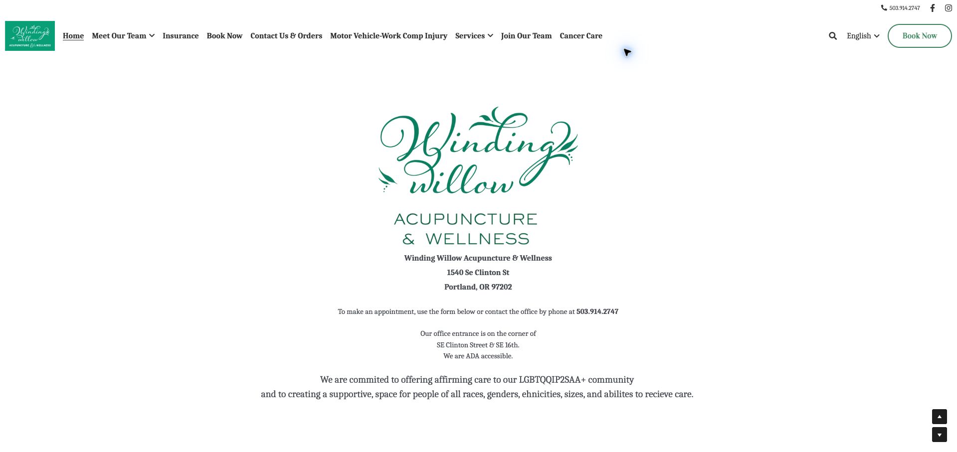
Winding Willow makes the first visit feel geographically specific. Its opening content names the Portland street address, identifies the corner entrance and states that the office is accessible before moving into the collective's wider approach. The green and white identity and large central logo suit a neighborhood practice, while the team, insurance and booking links give different visitors recognizable starting points. This is useful information design for a group of independent practitioners: the shared place is clear even before someone chooses a person. The page becomes less focused when extended wellness language and repeated contact prompts compete with those concrete instructions.
What you can learn
Put the entrance, access details and appointment route near the welcome; let the longer practice philosophy follow those immediate decisions.
Pros
The corner entrance is described in plain language.
Team and insurance links sit alongside appointment access.
Cons & considerations
The crowded navigation asks several audiences to share one row.
Repeated general wellness copy dilutes the practical opening.
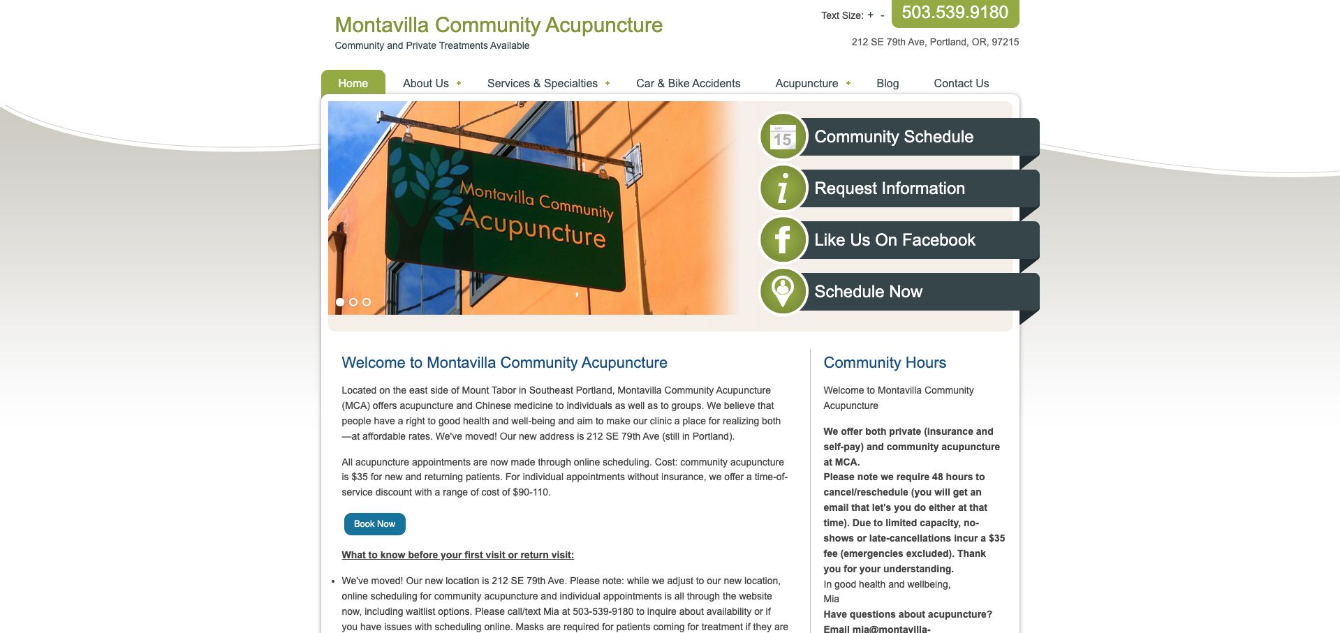
Montavilla's homepage works like a patient noticeboard. An actual clinic-sign photograph, phone number and address establish the place, while a right-hand group of schedule and contact actions makes the next step easy to spot. The body distinguishes community appointments from individual visits, including their different payment arrangements, and explains waitlists, preparation and cancellation expectations. That specificity is more useful than a generic promise of personalized care. The challenge is maintenance: the prominent relocation information sits near an older new-patient date, so readers must reconcile messages from different periods. Olive and blue panels organize a dense page, but the number of separate booking labels adds unnecessary choice.
What you can learn
Keep one current patient-information block with a visible review date, and explain the difference between appointment types before opening the scheduler.
Pros
Community and individual visits have distinct practical explanations.
Address and telephone remain easy to locate.
Cons & considerations
An old new-patient date weakens confidence in current instructions.
Several competing scheduling labels fragment the main action.
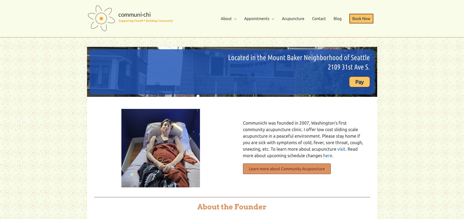
CommuniChi introduces the Mount Baker location with a clear address strip and a photograph of the treatment chairs. That image does real explanatory work: a visitor can understand the shared setting before reading the definition of community acupuncture. A warm floral background, restrained blue panels and orange actions keep the small practice personal rather than institutional. The founder introduction and first-visit forms give the page a useful human and operational sequence. Its main weakness is consistency. The sliding-scale section and later mission copy display different price floors, making the reader determine which statement is current. The design pattern is worth borrowing, but the conflicting amounts need a single maintained source.
What you can learn
Use a real room photograph to explain the service format, then keep fees and preparation instructions synchronized wherever they appear.
Pros
Treatment-chair photography makes the shared setting tangible.
First-visit paperwork is identified within the homepage.
Cons & considerations
Different fee references appear within the same page.
The lengthy mission and blog area can distract from booking.
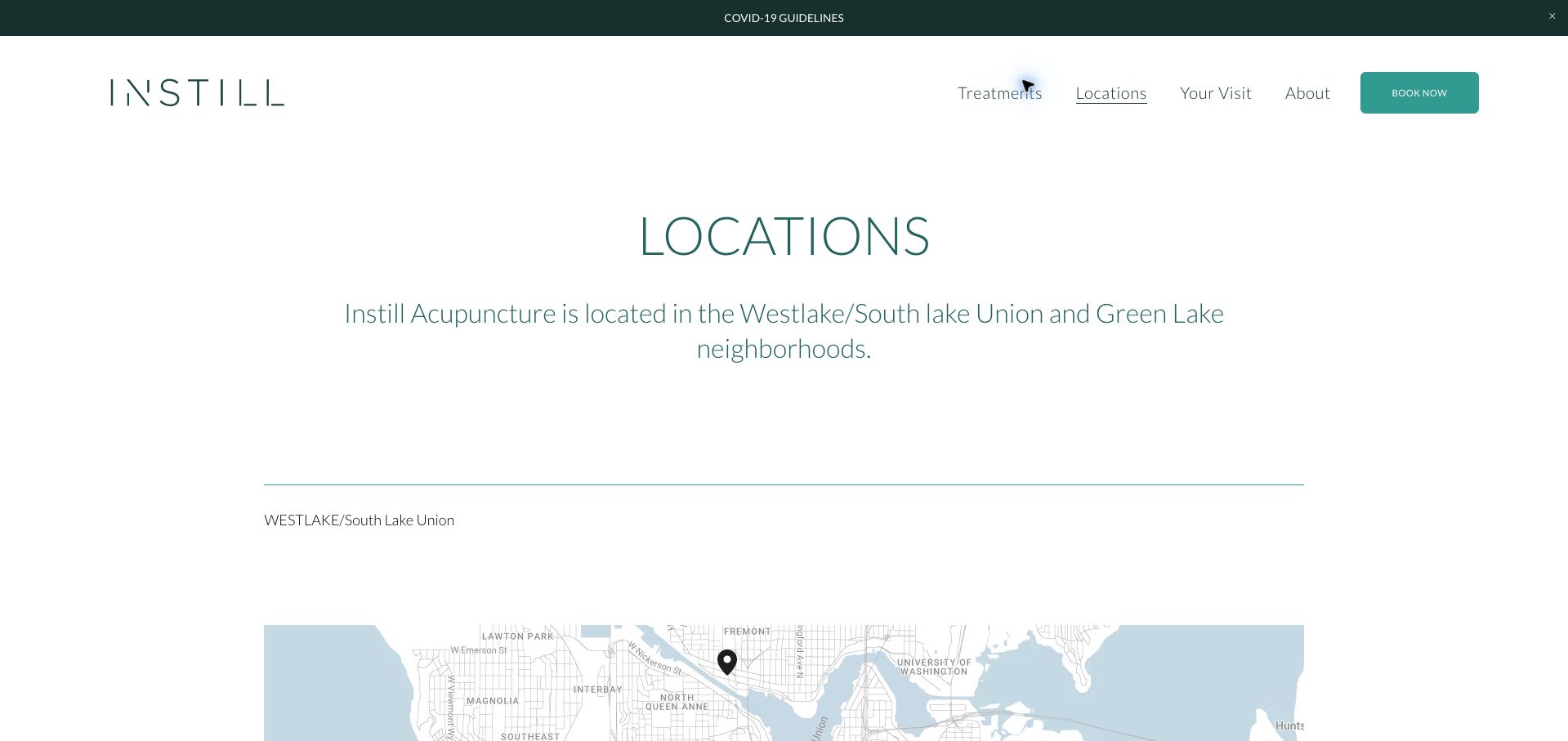
Instill's locations page treats arrival as part of the appointment experience. The two Seattle neighborhoods receive separate sections with their own days, addresses, parking notes and booking links. The Westlake section explains the secured-building process without publishing a door code, while the Green Lake section identifies the host clinic and nearby landmarks. These details matter when the practitioner name differs from the sign outside. The white and muted teal layout uses generous spacing and simple headings, making a practical page feel consistent with the wider identity. Large maps and a tall introduction push the useful instructions lower, however, and the thin typography could carry important details with more emphasis.
What you can learn
Write directions for the final few steps of the journey, especially when patients enter a shared or secured building.
Pros
Each branch has its own hours and arrival process.
The host-clinic name reduces uncertainty at the entrance.
Cons & considerations
Large introductory spacing delays the practical details.
Light text styling gives critical instructions limited emphasis.
Columbia City uses a restrained navigation with direct routes to the clinic story, insurance information and appointments. The fern imagery gives the site a recognizable Pacific Northwest mood, while the body supplies a precise address and nearby landmark. Most useful is the explicit notice that the practitioner is away and new appointments begin later: capacity is treated as information a prospective patient needs before contacting the clinic. Rates and insurance exceptions are also presented as readable text rather than hidden inside a booking account. The large photographic opening postpones those practical details, and date references without a year can become ambiguous if they remain online beyond the intended season.
What you can learn
Publish availability changes next to booking access and give temporary notices both a full date and a clear removal owner.
Pros
The menu separates insurance questions from appointment booking.
A nearby landmark helps visitors recognize the location.
Cons & considerations
The photographic opening places key information below the fold.
The temporary availability notice needs an unambiguous year.
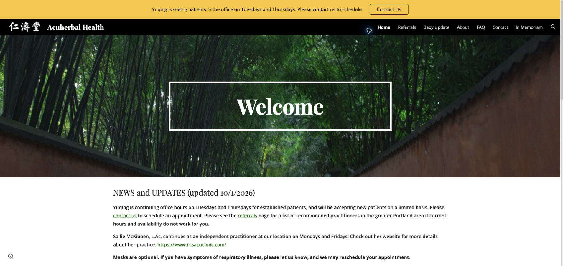
Acuherbal Health gives its current operating situation unusually high priority. A yellow announcement strip identifies the available days, and a dated news block explains limited new-patient capacity and alternatives. The page also distinguishes an independent practitioner working at the same address, linking to that practitioner's own site rather than blending the two identities. A bamboo photograph and framed welcome heading provide a modest visual identity around these practical updates. The design is straightforward enough to maintain, which is valuable for a family-run clinic. Its broad treatment narrative is much less precise than the scheduling information, and the appointment action is primarily a contact request rather than an immediately visible calendar.
What you can learn
When capacity changes, explain who is available, which days apply and what a visitor should do if those options do not fit.
Pros
The update has a visible publication date.
Shared premises do not obscure the independent practitioner's identity.
Cons & considerations
The contact route requires another step to discover availability.
Broad treatment claims need stronger editorial discipline than schedule facts.
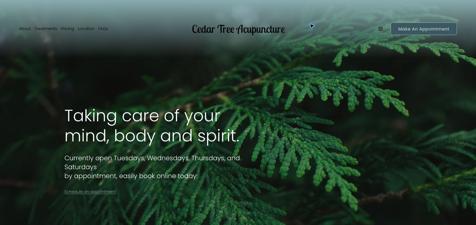
Cedar Tree pairs a close-up cedar photograph with a small, legible set of navigation choices: treatments, pricing, location and frequently asked questions. The homepage names the available days near the main appointment action, then repeats a detailed weekly schedule in the footer. It also explains that appointments are required and gives a waitlist option when the desired time is unavailable. That combination turns a quiet visual design into a useful planning tool. The photographic hero remains more atmospheric than informative about the actual clinic, and seasonal closure dates would benefit from a year. Still, the site demonstrates how a small practice can answer practical questions without building a large content library.
What you can learn
Pair a compact brand presentation with booking rules, current opening days and a fallback for people who cannot find a suitable slot.
Pros
Pricing and location have clear navigation labels.
The waitlist gives unavailable appointment searches a next step.
Cons & considerations
The nature photograph does not show the treatment setting.
Holiday closures need full dates to stay unambiguous.
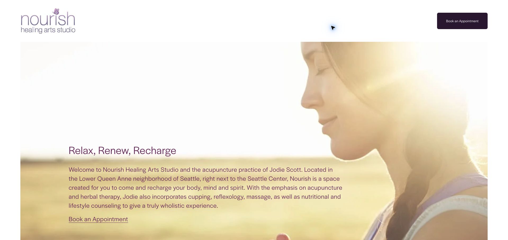
Nourish uses a sunlit portrait, plum-colored identity and minimal header to make the practitioner the center of the site. A prominent appointment link offers a clear action, and the long page brings together the introduction, practice news, insurance changes and biography. The personal presentation is inviting, but the content order creates a practical problem: the opening describes the older neighborhood position while a later news item announces the new address. A visitor should not need to read through product information to resolve where an appointment will happen. The example is strongest as a study in human presentation and weakest as a model for maintaining essential facts across a long, continuously appended homepage.
What you can learn
When a practice moves, update the permanent introduction and contact details as well as publishing a news announcement about the change.
Pros
The portrait gives the practice an immediate human identity.
Booking remains visible in a very simple header.
Cons & considerations
The opening location description conflicts with the later move notice.
Product and news content interrupts the path to practical details.
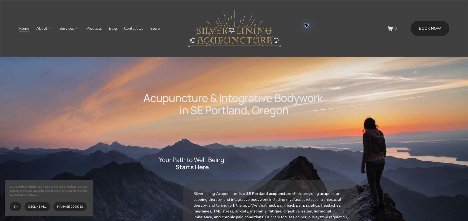
Silver Lining uses a mountain-at-sunset photograph and a detailed gold wordmark to establish an expansive, reflective mood. The heading still names the service and Southeast Portland, so the visual treatment does not entirely replace orientation. A dark booking button is distinct from the supporting navigation, and the page makes room for both acupuncture and integrative bodywork. The problem is the amount of explanation that follows. Multiple statements of mission, wellbeing and treatment approach repeat similar ideas before a visitor reaches simpler operational questions. The dark translucent text panel also has to work against a detailed photograph, and the cookie notice occupies part of the opening view. A tighter information hierarchy would make the strong identity easier to use.
What you can learn
Keep the location and service explicit inside an atmospheric design, then replace repeated philosophy with concrete first-visit information.
Pros
The opening heading identifies both service and neighborhood.
The booking button has a clear visual boundary.
Cons & considerations
Long overlapping mission statements slow scanning.
Text and cookie controls compete with the detailed hero image.
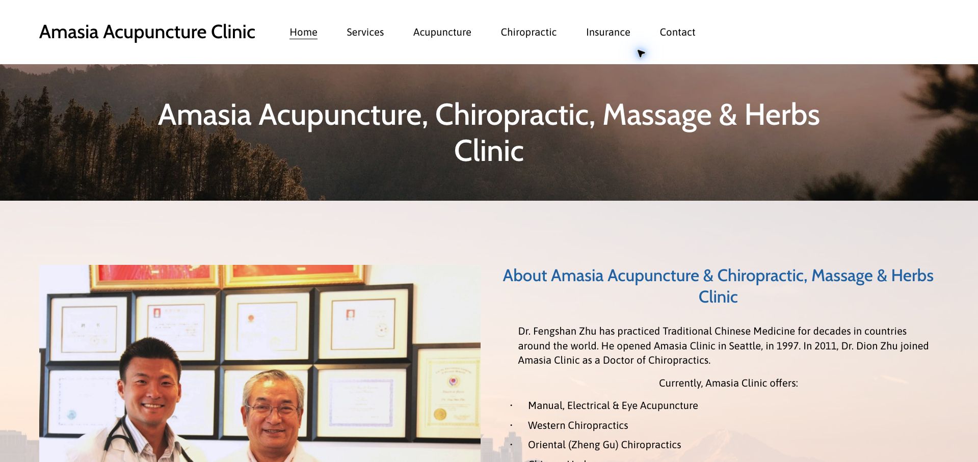
Amasia presents its full practice name in a plain header and immediately follows the forest banner with a photograph of the practitioners. The introduction explains the two clinicians' different roles, while the main navigation separates acupuncture, chiropractic care and insurance. This makes the relationship between services easier to understand than a single undifferentiated wellness menu would. The straightforward content and visible address fit a small local clinic, but the long headline lists so many services that it loses hierarchy. Appointment access also depends on reaching the contact prompt rather than a strong action in the header. Its useful lesson is the value of showing actual people and describing their roles before expanding into a broad service list.
What you can learn
Use a real team photograph and distinct role descriptions to clarify a multidisciplinary practice, then give appointments a dedicated visible action.
Pros
Practitioner photography makes the clinic identifiable.
Insurance has a direct navigation route.
Cons & considerations
The long service-stacked heading is difficult to scan.
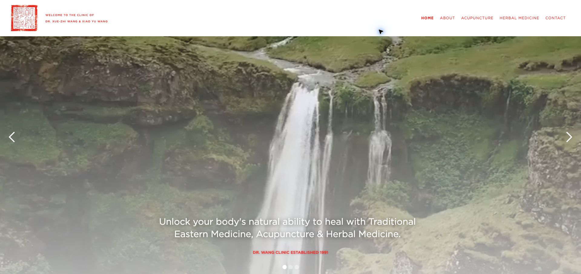
Dr. Wang Clinic combines a small red seal, a spacious white header and a waterfall carousel. The red accents carry consistently into navigation and supporting text, giving the site a coherent identity without a large number of decorative elements. Further down, the page introduces both practitioners, sets out office hours and separates acupuncture from herbal medicine. The family-practice story is a useful organizing idea, although the opening image shows scenery rather than the people or premises. News links also mix clinical publications with lifestyle coverage, which should not be presented as interchangeable evidence. For design purposes, the stronger pattern is continuity of identity and a readable weekly schedule, rather than the broad health promises in the hero.
What you can learn
Let practice history support orientation, but keep scheduling and practitioner identification more prominent than rotating scenery or undifferentiated news links.
Pros
A small set of red accents creates visual continuity.
The weekly schedule is written out clearly.
Cons & considerations
The carousel postpones a view of the actual clinic.
Different kinds of external coverage need clearer editorial separation.
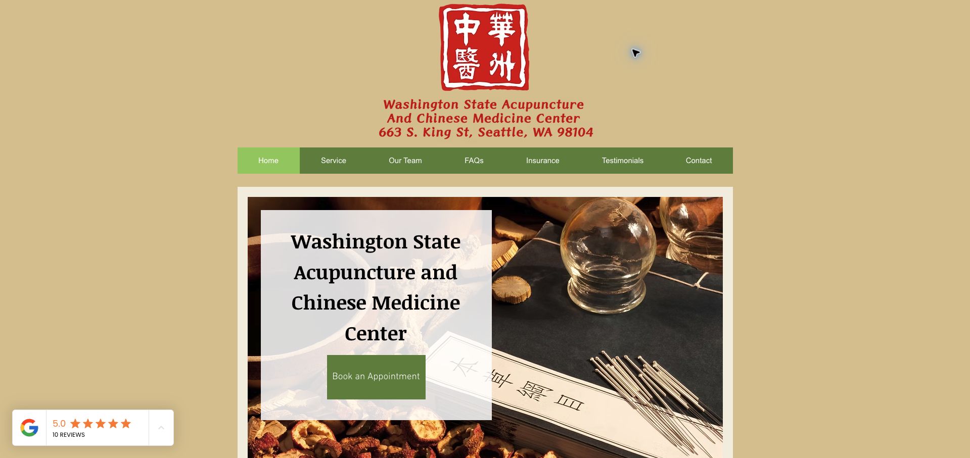
Washington State Acupuncture and Chinese Medicine Center uses a fixed-width composition, tan background and green navigation to keep the page compact. The address is part of the main identity, and the opening image includes a large appointment action rather than leaving visitors to search the footer. The short body lists opening days, telephone and text contact routes, plus precise parking instructions. It is a useful counterexample to sprawling clinic homepages: a visitor can retrieve several essentials quickly. The large logo and repeated full practice name consume much of the first view, however. Seasonal hours are expressed as daylight-saving hours without explicit effective dates, and the floating review badge takes attention away from the clinic's own practical information.
What you can learn
A concise clinic homepage can work well when it makes appointments, contact channels and parking explicit; date any seasonal schedule differences.
Pros
The location is reinforced directly in the brand area.
Parking instructions include a specific lot and assigned spaces.
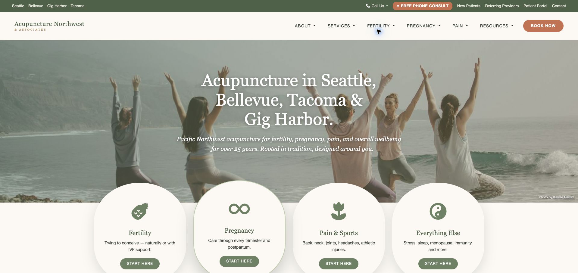
Acupuncture Northwest organizes a larger practice around two useful choices: the visitor's concern and the clinic location. Four rounded service panels sit immediately below the photographic introduction, while the utility bar names the cities and separates new patients, referring providers and the patient portal. The green, cream and terracotta palette connects those many routes without making the page feel like a directory. Branch cards and practitioner profiles continue the same structure farther down. The linked appointment route leads into an AcuBliss portal, so that change of context deserves clear expectations. There is also substantial navigation density, and the broad 'Everything Else' category is less informative than the three more specific service labels beside it.
What you can learn
For multiple clinics, combine a location route with a purpose-based route, and prepare visitors for any transition into a separate booking portal.
Pros
New patients and referring providers receive distinct entry points.
The first service panels make a complex offering scannable.
Cons & considerations
The utility and primary navigation together create many choices.
One catch-all service label is less precise than its neighbors.
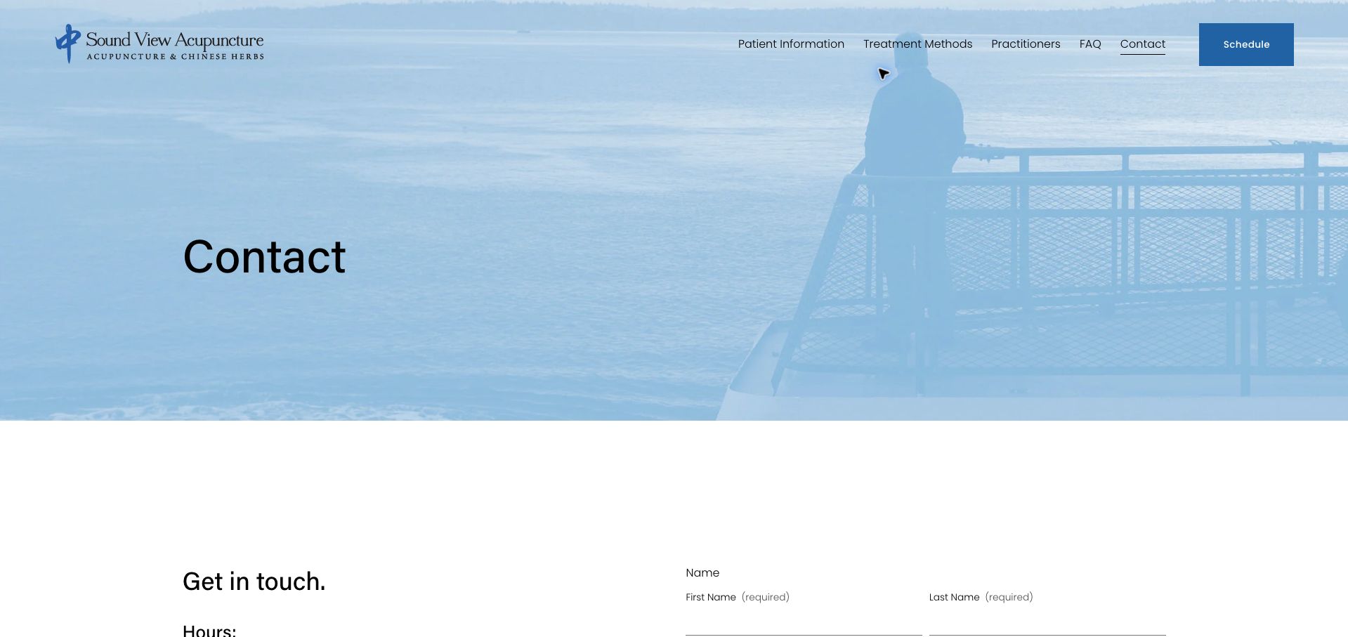
Sound View's contact page combines a blue waterfront image with a simple schedule action and a two-column contact area. Its most useful content is not decorative: the location explanation distinguishes the stairs from California Avenue from the wheelchair-accessible approach through the rear parking lot. That is exactly the kind of detail a map pin cannot communicate. The page also offers a waitlist by telephone when online openings do not work, providing a human fallback. The tall banner delays these useful instructions, and the message form gives visitors little visible guidance about what information belongs in an ordinary inquiry. The page is worth studying for its arrival explanation, with room to bring those practical details higher.
What you can learn
Describe accessible arrival routes in ordinary language beside the address, rather than relying on a map or an unexplained accessibility symbol.
Pros
The two entrance routes are clearly distinguished.
A telephone waitlist supplements online scheduling.
Cons & considerations
The large title banner pushes important directions downward.
The message form could better define the scope of an inquiry.
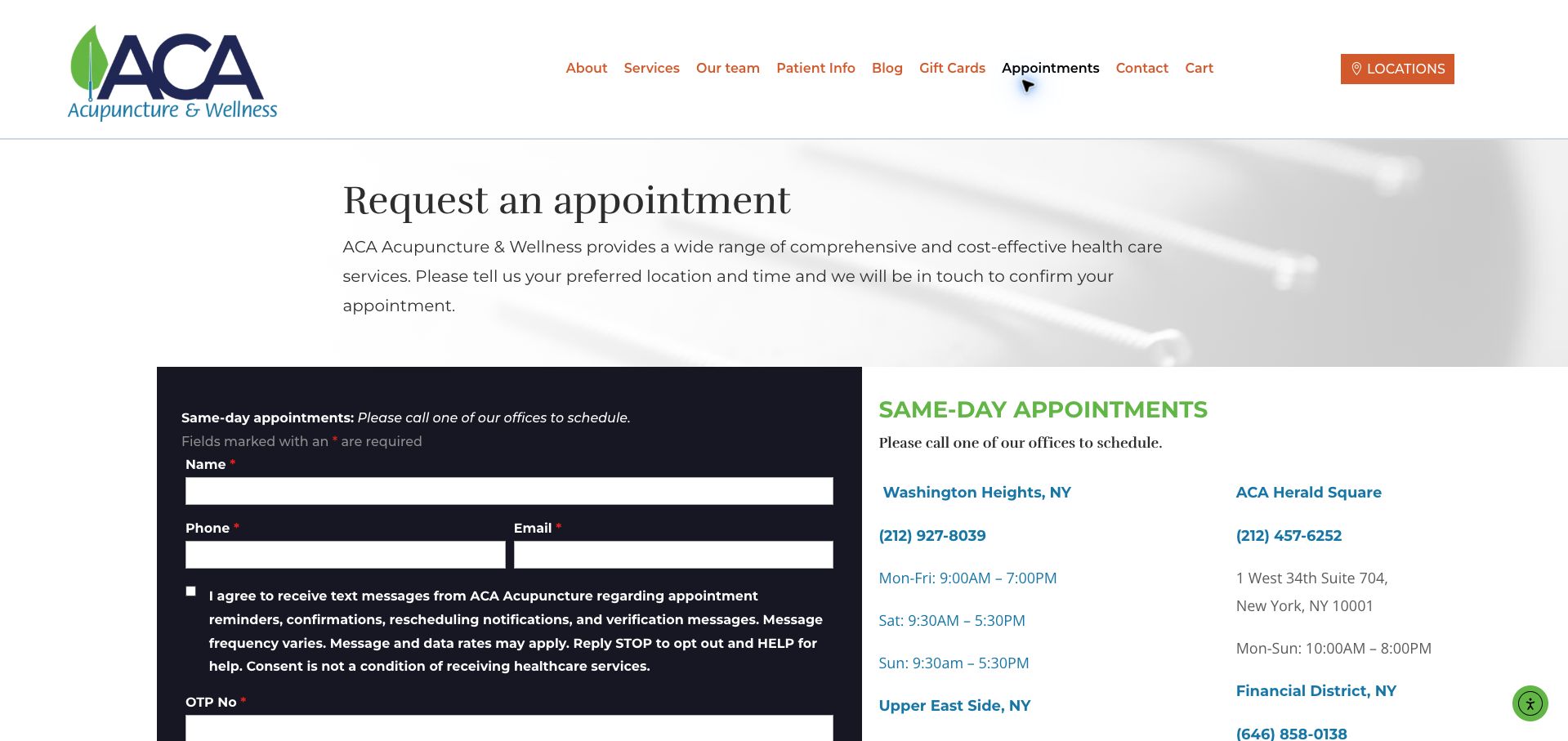
ACA's appointment page states that the visitor is requesting a preferred time and will receive confirmation later. That expectation is valuable because the form resembles a booking flow but does not promise an immediately secured slot. A dark form panel sits beside branch telephone numbers and hours, with a separate instruction to call for same-day appointments. The location selector accommodates a large network without creating separate forms for every office. The cost is complexity: name, contact details, verification, appointment preferences and referral questions make a long sequence. The opening also exposes a required OTP field without much explanation in the visible introduction. The design offers a useful model for setting confirmation expectations, but the form could reveal its steps more gradually.
What you can learn
Say whether an appointment is requested or confirmed before collecting details, and provide a clearly labeled route for urgent scheduling needs.
Pros
The page explicitly explains that staff confirmation follows.
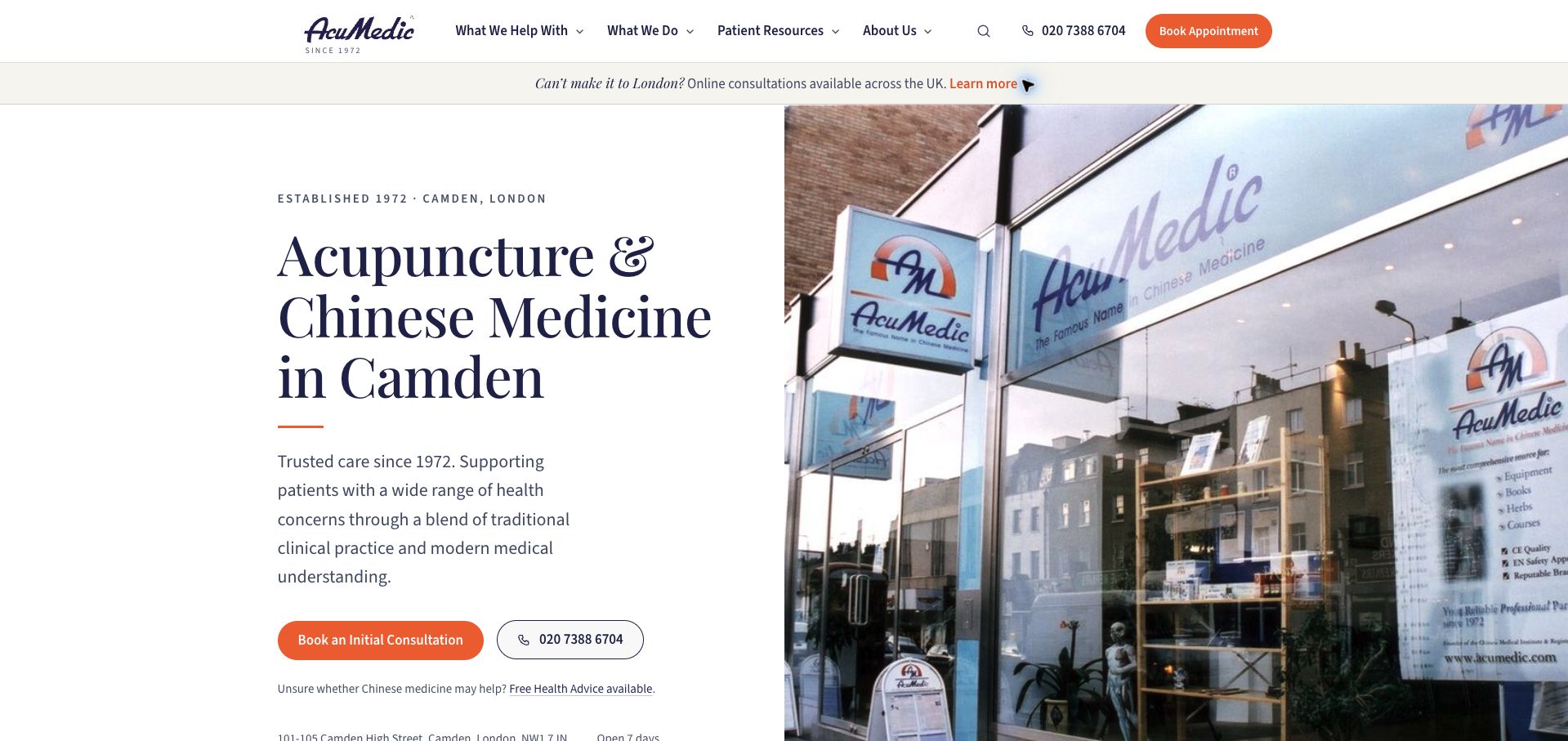
AcuMedic's homepage puts a specific service and Camden location in a large serif headline beside a photograph of the actual storefront. Orange appointment buttons stand out against the navy and cream palette, while a telephone alternative remains alongside the initial consultation action. An upper notice distinguishes online consultations from a London visit. Below, the page describes the care sequence and offers routes by concern and practitioner. That is a strong information structure for a complex clinic. Several credibility claims and patient testimonials also appear prominently, but those are statements from the practice rather than independently established outcomes. The volume of concern categories can make the page feel expansive, so the clear first-consultation route is doing important organizing work.
What you can learn
Show the physical destination and explain the first appointment before asking visitors to navigate a large set of treatments or concerns.
Pros
Storefront photography helps people recognize the destination.
Telephone and first-consultation actions are presented together.
Cons & considerations
Numerous concern categories can overwhelm an undecided visitor.
Prominent testimonial claims need careful separation from verified evidence.
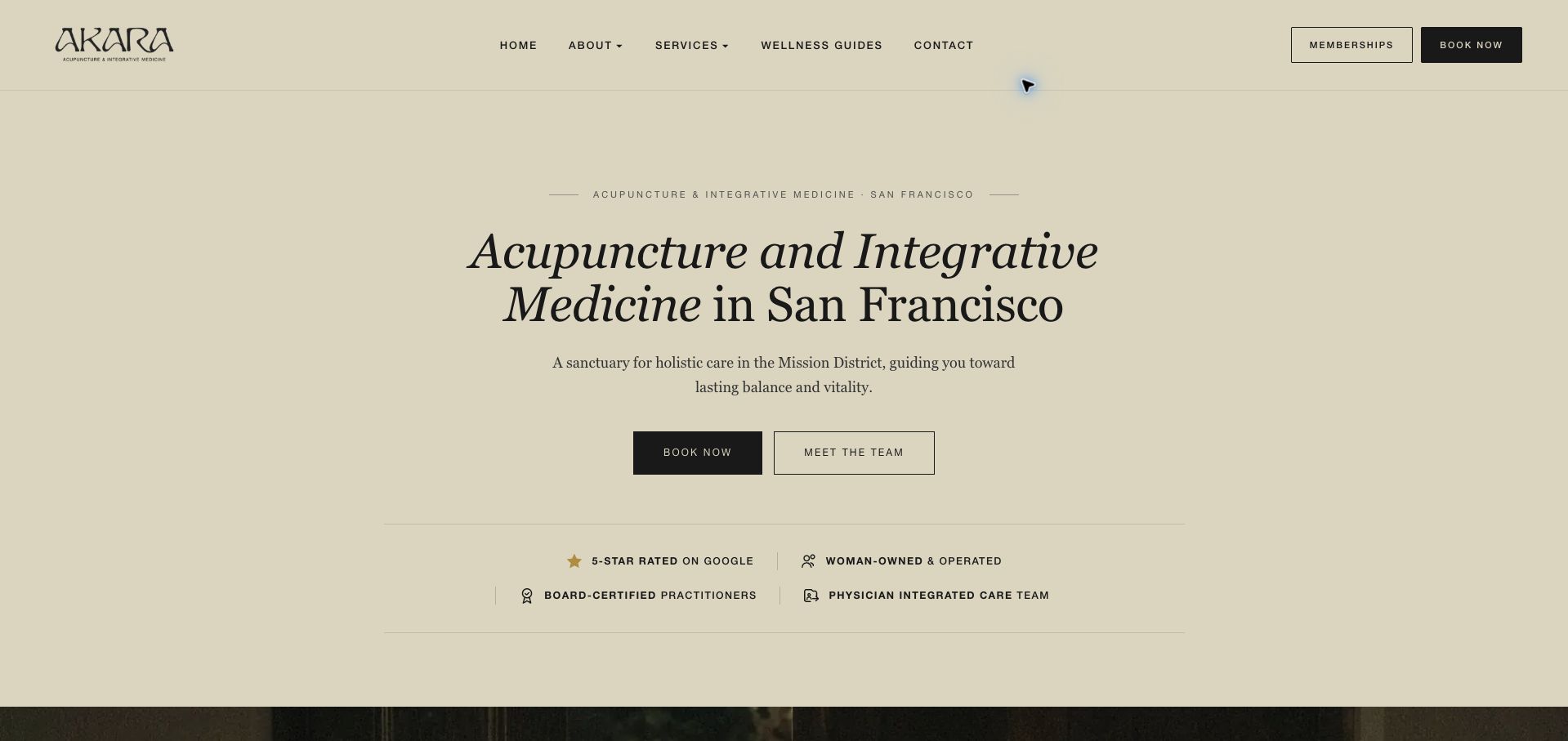
AKARA relies on typography, cream space and restrained black buttons rather than a large opening photograph. The headline names both acupuncture and San Francisco, and the supporting sentence narrows the location to the Mission District. Two actions let visitors book immediately or meet the team first. That is a useful acknowledgment that some people need to identify the practitioner before committing to a visit. The subsequent service cards distinguish internal medicine, orthopedic work and other offerings, while a location fact gives the abstract introduction a concrete anchor. The long catalog of conditions and prominent credential statements require careful editorial maintenance. Memberships also sit near booking, adding a commercial decision before a new visitor has necessarily understood the basic appointment.
What you can learn
Offer a direct appointment path and a practitioner-discovery path together, with enough location information to ground a minimal visual presentation.
Pros
The city and neighborhood are explicit at the top.
Meeting the team is a clear alternative to immediate booking.
Cons & considerations
The extensive condition list increases scanning effort.
Membership promotion competes with understanding a first visit.
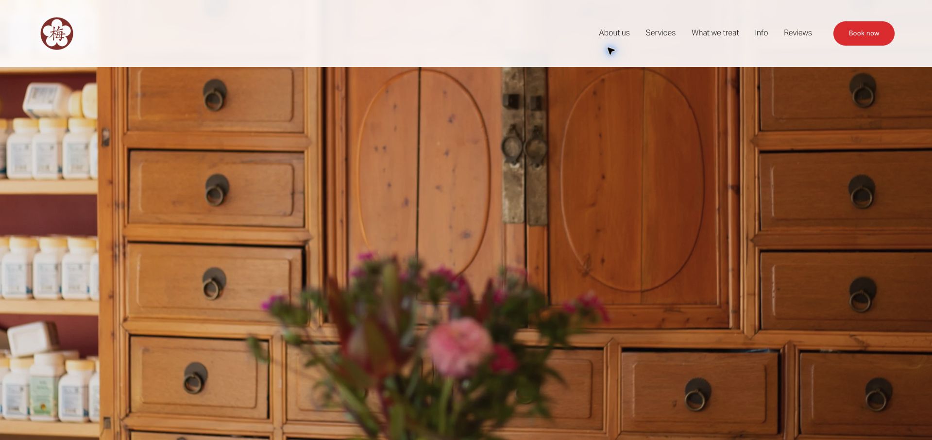
Umé opens with a close photograph of wooden herbal drawers and flowers, supported by a small red emblem and a matching booking button. The image feels connected to the practice environment rather than a generic landscape. The body then places the clinic at the intersection of three San Francisco neighborhoods and explains its approach in a compact introduction. A complimentary phone-consultation option provides a lower-commitment route for someone with questions. The environmental-practice statement is unusually specific, though it remains the clinic's own account. The large image delays the written orientation, and the compressed weekday notation in the footer is harder to parse than a normal schedule. Clearer operational formatting would strengthen an otherwise restrained presentation.
What you can learn
Let authentic details of the premises carry the visual identity, but keep address, consultation options and a readable weekly schedule close at hand.
Pros
The herbal cabinetry gives the page a distinctive material character.
A short phone consultation offers an alternative to immediate booking.
Cons & considerations
The opening photograph postpones the location explanation.
The abbreviated hours format is unnecessarily difficult to scan.
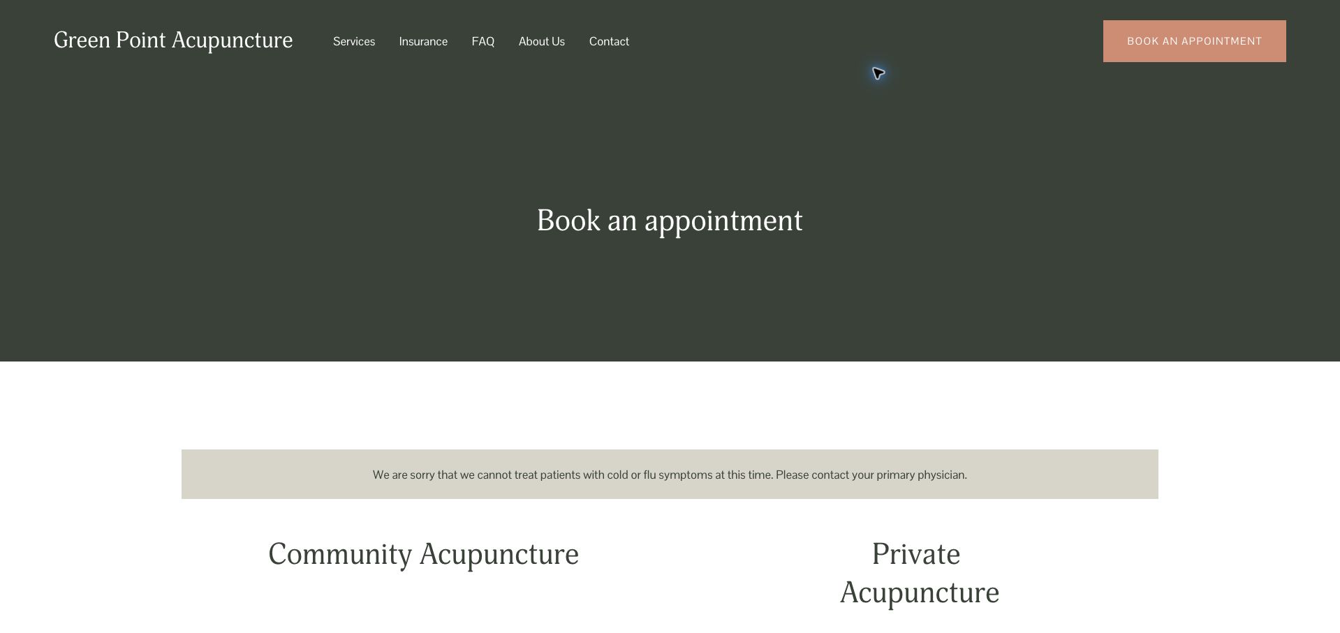
Green Point's appointment page makes an important distinction explicit: online scheduling applies to community acupuncture, while private visits follow a different route. The dark green title area and two-column service layout give those alternatives a clear visual structure. Returning private patients receive named telephone contacts, and new patients are directed to a separate inquiry form and preparation information. The content prevents a visitor from assuming that every appointment follows the same process. The private form is comparatively demanding, asking for birth date and insurance identifiers before the appointment is confirmed. Its surrounding explanation could better describe why those details are needed and how the intake relates to booking. The cancellation notice is useful, but should remain near the relevant action.
What you can learn
Explain appointment-type differences before presenting controls, and keep administrative intake proportionate to the step the visitor is actually taking.
Pros
Community and private appointments are clearly distinguished.
Returning patients can contact a named practitioner directly.
Cons & considerations
The private inquiry asks for extensive identifying information.
The tall title area delays the actual scheduling choices.
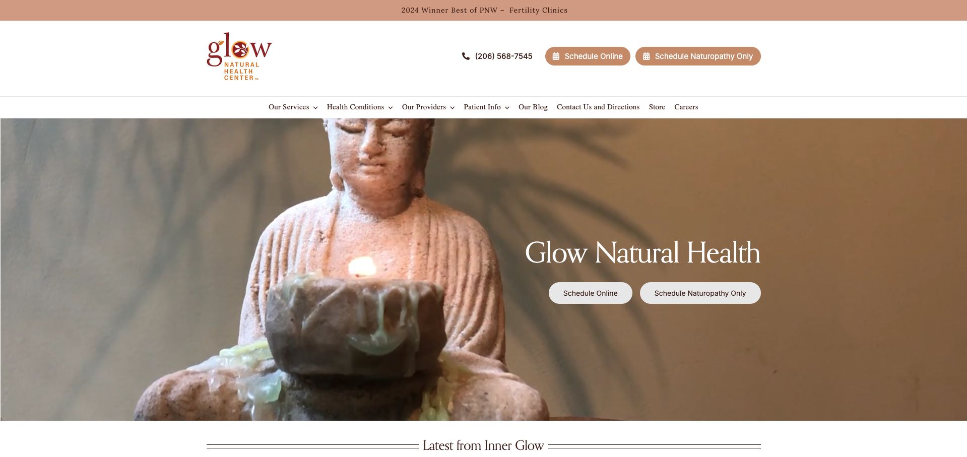
Glow repeats two scheduling actions in both the header and hero, explicitly distinguishing naturopathy from the general online route. That repetition is purposeful where a multi-service center cannot send every patient through one scheduler. Warm tan accents, a compact wordmark and a large interior object photograph establish a consistent mood. The navigation covers services, providers, patient information and directions, and the latest-news area gives operational changes a place to appear. However, a temporary relocation notice is much lower than the opening calls to action, where a visitor could overlook it. The old award banner also occupies prime space that could carry current arrival information. This is a useful scheduling pattern with an opportunity to elevate time-sensitive logistics.
What you can learn
Label separate booking systems by the service they handle, and give temporary location changes more prominence than evergreen promotional content.
Pros
The two booking routes are explicitly differentiated.
Provider and patient-information sections support a complex service mix.
Cons & considerations
Temporary relocation information appears far below the booking prompts.
A dated award banner competes with current practical information.
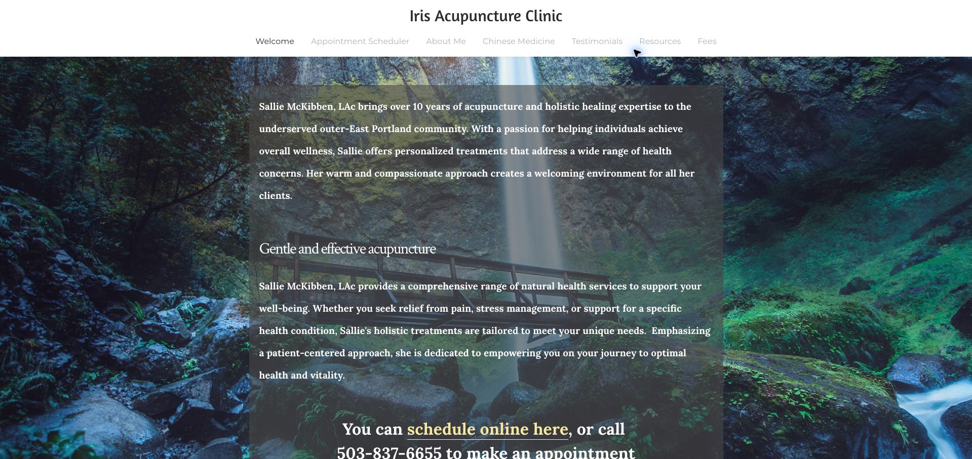
Iris introduces Sallie McKibben by name and places the appointment route inside a long welcome section over a forest waterfall. The more distinctive content comes later: the page explains that this practice is located within Acuherbal Health and gives step-by-step directions through the office complex. It also distinguishes ordinary Iris appointments from coverage appointments that must use the host clinic's system. Those distinctions reduce a real source of confusion when businesses share an address. Visually, the large translucent panel contains dense bold text, making the scenic background compete with the message. A concise opening, stronger booking button and more visible arrival block would make the useful operational explanation easier to find.
What you can learn
When sharing premises, identify the host business, the sign to follow and any separate booking process before the visitor arrives.
Pros
The office-complex directions go beyond a street address.
Coverage appointments are distinguished from the practitioner's own bookings.
Cons & considerations
Dense bold text is layered over a busy background.
The main scheduling link blends into the welcome copy.
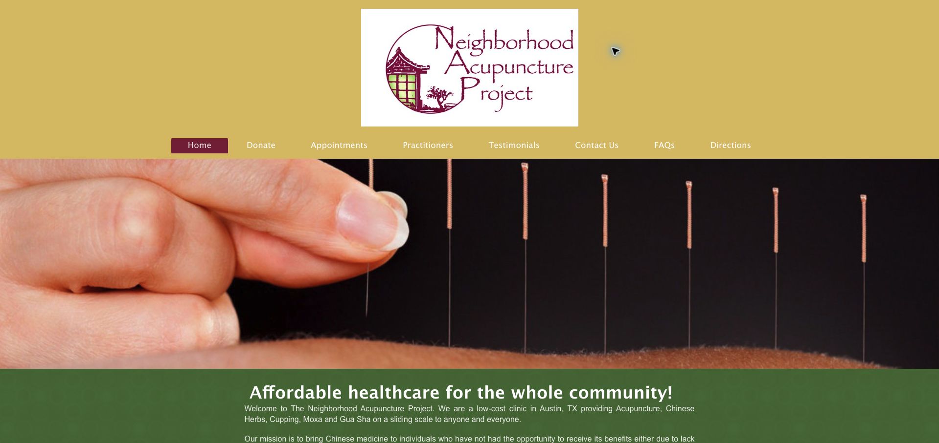
Neighborhood Acupuncture Project pairs a large neighborhood-themed logo with a direct statement of its community purpose. A treatment photograph leads into an explanation of the shared model, and the page sets out separate first-visit and follow-up ranges rather than merely calling the service affordable. It also states payment options, insurance handling and cancellation expectations. That practical disclosure makes the mission easier to evaluate as a prospective visitor. The gold, burgundy and green palette is distinctive, but the oversized logo and photograph push fees well below the opening view. The long spacing around hours and fee sections could be tightened. The useful pattern is transparency about the model, with an opportunity to show its most important terms earlier.
What you can learn
If affordability is the central promise, explain the actual fee structure, payment process and visit format near the main appointment action.
Pros
Initial and follow-up fee ranges are separated.
Insurance handling and cancellation expectations are stated plainly.
Cons & considerations
Large branding and imagery delay the practical cost information.
Excessive spacing makes a simple schedule take longer to scan.
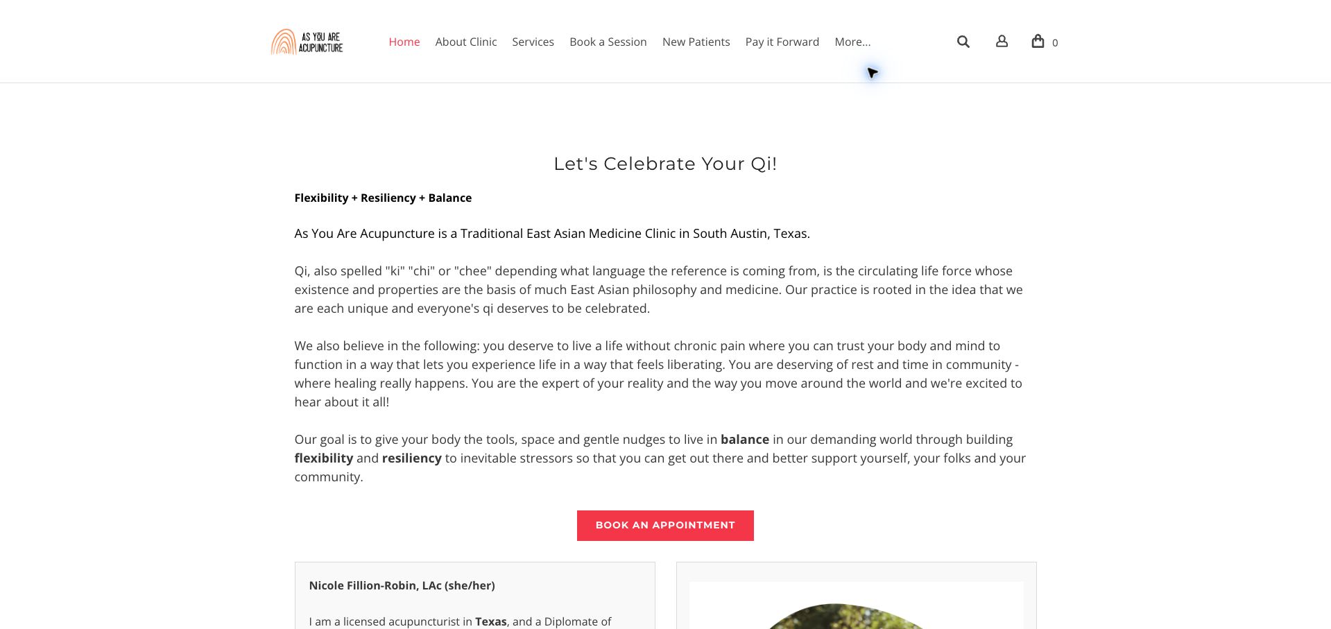
As You Are opens with a conversational statement and a plain-language explanation of the practice's philosophy. The restrained white layout, small rainbow mark and pink appointment button keep the page visually simple, while the navigation gives new patients a dedicated starting point. A named practitioner biography follows the introduction, and a Spanish-language route appears later on the page. The result feels personal, but the opening asks visitors to read several substantial paragraphs before reaching the main button. Important service and location information could be brought forward without losing that voice. Shopping and account icons also occupy the header despite appointments being the primary task. The site is most useful as a study in maintaining warmth while making first-visit information easier to retrieve.
What you can learn
Preserve a distinctive practitioner voice, but lead with the location, service and next step before the longer explanation of the practice's values.
Pros
New patients have a clearly labeled navigation route.
A Spanish-language option broadens the available information path.
Cons & considerations
The opening philosophy delays the main appointment action.
Store and account controls add distractions to a clinic header.
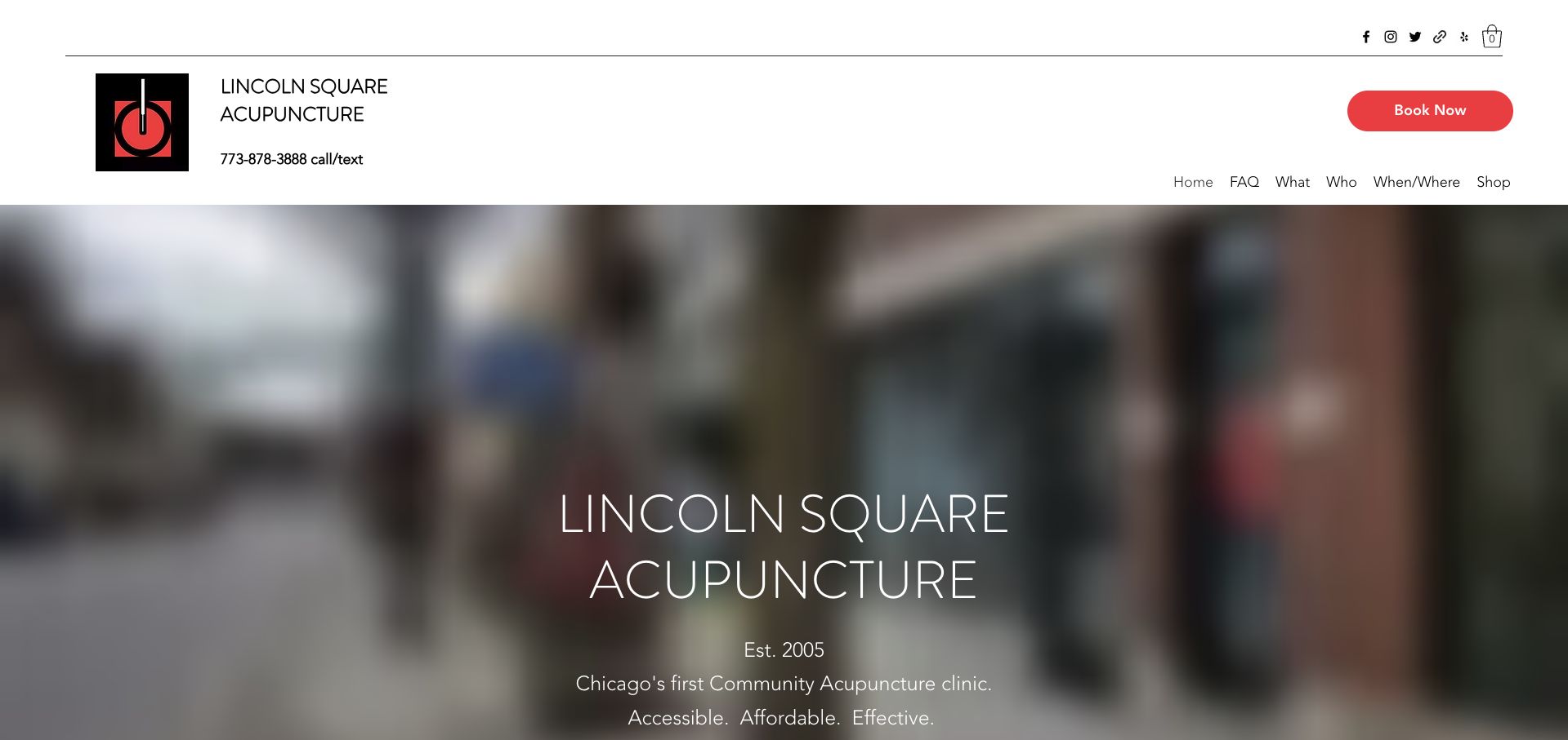
Lincoln Square places its name, call-or-text number and a large red booking button in a spacious white header. The body explains the community model and a pay-what-you-can range, then separates appointments, products and gift certificates into distinct areas. That structure gives returning patients useful choices without hiding the central service. The blurred background in the opening provides atmosphere, although it communicates little about the actual treatment room. Several notices refer to older dates, so the page needs a clear distinction between current policy and historical updates. The example demonstrates the value of naming a service model prominently, while showing how an accumulation of announcements can weaken otherwise straightforward information architecture.
What you can learn
Keep the service model and booking action unmistakable, and archive old announcements so current prices and procedures do not require interpretation.
Pros
A large booking control is visible beside direct telephone contact.
The community payment model is explained in ordinary language.
Cons & considerations
Older dated notices make freshness difficult to judge.
The blurred hero offers little practical information about the space.
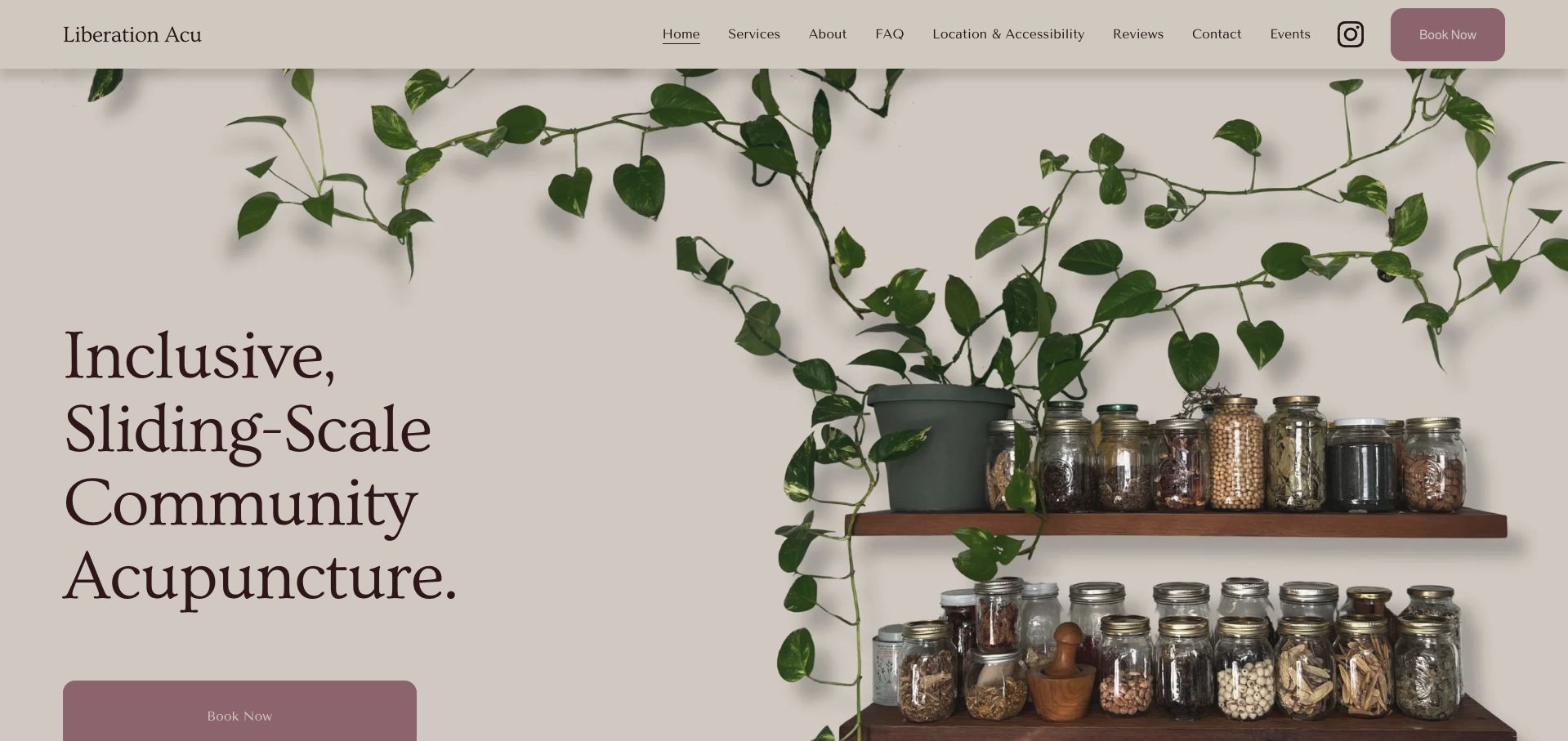
Liberation Acu uses a large editorial headline, muted plum actions and a photograph of plants and herbal jars to introduce its community model. The navigation explicitly names location and accessibility rather than leaving those questions inside a generic contact page. The long homepage explains the sliding scale, distinguishes initial and return visits, describes the shared recliner setting and clarifies which services cannot be booked online. These are concrete expectations that help visitors decide what to do next. The dense content still needs careful scanning, and the muted button colors deserve contrast testing. Its strongest design lesson is that accessibility, cost and service limits can be presented as normal parts of the experience rather than hidden exceptions.
What you can learn
Treat accessibility, shared-space expectations and appointment limits as primary information, with clear navigation labels and concise explanations beside the booking route.
Pros
Location and accessibility receive an explicit navigation label.
The page explains which services require direct contact.
Cons & considerations
The long homepage asks readers to process substantial detail.
Muted action colors should be checked carefully for contrast.
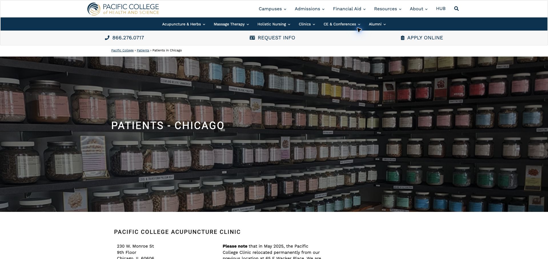
Pacific College's Chicago patient page provides an unusually detailed operational reference. It identifies the new address and entrance, distinguishes intern and licensed-practitioner fees, describes the community session and lists preparation and cancellation policies. These details explain the teaching-clinic model far better than an ordinary marketing introduction would. A dark herbal-dispensary photograph and breadcrumb establish the page within the wider college site. The shared institutional header is the main weakness: admissions, financial aid and application actions remain prominent even though the visitor is looking for care. Pricing has an explicit effective date, while other schedule references would benefit from the same discipline. The page is worth studying for its completeness and for the challenge of serving patient tasks within an education-focused shell.
What you can learn
Give clinic visitors a distinct task hierarchy inside institutional websites, while retaining clear fee categories, entrance details and preparation instructions.
Pros
Fees distinguish the different appointment provider types.
The relocation notice specifies the actual building entrance.
Cons & considerations
Admissions actions compete with the patient task.
A long policy page could use stronger in-page navigation.
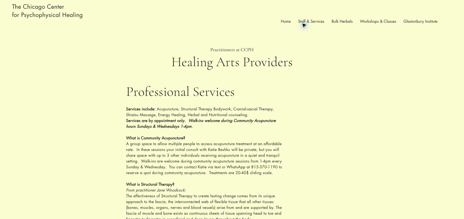
The Chicago Center for Psychophysical Healing uses a pale yellow page and large serif headings for its staff and services information. Before the biographies, it explains which visits require appointments and when community acupuncture accepts walk-ins. The community description clarifies that the initial conversation is private even though treatment happens alongside other visitors, a useful distinction for people unfamiliar with the format. The page then becomes a substantial mix of service explanations and practitioner histories. That depth can support research, but the narrow text column and repeated spacing make quick comparison difficult. A stronger set of practitioner cards and direct scheduling links would turn the available information into a more efficient decision path.
What you can learn
Explain the visit format and appointment rules first, then use consistent practitioner summaries to help visitors compare the available routes.
Pros
Walk-in and appointment-only services are distinguished.
The privacy of the initial conversation is explained.
Cons & considerations
Long service explanations make practitioner comparison slow.
The page lacks a strong booking action in its opening view.
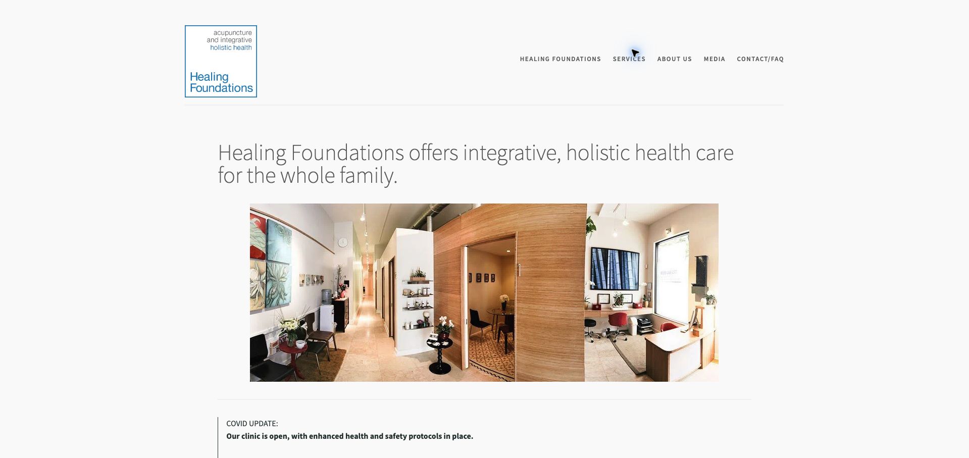
Healing Foundations places a wide interior photograph beneath a plain heading and compact navigation. The image shows the reception and treatment environment, giving visitors more useful orientation than an abstract wellness image. The short homepage then describes the Chicago neighborhood location, offers a treatment-scheduling action and provides a separate insurance-verification route. This is a manageable structure for a small multidisciplinary practice. However, the prominent health-protocol update does not show a clear review date, and the appointment action sits below the opening photograph and notice. The subdued gray typography is consistent with the quiet presentation but could use more hierarchy. The strongest element is the authentic view of the space, paired with two distinct administrative tasks.
What you can learn
Use real interior photography to reduce uncertainty, then give scheduling and insurance questions separate, clearly visible next steps.
Pros
The interior photograph makes the clinic environment recognizable.
Insurance verification is separate from treatment scheduling.
Cons & considerations
The operational notice has no clear freshness indicator.
The first appointment action appears below substantial introductory content.
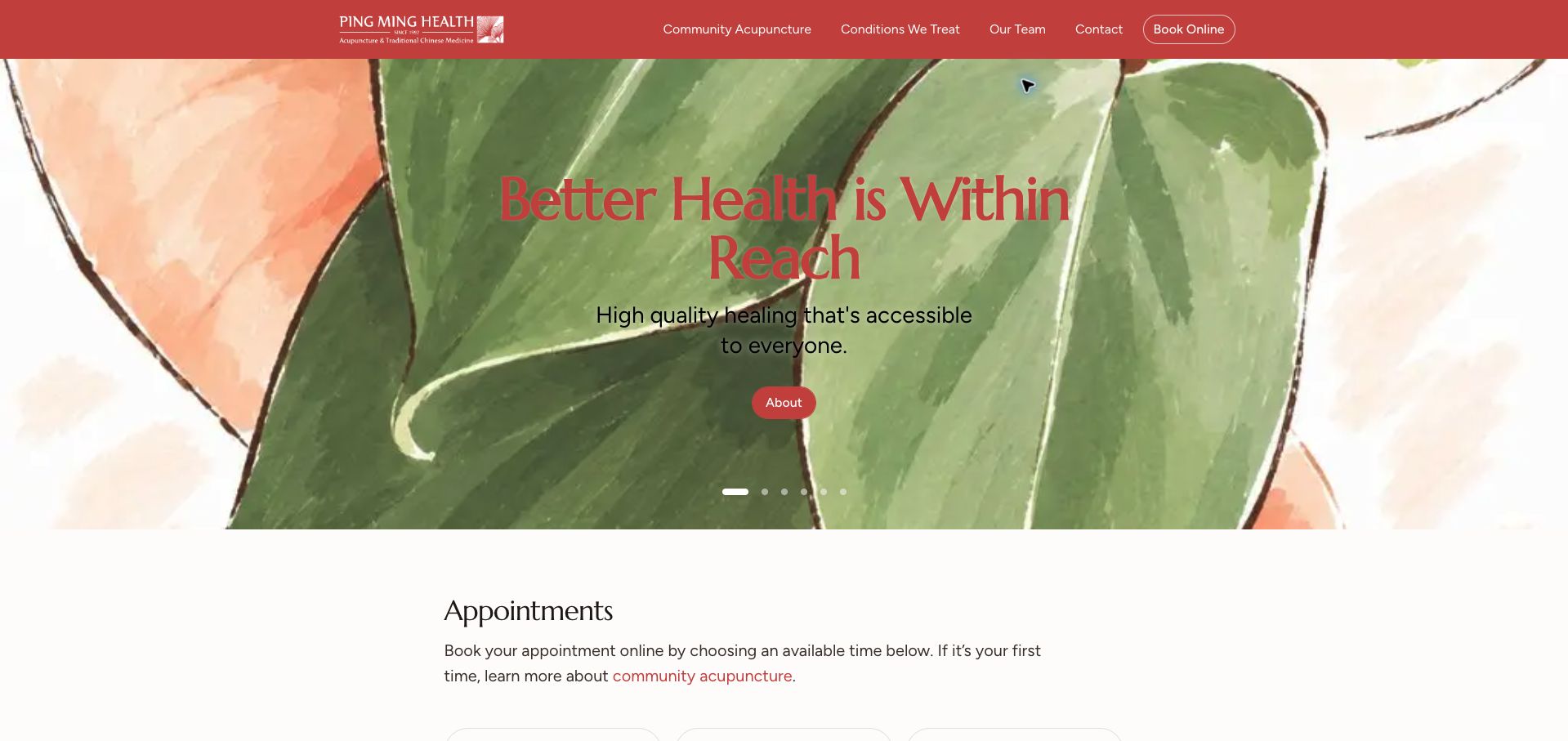
Community Acupuncture Melbourne brings three clinic locations into one appointment area. Each branch displays its own availability state, so visitors can compare options before committing to a location. The page also explains confirmation, cancellation and same-day changes alongside the appointment flow. This is useful operational content, although the payment-security statements remain the site's own claims rather than something established by a visual review. A red header and watercolor-style carousel give the page a distinctive identity, but the opening headline has limited separation from parts of the illustration. The long list of conditions below the booking section creates a second, less focused browsing task. The strongest pattern is the early comparison of branch capacity supported by clear booking expectations.
What you can learn
When appointment supply differs by branch, expose that difference before the user enters a scheduler and explain what happens after choosing a time.
Pros
Availability is separated by clinic location.
Confirmation and change policies accompany the booking area.
Cons & considerations
Parts of the hero artwork reduce headline contrast.
The extensive condition list competes with the main scheduling task.
Kegan is a freelance web designer and developer with 15+ years of experience helping businesses turn complicated website requirements into clear, maintainable digital experiences. He works directly with clients from planning and design through development, launch, and ongoing support.
For acupuncture website design, his development approach focuses on clear practitioner and clinic information, first-visit guidance, maintained fees and access details, and careful scheduling-system handoffs. The scope can be a targeted improvement or a complete custom build, with responsive layouts, thoughtful content structure, and integrations chosen around the people using and maintaining the site.
Show 3 other acupuncture website designersHide other acupuncture website designers
Plan the content around the decisions visitors need to make
Map the clinic’s actual services
List the real practitioners, locations, services and appointment types before designing navigation. Have the practice approve the terminology. Do not create symptom selectors that appear to diagnose a visitor or promise that a particular treatment is suitable.
Write an accurate first-visit explanation
Describe the administrative sequence, expected duration, clothing or preparation guidance approved by the clinic, and the follow-up after a request. Separate general public information from personal clinical advice and private intake.
Make prices interpretable
Distinguish an initial visit from follow-ups, packages or community sliding scales. Include the charging unit and important eligibility conditions. Assign an owner to update offers and remove expired promotions.
Prepare a useful location page
Document the correct entrance, floor, transport, parking and known physical-access arrangements. Use actual room and building photographs when helpful. A map pin should support this explanation rather than replace it.
Choose an appropriate inquiry boundary
Use a short public contact route for administrative questions and a suitable separate system for sensitive intake. Clearly identify external booking destinations and avoid placing health details in analytics events or URL parameters.
Test a realistic newcomer journey
Ask a tester to identify the practitioner, understand the fee basis, find the entrance and explain what the booking action does. Check keyboard access and consent overlays without submitting appointments or personal information.
The editing job behind the design
Choose a maintainable publishing and booking system
A publishing system should connect practitioner profiles, services, fees and location facts without requiring duplicate updates. Prefer editable structured content for these recurring details, then use the practice’s approved scheduling system for appointments.
Publicly observed plugins or hosting signals do not establish the suitability of a clinical system. Keep sensitive records outside public content and review forms, third-party embeds, analytics and booking handoffs with the people responsible for the practice’s privacy and operations.
Our WordPress website examples offer a separate look at publishing approaches. A visible platform label is evidence for that named page, not a guarantee that the same system will suit your requirements.
Before the public launch
Practical website planning checklist
Name current practitioners accurately.
Describe the actual service scope.
Explain the first-visit sequence.
Identify initial and follow-up fee units.
Date promotional offers.
Publish cancellation information.
Show the correct entrance and floor.
Provide practical access information.
Use genuine practice imagery.
Label external scheduling handoffs.
Keep public inquiries proportionate.
Test the mobile contact journey.
These checks are a project checklist, not a performance, legal, security, or accessibility certification. Test real journeys with the people responsible for the website before making claims about the result.
Sources & editorial method
How this collection was selected and reviewed
The 30 examples match the original saved collection target. Each official public page was opened, inspected and directly captured in an ordinary browser; source URLs and capture dates identify the reviewed state. Reviews describe observed design, information and navigation, with distinct practical lessons and limitations. A bounded public technology-audit attempt accompanies every source, preserving unknown and inaccessible results without inventing a hidden stack. Editors Choice is an explicit editorial selection favoring a smaller specialist or local organization, not a service-quality, safety or outcome endorsement. No booking, application, payment or private form was submitted. Website imagery and trademarks belong to their owners.
Each example links to its actual source page. Screenshots are direct browser captures with their own capture dates; moving imagery, announcements and live designs can change. The notes describe observable design choices and conditional tradeoffs, not measured traffic, conversion results, service quality, or accessibility conformance.
Technology labels use public page metadata, asset evidence, or explicitly cited platform documentation. Platform documentation is not a complete current deployment audit. A component reference may be legacy or unused; it is not a complete backend inventory. Unknown stacks are omitted. These sites are editorial examples, not our client portfolio.
Written, Edited and Curated are separate editorial records, not timestamps advanced by a rebuild. Website designs and imagery belong to their owners. See our editorial standards or suggest a correction.
Questions worth asking
Acupuncture website design questions
What belongs on an acupuncture homepage?
Show the practice identity, location, named practitioners and an understandable next step. Give fees, first-visit information and access details clear supporting routes rather than squeezing every treatment description into the opening screen.
Should every service have a page?
Only when the clinic has useful, approved information to explain. A smaller set of accurate pages is easier to maintain than many nearly identical condition pages that imply unsupported outcomes.
How should community pricing be presented?
Explain the price range, eligibility, what the appointment includes and how someone selects or asks about a fee. Keep that explanation connected to the actual booking process.
What makes a strong location page?
An accurate address, entrance and floor, transport and parking guidance, contact details and known access arrangements. Second Spring demonstrates the value of specific local information alongside practitioner identity.
Does Editors Choice recommend the treatment?
No. The selection recognizes the website’s information and design. It does not evaluate clinical effectiveness, individual suitability or the quality of care.
Build a clear account of the real practice: people, place, fees and the first step. Let the visual identity support those answers without turning the website into a promise of personal outcomes.