Best Golf Club Websites of 2026 (29 Real-World Examples)
Golf club websites that explain visitor access and seasonal green fees
A golf club’s visitor page needs to explain who can play, when, at what rate and under which conditions. These 29 examples compare green-fee tables, booking windows, seasonal restrictions, society visits and arrival information.
An impressive course photograph cannot resolve a visitor’s uncertainty about membership restrictions, winter play or advance booking. Keep the current visitor offer distinct from member resources and state the applicable dates beside the fee.
Golf information changes with seasons, course conditions and club events. A useful website gives each kind of information an appropriate update process rather than treating a historic status notice as a live report. This guide evaluates presentation, not course quality or playing suitability.
Before the examples
What makes good golf club website design in 2026?
Make the current visitor season explicit
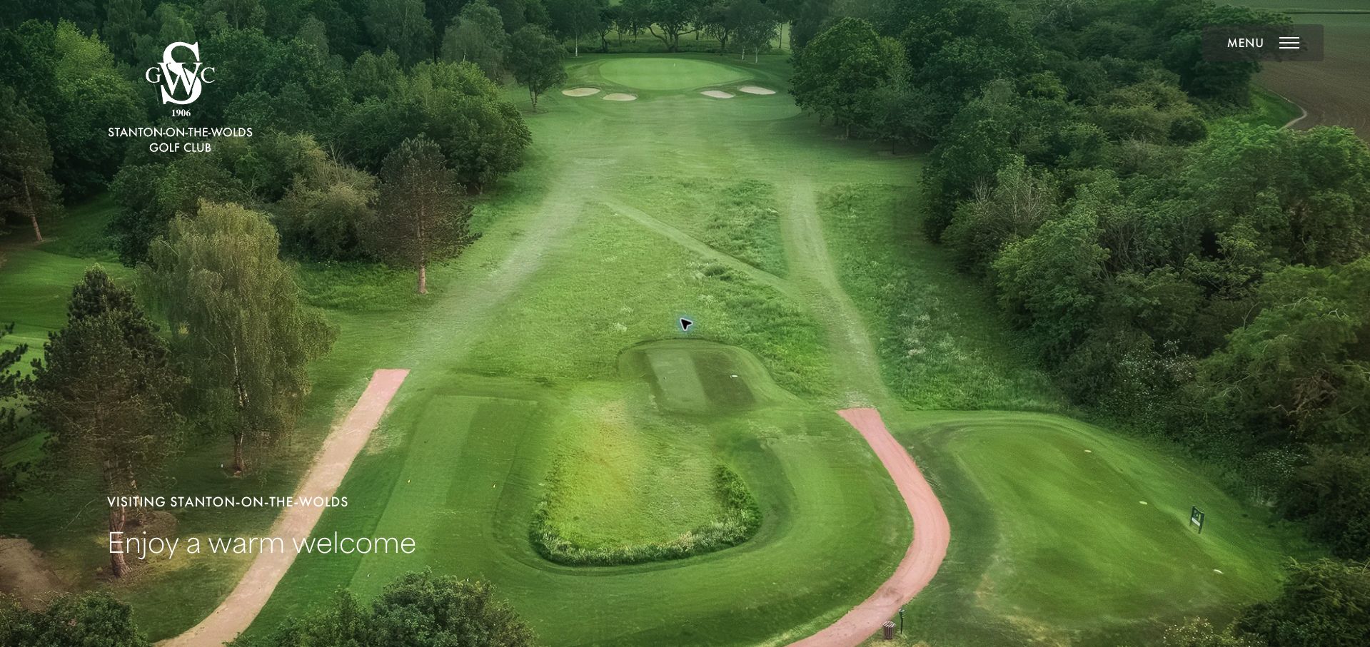
Stanton-on-the-Wolds places its winter dates, booking window and holiday restrictions alongside visitor information. The value is the relationship between the published fee and the dates on which a guest can actually use it.
Separate guest categories and conditions
Member guests, ordinary visitors, county card holders and societies can have different rules. Keep eligibility close to the relevant rate and avoid making a lower conditional price look universally available.
Explain the whole visit
Tee-time booking, arrival, clubhouse access, food service and equipment hire may follow different hours or arrangements. Visitors need those distinctions before planning a trip, especially outside the main season.
Treat course status as dated information
A dated notice can be useful without being live. Show when conditions were checked, who maintains them and where visitors should confirm changes. Do not let a stale banner imply current availability.
The collection · 29 examples
29 golf club websites worth studying
The examples span local clubs, resort courses and public facilities. Compare the clarity of visitor permissions, seasonal fee conditions and booking instructions rather than interpreting a scenic hero as a complete visitor guide.
Stanton-on-the-Wolds earns our Editors Choice for a visitor page that combines a composed course presentation with a particularly useful current-season brief. The winter fee heading gives its full 2026/27 period, the booking instructions state a sixty-day advance window, and the holiday interval reserved for members and their guests is explained before the rate table. Catering hours help visitors plan the wider day, while professional-shop contact and online booking provide two clear routes. The simple table distinguishes ordinary, county-card, reciprocal and junior categories. Aerial photography and a restrained green identity create atmosphere without replacing those operational facts. The full-screen opening still delays the practical content, and availability and buggy details sit behind additional controls. Even with those limitations, this small club communicates the relationship between price, access and timing unusually well. The selection recognizes website communication, not course quality.
What you can learn
Publish seasonal validity, advance-booking limits and visitor blackout dates together, then offer booking and telephone routes immediately beside the applicable fees.
Pros
Current winter dates and the holiday visitor closure are explicit.
Booking lead time, catering hours and rate categories support a complete visit plan.
Cons & considerations
The photographic opening occupies a full screen before the practical brief.
Additional availability and buggy information requires further interaction.
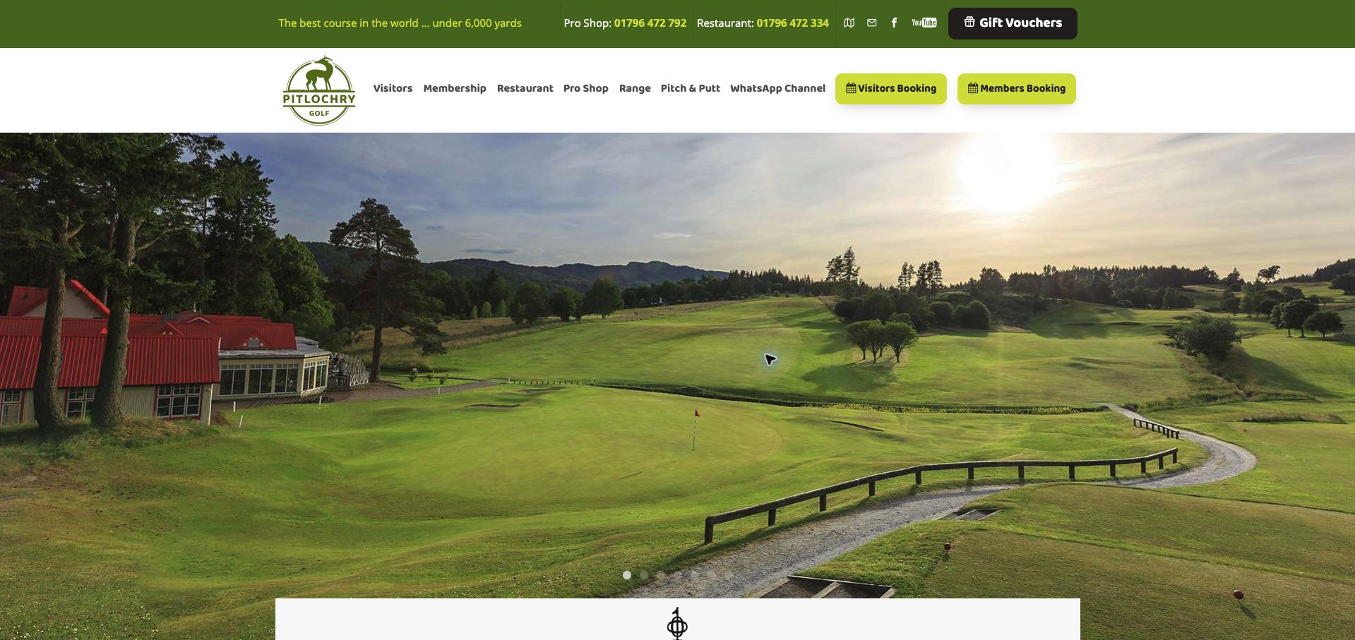
Pitlochry combines sweeping course photography with unusually visible operational information. The header separates visitor booking from member booking and gives the golf shop and restaurant distinct contact routes. Its conditions update is dated, describing course availability, main greens and the different shop and range hours. Those details help a visitor distinguish a playable course from an open clubhouse. The wider page introduces the eighteen-hole course, the shorter Lettoch Links and practice facilities, making the offer understandable beyond a single tee-time button. The broad photographic carousel takes substantial space, however, and a September event remains promoted alongside forward-looking membership material in November. The contrast shows why status notices and promotional cards need different maintenance schedules. This is a useful example of a destination homepage that also tries to serve the day's practical decisions.
What you can learn
Maintain a dated operational strip independently from seasonal marketing, with separate fields for course, practice facilities and clubhouse availability.
Pros
Member and visitor booking routes are clearly distinguished.
Course status and facility hours provide concrete arrival information.
Cons & considerations
Large carousel imagery delays some practical content.
An elapsed event promotion weakens the sense of editorial freshness.
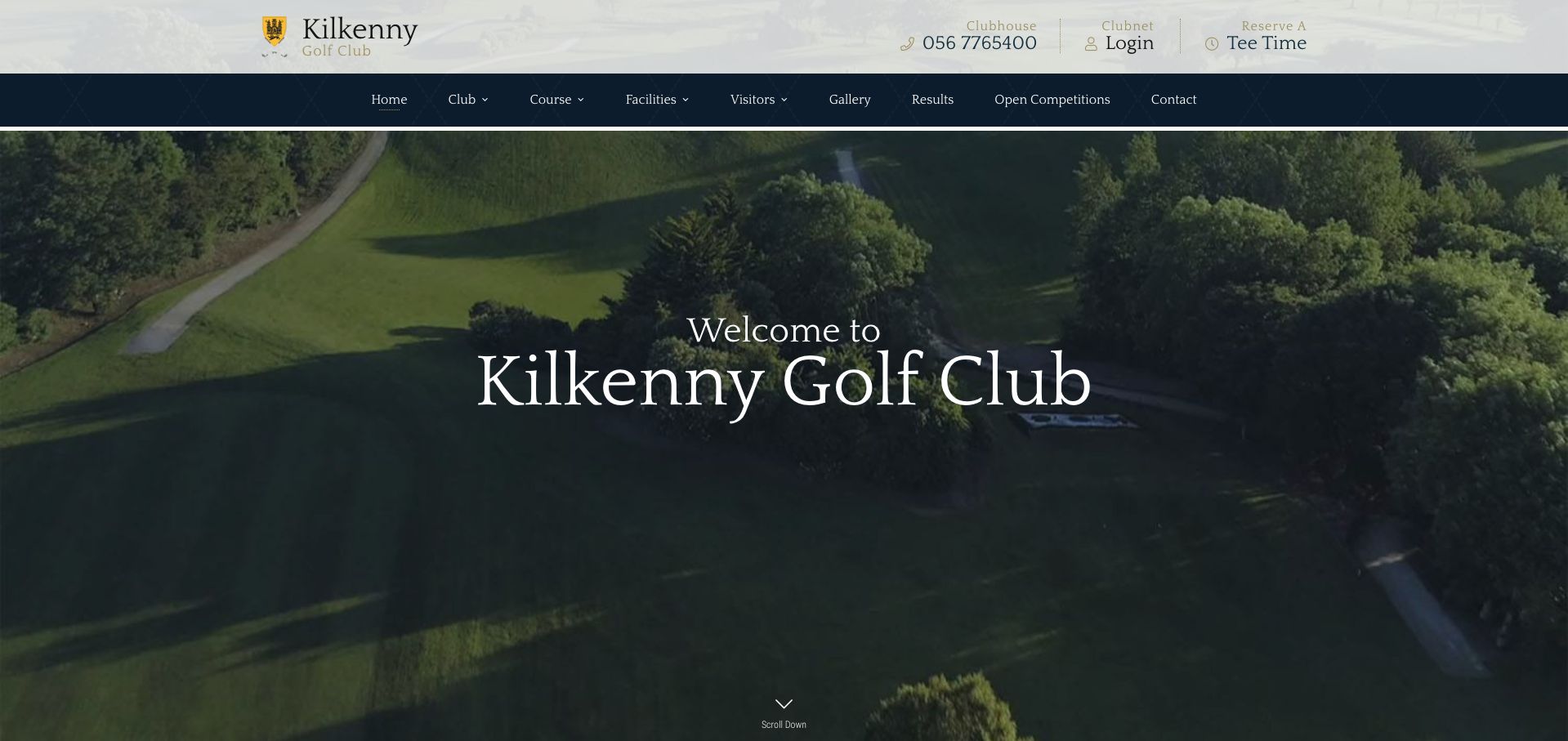
Kilkenny's homepage uses a cream, navy and gold palette with a large aerial course photograph to establish a traditional club identity. The reserve-a-tee-time route and member login are separated in the header, while introductory copy welcomes individuals, families and companies. The surrounding city is part of the proposition, giving visiting golfers a reason to consider the club within a wider trip. A contact section and sponsor area add institutional context without making the first screen crowded. The presentation is attractive but comparatively light on the facts needed to plan a round: course format, visitor eligibility and a dated rate summary are not gathered with the opening invitation. Much of the initial experience therefore depends on following another route. The lesson is that a polished welcome becomes more useful when paired with a compact, practical visitor brief.
What you can learn
Keep the calm visual identity, but accompany the first booking action with course format, visitor access and a link to current fees.
Pros
The aerial image and restrained palette create a coherent club identity.
Member access and tee-time reservation have distinct header entries.
Cons & considerations
The opening content offers few concrete round-planning facts.
The large hero requires additional navigation to evaluate visitor suitability.
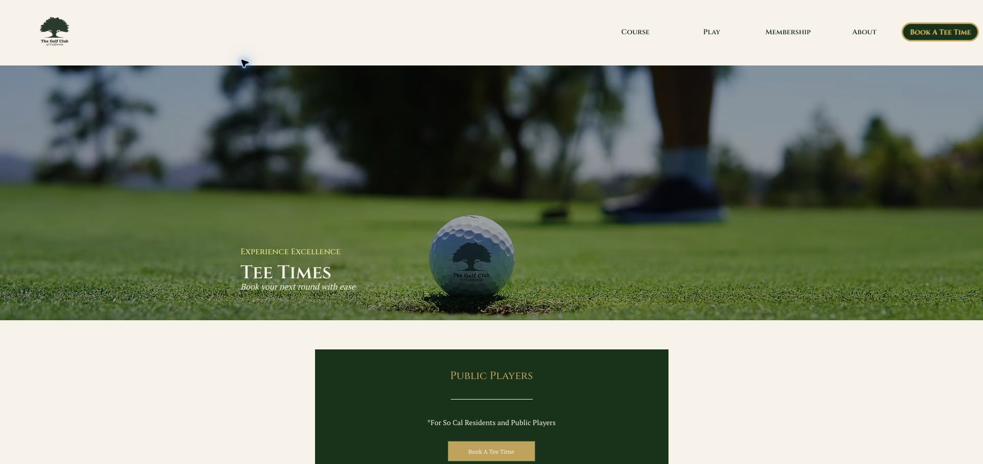
The Golf Club of California treats its tee-time page as an eligibility router. Public players, Summit members and JC Players receive separate sections, and the JC route states that identification is required. Holiday information and coupon exclusions appear alongside those distinctions, acknowledging that a discounted rate may depend on both the player and the date. A cream background, green branding and restrained gold accents keep the page connected to the club's broader identity. The main drawback is that repeated booking labels do little to explain which external step follows each choice, while ordinary prices remain outside this overview. The large golf-ball photograph also consumes space before the comparison. Still, the page demonstrates a valuable principle: choosing the correct customer category should happen before a golfer enters a reservation system and discovers an unexpected eligibility restriction.
What you can learn
Name booking actions for their audience and put identification requirements and holiday exceptions immediately beside the relevant route.
Pros
Public and membership booking categories are explicitly separated.
Identification and holiday exclusions are acknowledged before reservation.
Cons & considerations
Repeated generic booking labels provide limited destination context.
The introductory page does not offer a quick ordinary-rate comparison.
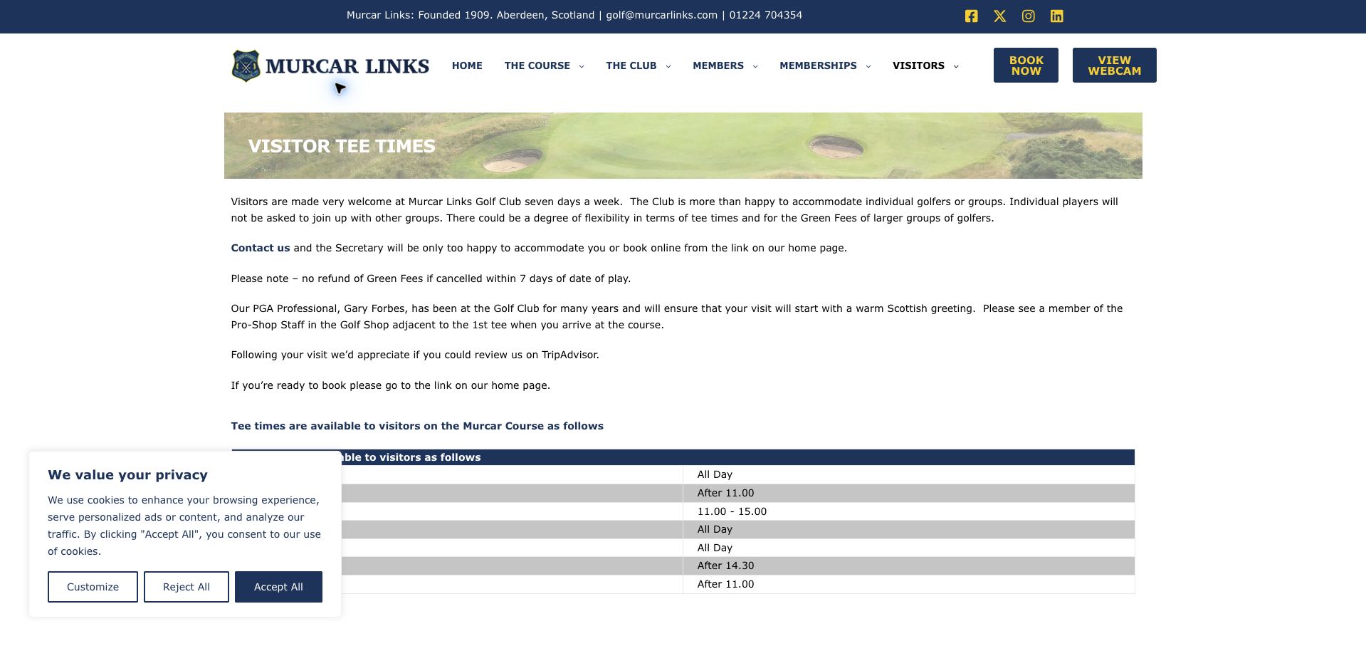
Murcar's visitor page makes availability a matter of specific days and times rather than a vague welcome. A striped timetable explains when visiting golfers may play, while separate instructions handle groups through the secretary. The page also states its pairing approach, cancellation terms and the need to report to the professional shop beside the first tee. These are practical details that prevent an attractive coastal-course photograph from becoming the whole sales argument. White space, navy text and a narrow photographic banner give the page a straightforward structure. Long paragraphs about travel and the overall visit nevertheless compete with the essential timetable, and the copy sends readers back toward the homepage to book despite a booking route in the header. The information is valuable; a tighter sequence would make the transition from eligibility to reservation easier to follow.
What you can learn
Present visitor windows, group exceptions, cancellation conditions and arrival instructions as a short sequence ending at the appropriate booking link.
Pros
A weekday timetable makes visitor restrictions concrete.
Pairing, cancellation and check-in expectations are stated.
Cons & considerations
Long travel paragraphs compete with the immediate booking task.
The written booking instruction introduces an unnecessary homepage detour.
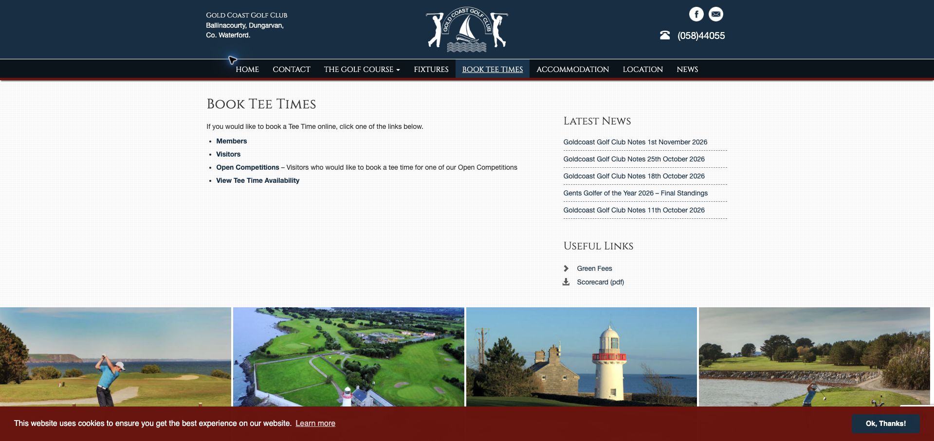
Gold Coast Golf Club uses a compact booking page with four clear destinations: members, visitors, open competitions and availability. The open-competition choice is explained, helping golfers understand why it is different from an ordinary visitor round. The navy crest and centered branding establish continuity, while a coastal image band adds a sense of place without swallowing the entire page. Green-fee and scorecard links support further preparation. The interface is simple enough to understand quickly, but the routes read as a small list rather than prominent, individually described actions. Recent-news content in the sidebar also competes with a task that should be focused. Prices and essential playing conditions remain on other pages. This is a useful reference for a lightweight booking hub, especially when a club already has separate operational systems and needs to direct each audience accurately.
What you can learn
Keep the route list short and label each destination with the player type or competition it serves, then add a nearby fees-and-conditions link.
Pros
Member, visitor and competition routes are explicitly differentiated.
Availability, green fees and scorecard resources are easy to identify.
Cons & considerations
Small list-style links could give the main actions more prominence.
Sidebar news distracts from the immediate reservation choice.
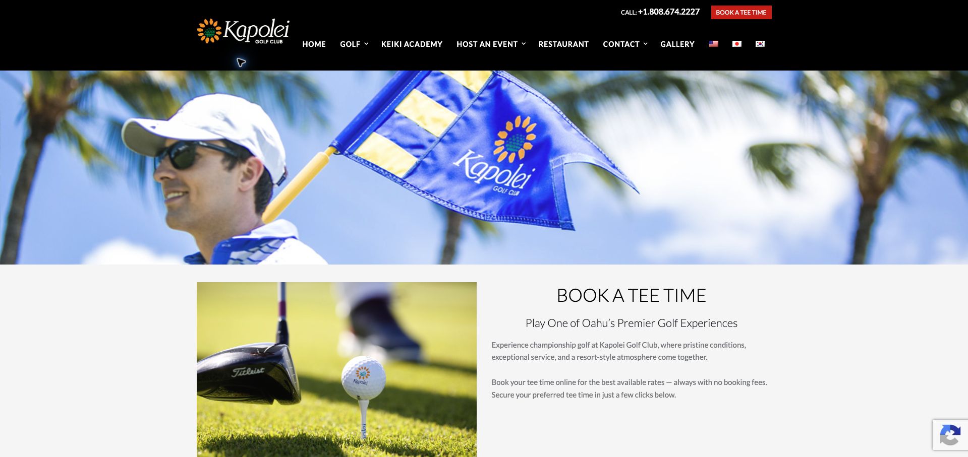
Kapolei organizes tee-time access around visitor, Kamaaina and Kamaaina twilight choices. That distinction is more useful than a single undifferentiated booking button because residency and playing time affect the appropriate route. The page also explains a golf-and-transport package with its own price, advance notice and nonresident restrictions. These qualifications help a traveler understand that transportation is a particular offer rather than an automatic inclusion in every round. Orange and red accents stand out against a white layout and a large flag photograph, while language options acknowledge an international audience. The ordinary green-fee comparison is less immediate, and the substantial hero image delays the practical choices. The transport explanation is strongest where it combines scope and restrictions; applying that same compact structure to every booking category would make the whole page easier to scan.
What you can learn
Treat transport and residency offers as clearly bounded products, stating who qualifies, what is included and how far ahead to arrange them.
Pros
Resident and visitor paths are named before the booking handoff.
The transport package includes price, eligibility and advance-notice context.
Cons & considerations
Ordinary rates are not summarized beside the audience choices.
A large hero image pushes decision-making content down the page.
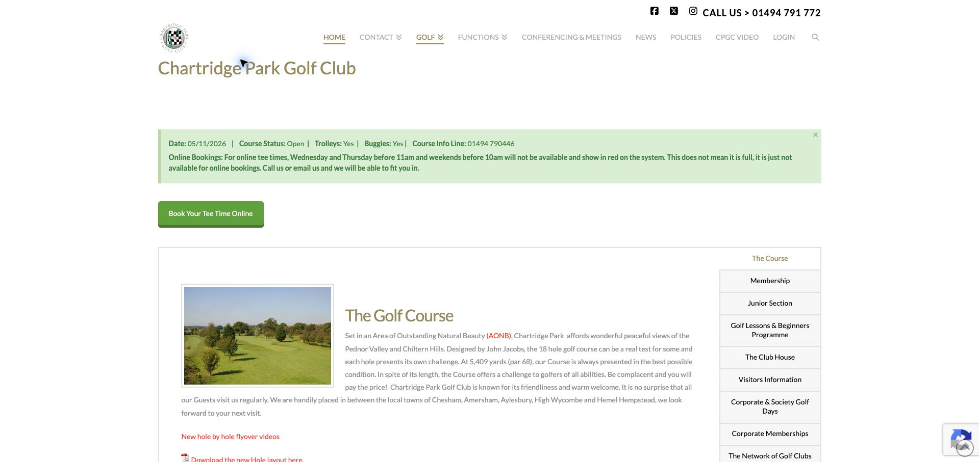
Chartridge Park's most helpful design element is an operational clarification. Its notice explains that red periods in the booking system may be unavailable online without being fully booked, then supplies telephone and email alternatives. That distinction can prevent a visitor from abandoning a playable time simply because the interface uses an ambiguous color. A dated status strip also reports course, trolley and buggy conditions. The otherwise restrained white and olive homepage gives access to course, membership, junior and visitor information without relying entirely on a dramatic hero. Course length, par and flyover resources provide useful orientation. The visual treatment is less polished than some peers: muted small text and wide paragraphs require attention, while an older footer date contrasts with the fresh course notice. Its strongest lesson is about explaining system behavior at the point where golfers might misunderstand it.
What you can learn
Translate booking-system status into plain language and place the alternative contact route beside any limitation on online availability.
Pros
The red-slot explanation distinguishes online restrictions from sold-out times.
Dated course and equipment conditions support practical planning.
Cons & considerations
Small muted text makes some operational detail less prominent.
Older footer dating sits awkwardly beside current status information.
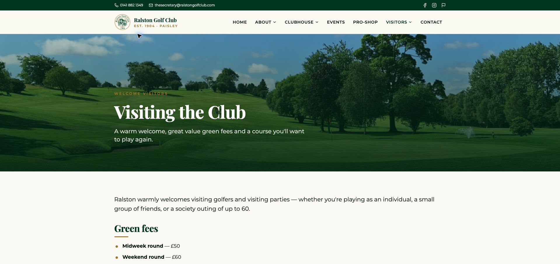
Ralston's visitor page uses a cream and forest-green palette, gold serif headings and a broad fairway photograph to create a composed introduction. The useful commercial detail follows directly: weekday and weekend green fees are stated, and groups of twelve or more are directed toward golf-and-food packages. The page also provides a telephone and email route, giving visitors a way to resolve questions before committing. This is a more concrete welcome than a purely atmospheric course description, especially for an organizer comparing individual and group options. The photograph and generous spacing nevertheless occupy much of the opening view, and the group package language still requires an enquiry to establish a particular day's inclusions and availability. A short comparison panel could make the relationship between a normal round, a society visit and an open competition clearer without losing the club's restrained presentation.
What you can learn
Pair a visitor welcome with a concise fee comparison and a separate group threshold, then explain what the group enquiry will confirm.
Pros
Weekday and weekend prices make the ordinary offer tangible.
The twelve-player group threshold and direct contacts are explicit.
Cons & considerations
The large photograph delays the practical fee information.
Group package inclusions still require a separate conversation to resolve.
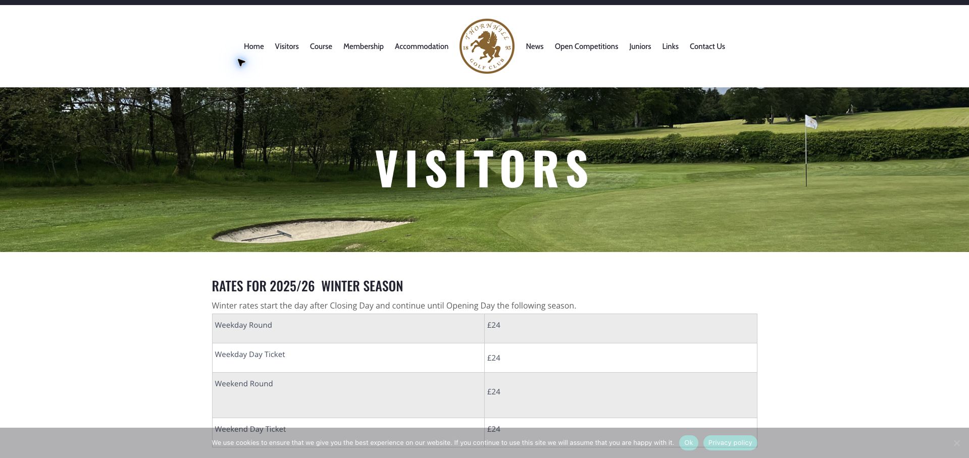
Thornhill brings a substantial amount of visitor information onto one page. Striped tables distinguish summer round and day-ticket options, with weekday, weekend and twilight differences. Voucher instructions, an earliest visitor starting time and dress requirements extend the page beyond price alone. The gold crest and broad course photograph give the information a recognizable club setting, while tables keep the many rate categories more legible than continuous prose would. The maintenance problem is significant: the winter heading refers to 2025/26, while summer information refers to 2026, leaving the current winter offer unclear at review. Different group-contact names across sections also create avoidable uncertainty about whom to approach. The page is useful as an example of comprehensive visitor documentation, but its structure needs a clear current-season state and a single authoritative contact for each task.
What you can learn
Publish each seasonal table with explicit validity dates and retire old seasons from the primary visitor view before adding the next offer.
Pros
Tables distinguish day tickets, twilight and weekday differences.
Voucher lead time and arrival restrictions supplement the advertised prices.
Cons & considerations
The displayed winter period had already elapsed at review.
Inconsistent group-contact references make the enquiry route less certain.
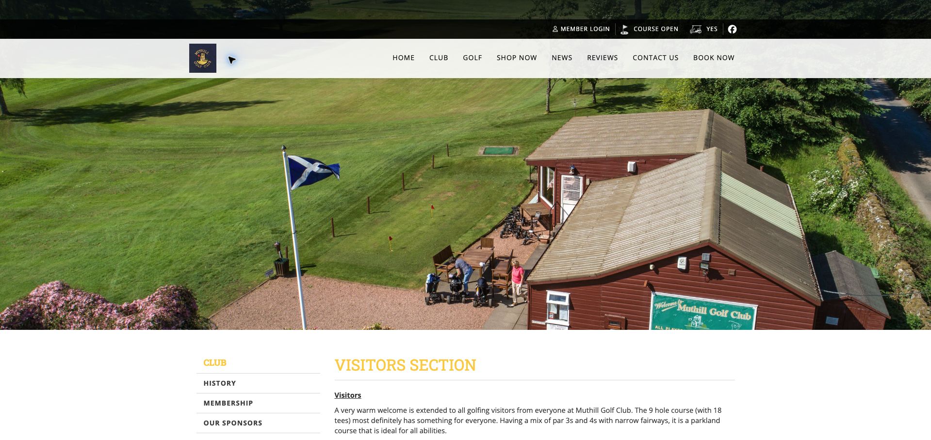
Muthill's visitor section introduces a nine-hole course with eighteen tees and then addresses the mechanics of paying and playing. The 2026 fee information distinguishes adult, junior and round-length options, with selected weekday offers and an insurance inclusion. Booking can be arranged through the website, the Scottish Golf app or direct contact. Particularly useful is the explanation of cash or card payment and the honesty-box arrangement when the clubhouse is closed, alongside the explicit statement that telephone payments are not accepted. Those details make a small-club visit more predictable. The aerial clubhouse image and gold branding provide identity, but extensive spacing and dash-separated prices make comparisons slower than a proper table would. Limited buggy availability is mentioned, yet could be more prominent near booking. The value here is transparent operating detail rather than an elaborate marketing experience.
What you can learn
Document the actual arrival and payment procedure, including unattended hours, and put scarce equipment availability next to the reservation instructions.
Pros
The page explains payment when the clubhouse is closed.
Round lengths, junior fees and insurance inclusion are identified.
Cons & considerations
Dash-separated prices are harder to compare than aligned rows.
Large spacing and pale gold details weaken the information hierarchy.
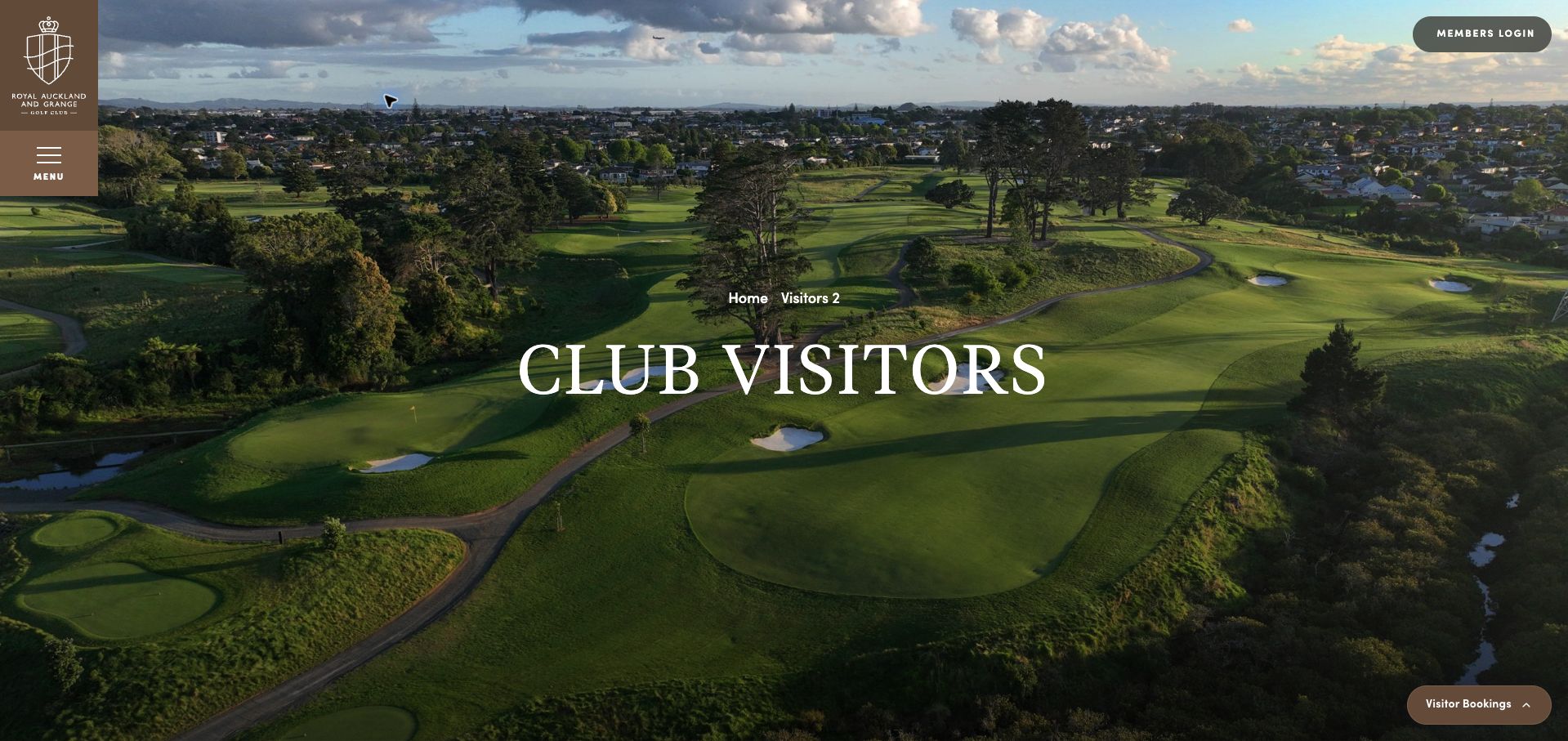
Royal Auckland and Grange combines a full aerial photograph with a distinctive vertical brown brand panel and a persistent visitor-booking entry. The visitor content explains that access is limited within a private club, preventing the booking invitation from implying unrestricted public play. Its fee structure distinguishes international and regional visitors, eighteen and twenty-seven holes, equipment hire and several seasons. Coring periods and possible price adjustments add operational context that scenic photography cannot supply. The amount of detail is useful for trip planning, but past and future seasons share the same presentation, making the currently relevant period harder to isolate. An internal-looking visitor label also reduces polish. A member testimonial offers a personal perspective but should be understood as that relationship, not independent proof. This page demonstrates the importance of combining premium presentation with precise access conditions.
What you can learn
Identify visitor eligibility before presenting prices, and visually distinguish the current season from historical and advance-planning rates.
Pros
Private-club access limitations are acknowledged before the enquiry.
Seasonal prices distinguish round lengths, visitor categories and hire.
Cons & considerations
Several seasons compete without a strongly emphasized current period.
An internal-looking visitor label detracts from the otherwise polished presentation.
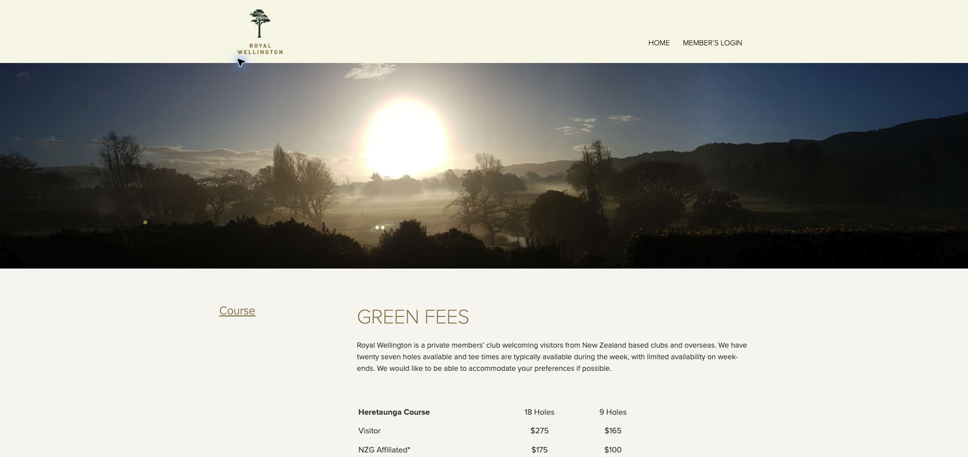
Royal Wellington's green-fee page explains visitor access in a few direct paragraphs before presenting a compact comparison. The Heretaunga and Terrace courses are distinguished by round length and player category, while accompanying notes cover affiliated-player limits, junior concessions and separate cart and club hire. The page also warns that weekday access is generally easier than weekend access. These qualifications help golfers interpret a price as an offer with conditions rather than an unconditional entitlement to play. Cream, olive and a large morning-course photograph create a traditional atmosphere. The surrounding navigation is unusually sparse, however, and the booking form link arrives after a substantial introduction and table. A visitor can learn the terms but has less immediate help exploring the wider club. The design is strongest as a focused fee document and weaker as a complete first-visit landing page.
What you can learn
Keep eligibility limits and equipment charges immediately below the comparison they qualify, with a clear next action for checking an actual date.
Pros
Course, round length and visitor category are compared together.
Affiliation limits and separate hire charges are explicitly qualified.
Cons & considerations
Minimal navigation provides little wider orientation for new visitors.
The booking action could appear earlier alongside the introduction.
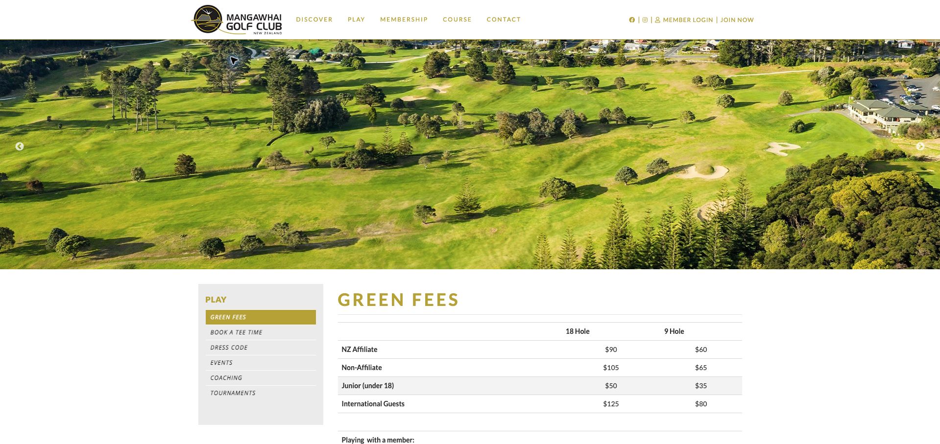
Mangawhai's green-fee page distinguishes nine- and eighteen-hole rounds across affiliated, non-affiliated, junior and international visitors. Separate prices for playing with a member make that relationship visible, while cart charges and a group-enquiry threshold add further planning context. The left-hand play navigation connects fees to booking, dress requirements and coaching, giving the information a sensible neighborhood within the site. A large aerial image and black-and-gold branding establish the coastal course before the table. The comparison would be stronger with an explicit effective date: without one, a prospective traveler must confirm whether the displayed offer applies to the intended visit. Affiliation terminology also assumes some prior knowledge. The enquiry form provides an alternative for exceptional requests, but it should complement an explanation of eligibility rather than become the only way a newcomer can understand the categories.
What you can learn
Define affiliation categories in plain language and date the complete table, including guest and cart rates, so visitors can compare on a consistent basis.
Pros
Nine- and eighteen-hole fees are separated by relevant player categories.
Member-guest rates and group enquiries receive distinct treatment.
Cons & considerations
The fee table does not prominently state an effective period.
Affiliation labels may be unclear to golfers unfamiliar with local conventions.
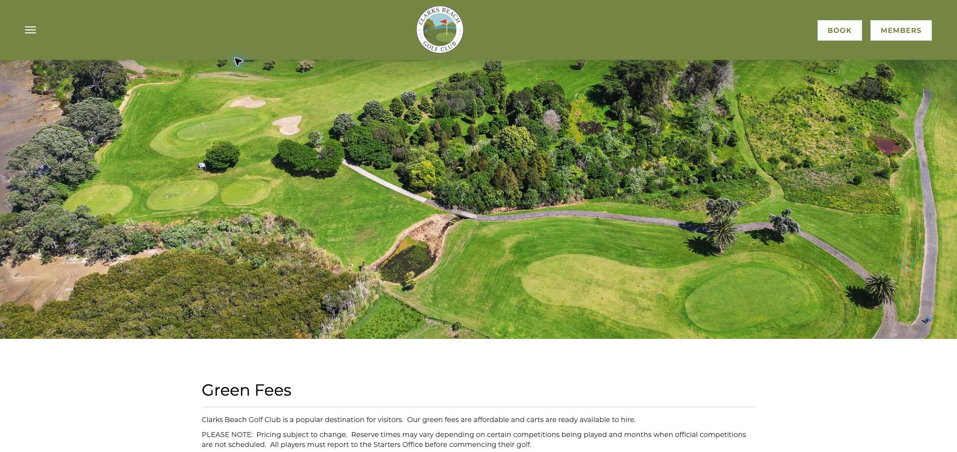
Clarks Beach pairs a broad aerial course image with a practical green-fee page. It tells visitors to report to the starter before play and gives both telephone and online booking routes. The rates distinguish affiliation and round length, while junior and cart charges are separately stated. Thursday and Friday specials include holiday and peak-period exclusions, which is helpful because a promotional headline alone would overstate availability. The olive header and centered crest maintain a simple club identity, with booking and member access readily visible. The ordering is less effective: promotional rates appear before the ordinary comparison, so visitors must first work out whether an exception applies. Date ranges without a clearly emphasized year also make future planning less certain. This is a useful example of operationally specific content that would benefit from a stronger standard-rate-first hierarchy.
What you can learn
Show the ordinary rate first, then attach a dated special offer with its exclusions and the check-in procedure needed on the day.
Pros
Starter check-in and alternative booking routes are explicitly described.
Promotional exclusions prevent an overly broad reading of the offer.
Cons & considerations
Special offers precede the standard rate comparison.
The applicable year is not strongly established beside seasonal exclusions.
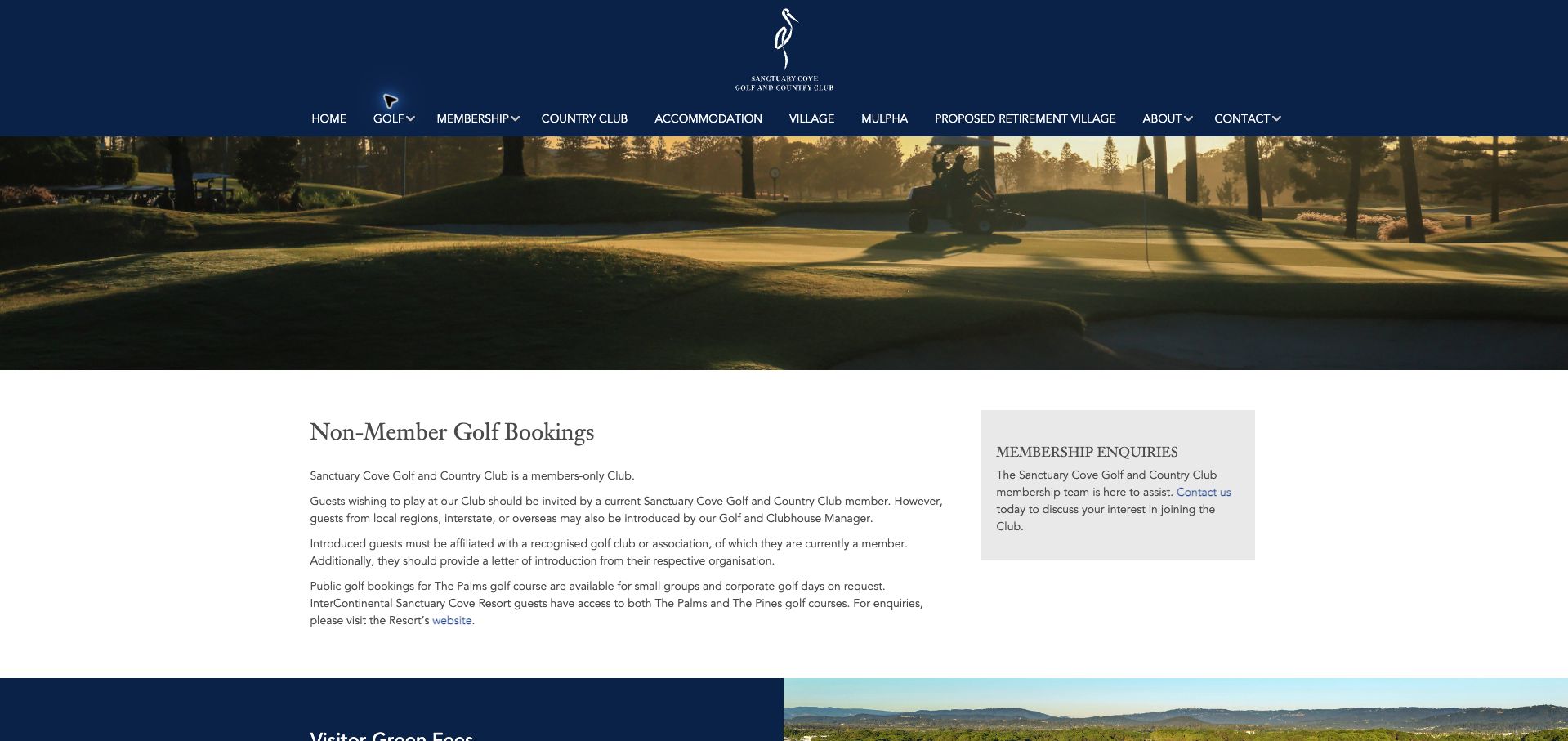
Sanctuary Cove's public-booking page is most interesting for the access rules it must explain. The club describes its members-only position, then sets out invitation or introduction requirements, affiliation documentation, group requests and access associated with resort stays. The Palms and Pines receive separate local or interstate and international rates, with shared-cart inclusion stated. That level of qualification helps avoid treating every visitor as eligible for every course. A navy crest, large course photograph and white content area create a formal resort presentation. The challenge is the density of the pathways: several exceptions are explained in paragraphs, while a membership sidebar competes with the immediate visitor task. An enquiry form provides the next step, but the page would be easier to understand as a small eligibility decision tree before any prices. Its strongest lesson is the value of defining access before advertising availability.
What you can learn
Map each visitor type to the course they may request, the evidence required and the next contact step before showing the relevant inclusive price.
Pros
Distinct access pathways acknowledge the private status of the club.
Course and visitor categories include a clear shared-cart qualification.
Cons & considerations
Several eligibility exceptions are difficult to compare in paragraphs.
Membership promotion competes with the visitor enquiry flow.
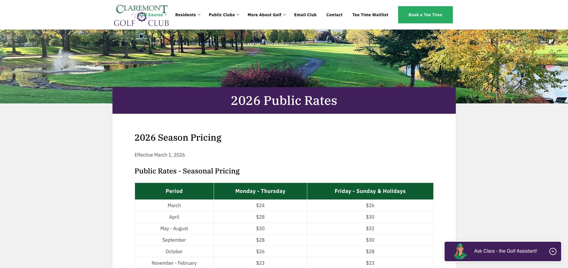
Claremont's rate page makes a useful distinction between the price of playing and the price of equipment. Its seasonal table separates weekday and weekend or holiday rates, while additional notes identify junior, senior, resident and legacy arrangements. Power-cart charges are qualified per rider and per nine holes, avoiding the ambiguity of a bare cart price. Rental-club availability and timing restrictions are also stated. The page gives the schedule an explicit 2026 effective date, which helps readers assess whether they are looking at the right version. Purple headings and green course branding create a recognizable visual combination, although the header logo crowds an adjacent navigation label in the reviewed desktop view. The quantity of exceptions calls for careful grouping. As a reference, this page is especially useful for showing that clear pricing depends on units, eligibility and dates as much as the headline amount.
What you can learn
Write the charging unit beside every equipment price and keep concessions under the main table with their age, residency or timing qualification.
Pros
The schedule has an explicit effective date and seasonal structure.
Cart charges specify both rider and nine-hole units.
Cons & considerations
The desktop header crowds the logo and neighboring navigation.
Several concession types require more visual grouping to compare quickly.
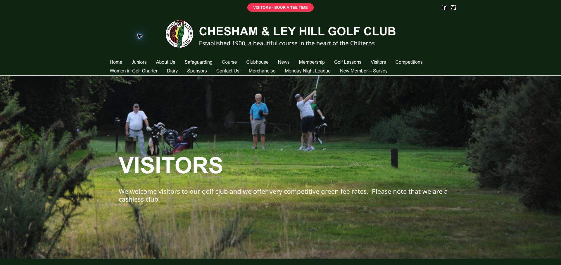
Chesham and Ley Hill's visitor page makes the operational rules unusually concrete. It identifies the club as cashless, requires online prepayment, explains bar check-in and a bag tag, and tells visitors how to handle the fourth and thirteenth holes during an eighteen-hole round. Alternating first- and tenth-tee groups add another detail a newcomer could easily miss. Seasonal 2026/27 prices and restrictions on single-player weekend bookings connect the fee offer to actual access. Dark green branding and red booking accents create a clear visual identity, but the large, multi-row header and photograph delay an already lengthy body of instructions. The forceful wording and dense requirements can feel more like a noticeboard than a welcoming guide. The content is valuable because it prevents surprises; breaking it into before-booking, arrival and on-course steps would make that value easier to absorb.
What you can learn
Turn unusual local rules into a chronological visitor checklist, with payment, check-in and course-routing instructions grouped by when they are needed.
Pros
Cashless payment and bag-tag check-in are explained explicitly.
The unusual hole-routing procedure is documented before arrival.
Cons & considerations
Dense and emphatic wording makes the visitor welcome feel demanding.
A large header and photo push essential instructions down the page.
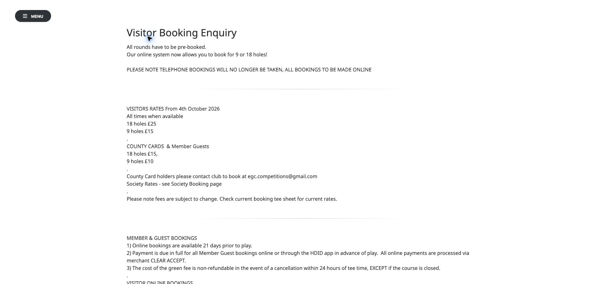
Elland's visitor booking page is visually spare but unusually precise about reservation mechanics. It gives an effective date for the fee information, separates member-guest and visitor advance-booking windows, and explains online prepayment. County-card users receive a different email route, while cancellation and course-closure conditions are stated in the same document. Restricted visitor periods are also described, helping golfers understand why a time may not be available. The plain white presentation keeps decoration from obscuring those rules, but large empty areas and minimal branding make the page feel disconnected from the club experience. Its enquiry heading is also an imperfect match for instructions that emphasize online booking. A full URL used as an action is less readable than a named booking button. The information architecture is worth studying even though the visual hierarchy could make the key distinctions much easier to find.
What you can learn
Place visitor and member-guest booking windows side by side, then separate exceptional contact routes from the ordinary prepaid reservation action.
Pros
Advance-booking windows and an effective date are explicit.
County-card and cancellation exceptions are documented in context.
Cons & considerations
The enquiry heading does not accurately frame an online-booking process.
Sparse branding and raw-link presentation weaken the action hierarchy.
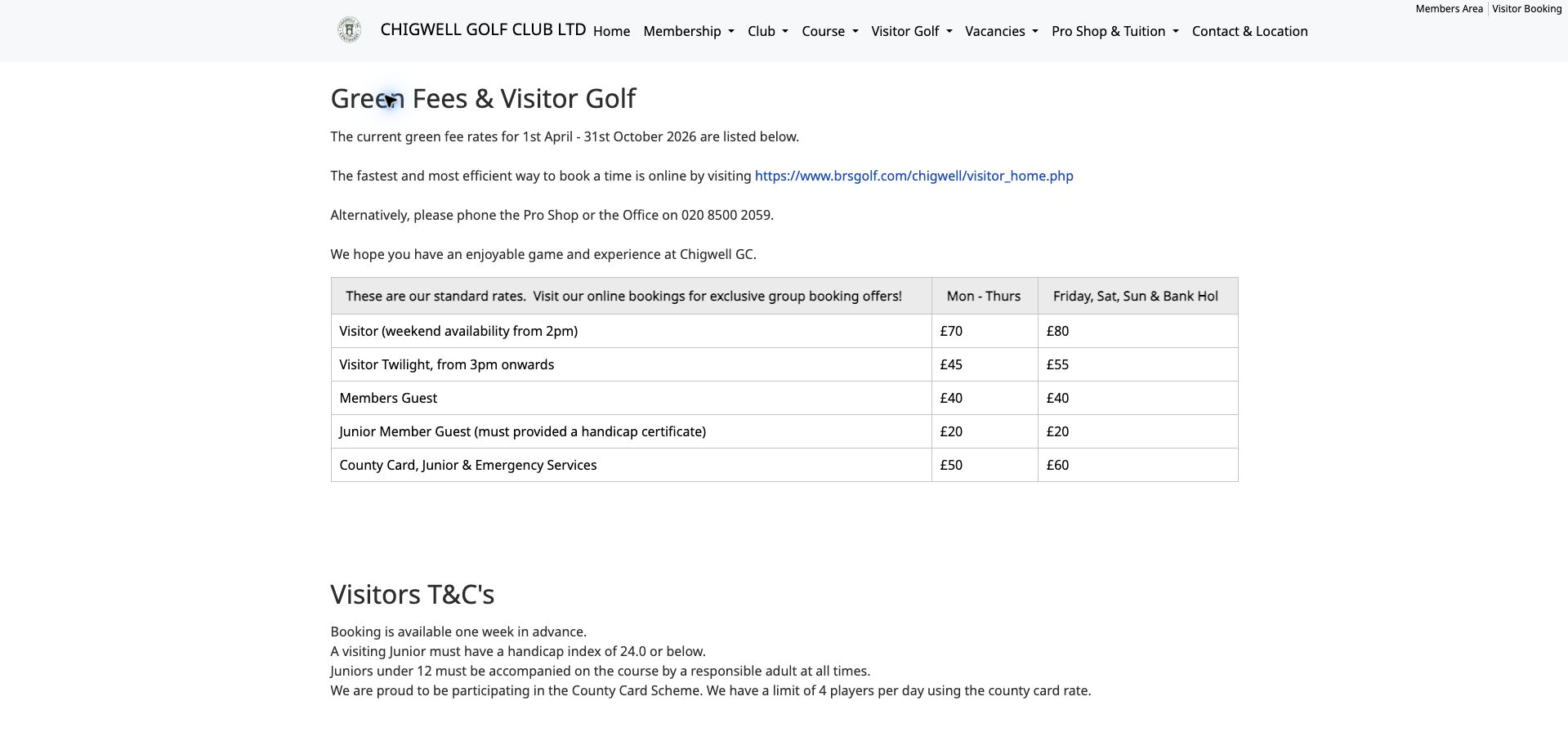
Chigwell uses straightforward tables to compare visitor fees and equipment hire. The booking instructions identify a one-week advance window, junior handicap expectations and adult accompaniment for younger children. County-card limits and a dress-code document further qualify the offer. The hire table is particularly useful because it distinguishes member and visitor arrangements and notes that rental clubs are right-handed only, a small detail with a large practical effect for some golfers. White space and restrained black typography keep the page relatively direct. The main weakness is currency: the displayed visitor-rate period ends on October 31, 2026, so the reviewed November page does not establish current winter pricing. A long booking URL also carries less visual emphasis than a descriptive action. This example shows the value of detailed tables while demonstrating why seasonal validity needs equally prominent maintenance.
What you can learn
Date fee tables prominently and place equipment limitations, such as club handedness, directly beside the associated hire option.
Pros
Tables make visitor categories and equipment hire easy to compare.
Junior eligibility and rental-club handedness are explicitly disclosed.
Cons & considerations
The displayed green-fee period had expired at review.
A raw booking URL is less legible and prominent than a named action.
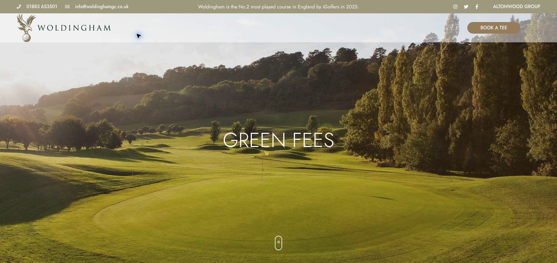
Woldingham places ordinary visitor and loyalty-card prices in adjacent columns, making the scheme's value open to comparison. The table distinguishes weekdays, weekend time bands and buggy charges, and provides an effective date. Its introduction describes the free card and its associated benefits, while separate visitor and member booking buttons keep reservation audiences distinct. The page also warns that smaller bookings may be paired with other golfers and states the deposit consequence of late cancellation. These details strengthen the offer by exposing limitations before the booking handoff. The olive and gold branding suits the course photography, but the full-screen hero delays a page whose primary purpose is fee comparison. Some twilight rows rely on a term without an equally prominent start time. The useful pattern is the honest side-by-side comparison, including cases where the loyalty price is the same as the standard price.
What you can learn
Compare promotional and ordinary rates on identical rows, including equal-price cases, and define the time boundaries that make each row applicable.
Pros
Standard and loyalty prices can be compared directly.
Pairing and cancellation conditions appear with the booking information.
Cons & considerations
A full-screen image delays the rate table.
Twilight terminology is less precise than the explicitly timed weekend bands.
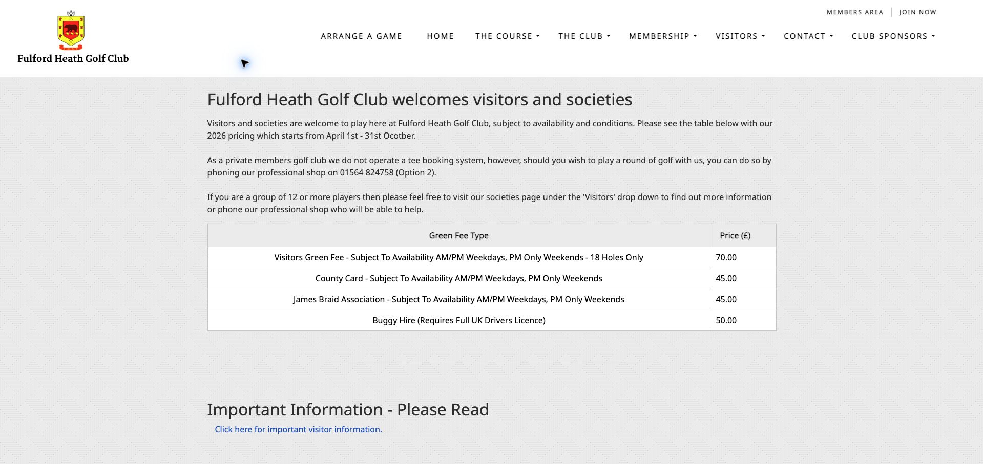
Fulford Heath explains a potentially confusing operating model in plain language: the private club does not run a tee-booking system, and visitors should telephone the professional shop to arrange a round. Groups of twelve or more are directed toward a separate society process. A compact table distinguishes ordinary, county-card and association rates, includes weekday versus weekend availability, and states the driving-licence requirement for buggy hire. The white layout and modest crest let those practical details appear high on the page, a refreshing contrast to full-screen course photography. The displayed 2026 pricing period nevertheless ends in October, leaving the current November rate unresolved. An additional important-information link also means that essential conditions may require a second page. The design succeeds at explaining the contact route, but needs the same precision in seasonal maintenance and in previewing what the linked visitor document contains.
What you can learn
When no live booking calendar exists, say so directly, give the correct telephone extension and summarize the information staff will need to arrange a visit.
Pros
The telephone-only arrangement is explained before a visitor searches for a calendar.
The fee table includes availability and buggy eligibility conditions.
Cons & considerations
The advertised pricing period had ended by the review date.
The generic important-information link gives little preview of its contents.
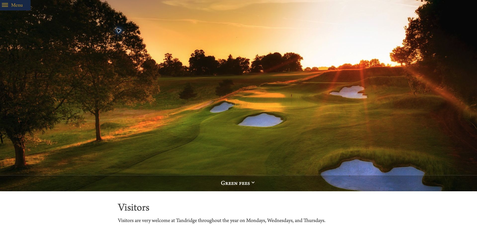
Tandridge's green-fee page follows a large sunset photograph with detailed visitor conditions. It names the ordinary visiting weekdays, separates limited Friday and Saturday arrangements, and explains the ten-day online booking window alongside telephone and email options for advance requests. Handicap requirements, acceptable evidence, professional-shop check-in and cancellation terms help prospective golfers evaluate suitability before reserving. This is useful specificity for a club whose visitor access is not universal. The visual treatment is restrained, with serif headings and a narrow reading column, but the oversized photograph and menu-only navigation postpone practical orientation. There is also a date inconsistency: one passage ends the restricted summer opportunity in September, while the premium weekend rate references October. The page illustrates how detailed rules can support a premium experience, provided the dates and exceptions are maintained as one coherent policy.
What you can learn
Use a single authoritative season definition across access rules and price labels, then distinguish online booking windows from advance enquiry arrangements.
Pros
Visiting days, advance windows and handicap evidence are explained.
Arrival and cancellation instructions extend beyond the initial booking pitch.
Cons & considerations
Summer access and premium-rate passages use inconsistent ending months.
The large photograph and collapsed navigation delay practical orientation.
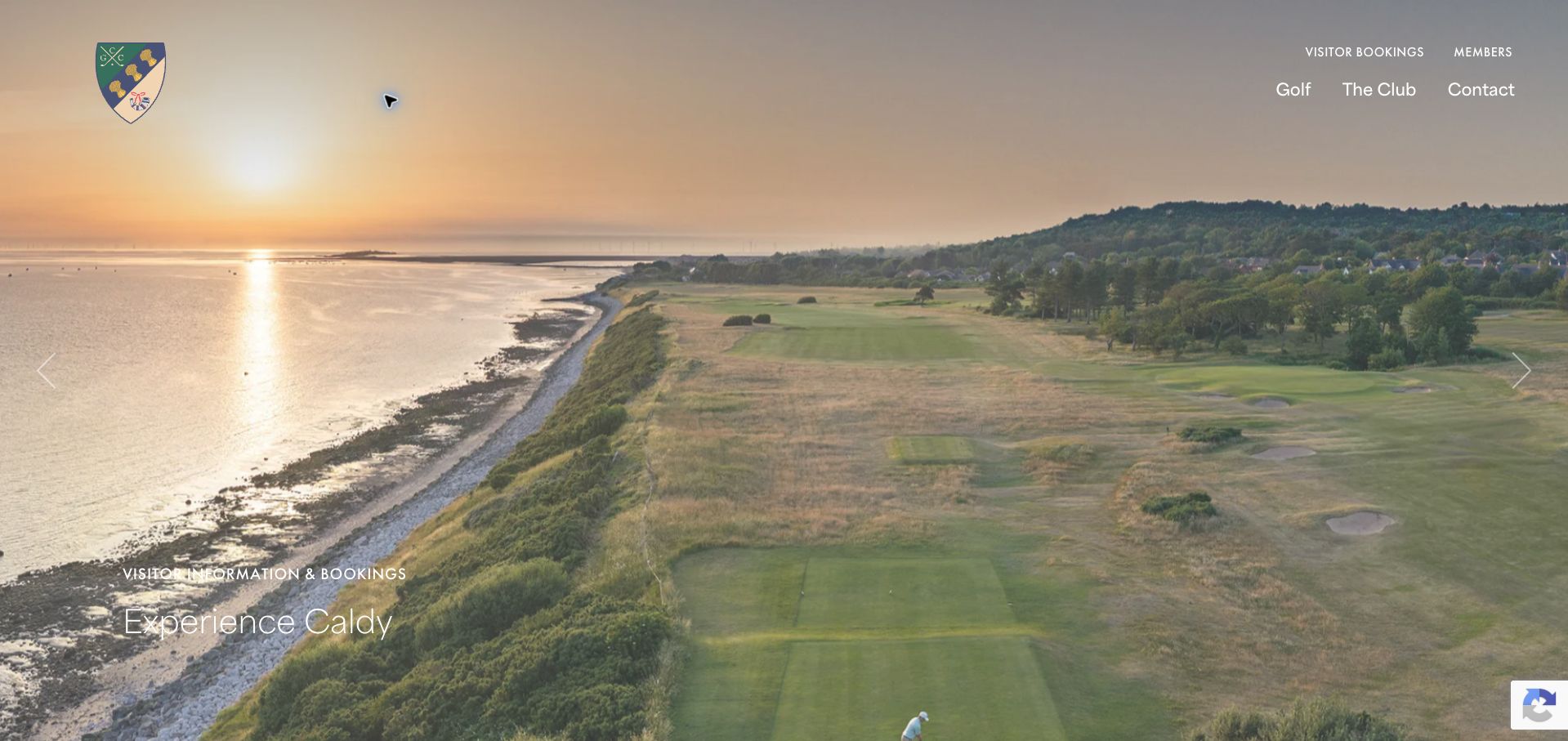
Caldy's visitor page separates bookings for one to twelve players from groups above twelve. The smaller-group section offers professional-shop contact and online booking, while larger parties receive an enquiry form with useful fields for date, group size, holes and the desired day. Seasonal tables include the current winter period and future planning, so visitors can compare a trip across different parts of the year. The coastal aerial photograph, spacious typography and minimal navigation create a strong sense of place. The first screen is almost entirely photographic, however, delaying the operational split that makes the page distinctive. A future season is also labeled with a nonexistent September 31 end date, a small but consequential editorial defect in a pricing document. The page is a useful model for structured group enquiries, with a reminder that precise date validation belongs in the publishing process.
What you can learn
Route visitors by actual group thresholds and collect only the trip details needed for a useful quote, while validating every seasonal date before publication.
Pros
The twelve-player threshold clearly separates booking and enquiry routes.
The group form asks for specific planning details rather than a vague message.
Cons & considerations
The full-screen coastal hero delays the practical booking split.
A future rate period contains an invalid September end date.
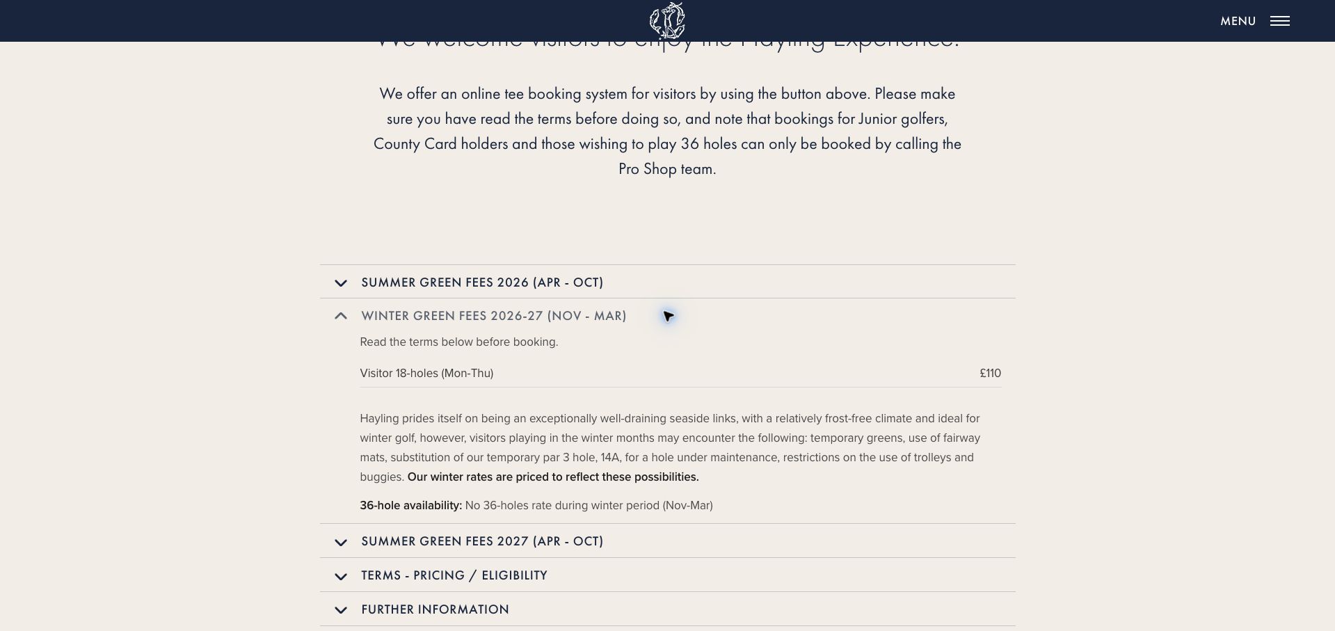
Hayling organizes its green-fee page into seasonal accordions, with booking access and telephone exceptions explained before the detailed tables. The winter section is especially useful: it describes possible temporary greens, fairway mats, a substitute hole and trolley or buggy restrictions, and connects the winter price to those possibilities. It also says that a thirty-six-hole rate is unavailable during that period. Junior players, county-card holders and golfers seeking thirty-six holes are directed to the professional shop rather than the ordinary online route. A navy and cream palette and spacious type give the information a calm presentation. The opening photographic slideshow consumes a full screen, and all seasonal details initially require interaction. Opening the current season by default would make the most relevant information easier to find. This is a strong example of explaining the experience behind a seasonal rate instead of publishing an unexplained discount.
What you can learn
Describe the course conditions a seasonal rate anticipates and open the currently applicable season, with exceptional booking routes visible outside the accordion.
Pros
Winter pricing is linked to specific possible course restrictions.
Telephone-only categories are identified before the online booking action.
Cons & considerations
A full-screen slideshow delays the fee information.
The current-season details are initially hidden inside an accordion.
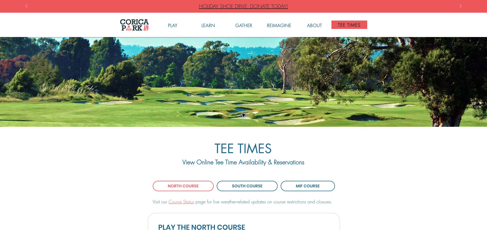
Corica Park's tee-time page presents North, South and Mif as three distinct course choices. Rounded controls and coral accents make the active selection visible against a restrained blue and white layout, while the course photograph supplies context without occupying the entire viewport. The North description and booking action are accompanied by a digital waitlist route and a link to live course-status information. Equipment details distinguish full sets for the main courses, half sets for the par-three course and borrowed range clubs, with first-come availability stated. That specificity helps a visitor prepare even before choosing a start time. Ordinary green fees are not summarized here, and the large promotional strip in the header competes with the reservation task. The page's main strength is treating course selection as a meaningful decision rather than sending every golfer into the same unexplained booking link.
What you can learn
Give each course a distinct selection state and connect its reservation action to format, equipment options, availability updates and a waitlist alternative.
Pros
Three course choices create a clear first step in booking.
Rental-set differences and first-come availability are explained.
Cons & considerations
The overview lacks an ordinary green-fee comparison.
A prominent campaign banner competes with the primary reservation task.
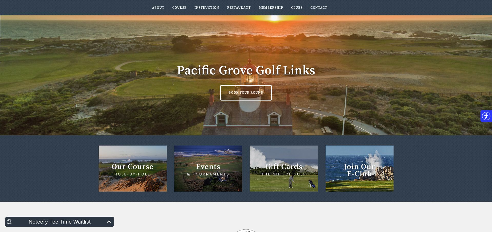
Pacific Grove places its coastal setting at the center of the homepage, using a lighthouse-and-ocean photograph with a prominent round-booking action. A row of four image cards then directs visitors toward the course, events, gift cards and the email club. This gives the opening screen a compact, understandable rhythm rather than a long succession of unrelated promotions. The course route promises hole-by-hole exploration, while a waitlist control offers another path when a desired time is unavailable. Environmental recognition and media mentions appear further down, although those are presented as the club's own selected evidence rather than an independent assessment here. The navy textured background and serif type create a traditional atmosphere. Practical information such as ordinary rates, booking windows and visitor conditions is less immediate. This is a useful visual reference, but its strong destination imagery should be paired with a more concise planning summary.
What you can learn
Use a small set of task cards beneath the main booking action, and give first-time visitors a short fee-and-arrival summary alongside the scenic introduction.
Pros
The first screen combines a clear round action with four supporting routes.
Hole-by-hole exploration and a waitlist address different planning needs.
Cons & considerations
Rates and reservation conditions are not summarized in the opening view.
Awards and media claims need more context than a list of selected mentions.
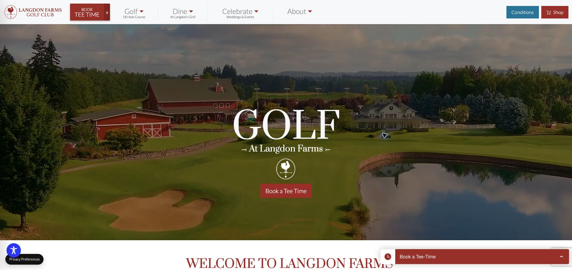
Langdon Farms separates golf, dining and celebrations in the main navigation while giving tee-time booking and conditions prominent dedicated controls. Below the cinematic opening, a dated conditions section distinguishes the course, carts and range, making operational status more specific than a generic open message. The homepage also connects golfers to aerial footage of all eighteen holes, rates and teaching programs, while restaurant and event visitors receive their own routes. Red accents and the farm identity give the site a recognizable local character. The initial visit is interrupted by an app promotion and a privacy panel, and a persistent booking widget adds another layer to an already busy screen. The conditions timestamp was several days old at review, so it should be read as an update date rather than a guarantee of live conditions. The strongest pattern is the permanent separation of operational information from promotional content.
What you can learn
Give course, cart and range conditions separate dated fields and a permanent navigation entry, while keeping app promotion from blocking first-visit tasks.
Pros
Conditions have a dedicated route and separate course, cart and range fields.
Golf, restaurant and event audiences receive distinct navigation paths.
Cons & considerations
An app promotion and privacy panel interrupt the initial experience.
The status timestamp needs attention before treating the information as live.
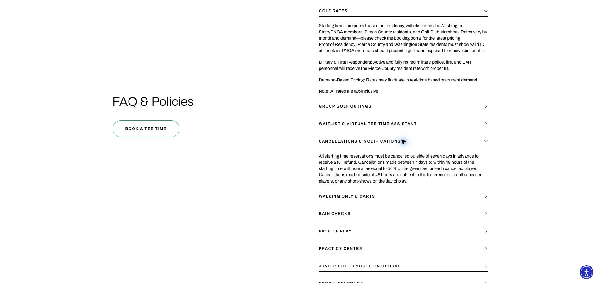
Chambers Bay's contact page doubles as a substantial visitor-policy hub. Named departmental contacts separate the golf shop, caddy services and restaurant, while the FAQ explains residency-based rates, required identification, demand-based changes and tax inclusion. The cancellation panel distinguishes the full-refund window from the intermediate partial charge and the final full-fee period. Those stages make an important cost consequence understandable before a reservation. The reviewed FAQ layout uses a spacious two-column composition, thin rules and restrained teal booking accents. Its placement beneath the contact section means that policy-seeking golfers must move through unrelated material, and the initial cookie and mailing-list overlays interrupt access. The page is strongest when it describes the qualifications behind a price rather than pretending a single static amount applies to everyone. Surfacing these same terms beside the booking handoff would make that clarity more useful.
What you can learn
Explain rate eligibility, required proof and staged cancellation consequences in a reusable policy section that is linked directly from reservation actions.
Pros
Residency evidence, tax inclusion and demand-based pricing are explained.
The cancellation policy distinguishes three materially different time windows.
Cons & considerations
The policy hub sits below a contact section with a different primary task.
Cookie and mailing-list overlays interrupted the first visit.
Kegan is a freelance web designer and developer with 15+ years of experience helping businesses turn complicated website requirements into clear, maintainable digital experiences. He works directly with clients from planning and design through development, launch, and ongoing support.
For golf club website design, his development approach focuses on seasonal green-fee information, visitor eligibility, course and clubhouse details, society inquiries, and tee-time booking connections. The scope can be a targeted improvement or a complete custom build, with responsive layouts, thoughtful content structure, and integrations chosen around the people using and maintaining the site.
Show 3 other golf club website designersHide other golf club website designers
Plan the content around the decisions visitors need to make
Define the visitor categories
List the actual guest types and the rules attached to each. Explain membership accompaniment, handicap or other club requirements only as approved by the club, with a contact route for uncertainty.
Structure seasonal rates
Store date ranges, days, rounds, guest categories and inclusions explicitly. Keep winter, peak and shoulder-season offers distinct, and check that every calendar date is valid before publication.
Explain the booking window
State how far ahead visitors can reserve, which days are available and whether a request needs staff confirmation. Identify exceptions for holidays, events and member-only periods beside the booking action.
Document practical arrival
Give the correct entrance, parking, check-in location and required arrival time. Add clubhouse and catering hours where they differ from course access, plus current hire or buggy arrangements when offered.
Assign owners to changing information
Separate fee updates from course-condition notices and event closures. Add timestamps where useful and retire old offers without silently replacing their historical meaning. Check external booking prices after each seasonal change.
Test a visitor’s full journey
Ask someone to identify an eligible date, applicable fee and booking route. Check large tables on narrow screens, expanded policy sections and external-provider handoffs without purchasing a tee time.
The editing job behind the design
Choose a maintainable publishing and booking system
Use structured fee and season records rather than embedding every rate in a promotional image. A content system should make it easy to update eligibility and date conditions wherever the same offer appears.
Tee-time software may manage inventory separately from public visitor information. Keep the two aligned and label manual status reports honestly. Visible delivery or CMS signals do not establish how the underlying booking inventory is synchronized.
Our WordPress website examples offer a separate look at publishing approaches. A visible platform label is evidence for that named page, not a guarantee that the same system will suit your requirements.
Before the public launch
Practical website planning checklist
Identify visitor categories.
Date every seasonal rate.
State the advance-booking window.
Explain restricted days.
Qualify guest discounts.
Distinguish nine and eighteen holes.
List hire charges where relevant.
Publish check-in guidance.
Separate catering and course hours.
Timestamp condition notices.
Remove expired offers.
Check rates in the booking system.
These checks are a project checklist, not a performance, legal, security, or accessibility certification. Test real journeys with the people responsible for the website before making claims about the result.
Sources & editorial method
How this collection was selected and reviewed
The 29 examples match the original saved collection target. Each official public page was opened, inspected and directly captured in an ordinary browser; source URLs and capture dates identify the reviewed state. Reviews describe observed design, information and navigation, with distinct practical lessons and limitations. A bounded public technology-audit attempt accompanies every source, preserving unknown and inaccessible results without inventing a hidden stack. Editors Choice is an explicit editorial selection favoring a smaller specialist or local organization, not a service-quality, safety or outcome endorsement. No booking, application, payment or private form was submitted. Website imagery and trademarks belong to their owners.
Each example links to its actual source page. Screenshots are direct browser captures with their own capture dates; moving imagery, announcements and live designs can change. The notes describe observable design choices and conditional tradeoffs, not measured traffic, conversion results, service quality, or accessibility conformance.
Technology labels use public page metadata, asset evidence, or explicitly cited platform documentation. Platform documentation is not a complete current deployment audit. A component reference may be legacy or unused; it is not a complete backend inventory. Unknown stacks are omitted. These sites are editorial examples, not our client portfolio.
Written, Edited and Curated are separate editorial records, not timestamps advanced by a rebuild. Website designs and imagery belong to their owners. See our editorial standards or suggest a correction.
Questions worth asking
Golf Club website design questions
What should a golf visitor page include?
Eligibility, current season dates, green fees, booking windows, restricted periods and practical arrival information. Keep these details connected so a visitor can identify a genuinely available offer.
How should winter rates be handled?
Show the exact valid dates and any changed facilities or playing arrangements approved by the club. Replace or archive the offer when the season ends rather than leaving an undated low price.
Should course status appear on the homepage?
It can be helpful if its update time and scope are clear. A manually maintained notice should not imply a live feed, and visitors need a route to confirm significant changes.
How should society bookings differ?
Give group organizers their own explanation of minimums, catering, package inclusions and inquiry steps. Do not assume an ordinary visitor tee-time link answers an event organizer’s questions.
Does Editors Choice rate the golf course?
No. It recognizes the clarity and design of the reviewed website. It does not assess playing conditions, service quality or the course itself.
Make the visitor offer precise: eligible guests, valid dates, the applicable fee and a dependable booking route. Keep seasonal and operational changes under active editorial ownership.