An accounting website earns attention by making expertise understandable—not by filling the page with abstract assurances about success.
A business owner may need routine accounting, a finance-function partner or specialist advice for a change in the business. An individual may have a very different question. A useful site makes the service and audience clear before presenting a large undifferentiated list of capabilities.
These examples range from focused practices to larger advisory firms. Compare their service structure, sector positioning, people and publishing. The collection reviews public websites, not professional qualifications or the suitability of financial or tax advice.
Before the examples
What makes good accounting website design in 2026?
Organize by the client’s situation
Explain the types of clients and work the firm supports, using recognizable language. Connect sectors to relevant services rather than duplicating generic claims on every page. A specialist practice can be more specific than a large multi-service firm; neither needs to make the visitor decode internal department names.
Make expertise attributable
Link commentary to named people and relevant service pages. Keep qualifications, roles and dated guidance under an editorial owner. Explain the scope of general information and avoid presenting a short article as personalized advice for every reader’s circumstances.
Separate a conversation from document exchange
Offer an appropriate inquiry route for new work and a clear route for existing clients. Keep tax documents, payroll information and financial records in approved systems. A marketing form should not become an accidental repository for sensitive business files.
The collection · 20 examples
20 accounting websites worth studying
Compare how firms explain who they help, what they provide and how to start. Large advisory networks offer useful structure ideas, but their breadth is not a checklist for a local practice.
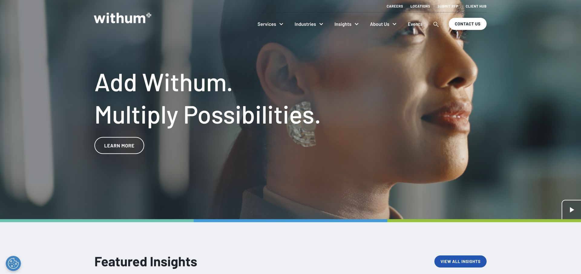
Withum combines a people-focused video with large white type and an outlined action. Services, industries, and insights form the main navigation, while client access, office locations, careers, and RFP submission occupy a utility layer. The separation recognizes that an existing client paying or sharing information is not following the same journey as a business choosing an accountant. A visible pause control gives the moving background an explicit control. A multicolor line links the photographic opening to the content below, making the first screen feel like part of a wider identity rather than an isolated video campaign.
What you can learn
Separate prospect tasks from client-administration tasks before designing the header. Video should support a clear written explanation, with a pause control and usable service navigation that do not depend on the film.
Pros
Client access and RFP submission are available without competing as the same task.
The pause control acknowledges that some visitors will not want continuous motion.
Cons & considerations
A broad brand headline still needs a specific service explanation nearby.
The large film area postpones the first detailed accounting guidance.
EisnerAmper builds the opening around a tax-planning question rather than an abstract welcome. Gold accents, a charcoal background, and large serif lettering give the campaign a distinct identity. A circular photographic treatment supplies visual interest without taking over the entire screen. The main action follows the topic of the headline, so readers can anticipate the kind of information behind it. Services, industries, solutions, and insights remain permanent navigation routes. Beneath the hero, topical pills offer another entry into the library. The result gives a changing campaign a clear place within an otherwise stable accounting-site structure.
What you can learn
Make a seasonal accounting campaign specific enough to be useful, and connect its action to the promised topic. Keep evergreen services outside the campaign and assign someone to replace or retire dated material.
Pros
The hero’s action relates directly to the tax question above it.
Topic pills create scannable routes into a larger insight library.
Cons & considerations
A seasonal message needs active editorial maintenance after its useful period.
Large headline lines need deliberate wrapping on smaller screens.
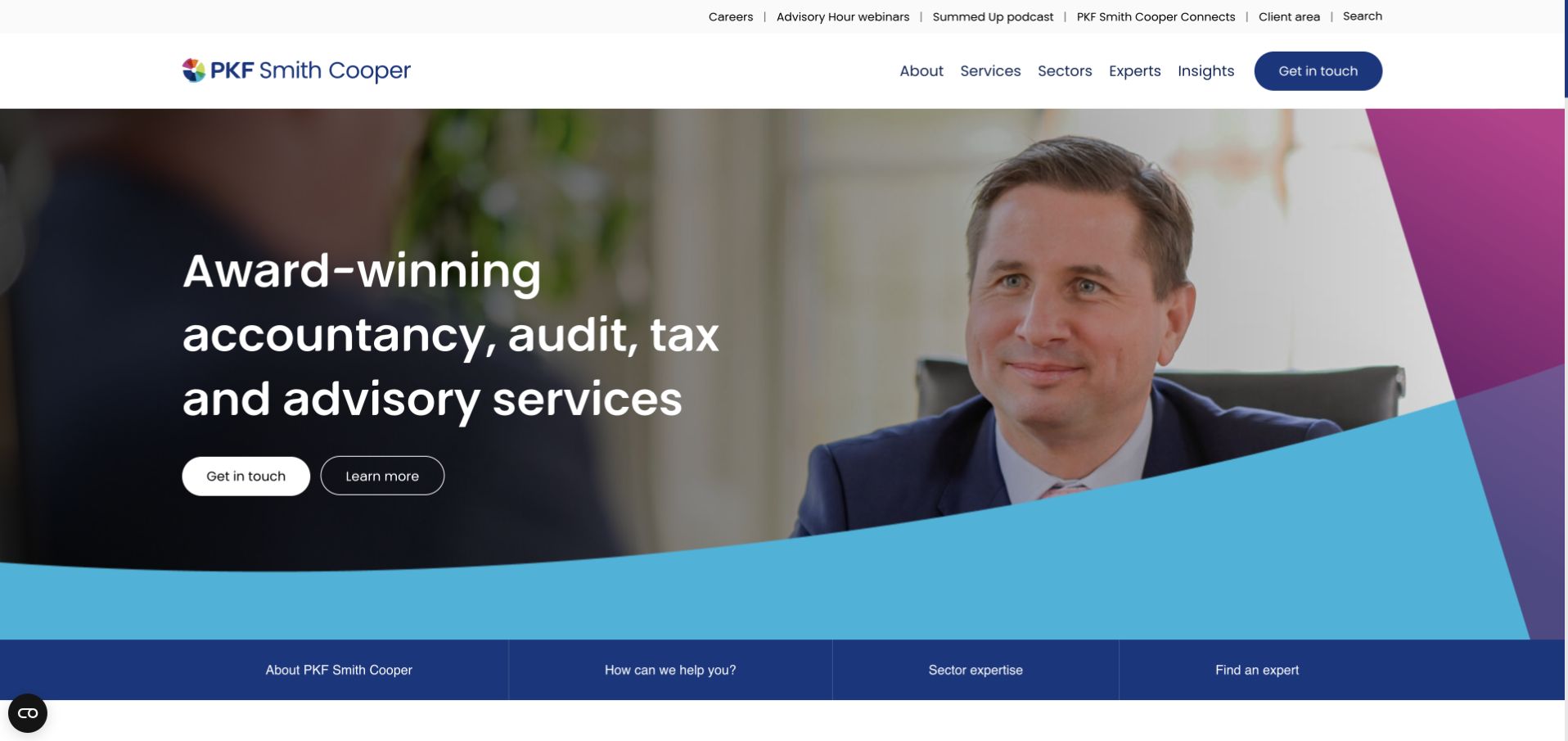
PKF Smith Cooper combines a meeting photograph with a white headline and turquoise and pink shapes. The white header contains services, sectors, experts, and contact, with client access and learning formats in a smaller utility layer. Four blue tiles immediately below the opening translate the broader site into a handful of starting points: firm information, help, sectors, and experts. Those tiles are more important to borrow than the decorative angles because they connect the general introduction to a real visitor task. The page feels personable while retaining the navigation structure expected of an established accountancy practice.
What you can learn
Use photography to establish tone, then give visitors a short set of task-based routes. Service, sector, and expert navigation should complement one another rather than being three differently labeled copies of the same directory.
Pros
The four lower tiles provide obvious next steps after the introduction.
Experts and sectors have explicit routes alongside the service offering.
Cons & considerations
Several angled color treatments can compete with the photograph and headline.
Two hero actions need a clear primary and secondary relationship.
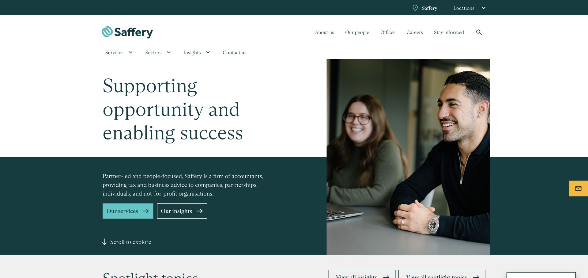
Saffery uses a white upper text field, a teal lower band, and a tall meeting photograph spanning both. The split gives introductory copy its own reading surface while preserving a human image. Serif display type contributes a calm editorial tone, and the service and insight actions use different button treatments. The header names services, sectors, insights, and contact, with practical utility information above. This is a useful alternative to putting white text directly over every photograph. It also creates a straightforward distinction between learning about the firm’s offering and browsing its commentary, without forcing those journeys into a rotating campaign.
What you can learn
Give service explanations a stable reading surface and distinguish service discovery from editorial reading. For accounting visitors, those are different levels of commitment and should not be presented as interchangeable actions.
Pros
Text and photography have separate space rather than competing for contrast.
Filled and outlined actions distinguish services from insight browsing.
Cons & considerations
Multiple header bands consume room before the main explanation begins.
A general introductory headline needs concrete service detail in the next section.
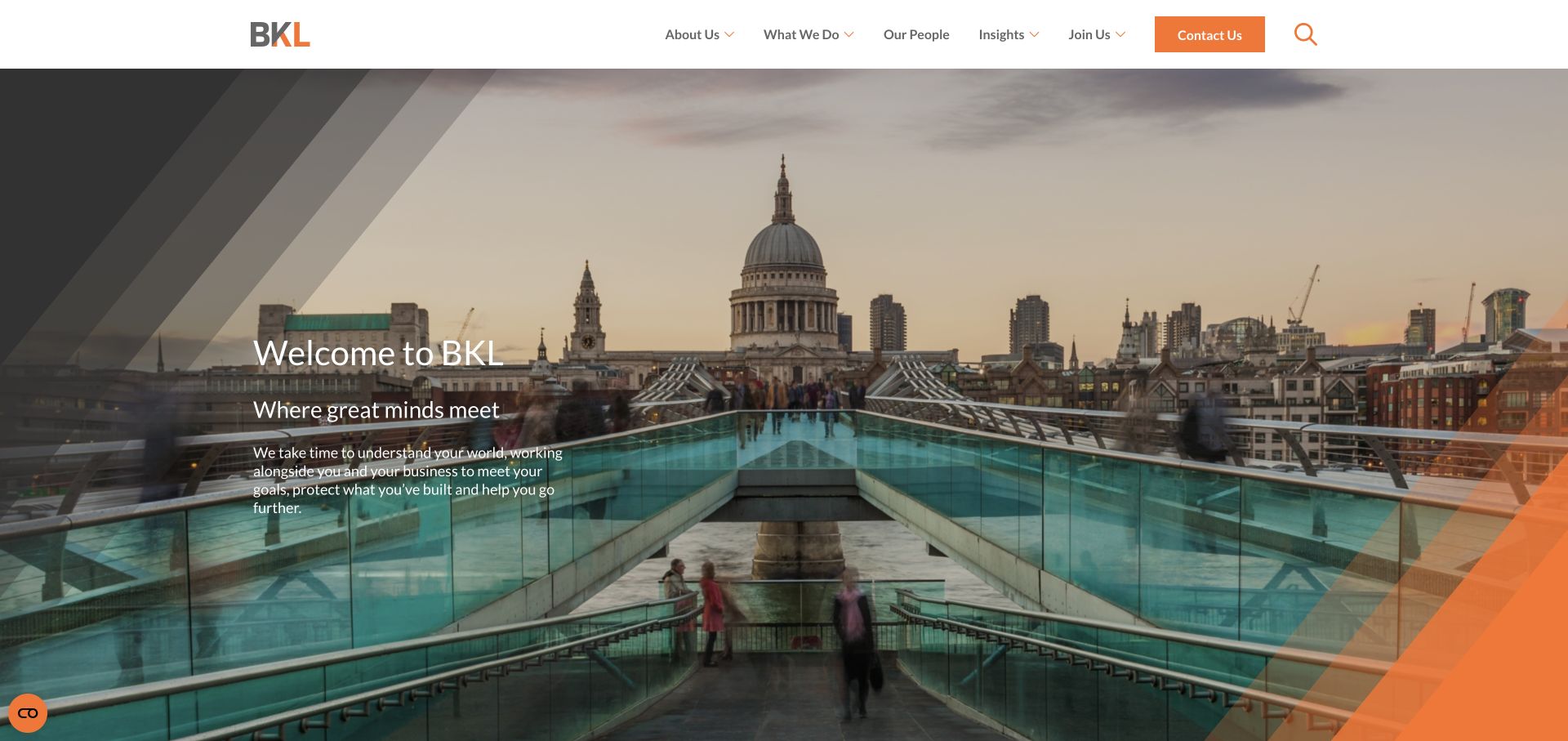
BKL places a short introduction over a London view, with gray diagonal lines and an orange corner treatment. The wordmark and contact action repeat that accent color in an otherwise white header. People, services, insights, and firm information are plainly named rather than wrapped in promotional terminology. The photograph supplies local context, while the modest hero text avoids a wall of copy. A regional firm can look identifiable with a small visual vocabulary. The location image still needs a specific explanation of who the practice helps and how.
What you can learn
Use local imagery when geographic familiarity matters, but connect it to actual client needs. Restrict the accent color to a few recognizable elements so that enquiry routes remain visible within an image-led opening.
Pros
Orange gives the contact route a consistent visual identity.
The concise navigation includes people as well as the service offering.
Cons & considerations
A broad welcome provides less guidance than a specific accounting need.
Text over sky and architecture requires checks across all image crops.
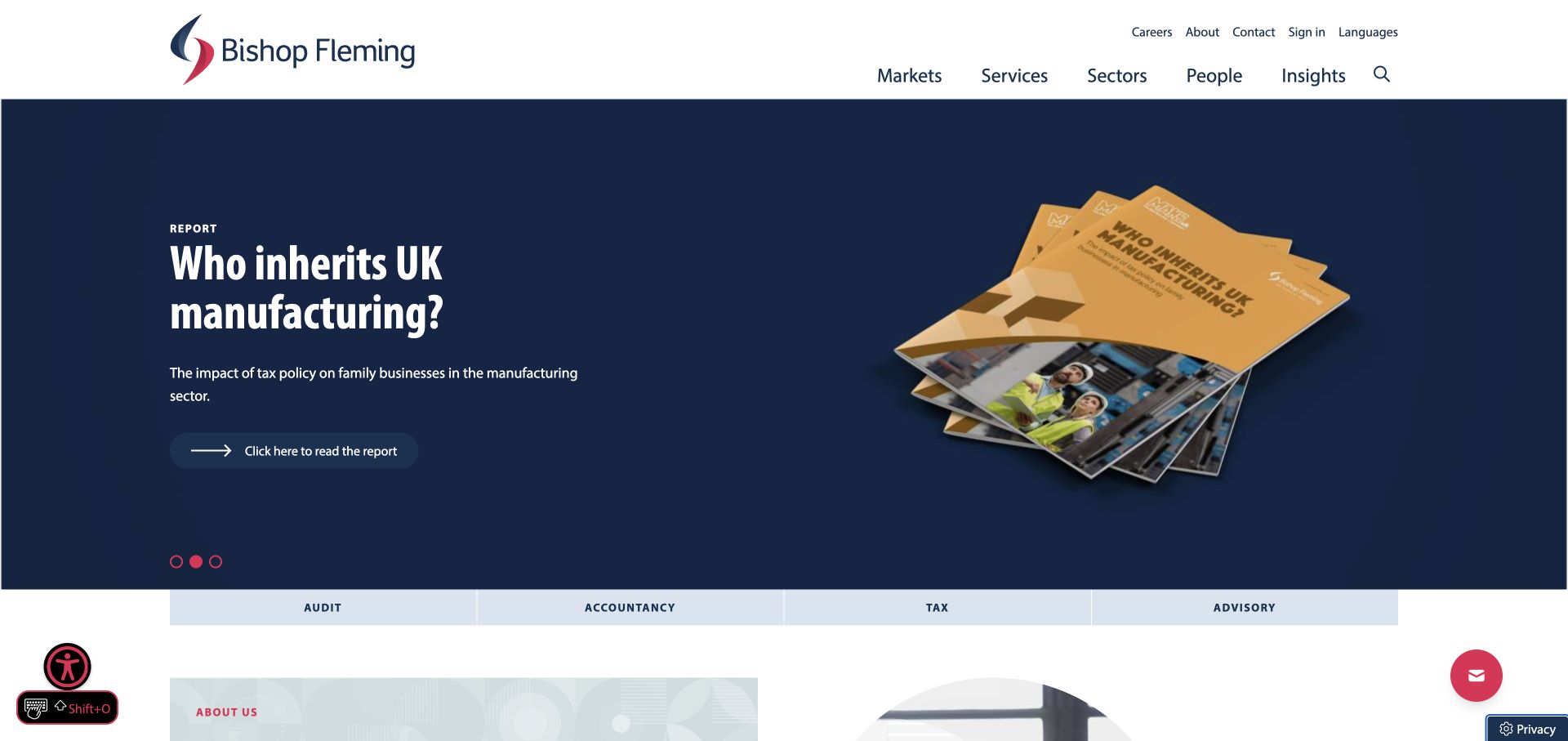
Bishop Fleming promotes a manufacturing report with a navy background, yellow publication artwork, and a content-type label. The report is visibly a resource rather than an unexplained sales message. A row of audit, accountancy, tax, and advisory routes follows the campaign, keeping core services outside the dropdown menu. The white header separates sectors, markets, people, and insights. This makes the opening useful to a visitor researching a business issue as well as someone who already knows which accounting service is required. The report illustration gives the hero a concrete object, unlike generic financial charts or unrelated office imagery.
What you can learn
When a report leads an accounting homepage, label its subject and format explicitly. Place permanent service shortcuts close enough that the campaign does not become an extra step for visitors who need routine help.
Pros
The report label and artwork explain what the campaign action offers.
The service strip keeps evergreen capabilities close to the opening.
Cons & considerations
A featured sector report will not be relevant to every visitor.
Several utility and floating controls can crowd an otherwise ordered layout.
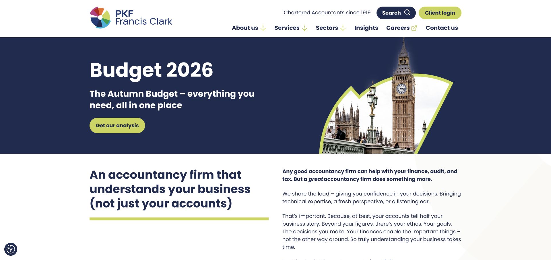
PKF Francis Clark uses a navy-and-lime campaign about the Budget, with a cropped photograph inside a fan-shaped graphic. The headline and action sit on the left, while the compact height lets the next white section enter the first screen. That lower section begins explaining the firm rather than extending the campaign indefinitely. Client login has its own lime utility treatment, and services, sectors, insights, and contact remain named in the header. The strong accent color ties these elements together without requiring a different decorative style for each. The page shows how a current tax story can lead without turning the entire homepage into a temporary announcement.
What you can learn
Keep campaigns short enough to reveal the evergreen introduction beneath them. Give client login a stable, recognizable position, and create an explicit retirement plan for budget or deadline-driven content.
Pros
The compact opening leaves room for a substantive introduction below.
Client access is visually recognizable without replacing prospect navigation.
Cons & considerations
Budget-led content needs prompt updating when its context changes.
Conversational positioning still needs specific services to explain the offering.
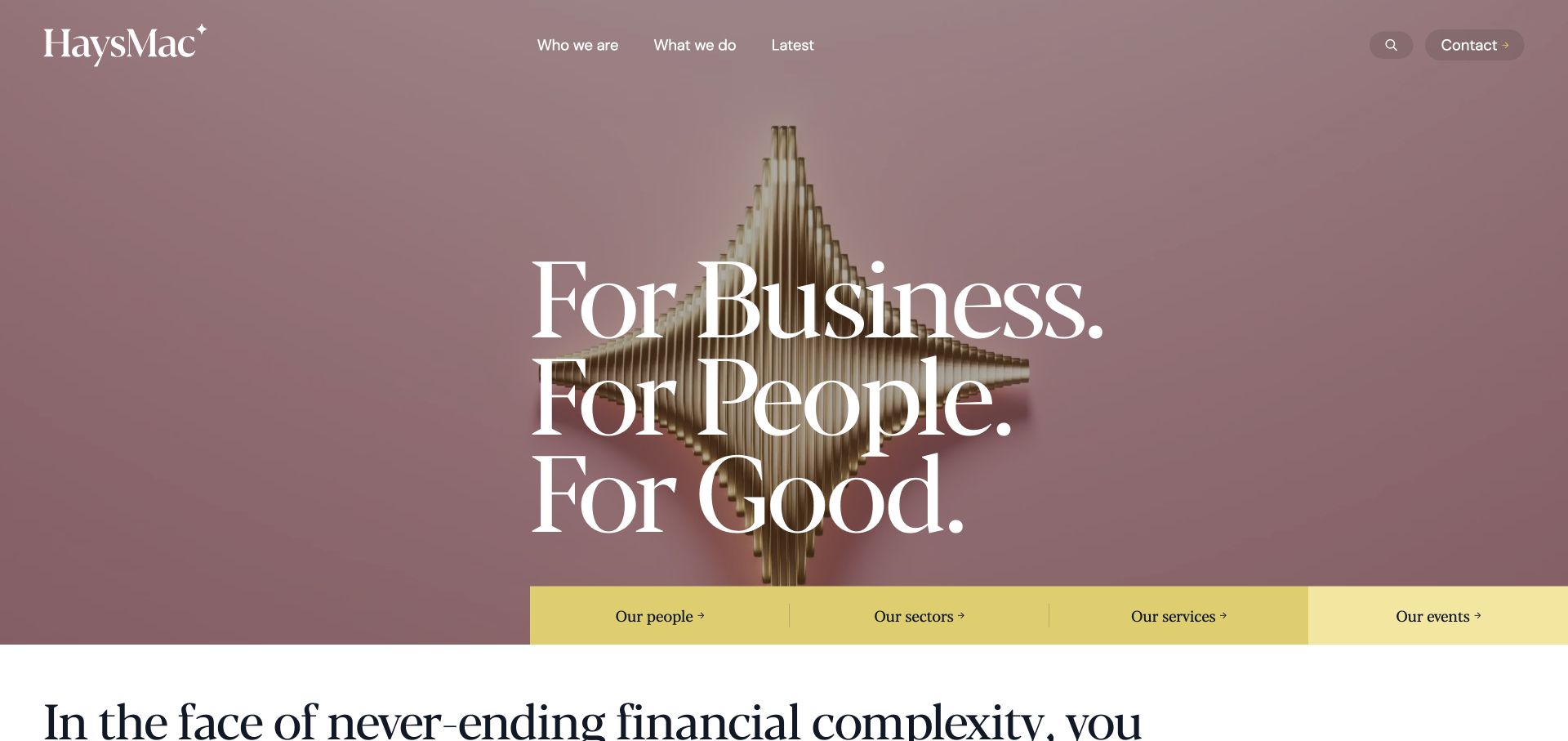
HaysMac uses an abstract sculpture with large fine serif lettering across it. Pink and pale background tones depart from the usual blue accounting palette. A short upper navigation keeps the opening visually quiet, while a yellow strip below names people, sectors, services, and events. That strip is the practical anchor: the art establishes character, but the links explain how to move through the business. Large black introductory text begins beneath it, adding another typographic register. This is an example worth studying for brand differentiation, provided the visual expression is supported by enough concrete accounting information.
What you can learn
An abstract visual identity can work when the task navigation remains literal. Put services, people, and industry routes close to the expressive opening so that a memorable design does not make users decipher the business.
Pros
The yellow link strip makes practical destinations easy to separate from artwork.
The sculptural imagery avoids interchangeable calculators and office-stock photographs.
Cons & considerations
Fine white lettering needs contrast checks against changing artwork.
Abstract imagery does not demonstrate accounting expertise without supporting content.
Gerald Edelman opens with snowy mountain footage, a white headline, and a curved red graphic. The thinly spaced wordmark and compact navigation leave much of the scene unobstructed. A certification mark appears separately from the headline. The visual metaphor suggests an ongoing journey, fitting relationship-led advisory positioning, but does not evidence a particular service. The useful design detail is restraint: one red curve, one dominant statement, and a limited set of header destinations. More specific service, team, and client context has to do the explanatory work after the atmospheric opening.
What you can learn
Use metaphor to establish a tone, not to carry the entire business explanation. Pair a relationship-led accounting introduction with concrete client situations and service routes before asking visitors to make an enquiry.
Pros
A single red graphic creates continuity without a collection of unrelated decorations.
The sparse header leaves a clear focal point in the hero.
Cons & considerations
Mountain imagery is less direct than showing the firm’s people or work.
Fine white navigation needs reliable contrast over moving footage.
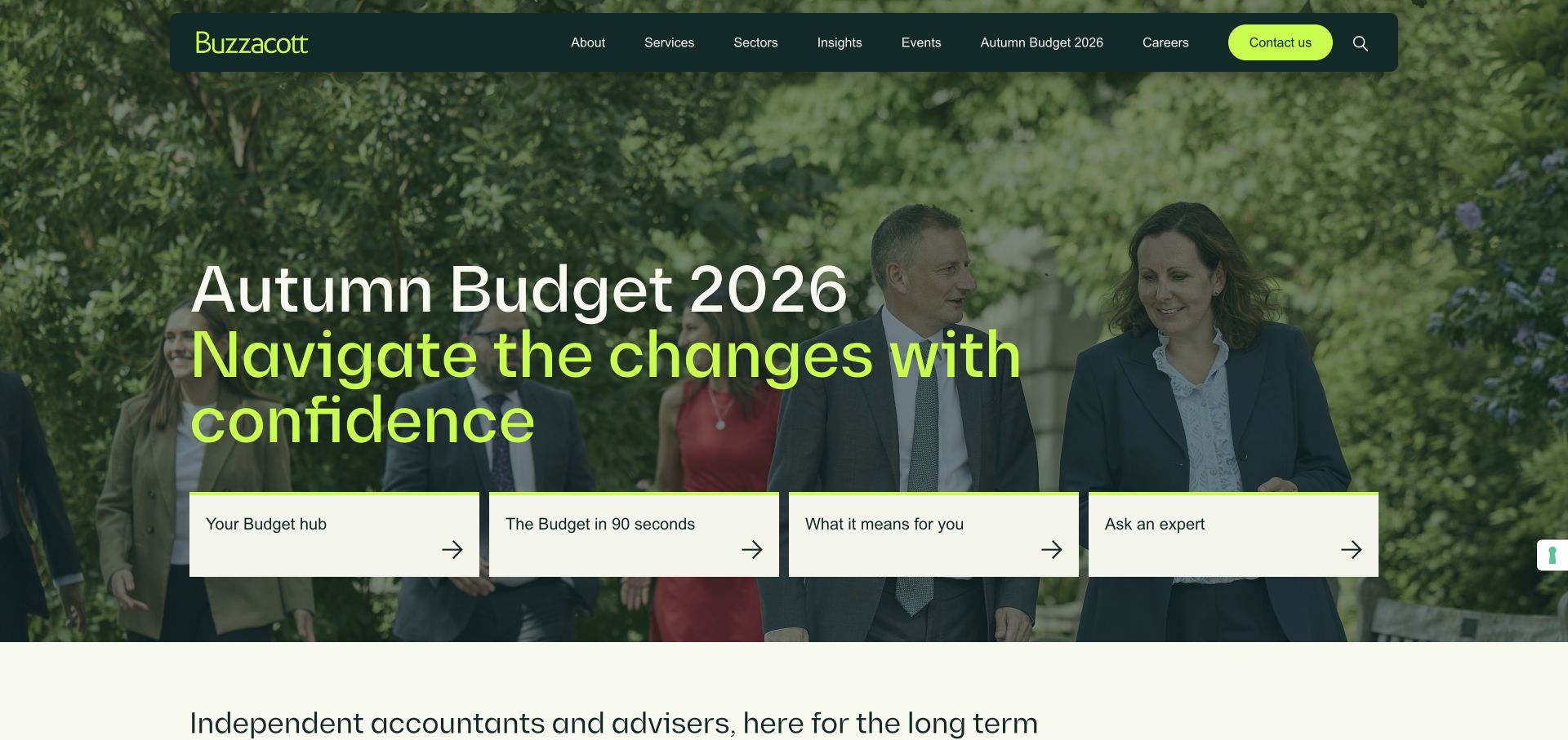
Buzzacott combines a floating dark-green navigation with a Budget campaign over a group photograph. Lime distinguishes the headline and contact action. Four light cards offer different levels of engagement: a central hub, short summary, interpretation, and expert help. That range is more useful than duplicating a read-more button across the hero. It acknowledges that visitors have different amounts of time and different reasons for researching a tax announcement. The cream section below introduces the firm independently of the campaign, so the opening is not the only available explanation of the business.
What you can learn
Build a topical resource around several genuine reader needs: overview, quick summary, detailed implications, and personal help. Keep those choices visibly different and preserve a service-led route for visitors uninterested in the current announcement.
Pros
Content choices distinguish a quick read from deeper interpretation and expert help.
The floating header remains visually separate from the group photograph.
Cons & considerations
Four prominent choices can feel excessive without clear labels and hierarchy.
A current tax campaign needs ongoing date and relevance checks.
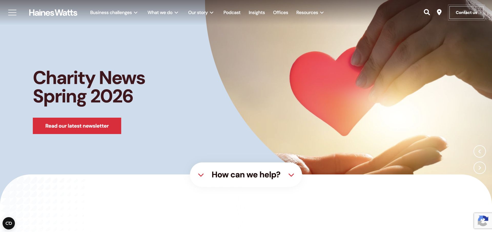
Haines Watts puts business challenges beside conventional services, accommodating visitors unfamiliar with accounting terminology. The current opening uses a light-blue editorial campaign, red action, and white curved transition into the next section. A help prompt at that transition connects the visual campaign to a practical starting point. The wordmark and navigation sit directly above the image, maintaining the same identity as the colored panels below. The page also includes podcast and resource routes, reflecting a publishing-heavy approach. Its useful lesson is the translation between owner language and professional services, rather than the presence of a carousel itself.
What you can learn
Offer problem-led navigation when clients are more likely to describe a business concern than request a named service. Keep an immediate help route available even when the featured campaign is an editorial topic.
Pros
Business challenges provide an alternative to accounting-specific service terminology.
The curved transition makes the following help entry feel intentional.
Cons & considerations
A long main navigation needs prioritization at smaller widths.
A rotating newsletter campaign can distract from evergreen service discovery.
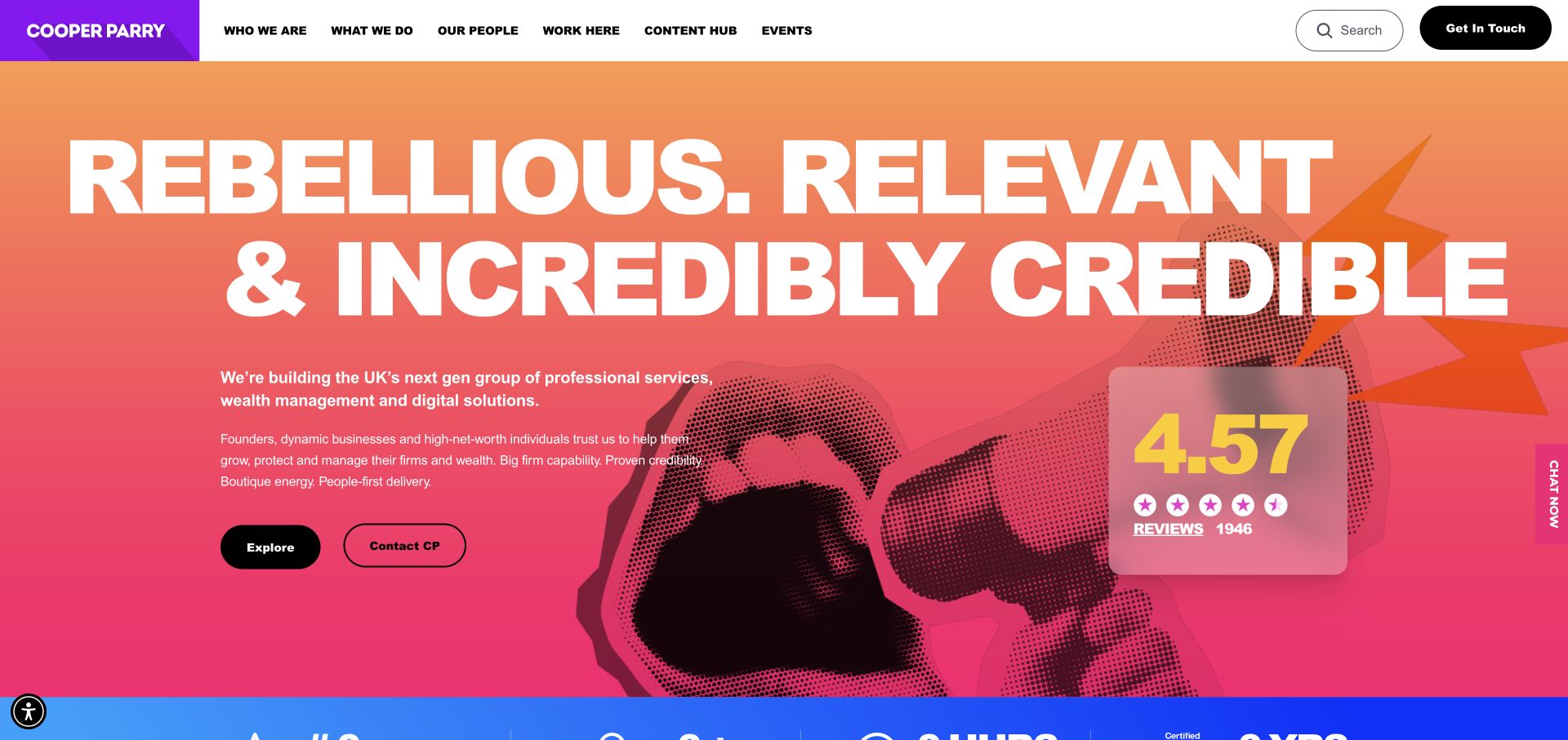
Cooper Parry uses an orange-to-pink field, oversized uppercase lettering, and halftone hands instead of office photography. Black pill actions remain clear within the loud treatment. A white header and purple identity tile provide stable contrast. A rating card and chat control add confidence and contact devices. The design shows an accountancy practice need not use muted blue to appear organized. Suitability depends on audience and the firm’s voice; copying the colors without the positioning creates decoration rather than differentiation. Service and people information still needs to support the promise.
What you can learn
Choose an expressive identity because it reflects the practice’s positioning, not simply to look different. Preserve plain service routes and link any ratings to inspectable sources rather than relying on a decorative scorecard.
Pros
Dark actions remain easy to distinguish within the saturated campaign.
The visual vocabulary is noticeably different from generic finance templates.
Cons & considerations
Oversized display text can crowd out useful service context.
Ratings and chat create additional focal points beside the main action.
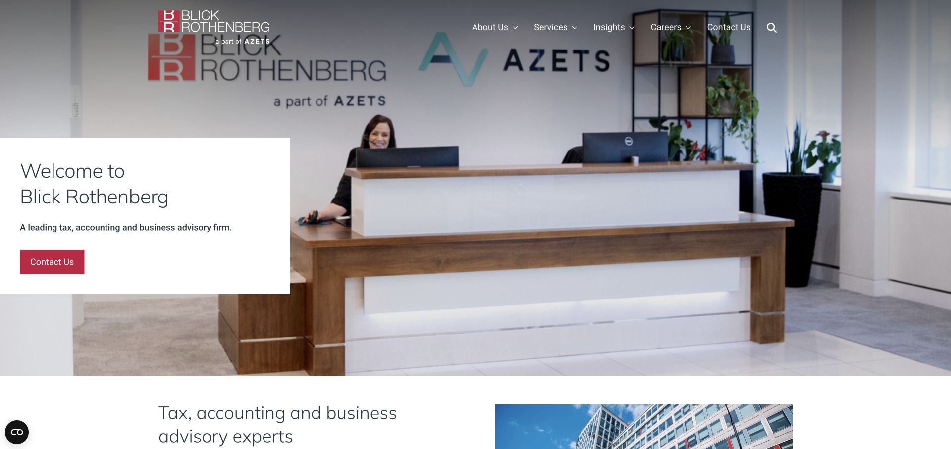
Blick Rothenberg places introductory copy on a solid white panel over a reception-area photograph. The panel prevents the headline, service description, and red contact action from depending on photographic contrast. The wordmark and main navigation occupy the upper edge, while a separate affiliation mark provides corporate context. The image feels like arriving at an office rather than viewing an abstract financial concept. A split section begins below, so the hero need not carry the whole story. The arrangement is familiar, but the literal welcome setting and concise service wording establish the business clearly.
What you can learn
A real reception or team image can make a professional-services opening more tangible. Keep important written information on a solid surface and make the first action specific enough to explain what happens next.
Pros
The white panel protects the introduction from a detailed photographic background.
A red action is easy to isolate within the restrained palette.
Cons & considerations
A generic welcome headline contributes less than a client-specific explanation.
Thin navigation over light parts of the image needs contrast testing.
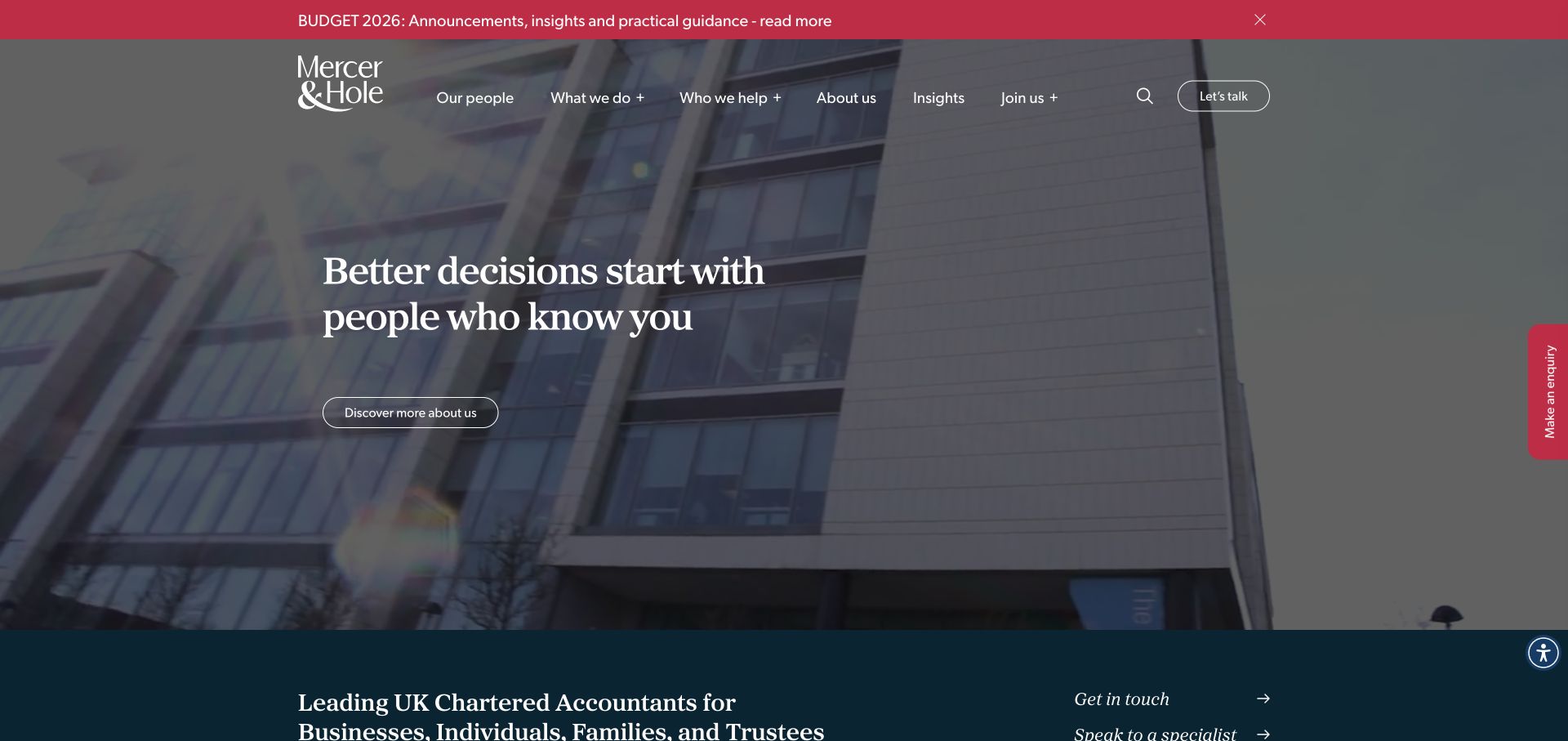
Mercer & Hole layers a relationship-focused introduction over meeting footage, using teal and red throughout. The header separates services from client types, important for a practice serving several audiences. A red topical notification sits above navigation, while an enquiry control remains at the right edge. Below, a teal section adds specific context and specialist routes. This combines a warm introduction with practical paths into the business. It also demonstrates the attention cost of persistent elements: notification, enquiry tab, video, and main text all seek space in the same opening.
What you can learn
Keep service and client-type navigation distinct, and use persistent enquiry controls sparingly. A tax notice should have an owner and expiry date so it does not become permanent visual clutter above the business introduction.
Pros
Visitors can browse either a service or a relevant client category.
The enquiry route remains recognizable beyond the introductory statement.
Cons & considerations
A notice bar and edge enquiry tab compete with the main content.
White text needs dependable contrast across changing meeting-video frames.
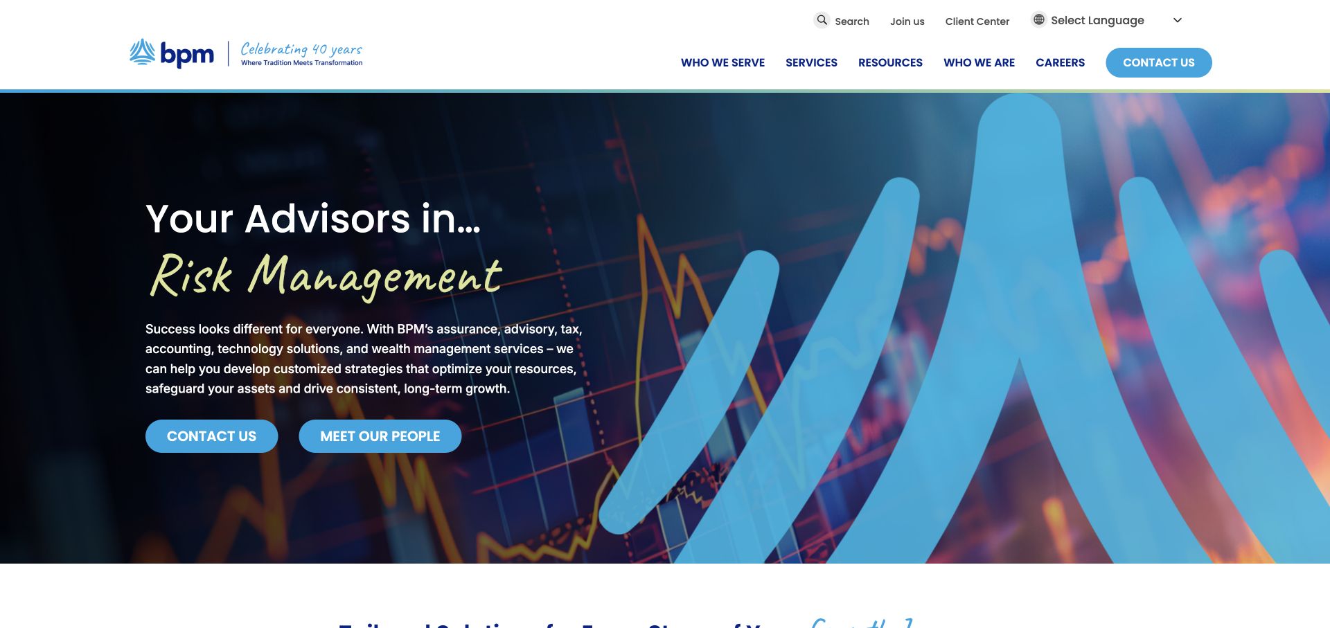
BPM combines a dark chart background, blue ribbon graphic, and lime handwritten phrase. The handwriting changes the tone of otherwise conventional imagery without making the whole page informal. Two cyan actions distinguish contacting the firm from meeting its people. The white header separates services, resources, client groups, and firm information, with client-center access in a utility position. This supports both advisor selection and existing-client tasks. The strongest idea is distinguishing team discovery from starting an enquiry; the decorative chart is not evidence of a specific client outcome.
What you can learn
Give relationship-building and direct enquiry separate, clearly labeled routes. Use expressive lettering as an accent rather than the only place where a service or proposition is explained, especially if the wording changes.
Pros
Contact and people actions support different stages of advisor selection.
The handwriting accent adds personality within an otherwise structured identity.
Cons & considerations
A changing phrase should not carry essential service information alone.
Generic charts need real sector and client context elsewhere on the page.
Armanino promotes a tax checklist in a gold-tinted hero with a serif headline and topic-matched action. The resource gives visitors something concrete to evaluate before contact. A visible search field occupies the white header alongside solutions, people, resources, and company navigation. RFP submission and payments have a separate utility row, acknowledging different client stages. Angled lower edges connect the photograph to the page beneath. The resource-led structure is purposeful, though light text over gold and an added chat prompt require prioritization. The useful model is task separation, not reproducing every utility.
What you can learn
Make educational accounting content concrete enough to inspect, such as a clearly described checklist. Keep payment and procurement tasks accessible but separate from the route a new visitor uses to understand the offering.
Pros
The campaign action promises a specific resource rather than vague inspiration.
Search, payment, and RFP functions have recognizable places in the interface.
Cons & considerations
White text over a bright gold tint needs close contrast review.
An automatic chat prompt can compete with the resource action.
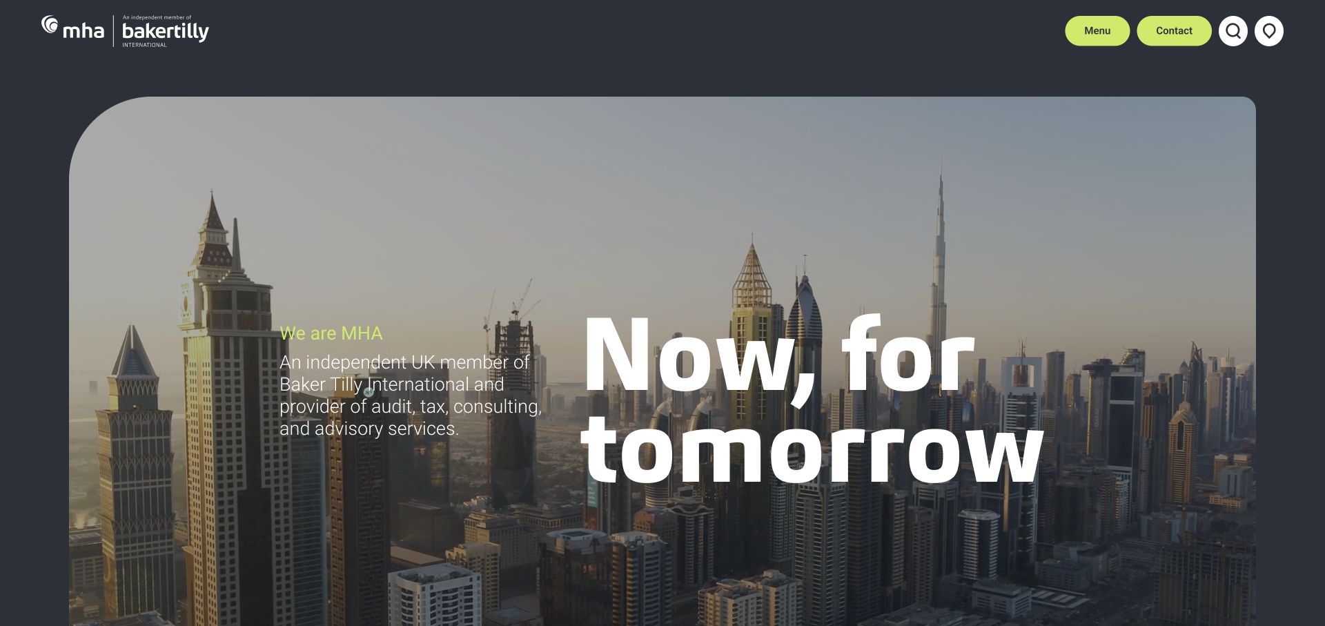
MHA uses a charcoal canvas around a rounded video panel. A compact firm introduction sits beside a much larger white statement. Lime contact and menu controls establish a consistent action color. Firm identity and network affiliation remain separate, distinguishing the practice from the wider organization. Search and location icons add utility without a long top-edge list. The result feels spacious and edited. The tradeoff is that the reduced header hides the service taxonomy: visitors must open another layer before seeing which accounting or advisory route applies.
What you can learn
A minimal header can work when the menu is easy to recognize and its first layer is organized around client tasks. Preserve an explicit written description so the film and affiliation do not become the entire introduction.
Pros
Lime actions remain conspicuous against the charcoal frame.
Firm identity and network affiliation occupy clearly separate positions.
Cons & considerations
Service discovery requires opening the menu instead of scanning visible labels.
Moving imagery needs a useful static alternative and motion controls.
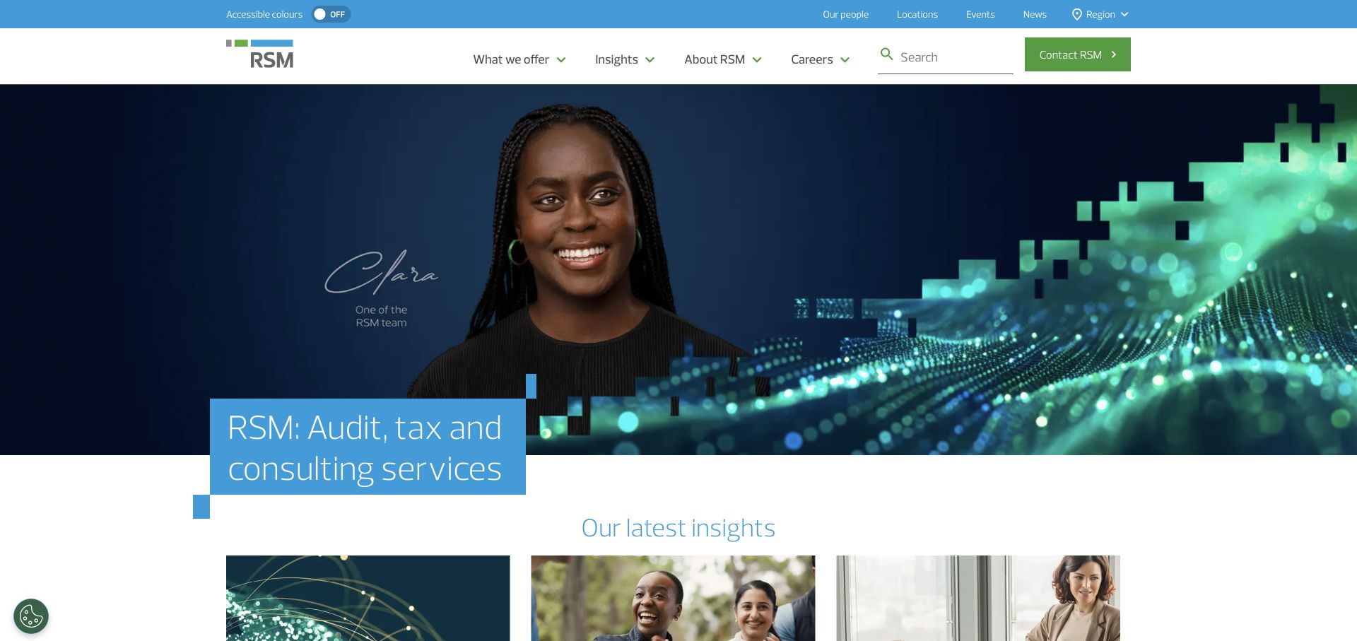
RSM UK places a named portrait inside a blue-and-green campaign, overlapped by a cyan headline panel. Naming the person is more specific than anonymous office stock. The layered header puts client and location utilities above services, insights, company, and careers navigation. A green contact action remains distinct, and editorial cards are visible below the compact opening. This suits a practice with regional and subject-matter information. Several overlapping systems create visual complexity; the strongest lesson is combining a human subject with an editorial hierarchy.
What you can learn
When expert commentary leads, identify the person and connect the feature to a useful destination. Separate regional utilities from core service navigation, and simplify both together when adapting the layout to narrower screens.
Pros
A named portrait gives the campaign a concrete human subject.
The compact hero reveals additional insight choices without excessive scrolling.
Cons & considerations
Utility controls and primary navigation create a dense upper area.
An overlapping headline panel can obscure important parts of the portrait.
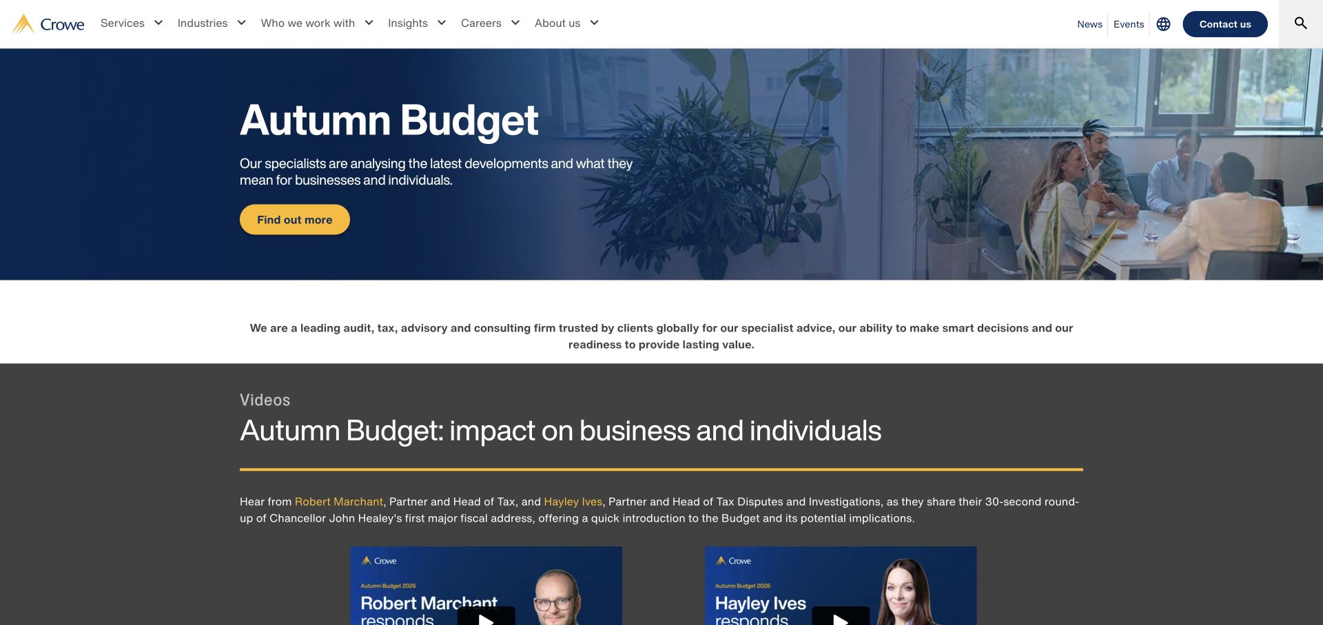
Crowe UK uses a short navy campaign with a meeting photograph and yellow action. Beneath, a white area explains the practice, followed by a dark section with video and named contributors. The sequence moves from topical content to context and people without repeating full-height panels. Navigation distinguishes services, industries, client groups, and insights, with contact and region utilities above. The consistent yellow accent makes actions recognizable. The example is useful for proportion: the campaign remains prominent without consuming the entire initial visit.
What you can learn
Keep a topical accounting announcement compact, then move into a stable explanation and identifiable experts. Use the same action language and color across these sections so the visitor does not have to learn a new interface repeatedly.
Pros
The shorter campaign brings the practice explanation closer to the opening.
Named experts create a useful bridge from general advice to people.
Cons & considerations
Several overlapping navigation categories need clear distinctions in their contents.
Text on the darker video section needs careful contrast and size checks.
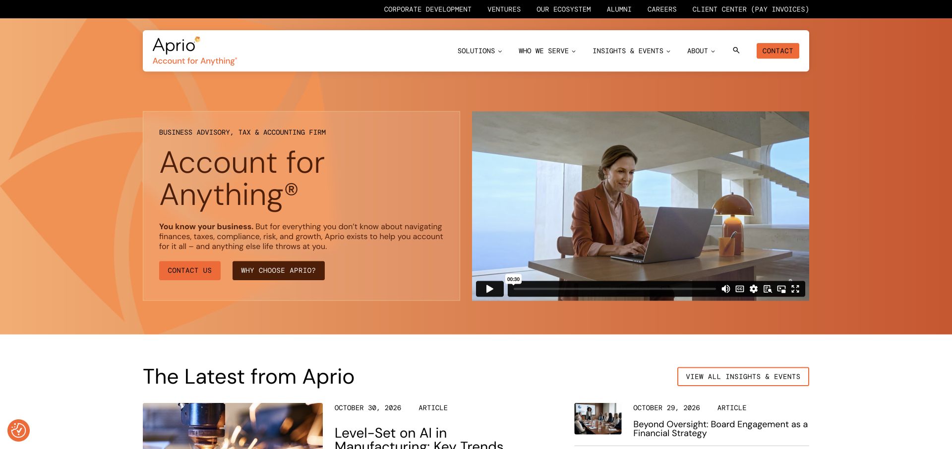
Aprio places written copy beside an embedded video within an orange-toned identity. Unlike background film, the player has visible controls and a bounded area. Readers can understand the offering without playing it. A white rounded header contains solutions, client groups, insights, events, and firm information; a black utility row handles client access and payments. Dark buttons stand out from the brighter field, with recent articles below. The structure supports different visitors without asking everyone to consume the same media. Its strongest lesson is the independence of written explanation and optional video.
What you can learn
Treat video as an additional format, not a prerequisite for understanding an accountancy practice. Keep the written proposition, service categories, and enquiry action usable on their own, then make client-administration utilities clearly secondary.
Pros
The bounded video player offers visible control rather than unavoidable background motion.
Written content explains the firm independently of whether the video is played.
Cons & considerations
A large utility layer can overwhelm smaller-business visitors with irrelevant choices.
Two prominent contact actions need a clear priority and distinct purpose.
Plan the service and publishing structure together
Define the audience before listing every service
Choose the real client groups, business stages and geographic scope. Write plain-language service summaries that say what the engagement covers and what happens at first contact. Avoid promises about savings, approval or outcomes that the firm cannot substantiate.
Build an accountable insights workflow
Decide who drafts, reviews and revisits time-sensitive guidance. Store publication and review dates independently. Connect articles to their authors and relevant services, and provide a correction route rather than allowing old commentary to look permanently current.
Map new and existing client routes
Separate inquiries, recruiting and existing-client support. Label any portal link clearly and use the approved portal rather than rebuilding sensitive document exchange inside the public website. Test where a non-sensitive sample request actually arrives.
The editing job behind the design
Prioritize reviewed content and protected operational systems
A CMS with structured services, sectors, people and articles can support the core marketing job. Draft review and ownership matter more than the number of available page effects. Keep the editor usable for the people responsible for deadlines and regular updates.
Treat accounting, payroll, identity verification and client document systems as separate operational decisions. A website redesign should preserve clear trusted entry points to those services without exposing credentials or sensitive information. Evaluate any new analytics or chat vendor with the responsible team.
Our WordPress website examples offer a separate look at publishing approaches. A visible platform label is evidence for that named page, not a guarantee that the same system will suit your requirements.
Before the public launch
Accounting website launch checklist
Have the firm approve service scope, qualifications and published claims.
Check author, sector and service relationships on insights.
Review dates and ownership of time-sensitive commentary.
Keep sensitive-document requests out of ordinary marketing forms.
Test client portal links, new-business routing and contact alternatives.
Check mobile service navigation, search, readable articles and keyboard access.
These checks are a project checklist, not a performance, legal, security, or accessibility certification. Test real journeys with the people responsible for the website before making claims about the result.
Sources & editorial method
How this collection was selected and reviewed
We selected official accounting and advisory firm websites to compare specialization, service structure and editorial presentation. The design review does not verify qualifications or provide financial, legal or tax recommendations.
Each example links to its actual source page. Screenshots are direct browser captures with their own capture dates; moving imagery, announcements and live designs can change. The notes describe observable design choices and conditional tradeoffs, not measured traffic, conversion results, service quality, or accessibility conformance.
Technology labels use public page metadata, asset evidence, or explicitly cited platform documentation. Platform documentation is not a complete current deployment audit. A component reference may be legacy or unused; it is not a complete backend inventory. Unknown stacks are omitted. These sites are editorial examples, not our client portfolio.
Written, Edited and Curated are separate editorial records, not timestamps advanced by a rebuild. Website designs and imagery belong to their owners. See our editorial standards or suggest a correction.
Questions worth asking
Accounting website design questions
Should an accountant publish a lot of articles?
Only with a sustainable review process and a clear audience. A smaller library of maintained answers can be more useful than a large archive of stale commentary.
Should services be grouped by industry or task?
Use both when each serves a genuine browsing need, and connect them. Avoid creating duplicate pages that merely swap the sector name without adding relevant context.
Can clients upload documents through the contact form?
Use the firm’s approved protected workflow for sensitive records. A public inquiry form should explain its limited purpose and direct existing clients to the appropriate system.
Should the site show fixed prices?
Publish pricing only where the firm can define the scope, assumptions and exclusions. A clear explanation of how an engagement is assessed may be more accurate than an unsupported headline fee.
Borrow the clarity of a specialist service structure and a well-maintained insights library. Keep the claims, review process and client systems grounded in the firm’s real work.