A landscaping website should make the outdoor work tangible while explaining whether the business designs, builds, maintains—or combines those services.
A homeowner planning a garden and a manager seeking commercial maintenance are not looking for the same engagement. The best starting point is a clear service and property type, followed by relevant project evidence and a practical route to discuss the work.
The examples include design-led studios, local design-build firms and larger maintenance providers. Compare the way they present scale, seasonality and process. These are website observations, not endorsements of construction, horticultural or maintenance quality.
Before the examples
What makes good landscaping website design in 2026?
Distinguish projects from recurring care
Explain which services are one-time design or construction work and which are ongoing maintenance. Make actual service areas visible. Avoid using a dramatic completed garden to imply that every inquiry receives the same scope or budget.
Give outdoor imagery a useful story
Identify the project type, the firm’s role and a relevant constraint such as a compact site or phased brief. Use approved images across seasons where available. Label renders, proposed work and completed photography so visitors do not mistake one for another.
Explain the next step and likely information needed
A first conversation may need the property type, location, service interest and project stage. Explain the survey or consultation process without promising an instant design or price. Separate existing-client requests from new project inquiries where operational needs differ.
The collection · 20 examples
20 landscaping websites worth studying
Look for useful differences between project-led portfolios and service-led maintenance sites. Borrow patterns that fit the actual work rather than treating every landscape business as a garden design studio.
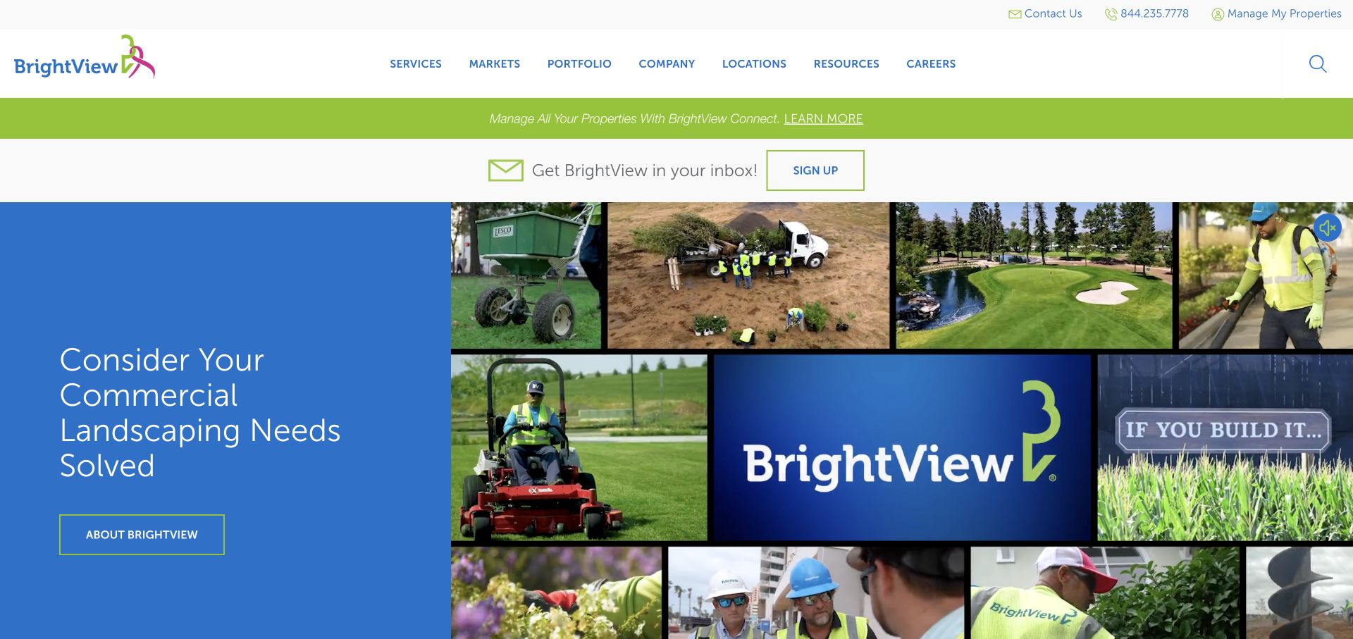
BrightView places a blue text panel beside a collage of crews, equipment, planted spaces, and company imagery. The header separates primary services, markets, portfolio, locations, and resources, while utility areas offer contact and property-management routes. Green accent bands connect the brand identity to these practical destinations. Rather than relying on one immaculate garden photograph, the opening makes the ongoing work of commercial landscaping visible: people, machinery, maintenance, and finished grounds appear in the same visual field.
What you can learn
Show the operating reality behind a broad service promise. A collage can explain that landscaping includes recurring care and construction, not just a finished garden. Keep client-management and new-business tasks distinguishable so the navigation does not force both audiences into the same journey.
Pros
Different types of landscape work are visible together rather than hidden behind generic imagery.
The header includes portfolio and market routes for buyers investigating relevant experience.
Cons & considerations
Several stacked promotional and utility bands delay the main content.
A busy collage needs a simpler mobile arrangement and should not carry essential information only in pictures.
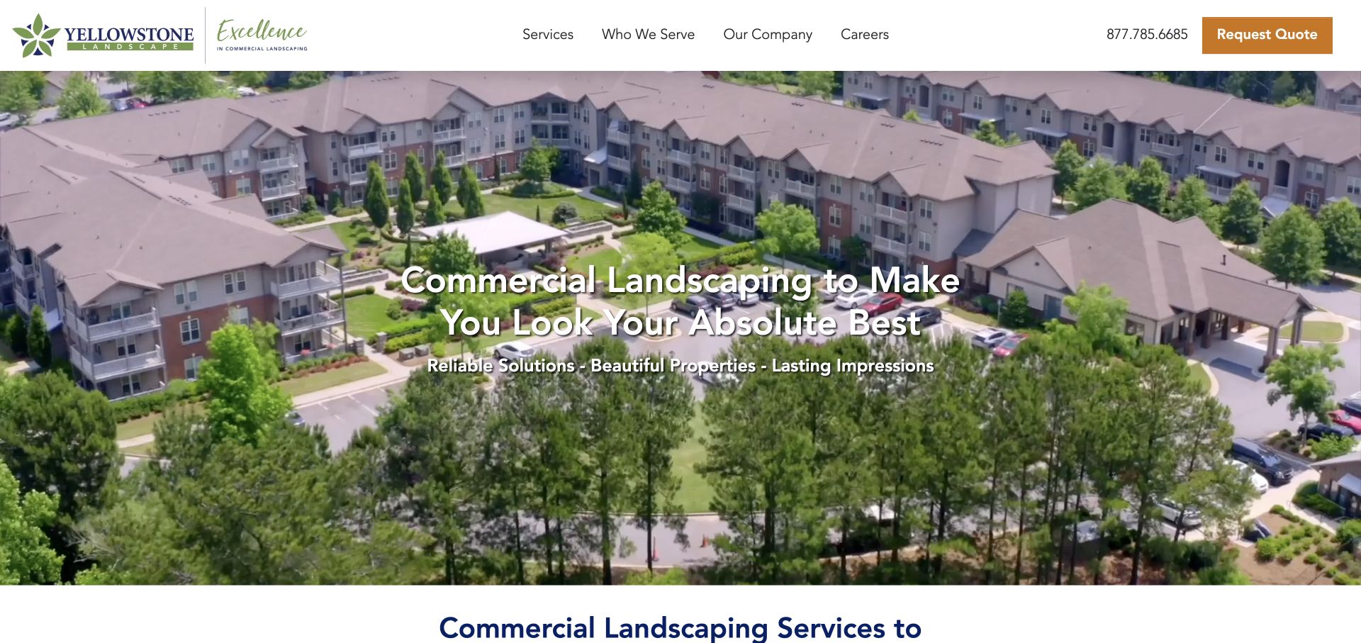
Yellowstone’s opening uses a wide aerial of a residential community, with the landscape visible in the context of buildings, circulation, and shared outdoor areas. A large centered white headline sits over the image, followed by a shorter supporting line. The white header keeps the main menu compact and reserves a contrasting warm-colored button for quote requests. The first view therefore communicates commercial property care through scale and setting, not through a close-up of a flower bed that could belong to any small residential project.
What you can learn
Match the image scale to the buyer’s responsibility. A property manager evaluating a large site benefits from seeing an entire landscape system. Keep the supporting copy short enough that the photograph remains useful, and use audience labels to help different property types find relevant examples.
Pros
The aerial makes the commercial context apparent before the visitor reads detailed service copy.
A compact menu leaves room for a prominent phone and quote route.
Cons & considerations
White type over bright roofs and greenery needs careful contrast across changing frames.
The broad promise needs specific service and geographic detail in the content immediately below.
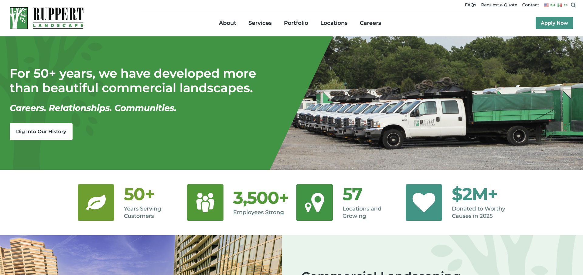
Ruppert splits its opening into a green message panel and a photograph of branded trucks. A diagonal edge joins the two halves, while a row of large icon-and-number treatments introduces company context beneath them. The header separates the main business navigation from utility links and an application button. The homepage thus presents landscaping as an organized service operation, not only as a collection of attractive spaces. The captured fleet image is a concrete counterpart to the company-focused wording.
What you can learn
Operational imagery can help explain a maintenance business, but distinguish capability evidence from sales decoration. Pair the fleet or team image with relevant service routes and portfolio examples. If recruiting is also important, make that route unmistakably different from requesting work so the two priorities can coexist.
Pros
A split hero gives the message a stable background rather than overlaying every line on photography.
The portfolio and locations routes are easy to identify in the main menu.
Cons & considerations
Company statistics occupy valuable early space and require clear context rather than decorative counting.
A prominent recruitment action can compete with the buyer’s quote or contact route.
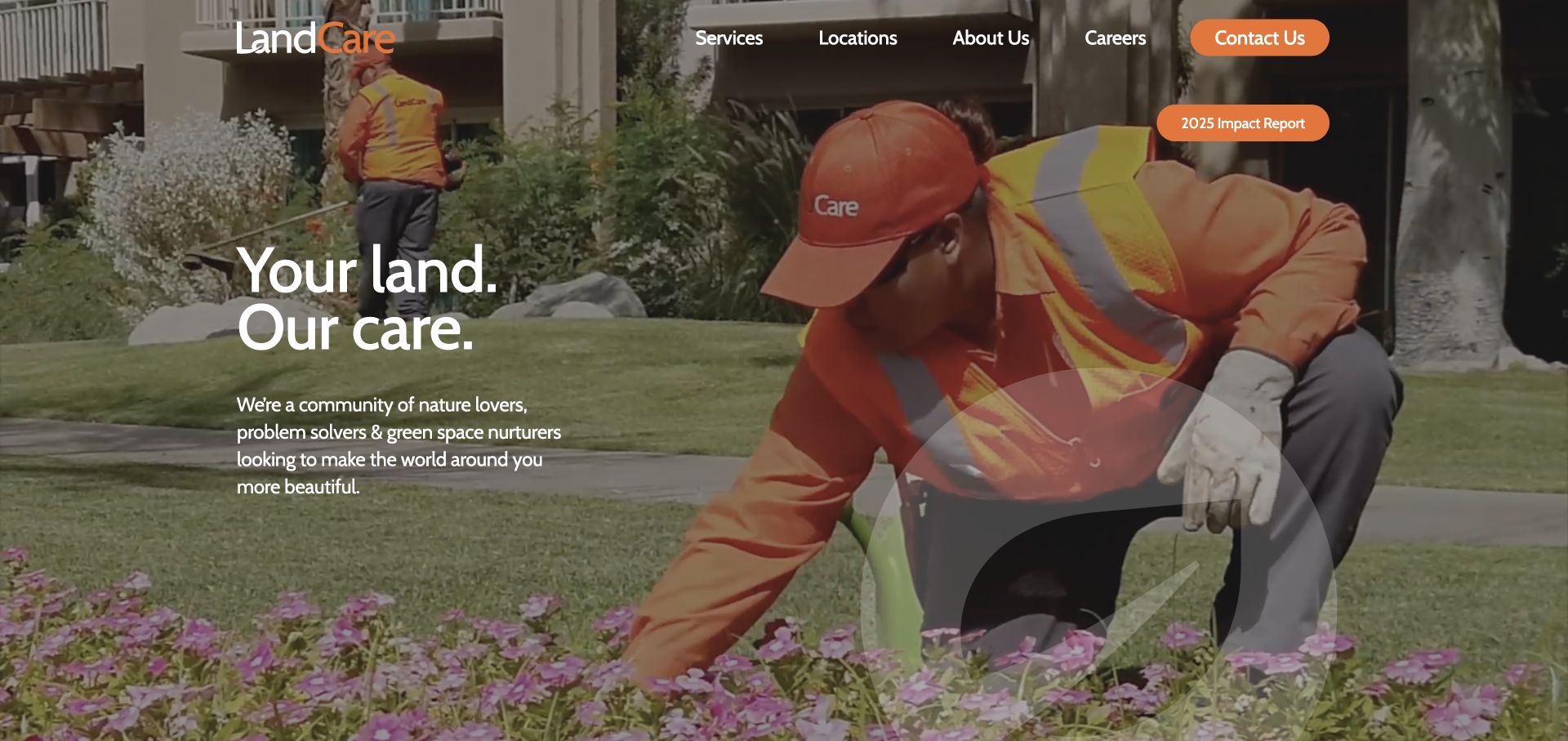
LandCare fills the hero with a close view of a uniformed team member working among plants. A short white message sits on the left, and the orange contact control in the navigation echoes the worker’s clothing. The image connects the brand color to a real work scene rather than a separate graphic. Navigation is limited to services, locations, company information, careers, and contact, with an impact-report route also visible. The opening feels people-led even though the business serves commercial properties.
What you can learn
A work-in-progress photograph can explain care better than another perfectly empty lawn. Choose a scene that leaves an intentional text area, then keep the first message short. Use the next section to turn that emotional introduction into clear services, coverage, and evidence of relevant work.
Pros
The brand accent is integrated naturally through the photographed uniform and contact button.
A small navigation set reduces the amount of terminology a new visitor must interpret.
Cons & considerations
The short statement leaves specific service scope and property types to later content.
An image-first opening needs a stable fallback and readable navigation throughout any background motion.
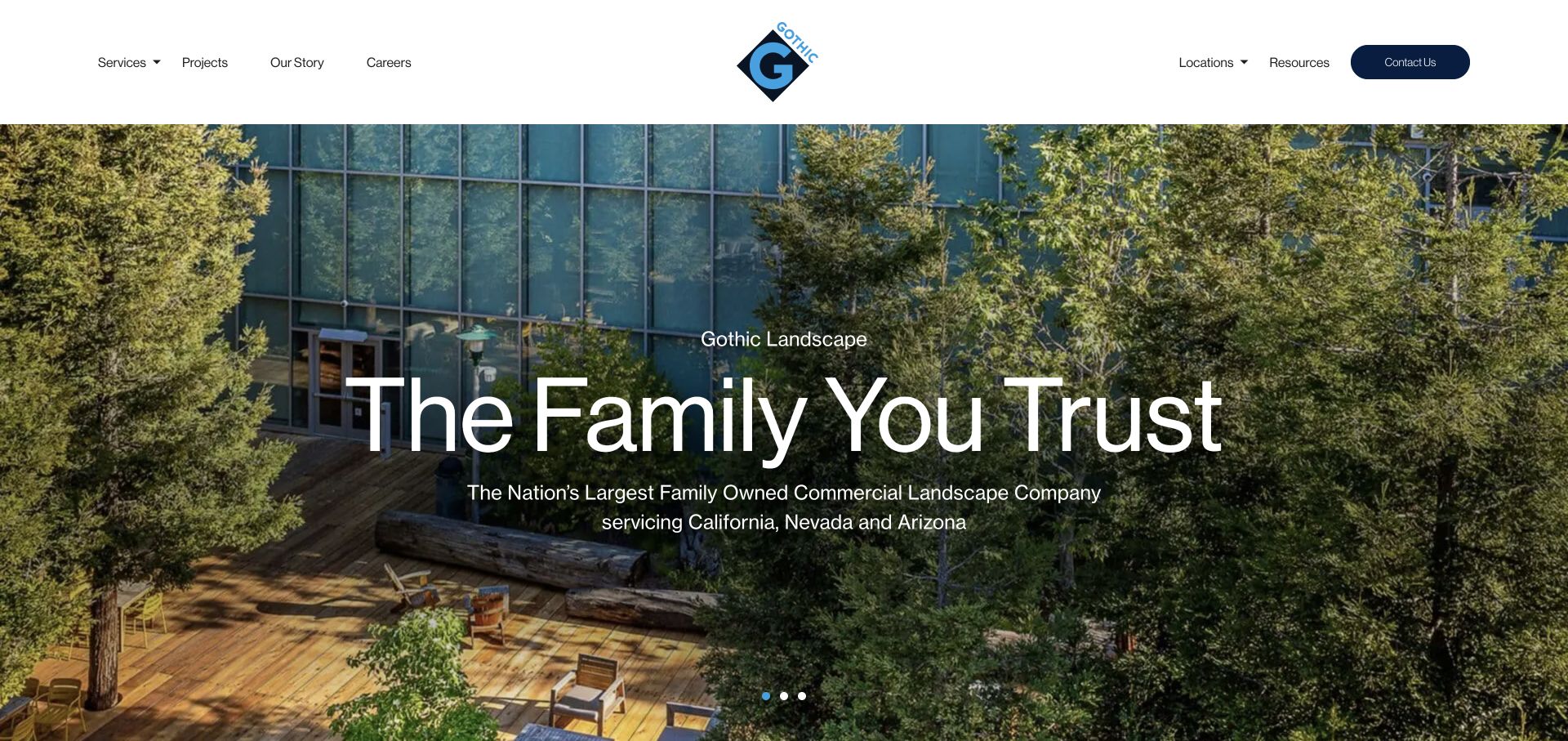
Gothic uses a generous white header with a centered geometric logo, balanced navigation groups, and a dark contact pill. The hero is a large photograph of a planted commercial environment, with an oversized light headline and shorter coverage statement placed near the center. Small carousel indicators sit near the bottom rather than becoming a separate visual feature. The emphasis is on the completed environment, while the header provides practical routes to services, projects, locations, and company information.
What you can learn
Let a finished property demonstrate the kind of environment you work on, but keep the buyer’s route visible outside the image. A centered logo can balance two navigation groups when their labels remain short. Supporting service-area copy is particularly useful when the photography alone cannot identify the market.
Pros
The project and location routes support buyers checking relevant experience and coverage.
A white header gives navigation a consistent background independent of the hero photograph.
Cons & considerations
The oversized headline can compete with the landscape details the photograph is meant to show.
A rotating hero should not hide essential service or coverage information on an unvisited slide.
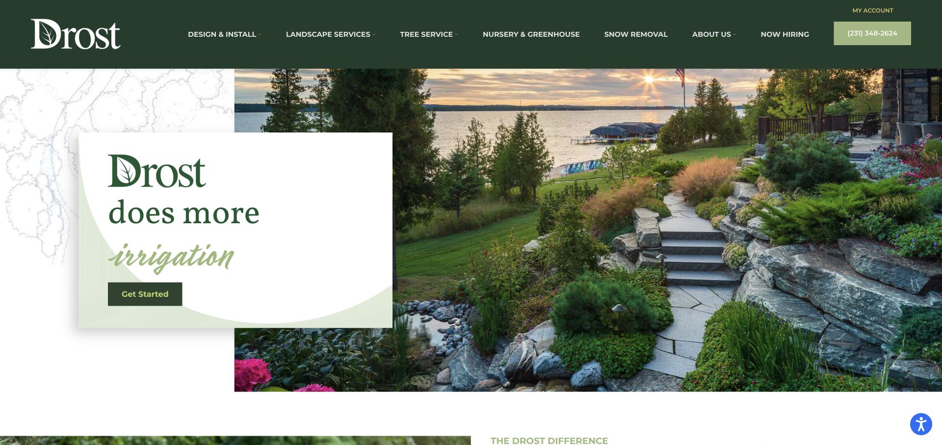
Drost layers a white message card over a waterfront garden photograph, using dark green branding, pale green curves, and a faint map-like background texture. The card introduces the company and a changing service word, with a simple starting action beneath it. The header makes design and installation, general landscape services, tree work, nursery, and snow removal visible as separate categories. The composition communicates a regional outdoor lifestyle while still acknowledging that the company provides practical year-round services.
What you can learn
Use a destination-quality project image to communicate the result, then give the text its own stable surface. When a business spans several seasons or service types, explain those categories plainly in the navigation. Do not make a rotating word the only place a service is named.
Pros
The overlapping card preserves legibility while leaving a large portion of the garden visible.
Distinct service categories acknowledge both project work and ongoing property care.
Cons & considerations
A long desktop menu requires substantial simplification on a phone.
The changing service word can create an incomplete message in a still image or reduced-motion view.
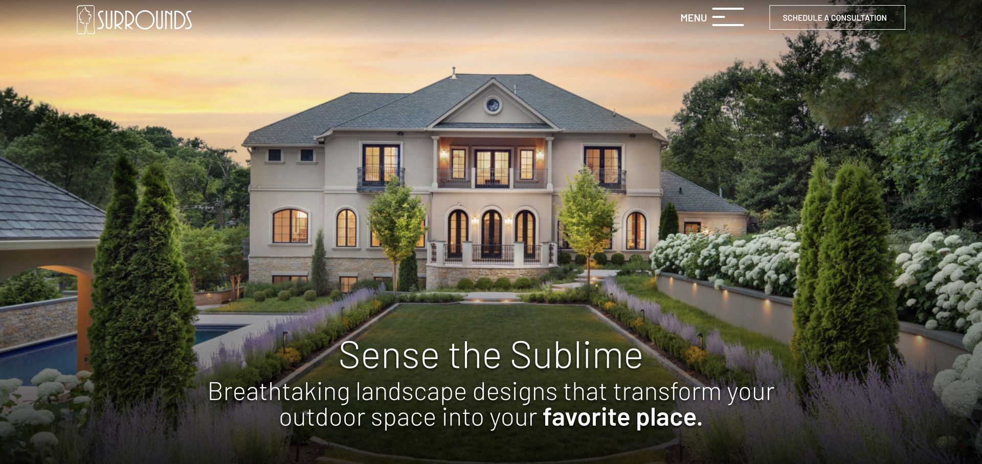
Surrounds opens with a formal garden and house at dusk, letting lighting, planting, paths, and the building’s symmetry form the composition. A light logo sits at the upper left, while a menu control and an outlined consultation button occupy the upper right. The lower headline is large but thin, with a short supporting line. The immediate experience is intentionally closer to an architectural portfolio than a lawn-maintenance directory, putting the completed environment ahead of a long service list.
What you can learn
A rich project photograph can carry an opening when the primary action remains explicit. Keep a consultation route visible even if the rest of the navigation is collapsed. Follow the atmospheric introduction with process, scope, and project context so visitors can judge fit rather than just admire the image.
Pros
The image shows several aspects of a complete outdoor environment in one coherent scene.
The consultation action remains visible without opening the menu.
Cons & considerations
Thin white typography needs careful positioning against changing image brightness.
A hidden navigation pattern adds a step for visitors looking for maintenance or service details immediately.
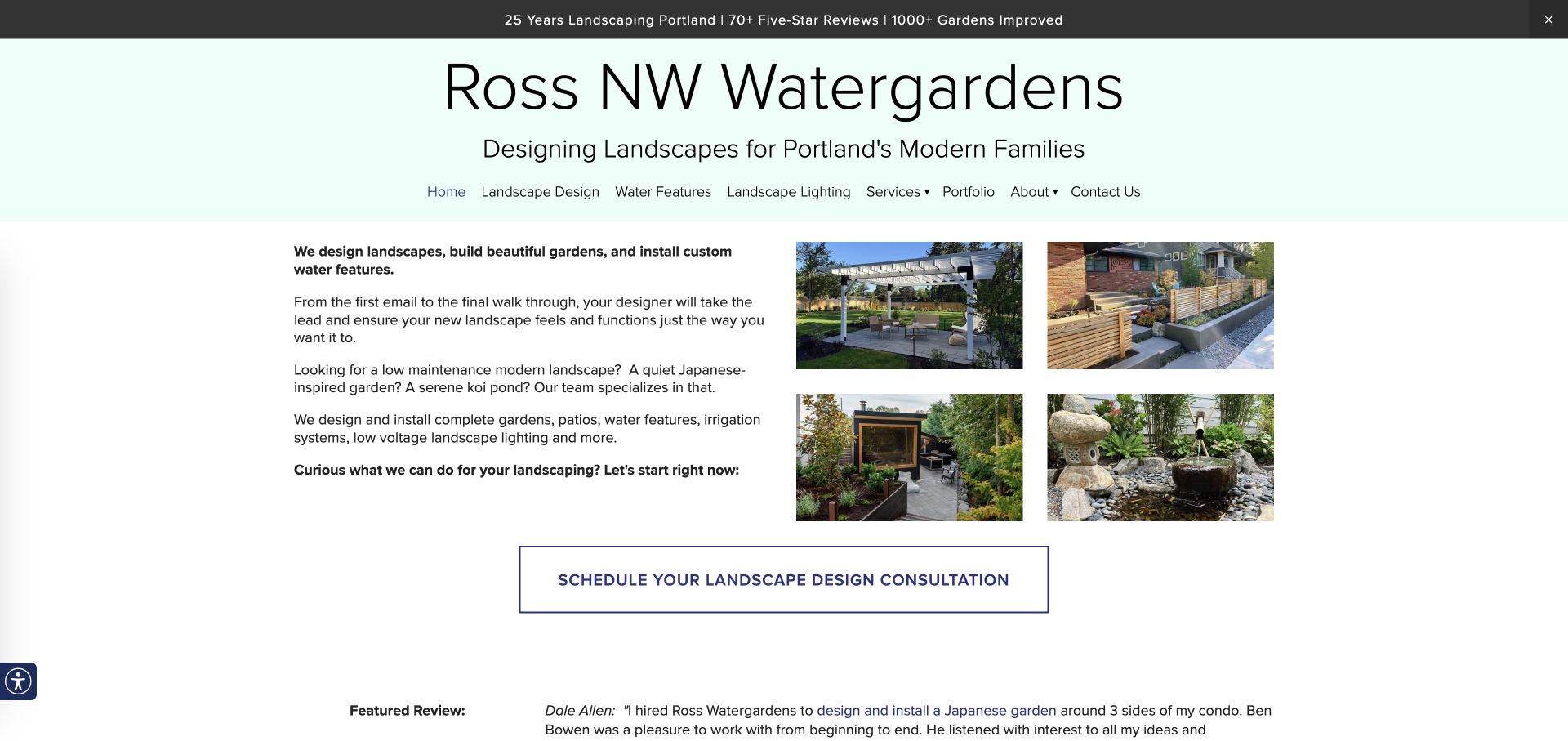
Ross NW Watergardens uses a pale mint masthead, a large typographic name, and an explicit regional audience description. Below, explanatory paragraphs sit beside a four-image grid of built gardens, fencing, seating, and a water feature. A broad outlined consultation button follows the introduction. This is a useful counterpoint to full-screen video: the opening provides enough words to explain the service, while several smaller images show the range without requiring a carousel or making the visitor wait for another frame.
What you can learn
A small portfolio grid can do more explanatory work than one generic hero. Select images that show distinct parts of the offering, then pair them with specific plain-language service copy. Keep the contact action near that evidence rather than separating it with several promotional sections.
Pros
Multiple project details make the specialist garden style easier to understand.
The introduction clearly connects service, audience, and local geography.
Cons & considerations
The large masthead consumes space that a narrower screen may need for practical content.
Several text paragraphs before the action can feel dense without shorter subheadings or stronger grouping.
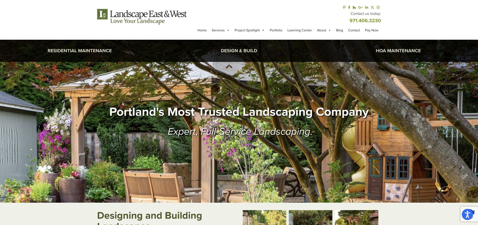
Landscape East & West places a dark three-part service band above a garden photograph. Residential maintenance, design and build, and association maintenance are therefore visible before the centered brand statement. The white header contains a substantial logo, contact number, and conventional navigation, including portfolio and learning content. The hero garden feels lived in, with seating, structures, and mature planting rather than an isolated ornamental detail. The page makes the distinction between ongoing care and project work particularly easy to notice.
What you can learn
Expose service categories that correspond to genuinely different buyer needs. A homeowner seeking maintenance and an association manager may not want the same case studies or contact questions. Keep those routes separate while retaining a common portfolio and educational area for people comparing the quality of the work.
Pros
The service band distinguishes recurring maintenance from new design/build work.
A garden scene with usable spaces explains the outcome beyond planting alone.
Cons & considerations
The combination of social links, navigation, contact details, and a service band makes the header tall.
A broad reputation-led headline needs concrete supporting evidence rather than functioning as proof itself.
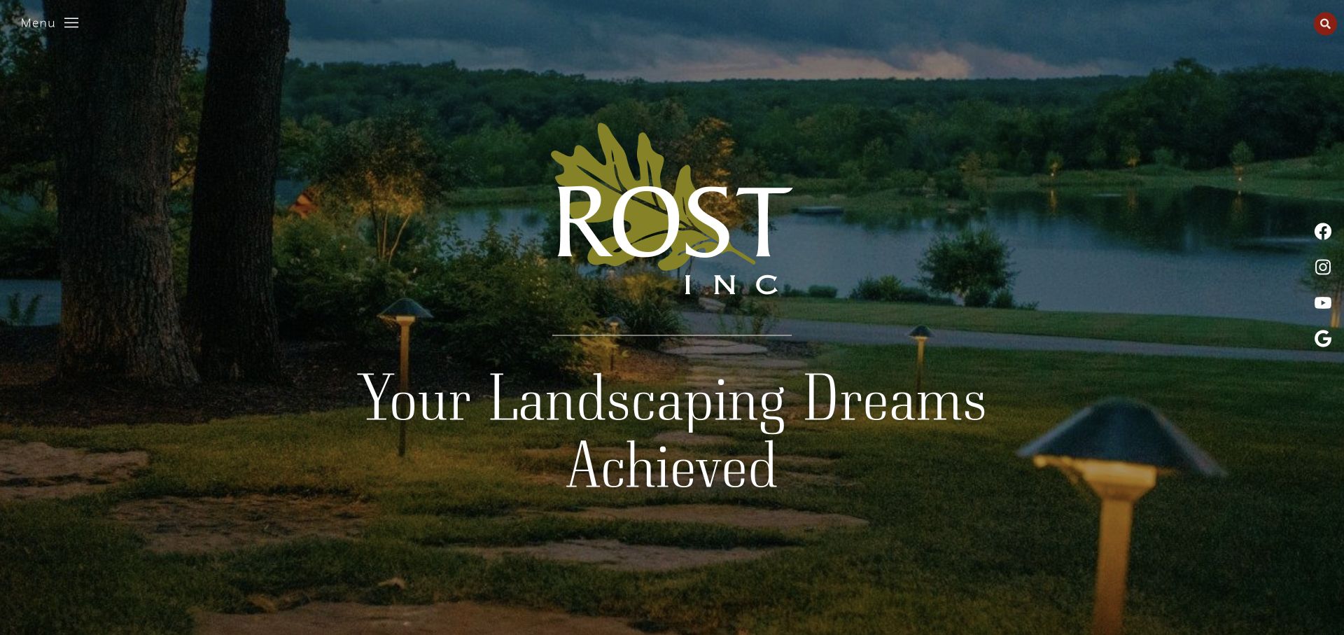
Rost uses a dark waterside landscape as a full-screen cover, placing its large serif logo and a centered aspirational headline over the scene. The menu control sits at the upper left, search at the upper right, and a vertical social rail follows the right edge. The image includes trees, water, path lighting, and lawn, so the first view conveys a complete environment. This is an atmospheric brand opening with very little conventional navigation competing against it.
What you can learn
If the portfolio is the main differentiator, let one carefully framed project establish the tone. Keep an obvious way to discover services and contact information, however, and make sure the next scroll adds practical context. A beautiful cover is an introduction to the buying journey, not a replacement for one.
Pros
The large identity and restrained text create a memorable, uncluttered focal point.
The scene shows lighting and landscape together rather than treating them as unrelated services.
Cons & considerations
A collapsed menu makes service and contact discovery less immediate.
The aspirational headline provides little geographic or project-scope information on its own.
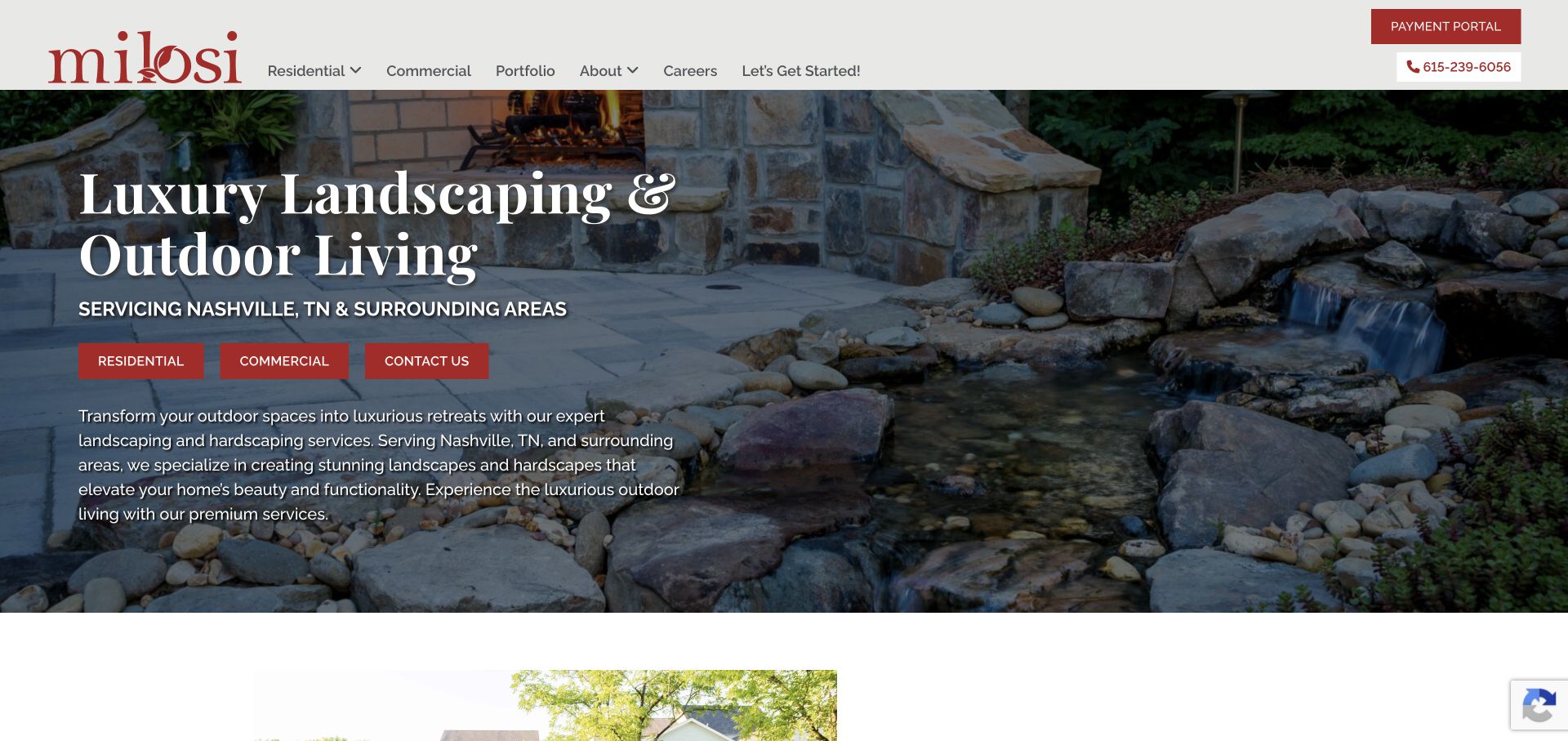
Milosi pairs a large serif heading with a direct Nashville-area coverage line, then offers separate residential, commercial, and contact buttons. The background image shows a patio, masonry fireplace, and water feature, so the outdoor-living proposition is visible rather than purely verbal. The white header uses a strong red logo and keeps the payment portal apart from the main navigation. A short paragraph beneath the buttons adds service context, making this opening more explanatory than a pure portfolio cover.
What you can learn
Combine the desired outdoor experience with immediate service-area clarity. Showing a complete setting can explain hardscape and landscape together. Keep existing-client tasks such as payments distinct from inquiry actions, and decide which audience route should be primary instead of giving every button identical visual importance.
Pros
The geographic qualifier sits directly beside the service proposition rather than hiding in a footer.
The patio and water feature show a broader outdoor-living offering.
Cons & considerations
Three equally weighted buttons can make the first decision less obvious.
The headline, coverage line, buttons, and paragraph compete for space over a detailed photograph.
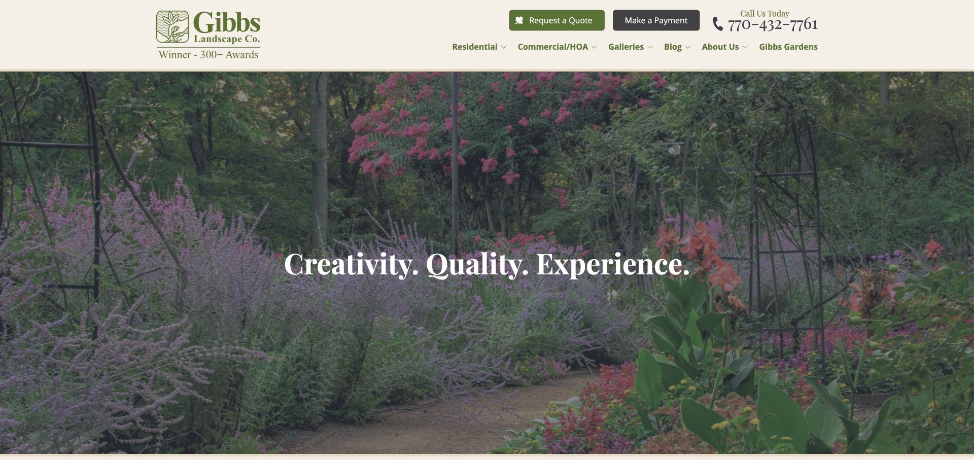
Gibbs uses a warm cream header, green identity, a conspicuous phone number, and separate quote and payment controls. Residential, commercial/association, galleries, and company information are visible in the navigation. The hero shows richly planted garden beds and a gate, with one restrained serif statement over the image. The cream and green palette connects naturally to the photography without requiring extra illustrations. Compared with highly experimental studio websites, the layout keeps familiar destinations and contact details near the top.
What you can learn
A familiar header can coexist with expressive planting photography. Give residential and commercial buyers distinct routes, then use galleries to substantiate the type of work. Keep existing-client payment tasks available but visually secondary so they do not distract from the new-business inquiry path.
Pros
The header differentiates new quote requests from existing-client payments.
Rich planting imagery gives the service a recognizable visual character.
Cons & considerations
The opening statement is broad and needs specific service information in the following section.
Several credibility claims in the header can crowd the navigation unless carefully prioritized.
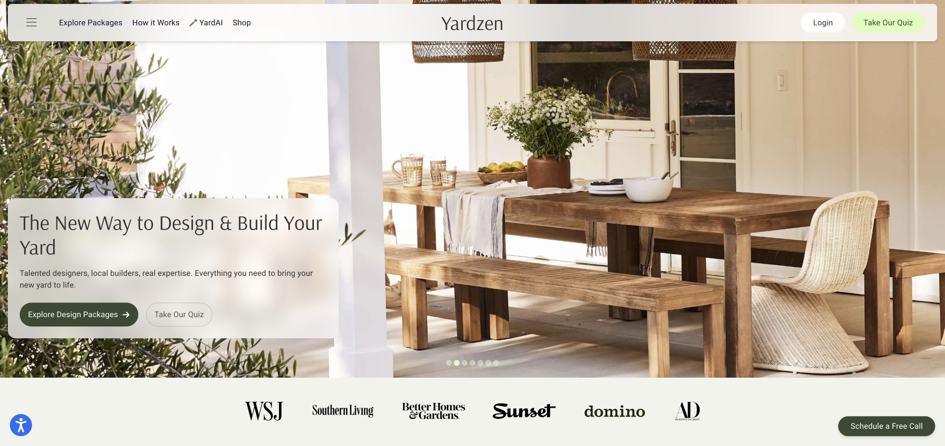
Yardzen uses a softly rounded floating navigation bar over a large outdoor dining image. A light card at the lower left explains the offer and presents two paths: explore design packages or take a quiz. A row of publication marks appears below the hero, while a quieter call-scheduling control stays at the bottom right. The opening presents landscape design as an understandable service product, using a welcoming lived-in scene rather than a technical plan as the first visual.
What you can learn
When a service has defined packages, show that buying model early. Give visitors a direct comparison route and an optional guided route, with labels that explain the distinction. The quiz should help someone choose rather than becoming an unnecessary gate to basic package information.
Pros
Package browsing and guided selection are separate, clearly named actions.
The light message card creates a steady reading area over detailed photography.
Cons & considerations
Newsletter interruptions can obstruct the useful first impression if shown too early.
A package-led presentation needs clear scope limits so visitors do not confuse design with included construction.
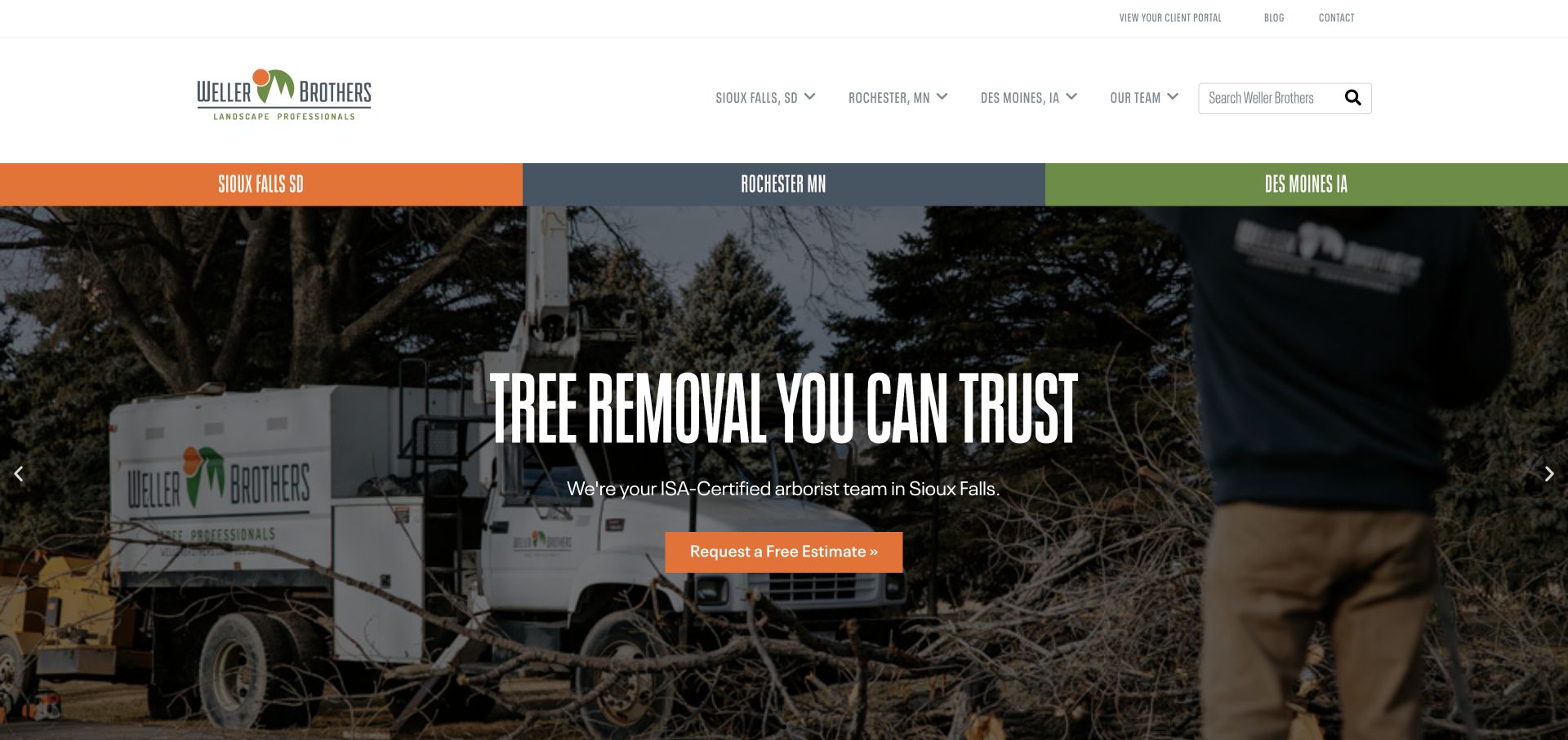
Weller Brothers gives its three service cities a prominent colored band above the hero. The same cities also appear in the navigation, alongside team information and search. The captured slide promotes tree work using a crew-and-equipment image, a condensed headline, and an orange estimate button. A slim utility row contains client portal, blog, and contact links. The opening makes local routing a central part of the experience rather than treating the entire region as one undifferentiated coverage area.
What you can learn
Use location-based organization when it changes the services, contact team, or examples a visitor should see. Make city labels explicit and connect them to useful local pages. A rotating campaign can promote a seasonal service, but the broader landscape offering should remain discoverable without waiting for another slide.
Pros
The city band makes geographic self-selection easy to recognize.
A photographed working crew provides context for the promoted practical service.
Cons & considerations
Repeating city links in both menu and band uses considerable header space.
A seasonal carousel slide can temporarily underrepresent the company’s broader design and maintenance work.
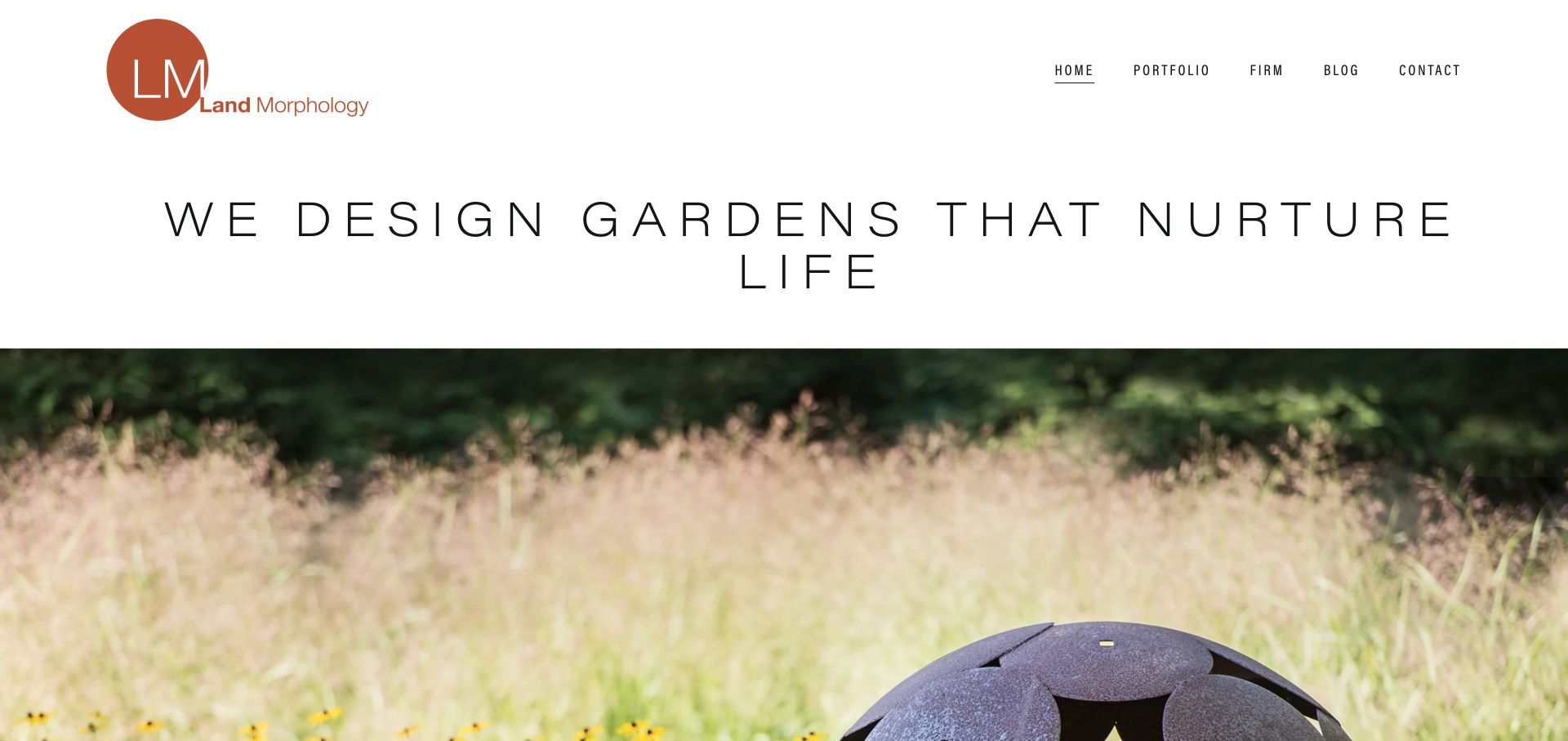
Land Morphology leaves a generous white area for its logo, compact navigation, and a widely spaced uppercase design statement before the project photograph begins. The image shows a sculptural object among planting, placing material, art, and horticulture in the same frame. The warm rust identity contrasts with a restrained black-and-white typographic system. This is an editorial studio introduction: it gives the practice a point of view first, then lets the portfolio image make that viewpoint tangible.
What you can learn
A design philosophy works best when the following image demonstrates it. Keep the opening statement concise and let project stories explain decisions, planting, and context in detail. Use a manageable number of navigation categories so the editorial tone does not come at the expense of finding work or contact information.
Pros
The text sits on a plain background, avoiding legibility problems over changing photography.
The image selection connects planting and constructed detail rather than showing a generic lawn.
Cons & considerations
The large statement pushes much of the first project image below the initial viewport.
Widely spaced uppercase text can become awkward when it wraps at narrower widths.
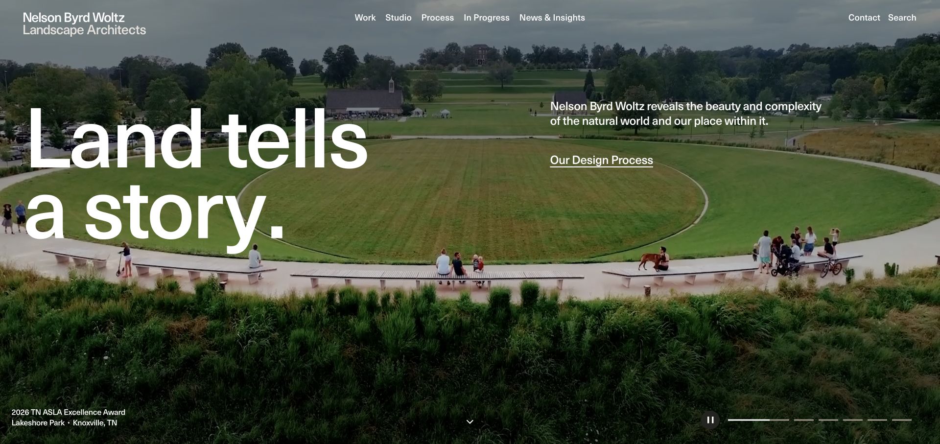
Nelson Byrd Woltz overlays a large left-aligned statement on an expansive park image, balancing it with a short explanatory paragraph and a process link on the right. The scene includes people using paths and open space, making the landscape feel inhabited rather than merely decorative. A project caption sits at the lower left, while slide indicators and a pause control make the hero’s movement visible. The navigation includes work, studio, process, in-progress projects, and news rather than only finished portfolio entries.
What you can learn
Show landscapes in use when the design concerns shared space and public life. Pair the image with enough project context to avoid turning real work into anonymous scenery. A process route helps prospective clients understand the thinking behind the finished pictures, especially on complex commissions.
Pros
People in the park give a sense of spatial scale and use.
The visible process route connects the visual portfolio to the studio’s working method.
Cons & considerations
Very large headline text can obscure parts of the landscape it introduces.
A motion-led hero needs readable captions and an equally coherent still or reduced-motion presentation.
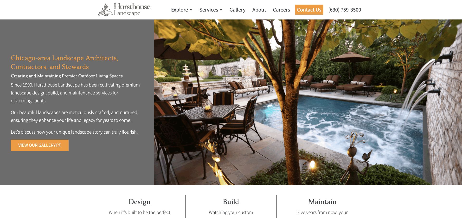
Hursthouse uses a straightforward split layout: a gray text panel on the left and a large poolside garden photograph on the right. The heading explicitly combines the Chicago area, landscape architecture, contracting, and stewardship. A gallery button follows a short explanation, and the next section begins with design, build, and maintain columns. The orange accent carries from the header contact control to the hero action, giving the functional routes a consistent appearance without overwhelming the project image.
What you can learn
Make the service lifecycle visible. Buyers may need help understanding the relationship between designing a space, building it, and maintaining it over time. A split hero provides room for that explanation without forcing several paragraphs over photography. Follow the introduction with evidence for each stage rather than repeating the same promise.
Pros
The split panel gives longer explanatory text a stable reading surface.
The design/build/maintain sequence previews the service structure immediately below the hero.
Cons & considerations
The first text panel is relatively dense and could benefit from tighter grouping.
A poolside scene may signal a narrower project type than the full service offering.
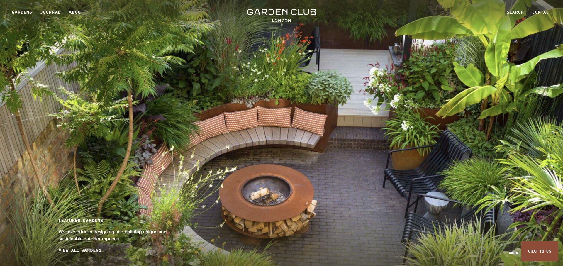
Garden Club London uses a full-screen project photograph with a centered wordmark and short navigation labels across the top. The reviewed view shows a compact planted seating area with built-in benches, a fire feature, paving, and layered foliage. A small lower-left description introduces the featured gardens and a direct link to the collection. The image demonstrates how much can happen within a limited outdoor footprint, making the studio’s spatial approach visible before any long explanation.
What you can learn
Choose photography that reveals the spatial problem your practice solves. For urban gardens, a view that includes boundaries, seating, circulation, and planting can communicate more than a close-up of flowers. Keep the project collection route explicit and provide practical commissioning information beyond the cover.
Pros
The image shows relationships between built elements and planting within a compact space.
A small featured-gardens label connects the opening directly to the portfolio.
Cons & considerations
White navigation over vegetation needs careful contrast across every carousel image.
The minimal opening leaves service scope, location, and commissioning detail to later pages.
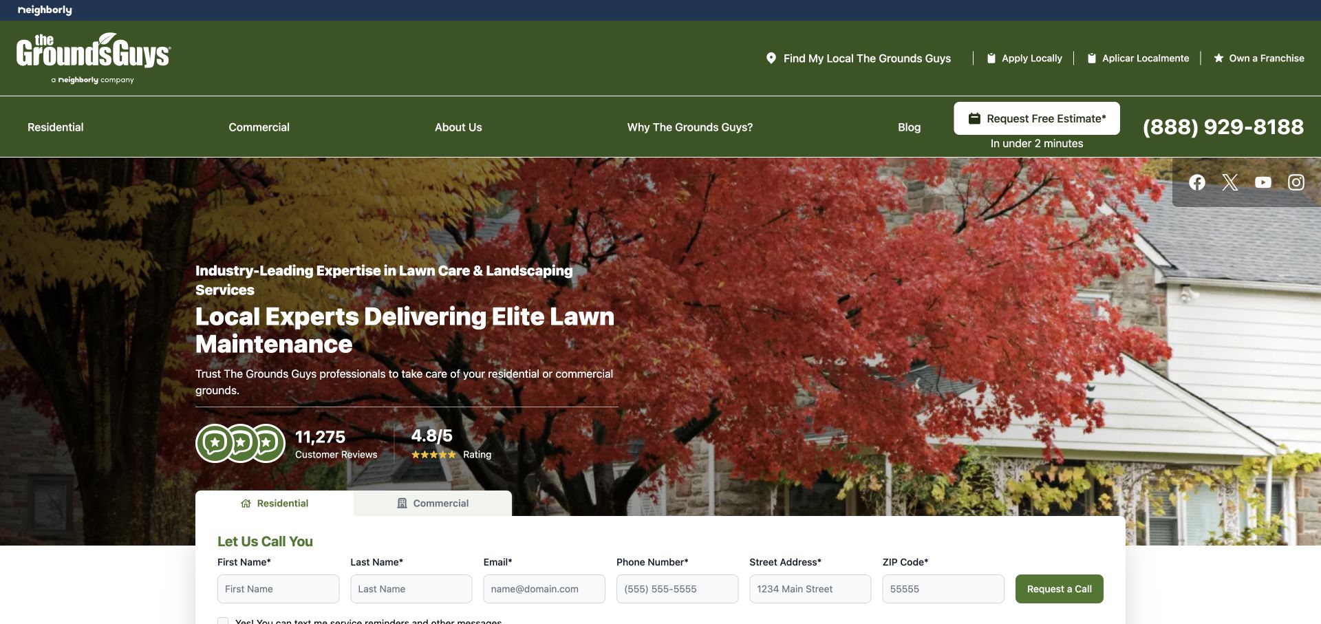
The Grounds Guys uses a green header and a seasonally colored yard photograph, with contact actions and a local-provider route visible above the hero. The left-hand copy is followed by a review treatment, while residential and commercial tabs introduce a broad call-request form below. The page combines brand-wide orientation with a local-service task. The foliage gives the opening a seasonal character, but the form and audience tabs are the practical structure that helps a visitor start a relevant inquiry.
What you can learn
If service delivery depends on a local operator, explain that routing early. Residential and commercial tabs can prevent a single large form from asking irrelevant questions. Treat review counts and aggregate ratings as evidence requiring context, not decorative guarantees, and keep the primary request route clear.
Pros
Residential and commercial audiences have distinguishable form routes.
The local-provider link is visible before someone enters their address and contact details.
Cons & considerations
A multi-row header leaves less room for the first service explanation.
The wide form asks for considerable personal information before the visitor has explored local details.
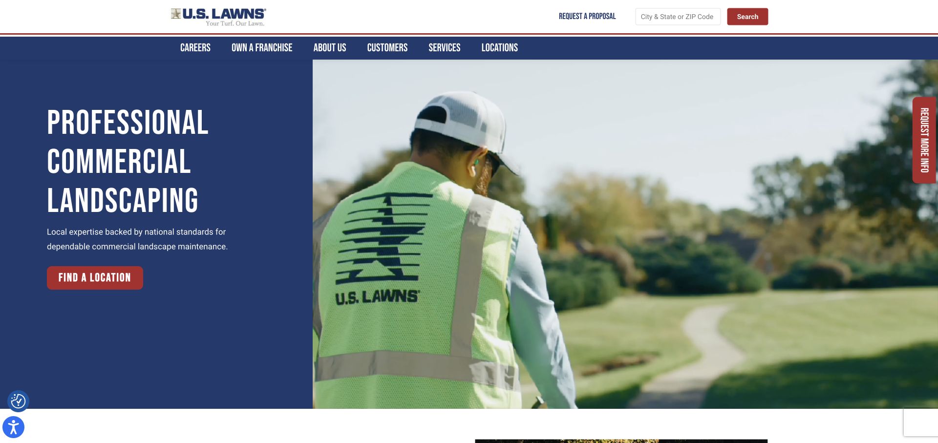
U.S. Lawns places a dark blue message panel beside a close view of a uniformed worker, using a red location button as the main hero action. The white utility header includes a city/state or ZIP search, while a separate blue navigation band handles customers, services, company information, careers, and locations. This gives the homepage a practical organizing principle: finding the appropriate local provider matters before requesting the details of a maintenance relationship.
What you can learn
When geography determines whether an inquiry is actionable, make the location task explicit. A simple search can sit above the broader service story without replacing it. Use working-team photography to explain maintenance as ongoing care, then let local pages provide specific coverage, contact, and portfolio context.
Pros
The hero action and header search both reinforce the location-finding task.
The separate message panel maintains text contrast without darkening the entire photograph.
Cons & considerations
Repeated location controls need consistent behavior so visitors do not wonder which to use.
Corporate and franchise recruitment links can compete with the commercial buyer’s route if equally emphasized.
Confirm which services the company delivers, what it subcontracts and where it operates. Group services in a way a property owner recognizes. Make commercial and residential routes distinct only where the work and inquiry process genuinely differ.
Collect project context with the photographs
Record the brief, scope, approved locality and the difference between design intent and completed work. Decide who can approve publication. A gallery becomes more persuasive when a visitor can understand the company’s actual contribution.
Set up seasonal editing and request routing
Choose who changes seasonal notices, service availability and project highlights. Explain current response processes accurately. Route ongoing maintenance support separately when the office needs to distinguish an existing property issue from a prospective contract.
The editing job behind the design
Use structured projects and services without overbuilding
A practical CMS can manage service categories, projects, service areas and team information. Provide gallery tools that handle seasonal image sets and explicit render labels. Avoid creating hundreds of location pages from the same paragraph.
If work requests connect to field-service or scheduling software, define the integration and staff ownership. Keep a contact fallback when the operational vendor is unavailable. Do not make customers provide detailed property information before explaining the purpose and next step.
Our WordPress website examples offer a separate look at publishing approaches. A visible platform label is evidence for that named page, not a guarantee that the same system will suit your requirements.
Before the public launch
Landscaping website launch checklist
Verify service scope, coverage and residential versus commercial routes.
Label proposed designs, renders and completed work accurately.
Record image permissions and relevant collaborator credits.
Test new-project and existing-client request routing.
Check galleries, tap-to-call and forms on a phone.
Assign an owner for seasonal updates and current availability.
These checks are a project checklist, not a performance, legal, security, or accessibility certification. Test real journeys with the people responsible for the website before making claims about the result.
Sources & editorial method
How this collection was selected and reviewed
We selected distinct official landscape design, construction and maintenance websites. This mix highlights different business models; the collection does not assess service quality or make environmental performance claims about the featured businesses.
Each example links to its actual source page. Screenshots are direct browser captures with their own capture dates; moving imagery, announcements and live designs can change. The notes describe observable design choices and conditional tradeoffs, not measured traffic, conversion results, service quality, or accessibility conformance.
Technology labels use public page metadata, asset evidence, or explicitly cited platform documentation. Platform documentation is not a complete current deployment audit. A component reference may be legacy or unused; it is not a complete backend inventory. Unknown stacks are omitted. These sites are editorial examples, not our client portfolio.
Written, Edited and Curated are separate editorial records, not timestamps advanced by a rebuild. Website designs and imagery belong to their owners. See our editorial standards or suggest a correction.
Questions worth asking
Landscaping website design questions
Should a landscaper show maintenance work?
Yes, if maintenance is part of the business and approved examples are available. Explain the ongoing scope and property type rather than presenting only one-time transformations.
How should service areas be presented?
State actual coverage clearly and add useful local context where available. Do not create duplicate pages for every nearby town without meaningful information.
Can we use garden renders?
Yes, with clear labels and appropriate rights. Keep them distinguishable from photographs of completed work so the portfolio does not imply an unbuilt project has been delivered.
Does a small landscaping company need a project database?
It can start with a simple repeatable project format. The key is that staff can add images, scope and permissions consistently without rebuilding a page for each job.
Borrow the project storytelling and service hierarchy that match your work. Use real properties, honest scope and a manageable plan for keeping the site seasonal and current.