Nginx is a server and proxy component, not a visual theme or a CMS. The useful design question is how a delivery setup can support the experience without hiding broken routes, stale pages, or failed services.
The examples below returned a scoped Nginx signal during the public source check. That is not an inventory of their infrastructure. A response may pass through several systems, reported headers can be customized, and a browser-facing component need not identify the origin application.
Read the screenshots as references for page and navigation requirements. An institutional archive, a technical support library, and a compact studio portfolio need different route structures and release tests. None of their visual choices is caused simply by using Nginx, and their server settings are not disclosed by an attractive homepage.
Before the examples
What makes good Nginx website development in 2026?
Start with the public route contract
List the pages and files a visitor should be able to request directly, including deep links, language variants, downloads, and old URLs. Decide which component owns each route and which failures should remain visible. A homepage that loads successfully is a weak test of an otherwise extensive website.
Distinguish serving files from forwarding requests
Nginx can serve static content and proxy requests to another service. Document which responsibility it has in your implementation rather than guessing from a Server header. Explain the handoff between the delivery layer and application, including timeout behavior and where a maintainer looks when a request fails.
Design the experience around failure as well as success
Give missing pages a useful route back into the site, preserve meaningful error status codes, and make external-service failures understandable. Do not disguise every unknown URL as a successful homepage. Keep private and personalized responses out of an indiscriminate public-cache rule, and review the actual configuration with the operating team.
The collection · 20 examples
20 Nginx website examples worth studying
Compare how these organizations expose navigation, archives, support, and audience routes. The Nginx evidence concerns a reported delivery component; the design observations do not establish which internal service produced a particular part of the page.
We start with five recognizable brands or organizations: Yale University, University of Cambridge, US Food and Drug Administration, US Department of Justice, HP Support. Each attribution applies to the named website property, not every product or website belonging to its organization. This is a curated reading sequence, not a measured ranking.
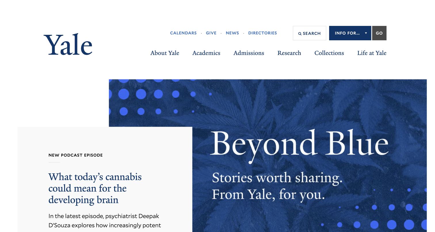
Yale places a traditional wordmark and familiar institutional navigation above an expressive editorial feature. A podcast item can sit beside the larger campaign without replacing routes for admissions, academics, research, and collections. An additional audience selector acknowledges that the same homepage serves several communities. The sampled response reported Nginx; that header is not a diagram of Yale's infrastructure or proof that all university properties share one server configuration.
What you can learn
For an institutional rebuild, inventory the stable destinations before changing delivery rules. Campaign artwork, news pages, and audience routes have different freshness and ownership needs. Write explicit cache and redirect tests for each, including an expired feature and a moved department page. Preserve ordinary navigation when rich media is unavailable instead of making the server deliver only a visually impressive opening.
Pros
Institutional and audience navigation remain visible around changing editorial content.
The feature accommodates a distinct media format without replacing the university identity.
Cons & considerations
Several audience layers require clear hierarchy on smaller screens.
The podcast feature needs a clear title, destination, and useful non-audio explanation for an unfamiliar visitor.
Cambridge's captured opening invites prospective postgraduate students to an event through a photograph and prominent text blocks. The institution's identity remains restrained, and permanent study destinations continue below the feature. This is useful reference material for separating a temporary invitation from the continuing course-finding task. The Nginx observation concerns the sampled public response, not every faculty website or application linked from it.
What you can learn
Specify what should happen to an event URL after registration closes. Decide whether visitors need an archive, a clear ended notice, or a relevant future destination, and test those behaviors independently of the homepage feature. Keep course pages and event assets under explicit freshness rules. A redirect plan should preserve useful context rather than sending every old campaign link to a generic homepage.
Pros
The campaign states its audience rather than relying on the photograph alone.
A lasting institutional identity frames the temporary recruitment message.
Cons & considerations
Time-sensitive copy needs an owner and an expiry process.
Visitors arriving after an open-day campaign ends need a dependable route to the underlying study information.
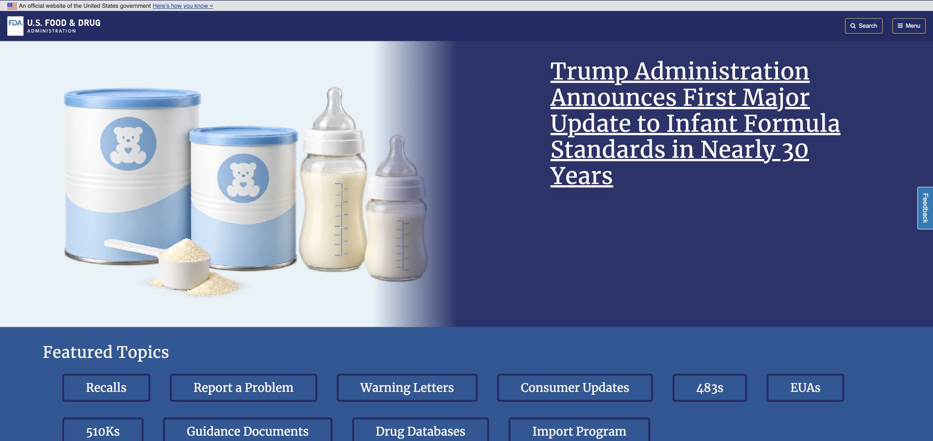
The FDA homepage places a feature announcement above a grid of recalls, reporting, consumer, guidance, and database links. Its official identity is visually separate from both layers. Visitors can choose a practical destination without first following the current story. Nginx was reported in the sampled response, but this does not identify the implementations of separate reporting tools or authoritative databases.
What you can learn
Build a route inventory that distinguishes information pages from service endpoints. A public announcement may be cacheable while a personalized submission response must not inherit the same policy. Test missing and retired references with meaningful status codes, and maintain redirects when guidance is reorganized. Make the content team responsible for the relationships between notices and their source material rather than relying on a web-server rule to repair an unclear information model.
Pros
Task labels offer direct alternatives to the featured announcement.
The visual hierarchy separates official identity from changing editorial emphasis.
Cons & considerations
A dense task grid needs careful ordering when space is limited.
The compact grid needs labels that distinguish reading guidance from beginning a formal reporting task.
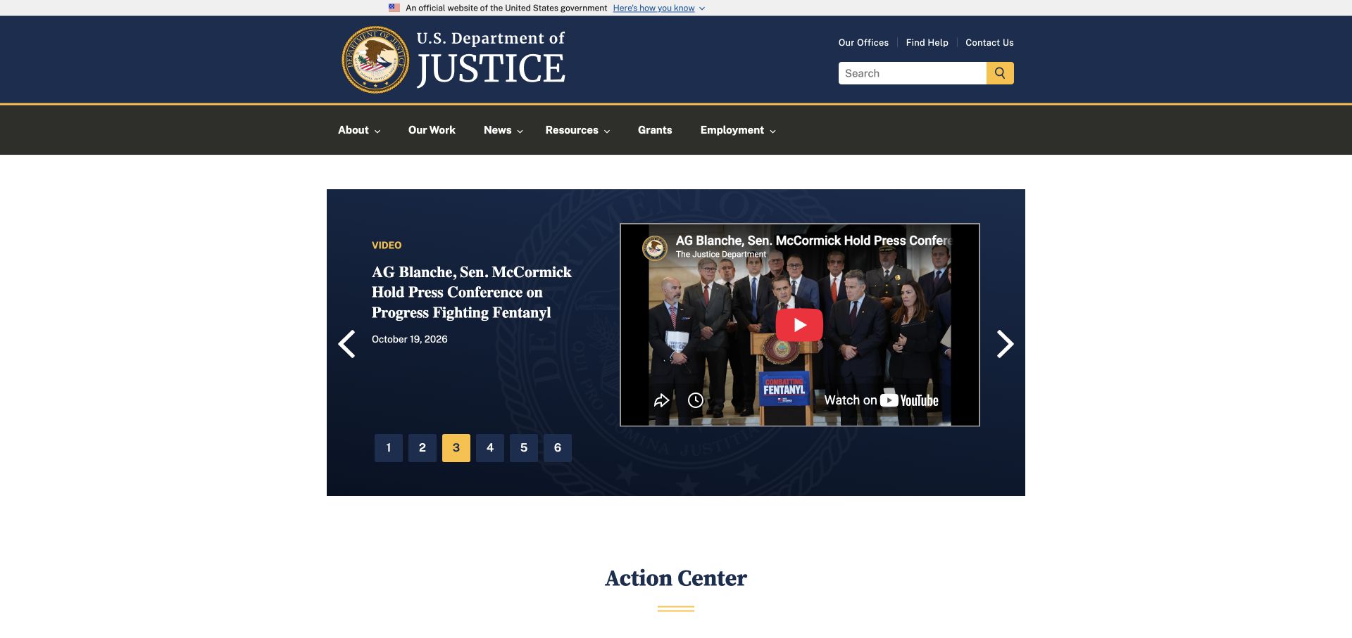
The Department of Justice pairs a broad institutional header with a smaller central media feature. Numbered choices and player controls occupy a bounded dark panel rather than the entire opening. An action-center section begins beneath it. The page's reported Nginx header supplies a scoped delivery observation; the embedded media service remains a separate visible component with its own behavior and availability.
What you can learn
Document which responses belong to the organization and which come from an embedded provider. A reverse-proxy or cache change should not accidentally turn a public page failure into a misleading success response. Provide a readable title and direct destination around important media, and include an unavailable-player case in acceptance tests. Preserve dated release URLs when the lead item changes so the archive remains understandable outside the current announcement cycle.
Pros
The media feature does not erase the permanent institutional navigation.
Visible position controls communicate that the opening contains several items.
Cons & considerations
A third-party player introduces a failure state outside the public page's own server.
Numbered feature controls need enough context to help someone find a known announcement without waiting.
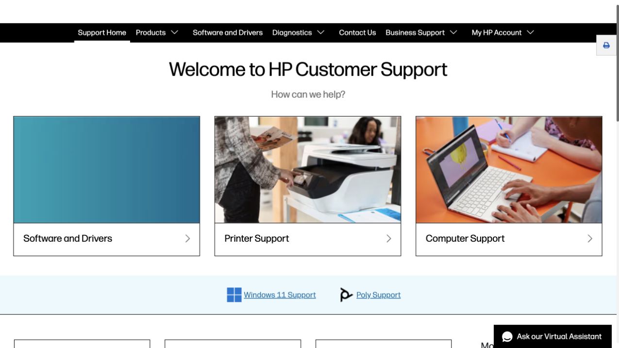
HP Support starts with three large choices for software and drivers, printers, and computers. Device photography distinguishes two routes, while support navigation and account access occupy the dark header. Additional Windows and Poly links form another layer. This is the support property specifically, not HP's entire public estate. Nginx appeared in a response header; no device identifier or account information was entered.
What you can learn
For a support rebuild, classify public documents, download assets, account routes, and diagnostic requests before writing proxy rules. Their caching, error, and authentication requirements differ. Ensure that a shared shell does not cache personalized responses, and test downloads and error states separately from the marketing header. Keep a plain support contact alternative when a diagnostic integration or device-specific lookup is unavailable.
Pros
The three opening choices use recognizable support tasks.
Account and business support destinations remain distinct from device categories.
Cons & considerations
Several support brands and utility layers can make navigation crowded.
Windows, Poly, and device categories need clear scope so the secondary bands do not become competing directories.
John Pawson's opening largely consists of one architectural photograph and a very small identity. The restraint gives the building a clear role as the introduction, with little competing visual material. It is a useful reference for a portfolio whose image choices carry much of the communication. The public response reported Nginx, which is a delivery clue rather than evidence of any particular image-processing or caching setup.
What you can learn
An equally minimal portfolio still needs explicit delivery decisions. Provide correctly sized image variants, a usable initial document, and a meaningful fallback when the chosen photograph cannot load. Keep versioned assets separate from HTML that must reflect current project information. Test the smallest supported screen with a slower connection before treating an attractive desktop capture as proof that the whole experience is lightweight.
Pros
One carefully chosen image creates a deliberately clear focal point.
Minimal visual competition makes the architectural subject easy to identify.
Cons & considerations
The approach depends heavily on the quality and usefulness of each image.
Practical studio information needs a discoverable route even when the visual introduction remains almost entirely photographic.
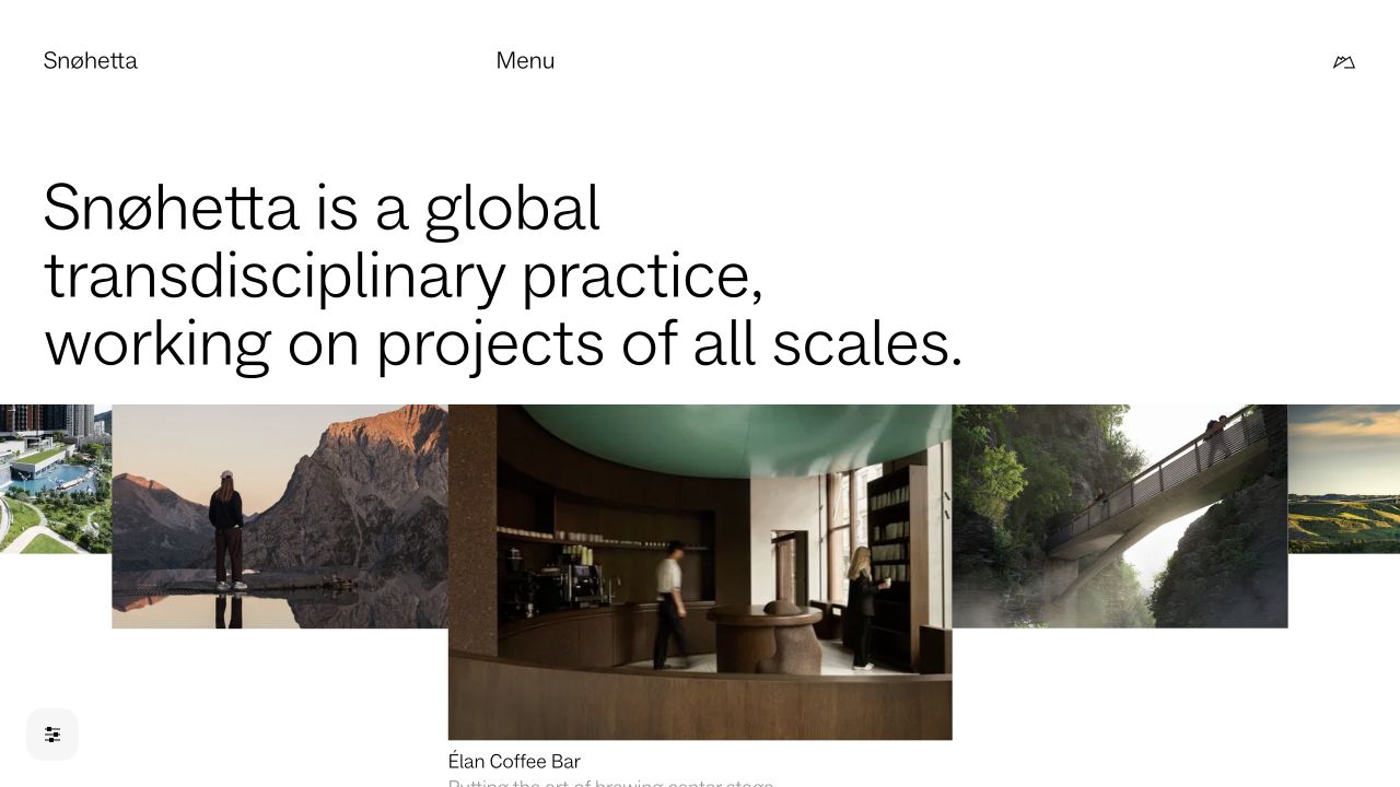
Snøhetta opens with an explicit description of its practice and then introduces several project images in a varied composition. The words give context before the body of work expands. A compact menu avoids turning the first screen into an index of every discipline. Nginx was observed as reported response software, not as proof of the content model, origin arrangement, or build process behind the portfolio.
What you can learn
Keep the practice description and project records available as useful documents independently of the visual sequencing. When routes or language versions move, preserve a coherent destination and an intentional status rather than a chain of broad redirects. Separate the caching needs of stable project images from changing editorial selections. Test direct entry to an individual project, not only arrival through the polished homepage.
Pros
The introduction explains what connects the different kinds of work.
A mixed project selection demonstrates breadth without a separate sales carousel.
Cons & considerations
A varied visual sequence still needs dependable project labels and destinations.
The broad multidisciplinary introduction needs project facts that help readers distinguish the different kinds of work.
Heatherwick Studio uses a large serif identity over an immersive architectural scene. The compact opening navigation keeps attention on the project imagery rather than on a large directory. The observed Nginx header belongs to the sampled public response; it does not establish how video, images, or the CMS are distributed. Visual ambition and infrastructure quality are separate things to evaluate.
What you can learn
Plan a launch around a complete media fallback as well as the intended opening effect. Version the heavy assets, define a safe HTML freshness policy, and make it possible to restore the previous page without leaving references to unavailable files. Check a direct project link after deployment and rollback. These are requirements for a similar implementation, not operating characteristics demonstrated by the reference photograph.
Pros
The studio identity remains legible as a recognizable anchor for the scene.
The small initial navigation gives the image room to communicate.
Cons & considerations
Immersive media needs deliberate loading, motion, and fallback choices.
Project discovery needs clear labels and direct entrances outside the immersive opening media.
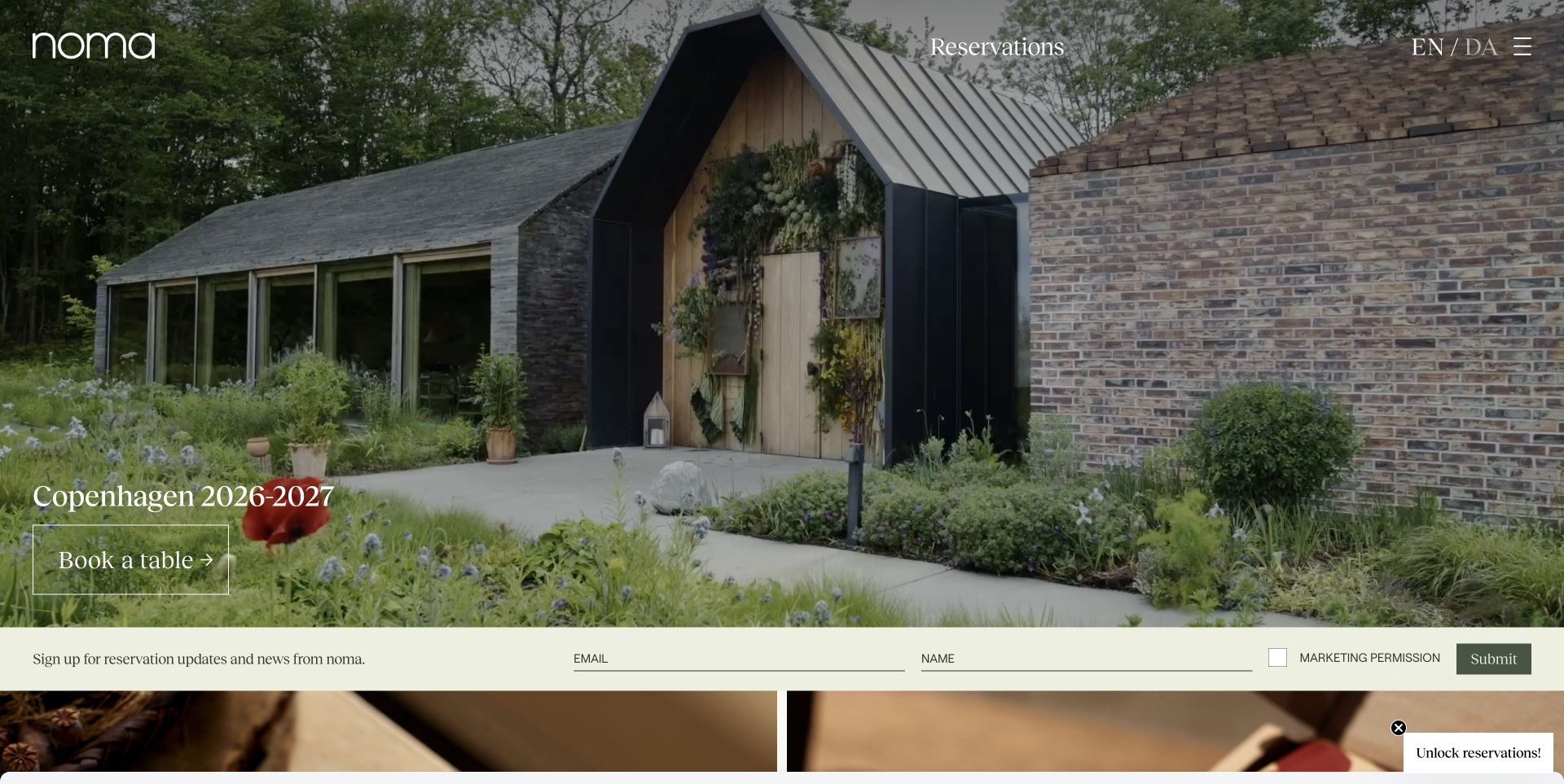
Noma introduces the restaurant environment through a large photograph, a restrained identity, and a seasonal message linked to reservations. The setting is the principal visual explanation, rather than a generic grid of dishes. The capture preserves its particular season. The response reported Nginx, but the separate booking destination and any customer information exchanged there were not inspected.
What you can learn
Treat season dates and booking availability as content with an explicit owner. Establish how the public page should change when a season closes, and avoid caching an obsolete booking announcement for longer than its useful life. Keep the restaurant's informational pages separate from the external reservation service's responsibilities. A guest arriving through an old link should receive clear context rather than an unexplained redirect into a different season.
Pros
The environment and the seasonal invitation reinforce one coherent introduction.
The main action has a recognizable practical purpose.
Cons & considerations
Seasonal presentation requires careful expiry and archival decisions.
Old seasonal reservation links need honest context rather than an unexplained transition into a different season.
Bestia places its distressed white identity and widely spaced navigation over a warm food-and-table scene. Menu, contact, events, gifts, and reservations are named plainly despite the expressive visual treatment. Address and hours continue in later content. Nginx was reported on the public response; that does not establish the behavior of booking, gift-card, or other separate providers.
What you can learn
Preserve the familiar task destinations when adjusting the presentation or delivery layer. Menu changes, event announcements, and booking handoffs should have clear freshness and ownership rules. Test an old menu URL and a missing image alongside the expected homepage. Keep essential address and contact information readable in the initial document so that a media problem does not erase the restaurant's practical usefulness.
Pros
The destination labels remain conventional and easy to recognize.
The warm imagery and clear identity create a cohesive first impression.
Cons & considerations
An image-dominated opening can postpone practical visiting details.
Menu, gift, event, and reservation destinations need clear boundaries around their different commitments.
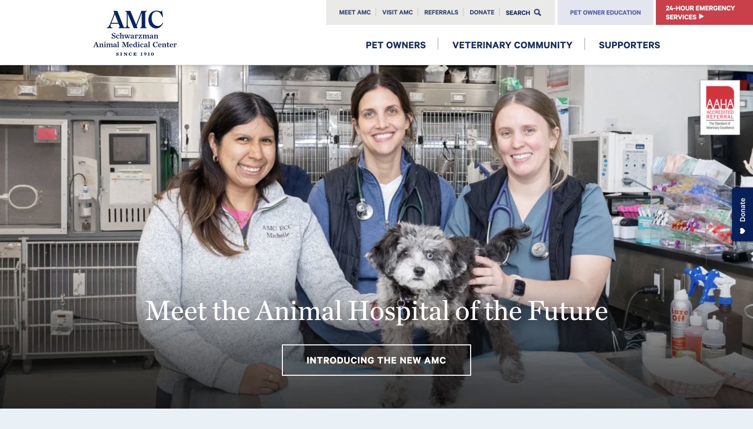
The Schwarzman Animal Medical Center shows a clinical team in its lead photograph and exposes routes for pet owners, veterinary professionals, and supporters. Emergency care receives a contrasting red entrance, while education and referral utilities remain available. This public page reported Nginx. It does not reveal the systems that manage referrals, patient records, payments, or any other protected hospital workflow.
What you can learn
Design proxy and caching boundaries around the actual information sensitivity of each service. Public educational articles and directions are different from an authenticated referral or patient-specific response. Keep emergency and arrival information usable if an optional integration fails. Write down the owner of every external handoff, and test the fallback instructions without entering real clinical or personal data during development.
Pros
Audience routes recognize that not every visitor is seeking the same kind of help.
The emergency destination is visually distinct from general institutional news.
Cons & considerations
Institutional campaign material can add steps for someone needing immediate practical information.
Clinical, emergency, and supporter routes need enough separation that an urgent care task is not diverted into institutional news.
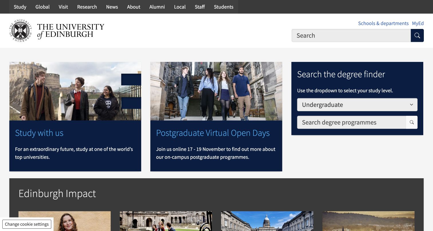
Edinburgh's opening combines study information, a postgraduate event panel, and a degree finder. The finder asks for a study type before the query, making the different audiences explicit. News and impact material follow the functional introduction. The reported Nginx response is limited to this public page; it does not identify every course database, department site, or admissions service linked from the institution.
What you can learn
Classify search result pages and their query parameters before introducing caches or redirects. A route should retain enough context for a visitor to share or revisit a useful search without exposing inappropriate information. Preserve plain undergraduate and postgraduate destinations as alternatives to the finder. Test renamed course URLs and zero-result queries, not just the default search form's visual appearance.
Pros
The study-type selector makes an important distinction before the search begins.
Functional discovery receives priority before the broader institutional stories.
Cons & considerations
Query-driven pages require rules beyond those used for static campaign assets.
The study-type choice and query field need consistent context when a visitor shares or revisits a search.
Toronto's captured opening celebrates convocation with a large photograph and a linked news item. Admissions, university life, and research remain in the main navigation, while status and support routes occupy the utilities. Everyday resources continue below. Nginx was reported in the sampled response, but the observation is not evidence that every campus, student service, and authenticated university application shares the same delivery arrangement.
What you can learn
Keep status and support information under ownership and freshness rules appropriate to their purpose. A celebratory feature can tolerate a different update rhythm from a time-sensitive operational notice. Document route ownership across campus domains and test cross-site redirects without losing the original destination's meaning. Do not apply a single convenient cache rule to every response merely because the header and institution name look consistent.
Pros
Community storytelling has room without removing familiar institutional destinations.
Operational utilities are distinguished from the current celebratory feature.
Cons & considerations
Multiple campus and service domains can create confusing ownership boundaries.
The celebratory feature should not displace the status and support information that recurring visitors need.
The V&A gives an exhibition photograph prominent space and follows it with the idea of a family of museums. Venue, availability, and price states appear alongside program material beyond the opening. The navigation includes visits, collections, learning, and support. Nginx was reported on the sampled response, not demonstrated as the origin or ticketing implementation behind every museum and exhibition destination.
What you can learn
Give each venue and exhibition a durable address with explicit dates and practical information. A sold-out state or closure notice needs a defined source and update policy rather than a copied decorative label. Check how cached program pages are refreshed when operational details change. Keep the ticketing handoff understandable and provide a public information alternative if the transactional destination is temporarily unavailable.
Pros
The presentation connects evocative imagery with a wider venue structure.
Program entries include practical distinctions beyond a beautiful exhibition title.
Cons & considerations
Availability labels require reliable ownership and refresh rules.
Venue, date, and entry conditions need consistent presentation across a family of museum programs.
Doctors Without Borders USA leads with a current field report and a large photograph. Location and attribution sit near the story, while the navigation separates work, involvement, and donations. The feature asks readers to understand a particular situation before introducing organizational scale. The sampled response reported Nginx; neither that header nor the photograph verifies the fundraising service or the operational systems used in the field.
What you can learn
Preserve the identity, date, source, and image credit of a report as its placement changes. A correction or urgent update should have an intentional publication and cache-refresh path. Keep donation and public publishing responsibilities separate, and test that a stale media reference does not obscure the report's essential text. Avoid presenting archived crisis material as newly published simply because the homepage has been rebuilt.
Pros
Location and attribution provide context around the emotional image.
The public story and support action have distinct places in the hierarchy.
Cons & considerations
Urgent reporting needs deliberate correction and expiry processes.
The featured report needs its date and location retained when it moves into the longer organizational archive.
Human Rights Watch presents a report headline and summary beside a large image, with latest news nearby. Countries, topics, reports, video, and impact have distinct routes, and a language selector sits in the utility layer. The public page reported Nginx. This is a scoped delivery signal, not evidence about research systems, translation processes, or the protection of unpublished source material.
What you can learn
Treat report URLs, translations, and corrections as related content records before defining redirect rules. A moved translation should lead to the appropriate language and edition, not merely to the nearest generic homepage. Define how a correction reaches cached public pages and retained downloadable material. Keep unpublished research and identifiable source information outside the public publishing path, regardless of how familiar the web-server software may be.
Pros
The research taxonomy remains visible around the current lead report.
Language and geographic routes acknowledge a genuinely international readership.
Cons & considerations
A large multilingual archive needs precise relationships rather than broad redirect shortcuts.
Country, topic, and language paths need predictable relationships when a report has no equivalent translated edition.
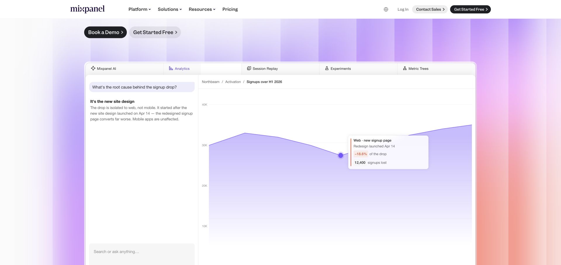
The captured Mixpanel homepage view centers a demonstration with a chat-like explanation beside an analytical chart. Product tabs span the panel, and the site's own navigation remains above it. Colored edge bands frame the white working surface. The Nginx header belongs to this public marketing response. It should not be read as a description of a customer's analytics workspace or the product's event-processing backend.
What you can learn
Separate the public demonstration's assets and routes from authenticated product delivery in the implementation brief. Give the preview an understandable fallback, and make its destination explicit so a visitor does not mistake an illustration for an active workspace. Test registration handoffs and error pages independently of the marketing shell. Avoid caching authenticated responses under rules copied from a polished but fundamentally different public page.
Pros
The demonstration gives the product category a concrete visual explanation.
The surrounding navigation distinguishes the website from the illustrated working surface.
Cons & considerations
A detailed preview can appear interactive even when it is only explanatory.
The preview must remain distinguishable from a live workspace and its account-related controls.
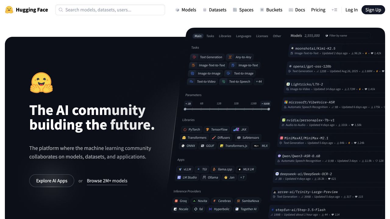
Hugging Face pairs a dark community introduction with an angled model-directory specimen. Search, models, datasets, spaces, documentation, and account actions stay visible in a white header. The friendly yellow identity softens the technical presentation without replacing its useful labels. The sampled response reported Nginx, but each hosted model, repository, or application may involve delivery and access boundaries beyond this particular public surface.
What you can learn
Define the boundary between public discovery and a user-owned resource before implementing proxy or cache behavior. Repository pages, large downloads, account responses, and embedded applications need different treatment. Keep direct links durable and test unavailable or removed resources with honest status and explanation. The lesson to borrow is the clear entrance structure, not an assumption that all of the platform's very different response types can share one simple rule.
Pros
The global search and resource categories remain accessible above the visual introduction.
The interface specimen communicates the technical subject without replacing readable labels.
Cons & considerations
A broad platform needs explicit public, private, and resource-delivery boundaries.
Resource categories need understandable removed-item and unavailable-application states, not only a successful discovery view.
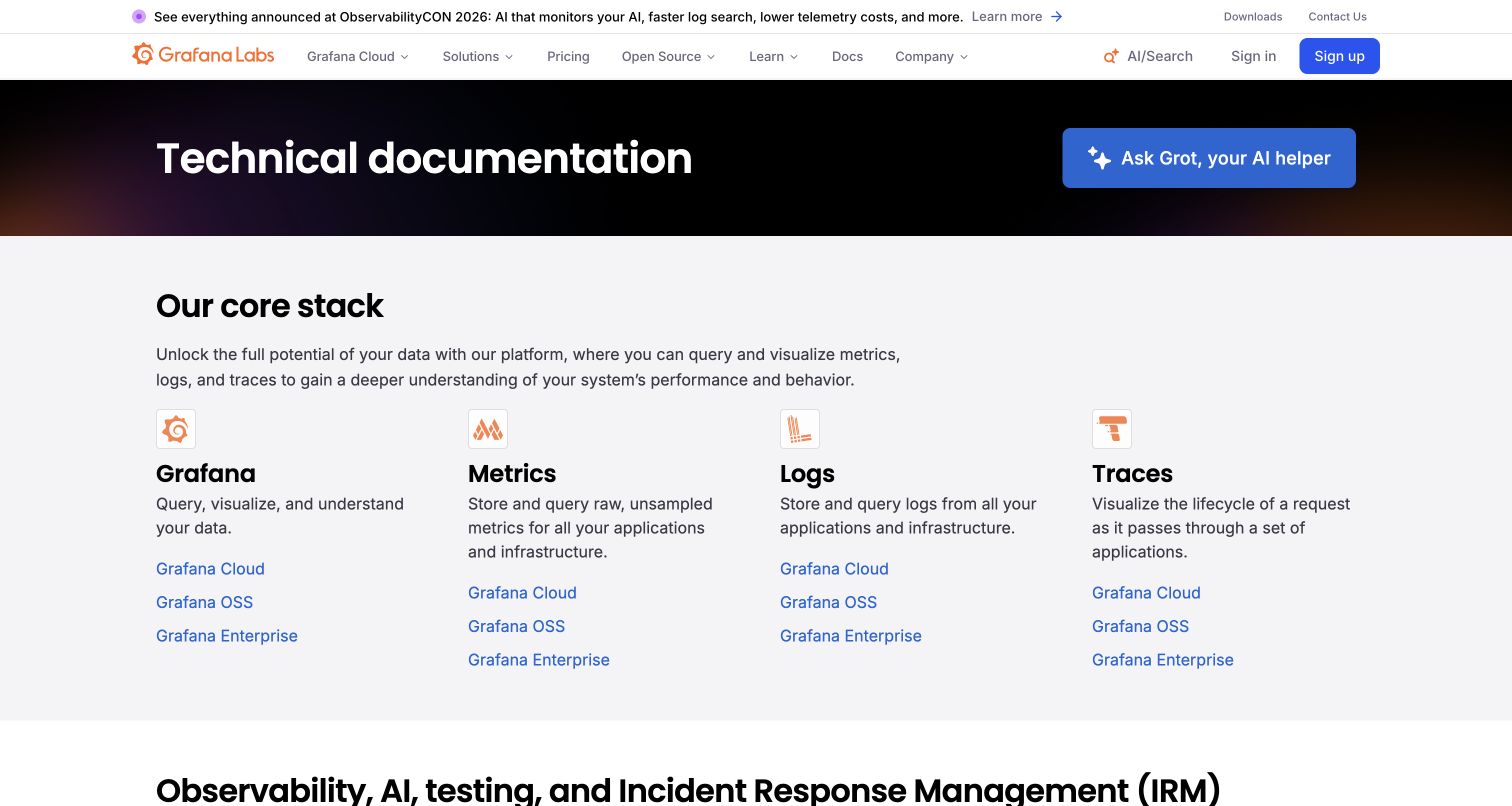
Grafana's documentation page introduces its core stack through four labeled columns for visualization, metrics, logs, and traces. Each includes related cloud, open-source, or enterprise routes. The AI-help action is visibly separate from the ordinary directory. The Nginx observation concerns the public documentation response and does not establish the architecture of Grafana dashboards or a customer's monitoring environment.
What you can learn
Give product and version routes explicit ownership before reorganizing the documentation tree. Preserve supported-version links and redirect only when an equivalent destination exists. Search pages, static reference assets, and downloadable examples should have intentional cache behavior. Keep the conventional directory useful when an optional assistant is unavailable, and ensure an apparently successful response is not silently serving the wrong product version after a release.
Pros
The four-column directory makes the product relationships understandable before a query.
The assistant control does not replace the conventional documentation entrances.
Cons & considerations
A versioned documentation estate needs more precise redirects than a marketing site.
Cloud, open-source, and enterprise links need precise labels for readers comparing similar product names.
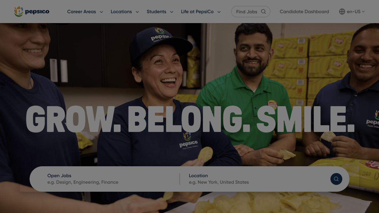
PepsiCo Careers combines an employee photograph and a large employer statement with a two-part role and location search. Career areas, locations, student information, and company-life routes remain in the header. A candidate dashboard is a separate utility. The response reported Nginx, but the observation does not describe the applicant-tracking system or prove that the job-search component and every page share one architecture.
What you can learn
Document the handoff from public job discovery to candidate authentication before writing delivery rules. Preserve role and location context in useful public links, but do not cache candidate-specific responses as campaign content. Plan clear behavior for expired job URLs and an unavailable search provider. Test with fictional development data only, and keep application details outside public assets and generic diagnostic logs.
Pros
Role and location are distinct fields within the main discovery surface.
Employer storytelling and candidate-account access have recognizable separate roles.
Cons & considerations
Expired vacancies require deliberate public-page and redirect behavior.
Role and location context should survive the handoff into an individual vacancy or candidate destination.
Choose the delivery responsibility you actually need
Use a managed delivery layer when it fits the operating model
If a hosting provider already maintains the serving and proxy layer, clarify what the team can configure and what requires provider support. Ask for a documented route and deployment workflow. Operating a separate server only to resemble a reference site creates another responsibility without necessarily solving a visitor problem.
Serve a static publication with explicit route behavior
For a generated content site, plan nested paths, redirects, missing pages, downloads, and immutable asset names together. Verify the deployed artifact rather than only a development preview. Keep a previous working artifact available so that recovery is a release operation rather than a hurried edit on the running server.
Proxy an application with visible ownership boundaries
Map public page routes, application endpoints, and external handoffs separately. Specify which service owns authentication, request validation, and meaningful errors. Keep operational diagnostics out of public responses and give maintainers enough context to distinguish an application failure from a delivery-layer failure.
From references to requirements
Turn navigation and publishing requirements into release tests
Create a route and redirect inventory
Include bookmarked content, alternate hostnames, trailing-slash behavior, campaign URLs, files, and deliberately missing paths. Record intended destinations and response types. Test the inventory against the actual staged deployment after configuration changes instead of relying on the CMS preview.
Separate content freshness from asset reuse
Decide how a corrected article or changed service detail becomes visible while versioned images and scripts can be reused. Treat authenticated and personalized content as a different class of response. Verify observed behavior with the actual application and delivery configuration; a generic copied cache rule is not an acceptance plan.
Assign a release and recovery owner
Document configuration review, validation, deployment permissions, health checks, and the route back to a known working release. Rehearse recovery with the people who operate the site. Avoid making the designer the only person who knows which service, certificate, or hostname is involved.
A useful handover demonstration
Ask the actual team to carry out its routine job: publish a realistic update, correct a mistake, preview a narrow screen, and identify who owns an integration failure. For a library or frontend framework, also ask who maintains the content source and deployment. A polished screenshot does not answer those operational questions.
Beyond the screenshot
Nginx website delivery checklist
Map static files, public pages, application routes, and service handoffs.
Request deep links and old URLs directly, not only through homepage navigation.
Check intended canonical-host and redirect behavior without redirect loops.
Verify real missing-page and upstream-failure responses.
Review content freshness and private-response handling with the operating team.
Check that diagnostic responses expose no credentials or internal configuration.
Validate the deployed release artifact and its linked assets.
Document configuration ownership, health checks, and a tested recovery procedure.
Test with real content, a keyboard, a small screen, slow or failed requests, and the people who will maintain the system. These are planning checks, not an accessibility, security, performance, or search-ranking certification.
Sources & editorial method
How this Nginx collection was reviewed
The target association is a reported Nginx response signal from the named public property, with the observation date retained in the shared evidence record. We did not inspect private server configuration or certify the accuracy of self-reported headers. Direct captures support the interface reviews, not a performance benchmark or a reconstruction of the network architecture.
Every image is an unmodified capture from the actual website, with its source and capture date. Some captures are reused from our shared catalog; their dates remain the original capture dates. None comes from a vendor gallery or a generated reconstruction. Moving imagery and live content can change.
Technology attribution uses public page assets or metadata, official platform documentation, or a cited first-party project case study. Documentary and framework-relationship evidence is identified where used; it is not a complete current backend inventory. A CMS image CDN alone does not establish a full CMS deployment. A library’s presence does not prove which individual controls use it, and a platform label does not establish AI authorship.
The composition notes, lessons, pros and tradeoffs are original editorial observations. We have not measured conversion, traffic, security, performance or accessibility conformance. Website owners retain their brands and imagery; these examples are not our client portfolio. Written, Edited and Curated are independent records, not dates advanced by a build. See our editorial standards or suggest a correction.
Questions worth asking
Nginx website development FAQs
Is Nginx responsible for the website’s design?
No. It is part of serving or forwarding requests. The visual interface and content may come from a separate CMS, application, or generated artifact. Those layers require their own evidence.
Does a Server header reveal the whole infrastructure?
No. Headers can be changed, suppressed, or added by an intermediary. The guide treats a reported Nginx value as a scoped observation, not an inventory of servers or internal applications.
Do I need to run my own Nginx server?
Not automatically. Compare the needs of your application and the responsibilities your team can support with a managed provider’s offering. A famous organization’s public signal does not establish the right operating model for your site.
Are the reference configurations available here?
No. We have not accessed private configuration. Use the official documentation and your own tested requirements rather than trying to reconstruct settings from a screenshot or header.