An aquarium website needs to explain more than what is behind the glass. Visitors need to understand admission, timed entry, presentations, optional encounters and the practical limits that shape their day.
Aquarium homepages often begin with remarkable animal imagery, but the visitor's decision depends on specific information: which location to choose, what the ticket includes, when entry closes and whether a special experience needs another reservation. A strong design lets that practical information coexist with the institution's educational purpose.
These seventeen official website examples range from quiet animal portraits to product comparisons, daily schedules and a gateway for several destinations. The reviews focus on observed design and content choices. They do not assess animal care, scientific results, ticketing performance or complete accessibility. Prices, campaigns and operating details in the captures are dated observations rather than current visitor advice.
Before the examples
What makes good aquarium website design in 2026?
Make the admission model understandable
Distinguish buying a ticket from reserving a time when those are separate tasks. Explain what general admission includes and label optional encounters, films, tours or evening events clearly. Show age and participation conditions beside the relevant product rather than expecting visitors to discover them after starting checkout.
Publish useful operational details
State hours, last entry, presentation schedules and habitat notices with their dates. For multiple buildings or locations, explain the scope of the ticket and preserve the selected destination. Link practical arrival, parking, transit and accessibility information from the same planning area.
Connect animal interest with meaningful learning
Give species, habitats, rescue work and conservation projects clear destinations beyond the hero photograph. Use approved factual content and distinguish the institution's work from general information about a species. Avoid treating a promotional image as a guarantee of animal visibility or a particular encounter.
The collection · 17 examples
17 aquarium websites worth studying
Compare how these sites move from aquatic imagery to actual planning tasks. Look for explicit entry limits, included experiences, separate reservation paths, location selection and useful explanations of education or conservation work.
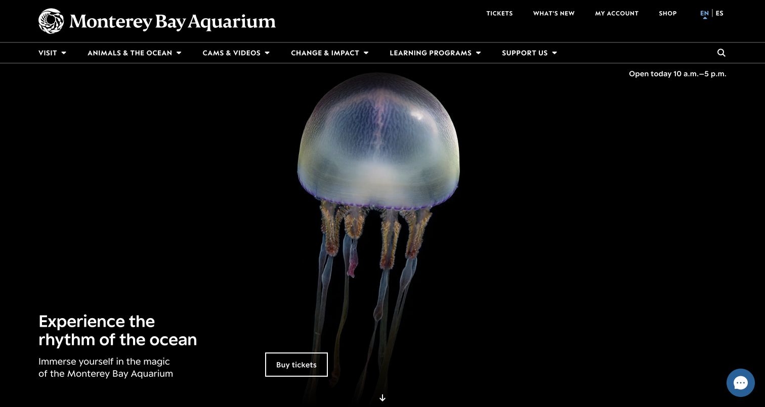
Monterey Bay Aquarium gives almost the entire opening view to luminous jellyfish against a dark background. A small invitation to experience the ocean and an outlined Buy Tickets action sit near the lower left, leaving the animals as the main subject. The white upper navigation separates visiting, ocean life, cameras and videos, learning, impact and support. Today’s hours remain visible near the top rather than being embedded in the campaign. This is a deliberately quiet opening compared with a page filled with simultaneous promotions.
What you can learn
Use exceptional animal imagery to establish interest, then keep timing and admission controls independent of that image. A minimal hero works best when the next planning page answers practical questions clearly and when the same invitation survives unavailable or paused media.
Pros
The dark animal composition provides a distinctive visual identity with little competing campaign text.
Hours and navigation remain outside the large media area, supporting visitors with a specific task.
Cons & considerations
The immersive opening postpones detailed pricing, access and arrival information until further navigation.
A large animated or photographic hero needs deliberate loading, fallback and reduced-motion behavior.
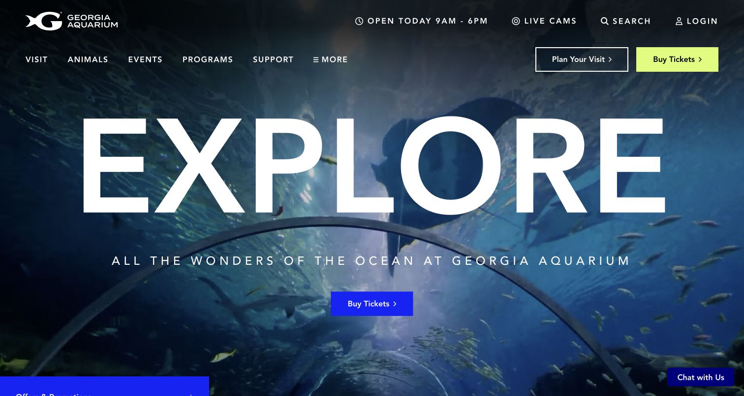
Georgia Aquarium sets an enormous Explore heading over a photograph of its underwater tunnel. The permanent header offers both Plan Your Visit and Buy Tickets, with current hours, live cameras, search and account access above the main categories. The observed navigation distinguishes gallery information, encounters, presentations and practical visitor guidance. A promotional panel initially expanded over the lower left of the hero; the saved view follows its collapse. That behavior shows the tension between a strong, simple opening composition and additional event marketing.
What you can learn
Keep planning and purchasing as two clearly named routes, especially where encounters, presentations and admission have different requirements. Limit automatic promotions to a small footprint so the destination photograph and main actions can still communicate the ordinary visit without interruption.
Pros
The paired planning and ticket buttons acknowledge that some visitors need information before choosing admission.
The visit navigation explicitly exposes parking, accessibility, maps and daily schedules.
Cons & considerations
The expanding offers panel can obscure the headline and compete with the principal ticket action.
Very large typography consumes space that could otherwise explain visit scope or important entry conditions.
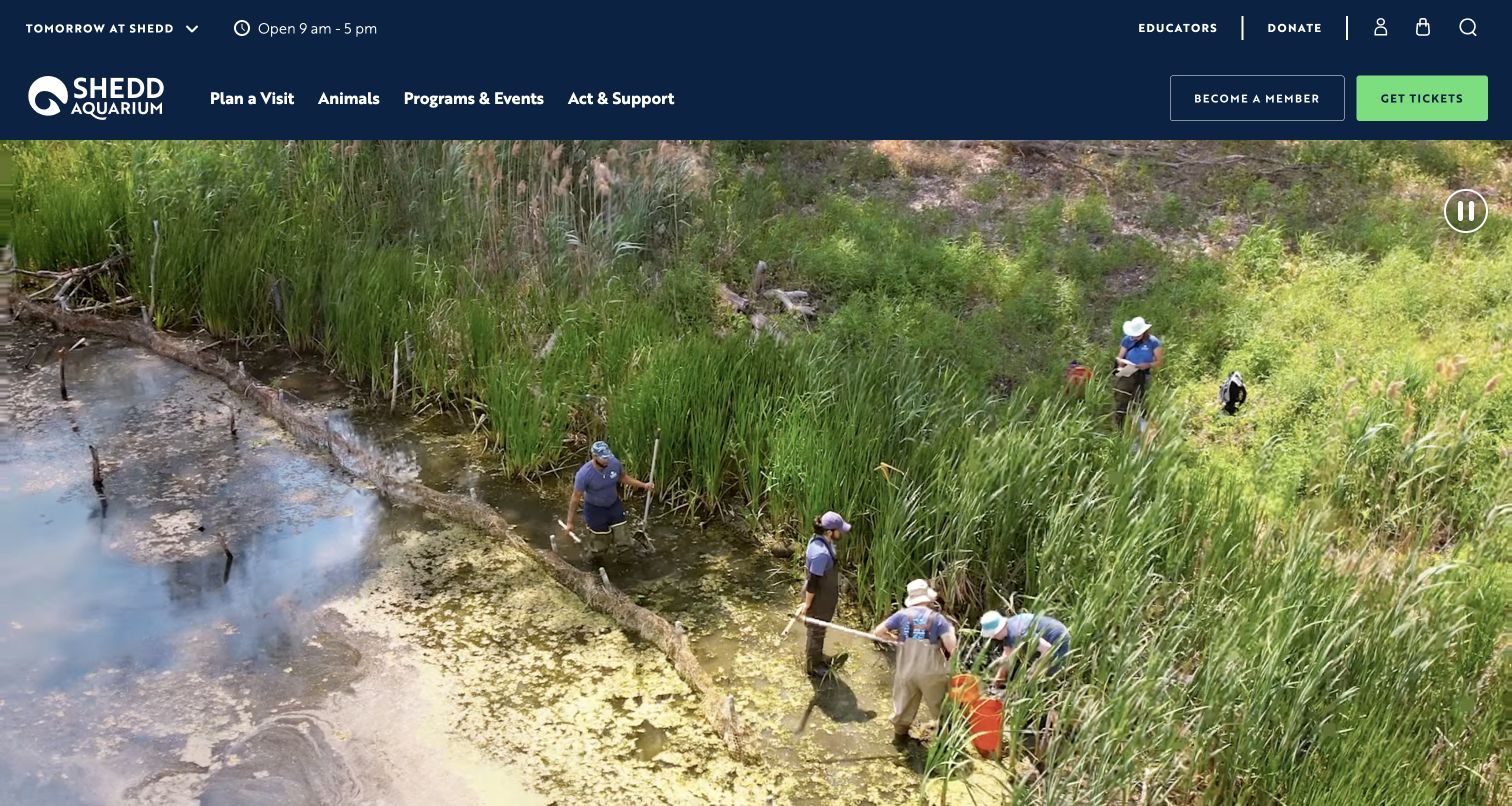
Shedd Aquarium uses its For Love of Waterkind message to connect the attraction with the wider world of water. The reviewed media included people working in a wetland, broadening the visual story beyond animals behind glass. The navigation separates visit planning, animals, programmes and events, and action or support. A utility area identifies the relevant day’s hours, while the page continues into visiting information and a dated upcoming programme such as a beluga rescue chat. The institution’s purpose and the visitor’s immediate schedule sit within the same homepage sequence.
What you can learn
Show conservation work in context rather than limiting the brand to exhibit footage. Keep the visitor date explicit and distinguish daily programming from longer-term mission stories so an inspiring homepage also supports a realistic plan for the day someone intends to attend.
Pros
The media connects animal interest with real environments and the people involved in their care.
Upcoming programme content gives visitors a concrete continuation beyond the broad mission statement.
Cons & considerations
A mission-led opening needs a readily visible route to prices and admission arrangements.
Day-specific schedules require consistent date handling so tomorrow’s information is not mistaken for today’s.
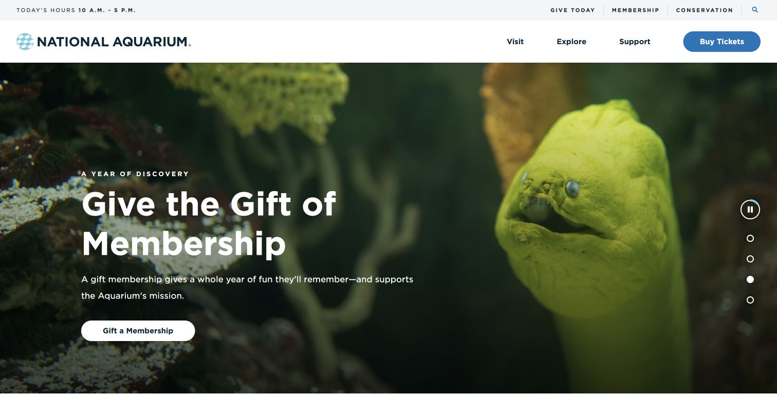
The National Aquarium keeps its main navigation compact with Visit, Explore and Support, followed by a blue Buy Tickets button. Hours appear in a separate upper strip alongside membership, giving and conservation. The saved carousel view presents a gift-membership campaign over an eel photograph, with a specific Gift a Membership action. Other observed slides address planning and tours. The campaign area supplies personality and seasonal relevance while the header preserves an uncomplicated route to an ordinary visit.
What you can learn
Give each campaign an action that names its actual product, such as gift membership or a tour. Maintain the everyday admission route outside the carousel, since a visitor arriving on the membership slide should still understand how to plan a single visit without waiting for another message.
Pros
The short top-level menu reduces the initial number of choices without hiding the ticket action.
The membership slide uses a product-specific action and explains the continuing relationship it offers.
Cons & considerations
Rotating campaigns may hide information from visitors who leave the opening screen quickly.
A large photograph and multiline headline require contrast and crop checks at smaller widths.
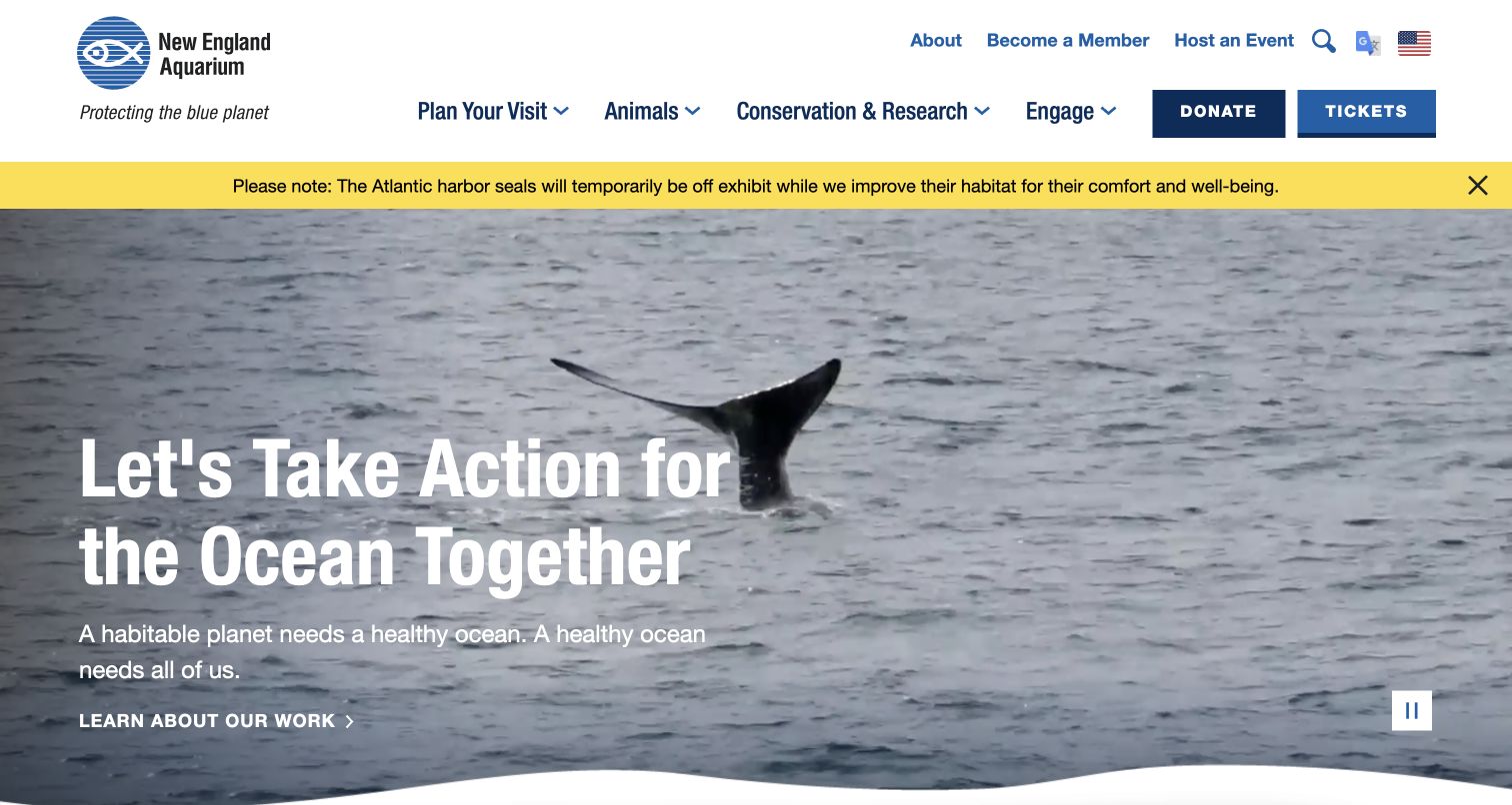
New England Aquarium opens with ocean footage and a call to act for the ocean together. Its navigation gives conservation and research their own category beside animals and visit planning. Above the hero, a yellow notice explains that Atlantic harbor seals are temporarily off exhibit while their habitat receives improvements. Tickets and donations remain distinct actions in the white header. The opening therefore combines an ambitious institutional purpose with a specific limitation that can affect a visitor’s expectations before arrival.
What you can learn
Keep exhibit availability close to the main invitation rather than burying it in a frequently asked questions page. Name the affected habitat or species and explain the nature of the change, while directing mission-minded readers toward substantive research and conservation information.
Pros
The habitat notice gives a concrete reason for an animal-viewing limitation instead of a vague service warning.
Research and conservation have a recognizable navigation destination separate from general visitor content.
Cons & considerations
The broad action-for-the-ocean headline does not by itself explain the on-site visitor experience.
Several header layers can consume valuable vertical space on a short or narrow display.
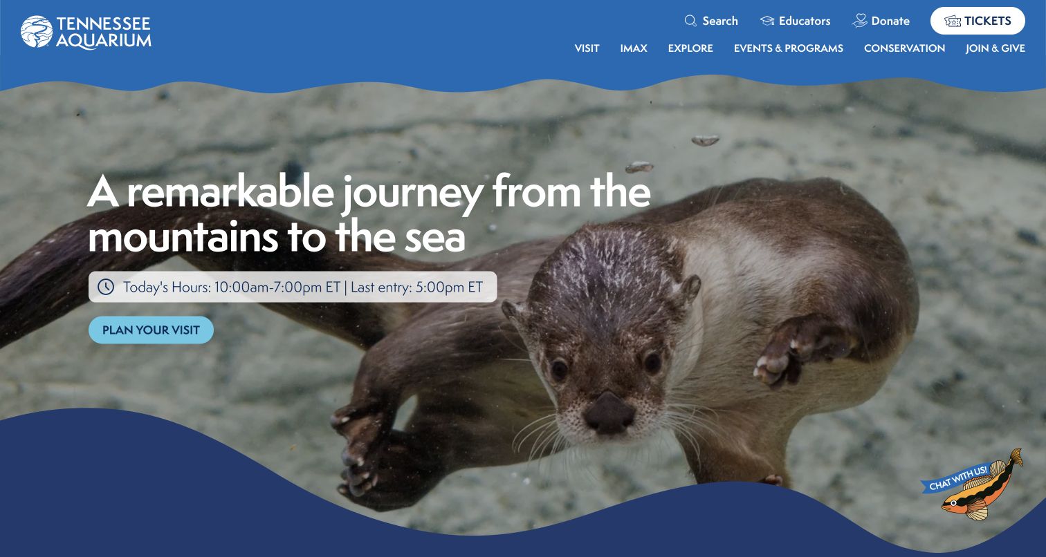
Tennessee Aquarium frames the visit as a journey from the mountains to the sea. Otter imagery and a wavy blue edge establish the opening, but today’s hours and the final entry time appear directly below the headline rather than only in a utility menu. The following section states Two Buildings, One Ticket and introduces River Journey and Ocean Journey as distinct parts of the experience. IMAX has its own navigation route. The page helps visitors understand the physical scope of admission while sustaining a coherent freshwater-to-ocean story.
What you can learn
Explain what one ticket includes before promoting extras. A multi-building destination should connect its narrative to practical facts such as entry cutoffs, walking routes and separate cinema arrangements, so visitors can estimate time and choose the right product without guessing.
Pros
The ticket-scope statement immediately resolves whether the two main buildings require separate admission.
The final-entry time is placed close to the main visit invitation and current hours.
Cons & considerations
Visitors still need an itinerary or duration estimate to understand how to divide time between buildings.
Cinema and special programmes require clear inclusion labels to avoid confusion with the main ticket.
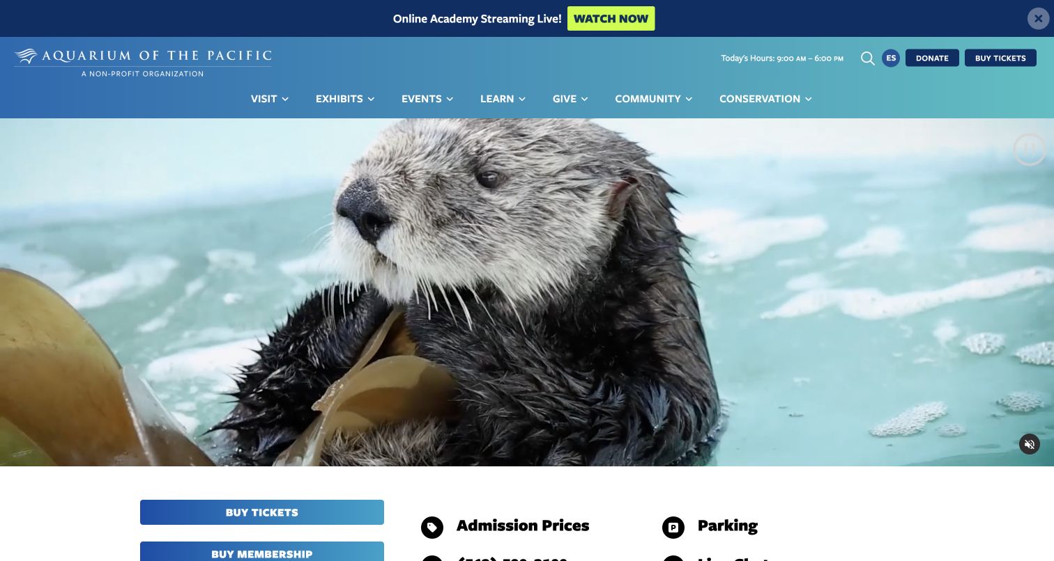
Aquarium of the Pacific places a live online-academy notice above its conventional visit navigation, giving remote education a visible route without replacing the main ticket action. The opening media features aquatic animals, while today’s hours, language selection, donations and Buy Tickets remain in the header. The page continues into ticket and membership choices with practical admission and parking information. Its navigation also names learning, community and conservation, reflecting an institution whose website serves audiences beyond people buying a ticket for the same day.
What you can learn
Separate remote learning from in-person attendance with explicit labels and destinations. Keep ordinary trip preparation near the purchase decision, and make streaming schedules or programme availability clear so an online invitation does not imply that every educational activity is part of admission.
Pros
The live-learning notice identifies a distinct audience and task without hiding the regular ticket route.
Admission and parking information provide a practical follow-up to the animal-led opening.
Cons & considerations
Multiple audience routes increase the need for concise navigation labels and consistent page hierarchy.
Live banners need reliable start and expiry controls so they do not advertise a stream after it ends.
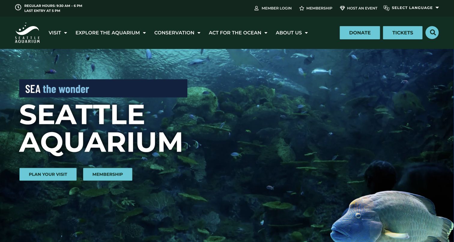
Seattle Aquarium overlays its name and a short sea-themed invitation on an underwater habitat photograph. A dark green header sets the brand apart from more conventional bright-blue aquarium sites. The utility row gives regular hours and a separate last-entry time, alongside membership, member login and language access. Plan Your Visit and Membership sit in the hero, while Donate and Tickets remain conspicuous in the navigation. The design makes ongoing membership, a first visit and financial support visibly different intentions.
What you can learn
Give arrival cutoffs the same prominence as closing time, particularly when guests may travel across a city to reach the venue. Use the hero for a small number of clear choices, then let planning pages explain transit, site layout and the time needed for the experience.
Pros
The hours presentation distinguishes the latest entry from the end of the operating day.
Membership and single-visit actions are separated in both the hero and the surrounding navigation.
Cons & considerations
The photograph-led opening offers limited immediate detail about ticket scope or visit duration.
Text over changing media needs consistent contrast and a reliable still-image fallback.
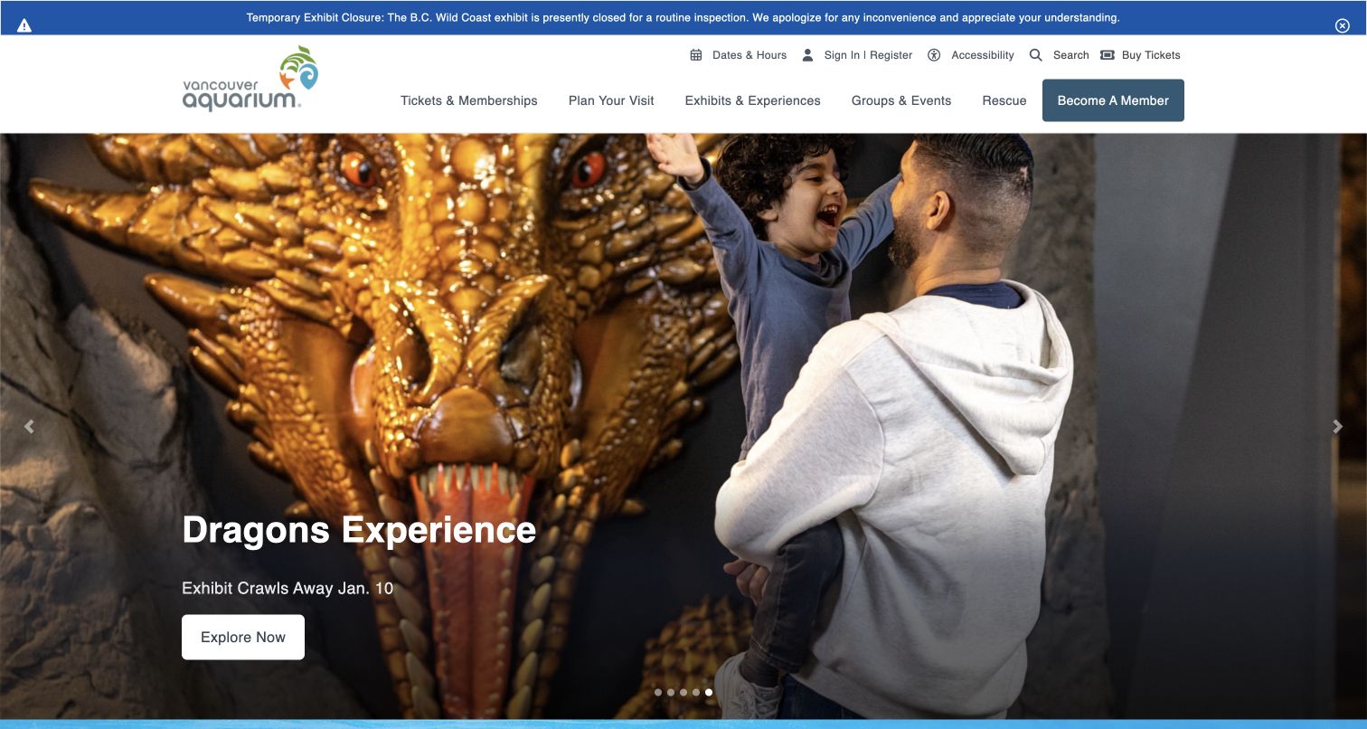
Vancouver Aquarium places a prominent blue notice about a temporary B.C. Wild Coast closure above its white navigation. The saved hero promotes a dragon-themed experience with a family photograph, an ending date and an Explore Now action. Tickets and memberships, visit planning, exhibits, groups and rescue information remain separate categories. The page demonstrates how a temporary attraction can become the main promotional story while a more practical habitat notice remains visible before the visitor reaches the campaign.
What you can learn
Treat operational limitations and special-experience timing as structured facts with clear owners. A temporary campaign should state its end date and explain its admission relationship on the destination page, while a closure notice should identify exactly which area of the normal visit is affected.
Pros
The closure message names a specific habitat area and the reason for the interruption.
The temporary-experience campaign includes an end date, making its availability less ambiguous.
Cons & considerations
A fantasy-themed headline can overshadow the aquarium’s regular animal and conservation offer.
The combination of utility controls, alert and broad menu needs careful mobile prioritization.
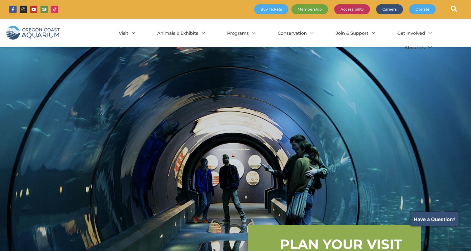
Oregon Coast Aquarium introduces the destination with a large walk-through tunnel photograph and a green Plan Your Visit panel. A yellow utility strip includes tickets, membership, accessibility and donations, while the main navigation covers visiting, exhibits, programmes and conservation. The page’s follow-up content distinguishes general admission from behind-the-scenes tours and animal encounters, including stated age requirements for some experiences. Parking information is also explicit. The page is useful for studying how an emotional first image can lead into decisions with different eligibility and inclusion rules.
What you can learn
Put experience conditions beside the product, including age limits, ticket inclusions and parking arrangements. Preserve a straightforward general-admission route so optional encounters enrich the visit without making the basic purchase harder to understand or forcing visitors to compare unrelated products.
Pros
Admission and optional experiences are described as different choices with practical conditions.
Accessibility is given a utility-level link rather than being confined to the bottom of the page.
Cons & considerations
The broad desktop menu wrapped at the observed width, indicating a need for responsive spacing checks.
A long list of offers can overwhelm readers unless the basic admission choice stays clearly prioritized.
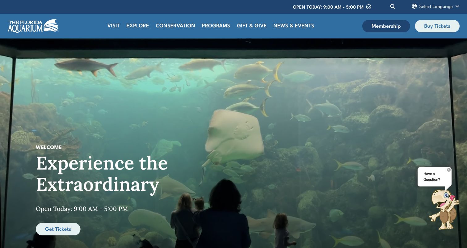
The Florida Aquarium pairs a large viewing-window image with the Experience the Extraordinary headline and a prominent Get Tickets action. Current hours appear both in the upper utility area and beside the hero invitation, making timing difficult to miss. The blue header separates visiting, exploring, conservation, programmes and giving, with membership and ticket purchase set apart. A small chat control remains in the lower corner. The composition lets the animal-viewing scene establish appeal while the practical next step is clearly repeated.
What you can learn
Repeat a critical fact only when both placements draw from the same maintained source. Clear hours near the admission action are helpful, but duplicate text should not become contradictory after seasonal changes; support widgets should remain small enough to leave those controls accessible.
Pros
Hours are visible next to the main invitation as well as in the utility header.
The photograph shows the visitor’s relationship to the habitat rather than presenting an isolated animal cutout.
Cons & considerations
A floating chat control can compete with lower-page actions on smaller screens.
The broad hero promise needs supporting detail about exhibits, inclusions and entry conditions on planning pages.
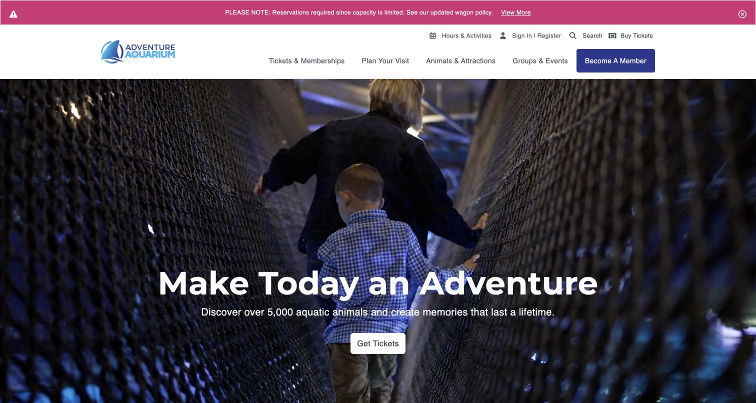
Adventure Aquarium opens with children crossing a rope bridge above the water, showing a physical activity rather than only a tank portrait. A pink notice states that reservations are required and points to an updated wagon policy. Below the hero, the observed page compares general admission, an admission bundle and annual membership, using starting prices and short inclusion lists. It separately explains the last-entry rule and the venue’s largely cashless operation. This makes the homepage a meaningful product-comparison surface as well as a promotional introduction.
What you can learn
Compare products using the same fields: duration, price basis and inclusions. Explain reservation requirements before purchase, and distinguish optional memory-making items from the underlying aquarium admission so a bundle does not imply that ordinary visitors miss the main exhibits.
Pros
The product cards identify what is added to basic admission rather than relying only on a higher price.
Reservation and payment-policy information are visible within the same visit-planning journey.
Cons & considerations
Starting prices require a clear calendar and full total before a visitor commits to a date.
A broad range of bundles, discounts and offers can lengthen the page and obscure the basic choice.
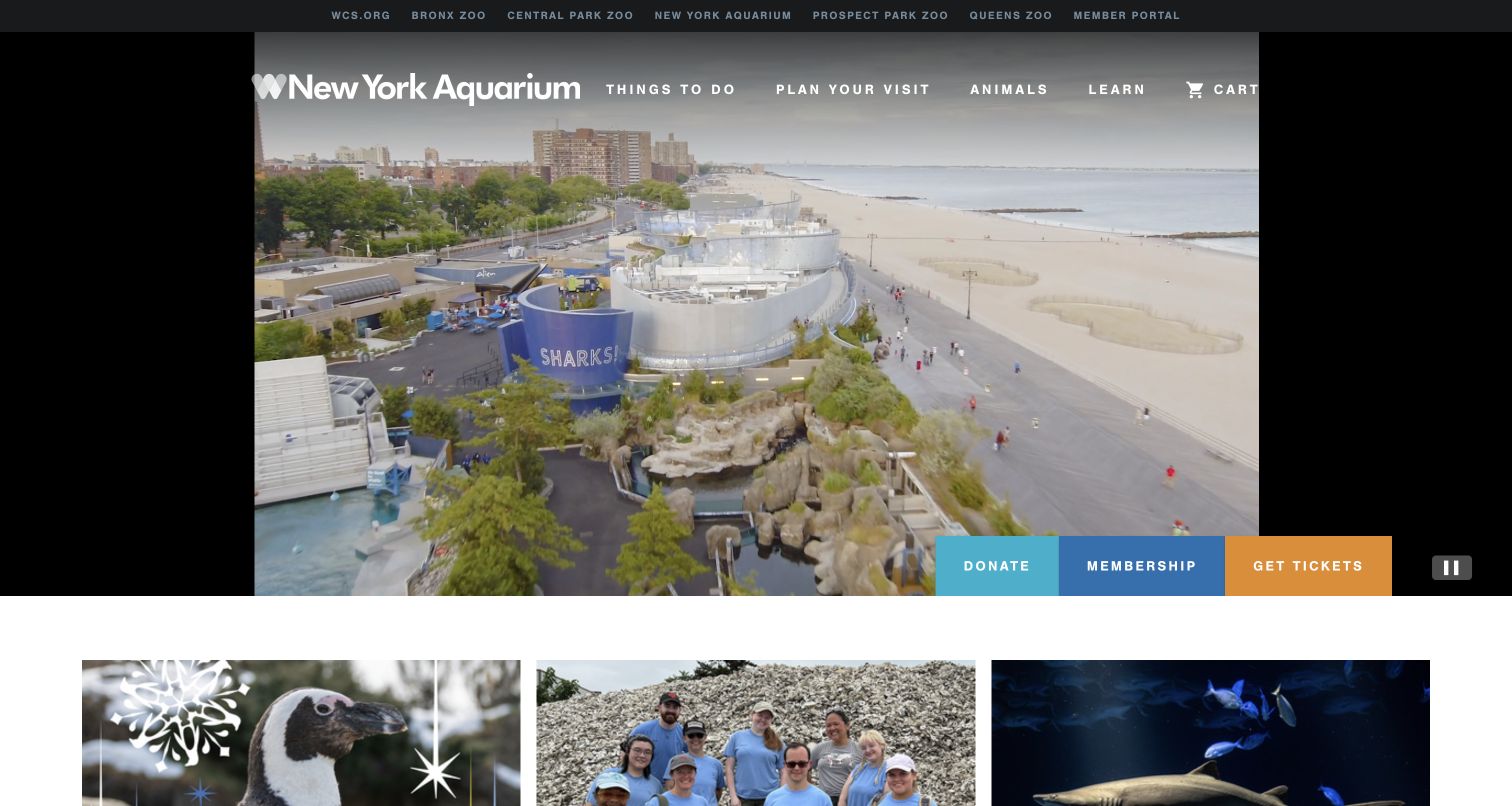
New York Aquarium uses aerial waterfront footage to establish its Coney Island setting, with Donate, Membership and Get Tickets grouped along the bottom of the media. Its main navigation names things to do, planning, animals and learning. Farther down, a Today at the Park table lists opening, presentation times, last entry and closing, with a link to the full dated schedule. Seasonal events, children’s programmes and live cameras add other entry points. The layout connects the physical setting with a more exact account of what a visitor can do during the day.
What you can learn
Use the daily schedule as structured information rather than a decorative event list. Show opening, last entry and closing separately, attach the date, and connect each presentation to its own details so visitors can build a plan without mistaking recurring examples for guaranteed availability.
Pros
The schedule makes the relationship between presentations and arrival cutoffs easy to inspect.
The waterfront footage supplies location context that a close animal image alone would not convey.
Cons & considerations
The broad media opening postpones detailed planning until the visitor continues down the page.
Multiple education and seasonal promotions need clear labels for dates, age groups and admission requirements.
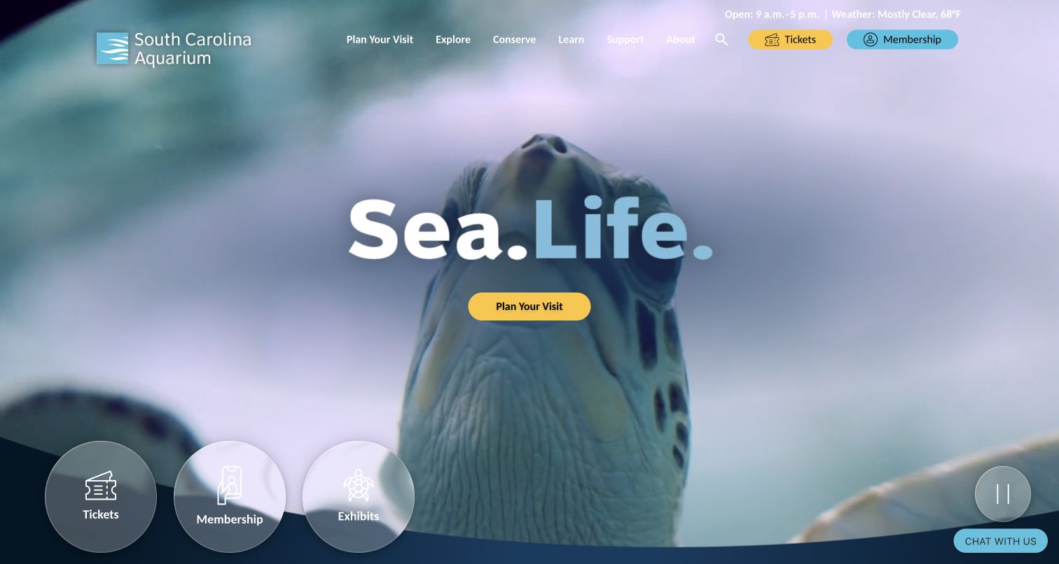
South Carolina Aquarium puts a concise Sea Life message over close aquatic footage, with a yellow Plan Your Visit action. Three circular shortcuts lead to tickets, membership and exhibits, while current hours and weather appear in the upper utility area. The page continues into featured experiences and a dated event carousel, including classes, coastal activities and conservation work. The opening stays simple even though the institution’s calendar serves audiences with very different purposes and age ranges.
What you can learn
Give the first screen one clear invitation, then use event cards to explain the broader programme precisely. Each card should identify its date, setting and participation conditions, especially when an off-site conservation activity or class differs from the ordinary aquarium visit.
Pros
The three hero shortcuts separate admission, ongoing membership and exhibit discovery.
Dated event cards connect the institution with learning and conservation beyond its building.
Cons & considerations
White navigation text over light areas of the moving background needs careful contrast testing.
An event carousel must distinguish past, sold-out and available activities without relying on color alone.
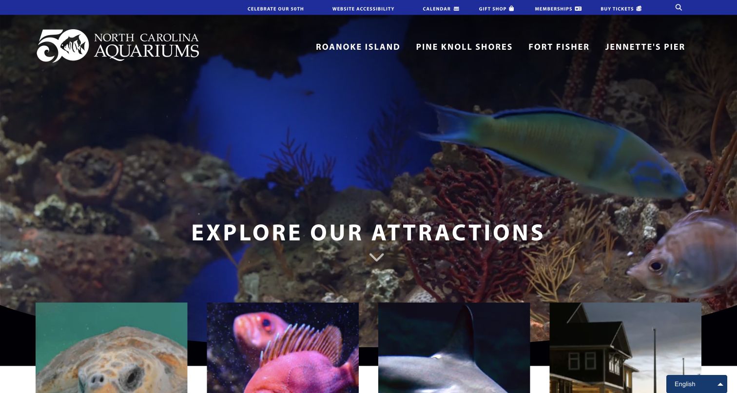
North Carolina Aquariums makes its four destinations the primary navigation: Roanoke Island, Pine Knoll Shores, Fort Fisher and Jennette’s Pier. A fish-filled hero invites visitors to explore, with corresponding location cards beginning immediately below. The utility bar includes shared ticket, membership, calendar and accessibility routes. Anniversary content provides an institutional story, while event listings identify the associated location. This is a useful alternative to pretending that a multi-site organization has one universal set of hours, attractions or admission details.
What you can learn
Ask visitors to identify their destination before showing location-dependent logistics. Shared branding and membership can remain centralized, but ticket flows, event cards and operational notices should carry the selected venue clearly so users do not reserve for or travel to the wrong place.
Pros
The main navigation is organized around the physical destinations that determine the rest of the visit.
Event listings include location context instead of assuming all programmes occur at one aquarium.
Cons & considerations
A shared Buy Tickets route must preserve destination selection clearly through the reservation process.
Large multi-level location menus require disciplined keyboard and mobile navigation behavior.
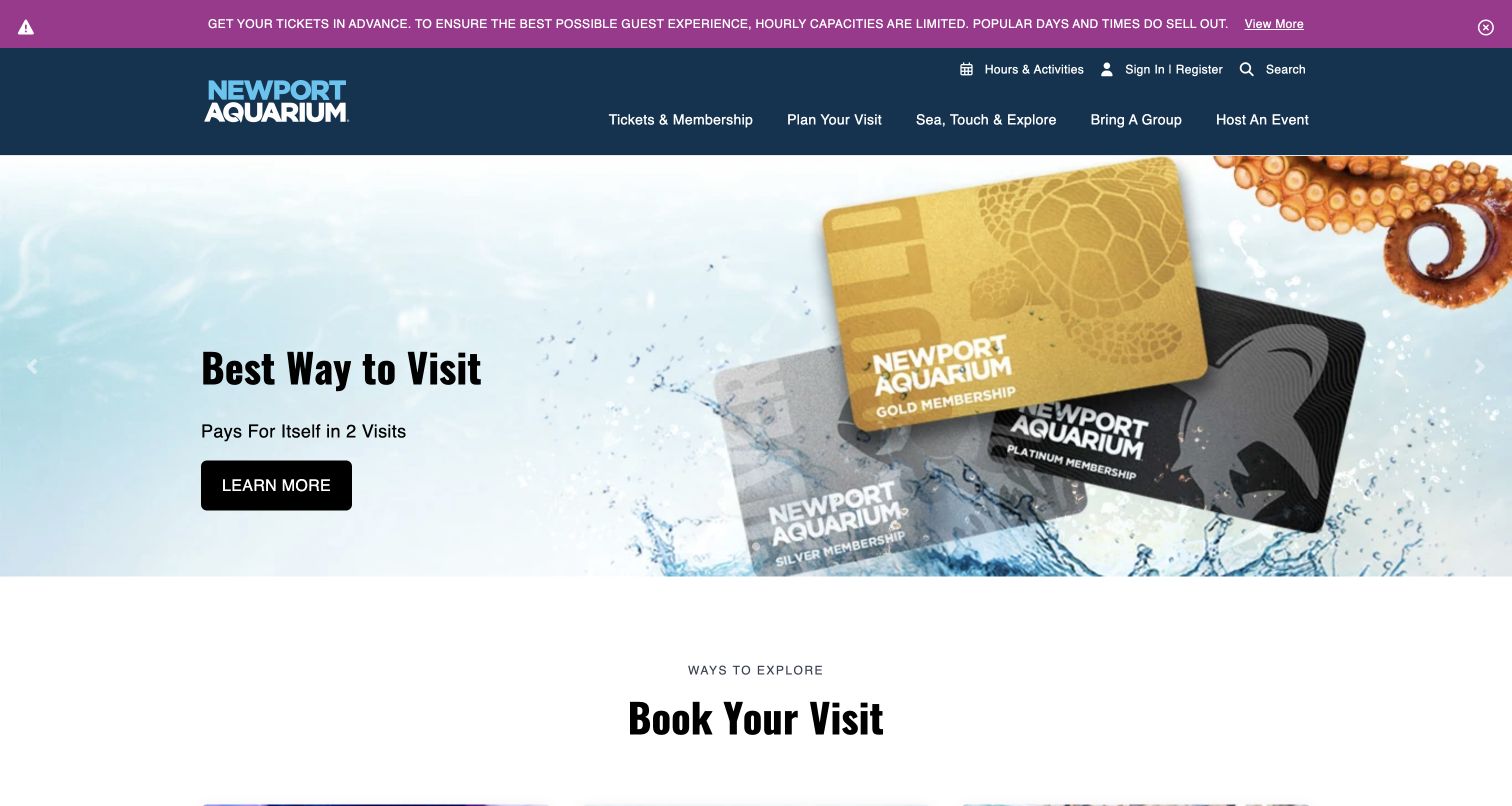
Newport Aquarium opens with a membership campaign, while a prominent notice explains limited hourly capacity and encourages advance tickets. Below, Book Your Visit separates three tasks: buying tickets, exploring membership and reserving a slot for an annual pass or an eligible undated or third-party ticket. Additional content explains cashless payment arrangements and a distinct adults-only seasonal event. This structure acknowledges that a visitor may already hold admission and only need the reservation step, rather than being forced through a new purchase path.
What you can learn
Separate the acquisition of admission from the reservation of a time slot whenever those are different tasks. Explain who should use each route and repeat the capacity rule at the relevant handoff, reducing the chance that passholders or voucher holders buy something they already have.
Pros
The reservation card explicitly identifies the ticket holders and members it serves.
Capacity and cashless-payment information address common sources of arrival-day confusion.
Cons & considerations
The membership hero may be less immediately useful to someone seeking a single dated visit.
Several similar booking labels need consistent wording across the homepage, admission pages and external checkout.
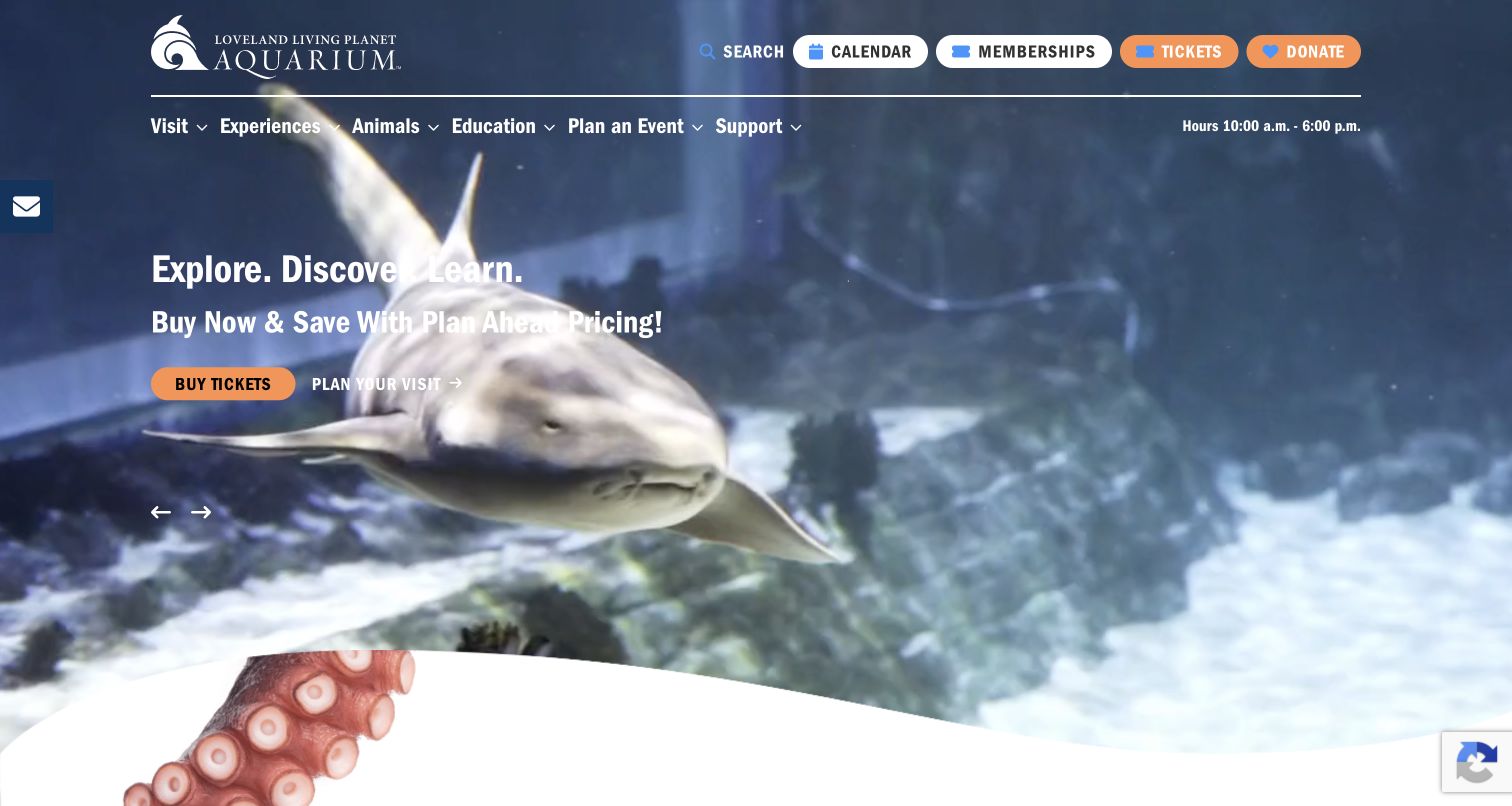
Loveland Living Planet Aquarium promotes planning ahead in its general-visit slide and a lantern festival in another observed campaign. The saved view uses a close shark image, an orange Buy Tickets button and a separate Plan Your Visit link. Below the hero, the page identifies daytime tickets, explains that prices vary with demand and lists discounts and age categories. It also presents membership, directions and different Monday versus other-day hours. The campaign system connects seasonal activity with a detailed practical follow-up.
What you can learn
Name the time-of-day product at the point of selection when daytime admission and evening events coexist. Explain how date-based pricing works without making the promotional starting price seem universal, and keep hours exceptions close to the practical booking information.
Pros
The follow-up content labels daytime tickets explicitly and explains the pricing basis.
Different operating patterns across the week are stated in the practical information section.
Cons & considerations
White text crosses bright areas of the animal footage, so contrast needs testing across video frames.
An identical Buy Tickets label can lead to different products in a rotating campaign and needs clear context.
Plan an aquarium website around the decisions visitors make
Map products before arranging navigation
List general admission, membership, time-slot reservations, school visits, encounters and special events. Identify which can be combined and which have separate conditions. Give each route a name that describes the visitor's task, then use consistent terminology across the website and external booking systems.
Build structured hours and programme records
Manage ordinary hours, last entry, closures and dated activities as reusable content with effective dates and responsible editors. Let the homepage, visit hub and calendar read from those records. An event card should identify its location, audience, availability and relationship to ordinary admission.
Treat video as an enhancement to clear content
Choose media that explains the destination without carrying essential facts by itself. Retain readable text, a meaningful still image and usable controls when video is paused or unavailable. Check contrast across changing frames, and keep chat, consent and promotional panels from covering the main actions.
Test distinct visitor journeys
Review a first-time ticket purchase path, a member reserving entry, a teacher researching a group visit and someone planning around access needs. Verify the selected date, location and product at each handoff without submitting real bookings or payments. Include narrow screens, keyboard navigation and failed-media conditions.
The editing job behind the design
Choose a publishing system that keeps visitor information dependable
Aquarium content needs both editorial storytelling and reliable operational updates. Prioritize structured records for hours, exhibits, programmes and notices, with clear ownership and expiry controls. Publicly observed website software does not reveal internal animal-care systems, membership databases or the full ticketing architecture.
Keep reservation, ticketing and membership handoffs consistent with the main site's language. Explain when a separate system opens and preserve the selected product where supported. Important planning information should remain available when optional analytics, chat, video or campaign scripts do not load.
Our WordPress website examples offer a separate look at publishing approaches. A visible platform label is evidence for that named page, not a guarantee that the same system will suit your requirements.
Before the public launch
Aquarium website planning checklist
Show opening, last-entry and closing times as distinct facts.
Explain which buildings, locations and experiences general admission covers.
Separate buying admission from reserving an existing pass or voucher.
Label daytime admission and evening-event tickets explicitly.
Place encounter age limits and participation conditions beside the offer.
Date habitat notices and remove them when the limitation ends.
Give daily presentations and events a location and relevant calendar date.
Provide clear arrival, parking, transit, map and accessibility information.
Keep educational and conservation content connected to specific supporting material.
Test booking handoffs without creating real reservations or transmitting personal information.
These checks are a project checklist, not a performance, legal, security, or accessibility certification. Test real journeys with the people responsible for the website before making claims about the result.
Sources & editorial method
How this collection was selected and reviewed
Each example was inspected on its official public website and captured directly in the browser. Reviews analyze the observed navigation, visual hierarchy and visitor-planning content. Seventeen distinct website properties were selected; North Carolina Aquariums is reviewed as one multi-location property. Two additional candidates, Clearwater Marine Aquarium and Mystic Aquarium, were excluded because an expanded blank chat panel obscured the capture. All included examples retain source URLs, genuine capture times and image dimensions. These observations are not a comprehensive accessibility or animal-welfare assessment.
Each example links to its actual source page. Screenshots are direct browser captures with their own capture dates; moving imagery, announcements and live designs can change. The notes describe observable design choices and conditional tradeoffs, not measured traffic, conversion results, service quality, or accessibility conformance.
Technology labels use public page metadata, asset evidence, or explicitly cited platform documentation. Platform documentation is not a complete current deployment audit. A component reference may be legacy or unused; it is not a complete backend inventory. Unknown stacks are omitted. These sites are editorial examples, not our client portfolio.
Written, Edited and Curated are separate editorial records, not timestamps advanced by a rebuild. Website designs and imagery belong to their owners. See our editorial standards or suggest a correction.
Questions worth asking
Aquarium website design questions
What should an aquarium homepage make clear first?
Identify the destination, provide a clear planning route and make admission easy to find. Show relevant hours and explain any major reservation requirement or habitat limitation. Animal imagery can create interest, but visitors should not need to watch a carousel to discover essential entry information.
How should optional encounters and tours be presented?
Give them separate descriptions with the relevant age limits, duration, availability and admission relationship. Explain whether general entry must also be purchased. Keep the ordinary ticket route clear so a visitor can choose a basic visit without comparing every optional experience.
How can a website avoid confusing members with new ticket buyers?
Provide a specific reservation route when members or existing ticket holders only need to choose an entry time. State who qualifies for that route and what proof or account is required. Use the same labels on the homepage, planning pages and external reservation system.
Should conservation lead the homepage?
It can, when the purpose is explained clearly and supported by useful deeper content. Keep practical visit information accessible alongside it. Distinguish broad species education, the institution's own projects and documented outcomes so the mission statement is an invitation to learn rather than a substitute for evidence.
What changes for a multi-location aquarium organization?
Let visitors choose the destination early and carry that choice through hours, events and ticket links. Shared membership and institutional information can stay centralized. Location-specific notices, access guidance and availability should never appear to apply automatically to every site in the system.
Give aquatic imagery room to create curiosity, then make the practical choices precise. The website should help visitors understand what they are booking, how to prepare and where to explore the institution's wider work.