Best Structural Engineering Websites of 2026 (16 Real-World Examples)
Clear scope, credible project responsibilities and a practical route from an idea to an engineering brief.
A structural engineering website has to serve people with very different starting points. A homeowner may only know that a wall needs to move. An architect may already have drawings, a programme and a design stage in mind. The best design helps both identify an appropriate conversation without pretending that a photograph or a web form can resolve the engineering question.
The examples in this collection range from small residential studios to international structural practices. Their visual languages differ considerably: some lead with completed buildings, others with drawings, workshops, research or a direct written explanation. The useful comparison is not which firm has the tallest project. It is how clearly the website connects a visitor’s situation with a service, an accountable team and evidence of relevant work.
These are website-design observations, not an assessment of engineering competence, project safety or professional suitability. A polished portfolio does not verify a designation or establish responsibility for every part of a building. When planning your own site, separate the firm’s role from the architect’s, contractor’s and other consultants’ contributions. Keep qualification and verification routes current, and use the initial enquiry to gather context rather than issue technical conclusions.
Before the examples
What makes good structural engineering website design in 2026?
Qualify the project before selling the practice
Put the main project types, service geography and stages of involvement close to the introduction. A residential extension, an investigation of an existing building and a complex façade commission are different buying situations. Give each a short plain-language route. Let an architect find the relevant discipline quickly, while offering a homeowner enough explanation to describe the problem without choosing an unfamiliar technical package.
Show responsibility, not only attractive architecture
Every featured project should state what the engineer actually did, the project stage or status, location and key collaborators where publication permission allows. Add an explanatory drawing, detail or process image when it helps reveal the structural decision. Do not imply that a practice designed the whole building simply because its name appears next to a beautiful photograph. Keep environmental and cost statements tied to a defined source and scope.
Make professional identity verifiable
Show named people, the professional designations they currently publish and the practical office or service location. Provide appropriate verification links rather than turning initials and institution marks into decoration. The Institution of Structural Engineers provides routes for finding firms and checking members; the website should help visitors use relevant verification information without implying that a design review here has performed that professional assessment.
The collection · 16 examples
16 structural engineering websites worth studying
Study the relationship between project evidence and service clarity in these examples. The first selection highlights a smaller specialist studio, while the wider collection offers contrasting approaches to research, multidisciplinary work and organisational change. An image captures a public page at a particular time; it is not a guarantee that every interaction or claim has been independently tested.
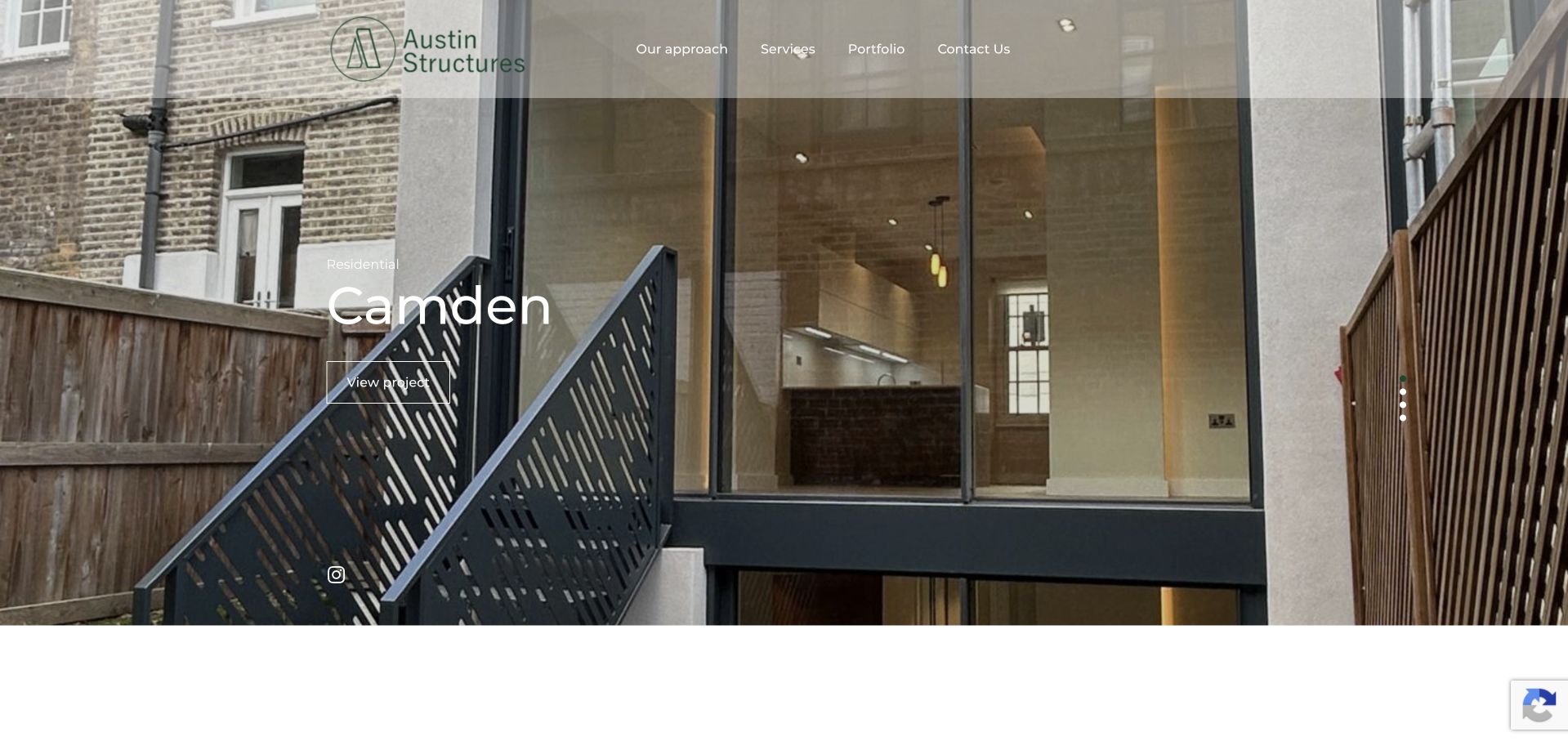
Austin Structures lets a completed house explain its architectural interests before presenting a service catalogue. The glass extension fills the opening view, while a restrained green identity, transparent navigation and a simple project label keep the building legible. Our approach, Services and Portfolio are visible rather than buried in a general menu. That combination feels appropriately scaled for a specialist London practice: a homeowner can browse outcomes, while an architect can find a working approach. The limitation is immediate qualification. The opening photograph and place name communicate taste more strongly than project scope, engineering responsibilities or service geography; those questions need the supporting copy.
What you can learn
Give a small engineering practice a real project to lead with, then place a literal service statement close enough that visitors do not need to interpret the photograph. Credit the engineering contribution separately from the architect and photographer.
Pros
The quiet green brand and unobtrusive controls preserve the architectural photograph rather than competing with it.
Visible approach, service and portfolio routes offer useful alternatives to an immediate enquiry.
Cons & considerations
The project-led opening delays a plain explanation of which structural commissions the studio accepts.
A photographic slider needs readable project labels, stable controls and an equivalent experience when motion is reduced.
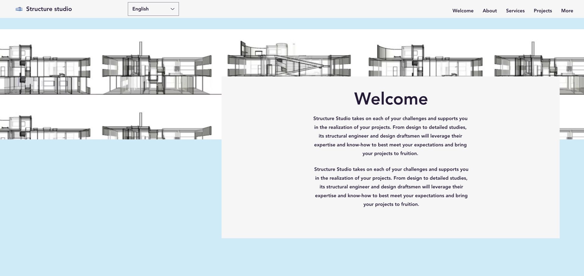
Structure Studio uses a pale blue drawing field rather than a glossy tower photograph to introduce the practice. A white text panel carries the welcome, and the navigation includes an explicit language choice. The page describes design, diagnosis and construction supervision, then gives the named engineer a place in the story. That makes the work feel less anonymous than a list of generic capabilities. The visible welcome text is repeated, however, which weakens an otherwise simple hierarchy. A visitor trying to choose between a structural diagnosis and a full design commission would benefit from shorter, clearly labelled entry points before reading the longer introduction.
What you can learn
A drawing can be an effective brand background when it supports, rather than replaces, explanatory text. Divide an independent engineer’s offer into the decisions a client actually faces, and proofread repeated content and contact destinations before launch.
Pros
The drawing-based visual language connects the introduction to technical work rather than generic corporate imagery.
A named engineer and specific service descriptions make the practice easier to understand as a working relationship.
Cons & considerations
Repeated introductory wording consumes space that could distinguish the main types of commission.
The small welcome panel and decorative linework need careful contrast and reading-order checks on narrow screens.
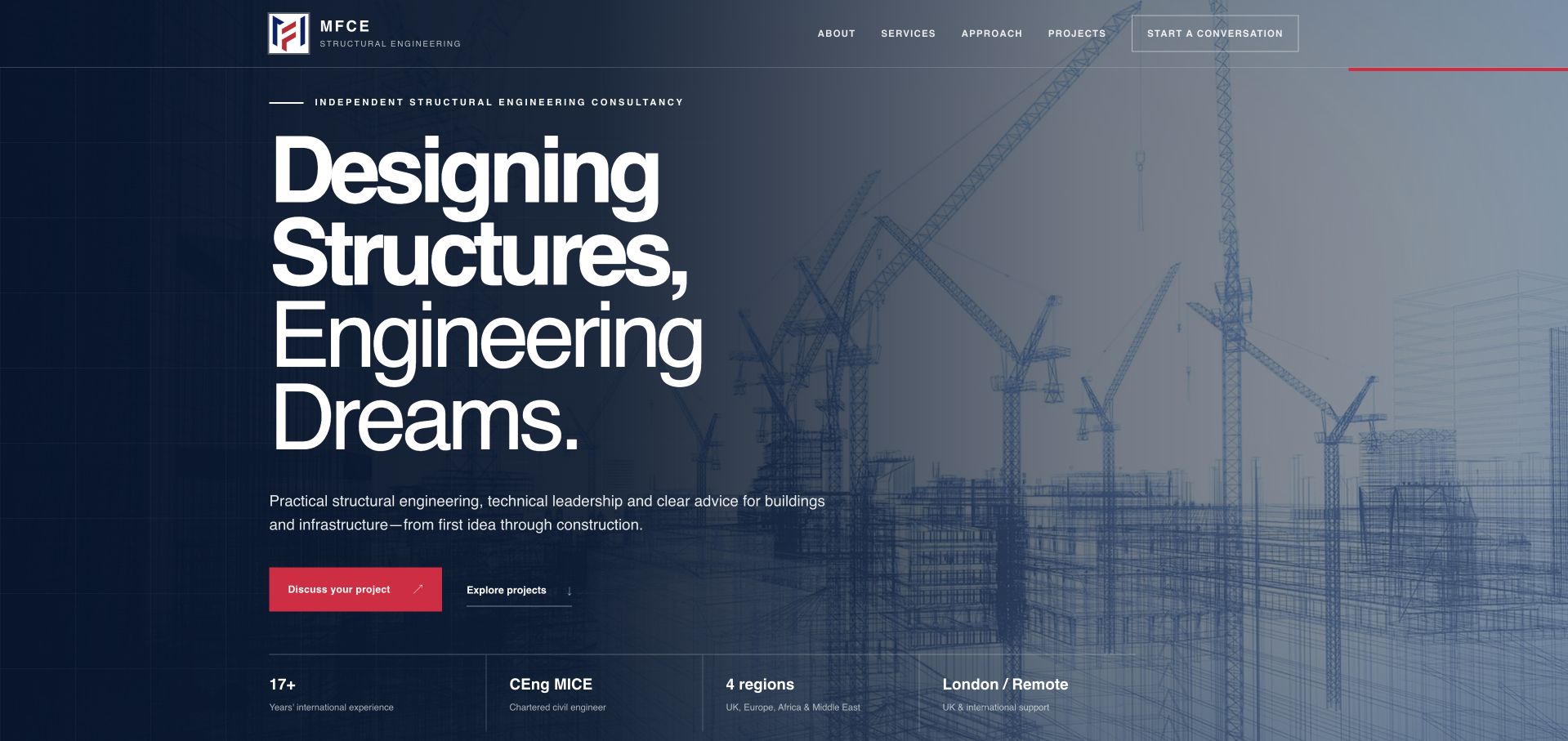
MFCE combines a dark technical image with an unusually direct introduction to structural engineering. A large, high-contrast headline and a red project-discussion button establish the next step, while a compact row of experience, professional designation and location claims provides context nearby. The service descriptions cover different stages of a project rather than treating every visitor as ready for final calculations. Its founder-led positioning is useful for clients who want to know who will actually be involved. Those credentials remain the firm’s published claims, not something a homepage design can independently verify. The strong sales hierarchy also needs enough project detail below it to make the proposition tangible.
What you can learn
Pair a clear engineering headline with a short qualification row, then explain which stage each service supports. Link designations to suitable verification information and show actual deliverables without exposing confidential calculations or client drawings.
Pros
The project-discussion action is visually distinct and closely connected to the service proposition.
Stage-specific services help an early feasibility enquiry avoid looking like a fully specified engineering brief.
Cons & considerations
Credential and experience claims need ownership, dates and appropriate supporting evidence rather than decorative repetition.
A dramatic technical background can become visual noise if the headline and proof row are compressed on mobile.
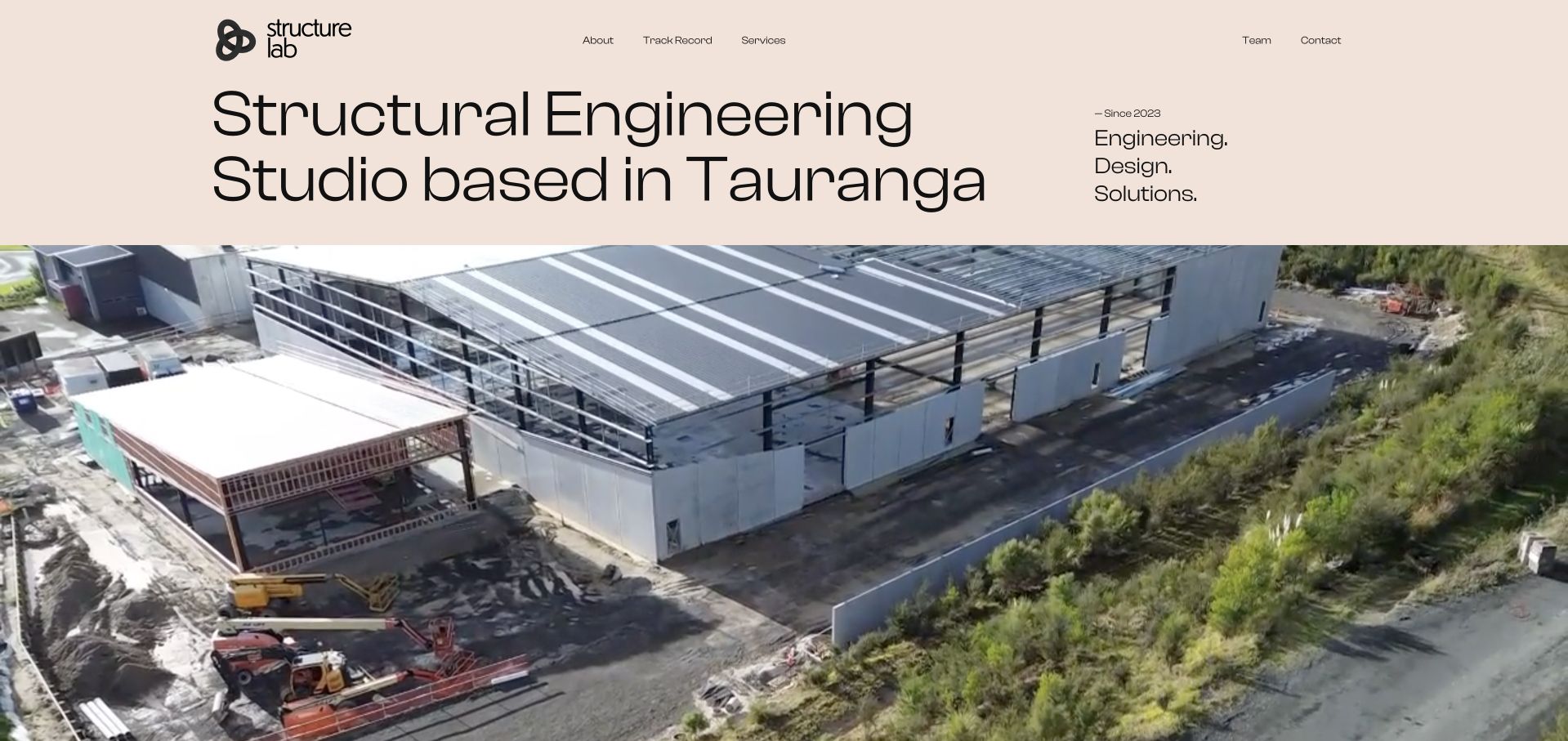
Structure Lab introduces itself as a Tauranga studio using a peach-toned field, oversized black typography and a broad project film. The regional statement and compact founding-date reference make the business easier to place than an abstract global promise would. Navigation separates track record, services and team, giving the visitor several ways to assess fit. The physical work is valuable because engineering can otherwise become a page of indistinguishable diagrams. The opening still asks a first-time visitor to connect the studio language with the exact service required. A video-led presentation also depends on a useful still image and explanatory text when playback is unavailable.
What you can learn
A newer practice can communicate place, people and real work without pretending to have a global firm’s history. Follow the regional introduction with specific project types, responsibilities and a short description of how a commission begins.
Pros
The Tauranga positioning gives the studio an immediate and concrete sense of place.
Separate track-record and team routes let prospective collaborators inspect work and people independently.
Cons & considerations
Large introductory typography leaves less room for practical project qualification in the first view.
The project film needs a meaningful poster, motion controls and text that stands on its own.
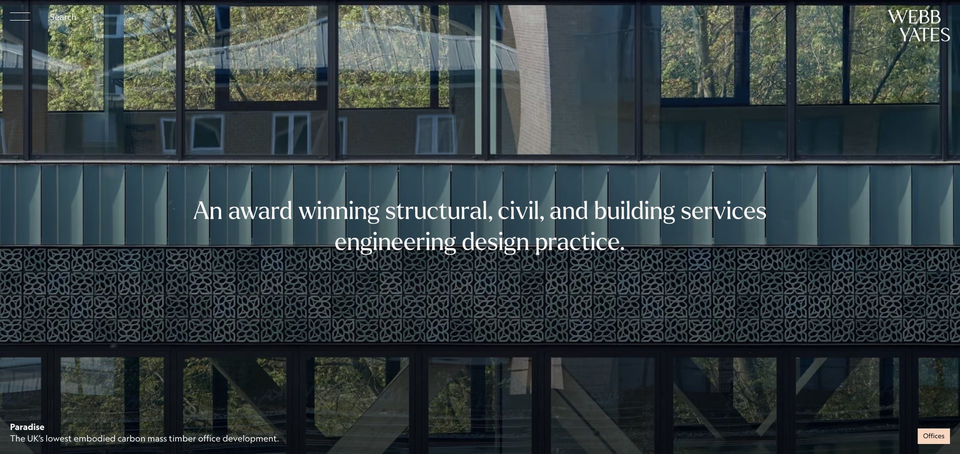
Webb Yates Engineers gives its opening image room to breathe, using a large white wordmark, a restrained serif service statement and a small project attribution. The timber architecture is not merely decoration: it provides an immediate setting for the multidisciplinary proposition. A project category chip adds another layer of context without turning the photograph into a dense caption sheet. The image-led approach is memorable, but much of the wider navigation is represented by compact search and menu controls. Someone arriving with a specific structural or building-services question has to take another step. Environmental statements associated with a featured project should also retain their original scope and evidence.
What you can learn
Use an architectural image to demonstrate where several engineering disciplines overlap, then make the disciplines easy to find in plain language. Keep project-specific environmental claims attached to their methods, boundaries and sources rather than generalising them to the whole firm.
Pros
The oversized wordmark and limited overlay establish a distinctive identity without obscuring the building.
Project attribution and a category marker add useful context to an otherwise cinematic first view.
Cons & considerations
Compact menu controls make a discipline-specific visitor work harder to locate the right service.
A single hero project cannot explain the full breadth, geography or practical constraints of a multidisciplinary practice.
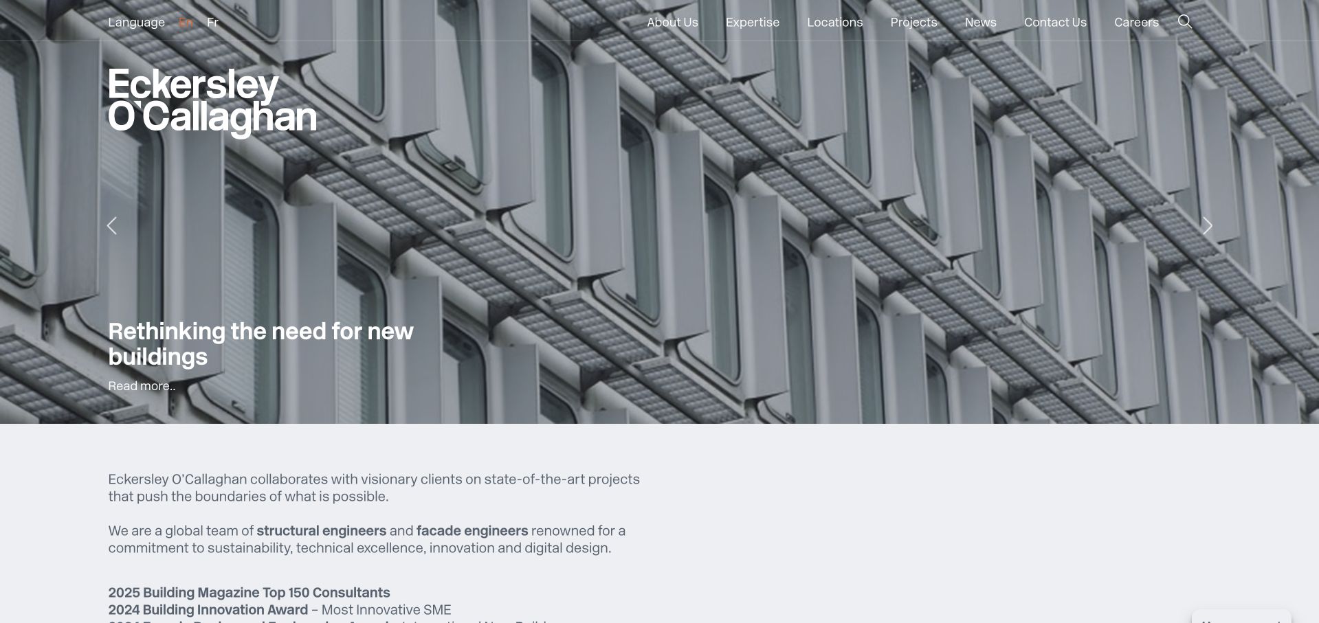
Eckersley O’Callaghan pairs large-scale project imagery with a more explicit written introduction below the hero. The opening uses white typography over a detailed building photograph, while the header exposes expertise, projects, locations and news as distinct destinations. That matters for a firm serving several professional audiences: work can inspire, but expertise and location help qualify the enquiry. The body’s linked structural and façade terminology is a useful bridge between the photograph and the service catalogue. The changing featured story can nevertheless alter what a new visitor learns first. Awards and ambitious project descriptions need to remain contextual evidence, not substitutes for a clear explanation of responsibility.
What you can learn
Let the hero tell one project story and use the next section to name the actual engineering disciplines. Connect those discipline terms directly to service pages, and keep credits explicit when a project involves many designers and consultants.
Pros
Expertise, project and location navigation supports different professional research journeys without requiring a generic contact first.
The introductory text links architectural imagery back to identifiable structural and façade services.
Cons & considerations
A rotating feature can make the first message inconsistent between visits and harder to reference.
Prominent awards or project claims still require supporting context about dates, roles and the specific work recognised.
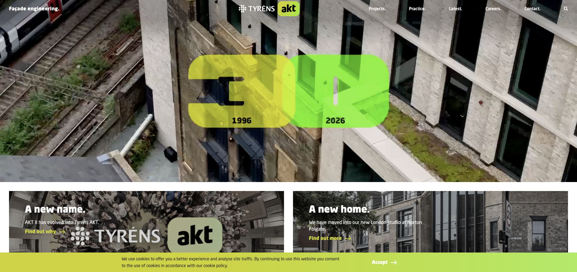
The former AKT II site now arrives at Tyréns AKT, and the homepage makes that transition part of its public story. A lime anniversary graphic, large wordmark and project film create a forceful visual identity, while news cards explain the new name and a new home. This is a useful example of a business change being addressed on the site rather than leaving visitors to reconcile old references themselves. Projects, practice, latest news and careers remain simple top-level choices. The celebratory opening is less effective as a literal service description, so visitors unfamiliar with either name need the practice content to understand the engineering offer.
What you can learn
When an engineering business changes its name, provide a visible explanation and preserve clear routes to people, projects and contact information. Treat an anniversary graphic as supporting identity, not the only information a first-time client receives.
Pros
Public rebrand news helps visitors connect older AKT II references with the current Tyréns AKT identity.
A short set of navigation choices avoids turning a large practice into an overwhelming directory at the top.
Cons & considerations
The anniversary-led first view gives less practical detail about disciplines and commission types.
Moving project imagery and very large graphics need a robust static presentation and sensible small-screen proportions.
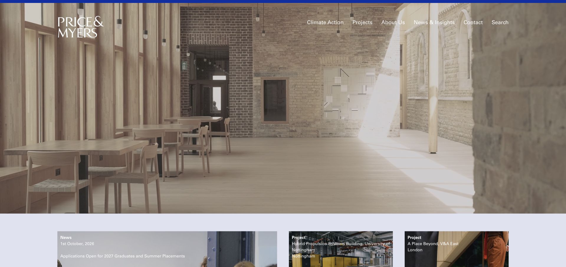
Price & Myers uses a calm courtyard photograph and an elegant wordmark to create a noticeably restrained first impression. A thin dark rule and clear navigation give the image a frame without adding a large sales message. Immediately below, pale-toned cards introduce project and practice material with categories and dates. That editorial layer gives returning visitors a reason to explore beyond the portfolio and helps distinguish a current announcement from an enduring project record. The opening photograph alone does not identify the exact engineering scope, however. A client who does not already know the firm must use the surrounding text and project pages to understand its role.
What you can learn
A quiet engineering homepage can still feel current through dated, clearly categorised stories below the main image. Separate project records from announcements so that a reader can tell what the firm designed, what it researched and what recently changed.
Pros
Restrained typography and a large uninterrupted project image create a composed, architectural presentation.
Dated and categorised cards introduce useful editorial structure rather than an undifferentiated stream of tiles.
Cons & considerations
The first view relies heavily on prior recognition or visual interpretation to communicate the service.
A mixed news-and-project feed needs clear labels and a deliberate archive so important work does not disappear beneath updates.
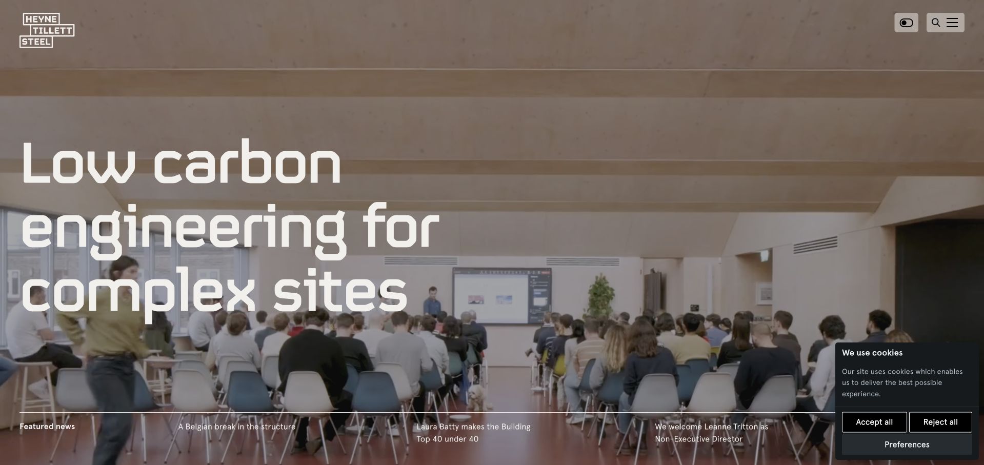
Heyne Tillett Steel places a team scene behind a large statement about engineering complex sites. It is a different choice from opening with a pristine finished façade: the people suggest that problem-solving and collaboration are part of the product. Search, menu and a low-carbon-mode control are kept compact, while a strip of featured material introduces current practice activity. The HTS+ research content gives the site another route into technical credibility. The opening remains visually busy, with a substantial headline over a detailed scene and additional stories below. A compact menu also hides the practical service structure until the visitor asks for it.
What you can learn
Show the team doing the work when collaboration is a meaningful part of an engineering offer, and connect research to actual project questions. A low-carbon interface control should explain its effect rather than relying on the label alone to imply a measured benefit.
Pros
A working team image communicates a different aspect of engineering than a conventional finished-building hero.
The visible research strand gives professional visitors a reason to investigate methods and ideas as well as projects.
Cons & considerations
Large text over a detailed photograph creates a demanding contrast and responsive-layout challenge.
Compact navigation postpones service discovery for visitors arriving with a specific structural problem or project stage.
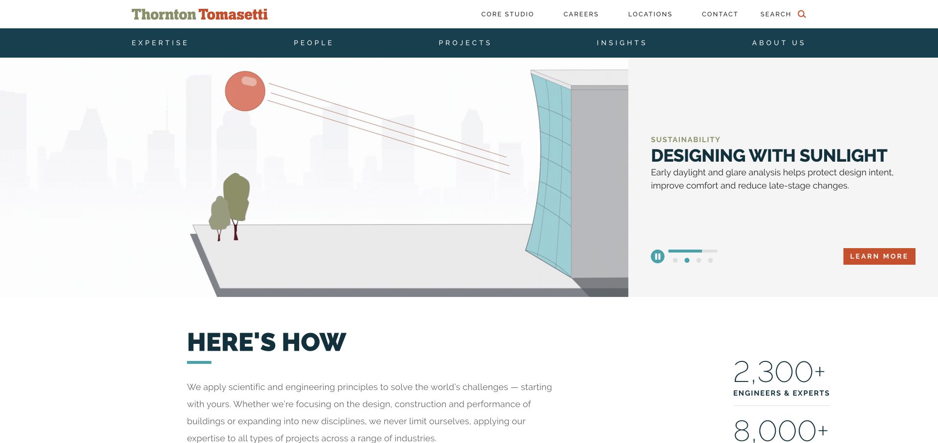
Thornton Tomasetti opens with a technical subject rather than a generic skyline. In the observed feature, a visual explanation of sunlight sits alongside a teal text panel and an orange action. The split composition gives an abstract analysis topic a concrete visual anchor, and carousel indicators make it clear that the story is one of several. The following introduction begins to explain the wider business, with supporting information set apart from the main narrative. This is useful for a multidisciplinary firm whose expertise can be difficult to summarise in one image. The tradeoff is breadth: a rotating technical feature may not match the service a procurement or design visitor needs today.
What you can learn
Translate a specialist engineering question into one clear visual example, then provide a stable route to the full service catalogue. Distinguish the explanation of a method from any claim about a project’s measured performance or guaranteed outcome.
Pros
A diagrammatic feature demonstrates a technical idea instead of relying exclusively on prestige architecture.
The split image-and-text layout gives the topic a readable explanation and a distinct next step.
Cons & considerations
A featured analysis topic can dominate the first visit even when the user needs a different discipline.
Rotating stories require predictable controls, readable text and a useful experience without automatic movement.
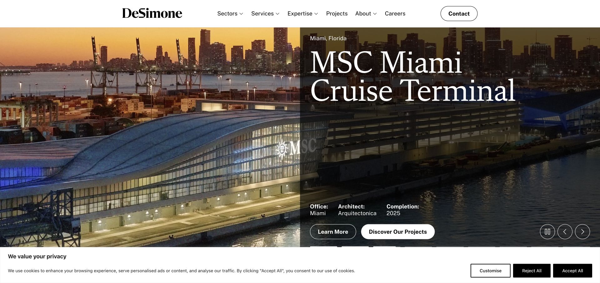
DeSimone pairs a large port-terminal photograph with an oversized serif project title and a compact set of project facts. Office, architect and completion information are included near the feature instead of being left entirely to a detail page. That is valuable in engineering, where an impressive photograph does not by itself explain who did what. A circular action and a separate project-discovery link offer different depths of exploration. The image and title occupy most of the screen, so the firm’s broader capabilities are less immediate. The layout also depends on careful treatment of long project names so that typography does not overwhelm either the image or its metadata.
What you can learn
Bring a small, consistent set of project credits close to the main image. Then use the detail page to explain the engineering scope, constraints and collaborators rather than asking the project’s scale to stand in for that information.
Pros
Architect, office and completion metadata give the opening project more context than an uncaptioned photograph.
Separate project and portfolio actions allow a reader to choose a focused story or a wider survey of work.
Cons & considerations
Large project typography can dominate the image and make long titles difficult to accommodate across screen sizes.
The first featured commission cannot communicate all of the firm’s disciplines, sectors or regional coverage.
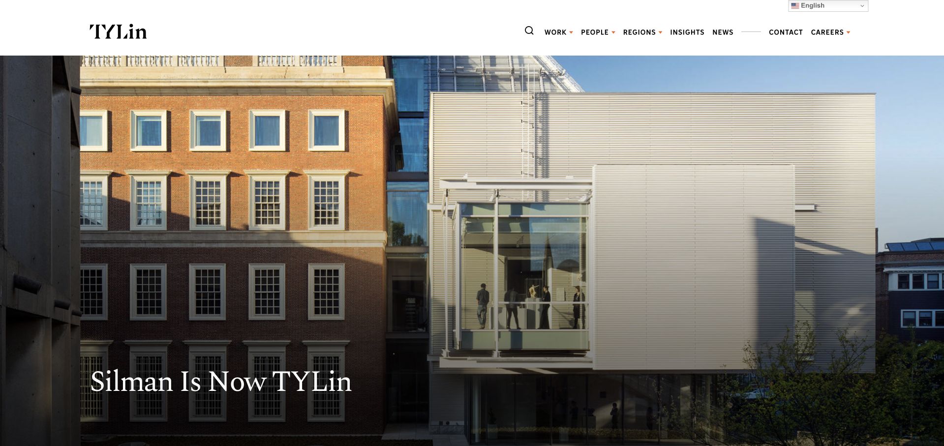
The Silman address leads to a TYLin transition page, not an unchanged standalone Silman homepage. Its main photograph, direct transition headline and explanatory body make the relationship visible. The TYLin header supplies routes to work, people, regions and insights, giving former Silman visitors a way into the combined organisation. This is worth studying as a migration and identity pattern: the old name has meaning, and the page explains where that meaning now belongs. It should not be mistaken for proof that all historical project information or contact routes remain identical. Visitors with an existing relationship may still need very specific guidance about their project team.
What you can learn
A merger or integration page should explain the naming change in plain language and direct existing clients toward current people and contact routes. Preserve historical project credits accurately while keeping the present organisation’s identity unmistakable.
Pros
The transition headline addresses the reason an older Silman reference now reaches a TYLin-branded page.
Current work, people and region navigation provides a useful onward route rather than a dead-end rebrand notice.
Cons & considerations
A broad group navigation cannot replace specific guidance for clients looking for an existing Silman project contact.
Historical project associations require careful naming so a transition page does not imply unchanged responsibilities or personnel.
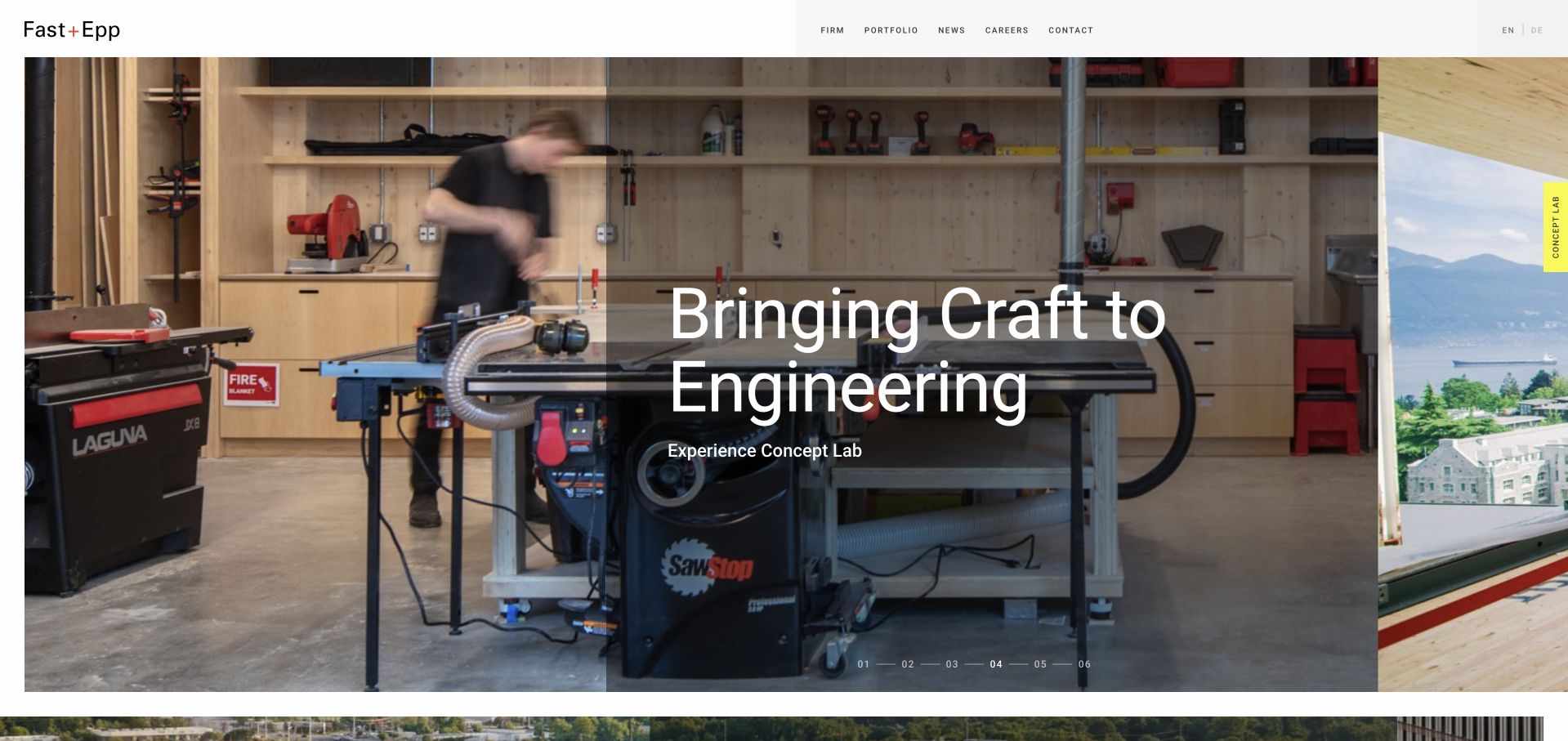
Fast + Epp uses a physical workshop scene to connect structural engineering with making. Large white type sits over a translucent dark panel, while a compact header keeps firm information, portfolio, news and contact available. A bright Concept Lab tab introduces an unusually tangible research route. Numbered slide controls give the project film or image sequence a visible structure. The presentation makes experiments and materials feel relevant to completed buildings rather than treating research as a separate corporate report. Its cinematic scale has a cost, though: the first view contains relatively little about a visitor’s location, project stage or route to the right specialist.
What you can learn
If prototyping is central to a practice, show the physical process and connect the lab to project decisions. Preserve a clear distinction between experimental work and commissioned engineering, and give visitors a plain way to start a relevant conversation.
Pros
Workshop imagery makes engineering methods feel concrete and shows a different kind of proof from finished architecture.
The distinctive Concept Lab route invites deeper investigation of materials and experimentation.
Cons & considerations
A full-screen sequence leaves practical project qualification and geographic information to later sections.
Numbered slides and moving backgrounds need meaningful labels, motion controls and a strong static fallback.
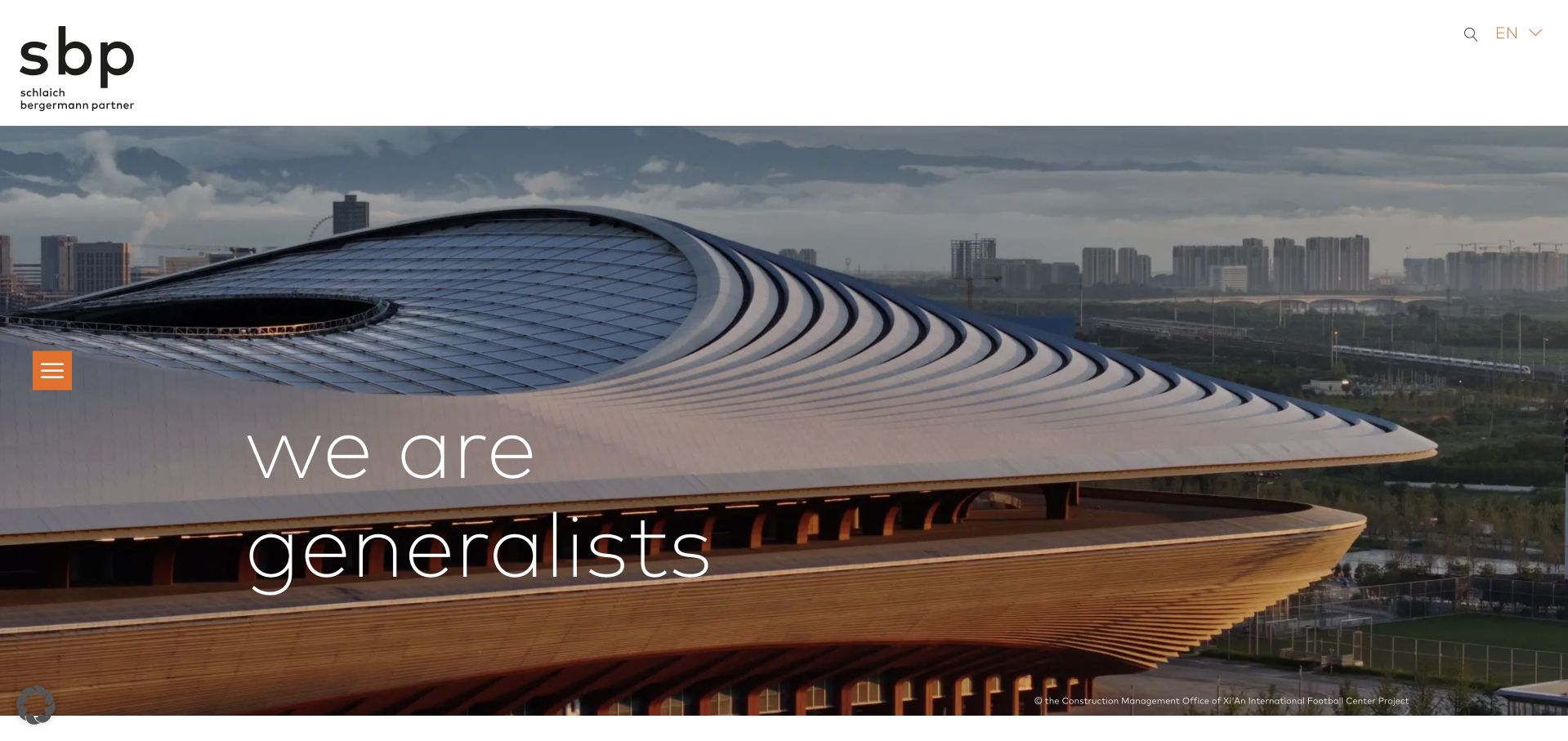
Schlaich bergermann partner uses a very spare header, a large project image and a short changing identity statement. The lowercase typography and orange menu control create a recognisable visual system without a dense top navigation. Project imagery does much of the explanatory work, while the wider site exposes separate expertise and project categories, including structural design and lightweight structures. It is a strong example of making a broad practice feel coherent through a small set of visual decisions. The same restraint creates a discovery burden: a first-time visitor has to open the menu or continue reading to understand disciplines, offices and the exact relevance of a featured structure.
What you can learn
A short identity statement works best when the underlying expertise catalogue is precise and easy to reach. Keep image credits visible, name structural responsibilities on project pages and ensure a hidden menu remains accessible by keyboard and assistive technology.
Pros
A limited typographic and colour system gives very different structural projects a consistent identity.
Distinct expertise and project categories offer more meaningful organisation than a single gallery of impressive images.
Cons & considerations
The minimal header hides practical service and office choices from the initial view.
Changing photography and broad identity words need supporting text so users do not have to infer the engineering offer.
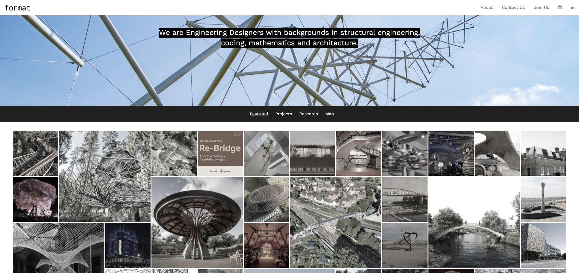
Format Engineers combines a slim, almost technical header with a large structural image and a concise cross-disciplinary proposition. A black filter bar then shifts the page into a catalogue of featured work, projects, research and a map. This arrangement makes computational or exploratory material feel part of the same practice as physical construction. The varied thumbnails reward browsing, but they also ask more of the captions: visitors need to know whether they are seeing a commission, a prototype, a research study or a visualisation. The understated navigation and small labels are elegant at desktop scale, yet they need particular care when touch targets, contrast and reading order are tested.
What you can learn
A shared catalogue can connect research to built work when every item clearly states its type and status. Give filters accessible names, preserve useful project captions and avoid presenting a speculative image as if it were a completed commission.
Pros
Project and research filters acknowledge different kinds of engineering work without splitting the practice into unrelated sites.
The restrained header and varied image grid create a compact, exploratory portfolio experience.
Cons & considerations
Small navigation and filter labels can become hard to scan or operate on narrow and touch-based displays.
Mixed research, visualisation and completed projects need explicit status labels to prevent misleading comparisons.
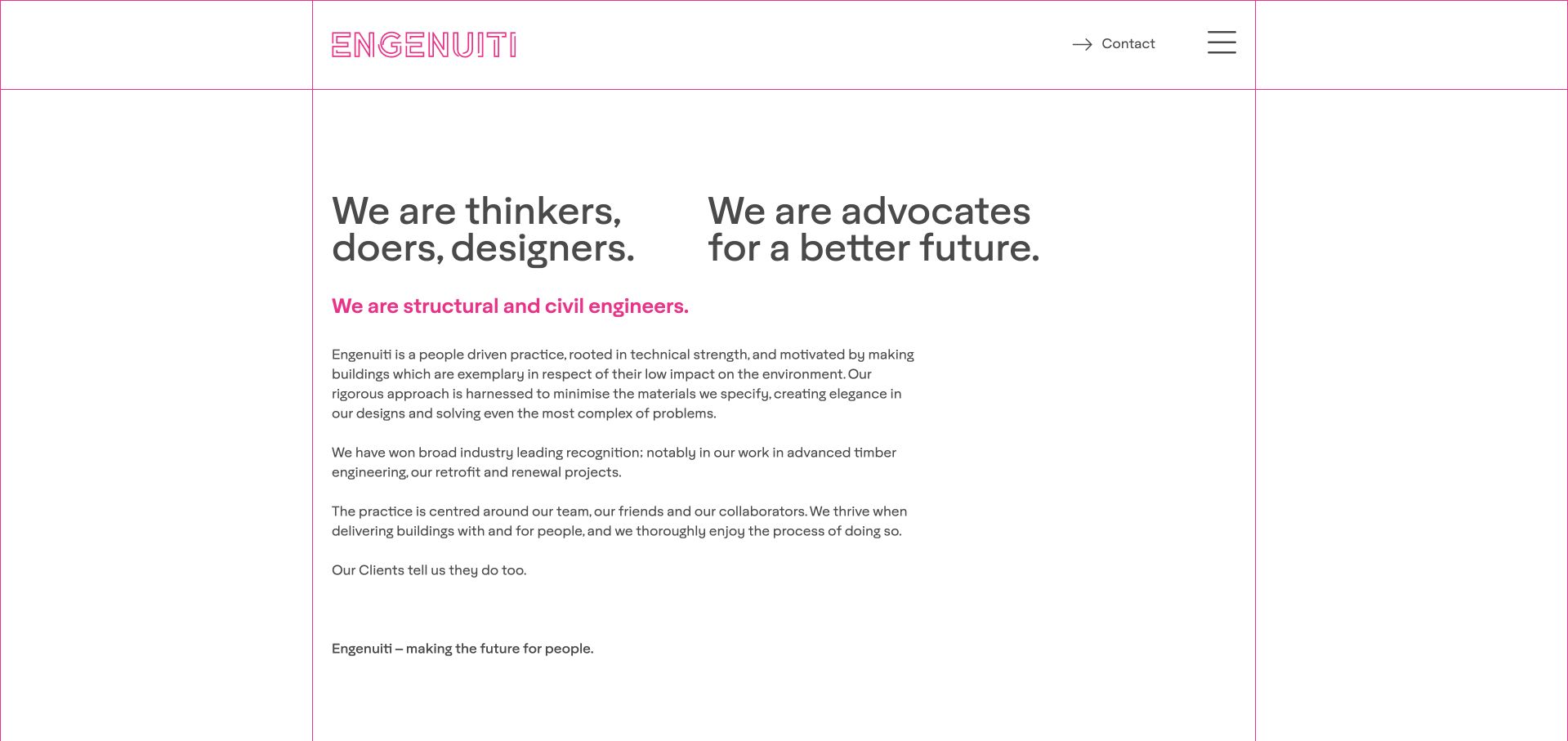
Engenuiti opens with writing rather than a large architectural photograph. Pink rules, an outlined wordmark and two substantial text columns turn the first screen into a clear statement of practice. A literal structural-and-civil-engineering line prevents the more expressive language about thinking and making from becoming entirely abstract. The body discusses materials and reuse before the image-led work comes into view. This is a useful counterpoint to the cinematic firms in the collection: words can carry the identity when they are edited and given enough space. The tradeoff is density. A visitor with a quick project-fit question has more reading to do before finding a concrete example or commission route.
What you can learn
A text-first engineering homepage can be distinctive if it names the service explicitly and uses a deliberate hierarchy. Follow philosophy with specific project responsibilities, material decisions and a simple enquiry route rather than adding more unqualified manifesto language.
Pros
The literal structural and civil engineering statement anchors an expressive introduction in a recognisable service.
Pink grid rules and an outlined identity create a distinctive presentation without relying on a full-screen film.
Cons & considerations
Two substantial opening columns demand more attention than a concise project-fit statement would.
Material and reuse ambitions need project-level explanations and evidence rather than being interpreted as guaranteed environmental outcomes.
Kegan is a freelance web designer and developer with 15+ years of experience helping businesses turn complicated website requirements into clear, maintainable digital experiences. He works directly with clients from planning and design through development, launch, and ongoing support.
For structural engineering website design, his development approach focuses on sector-specific capabilities, project case studies, technical team profiles, and well-routed project inquiries. The scope can be a targeted improvement or a complete custom build, with responsive layouts, thoughtful content structure, and integrations chosen around the people using and maintaining the site.
Show 3 other structural engineering website designersHide other structural engineering website designers
Plan a structural engineering website around the first useful conversation
Write three real enquiry scenarios
Draft a homeowner scenario, a professional design-team scenario and a returning-client scenario before choosing a layout. For each, write the question, the minimum information needed and the person responsible for responding. A homeowner might need to describe a building and a proposed change; a design team might need to identify stage, location and expected responsibilities. A returning client may only need an existing project contact. Do not send all three through a long identical sales form.
Create a project record with editorial rules
Define a repeatable project template containing title, location, status, service, scope, collaborators, image credit and a short explanation of a meaningful design constraint. Keep speculative research, competition work and completed commissions distinguishable. Ask an engineer to review the technical explanation and obtain permission before publishing client drawings. If a merger or rebrand changes the current identity, preserve historical credits while explaining the present organisation and contact route.
Make the enquiry secure and proportionate
Begin with contact details, project location, a short description and an optional stage or project-type choice. Explain whether drawings are needed immediately and provide an appropriate transfer route for sensitive files instead of encouraging unrestricted uploads to a public form. State that an enquiry does not create an appointment or provide engineering advice. Test confirmations and response ownership internally so the promise of a personal conversation has an operational process behind it.
The editing job behind the design
Choose a stack the project team can actually maintain
A project-led CMS should make it easy to maintain credits, statuses, services and office information without duplicating the same facts across dozens of pages. Use structured fields for the recurring information and flexible text for the design story. Image handling matters more than a fashionable frontend: provide responsive sizes, useful captions and a stable first image when video is unavailable. Keep drafts and private project material out of public assets and search indexes.
Treat navigation, forms and project filters as real interfaces. Test keyboard use, focus, contrast, zoom and reduced motion rather than assuming a minimalist visual style is accessible. The W3C accessibility reference is a useful starting point for the implementation brief. Technology labels in this collection are limited to evidence actually observed or documented; a drawing viewer or a project photograph does not reveal a firm’s private engineering software or complete backend.
Our WordPress website examples offer a separate look at publishing approaches. A visible platform label is evidence for that named page, not a guarantee that the same system will suit your requirements.
Before the public launch
Structural engineering website planning checklist
Name the structural disciplines and project types the practice actually accepts.
State the service geography without creating unsupported location claims.
Separate homeowner, professional-team and existing-client routes.
Identify the firm’s actual responsibility on every project record.
Label completed, in-progress, competition and research work accurately.
Keep architect, consultant and photographer credits with the relevant work.
Link current professional designations to appropriate verification routes.
Explain the scope and source of environmental or performance statements.
Use a meaningful still image when a project film cannot play.
Avoid collecting sensitive drawings before explaining the transfer process.
Test forms, filters and menus with keyboard, zoom and reduced motion.
Assign an owner to review people, offices, project status and contact details.
These checks are a project checklist, not a performance, legal, security, or accessibility certification. Test real journeys with the people responsible for the website before making claims about the result.
Sources & editorial method
How this collection was selected and reviewed
We inspected the public pages and captured the actual browser views recorded with each example. Reviews are original design observations, not engineering evaluations or measured conversion tests. The source links below provide professional-verification and accessibility context alongside the primary example pages; claims about individual projects remain attributed to their publishers.
Each example links to its actual source page. Screenshots are direct browser captures with their own capture dates; moving imagery, announcements and live designs can change. The notes describe observable design choices and conditional tradeoffs, not measured traffic, conversion results, service quality, or accessibility conformance.
Technology labels use public page metadata, asset evidence, or explicitly cited platform documentation. Platform documentation is not a complete current deployment audit. A component reference may be legacy or unused; it is not a complete backend inventory. Unknown stacks are omitted. These sites are editorial examples, not our client portfolio.
Written, Edited and Curated are separate editorial records, not timestamps advanced by a rebuild. Website designs and imagery belong to their owners. See our editorial standards or suggest a correction.
Questions worth asking
Structural Engineering website design questions
Should a structural engineer’s homepage lead with a project or text?
Either can work. A project-led opening needs a nearby literal explanation of the service and location. A text-led opening needs concrete work examples soon afterwards. Choose the approach that helps your actual clients qualify the practice, not simply the one with the most dramatic photograph.
How much technical detail belongs in a case study?
Enough to explain the constraint, the practice’s responsibility and the reasoning behind an important decision. Avoid publishing confidential calculations or implying that a short public explanation can be reused as engineering advice for another building. Have a responsible professional review technical wording.
Can professional logos replace a team page?
No. A mark does not explain who will work on a project or whether a particular person’s designation is current. Show the people, their published roles and relevant verification information. Do not invent registrations or present a website-design selection as professional accreditation.
Do small practices need the same site structure as global firms?
Usually not. A small studio may need a concise service explanation, a focused project collection, people and a useful enquiry route. A global firm needs more careful discipline, office and sector discovery. Copy the reasoning behind a structure rather than the number of menu items.
Should the first form require drawings?
Only if the practice has a clear reason and an appropriate transfer process. Many early enquiries can begin with a description, location and stage. Explain file handling and what happens next before asking users to upload potentially sensitive project material.
Borrow the clarity of the strongest examples: a recognisable service, accurately credited work and a proportionate next step. The goal is not to make an engineering firm look larger than it is, but to make the right project conversation easier to begin.