Best Alpine.js Websites of 2026 (20 Real-World Examples)
Twenty public properties with dated Alpine.js script evidence, plus practical ideas for focused interactive components.
A useful Alpine.js website starts with understandable content and adds interaction where a visitor needs it. These examples show civic pages, help centers, service businesses and product marketing with public Alpine references. Study their decisions about navigation, search and competing actions without assuming the library powers every visible feature.
Alpine connects state and events to HTML through attributes. Its introductory documentation demonstrates a counter, dropdown and search input, which are useful starting points for understanding the approach. The important project question comes earlier: which part of the page needs to change, what triggers that change, and what should remain usable if the enhancement is unavailable?
This collection opens with the Smithsonian National Zoo, London City Hall, Zapier Help Center, Substack Help Center and Autotrader Group’s corporate property. Those scopes matter. A support subdomain is not evidence about its parent company’s application, and a corporate homepage does not establish the implementation of a consumer marketplace. The reviews describe the actual saved captures rather than claiming to have tested private account or transaction flows.
Before the examples
What makes good Alpine.js website development in 2026?
Give each component a small, explicit responsibility
Alpine’s x-data defines component state within an HTML region. Before writing that state, name the user task: opening a navigation panel, selecting a region or dismissing a notice. Avoid sharing one ambiguous open flag across unrelated controls. A written list of allowed states makes the implementation easier to review and gives maintenance work a clear boundary.
Keep essential destinations understandable without interaction
A menu disclosure can reduce clutter, but its labels still need to explain where the visitor will go. Make the public document useful before adding motion or suggestion panels. Preserve ordinary links for destinations, and use buttons for actions that change the current interface. A decorative opening should not become the only route to hours, pricing, support or contact information.
Design the closed, empty and interrupted states
Showing a panel is only one part of its behavior. Decide what happens when it closes, when the result set is empty and when a request fails. Alpine’s x-show controls visibility, and its documentation discusses initialization flicker and transitions. Treat those mechanics separately from focus management, understandable labels and the visitor’s ability to recover from a failed action.
The twenty examples below pair original design analysis with real, previously captured public pages. Their script observations and screenshot dates remain distinct. Some references are packaged dependencies, and two broad audits are partial; a positive Alpine signal is never expanded into an unsupported claim about every component or the entire backend.
We start with five recognizable brands or organizations: Smithsonian’s National Zoo, London City Hall, Zapier Help Center, Substack Help Center, Autotrader Group (corporate). Each attribution applies to the named website property, not every product or website belonging to its organization. This is a curated reading sequence, not a measured ranking.
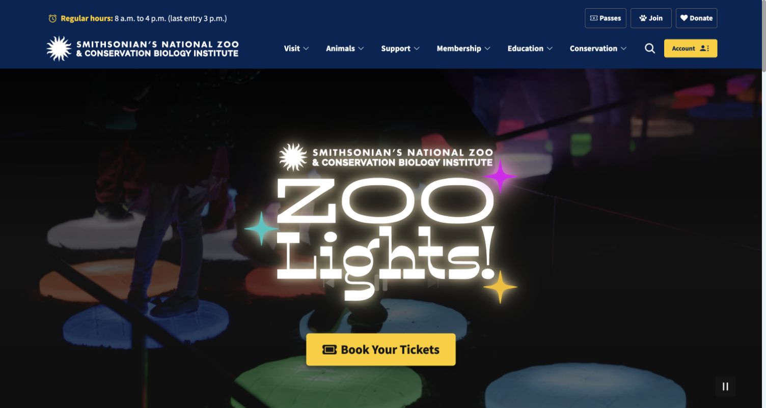
The National Zoo places its ZooLights campaign beneath a navy navigation system that still offers visiting, animals, membership and education. The captured hero uses an oversized event mark, a bright ticket button and a visible pause control. That separation matters more than the animation itself: a seasonal story can change while familiar visitor routes remain available. The yellow account action also occupies a different position from the campaign purchase invitation.
What you can learn
For an Alpine.js project, sketch the independent states before building a hero: navigation disclosure, media playback and account access should not accidentally control one another. Keep permanent destinations as ordinary links. The dated script reference establishes a public Alpine association; this capture does not identify which visible control uses that library.
Pros
Permanent visitor categories remain legible above the large seasonal artwork.
The contrasting ticket action gives the promotional area one obvious destination.
Cons & considerations
The tall campaign treatment pushes practical visit details below the opening view.
Motion and white overlay lettering need separate readability and reduced-motion checks.
Platform source: Dated public Alpine.js script reference. Dated public script reference on nationalzoo.si.edu; no attribution of individual controls or private backend. Platform evidence is separate from the direct website screenshot and is not a complete current infrastructure audit.
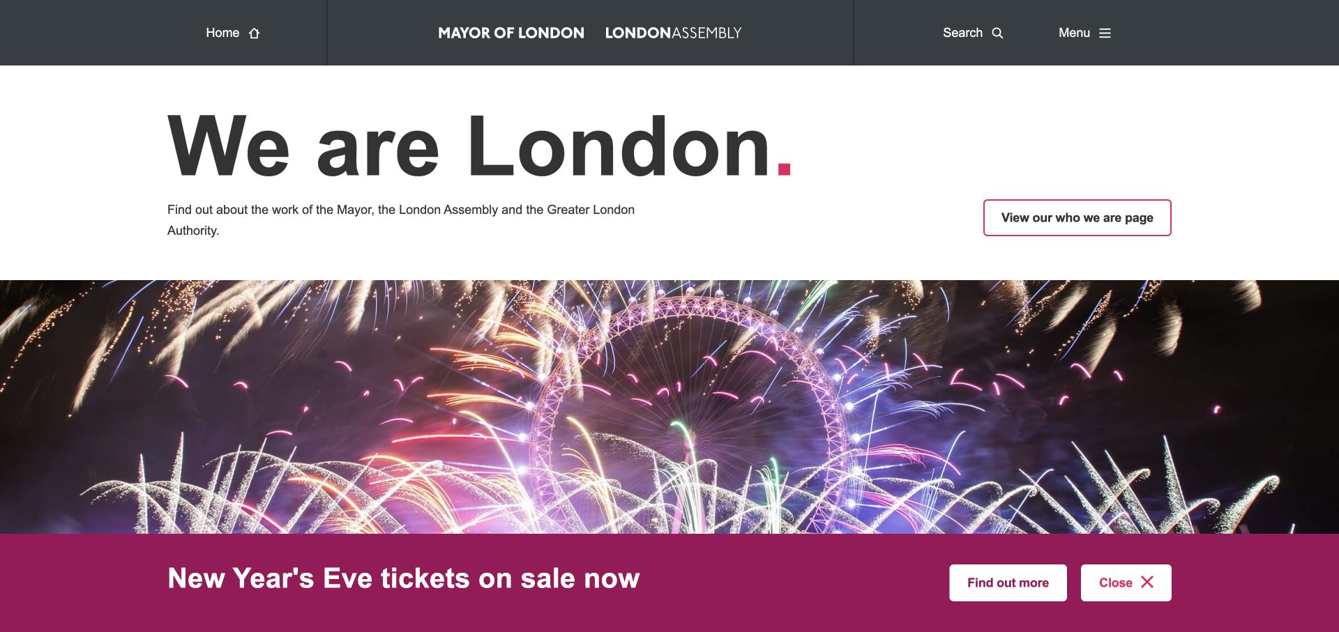
London City Hall opens with an unusually direct statement: We are London. A dark institutional header names the Mayor and Assembly, while a separate outlined action explains who they are. The fireworks image and magenta New Year banner introduce a temporary campaign below that identity. Search and Menu sit together in the header, keeping discovery controls visually distinct from the campaign button and its small close action.
What you can learn
Borrow the division between permanent page content and temporary interface state. A dismissed announcement should not remove the underlying institutional introduction or hide navigation. Define where focus returns after dismissal and how long that preference lasts. Alpine is evidenced by a dated theme script reference, rather than an inspection of this banner's actual event handlers.
Pros
The short opening statement makes the institutional identity easy to recognize.
The campaign has its own colored container and explicit destination.
Cons & considerations
A lower banner can cover content when space becomes tight on smaller screens.
The large image delays more specific public-service choices beyond the introductory view.
Platform source: Dated public Alpine.js script reference. Dated public script reference on london.gov.uk; no attribution of individual controls or private backend. Platform evidence is separate from the direct website screenshot and is not a complete current infrastructure audit.
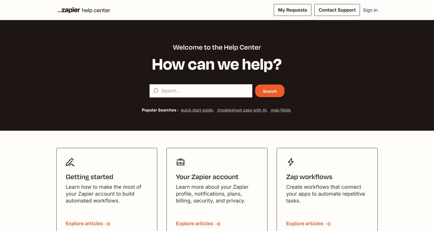
Zapier Help Center gives the opening question and search field most of the dark hero area, then supplies three outlined category cards below. Getting Started, Your Zapier Account and Zap Workflows are distinct enough to help visitors who do not know the right search term. Requests, contact and sign-in links stay in the white header. Orange accents connect the search button and article links without making every text label look interactive.
What you can learn
Use local interface state for suggestions or category disclosure only after the basic search and article routes work. Preserve the query when someone returns from a result, and plan an empty-results explanation. The Alpine evidence belongs specifically to this public help center, not Zapier's automation application or its customer workflows.
Pros
The search box is prominent without removing a useful browsing alternative.
Account and support links have a stable location outside the category cards.
Cons & considerations
Popular-search shortcuts need regular editing to remain useful to new visitors.
Large introductory cards show fewer specific article choices in the first screen.
Platform source: Dated public Alpine.js script reference. Dated public script reference on help.zapier.com/hc/en-us; no attribution of individual controls or private backend. Platform evidence is separate from the direct website screenshot and is not a complete current infrastructure audit.
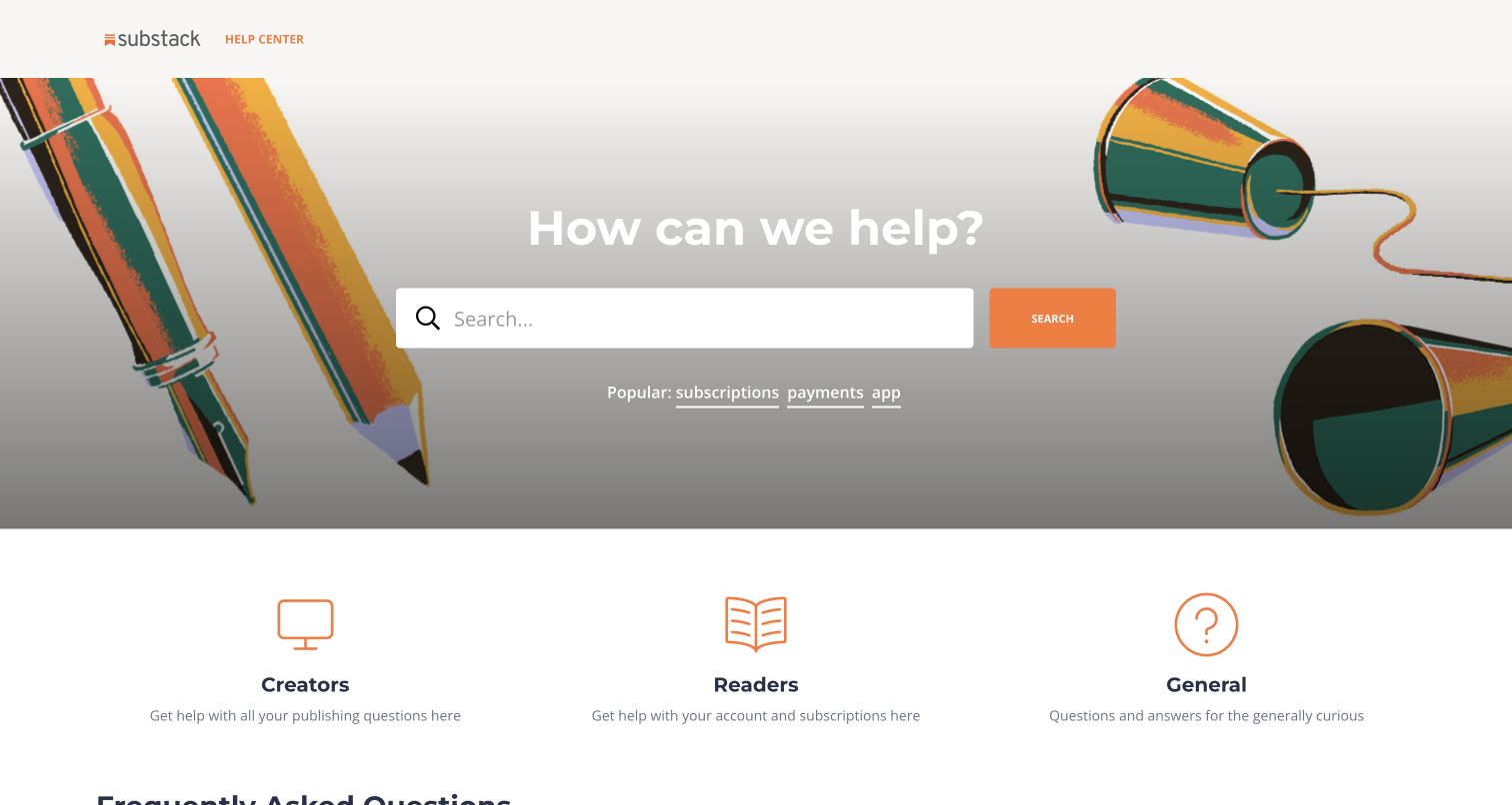
Substack Help Center pairs its orange identity with an illustrated hero of pencils and string telephones. A broad search field sits below the central question, followed by popular support topics. The next row divides the material into Creators, Readers and General, making the audience distinction visible before individual articles. The imagery gives a utilitarian support surface personality, though the white headline crosses a comparatively light portion of the illustration.
What you can learn
A small interactive layer should clarify which audience or search state is active without replacing meaningful category links. Keep those choices understandable if suggestions fail to load. The saved Alpine script evidence is scoped to Substack's help property; it does not establish the implementation of newsletters, payments or the main publishing application.
Pros
Creator and reader branches describe recognizable differences in support needs.
The branded illustration makes the help center feel connected to its parent product.
Cons & considerations
Headline contrast needs checking across the full responsive image crop.
A broad General category still needs specific labels once visitors enter it.
Platform source: Dated public Alpine.js script reference. Dated public script reference on support.substack.com/hc/en-us; no attribution of individual controls or private backend. Platform evidence is separate from the direct website screenshot and is not a complete current infrastructure audit.
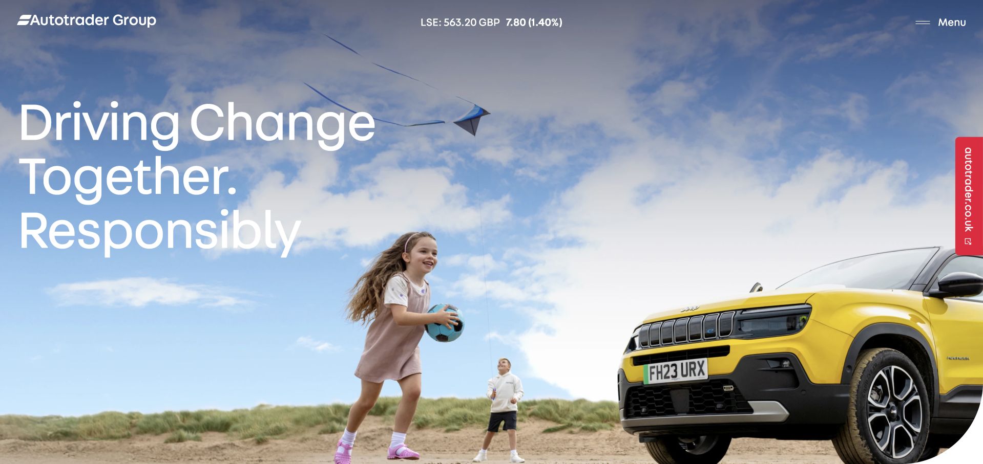
Autotrader Group uses a full photographic opening with an oversized statement about change and responsibility. The corporate mark, share-information strip and menu sit across the top, while a narrow red link points toward the consumer marketplace along the right edge. This is a useful distinction for organizations whose corporate and customer sites serve different audiences. The composition deliberately prioritizes the group story over a conventional grid of investor or career links.
What you can learn
Treat the menu and cross-property handoff as different navigation decisions. A compact disclosure can reveal corporate destinations while the marketplace remains a normal outbound route. Explain that change of context before a visitor follows it. The public Alpine reference was observed on the corporate property, not across Autotrader's vehicle-search platform.
Pros
The marketplace destination is visually differentiated from the group narrative.
A single large statement gives the photographic opening a clear editorial emphasis.
Cons & considerations
Hidden navigation adds a step for visitors seeking a specific corporate document.
White text over a changing photograph requires careful crop and contrast decisions.
Platform source: Dated public Alpine.js script reference. Dated public script reference on plc.autotrader.co.uk; no attribution of individual controls or private backend. Platform evidence is separate from the direct website screenshot and is not a complete current infrastructure audit.
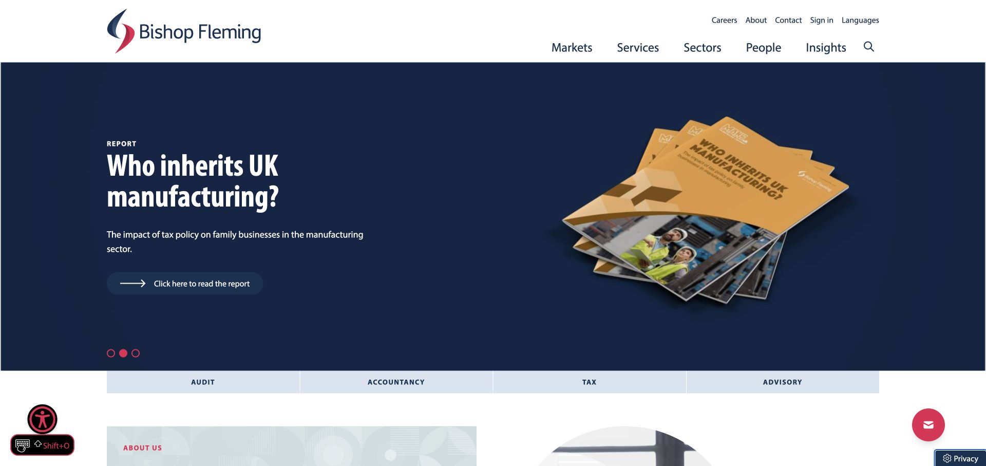
Bishop Fleming places a dark report promotion below two levels of white navigation. A gold report cover gives the campaign a concrete object, while a button and three small pagination marks establish its promotional role. The service strip at the bottom names Audit, Accountancy, Tax and Advisory. That lower strip is valuable because it offers a practical route for visitors whose immediate need is unrelated to the featured report.
What you can learn
Model campaign selection independently from service navigation. If a carousel changes panels, preserve an accessible route to every report and avoid moving a visitor's focus unexpectedly. The saved public theme script identifies Alpine; it does not prove that the slider or floating utility controls are implemented with it.
Pros
The report cover makes the featured content more tangible than a text-only announcement.
Named service categories remain available outside the campaign area.
Cons & considerations
Multiple utility controls compete for attention around the edges of the page.
Two navigation rows and a tall promotion leave limited opening space for service explanations.
Platform source: Dated public Alpine.js script reference. Dated public script reference on bishopfleming.co.uk; no attribution of individual controls or private backend. Platform evidence is separate from the direct website screenshot and is not a complete current infrastructure audit.
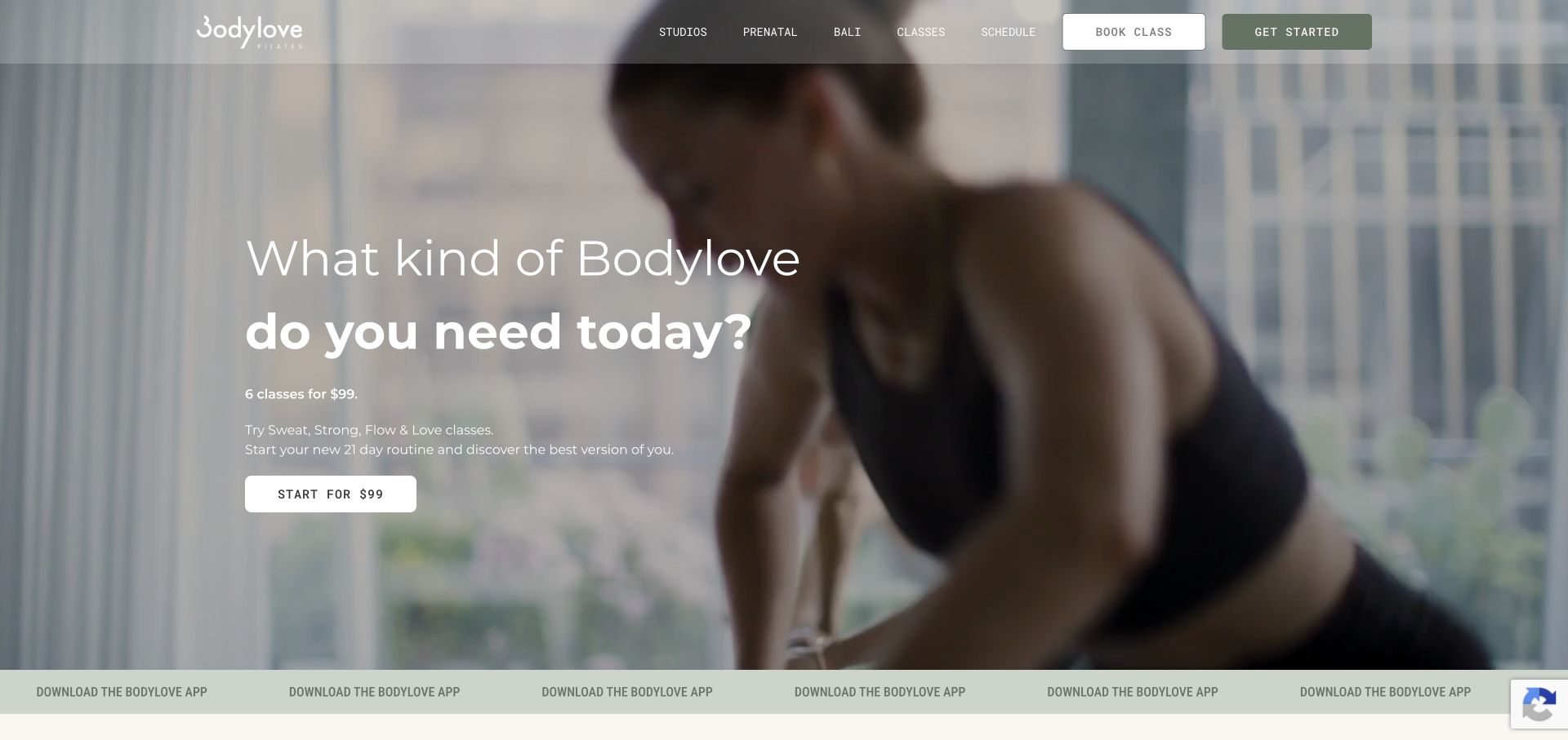
Bodylove Pilates uses an immersive fitness image behind a large question and introductory offer. The translucent header keeps Studios, Classes and Schedule alongside Book Class and Get Started, while an app promotion occupies the bottom strip. The visible actions reveal two different audiences: someone comparing a first visit and a member returning to book. Keeping those intents separate is more useful than giving every destination the same prominent button treatment.
What you can learn
Plan a small state map for studio choice, schedule filters and promotional dismissal before selecting interface code. Preserve direct booking links and make any selected location visible. The Alpine evidence here comes from an Elementor package reference; it does not demonstrate a custom Alpine application or identify the booking service's backend.
Pros
Introductory and returning-member actions are both visible in the opening composition.
The studio imagery gives the service a more concrete setting than abstract fitness graphics.
Cons & considerations
White lettering over an image needs contrast checks for each responsive crop.
The app strip competes with the introductory offer for a newcomer’s attention.
Platform source: Dated public Alpine.js script reference. Dated public script reference on bodylove-pilates.com; no attribution of individual controls or private backend. Included through an Elementor package. Platform evidence is separate from the direct website screenshot and is not a complete current infrastructure audit.
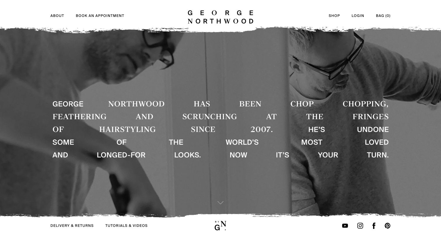
George Northwood centers a widely spaced wordmark above a grayscale working-salon image. About and Book Appointment occupy the left of the header; Shop, Login and Bag occupy the right. This division communicates two transactions without needing a large explanation. Rough photographic edges and mixed typography give the hero an editorial character, while delivery, returns and tutorial links below reinforce that the site also supports product customers.
What you can learn
Use the visual split as a planning device: appointment navigation and shopping state should have clear ownership and independent failure handling. A bag count should not obstruct a booking link. Alpine appears in the dated public script evidence, but the capture alone cannot attribute the cart, login or appointment experience to that library.
Pros
The booking destination is explicit and does not hide inside the shop navigation.
A real salon scene makes the opening feel connected to the service being offered.
Cons & considerations
Extremely wide letter spacing can slow reading of longer phrases.
A large atmospheric hero provides little immediate detail about appointment availability or locations.
Platform source: Dated public Alpine.js script reference. Dated public script reference on georgenorthwood.com; no attribution of individual controls or private backend. Platform evidence is separate from the direct website screenshot and is not a complete current infrastructure audit.
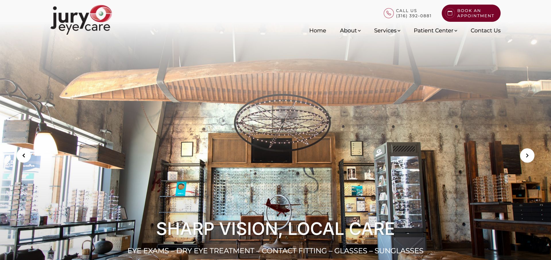
Jury Eye Care leads with an unusually memorable interior: eyewear displays, suspended canoe and chandelier all appear in the same wide photograph. A pale header keeps the logo and service navigation readable, with a burgundy appointment button beside the phone number. The lower white headline introduces the local practice, while arrows indicate more hero content. The strongest pattern is the persistent appointment route above the changing photographic story.
What you can learn
Keep appointment navigation independent from slide state and provide clear names for image controls. A visitor should not need to wait for a particular photograph to find contact details. The saved broad audit was partial but positively recorded an Alpine script; that limited evidence does not establish a complete stack or the controls' implementation.
Pros
The actual interior communicates a recognizable place rather than a generic medical setting.
The appointment action stays separate from the large photographic headline.
Cons & considerations
Location, accessibility and service specifics require exploration beyond the opening image.
Carousel arrows need descriptive labels and keyboard behavior that a screenshot cannot verify.
Platform source: Dated public Alpine.js script reference. Dated public script reference on juryeye.com; no attribution of individual controls or private backend. Broad audit remained partial; positive script evidence only. Platform evidence is separate from the direct website screenshot and is not a complete current infrastructure audit.
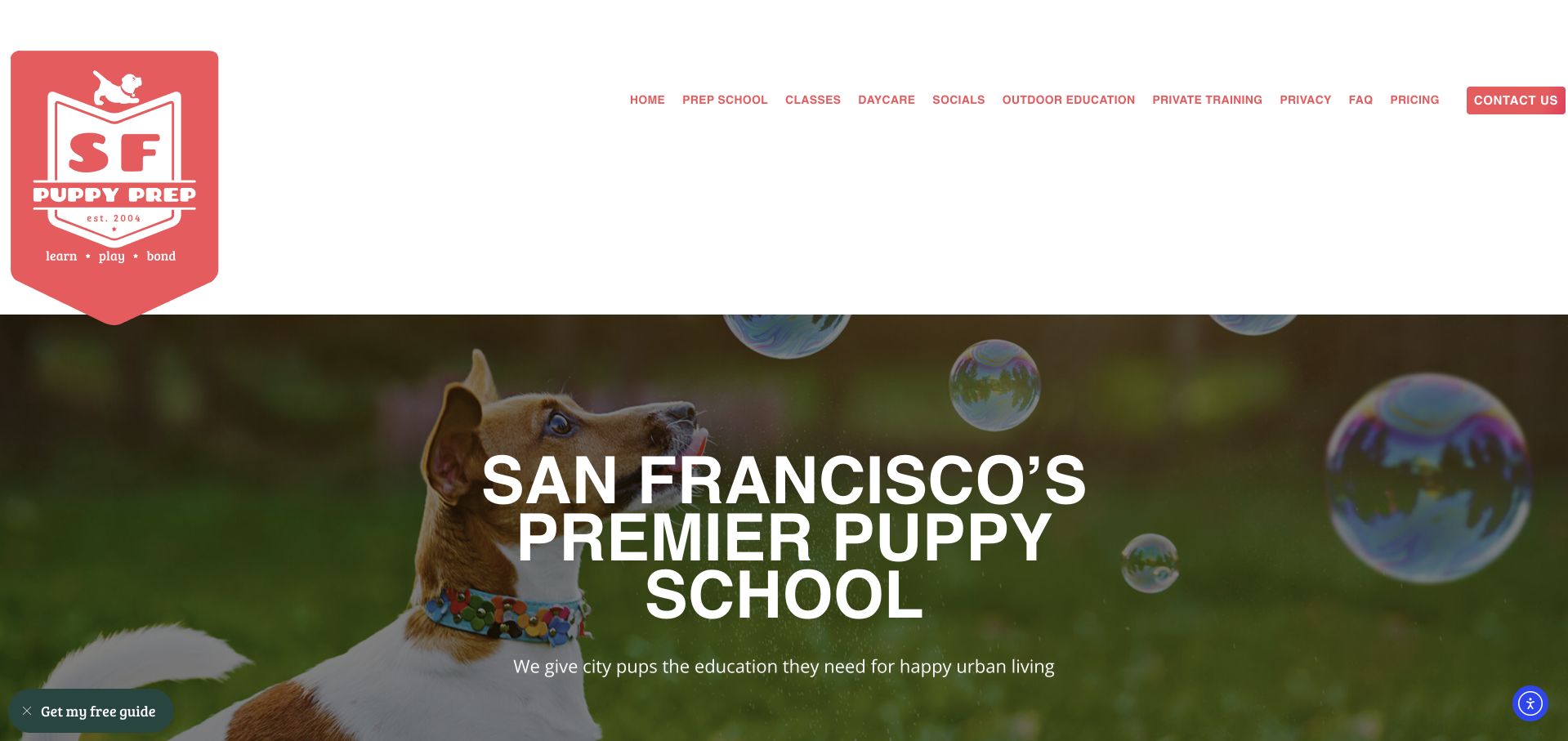
SF Puppy Prep uses a coral shield identity and a long white navigation row above a playful dog photograph. Prep School, Classes, Daycare, Socials and Private Training expose the range of programs directly. A free-guide prompt appears near the lower left, with another utility control at the opposite corner. The composition is welcoming, but it asks visitors to evaluate a substantial menu before they have much explanation of the programs.
What you can learn
Group related programs into understandable disclosures only when that reduces the initial decision load. Keep pricing and contact routes easy to recover, and ensure an optional guide prompt can be dismissed without trapping focus. Alpine is recorded as an Elementor dependency here, not proof that the booking journey or promotional widget uses custom Alpine code.
Pros
Literal program names provide more useful orientation than an unexplained umbrella label.
The distinctive identity and puppy imagery communicate the audience quickly.
Cons & considerations
The tall header and many adjacent links leave limited room for the service introduction.
Corner prompts can compete with one another and with the first booking decision.
Platform source: Dated public Alpine.js script reference. Dated public script reference on sfpuppyprep.com; no attribution of individual controls or private backend. Included through an Elementor package. Platform evidence is separate from the direct website screenshot and is not a complete current infrastructure audit.
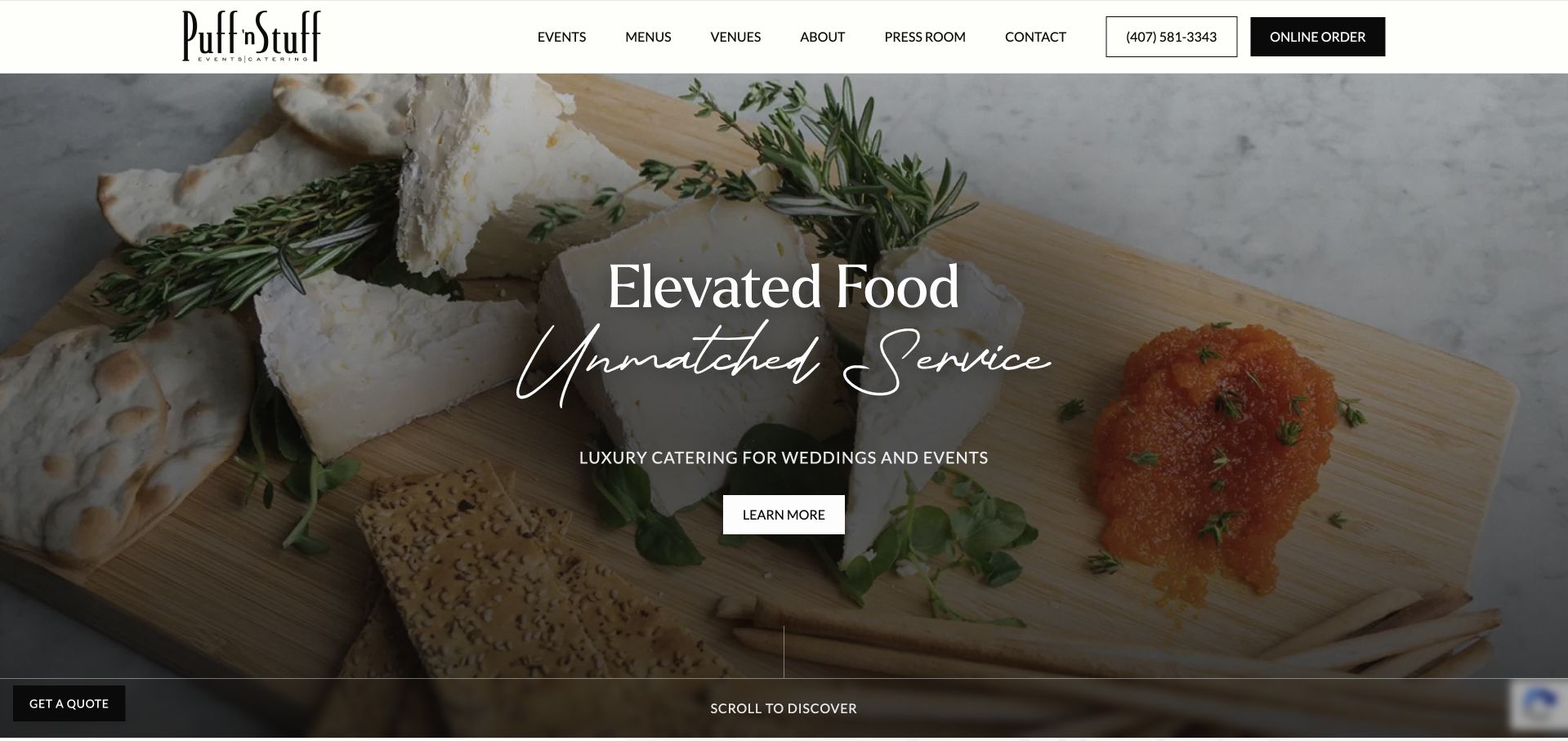
Puff ’n Stuff Catering presents a richly photographed food board beneath a restrained white header. Events, Menus and Venues describe exploration routes, while an outlined phone action and dark Online Order button offer more immediate tasks. The hero combines serif and script lettering with a short events statement. A separate Get Quote control appears toward the lower edge, revealing the distinction between planning an event and placing an order.
What you can learn
Give each transaction its own state and language. An event inquiry may need date and guest-count context, while direct ordering has a different sequence. Avoid one ambiguous modal for both. The dated Alpine script supports a public-page association only; neither the photograph nor that reference proves how orders or inquiries are processed.
Pros
Navigation makes menus and venues available without requiring an inquiry first.
Direct ordering receives a visually distinct action beside the ordinary contact options.
Cons & considerations
The generic Learn More hero label gives little indication of the next page.
Decorative lettering and a busy photograph need careful contrast and text-size choices.
Platform source: Dated public Alpine.js script reference. Dated public script reference on puffnstuff.com; no attribution of individual controls or private backend. Platform evidence is separate from the direct website screenshot and is not a complete current infrastructure audit.
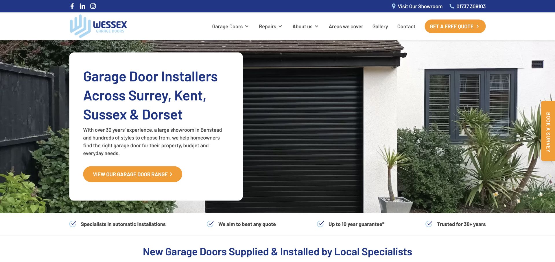
Wessex Garage Doors surrounds a photograph of an installed black door with a practical navigation system. Product ranges, repairs, coverage and contact sit above a white introductory card. Orange actions distinguish a quotation, product exploration and a vertical survey invitation. The real installation makes the service easy to picture, but the several calls to action create a design question: which next step best fits someone who already knows their problem?
What you can learn
Define whether a visitor is browsing styles, requesting a repair or arranging a survey before designing any disclosure. Each route should retain its label and selected context when panels change. Alpine is identified in a dated theme script; the collection does not attribute quote handling or the survey workflow to that script.
Pros
The installed product gives visitors a concrete reference for the service category.
Repair and product browsing remain explicit choices in the main navigation.
Cons & considerations
Quote, range and survey actions compete for attention within the same opening view.
Several header layers reduce the space available for explanatory content on smaller screens.
Platform source: Dated public Alpine.js script reference. Dated public script reference on wessexgaragedoors.co.uk; no attribution of individual controls or private backend. Platform evidence is separate from the direct website screenshot and is not a complete current infrastructure audit.
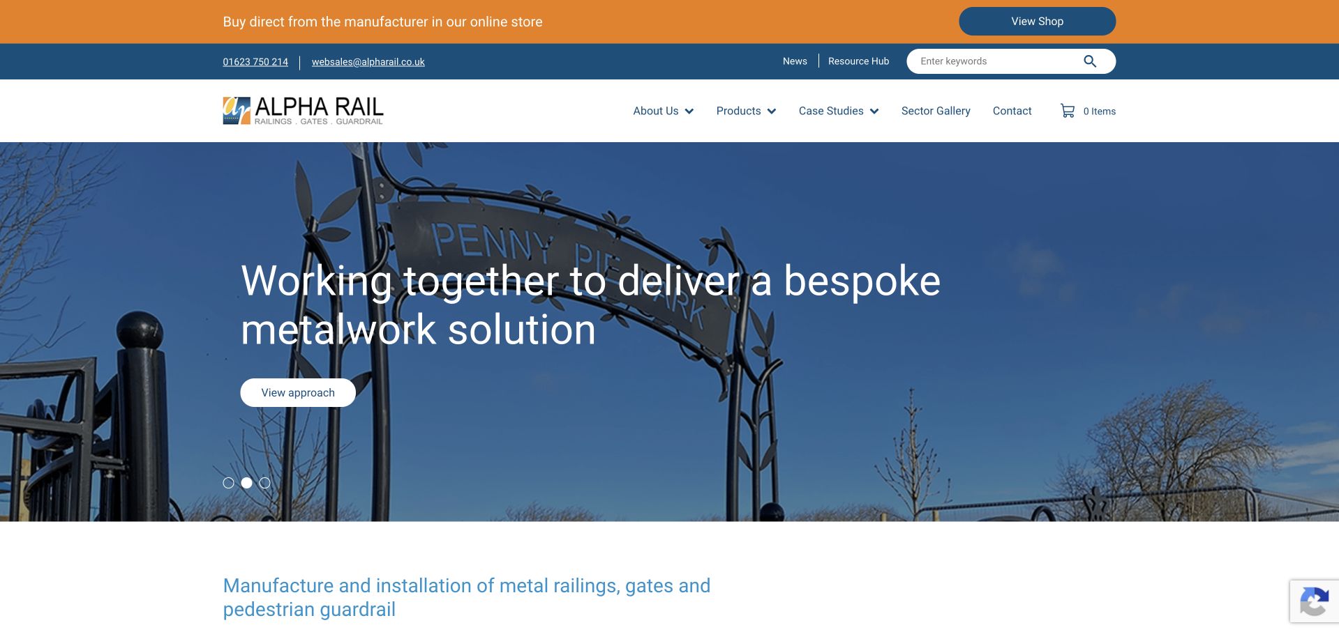
Alpha Rail places a bright shop announcement above a blue utility strip and white primary header. Products, Case Studies and Sectors offer different paths into its metalwork portfolio, while a small cart indicator suggests a separate buying route. The hero photograph shows gates in their setting, with a short white message and a View Our Approach button. Three small pagination dots indicate additional promotional panels beneath the main narrative.
What you can learn
Map shop state, navigation disclosure and campaign selection separately. The cart should preserve its meaning when someone enters a project case study, and service inquiries should not require shopping behavior. The dated public Alpine reference establishes library presence; it does not identify the commerce platform or show which control receives Alpine events.
Pros
Products and case studies offer useful alternatives for visitors with different levels of certainty.
The installed gate photograph connects the offer to a recognizable physical result.
Cons & considerations
Three stacked header areas make the initial route choice visually busy.
An approach-oriented hero button is less specific than a product or project destination.
Platform source: Dated public Alpine.js script reference. Dated public script reference on alpharail.co.uk; no attribution of individual controls or private backend. Platform evidence is separate from the direct website screenshot and is not a complete current infrastructure audit.
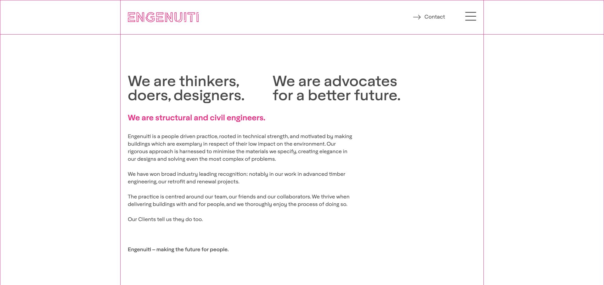
Engenuiti organizes its opening around thin pink rules, an outlined wordmark and two large text statements. A smaller colored line identifies structural and civil engineering, followed by compact explanatory paragraphs. Contact and a menu icon sit quietly in the upper right. The unusually open composition demonstrates that a site with public Alpine evidence need not present an elaborate application interface: the main value can remain in carefully structured text.
What you can learn
Start with a readable document and add only the disclosures the navigation needs. Keep project destinations discoverable and avoid hiding essential explanations behind interface state. The saved reference names an older Alpine distribution, so this example should not be treated as a current-version implementation recipe or evidence of a recent upgrade.
Pros
Typography and spacing give the service explanation a clear sequence without a large photograph.
Contact remains visible while the rest of the navigation is compact.
Cons & considerations
The menu icon conceals project and sector choices from an initial scan.
Large empty areas can delay access to specific examples on a shorter viewport.
Platform source: Dated public Alpine.js script reference. Dated public script reference on engenuiti.com; no attribution of individual controls or private backend. Platform evidence is separate from the direct website screenshot and is not a complete current infrastructure audit.
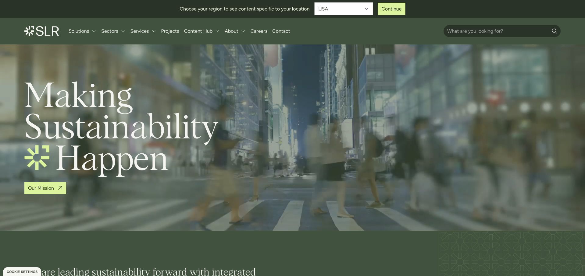
SLR Consulting puts a region selector and Continue action in a slim green strip above its main navigation. Solutions, Sectors, Services and Projects then offer several ways into the consultancy's work. Below, a blurred urban photograph supports a large sustainability statement with a lime accent and mission link. The visible region control is especially useful as a planning reference because it exposes a choice instead of leaving the visitor to infer which territory is active.
What you can learn
Make region state readable and reversible, then decide which links and content actually depend on it. Avoid silently changing an inquiry destination when a menu closes. The public vendor script provides dated Alpine evidence; neither that reference nor the screenshot verifies automatic geolocation or the underlying routing implementation.
Pros
The region choice is explicit and visually separate from the main content categories.
Projects and sector routes give visitors alternatives to the broad mission statement.
Cons & considerations
Solutions, services and sectors need clear distinctions to avoid overlapping navigation choices.
Large white hero text over photography requires contrast checks across responsive crops.
Platform source: Dated public Alpine.js script reference. Dated public script reference on slrconsulting.com; no attribution of individual controls or private backend. Platform evidence is separate from the direct website screenshot and is not a complete current infrastructure audit.
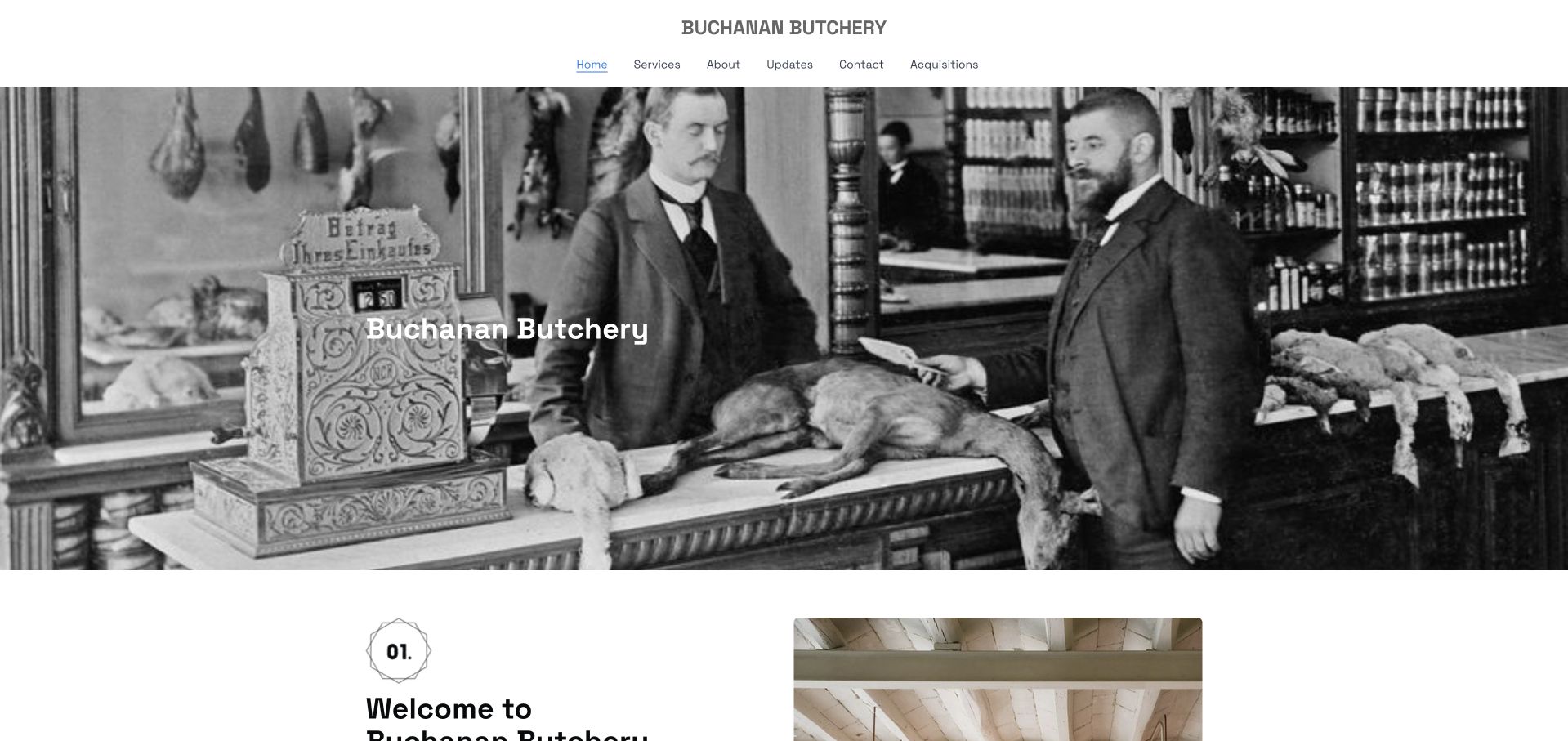
Buchanan Butchery centers an uppercase wordmark above a short row of literal navigation labels. A large monochrome shop photograph dominates the opening, with a small company title placed over it. Below, the next section begins a numbered introduction alongside another image. The composition offers a useful counterpoint to more interactive references: a public Alpine association can exist on a largely editorial page whose main job is introducing a business.
What you can learn
Use that restraint as a scope check. Keep ordinary content and destinations in the document, then identify whether any small disclosure genuinely helps visitors. A dated script reference is evidence of an included library, not proof that this page needs a complex component system. The photograph also cannot independently verify the business's operating history.
Pros
Short navigation labels give the company information a predictable structure.
The monochrome image creates a coherent visual tone without several competing promotions.
Cons & considerations
The opening repeats the company identity before explaining the practical offer.
The oversized image postpones service and location information until farther down the page.
Platform source: Dated public Alpine.js script reference. Dated public script reference on buchananbutchery.com; no attribution of individual controls or private backend. Platform evidence is separate from the direct website screenshot and is not a complete current infrastructure audit.
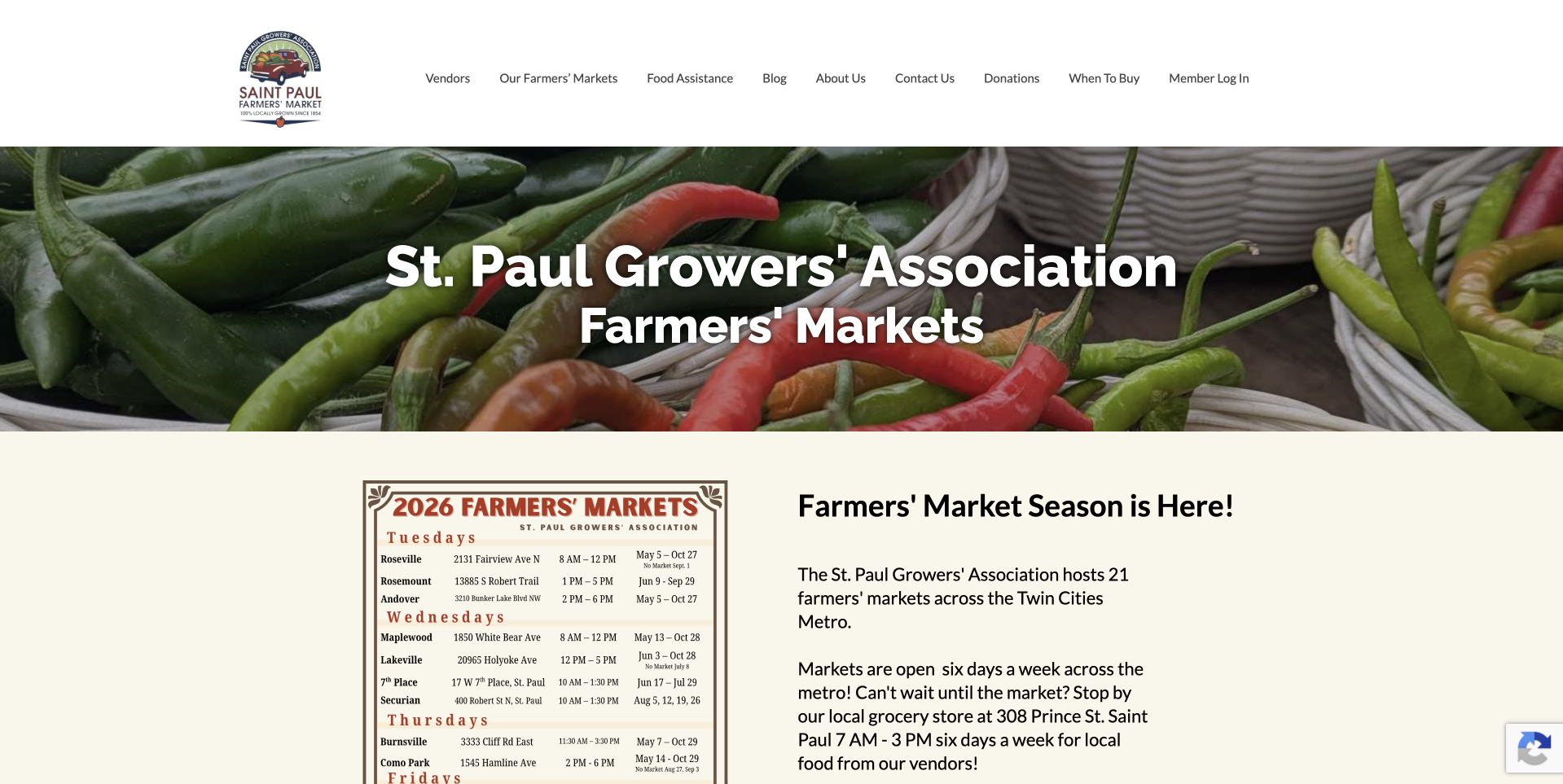
St. Paul Farmers’ Market uses a compact crest and a long navigation row above a bright pepper photograph. Vendors, markets and food assistance are visible alongside donations and member login. Below the hero, a printed schedule image sits beside introductory seasonal copy. The contrast between public planning information and member access makes this a useful reference for organizations that serve both occasional visitors and a continuing professional community.
What you can learn
Keep those audiences distinct when designing menu disclosures. A visitor should find market information without entering an account flow. Put essential schedule details in accessible text as well as any poster. The saved audit was partial, with a positive Alpine reference inside an Elementor package; it is not evidence of a complete platform inspection.
Pros
Market, vendor and assistance routes use recognizable task-oriented labels.
The schedule is introduced early enough to support practical visit planning.
Cons & considerations
A schedule supplied as an image can be difficult to read on a narrow screen.
The long navigation row and large hero compete with the more useful planning details.
Platform source: Dated public Alpine.js script reference. Dated public script reference on stpaulfarmersmarket.com; no attribution of individual controls or private backend. Included through an Elementor package. Broad audit remained partial; positive script evidence only. Platform evidence is separate from the direct website screenshot and is not a complete current infrastructure audit.
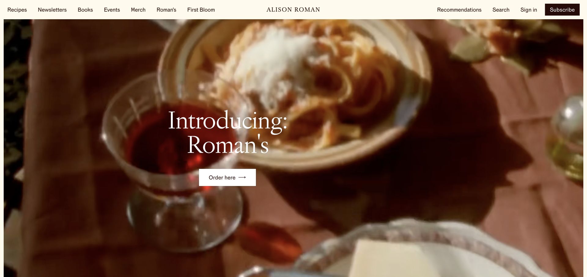
Alison Roman's captured opening uses a cream navigation bar with recipes, newsletters, books and events on one side, plus search, sign-in and subscription actions on the other. A large food-and-drink photograph introduces Roman's with a centered serif headline and order button. This creates a clear editorial design problem: a current retail campaign needs prominence without displacing the archive and membership routes that returning readers expect.
What you can learn
Treat search, account access and a promotional action as separate pieces of interface state. Keep archive links stable as campaigns change, and label any transition into a shop clearly. Alpine appears in the dated public script record; this review does not identify the implementation of paid memberships, order processing or the site's private publishing tools.
Pros
The navigation keeps several content formats visible above the featured campaign.
The centered headline and single order action give the photograph a definite purpose.
Cons & considerations
A dense collection of small header links needs careful grouping on smaller screens.
The tall campaign image postpones recent recipes or article choices beyond the opening view.
Platform source: Dated public Alpine.js script reference. Dated public script reference on alisoneroman.com; no attribution of individual controls or private backend. Platform evidence is separate from the direct website screenshot and is not a complete current infrastructure audit.
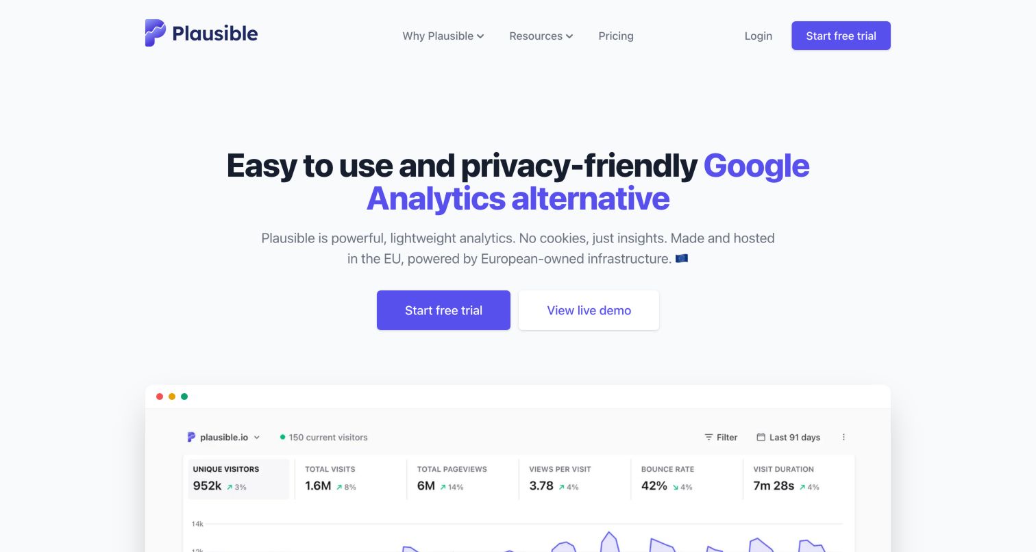
Plausible's marketing page places a black-and-purple headline above a short explanation and two adjacent actions: a filled trial button and an outlined live-demo button. A large dashboard preview follows, beginning with a row of metrics and the top of a chart. The restrained pale background keeps the product image central. The useful interaction pattern is the distinction between exploring an example and making a commitment to create an account.
What you can learn
Preserve those two intents when adding interactive menus or product demonstrations. An exploratory action should explain whether it opens a public demo or begins a registration flow. The dated Alpine asset belongs to the public marketing property; it does not independently establish the architecture of the private analytics application or validate its privacy claims.
Pros
Trial and demonstration actions have distinct labels and a clear visual hierarchy.
The dashboard preview helps explain the product with something more specific than abstract artwork.
Cons & considerations
Preview metrics are illustrative content rather than evidence of visitor or performance outcomes.
Product claims still require evaluation beyond what can be learned from a homepage capture.
Platform source: Dated public Alpine.js script reference. Dated public script reference on plausible.io; no attribution of individual controls or private backend. Platform evidence is separate from the direct website screenshot and is not a complete current infrastructure audit.
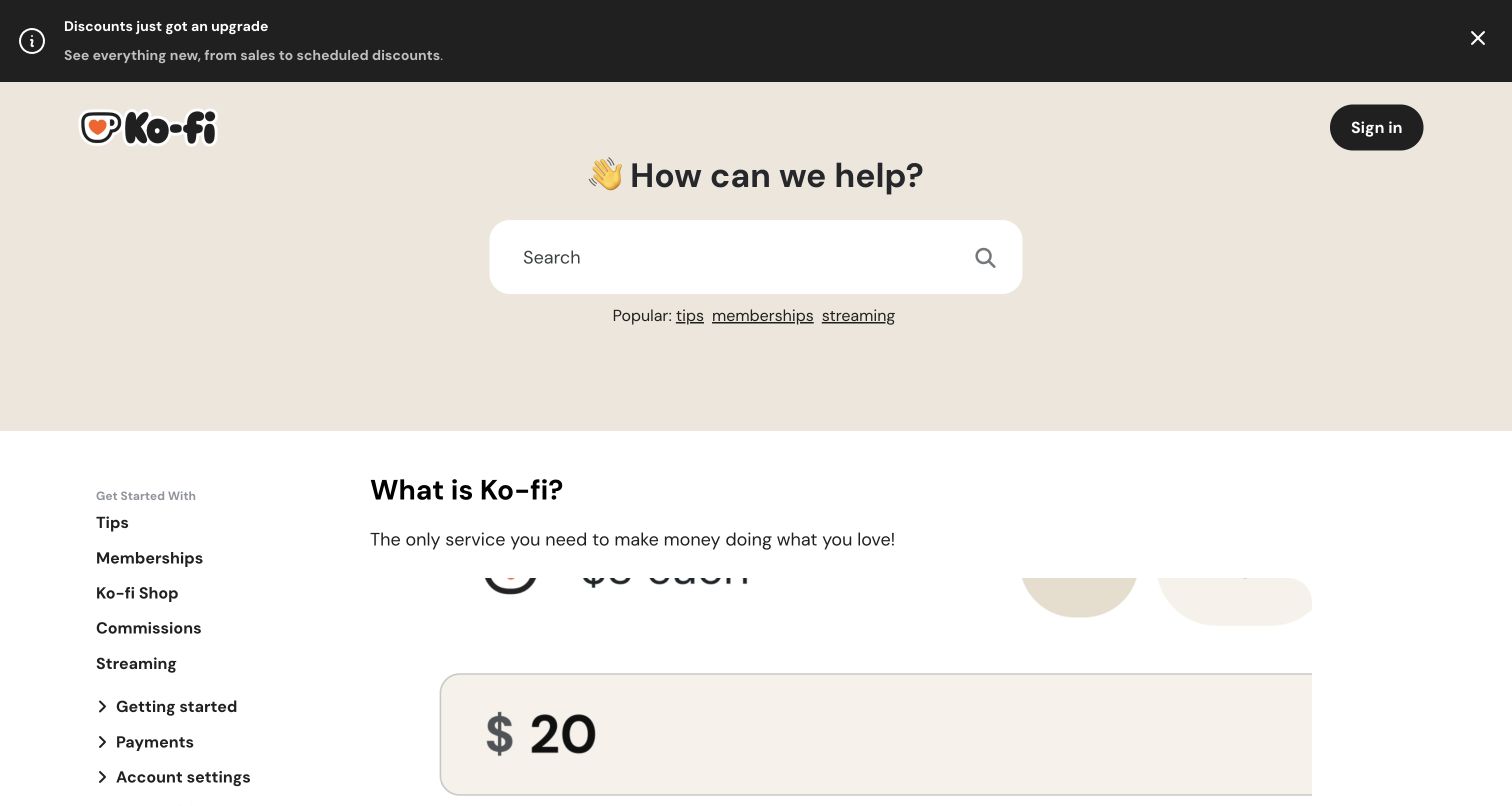
Ko-fi Help combines a dark announcement strip with a warm introductory area, large question and rounded search field. Popular topics appear beneath the search, while the next section introduces a persistent topic list beside article content. Tips, Memberships, Shop and Commissions describe concrete user tasks. The announcement has a small close control, making it a separate temporary layer above the more durable support structure.
What you can learn
Design notice dismissal and topic disclosure as independent states. Closing an announcement should leave both the search and category links easy to reach. Preserve meaningful article URLs rather than making navigation depend entirely on a panel. The public Alpine evidence is specific to this help center and does not establish how Ko-fi handles payments or creator accounts.
Pros
A persistent topic list supports visitors who cannot describe their issue in a search query.
The announcement is visually separated from the enduring support navigation.
Cons & considerations
The notice and generous hero area push detailed help content farther down the opening view.
Several topic groups need clear expanded-state labels when adapted to a compact mobile menu.
Platform source: Dated public Alpine.js script reference. Dated public script reference on help.ko-fi.com/hc/en-us; no attribution of individual controls or private backend. Platform evidence is separate from the direct website screenshot and is not a complete current infrastructure audit.
Kegan has 15+ years of experience working with small businesses, Fortune 500 companies, and everything in between. No development job is too big or too small: he brings the same hands-on attention to a focused improvement, a complete website, or a custom application.
For Alpine.js projects, he can help with responsive interfaces, reusable components, custom functionality, API connections, and performance-minded implementation. He works directly with clients on scope, design, implementation, testing, and handover, with an emphasis on clear communication and a system that remains practical to maintain after launch.
Show 3 other Alpine.js developersHide other Alpine.js developers
Choose the smallest maintainable interactive layer
Enhance an existing content site
Start with one representative menu, filter or announcement. Write the expected behavior in plain language and agree which parts of the page remain static. This approach is useful when the content model and URLs already work and the missing piece is a focused interaction. Demonstrate the result using realistic labels and long content before multiplying it across templates.
Work within a theme or plugin’s existing ownership
Several examples expose Alpine through a theme or an Elementor package. That is different from choosing a library for a new custom component. Identify who supplies and updates the existing dependency before adding another copy. Keep custom behavior in a documented extension point and check whether a theme update could replace the markup that the enhancement depends on.
Reconsider the boundary when the interface becomes a product
If a proposed page needs many coordinated workspaces, complex history or extensive shared application state, write those requirements down before committing to a small-component strategy. The right answer depends on the actual workflow and team, not the prestige of a reference brand. Compare maintenance responsibilities and failure behavior, including what happens when independent components need to agree on the same data.
From references to requirements
Plan state, content and maintenance together
Build a component inventory from visitor tasks
List each interactive region, its trigger, visible output, initial value and owner. Include secondary controls such as notice dismissal, region choice and account menus. Record whether a state belongs only to the current page, should survive navigation or should disappear when the session ends. Do not persist preferences or identifiers simply because browser storage is easy to access.
Set the security policy before choosing an expression style
The official documentation provides an alternate Alpine build for environments that disallow unsafe evaluation. Review its supported syntax against the real project policy before implementation. Do not loosen a production policy just to make a copied demonstration run. Keep private credentials and privileged business decisions on the server, regardless of which library manages the visible interface.
Assign responsibility for content changes and upgrades
A long navigation label, missing image or expired campaign can expose a component problem even when the JavaScript has not changed. Give editors representative examples and document which settings they can change safely. Name a maintainer for dependency updates, integration checks and rollback. Keep the chosen version and build route reproducible rather than treating an unpinned demonstration URL as a maintenance plan.
A useful handover demonstration
Ask the actual team to carry out its routine job: publish a realistic update, correct a mistake, preview a narrow screen, and identify who owns an integration failure. For a library or frontend framework, also ask who maintains the content source and deployment. A polished screenshot does not answer those operational questions.
Beyond the screenshot
An Alpine.js project checklist
Name the task, initial state and owner of every interactive component.
Keep essential content and meaningful destination links available in the document.
Check buttons, accessible names, expanded states and keyboard focus behavior.
Define dismissal, outside interaction and return-focus behavior where appropriate.
Exercise empty results, interrupted requests, long labels and missing optional content.
Check initialization behavior so hidden panels do not flash unexpectedly.
Respect reduced-motion preferences and avoid hiding information behind animation.
Verify the selected Alpine build against the project’s existing security policy.
Avoid duplicate library initialization from a theme, plugin and custom bundle.
Keep server authorization and validation independent from browser interface state.
Record dependency versions, editing boundaries, deployment ownership and rollback steps.
Verify real public routes after deployment without creating test transactions or account writes.
Test with real content, a keyboard, a small screen, slow or failed requests, and the people who will maintain the system. These are planning checks, not an accessibility, security, performance, or search-ranking certification.
Sources & editorial method
How this Alpine.js collection was reviewed
We selected twenty distinct public website properties with explicit Alpine.js script references in their saved technology evidence. Each has a genuine direct browser capture with its original URL, dimensions, attribution and date. Collection-specific reviews were written on November 9, 2026 after inspecting those images. Reusing a capture or audit does not refresh its observation date. The first five properties are identified through their official institutional, corporate or support pages. Broad audit attempts remain recorded for every source; Jury Eye Care and St. Paul Farmers’ Market retain partial status with their positive script observations. Reviews assess visible design, not measured conversion, service quality, accessibility certification or private application behavior. We do not attribute individual controls to Alpine without component-level evidence.
Every image is an unmodified capture from the actual website, with its source and capture date. Some captures are reused from our shared catalog; their dates remain the original capture dates. None comes from a vendor gallery or a generated reconstruction. Moving imagery and live content can change.
Technology attribution uses public page assets or metadata, official platform documentation, or a cited first-party project case study. Documentary and framework-relationship evidence is identified where used; it is not a complete current backend inventory. A CMS image CDN alone does not establish a full CMS deployment. A library’s presence does not prove which individual controls use it, and a platform label does not establish AI authorship.
The composition notes, lessons, pros and tradeoffs are original editorial observations. We have not measured conversion, traffic, security, performance or accessibility conformance. Website owners retain their brands and imagery; these examples are not our client portfolio. Written, Edited and Curated are independent records, not dates advanced by a build. See our editorial standards or suggest a correction.
Questions worth asking
Alpine.js website development FAQs
Does an Alpine.js script mean the entire website is built with Alpine?
No. It establishes a public reference at the observed page and date. Alpine may supply a focused enhancement or arrive through a theme or plugin. The evidence does not establish the CMS, backend or implementation of every visible control.
Can Alpine.js support a small dropdown or disclosure?
Yes. The official introduction demonstrates state and event handling in HTML, and x-show controls whether an element is visible. A finished disclosure still needs appropriate labels, keyboard behavior, focus handling and a usable content structure.
Are the support-center examples evidence about their parent applications?
No. Zapier Help Center, Substack Help Center and Ko-fi Help are the named public properties in this collection. Their evidence is not extended to automation workflows, newsletter publishing, creator payments or other private systems.
Do these screenshots show the current version of every website?
They show the page at its stated capture date. The collection preserves those dates and the separate technology-observation dates. A new review or rebuild does not make an older screenshot a newly captured view.
Should a project weaken its security policy to use Alpine?
No. Review the official CSP build and its supported syntax against the existing policy. Select and test a compatible implementation while keeping server secrets, authorization and validation outside browser-visible state.
Borrow a clear division of tasks before borrowing an animation. A focused component is successful when people understand its choices, can recover from an interruption and can still reach the information they came for.