Definitive guide · Cloudflare Turnstile website development
Cloudflare Turnstile website examples for considerate form protection (20 Real-World Examples)
Twenty public properties with scoped Turnstile resource or documentary evidence, genuine screenshots and original reviews of the surrounding customer journey.
A security check is one part of a form. Clear labels, preserved input, truthful outcomes and a usable recovery path determine whether people can complete the task around it.
Cloudflare Turnstile is a verification service that websites can integrate into protected actions. This collection includes exact public script references and first-party statements naming its use. Those observations establish scoped associations, not security effectiveness. A script may load globally, and a policy may describe a particular form that is not visible in the homepage capture.
The reviews focus on the interface surrounding potential verification: enquiries, account access, newsletter signup, quote requests and other customer tasks. No real forms or challenges were submitted. The screenshots do not validate backend enforcement, privacy practices, legal compliance or the security of any example website.
Before the examples
What makes good Cloudflare Turnstile website development in 2026?
Validate the token on the server
Cloudflare requires server-side Siteverify validation; displaying the client widget alone is insufficient. Tokens expire after five minutes and can be validated only once. Treat the result as part of the protected server action, and do not report success to the visitor until that action has actually completed.
Turnstile supports implicit rendering from markup and explicit rendering controlled by application code. Match that choice to the form lifecycle, especially when forms appear conditionally or several widgets share a page. Reserve space for status messages so the interface does not jump when verification becomes visible.
A visitor should be able to distinguish missing information, a verification problem and an unavailable service. Preserve appropriate entered content after recoverable errors, keep an alternative contact route visible and avoid presenting an indefinitely disabled button without an explanation. These are interface recommendations, not claims about the behavior of the examples.
Nalgene, Freshpet, Bianchi, Rapala’s Canadian storefront and Kuoni’s UK property open the collection. Fifteen examples have dated exact-page Turnstile script references. Five additional properties explicitly name Turnstile in their own public policies, with the stated form or newsletter scope retained.
We start with five recognizable brands or organizations: Nalgene, Freshpet, Bianchi, Rapala Canada, Kuoni. Each attribution applies to the named website property, not every product or website belonging to its organization. This is a curated reading sequence, not a measured ranking.
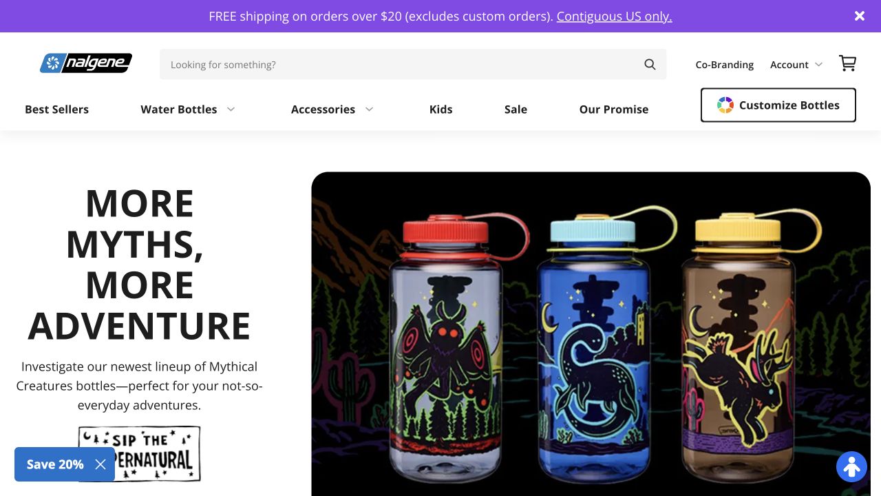
Nalgene pairs a bold product headline with a large photograph of three illustrated bottles. A prominent search field and category navigation sit above the campaign, with account, cart and bottle customization routes nearby. The source page has an exact Turnstile script reference, but the capture does not reveal which protected action uses it or whether server validation succeeds. Its value for this collection is the surrounding experience: security controls need to coexist with a busy retail interface without obscuring product choices or making the next step ambiguous. The design gives standard shopping and customization different entry points before the visitor reaches any data-entry process.
What you can learn
Map verification to the specific action it protects. Keep account access, search and customization visually distinct, and provide a clear recovery message if a later form cannot obtain or validate its token. Do not treat a script reference as proof of successful protection.
Pros
Search remains prominent above the campaign imagery.
Customization has its own clearly labeled entry point.
Cons & considerations
The shipping and discount messages add competing promotional layers.
The capture cannot establish which form invokes the referenced verification script.
Platform source: Public reference: nalgene.com. Linked script matches Cloudflare Turnstile on 2026-11-03: https://challenges.cloudflare.com/turnstile/v0/api.js. The script reference does not establish which form uses it or whether server-side validation is enforced. Platform evidence is separate from the direct website screenshot and is not a complete current infrastructure audit.
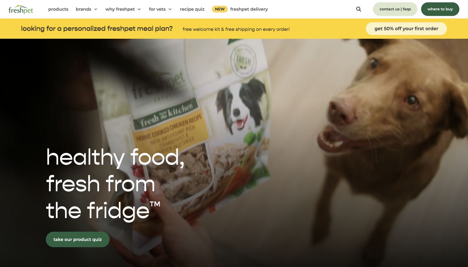
Freshpet opens with a close scene of a dog and refrigerated pet-food packaging, overlaid with a short product message and a quiz action. The white header separates products, brands, veterinary information, a recipe quiz and delivery, while a yellow promotional strip introduces a direct-order offer. The audited page references Turnstile, but that alone does not identify the protected workflow or demonstrate a successful challenge. The design is useful because it exposes several different intentions before asking for information. A shopper looking for a nearby stockist, a visitor exploring a quiz and someone considering delivery should not encounter an unexplained verification step that blurs those journeys.
What you can learn
Explain the purpose of each information-gathering path before placing security checks within it. Preserve quiz answers through recoverable errors and distinguish a verification problem from product eligibility, delivery availability or a normal form validation message.
Pros
The header separates retail, delivery and professional information routes.
The quiz action provides a concrete next step from the brand story.
Cons & considerations
The delivery promotion competes with the main quiz invitation.
The public script evidence does not identify the exact protected submission.
Platform source: Public reference: freshpet.com. Linked script matches Cloudflare Turnstile on 2026-11-04: https://challenges.cloudflare.com/turnstile/v0/api.js. The script reference does not establish which form uses it or whether server-side validation is enforced. Platform evidence is separate from the direct website screenshot and is not a complete current infrastructure audit.
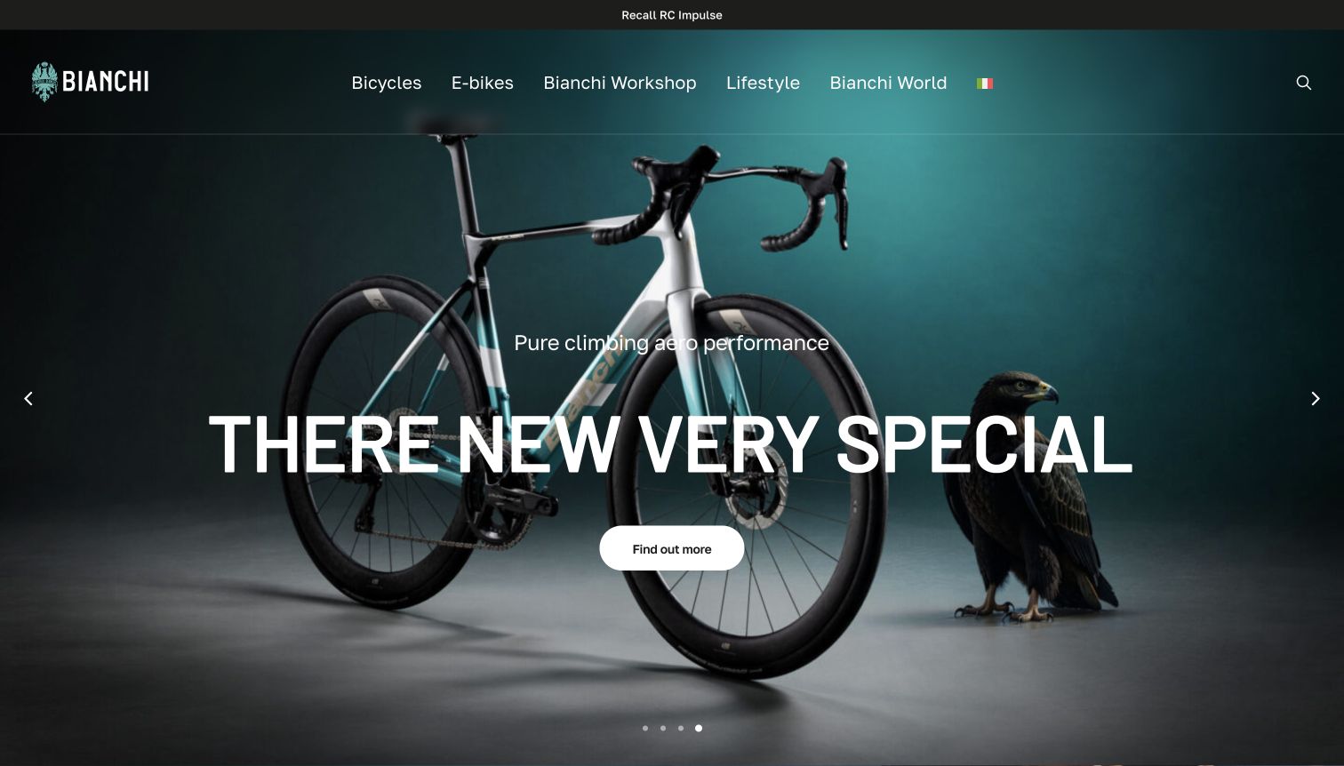
Bianchi gives a road bicycle a dramatic studio setting, using dark teal tones, a large overlaid heading and a compact detail action. A slim recall notice remains above navigation for bicycles, electric models, workshop and lifestyle. The capture preserves the browser’s translated wording, including an awkwardly rendered hero title. Exact Turnstile resources were observed on the page, but the screenshot does not establish that the hero or any specific contact flow uses the widget. For this collection, the important interface lesson is that a strong promotional identity still needs dependable practical routes. Service or ownership enquiries should remain understandable when a visitor moves beyond the campaign into a protected form.
What you can learn
Keep safety and service information outside promotional interaction. When verification belongs in an enquiry flow, explain failures beside the relevant action and preserve the person’s selected model and message rather than making them restart from the homepage.
Pros
The recall route remains visible above the promotional content.
The full bicycle silhouette communicates the product clearly.
Cons & considerations
The observed translation disrupts the main product heading.
Resource evidence alone does not confirm the behavior of a protected enquiry form.
Platform source: Public reference: bianchi.com. Linked script matches Cloudflare Turnstile on 2026-11-04: https://challenges.cloudflare.com/turnstile/v0/api.js. The script reference does not establish which form uses it or whether server-side validation is enforced. Platform evidence is separate from the direct website screenshot and is not a complete current infrastructure audit.
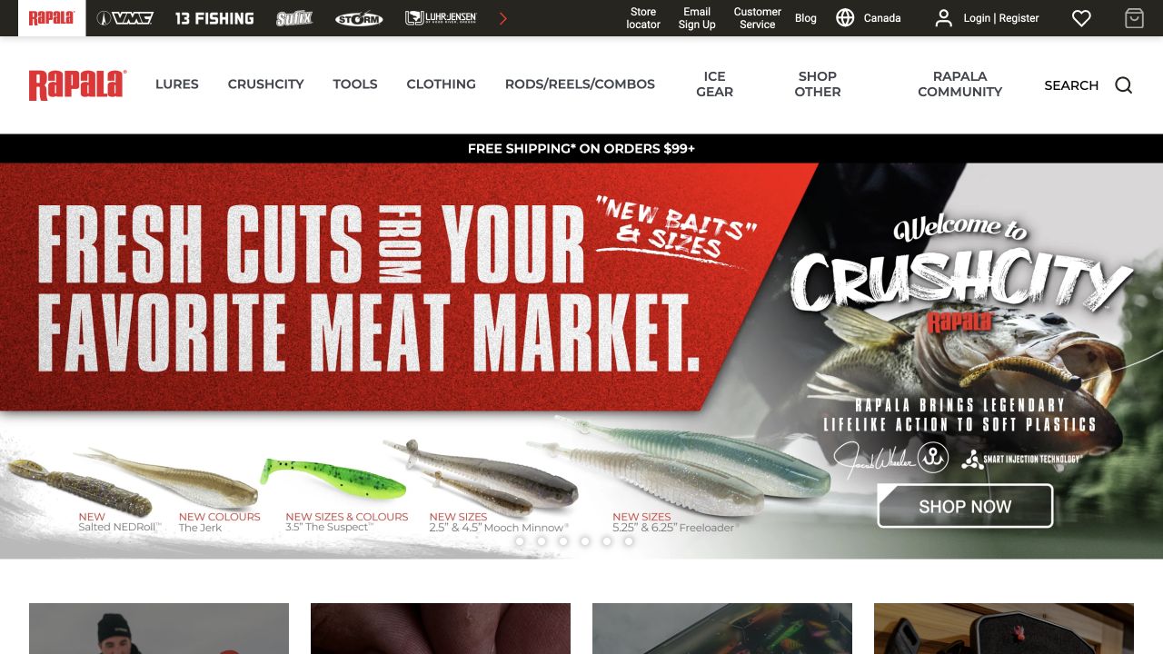
Rapala’s Canadian property combines a black group-brand strip with a white product navigation row and a large red campaign for fishing lures. Account, order status, customer service and a regional indicator appear in the upper interface. Several product categories and a separate search route surround the campaign. The exact public page references Turnstile, which establishes a scoped resource association rather than proof of checkout or account protection. The design is useful for studying how verification fits into a catalog with many utility paths. Visitors should be able to distinguish browsing, support and account tasks before being asked to complete an action that depends on a security token.
What you can learn
Keep region and task context visible through protected forms. If an account or support submission fails verification, retain the selected country and entered non-sensitive content, and explain the recovery path without implying that the shopper’s account details were necessarily incorrect.
Pros
Regional context appears alongside the account and service utilities.
Product categories remain available outside the featured campaign.
Cons & considerations
Two dense navigation bands compete for limited vertical space.
The capture does not show which submission uses the Turnstile reference.
Platform source: Primary platform or implementation reference. Linked script matches Cloudflare Turnstile on 2026-11-03: https://challenges.cloudflare.com/turnstile/v0/api.js. The script reference does not establish which form uses it or whether server-side validation is enforced. Platform evidence is separate from the direct website screenshot and is not a complete current infrastructure audit.
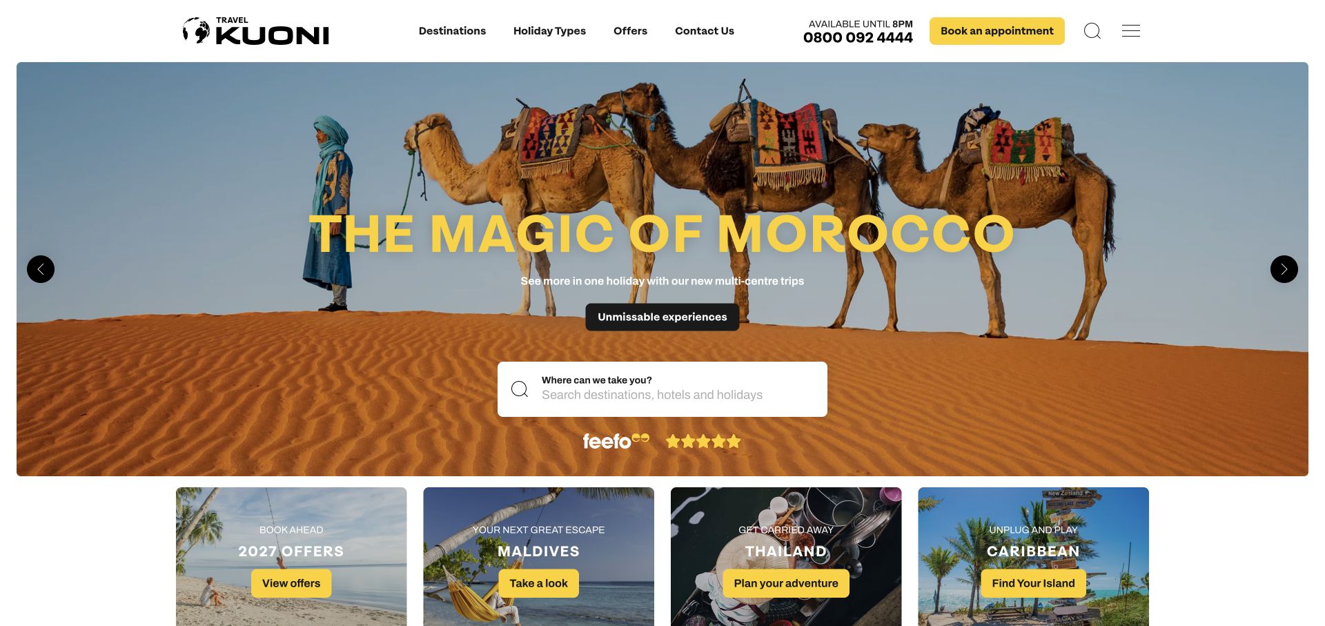
Kuoni places a desert campaign beneath a compact header with a phone number and a highlighted appointment action. A white destination search field sits over the hero, while smaller promotional cards begin immediately below. The arrangement gives visitors both self-directed browsing and a route to human advice. Turnstile resources were observed on the exact public page; no enquiry or appointment form was submitted, so the review does not verify the protection of those processes. The useful design issue is continuity: a person who moves from an inspirational destination panel into an enquiry should retain that context if verification needs to refresh or a network problem interrupts the next step.
What you can learn
Carry destination context into the enquiry journey and keep alternative contact routes visible. Security feedback should explain what happened to the submission, distinguish retryable verification trouble from missing form fields and avoid silently clearing a carefully written holiday brief.
Pros
Search and adviser contact offer different ways to begin planning.
The appointment action is visually distinct within the header.
Cons & considerations
Several campaign cards add competing destinations below the main search.
The captured homepage does not establish protected-form success or failure behavior.
Platform source: Public reference: kuoni.co.uk. Linked script matches Cloudflare Turnstile on 2026-11-03: https://challenges.cloudflare.com/turnstile/v0/api.js. The script reference does not establish which form uses it or whether server-side validation is enforced. Platform evidence is separate from the direct website screenshot and is not a complete current infrastructure audit.
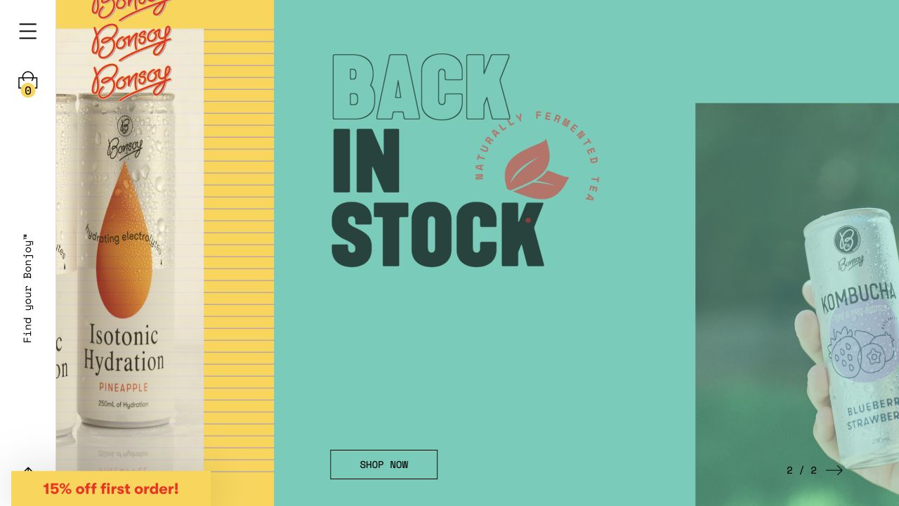
Bonsoy divides the screen into colorful campaign areas, with oversized type, a product can and a narrow white utility rail on the left. A restrained Shop now button appears within the teal panel, while a first-order offer sits near the lower edge. The visual presentation is much more expressive than the surrounding navigation. Exact Turnstile references were observed in the page’s resources, but the visible campaign does not reveal a challenge or identify the protected form. This makes it a useful example of separating the brand experience from the security mechanism: visitors should be able to browse the product story normally before a particular submission requires verification.
What you can learn
Keep verification close to its relevant action rather than allowing it to dominate an editorial landing page. For newsletter or account forms, provide clear labels and a recoverable error state that fits the visual system without hiding essential instructions in decorative typography.
Pros
The product can remains identifiable within the bold graphic composition.
The shopping action is separate from the first-order promotion.
Cons & considerations
Very large campaign lettering leaves little room for explanatory content.
The resource association does not reveal which action is protected.
Platform source: Exact public source-page audit. Linked script matches Cloudflare Turnstile on 2026-11-03: https://challenges.cloudflare.com/turnstile/v0/api.js. The script reference does not establish which form uses it or whether server-side validation is enforced. Platform evidence is separate from the direct website screenshot and is not a complete current infrastructure audit.
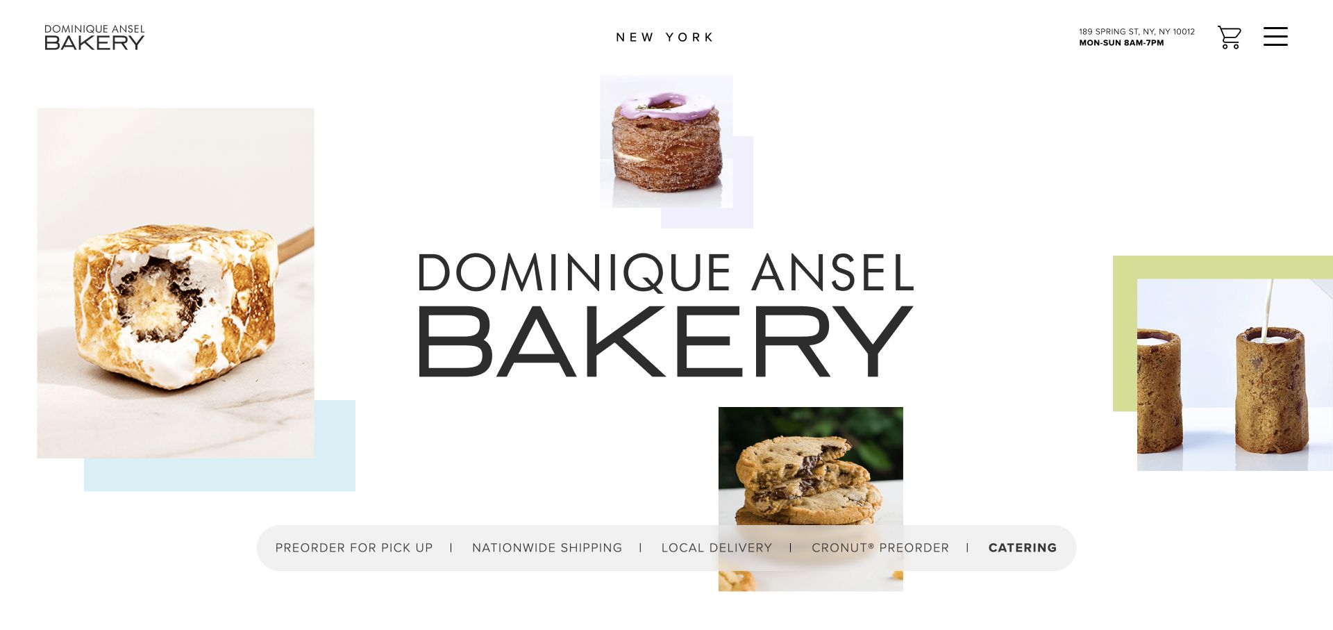
Dominique Ansel Bakery uses a spacious white canvas with scattered pastry photographs around a large central wordmark. A slim ordering strip distinguishes pickup, nationwide shipping, local delivery, a featured preorder and catering. The header adds a small address, cart and menu control. The audited source includes Turnstile resources, but the capture does not prove that any particular ordering destination invokes them. The design is valuable for a verification guide because several similar-looking customer tasks have different operational meanings. A protective check should not obscure whether a person is requesting catering information, starting an online order or simply following a link to another ordering service.
What you can learn
Name each customer action precisely before adding verification. Preserve the selected ordering mode through errors, and make transitions to outside ordering platforms clear so visitors understand where their information will be entered and which service is handling the next step.
Pros
The ordering strip distinguishes several practical fulfillment modes.
The pastry imagery communicates the product without covering the navigation.
Cons & considerations
Small utility text requires careful reading beside the oversized brand name.
The homepage capture does not verify the security behavior of linked ordering services.
Platform source: Public reference: dominiqueanselny.com. Linked script matches Cloudflare Turnstile on 2026-11-03: https://challenges.cloudflare.com/turnstile/v0/api.js. The script reference does not establish which form uses it or whether server-side validation is enforced. Platform evidence is separate from the direct website screenshot and is not a complete current infrastructure audit.
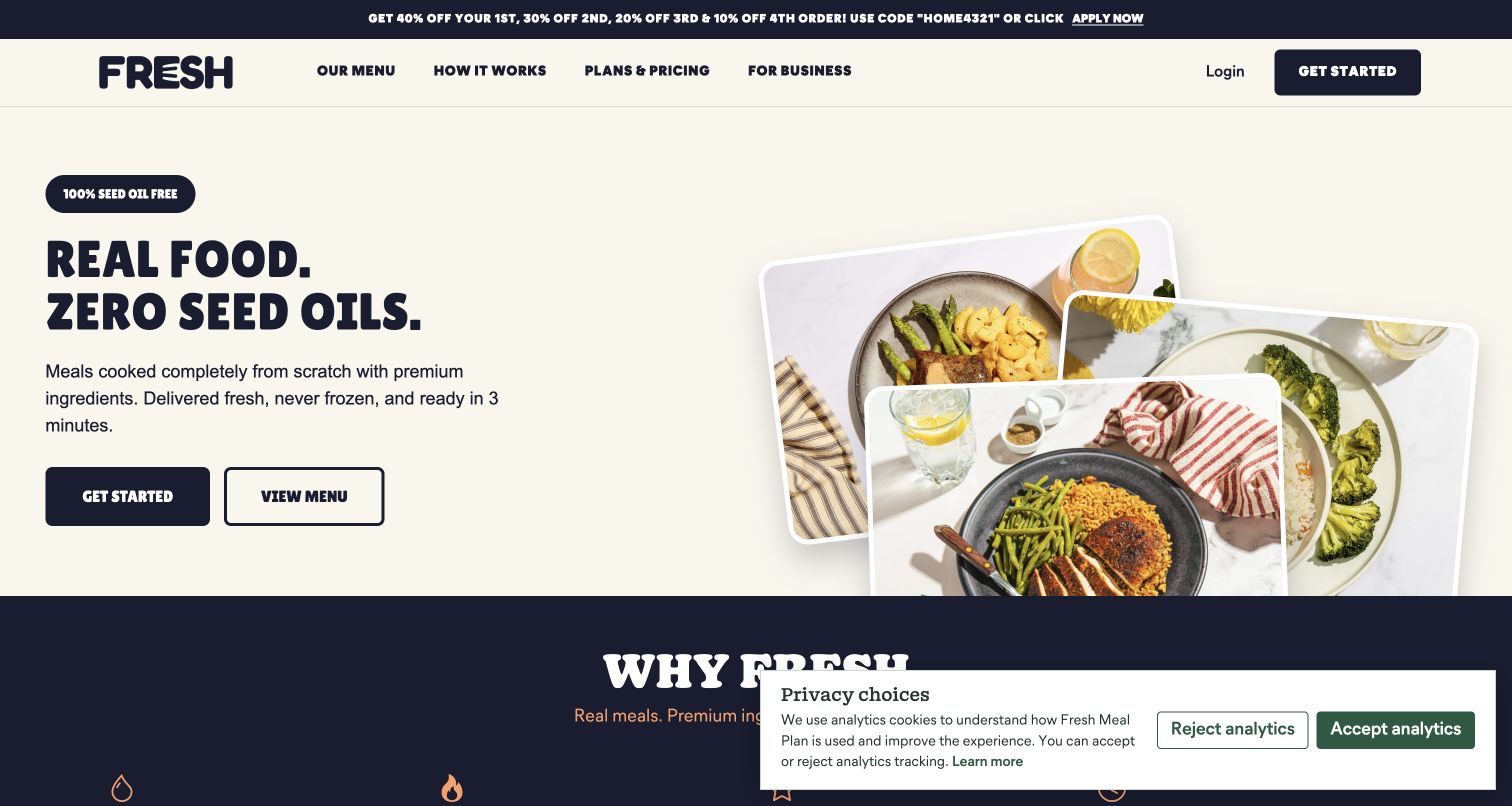
Fresh Meal Plan combines a bold food proposition with an overhead meal photograph on a pale background. Get started and View menu are presented as separate actions, while plans, pricing and business options remain in the header. A privacy-choice panel covers part of the lower screen in the captured state. The source page references Turnstile, but no signup or purchase flow was tested. The design is useful because it distinguishes evaluation from commitment: a visitor can inspect meals before starting a process that may request personal information. Verification should preserve that distinction rather than introducing an unexplained block into ordinary menu browsing.
What you can learn
Place security checks at the action that needs them and keep evaluation content readily accessible. Explain token or network errors in the signup flow without clearing selections, and ensure that privacy panels do not overlap verification status or the next-step control.
Pros
Menu browsing has a separate action from beginning signup.
The meal photograph gives the product proposition a concrete reference.
Cons & considerations
The captured privacy panel occupies space near the next content section.
The page resource evidence does not establish a successful protected signup.
Platform source: Public reference: freshmealplan.com. Linked script matches Cloudflare Turnstile on 2026-11-04: https://challenges.cloudflare.com/turnstile/v0/api.js. The script reference does not establish which form uses it or whether server-side validation is enforced. Platform evidence is separate from the direct website screenshot and is not a complete current infrastructure audit.
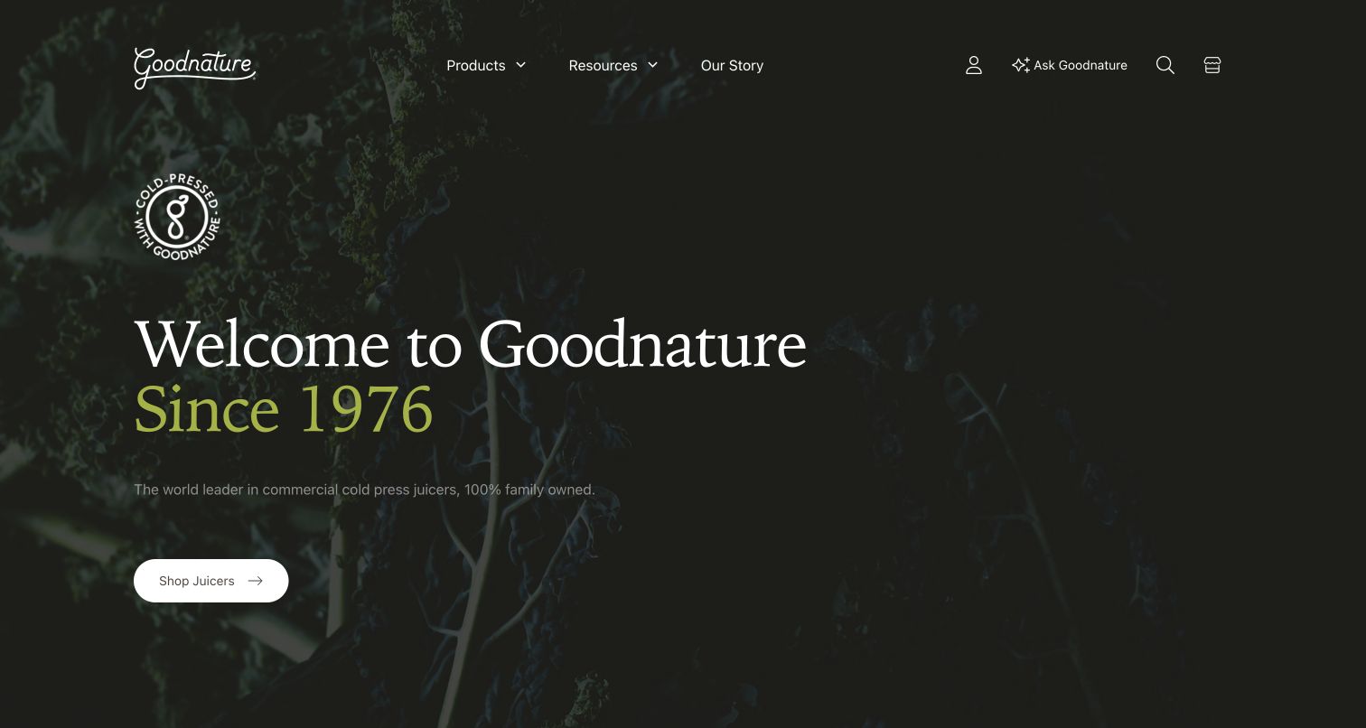
Goodnature presents its heritage over dark botanical imagery, with a direct Shop juicers action and a compact header containing products, resources and the company story. Account, search, cart and an assistant-style utility appear on the right. Turnstile is referenced by the audited public page, but the capture does not identify which of these later interactions uses it. This distinction matters when evaluating security-related technology through a visual example: the landing page shows how visitors enter the business’s different journeys, not whether a hidden validation endpoint is configured correctly. The calm layout provides room for clear instructions when a visitor eventually reaches an enquiry or account form.
What you can learn
Give each data-entry feature an explicit purpose and keep its verification feedback local. Account access, product questions and newsletter signup can share visual conventions, but their errors should tell visitors which action failed and whether their original information remains available.
Pros
Product research and company information have separate navigation routes.
The light shopping action remains visible against the dark hero.
Cons & considerations
Several small utility icons need clear labels to distinguish their purposes.
The exact protected action cannot be determined from the captured landing page.
Platform source: Prismic’s official public website gallery. Linked script matches Cloudflare Turnstile on 2026-11-03: https://challenges.cloudflare.com/turnstile/v0/api.js. The script reference does not establish which form uses it or whether server-side validation is enforced. Platform evidence is separate from the direct website screenshot and is not a complete current infrastructure audit.
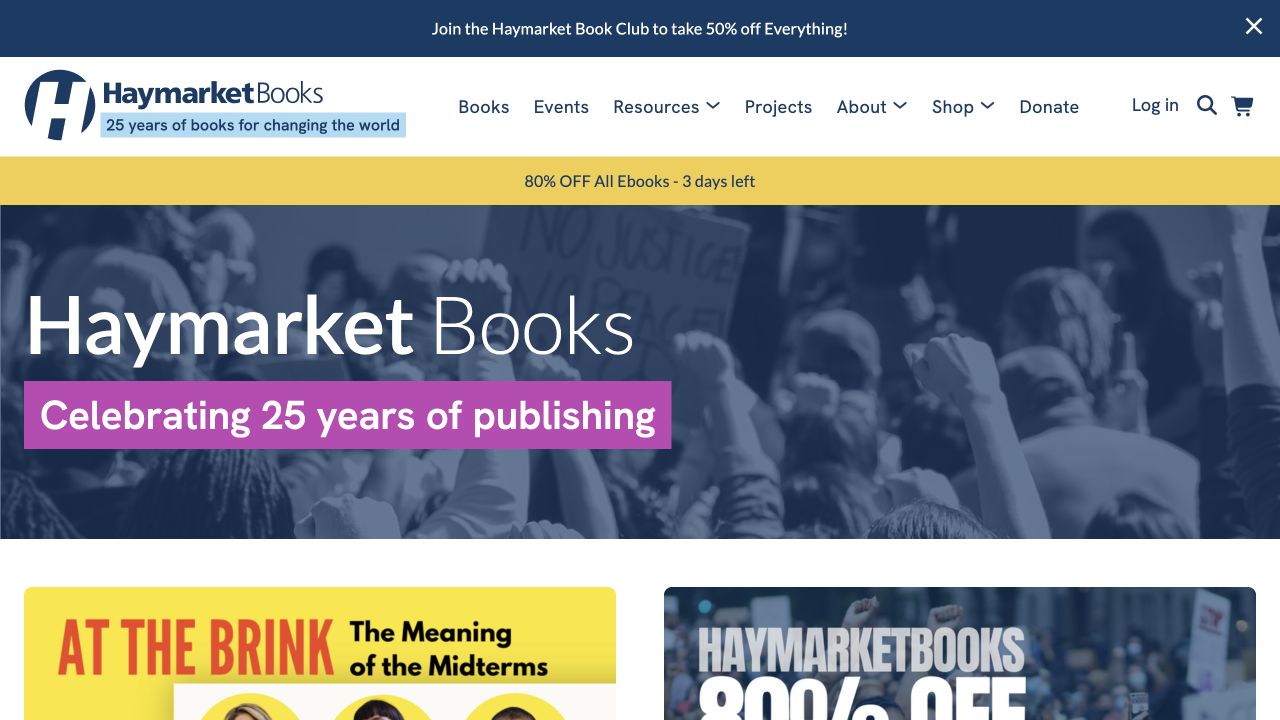
Haymarket Books combines a large anniversary banner with catalog promotions and a broad navigation row. Books, events, resources, projects, shop and donation routes appear alongside login, search and cart controls. Bright promotional strips above and below the header add urgency to the quieter blue brand treatment. The public source contains Turnstile references, but the screenshot does not establish which form is protected. For a publisher with both commerce and community activities, the useful design question is how those tasks remain distinct. A newsletter signup, donation enquiry and account login should not share vague feedback that leaves the visitor unsure what was actually submitted.
What you can learn
Design form feedback around the specific community or shopping task. Keep verification status near the submit control, maintain the visitor’s selected context and provide a clear alternative contact route when an otherwise valid message cannot be sent.
Pros
The navigation distinguishes editorial resources from shopping and donation routes.
Search and account access remain available above the featured content.
Cons & considerations
Multiple promotional banners compete with the main navigation.
The capture provides no evidence about server-side validation of protected forms.
Platform source: Public reference: haymarketbooks.org. Linked script matches Cloudflare Turnstile on 2026-11-03: https://challenges.cloudflare.com/turnstile/v0/api.js. The script reference does not establish which form uses it or whether server-side validation is enforced. Platform evidence is separate from the direct website screenshot and is not a complete current infrastructure audit.
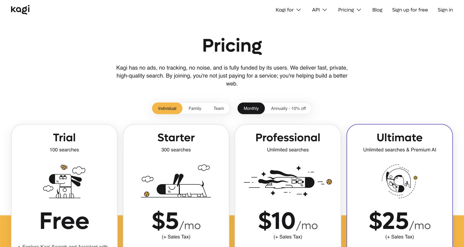
Kagi’s pricing page places four plan cards beneath a concise explanation and a set of audience and billing controls. The cards use simple illustrations, large price treatments and short allowance descriptions to make the comparison scannable. Navigation remains light, with account entry and signup at the top. Turnstile references were recorded on this exact pricing route, but no account was created and no verification result was observed. The design is useful for considering continuity between evaluation and signup: the selected plan and billing cadence should remain clear when a visitor proceeds into an account form, including when a verification token expires or a request needs another attempt.
What you can learn
Carry the chosen plan into the next step and separate payment, account and verification errors. A comparison page establishes expectations; the signup flow should preserve those choices and explain any interruption without requiring the visitor to reconstruct the decision.
Pros
Plan cards use consistent positions for price and allowance information.
Audience and billing choices appear above the comparison.
Cons & considerations
Several similar controls require clear selected states.
The public pricing capture does not demonstrate the account-verification workflow.
Platform source: Official product or provider documentation. Linked script matches Cloudflare Turnstile on 2026-11-04: https://challenges.cloudflare.com/turnstile/v0/api.js. The script reference does not establish which form uses it or whether server-side validation is enforced. Platform evidence is separate from the direct website screenshot and is not a complete current infrastructure audit.
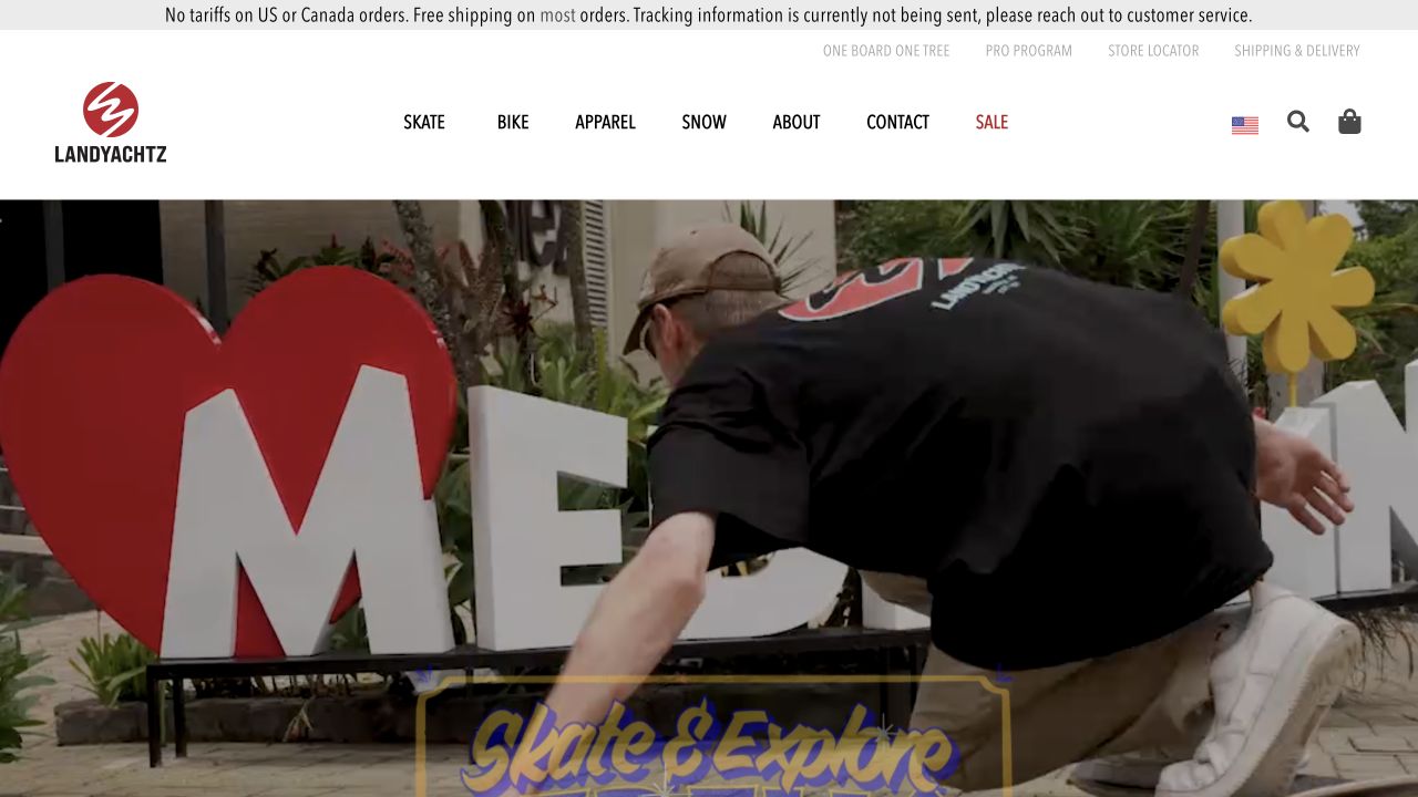
Landyachtz opens with a large skateboarding scene below a compact white header. Skate, bike, apparel and snow categories sit alongside about, contact and sale, while regional, search and cart controls occupy the right side. A thin shipping notice adds practical information above the navigation. The page’s exact resource evidence includes Turnstile, but no contact or account flow was submitted. The relevant design lesson is that the energetic brand image and the security layer serve different purposes. Visitors should be able to explore products and contact routes without mistaking a later verification state for a problem with the catalog or the selected region.
What you can learn
Keep form security attached to a clearly named task. If verification fails during an account or enquiry action, retain the product context and explain recovery in plain language, while allowing ordinary navigation to remain available.
Pros
The product categories offer a direct route beyond the activity photograph.
Regional and cart utilities remain separate from editorial navigation.
Cons & considerations
The large image postpones product detail below the first screen.
The captured page cannot establish which submission uses Turnstile or how errors are handled.
Platform source: Public reference: landyachtz.com. Linked script matches Cloudflare Turnstile on 2026-11-03: https://challenges.cloudflare.com/turnstile/v0/api.js. The script reference does not establish which form uses it or whether server-side validation is enforced. Platform evidence is separate from the direct website screenshot and is not a complete current infrastructure audit.
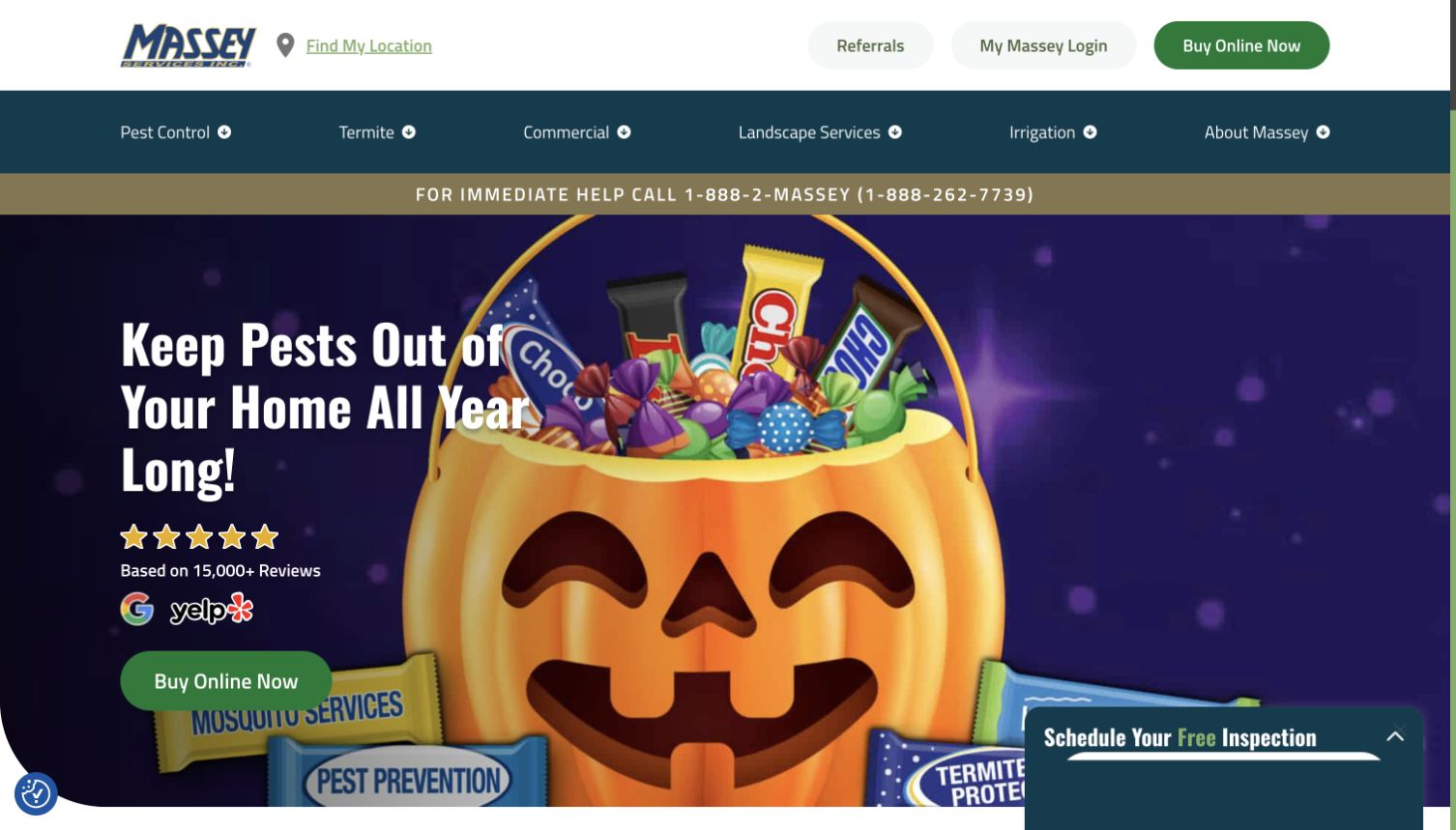
Massey Services places a phone-help strip above a seasonal service campaign, with a green online-purchase action and a partially visible inspection widget near the lower corner. The header includes location discovery, referrals and account access, while service categories occupy another row. Turnstile resources were recorded on this page, but neither an inspection request nor a purchase was submitted. The interface is useful for this collection because visitors may arrive with different levels of urgency. A verification problem in a lead form should not make the immediate phone route disappear or imply that the service request was received when it was actually blocked.
What you can learn
Make the outcome of a protected request unambiguous. Preserve location and service selections through recoverable errors, keep an alternative contact route visible and distinguish verification failure from a completed booking or a request awaiting confirmation.
Pros
The phone-help strip offers a visible alternative to online interaction.
Location discovery and account access have explicit header routes.
Cons & considerations
The inspection widget overlaps part of the promotional area.
The screenshot does not show whether a protected request reaches the service team.
Platform source: Public reference: masseyservices.com. Linked script matches Cloudflare Turnstile on 2026-11-03: https://challenges.cloudflare.com/turnstile/v0/api.js. The script reference does not establish which form uses it or whether server-side validation is enforced. Platform evidence is separate from the direct website screenshot and is not a complete current infrastructure audit.
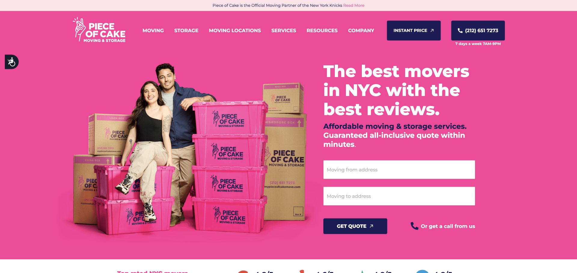
Piece of Cake Moving uses a vivid pink hero with a customer photograph, branded boxes and a compact quote form. Two address fields sit directly beneath the service proposition, followed by a Get quote action and a callback alternative. The page also keeps a phone number and service navigation in the header. Exact Turnstile resources were observed, but the form was not submitted and the review does not verify its backend protection. This is a useful design reference because the first interaction is already data entry. Verification feedback must fit beside the quote action without hiding the address labels or confusing a security error with an invalid moving location.
What you can learn
Keep the initial request focused and preserve entered route information when verification needs to refresh. State whether the quote request was sent, and offer the visible phone or callback route when a person cannot complete the online step.
Pros
The form asks for a limited set of details at the beginning.
A callback option accompanies the primary quote action.
Cons & considerations
Placeholder-style field guidance can be less persistent than visible labels.
The capture cannot establish how the form handles expired or rejected tokens.
Platform source: Public reference: mypieceofcakemove.com. Linked script matches Cloudflare Turnstile on 2026-11-03: https://challenges.cloudflare.com/turnstile/v0/api.js. The script reference does not establish which form uses it or whether server-side validation is enforced. Platform evidence is separate from the direct website screenshot and is not a complete current infrastructure audit.
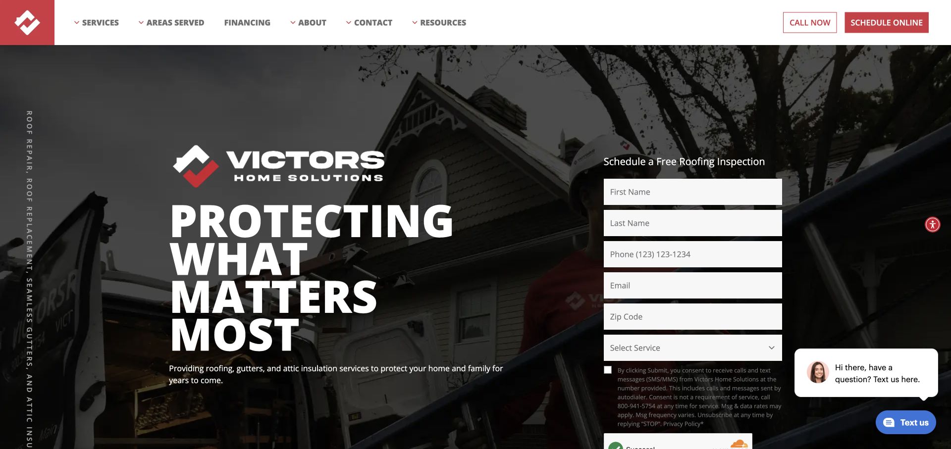
Victors Home Solutions puts a service statement on the left of a darkened house photograph and an inspection-request form on the right. The form asks for name, phone, email, postal code and service choice, followed by explanatory text and a partially visible verification area. A chat prompt sits nearby. The exact source includes Turnstile references, but no fields were completed and no challenge was submitted. The layout makes the design responsibility unusually visible: several contact and security elements occupy the same small region. The visitor needs to understand the requested information, the consent language and the final action without a floating chat panel obscuring that sequence.
What you can learn
Reserve space for verification and error messages before adding floating support tools. Keep field labels readable, preserve entered details after recoverable failures and confirm only the outcome that the server actually reports for the inspection request.
Pros
The form and service proposition are visible together on the first screen.
A service selector can help route the request to the appropriate team.
Cons & considerations
The long form pushes verification and explanatory text toward the viewport edge.
The chat prompt competes with the lower part of the enquiry area.
Platform source: Public reference: victors.com. Linked script matches Cloudflare Turnstile on 2026-11-03: https://challenges.cloudflare.com/turnstile/v0/api.js. The script reference does not establish which form uses it or whether server-side validation is enforced. Platform evidence is separate from the direct website screenshot and is not a complete current infrastructure audit.
Bryan University uses a graduation photograph behind a large two-color education message and a blue information-request action. A utility strip above the main navigation separates student resources from Request info and Apply now, while programs, admissions and financial aid occupy the next row. The institution’s public privacy policy explicitly states that website forms use Cloudflare Turnstile, including invisible mode. That is a documented form-level association; this homepage capture does not test a challenge or verify server enforcement. The design is useful because it distinguishes several stages of the education journey before a visitor reaches a protected form, from researching programs to applying or accessing existing student services.
What you can learn
Keep enquiry and application routes distinct and explain what each form will do. Verification feedback should preserve the chosen program and clearly identify whether the institution received the request, especially when a visitor has already entered several contact details.
Pros
Prospective-student actions are separated from existing-student utilities.
The information-request action is easy to locate within the hero.
Cons & considerations
Two navigation rows create a dense upper interface.
The large campaign photograph delays program-specific information below the first screen.
Platform source: Public reference: bryanuniversity.edu. The first-party policy, dated June 10, 2026 and read 2026-11-05, explicitly names Cloudflare Turnstile (including invisible mode) for forms on BryanUniversity.edu. This is documented form-level use; no form or server validation was tested. Platform evidence is separate from the direct website screenshot and is not a complete current infrastructure audit.
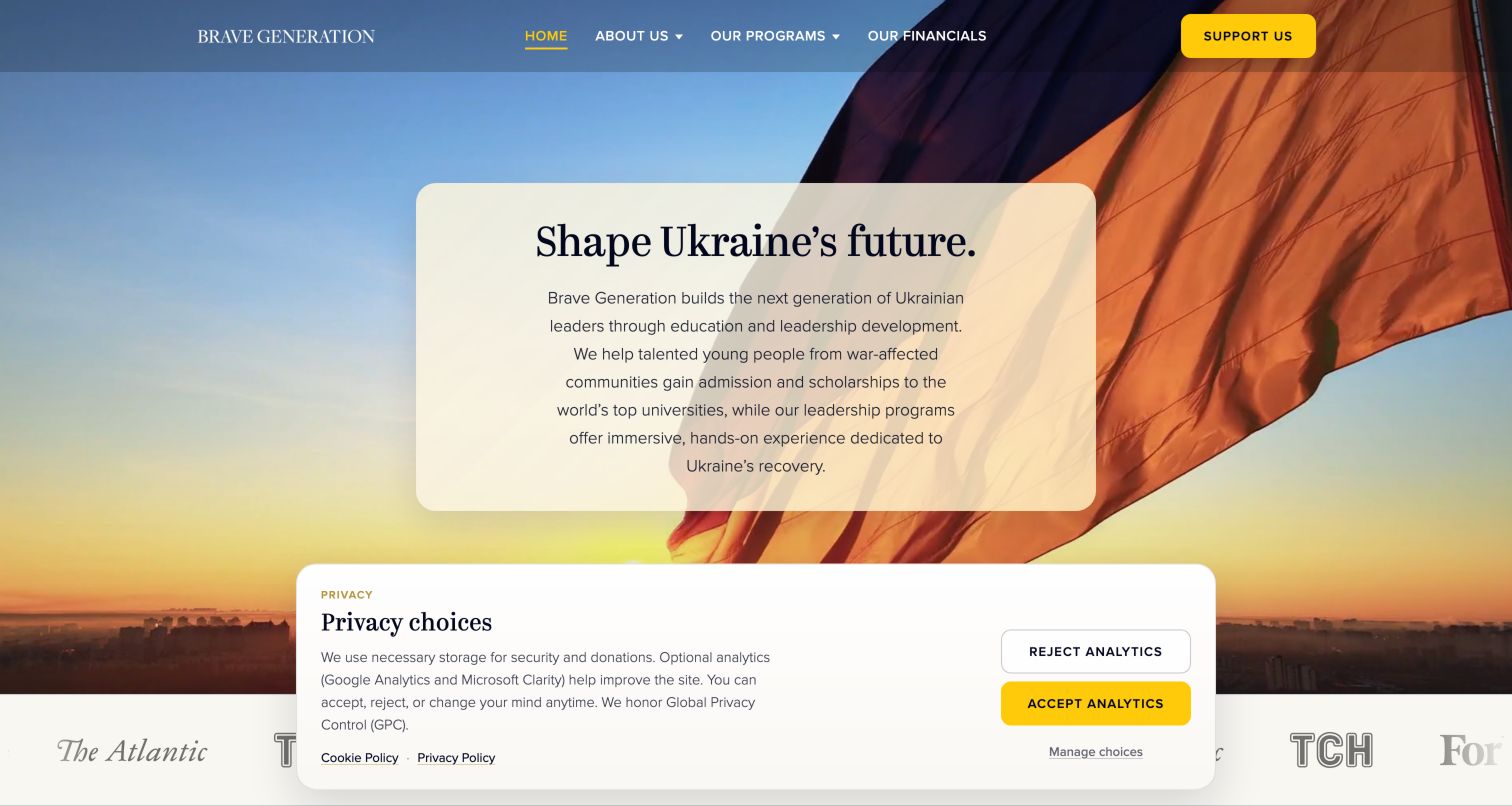
Brave Generation centers its mission in a translucent pale panel over a Ukrainian flag photograph. A yellow Support us action stands out in the header, alongside program, organization and financial-information routes. The captured privacy-choice panel occupies much of the lower screen and clearly separates analytics acceptance from rejection. The organization’s policy explicitly identifies invisible-mode Turnstile on its newsletter form. That narrow association does not establish protection of donations or other workflows. The page is useful for thinking about how security and consent fit around a nonprofit’s public story: each has a different purpose, and their messages should remain distinguishable rather than becoming one confusing set of conditions.
What you can learn
Name the purpose of each data-entry and privacy interaction. Keep newsletter verification separate from analytics preferences, preserve the intended subscription outcome through errors and make the policy link easy to find without suggesting that a donation or account action was performed.
Pros
The financial-information route is visible in the main navigation.
The privacy panel offers a clear analytics-rejection option.
Cons & considerations
The captured consent panel covers a substantial portion of the first screen.
The lengthy mission paragraph requires more reading before a specific program is visible.
Visible tech stack
Earlier / documented evidence
Cloudflare Turnstile
Platform source: Public reference: bravegeneration.org. The first-party policy, dated October 17, 2026 and read 2026-11-05, explicitly says the newsletter form uses Cloudflare Turnstile in invisible mode. This does not establish its use on donation or other workflows. No submission or verification was performed. Platform evidence is separate from the direct website screenshot and is not a complete current infrastructure audit.
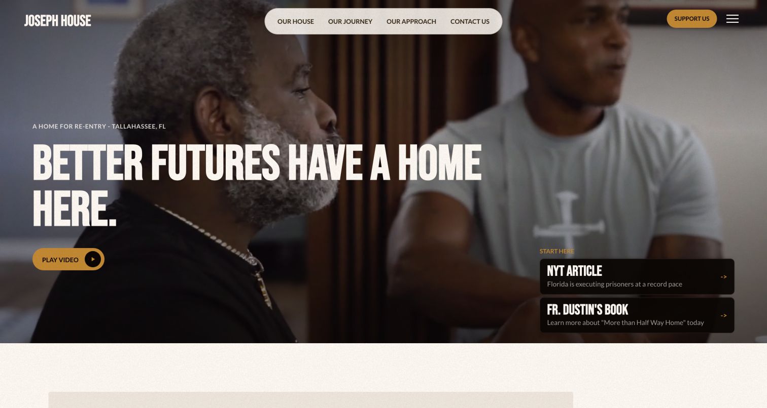
Joseph House places a large, condensed headline over a photograph of people in conversation, with a rounded navigation panel above and a yellow video action below. Two dark update cards sit at the lower right, while Support us remains prominent in the corner. Its public privacy page says website forms use Cloudflare Turnstile to reduce automated submissions. That statement supports a scoped form association; the capture does not demonstrate validation or assess the organization’s security. The design makes a useful distinction between learning the story and participating. A visitor can explore the house, journey or approach before choosing a contact or support route that may request information.
What you can learn
Keep participation paths explicit and give protected forms their own clear feedback. A volunteer enquiry should explain whether a message was received, retain entered context after a recoverable verification error and provide contact information when online submission is unavailable.
Pros
The main navigation separates several ways to understand the organization.
The support action remains distinct from the video and editorial updates.
Cons & considerations
Large overlay text covers much of the opening photograph.
The update cards compete with the central story for attention.
Platform source: Public reference: josephhouseus.org. The first-party public privacy page read 2026-11-05 explicitly states that website forms use Cloudflare Turnstile to reduce spam and automated submissions. The page describes itself as a draft; this is a published documentary statement, not tested enforcement. Platform evidence is separate from the direct website screenshot and is not a complete current infrastructure audit.
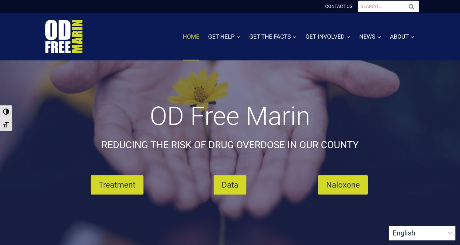
OD Free Marin uses a dark blue header and a photograph of hands holding a small flower behind its introductory statement. Three bright actions lead to treatment, data and naloxone information, with help, facts and involvement routes in the main navigation. A language selector appears in the lower corner. The site’s privacy statement explicitly names Cloudflare Turnstile as a security and spam-prevention service. This is documentary website evidence, not a test of any form or an assessment of the health guidance. The design is useful because information access is the primary task. A protective check on a contact form should not obscure the resource routes people came to find.
What you can learn
Keep essential public information available independently of form submission. Where verification protects an enquiry, explain its state plainly, retain the message after recoverable errors and provide another contact route without requiring visitors to repeat their search for resources.
Pros
The three large actions make the main information categories easy to identify.
Language selection is visible within the opening view.
Cons & considerations
The tall header consumes substantial space before the resource actions.
The broad introductory statement provides little detail about the destinations themselves.
Platform source: Public reference: odfreemarin.org. The first-party public privacy statement read 2026-11-05 explicitly names Cloudflare Turnstile under security and spam prevention for odfreemarin.org. This is a documented website association; no form or security outcome was tested. Platform evidence is separate from the direct website screenshot and is not a complete current infrastructure audit.
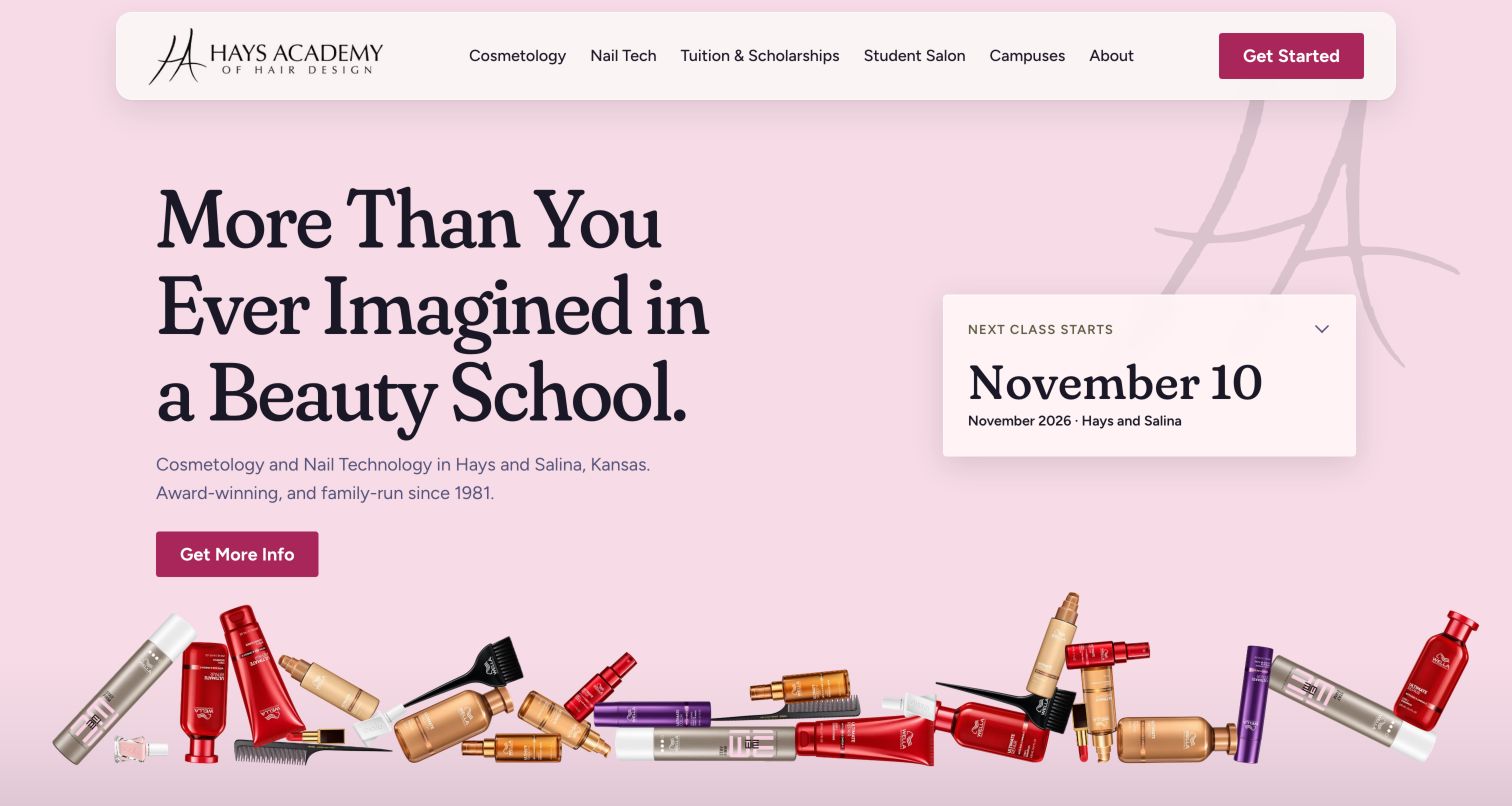
Hays Academy uses a pale pink background, a large editorial headline and a separate card showing the next class-start date. A white rounded header groups programs, tuition, salon services, campuses and general information, with a contrasting Get started action. Product imagery forms a decorative strip along the bottom of the hero. The academy’s privacy page explicitly says its forms use Cloudflare Turnstile, including information, tour and salon requests. That is a documented association rather than proof that any particular submission succeeds. The interface is useful because it gives prospective students a concrete timing cue before they move into an enquiry and distinguishes admissions from public salon services.
What you can learn
Carry program, campus and start-date context into the relevant form. Verification feedback should preserve those selections, explain whether a request was received and avoid confusing an admissions enquiry with a salon appointment or another service-specific action.
Pros
The next-start card gives the introduction a concrete planning detail.
Tuition and campus routes are visible before a visitor begins an enquiry.
Cons & considerations
The oversized headline leaves limited room for program detail in the hero.
Decorative product imagery adds visual weight without clarifying the application process.
Platform source: Public reference: haysacademy.edu. The first-party policy, dated October 20, 2026 and read 2026-11-05, explicitly identifies Cloudflare Turnstile for the website’s information, tour, salon, scholarship and graduate-story forms. No form, upload or challenge was submitted. Platform evidence is separate from the direct website screenshot and is not a complete current infrastructure audit.
Kegan has 15+ years of experience working with small businesses, Fortune 500 companies, and everything in between. No development job is too big or too small: he brings the same hands-on attention to a focused improvement, a complete website, or a custom application.
For Cloudflare Turnstile projects, he can help with responsive interfaces, reusable components, custom functionality, API connections, and performance-minded implementation. He works directly with clients on scope, design, implementation, testing, and handover, with an emphasis on clear communication and a system that remains practical to maintain after launch.
Show 3 other Cloudflare Turnstile developersHide other Cloudflare Turnstile developers
Keep service, location and project context with the request. If verification needs to refresh, avoid silently discarding a carefully written message. State whether the request was received and provide a phone or other contact route when online submission is unavailable.
Accounts and subscriptions
Distinguish authentication, billing and verification problems. Preserve the selected plan or newsletter intention through recoverable errors. Make it clear when a visitor is creating an account, requesting information or subscribing to updates rather than treating all submissions as interchangeable.
Public information websites
Keep ordinary resources and navigation accessible without forcing an unrelated form interaction. Explain security and privacy controls separately. A contact form can require verification while the organization’s essential information remains easy to browse.
From references to requirements
Test the full submission contract
Map each protected endpoint
Record the form’s purpose, expected response, verification step and completion condition. Keep secret validation credentials on the server and ensure that the endpoint handles missing, invalid, expired and reused tokens. Do not infer that a visible widget means these paths are covered.
Cloudflare provides dummy sitekeys and secret keys for predictable testing outcomes. Use those in an authorized test environment to exercise successful validation, rejection and duplicate-token handling without solving real third-party challenges or sending production enquiries. Keep test and production configuration distinct.
Test with consent panels, chat widgets, long forms, narrow screens and slow responses. Ensure status text is readable and associated with the relevant action. Confirm that error recovery preserves useful context and that success messaging corresponds to an actual completed operation.
A useful handover demonstration
Ask the actual team to carry out its routine job: publish a realistic update, correct a mistake, preview a narrow screen, and identify who owns an integration failure. For a library or frontend framework, also ask who maintains the content source and deployment. A polished screenshot does not answer those operational questions.
Beyond the screenshot
Turnstile development checklist
Identify the precise form or action being protected.
Validate tokens on the server before completing the protected operation.
Handle missing, invalid, expired and reused tokens.
Keep validation secrets out of client-side output.
Preserve appropriate input through recoverable verification errors.
Distinguish form validation, verification and service failures in plain language.
Use official test keys in an authorized test environment.
Check keyboard access, status messages, overlays and narrow-screen layouts.
Test with real content, a keyboard, a small screen, slow or failed requests, and the people who will maintain the system. These are planning checks, not an accessibility, security, performance, or search-ranking certification.
Sources & editorial method
How this Cloudflare Turnstile collection was reviewed
The twenty examples represent distinct public properties with genuine browser captures and scoped Turnstile evidence. Fifteen use dated script references from exact source-page audits; five use explicit first-party policy statements. The Joseph House policy describes itself as a draft, which remains recorded in its evidence. Original capture dates and technical observation dates are preserved separately. Every source has a broad audit attempt, including unavailable outcomes. No access checks were bypassed and no forms, account operations, payments or challenges were submitted. Inclusion does not certify protection, privacy or accessibility.
Every image is an unmodified capture from the actual website, with its source and capture date. Some captures are reused from our shared catalog; their dates remain the original capture dates. None comes from a vendor gallery or a generated reconstruction. Moving imagery and live content can change.
Technology attribution uses public page assets or metadata, official platform documentation, or a cited first-party project case study. Documentary and framework-relationship evidence is identified where used; it is not a complete current backend inventory. A CMS image CDN alone does not establish a full CMS deployment. A library’s presence does not prove which individual controls use it, and a platform label does not establish AI authorship.
The composition notes, lessons, pros and tradeoffs are original editorial observations. We have not measured conversion, traffic, security, performance or accessibility conformance. Website owners retain their brands and imagery; these examples are not our client portfolio. Written, Edited and Curated are independent records, not dates advanced by a build. See our editorial standards or suggest a correction.
Questions worth asking
Cloudflare Turnstile website development FAQs
Does loading the Turnstile script prove that a form is protected?
No. It proves only that the inspected page references the resource. The relevant form must obtain a token and its server endpoint must validate it before completing the protected action.
Can a homepage screenshot show which form uses Turnstile?
Usually it cannot. The evidence records identify whether the association comes from a script reference or a first-party statement and preserve any stated scope, such as a newsletter form.
How should verification failures be tested?
Use Cloudflare’s official test configurations in an authorized environment. Exercise clear success, rejection and duplicate-token outcomes, then inspect the surrounding form messages and retained input. Do not test by sending real enquiries to the example websites.
Does Turnstile establish legal compliance or complete website security?
No. It is one component of a larger implementation. The website’s data handling, server behavior, accessibility and other protections require their own project-specific review; this visual collection does not certify them.
Keep the protected action understandable from the first field through the final response. Security feedback should help a person recover without losing the context of what they were trying to do.