Best LiteSpeed Websites of 2026 (20 Real-World Examples)
Public LiteSpeed delivery references with real design examples, plus a practical brief for caching, dynamic routes and operational handover.
The web server is an operational layer. It can support a portfolio, directory or booking introduction without determining what that website looks like.
This collection pairs the visual decisions of real public sites with response-level LiteSpeed evidence. The design reviews are not speed benchmarks. They do not show the server configuration, resource allocation or response behavior of every path, visitor state and application behind a domain.
LiteSpeed Web Server, the LSCache family and a hosting provider’s wider environment are related but separate questions. Do not infer that a visible plugin, server header or attractive homepage proves a fast checkout, safe personalized cache or a particular hosting plan. The development brief should connect the delivery layer to the actual pages and editing workflow.
Before the examples
What makes good LiteSpeed website development in 2026?
Classify routes before enabling broad caching
Separate public editorial pages from account, checkout, search, forms and personalized states. Identify what varies and who owns that variation. A fast public landing page is not evidence that every dynamic route can use the same cache rules.
Keep server and application responsibilities explicit
Document the hosting provider, web-server layer, application and any caching integration as separate parts. LiteSpeed’s official documentation describes configuration and operations; the right arrangement still depends on the application and who will maintain it.
A cached page must still contain the right information. Rehearse changes to opening times, prices, availability and urgent notices. Record which cache is invalidated and how an editor confirms the update reached the public page.
The collection · 20 examples
20 LiteSpeed website examples worth studying
The opening examples are established product, logistics, cultural, professional-services and childcare brands. Smaller studios and regional services show different content needs. Public delivery signals are kept separate from unmeasured speed or operational-quality claims.
We start with five recognizable brands or organizations: Bianchi, Samskip, Designmuseum Danmark, HaysMac, Kids & Company. Each attribution applies to the named website property, not every product or website belonging to its organization. This is a curated reading sequence, not a measured ranking.
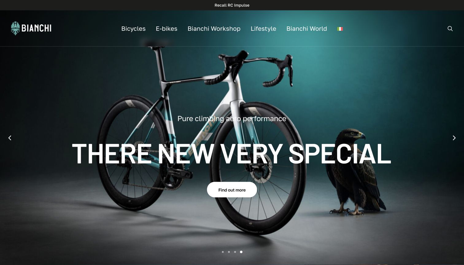
Bianchi’s captured hero places a complete road bicycle and an eagle against a dark teal studio background. The main heading, short performance-oriented line and rounded action sit over the product image, while the top navigation distinguishes bicycles, electric models, workshop, lifestyle and brand stories. A separate recall link occupies the narrow strip above the header. The source page uses Italian navigation in its DOM, while the browser visibly translated parts of the page into English, including an awkwardly rendered product heading. The capture preserves that real presentation rather than silently correcting its text.
What you can learn
Use studio imagery when the bicycle’s complete silhouette should be clear, but keep the model identity accurate across languages. Product names need protection from automatic translation. Service notices also deserve a stable, visible position so that a visually polished campaign does not conceal practical ownership information.
Pros
The studio composition shows the whole bicycle rather than only a component crop.
A recall route remains visible above the promotional content.
Cons & considerations
The observed translation distorts the main product heading.
Large overlaid text covers part of the bicycle’s frame and cockpit.
Platform source: WordPress.org Showcase. server response header identifies LiteSpeed. Exact public source-page sample: https://www.bianchi.com/. This identifies a public LiteSpeed reference or response association, not private configuration, complete architecture, measured performance or successful data collection. Platform evidence is separate from the direct website screenshot and is not a complete current infrastructure audit.
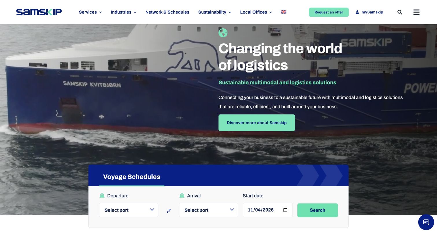
Samskip combines moving vessel imagery with a short explanation of its multimodal offering. A blue-and-white Voyage Schedules panel overlaps the lower edge of the hero and presents departure port, arrival port, and start date in one row. The header separately highlights Request an Offer and mySamskip, distinguishing a commercial enquiry from an existing customer portal. Services, Industries, Network and Schedules, and Local Offices provide another layer of route and audience information. The specific port choices in the recorded form make the network tangible without relying on the general sustainability message above it.
What you can learn
Pair a broad multimodal proposition with a small, concrete planning tool. Keep an offer request distinct from portal access, and explain whether the visible schedule represents only the sea leg or a wider door-to-door service.
Pros
Departure, arrival, and date are grouped in a straightforward schedule form below the introductory copy.
The local-office route and offer button provide alternatives to signing into the customer portal.
Cons & considerations
The large moving background competes visually with the relatively compact schedule entry.
A voyage search alone does not explain which inland connections are included in the wider service proposition.
Platform source: WordPress.org Showcase. server response header identifies LiteSpeed. Exact public source-page sample: https://www.samskip.com/. This identifies a public LiteSpeed reference or response association, not private configuration, complete architecture, measured performance or successful data collection. Platform evidence is separate from the direct website screenshot and is not a complete current infrastructure audit.
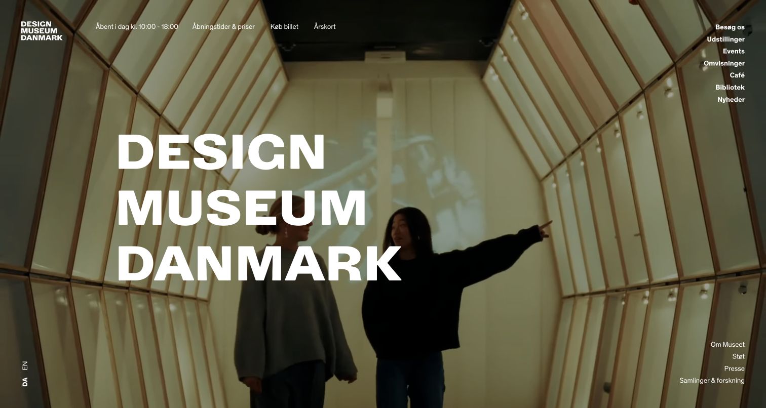
Designmuseum Danmark opens with an expansive interior photograph and large stacked typography. Practical information appears in the header, including today’s hours, prices, tickets and membership. The menu separates exhibitions, events, tours, the café, library and research resources. This is a useful example of a museum allowing a strong visual identity to lead while retaining the operational facts needed to plan a visit. The Danish page also makes an English-language route identifiable rather than assuming one audience language.
What you can learn
Let the museum’s environment establish atmosphere, then place hours, ticketing and accessibility information in stable positions. Treat translated navigation as an operational feature, and make exhibition dates and visitor details part of the content model rather than artwork embedded in an image.
Pros
Hours and ticket routes are available without requiring visitors to interpret the hero image.
The menu recognizes collection research, education and visitor services as different types of use.
Cons & considerations
Very large image-led openings need legible text treatment across changing photography and screen sizes.
A broad menu can become difficult to scan unless the main visitor tasks remain clearly prioritized.
Platform source: WordPress.org Showcase. server response header identifies LiteSpeed. Exact public source-page sample: https://designmuseum.dk/. This identifies a public LiteSpeed reference or response association, not private configuration, complete architecture, measured performance or successful data collection. Platform evidence is separate from the direct website screenshot and is not a complete current infrastructure audit.
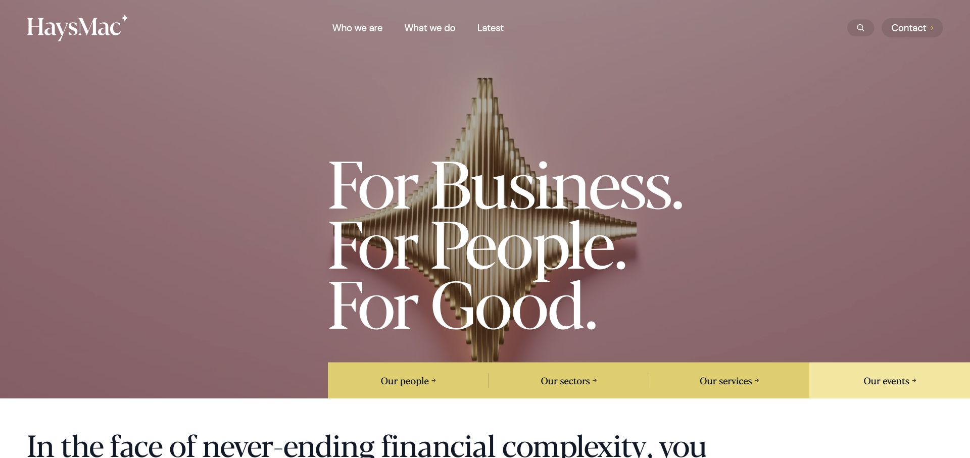
HaysMac uses an abstract sculpture with large fine serif lettering across it. Pink and pale background tones depart from the usual blue accounting palette. A short upper navigation keeps the opening visually quiet, while a yellow strip below names people, sectors, services, and events. That strip is the practical anchor: the art establishes character, but the links explain how to move through the business. Large black introductory text begins beneath it, adding another typographic register. This is an example worth studying for brand differentiation, provided the visual expression is supported by enough concrete accounting information.
What you can learn
An abstract visual identity can work when the task navigation remains literal. Put services, people, and industry routes close to the expressive opening so that a memorable design does not make users decipher the business.
Pros
The yellow link strip makes practical destinations easy to separate from artwork.
The sculptural imagery avoids interchangeable calculators and office-stock photographs.
Cons & considerations
Fine white lettering needs contrast checks against changing artwork.
Abstract imagery does not demonstrate accounting expertise without supporting content.
Platform source: WordPress.org Showcase. server response header identifies LiteSpeed. Exact public source-page sample: https://haysmac.com/. This identifies a public LiteSpeed reference or response association, not private configuration, complete architecture, measured performance or successful data collection. Platform evidence is separate from the direct website screenshot and is not a complete current infrastructure audit.
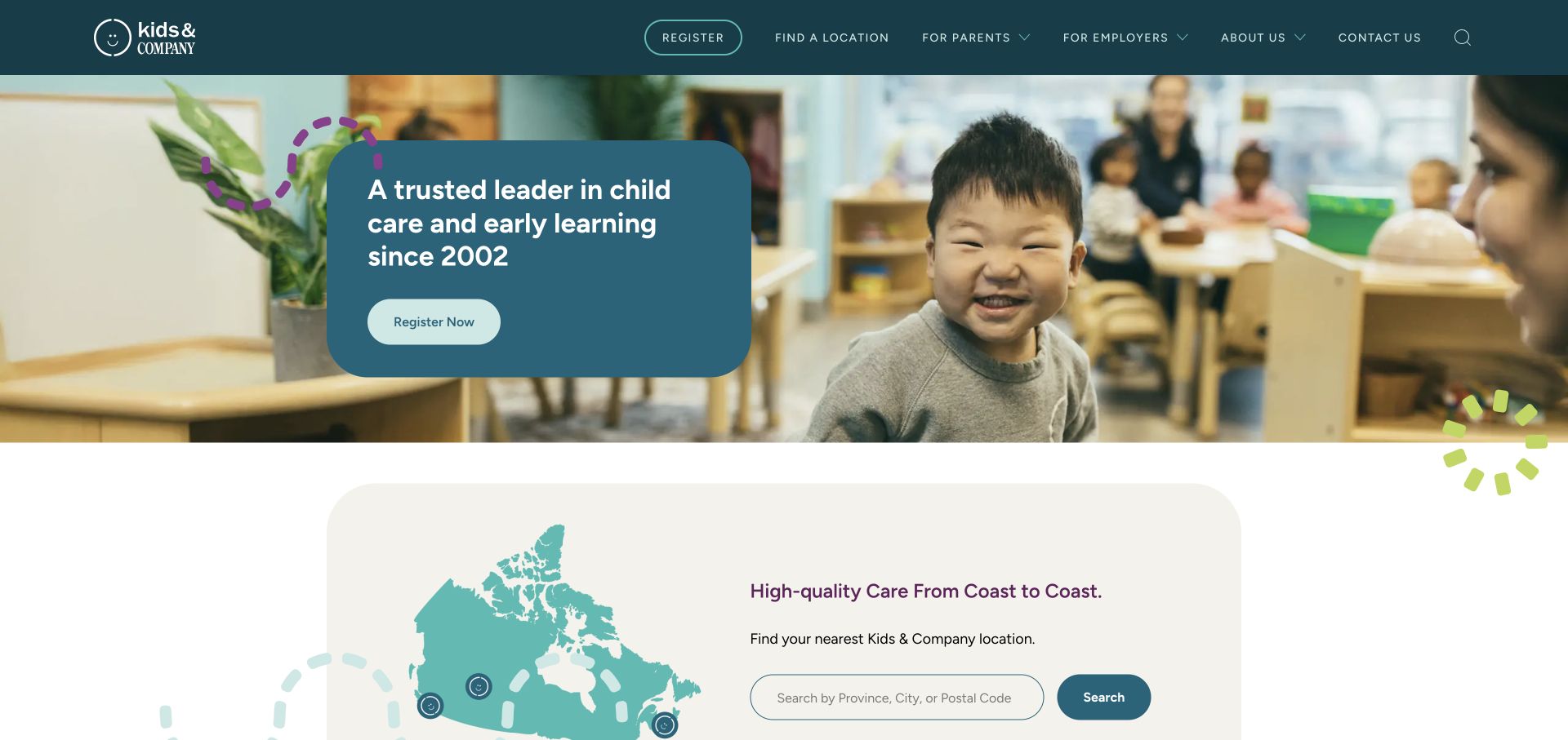
Kids & Company uses a dark teal header and a rounded blue message card over a classroom photograph. Registration is the hero’s main action, while a large map-and-search section begins immediately below. The navigation separates parent and employer information, with location discovery kept as its own route. Small illustrated marks soften the otherwise orderly layout. The page is useful for studying how a provider can connect a broad brand introduction with a geographic directory while also acknowledging a business audience.
What you can learn
Place location discovery close to registration. Families often need to establish whether a relevant center exists before they are ready for an enrollment conversation, so the transition between those tasks should be short and clearly labeled.
Pros
The map-and-search section makes geography visible immediately after the hero.
Parents and employers receive separately named navigation routes.
Cons & considerations
The main registration invitation appears before the visitor has selected a location.
The broad hero statement gives limited detail about age groups or local program differences.
Platform source: WordPress.org Showcase. server response header identifies LiteSpeed. Exact public source-page sample: https://kidsandcompany.com/. This identifies a public LiteSpeed reference or response association, not private configuration, complete architecture, measured performance or successful data collection. Platform evidence is separate from the direct website screenshot and is not a complete current infrastructure audit.
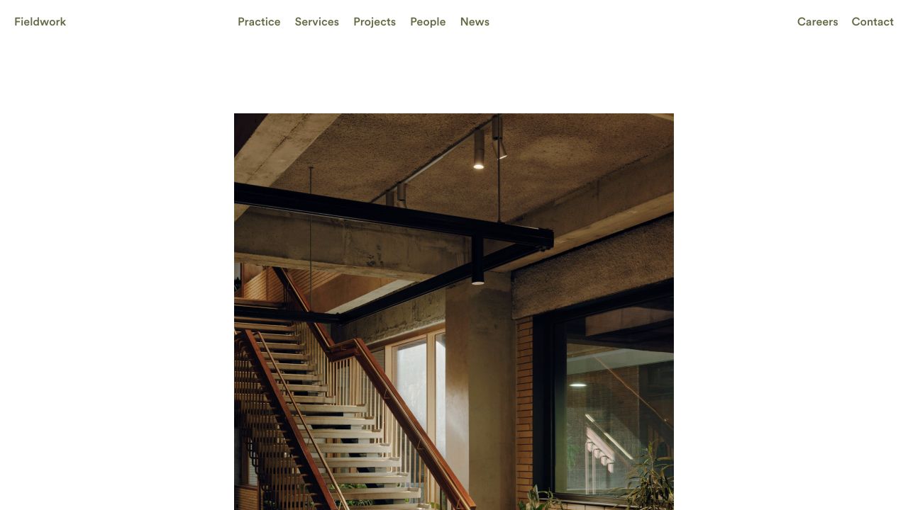
Fieldwork uses a light canvas, explicit top navigation and a large project photograph with generous space around it. Practice, services, projects, people and news are named rather than implied through imagery. The typography is quiet without making every destination a hidden control. This restrained arrangement gives the visitor a readable index to the practice before asking them to interpret a particular building or interior. Delivery evidence remains separate from these visible design decisions.
What you can learn
Define a compact hierarchy for page introductions, project facts, and ordinary navigation before adding display effects. Test the same system on a service description and a long project record, including a fallback font and larger user text. Keep enough distinction between a heading and a link that a new visitor can explore without guessing. White space should support reading and orientation, not require editors to maintain artificially short sample copy forever.
Pros
Service and project routes make the practice's offering understandable without interpretation.
Generous space gives the image and the navigation different roles.
Cons & considerations
Large white margins need adjustment on short or narrow displays.
Quiet typography still needs enough hierarchy when project descriptions become much longer.
Platform source: WordPress.org Showcase. server response header identifies LiteSpeed. Exact public source-page sample: https://fieldwork.au/. This identifies a public LiteSpeed reference or response association, not private configuration, complete architecture, measured performance or successful data collection. Platform evidence is separate from the direct website screenshot and is not a complete current infrastructure audit.
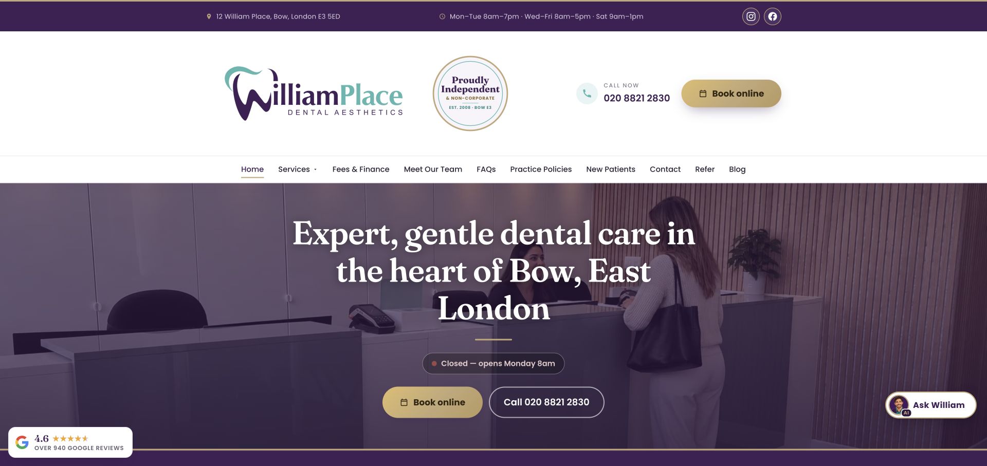
William Place devotes a substantial masthead to its logo, independent-practice badge, telephone number, and gold booking button. A purple utility bar supplies the address and opening hours before the main navigation. The hero then uses a reception photograph with a dark purple overlay, centered serif type, and two contact options. An opening-status pill adds a useful operational detail without requiring a visit to the contact page. The palette connects these otherwise numerous components.
What you can learn
A local dental homepage can make logistics part of the design rather than relegating them to the footer. Put address, hours, and the next appointment step in a stable hierarchy, while checking that the large masthead does not crowd the actual patient introduction out of the opening view.
Pros
Address, hours, phone, and booking are visible before a visitor needs to scroll.
The reception photograph provides a concrete preview of arriving at the practice.
Cons & considerations
The tall multilayer header occupies considerable space before the main care message begins.
Floating chat and review widgets can compete with the carefully grouped appointment controls.
Platform source: WordPress.org Showcase. server response header identifies LiteSpeed. Exact public source-page sample: https://www.williamplacedental.co.uk/. This identifies a public LiteSpeed reference or response association, not private configuration, complete architecture, measured performance or successful data collection. Platform evidence is separate from the direct website screenshot and is not a complete current infrastructure audit.
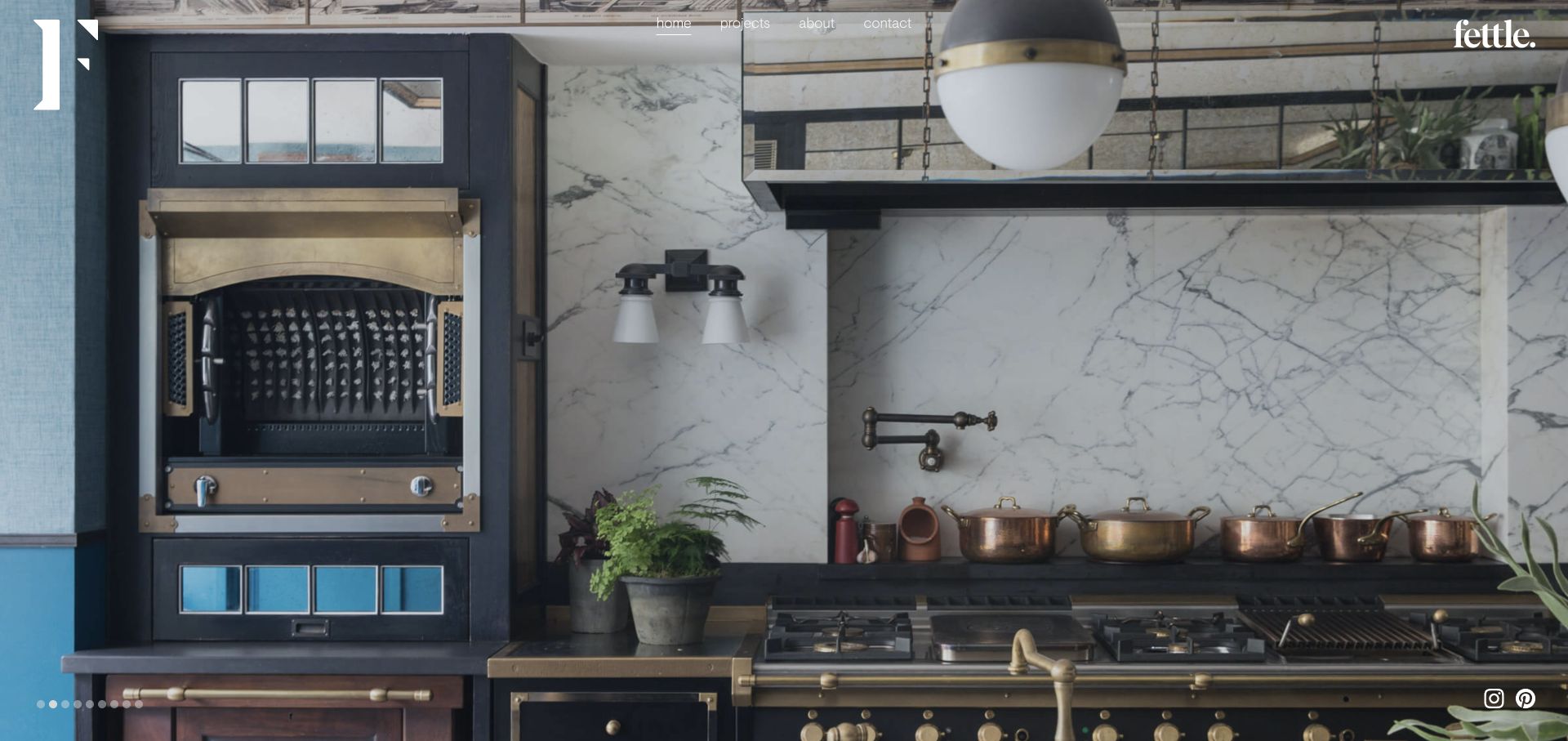
Fettle uses a full-screen interior photograph with a small centered navigation row, a large initial at the left, and its wordmark at the upper right. The reviewed view shows a detailed hospitality kitchen with metalwork, marble, timber, and lighting. Small carousel dots sit at the bottom left, and social icons stay near the opposite corner. The room fills almost the entire frame, allowing the different materials and functional elements to be read together rather than as separate detail crops.
What you can learn
A room-wide image is useful when the studio’s work depends on the interaction between materials and function. Keep the interface quiet, but make project and contact routes explicit. Give the carousel clear controls and provide contextual captions elsewhere so the work is not reduced to an anonymous aesthetic.
Pros
The wide view reveals how several materials and functional elements work together.
Home, projects, company information, and contact are available without opening a hidden menu.
Cons & considerations
Small light navigation can be difficult to read over brighter portions of alternate photographs.
The hero does not immediately identify the project or explain the practice’s hospitality specialization.
Platform source: WordPress.org Showcase. server response header identifies LiteSpeed. Exact public source-page sample: https://fettle-design.co.uk/. This identifies a public LiteSpeed reference or response association, not private configuration, complete architecture, measured performance or successful data collection. Platform evidence is separate from the direct website screenshot and is not a complete current infrastructure audit.
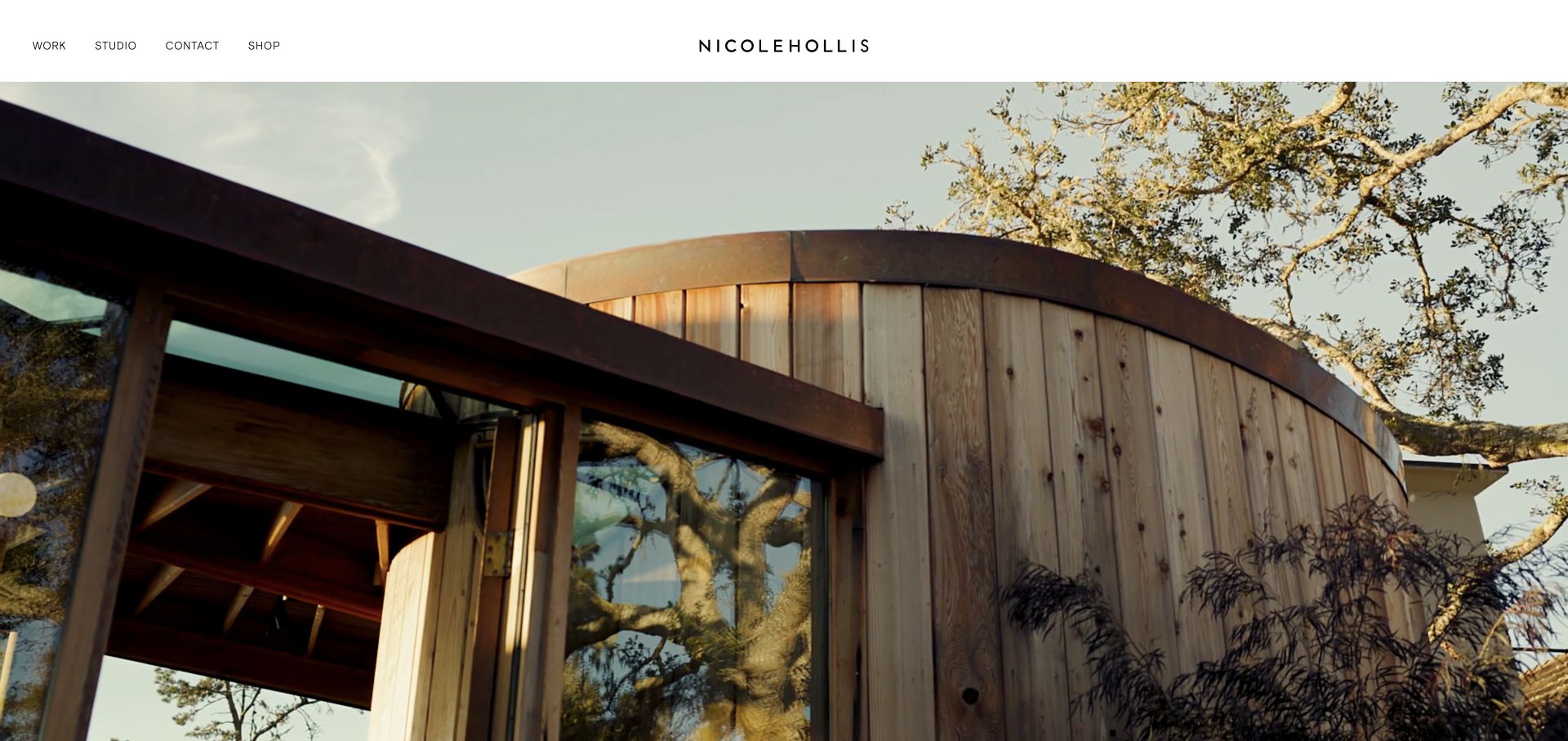
NicoleHollis pairs a slim white header with a project film filling the screen below. The centered wordmark is balanced by work, studio, contact, and shop links on the left. The reviewed frame shows timber, steel, glass, and surrounding trees, emphasizing the relationship between interior and exterior rather than presenting a collage of decorative details. The visual establishes the practice’s material sensibility with almost no promotional copy over it.
What you can learn
If a project film is the opening evidence, keep navigation stable and give the image enough context elsewhere on the page. Separate the commercial collection from the studio portfolio without hiding either. A considered still frame is important because visitors may never see the sequence in the way its editor intended.
Pros
The white header keeps key navigation legible independently of the moving image.
A small set of destinations makes work, practice information, and inquiry easy to distinguish.
Cons & considerations
A text-light opening gives limited immediate explanation of the services or project shown.
The visual argument depends heavily on high-quality media and a coherent fallback when motion is unavailable.
Platform source: WordPress.org Showcase. server response header identifies LiteSpeed. Exact public source-page sample: https://www.nicolehollis.com/. This identifies a public LiteSpeed reference or response association, not private configuration, complete architecture, measured performance or successful data collection. Platform evidence is separate from the direct website screenshot and is not a complete current infrastructure audit.
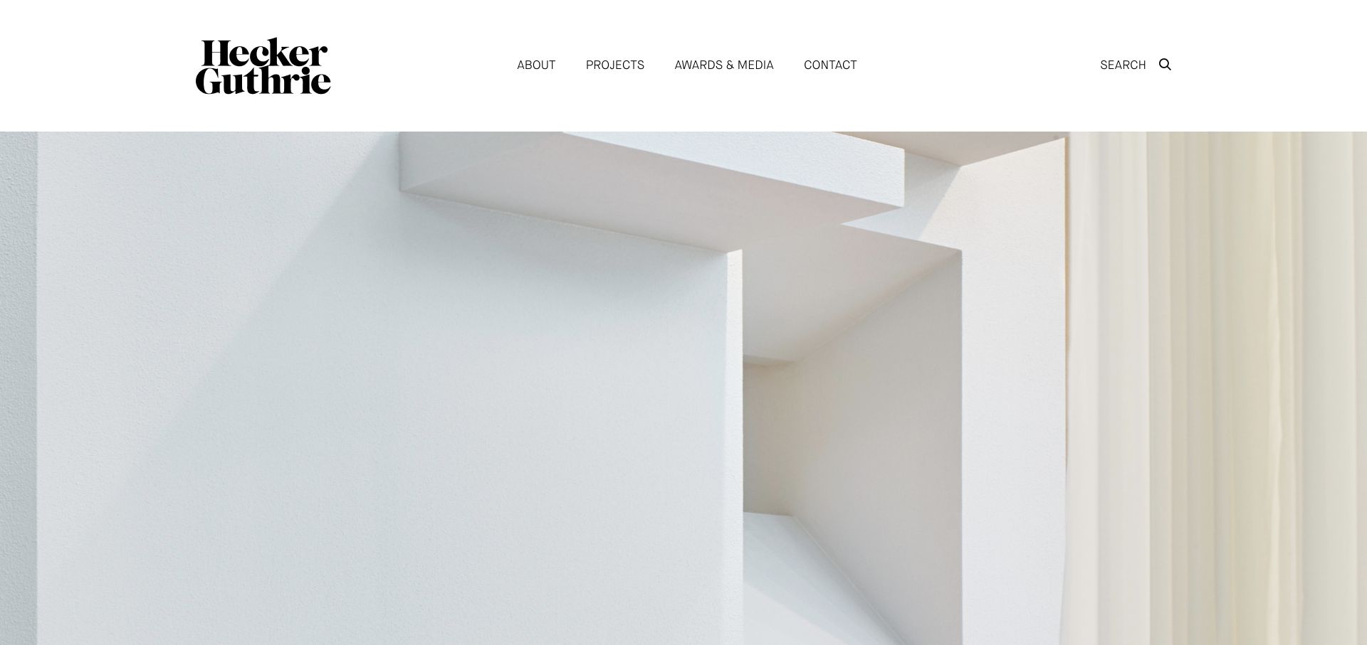
Hecker Guthrie uses a substantial white header with a stacked serif identity and a small set of navigation labels. About, projects, awards and media, contact, and search are visible before a large image begins. The reviewed hero focuses on pale sculptural architectural surfaces rather than a busy room scene. That restraint makes the studio’s graphic identity and attention to material feel connected, while the conventional navigation offers a familiar route into the actual project collection.
What you can learn
A quiet visual system can still be distinctive if the logo, margins, and photography have clear roles. Keep the navigation descriptive and use close-up images as part of a broader portfolio story, not as the only evidence of the work. Visitors comparing firms should be able to reach complete projects directly.
Pros
The plain white header keeps navigation stable and easy to distinguish from the image.
The typographic identity adds character without requiring extra graphics in the hero.
Cons & considerations
A detail-led opening gives less immediate understanding of the kinds of spaces the studio designs.
The tall header uses considerable space before the first project view on smaller displays.
Platform source: WordPress.org Showcase. server response header identifies LiteSpeed. Exact public source-page sample: https://www.heckerguthrie.com/. This identifies a public LiteSpeed reference or response association, not private configuration, complete architecture, measured performance or successful data collection. Platform evidence is separate from the direct website screenshot and is not a complete current infrastructure audit.
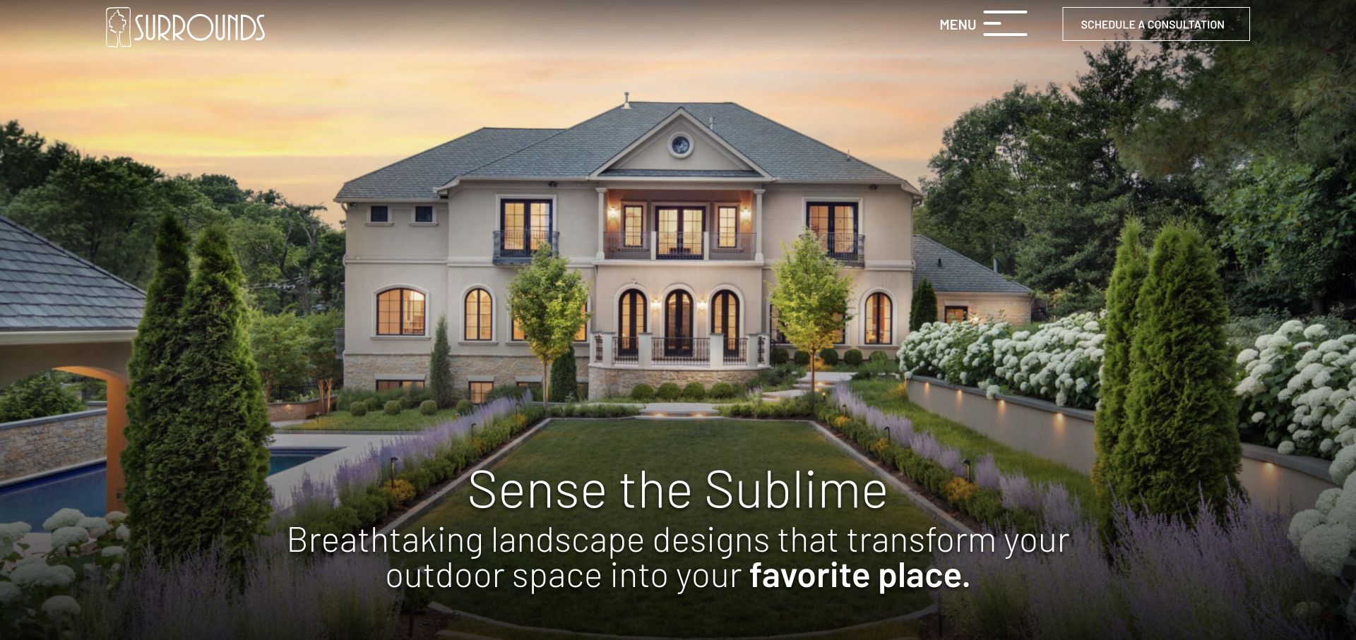
Surrounds opens with a formal garden and house at dusk, letting lighting, planting, paths, and the building’s symmetry form the composition. A light logo sits at the upper left, while a menu control and an outlined consultation button occupy the upper right. The lower headline is large but thin, with a short supporting line. The immediate experience is intentionally closer to an architectural portfolio than a lawn-maintenance directory, putting the completed environment ahead of a long service list.
What you can learn
A rich project photograph can carry an opening when the primary action remains explicit. Keep a consultation route visible even if the rest of the navigation is collapsed. Follow the atmospheric introduction with process, scope, and project context so visitors can judge fit rather than just admire the image.
Pros
The image shows several aspects of a complete outdoor environment in one coherent scene.
The consultation action remains visible without opening the menu.
Cons & considerations
Thin white typography needs careful positioning against changing image brightness.
A hidden navigation pattern adds a step for visitors looking for maintenance or service details immediately.
Platform source: WordPress.org Showcase. server response header identifies LiteSpeed. Exact public source-page sample: https://www.surroundslandscaping.com/. This identifies a public LiteSpeed reference or response association, not private configuration, complete architecture, measured performance or successful data collection. Platform evidence is separate from the direct website screenshot and is not a complete current infrastructure audit.
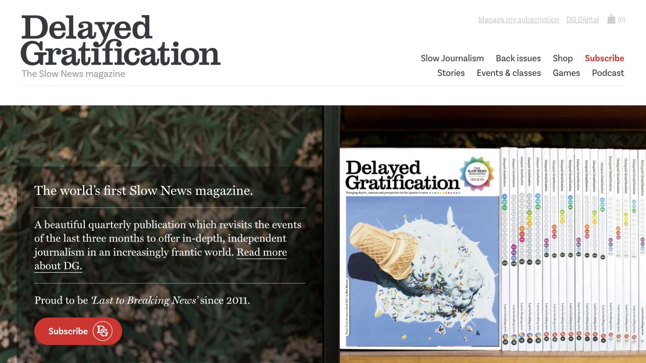
Delayed Gratification introduces its slow-journalism proposition beside a physical issue and separates subscriptions, back issues, stories, events, games and audio. Issue records distinguish the period covered from the date of publication. That is the most useful structural detail: a reader can understand why the material is intentionally retrospective instead of interpreting an older subject date as an abandoned website. The opening also gives the magazine’s graphic and illustrated character an immediate physical context.
What you can learn
When coverage period and publication date differ, store and display both deliberately. Give back issues durable contents pages and make subscription fulfillment terms separate from editorial descriptions. Treat workshops and events as their own time-sensitive records, with timezone and booking information, rather than letting a past class remain as an undated promotional card.
Pros
The editorial cadence is explained in plain language near the issue.
Coverage periods and publication dates are visibly different pieces of information.
Cons & considerations
Several non-magazine activities can dilute the central subscription task.
Back issues and dated classes need an explicit availability and archival policy.
Platform source: WordPress.org Showcase. server response header identifies LiteSpeed. Exact public source-page sample: https://www.slow-journalism.com/. This identifies a public LiteSpeed reference or response association, not private configuration, complete architecture, measured performance or successful data collection. Platform evidence is separate from the direct website screenshot and is not a complete current infrastructure audit.
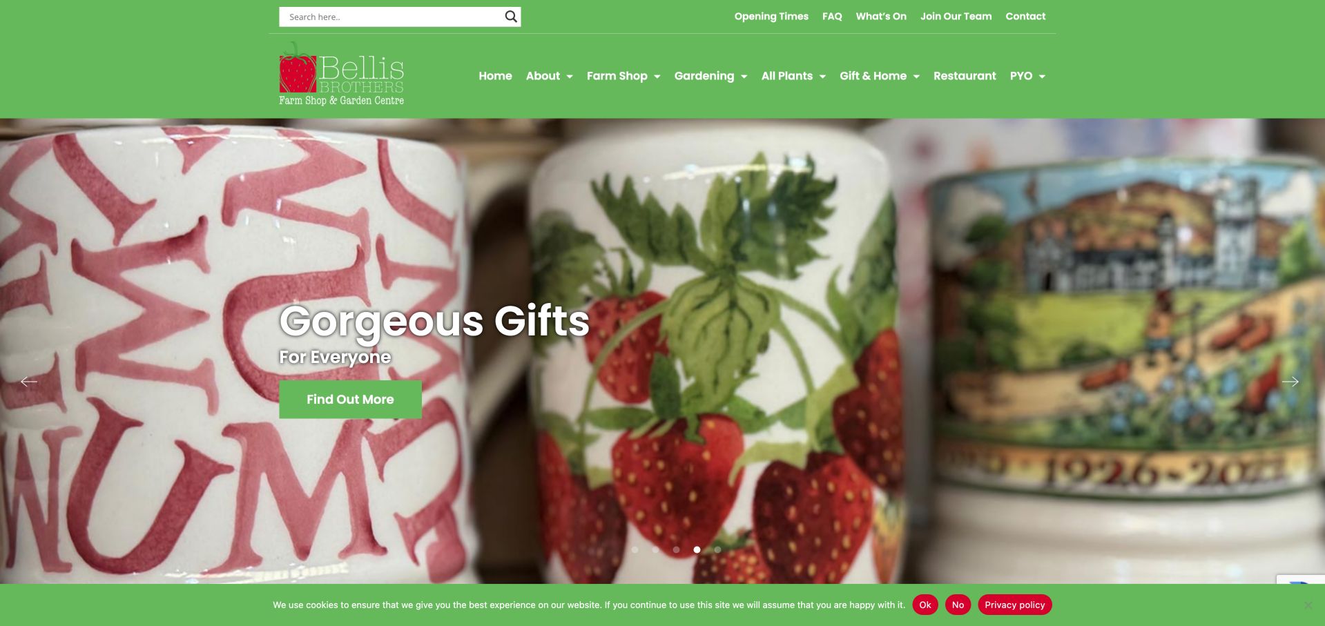
Bellis Brothers uses a familiar green header to connect its farm shop, garden center, gifts, restaurant and pick-your-own activities. The homepage distributes these offers into clearly labeled cards rather than making a single generic shop button carry every task. Its story section connects the business to its farming context, while practical links include opening times, plant returns, gardening tips and events. The design illustrates how a diversified rural destination can remain navigable when departments have distinct entry points.
What you can learn
Give each reason to visit its own card and destination. Separate seasonal activities from permanent departments, and publish clear dates so an old promotion cannot masquerade as a current opening or event. Keep practical hours readable as ordinary text.
Pros
Department cards make the mixed offer easy to scan.
Opening times and common questions have utility links.
Cons & considerations
Generic Learn More labels repeat across several cards.
Rotating campaigns can hide a particular offer until its slide appears.
Platform source: WordPress.org Showcase. server response header identifies LiteSpeed. Exact public source-page sample: https://www.bellisbrothers.co.uk/. This identifies a public LiteSpeed reference or response association, not private configuration, complete architecture, measured performance or successful data collection. Platform evidence is separate from the direct website screenshot and is not a complete current infrastructure audit.
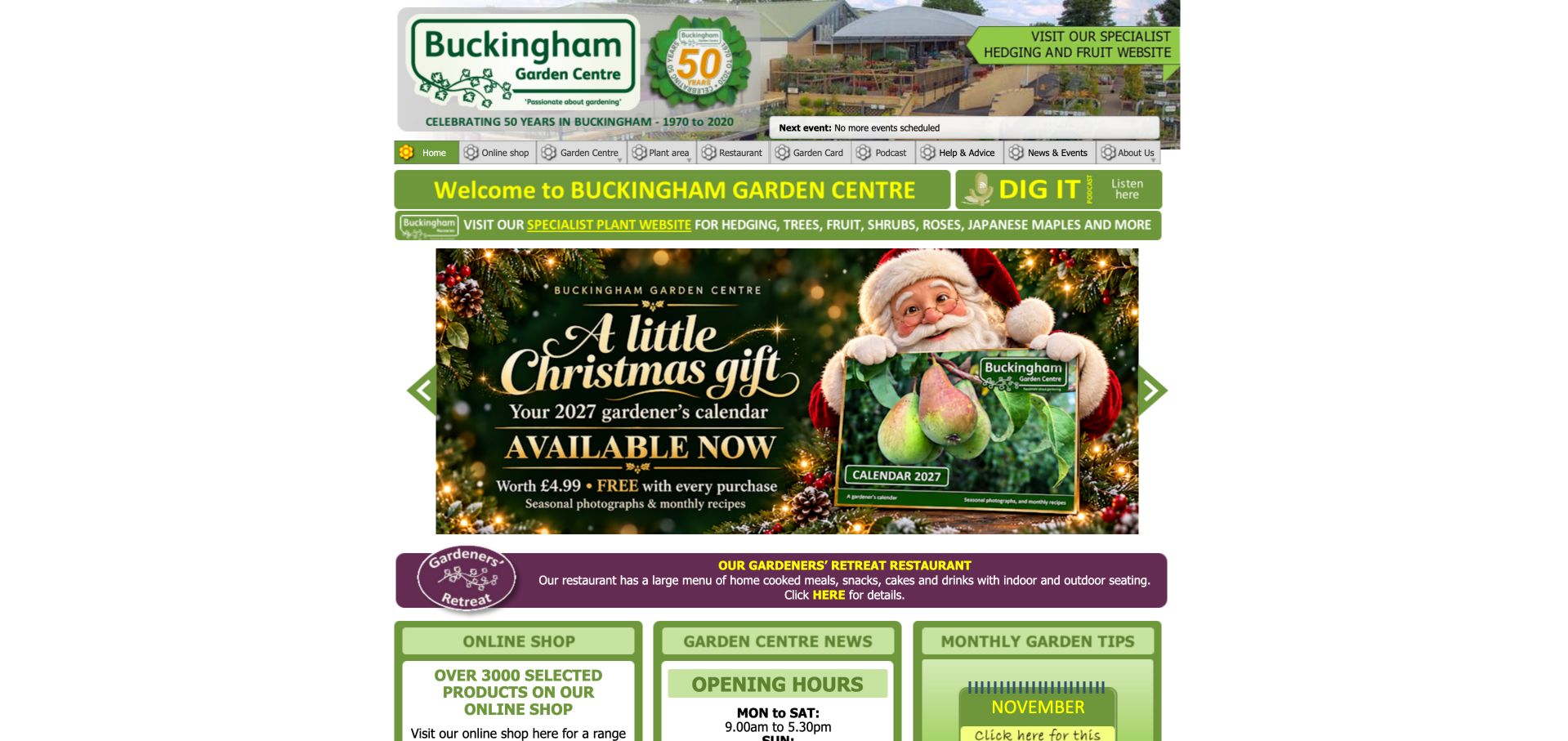
Buckingham packs its opening page with shop access, monthly garden tips, a podcast, restaurant information and opening hours. A dedicated banner points to its specialist hedging and fruit website, distinguishing that range from the general center. The compact, fixed-width layout feels more like an information board than a modern campaign landing page. It is particularly instructive for the usefulness of recurring advice and precise service information, while also showing how dated graphics and dense navigation can make that value harder to discover.
What you can learn
Keep specialist expertise visible through practical advice and named resources. Modernize around that useful material rather than replacing it with a less informative hero. Publish essential hours and service details as ordinary text, not only within campaign graphics.
Pros
Monthly advice and a podcast make horticultural knowledge visible.
The specialist plant website is clearly distinguished.
Cons & considerations
The fixed-width presentation underuses a wide screen.
Important information is sometimes embedded in graphics rather than ordinary text.
Platform source: WordPress.org Showcase. server response header identifies LiteSpeed. Exact public source-page sample: https://www.buckinghamgardencentre.co.uk/. This identifies a public LiteSpeed reference or response association, not private configuration, complete architecture, measured performance or successful data collection. Platform evidence is separate from the direct website screenshot and is not a complete current infrastructure audit.
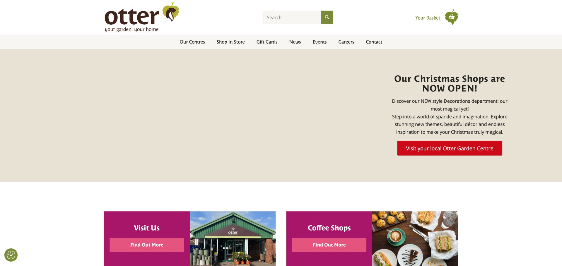
Otter uses a compact navigation with Our Centres, Shop In Store, news and events. The seasonal opening sends visitors to their local center, and the next panels distinguish visiting from coffee shops. Other sections connect plants grown by Otter, bulbs, garden buildings and practical environmental information to individual destinations. The site is useful as a regional gateway rather than a full product catalog, with repeated links back to location planning when the offer depends on the branch.
What you can learn
When most purchases happen in person, make the store finder a primary route. Explain branch-specific details instead of implying identical stock, cafes or events. Confirm that links distinguish a store visit from an online order, and keep the selected branch visible through the following journey.
Pros
Location selection is a primary task.
Separate coffee-shop and own-grown plant routes support specific interests.
Cons & considerations
The first observation contained an unloaded hero media area.
Repeated Find Out More labels provide less context than destination-specific wording.
Platform source: WordPress.org Showcase. server response header identifies LiteSpeed. Exact public source-page sample: https://www.ottergardencentres.com/. This identifies a public LiteSpeed reference or response association, not private configuration, complete architecture, measured performance or successful data collection. Platform evidence is separate from the direct website screenshot and is not a complete current infrastructure audit.
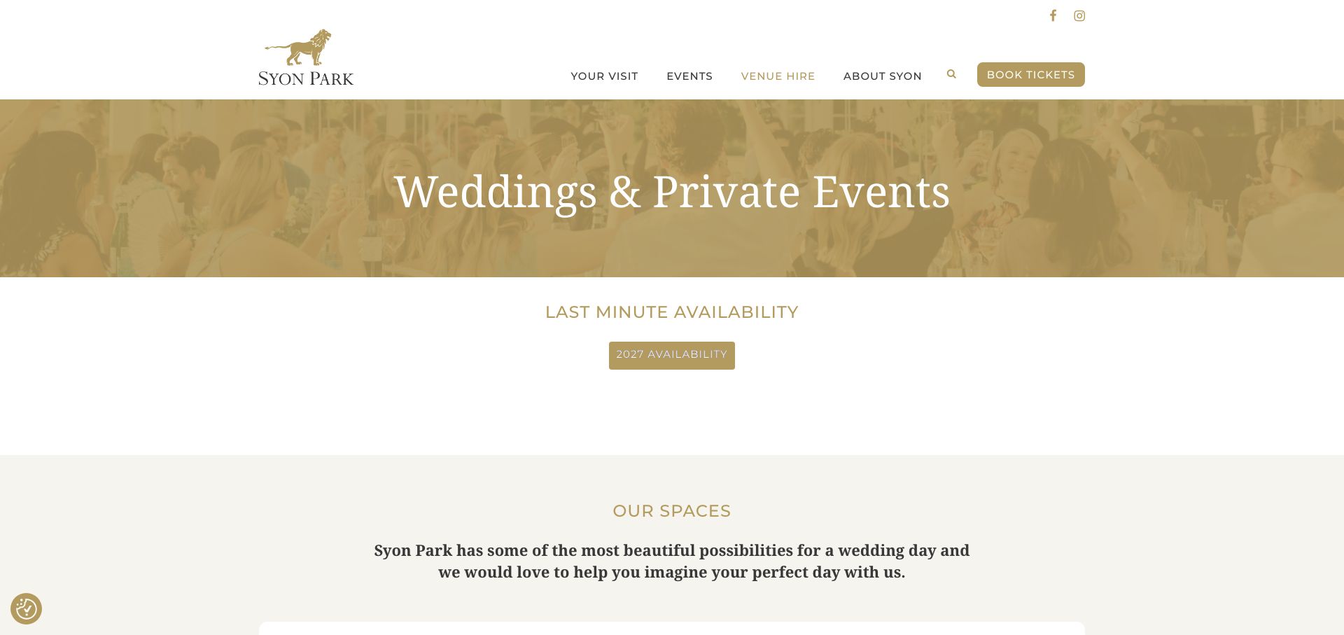
Syon Park's wedding and private-events page starts with an availability-diary link before moving into the House, Great Conservatory and Hotspur Wing. It provides hire-fee PDFs labeled by year and a separate wedding brochure, helping visitors distinguish dated commercial material from the general introduction. Suggested day formats and supplier links add further planning context, while the footer separates the postal address from the vehicle entrance. The page also covers summer, winter and Christmas parties, so wedding information shares a long page with other uses. Generic View and Book Now links reveal little about their destinations, and standing capacities vary by the event context described.
What you can learn
Give dated fee documents an explicit year and connect them to the relevant spaces. Keep arrival instructions precise, and label capacities and day formats carefully so visitors do not apply a reception maximum to a different wedding configuration.
Pros
Year-labeled hire documents and an availability diary support research.
Named spaces and a separate vehicle entrance improve planning context.
Cons & considerations
Several other party types make the wedding page lengthy.
Generic actions and context-dependent maximums require extra interpretation.
Platform source: WordPress.org Showcase. server response header identifies LiteSpeed. Exact public source-page sample: https://syonpark.co.uk/weddings-private-events/. This identifies a public LiteSpeed reference or response association, not private configuration, complete architecture, measured performance or successful data collection. Platform evidence is separate from the direct website screenshot and is not a complete current infrastructure audit.
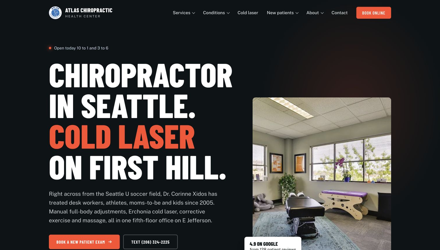
Atlas names Seattle and First Hill in oversized type beside a photograph of its treatment room. Its introductory paragraph adds a nearby landmark, the named practitioner, service range and fifth-floor setting, giving the page unusually concrete local context. New-patient booking and texting are separate actions. The inspected page continues with staff profiles, intake categories and a three-step first-visit explanation, including parking and the elevator. Opening hours also appear near the headline. The site publishes clinical and device claims, but the transferable design strength is the practical specificity rather than those unverified outcomes.
What you can learn
Use genuine room photography and precise arrival information to answer practical first-visit questions. State whether selecting a slot requests or confirms an appointment. Keep floor access, parking and current hours readable without relying on a map. Clinical claims require separate qualified review.
Pros
The introduction identifies the practitioner and exact neighborhood
First-visit instructions include parking and floor access
Cons & considerations
The very large headline can push actions toward the fold
Device and treatment claims need separate clinical substantiation
Platform source: WordPress.org Showcase. server response header identifies LiteSpeed. Exact public source-page sample: https://atlaschirohc.com/. This identifies a public LiteSpeed reference or response association, not private configuration, complete architecture, measured performance or successful data collection. Platform evidence is separate from the direct website screenshot and is not a complete current infrastructure audit.
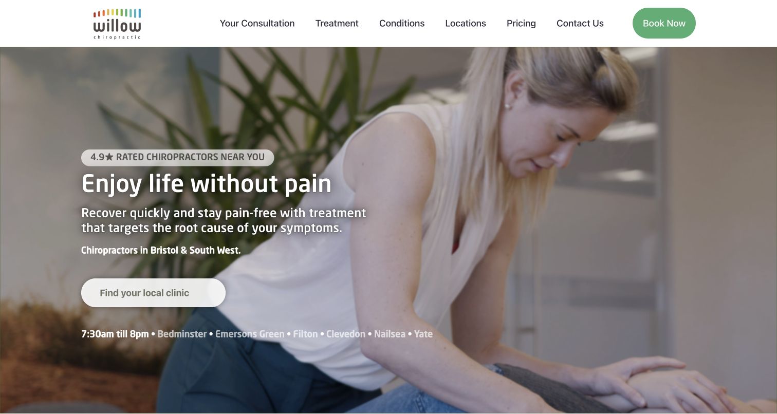
Willow pairs treatment photography with a prominent local-clinic button and a row of linked place names. Its menu gives consultation, treatment, locations and pricing separate positions, keeping the first practical choices familiar. The inspected page continues with concern cards, practitioner explanation, video and consultation content. It also presents several numerical outcome claims; those remain the publisher's assertions, not independently verified results in this review. The retained capture follows dismissal of the central consent dialog and shows the underlying regional orientation clearly, with a wide white navigation bar and green booking control.
What you can learn
Prioritize branch selection while preserving a clear explanation of consultation and costs. Place links should lead to current local details, not generic duplicates. Keep clinical claims subject to qualified review, and make the introductory information usable without video or animated counters.
Pros
Consultation and pricing are top-level destinations
Linked place names supplement the main clinic-finder action
Cons & considerations
Broad numerical outcome claims need transparent supporting context
The opening relies heavily on benefit language rather than explaining the first visit
Platform source: WordPress.org Showcase. server response header identifies LiteSpeed. Exact public source-page sample: https://willowlife.co.uk/. This identifies a public LiteSpeed reference or response association, not private configuration, complete architecture, measured performance or successful data collection. Platform evidence is separate from the direct website screenshot and is not a complete current infrastructure audit.
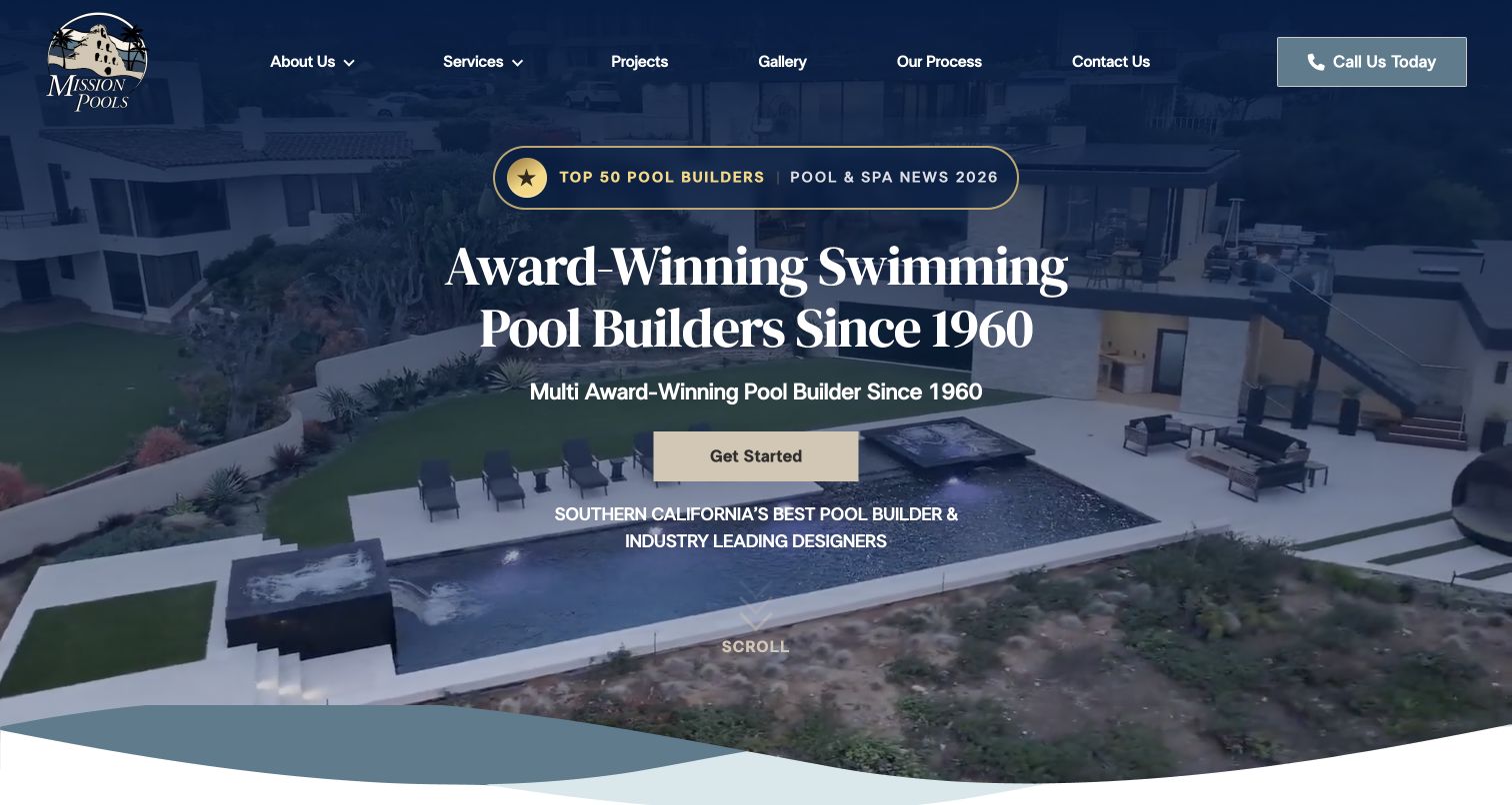
Mission Pools uses a navy overlay, serif headline and gold accents to frame aerial project footage. Projects, Gallery and Our Process are all visible header destinations, with a direct phone action. The body divides custom residential pools, renovation or maintenance and commercial construction before introducing a six-step image-led project questionnaire. Later project sections explicitly distinguish residential and commercial work, and branch contact information identifies the Southern California operation. This is an example of combining a polished showcase with assignment-based organization. The questionnaire can help start a conversation, but its image choices are not a substitute for checking site conditions, engineering, permissions and a detailed scope with qualified people.
What you can learn
Separate project types when their decision-makers and requirements differ. Give image-led questionnaires text labels, clear progress and revisable selections. Explain that a preference quiz begins a conversation, not a buildable design or final price.
Pros
Residential and commercial work receive distinct service and project routes
Process and direct phone access are visible beside the visual showcase
Cons & considerations
Repeated award wording uses space that could explain service coverage sooner
Image-based questionnaires need equivalent labels and accessible selection states
Platform source: WordPress.org Showcase. server response header identifies LiteSpeed. Exact public source-page sample: https://www.missionpools.com/. This identifies a public LiteSpeed reference or response association, not private configuration, complete architecture, measured performance or successful data collection. Platform evidence is separate from the direct website screenshot and is not a complete current infrastructure audit.
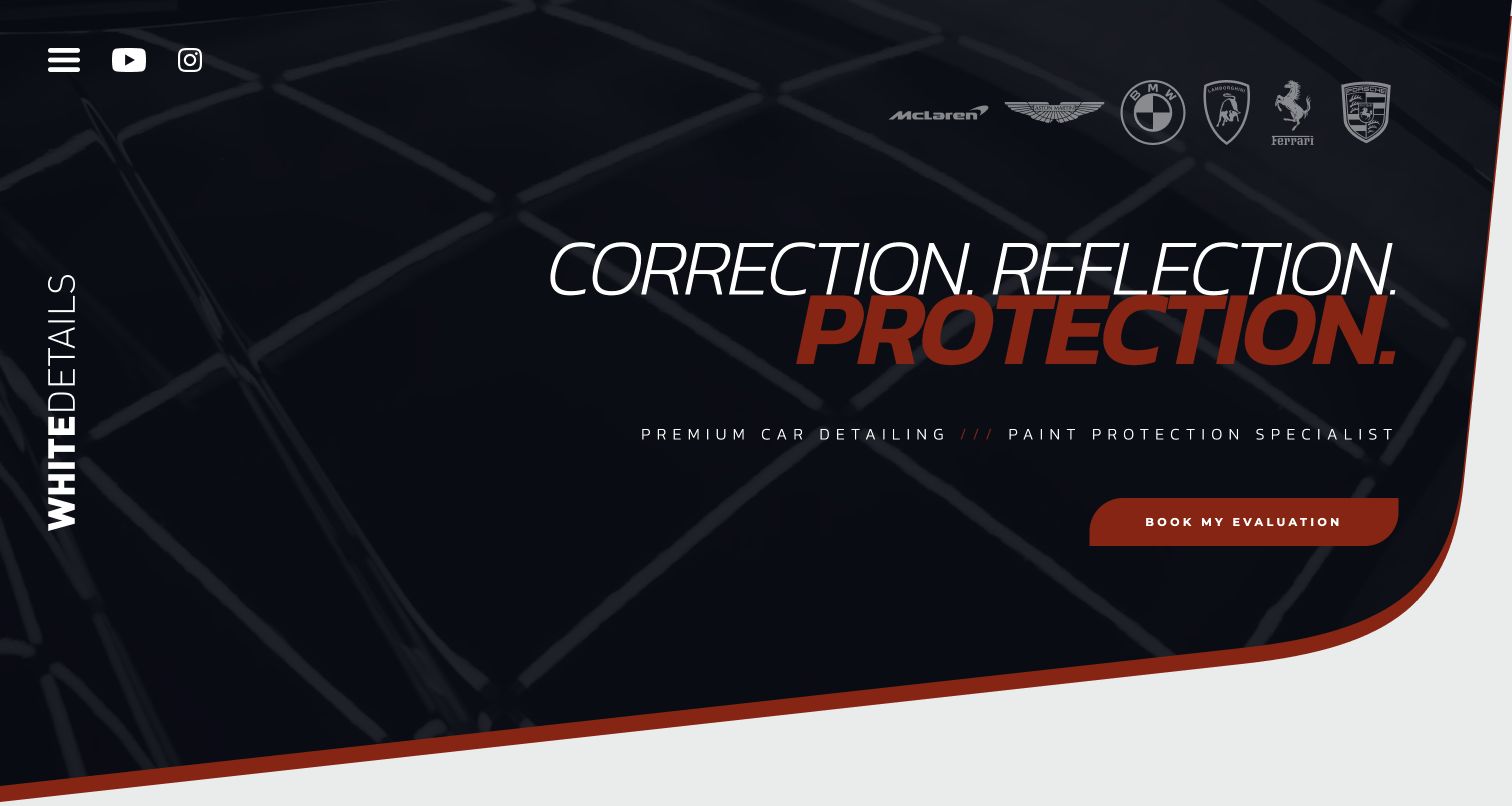
White Details combines italic typography, dark studio imagery, red accents and an evaluation invitation. A personal introduction explains the Lincolnshire studio, client updates and the difference between new-car preparation, correction and its comprehensive service. Video case studies add process context beyond glossy finished-car photography. Contact copy asks about condition and desired work while acknowledging variable response and lead times. The coherent specialist presentation invites discussion of the actual vehicle rather than promising one universal transformation. Social or performance claims remain the business’s own representations.
What you can learn
Make a personal studio distinctive through the way it explains judgment and communication, not just a dramatic logo. Name what an evaluation establishes and show work that illustrates different starting conditions. Keep essential service descriptions on the site even when longer case studies live on video platforms.
Pros
Distinct service descriptions explain new-car preparation versus correction
Personal communication and evaluation have a specific role in the process
Cons & considerations
If visitors do not open the compact menu, detailed service routes are initially hidden
When case studies move to external video, accessible text context still needs maintenance
Platform source: WordPress.org Showcase. server response header identifies LiteSpeed. Exact public source-page sample: https://www.whitedetails.co.uk/. This identifies a public LiteSpeed reference or response association, not private configuration, complete architecture, measured performance or successful data collection. Platform evidence is separate from the direct website screenshot and is not a complete current infrastructure audit.
Kegan has 15+ years of experience working with small businesses, Fortune 500 companies, and everything in between. No development job is too big or too small: he brings the same hands-on attention to a focused improvement, a complete website, or a custom application.
For LiteSpeed projects, he can help with website delivery requirements, hosting coordination, scoped caching rules, dynamic-page exclusions, deployment checks, and dependable maintenance. He works directly with clients on scope, design, implementation, testing, and handover, with an emphasis on clear communication and a system that remains practical to maintain after launch.
Show 3 other LiteSpeed developersHide other LiteSpeed developers
Choose an operating model before copying a cache setup
Managed hosting with a documented boundary
Ask which settings the provider controls and what the site team can change. A managed setup should include a clear escalation route and a way to verify a purge, restore a backup and diagnose stale public content.
An application-specific cache integration
Evaluate cache behavior against the real CMS, plugins and dynamic states. Keep exceptions narrow and understandable. More optimization switches are not automatically better, particularly when scripts, forms or media depend on ordering.
A self-managed server only with a maintenance owner
If the business takes responsibility for the server, define updates, certificates, logs, backups and recovery before launch. A server choice should not silently create an operations role that nobody has agreed to perform.
From references to requirements
Plan a delivery configuration that stays correct after launch
Build a route and state inventory
Include logged-out and authenticated visits, form errors, language variants and any query-driven output. Identify which systems are authoritative for availability or prices. Use representative cases rather than testing only the homepage.
Run a controlled change rehearsal
Publish a harmless change in a safe environment, verify the expected invalidation and restore the prior content. Repeat for media and relevant templates. A maintenance note should explain normal propagation, not tell editors to repeatedly clear every cache.
Define recovery and monitoring
Record where backups live, who can restore them and how the result is checked. Keep a rollback procedure for configuration changes. Compare observed delivery with a stable test method instead of treating one favorable score as a permanent property of the stack.
A useful handover demonstration
Ask the actual team to carry out its routine job: publish a realistic update, correct a mistake, preview a narrow screen, and identify who owns an integration failure. For a library or frontend framework, also ask who maintains the content source and deployment. A polished screenshot does not answer those operational questions.
Beyond the screenshot
Delivery and caching launch checklist
Name the hosting, server and application owners.
List public, private and personalized route classes.
Check cache variation for language and relevant visitor state.
Exercise form, booking and checkout exclusions where applicable.
Verify editor updates and urgent content invalidation.
Test representative media and script behavior after optimization.
Rehearse a backup restore and configuration rollback.
Record measured findings without promising a universal speed gain.
Test with real content, a keyboard, a small screen, slow or failed requests, and the people who will maintain the system. These are planning checks, not an accessibility, security, performance, or search-ranking certification.
Sources & editorial method
How this LiteSpeed collection was reviewed
The November 13 bounded audits found LiteSpeed response evidence on the exact reviewed properties. Original source screenshots and visual reviews are retained or adapted with their actual dates. A header identifies a response-level software association; it is not an independent hosting audit, performance measurement, complete architecture inventory or security assessment.
Every image is an unmodified capture from the actual website, with its source and capture date. Some captures are reused from our shared catalog; their dates remain the original capture dates. None comes from a vendor gallery or a generated reconstruction. Moving imagery and live content can change.
Technology attribution uses public page assets or metadata, official platform documentation, or a cited first-party project case study. Documentary and framework-relationship evidence is identified where used; it is not a complete current backend inventory. A CMS image CDN alone does not establish a full CMS deployment. A library’s presence does not prove which individual controls use it, and a platform label does not establish AI authorship.
The composition notes, lessons, pros and tradeoffs are original editorial observations. We have not measured conversion, traffic, security, performance or accessibility conformance. Website owners retain their brands and imagery; these examples are not our client portfolio. Written, Edited and Curated are independent records, not dates advanced by a build. See our editorial standards or suggest a correction.
Questions worth asking
LiteSpeed website development FAQs
Does a LiteSpeed header prove that a site is fast?
No. Real performance depends on content, application behavior, delivery configuration, devices and networks. No comparative speed ranking was performed.
Is LiteSpeed Cache the same as the web server?
Treat them as distinct layers and verify the actual integration. The presence of a plugin alone cannot establish every server or cache behavior.
Should dynamic pages always bypass caching?
Classify their actual variation with the responsible developer. Do not copy blanket rules from a screenshot collection or treat personalized responses as ordinary public pages.
Were the example servers tested or changed?
No configuration, load tests, accounts or private systems were accessed. The checks were bounded reads of public source responses.