A fitness studio website should help someone imagine showing up—not simply admire the energy of people who already belong.
A newcomer may not understand the class names, equipment or booking rules. A regular member may only need the timetable. A multi-location brand has another decision to support: which studio is right for this visit? Those tasks deserve clear routes beside the brand imagery.
These examples include specialist studios and broader fitness brands. Compare how they explain formats, introduce locations and connect schedules to booking. The reviews concern websites, not exercise suitability, coaching quality or health outcomes.
Before the examples
What makes good fitness website design in 2026?
Explain what a first session involves
Give class formats plain-language descriptions, relevant preparation information and a practical beginner route. Avoid relying solely on branded class names. Explain what a visitor should ask the studio about rather than offering individualized health or training advice on a marketing page.
Connect location, schedule and pricing
Make it easy to choose the correct studio before viewing availability or buying a pass. Keep package terms and introductory offers understandable. A visitor should be able to distinguish a class booking, membership inquiry and account login without guessing.
Show the people and environment
Use approved studio and instructor imagery to communicate the experience. Balance intensity with practical reassurance for first-time visitors. Avoid unsupported body-transformation claims and keep testimonials distinct from promises about what another member will achieve.
The collection · 20 examples
20 fitness websites worth studying
Look for useful differences in class explanation, location choice and first-visit support. A bold fitness identity still needs straightforward access to the timetable and booking rules.
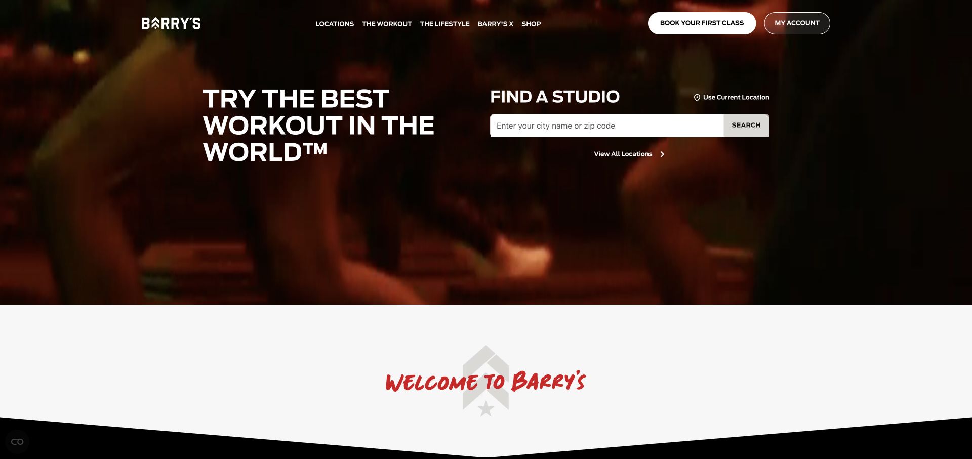
Barry’s uses dark red workout footage as a background, but gives roughly half the opening content area to a studio search. The white input, visible search button, and all-locations route are readable independently of the imagery. The header distinguishes a first-class booking from an existing account, while a curved white transition introduces the following section. The result blends the atmosphere of the workout with a concrete way to determine whether a nearby studio exists.
What you can learn
For multi-location fitness, location is often more decisive than a longer brand story. Give studio finding equal billing with the introductory message, and keep a plain browse-all option for people who would rather compare neighborhoods than enter an address or grant geolocation permission.
Pros
The large location finder makes the homepage useful before someone understands the entire workout format.
First-time booking and account access are separate controls rather than one ambiguous sign-in action.
Cons & considerations
Busy moving footage can distract from a search field if the background is not consistently dark.
The broad headline still needs a following explanation of class structure, equipment, and what beginners should expect.
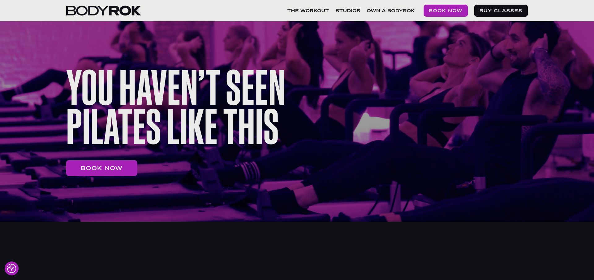
BODYROK’s opening is dominated by purple-tinted footage of an actual group reformer class and a very large condensed headline. A solid white header protects the brand and compact navigation from the moving background. Booking and buying classes are both visible there, with another purple booking button below the headline. The strong monochromatic image treatment makes the studio lighting feel like part of the identity rather than an unrelated background photograph.
What you can learn
Show the actual equipment and group setup when the class format is unfamiliar. Then explain the difference between reserving a class and purchasing credits, especially for a new visitor who may not know whether a package is required before a first session.
Pros
The class footage demonstrates the apparatus and group environment rather than relying on posed fitness portraits.
A short navigation leaves the primary booking and purchase controls easy to identify.
Cons & considerations
The large headline and saturated footage leave little room for practical first-timer information in the opening.
Booking and buying are adjacent actions whose relationship may need clearer explanation for a new member.
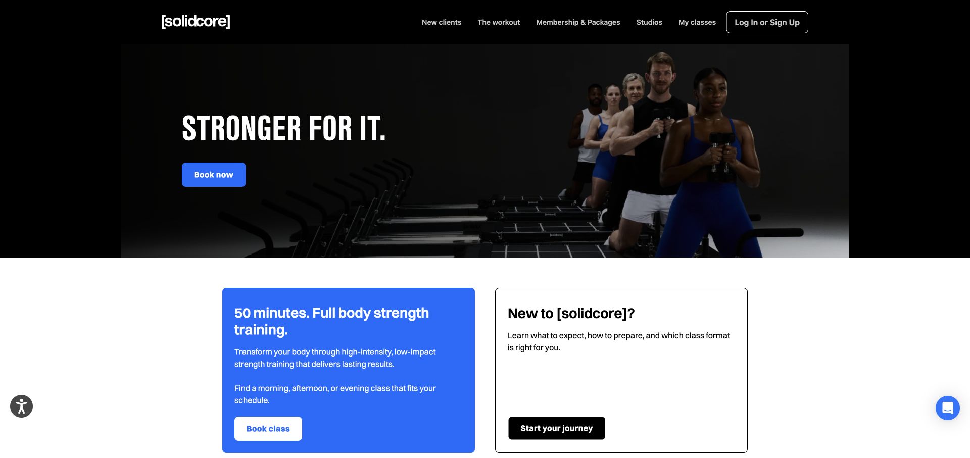
[solidcore] opens with a black header and a framed group image, using electric blue only for the main booking action. Immediately underneath, two substantial cards divide the content: one introduces the workout and class booking, while the other is explicitly for someone new to the studio. The contrast between the blue filled panel and white outlined panel creates a useful second-level hierarchy. Memberships, studios, and an existing member’s classes remain visible in the header.
What you can learn
A specialist studio should not assume its equipment or class style is self-explanatory. Let an experienced member book quickly while giving a newcomer a separate route to preparation, format choices, and expectations before they are asked to reserve a place.
Pros
The new-client panel is a substantial part of the layout, not a small help link.
The blue accent connects the hero booking action with the explanatory workout card below it.
Cons & considerations
The dark dramatic opening may feel more intense than the beginner material underneath suggests.
Several account, membership, and class routes need careful naming so that existing-member utilities do not overwhelm exploration.
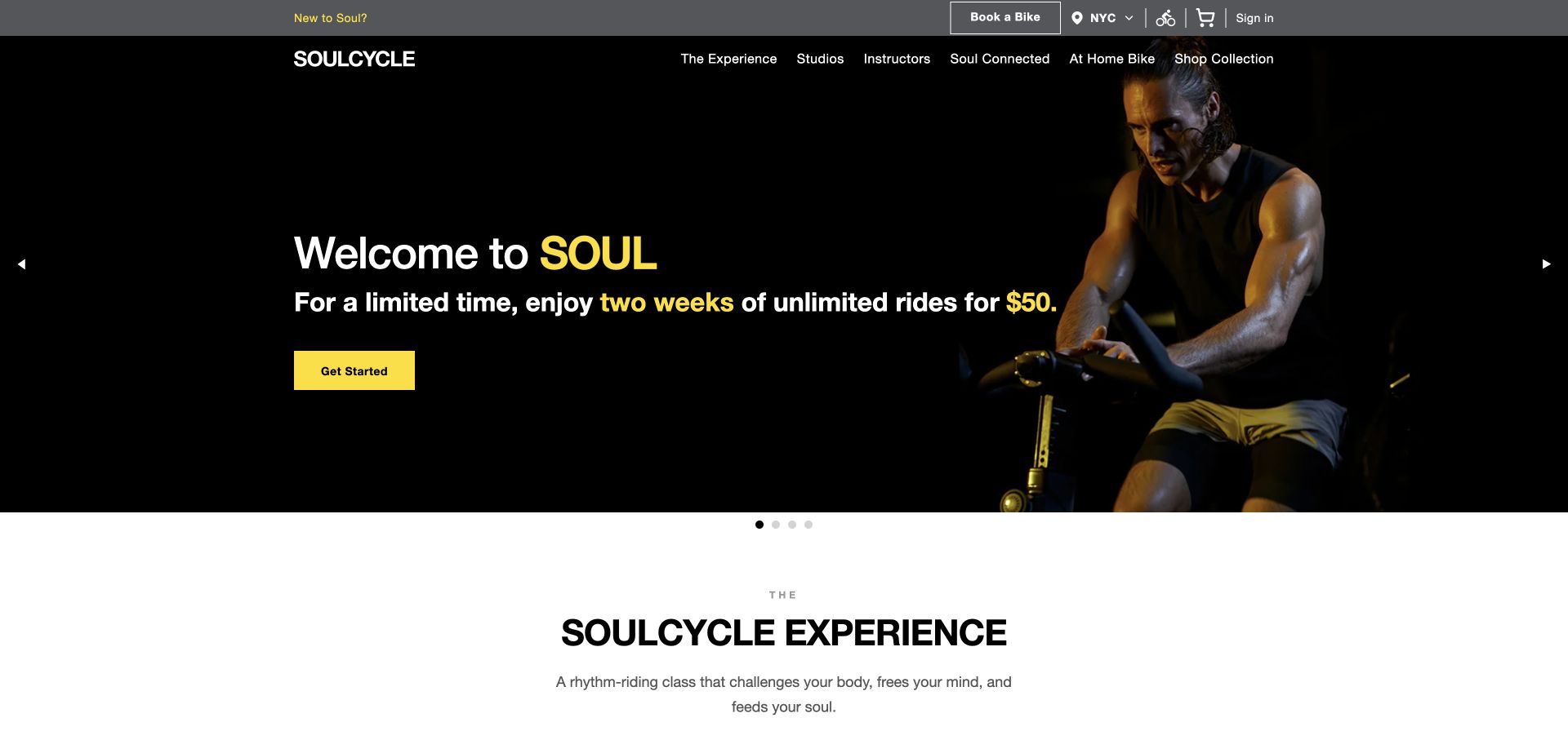
SoulCycle separates operational controls into a gray utility bar containing bike booking, region selection, account access, and shopping. Beneath, the black navigation and dark campaign image use yellow sparingly to highlight the introductory offer and primary button. The opening photograph unmistakably shows the cycling activity, while the next white section begins a more general explanation of the experience. Carousel dots indicate that the first view is part of a changing campaign sequence.
What you can learn
Returning studio members and first-time riders arrive with different tasks. Keep region and booking utilities stable even as the promotional hero changes, and provide a clearly labeled newcomer route so that an introductory package is not mistaken for the only way to attend.
Pros
The visible region selector helps users establish local context before attempting to book a bike.
Yellow is reserved for important offer text and actions against the largely black-and-white interface.
Cons & considerations
Several commercial and account icons in the utility bar create a fairly dense opening header.
A rotating promotional hero can hide useful details if visitors do not see or operate the slide controls.
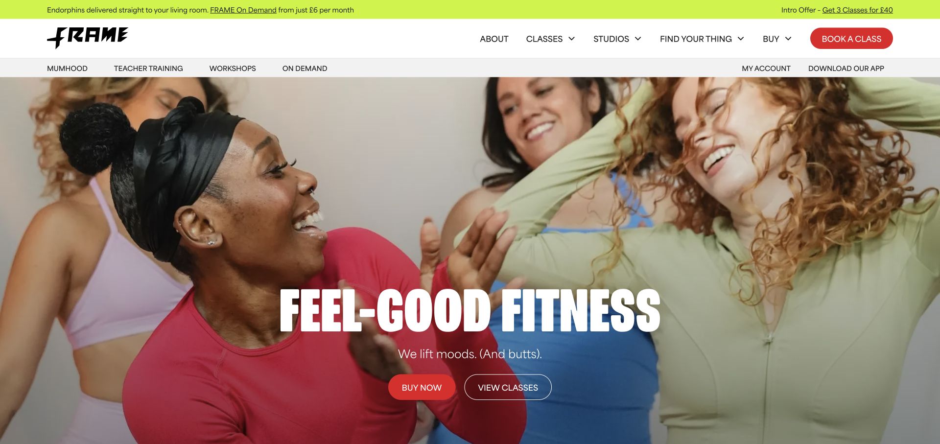
Frame uses a joyful group photograph and oversized condensed white type rather than an isolated athletic pose. Red rounded buttons and a lime utility strip supply a distinctive contrast to the warm imagery. The wide navigation has classes and studios as separate categories, with secondary routes for workshops, on-demand classes, and existing accounts. The hero makes buying and viewing classes different actions. The visual personality is playful, but the core studio and class routes remain conventional.
What you can learn
A multi-format fitness studio needs to help visitors browse before pushing a package purchase. Use the brand tone to convey the community, then organize class types, schedules, and locations in a vocabulary that does not require someone to already know the studio’s internal naming system.
Pros
The group photograph communicates social atmosphere without making the interface depend on a single instructor.
Class browsing is available beside purchase, giving a new visitor a lower-commitment next step.
Cons & considerations
Three header bands consume substantial vertical space before the main class message begins.
A broad menu of programs needs careful grouping to prevent occasional offerings from competing with everyday classes.
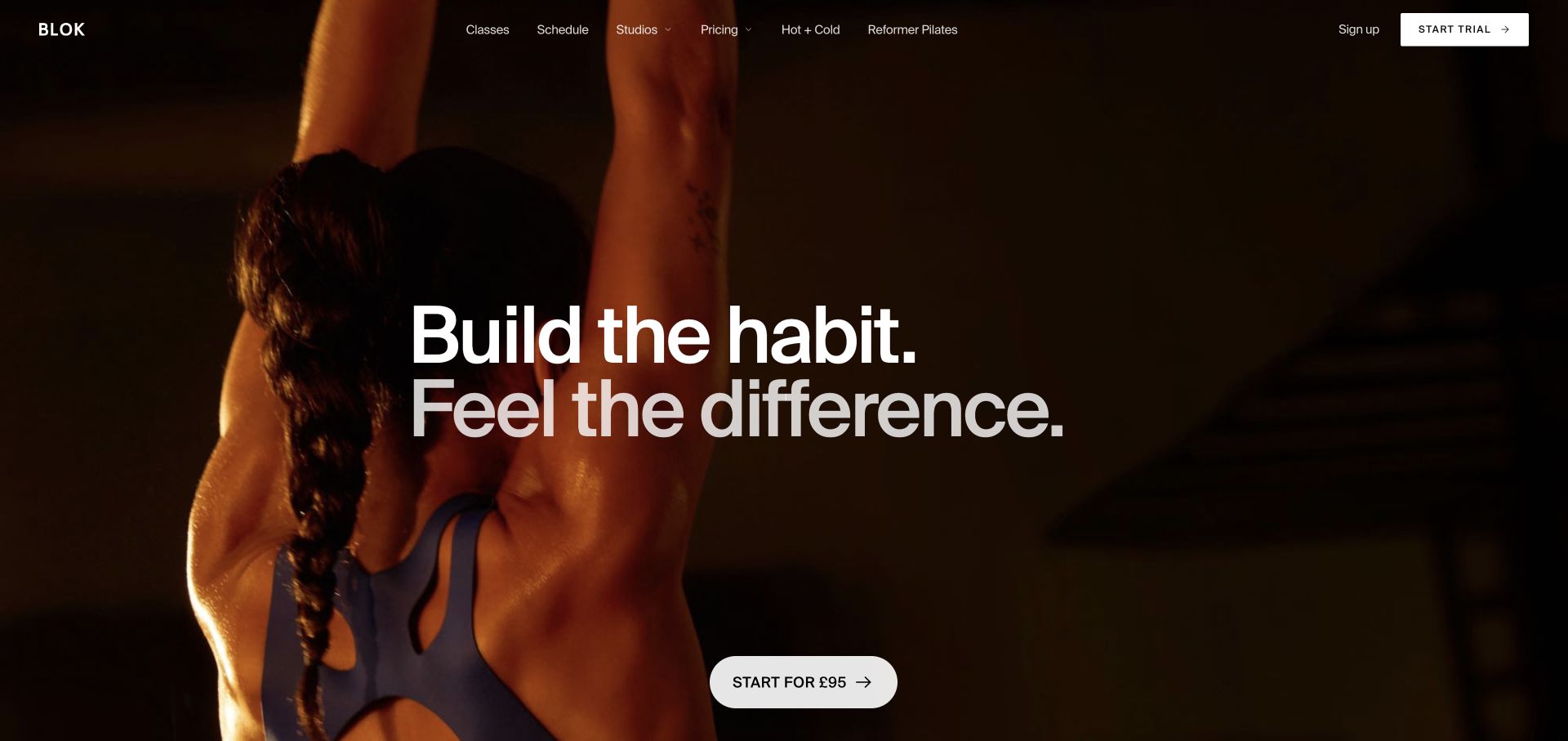
BLOK places a large two-line sans-serif statement across warm, dark exercise photography. The full-width image has enough empty area for the text to remain readable, while a white trial control sits near the bottom of the opening. The slim transparent header lists classes, schedule, studios, pricing, and specific offerings before an isolated trial action. The design feels editorial and restrained despite using a full-screen photograph, largely because it avoids additional promotional cards and badges.
What you can learn
A short fitness introduction can work when schedule, location, and price are already visible in the navigation. Make the trial’s terms inspectable and keep the class catalog reachable; the atmosphere should help someone choose a studio, not require them to commit before understanding the available sessions.
Pros
The trial action includes a price cue, making it more informative than a generic join button.
Schedule and pricing are primary navigation categories rather than details hidden behind membership inquiries.
Cons & considerations
The full-screen hero postpones class-type explanations until after the first scroll.
Text over moving or changing photography requires reliable contrast across every frame, not just the captured one.
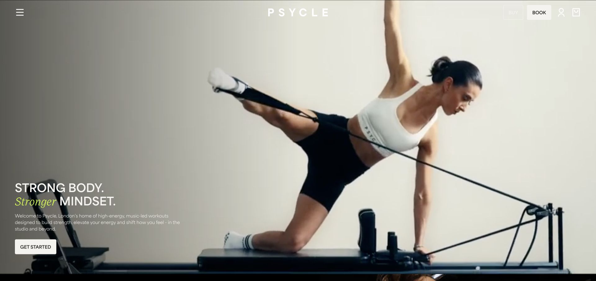
Psycle uses edge-to-edge training footage, a centered spaced wordmark, and a compact group of buy, book, account, and bag controls in the upper right. The main introduction is anchored near the lower left, including a short paragraph rather than a headline alone. One italic lime word interrupts the otherwise white typography. A menu icon keeps most browsing links out of the opening composition, allowing the footage to carry the atmosphere of the studio.
What you can learn
Film can show a range of movement more quickly than a long list of branded class names. Preserve a stable text layer and an obvious route to schedules and first-timer details, because a visitor should not have to interpret the video to know how to choose or reserve a class.
Pros
The introductory paragraph gives useful context while leaving the film as the main visual element.
Buying and booking are visibly separate, acknowledging that class credits and reservations are different tasks.
Cons & considerations
A collapsed desktop menu hides class categories and studio locations from immediate scanning.
Bright frames in the background film can reduce the legibility of the white header controls.
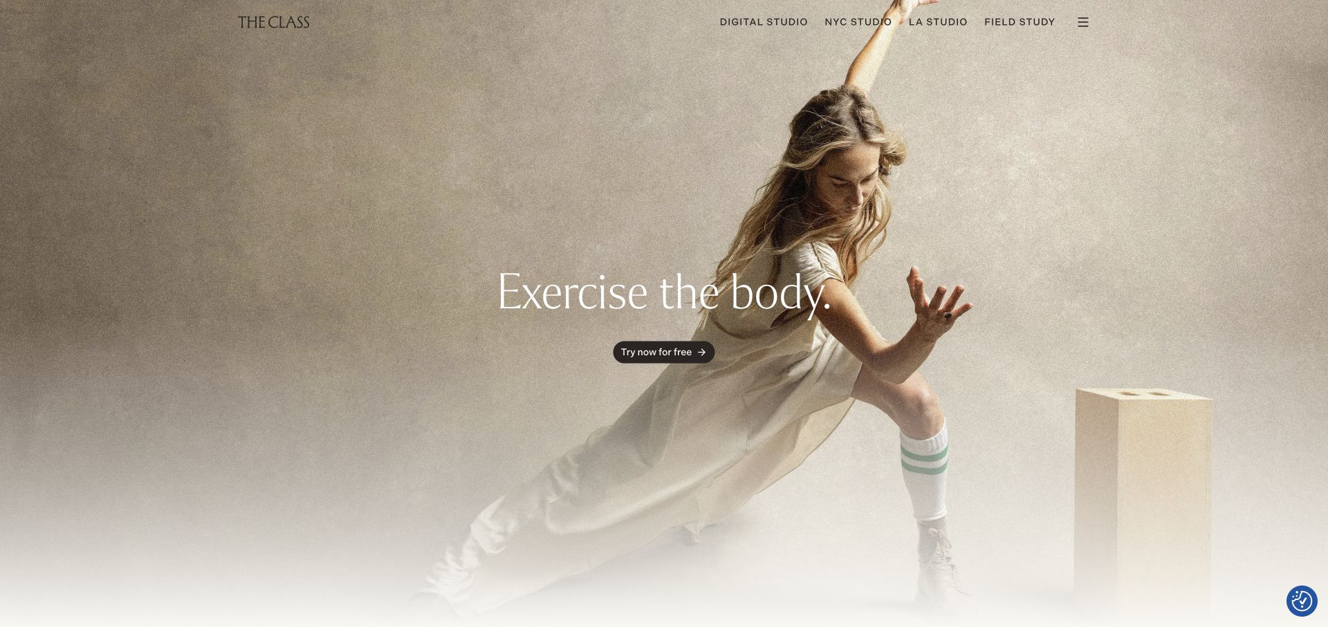
The Class opens with a softly textured movement portrait in warm neutral tones, fine serif type, and a very small central trial button. The header is equally spare but names the digital studio and individual city studios directly. The photograph has a deliberate editorial quality, with the figure occupying the right and enough quiet space around the type. Compared with the louder examples in this guide, it presents movement as a considered practice rather than a high-volume promotional campaign.
What you can learn
When a studio sells both physical attendance and online access, label those destinations clearly before someone starts a trial. Borrow the restraint of the composition, but make the scope of the trial and the route to an actual local timetable unmistakable.
Pros
City-specific studio links help distinguish physical attendance from the digital subscription route.
The neutral palette and spacious image composition create a coherent alternative to high-intensity fitness graphics.
Cons & considerations
The small trial control has relatively little visual weight compared with the expansive photography.
The broad opening statement does not explain the class structure without further browsing.
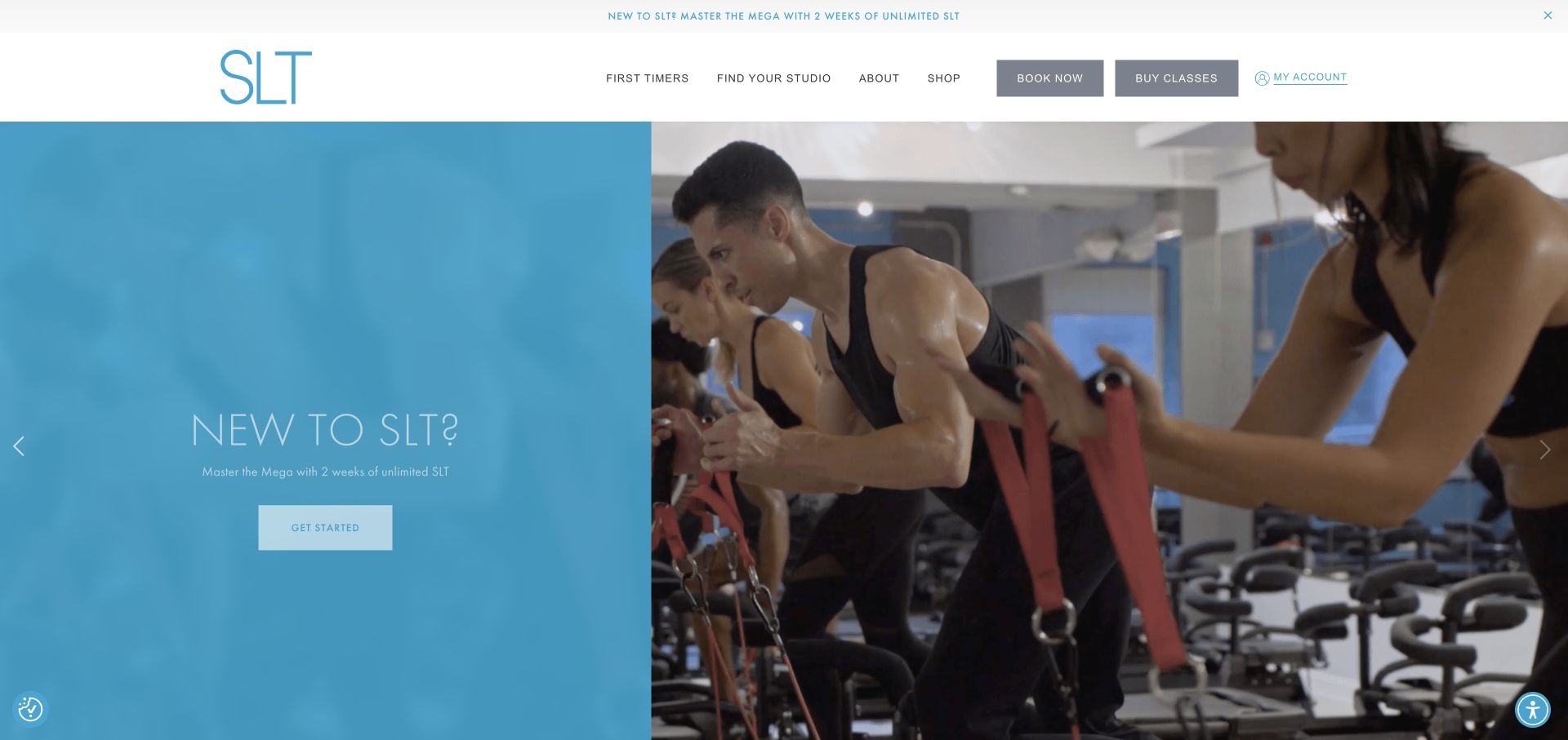
SLT pairs a solid pale blue copy panel with a large photograph of people using the studio equipment. A short newcomer message and centered action sit on the colored half, keeping the main text independent of the busy image. The white header separates first-timer information, studio finding, booking, buying, and account access. A narrow promotional strip adds a second place for introductory messaging. The palette is notably lighter than many reformer and strength-studio websites.
What you can learn
An unfamiliar apparatus benefits from a clear visual demonstration and an explicit newcomer path. Keep the useful distinction between finding a studio, purchasing sessions, and booking a place, but explain their sequence so visitors do not need prior experience with the studio’s scheduling system.
Pros
The split panel gives the headline a stable background while still showing an actual class setup.
First-timer information is a primary link rather than an afterthought below the booking form.
Cons & considerations
Light text and thin outlined controls can lose prominence against the pale blue panel.
A promotional carousel and separate offer ribbon can repeat the same message at the expense of explanation.
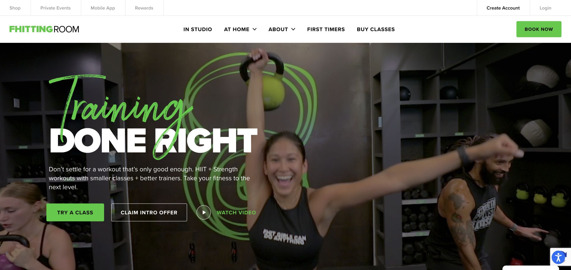
Fhitting Room combines a green handwritten-style word with a large white block headline over footage of a kettlebell class. The bright green action button echoes the equipment and logo, while an outlined intro-offer control and a video control create secondary routes. A solid white navigation divides in-studio and at-home attendance, with first-timer information visible alongside buying classes. The slim utility bar houses account and app links without mixing them into the primary hero copy.
What you can learn
If a fitness business operates several attendance models, distinguish them at the navigation level. Show the real class environment to explain the format, and keep an exploratory route for newcomers who need more information before deciding whether an intro package or a single session makes sense.
Pros
In-studio and at-home options are clearly separated in the main navigation.
The footage shows equipment, instructors, and other participants rather than only a polished athlete portrait.
Cons & considerations
Three adjacent hero actions can dilute the priority between trying a class and claiming an offer.
Handwritten display type is expressive but needs restraint so it does not overlap or obscure the main message.
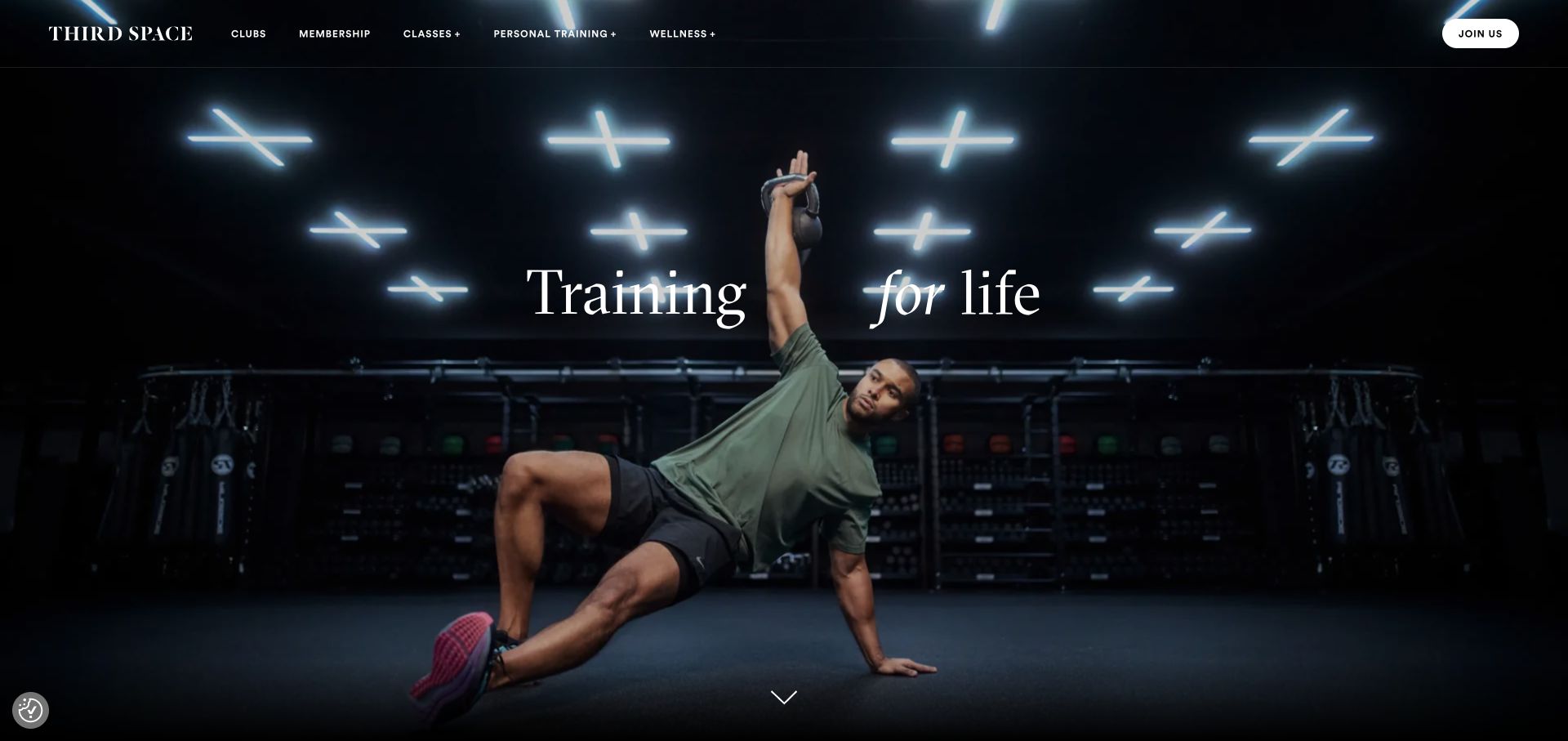
Third Space uses a dark, atmospheric training photograph with a large centered serif statement. A fine horizontal rule separates the transparent header from the hero, and the white membership button is isolated at the far right. The navigation names clubs, membership, classes, personal training, and wellness rather than a long sequence of individual workouts. The opening is deliberately sparse, leaving the room, lighting, and person in the photograph to establish the physical setting.
What you can learn
A club membership is broader than a single class purchase. Organize the site around facilities, attendance options, and services, then show enough real environments to help prospects compare locations. An atmospheric opening still needs a prompt transition to practical membership details rather than making a sales inquiry the only source of information.
Pros
The navigation reflects the different dimensions of a club membership instead of flattening them into one class list.
A single isolated join control maintains a clear action hierarchy in a spare header.
Cons & considerations
The opening provides little immediate information about membership pricing or the nearest club.
The dramatic full-screen photograph delays the broader facilities story until the visitor continues down the page.
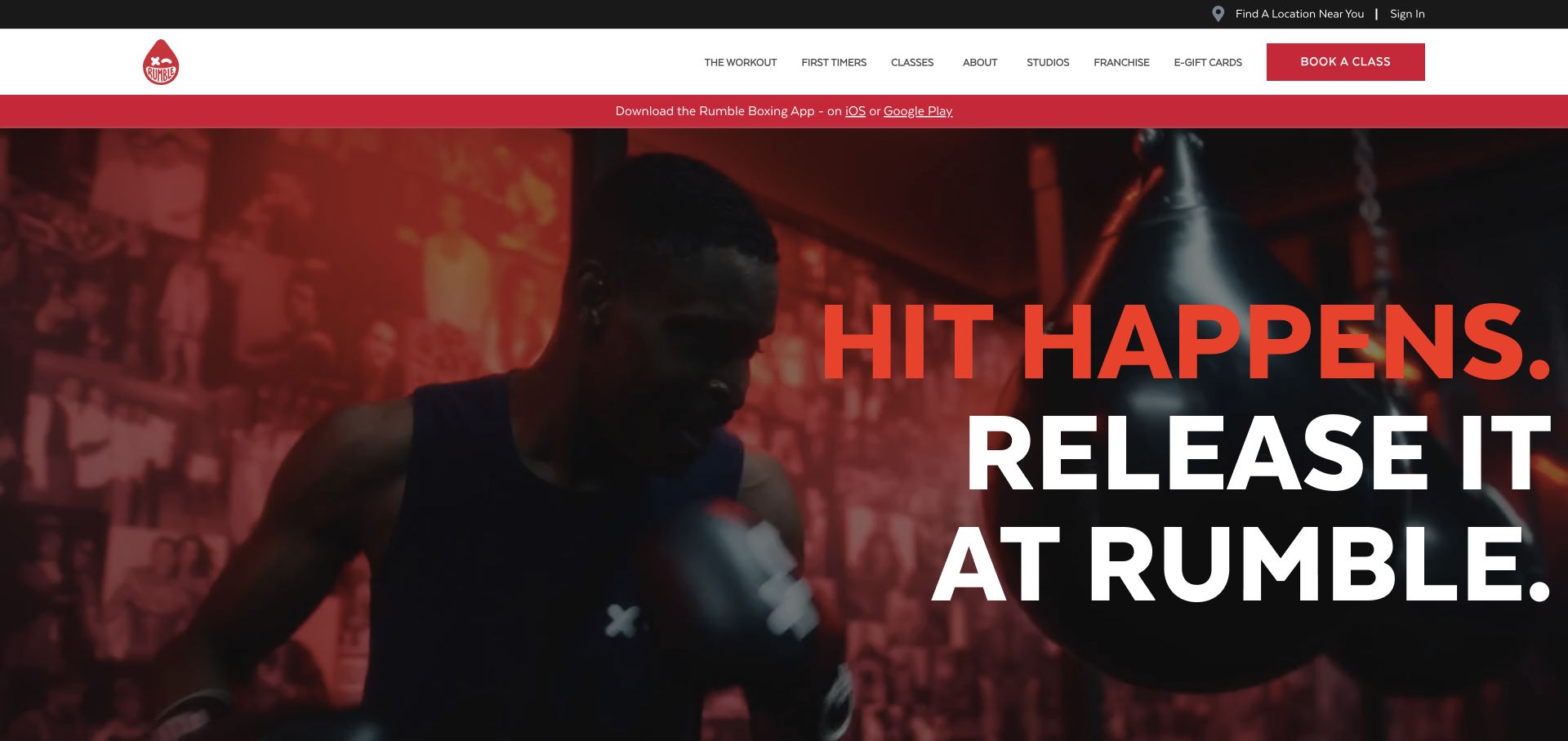
Rumble places very large stacked red and white type over close-up boxing footage. The main white navigation stays separate from the image and uses a red class-booking rectangle as the dominant control. A black utility strip provides location finding and sign-in, while a red band promotes the app. The activity is immediately recognizable from the gloves and bag, and the graphic scale makes the brand feel assertive without needing many decorative elements.
What you can learn
For a class format that may intimidate beginners, use real footage to show the environment but keep a visible first-timer route. Pair the strong visual tone with clear information about equipment, class structure, and how to reserve a place, rather than assuming an energetic campaign line answers those questions.
Pros
The actual boxing scene identifies the activity without relying on a long explanatory hero paragraph.
First-timer and studio links remain visible even while the large campaign message dominates the page.
Cons & considerations
The enormous stacked headline can consume almost the entire opening viewport on a shorter screen.
Multiple utility and app-promotion bands compete with the more immediate task of choosing a class location.
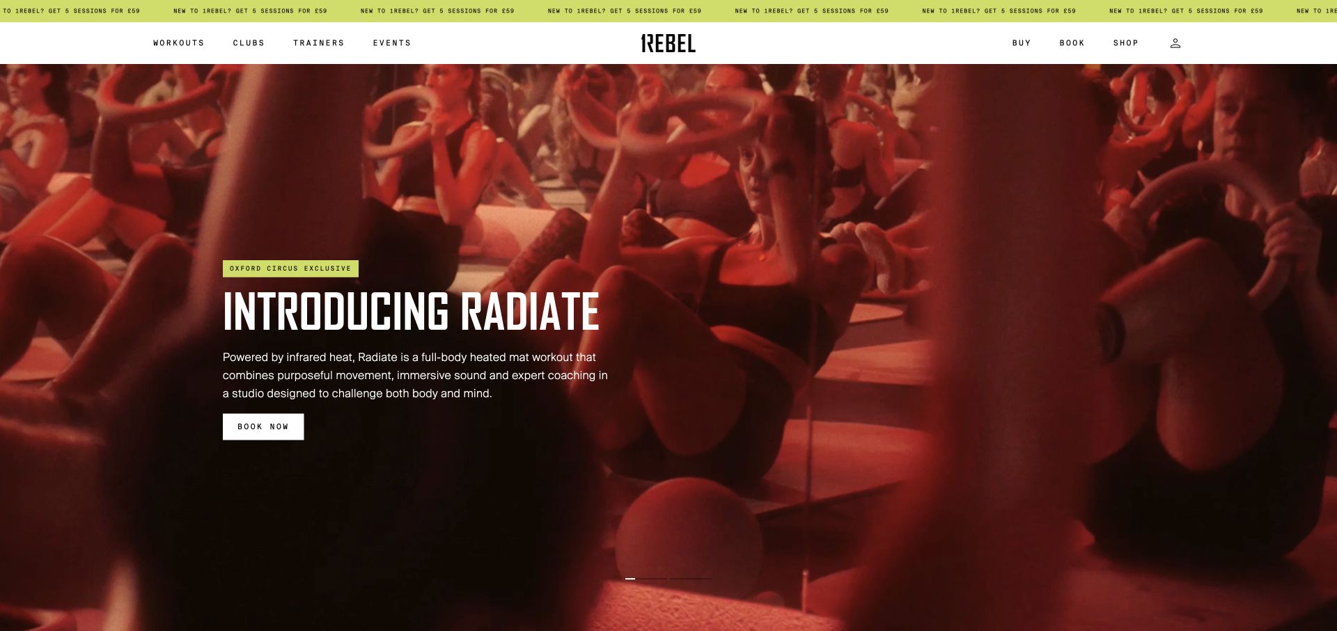
1Rebel uses a solid white header with a centered wordmark, tiny widely spaced navigation, and a lime offer ticker above it. The captured hero introduces one named heated workout over red-toned group footage. A small location tag, clear explanatory paragraph, and white booking control sit together in the lower-left portion. Unlike a generic fitness slogan, this hero explains a particular class format and identifies the club where it is available.
What you can learn
A new class launch should answer what it is and where it can be taken before asking for a booking. Keep the surrounding navigation stable so existing members can still reach their usual workouts, and avoid making a limited-location promotion look like the entire studio offering.
Pros
The location tag qualifies the offer instead of implying that every club offers the promoted class.
The hero includes a short format explanation as well as a branded class name.
Cons & considerations
Very small, spaced navigation labels may be harder to scan than the larger hero content.
An animated offer strip can compete with the class-launch message when both are visible together.
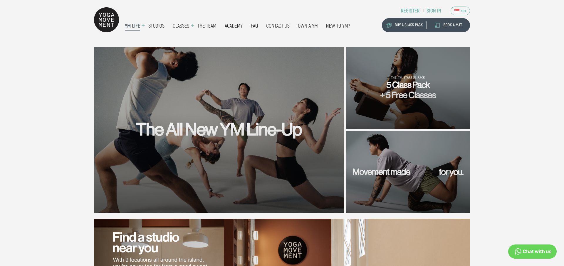
Yoga Movement organizes its opening as a large editorial tile beside two smaller photographic tiles, with a studio-finding section beginning beneath. The largest card introduces a class lineup, while the smaller panels carry an introductory package and a broader movement message. A compact top navigation includes studios, classes, team, and newcomer information; buying a class pack and booking a mat are grouped at the right. The grid allows several topics to coexist without becoming a conventional horizontal carousel.
What you can learn
A modular homepage can serve both returning students and prospective members when each tile has one clear purpose. Prioritize everyday booking and studio information, and treat temporary news or package promotions as replaceable editorial modules rather than the only content visible at the top.
Pros
The tile hierarchy distinguishes major news from smaller package and brand messages.
Buying a pack and reserving a mat use specific language suited to the actual studio workflow.
Cons & considerations
The number of simultaneous messages can make the first next step less obvious for a newcomer.
Animated media inside a grid needs reliable loading states so one unfinished tile does not dominate the composition.
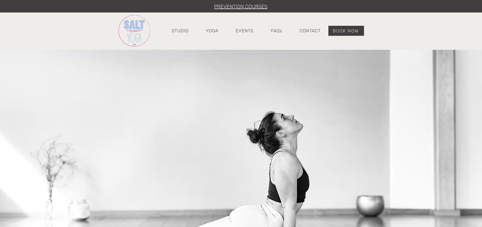
SALT YOGA uses a large black-and-white studio portrait below a warm off-white header. The pastel circular logo gives the otherwise monochromatic opening a small accent. Studio, yoga, events, FAQs, contact, and booking are arranged in one restrained navigation row, with a slim course strip above. The photograph provides ample negative space and emphasizes the room as well as the person. It is a notably calm alternative to the saturated group-workout footage elsewhere in this collection.
What you can learn
A small yoga studio can create a recognizable identity with one considered photograph and a useful timetable route rather than a complex campaign system. Keep upcoming events current and explain the class types below the image, particularly when the opening prioritizes atmosphere over a long introduction.
Pros
The original monochrome photograph creates a cohesive visual tone without a large collection of graphics.
Events, frequently asked questions, contact, and booking are plainly labeled in the header.
Cons & considerations
A very large photograph leaves little opening space for location or class-format information.
Time-sensitive course promotions require regular maintenance so dated events do not become the most prominent message.
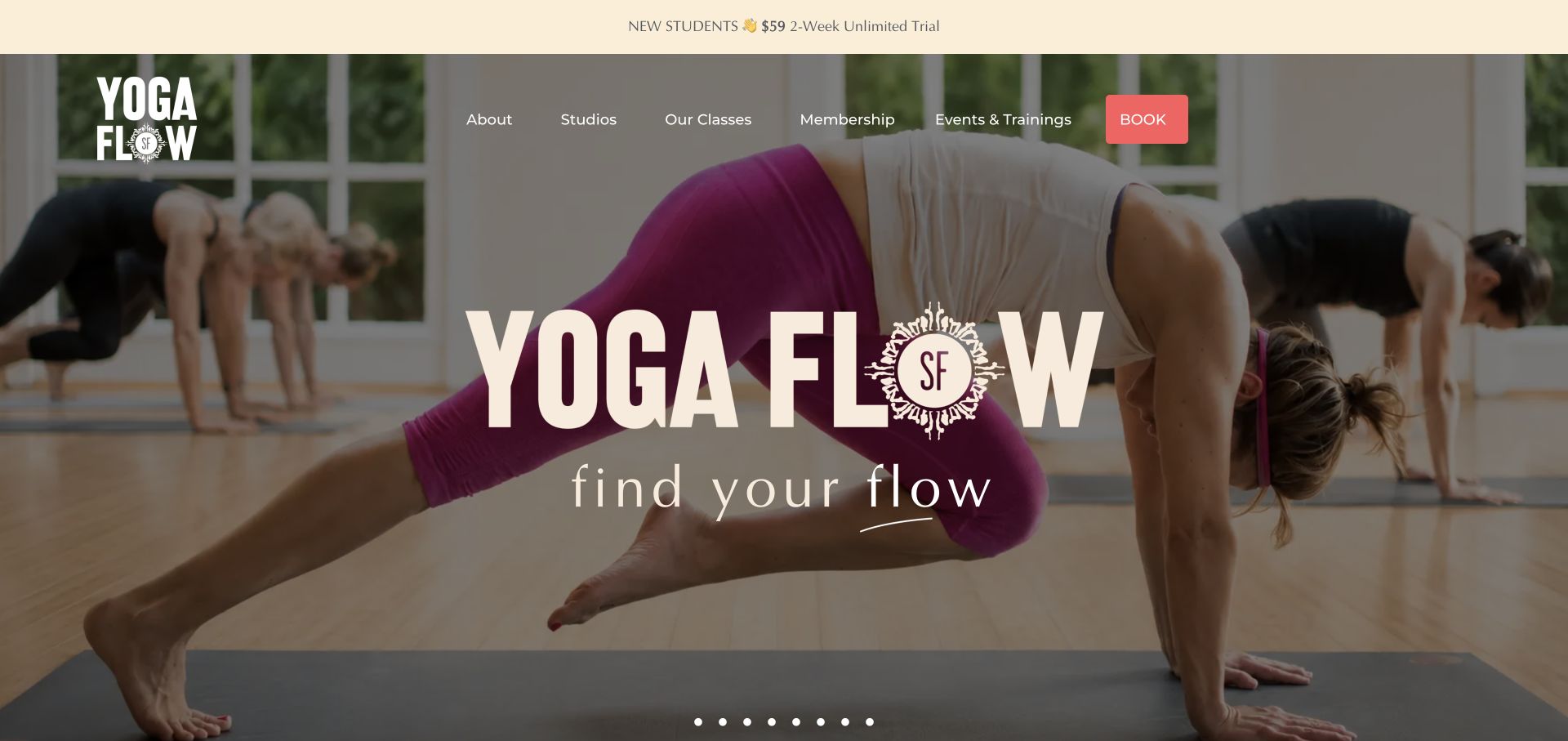
Yoga Flow SF places a large cream wordmark and lighter serif tagline over a full-width studio class photograph. The top strip promotes a newcomer trial, and a coral booking button provides the main color accent within the otherwise transparent navigation. Classes, studios, membership, and events are separate links. A row of carousel dots suggests multiple photographic or promotional slides. The visible wooden room and participating students communicate the actual group setting rather than an abstract wellness landscape.
What you can learn
A local studio should show the room students will enter and make the class and studio routes easy to distinguish. Use the hero for orientation, then provide a practical schedule and newcomer details so someone can choose a session without interpreting an entire carousel of promotional imagery.
Pros
The class photograph gives useful context about the room and the shared practice environment.
Studios and classes are separate categories, acknowledging that location and format are different decisions.
Cons & considerations
The oversized wordmark dominates space that could explain a beginner’s first visit.
Many carousel positions can hide important information if a visitor only sees the initial slide.
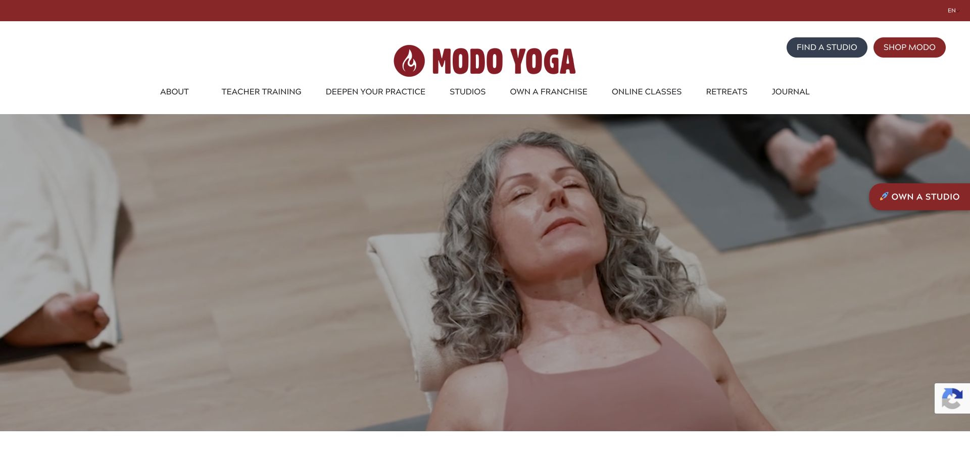
Modo Yoga uses a generous white masthead with a large red wordmark and clearly separated studio-finding and shopping buttons. The navigation stretches across several program areas, including teacher training, online classes, and retreats. Beneath it, a wide photograph shows a resting participant in a shared studio environment rather than an extreme athletic pose. Red accents connect the brand and utility elements, while most of the page remains neutral and spacious.
What you can learn
A yoga network with several business lines needs a patient navigation hierarchy: a prospective student looking for a local class should not have to understand teacher training or franchise opportunities first. Keep studio finding prominent and let the broader programs remain available without overtaking the core attendance journey.
Pros
Studio finding is given a distinct, visible button instead of being buried among the wider program links.
The human-scale class photograph offers a different visual tone from performance-focused fitness campaigns.
Cons & considerations
The large masthead and long navigation occupy considerable space before the introductory content.
Franchise and shopping promotions can distract from students who simply want nearby classes and prices.
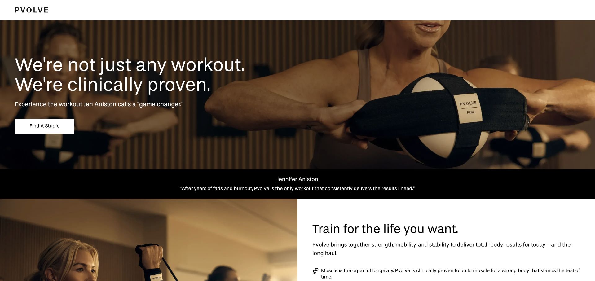
Pvolve’s studio landing page keeps the header almost empty, allowing a large class photograph and a clear studio-finding button to lead. The opening uses straightforward white sans-serif copy over a darkened image of participants using the method’s equipment. A separate black endorsement band divides the hero from an explanatory section below, where a photograph and text sit side by side. The page is noticeably more focused on studio attendance than a typical fitness equipment storefront.
What you can learn
When the same brand sells equipment, digital access, and studio classes, a dedicated attendance page can reduce confusion. Show the equipment in use, identify the next location-finding step, and keep any health or efficacy claims linked to inspectable evidence rather than expecting a celebrity endorsement to establish them.
Pros
A single studio-finding action keeps the first step focused on physical attendance.
The following split section begins explaining the method instead of immediately switching to unrelated merchandise.
Cons & considerations
The sparse header offers little visible navigation for someone who wants schedules or pricing first.
Prominent efficacy and endorsement language needs careful supporting context beyond the design of the opening.
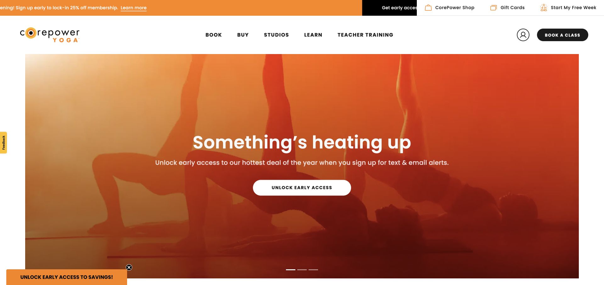
CorePower Yoga uses a solid white navigation with short task labels for booking, buying, studios, learning, and teacher training. The captured campaign occupies a large inset rectangle, combining warm orange imagery, centered type, and one white early-access control. A slim utility bar provides shop, gift cards, and newcomer trial access. The rounded black booking button remains visually distinct from the campaign action, so the header can continue serving existing students even when the hero promotes a temporary offer.
What you can learn
Keep the practical studio shell stable as campaigns change. A limited-time promotion should have its own clear terms and route, while a returning student can still find a class without interacting with marketing signup forms or waiting for a rotating message to reveal a booking option.
Pros
The solid navigation preserves clear task routes regardless of the current photographic campaign.
The booking control stays separate from the temporary promotional action in the hero.
Cons & considerations
A campaign focused on early access gives a newcomer little immediate explanation of the available yoga formats.
Several utility promotions can compete for attention unless the everyday booking task remains consistently dominant.
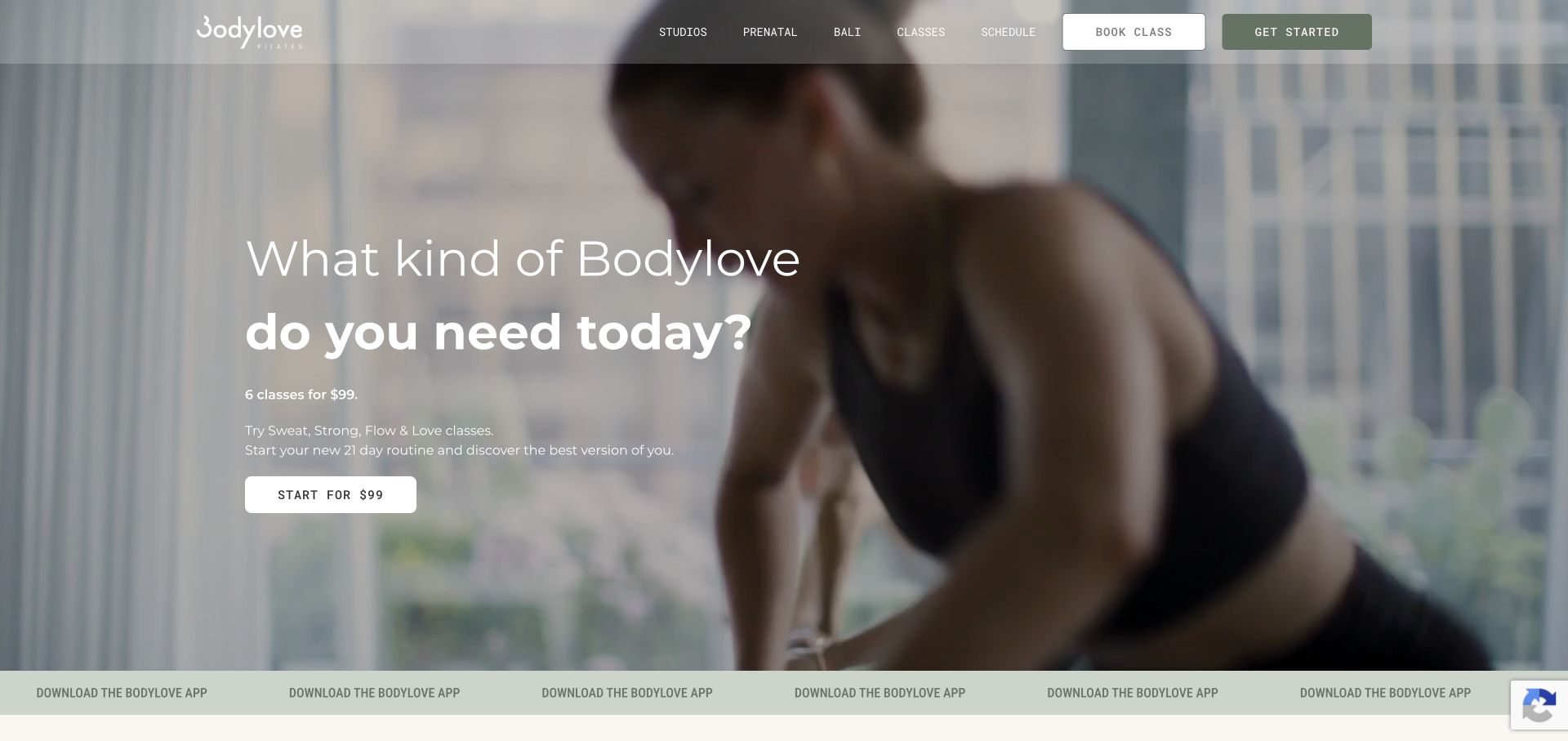
Bodylove uses softly toned movement footage with a left-aligned introduction and a large question-style headline. The opening explains an introductory package in a few short lines and places the price in the action label. A translucent header keeps studio, class, and schedule routes together, with separate booking and getting-started controls. A narrow sage strip promotes the studio app below the hero. The muted palette makes the presentation feel substantially different from neon or black-box fitness brands.
What you can learn
An introductory package is easier to evaluate when price, usable timeframe, and included class families are close together. Pair that detail with a schedule route, so a prospective Pilates student can check whether the offer fits their routine before buying access.
Pros
The offer’s price and timeframe are included near the action rather than hidden behind a vague trial button.
Schedule access remains visible alongside the broader classes and studio routes.
Cons & considerations
The pale translucent header can lose definition against bright frames in the background footage.
App promotion and two header actions add competing choices before a newcomer has compared class availability.
Plan for the first visit and the hundredth booking
Write a beginner route with the studio team
Collect the actual arrival process, equipment guidance, class distinctions and questions new members ask. Give staff a way to keep those details current. Link a newcomer to the appropriate class information without pretending one format suits everyone.
Map the booking platform journey
Document location selection, account creation, class availability, purchase and confirmation. Test a full class and a sold-out state. Make cancellations, package limitations and other approved terms available before a visitor commits.
Keep the timetable out of duplicated content
Use the operational schedule as the source of truth. Let the CMS explain classes, studios and instructors, with ownership for departures and location changes. Do not make staff edit the same class time in several unrelated places.
The editing job behind the design
Let the booking platform own live schedule information
A CMS can manage class descriptions, instructor profiles, studio pages and first-visit guidance. The booking or membership platform should handle its appropriate live availability, account and payment functions. Define which system owns each detail and how the visitor moves between them.
Check vendor embeds on a small screen and provide a clear booking link if the embedded view fails. Avoid collecting health information in a general marketing form. Keep tracking and third-party tools proportionate to the public website’s purpose.
Our WordPress website examples offer a separate look at publishing approaches. A visible platform label is evidence for that named page, not a guarantee that the same system will suit your requirements.
Before the public launch
Fitness studio website launch checklist
Verify class descriptions, first-visit guidance and studio addresses.
Test location selection, full classes and booking confirmation states.
Check package terms, introductory offers and current pricing sources.
Confirm instructor imagery, profile permissions and update ownership.
Keep sensitive intake information in approved operational workflows.
Test mobile timetables, keyboard access, zoom and a clear contact alternative.
These checks are a project checklist, not a performance, legal, security, or accessibility certification. Test real journeys with the people responsible for the website before making claims about the result.
Sources & editorial method
How this collection was selected and reviewed
We selected official fitness studio and fitness-brand websites to compare class, location and booking presentation. These design reviews do not assess training services, medical suitability or advertised results.
Each example links to its actual source page. Screenshots are direct browser captures with their own capture dates; moving imagery, announcements and live designs can change. The notes describe observable design choices and conditional tradeoffs, not measured traffic, conversion results, service quality, or accessibility conformance.
Technology labels use public page metadata, asset evidence, or explicitly cited platform documentation. Platform documentation is not a complete current deployment audit. A component reference may be legacy or unused; it is not a complete backend inventory. Unknown stacks are omitted. These sites are editorial examples, not our client portfolio.
Written, Edited and Curated are separate editorial records, not timestamps advanced by a rebuild. Website designs and imagery belong to their owners. See our editorial standards or suggest a correction.
Questions worth asking
Fitness website design questions
Should the timetable be on the homepage?
Give returning members a fast route to it, but consider whether a full embed overwhelms a newcomer. A clear schedule link and location choice can be more usable than a dense widget above every other explanation.
Does a studio need its own app?
Not simply because other brands have one. A usable mobile website and an appropriate booking system may cover the core tasks. Consider an app only when a recurring member need and operational support justify it.
How should introductory offers be shown?
Explain eligibility, what is included and any approved limits close to the offer. Keep the purchase destination consistent with those terms. Avoid a headline that becomes misleading when a visitor reaches checkout.
Can class descriptions include health claims?
Have qualified staff and the business’s appropriate reviewer approve public claims. Keep general class descriptions separate from individualized advice and avoid guaranteeing results from a website visit.
Borrow the energy and clarity that suit your studio. Give both a curious first-timer and a returning member a straightforward route to their next step.