Twenty distinct public properties with exact plugin evidence, genuine screenshots and original reviews of the experiences performance work must preserve.
WP Rocket can be part of a WordPress performance workflow. A useful plan starts with the visitor's task, a measurable baseline and a way to verify that optimization preserves the site's behavior.
These examples show WP Rocket resource references across commerce, cultural attractions, professional firms, local services and creative portfolios. The plugin does not dictate their visual style. Their differences make the collection useful for identifying the templates, controls and publishing states a performance project needs to test.
The evidence is deliberately limited to the exact public property. A plugin resource can establish an association without proving that every feature is enabled, that a page is fast, or that an external booking or account system uses the same stack. The reviews describe genuine captures and identify practical testing priorities; they do not claim measured performance gains, search improvements or conversion results.
Before the examples
What makes good WP Rocket website development in 2026?
Separate visibility from useful interaction
A page can display its headline while its menu, consent controls, finder or form remains unavailable. Inventory those early interactions before changing script delivery. WP Rocket documents that delaying JavaScript can affect when visible elements appear or become usable; investigate the specific dependency and use a narrow, tested exclusion when appropriate.
Distinguish public editorial content from carts, accounts, location-specific output and other personalized states. Review the documented behavior of your actual ecommerce and hosting combination. A general plugin association on another website does not reveal its exclusions or establish that its private application behaves the same way.
Assign owners to offers, opening hours, notices and other content whose usefulness expires. Define how those updates clear and rebuild public output, then verify the result through the visitor-facing URL. Preloading and cache clearing are operational processes to observe, not a substitute for checking that the intended content is now visible.
The opening five references are Nalgene, Lincoln Park Zoo, Philadelphia Zoo, Guidepost Montessori and Aptive. Each has product-specific WP Rocket evidence for the named public property. Focused service pages and WPBeginner's educational portal broaden the collection across commerce, admissions, local services and publishing, with separate testing priorities for each journey.
We start with five recognizable brands or organizations: Nalgene, Lincoln Park Zoo, Philadelphia Zoo, Guidepost Montessori, Aptive. Each attribution applies to the named website property, not every product or website belonging to its organization. This is a curated reading sequence, not a measured ranking.
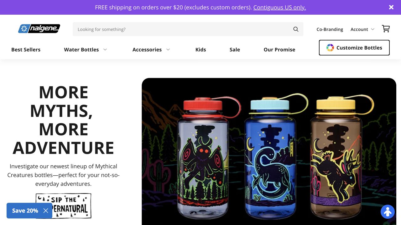
Nalgene's saved homepage combines a large illustrated bottle campaign with a spacious search field, named product categories and a separate customization action. The familiar bottle shapes make the visual promotion immediately understandable. Exact public resources identify WP Rocket on the property, but they do not establish a speed score, cache configuration or shopping-session behavior. For a performance project, the interesting feature is the mix of relatively stable catalog navigation and changing commercial content. A successful optimization must preserve both the initial campaign appearance and the practical tools customers use afterward.
What you can learn
Test search, product options, cart indicators and account boundaries alongside the visual landing page. Identify which content can be shared through a cache and which depends on an individual session; the presence of a caching plugin does not settle that design decision.
Pros
Search offers an obvious alternative to browsing a temporary campaign.
Product categories stay visually separate from the decorative bottle graphics.
Cons & considerations
Several promotional and navigation bands consume initial screen space.
Decorative variations still need clear capacity and product-specification information to support comparison.
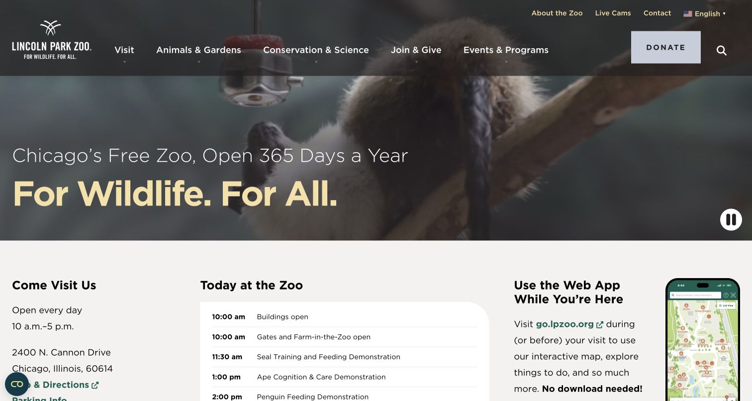
Lincoln Park Zoo uses animal footage behind a concise statement about its free admission and year-round opening. The hero is short enough for hours, the street address, today's activities and a web-app introduction to appear in the same saved view. A pause control is visible beside the media. Public WP Rocket resources associate the plugin with this exact property without proving which optimizations are active. The page is a useful performance-planning reference because its important content has different rhythms: an evergreen identity, changing daily activities and a media layer that should not delay practical information.
What you can learn
Make hours and daily schedules readable independently of background media. Test what happens when the schedule changes, then verify the public page after cache clearing. Confirm pause and navigation controls still work after any script-delay or styling optimization.
Pros
Hours and directions begin within the first desktop view beneath the hero.
The visible pause control gives visitors a way to stop background motion.
Cons & considerations
Today's schedule needs a defined update process to avoid stale cached details.
Text and navigation over changing footage require consistent contrast rather than one favorable frame.
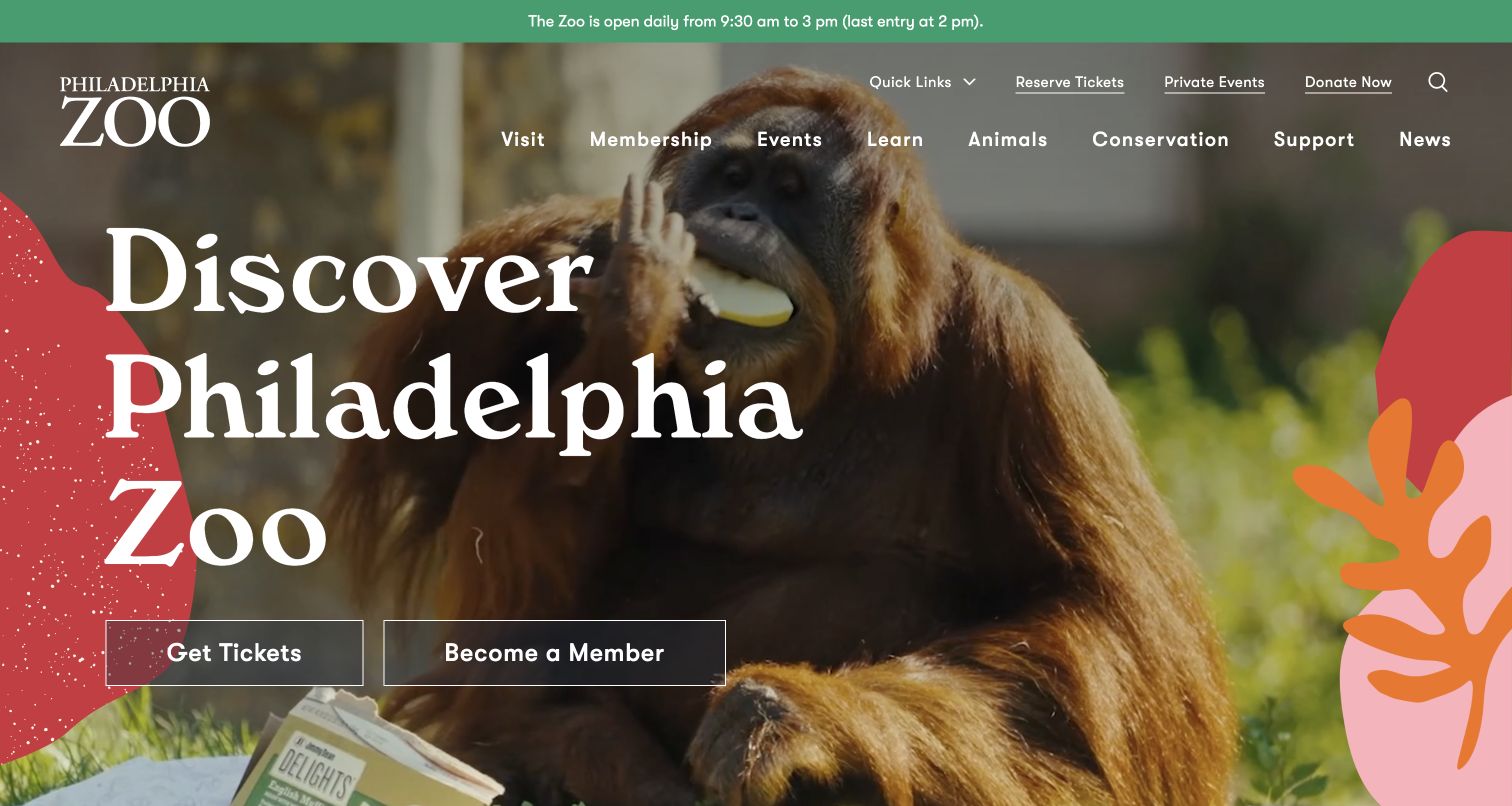
Philadelphia Zoo combines an orangutan photograph, a large serif title and warm abstract shapes around two distinct actions: tickets and membership. A green strip above the main header supplies daily hours and last entry, while conservation, learning and events remain separate menu choices. Exact WP Rocket resource evidence supports the technical association for this public property. It does not establish a measured performance improvement or prove that the ticketing system shares the plugin. The composition offers a useful boundary for optimization work: the photographic campaign can be expressive while operational details remain small, readable and independently maintained.
What you can learn
Treat the hours strip and ticket handoff as essential regression checks. Verify that a campaign update appears through the public cache, and assess image loading without postponing the headline or the two primary actions.
Pros
Tickets and membership are distinct choices with parallel visual treatment.
Hours and last entry occupy a stable position above the changing campaign.
Cons & considerations
Oversized type and decorative shapes need deliberate mobile cropping.
A public-page plugin signal says nothing about the behavior of the separate purchase destination.
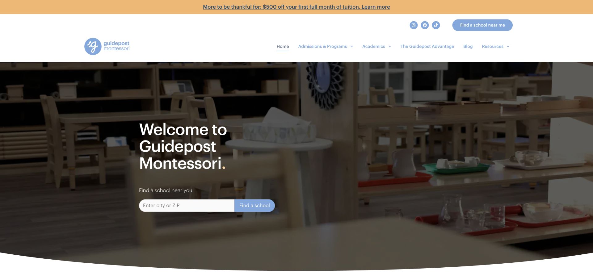
Guidepost Montessori's homepage centers a brief welcome and a city-or-ZIP finder over a darkened classroom photograph. The white header names admissions, programs, academics and resources, with a promotional strip above it. The search-like field gives this restrained introduction a concrete task. Public resources identify WP Rocket on the property; the screenshot does not demonstrate cache freshness or the speed of the finder. For a similar network, performance work must account for both the shared marketing page and the local results a family expects after entering a place, rather than judging only the initial image.
What you can learn
Include the finder, empty results and changed-location behavior in optimization checks. Keep essential program links available before any optional script runs, and verify that current campus information and promotional terms survive the cache's publishing lifecycle.
Pros
The location field provides an understandable next step beneath a short introduction.
Program and admissions routes remain visible for families needing context before searching.
Cons & considerations
The opening leaves age ranges and program distinctions for later exploration.
An additional promotion above the header competes with the main school-finding task.
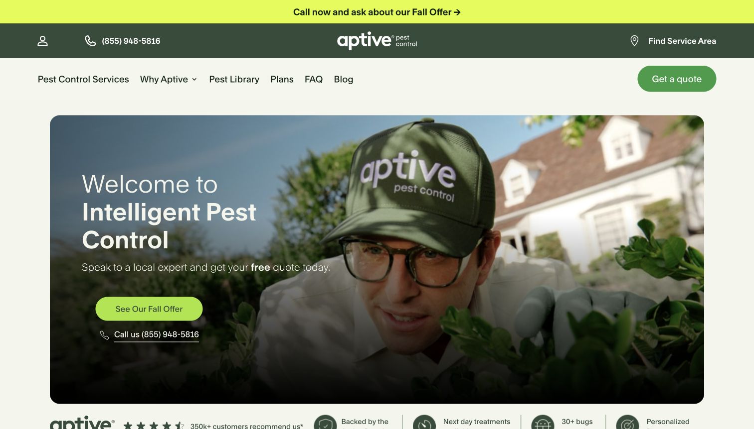
Aptive frames a technician photograph inside a rounded rectangle, using cream, dark green and bright lime to separate navigation from the seasonal offer. Plans, a pest library and common questions are visible alongside the quote route, and a service-area link sits in the upper bar. WP Rocket resources were observed on this exact public property. The association is useful context but does not measure loading speed or prove any particular script-delay setting. The page's performance requirements follow its visitor choices: understanding coverage, researching a pest and requesting a plan all need to remain available around the campaign.
What you can learn
Check the service-area route and quote interface after changing asset optimization settings. Define how seasonal copy is replaced and verified through the public cache, and preserve a usable research path for visitors who are not ready to request contact.
Pros
Plans and educational content provide routes beyond the featured offer.
The rounded image panel gives the campaign a clear boundary within the page.
Cons & considerations
A prominent promotion can precede an explanation of recurring service terms.
Multiple header layers increase the amount to scan before a visitor reaches the central proposition.
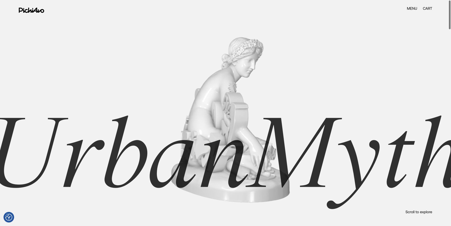
PichiAvo's UrbanMyth opening uses an unusually large italic title across a pale sculptural figure. A small brand mark, Menu and Cart occupy the edges, while a scroll prompt supplies the only immediate exploration cue. Exact WP Rocket resources were observed for the public page. That evidence does not identify the animation implementation or prove that any caching or script feature is responsible for the visible result. The useful performance question is how such a deliberately sparse interface behaves before every font, image and optional interaction has arrived, especially when its visual identity depends on precise scale and overlap.
What you can learn
Test an early-loading state as carefully as the finished composition. Preserve readable project identity and basic navigation if enhancement scripts are delayed, and verify cart and menu behavior independently of the artwork's entrance or motion.
Pros
The restrained interface gives the featured work a strong visual presence.
Menu and cart remain explicit labels instead of unexplained decorative icons.
Cons & considerations
The oversized title requires careful handling when the composition becomes narrow.
The opening provides little practical project or inquiry context until the visitor explores further.
Platform source: Dated exact public source-page audit. Linked stylesheet matches Contact Form 7. Dated public resource or code association on this exact source page; not proof that any particular visible component initializes or behaves as assumed. Platform evidence is separate from the direct website screenshot and is not a complete current infrastructure audit.
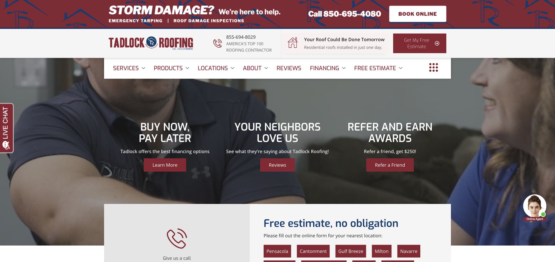
Tadlock Roofing stacks a storm-assistance banner, a branded contact row and a floating white navigation bar above three promotional columns. Financing, reviews and referrals share the main image area, with a location-oriented estimate section starting below. Burgundy buttons tie the separate components together. Public resources identify WP Rocket on this property without establishing a measured performance gain or the settings behind the page. This is a useful example for regression planning because several independent modules can look correct in a screenshot while still needing separate checks for current notices, responsive navigation and local inquiry routing.
What you can learn
Create an optimization checklist around the storm notice, location links, phone controls and each promotional destination. Verify critical notices after cache changes and consider which optional components can load later without postponing the main estimate or contact route.
Pros
The storm-help message has a position independent of the three campaign columns.
The estimate section makes location choice visible rather than hiding it in a broad inquiry.
Cons & considerations
Several equal-weight promotions weaken the initial hierarchy.
The tall stack of header components leaves less room for service explanation on smaller screens.
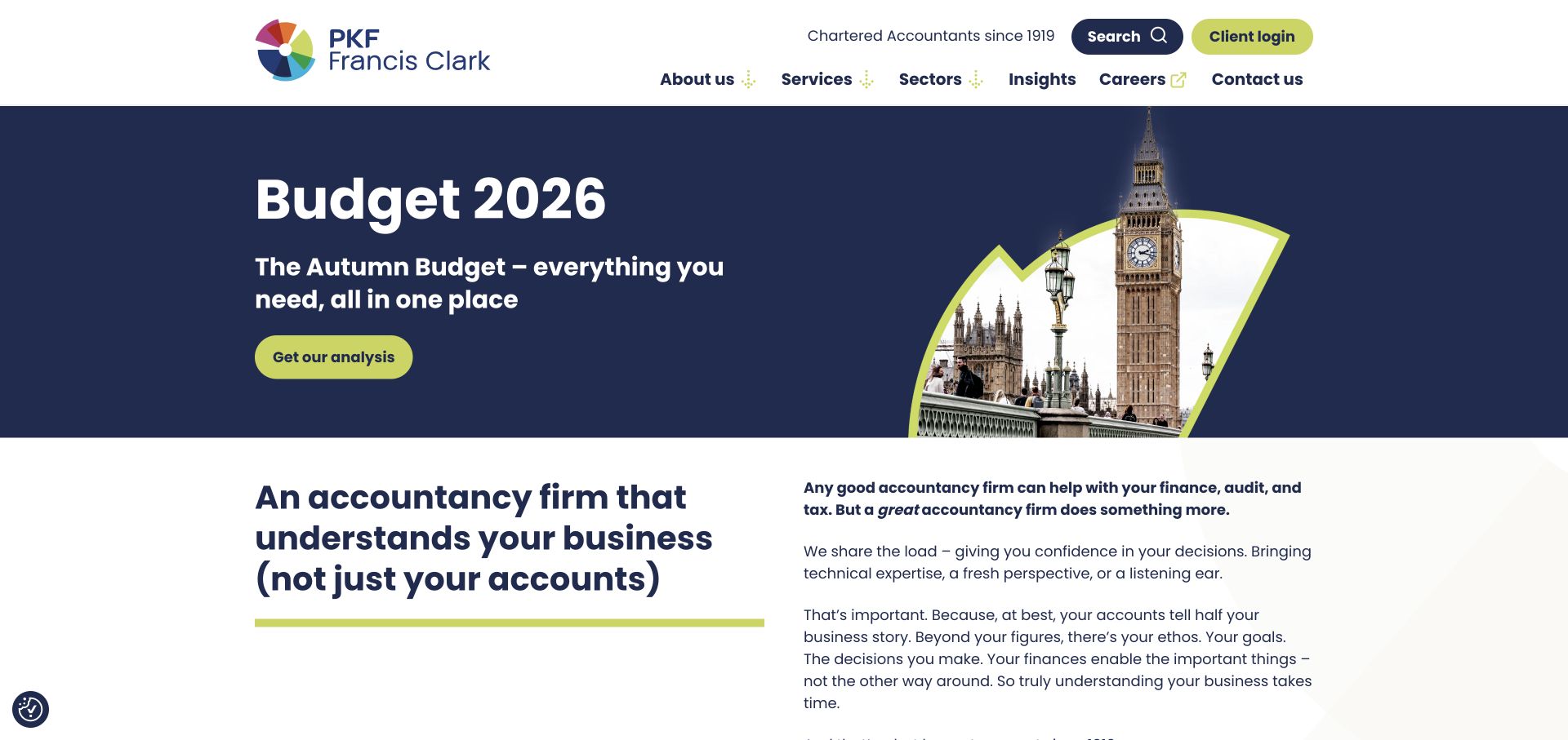
PKF Francis Clark uses navy and lime for a Budget campaign with a shaped architectural photograph on the right. The compact hero allows the firm introduction to begin in the same screen, while services, sectors, insights and contact remain visible in the white header. Client login receives its own lime treatment. Exact public resources identify WP Rocket for the property, but they do not establish the private portal's stack or the freshness of a particular cache. The page illustrates a common publishing problem: topical analysis should be prominent without becoming the only route to long-lived services and institutional information.
What you can learn
Give dated campaigns a review and replacement process, then verify their public output after publishing. Keep client login outside assumptions about the public marketing cache, and test navigation, search and article pages alongside the campaign template.
Pros
The moderate hero height introduces permanent firm content before another scroll.
Services and sectors remain named destinations despite the topical headline.
Cons & considerations
A dated campaign needs explicit ownership to avoid lingering beyond its useful period.
A public-page optimization signal cannot establish authenticated client-portal behavior.
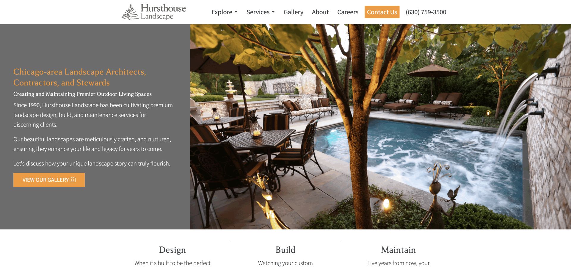
Hursthouse Landscape uses a straightforward split hero: a gray text panel defines its Chicago-area role, while a large poolside garden photograph demonstrates the work. Orange ties the gallery action to the header's contact button. Design, Build and Maintain begin as separate columns beneath the image. Public WP Rocket resources provide an exact property association, without evidence of specific compression, lazy-loading or caching choices. The visual structure is useful for a performance brief because text and image play different roles: the introduction can remain useful while the detailed project photograph arrives, provided the layout reserves its space.
What you can learn
Preserve the text panel, action and image dimensions during optimization. Compare gallery behavior on narrow screens and slower connections, and verify that subsequent photographs load without shifting the visitor's place or hiding project context.
Pros
The split composition gives the explanatory text a stable background.
Design, build and maintenance are represented as distinct service categories.
Cons & considerations
The large detailed photograph needs an appropriate delivery strategy for smaller screens.
Orange text on gray deserves contrast testing rather than relying on the palette alone.
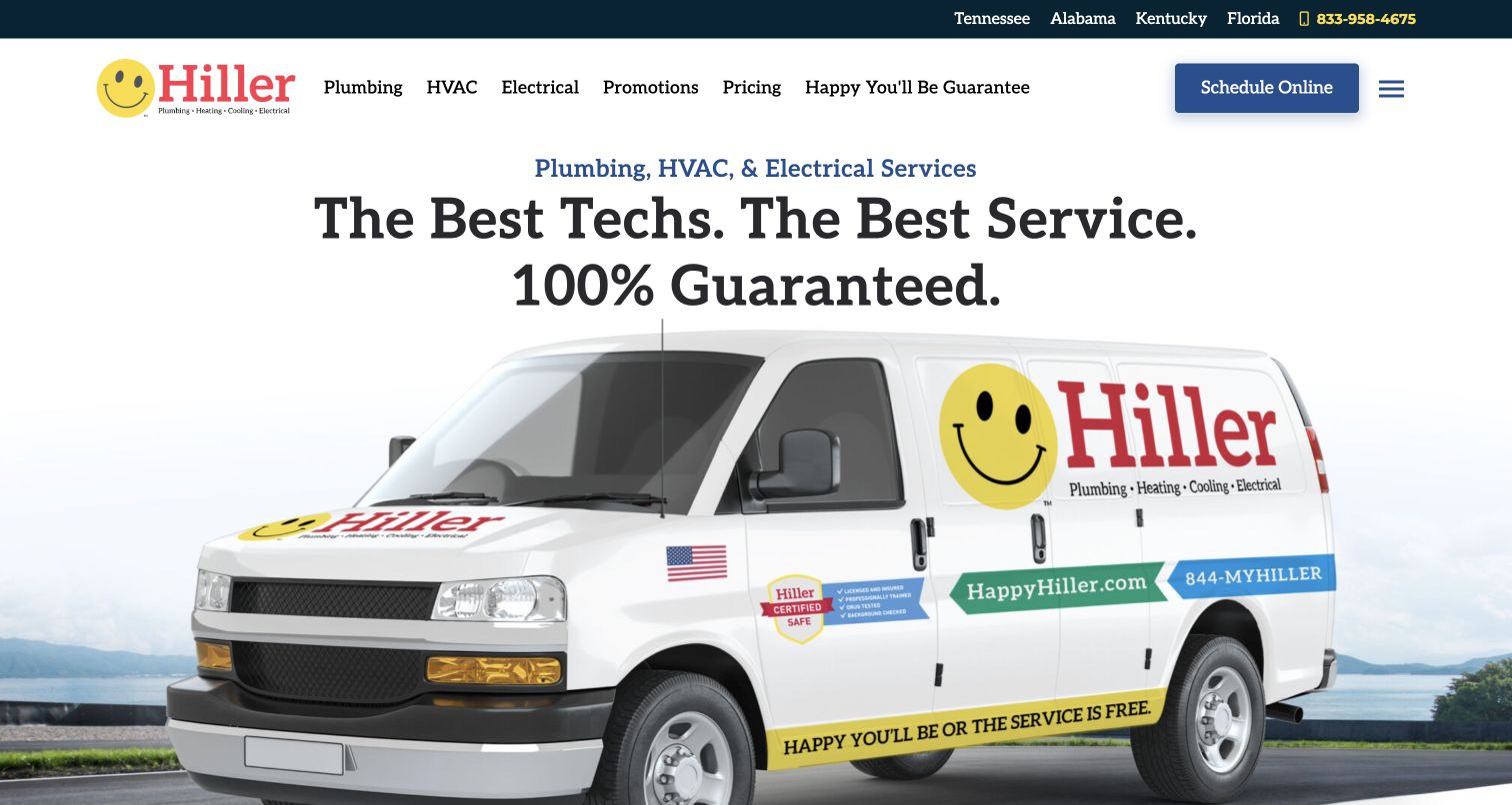
Hiller gives a branded service van much of the opening screen beneath a bold service promise. The white header names Plumbing, HVAC and Electrical individually, while state links and a phone number sit in a darker utility band. Schedule Online has its own blue button. Public resources identify WP Rocket on this property, but no performance score or enabled optimization can be inferred from that reference. The useful implementation lesson concerns priority: visitors should be able to choose a trade, confirm coverage or begin scheduling without waiting for a large promotional image to complete its presentation.
What you can learn
Treat scheduling, telephone links, trade menus and location selection as primary regression paths. Test them before and after changes to delayed JavaScript or CSS delivery, and retain a readable introduction when the hero image is still loading.
Pros
Named trade categories reduce the need to decode a generic services menu.
The separate scheduling button supplies a clear task alongside the large vehicle image.
Cons & considerations
The vehicle dominates space that could answer a specific service question sooner.
Strong promotional guarantees still require accessible explanatory terms beyond the headline.
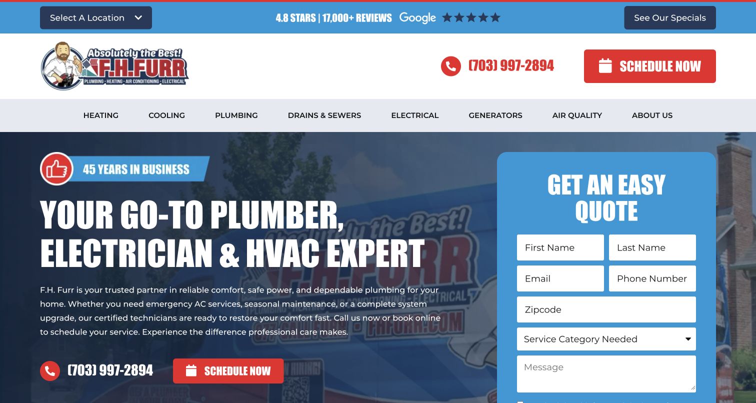
F.H. Furr places a tall blue quote panel beside a large statement about plumbing, electrical and HVAC services. Contact fields and a service-category selector are visible in the first screen, while the header keeps location choice, a phone number and scheduling prominent. WP Rocket resources were observed on this exact public property. The evidence supports the association, not a claim that the form submits successfully or that its scripts are safe to delay. For a form-led page, the important performance outcome is usable interaction: controls need to be ready, clearly labeled and stable when a visitor begins entering information.
What you can learn
Verify labels, selection controls, validation and the ordinary confirmation path in a safe test environment after optimization changes. Preserve the visitor's chosen service and location, and keep a visible telephone alternative if the inquiry interface is unavailable.
Pros
The service-category field makes routing part of the initial inquiry.
Phone contact and scheduling remain available outside the form.
Cons & considerations
The large panel competes with explanation of service scope.
Several contact fields ask for commitment before a visitor has necessarily compared the available services.
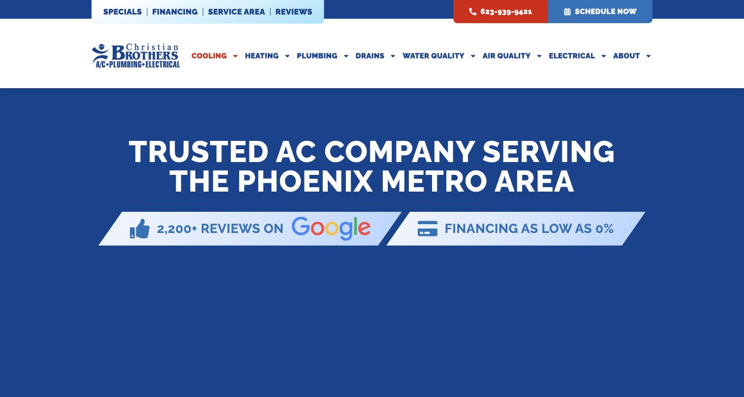
Christian Brothers' cooling page opens with a solid blue field and a direct Phoenix-area air-conditioning headline. The white header maintains the wider trade navigation, while review and financing strips sit immediately below the title. This focused page differs from a broad multi-service homepage: the visitor's subject is already defined. Exact WP Rocket resource evidence associates the plugin with the public property, without establishing speed or private scheduling behavior. It provides a useful reminder that performance work needs representative service templates, because a simple-looking title page can have different interactions and content dependencies from the homepage.
What you can learn
Include focused service pages in the optimization sample, with their contact actions and supporting details. Preserve local relevance and readable headings before optional embellishments, then check that cached versions update when service coverage or offer terms change.
Pros
The title immediately states both the service and geographic scope.
A solid background makes the main text independent of image-loading behavior.
Cons & considerations
The large plain opening postpones explanation of specific repair or replacement situations.
Financing and review signals cannot substitute for a clear description of what happens after contact.
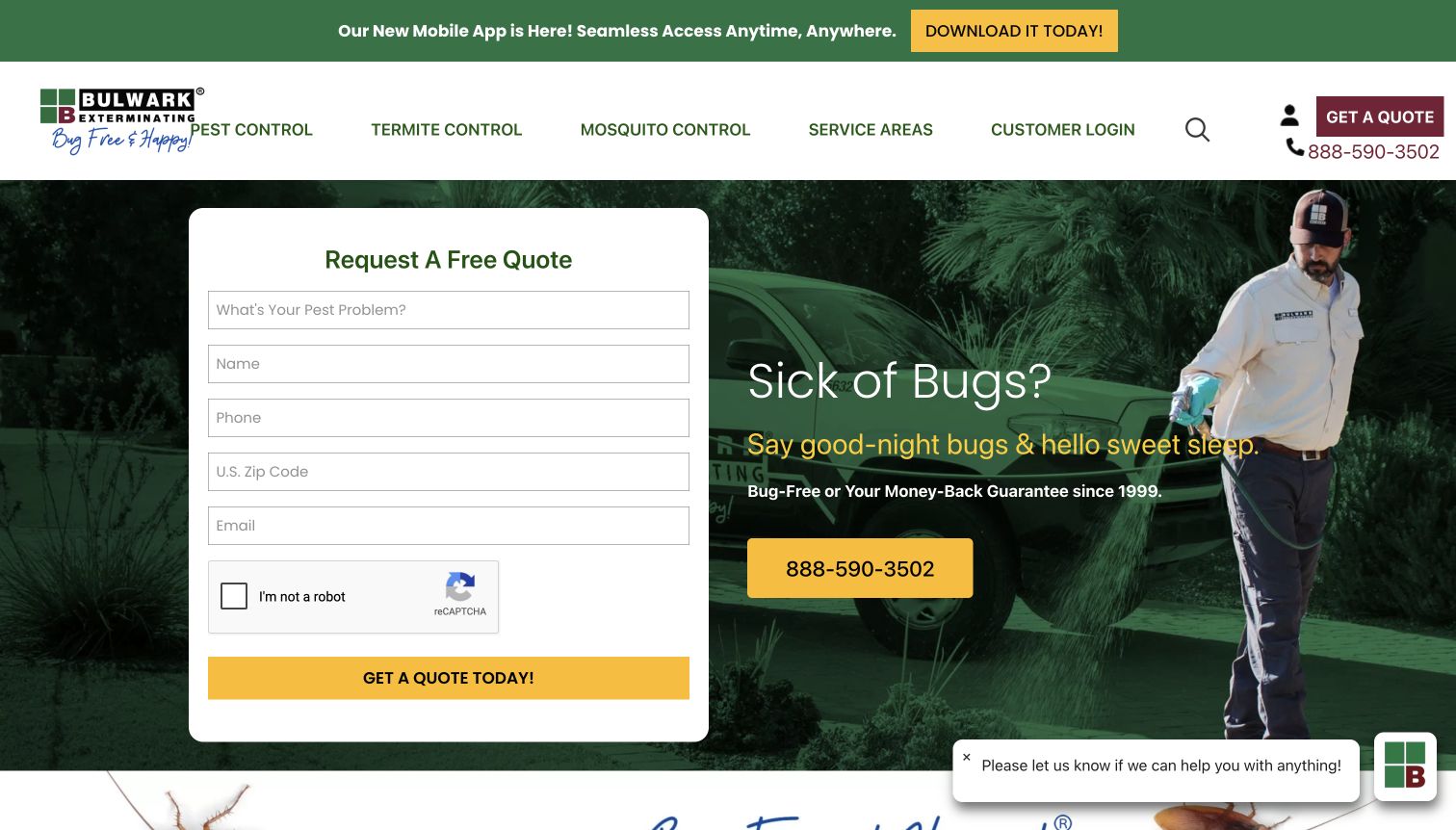
Bulwark Exterminating puts a white quote panel over a green-toned technician photograph. Pest description, name, phone, postal code and email appear before the yellow submission control, while a large telephone action provides another route. The header separates pest categories, service areas and customer login. Public resources identify WP Rocket for this property; they do not verify successful form submission, protection-widget behavior or private account infrastructure. The page is useful for judging the limits of a visual performance review: a quickly visible form still needs all of its required controls and dependencies to work reliably.
What you can learn
Test interactive readiness, validation and form dependencies in a controlled environment after changing optimization settings. Keep phone contact and coverage information accessible, and document exclusions only where tests show they are necessary rather than disabling optimization broadly.
Pros
The quote panel sits on a plain background with a clear action boundary.
A prominent phone option provides an alternative to entering several fields.
Cons & considerations
The form requests substantial contact information before a longer service explanation.
Chat and app-promotion elements add competing layers around the main task.
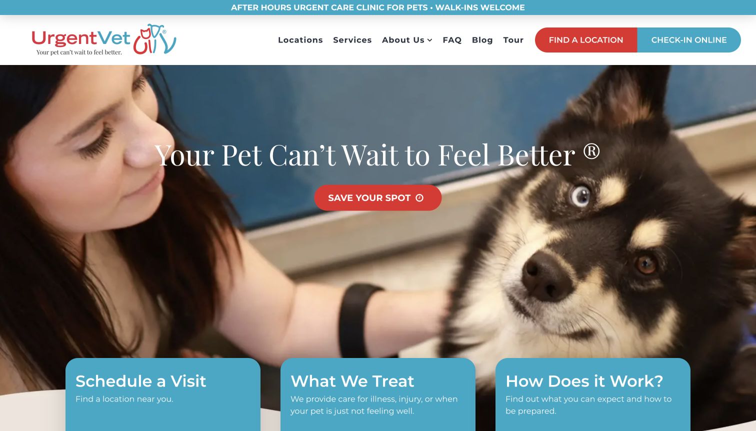
UrgentVet announces its after-hours role in a narrow top strip, then pairs a pet-care photograph with a prominent Save Your Spot action. The header separately labels Find a Location and Check-in Online, and three explanatory cards begin beneath the hero. Exact public resources identify WP Rocket on the property. That association does not prove the check-in system uses the same stack or measure how quickly it becomes interactive. For a service where visitors may arrive with immediate concerns, optimization needs to preserve explanatory context and clear routes before decorative media or secondary content finishes loading.
What you can learn
Check location discovery and the check-in handoff as distinct journeys. Keep service limitations and practical arrival information accessible in maintained content, and verify that delayed scripts or cached notices do not obscure the difference between locating a clinic and joining its queue.
Pros
The opening explains the after-hours service category before the main photograph.
Three cards introduce scheduling, treatment scope and the visit process.
Cons & considerations
Several closely related action labels may require clearer distinction.
Large white text over the care image needs consistent contrast across responsive crops.
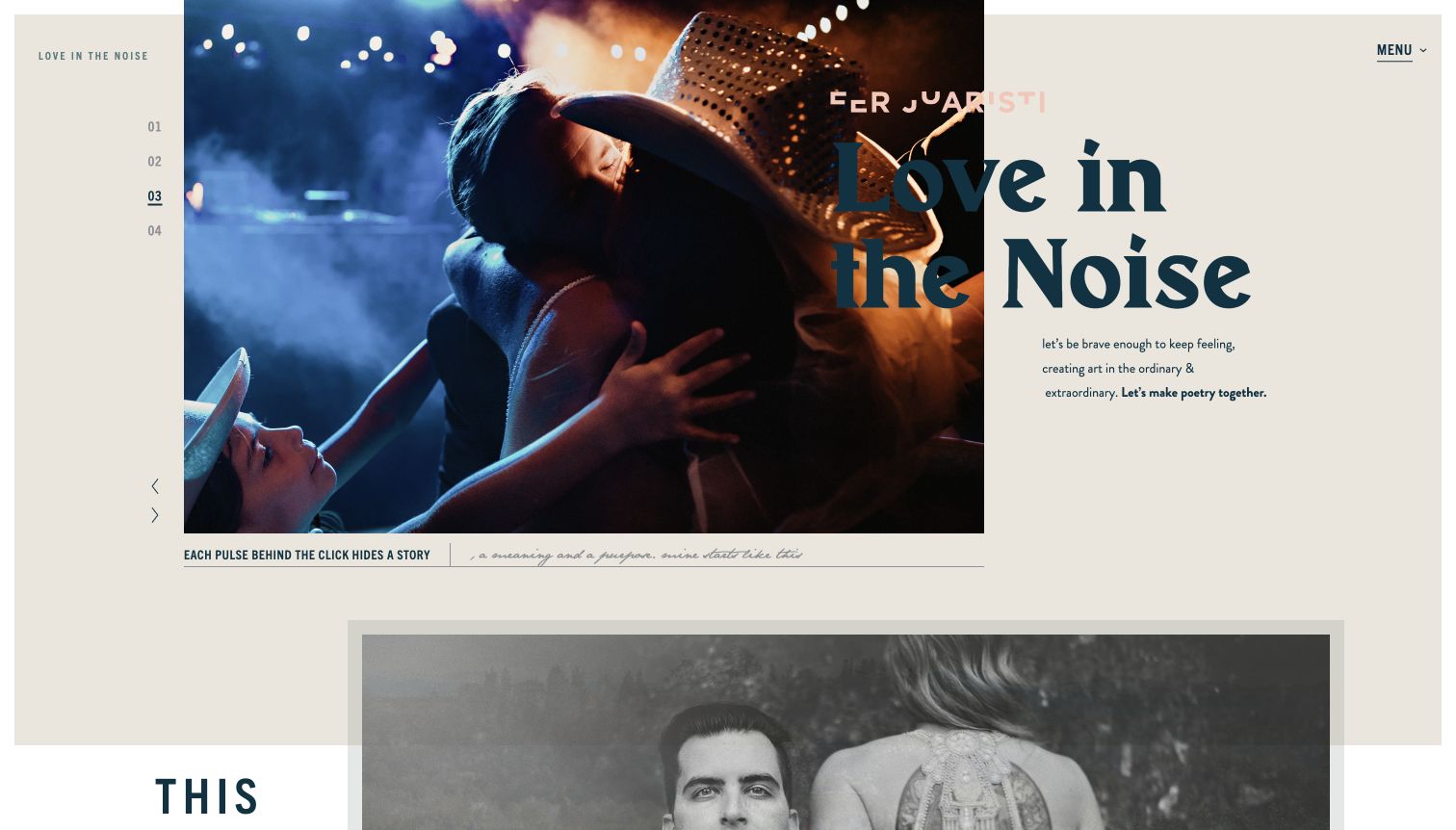
Fer Juaristi builds the opening like an editorial spread, with an off-center wedding photograph, a numbered sequence and oversized typography crossing from the image onto a warm paper-colored background. Small captions provide secondary texture, while Menu remains understated in the corner. Public WP Rocket resources identify the plugin on this property without revealing its configuration or establishing the animation system. The composition makes font and image behavior especially important: even small changes in the loading order or final type metrics can affect an arrangement whose visual interest depends on carefully controlled overlap.
What you can learn
Check font loading, reserved image space and navigation across early and fully loaded states. Test the numbered sequence and menu after script changes, and keep a useful still composition when motion or enhanced interaction is unavailable.
Pros
The asymmetric layout communicates a distinct photographic point of view.
A warm background gives captions and secondary text a consistent setting.
Cons & considerations
Type crossing the photograph can lose contrast in darker areas.
Poetic introductory copy leaves practical service and inquiry details for further exploration.
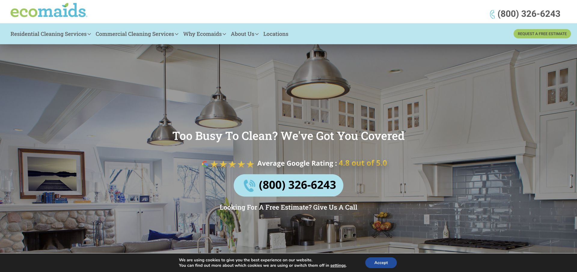
ecomaids places a centered service message over a broad kitchen photograph, with an oversized telephone control as the principal action. The header distinguishes residential and commercial cleaning and includes location discovery, while an estimate button provides a secondary route. Public resources identify WP Rocket on the property, but the reference does not measure performance or establish how telephone tracking and local routing are implemented. The layout is a useful example of a page where basic usefulness can arrive early: readable service context and a working contact route matter more than waiting for every background or supporting widget.
What you can learn
Keep the main contact number and service labels dependable when optional scripts are delayed. Check location-specific routing and any dynamic number replacement carefully, then confirm that cached output does not show stale coverage or contact details.
Pros
The large phone action makes the primary contact method clear.
Residential and commercial services receive separate navigation choices.
Cons & considerations
The large background image still needs an appropriate small-screen delivery strategy.
The observed cookie bar occupies the bottom of the opening view and adds an extra interface layer.
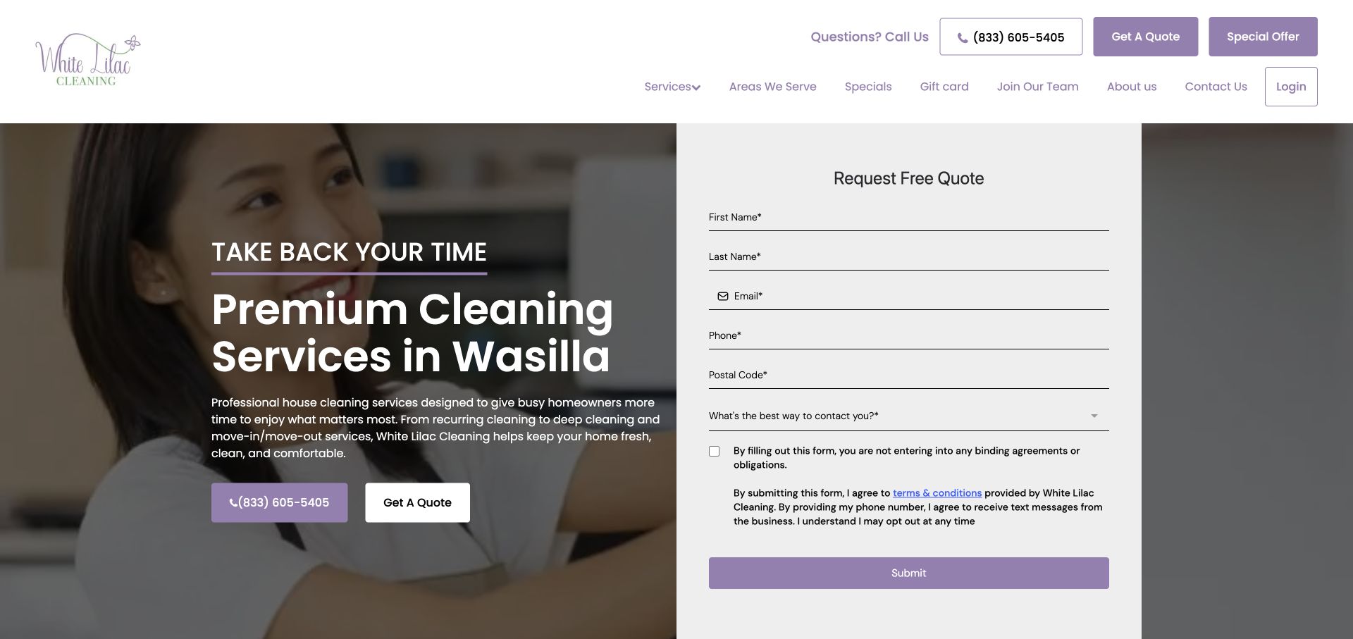
White Lilac Cleaning pairs a Wasilla-focused headline with a tall pale quote panel over a cleaner photograph. Purple connects the phone and quote actions, while the form includes contact details, postal code and a preferred contact method. Explanatory terms sit before the submit button. Exact WP Rocket resource evidence supports the public-page association, without proving submission behavior or any enabled script optimization. The relevant performance concern is continuity: a visitor should be able to read the inquiry conditions, understand the requested fields and complete an ordinary task without controls shifting or appearing only after unexpected interaction.
What you can learn
Review form rendering and required interactions after each optimization change in a safe testing environment. Preserve readable explanatory text and clear validation, and keep the local phone route available if the inquiry component cannot initialize.
Pros
The headline states a concrete service area rather than an ambiguous regional claim.
The form is visually separated from the photographic background.
Cons & considerations
The lengthy panel asks for substantial information in the opening view.
Several nearby quote and offer actions can distract from understanding the follow-up process.
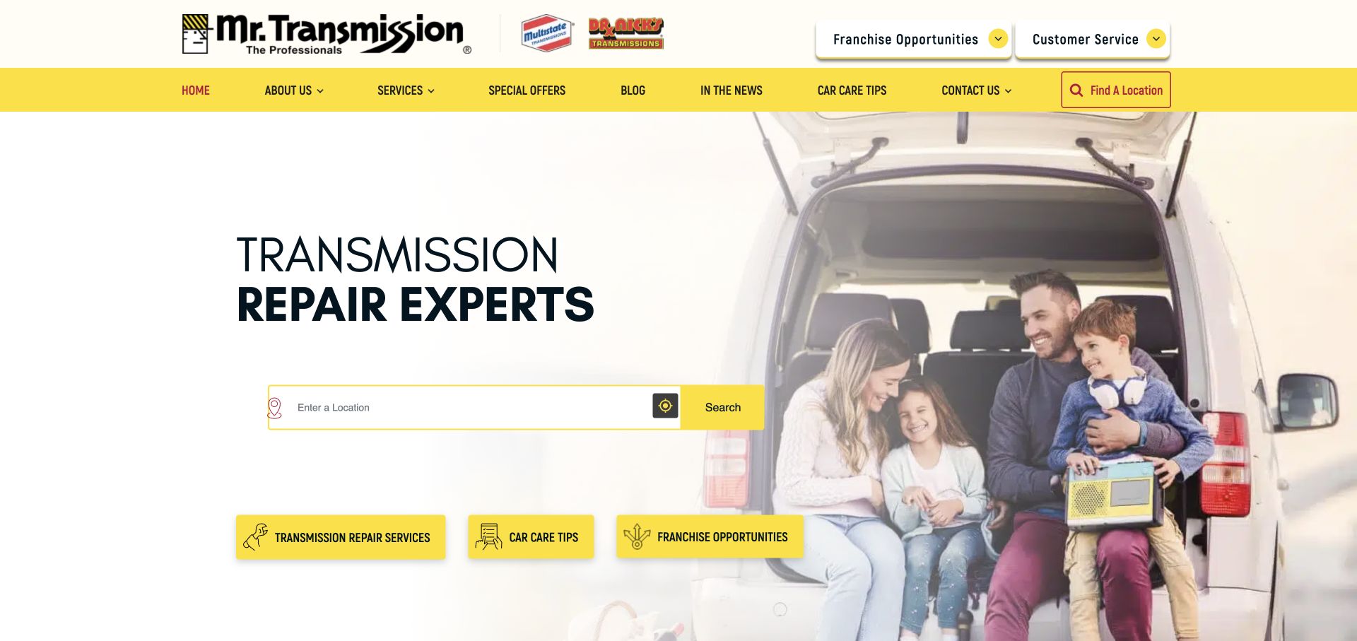
Mr. Transmission uses a white-and-yellow layout with a transmission-repair headline and a prominent location field. A family beside an open vehicle supplies context, while service, car-care and franchise shortcuts begin below. Several related brand marks share the header, making the local search especially important for orientation. Public resources identify WP Rocket on this property, but the evidence does not establish finder performance or the stack of each franchise location. The visible design suggests a practical optimization target: make the specialist proposition and the route to local service usable before secondary imagery and additional promotional components.
What you can learn
Test location search, no-results behavior and local-page transitions after altering script delivery. Keep ordinary service browsing available without location permission, and verify that shared cached pages do not retain another visitor's selection or outdated branch information.
Pros
The specialist headline gives the broad brand group a clear immediate subject.
A large location field makes the local service decision central.
Cons & considerations
Multiple related marks need explanation for visitors unfamiliar with the group.
Franchise recruitment beside repair shortcuts introduces a separate audience into the main customer journey.
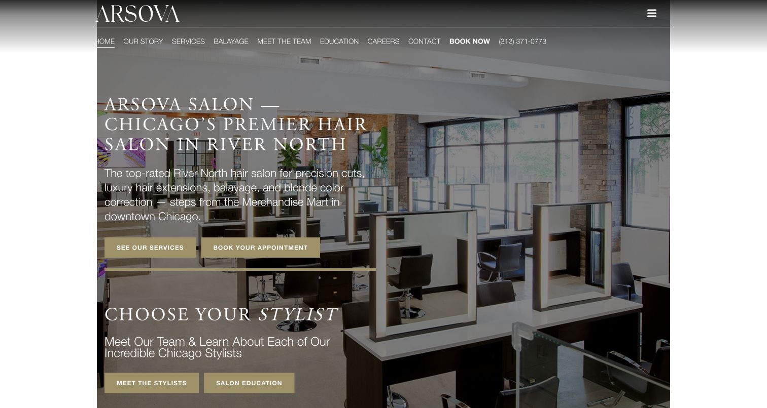
Arsova Salon uses an interior photograph behind a substantial local introduction, then distinguishes service exploration from appointment booking with two gold buttons. A stylist section begins below, bringing the people decision into the first desktop view. The header includes service categories and a phone number. Public WP Rocket resources identify the plugin for this property without revealing its settings or proving booking-system behavior. For a similar salon, performance work needs to preserve both the layered visual composition and the separate decisions it presents: understand the services, choose a stylist and reach the appropriate appointment destination.
What you can learn
Test booking links, stylist routes and the mobile menu after changing script or stylesheet delivery. Reserve the background's space and maintain readable overlays during loading, then verify that current service and team information appears through the public cache.
Pros
Separate service and appointment actions accommodate different levels of readiness.
The stylist section starts connecting the room and brand to individual professionals.
Cons & considerations
Long white copy competes with a visually detailed interior.
Dense navigation can become harder to scan when fonts or layout shift during loading.
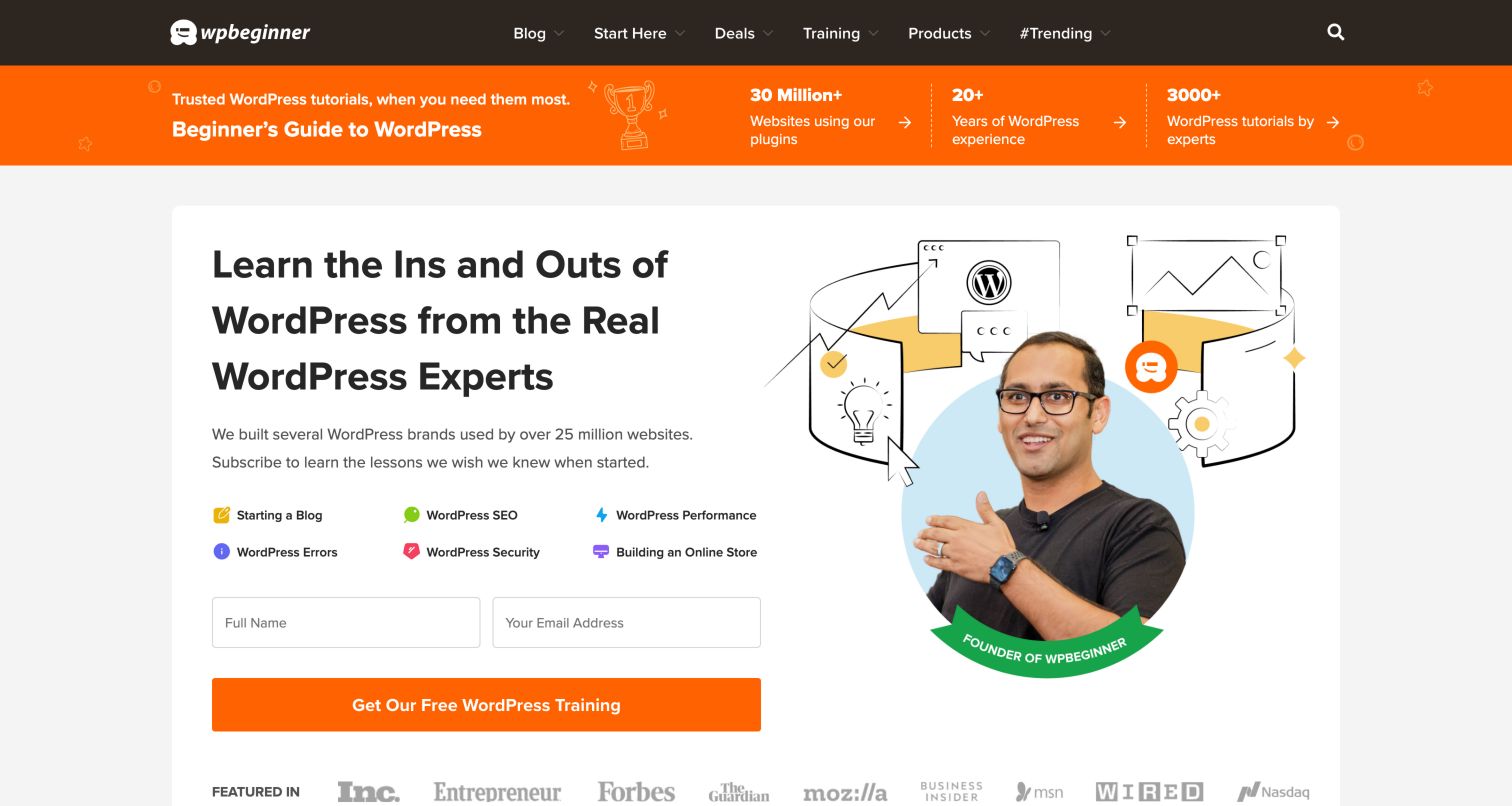
WPBeginner places a dark navigation bar above a bright orange credibility strip, then uses a spacious white panel for its educational promise. Six topic shortcuts sit beside a founder portrait and above a short training signup form. The page makes both self-directed learning and a continuing relationship available immediately. Its first-party Blueprint and performance article explicitly describe WP Rocket use on WPBeginner, providing stronger attribution than a vendor logo alone. Those disclosures do not establish a current speed score. Visually, the large illustration and lead form create distinct optimization priorities: stable image space, responsive fields and a usable navigation menu.
What you can learn
Test the educational journey as well as the signup path after optimization changes. Confirm that category navigation and search remain available before deferred scripts finish, then check the form in a controlled environment without enrolling real visitors during a design review.
Pros
Topic shortcuts translate a large archive into clear beginner tasks.
The form and portrait share a consistent panel with strong visual hierarchy.
Cons & considerations
Several credibility figures compete with the main teaching promise.
A broad navigation system adds interaction checks beyond the visible homepage panel.
Platform source: Public reference: wpbeginner.com. The first-party WPBeginner Blueprint identifies WP Rocket as a page/browser caching tool used on the WPBeginner website; its February 23, 2026 performance article independently describes its own WP Rocket configuration. This is documented use, not a detected current plugin asset or a performance measurement. Platform evidence is separate from the direct website screenshot and is not a complete current infrastructure audit.
Kegan has 15+ years of experience working with small businesses, Fortune 500 companies, and everything in between. No development job is too big or too small: he brings the same hands-on attention to a focused improvement, a complete website, or a custom application.
For WP Rocket projects, he can help with custom themes and templates, publishing workflows, plugin integrations, migrations, and ongoing maintenance. He works directly with clients on scope, design, implementation, testing, and handover, with an emphasis on clear communication and a system that remains practical to maintain after launch.
Show 3 other WP Rocket developersHide other WP Rocket developers
Sample both an evergreen page and a frequently changed campaign. Check early text rendering, navigation, media controls and the publishing lifecycle. Include an expired notice or replaced hero in the acceptance criteria rather than checking only a freshly built page.
Finders, inquiry forms and appointments
List the controls that must be usable on arrival. Test location changes, empty results, labels, validation and the handoff to any separate booking system in an appropriate test environment. Retain an ordinary contact alternative when a connected component cannot load.
Product catalogs and customer accounts
Separate public catalog browsing from session-dependent behavior. Sample search, product selection, cart indicators and account boundaries, using the actual integrations in your project. Verify personalized states explicitly instead of assuming that a faster public page establishes a correct shopping journey.
From references to requirements
Prepare a measured and reversible optimization plan
Record the baseline and representative journeys
Choose pages that cover your real templates and difficult states. Record the test conditions and metrics, then document the actions a visitor should complete. Screenshots are helpful for visual comparison but cannot establish loading performance or functional correctness on their own.
Change one meaningful group of settings at a time
Keep a record of the setting, reason, affected pages and result. Test menus, consent controls, forms, finders and media after changes. Investigate concrete failures before adding broad exclusions, and retain a recovery path to the previous working configuration.
Verify production behavior after publishing
Confirm assets, public content, cache freshness and the core visitor journeys after release. Recheck when a theme, builder, plugin or third-party integration changes. Performance maintenance should remain tied to ordinary publishing and functional review rather than a single launch-day score.
A useful handover demonstration
Ask the actual team to carry out its routine job: publish a realistic update, correct a mistake, preview a narrow screen, and identify who owns an integration failure. For a library or frontend framework, also ask who maintains the content source and deployment. A polished screenshot does not answer those operational questions.
Beyond the screenshot
WP Rocket optimization planning checklist
Identify the actual WordPress, hosting, theme and plugin configuration for your project.
Record baseline measurements with repeatable page and device conditions.
Select representative home, service, article, product and interactive templates.
Define essential early interactions, including consent, navigation and location discovery.
Separate shared public output from cart, account and other personalized states.
Test image space, font loading, layout stability and meaningful media controls.
Verify cache clearing and visible updates for offers, notices and schedules.
Document tested exclusions, recovery steps and ongoing ownership.
Test with real content, a keyboard, a small screen, slow or failed requests, and the people who will maintain the system. These are planning checks, not an accessibility, security, performance, or search-ranking certification.
Sources & editorial method
How this WP Rocket collection was reviewed
Twenty distinct public website properties were selected using product-specific resource evidence and genuine browser screenshots. Each has a documented broad public stack-audit attempt. Reused captures retain their actual dates, dimensions and attribution; technology observations retain their original dates separately from the new review. The collection identifies WP Rocket resources rather than claiming active configuration, measured speed, complete architecture or private-service behavior. Reviews are original visual analysis, and recommendations describe checks for a reader's own implementation. No real inquiry or transaction forms were submitted.
Every image is an unmodified capture from the actual website, with its source and capture date. Some captures are reused from our shared catalog; their dates remain the original capture dates. None comes from a vendor gallery or a generated reconstruction. Moving imagery and live content can change.
Technology attribution uses public page assets or metadata, official platform documentation, or a cited first-party project case study. Documentary and framework-relationship evidence is identified where used; it is not a complete current backend inventory. A CMS image CDN alone does not establish a full CMS deployment. A library’s presence does not prove which individual controls use it, and a platform label does not establish AI authorship.
The composition notes, lessons, pros and tradeoffs are original editorial observations. We have not measured conversion, traffic, security, performance or accessibility conformance. Website owners retain their brands and imagery; these examples are not our client portfolio. Written, Edited and Curated are independent records, not dates advanced by a build. See our editorial standards or suggest a correction.
Questions worth asking
WP Rocket website development FAQs
Does WP Rocket evidence mean these websites are fast?
No. A product-specific resource identifies an association, not a speed result. Performance depends on content, hosting, assets, integrations and configuration. Use repeatable measurements on representative pages and verify that the visitor's tasks still work.
Can I copy a website's WP Rocket settings from these examples?
The public evidence does not reveal those settings. Choose settings for your own implementation, test them against its dependencies and record narrow exclusions where needed. A visually similar page may have very different scripts, hosting and personalized behavior.
Why do the reviews discuss forms, menus and consent controls?
Optimization must preserve useful interaction. A fast-looking screenshot can conceal a control that initializes late or fails. These elements should be part of a regression checklist, without assuming that any observed problem was caused by WP Rocket.
Should caching be disabled for the entire website if one feature breaks?
Investigate the specific behavior and affected pages first. The official documentation describes troubleshooting and targeted exclusions. The appropriate response depends on the actual issue; keep changes reversible and confirm both functionality and performance after applying them.
Use the examples to identify what your performance work must preserve. Measure the result, test the complete visitor journey and keep content freshness part of the release process.