Best Window Tinting Company Websites of 2026 (25 Real-World Examples)
25 real window tinting websites, with original design reviews covering vehicle film, architectural applications, local service routes, and useful quotation journeys.
Good window tinting website design helps someone identify the right service before choosing a shade or requesting a price. These examples show how installers explain their work, establish local relevance, and connect a vehicle or property question to a useful next step.
A driver comparing automotive film and a facilities manager planning an office installation arrive with different questions. The strongest sites make that distinction visible. They name the service, identify the relevant location, and show work that actually represents the application being discussed. A sports-car photograph can introduce an automotive studio; it should not be expected to explain decorative privacy film in a meeting room.
This collection includes dedicated tint specialists, regional installers, architectural-film businesses, and automotive studios with a clearly documented tint service. Each review focuses on a specific public website property and the design decisions visible in its source material. The examples are design references, not endorsements of installation quality, film performance, advertised savings, warranties, or legal compliance.
Before the examples
What makes good window tinting company website design in 2026?
Separate the customer journeys
Distinguish automotive, residential, and commercial work early. Name any location-specific exclusions so a broad company menu does not promise services that a particular branch cannot provide.
Make the product understandable
Explain material families, appearance, and application differences with clear language and attributable specifications. Give visitors enough context to ask a useful question without presenting a shade choice as a complete technical assessment.
Connect evidence to an appropriate action
Show relevant installations, explain the assessment and aftercare process, and label estimates separately from appointments. Make the selected service and location clear before the customer supplies personal details.
The collection · 25 examples
25 window tinting company websites worth studying
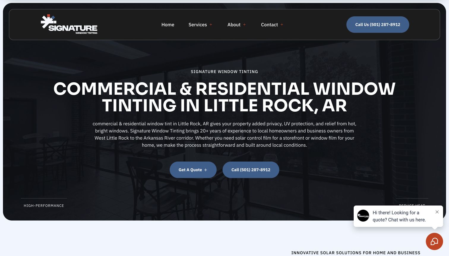
These 25 examples meet the original saved draw. Signature Window Tinting is the explicit Editors Choice for its Little Rock architectural-service page, particularly the clear local scope and explanation of measurement, installation, and aftercare. The badge recognizes website communication, not film performance or contractor quality.
Signature Window Tinting gives its Little Rock architectural service a dedicated page, rather than expecting building owners to decode an automotive homepage. The opening names commercial and residential work, the city, and practical situations such as bright storefronts. Dark panels, blue actions, and architectural imagery support a focused quote journey. Farther down, the installation explanation progresses through consultation and measurement, preparation and application, then inspection and curing. Those stages give the enquiry a purpose beyond collecting contact details. Local service links and business hours establish the operating context without requiring visitors to interpret a coverage map.
What you can learn
Borrow the sequence from property problem to assessment, installation, and aftercare. Explain what your installer needs to inspect before recommending film, and place a quote action beside that explanation. Keep film benefits distinct from measured project results.
Pros
A service-specific headline and regional context make the intended audience clear immediately.
The three installation stages explain both preparation and what happens after application.
Cons & considerations
Several benefit passages repeat similar comfort and privacy messages, lengthening the page.
The detailed enquiry asks for substantial address information before a personal conversation begins.
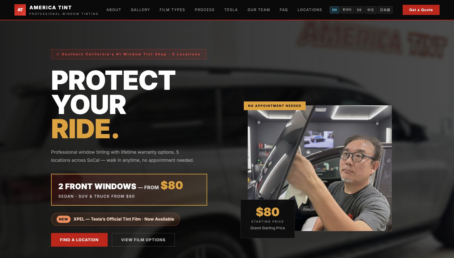
America Tint leads with a bold automotive proposition, a technician image, and a strong red, black, and gold palette. Its navigation offers film types, process, locations, and a Tesla route alongside company information. This is useful for buyers who have already decided to tint a car but still need to choose a shop or understand the product options. The homepage describes different film families and lays out consultation, preparation, installation, inspection, and aftercare. Language options are conspicuous in the header, making them part of the primary customer journey. Pricing and walk-in messaging add immediacy, although those offers remain dated business statements.
What you can learn
Separate the decision about where to visit from the decision about which film to discuss. A comparison route can introduce materials and tradeoffs before a quote, while an installation timeline explains the appointment rather than implying instant completion.
Pros
Film and location routes are easy to distinguish within the main navigation.
The process section extends past fitting to inspection and subsequent care expectations.
Cons & considerations
Multiple language controls and navigation choices compete with the main quote action.
Promotional pricing and walk-in messaging need consistent conditions wherever appointments are discussed.
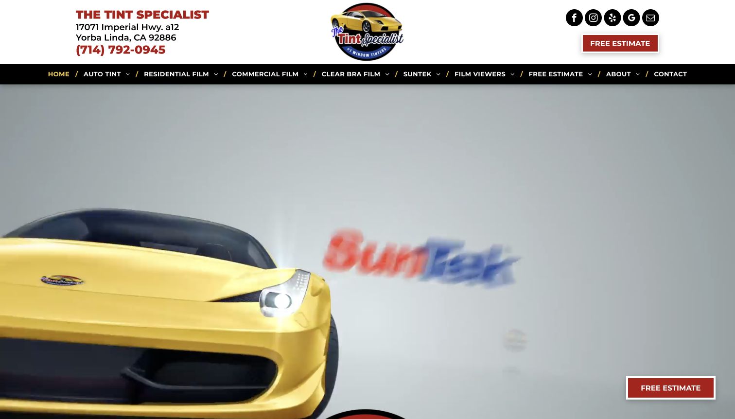
The Tint Specialist uses a familiar local-service structure: a visible Yorba Linda address and phone number, a prominent logo, and a broad menu above a large automotive image. Automotive, residential, and commercial work each receive their own route. The menu also exposes film categories and viewers, providing a way to investigate materials before asking for an estimate. A persistent estimate control keeps the next action available while visitors explore. The page's strongest information architecture is this distinction between what needs tinting and which film family might suit it. The opening photograph, however, communicates automotive work more strongly than the wider service list.
What you can learn
Give customers two sensible ways into your information: their vehicle or property type, and the product question they need answered. Preserve an estimate route across both, and explain film terminology in ordinary language on the destination pages.
Pros
Audience-specific menu labels reduce ambiguity between vehicle and architectural enquiries.
Visible contact information and a persistent estimate action support visitors ready to talk.
Cons & considerations
A large automotive hero can understate the residential and commercial services offered.
The extensive menu asks newcomers to interpret several material names before choosing confidently.
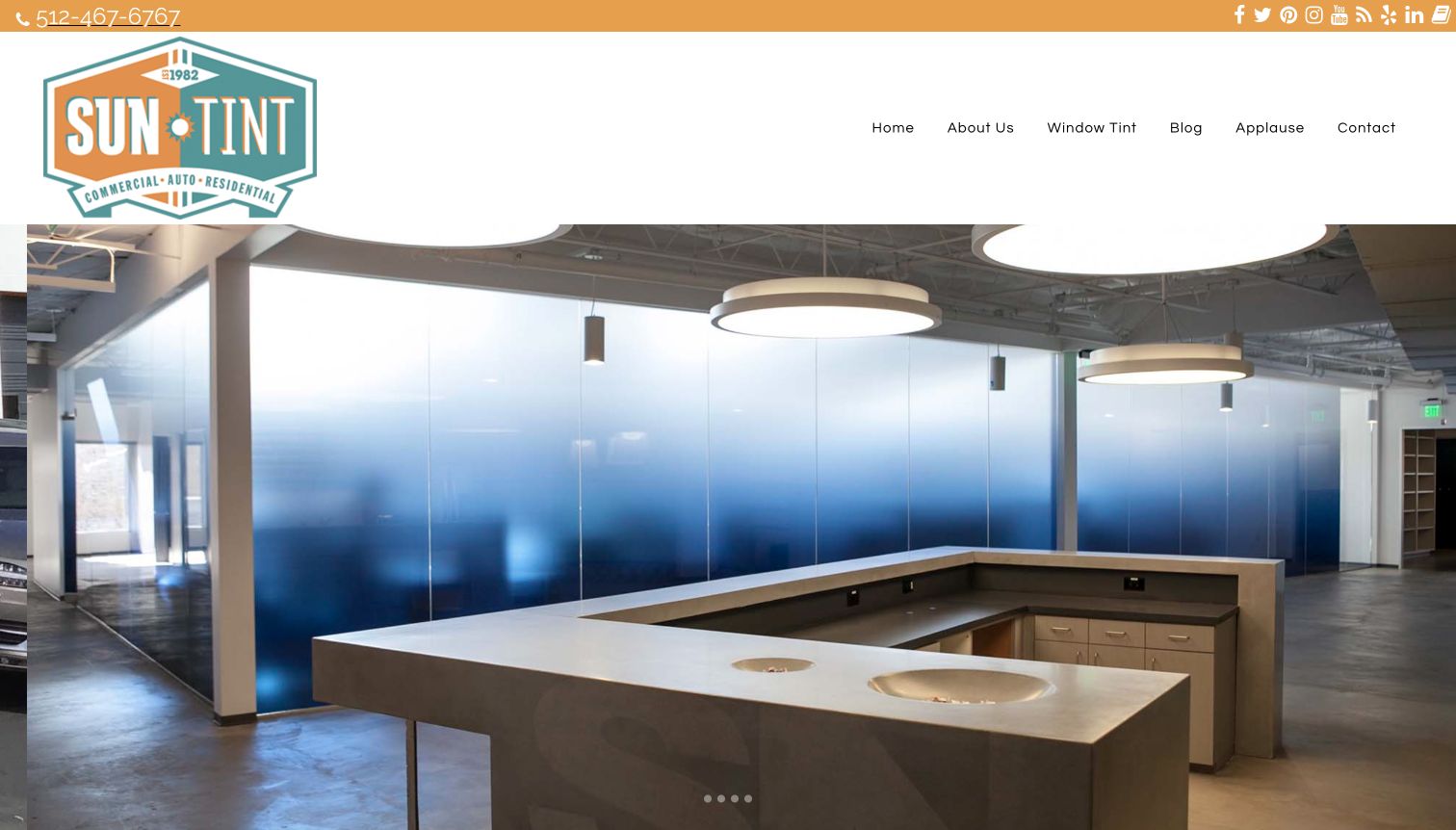
Sun Tint's opening combines a substantial illustrated logo, an orange contact strip, and a spacious navigation bar. The captured carousel frame shows decorative film across an interior glass partition, immediately broadening the story beyond darkened car windows. Beneath the rotating imagery, the page introduces an Austin business serving vehicles, homes, and commercial spaces. Its content includes solar, privacy, and decorative applications as well as related protective work. This breadth provides useful vocabulary for a conversation, while the large opening image allows the material's visual effect to carry much of the explanation. The opening is atmospheric.
What you can learn
Photograph the actual application you want more enquiries about. A room or partition can explain decorative film better than another sports car, provided a nearby caption names the application and a clear service link lets visitors continue without waiting for a carousel.
Pros
The architectural image demonstrates a different use of film from the usual automotive presentation.
The local introduction and visible phone number establish a recognizable regional business.
Cons & considerations
The tall header and image postpone detailed service choices below the opening screen.
Rotating imagery makes the first impression depend on the frame a visitor encounters.
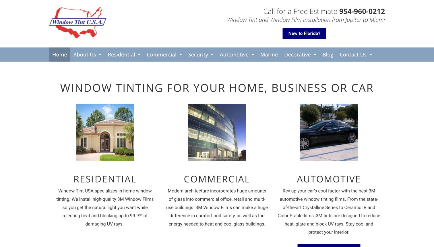
Window Tint USA makes its service structure unusually literal. A plain headline is followed by three illustrated columns for homes, commercial buildings, and vehicles, with additional routes for security, marine, and decorative work. The opening supplies a phone number and describes coverage from Jupiter to Miami. This gives a customer both a category decision and a geographic check before they spend time reading product language. The automotive column offers a pricing route, while other applications lead toward a quote. The design is restrained, with abundant white space and ordinary text links rather than a complex product configurator or immersive opening video.
What you can learn
Use recognizable property images and direct labels to establish service fit. Give each customer group the appropriate next action; a repeatable vehicle service may support a price guide, while a building project usually needs a more contextual enquiry.
Pros
The initial three-column structure makes major customer categories immediately understandable.
Regional coverage and telephone contact appear before the detailed sales descriptions.
Cons & considerations
Broad benefit claims need product-specific qualifications beyond the short introductory paragraphs.
The many secondary film categories could benefit from stronger grouping around customer problems.
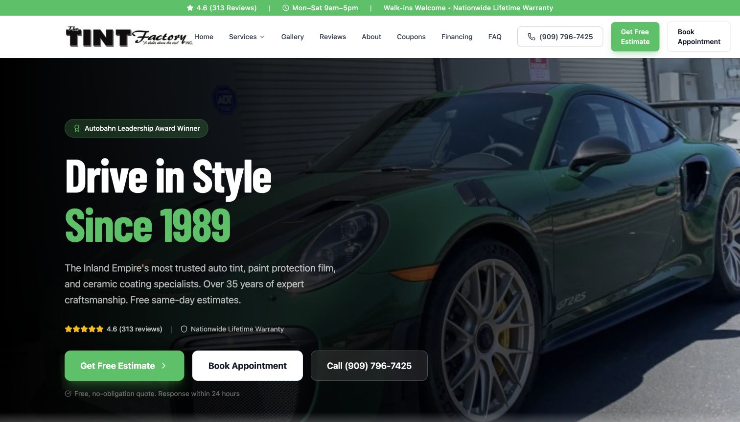
The Tint Factory builds its opening around a green sports car, a dark overlay, and three distinct actions: request an estimate, book an appointment, or call. The header repeats the estimate and booking choices, while a narrow strip presents hours and walk-in messaging. Below, service cards distinguish automotive tint, paint protection, coating, architectural film, and training. A three-stage process introduces consultation, installation, and final inspection with support. This creates a coherent route from an attractive vehicle image to the practical work involved. Business credentials and review figures are presented prominently, but the editorial value is the communication structure rather than verification of those claims.
What you can learn
Label enquiries and bookings differently. Customers comparing a building project need a different expectation from someone ready to schedule a known vehicle service. Carry that distinction through the header, service cards, and response-time wording.
Pros
The opening offers clearly named estimate, appointment, and telephone pathways.
Service cards keep tint distinct from coatings, paint protection, and professional training.
Cons & considerations
Three equally prominent hero actions can make the preferred next step less obvious.
Repeated warranty, award, and trust statements compete with specific installation information.
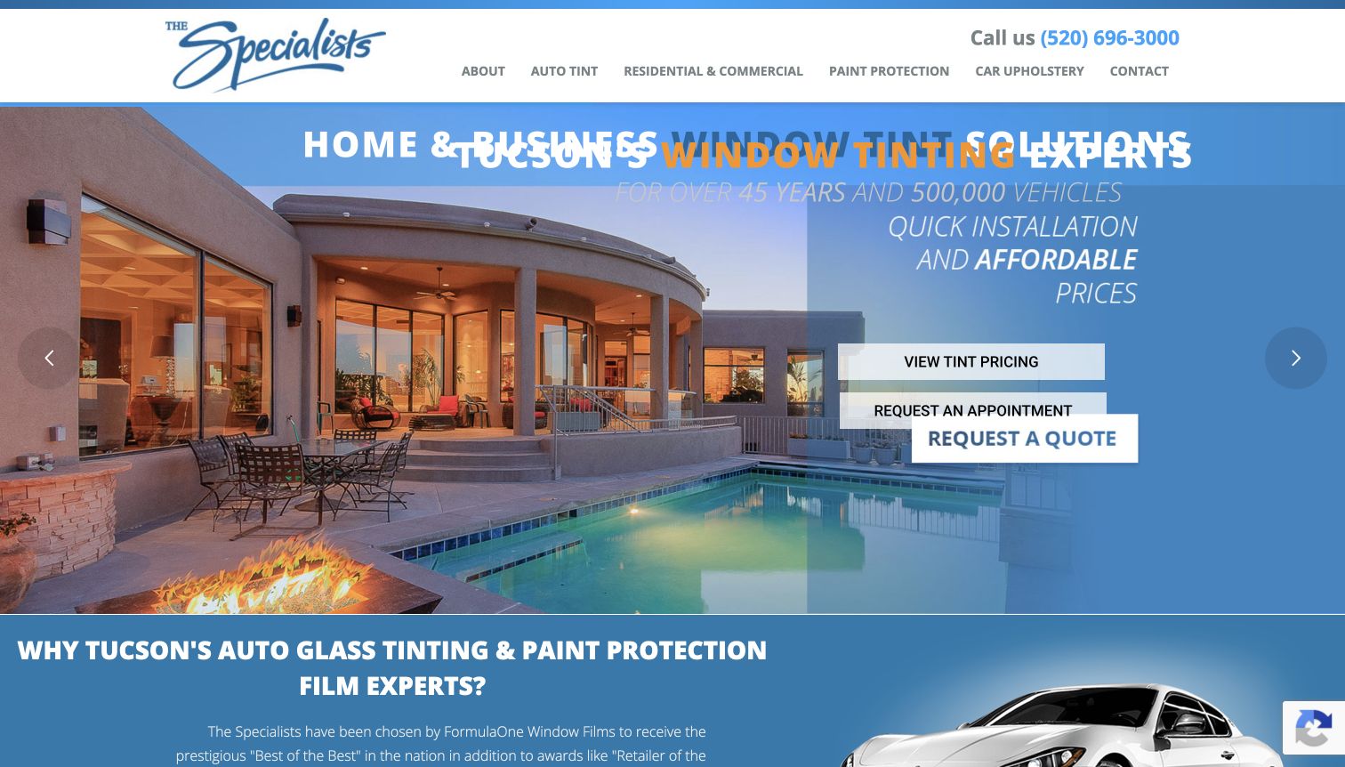
The Specialists connects an established Tucson identity with separate automotive and building-film journeys. Its homepage offers automotive pricing, while residential and commercial work points toward a quote on a related business website. Location blocks provide individual addresses, phone numbers, and directions. The page also distinguishes paint protection from window tinting, useful for visitors unfamiliar with the difference between those services. A large rotating banner carries much of the first impression; the direct capture caught overlapping slide text during a transition. That recorded moment is a reminder that a technically present message is not necessarily readable throughout an animation.
What you can learn
Match the action to the certainty of the job. Pricing can help compare vehicle packages, whereas property enquiries may need measurements and consultation. Keep a stable headline outside animated slides so the business and location remain understandable throughout the transition.
Pros
Pricing and quotation routes reflect the different information needed for cars and buildings.
Individual location details reduce dependence on a generic company-wide contact page.
Cons & considerations
The captured carousel transition temporarily overlaps messages and weakens headline readability.
Architectural enquiries cross to another domain, requiring a clear explanation of that relationship.
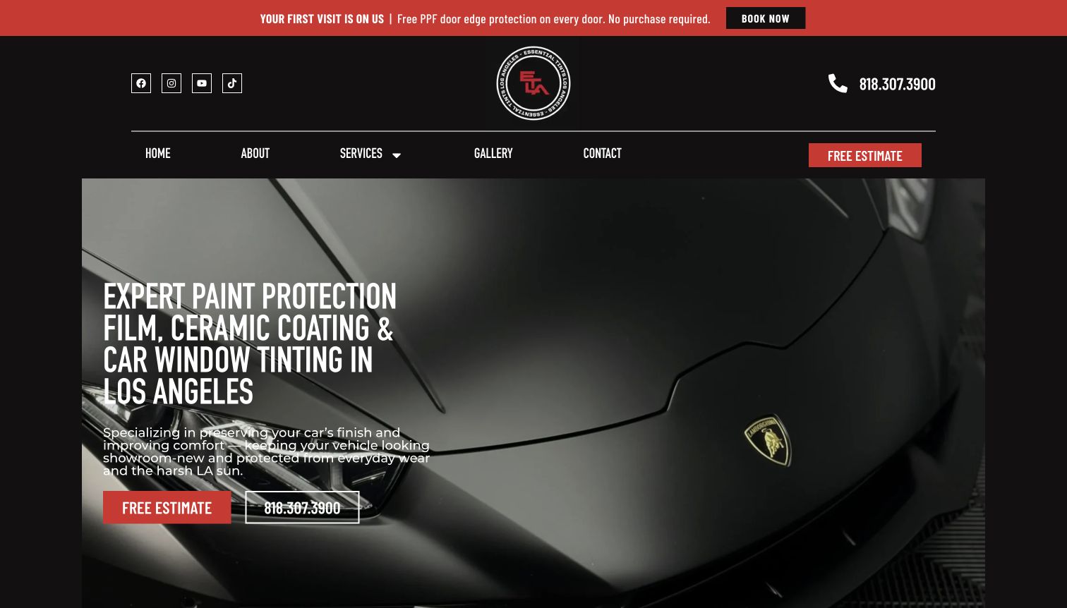
Essential Tints establishes its Los Angeles focus in a direct service headline over a close vehicle image. Red actions stand out against a dark, compact presentation, and a practical strip supplies phone, hours, and a Canoga Park address. The service cards distinguish window tinting from paint protection, colored film, and ceramic coating. A categorized work gallery offers a route to relevant examples instead of making every visitor browse the same mixed collection. The page also describes scheduling, vehicle preparation, application, delivery, and post-care support. Those stages turn a broad protection message into a more understandable customer experience before an enquiry.
What you can learn
Let a visitor connect the service label with relevant work and the steps that follow. Put tint examples in their own gallery category, then explain inspection, collection, and care so a customer knows what questions to ask before booking.
Pros
A service-specific gallery structure supports comparison without mixing every protective treatment together.
Hours, address, and a five-stage process supply useful information beyond the hero image.
Cons & considerations
The opening promotion competes with the estimate action and main service explanation.
Long sales passages repeat protection claims more often than they clarify film options.
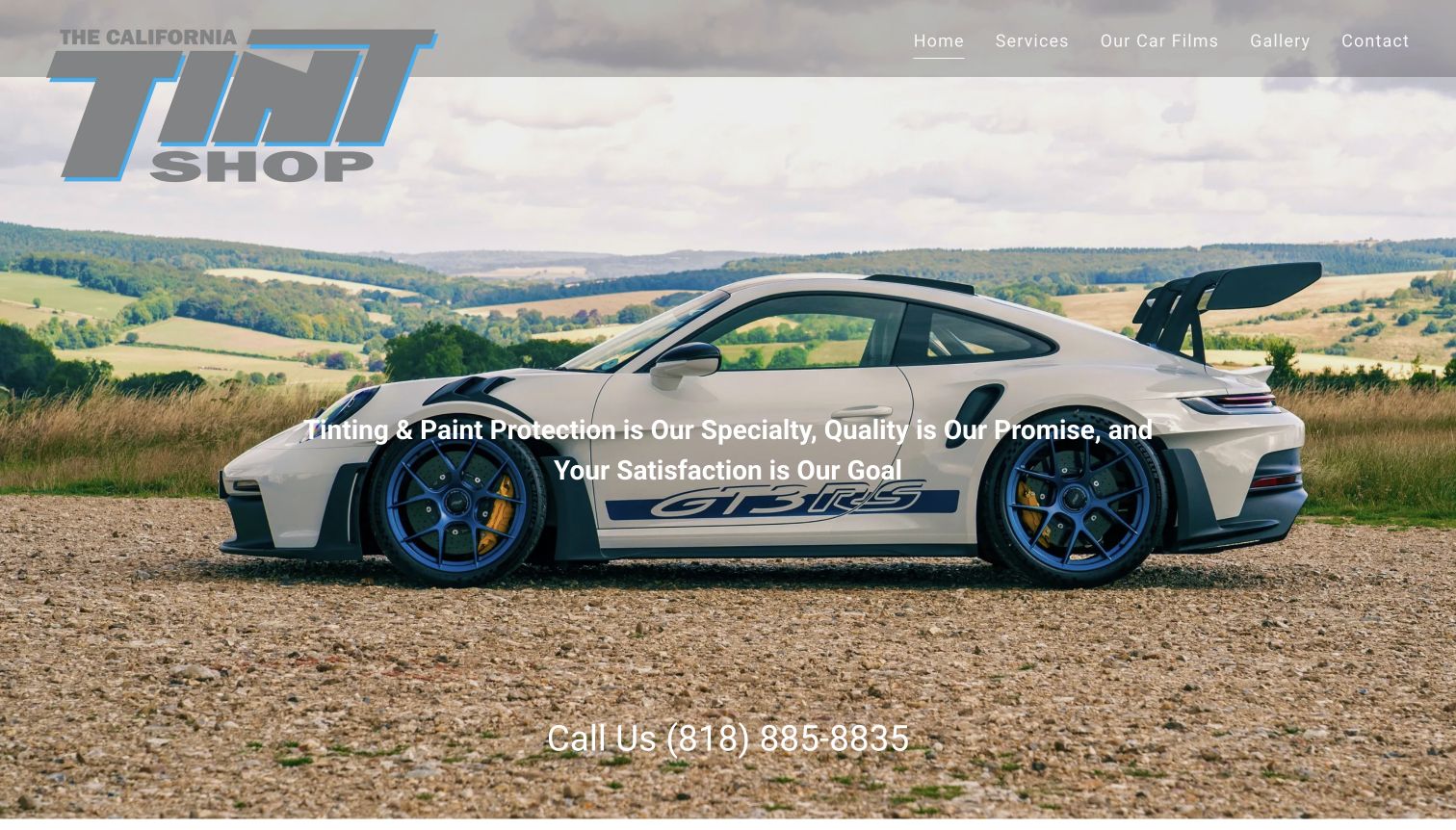
The California Tint Shop chooses a simple opening: a large car photograph, a compact menu, and a prominent telephone number. The introduction identifies Northridge and the wider San Fernando Valley, then explains the distinction between custom window tinting and paint protection. Film information and a gallery have visible navigation routes. A substantial section reproduces dated customer reviews, offering a familiar form of reassurance but making the page much longer than its service explanation. The structure invites direct contact with a local shop. Its strongest practical information appears in the introduction rather than the image-led first screen.
What you can learn
A small shop can keep the journey simple, but give the opening enough factual content to establish service and location. Use a short selection of attributed reviews alongside relevant work, then let customers continue to detailed film information when they need it.
Pros
The direct phone emphasis supports customers who prefer a conversation about their vehicle.
Separate film and gallery links offer useful routes beyond the introductory sales copy.
Cons & considerations
Text placed across the bright vehicle photograph has uneven visual contrast.
The long review sequence overwhelms the shorter explanation of choices and installation expectations.
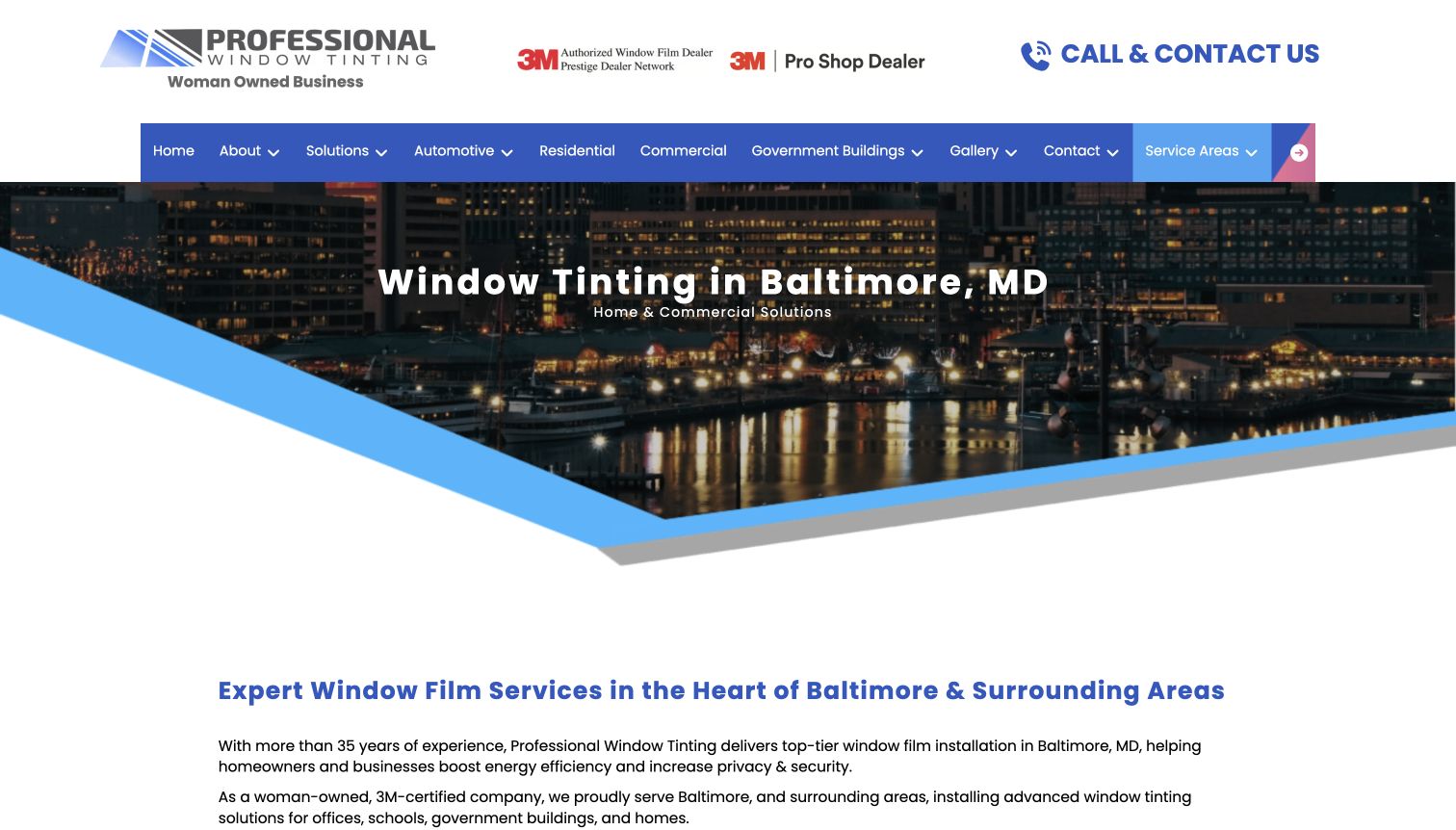
Professional Window Tinting's Baltimore page is a strong example of a location page doing real editorial work. Its city-specific opening immediately identifies home and commercial solutions. The body then explicitly states that automotive tinting is not offered at this location, even though the wider site's navigation includes automotive services. Commercial, residential, and decorative applications receive separate sections, followed by practical FAQ topics and named surrounding communities. The blue architectural presentation reinforces the building focus. A shared footer distinguishes Baltimore's scope from the Newark location, helping visitors avoid assuming every branch offers the same services. Its boundary-setting is useful.
What you can learn
A location page should explain what is different at that location. Put exclusions near the first enquiry route, and maintain the same distinction in shared navigation and footers. This can prevent a polished national menu from creating a misleading local expectation.
Pros
The explicit no-automotive notice resolves a genuine ambiguity created by the broader site menu.
Separate architectural applications and named communities make the page locally meaningful.
Cons & considerations
Long benefit paragraphs would be easier to compare as shorter project-specific explanations.
Manufacturer performance and security claims need fuller context than the introductory promotional wording.
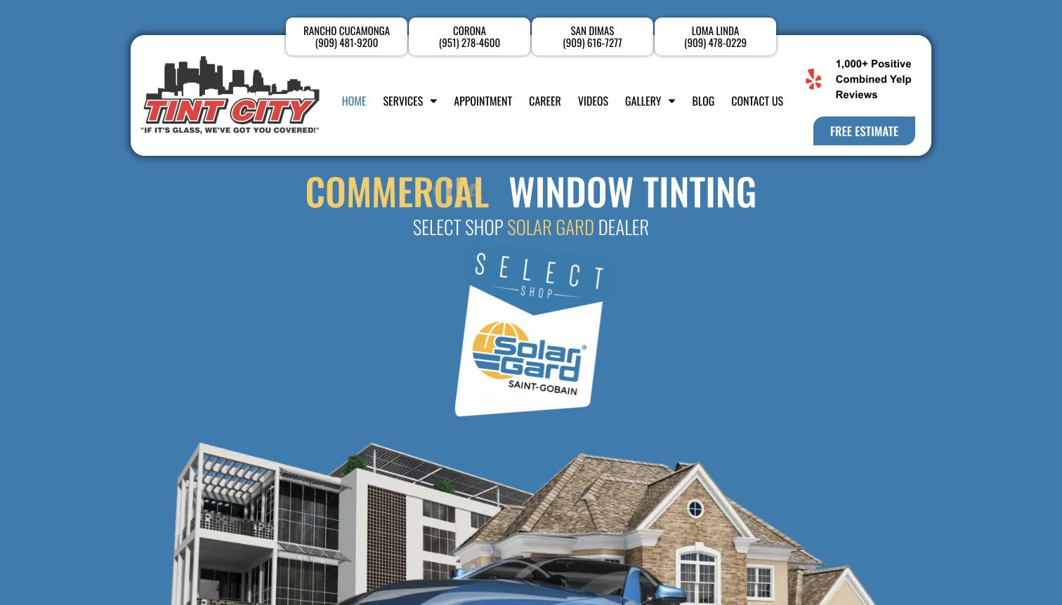
Tint City places four named locations and telephone numbers above its navigation, making branch choice immediately visible. The main presentation introduces automotive, residential, and commercial tinting through large type and an illustrated combination of vehicles and buildings. Separate service blocks then lead to more focused information. Local sections repeat addresses and service coverage, while appointment and estimate routes remain distinct. The result is especially useful for a regional business whose customers already know which town they prefer. Brand credentials and customer-review messaging take substantial space, so the central film comparison is less immediate than the branch and contact structure.
What you can learn
Make location selection useful before asking for personal details. Pair a town with its phone number and service scope, and preserve that context when customers request an estimate. Avoid forcing the visitor to infer which branch a company-wide form will contact.
Pros
Four clearly labeled branch contacts are visible without opening a locator.
Separate automotive, home, and commercial service cards organize a broad offering sensibly.
Cons & considerations
A tall branded header and supplier artwork consume much of the first screen.
Repeated testimonials and regional copy lengthen the path to specific film differences.
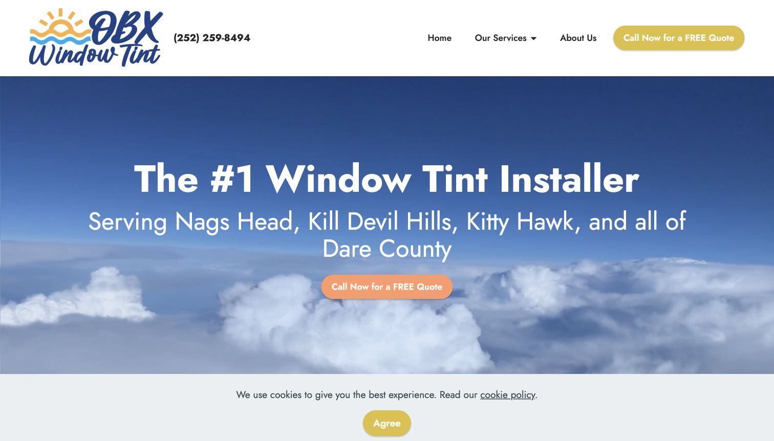
OBX Window Tint puts its service area directly beneath the opening headline, naming Outer Banks communities and Dare County. A large call button appears in the hero and again in the header, followed by a short enquiry form and separate explanations for vehicles, commercial buildings, and homes. The blue and yellow presentation uses coastal imagery to reinforce place rather than an expensive-looking vehicle. That local emphasis makes the service proposition easy to understand. The page also shows hours and a straightforward contact section. Some technical benefits are compressed into long paragraphs, and the main services link exposes a builder destination in the observed navigation.
What you can learn
For a geographically bounded business, the towns served can be more useful than another superlative. Keep the service region near the action, separate building and vehicle enquiries, and audit every navigation destination before treating a template as finished.
Pros
The opening geographic statement helps visitors establish local relevance quickly.
Three service groups cover cars and larger vehicles, business premises, and homes explicitly.
Cons & considerations
The observed services navigation includes an unrelated builder destination that could interrupt browsing.
Dense benefit paragraphs combine several product claims without adequate comparison or qualification.
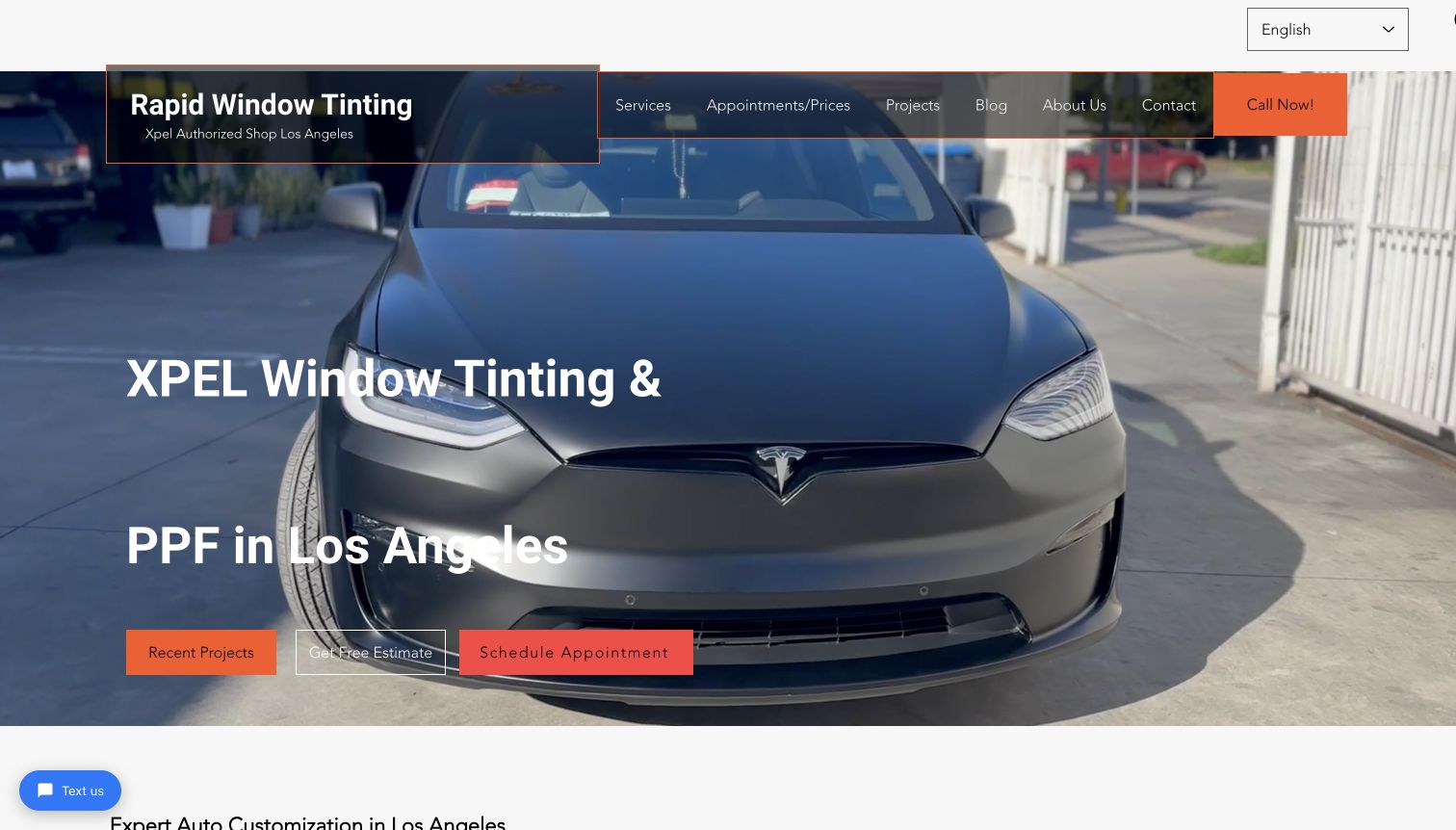
Rapid Window Tinting puts Los Angeles, the product brand, and the principal services directly in its opening headline. A vehicle image provides context, while recent projects, a free estimate, and an appointment each have their own action. The navigation includes an unusually explicit appointments-and-prices label, making the practical next step easy to identify. Below, individual sections discuss automotive tint, paint protection, architectural film, and other services, with links. The homepage also connects readers to a larger project collection. Its detailed copy is helpful for discovering scope, although repeated location and service phrases make several sections feel heavier than necessary.
What you can learn
Expose proof, price information, and scheduling as separate routes. A customer who needs reassurance can inspect completed work, while a ready buyer can move toward booking. Maintain a clear boundary between an advertised package, an estimate, and a confirmed appointment.
Pros
Project, estimate, and scheduling actions are visible together without relying on a generic contact label.
The appointments-and-prices navigation wording makes a common customer question easy to pursue.
Cons & considerations
Three prominent actions and a chat prompt divide attention across the opening screen.
Repeated promotional phrases reduce the scanability of otherwise useful service explanations.
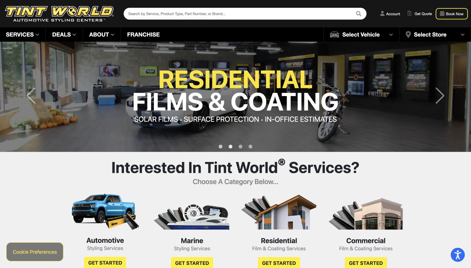
Tint World combines a broad service directory with explicit vehicle and store selectors in the main navigation. The observed homepage divides its offer into automotive, marine, residential, and commercial categories, each with an illustrated entry point. A second service grid breaks automotive work into tint, paint protection, coatings, electronics, lighting, and other treatments. The scale of the offering is visible immediately, and the search field accommodates services as well as products and brands. This network structure exceeds most local installers’ needs. The quoted service journey still depends on choosing an appropriate store and confirming local availability.
What you can learn
Borrow the separation between service discovery and location context, not the entire catalog. Make the desired treatment understandable first, then carry the customer's store choice into quotation and booking. Clearly distinguish installed services from retail products within shared search and navigation.
Pros
Four audience categories prevent residential and marine film from disappearing inside automotive menus.
Store and vehicle controls provide visible ways to narrow a very broad offering.
Cons & considerations
Retail shopping, franchise information, and service booking compete within the same homepage.
Rotating promotional panels can distract from the task of selecting a relevant local service.
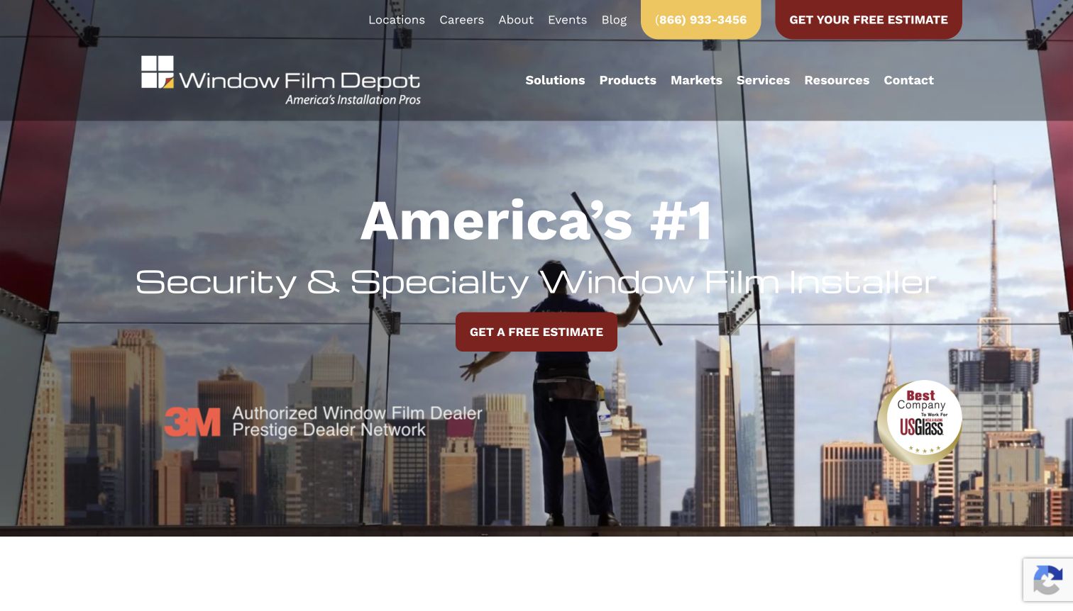
Window Film Depot addresses architectural buyers with navigation organized by solutions, products, markets, services, and resources. Its opening shows work on a large glass installation rather than a car, immediately establishing the different project scale. The main solution groups include sun control, privacy, decorative applications, and glass protection. A featured Oculus project connects a named setting with a specific film application and a case-study route. The estimate form asks about property type, the buyer's role, window quantity, and project stage, reflecting the information needed for a building enquiry. The taxonomy helps informed buyers but could overwhelm beginners.
What you can learn
Organize a complex product range around the customer's problem before showing the catalog. Then use a documented project to explain the application and collect only the project details needed to route the enquiry appropriately.
Pros
Solution and market pathways accommodate different ways architectural buyers research a project.
The featured project and contextual estimate questions connect marketing to a concrete installation brief.
Cons & considerations
Deep menus present many product names before a novice has established the right category.
Security and energy claims need carefully scoped technical evidence beyond the homepage promises.
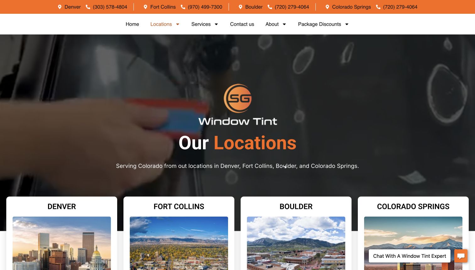
SG Window Tint's locations page gives each Colorado market an individual card beneath a simple regional introduction. The header repeats city names and phone numbers, while the captured hero uses an installation image rather than unrelated lifestyle photography. Denver, Fort Collins, Boulder, and Colorado Springs are easy to compare at the navigation level, with links leading toward their individual pages. The lower page adds project media, review content, and contact blocks. Aftercare links distinguish automotive work from commercial and residential film, extending the information beyond booking. Uneven location details make this a starting point rather than a complete visit planner.
What you can learn
Treat a locations page as a decision aid. Give each branch the same practical fields, including service scope, address, hours, and contact route, and carry the selected location into the next page. Shared aftercare information can remain grouped by treatment type.
Pros
Consistent city cards and header phone links make regional navigation straightforward.
The footer exposes separate aftercare resources for automotive and architectural customers.
Cons & considerations
Uneven address detail means some customers must investigate further before planning a visit.
Reviews and media occupy substantial space between the location overview and practical contact details.
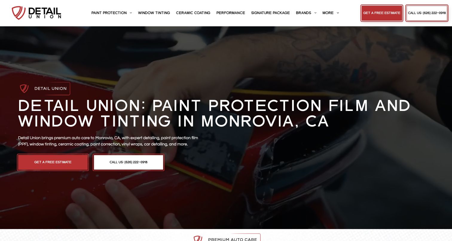
Detail Union's captured homepage names window tinting alongside paint protection in its main Monrovia headline. That clarity matters because the business also presents coatings, performance work, and other automotive services. A dark working image supports large white type, with estimate and telephone actions set apart in red and white. The navigation gives window tint its own route rather than hiding it inside a generic services menu. Vehicle-specific information and the quote context help visitors move beyond appearance toward a relevant conversation. The reused November 6 capture documents that presentation; this review examines tint within the wider offering.
What you can learn
If tint is an important enquiry source, name it in the opening and navigation. Use the broader protection story to explain related services, but let the customer identify one treatment without first understanding the whole studio's product range.
Pros
The first headline combines the service and locality without relying on a menu search.
Distinct estimate and call actions give customers two understandable ways to begin.
Cons & considerations
The broad navigation competes with the otherwise focused tint and protection message.
A shared work image needs clear labeling so film application is not mistaken for another treatment.
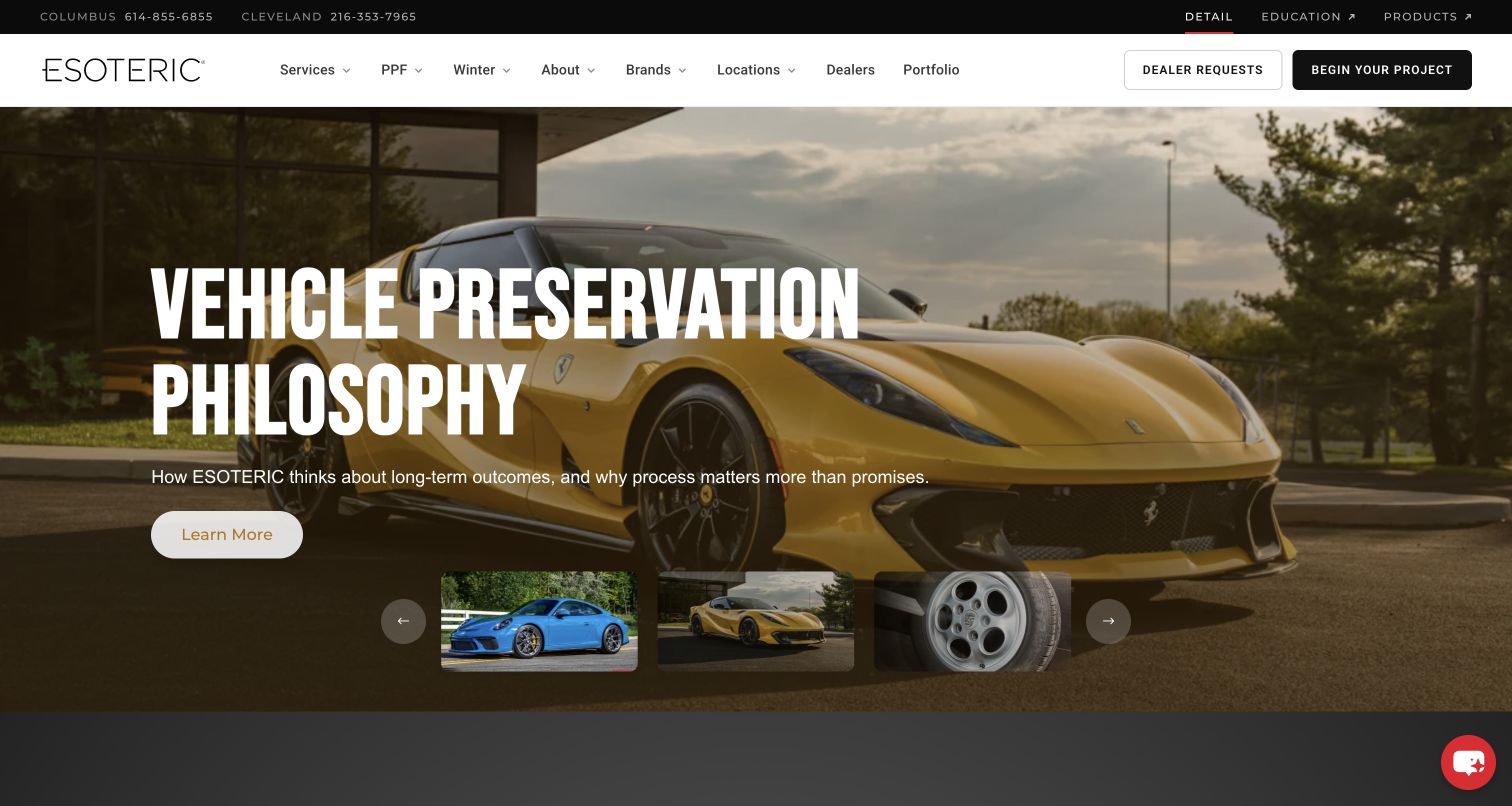
ESOTERIC's captured homepage separates detailing, education, and products before presenting its installation services. This is a useful distinction for a business serving both vehicle owners and professionals. The main hero uses a striking yellow vehicle and a broad preservation message, while the menu exposes services, locations, portfolio information, and a project enquiry. Window tint belongs to the installation offer but does not dominate the opening. For tint customers, the useful lesson is how to contain a complex business model without mixing a training purchase with a service appointment. The November 6 record and image retain their original observation date.
What you can learn
Separate audiences at the top level when a shop also sells products or teaches installers. Within the consumer route, make tint easy to identify and connect it to relevant completed vehicles. An elegant umbrella message still needs a direct service-level path.
Pros
Consumer services, professional education, and product shopping have distinct entry points.
Portfolio, location, and project-enquiry links support a considered installation decision.
Cons & considerations
The broad vehicle-preservation headline does not immediately tell a tint buyer where to begin.
Numerous service, brand, and audience choices increase the effort required for a simple request.
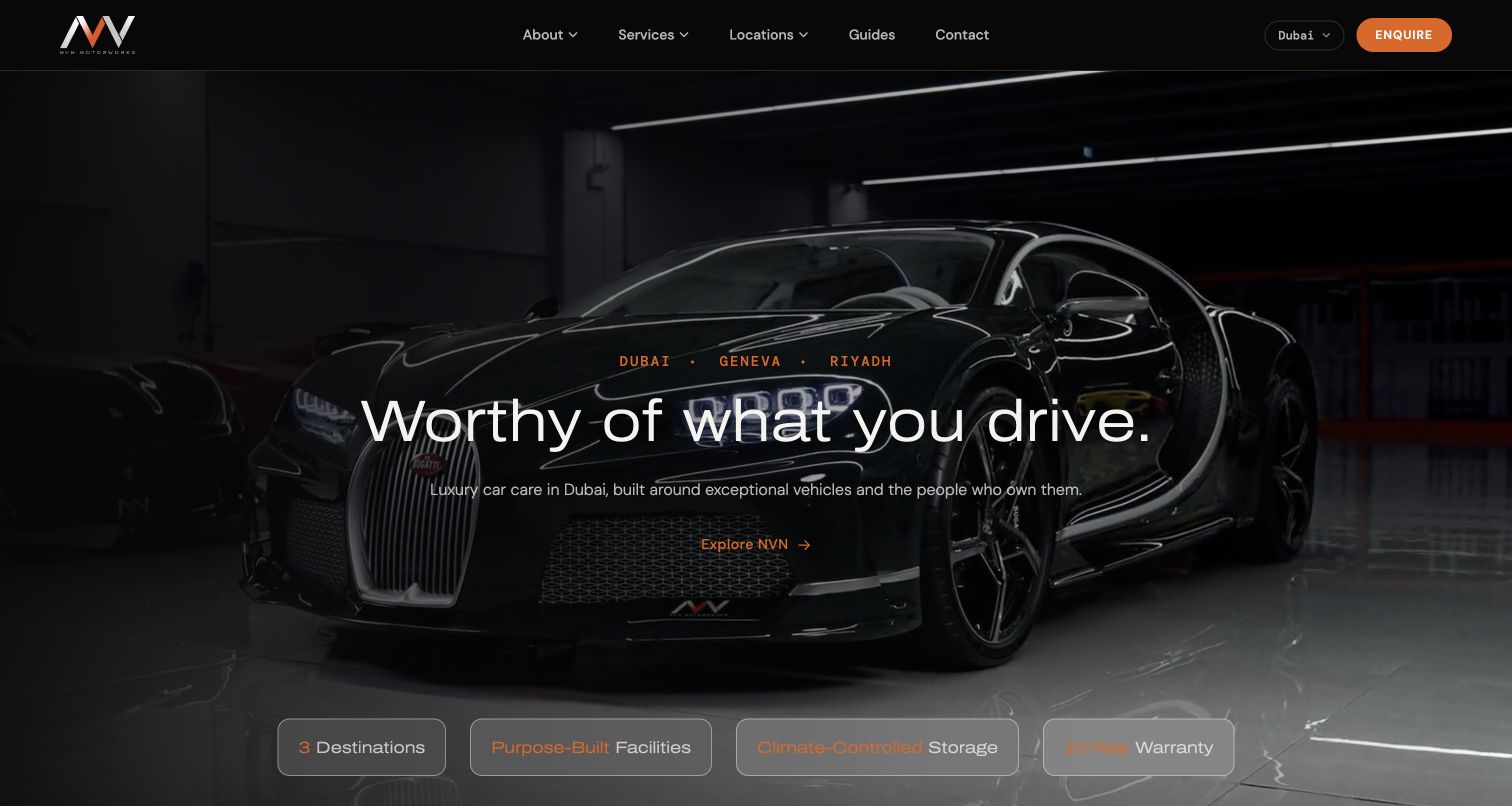
NVN Motorworks' Dubai page uses dark workshop imagery and restrained orange accents to introduce a premium vehicle-care setting. The city selector and Dubai label establish which location the visitor is exploring, while service and enquiry routes remain visible. The broader offer includes tint alongside paint protection, detailing, and other specialist work. Rather than making a technical film comparison in the opening, the page builds confidence in the studio environment and lets visitors move toward a consultation. That presentation can support a high-consideration enquiry, but the connection to a particular tint package needs another step. The retained November 6 capture documents the Dubai property specifically.
What you can learn
Keep location context attached to an international brand's service journey. Pair the studio's visual identity with precise treatment information so a customer can distinguish the atmosphere of the business from the specifications of the film being considered.
Pros
The Dubai location context is visible within the broader international brand structure.
Workshop imagery and a restrained action hierarchy create a coherent premium presentation.
Cons & considerations
The opening brand message supplies less immediate detail about window-film choices.
Several related services compete for attention before a tint customer reaches a specific enquiry.
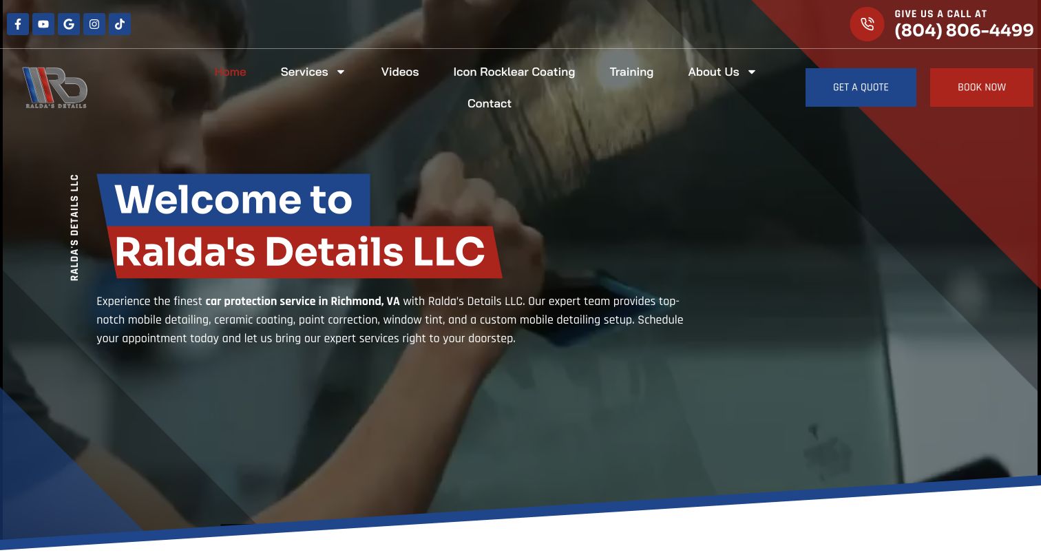
Ralda's Details presents a wide range of automotive services in a distinctly local Richmond context. The captured opening combines bold red and blue shapes with a hands-on work image, and names window tint among the available treatments. Quote and booking actions appear separately, while navigation also includes videos and professional training. This service business supports several customer intents within one homepage. Its strengths are the recognizable locality and direct access to a conversation. The tradeoff is that tint can become one item in a long proposition, especially when education and consumer services share prominent navigation space.
What you can learn
Keep the main service categories understandable before adding training or specialist extras. For tint, state where the work happens and what the enquiry covers; a business offering some mobile services should not imply every treatment is delivered at the customer's address.
Pros
Richmond context and explicit tint wording establish relevance within the first presentation.
Separate quote and booking actions distinguish exploration from readiness to schedule.
Cons & considerations
Training, videos, and numerous treatments make the top-level choice more demanding.
The mix of mobile and studio services needs treatment-specific location information to avoid assumptions.
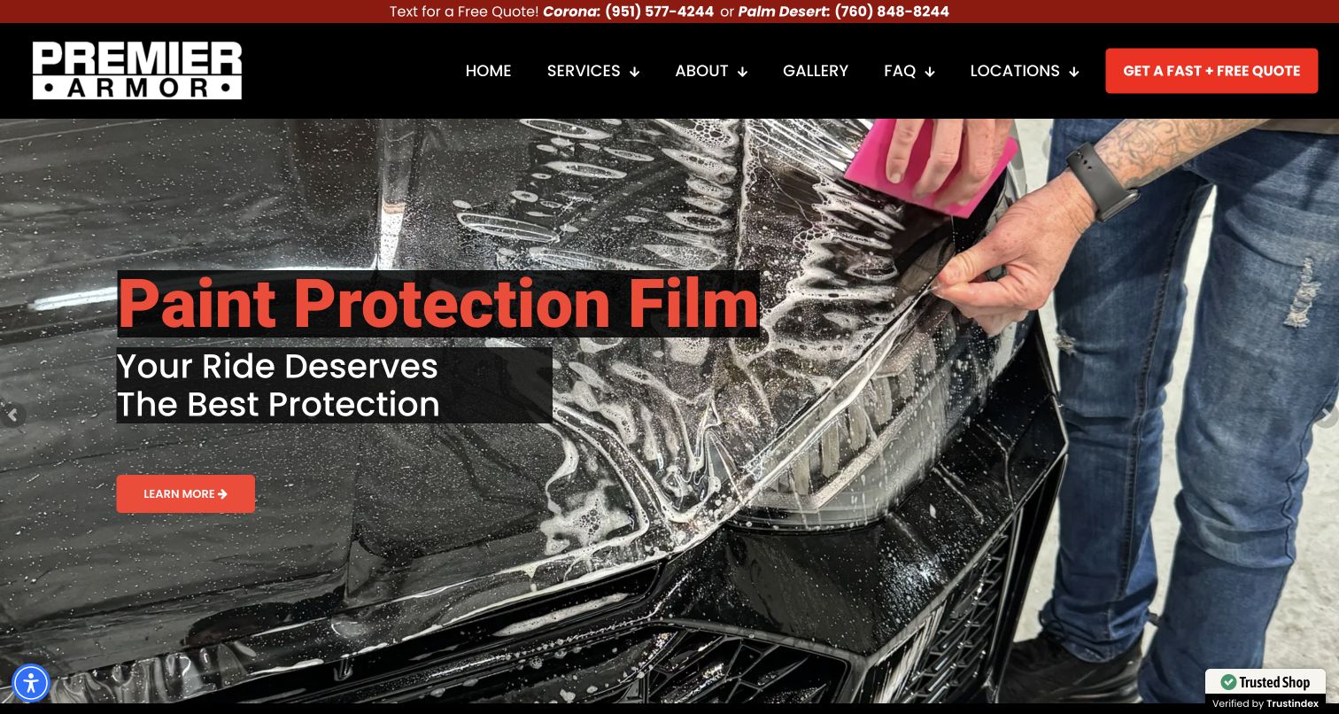
Premier Armor uses an application photograph and a prominent paint-protection message in the captured first screen. A red contact strip distinguishes Corona and Palm Desert enquiries, and the dark navigation offers services, gallery, FAQs, and locations. Window tint is part of the broader service offer, but the opening image demonstrates work on bodywork rather than glass. This distinction is important when studying the site for a tinting business: the structure is useful, while the photograph should not be relabeled as tint installation. Service modules lead to the appropriate treatment, and the gallery and FAQ navigation support customers who want more context before requesting a quote.
What you can learn
Use accurate imagery for each protective service. If the homepage leads with paint film, ensure window tint has a clearly named route and its own examples. Preserve location context in the enquiry so customers know which studio will respond.
Pros
Named location contacts make the regional operating structure visible immediately.
Gallery and FAQ links offer useful supporting information beside service discovery.
Cons & considerations
The first-screen paint-protection emphasis can delay recognition of window tinting availability.
A shared protective-services message needs precise photo captions to distinguish glass from body-film work.
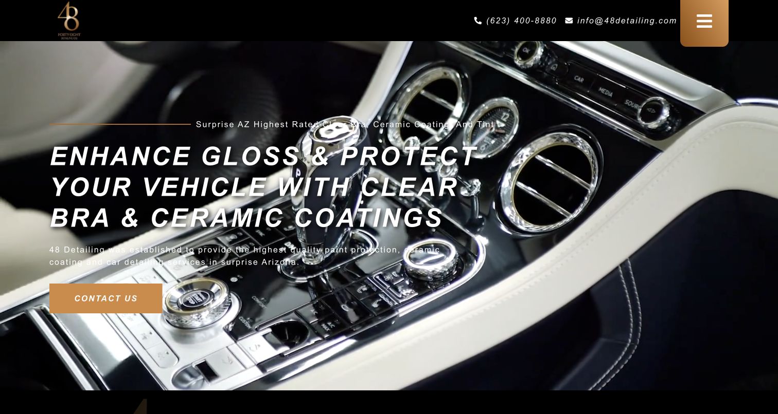
48 Detailing's captured opening pairs a black and gold identity with a close vehicle-interior image. The larger headline emphasizes clear bra and ceramic work, while smaller introductory wording includes tint and the Surprise, Arizona location. Phone and email contact details remain visible, with a compact menu and a direct contact action. This creates a controlled first impression, but the hierarchy makes window tint easier to overlook than the leading protective treatments. The source record distinguishes tint and provides location and hours information. The useful lesson is visual restraint; tint itself is less prominent.
What you can learn
Make the size of the service label reflect its business importance. A compact layout can still identify tint clearly, link to film choices, and provide an obvious estimate route without introducing a large menu or a long list of promotional badges.
Pros
A limited color palette and close image create a consistent studio identity.
Visible direct contact details provide an immediate route for visitors with a specific vehicle question.
Cons & considerations
Tint appears less prominently than clear bra and coating in the opening hierarchy.
The compact menu asks exploratory customers to take another step before seeing the service range.
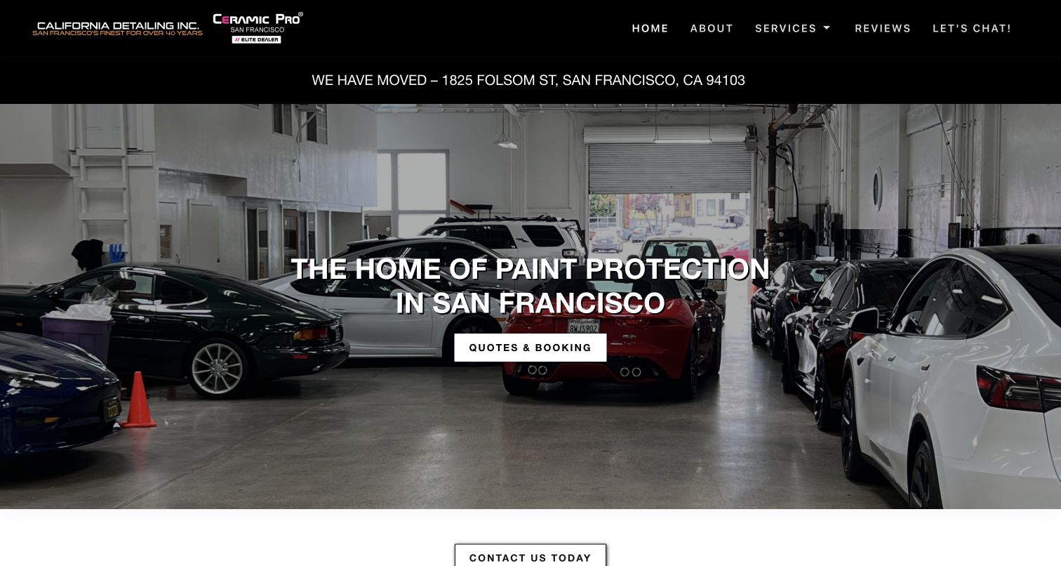
California Detailing's captured homepage prominently announces a move to Folsom Street in San Francisco before the main workshop image. That operational notice has a clear purpose: a visually attractive service page is of little use if a returning customer travels to an old address. The surrounding design is simple, with service, review, and contact navigation, followed by a protection-focused headline and a combined quotes-and-booking action. Window tint appears within the broader treatment grid rather than leading the hero. The image and notice are preserved as a November 6 observation, not asserted as a newly announced move. Practical business information takes priority over visual storytelling.
What you can learn
Reserve prominent space for information that changes a visit, such as a relocation or appointment requirement. Keep that notice dated and connected to directions, while giving tint its own service route beneath the broader studio message.
Pros
The relocation notice addresses an immediate customer risk before promotional content.
A restrained navigation and clear quotation route keep the overall journey understandable.
Cons & considerations
A general paint-protection headline gives tint less visibility than the broader service range.
Combining quotes and booking under one action leaves the next step less specifically defined.
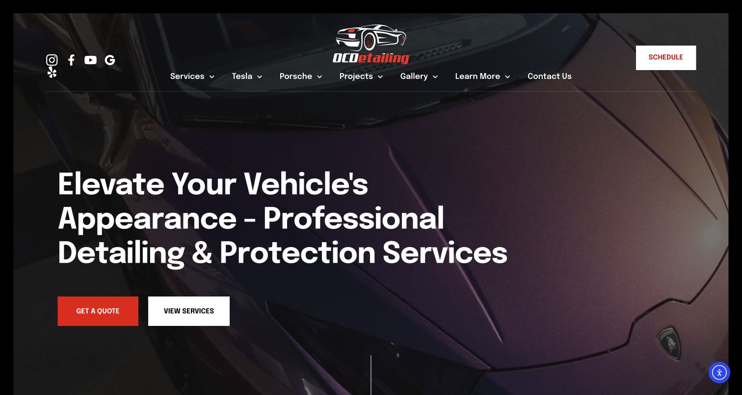
OCDetailing uses an expansive dark vehicle photograph and a restrained purple accent to establish its studio identity. In the retained capture, the navigation gives Tesla and Porsche audiences their own routes alongside services, projects, gallery, and contact. The homepage introduces detailing and protection broadly, with window tint available within the service offer. Visitors can investigate through their vehicle or the treatment they need. A quote action and a service action sit together, allowing visitors to choose between starting a conversation and learning more. The design is persuasive visually, but tint specifications are necessarily beyond the broad opening.
What you can learn
Use vehicle-specific navigation only where it adds relevant information. Connect those pages back to clearly named treatments and authentic examples, so a customer does not mistake a vehicle specialization for proof that every film or package is appropriate for their car.
Pros
Vehicle and service routes accommodate two common starting points for automotive customers.
Quote and exploration actions distinguish immediate enquiries from early research.
Cons & considerations
The general protection message requires another step to establish the tint offering.
Large atmospheric imagery leaves limited room for practical installation details in the opening view.
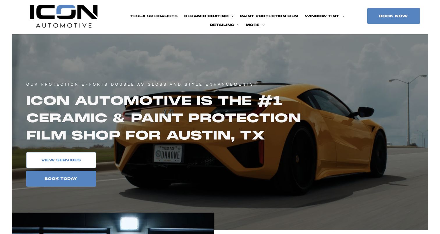
ICON Automotive Austin's captured homepage retains its authenticdetails.com address while presenting the ICON brand. The opening shows a bright vehicle image, a strong Austin proposition, and separate service and booking actions. Window Tint has its own main-navigation label alongside paint protection, coatings, detailing, and vehicle-specific information. For this expansive offer, tint remains discoverable even when the hero describes protection in general terms. The source identity and original capture date are preserved, avoiding an invented new property based on the visible branding. The page's business superlatives are promotional statements, while the useful editorial pattern is the clear service-level navigation.
What you can learn
Keep a recognizable service label visible through branding changes and broad campaigns. A customer searching for tint should not need to understand the company's naming history or browse every protective treatment before finding the relevant information and appointment route.
Pros
Window tint receives a direct top-level link despite the wide service range.
Regional wording and separate discovery and booking actions support different visitor needs.
Cons & considerations
A broad hero proposition supplies less film-specific information than the navigation promises.
Older domain wording and newer visible branding benefit from a concise continuity explanation.
Kegan is a freelance web designer and developer with 15+ years of experience helping businesses turn complicated website requirements into clear, maintainable digital experiences. He works directly with clients from planning and design through development, launch, and ongoing support.
For window tinting company website design, his development approach focuses on automotive and architectural service distinctions, project explanations and useful local inquiry routes. The scope can be a targeted improvement or a complete custom build, with responsive layouts, thoughtful content structure, and integrations chosen around the people using and maintaining the site.
Show 3 other window tinting company website designersHide other window tinting company website designers
Plan a window tinting website around the questions customers actually bring
Map the enquiry by application and location
Start with the work the business actually performs. List vehicle tint, residential film, commercial projects, decorative applications, and any related treatments separately. Then record which locations provide each service. A customer should not have to discover during a phone call that a branch shown in the navigation handles buildings but not cars. Put that distinction on the relevant location page and repeat it in the enquiry path.
Use the homepage to establish service and geography together. A concise introduction can name the town or region, explain the principal work, and offer a sensible next step. For a multi-location company, carry the chosen branch forward instead of returning customers to a company-wide form with no context. For an architectural installer, distinguish a staffed showroom from an area served by appointment.
Build separate paths where the information genuinely differs. An automotive enquiry may need a vehicle model and existing-film question. A building enquiry may need property type, the problem being addressed, and a general location before detailed measurements are useful. Explain what happens after the request and whether an appointment is confirmed by a person. The goal is a useful conversation, not a long form that asks every customer every possible question.
Explain film choices with comparable evidence
People often arrive with a product word, a desired appearance, or a practical problem rather than a complete specification. Organize film information so those starting points can meet. Explain the difference between tint for glass and protective film applied to bodywork. Within architectural work, distinguish decorative appearance from solar-control and other specialized applications. A clear service label prevents an impressive photograph from making the wrong promise.
For each product family, identify the manufacturer and the specific range being discussed. Describe the application, available appearance, and the questions that require an installer assessment. If publishing performance figures, keep the product, test conditions, source, and qualification attached to the figure. Do not turn a general supplier statement into a guaranteed result for every vehicle or building. Treat jurisdiction-specific automotive requirements as maintained reference content, linked to appropriate official guidance rather than copied into an evergreen sales paragraph.
Use a small set of comparable examples. Show the glass, the surrounding environment, and a caption that names the application. A decorative office partition and a rear vehicle window answer different questions even when both use film. Give visitors a route to discuss their situation without implying that a screen image can establish the final color, performance, suitability, or permitted installation.
Show the work and define the next step
A useful project record explains more than the make of an attractive car or the address of a striking building. Name the service performed, show an appropriate view, and explain the customer problem the installation was intended to address. Keep outcomes attributable: a photograph can show appearance, but it cannot independently establish heat reduction, energy savings, security performance, or long-term durability. Where results were measured, document the method and limits.
Connect that evidence to the working process. Explain assessment, preparation, application, inspection, and aftercare in plain terms. Let customers know which details will be confirmed during a consultation and where they can find care instructions afterward. Distinguish an estimate request from a reserved appointment. If a booking route opens another service, make that destination and its purpose understandable before the customer leaves the site.
Keep practical information near the action. Include the relevant location, contact route, hours, and any appointment requirement. A relocation notice may deserve more prominence than a promotional banner. Review the journey periodically using read-only checks, keeping real customer forms untouched during quality assurance. Maintain accurate links and remove stale offers. A clear, current path from project evidence to a specific enquiry is more useful than repeated claims of being the best installer.
The editing job behind the design
Choose technology that supports a clear service journey
A tinting website usually benefits first from maintainable service pages, location records, project images, and accessible contact routes. Choose a content system that the business can keep current, especially when branches offer different services or a studio changes address. A sophisticated visual template does not compensate for an incorrect phone link or a pricing page without scope.
Keep enquiry and booking integrations proportionate. Explain external destinations, collect only useful project context, and avoid treating an estimate as a confirmed appointment. Test links and validation without creating real enquiries, bookings, reviews, or payments. Image handling should preserve truthful captions while providing responsive files and adequate text contrast.
The technology stacks below reflect bounded public-source evidence and retained documented observations. A visible script or delivery service is not proof of the hidden booking system, customer database, or complete hosting setup. Failed and partial audit attempts remain qualified in the records and do not establish that a technology is absent. Older captures retain their original dates.
Our WordPress website examples offer a separate look at publishing approaches. A visible platform label is evidence for that named page, not a guarantee that the same system will suit your requirements.
Before the public launch
Window tinting website planning checklist
Name the principal tinting service and local service area in the opening.
Separate automotive, residential, and commercial enquiry routes where their needs differ.
State any branch-specific exclusions before the customer requests an appointment.
Keep phone numbers, addresses, hours, and relocation notices current.
Distinguish window film from paint protection and ceramic coating.
Describe film families with product-specific sources and appropriate qualifications.
Label project photography by application without implying unmeasured performance.
Make estimate requests and confirmed appointments clearly different actions.
Explain assessment, preparation, installation, inspection, and aftercare.
Carry the selected service and location into the enquiry process.
Keep headings, contrast, image alternatives, and keyboard navigation understandable.
Check public links and form safeguards without submitting real customer enquiries.
These checks are a project checklist, not a performance, legal, security, or accessibility certification. Test real journeys with the people responsible for the website before making claims about the result.
Sources & editorial method
How this collection was selected and reviewed
This guide preserves the original randomly saved target of 25 distinct website properties for the November 9 evening batch. Research and new direct browser captures were completed on November 10, 2026. Sixteen current captures accompany nine inspected, previously verified November 6 captures; each example retains its actual source URL, capture date, dimensions, attribution, and evidence. The reused stable authoring records receive original tint-specific reviews, without relabeling older screenshots or observations as new. Every source has a bounded broad public technology-audit attempt, including existing attempts retained with their original dates; inaccessible and partial scans remain explicitly qualified. Signature Window Tinting was selected deliberately after reviewing its architectural-service page and direct capture, particularly its local scope and installation explanation. The selection assesses public website design and communication, not installation quality, safety, legal compliance, or product performance. No bookings, enquiries, payments, reviews, or messages were submitted during research.
Each example links to its actual source page. Screenshots are direct browser captures with their own capture dates; moving imagery, announcements and live designs can change. The notes describe observable design choices and conditional tradeoffs, not measured traffic, conversion results, service quality, or accessibility conformance.
Technology labels use public page metadata, asset evidence, or explicitly cited platform documentation. Platform documentation is not a complete current deployment audit. A component reference may be legacy or unused; it is not a complete backend inventory. Unknown stacks are omitted. These sites are editorial examples, not our client portfolio.
Written, Edited and Curated are separate editorial records, not timestamps advanced by a rebuild. Website designs and imagery belong to their owners. See our editorial standards or suggest a correction.
Questions worth asking
Window Tinting Company website design questions
What should a window tinting website explain first?
Start with the service and location: what the business tints, where it works, and how a customer begins. Automotive, residential, and commercial customers often need different information. A direct service label and a clear local enquiry route are more useful than a broad promise about protection.
Should tinting prices be published online?
A price guide can help when its scope is clear. Identify what the package includes, the relevant vehicle or application, and what still needs assessment. Distinguish an indicative price from a personalized estimate and a confirmed booking. Building projects may need more context before a meaningful quotation is possible.
How should a tinting company present project photographs?
Use real work with accurate permission and attribution, clear application labels, and useful captions. Separate window film from paint protection and coatings. Images can demonstrate appearance and workmanship details visible in the photo, but do not independently prove energy savings, security performance, legal compliance, or long-term durability.
Can automotive and architectural tint share one website?
Yes, provided the paths are clearly separated. Give each audience relevant examples, product explanations, and enquiry questions. Where locations differ, state their exact service scope. Do not let a company-wide automotive menu imply that a building-only branch offers car appointments.
What does the Editors Choice badge mean here?
It is an explicit editorial selection for public website design and communication. Signature Window Tinting was chosen for the clarity of its Little Rock architectural-service page and its installation explanation. The badge is not vote-derived and does not certify contractor quality, product performance, safety, or legal compliance.
Use these examples to make service fit, film information, and the next step easier to understand. A useful window tinting website shows relevant work, respects the difference between an estimate and an appointment, and explains enough of the process for a customer to start a well-informed conversation.