Definitive guide · Amazon DynamoDB website development
Best Amazon DynamoDB Websites of 2026 (20 Real-World Examples)
Public websites from organizations with documented DynamoDB workloads, with the design and database evidence kept separate.
DynamoDB does not dictate a visual style. Use this collection to study public communication and discovery patterns, then evaluate the database against your application’s actual access patterns.
A streaming watchlist, a mobile backup index and a ride-tracking workflow have very different interfaces, but each needs a clear contract between what the user asks and what the application can return. The examples below connect independently inspected public pages with official DynamoDB customer or engineering documentation. That connection is scoped: a company’s use of DynamoDB in one service does not establish the database behind its press room, investor site or retail campaign.
Begin your own brief with the user’s recurring task. Identify the records required to complete it, the expected response when information is missing and the meaning of a successful update. Then design the page so these states are understandable. A visually polished interface cannot compensate for a workflow that silently loses context or reports success before a write is durable.
Before the examples
What makes good Amazon DynamoDB website development in 2026?
Design the question before the table
Write down the requests the interface must answer: retrieve one profile, list a customer’s orders, resume a saved item or show recent activity. Include sorting, pagination and access boundaries. A mockup that implies arbitrary filtering can create a very different data requirement from a fixed lookup. Resolve that difference before promising the interface to stakeholders.
A user should be able to tell the difference between an empty collection, a request still loading and a failed update. Preserve entered information when retrying. If another screen may not immediately show a change, explain that behavior in the workflow instead of leaving people to refresh repeatedly or create duplicate records.
Keep operational data behind a controlled application layer
Public pages and browser forms should not receive unrestricted database credentials. Define which application component validates requests, checks the user’s permissions and returns only the required fields. Separate the public editorial site from private account experiences even when they share a brand and navigation system.
These 20 public design references are paired with scoped official DynamoDB evidence. The first five are recognizable major brands; individual evidence notes identify the documented product or workload, including dated historical context where relevant.
We start with five recognizable brands or organizations: Disney+, Netflix, Samsung, Nike, Zoom. Each attribution applies to the named website property, not every product or website belonging to its organization. This is a curated reading sequence, not a measured ranking.
Disney+’s public press homepage uses a compact white navigation bar above an almost uninterrupted entertainment image. The separation is useful: About, News, Media Kits and search remain legible while the featured production gets room to establish its visual world. Recent news and dedicated asset destinations turn the page into a working reference for journalists rather than a subscription landing page. The design depends heavily on the quality of supplied artwork, and the initial screen offers little explanatory context without scrolling. This is the public press property; the documented DynamoDB association concerns Disney+ streaming-service features, not proof of this press site’s database.
What you can learn
Give each audience a purpose-built entry point. A press room should make finding an announcement, identifying its date and obtaining approved media easier than buying a subscription. Keep those jobs separate even when they share the same brand.
Pros
A short task-based header preserves attention for the featured creative asset.
News, company information and media kits have clearly different destinations.
Cons & considerations
The oversized visual delays the first complete headline on a short viewport.
Artwork-led navigation needs strong text alternatives and predictable keyboard focus.
Platform source: Official product-specific customer case. AWS documents DynamoDB in Disney+ content-discovery features, including watchlists and viewing bookmarks. The public reference pictured here is the separate Disney+ press site. This source establishes only the stated organization, product or workload association. It does not prove the pictured public page uses this technology, identify its CMS or frontend, establish a complete current architecture, or independently verify vendor-reported outcomes. Platform evidence is separate from the direct website screenshot and is not a complete current infrastructure audit.
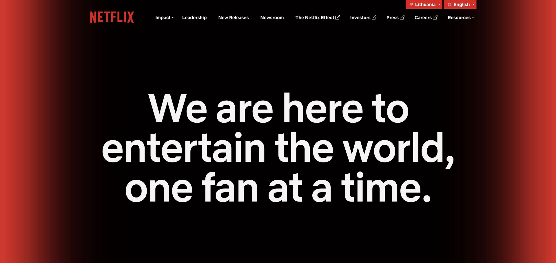
Netflix’s About homepage is strikingly different from a streaming catalog. A large white statement sits against a black field with red light at the edges, while the upper navigation groups impact, leadership, new releases, newsroom and business information. The result is a company-level introduction with a clear visual hierarchy, not a screen full of competing shows. It works because many visitors already know what Netflix sells. A less familiar organization would need a more concrete explanation of its product and audience before attempting this much abstraction. The pictured corporate page is a design reference; the DynamoDB source documents a separate experimentation workload.
What you can learn
Decide what a corporate homepage must add beyond the consumer product. Use a single concise purpose statement, then provide visible routes to evidence, leadership and current activity instead of repeating the purchase journey.
Pros
Restrained red and black styling makes the central message unusually easy to notice.
A dedicated business navigation supports journalists, applicants and investors without mixing their tasks.
Cons & considerations
A mission statement alone cannot explain an unfamiliar service or its practical value.
The wide headline treatment needs careful wrapping at intermediate screen sizes.
Platform source: Official product-specific customer case. AWS’s June 26, 2024 media-and-entertainment article describes Netflix using DynamoDB in an A/B testing context. This is dated workload evidence, not a corporate-page runtime claim. This source establishes only the stated organization, product or workload association. It does not prove the pictured public page uses this technology, identify its CMS or frontend, establish a complete current architecture, or independently verify vendor-reported outcomes. Platform evidence is separate from the direct website screenshot and is not a complete current infrastructure audit.
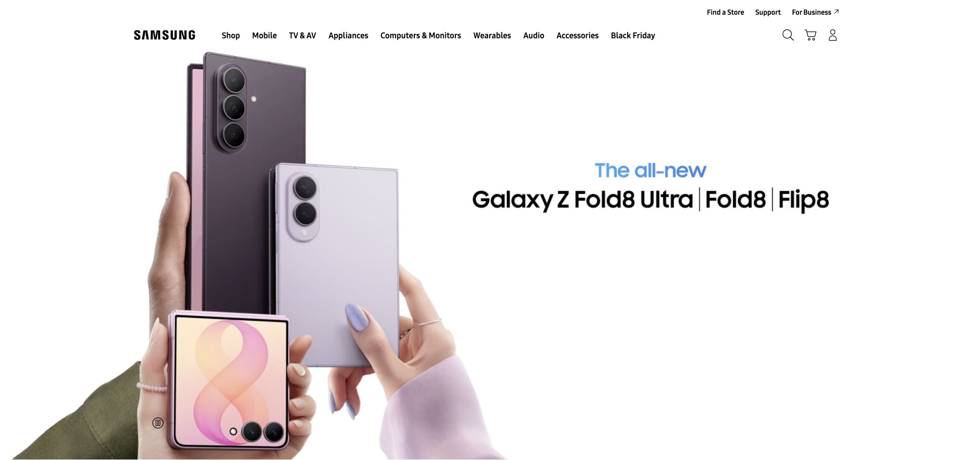
Samsung’s US homepage gives the foldable-phone campaign a white canvas. The products appear large on the left, with the model family named on the right, while the global header carries categories for phones, televisions, appliances and other devices. The composition is useful for a product whose shape matters: the image communicates folded and unfolded forms more quickly than a paragraph could. The tradeoff is that model names and campaign claims still need comparison content. A striking launch panel should not force visitors to remember small differences across several similar devices. The database evidence concerns Samsung Cloud, not an inspection of this storefront’s backend.
What you can learn
Choose the visual that answers the buyer’s first uncertainty. For a physical product, demonstrate scale, shape or use before surrounding it with specifications. Keep a clear comparison route available for people who are past the introductory stage.
Pros
Generous negative space keeps several devices from becoming a cluttered product collage.
Persistent category navigation makes the campaign a starting point rather than a dead end.
Cons & considerations
Closely related model names can overwhelm visitors without an accessible comparison path.
Large launch imagery needs responsive crops that preserve the distinguishing product details.
Platform source: Official product-specific customer case. AWS documents DynamoDB as a metadata index for Samsung Cloud mobile-device backups. The evidence does not identify every Samsung product or the retail homepage database. This source establishes only the stated organization, product or workload association. It does not prove the pictured public page uses this technology, identify its CMS or frontend, establish a complete current architecture, or independently verify vendor-reported outcomes. Platform evidence is separate from the direct website screenshot and is not a complete current infrastructure audit.
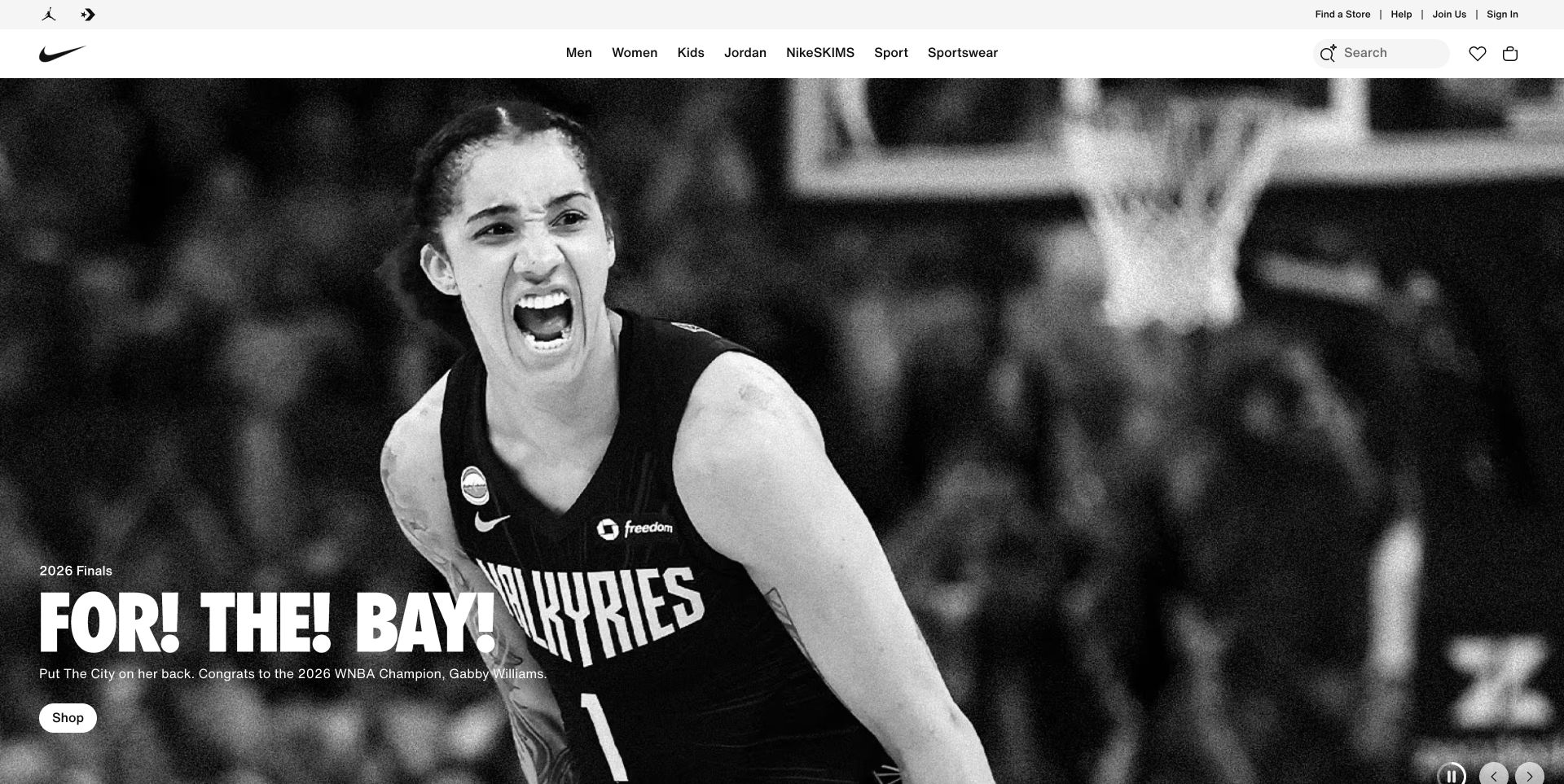
Nike’s captured homepage pairs a monochrome basketball photograph with a short, forceful campaign headline near the lower edge. The shopper still has recognizable category navigation, search, favorites and a shopping bag at the top. That contrast is the interesting design decision: the image establishes belonging and excitement, while the interface remains practical. The campaign does not have to explain every category because the surrounding shop structure carries that work. Smaller retailers should be careful about borrowing the visual scale without the merchandising depth behind it. The AWS evidence is for Nike Digital’s DynamoDB adoption and does not establish the exact database serving this campaign page.
What you can learn
Separate the emotional reason to care from the functional route to buy. One strong campaign can lead the page, provided visitors can quickly browse by audience, sport or product and do not have to decode the campaign language first.
Pros
Black-and-white photography lets the athlete and expressive headline carry the campaign.
Conventional shopping controls remain available without competing with the hero image.
Cons & considerations
Small overlay copy can become difficult to read over a busy photograph.
Campaign-led entry points need useful category alternatives for task-oriented shoppers.
Platform source: Official product-specific customer case. AWS identifies Nike Digital’s migration from Cassandra clusters to DynamoDB, without establishing the runtime of the pictured retail campaign. This source establishes only the stated organization, product or workload association. It does not prove the pictured public page uses this technology, identify its CMS or frontend, establish a complete current architecture, or independently verify vendor-reported outcomes. Platform evidence is separate from the direct website screenshot and is not a complete current infrastructure audit.
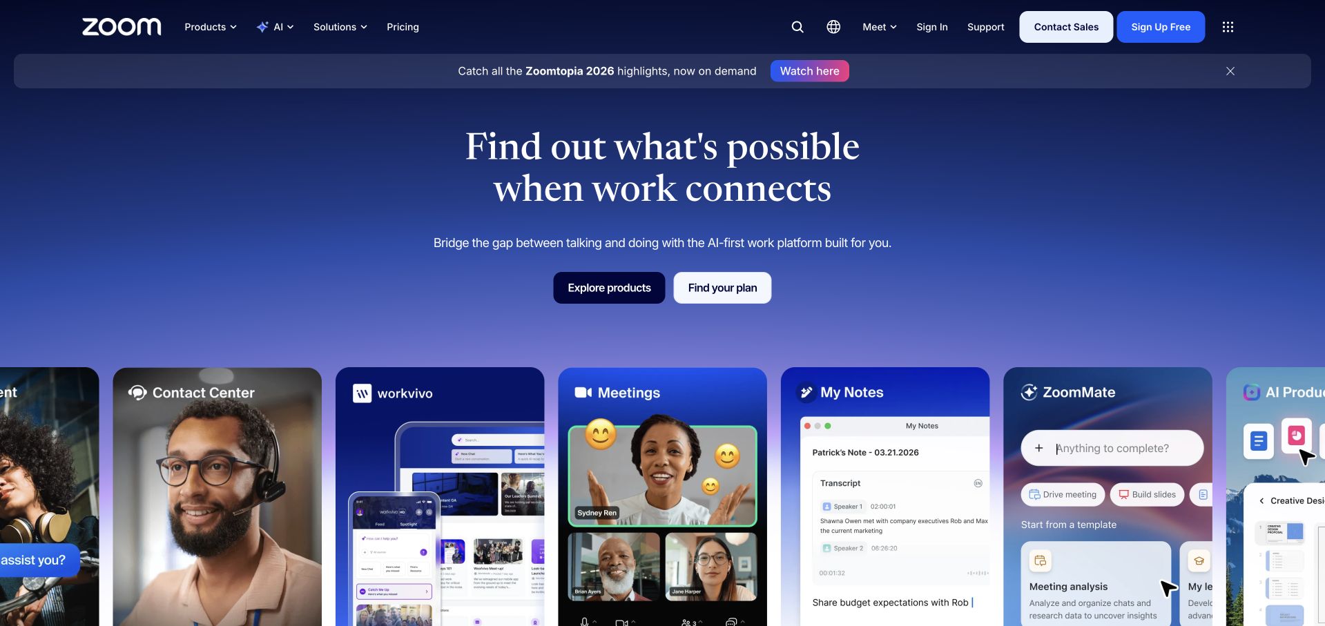
Zoom’s homepage uses a blue gradient, a centered headline and a row of individual product cards to introduce a platform broader than meetings. Contact Center, Meetings, My Notes and related tools receive their own visual surfaces rather than appearing only in a long feature list. The shared card treatment helps the portfolio feel connected, while screenshots and people provide clues about each product’s purpose. The challenge is prioritization: a new visitor can still struggle to tell which product to begin with when several cards are simultaneously visible. AWS’s documented DynamoDB example concerns Zoom Meetings and its early-2020 scaling context, not every tool pictured here.
What you can learn
When expanding a software brand, preserve a simple starting decision. Show the family resemblance across products, but let visitors choose by their immediate job before asking them to understand the complete platform architecture or licensing structure.
Pros
Distinct product cards make an expanding software suite easier to scan.
A common gradient and visual rhythm keep the page from feeling like separate microsites.
Cons & considerations
Multiple neighboring cards can dilute the most important conversion route.
Screenshot text should not be the only way to understand a product’s function.
Platform source: Official product-specific customer case. AWS’s Zoom customer quotation specifically describes DynamoDB global tables and on-demand mode supporting Zoom Meetings during the early-2020 usage surge. This source establishes only the stated organization, product or workload association. It does not prove the pictured public page uses this technology, identify its CMS or frontend, establish a complete current architecture, or independently verify vendor-reported outcomes. Platform evidence is separate from the direct website screenshot and is not a complete current infrastructure audit.
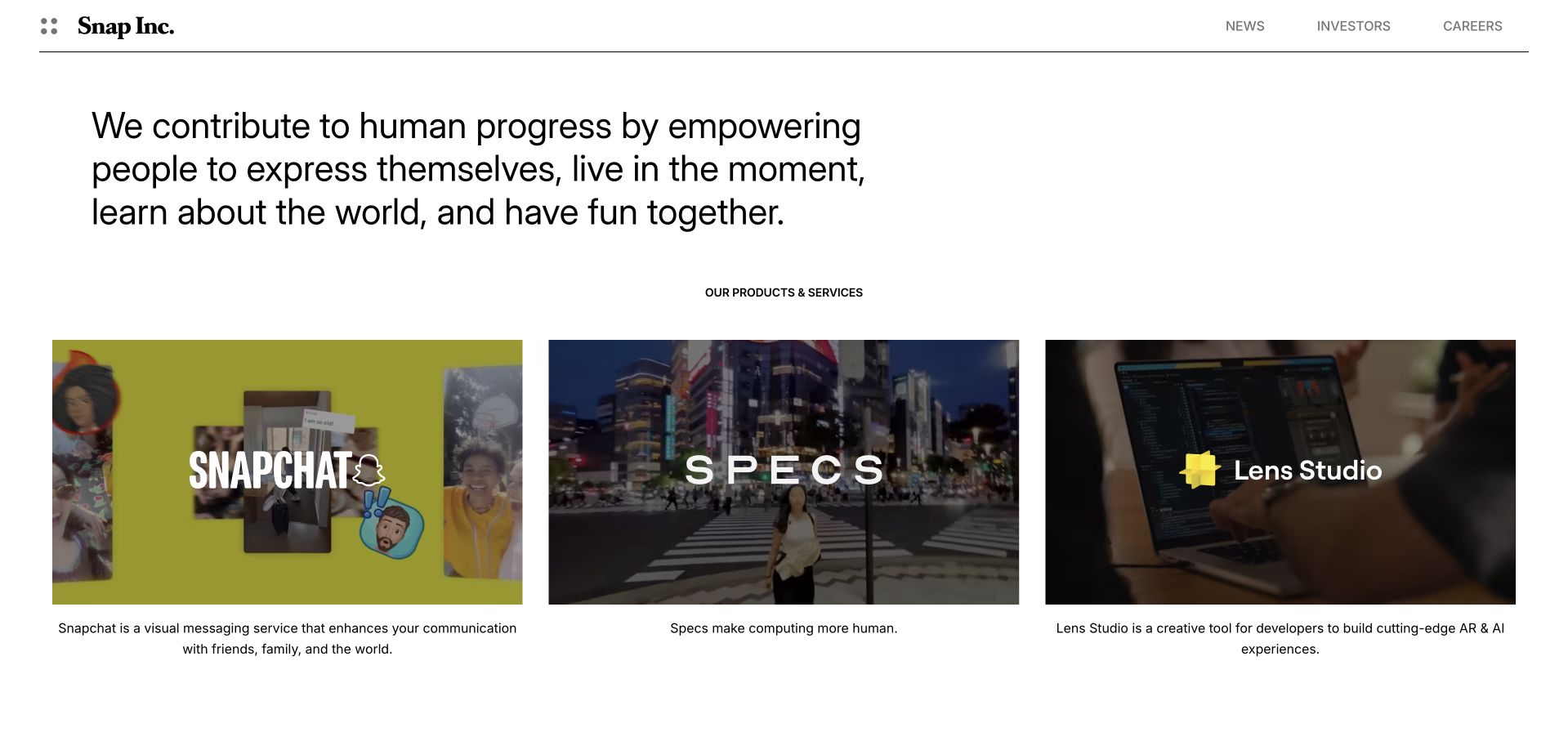
Snap’s corporate homepage begins with a large, plain-language purpose statement, then divides its products into three equal visual blocks: Snapchat, Specs and Lens Studio. The restrained header sends business visitors to news, investors or careers without requiring a large navigation panel. Each product image has a short explanatory sentence underneath, so the company is not relying on logos alone. This is an effective way to introduce a portfolio with different audiences and interaction models. The limitation is that equal visual weight can imply equal relevance to every visitor. Product-specific tasks are appropriately deferred to separate destinations rather than squeezed into the corporate introduction.
What you can learn
Treat the corporate page as a routing layer. Explain what unites the products, give each one a concrete description and send people onward. Equal-sized cards work best when the choices are genuinely distinct and limited in number.
Pros
Three parallel product blocks make the company’s scope immediately understandable.
Short supporting descriptions clarify unfamiliar products without making the page dense.
Cons & considerations
Equal-sized cards provide little help choosing a starting point for a specific task.
The broad mission statement needs the product section to supply practical meaning.
Platform source: Official product-specific customer case. AWS describes DynamoDB use in Snapchat multimedia-messaging infrastructure; the public Snap Inc. corporate page is a separate design reference. This source establishes only the stated organization, product or workload association. It does not prove the pictured public page uses this technology, identify its CMS or frontend, establish a complete current architecture, or independently verify vendor-reported outcomes. Platform evidence is separate from the direct website screenshot and is not a complete current infrastructure audit.
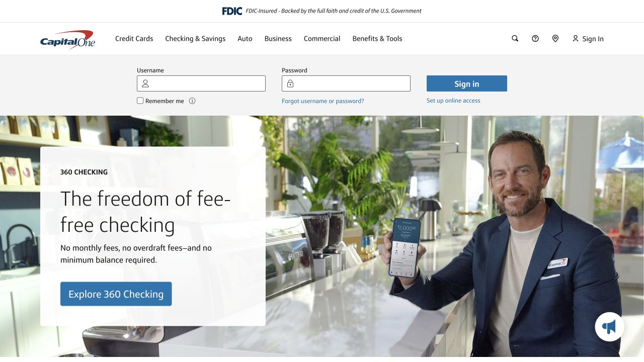
Capital One’s captured public homepage puts a compact sign-in strip above a large checking-account offer. The marketing panel combines a clear product name, a short fee-related explanation, a prominent blue action and a lifestyle photograph with a visible phone. Existing customers are not forced to navigate through the promotion to find their account entry, while prospective customers can recognize the offer without reading the full site. The two audiences share one viewport, which is useful but also demanding. Sign-in and product acquisition need visibly different purposes, particularly on narrow screens. No account was accessed, and the public image does not verify the financial service’s internal architecture.
What you can learn
Design account access and acquisition as separate tasks, even when they share a homepage. Keep labels explicit, avoid prefilled private information in public examples and ensure that marketing imagery never disguises the secure sign-in route.
Pros
The checking offer uses a short benefit statement rather than a dense feature catalog.
A dedicated sign-in area preserves a familiar route for returning customers.
Cons & considerations
The sign-in strip adds substantial height before the main introductory message.
Promotional claims need nearby conditions and accessible supporting details.
Platform source: Official product-specific customer case. AWS describes Capital One moving mobile-application transaction workloads from a mainframe context to a serverless DynamoDB architecture. This source establishes only the stated organization, product or workload association. It does not prove the pictured public page uses this technology, identify its CMS or frontend, establish a complete current architecture, or independently verify vendor-reported outcomes. Platform evidence is separate from the direct website screenshot and is not a complete current infrastructure audit.
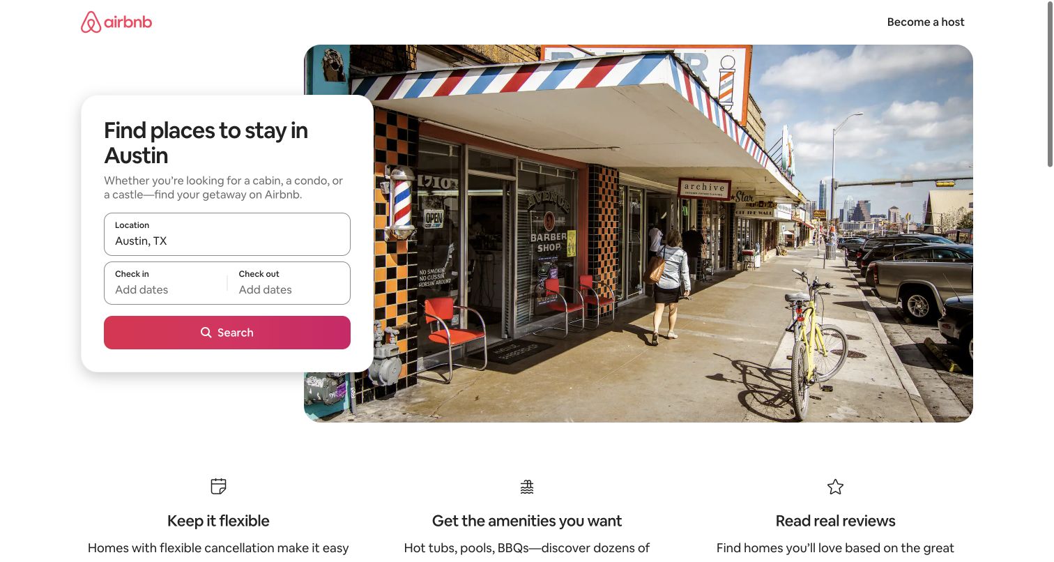
Airbnb’s Austin landing page starts with a search card layered over a neighborhood photograph. The destination is already identified, leaving dates as the main remaining input. Underneath, three small benefit blocks address flexibility, amenities and reviews. This page is more focused than a universal travel homepage: visitors who arrived with a city in mind can recognize that they are in the right place and continue without re-entering the same context. The photograph adds local character without turning the page into a travel magazine. A destination-specific layout does need careful maintenance so its imagery, inventory promises and supporting copy remain appropriate to the place named.
What you can learn
Carry useful context into the next step. If a visitor already chose a city, category or service, reflect that choice in the heading and form rather than presenting a completely blank search interface again.
Pros
The known location makes the search form feel immediately relevant.
Three compact reassurance blocks support the booking task without adding a long sales narrative.
Cons & considerations
A broad neighborhood image cannot communicate the details of individual accommodations.
Date and location controls must remain usable when the overlaid card becomes stacked on mobile.
Platform source: Official product-specific customer case. AWS identifies DynamoDB in Airbnb real-time processing workflows. It does not state that the Austin destination page pictured here uses DynamoDB. This source establishes only the stated organization, product or workload association. It does not prove the pictured public page uses this technology, identify its CMS or frontend, establish a complete current architecture, or independently verify vendor-reported outcomes. Platform evidence is separate from the direct website screenshot and is not a complete current infrastructure audit.
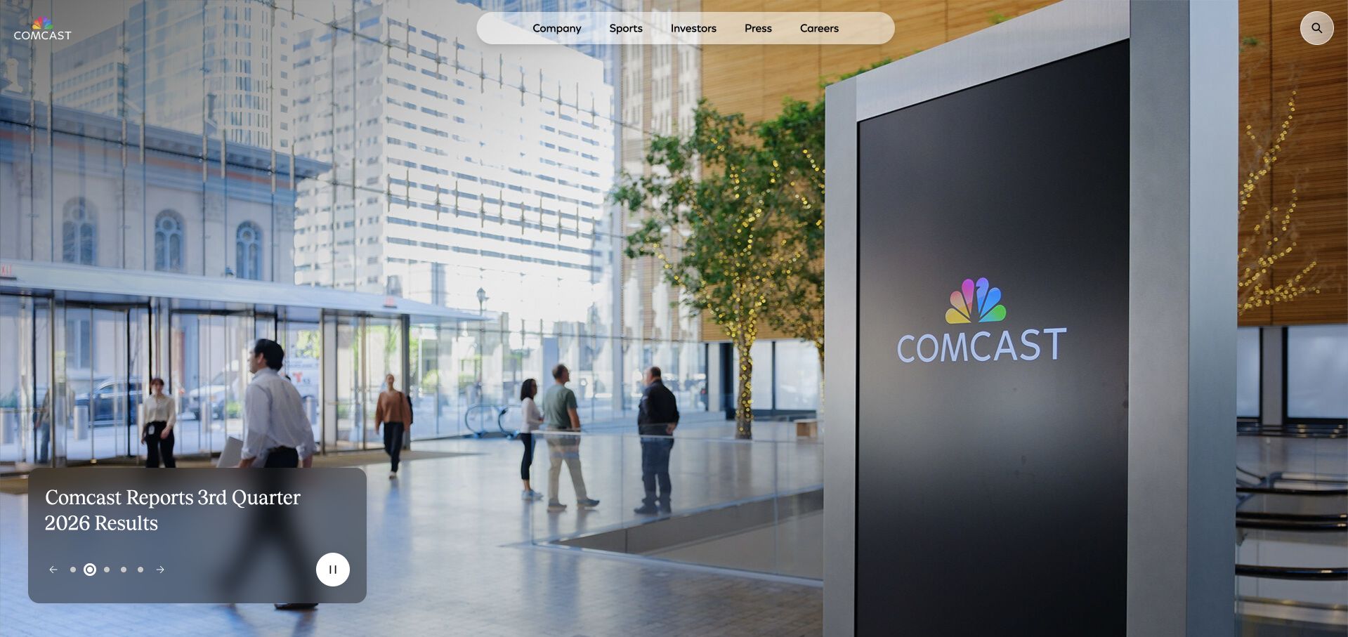
Comcast’s corporate homepage uses a full-bleed image of its workplace and signage, with a small overlay for the current business update. A rounded navigation capsule groups company, sports, investors, press and careers near the top. The architecture leaves the photograph as the main impression while keeping the news item concise and actionable. It is a useful alternative to a corporate homepage crowded with press-release cards. The balance is not effortless: the update panel, navigation and carousel controls all sit over imagery, so their contrast must survive every slide. The DynamoDB evidence is scoped to Comcast’s documented XFINITY X1 video context rather than this corporate page.
What you can learn
A major update does not need to fill the whole hero. Give the story a concise label and a clear destination, then let a recognizable environment or brand image establish context without adding competing calls to action.
Pros
The compact update panel leaves room for the corporate photograph to breathe.
A short audience-based header helps business visitors find their relevant section.
Cons & considerations
Overlay contrast must be checked against every image in the rotating sequence.
A small update title can be overlooked when the photograph dominates the viewport.
Platform source: Official product-specific customer case. AWS identifies DynamoDB use for Comcast’s XFINITY X1 video experience, not the public corporate homepage. This source establishes only the stated organization, product or workload association. It does not prove the pictured public page uses this technology, identify its CMS or frontend, establish a complete current architecture, or independently verify vendor-reported outcomes. Platform evidence is separate from the direct website screenshot and is not a complete current infrastructure audit.
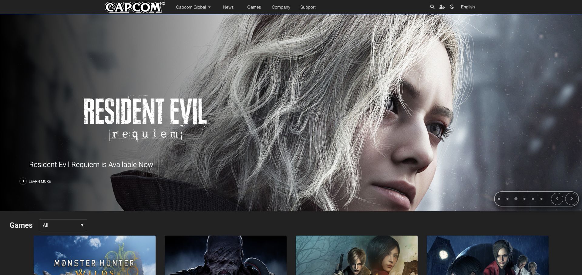
Capcom USA’s homepage lets a game release occupy most of the opening screen, using dramatic character artwork and a small launch message rather than a corporate introduction. A thin dark header retains News, Games, Company and Support, and the next row begins the wider games catalog. This division respects two intentions: fans can investigate the promoted release, while visitors looking for another title are not trapped inside the campaign. The artwork is effective for an audience that recognizes the franchise, but less explanatory for someone unfamiliar with it. The AWS customer reference concerns Capcom’s game-related DynamoDB use, not a verified database implementation for the USA marketing page.
What you can learn
Use a campaign hero as a featured shelf, not the entire information architecture. Keep the catalog and support paths visible, and give unfamiliar visitors a short descriptive clue in addition to the title’s visual identity.
Pros
The release artwork creates a strong visual identity without a long introduction.
The visible catalog row signals that other games remain easy to explore.
Cons & considerations
A franchise logo can leave newcomers uncertain about genre or available platforms.
Rotating release panels need pause controls and readable text over varying artwork.
Visible tech stack
Earlier / documented evidence
Amazon DynamoDB
Platform source: Official product-specific customer case. AWS documents Capcom game workloads using DynamoDB for request scaling. The Capcom USA marketing page is not the application implementation identified by that evidence. This source establishes only the stated organization, product or workload association. It does not prove the pictured public page uses this technology, identify its CMS or frontend, establish a complete current architecture, or independently verify vendor-reported outcomes. Platform evidence is separate from the direct website screenshot and is not a complete current infrastructure audit.
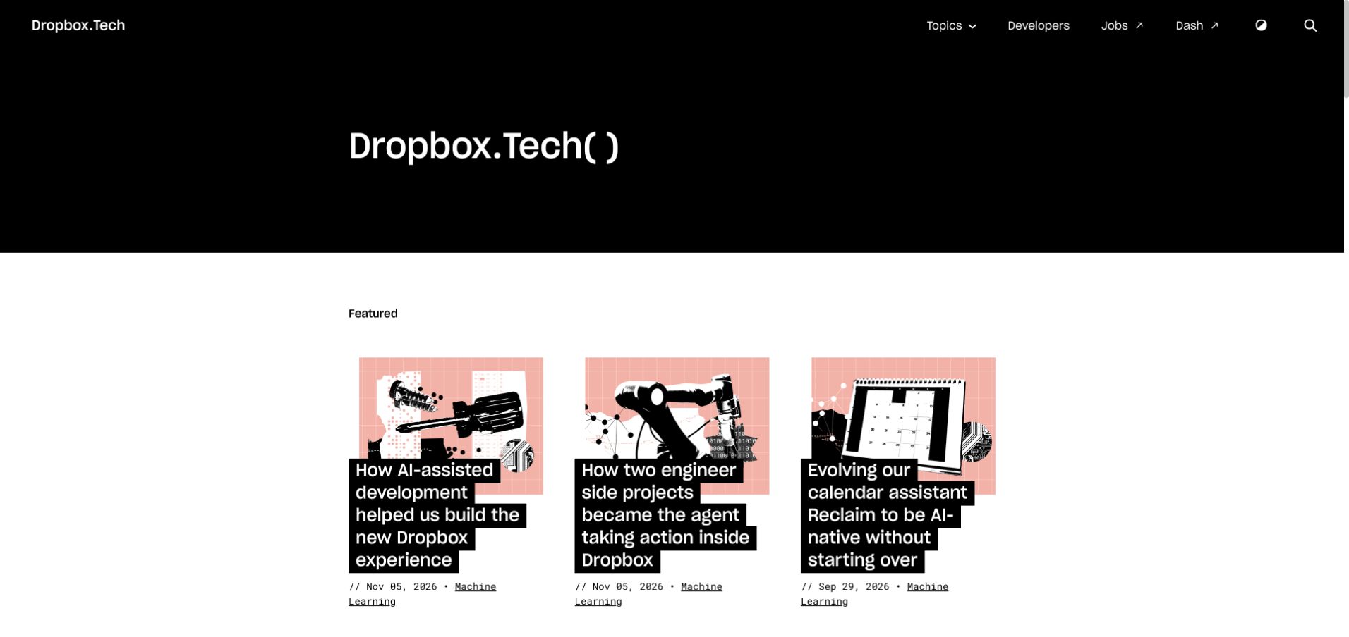
Dropbox.Tech uses a black masthead with an animated publication title, then switches to a bright editorial grid. Featured article illustrations share a pink, black and white collage style, while headlines sit in bold black text blocks across the images. Dates and topic links appear beneath each card, making the publication feel maintained and browsable. The approach gives engineering work a recognizable home without repeating a file-storage sales pitch. The oversized masthead is more atmospheric than informative, however, and the layered headlines need careful treatment on small screens. This is Dropbox’s public engineering publication, selected to avoid an account-personalized consumer homepage; AWS’s DynamoDB evidence concerns a separate storage-system workload.
What you can learn
An engineering blog can share a company’s credibility without copying its sales layout. Establish consistent article metadata, distinctive imagery and a reliable topic structure, then let the technical writing provide the detailed evidence.
Pros
A coordinated illustration system gives unrelated engineering topics a coherent editorial identity.
Visible dates and topic links help readers evaluate freshness and browse related work.
Cons & considerations
The large masthead postpones the first substantive article on short screens.
Headlines layered over illustrations require generous line spacing and resilient responsive layouts.
Platform source: Official product-specific customer case. AWS documents DynamoDB and S3 in Dropbox’s Alki storage-system context. The pictured Dropbox.Tech publication is a public design reference, not the storage application. This source establishes only the stated organization, product or workload association. It does not prove the pictured public page uses this technology, identify its CMS or frontend, establish a complete current architecture, or independently verify vendor-reported outcomes. Platform evidence is separate from the direct website screenshot and is not a complete current infrastructure audit.
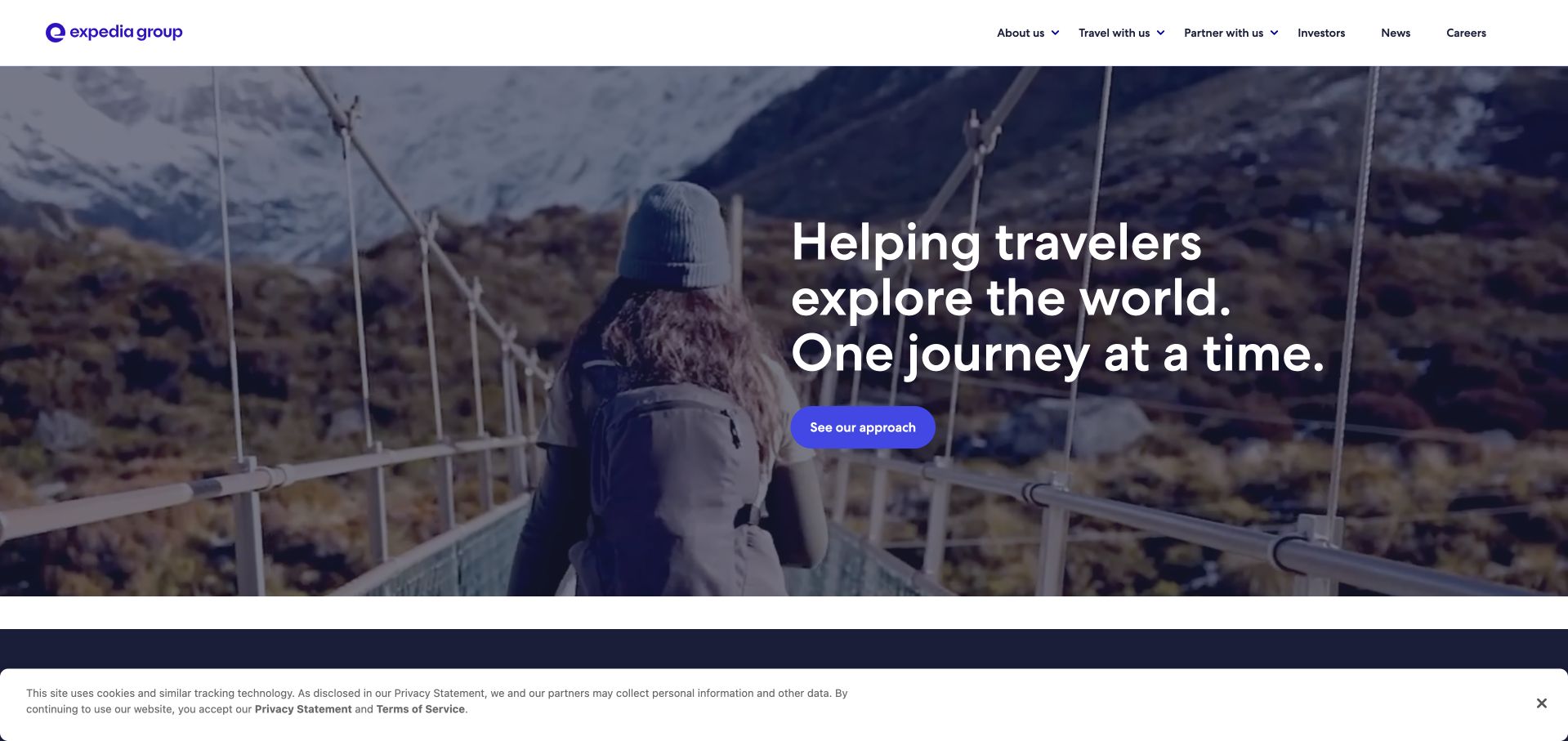
Expedia Group’s corporate homepage places a concise travel statement over footage of a person crossing a mountain bridge. The white header is deliberately ordinary, with About Us, Travel With Us, Partners, Investors, News and Careers. That distinction matters: the page introduces the organization behind several travel brands instead of pretending to be the booking interface itself. Further down, brand logos and leadership information explain the marketplace’s scope. The opening is emotionally clear but commercially broad, so the next section must quickly answer what the group actually does. Its documented DynamoDB association concerns reference-data processing; the image is not evidence that this corporate homepage uses the same database.
What you can learn
Match the homepage to the organization’s role. A parent company can explain its ecosystem and audiences, while individual consumer brands handle booking. Keep those destinations explicit so a beautiful travel image does not become a navigational detour.
Pros
A simple white header remains legible against moving landscape imagery.
The audience routes distinguish travelers, partners, investors and job applicants.
Cons & considerations
An abstract travel promise needs concrete marketplace context shortly afterward.
Background video should have a lightweight fallback and respect reduced-motion preferences.
Platform source: Official product-specific customer case. AWS describes an Expedia Group DynamoDB streaming-application context involving reference datasets, not the corporate homepage’s content system. This source establishes only the stated organization, product or workload association. It does not prove the pictured public page uses this technology, identify its CMS or frontend, establish a complete current architecture, or independently verify vendor-reported outcomes. Platform evidence is separate from the direct website screenshot and is not a complete current infrastructure audit.
GE Aerospace’s homepage uses the interior of an aircraft-engine facility as its opening visual. A short white statement sits low on the image, alongside a clearly labeled Watch control, while the upper navigation separates commercial, defense, systems, news and company information. The photograph gives physical context to an otherwise broad innovation message. It also leaves room for the site to explain capabilities in later sections rather than listing every product at once. The challenge is readability: pale industrial surfaces and white type can meet in the same frame. The AWS customer material documents a particular data-querying workload, not the exact infrastructure delivering the public corporate site.
What you can learn
For complex industrial products, show the environment in which expertise becomes tangible. Pair that image with a small number of capability paths and reserve detailed technical specifications for pages where the visitor has chosen a relevant product or application.
Pros
Real industrial imagery gives the company’s positioning a concrete physical setting.
Separate commercial and defense paths acknowledge genuinely different buyer requirements.
Cons & considerations
White text over changing factory imagery needs carefully controlled contrast.
A video-led introduction should not be required to understand the basic company proposition.
Platform source: Official product-specific customer case. AWS identifies a GE Aerospace plotting and data-query application rearchitected with DynamoDB. This source establishes only the stated organization, product or workload association. It does not prove the pictured public page uses this technology, identify its CMS or frontend, establish a complete current architecture, or independently verify vendor-reported outcomes. Platform evidence is separate from the direct website screenshot and is not a complete current infrastructure audit.
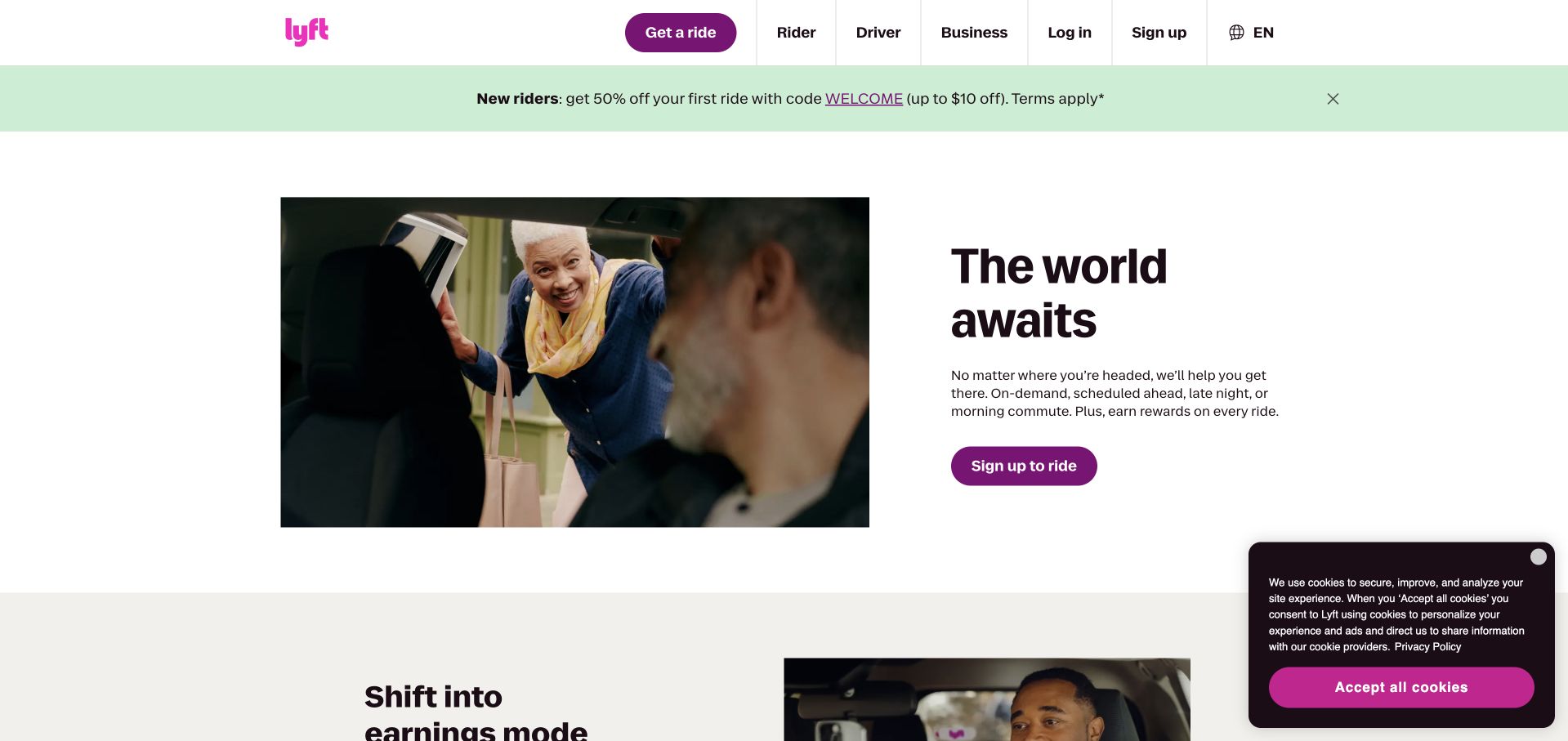
Lyft’s public homepage opens with a rider-focused message, a candid pickup photograph and a prominent purple signup action. The next visible section changes the emphasis to earning, making the driver audience a deliberate second journey instead of a footnote. The header also preserves Rider, Driver and Business as distinct choices. This is an instructive arrangement for any marketplace with more than one customer type: the opening commits to a primary visitor while keeping the other routes easy to find. Promotional pricing and new-rider terms add complexity, so they should remain clearly connected to the offer. The AWS case concerns ride-tracking data rather than a verified marketing-page database.
What you can learn
Choose a primary audience for the opening screen, but make secondary participation routes explicit. A marketplace becomes confusing when buyers and suppliers are asked to interpret the same generic call to action or benefit statement.
Pros
A single rider action gives the first screen a clear practical purpose.
The next section and header maintain a distinct route for potential drivers.
Cons & considerations
New-customer promotions can distract from the underlying service explanation.
People photography needs useful contextual text for visitors who cannot see it.
Platform source: Official product-specific customer case. AWS’s Lyft case describes DynamoDB in the ride-tracking backend, including GPS-related trip information. This source establishes only the stated organization, product or workload association. It does not prove the pictured public page uses this technology, identify its CMS or frontend, establish a complete current architecture, or independently verify vendor-reported outcomes. Platform evidence is separate from the direct website screenshot and is not a complete current infrastructure audit.
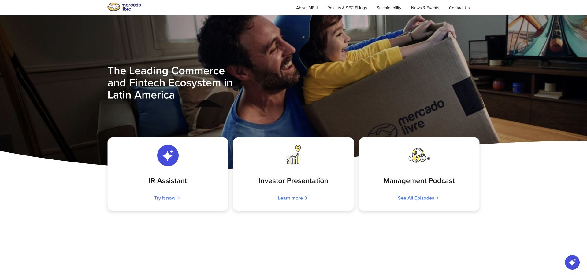
Mercado Libre’s investor homepage introduces its commerce and fintech ecosystem with a human photograph, then places three white utility cards across the bottom of the hero. An investor assistant, presentation and management podcast each receive a recognizable destination. The design makes recurring research tasks visible without turning the opening into a spreadsheet of financial metrics. Its yellow and blue brand details are restrained enough to leave the content hierarchy intact. The limitation is that a tool card and a formal disclosure are not interchangeable; investors still need direct, dependable access to filings and dated results. The DynamoDB case supports a backend customer association, not the pictured investor property’s runtime.
What you can learn
Build investor navigation around repeat visits. Present the current narrative, but keep presentations, filings, results and contacts in stable locations. Any assistant should supplement source documents rather than becoming the only way to retrieve material information.
Pros
Three concise utility cards expose common investor tasks immediately.
The business proposition connects commerce and finance before introducing detailed reports.
Cons & considerations
An assistant route needs clear boundaries and links back to authoritative documents.
Large hero photography can delay financial data for visitors seeking a specific result.
Platform source: Official product-specific customer case. AWS’s Mercado Libre case documents a DynamoDB operational-data workload in its commerce platform context. This source establishes only the stated organization, product or workload association. It does not prove the pictured public page uses this technology, identify its CMS or frontend, establish a complete current architecture, or independently verify vendor-reported outcomes. Platform evidence is separate from the direct website screenshot and is not a complete current infrastructure audit.
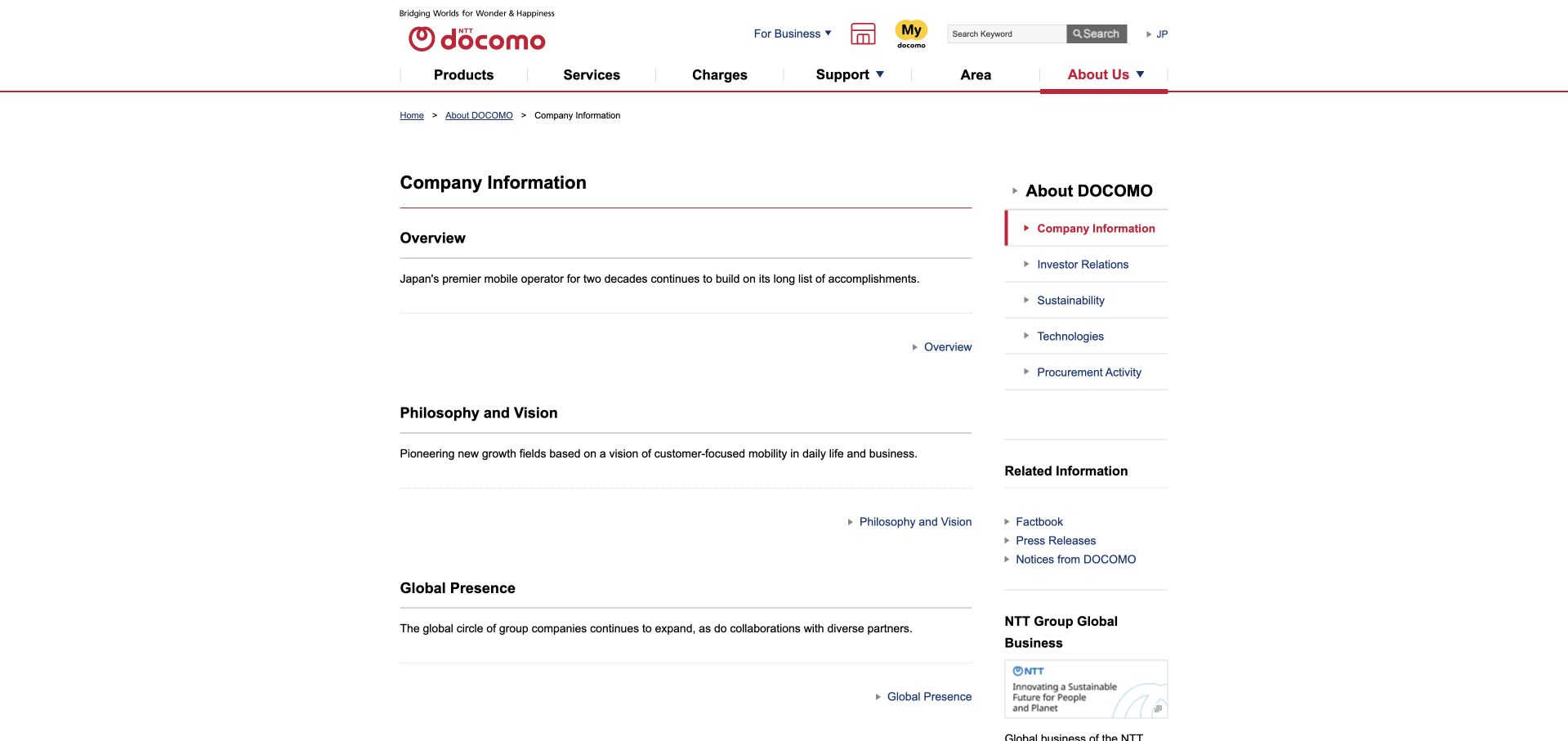
NTT DOCOMO’s English company-information page uses a restrained two-column layout: descriptive sections fill the main column, and an About DOCOMO menu anchors the right side. Red rules and active-state markers connect the page to the brand without turning the content into a campaign. Overview, philosophy and global presence are framed as separate destinations with brief explanations, which is helpful for visitors arriving from an external search. The page is intentionally conventional, but the generous gaps between sections can make a small amount of information feel longer than it is. AWS’s specific DynamoDB source concerns the Lemino streaming service, not this public company-information page.
What you can learn
Reference content needs orientation more than novelty. Use a descriptive page title, visible section relationships and short destination summaries, then make sure spacing supports scanning rather than stretching a compact set of links into an unnecessarily long page.
Pros
A persistent company-information sidebar makes the surrounding hierarchy easy to understand.
Short explanations distinguish overview, philosophy and global-presence destinations.
Cons & considerations
Large vertical gaps can make a concise reference page feel sparse.
Conventional link lists need visible focus states and sufficient mobile tap targets.
Platform source: Official product-specific customer case. AWS’s NTT DOCOMO case identifies DynamoDB in backend application components for the Lemino video-streaming service, not the pictured company-information page. This source establishes only the stated organization, product or workload association. It does not prove the pictured public page uses this technology, identify its CMS or frontend, establish a complete current architecture, or independently verify vendor-reported outcomes. Platform evidence is separate from the direct website screenshot and is not a complete current infrastructure audit.
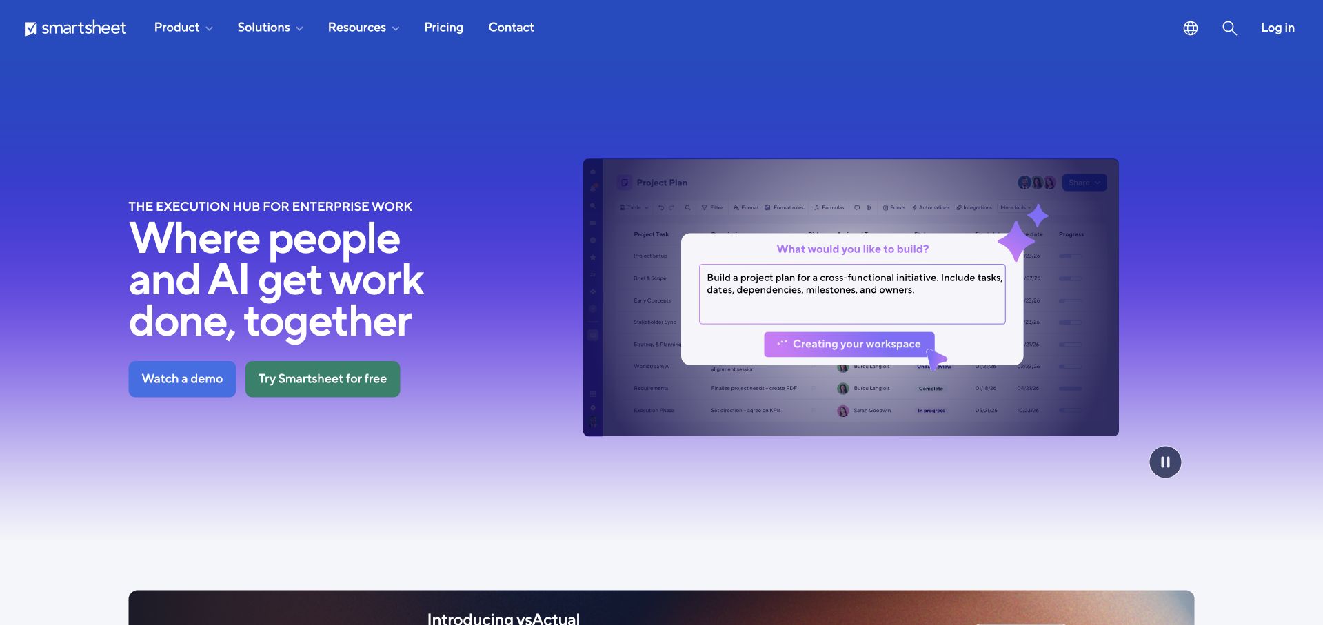
Smartsheet’s homepage pairs a large white headline on a blue-to-lilac gradient with an animated view of its working interface. The screenshot supplies the concrete context that the broad collaboration message would otherwise lack. Two prominent actions distinguish watching a demonstration from trying the product, while the header keeps product, solutions, resources and pricing accessible. The composition gives visitors both an emotional promise and a practical clue about what they would use. The risk is that small interface details become decoration when reduced, especially if a visitor cannot pause or inspect them. AWS documents DynamoDB production-table usage separately from this public homepage’s visible implementation.
What you can learn
Show a meaningful product state rather than a collage of interface fragments. Choose one workflow, identify the action occurring on screen and provide an accessible text explanation. A demonstration should answer a question, not simply prove that the software has a dashboard.
Pros
A real-looking work surface grounds an otherwise broad collaboration statement.
Demo and trial actions acknowledge different levels of buying readiness.
Cons & considerations
Small interface labels lose meaning when the product image is compressed.
Animation needs a visible pause control and a useful reduced-motion alternative.
Platform source: Official product-specific customer case. AWS identifies DynamoDB tables across Smartsheet production services without identifying the public marketing homepage’s database. This source establishes only the stated organization, product or workload association. It does not prove the pictured public page uses this technology, identify its CMS or frontend, establish a complete current architecture, or independently verify vendor-reported outcomes. Platform evidence is separate from the direct website screenshot and is not a complete current infrastructure audit.
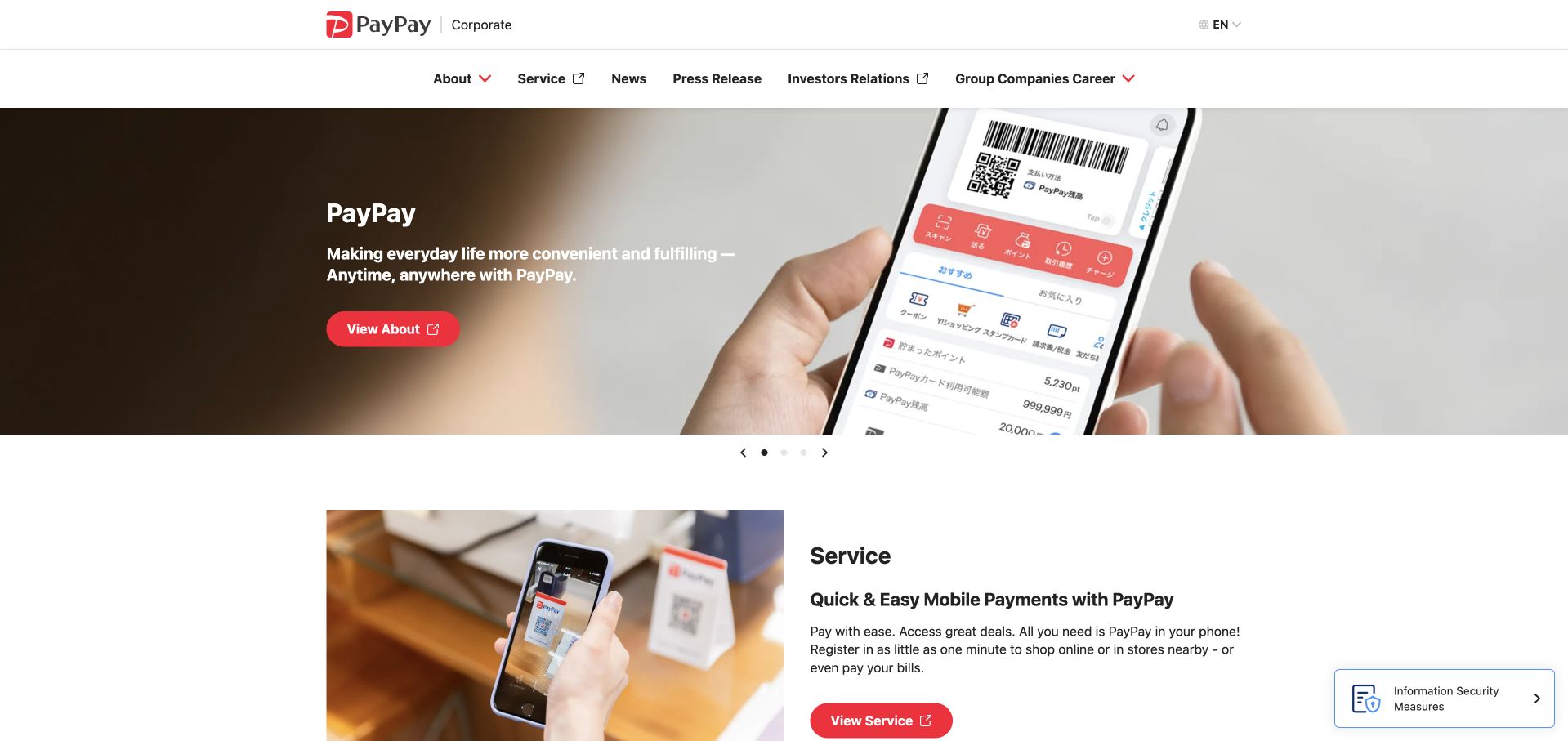
PayPay’s English corporate homepage uses a white navigation frame and a rotating hero to move between service, investor-relations and careers messages. The captured consumer-service frame pairs a phone payment interface with a concise explanation and a prominent red action. This product-focused opening makes the payment experience more tangible before visitors explore the wider company narrative. The architecture is useful for a brand with several audiences, but a carousel cannot be the only route to important information. Visitors may arrive during a frame meant for someone else, and the permanent navigation must compensate. The documented DynamoDB example concerns an in-app messaging feature, not this corporate page’s database.
What you can learn
Use rotating content as an optional spotlight. Every investor, careers or service destination should also have a stable labeled route outside the carousel, so timing does not determine whether a visitor can find the information they need.
Pros
The white header separates navigation from the changing hero artwork.
Distinct red actions make the active stakeholder message easy to identify.
Cons & considerations
A rotating hero can present the wrong audience message on arrival.
Important content should never be discoverable only through carousel pagination controls.
Platform source: Official product-specific customer case. AWS identifies DynamoDB supporting in-app messaging features at PayPay, including a message-box feature. This source establishes only the stated organization, product or workload association. It does not prove the pictured public page uses this technology, identify its CMS or frontend, establish a complete current architecture, or independently verify vendor-reported outcomes. Platform evidence is separate from the direct website screenshot and is not a complete current infrastructure audit.
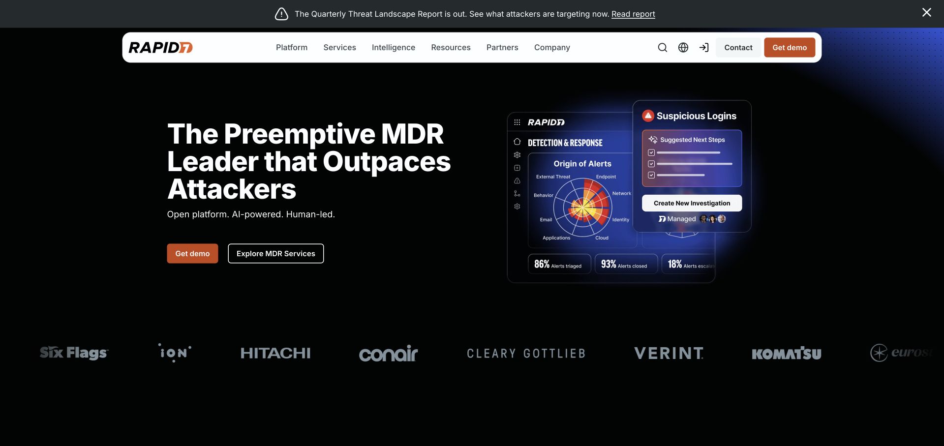
Rapid7’s homepage combines a large managed-detection headline with a dark product illustration showing alerts, suggested actions and a detection-and-response view. The interface is not merely a generic laptop mockup: it gives shape to the security work being sold. Orange actions stand out against the black background, and a customer-logo row supplies a quieter second level of context below. The opening still uses specialist terminology, so a smaller organization would need to explain those terms rather than assuming every buyer knows them. AWS’s DynamoDB customer reference concerns security-data workloads; it does not establish the backend of the pictured public marketing page.
What you can learn
When a service is invisible, illustrate the decisions it helps a person make. Show a recognizable input, an action and an outcome, then explain the limits of the illustration rather than presenting interface imagery as independent proof of effectiveness.
Pros
The operational illustration makes an abstract security service easier to picture.
Orange actions remain easy to distinguish from secondary navigation and supporting logos.
Cons & considerations
Acronyms and category claims can create a barrier for less technical buyers.
Dark interface illustrations need enough contrast to remain readable at reduced sizes.
Platform source: Official product-specific customer case. AWS lists Rapid7 as a DynamoDB customer in a security-data processing context; no particular public marketing-page implementation is established. This source establishes only the stated organization, product or workload association. It does not prove the pictured public page uses this technology, identify its CMS or frontend, establish a complete current architecture, or independently verify vendor-reported outcomes. Platform evidence is separate from the direct website screenshot and is not a complete current infrastructure audit.
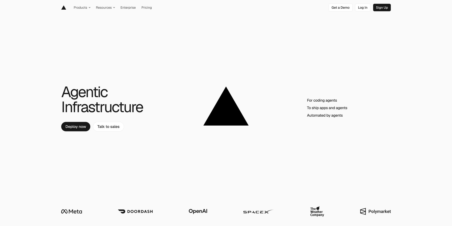
Vercel’s homepage is unusually sparse for a developer platform. A short infrastructure headline, a large black triangular mark and two primary actions sit inside a broad white composition. Smaller supporting text identifies its intended context, while customer logos occupy a separate band near the bottom. The layout communicates confidence through omission, but that strategy depends on visitors having some idea of the product already. New teams still need accessible explanations of deployment, application support and commercial constraints beyond the opening frame. Vercel’s own engineering article documents DynamoDB’s role in build-state storage; that source is more specific than inferring database use from this page’s appearance.
What you can learn
Minimalism is useful when the remaining elements answer real questions. Keep the primary action obvious, provide a secondary route for evaluation and make sure the detailed architecture and pricing explanations remain reachable without relying on brand familiarity.
Pros
A very limited action set makes the opening screen easy to scan.
Generous white space gives the headline and visual mark clear separation.
Cons & considerations
An abstract infrastructure label may not explain the product to new developers.
A brand-led composition needs substantive documentation and pricing routes close at hand.
Platform source: Official product-specific customer case. Vercel’s own engineering article describes migrating the build-state database behind its build system to DynamoDB, not a complete architecture for the public homepage. This source establishes only the stated organization, product or workload association. It does not prove the pictured public page uses this technology, identify its CMS or frontend, establish a complete current architecture, or independently verify vendor-reported outcomes. Platform evidence is separate from the direct website screenshot and is not a complete current infrastructure audit.
Kegan has 15+ years of experience working with small businesses, Fortune 500 companies, and everything in between. No development job is too big or too small: he brings the same hands-on attention to a focused improvement, a complete website, or a custom application.
For Amazon DynamoDB projects, he can help with data modeling, application data access, query design, search and cache integrations, migration planning, access boundaries, and maintainable handover. He works directly with clients on scope, design, implementation, testing, and handover, with an emphasis on clear communication and a system that remains practical to maintain after launch.
Show 3 other Amazon DynamoDB developersHide other Amazon DynamoDB developers
Three ways to structure a DynamoDB-backed website project
A public site beside an independent application
Keep marketing, documentation and press content in a content system suited to editors. Let the authenticated application own the operational DynamoDB workflow. Share brand elements and clear transition labels, but do not force editorial publishing into the same data model simply because the company already uses DynamoDB elsewhere.
A focused transactional feature
Start with one bounded feature such as saved items, preferences or a status lookup. Document its input, output and failure states, then measure the real traffic pattern. A small, well-observed feature provides better evidence for expanding the architecture than choosing a database because a famous company appears in a customer list.
A larger event-driven application
For multiple services, establish ownership of each event and define how consumers handle retries, duplicates and delayed delivery. The website should communicate the state of the user’s task, not expose internal event terminology. Build operational dashboards and recovery procedures alongside the visible interface rather than treating them as later enhancements.
From references to requirements
Plan access, recovery and delivery before the visual polish
Create an access-pattern inventory
List each screen and the specific information it reads or changes. Record expected item sizes, busiest periods, tenant boundaries and the indexes needed for sorting or filtering. Include administrator and support tasks, which are often missed in customer-only prototypes. Review the inventory when a design change introduces a new query rather than assuming the database can absorb it without consequence.
Test an expired session, a slow response, an interrupted submission, an empty result and a repeated click. Use realistic text lengths and enough records to exercise pagination. Define the language used when an operation is pending or needs attention. These states should be reviewed with the same care as the successful desktop mockup.
Assign operational ownership
Name the person responsible for capacity alarms, backups, access changes and recovery tests. Set a cost-review process and a retention policy for data that no longer serves a legitimate purpose. A serverless service removes some infrastructure work, but it does not remove the need to understand usage, permissions or a failed customer workflow.
A useful handover demonstration
Ask the actual team to carry out its routine job: publish a realistic update, correct a mistake, preview a narrow screen, and identify who owns an integration failure. For a library or frontend framework, also ask who maintains the content source and deployment. A polished screenshot does not answer those operational questions.
Beyond the screenshot
A DynamoDB website planning checklist
List every customer and support access pattern.
Identify the authoritative owner of each record.
Define tenant and user authorization boundaries.
Document sorting, filtering and pagination requirements.
Estimate realistic record sizes and peak request patterns.
Choose clear empty, loading and error messages.
Prevent duplicate submissions and unsafe retries.
Keep database credentials out of browser code.
Plan backup, restore and retention procedures.
Set operational alarms and cost-review responsibilities.
Test keyboard, mobile and slow-connection journeys.
Document the handoff between public content and private application screens.
Test with real content, a keyboard, a small screen, slow or failed requests, and the people who will maintain the system. These are planning checks, not an accessibility, security, performance, or search-ranking certification.
Sources & editorial method
How this Amazon DynamoDB collection was reviewed
Public pages were independently inspected and captured through a normal browser. Official AWS customer material and first-party engineering sources establish only their stated DynamoDB associations. Screenshots are not backend audits, and vendor-reported outcomes were not independently tested. Historical source contexts remain dated.
Every image is an unmodified capture from the actual website, with its source and capture date. Some captures are reused from our shared catalog; their dates remain the original capture dates. None comes from a vendor gallery or a generated reconstruction. Moving imagery and live content can change.
Technology attribution uses public page assets or metadata, official platform documentation, or a cited first-party project case study. Documentary and framework-relationship evidence is identified where used; it is not a complete current backend inventory. A CMS image CDN alone does not establish a full CMS deployment. A library’s presence does not prove which individual controls use it, and a platform label does not establish AI authorship.
The composition notes, lessons, pros and tradeoffs are original editorial observations. We have not measured conversion, traffic, security, performance or accessibility conformance. Website owners retain their brands and imagery; these examples are not our client portfolio. Written, Edited and Curated are independent records, not dates advanced by a build. See our editorial standards or suggest a correction.
Questions worth asking
Amazon DynamoDB website development FAQs
Does a DynamoDB customer story prove the homepage uses DynamoDB?
No. It establishes only the product, organization or workload described by that source. A public marketing page can use a different content system and delivery platform.
Should a small marketing website use DynamoDB?
Not automatically. If the main requirement is editing pages, a conventional content system may be simpler. DynamoDB becomes relevant when a specific application feature benefits from its operational data model.
Can the same design work with a relational database?
Often, yes. Visual hierarchy and accessible interaction patterns are largely independent of database choice. Query requirements, consistency and operational constraints still need an architecture review.
Why include press and investor pages?
They provide public, non-personalized design references from the documented organizations. Their database association is separately qualified rather than inferred from the screenshot.
What should the first prototype test?
One complete task, including its unsuccessful states: missing data, delayed responses, denied access and interrupted updates. That reveals more than a set of disconnected successful screens.