A carousel earns its place when it helps people inspect a useful sequence. These examples reveal the content, navigation, and operational details that need to remain understandable whether a slide moves or stays still.
Slick Carousel provides options for slide counts, arrows, dots, responsive breakpoints, autoplay, and other behavior. Those capabilities are choices to configure and test. Finding a Slick stylesheet or script on a public page does not prove that a particular visible feature initializes the library or that its interaction is accessible.
This collection looks at the surrounding design: credited field reporting, book discovery, product campaigns, audience choices, location finding, and exhibition captions. Each review ties a genuine screenshot to dated source evidence, then turns the visible pattern into a practical implementation question. Library association and observed visual behavior remain separate.
Before the examples
What makes good Slick Carousel website development in 2026?
Start with a readable collection
Write useful titles, destinations, captions, and ordering rules before introducing movement. A slide should make sense when visited first, last, or directly. Keep essential tasks such as location finding, emergency directions, and account access outside a changing sequence.
Slick documents separate controls for autoplay, arrows, dots, pause behavior, and responsive settings. Choose behavior based on the content and test it in the actual page. A library option or marketing statement is not a substitute for keyboard, focus, reduced-motion, and screen-reader checks.
Provide permanent destinations for announcements, products, projects, and stories. A featured slot can change without changing the identity of its content. If the collection becomes static at a breakpoint, preserve the same useful reading order and links.
The opening references are the US Department of Justice, Doctors Without Borders, Penguin Random House, Drunk Elephant, and Sprouts Farmers Market. Each is a separate public property with a documented Slick resource or code association. Reviews do not assign untested visible controls to the library.
We start with five recognizable brands or organizations: US Department of Justice, Doctors Without Borders USA, Penguin Random House, Drunk Elephant, Sprouts Farmers Market. Each attribution applies to the named website property, not every product or website belonging to its organization. This is a curated reading sequence, not a measured ranking.
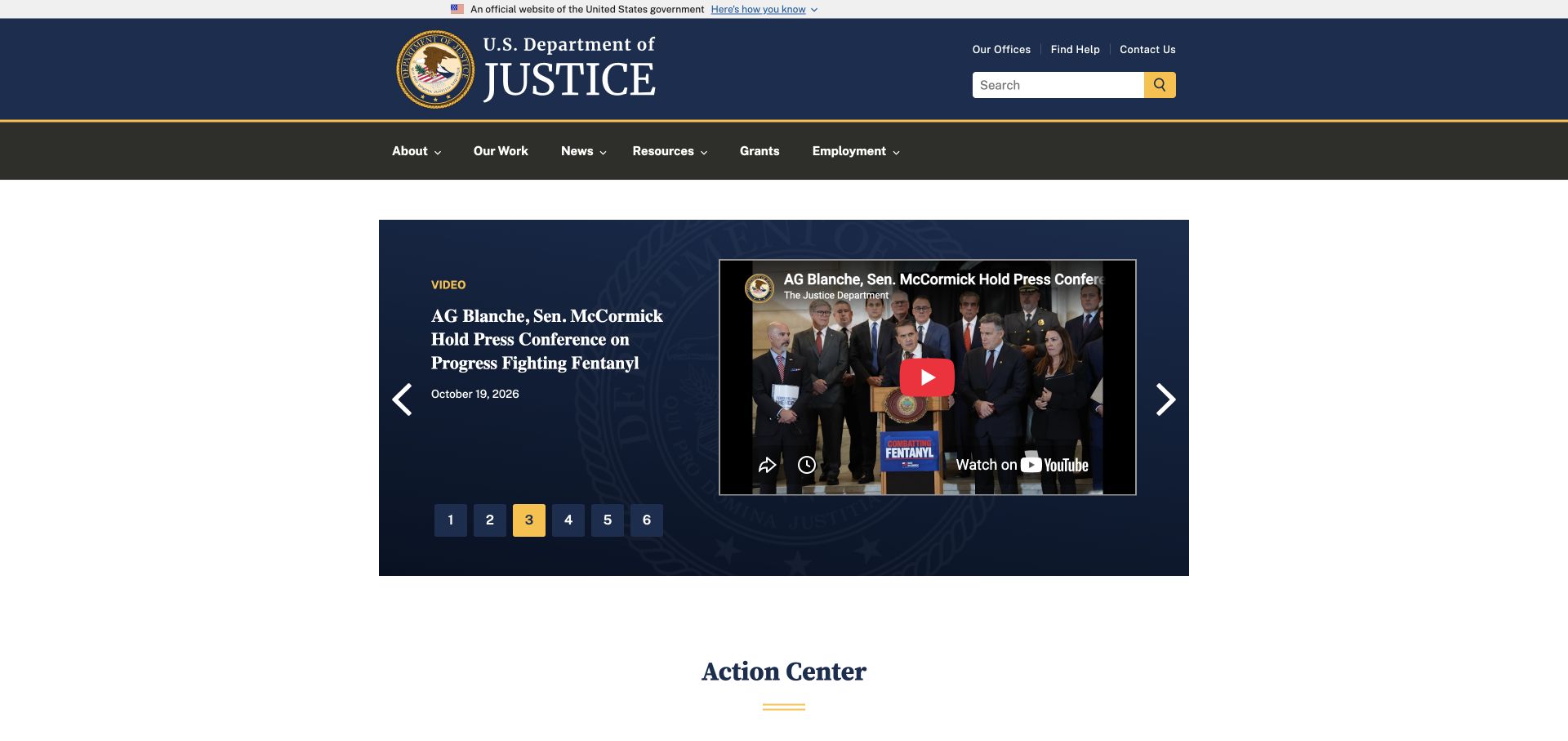
The Department of Justice places a central media feature inside a broad institutional header, with numbered choices and player controls contained in a dark panel. The action center begins beneath that feature rather than disappearing behind a full-screen presentation. This is a useful reference for planning a Slick collection around public announcements: the sequence needs a clear boundary and permanent alternatives. A Slick stylesheet was observed on the exact source page, but the evidence does not assign every visible player or numbered control to that library.
What you can learn
Keep an ordinary title and destination for every announcement outside any dependency on autoplay. For a similar implementation, provide meaningful slide labels, check keyboard movement, and verify that a failed embedded player leaves useful context. Preserve the announcement's permanent URL when it leaves the featured sequence so people can cite it without depending on its temporary homepage position.
Pros
The media panel leaves institutional navigation visible and recognizable.
Position controls communicate that more than one item is available.
Cons & considerations
Numbers alone provide little help when finding a known announcement.
An embedded player adds failure states beyond the carousel's own behavior.
Platform source: Dated exact public source-page audit. Linked stylesheet matches Slick Carousel. Dated public resource or code association on this exact source page; not proof that any particular visible component initializes or behaves as assumed. Platform evidence is separate from the direct website screenshot and is not a complete current infrastructure audit.
Doctors Without Borders leads with a specific field report over a large photograph, retaining location, year, and photographer credit. Mission explanation and sourced activity figures follow the immediate story. For a Slick-based editorial sequence, this is a useful reminder that captions are part of the content, not decoration attached after the image. The detected Slick resource establishes a page-level association only; the capture does not prove which feature rotates, whether autoplay is enabled, or how controls behave for keyboard users.
What you can learn
Store story title, location, reporting period, credit, and full-report destination together. If several reports become slides, keep those fields available at every breakpoint and let visitors pause to read. Review image choices as editorial decisions, then test a long credit and a short title without allowing the controls to cover important context or compete with permanent mission information.
Pros
Specific credits and location details make the opening report accountable.
Organizational figures connect to a named reporting source below.
Cons & considerations
Urgent imagery requires careful editorial selection and contextual treatment.
A changing feature may delay visitors with a narrow practical task.
Platform source: Dated exact public source-page audit. Linked script matches Slick Carousel. Dated public resource or code association on this exact source page; not proof that any particular visible component initializes or behaves as assumed. Platform evidence is separate from the direct website screenshot and is not a complete current infrastructure audit.
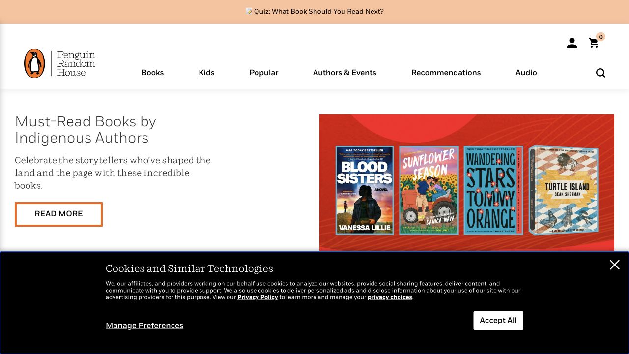
Penguin Random House combines book covers and a reading theme within a light navigation system that distinguishes books, children, authors, and recommendations. A reader quiz and subsequent shelves offer different ways into the catalog. For Slick planning, the page is useful because cover collections must support both exploratory browsing and known-title discovery. A public Slick reference does not prove that every shelf uses the library, nor does a visible row tell us its keyboard behavior, lazy-loading strategy, or mobile configuration.
What you can learn
Give each book a complete record and let themed shelves reference it. On a similar carousel, expose the title and author as text, keep focus order predictable, and provide a route to the whole category. Test a one-item shelf and a longer collection; do not make dragging the only way to discover a book or reach its permanent detail page.
Pros
Editorial themes give book covers a useful browsing context.
Children's content has a recognizable route in the main header.
Cons & considerations
Several recommendation mechanisms can feel redundant without distinct labels.
Inconsistent book metadata becomes more visible across repeated promotional shelves.
Platform source: Dated exact public source-page audit. Linked script matches Slick Carousel. Dated public resource or code association on this exact source page; not proof that any particular visible component initializes or behaves as assumed. Platform evidence is separate from the direct website screenshot and is not a complete current infrastructure audit.
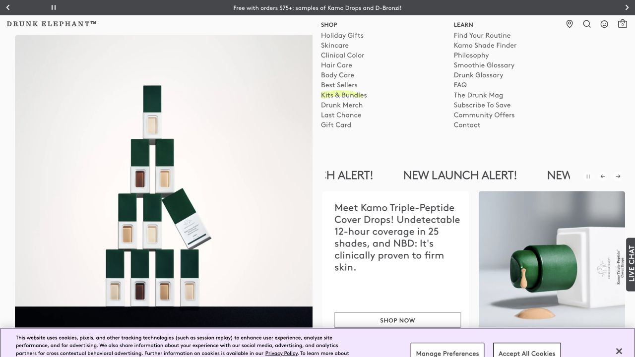
Drunk Elephant uses bright product colors and a clear Shop/Learn split, with routine guidance and explanatory material supporting the retail structure. The opening pairs a product announcement with a model and a short action. For Slick development, the useful pattern is a campaign sequence surrounded by durable learning routes. The page's dated Slick asset evidence does not identify the implementation of a particular promotion or establish that a visitor can pause, swipe, or navigate it with a keyboard.
What you can learn
Keep product names, plain-language purpose, and campaign destinations in the slide record. A rotating launch should not become the only route to an item or its usage information. Test unfamiliar product names and longer explanatory text on a narrow screen, and make the next/previous controls distinct from the action that actually opens the product page.
Pros
The shopping and learning split supports different levels of familiarity.
Color creates strong continuity between products and promotional presentation.
Cons & considerations
Playful names can obscure functional differences between products.
Launch-focused imagery can overwhelm quieter usage and service information.
Platform source: Dated exact public source-page audit. Linked script matches Slick Carousel. Dated public resource or code association on this exact source page; not proof that any particular visible component initializes or behaves as assumed. Platform evidence is separate from the direct website screenshot and is not a complete current infrastructure audit.
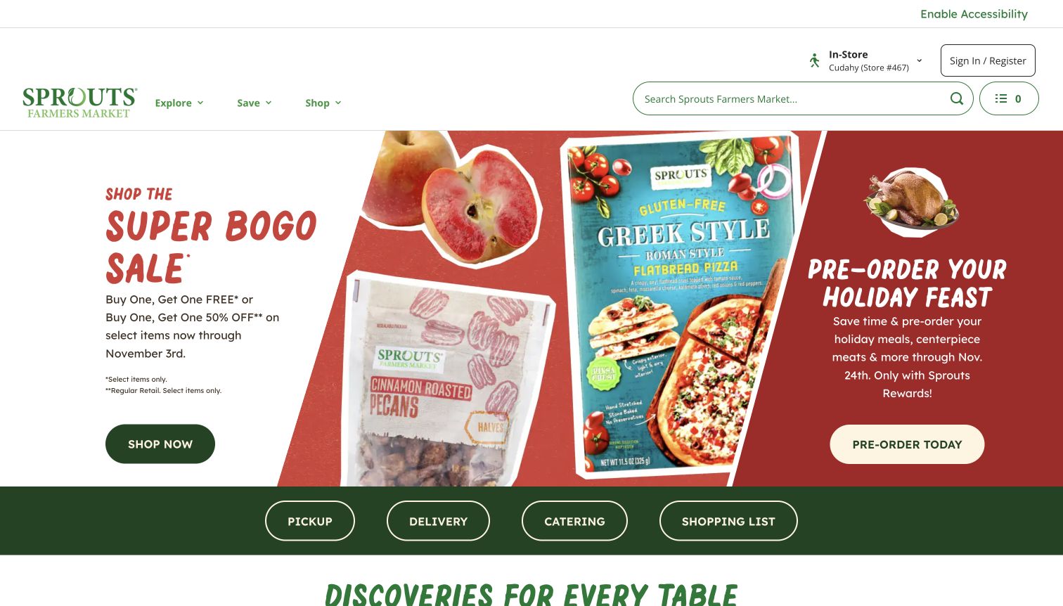
Sprouts puts a sale, packaging imagery, and a holiday preorder into adjacent opening panels, then distinguishes pickup, delivery, catering, and shopping-list tasks below. Campaign dates and membership qualifications remain visible, though subordinate to the large offer. This is useful Slick inspiration for promotions that have different operational rules. The exact source contains a Slick reference; that observation does not establish which panel moves, how a mobile sequence is configured, or whether all offer conditions remain readable during transitions.
What you can learn
Treat each promotion as a complete message with dates, qualification, shopping mode, and destination. If the mobile design turns adjacent panels into slides, preserve those conditions and provide deliberate controls. Test the campaign without automatic movement first. A grocery customer should not need to wait for a slide cycle to discover whether an offer applies to pickup or a holiday preorder.
Pros
Shopping-mode labels distinguish four materially different next steps.
Visible dates add useful context to temporary promotions.
Cons & considerations
Adjacent campaigns divide attention before a visitor chooses a task.
Small qualification text risks disappearing beneath the dominant offer wording.
Platform source: Dated exact public source-page audit. Linked script matches Slick Carousel. Dated public resource or code association on this exact source page; not proof that any particular visible component initializes or behaves as assumed. Platform evidence is separate from the direct website screenshot and is not a complete current infrastructure audit.
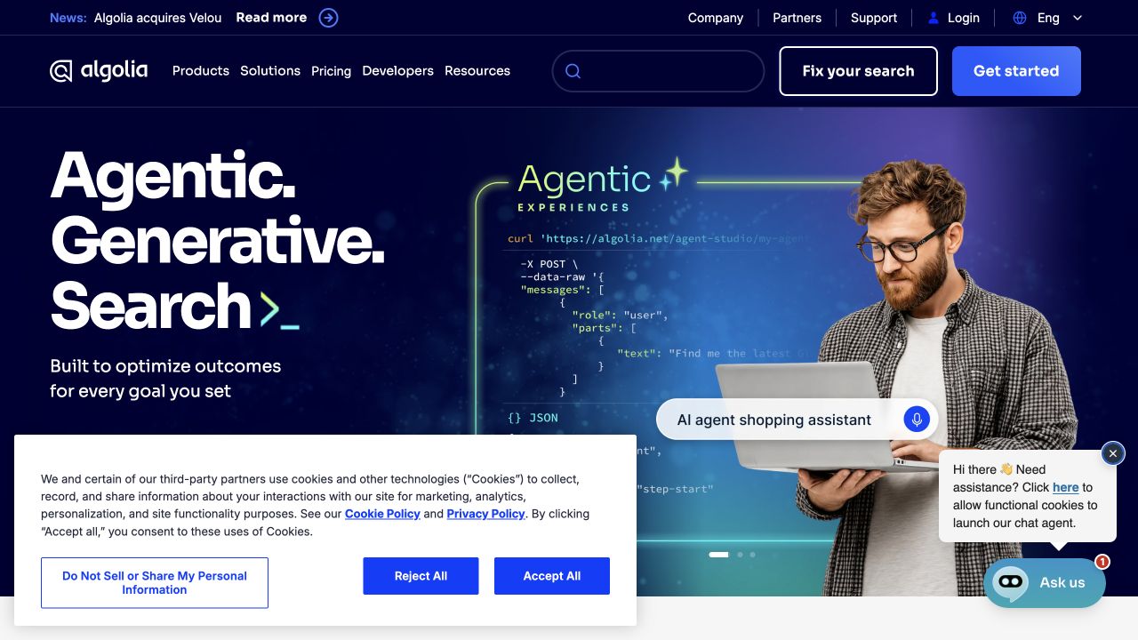
Algolia's blue opening combines a human figure, large white language, code-like graphics, two header rows, and several evaluation actions. Consent and chat surfaces overlap the lower hero in the capture. The page makes a useful stress case for any Slick integration: a carousel's controls must coexist with the rest of the interface. A dated Slick resource association does not prove that the main visual uses it, or that any overlapping surface has been tested together with a moving collection.
What you can learn
Before adding movement, draw the occupied areas for navigation, consent, chat, hero actions, and slide controls. Give each surface a clear priority at narrow widths and short viewport heights. Test first and last slides with longer text, and ensure dismissing a temporary overlay does not unexpectedly move focus or leave the carousel's controls in an inaccessible position.
Pros
Utility destinations have a separate level from product navigation.
The human figure makes an abstract technical proposition more tangible.
Cons & considerations
Multiple overlays obscure the same part of the hero.
Several evaluation actions make one primary next step less obvious.
Platform source: Dated exact public source-page audit. Linked script matches Slick Carousel. Dated public resource or code association on this exact source page; not proof that any particular visible component initializes or behaves as assumed. Platform evidence is separate from the direct website screenshot and is not a complete current infrastructure audit.
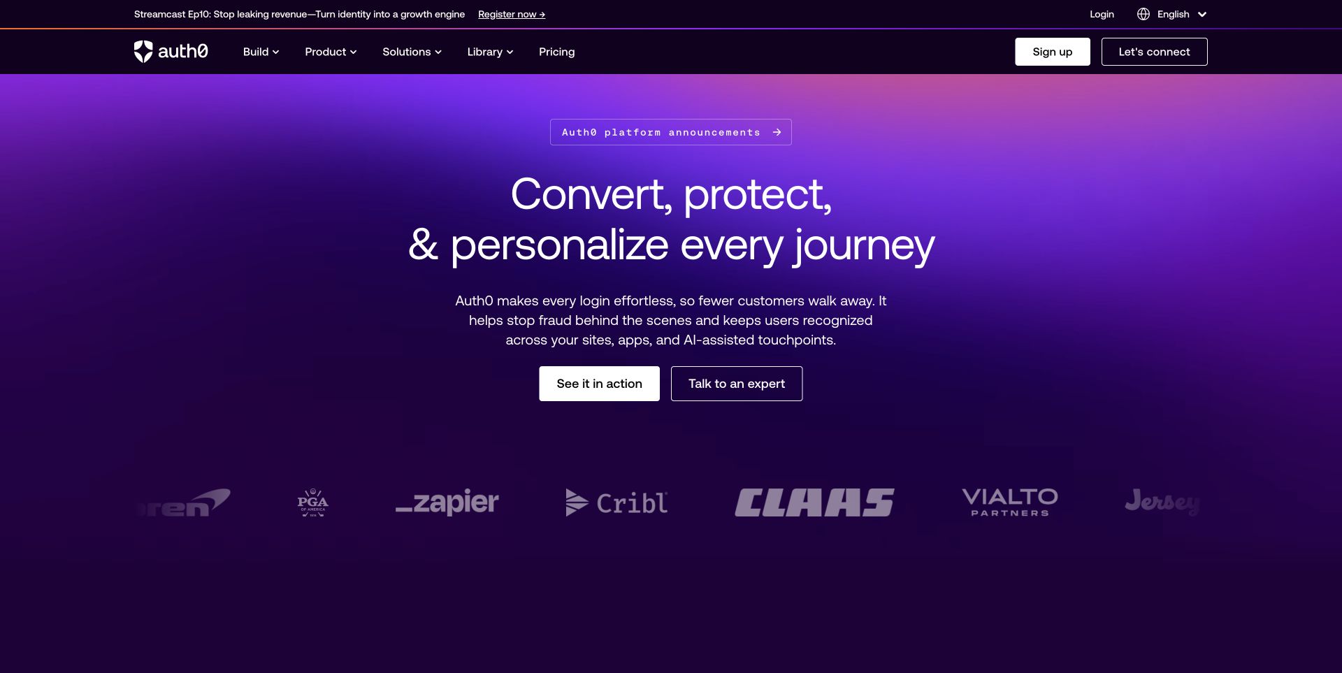
Auth0's marketing entrance uses a saturated purple field and a broad identity-platform proposition, while product, solutions, and learning remain in a conventional header. Technical researchers and commercial evaluators therefore share the opening without sharing exactly the same task. For Slick planning, this demonstrates why permanent evaluation routes should sit outside rotating campaign content. The public source association does not identify a particular carousel instance or verify the behavior of authentication products, documentation, or customer applications linked from the marketing site.
What you can learn
If customer stories or use cases form a sliding collection, label each with the specific problem it addresses. Keep documentation, plans, and support independently reachable. Test whether a developer can bypass the entire sequence and reach implementation material, while a buyer can understand the difference between a product claim and a case-specific outcome before following the associated link.
Pros
Strong color gives the broad platform a recognizable visual identity.
Product and learning routes remain useful to different evaluation roles.
Cons & considerations
Platform language can conceal a narrow implementation starting point.
Security-related claims require precise scope beyond the campaign atmosphere.
Platform source: Dated exact public source-page audit. Linked stylesheet matches Slick Carousel. Dated public resource or code association on this exact source page; not proof that any particular visible component initializes or behaves as assumed. Platform evidence is separate from the direct website screenshot and is not a complete current infrastructure audit.
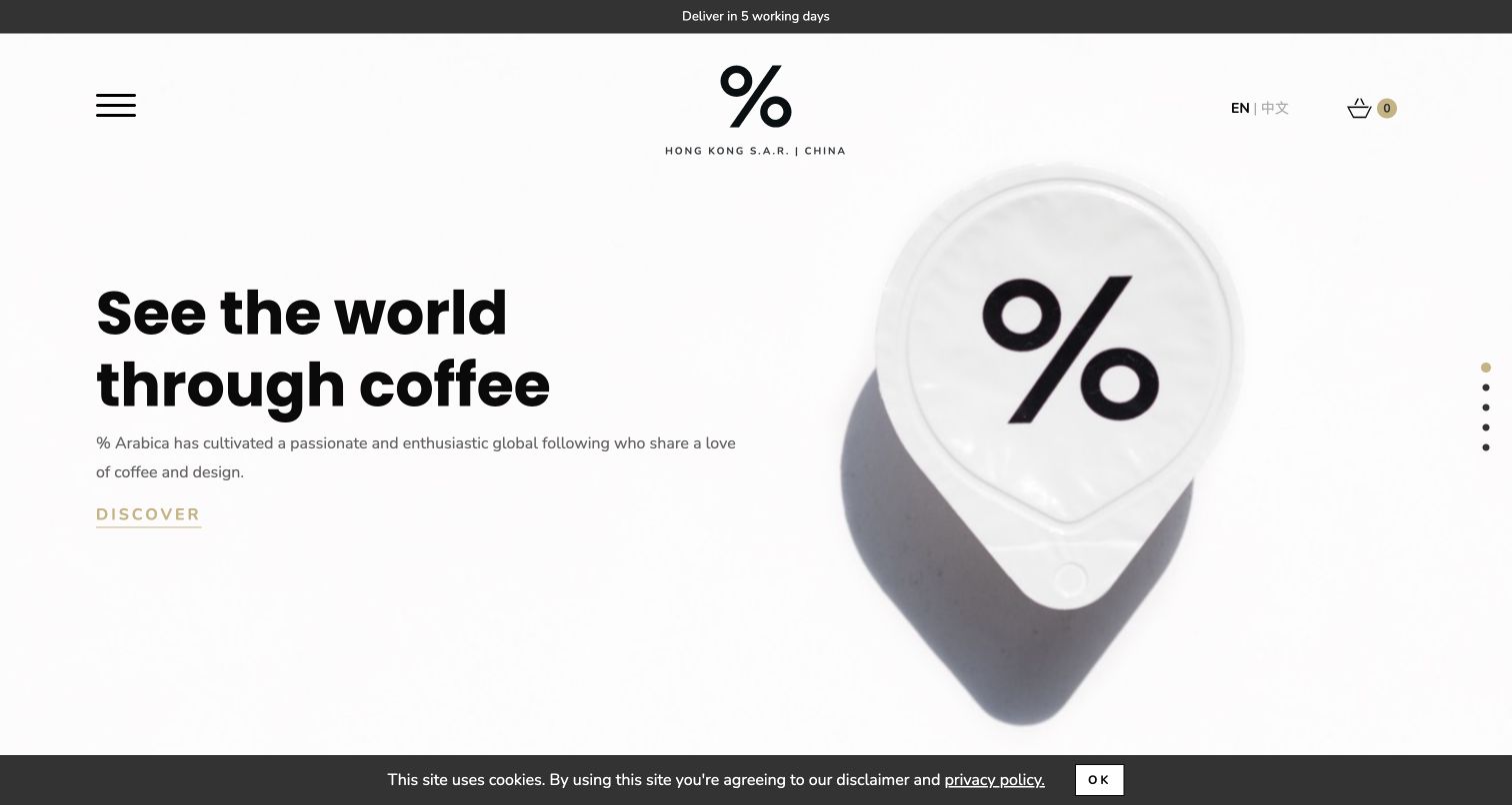
The Hong Kong % Arabica property puts a large coffee cup and percent identity on a white field, using a quiet Discover action and compact regional utilities. Language, cart, and delivery information establish the market context without a crowded header. For a Slick collection, the useful lesson is restraint: a small number of clear objects can support exploration without becoming a continuous promotional stream. The observed library reference applies to this regional page, not every Arabica site or an identified hero implementation.
What you can learn
Keep regional product availability and delivery messages independent from decorative slide changes. If a product series is introduced, use consistent image framing and make the current item understandable without motion. Verify descriptive labels for icon controls and test the quiet action against the pale background. A market switch should not leave a promotional slide pointing to unavailable merchandise or another region's shipping information.
Pros
The regional and language controls establish the property's commercial scope.
One product photograph gives the minimal identity a concrete focus.
Cons & considerations
Icon-led navigation reveals less than explicit destination labels.
Low-emphasis actions require careful contrast and focus-state review.
Platform source: Dated exact public source-page audit. Linked stylesheet matches Slick Carousel. Dated public resource or code association on this exact source page; not proof that any particular visible component initializes or behaves as assumed. Platform evidence is separate from the direct website screenshot and is not a complete current infrastructure audit.
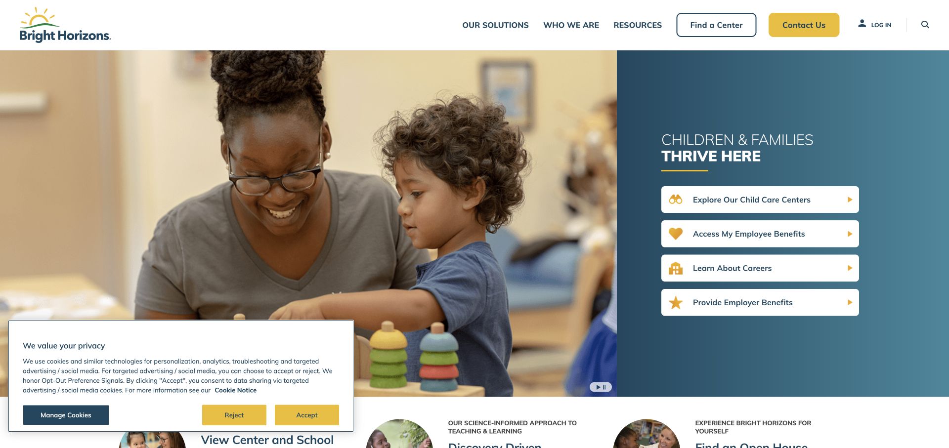
Bright Horizons divides a classroom image from a blue panel of audience actions for families, employees, employers, and prospective staff. Center finding and contact have separate positions in the header. This is relevant to Slick development because an audience selector should not depend on waiting through a sequence of unrelated offers. The page's Slick association is a public asset observation; it does not identify which visual component initializes the library or demonstrate that the audience panel is a carousel.
What you can learn
Keep primary audience choices visible as ordinary links. Reserve any sliding collection for supporting stories within an already selected audience. In a prototype, ask a family to find a center and an employer to explore benefits without reading the same promotional sequence. If testimonials move, include their audience and context in each item so a cropped quote cannot imply a universal service outcome.
Pros
Distinct audience actions make the organization's multiple roles visible.
The center finder remains available above the broader corporate story.
Cons & considerations
Equally prominent choices can slow a visitor with one urgent task.
A broad classroom image offers little detail about a local center.
Platform source: Dated exact public source-page audit. Linked stylesheet matches Slick Carousel. Dated public resource or code association on this exact source page; not proof that any particular visible component initializes or behaves as assumed. Platform evidence is separate from the direct website screenshot and is not a complete current infrastructure audit.
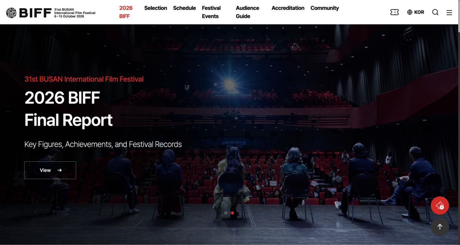
Busan International Film Festival uses a final-report feature with theater photography while retaining Selection, Schedule, Festival Events, and Audience Guide in its white header. Red accents connect edition information and controls to the otherwise restrained palette. For Slick planning, this is a useful post-event state: a collection can change its editorial purpose without erasing the archive. The detected resource supports the library association, but it does not establish transition timing, control accessibility, or which individual feature owns the implementation.
What you can learn
Give each featured item an edition, status, and durable destination. When live ticketing gives way to reports, update both visible labels and linked pages rather than only replacing a photograph. Test a mixed sequence containing a report and an archived screening: visitors should immediately understand which year and stage each belongs to, even when arriving directly at a later slide.
Pros
The final report gives the completed festival a meaningful next story.
Audience guidance remains separate from film and professional discovery.
Cons & considerations
Prominent archived schedules need explicit edition context.
Icon controls require clear names and deliberate mobile presentation.
Platform source: Dated exact public source-page audit. Linked stylesheet matches Slick Carousel. Dated public resource or code association on this exact source page; not proof that any particular visible component initializes or behaves as assumed. Platform evidence is separate from the direct website screenshot and is not a complete current infrastructure audit.
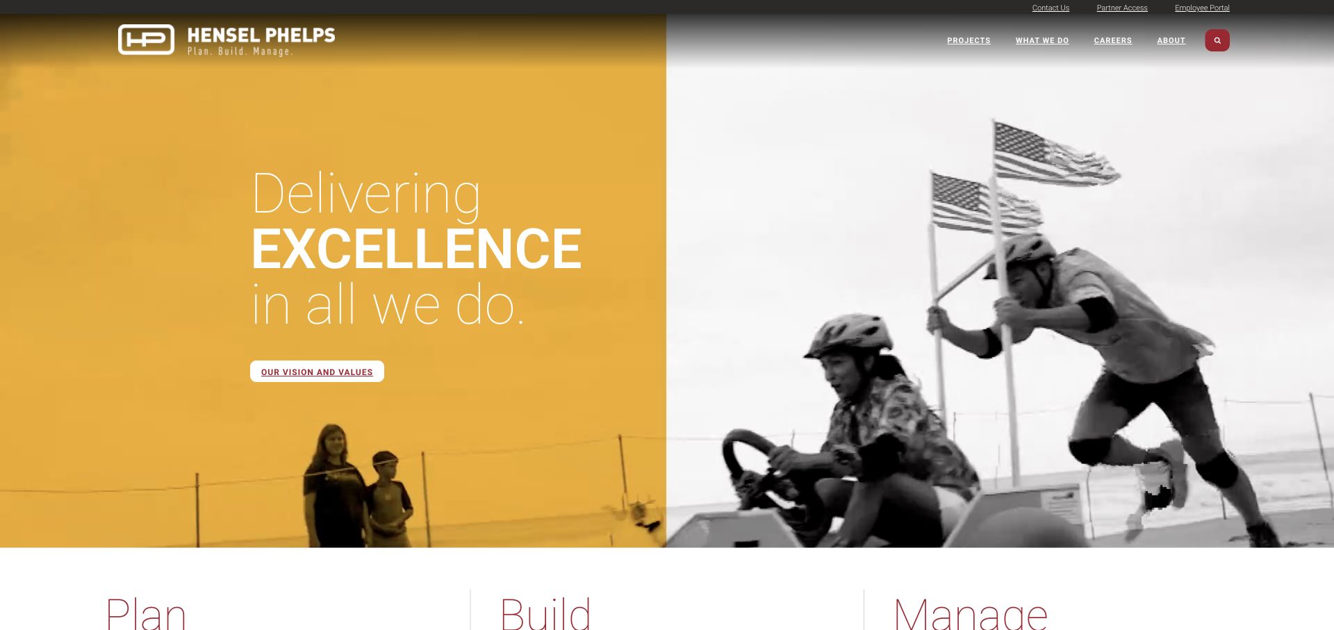
Hensel Phelps combines gold and monochrome work imagery with a concise delivery proposition, then introduces Plan, Build, and Manage. Contact, partner access, and an employee portal occupy utility positions. The page is useful Slick inspiration because a visual sequence should reinforce a service model rather than replace it. Public resource evidence records Slick on the reviewed page; it does not establish how the opening is animated, whether every project image belongs to a carousel, or which portal technology operates elsewhere.
What you can learn
Keep the three lifecycle stages as stable links and give any associated project slides a specific stage and outcome. Test whether a visitor can distinguish planning from facility management without waiting for a photograph to change. Use explicit captions for project context, then review the sequence with a single item and with mixed image proportions so layout stability survives routine editorial changes.
Pros
Three lifecycle labels make a broad offer easier to remember.
Operational utilities remain separate from the introductory marketing story.
Cons & considerations
Compact stage labels need detailed destinations to clarify responsibilities.
Repeated gold and monochrome treatments can make different projects feel similar.
Platform source: Dated exact public source-page audit. Linked stylesheet matches Slick Carousel. Dated public resource or code association on this exact source page; not proof that any particular visible component initializes or behaves as assumed. Platform evidence is separate from the direct website screenshot and is not a complete current infrastructure audit.
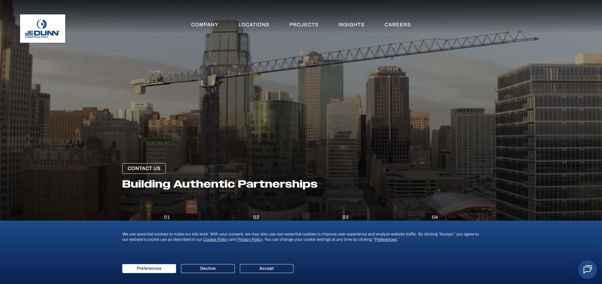
JE Dunn frames dusk project photography in a consistent blue system and uses numbered sections to move from identity to method, work, and news. Markets and local offices give more directed visitors alternative routes. For Slick integration, the relevant idea is an ordered narrative that does not trap experienced buyers in a prescribed sequence. The observed Slick association does not prove that the numbered navigation or hero uses the library, and the screenshot cannot establish how focus behaves during movement.
What you can learn
If project examples become slides within the narrative, provide a clear section heading and direct access to the full project collection. Preserve office and market shortcuts outside that component. Test someone returning to a known project, including browser back navigation, so a decorative sequence does not reset their position or require them to replay the introductory company story.
Pros
Numbered sections make the long company presentation easier to scan.
A consistent frame connects photography with practical navigation.
Cons & considerations
Linear storytelling can delay buyers who already know their requirements.
Partnership language needs specific project evidence behind its visual treatment.
Platform source: Dated exact public source-page audit. Linked script matches Slick Carousel. Dated public resource or code association on this exact source page; not proof that any particular visible component initializes or behaves as assumed. Platform evidence is separate from the direct website screenshot and is not a complete current infrastructure audit.
Kiddie Academy pairs burgundy, yellow, and navy with a teacher-and-child photograph and hand-drawn accents. A geographic locator appears beneath expressive headline lettering, while tuition and enrollment have explicit navigation positions. For Slick planning, this is a useful boundary between atmosphere and task: finding a local academy should remain stable while supporting imagery changes. The library's presence in the source does not prove that the hero rotates or establish how any slider and locator interact in the browser.
What you can learn
Keep the location input outside changing slide markup and preserve its value when supporting content moves. If local stories or program cards use a carousel, label the geography and age group clearly. Test typing, focus, and validation while the surrounding layout changes, then verify that a family can reach tuition information without needing to interpret decorative lettering or a campaign slogan.
Pros
The locator names a concrete geographic input for the visitor.
Tuition and enrollment use language that matches practical family questions.
Cons & considerations
Several lettering styles and decorative marks compete for attention.
The hero provides little immediate detail about any individual location.
Platform source: Dated exact public source-page audit. Linked stylesheet matches Slick Carousel. Dated public resource or code association on this exact source page; not proof that any particular visible component initializes or behaves as assumed. Platform evidence is separate from the direct website screenshot and is not a complete current infrastructure audit.
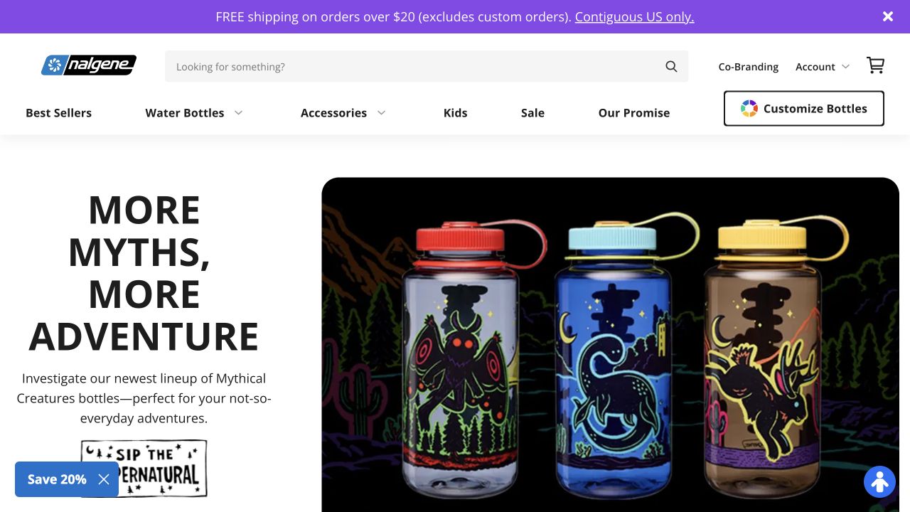
Nalgene's opening puts decorated bottles against a vivid collaboration background while ordinary product categories remain in a lighter header. Promotional and account layers sit above that campaign. For a Slick product collection, this is a useful distinction between a changed appearance and a changed specification. A library reference on the public page does not identify the carousel controlling those bottles, show how variations are selected, or verify that every displayed product shares the same capacity and closure.
What you can learn
Attach size, lid, material information, and product destination to each item independently of campaign artwork. Use a consistent image scale so a decorative difference does not imply a functional one. Test keyboard traversal and the transition from a promotional slide to product detail, then retire the campaign without removing ordinary category access or leaving obsolete links in a cloned slide.
Pros
The repeated bottle shape makes the collaboration easy to understand.
Persistent categories let visitors bypass the temporary campaign.
Cons & considerations
Stacked header bands consume space before product comparison begins.
Decorative variation can conceal meaningful specification differences between items.
Platform source: Dated exact public source-page audit. Linked stylesheet matches Slick Carousel. Dated public resource or code association on this exact source page; not proof that any particular visible component initializes or behaves as assumed. Platform evidence is separate from the direct website screenshot and is not a complete current infrastructure audit.
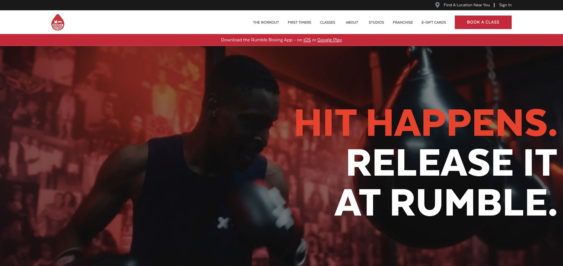
Rumble's opening combines oversized red-and-white type with close-up boxing footage, while a separate white header gives class booking a strong red control. Location finding, sign-in, and app promotion occupy additional bands. For Slick planning, this is a reminder to account for motion already present before adding another moving component. The dated Slick resource signal does not prove that the footage, booking control, or any visible promotion is implemented by that library, nor does it verify class availability.
What you can learn
If testimonials or studio offers slide below the hero, let visitors control movement and keep location selection outside the sequence. Test the page with reduced motion and with video unavailable, ensuring the activity and next step remain understandable. A beginner should still find class structure and equipment information without treating an intense visual message as a substitute for practical preparation.
Pros
Real boxing imagery identifies the activity without a lengthy explanation.
Studio and first-timer routes support more practical exploration.
Cons & considerations
Very large type can dominate a short viewport almost completely.
Several promotional bands compete with the immediate location and booking task.
Platform source: Dated exact public source-page audit. Linked stylesheet matches Slick Carousel. Dated public resource or code association on this exact source page; not proof that any particular visible component initializes or behaves as assumed. Platform evidence is separate from the direct website screenshot and is not a complete current infrastructure audit.
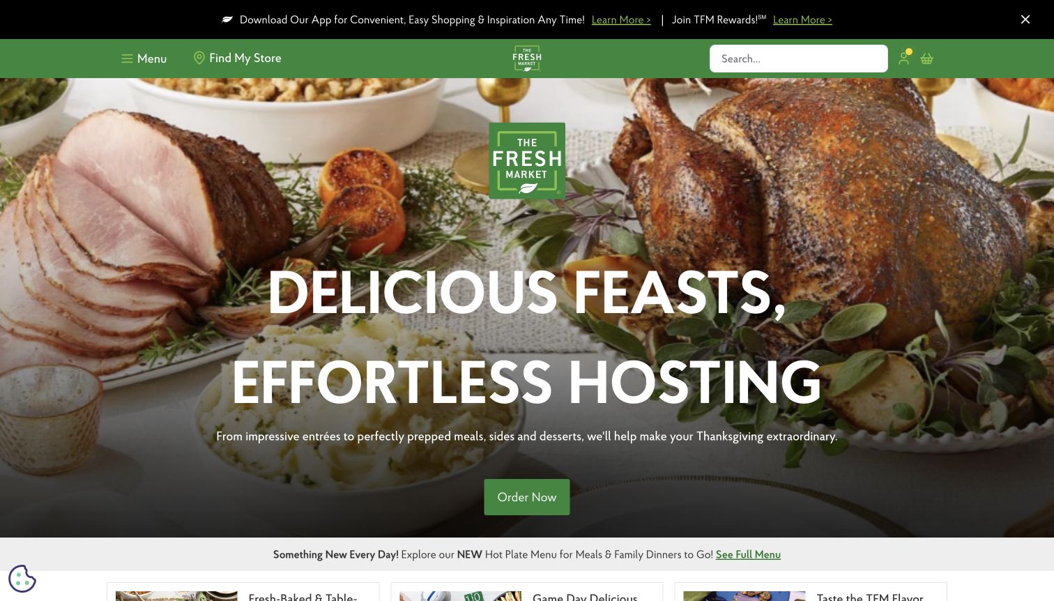
The Fresh Market uses a prepared holiday table, a large hosting message, and one green order action, while store search and menu controls remain compact. Rewards promotion sits above the campaign, and later sections distinguish prepared meals and groceries. The page is useful Slick inspiration for seasonal collections whose conditions matter as much as imagery. The observed source reference does not identify a specific carousel, verify local stock, or show how an order destination handles store selection and pickup rules.
What you can learn
Treat portion details, ordering deadlines, pickup windows, and store scope as content attached to each seasonal offer. If multiple meal occasions become slides, keep those facts readable and avoid making the deadline visible only on one frame. Test a visitor changing stores after choosing a campaign, and preserve an ordinary route to the full prepared-meal category.
Pros
A single hero action gives the holiday story a clear destination.
The wider page acknowledges that local pricing depends on store selection.
Cons & considerations
Large occasion language postpones portions and deadline information.
Rewards and app promotion add another layer above the meal task.
Platform source: Dated exact public source-page audit. Linked script matches Slick Carousel. Dated public resource or code association on this exact source page; not proof that any particular visible component initializes or behaves as assumed. Platform evidence is separate from the direct website screenshot and is not a complete current infrastructure audit.
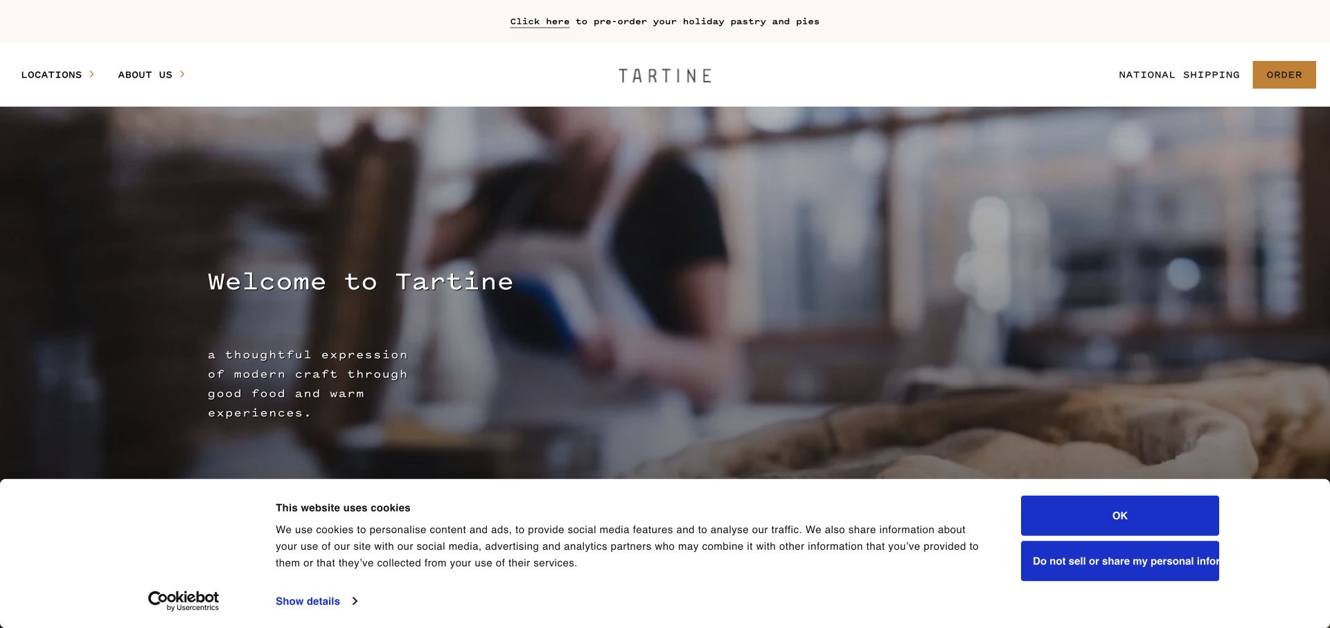
Tartine's immersive bakery scene sits beneath a spare header with a centered identity and compact location and ordering links. Regional locations, shipping, seasonal orders, and special cakes emerge as separate offerings. For Slick development, this is a useful case for preserving operational differences within a shared visual story. The public library association does not establish how the opening media is controlled or whether a carousel, ordering service, and regional destinations share any underlying implementation.
What you can learn
When presenting several bakeries or seasonal products as slides, give each a location and an appropriate order destination. Keep menus, hours, and lead times on stable local pages. Test a visitor who recognizes a photograph but is in another city: the sequence should not imply that every item, collection window, or special-cake service is available at every bakery carrying the brand.
Pros
Compact location and ordering routes remain visible around the atmosphere.
Regional grouping acknowledges that the brand covers distinct local experiences.
Cons & considerations
Cinematic media provides less immediate product detail than a menu.
Seasonal lead times need coordinated maintenance across several destinations.
Platform source: Dated exact public source-page audit. Linked stylesheet matches Slick Carousel. Dated public resource or code association on this exact source page; not proof that any particular visible component initializes or behaves as assumed. Platform evidence is separate from the direct website screenshot and is not a complete current infrastructure audit.
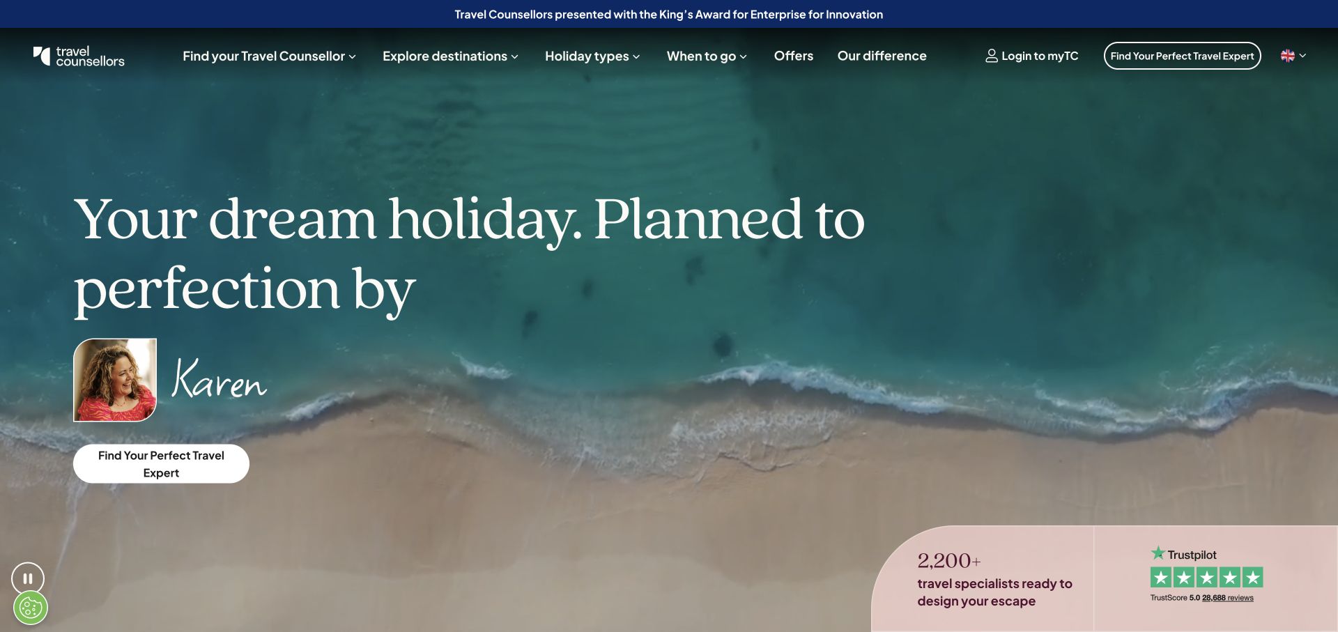
Travel Counsellors places an adviser's portrait and name within an ocean-led opening, pairing a serif proposition with an expert-finding action. Destinations, trip types, timing, and offers provide further routes. The page is useful Slick inspiration because a human-service story needs attribution as it moves through a collection. A public Slick reference does not prove the portrait belongs to a carousel or verify adviser matching, availability, or booking behavior. The review concerns the visible public presentation and its planning implications.
What you can learn
If advisers or trip stories form a sequence, keep the name, role, location context, and destination together on every item. Do not allow a cropped testimonial to lose its attribution. Test a visitor who wants the featured person and one who needs an expert for a different trip; both should reach a clear next step without replaying the entire promotional sequence.
Pros
A named adviser makes the service relationship tangible immediately.
Timing offers a discovery route beyond destination alone.
Cons & considerations
Large opening imagery delays detailed itinerary examples.
Review and scale signals do not explain the matching process by themselves.
Platform source: Dated exact public source-page audit. Linked stylesheet matches Slick Carousel. Dated public resource or code association on this exact source page; not proof that any particular visible component initializes or behaves as assumed. Platform evidence is separate from the direct website screenshot and is not a complete current infrastructure audit.
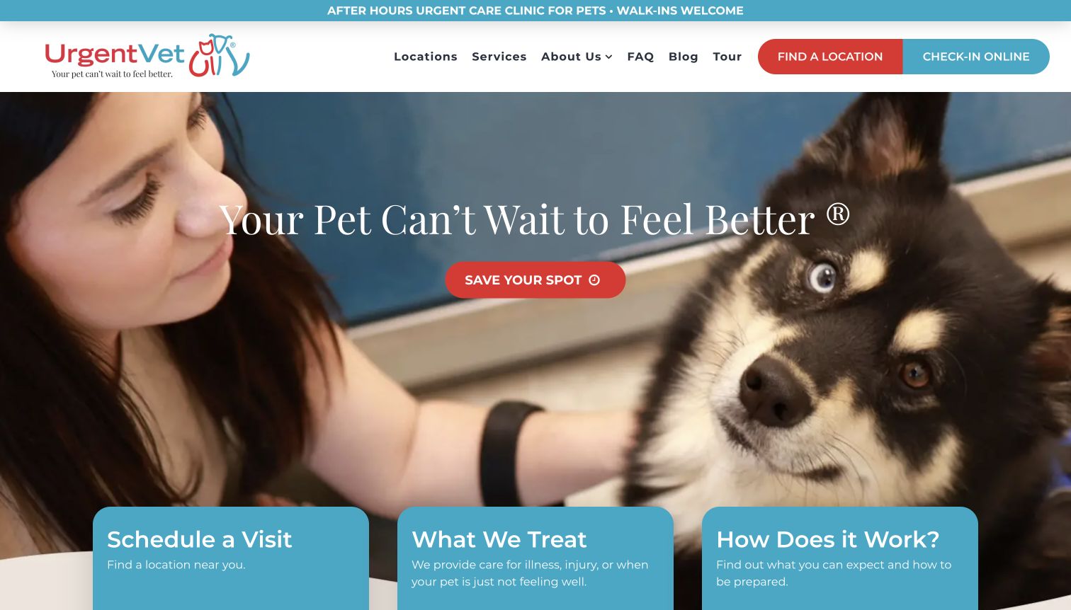
UrgentVet states its after-hours role early and repeats location and check-in actions around a pet-care hero. Cards for scheduling, treatment scope, and the visit process add explanation beneath the image. For Slick planning, the important pattern is to preserve urgent tasks as stable controls. The detected library association does not show that these cards rotate or verify a particular booking flow. It also cannot establish clinical availability, waiting times, or the outcome of an online check-in request.
What you can learn
Keep scope, emergency directions, and location finding outside any automatically changing panel. If supporting process cards become a mobile carousel, retain clear position cues and an ordinary reading order. Test the difference between saving a place and confirming an appointment in the labels and destination copy, so a visually efficient sequence does not shorten away an important operational distinction.
Pros
The after-hours role appears before the main promotional message.
Scope and process cards explain the service alongside the action.
Cons & considerations
Several related booking labels can create uncertainty about the next step.
Text over photography needs dependable contrast across image changes.
Platform source: Dated exact public source-page audit. Linked stylesheet matches Slick Carousel. Dated public resource or code association on this exact source page; not proof that any particular visible component initializes or behaves as assumed. Platform evidence is separate from the direct website screenshot and is not a complete current infrastructure audit.
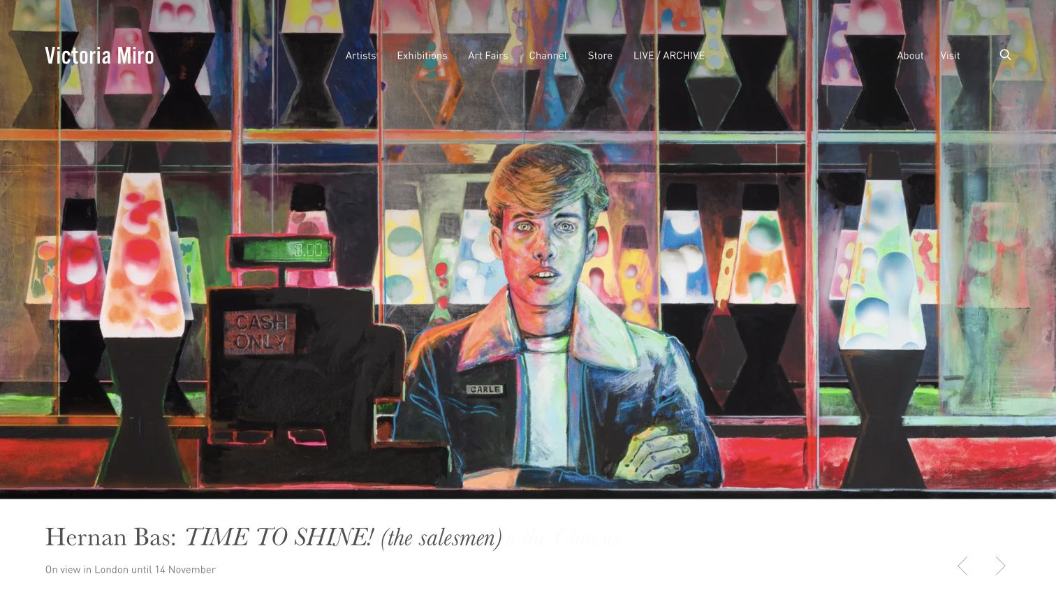
Victoria Miro gives a colorful painting most of the opening, then places artist, exhibition title, location, and dates in a white caption strip. Pale arrows sit within that strip while navigation overlays the artwork. For Slick development, the separation is a useful pattern: detailed captions need a stable reading surface when images vary dramatically. The public resource association does not independently assign those arrows to Slick or establish their focus, timing, swipe behavior, or accessibility under a different exhibition.
What you can learn
Keep artist, title, location, dates, and credit with each image record, and allow the caption area to grow for longer names. Give controls sufficient contrast and meaningful labels without placing them over essential information. Test a bright painting, a dark installation photograph, and a long title together, then verify that navigation remains legible as the visual sequence changes.
Pros
The white information band protects a detailed exhibition caption.
Visit and institutional information remain direct navigation choices.
Cons & considerations
Thin navigation text competes with the detailed artwork beneath it.
Pale arrows are easy to overlook on the white caption surface.
Platform source: Dated exact public source-page audit. Linked stylesheet matches Slick Carousel. Dated public resource or code association on this exact source page; not proof that any particular visible component initializes or behaves as assumed. Platform evidence is separate from the direct website screenshot and is not a complete current infrastructure audit.
Give each story a title, reporting period, credit, and permanent destination. Avoid placing the only copy of an urgent fact in a later slide. Let visitors stop long enough to understand images and captions.
Product or project shelves
Use comparable image framing and maintain identifying text outside the image. Expose the full category and individual detail pages. A decorative variation should not conceal functional product differences or project context.
Supporting stories around a stable task
Keep location inputs, booking routes, and audience selection fixed while supporting stories change. Test typing and focus when nearby content moves, and make sure a temporary overlay cannot cover the sequence controls.
From references to requirements
Plan the carousel's least convenient states
Define content boundaries
Specify minimum and maximum items, long captions, mixed image ratios, attribution, and expired campaigns. Decide what should happen with one item and whether an empty collection removes the section cleanly.
Test within the complete page
Include header navigation, consent UI, chat, embedded video, and short viewport heights in review. Inspect first and last items, visible focus, control names, and the route back from a detail page.
Measure the cost of movement
Check image dimensions and loading, layout stability, and whether moving content delays the next task. Compare the implementation with a static list using the same material. Retain the carousel only when it improves the particular browsing problem.
A useful handover demonstration
Ask the actual team to carry out its routine job: publish a realistic update, correct a mistake, preview a narrow screen, and identify who owns an integration failure. For a library or frontend framework, also ask who maintains the content source and deployment. A polished screenshot does not answer those operational questions.
Beyond the screenshot
Slick Carousel development checklist
Document the installed library version and its jQuery compatibility in your own project.
Write useful text and permanent links for every item.
Choose autoplay, pause, arrows, and dots deliberately.
Verify keyboard operation, visible focus, labels, and reduced-motion behavior.
Test one item, long captions, missing media, and mixed image ratios.
Check breakpoints with consent, chat, and fixed headers present.
Confirm that campaign removal preserves category and detail destinations.
Test with real content, a keyboard, a small screen, slow or failed requests, and the people who will maintain the system. These are planning checks, not an accessibility, security, performance, or search-ranking certification.
Sources & editorial method
How this Slick Carousel collection was reviewed
The collection contains twenty distinct public properties with genuine original captures and dated Slick resource or code evidence. Every source page has a documented broad public stack-audit attempt. Capture dates and dimensions remain unchanged when reused. A linked library can be available without initializing a visible component; reviews therefore distinguish observed composition from recommended interaction tests. No forms, purchases, or private accounts were used for this review.
Every image is an unmodified capture from the actual website, with its source and capture date. Some captures are reused from our shared catalog; their dates remain the original capture dates. None comes from a vendor gallery or a generated reconstruction. Moving imagery and live content can change.
Technology attribution uses public page assets or metadata, official platform documentation, or a cited first-party project case study. Documentary and framework-relationship evidence is identified where used; it is not a complete current backend inventory. A CMS image CDN alone does not establish a full CMS deployment. A library’s presence does not prove which individual controls use it, and a platform label does not establish AI authorship.
The composition notes, lessons, pros and tradeoffs are original editorial observations. We have not measured conversion, traffic, security, performance or accessibility conformance. Website owners retain their brands and imagery; these examples are not our client portfolio. Written, Edited and Curated are independent records, not dates advanced by a build. See our editorial standards or suggest a correction.
Questions worth asking
Slick Carousel website development FAQs
Does a Slick file prove that the homepage hero uses Slick?
No. It supports a scoped public-page association. A library can be included globally, used farther down the page, or remain unused. Identifying a particular instance requires additional observation beyond the resource reference.
Should every carousel autoplay?
No. Decide from the content and visitor task. Long captions, credited reports, and important conditions need reading time. Verify the actual pause and motion behavior instead of assuming a default configuration suits the page.
Can a mobile layout use a different collection treatment?
Yes. Slick exposes responsive configuration. Design the reading order and controls for the specific breakpoint, and verify that switching treatment preserves links, content, focus, and any nearby input state.
Are these examples accessibility certifications?
No. Screenshots and public-source observations support editorial analysis. Keyboard, assistive-technology, focus, contrast, and motion testing are separate tasks for the actual implementation; this guide does not certify conformance.
Use these references to improve collection structure and control placement. Make each item understandable first, then verify that the configured movement helps the visitor.