Best WPBakery Websites of 2026 (20 Real-World Examples)
Websites with public WPBakery Page Builder evidence
These 20 examples compare page composition, service navigation, content density, and the maintenance questions behind a WordPress page-builder implementation.
WPBakery offers frontend and backend page editing for WordPress. The public sites below have supported plugin-resource associations, but a resource path does not identify which individual section was built in its editor.
LS Tractor, Monro, Pittsburgh Zoo, Bergelectric, and Flynn Group open the collection. Earlier direct captures and their dated observations are preserved.
Before the examples
What makes good WPBakery website development in 2026?
Define reusable editing patterns
Give editors a small set of useful section types with predictable spacing and typography. Flexibility should help routine publishing rather than require design decisions for every paragraph.
Use long headings, uneven card descriptions, missing images, and several calls to action. A builder layout is only useful if it survives ordinary updates.
Keep plugin evidence narrowly scoped
The js_composer directory is documented in WPBakery’s integration material. Assets can remain included even when a particular page section uses another mechanism.
The collection · 20 examples
20 WPBakery website examples worth studying
The collection uses dated js_composer observations and explicitly qualifies narrower CSS or image references. It does not inspect the private editing interface.
We start with five recognizable brands or organizations: LS Tractor, Monro Auto Service and Tire Centers, Pittsburgh Zoo & Aquarium, Bergelectric, Flynn Group of Companies. Each attribution applies to the named website property, not every product or website belonging to its organization. This is a curated reading sequence, not a measured ranking.
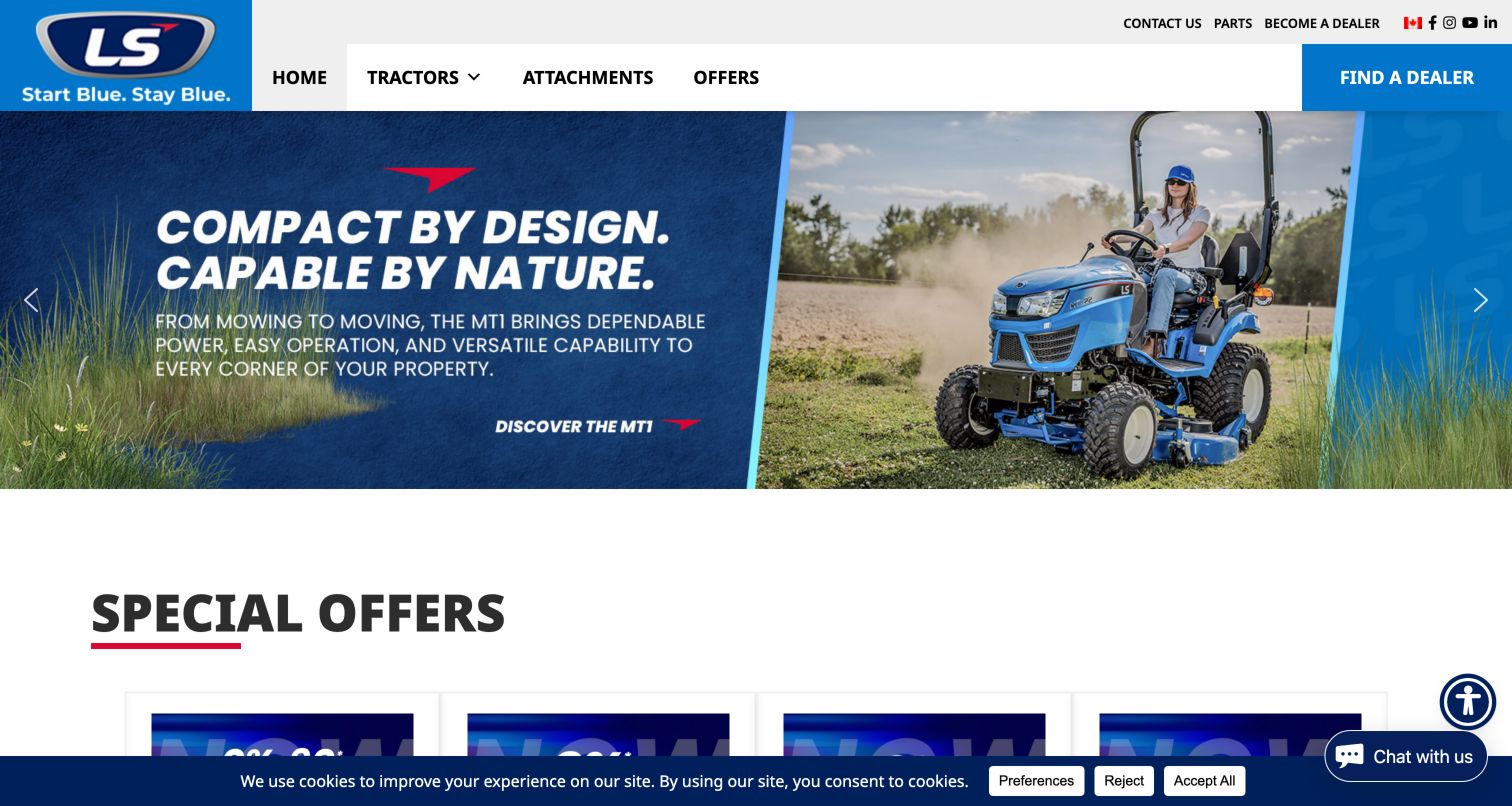
LS Tractor pairs a large product campaign with a straightforward navigation system for tractors, attachments, and offers. Find a Dealer receives a solid blue block at the right edge, while parts and dealer recruitment sit in a quieter utility row. Below the hero, a Special Offers section begins a repeated card layout. The public audit observed WPBakery’s frontend script under the js_composer plugin directory. That supports a page-level integration, without proving which hero or offer components were authored in its editor. This is the United States public marketing property, not evidence about every LS website or dealer system.
What you can learn
Build campaign rows around a stable product taxonomy and one recognizable sales handoff. Keep repeatable offers visually consistent, but let visitors bypass temporary promotions to explore products or locate a dealer; the layout should remain useful when the campaign changes.
Pros
Dealer discovery has a clear position outside the rotating campaign.
The offers heading makes the next content section easy to recognize.
Cons & considerations
The cookie banner and chat control occupy the lower edge together.
Promotional claims require detailed specifications and conditions on their destination pages.
Platform source: Public-page WPBakery resource observation, 2026-11-05. The dated public audit found resource references beneath /wp-content/plugins/js_composer/, the WPBakery Page Builder plugin directory identified in its official theme-integration documentation. References establish a plugin asset association, not which individual sections were authored with its editor, execution of every asset, or access to the private WordPress editor. Platform evidence is separate from the direct website screenshot and is not a complete current infrastructure audit.
Monro’s opening screen combines a large seasonal savings campaign with a row of individual service and tire offers. Each card pairs a product or service with its own promotion, while the blue header preserves service categories, location search, and appointment access. The repeated card structure is useful for comparing how a WordPress site can organize many offers without giving each a different visual treatment. A dated public audit identified WPBakery’s js_composer stylesheet on this page. It does not establish that the appointment system or location finder is implemented by WPBakery, nor does it validate the advertised savings.
What you can learn
Treat temporary promotions as structured content with consistent labels, conditions, and expiry information. Keep location and appointment tasks in a stable shared header so users can act without first navigating the seasonal campaign or interpreting every promotional card.
Pros
Location search and appointment access remain grouped together.
Consistent card boundaries make multiple offers easier to scan.
Cons & considerations
Dense promotional artwork includes small terms that need a clearer detail view.
Several competing savings messages can obscure the service a visitor originally wanted.
Platform source: Public-page WPBakery resource observation, 2026-11-03. The dated public audit found resource references beneath /wp-content/plugins/js_composer/, the WPBakery Page Builder plugin directory identified in its official theme-integration documentation. References establish a plugin asset association, not which individual sections were authored with its editor, execution of every asset, or access to the private WordPress editor. Platform evidence is separate from the direct website screenshot and is not a complete current infrastructure audit.
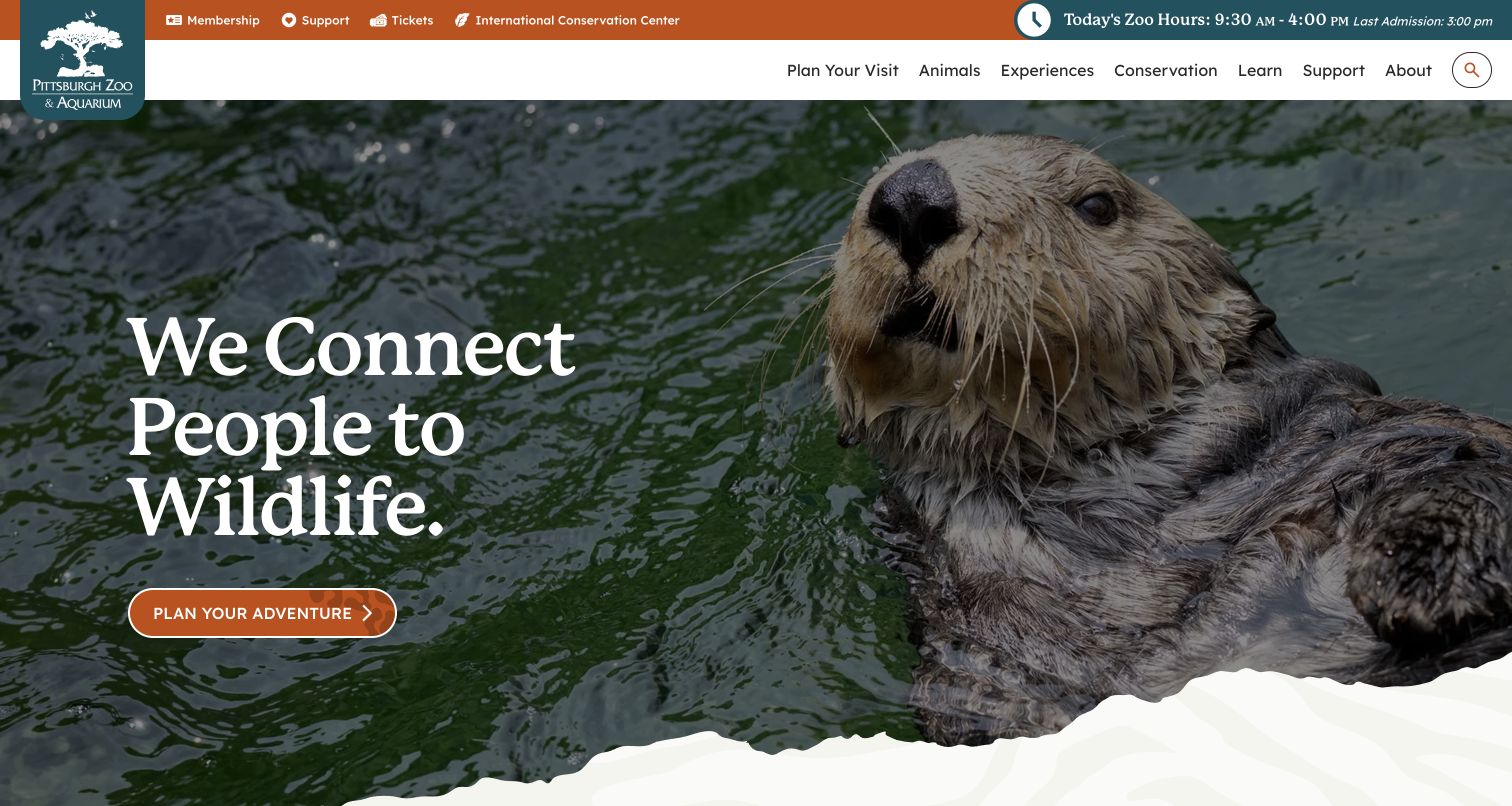
Pittsburgh Zoo & Aquarium uses an otter photograph, a short mission statement, and a warm-colored planning button to introduce the visitor experience. An irregular white edge gives the hero a more organic transition into the page. Practical details are kept above the image: ticket and membership links, today’s hours, and the last-admission time. The dated public audit found WPBakery’s js_composer stylesheet on the inspected homepage. This supports an asset association with the page builder, not attribution of every decorative element or the separate ticketing flow. The displayed hours are part of the dated capture and are not a current schedule recommendation.
What you can learn
Separate operational facts from campaign artwork. Build the hero as a reusable message-and-image section, but keep hours, admission cutoffs, and ticket access in predictable positions that remain available when the featured animal or campaign changes.
Pros
Hours and last admission are visible before the visitor starts scrolling.
The planning action contrasts clearly with the photograph.
Cons & considerations
The broad adventure label provides less detail than a specific ticket or visit action.
Large imagery places most supporting information below the initial view.
Platform source: Public-page WPBakery resource observation, 2026-11-05. The dated public audit found resource references beneath /wp-content/plugins/js_composer/, the WPBakery Page Builder plugin directory identified in its official theme-integration documentation. References establish a plugin asset association, not which individual sections were authored with its editor, execution of every asset, or access to the private WordPress editor. Platform evidence is separate from the direct website screenshot and is not a complete current infrastructure audit.
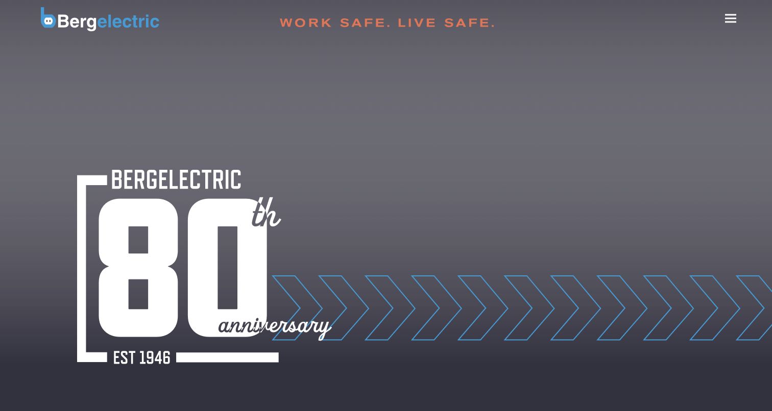
Bergelectric’s captured opening is dominated by an eightieth-anniversary graphic, oversized numerals, and a repeating directional motif. The logo remains in the upper left, a safety message occupies the center, and a compact menu icon sits at the right. This creates a strong commemorative campaign but leaves the visitor to open navigation or continue down the page for more specific service information. The dated public audit records WPBakery’s js_composer stylesheet. That is evidence of a frontend plugin resource, not a reconstruction of the private authoring workflow or proof that WPBakery produced every part of the animation or graphic.
What you can learn
Use a campaign section to express a milestone, then give visitors an equally clear route to capabilities, projects, and careers. A page builder makes large visual sections possible, but content hierarchy still determines whether a first-time visitor understands what to do next.
Pros
The anniversary theme has a coherent and memorable visual treatment.
A restrained header keeps the campaign uncluttered.
Cons & considerations
The opening view provides little concrete service information.
A menu icon requires an extra action to discover the available routes.
Platform source: Public-page WPBakery resource observation, 2026-11-03. The dated public audit found resource references beneath /wp-content/plugins/js_composer/, the WPBakery Page Builder plugin directory identified in its official theme-integration documentation. References establish a plugin asset association, not which individual sections were authored with its editor, execution of every asset, or access to the private WordPress editor. Platform evidence is separate from the direct website screenshot and is not a complete current infrastructure audit.
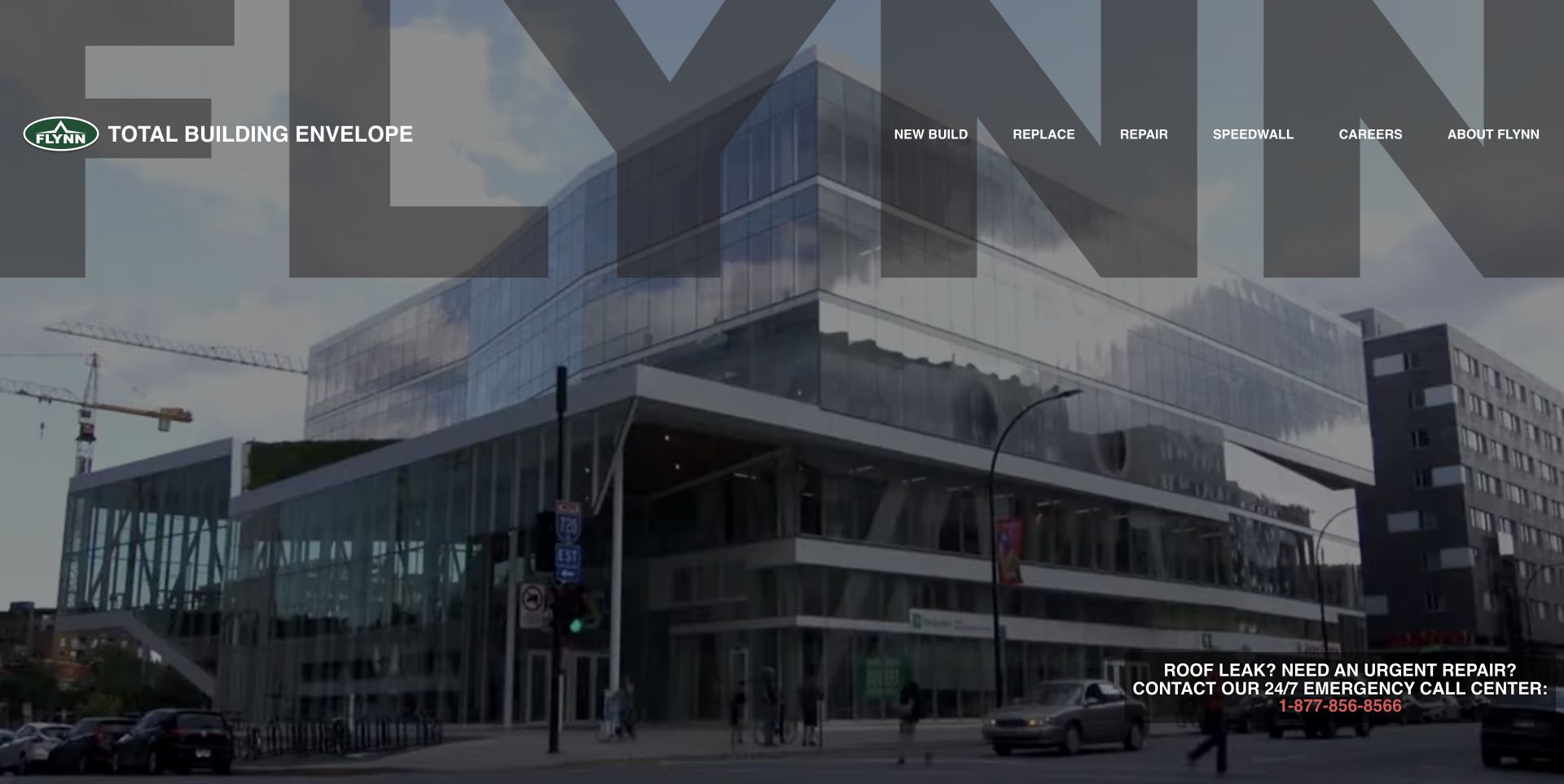
Flynn’s homepage places a building photograph behind an oversized translucent brand treatment. The navigation is unusually task-oriented: New Build, Replace, and Repair appear before the company and careers routes. A separate emergency callout occupies the lower right, making an urgent repair path visible without replacing the portfolio presentation. The dated audit found references to assets beneath WPBakery’s js_composer directory within public stylesheets. These are plugin-associated resource references, not proof that every resource executed or that the hero and emergency panel were authored with the builder. The review concerns the marketing property, not a service guarantee.
What you can learn
Organize navigation around the condition of the customer’s project rather than only internal departments. Keep an urgent operational action visually distinct from exploratory project content, and ensure its text remains readable across the background used by the shared campaign section.
Pros
New build, replacement, and repair describe recognizable customer situations.
The emergency route is visible without opening a menu.
Cons & considerations
Large branding and photography compete with smaller white navigation.
The emergency message relies on a dark image area and small contrasting phone text.
Platform source: Public-page WPBakery resource observation, 2026-11-03. The dated public audit found resource references beneath /wp-content/plugins/js_composer/, the WPBakery Page Builder plugin directory identified in its official theme-integration documentation. References establish a plugin asset association, not which individual sections were authored with its editor, execution of every asset, or access to the private WordPress editor. Platform evidence is separate from the direct website screenshot and is not a complete current infrastructure audit.
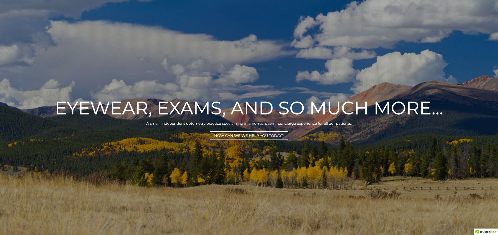
Best In Sight Eye Care opens with a mountain landscape, a large line naming eyewear and exams, and a small assistance button. A short supporting sentence describes the practice’s preferred service experience, but the screenshot keeps almost everything secondary to the landscape and central message. This is a useful example of a simple full-width section rather than a dense arrangement of modules. A dated audit identified WPBakery’s js_composer stylesheet on the public WordPress page. It does not demonstrate the editor configuration, appointment technology, or the quality of care described in the site’s marketing copy.
What you can learn
A restrained hero still needs a concrete next step and enough context to orient a new visitor. When composing a full-width image section, check the supporting text and button at ordinary reading sizes, and provide location and appointment details immediately after the introductory message.
Pros
The main heading states the broad service categories.
A single action keeps the opening composition visually simple.
Cons & considerations
The small supporting sentence and button are dwarfed by the landscape.
The captured opening does not show the practice location or a direct booking route.
Platform source: Public-page WPBakery resource observation, 2026-11-06. The dated public audit found resource references beneath /wp-content/plugins/js_composer/, the WPBakery Page Builder plugin directory identified in its official theme-integration documentation. References establish a plugin asset association, not which individual sections were authored with its editor, execution of every asset, or access to the private WordPress editor. Platform evidence is separate from the direct website screenshot and is not a complete current infrastructure audit.
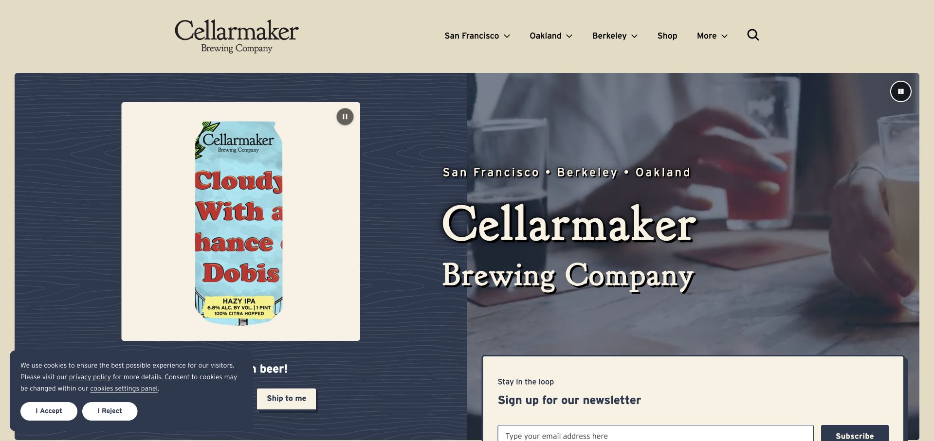
Cellarmaker divides its opening content between a product panel and a larger brewery presentation. A featured can appears in a framed area beside a shipping action, while the neighboring image and large type introduce the company and its three city locations. The beige header uses those cities as primary navigation choices, alongside Shop and search. Visible pause controls acknowledge movement in the presentation. The dated audit found WPBakery’s js_composer stylesheet on the public page. This supports plugin association but does not identify which media, newsletter, or commerce features depend on WPBakery or verify a shipping transaction.
What you can learn
Give product discovery and physical-location research separate areas within a shared visual system. Keep moving content controllable, make each panel’s next action specific, and check that newsletter or cookie overlays do not conceal the commerce path they sit beside.
Pros
City-based navigation provides an immediate local orientation.
Pause controls are visibly available for the moving presentation.
Cons & considerations
The cookie panel covers part of the product area in the capture.
Multiple media panels and a newsletter form compete for attention near the fold.
Platform source: Public-page WPBakery resource observation, 2026-11-06. The dated public audit found resource references beneath /wp-content/plugins/js_composer/, the WPBakery Page Builder plugin directory identified in its official theme-integration documentation. References establish a plugin asset association, not which individual sections were authored with its editor, execution of every asset, or access to the private WordPress editor. Platform evidence is separate from the direct website screenshot and is not a complete current infrastructure audit.
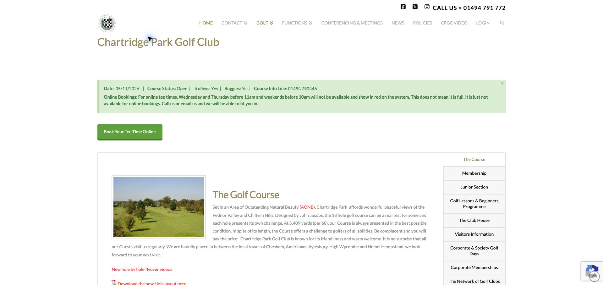
Chartridge Park Golf Club places a dated course-status notice and online-booking explanation above its booking button. The notice explains that some unavailable online times require direct contact rather than necessarily indicating a full course. Beneath it, a bordered information area pairs a course photograph and text with a vertical list of related topics. A dated audit observed WPBakery’s js_composer stylesheet on the page. The evidence concerns this public presentation, not the reservation system or a guarantee of current course availability. The captured status and dates remain historical details of the inspected view.
What you can learn
Put operational exceptions before the action they qualify. A modular page can combine a status strip, a booking link, and a compact content panel, but each needs a clear priority so visitors understand limitations before entering a separate booking workflow.
Pros
The booking explanation appears before the online booking button.
Related course and membership topics are grouped beside the main text.
Cons & considerations
Large blank spacing delays the practical notice after the page title.
The small gray body text and dense side list demand careful reading.
Platform source: Public-page WPBakery resource observation, 2026-11-07. The dated public audit found resource references beneath /wp-content/plugins/js_composer/, the WPBakery Page Builder plugin directory identified in its official theme-integration documentation. References establish a plugin asset association, not which individual sections were authored with its editor, execution of every asset, or access to the private WordPress editor. Platform evidence is separate from the direct website screenshot and is not a complete current infrastructure audit.
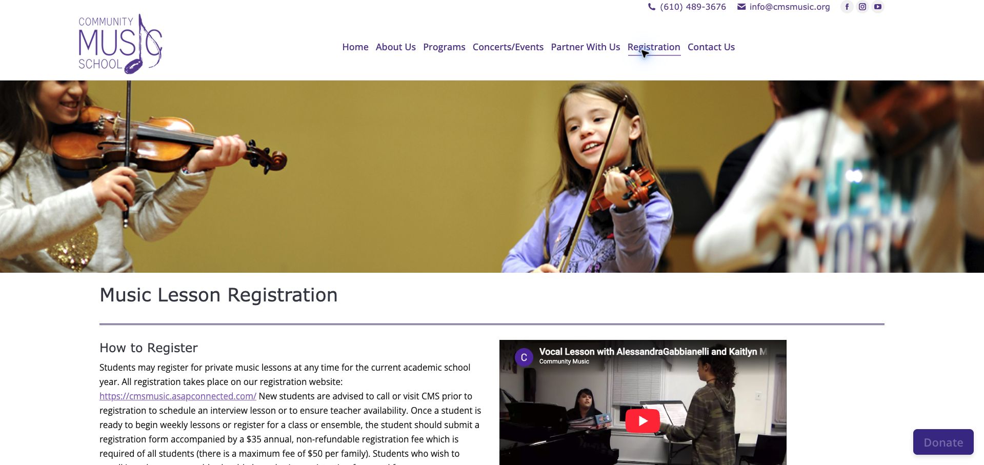
Community Music School’s registration page moves from a wide lesson photograph into a two-column area with written instructions and a video preview. The heading clearly names Music Lesson Registration, and the text identifies a separate registration website while advising new students to contact the school before proceeding. Telephone and email details are available in the shared header. A dated public audit found WPBakery’s js_composer stylesheet on this exact page. That establishes a plugin resource association for the explanatory website; it does not make the external enrollment service a WPBakery implementation or demonstrate a completed registration.
What you can learn
Use a public content page to prepare visitors for an external transaction. Explain prerequisites and where the next step happens, and keep supporting media secondary to the written instructions so families can understand the process without playing a video.
Pros
The registration destination is explicitly identified in the instructions.
The text and video give complementary ways to understand the school.
Cons & considerations
A wide introductory photograph delays the detailed registration guidance.
Long paragraphs and a raw destination URL make the process harder to skim than numbered steps.
Platform source: Public-page WPBakery resource observation, 2026-11-07. The dated public audit found resource references beneath /wp-content/plugins/js_composer/, the WPBakery Page Builder plugin directory identified in its official theme-integration documentation. References establish a plugin asset association, not which individual sections were authored with its editor, execution of every asset, or access to the private WordPress editor. Platform evidence is separate from the direct website screenshot and is not a complete current infrastructure audit.
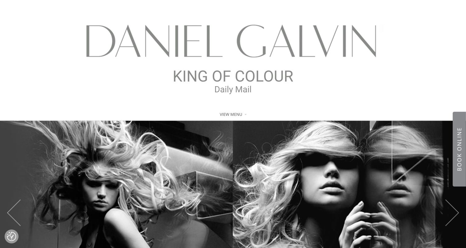
Daniel Galvin’s captured homepage gives its wordmark an unusually large share of the opening screen. A short attributed press line sits below it, followed by a small menu control and a monochrome editorial image carousel. A vertical Book Online tab remains at the right edge, providing a practical route beside the visual campaign. The dated public audit identifies WPBakery’s frontend js_composer script. This is evidence of a plugin resource on the public site, not proof that the carousel, booking service, or individual design elements are implemented by that plugin. The press wording is a displayed attribution rather than an independently assessed service ranking.
What you can learn
If a brand-led masthead occupies substantial space, preserve a visible action for visitors ready to book. Use editorial imagery deliberately, but make service and location information easy to reach so the visual identity supports rather than delays practical decisions.
Pros
The monochrome imagery and restrained type create a consistent editorial mood.
Booking remains visible beside the carousel.
Cons & considerations
The small menu control is easy to overlook beneath the oversized masthead.
Vertical booking text is less immediately readable than a conventional horizontal button.
Platform source: Public-page WPBakery resource observation, 2026-11-03. The dated public audit found resource references beneath /wp-content/plugins/js_composer/, the WPBakery Page Builder plugin directory identified in its official theme-integration documentation. References establish a plugin asset association, not which individual sections were authored with its editor, execution of every asset, or access to the private WordPress editor. Platform evidence is separate from the direct website screenshot and is not a complete current infrastructure audit.
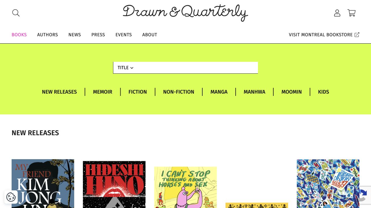
Drawn & Quarterly’s books page places its discovery controls in a bright lime band between the shared header and the catalogue. A title control sits above genre and audience links, followed by a New Releases heading and a row of book covers. The header separately offers authors, editorial content, events, and a marked link to the Montreal bookstore. A dated audit identified WPBakery’s js_composer stylesheet on this public page. That resource association does not establish that the catalogue query, account system, or checkout is supplied by WPBakery. The example is useful for its content hierarchy rather than as a demonstration of a private editing screen.
What you can learn
Give catalogue discovery its own recognizable area and support both a known title and open-ended browsing. Let covers carry visual identity while consistent headings, categories, and search controls provide structure; do not make a page builder’s layout choices substitute for useful product data.
Pros
The discovery band is visually distinct from the book grid.
The physical bookstore link clearly signals a separate destination.
Cons & considerations
The large control band pushes product details lower on the page.
Category names mix genres, audiences, and properties, which may need explanatory context.
Platform source: Public-page WPBakery resource observation, 2026-11-03. The dated public audit found resource references beneath /wp-content/plugins/js_composer/, the WPBakery Page Builder plugin directory identified in its official theme-integration documentation. References establish a plugin asset association, not which individual sections were authored with its editor, execution of every asset, or access to the private WordPress editor. Platform evidence is separate from the direct website screenshot and is not a complete current infrastructure audit.
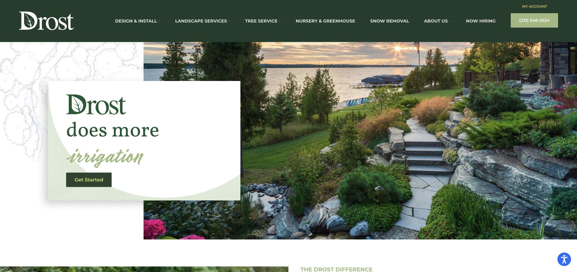
Drost Landscape uses a large garden photograph offset to the right, with a white service panel overlapping its left edge. The panel combines the brand, a service word, and a compact Get Started button, while a dark green header lists the wider service range, recruitment, account access, and telephone contact. A dated audit observed WPBakery’s js_composer stylesheet on the public WordPress homepage. It supports a plugin asset association but does not prove that the overlapping composition, changing service text, or navigation was authored in its editor. The review focuses on the visible relationship between the service message and the project imagery.
What you can learn
Use overlap to connect a short message with a supporting photograph, but preserve a clear reading order and enough contrast. Keep the broader service taxonomy outside the campaign panel so a visitor can find a specific need even when the featured service is unrelated.
Pros
The solid panel makes the primary text independent of image contrast.
Service categories remain directly available in the header.
Cons & considerations
The generic Get Started label does not describe the next step.
The long desktop navigation requires careful adaptation to smaller screens.
Platform source: Public-page WPBakery resource observation, 2026-11-03. The dated public audit found resource references beneath /wp-content/plugins/js_composer/, the WPBakery Page Builder plugin directory identified in its official theme-integration documentation. References establish a plugin asset association, not which individual sections were authored with its editor, execution of every asset, or access to the private WordPress editor. Platform evidence is separate from the direct website screenshot and is not a complete current infrastructure audit.
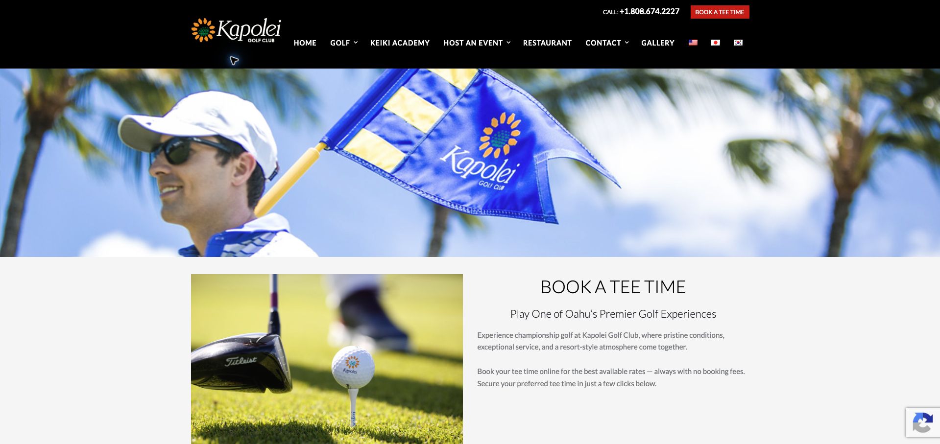
Kapolei Golf Club’s booking page uses a wide course-branded photograph above a balanced two-column introduction. A golf equipment image sits on the left, while Book a Tee Time, a short positioning line, and explanatory copy occupy the right. The shared black header retains telephone access, a red booking shortcut, and navigation for golf, the academy, events, dining, and contact. The dated public audit found WPBakery’s js_composer stylesheet on this page. This association applies to the public introduction; it does not verify the separate booking interface, current rates, or the no-fee claim displayed in the copy.
What you can learn
Make a transaction landing page state its purpose before adding promotional detail. Keep the supporting image subordinate to practical instructions, and identify where live availability begins so visitors can distinguish descriptive content from the system that confirms a time and price.
Pros
The page heading names the intended booking task directly.
Telephone and booking shortcuts remain available in the shared header.
Cons & considerations
The large banner and introductory row delay live booking information.
Several promotional claims need confirmation in the actual reservation terms.
Platform source: Public-page WPBakery resource observation, 2026-11-07. The dated public audit found resource references beneath /wp-content/plugins/js_composer/, the WPBakery Page Builder plugin directory identified in its official theme-integration documentation. References establish a plugin asset association, not which individual sections were authored with its editor, execution of every asset, or access to the private WordPress editor. Platform evidence is separate from the direct website screenshot and is not a complete current infrastructure audit.
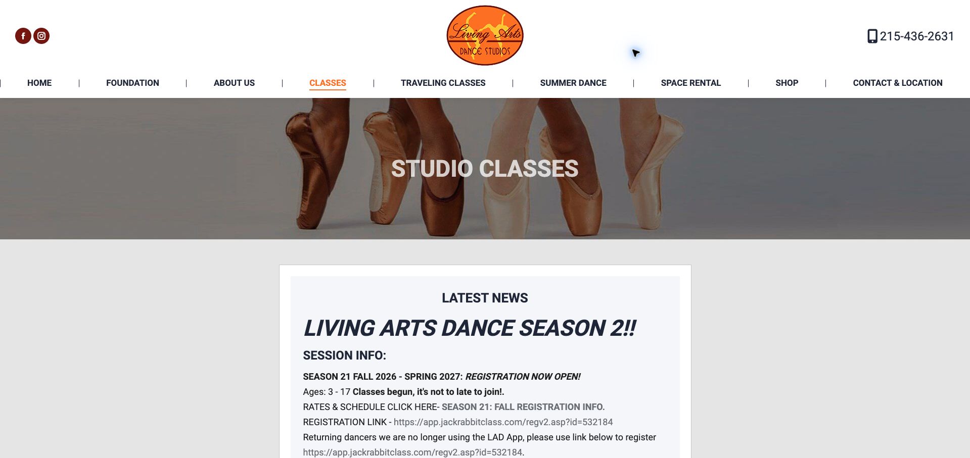
The Living Arts Dance Studios’ class page places a compact ballet-image banner above a centered notice card. The card identifies the dance season, age range, registration status, and a change in the enrollment route for returning dancers. The header keeps studio classes separate from traveling classes, summer dance, and space rental. A dated public audit found stylesheet references to resources in WPBakery’s js_composer directory. These are evidence of plugin-associated assets, not proof that each notice or registration control was created with the editor. The linked enrollment system is a separate destination and was not used to register anyone.
What you can learn
Use a reusable notice area for seasonal changes, but give dates, audience, fees, and registration steps their own hierarchy. Replace long raw links with clear action labels while preserving explicit information about changes that returning customers could otherwise miss.
Pros
The season and enrollment change are visible near the top of the page.
Program types have distinct navigation labels.
Cons & considerations
Dense capitalized text makes the notice harder to skim.
Repeated raw registration links distract from the sequence of steps.
Platform source: Public-page WPBakery resource observation, 2026-11-07. The dated public audit found resource references beneath /wp-content/plugins/js_composer/, the WPBakery Page Builder plugin directory identified in its official theme-integration documentation. References establish a plugin asset association, not which individual sections were authored with its editor, execution of every asset, or access to the private WordPress editor. Platform evidence is separate from the direct website screenshot and is not a complete current infrastructure audit.
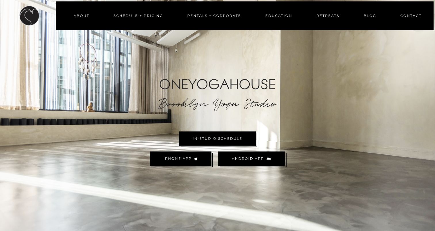
ONEYOGAHOUSE uses a bright, largely empty studio photograph as the background for its name and Brooklyn location descriptor. A central In-Studio Schedule button appears above separate iPhone and Android app links. The dark navigation bar expands the offering into pricing, rentals, education, retreats, and editorial content without adding more competing hero messages. A dated public audit records WPBakery’s js_composer stylesheet on this WordPress page. This supports the public site’s plugin association, not a claim that either mobile application or the scheduling service is built with WPBakery. The opening design is primarily an exercise in grouping related actions within a spacious composition.
What you can learn
Group related access routes while making their destinations explicit. Keep a browser-based schedule available for visitors who only want to investigate, and position optional app links as separate choices rather than making installation appear necessary for basic information.
Pros
The schedule and two app destinations are clearly distinguished.
The studio photograph provides context without a busy foreground.
Cons & considerations
Fine, widely spaced navigation text can be harder to scan.
The opening view provides little class-level detail before the schedule handoff.
Platform source: Public-page WPBakery resource observation, 2026-11-06. The dated public audit found resource references beneath /wp-content/plugins/js_composer/, the WPBakery Page Builder plugin directory identified in its official theme-integration documentation. References establish a plugin asset association, not which individual sections were authored with its editor, execution of every asset, or access to the private WordPress editor. Platform evidence is separate from the direct website screenshot and is not a complete current infrastructure audit.
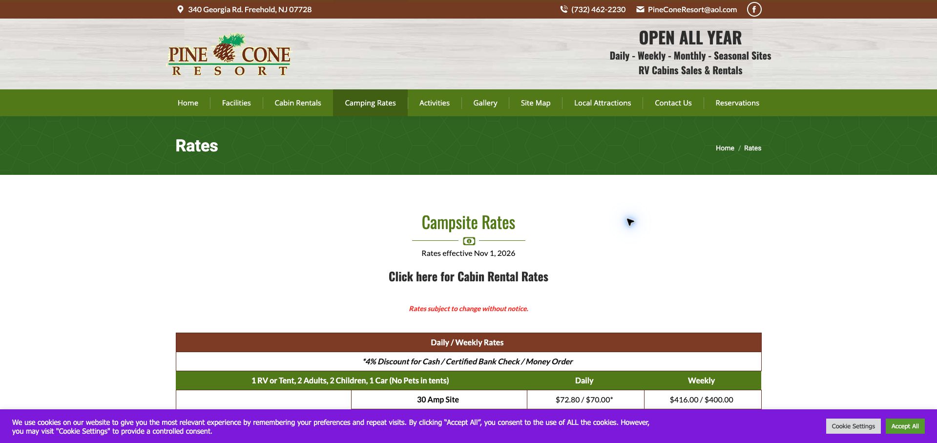
Pine Cone Resort’s rates page uses a green title band and breadcrumb before introducing its campsite pricing. The effective date, a separate cabin-rate link, and a change notice appear above a table with daily and weekly columns. The shared header supplies location and contact details, while the main navigation distinguishes facilities, rentals, camping rates, activities, and reservations. A dated public audit found WPBakery’s js_composer stylesheet on this exact page. That is a public resource association, not proof that the table is a particular builder element or that the reservation process uses the same technology. Prices in the screenshot are historical captured content.
What you can learn
Treat prices as structured information with an effective date, clear units, and relevant conditions. Separate different accommodation types, preserve table relationships on small screens, and avoid letting decorative spacing or consent overlays hide the terms visitors need before reserving.
Pros
An effective date gives the rate table useful temporal context.
Cabin pricing has a distinct route from campsite rates.
Cons & considerations
Large gaps push much of the rate table below the initial view.
The cookie banner covers the lower table area in the captured state.
Platform source: Public-page WPBakery resource observation, 2026-11-07. The dated public audit found resource references beneath /wp-content/plugins/js_composer/, the WPBakery Page Builder plugin directory identified in its official theme-integration documentation. References establish a plugin asset association, not which individual sections were authored with its editor, execution of every asset, or access to the private WordPress editor. Platform evidence is separate from the direct website screenshot and is not a complete current infrastructure audit.
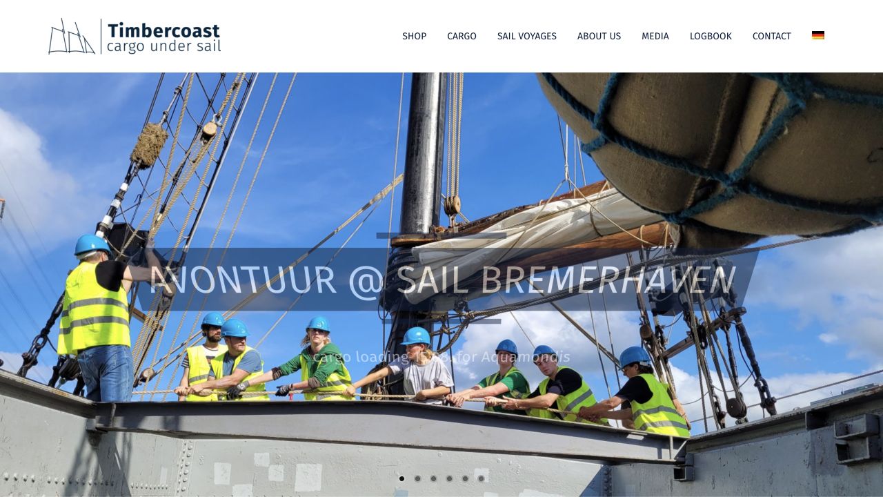
Timbercoast opens with a working-vessel photograph and a campaign caption, while a compact header separates Shop, Cargo, Sail Voyages, company information, media, and the logbook. The image shows people and equipment in context rather than an abstract shipping graphic. Pagination dots reveal a sequence of campaign panels. The dated public audit identified WPBakery’s js_composer stylesheet on this English-language page. That observation supports an asset association but does not establish which slider or commerce components were built with WPBakery, or substantiate environmental performance claims. The screenshot records the public presentation and its original capture state.
What you can learn
Use documentary images to explain a specialist activity, then make the distinct commercial and editorial routes easy to recognize. Captions need enough contrast and context to remain useful as slides change; the navigation should still work for someone who bypasses the campaign entirely.
Pros
Cargo, voyages, and shopping are separate navigation choices.
The working scene makes the organization’s subject tangible.
Cons & considerations
The translucent campaign caption has weak contrast in this captured frame.
Unlabeled carousel dots provide little information about the other panels.
Platform source: Public-page WPBakery resource observation, 2026-11-05. The dated public audit found resource references beneath /wp-content/plugins/js_composer/, the WPBakery Page Builder plugin directory identified in its official theme-integration documentation. References establish a plugin asset association, not which individual sections were authored with its editor, execution of every asset, or access to the private WordPress editor. Platform evidence is separate from the direct website screenshot and is not a complete current infrastructure audit.
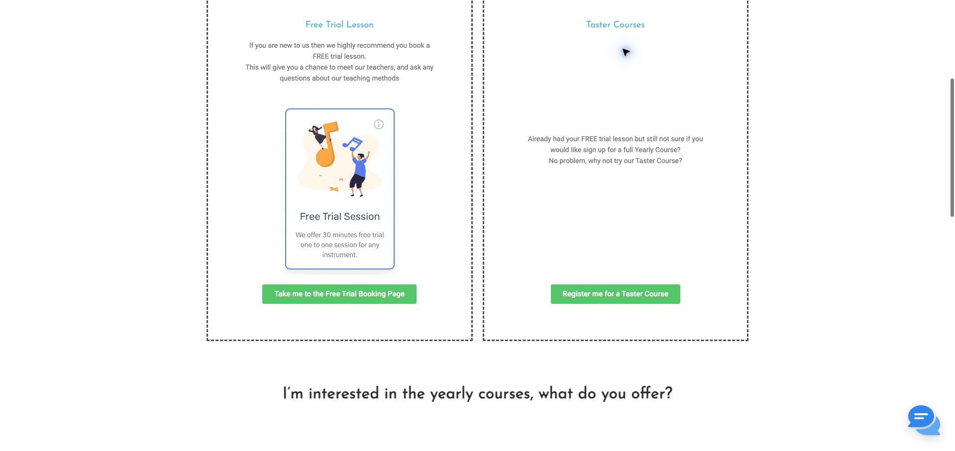
The Masters Music School’s captured pricing section compares a free trial lesson with a taster course in two bordered columns. Each column has an explanation and a green action button, while a question about yearly courses introduces the next section below. The trial card provides additional detail about duration and the individual lesson format. A dated audit found WPBakery’s js_composer stylesheet on this public pricing page. The evidence does not show the private editor, prove that these columns use a particular built-in component, or verify booking availability. The screenshot is a deliberately scrolled content view rather than the top of the homepage.
What you can learn
Compare introductory options using parallel labels, explanations, and actions. Give visitors enough detail to understand the difference in commitment, then lead into longer programs in a separate section; equal column widths alone do not create a useful comparison without balanced content.
Pros
Distinct buttons identify the trial and taster destinations.
The next heading creates a natural transition toward yearly courses.
Cons & considerations
Uneven content density leaves substantial blank space in the taster column.
The dashed borders and small explanatory text create a somewhat fragmented reading experience.
Platform source: Public-page WPBakery resource observation, 2026-11-07. The dated public audit found resource references beneath /wp-content/plugins/js_composer/, the WPBakery Page Builder plugin directory identified in its official theme-integration documentation. References establish a plugin asset association, not which individual sections were authored with its editor, execution of every asset, or access to the private WordPress editor. Platform evidence is separate from the direct website screenshot and is not a complete current infrastructure audit.
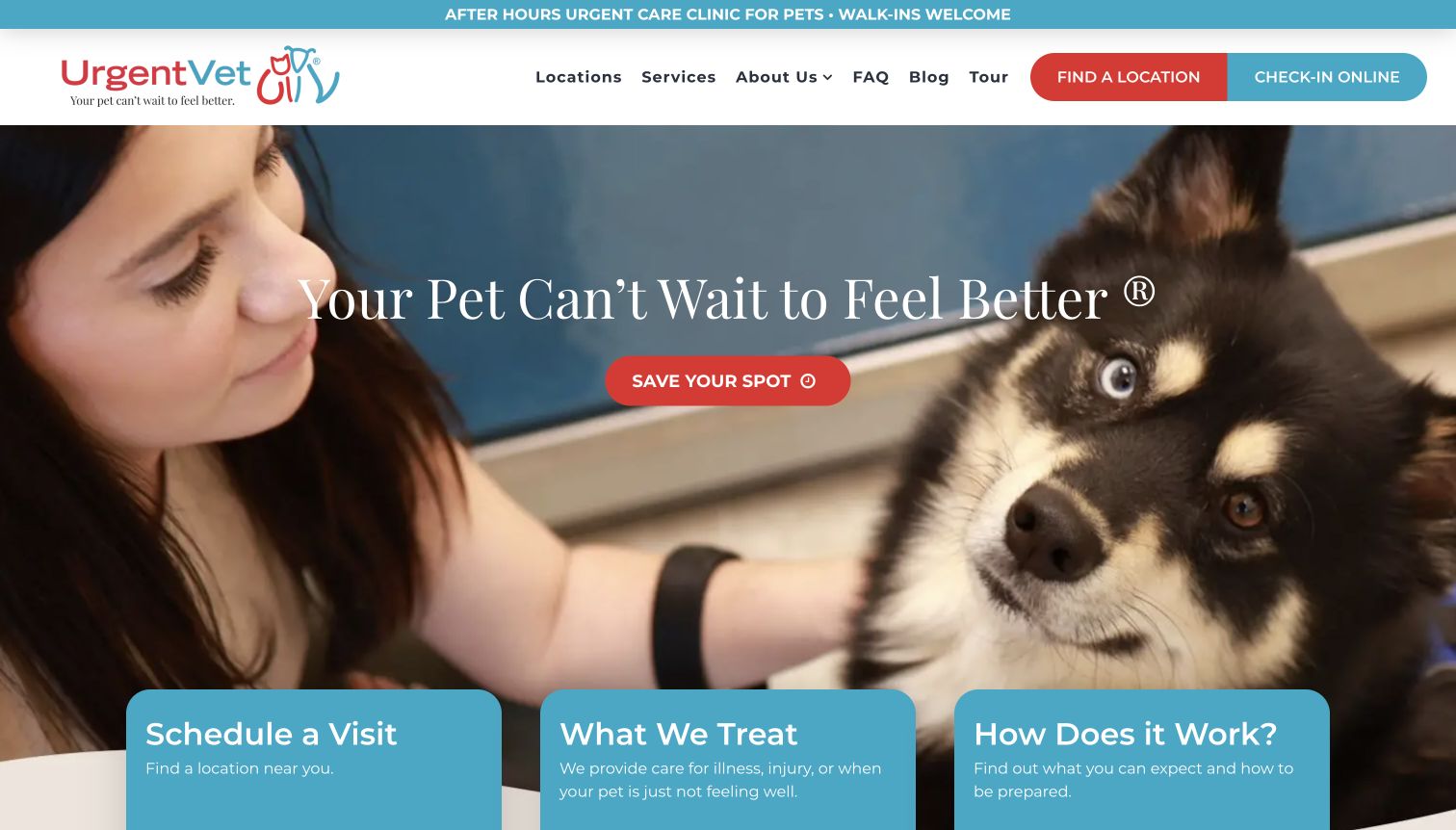
UrgentVet pairs a pet photograph and a short reassurance message with a prominent Save Your Spot action. The header separates finding a location from online check-in, and three cards at the bottom of the hero introduce scheduling, treatment scope, and what to expect. The resulting hierarchy gives the campaign practical supporting routes. A dated public audit identified a WPBakery js_composer component stylesheet on the marketing page. That resource does not establish that check-in, clinical systems, or every visible card is implemented by the builder. This is a design review of the public interface, not an assessment of medical suitability or live clinic availability.
What you can learn
Give a service campaign supporting answers close to its main action. Separate where to go, what the service covers, and how the process works, and keep urgent operational details current on their destination pages rather than relying on reassurance alone.
Pros
Location and check-in are visibly different header actions.
The three supporting cards answer practical questions beneath the campaign.
Cons & considerations
The large hero delays more detailed scope and eligibility information.
Save Your Spot and Check-In Online may need clearer explanation of their relationship.
Platform source: Public-page WPBakery resource observation, 2026-11-03. The dated public audit found resource references beneath /wp-content/plugins/js_composer/, the WPBakery Page Builder plugin directory identified in its official theme-integration documentation. References establish a plugin asset association, not which individual sections were authored with its editor, execution of every asset, or access to the private WordPress editor. Platform evidence is separate from the direct website screenshot and is not a complete current infrastructure audit.
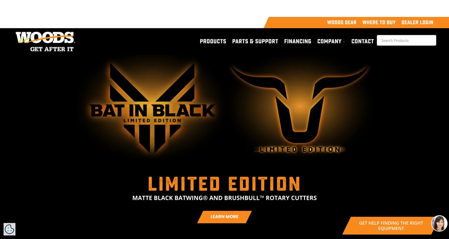
Woods Equipment’s captured homepage uses black and orange campaign artwork to promote a limited-edition product range. A central action follows the product-category description, while the header keeps product search, parts and support, financing, and contact available. A separate utility strip provides dealer access and a purchasing-location route. The dated public audit observed WPBakery’s js_composer stylesheet on the WordPress page. That evidence supports a plugin association at the public-page level, not attribution of the dealer portal, search implementation, or all campaign graphics to WPBakery. The featured product claims remain the manufacturer’s marketing statements rather than independently tested equipment results.
What you can learn
Let a campaign use a distinctive visual treatment while preserving predictable catalogue, support, and dealer routes. Ensure the product category is stated in text and that the next action leads to specifications, so visitors are not forced to infer function from campaign branding.
Pros
Product search remains directly available in the main navigation.
Dealer access is separated from general product exploration.
Cons & considerations
Campaign branding dominates over detailed equipment information.
The help widget and lower campaign action compete for attention near the bottom edge.
Platform source: Public-page WPBakery resource observation, 2026-11-05. The dated public audit found resource references beneath /wp-content/plugins/js_composer/, the WPBakery Page Builder plugin directory identified in its official theme-integration documentation. References establish a plugin asset association, not which individual sections were authored with its editor, execution of every asset, or access to the private WordPress editor. Platform evidence is separate from the direct website screenshot and is not a complete current infrastructure audit.
Kegan has 15+ years of experience working with small businesses, Fortune 500 companies, and everything in between. No development job is too big or too small: he brings the same hands-on attention to a focused improvement, a complete website, or a custom application.
For WPBakery projects, he can help with custom themes and templates, publishing workflows, plugin integrations, migrations, and ongoing maintenance. He works directly with clients on scope, design, implementation, testing, and handover, with an emphasis on clear communication and a system that remains practical to maintain after launch.
Show 3 other WPBakery developersHide other WPBakery developers
Choose the implementation around the operating model
Adapt an existing layout system
Start by identifying which content changes staff actually need. Reuse a sound theme structure before introducing many custom components.
Create a controlled component library
Specify a limited set of repeatable sections and demonstrate their responsive behavior. Make visual rules easier to preserve than to accidentally override.
Plan a migration before replacing the builder
Inventory content dependencies, reusable templates, and any stored builder markup. Test representative pages rather than assuming a plugin can be removed without consequences.
From references to requirements
Plan the content and everyday maintenance
Audit the editing experience
Ask the intended editor to publish a service update and replace an image. Record confusing controls and unnecessary choices.
Review dependencies and updates
Identify the theme, builder, extensions, and custom code owners. Rehearse updates and recovery in a suitable test environment.
Check rendered output
Inspect heading order, reading flow, keyboard navigation, image sizes, and mobile spacing. Editor convenience does not automatically produce accessible or fast pages.
A useful handover demonstration
Ask the actual team to carry out its routine job: publish a realistic update, correct a mistake, preview a narrow screen, and identify who owns an integration failure. For a library or frontend framework, also ask who maintains the content source and deployment. A polished screenshot does not answer those operational questions.
Beyond the screenshot
WPBakery project checklist
Define reusable sections.
Limit arbitrary styling.
Test long content.
Check heading order.
Review mobile spacing.
Optimize source images.
Inventory add-ons.
Assign update ownership.
Test rollback.
Plan builder-removal consequences.
Test with real content, a keyboard, a small screen, slow or failed requests, and the people who will maintain the system. These are planning checks, not an accessibility, security, performance, or search-ranking certification.
Sources & editorial method
How this WPBakery collection was reviewed
Twenty distinct public properties have direct website captures and original design reviews. The first five are explicitly identified recognizable organizations or established specialists. Platform evidence is scoped to each named property; documentary associations, dated observations, and narrower asset-only signals remain qualified. Captures and technology verification have independent dates. A bounded public stack audit was attempted for every source, preserving inaccessible and unknown results. No private administration or transactions were inspected.
Every image is an unmodified capture from the actual website, with its source and capture date. Some captures are reused from our shared catalog; their dates remain the original capture dates. None comes from a vendor gallery or a generated reconstruction. Moving imagery and live content can change.
Technology attribution uses public page assets or metadata, official platform documentation, or a cited first-party project case study. Documentary and framework-relationship evidence is identified where used; it is not a complete current backend inventory. A CMS image CDN alone does not establish a full CMS deployment. A library’s presence does not prove which individual controls use it, and a platform label does not establish AI authorship.
The composition notes, lessons, pros and tradeoffs are original editorial observations. We have not measured conversion, traffic, security, performance or accessibility conformance. Website owners retain their brands and imagery; these examples are not our client portfolio. Written, Edited and Curated are independent records, not dates advanced by a build. See our editorial standards or suggest a correction.
Questions worth asking
WPBakery website development FAQs
Do WPBakery assets prove the whole page uses the builder?
No. They establish a plugin association, with CSS-only or image-only evidence qualified in the individual records.
Should editors have unlimited layout controls?
Only when that matches their skills and workflow. A smaller controlled library often makes routine publishing more consistent.
Can the builder be replaced without content work?
Do not assume so. Inspect the actual stored content and template dependencies before planning a migration.
Do these examples establish performance results?
No. Visual reviews and public resource evidence do not substitute for measured performance tests.