Best Cloud Hosting Websites of 2026 (28 Real-World Examples)
How to make a hosting offer understandable, show the work behind a running service and help visitors choose an appropriate next step.
Cloud hosting website design is not only a matter of making infrastructure look impressive. A useful site explains exactly what is hosted, who operates each part, how a visitor can evaluate the service and where existing customers go when they need help.
This collection deliberately includes several provider models: general application hosts, managed website platforms, hosted databases and backends, and specialist compute services. They share the task of explaining remotely operated infrastructure, but they are not interchangeable products. A visitor looking for managed WordPress hosting needs different information from a developer evaluating a hosted database or a team planning a compute workload. The first design decision is to identify the actual offer, not to make every provider sound like the same all-purpose cloud.
A hosting website also has to serve people at different moments. Someone comparing services may need product scope and plan detail; a developer trying a platform needs prerequisites and a small successful first task. An existing operator may need account access, documentation or a status update immediately. Those journeys should not be collapsed into a single large start button. Strong public navigation acknowledges them without turning the first screen into an exhaustive operating manual.
Use the examples as design references rather than independent hosting recommendations. Public descriptions, interface illustrations and customer marks do not verify uptime, speed, security, privacy compliance, support quality or total operating cost. Each screenshot records an actual page and date. Rechecking the current provider offer does not make an older image new, and a documentation gateway is identified as a documentation view rather than relabelled as a homepage.
Before the examples
What makes good cloud hosting website design in 2026?
Name the hosted component
Say whether the service runs websites, application code, databases, storage, inference workloads or a combination. Explain how the parts relate. A cloud metaphor can establish a visual identity, but it cannot tell a visitor which component they are selecting or which technical work remains theirs.
Separate learning, starting and operating
Keep product evaluation, documentation, account access, support and service status identifiable. Someone trying to understand the offer should not have to create an account first. Someone managing an existing workload should not have to navigate a new-customer campaign to find help.
Explain responsibility rather than just features
A managed service still has boundaries. Identify what the provider runs, what the customer configures and which maintenance tasks depend on the chosen offer. Have the relevant product and operations teams review this material rather than inferring responsibilities from a reassuring illustration.
Make plan comparisons meaningful
Organise price information around the actual units, included resources and service differences. Distinguish an introductory offer from ongoing terms. Avoid a feature table whose ticks look reassuring but do not help visitors understand which workload or operating requirement each plan supports.
Show a real evaluation path
Connect the introduction to a useful example, demonstration, documentation route or technical conversation. Explain what an account-starting action begins. Sample dashboards, logs and deployment states should be identified as examples, not presented as independent proof of operating results.
Keep important information available without spectacle
Motion and infrastructure artwork can give a technical brand a strong identity. They should not hide the service category, pricing route or task navigation. Test the actual text, controls, forms, documentation and small-screen journeys rather than treating a polished desktop hero as a complete experience.
The collection · 28 examples
28 cloud hosting websites worth studying
Compare the information patterns within the actual service category. Some examples introduce general application hosting, while others explain a managed content platform, database or specialist compute service. The reviews identify that role and describe only the accepted public view, including clearly labelled documentation sources.
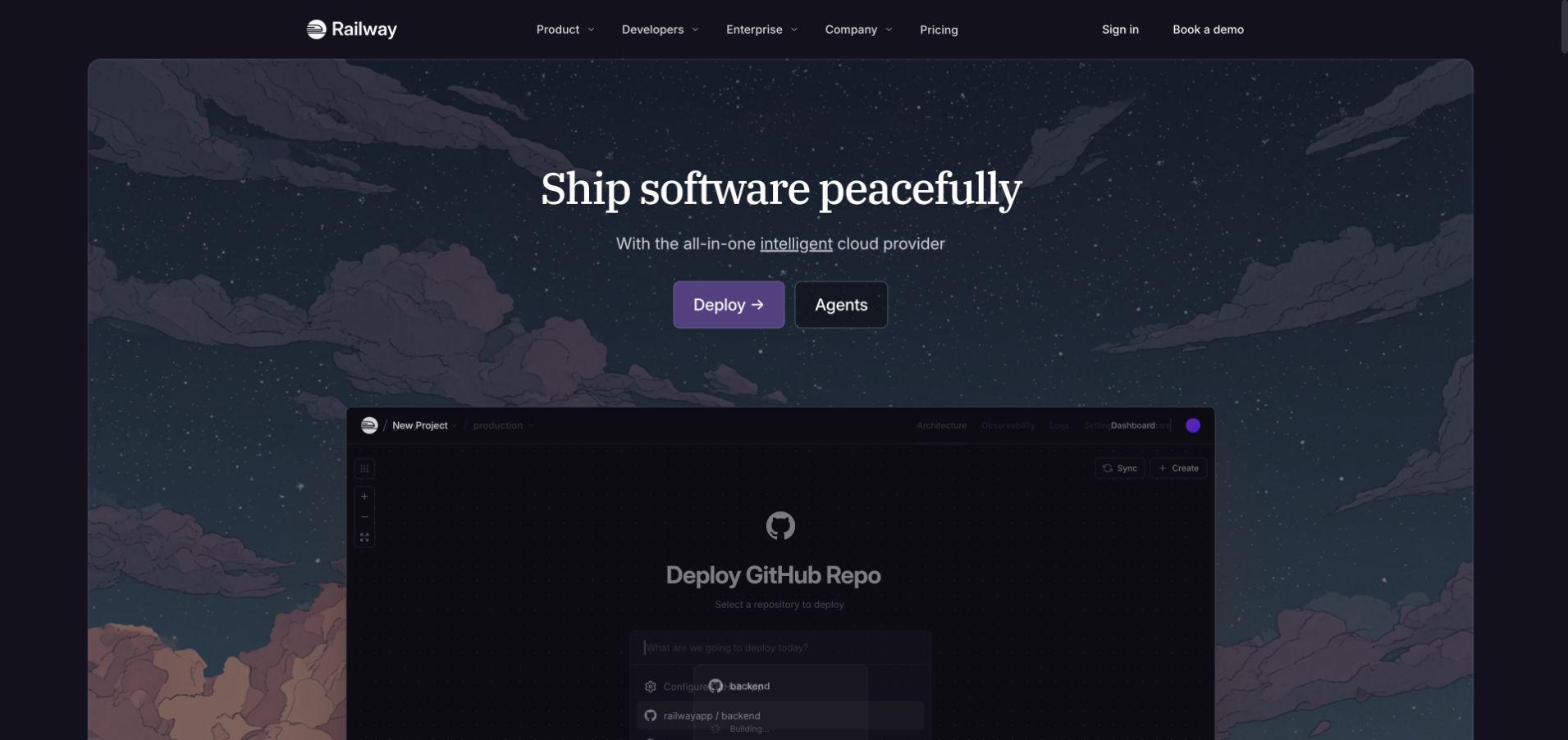
Railway’s dark opening combines a starry illustrated environment with a cloud-platform proposition. Deployment and agent-related actions are separated, and a public deployment preview begins below the main statement. That interface supplies a development object within the imaginative art. The useful pattern is letting a distinctive world establish the identity while a pictured workflow explains what a developer might begin. A building state inside the illustration belongs to that demonstration; it is not evidence that this review initiated a deployment or measured its completion. The current provider offer includes application and data hosting, not just a decorative software landing page.
What you can learn
Connect the invitation to deploy with the actual steps an evaluator needs to understand. Explain source access, supported workloads, configuration and what starts billing through the appropriate product material. Keep product demonstrations visibly separate from a real project state, especially when an interface uses progress or status labels.
Pros
A deployment preview gives the illustrated introduction a practical subject.
Separate action labels distinguish different starting interests.
Cons & considerations
If imaginative artwork dominates, retain a plain explanation of the hosting category.
If status labels appear in demos, avoid presenting them as independently observed operational results.
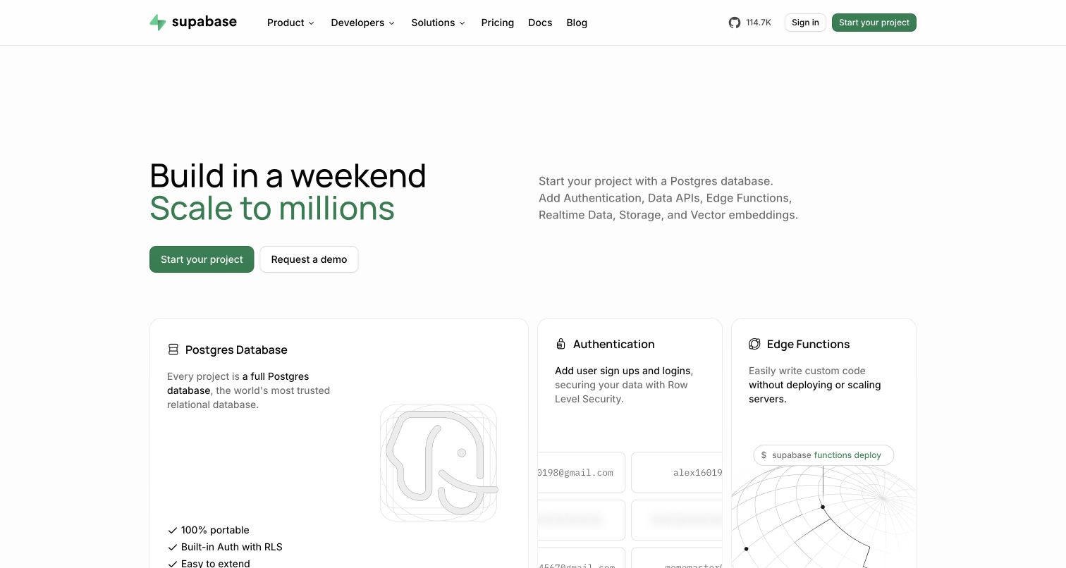
Supabase’s white introduction pairs a broad application-building statement with a grid of backend capabilities. The visible cards identify familiar implementation areas rather than presenting hosting as an anonymous server photograph. An account-starting action sits within the introduction, while the header keeps product, developer resources and pricing available. The useful hosting-design pattern is showing what parts of an application the provider offers to operate. This is a managed database and backend reference, not a claim that it is interchangeable with every website-hosting plan. Public capability labels do not independently establish the configuration, availability or responsibilities of a particular project.
What you can learn
Explain the relationship between database, files, identity and application code before encouraging account creation. Give each component a useful detail route and identify which responsibilities remain with the project team. A concise capability grid can introduce the architecture without implying that every listed service is automatically configured.
Pros
Named backend capabilities give the broad hosting offer concrete components.
The white layout keeps individual product destinations distinguishable.
Cons & considerations
If several services share one platform, explain their billing and configuration boundaries.
If the introduction promises a complete backend, clarify project-specific setup and ongoing responsibilities.
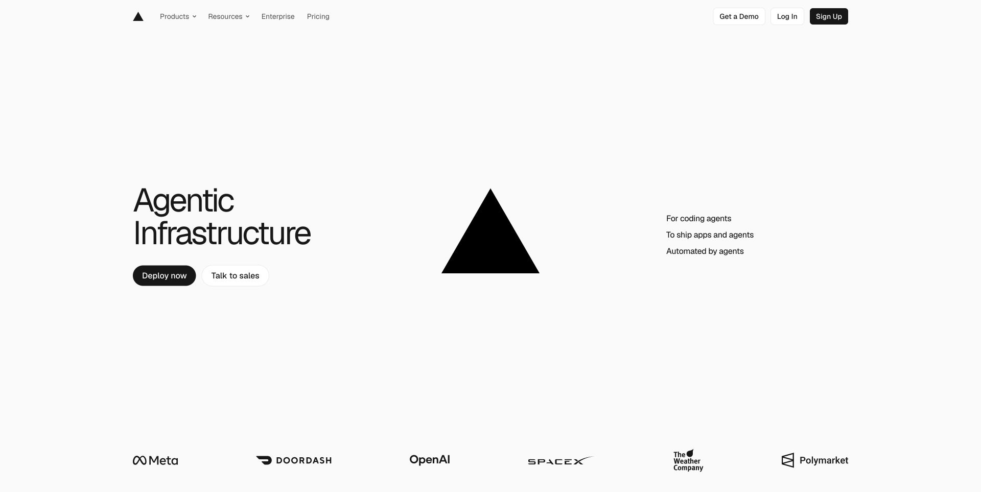
Vercel’s captured opening uses a spacious white field with a large statement on the left and a black triangular visual near the centre. Phrases to the right suggest different parts of the development proposition, while a customer-mark row begins below. The restrained header leaves the introductory composition open. The useful pattern is giving an infrastructure brand a memorable organising form without turning the first screen into a feature catalogue. Current official material establishes a web-application deployment and compute offer; the image does not independently verify the performance, reliability or architecture of a site deployed through the platform.
What you can learn
Make a broad deployment proposition concrete through the next layer of product information. Explain the relationship between a source change, a build, a running application and delivery. Preserve direct routes for pricing and developer guidance so visual simplicity does not become an obstacle to understanding the actual service.
Pros
The spacious composition establishes a clear visual hierarchy.
Short supporting statements divide the broad proposition into smaller ideas.
Cons & considerations
If the opening is deliberately minimal, ensure practical product detail follows promptly.
If customer marks imply broad adoption, distinguish reputation from evidence for an individual workload.
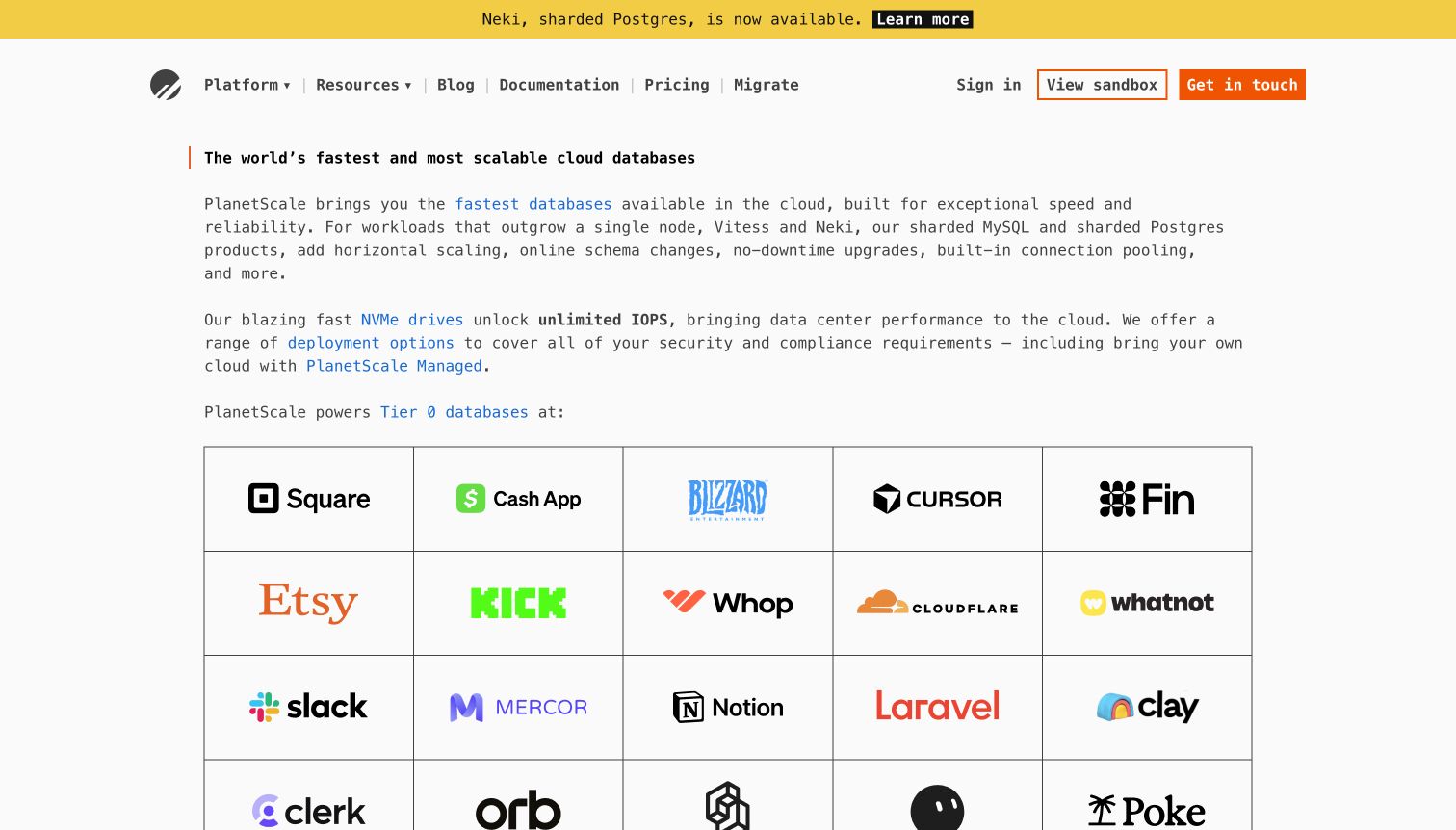
PlanetScale’s captured page uses a text-led introduction, monospace details and a structured customer-mark grid rather than a large lifestyle photograph. A yellow announcement is visibly separate from the permanent navigation. The composition makes the database category feel specific, with room for a fuller explanation than a very short slogan would allow. The useful pattern is a technical identity that leaves the main proposition readable. This example belongs to managed cloud-database hosting; it should not be treated as a generic website plan or evidence that every customer uses the same database engine, deployment model or operational configuration.
What you can learn
Name the hosted component and explain where it sits in the customer’s architecture. Developers evaluating a database need routes into connection, migration, operating and pricing information, not just general business outcomes. Keep announcements distinct from stable instructions, and scope performance or compatibility claims to the actual documented conditions.
Pros
The text-led layout gives a technical product room for explanation.
The announcement is distinguishable from permanent product navigation.
Cons & considerations
If technical language leads, provide an understandable starting route for non-specialist buyers.
If customer logos support the offer, do not let them replace workload and operating detail.
Cloudflare’s earlier accepted capture uses a large orange introduction with a prominent headline, supporting copy and a distinct starting action. The strong colour unifies a wide infrastructure offer without showing every product together. Navigation remains available above the main field. The useful pattern is visual consistency across a portfolio that includes application hosting and compute as well as network and security services. The screenshot is not a complete product map, and a reference to hosting here does not mean that the pictured page establishes the precise configuration or underlying stack of another website.
What you can learn
Help visitors move from the umbrella identity into the particular infrastructure task they need. Application deployment, content delivery, account management and security evaluation call for different information. Use the next layer of navigation and content to clarify those relationships instead of assuming that one broad headline explains every service.
Pros
The orange field creates an immediately recognisable introduction.
The main action is easy to distinguish from navigation.
Cons & considerations
If one brand spans many categories, provide specific task-based routes beneath the umbrella message.
If broad scale or protection statements appear, explain their scope rather than treating them as universal guarantees.
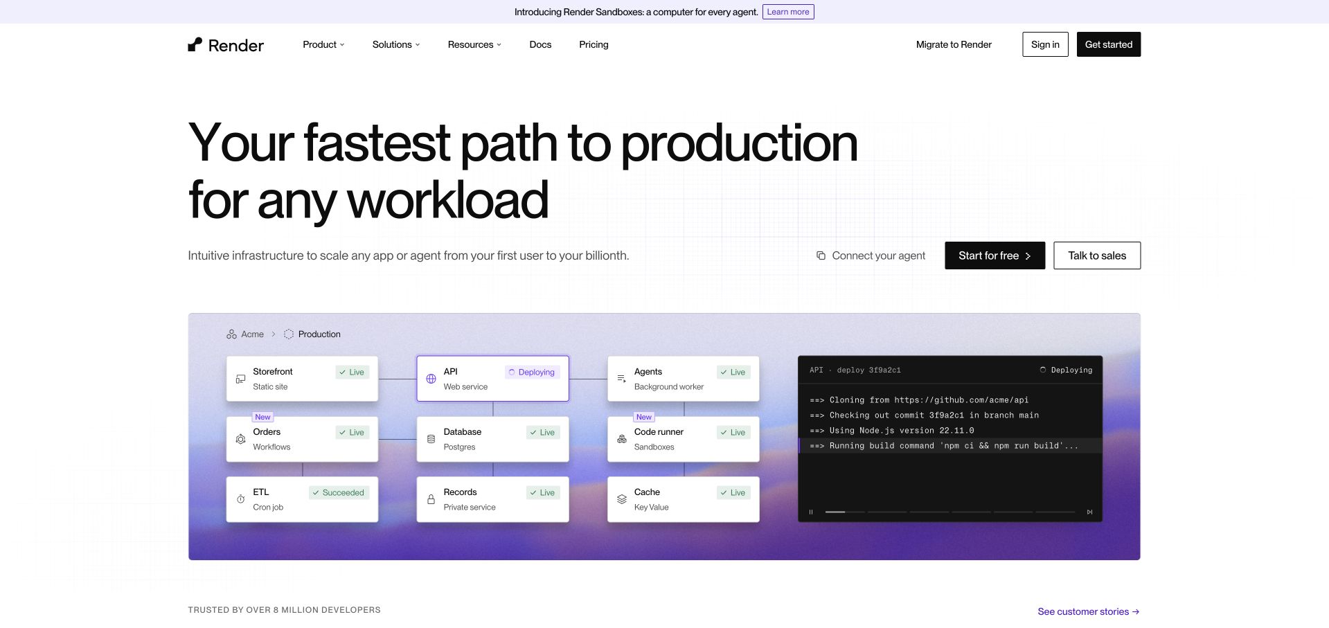
Render’s white opening gives a short hosting proposition a concrete illustration below: connected service-like blocks, deployment context and a log-oriented interface. The product announcement is separate from the central explanation. The useful pattern is showing an application as related operating pieces rather than an isolated upload button. Current official material identifies hosted web and private services, workers, static sites and managed data, but the drawing is a public illustration rather than an independently inspected customer system. Its status and log details do not establish that a deployment succeeded during this review or that another application has the same architecture.
What you can learn
Show the relationships that matter to an evaluator, then link each service type to its real operating and pricing detail. Explain the boundary between the provider-managed platform and the customer’s application configuration. A topology-style image should support understanding without pretending to be a complete implementation plan.
Pros
The service illustration gives application hosting a tangible structure.
The introductory message remains separate from the detailed working view.
Cons & considerations
If the diagram simplifies an architecture, label its illustrative scope.
If several service types share one platform, make their operating and cost differences discoverable.
Neon’s dark captured opening uses green-lit geometric blocks around a central database proposition. Two nearby actions separate starting from documentation, with customer marks beneath the introduction. The visual treatment is distinctive without requiring the reader to decode a busy architecture diagram. The useful pattern is a narrowly framed hosting category given an obvious learning route alongside its account route. Current official material identifies hosted Postgres and related backend capabilities. The public page and the abstract blocks do not independently establish query performance, resource isolation, operating cost or the suitability of a particular database configuration.
What you can learn
Keep the hosted component explicit, then explain the practical choices an evaluator must make next. Database setup, connection information, service boundaries and cost behaviour need maintained product material. A memorable visual can support recognition, but documentation should carry the details that an abstract image cannot communicate.
Pros
The distinctive green treatment supports a focused product identity.
Documentation is visibly available beside the starting action.
Cons & considerations
If the introduction uses an abstract infrastructure image, provide concrete implementation context nearby.
If hosting behaviour sounds automatic, explain the relevant limits and configuration choices.
Aiven’s dark introduction places large purple and green geometric forms around its managed-data message. Trial and demo routes are separately labelled, while a webinar announcement occupies a distinct strip above. The visual language helps a multi-service business remain recognisable before the visitor investigates individual products. The useful pattern is a portfolio introduction with more than one evaluation route, rather than a single sales demand. This is managed data infrastructure across cloud environments, not a directly interchangeable reference for every small-business website-hosting plan. The captured design does not independently establish operational coverage or the conditions of any individual service.
What you can learn
Explain the specific hosted products and the provider’s role in running them. A multi-service platform needs understandable routes by workload, not only a collective brand promise. Keep a low-commitment exploration path alongside assisted evaluation, and identify the assumptions behind migration, management or performance descriptions.
Pros
The bold colour system gives a wide portfolio a coherent identity.
Trial and demo labels distinguish self-directed and assisted evaluation.
Cons & considerations
If product breadth is substantial, provide clear selection criteria beneath the introduction.
If a webinar competes with the main task, keep its promotional role visually separate.
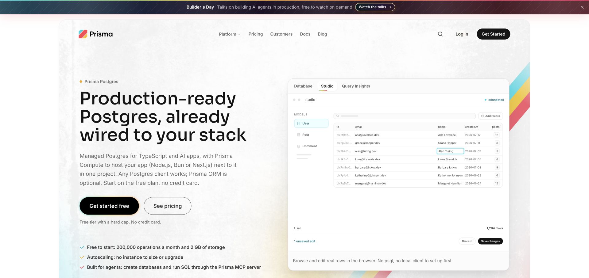
Prisma’s captured product page uses a light introduction and a visible Studio-style table to explain a Postgres-oriented offer. The example puts rows and fields near the product proposition rather than relying on a cloud symbol. The useful pattern is connecting a managed service to an object developers recognise. Current official product material establishes hosted Postgres and an optional application-compute offer; it does not make this page a reference for every general hosting requirement. The pictured table is an illustration, not access to a live customer database or independent evidence of query behaviour.
What you can learn
Show what a person can understand or manage through the product, then explain how that interface relates to the hosted service. Connection setup, schema work, permissions and billing require their own supporting material. Keep a friendly table view from implying that all database administration or application responsibilities have disappeared.
Pros
The data-table view makes the abstract hosting category more tangible.
The light visual treatment keeps the product introduction approachable.
Cons & considerations
If a management interface leads the explanation, clarify the hosted service behind it.
If ease-of-use language is prominent, still identify technical prerequisites and ongoing responsibilities.
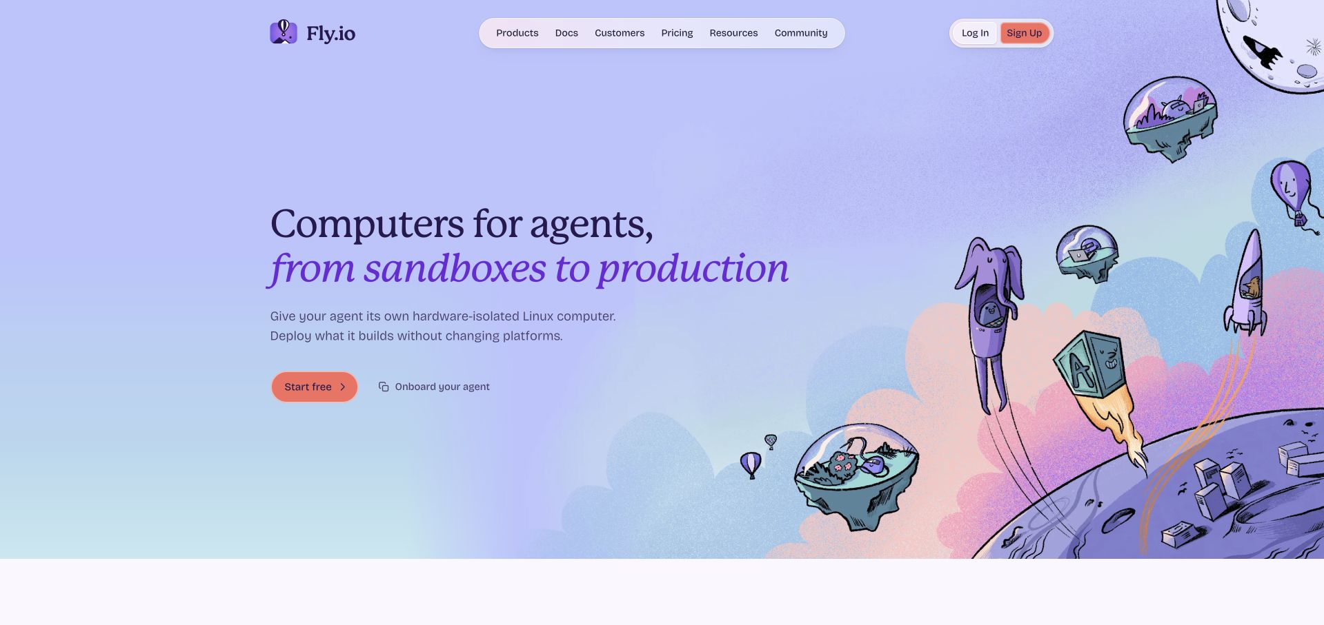
Fly.io’s captured opening uses a purple environment and illustrated floating-machine imagery rather than a conventional server photograph. The introduction is paired with starting and guidance-oriented actions, keeping the next step visible within the expressive visual world. The useful pattern is a memorable identity that still recognises the evaluator’s need for help. Current official material identifies application virtual machines, hosted data and related infrastructure services, not just a website-building tool. The artwork is conceptual: it does not show a customer’s deployment, prove geographic distribution or independently establish performance and resilience.
What you can learn
Let illustration establish the brand, then use precise product language and maintained guidance to explain what runs where. Help visitors distinguish learning the deployment model from creating an account or launching a workload. Information about configuration, data and ongoing operation should be reachable without deciphering the artwork.
Pros
The illustration creates a distinctive identity in a technical category.
Starting and guidance routes give different evaluators sensible options.
Cons & considerations
If playful terminology accompanies infrastructure concepts, supply plain explanations.
If location or scale is part of the offer, scope those claims in product documentation rather than visual metaphor.
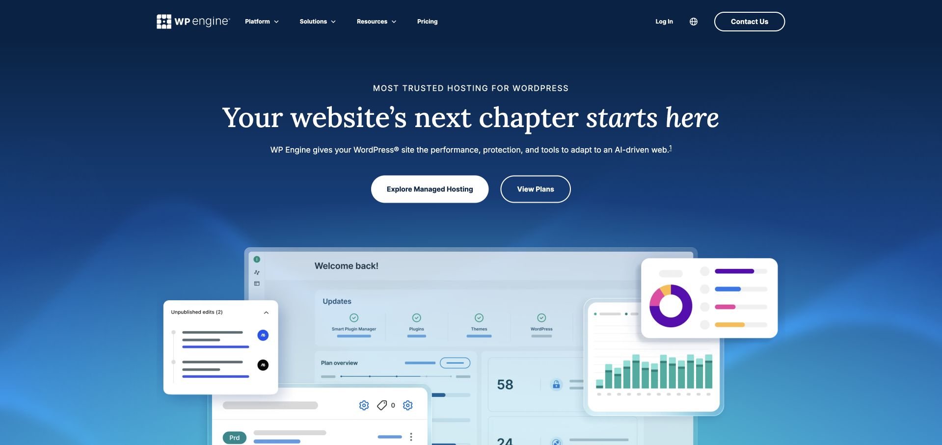
WP Engine’s earlier accepted homepage capture uses a blue gradient, a large hosting statement and distinct plan-oriented actions. Interface panels give the introduction a visible operating surface, rather than leaving the offer at a general digital-experience slogan. The useful pattern is connecting a specialist hosting category to an image of managing websites. The original picture remains dated as captured. A current homepage fetch timed out; the separate official managed-hosting platform page positively establishes the present WordPress-hosting offer. This qualification matters: neither an old screenshot nor a supporting product page independently verifies speed, security, support response or another site’s configuration.
What you can learn
Keep the managed service and its practical boundaries understandable. A business buyer needs a clear plan route, while a technical evaluator needs current platform and operating detail. Explain what the host manages, what the site owner maintains and how those responsibilities change between offers.
Pros
The blue introduction gives the specialist hosting offer a coherent identity.
The interface illustration makes website operation a visible subject.
Cons & considerations
If performance or protection language leads, provide its documented conditions.
If plans differ materially, explain responsibilities rather than relying on feature ticks alone.
Hostinger’s captured opening is a seasonal campaign, using purple and black sections, a large offer treatment and a domain-search field. A small wheel launcher is collapsed, leaving the main content readable. The useful pattern is serving two related but different tasks: comparing hosting and beginning with a domain name. The dated promotion is part of the original image, not a current price recommendation. Current official material establishes cloud, virtual-server and managed website-hosting categories, but the capture does not independently verify their configuration, suitability, performance or total cost for a specific project.
What you can learn
Separate an introductory promotion from the information needed to choose a service. Domain search, hosting selection and an existing customer’s account access should have distinct routes. Explain renewal, included resources and operating responsibilities in maintained plan detail rather than expecting a large discount treatment to answer those questions.
Pros
The domain field provides an identifiable task beyond reading an offer.
The purple campaign treatment keeps the first screen visually coherent.
Cons & considerations
If promotional pricing dominates, make ongoing terms easy to investigate.
If several hosting categories share a storefront, explain which project needs each one addresses.
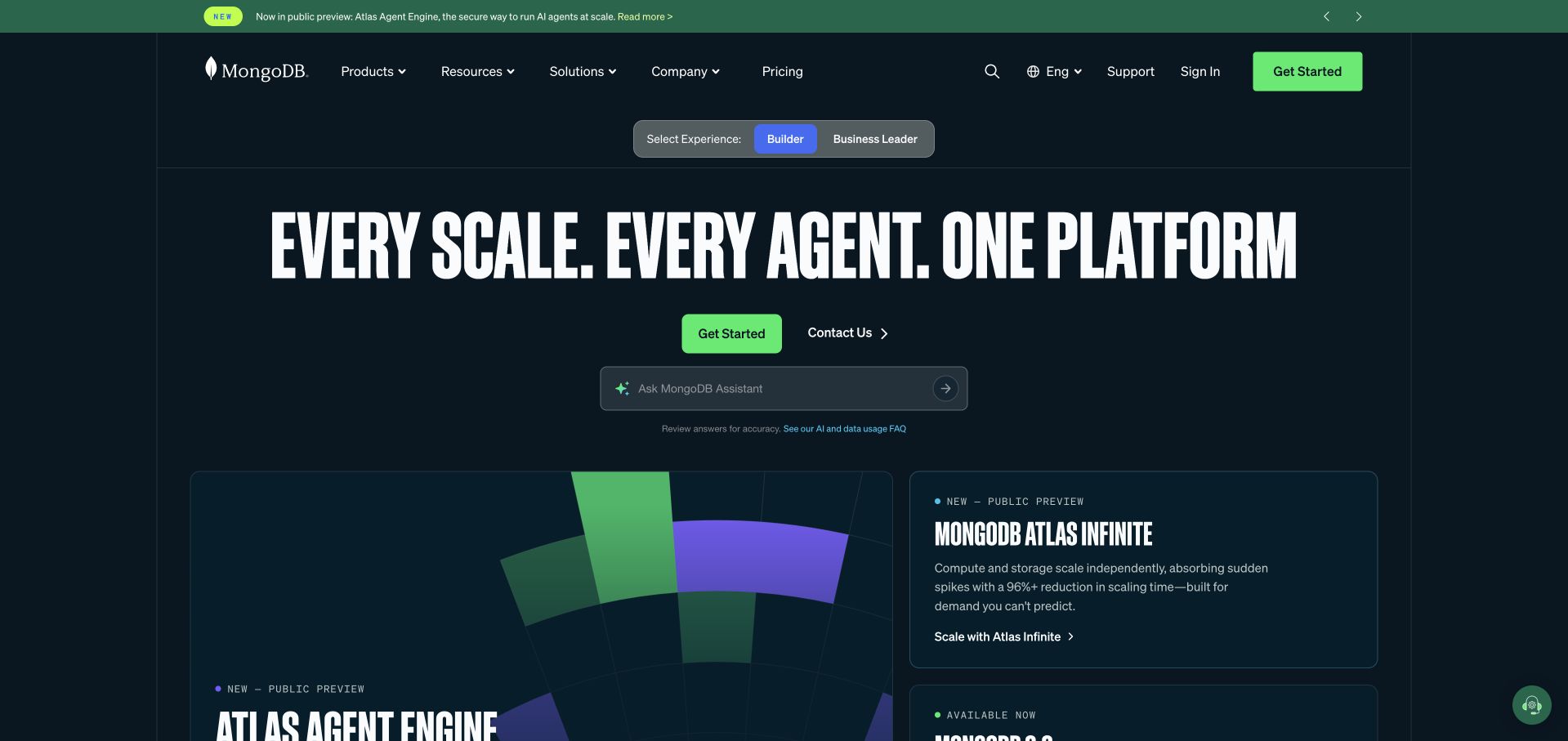
MongoDB’s dark captured page uses a large data-platform statement, separate builder and business-leader choices, and a visible assistant-style input. Product cards begin below, giving the wide proposition more concrete destinations. A small assistant launcher remains collapsed rather than covering the page. The useful pattern is acknowledging that the person implementing a hosted database and the person evaluating the business offer may need different explanations. Atlas provides the genuine cloud-database context for this collection; the company is not included merely because another website uses a MongoDB-related technology. The public interface does not independently establish a customer’s data model, deployment or operational outcomes.
What you can learn
Identify the hosted service explicitly and let different audiences reach relevant detail without inventing different underlying facts. Keep technical setup, procurement questions and account assistance distinguishable. An assistant invitation should supplement stable product navigation and documentation rather than become the only route to understanding the platform.
Pros
Audience choices make different evaluation needs visible.
Product cards begin to break down the umbrella data-platform message.
Cons & considerations
If an assistant is prominent, retain usable routes that do not require conversation.
If several data products share the introduction, clarify which are hosted services.
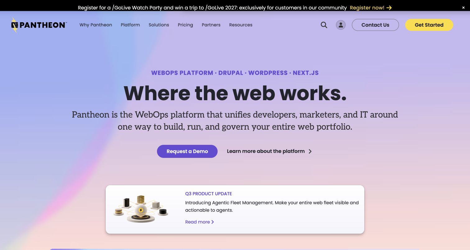
Pantheon’s captured introduction uses a pale gradient and a product-update card beside its broader platform message. A customer-event announcement is kept in a separate top strip, while navigation and evaluation routes remain visible. The useful pattern is connecting a continuing website-operations offer to something concrete that a visitor can investigate. Current official material establishes a platform for building and running web portfolios, rather than a generic consultancy merely discussing cloud services. The update card is a dated public communication, not independent evidence that every customer has the same feature set, workflow or operational results.
What you can learn
Explain the relationship between hosting, development change and ongoing website work. Teams managing a portfolio need to understand environments, ownership and publishing responsibilities as well as an introductory proposition. Product updates can demonstrate activity, but keep stable platform information reachable when announcements are replaced.
Pros
The update card gives a broad platform statement a specific secondary destination.
The event strip is visually separate from the main introduction.
Cons & considerations
If operating terminology is broad, explain the actual tasks and roles it covers.
If a dated announcement supports the offer, maintain permanent product guidance alongside it.
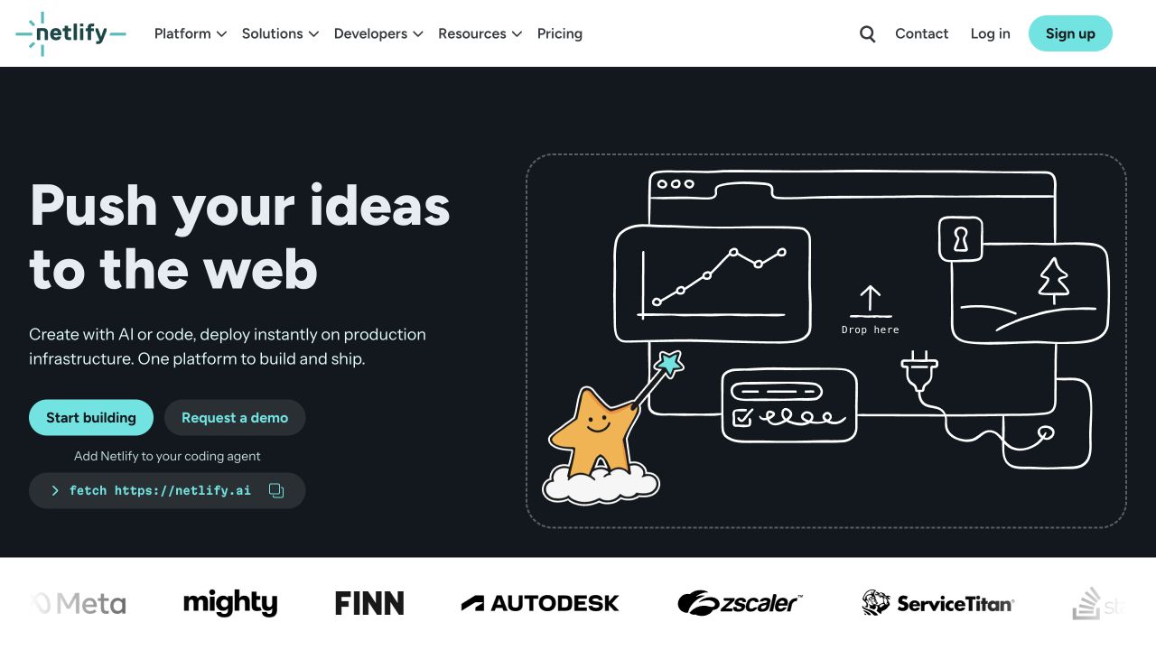
Netlify’s clean earlier capture uses a dark background, a line-drawn browser illustration and distinct start and demo actions. A setup-oriented snippet begins to make the development proposition concrete. This is a separately accepted original image, not the other retained Netlify capture with an expanded cookie panel. Its original date and bytes remain unchanged. The useful pattern is connecting a visual browser metaphor to a practical starting object. Current official material establishes deployment, functions and related hosted services; the picture does not independently establish the backend of another site, the result of a deployment or platform performance.
What you can learn
Show how a visitor moves from project source to a hosted result, then link into the real setup and operating material. Keep self-directed evaluation distinct from a demonstration or sales conversation. A small snippet should identify its context and next step rather than look like a complete production configuration.
Pros
Start and demo actions give the visitor different evaluation routes.
The setup example connects the visual identity to a development task.
Cons & considerations
If the first snippet is simplified, label the prerequisites and follow-on work.
If the platform spans several services, make those boundaries discoverable.
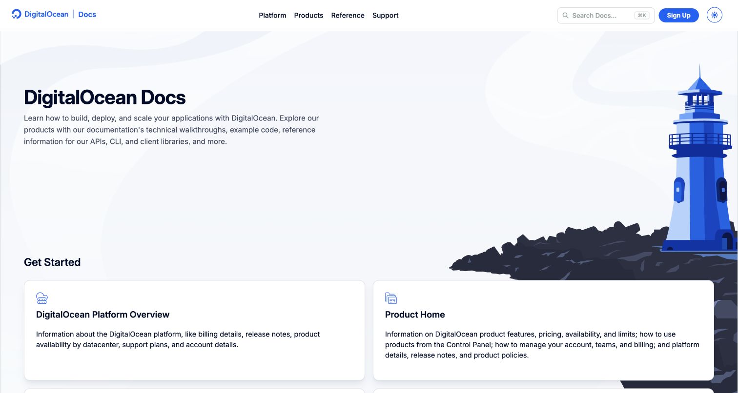
The accepted DigitalOcean source is its documentation gateway, not a marketing homepage. A lighthouse illustration accompanies a light layout with search, platform information and product-starting cards. Those categories give visitors a way into a broad hosting and infrastructure offer without reading an entire product catalogue first. The useful pattern is treating documentation as a purposeful public entry point in its own right. Current source material establishes compute, hosting, storage and managed-data categories. The gateway does not independently verify a particular plan’s behaviour, a customer deployment or the completeness of an operational procedure.
What you can learn
Organise guidance around the hosted components people need to set up and maintain. Keep product selection, first steps and deeper reference distinguishable, and explain version or environment assumptions where they matter. Search is helpful, but the visible structure should also give an unfamiliar evaluator a sensible path.
Pros
The product cards make several infrastructure starting points explicit.
The light gateway separates orientation from detailed reference content.
Cons & considerations
If product breadth grows, keep category labels and documentation ownership current.
If guidance depends on an environment or plan, make that context visible before instructions.
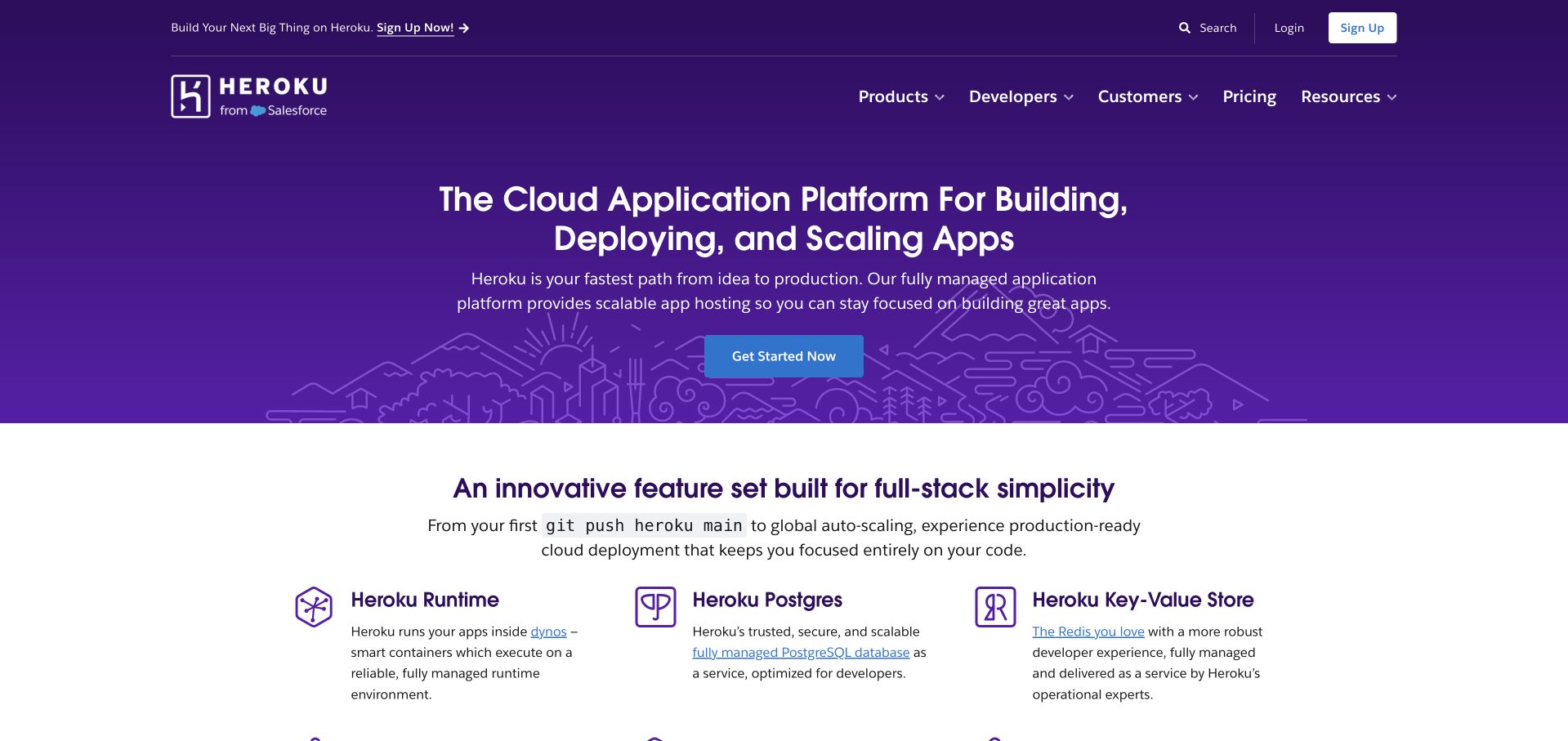
Heroku’s purple captured opening uses a direct application-deployment statement and a central starting action. Named runtime, Postgres and key-value components begin below, giving a general platform proposition a more concrete structure. The useful pattern is moving from the application as a whole to the services a developer needs to understand. Current official material establishes a cloud application platform and managed-data offer; the example is not a third-party customer being mistaken for a host. The public page does not independently establish deployment speed, compatibility or the operating characteristics of a particular customer environment.
What you can learn
Explain the relationship between application execution and supporting data services. Keep a clear getting-started route, but make costs, configuration, persistence and operating responsibilities discoverable before a production commitment. A simple first screen should introduce the platform rather than conceal the work required to run a real application.
Pros
Named service components give the broad platform message useful structure.
The central starting action is easy to identify.
Cons & considerations
If one start route serves several workloads, provide clear selection guidance next.
If data services are separate components, explain their configuration and pricing boundaries.
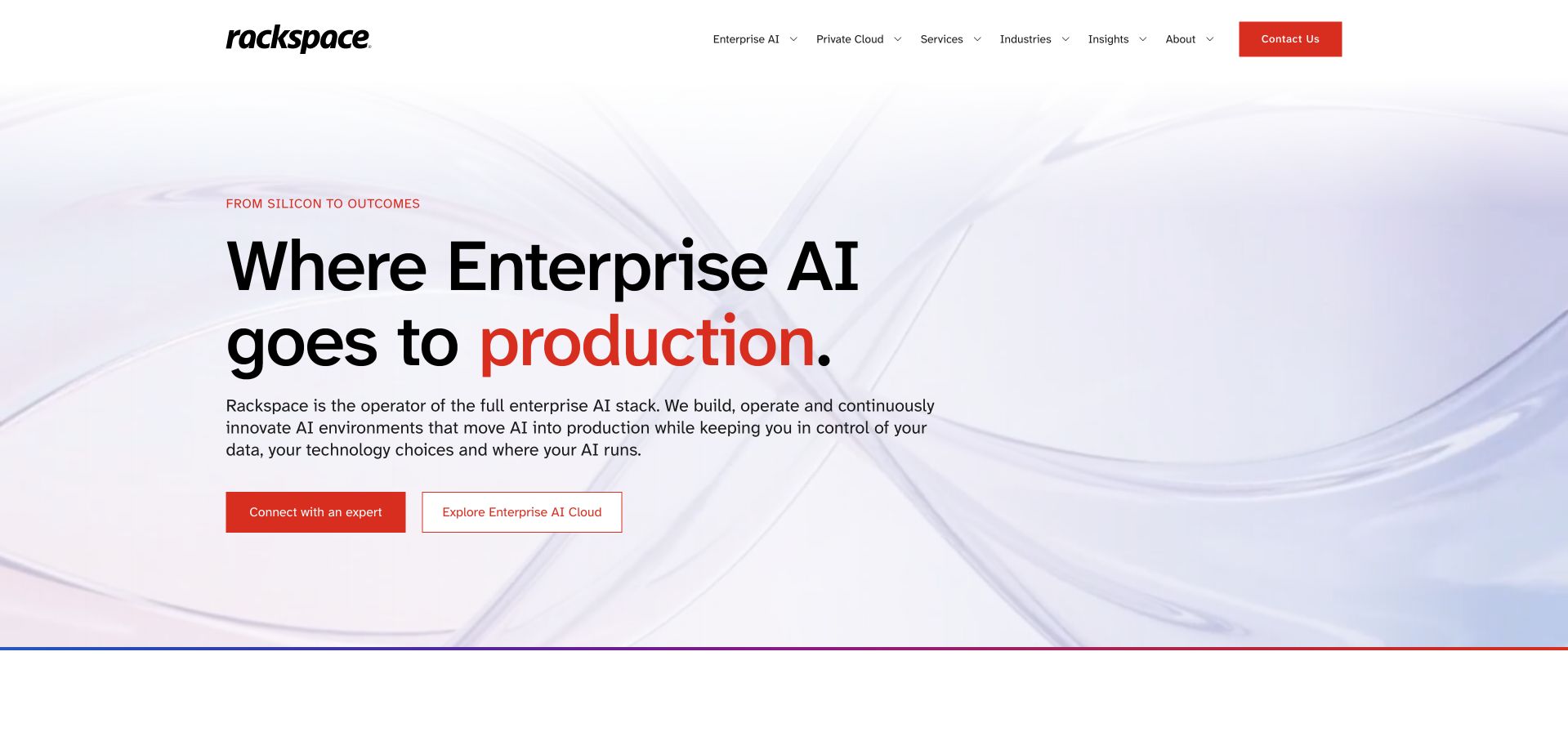
Rackspace’s captured page uses a pale abstract background, a large black-and-red enterprise-oriented statement and two introductory actions. The restrained treatment differs from a small self-service hosting storefront, while navigation keeps private-cloud and broader service categories available. The useful pattern is leaving room for both a strategic proposition and more detailed investigation. Current official material explicitly identifies private cloud, bare metal and managed operations, so the hosting fit rests on the provider’s actual offer. The introductory AI-related positioning is supplier presentation, not evidence of implementation quality, business results or the configuration of a customer workload.
What you can learn
Make the relationship between infrastructure and professional operation explicit. An enterprise evaluator needs to understand the offered service boundaries, the customer’s responsibilities and the appropriate route into a technical discussion. Use specific service material to support a broad transformation statement rather than expecting abstract imagery to explain the delivery model.
Pros
The restrained composition gives the main statement a clear hierarchy.
Two actions allow different levels of investigation.
Cons & considerations
If strategic language leads, connect it to concrete infrastructure and service categories.
If managed operation is part of the offer, explain responsibilities and relevant conditions.
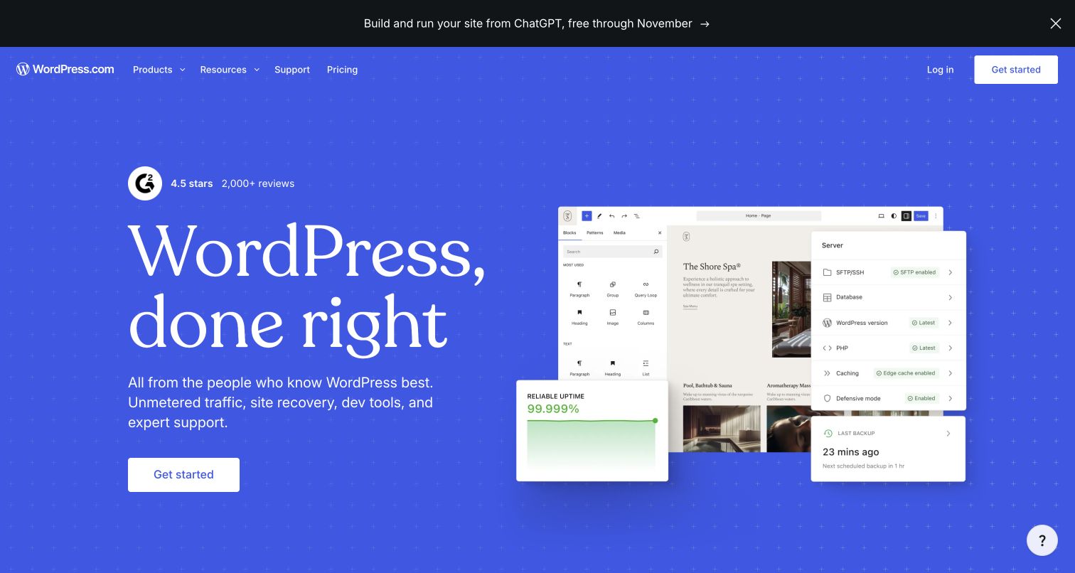
WordPress.com’s captured opening uses a blue field, a publishing-oriented headline and illustrated editor and server-style panels. A starting action gives the composition a practical destination. The useful pattern is relating the hosted service to both making content and running a website, rather than presenting hosting only as machine capacity. This is WordPress.com’s managed hosting business, not the downloadable WordPress project or proof that every WordPress website uses this host. The public interface illustrations do not independently establish another site’s plan, installed software, permissions or ongoing maintenance arrangement.
What you can learn
Explain the distinction between the underlying content system and the managed service being offered. Help visitors understand who creates content, who operates the site and which capabilities depend on the selected plan. A familiar product name can reduce explanation, but it should not erase important differences between hosted and self-managed arrangements.
Pros
Publishing and operating imagery connect hosting to recognisable website work.
The strong blue field gives the introduction a consistent identity.
Cons & considerations
If a brand also names downloadable software, clarify which service the page offers.
If plan differences affect capabilities, make those distinctions visible before signup.
Modal’s earlier accepted capture uses a dark central introduction and green particle artwork around a production-AI proposition. Starting and contact routes are separately visible, while a short explanation connects the identity to cloud infrastructure rather than an end-user chatbot. The useful pattern is a specialist workload category made recognisable without a crowded service grid. Current official material establishes cloud compute, inference hosting, endpoints and sandbox services, which gives this source a genuine provider role in the collection. The artwork and public positioning do not independently establish hardware availability, model quality, runtime performance or costs for a particular workload.
What you can learn
Name the workload and explain what the provider runs, then connect that promise to setup, resource and operating detail. A specialist cloud homepage should help developers distinguish experimentation from a production arrangement. Keep a contact route available without making it a substitute for understandable technical and pricing material.
Pros
The production-AI category gives the cloud offer a focused introduction.
Start and contact actions distinguish self-directed and assisted evaluation.
Cons & considerations
If a workload category changes quickly, keep supporting product scope current.
If infrastructure imagery is abstract, provide concrete execution and resource information nearby.
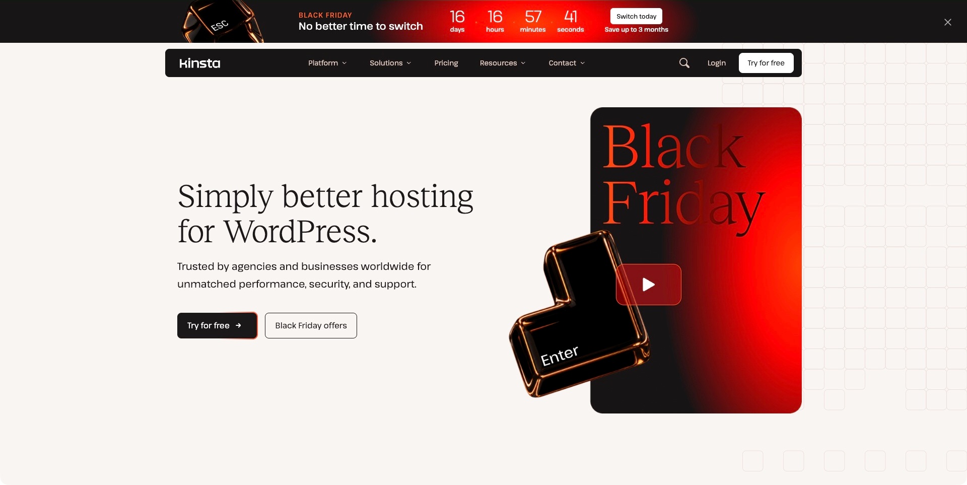
Kinsta’s captured opening combines a cream reading area, a black navigation bar and red seasonal artwork. The large written statement names WordPress hosting directly, with a free-trial action separate from the campaign offer. A countdown strip occupies its own space above the permanent header. The useful pattern is keeping a specialist service category readable even while promotion is prominent. The captured offer is a dated page state, not a current price recommendation. Performance, protection and support language remains the supplier’s positioning rather than an independently tested property of a customer site.
What you can learn
Give the stable service explanation a structure that survives the campaign. A visitor should still understand the hosting category, find plan detail and reach documentation when the promotional artwork changes. Explain trial and renewal conditions through maintained material rather than expecting a countdown to support a purchasing decision.
Pros
The hosting specialism is named in the main statement.
Trial and campaign actions have different labels.
Cons & considerations
If the offer appears in several places, avoid overwhelming stable product information.
If a trial is prominent, clarify what begins and which conditions apply.
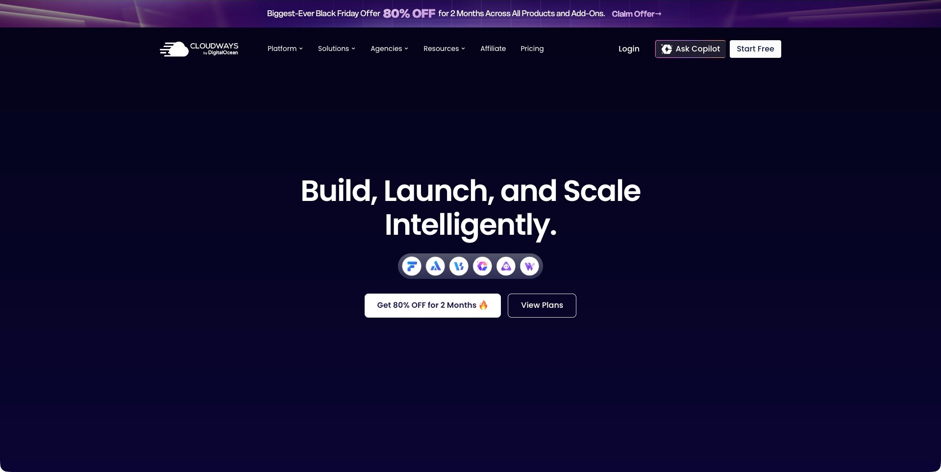
Cloudways’ captured page uses a deep navy field, a large centred statement and a compact row of product-style icons. A promotional action and a separate plan-viewing button sit together beneath, while a seasonal strip is visibly distinct above the main navigation. The useful pattern is leaving an investigation route alongside a campaign rather than making the offer the only next step. The brand is explicitly identified as Cloudways by DigitalOcean. Current official material lists several managed-hosting and application-related products. The small icons do not independently explain their differences, and the public positioning does not establish speed, deployment success or total project cost.
What you can learn
Translate the umbrella proposition into named service choices before asking visitors to select a plan. Explain how products, underlying providers and customer responsibilities relate through appropriate supporting content. Keep account access and plan investigation visible even when a short-term promotion takes visual priority.
Pros
The plan route remains separate from the promotional action.
The dark field gives the broad introduction a consistent identity.
Cons & considerations
If icons introduce several products, provide meaningful names and selection guidance.
If a promotion dominates, distinguish its terms from ongoing service costs.
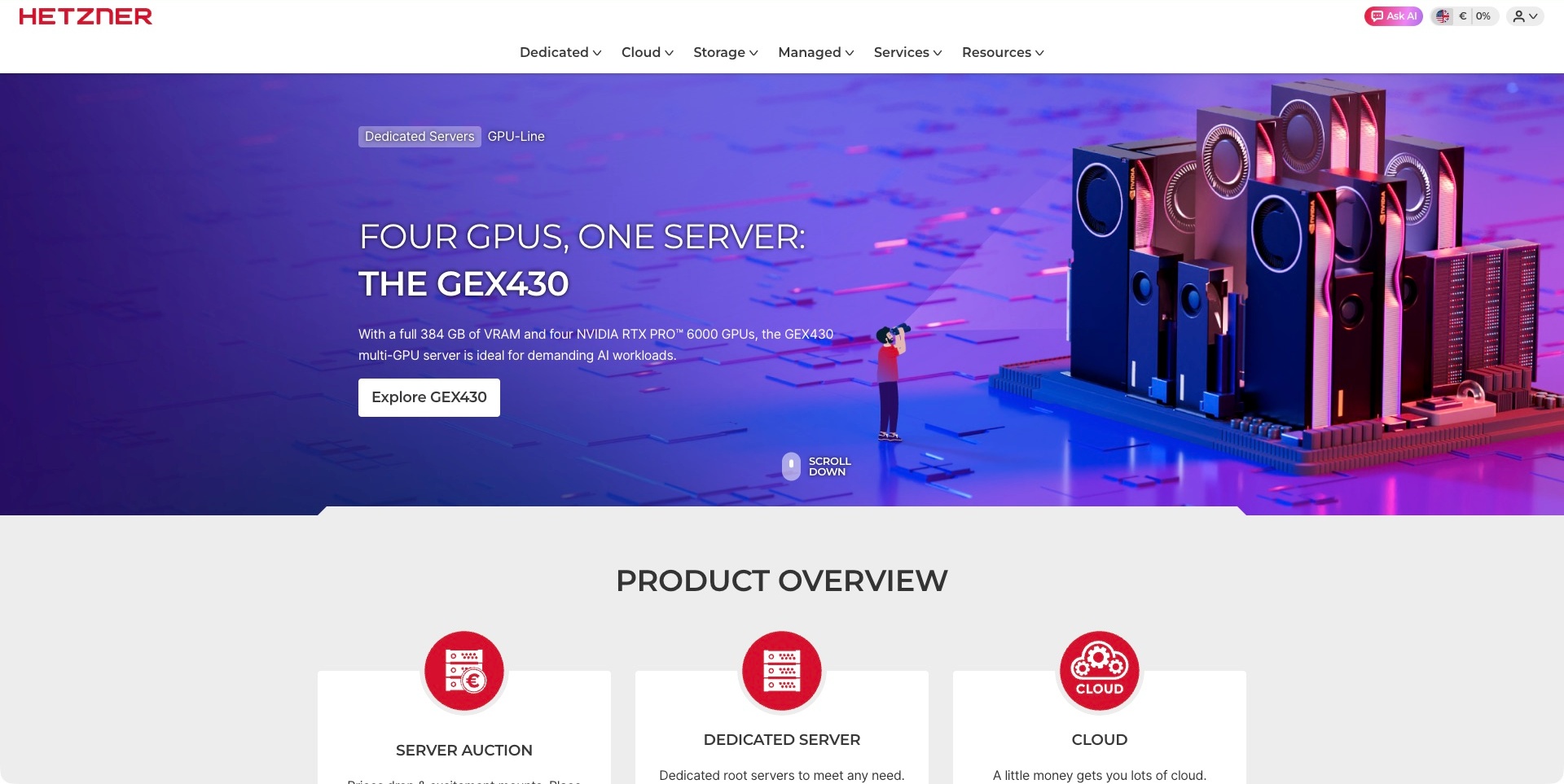
Hetzner’s accepted frame promotes a named GPU server through purple hardware artwork, a short specification description and an explore action. The header separately names dedicated, cloud, storage and managed categories, while product-overview cards begin below. The useful pattern is focusing a campaign on one concrete offer without making that product stand in for the whole portfolio. The visible hardware specification is supplier presentation, not an independent benchmark or availability check. The current English and euro context was retained during capture, rather than silently switching regional assumptions.
What you can learn
Keep the product hierarchy understandable when a specialist campaign occupies the first screen. Explain how a dedicated server differs from cloud or managed offers, and link into relevant operating and commercial detail. Hardware imagery should support those distinctions without implying performance for every possible workload.
Pros
The campaign identifies a particular product rather than an unnamed machine.
The broader category navigation remains visible.
Cons & considerations
If specifications lead, explain their practical scope and conditions.
If regional settings affect offers, make the active context understandable before purchase.
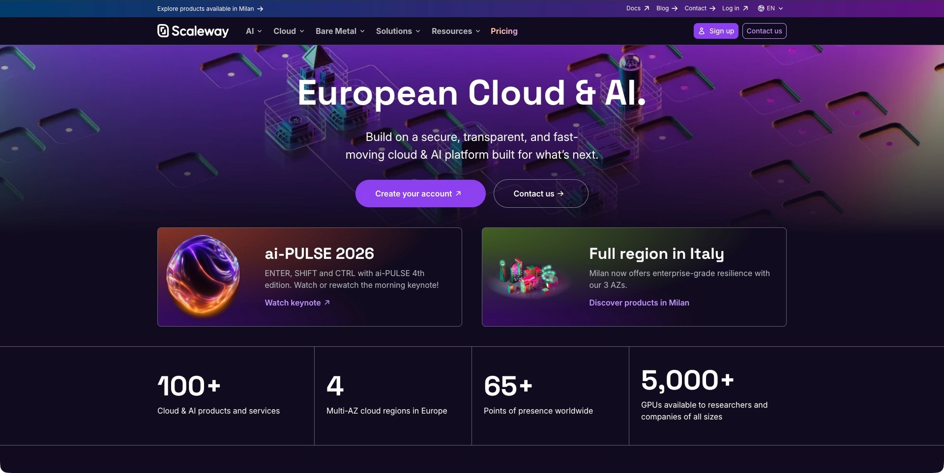
Scaleway’s captured opening uses a purple hardware-like background, a centred cloud-and-AI proposition and separate account and contact actions. A utility row keeps documentation and login distinct, while two large cards introduce an event and a regional product development. Portfolio figures begin below. The useful pattern is connecting a broad infrastructure identity to several concrete investigation routes without putting all products in the hero. The geographic framing, capacity figures and performance or assurance language remain supplier descriptions; the screenshot does not independently verify deployment geography, availability or a customer’s operating requirements.
What you can learn
Use regional positioning as context, then explain the actual products and their documented conditions. An account route, technical documentation and a commercial conversation serve different needs. Keep event promotion and platform updates separate from the stable information visitors need to evaluate a workload.
Pros
Documentation and account access have a distinct utility position.
The two content cards give the umbrella message specific continuations.
Cons & considerations
If geography matters to the offer, explain relevant product and contractual scope.
If portfolio figures appear, identify their meaning rather than treating them as workload guarantees.
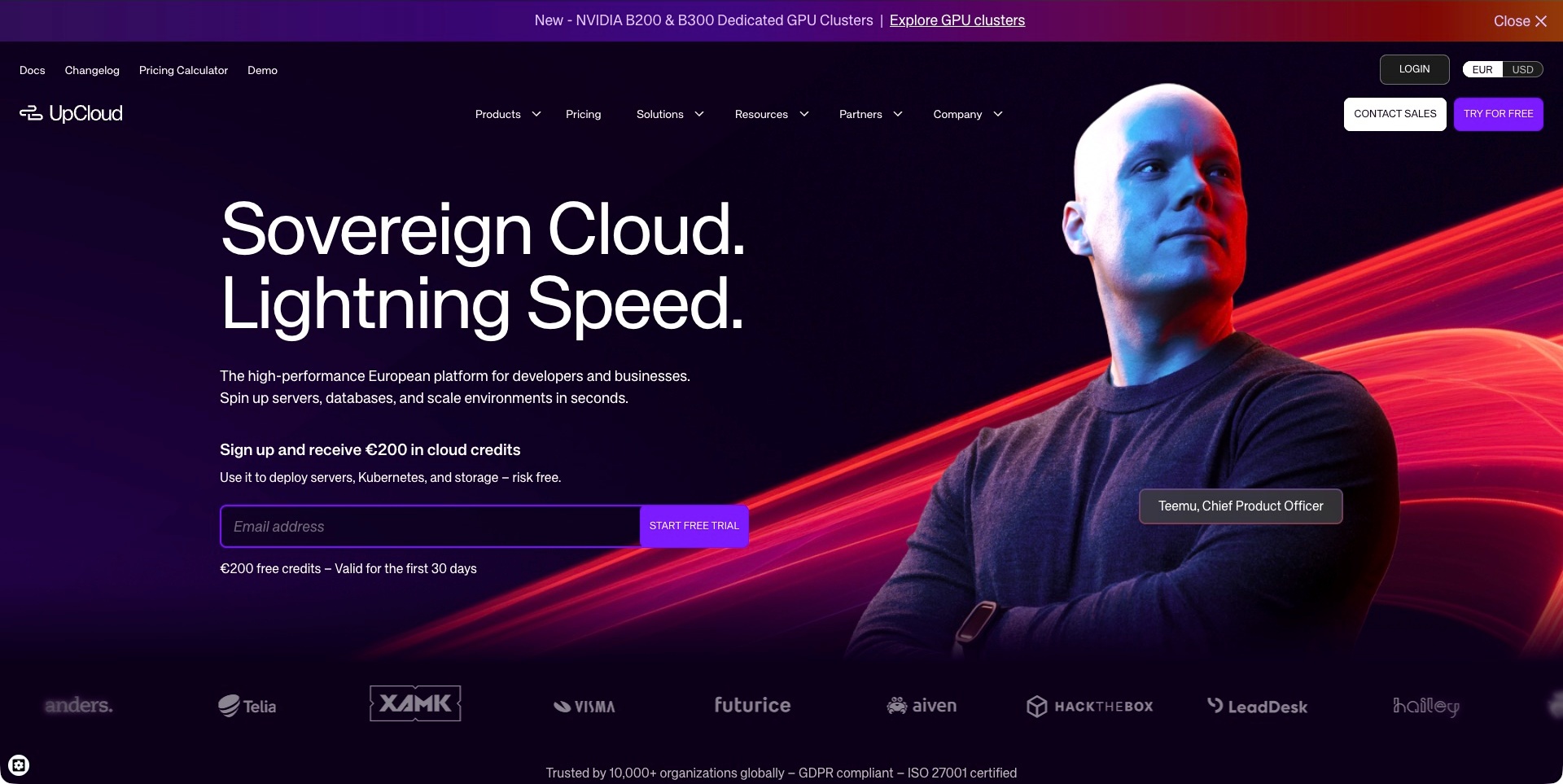
UpCloud’s captured page pairs large white cloud-positioning text with a named company-person portrait, bright red light trails and a visible email trial field. Documentation, changelog, calculator and demo links have their own utility row. Sales and trial actions remain distinct, with a currency control also visible. The useful pattern is putting practical evaluation tools around a visually assertive introduction. The trial-credit statement is a captured offer, not an independently verified entitlement. The sovereignty, speed and assurance language remains supplier positioning rather than a legal or performance conclusion from this design review.
What you can learn
Let visitors inspect the service and estimate relevant costs before entering a trial. Explain what an email field starts and keep currency, offer conditions and product assumptions understandable. A person-led campaign can make an infrastructure brand less abstract without substituting for operating detail.
Pros
The calculator and documentation routes support investigation before signup.
Assisted contact and trial entry have different labels.
Cons & considerations
If a credit offer is prominent, explain its scope and time conditions.
If strong jurisdiction or speed claims lead, link to appropriately qualified supporting detail.
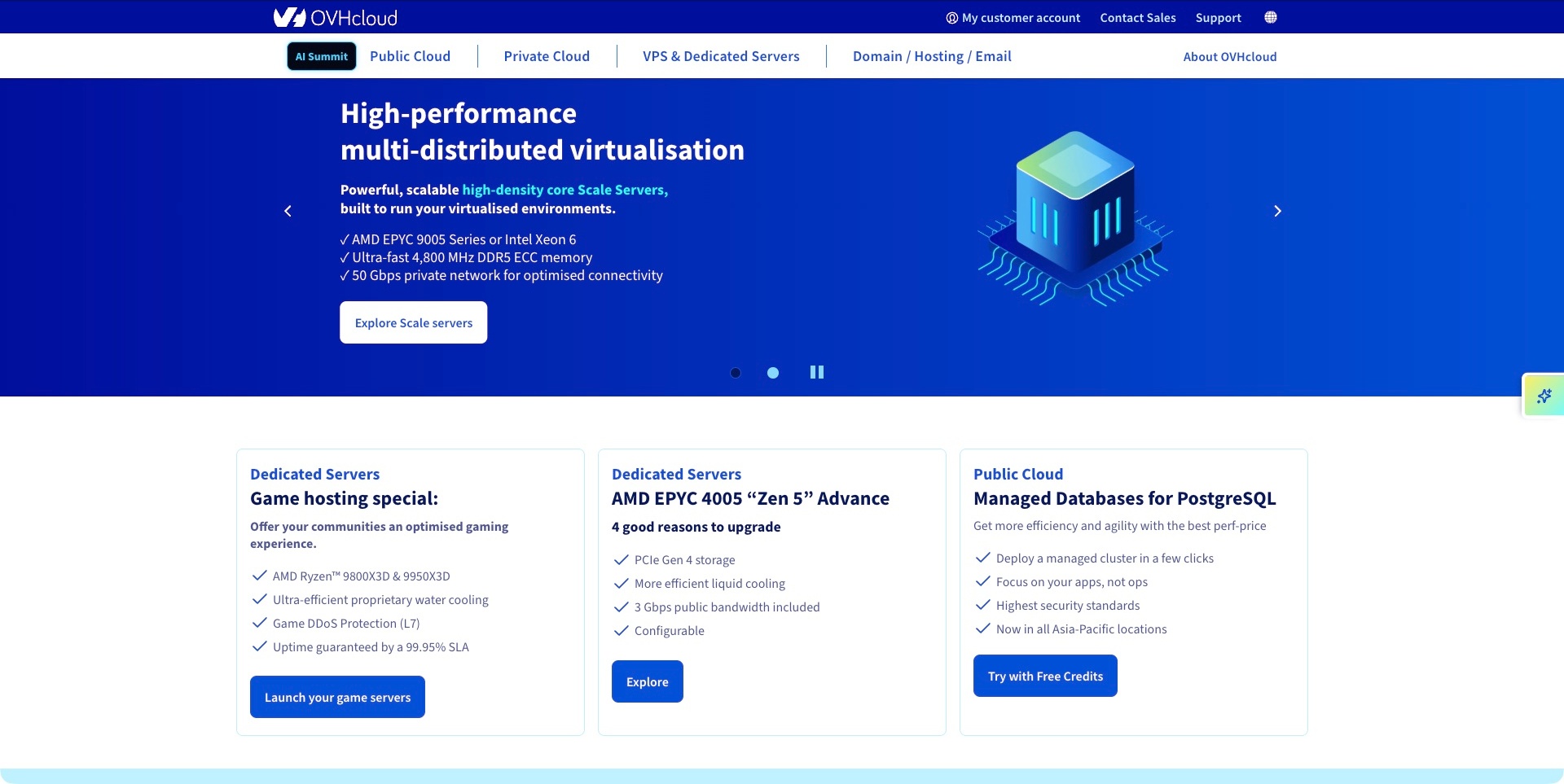
OVHcloud’s worldwide page uses a blue campaign field, a named server proposition and a compact list of technical characteristics beside a processor-style illustration. Visible carousel controls identify the rotating format. Beneath, three cards introduce different server and managed-data offers, while the header separates public cloud, private cloud, dedicated infrastructure and website-related services. The useful pattern is a catalogue with several understandable levels: product family, current campaign and specific offer. The captured specifications and operating claims are supplier statements, not independently tested performance, support or service-level results.
What you can learn
Keep category selection available when the campaign is not relevant to a visitor’s workload. Each offer should lead to its own documented scope, configuration and pricing information. A rotating introduction needs complete meaning within each frame, while the surrounding catalogue should remain usable without waiting through every campaign.
Pros
Product-family labels distinguish several hosting models.
The lower cards give visitors alternatives to the featured campaign.
Cons & considerations
If many technical offers appear together, explain their selection criteria.
If specifications support the proposition, scope them rather than implying universal results.
Liquid Web’s captured page uses a cream background and a large black hosting statement opposite a concise supporting paragraph. An orange solutions action and outlined conversation button provide different next steps. The header separates hosting, sites and stores, software and WordPress, while a utility layer keeps support and login apart. Product-themed cards begin below. The useful pattern is a service-oriented introduction with a clear route to investigate before contacting someone. The Nexcess-associated identity is visible; this is not presented as an unrelated independent company. Reliability, speed and expertise language remains supplier positioning, not an independently assessed hosting result.
What you can learn
Explain what managed means through the relevant service and plan detail. Keep an assisted discussion available without making it the only way to understand the offer. Distinguish support for existing customers from a new commercial conversation, and clarify the service boundaries across related brands.
Pros
Solutions and conversation actions are separately labelled.
The cream layout gives the written proposition a clear hierarchy.
Cons & considerations
If related brands share the header, explain which property handles each task.
If management is a key promise, identify the customer’s remaining responsibilities.
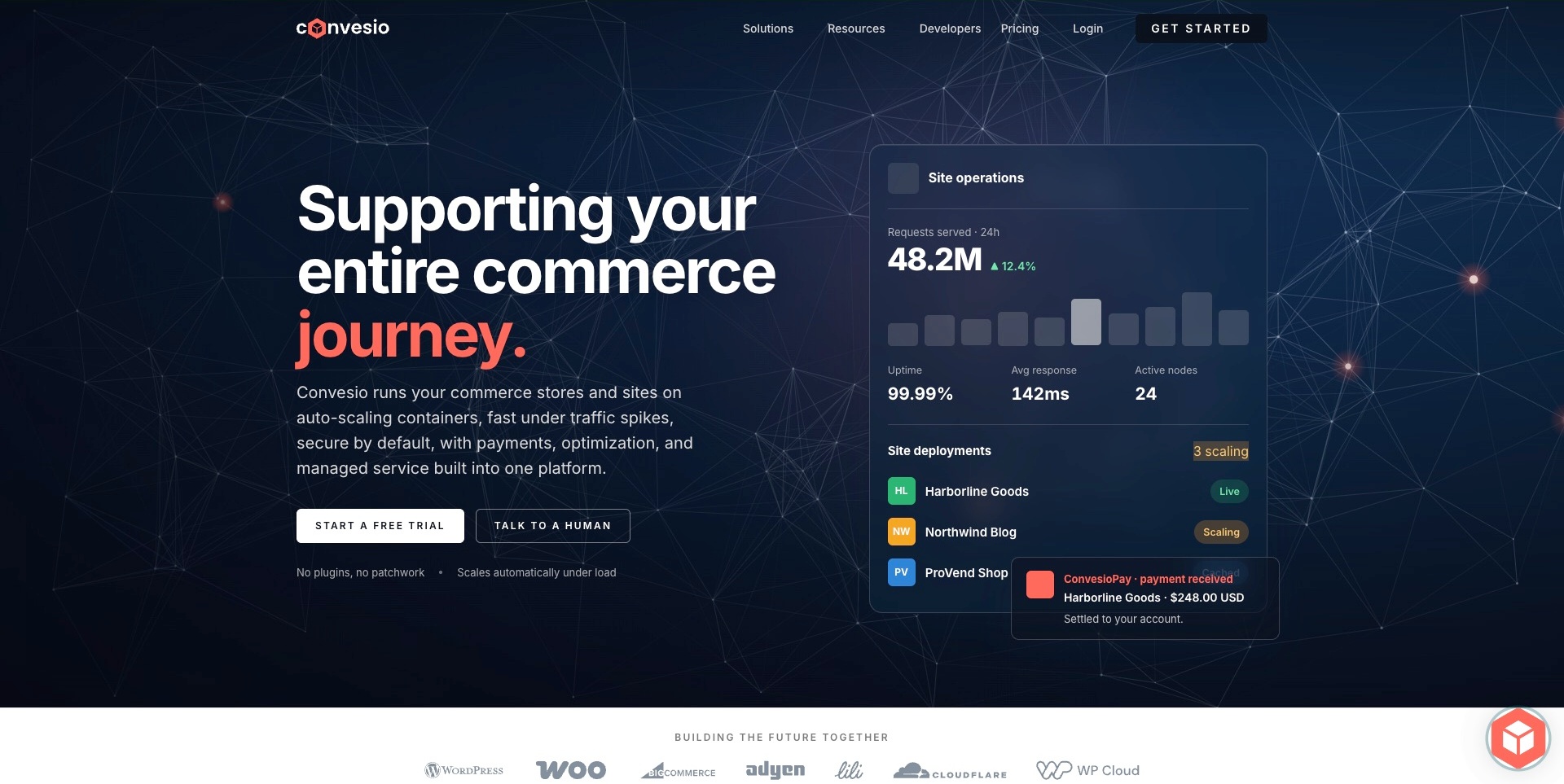
Convesio’s dark introduction pairs a commerce-focused statement with an illustrated operating dashboard. A request chart, site-deployment rows and a payment-style notification give the broad platform message several concrete objects. Trial and human-contact actions are separate, and developer resources remain in the header. The useful pattern is relating hosting to operating a store rather than showing only an anonymous cloud. The displayed uptime, response, request and payment figures are demonstration content, not independently verified service metrics or real transactions. Current official material establishes hosting alongside commerce and payment-related offerings; it does not prove every customer uses the whole suite.
What you can learn
Explain which part of the commerce operation each product supports and what the demonstration actually represents. Keep hosting, payments and optimisation responsibilities distinguishable. A useful dashboard illustration should lead to scoped product material, not imply that a trial automatically configures every operational process.
Pros
The operating objects give the commerce proposition a tangible subject.
Trial and assisted contact have distinct labels.
Cons & considerations
If demo metrics look authoritative, label their illustrative context.
If one platform spans hosting and payments, explain separate product and responsibility boundaries.
Kegan is a freelance web designer and developer with 15+ years of experience helping businesses turn complicated website requirements into clear, maintainable digital experiences. He works directly with clients from planning and design through development, launch, and ongoing support.
For cloud hosting website design, his development approach focuses on clear managed-versus-infrastructure service distinctions, workload and region information, understandable pricing and support boundaries, technical-document discovery, and careful trial or consultation handoffs. The scope can be a targeted improvement or a complete custom build, with responsive layouts, thoughtful content structure, and integrations chosen around the people using and maintaining the site.
Show 3 other cloud hosting website designersHide other cloud hosting website designers
Plan a cloud hosting website around selection, setup and ongoing operation
Define the service model before designing the first screen
Write a plain description of the thing being hosted and the work the provider performs. Identify the intended evaluator, the main alternatives they are considering and the assumptions needed to understand the offer. Avoid beginning with a universal promise such as hosting everything; that can conceal important distinctions between an application platform, a managed website service and a hosted data component.
Turn that description into the content hierarchy. A short category statement can introduce the service, followed by the relevant workload or operating model. Use a diagram only when it clarifies a relationship that prose cannot communicate as efficiently. The drawing should identify whether it is conceptual, an example architecture or a documented implementation pattern.
Check every broad term against the supporting product material. If managed, serverless, dedicated or global has a specific meaning in the offer, explain it through the real documentation. The design should make that explanation easier to find, not invent a definition that the service does not support.
Map distinct journeys for the buyer, developer and operator
List the tasks visitors need to complete before choosing navigation labels. A buyer may compare scope and cost. A developer may want to know whether a workload is supported and how to try it. An operator may need a console, a reference document or a status page. These can overlap, but they should not all end at a sales form.
Design a short path for each important task. Keep an account login distinguishable from creating a new account, and explain when documentation or support opens on another property. A product category menu should help someone choose, while search should support finding a specific known topic. Neither can replace a coherent structure.
Review the paths with realistic scenarios, including visitors who arrive through a deep link rather than the homepage. A pricing article, product page or documentation result should still provide enough context to identify the service and reach its related material. Preserve those relationships when campaigns change.
Build a plan explanation around actual units and boundaries
Work with the commercial and product teams to establish which units matter. Storage, compute duration, requests, seats, environments and included assistance can represent different kinds of cost. The page should help a visitor understand the real offer rather than display a large number with essential conditions hidden elsewhere.
Use consistent comparison criteria. If plans target different workloads or operating arrangements, say so before asking the visitor to choose a tier. Explain the difference between an estimate, an introductory promotion and a commitment. Where a calculator is useful, identify its assumptions and link to maintained detail instead of presenting an illustrative result as a quote.
Keep ownership of pricing content explicit. Set a process for updating plan names, units, included items and linked terms together. A design review can identify unclear presentation, but the responsible business team must confirm the accuracy of the commercial information before publication.
Make the first technical task small and verifiable
A developer should understand what the first action starts, which prerequisites apply and how to recognise a small successful result. An installation command, account screen or repository button can be useful, but only when it belongs to current supporting instructions. Do not borrow a snippet merely because code gives a page a technical appearance.
Connect the first task to the service model. A hosted database introduction may lead to connection setup; an application host may begin with a deployment; a managed website platform may begin with a site or migration conversation. Those are different workflows, and the content should not pretend that one generic checklist covers them all.
Keep sample credentials, outputs and status labels clearly illustrative. Never publish sensitive customer information to make a demonstration look authentic. Describe what the example shows and where it stops. A running-looking preview is a communication aid, not independent evidence that a visitor’s workload is ready for production.
Explain migration and ongoing responsibility with equal care
Getting a workload onto a platform is not the same as operating it over time. Give visitors appropriate routes into migration scope, configuration, maintenance and support material. Explain which tasks depend on their own application, content or data decisions. A managed label should not be used to imply that every responsibility disappears.
If migration assistance is offered, state what the process actually covers and how a team establishes the scope. Avoid promising a universal timetable, uninterrupted transition or compatibility without the relevant review. A useful enquiry path gathers enough context for a real conversation without inviting an initial visitor to paste credentials or private infrastructure details into an ordinary form.
Keep operational and commercial routes distinct. An existing customer investigating a problem should be able to reach the relevant support or status material without mistaking a sales demo for incident assistance. Have the responsible teams validate the labels, handoffs and expectations the website communicates.
Use evidence with a visible scope
A customer story, benchmark, assurance document and public interface demonstration answer different questions. Identify what a piece of evidence is meant to establish and how current it is. A customer logo can show a public association, but it cannot independently prove the performance of another deployment or the suitability of a different workload.
Put qualifications near the relevant claim rather than relying on a distant general disclaimer. If an illustrated log or dashboard is simplified, explain that. If a figure comes from a supplier test, link to its method and conditions through maintained material. Do not turn a visually compelling chart into a guarantee.
Apply the same discipline to AI and automation language. Explain the actual task, the review boundary and the information a person can inspect. A generated-looking answer or autonomous-sounding headline should not replace a clear account of permissions, configuration and responsibility.
Plan maintenance for the website as well as the service
Hosting information changes: products gain capabilities, plans are revised, documentation moves and campaigns expire. Assign content owners to the high-risk parts of the site and define how they are reviewed. A dated announcement should not silently become the only explanation of an important feature.
Test the public journeys at realistic screen sizes and with appropriate input methods. Inspect navigation, forms, tables, code blocks, diagrams, media and external handoffs. Keep useful content readable when animation does not run. A website about infrastructure does not automatically demonstrate good accessibility, privacy handling or operational resilience itself.
Finally, decide how old links and discontinued offers are handled. Preserve useful context where possible, make replacements explicit and avoid sending every obsolete document to an unrelated homepage. Treat documentation and marketing as connected parts of one public experience, with different purposes but consistent service names and responsibilities.
The editing job behind the design
Understand the visible website stack separately from the hosting product
A provider’s marketing website and its customer platform are different systems. An observed frontend library, font, analytics reference or media host on the public page does not establish the architecture of every workload the provider runs.
Technology notes should name only what the actual public source supports, with the relevant observation date and page scope retained. A product description proves that a service is offered; it is not runtime evidence that the marketing page uses the same service internally.
Do not choose a website stack only to imitate an infrastructure brand. Select tools around the team’s content, documentation, forms, maintenance and publishing needs, then validate the real implementation. The examples are references for communication, not complete backend inventories.
Our WordPress website examples offer a separate look at publishing approaches. A visible platform label is evidence for that named page, not a guarantee that the same system will suit your requirements.
Before the public launch
Cloud hosting website planning checklist
Name the actual hosted component and service model.
Identify the primary workload and evaluator for each product page.
Separate product evaluation from login, support and status tasks.
Explain provider and customer responsibilities in maintained material.
Keep a documentation route visible before account creation.
Use meaningful plan criteria and identify cost units.
Distinguish introductory promotions from ongoing terms.
State assumptions beside illustrative calculators and comparisons.
Label sample interfaces, logs and deployment states as examples.
Explain prerequisites and the next verification step for setup.
Scope migration assistance before implying an outcome.
Identify sources and conditions for performance or assurance claims.
Test small-screen navigation, diagrams, tables, forms and code blocks.
Assign owners to pricing, product, documentation and campaign updates.
These checks are a project checklist, not a performance, legal, security, or accessibility certification. Test real journeys with the people responsible for the website before making claims about the result.
Sources & editorial method
How this collection was selected and reviewed
This collection contains exactly28 distinct public website examples, matching the original random target saved before research. Every accepted image was independently inspected. Reused original direct screenshots retain their exact bytes, source identity and original capture dates; new direct screenshots retain actual UTC timestamps and browser-only crop records. Current official source observations establish topic fit without turning older images into fresh captures. Reviews are original industry-specific editorial analysis of the visible communication, including conditional tradeoffs; illustrations and vendor claims are not independently tested product outcomes. Railway is the explicitly researched Editors Choice for the stated website-design reasons, not a vote-derived or measured ranking. Unknown technologies remain unlisted until supported by a scoped dated observation. External imagery and trademarks belong to their respective owners.
Each example links to its actual source page. Screenshots are direct browser captures with their own capture dates; moving imagery, announcements and live designs can change. The notes describe observable design choices and conditional tradeoffs, not measured traffic, conversion results, service quality, or accessibility conformance.
Technology labels use public page metadata, asset evidence, or explicitly cited platform documentation. Platform documentation is not a complete current deployment audit. A component reference may be legacy or unused; it is not a complete backend inventory. Unknown stacks are omitted. These sites are editorial examples, not our client portfolio.
Written, Edited and Curated are separate editorial records, not timestamps advanced by a rebuild. Website designs and imagery belong to their owners. See our editorial standards or suggest a correction.
Questions worth asking
Cloud Hosting website design questions
Should every hosting website begin with a price?
Not necessarily. A self-service website plan and an enterprise managed-service arrangement have different evaluation needs. Identify the offer first, then make appropriate commercial information easy to find. Where a price is displayed, explain its unit, relevant conditions and whether it is introductory. A large number alone rarely answers which service a project needs.
Why include managed database and backend providers?
They are genuine hosting providers for particular application components. The collection identifies that role instead of treating them as interchangeable with general virtual servers or managed website plans. Their websites offer useful examples of explaining technical scope, documentation and evaluation, but their inclusion is not a recommendation for every hosting requirement.
Can interface screenshots prove that hosting is reliable?
No. A public interface illustration can help explain a service, but it does not independently verify availability, speed, recovery, support or a customer configuration. Claims about operating behaviour need appropriately scoped evidence and evaluation. The design lesson is how the website communicates the offer, not a conclusion about every deployed workload.
How much technical detail belongs on the homepage?
Enough to identify the category, intended audience and next useful step. Deeper configuration and operating material should be reachable through a clear structure. Avoid both a vague slogan with no detail and an exhaustive reference manual on the first screen. The right balance depends on the service and the tasks visitors arrive to complete.
Are documentation pages valid design references?
Yes, when they are identified accurately. A documentation gateway can demonstrate orientation, search and product structure that matter to hosting evaluation and operation. It should not be relabelled as a marketing homepage. The review describes the actual captured public source and retains its original date rather than implying a new or broader inspection.
Borrow the clearest explanation of scope, responsibility and the next useful task. Then build a website around the hosting service you actually operate, with product detail your team can keep accurate.