The best architecture websites do more than show beautiful buildings. They help someone understand a practice’s point of view, find relevant work, and decide whether there is a good reason to start a conversation.
This guide looks at 21 real practices, from tightly edited studios to global project archives. For each example, you will find an original design review, what you can learn, pros and cons, and the visible technology evidence. “Best” is an editorial selection of useful approaches—not a measured ranking of traffic, accessibility, or commercial success.
You do not need a global practice’s budget to apply the lessons. The useful part may be as small as a better project label, a simpler menu, or a more deliberate choice of your opening photograph.
Before the examples
What makes good architecture website design in 2026?
A useful practice website balances atmosphere and evidence. Photography should communicate the experience of a place. Project information should explain what the practice actually did. Navigation should let different visitors find what matters without having to watch an entire introduction.
A deliberate first impression
Choose an opening project that reflects the work you want to be known for. A beautiful image from an unusual commission may be a poor introduction if it suggests a specialization you do not actually offer. Give the image enough context to be understood: a project name, type, location, or a short description of the practice.
Projects that answer real questions
A prospective client may need to know the scope, location, completion status, collaborators, and the practice’s role. A single attractive image cannot answer all of that. Use a repeatable project format, then let each story add depth through drawings, process, materials, constraints, and the finished experience.
Navigation that fits the size of the practice
Twenty filter categories might help a firm with hundreds of projects. A studio with eight strong projects may need only Work, Practice, and Contact. The number of menu items should follow the body of work, not imitate a larger firm’s organization chart.
A usable experience beyond the first screen
Think about people on small screens, with slower connections, using a keyboard, or choosing reduced motion. Test the actual image crops, text contrast, navigation, forms, and project browsing. The reviews below raise design considerations; they are not accessibility or performance certifications.
The collection · 21 practices
21 architecture websites worth studying
The order is a reading sequence, not a league table. Start with the smaller, more focused practices, then compare how larger archives handle scale. Each example has its own lesson to borrow and tradeoff to consider.
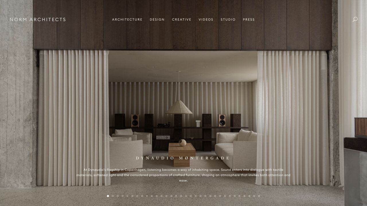
Norm opens with an atmospheric interior photograph, a small wordmark, and restrained navigation. The quiet framing lets texture, light, and proportion communicate the studio’s taste before a visitor reads a manifesto.
What you can learn
Give a strong project photograph room to breathe. Keep enough context nearby that visitors can tell what they are looking at.
Pros
A large, carefully selected photograph gives the opening a clear focal point.
Restrained typography and navigation leave room for the work’s material detail.
Cons & considerations
White text over changing photographs needs a contrast check for every image and crop.
A strongly atmospheric opening still needs clear project facts and an inquiry route further into the site.
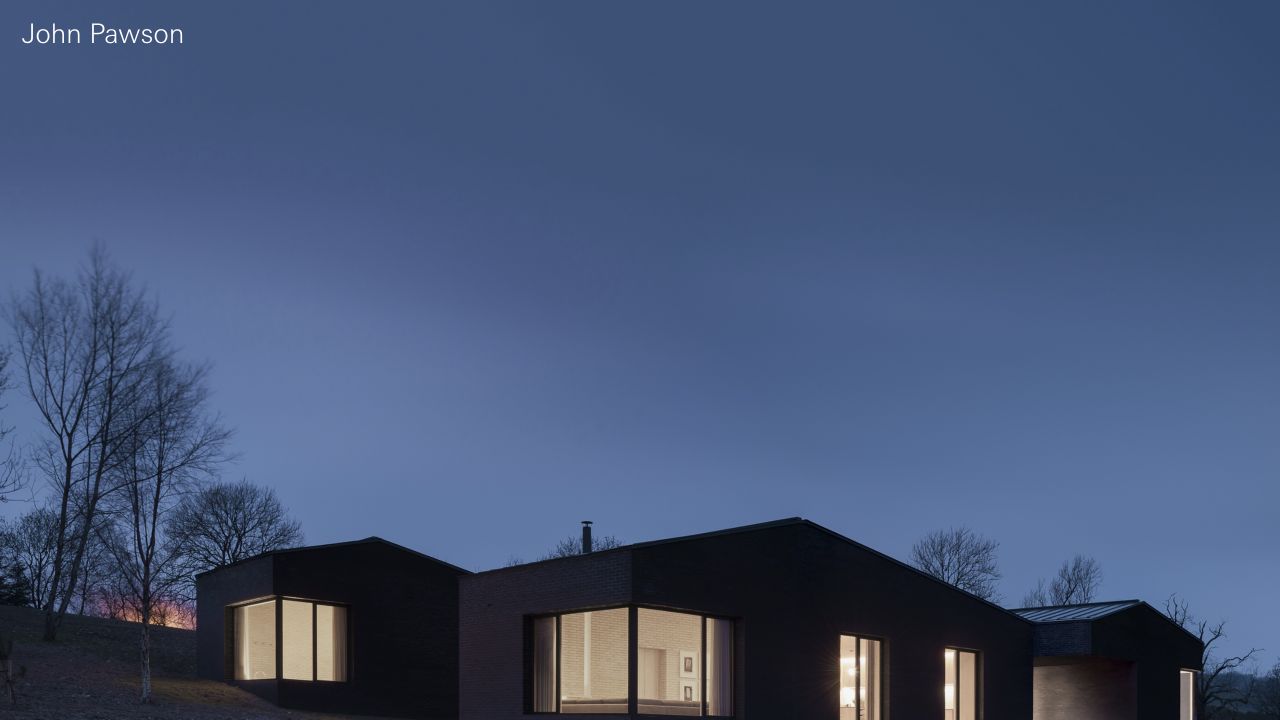
A small identity and a nearly full-screen architectural photograph make John Pawson’s opening feel more like the first plate in a monograph than a sales landing page. Almost everything competing with the image has been removed.
What you can learn
Remove competing messages when the work can lead. Then make sure the route into the project archive remains easy to find.
Pros
The first screen has a deliberately singular visual priority.
The restraint gives the project photography a consistent frame rather than a different decorative treatment for each project.
Cons & considerations
Very quiet navigation can increase the effort required to find practical studio or contact information.
This approach depends on excellent photography; it provides little visual cover for an uneven project selection.
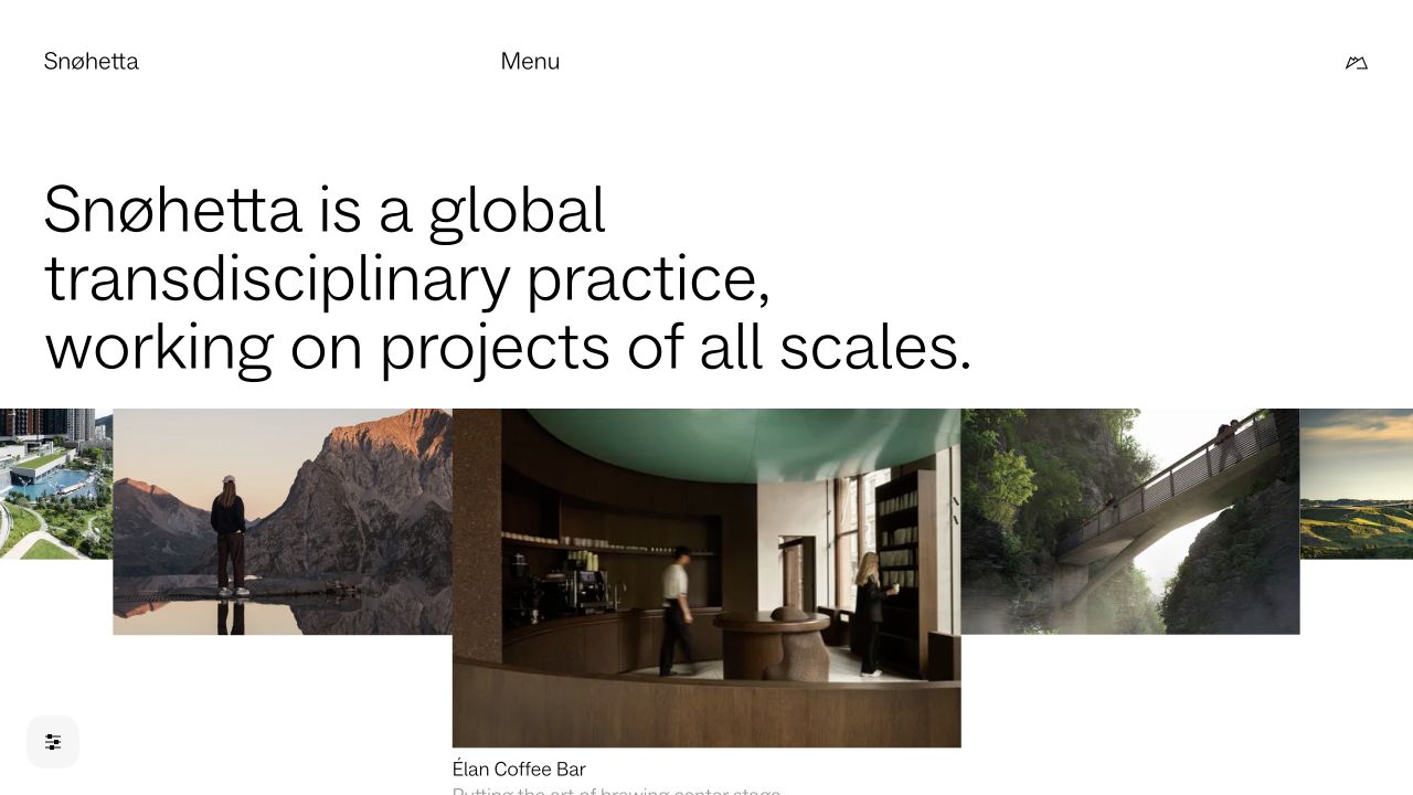
Snøhetta introduces the practice in words and then lets a varied project sequence demonstrate its range. An editorial opening gives visitors context for a body of work that is broader than one building type or visual style.
What you can learn
Pair a clear position with selected evidence. A visitor should understand both what you believe and what that produces.
Pros
The opening position explains what connects the work before the portfolio expands.
Varied project imagery communicates breadth without needing a separate sales message over each image.
Cons & considerations
An expressive, varied project sequence still needs useful labels and predictable navigation.
A broad positioning statement needs concrete project evidence to remain meaningful to a prospective client.
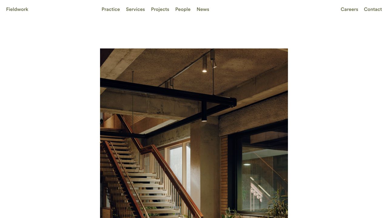
Fieldwork uses a restrained, light layout, an explicit navigation row, and a large project photograph with generous space around it. Services and Projects sit beside one another, a useful distinction for visitors who need to understand both the work and what they can commission.
What you can learn
Pair project credibility with service clarity. Visitors should be able to understand both what the practice has made and how their own project could fit.
Pros
Services and Projects are separate destinations, helping prospective clients connect the portfolio to what they can commission.
A direct People route and dedicated practice information put the team and approach alongside the work.
Cons & considerations
A mixed project-and-commentary opening depends on strong content labels to orient a new visitor.
Maintaining service, practice, people, and news sections requires real editorial ownership rather than a one-time launch effort.
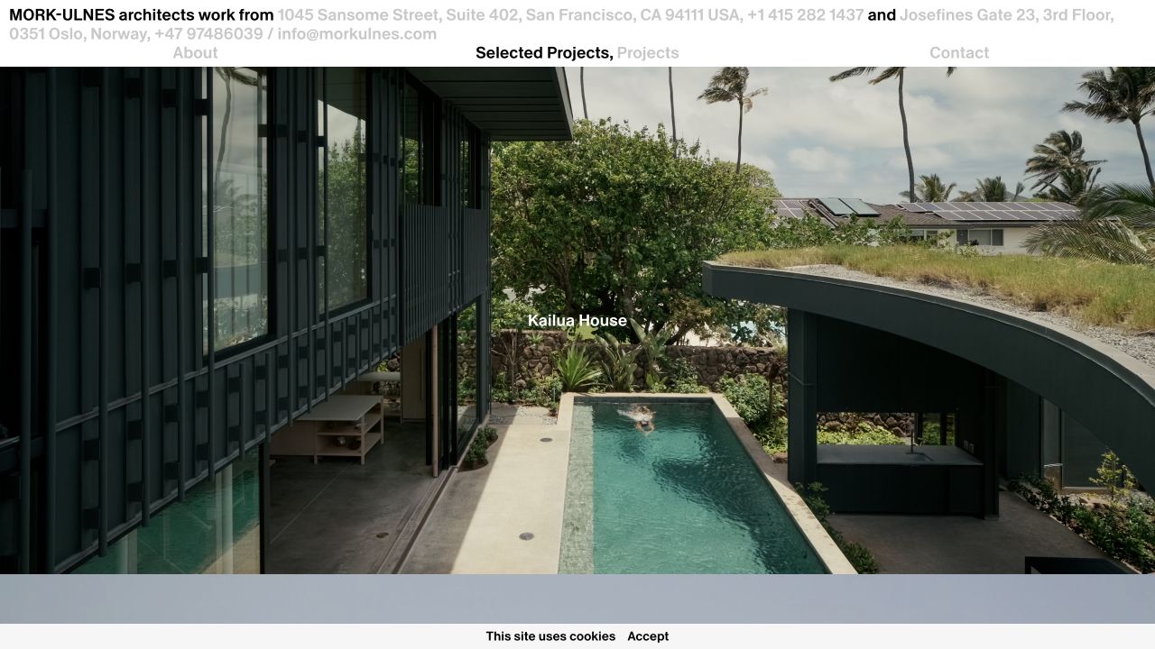
Mork-Ulnes places unusually direct studio contact information across the opening header, followed by selected projects with large images and centered labels. Selected work and the complete archive are separate routes, keeping the first impression edited without hiding the rest.
What you can learn
Curate a small opening selection, then give visitors a clearly labeled route to the complete body of work. Keep location and project facts close to the story.
Pros
Selected projects and the complete archive are distinct routes, so a shortlist does not have to carry every project.
Project entries include practical context such as location, completion status, and floor area alongside the architectural narrative.
Cons & considerations
A project-led introduction can leave prospective clients looking for service and process information on a second page.
Highly focused navigation works best when project pages supply the detail that a larger menu would otherwise expose.
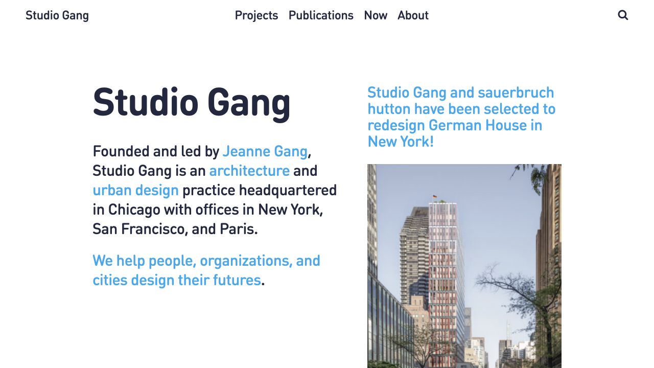
Studio Gang uses a text-forward introduction, prominent blue links, and a current project story on a white background. The practice’s name, disciplines, locations, and purpose are immediately readable; the visitor does not have to decode an abstract brand statement.
What you can learn
Let the homepage explain both what you design and why. Give the portfolio a visible route for visitors who want proof before reading a longer practice story.
Pros
The practice is described in actual words, so visitors do not have to infer its scope from photography.
Projects, publications, news and people each have a clear place in the information architecture.
Cons & considerations
A narrative homepage asks more reading effort than a compact visual project index.
An extensive studio/about section needs careful prioritization so first-time clients can still reach relevant work quickly.
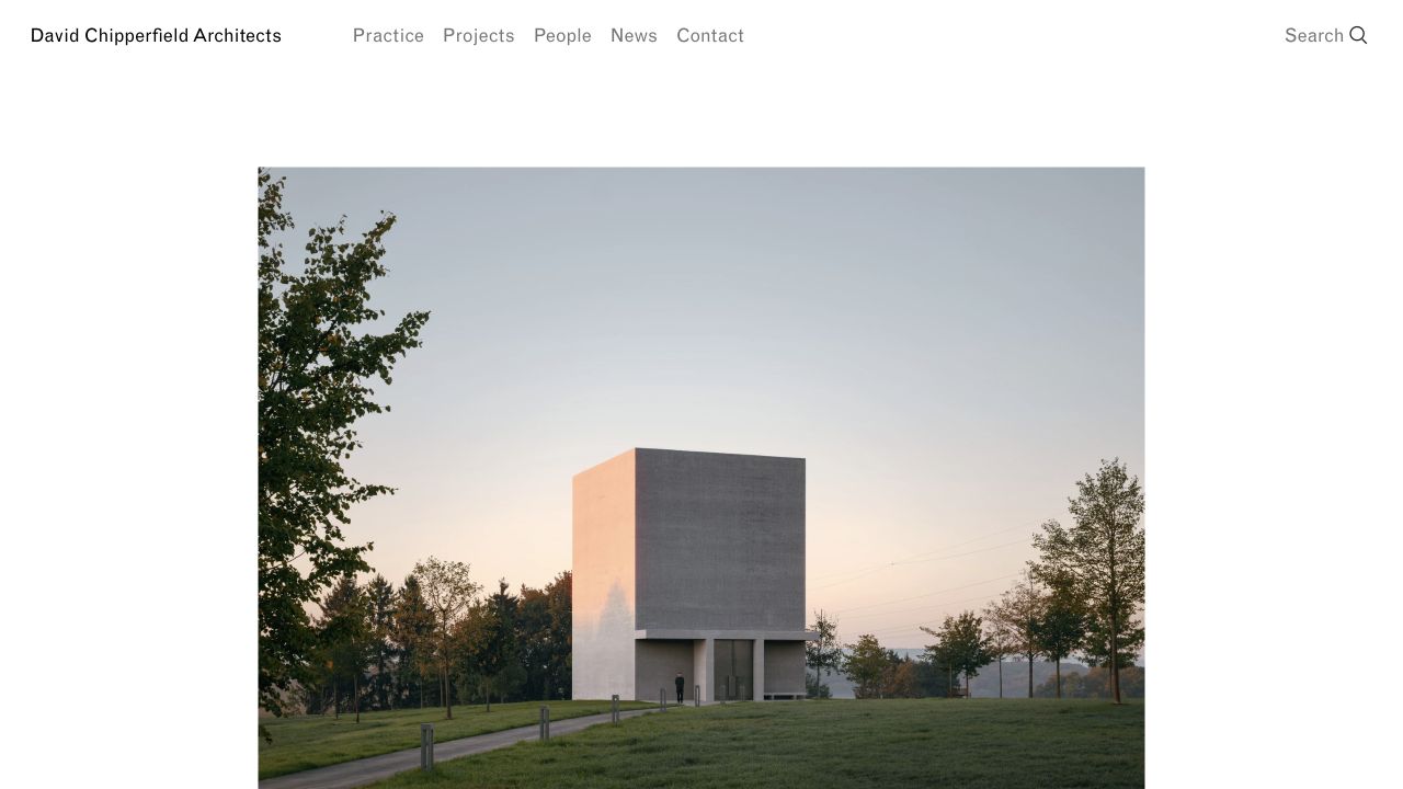
David Chipperfield Architects gives a project photograph generous white margins and uses familiar navigation labels in a restrained header. The quiet visual frame works with, rather than against, the site’s substantial mix of projects, announcements, research, and publications.
What you can learn
Content-type labels make an extensive archive easier to interpret. Keep the main navigation familiar even when the publication itself contains many formats.
Pros
Practice, Projects, People, News, and Contact form an immediately understandable primary navigation.
Explicit labels such as Project, News, Research, and Publication tell readers what kind of depth to expect before opening a page.
Cons & considerations
A long mixed-content homepage can require substantial browsing for visitors seeking one specific project type.
An editorial catalogue needs a deliberate featured selection so its strongest work is not lost among announcements.
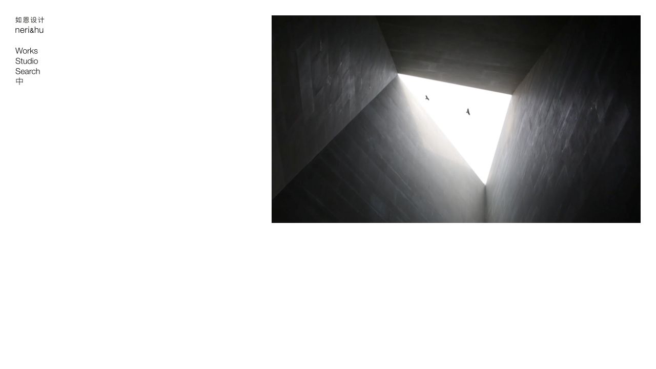
Neri&Hu places its bilingual identity and a very short navigation column on the left, leaving most of the screen to a single media panel. That quiet opening leads to a much deeper, categorized body of architecture, interiors, and design work.
What you can learn
Organize a multidisciplinary portfolio around the ways clients actually look for work: discipline, project type, and location. Add alternative views only when the archive justifies them.
Pros
Discipline and project-type categories give a broad practice a coherent content structure.
Index and map links recognize that not every visitor wants the same browsing experience.
Cons & considerations
The deep category system is more useful for a substantial archive than for a small practice with a dozen projects.
Multiple browsing modes can create navigation overhead unless their purpose is clear at each step.
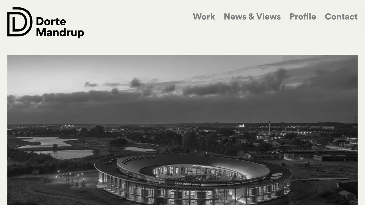
Dorte Mandrup pairs a large black identity with four straightforward navigation choices on a pale background. A substantial image and dated editorial stories give the homepage a publication-like rhythm while preserving a clearly named route to the work.
What you can learn
Build a simple primary navigation even when the underlying publication is rich. Dates and project context give editorial content a purpose beyond filling space.
Pros
The four main content routes use straightforward labels instead of forcing visitors to decode branded navigation.
Editorial items carry dates and project entries supply contextual descriptions, giving the practice an active public record.
Cons & considerations
A news-rich opening can put a returning visitor’s desired project several items away.
Long-lived quoted positioning and current announcements need careful balance to avoid competing for attention.
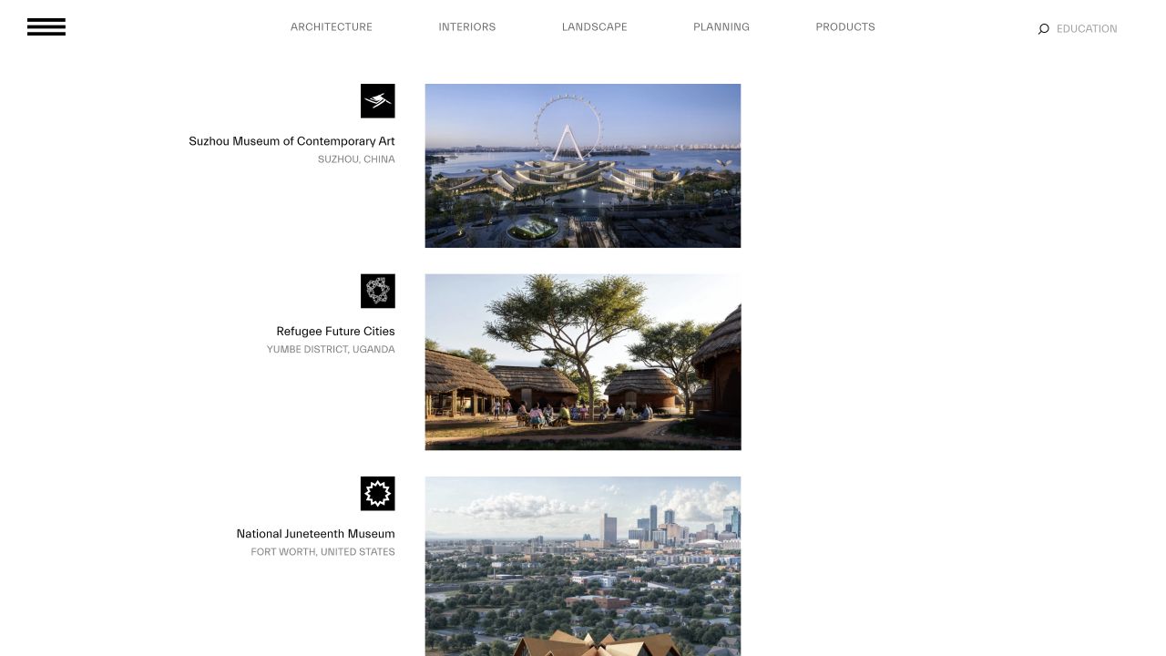
BIG treats the opening as a working project index. Project names, locations, small identifying graphics, and images sit in a repeated sequence; practice-area links remain visible across the top. It is useful precisely because it is more than a hero image.
What you can learn
Organize a large portfolio around the questions a visitor actually has: project type, location, and practice area. Use fewer categories when the work does not support a deep taxonomy.
Pros
Named sectors give a broad portfolio several useful entry points.
Project names and locations provide context beyond an unlabeled image gallery.
Cons & considerations
This much taxonomy needs an established body of work; a small practice could make itself feel thinner by copying every category.
An expansive archive can become the entire experience unless the studio also makes its positioning and inquiry path clear.
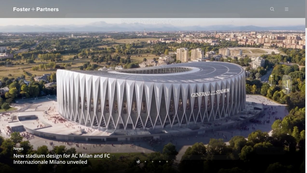
Foster + Partners leads with a large project photograph and a specific news headline. A compact header keeps the work dominant, while lower sections separate the studio, architecture, expertise, news, and climate-related work.
What you can learn
Give the main image a specific story, then provide separate routes into the practice’s capabilities. If a carousel is used, make the surrounding navigation useful without requiring visitors to see every slide.
Pros
A named, current project gives the immersive first screen a concrete subject.
Expertise has its own content structure, so the practice is not represented only by photographs.
Cons & considerations
A full-screen carousel means some opening messages are out of view until another slide is selected.
Compact menu and search controls require a deliberate route into a broad archive; a smaller practice may benefit from visible primary links.
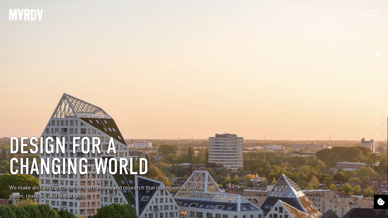
MVRDV puts a bold condensed headline over a full-screen project scene. The visual language is emphatic rather than anonymous; thematic routes then connect that first impression to housing, transformations, sustainability, research, and other interests.
What you can learn
Give different visitor interests a clear path, but only create a category or language version when you can keep its content useful and complete.
Pros
Thematic entry points show the breadth of the practice without relying on one undifferentiated project list.
Research and sustainability are findable alongside built-work categories.
Cons & considerations
A long theme list increases the amount a first-time visitor has to interpret.
A multilingual, category-rich structure adds content maintenance and navigation work; a smaller firm may be better served by fewer well-developed routes.
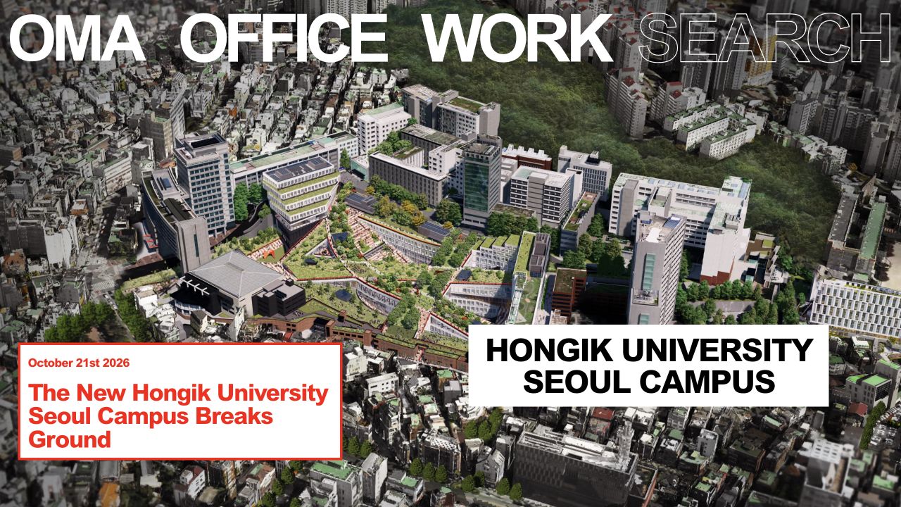
OMA combines oversized typographic navigation, a project image, and a sharply framed news panel. The first screen behaves like an editorial cover: the architecture and the story about it are presented together, rather than reduced to an unlabeled slideshow.
What you can learn
Pair experimental presentation with dependable project metadata and an obvious route to the main archive. Treat research as a separate content type rather than mixing everything into one unlabeled feed.
Pros
Structured project facts can make ambitious work easier to compare and understand.
Publications and research provide a way to communicate a design practice beyond finished-building photography.
Cons & considerations
An interface that relies on client rendering needs a robust initial, loading, and failure experience.
Research, publications, news, and projects need distinct labels so a prospective client can find built-work evidence quickly.
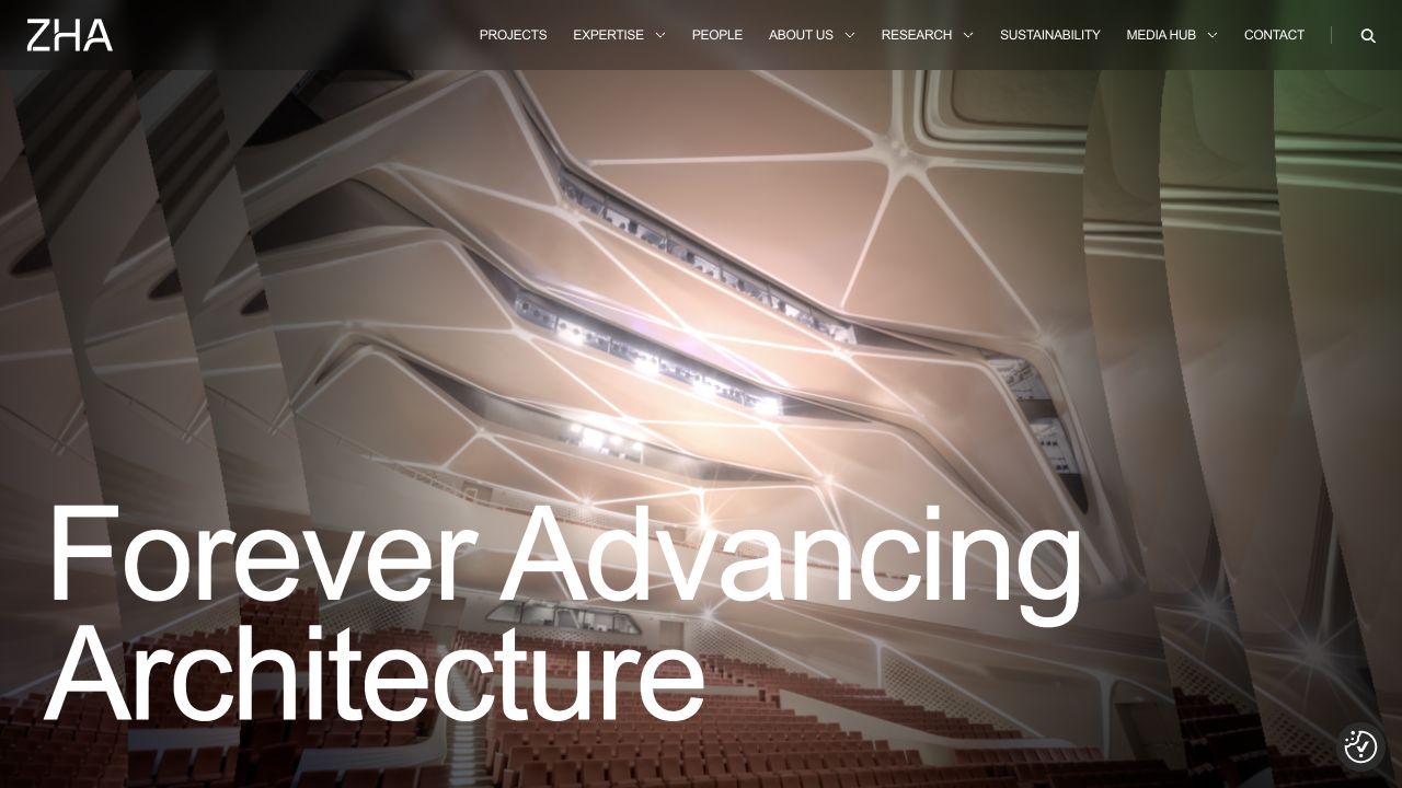
ZHA’s opening pairs an immersive architectural image with a large positioning statement. A full row of labeled navigation—projects, expertise, people, research, and more—provides a more explicit map than the image-only openings used by several other studios.
What you can learn
Explain what the practice does before asking the visitor to interpret individual projects. If news takes a central role, keep portfolio discovery equally obvious.
Pros
A concise practice introduction supplies context before a visitor enters the news.
Dated updates and explicit image credits distinguish current work from an anonymous visual moodboard.
Cons & considerations
A long row of primary categories needs a carefully prioritized mobile equivalent.
Large type over moving or changing imagery requires reliable contrast and a useful static fallback.
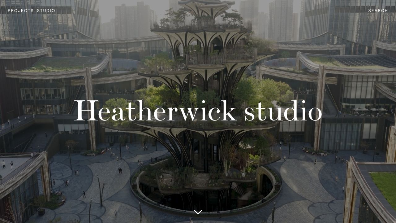
Heatherwick sets a large serif identity against an immersive project scene, with a notably small set of opening navigation choices. The practice’s stated interest in joyful, engaging places gives the imagery a narrative beyond architectural spectacle.
What you can learn
Use a short statement of what the work is trying to achieve, then immediately connect that statement to evidence. Group the menu by visitor task, not by internal departments.
Pros
Separating work types from studio information gives the menu a useful mental model.
A plain-language design position gives the project imagery a purpose beyond looking impressive.
Cons & considerations
A long menu can become excessive when transplanted to a practice with only a few services or projects.
Large brand statements still need nearby links to concrete work and a discoverable contact route.
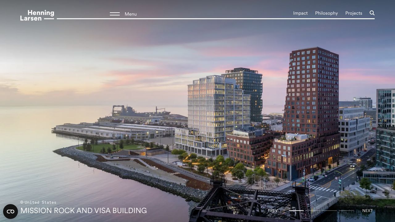
Henning Larsen’s opening uses a cinematic project scene with a restrained header and a named location. Beyond the hero, a mix of projects and editorial material lets the practice communicate how it thinks as well as what it has completed.
What you can learn
Use a varied editorial homepage to show how a practice thinks, while retaining an obvious path for visitors who arrive with a particular building type in mind.
Pros
Project locations and content-type labels help distinguish a building from an insight or news item.
The opening positioning explains the practice across architecture, landscape, urbanism, and interiors.
Cons & considerations
Mixing research, news, and projects creates more choices for someone who only wants to see comparable completed work.
A changing editorial feed needs ongoing curation so that the practice’s core offer stays legible.
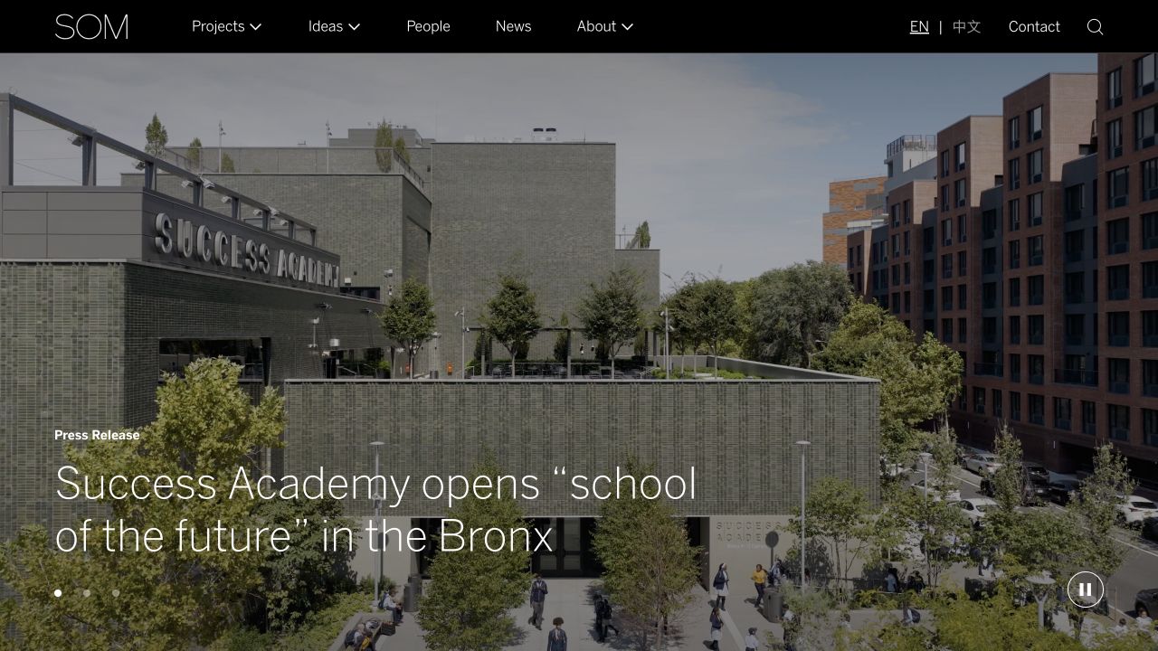
SOM combines a slim dark navigation bar with a full-width project/news image. Projects, Ideas, People, News, and About are explicit destinations; the wider project archive supports region, type, and topic routes for visitors with a specific brief.
What you can learn
Build filtering around the way your prospective clients evaluate relevance. A large practice can justify layered categories; a small one may only need project type and location.
Pros
Region/type/topic filters offer practical ways into a large, multidisciplinary project archive.
An Ideas section gives research and publications a coherent home separate from project case studies.
Cons & considerations
Many filter choices can overwhelm visitors if defaults and labels are not clear.
A broad institutional taxonomy would be unnecessary overhead for a small residential practice.
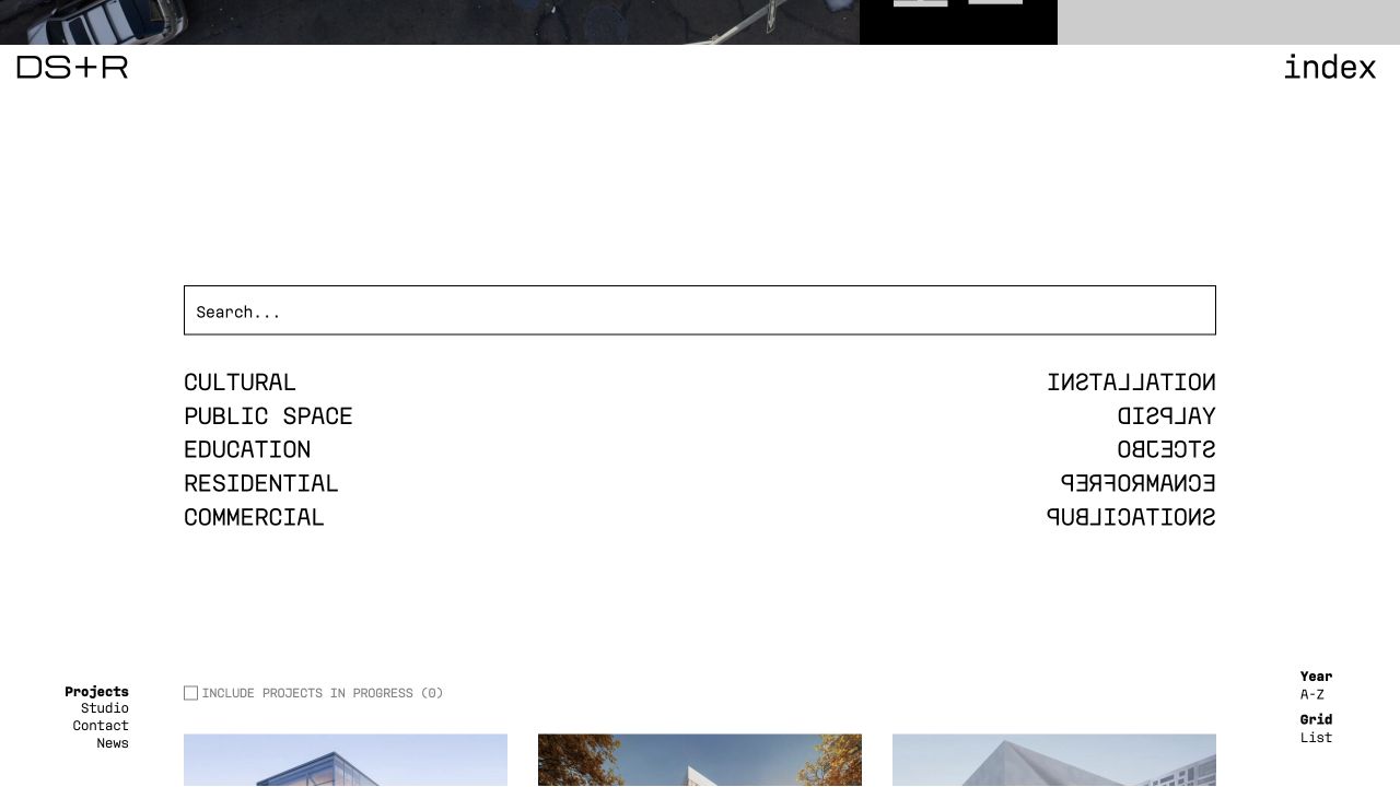
DS+R’s index provides a more explicit alternative to its experimental homepage. A large search field, discipline categories, year and alphabetic ordering, and grid/list modes make the archive itself an important part of the design.
What you can learn
Pair a distinctive portfolio interaction with a conventional index and search. A visitor trying to find one known project should not have to replay the entire visual experience.
Pros
An exposed search field makes a known-project lookup an obvious task.
Categories and alternative views give repeat visitors options beyond the visual opening.
Cons & considerations
Reversed lettering and unusual presentation make some controls less immediately familiar.
The opening homepage exposed little content before client rendering in this review, so a dependable index and loading fallback matter.
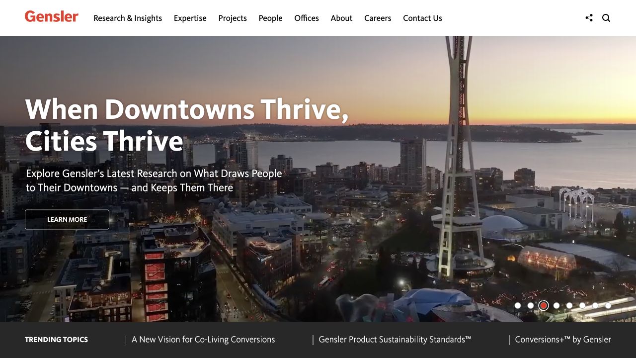
Gensler’s opening combines a conventional, fully labeled navigation bar with a large editorial carousel. Research & Insights receives the same level of prominence as Projects, making expertise and published thinking part of the main visitor journey.
What you can learn
Match navigation complexity to the real scale of the practice. A sector-led architecture site benefits from dedicated audience routes, but the menu should grow from content rather than ambition.
Pros
Sector-specific entry points let clients approach the practice through a familiar business problem.
A distinct research library gives insights a durable home rather than hiding everything in a generic news stream.
Cons & considerations
The breadth of the taxonomy would overwhelm a much smaller practice without a comparable depth of content.
Large navigation systems need strong hierarchy so that a visitor’s most likely next step is not buried in every possible option.
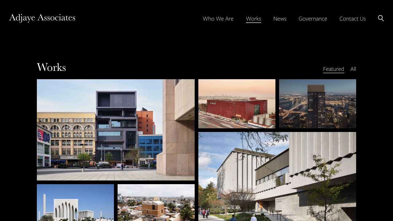
Adjaye Associates pairs a dark visual frame with a varied project selection. The homepage names featured work and locations, while the Works page offers a more direct image-led overview. Compact navigation keeps practice, work, news, governance, and contact separate.
What you can learn
Let the work carry the first impression, but pair it with names, places, and a well-structured practice section that makes due diligence easier.
Pros
Project labels supply city and country rather than leaving the architecture anonymous.
Search and a structured practice section support visitors who need evidence beyond a few featured buildings.
Cons & considerations
An extensive secondary menu asks visitors to understand several internal content categories.
A culturally ambitious project selection needs clear service and contact routes for visitors with a more practical brief.
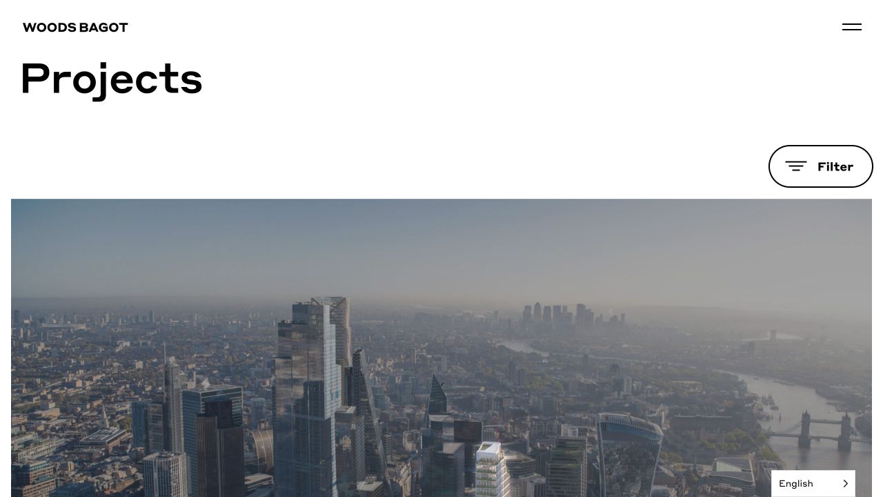
Woods Bagot’s project index brings large images together with project names, categories, and locations. It is a practical counterpart to the film-led homepage: someone with a specific sector or building type in mind can move directly into comparable work.
What you can learn
Tie brand storytelling to named projects, then offer a practical way to explore by sector. Plan how the story should work when a visitor does not watch the film.
Pros
Project names sit beside the editorial framing, connecting a broad design message to identifiable work.
The site offers both project-led and sector-led discovery rather than making one archive serve every visitor.
Cons & considerations
A film-heavy presentation needs careful loading, motion, and fallback decisions; those were not measured in this review.
An expansive global narrative needs clear local contact routes for visitors with a concrete regional brief.
A homeowner, a developer, a public-sector selection team, and a potential employee are not all looking for the same evidence. Choose the primary audience, write down the questions they need answered, and make sure the homepage, project archive, and contact route work for that journey. Secondary audiences can have their own clearly labeled routes.
2. Prepare a small set of complete project stories
Start with your strongest relevant work. For each project, gather a short description, location, type, scope, role, status, and credited images. Write the information before you design the layout. An adaptable, complete project template is usually more valuable than a homepage full of one-off effects.
3. Choose the lesson, not the entire look
Make a short reference brief: perhaps Fieldwork’s clear Services route, BIG’s project labels, and the restraint of John Pawson’s opening. Explain why each choice suits your audience. Do not copy photographs, identity, layouts, or text; turn the useful principle into a design that fits your own practice.
4. Define the editing job before choosing the software
List the content you need to add and maintain: projects, people, news, offices, publications, and language versions. Identify who will edit it and how often. A good CMS choice supports those jobs without making a routine image or project update dependent on a developer.
5. Prototype one real project on a small screen
Use final copy and real, licensed photography. Test the navigation, a long project title, a portrait image, an image with text on top, the contact form, and the page without motion. A desktop mockup with perfect sample content is not enough to expose the awkward cases.
6. Launch with an upkeep plan
Check project links, image credits, form delivery, image sizes, page titles, indexing settings, and redirects from the previous site. Give someone responsibility for updates, security, backups, and corrections. Decide when the work will next be reviewed; a current, accurate small portfolio is more useful than a sprawling archive nobody maintains.
With a designer or on your own?
Doing it yourself: use a well-supported platform, keep the structure simple, and spend most of your effort on project content, image preparation, and testing. A restrained template can work well when the material is strong.
Working with a designer: bring a content inventory, audience priorities, project examples, editing needs, and a clear scope. Ask for a working project template and responsive behavior—not only an attractive homepage.
Using AI: treat generated layouts and code as drafts. Check factual content, image rights, forms, accessibility, dependencies, and maintainability before a public launch. Our AI website checker inspects public builder clues; it cannot certify quality or establish who wrote the code.
Technology without the guesswork
Which tech stack should an architecture website use?
There is no single “architecture stack.” This collection includes direct signals for WordPress, Drupal, Next.js, Angular, and other services—and sites whose CMS we could not confirm. The best choice for your practice depends on publishing needs, design control, support capacity, and total upkeep.
For a straightforward portfolio
Start by comparing the editing experience and the quality of the project template. A supported CMS or website builder may be enough. Test image galleries, project facts, contact forms, and redirects with your actual content before committing to a theme or template.
For a complex publication or project archive
Define the content model and relationships first. Multiple offices, disciplines, languages, project filters, and editorial formats can justify a more structured CMS or a separate frontend. They also create more integration and maintenance work. Make sure the flexibility solves a real problem rather than becoming the project itself.
Read the technology lists as observations, not instructions
A WordPress asset path is a WordPress-related signal. A Sanity image URL identifies asset delivery, not necessarily the entire CMS. A Next.js bundle identifies frontend tooling, not the person or process that created the site. The lists name publicly observed components, not a complete infrastructure inventory. Unconfirmed technologies are left out. For more examples across different industries, explore our WordPress website development guide.
If you are still defining requirements, Kegan’s CMS selection guide offers a separate planning framework. That link goes to the curator’s own business website.
Our method
How we selected and reviewed these sites
The collection was reviewed on November 1, 2026 using the official practice websites, direct browser observations, and publicly delivered HTML. We selected contrasting approaches to photography, project discovery, editorial content, and practice positioning. This is not an exhaustive list of every good architecture website.
Each example includes a dated screenshot, a source link, original commentary, conditional design tradeoffs, and a technology note. Some captures show the project index rather than the homepage; these are labeled. Where we could not verify a CMS, we say so. Visible generator tags and asset paths are evidence of public implementation signals, not a complete internal audit.
We have not measured traffic, leads, accessibility conformance, speed, uptime, or security, and do not claim that these visual decisions caused business results. Sites change; a screenshot records one moment, not every slide or interaction. The order is editorial, and no listed practice paid for inclusion in this concept.
All websites, photographs, brands, and designs remain their owners’ property. The examples are editorial references, not work produced by Website Unpacked or Kegan. Rights holders can raise an image or credit concern through our contact page. Read our editorial approach.
A few practical answers
Architecture website design questions
What should an architecture firm’s homepage include?
A clear identity, relevant selected work, enough positioning to understand the practice, and obvious routes to projects, practice information, and contact. Add news, publications, recruiting, or research when those serve real audiences and have someone responsible for keeping them current.
How many projects should I show?
Enough strong, relevant examples to demonstrate the work you want to be commissioned for. There is no universal number. A short selection of complete project stories is more informative than dozens of image-only entries with no context or inconsistent quality.
Do I need video or an animated homepage?
No. Motion is a presentation choice, not a requirement for credibility. If it helps explain the work, give it a useful poster image, appropriate controls, and a reduced-motion alternative. A good photograph with clear context can communicate the practice just as deliberately.
Can I use another practice’s project photographs?
Do not treat an inspiration collection as an asset library. Use your own material or material you have permission to publish, honor the agreed credits, and confirm the scope of the license with the rights holder. A link to a source does not itself grant reuse permission.
Can the technology notes tell whether these websites were built by AI?
No. CMS and frontend detection do not establish authorship. The AI website checker can look for supported public attributions to specific builders, but an absence of those signals is not proof that no AI was used.