Definitive guide · Formidable Forms website development
Best Formidable Forms Websites of 2026 (20 Real-World Examples)
Real websites with Formidable Forms references, plus practical lessons for useful forms, clear feedback, and maintainable WordPress workflows.
Formidable Forms is a WordPress form and data-workflow product. It is not the explanation for an entire website’s visual design. The examples below have scoped public references to the plugin, with separate editorial observations about their actual interfaces.
A form is a handoff between a person and an organization. The visible fields are only one part of that handoff: somebody must understand the request, validate it, handle the data appropriately, and complete the next action. A polished page can still fail at any of those boundaries. Begin with the outcome the visitor expects, then work backward to the smallest set of questions and systems needed to support it.
These examples are useful for studying task routes, information hierarchy, and the balance between explanation and action. Their public Formidable asset reference does not prove that every form uses the plugin, that a paid edition is installed, that a calculation is correct, or that notifications arrive. We have not accessed private entries or certified the organizations’ workflows. Product capabilities must be confirmed against current official information for the specific edition and configuration.
Before the examples
What makes good Formidable Forms website development in 2026?
Ask questions that support a real next action
For every field, explain who needs the answer and what decision it supports. A large form can feel thorough while collecting information nobody uses. Keep the first step understandable and avoid requiring detailed information before the visitor knows what will happen next.
Conditional fields can simplify a relevant journey, but they can also hide important instructions or create inconsistent combinations. Write the branches in plain language and test their boundaries. Do not assume that hiding a field is equivalent to protecting its data or validating a request.
The plugin documents separate form actions such as notifications and integrations. Describe acceptance, storage, and downstream completion as distinct states. A reassuring confirmation should match what the system actually knows, not imply that a booking, payment, or staff response is already complete.
20 Formidable Forms website examples worth studying
Compare how the websites explain their services, give visitors a useful route to act, and present supporting information. The dated Formidable reference concerns the exact cited page, not every workflow or private configuration behind the brand.
We start with five recognizable brands or organizations: Bekins Van Lines, C2 Education, MYR Group, Winnipeg Folk Festival, Safe Harbor Old Port Cove. Each attribution applies to the named website property, not every product or website belonging to its organization. This is a curated reading sequence, not a measured ranking.
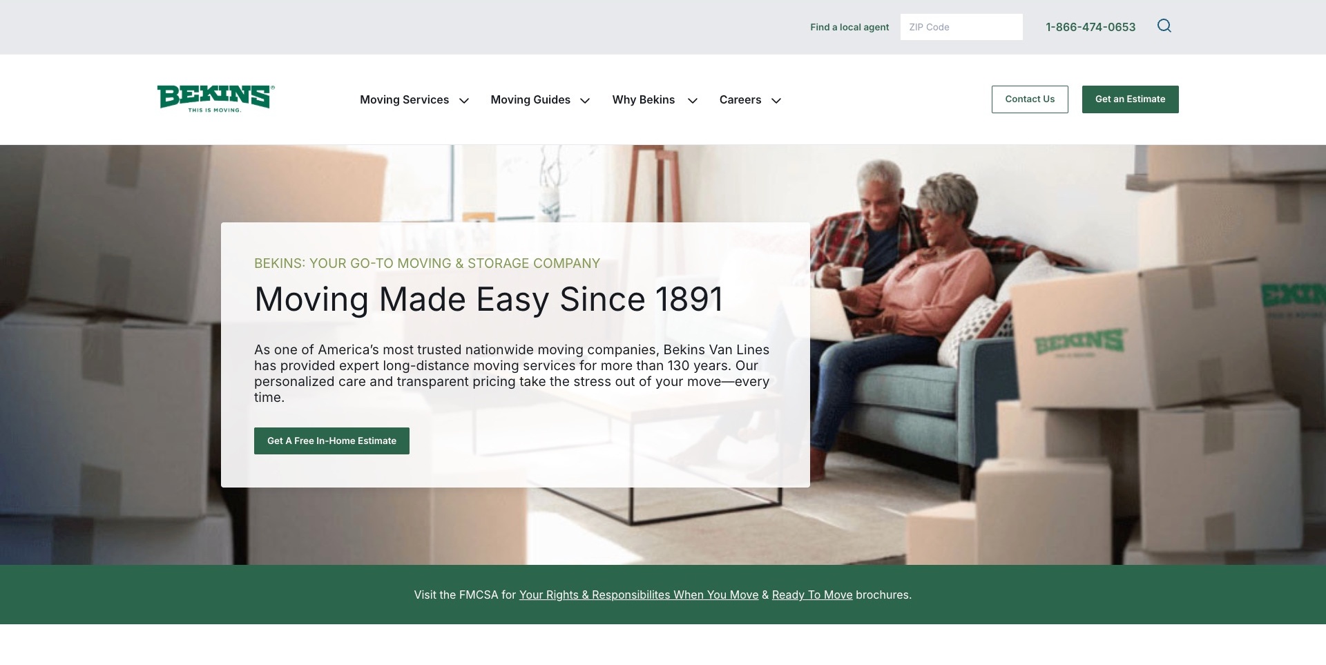
Bekins combines a white-and-green header with a couple-and-boxes photograph and a translucent explanatory panel. A free-estimate action is prominent, while the utility row offers ZIP-based local-agent discovery. Moving services and guidance have separate navigation routes. A consumer-resource strip begins below the hero. Current exact-page evidence references a Formidable Forms stylesheet; the screenshot does not identify which visible input or downstream form uses it, or verify submission, storage or notification delivery. The estimate action was not activated.
What you can learn
Separate finding a local provider from requesting an estimate, and explain the next step in each journey. Form tooling is only part of the implementation: labels, validation, appropriate information collection and confirmation need their own review. Keep guidance available for visitors not ready to enquire.
Pros
Agent search and estimate requests are distinct.
Guidance has a permanent navigation route.
The written panel remains readable over the photograph.
Cons & considerations
If an estimate is offered, explain what it does not confirm.
If a network routes enquiries, clarify the handoff.
If a plugin stylesheet loads, do not infer successful form processing.
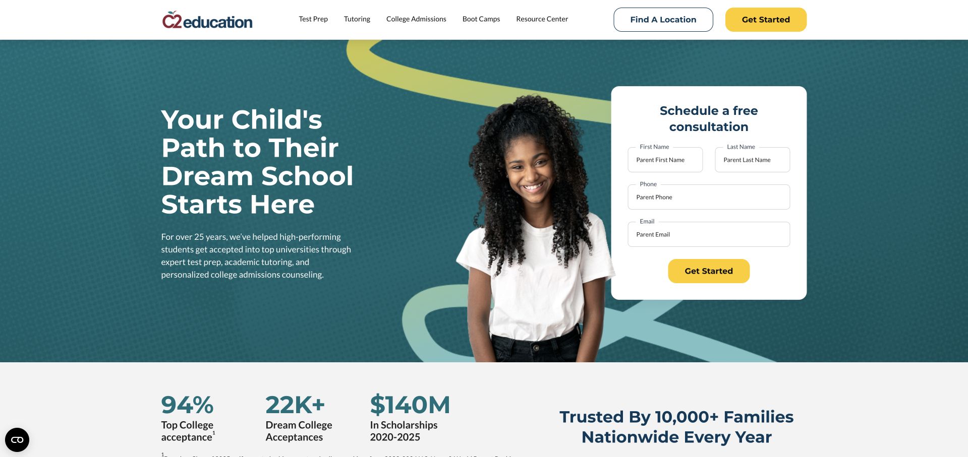
C2 Education’s retained hero places a white consultation panel beside an admissions-oriented introduction and student photograph. Parent name, phone and email fields are visible, with a yellow action matching the header. Test preparation, tutoring, admissions and boot camps remain separate navigation choices. Current exact-page evidence references Formidable Forms resources. That establishes a plugin association, not proof that the pictured consultation form uses it, reaches a particular center or has been submitted successfully. The visible structure is useful for comparing a short first inquiry with a fuller educational intake.
What you can learn
Explain the next step beside the contact fields and request only information needed for that initial response. Keep detailed student records out of a generic first inquiry, distinguish optional marketing choices and make errors understandable. Test routing and confirmation through an authorized process rather than inferring success from a stylesheet.
Pros
The form has a separate, readable surface rather than fields floating over photography.
Distinct service categories let families investigate before contacting the provider.
Cons & considerations
If numerical outcomes are promoted, their scope and method need accessible context.
The public plugin reference does not establish form validation, delivery or admissions results.
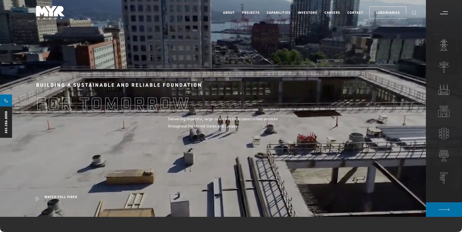
MYR Group’s captured corporate page uses a rooftop-construction video frame behind outlined typography and a service-region line. Projects, capabilities, investors, careers and subsidiaries appear across the header; a right-hand icon rail and left telephone tab create additional routes. Current exact-page evidence references a Formidable Forms stylesheet. This does not prove which corporate or subsidiary enquiry uses the plugin, whether any submission succeeds or how private information is routed. No contact or recruitment action was submitted.
What you can learn
Give a broad corporate audience clear destinations before asking for information. A project enquiry, investor question and career application are different processes. If form tooling supports one of them, describe its purpose and confirmation honestly; do not infer routing or integration from the mere presence of a stylesheet.
Pros
The main header distinguishes stakeholder tasks.
Capabilities have another visible navigation treatment.
The video frame supports the infrastructure subject.
Cons & considerations
If icons provide navigation, supply understandable labels.
If several companies share a brand, explain the destination.
If a form asset is referenced, verify the actual workflow independently.
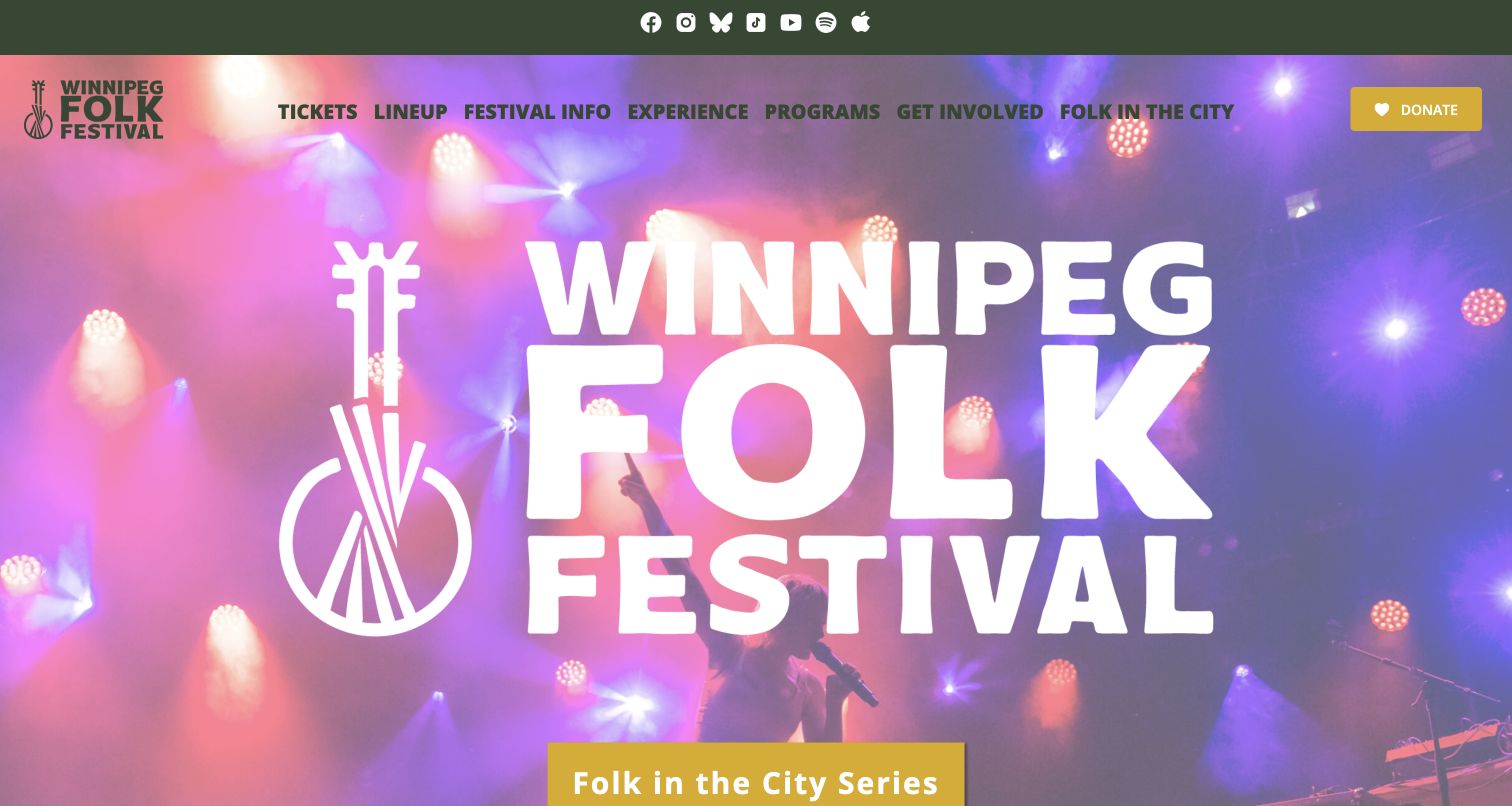
Winnipeg Folk Festival’s retained opening places an oversized white identity over performance imagery, with green navigation and a yellow action for its city concert series. Tickets, lineup, festival information, programs and involvement remain distinct labels. Current source evidence references Formidable Forms resources on the exact page, but no form fields are visible in this frame. The association does not identify the ticket engine, donation workflow or a particular participation form. The useful design question is how different event and organizational tasks stay understandable beneath one prominent festival identity.
What you can learn
Give each inquiry or application a specific purpose and event context. A general question, volunteer interest and a program application should not silently share ambiguous confirmations. Preserve ordinary event information without requiring a submission, and test actual validation, routing and failure feedback separately from the public asset observation.
Pros
The navigation separates the annual festival from wider programs and involvement.
The concert-series action has a visually identifiable position.
Cons & considerations
If multiple event programs share one identity, dates and venues need precise labels.
The observed plugin resources do not establish which form runs or whether submissions reach the intended team.
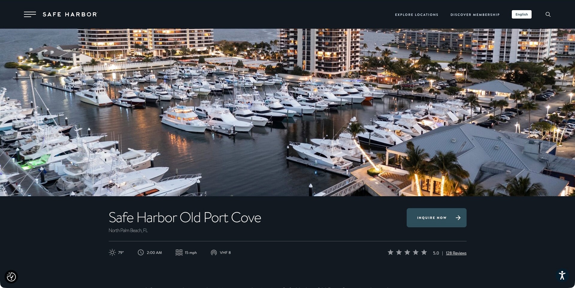
Safe Harbor Old Port Cove’s location page places a broad marina aerial photograph above its name, North Palm Beach location and an enquiry action. Weather, time, wind and radio-style indicators sit below, with a review display to the right. The permanent header retains location exploration and membership routes. Current evidence references a Formidable Forms stylesheet on this exact property page. That does not establish a completed enquiry, confirmed berth availability, private routing or the technology of every Safe Harbor location.
What you can learn
Keep a property’s identity and enquiry scope explicit, particularly within a larger network. Explain what a visitor can request and what requires confirmation. Form tooling does not independently establish availability, service quality or current operational conditions; verify the actual location-specific workflow before making those promises.
Pros
The property name and locality are explicit.
The enquiry action has a clear position beside location details.
Network exploration remains separate from the property introduction.
Cons & considerations
If operational indicators are shown, identify their scope and currency.
If reviews support the page, retain their source context.
If a plugin asset loads here, do not generalise it across the network.
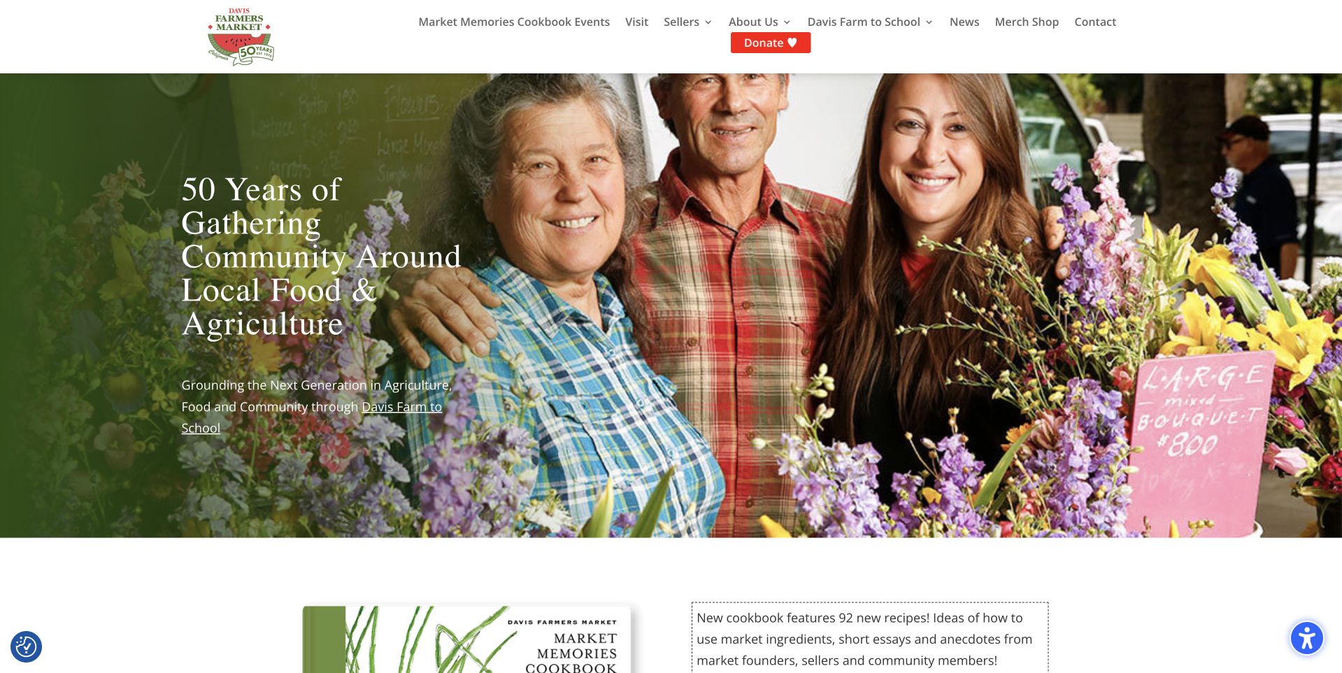
Davis Farmers Market’s retained homepage places a community photograph beneath a white header and anniversary identity. Large serif text introduces the market’s history, while navigation distinguishes visits, sellers, school programs, news and contact. A cookbook section begins below. The current exact page references Formidable Forms resources, establishing a form-plugin association rather than identifying a seller application, donation process or other particular workflow. No form was submitted. The useful structure is a shared community story surrounded by different practical destinations for shoppers and participants.
What you can learn
Name the task before collecting information: a visitor question, seller inquiry and school-program request need different context. Keep current visit details accessible without a form, ask only what the next response requires and give an honest confirmation. Verify actual routing and validation independently instead of assuming that a loaded resource proves delivery.
Pros
Visitor and seller routes are visibly distinguished in the header.
The photograph connects the anniversary message to recognizable community activity.
Cons & considerations
If anniversary artwork remains, ordinary operating information still needs clear priority.
A public plugin asset does not verify application requirements or successful handling of a submission.
Elements Spa’s retained entry page places four city buttons below a short centered introduction over a dark pool photograph. It is a location gateway, not a page displaying a treatment form or a full service catalog. Current evidence from this exact page references Formidable Forms resources. That supports a plugin association, not a claim that Formidable creates the city selector, handles treatment bookings or shares data among all locations. The visible design makes geography the first decision before visitors encounter the details of an individual destination.
What you can learn
Carry the selected location into any later inquiry and make the destination clear beside the form. Explain whether the visitor is asking a question or requesting a booking; do not imply availability from a button alone. Test validation, routing and confirmation separately rather than assuming a dependency identifies an operational reservation system.
Pros
Four clearly named city choices keep the initial task focused.
The sparse composition avoids presenting a shared catalog before location is chosen.
Cons & considerations
If locations differ, their services and visit conditions need explicit destination content.
The Formidable reference does not verify a booking, payment or particular form implementation.
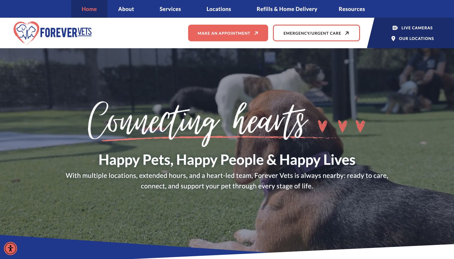
Forever Vets’ retained page uses blue and coral accents around a dog-related photograph and a relationship-focused introduction. The header gives routine appointments and emergency or urgent care separate actions, with location access nearby. Current exact-page evidence references Formidable Forms resources. This supports a plugin association, not proof that it operates appointment scheduling, urgent-care routing or any patient system. No submission was tested. The visible distinction between ordinary appointments and time-sensitive needs is more important than assuming one general form can serve every visitor.
What you can learn
Label each inquiry purpose and relevant facility before collecting information. Keep the provider’s urgent-contact route separate from a routine message form and do not imply that an untested submission receives immediate attention. Request only appropriate first-contact details, then verify actual error, routing and confirmation behavior through a separate authorized process.
Pros
Routine and urgent-care actions are clearly distinguished in the header.
Location access remains available near the main contact choices.
Cons & considerations
If facilities provide different services, the selected location needs explicit scope information.
A referenced form plugin does not establish response time, clinical handling or successful booking.
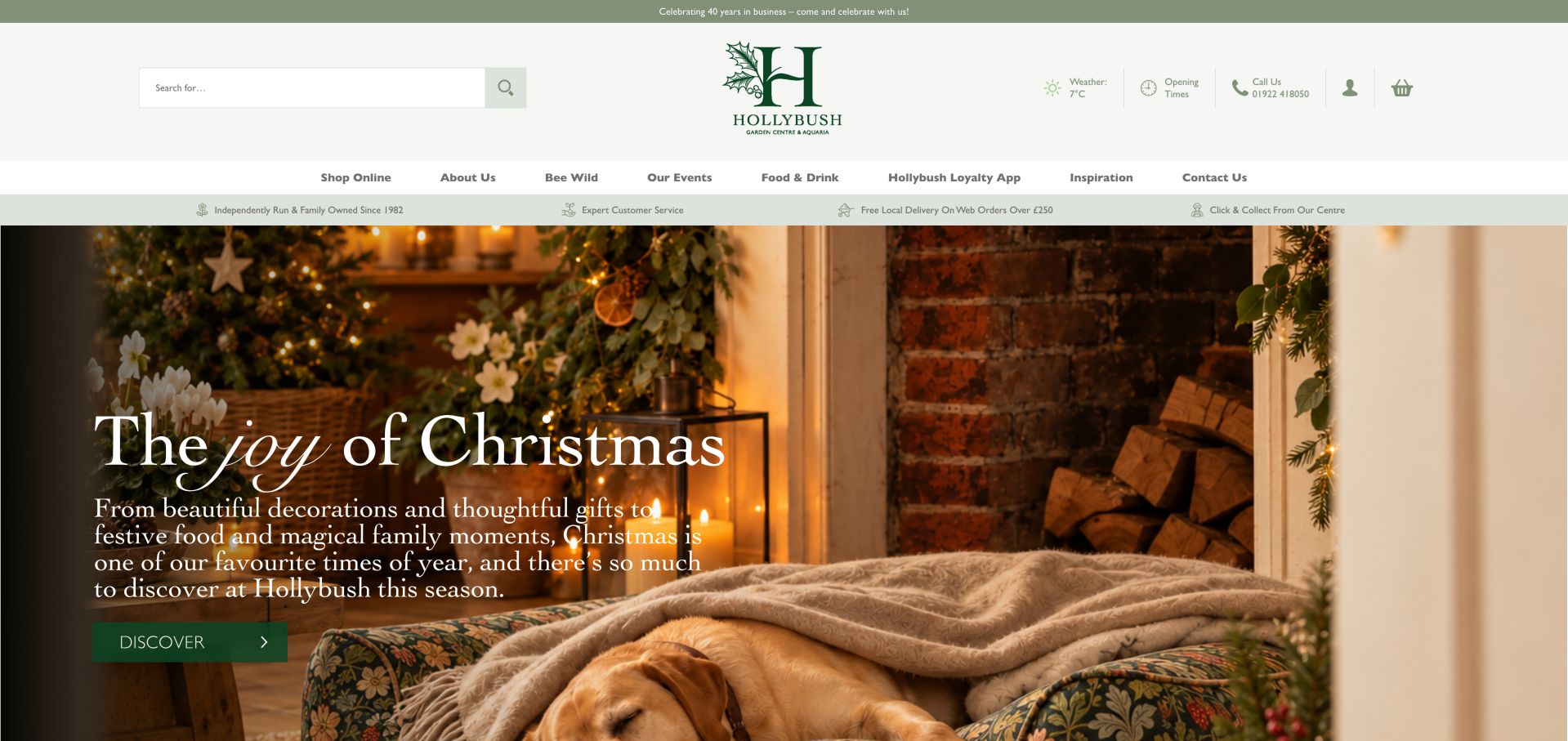
Hollybush’s retained homepage surrounds a seasonal interior photograph with product search, opening-time access, telephone information and ordinary account and basket controls. The navigation separates shopping, events, food and drink, inspiration and contact. Current source evidence references Formidable Forms resources on this exact page. This identifies a form-plugin association, not the shopping cart, loyalty app or a specific event-registration interface. The pictured opening contains no completed form. Its useful quality is the practical store information remaining available while the seasonal campaign supplies a different visual focus.
What you can learn
Let a contact form identify the subject of an inquiry rather than making shoppers describe every task in one unstructured box. Preserve product search and opening details outside the form, explain what happens next and verify actual routing and feedback. Do not attribute store systems or transaction outcomes to a loaded plugin resource.
Pros
Search and visit-related utilities remain distinct from the campaign.
The menu names several different reasons to contact or visit the business.
Cons & considerations
If header rows accumulate, their combined height can delay the useful content.
The asset association does not establish an active form, configured notifications or successful delivery.
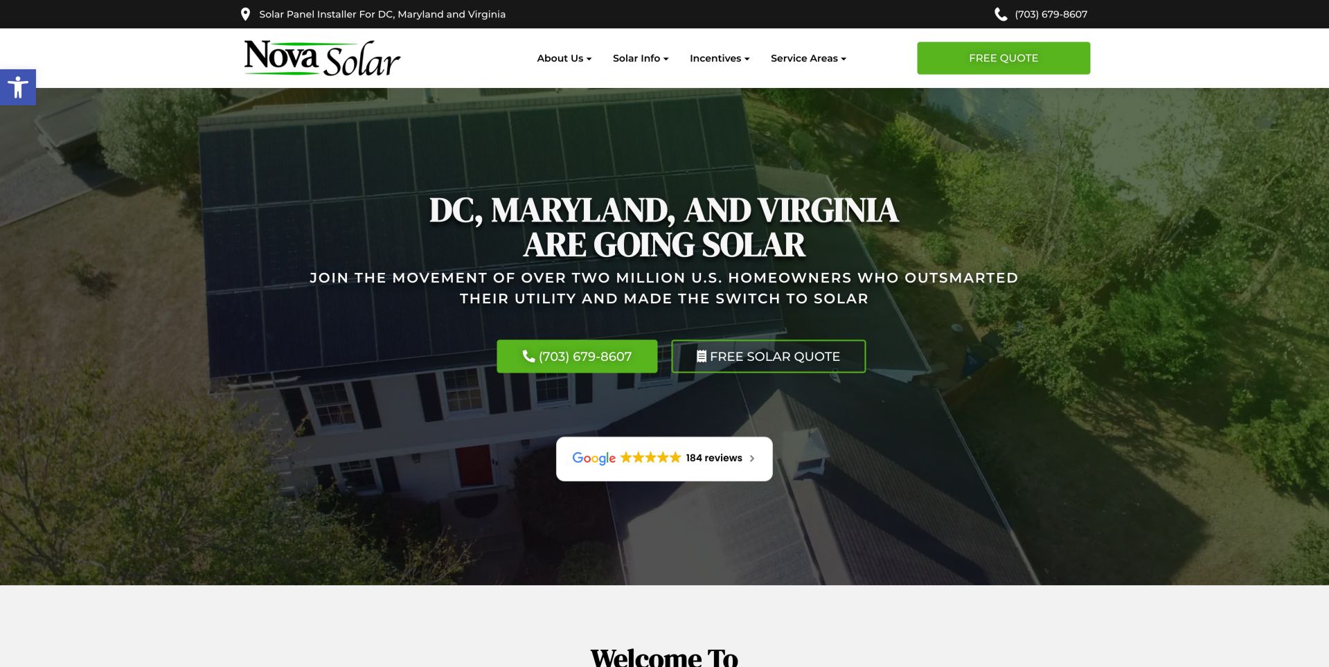
Nova Solar’s retained opening names DC, Maryland and Virginia above rooftop imagery. A green telephone action and an outlined quotation action sit together beneath the introduction, while service areas and solar information remain in the header. Current evidence on the exact page references Formidable Forms resources. That supports a form-plugin association, not proof that the quotation route uses it, calculates savings or produces an engineering assessment. No inquiry was submitted. The useful pattern is the customer being able to choose a conversation or a more structured request.
What you can learn
Explain what a quotation inquiry asks for and what review follows it. Keep initial fields proportionate and avoid presenting an indicative form response as a verified system design or financial result. Preserve a telephone alternative and test the actual validation, notification and confirmation paths independently of the public resource observation.
Pros
Service territory is stated clearly before a visitor begins an inquiry.
Telephone and quote routes accommodate different levels of readiness.
Cons & considerations
If future costs or savings are discussed, assumptions and dates need maintained context.
The observed plugin does not verify calculations, project suitability or successful delivery.
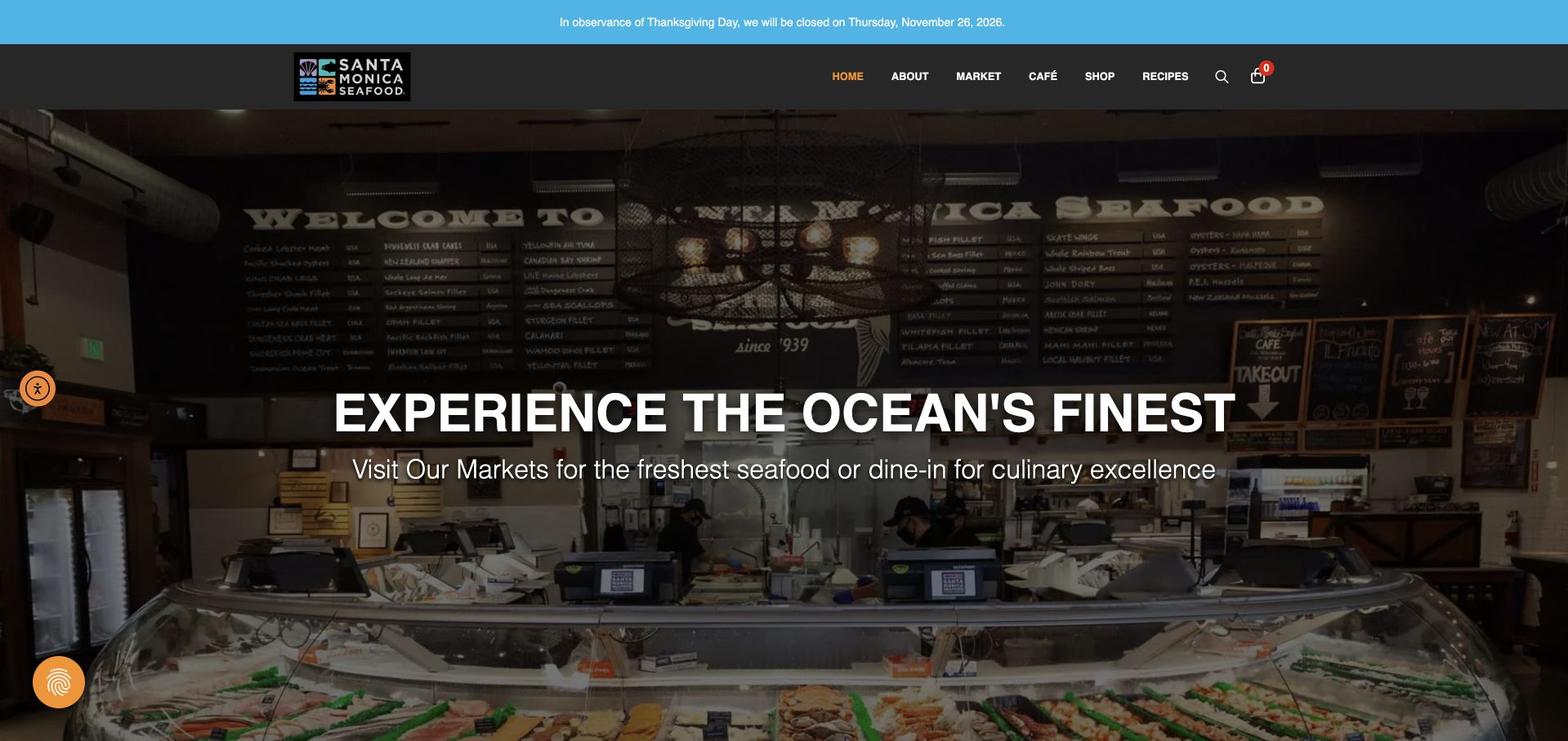
Santa Monica Seafood Market & Café’s retained page shows its physical counter under a dark header, with a separate holiday-closure notice above. Market, Café, Shop and Recipes are distinct routes, reflecting different visitor tasks. Current evidence references Formidable Forms resources on this exact public destination. That supports a plugin association, not the ordering system, a café reservation process or a particular contact form. The design is useful because the actual place and its different offers are understandable before a visitor is asked to supply any information.
What you can learn
Use clearly labeled inquiry purposes for the market and café rather than routing every question through an unexplained generic form. Keep hours and exceptional closures accessible without submitting, describe the next response and test actual validation and delivery separately. A loaded stylesheet cannot establish that a message reaches the right location.
Pros
The counter photograph gives the visitor a concrete sense of the physical market.
The closure notice is separate from the main introduction and navigation.
Cons & considerations
If market and café details differ, location and inquiry labels need to remain consistent.
The Formidable association does not demonstrate ordering, reservations or successful message handling.
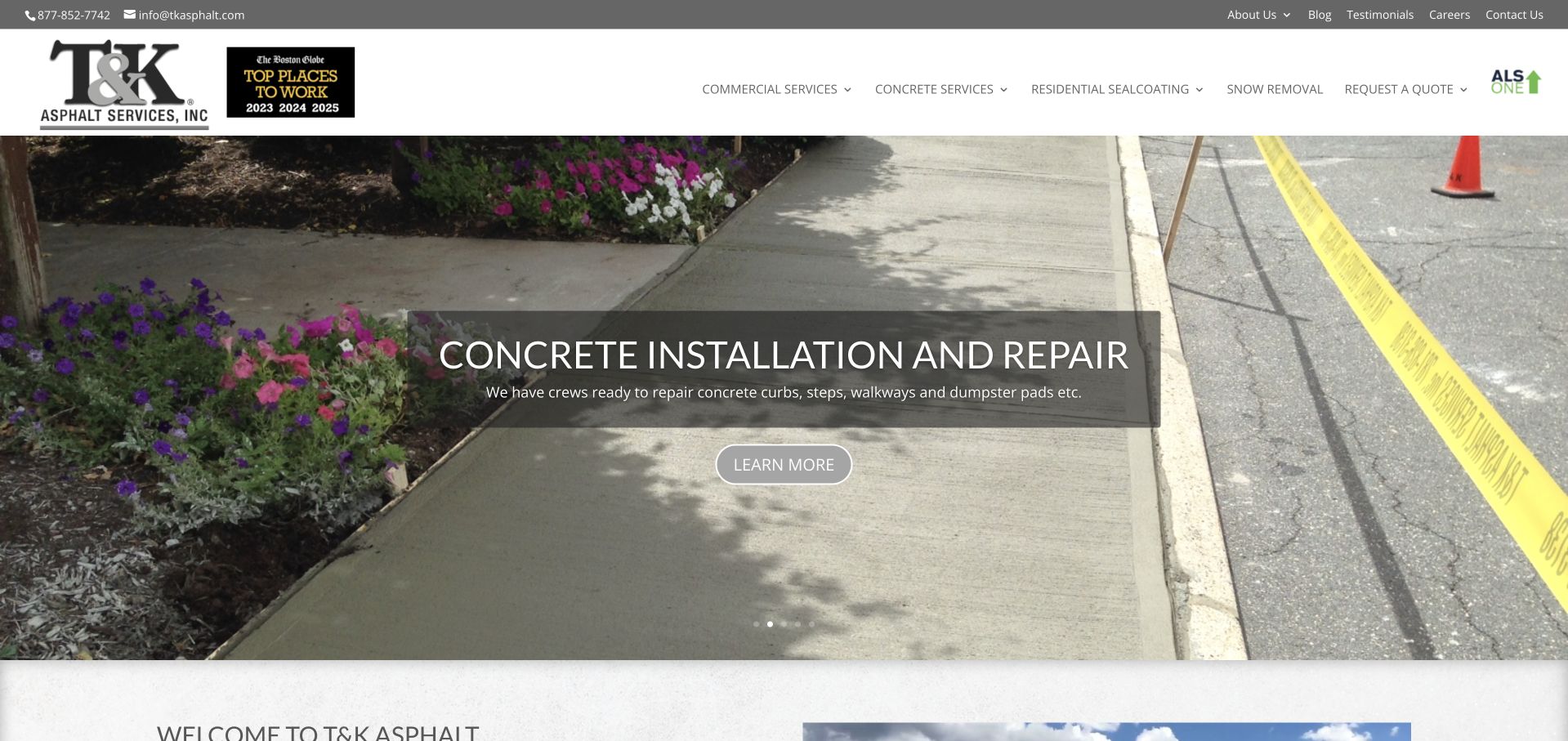
T&K Asphalt’s retained opening shows a concrete-installation photograph beneath a practical header. A translucent panel names the pictured service, while permanent navigation distinguishes commercial work, concrete, residential sealcoating, snow removal and quotation access. Current exact-page evidence references Formidable Forms resources. This establishes a form-plugin association, not the quotation route’s implementation, project pricing or any construction capability. No submission was made. The visible catalog matters because someone seeking paving should not have to infer that it exists from a slide currently discussing concrete.
What you can learn
Let an inquiry identify the relevant service and project location before requesting more detailed information. Explain what happens after the request and avoid presenting a form as an instant binding estimate. Keep service research accessible without submitting, then independently test field feedback, routing and confirmation for the actual implementation.
Pros
Major service categories remain available outside the featured image.
Quotation access has a plainly named position in the header.
Cons & considerations
If a rotating feature introduces different work, the service context must stay clear.
The public asset does not verify notification setup, pricing or successful inquiry handling.
Tomorrow’s retained opening uses a huge lowercase wordmark over fine blue-and-purple stripes. A Jobs action and compact menu occupy the upper right, while a closed chat launcher remains at the bottom. Current evidence references a Formidable Forms stylesheet on Tomorrow Worldwide. That supports the plugin association, not a claim that it runs job applications, powers the chat or produces the striped layout. No form was submitted. The useful design question is how a strongly branded recruitment page can connect its minimal opening to clearly described candidate and employer workflows.
What you can learn
Give different inquiry types distinct labels and collect only information needed for the next step. If applications require documents, define permissions, access and retention separately. Test actual errors and delivery through an authorized process; a loaded form stylesheet cannot verify routing or a completed application.
Pros
A direct Jobs action remains visible outside the compact menu.
The simple opening gives the own-brand identity a clear visual role.
Cons & considerations
The first view needs further context to identify recruitment responsibilities.
The public asset does not reveal which form is active or where submissions go.
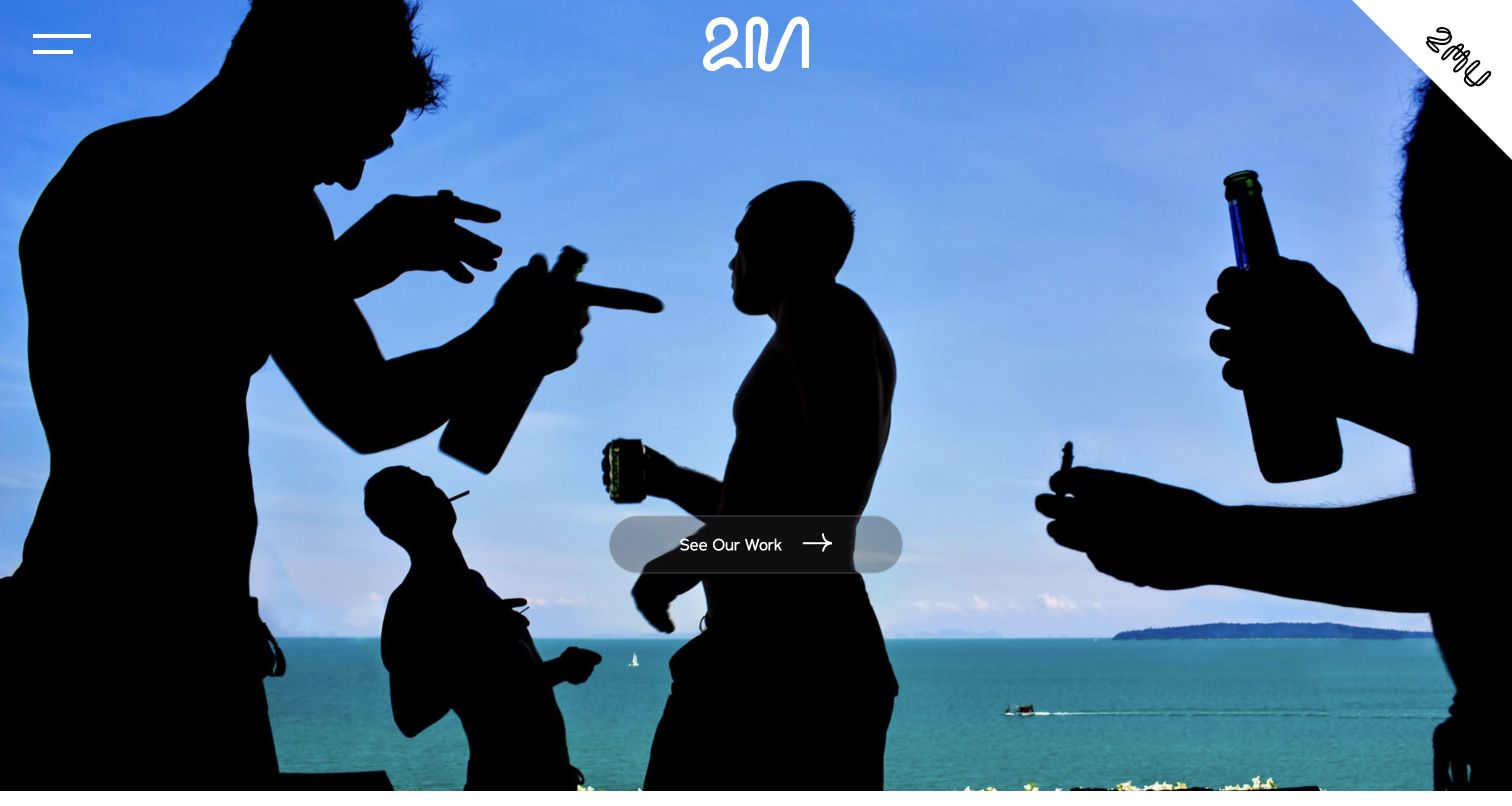
Two Mann Studios’ retained opening fills the screen with a silhouetted group beside a bright blue sea. A compact identity, menu control and single work-viewing action leave the photograph dominant. Current evidence references Formidable Forms resources on this exact page. The association does not establish that the plugin creates the portfolio, operates an availability calendar or powers a particular inquiry. No form was submitted. The useful design contrast is between an expressive photographic introduction and the more structured information a studio needs before discussing a real event.
What you can learn
After portfolio discovery, make the inquiry purpose and next step plain. Ask for proportionate event context rather than collecting every planning detail at once, and distinguish a request from confirmed availability. Verify the actual labels, errors and message routing separately; an observed form asset cannot establish successful delivery or a booking.
Pros
One clear work action keeps the initial choice focused.
The photograph communicates an observational visual approach without multiple promotional panels.
Cons & considerations
If contact remains inside the menu, visitors need an understandable route to it.
The Formidable reference does not verify availability, form behavior or successful communication.
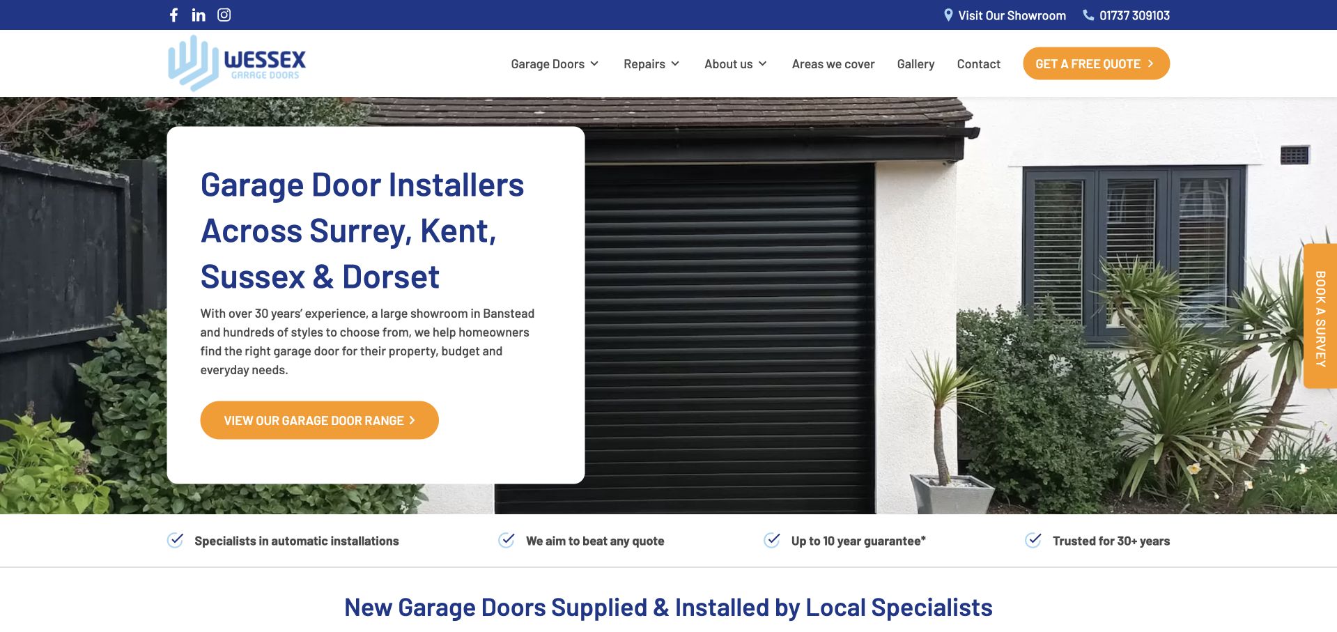
Wessex Garage Doors’ retained page places a readable white information card over a garage exterior. The card names its service region and invites browsing the range, while the header separately offers quotation and showroom routes. A vertical survey tab supplies another contact choice. Current exact-page evidence references Formidable Forms resources. This supports a form-plugin association, not proof that it powers the survey request, schedules a visit or prepares a price. The useful visible distinction is between researching door options and asking the business to take a next step.
What you can learn
Explain whether a form requests advice, a quotation or a survey, and preserve the relevant service-area context. Keep range browsing available without submitting and avoid treating a received inquiry as a confirmed appointment. Test validation, notification and confirmation separately rather than attributing a working booking process from the public asset reference.
Pros
The service region has a stable, high-contrast reading area.
Range browsing and showroom discovery provide alternatives to immediate inquiry.
Cons & considerations
If contact actions are repeated, their purposes should remain distinct rather than competing.
The plugin reference does not establish scheduling, a calculated price or delivery success.
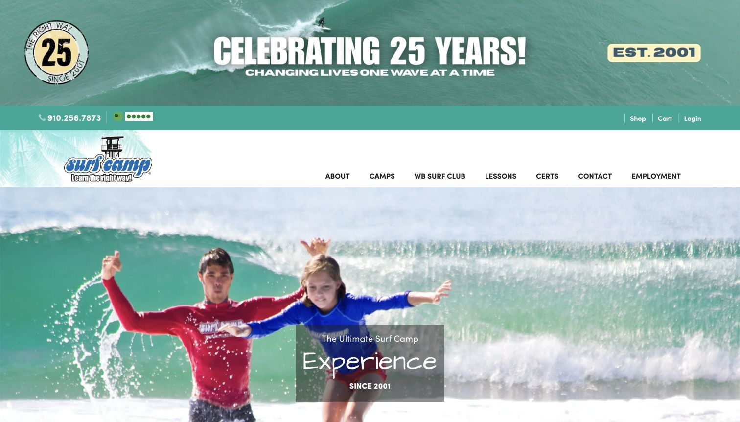
WB Surf Camp’s retained homepage combines a large anniversary banner with a bright surfing photograph and separate navigation for camps, lessons and its surf club. Contact and employment are also plainly labeled. Current evidence on the exact page references Formidable Forms resources. This supports a form-plugin association, not proof that the plugin operates registration, payments or any particular participant form. No submission was tested. The visible program distinctions are useful because a local lesson, a youth camp and a general inquiry involve different information and expectations.
What you can learn
Identify the chosen program and inquiry type before asking for further details. Keep an initial question separate from full registration, and explain when a parent or guardian should be the contact rather than collecting extensive participant information unnecessarily. Verify actual validation, routing and confirmations independently of the public component evidence.
Pros
Camp and lesson navigation recognizes different visitor tasks.
Contact remains a separate destination from the program categories.
Cons & considerations
If the program catalog is broad, age and format context need clear destination pages.
The observed plugin does not verify registration rules, payment handling or successful delivery.
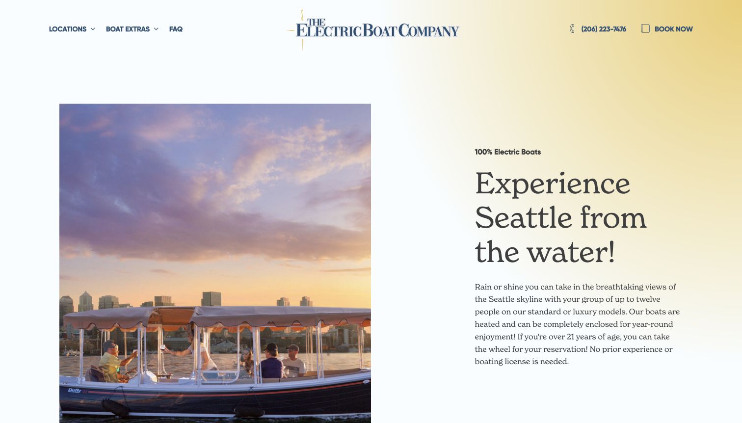
The Electric Boat Company pairs a warmly lit boat photograph with a spacious Seattle introduction on a pale background. Locations, extras and FAQ routes sit beside telephone and booking actions in the header. The image establishes the outing’s setting, while the text provides practical context. Current evidence references Formidable Forms styling, but the saved frame does not show an inquiry form or identify the booking system. The association does not prove live inventory, payment handling or a successful reservation. The useful example is a service introduction that leaves several practical routes visible.
What you can learn
Distinguish an inquiry from a confirmed booking and explain what remains to be checked. Keep availability, pricing and payment decisions in their actual authorized workflow. For a public form, use clear labels and truthful delivery feedback rather than implying that submission reserves a boat.
Pros
Telephone and booking routes are visible before deeper exploration.
The photograph and written introduction have separate, readable areas.
Cons & considerations
The spacious opening delays more detailed comparisons below this view.
A plugin stylesheet does not establish a functioning reservation integration or payment flow.
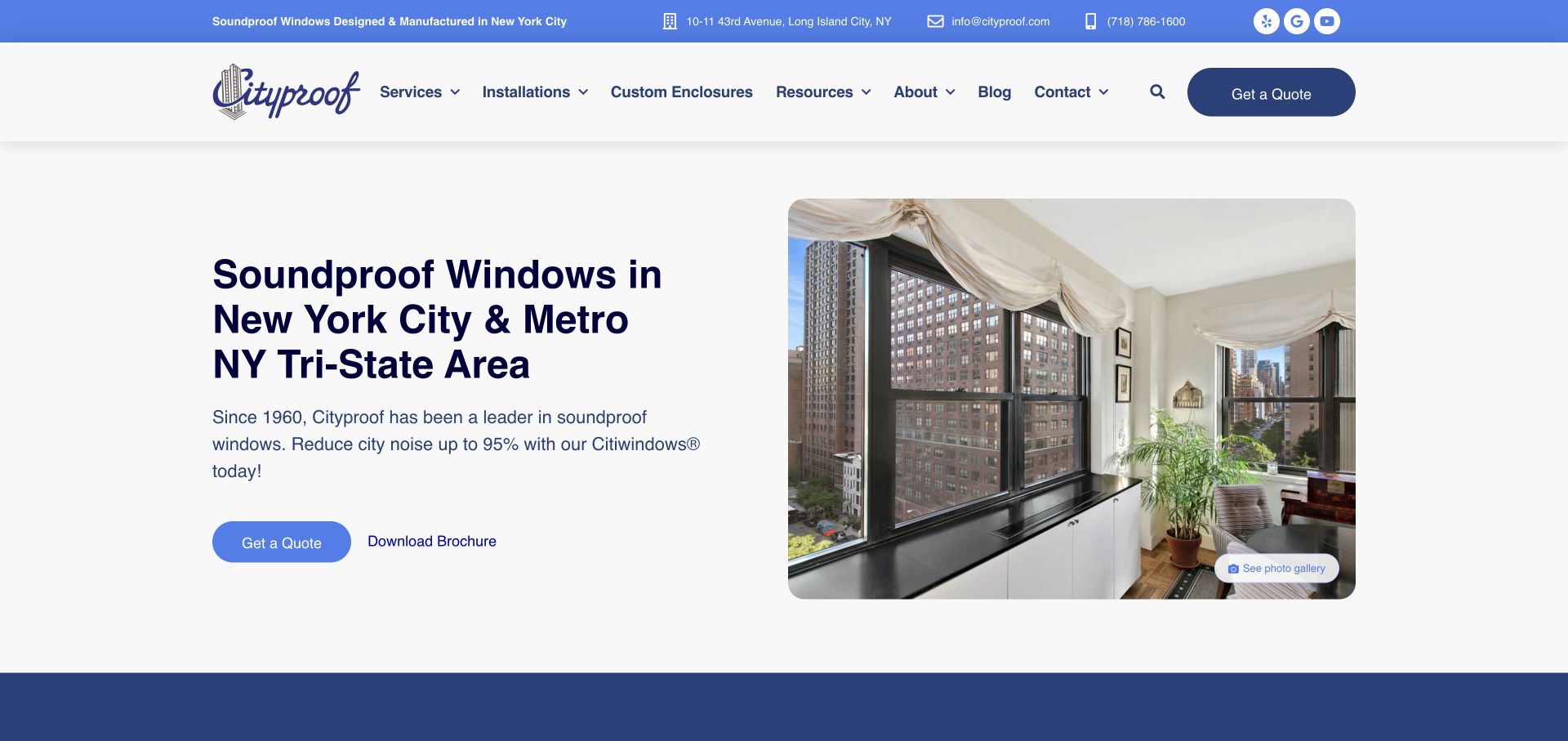
Cityproof’s retained homepage places an apartment-window photograph beside a New York service introduction. A quotation action, brochure link and photo-gallery route offer different depths of research, with ordinary contact information above. Current evidence references a Formidable Forms stylesheet. This supports a plugin association on the page, but it does not prove that the visible quote action opens a Formidable form, that an estimate is calculated or that a message reaches the business. The useful pattern is a clear separation between learning about the product and beginning an inquiry.
What you can learn
Explain what a quote request does and collect only enough information to route it. Keep project documents and detailed technical decisions in an appropriate later process. Test labels, error handling, spam checks and actual delivery separately rather than treating a referenced plugin as proof of a working lead workflow.
Pros
Quotation, brochure and gallery routes serve different research tasks.
The installed-product photograph gives the inquiry a concrete visual context.
Cons & considerations
Performance claims need their own defined evidence and conditions.
The stylesheet reference does not identify an active form or validate its routing and confirmation.
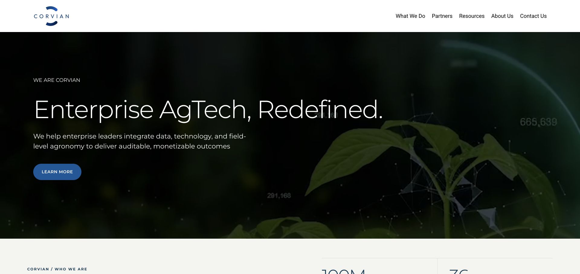
Corvian’s retained homepage uses a dark crop-media frame, a broad enterprise-agriculture proposition and a single Learn More action. A restrained white header separates services, partners, resources, company information and contact. The original record preserves the transition from a legacy Farmers Edge address to the current brand. Current evidence references Formidable Forms styling on Corvian. It does not establish the form’s questions, a connected customer system or successful delivery. The useful design distinction is between explaining a broad enterprise offer and collecting the details needed for an initial conversation.
What you can learn
Route audience and engagement questions clearly before requesting detailed business information. A form can begin with a concise need and reliable contact details, while confidential operational data belongs in an appropriate later exchange. Verify routing and feedback directly; a plugin asset does not prove an integration.
Pros
The header gives resources and contact separate destinations.
A restrained action avoids crowding the enterprise introduction with fields.
Cons & considerations
Broad outcome language needs concrete engagement examples nearby.
The public stylesheet does not reveal an active form’s scope, permissions or submission behavior.
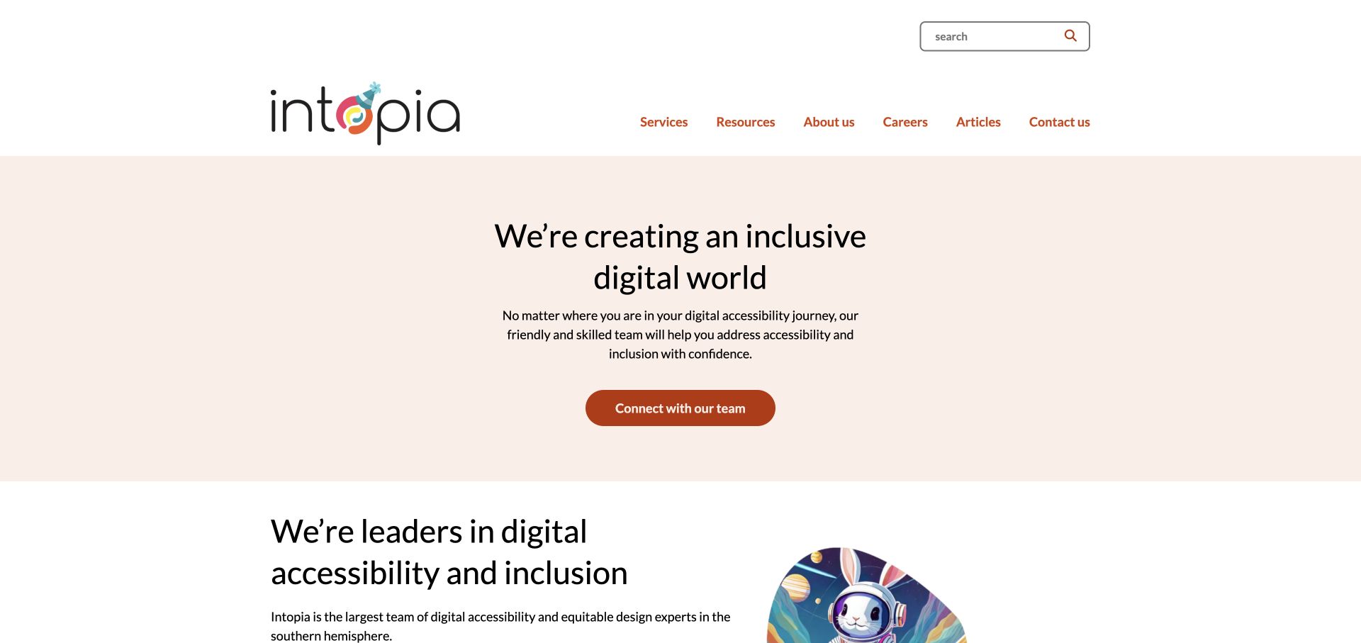
Intopia’s retained homepage uses a pale peach field, centered introductory text and a burnt-orange contact action. Services, resources, articles and company information remain in the header, with a search field above. Current evidence references a Formidable Forms stylesheet. This identifies an observable plugin association, not which inquiry form is used or whether its actual configuration is accessible. The organization’s accessibility focus also does not independently certify the website. The useful pattern is a calm introduction that can lead to precise service explanations before a visitor provides project details.
What you can learn
Let the inquiry follow a clear description of the requested service, and ask only for information needed to route the conversation. Test labels, keyboard operation, errors and confirmation in the implemented form. Neither the provider’s discipline nor a plugin name establishes usable behavior or successful delivery.
Pros
The contact action has a clear visual position within the restrained introduction.
Resources and service research remain separate routes.
Cons & considerations
A broad introductory statement needs specific deliverables nearby.
The observed form stylesheet does not establish accessibility, account setup or submission routing.
Kegan has 15+ years of experience working with small businesses, Fortune 500 companies, and everything in between. No development job is too big or too small: he brings the same hands-on attention to a focused improvement, a complete website, or a custom application.
For Formidable Forms projects, he can help with WordPress form planning, understandable field and conditional flows, permissions and notification review, accessible feedback states, integration testing, and maintainable handover. He works directly with clients on scope, design, implementation, testing, and handover, with an emphasis on clear communication and a system that remains practical to maintain after launch.
Show 3 other Formidable Forms developersHide other Formidable Forms developers
For a straightforward contact request, prioritize a clear purpose, necessary fields, accessible feedback, and reliable ownership. A simple form with an understood response process can be more useful than a sprawling questionnaire whose entries disappear into an unmonitored inbox.
Prototype conditional intake before connecting systems
Where different requests genuinely need different questions, map and review the branches first. Use non-sensitive sample cases to test the content and decision logic. Connect the live destination only after the organization understands the information being collected and the action that follows.
Treat data-driven applications as a larger project
Directories, calculated tools, payments, and published entry views introduce different permissions and operational responsibilities. Check current product scope and edition requirements, then write acceptance criteria for the actual workflow. A form plugin’s feature list is not a complete application specification.
Plan the request, decision, and follow-through together
Define the outcome and minimize the intake
Describe the successful handoff in ordinary language. Is the visitor asking for a callback, sending a service inquiry, registering interest, requesting an estimate, or completing a transaction? Those outcomes require different questions and different confirmation wording. Identify the person or system that receives the request and what they need to act. Remove fields that are merely interesting rather than necessary. A visitor should not have to complete an elaborate internal qualification exercise before learning whether the organization offers the relevant service.
Write a field dictionary containing the label, purpose, required status, validation rule, and intended destination. Include help text where a person might reasonably misunderstand the request. Keep examples concrete without inviting confidential information into an ordinary public form. Consider whether a broad free-text field will attract sensitive details and provide appropriate guidance. Review the dictionary with the staff who handle real inquiries; their practical knowledge can reveal questions that are confusing, redundant, or asked too early. Keep the approved version with the project rather than relying on a mockup alone.
Sketch the conditional paths as a set of explicit cases. Include the common route, an unusual but valid route, missing answers, a changed earlier answer, and combinations that should not be accepted. Decide what happens to values in fields that are no longer relevant. The public interface should not silently submit a confusing mixture of old and current answers after a visitor changes direction. Formidable documents conditional field behavior; the project still needs to specify what that behavior should mean for the organization.
If a calculation is proposed, document its inputs, units, assumptions, rounding, and limitations. Have the business owner approve representative expected results before a developer builds the attractive calculator. Distinguish an illustrative estimate from an authoritative price, eligibility decision, or contract. Test boundary values and unexpected input in an appropriate environment. Do not infer the correctness of a competitor’s calculator from the appearance of its form, and do not assume that selecting a feature in a plugin makes a business rule sound. The formula needs a responsible owner and a versioned change process.
Prepare the experience for invalid input, missing required information, submission in progress, acceptance, duplicate attempts, provider failure, and an interrupted connection. Tell the visitor what to do next without exposing internal errors or private records. Keep entered non-sensitive information where appropriate so a correctable error does not force somebody to start again unnecessarily. Review the wording with the team responsible for the outcome: receiving a request does not mean a meeting is booked, a payment has cleared, or a staff member has agreed to a deadline.
Separate the form’s accepted entry from the actions that follow it. Formidable’s action and email documentation describes configurable triggers and conditions; those need deliberate testing. Establish what a maintainer checks when a notification is missing and how staff reconcile a stored entry with the intended destination. Avoid relying on a single email as the only indication that a valuable request exists. Use authorized test addresses and non-sensitive sample records. A useful acceptance session verifies the destination and resulting state, not just the appearance of a thank-you message.
Identify which information is public, private to staff, or visible only to an authorized person. Keep that distinction explicit if entries are displayed in a directory, account area, or other generated view. A hidden field, an obscure URL, or an unlinked page is not a substitute for an access-control decision. Formidable’s settings documentation includes permission-related controls, but the organization must choose and test an appropriate arrangement. Ask the implementer to demonstrate the unauthorized state as well as the expected successful one.
Treat file uploads as their own scope rather than adding them casually to an inquiry. Decide what kinds of files are needed, who may retrieve them, how long they should remain, and how a mistaken upload is handled. Have the responsible security and privacy reviewers assess sensitive workflows in context. Keep confidential form contents out of analytics parameters, public error messages, and design-review artifacts. Record the approved data boundary and the person who can authorize changes. A general form plugin is not evidence that a particular regulated or high-risk workflow is suitable without further review.
Expect automated submissions and plan how to investigate unusual volume. Review the product’s current protection options and the actual endpoint behavior, not only a visible challenge widget. Make sure a protection failure does not become an automatic acceptance. At the same time, check how a genuine visitor receives help if a challenge is unavailable or a request is rejected. Use layered controls appropriate to the project and keep their operational owner clear. No plugin reference in public HTML proves that those controls are enabled or effective on the example website.
Review spam handling separately from the ordinary inquiry workflow. Decide who can inspect held records, what information is appropriate to retain, and how legitimate requests are recovered. Avoid sending unrestricted user-supplied content into a wide collection of notification recipients. Keep integration destinations and privileges deliberate. Test the failure path in an appropriate non-production setting rather than probing a competitor’s forms or submitting real business requests for QA. A website can demonstrate dependable handling without generating unwanted messages, payments, bookings, or records in another organization’s systems.
Give the business control of relevant accounts, licenses, integration settings, and authorized administrator access. Confirm feature availability against the actual selected edition rather than assuming every capability in a marketing list is included. Document what changes when a field, destination, or business rule is edited. If several forms share an integration, explain which settings are shared and which are local. Keep a known working configuration and an understandable recovery procedure for a mistaken change. Routine content edits should not require somebody to guess how the entire workflow was assembled.
Rehearse one ordinary request, one correctable error, and one downstream failure with the people who will operate the site. Demonstrate how to locate the relevant entry, understand its status, make an authorized correction, and report a problem with useful context. Review the workflow after meaningful business changes rather than assuming the launch configuration remains appropriate forever. Measure any claimed improvement in inquiry quality or completion through an approved, separately defined process. The presence of Formidable Forms is a component choice, not proof of better conversion, reliable support, or a finished business system.
Ask the actual team to carry out its routine job: publish a realistic update, correct a mistake, preview a narrow screen, and identify who owns an integration failure. For a library or frontend framework, also ask who maintains the content source and deployment. A polished screenshot does not answer those operational questions.
Beyond the screenshot
Formidable Forms project checklist
Define the visitor’s expected outcome and receiving owner.
Justify every field with a real operational purpose.
Map conditional branches and changed-answer behavior.
Approve calculation assumptions and representative results.
Distinguish acceptance, storage, notification, and later completion.
Write useful validation and failure messages.
Review permissions and unauthorized states.
Treat uploads and published entries as explicit data scopes.
Keep private input out of analytics and public diagnostics.
Test endpoint protection and legitimate recovery paths.
Verify actual edition requirements and account ownership.
Rehearse entry handling, troubleshooting, and recovery at handover.
Test with real content, a keyboard, a small screen, slow or failed requests, and the people who will maintain the system. These are planning checks, not an accessibility, security, performance, or search-ranking certification.
Sources & editorial method
How this Formidable Forms collection was reviewed
Each example has a fresh dated public reference to a Formidable-specific asset path on its exact cited page. The association does not expose private entries, confirm paid entitlements, establish calculation correctness, or identify every form. Actual screenshots support the independent interface observations and retain their capture dates. Product planning cites official documentation rather than treating a competitor’s public source as a configuration manual.
Every image is an unmodified capture from the actual website, with its source and capture date. Some captures are reused from our shared catalog; their dates remain the original capture dates. None comes from a vendor gallery or a generated reconstruction. Moving imagery and live content can change.
Technology attribution uses public page assets or metadata, official platform documentation, or a cited first-party project case study. Documentary and framework-relationship evidence is identified where used; it is not a complete current backend inventory. A CMS image CDN alone does not establish a full CMS deployment. A library’s presence does not prove which individual controls use it, and a platform label does not establish AI authorship.
The composition notes, lessons, pros and tradeoffs are original editorial observations. We have not measured conversion, traffic, security, performance or accessibility conformance. Website owners retain their brands and imagery; these examples are not our client portfolio. Written, Edited and Curated are independent records, not dates advanced by a build. See our editorial standards or suggest a correction.
Questions worth asking
Formidable Forms website development FAQs
Is Formidable Forms a complete website builder?
It is a WordPress form and data-workflow product. Themes, content architecture, hosting, visual design, and many application responsibilities remain separate.
Does the public asset prove a paid edition is installed?
No. The cited reference supports a scoped product association, not an account entitlement or private configuration finding.
Can a form’s success message prove a notification arrived?
No. Acceptance, entry storage, provider handoff, and message delivery are different stages. Test the configured boundaries and provide an operational reconciliation process.
Is conditional visibility a security control?
Not by itself. Hiding a field or section is an interface behavior. Authorization, validation, and data access need their own explicit implementation and review.
Should every inquiry become a long questionnaire?
No. Start with the information necessary for the actual next action. Add complexity only when the organization can explain, operate, and maintain it.
Borrow a clear route to action, then design the questions, decisions, data boundaries, and follow-through around your own organization. The form is only finished when the handoff works.