A real estate website should help someone understand the property, the place and the people—not just scroll past another impressive exterior.
Some firms lead with property search; others emphasize a brokerage’s editorial point of view, a development or a local advisory relationship. Those approaches solve different problems. A useful design makes the business model and geographic scope apparent before asking the visitor to create an account.
This collection compares brokerage, agency and property-led websites. Focus on the relationship between discovery, listing detail and contact. We do not verify availability, listing claims, market data or the suitability of a property.
Before the examples
What makes good real estate website design in 2026?
Make discovery understandable
Explain the search geography, property types and whether results concern sale, rental or another category. Preserve filters when a visitor returns from a detail page. If there is no live search, make the editorial or advisory purpose clear instead of imitating an incomplete listing portal.
Give detail pages consistent practical information
Organize representative images, location context, approved property facts and a clear contact route. Distinguish an active listing from a sold project or portfolio example. Avoid allowing stale promotional copy to contradict the current listing source.
Connect people to a useful local perspective
Show who handles the relevant location or property type and give visitors context for contacting them. Editorial neighborhood content should add genuine observations, not replace basic property facts or make unsupported claims about an area.
The collection · 20 examples
20 real estate websites worth studying
Compare search-led experiences with editorial and advisor-led approaches. A boutique agency does not need the feature set of an international portal, but every site needs a clear source of current property information.
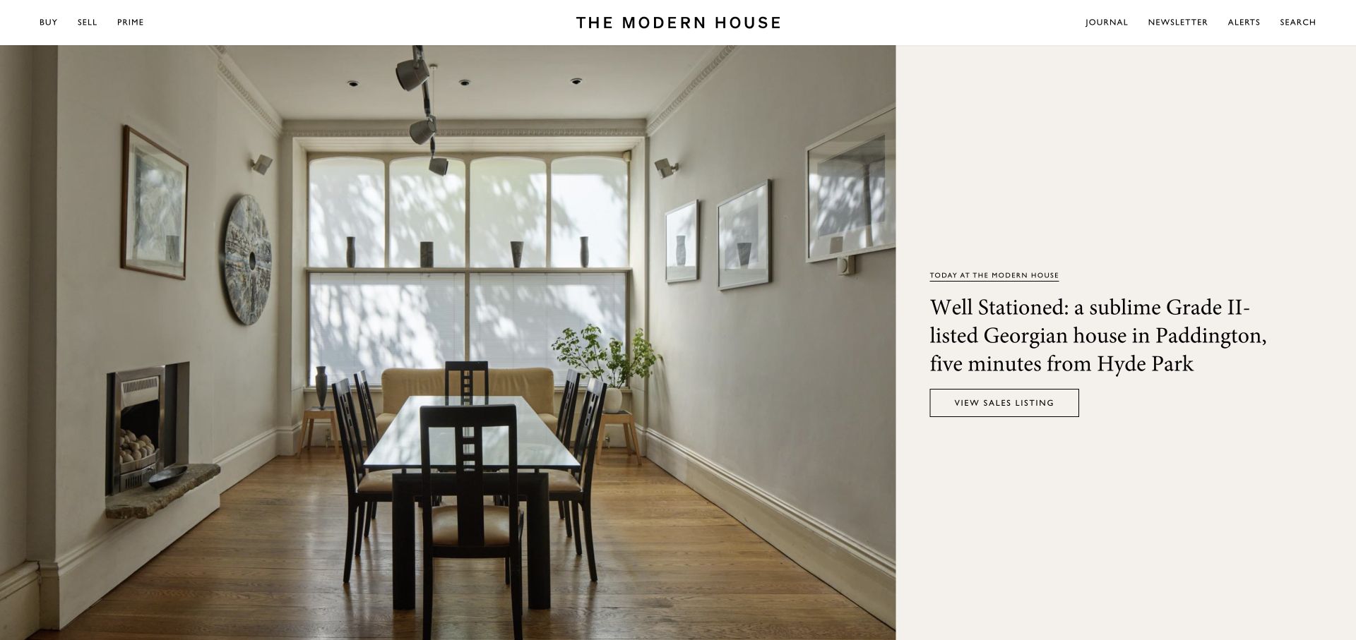
The Modern House pairs a large interior photograph with a cream editorial panel. A small date-style label, serif story headline, and outlined listing action make the home feel like a considered feature rather than a generic search result. Buy and sell remain visible in the white header, with journal and search routes separated at the other side. The opening gives the room enough space to communicate its character while retaining a direct path to the actual sales listing. It is a curated discovery experience, not an attempt to display every filter immediately.
What you can learn
Use a property story to communicate qualities a thumbnail cannot show, but connect it directly to the listing. Keep ordinary buy, sell, and search routes visible for visitors who are not in an editorial browsing mood.
Pros
The feature photograph and text panel have distinct, readable roles.
A direct listing action connects inspiration to an actual property.
Cons & considerations
Price and bedroom information are not available in the initial feature.
Visitors with precise requirements need a separate route to filtered search.
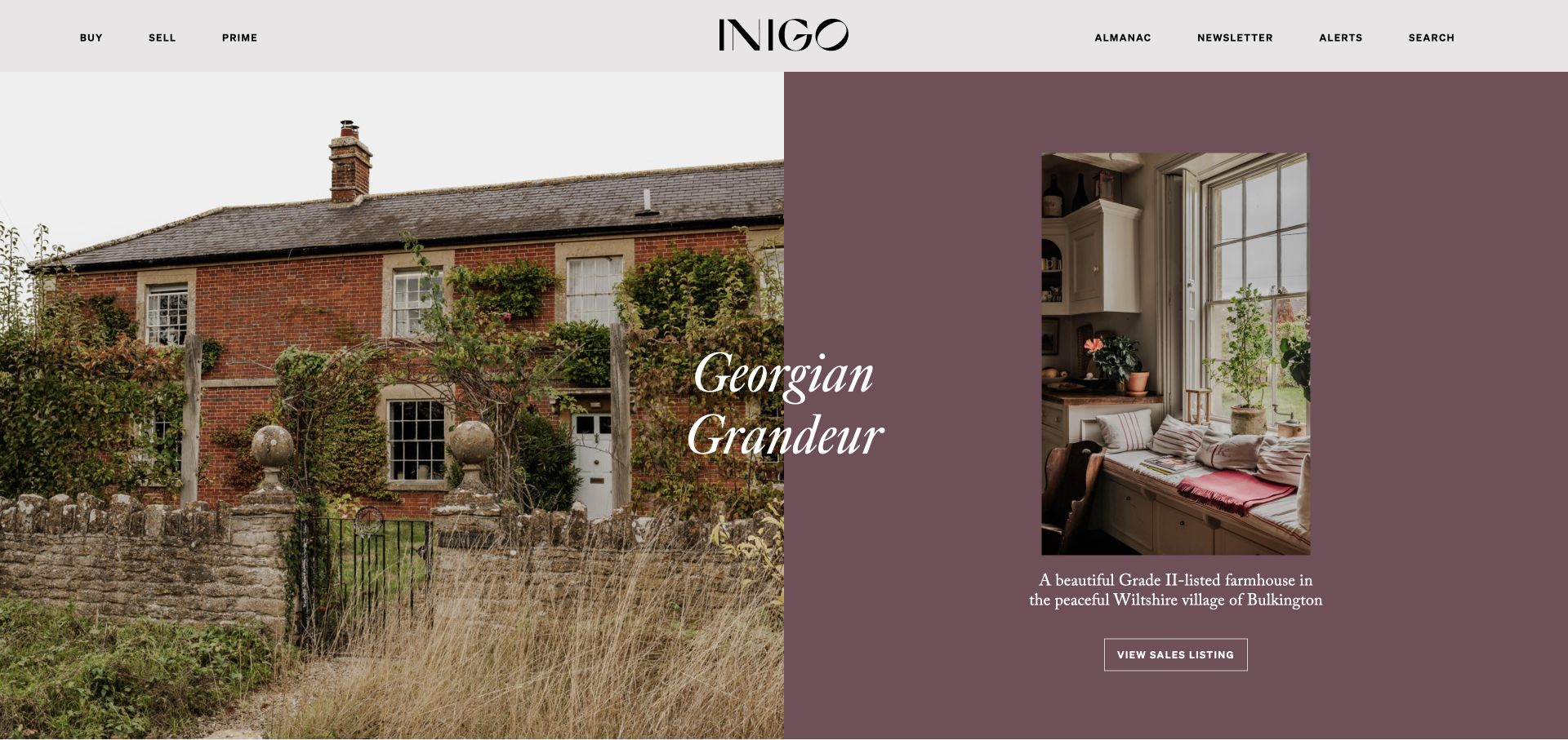
Inigo introduces a featured home through both an exterior view and an interior detail. Muted plum and cream surround the photographs, while fine serif lettering crosses the composition. The pairing helps express the relationship between a building’s setting and the rooms inside it, which matters when character is a major part of the buying decision. A listing action remains attached to the feature, and buying, selling, and search are available in the header. The art direction is unusually specific to historic homes rather than an interchangeable luxury-property treatment.
What you can learn
Choose complementary property images that answer different questions: setting, building, and lived interior. Attach the story to a listing route, and preserve a plain search alternative for buyers comparing location, budget, and accommodation.
Pros
Exterior and interior views reveal different aspects of the same home.
The muted palette and serif type support the historic-property focus.
Cons & considerations
Overlapping display type needs careful cropping and contrast on mobile.
Editorial presentation postpones price and filter information for task-focused buyers.
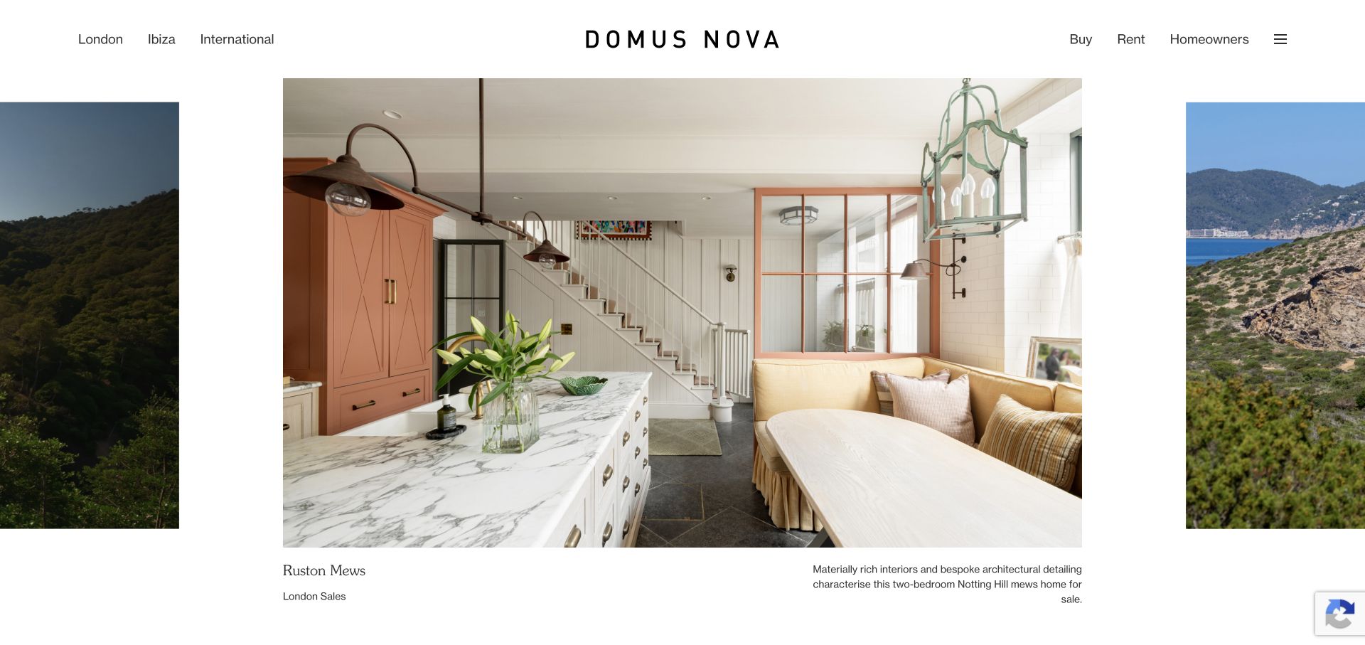
Domus Nova places geography before transaction type in the header, naming London, Ibiza, and international destinations. The hero behaves like a wide gallery: a large central property image is flanked by glimpses of neighboring slides. A listing name and market label sit beneath the image rather than competing with the architecture. The partial slides suggest more inventory without resorting to a dense grid. This supports leisurely discovery, especially where atmosphere and design are central to selection. The header still preserves buy, rent, and homeowner routes for visitors approaching the business with a specific task.
What you can learn
When markets differ substantially, let visitors choose geography before asking them to browse inventory. Use gallery previews to encourage exploration, but retain conventional listing details and search for serious comparison.
Pros
Geographic routes make the agency’s separate markets immediately understandable.
Adjacent slide previews suggest more properties without covering the main photograph.
Cons & considerations
Gallery controls should remain obvious to visitors who do not swipe.
The initial feature omits price, making quick comparison a later task.
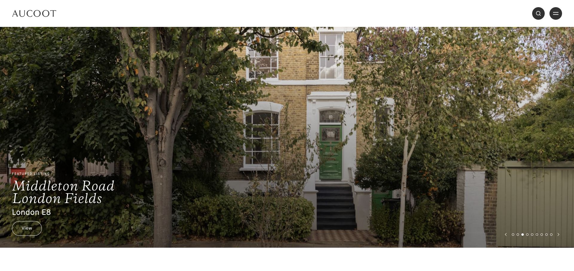
Aucoot uses a large property photograph almost edge to edge beneath a white header. A generous wordmark, circular search control, and circular menu control establish a small set of recognizable elements. The listing caption includes a street or area and postcode, grounding the image in a real market rather than leaving it as anonymous inspiration. A thin outlined viewing action sits alongside that caption. The large image does most of the opening work, with carousel dots showing additional features. The example is useful for its restraint, provided the actual property pages supply the details absent from this first screen.
What you can learn
Even a highly visual property homepage should identify what and where the image represents. Keep captions literal and searchable, then provide a direct listing destination and a clear route to the complete inventory.
Pros
A visible locality gives the photograph practical geographic meaning.
A compact header keeps attention on the property rather than interface decoration.
Cons & considerations
Buy and sell journeys are less visible when hidden inside the menu.
Many carousel positions make side-by-side property comparison harder.
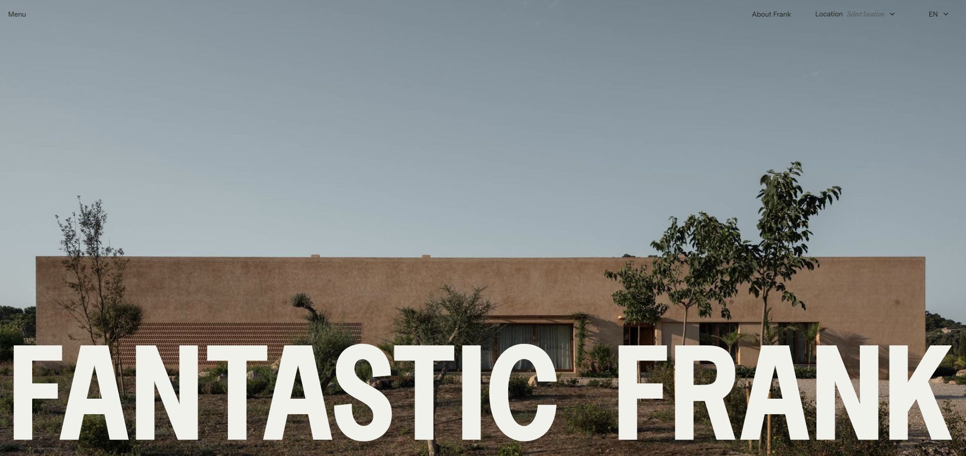
Fantastic Frank opens with a nearly full-screen architectural photograph and an exceptionally large white wordmark along the bottom. Menu, location, language, and firm information remain quiet at the top. The visual hierarchy makes the selected property image the main expression of the brand, rather than adding a large promotional headline over it. That is appropriate for a design-led agency with consistently strong photography. The international controls acknowledge that visitors may need to choose a market or language before exploring. The same restraint also means the first screen offers relatively little literal guidance about inventory or transaction types.
What you can learn
Let excellent property photography carry a curated identity, but make market selection and search easy to recognize. A visually confident brand still needs ordinary buyer and seller pathways that do not depend on interpreting the image.
Pros
The oversized wordmark creates recognition without covering the entire photograph.
Location and language functions reflect the agency’s international audience.
Cons & considerations
The opening is primarily atmospheric rather than an immediate property-search interface.
Small, understated navigation can be overlooked against a detailed image.
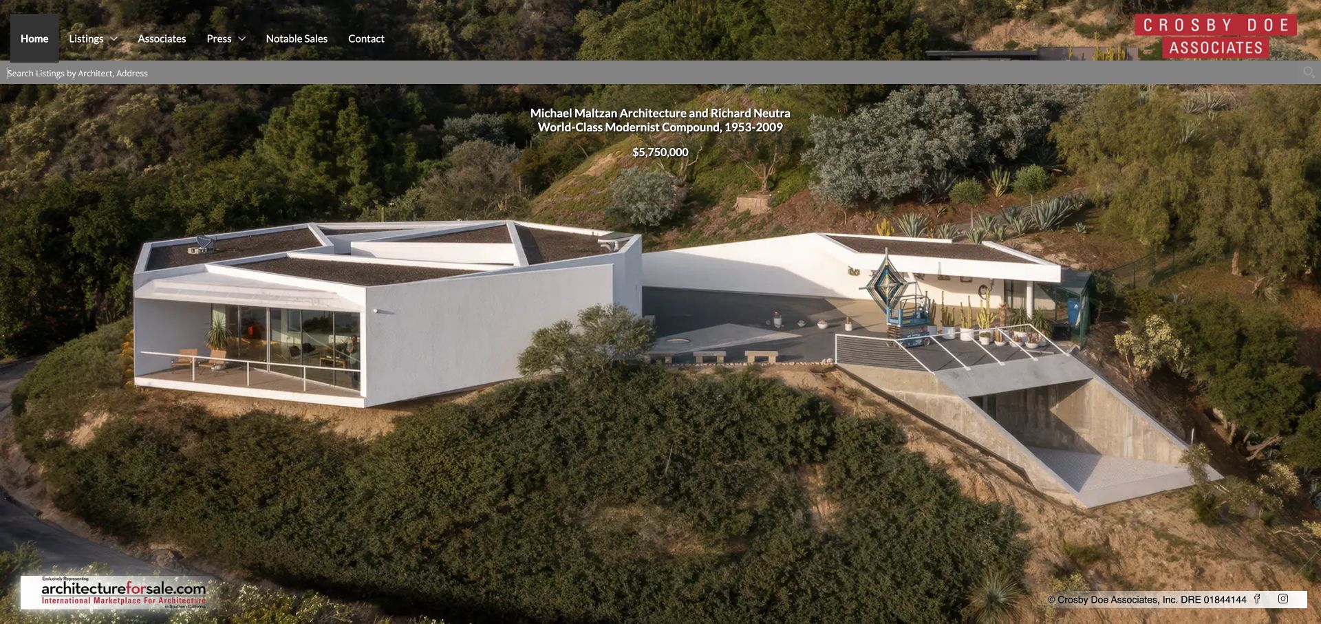
Crosby Doe Associates makes architect or address search visible directly beneath its header. That is a distinctive response to the audience: some buyers arrive looking for a designer’s work rather than only a town or bedroom count. A large aerial property photograph fills the opening, with an architect credit, property description, and price grouped near the top. The dark navigation and red identity mark establish a compact frame around the imagery. This is a specialist catalog rather than a broad neighborhood portal. Its strongest feature is the use of architectural authorship as practical discovery information, not merely decorative prestige copy.
What you can learn
Build search around the attributes your particular buyers actually know. For significant architecture, designer and address can be meaningful entry points; still preserve location, price, and accommodation details for practical comparison.
Pros
Architect search directly serves a specialist property-buying interest.
Property authorship and price provide context beside the feature image.
Cons & considerations
Small overlaid details need enough contrast and size to remain readable.
A full-screen image makes comparing several properties a separate step.
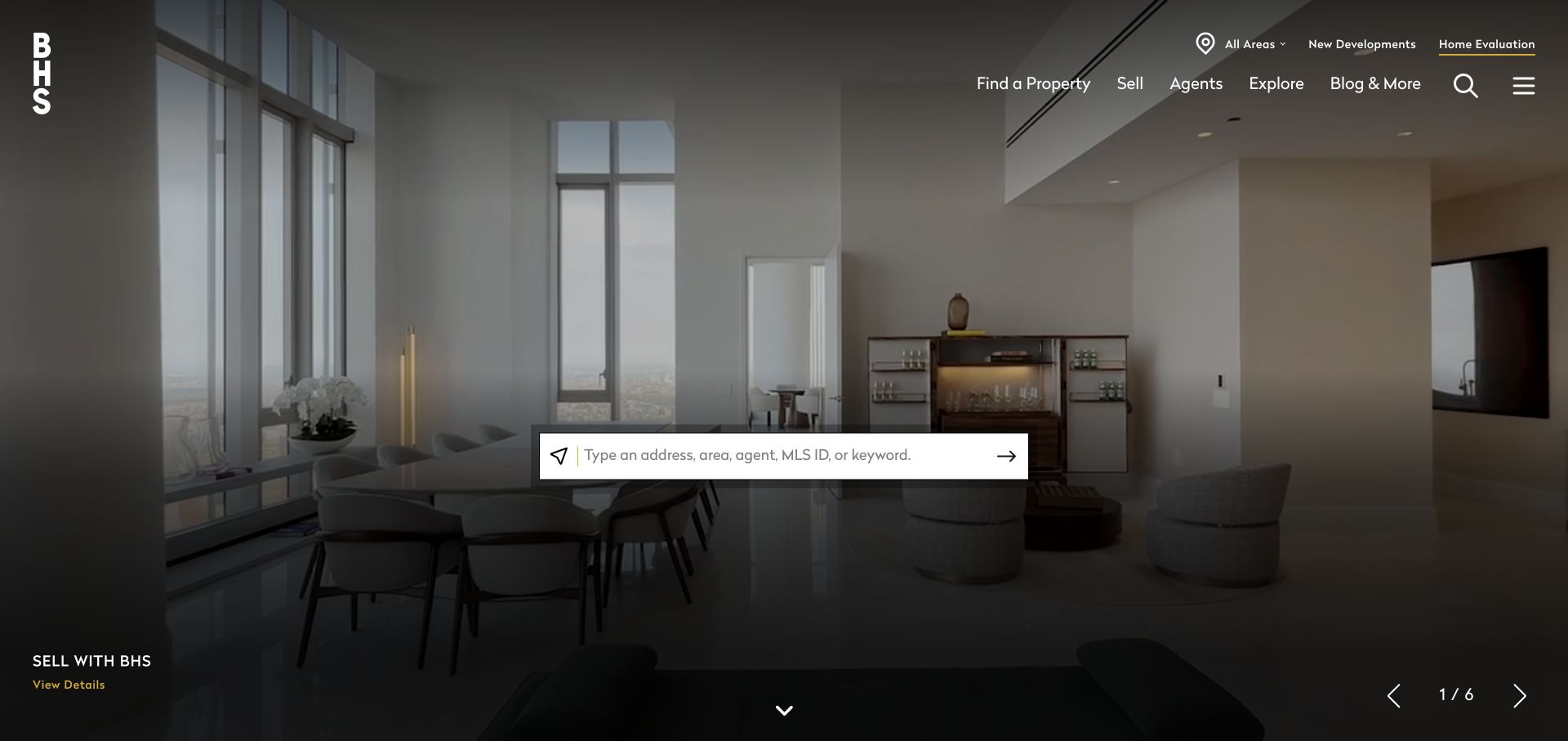
Brown Harris Stevens centers a large search field over a darkened property video. The placeholder accepts several useful starting points, including a location, address, agent, or listing identifier. That avoids assuming every visitor begins with the same piece of information. Buy, sell, agents, and exploration routes remain in the upper navigation, while a slide caption at the bottom identifies the visual feature. The stacked wordmark is recognizable without occupying the entire screen. A regional selection prompt adds another layer to the experience, useful for a broad brokerage but potentially interruptive when someone simply wants to begin searching.
What you can learn
Design the main lookup around real search inputs rather than one idealized journey. Offer market selection without blocking a visitor who already has an address, agent name, or listing reference ready.
Pros
One field accommodates several genuinely different property-research starting points.
The dark video treatment keeps the white search surface visually prominent.
Cons & considerations
An automatic regional prompt can interrupt the first search attempt.
Detailed buyer filters are not present in the initial lookup.
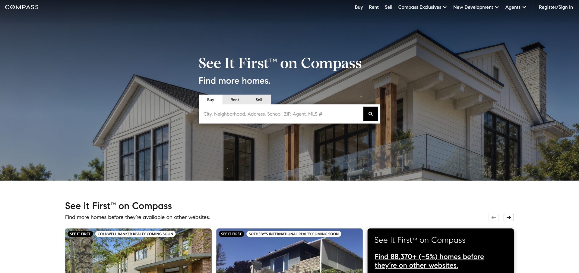
Compass places buy, rent, and sell tabs above a large white search field on a residential photograph. The transaction choice appears before the location input, making the purpose of the lookup easier to understand. A black search action is visually distinct from the field itself. The white header preserves the same primary journeys along with agents and new development. A row of property cards begins below the hero, including status treatments that help distinguish inventory at a glance. The page combines a recognizable brand statement with a conventional search pattern, making it useful to study for task hierarchy rather than unusual decoration.
What you can learn
Ask for the transaction type before presenting the search input when buying, renting, and selling lead to different experiences. Reveal actual inventory early enough that users can confirm they are in the right market.
Pros
Buy, rent, and sell have explicit states rather than one ambiguous search.
Property cards appear soon after the introductory search area.
Cons & considerations
A brand-led headline adds less practical information than a precise search description.
Advanced requirements such as budget and bedrooms need another search layer.
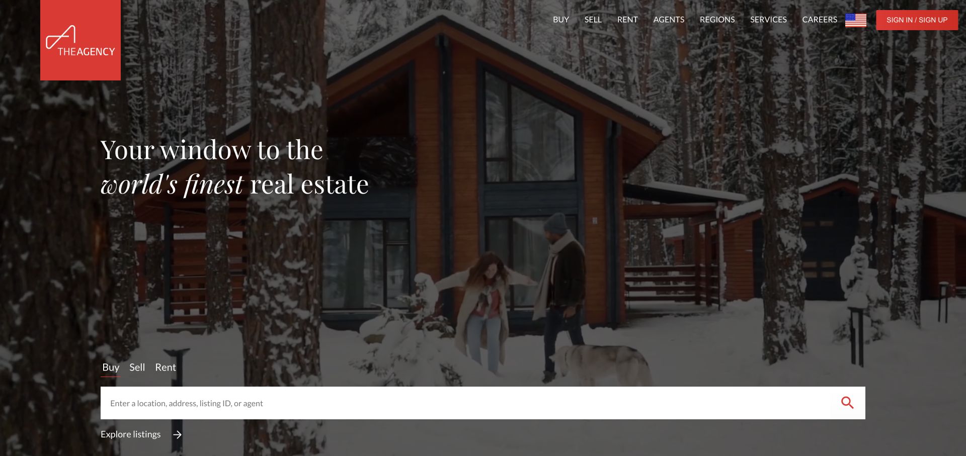
The Agency combines a red identity tile, white navigation, and cinematic property footage. A serif statement sits above a wide white search surface, with buy, sell, and rent tabs defining the lookup. Regions, agents, and services remain visible in the header, supporting a brokerage with more than one local office. The film establishes an aspirational setting, but the large search field keeps the opening connected to inventory. Its placement toward the bottom of the hero is the key tradeoff: it creates a dramatic image-led first impression while potentially moving the main practical control lower on a shorter display.
What you can learn
Keep the transaction selector and search field visually independent of cinematic footage. An aspirational property brand should still make the ordinary inventory task easy to locate before a visitor scrolls through campaign content.
Pros
The red identity tile stays recognizable across different photographic frames.
A broad search surface connects the lifestyle presentation to actual listings.
Cons & considerations
The low search placement may fall beneath the first screen on shorter displays.
Moving footage needs controls and a useful static alternative.
Hilton & Hyland uses a black header and monochrome film to establish a deliberately cinematic opening. White navigation names associates, exclusive properties, media, the firm’s story, and contact, giving the page a stable task layer above the moving scene. A large serif statement and a viewing action appear near the lower part of the hero. The monochrome treatment ties varied footage together, but the film includes lifestyle detail rather than simply showing a listing exterior. This makes the design useful as a study in brand atmosphere, not as a ready-made property search interface for every type of brokerage.
What you can learn
If a luxury campaign uses lifestyle footage, preserve a plainly named listings route and make viewing actions specific. Visitors should understand whether a button opens a property, a brand film, or a general collection.
Pros
The black header creates a stable navigation surface above changing footage.
Exclusive-property and associate routes are stated directly rather than hidden in slogans.
Cons & considerations
A generic viewing action can leave its destination unclear.
Lifestyle imagery does not replace price, location, and property comparison tools.
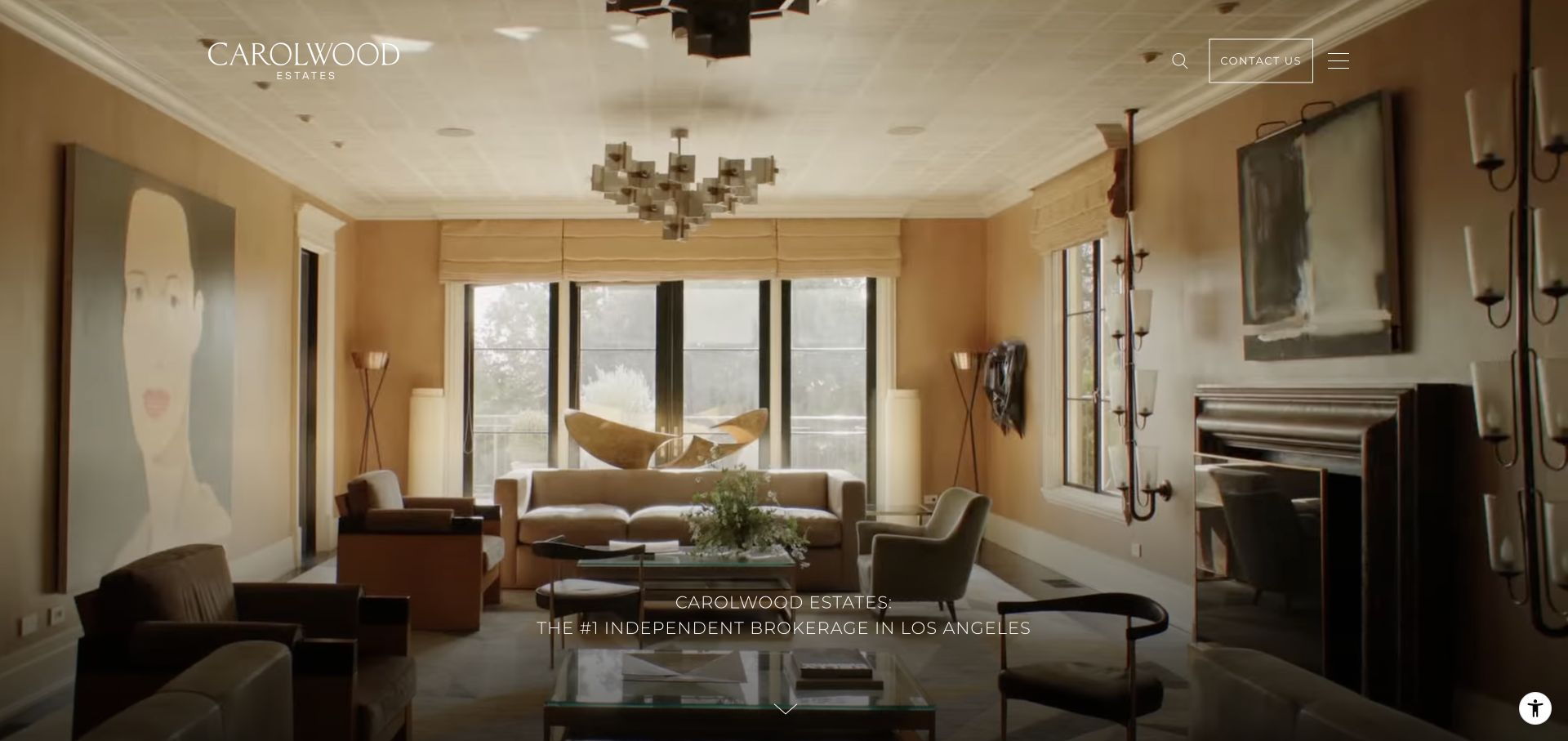
Carolwood Estates lets a large interior film dominate the first screen. The wordmark occupies the upper left, while contact, search, and menu controls are grouped at the right. A short positioning line and down cue sit near the bottom rather than covering the room with a large sales message. The sparse treatment makes the property image feel like a gallery exhibit. It also puts significant responsibility on the menu and search controls, because the transaction and service routes are not spelled out across the header. The design is most relevant to a small curated offer with strong imagery, not a universal template for inventory-heavy agencies.
What you can learn
Minimal property interfaces work best when the few visible controls are unmistakable. Keep contact and search independent of animation, and make the hidden menu reveal buyer, seller, and listing routes in plain language.
Pros
The image remains largely unobstructed by promotional copy.
Contact and search keep permanent positions beside the menu control.
Cons & considerations
Important transaction choices are hidden instead of available to scan.
Bottom-aligned positioning can disappear below the fold on shorter screens.
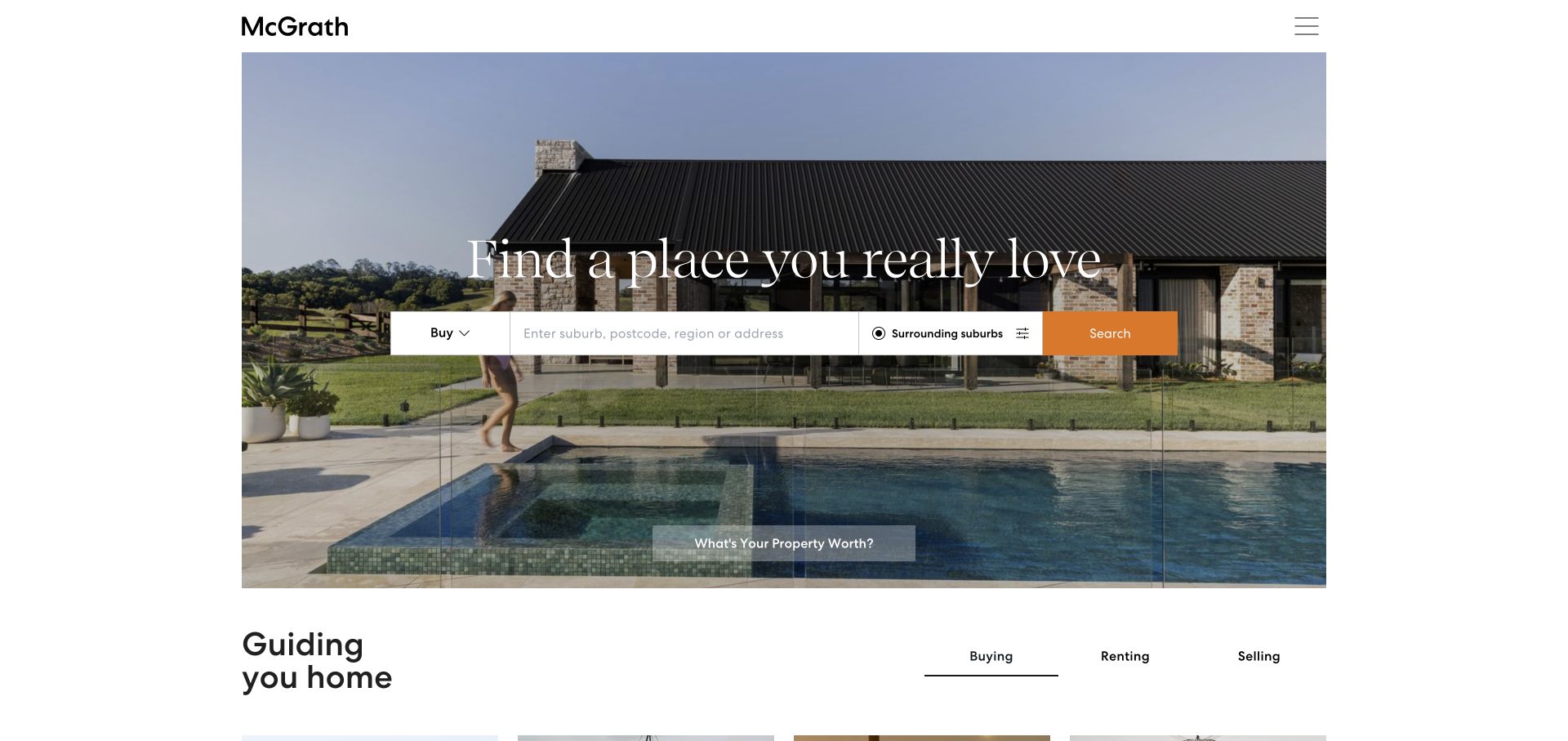
McGrath places a wide, bounded property image within a white page rather than running every visual edge to edge. The search row combines transaction type, location input, surrounding-suburb selection, filters, and an orange search action. That is a practical set of controls for buyers whose search area is flexible. A valuation route sits separately, acknowledging a seller’s different task. The next content section begins beneath the image with buying, renting, and selling choices. The generous white frame and fine serif headline give the page an editorial feel while leaving ordinary property search central to the interaction.
What you can learn
Keep the first search compact but expose the refinements that matter most, such as nearby suburbs. Give seller appraisal a distinct route instead of forcing sellers through a buyer-oriented inventory form.
Pros
Nearby-suburb and filter controls support a more realistic property search.
The valuation route is separate from the buyer and renter lookup.
Cons & considerations
White headline text over a bright property photograph needs careful contrast.
A minimal visible header places more responsibility on the menu’s organization.
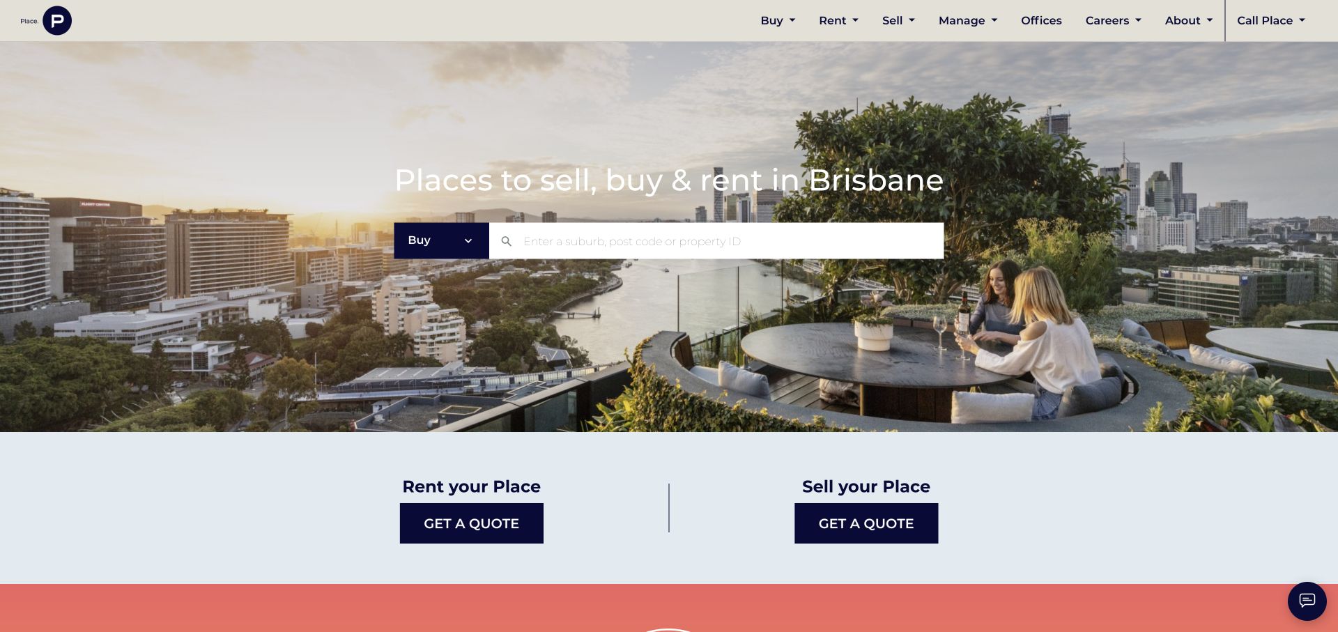
Place names Brisbane directly in the hero above a transaction selector and a large location or property-reference field. The background combines the city and a lived rooftop scene, keeping the market recognizable. A solid cream header separates navigation from the photograph. Beneath the search, two pale-blue panels distinguish renting out a property from selling one, each with its own enquiry action. This is useful task separation: a landlord seeking management is not simply another inventory browser. The design connects the city-level promise to transaction-level choices without making the opening an exhaustive form.
What you can learn
State the geographic market plainly and separate inventory search from owner services. Give rental management and sales their own contextual actions, even when both eventually lead to an enquiry form.
Pros
The city is explicit in the headline rather than implied only by photography.
Seller and landlord routes remain distinct beneath the main search.
Cons & considerations
Identically worded enquiry buttons depend on nearby headings for context.
Newsletter and chat prompts can interrupt an otherwise clear search journey.
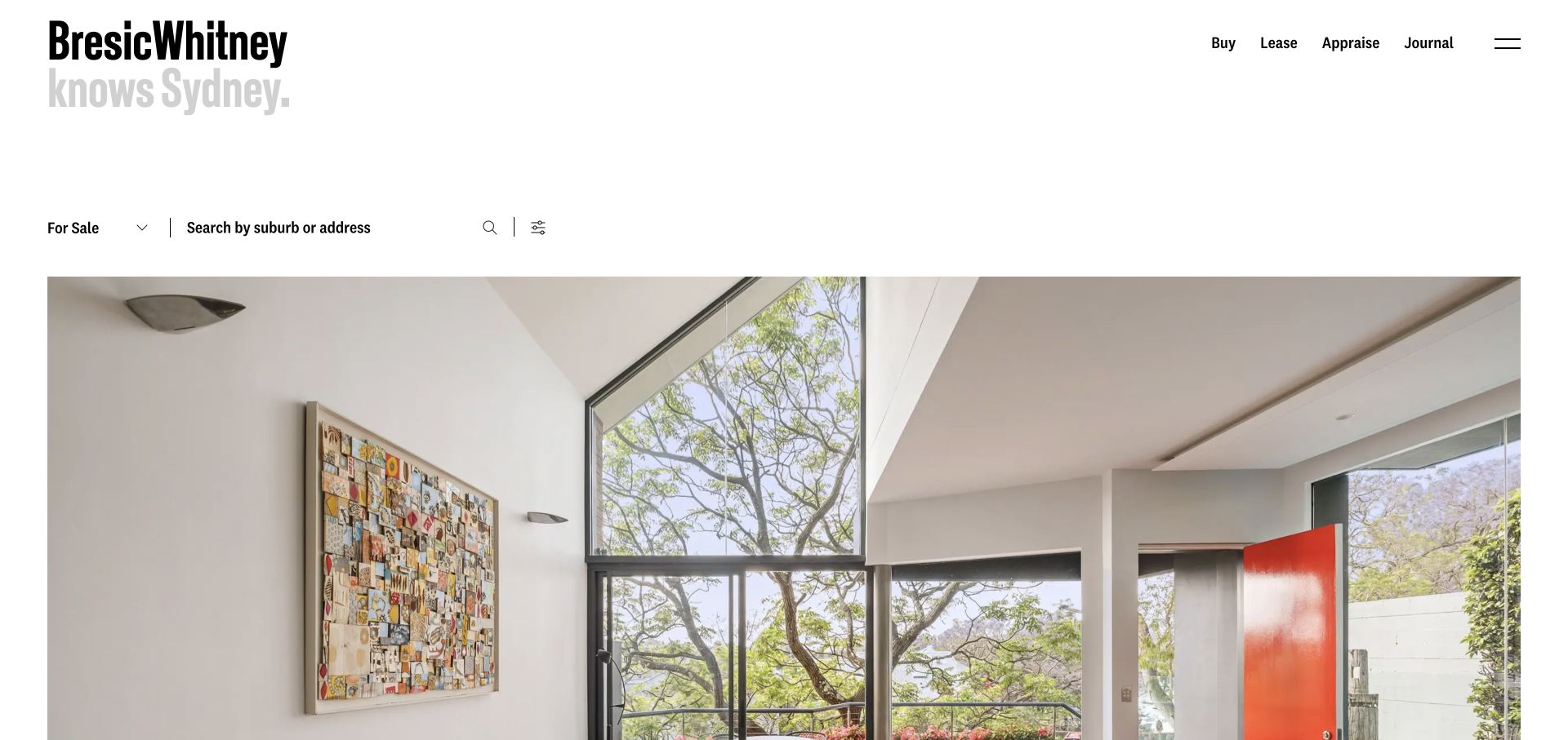
BresicWhitney uses a large condensed wordmark, a short upper navigation, and generous white space above its property imagery. The sale selector, suburb or address input, and filter control sit before the large photograph rather than inside it. That gives search a stable surface and avoids making it dependent on the image’s contrast. Buy, lease, appraisal, and journal routes distinguish the main client tasks. The first photograph remains substantial, maintaining a design-led identity, but the hierarchy puts the practical lookup earlier than many cinematic brokerage sites. The spacious introduction does require care so it feels intentional rather than like missing content.
What you can learn
Place search on a solid surface when it is the main reason people visit. Preserve a strong property image beneath it, but make transaction and appraisal routes understandable without waiting for imagery or animation.
Pros
The search controls do not compete with photographic detail.
Appraisal and leasing are named separately from the buying route.
Cons & considerations
An extended blank opening can resemble a loading gap before the page settles.
Large image presentation delays detailed listing information and comparison.
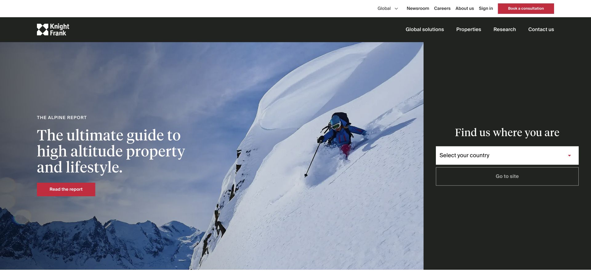
Knight Frank splits its opening between a large Alpine property-market report and a narrow dark country-selection panel. The report image and serif headline make the editorial feature clear, while the adjoining panel asks visitors to choose where they need help. A white header separates global solutions, property, research, and contact, with corporate utilities above. This acknowledges that a global consultancy cannot present every local listing market on one first screen. The useful pattern is separating geographic routing from the current campaign rather than allowing a report to become the only visible next step.
What you can learn
For a genuinely international property business, make location choice a functional part of the opening. Keep it independent of seasonal research, and avoid imposing the same country-selection step on a small local agency.
Pros
Country selection is visible alongside, not buried beneath, the campaign.
Research, property, and advisory work are separate navigation categories.
Cons & considerations
Choosing a country adds a step before visitors reach local inventory.
A major research campaign may be irrelevant to someone seeking a specific home.
Savills places a location dropdown within a large skyline hero, using yellow to identify the main selection action. The square yellow-and-red identity mark remains recognizable above the image. Property, services, research, and contact are distinct navigation routes, reflecting a business that supports more than residential buying. A short introduction explains the global context before asking where the visitor wants to go. This is a gateway structure rather than a local listings page. Its value lies in making market choice a normal part of the journey while preserving direct categories for people already familiar with the company’s offering.
What you can learn
Use geographic routing when the business genuinely spans separate markets, and label the next step plainly. Preserve property and advisory-service routes so the same gateway can serve buyers, owners, and professional clients.
Pros
The yellow selection action has a clear role within the photographic hero.
Property and professional services are not collapsed into one ambiguous category.
Cons & considerations
The international gateway adds a step for visitors seeking immediate local results.
Small white navigation needs contrast across detailed skyline photography.
Visible tech stack
Referenced on the public page
Amazon CloudFrontDelivery / hosting signal
Public source checked November 3, 2026. References may be embedded or legacy—not a complete backend inventory.
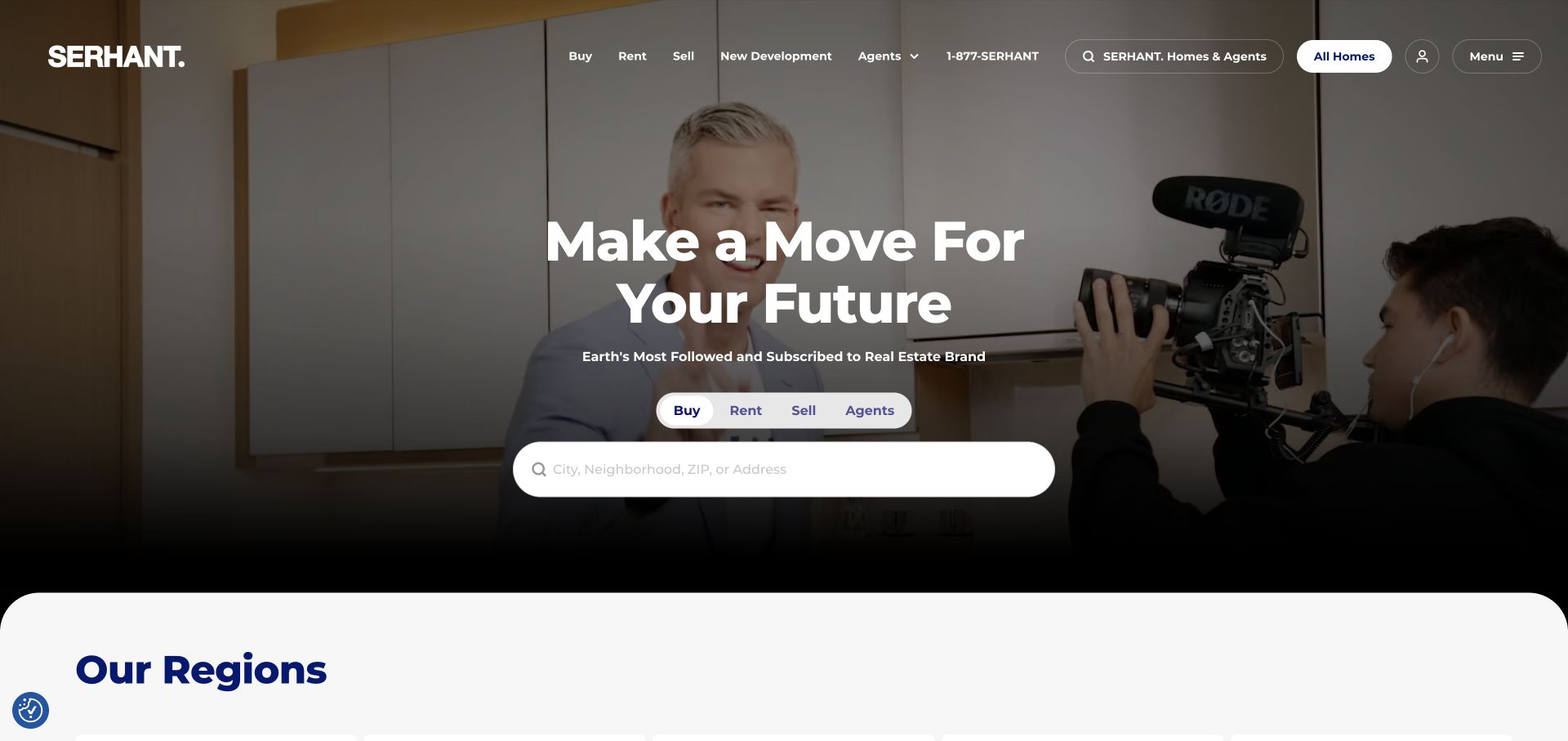
SERHANT. centers a bold statement and rounded search field over footage of people and production activity. Buy, rent, sell, and agent tabs define the search context, while the header separately offers agents, new development, telephone access, and additional search. A dark lower gradient creates a reading surface for the white controls. The next regions section begins with a rounded white edge, making the transition from brand film to geographic browsing clear. The page demonstrates how a media-oriented identity can coexist with literal property tasks, although the numerous search and menu controls also introduce some duplication.
What you can learn
Keep transaction choice and location entry prominent even when the brand story emphasizes people or media. Use a consistent search vocabulary, and make any second header search clearly different from the main inventory lookup.
Pros
Transaction tabs explain the purpose of the central search field.
The dark gradient keeps the main controls separate from changing footage.
Cons & considerations
Several search and menu entry points can create unnecessary choice.
Brand-production footage offers less property detail than an actual featured listing.
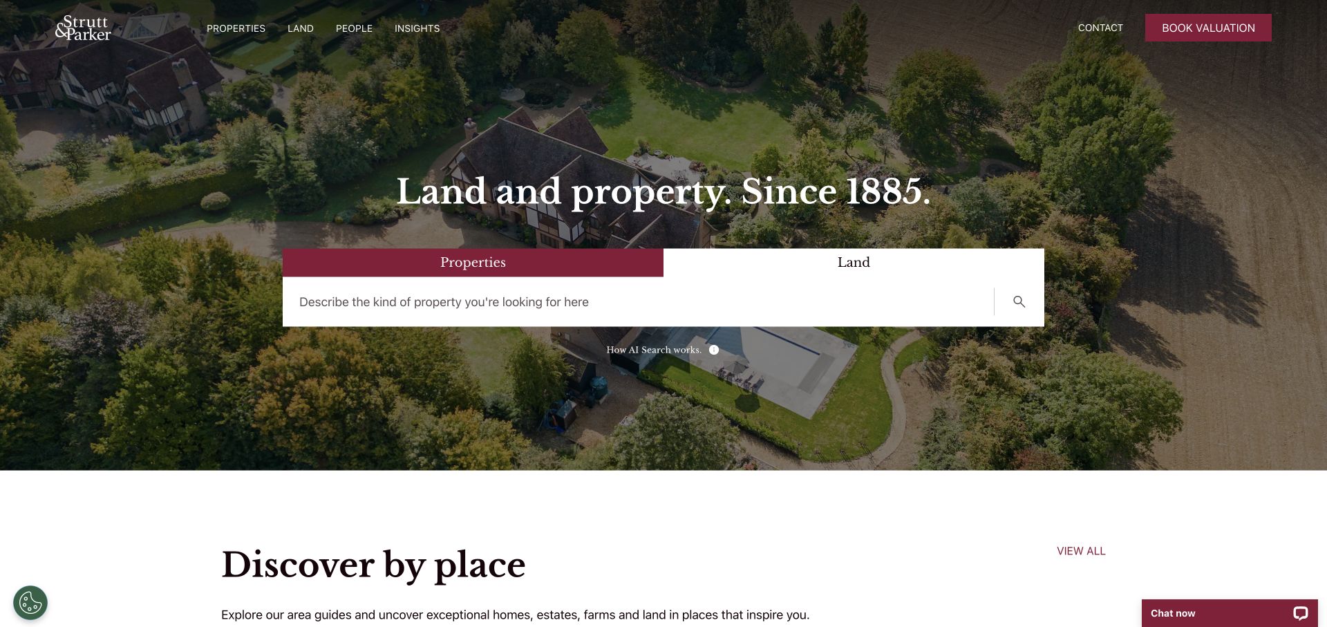
Strutt & Parker places property and land as two clear modes above a wide search field. The aerial estate photograph supports both categories without suggesting that all inventory is conventional housing. A short explanatory control accompanies the search, acknowledging that its natural-language approach may be unfamiliar. Burgundy identifies the active state and valuation action. The following section offers discovery by place, giving visitors a browsing alternative to writing a query. The header remains compact, naming property, land, people, and insights. This is a useful example of aligning the interface with genuinely different asset categories rather than forcing them into a single residential filter.
What you can learn
Separate materially different property categories before search begins. If introducing an unfamiliar search behavior, explain it beside the control and preserve conventional geographic browsing for people who prefer not to compose a query.
Pros
Property and land have explicit modes rather than an ambiguous combined form.
Place-based browsing provides a useful alternative to free-text search.
Cons & considerations
Natural-language search needs clear examples and predictable result explanations.
The large estate image can imply a narrower inventory than the full offering.
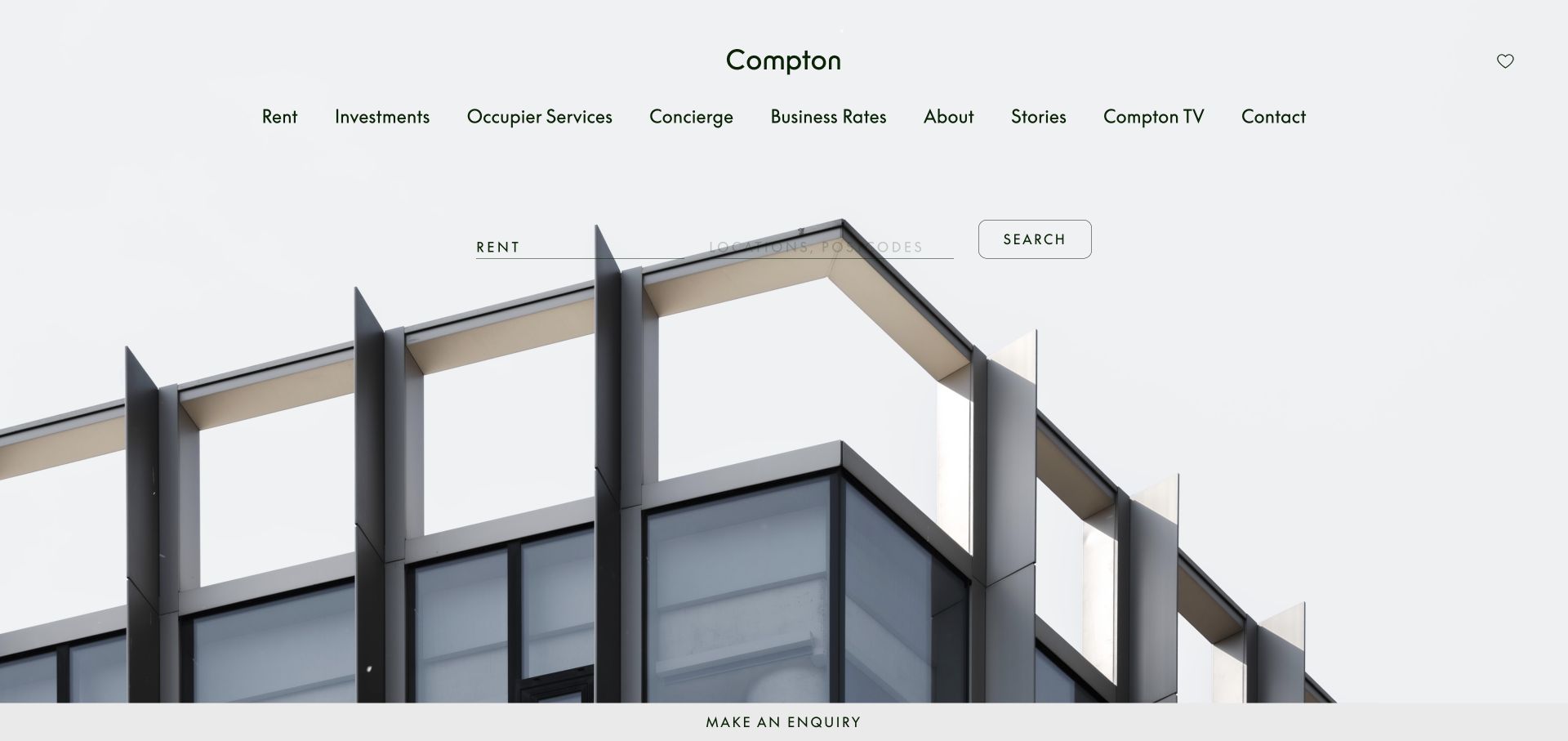
Compton places a rental lookup above a large architectural photograph, using green lettering and a warm orange identity accent. The header names occupier services, investments, business rates, and other commercial functions rather than borrowing residential terminology. Its expanded navigation organizes offices by neighborhood, collection, and lease type, reflecting how a business may evaluate workspace. The opening is spare, with a persistent enquiry strip at the bottom and little promotional text covering the building. This makes the site a useful counterpoint to residential portals: the inventory and client tasks require a different taxonomy, not merely different photographs inside the same template.
What you can learn
Build commercial-property navigation around actual occupier decisions: location, workspace type, fit-out, and lease model. Keep the initial search simple, then expose those meaningful refinements in a well-labeled browse structure.
Pros
Neighborhood and collection routes reflect concrete workspace-selection criteria.
Commercial services are named directly instead of using residential transaction labels.
Cons & considerations
The many service routes need hierarchy to avoid an overlong navigation row.
Thin search fields can lose contrast against a pale architectural image.
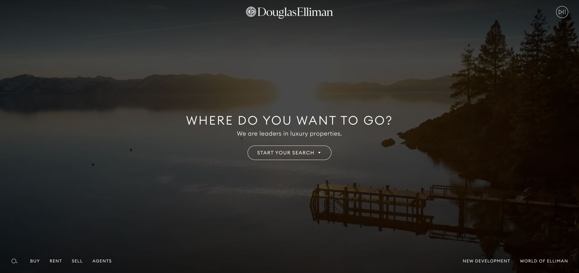
Douglas Elliman uses a darkened landscape film with a centered wordmark, a short destination-oriented statement, and one outlined search action. The primary transaction routes sit along the lower edge, leaving the center of the screen unusually uncluttered. A visible playback control acknowledges that the imagery is moving. The film establishes a broader lifestyle context rather than documenting one listing, so the search action carries the practical responsibility of moving visitors into inventory. The composition is memorable for its restraint, but it introduces a step between the homepage and the form where location or property requirements are entered.
What you can learn
A cinematic gateway should have one unmistakable path into property search and an independent route to core transactions. Make the additional step worthwhile, and preserve controls so motion is never required to understand the interface.
Pros
One central action gives the immersive opening a clear next step.
A playback control makes the background film explicitly controllable.
Cons & considerations
The search field is not immediately available in the opening itself.
Bottom-edge navigation may be missed or fall lower on shorter displays.
Start with the property data and the contact journey
Identify the source of truth for listings
Document where property facts, status, prices and images originate and what the website is allowed to display. Confirm update timing and how withdrawn or completed listings are handled. A redesign should not create an independent stale copy of a live listing feed.
Design the search-to-detail loop
Map filtering, sorting, list or map choices and the return to results. Test zero results and unavailable listings. Keep the basic task usable on a phone before adding elaborate transitions or large interactive maps.
Give local content a real editorial purpose
Choose useful area information and an owner who can maintain it. Connect agents, offices and relevant properties without duplicating generic location copy. Have the business’s appropriate reviewer approve public claims and required listing information.
The editing job behind the design
Keep listing integrations distinct from editorial publishing
Use the approved listing source or operational system for property status and transactional facts. The CMS can manage people, offices, area content and the presentation surrounding the listings. Define synchronization, error handling and ownership before promising live accuracy.
Search and maps can add complexity, licensing considerations and third-party dependencies. Start with a reliable result list and clear property detail. Evaluate a custom front end when the feed and interaction requirements justify the ongoing development work.
Our WordPress website examples offer a separate look at publishing approaches. A visible platform label is evidence for that named page, not a guarantee that the same system will suit your requirements.
Before the public launch
Real estate website launch checklist
Confirm listing data rights, update ownership and image permissions.
Test sale, rental, active and archived status presentation.
Check filters, zero results and returning from a property to search.
Verify property contacts, office details and inquiry routing.
Have the business review public property and area claims.
Test readable details, keyboard navigation and search on a small screen.
These checks are a project checklist, not a performance, legal, security, or accessibility certification. Test real journeys with the people responsible for the website before making claims about the result.
Sources & editorial method
How this collection was selected and reviewed
We reviewed official real estate business websites with varied discovery and editorial approaches. The collection considers visible interface choices; it does not independently verify property facts, availability, market assertions or professional services.
Each example links to its actual source page. Screenshots are direct browser captures with their own capture dates; moving imagery, announcements and live designs can change. The notes describe observable design choices and conditional tradeoffs, not measured traffic, conversion results, service quality, or accessibility conformance.
Technology labels use public page metadata, asset evidence, or explicitly cited platform documentation. Platform documentation is not a complete current deployment audit. A component reference may be legacy or unused; it is not a complete backend inventory. Unknown stacks are omitted. These sites are editorial examples, not our client portfolio.
Written, Edited and Curated are separate editorial records, not timestamps advanced by a rebuild. Website designs and imagery belong to their owners. See our editorial standards or suggest a correction.
Questions worth asking
Real Estate website design questions
Does every agency need an interactive map?
No. A useful result list with clear location and filters may be enough. A map is worthwhile when it helps the audience compare relevant locations and can be maintained and tested properly.
Should visitors have to register to view properties?
Evaluate the actual purpose and the visitor’s expectations. Requiring an account too early can interrupt basic research. Explain any saved-search or alert benefit clearly and keep consent choices explicit.
Can sold properties remain on the site?
They can be useful as clearly labeled archive or portfolio content if display rights allow it. Do not leave them looking like current availability, and keep the archive separate from active search where appropriate.
Should neighborhood pages be generated in bulk?
Only publish pages with useful, accurate local information and a maintenance owner. Repeating the same claims with a new place name is not a substitute for local expertise.
Borrow the discovery patterns that match your property business. Build around current data, useful context and a clear route to the appropriate person.