Best Complianz Websites of 2026 (20 Real-World Examples)
A privacy interface is useful when its visible choices and the site’s actual behavior are deliberately designed and tested together.
Complianz examples should be studied as WordPress implementations with a visible privacy component—not as proof that a website is legally compliant or that every script follows the visitor’s choice.
A consent banner is a small interface connected to a much larger set of decisions about services, content and data handling. Its appearance cannot establish how a website behaves before a choice, after refusal or when preferences change. Complianz can be part of that implementation, but the owner still needs to understand the actual tools in use and the policy the configuration is intended to implement.
This collection concerns the WordPress product and exact public properties with supported evidence. It does not infer a paid plan, certification or legal result from a script name or visible control. Use the examples to consider readable choices, useful document routes and the relationship between privacy controls and the surrounding website. This is implementation-planning information, not legal advice.
Before the examples
What makes good Complianz website development in 2026?
Decide the intended behavior before styling the banner
Inventory the services the website uses and identify who is responsible for deciding their treatment. Include embedded media, maps, analytics, marketing tools and plugins that introduce their own third-party requests. A polished preferences panel cannot compensate for an incomplete inventory. Work from the site’s actual implementation and applicable policy rather than copying another organization’s banner labels.
Complianz’s current setup documentation separates configuration, service integrations, documents and activation. Treat those as connected tasks, not a sequence to click through without review. The project brief should describe what the visitor can choose and what is expected to happen in each state. A software wizard can organize settings, but it cannot independently determine every obligation of the business.
Use direct labels and concise explanations that reflect the actual categories or services. Keep controls readable at normal zoom, visible against the page and reachable by keyboard. Test long translations and small screens rather than assuming a banner that fits the desktop preview will remain usable everywhere. Avoid disguising refusal or changing the meaning of a control for visual emphasis.
Provide a discoverable route to revisit preferences after the first interaction. Complianz documents a manage-consent control and ways to reopen the banner. Check that this route remains available on mobile and does not collide with chat widgets, sticky actions or accessibility controls. The ability to reopen a panel should be verified in the completed implementation, not assumed from the presence of a footer link.
Keep integration evidence separate from compliance claims
A public Complianz asset or control can support an exact-property technology association. It does not reveal every administrative setting, establish which product tier is licensed or prove that no other script loads independently. Describe what was observed and keep unknown parts unknown. A website-design collection should not present a privacy component as an independent certification badge.
The implementation needs its own test of expected behavior. Compare the initial state, an explicit refusal, selected preferences and a later change of choice. Include relevant embedded content and navigation paths. Keep test accounts and fictional form data separate from real visitors, and do not alter the owner’s saved privacy preference merely to make a demonstration appear convenient.
Compare how supported public examples place privacy controls within their broader design. The screenshots show presentation at a genuine moment in time; they do not establish hidden configuration, the complete service inventory or legal compliance.
We start with five recognizable brands or organizations: Tradeshift, Rosendin, AccentCare, Intellect Design Arena, CropX. Each attribution applies to the named website property, not every product or website belonging to its organization. This is a curated reading sequence, not a measured ranking.
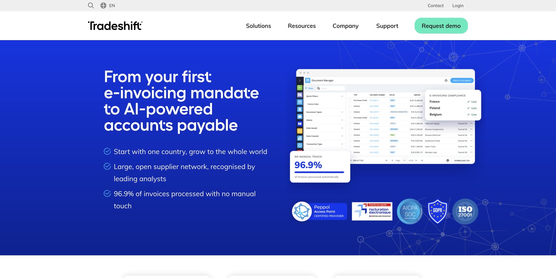
Tradeshift places a large accounts-payable proposition beside an invoice-management screen and a compact country-status panel. The blue hero gives the interface preview a clear stage, while check-marked bullets summarize the intended workflow. Below it, three routes separate e-invoicing compliance, automation and the supplier network, allowing the broad opening to resolve into distinct product interests. Analyst and resource sections add further investigation paths rather than leaving the page at a demo request alone. The screenshot is useful for studying how a technical service is introduced through a recognizable business object: the invoice. The displayed compliance marks, processing percentages and savings are the company’s claims, not outcomes verified in this design review.
What you can learn
Show the business object that anchors a complex service, then divide the offering into understandable decisions. Keep quantitative and compliance claims connected to their conditions and supporting material rather than treating them as decorative proof.
Pros
An invoice screen makes the workflow less abstract.
Three follow-on routes clarify the main product interests.
Cons & considerations
Several performance and compliance claims compete in the hero.
The long headline requires substantial space before the next section.
Platform source: WordPress.org Showcase. Linked script matches Complianz. Exact public source-page reference: https://tradeshift.com/. This is an observed component association, not proof of private configuration, a paid plan, measured results or complete architecture. Platform evidence is separate from the direct website screenshot and is not a complete current infrastructure audit.
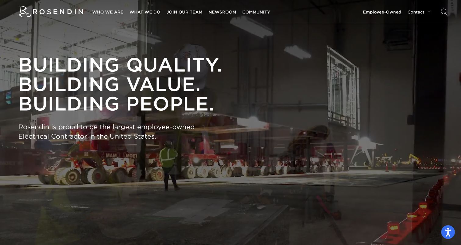
Rosendin uses a full-width active jobsite background with a large stacked statement about quality, value and people. Its navigation separates company information, capabilities, recruiting, newsroom and community material, while employee ownership receives a visible utility link. For electrical construction, the scale of the work is apparent without a lengthy introductory paragraph. The content structure also recognizes that prospective employees and clients share the site but need different routes. The visual strength comes with a readability tradeoff: text and navigation sit over moving or changing imagery. Project scope, safety information and relevant contact details still need clear destinations beyond the broad institutional message.
What you can learn
Use project imagery to establish the kind of electrical work, then separate client evidence from recruiting and culture content. Preserve readable text and direct routes to capabilities so a strong institutional hero does not become a navigation obstacle.
Pros
The jobsite imagery conveys the scale and context of the work.
Client, recruiting and community routes are distinctly labeled.
Cons & considerations
Text overlays need contrast across changing imagery.
The broad hero statement leaves specific capability evidence to later pages.
Platform source: WordPress.org Showcase. Linked stylesheet matches Complianz. Exact public source-page reference: https://www.rosendin.com/. This is an observed component association, not proof of private configuration, a paid plan, measured results or complete architecture. Platform evidence is separate from the direct website screenshot and is not a complete current infrastructure audit.
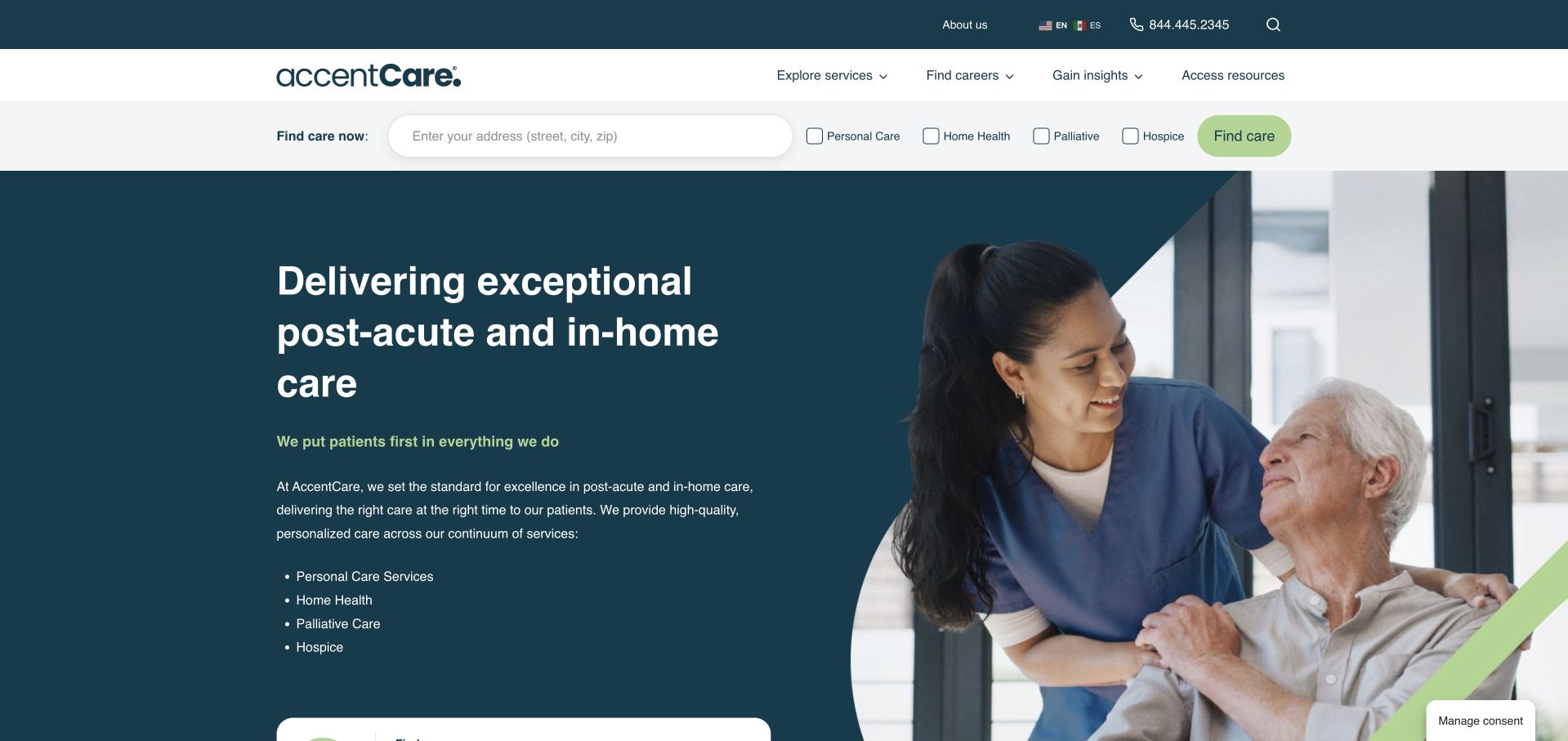
AccentCare places a location finder and service choices in a separate strip above its hero. The opening combines a dark teal text field with a care-interaction photograph and concise service list. Personal care, home health, palliative care and hospice are named rather than collapsed into one label. This helps a visitor who knows either the geography or required service. The compact controls also need space on mobile. Public information must explain category differences without presenting a selection as a clinical recommendation or suggesting that every service is available everywhere.
What you can learn
Separate geography and service type while keeping their relationship visible. Provide plain definitions and appropriate contact routes, then use local results to confirm actual provision rather than implying that every service exists everywhere.
Pros
The opening names several service lines explicitly instead of relying only on a broad care promise.
The finder sits on its own stable surface outside the photographic hero.
Cons & considerations
Several closely spaced service controls need careful mobile layout and keyboard testing.
Choosing a service category should not be presented as an assessment of a person’s needs or eligibility.
Platform source: WordPress.org Showcase. Linked stylesheet matches Complianz. Exact public source-page reference: https://accentcare.com/. This is an observed component association, not proof of private configuration, a paid plan, measured results or complete architecture. Platform evidence is separate from the direct website screenshot and is not a complete current infrastructure audit.
Intellect Design Arena positions itself within enterprise financial technology, using product and solution language to introduce a specialist portfolio. The presentation is aimed at organizational evaluation rather than consumer banking tasks. That audience focus is useful, but unfamiliar visitors still need a concrete explanation of each product’s users, inputs, and outputs before broad AI positioning becomes meaningful. Documented association checked November 8, 2026: MongoDB Atlas in Purple Fabric’s governed enterprise-AI architecture for unstructured ESG insights.
What you can learn
Scope governed AI to the actual application and information it processes. Purple Fabric’s ESG example is a specific documentary association; useful project planning would identify document provenance and review responsibilities rather than treating the database name as proof of trustworthy analysis.
Pros
Specialist positioning helps organizational buyers understand the category before exploring detailed product information.
A portfolio structure can support several financial-technology needs without pretending they are one consumer application.
Cons & considerations
Enterprise terminology raises the learning burden for visitors without knowledge of the product family.
A corporate AI proposition cannot independently validate the quality or governance of individual ESG insights.
Platform source: WordPress.org Showcase. Linked stylesheet matches Complianz. Exact public source-page reference: https://www.intellectdesign.com/. This is an observed component association, not proof of private configuration, a paid plan, measured results or complete architecture. Platform evidence is separate from the direct website screenshot and is not a complete current infrastructure audit.
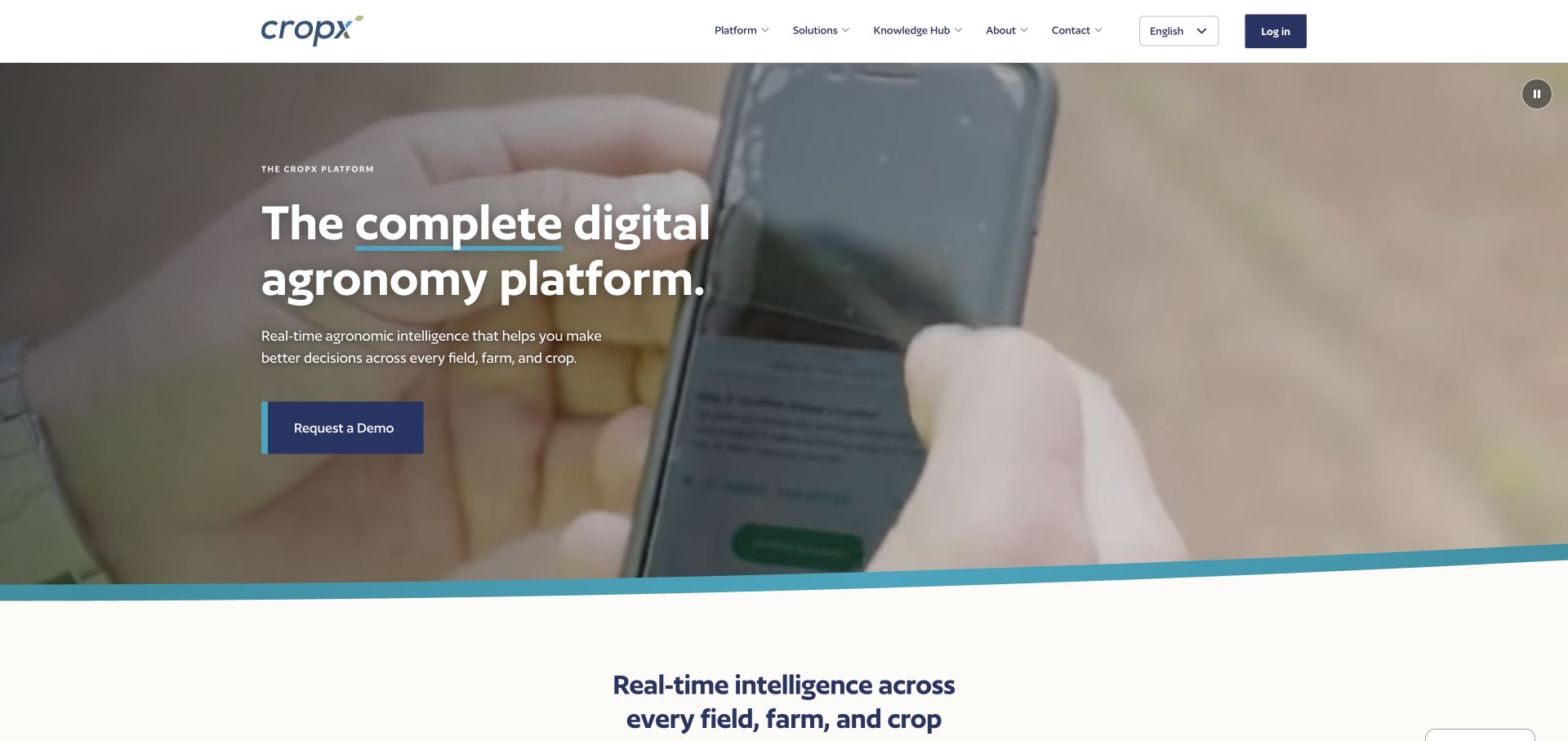
CropX explains its digital agronomy platform through soil, weather, satellite, crop-analysis and machinery-integration themes. Specific sensor and data product cards make the system less abstract. Demo and existing-user login routes are separate, allowing the page to serve research and day-to-day access without forcing both through one conversion path.
What you can learn
Show the parts of a data platform in terms a grower can investigate. Distinguish measurements, analysis and integration layers instead of treating connected agriculture as a self-explanatory phrase. Let a prospective customer understand which inputs are needed, what an output represents and where a demonstration can answer their operational questions. Keep existing-user access visible without making a new visitor enter a private application to discover the basic offer. The marketing page should explain the decision being supported, not substitute a long feature list for an understandable workflow.
Pros
Named data sources help explain what contributes to the platform.
Sensor and software paths are available alongside distinct demo and login actions.
Cons & considerations
A long platform feature list needs prioritization by crop and operational question.
The presence of several data inputs does not independently verify recommendation accuracy.
Platform source: WordPress.org Showcase. Linked stylesheet matches Complianz. Exact public source-page reference: https://cropx.com/. This is an observed component association, not proof of private configuration, a paid plan, measured results or complete architecture. Platform evidence is separate from the direct website screenshot and is not a complete current infrastructure audit.
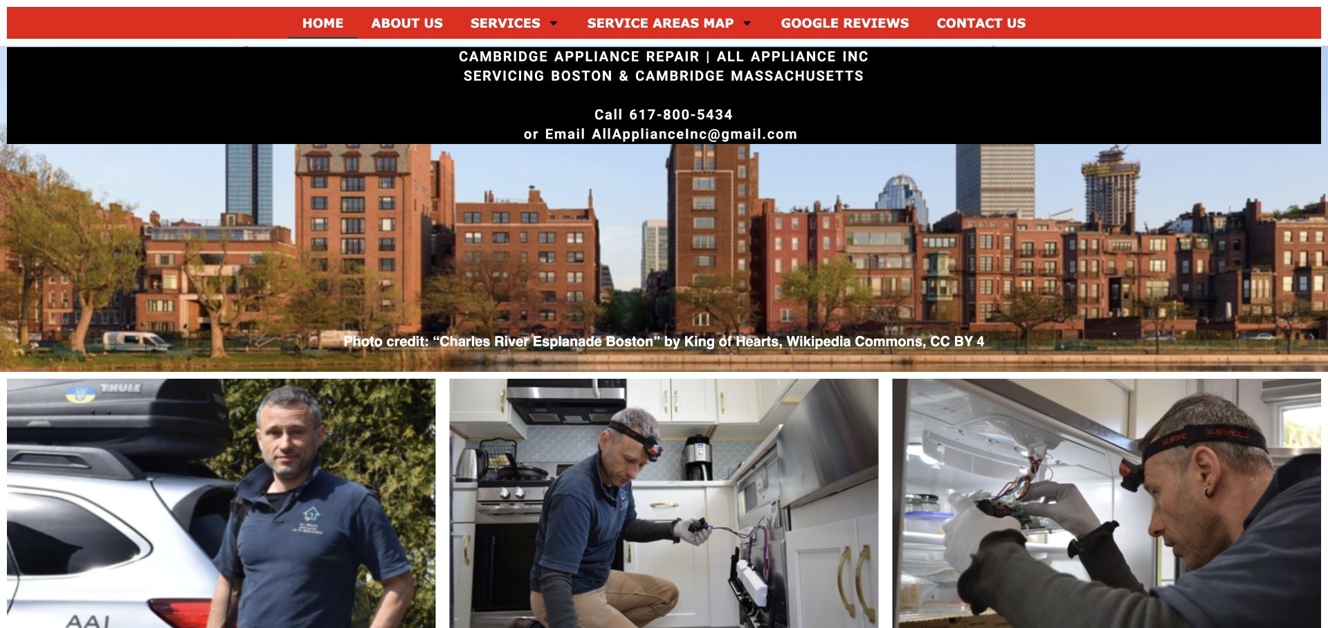
All Appliance uses a red navigation bar and black contact panel above a large Boston riverside photograph. The public page names Boston and Cambridge directly, then shows three photographs of technicians and appliance work below the city image. The result combines a recognizable local setting with company-specific people rather than relying on a generic kitchen alone. Telephone and email details are visible before the photographs, while service and coverage-map routes remain in the short navigation. This is a useful compact reference for preserving practical local facts while improving the reading hierarchy of an older service site.
What you can learn
For a local repair brief, prioritize supported appliances, real coverage boundaries, and a clear inquiry process before adding marketing components. Keep the business name and telephone route recognizable throughout the journey.
Pros
A local-business focus supports a more specific service conversation than a broad marketplace.
Direct company information can reduce the need to navigate through unrelated home-service categories.
Cons & considerations
A small catalog still needs enough model and service detail to answer eligibility questions.
The visual design should not be treated as evidence of technical competence or repair outcomes.
Platform source: WordPress.org Showcase. Linked stylesheet matches Complianz. Exact public source-page reference: https://allapplianceinc.com/. This is an observed component association, not proof of private configuration, a paid plan, measured results or complete architecture. Platform evidence is separate from the direct website screenshot and is not a complete current infrastructure audit.
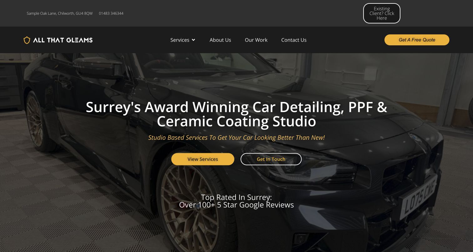
All That Gleams uses a dark vehicle photograph, yellow accents, and a service-specific headline to introduce detailing, paint protection film, and ceramic coating. View Services and Get In Touch sit together in the hero, while a quote button and a separate existing-client shortcut occupy the header. The address and telephone number provide immediate local context. A dated public audit recorded Site Kit content-event and Contact Form 7 integration scripts. These references do not prove lead quality, completed form submissions, or the review and award claims shown in the campaign. The assessment is limited to the public interface and its visible organization of visitor intent.
What you can learn
Provide a comparison route before asking every visitor for a quote, and give existing clients a separate entry. Keep public marketing claims linked to support where possible, and assess service exploration independently from confirmed inquiry completion.
Pros
Service names and geographic context are available in the opening view.
Returning clients receive a distinct shortcut above the main navigation.
Cons & considerations
Several contact and quote labels compete for similar attention.
Prominent reputation claims need supporting detail beyond their appearance in the hero.
Platform source: WordPress.org Showcase. Linked stylesheet matches Complianz. Exact public source-page reference: https://allthatgleams.co.uk/. This is an observed component association, not proof of private configuration, a paid plan, measured results or complete architecture. Platform evidence is separate from the direct website screenshot and is not a complete current infrastructure audit.
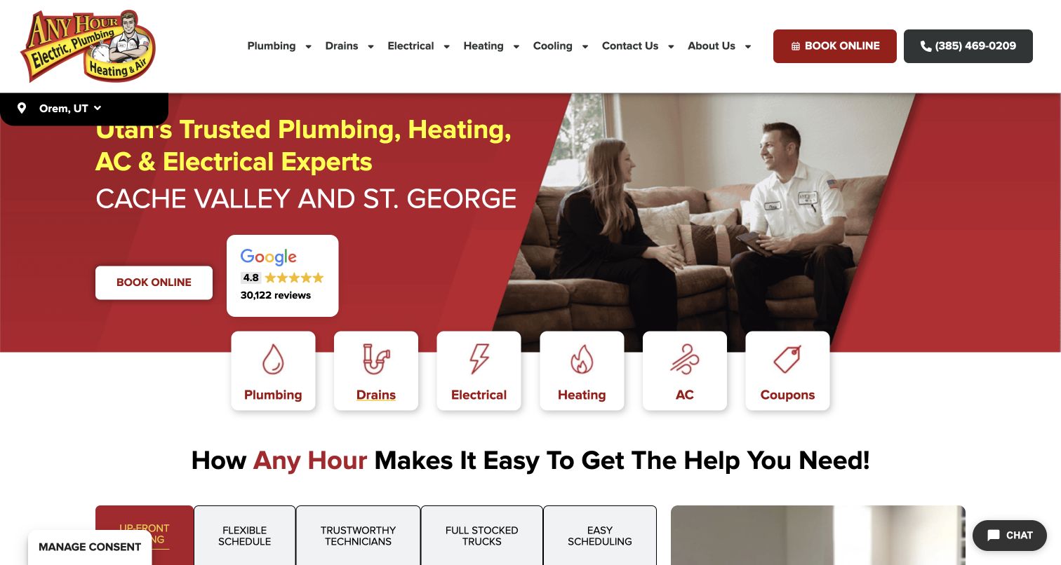
Any Hour places a row of white service cards across the boundary between its red hero and the content below. Plumbing and drains are separate choices beside electrical, heating, cooling and coupons. A technician talking with customers provides a domestic setting, while a location strip anchors the regional version of the page. For plumbing visitors, the most transferable detail is the compact icon-and-label entry point: it requires little interpretation before someone can reach the relevant department. The hero still carries broad multi-trade messaging, and the coupon tile gives a commercial offer equal structural weight to an actual service category.
What you can learn
Use short labels and recognizable service grouping to make a broad company easy to scan. Decide whether offers belong in the same row as essential plumbing routes, and preserve enough room for the local service boundary.
Pros
Plumbing and drains have separate visible entry cards.
Platform source: WordPress.org Showcase. Linked script matches Complianz. Exact public source-page reference: https://anyhourservices.com/. This is an observed component association, not proof of private configuration, a paid plan, measured results or complete architecture. Platform evidence is separate from the direct website screenshot and is not a complete current infrastructure audit.
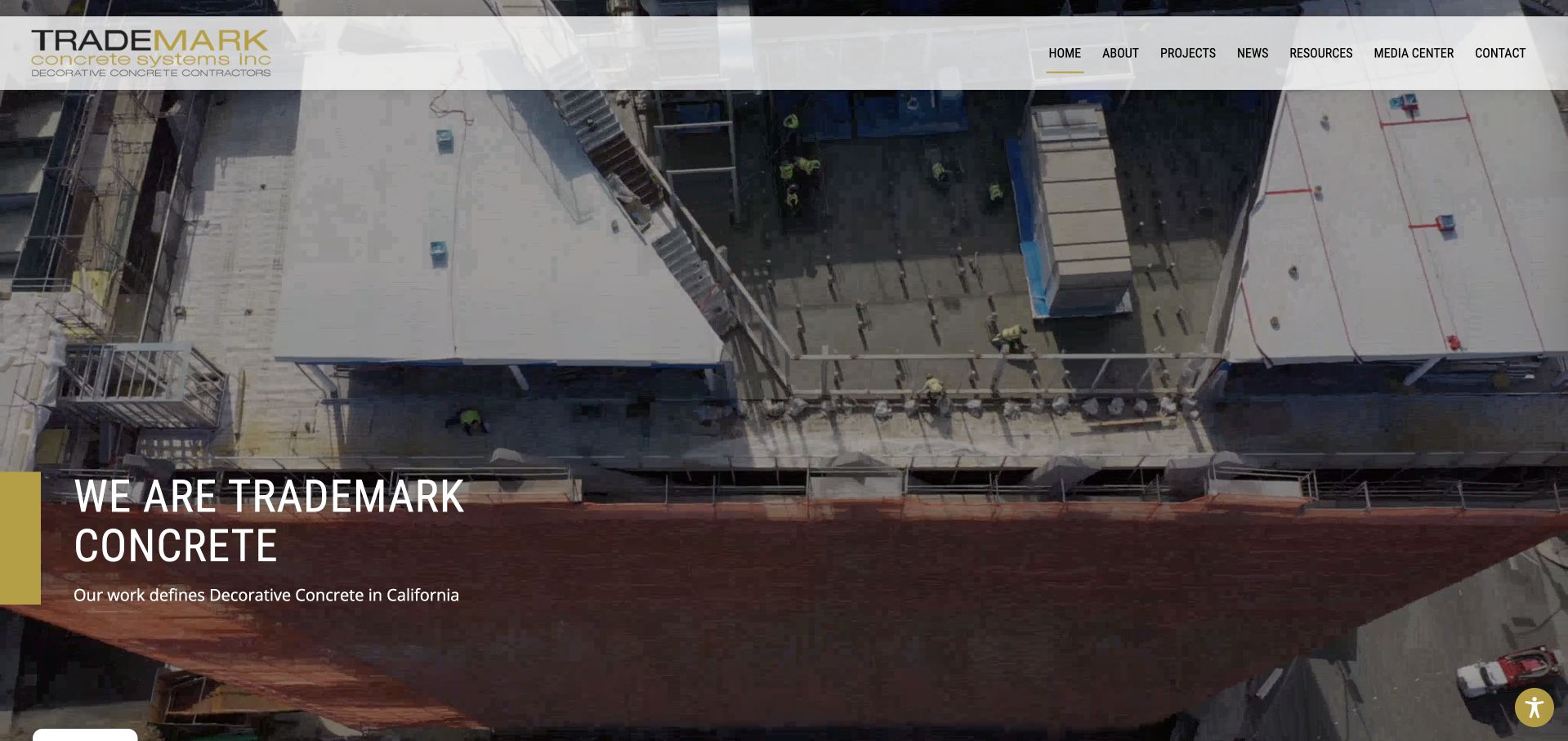
Trademark uses a wide construction-site photograph with a restrained company statement positioned near the lower left. A pale header holds the mark and compact project, news, resource, and contact navigation. Yellow emphasis ties the introduction to the brand without placing a form over the image. This is useful for studying a portfolio-first concrete site with a more architectural, less domestic visual context. The next section begins company information, keeping the opening concise. The photograph and decorative-concrete positioning do not independently validate workmanship, qualifications, engineering requirements, or material performance. An optional accessibility interface was closed before capture so the actual content remained visible.
What you can learn
Let a substantial project image establish context, then supply accurate scope and captions. Keep optional interfaces from obscuring the portfolio, and distinguish a concise brand introduction from the detailed information needed to evaluate a construction inquiry.
Pros
The project photograph remains largely unobstructed by intake fields.
Yellow emphasis adds brand identity without overwhelming the image.
Cons & considerations
A short company statement needs a fuller service and regional explanation nearby.
Compact upper navigation requires comfortable sizing on smaller screens.
Platform source: WordPress.org Showcase. Linked stylesheet matches Complianz. Exact public source-page reference: https://trademarkconcrete.com/. This is an observed component association, not proof of private configuration, a paid plan, measured results or complete architecture. Platform evidence is separate from the direct website screenshot and is not a complete current infrastructure audit.
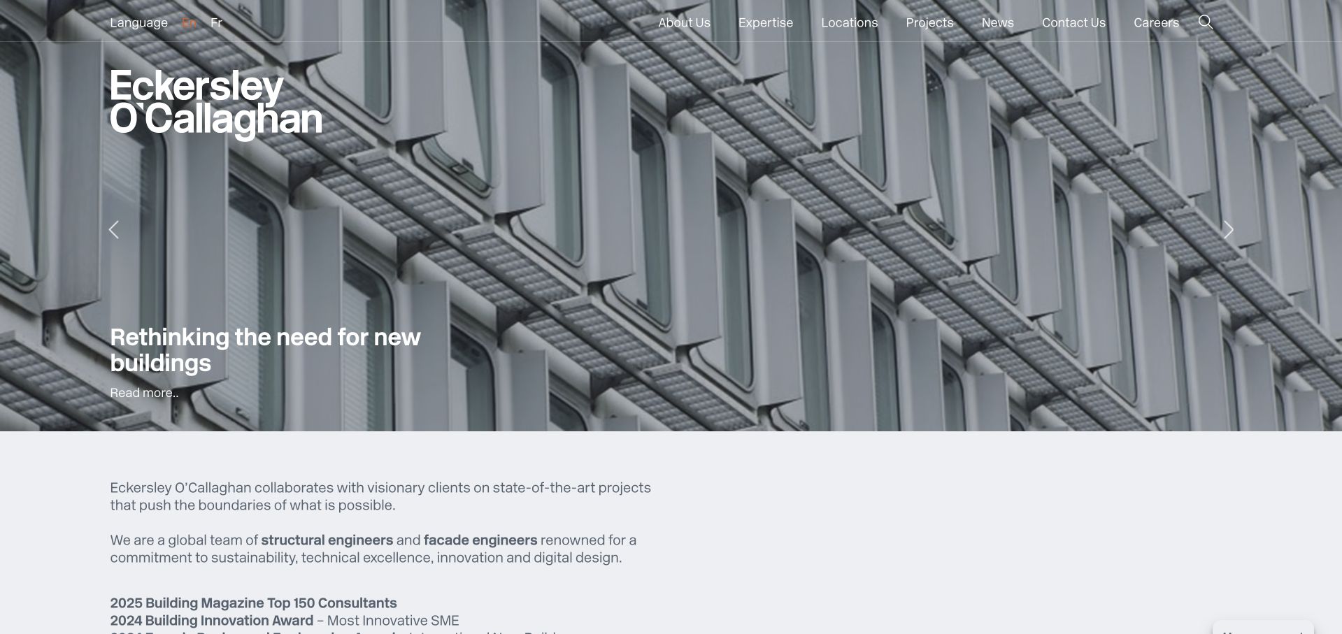
Eckersley O’Callaghan pairs large project imagery with an explicit written introduction beneath the hero. White typography overlays a detailed building photograph, while expertise, projects, locations and news remain distinct header destinations. For professional audiences, the work can inspire while discipline and location help qualify an enquiry. Linked structural and façade terminology bridges the photograph and the service catalogue. The changing feature can alter what a new visitor learns first, so individual project context and responsibility still need to be explained beyond awards or dramatic imagery.
What you can learn
Let the hero tell one project story and use the next section to name the actual engineering disciplines. Connect those discipline terms directly to service pages, and keep credits explicit when a project involves many designers and consultants.
Pros
Expertise, project and location navigation supports different professional research journeys without requiring a generic contact first.
The introductory text links architectural imagery back to identifiable structural and façade services.
Cons & considerations
A rotating feature can make the first message inconsistent between visits and harder to reference.
Prominent awards or project claims still require supporting context about dates, roles and the specific work recognised.
Platform source: WordPress.org Showcase. Linked stylesheet matches Complianz. Exact public source-page reference: https://www.eocengineers.com/. This is an observed component association, not proof of private configuration, a paid plan, measured results or complete architecture. Platform evidence is separate from the direct website screenshot and is not a complete current infrastructure audit.
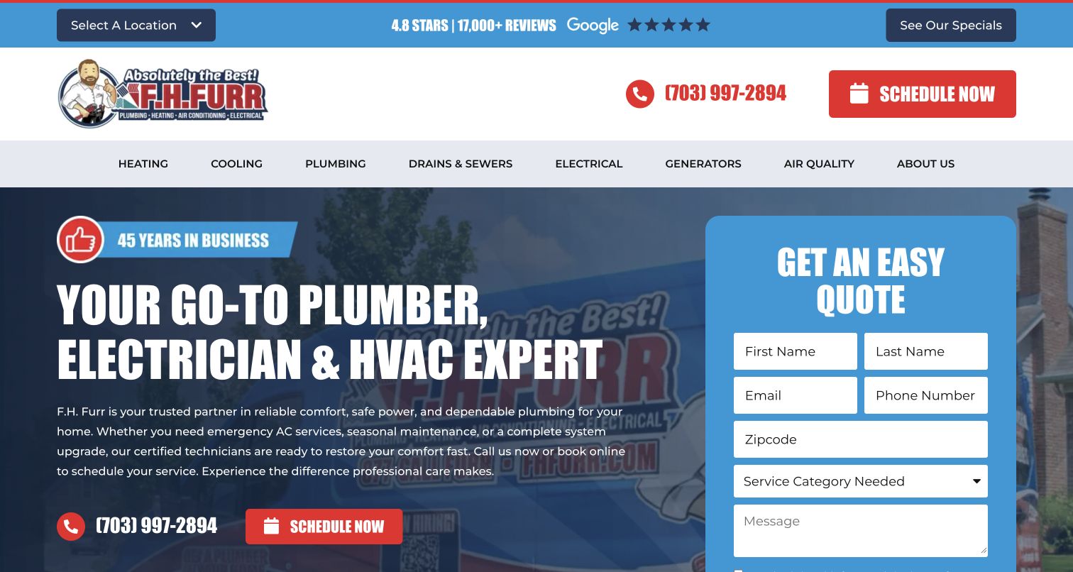
F.H. Furr puts a blue request panel directly over a branded service image, making inquiry the center of the homepage rather than a footer task. The form begins with service selection, which matters for a company spanning plumbing, HVAC and electrical work. Location selection and specials remain visible in the utility layer. This is a useful plumbing pattern when the office needs an initial category to route a request, but it should be kept proportionate to what the team truly needs before speaking with someone. The large form also reduces the amount of room available for service scope, so the surrounding copy must be especially clear.
What you can learn
Design the initial form with the people who handle plumbing calls. Use a short service choice to support routing, explain that submission requests a conversation, and give urgent callers a visible alternative to waiting for a form response.
Pros
The form is integrated into the primary layout.
Service selection supports department routing.
Cons & considerations
The form occupies much of the first screen.
Specials and location controls add decisions before detailed service information.
Platform source: WordPress.org Showcase. Linked stylesheet matches Complianz. Exact public source-page reference: https://www.fhfurr.com/. This is an observed component association, not proof of private configuration, a paid plan, measured results or complete architecture. Platform evidence is separate from the direct website screenshot and is not a complete current infrastructure audit.
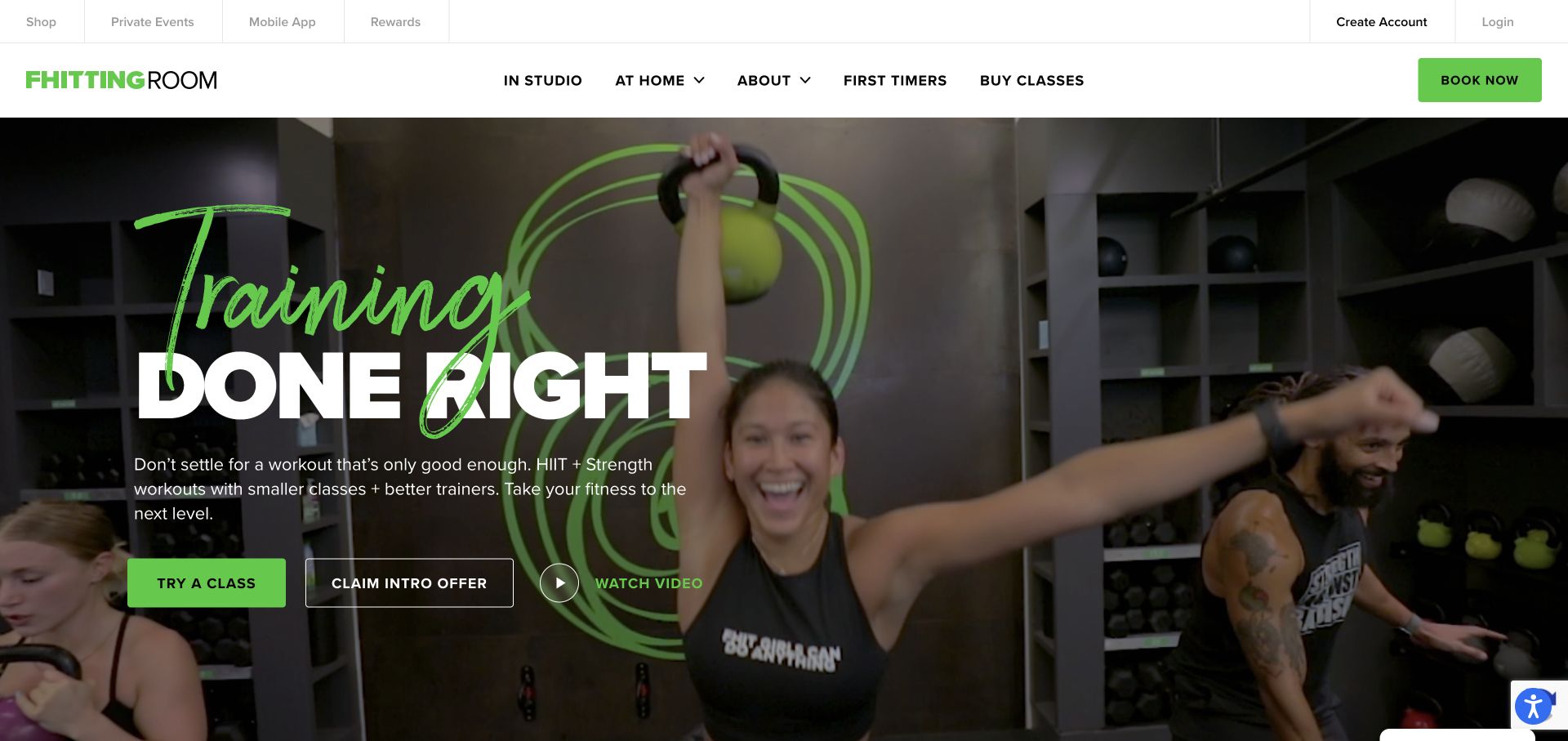
Fhitting Room combines a green handwritten-style word with a large white block headline over footage of a kettlebell class. The bright green action button echoes the equipment and logo, while an outlined intro-offer control and a video control create secondary routes. A solid white navigation divides in-studio and at-home attendance, with first-timer information visible alongside buying classes. The slim utility bar houses account and app links without mixing them into the primary hero copy.
What you can learn
If a fitness business operates several attendance models, distinguish them at the navigation level. Show the real class environment to explain the format, and keep an exploratory route for newcomers who need more information before deciding whether an intro package or a single session makes sense.
Pros
In-studio and at-home options are clearly separated in the main navigation.
The footage shows equipment, instructors, and other participants rather than only a polished athlete portrait.
Cons & considerations
Three adjacent hero actions can dilute the priority between trying a class and claiming an offer.
Handwritten display type is expressive but needs restraint so it does not overlap or obscure the main message.
Platform source: WordPress.org Showcase. Linked stylesheet matches Complianz. Exact public source-page reference: https://www.fhittingroom.com/. This is an observed component association, not proof of private configuration, a paid plan, measured results or complete architecture. Platform evidence is separate from the direct website screenshot and is not a complete current infrastructure audit.
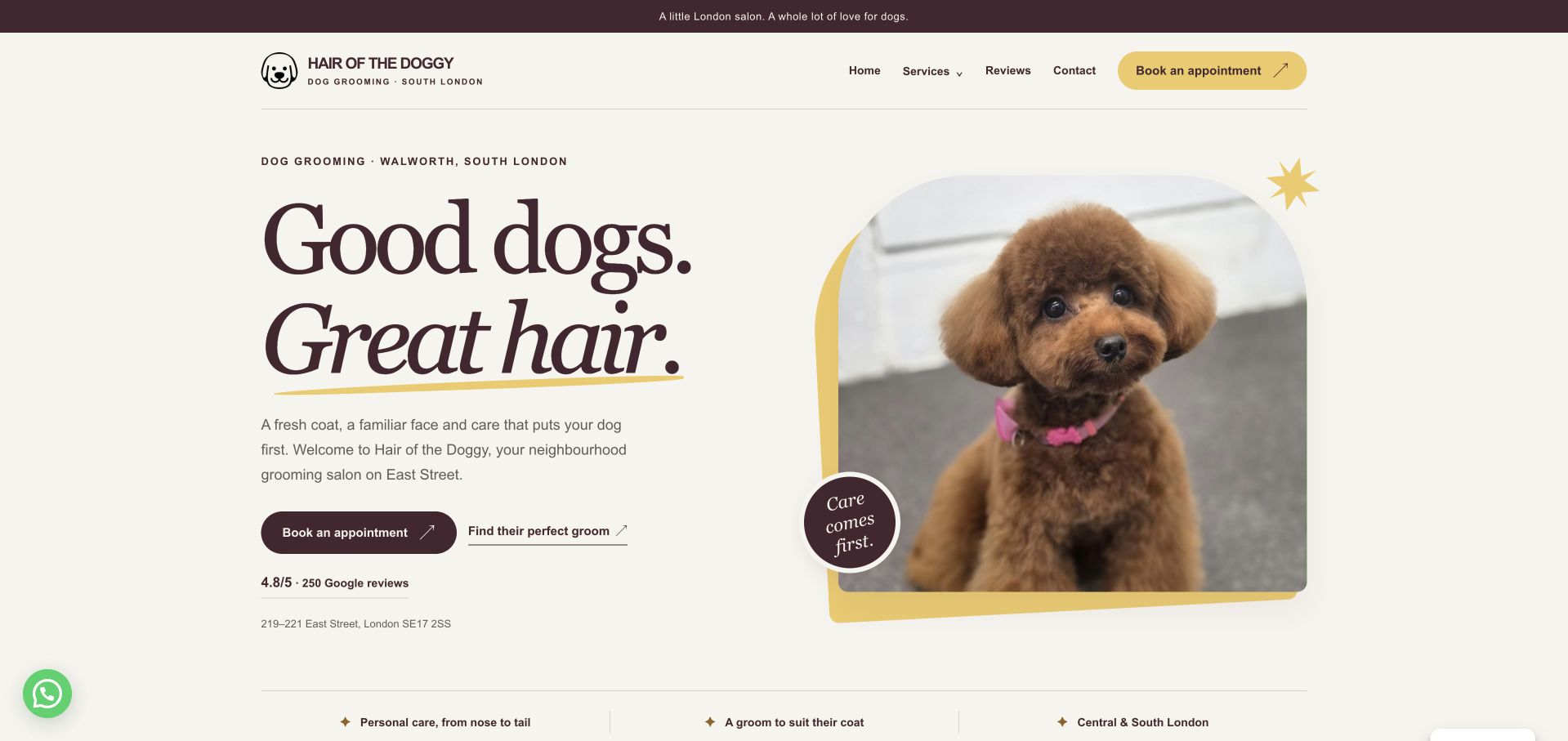
Hair of the Doggy puts its South London location, a groomed-dog portrait, and two useful routes into one composed opening. Visitors can book an appointment or explore which groom suits their dog, while the street address remains visible beneath those choices. Burgundy typography, cream space, and yellow accents give the salon character without obscuring the basic task. The service menu further down distinguishes grooming from other offerings instead of treating every visitor as ready to reserve. This is our editorial choice for the balance between personality and practical orientation. The displayed review score is a site claim, and the initial cookie dialog interrupts the otherwise restrained layout.
What you can learn
Place the salon’s location beside the first decision. Pair a booking action with a service-exploration route so new customers can understand their options before entering an appointment system.
Pros
The address is visible within the opening service introduction.
Booking and service exploration have different, readable actions.
Cons & considerations
The initial cookie dialog covers part of the introduction.
Detailed pricing requires moving beyond the opening panel.
Platform source: WordPress.org Showcase. Linked stylesheet matches Complianz. Exact public source-page reference: https://www.hairofthedoggy.co.uk/. This is an observed component association, not proof of private configuration, a paid plan, measured results or complete architecture. Platform evidence is separate from the direct website screenshot and is not a complete current infrastructure audit.
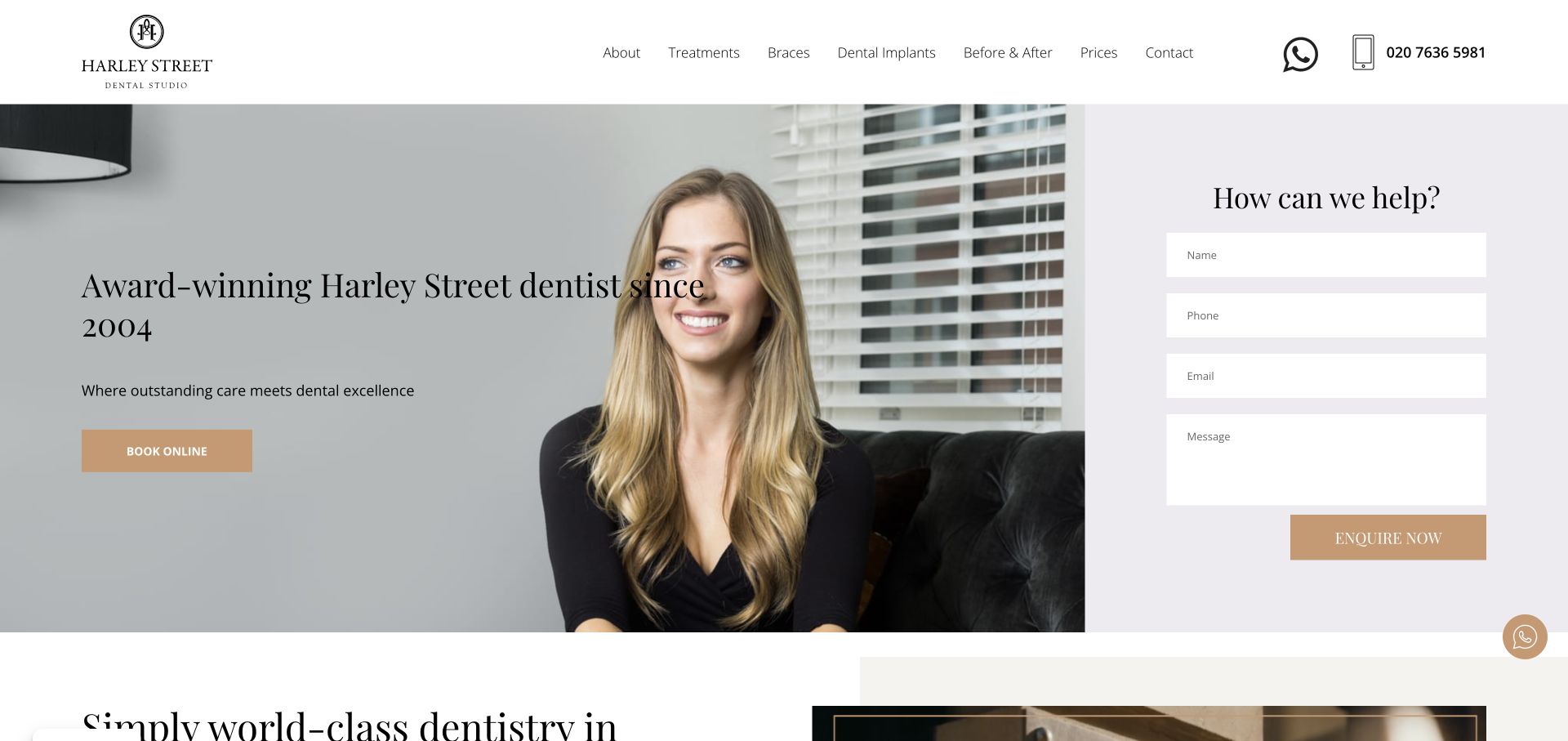
Harley Street Dental Studio places a large portrait and serif introduction beside a pale lavender inquiry panel. The form is part of the page composition rather than a separate popup, with four clearly separated fields and a gold submit control. The white header keeps treatment categories, prices, contact, a messaging icon, and the telephone number visible. Gold accents connect the hero booking button and the inquiry action, giving the otherwise familiar layout a consistent visual vocabulary.
What you can learn
Putting an inquiry form beside the introduction makes sense when visitors may have questions before booking. Keep the form concise and clarify what happens after submission. For dental practices, avoid asking for unnecessary clinical details in a broad homepage form simply because there is room for more fields.
Pros
Prices and contact are visible in the desktop navigation alongside treatment categories.
The written inquiry option is clear without forcing a visitor into an appointment scheduler first.
Cons & considerations
Two large adjacent conversion paths can compete unless their different purposes are explained.
The form occupies space that could otherwise introduce clinicians, location, or the first-visit process.
Platform source: WordPress.org Showcase. Linked stylesheet matches Complianz. Exact public source-page reference: https://www.harleystreetdentalstudio.com/. This is an observed component association, not proof of private configuration, a paid plan, measured results or complete architecture. Platform evidence is separate from the direct website screenshot and is not a complete current infrastructure audit.
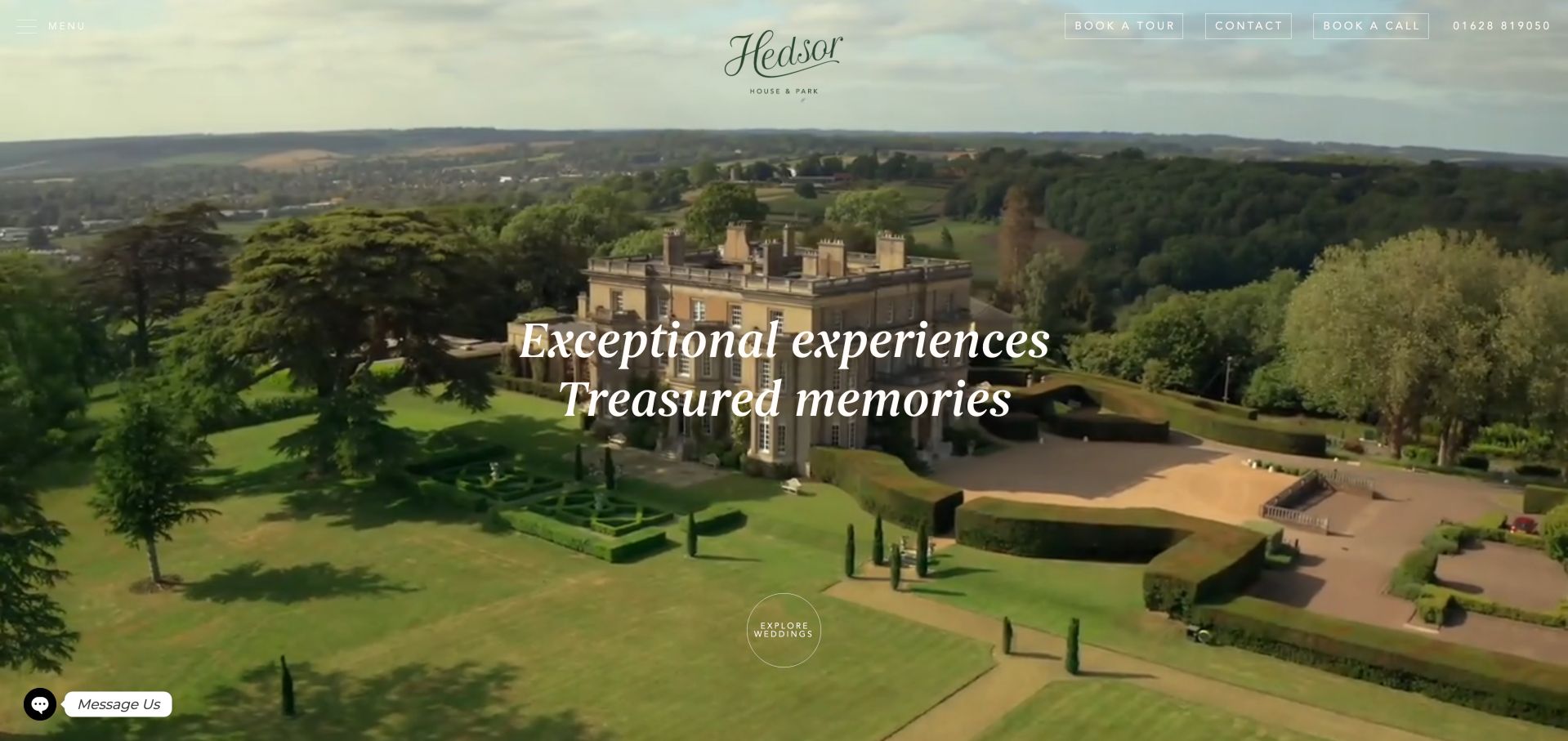
Hedsor House pairs an aerial estate view with elegant white typography and a compact group of tour, contact and call options. The imagery establishes scale before the page moves into the house, grounds and celebration possibilities. Photography is credited by name, and the wider navigation includes a virtual tour and visiting information. Separate dry-hire and wedding-package terms are particularly useful because they acknowledge different ways of commissioning the venue. The opening's light text must compete with changing sky and building tones, while long romantic passages and repeated Learn More links can make a specific planning question harder to locate.
What you can learn
Use estate imagery to introduce character, then make the commercial models and visit options explicit. If both venue hire and packages are offered, label their resources separately so couples know which information applies to their enquiry.
Pros
Tour, telephone and written contact options remain easy to identify.
Distinct hire and package terms support more informed research.
Cons & considerations
Light navigation over changing imagery needs careful contrast review.
Long promotional copy and generic links reduce scanning speed.
Platform source: WordPress.org Showcase. Linked script matches Complianz. Exact public source-page reference: https://www.hedsor.com/. This is an observed component association, not proof of private configuration, a paid plan, measured results or complete architecture. Platform evidence is separate from the direct website screenshot and is not a complete current infrastructure audit.
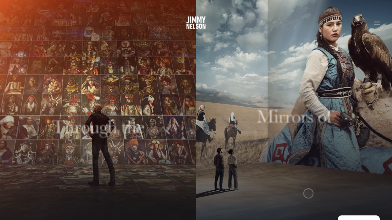
Jimmy Nelson’s homepage opens as a layered photographic environment rather than a familiar store grid. A small centered wordmark and a menu icon leave the imagery in control. The captured composition juxtaposes a wall of portraits, a landscape scene, and a large portrait with an eagle. Minimal overlaid labels connect these visual areas, but there is little shopping vocabulary in the opening frame. The public page contains WooCommerce markers; its initial experience is nonetheless an editorial presentation of photographic work.
What you can learn
A publication can lead with the work while allowing commerce to sit deeper in the experience. That is different from making a store’s buying route obvious on arrival. Decide which task is primary for your audience, then preserve a conventional alternative for people who want a specific book or product rather than exploration.
Pros
The photographic material establishes the subject and visual ambition immediately.
The restrained header avoids covering the work with a conventional promotional banner.
Cons & considerations
The store route is not obvious from the sparse opening controls alone.
An immersive layered composition needs a meaningful static and reduced-motion alternative for readers.
Platform source: WordPress.org Showcase. Linked stylesheet matches Complianz. Exact public source-page reference: https://www.jimmynelson.com/. This is an observed component association, not proof of private configuration, a paid plan, measured results or complete architecture. Platform evidence is separate from the direct website screenshot and is not a complete current infrastructure audit.
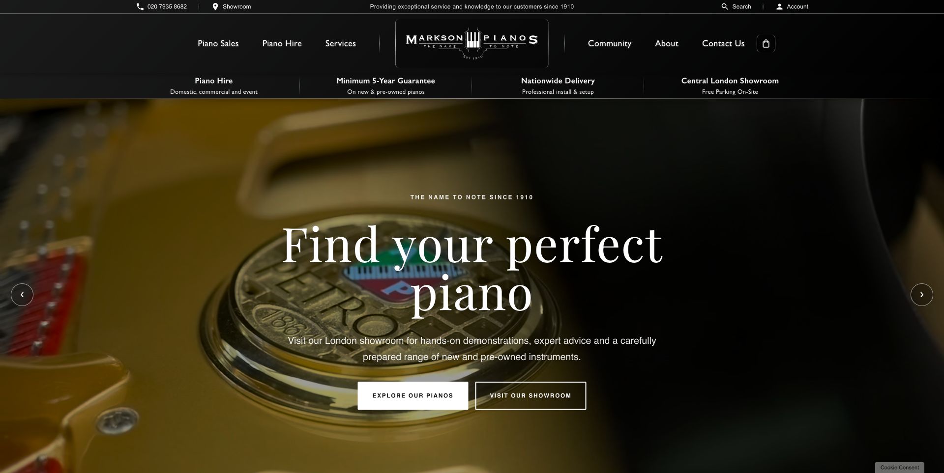
Markson Pianos centres its piano-key identity within a symmetrical black header. A short assurance strip introduces hire, guarantee, delivery and visiting information before a moving piano image fills the main feature. Large serif lettering gives the opening a familiar showroom character, and separate browse and visit actions distinguish online exploration from travelling to the store. New, pre-owned and hire categories then make the commercial choices more specific. Priced promotions further down provide a useful counterweight to the broad opening invitation. The page also contains substantial customer testimony and historical material, which can help orientation but makes a quick stock comparison less direct.
What you can learn
Distinguish browsing, hiring and visiting with clear labels before explaining the business at length. Keep practical terms close to those routes, and let product information remain accessible without asking visitors to read the full history or testimonial sequence.
Pros
The browse and showroom actions represent different intentions clearly.
Product categories and visible promotional prices make the offering more tangible.
Cons & considerations
Moving hero imagery competes with the introductory message.
Long testimonial sections add distance between the first invitation and detailed comparison.
Platform source: WordPress.org Showcase. Linked stylesheet matches Complianz. Exact public source-page reference: https://marksonpianos.com/. This is an observed component association, not proof of private configuration, a paid plan, measured results or complete architecture. Platform evidence is separate from the direct website screenshot and is not a complete current infrastructure audit.
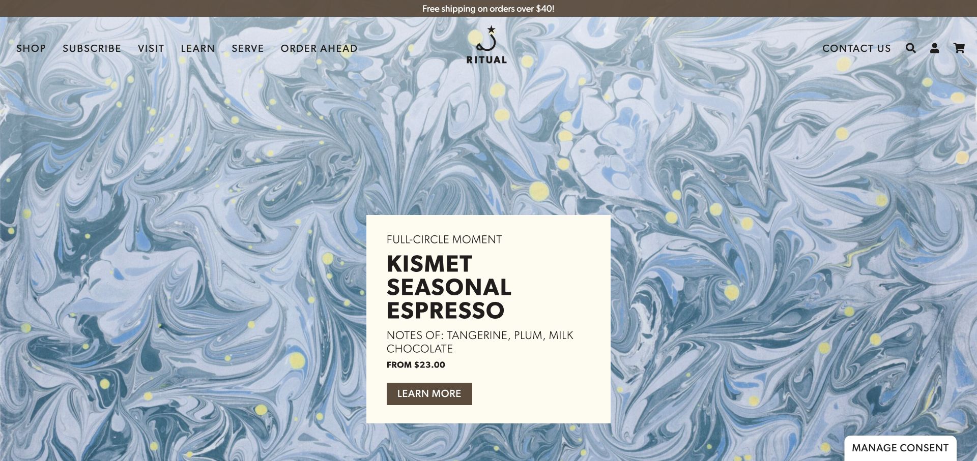
Ritual pairs a full-screen marbled campaign background with a cream information card for a seasonal espresso. The card includes tasting notes, a starting price and a direct link, bringing useful buying context into a highly expressive visual treatment. The navigation names shopping, subscriptions, visits, learning and ordering ahead. Lower product sections continue the combination of origin information, flavor notes and prices. A separate subscription section explains that the business offers several tailored options. The page connects the look of a particular release with distinct routes for home brewing and café customers.
What you can learn
A bold campaign background becomes easier to use when practical information sits on a stable, readable card. Keep flavor notes, price and the next step together rather than scattering them across separate promotional elements.
Pros
The cream product card remains readable against detailed artwork and contains more than a purely decorative headline.
Ordering ahead and visiting have explicit labels alongside the routes for shipped coffee and subscriptions.
Cons & considerations
Rotating campaign content means an important message may not be the first one every visitor sees.
Several subscription choices need comparison details so their differences remain understandable beyond a general promise of variety.
Platform source: WordPress.org Showcase. Linked stylesheet matches Complianz. Exact public source-page reference: https://ritualcoffee.com/. This is an observed component association, not proof of private configuration, a paid plan, measured results or complete architecture. Platform evidence is separate from the direct website screenshot and is not a complete current infrastructure audit.
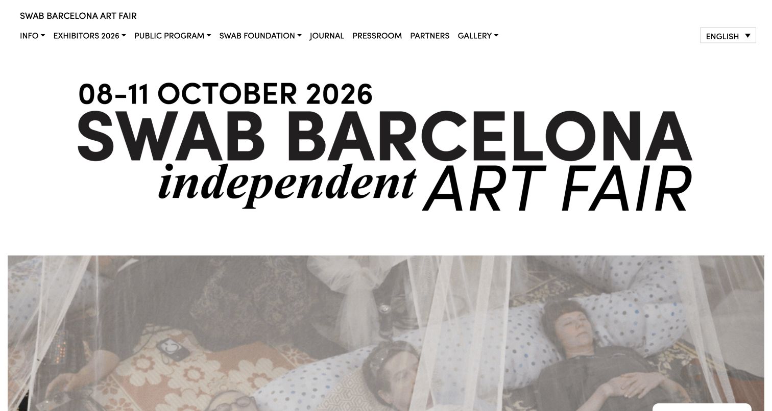
SWAB Barcelona combines a large typographic event title with an expressive photograph and a straightforward two-row header. Its body describes the fair’s community role before introducing exhibitors, radio, performance and workshops as different formats. Each programme has an explanatory paragraph and its own destination. The reviewed edition dates remain from October 2026, so this is a completed-event presentation rather than evidence that the fair is currently open.
What you can learn
Explain how each programme format works, not just its name. Keep an independent fair’s broader mission connected to specific activities people can explore. Give completed editions a stable archive and label new dates separately, so an expressive event identity remains useful to readers arriving after the programme has finished.
Pros
Radio, performance and workshop content receive distinct descriptions.
The edition year is visible in the event identity and navigation.
Cons & considerations
Long all-capital introductory passages can be tiring to read.
Past event dates need clear archival status before a next-edition promotion begins.
Platform source: WordPress.org Showcase. Linked stylesheet matches Complianz. Exact public source-page reference: https://swab.barcelona/. This is an observed component association, not proof of private configuration, a paid plan, measured results or complete architecture. Platform evidence is separate from the direct website screenshot and is not a complete current infrastructure audit.
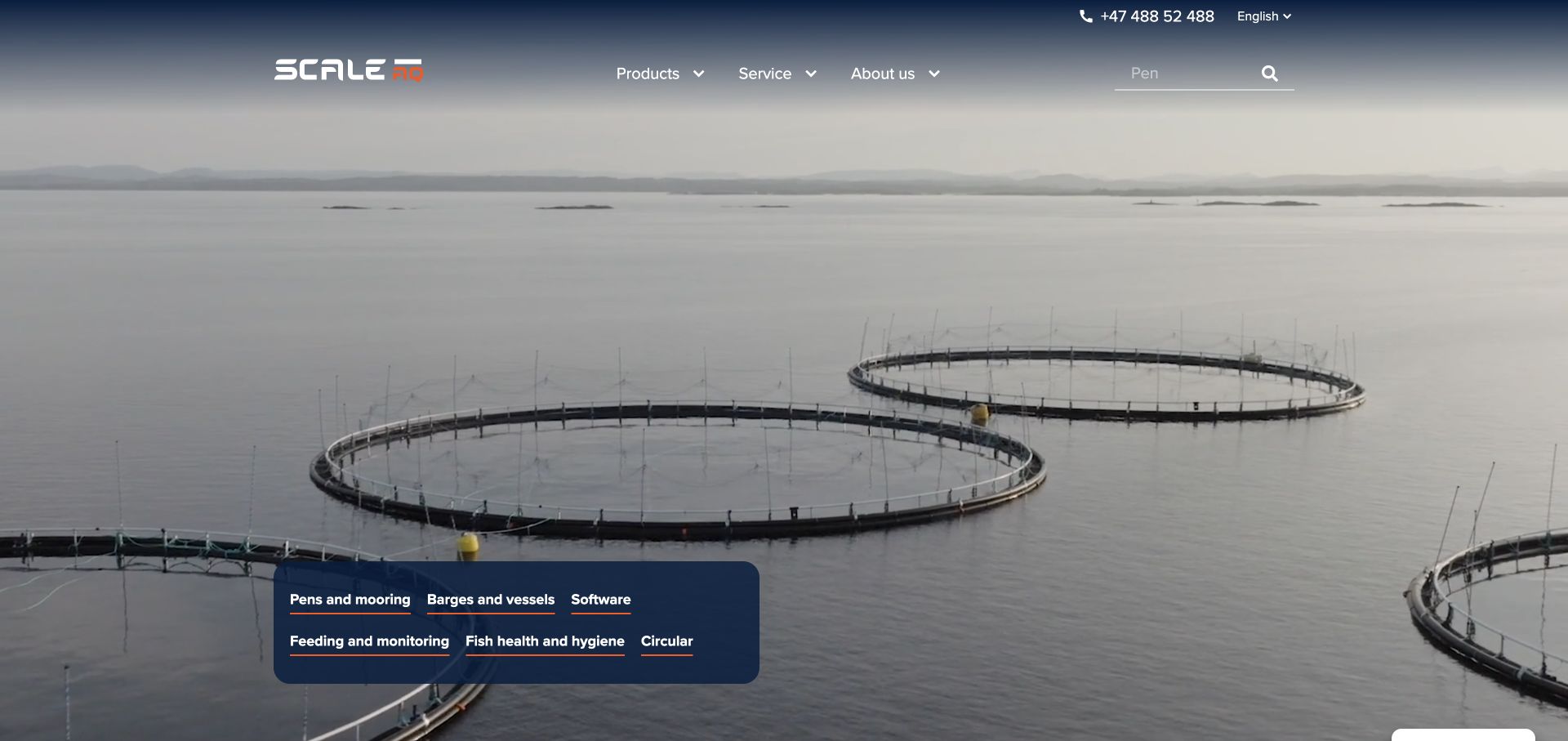
ScaleAQ overlays a compact group of product links on real marine footage. Pens and mooring, barges and vessels, software, feeding and monitoring, fish health and circular services form the initial catalog structure. The wider navigation also exposes manuals, warranty and service information, acknowledging that the site is useful after equipment has been installed.
What you can learn
Make the core system categories visible without forcing a user to decode the company organization. Maintain equally clear routes for manuals, warranty and service. A returning operator looking for documentation has a different task from a buyer comparing pens, so neither route should obscure the other. Connect product introductions to the relevant technical information and support contact instead of expecting a moving background to explain system compatibility or a particular installation.
Pros
A small product-category panel gives the media-led entrance practical navigation.
The support structure includes specific post-purchase tasks.
Cons & considerations
A media-heavy opening needs a readable alternative when video is unavailable.
Deep equipment menus need consistent product naming and comparison information to remain manageable.
Platform source: WordPress.org Showcase. Linked stylesheet matches Complianz. Exact public source-page reference: https://scaleaq.com/. This is an observed component association, not proof of private configuration, a paid plan, measured results or complete architecture. Platform evidence is separate from the direct website screenshot and is not a complete current infrastructure audit.
Kegan has 15+ years of experience working with small businesses, Fortune 500 companies, and everything in between. No development job is too big or too small: he brings the same hands-on attention to a focused improvement, a complete website, or a custom application.
For Complianz projects, he can help with documented consent requirements, plugin integration boundaries, accessible preference controls, permitted-script verification and maintainable WordPress handover. He works directly with clients on scope, design, implementation, testing, and handover, with an emphasis on clear communication and a system that remains practical to maintain after launch.
Show 3 other Complianz developersHide other Complianz developers
Choose a Complianz setup around the real WordPress service inventory
Use supported integrations when they match the implementation
Start by mapping installed plugins and third-party services to the integrations documented for the current product. Complianz distinguishes services, integrated plugins and its script-center functionality. Confirm what each integration is expected to handle and whether the website introduces the same service through another path, such as custom code or a tag manager. Two loading routes can create behavior that a single setting does not explain.
Keep ownership explicit when an agency, marketing team and site administrator all add tools. A new embed or campaign tag is a change to the service inventory, not only a content update. Define the review needed before it reaches production. Do not assume that a recognized integration removes the need to test the actual theme, caching setup and plugin combination used on the site.
Treat custom scripts as an implementation task with an owner
When a service is not handled by the chosen setup, document why it is needed and how it is loaded. Assign someone who can review the integration and its failure behavior. Avoid pasting unrelated code into several theme fields and expecting the privacy plugin to infer the intended relationship automatically. The site should have one understandable account of which system introduces each optional service.
Prototype a representative interaction with the service unavailable as well as available. A blocked video can offer a clear explanation and a deliberate next step, while a map can retain essential address text outside the embed. Those fallbacks should help the visitor complete the task without making an accidental choice. Do not disable privacy controls simply to conceal an integration problem during a release.
Plan multilingual and regional differences deliberately
A multilingual website needs readable choices and matching document routes in its actual languages. Complianz documents integration with WordPress multilingual tools, including WPML. Verify what the chosen product and configuration support rather than assuming that translating a button also translates every document or preserves the intended behavior. Have the organization review meaning, not just literal word replacement.
Regional treatment is a policy and implementation decision that needs appropriate review. Do not infer it from a visitor’s browser language or copy another website’s settings as a legal shortcut. Define what should happen when a region cannot be determined and test the configured behavior through an approved method. Public evidence on an example does not establish that the same settings are suitable for another business.
Plan the documents, tests and ongoing change process
Build an inventory and a clear responsibility map
Record each relevant service, why it is used, how it enters the page and who can change it. Include tools added through WordPress plugins, theme code, a tag manager and embedded content. Compare automated observations with that inventory instead of treating a scanner as a complete description of every behavior. Authentication or connectivity failures should remain unresolved findings, not be reclassified as proof that the site has nothing to detect.
Assign the policy decisions to the appropriate owner and seek qualified advice where needed. The development brief should translate those decisions into testable behavior without making legal conclusions on its own. Keep the plugin’s current documentation and version context available to maintainers. Older articles can describe an earlier scanning system; check deprecation notices before reusing their instructions in a new implementation.
Test choices and site functions as separate but connected concerns
Prepare a matrix of expected states before testing: no saved choice, refusal, a selected category, acceptance where offered and a later preference change. Use an appropriate isolated test context rather than overwriting a real user’s existing choice. Check direct URLs and repeat visits as well as the homepage. A successful click animation does not establish that the underlying services followed the intended state.
Also test the visitor tasks affected by optional services. A contact page should still explain how to reach the business if its map is not loaded. A blocked media placeholder should not cover unrelated controls. Review keyboard focus, text contrast, zoom, responsive layout and overlapping floating widgets. Keep screenshots and observations scoped to the state actually inspected, and distinguish a visual check from a network or storage verification.
Maintain truthful documents and a safe update process
Keep policy links discoverable and confirm that their content describes the real configuration. A generated document needs review and a correction owner; its existence does not independently establish accuracy. Check contact information, service descriptions and language variants when the implementation changes. Avoid treating a dated document as evergreen while the business adds tools that materially change its data handling.
Recheck the agreed behavior after relevant theme, plugin, cache or integration updates. Complianz’s current setup guidance includes checking the public banner in a private window after clearing the site cache; the broader operational lesson is to verify the deployed result rather than rely only on an administrative preview. Record problems, rollback options and escalation contacts. A maintenance process is part of the implementation, not a promise that installing one plugin completes privacy work forever.
Ask the actual team to carry out its routine job: publish a realistic update, correct a mistake, preview a narrow screen, and identify who owns an integration failure. For a library or frontend framework, also ask who maintains the content source and deployment. A polished screenshot does not answer those operational questions.
Beyond the screenshot
Before launching a Complianz implementation
Confirm this brief concerns the WordPress product and current documentation.
Inventory services added by plugins, theme code, embeds and tag managers.
Assign policy decisions and integration responsibilities explicitly.
Verify applicable features without inferring a paid tier from public assets.
Define expected initial, refusal, preference and later-change states.
Make choices readable and usable with keyboard, zoom and touch.
Keep a discoverable way to reopen preferences, including on mobile.
Test useful fallbacks for optional maps, media and other embeds.
Review documents and translations against the actual service inventory.
Distinguish rendered checks from network, storage and configuration verification.
Recheck relevant behavior after updates and preserve unresolved findings.
Test with real content, a keyboard, a small screen, slow or failed requests, and the people who will maintain the system. These are planning checks, not an accessibility, security, performance, or search-ranking certification.
Sources & editorial method
How this Complianz collection was reviewed
The examples pair genuine direct captures with exact-property public Complianz evidence prepared separately from this planning text. That evidence identifies a visible WordPress component or related asset, not a paid plan, complete configuration or legal result. Product-specific statements cite current official documentation, with deprecated instructions excluded as implementation guidance. The observations are editorial website references and do not constitute legal advice or an independent compliance audit.
Every image is an unmodified capture from the actual website, with its source and capture date. Some captures are reused from our shared catalog; their dates remain the original capture dates. None comes from a vendor gallery or a generated reconstruction. Moving imagery and live content can change.
Technology attribution uses public page assets or metadata, official platform documentation, or a cited first-party project case study. Documentary and framework-relationship evidence is identified where used; it is not a complete current backend inventory. A CMS image CDN alone does not establish a full CMS deployment. A library’s presence does not prove which individual controls use it, and a platform label does not establish AI authorship.
The composition notes, lessons, pros and tradeoffs are original editorial observations. We have not measured conversion, traffic, security, performance or accessibility conformance. Website owners retain their brands and imagery; these examples are not our client portfolio. Written, Edited and Curated are independent records, not dates advanced by a build. See our editorial standards or suggest a correction.
Questions worth asking
Complianz website development FAQs
Does a Complianz banner prove that a website is compliant?
No. Its appearance does not establish the complete service inventory, configuration or actual behavior in every state. Legal obligations and technical implementation need their own appropriate review. This collection does not certify example websites.
Can public assets show which paid plan a site uses?
Not reliably. A script, stylesheet or visible control can support the observed product association without identifying the license tier. Confirm features for a new implementation from current official information rather than guessing from an example.
Is a website scan enough to finish configuration?
Treat it as an input alongside the site’s known service inventory and testing. Missing authentication, blocked access or unobserved interactions can limit a scan. An unavailable result is not proof that no relevant service exists.
Should the banner match the brand?
It can fit the website visually while keeping choices clear, readable and accessible. Do not sacrifice the meaning or availability of controls for styling. Test the actual interface on small screens and with keyboard navigation.
What changes require another review?
Relevant new services, embeds, tags, plugins, document changes and integration updates should enter the agreed review process. The exact tests depend on the implementation, but ongoing changes should not bypass the people responsible for policy and technical behavior.
Borrow clear controls and useful document routes, then verify the intended behavior in your own implementation. Keep the visible component, technical evidence and legal conclusions distinct.