Best Accessibility Consultant Websites of 2026 (30 Real-World Examples)
30 real websites showing how accessibility specialists explain assessments, remediation, research, training and continuing support.
An accessibility consultant website needs to do more than promise inclusion. It should make the service understandable, reveal the people and methods behind it, and provide an enquiry journey that works for the audiences it wants to serve.
This collection includes small specialist practices, research organisations, nonprofits with professional services and dedicated accessibility practices inside larger firms. The common thread is a public offer of human accessibility assessment, consulting or research. A platform interface alone is not the basis for inclusion, and the examples do not all sell equivalent work.
These are editorial website-design observations, not an independent accessibility audit, legal assessment or recommendation of a provider. Axess Lab is the explicit Editors Choice for its coherent specialist identity and concrete service structure. The other examples remain editorially ordered; votes do not establish conformance or change that order.
Before the examples
What makes good accessibility consultant website design in 2026?
Separate the kinds of work
An automated scan, manual evaluation, disabled-user study, remediation engagement and organisational strategy produce different information. Name them plainly and explain the deliverables.
Make the method credible
Identify who does the work, what is sampled, which environments are covered and how findings are reported. Provide attributable evidence without implying a universal guarantee.
Design an accessible enquiry
Use clear labels, keyboard-operable controls, helpful errors and a fallback contact route. Ask only for information needed at that stage and explain the next step.
Show long-term ownership
Explain who fixes issues, verifies changes, trains internal teams and maintains the service after launch. Accessibility work should not disappear into an unexplained score or badge.
Study the relationship between the opening promise and the practical information underneath it. The most transferable ideas concern scope, method, audience routes and honest next steps—not a claim that the listed websites or services have been independently certified.
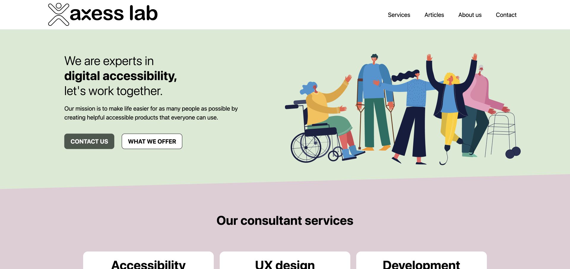
Axess Lab uses pale green, oversized black type and an illustration of people using different devices to establish a friendly specialist identity. Its introduction leads into three named service families: accessibility, UX design and development. Concrete sublists distinguish audits, usability testing and training instead of treating accessibility as one vague package.
What you can learn
Use a short positioning statement, then name the actual work someone can buy. Distinguishing an audit from research, implementation and training helps visitors form a useful brief before making contact.
Pros
The service families explain materially different kinds of engagement.
Specific sublists make the broad accessibility positioning tangible.
Cons & considerations
The illustration establishes tone but should not replace evidence of actual people and work.
A large opening headline needs careful line wrapping on narrower screens.
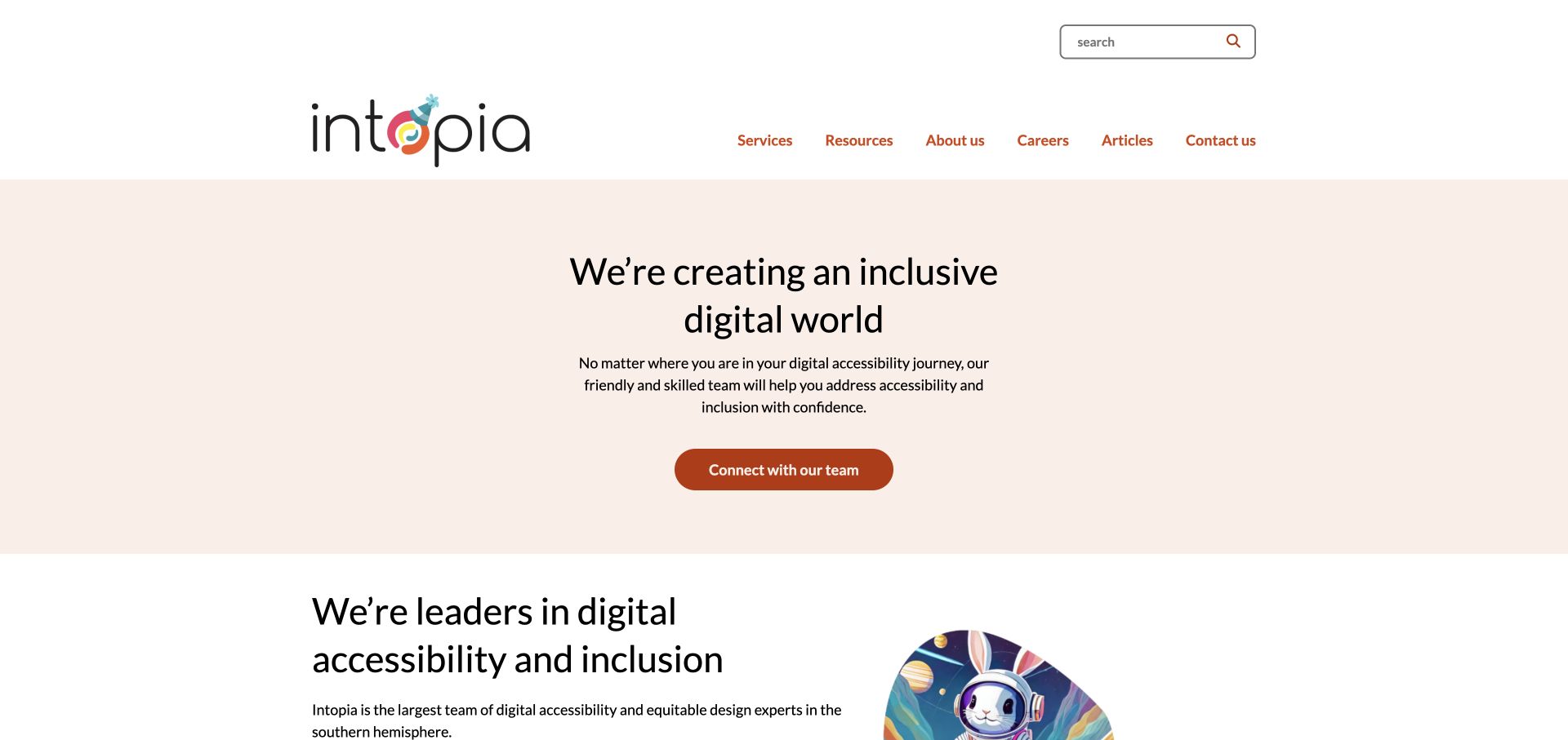
Intopia opens with a warm peach background, centered text and a restrained burnt-orange contact action rather than a product dashboard. The services navigation is unusually specific, separating assessments, strategy, training, research, conformance reporting and ongoing operations. Resources and articles give educational browsing a different route from project enquiries.
What you can learn
A quiet hero can work when the next layer of information is precise. Organise service pages around decisions and deliverables, not a long interchangeable list of reasons accessibility matters. The service directory can do the qualifying work that the quiet hero deliberately avoids. Each route should explain whether the reader receives findings, strategic advice, training or continuing operational support.
Pros
Service categories distinguish strategic, technical and educational work.
The restrained color palette keeps the contact action identifiable.
Cons & considerations
The broad opening statement needs concrete deliverables nearby.
Generous header and hero spacing should be checked against mobile information priorities.
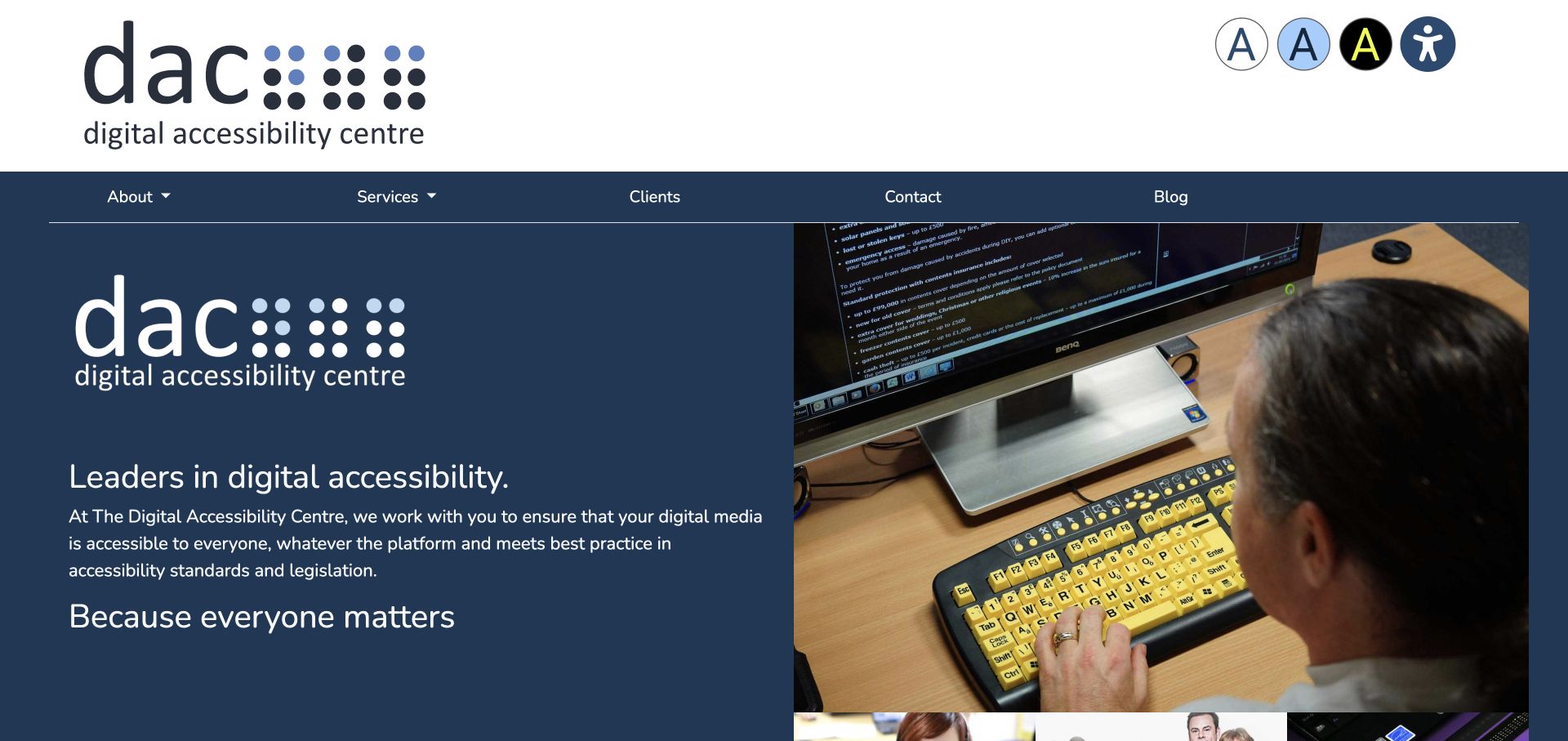
Digital Accessibility Centre pairs a navy introduction with a photograph of someone working at an assistive-technology setup. Its white header includes an accessibility route and display controls, while the surrounding content explains testing, training, issue resolution and ongoing work. The genuine work context adds more specificity than a generic inclusive-people illustration.
What you can learn
Show the context in which the work happens and explain what follows the assessment. Display controls can support preference choices, but should never stand in for evaluating the actual website journeys.
Pros
The working photograph gives the service a concrete human context.
Training and ongoing issue support extend the story beyond an initial test.
Cons & considerations
The large repeated branding consumes valuable opening space.
Display controls are not themselves evidence of accessibility conformance.
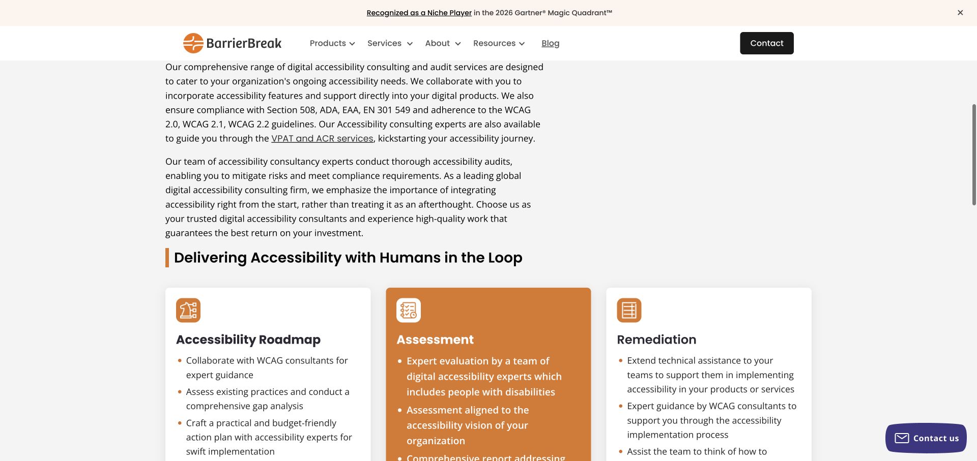
BarrierBreak’s consulting page moves from explanatory paragraphs into distinct roadmap, assessment and remediation cards. Orange provides a strong emphasis within an otherwise white layout. The reviewed capture is the actual service-content section rather than the mostly empty opening area, and shows how the page separates planning from identifying issues and addressing them.
What you can learn
Turn a consulting promise into a sequence of understandable jobs. A visitor should know whether the engagement produces a plan, findings, implementation support or several separately scoped deliverables. Make the handoff between those stages explicit: a roadmap does not itself implement a fix, and a remediation engagement should explain how proposed changes will be reviewed.
Pros
The three service cards distinguish different project stages.
A limited accent color makes the selected emphasis recognisable.
Cons & considerations
The large opening gap delays the useful explanation.
Long introductory paragraphs would benefit from tighter headings and clearer scoping details.
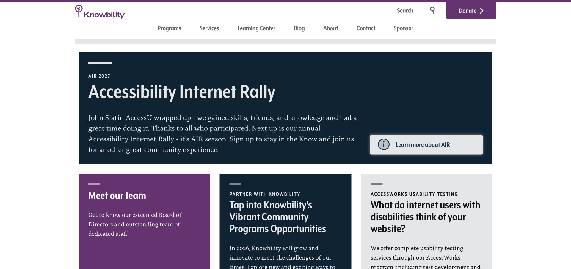
Knowbility gives a prominent purple-and-navy panel to its community AIR event, while the header separates programs, services, learning and sponsorship. The page then offers team, partnership and usability-testing routes. Its service structure distinguishes audits, leadership consulting, training and ongoing help rather than forcing every visitor into the current event.
What you can learn
Preserve separate journeys for the people participating in a mission and the organisations buying services. A current campaign can be prominent without becoming the only route into the site.
Pros
Programs, learning and commercial service routes have recognisable labels.
Usability research has a specific destination rather than remaining an abstract promise.
Cons & considerations
An event-first hero may not orient a visitor seeking an audit.
Long text in adjacent cards needs consistent hierarchy and comfortable reading widths.
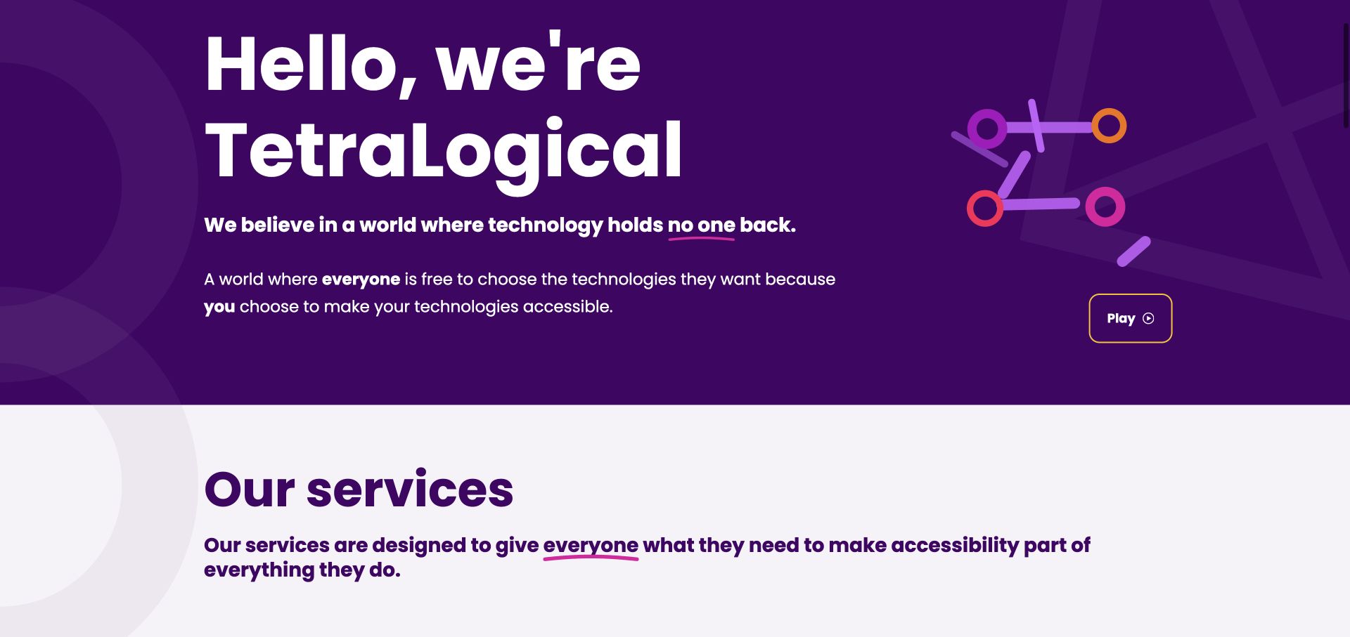
TetraLogical combines a strong purple geometric identity with very large introductory type. After the welcome, assessments, consultancy and training become three understandable service routes. Its site also connects the offer with a named specialist team and an editorial resource area. The accepted capture shows the introduction and services opening after the animation was paused through its normal control.
What you can learn
A distinctive graphic system is most useful when it supports a small number of explicit choices. Keep the method and people easy to find, and give moving introductions a usable pause option.
Pros
Three service families provide a concise structure for different enquiries.
A named specialist-team route makes the consultancy less anonymous.
Cons & considerations
Very large opening type can postpone practical service information.
Animated branding needs a stable paused state and reduced-motion consideration.
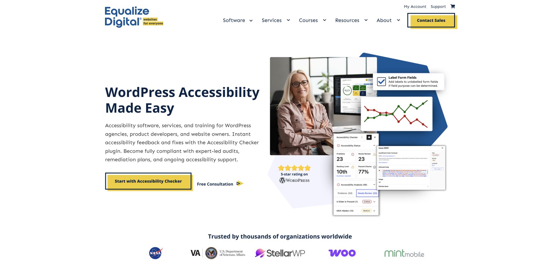
Equalize Digital places its WordPress focus directly in the opening heading, next to a product interface and human imagery. A navy-and-yellow system distinguishes the accessibility-checking product action from a consultation. The site goes on to name audits, remediation, training and user testing, keeping a software purchase from being the only possible response.
What you can learn
State the platform specialism early and separate product evaluation from commissioning human work. Explain what automated checking does not establish before a visitor confuses a dashboard with a complete assessment.
Pros
The platform specialism is explicit rather than implied by a logo.
Different actions distinguish software exploration from a professional-services enquiry.
Cons & considerations
The opening collage adds several competing visual focal points.
A product interface and marketing promise do not demonstrate complete accessibility coverage.
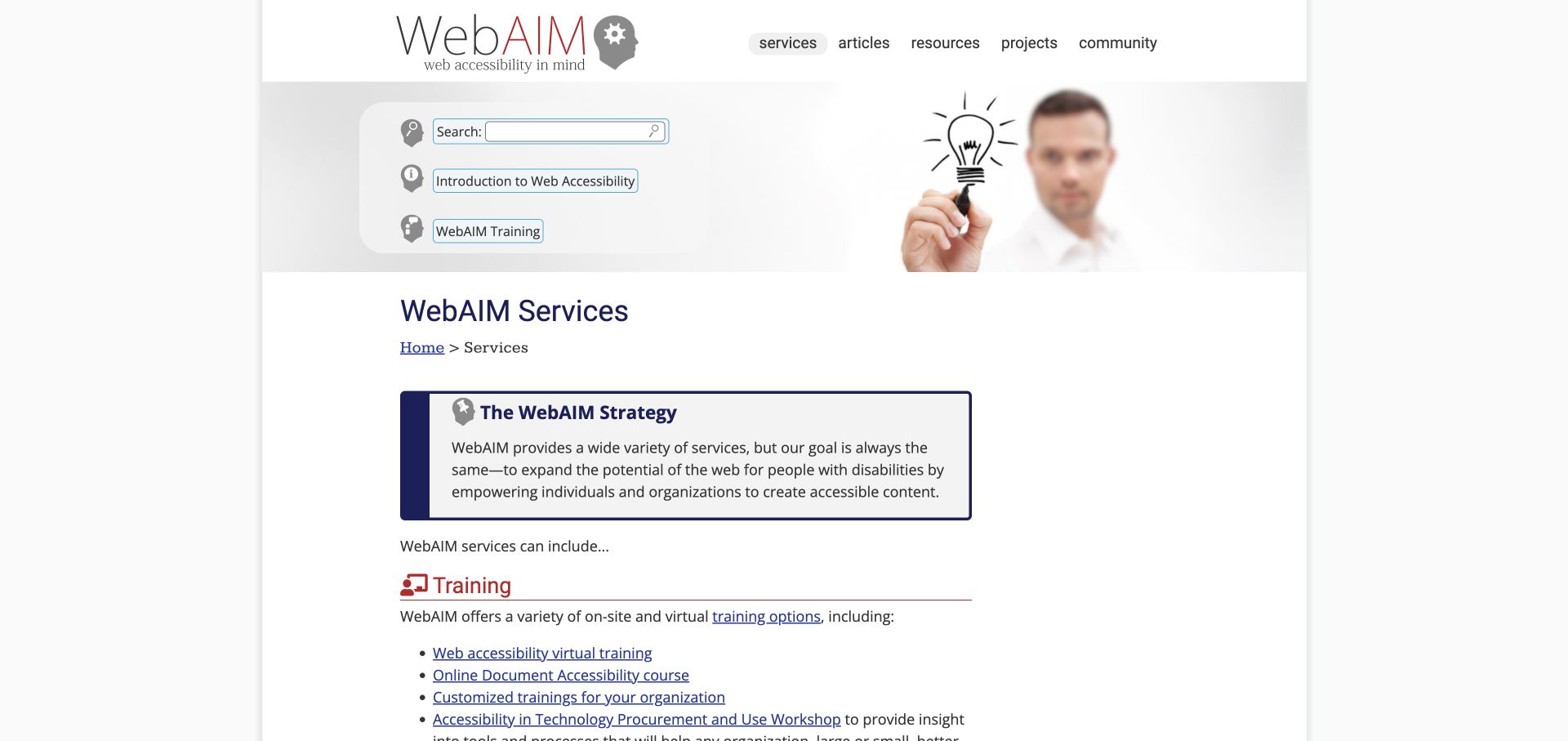
WebAIM’s services page uses a contained text layout, familiar underlined links and a clear page title rather than a full-screen promotional hero. Training, consulting, evaluation and certification are separate sections. Its evaluation explanation describes a representative sample and report, giving the reader a more concrete idea of the work than a generic compliance slogan.
What you can learn
Publish the scope of the assessment in ordinary language. Explain what is sampled, what the client receives and where advice ends, so a visitor can compare services without assuming every audit means a whole-site guarantee.
Pros
Service sections give readers concrete differences between types of work.
The evaluation copy explains sampling and the resulting report.
Cons & considerations
The stock-style header image adds little to the practical service explanation.
A long text-led page needs strong section navigation for repeat visitors.
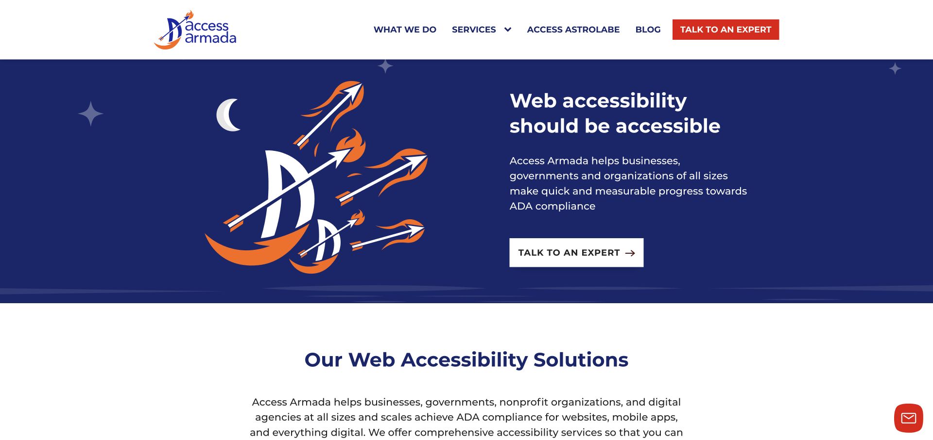
Access Armada uses a navy-and-white layout, orange accents and a nautical illustration to support a direct expert-contact action. Its service structure distinguishes audit and testing, support for new builds, and remediation or coaching. A manual-assessment invitation gives the opening a specific next step instead of presenting an automated score as the entire offer.
What you can learn
Give a new visitor one understandable starting action, then show the different service routes underneath. Make clear whether the initial assessment is diagnostic, sampled or a paid project before requesting access. The manual-assessment invitation needs a defined scope alongside its friendly framing. New-build guidance and fixes to an existing site should not sound like identical starting engagements.
Pros
A single expert-contact action keeps the opening focused.
New-build support is distinguished from auditing and remediation.
Cons & considerations
The illustration uses space that could also explain the assessment deliverable.
Broad legal-compliance language needs careful scope and substantiation.
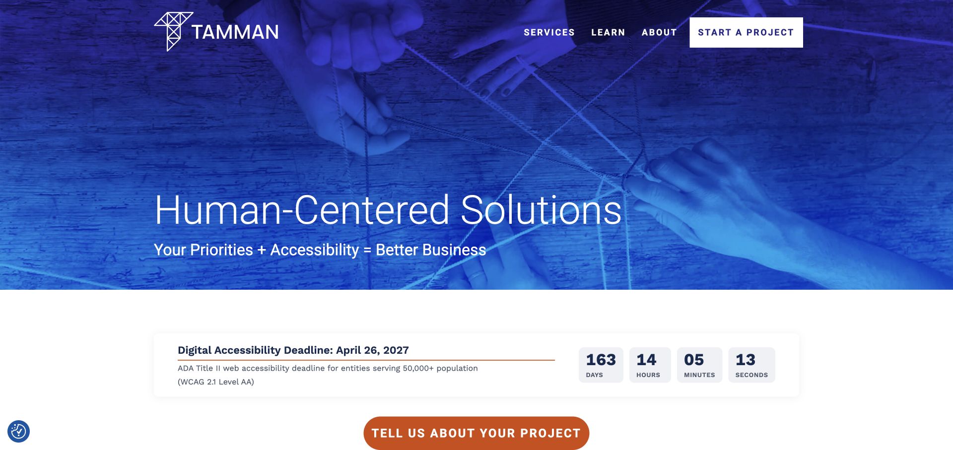
Tamman uses a blue-toned photograph of hands arranging a geometric structure beside a large human-centered positioning statement. Start a Project is a clear header action, with services and learning content extending the introduction. The reviewed page also includes deadline-oriented accessibility messaging, which adds urgency but needs context and an editorial owner.
What you can learn
A broad practice needs concrete engagement examples close to its positioning. If deadlines are part of the message, state their scope and keep them current rather than relying on urgency as the only explanation.
Pros
The opening image provides a coherent visual metaphor across the introduction.
A project-start action is visible independently of editorial browsing.
Cons & considerations
Broad human-centered language needs specific deliverables to qualify enquiries.
Deadline-led panels require regular review and appropriate contextual explanation.
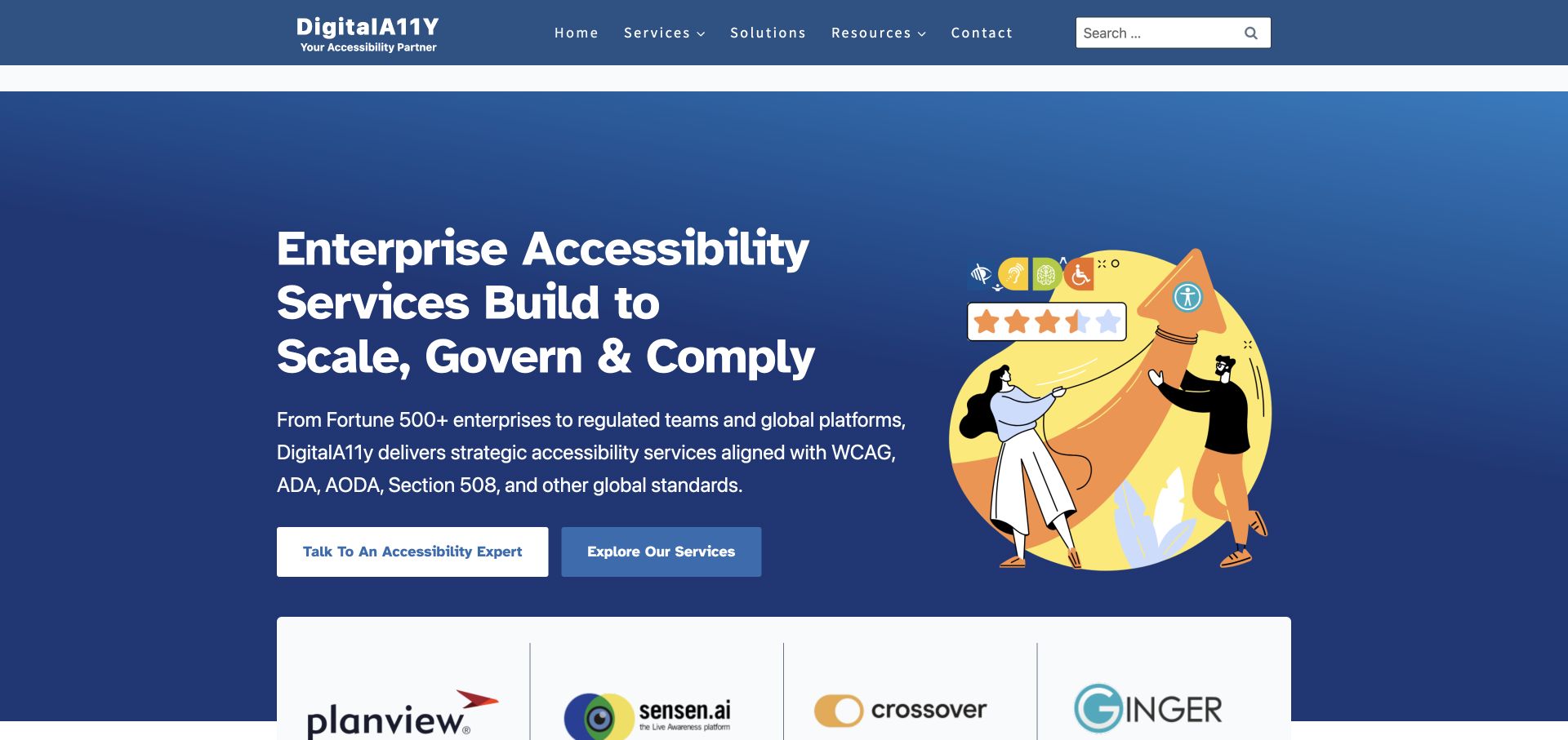
DigitalA11Y uses a blue gradient, an interface illustration and a prominent enterprise-oriented headline. Talk to an Expert and Explore Services provide different commitment levels. The header separates resources, solutions and services, while the body connects assessments with program planning. The decorative rating imagery should be read as part of the presentation, not as independently verified customer evidence.
What you can learn
Let someone learn about the service before asking them to speak to sales. Define technical and regulatory abbreviations at the point of use, and keep decorative trust imagery separate from attributable evidence.
Pros
The two introductory actions support different levels of readiness.
Resources have a separate route from commissioned services.
Cons & considerations
Acronym-heavy enterprise copy may exclude a less experienced buyer.
Decorative rating graphics need clear distinction from actual sourced reviews.
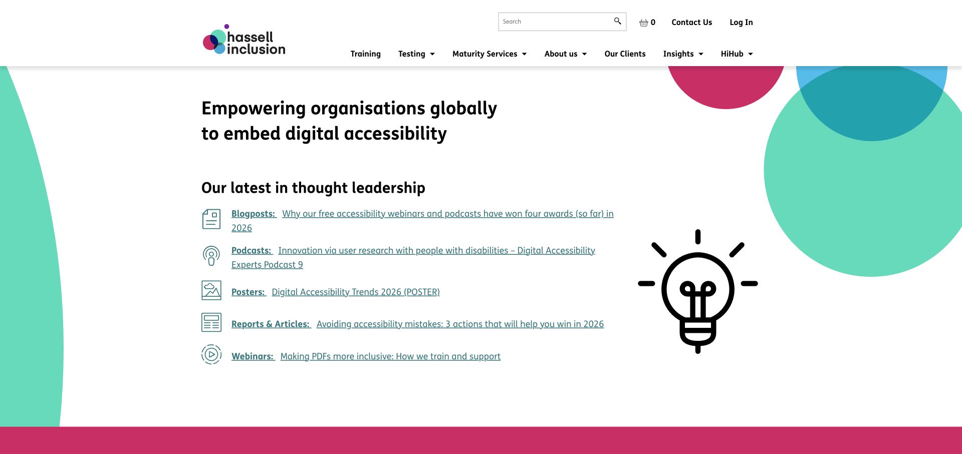
Hassell Inclusion uses a mostly white introduction with circular color details and a mission centered on embedding accessibility. Services, training and testing are distinguishable routes. Its content area labels formats such as podcasts, posters, reports and webinars, helping visitors choose how to learn rather than presenting every resource as an identical article.
What you can learn
Explain the organisational change you support, then connect it to concrete service types. Label resource formats so readers know whether a destination is a short article, event, recording or downloadable document.
Pros
Training and testing are separated from the broader consulting offer.
Resource-format labels set useful expectations before a click.
Cons & considerations
A long content list can compete with the next step for a project enquiry.
Long linked titles need comfortable line lengths and visible interaction states.
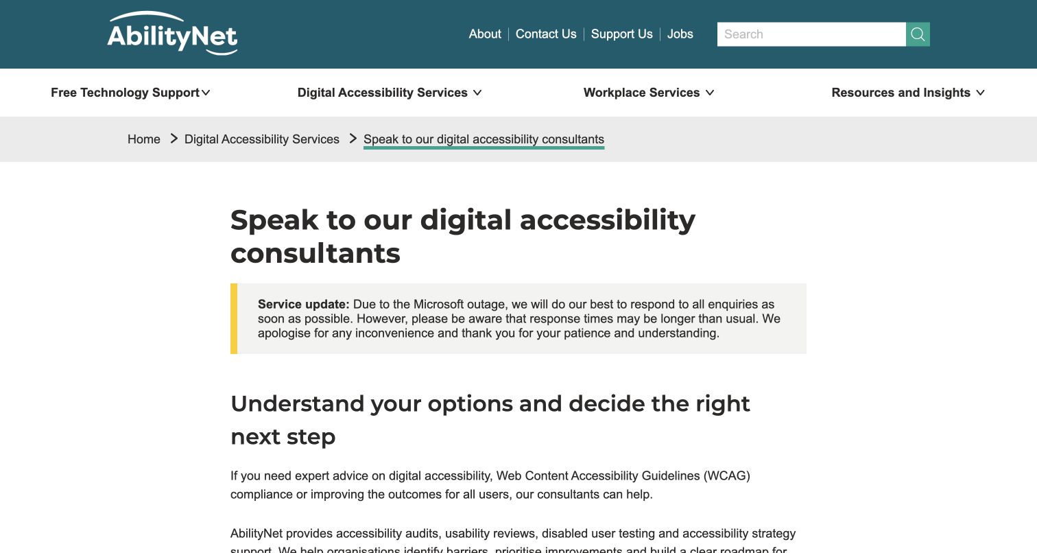
AbilityNet’s consultant-contact page provides useful scoping guidance before the enquiry is completed. It asks visitors to consider journeys, platforms, page scope and timing, and explains what happens after contact. A three-step business-email form is accompanied by a fallback contact route if the form does not appear. The page also carries an operational service update above the main content.
What you can learn
Explain the information needed for a meaningful first conversation and provide a fallback when an embedded form fails. Do not make the form itself the only source of contact instructions or response expectations.
Pros
The scoping guidance helps a visitor prepare a more actionable enquiry.
A fallback route acknowledges that an embedded form may not load.
Cons & considerations
A multi-step email-first form can feel like a commitment before the full questions are visible.
Operational update notices need dates and prompt retirement when no longer relevant.
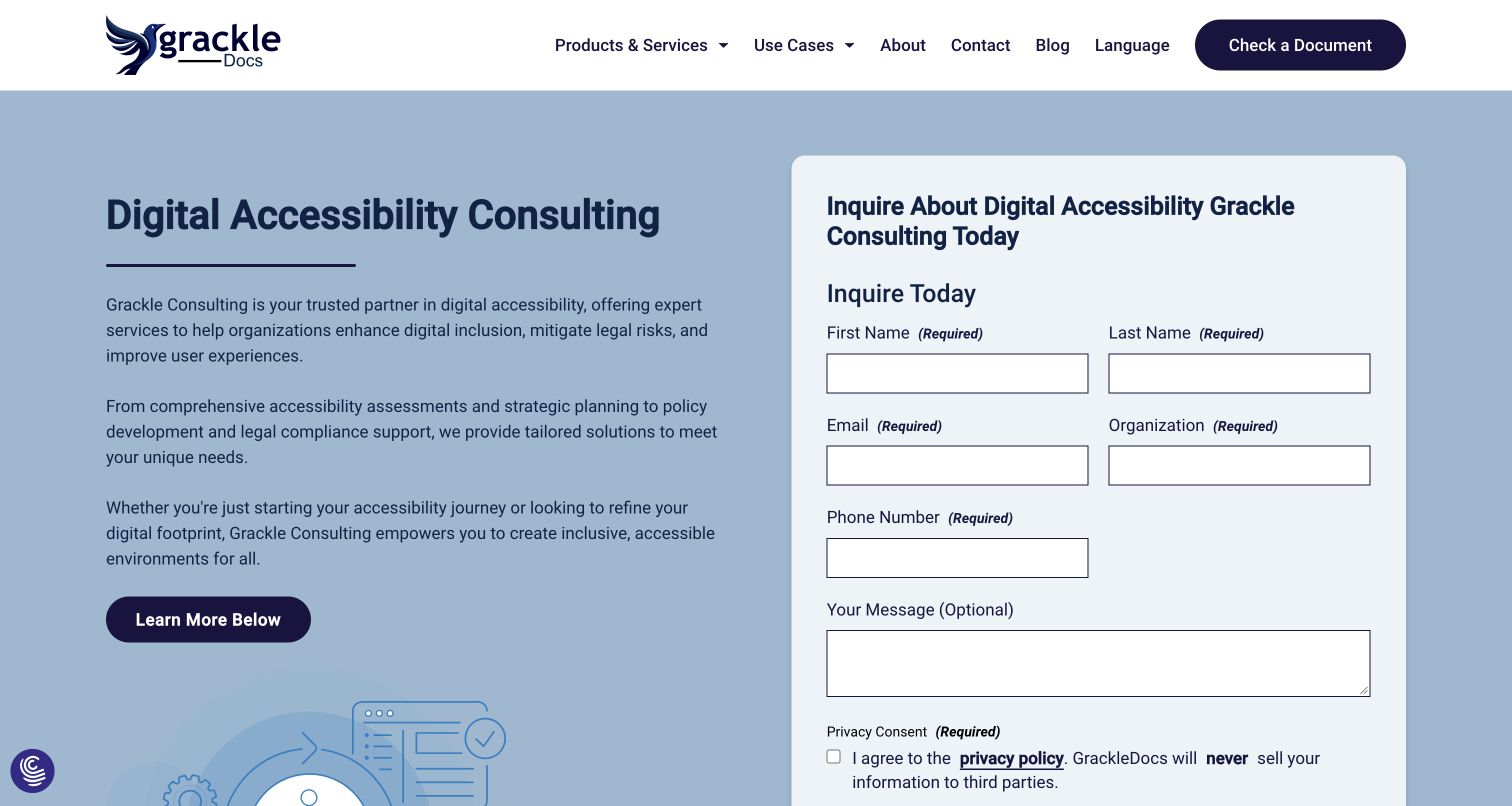
GrackleDocs’ consulting page places its introduction alongside a rounded white enquiry panel on a pale blue background. The form visibly distinguishes required contact fields from an optional message and includes a privacy acknowledgement. Product, service and use-case navigation preserve the wider document-accessibility context, while lower content explains consulting packages and resources.
What you can learn
Use persistent labels and explain what is required, but keep the enquiry proportionate to the first conversation. Introduce the type of consulting before asking for detailed contact information.
Pros
Required and optional fields are visibly distinguished.
The form sits in a coherent service-page layout rather than an unexplained popup.
Cons & considerations
A required phone number adds friction for a preliminary enquiry.
The form occupies substantial space before the reader has explored the engagement options.
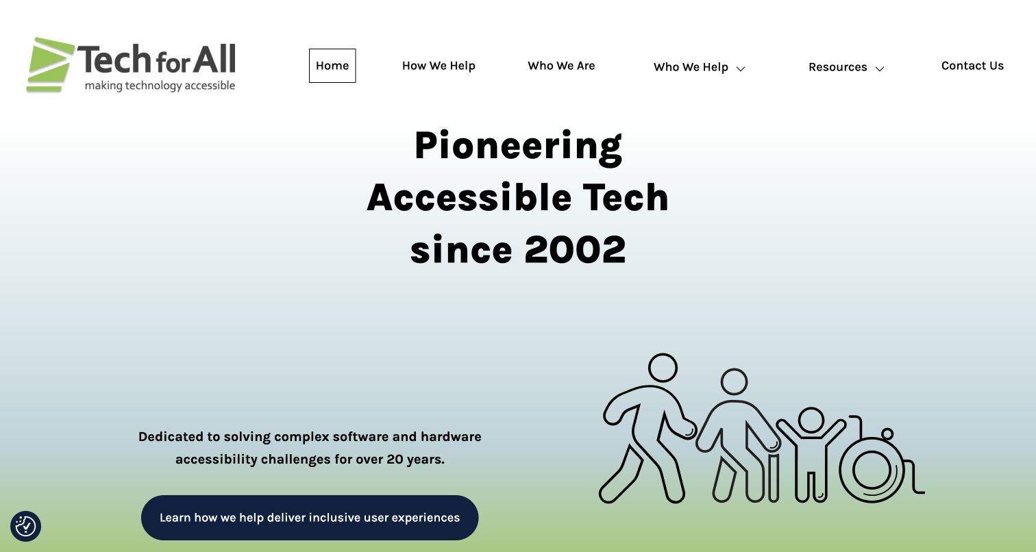
Tech for All combines green and blue illustration with a direct accessibility mission. Its navigation asks how the team helps, who it helps and who it is. The service description reaches beyond websites to applications, hardware and kiosks, making the intended scope more concrete than a purely standards-led introduction. Resources and a direct contact route remain separate.
What you can learn
Name the environments and products the team actually evaluates. A kiosk, native app and document project may need very different expertise, access arrangements and deliverables even when the same broad standards language appears.
Pros
The service scope includes identifiable environments beyond ordinary websites.
The navigation distinguishes the offer, audiences and team.
Cons & considerations
The large opening headline uses space before the detailed scope.
Links that move between public hostnames should be checked for consistent context and destination labels.
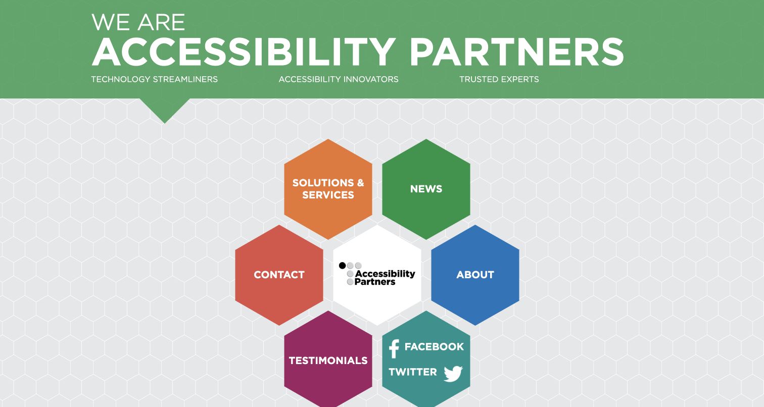
Accessibility Partners gives its homepage a distinctive honeycomb structure, with large hexagonal destinations for services, company information, testimonials, news and contact. Green branding and visible phone and email information make the organisation identifiable. The presentation is a useful contrast with conventional consultancy layouts, but asks visitors to learn an unusual navigation pattern.
What you can learn
A memorable navigation device still needs ordinary text labels, predictable focus order and a clear mobile fallback. Keep direct contact information available without requiring someone to decipher a visual metaphor.
Pros
Primary destinations use recognisable text labels inside the unusual layout.
Direct contact information is visible rather than restricted to a form.
Cons & considerations
An unconventional navigation pattern can add learning effort for first-time visitors.
Multiple colors should not be the sole means of distinguishing destinations.
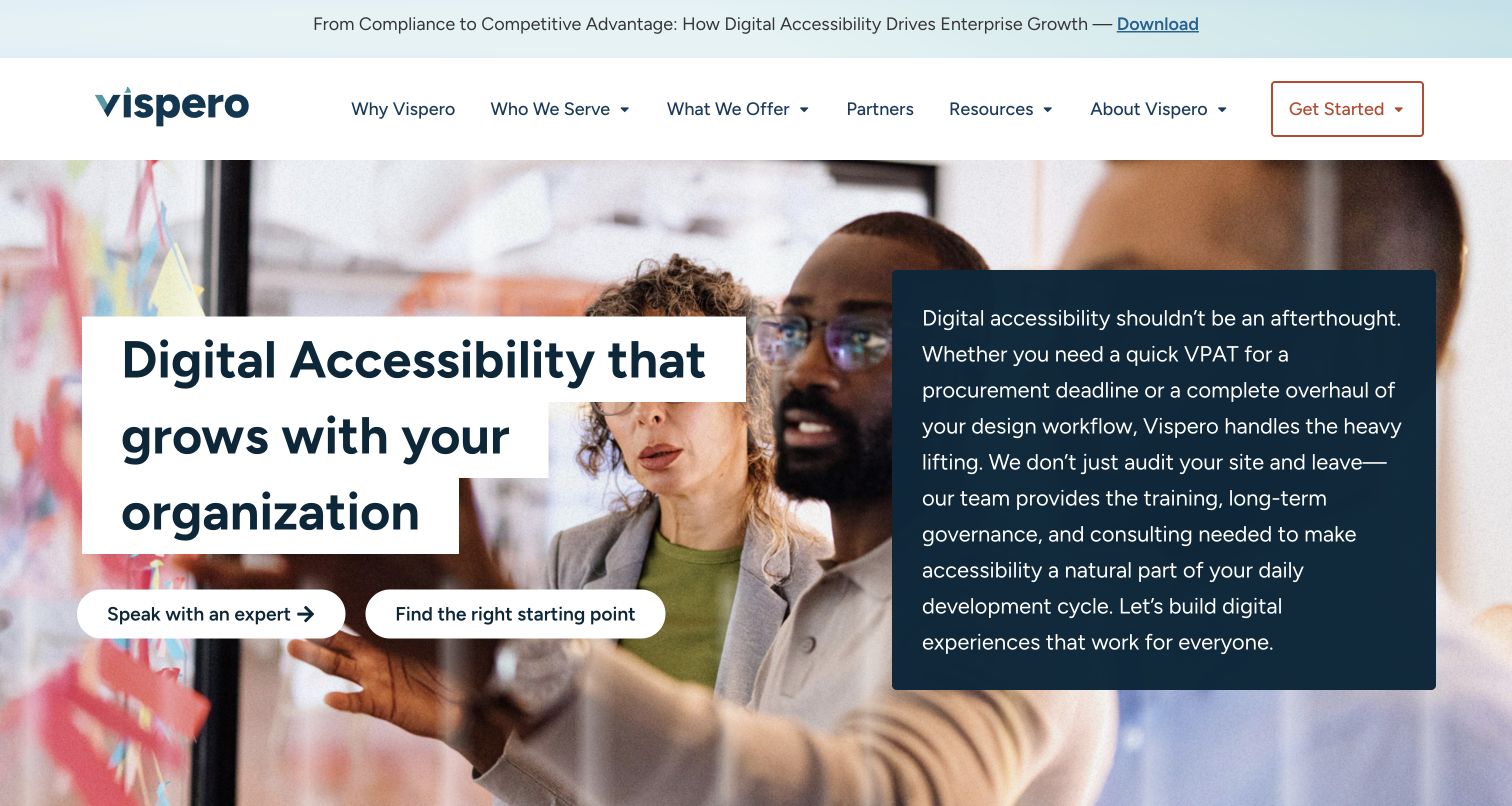
Vispero’s digital-accessibility page pairs a white text panel with team imagery and clear contact or starting-point actions. The body then routes readers by need: an audit, a report, a roadmap, help fixing issues, internal expertise or ongoing support. This turns a broad capability list into a set of recognisable project situations. The page is the current destination reached from the former TPGi service route.
What you can learn
Organise a complex service portfolio around the decision the visitor is trying to make. A problem-led route is useful only if it then explains the actual scope, deliverable and next step.
Pros
Need-based routes make a broad service portfolio easier to enter.
The opening offers both expert contact and help choosing a starting point.
Cons & considerations
A dense opening paragraph needs careful reading width on small screens.
Several parallel routes need clear explanations to avoid becoming a different kind of overwhelming menu.
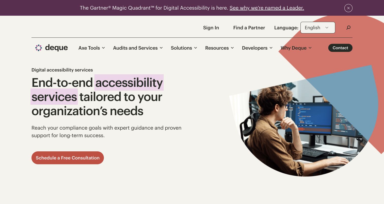
Deque’s services page uses a warm neutral background, pink emphasis and a large photograph within geometric shapes. Audits, training and consulting are distinct explanatory sections rather than one combined service label. The surrounding navigation preserves access to tools and resources, while the professional-services copy explains support beyond simply running an automated scan.
What you can learn
Keep the professional-services journey legible inside a software-heavy business. Show how findings, training and consulting relate, but do not imply that buying one automatically includes the others. Keep the relationship between tools and expert services explicit at each destination. A buyer should be able to distinguish an assessment deliverable from software access or a training commitment.
Pros
Audits, training and consulting are separate information routes.
The image and restrained accent create a recognisable service-page identity.
Cons & considerations
The promotional strip and multiple header levels consume opening space.
Tool and service terminology needs clear boundaries for newcomers.
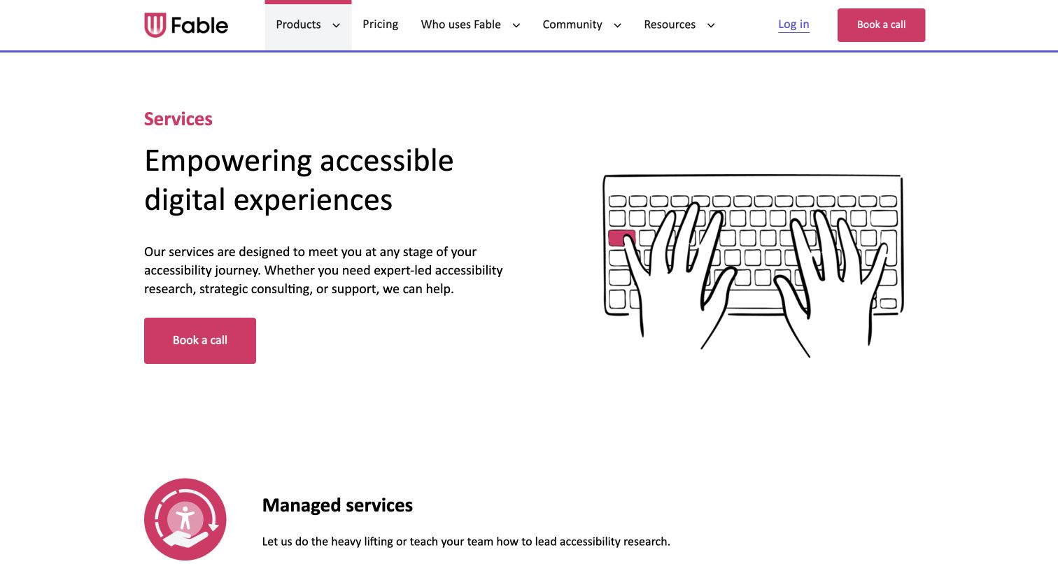
Fable’s services page uses a clean white-and-magenta identity with a keyboard illustration and a direct call-booking route. Its content distinguishes managed research, collaborative support and consulting delivered through a named partner. That explicit division helps readers understand who is involved and whether they are buying execution, guidance or a wider accessibility engagement.
What you can learn
Describe the delivery model, not just the desired outcome. Make partnerships explicit and explain the difference between research participation, managed execution and coaching before someone commits to a call.
Pros
Different delivery models are explained rather than bundled into one research promise.
The consulting partnership is named within the service content.
Cons & considerations
The generic opening statement needs the specific delivery models nearby.
A product-centered main navigation can make the services route less immediately obvious.
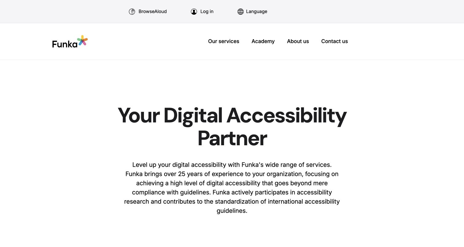
Funka’s English homepage places a large centered accessibility introduction on a mostly white canvas. A compact main menu separates services, the academy, the company and contact, while language and account utilities occupy another layer. The body introduces audits, document remediation and learning, giving the broad partner message more concrete destinations.
What you can learn
A text-first hero can feel confident without large photography. Follow broad positioning with task-specific service links, and distinguish learning or account access from the route for a new project enquiry.
Pros
A compact primary menu separates service, learning and contact tasks.
The restrained visual treatment keeps the introductory text prominent.
Cons & considerations
Large areas of whitespace can delay the first concrete service choice.
The broad hero paragraph could do more to explain the initial engagement.
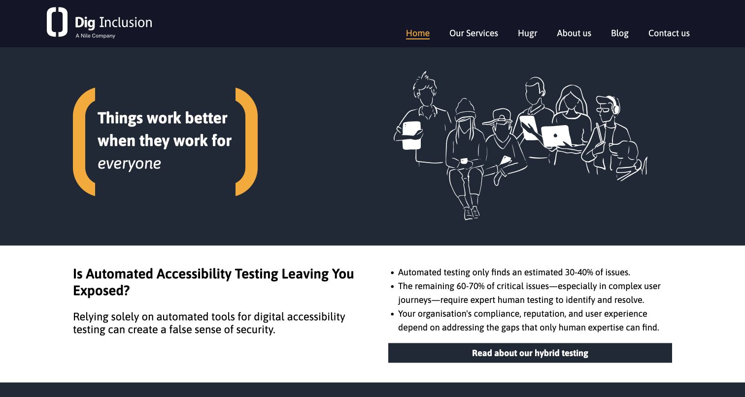
Dig Inclusion uses a dark navy background, bright yellow emphasis and line illustrations of people using devices. The introduction is followed by an explanation of automation’s limitations and routes into testing and support. Hugr has its own navigation position, distinguishing the product from audits, user testing and upskilling. The page identifies its wider company relationship in the footer.
What you can learn
Explain the boundary between software and expert work in plain language. If a site uses numerical claims about automated coverage, provide the relevant scope and source rather than presenting the number as universal.
Pros
The product has an identifiable route separate from the service offer.
The body explains why human involvement remains part of the work.
Cons & considerations
Coverage percentages need a clear, current basis and context.
The broad introductory statement postpones the concrete engagement choices.
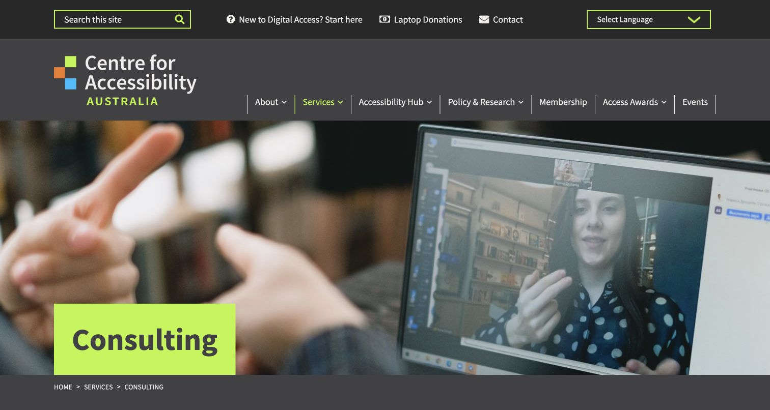
Centre for Accessibility Australia’s consulting page uses a charcoal-and-lime heading over a photograph of a sign-language video conversation. The surrounding navigation includes a newcomer route, research, membership and other programs. The consulting explanation distinguishes hourly advice, embedded support and research-related work rather than assuming every enquiry needs a full audit.
What you can learn
Give newcomers a separate learning route while making paid engagement types explicit. Explain how a short advice session differs from embedded support and which information is needed to scope each.
Pros
The newcomer route recognises that not every visitor knows the terminology.
Different engagement arrangements are named in the consulting content.
Cons & considerations
The tall utility and primary navigation layers push service detail down.
Translation and display options should not be presented as proof of the entire site’s accessibility.
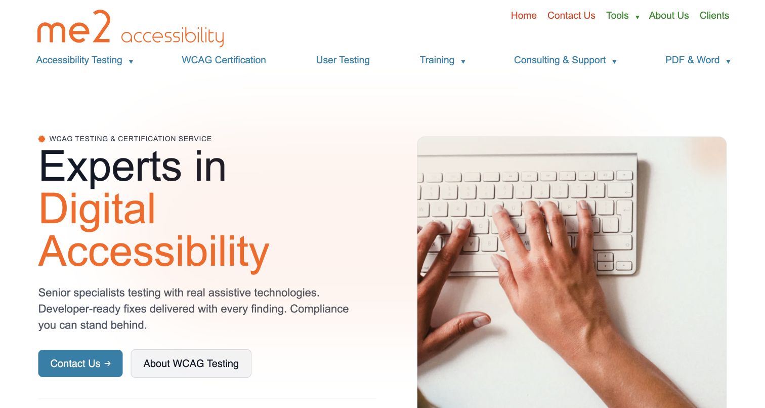
me2 Accessibility uses a white-and-orange introduction beside a keyboard photograph. Its two navigation tiers name testing, user research, training, consulting and document work, while the opening offers both contact and more testing information. The service copy connects findings with practical guidance for developers, rather than leaving remediation as an unexplained final step.
What you can learn
Name the content formats and the people receiving the deliverables. A useful findings report should lead to a clear implementation conversation, with document work scoped separately from a website test.
Pros
Document services are visible rather than hidden beneath a general web label.
Visitors can read about testing before beginning a contact enquiry.
Cons & considerations
Two wide navigation tiers need careful prioritisation on mobile.
Certification and human-testing claims need explicit boundaries and supporting method details.
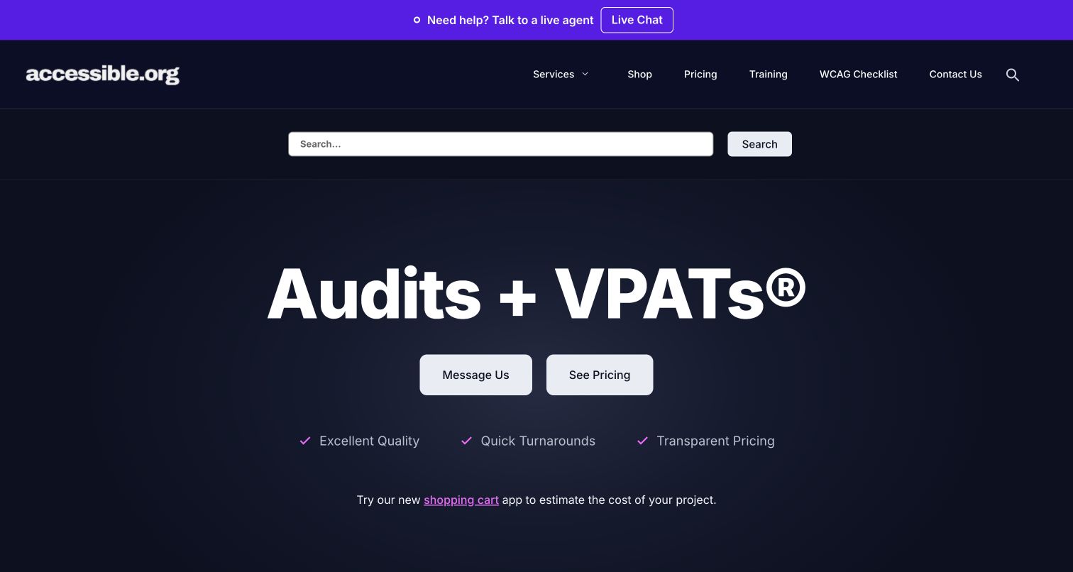
Accessible.org uses a navy hero that names audits and conformance reporting without a long aspirational introduction. Message Us and See Pricing offer different next steps. The supporting content stresses transparent pricing and a defined audit process, while navigation makes estimation and service selection visible. Its presentation is especially useful for studying how to answer commercial questions before an enquiry.
What you can learn
Publish enough scope and pricing context for a visitor to judge fit. Define acronyms near their first use and explain exactly what the quoted service includes, rather than making transparency a slogan without detail.
Pros
The opening names concrete outputs instead of only an inclusion mission.
Pricing is available as a distinct route before a sales conversation.
Cons & considerations
Specialist acronyms still need plain-language explanations for unfamiliar buyers.
Chat, search and several commercial utilities can compete for attention.
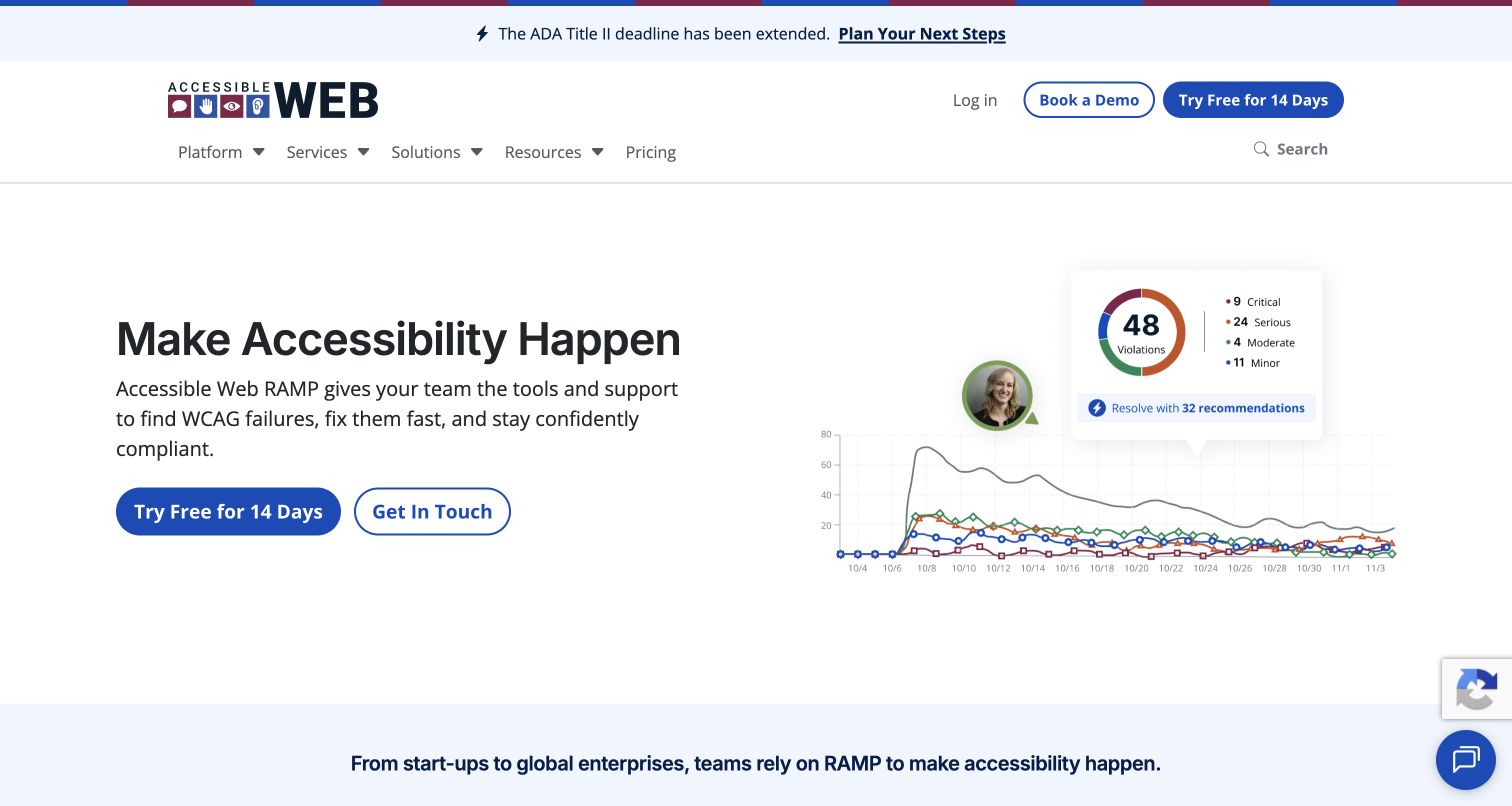
Accessible Web introduces its RAMP platform with a blue-and-white interface illustration, issue counts and trend graphics. Trial and contact actions offer distinct entry points, while the header separates the platform, professional services, solutions and pricing. Audits, remediation assistance, reporting and consulting extend the product narrative rather than remaining implied by the dashboard.
What you can learn
Use the interface to explain the product’s job, then show where human expertise starts. Counts and graphs are useful explanatory visuals, but should never be treated as evidence that every accessibility issue has been found.
Pros
Platform and professional-service routes are separately named.
The interface illustration gives the software proposition a concrete visual context.
Cons & considerations
The platform-first hero can overshadow the consulting offer.
Issue counts and trend charts need careful explanation rather than a completeness implication.
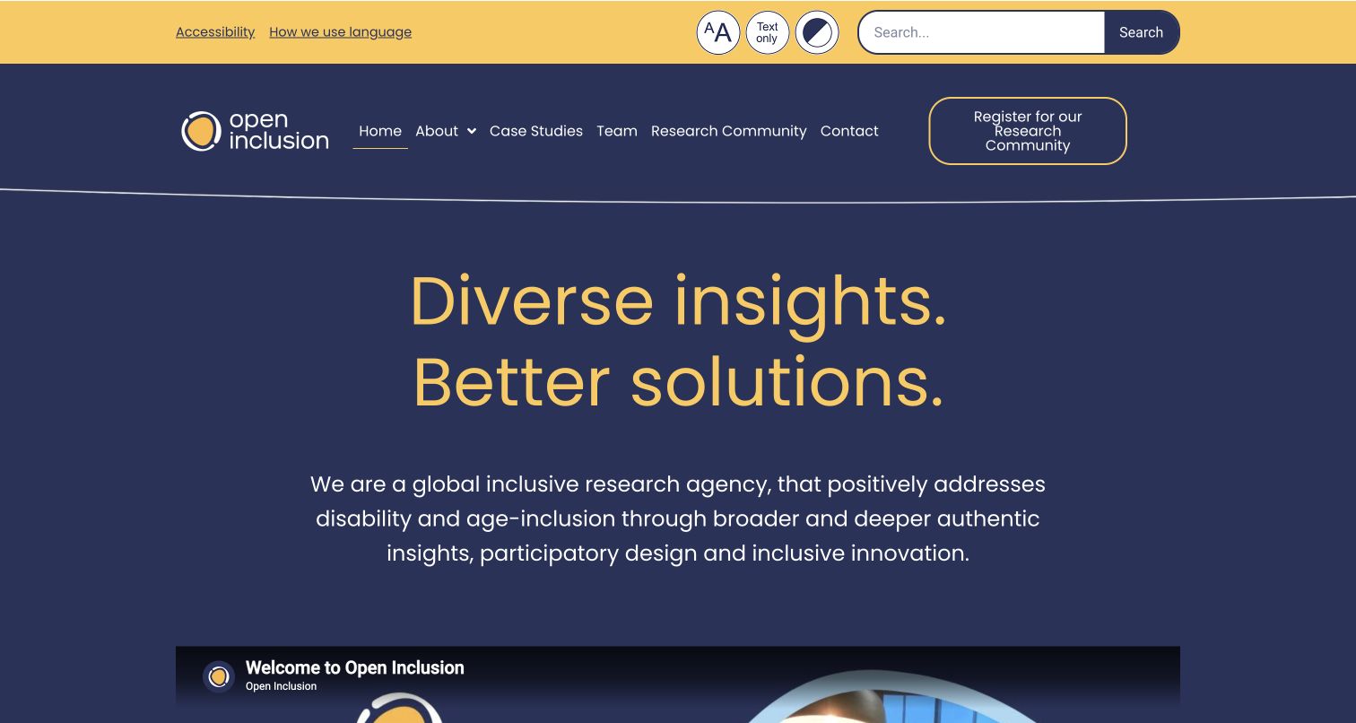
Open Inclusion combines navy and gold with a large research-led introduction. Case studies, team information and contact have distinct routes, alongside community registration. The homepage provides an introductory video with a transcript link and a sign-language route, giving visitors more than one way to approach the explanation. Its focus is participation in research and design, not simply an audit checklist.
What you can learn
Separate the organisation commissioning research from the people participating in it. Provide useful text alongside media and explain the purpose of community registration before requesting personal information.
Pros
Case studies and team information have recognisable navigation destinations.
Transcript and sign-language routes are explicitly offered beside the introduction.
Cons & considerations
A prominent community-registration action may need a clearer audience label.
Video alternatives still require testing; their presence alone does not prove accessibility.
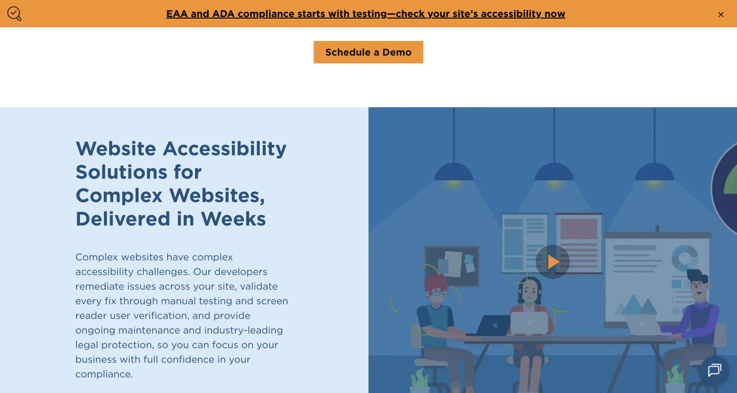
UsableNet’s managed-service page describes a progression from a core phase into wider conformance work and ongoing support. The reviewed section pairs a clear explanatory heading with a visual demo preview and substantial service text. It is useful as an example of presenting a continuing engagement, although its legal and implementation assurances require their own contractual context.
What you can learn
Explain phases, dependencies and who does the work before inviting a demo. Keep legal assurances separate from design claims, and identify what is reviewed again after the underlying site changes.
Pros
The service is described as phases rather than an unexplained recurring fee.
Ongoing support has an explicit place in the engagement narrative.
Cons & considerations
Strong legal or no-impact assurances need exact terms and boundaries.
Demo-first content should not obscure practical scope and ownership questions.
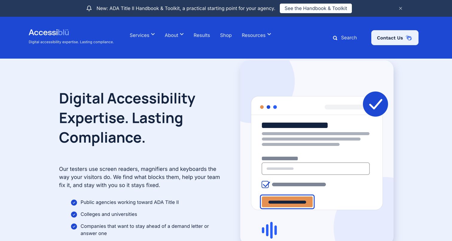
Accessiblü uses a strong blue header, pale-blue hero and an illustration of labelled interface controls. Its introduction describes screen readers, magnifiers and keyboard use, then names public agencies, colleges and companies as different audiences. Consultation and toolkit routes separate bespoke work from a packaged educational purchase. Results have their own destination in the main menu.
What you can learn
Name the audiences and practical testing methods without making a badge the evidence. Separate a downloadable toolkit from a commissioned assessment and explain what each can and cannot provide.
Pros
The opening names actual testing contexts rather than relying entirely on standards acronyms.
Results and consultation have distinct destinations.
Cons & considerations
The layered announcement and header take substantial vertical space.
Illustrated conformance badges and perfect scores must not imply verified universal coverage.
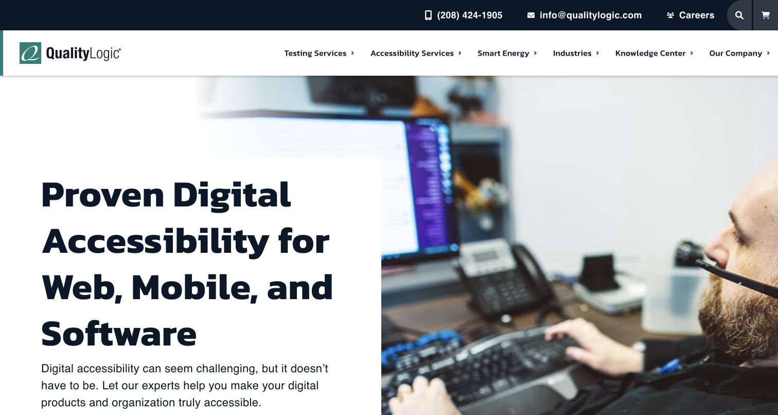
QualityLogic’s accessibility page uses a large white text panel against a photograph of someone at a computer and assistive-technology setup. Consultation and a starter kit offer different commitment levels. The body groups getting started, integrated support, reporting and organisational transformation, then names auditing, document remediation, training and consulting as separate services.
What you can learn
Create a focused landing page when accessibility is one practice inside a larger firm. Group the work by the buyer’s stage, then provide specific deliverables and a low-pressure educational route.
Pros
A dedicated practice page prevents accessibility from becoming a footnote to general testing.
The starter kit gives an alternative to immediate consultation.
Cons & considerations
The oversized heading delays the opening actions below the first view.
A broad navigation shared with unrelated practice areas needs a clear current-section signal.
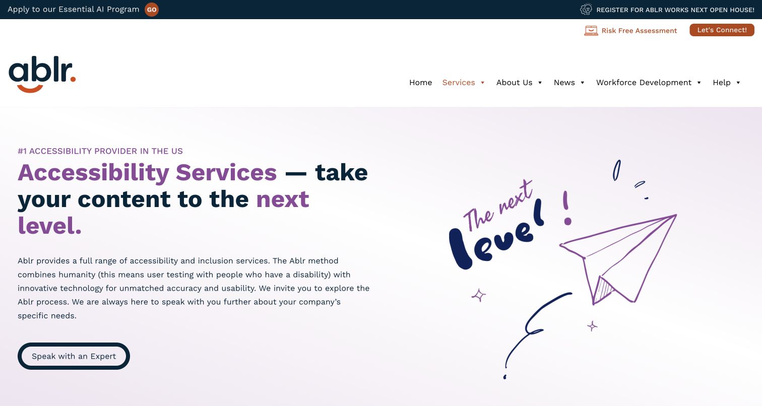
Ablr’s accessibility-services page uses navy, orange and purple with a hand-drawn paper-plane illustration. The introduction explicitly explains its use of testing with disabled people, then links to named programs for assessment, continuing advice, training and usability work. The surrounding navigation also distinguishes disability inclusion and workforce development from the digital-services enquiry.
What you can learn
Explain human involvement in practical terms and translate branded program names into the work they contain. Keep adjacent mission-led programs distinct so a buyer can scope a service without confusing it with employment or training participation.
Pros
The introduction describes human testing rather than only displaying a compliance badge.
Program descriptions connect continuing support and learning with the wider service offer.
Cons & considerations
Several branded program names require comparison to reveal their differences.
Absolute compliance and leading-provider claims need independent support and carefully stated scope.
Kegan is a freelance web designer and developer with 15+ years of experience helping businesses turn complicated website requirements into clear, maintainable digital experiences. He works directly with clients from planning and design through development, launch, and ongoing support.
For accessibility consultant website design, his development approach focuses on clearly scoped audit and remediation services, qualified team profiles, practical reporting examples, and accessible enquiry journeys without unsupported conformance claims. The scope can be a targeted improvement or a complete custom build, with responsive layouts, thoughtful content structure, and integrations chosen around the people using and maintaining the site.
Show 3 other accessibility consultant website designersHide other accessibility consultant website designers
Plan an accessibility consultant website around clear service boundaries
1. Define what an engagement actually includes
Start with a service inventory written with the people doing the work. Separate automated checking, manual evaluation, assistive-technology testing, user research, design review, remediation, document work, training and program strategy. Several may be combined in an engagement, but they should not become interchangeable labels. A visitor needs to understand what problem each service addresses and what they receive at the end.
Give each service a concise scope statement. Describe the kinds of products and content covered, how representative samples are chosen, which environments are considered and what access the team needs. Explain whether the deliverable is a findings report, annotated examples, a conformance report, implementation help or an ongoing advice arrangement. Keep any exclusions visible before an enquiry is submitted.
Avoid promising that a badge, one-time scan or specific vendor can eliminate every issue or legal risk. Standards conformance, practical usability and legal obligations are different questions. Have qualified people review compliance-related wording and keep the site’s claims proportionate to the documented service. This design collection does not provide legal advice or verify a provider’s outcomes.
2. Turn expertise into useful, attributable evidence
Introduce the people involved through accurate biographies, relevant experience and roles. Explain when disabled participants contribute to research, how that work is arranged and what it can establish. Do not use a generic illustration, stock portrait or certification icon as a substitute for identifying the method. Credentials should be accurate, current and connected to the actual person or organisation that holds them.
Choose case studies that explain the starting problem, the work performed, the boundaries and the client-approved result. A report excerpt or an anonymised issue example can demonstrate the shape of the deliverable without disclosing a client’s private systems. Attribute testimonials and obtain permission for logos, quotations and screenshots. Explain sample sizes or date ranges when publishing numerical outcomes.
Make educational material useful in its own right. Organise articles, recordings, transcripts, checklists and training by audience and format so visitors can choose what helps them. Keep publication and update dates truthful, retire expired regulatory summaries and separate general educational material from project-specific advice. Do not make every resource download an unexplained sales-registration requirement.
3. Build a proportionate enquiry and scoping journey
Help people prepare a useful brief before they meet the form. Ask which product or content needs review, the intended audience, relevant platforms, timing and the kind of assistance sought. Explain why sensitive details or production credentials should not be placed in an ordinary public enquiry field. The first contact should establish a safe scoping conversation, not collect unrestricted access to a live system.
Use persistent labels, understandable required-field indicators and error messages that identify the problem and how to fix it. Support keyboard use, visible focus, zoom and appropriate assistive technologies. If a third-party scheduling or form system is involved, test that actual journey rather than only the surrounding landing page. Provide a readable fallback address or phone route and state realistic response expectations.
Distinguish an educational download, software trial, research-participant registration and consulting enquiry. They involve different consent, data and follow-up expectations. Explain who receives a submission and what happens next; do not imply that contact creates a contract, completes an audit or enrolls someone in unrelated marketing. Give returning clients an identifiable support route separate from new-project sales.
4. Treat the website as a maintained service
Set a publishing owner for service scope, team details, contact routes, resources and time-sensitive notices. An accessibility consultancy should not hand off a beautiful but unmaintainable collection of custom pages. Use repeatable content patterns that preserve heading structure, link meaning, alternative text and appropriate document formats as new material is added.
Build accessibility evaluation into the release process. Automated checks can identify some defects, but manual inspection, assistive-technology testing and appropriately scoped user research answer different questions. Test the actual tasks people need: finding a service, understanding a report, making contact and receiving errors or confirmations. An accessibility toolbar or self-declared badge does not replace that work.
Document ownership after publication: who patches the CMS, checks integrations, updates statements, responds to reported barriers and verifies fixes. Provide a public accessibility statement with a usable feedback route, but do not expose private research, client findings or participant information. Collect only data the organisation needs and can responsibly handle. The website’s visible technology is not an assurance of the organisation’s methods.
The editing job behind the design
Choose a stack that supports accessible publishing and service delivery
Choose a content system around the actual publishing team: service pages, staff biographies, case studies, articles, transcripts and document alternatives. Require semantic templates, sensible image fields, a clear heading model and reusable form patterns. A particular CMS does not guarantee that the final content or interactions will be accessible.
Separate the marketing website from the tools used to perform audits, share findings or manage research. A visible dashboard, scheduling embed or analytics script is not evidence of the underlying consulting process. Document third-party boundaries, access permissions and fallback contact paths instead of treating every integration as part of one seamless promise.
Visible technology labels must come from dated public evidence. These direct source captures establish the pages reviewed and their actual appearance; the publisher’s separate broad technology audit supplies verifiable stack observations. Unknown technologies are omitted rather than inferred from a site’s visual style, service vocabulary or standards claims.
Our WordPress website examples offer a separate look at publishing approaches. A visible platform label is evidence for that named page, not a guarantee that the same system will suit your requirements.
Explain the difference between testing, research, remediation and strategy.
State the products, formats and environments covered.
Describe sampling, deliverables and important exclusions.
Identify people and roles without inventing credentials.
Attribute client stories and obtain permission for logos.
Provide useful formats and text alternatives for resources.
Keep compliance wording scoped and appropriately reviewed.
Make new-project, participant and client-support routes distinct.
Use labelled forms, clear errors and visible keyboard focus.
Provide a fallback when a third-party form or scheduler fails.
Assign an owner for dated notices and changing service information.
Test real tasks and document ongoing maintenance responsibilities.
These checks are a project checklist, not a performance, legal, security, or accessibility certification. Test real journeys with the people responsible for the website before making claims about the result.
Sources & editorial method
How this collection was selected and reviewed
The 30 distinct source pages were reviewed and directly captured in a normal browser on November 13, 2026. Actual UTC capture times, decoded image dimensions and independent SHA256 evidence are retained privately. Ordinary consent and close controls were used for obstructing notices; raw obstructed, blank and transition captures remain excluded. One source with an expired certificate was not bypassed. Reviews concern public communication and observed design, not a formal accessibility audit, completed enquiry transaction, legal assessment, service-quality verification or endorsement of compliance guarantees. Editors Choice is an explicit editorial selection at a focused specialist practice. Technology labels depend on the separately scoped public audit.
Each example links to its actual source page. Screenshots are direct browser captures with their own capture dates; moving imagery, announcements and live designs can change. The notes describe observable design choices and conditional tradeoffs, not measured traffic, conversion results, service quality, or accessibility conformance.
Technology labels use public page metadata, asset evidence, or explicitly cited platform documentation. Platform documentation is not a complete current deployment audit. A component reference may be legacy or unused; it is not a complete backend inventory. Unknown stacks are omitted. These sites are editorial examples, not our client portfolio.
Written, Edited and Curated are separate editorial records, not timestamps advanced by a rebuild. Website designs and imagery belong to their owners. See our editorial standards or suggest a correction.
Questions worth asking
Accessibility Consultant website design questions
What should an accessibility consultant homepage explain first?
State who the practice helps and the kinds of work it actually performs. Then offer clear routes to scope, methods, people and contact. A mission statement is useful, but should not be the only explanation of the engagement.
Should audits, user testing and remediation be separate service pages?
Usually they need distinct explanations, even if sold together. A standards evaluation identifies particular issues, research explores experiences and remediation changes the product. Explain the deliverables and boundaries so visitors do not assume one automatically includes the others.
Does a visible accessibility badge prove that a website is accessible?
No. A badge, toolbar or score is not evidence of complete conformance. Assess the actual content and tasks with an appropriate combination of automated checks, manual inspection, assistive technologies and user involvement.
How much information should a first consulting enquiry request?
Enough to start a useful scoping conversation: product or content type, goals, timing and a contact route. Explain any required fields and offer a fallback. Do not ask visitors to submit sensitive findings, credentials or unrestricted production access in a general public form.
Are these companies ranked by service quality or legal compliance?
No. This is a website-design collection based on public source review. Its observations and Editors Choice concern communication, navigation and presentation, not verified provider performance, legal advice or an independent accessibility certification.
Borrow the clarity: explain the scope, show the method and give people an understandable next step. A credible accessibility consultant website makes fewer unsupported promises and more useful distinctions.