Definitive guide · Microsoft SQL Server website development
Best Microsoft SQL Server Websites of 2026 (20 Real-World Examples)
Public websites from organizations with specific SQL Server evidence, including clearly labeled historical customer references.
SQL Server projects are data and service projects before they are dashboard projects. Use the examples for communication patterns, then verify the application and deployment requirements independently.
A corporate homepage, shipping tool and government portal can all belong to organizations with SQL Server experience without being served by the same architecture. This collection keeps that distinction explicit. Recent Microsoft cases identify particular operational or governance work; older references, including Microsoft’s 2017 customer presentation and Stack Overflow’s 2016 engineering account, remain historical evidence rather than being promoted into current runtime claims.
For your own website, start with the decisions a person needs to make and the information required to support them. A polished reporting interface is useful only when the underlying definitions are reliable. Record ownership, access rules, update timing and recovery expectations before deciding how many charts or cards the dashboard should contain.
Before the examples
What makes good Microsoft SQL Server website development in 2026?
Define the record and the measure
Agree on what a customer, order, case or active account means before building screens or reports. Distinguish a source record from an aggregated metric, and state the relevant time period. This prevents a visual redesign from making inconsistent business definitions look more authoritative simply because they are displayed in a cleaner interface.
Separate SQL Server from adjacent Microsoft services
SQL Server, Azure SQL Database, Azure SQL Managed Instance and Fabric-related services have different deployment and operating responsibilities. Record the actual product and configuration involved in a proposal. A case describing migration or data ingestion should not be read as proof that all of the original systems remain unchanged.
A user’s interface should reflect the records and actions they are permitted to access. Avoid exposing entire tables to satisfy a small screen requirement. Provide clear states for denied access, conflicting edits and unavailable reports, with enough operational information for support staff to resolve the issue safely.
The collection · 20 examples
20 Microsoft SQL Server website examples worth studying
These 20 public references pair original design reviews with scoped primary SQL Server evidence. Historical customer logos, an engineering architecture article, production cases and a proof-of-concept are described according to what their sources actually establish.
We start with five recognizable brands or organizations: BMW Group, Target, Dell, Nasdaq, Mediterranean Shipping Company. Each attribution applies to the named website property, not every product or website belonging to its organization. This is a curated reading sequence, not a measured ranking.
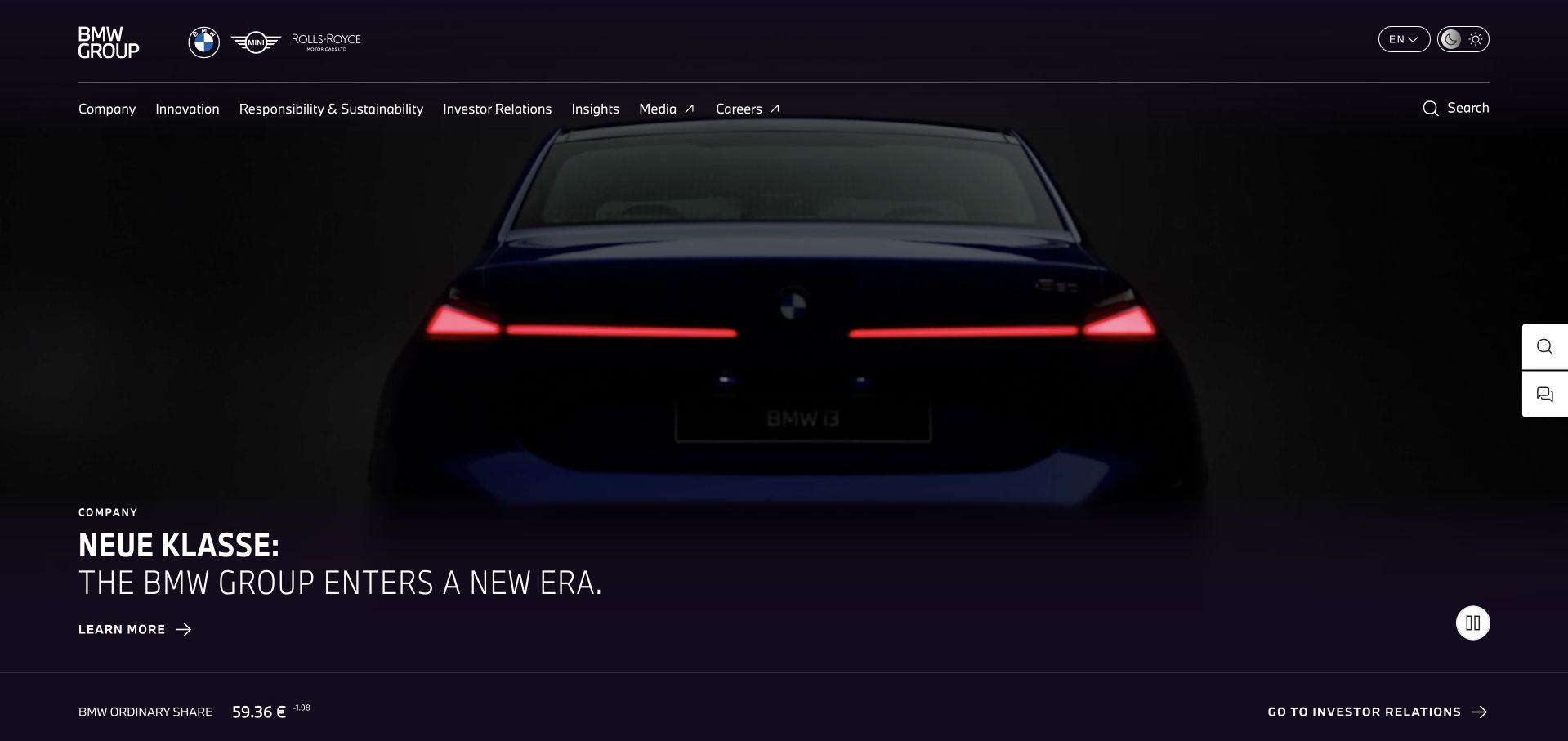
BMW Group’s corporate homepage lets a dark vehicle reveal establish the opening impression. A compact message about the company’s next chapter sits low on the image, while the primary navigation remains company-oriented rather than functioning as a vehicle configurator. A separate stock-information band gives investors a recurring reference point without competing directly with the campaign. The page is useful because it distinguishes a group-level story from a consumer sales journey. The darkness also makes the presentation dependent on image quality and contrast. This collection’s SQL Server evidence for BMW is explicitly historical Microsoft customer documentation, not a claim about the current corporate website’s runtime.
What you can learn
A parent-company page can use a flagship product as evidence of direction, but it should retain its institutional purpose. Keep strategy, responsibility, news and investor routes distinct from the detailed consumer configuration process.
Pros
The product reveal creates a strong visual statement without a crowded introduction.
Investor information is separated from the campaign in a stable horizontal band.
Cons & considerations
Dark imagery can conceal important product details on low-quality displays.
A dramatic reveal does not explain the group’s full business or geographic scope.
Platform source: Historical official Microsoft presentation, page 24. BMW Group is explicitly shown in the customer-logo grid headed Customers using SQL Server for Tier 1 on page 24 of Microsoft’s April 6, 2017 presentation. This is a historical organization-level association with no specific current workload or version established. This source establishes only the stated organization, product or workload association. It does not prove the pictured public page uses this technology, identify its CMS or frontend, establish a complete current architecture, or independently verify vendor-reported outcomes. Platform evidence is separate from the direct website screenshot and is not a complete current infrastructure audit.
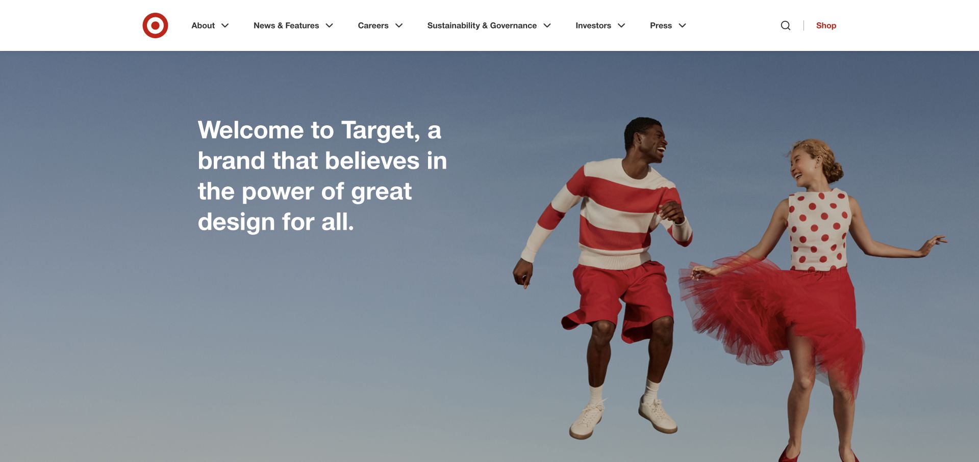
Target’s corporate homepage uses an energetic photograph of people wearing its recognizable red-and-white palette. The introduction is written as a company statement, while the header organizes About, News, Careers, Sustainability, Investors and Press. A separate Shop link acknowledges consumer intent without turning the whole corporate page into a storefront. This is a useful distinction for companies whose public audience extends far beyond buyers. The photograph communicates personality quickly, but the broad design promise needs supporting stories and concrete information below. Target’s SQL Server association here comes from Microsoft’s dated 2017 customer material; no current database or retail implementation is inferred from the photograph.
What you can learn
Make the corporate site feel like the same brand without duplicating the shop. Preserve an obvious shopping exit, then use the remaining structure to answer questions about the organization, its work, people and responsibilities.
Pros
The red-and-white image carries brand recognition without relying on repeated logos.
A separate Shop route prevents consumer visitors from becoming stranded in corporate content.
Cons & considerations
A broad company statement needs concrete supporting evidence further down the page.
Large lifestyle photography should have a useful responsive crop and descriptive alternative.
Platform source: Historical official Microsoft presentation, page 24. Target is explicitly shown in the customer-logo grid headed Customers using SQL Server for Tier 1 on page 24 of Microsoft’s April 6, 2017 presentation. This is a historical organization-level association with no specific current workload or version established. This source establishes only the stated organization, product or workload association. It does not prove the pictured public page uses this technology, identify its CMS or frontend, establish a complete current architecture, or independently verify vendor-reported outcomes. Platform evidence is separate from the direct website screenshot and is not a complete current infrastructure audit.
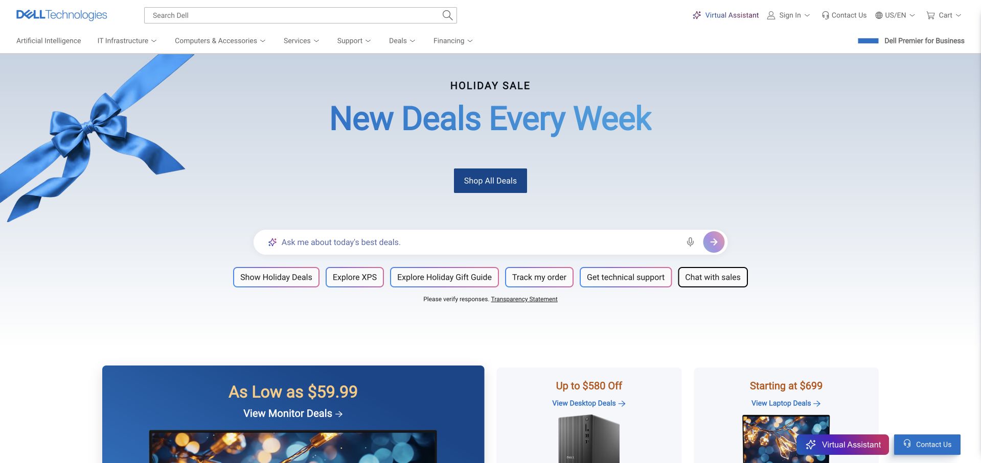
Dell’s captured US homepage leads with a pale blue holiday promotion, a short offer headline and a clearly contrasting shop action. Search occupies a major position in the header, and a row of practical shortcuts includes order tracking, technical support and sales contact. The arrangement recognizes that visitors may be evaluating a computer or maintaining one they already own. That is a useful lesson for any technology retailer with a long customer lifecycle. Promotional language remains broad until a visitor chooses a category, so comparison content and eligibility details need to be easy to reach. The SQL Server evidence is historical organization-level documentation rather than proof of this storefront’s backend.
What you can learn
Do not treat every returning visitor as a new lead. Keep ownership tasks visible beside commercial discovery, and use the promotional hero as one route among several rather than the only meaningful action.
Pros
A large search field supports specific product and support needs.
Order tracking and technical-help shortcuts acknowledge the post-purchase customer journey.
Cons & considerations
A general sale message provides little help choosing between product families.
Promotional terms and product comparisons require clear destinations beyond the opening panel.
Platform source: Historical official Microsoft presentation, page 24. Dell is explicitly shown in the customer-logo grid headed Customers using SQL Server for Tier 1 on page 24 of Microsoft’s April 6, 2017 presentation. This is a historical organization-level association with no specific current workload or version established. This source establishes only the stated organization, product or workload association. It does not prove the pictured public page uses this technology, identify its CMS or frontend, establish a complete current architecture, or independently verify vendor-reported outcomes. Platform evidence is separate from the direct website screenshot and is not a complete current infrastructure audit.
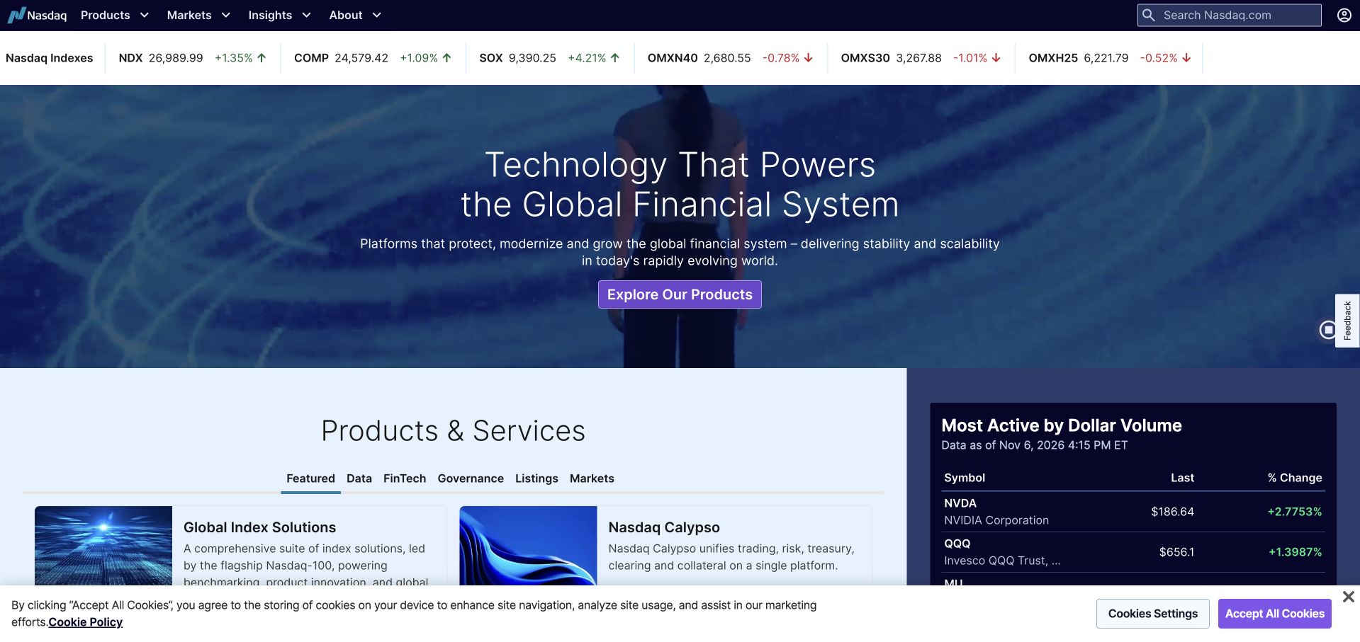
Nasdaq’s homepage combines a dark technology-oriented hero with a strip of market information and a structured products section. The contrast between the broad global-finance statement and the smaller operational data makes the page feel connected to a working financial environment. Product tabs below the hero offer a route into more specific services rather than extending the corporate introduction indefinitely. The design is informative but dense, and market numbers should always be understood in their stated date and source context. Nasdaq’s inclusion is based on historical Microsoft SQL Server customer documentation, not an independent verification of its present trading systems or this marketing page.
What you can learn
Use live or dated reference information to support the page’s purpose, not merely as decoration. Keep timestamps, data meanings and product routes understandable, especially when expert and general audiences share the same screen.
Pros
Market context makes the technology proposition feel connected to an actual industry task.
Tabbed product groupings provide a more concrete next step than a single generic contact action.
Cons & considerations
Financial data and navigation compete for attention in a relatively small area.
Market figures need clear timing and accessibility rather than relying on visual color changes.
Platform source: Historical official Microsoft presentation, page 24. Nasdaq is explicitly shown in the customer-logo grid headed Customers using SQL Server for Tier 1 on page 24 of Microsoft’s April 6, 2017 presentation. This is a historical organization-level association with no specific current workload or version established. This source establishes only the stated organization, product or workload association. It does not prove the pictured public page uses this technology, identify its CMS or frontend, establish a complete current architecture, or independently verify vendor-reported outcomes. Platform evidence is separate from the direct website screenshot and is not a complete current infrastructure audit.
MSC’s homepage pairs a large container-vessel photograph with a compact operational panel for tracking, schedules and contacts. The central brand mark and yellow accents are recognizable without overwhelming the shipping task. The design is particularly useful because a returning customer does not need to navigate through a corporate narrative before finding the tool they came for. Broader solutions and company information remain available elsewhere on the page. The approach depends on careful form design: reference types, search labels and errors must remain understandable when the panel is reduced on mobile. Microsoft’s recent SQL Server case concerns MSC’s documented operational-data environment, not an inspection of every public shipping tool.
What you can learn
Put the repeat operational task close to the entry point. For a logistics business, tracking or schedules may be more useful than a generic lead form, provided the interface clearly explains the input and does not obscure service discovery.
Pros
The tracking panel gives returning customers an immediate practical destination.
A real vessel image establishes the service context without additional explanatory copy.
Cons & considerations
Compact tabs need clear selected states and a logical keyboard order.
Different shipment-reference formats require helpful labels and useful error messages.
Visible tech stack
Earlier / documented evidence
Microsoft SQL Server
Platform source: Official product-specific customer case. Microsoft’s May 20, 2026 MSC case describes SQL Server 2025 operational-data work and integration with Fabric. This source establishes only the stated organization, product or workload association. It does not prove the pictured public page uses this technology, identify its CMS or frontend, establish a complete current architecture, or independently verify vendor-reported outcomes. Platform evidence is separate from the direct website screenshot and is not a complete current infrastructure audit.
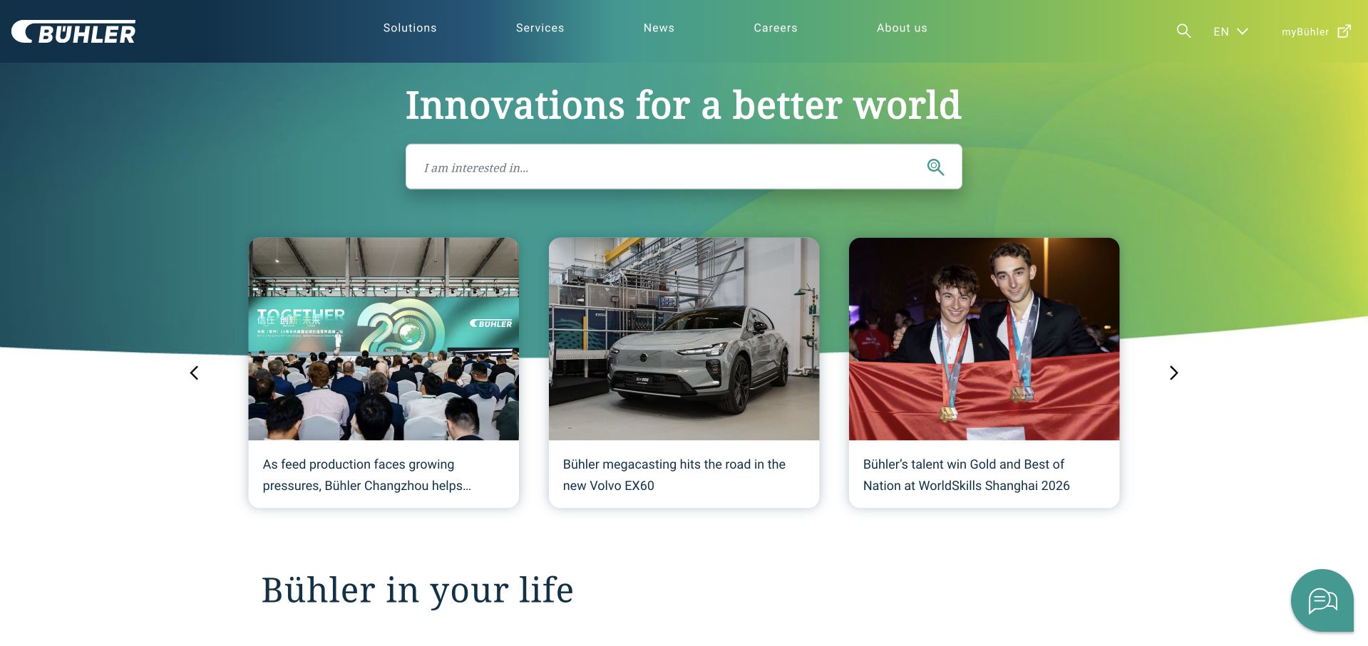
Bühler’s homepage opens with a broad innovation statement and a prominent search field, then brings three current stories into the same visual composition. The green-to-blue gradient gives the page an identifiable frame, while photographs of applications and people provide concrete entry points. Search is important here because the company’s product and industry range is wider than a small set of hero buttons could comfortably explain. The editorial cards add freshness but also compete with the introductory search task. Microsoft’s SQL Server 2025 source describes Bühler India’s proof-of-concept and early-adoption context; it is not presented as evidence of a company-wide production rollout.
What you can learn
For a broad industrial catalog, make discovery the hero’s functional purpose. Support search with a small number of meaningful application stories, but keep the distinction between a current news item and a durable product category clear.
Pros
A prominent search field supports visitors with specific industrial requirements.
Current application stories make a broad innovation statement more concrete.
Cons & considerations
Several editorial cards can compete with the search task for attention.
A general company proposition needs clearer industry context for first-time buyers.
Platform source: Official product-specific customer case. Microsoft’s November 10, 2025 Bühler India case describes SQL Server 2025 proof-of-concept and early-adoption testing. It is not evidence of a completed company-wide production rollout. This source establishes only the stated organization, product or workload association. It does not prove the pictured public page uses this technology, identify its CMS or frontend, establish a complete current architecture, or independently verify vendor-reported outcomes. Platform evidence is separate from the direct website screenshot and is not a complete current infrastructure audit.
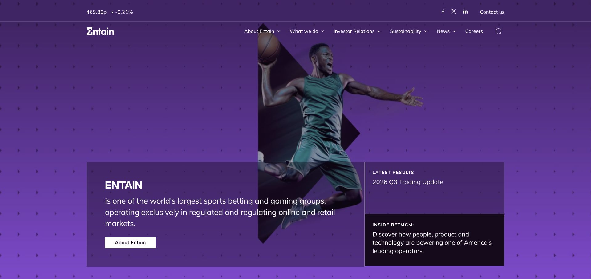
Entain’s corporate homepage uses a vivid purple field, sport imagery and a short company explanation. A current-results panel sits beside the introduction, making investor material part of the opening rather than a distant footer link. The header remains focused on the group, its activities, responsibility, news and careers. This is an informative reference for a regulated multi-brand organization, not a gambling transaction interface. The visual energy is strong, but a broad company label cannot explain the distinct brands, markets or regulatory conditions by itself. Microsoft’s case describes SQL Server estate management with Azure Arc, not this corporate homepage’s application stack.
What you can learn
Keep corporate and transactional responsibilities separate. A parent-group site can explain its operating context and current results while directing readers to detailed governance, market and responsibility information without encouraging a transaction in the same space.
Pros
The results panel gives recurring investor information a visible place near the introduction.
A consistent purple system creates a distinctive corporate identity.
Cons & considerations
The opening cannot communicate all brand and jurisdiction differences on its own.
Overlay panels and active imagery need strong contrast and reduced-motion support.
Platform source: Official product-specific customer case. Microsoft’s Entain case describes SQL Server estate management with Azure Arc in the documented operational environment. This source establishes only the stated organization, product or workload association. It does not prove the pictured public page uses this technology, identify its CMS or frontend, establish a complete current architecture, or independently verify vendor-reported outcomes. Platform evidence is separate from the direct website screenshot and is not a complete current infrastructure audit.
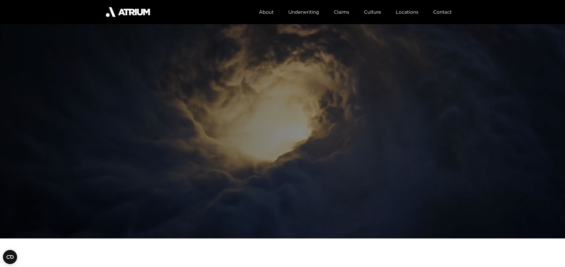
Atrium’s homepage uses a dark, cinematic opening image under a compact black header. The company’s explanatory content follows with a direct statement about protecting clients and a separate claims section. That sequencing is useful for a specialist insurer: the service is not only underwriting a policy, but responding when the client needs it. The header gives underwriting, claims, culture, locations and contact distinct positions. The visual treatment can feel more like a film introduction than an information page, so the essential proposition should remain easy to reach without waiting for motion. Microsoft’s source documents a SQL Server 2022 data-estate project, not the public marketing site’s database.
What you can learn
For a service that is tested later, explain the after-purchase experience early. Clear claims, support or response information can provide a more meaningful trust signal than a sequence of abstract corporate promises.
Pros
Claims receives a named, visible route rather than being hidden inside support.
A compact header keeps specialist service categories understandable.
Cons & considerations
An atmospheric opening can delay practical information for task-oriented visitors.
Video-based storytelling needs a stable text alternative and predictable loading behavior.
Platform source: Official product-specific customer case. Microsoft’s Atrium Underwriters case describes a SQL Server 2022 data-estate modernization project. This source establishes only the stated organization, product or workload association. It does not prove the pictured public page uses this technology, identify its CMS or frontend, establish a complete current architecture, or independently verify vendor-reported outcomes. Platform evidence is separate from the direct website screenshot and is not a complete current infrastructure audit.
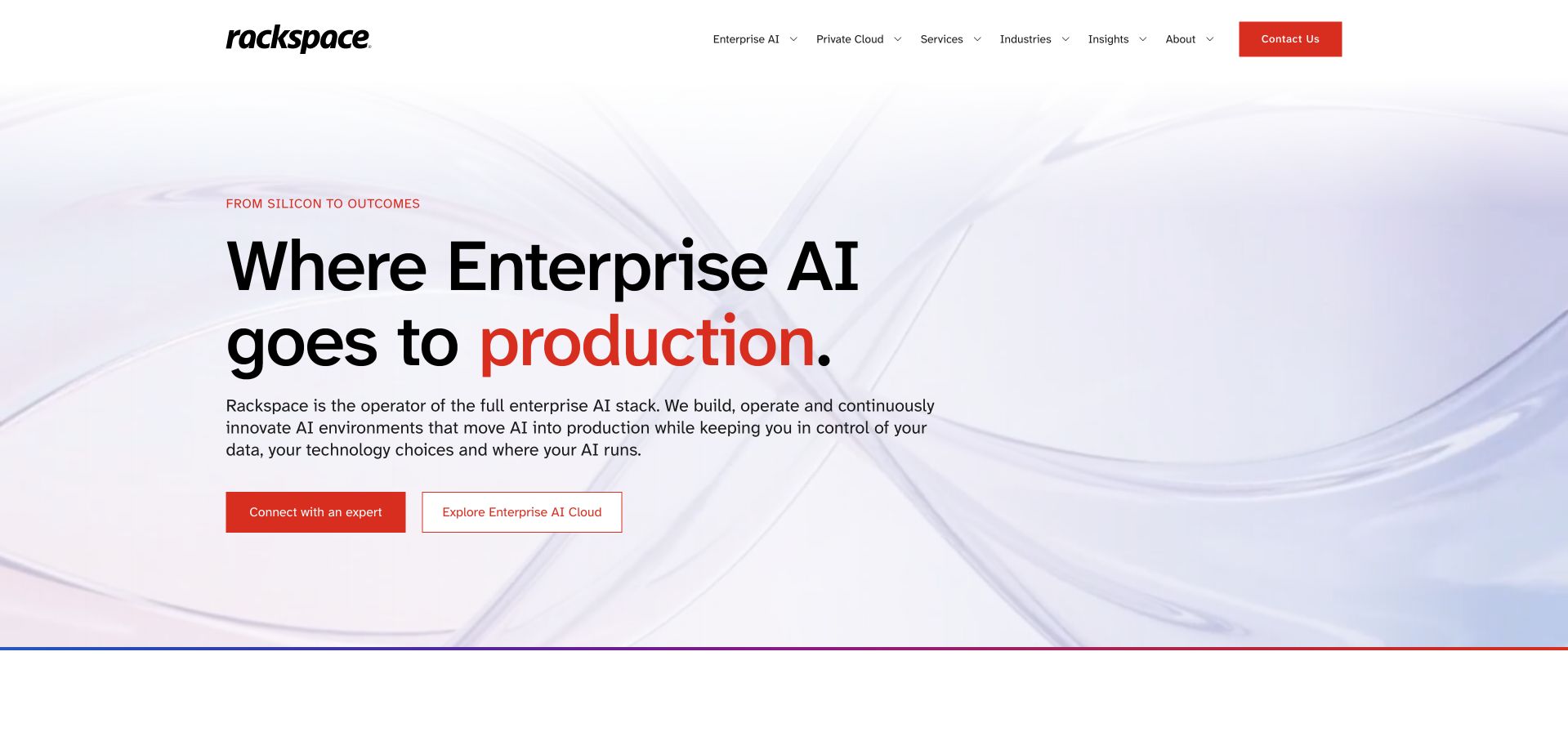
Rackspace’s homepage uses a pale abstract background, a large black headline and a red emphasis word to introduce its enterprise-AI positioning. Supporting text explains an operating role, and the two main actions separate speaking to an expert from exploring the offering. The design does not depend on a dashboard collage to establish technical credibility; the hierarchy and explanatory copy do most of the work. This makes the opening easier to scan than a dense capability matrix. The proposition is still broad, so infrastructure, data and operational responsibilities need detailed supporting pages. Microsoft’s SQL Server source concerns Azure Arc-enabled estate management, not proof of this page’s runtime.
What you can learn
A technical service can be introduced through responsibility rather than feature count. State what the provider operates, what the customer retains control over and where the detailed evaluation begins, then let the visual treatment support that distinction.
Pros
A restrained background gives the headline and explanation strong visual separation.
Two distinct actions support both exploratory and sales-ready visitors.
Cons & considerations
A broad full-stack claim requires concrete scope and exclusions in supporting content.
A large headline should not push the practical service explanation below the fold on mobile.
Platform source: Official product-specific customer case. Microsoft’s Rackspace case describes SQL Server enabled by Azure Arc for its documented licensing and estate-management context. This source establishes only the stated organization, product or workload association. It does not prove the pictured public page uses this technology, identify its CMS or frontend, establish a complete current architecture, or independently verify vendor-reported outcomes. Platform evidence is separate from the direct website screenshot and is not a complete current infrastructure audit.
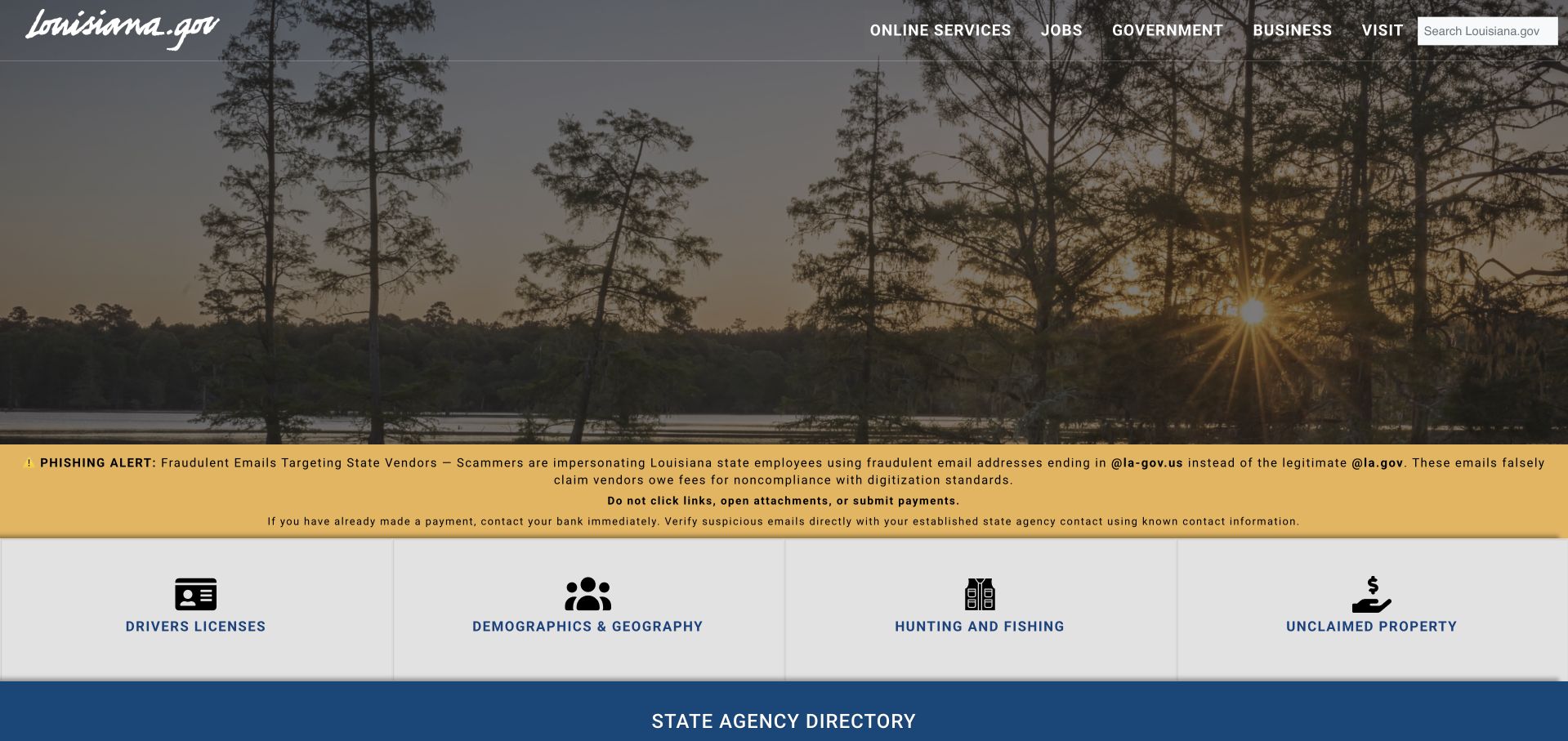
Louisiana’s official portal combines a landscape photograph with a conspicuous phishing alert and a row of common service shortcuts. The opening does not attempt to explain every state agency. Instead, it offers recognizable tasks such as driver licensing, demographics, hunting and fishing, and unclaimed property, followed by a larger agency-directory route. The yellow warning is visually distinct from both navigation and service cards, which helps communicate urgency without disguising it as promotion. A portal this broad still needs excellent search and consistent destination labeling. Microsoft’s SQL Server evidence describes government database-estate governance, not the backend of every service linked from the public portal.
What you can learn
Public portals should prioritize urgent notices and high-frequency tasks over an institutional introduction. Use plain labels, distinguish official destinations and preserve a directory route for people whose needs do not fit the first few shortcuts.
Pros
The security warning is visually separated from routine service navigation.
Common-task cards reduce the need to understand agency names before starting.
Cons & considerations
A small shortcut set cannot represent the full range of public-service needs.
Linked services need consistent ownership and accessibility cues across different domains.
Platform source: Official product-specific customer case. Microsoft’s State of Louisiana case describes SQL Server estate governance with Azure Arc. This source establishes only the stated organization, product or workload association. It does not prove the pictured public page uses this technology, identify its CMS or frontend, establish a complete current architecture, or independently verify vendor-reported outcomes. Platform evidence is separate from the direct website screenshot and is not a complete current infrastructure audit.
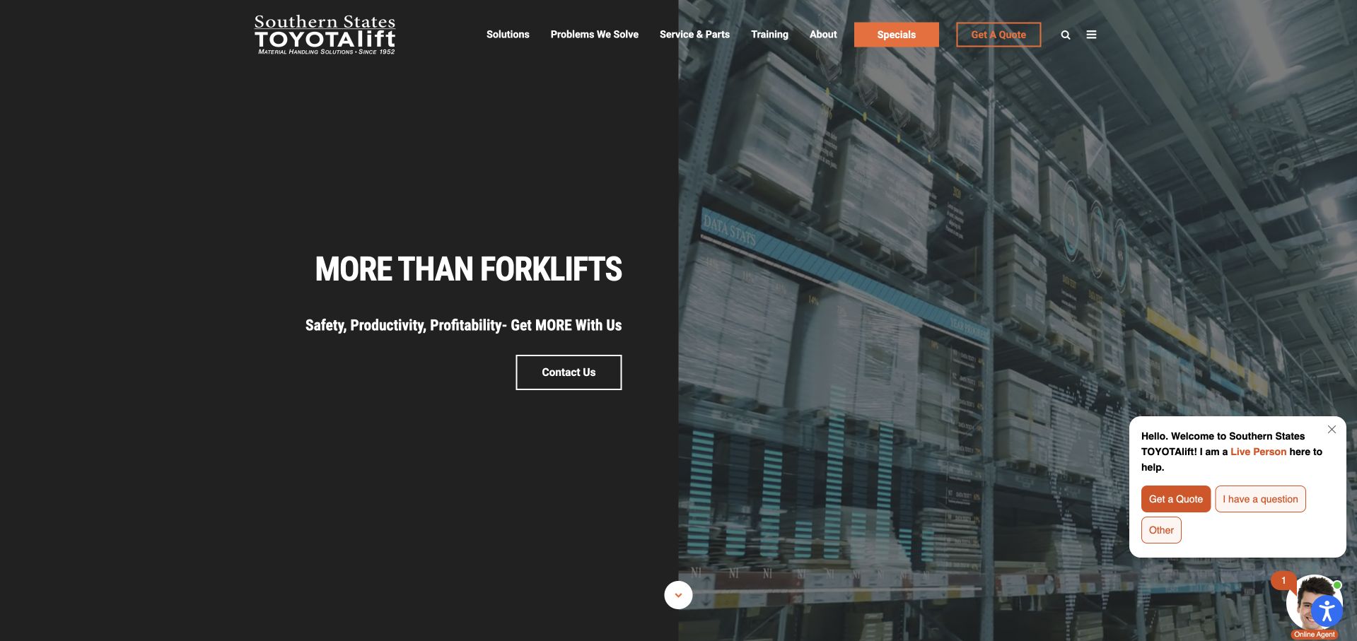
Southern States TOYOTAlift’s homepage divides its hero between a dark statement panel and warehouse imagery. The introduction emphasizes a broader material-handling relationship rather than a single forklift model, while navigation separates solutions, problems, service, training and company information. Further sections make rental and equipment routes explicit. This is useful for a business whose customer may need a machine, a repair or operational advice. The opening remains concise, though a generic contact action could be more specific about the next step. Microsoft links its Southern States Material Handling case directly to this company’s website and describes SQL Server as an operational source in a Fabric analytics project.
What you can learn
Industrial buyers often arrive with different levels of urgency. Separate equipment discovery, rental, service and training early, and make the response path specific enough that a customer knows what information to prepare.
Pros
The split hero keeps the core proposition readable beside working-environment imagery.
Service and training are visible alongside equipment-related navigation.
Cons & considerations
A broad contact action gives limited guidance about the expected next step.
Floating chat controls should not cover service content or important mobile actions.
Platform source: Official product-specific customer case. Microsoft’s January 20, 2026 Southern States Material Handling case identifies SQL Server among operational data sources for a Fabric analytics project. Microsoft links the named customer directly to sstlift.com; the site brands itself Southern States TOYOTAlift. This source establishes only the stated organization, product or workload association. It does not prove the pictured public page uses this technology, identify its CMS or frontend, establish a complete current architecture, or independently verify vendor-reported outcomes. Platform evidence is separate from the direct website screenshot and is not a complete current infrastructure audit.
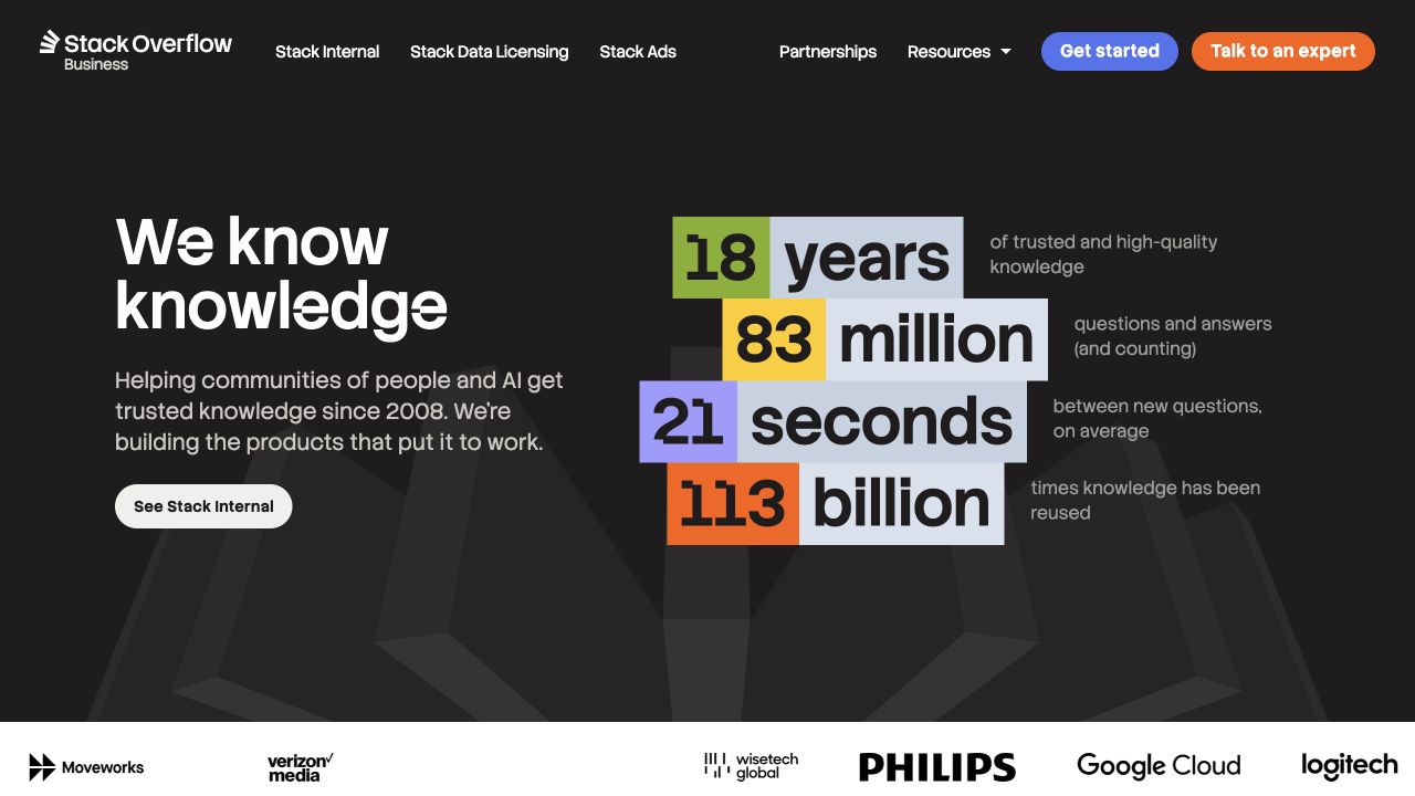
Stack Overflow’s business homepage uses a dark field and brightly colored number blocks to introduce the scale of its knowledge base. A short proposition sits to the left, with separate actions for exploring the enterprise product and speaking to the company. Customer logos provide a compact supporting band below. The layout is effective because the figures are organized as a visual system rather than scattered across several unrelated cards. Their definitions still matter: a large number can impress without explaining what the product actually does for a team. The SQL Server association is historical engineering documentation from 2016, not a claim about this current business homepage.
What you can learn
Use scale figures to support a product explanation, not replace one. Define what each number measures, connect the proof to the buyer’s task and provide a clear route into the actual workflow or documentation.
Pros
Colored metric blocks establish a clear hierarchy without filling the screen with charts.
Separate exploration and sales actions accommodate different evaluation stages.
Cons & considerations
Large figures need definitions and dates to be meaningful evidence.
A familiar community brand still needs to explain its enterprise product distinctly.
Platform source: First-party engineering architecture account, February 2016. Stack Overflow’s February 17, 2016 architecture article links directly to author and engineer Nick Craver’s detailed account, which explicitly identifies Microsoft SQL Servers in the architecture at that time. This is historical Q&A-platform evidence, not the current business homepage runtime. This source establishes only the stated organization, product or workload association. It does not prove the pictured public page uses this technology, identify its CMS or frontend, establish a complete current architecture, or independently verify vendor-reported outcomes. Platform evidence is separate from the direct website screenshot and is not a complete current infrastructure audit.
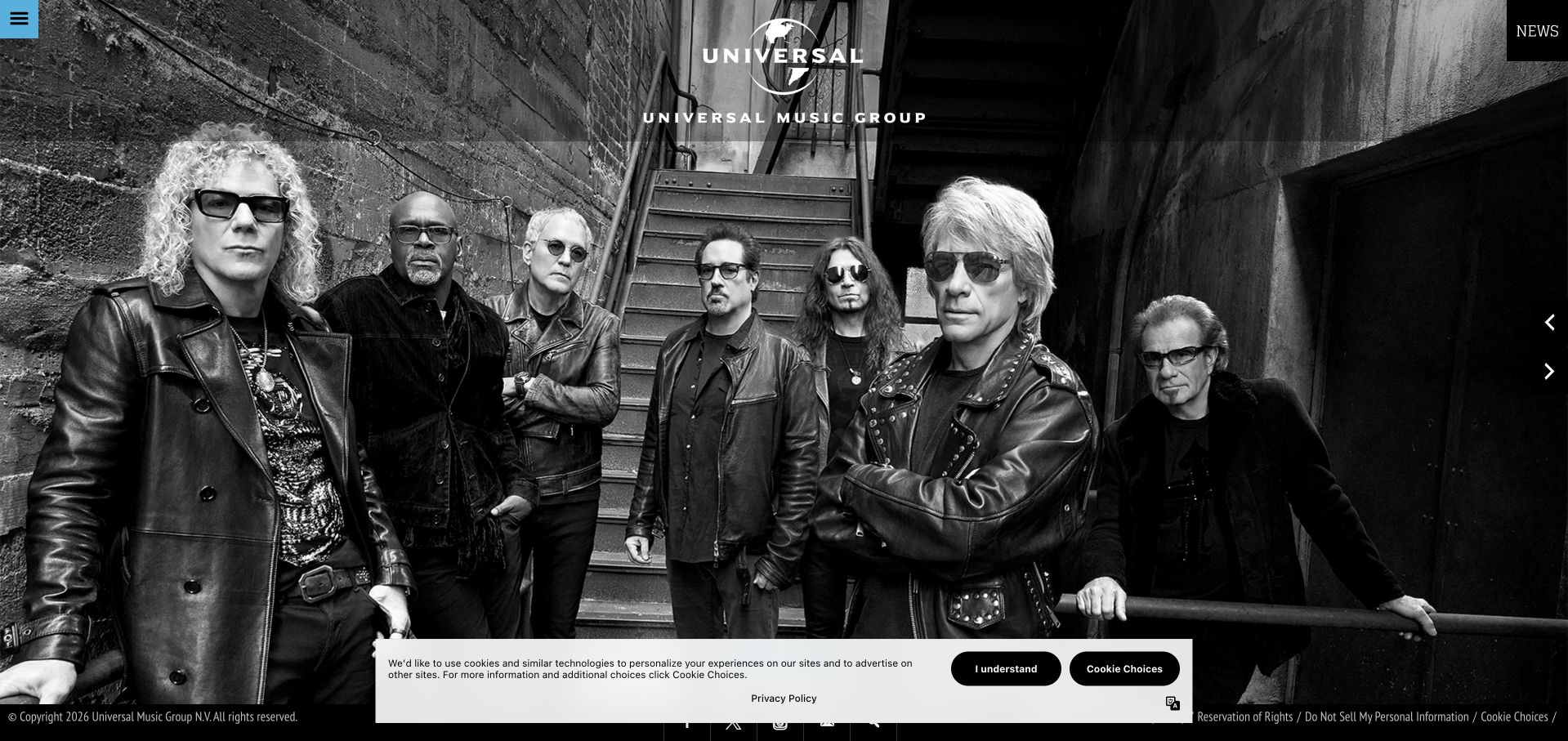
Universal Music Group’s homepage makes the artist image the dominant opening element, with the company mark centered over the photograph and navigation kept at the edges. The captured black-and-white band portrait communicates the organization’s creative world more quickly than a conventional corporate paragraph. Company news and institutional information follow elsewhere on the page. This approach is compelling for a highly familiar entertainment category, but it is less useful for visitors who need a specific label, artist or business contact immediately. Those tasks depend on strong search and navigation. The SQL Server relationship shown in this collection is explicitly historical Microsoft customer evidence, not current music-platform infrastructure verification.
What you can learn
A creative organization can let its work introduce the brand, but it still needs a dependable information layer. Preserve straightforward access to catalog search, company information and business contacts rather than requiring visitors to interpret the featured image.
Pros
The full-screen artist image gives the company an immediate creative identity.
Minimal navigation chrome keeps attention on the featured work.
Cons & considerations
Sparse navigation can slow visitors who arrive with a specific business task.
Artist imagery needs useful alternative text and readable overlaid brand elements.
Platform source: Historical official Microsoft presentation, page 24. Universal Music Group is explicitly shown in the customer-logo grid headed Customers using SQL Server for Tier 1 on page 24 of Microsoft’s April 6, 2017 presentation. This is a historical organization-level association with no specific current workload or version established. This source establishes only the stated organization, product or workload association. It does not prove the pictured public page uses this technology, identify its CMS or frontend, establish a complete current architecture, or independently verify vendor-reported outcomes. Platform evidence is separate from the direct website screenshot and is not a complete current infrastructure audit.
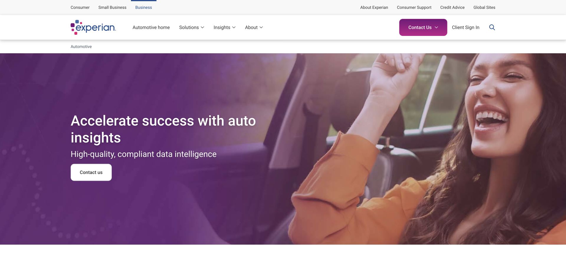
Experian’s automotive page uses a recognizable driving photograph beside a short industry-focused headline and a direct contact action. The upper utility navigation separates Consumer, Small Business and Business, while the local navigation identifies the automotive section and its own solutions, insights and company routes. This layered structure is valuable because it prevents a specialist buyer from mistaking the page for the consumer credit service. It also demonstrates how one brand can support different information architectures without losing visual continuity. The page shown is a public automotive-business destination, selected instead of a personalized consumer homepage. The SQL Server association remains a historical organization-level Microsoft listing.
What you can learn
Make the local business context explicit when one brand serves very different markets. Preserve a clear parent navigation, then give the specialist section its own descriptive title, relevant resources and an appropriately scoped conversion route.
Pros
Audience labels distinguish business research from consumer account services.
The automotive-specific introduction gives specialist buyers immediate context.
Cons & considerations
Two navigation layers can become cumbersome when reduced to a mobile menu.
A broad data-intelligence claim still requires concrete product definitions and limitations.
Platform source: Historical official Microsoft presentation, page 24. Experian is explicitly shown in the customer-logo grid headed Customers using SQL Server for Tier 1 on page 24 of Microsoft’s April 6, 2017 presentation. This is a historical organization-level association with no specific current workload or version established. This source establishes only the stated organization, product or workload association. It does not prove the pictured public page uses this technology, identify its CMS or frontend, establish a complete current architecture, or independently verify vendor-reported outcomes. Platform evidence is separate from the direct website screenshot and is not a complete current infrastructure audit.
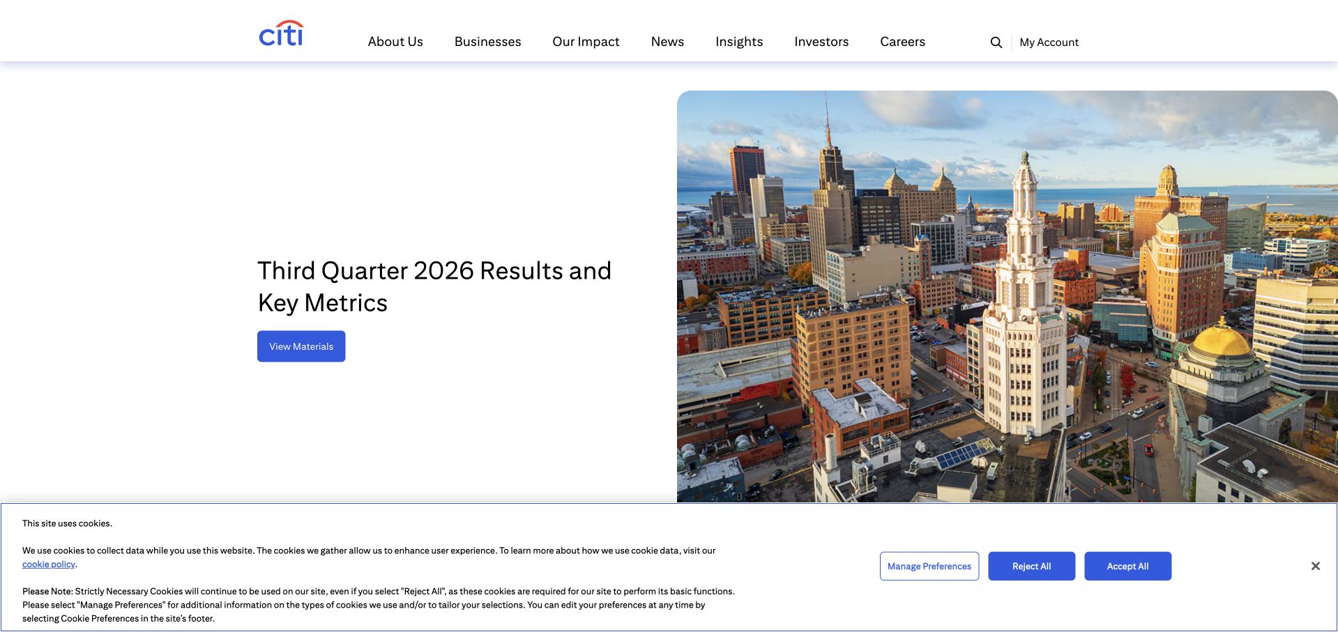
Citi’s corporate homepage places the latest quarterly-results message beside a city photograph, with a concise View Materials action. The header groups company information, businesses, impact, news, insights, investors and careers. The result is a clear institutional page rather than a retail account landing screen. The city image provides context without competing with the current business update, and the next section begins a broader company explanation. A results-led hero is useful only while the material stays dated and easy to distinguish from evergreen information. Citi’s SQL Server association in this guide comes from a historical 2017 Microsoft customer presentation, not a current infrastructure audit.
What you can learn
Recurring business updates deserve a stable, clearly dated destination. Use the homepage to spotlight the latest material, while preserving ordinary company and investor routes for people researching a different period or a more general question.
Pros
A single results action makes the current investor update easy to identify.
The corporate navigation acknowledges several distinct institutional audiences.
Cons & considerations
A results-led opening may not explain the company to an unfamiliar visitor.
Quarterly material needs clear dates and an accessible archive beyond the hero.
Visible tech stack
Earlier / documented evidence
Microsoft SQL Server
Platform source: Historical official Microsoft presentation, page 24. Citi is explicitly shown in the customer-logo grid headed Customers using SQL Server for Tier 1 on page 24 of Microsoft’s April 6, 2017 presentation. This is a historical organization-level association with no specific current workload or version established. This source establishes only the stated organization, product or workload association. It does not prove the pictured public page uses this technology, identify its CMS or frontend, establish a complete current architecture, or independently verify vendor-reported outcomes. Platform evidence is separate from the direct website screenshot and is not a complete current infrastructure audit.
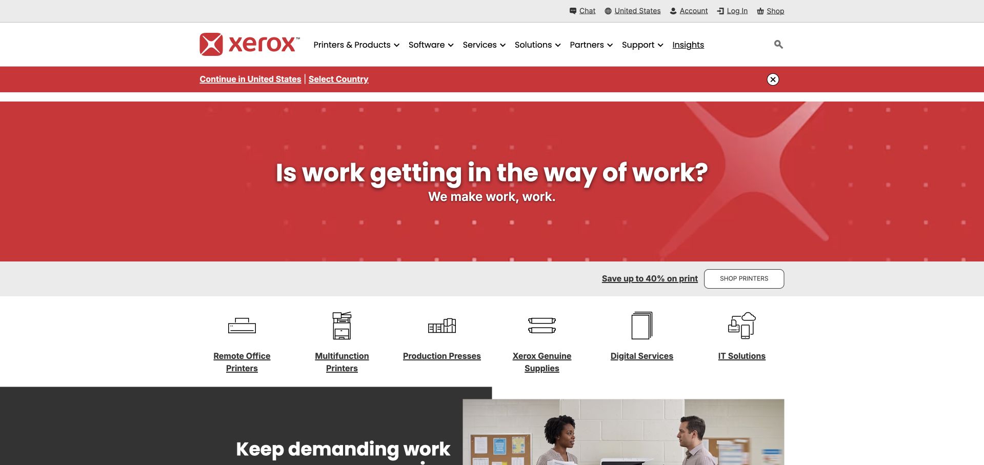
Xerox’s homepage uses a red brand panel, a short question about work and a compact supporting statement before introducing product and service categories. The next row makes remote-office printers, multifunction devices, production equipment, supplies and digital services visible as separate destinations. The layout retains the recognition of a familiar manufacturer while broadening the offer beyond a single machine. The useful lesson is the transition from a positioning statement into concrete categories. The opening slogan would be too abstract without that second layer. The SQL Server evidence is a historical organization-level customer reference, not proof of a current printer service, account platform or public homepage implementation.
What you can learn
When repositioning an established brand, connect the new message to recognizable choices quickly. A broad statement can introduce direction, but visitors still need concrete categories that explain what they can buy, use or get help with.
Pros
A strong red panel preserves brand recognition while presenting a broader service message.
The category row turns an abstract proposition into practical destinations.
Cons & considerations
The opening question alone offers little guidance about specific products.
Small category icons need descriptive labels and sufficient touch spacing on mobile.
Platform source: Historical official Microsoft presentation, page 24. Xerox is explicitly shown in the customer-logo grid headed Customers using SQL Server for Tier 1 on page 24 of Microsoft’s April 6, 2017 presentation. This is a historical organization-level association with no specific current workload or version established. This source establishes only the stated organization, product or workload association. It does not prove the pictured public page uses this technology, identify its CMS or frontend, establish a complete current architecture, or independently verify vendor-reported outcomes. Platform evidence is separate from the direct website screenshot and is not a complete current infrastructure audit.
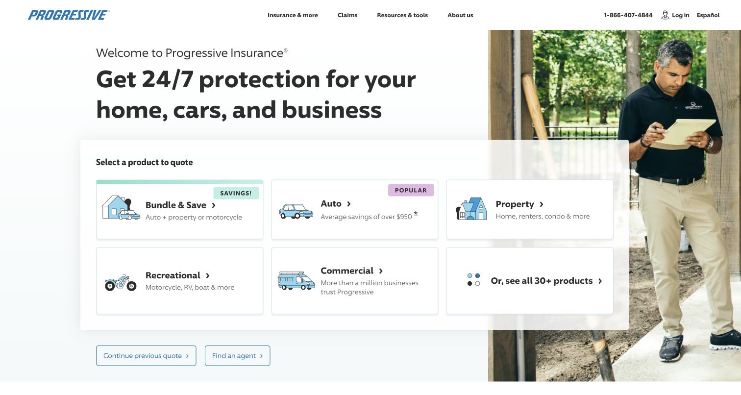
Progressive’s public homepage pairs a short insurance proposition with a prominent product-selection panel. Bundled coverage, auto, property, recreational and commercial options appear as labeled cards, while an additional route acknowledges the wider catalog. The photograph gives the page a human context, but the selection interface is the practical center of the composition. This is useful when the visitor’s first decision determines most of the following journey. The risk is oversimplification: product availability, coverage details and quote conditions still need explanation after the choice. Progressive’s SQL Server inclusion is based on dated Microsoft customer material rather than a verified current quoting-system architecture.
What you can learn
Ask the smallest useful qualifying question first. A clear product choice can reduce an overwhelming service catalog, provided the next step explains conditions and lets people correct a mistaken selection without starting over.
Pros
Labeled product cards give visitors a practical first decision.
A wider-catalog route avoids pretending the visible options cover every need.
Cons & considerations
Coverage differences cannot be communicated adequately by small category cards.
The quote journey needs clear conditions and accessible recovery from a wrong choice.
Platform source: Historical official Microsoft presentation, page 24. Progressive is explicitly shown in the customer-logo grid headed Customers using SQL Server for Tier 1 on page 24 of Microsoft’s April 6, 2017 presentation. This is a historical organization-level association with no specific current workload or version established. This source establishes only the stated organization, product or workload association. It does not prove the pictured public page uses this technology, identify its CMS or frontend, establish a complete current architecture, or independently verify vendor-reported outcomes. Platform evidence is separate from the direct website screenshot and is not a complete current infrastructure audit.
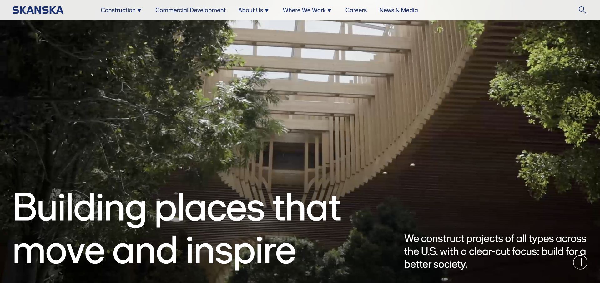
Skanska’s US homepage lets a large architectural interior establish the opening impression, with an oversized white statement and a short regional explanation placed over the image. The header separates construction, commercial development, company information, locations, careers and media. This makes the page feel like an introduction to a working construction business rather than a detached image gallery. The photograph communicates spatial quality, but it cannot establish the company’s role or project scope by itself. Those details need to appear in project and service pages. The SQL Server association is historical Microsoft documentation; no present project system or public-site database is inferred from the image.
What you can learn
Use project imagery to introduce the experience of a place, then explain the company’s actual contribution. Regional scope, delivery role and service categories matter more to a prospective client than an impressive photograph without context.
Pros
A real architectural environment gives the company proposition an immediate spatial context.
Service and location routes remain visible in a restrained header.
Cons & considerations
Overlaid white text needs reliable contrast across moving or changing imagery.
Project photographs alone cannot establish delivery responsibilities or technical capabilities.
Platform source: Historical official Microsoft presentation, page 24. Skanska is explicitly shown in the customer-logo grid headed Customers using SQL Server for Tier 1 on page 24 of Microsoft’s April 6, 2017 presentation. This is a historical organization-level association with no specific current workload or version established. This source establishes only the stated organization, product or workload association. It does not prove the pictured public page uses this technology, identify its CMS or frontend, establish a complete current architecture, or independently verify vendor-reported outcomes. Platform evidence is separate from the direct website screenshot and is not a complete current infrastructure audit.
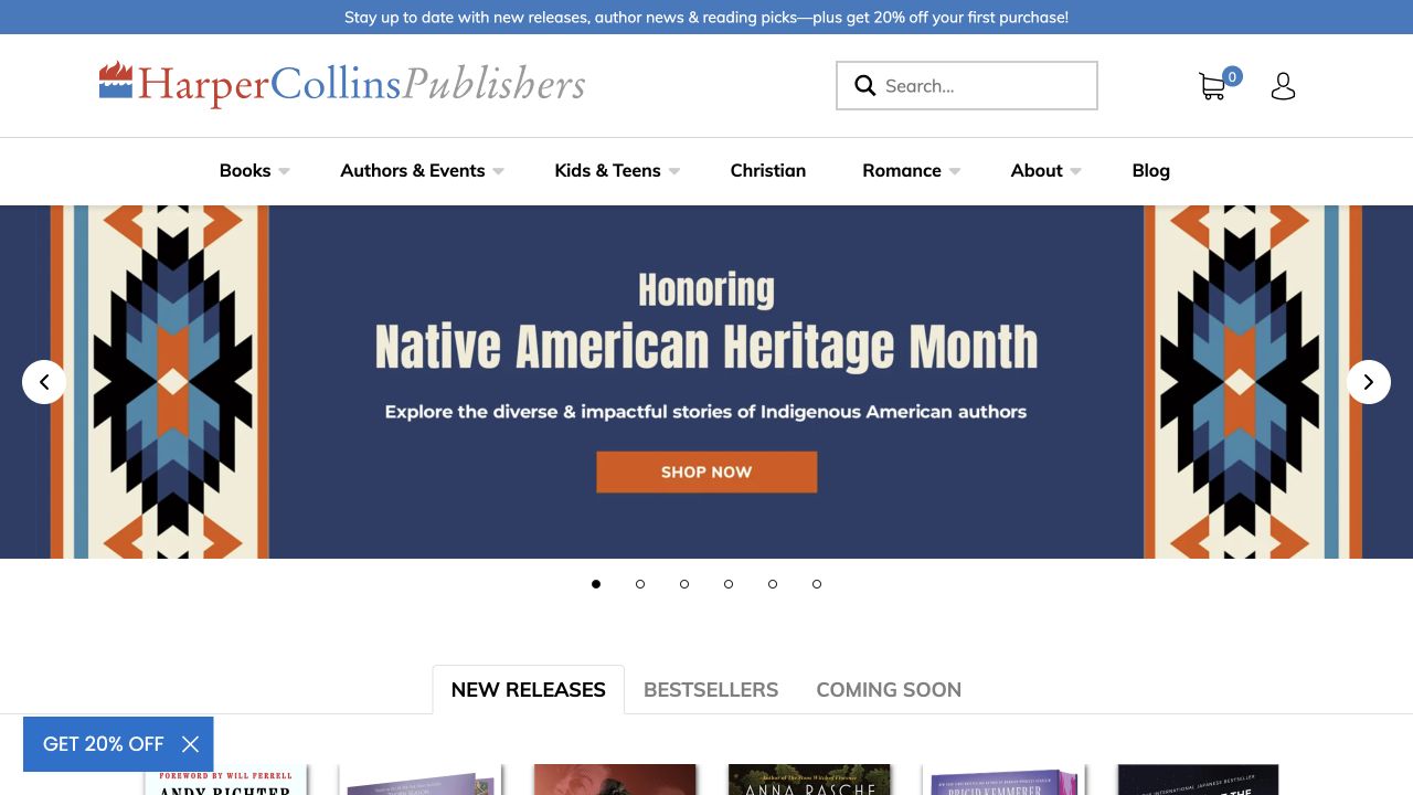
HarperCollins’ homepage gives a seasonal book collection a strong illustrated banner, then begins a conventional tabbed catalog for new releases, bestsellers and coming titles. Search and account controls remain visible in the white header, while category navigation includes books, authors, children’s publishing and other reader interests. The design works because editorial curation and catalog browsing have distinct jobs: the campaign suggests a theme, while the product structure supports a specific search. The campaign must remain current, and detailed book information should not depend on recognizing a cover image. This guide’s SQL Server association is a historical Microsoft customer listing, not a statement about the current ecommerce backend.
What you can learn
Use editorial collections to create a reason to browse, but keep the underlying catalog predictable. Readers should be able to move from a theme to a title, author or format without losing access to ordinary search and category navigation.
Pros
The illustrated campaign gives a seasonal collection a recognizable editorial identity.
Catalog tabs support visitors who prefer conventional book-discovery routes.
Cons & considerations
Seasonal collections need timely updates and a clear route to older material.
Book-cover imagery cannot substitute for accessible title, author and format information.
Platform source: Historical official Microsoft presentation, page 24. HarperCollins is explicitly shown in the customer-logo grid headed Customers using SQL Server for Tier 1 on page 24 of Microsoft’s April 6, 2017 presentation. This is a historical organization-level association with no specific current workload or version established. This source establishes only the stated organization, product or workload association. It does not prove the pictured public page uses this technology, identify its CMS or frontend, establish a complete current architecture, or independently verify vendor-reported outcomes. Platform evidence is separate from the direct website screenshot and is not a complete current infrastructure audit.
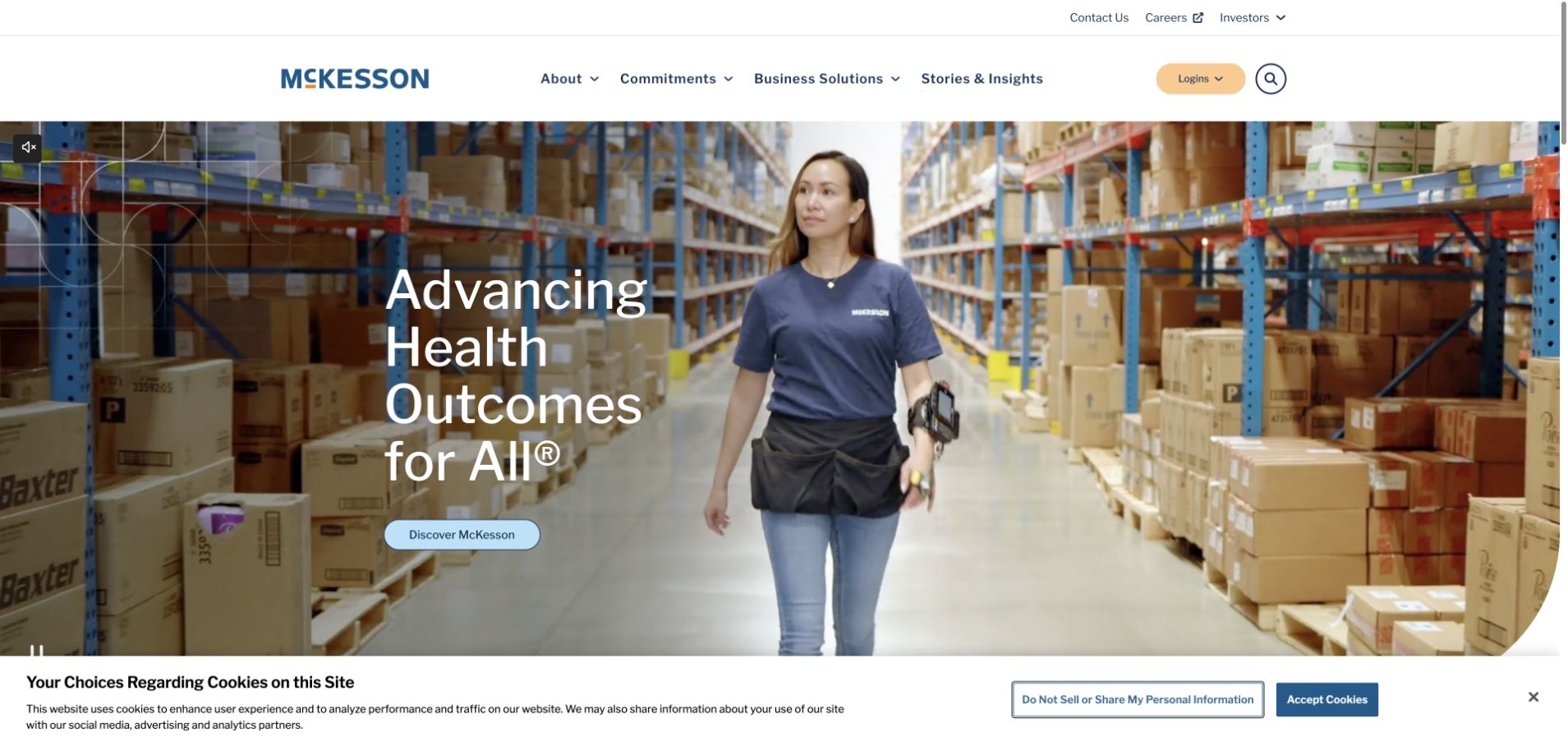
McKesson’s homepage combines a warehouse photograph with a short statement about health outcomes. The image is a useful choice because it points to the organization’s operational role rather than implying that every visitor is seeking direct clinical care. The header separates company information, commitments, business solutions and stories, with login kept as a distinct control. The broad mission is easy to absorb, but detailed audiences and service boundaries still need to appear promptly below the introduction. This collection uses historical Microsoft SQL Server customer documentation for the association; it does not verify any current healthcare database, clinical system or public-site implementation.
What you can learn
Choose imagery that reflects the organization’s actual contribution. A supply-chain or distribution business can communicate its health-related mission through real operational work, then use specific audience routes to explain services and responsibilities.
Pros
Warehouse imagery connects the mission statement to a tangible operating environment.
Business solutions and account access have visibly different destinations.
Cons & considerations
A broad outcomes statement needs concrete service scope nearby.
A large image-led opening can postpone practical routes for repeat business users.
Platform source: Historical official Microsoft presentation, page 24. McKesson is explicitly shown in the customer-logo grid headed Customers using SQL Server for Tier 1 on page 24 of Microsoft’s April 6, 2017 presentation. This is a historical organization-level association with no specific current workload or version established. This source establishes only the stated organization, product or workload association. It does not prove the pictured public page uses this technology, identify its CMS or frontend, establish a complete current architecture, or independently verify vendor-reported outcomes. Platform evidence is separate from the direct website screenshot and is not a complete current infrastructure audit.
Kegan has 15+ years of experience working with small businesses, Fortune 500 companies, and everything in between. No development job is too big or too small: he brings the same hands-on attention to a focused improvement, a complete website, or a custom application.
For Microsoft SQL Server projects, he can help with data modeling, application data access, query design, search and cache integrations, migration planning, access boundaries, and maintainable handover. He works directly with clients on scope, design, implementation, testing, and handover, with an emphasis on clear communication and a system that remains practical to maintain after launch.
Show 3 other Microsoft SQL Server developersHide other Microsoft SQL Server developers
Three ways to approach a SQL Server website project
A website connected to an existing business system
Keep the existing system’s authority clear and build a limited application interface around the required tasks. Document what the website reads, what it may change and how the two systems handle an interrupted operation. Do not give a public form broad database access merely because it connects to a familiar internal platform.
A custom transactional application
Define the relational model, transaction boundaries and user roles alongside the interface prototype. Test the workflows that staff use to resolve exceptions, not only the customer’s successful path. A small number of complete tasks is a better initial milestone than a large collection of empty administrative screens.
An analytics or modernization project
Establish the source-of-truth systems, update schedule and reconciliation rules before designing charts. Explain whether information is live, periodically refreshed or historical. If the project changes hosting or database products, separate migration validation from the visual redesign so that one does not hide errors in the other.
From references to requirements
Plan definitions, operations and rollout together
Inventory the real application estate
List databases, supported versions, integrations, scheduled jobs, reports and manual exports. Identify which are still actively used and who owns them. A website project often reveals undocumented dependencies that are more important than the public interface. Resolve their scope before setting a launch date or promising that an old system can be retired.
Design the permission and recovery model
Define customer, employee, editor and administrator roles separately. Record how credentials are issued and removed, how backups are protected and who performs a restore. Review the actual high-availability and recovery requirements with the operator rather than assuming that an enterprise product automatically supplies the configuration the application needs.
Choose representative records and reports for pre-launch comparison. Include edge cases, old records and unusually large transactions. Rehearse the cutover and document the conditions that would trigger a pause or rollback. Keep a named owner available for post-launch exceptions, because a successful deployment is not the same as a verified business workflow.
A useful handover demonstration
Ask the actual team to carry out its routine job: publish a realistic update, correct a mistake, preview a narrow screen, and identify who owns an integration failure. For a library or frontend framework, also ask who maintains the content source and deployment. A polished screenshot does not answer those operational questions.
Beyond the screenshot
A SQL Server website planning checklist
Name the actual Microsoft database products involved.
Inventory supported versions and application dependencies.
Define stable identifiers and business terms.
Separate source records from aggregated measures.
Record refresh schedules and data freshness labels.
Design customer and staff permissions explicitly.
Protect credentials and restrict public endpoint access.
Test conflicting edits and interrupted transactions.
Verify backups through a restore rehearsal.
Reconcile reports and representative records before launch.
Document cutover, rollback and support ownership.
Test the interface on mobile, keyboard and slow connections.
Test with real content, a keyboard, a small screen, slow or failed requests, and the people who will maintain the system. These are planning checks, not an accessibility, security, performance, or search-ranking certification.
Sources & editorial method
How this Microsoft SQL Server collection was reviewed
Public pages and actual browser captures were independently inspected. Microsoft customer stories, a historical Microsoft presentation and a first-party engineering article support only the stated SQL Server scope. Proof-of-concept, migration, historical and organizational references are distinguished from current production claims; vendor outcomes were not independently tested.
Every image is an unmodified capture from the actual website, with its source and capture date. Some captures are reused from our shared catalog; their dates remain the original capture dates. None comes from a vendor gallery or a generated reconstruction. Moving imagery and live content can change.
Technology attribution uses public page assets or metadata, official platform documentation, or a cited first-party project case study. Documentary and framework-relationship evidence is identified where used; it is not a complete current backend inventory. A CMS image CDN alone does not establish a full CMS deployment. A library’s presence does not prove which individual controls use it, and a platform label does not establish AI authorship.
The composition notes, lessons, pros and tradeoffs are original editorial observations. We have not measured conversion, traffic, security, performance or accessibility conformance. Website owners retain their brands and imagery; these examples are not our client portfolio. Written, Edited and Curated are independent records, not dates advanced by a build. See our editorial standards or suggest a correction.
Questions worth asking
Microsoft SQL Server website development FAQs
Are these all confirmed SQL Server homepages?
No. They are public design references from documented organizations or applications. The exact SQL Server association is stated separately and does not imply the pictured homepage uses that database.
Why include historical customer references?
They provide dated, primary evidence of an organizational association. They remain labeled historical and are not used to claim a current version, workload or deployment.
Is Azure SQL Database the same product as SQL Server?
They are related but should not be treated as interchangeable deployment descriptions. Use the official product documentation and the actual project requirements to identify responsibilities and constraints.
Should the redesign include database migration?
Only when it is part of the agreed scope. Visual changes and data-platform changes have different risks, and each needs its own test and acceptance criteria.
What should a dashboard show first?
The information needed for a specific decision, with a defined measure and update time. Begin with the user’s task rather than the number of available charts.