Definitive guide · Font Awesome website development
Best Font Awesome Websites of 2026 (20 Real-World Examples)
An icon library helps a website communicate consistently when the symbols, labels and interactions have a clear purpose.
Study the complete pages, not just their small symbols. Font Awesome is one presentation component within these websites, not a theme, a CMS or an explanation for every design decision.
An icon can make a familiar action easier to recognise, but it can also leave an important task unexplained. A magnifying glass, location pin or chevron works best within a deliberate interface: a visible label where needed, a predictable control and a clear result. Choosing a large library does not settle those decisions. The useful starting point is a list of the visitor tasks that need visual support, not a search for as many symbols as the design can accommodate.
This collection uses exact public-page resource observations alongside genuine screenshots. A script or stylesheet reference supports a scoped Font Awesome association; it does not prove that every pictured symbol comes from the library, that the resource rendered successfully, or that a particular paid plan is active. The surrounding layout, publishing system, forms and integrations remain separate questions. Use these examples to compare communication patterns while keeping the implementation evidence within its actual limits.
Before the examples
What makes good Font Awesome website development in 2026?
Start with the action or meaning, then choose the icon
Write the action in ordinary language before selecting its visual shorthand. Search, find a location, open navigation and download a document are different tasks, even when each occupies a small area in the header. Decide where a visible text label is necessary, particularly when the symbol is unusual or the consequences matter. Reusing a familiar shape is helpful only when the resulting control behaves as the visitor expects.
Create a small working inventory that records the purpose, preferred symbol, label and relevant states. Include empty, active, disabled and error states where they are meaningful. A favourite control should not look identical before and after saving an item without another indication of the result. Keep these decisions consistent across page templates so editors and developers are not repeatedly interpreting the same action in different ways.
Design the whole control, not only the glyph
A tiny pictogram is not the same thing as a usable button. Specify the clickable area, keyboard focus, placement and response as part of the component. A visually restrained search control can still have a comfortable target and a clear name. Test it near other utilities such as account, cart, language and menu controls, where several similar outlines can otherwise become difficult to distinguish.
Font Awesome’s accessibility guidance distinguishes decorative icons from symbols that carry meaning. Treat an icon beside an already sufficient text label differently from an icon-only control, and give the interactive element the appropriate accessible name. Then test the completed component rather than assuming the library makes every surrounding interaction accessible. Focus order, state announcements, contrast and the action itself remain responsibilities of the website implementation.
Choose a restrained set of families, styles and sizes for the actual interface. A header, service list and article may need different treatments, but their relationships should be intentional. Compare stroke weight and optical balance beside the site’s own type rather than treating every icon as a perfectly interchangeable square. Review alignment at ordinary reading sizes, not only a large design-board preview.
Decide when an illustration, photograph or ordinary word communicates better than a library symbol. A generic building icon cannot explain a specialist service, and a decorative checkmark should not imply a certification or independent assessment. For third-party brands, verify that the actual mark is appropriate and sourced. Do not use a vaguely similar symbol to suggest an affiliation that does not exist.
The collection · 20 examples
20 Font Awesome website examples worth studying
Compare how these public websites organise navigation, product information, service explanations and calls to action. The recorded Font Awesome resource association is one component observation; the editorial reviews do not claim it caused the surrounding design or identify the complete technology stack.
We start with five recognizable brands or organizations: University of Bologna, Brown Bag Films, Q Burger, Philadelphia Zoo, Bush Hog. Each attribution applies to the named website property, not every product or website belonging to its organization. This is a curated reading sequence, not a measured ranking.
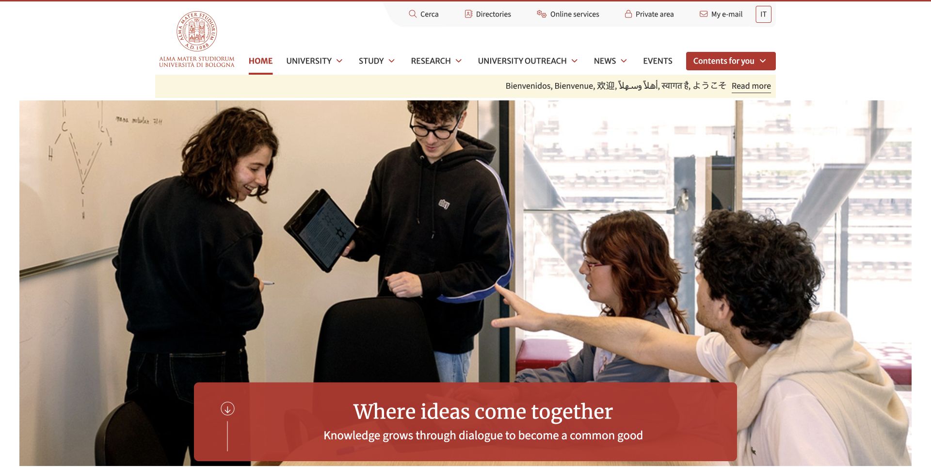
The University of Bologna’s retained portal image places a seal and main navigation above students collaborating around a table. A separate upper utility row combines small symbols with words for directories, services and private access. The current exact public page directly references a FontAwesome stylesheet. That establishes the component association, but it does not identify which visible symbol came from that file or mean the library created the portal’s layout.
What you can learn
Keep utility icons paired with meaningful text when a site serves several audiences and many different tasks. A consistent symbol family can support recognition, while labels, grouping and predictable destinations do the more important work of explaining where a student, researcher or visitor should go.
Pros
The utility row is visually separate from the main university categories, reducing competition between different kinds of task.
Visible words accompany compact symbols rather than requiring every visitor to interpret an unfamiliar pictogram.
Cons & considerations
An icon stylesheet reference does not establish that every utility action works or has an appropriate accessible name.
When adding more service shortcuts, preserve clear labels and grouping instead of turning the header into a dense icon strip.
Platform source: WordPress.org Showcase. The exact public HTML page directly references a Font Awesome stylesheet resource: https://www.unibo.it/++theme++unibotheme.portale/styles/font-awesome/css/fontawesome.min.css?hash=d1f6abdc10f5249efa2d9bff7cd816b9ed10ca971ec3c03c3189f7c9. This is a source-page reference observation, not a claim that the linked resource was fetched, executed or responsible for a particular pictured glyph. Platform evidence is separate from the direct website screenshot and is not a complete current infrastructure audit.
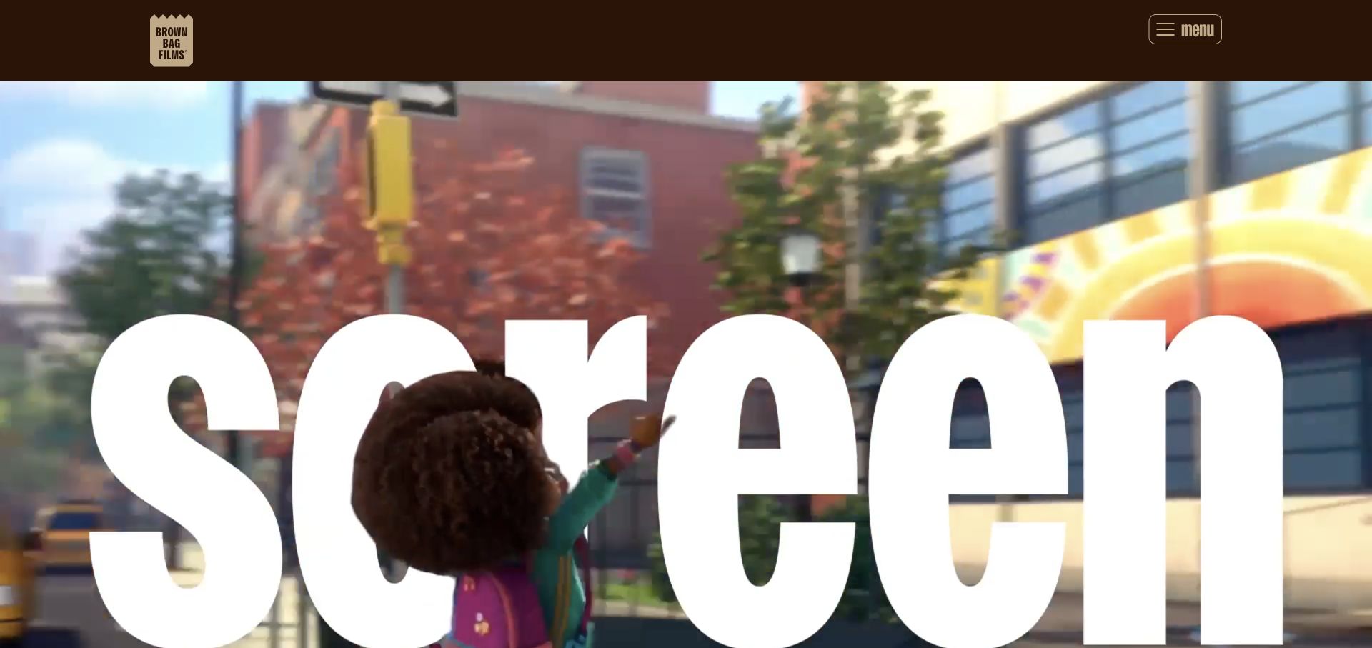
Brown Bag Films’ original frame uses a dark brown header, a paper-bag identity and a small labelled menu control above a large animated-character production image. Oversized white lettering becomes part of the composition rather than a row of utility icons. The current page references a FontAwesome stylesheet, but the observed art direction and lettering should not be attributed to that library. Its presence is a component-level public-source finding.
What you can learn
On a strongly visual portfolio, use icons for clearly defined interface tasks instead of asking them to carry the entire brand expression. Keep a recognisable menu label and useful navigation structure so the production imagery remains engaging without making practical routes disappear.
Pros
A restrained header preserves a clear distinction between the studio’s identity, navigation and featured production imagery.
The menu control has an explicit word label rather than relying only on stacked lines or an unfamiliar symbol.
Cons & considerations
A dramatic campaign image cannot explain the full project catalogue, so the navigation needs to reveal meaningful categories.
Loading an icon library does not prove that the menu’s interactive behaviour or keyboard access was implemented correctly.
Platform source: WordPress.org Showcase. The exact public HTML page directly references a Font Awesome stylesheet resource: https://cdnjs.cloudflare.com/ajax/libs/font-awesome/6.7.2/css/all.min.css. This is a source-page reference observation, not a claim that the linked resource was fetched, executed or responsible for a particular pictured glyph. Platform evidence is separate from the direct website screenshot and is not a complete current infrastructure audit.
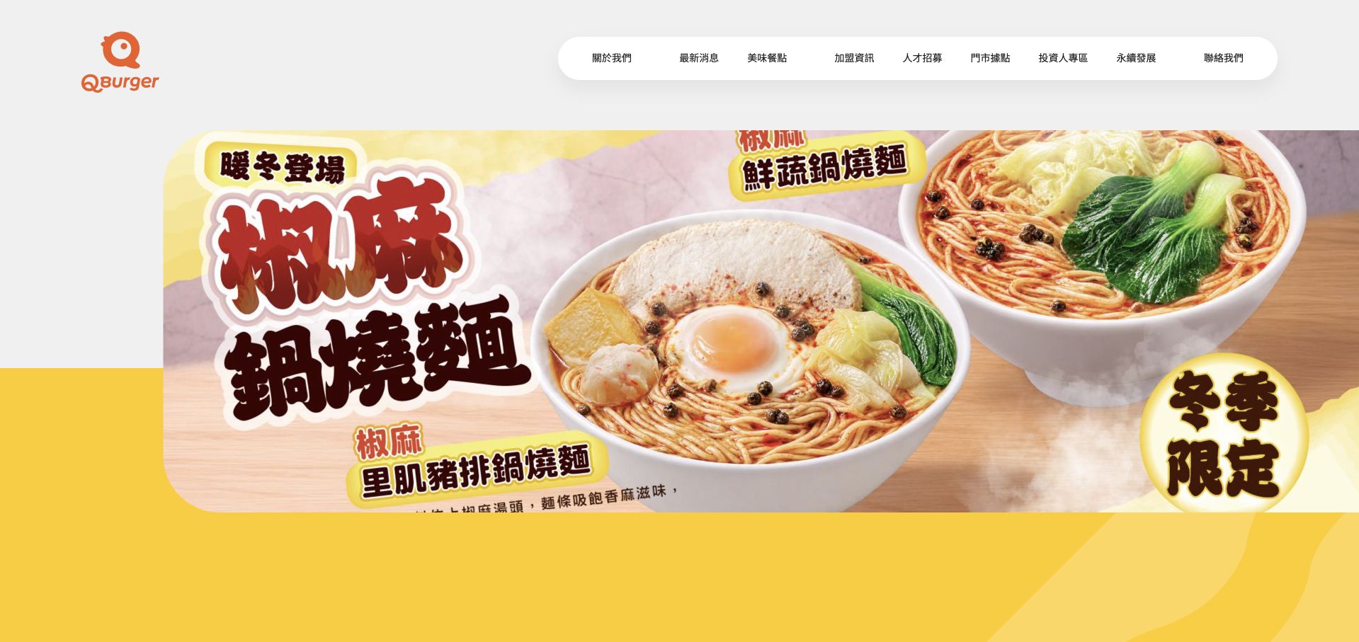
Q Burger’s retained opening places an orange logo beside a white pill-shaped navigation row and a large noodle-bowl campaign. Chinese campaign typography is integrated into the food artwork, while the surrounding interface remains comparatively restrained. The current exact page directly references FontAwesome resources, including its own hosted stylesheets. Those references qualify the public component association; they do not make the icon package responsible for the photography, restaurant operations or the broader company’s data systems.
What you can learn
Keep navigation symbols subordinate to clear labels when a campaign already has substantial visual information. A restaurant brand can maintain playful art direction while separating practical paths such as finding a location or exploring the menu from the artwork itself.
Pros
The rounded navigation container creates a clear interface layer above the visually dense food campaign.
A distinctive logo and large product photography establish the restaurant brand without requiring decorative icons to do that work.
Cons & considerations
Promotional artwork should not become the only place where important menu or offer information can be read.
References to a Pro-named asset path do not establish the current licence, paid account or successful rendering of every icon.
Platform source: WordPress.org Showcase. The exact public HTML page directly references a Font Awesome stylesheet resource: https://www.qburger.com.tw/assets/vendor/@fortawesome/fontawesome-pro/css/fontawesome.min.css?ccf168f567c0c1b5de6176de. This is a source-page reference observation, not a claim that the linked resource was fetched, executed or responsible for a particular pictured glyph. Platform evidence is separate from the direct website screenshot and is not a complete current infrastructure audit.
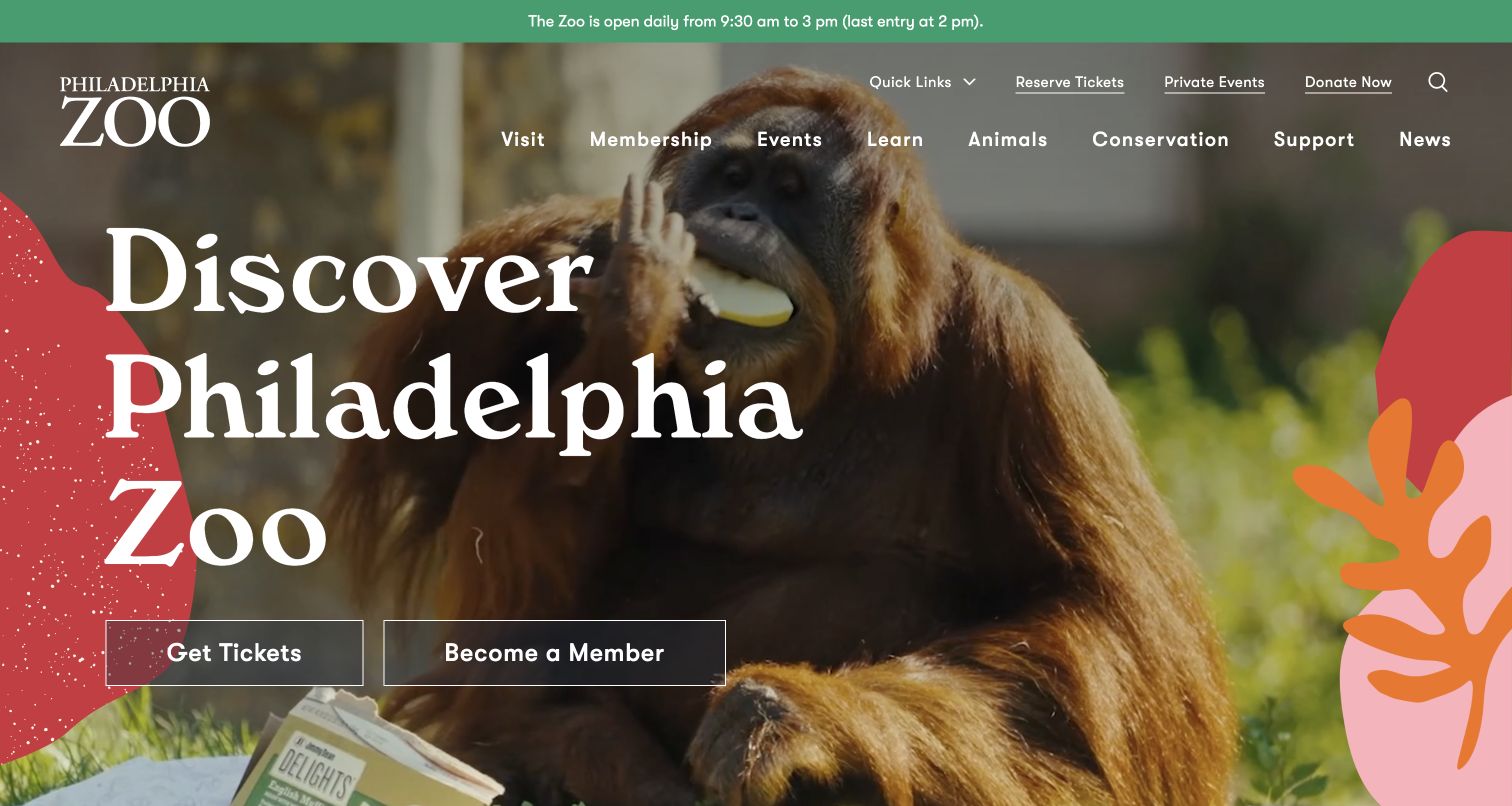
Philadelphia Zoo’s original capture puts an orangutan photograph behind a large white heading and two explicit actions for tickets and membership. Visitor categories remain named across the header, with compact search and dropdown indicators occupying a supporting role. The current public homepage directly references a FontAwesome stylesheet through a cached resource URL. That is evidence of a referenced component, not proof that a particular icon or the ticketing experience was built by it.
What you can learn
Use text to distinguish different visitor intentions, then add familiar symbols where they make a specific control easier to recognise. A ticket button, membership route and search action have different jobs; a common icon style should support those distinctions rather than flatten them into identical controls.
Pros
Tickets and membership are expressed as distinct labelled actions within an otherwise image-led introduction.
The main visitor categories remain readable words rather than a navigation system made entirely of pictograms.
Cons & considerations
A search symbol still needs an appropriate name and usable interaction; the screenshot does not test either.
A cached FontAwesome URL does not establish the current version of every icon or the behaviour of external booking services.
Platform source: WordPress.org Showcase. The exact public HTML page directly references a Font Awesome stylesheet resource: https://www.philadelphiazoo.org/wp-content/cache/min/1/ajax/libs/font-awesome/5.15.4/css/all.min.css?ver=1794598515. This is a source-page reference observation, not a claim that the linked resource was fetched, executed or responsible for a particular pictured glyph. Platform evidence is separate from the direct website screenshot and is not a complete current infrastructure audit.
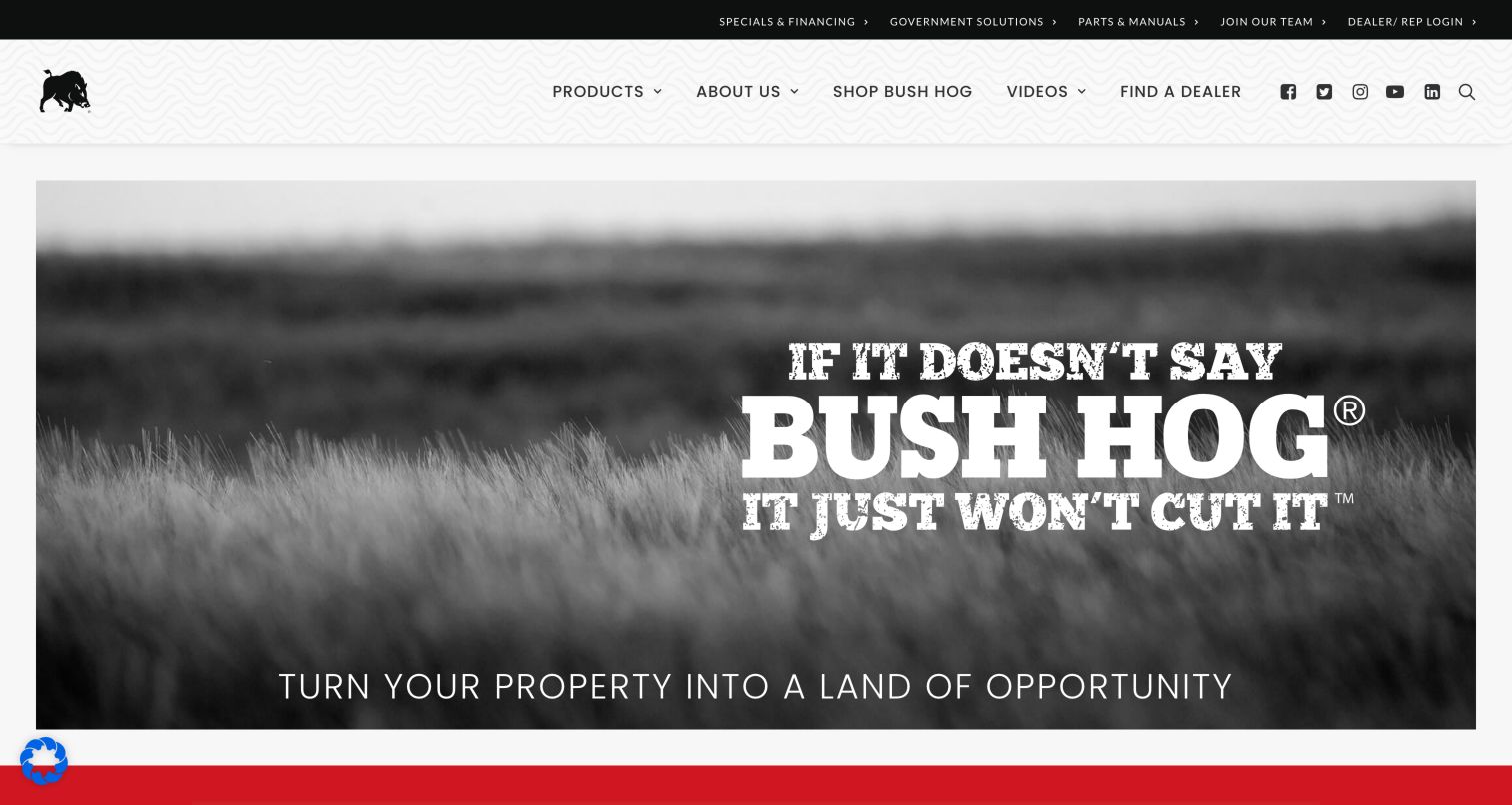
Bush Hog’s retained image uses a monochrome field and large branded campaign lettering under a white navigation band. Product, dealer and video routes remain written out, while a compact group of social symbols occupies the right side. The current exact page includes a FontAwesome stylesheet reference. The broader probe remains partial, so this is a positive component observation within an incomplete audit—not a complete inventory of the equipment brand’s technology.
What you can learn
Reserve icons for recognisable utilities and retain explicit labels for important catalogue and support journeys. Someone seeking a dealer or manual should not need to decode a decorative symbol or interpret a campaign slogan before reaching a practical destination.
Pros
The named dealer and product routes remain distinct from the row of compact social destinations.
A restrained monochrome campaign leaves the brand and primary navigation legible without many competing interface treatments.
Cons & considerations
Social symbols need clear destinations and accessible names even when their visual shapes are familiar.
A positive stylesheet reference inside a partial probe does not justify claims about every asset, backend service or interactive control.
Platform source: WordPress.org Showcase. The exact public HTML page directly references a Font Awesome stylesheet resource: https://bushhog.com/wp-content/plugins/revslider/sr6/assets/fonts/font-awesome/css/font-awesome.css. This is a source-page reference observation, not a claim that the linked resource was fetched, executed or responsible for a particular pictured glyph. Platform evidence is separate from the direct website screenshot and is not a complete current infrastructure audit.
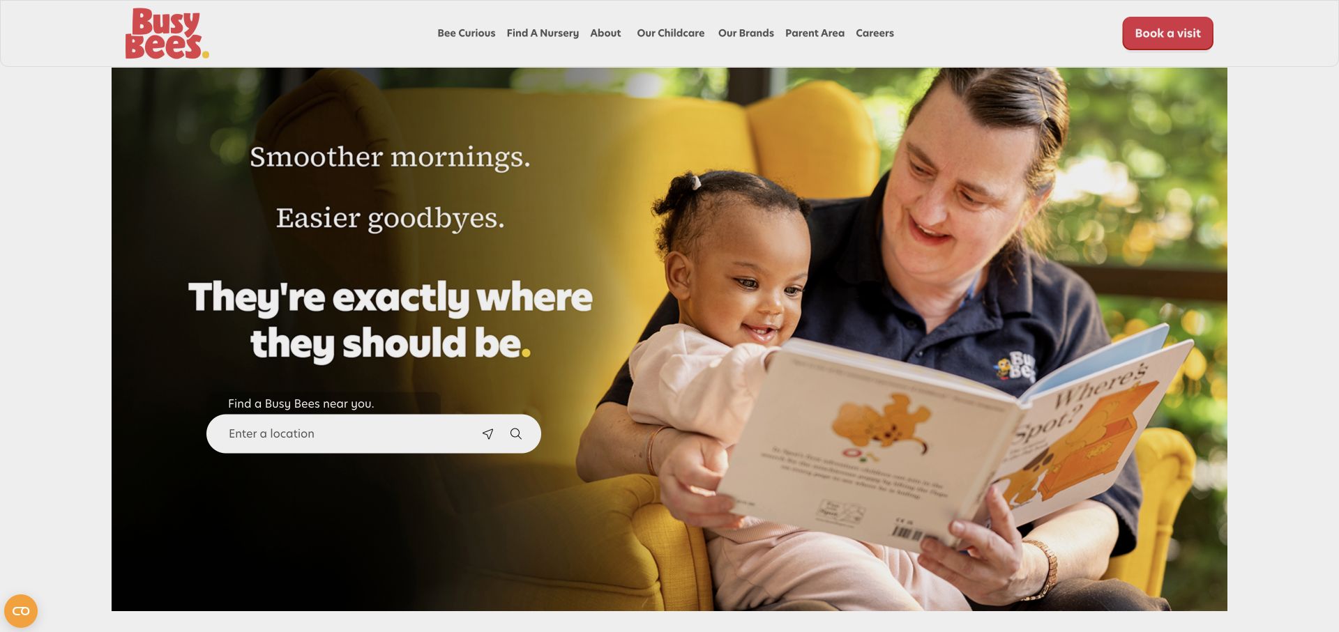
Busy Bees’ original opening pairs a caregiver reading with a toddler and a darkened text area containing a location field. Small direction and search symbols sit within that finder, while a separate labelled button invites a visit. The current public page directly references a FontAwesome resource. The screenshot does not prove which library supplied each visible glyph, but it offers a useful example of symbols accompanying an understandable task rather than replacing its explanation.
What you can learn
Give a finder a clear purpose before adding its icons. Preserve the location label, field instructions and an understandable submission route so people can use the service without guessing whether a symbol means locate me, search or open a map.
Pros
The location task is stated in words and placed directly beside the relevant input field.
A separate visit action distinguishes an enquiry-oriented next step from the initial search for a nursery.
Cons & considerations
Location and search symbols can be confused if their names, focus states and actions are not clearly differentiated.
An icon-library reference cannot establish childcare quality, location accuracy or the successful completion of the finder.
Platform source: WordPress.org Showcase. The exact public HTML page directly references a Font Awesome script resource: https://kit.fontawesome.com/308b53a9a3.js. This is a source-page reference observation, not a claim that the linked resource was fetched, executed or responsible for a particular pictured glyph. Platform evidence is separate from the direct website screenshot and is not a complete current infrastructure audit.
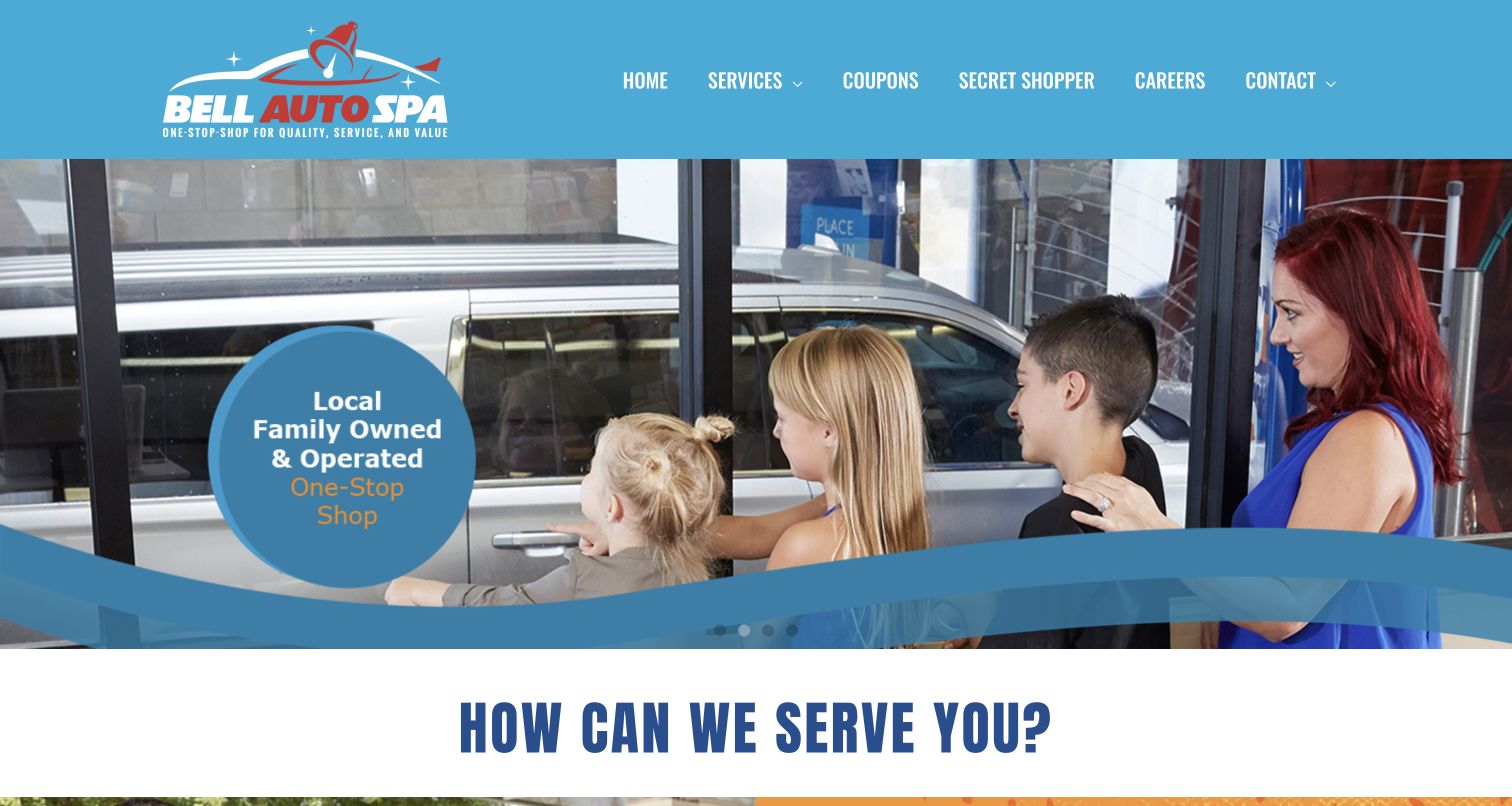
Bell Auto Spa’s retained frame uses a blue header and a photograph of a family beside a carwash, with a circular campaign message and a large service-section heading below. Navigation routes are written out rather than presented as an unexplained set of symbols. The current exact homepage references FontAwesome resources, but no individual visible icon is attributed to them here. The useful comparison is how an icon component can coexist with a predominantly text-led interface.
What you can learn
Use an icon library selectively and keep service labels specific. A visitor looking for wash options, coupons or contact information should not have to infer the destination from a car silhouette or promotional illustration, particularly when several services may use similar imagery.
Pros
Named navigation categories provide practical routes independently of the large photographic campaign.
A consistent blue frame connects the identity, campaign and service introduction without requiring icons to carry the entire hierarchy.
Cons & considerations
A large campaign photograph still needs a clear connection to actual service details and any relevant location information.
Several referenced icon resources do not prove that all are necessary, rendered successfully or used by the visible header.
Platform source: WordPress.org Showcase. The exact public HTML page directly references a Font Awesome stylesheet resource: https://bellautospa.com/wp-content/plugins/elementor/assets/lib/font-awesome/css/all.min.css?ver=4.4.0. This is a source-page reference observation, not a claim that the linked resource was fetched, executed or responsible for a particular pictured glyph. Platform evidence is separate from the direct website screenshot and is not a complete current infrastructure audit.
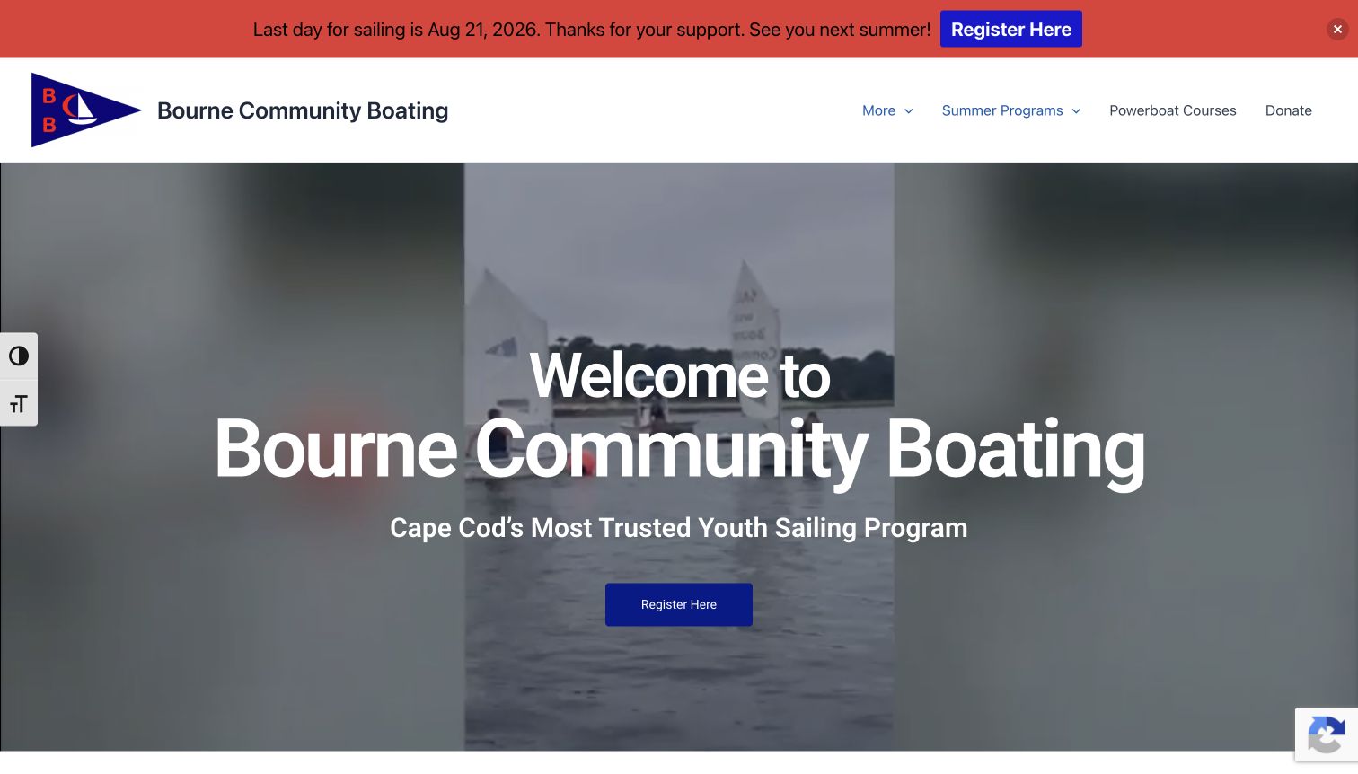
Bourne Community Boating’s original capture shows a sailing-film frame under a white identity and navigation row. A red site announcement sits above the header, and registration appears as a clearly labelled action in the centre. The current exact page directly references FontAwesome resources. The retained announcement has its own seasonal date and should not be treated as a current schedule. Nor does the icon component establish the accessibility or safety of the advertised programme.
What you can learn
Keep essential programme actions in words and maintain time-sensitive notices separately from decorative controls. Small indicators can help disclose a menu, but current dates, understandable registration labels and a useful fallback matter more than choosing a large icon set.
Pros
A direct registration label makes the next step understandable without requiring a visitor to recognise a symbol.
The navigation separates programme information from the central photographic introduction rather than crowding the image with links.
Cons & considerations
Seasonal announcements need active maintenance so an older date does not mislead a visitor arriving outside that period.
A visible accessibility control or icon stylesheet is not proof that the underlying page meets an accessibility standard.
Platform source: WordPress.org Showcase. The exact public HTML page directly references a Font Awesome stylesheet resource: https://bournecommunityboating.org/wp-content/plugins/elementor/assets/lib/font-awesome/css/all.min.css?ver=3.35.5. This is a source-page reference observation, not a claim that the linked resource was fetched, executed or responsible for a particular pictured glyph. Platform evidence is separate from the direct website screenshot and is not a complete current infrastructure audit.
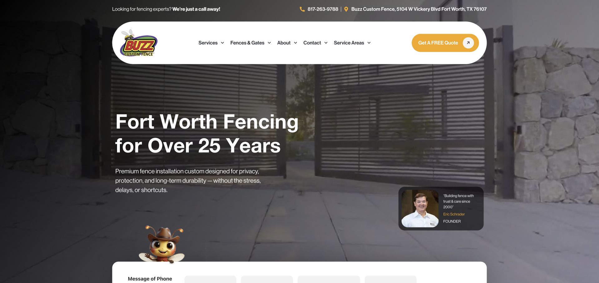
Buzz Custom Fence’s original opening places a pill-shaped white header over a dark gate photograph. A compact upper line combines phone and location symbols with readable contact details, while the quote action has both a label and a small directional mark. The current public page references FontAwesome assets. This supports a component association, not attribution of the gate image, founder card or quote workflow to the icon library.
What you can learn
Pair contact symbols with the actual information they represent. A phone pictogram is more useful beside a readable number, and an address remains clearer than an unexplained map pin. Keep the quote action named so the visitor knows what a small directional symbol will lead to.
Pros
Readable contact details accompany the compact phone and location marks instead of hiding them behind icons alone.
The labelled quote action stays visually distinct from the broader service and product-navigation choices.
Cons & considerations
Directional marks should not substitute for a clear explanation of the enquiry’s next step or information required.
A FontAwesome asset reference does not verify the business’s service claims, form delivery or the origin of every visible symbol.
Platform source: WordPress.org Showcase. The exact public HTML page directly references a Font Awesome stylesheet resource: https://buzzfence.com/wp-content/plugins/unlimited-elements-for-elementor-premium/assets_libraries/font-awesome6/fontawesome-all.min.css. This is a source-page reference observation, not a claim that the linked resource was fetched, executed or responsible for a particular pictured glyph. Platform evidence is separate from the direct website screenshot and is not a complete current infrastructure audit.
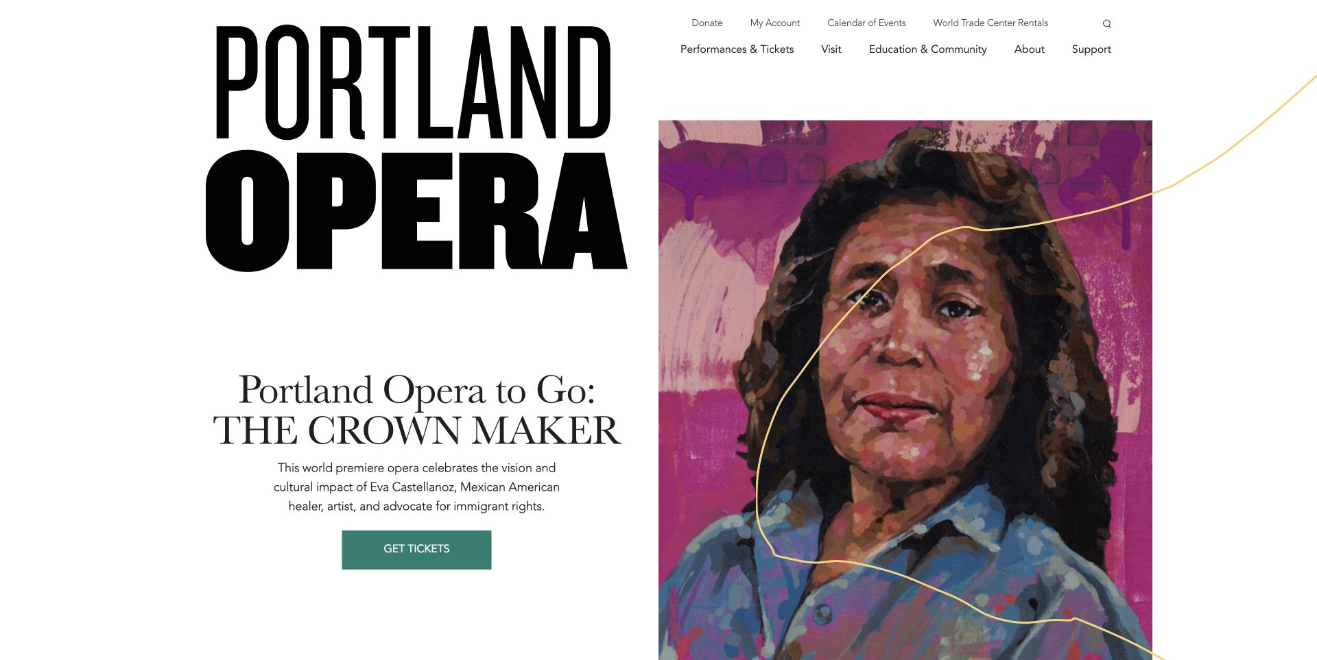
Portland Opera’s retained opening combines an oversized black identity with a painted portrait, a named production and a green ticket action. Small utility routes and search sit above the main performance and visitor navigation. The exact current homepage directly references a FontAwesome resource, but the library is not credited with the portrait, typography or ticketing platform. Its role is evidenced only as a referenced public-page component.
What you can learn
Let production identity and written actions establish the hierarchy, then use small utility symbols where they serve a recognisable task. A coherent icon style can support search or ancillary links without turning a cultural website’s programme into an icon catalogue.
Pros
The production title and ticket action are explicit, reducing dependence on interpreting artwork or a standalone ticket symbol.
Utility and programme navigation occupy different layers, keeping the most practical browsing routes visible.
Cons & considerations
A compact search icon needs a meaningful name and discoverable interaction beyond its appearance in a screenshot.
A library reference does not establish that ticket availability, account access or external booking integrations have been tested.
Platform source: WordPress.org Showcase. The exact public HTML page directly references a Font Awesome script resource: https://kit.fontawesome.com/b5fd2067bf.js. This is a source-page reference observation, not a claim that the linked resource was fetched, executed or responsible for a particular pictured glyph. Platform evidence is separate from the direct website screenshot and is not a complete current infrastructure audit.
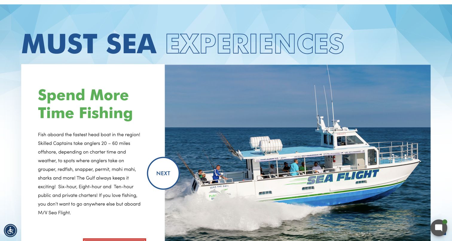
Pure Florida’s retained image is a lower-page experience panel, not the homepage hero. A photograph of the Sea Flight boat sits beside descriptive text, with a large circular control explicitly labelled Next. The current exact homepage references FontAwesome resources, but this does not establish that the particular carousel control is supplied by the library. The screenshot is useful for studying how written control labels can remain clear within an image-heavy tourism layout.
What you can learn
Name the action when a symbol alone could leave someone guessing what will change. Keep the control close to its content, make the selected experience identifiable and provide usable navigation without requiring a visitor to interpret a decorative arrow or rely on automatic rotation.
Pros
The word Next explains the control’s immediate purpose within the surrounding experience panel.
Text and the boat photograph remain distinct, allowing practical information and visual context to be read together.
Cons & considerations
A still image cannot establish whether carousel navigation, keyboard access or pause behaviour works correctly.
A public icon-resource reference does not confirm charter availability, booking behaviour or the origin of this particular control.
Platform source: WordPress.org Showcase. The exact public HTML page directly references a Font Awesome stylesheet resource: https://www.purefl.com/wp-content/themes/purefl/font-awesome/css/font-awesome.min.css. This is a source-page reference observation, not a claim that the linked resource was fetched, executed or responsible for a particular pictured glyph. Platform evidence is separate from the direct website screenshot and is not a complete current infrastructure audit.
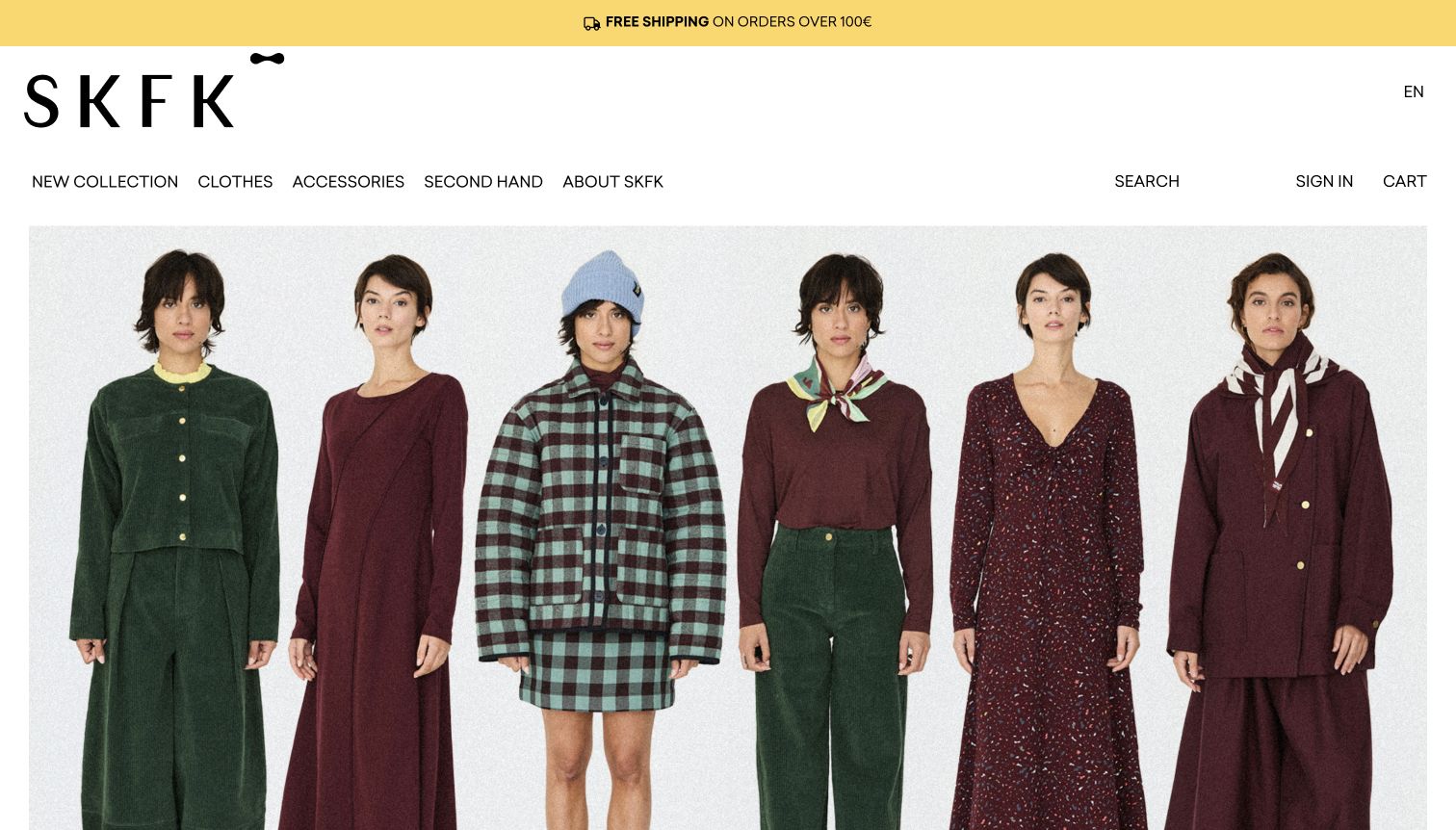
SKFK’s retained opening shows six outfits beneath a large black wordmark and a restrained navigation row. Search, sign-in and cart are written out; a small truck symbol accompanies the yellow shipping strip above. The current exact English page directly references FontAwesome resources. That component association does not identify the origin of the truck or every utility, and it does not substantiate the brand’s wider ethical or material claims.
What you can learn
Use symbols to reinforce a message whose meaning is already available in text. Fashion imagery can carry the brand expression while shopping utilities remain predictable. If delivery conditions matter to an offer, keep the conditions readable instead of expecting a truck pictogram to communicate the policy.
Pros
Written search, account and cart labels reduce dependence on a visitor’s familiarity with a particular icon style.
The small shipping utility remains secondary to the clearly presented clothing collection and brand identity.
Cons & considerations
An icon next to a shipping offer cannot explain destination exclusions, timing or the full delivery policy.
The presence of a referenced icon package does not verify environmental claims, commerce behaviour or current licence arrangements.
Platform source: WordPress.org Showcase. The exact public HTML page directly references a Font Awesome script resource: https://kit.fontawesome.com/751422a41d.js. This is a source-page reference observation, not a claim that the linked resource was fetched, executed or responsible for a particular pictured glyph. Platform evidence is separate from the direct website screenshot and is not a complete current infrastructure audit.
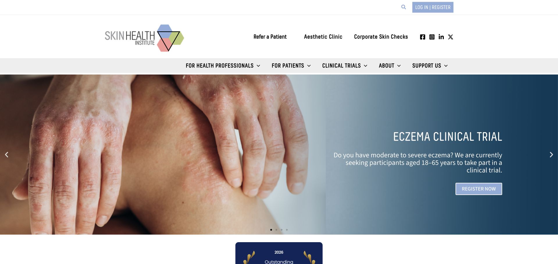
Skin Health Institute’s original frame pairs a hands photograph with a blue clinical-trial information panel and a labelled registration action. The header distinguishes health professionals and patients, with a separate row of compact social marks. The current exact page directly references FontAwesome resources. This is a website-component finding only: neither the resource nor the screenshot validates medical information, trial eligibility or the accessibility of the registration process.
What you can learn
Preserve explicit audience and action labels when the consequences of choosing a route matter. Icons can support ancillary utilities, but should not replace words that explain whether a destination is for patients, professionals or a particular programme. Keep current programme details maintained independently of decorative interface choices.
Pros
Audience categories remain readable text rather than requiring visitors to identify a clinical or professional pictogram.
The information panel and registration action are clearly separated from the supporting social utilities.
Cons & considerations
Time-sensitive programme information requires current editorial review; a retained campaign image is not evidence that registration remains open.
A FontAwesome reference does not establish accessible names, privacy handling or the correct delivery of a sensitive enquiry.
Platform source: WordPress.org Showcase. The exact public HTML page directly references a Font Awesome stylesheet resource: https://skinhealthinstitute.org.au/wp-content/plugins/elementor/assets/lib/font-awesome/css/fontawesome.min.css?ver=5.15.3. This is a source-page reference observation, not a claim that the linked resource was fetched, executed or responsible for a particular pictured glyph. Platform evidence is separate from the direct website screenshot and is not a complete current infrastructure audit.
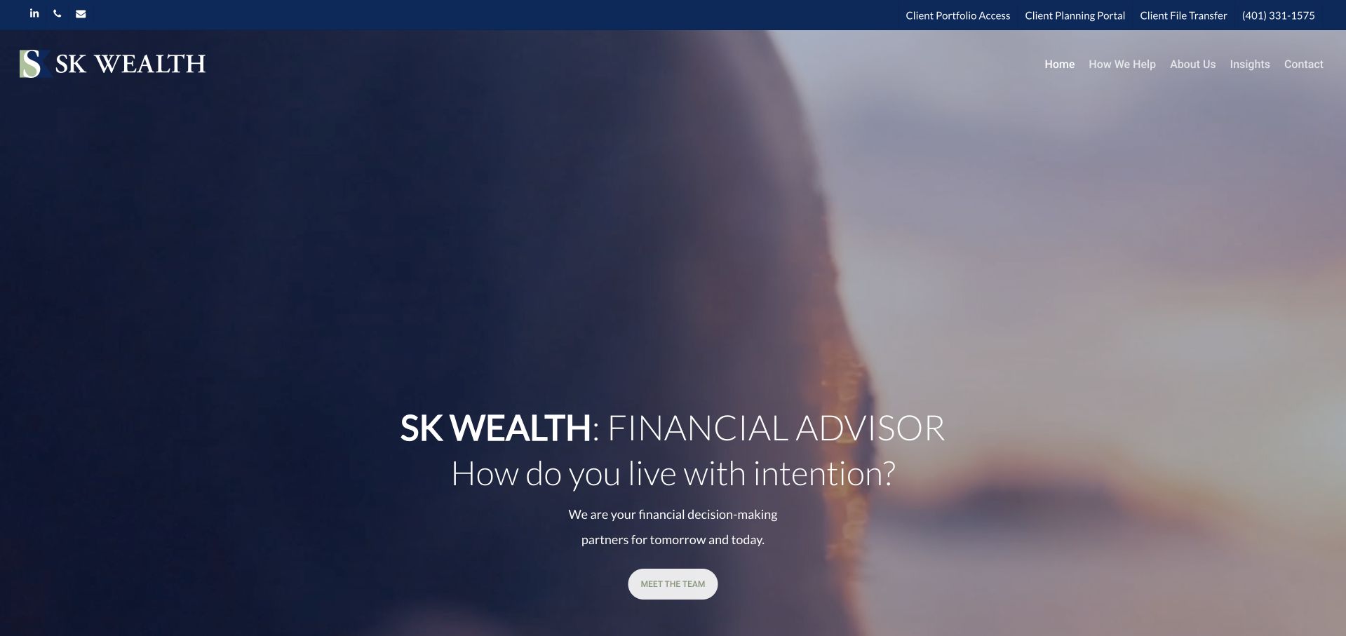
SK Wealth’s retained opening uses a softly blurred horizon-and-person film frame behind a centred introduction and team action. A navy utility bar above it names separate client destinations and includes small contact symbols. The current exact homepage references FontAwesome resources. The component association should not be confused with the financial firm’s private systems or treated as evidence that any client portal, file-transfer service or advisory process has been assessed.
What you can learn
Name existing-client destinations explicitly and separate them from general marketing navigation. A consistent symbol can help identify a phone or email route, but it should not stand in for an explanation of which portal a person is about to enter or what that destination is for.
Pros
The client utility layer is distinct from the public service and team-navigation structure.
Written portal labels provide more context than a set of indistinguishable lock or account icons would offer.
Cons & considerations
An icon or portal label does not establish security properties, account access or the suitability of a financial service.
The public resource reference cannot reveal the technology or operational behaviour of destinations that were not inspected.
Platform source: WordPress.org Showcase. The exact public HTML page directly references a Font Awesome stylesheet resource: https://skwealth.com/wp-content/uploads/font-awesome/v5.15.3/css/svg-with-js.css?ver=1788279512. This is a source-page reference observation, not a claim that the linked resource was fetched, executed or responsible for a particular pictured glyph. Platform evidence is separate from the direct website screenshot and is not a complete current infrastructure audit.
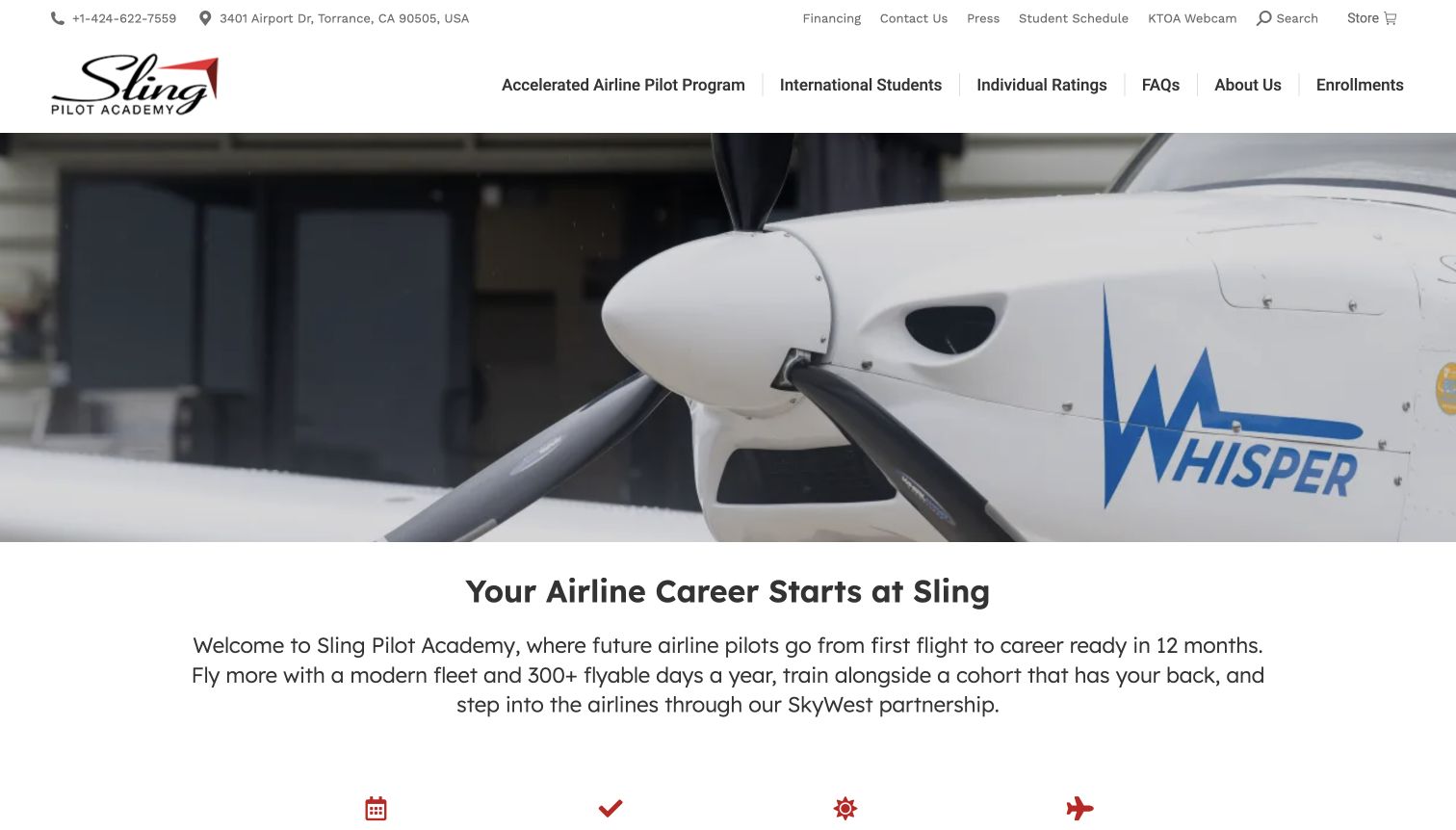
Sling Pilot Academy’s original capture shows a close aircraft-propeller frame above a written introduction, with a detailed header naming programmes, international students and individual ratings. Small symbols accompany contact and utility information, and red pictograms begin another section at the bottom. The current exact homepage references FontAwesome resources. We do not attribute every visible mark to that file or treat the library as proof of any advertised training outcome.
What you can learn
Keep programme choices and practical student routes named in ordinary text, using symbols only to support recognisable utilities. Where a pictogram introduces a feature, pair it with a specific heading and maintained explanation so a visitor is not asked to infer an important training detail from an image alone.
Pros
Written programme destinations remain prominent despite the large aircraft photograph and compact supporting utility row.
Contact information is visible as text alongside symbols rather than hidden behind an unexplained phone or location control.
Cons & considerations
An icon-led feature row needs explicit supporting copy before a prospective student can evaluate what is actually being offered.
A public asset reference does not verify enrolment behaviour, programme eligibility, aircraft availability or career-related claims.
Platform source: WordPress.org Showcase. The exact public HTML page directly references a Font Awesome stylesheet resource: https://www.slingpilotacademy.com/wp-content/plugins/counter-number-showcase/assets/css/font-awesome/css/font-awesome.min.css?ver=7.1.4. This is a source-page reference observation, not a claim that the linked resource was fetched, executed or responsible for a particular pictured glyph. Platform evidence is separate from the direct website screenshot and is not a complete current infrastructure audit.
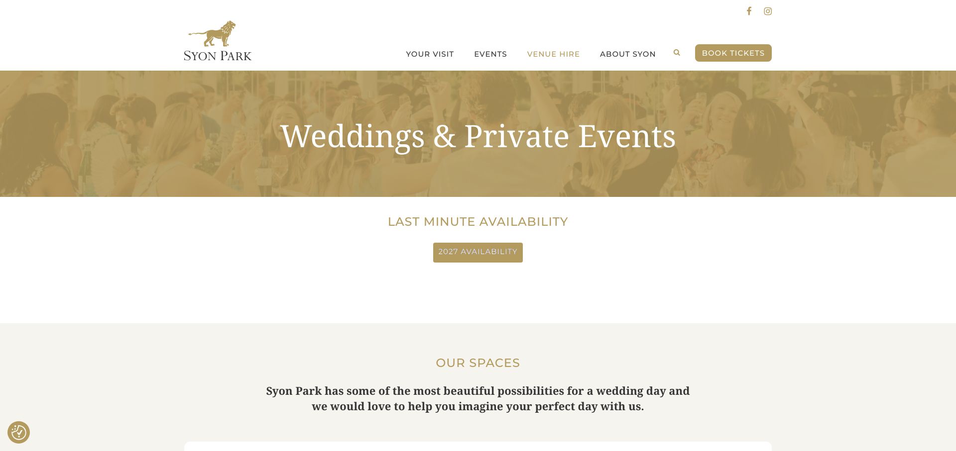
Syon Park’s retained image documents its weddings and private-events page. A gold-tinted wedding banner leads into a written availability action and space introduction, while the header keeps visit, events and venue-hire routes named. Small search and social symbols stay secondary. The current exact service page directly references a FontAwesome resource, which qualifies the component on this property and path rather than implying a technology finding for every connected venue or booking system.
What you can learn
Scope icons to clear utility tasks and keep event-specific actions in words. A venue page should identify whether someone is exploring spaces, checking an enquiry route or buying a public admission ticket; a common visual style must not make those distinct tasks appear interchangeable.
Pros
The events-page title and availability action establish context independently of the small header utilities.
Named navigation makes the distinction between a venue-hire task and an ordinary visitor journey visible.
Cons & considerations
A retained availability message is not confirmation of a current event date or a booking that can be completed online.
The referenced library does not establish how external enquiries, ticket systems or accessible interactions behave.
Platform source: WordPress.org Showcase. The exact public HTML page directly references a Font Awesome stylesheet resource: https://syonpark.co.uk/wp-content/plugins/goodlayers-core/plugins/fontawesome/font-awesome.css?ver=7.1.4. This is a source-page reference observation, not a claim that the linked resource was fetched, executed or responsible for a particular pictured glyph. Platform evidence is separate from the direct website screenshot and is not a complete current infrastructure audit.
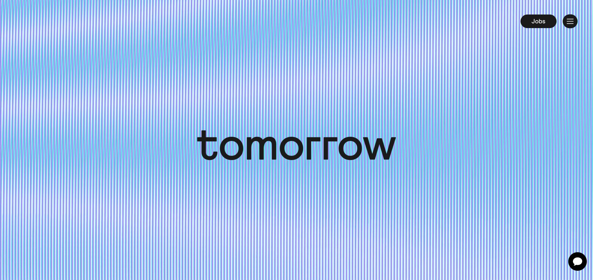
Tomorrow Worldwide’s retained opening is deliberately spare: a blue-and-green striped background carries the large wordmark, with a labelled Jobs pill, a compact menu and a closed chat control at the right. The current exact page directly references FontAwesome resources. The small interface does not prove which glyphs were drawn from that package, and the icon library should not be credited with the striped art direction or the recruitment platform behind the jobs route.
What you can learn
In a minimal interface, a few clear labels become especially important. Keep the main recruitment task written out and give compact menu or chat controls meaningful names. A strong brand treatment should not force a visitor to infer how to reach the practical content.
Pros
The Jobs label provides a clear functional anchor within an otherwise strongly brand-led opening.
A small control set avoids competing visually with the central identity treatment.
Cons & considerations
A minimal first screen may need additional explanation once a visitor reaches the menu or the job destination.
A component reference does not verify vacancy freshness, application delivery or the technology used by an external recruitment service.
Platform source: WordPress.org Showcase. The exact public HTML page directly references a Font Awesome stylesheet resource: https://tomorrow-worldwide.com/wp-content/plugins/unlimited-elements-for-elementor-premium/assets_libraries/font-awesome6/fontawesome-all.min.css. This is a source-page reference observation, not a claim that the linked resource was fetched, executed or responsible for a particular pictured glyph. Platform evidence is separate from the direct website screenshot and is not a complete current infrastructure audit.
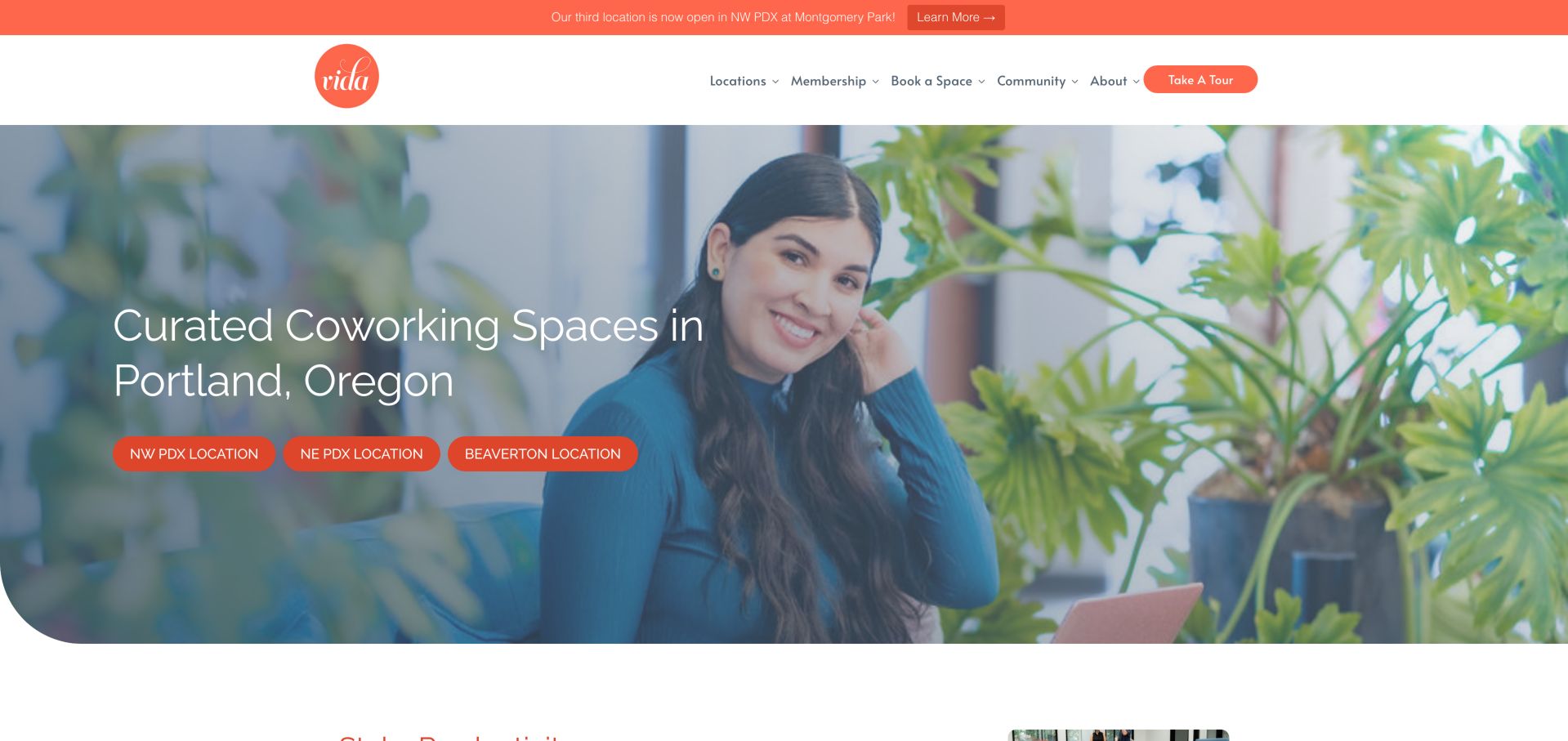
VIDA’s retained frame puts a person in a leafy coworking setting behind a clear Portland introduction and three location actions. The white header names membership, space booking and community routes, with small indicators beside some labels. A current exact-page FontAwesome resource reference supports the component association. It does not establish which indicators came from the library, how room booking works or what facilities are included in a membership.
What you can learn
Keep location and service choices understandable in text, using small symbols only to indicate a specific interaction. Distinguish a location destination, a menu disclosure and a tour request rather than giving every control the same unexplained mark. A shared icon family should support that hierarchy.
Pros
Named location actions connect the workspace introduction to concrete browsing destinations.
Written membership, booking and tour routes distinguish visitor intentions before they enter another page.
Cons & considerations
A menu indicator needs predictable behaviour and an appropriate name; a screenshot cannot establish those interaction details.
A public icon resource does not confirm room availability, membership inclusions or the completion of a booking process.
Platform source: WordPress.org Showcase. The exact public HTML page directly references a Font Awesome stylesheet resource: https://use.fontawesome.com/releases/v5.0.6/css/all.css?ver=7.1.4. This is a source-page reference observation, not a claim that the linked resource was fetched, executed or responsible for a particular pictured glyph. Platform evidence is separate from the direct website screenshot and is not a complete current infrastructure audit.
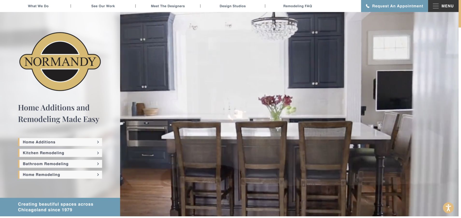
Normandy Remodeling’s retained opening divides a kitchen photograph from a branded left panel containing four named service rows. Small directional marks sit at the end of those rows, while an appointment action in the top bar includes a phone symbol and written text. The current exact homepage directly references FontAwesome resources. That qualifies a component association, not attribution of each visible symbol, the interior project or the appointment system to the icon library.
What you can learn
Write the destination first and let a small symbol reinforce that it is actionable. A visitor should be able to distinguish a kitchen-remodelling route from an appointment request without knowing an icon vocabulary. Keep similar service rows consistent and explain the next step once they are opened.
Pros
Each service row retains a specific written label alongside its compact directional cue.
The appointment action is visibly separate from project browsing and includes an understandable text instruction.
Cons & considerations
Repeated directional symbols should not hide meaningful differences between a service-information page and an enquiry action.
A referenced icon component does not verify project claims, consultation availability or the successful submission of a request.
Platform source: WordPress.org Showcase. The exact public HTML page directly references a Font Awesome stylesheet resource: https://normandyremodeling.com/wp-content/cache/min/1/font-awesome/4.7.0/css/font-awesome.min.css?ver=1787244033. This is a source-page reference observation, not a claim that the linked resource was fetched, executed or responsible for a particular pictured glyph. Platform evidence is separate from the direct website screenshot and is not a complete current infrastructure audit.
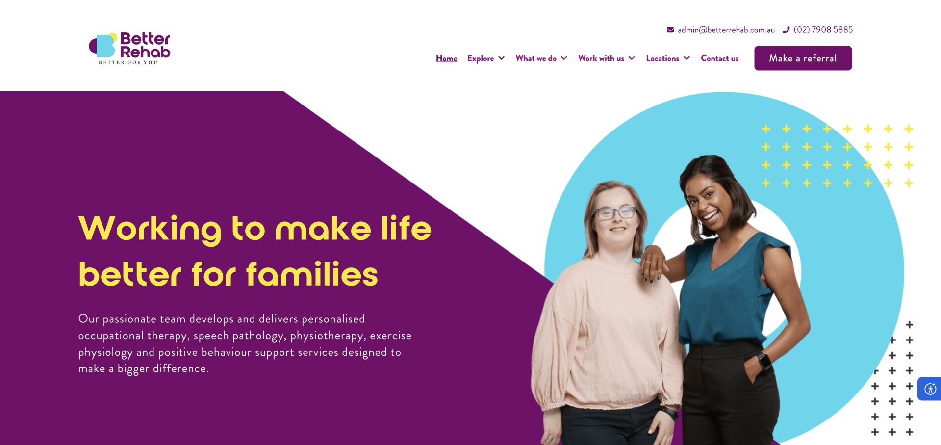
Better Rehab’s retained opening combines a purple text panel and yellow headline with a portrait framed by a cyan ring. In the header, small email and phone symbols sit beside readable contact information, while the referral action is explicitly named. The current exact homepage directly references a FontAwesome resource. This establishes a public component association, not the provenance of every glyph or any claim about treatment quality, outcomes or enquiry privacy.
What you can learn
Use contact icons as reinforcement, not as the only explanation of an action. Keep referral and general-contact routes named and distinct so people understand the destination before opening it. A consistent symbol family can make the header feel coherent without replacing the more important task labels.
Pros
Readable phone and email details accompany the utility symbols rather than being hidden behind them.
The labelled referral action remains distinct from the general service and location-navigation choices.
Cons & considerations
A clear-looking referral button does not establish the privacy, eligibility or operational handling of the information requested next.
The icon resource does not prove accessible names or that every visible contact action behaves as a visitor expects.
Platform source: WordPress.org Showcase. The exact public HTML page directly references a Font Awesome script resource: https://kit.fontawesome.com/88a0f0de5a.js. This is a source-page reference observation, not a claim that the linked resource was fetched, executed or responsible for a particular pictured glyph. Platform evidence is separate from the direct website screenshot and is not a complete current infrastructure audit.
Kegan has 15+ years of experience working with small businesses, Fortune 500 companies, and everything in between. No development job is too big or too small: he brings the same hands-on attention to a focused improvement, a complete website, or a custom application.
For Font Awesome projects, he can help with purposeful icon selection, consistent accessible labels, lean asset delivery, clear licensing boundaries, responsive interface integration, and maintainable icon-library handover. He works directly with clients on scope, design, implementation, testing, and handover, with an emphasis on clear communication and a system that remains practical to maintain after launch.
Show 3 other Font Awesome developersHide other Font Awesome developers
Choose a delivery approach that fits the site and its maintainers
Use web fonts and CSS where they fit the existing implementation
Font Awesome documents a web-font and CSS approach alongside other delivery methods. For an existing site using that arrangement, first map which stylesheet, font files and version are actually present. Look for duplicates introduced by a theme, builder or plugin before adding another copy. A redesign may need to preserve a working dependency until the components using it have been identified and checked.
Prototype representative navigation, a repeated content list and a form control with the intended files available and unavailable. Decide how essential actions remain understandable if an icon does not appear. Check alignment, text zoom and style overrides in the completed pages. Choose the approach because it supports the project’s requirements and maintenance process, not because one screenshot or file extension proves it is universally faster or easier.
Use SVG-based integration when the component workflow benefits
SVG-based options can fit a component-oriented implementation, but the choice still needs a clear loading and ownership plan. The official documentation separates self-hosted SVG plus JavaScript from other ways of adding icons. Verify the exact supported method for the chosen application rather than combining unrelated examples from different versions. Document whether components, a shared library or an existing integration are responsible for introducing each resource.
Test repeated icons as well as a single demonstration. A catalogue might display dozens of save controls, while a navigation bar uses only a handful of utilities. Review the actual markup and behaviour produced by the selected approach, including meaningful labels and duplicate identifiers where relevant. Keep the visitor’s task independent of decorative loading, and do not assume that a vector format alone establishes performance or accessibility.
Use a managed kit or integration with explicit ownership
If the project chooses a kit or platform integration, record who owns its account, settings and permitted domains. Demonstrate how the production site, staging environment and local work obtain the resources they need. Keep tokens or credentials in the appropriate secure systems rather than public briefs or screenshots. Check the current product documentation and terms for the intended features instead of inferring access from another website’s visible assets.
Make future changes understandable to the person maintaining the site. Adding an icon should not require guessing which of several plugins controls the library or why a development environment differs from production. Write a short operating note identifying the delivery path, version context and update process. A managed service can change how resources are delivered; it does not remove responsibility for readable controls, testing or an appropriate fallback.
Turn the icon choice into a maintainable interface system
Inventory real interface uses before changing the dependency
Review the current site by task and template. Include header utilities, mobile navigation, forms, content cards, document downloads, social links, notices and floating controls. Record which symbols are decorative and which communicate an action or state. Note custom graphics separately rather than assuming every familiar outline is supplied by the same library. A public resource reference is a useful discovery clue, not a complete inventory of visible use.
Work with actual content and awkward cases: long labels, translated text, a large unread count, no saved items and an unavailable document. Decide how those states appear without introducing a different visual convention on every page. Agree a small set of shared components and identify intentional exceptions. The resulting inventory becomes a review checklist and a practical handover document, rather than a collection of screenshots that only the original designer understands.
Budget and measure the delivered resources
List the resources introduced by the chosen approach and compare them with what the page actually needs. Font Awesome documents performance and subsetting considerations, but an optimisation should be tested against the real implementation. A small interface and a large catalogue have different patterns of use. Establish a baseline on representative pages before replacing a working setup or declaring a library responsible for every loading problem.
Measure the effect of the complete change, including duplicate resources, caching and any added JavaScript work. Keep observations specific to the tested page and conditions. Avoid promising a search-ranking or conversion improvement from a smaller icon payload alone. After reducing the available set, check every intended symbol and state; an omitted save or menu icon is an implementation failure even if a transfer-size report looks better.
Test navigation and content with the finished interaction states
Review components using keyboard, touch and pointer input at the sizes the site actually supports. A symbol may fit neatly while its target collides with a sticky header, chat launcher or nearby control. Check visible focus and expanded states, and confirm that a menu or disclosure can be closed predictably. If the control changes an application state, make its result understandable without relying only on colour or the replacement of one small shape.
Use appropriate isolated tests for failure conditions rather than altering a real visitor’s saved settings. Check essential tasks when optional resources are unavailable and review text at increased zoom. Keep test observations distinct: seeing a correctly drawn icon is not proof that a form submits, a cart updates or a phone link reaches the intended number. Verify the relevant action through its own approved test instead of treating visual polish as functional evidence.
Plan upgrades, licensing and editorial handover together
Record the currently selected icon names, styles and version context so an update can be reviewed deliberately. A website can contain older assets or compatibility layers, and a new component may introduce a second copy without making that conflict obvious in the design. Test representative templates in staging and keep a rollback route. The goal is a controlled dependency change, not a broad visual refresh disguised as a routine package update.
Verify the applicable product and artwork permissions for the actual implementation through current official information and appropriate review. Do not infer a paid subscription, redistribution right or brand endorsement from a public stylesheet. Explain which controls ordinary editors can change, which symbols are part of shared components and who maintains any custom artwork. Preserve that distinction when staff or suppliers change so a new campaign does not fragment the interface vocabulary.
Ask the actual team to carry out its routine job: publish a realistic update, correct a mistake, preview a narrow screen, and identify who owns an integration failure. For a library or frontend framework, also ask who maintains the content source and deployment. A polished screenshot does not answer those operational questions.
Beyond the screenshot
Before launching or updating a Font Awesome implementation
Inventory actual icon uses by template, action and state rather than guessing from one resource reference.
Separate decorative symbols from meaningful controls and provide appropriate names.
Keep visible labels where a symbol alone would leave the action ambiguous.
Define a restrained family, size and alignment system beside the site typography.
Choose and document one intentional delivery path, account owner and version context.
Check for resources introduced separately by themes, builders, plugins and custom code.
Test keyboard focus, touch targets, zoom, expanded states and nearby floating controls.
Keep essential actions understandable if optional icon resources are unavailable.
Measure representative pages before and after performance changes.
Verify all intended icons after subsetting or changing packages.
Review current artwork, product and brand permissions without assuming a paid plan.
Document routine additions, upgrade testing, rollback and ownership for handover.
Test with real content, a keyboard, a small screen, slow or failed requests, and the people who will maintain the system. These are planning checks, not an accessibility, security, performance, or search-ranking certification.
Sources & editorial method
How this Font Awesome collection was reviewed
These examples pair genuine direct-browser captures with dated exact-page observations of Font Awesome script or stylesheet resource references. Such evidence supports a component association, not proof that a particular visible glyph rendered, that every icon uses the library or that the library created the layout. Partial and unavailable audit statuses remain recorded as such. Original capture dates are retained when an earlier image is reused; a fresh resource check does not make that image new. Official documentation supports the limited product-specific implementation statements. The collection is an editorial website-design reference, not a measured ranking, accessibility certification, performance guarantee or software-license assessment.
Every image is an unmodified capture from the actual website, with its source and capture date. Some captures are reused from our shared catalog; their dates remain the original capture dates. None comes from a vendor gallery or a generated reconstruction. Moving imagery and live content can change.
Technology attribution uses public page assets or metadata, official platform documentation, or a cited first-party project case study. Documentary and framework-relationship evidence is identified where used; it is not a complete current backend inventory. A CMS image CDN alone does not establish a full CMS deployment. A library’s presence does not prove which individual controls use it, and a platform label does not establish AI authorship.
The composition notes, lessons, pros and tradeoffs are original editorial observations. We have not measured conversion, traffic, security, performance or accessibility conformance. Website owners retain their brands and imagery; these examples are not our client portfolio. Written, Edited and Curated are independent records, not dates advanced by a build. See our editorial standards or suggest a correction.
Questions worth asking
Font Awesome website development FAQs
Does a Font Awesome reference explain how the entire website was built?
No. It identifies a supported icon-related component association on the observed public page. The CMS, layout system, private backend and other services require their own scoped evidence. A library reference does not establish authorship or a complete stack.
Can you identify every pictured icon from a script or stylesheet URL?
Not reliably. The resource may be loaded for another component, and the page can also use custom artwork or other icon sources. The examples keep that uncertainty explicit rather than attributing every symbol to Font Awesome.
Should every button use an icon instead of a text label?
No. Start with the action and decide what makes it understandable. Familiar symbols can support a label, while an icon-only control needs an appropriate accessible name. Unusual or consequential actions often benefit from visible words.
Are web fonts or SVG always the better choice?
There is no universal answer established by these screenshots. Compare the current documented options against the project’s component workflow, resource budget and maintenance needs. Prototype representative pages and measure the completed implementation.
Does using Font Awesome automatically make the site accessible or fast?
No. The surrounding controls, content, loading choices and interaction states still need testing. Accessibility and performance observations must describe the actual page and test conditions rather than being inferred from a library name.