Best Plone Websites of 2026 (20 Real-World Examples)
Twenty real public properties with genuine screenshots and qualified Plone implementation records, from university portals to environmental information services.
A content management platform does not prescribe a visual style. These twenty websites show different ways to organize institutional stories, scientific resources, programmes and public tasks. Each has an official Plone implementation association for the particular property, with the limits recorded separately from the design review. The captures show the actual public pages; they do not expose a private backend or establish an exact deployed version.
Large publishing systems often fail at the handoff between an organizational structure and a visitor’s question. A research institute thinks in departments; an applicant needs a course; a policy reader needs a map or a dated report. The useful lesson in this collection is how those intentions become navigation, search, resource labels and next steps. A beautiful landscape can establish context, but it should not be the only route into useful information.
The European Environment Agency, Amnesty International Switzerland, the University of Bologna, York College CUNY and Forschungszentrum Jülich open the collection. Later examples include separately branded environmental portals, a tourism service, research institutes and an archived open day. These are distinct public properties, including two separately documented WISE services on one domain. Their shared infrastructure is not a reason to treat every page as an independent example.
Before the examples
What makes good Plone website development in 2026?
Design around a reader’s task
Start with the questions that bring people to the site. Separate audience routes from subject browsing when both are useful, and make search a dependable alternative rather than an unexplained icon. A university applicant should not need to understand the institution’s administrative chart. A data reader should know whether a link opens a map, a dataset or a report. Use those distinctions to decide what belongs in the first screen and what can wait until the reader has chosen a path.
Give different information different structures
Plone content types can define fields and publishing behavior for different kinds of material. Use that capability deliberately: an event needs a date and an archive state, while a report needs a publication date and a clear download. Before implementation, list the information that editors must supply for each type. Avoid placing every detail in one unrestricted text field, where consistent labels and missing information become harder to check.
A translated gateway may have a different purpose from a complete local-language website. Say so plainly, and label language changes before the visitor follows a link. Likewise, distinguish a national chapter from an international organization, or a research institute from its parent network. Consistent identity helps people recognize the relationship, but the page still needs to explain whose content, services and contact routes it actually provides.
The collection · 20 examples
20 Plone website examples worth studying
The examples below are reviewed as public website designs. Official Plone case studies document the implementation associations; separate bounded audits record whatever the public responses revealed. Historical versions and unavailable scans are not presented as current backend confirmation.
We start with five recognizable brands or organizations: European Environment Agency, Amnesty International Switzerland, University of Bologna, York College, CUNY, Forschungszentrum Jülich. Each attribution applies to the named website property, not every product or website belonging to its organization. This is a curated reading sequence, not a measured ranking.
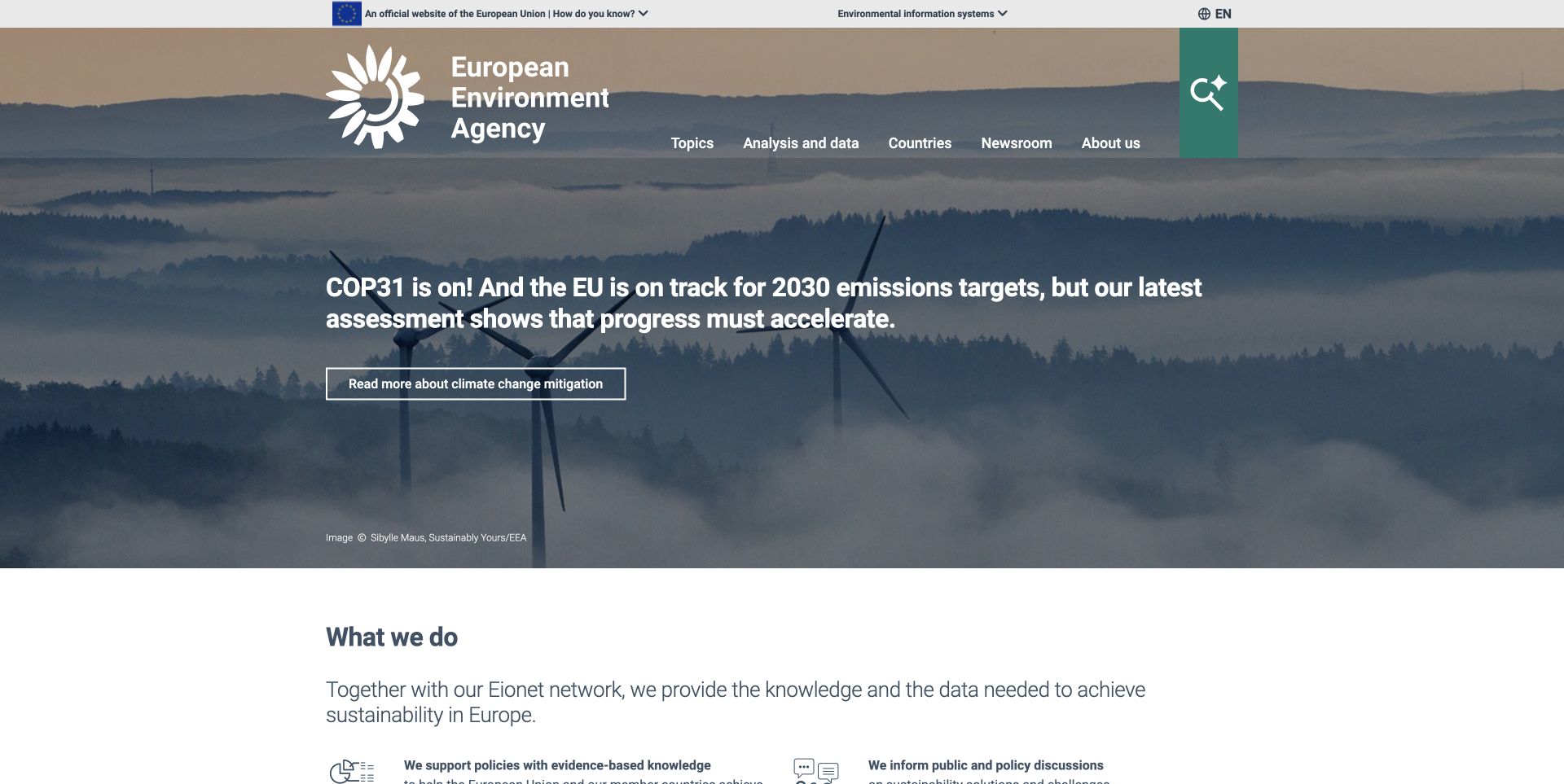
The European Environment Agency places its public identity above a landscape rather than starting with a crowded document index. The EU strip, white agency mark and five subject headings establish where the visitor has arrived. A prominent search control offers another route for readers who already know their question. The photographed wind turbines support the climate story without becoming a substitute for its headline. Below the opening image, the page explains the agency's information, network and assessment roles. That progression helps a broad institution introduce itself before asking visitors to choose specialist material. The current lead is tied to a climate conference, so the homepage still needs active editorial maintenance.
What you can learn
Borrow the separation between institutional trust, subject navigation and a current editorial lead. Keep a direct route to data alongside the story, and test whether newcomers understand the difference between a report, an indicator and a dataset.
Pros
The official identity remains visible without consuming the entire header.
Topic navigation and search support different starting intentions.
Cons & considerations
The long lead headline competes with a large photographic background.
A specific dataset requires another navigation step from the opening view.
Platform source: Official Plone implementation case. The official Plone case study, updated August 18, 2026, identifies the EEA main portal and its environmental information platforms as Plone deployments. It documents several generations, not a single current version. Official project implementation documentation reviewed on November 12, 2026. This is a documented association with the exact named public property; it is not access to its private backend, an exact current version inventory, or proof that the CMS caused the visible design. Platform evidence is separate from the direct website screenshot and is not a complete current infrastructure audit.
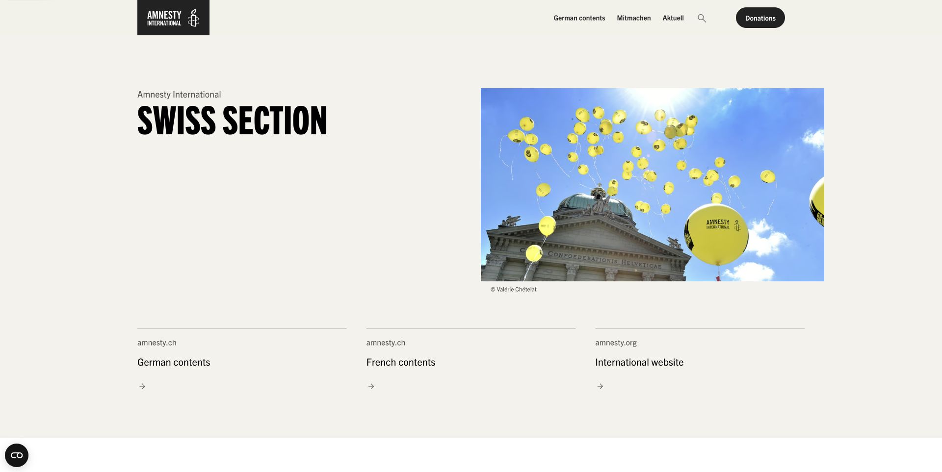
Amnesty International Switzerland uses a restrained cream canvas and strong black typography to introduce its English-language gateway. A photograph of yellow balloons in front of parliament gives the section a recognizable campaign context, while the large heading carries the message independently of the image. The next choices distinguish German, French and international material, with local English-speaking groups further down the page. This is a useful example of acknowledging that one language edition may serve a different purpose from a full news archive. The layout is spacious enough to make those choices feel deliberate. Some surrounding navigation remains German, however, which interrupts the otherwise clear language orientation.
What you can learn
Make the role of each language edition explicit before copying the visual treatment. A gateway can be valuable without mirroring every article, provided destination labels, language changes and local participation options remain understandable to the intended reader.
Pros
The photograph and typography create a clear editorial focal point.
Language destinations and local groups address distinct reader needs.
Cons & considerations
Mixed-language navigation adds friction to the English entry page.
The inspected international destination had an empty link target.
Visible tech stack
Earlier / documented evidence
Plone
Platform source: Official Plone implementation case. The official implementation case describes amnesty.ch with a multilingual Plone 6 Classic/7inOne backend and a separate SvelteKit frontend consuming its REST API. This concerns the Swiss section, not every Amnesty website. Official project implementation documentation reviewed on November 12, 2026. This is a documented association with the exact named public property; it is not access to its private backend, an exact current version inventory, or proof that the CMS caused the visible design. Platform evidence is separate from the direct website screenshot and is not a complete current infrastructure audit.
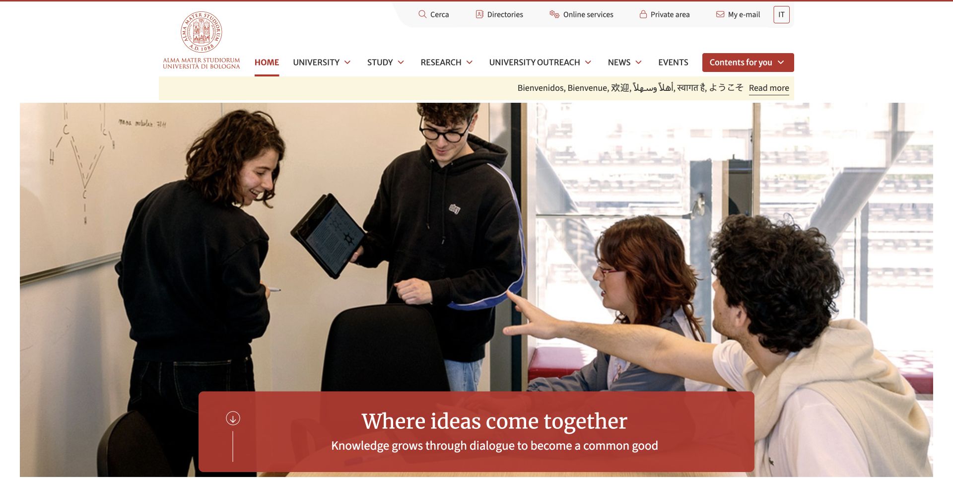
The University of Bologna combines a traditional red seal with an expansive, contemporary photograph of students working together. Separate utility and subject navigation let the university carry administrative links without making them the main story. A multilingual welcome strip adds an international cue, and the red translucent headline panel ties the photograph back to the institution's identity. The audience shortcut offers a useful alternative to browsing by department or topic. Below the hero, research and civic stories broaden the picture of university life. The page succeeds as an institutional introduction, although a prospective student still has to move into the navigation to begin comparing courses.
What you can learn
Use audience routes to complement a university's organizational structure. Keep the central identity consistent, but give applicants, current students and researchers clear next steps. An attractive institutional story should support those tasks rather than becoming their only entry point.
Pros
The seal, red accent and welcome strip form a coherent identity.
Utility links are separated from the primary subject navigation.
Cons & considerations
The opening screen does not provide a direct course-search form.
An Italian search label remains within the English edition.
Platform source: Official Plone implementation case. The university implementation case explicitly identifies its main portal as Plone as well as its degree-programme websites. The version stated for the original course project is not assumed to be the current main-portal version. Official project implementation documentation reviewed on November 12, 2026. This is a documented association with the exact named public property; it is not access to its private backend, an exact current version inventory, or proof that the CMS caused the visible design. Platform evidence is separate from the direct website screenshot and is not a complete current infrastructure audit.
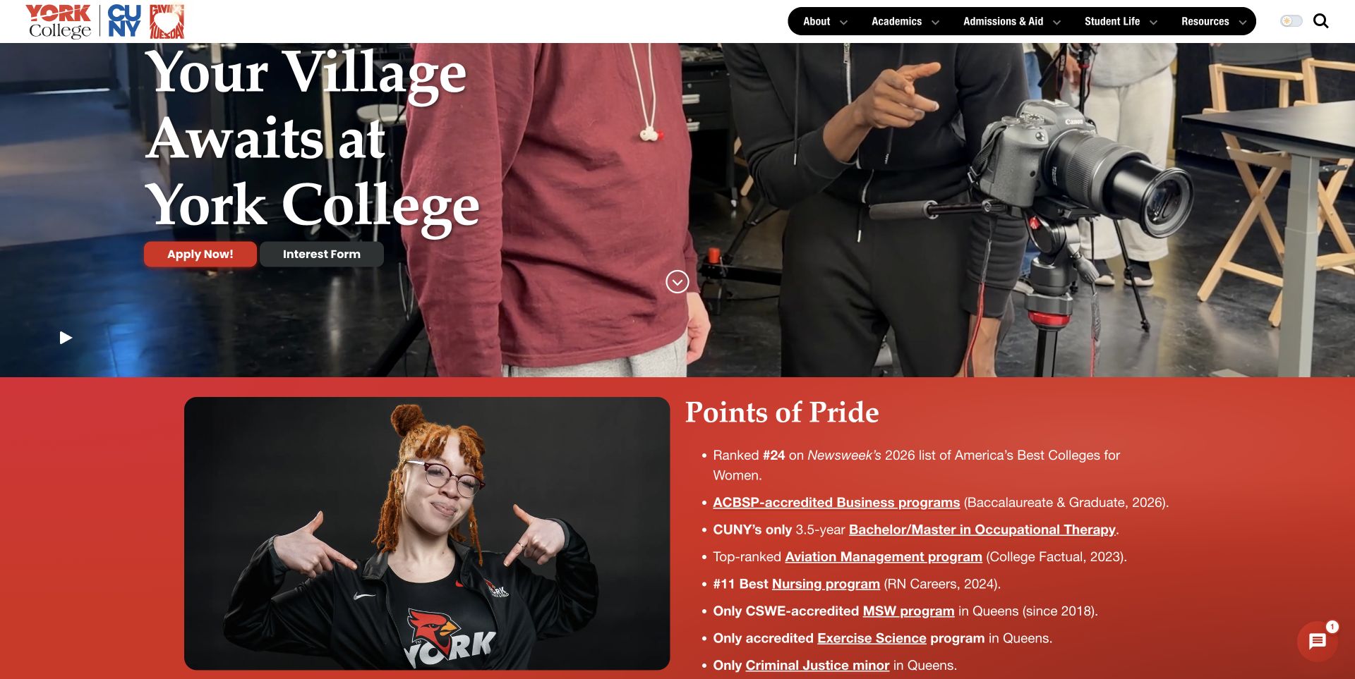
York College places its CUNY affiliation and Giving Tuesday identity around a compact navigation bar, then lets a large serif community message lead the recruitment story. The captured view follows a normal video pause and shows the hero together with the beginning of Points of Pride. Apply and interest actions sit close to the central statement, while the red-orange section below connects institutional claims to individual programmes. The camera-production imagery gives the page a concrete campus activity instead of a purely abstract promise. Rankings and other proof points remain the college's own published claims; the screenshot does not independently establish their methodology or current standing.
What you can learn
Pair a broad community message with a small number of practical recruitment actions. Give supporting claims their own section and link them to specific programmes or explanations, so visitors can investigate rather than relying on a promotional number alone.
Pros
Application and interest routes appear beside the main message.
Strong color changes distinguish the hero from supporting programme content.
Cons & considerations
Donation and recruitment priorities compete within the opening experience.
Two inspected navigation labels led to the same resource destination.
Platform source: Official Plone implementation case. The official York College implementation case identifies www.york.cuny.edu as a long-running Plone website. Separate internal applications and other CUNY campuses are outside this public-site claim. Official project implementation documentation reviewed on November 12, 2026. This is a documented association with the exact named public property; it is not access to its private backend, an exact current version inventory, or proof that the CMS caused the visible design. Platform evidence is separate from the direct website screenshot and is not a complete current infrastructure audit.
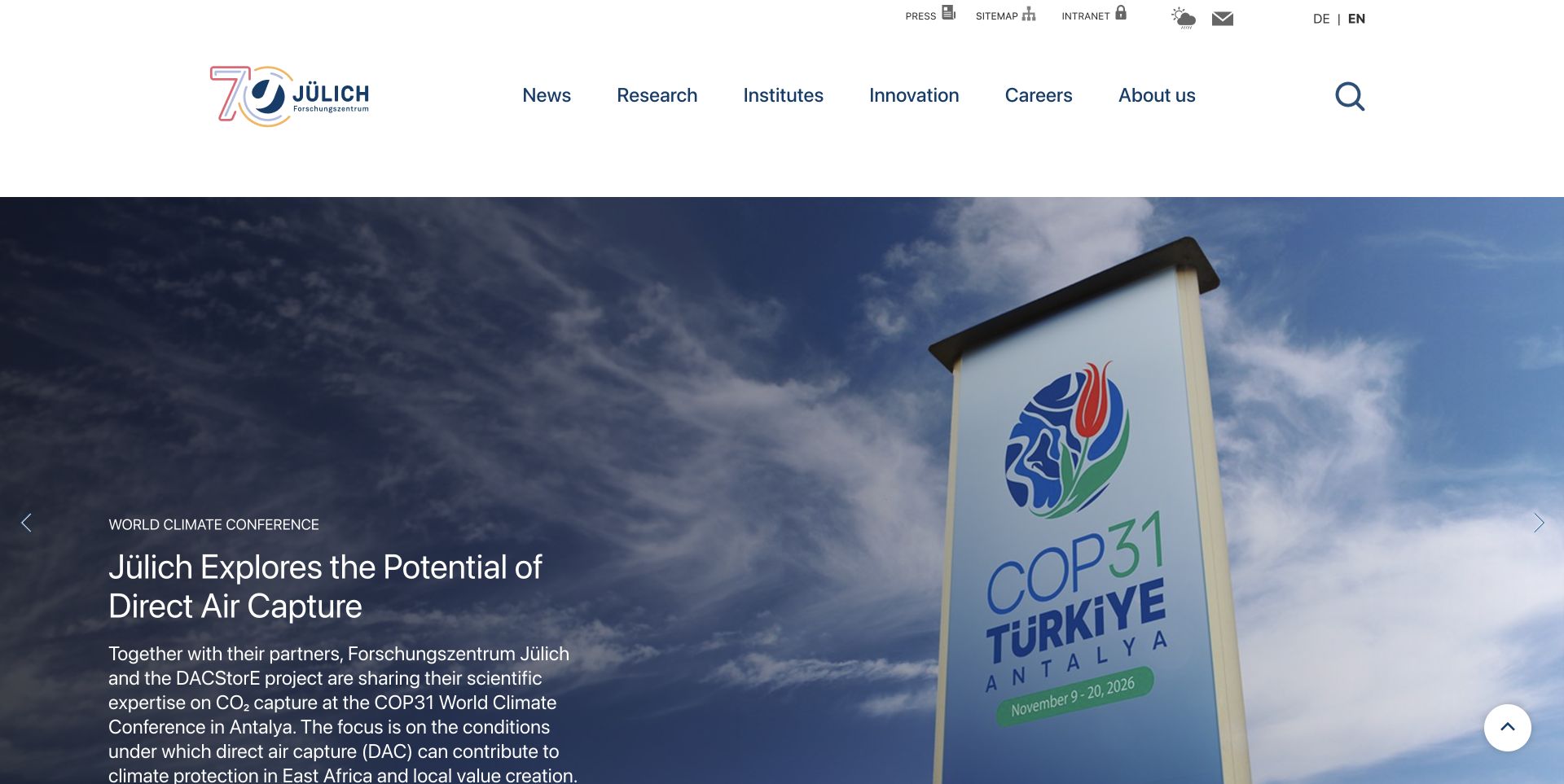
Forschungszentrum Jülich uses a generous white header to separate research, institutional information and careers from smaller utility links. Its anniversary identity and prominent search sit above a large topical story, giving the portal both a stable institutional frame and a changing editorial centre. The captured climate-conference feature combines an eyebrow, headline and explanatory deck rather than relying on a photograph alone. Further down, strategic research themes provide a more durable way into the organization's work. This approach is useful for a research institution that must communicate with specialists, applicants and the general public. The opening story is substantial enough that its text extends beyond the first viewport.
What you can learn
Build separate routes for recurring tasks and current research communication. Keep the thematic structure stable as stories change, and decide how much explanatory copy belongs in a homepage feature before it delays access to the rest of the institution.
Pros
The main navigation separates institutional, research and career intentions.
A clear story hierarchy explains why the featured image matters.
Cons & considerations
The large feature and long deck postpone lower-page choices.
Several small utility icons require recognition or closer inspection.
Visible tech stack
Earlier / documented evidence
Plone
Platform source: Official Plone implementation case. The official implementation case identifies the April 2022 main-portal relaunch using Plone and a Volto frontend through the Plone REST API. It is implementation documentation, not a current backend-version scan. Official project implementation documentation reviewed on November 12, 2026. This is a documented association with the exact named public property; it is not access to its private backend, an exact current version inventory, or proof that the CMS caused the visible design. Platform evidence is separate from the direct website screenshot and is not a complete current infrastructure audit.
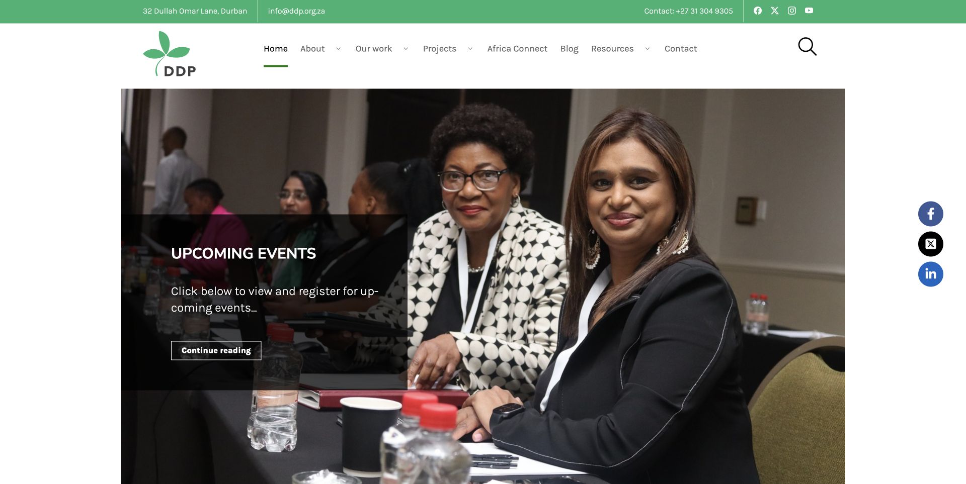
The Democracy Development Program combines a green identity, a compact contact strip and a large photograph of people gathered around a meeting table. The image presents the organization through activity, while a translucent panel identifies the current events area. Its leaf-like mark and restrained palette keep the page recognizable without overwhelming the participants in the photograph. Work areas and fellowship material provide further routes after the opening feature. The design is most useful as an example of making an organization's programme visible before presenting a long institutional history. The generic Continue reading action, however, asks visitors to infer what they will find after clicking.
What you can learn
Let a specific programme or event demonstrate the organization's purpose, then connect it to durable work-area pages. Give the action a descriptive label and keep the image overlay short enough that the people and setting remain legible.
Pros
Real programme imagery gives the opening page a concrete human context.
The green identity links the header and editorial treatment consistently.
Cons & considerations
The main action does not name its destination or event.
A social-sharing rail adds another competing element beside the feature.
Platform source: Official Plone implementation case. The official Plone implementation case identifies the public Democracy Development Program website as a Plone 6 and Volto project. Official project implementation documentation reviewed on November 12, 2026. This is a documented association with the exact named public property; it is not access to its private backend, an exact current version inventory, or proof that the CMS caused the visible design. Platform evidence is separate from the direct website screenshot and is not a complete current infrastructure audit.
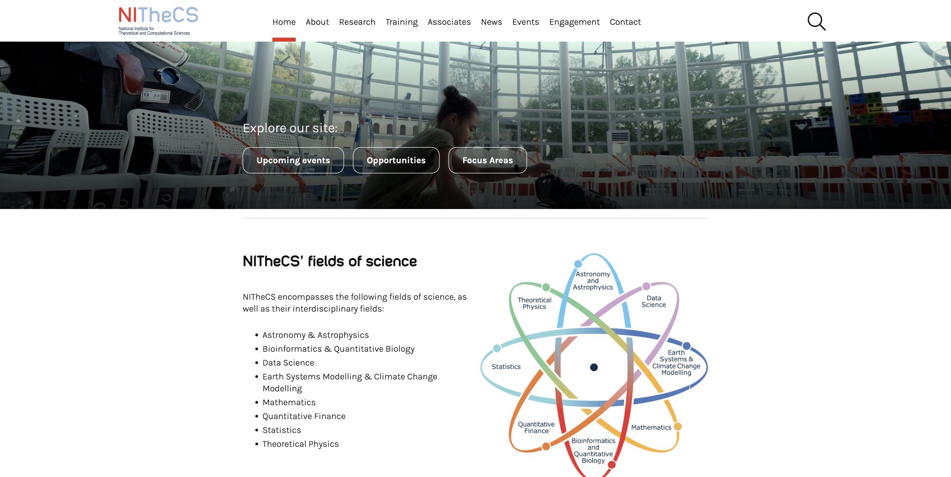
NITheCS introduces its research world with a compact institutional header and a shallow video-backed hero. Three direct shortcuts identify events, opportunities and focus areas, allowing visitors to choose a practical task before reading a broad explanation of the institute. Further down, an orbital diagram organizes the scientific disciplines into a visual system. That combination is more useful than treating every field as an identical promotional card: the shortcuts answer immediate needs, while the diagram communicates relationships. The imagery should be read as presentation material, with stock-image credits retained in the source, rather than assumed to document a particular institute building or research activity.
What you can learn
Separate frequently requested actions from the explanation of a complex research network. Use a diagram when relationships matter, but accompany it with ordinary text links so the information remains understandable without interpreting the illustration or watching a video.
Pros
Events and opportunities are visible as distinct practical destinations.
The discipline diagram gives the breadth of research a coherent structure.
Cons & considerations
Repeated Open menu labels provide limited distinction in the inspected navigation.
The inspected privacy and terms links returned to the homepage.
Visible tech stack
Earlier / documented evidence
Plone
Platform source: Official Plone implementation case. The official implementation case describes the public National Institute for Theoretical and Computational Sciences website migrating from WordPress to Plone 6 with Volto. Its planned future member features are not claimed to be live. Official project implementation documentation reviewed on November 12, 2026. This is a documented association with the exact named public property; it is not access to its private backend, an exact current version inventory, or proof that the CMS caused the visible design. Platform evidence is separate from the direct website screenshot and is not a complete current infrastructure audit.
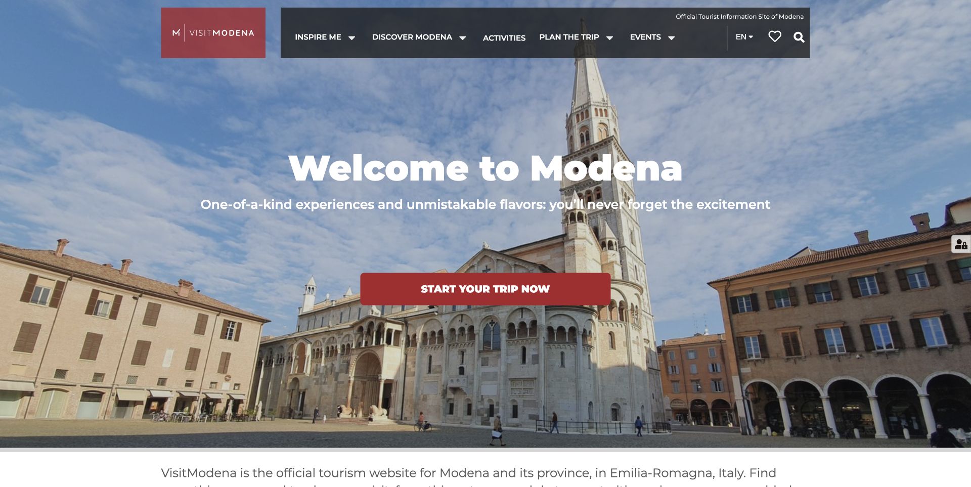
Visit Modena opens with a cathedral-square panorama, a red identity block and a broad invitation to start planning a trip. The translucent navigation keeps destination categories visible over the photograph, while a solid red action creates a clear point of emphasis. The useful work continues below: timed visits, guided experiences, transport advice and one-, two- and three-day itineraries connect inspiration with practical planning. The page also distinguishes upcoming events from permanent sights, helping visitors move between reasons to travel and things they can book. This is an official destination gateway rather than evidence that any particular tour, promotion or booking flow was tested.
What you can learn
Connect an evocative destination image to practical decisions within the same page. Give visitors enough information to choose a duration, understand arrival restrictions and identify bookable activities, while keeping temporary offers visibly separate from permanent travel advice.
Pros
The red primary action remains easy to locate over the panorama.
Arrival advice and duration-based itineraries support real planning tasks.
Cons & considerations
The large opening image delays the first specific activity choices.
Several discovery labels are generic compared with the detailed destination content.
Visible tech stack
Earlier / documented evidence
Plone
Platform source: Official Plone implementation case. The official implementation case explicitly names visitmodena.it as the public tourism portal built on Plone. The separate municipal intranet is not an example in this collection. Official project implementation documentation reviewed on November 12, 2026. This is a documented association with the exact named public property; it is not access to its private backend, an exact current version inventory, or proof that the CMS caused the visible design. Platform evidence is separate from the direct website screenshot and is not a complete current infrastructure audit.
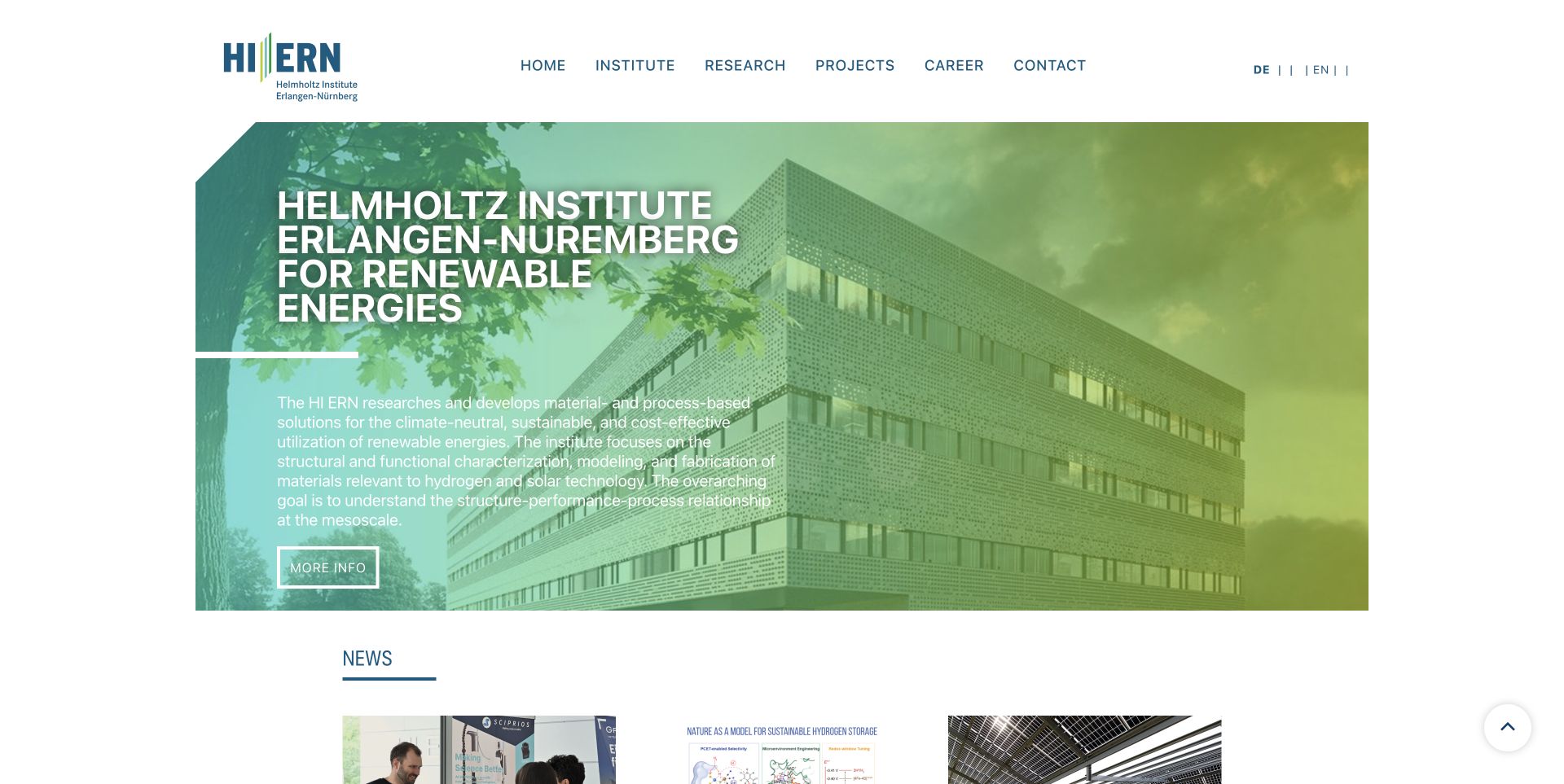
The Helmholtz Institute Erlangen-Nürnberg gives its renewable-energy research a separate visual identity while retaining the structure of an institutional portal. A teal-to-green treatment unifies the building photograph, large uppercase title and explanatory paragraph. Six straightforward navigation choices cover the institute, research, projects, careers and contact needs. News begins immediately below the hero, making the relationship between a stable mission and current work easy to understand. The page is a useful example of a separately branded institute property within a larger publishing platform. Its public design can be reviewed independently without treating it as another view of the Jülich homepage.
What you can learn
Give a sub-institute a recognizable identity and a concise mission while preserving familiar navigation. Keep the scientific description readable for newcomers, then offer more detailed research pages for specialists instead of compressing every technical distinction into the hero.
Pros
The limited palette connects the logo, photograph and section headings.
A short navigation set makes the institute's main responsibilities clear.
Cons & considerations
The long uppercase title takes substantial space on the opening screen.
The technical mission paragraph and generic More info action need careful editing.
Visible tech stack
Earlier / documented evidence
Plone
Platform source: Official Plone implementation case. The Jülich implementation case explicitly names www.hi-ern.de as a separately branded public subsite using its Plone/Volto publishing platform. This is the institute property, not a duplicate of the parent homepage. Official project implementation documentation reviewed on November 12, 2026. This is a documented association with the exact named public property; it is not access to its private backend, an exact current version inventory, or proof that the CMS caused the visible design. Platform evidence is separate from the direct website screenshot and is not a complete current infrastructure audit.
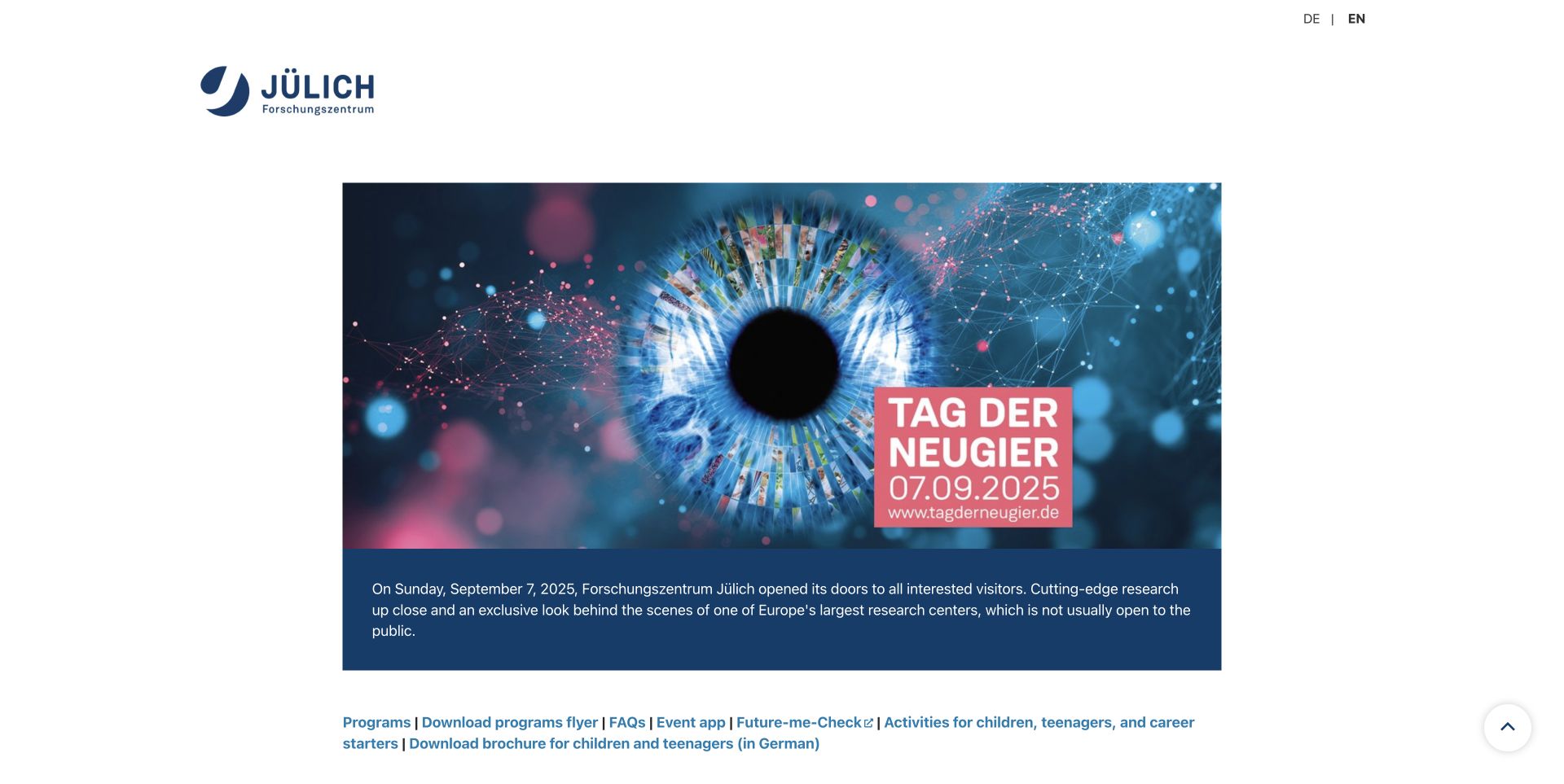
Jülich's Day of Curiosity site retains a striking eye-shaped collage above a dark-blue introductory panel. The date remains clearly visible in the artwork, and the accompanying text uses the past tense to describe the September 2025 open day. Programme, flyer, FAQ and activity links sit close together below, preserving useful routes into the event material. The English page keeps the event's German visual identity rather than rebuilding the artwork in another language. This is a public event archive, not a current invitation to attend. The distinction matters because the same layout could otherwise make a past event look like an upcoming opportunity.
What you can learn
Plan the post-event state before launch. Keep the original date visible, change invitation copy to an archive explanation and preserve useful programme materials. Review embedded services separately, because an expired social wall can weaken an otherwise useful archive.
Pros
The event date and past-tense introduction make its timing understandable.
Programme and practical reference links remain close to the introductory panel.
Cons & considerations
A dense inline link list is harder to scan than grouped tasks.
The inspected social-wall embed reported that it was inactive.
Visible tech stack
Earlier / documented evidence
Plone
Platform source: Official Plone implementation case. The Jülich implementation case explicitly names www.tagderneugier.de as a separate public Plone/Volto event site. The inspected page preserves a September 2025 event and is reviewed as an event archive, not an upcoming event. Official project implementation documentation reviewed on November 12, 2026. This is a documented association with the exact named public property; it is not access to its private backend, an exact current version inventory, or proof that the CMS caused the visible design. Platform evidence is separate from the direct website screenshot and is not a complete current infrastructure audit.
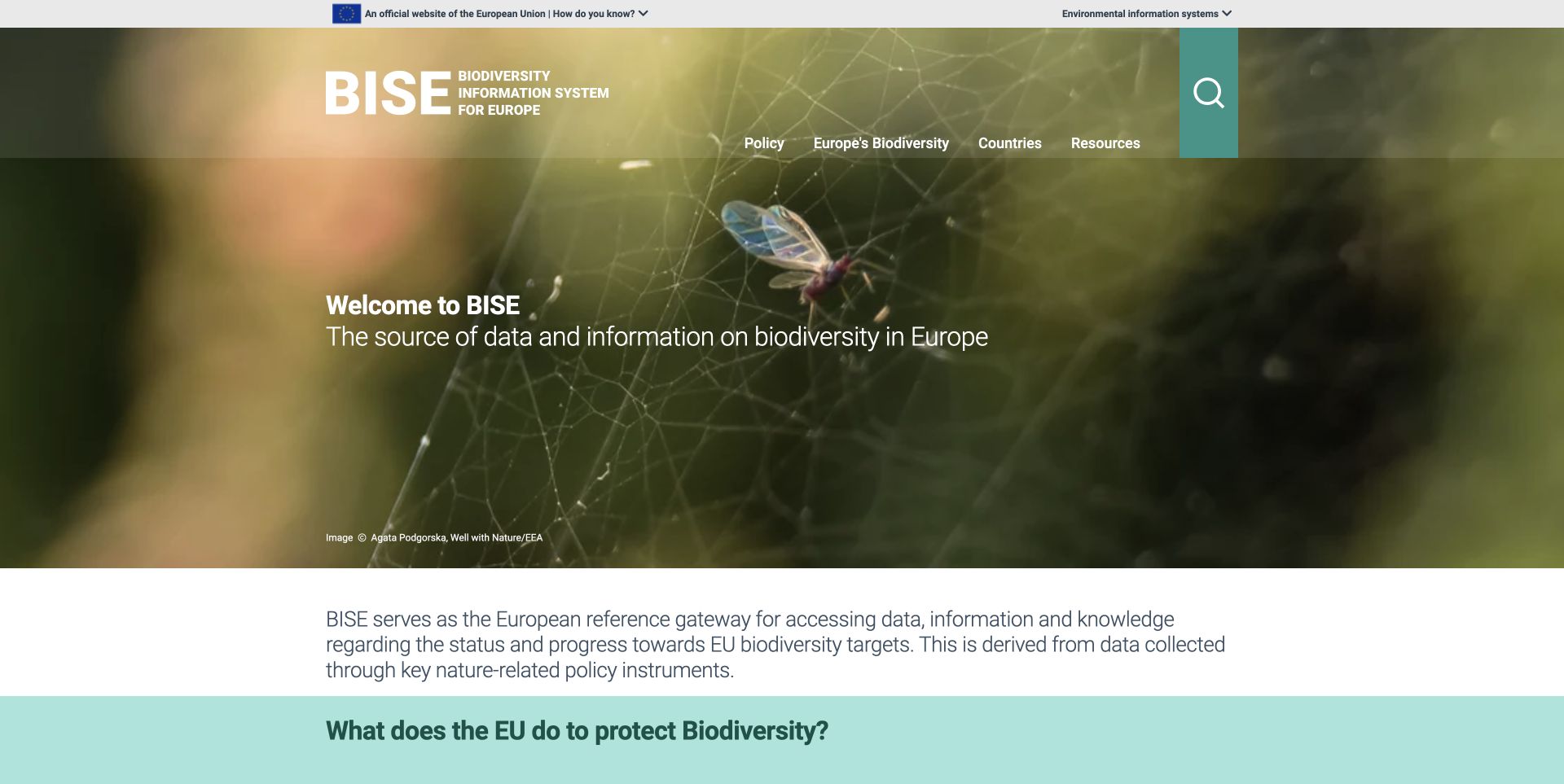
BISE uses a close-up nature photograph to introduce biodiversity information without making the subject feel abstract. Its expanded name sits beside the acronym, while policy, biodiversity, countries and resources form a compact navigation set. A large search control provides an alternative to that hierarchy. Below the image, the portal explains its purpose and separates services from highlighted resources. Labels such as digital report, country factsheets and map viewer help readers anticipate the kind of destination they will open. The numbers shown on the page are published portal claims, not measurements independently checked for this design review. Their sources and dates deserve attention when reused elsewhere.
What you can learn
Label resources by both subject and format. A reader looking for a map has a different need from someone seeking policy guidance, even when both concern biodiversity. Keep the institutional identity and an accessible search route visible as the collection grows.
Pros
The full portal name explains the acronym immediately.
Format labels distinguish maps, factsheets and editorial reports.
Cons & considerations
The long introductory explanation postpones the first specialist resources.
The oversized photographic opening gives immediate data retrieval less prominence.
Visible tech stack
Earlier / documented evidence
Plone
Platform source: Official Plone implementation case. The official EEA Plone implementation case explicitly lists biodiversity.europa.eu as its biodiversity information property. This documents the named portal, without establishing an exact currently deployed Plone version. Official project implementation documentation reviewed on November 12, 2026. This is a documented association with the exact named public property; it is not access to its private backend, an exact current version inventory, or proof that the CMS caused the visible design. Platform evidence is separate from the direct website screenshot and is not a complete current infrastructure audit.
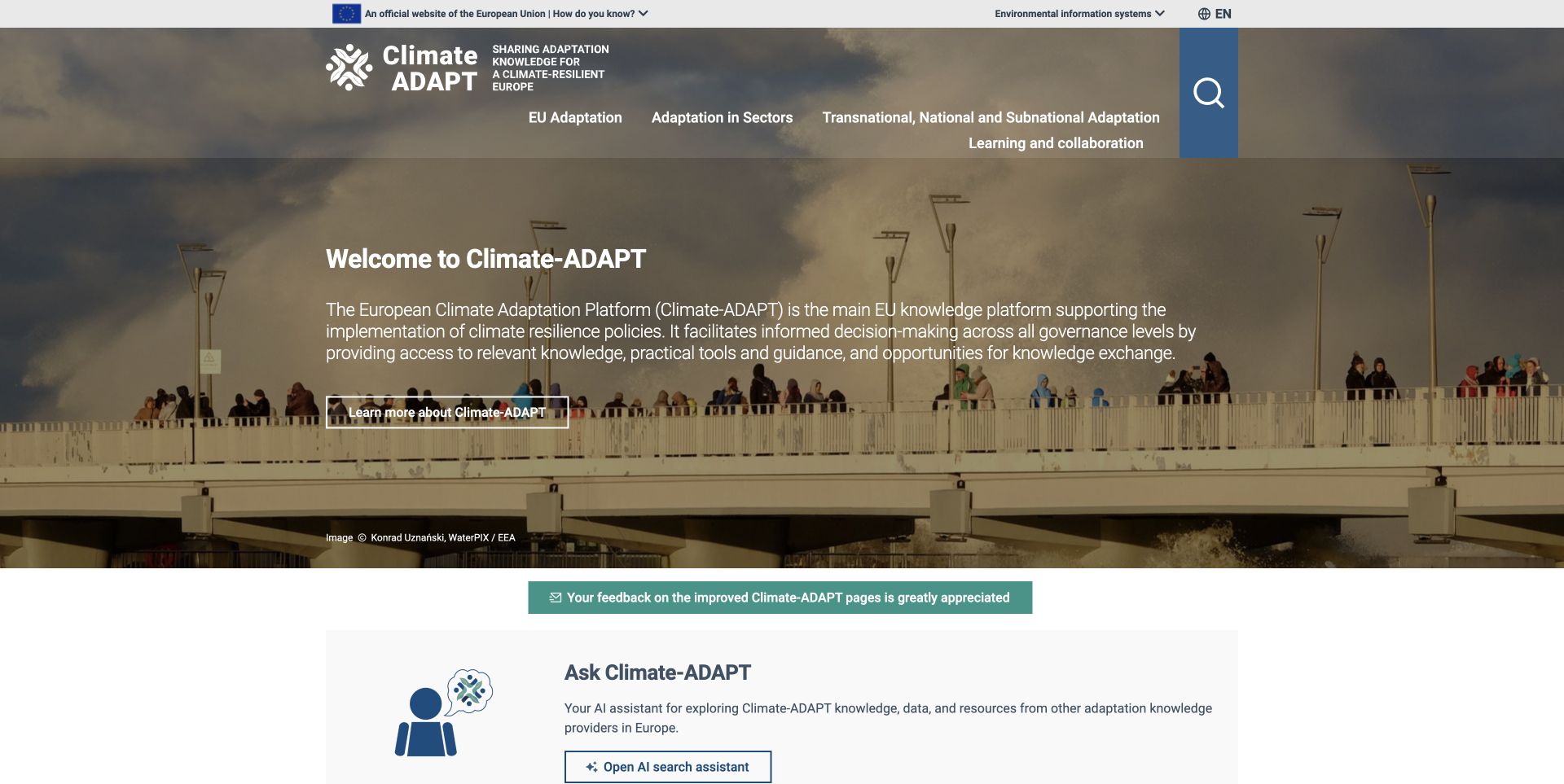
Climate-ADAPT pairs a dramatic coastal photograph with a substantial explanation of the platform's role. The institutional strip and broad subject navigation establish a European policy context, while the page offers an AI search assistant and a navigator of resilience tools below the opening feature. These routes address different kinds of discovery: asking a question, browsing a curated tool collection or following the adaptation policy cycle. The visual treatment gives an otherwise technical subject a recognizable entry point. The inspected navigation also exposed several internal backend addresses, which is a serious usability detail to catch before borrowing this kind of decoupled publishing architecture.
What you can learn
Offer several discovery methods only when their roles are clear. Explain what a search assistant covers, keep curated resources independently reachable and verify every published link after deployment. A convincing homepage cannot compensate for navigation pointing to an internal host.
Pros
The page states the platform's purpose before introducing specialist tools.
Policy-cycle resources provide a structured alternative to open-ended search.
Cons & considerations
Several inspected primary links pointed at an internal backend address.
The large introductory paragraph makes the first screen text-heavy.
Visible tech stack
Earlier / documented evidence
Plone
Platform source: Official Plone implementation case. The official EEA Plone implementation case explicitly lists climate-adapt.eea.europa.eu as the climate-adaptation property. This association does not establish the technology of external resources linked from it. Official project implementation documentation reviewed on November 12, 2026. This is a documented association with the exact named public property; it is not access to its private backend, an exact current version inventory, or proof that the CMS caused the visible design. Platform evidence is separate from the direct website screenshot and is not a complete current infrastructure audit.
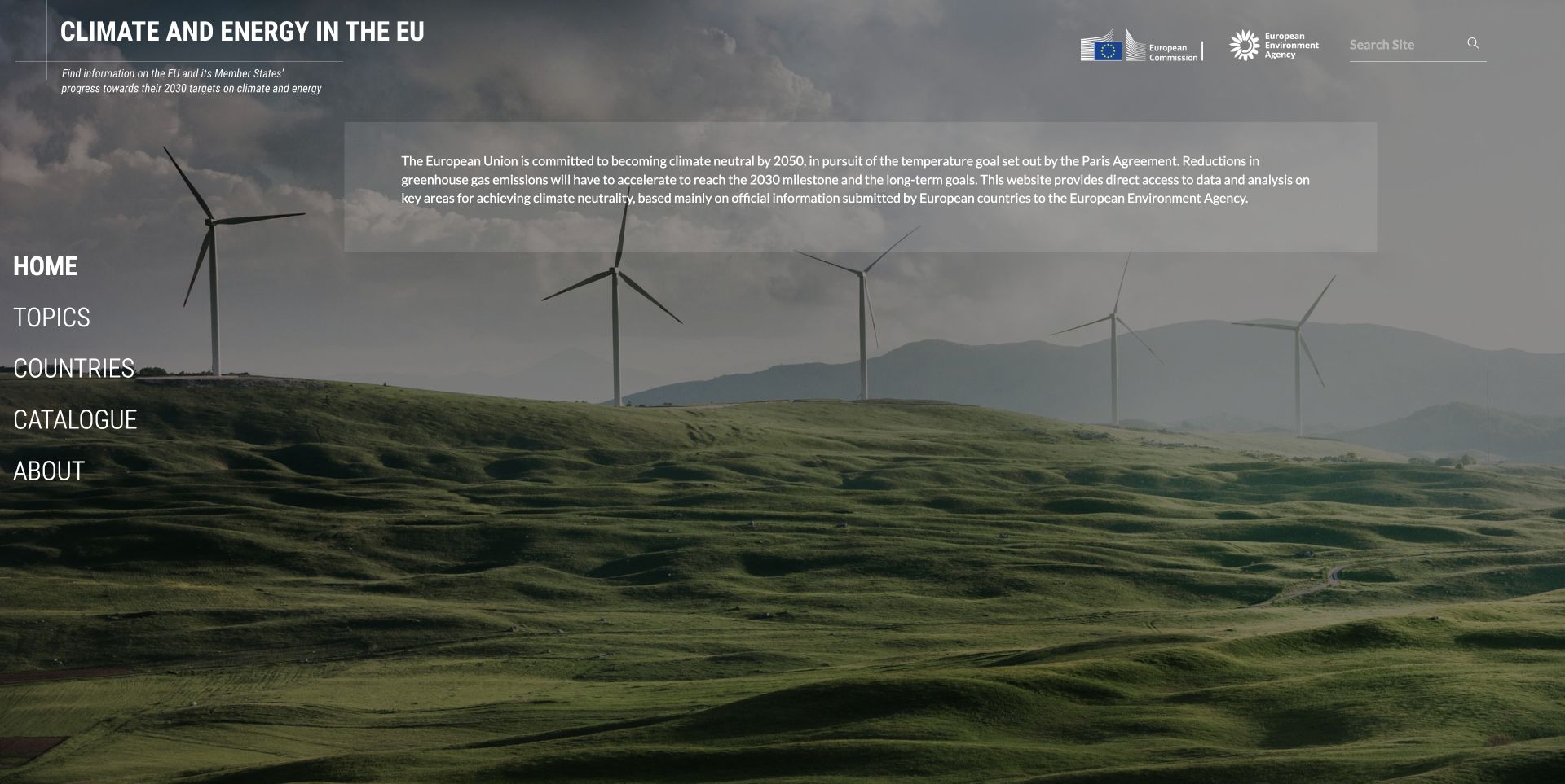
Climate and Energy in the EU uses a full-screen wind-farm landscape behind a small set of navigation choices. The title and institutional marks occupy the upper edge, while Home, Topics, Countries, Catalogue and About form a vertical menu at the left. A translucent text panel explains the purpose of the service without turning the opening page into a grid of competing reports. The composition makes the gateway feel distinct from a conventional agency homepage. It also leaves most of the first screen to the background image, so visitors seeking a particular statistic must choose a route before seeing actual data or results.
What you can learn
A specialist gateway can work with a small, deliberate menu. Make the difference between topic browsing, country views and the full catalogue explicit, and ensure the next page rewards that choice with useful filters and clearly attributed information.
Pros
Five broad destinations make the information architecture easy to grasp.
Institutional marks and search remain visible above the photographic background.
Cons & considerations
No specific dataset or result is available directly in the opening view.
Small white text over a varied photograph requires careful contrast treatment.
Platform source: Official Plone implementation case. The official EEA Plone implementation case explicitly lists climate-energy.eea.europa.eu as a distinct climate-and-energy information website. It does not prove a particular current version or the stack of embedded data tools. Official project implementation documentation reviewed on November 12, 2026. This is a documented association with the exact named public property; it is not access to its private backend, an exact current version inventory, or proof that the CMS caused the visible design. Platform evidence is separate from the direct website screenshot and is not a complete current infrastructure audit.
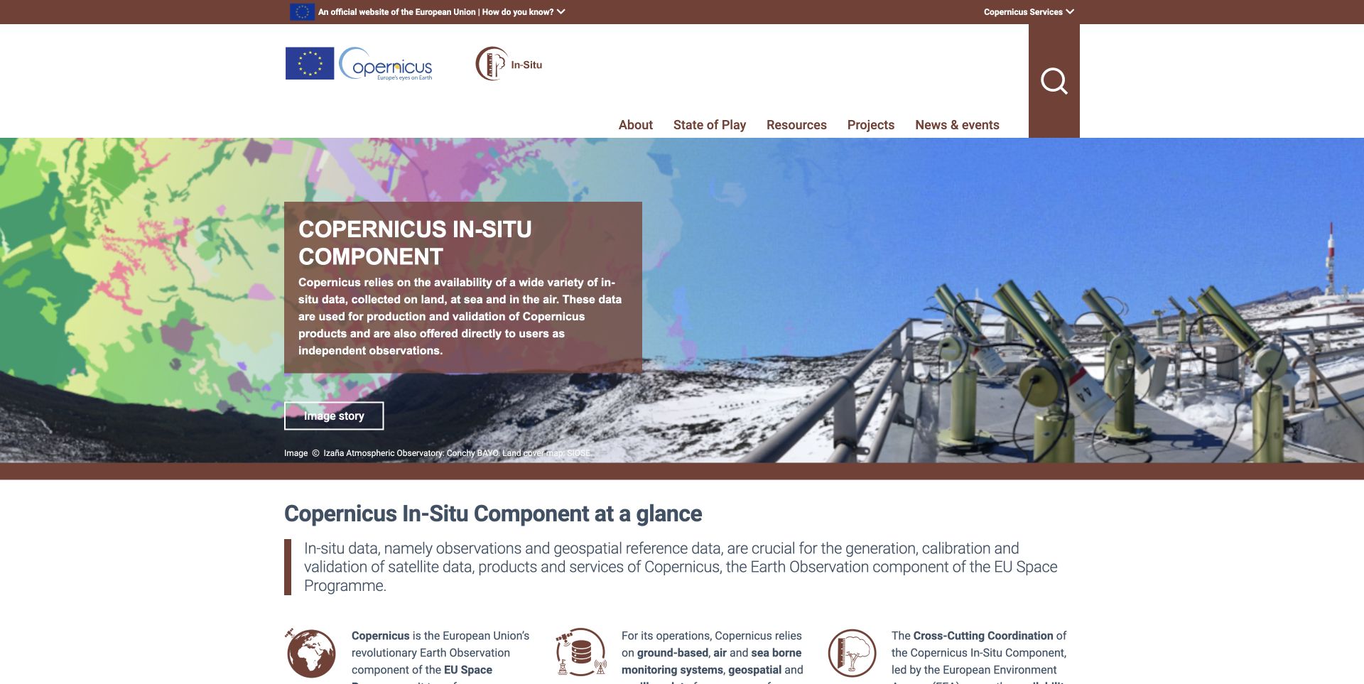
The Copernicus In-Situ Component introduces a technical subject through a composite of mapped land cover and observation equipment. A brown overlay explains what in-situ data contributes, while the Image story link acknowledges that the visual has its own context. The next section distinguishes observations, geospatial information and coordination responsibilities, helping visitors understand the system before exploring its resources. Navigation separates state-of-play reporting, projects and news from the explanatory material. This makes the portal useful as a design reference for complex networks of data providers. The review concerns the public information website, not the quality of measurements or the satellite-processing systems it discusses.
What you can learn
Explain unfamiliar infrastructure through the roles its parts perform. Use a short visual introduction, then give definitions and routes to evidence. Keep image attribution and explanatory material close together so technical illustration does not become an unsupported promise.
Pros
The composite image connects mapped information with physical observation equipment.
Definitions and coordination roles give the specialist vocabulary a useful structure.
Cons & considerations
The opening explanation remains dense for readers new to the programme.
Several inspected image labels did not distinguish the visible organizational marks.
Platform source: Official Plone implementation case. The official EEA Plone implementation case explicitly lists insitu.copernicus.eu as the public in-situ coordination website. The association is with this information portal, not satellite processing infrastructure. Official project implementation documentation reviewed on November 12, 2026. This is a documented association with the exact named public property; it is not access to its private backend, an exact current version inventory, or proof that the CMS caused the visible design. Platform evidence is separate from the direct website screenshot and is not a complete current infrastructure audit.
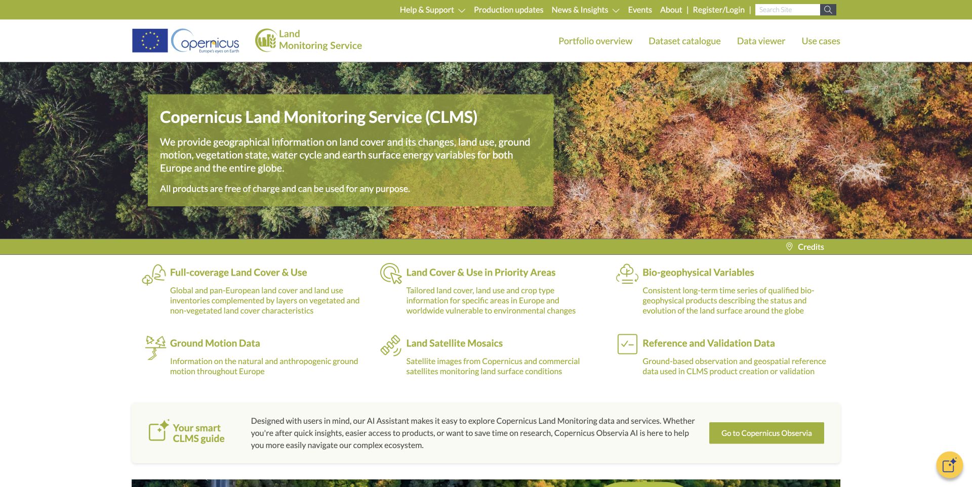
The Copernicus Land Monitoring Service makes its dataset catalogue and map viewer prominent in the main navigation. An olive-green feature panel explains the scope of the service, followed by six product families with short descriptions. That arrangement gives readers an understandable intermediate step between a broad mission and a technical dataset. News, production updates and use cases sit further down, separating operational information from the stable portfolio. The page also introduces an assistant as an additional route into its resources. The captured design is useful for studying catalogue organization, but it does not establish the accuracy, licensing details or operational availability of any individual dataset.
What you can learn
Organize a complex data service around meaningful product families before exposing every technical option. Keep catalogue, viewer and support routes distinct, and check that editorial links resolve publicly rather than leaking internal application addresses into the published page.
Pros
Catalogue and viewer destinations are visible in the main navigation.
Six concise product descriptions help readers choose a relevant data family.
Cons & considerations
Some inspected feature links pointed to an internal backend or an incomplete destination.
The pale green text and large rotating feature need careful readability checks.
Visible tech stack
Earlier / documented evidence
Plone
Platform source: Official Plone implementation case. The official EEA Plone implementation case explicitly lists land.copernicus.eu as the land-monitoring information property. This does not identify the infrastructure processing or serving underlying geospatial datasets. Official project implementation documentation reviewed on November 12, 2026. This is a documented association with the exact named public property; it is not access to its private backend, an exact current version inventory, or proof that the CMS caused the visible design. Platform evidence is separate from the direct website screenshot and is not a complete current infrastructure audit.
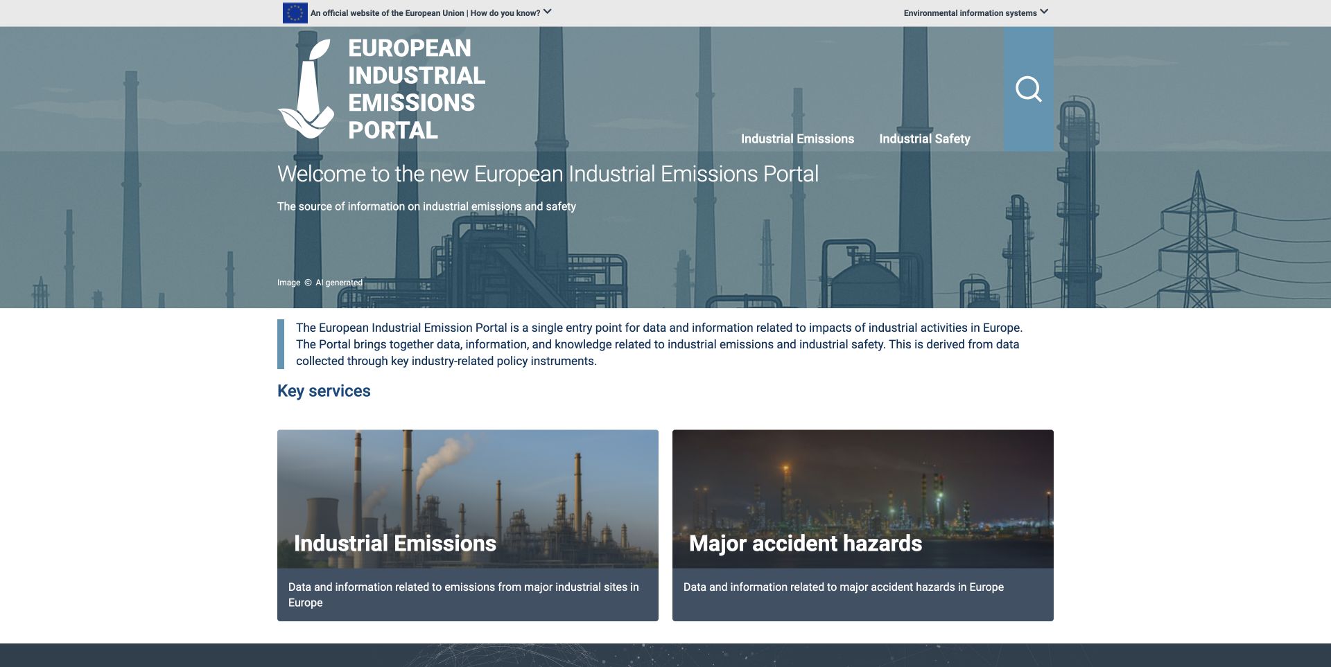
The European Industrial Emissions Portal keeps its opening choice unusually focused: industrial emissions or major accident hazards. A short purpose statement sits above two large destination cards, each with an image, a title and a sentence explaining its scope. The agency identity and search are retained in the header, while the introductory artwork is explicitly labelled as AI generated. That disclosure matters when studying a page about real industrial impacts; the image should not be mistaken for documentary evidence of a particular facility. The design offers a clear gateway into two related information needs, although the underlying datasets are necessarily another step away.
What you can learn
When a portal has two dominant audiences or tasks, make that split visible instead of presenting an undifferentiated document list. Explain the boundary between each route, and label illustrative imagery so it cannot be confused with the evidence being presented.
Pros
Two substantial cards make the main decision easy to understand.
The artwork disclosure separates illustration from documentary source material.
Cons & considerations
The large identity and welcome area delay access to specific records.
A visitor with a known facility or pollutant must use another route to search.
Visible tech stack
Earlier / documented evidence
Plone
Platform source: Official Plone implementation case. The official EEA Plone implementation case explicitly lists industry.eea.europa.eu as its industrial-emissions information portal. Public-site implementation evidence does not establish the database architecture. Official project implementation documentation reviewed on November 12, 2026. This is a documented association with the exact named public property; it is not access to its private backend, an exact current version inventory, or proof that the CMS caused the visible design. Platform evidence is separate from the direct website screenshot and is not a complete current infrastructure audit.
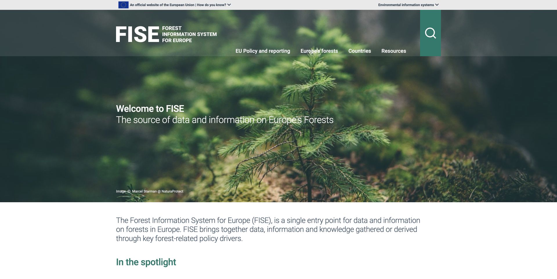
FISE uses a forest photograph and a restrained green palette to establish its subject before introducing policy, country and resource navigation. The full name expands the acronym in the header, and a dedicated search control balances the topic hierarchy. Spotlight cards identify country factsheets, research material and a tree-planting initiative as different kinds of content. Later sections connect statistical summaries with source links and introduce forest maps and policy resources. The design is useful for bringing several evidence formats into one subject library. Some numerical fields were incomplete in the inspected page text, so the statistical presentation needs its own quality checks beyond the visual composition.
What you can learn
Give readers clear labels for the kind of evidence they are opening. Keep maps, country summaries and research commentary distinguishable, and verify that every data-driven statistic has a value, unit, date and source when the page is actually served.
Pros
A consistent subject identity connects the header and resource sections.
Spotlight labels help separate research, initiatives and country information.
Cons & considerations
Some inspected statistical labels lacked their expected values or years.
The large hero and introductory paragraph postpone the practical resource list.
Visible tech stack
Earlier / documented evidence
Plone
Platform source: Official Plone implementation case. The official EEA Plone implementation case explicitly lists forest.eea.europa.eu as the forest information property. The scope is the public portal, not all linked research and mapping services. Official project implementation documentation reviewed on November 12, 2026. This is a documented association with the exact named public property; it is not access to its private backend, an exact current version inventory, or proof that the CMS caused the visible design. Platform evidence is separate from the direct website screenshot and is not a complete current infrastructure audit.
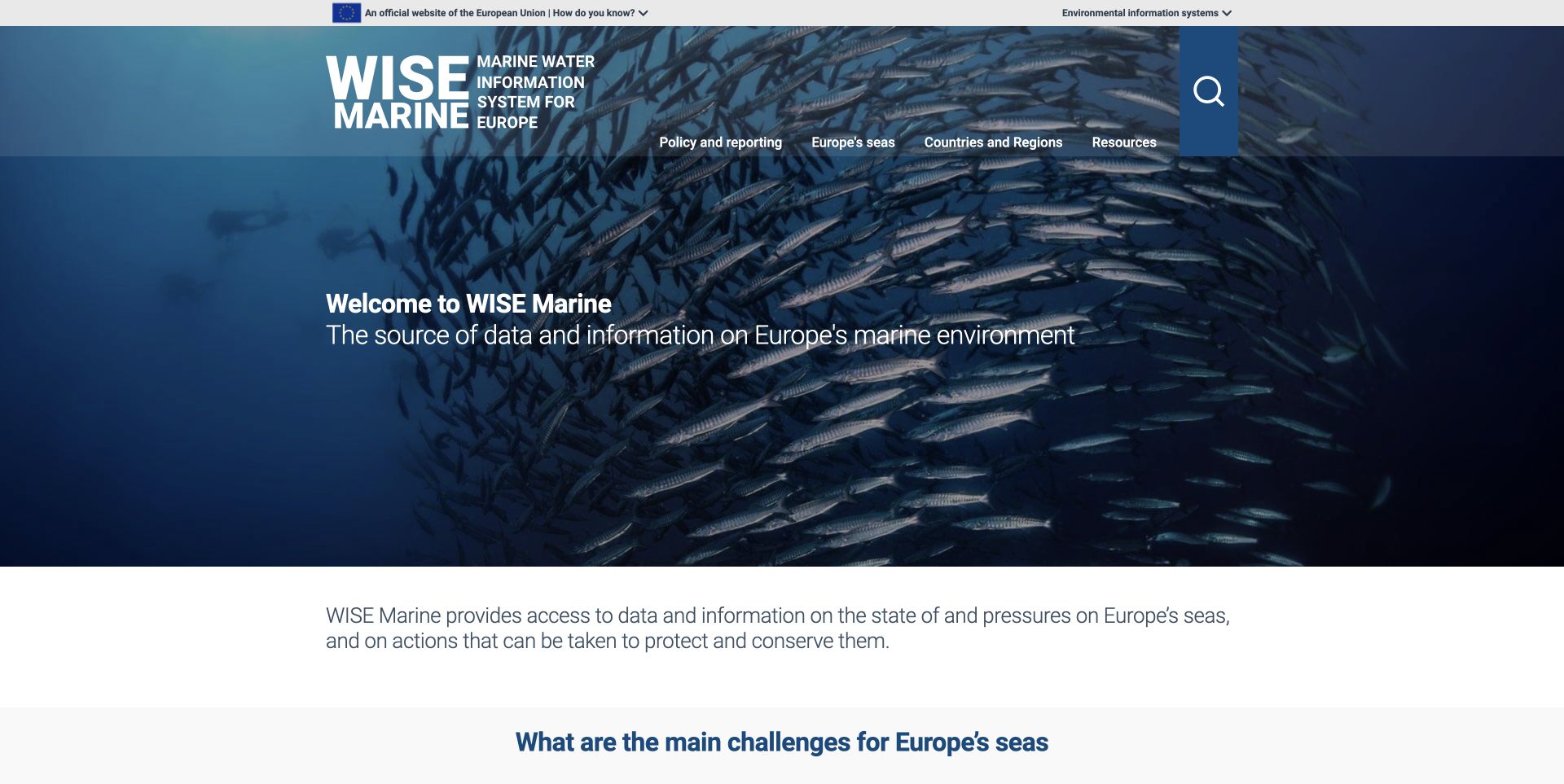
WISE Marine presents itself as a distinct marine information property, with its own identity, navigation and service hierarchy on the shared European water domain. A large photograph of schooling fish introduces the subject, followed by a concise explanation of environmental conditions and pressures. The page then distinguishes policy reporting, map viewers, dashboards and protected-area information. Those labels help readers move from a general concern about the sea to a more specific evidence format. Country and regional-sea routes provide another useful organizing principle. The layout is recognizable as part of the wider information-system family, but its marine responsibilities remain clearly separate from freshwater reporting.
What you can learn
A shared publishing platform does not require identical information architecture. Preserve the family identity while choosing navigation and services around each portal's audience. Use resource-type labels to explain whether a destination is a report, interactive map or reporting dashboard.
Pros
The marine identity and service set distinguish this property from its sibling.
Maps, dashboards and policy material receive descriptive destination labels.
Cons & considerations
The large photographic opening delays direct access to specialist tools.
The inspected search button lacked a descriptive accessible name.
Visible tech stack
Earlier / documented evidence
Plone
Platform source: Official Plone implementation case. The official EEA Plone implementation case separately identifies water.europa.eu/marine as the marine information property. Its own branding, navigation, MSFD services and site root distinguish it from the freshwater portal on the same host. Official project implementation documentation reviewed on November 12, 2026. This is a documented association with the exact named public property; it is not access to its private backend, an exact current version inventory, or proof that the CMS caused the visible design. Platform evidence is separate from the direct website screenshot and is not a complete current infrastructure audit.
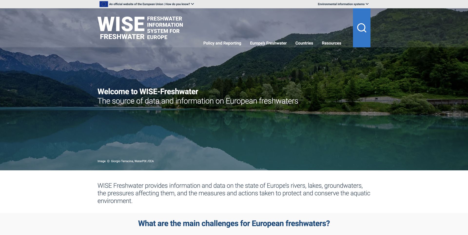
WISE Freshwater uses a lake-and-mountain photograph to establish a separate freshwater identity within the European water domain. Its navigation emphasizes policy, freshwater topics, countries and resources, then the body connects those categories to specific services. Water Framework Directive material, country profiles and map viewers are described by both their purpose and their format. A dated insights section distinguishes new datasets from publications, which helps readers assess what changed without confusing a report date with a data release. The page is useful as a subject-specific information gateway. It does not itself prove the current condition of a river, lake or groundwater body.
What you can learn
Keep update types and dates explicit in an evidence library. A new dashboard, a revised dataset and a publication are different events for the reader. Preserve a familiar family layout while making each portal's responsibilities and specialist tools clear.
Pros
Country profiles and directive resources receive useful explanatory descriptions.
Dated updates distinguish datasets, dashboards and published reports.
Cons & considerations
The prominent hero postpones the map and tool destinations.
The inspected logo link and search control had generic or missing accessible names.
Visible tech stack
Earlier / documented evidence
Plone
Platform source: Official Plone implementation case. The official EEA Plone implementation case separately identifies water.europa.eu/freshwater as the freshwater property. Its own site root, branding, WFD services and country profiles distinguish it from the marine portal on the same host. Official project implementation documentation reviewed on November 12, 2026. This is a documented association with the exact named public property; it is not access to its private backend, an exact current version inventory, or proof that the CMS caused the visible design. Platform evidence is separate from the direct website screenshot and is not a complete current infrastructure audit.
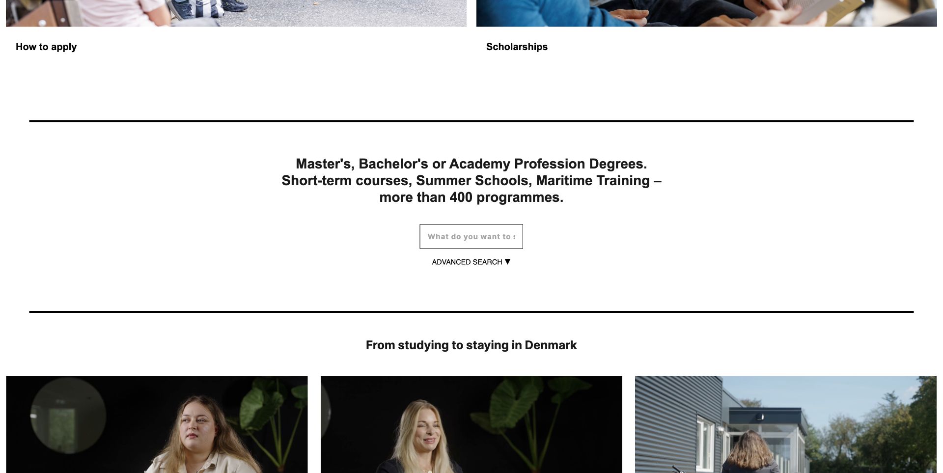
Study in Denmark puts programme discovery between practical application topics and stories about life after graduation. The captured scrolled section names several qualification types, offers a focused search field and keeps an advanced-search option nearby. Student videos below connect the catalogue to longer-term decisions about living and working in the country. The wider page includes institution events and practical navigation, making it a gateway rather than an individual university prospectus. The search input appears narrow relative to the large surrounding space, and its placeholder is visibly truncated. The review concerns this public browsing experience; no application, enquiry or student account was submitted.
What you can learn
Place programme search where visitors can connect it to practical decisions, then support it with clearly identified student experiences. Size the field for realistic questions and verify important application links independently, especially when a frontend receives addresses from a separate CMS.
Pros
Programme types and advanced search make the catalogue's breadth explicit.
Student stories connect study choices with post-graduation considerations.
Cons & considerations
The narrow search field truncates its own prompt in the captured view.
The inspected application and scholarship links exposed internal backend addresses.
Platform source: Official Plone implementation case. The official implementation case identifies studyindenmark.dk as a Plone education portal and documents an older Plone 4 implementation. The current source capture is separate evidence of presentation, not proof that this older version remains deployed. Official project implementation documentation reviewed on November 12, 2026. This is a documented association with the exact named public property; it is not access to its private backend, an exact current version inventory, or proof that the CMS caused the visible design. Platform evidence is separate from the direct website screenshot and is not a complete current infrastructure audit.
Kegan has 15+ years of experience working with small businesses, Fortune 500 companies, and everything in between. No development job is too big or too small: he brings the same hands-on attention to a focused improvement, a complete website, or a custom application.
For Plone projects, he can help with responsive interfaces, reusable components, custom functionality, API connections, and performance-minded implementation. He works directly with clients on scope, design, implementation, testing, and handover, with an emphasis on clear communication and a system that remains practical to maintain after launch.
Show 3 other Plone developersHide other Plone developers
Choose a publishing architecture the team can maintain
Use Classic UI where its model fits
Plone supports a server-rendered Classic UI. Evaluate it against the editors’ actual work and the project’s presentation needs. Make a small representative content set before committing to custom templates: a long article, an event, a downloadable report and a multilingual landing page. Review who maintains the theme, which add-ons are required and how updates are tested. Architecture should follow the needs of the publishing team, not the appearance of an unrelated reference site.
Volto is Plone’s React frontend, connected to the backend through the REST API. Treat frontend operation, theming and release work as explicit responsibilities in the project plan. Editors still need a predictable content model and review process. Readers need ordinary public links, useful search results and accessible controls. The same platform can support very different websites, so a successful case study is a starting point for questions rather than a promise about implementation effort.
Keep custom frontends accountable to public behavior
A documented headless implementation can use another frontend while retaining Plone for content management. Before choosing that route, identify who owns previews, redirects, language negotiation and the publishing boundary. Test the public destinations generated by the CMS, especially when internal services use different hostnames. Several reviewed pages exposed internal addresses in links; that visible defect illustrates why a working editorial backend and a correct public website require separate checks.
Plan the content, ownership and public routes together
Inventory the material before designing templates
Gather a representative sample of real content and identify its owner. Separate durable information from campaigns, time-limited events and externally maintained datasets. Record required dates, languages, source links and the person responsible for retirement or correction. Use that inventory to define the navigation and templates. A small, realistic sample reveals more than a large collection of empty cards, because long titles, missing images and old events expose the decisions that a polished mockup can conceal.
Describe review and publishing responsibilities
Plone content types can attach workflows and permissions to publishing states. Define the people and decisions behind those states before implementing them. Establish who can prepare, review, publish and archive each kind of material, and what happens when an editor leaves. Test the process with a real correction and an expired event. The goal is a maintainable publication process, not an elaborate approval diagram that the team cannot follow in ordinary work.
Build a repeatable list of public checks around the site’s actual risks: canonical addresses, language links, search destinations, downloadable files, internal-host leakage and expired embedded services. Preserve accepted content and a rollback path when changing templates or integrations. Review the public page with realistic content lengths and ordinary privacy controls. A deployment that returns a successful response can still publish a broken application link or an empty statistical field.
A useful handover demonstration
Ask the actual team to carry out its routine job: publish a realistic update, correct a mistake, preview a narrow screen, and identify who owns an integration failure. For a library or frontend framework, also ask who maintains the content source and deployment. A polished screenshot does not answer those operational questions.
Beyond the screenshot
A practical Plone website checklist
Name the audiences and the tasks that should be reachable from the opening page.
Distinguish reports, datasets, maps, events and ordinary articles in the content model.
Record the owner and review responsibility for each content type.
Choose Classic UI, Volto or a custom frontend against real editorial requirements.
Keep public URLs separate from internal service addresses and verify generated links.
Label language changes and make each edition’s purpose understandable.
Include an explicit archive state for expired events and campaigns.
Check every visible statistic for its value, unit, date and supporting source.
Test keyboard navigation, focus states and search labels independently of visual polish.
Keep source evidence, capture dates and platform version claims distinct.
Preserve a rollback path and review embedded services when the main site changes.
Test with real content, a keyboard, a small screen, slow or failed requests, and the people who will maintain the system. These are planning checks, not an accessibility, security, performance, or search-ranking certification.
Sources & editorial method
How this Plone collection was reviewed
Twenty distinct public properties were directly reviewed and captured on November 12, 2026 UTC for the November 12 Pacific morning batch. Official Plone implementation cases supplied exact-property associations, including the separate Marine and Freshwater services on water.europa.eu. Older platform versions remain historical descriptions. All twenty accepted images are unaltered direct browser screenshots, with original URLs, timestamps, dimensions and hashes retained. Necessary-only or rejection controls and ordinary close controls removed obstructing notices where available; no page content or CSS was changed. York was captured after pausing its own video, and Study in Denmark shows its programme-search section. The Day of Curiosity example is explicitly a September 2025 event archive. The broad stack audit attempted every page, retaining checked, partial and unavailable outcomes without bypassing restrictions. Original reviews describe visible design and observed link limitations. No accounts, enquiries, applications, donations, bookings or private interfaces were used. A platform case and a screenshot do not establish current version, measured accessibility, service quality or the truth of a promotional claim.
Every image is an unmodified capture from the actual website, with its source and capture date. Some captures are reused from our shared catalog; their dates remain the original capture dates. None comes from a vendor gallery or a generated reconstruction. Moving imagery and live content can change.
Technology attribution uses public page assets or metadata, official platform documentation, or a cited first-party project case study. Documentary and framework-relationship evidence is identified where used; it is not a complete current backend inventory. A CMS image CDN alone does not establish a full CMS deployment. A library’s presence does not prove which individual controls use it, and a platform label does not establish AI authorship.
The composition notes, lessons, pros and tradeoffs are original editorial observations. We have not measured conversion, traffic, security, performance or accessibility conformance. Website owners retain their brands and imagery; these examples are not our client portfolio. Written, Edited and Curated are independent records, not dates advanced by a build. See our editorial standards or suggest a correction.
Questions worth asking
Plone website development FAQs
Does every example use the same Plone version?
No. The official cases describe different implementations and sometimes earlier platform generations. Each record preserves that scope. A current public capture is not proof that an older version statement remains current.
Are all of these websites built with Volto?
That is not the claim. The reviewed cases include different frontend arrangements, and Plone supports several approaches. Use each property’s evidence rather than inferring a shared frontend from its inclusion in this collection.
Why are two WISE services included on one domain?
Marine and Freshwater are separately named public properties in the official implementation evidence, with distinct identities, navigation and service responsibilities. They are not two screenshots of the same homepage or separate articles counted as websites.
Do the screenshots prove accessibility or data quality?
No. They support observations about the visible interface at a recorded time. Keyboard behavior, accessibility conformance, dataset accuracy and application reliability require their own evaluation.
Why include an older event page?
The Day of Curiosity page is clearly reviewed as a September 2025 archive. Its preserved date, past-tense introduction and programme links provide useful lessons about the state of an event website after the event has finished.
What happens when a public technology scan is incomplete?
The failed or partial outcome stays recorded. Previously reviewed implementation documentation remains a qualified association; it is not relabeled as a successful live scan. No access restriction was bypassed to fill the collection.
Borrow the clear audience routes, resource labels and practical next steps. Choose the platform arrangement around your own editors and content, and keep every implementation claim tied to the property and evidence that supports it.