Best Fencing Company Websites of 2026 (28 Real-World Examples)
Fencing installers, manufacturers and product catalogues with ideas worth adapting
Fencing websites need to distinguish an installed project from a basket of materials. These examples show how businesses organise customer types, products, local service, specification support and quotations without treating every fence enquiry as the same task.
A visitor replacing a garden boundary, a contractor buying panels and a facilities team specifying perimeter systems are not making the same decision. Their questions overlap, but the route to an answer is different. A useful fencing website identifies whether the company manufactures, supplies, installs, hires or coordinates a network of providers. It then makes material browsing, project evidence and a properly explained enquiry available without forcing every customer through an identical sales form.
The collection intentionally includes both installers and suppliers, from regional family businesses to larger product brands. Reviews identify those roles rather than implying that each company can visit every location or perform every kind of work. Study how the sites use application photographs, product categories, audience navigation and service finders. A visually impressive fence is not proof of security performance, regulatory suitability or installation quality; those questions need the relevant documentation and project assessment.
Before the examples
What makes good fencing company website design in 2026?
Separate supply, installation and specialist project routes
An ecommerce price may cover a component, not delivery, preparation or fitting. Label the transaction clearly and give installation customers their own scope and coverage information. If the business provides rental fencing, commercial projects or trade accounts, explain those separately. An installer finder and a stockist finder should not be interchangeable labels. The visitor should know which organisation will answer, survey and perform the work before submitting a detailed enquiry.
Organise the range by a useful first decision
Some visitors know the material; others know the application. Consider a small, well-maintained set of material categories alongside genuine use contexts such as gardens, commercial sites or agricultural work. Avoid a sprawling menu of near-duplicate terms. Each product page should connect photographs with useful dimensions, options and current documentation, while a service page should explain installed project scope rather than repeating catalogue copy.
Show projects with context instead of unsupported claims
A photograph can explain appearance, setting and scale when its caption is accurate. Identify the product or material, broad application and the company’s role in the work. Keep manufacturer images distinct from completed company installations. Security, acoustic, warranty and certification statements need their exact scope and source; a badge near a photograph is not evidence that every installation meets the same standard. Avoid copying another company’s superlatives into the brief.
The collection · 28 examples
28 fencing company websites worth studying
Compare how the sites divide customers and transactions before looking at decorative details. A clear installation route, a maintained technical library or a well-captioned project can be more valuable than another large lifestyle image.
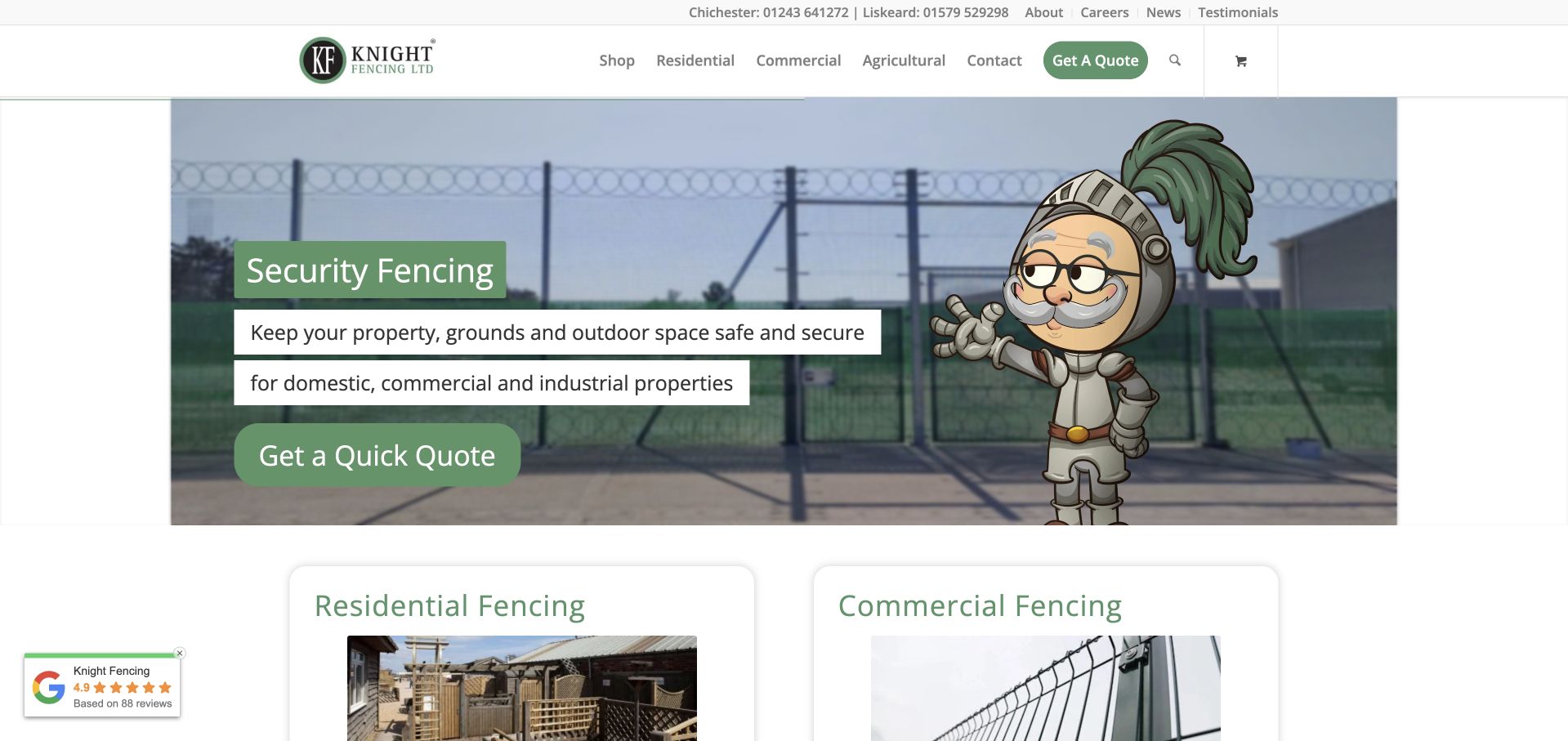
Knight Fencing uses a recognisable illustrated knight beside a real fencing photograph, keeping its name and personality connected. The compact header separates the shop from residential, commercial and agricultural work, while two labelled regional telephone numbers provide practical contact context. The security-fencing slide has an ordinary service explanation and a quotation action; residential and commercial cards begin immediately below it. This makes the broader range understandable without presenting all products as interchangeable. The short audience labels are reinforced by larger service cards rather than an unexplained list of technical product terms. The strongest transferable idea is a useful audience hierarchy supported by a distinctive identity, not the use of a mascot alone.
What you can learn
When a business sells materials and installs fences for several audiences, give those tasks separate entry points. Keep a stable service structure around rotating campaign images so visitors can still find the right route on any slide.
Pros
The shop and three customer audiences are clearly distinguished.
Regional telephone contacts and a quotation route are visible.
Cons & considerations
The mascot and slide copy compete with the project photograph.
The changing hero needs stable supporting service information.
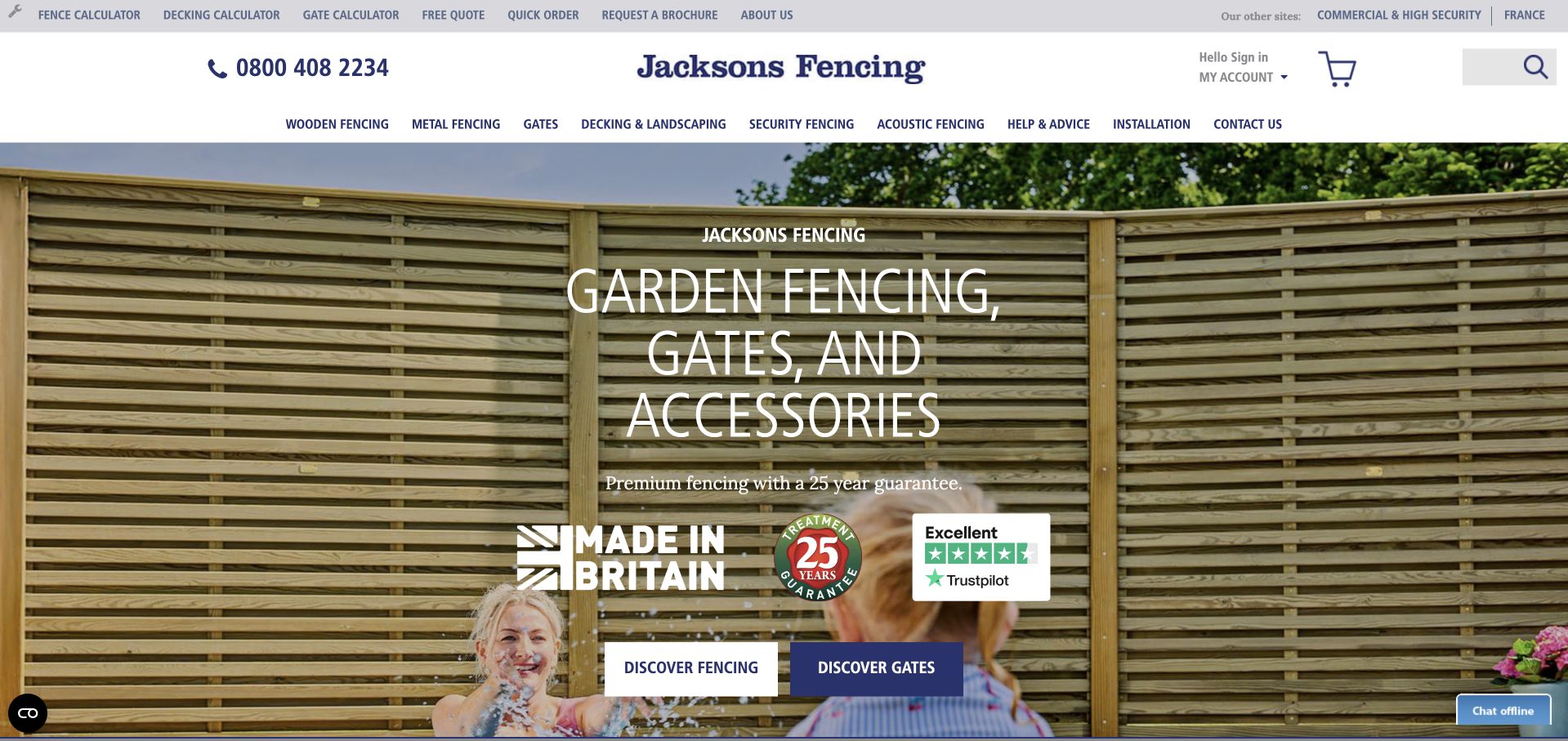
Jacksons Fencing combines a large garden photograph with a restrained blue-and-white catalogue header. Fencing, gates, landscaping, security products and help are distinct categories, while calculators and quick ordering occupy a separate utility row. A garden-facing hero has separate fencing and gate actions rather than a single generic enquiry. An initial audience-selection panel provides additional routing but can delay access to the underlying product structure. The design is useful for a manufacturer with a wide range, but its many tools and categories would be excessive for a narrow local installer unless the content and operational support genuinely existed.
What you can learn
Use planning tools when they answer a real product question, and distinguish calculation from installation assessment. A broad supplier catalogue should make ordering, choosing a product and locating installation help separate, understandable journeys.
Pros
Product categories and planning calculators have distinct navigation roles.
Fencing and gate discovery are separated in the hero.
Cons & considerations
The dense utility row makes the first scan demanding.
Initial audience and privacy panels can delay access to the catalogue.
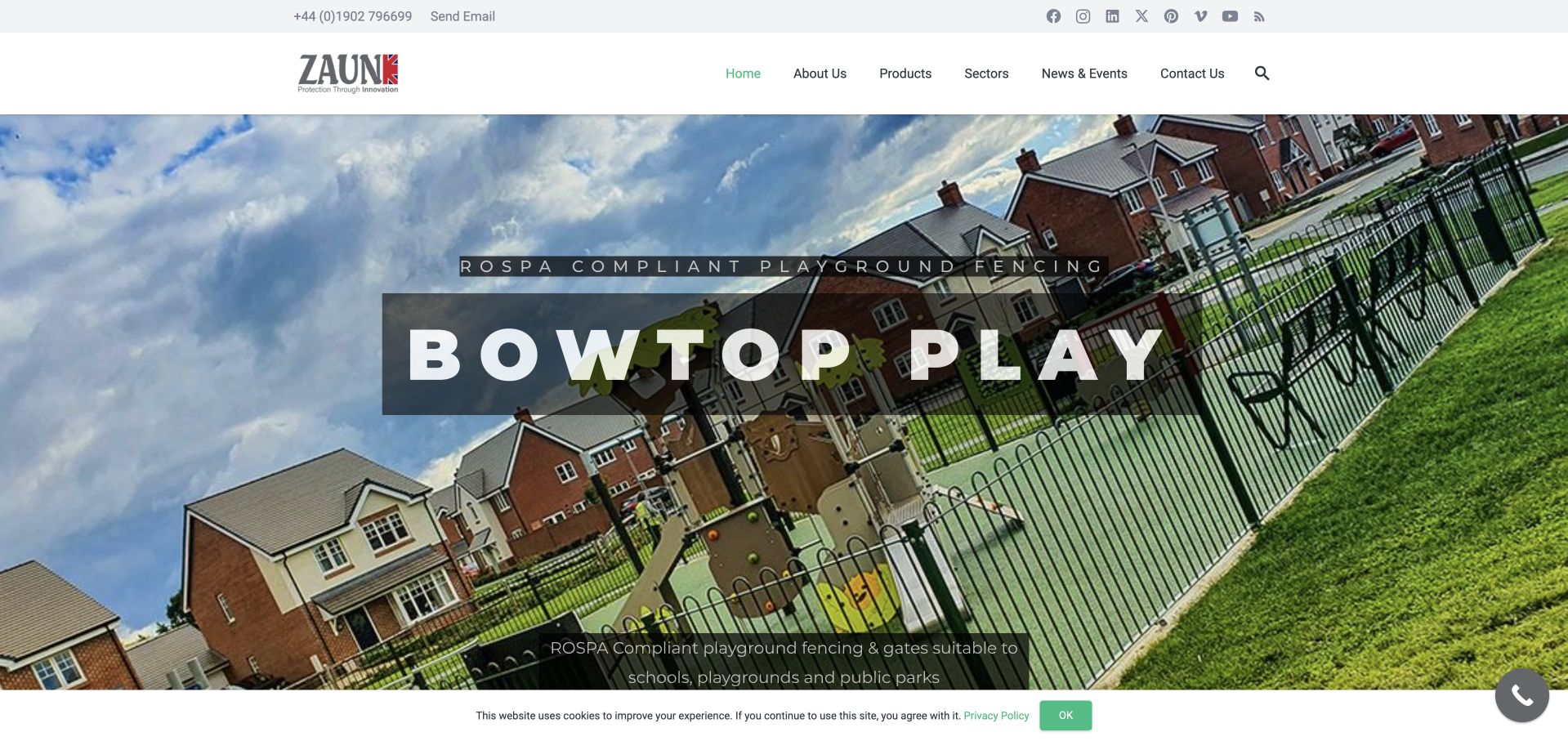
Zaun uses a wide playground-fencing photograph to introduce a named product application. The image shows the fence in a recognisable surrounding environment rather than as an isolated mesh sample, and the caption connects it with schools, playgrounds and parks. A small white header separates products, sectors, company information and news. This is a useful manufacturer presentation: product discovery can begin from the setting in which the fence is required, not just from a technical product code. The large angled image is visually energetic, but the main application title is broad and the detailed explanatory line sits low over the photograph. Any compliance language remains the company’s claim, not an independent certification here.
What you can learn
Give technical products an understandable use context and a route to the current specification. Keep compliance evidence attributed to the right product and source rather than turning a large promotional caption into a universal guarantee.
Pros
The product is shown within a specific application context.
Products and sectors offer different ways to explore the range.
Cons & considerations
Small text over the lower photograph is less prominent than the product name.
A rotating application slide may not establish the full manufacturer scope.
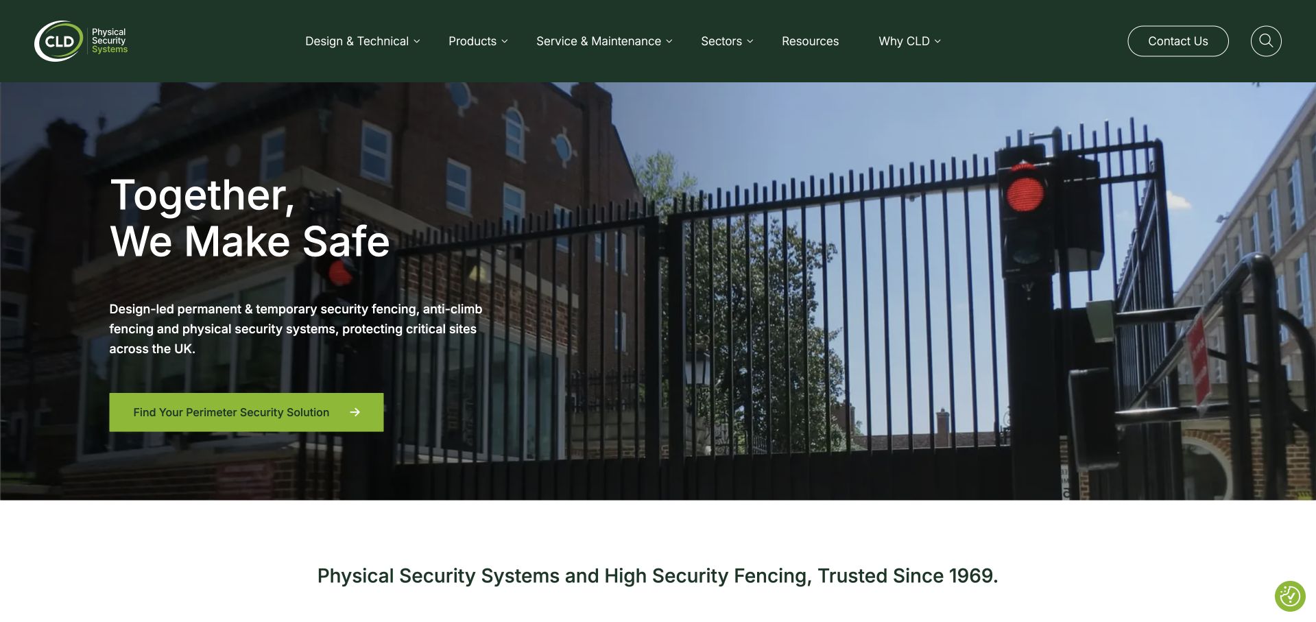
CLD uses a dark green header and an installed security-perimeter photograph behind a short brand statement. The supporting line explicitly names permanent and temporary fencing, anti-climb products and physical-security systems. A product-finding action sits beneath it, while design and technical information, maintenance, sectors and resources have their own menu routes. The UK-focused introduction supports that hierarchy with ordinary language about the kinds of systems provided rather than a list of unexplained product codes. This structure is useful for a specialist system provider because specification and aftercare are treated as real tasks rather than being hidden behind one sales form. The broad brand statement still needs the smaller line to explain the actual offer.
What you can learn
Separate technical specification, product selection and later maintenance when they involve different questions. Keep the plain service explanation close to the brand headline, and avoid forcing every research-stage visitor through an audit-request form.
Pros
Technical, product and maintenance information is separately labelled.
The supporting line explains the specialist system scope.
Cons & considerations
The broad headline relies on smaller supporting text for meaning.
Automatic promotional and privacy panels can compete with product research.
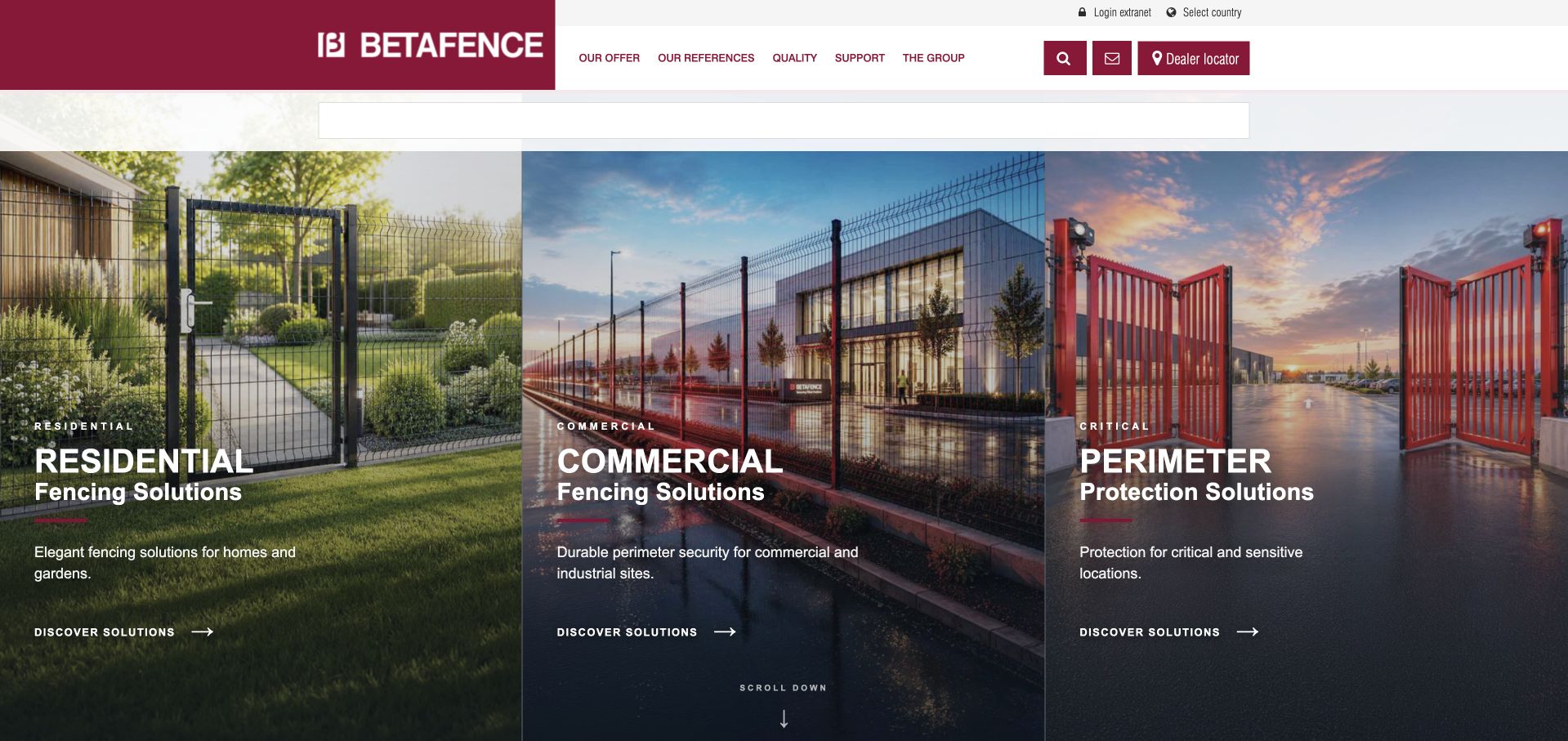
Betafence divides the opening into three tall photographic panels for residential, commercial and perimeter-protection solutions. Each panel has a short contextual description and its own discovery action, avoiding a single technical catalogue presented to every visitor. The burgundy-and-white header keeps references, quality, support and a dealer locator visible above the images. Country selection and login occupy a smaller utility area. This is useful for a manufacturer serving very different project contexts: the audience split changes the starting point before detailed product selection. The tradeoff is the amount of space committed to three large images and the need for each application route to provide substantive, distinct information.
What you can learn
Start broad ranges with genuinely different applications, not arbitrary marketing labels. Carry that context into the product and dealer journey, and make it clear when the central website is a supplier rather than the organisation performing local installation.
Pros
The opening separates three materially different project contexts.
References and dealer finding are distinct supporting routes.
Cons & considerations
Large panels delay detailed product information.
The application categories need clear boundaries to avoid overlap.
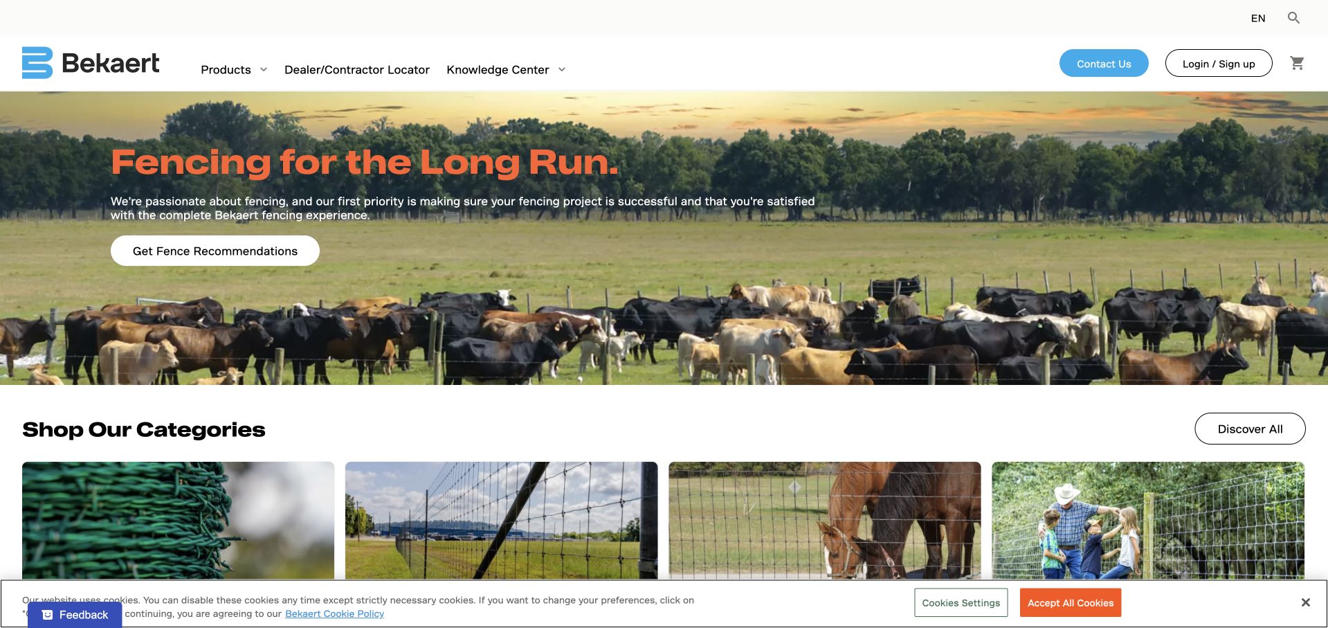
Bekaert Fencing uses a cattle-and-pasture photograph rather than a domestic garden to establish its agricultural focus. The orange headline and white recommendation button sit on a readable part of the image, while product categories begin directly below it. A dealer-and-contractor locator, knowledge centre and product navigation occupy a restrained white header. This gives the site a useful selection structure: practical advice and finding supply or installation are different tasks. The large image communicates the environment, but visitors still need product-specific information about suitability and installation; the broad long-run promise cannot provide that on its own. The cookie strip adds a small competing layer at the bottom.
What you can learn
Use the application context to guide product choice, then support recommendations with current specifications and the right local supply route. A manufacturer’s recommendation tool should not be presented as a substitute for assessing the actual site and intended use.
Pros
The agricultural setting establishes a specific audience.
Recommendations, knowledge and local locating have separate roles.
Cons & considerations
The broad headline does not explain product differences.
The recommendation action requires further expectation-setting about its scope.
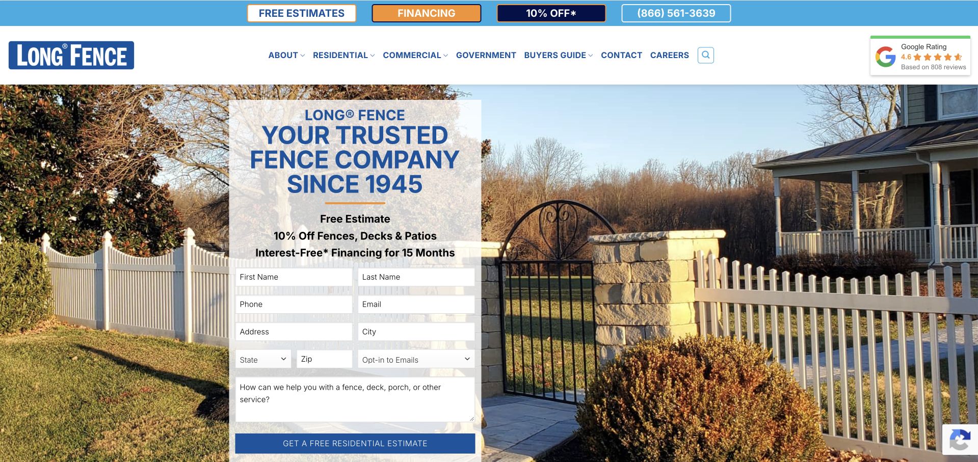
Long Fence places a tall estimate card over a property photograph showing several fence and gate materials. Residential, commercial and government routes sit in a compact white menu, while financing and offers occupy a separate blue strip. The form asks for property and service details and includes an email-preference field, making the initial commitment visible. A recruitment popup can initially cover the form, competing with a visitor’s attempt to understand the estimate process. This is a useful mixed-audience structure, but the homepage remains highly sales-led: promotion, financing, history, contact fields and review content all compete before the visitor reaches a specific product explanation.
What you can learn
A company serving households and institutional buyers should give them different starting points. Keep recruitment and finance campaigns from obscuring the service task, and explain what an estimate request does before collecting a full property address.
Pros
Residential, commercial and government work are separate navigation choices.
The form makes its required contact and project information visible.
Cons & considerations
The estimate card requires substantial early commitment.
Promotions and recruitment messaging can interrupt the underlying service journey.
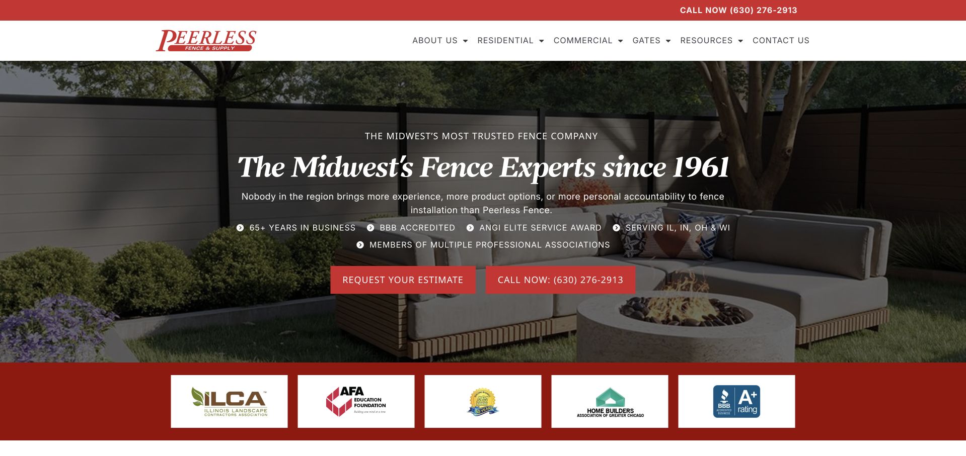
Peerless Fence uses a darkened garden-fence photograph, cream serif headline and red contact controls. The main introduction names the Midwest, while navigation distinguishes residential, commercial and gate work. A short row of company-presented credentials and territory references sits near the actions, with a larger association-mark strip beneath the photograph. The composition offers a recognisable regional identity rather than a national product catalogue. Its challenge is the density of reassurance: several superlatives, history statements and logos are visible before the visitor learns much about a particular material or installation process. The useful structure is the clear audience split and direct contact, not the amount of unqualified praise.
What you can learn
Make the regional service and main customer types obvious, then develop supporting evidence on useful project and process pages. Explain credential marks and review sources rather than asking a row of logos to establish everything at once.
Pros
Residential, commercial and gate routes are clearly labelled.
Estimate and telephone actions are visibly distinct.
Cons & considerations
Many reassurance claims compete within the opening.
The project photograph has little accompanying material or installation context.
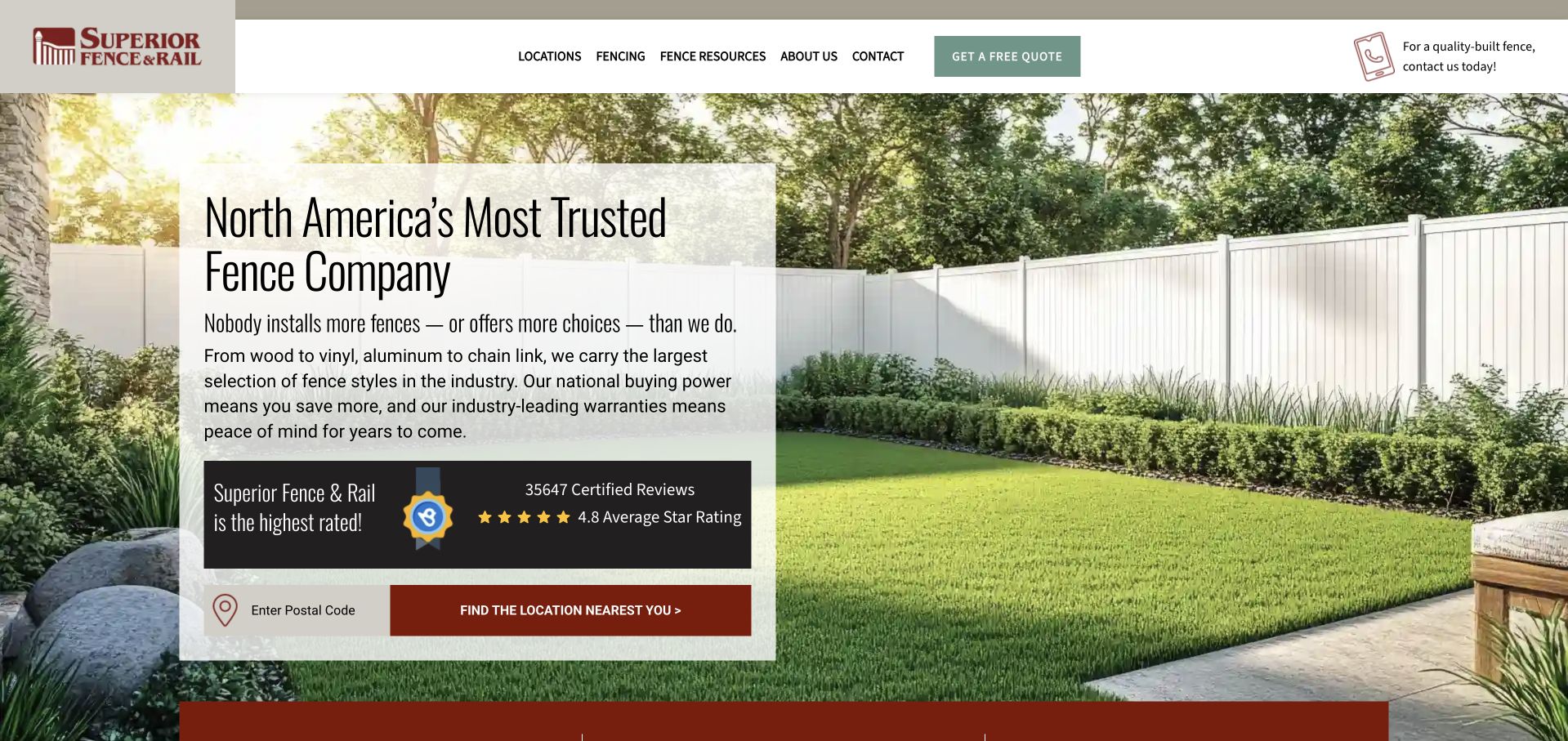
Superior Fence & Rail places its service explanation on a translucent white card over a garden-fence photograph. The panel names several materials, then gives a postcode field and local-location finder a prominent role. Locations, fencing, resources and contact remain available in the header, alongside a separate quote action. This is a practical network pattern: the national page introduces the range while the location search starts the handoff. The text also carries substantial trust and comparison claims, and a large review panel occupies much of the card. Those claims are not independently established by the screenshot and should not be copied into another business’s brief.
What you can learn
A location finder should lead to specific availability and contact details rather than a generic national form. Keep material research accessible before the handoff, and use attributable evidence instead of relying on broad comparative claims.
Pros
The postcode action is clearly connected to finding a local provider.
The introductory panel names different material families.
Cons & considerations
Trust claims and a large review panel dominate the service explanation.
The national introduction still requires a local page to establish practical fit.
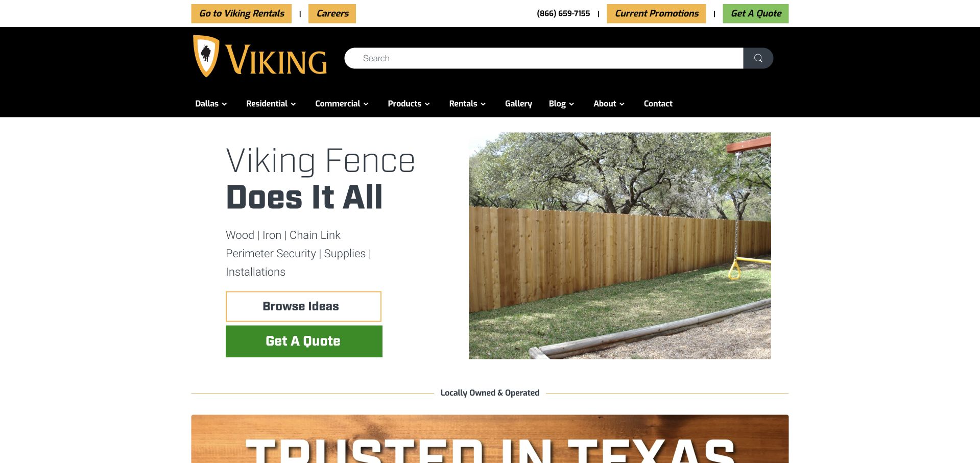
Viking Fence uses a white split layout, placing a short service-range statement beside a timber-fence photograph. Wood, iron, chain link, supplies and installations are named together, while the two actions distinguish browsing ideas from requesting a quote. The dark header separates residential, commercial, products, rentals and a gallery, recognising the company’s different business lines. A regional selection is also visible. This makes the mixed supply-and-service offer easier to understand than one generic fencing form. The broad “does it all” headline remains less informative than the small service list, and the long navigation asks the visitor to compare several different purchase and hire tasks.
What you can learn
If a company supplies materials, installs projects and rents temporary fencing, give those transactions different labels. Provide a research route for someone comparing ideas rather than assuming every visitor is ready for a site quotation.
Pros
Supplies, installation and rentals have identifiable routes.
Browsing ideas is an alternative to a quotation request.
Cons & considerations
The main headline is broader than the practical supporting list.
A wide range of transactions makes the header relatively dense.
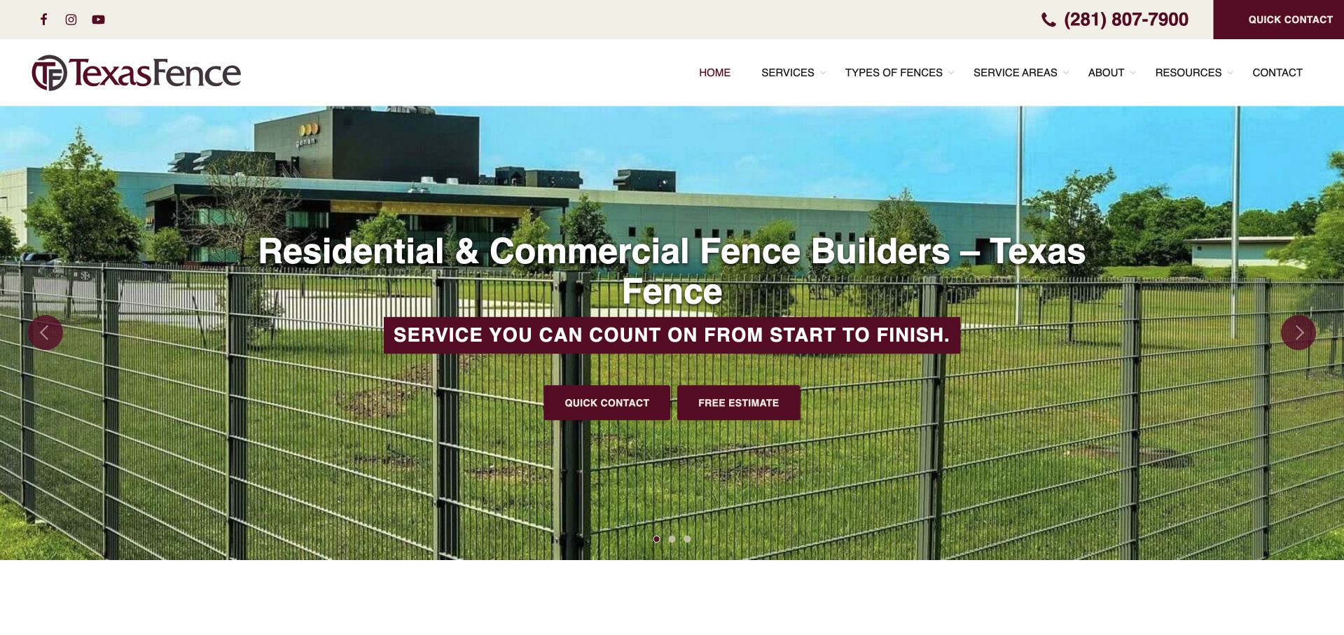
Texas Fence uses a large installed mesh-fence photograph at a commercial site behind its residential-and-commercial introduction. Burgundy controls connect the utility contact strip with the hero’s quick-contact and estimate actions. Services, fence types and service areas are separately labelled in the main navigation, providing both task and material entry points. The opening communicates that this is a builder rather than simply a catalogue of panels. The two actions, however, need a clear distinction in the following journey: “quick contact” and “free estimate” can feel similar if both lead to the same questions. The image is also specific to one application rather than the full residential range.
What you can learn
Separate an ordinary question from a scoped estimate only when the next step genuinely differs. Give material categories and service areas useful content, and balance a commercial hero with evidence of other work the business actually undertakes.
Pros
The installation role and customer types are explicit.
Fence materials and coverage have separate navigation routes.
Cons & considerations
The two contact actions need clearer expectations to avoid overlap.
One commercial photograph provides limited context for residential projects.
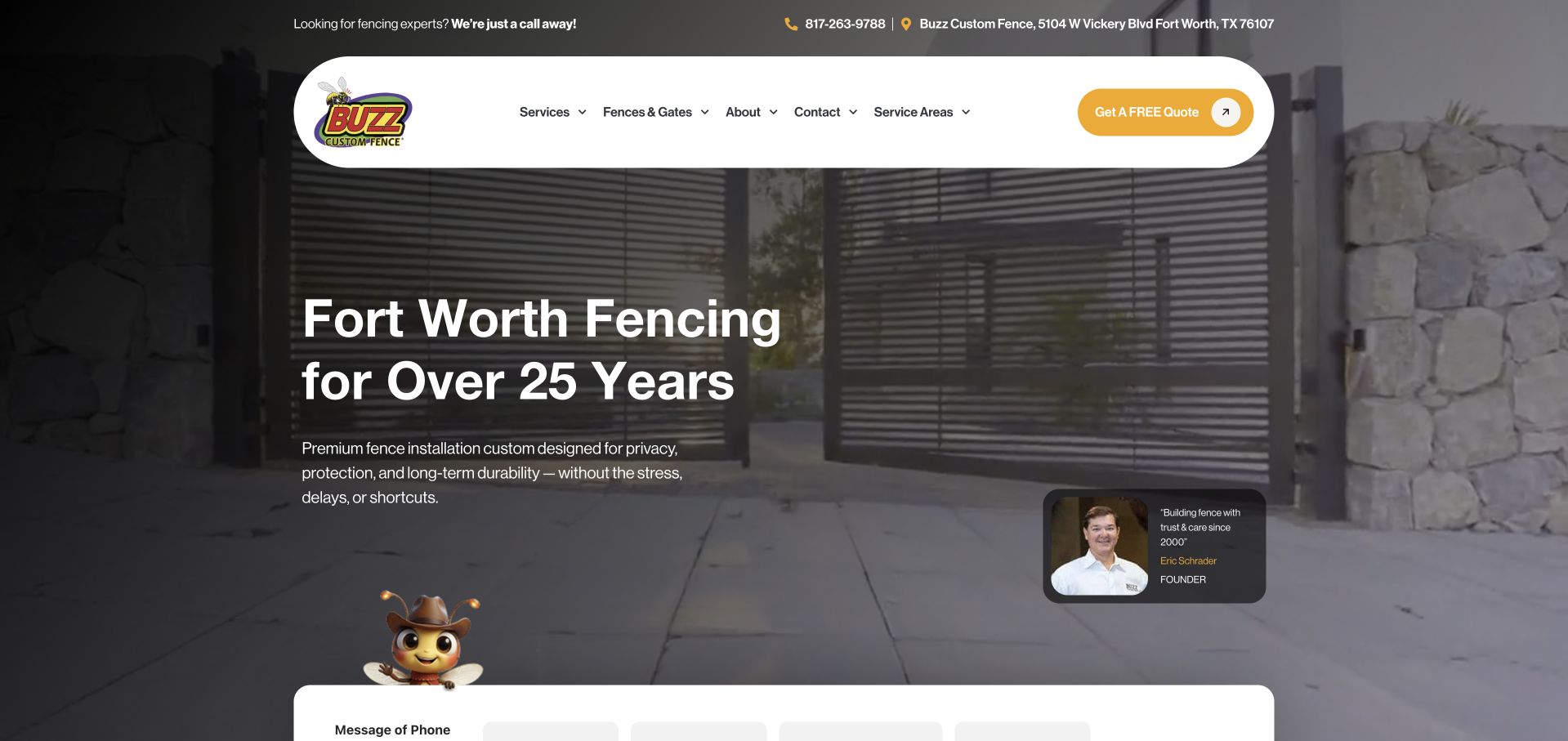
Buzz Custom Fence combines a dark gate photograph, rounded white menu and a yellow action colour that echoes its illustrated bee identity. The headline names Fort Worth and the supporting copy describes installation for privacy and protection. A small founder portrait and quotation sit beside the introduction, adding a human business identity without replacing the product image. Services, fence-and-gate categories and service areas remain distinct in the header. The top of an enquiry form is visible below the hero. The composition is coherent, though several personality devices—the mascot, founder card and floating action—can compete when placed near the same contact journey.
What you can learn
A founder introduction can explain the business relationship, but it should support a clear service statement. Keep product evidence, biography and enquiry tasks visually distinct so personality does not become another layer of clutter.
Pros
The local installation service is described plainly.
The founder card provides a recognisable human business identity.
Cons & considerations
Several mascot and personality elements share the enquiry area.
The dark photograph has little captioned context about the project shown.
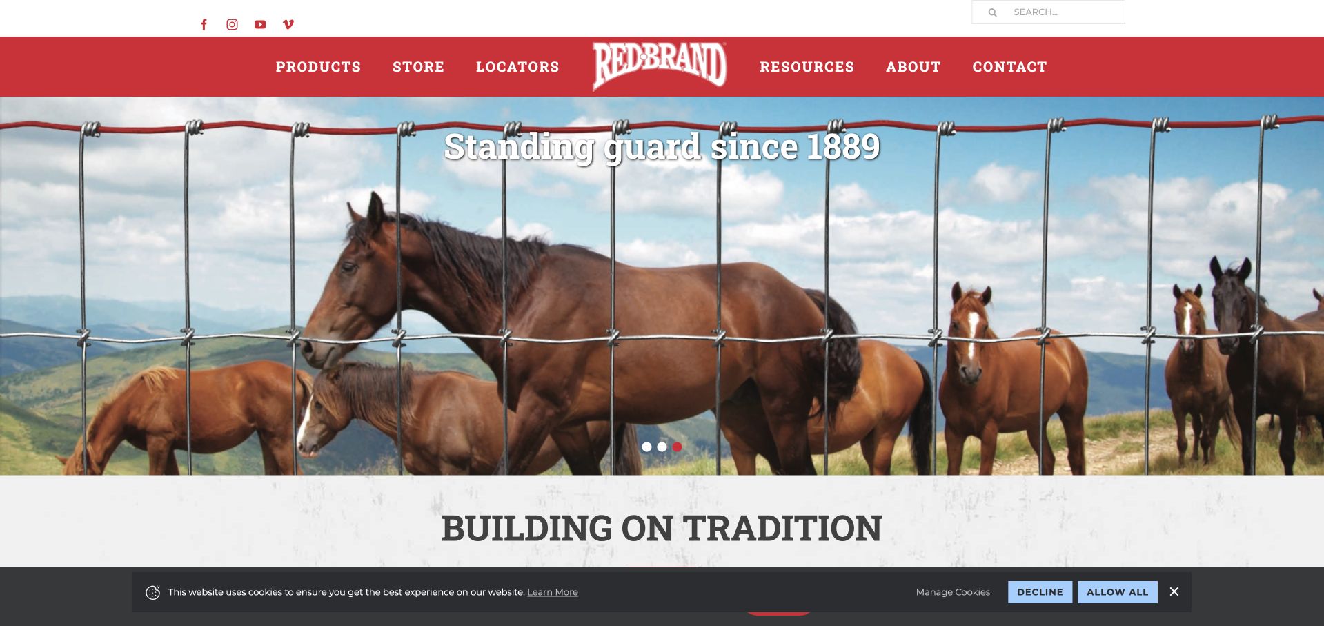
Red Brand uses a horse-pasture photograph, a red header and a wire-fence foreground device to make the agricultural product context unmistakable. Product, store, locator and resources destinations are individually named, while the next section begins a tradition-led brand story. This is a manufacturer and distribution example rather than a local residential-installer homepage, and that distinction is important when borrowing its structure. The photograph gives the product a recognisable application, but the short history message does not help someone choose among wire types on its own. The carousel and privacy strip also share the opening, so practical product research depends on the supporting navigation.
What you can learn
Use the product’s real application to establish the audience, then provide clear comparison and stockist information. Do not imply that a manufacturer’s product website is itself a local installation service or that a brand-history statement establishes suitability for a particular site.
Pros
The agricultural audience is visually clear.
Product research, shopping and locating supply are separate choices.
Cons & considerations
The opening history message gives little product-selection detail.
The photograph and carousel delay a more practical range explanation.
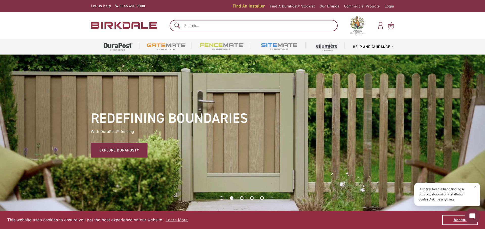
The DuraPost domain currently leads to Birkdale’s broader product-group homepage. Its burgundy-and-white header separates the named brands, search, help and guidance, while installer and stockist finders occupy a utility row. The featured slide shows a complete fence-and-gate setting with a small DuraPost discovery action. This is a useful brand-architecture example, not an archived standalone DuraPost site. The site must serve people researching a system, locating a seller and arranging installation, and those tasks are visibly different. A floating assistance card and cookie strip remain part of the captured page and illustrate the space occupied by supporting tools.
What you can learn
When a product brand moves into a group catalogue, make the relationship clear and preserve direct access to its range. Distinguish a stockist from an installer, and keep help content specific enough to support real product comparisons.
Pros
Named brands are separately visible in the main navigation.
Installer and stockist finders represent different practical tasks.
Cons & considerations
The old product domain and broader current branding may require explanation.
Cookie and assistance controls add competing layers to a restrained catalogue.
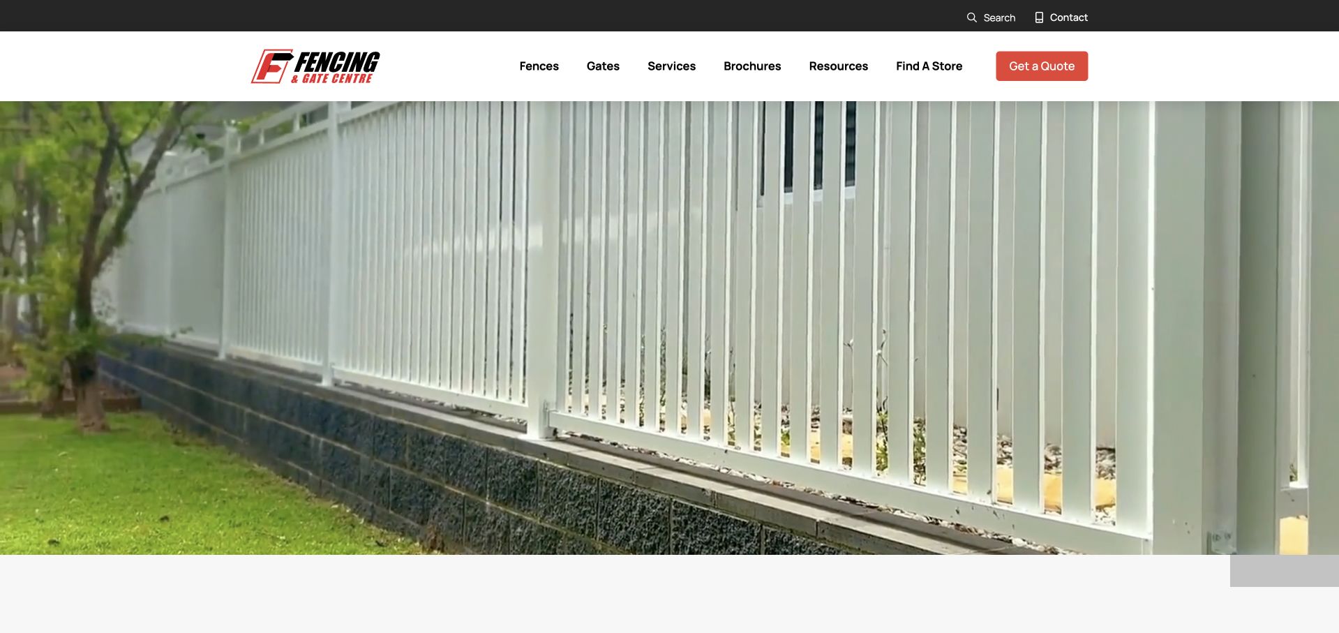
Fencing and Gate Centre uses a close, full-width photograph of a light-coloured installed fence, allowing its vertical lines and material detail to dominate the opening. The white header stays simple, separating fences, gates, services, brochures, resources and store finding. A small red quotation button provides a direct action without a first-screen questionnaire. This is a manufacturer-facing catalogue presentation rather than a description of one local installer. The photograph is an effective product subject, but the captured opening contains little prominent explanatory text, so a new visitor depends heavily on navigation to understand supply, service and installation arrangements. That tradeoff is worth noticing before adopting an equally image-led approach.
What you can learn
Detailed product imagery should lead to clear specifications and delivery or installation information. A compact catalogue header can work, but it still needs a plain introduction explaining the company’s role and where a customer should start.
Pros
The image gives the actual fence detail room to communicate.
Brochures, resources and stores have separate labels.
Cons & considerations
The opening has little visible service or geographic explanation.
The product photograph does not establish the scope of installation services.
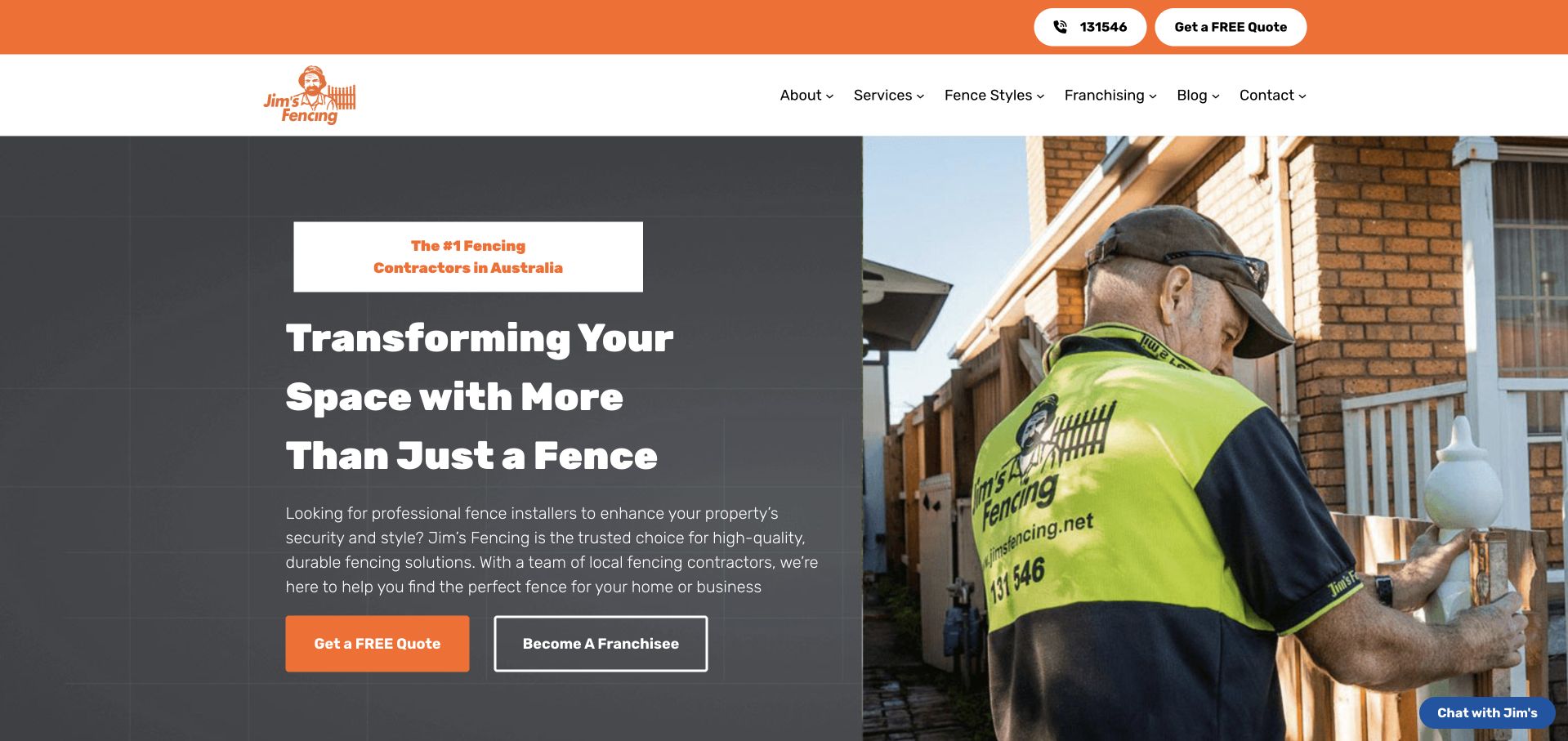
Jim’s Fencing uses a split hero: a dark readable text panel on the left and a photograph of an installer working at a home on the right. Orange controls connect the header with the quotation action, while becoming a franchisee has a different outlined treatment. Services and fence styles are separately named in the navigation. The composition makes the customer service and network-growth audiences visible without using the same form for both. Its main headline remains broad and aspirational, however, with practical fence types and local provider details left to surrounding content. A small chat prompt also shares the edge of the working photograph.
What you can learn
Keep recruitment or franchise enquiries separate from a customer’s project request. Use the work image to support a concrete service explanation, and make sure a national introduction leads to meaningful local coverage and contact information.
Pros
The text panel keeps the introduction independent of the photograph.
Customer quotes and franchise enquiries have distinct actions.
Cons & considerations
The broad headline provides limited product detail.
Local delivery still needs a further provider or service-area step.
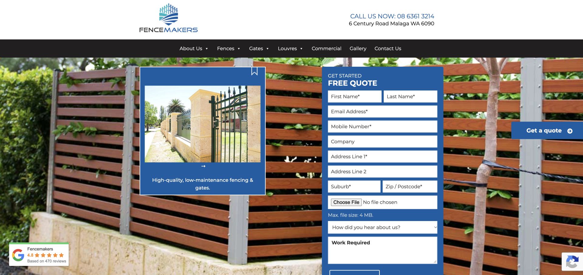
Fencemakers places a tall blue quotation form over a photograph of horizontal timber-look fencing. The form requests contact and property details, offers a file upload and asks what work is required. A smaller project card sits beside it, while the header separates fences, gates, louvres, commercial work and a gallery. Telephone and address information appear above that navigation, making the regional business context practical rather than purely decorative. This is useful for studying a detailed bespoke enquiry, but the form occupies much of the first view and may be premature for someone still comparing materials or looking for installation coverage. The upload also needs clear purpose and privacy handling.
What you can learn
A bespoke project may benefit from drawings or photos, but explain what is helpful and what can wait. Keep material research and coverage information accessible without requiring an address and file before a visitor understands the process.
Pros
The form makes its requested project information visible.
A gallery and separate commercial route support further research.
Cons & considerations
The long form dominates the opening product photograph.
The upload field needs clear expectations and handling information.
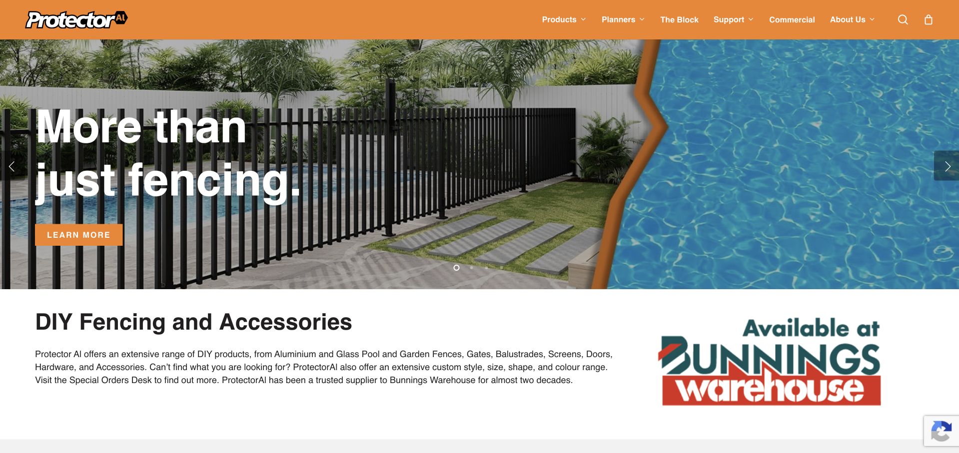
Protector Aluminium uses a pool-and-garden fence photograph within an orange-and-white identity, then follows it with a readable DIY products explanation. A large retail-partner mark makes the supply channel visible instead of presenting the page as a local installation service. Products, planners, support and commercial information have distinct menu routes. The product family is broader than fencing alone, and that breadth is explained beneath the short hero. The useful lesson is honesty about the transaction: this is product discovery and retail access, not an installer’s promise to attend a property. The broad “more than fencing” headline still needs the following paragraph to identify the actual range.
What you can learn
State whether visitors are buying a DIY product, finding a retailer or arranging installation. Product planners and support content should lead to relevant specifications and instructions rather than letting an attractive pool image imply suitability for every setting.
Pros
The DIY role and retail channel are explicitly explained.
Planning and support are separate from product browsing.
Cons & considerations
The hero headline is broad until the following paragraph is read.
The large lifestyle image provides little product-specific detail.
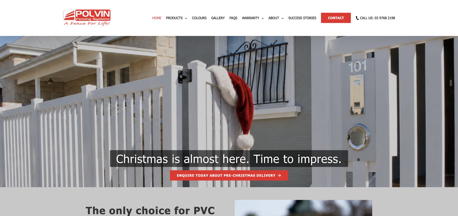
Polvin uses a white fence and front-door photograph to support a seasonal delivery campaign. The white header remains restrained, with products, colours, a gallery, FAQs, warranty information and company background individually named. This is a focused PVC-fencing supplier presentation rather than a broad all-material installer site. The material specialism gives the supporting content a useful boundary: colour choices, warranty scope and actual applications can be developed in depth. The seasonal message is visually prominent, though it delays the enduring product explanation. A company copying this structure would need a reliable process for retiring the campaign and keeping delivery expectations accurate.
What you can learn
A narrow material range can support a deeper, clearer catalogue. Keep seasonal delivery messages separate from permanent product information, and give them a maintained expiry rather than letting a one-time offer become the company’s lasting homepage introduction.
Pros
Colours, gallery, FAQs and warranty have distinct research routes.
The photograph makes the fence material a visible subject.
Cons & considerations
The seasonal campaign dominates the enduring product message.
The supplier role needs clear installation and distribution guidance beyond the hero.
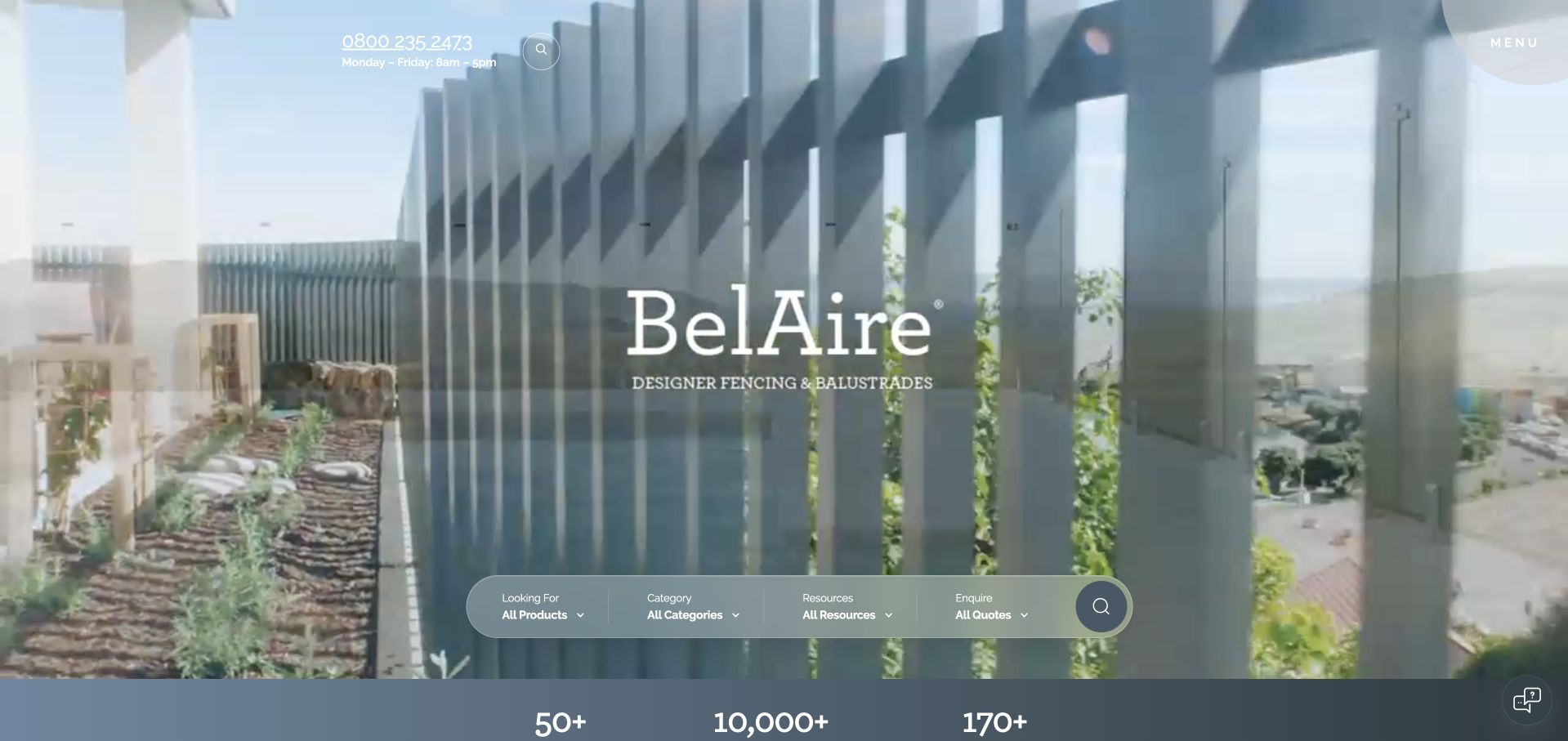
BelAire uses a close photograph of vertical fencing beneath a restrained serif identity. A rounded multi-part search panel separates products, categories, resources and quotes, turning the broad catalogue into several different discovery tasks. Telephone information and the menu are intentionally small at the top, while numerical brand claims begin below the image. The result is visually distinctive and product-focused, but it asks a first-time visitor to understand the search categories before reading much explanation of the company’s role. Fine white utility text and moving imagery also require careful contrast decisions. The collection treats those brand claims as presentation rather than independently verified performance measures.
What you can learn
A structured search can be useful when the underlying catalogue genuinely supports each filter. Explain the difference between a product, resource and quotation journey, and retain a simple browse route for visitors unfamiliar with the brand’s terminology.
Pros
The search interface distinguishes several research intentions.
The close product photograph reinforces the specialist visual identity.
Cons & considerations
Small white utility text is delicate over a changing image.
The opening gives limited plain-language context before the search interface.
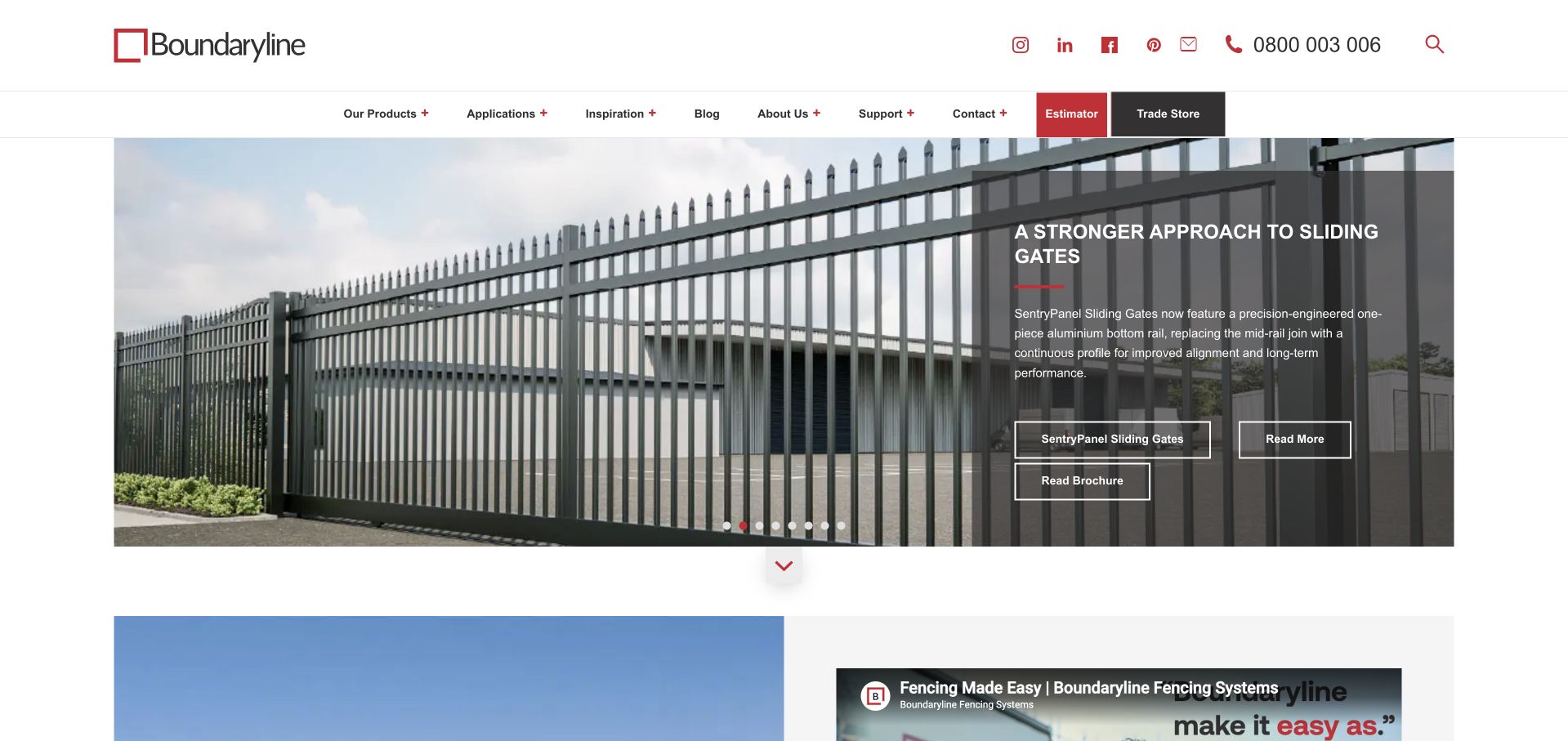
Boundaryline uses a contained gate photograph with a dark explanatory card at the right. The captured slide introduces a specific sliding-gate range and offers separate product and brochure actions. Products, applications, inspiration, support, an estimator and a trade store remain distinct above it. This makes the site useful for both project research and repeat trade transactions. The photograph is connected to a named product rather than left as decoration, but the carousel places a large amount of meaning into one temporary slide. A first-time visitor still needs a stable explanation of the wider fencing range and whether local installation is provided directly or through others.
What you can learn
Connect an application photograph to a specific product and current documentation. Keep trade ordering separate from project inspiration, and make the wider company role understandable even when the carousel features only one specialised gate system.
Pros
Product detail and brochure actions have different purposes.
Trade store, support and inspiration are distinct navigation routes.
Cons & considerations
The current slide foregrounds one specialised product within a broad range.
The small text card requires sustained reading over the photograph.
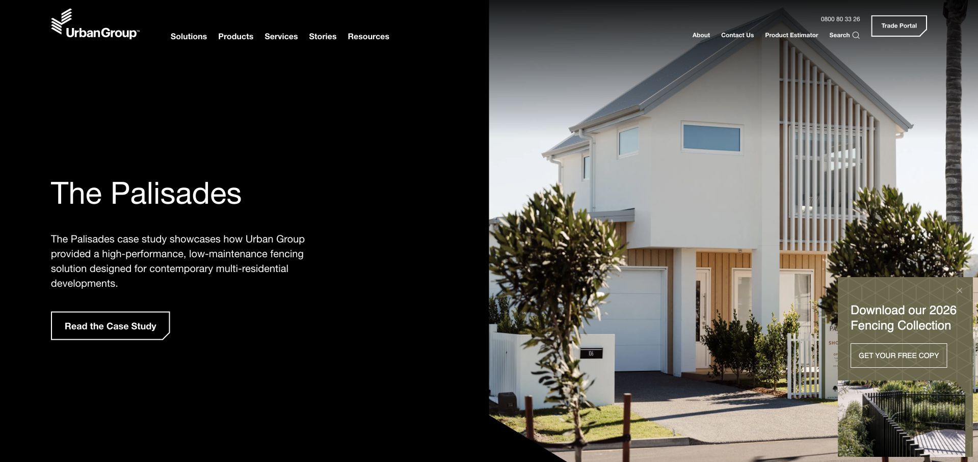
Urban Group uses a black split panel and a large residential-development photograph to introduce a named case study. The short paragraph explains the fencing’s role within that project, and a clear case-study action invites further context. Solutions, products, services, stories and resources occupy a restrained menu, while a trade portal and estimator are separate utility tasks. A collection-download card overlays the photograph’s lower edge, adding another research route. This is a useful alternative to a generic product hero because it starts with an actual application and a reason to investigate it. The tradeoff is that a case-study-led opening needs a clear route back to the overall catalogue.
What you can learn
Use a real project to explain the application of a product system, not only to display an attractive house. Keep catalogue and trade tasks visible so the featured story does not become the only way into the range.
Pros
The hero gives a named project a short explanatory context.
Trade access and estimation are separate from editorial stories.
Cons & considerations
The download card competes with the main case-study action.
The featured project alone does not explain the full product range.
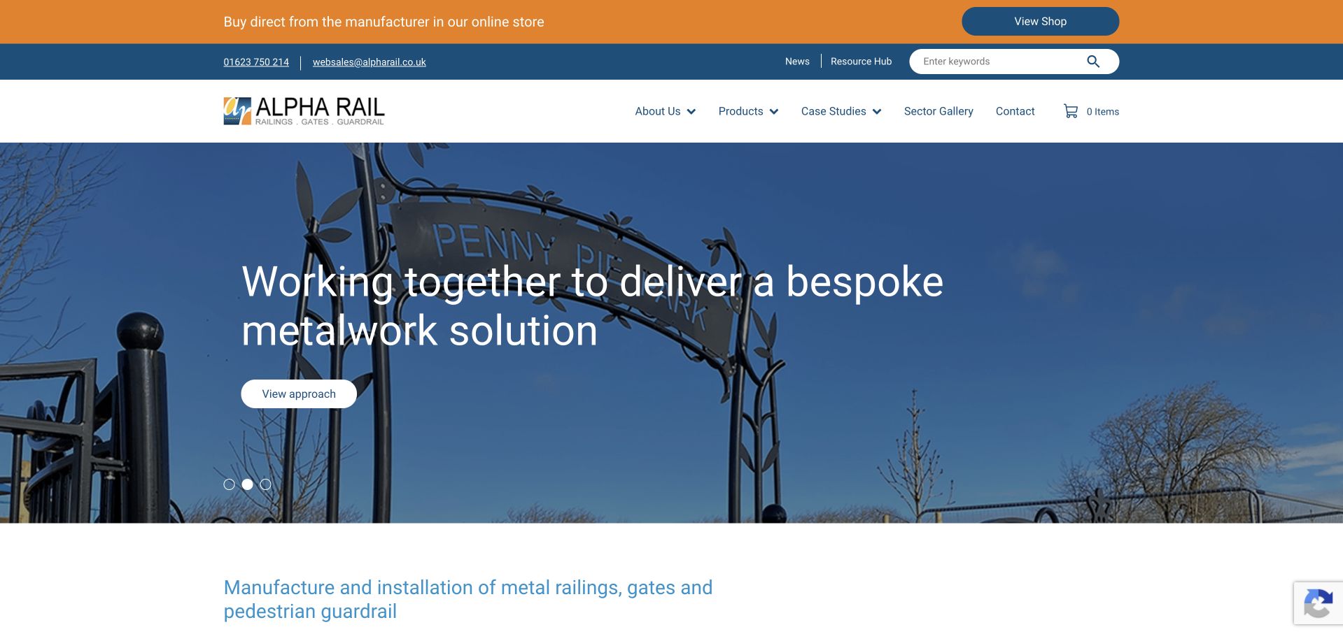
Alpha Rail uses a decorative gate-and-sign photograph behind a direct bespoke-metalwork message. The white header separates products, case studies and a sector gallery, while a prominent orange strip introduces its online shop. The beginning of the next section explicitly names manufacture and installation of railings, gates and pedestrian guardrail, adding a practical explanation below the broader hero. This is useful for a company balancing standard product transactions with custom projects. The layered header is comparatively busy, however, and the ornate featured image may not represent the more utilitarian work that other visitors need to evaluate. The distinction between buying and commissioning needs to remain clear.
What you can learn
Separate standard shopping from a bespoke specification or installation enquiry. Use case studies and sector information to explain the project types, and ensure an ornamental hero does not hide the company’s practical industrial or public-realm scope.
Pros
Products, case studies and sectors provide different research routes.
The next section names the manufacturing and installation role.
Cons & considerations
Several header bands compete before the service introduction.
The decorative hero represents only part of the broader range.
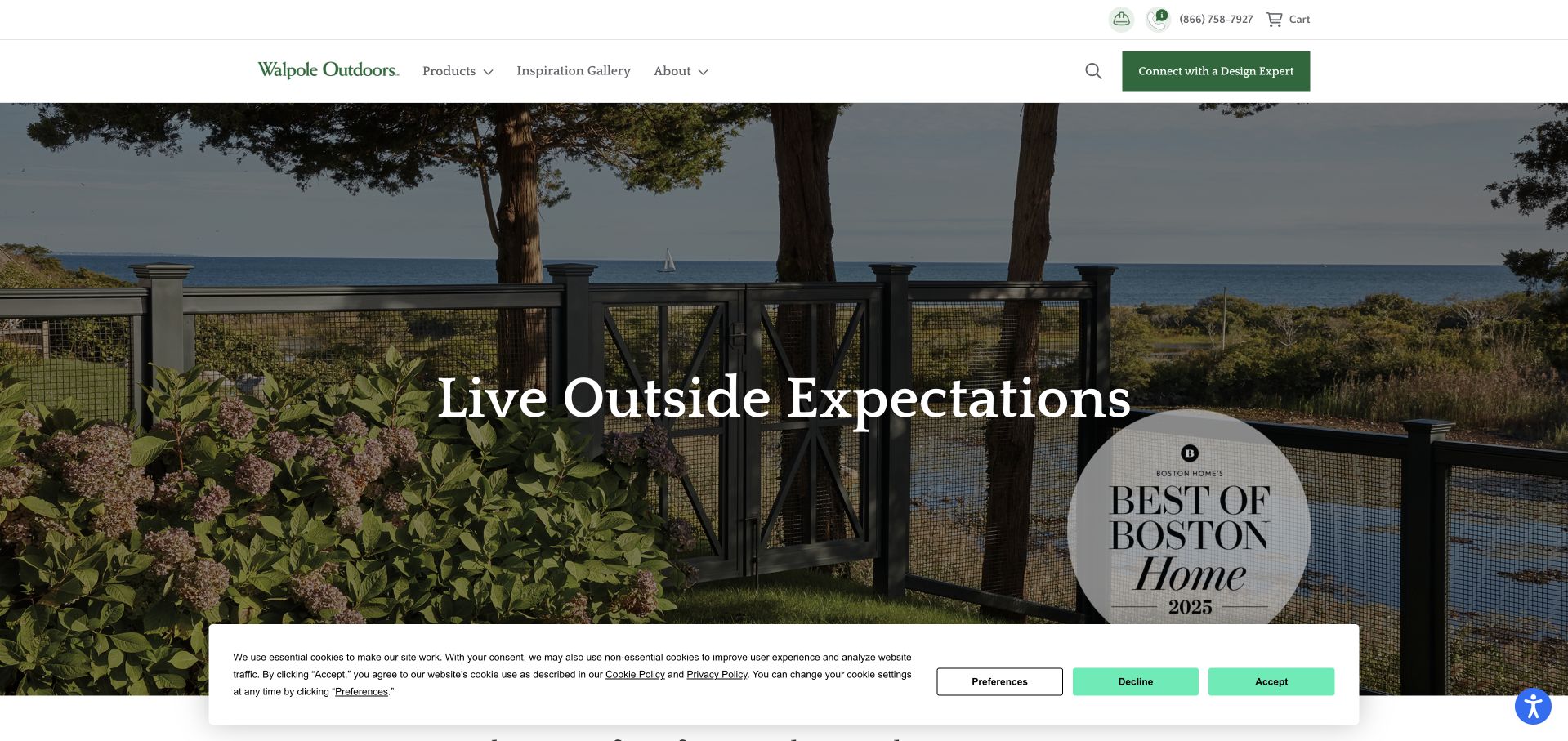
Walpole Outdoors uses a coastal garden photograph showing a fence within a complete outdoor setting. A quiet serif headline and restrained green design-expert action create an editorial impression rather than an estimate-form wall. Products, an inspiration gallery and company information form a short main menu, while telephone and cart access sit above. The approach gives the fence a role within a landscape, which is useful for design-led customers considering more than a perimeter alone. An award badge and privacy panel are also prominent in the captured opening. The broader product scope and the practical delivery or installation arrangements require further exploration beyond the atmospheric first statement.
What you can learn
A lifestyle image can introduce the surrounding use of a fence, but keep the product and service transaction clear. Explain what a design conversation covers and distinguish ordering a structure from arranging local installation.
Pros
The fence is shown within a recognisable complete landscape.
Inspiration browsing and a design conversation have different routes.
Cons & considerations
The broad lifestyle headline gives little practical product information.
Award and privacy panels compete with the image-led composition.
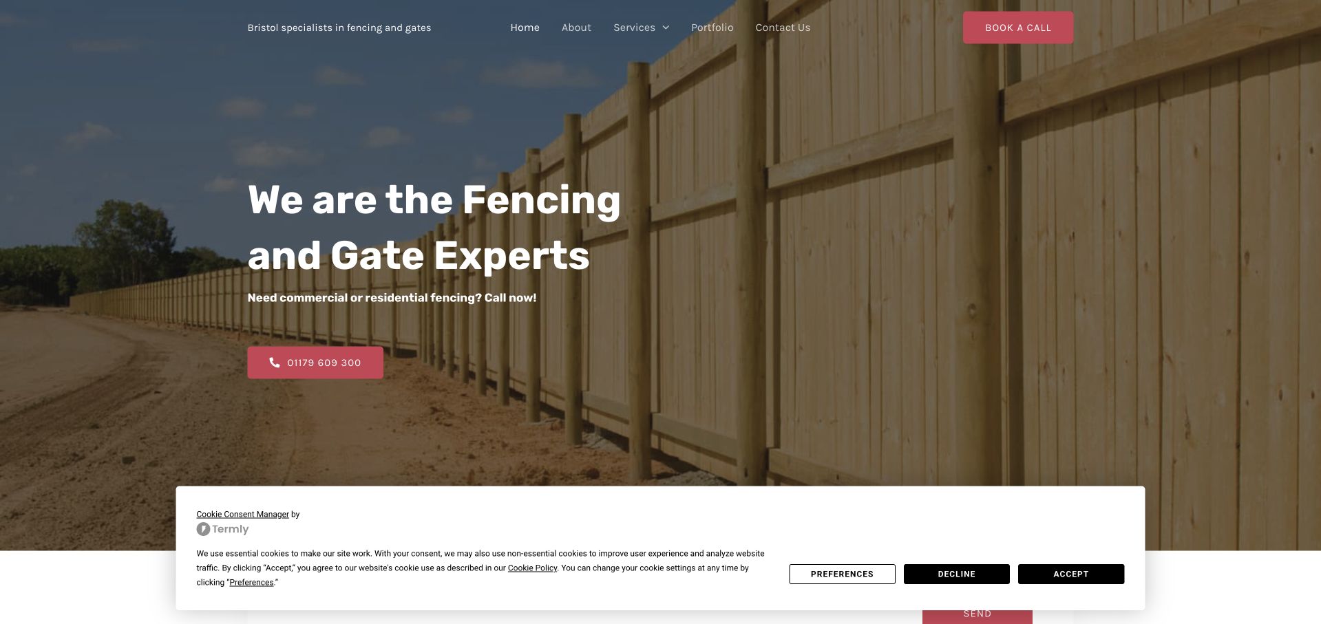
Bristol Fencing and Gates uses a long timber-fence photograph and a direct expertise headline over a darkened background. The supporting line distinguishes commercial and residential work, while a bright pink telephone action makes immediate contact easy to identify. A compact menu exposes services, a portfolio and company information, with a separate call-booking control. The page is more contractor-led than catalogue-led: it invites a conversation about an installed project rather than a basket of panels. The captured privacy panel occupies the lower edge but leaves the main explanation visible. The opening could still make the precise service boundary and the difference between calling and booking clearer.
What you can learn
For a local installer, a concise project-led introduction can be enough when service scope and coverage are explicit. Keep a portfolio accessible and explain whether a booking action arranges a call, a survey or simply requests contact.
Pros
Commercial and residential work are explicitly recognised.
The portfolio provides an evidence route separate from contact.
Cons & considerations
The call and booking controls need clearly different expectations.
The lower privacy panel reduces the visible start of the next section.
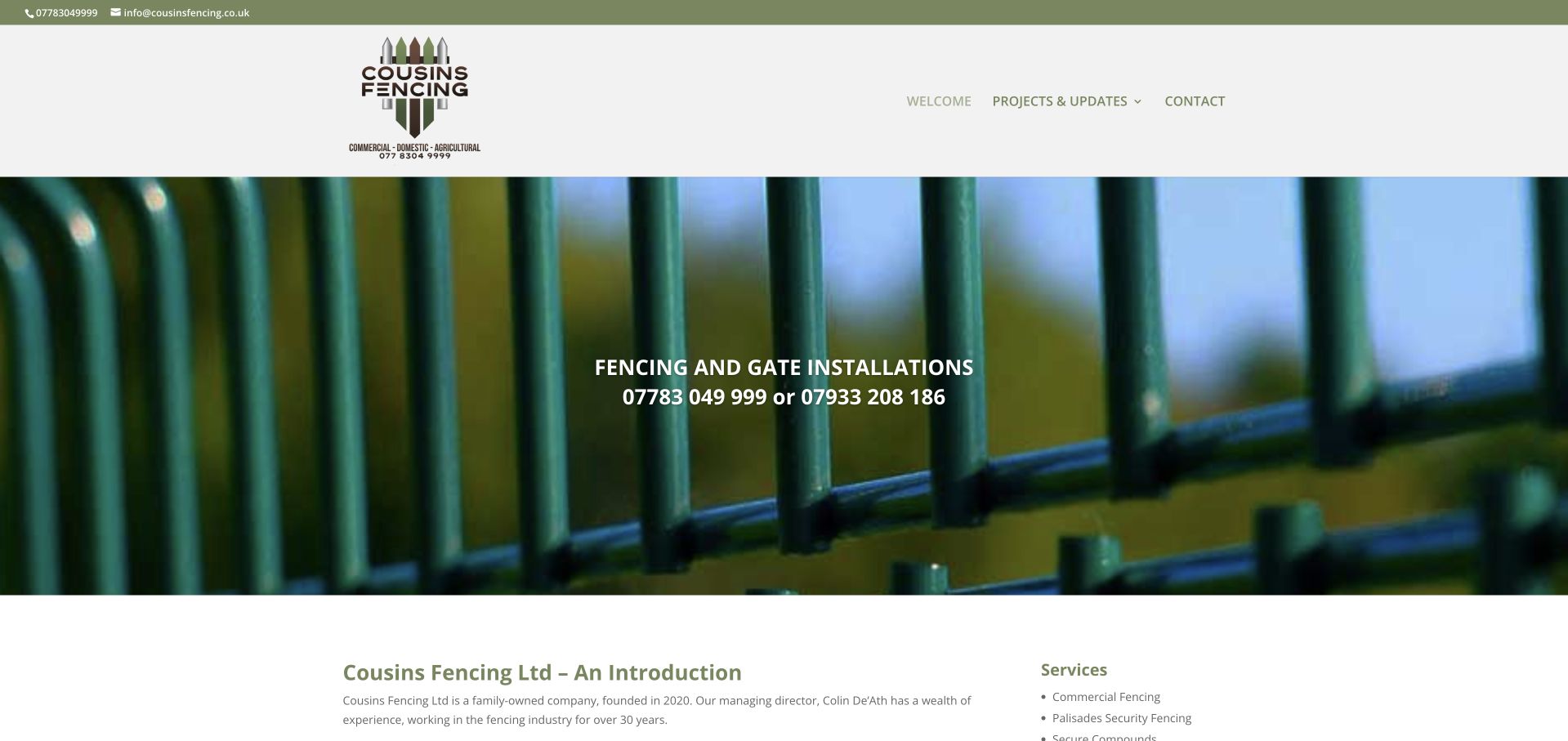
Cousins Fencing uses a close metal-fence photograph with a short installation statement and two telephone numbers. A white header keeps the mark, project updates and contact links simple, while the first content section introduces the family business and its service categories. This is a straightforward contractor presentation rather than a large catalogue, and its commercial focus is clearer in the explanatory section than in the short hero. The project-update route is useful because it can develop that scope through actual work. The minimalist navigation and small type, however, place considerable weight on the lower introduction to explain what a new customer should do next.
What you can learn
A small contractor can keep the top of the site simple, but follow it with specific scope, coverage and project evidence. Label multiple telephone contacts by purpose or person where appropriate rather than leaving visitors to choose between unexplained numbers.
Pros
The installation role is stated plainly.
Projects and updates have a dedicated evidence route.
Cons & considerations
The two telephone numbers have limited task-based context in the hero.
The short opening does not explain the full commercial service range.
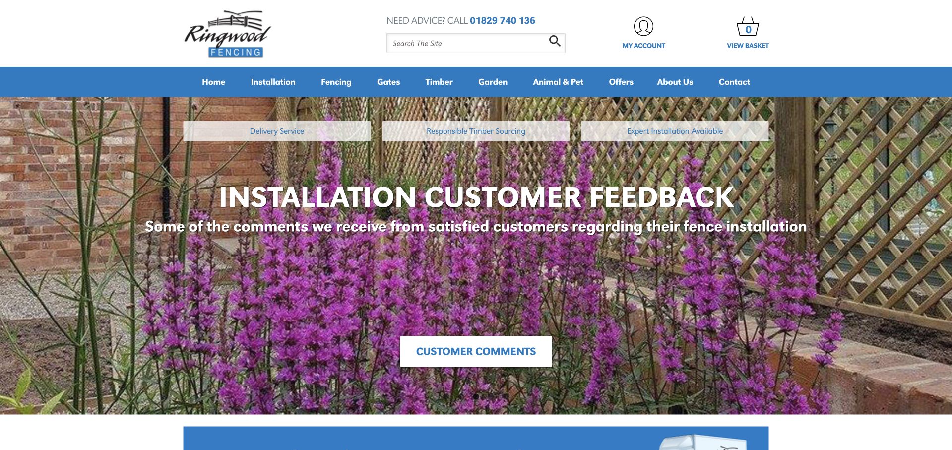
Ringwood Fencing combines an ecommerce-style header with a broad blue product menu, including fencing, gates, timber and garden categories. Installation has its own top-level destination, separating it from purchasing materials. The customer-feedback carousel frame promotes customer feedback over a real garden setting, with a short action to read comments. Advice, account and basket controls are visible in the header, while service statements sit above the slide. This is useful for a business that genuinely handles both supply and fitting. It also illustrates the challenge of a mixed catalogue: a new installation customer should not have to infer the enquiry journey from store terminology or a rotating testimonial promotion.
What you can learn
Make supply-only shopping and installation enquiries different tasks from the outset. Use customer feedback as supporting evidence, and keep a stable explanation of delivery, service coverage and the next assessment step outside the carousel.
Pros
Installation is separated from the product-shop categories.
Advice, account and basket controls have recognisable roles.
Cons & considerations
The broad catalogue creates a dense horizontal menu.
A customer-feedback slide gives less immediate product or service detail.
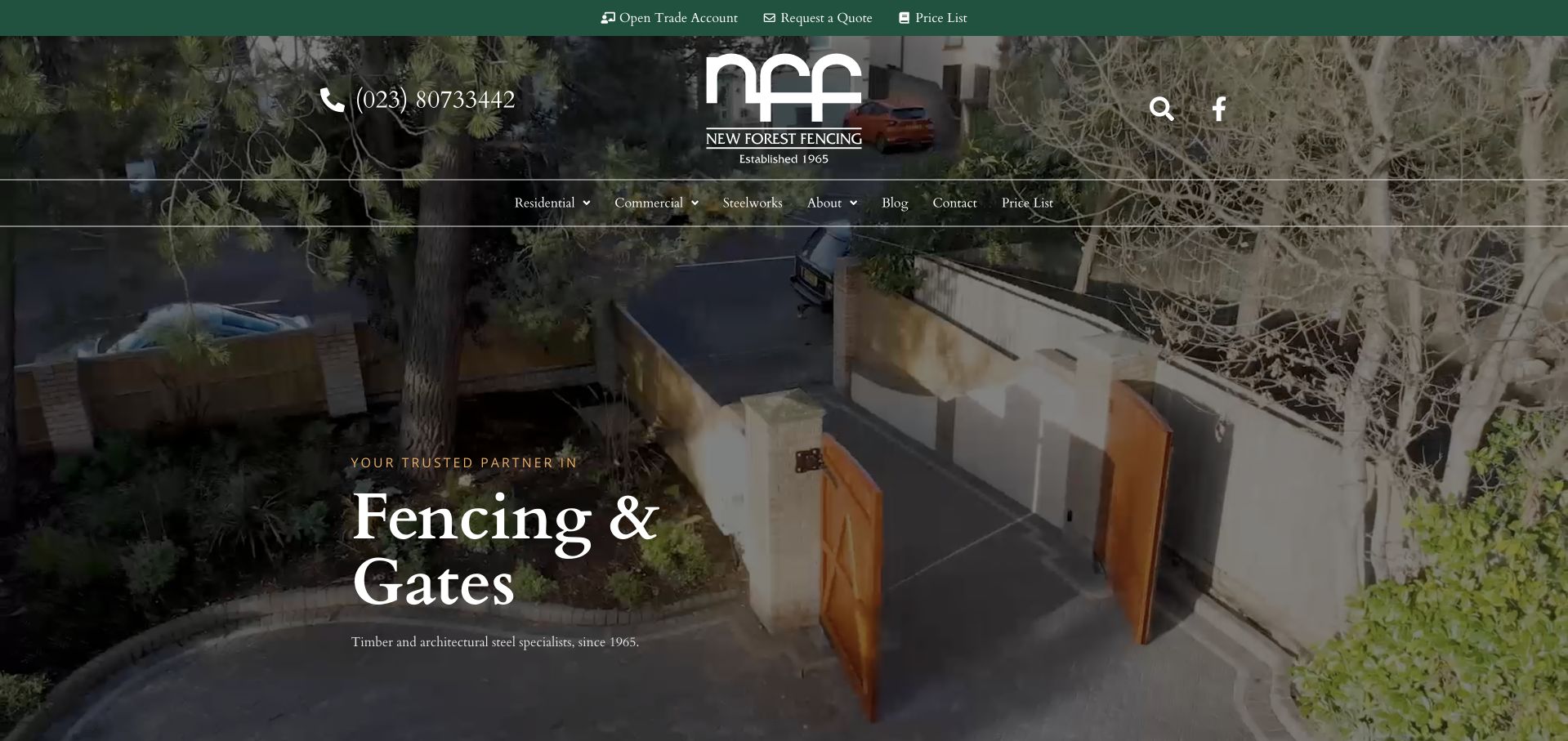
New Forest Fencing uses an overhead view of timber gates within a complete landscaped entrance. Serif lettering, a centred monogram and dark green utility controls connect the traditional identity with a contemporary photographic presentation. Residential and commercial routes sit above the image, while trade accounts, quotation requests and a price list have distinct utility roles. The hero names fencing and gates without a large form or promotional block. This is useful for studying a business that both manufactures and installs, but the atmospheric introduction still relies on the next sections to explain materials, service coverage and the practical difference between a trade purchase and a commissioned project.
What you can learn
Use a complete project view to show how gates and fencing relate to the property. Keep trade accounts, price information and an installation enquiry separate, and give each route enough scope information to prevent a supply price being mistaken for a fitted quotation.
Pros
Residential, commercial and trade interests have different entry points.
The photograph provides a complete architectural context for the gates.
Cons & considerations
The opening gives limited immediate coverage or process information.
Small utility controls carry several important transactional tasks.
Kegan is a freelance web designer and developer with 15+ years of experience helping businesses turn complicated website requirements into clear, maintainable digital experiences. He works directly with clients from planning and design through development, launch, and ongoing support.
For fencing company website design, his development approach focuses on material and product comparisons, real installation galleries, coverage and access details, specification resources, and qualified estimate requests. The scope can be a targeted improvement or a complete custom build, with responsive layouts, thoughtful content structure, and integrations chosen around the people using and maintaining the site.
Show 3 other fencing company website designersHide other fencing company website designers
Plan the fencing website around buying, specifying and installing
Define the enquiry information the team actually needs
For an installed project, the first conversation may need location, intended use, approximate extent and a short description, not a complete technical specification from a homeowner. Offer optional plans or photographs only with a clear purpose and handling process. Explain whether the submission requests advice, a survey, a quotation or a confirmed appointment. If the site also sells materials, keep basket and delivery questions separate from the installation form so neither audience enters the wrong process.
Build a maintainable product and document library
Give products structured fields for the facts the business can maintain: name, material, dimensions, finishes, relevant accessories and current supporting files. Use versioned or clearly dated documentation where appropriate and retire superseded downloads. Keep product, system and installation claims distinct. A project story can link to the relevant current range without duplicating a specification table that will drift out of date. Give trade buyers efficient ordering routes without making account terminology the only way into the catalogue.
Connect inspiration with practical service evidence
A good project record explains the starting brief, application, broad location, chosen approach and the company’s contribution. Images showing corners, gates, changes in level or relationship to a building can be more informative than repeated straight-on panels. Publish only accurate, permitted details. Support local service pages with real coverage and relevant work rather than repeated place-name paragraphs. Maintain branch contacts, display areas, delivery zones and installation arrangements as practical operating content.
The editing job behind the design
Choose technology for a clear catalogue and reliable project handoff
A supplier may need stock, delivery and ordering functions; a regional installer may need a structured service and project library instead. Many businesses need both, but they should not be blended accidentally. Test the actual editorial tasks before choosing a platform: update a product, replace a brochure, amend coverage and retire a campaign. Relationships among products, applications, projects and documents should reduce duplication rather than create dozens of disconnected landing pages.
Estimators, product selectors and visualisers should state their assumptions and the next verification step. They are not evidence of site suitability by themselves. Keep a simple alternative when a tool cannot run, use accessible form labels and errors, and optimise the large material and project images. Test the real cookie, chat and booking interfaces together. Public stack observations identify supported visible signals, not private ordering systems, specification workflows or the company’s complete infrastructure.
Our WordPress website examples offer a separate look at publishing approaches. A visible platform label is evidence for that named page, not a guarantee that the same system will suit your requirements.
Before the public launch
Fencing website planning checklist
State manufacturing, supply, installation, hire and network roles accurately.
Separate installed-project enquiries from material orders, trade accounts and rental requests.
Distinguish a stockist from an installer and explain who performs the local service.
Choose meaningful material and application categories, with no empty duplicate routes.
Caption real projects and distinguish them from manufacturer or illustrative imagery.
Publish specifications and technical documents with an owner responsible for keeping them current.
Attribute security, acoustic, warranty and certification claims to their exact applicable source and scope.
Explain indicative prices, delivery and installation exclusions without implying that every project has the same cost.
Provide accurate coverage, branch, display-area and contact information.
Test catalogue navigation, filters, forms, document links and third-party overlays on mobile and with a keyboard.
These checks are a project checklist, not a performance, legal, security, or accessibility certification. Test real journeys with the people responsible for the website before making claims about the result.
Sources & editorial method
How this collection was selected and reviewed
The examples were directly inspected on their public official pages and captured through the browser. Reviews evaluate visible website structure and communication, not fence performance, security effectiveness, workmanship or a measured commercial ranking. Official sources establish the business’s stated role; manufacturers, distributors and installers are distinguished in the reviews. Images and trademarks remain their owners’ property. Technology notes are restricted to supported public evidence and are not a complete inventory of private systems.
Each example links to its actual source page. Screenshots are direct browser captures with their own capture dates; moving imagery, announcements and live designs can change. The notes describe observable design choices and conditional tradeoffs, not measured traffic, conversion results, service quality, or accessibility conformance.
Technology labels use public page metadata, asset evidence, or explicitly cited platform documentation. Platform documentation is not a complete current deployment audit. A component reference may be legacy or unused; it is not a complete backend inventory. Unknown stacks are omitted. These sites are editorial examples, not our client portfolio.
Written, Edited and Curated are separate editorial records, not timestamps advanced by a rebuild. Website designs and imagery belong to their owners. See our editorial standards or suggest a correction.
Questions worth asking
Fencing Company website design questions
Should a fencing website organise products by material or application?
Use the first decision your actual customers can make. A homeowner may start with a garden use, while a contractor may know the material or system. Both can be supported when the content is genuinely different and the routes connect clearly. Avoid duplicating the same catalogue into many thin pages with different headings.
How should supply-only prices be distinguished from fitted quotes?
Label them directly and state what is included, with delivery, preparation, accessories or installation handled accurately. A basket total should not look like a full project quotation. Give customers seeking installation an understandable survey or assessment route and explain who will provide the service.
What makes a useful fencing project gallery?
Accurate context: the application, material, broad location, company role and relevant design constraints. Show details that help someone understand the completed arrangement, not just a large number of near-identical panel photographs. Use permissions and captions carefully, and do not imply that a project photograph proves a technical performance claim.
Should the homepage include an estimator?
Only if its assumptions can be explained and maintained. It may help outline materials or an indicative range, but site conditions and project scope still matter. Explain what the result represents and what must be assessed next. A clear contact and project-information journey can be more useful than an opaque calculator.
How should specialist security claims be presented?
Use the precise applicable product or system documentation and keep claims attributed. Do not generalise a certification, test or specification to every product and installation shown on the website. Have the appropriate specialist review the content, and let project buyers reach the current technical material rather than relying on a promotional badge.
Start with a clear distinction between the product being bought and the service being commissioned. Accurate roles, useful project context and maintained documents create a stronger fencing website brief than a collection of interchangeable reassurance claims.