Best Jetpack Websites of 2026 (20 Real-World Examples)
WordPress examples with scoped Jetpack signals, plus a practical brief for selecting only the modules and service dependencies you actually need.
Jetpack is a family of WordPress features and connected products, not one uniform website stack. A public signal can support a specific association without revealing which modules, subscriptions, security controls, backups, analytics, or AI features are active.
Treat each example as a website to study rather than a demonstration of every Jetpack product. A recognized asset or delivery reference can coexist with a separate theme, editor, host, media workflow, and set of integrations. It does not establish that the page is built with AI or that the company uses a particular paid bundle.
The useful planning question is not whether to switch on everything. It is which job the website needs to perform, who will own that job, what dependencies it introduces, and how the actual result will be tested. Keep product capabilities, observed public signals, administrator configuration, and measured outcomes separate throughout the brief.
Before the examples
What makes good Jetpack website development in 2026?
Specify a feature, not a blanket promise
Jetpack documents several products and optional features. A project brief should name the chosen job and its acceptance test rather than treating the suite name as proof of backup, security, search, analytics, or AI implementation.
Connection requirements vary by feature. Confirm the actual site and account relationship for the selected setup, identify the business owner, and document how access transfers when a maintainer changes. A public page does not reveal that administrative arrangement.
Test the page and the operational outcome separately
A composed screenshot shows neither a successful restore nor a correctly routed subscription, search, or form. Define appropriate tests for selected functions and retain the difference between a visible reference, a configured feature, and a verified result.
Study the individual websites’ information hierarchy, imagery, navigation, and practical interactions. Jetpack attribution remains tied to the public evidence for each property, not to every service in the wider product family.
We start with five recognizable brands or organizations: Nutribullet, Graywolf Press, City Lights Booksellers & Publishers, First Avenue, Oregon Humane Society. Each attribution applies to the named website property, not every product or website belonging to its organization. This is a curated reading sequence, not a measured ranking.
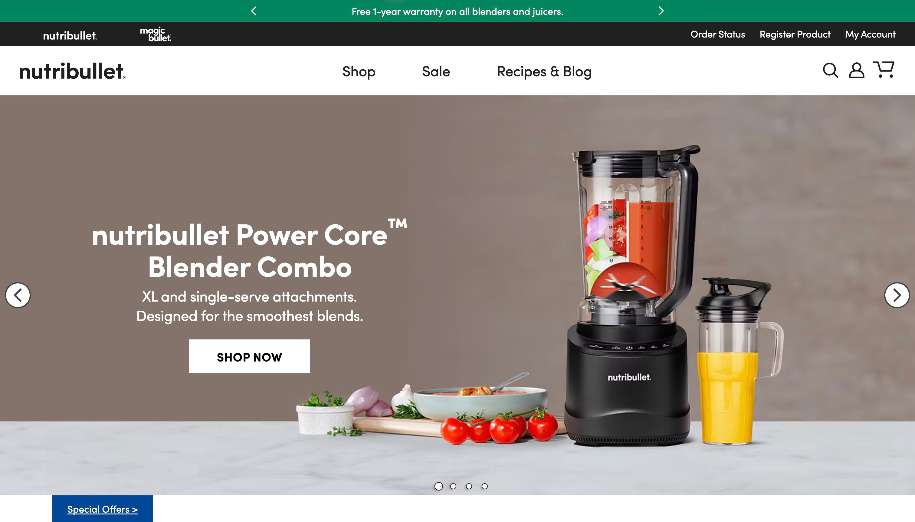
Nutribullet places its Power Core Blender Combo beside a direct product name and a compact description of its attachments. The neutral campaign background leaves room for the appliance, ingredients and accessories to establish the product category. Shop, sale and recipe links stay in a short main navigation; order status, support, account and registration occupy a separate utility layer. This is a different carousel frame from the earlier orange juicer view, so its campaign details are described on their own terms.
What you can learn
Let the product name and a concrete distinction support the photograph. Preserve a direct route to specifications rather than asking a customer to infer compatibility from accessories pictured together. Keep support and registration visible even when the central campaign changes.
Pros
The named appliance and visible attachments establish the product category quickly.
Shopping and post-purchase tasks occupy distinct navigation layers.
Cons & considerations
A rotating campaign needs reliable controls and useful text when motion is unavailable.
Photographed accessories do not replace precise included-item and compatibility information.
Platform source: WordPress.org Showcase. Linked script matches Jetpack. Exact public source-page reference: https://www.nutribullet.com/. This is an observed component association, not proof of private configuration, a paid plan, measured results or complete architecture. Platform evidence is separate from the direct website screenshot and is not a complete current infrastructure audit.
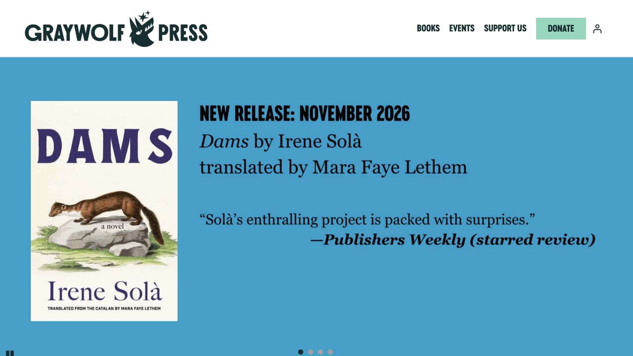
Graywolf Press uses a light header and a strong blue featured-book composition, with the cover, author and translator receiving meaningful space. Books and events sit alongside support information and a donation route. The opening is book-led while still explaining that the press has an institutional mission beyond selling the featured publication. This is useful for smaller literary organizations that need to acknowledge creative contributors without turning the first screen into a lengthy organizational history.
What you can learn
Make translator and other contributor credits proper catalog fields rather than optional text in a campaign image. Separate the reader’s purchase route from the supporter’s donation journey, and preserve an understandable route between them. Plan author-event records so that the corresponding title page remains useful when the tour or launch has finished.
Pros
Creative attribution includes more than the headline author.
The support route is present without replacing the book-centered opening.
Cons & considerations
A single large feature necessarily limits immediate exposure for the wider list.
Purchase and donation actions need different explanations and confirmation messages.
Platform source: WordPress.org Showcase. Linked script matches Jetpack. Exact public source-page reference: https://graywolfpress.org/. This is an observed component association, not proof of private configuration, a paid plan, measured results or complete architecture. Platform evidence is separate from the direct website screenshot and is not a complete current infrastructure audit.
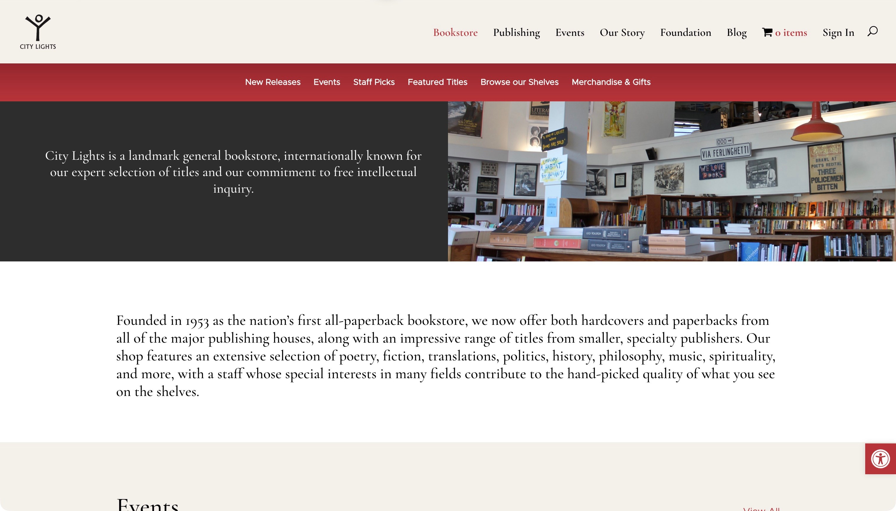
City Lights introduces its bookstore through a shop photograph and a clear account of its literary character. Cream, red and black connect the page to printed books, while a second navigation row makes Staff Picks, Featured Titles and Browse Our Shelves explicit destinations. The longer page connects that identity to books, events, merchandise and practical visiting information. Curation is treated as part of the store rather than a generic product filter. The opening has a cost: its introductory treatment delays individual titles, and readers arriving with a specific purchase in mind must use search or secondary navigation.
What you can learn
Let the shop’s point of view organize discovery, then connect that story to useful shelves. Keep a direct search route available for readers who already know the title they need.
Pros
Named editorial sections make browsing feel intentional.
The physical bookstore and online selection belong to one coherent identity.
Cons & considerations
The first viewport prioritizes introduction over individual books.
A long opening paragraph slows the route to product discovery.
Platform source: WordPress.org Showcase. Linked script matches Jetpack. Exact public source-page reference: https://citylights.com/bookstore/. This is an observed component association, not proof of private configuration, a paid plan, measured results or complete architecture. Platform evidence is separate from the direct website screenshot and is not a complete current infrastructure audit.
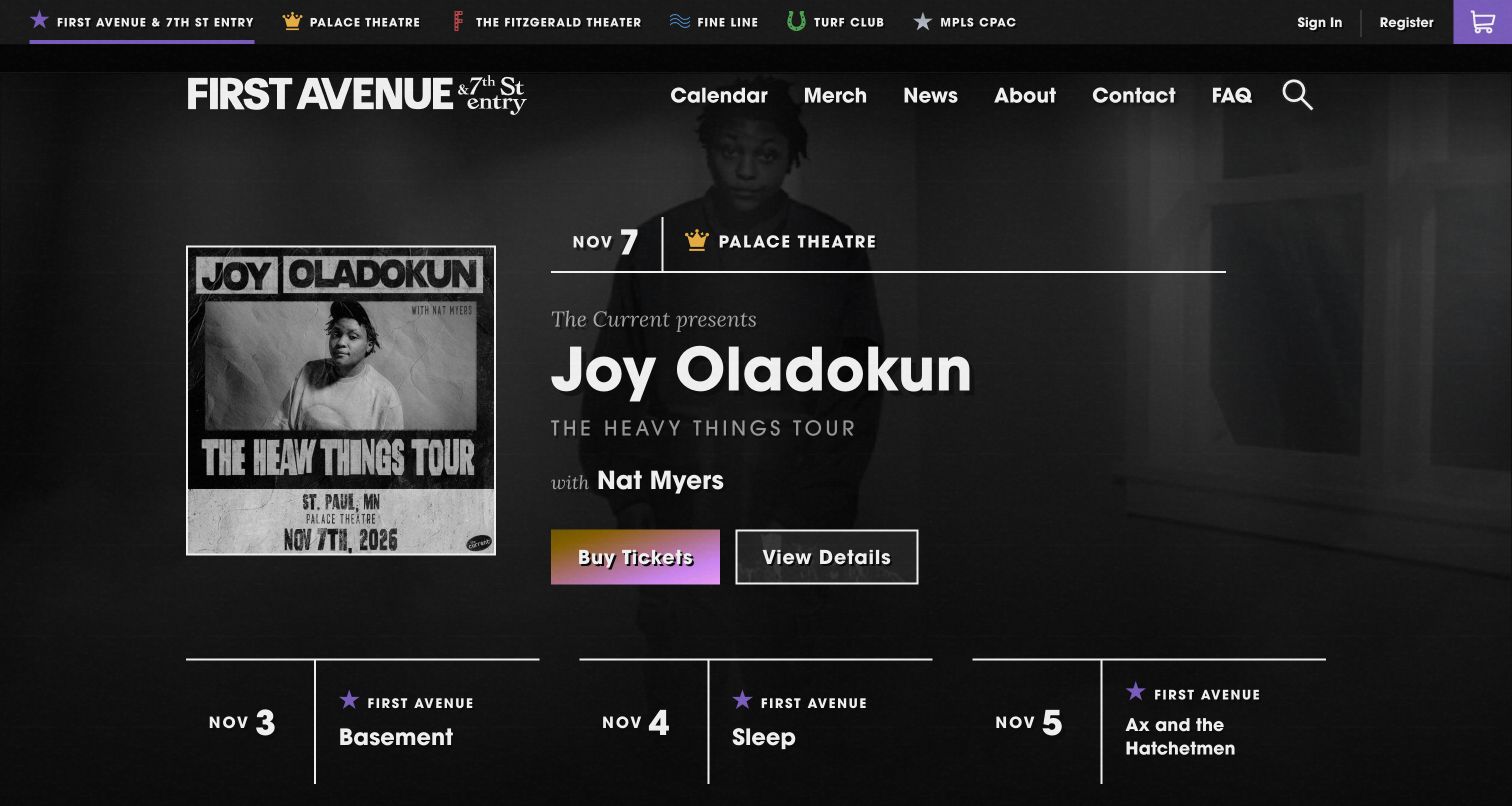
First Avenue combines a gritty monochrome visual identity with unusually useful event labeling. The captured feature names Joy Oladokun, gives a November date and identifies Palace Theatre rather than assuming the show happens at the namesake venue. Buy Tickets and View Details are separate actions. A venue switcher and calendar navigation support the wider network, making the page relevant to people choosing a performance across several rooms with different locations and expectations.
What you can learn
Whenever a promoter runs more than one room, place the actual venue beside the artist and date. Keep a details route next to the purchase action so visitors can check age restrictions, support acts or arrival information before committing to the ticketing handoff.
Pros
The featured show includes its venue, reducing the risk of a visitor confusing the promoter's brand with the event location.
Separate ticket and detail actions support both decisive buyers and people who still need practical information.
Cons & considerations
If the venue selector becomes crowded, unfamiliar visitors may need geographic or capacity context before choosing a room.
If the high-contrast photography and display type are copied too literally, a different promoter could lose its own local identity.
Platform source: WordPress.org Showcase. Linked script matches Jetpack. Exact public source-page reference: https://first-avenue.com/. This is an observed component association, not proof of private configuration, a paid plan, measured results or complete architecture. Platform evidence is separate from the direct website screenshot and is not a complete current infrastructure audit.
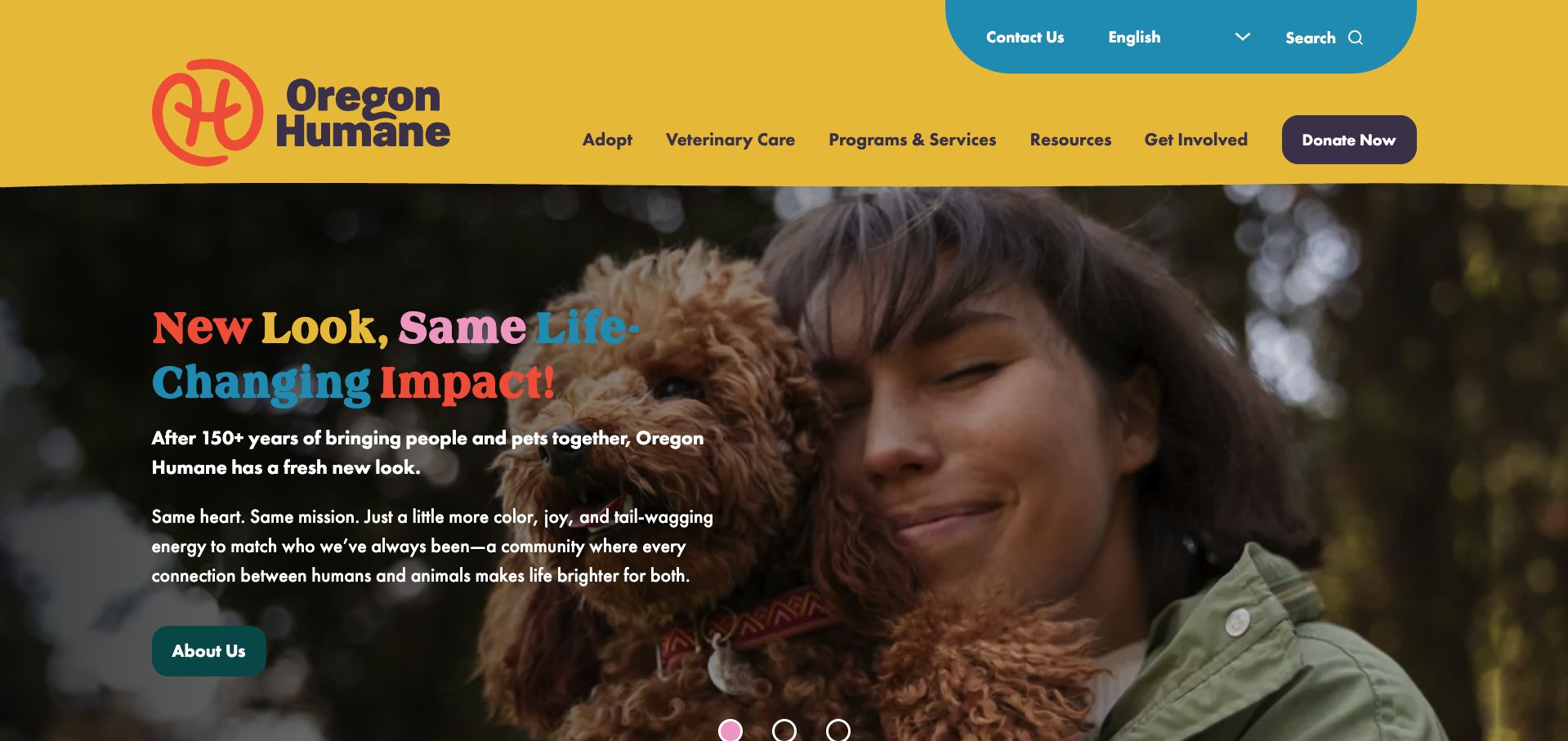
Oregon Humane pairs its bright yellow header with an intimate photograph of a person holding a dog. The opening announcement introduces a new visual identity, but keeps the emotional connection between people and animals at the center. Multicolored headline words echo the palette without replacing the explanatory text. Navigation distinguishes adoption, veterinary care and wider services, and language selection is available above it. A prominent donation button remains visually separate from those service categories. The result is an expressive brand introduction that still acknowledges the different reasons someone might visit an established regional animal organization.
What you can learn
Explain a rebrand through the continuity of the mission and services. Use a representative photograph and a short explanation, then keep familiar navigation categories intact so returning visitors can still complete their original task.
Pros
The photograph communicates companionship more specifically than a generic animal collage.
Language selection and veterinary care are visible in the header.
Cons & considerations
Several headline colors demand careful contrast checking against the photograph.
The About Us campaign action is less direct for a visitor ready to adopt.
Platform source: WordPress.org Showcase. Linked stylesheet matches Jetpack. Exact public source-page reference: https://www.oregonhumane.org/. This is an observed component association, not proof of private configuration, a paid plan, measured results or complete architecture. Platform evidence is separate from the direct website screenshot and is not a complete current infrastructure audit.
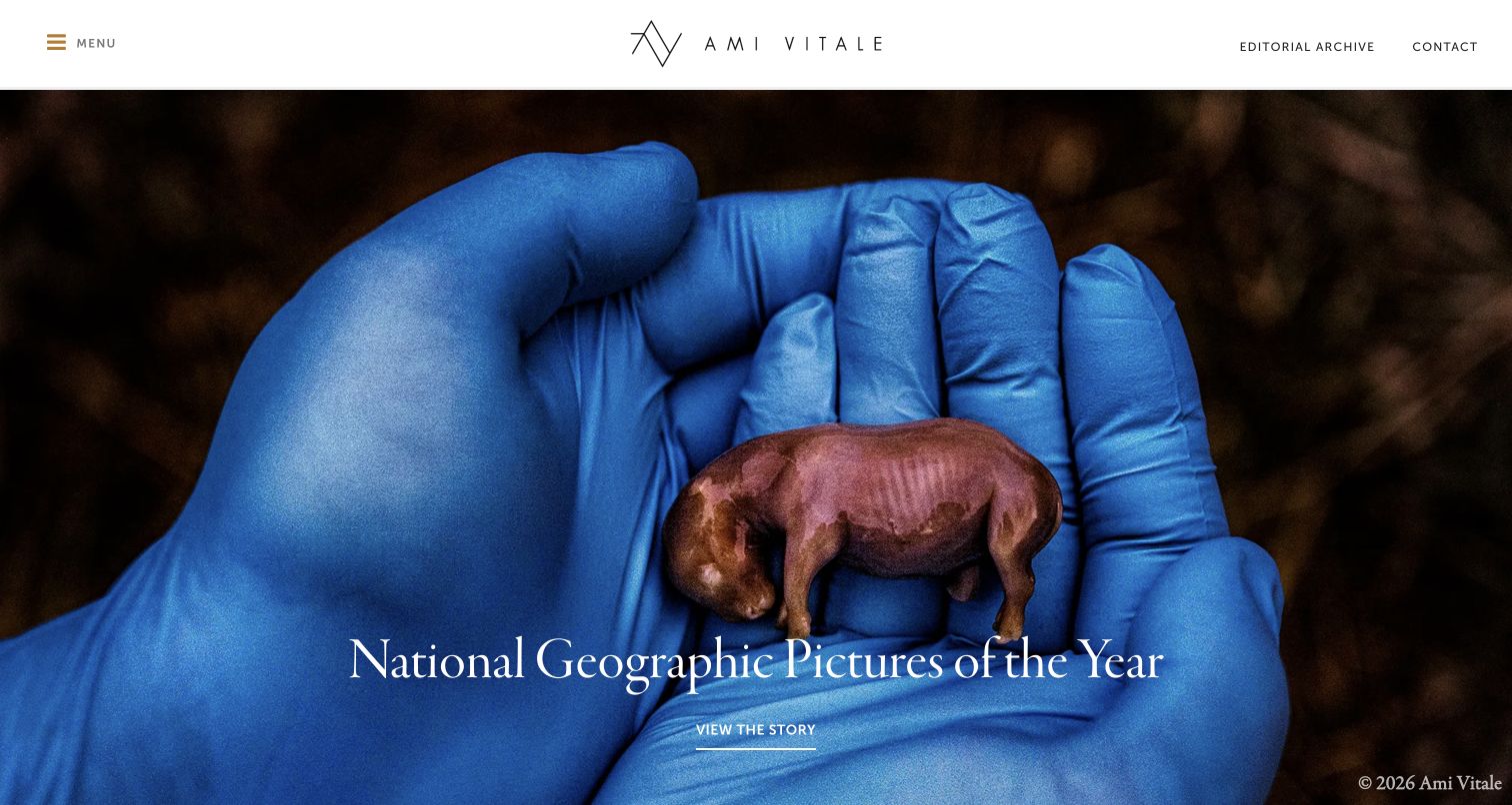
Ami Vitale's homepage treats the opening photograph as a story invitation, with a clear title and a View the Story action. The white header preserves contact and editorial-archive routes outside the collapsed menu, keeping practical professional tasks visible. The large image gives the work emotional weight, while the story title makes it more specific than a generic portfolio slideshow. This is a useful model for photographers whose projects are best understood through narrative. The full-screen treatment still means visitors see one featured story at a time, and smaller navigation labels need enough contrast and space to remain usable.
What you can learn
Use a featured image to lead into a complete story with context and sequencing. Keep archive and contact tasks available for editors who already know what they need. A rotating feature should supplement a stable project index rather than becoming the only way to discover the work.
Pros
Story titles give the opening imagery a clear context.
Archive and contact remain visible outside the menu.
Cons & considerations
One featured story dominates the first impression.
Small utility labels can be less prominent than the large media.
Platform source: WordPress.org Showcase. Linked script matches Jetpack. Exact public source-page reference: https://www.amivitale.com/. This is an observed component association, not proof of private configuration, a paid plan, measured results or complete architecture. Platform evidence is separate from the direct website screenshot and is not a complete current infrastructure audit.
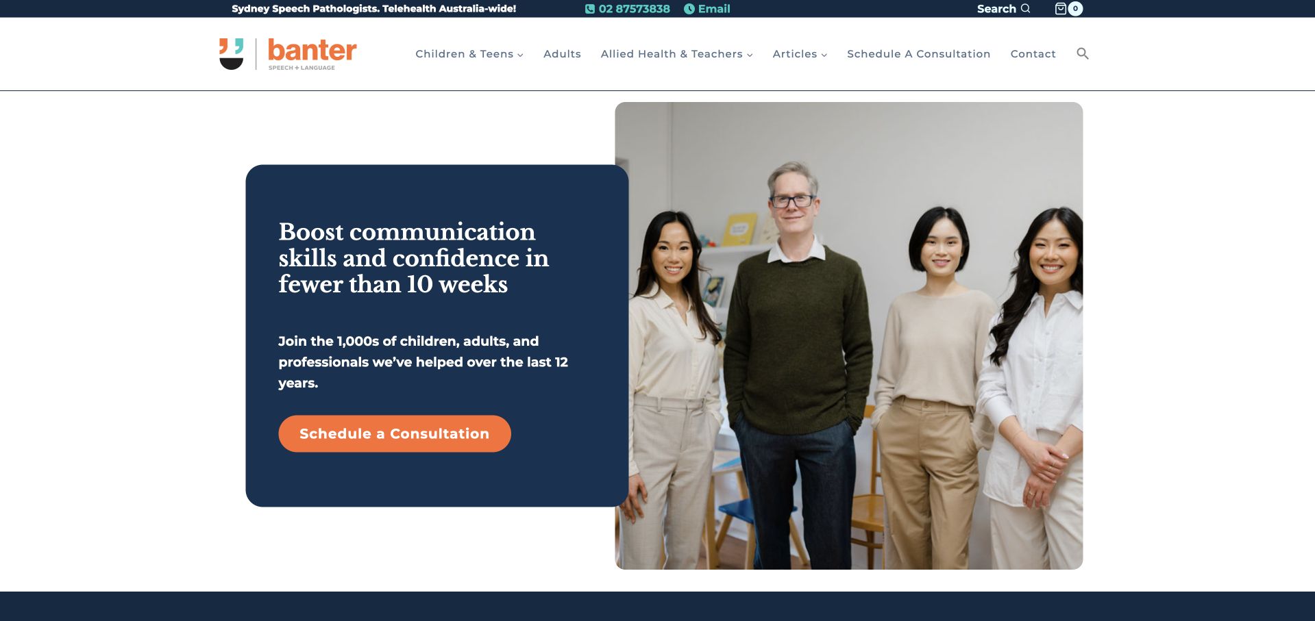
Banter combines a dark-blue header and content panels with a bright orange consultation action. The opening is followed by distinct pathways for children and teenagers, adults, and allied-health or teaching professionals. That separation matters because the site also offers educational material and resources, not just appointments. Contact information and a search control are visible above the main navigation, supporting visitors who already know what they need. The headline makes a strong time-based marketing claim, which should not be borrowed as an assumed result. More transferable is the way the page divides clinical help from professional learning while maintaining one visual identity.
What you can learn
When a clinic also publishes or sells resources, separate the visitor journeys before they enter the catalogue. Make appointments and professional learning different tasks, and ensure ambitious marketing headlines do not replace a clear explanation of service scope.
Pros
The three audience pathways distinguish personal therapy needs from professional resource browsing.
Phone, email, search and consultation options support several levels of visitor readiness.
Cons & considerations
The combination of clinic, articles and shop features creates a relatively busy header.
A time-specific outcome headline needs careful clinical and editorial review rather than uncritical imitation.
Platform source: WordPress.org Showcase. Linked script matches Jetpack. Exact public source-page reference: https://www.banterspeech.com.au/. This is an observed component association, not proof of private configuration, a paid plan, measured results or complete architecture. Platform evidence is separate from the direct website screenshot and is not a complete current infrastructure audit.
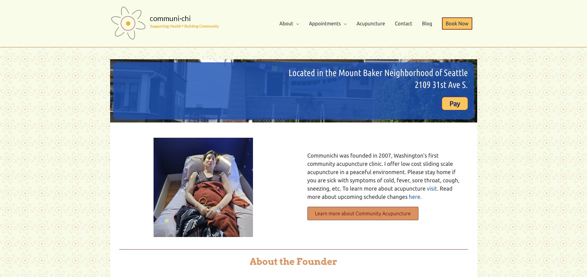
CommuniChi introduces the Mount Baker location with a clear address strip and a photograph of the treatment chairs. That image does real explanatory work: a visitor can understand the shared setting before reading the definition of community acupuncture. A warm floral background, restrained blue panels and orange actions keep the small practice personal rather than institutional. The founder introduction and first-visit forms give the page a useful human and operational sequence. Its main weakness is consistency. The sliding-scale section and later mission copy display different price floors, making the reader determine which statement is current. The design pattern is worth borrowing, but the conflicting amounts need a single maintained source.
What you can learn
Use a real room photograph to explain the service format, then keep fees and preparation instructions synchronized wherever they appear.
Pros
Treatment-chair photography makes the shared setting tangible.
First-visit paperwork is identified within the homepage.
Cons & considerations
Different fee references appear within the same page.
The lengthy mission and blog area can distract from booking.
Platform source: WordPress.org Showcase. Linked stylesheet matches Jetpack. Exact public source-page reference: https://communichi.org/. This is an observed component association, not proof of private configuration, a paid plan, measured results or complete architecture. Platform evidence is separate from the direct website screenshot and is not a complete current infrastructure audit.
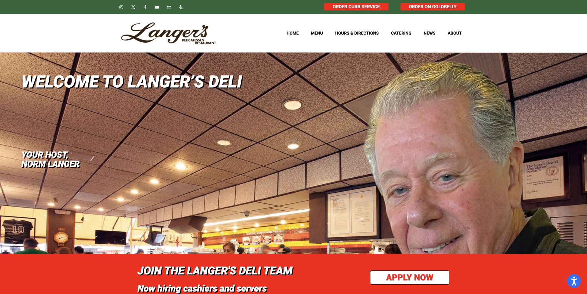
Langer’s Delicatessen uses a large photograph of its named host in the dining room rather than opening with a sandwich close-up. The green-and-white header supplies the brand and navigation, while pickup and delivery routes receive their own small buttons above. This creates a personal introduction without forcing the whole business story into the hero. A red recruitment strip sits below the main image as a distinct, current notice. The useful pattern is the separation between a durable human identity and practical operating actions. The photograph shows the place and its representative; the navigation then offers a direct way to use the business.
What you can learn
A real host or owner photograph can introduce a deli more effectively than generic hospitality imagery. Keep the person’s role accurately labelled, preserve separate pickup and delivery paths and give temporary notices their own removable section rather than baking them into the portrait.
Pros
The named host gives the restaurant a human introduction.
Pickup and delivery remain distinct from the portrait.
Cons & considerations
The portrait-led opening shows less of the food than product-focused alternatives.
A recruitment strip can distract from ordering if its priority is not managed.
Platform source: WordPress.org Showcase. Linked stylesheet matches Jetpack. Exact public source-page reference: https://www.langersdeli.com/. This is an observed component association, not proof of private configuration, a paid plan, measured results or complete architecture. Platform evidence is separate from the direct website screenshot and is not a complete current infrastructure audit.
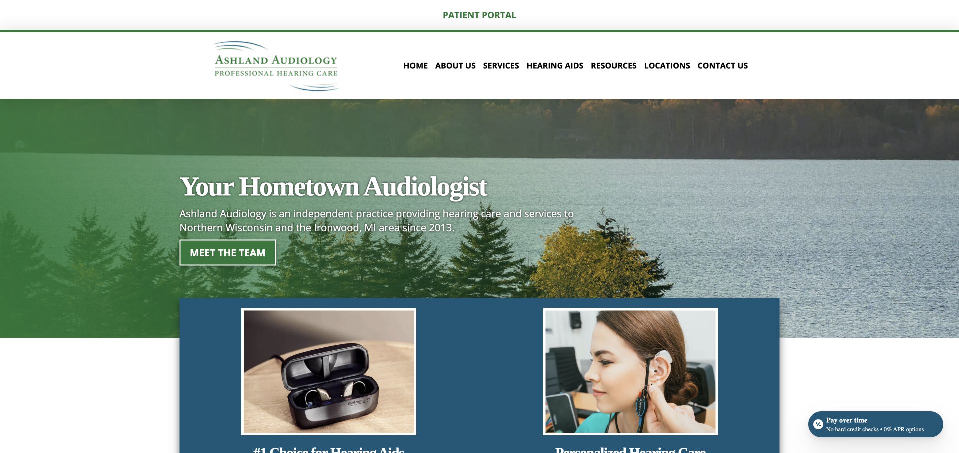
Ashland Audiology uses a woodland-and-water image, green branding and a direct hometown introduction. Below the opening, hearing-aid and service material are presented as separate destinations, while the navigation includes locations and contact information. The landscape gives the practice a regional character without relying only on clinical imagery. This is a useful reference for a business serving several communities: a local visual identity can coexist with a practical multi-office structure. The page also contains health and product claims that need professional review; its design value lies in orientation and navigation rather than any independent validation of those statements.
What you can learn
Use regional imagery to establish place, but name the actual offices and service area in text. Keep educational claims reviewed and dated, and separate hearing-aid product information from the explanation of how a visitor arranges an assessment.
Pros
The landscape image gives the practice a recognisable regional identity.
Separate location, service and device routes support several different visitor tasks.
Cons & considerations
A large scenic opening provides little direct information about the appointment environment.
Health and product claims need maintained professional review rather than being inferred from design presentation.
Platform source: WordPress.org Showcase. Linked script matches Jetpack. Exact public source-page reference: https://ashlandaudiology.com/. This is an observed component association, not proof of private configuration, a paid plan, measured results or complete architecture. Platform evidence is separate from the direct website screenshot and is not a complete current infrastructure audit.
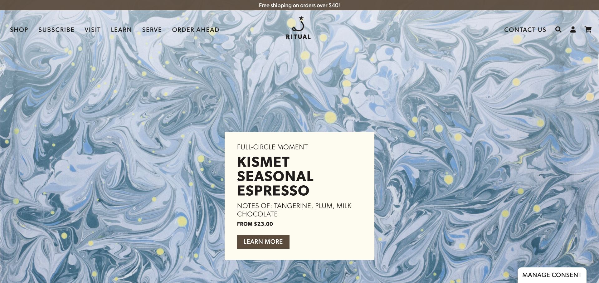
Ritual pairs a full-screen marbled campaign background with a cream information card for a seasonal espresso. The card includes tasting notes, a starting price and a direct link, bringing useful buying context into a highly expressive visual treatment. The navigation names shopping, subscriptions, visits, learning and ordering ahead. Lower product sections continue the combination of origin information, flavor notes and prices. A separate subscription section explains that the business offers several tailored options. The page connects the look of a particular release with distinct routes for home brewing and café customers.
What you can learn
A bold campaign background becomes easier to use when practical information sits on a stable, readable card. Keep flavor notes, price and the next step together rather than scattering them across separate promotional elements.
Pros
The cream product card remains readable against detailed artwork and contains more than a purely decorative headline.
Ordering ahead and visiting have explicit labels alongside the routes for shipped coffee and subscriptions.
Cons & considerations
Rotating campaign content means an important message may not be the first one every visitor sees.
Several subscription choices need comparison details so their differences remain understandable beyond a general promise of variety.
Platform source: WordPress.org Showcase. Linked script matches Jetpack. Exact public source-page reference: https://ritualcoffee.com/. This is an observed component association, not proof of private configuration, a paid plan, measured results or complete architecture. Platform evidence is separate from the direct website screenshot and is not a complete current infrastructure audit.
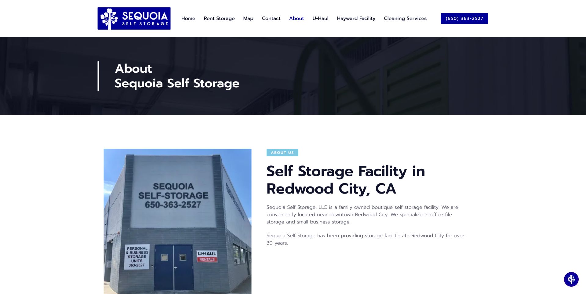
Sequoia's about page gives its small-business positioning a concrete setting. A photograph of the building sits beside a Redwood City heading and short copy identifying office-file and small-business storage as particular uses. The photograph includes the facility name and entrance, making it useful for recognition rather than merely decoration. Above, a dark title band and restrained blue accents separate the page heading from the main content without overwhelming it. The surrounding navigation retains rental, map and contact routes, but also includes moving-truck, other-facility and cleaning-service links. That breadth may be useful to the operator while asking a storage visitor to sort through several different services. The saved notes also identify specific access features further down the page. The strongest reusable idea is the connection between a particular customer need and a real place; current availability still requires the rental route.
What you can learn
Name the storage job you specialise in and explain floors, lifts and access hours. Business customers need physical constraints as much as a reassuring brand.
Platform source: WordPress.org Showcase. Linked stylesheet matches Jetpack. Exact public source-page reference: https://sequoiaselfstorage.com/about/. This is an observed component association, not proof of private configuration, a paid plan, measured results or complete architecture. Platform evidence is separate from the direct website screenshot and is not a complete current infrastructure audit.
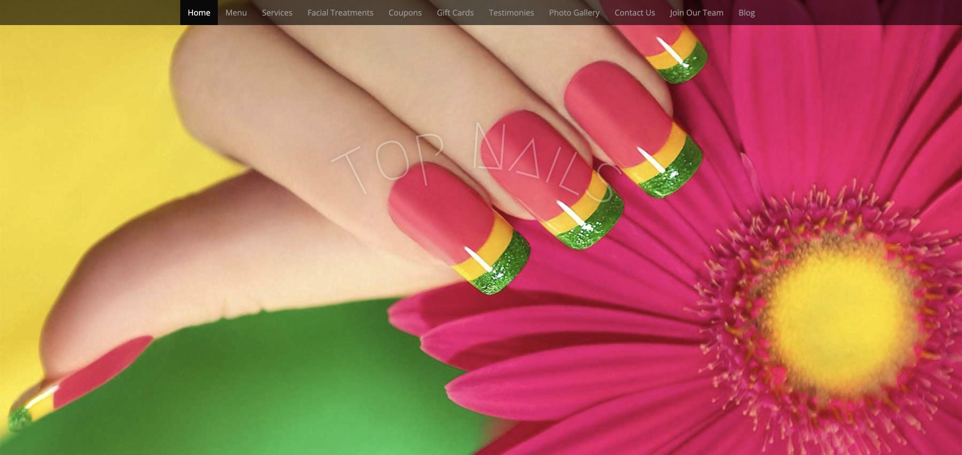
Top Nails opens with a colorful close manicure photograph beneath a dense conventional navigation bar. The inspected site supplies Clarksville context, working hours and a concrete distinction between walk-ins and calling ahead. Menu, photos and testimonials have their own destinations, so the practical information is not entirely dependent on the image. The visual treatment is less restrained than newer boutique examples, and the header offers many similarly weighted choices. The useful borrowing opportunity is the explicit visit information rather than the number of links or decorative effects.
What you can learn
Keep the business facts that answer whether someone can visit today. A redesign can simplify the header and modernize the typography without losing clear hours, walk-in expectations and a plain service-menu destination.
Pros
Hours and walk-in guidance give the site practical local value.
Menu and work photographs are identifiable navigation options.
Cons & considerations
Many equally weighted header links make the first decision harder.
The dated visual treatment can distract from otherwise useful visit information.
Platform source: WordPress.org Showcase. Linked stylesheet matches Jetpack. Exact public source-page reference: https://www.topnails.org/. This is an observed component association, not proof of private configuration, a paid plan, measured results or complete architecture. Platform evidence is separate from the direct website screenshot and is not a complete current infrastructure audit.
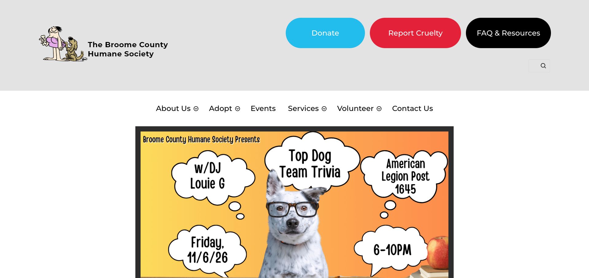
Broome County Humane Society places large colored controls for giving, reporting cruelty and finding resources above its main navigation. Those unusually prominent utility actions make the page's community role clear before the visitor reaches an animal listing. The opening content is an event poster with a playful dog photograph and speech-bubble lettering, giving the site a local, volunteer-driven character. The separate white navigation row offers adoption, services and volunteering without trying to fit every task into the artwork. This is a useful example of a site that prioritizes locally meaningful information, although the event-led opening also makes editorial maintenance especially visible.
What you can learn
Keep important service actions outside campaign graphics. Posters can convey a local event's personality, but reporting a concern, finding resources and beginning adoption should remain ordinary links that do not depend on reading an image.
Pros
Report Cruelty is highly visible alongside donation and resource actions.
The main navigation remains separate from the large event artwork.
Cons & considerations
The captured opening features an event date that has already passed.
Information embedded in a poster needs an equivalent accessible text description.
Platform source: WordPress.org Showcase. Linked stylesheet matches Jetpack. Exact public source-page reference: https://bchumanesoc.com/. This is an observed component association, not proof of private configuration, a paid plan, measured results or complete architecture. Platform evidence is separate from the direct website screenshot and is not a complete current infrastructure audit.
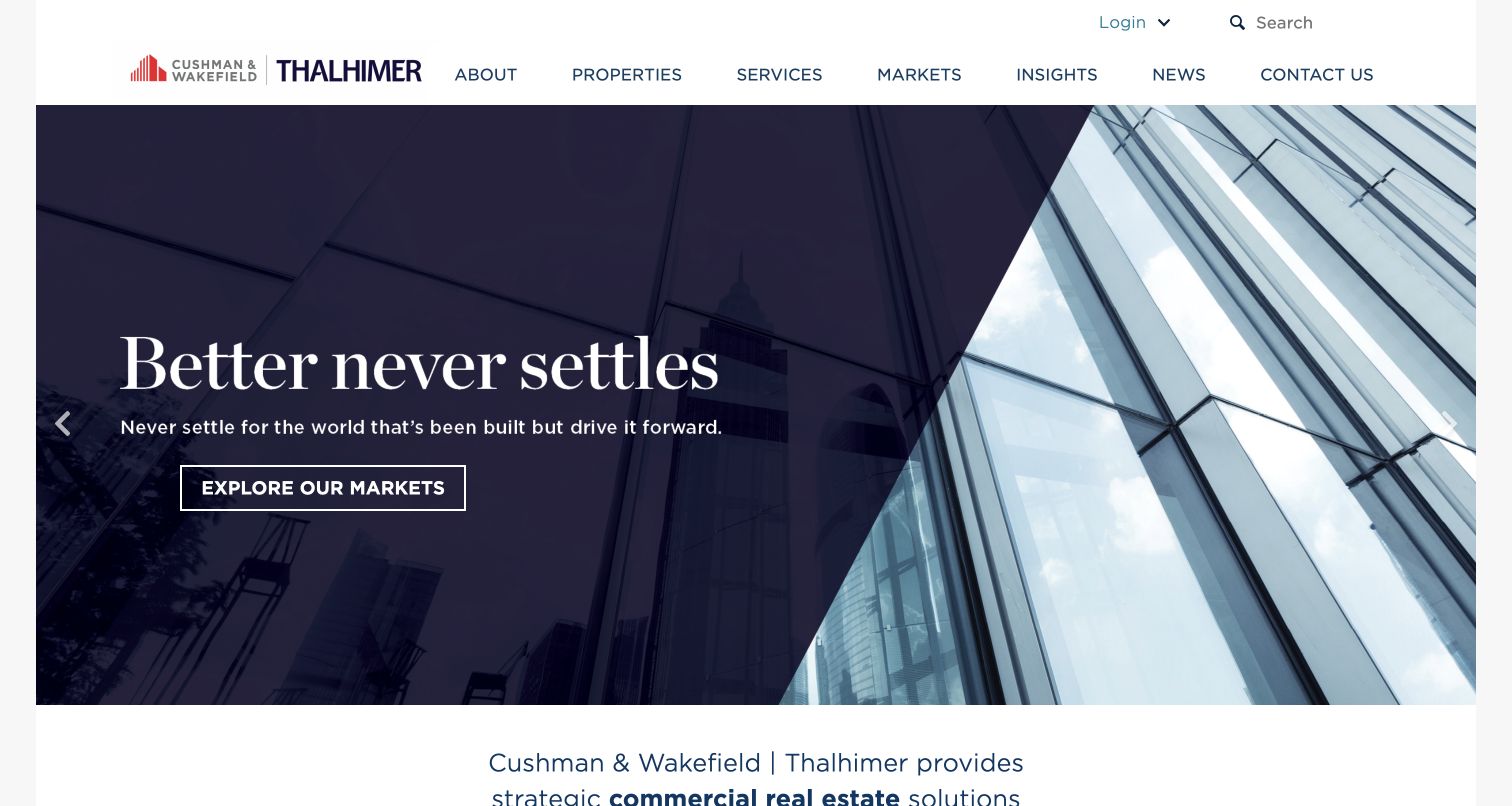
Thalhimer combines its own name with the Cushman & Wakefield alliance identity in a white header, then places a diagonal dark panel over a building photograph. The headline and market-exploration action remain together within that panel. Below the hero, the page moves into a regional commercial-service explanation and distinguishes visitors who have property from those who need it. Named market routes supply more practical geography than the opening slogan alone. The design demonstrates how an affiliated regional firm can present both its relationship and its own service territory without making the entire homepage look like a generic copy of a larger corporate site.
What you can learn
Explain an alliance clearly while retaining specific local destinations. An affiliation mark can provide context, but a visitor still needs to know which office, market and service team will handle the actual request.
Pros
The angled overlay gives the headline a predictable readable area.
Have-property and need-property routes recognize different visitor intentions.
Cons & considerations
Two brand identities require a clear explanation of their relationship.
An abstract opening promise depends on the regional content below for substance.
Platform source: WordPress.org Showcase. Linked stylesheet matches Jetpack. Exact public source-page reference: https://thalhimer.com/. This is an observed component association, not proof of private configuration, a paid plan, measured results or complete architecture. Platform evidence is separate from the direct website screenshot and is not a complete current infrastructure audit.
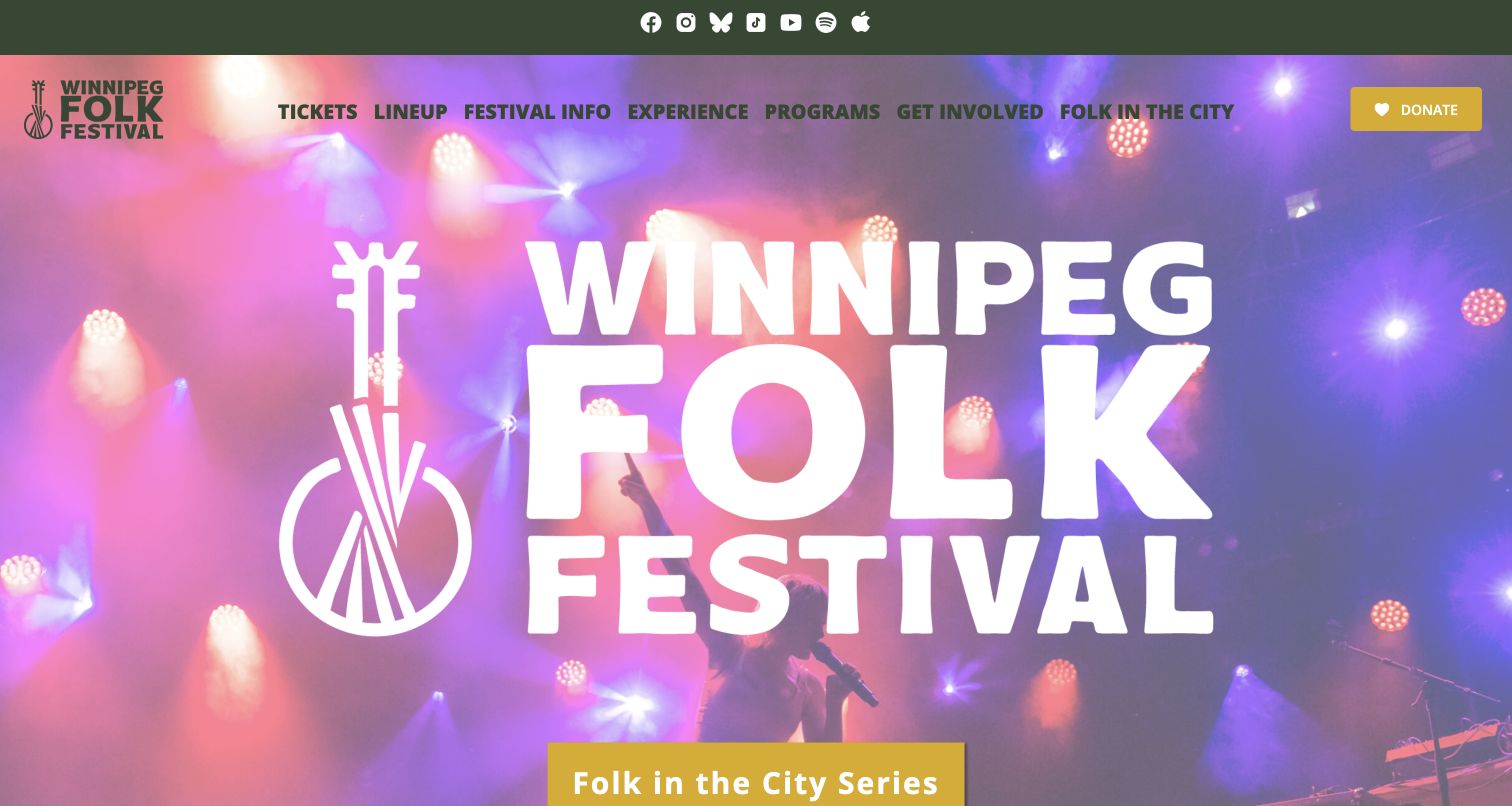
Winnipeg Folk Festival leads with an oversized wordmark over performance imagery, using a green header and yellow action to create a consistent visual identity. Its navigation separates the annual festival, wider programs, involvement and the city concert series. The next festival dates and a countdown appear below the hero, followed by named concerts with venues and times. This supports a year-round presence alongside the annual event. The main challenge is hierarchy: a new visitor sees the concert-series action before the forthcoming festival date and must distinguish both programs.
What you can learn
Separate an annual festival from the organization's other concerts using clear labels and dated listings. A shared brand can connect them, but each event needs its own venue, timing and ticket context so visitors understand what they are actually considering.
Pros
The navigation gives community programs and the city concert series explicit destinations alongside festival information.
Named concert cards include venue and time context instead of relying only on performer photographs.
Cons & considerations
The very large wordmark delays the next festival's date and practical information below the opening view.
The concert-series action can distract first-time visitors unless the distinction from the annual festival stays clear.
Platform source: WordPress.org Showcase. Linked stylesheet matches Jetpack. Exact public source-page reference: https://www.winnipegfolkfestival.ca/. This is an observed component association, not proof of private configuration, a paid plan, measured results or complete architecture. Platform evidence is separate from the direct website screenshot and is not a complete current infrastructure audit.
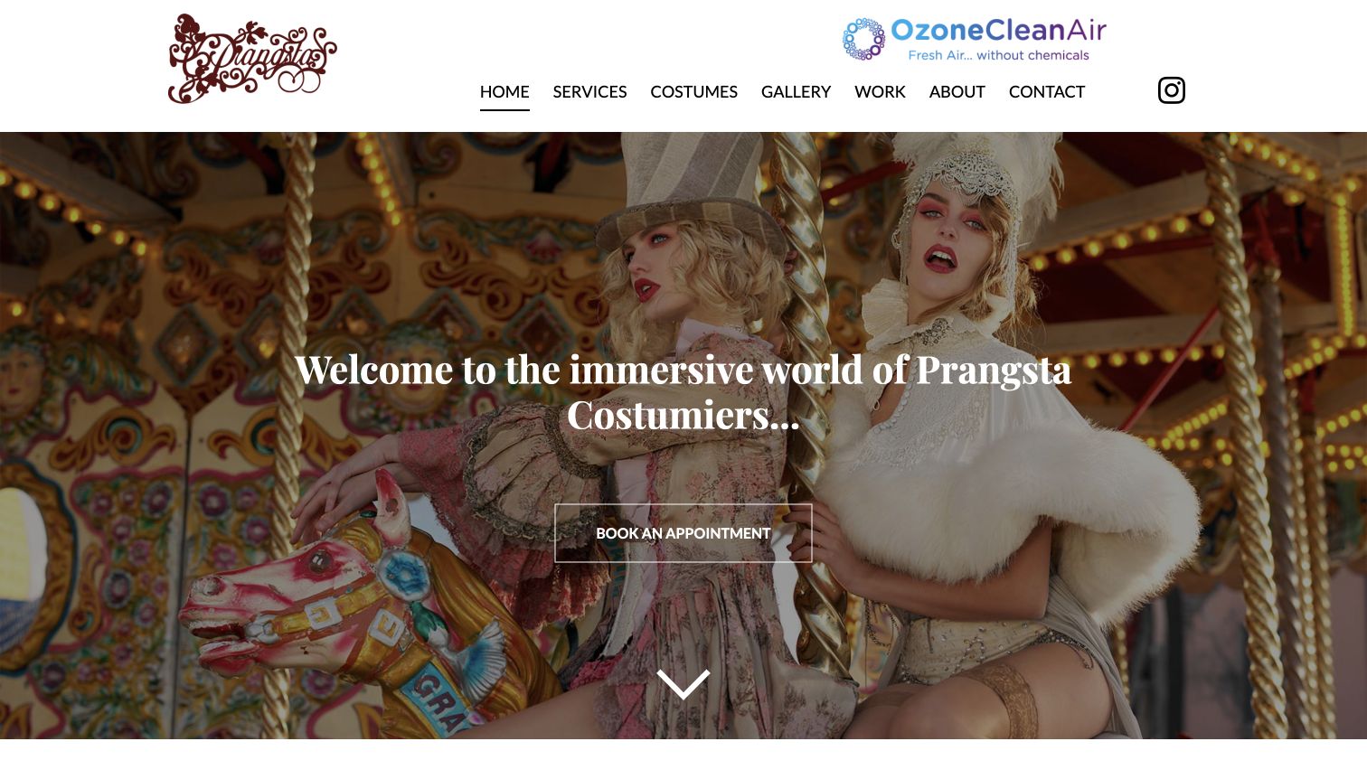
Prangsta makes its particular kind of costume work immediately recognizable. An elaborate fashion photograph fills the opening screen, while the restrained white header keeps the service menu readable. The central appointment link gives that theatrical presentation a practical destination. Below it, separate routes distinguish styling, bespoke work, photography and event services. The directly reviewed styling page then explains appointment expectations, preparation, hire periods and the difference between consultation and alterations. Its company page describes the New Cross studio, giving the creative language a specific place and working context. The result feels more like an introduction to a specialist than an undifferentiated costume warehouse.
What you can learn
Use an expressive image to establish the specialty, then connect it to plain service information. Visitors should understand what happens after choosing an appointment.
Pros
Distinctive styling photographs communicate the creative direction before visitors read the longer introduction.
The separate styling page explains preparation and service boundaries beyond the homepage’s broad promise.
Cons & considerations
The opening appointment link does not itself explain pricing, duration or availability for newcomers.
The prominent third-party cleaning graphic competes visually with the studio’s own decorative brand mark.
Platform source: WordPress.org Showcase. Linked script matches Jetpack. Exact public source-page reference: https://www.prangsta.co.uk/. This is an observed component association, not proof of private configuration, a paid plan, measured results or complete architecture. Platform evidence is separate from the direct website screenshot and is not a complete current infrastructure audit.
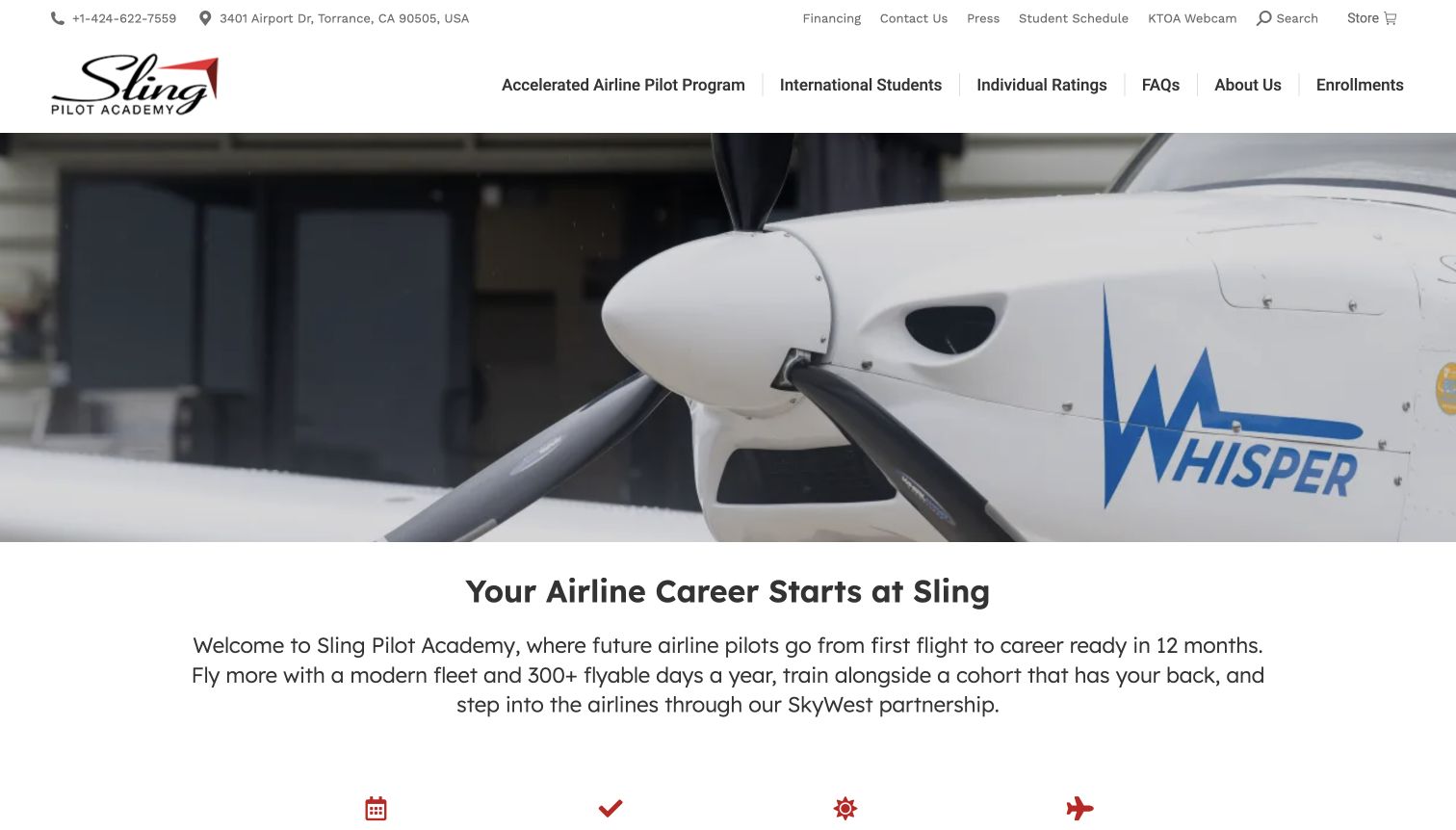
Sling Pilot Academy places a close aircraft view beneath a practical two-level header. Contact details, financing and scheduling sit above program, international-student and individual-rating routes. The page then moves from its career proposition to student stories and upcoming class dates. That sequence makes the academy feel like a place with an active intake rather than an abstract course catalog. The dated enrollment section offers both enrollment and a tour, giving a prospective student a smaller step before commitment. In the captured view the aircraft media dominates, so the supporting text and location detail become more useful after scrolling.
What you can learn
A cohort-based school should make the next intake easy to find and keep a visit available beside enrollment. Show the environment first, then turn interest into a concrete planning decision with clear dates and locations.
Pros
The header keeps practical financing and existing-student scheduling distinct from program exploration.
Upcoming intake dates connect the broad career story to a specific next planning step.
Cons & considerations
Several utility links and a second navigation row make the header visually dense.
Career and pass-rate claims need their supporting context; the surrounding photography cannot verify those outcomes.
Platform source: WordPress.org Showcase. Linked stylesheet matches Jetpack. Exact public source-page reference: https://www.slingpilotacademy.com/. This is an observed component association, not proof of private configuration, a paid plan, measured results or complete architecture. Platform evidence is separate from the direct website screenshot and is not a complete current infrastructure audit.
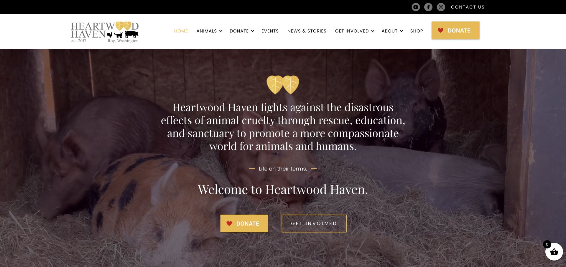
Heartwood Haven combines a warm yellow accent with a full-width photograph of pigs resting together. Its long mission statement stays over the photograph, followed by distinct Donate and Get Involved actions. Below, rescue, rehabilitation and education become separate explanations, while individual animal stories, adoption listings and support options extend the introductory invitation.
What you can learn
Pair an emotionally specific photograph with recognisable support actions. Separate volunteering, sponsorship, adoption and tours instead of expecting one donation button to answer every visitor’s question. Maintain practical explanations of eligibility, timing and the commitment involved in each route. A resident’s story can introduce the mission, but someone planning to help still needs to understand what happens after clicking. Keep those instructions useful when a particular appeal or featured animal changes.
Pros
Donate and Get Involved offer different levels of commitment.
Individual animal stories connect the broad mission with identifiable residents.
Cons & considerations
The opening mission statement needs careful line lengths on smaller screens.
Repeated donation links should not make practical visit and adoption information secondary.
Platform source: WordPress.org Showcase. Linked script matches Jetpack. Exact public source-page reference: https://heartwoodhaven.org/. This is an observed component association, not proof of private configuration, a paid plan, measured results or complete architecture. Platform evidence is separate from the direct website screenshot and is not a complete current infrastructure audit.
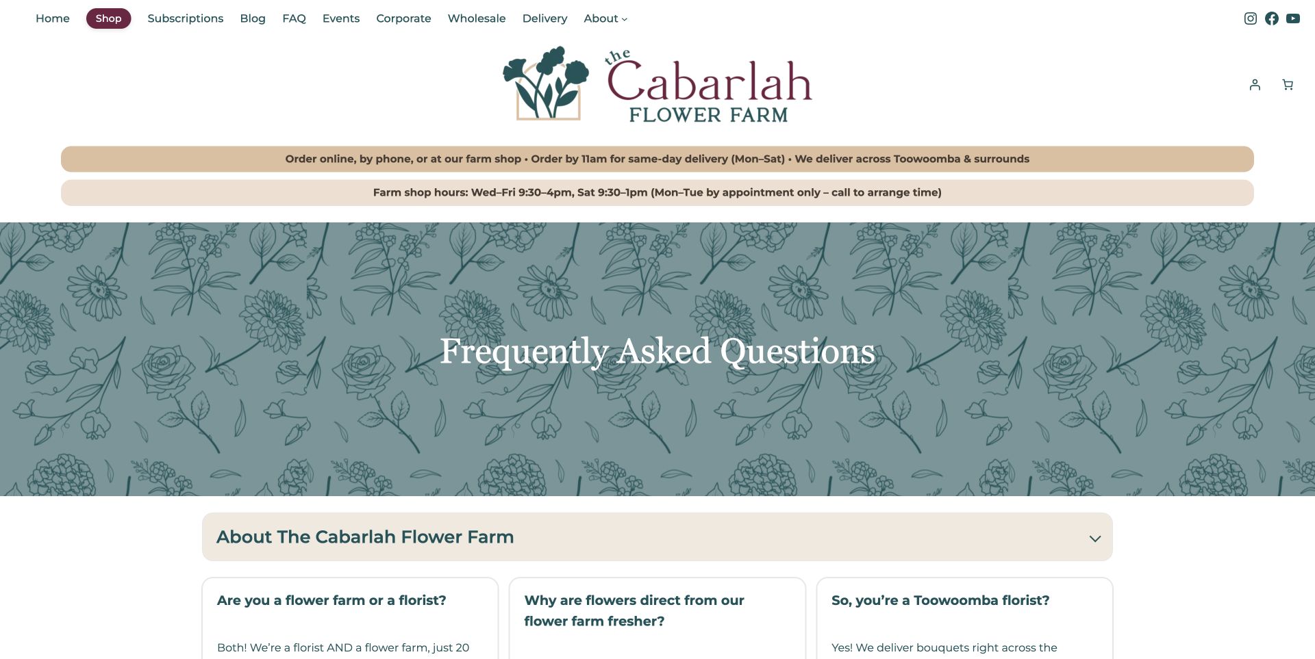
The Cabarlah Flower Farm's FAQ page uses teal botanical illustration and cream question cards beneath two useful operational strips. Delivery cutoff and farm-shop hours appear before the decorative page title, while individual questions have direct links. The answers distinguish the public florist shop from the working farm, which is not open for tours, and explain retail, wholesale and seasonal flower choices. This is a strong information pattern for a business that visitors might otherwise misunderstand. The large title area delays the answers, and broad freshness comparisons remain the business's own claims. The useful design lesson is the specificity of the questions and access rules, rather than an assumption that the FAQ verifies every claim it contains.
What you can learn
Build FAQs around real misunderstandings, especially when a farm and retail shop share one property. Put hours and delivery rules in a stable visible place, and give important answers direct links that staff can share.
Pros
Shop access and farm-tour limits are explicitly distinguished.
Delivery cutoff and hours remain prominent above the FAQ.
Cons & considerations
A large decorative title delays the answer cards.
Some comparative claims need evidence beyond the page itself.
Platform source: WordPress.org Showcase. Linked script matches Jetpack. Exact public source-page reference: https://www.thecabarlahflowerfarm.com.au/frequently-asked-questions/. This is an observed component association, not proof of private configuration, a paid plan, measured results or complete architecture. Platform evidence is separate from the direct website screenshot and is not a complete current infrastructure audit.
Kegan has 15+ years of experience working with small businesses, Fortune 500 companies, and everything in between. No development job is too big or too small: he brings the same hands-on attention to a focused improvement, a complete website, or a custom application.
For Jetpack projects, he can help with deliberately selected WordPress modules, integration and account ownership, publishing and support workflows, verification and maintainable handover. He works directly with clients on scope, design, implementation, testing, and handover, with an emphasis on clear communication and a system that remains practical to maintain after launch.
Show 3 other Jetpack developersHide other Jetpack developers
Choose a bounded Jetpack role within the existing WordPress site
Use one specific capability with clear ownership
Begin with a real requirement and identify the relevant documented feature. Decide what success looks like, who manages it, and which parts remain with the host, theme, or another provider. Do not infer enabled modules from another example’s public assets.
Review a connected service as an operational dependency
Where a feature uses a connection or external service, include account ownership, availability, data handling, and failure behavior in the brief. Match the selected setup to current documentation instead of assuming all Jetpack functions have identical requirements.
Keep an existing stack coherent rather than duplicating it
Inventory current backup, security, media, search, analytics, and editorial tools before adding another overlapping responsibility. Assign intentional boundaries and use appropriate staging and troubleshooting rather than casually disabling production tools to see what happens.
Plan Jetpack around a named job, a responsible owner, and a verifiable result
Write a requirement that does not assume the whole suite
Begin with the actual website task and the person responsible for it. An editor may need a particular publishing interaction, a site owner may need a documented operational capability, or a developer may be evaluating a delivery or integration requirement. Describe that job in ordinary terms before naming a plugin. Record what already exists and which problem remains unsolved. The result should be a short statement that can be tested, not a promise that installing Jetpack makes the website secure, fast, intelligent, or complete. Those broad outcomes involve several separate responsibilities and need evidence of their own.
Create a requirement table with the chosen capability, its owner, the expected visitor or administrator action, the dependencies, and the acceptance test. Mark optional ideas separately from the launch scope. A feature available somewhere in the product family is not automatically part of the selected plan or enabled installation. Keep a decision record for features deliberately left off so a later maintainer does not enable them merely because they appear in an onboarding screen. This makes the eventual implementation smaller, more understandable, and easier to change when the site’s real requirements evolve.
Audit the current WordPress responsibilities before adding another layer
Inventory the host, theme, editor, plugins, connected accounts, and external services that already perform relevant tasks. Record who controls each system and where a configuration change is approved. This is an ownership exercise rather than a demand to replace the entire stack. A website may already have an established media workflow, privacy-approved analytics, a backup arrangement, or a search service. Identify the gap the proposed Jetpack feature would fill and the overlap it could introduce. Avoid assuming that two tools with similar marketing labels are interchangeable or that one can be removed without affecting another part of the site.
Walk through a normal publishing job with the actual editors. Note any controls they rely on, automated actions that happen after publication, and responsibilities they cannot currently explain. Preserve existing functioning behavior unless a scoped change is explicitly approved. If the project changes a search, subscription, form, or other interaction, map where the visitor’s action goes and who verifies the outcome. A visible button is only the beginning of that route. A good brief makes it possible to tell whether a problem belongs to the theme, WordPress configuration, the selected module, a connection, or a different service.
Confirm feature availability and the actual connection model
Check current official documentation for the exact selected feature and the installation being planned. Jetpack distinguishes site and account connections, and requirements are not identical for every feature. Record the applicable relationship without generalizing it to the entire suite. Identify the business account owner, the site administrator who can manage the connection, and the process for a future handover. Do not configure an organization’s operational dependency under a contractor’s personal account simply because it is convenient during a demonstration. Account recovery and renewal responsibility belong in the implementation plan, not in an email thread nobody can find later.
Keep pricing, plan limits, and account assumptions out of permanent copy unless they have a clear review owner and date. The project specification can link to the current official product documentation and record the decision actually made. If a feature depends on a paid service, define what happens when a subscription changes or ends and which person receives important notices. If a site is moved, renamed, or copied to staging, follow the appropriate official workflow rather than treating a copied configuration as proof of a correct new connection. Test the actual intended environment before calling the setup complete.
Review data handling for the selected feature, not a generic label
Identify the data involved in the chosen interaction, where it is processed, who can access it, and how long it is retained under the organization’s approved policy. Different publishing, analytics, subscription, and operational tasks can involve very different information. Use Jetpack’s feature-specific privacy material as an input to that review, and involve the appropriate organizational or legal adviser when needed. Do not describe the whole suite as anonymous, automatically compliant, or free of external processing simply because the website’s visual interface is minimal. A public signal also does not show the full administrator configuration.
Make visitor-facing explanations consistent with what is actually enabled. If the project does not use a particular analytics, newsletter, payment, or AI feature, do not add disclosures that imply it does. Conversely, do not remove an applicable explanation because a module has a familiar brand name. Keep consent or regional behavior aligned with the site’s real requirements and existing policy rather than changing it as a side effect of a plugin project. Limit administrator access, document exports and deletion procedures where relevant, and avoid using real inquiry or subscriber records as casual test data.
Build a representative test environment and protect the live site
Choose an appropriate testing approach before changing a live installation. Include realistic pages, navigation, images, and interactions rather than an empty demo that cannot reveal a conflict. Protect private content in any copied environment and document which external actions are disabled there. Do not let a staging test send genuine newsletters, post to connected social accounts, charge a payment method, or notify customers unexpectedly. A separate environment is useful only when its connections and side effects are understood. Record the test scope and the differences from production so a successful preview is not mistaken for a verified live workflow.
Use the official troubleshooting guidance when investigating conflicts, and prefer isolated or staging tests over casually switching production plugins and themes for all visitors. Make one understood change at a time and preserve the findings, including an unsuccessful result. Account for the relevant cache or host behavior when comparing outcomes, but do not weaken protections to force a test to pass. Identify the person who can approve a rollback and the information needed to restore the previous working state. A repeatable diagnosis is more valuable than a collection of unexplained toggles that happened to make one screenshot look correct.
Write a concrete demonstration for the job being implemented. If the scope is an editorial interaction, have the editor use realistic content and correct a mistake. If it is a visitor-facing function, test the normal route, empty states, keyboard operation, narrow layouts, and an appropriate failure case. If the scope is operational, define what independent result the owner needs to verify rather than relying only on a dashboard saying a feature is active. Do not claim a backup restore, malware response, performance result, or business conversion that was not actually tested within the authorized scope.
Keep the test record understandable to the next maintainer. Record the environment, selected configuration, relevant account, test data, expected outcome, actual outcome, and limits. Distinguish an installed plugin from a connected feature and a connected feature from a completed workflow. A public Jetpack reference in an example website proves none of those administrator outcomes on your own site. When results depend on an external service, test navigation or content behavior during an appropriate simulated failure in a safe environment. The page should communicate uncertainty or an error truthfully rather than displaying success because the front-end control was clicked.
Preserve the wider design and accessibility responsibilities
Review how the selected function fits the actual page hierarchy. Search, related content, a subscription control, or other visible additions should help the visitor’s task without overwhelming the primary content. Keep labels, headings, focus behavior, error messages, and mobile spacing under the same design standard as the rest of the site. Do not treat a supplied widget as automatically accessible or assume that a familiar platform removes the need to test the integration. The content around the feature, the theme styling, and the site’s broader navigation still affect whether a person can use it.
Set a performance budget appropriate to the pages involved and compare actual requests and rendered behavior when introducing a visible feature. Avoid attributing a measured change to Jetpack without controlling for other differences. A reference in another site’s source does not establish that the same configuration or outcome exists here. Keep a clear fallback for important visitor tasks where appropriate and avoid making critical contact information depend on an optional enhancement. The goal is a coherent website with a bounded tool in it, not a set of feature panels competing to prove that the suite has been fully used.
Hand over ownership, routine tasks, and an exit path
Demonstrate the actual routine with the people who will maintain the site. Have them perform a realistic update, find the relevant settings, identify the business account owner, and explain who handles a failed integration. Supply a concise configuration record showing which functions are enabled and which were intentionally omitted. Include the relevant official documentation rather than an outdated list of every product in the suite. Keep credentials in the organization’s approved system, not in public source or a shared planning article. A visually finished page is not a complete handover if nobody knows which account controls an essential dependency.
Document the review cadence for updates, plan changes, account ownership, privacy explanations, and the chosen acceptance tests. Give the organization a scoped exit plan: what content or settings must be preserved, what behavior needs a replacement, and what should be checked after a feature is removed. Do not assume that disconnecting a suite is harmless or that every related product shares the same lifecycle. Preserve evidence and backups appropriate to the actual task. A good implementation leaves the owner able to maintain or replace a selected capability without having to rediscover the entire website’s architecture from scratch.
A useful handover demonstration
Ask the actual team to carry out its routine job: publish a realistic update, correct a mistake, preview a narrow screen, and identify who owns an integration failure. For a library or frontend framework, also ask who maintains the content source and deployment. A polished screenshot does not answer those operational questions.
Beyond the screenshot
Jetpack project and handover checklist
Name the selected feature and its concrete website task.
Keep a detected Jetpack reference separate from enabled-module claims.
Inventory existing tools and define intentional ownership boundaries.
Confirm current feature availability, plan conditions, and account requirements.
Record business account ownership, administrator access, and recovery responsibility.
Review feature-specific data processing and applicable privacy explanations.
Protect staging content and disable unintended external side effects.
Use appropriate isolated conflict testing and preserve unsuccessful findings.
Test the actual visitor or administrator workflow, including relevant failure cases.
Check labels, keyboard use, focus, errors, and narrow-screen layouts.
Do not imply verified backups, security outcomes, AI usage, or compliance without evidence.
Provide a configuration record, routine demonstration, update owner, and scoped exit plan.
Test with real content, a keyboard, a small screen, slow or failed requests, and the people who will maintain the system. These are planning checks, not an accessibility, security, performance, or search-ranking certification.
Sources & editorial method
How this Jetpack collection was reviewed
Jetpack attribution is limited to the cited public signal on the named website property. It does not reveal every active module, connection, plan, backup, security measure, analytics setting, or AI workflow. Original commentary evaluates observable page composition and conditional tradeoffs; operational planning uses current official documentation and does not claim that the example sites have been tested for those outcomes.
Every image is an unmodified capture from the actual website, with its source and capture date. Some captures are reused from our shared catalog; their dates remain the original capture dates. None comes from a vendor gallery or a generated reconstruction. Moving imagery and live content can change.
Technology attribution uses public page assets or metadata, official platform documentation, or a cited first-party project case study. Documentary and framework-relationship evidence is identified where used; it is not a complete current backend inventory. A CMS image CDN alone does not establish a full CMS deployment. A library’s presence does not prove which individual controls use it, and a platform label does not establish AI authorship.
The composition notes, lessons, pros and tradeoffs are original editorial observations. We have not measured conversion, traffic, security, performance or accessibility conformance. Website owners retain their brands and imagery; these examples are not our client portfolio. Written, Edited and Curated are independent records, not dates advanced by a build. See our editorial standards or suggest a correction.
Questions worth asking
Jetpack website development FAQs
Does a Jetpack signal mean the website uses all Jetpack products?
No. Jetpack includes multiple optional features and connected products. Public evidence must remain scoped to what was actually observed.
Does Jetpack prove the site was created with AI?
No. A Jetpack association does not identify how the website was authored or establish that an optional AI capability is enabled or used.
Can we assume backups and security scanning are active?
No. A public reference does not show plan entitlement, configuration, or verified operational outcomes. Confirm selected capabilities through an authorized administrator review and appropriate tests.
Does every feature require the same account connection?
No. Consult current official documentation for the selected feature and distinguish site connection, user-account connection, and any plan requirements.
What is the most useful handover evidence?
A bounded configuration record, clear business ownership, and a real demonstration of the selected task and its failure handling. Avoid a generic claim that the entire suite is installed and therefore everything is covered.
Borrow the pages’ useful editorial and interaction patterns, then choose only the Jetpack role your own website needs. Keep configuration, accountable ownership, and verified outcomes more specific than the product family’s name.