Best Wedding Venue Websites of 2026 (26 Real-World Examples)
Wedding venue websites that connect a memorable setting with a workable plan
A wedding venue website has to help couples imagine the occasion and understand whether the place fits their plans. These 26 examples show different ways to connect photographs, spaces, food, accommodation and a clear next step.
A beautiful room can earn attention, but choosing a venue involves many connected decisions. Couples need to understand how the ceremony, drinks, meal and party move through the property; how the guest list fits each layout; and what happens if outdoor plans change. Overnight stays, catering arrangements, access, travel and the scope of a quote can matter as much as the first photograph.
This collection examines public websites for urban event spaces, country houses, garden venues, barns, hotels and cultural properties. The reviews focus on observed design and information structure. They do not assess the quality of a wedding service, confirm availability or verify the suitability of a property for a particular event. The useful comparison is how each website helps a visitor move from interest to an informed conversation.
Before the examples
What makes good wedding venue website design in 2026?
Connect the photographs to named spaces
Identify the room or outdoor setting in each important image and explain its role in the day. Show ceremony, dinner and dancing configurations where relevant. A close-up of flowers cannot answer how a guest list fits around tables or how people move between buildings.
Make the main constraints easy to compare
Separate seated, standing and ceremony capacities. Explain outdoor seasonality, indoor alternatives, exclusive-use scope, guest accommodation and supplier arrangements. Keep those facts near the spaces they describe, rather than scattering them across galleries and downloadable brochures.
Explain costs through their components
Distinguish venue hire from food, drinks, accommodation and optional services. State the context of starting prices and identify what changes by date or guest count. When a tailored quote is needed, explain which details the team requires and what the initial enquiry will achieve.
Offer a clear next research step
Give couples a choice between reviewing practical information, taking a virtual tour and arranging a visit. Label an enquiry as an enquiry. A brochure request, provisional date hold and confirmed reservation are different outcomes and should not share misleading booking language.
The collection · 26 examples
26 wedding venue websites worth studying
Compare these sites by the planning question each answers well: understanding a building, choosing a wedding format, arranging an overnight celebration, comparing costs or preparing for a viewing. The first example is an explicit editorial selection from a focused regional venue, based on its website rather than its wedding services.
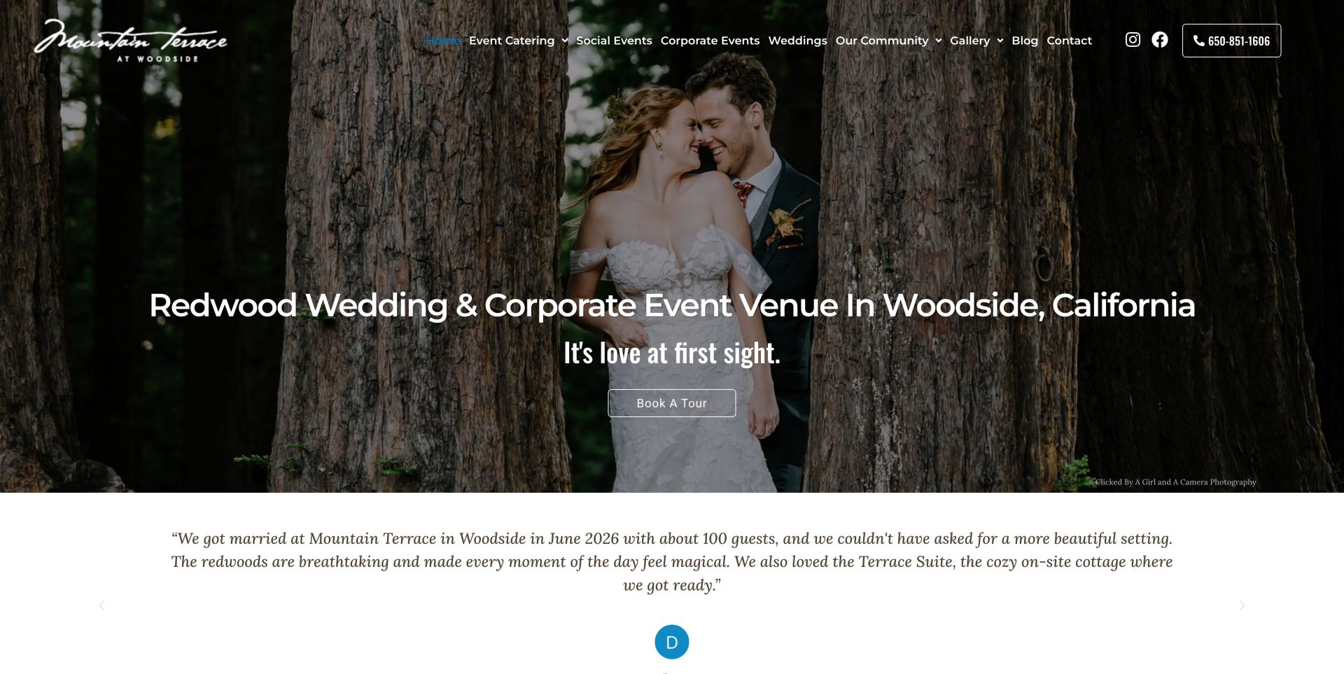
The Mountain Terrace identifies both its redwood setting and Woodside location in the opening headline. A photograph of a couple beneath the trees makes that description tangible, while the tour button provides a visible next step. Event Catering sits beside Weddings, Corporate Events and Social Events in the navigation. Further down, short venue facts cover event settings, catering and amplified music, and the food section distinguishes menus by meal. This is a useful example of a regional venue explaining the planning implications of its setting. The extensive testimonial sequence occupies substantial space, and decorative icon characters appear in the text representation.
What you can learn
Pair the setting that makes a venue memorable with the facts that determine whether it fits. Keep meal choices and event restrictions near the enquiry journey so visitors can prepare specific questions before a tour.
Pros
The headline names the location and the physical setting immediately.
Meal-specific menus and short event facts support practical comparison.
Cons & considerations
The long testimonial sequence adds weight to the homepage.
Decorative icon characters need cleaner accessible labels.
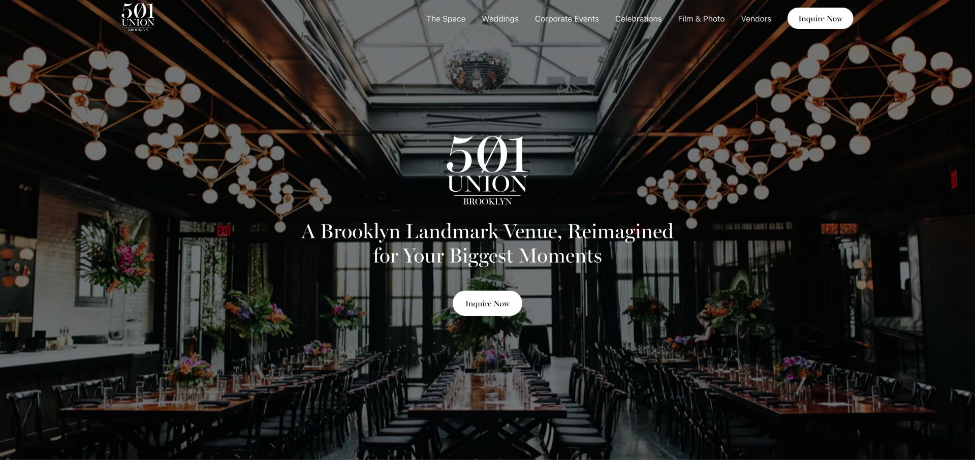
501 Union introduces the Brooklyn venue with a full-width reception photograph, restrained white typography and a high-contrast inquiry button. Navigation separates weddings, corporate events, celebrations and filming while keeping the physical space central. Below the hero, photographed rooms and event configurations explain how the building can change across a day. A venue tour action and a preferred-vendor route help move the visitor from atmosphere to practical research. The page does not make a price or capacity comparison in its opening view, so a visitor must continue into the wedding and space pages before judging suitability.
What you can learn
Use one strong room photograph to establish the venue, then give couples clear routes to spaces, logistics and a tour. A mixed-use venue can share one visual identity without forcing wedding visitors through corporate-event information.
Pros
The room image and Brooklyn headline identify a specific place immediately.
Event-type navigation and repeated tour actions make the next research step clear.
Cons & considerations
The image-heavy opening leaves practical capacity and pricing questions to deeper pages.
The transparent navigation needs contrast testing across every hero photograph.
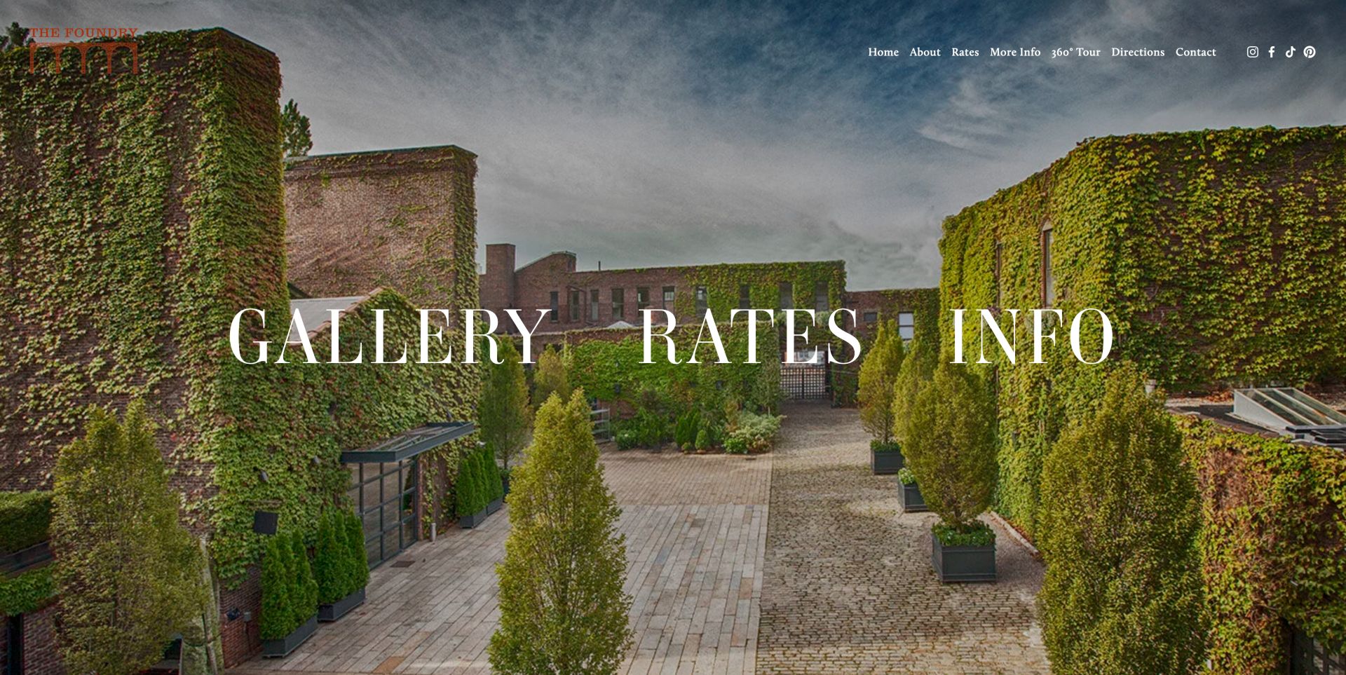
The Foundry uses an ivy-covered industrial courtyard as almost the entire opening screen. Its restrained wordmark and navigation leave the architecture visible, while Gallery, Rates and Info become unusually large entry points. The navigation also separates subway and driving directions and includes a 360-degree tour, making remote research and arrival distinct tasks. That combination is more useful than a purely decorative splash screen because it exposes a commercial question early. The tradeoff is a very sparse introduction: location, event scale and the relationship between spaces are not summarized there. Some images also retain filename-style labels in the observed page text.
What you can learn
If a photograph carries the introduction, give it a small number of decisive links. Rates, a spatial tour and transport instructions can turn an atmospheric opening into a useful starting point without adding a long sales paragraph.
Pros
Rates is prominent beside the gallery and general information.
Separate subway and driving directions acknowledge different arrival needs.
Cons & considerations
The opening provides little immediate capacity or venue context.
Filename-style image labels weaken the otherwise restrained presentation.
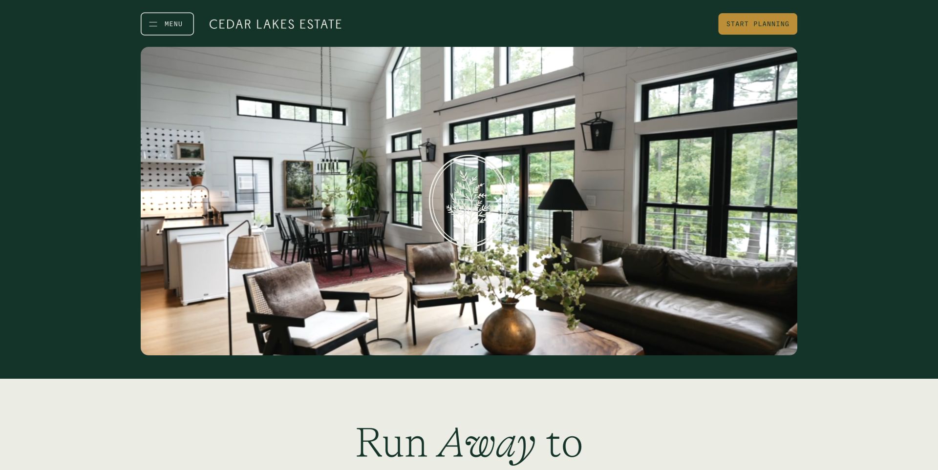
Cedar Lakes Estate frames its opening media with dark green, a compact menu and a gold Start Planning action. The warm interior scene introduces a place to spend time, while later sections separate Weddings, Retreats and Getaways. Accommodation, activities, food and a property map extend the story beyond the ceremony itself. This structure helps explain a destination venue as a connected stay rather than a single rented room. The distinct audience cards prevent every visitor from receiving the same pitch. The minimal header hides deeper destinations, however, and the expansive opening media postpones the practical facts needed to judge a wedding weekend.
What you can learn
Organize a residential estate around the reason for the visit, then connect each journey to lodging, food and the site layout. Keep the planning action visible while letting visitors understand the full stay before making an enquiry.
Pros
Wedding, retreat and getaway routes are clearly differentiated.
The property map and lodging resources support multi-day planning.
Cons & considerations
Important navigation is concealed behind the compact menu.
The large atmospheric opening delays practical wedding details.
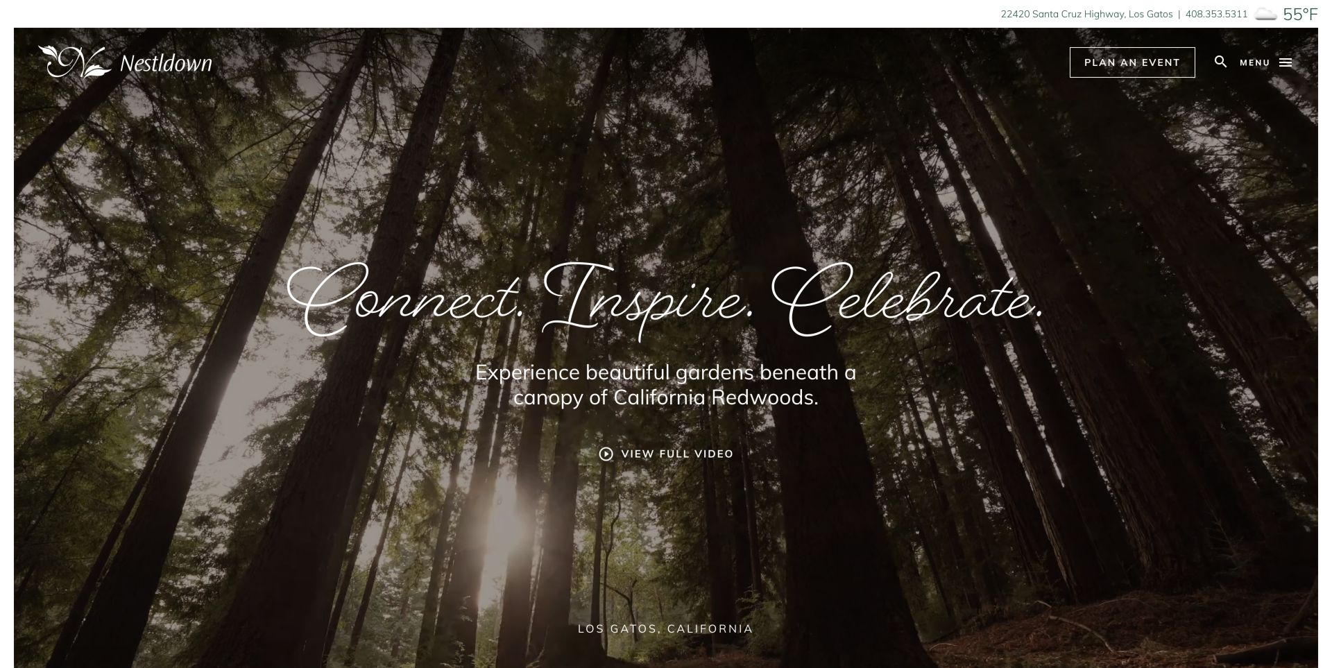
Nestldown opens with a redwood canopy, script typography and a short garden description, surrounded by a restrained white frame. The upper information strip and Los Gatos location provide grounding for an otherwise immersive view. The wider page organizes discovery around gardens, seasons, plants and getting there, while event paths distinguish weddings from smaller elopement and minimony formats. Visitor information and etiquette acknowledge that a garden is a place with operating needs as well as a backdrop. The initial view remains light on event logistics, and icon-font text appears in the observed navigation representation, making some controls less self-explanatory than their visual treatment suggests.
What you can learn
Let a distinctive landscape shape the site structure, but connect its beauty to visitor guidance. Explain ceremony formats, arrival and garden rules in the same journey so prospective couples can imagine both the occasion and its practical requirements.
Pros
Garden discovery is supported by seasons and visitor information.
Smaller ceremony formats have a recognizable route of their own.
Cons & considerations
The first screen contains few concrete event-planning facts.
Icon-font labels require care for nonvisual navigation.
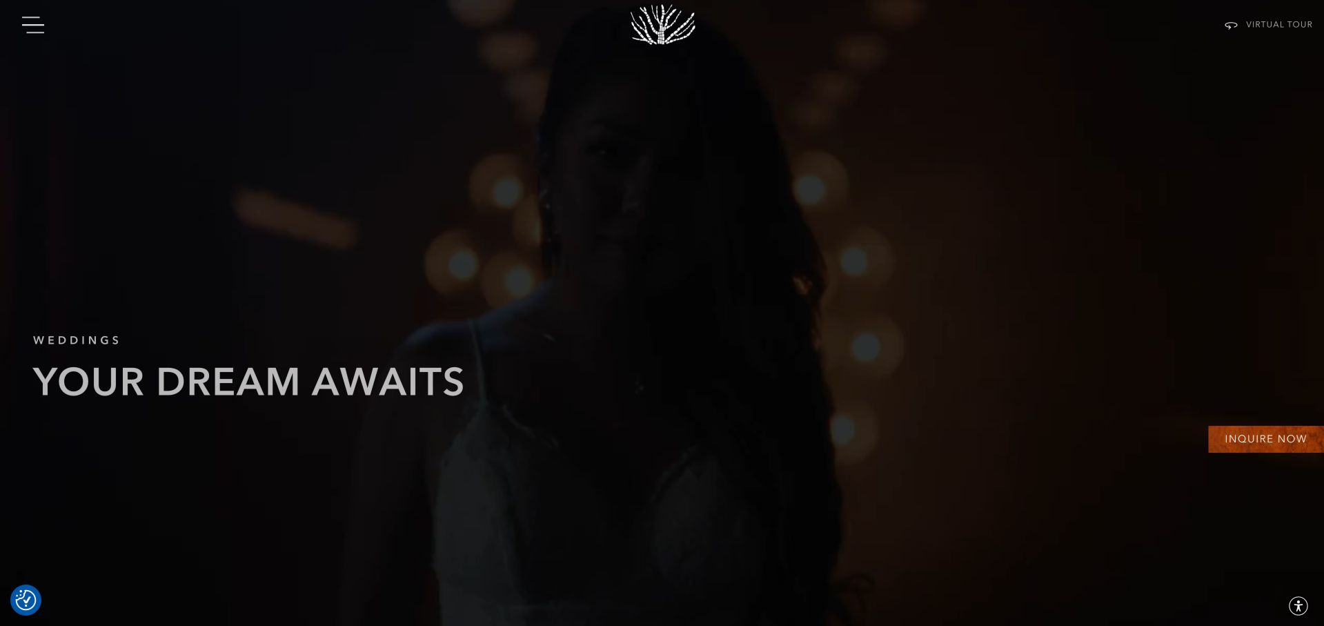
The Pearl's wedding page uses a dark, full-screen reception scene with a quiet Weddings heading, a virtual-tour link and an orange enquiry action. The effect is intimate and theatrical, while subsequent content explains the multi-level venue. Links distinguish the Main Floor, Mezzanine and Rooftop, and the bar program and vendor partners address services beyond the room itself. The selected wedding page is more direct for couples than the broader interactive homepage. Its opening still prioritizes mood over logistics, and several gallery controls use generic View labels. The enquiry form is visible further down, but no submission or availability check was performed.
What you can learn
For a venue with several levels, give each space a clear identity and show how the celebration moves between them. Keep the tour, vendor information and enquiry connected without making cinematic media the only way to understand the property.
Pros
Named space pages make the multi-level property easier to explore.
Bar and vendor resources extend the research beyond visual styling.
Cons & considerations
Capacity and other logistics are not prominent in the opening.
Generic gallery labels provide limited context for individual images.
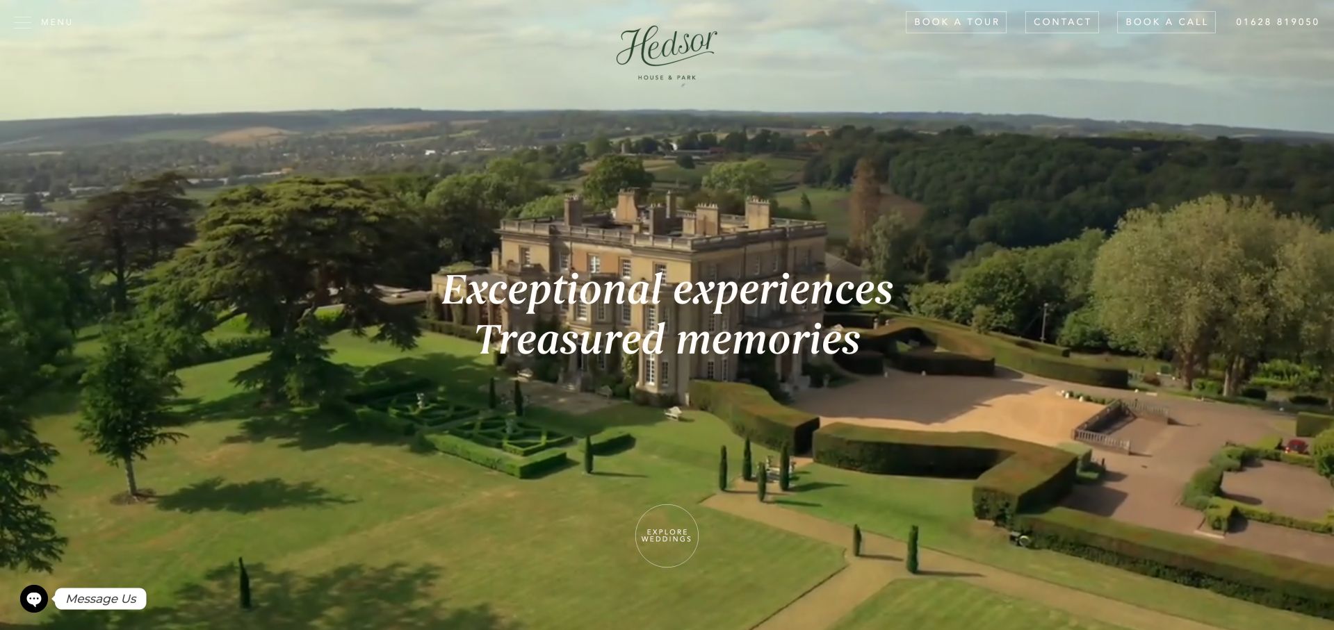
Hedsor House pairs an aerial estate view with elegant white typography and a compact group of tour, contact and call options. The imagery establishes scale before the page moves into the house, grounds and celebration possibilities. Photography is credited by name, and the wider navigation includes a virtual tour and visiting information. Separate dry-hire and wedding-package terms are particularly useful because they acknowledge different ways of commissioning the venue. The opening's light text must compete with changing sky and building tones, while long romantic passages and repeated Learn More links can make a specific planning question harder to locate.
What you can learn
Use estate imagery to introduce character, then make the commercial models and visit options explicit. If both venue hire and packages are offered, label their resources separately so couples know which information applies to their enquiry.
Pros
Tour, telephone and written contact options remain easy to identify.
Distinct hire and package terms support more informed research.
Cons & considerations
Light navigation over changing imagery needs careful contrast review.
Long promotional copy and generic links reduce scanning speed.
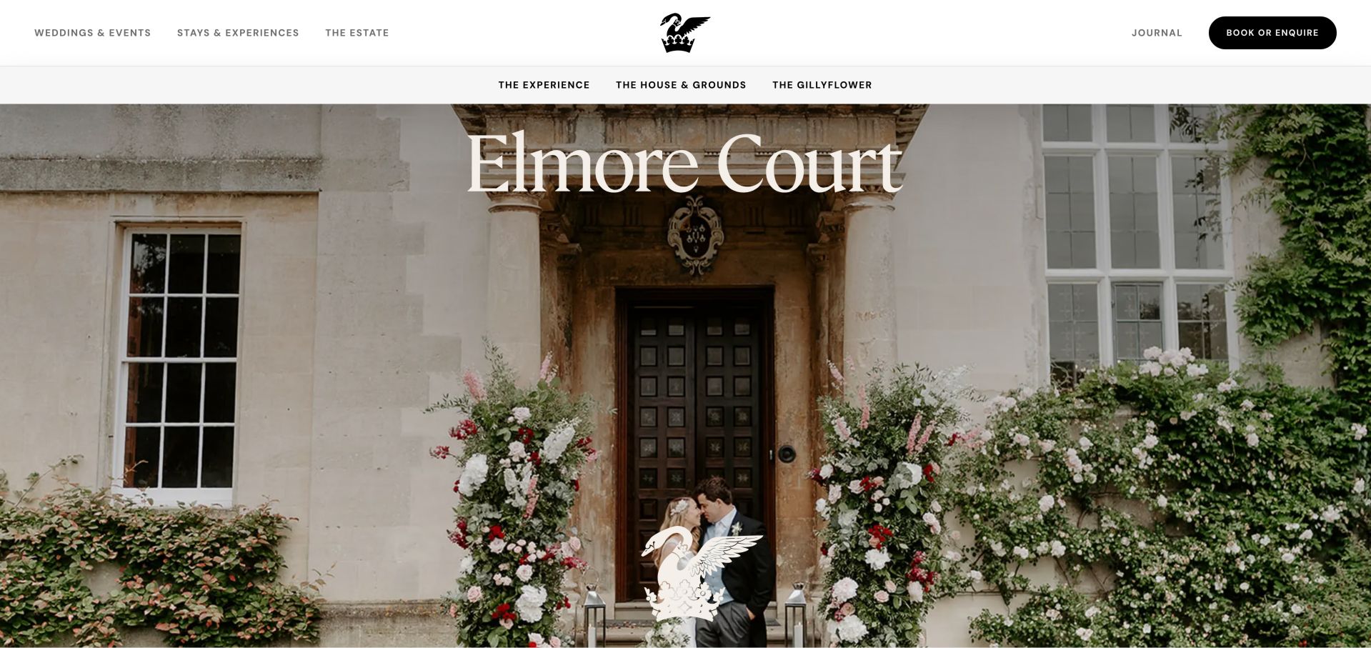
Elmore Court's page sits within a wider estate site, using a pale header, a centered crest and a large photograph of the house. A secondary navigation distinguishes the experience, house and grounds, and Gillyflower. The copy explains the relationship between the historic rooms and the modern celebration space, rather than presenting the buildings as interchangeable photographs. Bedroom and coach-house information also helps visitors consider the overnight part of the event. The broader estate navigation introduces stays and other experiences, which can be valuable but increases the number of choices. Long descriptive passages would benefit from concise planning summaries alongside the imagery.
What you can learn
When a wedding spans contrasting buildings, explain each building's job in the day. A clear distinction between ceremony, reception, party and overnight spaces is more useful than expecting visitors to reconstruct the layout from a gallery.
Pros
House and Gillyflower have distinct names and discovery routes.
Overnight accommodation is connected to the celebration story.
Cons & considerations
The wider estate hierarchy adds competing navigation choices.
Lengthy promotional passages make quick logistical comparison harder.
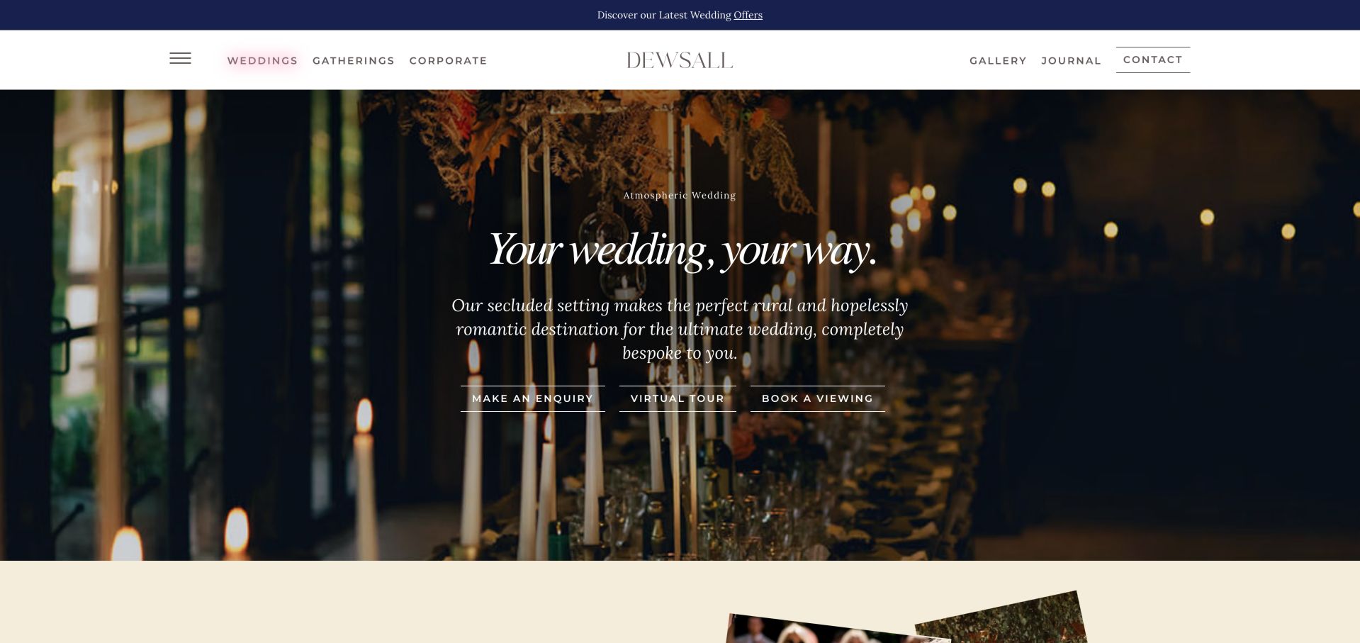
Dewsall's wedding page places enquiry, virtual tour and viewing actions together over a candlelit interior. Below that atmospheric opening, it names individual ceremony settings and uses one-night and two-night choices to frame the stay. The sequence runs through a welcome supper, ceremony, reception, party, after-party and departure brunch. This makes a multi-day celebration easier to imagine than a list of rooms alone. Food, the house and the team receive supporting routes. The narrative is lengthy, however, and several image descriptions expose asset-like strings instead of explaining the pictured space. A compact comparison of the stay options would complement the story.
What you can learn
Show how a wedding unfolds over time and connect each stage to a named space. For overnight packages, make arrival, meals, celebration and departure explicit so couples can understand what differentiates the options before requesting a tour.
Pros
The sequence connects accommodation and meals to the wedding day.
Three distinct actions support enquiry, remote viewing and a visit.
Cons & considerations
Long romantic descriptions slow direct comparison of stay options.
Asset-style image labels do not describe the venue meaningfully.
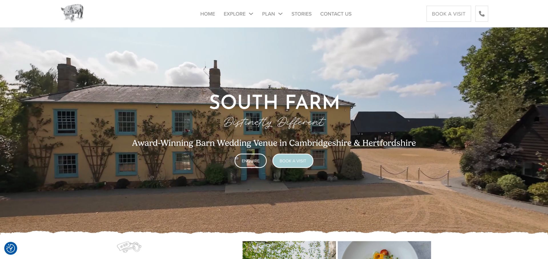
South Farm identifies its barn setting and region in the opening headline, using a farmhouse view and gentle illustrated details to establish its character. Enquiry and visit actions are immediately visible, with availability linked further down. The content divides ceremonies, gardens and food into recognizable topics, then connects the farm's growing activity to its menus. A separate micro-wedding section broadens the picture beyond large celebrations. Named photography credits and real-wedding stories give the visual material context. The homepage is extensive, with multiple galleries and repeated regional phrases, so its strongest practical links can become surrounded by more text than a returning visitor needs.
What you can learn
Make a rural venue's distinctive operations useful to the visitor. Connect gardens, food and ceremony options to specific planning routes, and give small celebrations an explicit place rather than assuming every couple is organizing the same scale of event.
Pros
Availability and visit links provide clear research next steps.
Micro-wedding guidance and food resources address different planning needs.
Cons & considerations
Repeated regional phrases make parts of the copy feel heavy.
Several galleries add length before all practical questions are resolved.
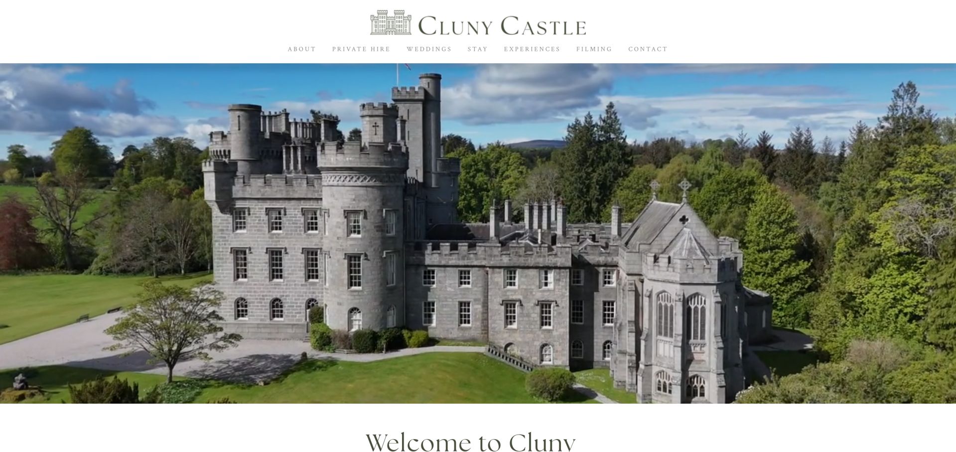
Cluny Castle places its wordmark and a straightforward navigation above an expansive castle view. Weddings, Stay and Private Hire are separate choices, which is useful because a visitor may be planning a ceremony, an extended celebration or a different gathering. The homepage presents the property as a family residence and explains the accommodation alongside its chapel and grounds. A named video credit acknowledges the source of the opening film. The approach has a calm, residential tone, but prices and date availability are not summarized near the introduction. Repeated Picture labels and layout-table content in the observed text also reveal opportunities to improve the underlying page structure.
What you can learn
Give each use of a private residence its own route while preserving a consistent sense of place. Connect the wedding story to overnight capacity and access information, and use meaningful image descriptions instead of relying on the photographs alone.
Pros
Wedding, stay and private-hire journeys are visibly distinct.
Accommodation context helps visitors assess the whole weekend.
Cons & considerations
The introduction does not expose pricing or availability information.
Generic image labels and layout tables weaken structural clarity.
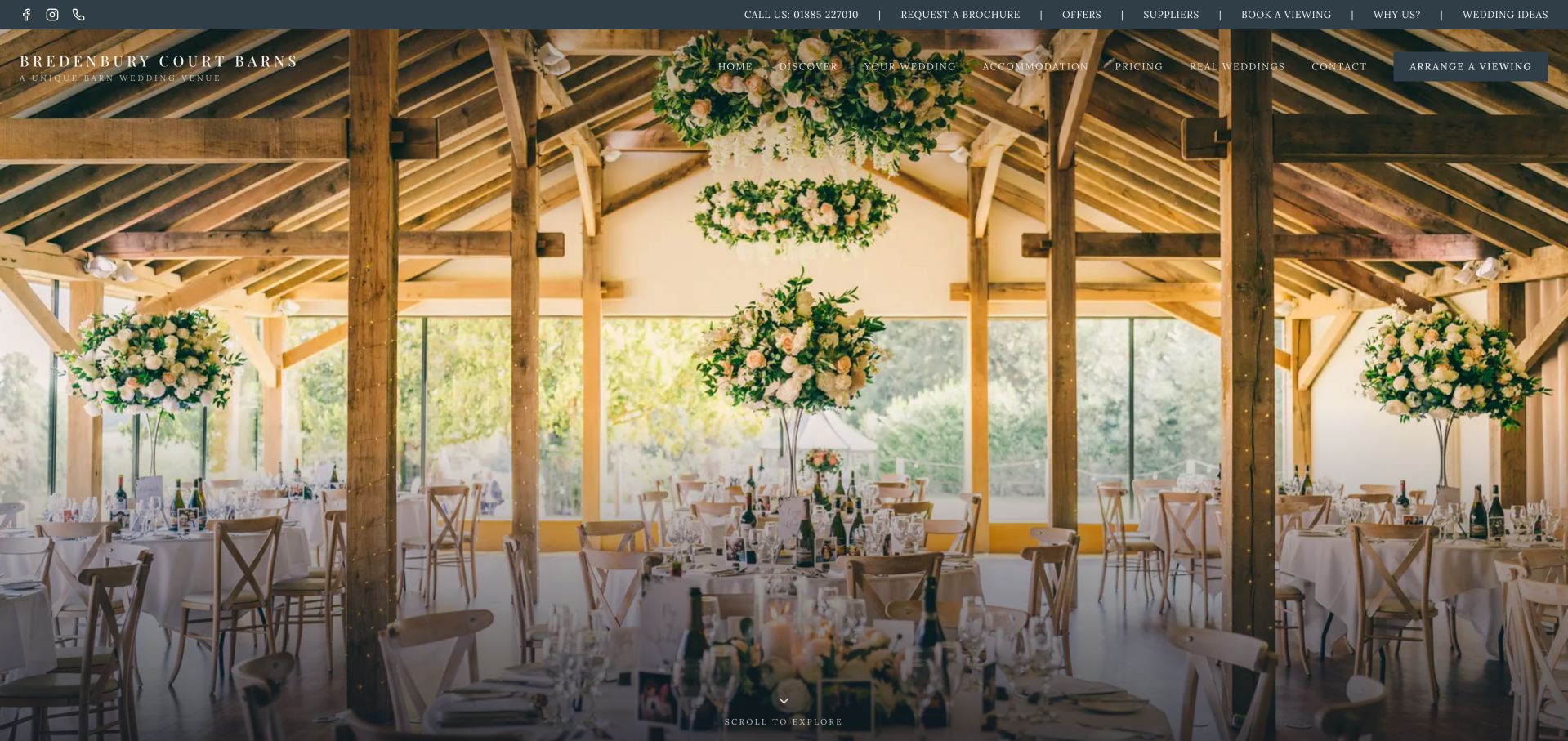
Bredenbury Court Barns opens with a broad interior photograph and a dense two-tier navigation. Its most useful material follows in numbered chapters: the venue proposition, reasons it may fit, inclusions, pricing and the flow of the day. The pricing section separates hire, meals, evening food, drinks policy and accommodation instead of reducing every cost to one starting figure. The day sequence then links moments such as preparation, arrival, ceremony and dinner to named spaces. These are useful comparison devices even though all figures remain the venue's own published statements. The extensive homepage and small header links require patience, particularly when the visitor already knows which detail they need.
What you can learn
Explain a price through its components and connect those components to the event experience. A clear inclusion list and a room-by-room day sequence can help couples ask better questions without presenting an illustrative estimate as a confirmed quote.
Pros
Separate cost categories make the offer easier to interpret.
Named spaces are connected to the actual sequence of a wedding.
Cons & considerations
Two navigation tiers create a crowded opening header.
The long chapter sequence makes returning visits less direct.
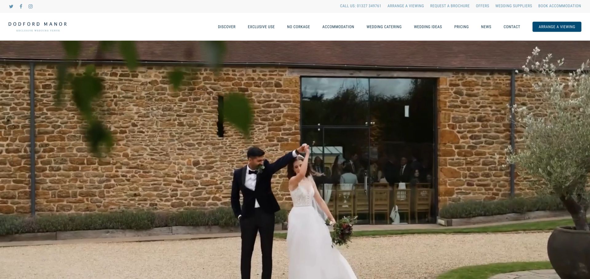
Dodford Manor gives No Corkage a place in the main navigation alongside Exclusive Use, Wedding Catering and Pricing. That makes a practical policy a first-class destination rather than burying it in a brochure. The wider menu distinguishes micro, intimate and big weddings, and links to a venue layout and 360-degree tour. Accommodation information adds context about staying nearby, while the photographed barns establish the physical character. The site is a distinct property website even though it links to Bredenbury Court Barns. Its navigation is dense and its repeated venue descriptions could be shorter; the useful planning resources deserve a cleaner path through the homepage.
What you can learn
Promote the policies that materially affect a couple's decision. If drinks arrangements, wedding size or nearby lodging are common questions, give them clear labels and connect them to spatial information before asking the visitor to request a brochure.
Pros
Drinks policy and pricing are recognizable navigation destinations.
Layout, tour and wedding-size routes support early qualification.
Cons & considerations
The large menu asks visitors to scan many competing items.
Repeated promotional descriptions dilute the practical information.
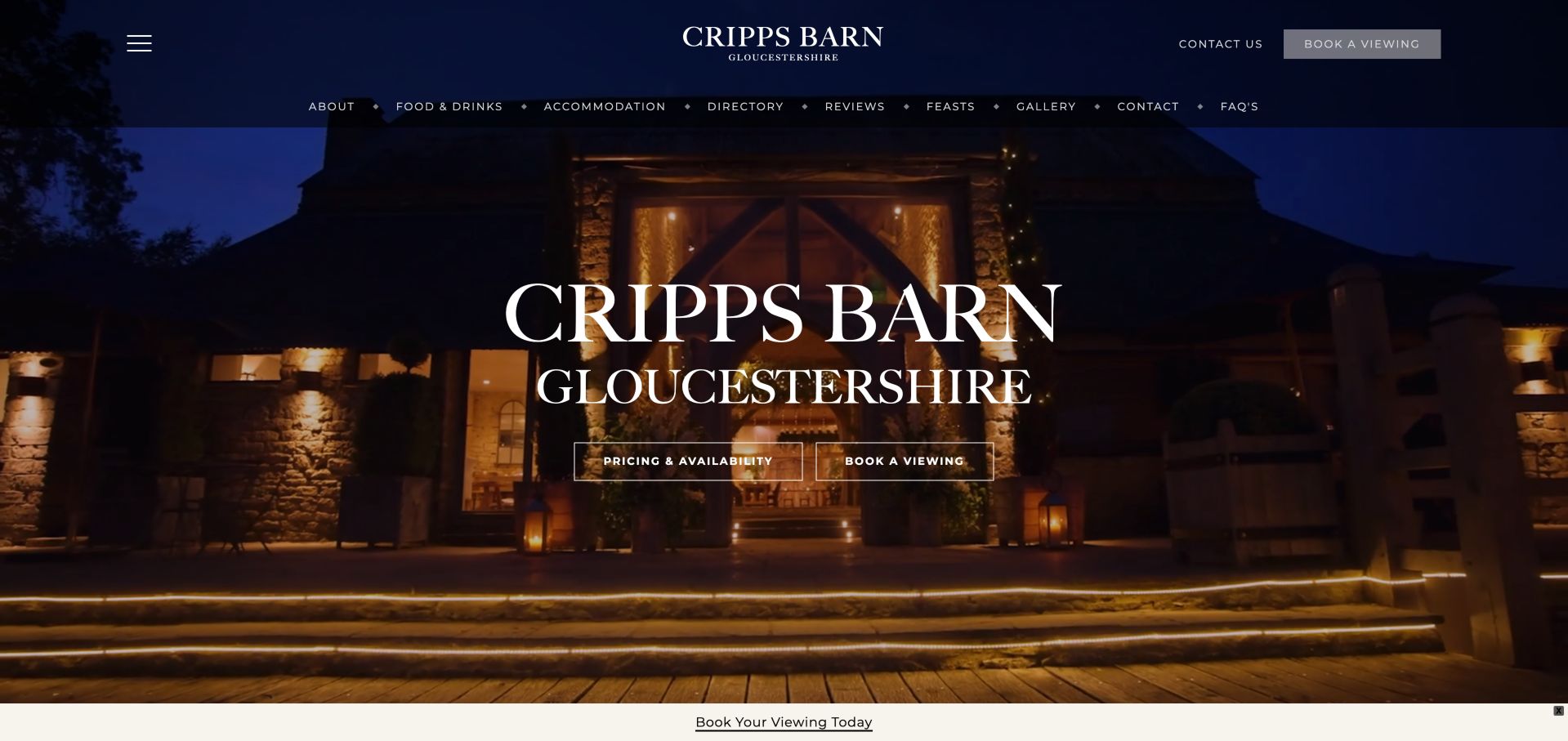
Cripps Barn keeps the property name and Gloucestershire location prominent within the wider Cripps and Co site. Pricing and Availability appears beside Book a Viewing, and a second navigation jumps to food, accommodation, directory, gallery and FAQs. The page supplies a local contact block, a downloadable brochure and named nearby stays, while a pause control accompanies the opening media. This gives the individual property a substantial planning page rather than a thin card in a group directory. Shared brand and food information still compete with local tasks, and the long sequence of sections requires sustained scrolling when a visitor is comparing several venues.
What you can learn
Let a group identity support an individual venue without replacing its local facts. Give every property its own contact details, planning resources and availability route, then connect shared food or supplier services where they help the decision.
Pros
Property-specific pricing and viewing links are immediately visible.
Local contacts, brochure and accommodation resources are grouped coherently.
Cons & considerations
Group-level material competes with some property-specific tasks.
The comprehensive page is lengthy for side-by-side venue comparison.
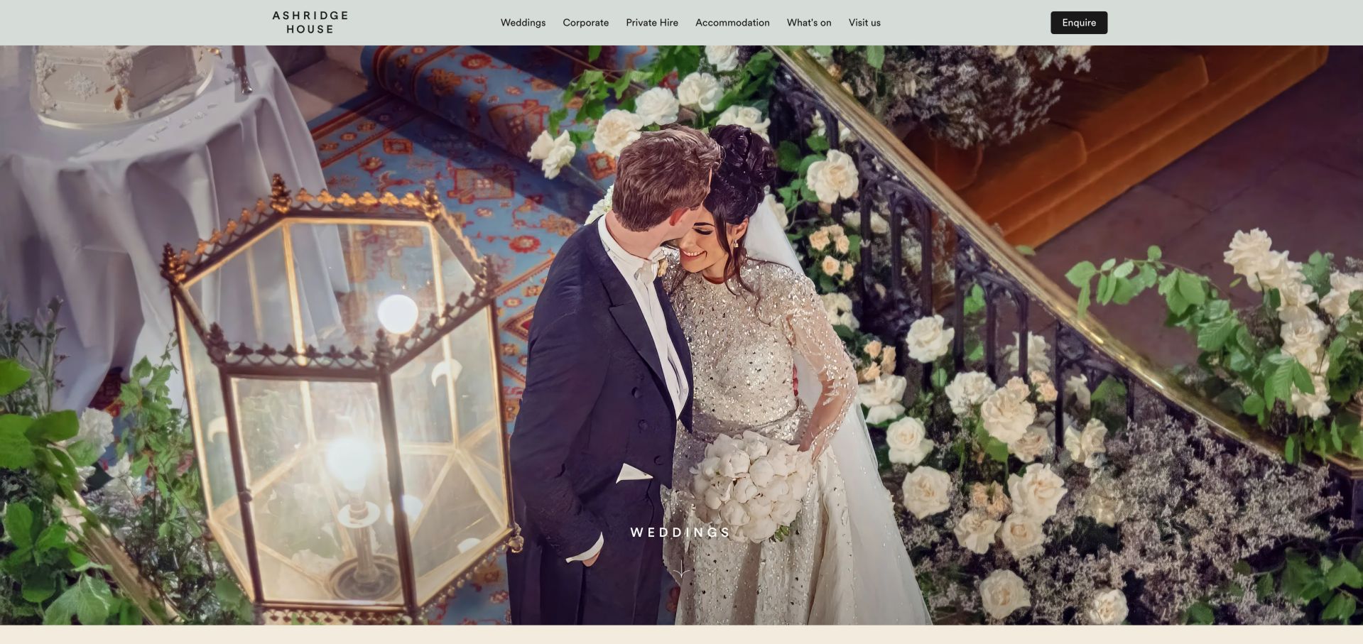
Ashridge House's wedding page starts with a large ceremony photograph and a restrained navigation. The introduction distinguishes its heritage rooms from the accommodation available on site, while later sections divide offerings into The House, Cultural and Dukes Yard. Dining, suppliers, service and enhancements receive their own blocks, making the operational parts of a celebration visible beside the architecture. The FAQ prompts are especially useful: they address provisional dates, supplier choices, exclusivity and celebrations after midnight. Repeated Learn More buttons provide less context than those specific questions, and generic Image labels leave some photographs without a meaningful description in the observed page text.
What you can learn
Use specific questions to explain the constraints of a complex estate. Date holds, exclusivity, supplier rules and late celebrations deserve clear answers, with accommodation presented as its own planning consideration rather than hidden inside an aesthetic story.
Pros
FAQ topics reflect concrete decisions couples must make.
Packages, dining and accommodation have distinct content sections.
Cons & considerations
Repeated Learn More labels are less useful out of context.
Generic image descriptions miss an opportunity to identify spaces.
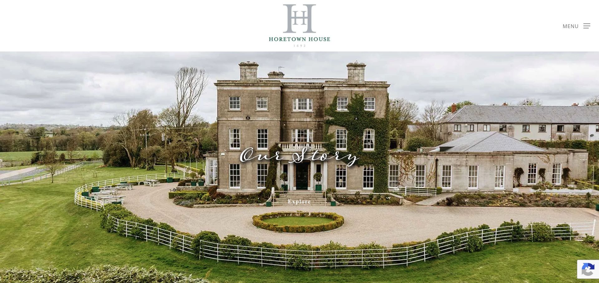
Horetown House presents its country-house setting through broad photography and a deliberately quiet header. Its content connects wedding weekends with the gardens and food grown there, giving the venue a recognizable editorial theme. Further down, concise cards name the wedding rooms and separate their capacities from overnight accommodation, including the different types of stay. Brochure and enquiry actions provide a route from that story into planning. The main menu is hidden behind a menu control, and several cards use repeated Explore or Learn More wording. The first screen also depends heavily on atmosphere, so visitors need to continue scrolling before the practical distinctions become apparent.
What you can learn
A venue's food and landscape can create a coherent story, but anchor that story with concise room and lodging facts. Separate event capacity from sleeping capacity and label the next step according to what the visitor will actually receive.
Pros
Food, gardens and the weekend experience form a consistent theme.
Room and accommodation cards supply useful distinctions below the hero.
Cons & considerations
The concealed menu makes deeper destinations less immediately visible.
Generic repeated links and sparse opening facts slow direct research.
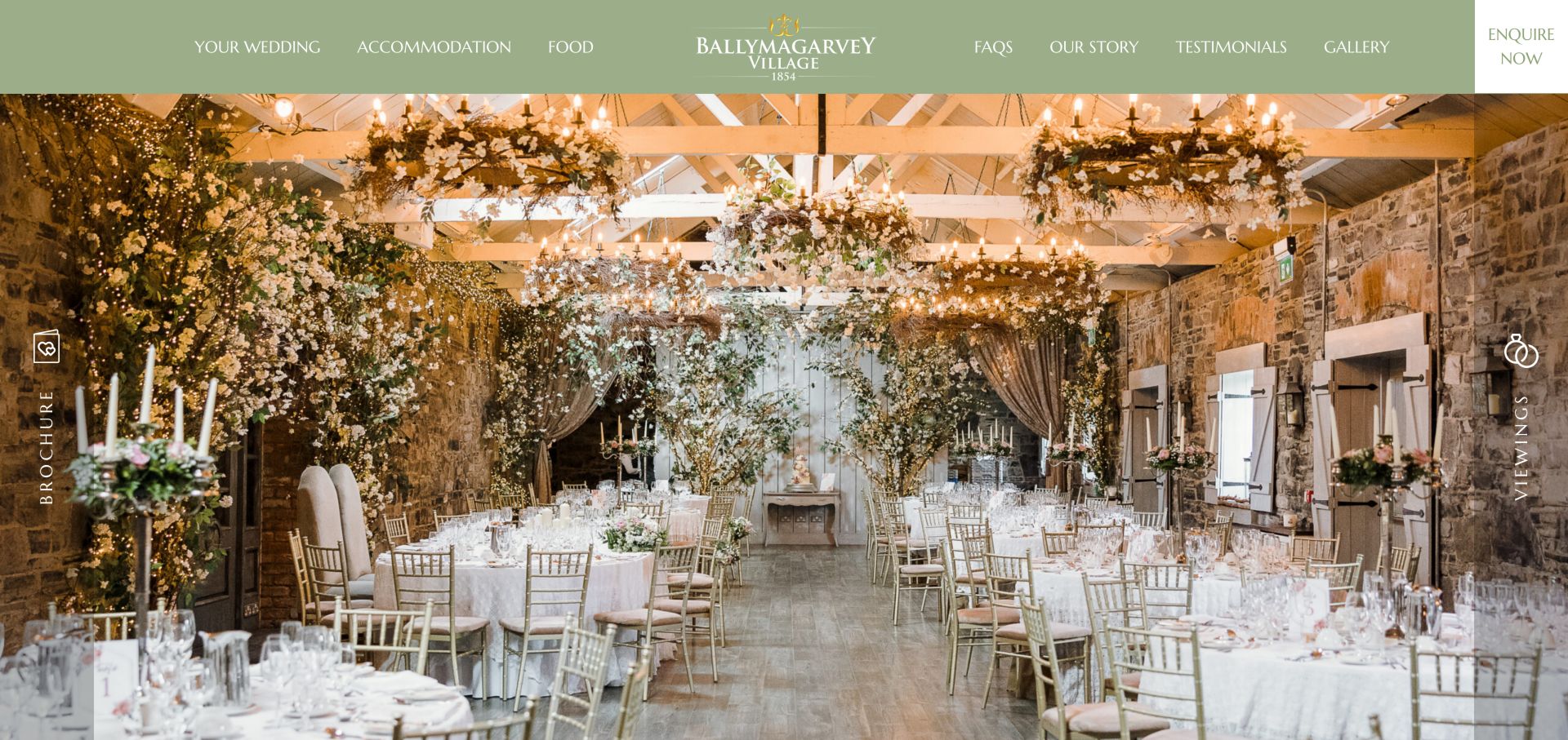
Ballymagarvey Village divides its header between Your Wedding, Accommodation and Food on one side and FAQs, story, testimonials and gallery on the other. A pale green band and a full-width reception photograph give those choices a consistent setting. Persistent brochure and viewing entries keep the next step close to the imagery. The brochure information explicitly distinguishes the downloadable document from rate cards that require contact, avoiding the impression that every commercial detail is already included. The homepage then gives substantial space to testimonials and galleries. Many image descriptions repeat the same general venue label, which adds little help in distinguishing particular rooms or configurations.
What you can learn
Keep the main navigation aligned with the decisions couples make: celebration, sleeping arrangements and food. Be explicit about what a brochure contains and what still requires an enquiry, so a download does not create a false expectation of complete pricing.
Pros
The primary categories are simple and wedding-specific.
Brochure and rate-card availability are clearly distinguished.
Cons & considerations
A long testimonial sequence competes with practical planning content.
Repeated image descriptions do not differentiate the photographed spaces.
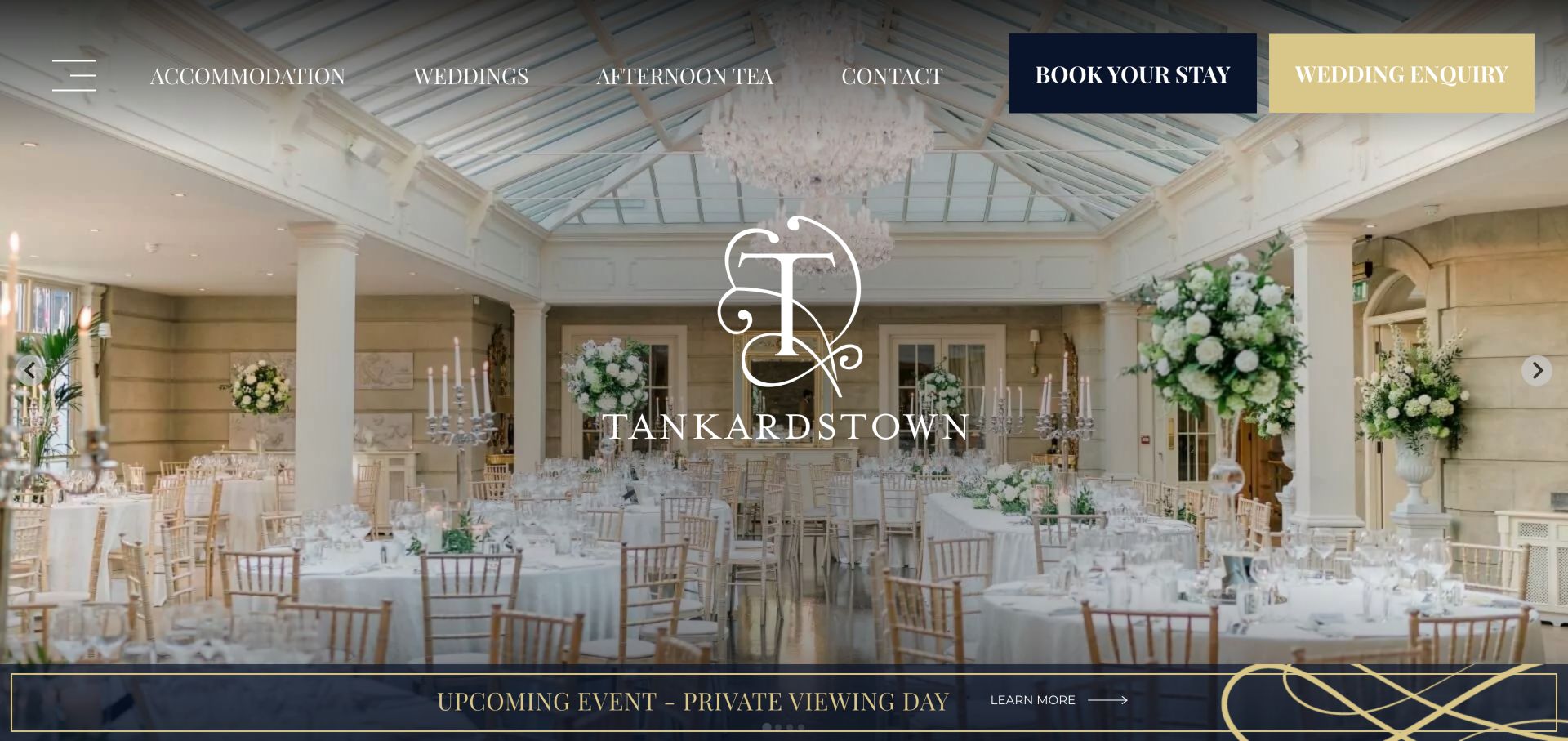
Tankardstown's wedding page gives the Orangery a central role and describes the transition from the house's reception rooms into dinner. Its supporting navigation includes celebration spaces, sample menus, intimate weddings and planning from abroad. Those routes acknowledge that a local couple and a destination planner may need different information. A wedding-specific email and FAQ link also offer alternatives to browsing every gallery. The broader hotel-style navigation retains a prominent Book Your Stay action, which can compete with the wedding enquiry. Long testimonials and file-like image descriptions add further weight to a page whose strongest feature is the practical separation of planning topics.
What you can learn
Create routes for the circumstances that change wedding research. Remote planning, smaller guest lists and menu decisions benefit from their own explanations, while room booking and venue enquiry should remain clearly distinguishable throughout the same site.
Pros
Planning from abroad and intimate weddings have explicit destinations.
Named spaces and a wedding contact make the section concrete.
Cons & considerations
Hotel booking remains a competing action for wedding visitors.
Lengthy testimonials and file-style image labels reduce clarity.
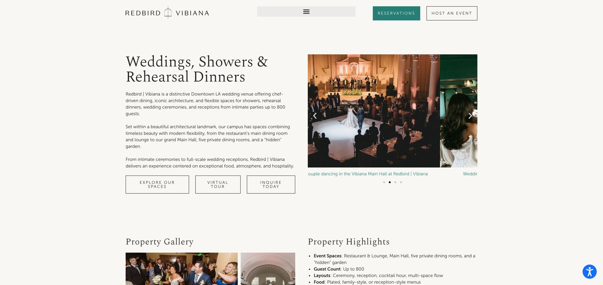
Redbird and Vibiana's wedding page pairs an explanatory text column with event photography rather than relying on an image-only opening. It identifies ceremonies, showers and rehearsal dinners together, then links to a space comparison and virtual tour. Property highlights separate layouts, food styles and beverage options, including nonalcoholic choices. The enquiry section labels rooms with seated and standing capacities, allowing visitors to express a preference in context. The form is extensive, with several required planning fields, and its marketing checkbox was preselected when observed. Those details introduce friction at an otherwise useful transition from inspiration to a more specific conversation.
What you can learn
Place the information needed to choose a room beside the enquiry pathway. Distinguish layouts and service options clearly, but keep the initial form proportionate to what a couple can reasonably know before speaking with the venue.
Pros
The introduction explains event types alongside specific space routes.
Layout, menu and beverage highlights support a more informed enquiry.
Cons & considerations
The enquiry requests considerable detail at the first contact stage.
The observed marketing preference was preselected rather than an explicit opt-in.
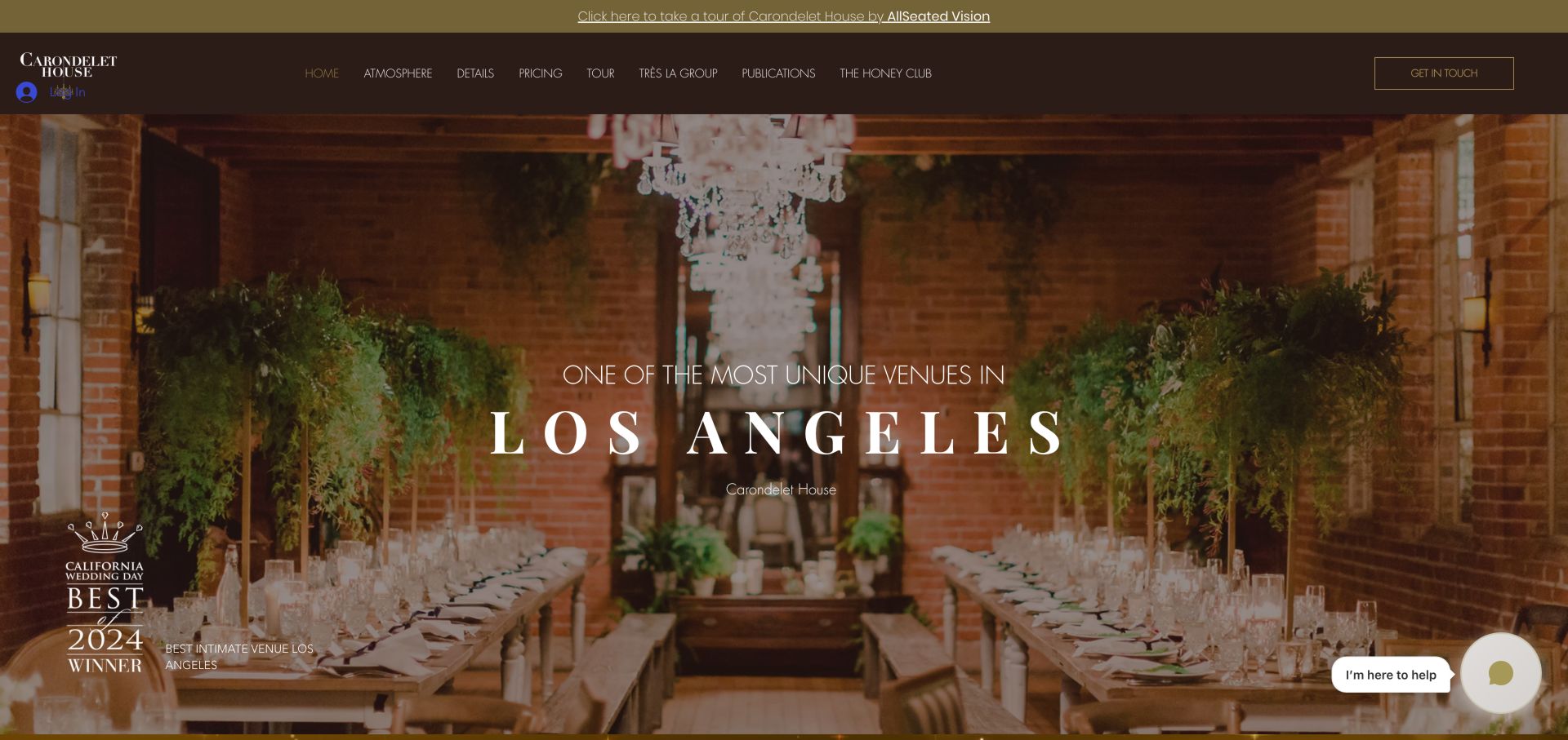
Carondelet House uses a dark brown and gold palette around a broad photograph of its brick-lined reception interior. A virtual-tour link sits above the navigation, while Atmosphere, Details and Pricing provide different ways to explore the venue. Further down, real-wedding material and the named in-house catering connection extend the visual story into event planning. The site makes its Los Angeles identity clear, but many sections use top-level headings and large promotional phrases, weakening the distinction between the main subject and supporting topics. A seasonal promotion, login control and chat prompt also compete with the central wedding pathway in the observed presentation.
What you can learn
Let architectural character influence the visual identity while keeping the planning hierarchy disciplined. Separate atmosphere, specifications and pricing, and ensure secondary promotions or account controls do not distract from the venue tour and enquiry.
Pros
The interior photograph and palette form a consistent visual identity.
Tour, details and pricing are distinct research entry points.
Cons & considerations
Numerous top-level headings flatten the content hierarchy.
Promotional and chat elements compete with the main venue journey.
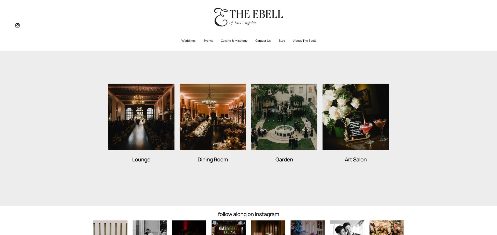
The Ebell's institutional site links to a dedicated event website, where the wedding landing page reduces the choice to four pictured spaces: Lounge, Dining Room, Garden and Art Salon. Each room has a visible label and a separate destination, making the page easy to scan. A centered wordmark, generous white space and a short navigation keep the visual focus on those choices. Cuisine and Mixology is also a top-level route. This clarity comes with limited context: the landing page offers no compact comparison of capacities, costs or location, and the move between the institutional and event sites introduces another layer of navigation.
What you can learn
A room-based landing page can make a complex cultural property approachable. Pair each named photograph with a few comparison facts, and keep the relationship between the institution and its event site clear so visitors know they remain in the same venue journey.
Pros
Four named room cards create an immediately understandable choice.
Cuisine has a separate route beside weddings and events.
Cons & considerations
The room overview lacks a concise practical comparison.
The institutional-to-event-site transition adds navigation complexity.
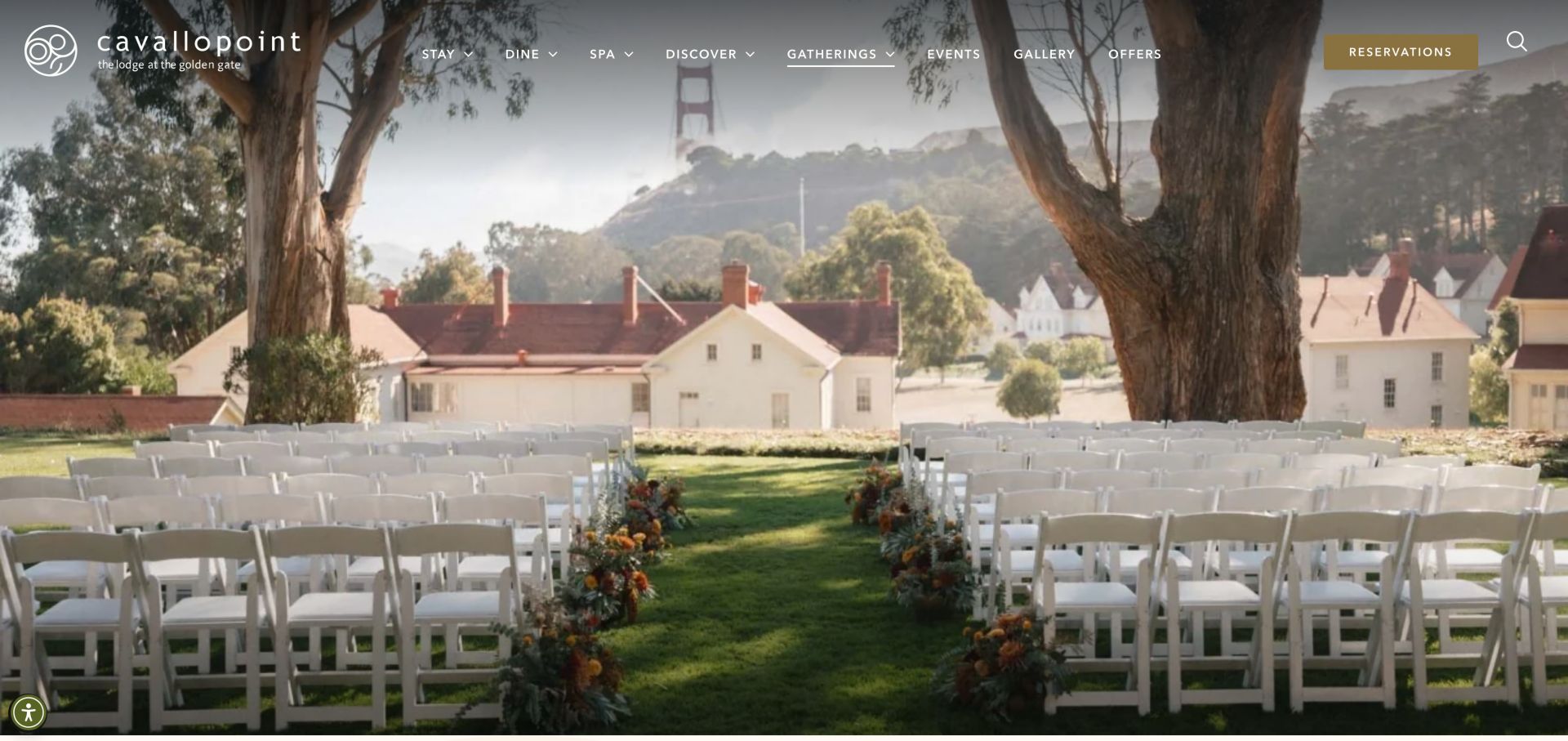
Cavallo Point's wedding page opens with a ceremony setting overlooking the Golden Gate surroundings, then supplies a wedding-specific telephone number, email and proposal-request link. Its venue cards pair named spaces with area and capacity information, while catering and room-block questions receive separate treatment. Photographer credits accompany the imagery. These details help connect the resort setting to the operational choices of a celebration. Some capacity figures describe broad or combined spaces, so they still need interpretation for a particular layout. Multiple carousels also make comparison less direct, and the abbreviation RFP may be less familiar to couples than to professional event planners.
What you can learn
Connect a resort's destination appeal to the exact spaces being considered. Label capacities by layout and explain proposal requests in ordinary language, while keeping wedding contacts and guest-accommodation information close enough to support one coherent plan.
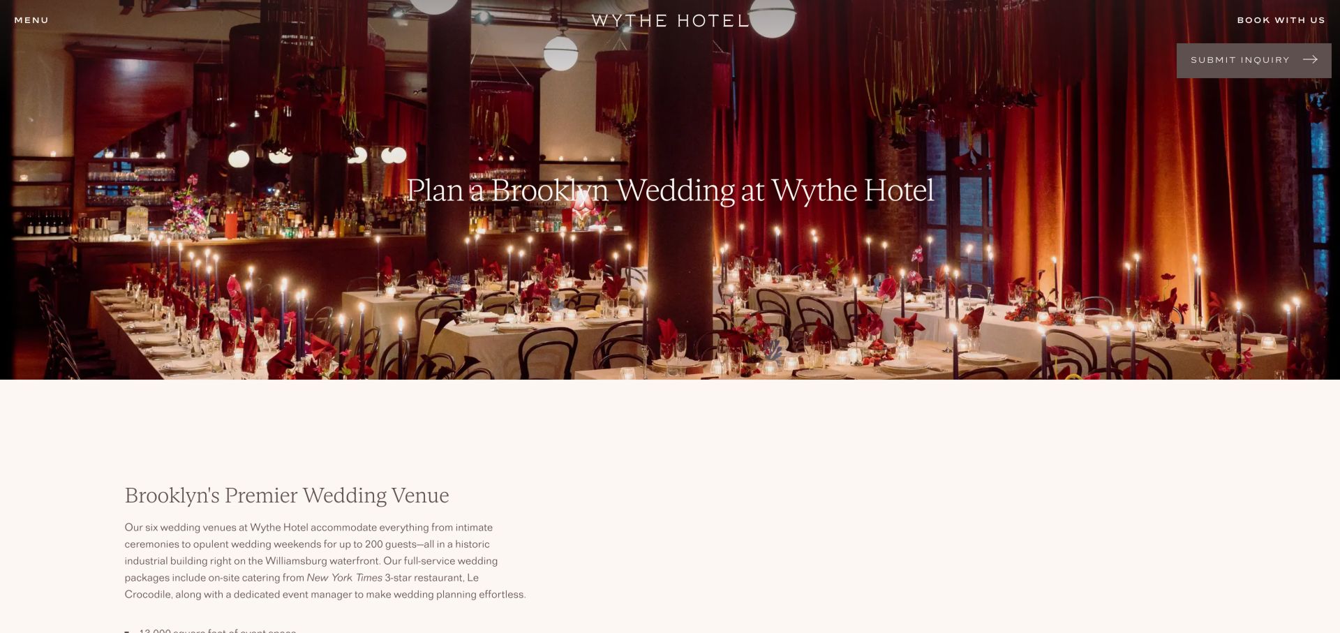
Wythe Hotel combines a richly colored reception photograph with a plain wedding headline and enquiry action. Jump controls then divide the long page into experience, spaces, packages, FAQs and contact. The room descriptions distinguish seated and standing capacities and link to floor plans and tours. Outdoor terrace information names its seasonal availability, a useful constraint that photographs alone cannot communicate. The page also discusses rehearsal dinners, brunch celebrations and a sample schedule. Its depth is valuable, although room carousels make simultaneous comparison difficult. The general Book with us action remains visible and needs to be distinguished from the wedding enquiry pathway.
What you can learn
Publish the constraints that change how a space can be used, especially seasonality and seating format. Combine room facts, plans and a sample schedule so couples can understand how several hotel spaces might support the same celebration.
Pros
Floor plans and tours are connected to individual room descriptions.
Terrace seasonality and seating formats are stated explicitly.
Cons & considerations
Carousel presentation makes several rooms harder to compare together.
The general hotel booking action competes with wedding enquiries.
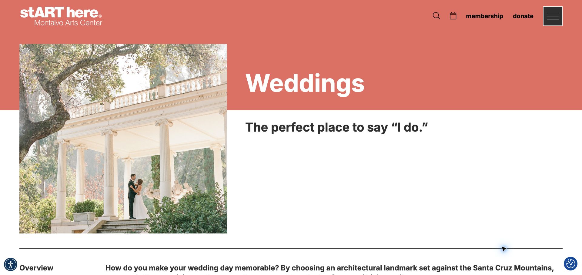
Montalvo Arts Center gives its wedding page a coral header and a large garden-ceremony photograph, maintaining the institution's identity while clearly naming the event type. The text identifies the Villa, Great Lawn, Spanish Courtyard and garden settings, then explains that fees depend on the date, guest count and spaces required. An email address accompanies the external enquiry-form link, giving visitors another way to contact the team. A separate photography-permit section distinguishes professional shoots from personal pictures. The page is concise, but it leaves capacity comparisons and weather arrangements unresolved, and the broader institutional navigation remains prominent around the venue content.
What you can learn
A cultural venue can keep its institutional identity while giving private-event visitors a focused page. Name the spaces, explain what affects a quote and provide a direct contact, then add the logistical facts that prevent an enquiry from starting entirely from scratch.
Pros
The page explains the variables behind a tailored rental quote.
Direct email and photography-permit guidance clarify separate tasks.
Cons & considerations
Capacity and weather-backup comparisons are not summarized.
Institutional navigation offers limited direct wedding-planning structure.
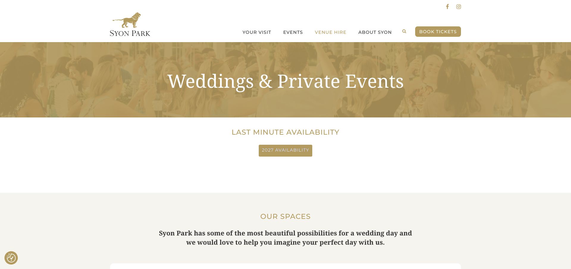
Syon Park's wedding and private-events page starts with an availability-diary link before moving into the House, Great Conservatory and Hotspur Wing. It provides hire-fee PDFs labeled by year and a separate wedding brochure, helping visitors distinguish dated commercial material from the general introduction. Suggested day formats and supplier links add further planning context, while the footer separates the postal address from the vehicle entrance. The page also covers summer, winter and Christmas parties, so wedding information shares a long page with other uses. Generic View and Book Now links reveal little about their destinations, and standing capacities vary by the event context described.
What you can learn
Give dated fee documents an explicit year and connect them to the relevant spaces. Keep arrival instructions precise, and label capacities and day formats carefully so visitors do not apply a reception maximum to a different wedding configuration.
Pros
Year-labeled hire documents and an availability diary support research.
Named spaces and a separate vehicle entrance improve planning context.
Cons & considerations
Several other party types make the wedding page lengthy.
Generic actions and context-dependent maximums require extra interpretation.
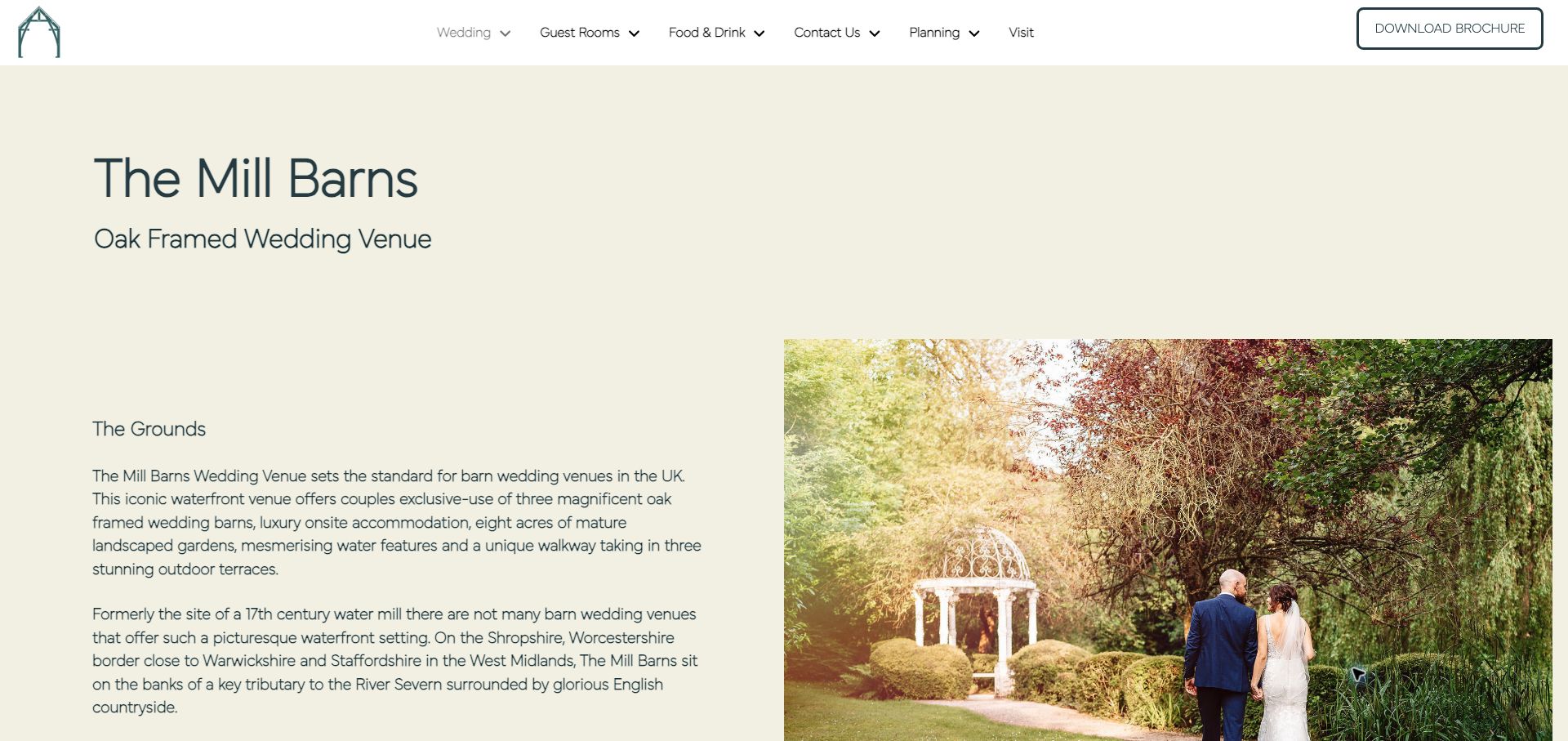
The Mill Barns' venue overview follows the celebration through the grounds, entrance, ceremony, drinks reception, meal and party. It names the connected barns as it goes, explaining how visitors move between them and when the terrace provides an outdoor option. The dressing-room section and included-services link extend that sequence into preparation and commissioning. The broader homepage also distinguishes guest rooms, prices and the scope of its drinks policy. This is useful operational storytelling, although the paragraphs are long and sometimes repeat the venue category. A Download Brochure action points to a request route, so its wording could better explain the step that follows.
What you can learn
Describe a venue as a sequence of usable spaces, including the indoor alternative and preparation area. Attach policy and inclusion information to that sequence, and label brochure requests accurately so visitors understand whether they will receive an immediate file or make contact.
Pros
Named barns are connected to specific stages of the celebration.
Indoor and outdoor options are explained within the same venue story.
Cons & considerations
Long paragraphs make the spatial sequence slower to scan.
Download wording does not clearly signal the brochure-request route.
Kegan is a freelance web designer and developer with 15+ years of experience helping businesses turn complicated website requirements into clear, maintainable digital experiences. He works directly with clients from planning and design through development, launch, and ongoing support.
For wedding venue website design, his development approach focuses on venue and space information, real event photography, guest-planning details, and straightforward tour or availability inquiries. The scope can be a targeted improvement or a complete custom build, with responsive layouts, thoughtful content structure, and integrations chosen around the people using and maintaining the site.
Show 3 other wedding venue website designersHide other wedding venue website designers
Plan the website around the couple's decisions and the guest's visit
Map the celebration through the property
List the spaces used for preparation, arrival, ceremony, drinks, dinner and dancing. Include the indoor alternative to an outdoor plan. Build the page around that sequence, using named photographs and a simple plan so visitors can understand the relationships between rooms before touring.
Maintain one reliable set of venue facts
Give each space a record for its layouts, capacities, access information and seasonal restrictions. Distinguish an entire-property maximum from the capacity of a particular room or combined arrangement. Use the same facts in web pages and brochures, and assign someone to update them when the offer changes.
Describe the scope of the offer
Explain what hire includes and what needs a separate arrangement. Cover catering, drinks policy, furniture, staffing, setup time, accommodation and preferred suppliers where those apply. Present a starting figure with its assumptions and keep downloadable rates clearly labeled by the period they cover.
Design an enquiry that starts a useful conversation
Ask for a date or date range, approximate guest count, celebration type and a way to respond. Allow uncertainty where the couple is still exploring. Provide a direct contact alternative, describe the response process and make marketing preferences optional rather than a condition of asking about the venue.
Support the people who will attend
Publish the correct arrival entrance, transport options, parking, accommodation and practical accessibility information. Keep venue-wide information separate from a particular couple's private schedule. Guests should not have to interpret the sales brochure to find the right gate or understand how to contact the venue.
Review the whole journey before launch
Check room discovery, price information, tour links, documents and contact routes on mobile and with a keyboard. Verify that media settles into a complete view and that banners do not obscure key controls. Use a test environment for forms, and review promotions, rate documents and seasonal claims regularly.
The editing job behind the design
Choose systems that keep venue information dependable
The content model matters more than a particular visual framework. Named spaces, wedding formats, accommodation options and dated price documents should be maintainable without duplicating facts across the site. A property with multiple event spaces benefits from shared records that can support room pages, comparisons and brochures while preserving the distinct photographs and explanations for each setting.
Video, virtual tours and enquiry systems can help remote planning, but the essential facts should remain readable without those integrations. Provide a useful still image, clear text and a direct contact route. Only expose confirmed availability when the operating process supports it. Public technology observations describe what was visible on a reviewed source page; they do not establish an unseen booking system or prove the quality of a venue's service.
Our WordPress website examples offer a separate look at publishing approaches. A visible platform label is evidence for that named page, not a guarantee that the same system will suit your requirements.
Before the public launch
Wedding venue website checklist
Identify the venue and its location in ordinary text.
Name photographed spaces and show relevant event configurations.
Separate ceremony, seated-dinner and standing-reception capacities.
Explain how the celebration moves between rooms and outdoor areas.
Describe weather alternatives and seasonal restrictions clearly.
Distinguish event capacity from overnight accommodation capacity.
State the scope of exclusive use and included services.
Explain catering, drinks and supplier arrangements where relevant.
Label starting prices and dated documents with their assumptions.
Distinguish a brochure download, enquiry, viewing and confirmed booking.
Publish arrival and practical accessibility information for guests.
Check media, documents, navigation and contact routes for mobile and keyboard use.
These checks are a project checklist, not a performance, legal, security, or accessibility certification. Test real journeys with the people responsible for the website before making claims about the result.
Sources & editorial method
How this collection was selected and reviewed
These public venue websites were inspected directly and captured for editorial review on November 6, 2026 UTC. The collection contains 26 distinct source pages with individual observations and real screenshots. Reviews assess visible navigation, space discovery, planning information and contact pathways. We did not submit enquiries, reserve dates, book tours or verify service outcomes. Venue statements about prices, capacities, policies and availability can change. Editors Choice is an explicit editorial design selection from a regional specialist, not a service endorsement, certification or vote-derived award.
Each example links to its actual source page. Screenshots are direct browser captures with their own capture dates; moving imagery, announcements and live designs can change. The notes describe observable design choices and conditional tradeoffs, not measured traffic, conversion results, service quality, or accessibility conformance.
Technology labels use public page metadata, asset evidence, or explicitly cited platform documentation. Platform documentation is not a complete current deployment audit. A component reference may be legacy or unused; it is not a complete backend inventory. Unknown stacks are omitted. These sites are editorial examples, not our client portfolio.
Written, Edited and Curated are separate editorial records, not timestamps advanced by a rebuild. Website designs and imagery belong to their owners. See our editorial standards or suggest a correction.
Questions worth asking
Wedding Venue website design questions
What should a wedding venue homepage show first?
Identify the place and location, show a useful view of the venue, and provide a clear route to wedding spaces and planning information. A strong photograph can establish character, but couples also need a short explanation of the event formats and a recognizable way to learn more or arrange a viewing.
Should a venue publish prices online?
Publish enough context for visitors to understand the offer. A price range, dated rate document or explanation of quote components can all help, provided the assumptions are clear. Separate hire, food, drinks, rooms and optional services. If pricing requires a conversation, explain what affects the quote and what information the team needs.
How should room capacities be presented?
Label them by space and configuration. Ceremony seating, a seated meal with a dance floor and a standing reception can require different arrangements. Explain combined spaces separately and avoid using one property-wide maximum as the answer to every layout question. Keep floor plans and brochures aligned with the web page.
Is a gallery enough to explain the venue?
A gallery helps visitors imagine the atmosphere, but it rarely explains the whole event. Add room names, configuration captions, a simple plan and the sequence of the day. Include preparation, circulation and indoor alternatives where relevant, so the website answers practical questions as well as showing decorative details.
How can hotels and cultural institutions make weddings easy to find?
Provide a dedicated wedding page or section with its own spaces, planning information and contact route. Keep hotel-room booking, public event tickets and institutional membership separate from venue enquiries. Shared navigation can remain available, but it should not make couples reconstruct the wedding offer from unrelated sections.
A useful wedding venue website makes a distinctive place understandable. Show how the day works, explain the facts that determine fit, and make the next step clear enough for couples to begin a specific conversation.