Best Flight Training Websites of 2026 (15 Real-World Examples)
Flight-training websites that turn ambitious goals into understandable programs, locations and next steps.
Explore 15 real flight-training websites, from regional schools to larger career academies. Compare how they explain training paths, pace, practical costs and the first conversation with a prospective student.
A dramatic aircraft photograph can make someone imagine flying, but it cannot explain the commitment of training. A useful school website connects that interest to the student's goal, current experience, preferred pace and location. The strongest pages help readers understand the offer before they enter an application or ask for a quote.
This collection compares public website design and communication across different training models. A regional school offering leisure flying and rentals has different information needs from an academy presenting a full-time career program. The reviews do not rank instruction, operating safety, regulatory standing, financing suitability or employment prospects.
Before the examples
What makes good flight training website design in 2026?
Start with the student's goal
Separate recreational learning, a career pathway, a new rating and completion of existing training. Describe who each route serves before using technical abbreviations. Give undecided visitors a useful overview and a way to ask a question without implying that an application is the only next step.
Explain pace, place and cost together
A program name means little without its expected commitment, campus and pricing basis. State the assumptions behind estimates and distinguish training costs from other expenses. Keep current dates and availability in the appropriate authoritative source rather than relying on an evergreen promotional banner.
Qualify outcomes and partnerships
Explain what a pathway, partnership or graduate story actually demonstrates. Keep selection conditions, scope and dates close to the relevant statement. A logo or aircraft image should not imply guaranteed employment, universal eligibility or independently verified training quality.
The collection · 15 examples
15 flight training websites worth studying
Compare 15 distinct school websites through their program navigation, training sequences, campus information and inquiry routes. The researched Editors Choice recognizes clear website communication and a useful planning structure, rather than an endorsement of the training itself.
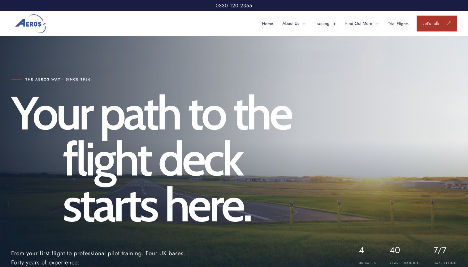
Aeros gives a regional training business a confident editorial identity. An oversized headline sits over a runway photograph, while restrained navigation separates training, trial flights and contact. Farther down, paired pathway cards distinguish an intensive program from training around work and family. Each uses a short explanation and a different cost framing, making the decision more concrete than a generic course list. A numbered qualification sequence adds orientation, and the four-base map connects the offer to actual places. The page also explicitly qualifies its progression illustration, avoiding the implication that a visual route guarantees an airline job.
What you can learn
Explain the student's first meaningful choice before presenting every qualification. Pair pace, commitment and cost context, then let a visual sequence show where individual courses belong without promising an automatic employment outcome.
Pros
Parallel pathway cards make the difference between intensive and flexible training easy to scan.
Named bases and a numbered course sequence connect the brand promise to practical planning.
Cons & considerations
The very large opening headline postpones the detailed pathway comparison until the next section.
Airline logos still require readers to inspect the linked relationship details and current conditions.
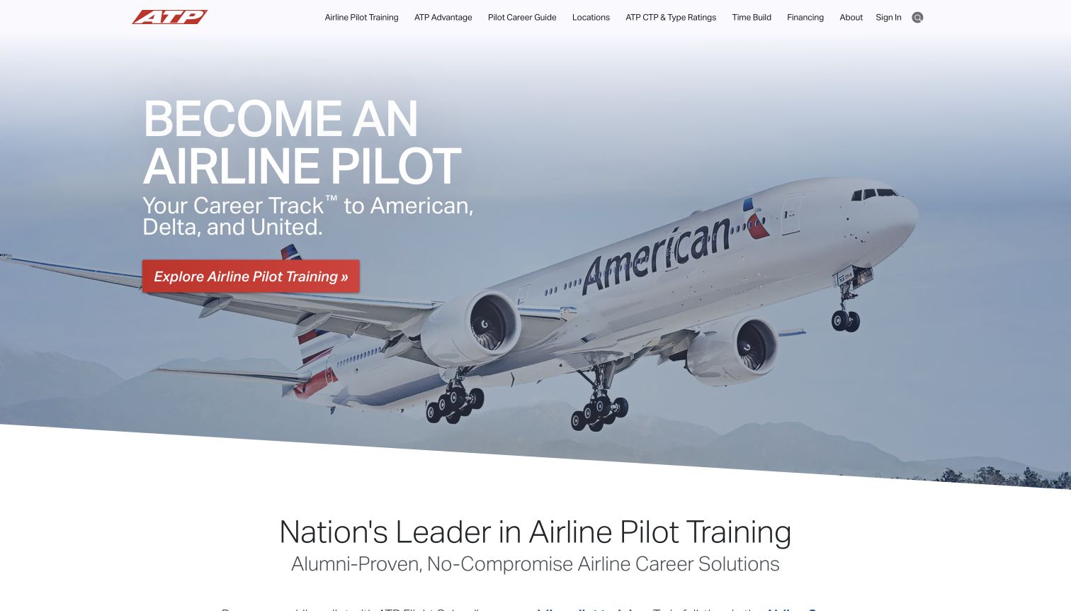
ATP opens with a large airline aircraft, a short career headline and a red program button. The composition is immediately legible: the photograph establishes the destination while the call to action points back to training. The main navigation keeps locations, financing and the career guide within reach, so the ambitious opening has practical escape routes. The reviewed page then distinguishes full-time and part-time programs and presents a smaller discovery option for visitors who are still exploring. This breadth helps serve different levels of commitment, although the opening airline associations need more explanation than a hero can supply.
What you can learn
A strong career image can organize the first screen, but the next layer should answer pace, location and initial commitment. Keep exploratory routes visible for people who are interested but not ready to enroll.
Pros
One high-contrast program button establishes a clear next step against the large aircraft image.
Financing, locations and career guidance are represented directly in the main navigation.
Cons & considerations
The airline-led opening can overshadow recreational or narrower qualification needs outside its primary audience.
Career-track language requires readers to review program conditions rather than interpret imagery as a job guarantee.
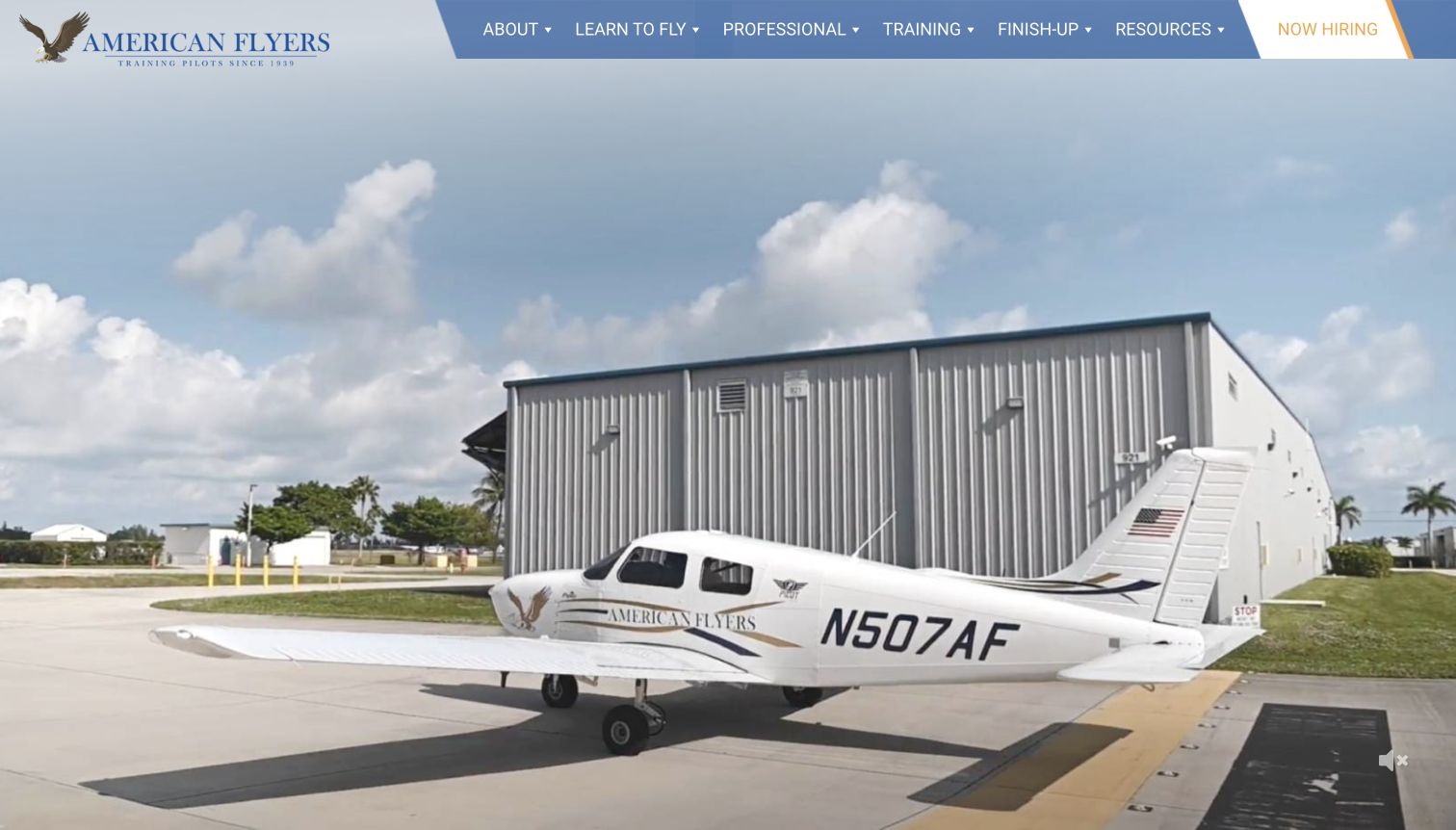
American Flyers combines a traditional eagle wordmark with an angled blue navigation strip and a full-width aircraft video. The opening frame shows a branded training airplane beside its hangar, giving the institution a tangible setting. The page's content ranges from an airline academy to introductory flying, ground school and instructor renewal. Those distinct tasks explain why the navigation separates learning to fly, professional study, training and finishing an existing course. A footer location list gives the national offer local destinations. The tradeoff is that a large motion-led opening does less immediate sorting than the detailed program sections below it.
What you can learn
When a school serves students at several stages, organize navigation around their current task. Existing pilots should be able to find renewal or completion work without reading a beginner's career pitch first.
Pros
The real branded aircraft and hangar make the opening more specific than generic aviation stock.
Separate learning, professional and finish-up routes acknowledge different levels of prior experience.
Cons & considerations
The captured video-first screen shows little explanatory copy before the visitor begins scrolling.
Broad training labels may require additional navigation to distinguish individual certificates and course formats.
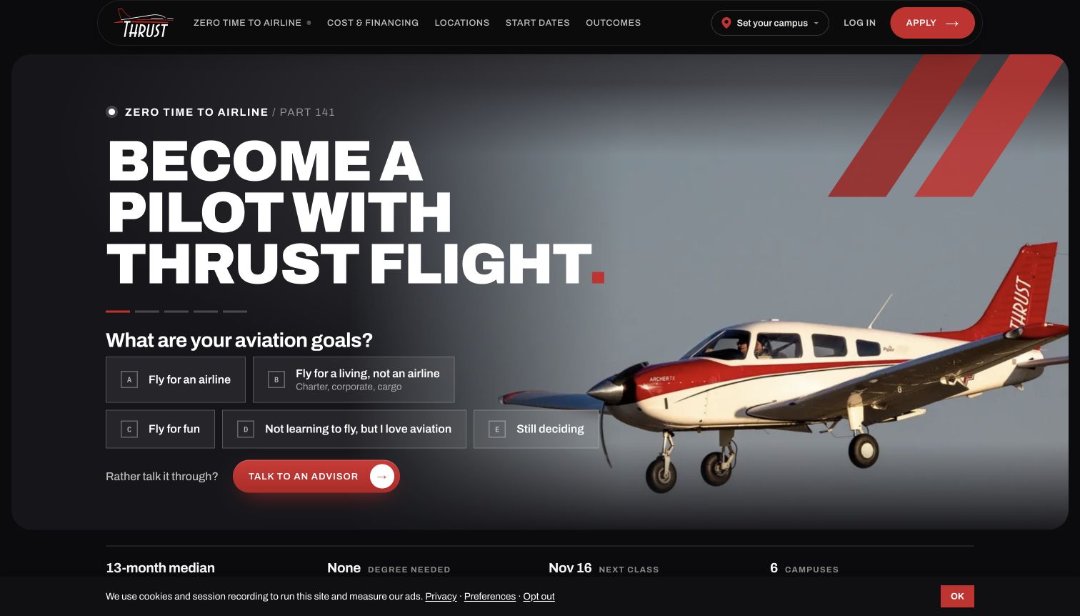
Thrust Flight puts a useful question inside its hero instead of relying solely on an enrollment button. Five visible choices distinguish airline ambitions, other commercial work, leisure flying, general interest and uncertainty. A separate advisor route supports visitors who would rather discuss their situation. The dark background, large white type and red aircraft create a coherent visual system, while a compact facts strip introduces pace and campus scope. Lower on the page, side-by-side program information names included qualifications and presents cost assumptions. These are presentation observations; the school's outcomes and financing figures still require independent consideration by prospective students.
What you can learn
Ask about goals before asking for contact details. A small set of understandable paths can reduce the burden of interpreting aviation terminology, especially when an undecided option and a human contact route remain visible.
Pros
The hero explicitly accommodates undecided visitors instead of forcing a premature program selection.
Program comparisons display inclusions and financial assumptions close to the stated price framing.
Cons & considerations
Five hero options plus an advisor action create a relatively busy first interaction.
Animated outcomes and changing start dates need careful maintenance so transient states do not confuse readers.
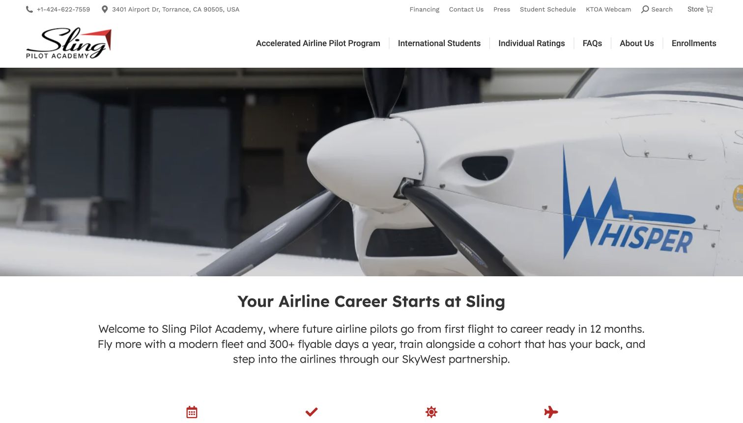
Sling Pilot Academy places a close aircraft view beneath a practical two-level header. Contact details, financing and scheduling sit above program, international-student and individual-rating routes. The page then moves from its career proposition to student stories and upcoming class dates. That sequence makes the academy feel like a place with an active intake rather than an abstract course catalog. The dated enrollment section offers both enrollment and a tour, giving a prospective student a smaller step before commitment. In the captured view the aircraft media dominates, so the supporting text and location detail become more useful after scrolling.
What you can learn
A cohort-based school should make the next intake easy to find and keep a visit available beside enrollment. Show the environment first, then turn interest into a concrete planning decision with clear dates and locations.
Pros
The header keeps practical financing and existing-student scheduling distinct from program exploration.
Upcoming intake dates connect the broad career story to a specific next planning step.
Cons & considerations
Several utility links and a second navigation row make the header visually dense.
Career and pass-rate claims need their supporting context; the surrounding photography cannot verify those outcomes.
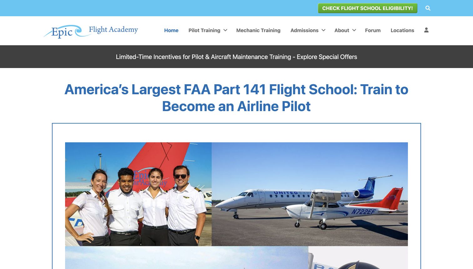
Epic Flight Academy favors a substantial information page over a sparse cinematic landing screen. A blue headline, framed collage and visible eligibility action introduce the offer, while the navigation separates pilot training, mechanic training, admissions and locations. The reviewed content contains distinct domestic and international pathways, individual courses and transfer information. Graduate stories and dated student milestones give the long page recurring human reference points. This breadth can help a reader research several practical questions in one place, but it also competes with promotions and institutional claims for attention. The design works best when the visitor already has a fairly specific training question.
What you can learn
A detailed academy site benefits from audience-specific routes and descriptive subheadings. Use those labels to make a large information library navigable, and keep promotional material secondary to the questions a student is trying to answer.
Pros
Domestic, international and individual-course routes recognize materially different student needs.
Dated student milestones add concrete evidence of current site activity within the long page.
Cons & considerations
The promotional strip, eligibility action and large institutional headline compete at the top.
Long paragraphs make quick comparisons harder than a concise program summary or structured comparison table.
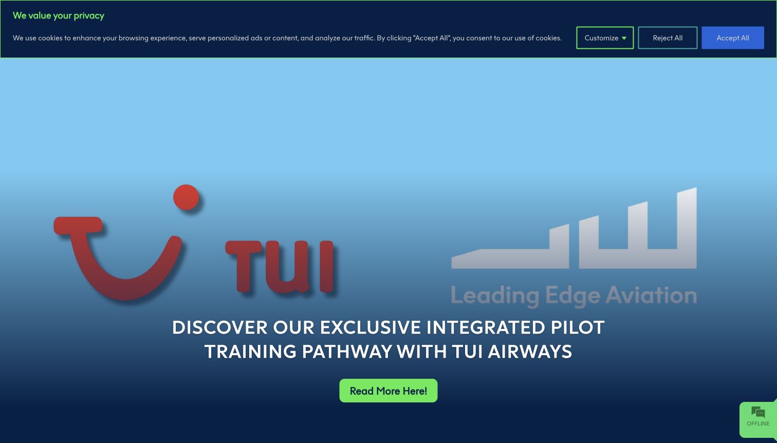
Leading Edge Aviation leads with a large partnership announcement rather than a timeless introductory slogan. The captured blue composition pairs the academy's identity with the partner brand and a bright green reading action. Below it, the page separates integrated UK, integrated EU, modular and advanced course routes. News cards and upcoming events provide additional reasons to return, while open days offer a practical way to investigate the school. This creates a useful editorial rhythm, although the latest announcement can temporarily dominate the needs of a first-time visitor who simply wants to understand the available training paths.
What you can learn
A timely announcement can give a school homepage energy, provided the permanent course structure remains close by. Keep event dates and program routes distinct so visitors can tell an introductory visit from an application or a specialist course.
Pros
The page presents clearly named course families beneath the current lead story.
Dated news and open-day entries provide concrete paths for further investigation.
Cons & considerations
The large partnership promotion can delay a general explanation of the academy for newcomers.
The captured privacy banner takes substantial space above the hero and adds another competing decision.
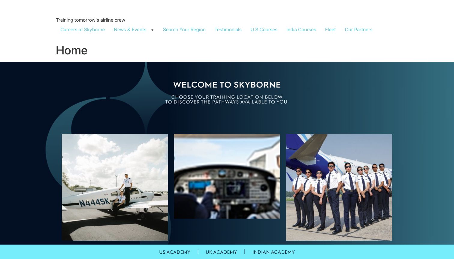
Skyborne's global entry page asks visitors to choose a training location before presenting a course. Three image panels lead toward the United States, United Kingdom and Indian academy routes, supported by repeated text links along the bottom of the visible section. The dark blue and turquoise background gives the selector a consistent brand setting without surrounding it with a large admissions form. This is a deliberately narrow page: its main job is routing. The observed top area also includes a plain Home heading and several utility links, which feel less focused than the central location choice itself.
What you can learn
When programs differ by region, a short location gateway can prevent visitors from reading the wrong requirements. Name the regions in text as well as imagery, and explain whether the choice refers to training location or applicant eligibility.
Pros
Three clearly named academy destinations make the page's main routing task easy to identify.
Repeated text links provide another route beyond the large photographic panels.
Cons & considerations
The gateway offers little information for a visitor who does not yet know which region fits.
The extra utility links and plain page heading dilute the otherwise focused regional selection.
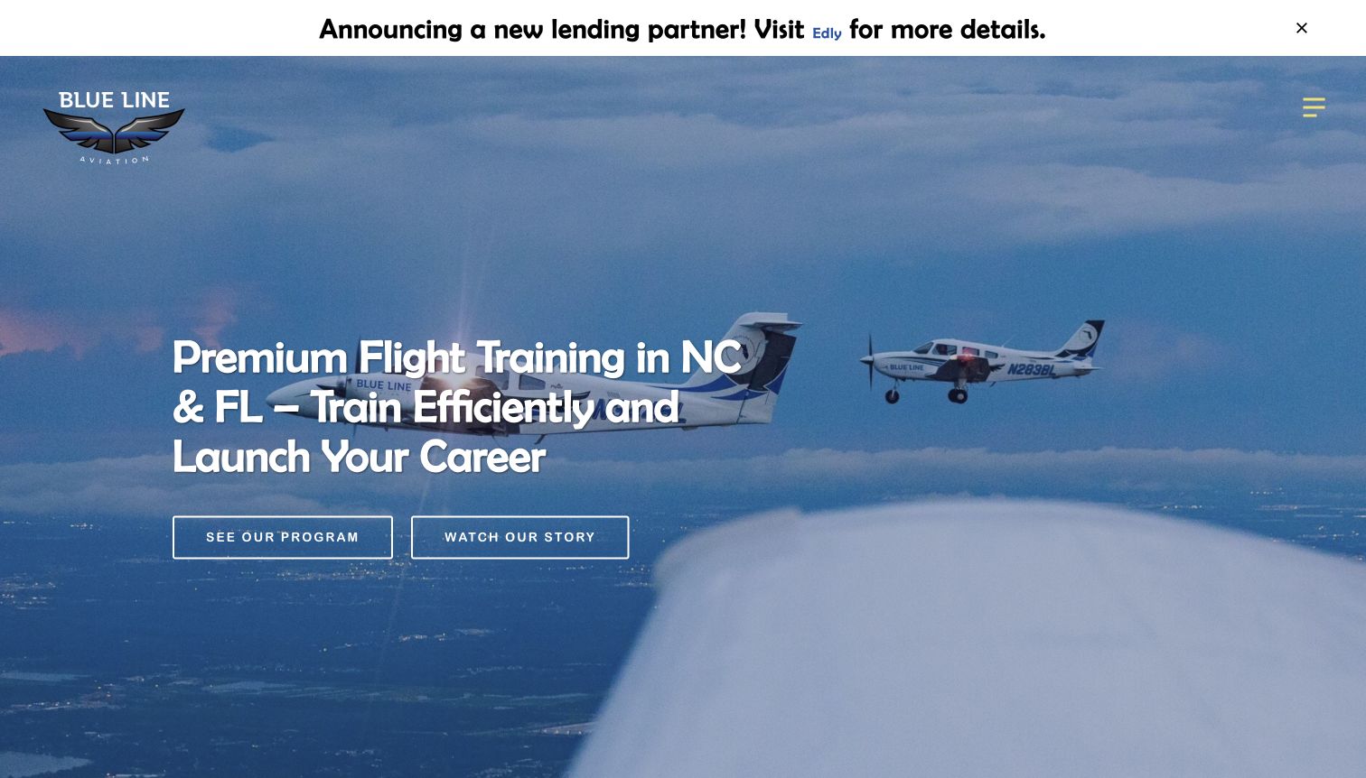
Blue Line Aviation opens with formation-flight imagery, a compact location statement and two distinct actions: inspect the program or watch the story. The page then moves toward a readiness quiz and an advisor call, explicitly describing the full-time commitment of accelerated training. Campus sections distinguish North Carolina and Florida, while student stories add a personal layer to the planning material. The presentation recognizes that training is a substantial decision and describes what an admissions conversation should cover. At the same time, the opening financing announcement and repeated career language can make a cautious visitor look harder for a neutral program breakdown.
What you can learn
Explain the expected commitment before inviting someone into an admissions conversation. A quiz should remain optional, with equivalent program and contact information available to readers who prefer to evaluate the offer without providing personal details.
Pros
The first screen separates practical program exploration from the more emotional story video.
Campus-specific sections acknowledge that facilities, location and planning details influence the decision.
Cons & considerations
The prominent lending announcement competes with the training introduction at the top of the page.
Some key next steps emphasize a quiz or call, adding friction for readers seeking self-service detail.
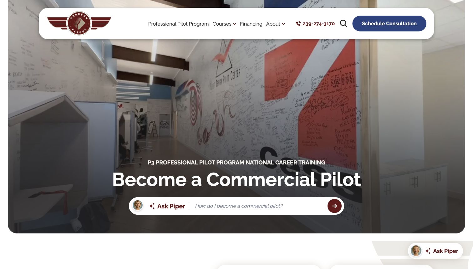
Paragon Flight uses a rounded navigation panel and a large training-environment video to frame its professional pilot offer. A conversational question field sits inside the hero, while a consultation button remains available in the header. Farther down, the page separates professional and recreational pathways, describes flexible pacing and presents a financial-planning section with a stated estimate and training intensity. FAQs address the learning process and what a first lesson might involve. Those sections make the proposition more tangible than the opening career headline alone. The conversational interface is prominent, but its presence is not evidence that it can replace direct course documentation.
What you can learn
Pair a personal consultation offer with enough visible program detail to make that conversation productive. State which pathway an estimate describes, the assumed pace and where the reader can confirm inclusions rather than treating a single figure as universal.
Pros
Professional and recreational pathways are visibly separated instead of being buried in one catalog.
Cost and duration framing appear together with an explanation of the expected training pace.
Cons & considerations
The prominent question interface may distract from reading the underlying course information.
Headline completion and pass-rate claims need definitions and supporting context beyond the promotional overview.
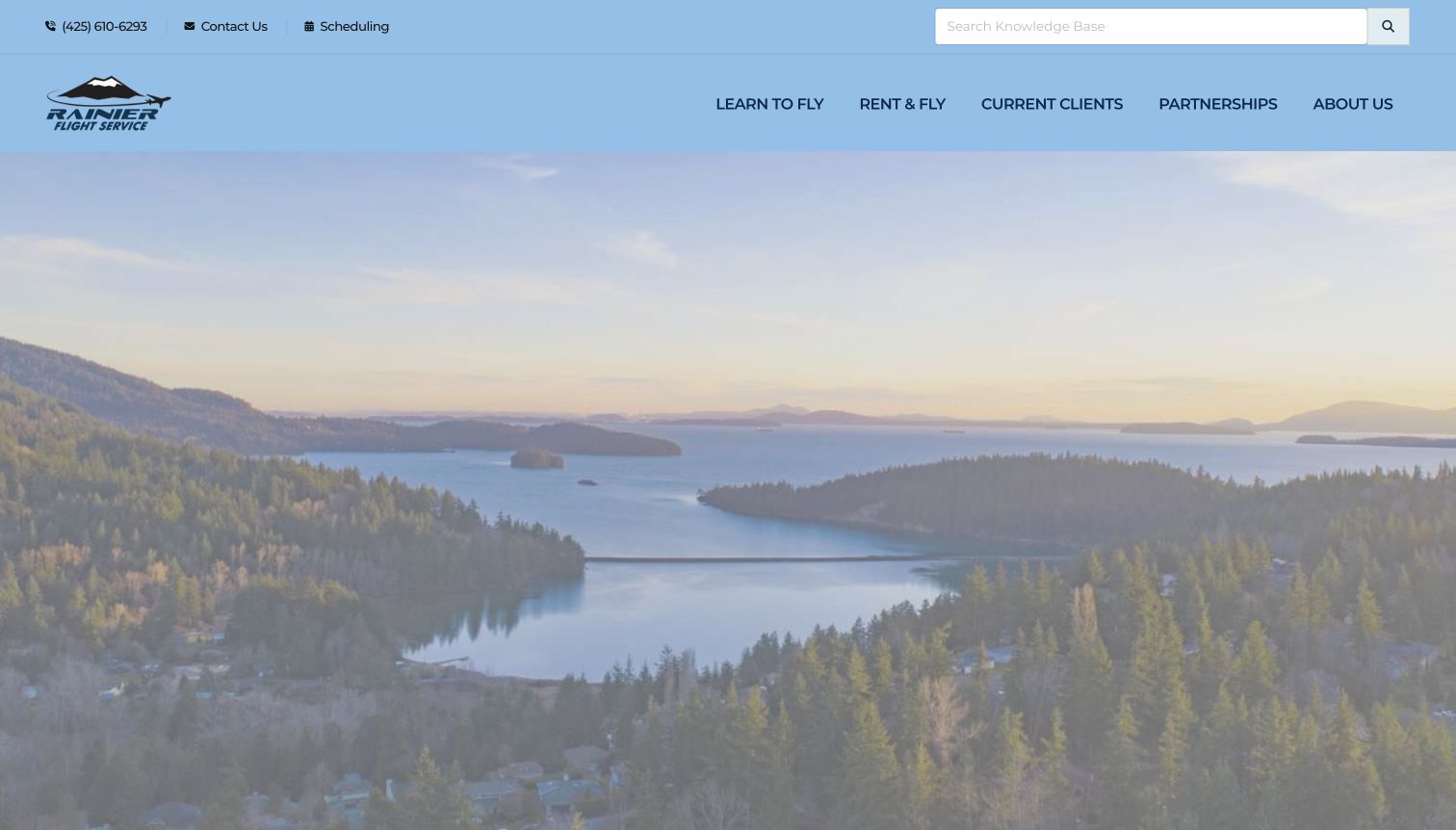
Rainier Flight Service combines a Pacific Northwest landscape with a broad but purposeful navigation system. Learning, aircraft rental, current-client resources, partnerships and organizational information have separate routes. The utility area adds contact, scheduling and a knowledge-base search, making the site useful beyond the first inquiry. Reviewed page content names four local areas and distinguishes career from leisure training. A pre-training checklist and course catalog offer more concrete preparation than the atmospheric opening image. The captured hero is mostly landscape and navigation, so readers must move beyond that first view to see the full training explanation and regional location detail.
What you can learn
A local flight school's website can support both recruitment and ongoing use without mixing every task. Give current students scheduling and documents directly, while new visitors receive a course overview, preparation checklist and clear location choices.
Pros
Training, rental and current-client resources are separated into recognizable navigation groups.
The visible search and scheduling utilities support repeat visits as well as first-time research.
Cons & considerations
The landscape-led opening delays the concrete program explanation in the captured viewport.
The extensive navigation can be demanding for beginners unfamiliar with certificate and rating terminology.
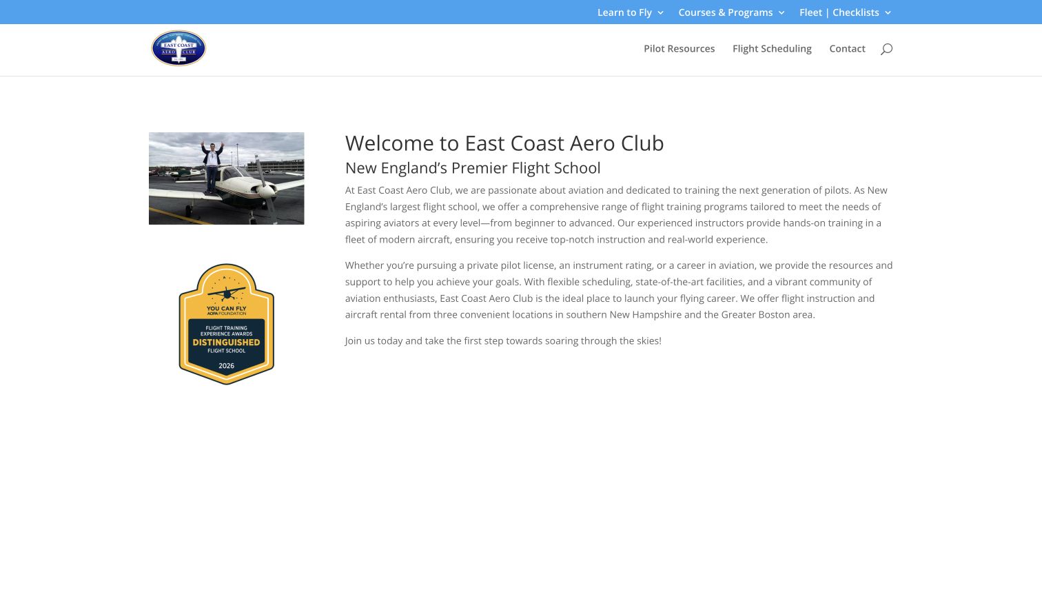
East Coast Aero Club uses a restrained opening: a small aircraft photograph and recognition graphic sit beside a straightforward introduction. The navigation gives courses, fleet checklists, pilot resources and scheduling their own places rather than hiding everything behind a single enrollment action. The page describes both flight instruction and aircraft rental, then lists three local airports with hours and direct contact details. This structure suits a visitor comparing nearby training options or returning to find operational information. A long social feed adds community activity below the introduction, but it can make the useful location blocks feel farther away than necessary.
What you can learn
A regional school's strongest conversion aid may be simple local information. Make airport, hours, contact and the distinction between instruction and rental easy to find, then use community content as supporting material rather than the only evidence of activity.
Pros
Courses, checklists and scheduling are plainly labeled for new and returning visitors.
Separate airport contact blocks connect the regional claim to specific places and opening hours.
Cons & considerations
The opening paragraphs are broad and do not immediately compare individual training options.
The extensive social feed lengthens the route from the introduction to practical location details.
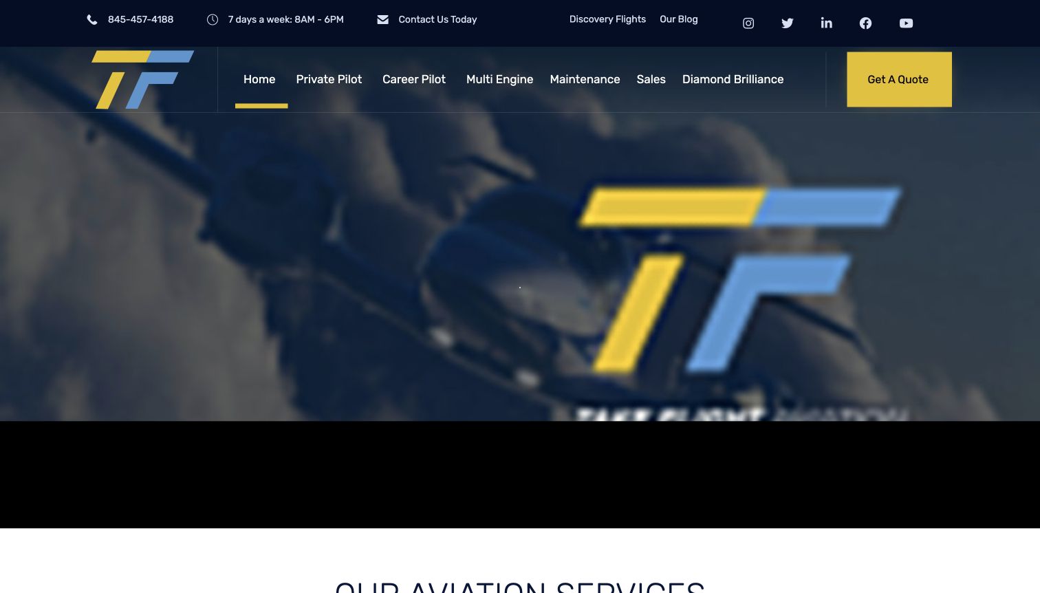
Take Flight Aviation uses navy, yellow and pale blue consistently across its wordmark, navigation and quote button. The top utility bar gives a phone number, hours and discovery-flight access, while the main menu distinguishes private, career and multi-engine training from maintenance and sales. The reviewed content follows that structure with short service descriptions, including custom and completion training. This makes a multi-service aviation business easier to understand than an undifferentiated list of capabilities. In the captured frame the moving hero displays the large brand mark with little explanation, placing more responsibility on the strong navigation and the service section below.
What you can learn
When training shares a website with maintenance or sales, establish separate service families early. Keep a low-commitment discovery route visible, and let short summaries explain who each training route serves before asking for a detailed quote.
Pros
Distinct training and aircraft-service labels reduce confusion between different customer tasks.
Phone, hours and discovery-flight access are visible in the practical utility strip.
Cons & considerations
The motion-led hero frame provides less immediate explanation than the service summaries below it.
A general quote action could benefit from a clearer indication of which service the inquiry concerns.
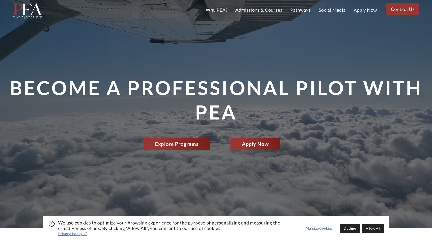
Phoenix East Aviation places a large career headline over an aircraft-wing view above the clouds. Two red actions offer a useful distinction between exploring programs and applying. The navigation keeps admissions, pathways and contact visible, while the body provides a concise institutional introduction and student testimonial material. Compared with information-heavy academy sites, this homepage asks the visitor to move into a dedicated program page sooner. That keeps the visual story focused, although practical questions about pace, cost and locations need another step. The captured privacy notice occupies the lower edge of the screen without replacing the main actions.
What you can learn
Separate research from application in the first screen. A concise homepage can work when the program destination supplies the missing detail and the exploratory action remains as easy to find as the more consequential admissions route.
Pros
Explore and apply actions acknowledge that visitors arrive with different levels of readiness.
The wing-and-cloud image and short headline create a clear visual hierarchy.
Cons & considerations
The homepage provides limited practical comparison detail before sending readers to another page.
Institutional claims and testimonials should be evaluated in context rather than treated as independent outcome evidence.
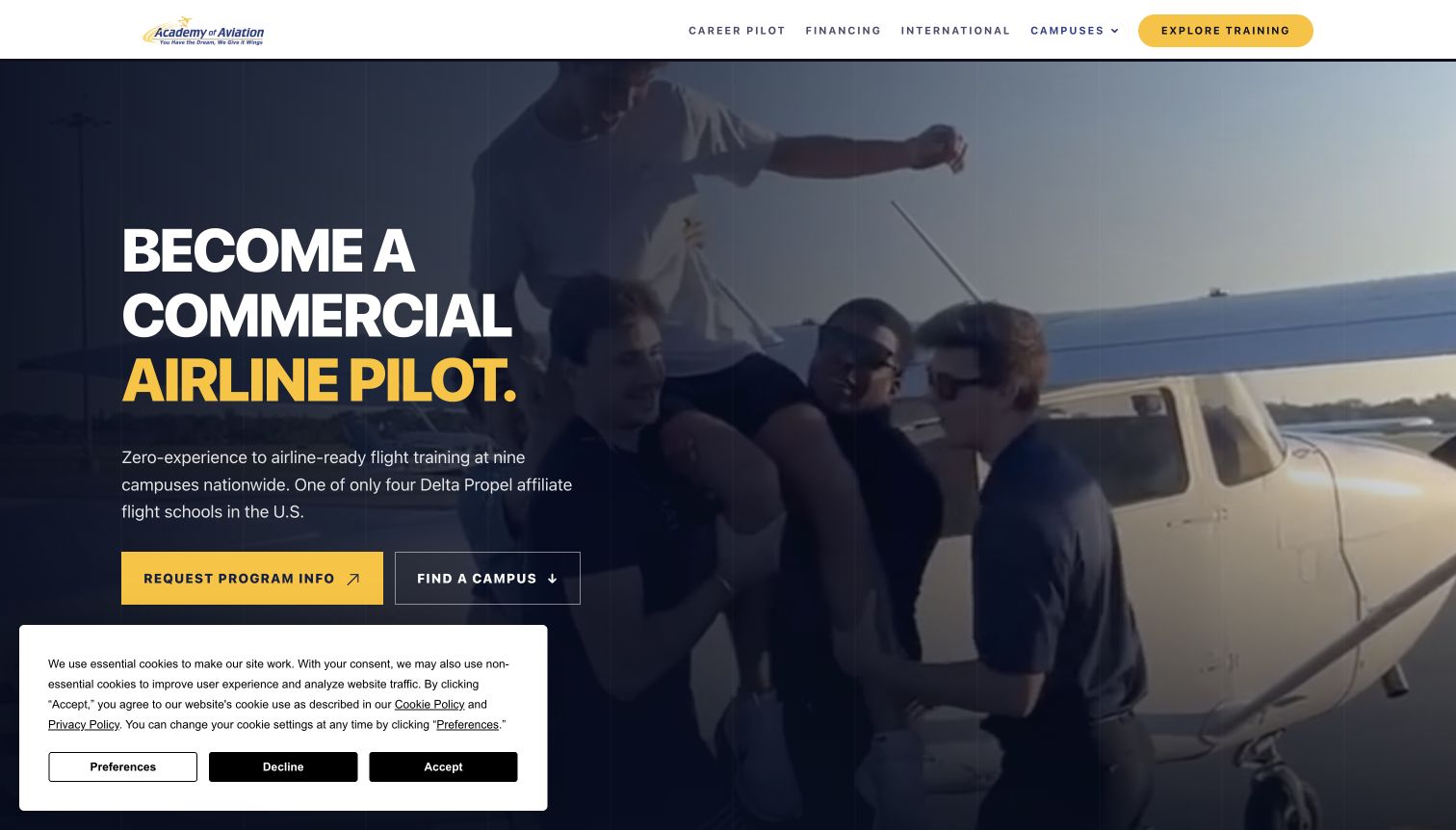
Academy of Aviation pairs a dark aircraft scene with strong yellow emphasis and two practical actions: request information or find a campus. The page then breaks its career path into four numbered stages, moving from initial learning through further qualifications, instruction and time building. Campus lists group locations by geography and name the airports, which makes a national offer more concrete. The reviewed copy also qualifies competitive airline selection and separates third-party financing decisions from the academy's role. The result is a clearer planning narrative than a string of partner logos, although several acronyms still assume a reader willing to learn the terminology.
What you can learn
Show the sequence and the place together. A numbered pathway helps a newcomer understand the broad progression, while airport-specific campus pages explain where it happens. Keep competitive selection and financing conditions close to the claims they qualify.
Pros
The four-stage sequence turns a long training journey into a manageable overview.
Campus names and airport identifiers make location selection specific rather than merely regional.
Cons & considerations
Certificate and rating abbreviations still require explanation for a completely new visitor.
The captured cookie panel covers part of the lower hero and competes with the opening actions.
Kegan is a freelance web designer and developer with 15+ years of experience helping businesses turn complicated website requirements into clear, maintainable digital experiences. He works directly with clients from planning and design through development, launch, and ongoing support.
For flight training website design, his development approach focuses on flight training websites that explain course routes, entry requirements, aircraft and instructor information with clear enquiries and qualified licensing context. The scope can be a targeted improvement or a complete custom build, with responsive layouts, thoughtful content structure, and integrations chosen around the people using and maintaining the site.
Show 3 other flight training website designersHide other flight training website designers
Plan a flight-school website around the student's decisions
Define the training pathways before the page layout
Begin with the actual audiences and programs the school supports. A person considering a first lesson needs different information from a pilot seeking an additional rating or returning to complete earlier training. Map those routes with the training and admissions team before choosing a hero image. Distinguish program information from existing-student resources such as scheduling, documents and aircraft rental. Both can share a website without competing for the same primary action.
Build a consistent program summary around the questions students ask. Describe the intended audience, starting point, pace, location, expected structure and route to further details. Expand abbreviations on first use and explain the difference between an individual course and a broader pathway. Avoid turning a visual progression into a promise that every student will follow the same timeline or reach the same employment outcome. Have the school approve the language for its own current programs.
Give exploratory visitors a legitimate next step. A program overview, campus visit or introductory conversation may be appropriate before an application. Label those actions distinctly so people know whether they are requesting information, arranging a visit or beginning a formal process. If a readiness quiz is offered, keep equivalent core information available without it. A school can help people assess the offer without collecting personal details at every stage of browsing.
Make financial and location information useful for comparison
Treat costs as structured editorial information, not just a large promotional number. State which program an estimate describes, what assumptions it uses and where the visitor can review inclusions and exclusions. Keep optional services, living expenses and other relevant costs distinguishable from the training fee. Link to approved current details rather than copying another school's pricing language or suggesting that a displayed monthly figure explains the total commitment.
Connect each program to the places where it is offered. Name the airport and campus, show genuine facilities where possible, and explain how someone can arrange a visit. A national or regional map is useful only when it leads to specific information. Distinguish a training location from the applicant's country of residence, and let qualified staff provide current eligibility guidance. A web designer should not infer regulatory, immigration or medical requirements from a neighboring school's content.
Review claims about pace, outcomes and partnerships with the people who own the underlying records. Explain the population and period behind a statistic when the school publishes one, and distinguish a typical or estimated duration from a guarantee. A graduate story can illustrate one person's experience without forecasting another's result. Keep financing descriptions tied to the responsible provider and current conditions; attractive typography should not make qualified information appear unconditional.
Keep the site useful after the first inquiry
Plan ongoing tasks alongside recruitment. Existing students may return for scheduling, documents, weather-resource links or contact information. Put those utilities in a recognizable area while preserving a simple program path for newcomers. If a separate portal owns scheduling, label the transition clearly and maintain a public fallback for general questions. Do not copy operational data into marketing pages unless someone is responsible for keeping it accurate.
Assign an owner to changing information such as intake dates, campus availability, staff profiles and course estimates. News and student milestones can demonstrate current activity, but they should retain dates and remain distinct from permanent program descriptions. An old announcement about a partnership should not quietly become the sole explanation of the present offer. Keep archived material useful without presenting it as a current enrollment opportunity.
Use aircraft and student imagery to explain the environment, with appropriate permissions and descriptive context. Provide a useful still image and readable text when a video does not load or a visitor reduces motion. Keep the core program details available without optional chat or marketing tools. Inquiry forms should ask only for appropriate information and clearly explain the next step, while sensitive application records stay within the school's approved private systems.
The editing job behind the design
Choose tools that keep program information accurate
Model program, campus and intake information consistently so editors can change shared details without searching through every page. Preserve meaningful distinctions between an introductory lesson, an individual course and a complete training pathway.
Keep scheduling and application records in the appropriate authorized systems. A public marketing site can explain the process and provide a clear transition without duplicating private student data or pretending that every inquiry is an enrollment.
Use restrained media and reliable publishing defaults. The stack observations shown with these examples come from bounded public-page audits and describe only supported signals; they do not establish the school's complete architecture, operational software or hidden student systems.
Our WordPress website examples offer a separate look at publishing approaches. A visible platform label is evidence for that named page, not a guarantee that the same system will suit your requirements.
Before the public launch
Flight-training website brief checklist
Identify the student goals and experience levels each program serves.
Separate leisure, career, rating and completion pathways where relevant.
Expand unfamiliar certificate and rating abbreviations.
Explain the expected training pace and commitment.
Link programs to specific campuses and airports.
State the basis and scope of published cost estimates.
Keep inclusions, exclusions and other expenses understandable.
Distinguish information requests, visits and applications.
Give undecided visitors a useful route without mandatory data collection.
Qualify partnership, timeline and graduate-outcome claims.
Keep intake dates and program availability under clear editorial ownership.
Provide genuine imagery and readable alternatives to motion-heavy heroes.
Separate existing-student utilities from new-student program browsing.
Keep application and student information in approved private systems.
These checks are a project checklist, not a performance, legal, security, or accessibility certification. Test real journeys with the people responsible for the website before making claims about the result.
Sources & editorial method
How this collection was selected and reviewed
We directly inspected these public homepages on November 11, 2026, comparing their navigation, program explanations, practical planning information and next-step labels. The collection includes regional schools and larger academies with different audiences. Aeros was selected after comparison for its explicit intensive and flexible pathways, qualification sequence and named training bases. Captures retain the observed source view, including moving-media frames and consent notices. Each exact source received a bounded broad public technology-audit attempt. These reviews concern website presentation; institutional claims, prices, dates and program conditions can change and are not independently certified by this collection.
Each example links to its actual source page. Screenshots are direct browser captures with their own capture dates; moving imagery, announcements and live designs can change. The notes describe observable design choices and conditional tradeoffs, not measured traffic, conversion results, service quality, or accessibility conformance.
Technology labels use public page metadata, asset evidence, or explicitly cited platform documentation. Platform documentation is not a complete current deployment audit. A component reference may be legacy or unused; it is not a complete backend inventory. Unknown stacks are omitted. These sites are editorial examples, not our client portfolio.
Written, Edited and Curated are separate editorial records, not timestamps advanced by a rebuild. Website designs and imagery belong to their owners. See our editorial standards or suggest a correction.
Questions worth asking
Flight Training website design questions
What should a flight-school homepage explain first?
Identify who the school serves, the training routes it offers and where they take place. A clear program overview and useful next step usually help more than an unexplained list of qualifications or a broad career promise.
Should leisure and career training share one page?
They can share a homepage, but the routes should be clearly distinguished. Explain the different goals and commitments, then give each program enough detail for a visitor to decide which information to explore next.
How should a school present training costs?
State which program an estimate covers, its assumptions and the route to current inclusions and exclusions. Keep financing illustrations and additional expenses distinguishable from the underlying training price, using wording approved by the responsible school and provider.
Is an application form the best first action?
Not for every visitor. Program details, campus information, a visit or an introductory conversation can be useful earlier steps. Label information requests and formal applications differently so the action matches the visitor's readiness.
How should airline partnerships and graduate stories be used?
Explain the actual relationship and any relevant selection conditions. Attribute stories to the people and dates involved. Logos and testimonials can provide context, but they should not imply that every student receives the same opportunity or outcome.
Does Editors Choice recommend a school for flight instruction?
No. It recognizes observed website design and communication. It does not establish instructional quality, safety, regulatory approval, personal eligibility, financing suitability or employment prospects.
Borrow the decision structure behind the design. Explain the route, the commitment and the place, then give prospective students a clear way to investigate the program at their own pace.