Best Animation Studio Websites of 2026 (21 Real-World Examples)
Animation studio websites that connect distinctive visual work with clear projects, production capabilities and commissioning routes.
Explore 21 animation studio websites spanning character films, commercial motion, CGI, stop motion and animation for AR experiences. The collection studies how studios explain their work online, not which studio will deliver the best production outcome.
An animation studio has an unusually strong visual portfolio to draw on, but a website cannot simply behave like a continuous showreel. A producer may need to understand a studio’s role, a brand team may be comparing techniques, and an artist may be looking for a specific kind of collaboration. Each needs a route from the moving image to useful information.
The examples range from specialist independent practices to entertainment studios with film catalogues and several business divisions. Some lead with a character or a cinematic frame; others introduce the studio in plain language before showing work. Compare those choices against your own audience, project mix and ability to maintain the site. An AR production specialist and an original-feature studio do not need identical homepages.
Before the examples
What makes good animation studio website design in 2026?
Make the production offer legible
State whether the studio develops original films, produces commissioned animation, represents directors, builds motion systems or combines several of those roles. Use clear service labels near the work. A beautiful reel can suggest a style, but it cannot reliably tell a commissioner which part of a collaboration the studio handled.
Give every project enough context
Pair the finished piece with its title, client or commissioner where approved, production role and relevant credits. Distinguish studio originals from commissioned work. A short explanation of the brief and selected process material can be more useful than an unsupported claim that the film increased engagement.
Treat motion as a choice, not an obstacle
Give visitors a clear way to start and stop substantial video and avoid unexpected sound. Supply an intentional poster frame and readable text when media cannot play. Consider reduced-motion preferences and keyboard use as part of the viewing journey rather than assuming that every visitor can comfortably watch a large looping reel.
Separate audiences without fragmenting the studio
Work, process, directors, careers and contact answer different questions. Entertainment studios may also need film archives and audience destinations. Choose a small set of labels that describe real content, then keep them stable as individual campaigns change.
Show how a commission becomes a finished film
Explain the stages that actually apply to the studio: discovery, script, visual development, storyboards, animatic, animation, sound and delivery. State how feedback is handled without promising a universal timeline or fixed price that the team has not approved. The purpose is to make the collaboration understandable, not to expose confidential production information.
The collection · 21 examples
21 animation studio websites worth studying
These 21 examples retain the original saved draw. Ordinary Folk is the explicit Editors Choice for combining a distinctive introduction, a varied motion portfolio and a clear account of the production process. It is an editorial website-design selection, not an award for service quality or a vote-derived ranking. Paper Triangles is included specifically for its documented animation and AR production practice.
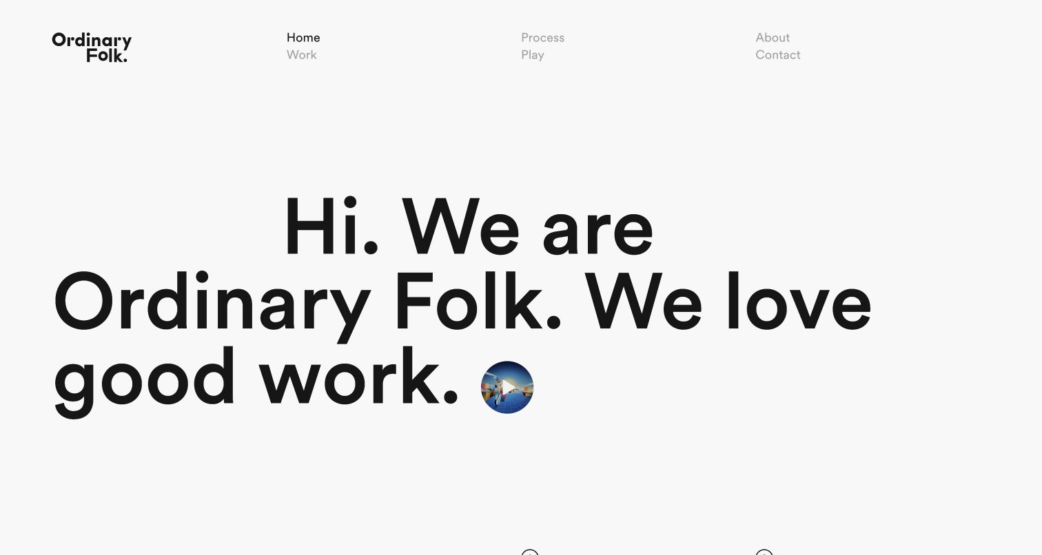
Ordinary Folk turns a large, plainspoken greeting into the centre of its homepage. The small circular reel thumbnail sits inside that introduction rather than replacing it with an unlabeled full-screen film. Widely spaced navigation makes Work, Process, Play and Contact separate decisions. The Process page then explains message, design, animation and audio in a sequence a commissioner can follow. Featured projects mix named client work with studio-led pieces, so the portfolio shows both commissioned applications and creative interests. This combination makes a specialist animation practice approachable without requiring a visitor to know production terminology first.
What you can learn
Give a buyer a way to understand the working relationship as well as the finished reel. A clear process destination can turn a striking portfolio into a more useful commissioning reference.
Pros
Separate Work and Play routes distinguish commissions from experimentation.
The production sequence gives non-specialists useful context before contacting the studio.
Cons & considerations
The large greeting delays the first full project image on a smaller viewport.
A deliberately informal introduction needs nearby service context for visitors unfamiliar with the studio.
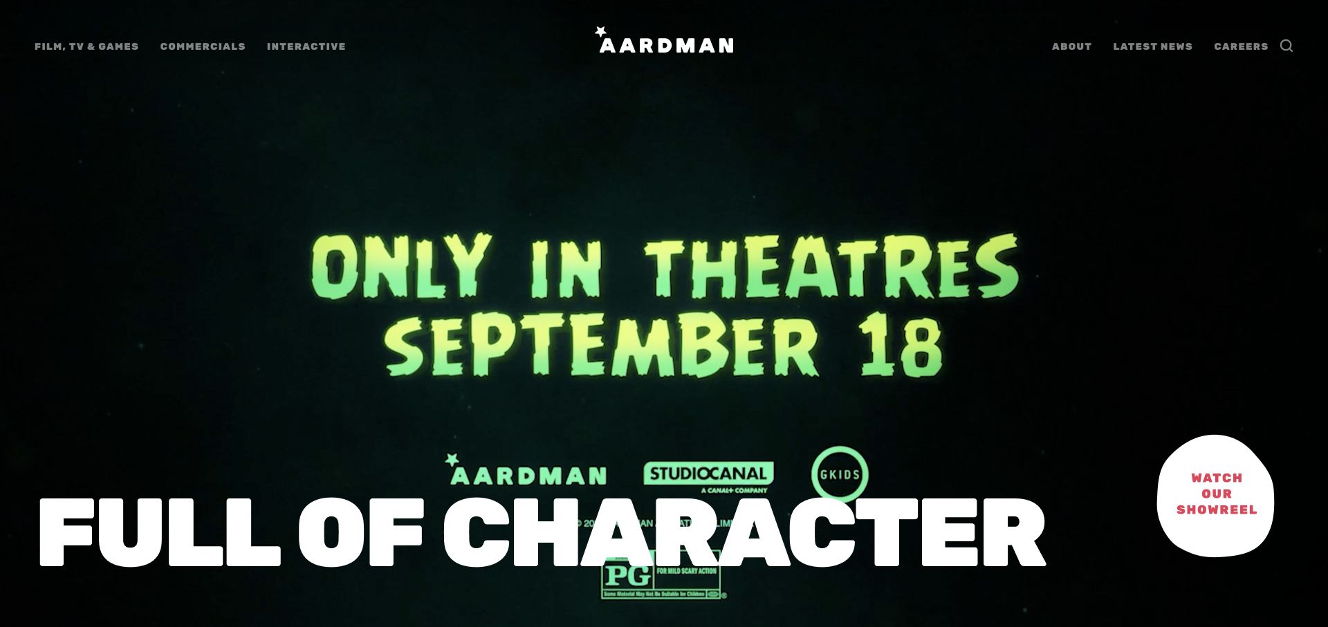
Aardman puts a moving showreel behind a large identity statement while keeping several distinct business destinations in the header. Film, TV and games sit alongside commercials and interactive work; the broader page also routes visitors toward characters, licensing, attractions and training. The captured frame is one moment in that reel, not a fixed homepage illustration. The useful design decision is the separation of a broad creative promise from literal business labels. Fans, commissioners and prospective collaborators can begin with the same visual introduction without being forced through the same enquiry journey.
What you can learn
When a studio serves several audiences, let the reel communicate personality and let navigation do the sorting. Name the commissioning divisions rather than expecting visitors to infer them from a montage.
Pros
Business divisions remain discoverable over the visual opening.
A direct showreel control gives the large imagery a clear purpose.
Cons & considerations
A busy reel can compete with navigation over some frames.
A broad set of divisions needs careful prioritisation on compact screens.
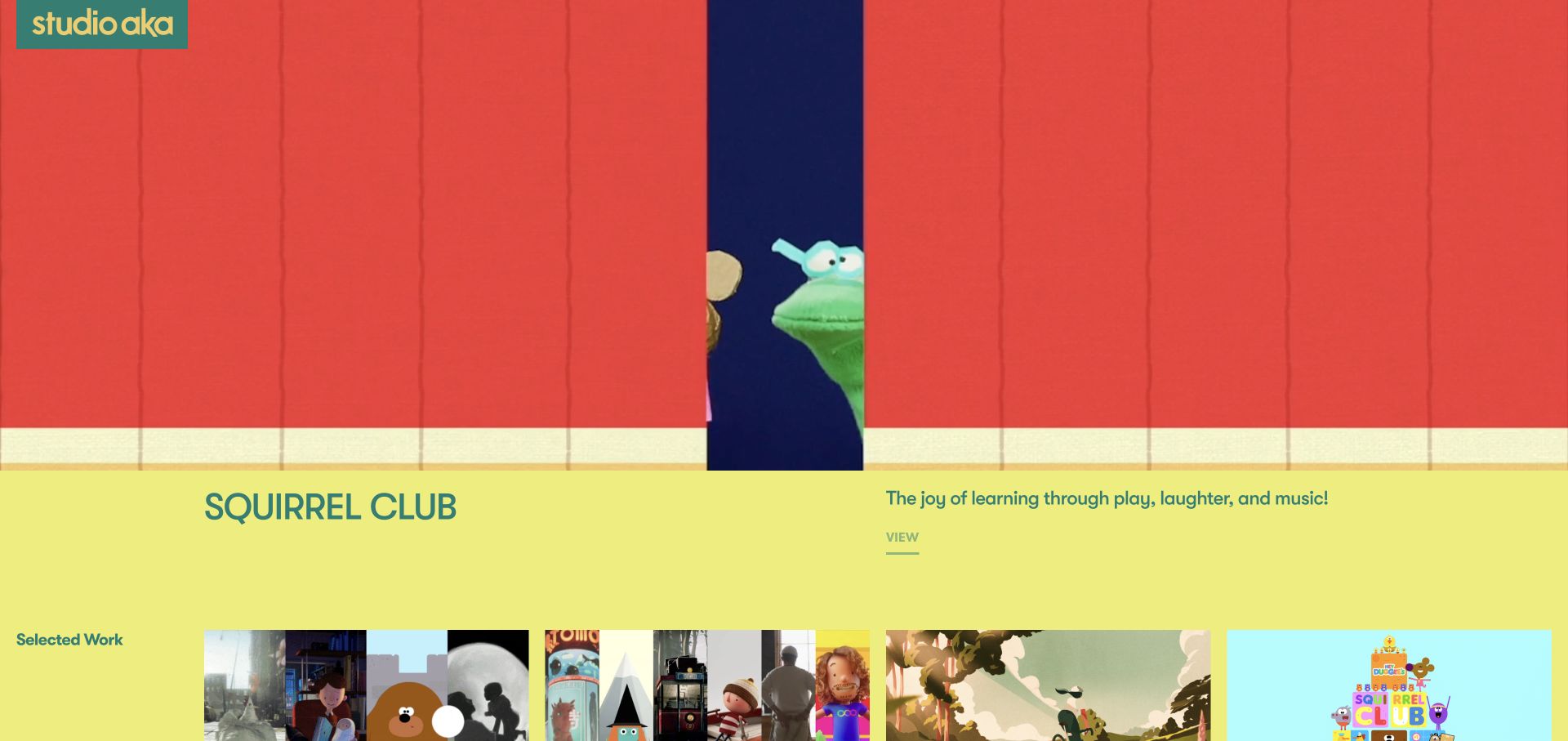
Studio AKA frames its opening project with a strong yellow background, teal identity and a large character image. The project title and a separate explanatory block sit below the artwork, giving the visitor both visual impact and a reason to continue. Navigation distinguishes work, development, showreels and studio information instead of treating everything as one gallery. The initial Squirrel Club presentation illustrates how a recognisable character world can carry the brand while conventional project labels keep the portfolio understandable. The review concerns that presentation, not the commercial performance or production quality of the project.
What you can learn
Use a project’s visual language generously, then place its title, short explanation and next step in a calm reading area. Animation portfolios benefit from context that survives when the video is paused.
Pros
A strong colour relationship connects the identity and featured work.
Project text provides context outside the image itself.
Cons & considerations
Large featured artwork means other projects require scrolling.
A vivid site palette needs checking against varied future project imagery.
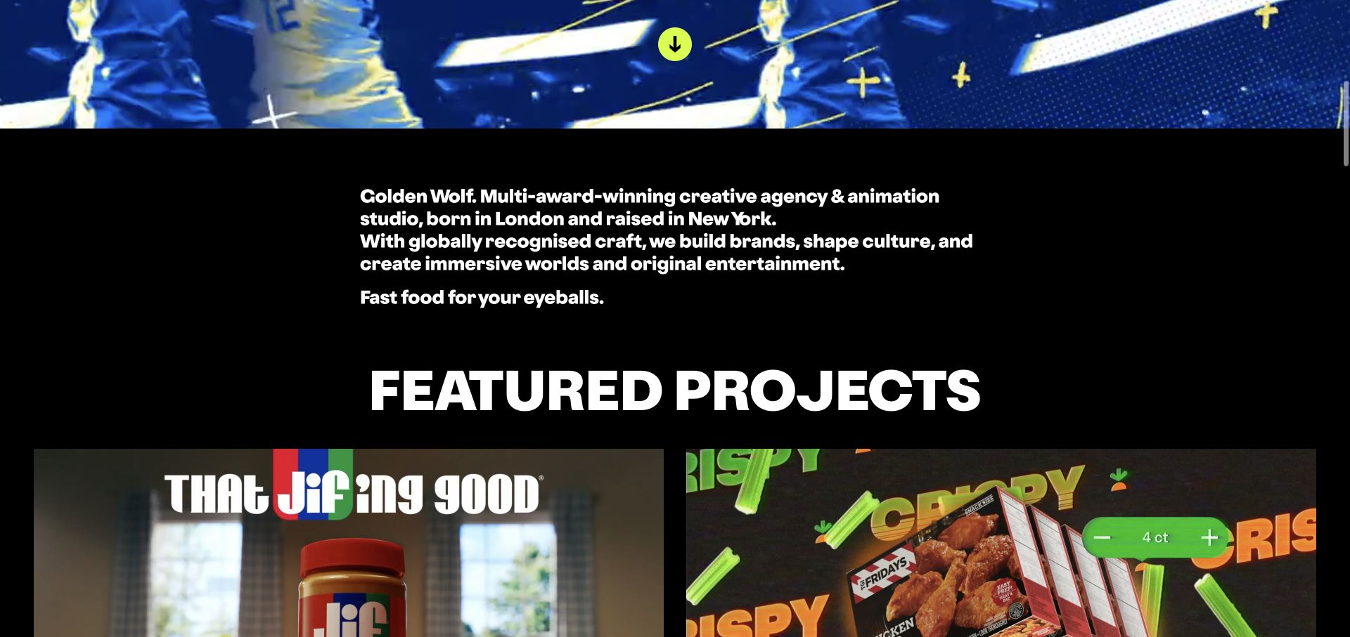
Golden Wolf uses a black canvas, assertive white typography and a concise studio description before its featured campaign cards. The captured view is the scrolled introduction reached through the page’s own description control, not the top of the homepage. It brings the proposition and the start of the project grid into one view. Named work for JIF and Instacart appears beneath the explanation, giving the studio’s voice concrete examples to support it. The hierarchy separates brand personality, what the agency does and where a visitor should look next rather than asking a reel to explain all three.
What you can learn
Plan an introduction view that works independently of the opening animation. A short studio statement followed by named projects gives visitors a useful second step after the visual spectacle.
Pros
The description is grounded immediately by recognisable project cards.
High-contrast typography gives the studio a distinctive editorial voice.
Cons & considerations
The initial spectacle and description occupy different scroll positions.
Large type needs deliberate line breaks as screen width changes.
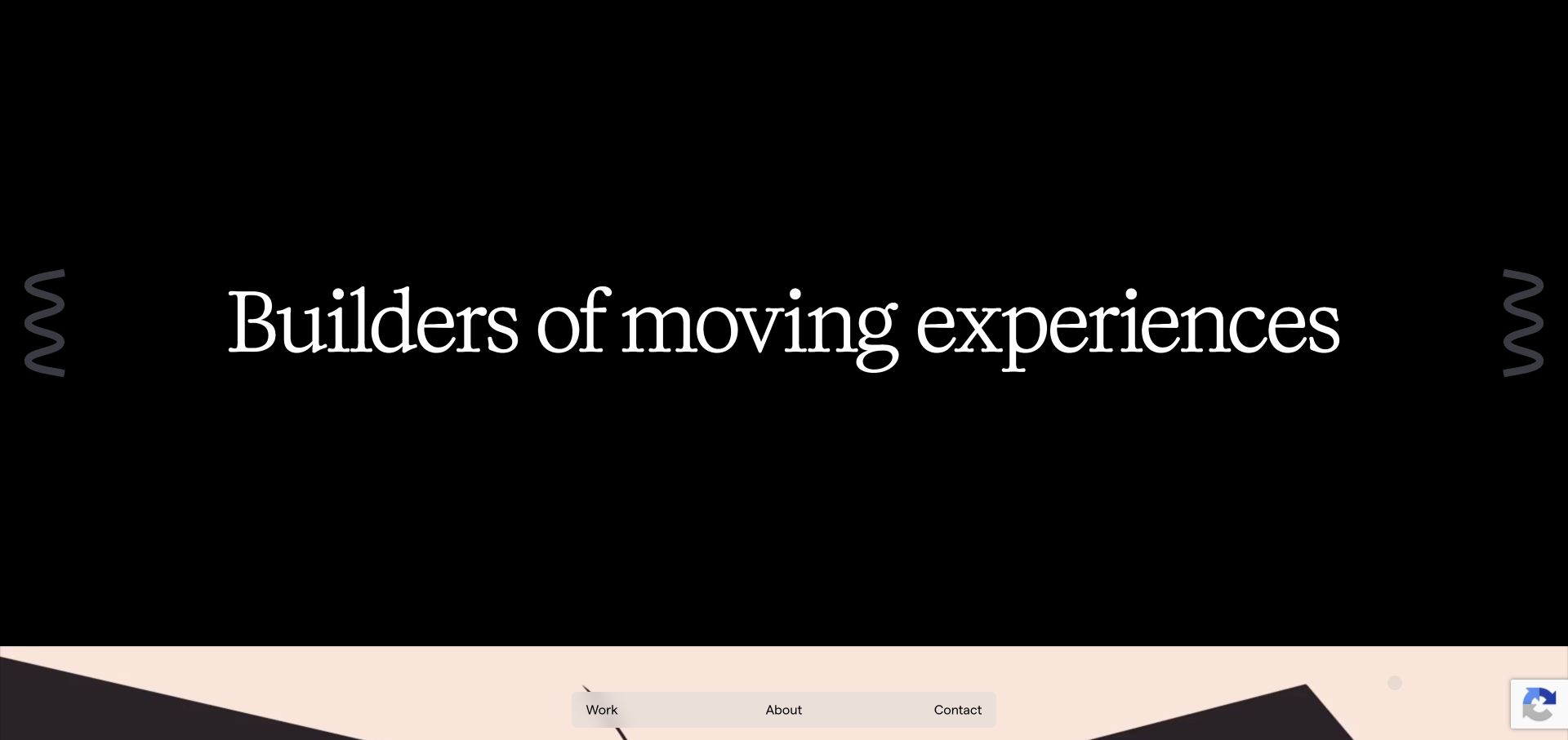
Oddfellows combines a large serif statement with curved abstract artwork on a dark background. A compact floating Work, About and Contact navigation keeps the first view spare. The page then connects its moving-experience proposition to projects across motion systems, illustration and storytelling, with named client applications instead of only decorative thumbnails. The opening communicates an artistic point of view while the later categories explain the range of deliverables. For an animation studio, that distinction matters: the same visual craft may serve a product interface, a brand system or a narrative film, and buyers need to recognise which examples match their brief.
What you can learn
Use a distinctive opening to establish taste, but classify the work by the job it performs. That lets a portfolio communicate range without turning every project into an interchangeable video tile.
Pros
A short floating navigation preserves space for the work.
Discipline labels help explain different applications of motion.
Cons & considerations
The abstract opening does not immediately identify a specific client project.
Floating controls should be tested against changing backgrounds and keyboard focus.
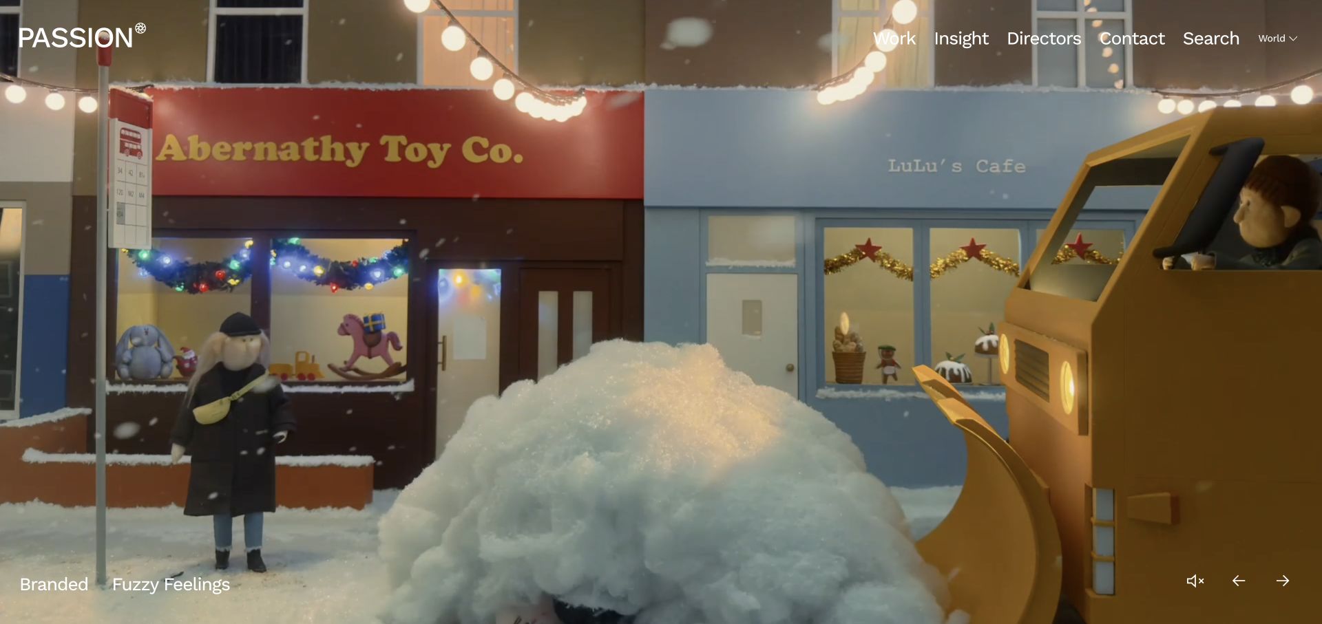
Passion Animation gives an individual film almost the whole first screen. The captured Fuzzy Feelings frame presents the project title and category in a small lower-corner label, while the header keeps Work, Insight, Directors and Contact accessible. Previous, next and audio controls establish that the image is part of a deliberate viewing sequence. The director route is especially relevant for a production company: a visitor can browse by creative authorship as well as project. This is the animation division’s property, distinct from the documentary-focused page encountered on the group’s other domain.
What you can learn
A cinematic homepage still needs clear authorship and navigation. Identify each featured project and give commissioners a route to directors when selecting a creative collaborator is part of the buying decision.
Pros
Project identity remains available beside the full-screen film.
Director and insight routes add ways to evaluate the work.
Cons & considerations
Small overlay labels may be less legible over brighter film frames.
Carousel-led discovery can hide breadth from visitors who do not advance it.
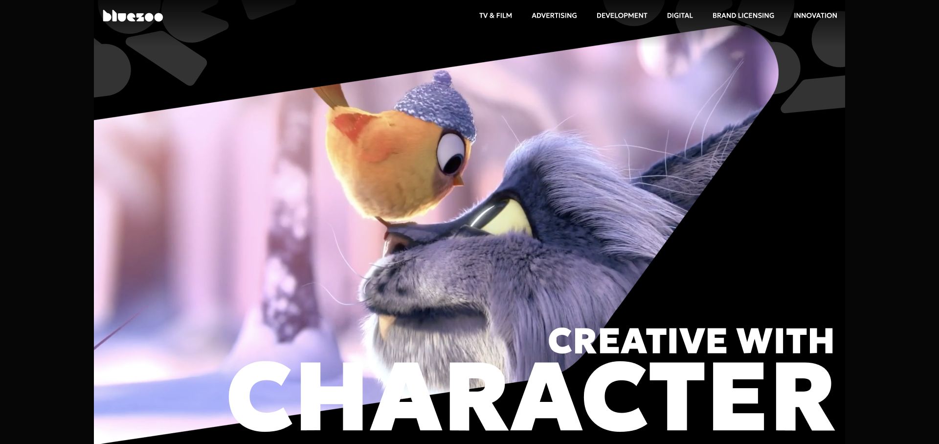
Blue Zoo places a large character-focused statement over a diagonal moving-image composition. The header immediately names several kinds of work, including TV and film, advertising, development, digital and licensing. Lower project and studio sections widen the picture beyond the opening reel. The result is a useful example of a studio identity that is expressive but still organised around real commissioning routes. The homepage does not require a visitor to recognise a particular animated character before understanding that the studio offers several production capabilities.
What you can learn
Connect a memorable visual theme to concrete service destinations. A shared identity can cover several production divisions as long as the navigation makes their different purposes understandable.
Pros
The division labels explain the breadth behind the character-led brand.
The angled imagery gives the hero a recognisable composition.
Cons & considerations
Several primary destinations can make navigation dense on smaller screens.
A large headline over video needs contrast testing across the entire loop.
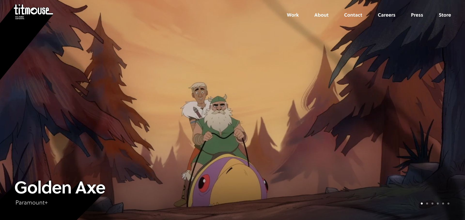
Titmouse leads with illustrated project artwork instead of a long corporate introduction. In the saved frame, Golden Axe occupies the screen and a diagonal lower-corner panel carries its title and viewing context. A compact header provides Work, About, Contact, Careers, Press and Store, while carousel indicators signal more featured productions. This creates a useful separation between audience interest in a particular show and practical studio information. The visible artwork is the website’s own project presentation; it should not be treated as a claim about the studio’s exact production responsibilities beyond what its project records establish.
What you can learn
Pair promotional artwork with a stable text label and a clear route to more work. Fans and commissioning visitors may arrive for different reasons, so keep corporate and career routes visible too.
Pros
A dedicated title panel gives the featured image an identity.
The main menu covers practical studio destinations without long introductory copy.
Cons & considerations
Small carousel indicators reveal little about the unseen projects.
A project-heavy opening may need stronger service context farther down the page.
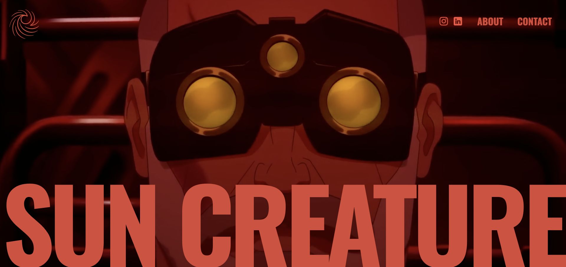
Sun Creature makes the film frame the dominant element, with a small emblem and a few practical links at the top and a large coral wordmark across the lower edge. The captured character close-up demonstrates the site’s image-first approach. The reviewed About page supplies the missing context by identifying narrative films, series and branded content as the studio’s work. This is a deliberately lean opening: it communicates visual character quickly, while the explanatory job is deferred to another destination. That tradeoff can suit a focused studio, provided the navigation remains evident against the footage.
What you can learn
Minimal navigation works best when the adjacent About and Contact destinations answer the questions the hero leaves open. Treat the film frame and the explanatory copy as complementary parts of the same journey.
Pros
A limited set of controls keeps attention on the animation.
The oversized wordmark creates a strong studio signature.
Cons & considerations
The first view offers little project or service explanation.
Text over a changing film requires care with contrast and cropping.
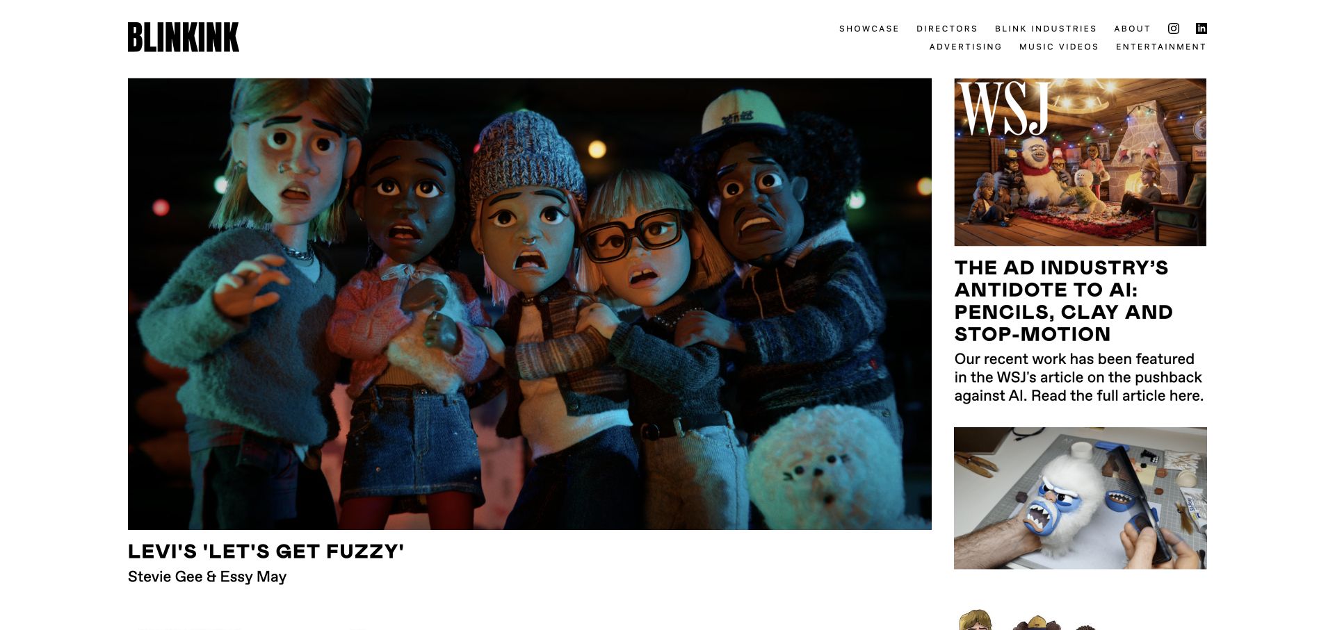
Blinkink’s Showcase page places a large featured film image beside a narrower editorial column. The saved Levi’s project view includes the project and director names beneath the main image, while the adjacent material introduces press and behind-the-scenes context. Advertising, music-video and entertainment routes sit below the primary navigation. The layout makes more than the finished frame available for evaluation: a commissioner can understand creative authorship and find context about how a piece was made. Its white background and straightforward hierarchy prevent the surrounding interface from competing with varied animation styles.
What you can learn
Give a flagship project an accompanying context column. Director credits, process material and clearly separated work categories can make a portfolio more informative without shrinking the central film into a crowded grid.
Pros
Creative credits remain visible near the featured work.
The editorial column adds context without interrupting the main image.
Cons & considerations
Parallel columns need a logical reading order when stacked on mobile.
A showcase page should make older work easy to find beyond the lead project.
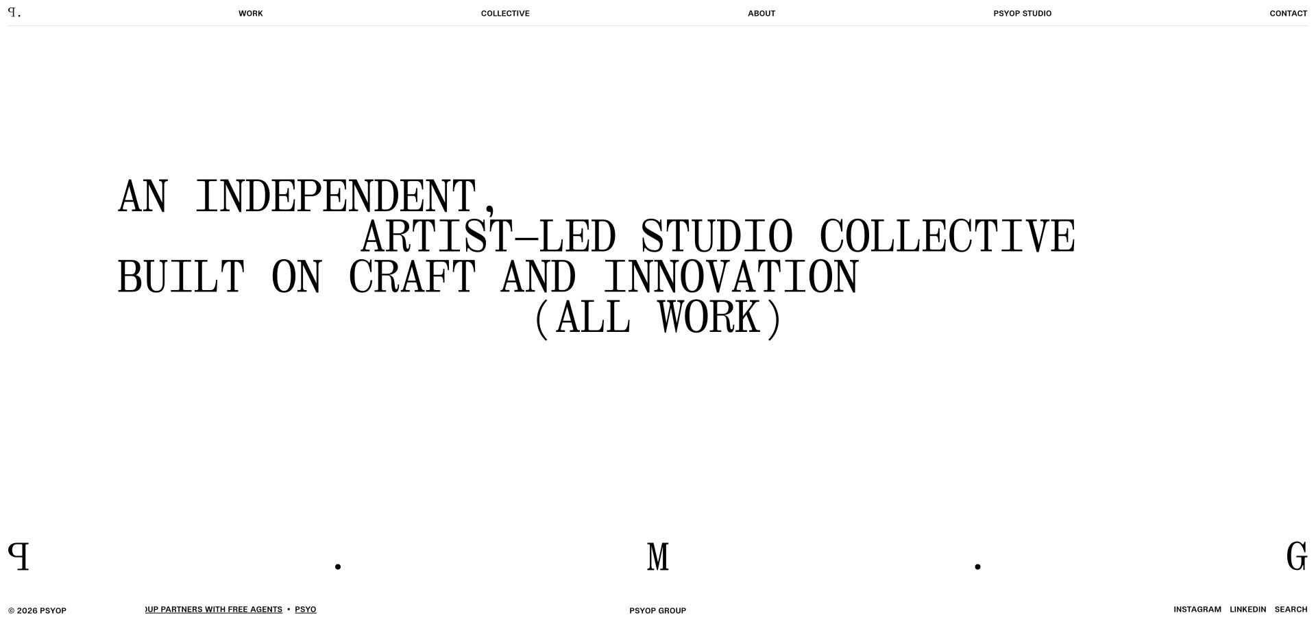
Psyop’s homepage uses large, carefully spaced typography to introduce an artist-led studio collective. Work, Collective, About, Psyop Studio and Contact remain distinct navigation destinations on a mostly white canvas. The separate studio page explicitly identifies animation, character work, gaming and live-action/VFX, with projects labelled by discipline. That structure is useful when a production business has grown beyond one medium: the homepage communicates the group’s identity, while the studio page gives a buyer more specific evidence. The sparse opening is strongest when those more detailed routes are easy to recognise.
What you can learn
If a studio and a wider collective share one brand, explain the relationship through the navigation. Use discipline-labelled projects to make the animation offer explicit instead of relying on an abstract creative statement.
Pros
Separate collective and studio routes clarify different layers of the business.
A restrained interface leaves room for a varied portfolio.
Cons & considerations
Visitors seeking a reel must move beyond the typographic introduction.
Organisational labels need clear supporting copy for first-time visitors.
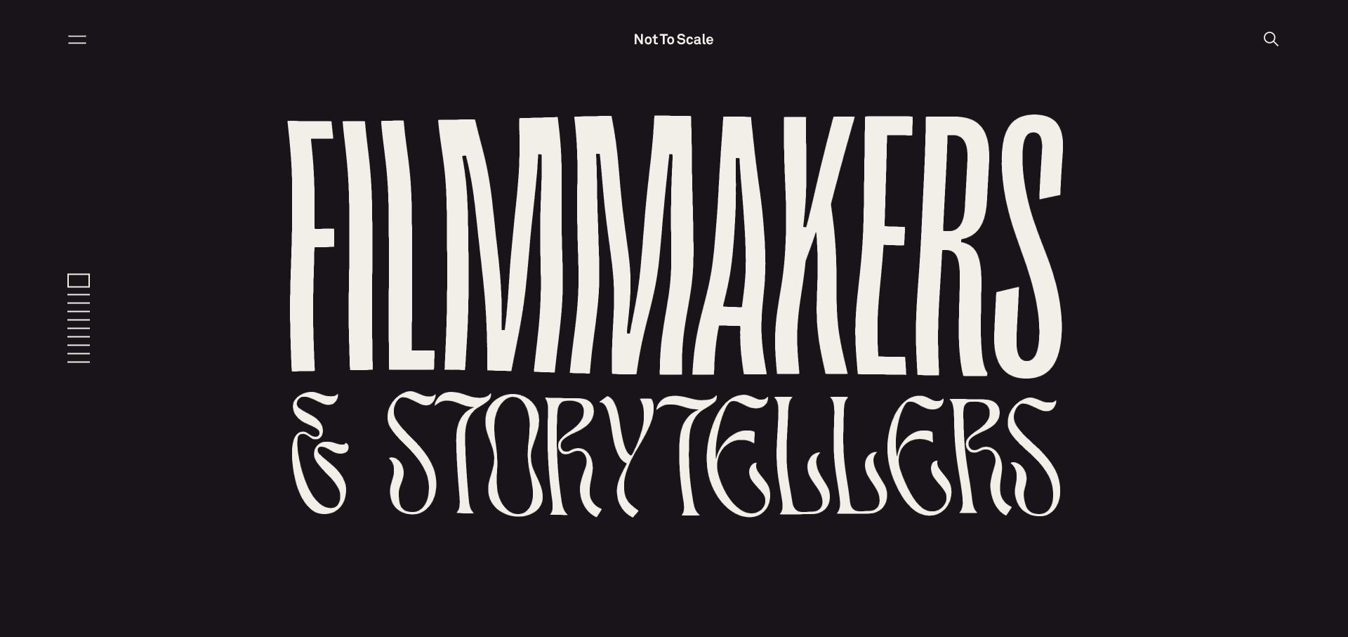
Not To Scale opens with unusually tall, varied lettering over a dark purple visual field. The studio name sits centrally, with menu and search controls at opposite upper corners and a slide indicator along the edge. The public page explicitly describes 2D and 3D animation, CGI, stop motion and VFX, so the bold visual treatment has a clear production context behind it. This is an example of using typography as an expressive asset in its own right. It establishes a creative tone without turning the studio’s identity into a generic play-button overlay.
What you can learn
Display typography can carry an animation studio’s personality, but the underlying service language should remain literal. Keep an obvious path from the expressive first screen to specific disciplines and credited projects.
Pros
The display type creates a distinctive identity before a film is played.
Menu and search provide separate routes into a broad body of work.
Cons & considerations
Highly stylised lettering can slow first-time reading.
Corner controls and sparse labels require strong focus and contrast treatment.
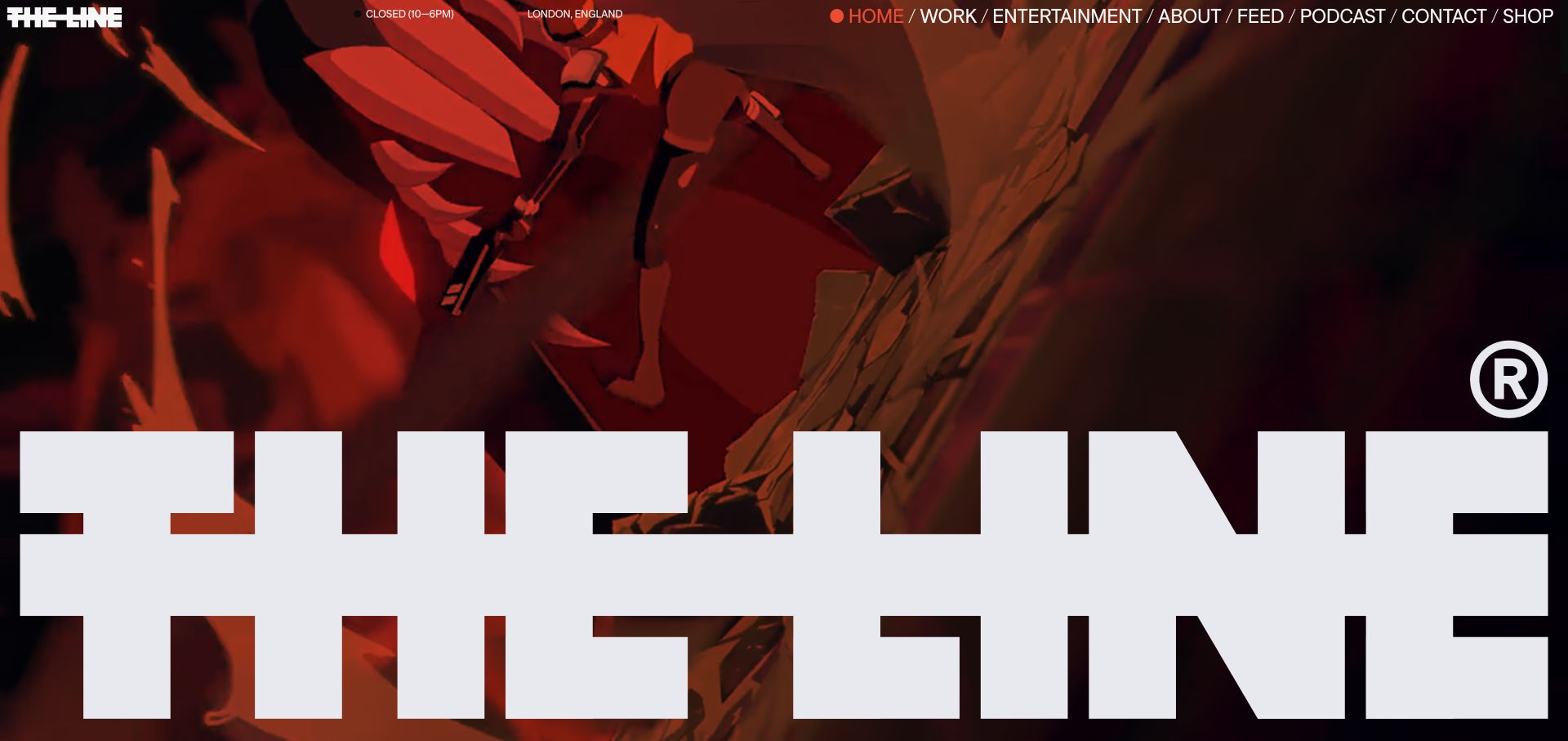
The Line places its large cut-through wordmark over a full-screen animated sequence. The saved frame shows red-toned character action, while a slim top navigation names Work, Entertainment, About, Feed, Podcast, Contact and Shop. The page supports that energetic opening with project entries and a direct description of its animation practice. The contrast between the huge signature and compact practical links makes the studio feel present without enclosing every image in a conventional card. It also shows the editorial challenge of motion-led websites: a single still can communicate identity, but not the full rhythm of the reel.
What you can learn
Choose a recognisable graphic signature that can hold together changing animation styles. Keep work and studio-information routes readable so the visual identity does not become a barrier to evaluating projects.
Pros
The wordmark ties changing reel frames back to the studio.
Work and Entertainment are differentiated in the main navigation.
Cons & considerations
Oversized branding can cover substantial areas of project imagery.
A long horizontal navigation needs careful compression on small screens.
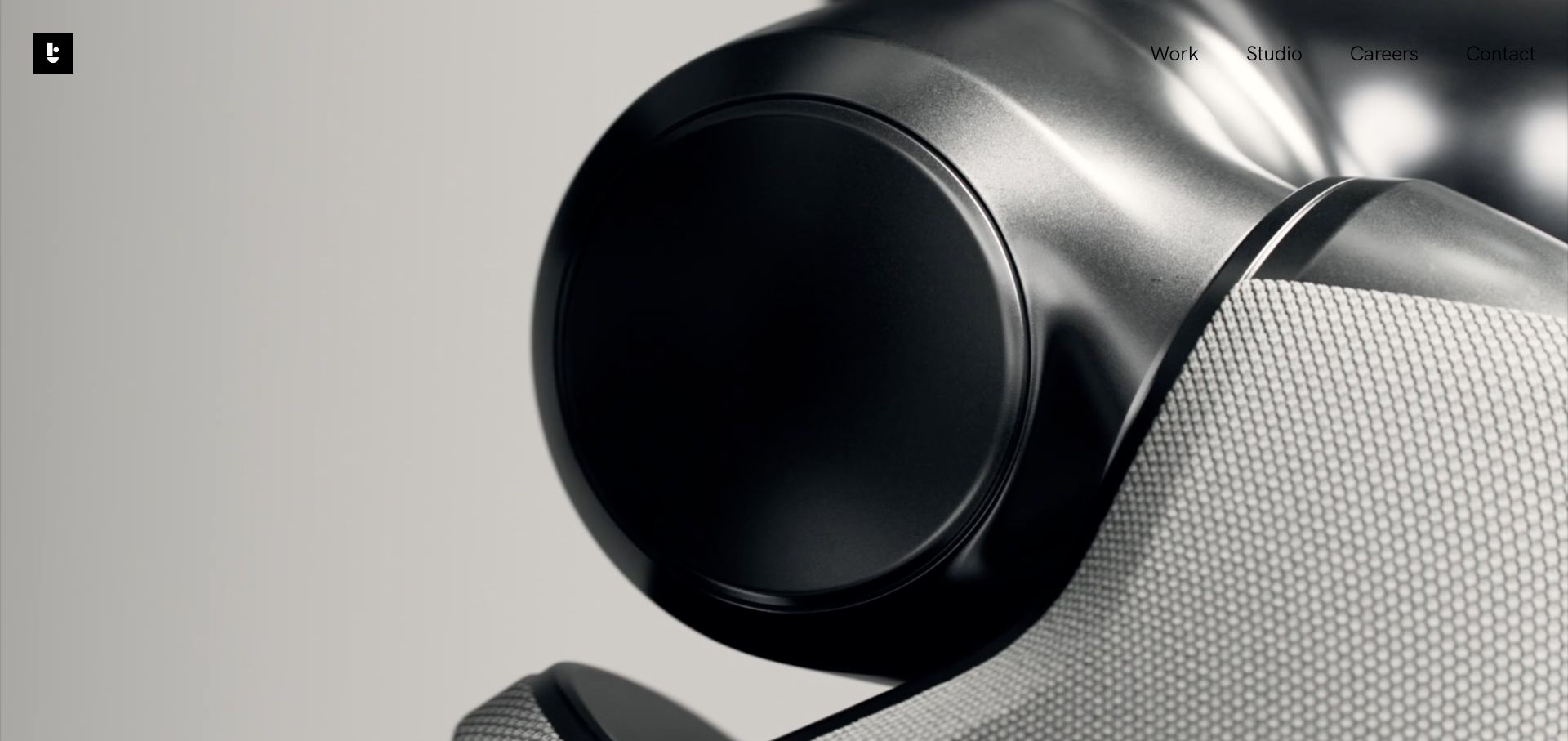
Tendril’s captured opening is a close view of a metallic product surface, framed by a small symbol and four simple navigation choices. The broader homepage explains its interest in making hidden innovation visible, then pairs project names with short descriptions of the creative task. Examples span product launches, hardware imagery and motion systems. This combination is useful for animation studios working on abstract or technical subjects: the visual establishes material craft, while the project index explains what the film needed to communicate. The imagery is evidence of presentation, not proof of a product’s physical construction.
What you can learn
Explain the communication problem behind technically impressive visuals. A short project description can connect a material study or abstract motion system to the client’s actual brief without overwhelming the image.
Pros
A compact header lets detailed imagery carry the opening.
Project descriptions explain the purpose behind the visual work.
Cons & considerations
An abstract close-up may not immediately identify the featured project.
Many moving or embedded project previews need careful loading priorities.
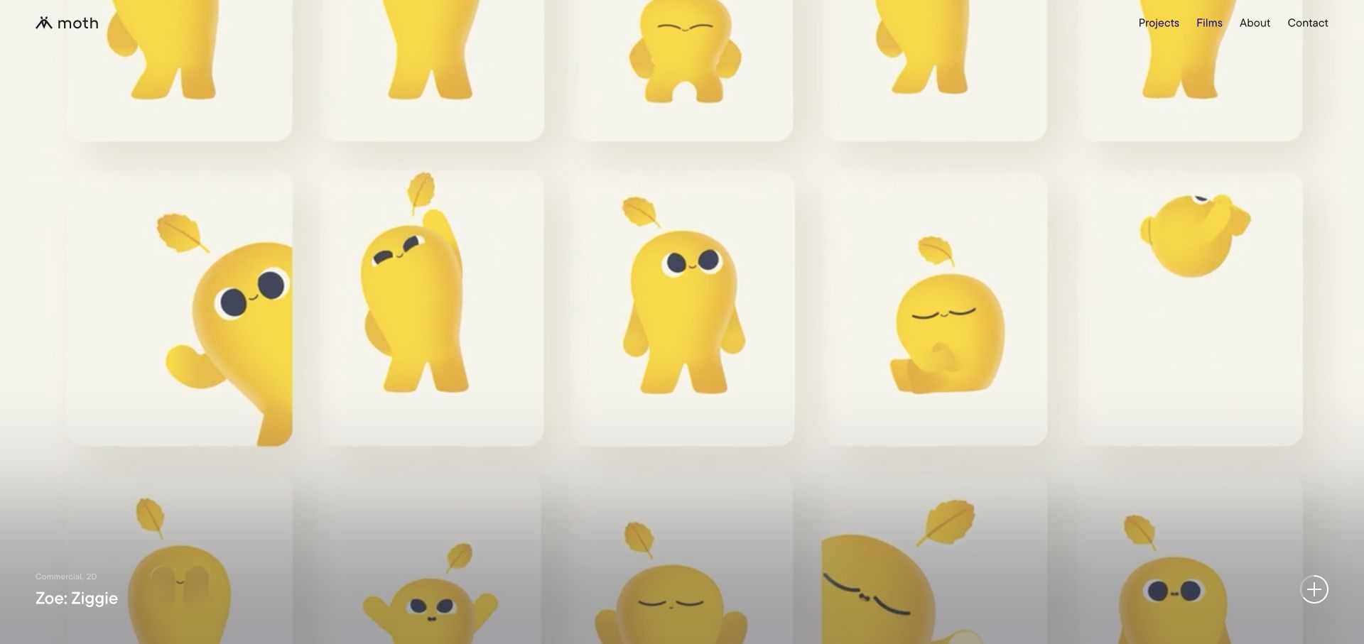
Moth’s opening gives a character project nearly the whole screen while retaining a small logo and plain Projects, Films, About and Contact links. The captured Ziggie character presentation includes a compact project title and technique/category labels near the bottom, plus a clear control for more detail. Below, the page explicitly describes an independent animation studio and mixes project summaries with further work. This is a useful balance between personality and classification: the character supplies the emotional introduction, while short labels help a commissioner understand the kind of work being shown.
What you can learn
Put small but useful metadata beside large animation imagery. A project name, technique and route to details can make a visually simple homepage informative without turning it into a catalogue table.
Pros
Project identity and categories accompany the large character imagery.
A short primary menu keeps the next action understandable.
Cons & considerations
Small bottom labels can be easy to miss beside an energetic film.
Technique labels need supporting case studies to explain the studio’s precise role.
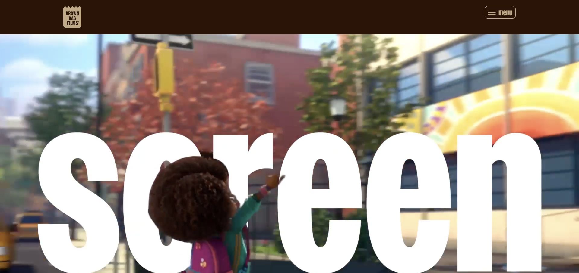
Brown Bag Films combines its paper-bag identity and warm brown header with a large animated reel. Oversized words become part of the moving composition rather than a separate text panel. Beneath that opening, the homepage presents named productions and clear routes to services, locations and careers, followed by dated news. This gives different audiences a way forward after the initial character-led impression. The saved capture is a transient reel frame, so the useful lesson is the relationship between the expressive opening and the practical navigation below it, rather than any one frozen word or scene.
What you can learn
A playful reel should lead into concrete studio information. Services, locations, recruitment and recent work answer different visitor questions and deserve distinct destinations after the visual introduction.
Pros
A recognisable brand mark remains separate from the changing reel.
Services and career routes support both buyers and prospective collaborators.
Cons & considerations
The menu requires an extra action to reveal all destinations.
Large text inside a reel may be difficult to interpret from an isolated frame.
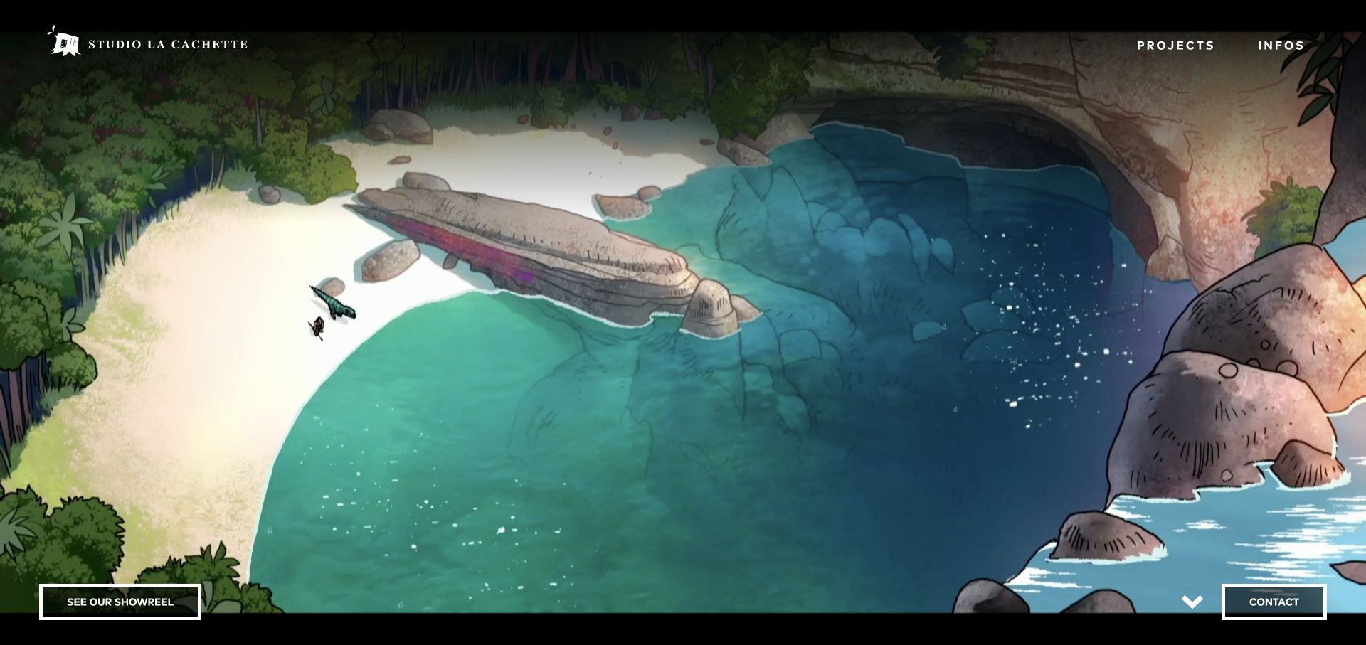
Studio La Cachette lets an illustrated scene fill the opening, bounded by a small studio identity, two top-level links and separate showreel and contact buttons along the bottom. The reviewed homepage continues into a selection of named projects including series, shorts and title work. The interface keeps ornament to a minimum so the drawn environment can establish the studio’s visual character. Unlike a hero that only offers a play symbol, the two bottom actions distinguish watching the reel from starting a conversation. That clarity is valuable when very little explanatory text is visible initially.
What you can learn
When the artwork carries the first screen, make the available actions unusually clear. Distinct reel and contact controls let a visitor appreciate the animation without losing the route toward commissioning work.
Pros
The illustration remains dominant without obscuring the studio identity.
Separate reel and contact buttons distinguish two useful next steps.
Cons & considerations
The first screen says little about production scope or location.
Very minimal navigation makes the quality of the following project labels especially important.
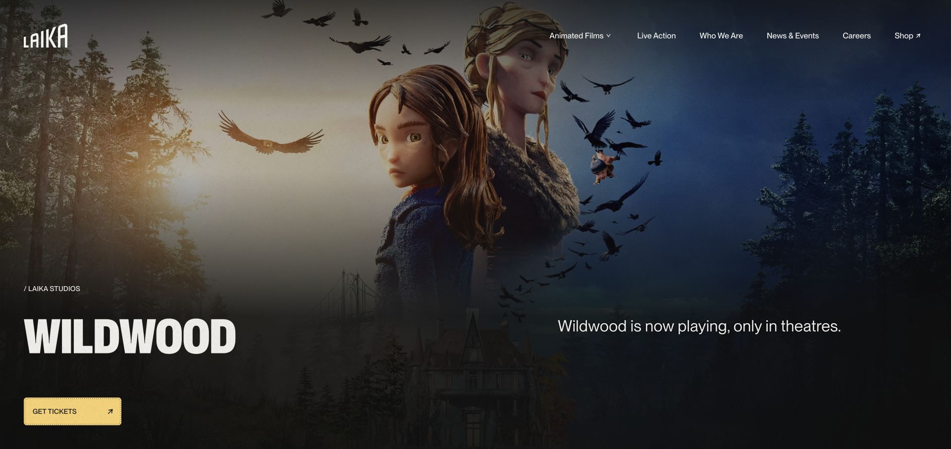
LAIKA’s homepage leads with a current film campaign: a large illustrated scene, the Wildwood title and a direct ticket route. A conventional header then separates animated films, live action, company information, news, careers and shopping. The page also contains film summaries and studio destinations, so the release promotion does not have to carry every audience journey. The design is useful as a reference for entertainment studios whose immediate priority changes with a release. The review records the observed presentation; time-sensitive availability language remains the source website’s claim and should be rechecked independently.
What you can learn
Give the current release a focused action while retaining durable studio navigation. Campaign art can change frequently, but film archives, careers and company information should remain easy to find.
Pros
The featured title and its primary action are explicit.
Studio and audience destinations remain separate in the header.
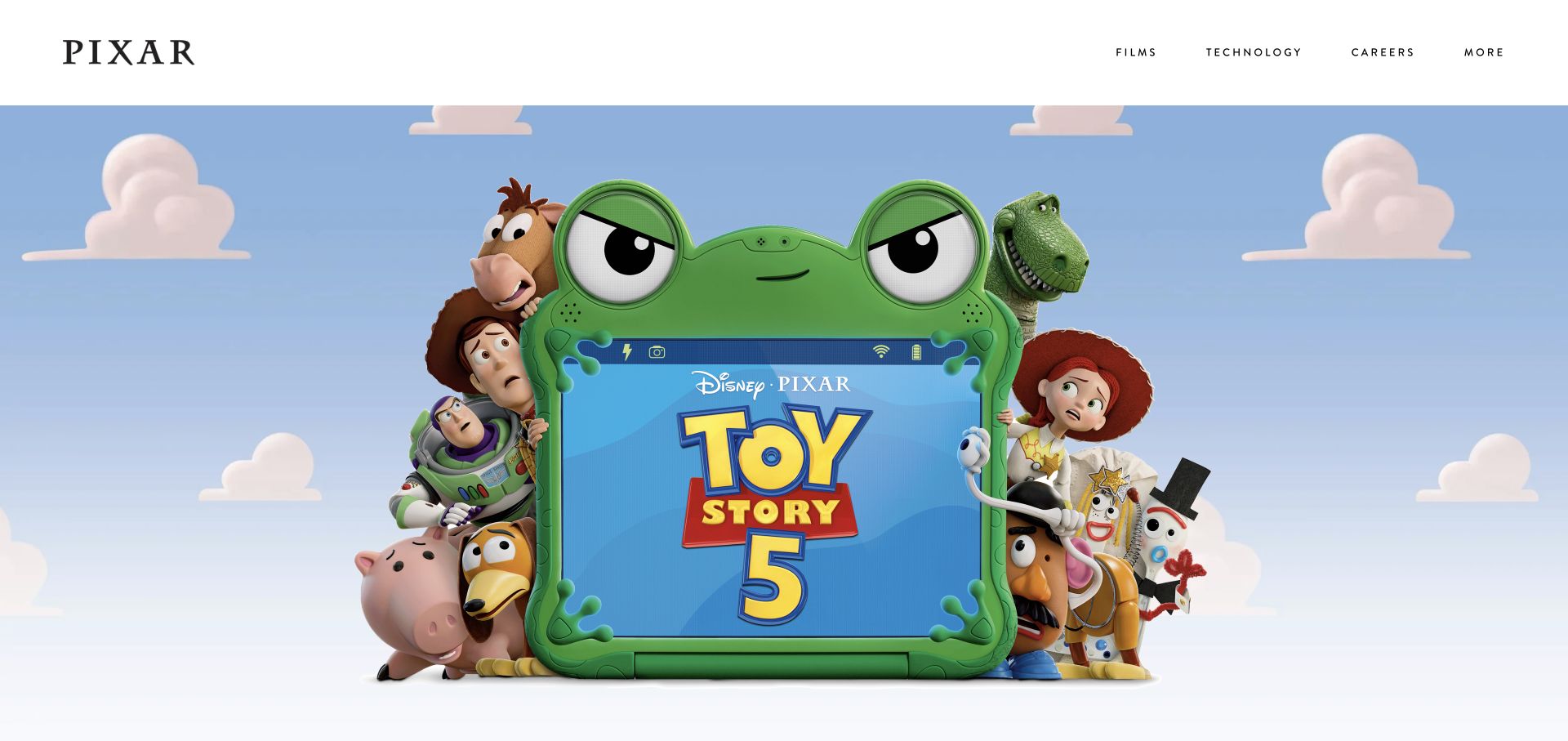
Pixar’s retained homepage capture uses a quiet white header above large Toy Story character artwork. Films, Technology, Careers and More are spaced across the top, giving the site several practical entry points without competing with the campaign image. The contrast is the useful pattern: expressive entertainment imagery occupies the main canvas, while a restrained navigation system supports viewers, applicants and people interested in the studio’s technology. This screenshot retains its original November 2 capture date and is used as a design reference rather than presented as a newly observed release announcement.
What you can learn
Let recognisable work carry the visual weight and keep the surrounding navigation stable. Separate film discovery, technical information and careers when those audiences need different content.
Pros
A restrained header gives complex character art room to breathe.
Technology and careers are visible alongside the film catalogue.
Cons & considerations
A campaign image alone provides little context about individual production roles.
The featured artwork needs updating when the studio’s promotional priorities change.
Platform source: Exact public source-page audit. The public source-page audit on 2026-11-03 recorded linked script matches onetrust for this exact property. This is a public resource reference, not a test of every user journey, a complete backend inventory, or a claim that every visible element uses OneTrust. Platform evidence is separate from the direct website screenshot and is not a complete current infrastructure audit.
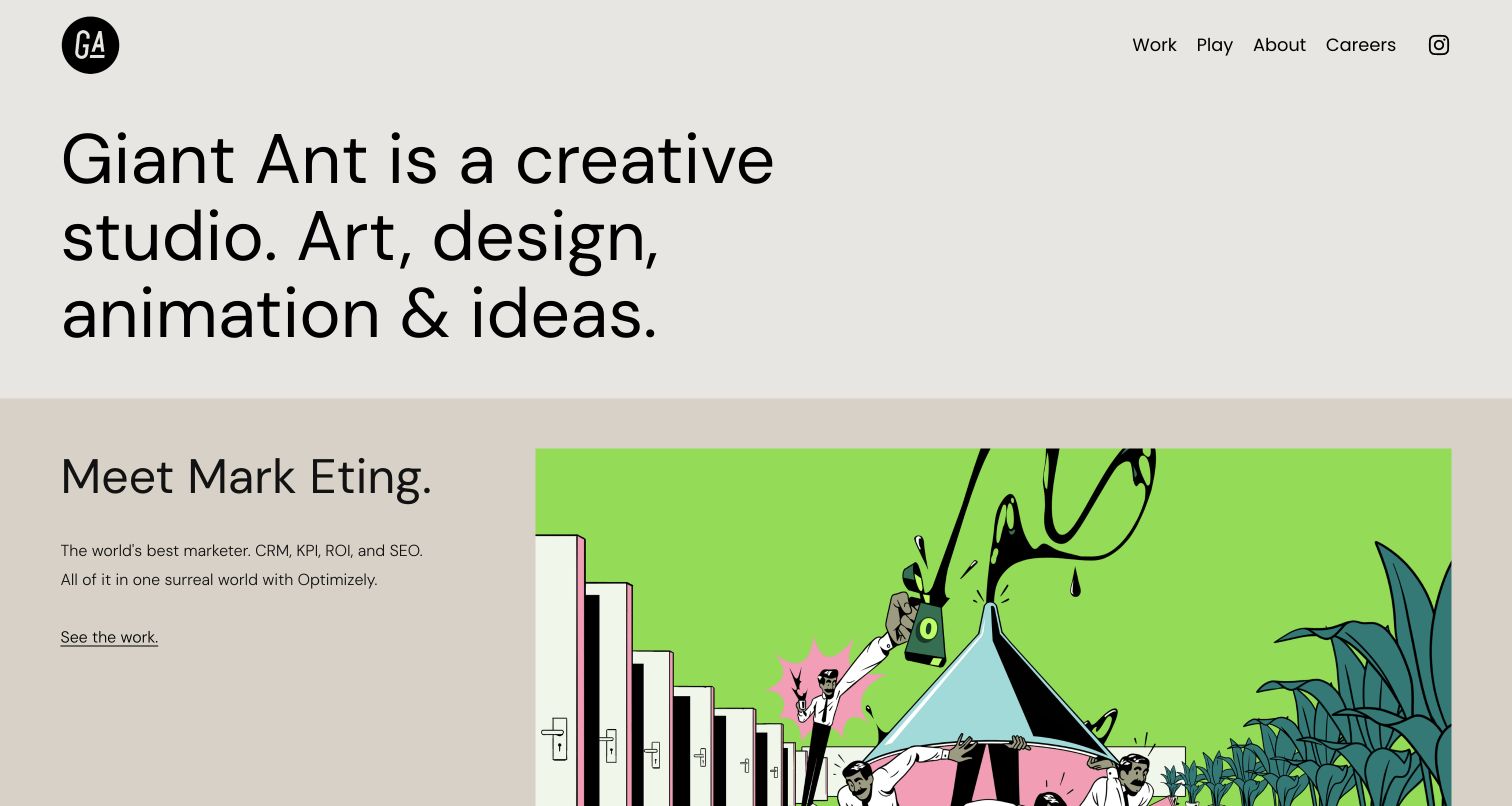
Giant Ant’s retained capture starts with a large, direct description of the studio’s creative disciplines. A project section immediately follows, pairing an introduction to an Optimizely character world with an illustrated scene and a simple link to the work. Work and Play appear separately in the header, alongside About and Careers. This makes the homepage useful without forcing an immediate video interaction: visitors can read what the studio does and identify a specific piece of work from the same view. The capture’s original date is preserved, and the review adds an animation-specific interpretation of that documented layout.
What you can learn
Place a named project close to the studio proposition. A concise explanation and a single contextual image can make an animation portfolio useful before a visitor chooses to watch a film.
Pros
The opening states the creative disciplines directly.
Text and imagery give the featured project context together.
Cons & considerations
Large introductory type pushes part of the first project below the fold.
A quiet opening may need a clear reel route for visitors who prefer a quick motion overview.
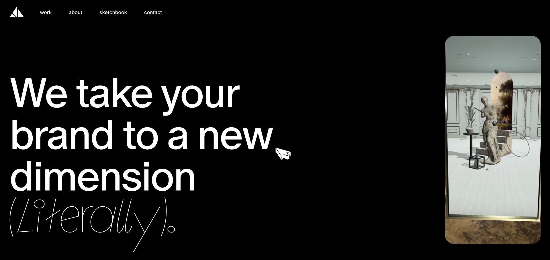
Paper Triangles pairs an oversized brand promise with a tall, rounded mobile-experience preview on a black canvas. Work, About, Sketchbook and Contact form a simple header, while the illustrated triangular pointer reinforces the identity. The homepage positions the company as an AR agency; its About page explicitly identifies animation-team work, a 2D animator and storyboard/character production. It is included here as an animation-and-AR specialist, not as a conventional film studio. The device-shaped preview is the useful design lesson: it shows the context in which the animated experience will be encountered rather than presenting every project as a cinema-style rectangle.
What you can learn
Match the portfolio frame to the intended viewing environment. For animation embedded in an AR or mobile experience, show that context and explain the production discipline instead of relying on a broad innovation claim.
Pros
The tall preview communicates the phone-based context of the work.
Simple navigation separates finished work from experimental sketches.
Cons & considerations
The opening promise needs the following text to explain the actual service.
Interactive effects should have a useful fallback for visitors who cannot or do not want to engage with them.
Kegan is a freelance web designer and developer with 15+ years of experience helping businesses turn complicated website requirements into clear, maintainable digital experiences. He works directly with clients from planning and design through development, launch, and ongoing support.
For animation studio website design, his development approach focuses on commissioning portfolios, production processes, service scope and useful project enquiry routes. The scope can be a targeted improvement or a complete custom build, with responsive layouts, thoughtful content structure, and integrations chosen around the people using and maintaining the site.
Show 3 other animation studio website designersHide other animation studio website designers
Plan an animation studio website around the commissioning journey
Define the primary visitor and the first useful action
Decide whether the homepage mainly serves producers, brand teams, distribution partners, audiences or recruits. List what each group needs before contacting the studio. Prioritise one opening action, such as viewing selected work, while retaining a visible route to the other essential destinations.
Build a project record before designing the grid
For each publishable project, collect the approved title, client or partner, studio responsibilities, credits, film, poster, stills and a short account of the brief. Identify usage restrictions and release dates. A consistent record makes it easier to show projects in several ways without losing their context.
Choose a portfolio structure that matches real differences
Useful divisions might include original entertainment, commercial work, character animation, motion systems or interactive experiences. Avoid creating a filter for every technique if most projects belong in several of them. Keep a direct project URL and a readable title available even when the visual presentation uses a carousel or experimental layout.
Plan the film, poster and text together
Select poster frames deliberately rather than letting an accidental black frame stand in for the work. Make the page useful before media loads. Decide which clips deserve immediate loading and which can wait for a visitor’s action. Review title placement against varied frames so that navigation does not disappear during the loop.
Write the enquiry and maintenance requirements
Explain what information helps scope a conversation, such as project type, intended channels, approximate timing and existing materials. Avoid requiring confidential briefs before an appropriate conversation. Assign someone to update current projects, team information, release promotions and recruitment links so the site does not imply that an old opportunity is still available.
The editing job behind the design
Choose publishing tools around project media and editorial ownership
Begin with the people who will add and approve projects. A useful content model separates the project title, credits, studio role, poster, media, short description and related work. Keep important information as readable page content rather than embedding all context in a film or image.
Evaluate video delivery, captions, poster handling, responsive images and consent behaviour with real project assets. An external player may affect privacy, loading and playback controls; a self-hosted file still needs suitable encoding and delivery. Do not assume that a platform visible in a competitor’s public source solves your own media or editorial requirements.
Prefer a system the team can maintain over a complicated interaction that requires a developer for every portfolio change. Preserve accessible navigation and direct project URLs even when the site uses custom motion. The stack labels in this collection reflect bounded public-source evidence, not a complete inventory of each studio’s internal tools or production software.
Our WordPress website examples offer a separate look at publishing approaches. A visible platform label is evidence for that named page, not a guarantee that the same system will suit your requirements.
Before the public launch
Animation studio website launch checklist
Confirm that every featured project is approved for public display and has accurate studio-role and credit information.
Make Work, Contact and any genuinely important audience destinations easy to find without playing a video.
Provide a deliberate poster frame and useful text if a video is paused, blocked or slow to load.
Check play, pause, sound and fullscreen controls using a keyboard as well as a pointer.
Review motion behaviour with reduced-motion preferences and avoid relying on movement to reveal essential text.
Test title and navigation contrast across the actual frames used in rotating or moving heroes.
Check project filters, carousel controls, direct URLs and back navigation with representative work.
Keep careers, release promotions, viewing links and studio contact details current.
Check media and image loading on smaller screens and ordinary network conditions using realistic project assets.
Separate enquiries from newsletter signups and explain any required data collection clearly.
Make captions, transcripts or alternative explanations available where the content calls for them.
Verify the published project count, credits, links and source permissions after content migration.
These checks are a project checklist, not a performance, legal, security, or accessibility certification. Test real journeys with the people responsible for the website before making claims about the result.
Sources & editorial method
How this collection was selected and reviewed
The industry target was drawn once before research and remains 21 distinct website properties. Reviews combine direct public-page observations with genuine browser captures. Three previously verified captures retain their original November 2 or November 10 dates; the remaining accepted captures were made on November 12 UTC during the November 11 Pacific work date. Screenshots were reviewed for popup obstruction, and unusable, consent-held or duplicate candidates were excluded without changing the saved target. Ordinary Folk was selected explicitly after review of its homepage and process explanation. Every source has a bounded broad technology-audit attempt or a preserved existing record; scanner refusals and limits do not become guessed stack claims. Paper Triangles is qualified as an animation/AR specialist using its explicit team and production descriptions. No accounts, private project materials, enquiry submissions, measured business outcomes or client-service assessments form part of this review.
Each example links to its actual source page. Screenshots are direct browser captures with their own capture dates; moving imagery, announcements and live designs can change. The notes describe observable design choices and conditional tradeoffs, not measured traffic, conversion results, service quality, or accessibility conformance.
Technology labels use public page metadata, asset evidence, or explicitly cited platform documentation. Platform documentation is not a complete current deployment audit. A component reference may be legacy or unused; it is not a complete backend inventory. Unknown stacks are omitted. These sites are editorial examples, not our client portfolio.
Written, Edited and Curated are separate editorial records, not timestamps advanced by a rebuild. Website designs and imagery belong to their owners. See our editorial standards or suggest a correction.
Questions worth asking
Animation Studio website design questions
Should an animation studio homepage open with a showreel?
It can, when a short reel gives a useful impression of the studio’s work. Keep a readable studio description, obvious navigation and an intentional poster available alongside it. A visitor comparing capabilities should not have to finish a film before understanding what the studio does.
What belongs in an animation project case study?
Include the approved project title, client or commissioner where appropriate, the studio’s actual role, credits, the finished work and a concise explanation of the brief. Process material can help explain decisions, but only publish material the team is permitted to share. Do not invent performance results or imply ownership of a collaborator’s contribution.
How should commercial work and original films be organised?
Use labels that reflect the studio’s actual business and that visitors understand. Separate originals, commissioned work, represented directors or interactive experiences when those differences affect how someone evaluates the studio. Keep projects accessible through direct links even if they appear in several relevant categories.
Does a more animated website prove a better animation studio?
No. The website shows how a studio presents its work and explains its process. It does not establish service quality, production reliability or suitability for a specific commission. A restrained site can communicate complex work very well when its project evidence and navigation are clear.
How can a studio make a video-heavy portfolio easier to use?
Provide clear controls, intentional stills, readable project text and a useful experience when motion is reduced or media cannot load. Load the most important assets first and check real pages on smaller screens. These are design and testing decisions, not a guarantee of any particular performance or accessibility result.
Why is an AR agency included in this animation collection?
Paper Triangles explicitly documents animation-team work, a 2D animator and related character and storyboard production. Its example is scoped to animation within AR and mobile brand experiences. It is not presented as a traditional feature-film studio or included merely because its website is interactive.
Borrow the relationship between artwork, context and a useful next step. Your studio’s own work, production role and audience should determine the final structure.