Best Sailing School Websites of 2026 (17 Real-World Examples)
17 sailing-school websites showing how to explain beginner lessons, course progression, club access and practical preparation.
A useful sailing-school website helps a visitor choose a suitable next step before asking for a booking. These 17 examples show different ways to connect an inviting waterfront image with course level, format, location and preparation.
Someone considering a first lesson has different questions from a sailor looking for a particular qualification, a parent comparing youth programs or a member arranging more time on the water. The website needs to distinguish those journeys without making a newcomer learn the entire training vocabulary first. Clear starting points, short course descriptions and practical next steps do much of that work.
The collection includes regional schools, community boating organizations and larger training businesses. Some examples are homepages; others are the specific instruction pages where the clearest design decisions appear. The observations concern public website communication, not the quality or safety of instruction, the validity of credentials or the suitability of any course for an individual. Seasonal references, prices and availability require confirmation directly with the provider.
Before the examples
What makes good sailing school website design in 2026?
Explain the starting level
Use ordinary language to distinguish a first experience, a beginner course, further practice and advanced training. Put any stated prerequisites near the course summary so a familiar-looking photograph does not imply that every visitor can join every program.
Separate learning from boat access
Lessons, memberships, rentals, hosted sails and charter arrangements may share a website, but they are different decisions. Explain their relationship and give each a clear route instead of presenting all participation as a single booking action.
Make the practical setting visible
Show where instruction starts, the relevant boat or format, how the schedule is organized and where preparation information lives. A compelling waterfront scene works better when it connects to a specific program rather than a vague promise of adventure.
The collection · 17 examples
17 sailing school websites worth studying
Study the way each site moves from interest to understanding: audience routes, course ladders, format comparisons, seasonal notices and preparation links. The capture labels identify the actual page and observed state; ordinary notices and interruptions are retained or described where relevant.
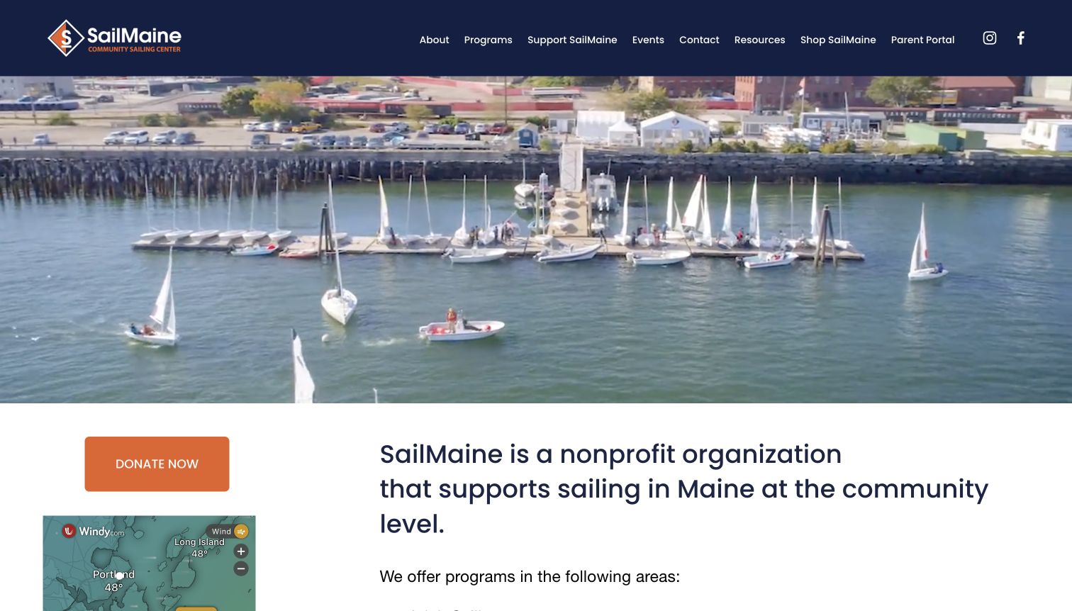
SailMaine gives its Portland waterfront setting room to establish the character of the organization. The opening aerial scene shows boats and docks rather than relying on an abstract sporting image, while the navigation separates programs, resources and support. Farther down, adult, youth and other participation routes make the community purpose concrete. The directly reviewed adult page is especially useful: it distinguishes group lessons, individual instruction and a cruising option with an explicit prerequisite. It also explains the relationship between lessons and boat access. This is a strong regional communication pattern, although the large opening postpones course selection and the adult page mixes current season references with an older private-lesson heading.
What you can learn
Connect the local setting to clear participation routes. Explain who a lesson is for, what comes next and which experience is required, then assign someone to keep every seasonal heading consistent across the whole program page.
Pros
Distinct program routes support several kinds of community participation.
The adult page explains lesson formats and a cruising prerequisite.
Cons & considerations
The large opening image delays practical course information.
Mixed season references require clarification before someone plans a lesson.
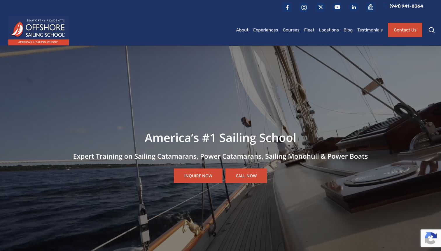
Offshore Sailing School uses a large on-water image, a blue header and red actions to make the first screen immediately recognizable as a training offer. Contact and inquiry routes are easy to spot, while the navigation separates learning, fleet and destination information. The page extends beyond introductory sailing into cruising and powerboat-related training, so those distinctions matter when visitors compare programs. A leadership announcement adds current organizational context rather than leaving the entrance entirely timeless. The opening also relies heavily on a broad superlative, which is less useful for course fit than a concise explanation of starting level and format. Visitors must continue into the catalog to make that comparison.
What you can learn
For a school with several boat types, put the learning goal and training category near the main action. An inquiry button becomes more useful when visitors understand which program they are asking about and which details remain to be confirmed.
Pros
Contrasting actions provide a visible route to further information.
Fleet and destination navigation support practical course research.
Cons & considerations
The broad opening claim does little to distinguish student levels.
Several training categories require careful explanation beyond the hero.
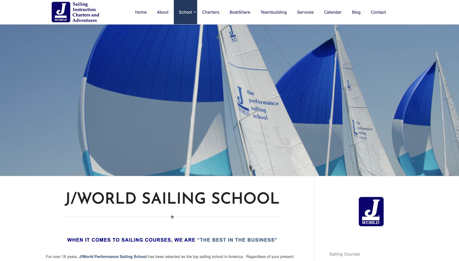
J/World’s sailing-school overview establishes its subject with a wide photograph of boats under sail and a prominent school heading. It then explains several branches of the offer rather than treating every visitor as a complete beginner. Cruising, racing, private instruction and coaching receive their own context, with course and calendar routes available for deeper planning. The page’s strength is the relationship between an overview and specialist paths: a returning sailor can identify a relevant direction without reading a beginner-only sales pitch. The large image takes considerable space before those distinctions appear, and the substantial introductory copy asks visitors to separate practical information from the school’s promotional claims.
What you can learn
Give a mixed-experience audience an overview that names its different goals. Keep the explanation concise enough to scan, then direct visitors to course pages where prerequisites, format and the actual learning progression can be compared.
Pros
The overview acknowledges different learning and coaching needs.
Course and calendar routes connect the explanation to planning.
Cons & considerations
The large photograph delays the first detailed distinctions.
Dense promotional copy makes the useful structure harder to scan.
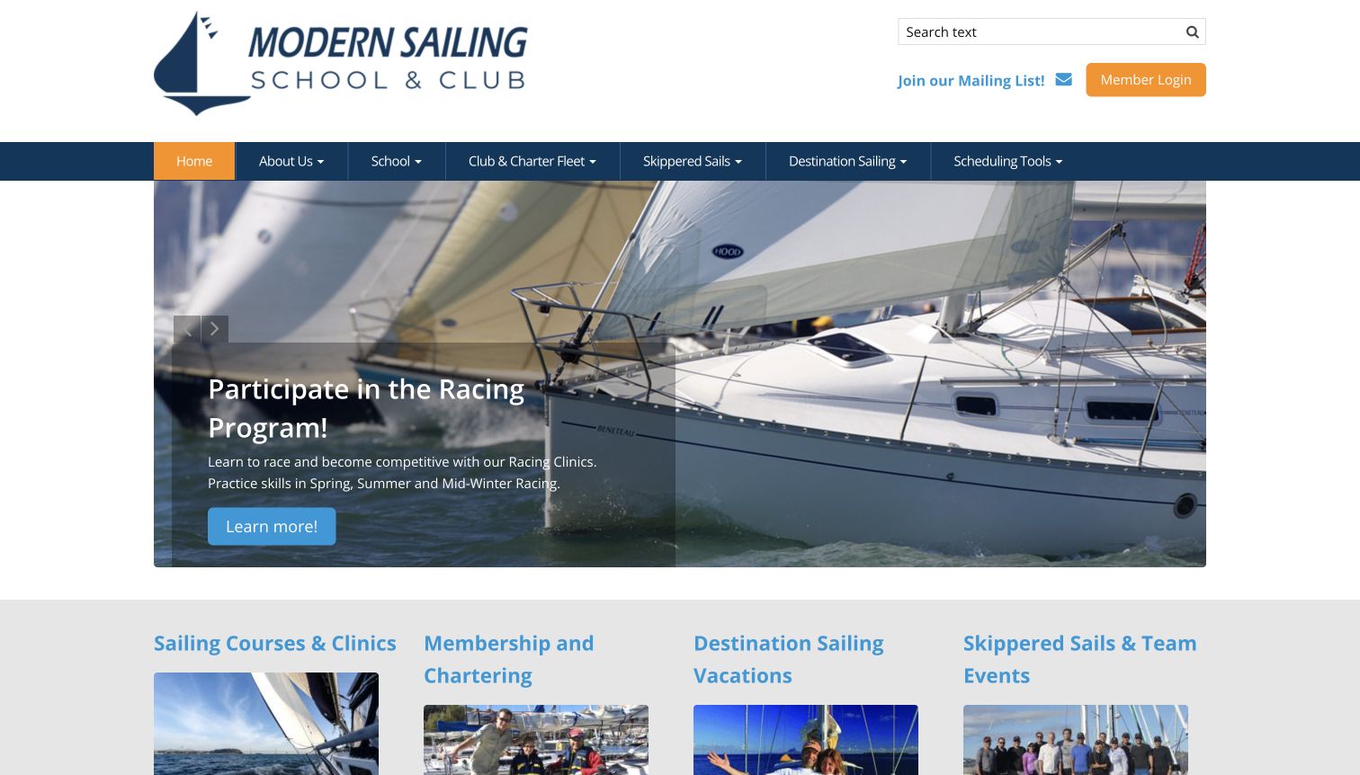
Modern Sailing presents the school as part of a broader sailing routine. Its blue navigation separates instruction, club and charter information, destination travel and scheduling tools, while the prominent member login gives returning customers a direct route. The observed hero promoted racing with close-up boat photography and a clear action. Below it, four grouped cards distinguish courses, membership, travel and skippered experiences. This is useful for explaining what happens after a first lesson: the relationship can continue through practice and boat access. The breadth also creates a challenge. A new visitor must distinguish a course from a membership or hosted outing, and a rotating hero can emphasize an advanced activity before beginner information appears.
What you can learn
Show the next stage of participation without making it a prerequisite for understanding the first. A school-and-club website should explain the difference between learning, independent access and a hosted sail in plain language beside each route.
Pros
Grouped routes connect instruction to continued participation.
Scheduling tools and member access serve returning visitors directly.
Cons & considerations
The broad offer asks beginners to interpret several relationships.
A rotating racing promotion may not match a newcomer’s immediate goal.
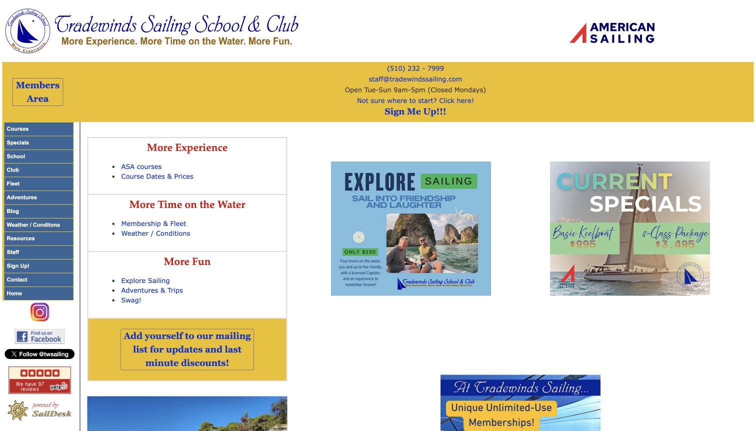
Tradewinds Sailing School and Club places a beginner-oriented starting link beside its contact information, giving an uncertain visitor a useful alternative to exploring the whole menu. The page’s vertical navigation exposes a large set of courses, club resources, fleet information and practical sailing links. In the main area, separate boxes frame the offer around building experience, spending more time on the water and enjoying further adventures. This is a functional way to connect lessons with longer-term participation. Visually, the page is much denser than the more spacious examples here: small text, uneven panels and several competing actions make the hierarchy harder to follow. The helpful starting point has to work within that crowded arrangement.
What you can learn
Retain the useful breadth of a mature resource library, but give newcomers a short guided route. Separate first-course decisions from member utilities so both audiences can find what they need without reading the entire navigation tree.
Pros
A visible starting link acknowledges visitors who need guidance.
The catalog connects training with fleet and club resources.
Cons & considerations
Small text and many links create a dense first impression.
Several panel styles compete instead of reinforcing one clear hierarchy.
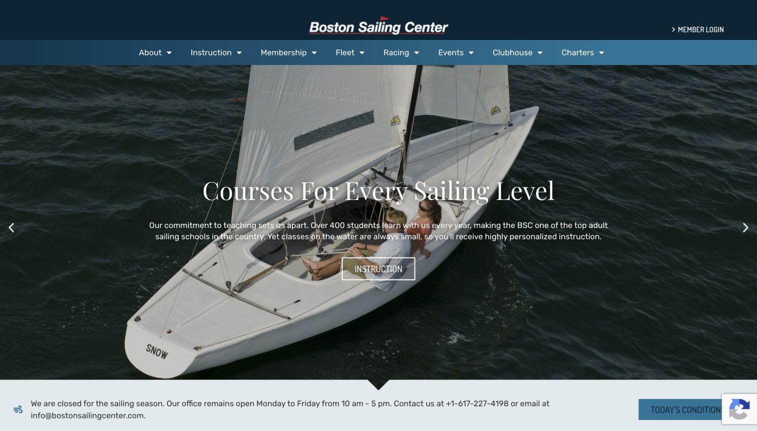
Boston Sailing Center combines a dark blue header with a wide photograph of sailing boats and a direct instruction link. The main navigation separates courses, membership, fleet and racing, helping visitors see that learning and club participation are related but different activities. The most useful operational detail is the seasonal notice beneath the opening: it clearly distinguishes the sailing season from continued office availability. Lower featured items then point toward other learning and community activities. This gives the page a useful sense of time without implying that every program runs year-round. The tall photographic entrance still delays those practical details, and several rotating messages can make the first impression depend on the slide a visitor happens to encounter.
What you can learn
Treat seasonal status as part of the content design. Explain what is closed, what remains available and where visitors should go next, while keeping that notice separate from the broader promise of the school.
Pros
The seasonal notice distinguishes sailing operations from office access.
Instruction, membership and fleet information have recognizable navigation routes.
Cons & considerations
The large opening postpones the practical status information.
Rotating hero messages can change the emphasis between visits.
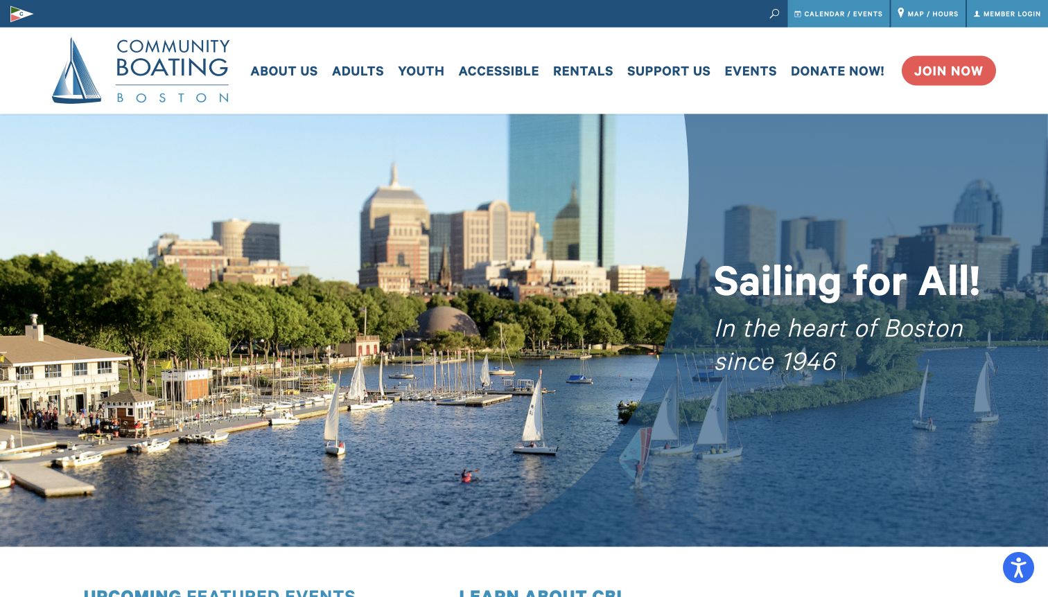
Community Boating in Boston makes its location immediately visible through a broad waterfront image with the city behind the boats. A curved blue overlay carries the main proposition, while separate navigation labels identify adult, youth and accessible programs. Those audience distinctions are more useful than a single generic courses label because visitors may need very different participation information. A slim utility bar provides calendar, location and member routes, and the main header distinguishes joining from donating. The result communicates a public community organization rather than only a course catalog. The large hero leaves detailed instruction below the first screen, however, and the number of navigation and support actions creates a busy header.
What you can learn
Let audience needs shape the main navigation when the programs genuinely differ. Put practical visitor information in a secondary layer and explain the relationship between joining, taking lessons and supporting the organization before asking for a commitment.
Pros
Adult, youth and accessible routes make program differences visible.
The waterfront photograph gives the organization a specific local setting.
Cons & considerations
The tall image delays individual course details.
Membership and donation actions add competition within the main header.
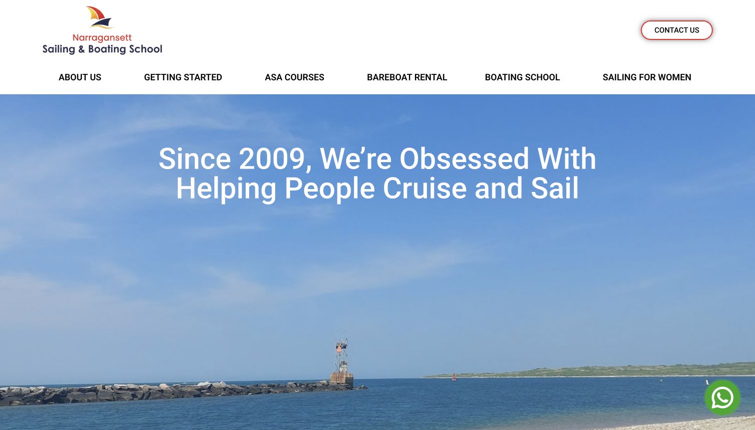
Narragansett Sailing School follows its spacious coastal opening with a useful question: which course fits the visitor’s next step? The page distinguishes first experiences, taking an active crew role, developing confidence and learning maintenance. It then connects those needs to named courses and short descriptions, rather than leaving certification numbers unexplained. Separate maintenance and women’s sailing sections broaden the offer while retaining a regional identity. The selected screenshot shows the homepage after closing a newsletter invitation; the original interruption is preserved in the research record. The opening itself provides little immediate course detail, and repeated booking and information links create a long page that needs careful maintenance as individual destinations change.
What you can learn
Translate a qualification ladder into the learner’s own questions before presenting course codes. Keep supporting maintenance or specialist programs distinct, and make sure each next-step action has a clear purpose and an appropriate public destination.
Pros
Learner-oriented questions make the course progression easier to understand.
Maintenance and specialist learning receive explicit sections.
Cons & considerations
The newsletter invitation interrupts the initial exploration.
Many repeated actions increase the burden of keeping routes consistent.
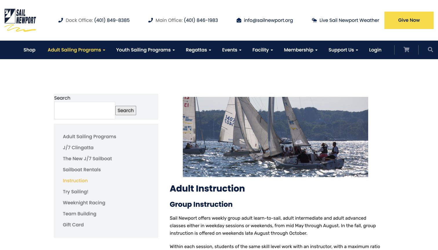
Sail Newport’s adult instruction page uses a straightforward two-column arrangement: related programs sit in a left sidebar, while the main column pairs a sailing photograph with the lesson explanation. The page distinguishes group and private formats, describes how participants are grouped and gives clear context for lesson length and seasonal scheduling. Schedule and rate sections are organized as expandable areas instead of filling the introduction with every detail. This is a practical alternative to a purely promotional homepage. The design leaves substantial space above the article, though, and visitors must open additional sections to compare key planning information. The page also indicates that online availability is forthcoming, making the contact route important.
What you can learn
Put format, level and scheduling context ahead of the booking interface. If online availability is not ready, state that plainly and provide a usable next step instead of implying that a calendar will complete the process.
Pros
Group and private instruction are explained separately.
Related adult programs remain visible beside the main article.
Cons & considerations
Large margins reduce the amount of useful content in the opening view.
Expandable schedules and rates require extra exploration to compare options.
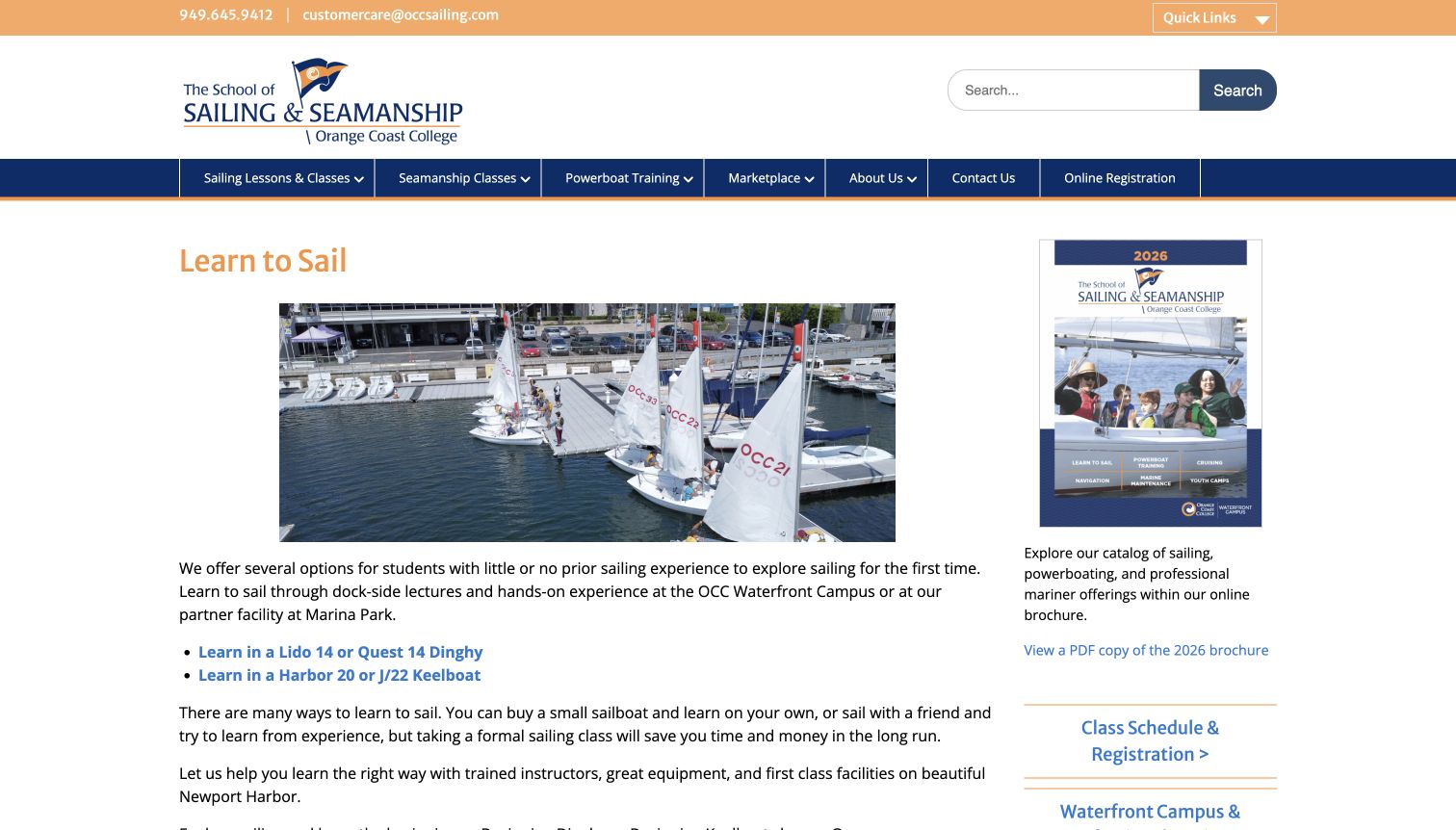
Orange Coast College’s Learn to Sail page starts with a direct title, a photograph of training boats and a plain explanation of the available starting points. Two prominent links distinguish dinghy and keelboat learning, followed by detailed sections that explain activities, prerequisites and the next course in the sequence. This is useful information architecture: visitors can understand why there are different beginner options before reaching registration. A sidebar links the broader catalog and schedule, keeping administrative routes close to the explanation. The article becomes lengthy as additional levels are included, however, and references to unfamiliar boat models still require reading. The extensive top navigation also reflects a wider seamanship school rather than just beginner sailing.
What you can learn
Explain the practical difference between entry routes before presenting their names. Pair each course with its prerequisites and next step, and keep registration nearby without making an external catalog the only place to understand the learning path.
Pros
Boat-type options give beginners a concrete comparison.
Prerequisites and progression are stated within the course explanations.
Cons & considerations
Several levels make the page long for a first-time visitor.
Unfamiliar boat names need the accompanying descriptions to be meaningful.
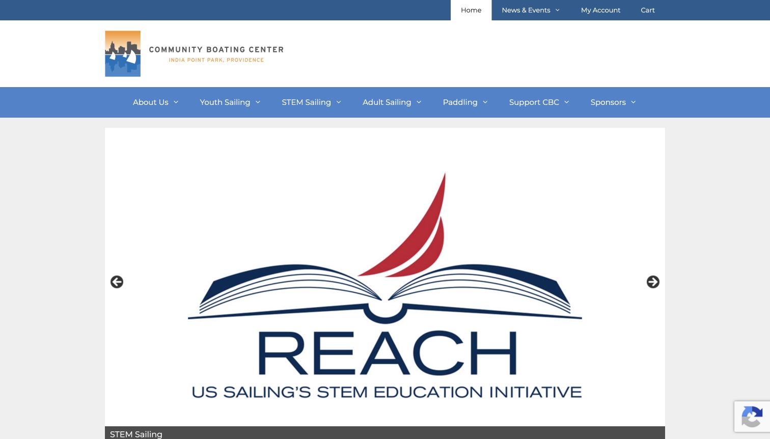
Community Boating Center in Providence organizes its main navigation around youth, adults, STEM learning and paddling, with support routes kept alongside them. The observed opening carousel showed an education graphic, making the organization’s learning mission visible before the main introduction. Lower copy connects the programs to public access on the local waterfront and explains the center’s community role. The adult menu provides several useful distinctions, including private instruction, evening and weekend formats, membership and rating information. The overall structure is comprehensive, but the large rotating graphic can postpone a clear explanation of the next available lesson. A crowded sidebar of categories, posts and archives adds another layer for visitors to interpret.
What you can learn
Use a community mission to explain the program structure, then give each audience a direct practical path. Educational campaigns can add context, but they should not obscure the basic distinction between a first lesson, membership and other activities.
Pros
Audience-specific navigation exposes several relevant learning formats.
The introduction connects the programs to a particular public waterfront.
Cons & considerations
A large rotating graphic delays the main program explanation.
Sidebar categories and archives add density beyond the primary task.
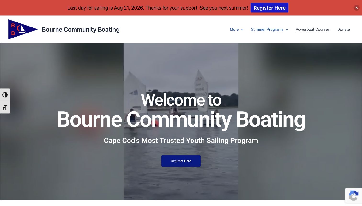
Bourne Community Boating uses a large introductory heading and on-water video to establish the organization before presenting three program families: sailing school, ocean exploration and adult or private instruction. Short descriptions explain the difference between learning boat skills and broader marine activities. Team names and an organizational introduction appear farther down, giving the site a local human presence. The captured page retains a clear end-of-season notice, while an ordinary information popup was dismissed without following its registration link. The large opening and repeated registration actions make the first screen more promotional than explanatory. The page also mixes audience, activity and administrative information, which could be easier to scan with stronger grouping.
What you can learn
Explain the differences between program families before sending every visitor to registration. Keep seasonal status visible, and give parents or adult learners a clear path to preparation information that matches the particular activity they are considering.
Pros
Three program summaries distinguish sailing from broader ocean activities.
The visible seasonal notice sets expectations about current operations.
Cons & considerations
A very large opening delays the practical program descriptions.
Repeated registration prompts compete with the explanatory content.
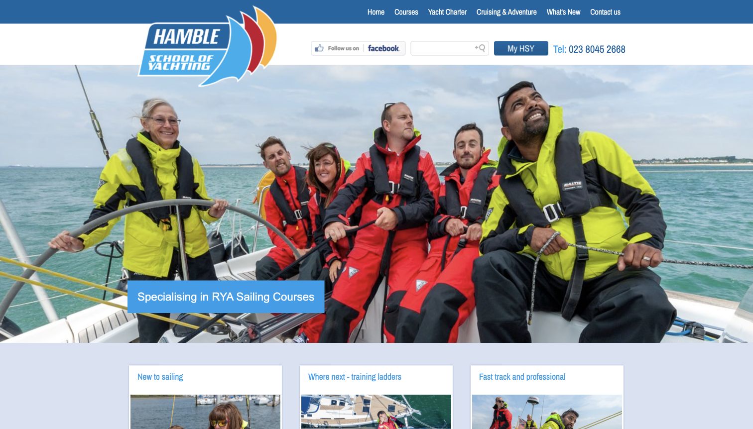
Hamble School of Yachting pairs a photograph of people aboard a boat with three useful starting points: trying sailing, finding the next training step and exploring professional study. The cards beneath the image explain those choices in ordinary language, including a route for people who may feel apprehensive about a first experience. This is more helpful than presenting every qualification at once. The navigation also separates courses, charter and adventures, showing the wider business without making those offers identical. The layout is visually older, with compact type and small utility controls, and the introductory copy includes broad reputation claims. Still, the three-way distinction gives the page a practical organizing idea that can transfer to a modern design.
What you can learn
Organize the entrance around the visitor’s ambition rather than a long credential list. A beginner, an improving sailor and a professional candidate need different explanations, even when their eventual courses share instructors, facilities or boats.
Pros
Three starting cards distinguish genuinely different learning goals.
The beginner explanation acknowledges uncertainty about a first course.
Cons & considerations
Small utility controls and compact type reduce visual clarity.
Broad reputation language is less useful than concrete course distinctions.
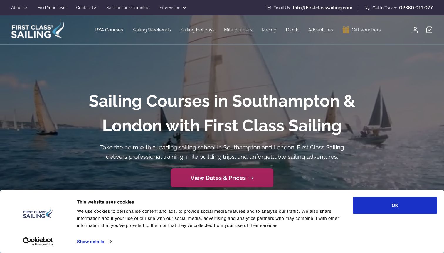
First Class Sailing identifies its geographic scope and course purpose in the main heading, then places a prominent dates-and-prices action against the sailing imagery. That gives visitors a practical next step without requiring them to understand the whole navigation. Below, the page separates classroom theory, practical courses and additional learning, with cards explaining what each course addresses. A level-finder route in the utility navigation offers another starting point for uncertain visitors. The page also includes many review and media references, which should be read as the site’s presentation rather than independent verification here. The first-visit cookie panel occupies substantial space, and the broad adventure catalog makes the header relatively busy.
What you can learn
Connect a clear geographic promise with a transparent planning route. When classroom and practical training take place differently, explain that distinction before visitors compare dates, and provide a separate level-finding path for people who are still unsure.
Pros
The main action clearly names dates and prices.
Course groups distinguish classroom study from practical learning.
Cons & considerations
The initial cookie panel competes with the central action.
A wide adventure catalog adds complexity around the core training offer.
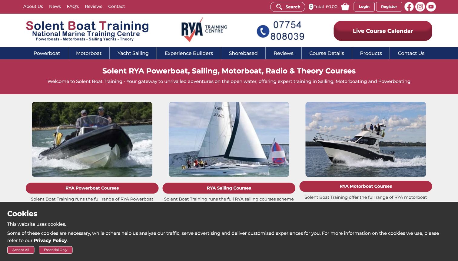
Solent Boat Training presents its range through a grid rather than a large atmospheric hero. Sailing, powerboat and motorboat cards appear near the top, with shore-based study, navigation and experience-building options continuing below. The consistent image-and-label pattern makes the catalog easy to recognize, while a prominent course-calendar button supplies a direct planning route. A separate course-details link acknowledges that preparation information matters alongside availability. The breadth is useful for a mixed training center, although a sailing beginner must still choose among categories that describe both boat types and learning goals. The first-visit cookie panel covers the lower edge of the cards, and the many promotional statements make the page text-heavy farther down.
What you can learn
A broad training catalog benefits from a consistent visual pattern, but categories need a clear logic. Keep boat type separate from course level and experience-building goals, then connect each route to preparation details as well as dates.
Pros
The card grid exposes the range without hiding it behind a carousel.
Calendar and course-information routes are visible in the header.
Cons & considerations
The category system mixes equipment types and learning purposes.
The first-visit consent panel overlaps the lower catalog area.
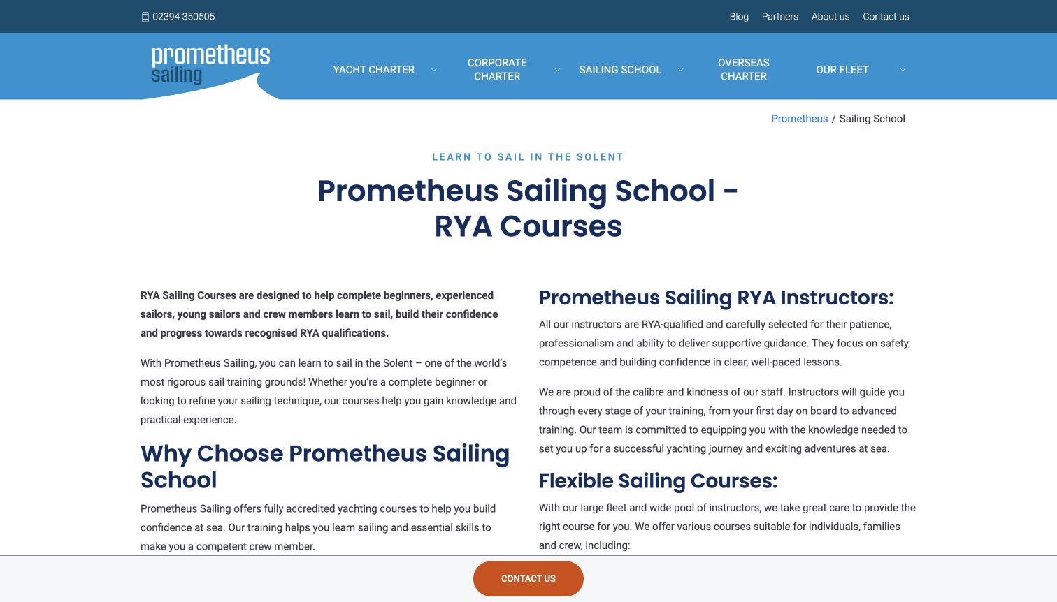
Prometheus Sailing’s school page clearly separates instruction from the charter routes in the main navigation. A large heading and two-column text layout introduce the courses, training setting, fleet and instructors before the page reaches specific offers. This makes the school feel like a defined part of the business rather than an incidental product. Joining instructions are linked within the explanation, and individual course cards provide more focused next steps farther down. The opening is unusually text-heavy for this collection, giving practical context priority over scenery. That choice also creates long paragraphs and delays the actual course list. Dated promotions introduce another maintenance responsibility, and broad claims about the fleet require careful distinction from independently verified facts.
What you can learn
Give an instructional service its own landing page when it sits beside charter or hospitality. Explain the learning environment and preparation route, then use concise course summaries so readers can move from context to a specific decision.
Pros
The school has a distinct route within the wider charter business.
Joining information appears alongside the training explanation.
Cons & considerations
Long opening columns delay comparison of individual courses.
Dated offers need regular maintenance to remain useful.
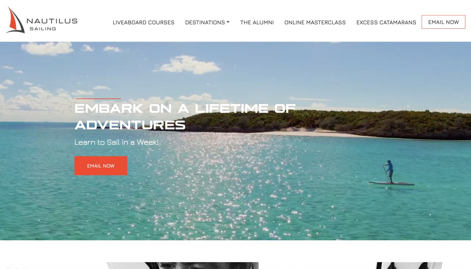
Nautilus Sailing uses expansive destination imagery and a direct contact action to position learning as part of a broader sailing journey. The navigation names liveaboard courses, destinations, alumni and online preparation, making the format more specific than a generic learn-to-sail promise. A sequence farther down connects building skills, gaining experience and sailing independently, while a separate process section explains the stages from initial conversation to departure. This helps visitors understand the relationship between a course and continued participation. The opening’s short time-based promise still needs the detailed curriculum and prerequisites for context. Practical comparison is also contact-led, so visitors cannot resolve every planning question from the initial screen alone.
What you can learn
An immersive course benefits from a clear before-and-after story. Explain preparation, the actual learning format and opportunities to practice later, while avoiding the suggestion that completing a short program guarantees readiness for every sailing situation.
Pros
The navigation makes the liveaboard format explicit.
Preparation and continued experience are connected to the initial course.
Cons & considerations
The short headline promise needs detailed learning context.
Contact-led planning leaves several practical comparisons for a later conversation.
Kegan is a freelance web designer and developer with 15+ years of experience helping businesses turn complicated website requirements into clear, maintainable digital experiences. He works directly with clients from planning and design through development, launch, and ongoing support.
For sailing school website design, his development approach focuses on sailing school websites that explain course formats, experience requirements and progression, with clear seasonal information and practical ways to compare programs. The scope can be a targeted improvement or a complete custom build, with responsive layouts, thoughtful content structure, and integrations chosen around the people using and maintaining the site.
Show 3 other sailing school website designersHide other sailing school website designers
Plan a sailing-school website around the learner’s next decision
Map the learning paths before designing the catalog
Start with the questions your school actually receives. A prospective student may want to try sailing once, learn a basic set of skills, return after a long break or prepare for a particular course. Those are useful entry routes even when the internal catalog uses formal course names. Write a short explanation of each route and connect it to the relevant prerequisites, format and next step. Keep professional training, youth programs and adult leisure learning distinct when their requirements differ. Then check that someone can reach a meaningful course description from the homepage without first interpreting a large list of abbreviations.
Design one consistent course information pattern
Choose a small set of fields that help visitors compare programs: intended starting level, stated prerequisites, duration, location, boat or learning format, preparation material and the next planning action. Use the same sequence across comparable course pages. Explain whether a displayed date is a scheduled session, an inquiry option or a season reference; do not make an empty calendar look like confirmed availability. If registration happens elsewhere, explain that transition and keep the course description available on your own site. Contact-led planning can work well when the visitor knows what information to ask about.
Give seasonal content a clear owner
Sailing websites often carry several clocks at once: the teaching season, office hours, registration openings, youth-program dates and occasional promotions. List those content locations before launch and assign responsibility for updating them. A closed sailing season does not necessarily mean that inquiries, classroom study or future planning are unavailable, so state the distinction clearly. Remove or label superseded offers while preserving useful preparation resources. Review the homepage, program pages and external booking destinations together so that one current banner does not sit beside an older heading that creates uncertainty.
The editing job behind the design
Choose technology that keeps course information dependable
A manageable content system matters more than a fashionable stack. Staff should be able to update a course description, seasonal notice and preparation link without copying inconsistent information across several pages.
Treat registration, membership and payment services as separate responsibilities with clear handoffs. Preserve useful public course information even when a visitor has not opened an external booking tool or created an account.
Keep video and large photographs proportionate to the information they support. Provide a useful static view and clear text so the learning proposition does not depend on motion or a particular carousel frame.
The example stacks come from bounded public-source checks and any retained documentary evidence. A visible library, font or delivery reference does not establish a hidden booking system, database or complete backend. Unknown components remain unknown.
Our WordPress website examples offer a separate look at publishing approaches. A visible platform label is evidence for that named page, not a guarantee that the same system will suit your requirements.
Before the public launch
Sailing-school website planning checklist
Provide a clear route for someone who has never sailed before.
Explain course names and abbreviations beside their learning purpose.
State the intended starting level and any documented prerequisites on each course page.
Distinguish lessons, memberships, rentals, hosted experiences and charter options.
Keep location, preparation information and contact routes close to the course description.
Label seasonal notices and explain what remains available outside the sailing season.
Use consistent comparison fields across similar programs.
Make external registration transitions clear without requiring an account to understand the offer.
Check that promotional dates, course links and supporting instructions agree.
Use authentic program imagery with readable text and a useful static fallback for video.
These checks are a project checklist, not a performance, legal, security, or accessibility certification. Test real journeys with the people responsible for the website before making claims about the result.
Sources & editorial method
How this collection was selected and reviewed
This collection follows the saved random target of 17 distinct sailing-school and community-instruction website properties. Each review combines direct public-page reading with an inspected browser screenshot captured on November 10, 2026 UTC. Specific instruction pages are identified where they are more informative than a homepage. Ordinary cookie notices and newsletter interruptions are described as observed; no forms, accounts, bookings, payments or subscriptions were submitted. Every exact captured source page received a bounded broad technology-audit attempt, with unavailable results retained without inferred replacements. The explicitly researched Editors Choice is SailMaine, selected for its regional identity, audience routes and explanation of learning formats. That editorial selection is about website design and communication, not instruction quality, safety, credentials, pricing or availability. A mixed-year heading on its adult page is retained as a limitation. No current course or seasonal offer is guaranteed by inclusion.
Each example links to its actual source page. Screenshots are direct browser captures with their own capture dates; moving imagery, announcements and live designs can change. The notes describe observable design choices and conditional tradeoffs, not measured traffic, conversion results, service quality, or accessibility conformance.
Technology labels use public page metadata, asset evidence, or explicitly cited platform documentation. Platform documentation is not a complete current deployment audit. A component reference may be legacy or unused; it is not a complete backend inventory. Unknown stacks are omitted. These sites are editorial examples, not our client portfolio.
Written, Edited and Curated are separate editorial records, not timestamps advanced by a rebuild. Website designs and imagery belong to their owners. See our editorial standards or suggest a correction.
Questions worth asking
Sailing School website design questions
What should a sailing-school homepage explain first?
Explain who the school serves, where learning takes place and how a visitor finds a suitable starting point. A beginner route and a separate path for experienced sailors are often more useful than an undifferentiated list of every course.
Should course codes appear in the main navigation?
They can help visitors who already know the qualification they want, but they need plain-language context. Pair the code or formal name with its purpose and starting level, and offer a simpler route for people who do not yet know the terminology.
How should lessons and memberships be presented together?
Explain them as related but distinct arrangements. Show what a lesson covers, what membership provides and whether any stated experience or assessment is required for boat access. Do not leave visitors to infer that buying one automatically includes the other.
Is an online booking system necessary?
The examples use different approaches. A clear inquiry route can support a complex or personalized program, while scheduled sessions may benefit from an accurate calendar. In either case, visitors should be able to understand the course and the next step before entering personal information.
How should a seasonal sailing school handle winter content?
State the current operating status and distinguish the sailing season from office availability, future registration and other learning options. Review dates across the homepage, course pages and external registration links so that older headings do not contradict the current notice.
Does inclusion verify a school’s qualifications or safety?
No. These are editorial website-design observations based on public pages and actual captures. They do not verify instructional quality, credentials, safety practices, current prices or availability. Anyone considering a course should confirm the relevant details directly with the provider.
The most useful sailing-school design makes the next decision understandable. Combine a real sense of place with clear learning routes, comparable course information and honest seasonal status, then make the path to further planning easy to follow.