Flickity website examples for deliberate carousel design (20 Real-World Examples)
Twenty public properties with genuine screenshots, scoped Flickity evidence and original lessons for campaigns, galleries and product browsing.
A carousel is a sequence of decisions about content, navigation and attention. These examples show how to keep each panel useful while preserving the practical routes around it.
Flickity is a carousel library with touch interaction and configurable cell behavior. The examples here include dated public resource references and two historical associations documented in the official showcase. A stylesheet or script reference does not prove which visible component uses the library, whether it initializes in the captured state or which version remains installed.
The most useful design lessons sit around the moving area. Recruitment pages need stable search tools, galleries need readable exhibition information, stores need direct catalog routes and attractions need opening details that never disappear into a slide sequence. The reviews examine those choices without assigning every photographed hero or visible control to Flickity.
Before the examples
What makes good Flickity website development in 2026?
Give every cell a complete purpose
A panel should contain enough context to understand its subject and destination. Keep product identity, event dates and exhibition captions attached to the corresponding visual. Flickity can group several cells into one slide; choose that behavior according to the relationship between items, not merely the number that fit on a wide screen.
Search, reservations, contact details and service alerts should remain available when the active promotion changes. Use the carousel for optional exploration or a bounded set of campaigns, and retain ordinary navigation to the full collection. A visitor should not need to discover the correct slide before completing an unrelated task.
Make movement and controls intentional
Decide whether the content needs automatic advancement, free scrolling or explicit next and previous controls. Flickity exposes these options, but the design still needs readable controls, sufficient time for copy and testing with keyboard and touch. Evaluate motion in the finished page rather than treating a library setting as an accessibility guarantee.
PepsiCo Careers, Mattel Creations, Carlsberg Group, Yamaha Boats and Houston Zoo open the collection. Eighteen examples have dated exact-page resource evidence. Riot Games and SXSW are explicitly labeled historical official-showcase associations, with no claim that their current designs still use Flickity.
We start with five recognizable brands or organizations: PepsiCo Careers — embedded search, Mattel Creations storefront, Carlsberg Group, Yamaha Boats, Houston Zoo. Each attribution applies to the named website property, not every product or website belonging to its organization. This is a curated reading sequence, not a measured ranking.
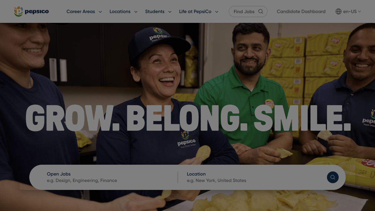
PepsiCo Careers gives the first screen two jobs: communicating the employer identity and letting a visitor begin a job search. A photograph of colleagues fills the hero behind a large, compact three-part message. The search panel crosses the lower portion of the image, with separate spaces for role keywords and location. Above it, career areas, students and life at the company remain visible as alternative routes. For a carousel-led design, the valuable detail is that the practical search interface has a stronger, more consistent position than any individual campaign photograph.
What you can learn
Keep task controls outside replaceable promotional content. A recruitment carousel can introduce different teams, but a changing slide should never move the vacancy search or erase a location already entered. Review the search panel at narrow widths before expanding the campaign inventory.
Pros
The keyword and location fields give returning candidates a direct starting point.
People photography supports the employer message without replacing navigation.
Cons & considerations
The very large headline consumes room needed by the search interface.
Text layered over photography needs reliable contrast across every campaign.
Platform source: Public reference: pepsicojobs.com. Linked script matches Flickity on 2026-11-03: https://unpkg.com/flickity@2/dist/flickity.pkgd.min.js. The reference establishes the library resource association, not which visible carousel is initialized or whether it remains active. Platform evidence is separate from the direct website screenshot and is not a complete current infrastructure audit.
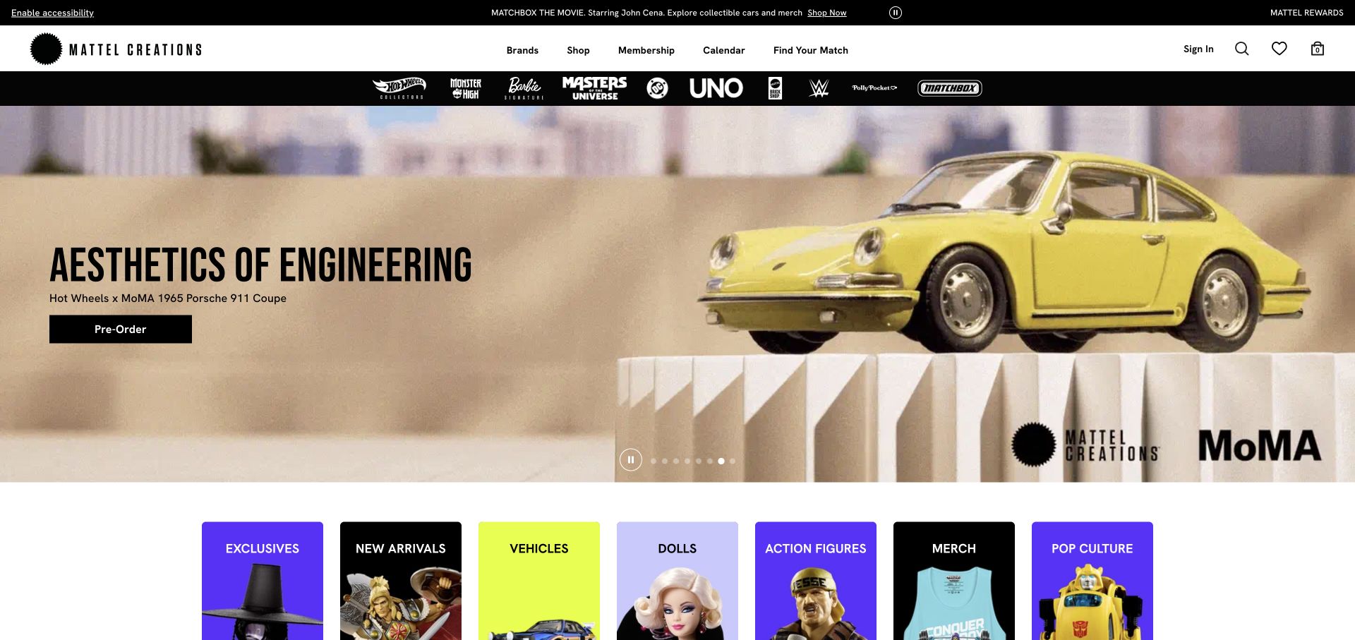
Mattel Creations uses a broad product campaign to establish the appeal of a particular release, then immediately reveals a colorful row of shopping categories. In the capture, a yellow Porsche model sits on a sculptural pedestal beside a short engineering-themed headline and preorder action. The black franchise strip above the hero provides another way into the catalog. Small pagination dots sit near the bottom of the campaign. This layered structure is useful for carousel planning because the rotating promotion is only one entry point: visitors can also choose a brand or a product category without waiting for another slide.
What you can learn
Design the surrounding navigation before deciding how many promotions the carousel can hold. Limited releases should have a direct product link, while enduring category and franchise routes should stay available independently of the active slide.
Pros
The product remains large enough to communicate its collectible detail.
Franchise and category routes reduce dependence on promotional sequencing.
Cons & considerations
Several navigation layers compete for attention before the first product listing.
The small slide indicators are quieter than the surrounding campaign artwork.
Platform source: Observed public HTTP response. Linked stylesheet matches Flickity on 2026-11-03: https://unpkg.com/flickity@2/dist/flickity.min.css. The reference establishes the library resource association, not which visible carousel is initialized or whether it remains active. Platform evidence is separate from the direct website screenshot and is not a complete current infrastructure audit.
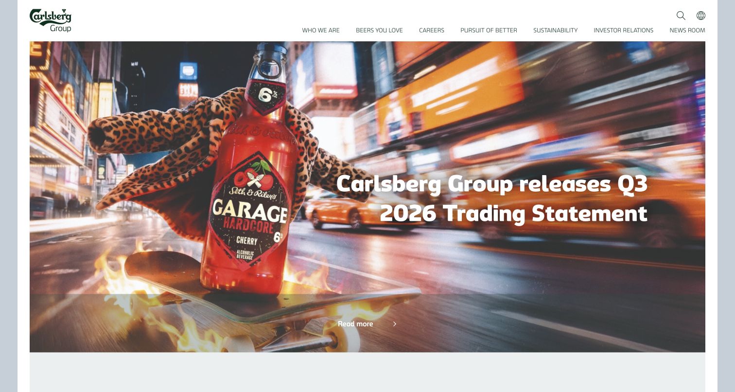
Carlsberg Group gives a quarterly trading announcement the scale and imagery of a consumer campaign. A bottle and a blurred city scene fill the wide hero, with the announcement in bold white type on the right and a restrained read-more link below. The white header separates investor relations, sustainability, careers and news from the imagery. This is a useful carousel reference for organizations with very different audiences: a single visual stage can introduce the newest announcement while the permanent menu preserves the specialist destinations. The capture also demonstrates how quickly a colorful photograph can become busy behind a long corporate headline.
What you can learn
Create a consistent text zone for each announcement and check unusually long report titles. Financial updates, recruitment and brand campaigns should retain distinct destinations even when they share the same rotating presentation area.
Pros
The permanent corporate navigation provides clear alternatives to the featured story.
A large photograph gives a routine announcement an identifiable visual treatment.
Cons & considerations
White headline text crosses several bright and detailed areas of the image.
The understated read-more control is less prominent than the announcement itself.
Platform source: Official Umbraco implementation case. Linked stylesheet matches Flickity on 2026-11-03: https://www.carlsberggroup.com/assets/css/libs/flickity.css. The reference establishes the library resource association, not which visible carousel is initialized or whether it remains active. Platform evidence is separate from the direct website screenshot and is not a complete current infrastructure audit.
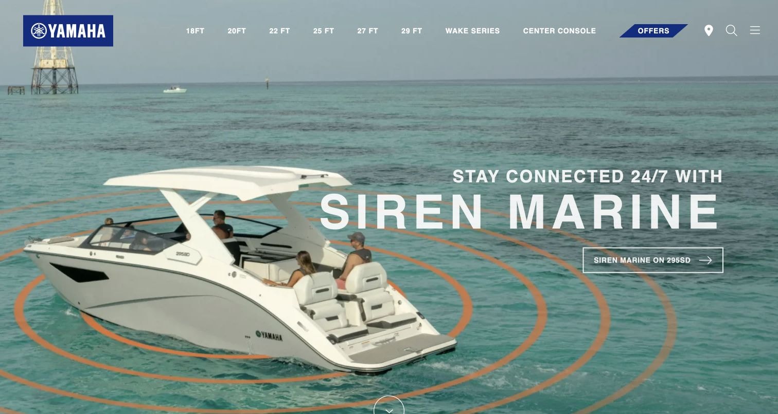
Yamaha Boats places its product-family menu directly over a full-width marine campaign. The captured slide shows a boat at sea with a large Siren Marine message on the right and a small outlined detail link beneath it. Model lengths and specialized ranges remain visible across the top, alongside offers and utility icons. The composition illustrates an important division of responsibilities: the hero can communicate an ownership experience, while the header supplies the more literal product taxonomy. A carousel can accommodate different boating stories within that frame, but the image must leave sufficient space for both the promotional copy and the navigation.
What you can learn
Reserve stable areas for model selection and campaign text. Test every replacement photograph against those areas, particularly on mobile where the boat, headline and menu cannot all retain their desktop proportions.
Pros
Model lengths offer a concrete browsing route beside the lifestyle imagery.
The photographed boat provides immediate context for the featured accessory message.
Cons & considerations
Fine white navigation depends on the brightness of the sea and sky.
The small outlined call to action has limited visual separation from the image.
Platform source: Optimizely CMS customer implementation story. Linked stylesheet matches Flickity on 2026-11-03: https://unpkg.com/flickity@2/dist/flickity.min.css. The reference establishes the library resource association, not which visible carousel is initialized or whether it remains active. Platform evidence is separate from the direct website screenshot and is not a complete current infrastructure audit.
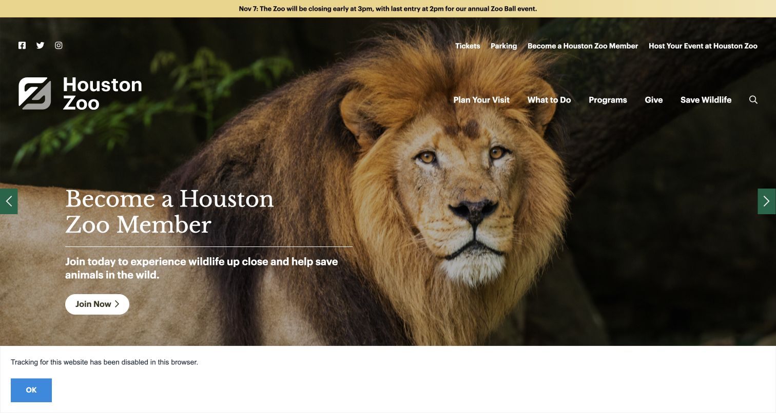
Houston Zoo centers a lion portrait in a large promotional hero while placing a membership invitation to the left. Tickets, parking, membership and event hosting appear in a utility row, with visit planning, activities, programs and conservation in a second menu. The captured state includes prominent side arrows and a dated early-closing notice above the navigation. These details make the page a useful carousel example: changing stories sit inside a practical visitor interface, and operational information has its own position. The photograph attracts attention, but the surrounding routes still acknowledge that many visitors arrive with a specific planning question.
What you can learn
Keep time-sensitive opening information outside the slide sequence. When membership, events and wildlife stories rotate through one hero, ticket access and visit planning should remain predictable and usable with keyboard or touch navigation.
Pros
The closing notice has a dedicated strip above promotional material.
Clearly visible side arrows reveal that additional campaign panels exist.
Cons & considerations
Two navigation rows require careful compression on a narrow screen.
The captured privacy notice uses space below an already tall hero.
Platform source: Public reference: houstonzoo.org. Linked stylesheet matches Flickity on 2026-11-05: https://unpkg.com/flickity@2/dist/flickity.min.css. The reference establishes the library resource association, not which visible carousel is initialized or whether it remains active. Platform evidence is separate from the direct website screenshot and is not a complete current infrastructure audit.
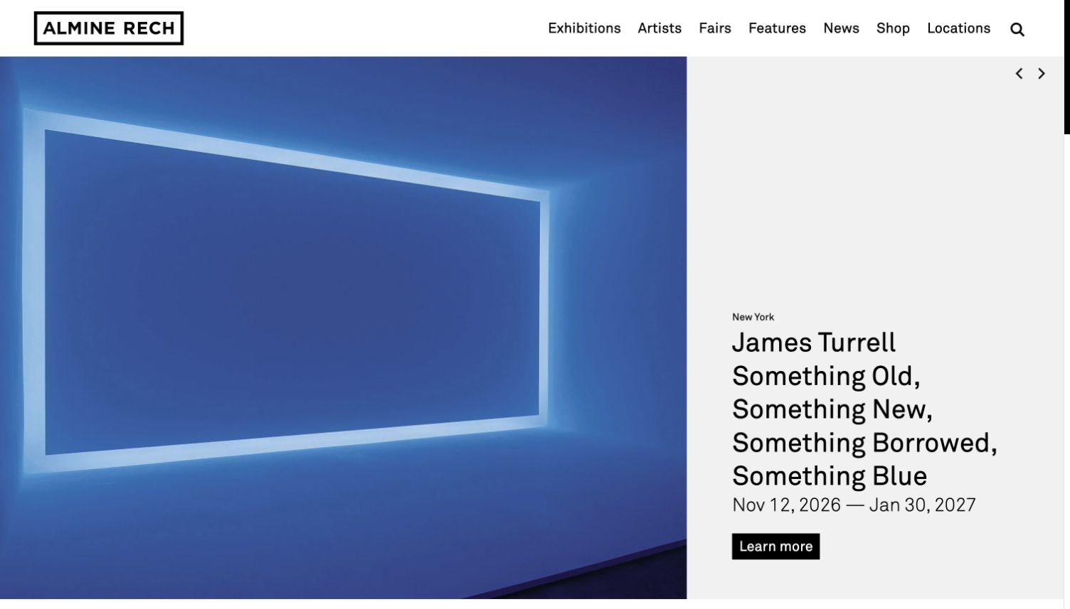
Almine Rech uses a sharply divided composition: artwork occupies the broad left panel, while location, artist, exhibition title, dates and action sit in a pale column on the right. The captured James Turrell presentation benefits from this separation because its luminous blue image remains unobstructed. Small previous and next controls sit at the top of the caption area. For a Flickity reference, the design offers a clear content contract for each cell: a large image paired with a structured caption. Different works can retain their own colors and proportions without requiring every exhibition title to find a readable place over the artwork.
What you can learn
Treat the image and its caption as one navigable unit. Establish minimum caption space using the longest expected title, and ensure that slide changes update the artist, date range and destination together.
Pros
A dedicated caption column protects text contrast across different artworks.
The exhibition date range is visible beside the featured work.
Cons & considerations
The controls are much smaller than the artwork and title.
A long exhibition name can push practical details toward the bottom of the panel.
Platform source: Public reference: alminerech.com. Linked stylesheet matches Flickity on 2026-11-04: https://www.alminerech.com/assets/Front/css/modules/flickity.min.css. The reference establishes the library resource association, not which visible carousel is initialized or whether it remains active. Platform evidence is separate from the direct website screenshot and is not a complete current infrastructure audit.
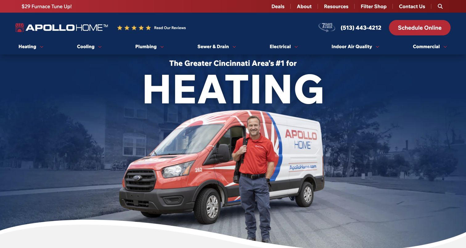
Apollo Home places a technician and branded van in front of a dark blue neighborhood scene, beneath an oversized heating headline. A red scheduling button and phone number stay in the header, while the next row lists heating, cooling, plumbing, drains, electrical and other services. The result is a campaign stage surrounded by an extensive service directory. In a carousel context, that surrounding structure matters more than the motion: the company can change the seasonal headline without hiding the visitor's route to a different repair. The photograph also introduces a recognizable human figure rather than relying only on equipment or abstract comfort imagery.
What you can learn
Let seasonal campaigns change inside a fixed service framework. Keep phone and scheduling actions in stable positions, and give every slide a short headline that can survive a narrower crop without covering the technician's face.
Pros
The branded vehicle and technician connect the offer to a real service operation.
The red scheduling action is visually distinct from the blue navigation.
Cons & considerations
The oversized service word leaves limited room for explanatory detail.
The many header links will need deliberate prioritization on small screens.
Platform source: Public reference: apollohome.com. Linked script matches Flickity on 2026-11-03: https://apollohome.com/wp-content/plugins/oxyextras/components/assets/flickity/flickity.pkgd.min.js. The reference establishes the library resource association, not which visible carousel is initialized or whether it remains active. Platform evidence is separate from the direct website screenshot and is not a complete current infrastructure audit.
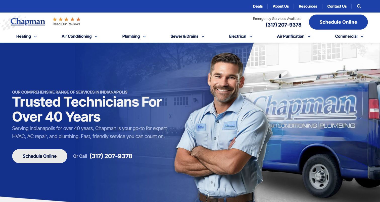
Chapman uses a blue text field on the left and a technician beside a branded van on the right. The heading emphasizes the company’s years of service, followed by a short explanation and two contact options: online scheduling and a phone number. The header repeats the practical booking route and groups services into separate menu items. Compared with a full-bleed image carousel, this composition creates a more predictable home for text. It is a useful reference when promotional slides need to share a consistent layout: the image can vary while the heading, explanation and actions remain aligned within a stable reading area.
What you can learn
Build a reusable slide structure around the visitor's decision. Keep the service promise brief, provide a direct contact action, and give photography its own space so changes to the image do not require repeated text-position adjustments.
Pros
The left text area provides dependable contrast for the service explanation.
Phone and online scheduling serve different visitor preferences.
Cons & considerations
Repeated scheduling controls can make the header and hero feel redundant.
The large technician portrait limits the amount of practical information above the fold.
Platform source: Public reference: chapmanheating.com. Linked script matches Flickity on 2026-11-03: https://chapmanheating.com/wp-content/plugins/oxyextras/components/assets/flickity/flickity.pkgd.min.js. The reference establishes the library resource association, not which visible carousel is initialized or whether it remains active. Platform evidence is separate from the direct website screenshot and is not a complete current infrastructure audit.
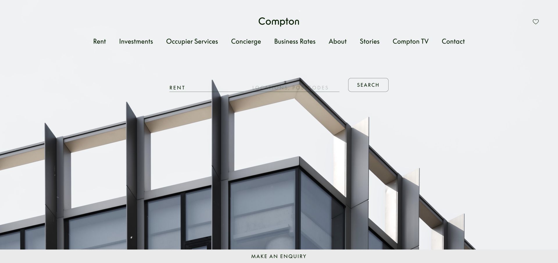
Compton gives the first screen a restrained architectural character. A pale background surrounds a centered wordmark and compact navigation, while a close view of a contemporary building fills the lower hero. Rent and a search control sit above the roofline, and a thin enquiry strip remains visible along the bottom. The design is relevant to carousel planning because it shows how little overlay content a strong property photograph needs. A sequence of buildings could preserve the same search and enquiry anchors, but each image would need an intentional crop so structural lines do not compete with those controls or conceal them.
What you can learn
Use the property image to establish character and the search to establish purpose. Keep selection controls independent of slide content, and evaluate each crop with the same visual constraints instead of assuming one universal background treatment will work.
Pros
The architectural crop gives the page a specific visual identity.
Search and enquiry appear as separate, understandable routes.
Cons & considerations
Fine text and thin borders can feel understated against a large photograph.
The compact navigation contains many choices with similar visual weight.
Platform source: Public reference: compton.london. Linked stylesheet matches Flickity on 2026-11-03: https://www.compton.london/css/flickity.css. The reference establishes the library resource association, not which visible carousel is initialized or whether it remains active. Platform evidence is separate from the direct website screenshot and is not a complete current infrastructure audit.
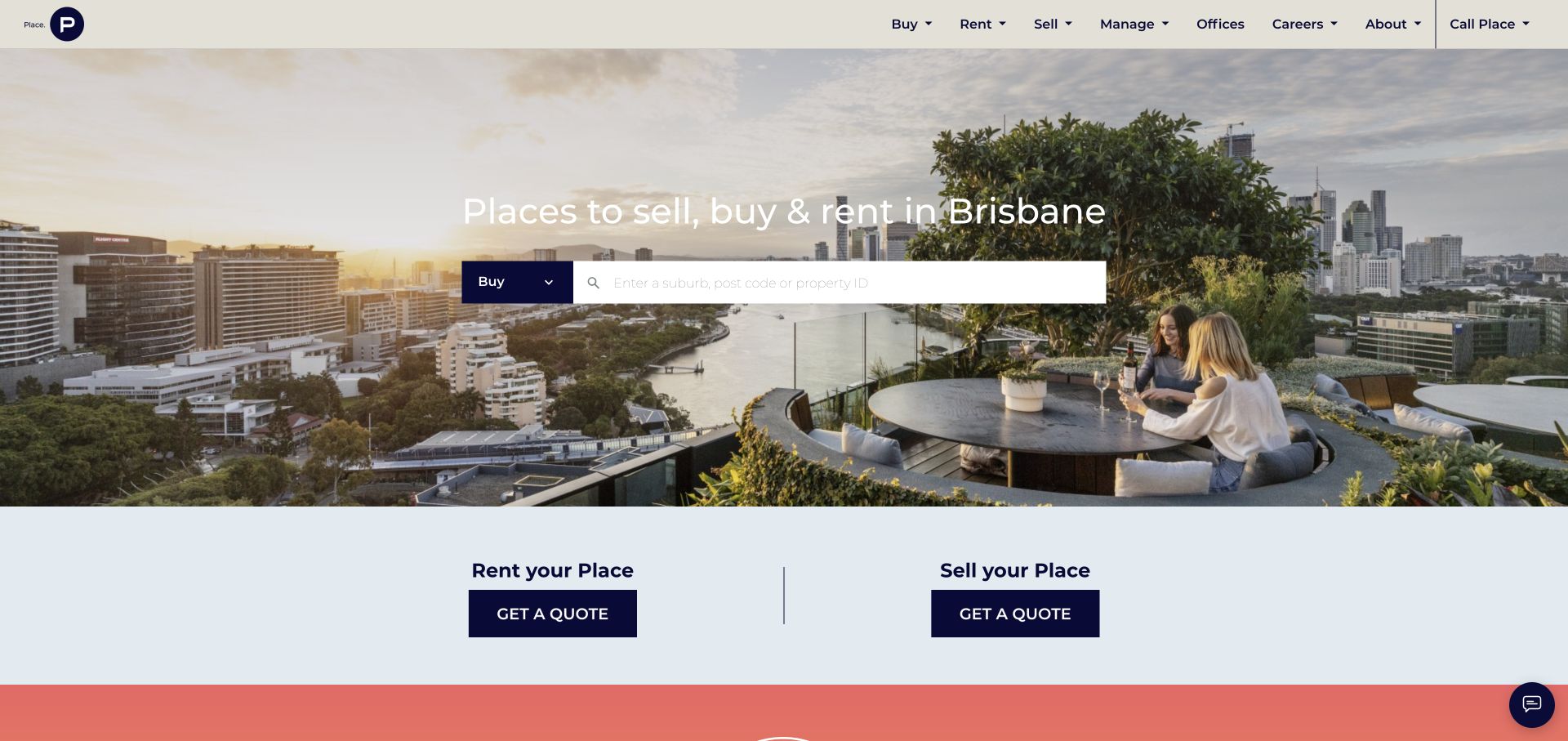
Place opens with a Brisbane city view and a direct statement about selling, buying or renting. A compact property search sits across the image, while the following pale section separates renting out a property from selling one. The hero therefore introduces the market without making the photograph the only means of navigation. For a carousel reference, this is a practical arrangement: multiple neighborhood images could share the same search tool and still preserve the visitor's chosen transaction. The navigation uses a dark brand accent sparingly, letting the photograph carry most of the page's color and atmosphere.
What you can learn
Keep transaction intent explicit when using changing location imagery. A visitor should be able to distinguish searching for a rental from offering a property for rent, and those paths should not depend on the current promotional panel.
Pros
The search field translates the location story into an immediate task.
The next section separates owner enquiries into two clear actions.
Cons & considerations
Text placed over the skyline needs careful contrast for every image.
The hero offers little explanation of search behavior before the visitor begins.
Platform source: Public reference: eplace.com.au. Linked stylesheet matches Flickity on 2026-11-03: https://cdnjs.cloudflare.com/ajax/libs/flickity/2.0.0/flickity.css. The reference establishes the library resource association, not which visible carousel is initialized or whether it remains active. Platform evidence is separate from the direct website screenshot and is not a complete current infrastructure audit.
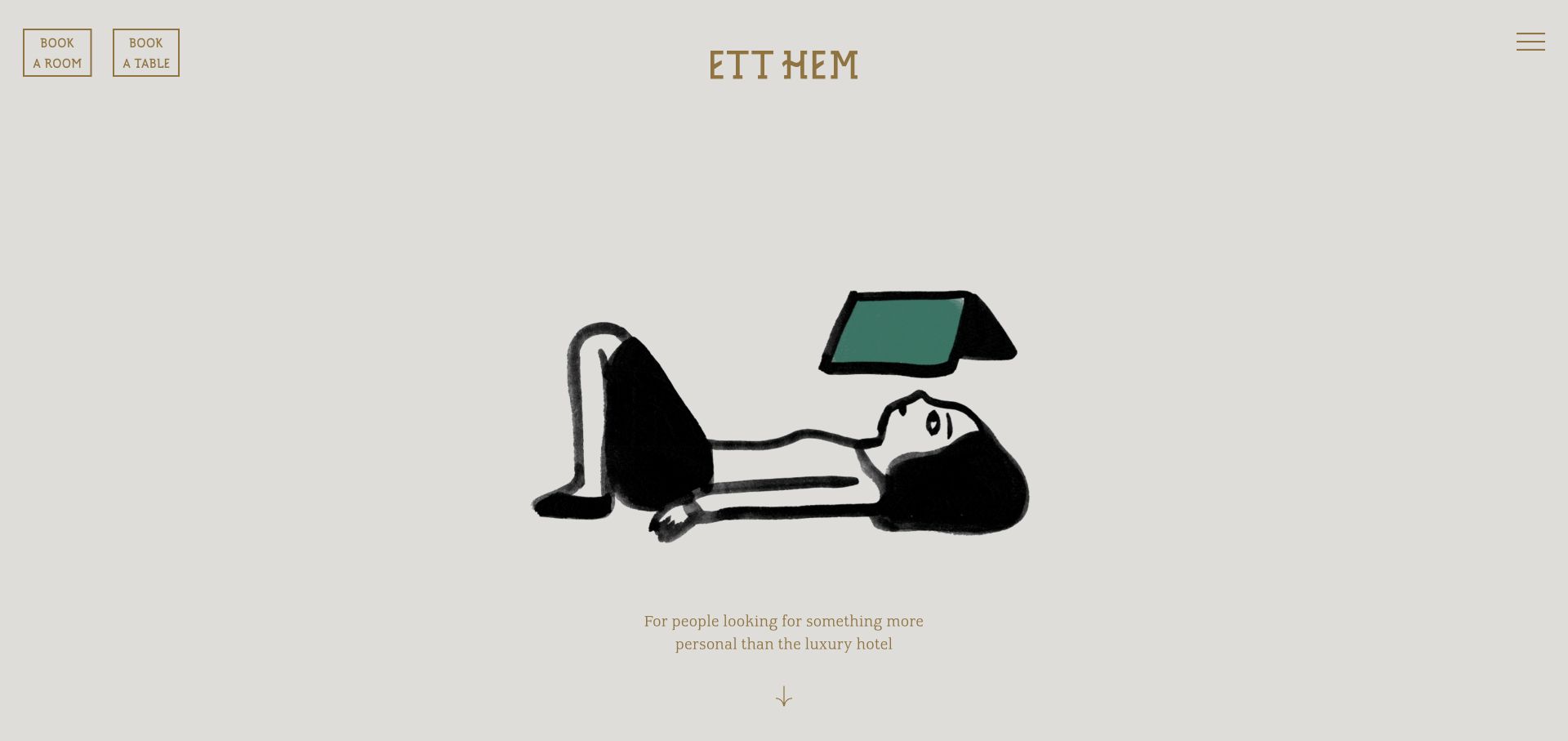
Ett Hem makes a deliberately quiet first impression. Its pale background contains a small centered wordmark, a hand-drawn domestic scene and a short positioning line. Two outlined booking controls sit in the upper left, while a compact menu occupies the opposite corner. The composition is useful for thinking about carousel boundaries even though the capture does not establish that this particular illustration is a Flickity cell. Booking belongs to the stable page interface; the central visual has room to change without taking those essential actions with it. The sparse arrangement also makes the tone feel personal rather than like a conventional inventory grid.
What you can learn
Separate atmospheric content from the actions people came to complete. If illustrations or room scenes rotate, preserve booking access and provide a readable path to room details instead of expecting imagery alone to explain the offer.
Pros
Booking a room and booking a table are distinguished at the top.
The limited palette lets the illustration establish a calm identity.
Cons & considerations
The small introductory line offers little practical information on the first screen.
Minimal controls can be easy to overlook on a large display.
Platform source: Public reference: etthem.se. Linked stylesheet matches Flickity on 2026-11-03: https://www.etthem.se/wp-content/themes/etthem/assets/css/flickity.min.css. The reference establishes the library resource association, not which visible carousel is initialized or whether it remains active. Platform evidence is separate from the direct website screenshot and is not a complete current infrastructure audit.
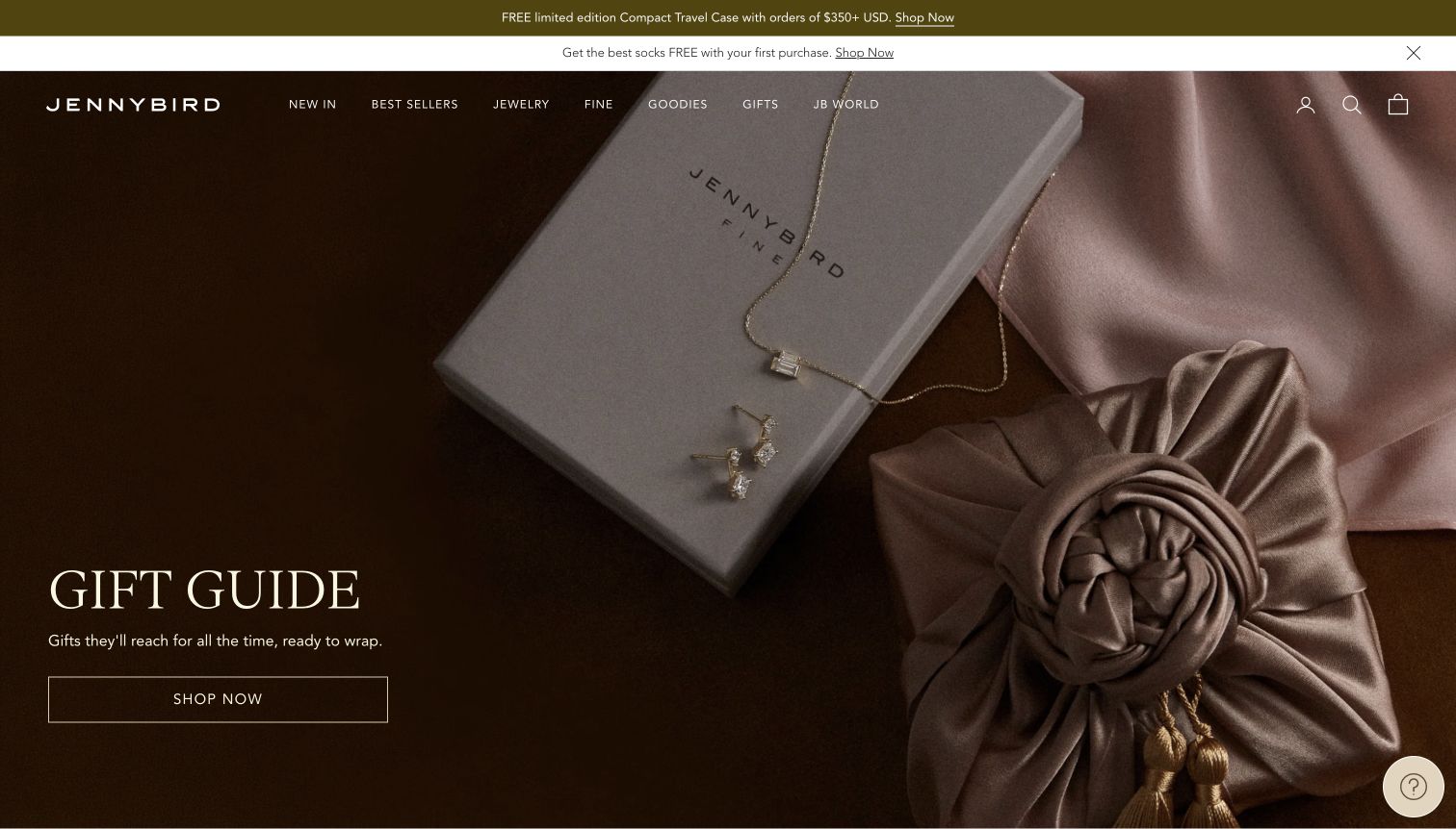
Jenny Bird uses a warm, tightly cropped still life to introduce its gift guide. Jewelry, packaging and gathered fabric fill the frame, with a modest headline and an outlined Shop now action in the lower left. The navigation remains a narrow line across the top of the image, beneath two promotional strips. The page offers a useful lesson for carousel art direction: a sophisticated photograph can carry the mood, but the text needs a consistently quiet area within every crop. The image's large areas of dark brown help the current caption, while the product details provide enough specificity to connect the campaign to the catalog.
What you can learn
Art-direct each slide for the space its caption will occupy. Keep gifting actions direct, and check whether sale messages, delivery notices and slide indicators are collectively crowding the product rather than helping a shopper decide.
Pros
The close product composition makes the gift theme tangible.
A restrained action lets the campaign retain its editorial tone.
Cons & considerations
The fine header text relies on favorable background contrast.
Multiple promotional strips reduce the height available for the main image.
Platform source: Public reference: jenny-bird.com. Linked stylesheet matches Flickity on 2026-11-04: https://jenny-bird.com/cdn/shop/t/59/assets/flickity.min.css. The reference establishes the library resource association, not which visible carousel is initialized or whether it remains active. Platform evidence is separate from the direct website screenshot and is not a complete current infrastructure audit.
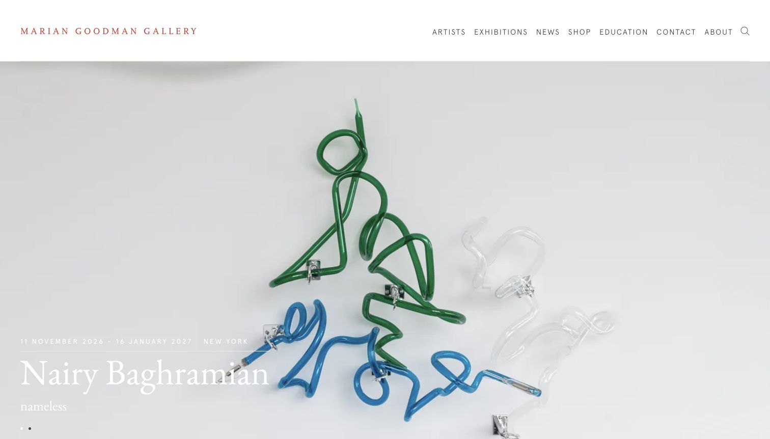
Marian Goodman Gallery gives a sculptural installation most of the first screen. A discreet wordmark and widely spaced navigation sit on a white header, while the exhibition name and dates appear near the lower left of the photograph. The captured work includes pale materials against a pale wall, making the small white caption less assertive than the central image. As a carousel reference, this illustrates the tradeoff of keeping the artwork uninterrupted: the caption can feel integrated, but its readability depends heavily on each incoming photograph. Small dots near the lower edge suggest a sequence without competing strongly for attention.
What you can learn
Define caption treatment for the lightest and darkest works in the program. A carousel should not require curators to avoid important images simply because the default overlay assumes a dark background behind the title and dates.
Pros
The generous image area communicates the installation’s scale and spatial setting.
The header keeps artists and exhibitions available outside the featured presentation.
Cons & considerations
White caption text has limited separation from the pale installation photograph.
Very small pagination indicators make the available sequence easy to miss.
Platform source: Public reference: mariangoodman.com. Linked stylesheet matches Flickity on 2026-11-04: https://www.mariangoodman.com/scripts/flickity/2.0.5/flickity.css. The reference establishes the library resource association, not which visible carousel is initialized or whether it remains active. Platform evidence is separate from the direct website screenshot and is not a complete current infrastructure audit.
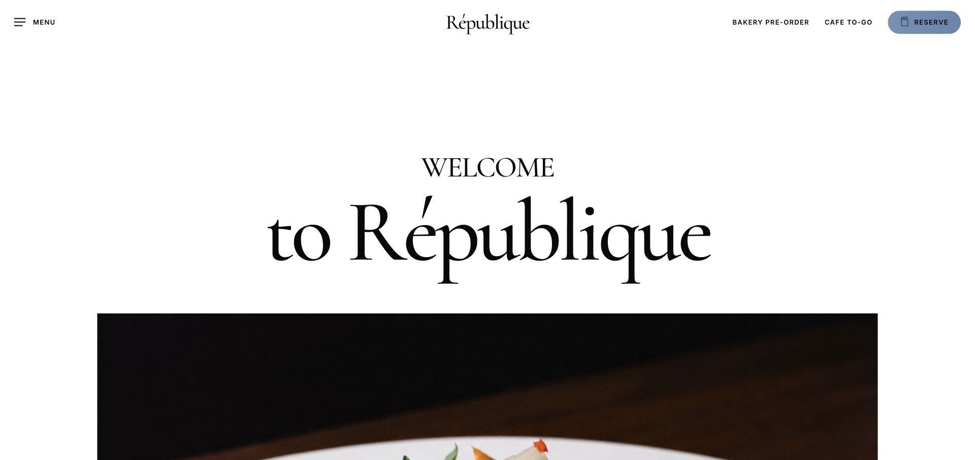
République begins with a large typographic welcome in a generous white space, followed by the top edge of a wide food or interior image. The wordmark sits at the center of the header, while bakery preorder, café takeaway and a blue reservation control occupy the right side. This is a useful example of keeping the website's business actions separate from an image component. The recorded Flickity evidence concerns the source page's resources; the capture does not prove that the visible image is initialized as a carousel. What the composition clearly demonstrates is how typography can establish hierarchy before a visitor reaches a visual sequence.
What you can learn
Give reservations and ordering modes clear names and stable locations. Use any gallery or carousel to deepen the restaurant's atmosphere, while keeping the practical routes available without needing to wait for or advance an image.
Pros
Reservation and ordering paths remain visible above the editorial introduction.
The generous white space gives the restaurant name a strong hierarchy.
Cons & considerations
The tall introduction postpones detailed imagery below the first screen.
The small utility labels require more effort to read than the oversized welcome.
Platform source: Public reference: republiquela.com. Linked stylesheet matches Flickity on 2026-11-03: https://republiquela.com/wp-content/themes/salient/css/build/plugins/flickity.css. The reference establishes the library resource association, not which visible carousel is initialized or whether it remains active. Platform evidence is separate from the direct website screenshot and is not a complete current infrastructure audit.
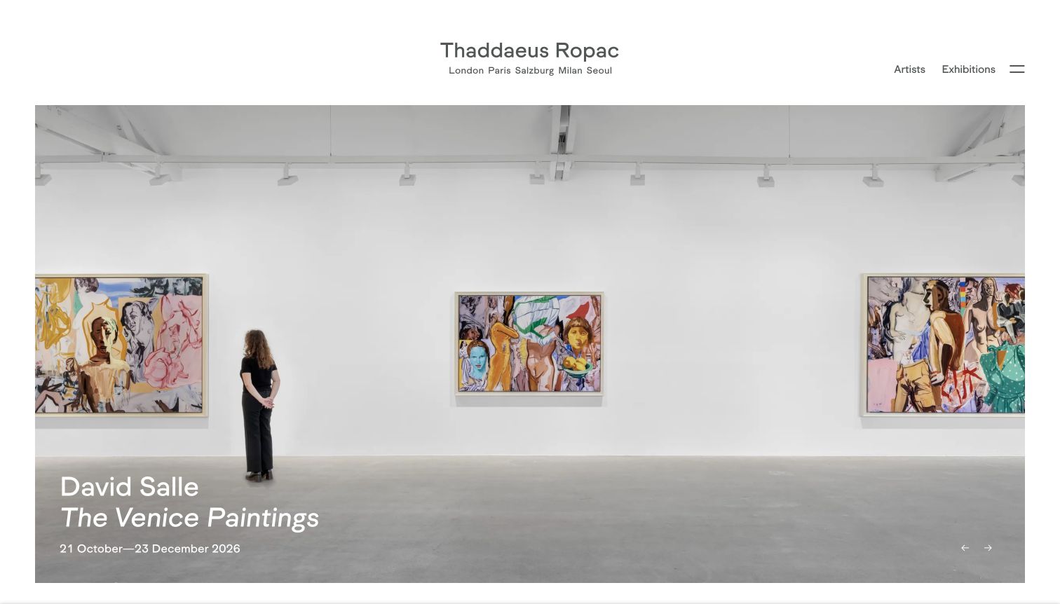
Thaddaeus Ropac places a wide gallery installation beneath a very compact header. The photograph shows several paintings and a person within the room, helping communicate scale. A white caption near the lower left supplies the artist, exhibition title and dates, while small directional controls sit toward the lower right. The page makes a strong visual case for a carousel that treats each exhibition as a complete editorial panel rather than a decorative image. Its restraint also exposes a familiar challenge: the caption and controls must remain legible when the gallery walls are bright, and location context must stay easy to find as exhibitions change.
What you can learn
Pair every exhibition image with enough information to act: title, artist, dates and location. Preserve the spatial quality of installation views, but test text placement on white walls and provide controls that do not disappear into the photograph.
Pros
The installation photograph conveys relationships between works and their scale.
The exhibition title and date range accompany the visual rather than appearing elsewhere.
Cons & considerations
White overlay text can lose contrast against a bright gallery interior.
The small directional controls are subordinate to the image and easy to overlook.
Platform source: Public reference: ropac.net. Linked stylesheet matches Flickity on 2026-11-04: https://ropac.net/scripts/flickity/flickity.css. The reference establishes the library resource association, not which visible carousel is initialized or whether it remains active. Platform evidence is separate from the direct website screenshot and is not a complete current infrastructure audit.
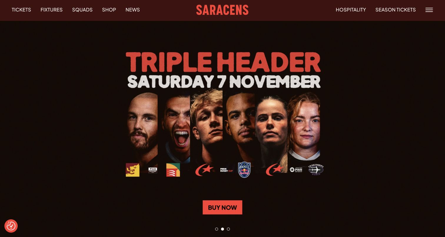
Saracens uses its opening hero like a tightly controlled event poster. A dark background supports red and white typography, a row of player portraits and a prominent Buy now button. The captured triple-header campaign includes a date large enough to read before exploring the rest of the page. Tickets, fixtures, squads, shop and news remain in the top navigation, with hospitality and season tickets on the opposite side. This is a strong carousel planning reference because the featured panel has a complete proposition of its own. Visitors can understand the event and its action without needing another slide to supply missing context.
What you can learn
Give every event slide a self-contained date, proposition and destination. Keep fixture browsing outside the promotional sequence so that supporters looking for a different match can proceed immediately rather than cycling through unrelated campaigns.
Pros
The event date is integrated into the main visual hierarchy.
A bright purchase control stands apart from the dark poster artwork.
Cons & considerations
The tightly packed portrait row offers little breathing room on narrow screens.
The small pagination dots have much less emphasis than the campaign headline.
Platform source: Public reference: saracens.com. Linked script matches Flickity on 2026-11-04: https://saracens.com/wp-content/plugins/sizzle-saracens-core/assets/js/vendor/flickity-carousel/flickity.pkgd.min.js. The reference establishes the library resource association, not which visible carousel is initialized or whether it remains active. Platform evidence is separate from the direct website screenshot and is not a complete current infrastructure audit.
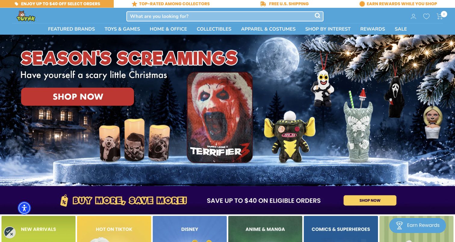
Toynk combines a bright blue search header with a highly illustrated seasonal hero. The captured campaign displays several horror-themed products against a snowy night scene, with a red Shop now action and a large holiday headline. A discount strip and colorful category tiles follow immediately. The page is useful for examining carousel density: the hero can introduce a themed collection, but it operates among many other promotions, navigation choices and utility features. The central search field is an important counterweight because a visitor who already knows a character or product can bypass the visual campaign and start a more precise journey.
What you can learn
Evaluate the entire promotional stack when designing a carousel. A vivid slide may work alone yet become overwhelming beside discount banners and category tiles. Preserve a clear search route and limit each panel to one principal offer.
Pros
A prominent search field supports shoppers arriving with a specific product in mind.
The hero shows actual merchandise rather than only an abstract seasonal message.
Cons & considerations
Several promotional bands compete with the main campaign for attention.
Detailed background artwork can make product silhouettes harder to distinguish.
Platform source: Public reference: toynk.com. Linked stylesheet matches Flickity on 2026-11-04: https://www.toynk.com/cdn/shop/t/318/assets/flickity.css. The reference establishes the library resource association, not which visible carousel is initialized or whether it remains active. Platform evidence is separate from the direct website screenshot and is not a complete current infrastructure audit.
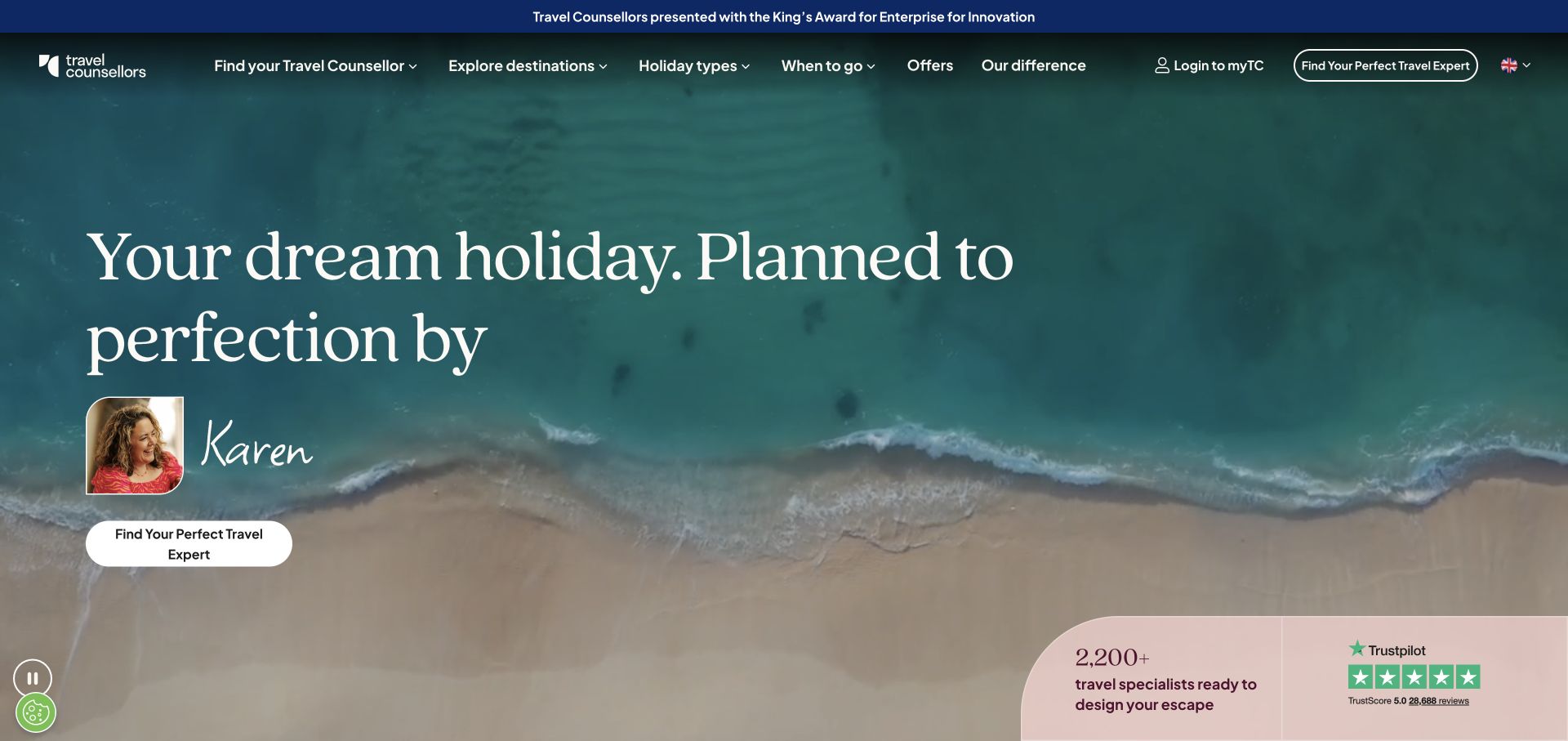
Travel Counsellors places an overhead beach image behind a large promise of a personally planned holiday. A named adviser portrait and a handwritten-style name bring a human element into the campaign, while a direct action invites visitors to find a travel expert. The lower corner introduces a specialist count and review mark. Navigation across the top covers destinations, holiday types and planning topics. For carousel design, the distinctive feature is the pairing of an interchangeable destination scene with a consistent service proposition. The beach can establish aspiration, but the adviser gives the visitor a concrete next step beyond admiring the imagery.
What you can learn
Make the service relationship clear before adding more destination slides. Preserve adviser discovery and practical planning navigation, and ensure that any changing scene still leaves a quiet area for the headline, portrait and primary action.
Pros
The adviser portrait gives the planning service a human reference point.
The main action matches the promise of a personally organized holiday.
Cons & considerations
Several supporting proof elements share the lower portion of the image.
Large overlay typography can require substantial recropping on mobile.
Platform source: Public reference: travelcounsellors.co.uk. Linked script matches Flickity on 2026-11-03: https://www.travelcounsellors.co.uk/scripts/lib/flickity.pkgd.min.js. The reference establishes the library resource association, not which visible carousel is initialized or whether it remains active. Platform evidence is separate from the direct website screenshot and is not a complete current infrastructure audit.
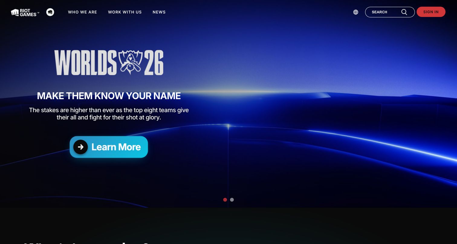
Riot Games uses an expansive game campaign as the first impression, with character artwork, a short promotional heading and a bright action against a dark interface. The header keeps company information, news, search and sign-in separate from the featured game. This site appears in Flickity’s official showcase, but that documentary association is historical: the current capture and resource audit do not establish that the displayed hero still uses Flickity. It remains a useful design comparison because the game artwork is treated as a campaign environment, while the publisher's permanent identity and utility routes stay in a consistent layer above it.
What you can learn
Separate the durable publisher interface from replaceable game campaigns. Keep the campaign's destination obvious and use a stable text area, especially when highly detailed character artwork changes between titles, updates or promotional seasons.
Pros
The bright campaign action is easy to distinguish within the darker artwork.
The header preserves corporate and account routes outside the game promotion.
Cons & considerations
Detailed artwork can compete with promotional copy in smaller crops.
A historical showcase listing does not confirm the current carousel implementation.
Platform source: Public reference: flickity.metafizzy.co. The official Flickity website lists Riot Games in its “Flickity in use” showcase. Observed 2026-11-05; this is a historical documented association with no implementation date. The current homepage capture and broad audit do not establish current Flickity use. Platform evidence is separate from the direct website screenshot and is not a complete current infrastructure audit.
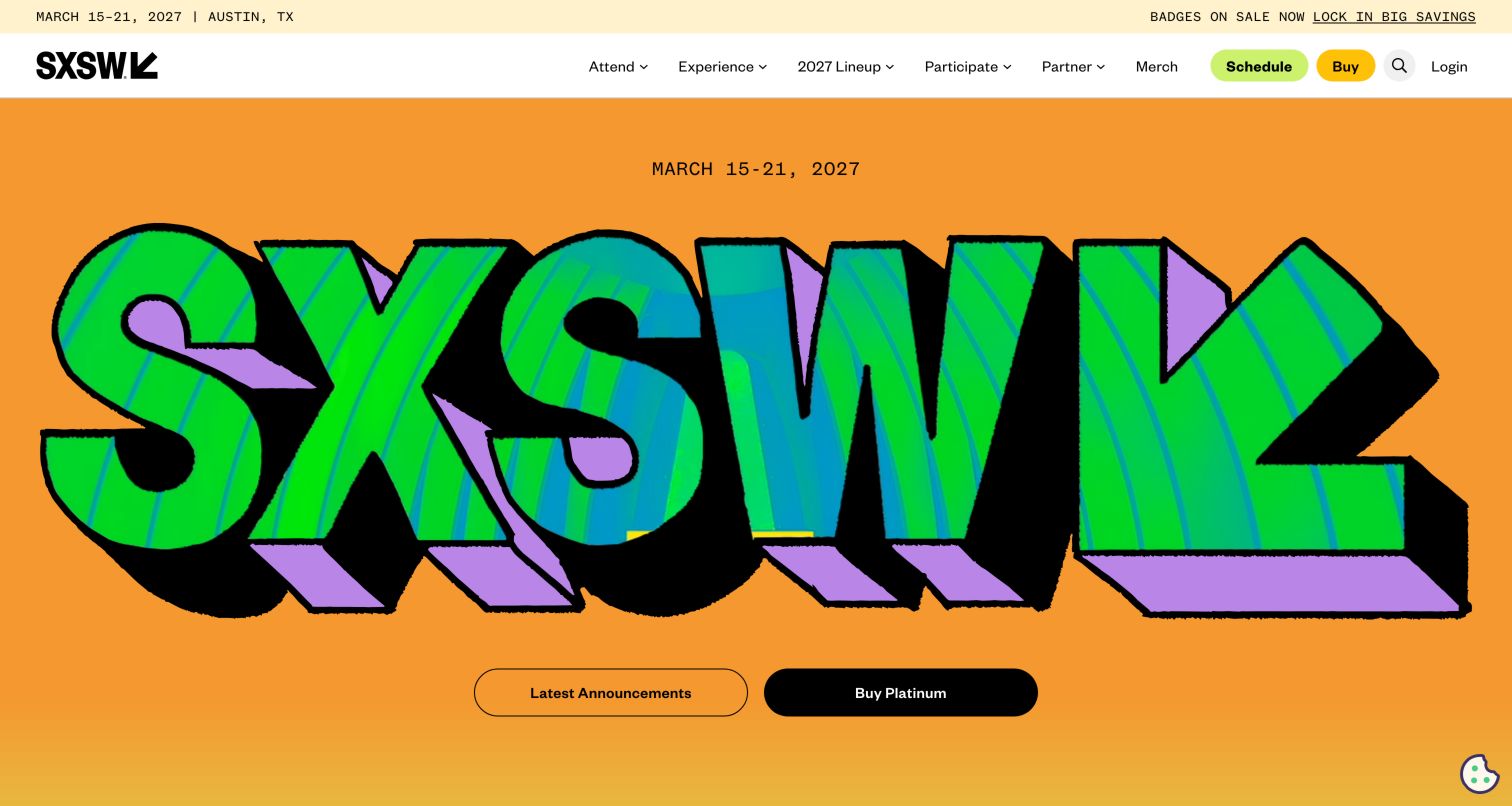
SXSW fills the opening screen with oversized graphic lettering in orange, green and purple. The event dates and Austin location are visible above a broad navigation row, while Schedule and Buy buttons stand out as rounded actions. The hero points toward announcements and a ticket offer rather than trying to list every festival experience. Flickity’s official showcase links to SXSW, which supports a historical association; it does not verify that the current graphic hero runs on the library. The design is still instructive for campaign systems because the typography, color blocks and practical actions have clearly different roles within the same crowded event environment.
What you can learn
Give dates, location, schedule and purchase routes stable positions around changing announcements. An expressive event graphic can establish recognition, but each promotional panel still needs a specific destination and enough readable context to be useful on a phone.
Pros
The event dates and location appear before the visitor reaches detailed content.
Schedule and purchase actions have stronger emphasis than general navigation.
Cons & considerations
Very large lettering leaves limited room for explanatory content in the hero.
The official showcase association does not establish the current implementation.
Visible tech stack
Earlier / documented evidence
Flickity
Platform source: Public reference: flickity.metafizzy.co. The official Flickity website links to SXSW in its “Flickity in use” showcase. Observed 2026-11-05; this is a historical documented association with no implementation date. No current Flickity resource conclusion is made. Platform evidence is separate from the direct website screenshot and is not a complete current infrastructure audit.
Kegan has 15+ years of experience working with small businesses, Fortune 500 companies, and everything in between. No development job is too big or too small: he brings the same hands-on attention to a focused improvement, a complete website, or a custom application.
For Flickity projects, he can help with responsive interfaces, reusable components, custom functionality, API connections, and performance-minded implementation. He works directly with clients on scope, design, implementation, testing, and handover, with an emphasis on clear communication and a system that remains practical to maintain after launch.
Show 3 other Flickity developersHide other Flickity developers
Give each campaign one principal message and one destination. Reserve a consistent text area and keep the permanent menu independent of the hero. Test the longest heading against the busiest photograph before accepting another campaign into the rotation.
Artwork and exhibition views
Keep artist, title, dates and location readable across pale and dark imagery. A separate caption column can provide more dependable contrast than an overlay. Preserve an ordinary exhibition-detail route so the sequence supports deeper reading instead of replacing it.
Product and category browsing
Let visitors reach the catalog through search or category links as well as the carousel. Keep each product identifiable and avoid mixing unrelated offers into one continuous strip. Show enough of the next item to suggest continuation only when doing so remains clear on touch screens.
From references to requirements
Plan the content contract before the animation
Inventory the installation and license
Confirm the installed version, initialization method and any separately installed extensions in your own project. Review the official licensing terms for the intended use. Public resource names in this collection are evidence of an association, not a recommendation to copy another website’s dependency or license choice.
Record image dimensions, alternative text, headline, caption, destination and ordering rules. Include single-item, missing-image and unusually long-text states. Keep useful content available when JavaScript fails, and avoid duplicate links that become confusing when the carousel is not initialized.
Test lifecycle changes in context
If cells are added, removed or revealed after page load, check sizing and selected state. Flickity’s API includes methods for resizing, reloading cells and destroying an instance. Use the appropriate lifecycle for the actual interface and verify that navigation remains stable after changes.
Ask the actual team to carry out its routine job: publish a realistic update, correct a mistake, preview a narrow screen, and identify who owns an integration failure. For a library or frontend framework, also ask who maintains the content source and deployment. A polished screenshot does not answer those operational questions.
Beyond the screenshot
Flickity development checklist
Confirm the installed version, initialization and applicable license.
Define a meaningful relationship between the items in each sequence.
Keep essential search, booking and contact actions outside the slides.
Pair images with accurate titles, dates, captions and destinations.
Check controls against bright and dark imagery.
Test keyboard, touch, motion preferences and long reading content.
Verify one-item, missing-image and JavaScript-failure states.
Review narrow-screen crops and dynamic cell changes in the finished page.
Test with real content, a keyboard, a small screen, slow or failed requests, and the people who will maintain the system. These are planning checks, not an accessibility, security, performance, or search-ranking certification.
Sources & editorial method
How this Flickity collection was reviewed
The collection contains twenty distinct public properties and original reviews based on genuine screenshots. Original capture dates, dimensions and attribution are preserved when images are reused. Exact-page resource observation dates remain separate from capture dates. Two official-showcase examples are explicitly historical and do not establish a current implementation. Every source has a broad public stack-audit attempt; failed or restricted observations do not become new technology conclusions. No real forms, purchases, reservations or private accounts were used.
Every image is an unmodified capture from the actual website, with its source and capture date. Some captures are reused from our shared catalog; their dates remain the original capture dates. None comes from a vendor gallery or a generated reconstruction. Moving imagery and live content can change.
Technology attribution uses public page assets or metadata, official platform documentation, or a cited first-party project case study. Documentary and framework-relationship evidence is identified where used; it is not a complete current backend inventory. A CMS image CDN alone does not establish a full CMS deployment. A library’s presence does not prove which individual controls use it, and a platform label does not establish AI authorship.
The composition notes, lessons, pros and tradeoffs are original editorial observations. We have not measured conversion, traffic, security, performance or accessibility conformance. Website owners retain their brands and imagery; these examples are not our client portfolio. Written, Edited and Curated are independent records, not dates advanced by a build. See our editorial standards or suggest a correction.
Questions worth asking
Flickity website development FAQs
Does a Flickity stylesheet prove the visible hero uses Flickity?
No. It establishes a resource association with the inspected page. A library may be loaded globally, used by a different component or unused in the captured state. Specific instance behavior requires separate observation.
Why are Riot Games and SXSW included as historical examples?
The official Flickity showcase links to those properties. Their reviews explicitly preserve that documentary scope and do not claim that the current captured designs still use the library.
Should every campaign automatically advance?
Choose behavior according to the content and visitor task. Long explanations and important choices need enough reading time and dependable controls. Test the complete experience, including keyboard use and motion preferences.
Can a carousel replace normal catalog navigation?
Keep direct routes to the complete catalog, event list or exhibition program. A sequence can introduce selected material, while ordinary links and search support visitors who already know what they need.
Use the carousel to organize related material while keeping identity, context and practical actions easy to find. The content should remain understandable even when the motion stops.