Definitive guide · The Events Calendar website development
Best The Events Calendar Websites of 2026 (20 Real-World Examples)
WordPress event pages that make dates and attendance details useful
These 20 examples compare calendars, list views, individual events, filters, empty states, and the clarity of event details and registration handoffs.
The Events Calendar supports event publishing in WordPress. The design challenge is to make the event’s date, place, audience, price, and next step understandable in the view the visitor actually uses.
New England Aquarium, Woodland Park Zoo, Lincoln Park Zoo, the Schwarzman Animal Medical Center, and the Smart Networks and Services Joint Undertaking open the collection. The reviewed page may be a calendar or an individual event.
Before the examples
What makes good The Events Calendar website development in 2026?
Make the event record complete
Treat start and end times, location, attendance format, and registration destination as essential content. A title and photograph alone are not enough to plan attendance.
A month grid, list, map, or single-event page serves different browsing needs. Avoid making a sparse calendar look busy through repeated decoration.
Design empty and past states
An empty list should explain whether no events match, none are scheduled, or the date range is past. Keep older events labeled and remove expired registration actions.
The collection · 20 examples
20 The Events Calendar website examples worth studying
Most examples expose current plugin resources and calendar markup. Empty calendars, mixed views, and the narrower Timber Lanes stylesheet association remain explicit.
We start with five recognizable brands or organizations: New England Aquarium, Woodland Park Zoo, Lincoln Park Zoo, Schwarzman Animal Medical Center, Smart Networks and Services Joint Undertaking. Each attribution applies to the named website property, not every product or website belonging to its organization. This is a curated reading sequence, not a measured ranking.
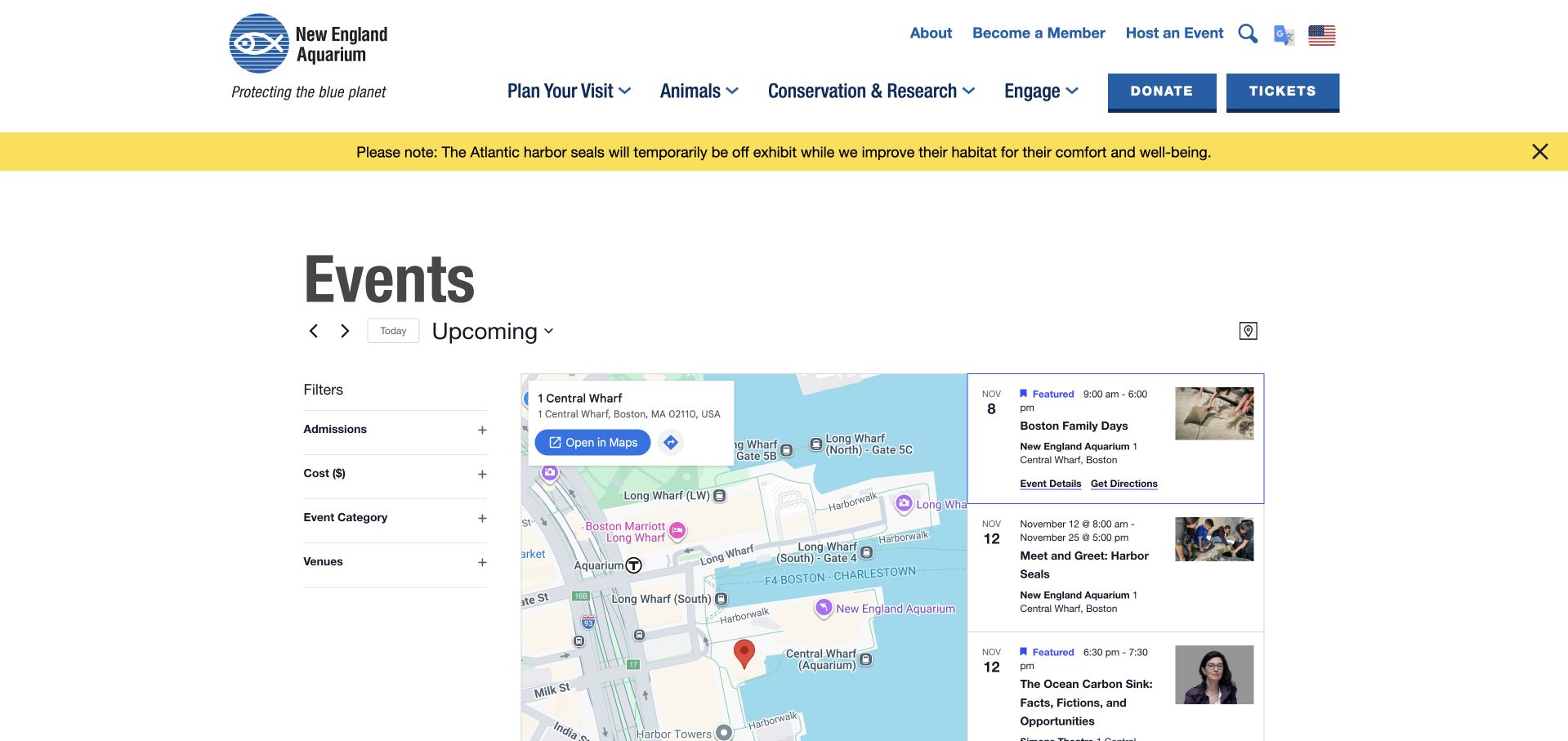
New England Aquarium puts a map between its filters and a dated event list, treating location as part of choosing an activity. Admissions, cost, category, and venue controls describe practical differences without requiring visitors to know an internal program name. The selected card pairs its title and time with an address, details link, and directions action. This is particularly useful where aquarium and theatre programming share a waterfront setting but differ in venue or audience. The captured page exposes both The Events Calendar and its Pro assets alongside calendar markup. That evidence supports this public event interface, without implying that the same plugin manages admission checkout.
What you can learn
Keep the route from discovery to arrival visible. A map earns its space when the event card identifies the venue clearly and offers an understandable next step; it should complement dates and eligibility rather than replace them.
Pros
Practical filters separate admission, price, category, and venue decisions.
Event details and directions sit together beside the selected listing.
Cons & considerations
Three parallel columns make the desktop page visually dense.
Repeated events at one address can make the map less informative than the list.
Platform source: Public page platform evidence. The inspected page includes The Events Calendar plugin resources and tribe-events calendar markup. Current plugin resources and calendar markup on the pictured public page Platform evidence is separate from the direct website screenshot and is not a complete current infrastructure audit.
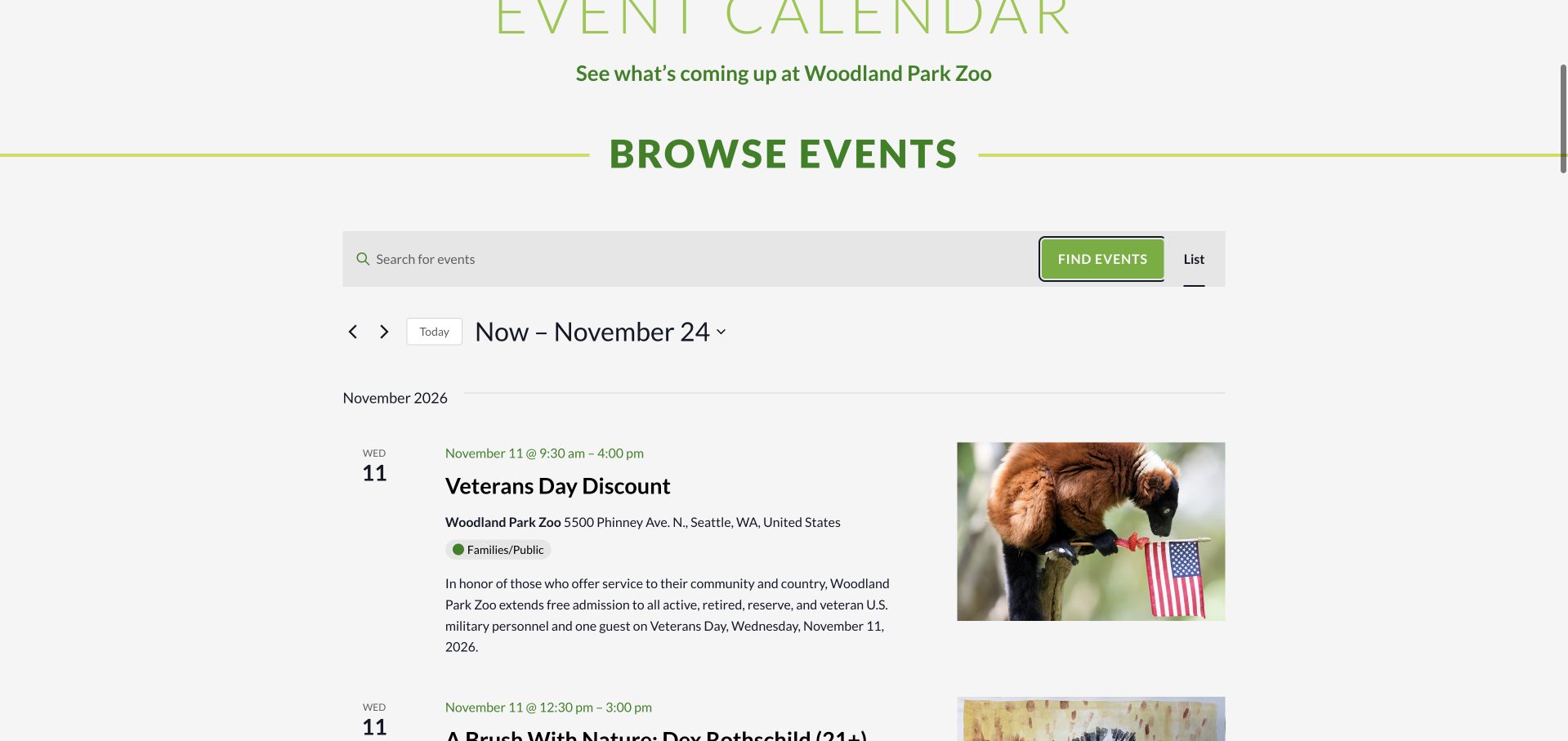
Woodland Park Zoo gives its calendar generous rows, large event titles, a separate date column, and supporting photographs. Each entry combines a time range with venue information, an audience label, and a short explanation. Visitors can therefore compare an admission offer, an art session, and an evening lantern program without opening every detail page. Repeated WildLanterns dates show why a chronological list can become long even when the underlying program changes little. The observed calendar loads The Events Calendar and Pro resources. Its visual design is useful to study, although an art event marked 21+ also carried the broader Families/Public label in the captured list.
What you can learn
Use audience metadata as carefully as dates. A broad category and a specific age restriction should reinforce each other, while recurring sessions need enough distinction to help visitors choose the right occurrence.
Pros
Date, time, venue, and audience appear together in readable event rows.
Short descriptions explain the practical difference between related zoo programs.
Cons & considerations
Repeated lantern entries lengthen the list substantially.
The captured art listing combines a 21+ title with a broad family audience tag.
Platform source: Public page platform evidence. The inspected page includes The Events Calendar plugin resources and tribe-events calendar markup. Current plugin resources and calendar markup on the pictured public page Platform evidence is separate from the direct website screenshot and is not a complete current infrastructure audit.
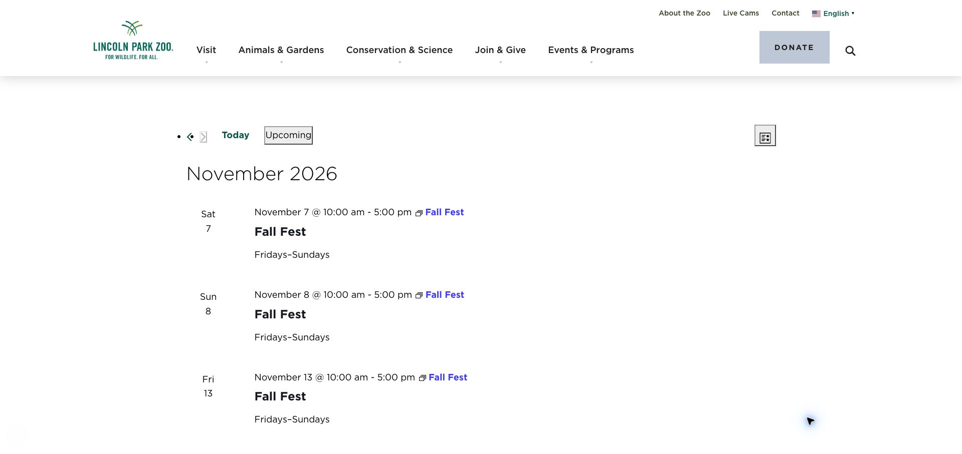
Lincoln Park Zoo’s event-date list uses a very compact presentation beneath the familiar zoo header. Month dividers, small date blocks, linked titles, and time ranges make the information easy to recognize as a schedule. The capture repeatedly lists Fall Fest with a Fridays–Sundays description, while the underlying public page continues those entries through later months. This makes it a useful example of both structured recurrence and the editorial checks recurrence requires. The Events Calendar appears in current resource paths and calendar classes. The review concerns the displayed index; the repeated dates should not be treated as independently confirmed operating information for planning a visit.
What you can learn
Recurring rules need an editorial boundary as well as a technical one. Show the season or final occurrence prominently, and check the resulting list for unexpected dates before making it a visitor’s primary planning tool.
Pros
A restrained date-and-title hierarchy keeps individual rows compact.
Month headings make a long sequence easier to scan chronologically.
Cons & considerations
Repeated Fall Fest entries extend far beyond the initial seasonal context.
Some calendar controls look less integrated than the surrounding branded navigation.
Platform source: Public page platform evidence. The inspected page includes The Events Calendar plugin resources and tribe-events calendar markup. Current plugin resources and calendar markup on the pictured public page Platform evidence is separate from the direct website screenshot and is not a complete current infrastructure audit.
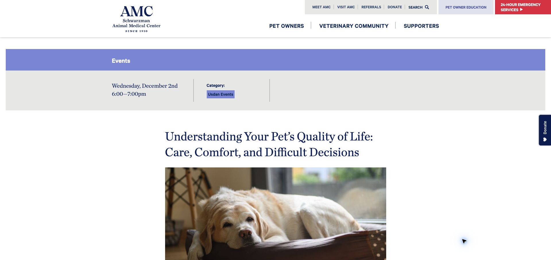
Schwarzman Animal Medical Center gives a single webinar the space of an editorial article. A gray metadata band establishes the date, time, and event category before a large headline and pet photograph introduce the subject. The body then explains the session, names its speakers, specifies Zoom and Eastern Time, and distinguishes pet-owner education from continuing-education credit. A descriptive registration link follows that context. Current The Events Calendar assets and event-page classes support the platform association on this exact detail page. The example demonstrates information architecture for an educational event; it does not establish the quality of the medical content or the behavior of the external registration process.
What you can learn
State who a session serves and what it qualifies for before registration. Detailed speaker context can strengthen an event page when the date, delivery format, time zone, and next action remain easy to find.
Pros
The metadata band introduces timing before the long event title.
Audience and continuing-education eligibility are explicitly distinguished in the description.
Cons & considerations
The oversized heading and photograph push registration lower down the page.
The time zone appears in the body rather than alongside the opening time.
Platform source: Public page platform evidence. The inspected page includes The Events Calendar plugin resources and tribe-events calendar markup. Current plugin resources and calendar markup on the pictured public page Platform evidence is separate from the direct website screenshot and is not a complete current infrastructure audit.
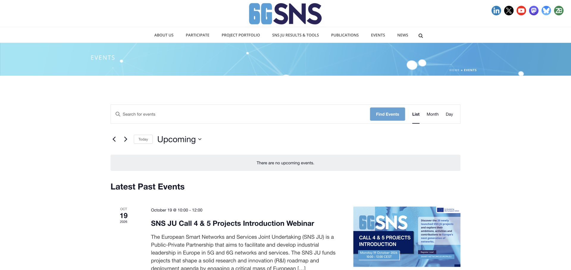
The Smart Networks and Services Joint Undertaking places a familiar event toolbar within its research-program website. Keyword search, view choices, and a date control provide clear orientation, while the current page explicitly says there are no upcoming events. Instead of ending there, it introduces a separate Latest Past Events section with dated research sessions and descriptive excerpts. That division lets readers explore previous activity without presenting it as something they can still attend. Current The Events Calendar resources and calendar classes support the implementation on this property. The association applies to this joint undertaking’s public site, not to all European Union websites or their internal publishing systems.
What you can learn
An empty schedule can still be useful if historical material is unmistakably labeled. Keep the empty-state message short, then give past sessions enough topical context for researchers to decide whether their detail pages are relevant.
Pros
The upcoming-state message and past-events heading establish a clear chronological boundary.
Search and alternate views remain visible above the research listings.
Cons & considerations
The page offers little immediate guidance about when new sessions will appear.
Long specialist titles require more reading than a simple date-based schedule.
Platform source: Public page platform evidence. The inspected page includes The Events Calendar plugin resources and tribe-events calendar markup. Current plugin resources and calendar markup on the pictured public page Platform evidence is separate from the direct website screenshot and is not a complete current infrastructure audit.
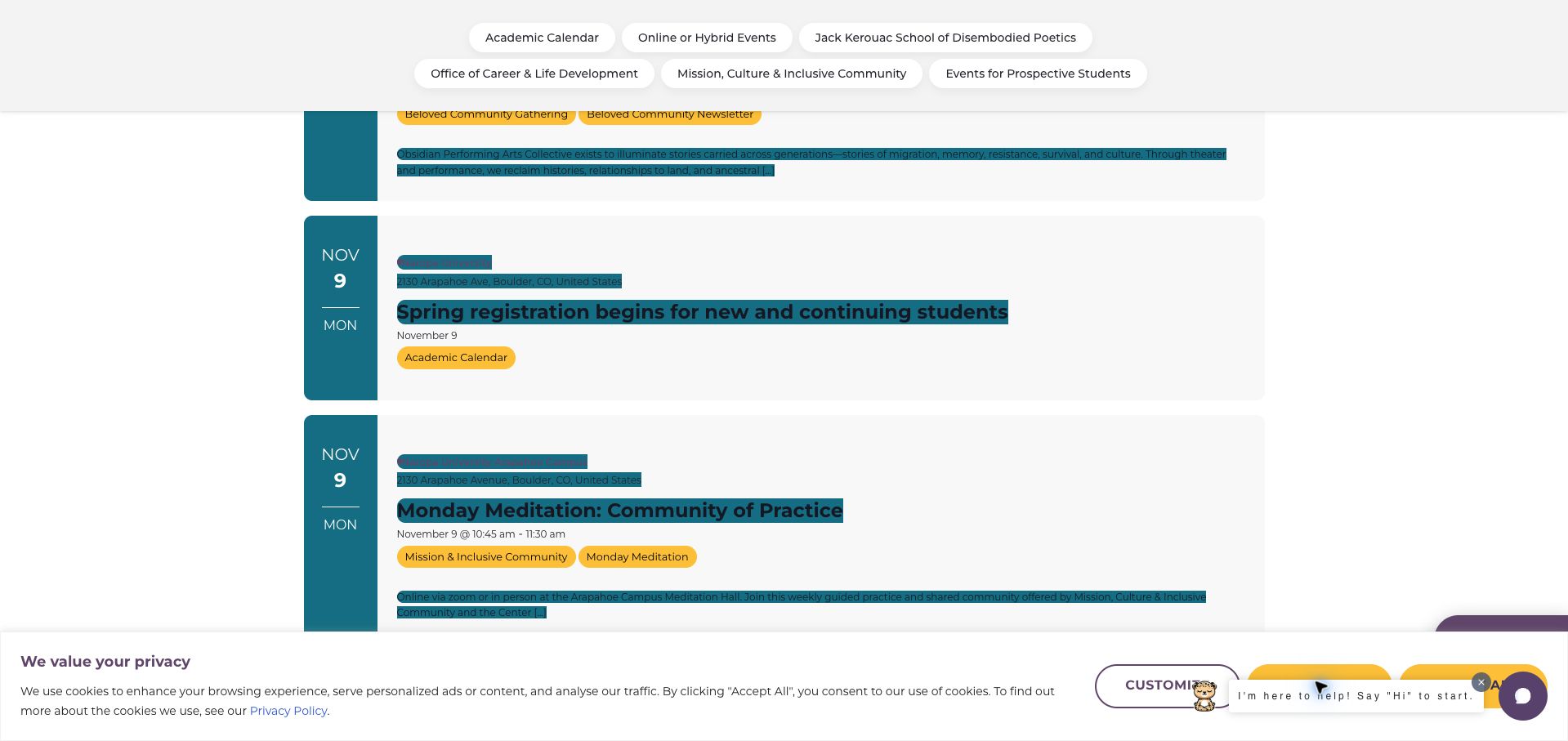
Naropa University’s list brings academic closures, student activities, public programs, and community meetings into one chronological stream. Teal date blocks and yellow category labels give the rows a recognizable visual rhythm. Venue names, online context, descriptions, and occasional prices help explain how the entries differ. This breadth is valuable for a university whose calendar serves several audiences, though the captured view also illustrates presentation costs: dense category labels and dark text on teal linked areas compete with the event hierarchy. Cookie and chat interfaces further occupy the viewport. Current The Events Calendar and Pro resources are present alongside the event markup; the evidence does not attribute every campus interface to that plugin.
What you can learn
A shared campus calendar needs both chronological order and audience clarity. Keep category labels selective, check text contrast in the actual theme, and account for overlays when deciding how much information fits in each row.
Pros
Academic dates and community activities can be understood in one sequence.
Venue and online participation context accompany the descriptive event summaries.
Cons & considerations
Some linked text has weak contrast against teal backgrounds in the capture.
Cookie and chat overlays compete with the dense calendar content.
Platform source: Public page platform evidence. The inspected page includes The Events Calendar plugin resources and tribe-events calendar markup. Current plugin resources and calendar markup on the pictured public page Platform evidence is separate from the direct website screenshot and is not a complete current infrastructure audit.
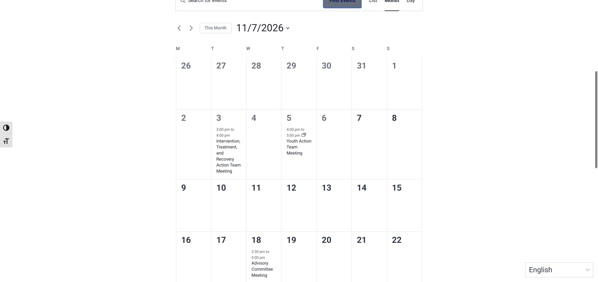
OD Free Marin introduces its calendar with a short explanation of which community activities belong there. The month grid then gives action-team and advisory meetings a predictable place, with start and end times inside the relevant day cells. Keyword search and List, Month, and Day controls offer alternatives to the default calendar. The captured month is sparse, making the relationship between meetings easier to see, but long committee names wrap heavily inside narrow cells. Current The Events Calendar resources and calendar classes support the observed implementation. This review evaluates the public schedule and its legibility, rather than the organization’s treatment resources or the substance of any meeting.
What you can learn
For a coalition calendar, define the scope before showing the grid. Use concise public-facing meeting titles and preserve a list alternative so that a long committee name does not become difficult to read in a small day cell.
Pros
The introduction explains what kinds of community activity the calendar includes.
Meeting times are visible directly within the monthly overview.
Cons & considerations
Long action-team names create substantial wrapping within individual cells.
A lightly populated month uses considerable vertical space for empty dates.
Platform source: Public page platform evidence. The inspected page includes The Events Calendar plugin resources and tribe-events calendar markup. Current plugin resources and calendar markup on the pictured public page Platform evidence is separate from the direct website screenshot and is not a complete current infrastructure audit.
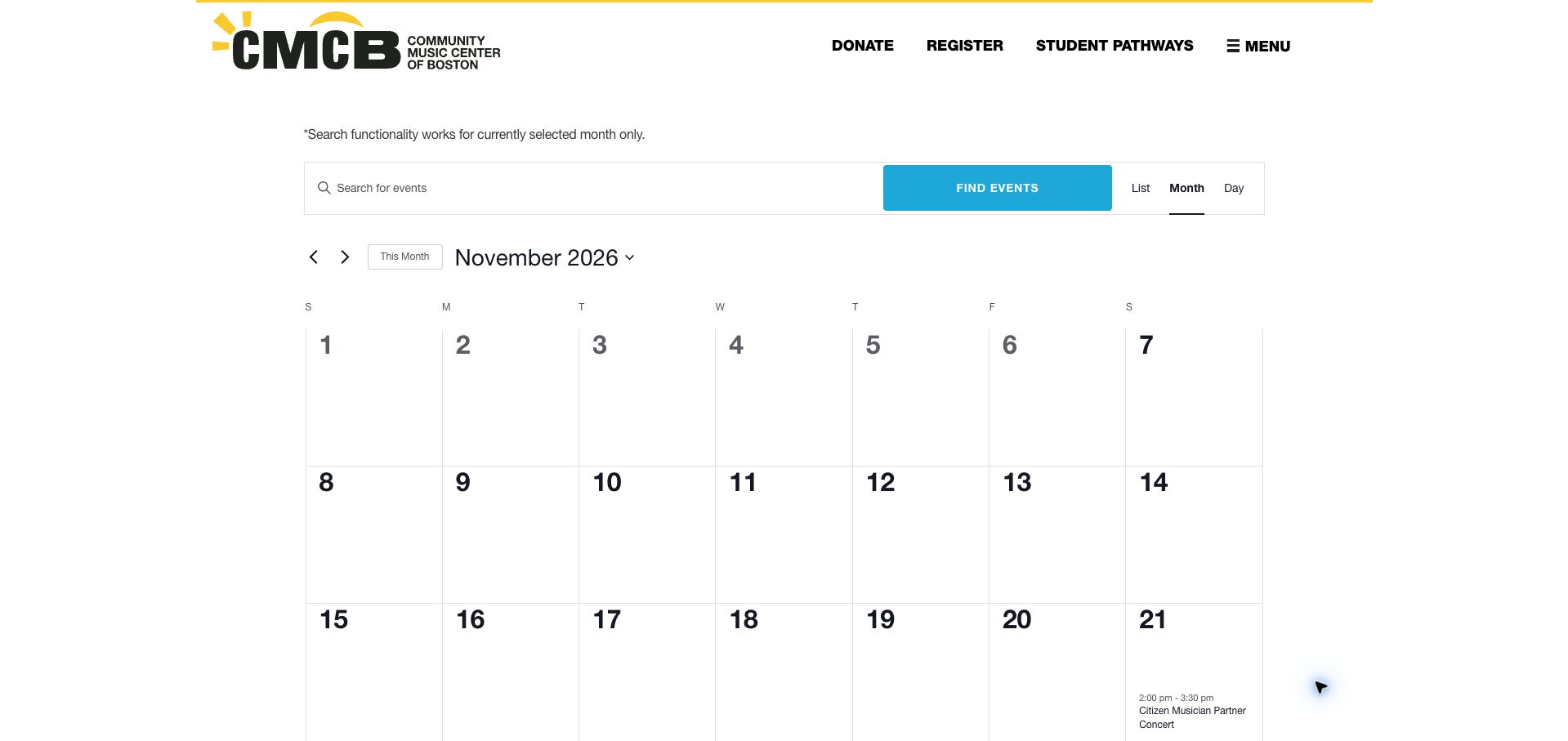
Community Music Center of Boston places an unusually helpful note above its calendar: search applies only to the currently selected month. That sentence gives visitors information they would otherwise discover through an apparently missing result. The calendar uses a spacious Sunday-first grid, a clearly labeled month, and a compact toolbar with List, Month, and Day views. The captured November contains a partner concert, with early December performances appearing in the trailing cells. Donate, Register, and Student Pathways remain available in the institutional header. Current The Events Calendar assets and markup establish the plugin’s presence on this page, without demonstrating how registration or student systems operate behind those separate links.
What you can learn
Explain a search boundary where people encounter the search field. When a calendar spans performances, student activity, and registration concerns, keep those tasks distinct while giving users an easy way to switch from a grid to a list.
Pros
A plain-language note discloses the calendar search’s month limitation.
The month label and alternate views keep the large grid understandable.
Cons & considerations
A sparse month leaves substantial blank space before the next event.
The search limitation still requires visitors to choose the correct month first.
Platform source: Public page platform evidence. The inspected page includes The Events Calendar plugin resources and tribe-events calendar markup. Current plugin resources and calendar markup on the pictured public page Platform evidence is separate from the direct website screenshot and is not a complete current infrastructure audit.
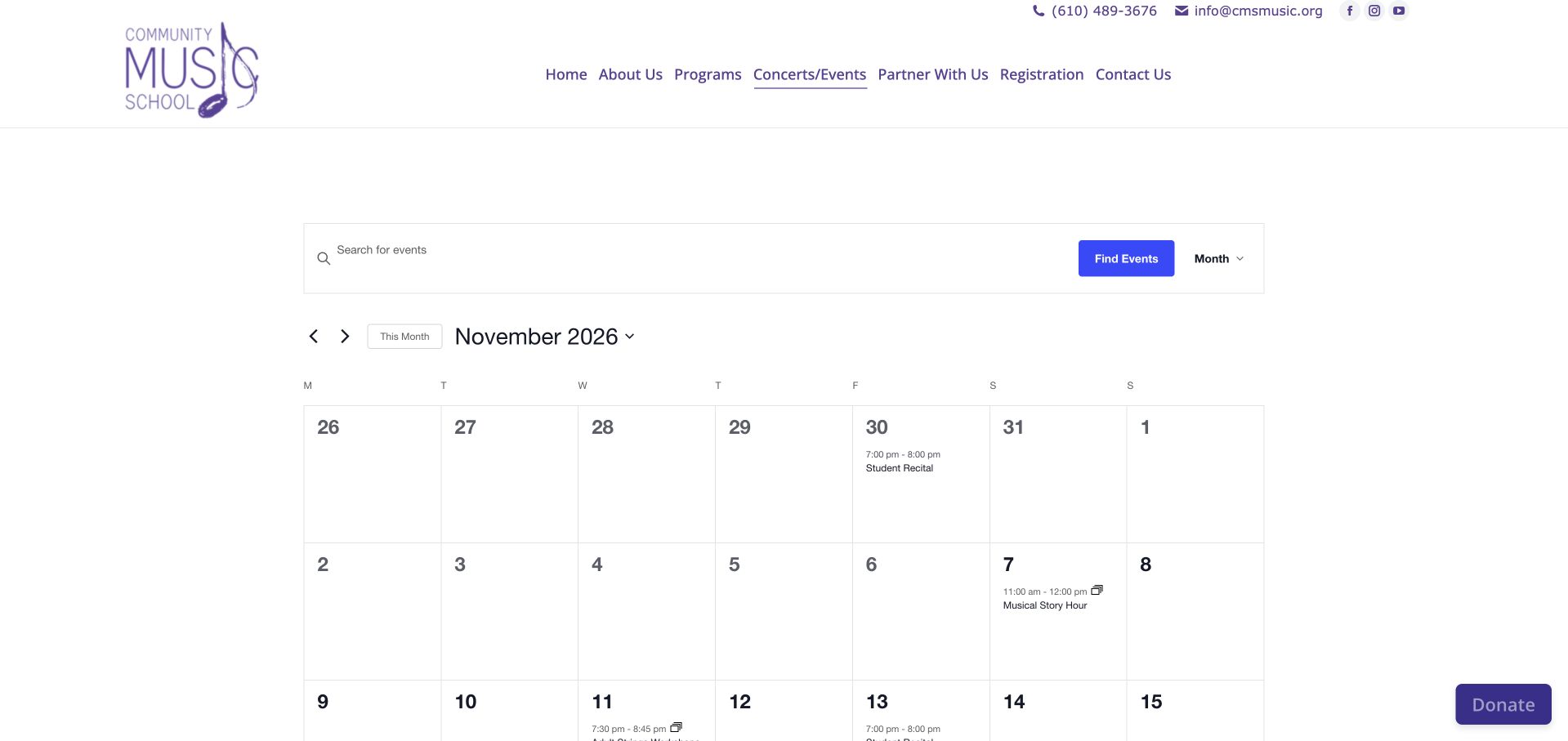
Community Music School uses a Monday-first month grid to combine public performances with practical school dates. Story hour, adult strings workshops, student recitals, make-up lessons, and closures occupy the same visual framework. Multi-day notices stretch across adjacent dates, which makes a holiday closure easier to recognize than several disconnected messages. The school’s phone number, email, and registration route remain in the surrounding header. Current The Events Calendar resources and calendar markup support this example, while other observed WordPress components belong to the wider page stack. The calendar’s strength is its shared overview; it also asks visitors to distinguish activities they can attend from operational notices that simply affect their schedule.
What you can learn
A school calendar should describe both participation and interruption. Give closures a clear visual treatment, keep event names short enough for day cells, and use categories or labels to distinguish concerts from lesson-administration notices.
Pros
Multi-day closure bars communicate periods that affect several adjacent dates.
Public programs and lesson-related notices share one familiar monthly overview.
Cons & considerations
Long workshop titles become cramped inside the narrow calendar columns.
Different kinds of participation appear together without a strong audience distinction.
Platform source: Public page platform evidence. The inspected page includes The Events Calendar plugin resources and tribe-events calendar markup. Current plugin resources and calendar markup on the pictured public page Platform evidence is separate from the direct website screenshot and is not a complete current infrastructure audit.
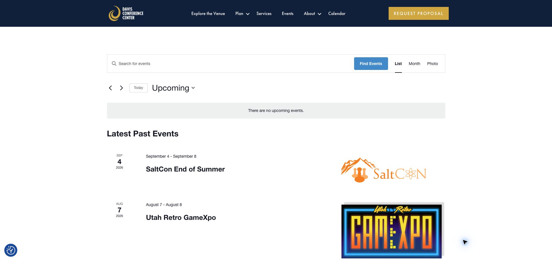
Davis Conference Center keeps its event interface restrained beneath a navy header and gold proposal button. Search, List, Month, and Photo choices sit above a clear upcoming-date control. At capture time, a notice states that no upcoming events are listed, followed by a distinct archive containing SaltCon, a retro gaming expo, and another past gathering. Large event artwork helps visitors recognize those programs while the date column preserves chronology. Current The Events Calendar and Pro assets accompany the calendar markup. The empty public feed should not be read as evidence that the venue has no bookings; it describes only what this public calendar displayed when reviewed.
What you can learn
Separate public event discovery from venue sales. An archive can demonstrate the kinds of gatherings a building hosts, but its labels should keep readers from confusing historical examples with available dates or bookable future programs.
Pros
The empty-state notice clearly separates upcoming listings from the archive.
Event artwork adds recognition without obscuring the adjacent dates and titles.
Cons & considerations
The captured feed offers no next public event to pursue.
Large logos consume space without explaining much about each gathering.
Platform source: Public page platform evidence. The inspected page includes The Events Calendar plugin resources and tribe-events calendar markup. Current plugin resources and calendar markup on the pictured public page Platform evidence is separate from the direct website screenshot and is not a complete current infrastructure audit.
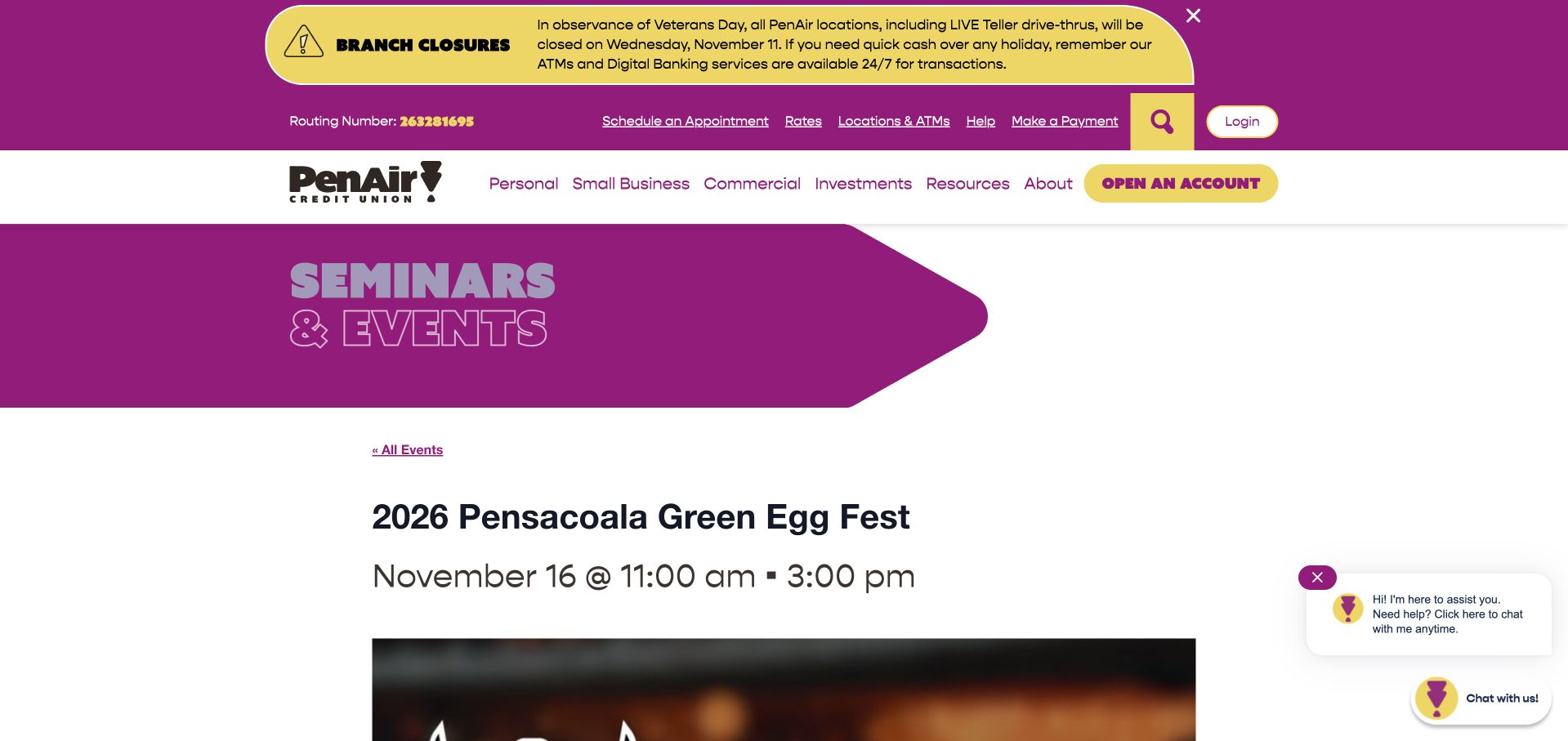
PenAir brings its bold purple and yellow identity into a community-event detail page. A large section banner precedes an All Events link, the event title, and an unusually prominent time line. Below, the description separates admission types, location, ticket information, and the reason for the organization’s involvement. That hierarchy makes a long sponsorship announcement easier to navigate. It also exposes a consequential editorial problem: the captured headline metadata says November 16, while the body specifies Sunday, November 15, 2026. Current The Events Calendar and Pro resources support the public event implementation. The conflicting dates are a design and content lesson, not a verified recommendation about when to attend.
What you can learn
Maintain one authoritative date across structured fields and narrative copy. Strong typography amplifies an error as readily as correct information, so preview the complete event page after changing either its schedule or description.
Pros
The event title and time receive a clear, prominent hierarchy.
The description separates admission, venue, and ticket information into readable sections.
Cons & considerations
The captured structured date conflicts with the date written in the description.
Branch notices and chat occupy space before the event’s practical details.
Platform source: Public page platform evidence. The inspected page includes The Events Calendar plugin resources and tribe-events calendar markup. Current plugin resources and calendar markup on the pictured public page Platform evidence is separate from the direct website screenshot and is not a complete current infrastructure audit.
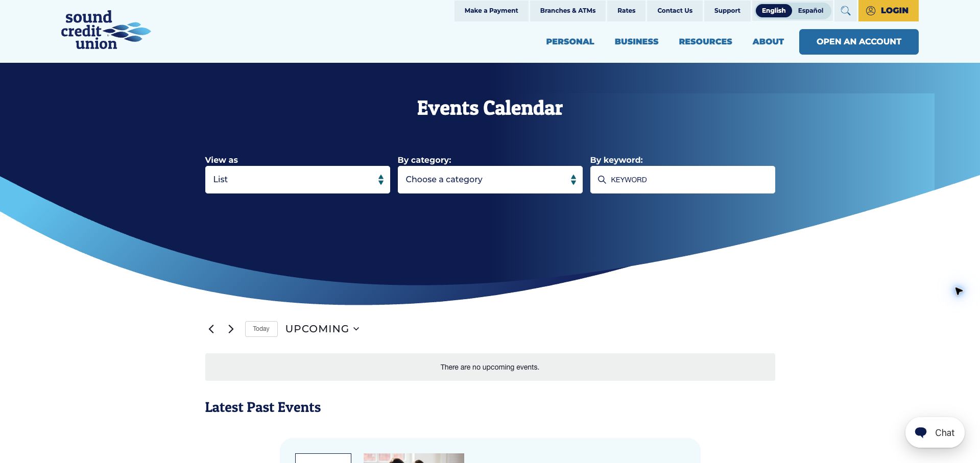
Sound Credit Union puts its view selector, category selector, and keyword field directly inside a curved blue event header. The controls are large and plainly labeled, giving the page a distinct identity before the more conventional calendar content begins. Below, the upcoming view reports no events and introduces historical webinars under Latest Past Events. Those entries include topical summaries and further-information links, preserving a route into educational content. The current page contains The Events Calendar resources and calendar classes. Its branded filter presentation is the useful design reference; the review does not establish that historical webinar registration remains available or that any financial guidance is current.
What you can learn
Integrate filters with the brand without sacrificing their labels or grouping. When the selected period is empty, explain that state beside the results and mark historical content clearly enough that an old educational event cannot look newly scheduled.
Pros
View, category, and keyword controls form a clear three-part search area.
The archive remains accessible below an explicit empty upcoming-state message.
Cons & considerations
The oversized curved header delays access to actual event descriptions.
Historical rows require careful date reading despite their prominent topic titles.
Platform source: Public page platform evidence. The inspected page includes The Events Calendar plugin resources and tribe-events calendar markup. Current plugin resources and calendar markup on the pictured public page Platform evidence is separate from the direct website screenshot and is not a complete current infrastructure audit.
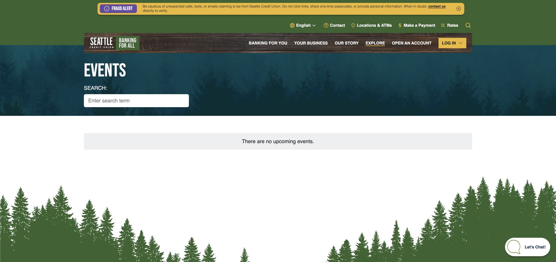
Seattle Credit Union surrounds a short event page with a regional visual language. Forest silhouettes, a dark photographic banner, wood-textured navigation, and green accents make the calendar feel like part of the same organization. The content itself is straightforward: an Events heading, a labeled search field, and a notice that no upcoming events are listed. This is a useful example of a designed empty state, although it leaves visitors with few calendar-specific next steps. Current The Events Calendar resources and event-view classes confirm the plugin’s presence on this page. That evidence concerns public event publishing and says nothing about the separate online-banking systems linked from the header.
What you can learn
Treat an empty schedule as a normal state that deserves deliberate design. Retain the page’s identity and a plain explanation, but consider a relevant alternative such as past sessions or an event-update route when there is nothing current to browse.
Pros
The empty-state message is unambiguous and easy to find.
Regional imagery and typography connect the calendar to the surrounding site.
Cons & considerations
The captured page provides no event archive or calendar-specific follow-up action.
A large portion of the viewport remains unused after the short notice.
Platform source: Public page platform evidence. The inspected page includes The Events Calendar plugin resources and tribe-events calendar markup. Current plugin resources and calendar markup on the pictured public page Platform evidence is separate from the direct website screenshot and is not a complete current infrastructure audit.
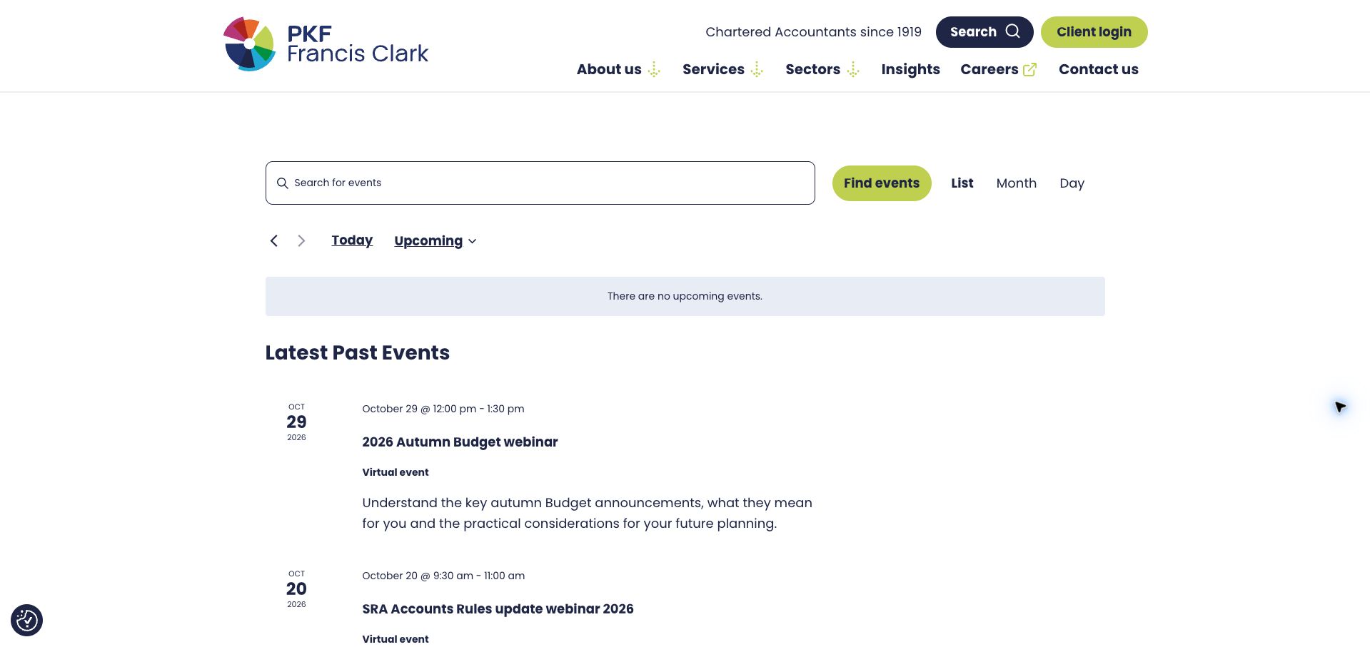
PKF Francis Clark carries its navy typography and lime accents into an otherwise restrained event list. A large search field, a rounded Find events button, and clear view choices make the calendar controls easy to identify. The captured upcoming state is empty, but past webinars remain listed with dates, time ranges, a Virtual event label, and short explanations of their subject. The summaries are more helpful than title-only entries because they explain why a specialist audience might open each page. Current The Events Calendar resource paths and calendar markup support the implementation. These are observations about a public publishing interface, rather than verification of webinar availability or the underlying tax and compliance content.
What you can learn
For specialist events, pair the title with a brief explanation of its practical focus. Make delivery format visible in the list and distinguish past sessions before readers invest time in evaluating whether they can still participate.
Pros
Virtual-event labels clarify format without requiring a detail-page visit.
Short descriptions give technical webinar titles useful context.
Cons & considerations
The captured schedule has no upcoming session to continue toward.
The opening layout lacks a substantial introduction to the event program.
Platform source: Public page platform evidence. The inspected page includes The Events Calendar plugin resources and tribe-events calendar markup. Current plugin resources and calendar markup on the pictured public page Platform evidence is separate from the direct website screenshot and is not a complete current infrastructure audit.
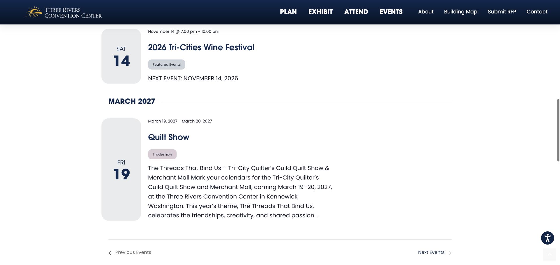
Three Rivers Convention Center opens with a branded event banner and a featured gathering before presenting the chronological calendar. In the scrolled capture, tall rounded date blocks, bold month dividers, category chips, and generous text spacing give the list a distinct visual treatment. A wine festival and a later quilt show demonstrate how a venue can accommodate different programs within one framework. Current The Events Calendar and Pro resources accompany the event markup. The featured treatment is useful for promotion, while the list carries the dates and descriptions needed for comparison. The observed entries establish the displayed design, not an independent guarantee of event availability.
What you can learn
Give a featured event a promotional role, then let the calendar handle comparison. Keep the date visible when a title wraps, and ensure that a brief entry and a longer description still feel like parts of the same system.
Pros
Large date blocks remain legible beside both short and long event descriptions.
Month dividers and category chips provide multiple ways to understand the sequence.
Cons & considerations
The promotional opening pushes the full calendar below the initial viewport.
Large blocks and generous spacing make a short schedule quite tall.
Platform source: Public page platform evidence. The inspected page includes The Events Calendar plugin resources and tribe-events calendar markup. Current plugin resources and calendar markup on the pictured public page Platform evidence is separate from the direct website screenshot and is not a complete current infrastructure audit.
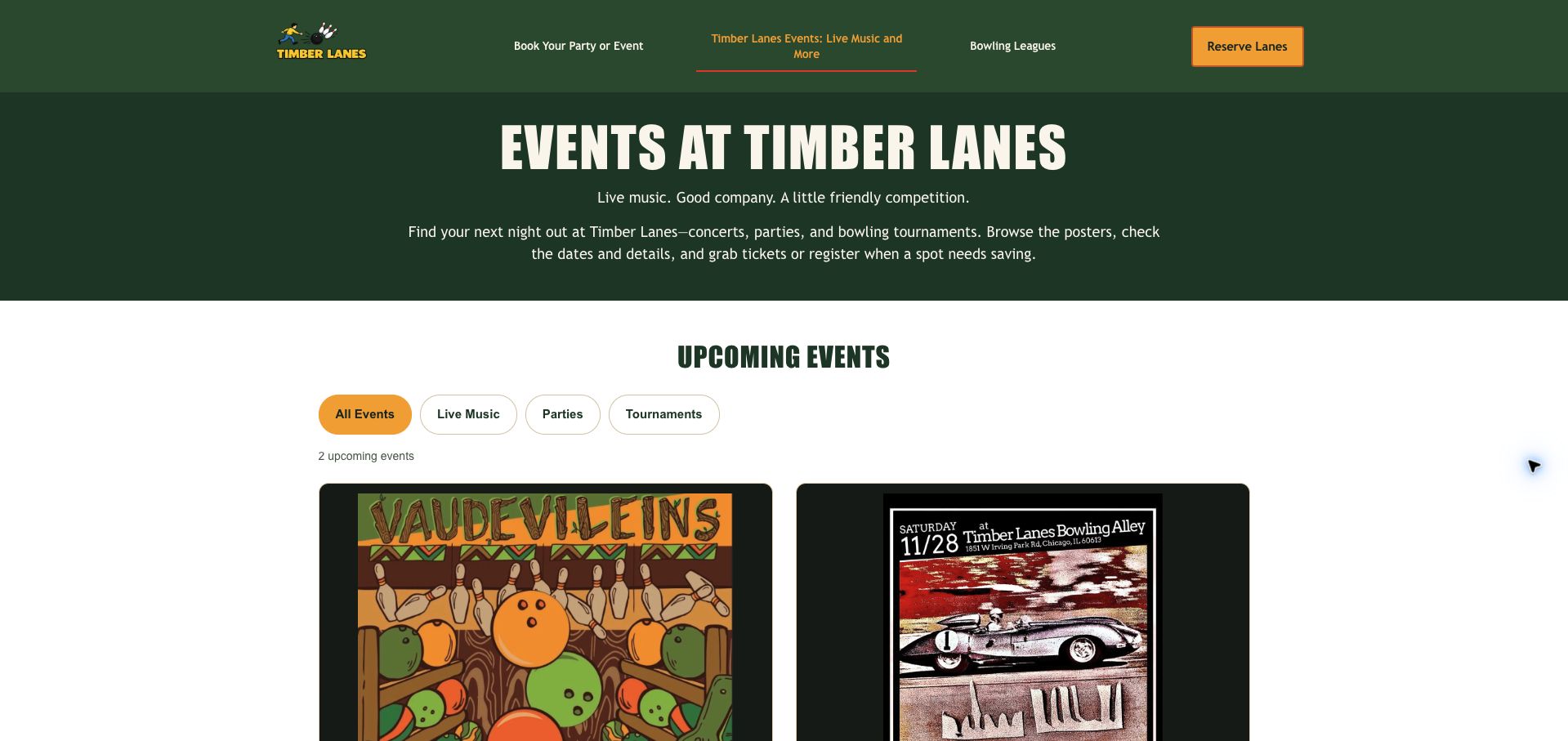
Timber Lanes presents concerts and themed nights with a dark green header, cream display type, orange accents, and large event posters. Filter buttons distinguish live music, parties, and tournaments, while a visible count tells visitors how many upcoming entries are available. Once loaded, the captured page shows two concerts with dates, Chicago time, age restrictions, and admission information in text as well as artwork. Current The Events Calendar stylesheets are present, including its Elementor integration resources. The custom cards do not expose the standard calendar classes, so that resource evidence establishes plugin presence without proving that every part of the interface is rendered by it.
What you can learn
Let posters supply atmosphere, but repeat essential details as readable text. A custom event layout should make timing, restrictions, and cost understandable even when artwork is dense, while its platform attribution stays limited to the evidence actually visible.
Pros
Text repeats timing and admission details that could otherwise be trapped inside posters.
Category buttons and an event count orient visitors before the artwork.
Cons & considerations
Large posters push practical details below the initial viewport.
The initial loading state briefly resembled an empty schedule before events appeared.
Platform source: Public page platform evidence. The inspected page references The Events Calendar stylesheets; asset inclusion alone does not establish that the pictured schedule is rendered by the plugin. Current plugin resources; custom interface attribution not established Platform evidence is separate from the direct website screenshot and is not a complete current infrastructure audit.
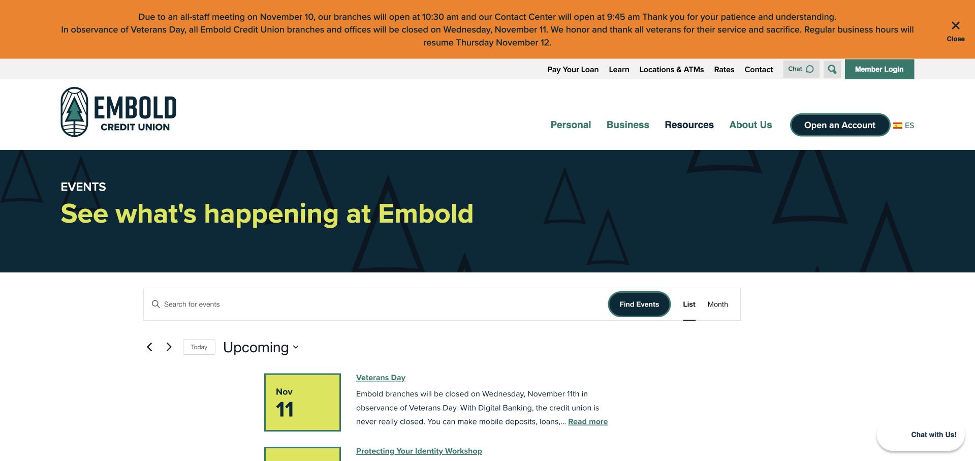
Embold Credit Union combines a dark teal introduction, bright yellow-green accents, and compact calendar rows. Square date tiles anchor each entry, while linked titles and short excerpts provide a quick route to more detail. The feed mixes branch holidays with identity-protection and homebuyer workshops, making it useful for both operational planning and community participation. Some educational entries display a Free label, whereas closures explain the service interruption. Current The Events Calendar resources and event classes support the public calendar implementation. The design shows how one feed can serve practical needs, although mixing those needs also creates a need for clear labels.
What you can learn
When a calendar includes closures as well as activities, make that distinction immediately visible. Use dates consistently, show meaningful participation information near workshop titles, and avoid making visitors open every entry to learn whether it is an event or a service notice.
Pros
Bright date tiles give the compact rows a consistent visual starting point.
Closures and educational activities are available in one chronological sequence.
Cons & considerations
The captured list mixes service interruptions with events visitors can attend.
A large branch notice and introduction reduce the first viewport’s room for listings.
Platform source: Public page platform evidence. The inspected page includes The Events Calendar plugin resources and tribe-events calendar markup. Current plugin resources and calendar markup on the pictured public page Platform evidence is separate from the direct website screenshot and is not a complete current infrastructure audit.
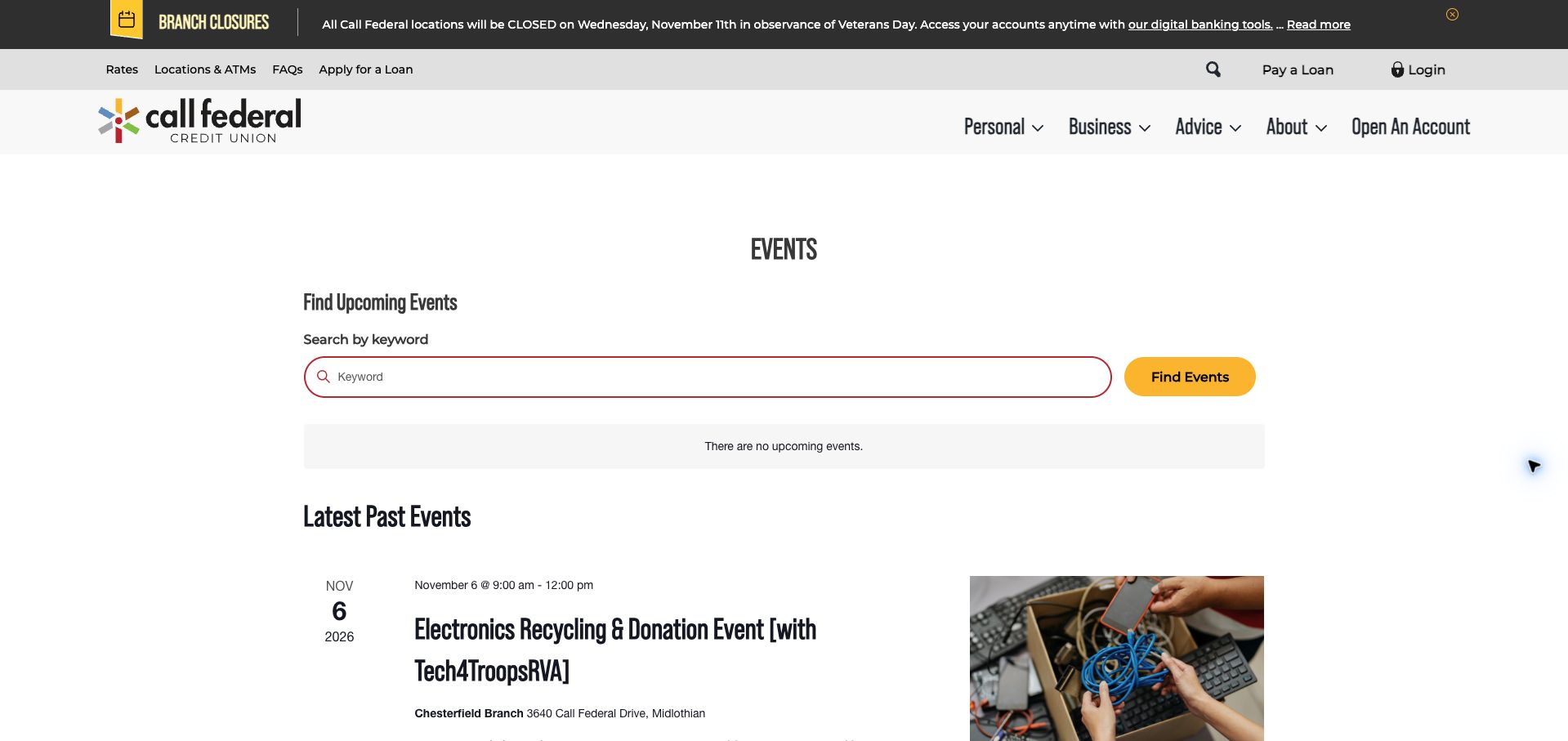
Call Federal uses a simple event page with a wide keyword field and a yellow Find Events button. Under an explicit no-upcoming-events message, a historical recycling event combines a date column, an informative title, a branch address, an explanatory excerpt, and a relevant photograph. This makes the archive more useful than a bare list of expired names: readers can understand the kind of community activity the institution supports. A rescheduled shred event further shows why status belongs in the title when it changes expectations. Current The Events Calendar resources and calendar classes establish the platform association. The review describes the public archive and does not imply that past activities remain available.
What you can learn
Use archive entries to preserve context, not merely dates. Keep changes such as rescheduling visible, include the relevant venue, and clearly separate historical community activity from the events a visitor can still plan to attend.
Pros
The archive combines dates, branch context, descriptions, and relevant imagery.
A clearly labeled keyword search creates a simple starting point.
Cons & considerations
The current view offers no upcoming event after the search area.
Long titles and excerpts make individual historical entries occupy substantial space.
Platform source: Public page platform evidence. The inspected page includes The Events Calendar plugin resources and tribe-events calendar markup. Current plugin resources and calendar markup on the pictured public page Platform evidence is separate from the direct website screenshot and is not a complete current infrastructure audit.
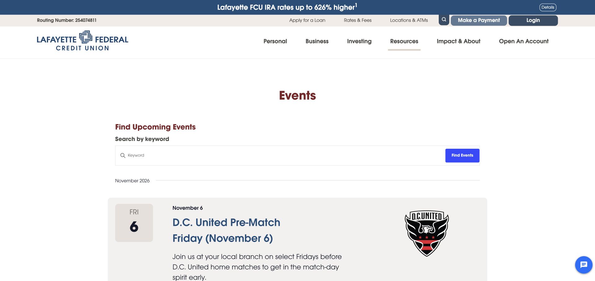
Lafayette Federal Credit Union uses wide pale cards, separate date tiles, large blue titles, and substantial imagery for its event listings. The captured first card pairs a D.C. United pre-match gathering with the club’s recognizable mark and a short invitation. Other visible entries describe networking and a local board-game launch, with locations included where supplied. A keyword search sits above the month divider. Current The Events Calendar assets and calendar classes support the implementation. The design makes community partnerships easy to recognize, while the review remains about the public event interface rather than the financial products promoted elsewhere in the header or the availability of any particular gathering.
What you can learn
Use partner imagery to aid recognition, then give the date and local context equal clarity. A consistent card can accommodate both a familiar sports brand and a less familiar community activity without forcing visitors to decipher a promotional image.
Pros
Date tiles and descriptive titles establish a clear hierarchy within each card.
Partner imagery gives the community program an immediately recognizable reference.
Cons & considerations
Large cards reveal relatively few events in the opening viewport.
The separate promotional strip competes with the calendar’s community-focused purpose.
Platform source: Public page platform evidence. The inspected page includes The Events Calendar plugin resources and tribe-events calendar markup. Current plugin resources and calendar markup on the pictured public page Platform evidence is separate from the direct website screenshot and is not a complete current infrastructure audit.
OnPoint Community Credit Union presents events as two-column cards beneath a restrained framed introduction. Location and event-type controls sit together, with an optional location-based action alongside them. The scrolled capture shows a homebuying seminar and a cybersecurity workshop, each with a photograph, colored category strip, date and time, linked title, and branch location. That structure helps visitors compare both subject and travel context without opening a detail page. Current The Events Calendar resources and event-related classes support this public implementation. The location feature was not activated, and the review makes no claim about geolocation accuracy, registration, or the educational outcomes of the workshops.
What you can learn
Place subject, timing, and branch information in a repeatable order. Location-based discovery should remain optional when a visitor can choose a place manually, and decorative image treatment should not distract from the details needed to select an event.
Pros
Each card groups topic, timing, and branch information in a predictable sequence.
Location and event-type controls reflect practical ways to narrow a community schedule.
Cons & considerations
The large introductory frame delays the event cards in the opening viewport.
Layered image borders add visual weight without adding scheduling information.
Platform source: Public page platform evidence. The inspected page includes The Events Calendar plugin resources and tribe-events calendar markup. Current plugin resources and calendar markup on the pictured public page Platform evidence is separate from the direct website screenshot and is not a complete current infrastructure audit.
Kegan has 15+ years of experience working with small businesses, Fortune 500 companies, and everything in between. No development job is too big or too small: he brings the same hands-on attention to a focused improvement, a complete website, or a custom application.
For The Events Calendar projects, he can help with custom themes and templates, publishing workflows, plugin integrations, migrations, and ongoing maintenance. He works directly with clients on scope, design, implementation, testing, and handover, with an emphasis on clear communication and a system that remains practical to maintain after launch.
Show 3 other The Events Calendar developersHide other The Events Calendar developers
Choose the implementation around the operating model
Use a straightforward event list
A readable chronological list can suit a small program when dates and practical details are visible without opening every item.
Add filters only when useful
Define categories, venue relationships, and audience labels before introducing many controls. A filter that frequently returns nothing creates work rather than clarity.
Connect registration at an explicit boundary
Explain whether the next step reserves a place, buys a ticket, or opens another provider. Calendar publication and ticketing are not automatically the same workflow.
From references to requirements
Plan the content and everyday maintenance
Assign event data ownership
Name who maintains times, prices, venue details, cancellations, and recurring dates. Reconcile differences between cards and event detail pages.
Test time and recurrence behavior
Review multi-day events, timezone presentation, repeated sessions, and schedule changes in the actual setup. Confirm that old occurrences do not look like new availability.
Review mobile and failure states
Check long event names, calendar controls, empty results, and external booking links. Retain contact information when registration is unavailable.
A useful handover demonstration
Ask the actual team to carry out its routine job: publish a realistic update, correct a mistake, preview a narrow screen, and identify who owns an integration failure. For a library or frontend framework, also ask who maintains the content source and deployment. A polished screenshot does not answer those operational questions.
Beyond the screenshot
The Events Calendar project checklist
State dates and times.
Identify timezone when needed.
Show venue or online format.
Explain price and eligibility.
Label registration handoffs.
Maintain cancellations.
Test recurring dates.
Design empty results.
Archive past events clearly.
Check mobile filters.
Test with real content, a keyboard, a small screen, slow or failed requests, and the people who will maintain the system. These are planning checks, not an accessibility, security, performance, or search-ranking certification.
Sources & editorial method
How this The Events Calendar collection was reviewed
Twenty distinct public properties have direct website captures and original design reviews. The first five are explicitly identified recognizable organizations or established specialists. Platform evidence is scoped to each named property; documentary associations, dated observations, and narrower asset-only signals remain qualified. Captures and technology verification have independent dates. A bounded public stack audit was attempted for every source, preserving inaccessible and unknown results. No private administration or transactions were inspected.
Every image is an unmodified capture from the actual website, with its source and capture date. Some captures are reused from our shared catalog; their dates remain the original capture dates. None comes from a vendor gallery or a generated reconstruction. Moving imagery and live content can change.
Technology attribution uses public page assets or metadata, official platform documentation, or a cited first-party project case study. Documentary and framework-relationship evidence is identified where used; it is not a complete current backend inventory. A CMS image CDN alone does not establish a full CMS deployment. A library’s presence does not prove which individual controls use it, and a platform label does not establish AI authorship.
The composition notes, lessons, pros and tradeoffs are original editorial observations. We have not measured conversion, traffic, security, performance or accessibility conformance. Website owners retain their brands and imagery; these examples are not our client portfolio. Written, Edited and Curated are independent records, not dates advanced by a build. See our editorial standards or suggest a correction.
Questions worth asking
The Events Calendar website development FAQs
Is a calendar always better than a list?
No. Match the view to event volume and the visitor’s task. A short list can be easier to scan than a mostly empty month.
Does plugin CSS prove the pictured schedule uses the plugin?
No. The Timber Lanes example retains an asset-only qualification rather than claiming its visible schedule is generated by the plugin.
What should an empty calendar say?
Explain the selected period or filters and offer a sensible way to change them or find future announcements.
Can the event date disagree with registration details?
It should not. Assign an owner to reconcile cards, detail pages, recurring occurrences, and external ticketing information.