Best Boat Tour Websites of 2026 (24 Real-World Examples)
Boat-tour websites that connect the view from the water with clear routes, vessel choices, departure details and a useful path to tickets.
Explore 24 real boat-tour websites, from regional sailing and lobstering operators to city sightseeing fleets and coastal adventure specialists. Compare how they explain the experience before asking visitors to choose a departure.
A boat-tour photograph can make a destination appealing, but it rarely answers the practical questions that determine whether a trip fits. Visitors need to know where they board, how long they will be away, what kind of vessel they will use and whether they are buying individual seats or a private charter. The website has to connect the scenery with those decisions.
This collection includes harbor cruises, sailing excursions, wildlife trips, canal tours and more active small-boat experiences. These are different products, so the reviews preserve their distinctions. The focus is on observable website design and communication. A clear page is useful evidence of presentation, not a guarantee of safety, wildlife sightings, service quality or a particular travel outcome.
Before the examples
What makes good boat tour website design in 2026?
Explain the trip people are choosing
Name the route or destination, duration and vessel format in ordinary language. Distinguish a sail from a motorboat cruise, a shared ticket from a whole-boat charter and a sightseeing trip from an activity that asks guests to participate. The difference should be understandable without opening a reservation form.
Make departure information easy to find
Give the correct pier, check-in expectation and return arrangement a stable home. A one-way route needs different preparation from a cruise that returns to its starting point. Keep seasonal schedules, date-specific availability and general trip descriptions distinct so an old promotion does not imply a current departure.
Use imagery to clarify the experience
Show the vessel, seating and onboard atmosphere as well as the landscape. Keep route changes and natural variability clear where relevant. Moving media should have a useful fallback, and essential information should remain readable when a visitor declines optional cookies or a third-party component does not load.
The collection · 24 examples
24 boat tour websites worth studying
These 24 distinct public properties match the original saved industry draw. Study their tour comparisons, fleet presentation, local identity and planning routes. The Editors Choice is an editorial website-design selection, not a ranking of boat operators or a service endorsement.
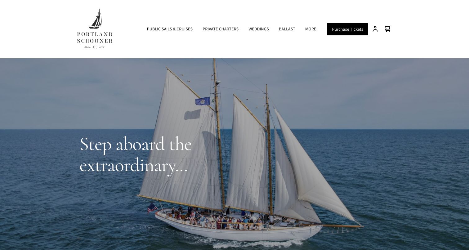
Portland Schooner Co. presents a quiet sailing photograph beneath a spacious white header. The restrained serif typography suits the wooden vessel without turning the page into a dense nautical theme. Its useful distinction appears in the service structure: windjammer sails, motorboat lighthouse cruises and private charters receive separate explanations. The linked public-trip page reinforces that difference with durations, seasonal departure tables and separate price groups. It even labels the motorboat ticket route plainly, reducing the chance of mistaking a cruise for a sail. That combination of atmosphere and concrete comparison makes the regional specialist a strong design reference.
What you can learn
Show the actual vessel, then explain how its experience differs from the alternatives. Attractive photography becomes more useful when duration, propulsion, departure season and the kind of booking are understandable before someone reaches a ticket screen.
Pros
The vessel photograph and restrained type establish a coherent local sailing identity.
Separate sail and motorboat descriptions make a meaningful product distinction unusually explicit.
Cons & considerations
The first visit displayed a mailing-list overlay before the underlying homepage was visible.
Seasonal times and forthcoming ticket notices need careful maintenance to avoid conflicting expectations.
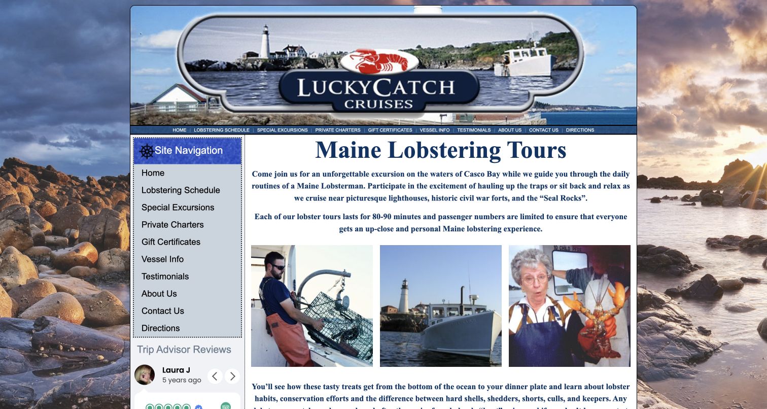
Lucky Catch makes its specific activity clear immediately: the page introduces Maine lobstering rather than a generic harbor experience. Three photographs show a trap being handled, a working boat near a lighthouse and a passenger holding a lobster. A left-hand navigation column keeps the schedule, vessel information, directions and private-charter routes visible beside that explanation. The opening also gives an approximate duration and explains that passengers can participate or simply watch. Its compact, older-style composition has less visual polish than many larger fleets, but it provides concrete evidence of what makes this particular excursion different.
What you can learn
Explain the guest's role with images and ordinary language. A hands-on activity needs more than scenery: show what people might do, how long they will be aboard and where practical preparation information can be found.
Pros
The photographs illustrate participation rather than relying solely on distant coastal scenery.
Duration, schedule and directions are easy to identify in the initial information structure.
Cons & considerations
The narrow top navigation repeats the larger sidebar and adds unnecessary visual density.
The decorative background and older review widget compete with otherwise useful practical copy.
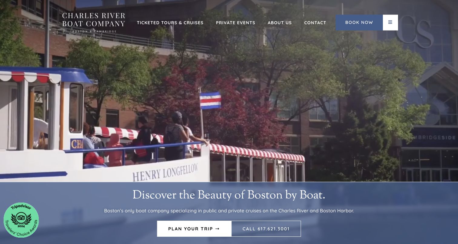
Charles Riverboat Company places its wordmark and concise navigation over footage of a vessel beside the city. A blue panel beneath the moving scene introduces the Boston location and offers planning and telephone routes. The homepage then divides public tours from private events before presenting more specific sightseeing, architecture and sunset offerings. This is a helpful information sequence for an operator whose customers arrive with very different intentions. The public visitor can look for a timed experience while an event organizer can investigate charter possibilities without interpreting a single, overloaded booking label.
What you can learn
Separate individual tickets from private-event planning early in the journey. Shared scenery can establish the brand, but the next destination should reflect whether someone is comparing a scheduled tour or organizing a group occasion.
Pros
The blue text panel gives the location statement a stable backdrop below the video.
Public-tour and private-event categories make two distinct buying situations easy to recognize.
Cons & considerations
The large opening footage delays more detailed duration and departure comparisons below the fold.
Several planning links open overlays, so their fallback and keyboard behavior deserve careful implementation.
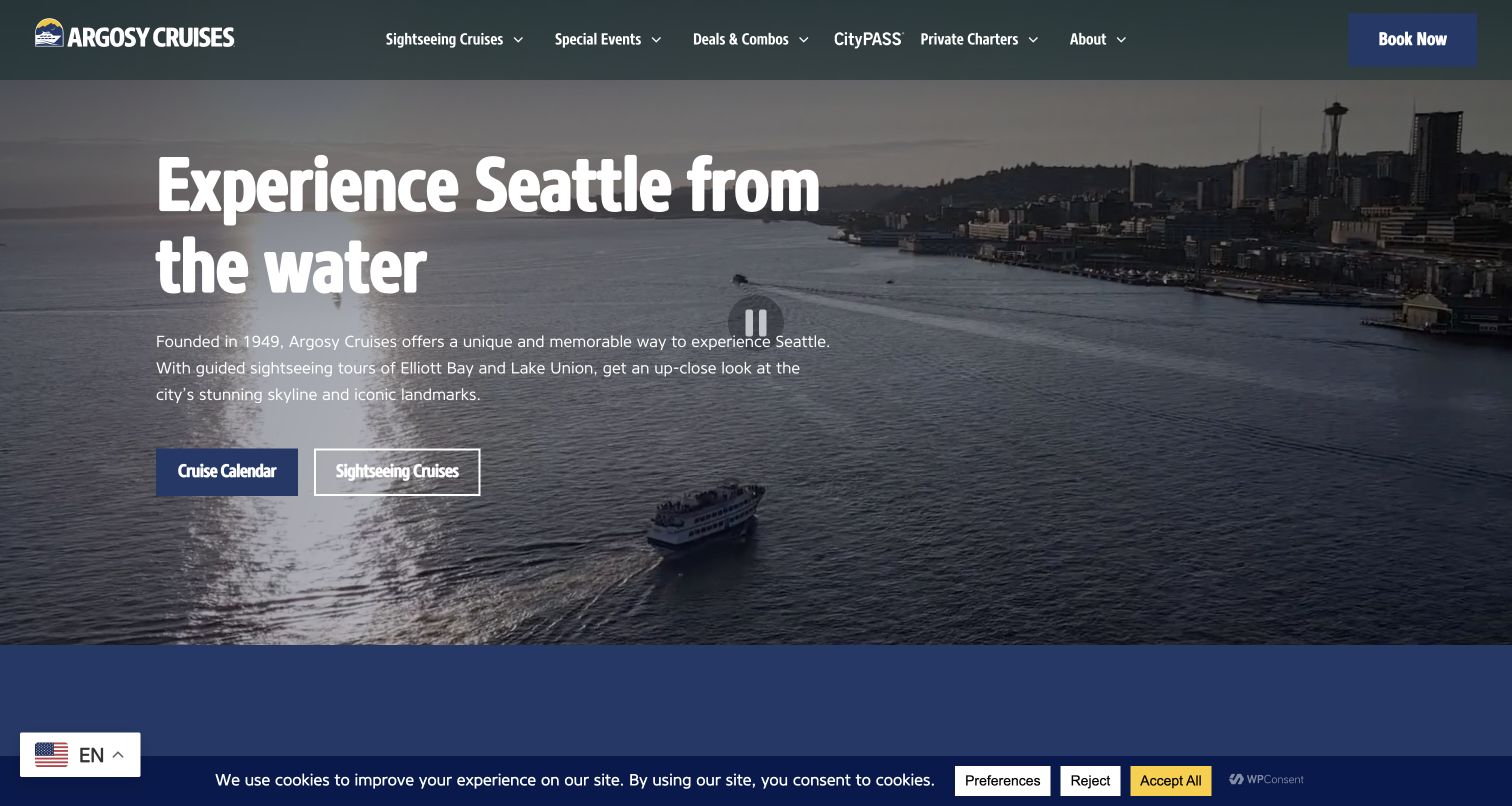
Argosy Cruises begins with a direct Seattle proposition over waterfront footage, then gives visitors a choice between the calendar and cruise discovery. Its tour cards carry practical distinctions that the broad hero cannot communicate: the harbor cruise lists a pier and duration, while the locks trip explains its one-way format and alternative endpoints. The dark blue palette and condensed headings create a consistent visual system across the introduction and experience listings. The useful lesson is in the progression from recognizable place to route-specific detail, rather than in the scale of the moving background itself.
What you can learn
Treat departure and return arrangements as comparison information, not fine print. When routes share a city but differ in length or endpoint, place those differences alongside their names before asking the visitor to select a departure.
Pros
The calendar and sightseeing links support both date-first and experience-first visitors.
Tour cards surface route length and boarding context instead of relying on evocative names.
Cons & considerations
The opening uses external video, making a readable static fallback important for slower visits.
The captured first view retains a cookie notice that competes with the lower navigation area.
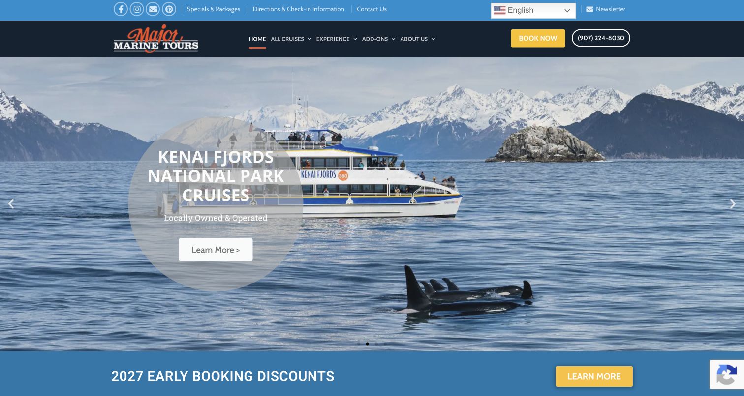
Major Marine Tours uses a large Alaska scene to introduce its cruises, with a vessel, wildlife and mountains all visible in the opening composition. A circular translucent text area keeps the destination message separate from the picture's busiest parts. Above it, a utility row gives directions and check-in information their own link, while the main navigation distinguishes cruises, experiences and add-ons. The rotating promotion below the hero introduces the coming season. This arrangement shows how an operator can sell a destination while still giving returning or already-booked visitors a practical route into their trip preparation.
What you can learn
Put check-in and travel preparation where existing guests can find them without re-entering a sales journey. Scenic storytelling and operational information serve different needs, and both deserve clear placement in a tour site's navigation.
Pros
Directions and check-in have a named utility link above the main experience navigation.
The opening photograph connects the vessel to the landscape visitors are considering.
Cons & considerations
Automatic slides change the message, so important trip facts should also have stable destinations.
Two navigation rows and seasonal promotions increase the number of competing entry points.
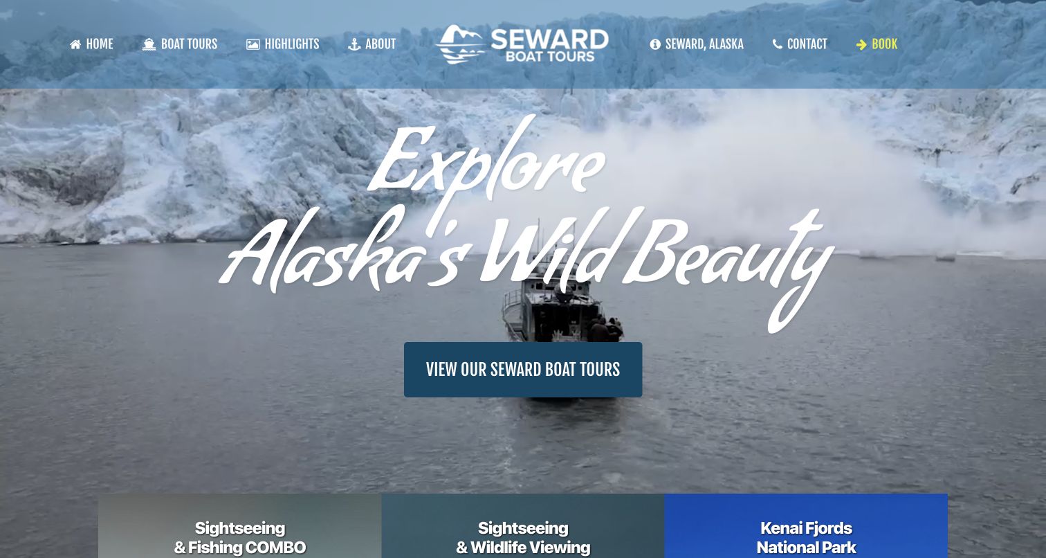
Seward Boat Tours pairs a glacier scene with a prominent route to its experiences, then introduces three clearly differentiated options. Fishing combined with sightseeing, wildlife viewing and a longer national-park cruise each have their own heading. The cards state whole-boat charter scope and daily time windows, helping visitors understand that these are not simply interchangeable seats on a large sightseeing vessel. Further sections introduce the boats and captains, connecting the landscape to the people and equipment involved. The page is strongest where those practical details balance the expansive, handwritten-style opening headline.
What you can learn
Explain the unit being purchased: a seat, an entire vessel or a private itinerary. Put capacity and time commitment beside the experience description so visitors can judge fit before they enter an external reservation system.
Pros
The experience cards distinguish combined fishing, wildlife viewing and longer scenic trips.
Whole-boat wording and time windows make the charter format more concrete for groups.
Cons & considerations
The oversized opening script occupies space that could otherwise preview practical trip details.
Wildlife imagery can imply certainty unless seasonal and natural variability remain clear in detail pages.
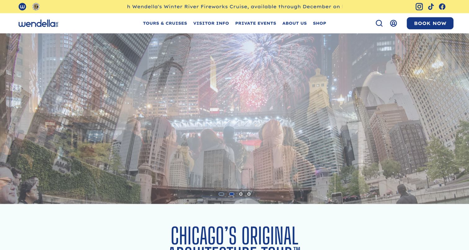
Wendella uses a bright yellow announcement strip and blue wordmark to introduce a clean, contemporary Chicago identity. The main navigation is compact despite the range of services: tours, visitor information, private events and the company story remain distinct. A large rotating scene highlights seasonal experiences before the page turns toward the architecture-tour proposition. The design makes the site feel active without hiding the route to its schedule. Its tradeoff is reliance on changing promotional imagery; the reviewed capture caught a transition between scenes, demonstrating why essential tour information needs a stable presentation elsewhere on the page.
What you can learn
Let seasonal offers occupy a clearly bounded area while keeping the everyday tour and visitor-information routes consistent. A returning guest should not need to understand the current campaign to find the schedule or arrival instructions.
Pros
The short navigation labels distinguish tour discovery, practical information and private-event needs.
The announcement strip creates a recognizable location for seasonal operating messages.
Cons & considerations
Rotating hero imagery can produce visually busy transitions and obscure a single clear focal point.
The first screen emphasizes the campaign before supplying the main tour comparison details.
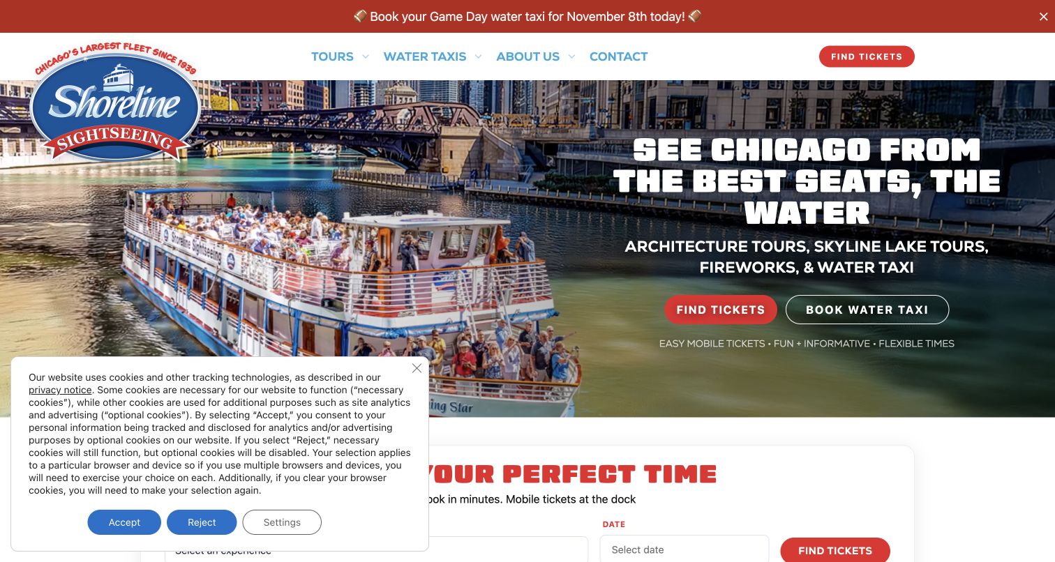
Shoreline Sightseeing identifies its main experiences directly in the hero instead of asking the skyline photograph to explain the business. Architecture, lake tours, fireworks and water taxis sit beneath a bold headline, with separate ticket and water-taxi actions. The next section combines an experience/date selector with cards that list durations and starting prices. This gives visitors two ways to narrow the same catalog. A time-sensitive announcement remains at the top, and a privacy panel covered part of the lower-left area during the visit. Both are useful reminders that operational notices influence the effective layout.
What you can learn
Support quick selection without removing comparison. A date picker suits visitors who already know their plan, while concise cards help others decide which duration and route fit the time they have available in the city.
Pros
Boat tours and water taxis receive distinct actions in the first screen.
Experience cards pair recognizable categories with duration and entry-level price context.
Cons & considerations
The captured privacy notice covers part of the planning area and reduces immediate visibility.
Time-sensitive announcements need expiry rules so past event messages do not remain prominent.
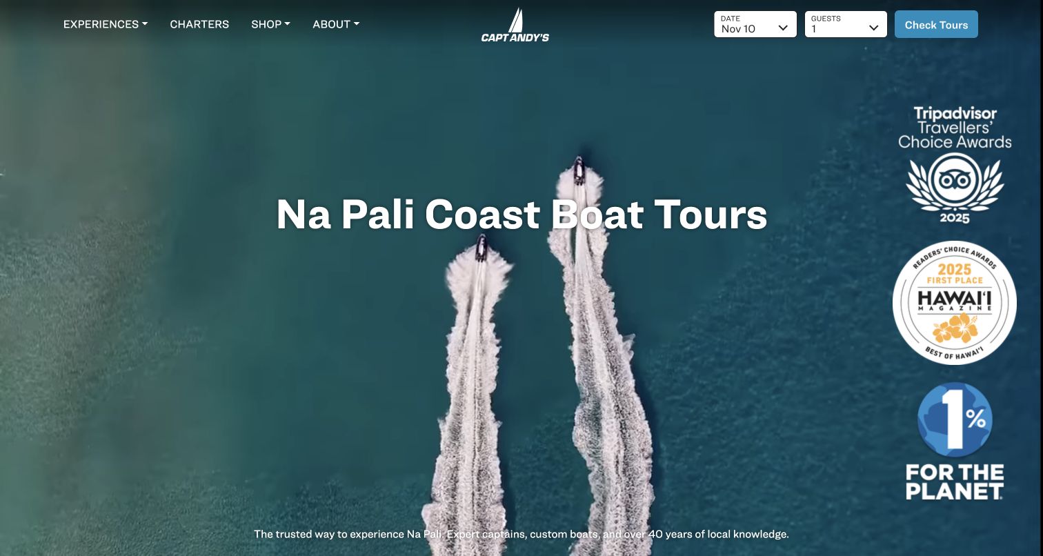
Capt Andy's opens with aerial boat footage and a concise Na Pali destination heading. The header combines general discovery links with a date and guest selector, allowing a visitor with a firm plan to move toward availability. Below the dramatic opening, the trip cards distinguish sailing, dinner, scenic and raft experiences with durations, check-in times and inclusions. Those details matter because the boats and physical character of the trips differ substantially. The page supplies a useful example of letting a simple hero introduce the landscape while a more structured comparison explains the actual choices.
What you can learn
Use consistent fields to compare experiences that share a destination but differ in comfort, activity and time. A name and photograph should introduce the trip, while vessel type and practical inclusions help visitors select an appropriate option.
Pros
Trip cards expose duration, check-in timing and included elements in a repeatable structure.
The header supports date-led planning without removing the route to browse experiences.
Cons & considerations
The opening screen gives considerable space to awards and imagery before practical comparison appears.
Prominent wildlife footage needs nearby expectations that encounters and routes depend on conditions.
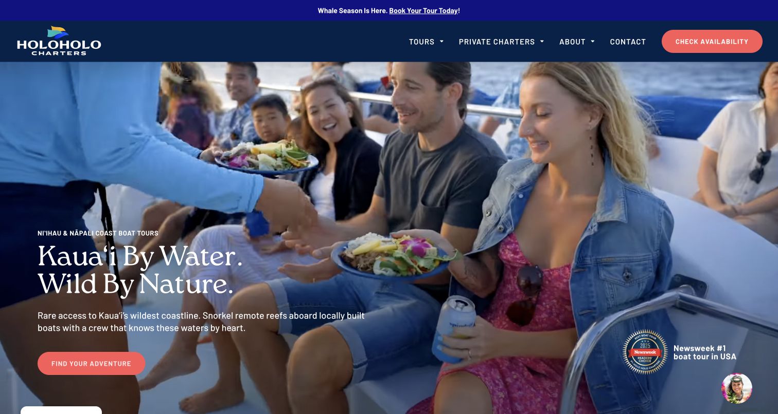
Holo Holo Charters combines coastal positioning with footage of guests being served aboard a boat. That choice broadens the first impression beyond cliffs and wildlife to the onboard experience. Coral actions stand out against the navy header and lead into a tour section with price, duration and detail routes. The comparison content identifies food, snorkeling and vessel differences rather than presenting every excursion as the same adventure. A seasonal announcement sits above the navigation. The page demonstrates how a destination business can connect emotional imagery with the practical ingredients that shape a visitor's day.
What you can learn
Show both the place and the experience aboard the vessel. Then compare the elements guests actually choose between, including time, food, activity and boat format, using the same vocabulary across the tour catalog.
Pros
The tour comparison fields make inclusions and vessel differences available in one structure.
Contrasting coral actions create a clear discovery route within the dark blue identity.
Cons & considerations
The video and multiple promotional claims compete for attention in the opening composition.
Short tour labels still require detail pages to explain weather limits and boarding requirements.
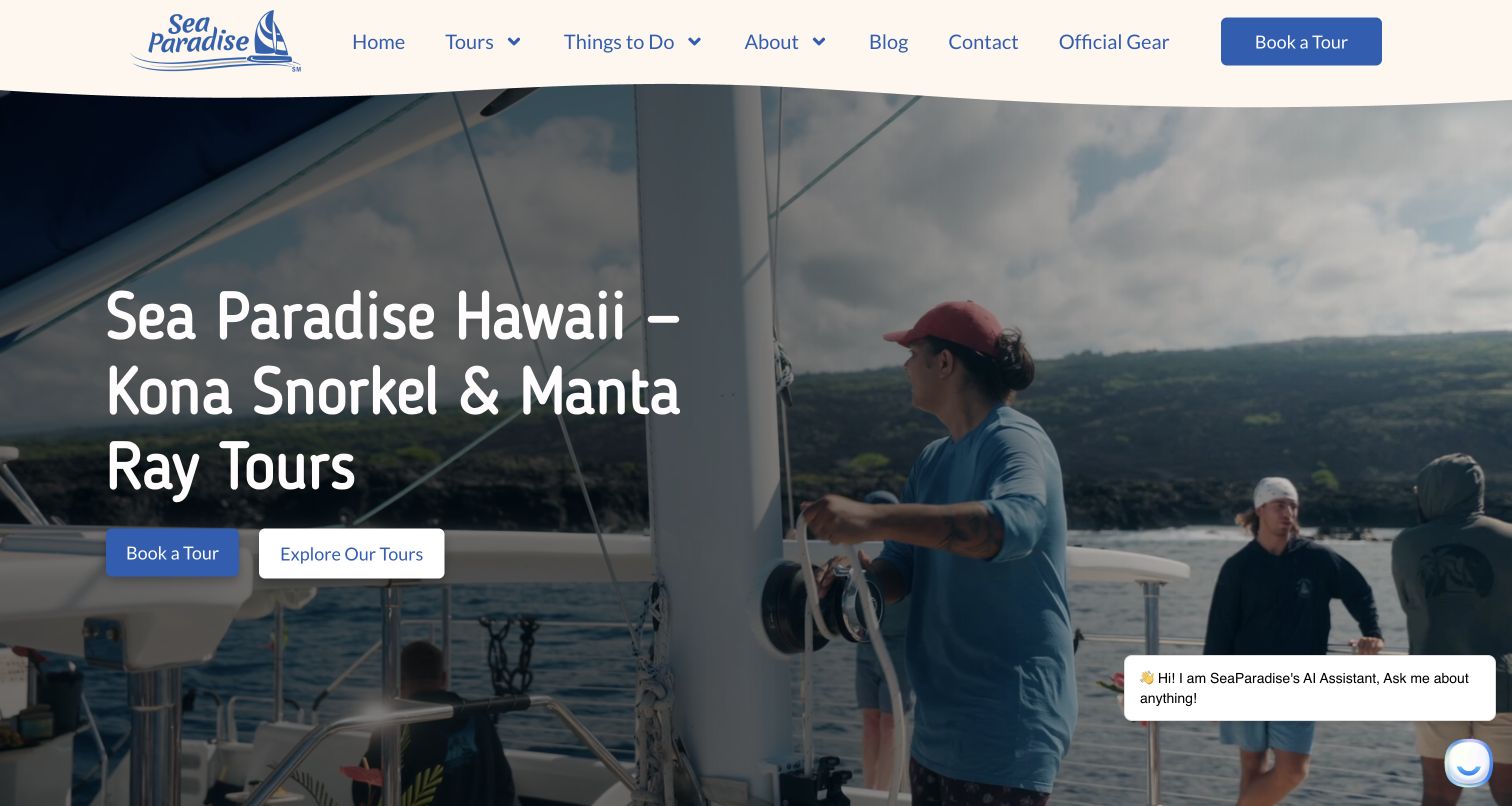
Sea Paradise names its Kona snorkeling and manta-ray activities in the opening rather than using an abstract travel slogan alone. Two adjacent actions distinguish booking from exploring the tours, preserving a useful route for visitors who are not ready to choose a departure. The following section states the common departure location and then separates morning, afternoon and evening experiences with timing, inclusions and age-based price categories. The warm header and rounded typography soften the large onboard photograph. A chat prompt appears in the corner, showing how support widgets can compete with an otherwise restrained composition.
What you can learn
Give uncertain visitors a way to understand the offer before asking them to book. Shared departure information belongs above the comparison, while differences in timing, activity and inclusions belong with each individual tour.
Pros
The main heading names both the place and the specific water activities offered.
The experience section introduces departure context before listing individual trip choices.
Cons & considerations
The corner chat message covers a portion of the opening photograph and adds visual noise.
Marine-life photography needs careful supporting language so an experience is not read as a guaranteed sighting.
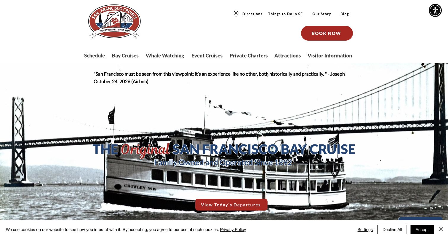
Red and White Fleet brings its history into the opening through a rotating image sequence that includes an archival vessel photograph. A large contemporary header provides schedule, cruise and visitor-information routes above that scene. The most useful action is specific: visitors can view the day's departures without first interpreting the complete product catalog. Below, cruise cards combine duration and price categories with short descriptions. The historical imagery creates distinction, but the practical structure prevents the site from becoming only a heritage story. The captured cookie strip remains visible along the bottom of the page.
What you can learn
Use company history to differentiate the presentation while keeping current operating information one clear step away. A departure-specific action can be more useful to an arriving traveler than a broad invitation to learn about the brand.
Pros
The departures action gives time-sensitive visitors an understandable destination from the hero.
Cruise descriptions include duration and age-based pricing context for comparison.
Cons & considerations
The large multilevel header occupies significant space before the actual cruise information.
Changing imagery and a persistent cookie strip can reduce clarity in the opening view.
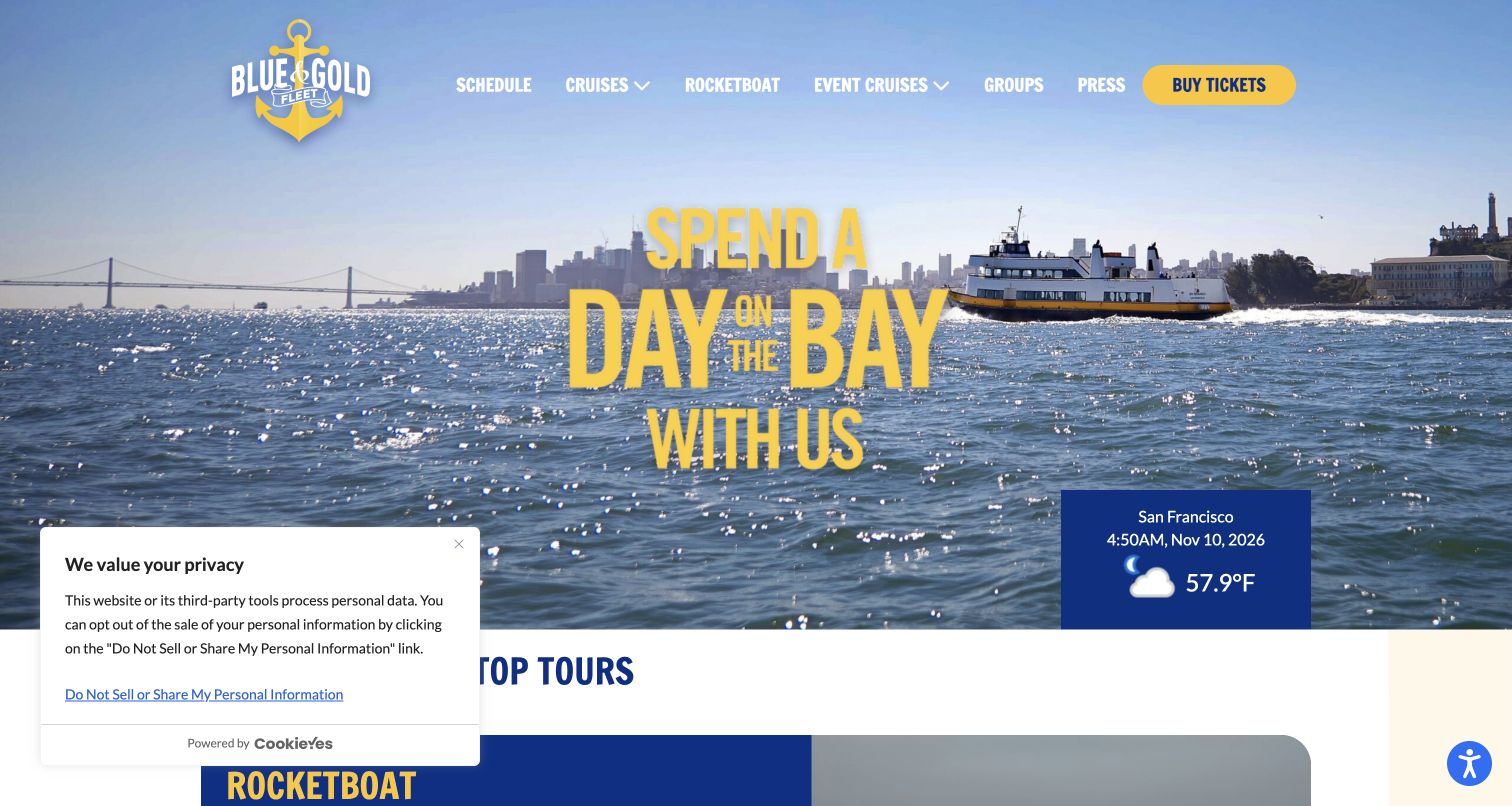
Blue & Gold Fleet uses its namesake colors consistently across the logo, hero message and ticket action. A wide bay photograph establishes the setting, while a small weather panel adds a sense of the current destination. The navigation keeps the schedule prominent and separates regular cruises from event offerings and group arrangements. Further down, the page introduces specific tour lengths alongside ferry-service information. The layout is useful for studying a fleet with several public purposes, although transport and sightseeing content require clear boundaries so a visitor can recognize which service is being described.
What you can learn
Make the primary service categories explicit when one fleet handles both leisure trips and transport. A shared brand can connect them, but schedules, boarding information and ticket expectations should remain specific to the visitor's chosen journey.
Pros
The high-contrast ticket action is identifiable within the blue-and-yellow visual system.
Schedule and group routes are clearly named instead of being buried within promotional copy.
Cons & considerations
The first-view privacy panel obscures a substantial portion of the lower-left content.
Weather and destination imagery add atmosphere but do not replace route-specific operating information.
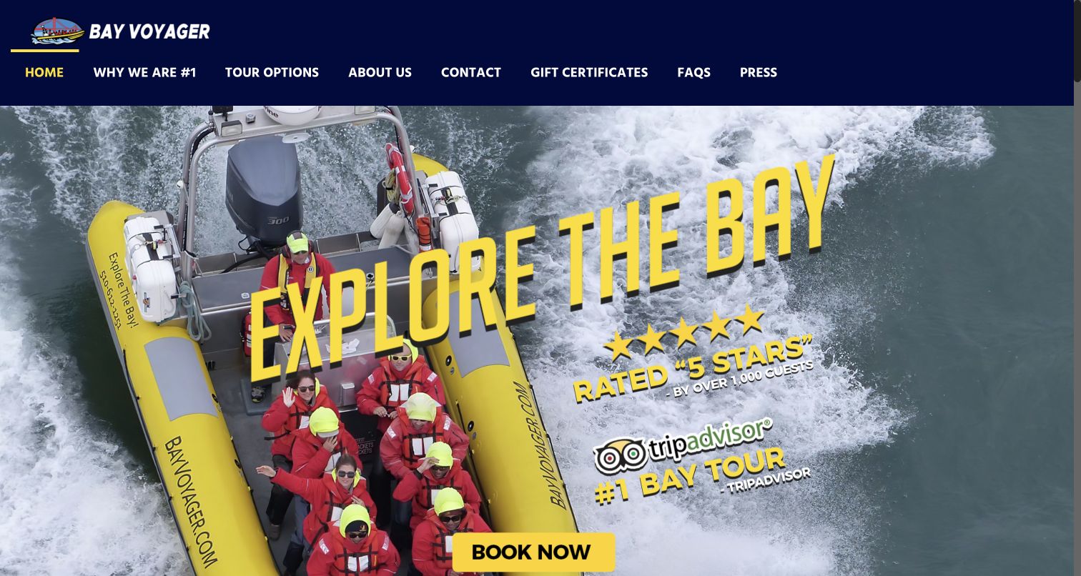
Bay Voyager shows the actual inflatable boat from above, with passengers and its scale clearly visible. The yellow-and-navy identity connects that photograph to the logo, navigation and booking action. Beneath the image-led introduction, the site distinguishes a longer bay tour, a shorter waterfront option and private charters. Directions and a telephone route appear alongside those choices. The presentation is forceful and promotional, but its strongest content is concrete: the type of vessel and the difference in time commitment help visitors imagine the experience rather than simply admire the San Francisco skyline.
What you can learn
Photograph the vessel in a way that explains its scale and passenger experience. Then give each tour a clear duration and purpose, so a dramatic adventure image leads to a meaningful choice rather than an undifferentiated booking button.
Pros
The opening photograph makes the small-boat format visually apparent before detailed reading.
Longer, shorter and private experiences are separated into understandable routes.
Cons & considerations
Large ranking and review claims dominate the image and should retain verifiable source context.
The hero artwork contains important text within the image, making responsive treatment more demanding.
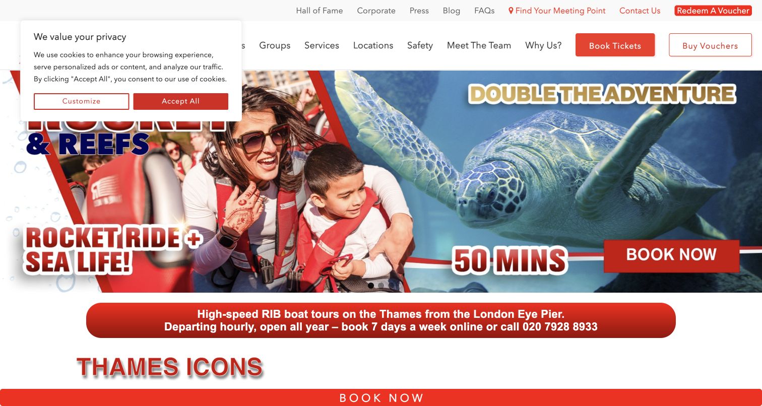
Thames Rockets uses red campaign graphics and large photographic panels to communicate an energetic London speedboat experience. A utility row includes a dedicated meeting-point route, voucher redemption and contact information, while the main navigation separates experiences, groups and safety. The current promotion combines a boat trip with another attraction, illustrating how a tour operator can present a packaged day out. The design is intentionally busy, with repeated booking opportunities and a fixed lower action bar. Its practical strength lies in naming the logistical routes that a colorful promotion alone cannot explain.
What you can learn
Give meeting points and safety information their own recognizable routes. Themed product names and energetic artwork can attract attention, but guests still need a reliable way to identify the correct pier, duration and preparation requirements.
Pros
The utility navigation makes meeting-point discovery distinct from browsing or buying an experience.
Groups and safety have named destinations alongside the regular tour catalog.
Cons & considerations
The initial privacy notice overlays part of the already crowded campaign artwork.
Multiple promotions and persistent booking actions can compete with product comparison and logistical detail.
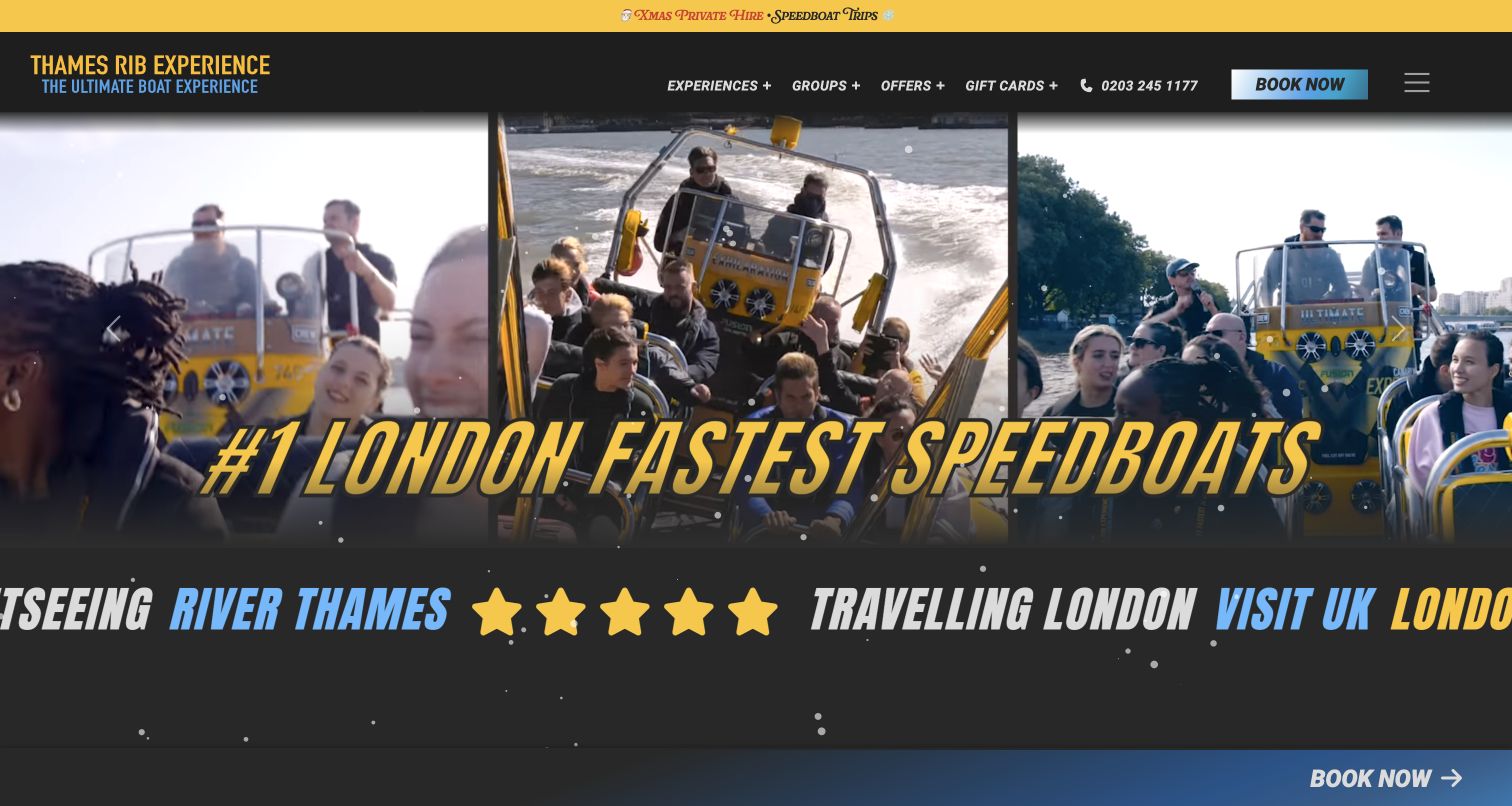
Thames RIB Experience combines a black background, bright yellow type and fast-moving photographic panels. The resulting visual language matches the active nature of the product more directly than a tranquil scenic treatment would. The navigation names experiences, groups, offers and gift cards, with telephone and booking options kept visible. Its experience list distinguishes several routes by minutes, and location information has a separate destination. The page is a useful reference for strong brand character, but the animated and promotional layers also show why essential comparisons should not depend on reading a moving headline.
What you can learn
Match the visual tone to the activity while keeping the decision criteria stable. Duration, departure point and suitability should remain readable outside any animated montage, especially when several themed experiences use similar imagery and booking language.
Pros
The yellow-and-black treatment creates a distinctive and consistent adventure identity.
Named experience routes include durations, making differences more concrete than names alone.
Cons & considerations
Animation and oversized promotional text can crowd the first screen and demand motion alternatives.
Gift offers and themed campaigns add choices before a newcomer understands the core routes.
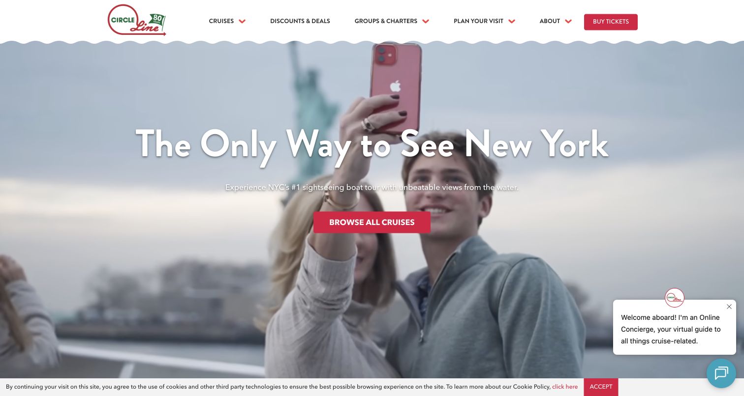
Circle Line places a short New York proposition over moving waterfront footage, with a single action leading into its cruise selection. The page then becomes more practical: date shortcuts, tour duration, departure pier and available times appear in the public interface. That progression supports visitors who are fitting a cruise into a day already planned around other attractions. The navigation also distinguishes full-island, shorter landmark and evening experiences. An unsolicited discount overlay appeared on the initial visit; the retained main capture shows the unobstructed homepage on a subsequent view, with the support prompt still present.
What you can learn
Connect an inspirational opening to a date-and-location decision quickly. Frequent departures are easier to understand when tour length, boarding pier and the day's choices appear together, instead of requiring visitors to jump between unrelated pages.
Pros
The date-oriented selection structure suits travelers working within a limited sightseeing window.
Cruise labels distinguish route scope and evening experiences before the ticket step.
Cons & considerations
The initial discount overlay interrupted exploration before the visitor had chosen a product.
Video, chat and cookie elements compete with an otherwise clear central discovery action.
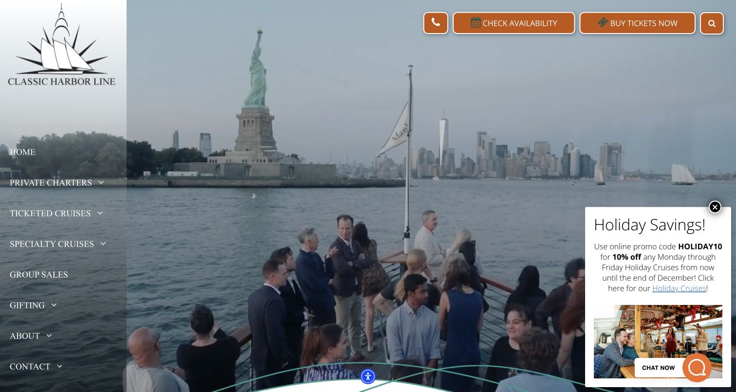
Classic Harbor Line New York uses a tall left navigation rail over waterfront footage, creating a layout that differs from the common horizontal-header pattern. The rail separates private charters, ticketed cruises, specialty trips and dining, while prominent controls at the upper right lead to availability and tickets. The catalog contains audience-specific routes such as architecture, family and music experiences. This organization helps a broad offering remain discoverable, although it asks visitors to understand several neighboring category names. A holiday promotion and chat control appeared together during the capture, competing with the vessel imagery.
What you can learn
Organize a large tour catalog around recognizable visitor purposes, but test whether category labels overlap. The route to browse a themed experience and the route to reserve a date should be distinct without making the navigation feel fragmented.
Pros
The vertical rail keeps the main catalog categories visible beside the opening scene.
Availability and ticket controls remain identifiable at the opposite edge of the layout.
Cons & considerations
Similar category terms can require extra interpretation from visitors unfamiliar with the offering.
The holiday panel and chat widget add competing layers over the promotional footage.
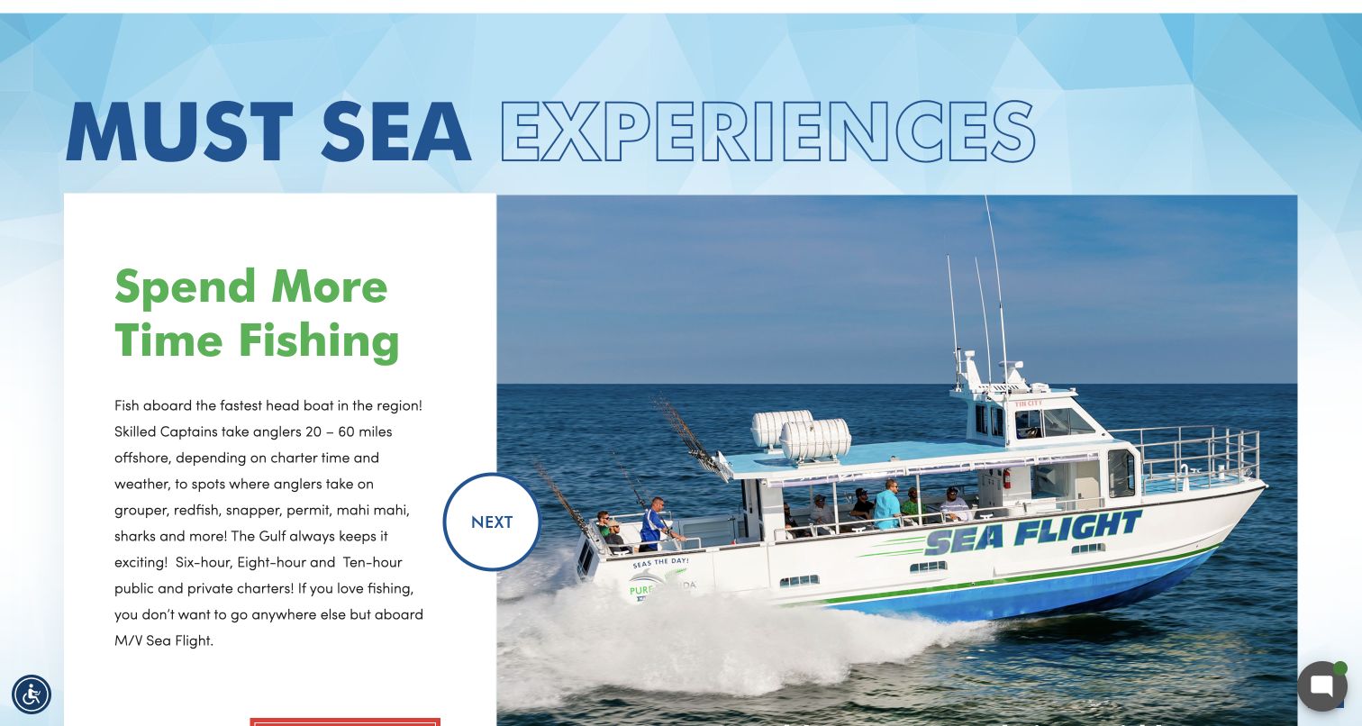
Pure Florida builds its identity from bright blue, green and red accents rather than a single dramatic destination photograph. Its header gives boat information a prominent place beside tickets, which is useful for a business offering several vessel-based activities. The retained screenshot is a scrolled homepage view of an experience panel pairing a substantial boat photograph with explanatory copy. The broader page separates fishing, dolphin tours, cruises, rentals and charters. This is a useful example of connecting a diverse activity catalog to actual equipment, while the large rotating panels introduce maintenance and motion considerations.
What you can learn
Let visitors inspect the vessels as well as the activities. When a business spans fishing, sightseeing and rentals, equipment context and clearly named categories help explain differences that cannot be conveyed by a general promise of waterfront fun.
Pros
The header makes the fleet information a first-class destination rather than a footer detail.
Large experience panels connect activity descriptions with identifiable boat imagery.
Cons & considerations
The opening chat panel appeared automatically and obscured a significant part of the page.
Rotating panels and animated transitions make stable comparison information especially important elsewhere.
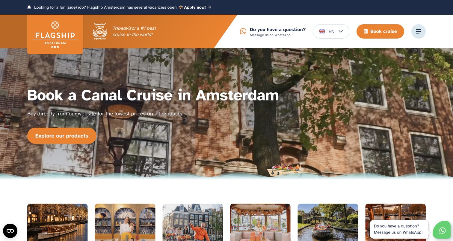
Flagship Amsterdam introduces canal cruising with a warm orange identity and a large destination scene. The header combines a language control, booking action and contact route, while the page below groups public cruises and broader activities. Its tour cards list departure areas, duration, guide language or inclusions, giving substance to otherwise similar-looking canal trips. Distinct information and ticket actions support different stages of planning. The initial consent dialog covered the center of the page; after declining optional cookies, the retained view shows the underlying introduction and visual category strip without that obstruction.
What you can learn
Use a consistent set of card details to distinguish trips that share the same scenery. Departure point, language, duration and included refreshments are often more helpful for choosing a canal cruise than another broad destination photograph.
Pros
The tour cards expose practical differences between superficially similar canal experiences.
Separate information and ticket routes support both exploration and a ready-to-book visitor.
Cons & considerations
The initial consent dialog interrupts the first impression before the product hierarchy is visible.
The expanding mix of cruises and unrelated activities can dilute a newcomer's focus.
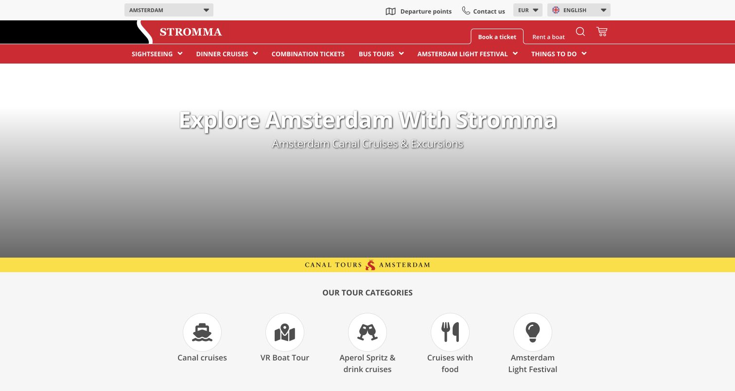
The reviewed Stromma Amsterdam page combines a city selector with language, currency and departure-point routes above a red navigation bar. Within the Amsterdam section, clear categories distinguish canal sightseeing, dining, combinations and seasonal experiences. A row of simple icons repeats those categories below the hero, giving visitors a more visual way into the catalog. In the captured necessary-cookie-only view, the opening media area displays its gradient fallback while the heading remains readable. That observed limitation is instructive: the site still explains its location and routes even when the decorative media does not appear.
What you can learn
Keep the destination and essential navigation independent of optional media. A multi-city brand should clearly identify the active location, provide departure information and let visitors browse meaningful categories even when a video or external component is unavailable.
Pros
Destination, language and departure-point controls establish context before visitors browse the products.
The category icon row offers a scannable alternative to the denser navigation bar.
Cons & considerations
The retained view has a large empty media fallback area above the product categories.
Many city and experience choices make consistent active-location labeling important throughout the journey.
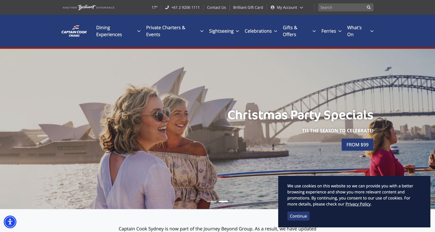
Captain Cook Cruises Sydney uses a restrained blue header to organize a broad range of harbor experiences. Dining, sightseeing, private events and ferries are separate navigation choices, while a utility bar contains contact, account and search functions. The captured hero promotes seasonal parties through a photograph that includes recognizable Sydney landmarks and guests aboard a vessel. Below it, the page introduces the wider cruise proposition. The design demonstrates how an operator can promote a current occasion without discarding its permanent service taxonomy, although the layered header and cookie notice consume a substantial part of the first view.
What you can learn
Keep permanent service categories visible while seasonal promotions change. Dining, transport and sightseeing may share a harbor and fleet, but their audiences need different information before choosing the appropriate trip or event conversation.
Pros
The main navigation separates dining, sightseeing, private events and ferry use explicitly.
The seasonal image connects the occasion to the actual harbor setting and onboard experience.
Cons & considerations
The large header and utility row push detailed experience comparison further down the page.
The visible cookie panel covers part of the opening photograph and its supporting content.
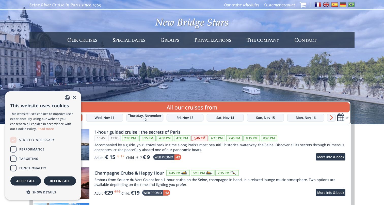
Vedettes du Pont Neuf puts a date strip and individual departure times near the top of its Seine-cruise homepage. A Paris river photograph establishes the location, but the next major section quickly becomes a practical list of guided, champagne and other themed departures. Descriptions and age-based prices appear beside those time choices. The reviewed page rendered in English in the connected browser, including a literal translation of the brand heading, which illustrates the need to check multilingual presentation carefully. Its strongest pattern is the immediate connection between the selected day and the actual range of experiences.
What you can learn
Show time choices in the context of the experience they belong to. A schedule is easier to use when duration, description and fare categories sit nearby, and translated interfaces should preserve recognizable brand names and consistent destination terminology.
Pros
The date strip and departure times make the operating schedule central to the page.
Each cruise description includes useful duration or price context before a booking step.
Cons & considerations
The rendered translation altered the brand heading, creating an avoidable identity inconsistency.
The retained privacy panel overlaps part of the schedule area in the initial view.
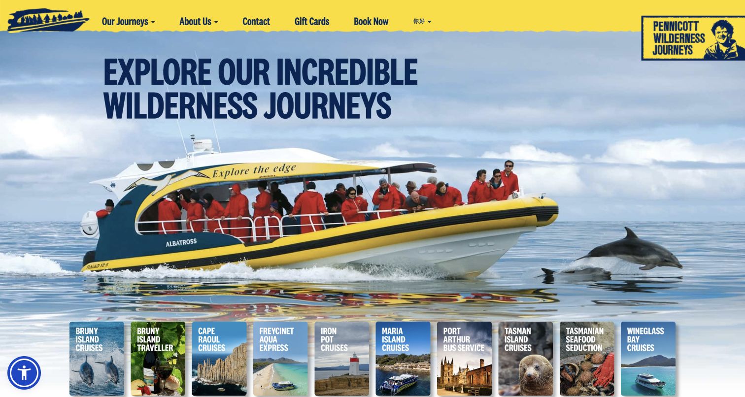
Pennicott Wilderness Journeys uses a bright yellow header and an unmistakable boat photograph to establish a consistent regional identity. Beneath the broad introduction, compact photographic tiles name the individual journeys rather than presenting an undifferentiated list of activities. The public portfolio includes several coastal cruises alongside land-based options, and each route leads toward a more focused destination. The homepage also supplies a brief company introduction and a wider image gallery. It works as a gateway to a family of experiences, although a first-time visitor still needs the individual journey pages to compare practical commitments.
What you can learn
Use a parent homepage to orient visitors, then make each named experience lead to a focused explanation. Consistent vessel and brand imagery can connect the portfolio without suggesting that every journey has the same duration, departure point or activity level.
Pros
The yellow visual identity links the navigation, vessel photograph and individual journey tiles.
Named regional experiences create more specific discovery routes than a generic activities category.
Cons & considerations
The compact tiles provide limited room for duration or departure-location comparison.
Boat and land experiences share the same gateway, so their differences need clear detail-page context.
Kegan is a freelance web designer and developer with 15+ years of experience helping businesses turn complicated website requirements into clear, maintainable digital experiences. He works directly with clients from planning and design through development, launch, and ongoing support.
For boat tour website design, his development approach focuses on tour comparisons, departure details, private-charter routes and clear booking handoffs. The scope can be a targeted improvement or a complete custom build, with responsive layouts, thoughtful content structure, and integrations chosen around the people using and maintaining the site.
Show 3 other boat tour website designersHide other boat tour website designers
Plan around the experience, the departure and the passenger's next decision
Build a trip model before designing the cards
Start with the facts that make one experience different from another. Record the route, approximate duration, boarding location, return location, vessel type, public or private format and the inclusions the operator is prepared to promise. Some trips need additional suitability or participation information. Keep that information grounded in the operator's approved procedures, and have the responsible team review it before publication. A website designer should not invent marine-safety advice or interpret a scenic photograph as proof of accessibility.
Use those facts to create a repeatable trip card. A concise title and photograph can introduce the experience, followed by the few fields most useful for comparison. A sunset sail and a daytime wildlife trip may share a harbor but involve different timing, expectations and equipment. If price is displayed, state the applicable category and whether it is a starting price, while leaving current date-specific inventory to the reservation system. Avoid copying a price into multiple places that will be difficult to maintain.
Decide how visitors will browse before adding filters. A small fleet may need only a short, consistent comparison. A larger catalog may benefit from routes organized by duration, activity or departure area. Keep private-charter inquiries separate from individual tickets when the operating process differs. A clear catalog should help someone understand the choice before they are asked to provide a name, payment or detailed travel information.
Connect the marketing page to real arrival information
Map the journey from discovering a tour to reaching the correct boarding point. The homepage can introduce the region, but each experience needs a stable destination with its own practical information. Use the actual departure location rather than a general city name, and distinguish boarding time from the time the vessel leaves. Explain return arrangements where they differ from the starting point. If several piers are used, give them clear labels and maintain a direct route to the appropriate directions.
Separate general schedules from live availability. A seasonal timetable explains the typical operating pattern; a booking system determines which departures can currently be purchased. Make those roles clear and identify who maintains each source. When the season ends, replace outdated availability language with an accurate explanation of the next operating period. A visible notice is useful only when it is current, easy to understand and removed when it no longer applies.
Plan for changes without implying certainty that the operation cannot support. Weather, routing and wildlife conditions may affect a trip, so link to the operator's actual policies and preparation information. Keep notifications, booking confirmations and private customer records within their appropriate systems. The public page should make preparation easier, while a tour-specific confirmation supplies the details that apply to a genuine reservation. Testing the marketing journey does not require making a real booking or submitting a customer's information.
Make the content dependable when media and integrations vary
Choose photographs that explain the trip rather than merely decorate it. A wide landscape establishes place, while a view of the deck, vessel or guests can help communicate scale and atmosphere. Record image rights and attribution, write useful alternative text and prepare crops that preserve the important subject on smaller screens. Do not use a dramatic wildlife image to imply a guaranteed encounter. If images show different vessels or seasons, provide enough context to avoid confusing the visitor.
Use moving media deliberately. A video or carousel can communicate the feel of a journey, but the main proposition and navigation should not depend on a particular frame. Provide readable text outside embedded artwork, a sensible static fallback and appropriate motion controls. Check what remains visible when optional cookies are declined. A large empty player or a stack of chat, discount and privacy overlays can change the effective design more than the underlying typography does.
Treat the reservation service as part of the visitor journey while keeping its responsibility clear. Explain whether an action opens availability, begins a private inquiry or purchases a specific departure. Preserve consistent tour names across the marketing page and external system. Provide a usable contact route for questions, but avoid automatic chat panels that obscure essential information. Assign responsibility for updating schedules, inclusions, imagery and operational notices so the site remains dependable after the launch.
The editing job behind the design
Choose publishing and reservation tools around accurate trip information
Use a publishing system that keeps tour descriptions, vessel information, arrival instructions and seasonal notices easy to maintain. A reusable trip structure is more valuable than a large collection of independently styled pages with conflicting details.
Connect to the operator's approved reservation service with clear action labels and consistent experience names. Keep customer records and payment handling in their appropriate private systems. A public ticket link does not prove anything about the hidden software used to operate the boats.
Optimize genuine photographs and provide useful fallbacks for video, maps and external widgets. The technology stacks accompanying these examples come from bounded public-page audit attempts; unavailable scans are retained honestly and are not replaced with guessed platforms.
Our WordPress website examples offer a separate look at publishing approaches. A visible platform label is evidence for that named page, not a guarantee that the same system will suit your requirements.
Before the public launch
Boat-tour website brief checklist
Name the real trip types and the destinations or routes they cover.
Distinguish public seats, private charters and rentals clearly.
Explain vessel format and meaningful differences between experiences.
Provide duration, boarding location and return arrangements.
Separate check-in expectations from departure time.
Keep general seasonal schedules distinct from live ticket availability.
Use consistent tour names in the website and reservation system.
Publish only approved pricing, inclusions and suitability information.
Link actual cancellation, weather and preparation policies where relevant.
Show the vessel and onboard experience as well as the destination.
Maintain image permissions, credits and useful text alternatives.
Keep essential information usable when optional media or cookies are unavailable.
Prevent chat, discount and privacy interfaces from obscuring the main decision.
Assign owners for seasonal notices, schedule changes and content updates.
These checks are a project checklist, not a performance, legal, security, or accessibility certification. Test real journeys with the people responsible for the website before making claims about the result.
Sources & editorial method
How this collection was selected and reviewed
The collection contains 24 distinct public website properties, matching the original saved random draw. All 24 received direct browser captures on November 10, 2026, with source URLs, actual capture times, dimensions and image hashes preserved. Stromma is an Amsterdam destination page; Pure Florida is a scrolled homepage view of an experience panel. Other retained views are homepages. Some captures retain visible notices or media fallbacks, and the Vedettes du Pont Neuf page rendered in English in the connected browser. Reviews are original observations of design and information structure. All sources received a bounded broad technology-audit attempt: 20 returned checked evidence, three stopped at access or bot checks and one exceeded the response-size limit. No restriction was bypassed, hidden stack inferred, booking made or form submitted.
Each example links to its actual source page. Screenshots are direct browser captures with their own capture dates; moving imagery, announcements and live designs can change. The notes describe observable design choices and conditional tradeoffs, not measured traffic, conversion results, service quality, or accessibility conformance.
Technology labels use public page metadata, asset evidence, or explicitly cited platform documentation. Platform documentation is not a complete current deployment audit. A component reference may be legacy or unused; it is not a complete backend inventory. Unknown stacks are omitted. These sites are editorial examples, not our client portfolio.
Written, Edited and Curated are separate editorial records, not timestamps advanced by a rebuild. Website designs and imagery belong to their owners. See our editorial standards or suggest a correction.
Questions worth asking
Boat Tour website design questions
What should a boat-tour homepage explain first?
Identify the location and the kind of experience offered, then provide a clear route to compare trips. Duration, vessel format and public-versus-private booking are often more useful than another general promise about the scenery.
Should prices and departure times appear on tour cards?
They can help visitors compare options when they are accurate and clearly qualified. Keep general schedules and starting prices distinct from date-specific availability, and avoid maintaining the same changing details in several unrelated places.
How should private charters differ from public tickets?
Explain whether the visitor is reserving individual seats or discussing exclusive use of a vessel. Use separate routes when the information required, pricing process or confirmation steps differ. A charter inquiry should not be presented as a confirmed reservation.
Does a boat-tour site need a video hero?
No. A useful photograph and clear description can establish the experience. If video is used, keep essential text and navigation independent of it, provide a suitable fallback and consider reduced-motion preferences and optional-cookie behavior.
How should wildlife and weather be described?
Use the operator's approved information and make natural variability clear. Photography does not establish a guaranteed sighting or route. Link relevant preparation and operating policies without inventing safety advice or promises about conditions.
Does inclusion here endorse a tour operator?
No. The reviews examine public website design and communication. The Editors Choice identifies an editorial design selection, not verified operating performance, safety, accessibility conformance or a guaranteed customer experience.
Borrow the way a useful site connects an appealing view with a clear decision. Build your own tour pages around the actual vessels, routes and operating process, then make the next step understandable for both the first-time visitor and the guest preparing to board.