A childcare website helps adults answer practical questions while introducing a warm, recognizable brand. These examples show how location finders, age cues, program navigation, and tour invitations fit around photography and educational stories.
Families may arrive knowing a neighborhood, an age group, or a preferred schedule, but not the name of a particular center. The homepage needs to connect those starting points to local information. A memorable photograph or illustration can establish tone, yet the most useful structure often comes from clear location search, program labels, and a predictable next step.
This collection reviews public website design and navigation. It examines how information is presented and how different audiences find their routes. It does not evaluate childcare quality, safeguarding practices, educational outcomes, licensing, or suitability for a particular child. Statements and recognition marks visible on source websites are treated as page content, not independently verified endorsements.
Before the examples
What makes good childcare website design in 2026?
Put local discovery near the beginning
Make it clear whether visitors should enter a town, postcode, ZIP code, or address. Keep manual search available when optional current-location features exist. If programs differ by center, help families understand that before they assume every location offers the same service.
Use ages and programs as plain-language navigation
Connect age ranges to recognizable program names. Explain educational terminology without requiring families to know internal labels. A short introductory cue can lead to fuller program pages and center-specific details rather than attempting to answer every question in the hero.
Separate audiences through hierarchy
Families, existing customers, employers, job applicants, and prospective franchise owners may all use the site. Give each a clear route, while deciding which audience owns the main hero action. Equal buttons are not always the clearest way to represent different priorities.
The collection · 25 examples
25 childcare websites worth studying
Compare how quickly each example connects a family to a location or program. Notice whether the hero asks for a search, a tour, or a general learning step, and how the header serves returning families alongside new inquiries.
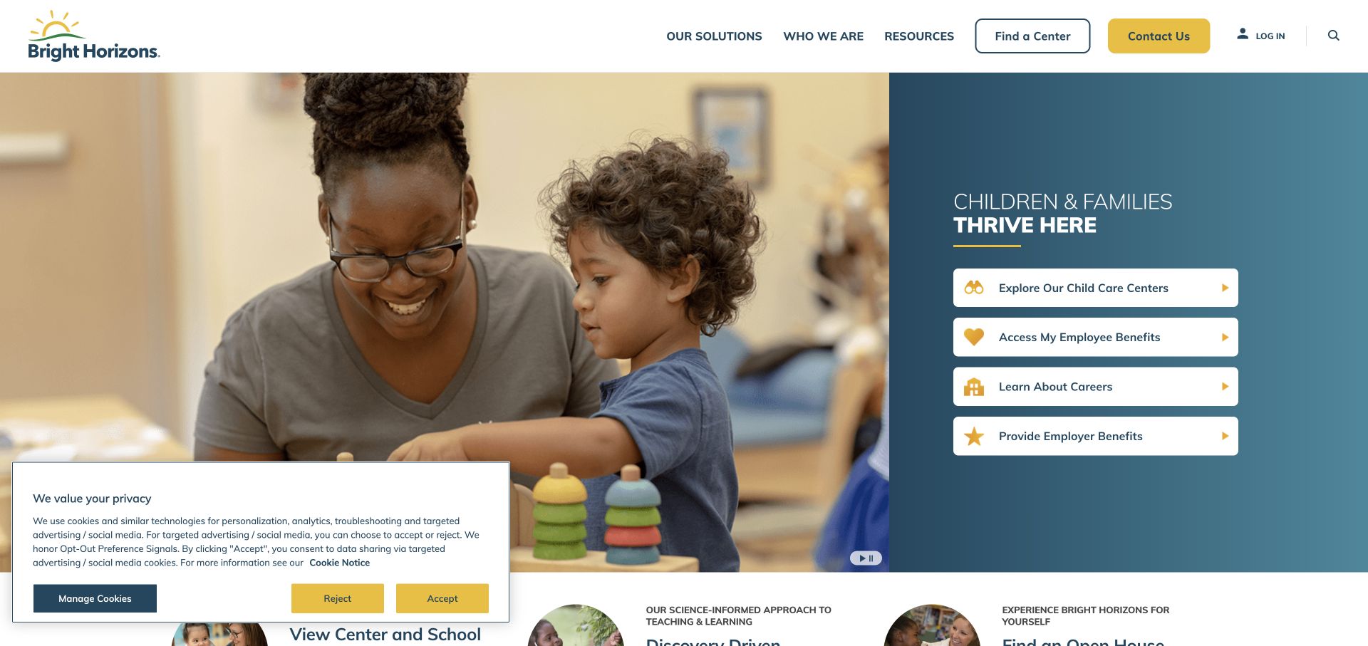
Bright Horizons divides its hero between a large classroom photograph and a blue panel containing several audience-specific actions. The choices address families seeking care, people exploring employee benefits, prospective employees, and employers. The header separately exposes a center finder and contact route. This is a useful reference for an organization whose website has more than one major audience: the opening makes those roles visible rather than assuming every visitor is a parent looking for a nearby location.
What you can learn
Name the visitor’s role before presenting a large service catalog. A family and an employer may use the same brand but need different explanations, contact teams, and next steps, so the first split should be unambiguous.
Pros
The blue action panel gives each audience a recognizable starting point.
The center finder remains visible in the header alongside the broader corporate navigation.
Cons & considerations
Several equally visible audience choices can slow a family with one immediate task.
The large photograph provides atmosphere but little location-specific information in the opening view.
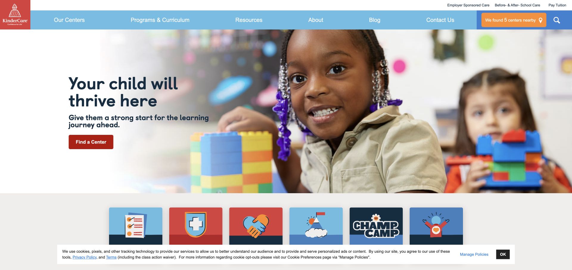
KinderCare combines blue, red, and orange branding with a broad photograph of children and classroom materials. The hero fades toward white on the text side, giving the headline and center-finding action a calmer background. The navigation exposes centers, programs and curriculum, resources, company information, and contact, with a nearby-centers route also visible. Information tiles begin below the image. The design is useful for balancing a familiar consumer-brand presentation with the practical need to find a location before comparing programs.
What you can learn
Make location discovery easy to recognize at both the header and hero level. The surrounding content can explain the brand, but families should not have to read the entire story before finding the relevant local center.
Pros
The faded image edge gives the hero text a distinct reading area.
Programs and resources are named explicitly in the primary navigation.
Cons & considerations
The general campaign contains limited immediate detail about an individual center.
The captured consent strip reduces visible space near the bottom of the first screen.
Visible tech stack
Referenced on the public page
Google Maps
Amazon CloudFrontDelivery / hosting signal
ASP.NETReported response header
Microsoft IISReported response header
Public source checked November 3, 2026. References may be embedded or legacy—not a complete backend inventory.
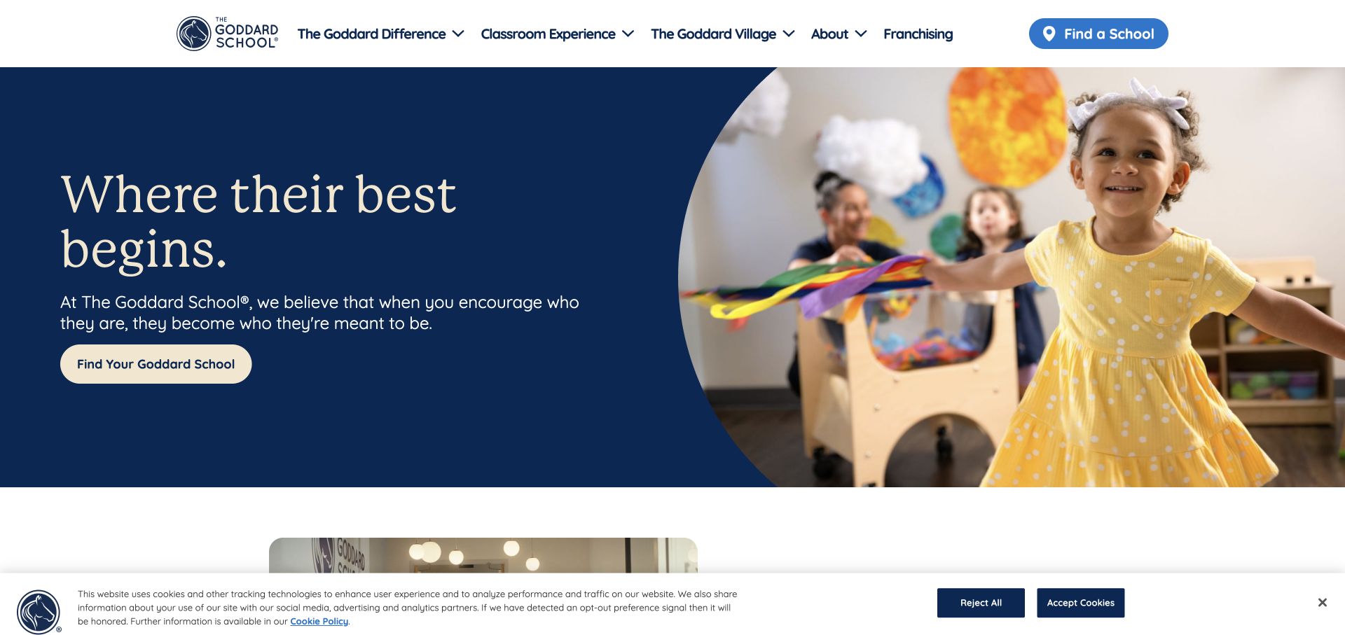
The Goddard School uses navy, cream, and blue around a large curved photograph. A serif headline occupies a separate cream area, and the school-finding action appears both in the header and within the hero. Navigation groups the organization’s difference, classroom, family-oriented material, company information, and franchising. The composition is useful because it gives the primary local-discovery task repeated visibility without filling the hero with multiple forms or promotional tiles. The curved image adds character while preserving an orderly reading sequence.
What you can learn
Repeat the main family task where it is useful, but keep the label consistent. A school finder in the header and hero can reinforce the next step without requiring two different calls to action or competing messages.
Pros
The cream text panel keeps the headline independent of the classroom photograph.
The school-finding route is visible in two predictable locations.
Cons & considerations
Some navigation labels describe the brand story more than the practical information families may seek.
Franchising introduces a second audience within the same primary navigation.
Visible tech stack
Referenced on the public page
Google Fonts
Vimeo
YouTube
Public source checked November 3, 2026. References may be embedded or legacy—not a complete backend inventory.
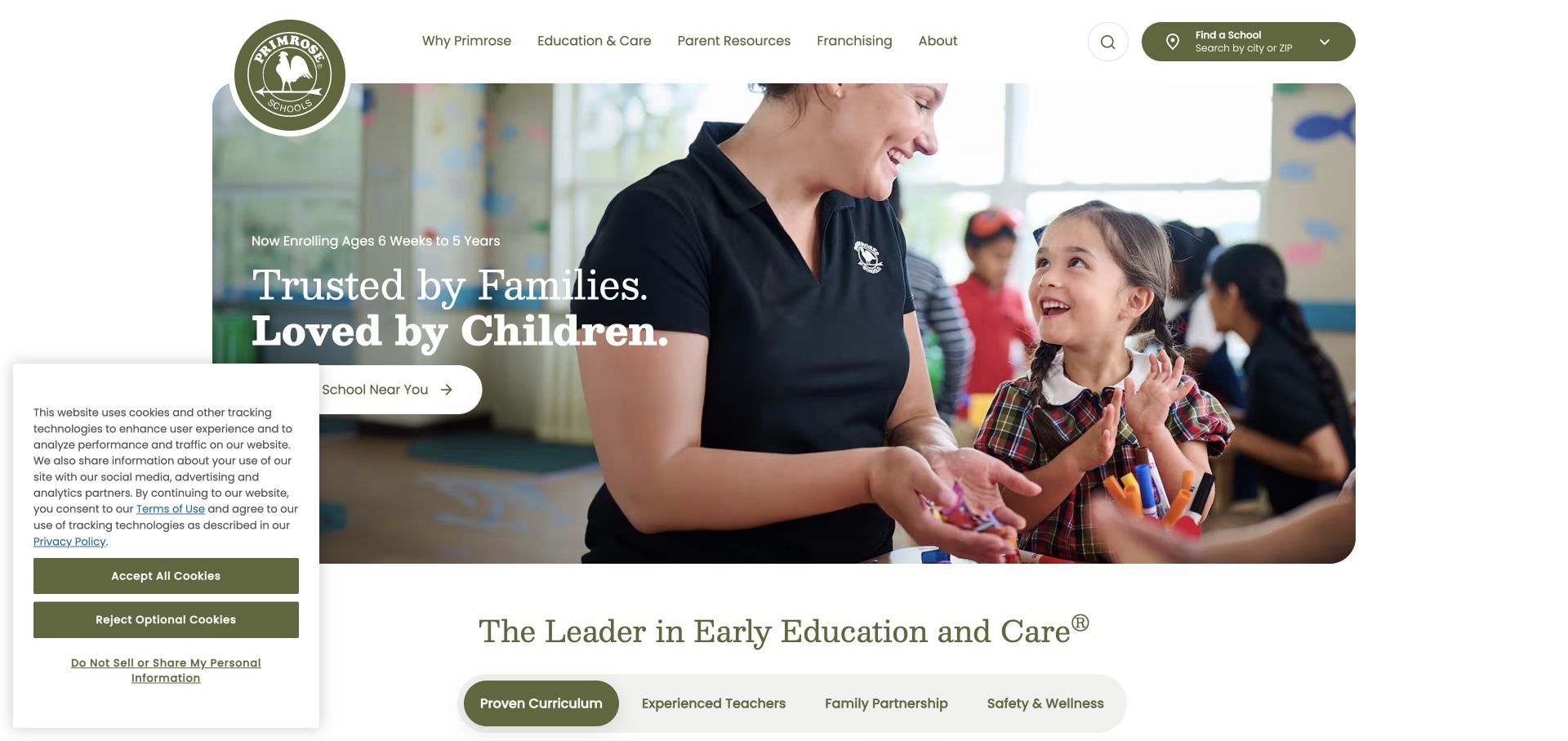
Primrose Schools uses olive, cream, and white with a circular logo that overlaps the header area. A curved classroom image supports a short hero message, an age-range cue, and a school-finding action. Below the hero, tabs introduce curriculum, teachers, family, and safety-related information as separate topics. The page is a useful reference for moving from a broad brand introduction into more specific questions. The review concerns the visibility and organization of those topics, rather than verifying any claims about educational or care quality.
What you can learn
Give families an early age cue, then organize deeper explanations around the questions they are likely to ask. Topic tabs need clear labels and visible active states so important information is not mistaken for decorative content.
Pros
The age-range cue helps visitors recognize the intended program stage.
The topic row offers a structured route into several common information needs.
Cons & considerations
The overlapping logo and curved hero require careful spacing in a narrower layout.
The captured consent panel covers part of the lower hero area and competes with its action.
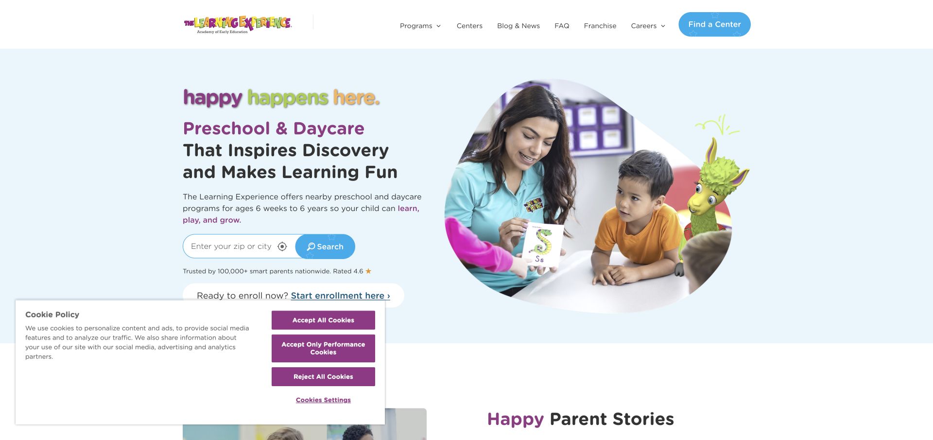
The Learning Experience combines pale blue, purple, and sky blue with a mascot and circular classroom imagery. The hero names preschool and daycare, includes an age range, and provides a city-or-ZIP search field. An enrollment link supplies a secondary route. The page is useful because its playful visual identity still leaves room for practical information about what the organization offers and how to find a location. Review statements appear further down, but the location field remains the clearest task in the opening composition.
What you can learn
A child-oriented visual style should still support adult decision making. Put service type, age range, and location discovery in plain language so illustrations and mascots add personality without carrying the burden of explanation.
Pros
The location field makes the first practical step visible within the hero.
The service and age labels give context before a visitor begins searching.
Cons & considerations
Several decorative elements can compete with the form for attention.
The consent panel occupies space near the main content in the captured first-visit state.
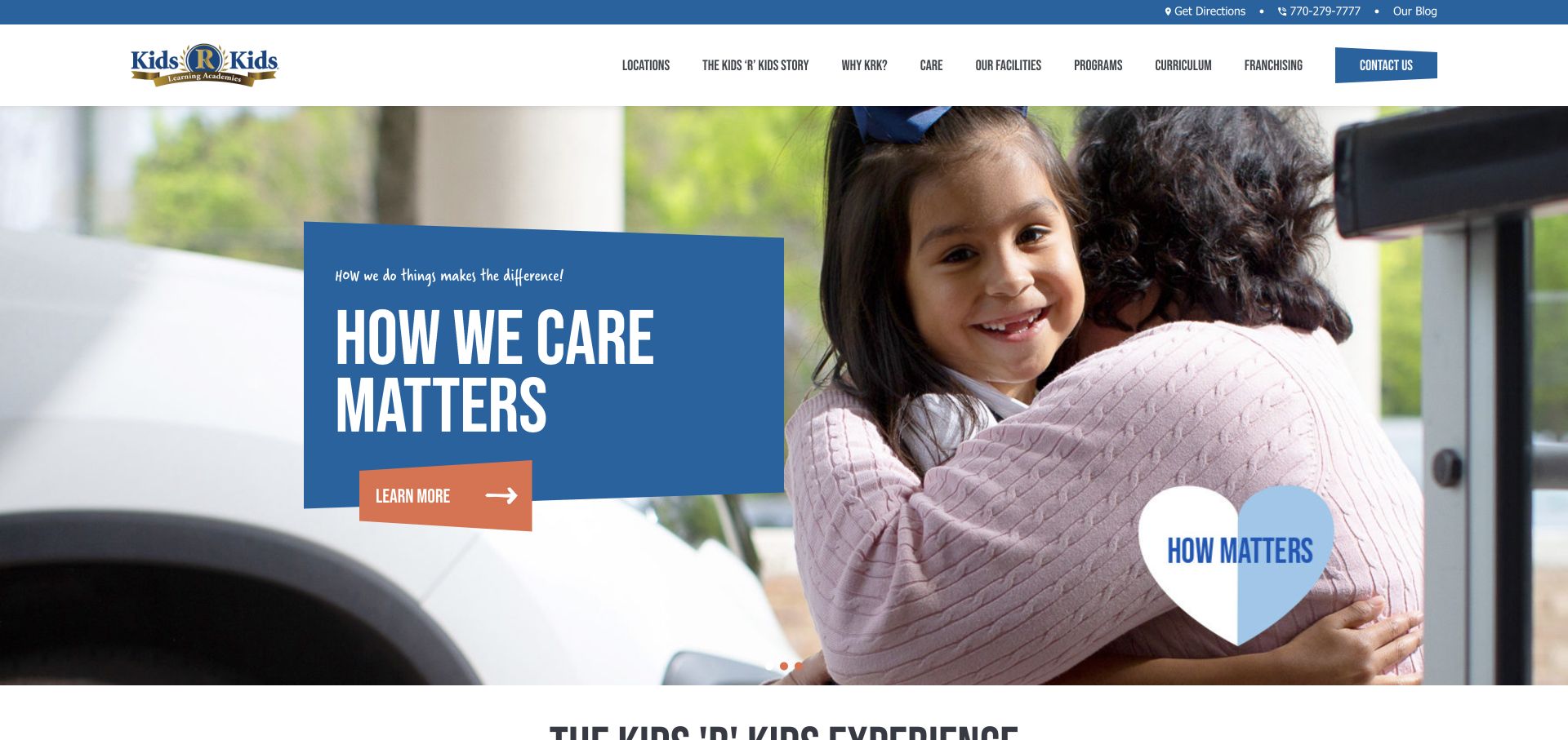
Kids ‘R’ Kids places a blue text placard over a warm photograph, with orange accents identifying the primary hero action. The header includes utility contact links and a dense navigation system covering locations, the company story, care, facilities, programs, curriculum, franchising, and contact. A heart-shaped brand mark reinforces the emotional tone. The page is useful for studying the tradeoff between exposing a comprehensive catalog and giving families a simple first step. The visual message is immediate, while practical choices depend heavily on navigation.
What you can learn
Keep a large program catalog organized around family questions. If the hero uses a general learning action, make the location route sufficiently prominent that a parent can bypass the brand story when they already know what they need.
Pros
The solid blue placard keeps the message legible over the photograph.
Programs, curriculum, facilities, and locations are all exposed as distinct navigation concepts.
Cons & considerations
The many primary labels create a dense header to scan.
The general hero action gives less direct task guidance than a location-specific invitation would.
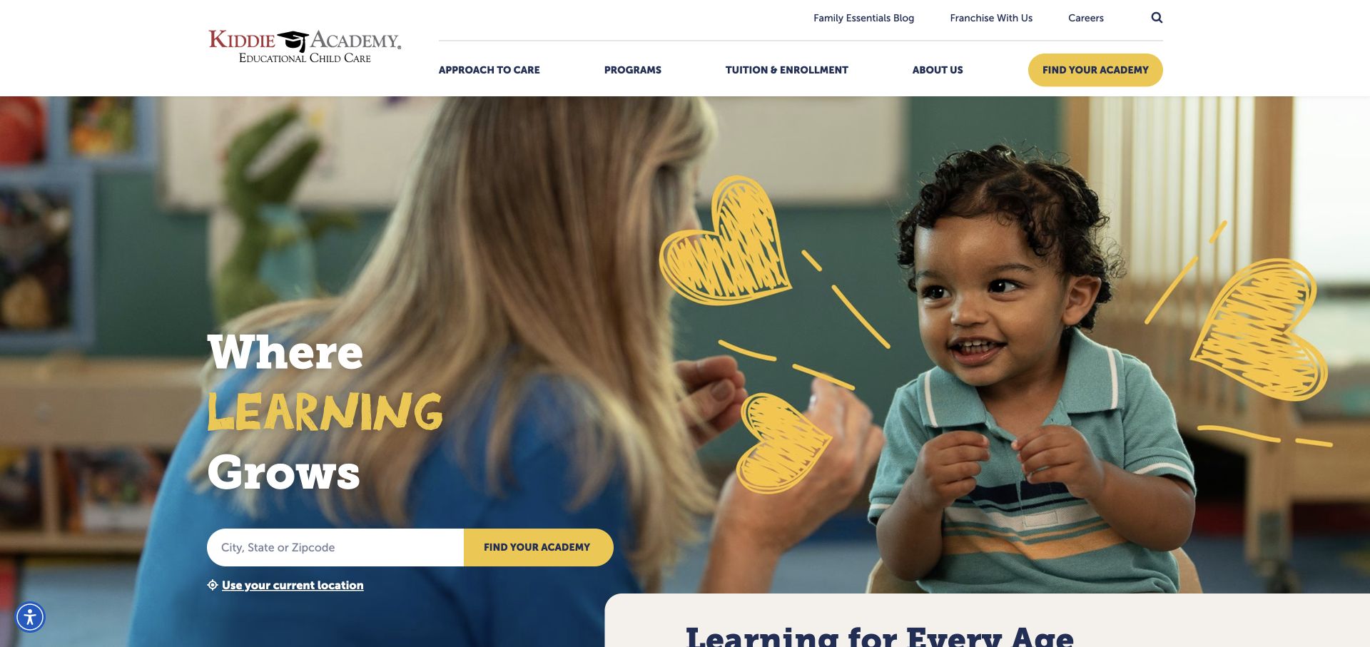
Kiddie Academy uses burgundy, yellow, and navy with a teacher-and-child photograph and hand-drawn heart accents. The headline mixes expressive lettering with serif type, while a city, state, or ZIP locator provides a concrete action beneath it. The primary navigation names tuition and enrollment alongside programs, care, and company information. Utility links keep careers and franchising above that main layer. The result is a useful reference for combining a warm visual tone with information labels that closely match the questions families bring to a childcare search.
What you can learn
Use practical terms such as tuition and enrollment where families can see them. Expressive art direction can surround those routes, but should not force visitors to translate a brand slogan before finding basic information.
Pros
The location field has an explicit geographic input rather than a vague invitation to explore.
Tuition and enrollment appear as a visible navigation category.
Cons & considerations
Mixed lettering styles and decorative marks create several competing visual accents.
The hero does not itself explain the details available for each individual location.
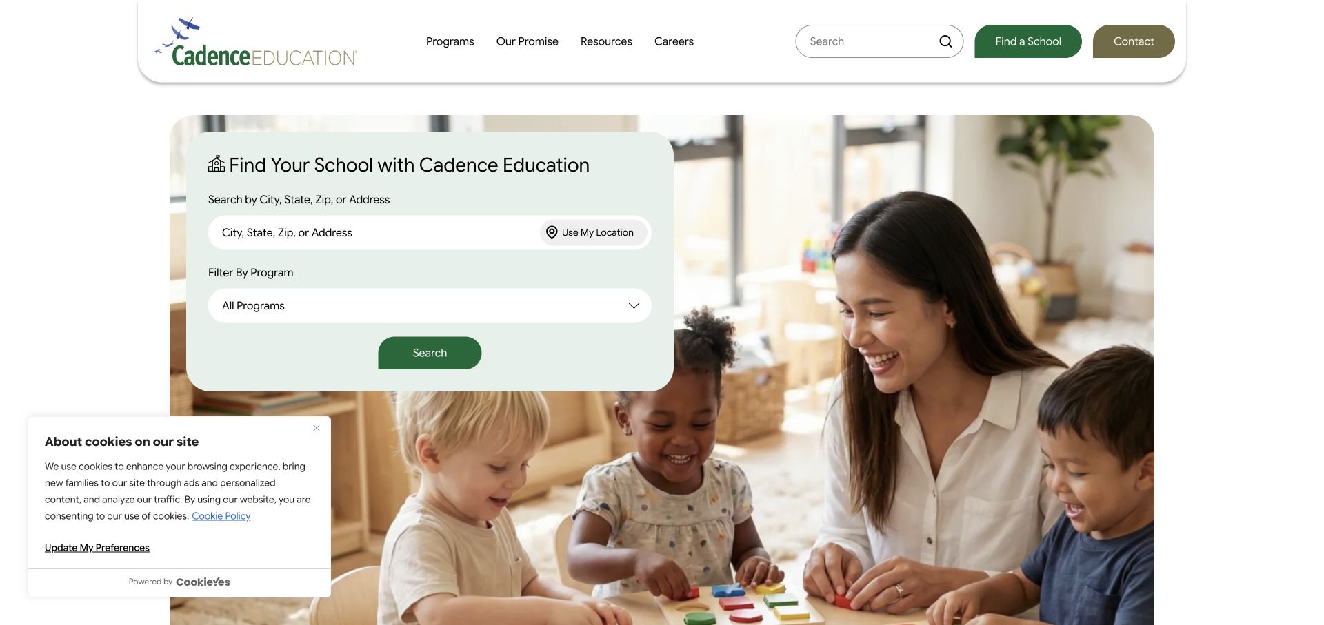
Cadence Education makes a large pale green location-finding panel the center of the hero. Families can identify an area and see a program filter alongside the search action, with a classroom photograph supplying context behind it. A rounded white header carries programs, the organization’s promise, resources, and careers, while contact remains separate. The design is useful for networks where a nearby location may not offer every age group or educational format. It brings that distinction into discovery rather than leaving it until after a generic location search.
What you can learn
When program availability varies by center, let families express the relevant need early. A program filter can clarify the search, but its labels should explain recognizable age groups or formats rather than internal operating terminology.
Pros
The finder combines geography and program choice in one clearly bounded panel.
The solid form surface remains readable against the classroom photograph.
Cons & considerations
An additional filter asks families to understand program terminology before seeing results.
The large finder leaves limited space for an introductory explanation of the network.
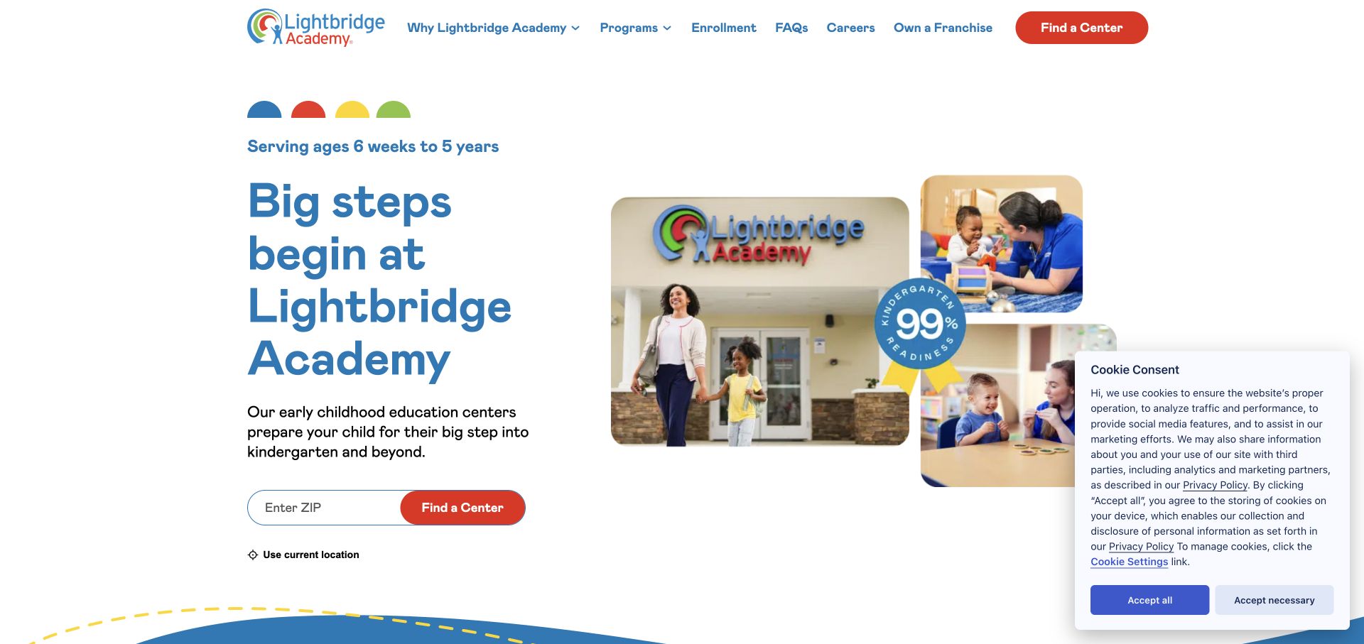
Lightbridge Academy uses familiar primary colors and a collage of a building and classroom interactions. The hero pairs an age cue with a stacked blue headline and a ZIP-code finder, finished with a red search action. FAQ and enrollment routes are exposed in the navigation, and age-related program tabs begin below the opening. The layout is useful because it brings location discovery, age context, and common questions into close proximity. The collage adds variety, but the search remains the most practical element in the first screen.
What you can learn
Place age context close to the location task. Families should be able to recognize the relevant stage before searching, then find clear enrollment and FAQ routes when they need more detail about the process.
Pros
The red search action stands out within the predominantly blue and white layout.
FAQ and enrollment labels make common information needs visible in navigation.
Cons & considerations
Several collage images compete with the stacked headline for attention.
The opening age cue still needs center-level detail to explain actual local program availability.
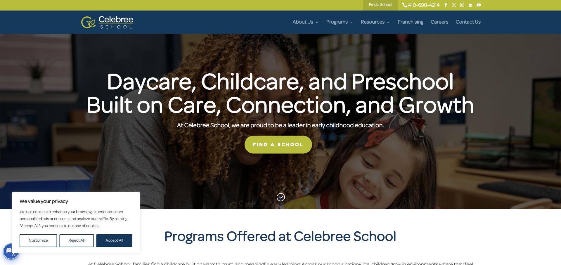
Celebree School uses lime green and navy around a darkened classroom photograph. A centered headline names daycare, childcare, and preschool, with a lime action leading toward school discovery. The header includes a phone number and a school-finding route, while the next section begins introducing programs. This is a useful reference for a relatively direct homepage: the service category is explicit, the primary action is repeated, and the image supplies context without requiring a complicated search interface in the hero.
What you can learn
Make the service category clear before relying on the brand name. A simple school-finding action can be effective when it is consistently labeled and followed by enough program information to help families understand their options.
Pros
The lime action is easy to distinguish against the darkened classroom background.
The headline identifies the service categories in familiar terms.
Cons & considerations
The broad opening message offers little immediate detail about ages or program differences.
A centered text overlay depends on the photograph remaining visually quiet behind it.
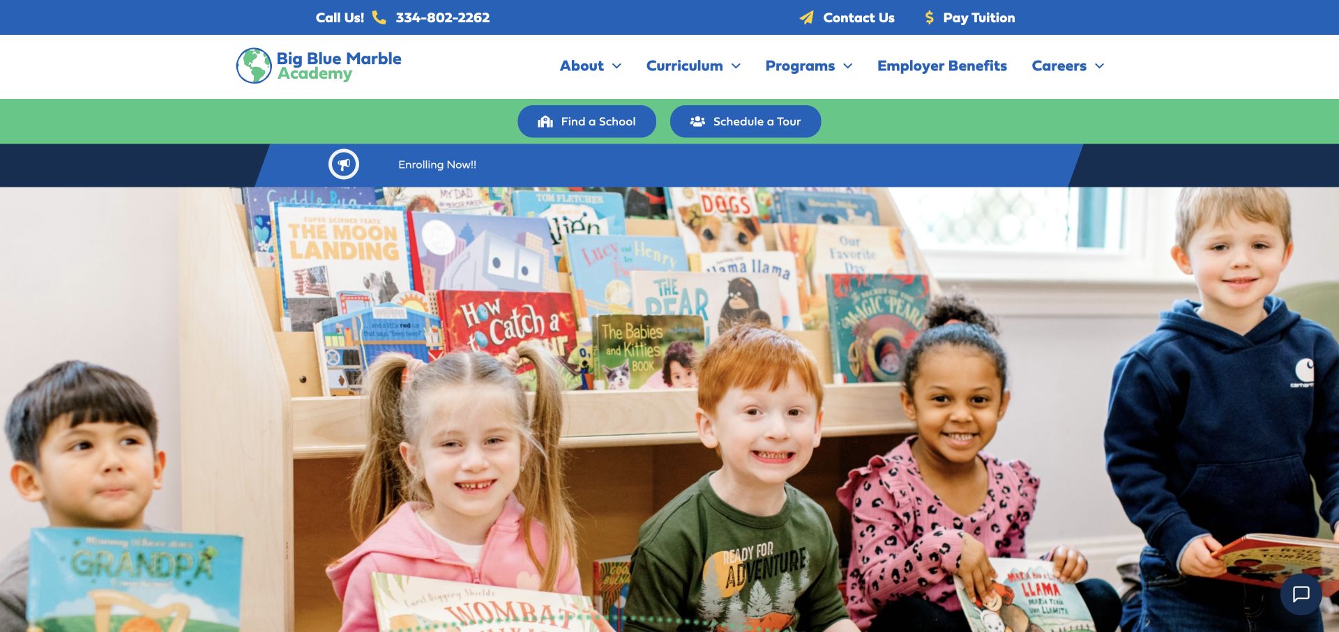
Big Blue Marble Academy uses blue and green across several horizontal header bands. Tuition payment and contact utilities serve existing families, while school-finding and tour actions appear in a dedicated band above an enrollment notice. Curriculum, programs, employer benefits, and careers are available in navigation. A large classroom photograph follows, with introductory text lower down. The design is useful for recognizing how many different tasks a childcare network may need to support, while also showing the cost of stacking each priority into its own strip.
What you can learn
Group tasks by audience before adding another header band. Existing-family utilities and new-family enrollment routes can both remain visible, but the combined stack should leave enough room for a clear introduction and local-discovery task.
Pros
Tuition payment is treated as a recognizable utility for returning families.
School discovery and tour scheduling receive explicit actions above the hero image.
Cons & considerations
Several stacked bands consume much of the opening viewport.
The large photograph then delays the fuller service explanation until further down the page.
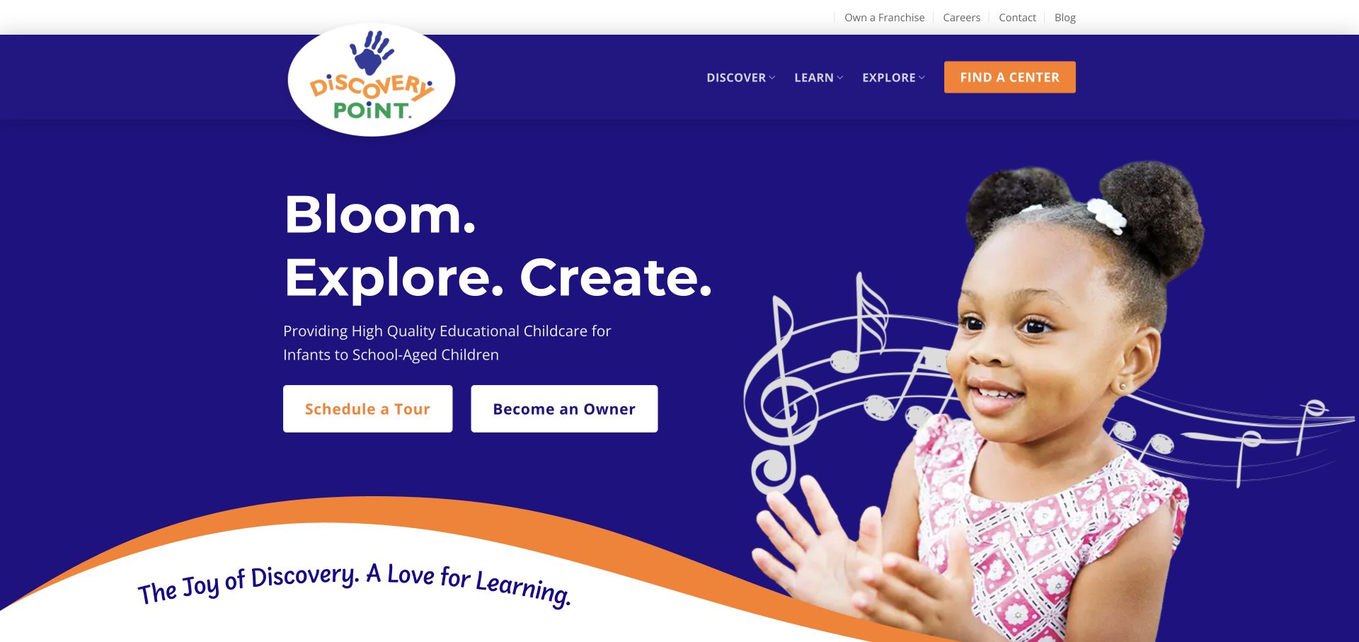
Discovery Point uses vivid indigo and orange with a child cutout, musical-staff illustration, and short action-led words in the hero. A curved edge leads into the next section. The navigation uses broad categories such as discover, learn, and explore, while the hero presents tour scheduling and ownership opportunities as similarly sized actions. The page is useful for studying a memorable visual identity and the importance of audience prioritization. A family and a prospective franchise owner can both find a route, but they are asked to share the focal area.
What you can learn
Distinguish family inquiries from business-development actions through hierarchy as well as labels. Both routes can be available, but the main homepage task should make sense to the audience most likely to arrive there.
Pros
The indigo and orange palette creates a distinctive, consistent visual identity.
Tour scheduling is presented as an explicit next step in the hero.
Cons & considerations
The ownership action competes directly with the family-facing tour invitation.
Broad navigation verbs reveal less about their contents than specific program or location labels.
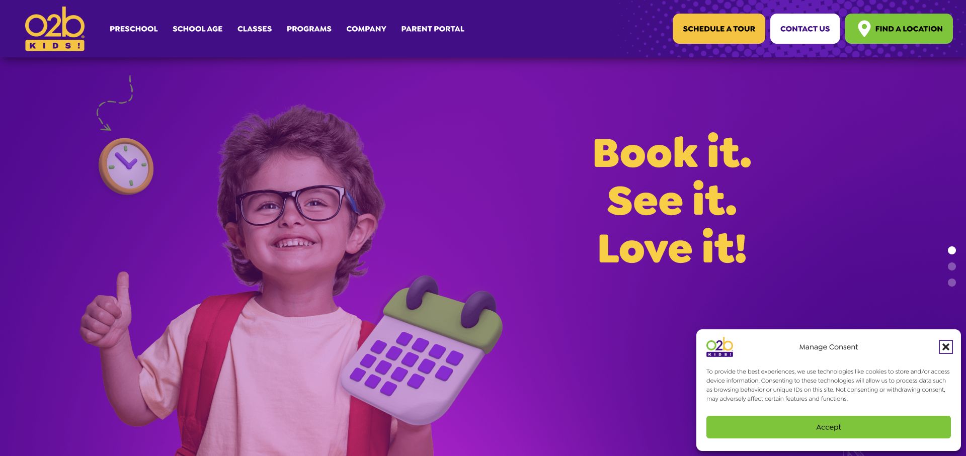
O2B Kids uses saturated purple, yellow, and green with oversized playful lettering and a child cutout in the hero. The header separates preschool, school-age services, classes, and programs, and gives tour scheduling, contact, and location discovery their own buttons. The page snapshot also identifies age ranges across the program carousel below. The design is useful for a provider whose offer extends beyond one preschool service: the colorful campaign establishes tone, while the category labels explain the breadth of the program mix.
What you can learn
When a childcare brand includes afterschool, camps, and classes, keep those distinctions visible. Families should be able to identify the relevant age stage and service type without treating every offering as the same enrollment journey.
Pros
The header gives preschool and school-age visitors separate starting categories.
Location, contact, and tour actions are clearly named in distinct buttons.
Cons & considerations
Several saturated buttons compete with the already vivid hero artwork.
The short campaign slogan supplies less practical detail than the program information further down.
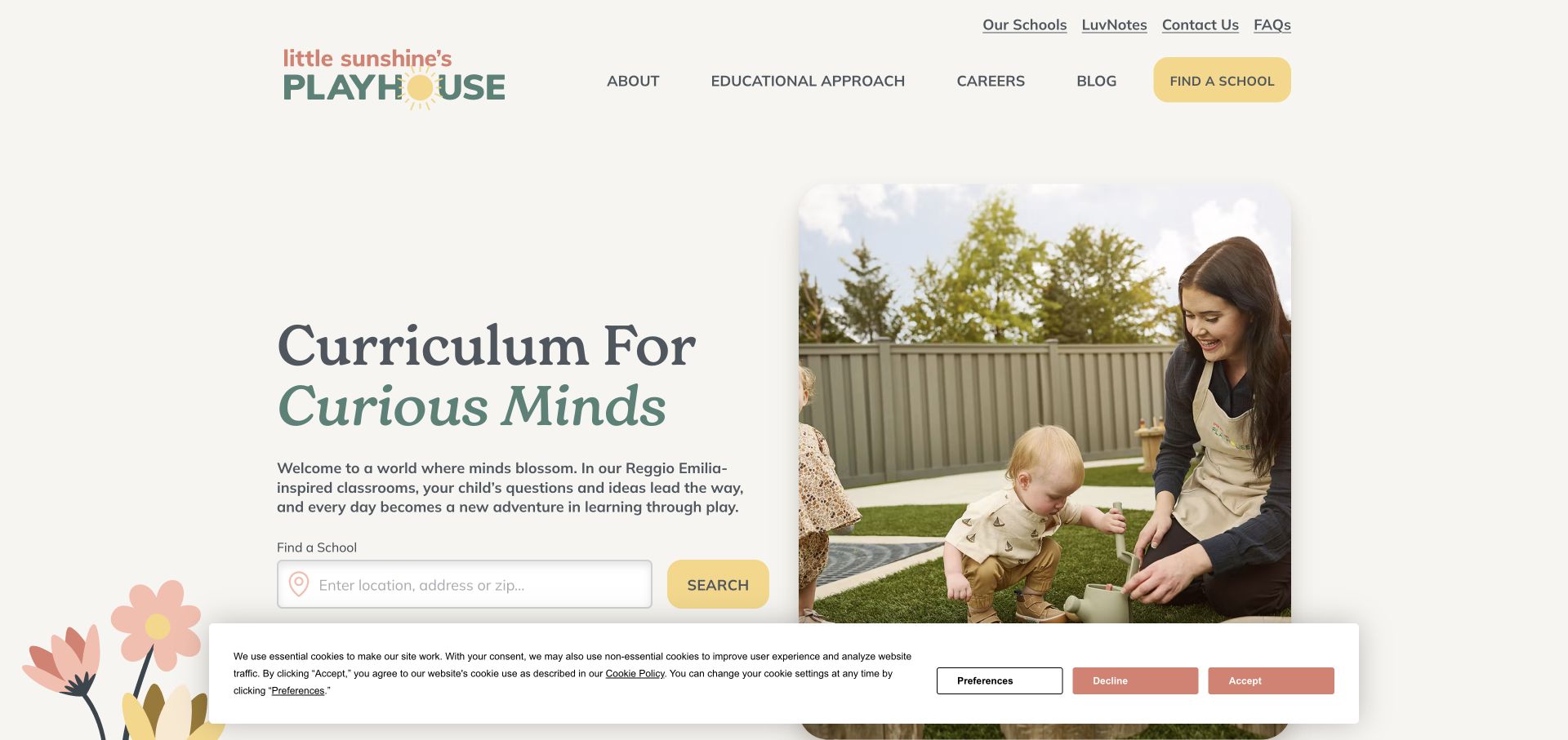
Little Sunshine’s Playhouse uses warm white, muted green, coral, and yellow around a spacious split hero. A serif headline introduces the educational story on the left, while a rounded photograph shows an adult and child outdoors on the right. A location, address, or ZIP field sits beneath the introductory text. The header exposes an educational-approach category and a school-finding action, with family utilities above. The page is useful for showing how a calm visual identity can support a practical search without the bright primary-color style common in the sector.
What you can learn
Let the educational explanation and location finder support one another. Families can read a short introduction, then move directly to the relevant school rather than having to navigate back through a generic company menu.
Pros
The split layout gives text and photography separate, orderly areas.
The search field accepts several recognizable ways to describe a location.
Cons & considerations
The generous spacing places some hero content close to the lower edge of the first screen.
The captured consent banner overlays part of that lower content area.
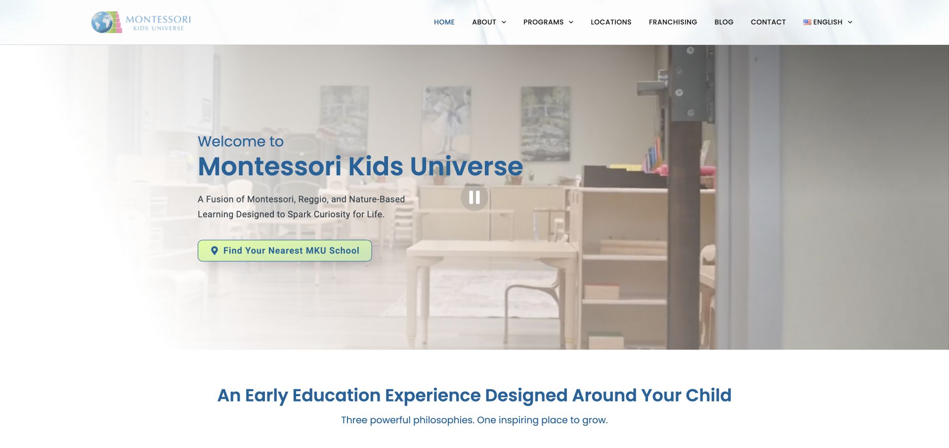
Montessori Kids Universe places a blue headline and a short educational-positioning statement over a pale classroom film. A bright school-finding action sits below, with a visible pause control in the media. The next section introduces three distinct themes: Montessori learning, Reggio-inspired creativity, and outdoor classrooms. Navigation remains conventional, including programs, locations, and company information. The page is useful for studying how a school can summarize a multi-part educational narrative without putting the entire explanation into the hero. The design review does not assess those approaches or their outcomes.
What you can learn
Give the opening a concise explanation, then divide the deeper story into clearly named themes. Keep location discovery available throughout so the educational narrative does not become a barrier to finding a particular school.
Pros
The bright finder action is distinct from the pale classroom background.
The three-theme section provides a clear structure for the longer educational explanation.
Cons & considerations
The combination of several educational labels may require additional plain-language explanation.
Franchising sits within the same main navigation as family-oriented program and location routes.
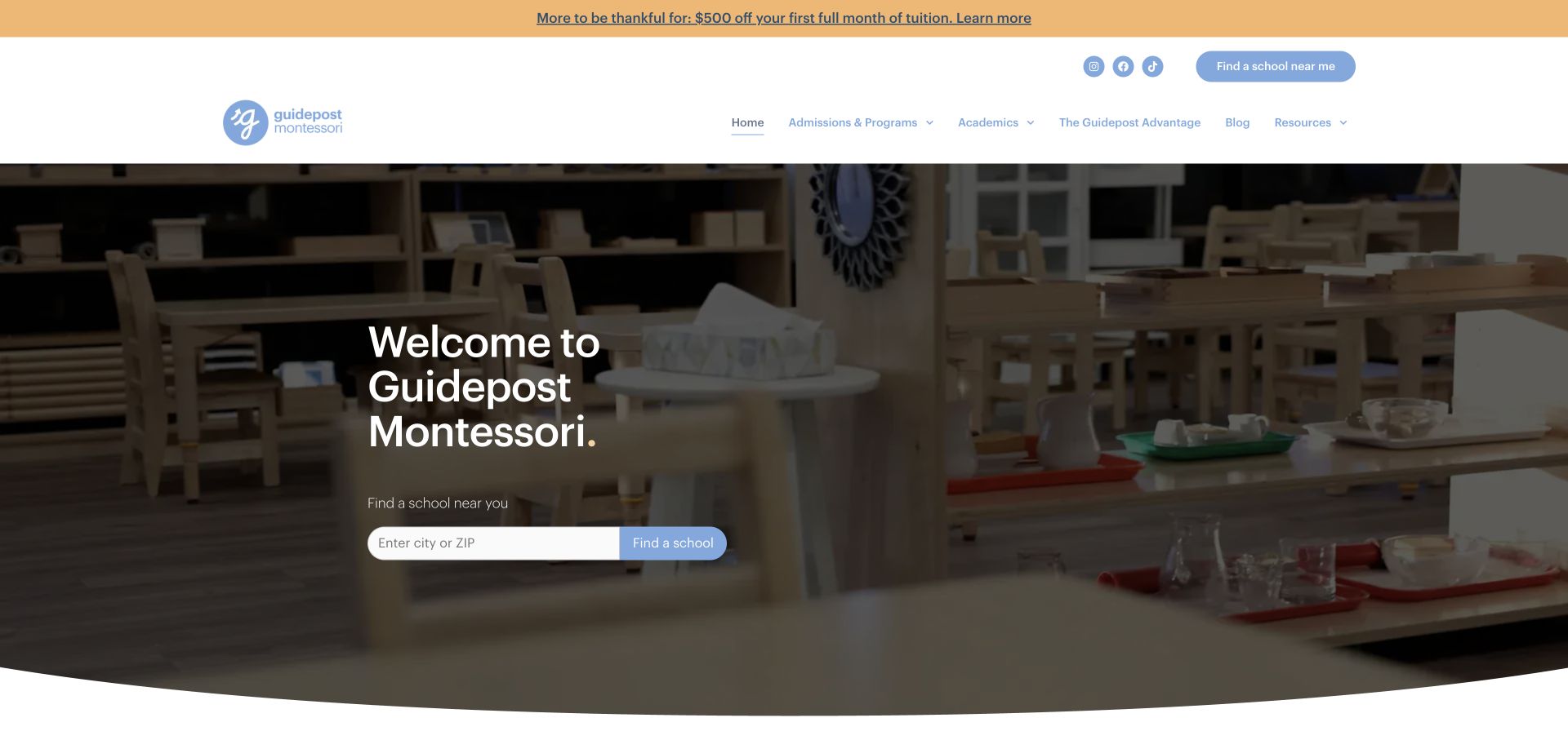
Guidepost Montessori uses a simple welcome headline over a darkened classroom image, with a city-or-ZIP school finder directly beneath it. The white header includes admissions and programs, academics, resources, and a separate school-finding action. A promotional strip sits above the header. The page is useful as a reference for reducing the hero to identity and location discovery: the more detailed explanation of the organization begins below, leaving the first screen centered on finding the relevant school.
What you can learn
A minimal hero can work when the next task is concrete. If the opening does little more than introduce the name, make the location finder explicit and ensure program information is available nearby for families who need context first.
Pros
The city-or-ZIP field has a clear label and a directly adjacent action.
Admissions and programs are named in the main navigation rather than hidden in a generic about section.
Cons & considerations
The simple welcome provides little immediate explanation of ages or program formats.
The promotional strip adds another message before the core location task.
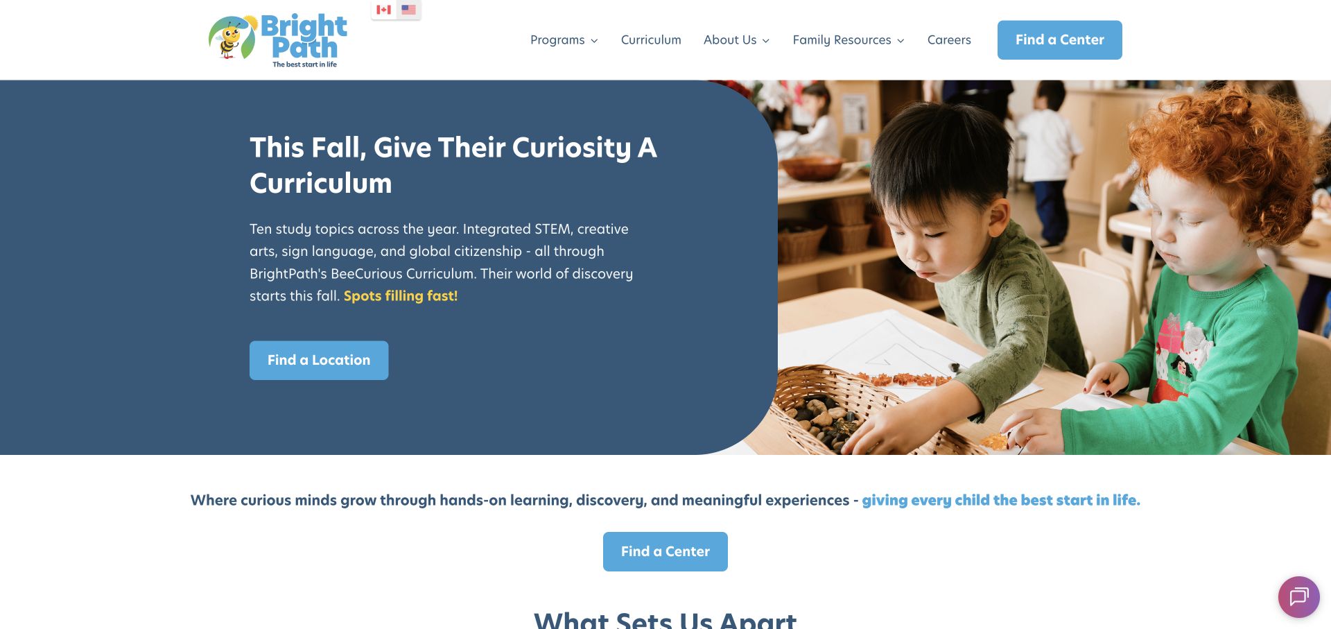
BrightPath uses a white header and a large split hero: a slate-blue text panel on the left and a classroom photograph on the right. The campaign describes the organization’s curriculum, then provides a location-finding action. Another center-finding button appears beneath the hero. Programs, curriculum, company information, family resources, and careers are exposed in navigation, with country selection near the logo. The design is useful for connecting an educational campaign to the local next step while keeping the text on a reliable solid-color surface.
What you can learn
When a campaign explains a curriculum, end with a clear route to the local center where families can ask practical questions. Use the surrounding navigation to separate program explanation from costs, family resources, and enrollment information.
Pros
The solid text panel keeps the campaign readable independently of the classroom photograph.
Family resources and curriculum are visible as separate information categories.
Cons & considerations
Repeated center-finding actions can feel redundant within a short vertical distance.
The campaign contains several educational concepts before visitors see local availability or age details.
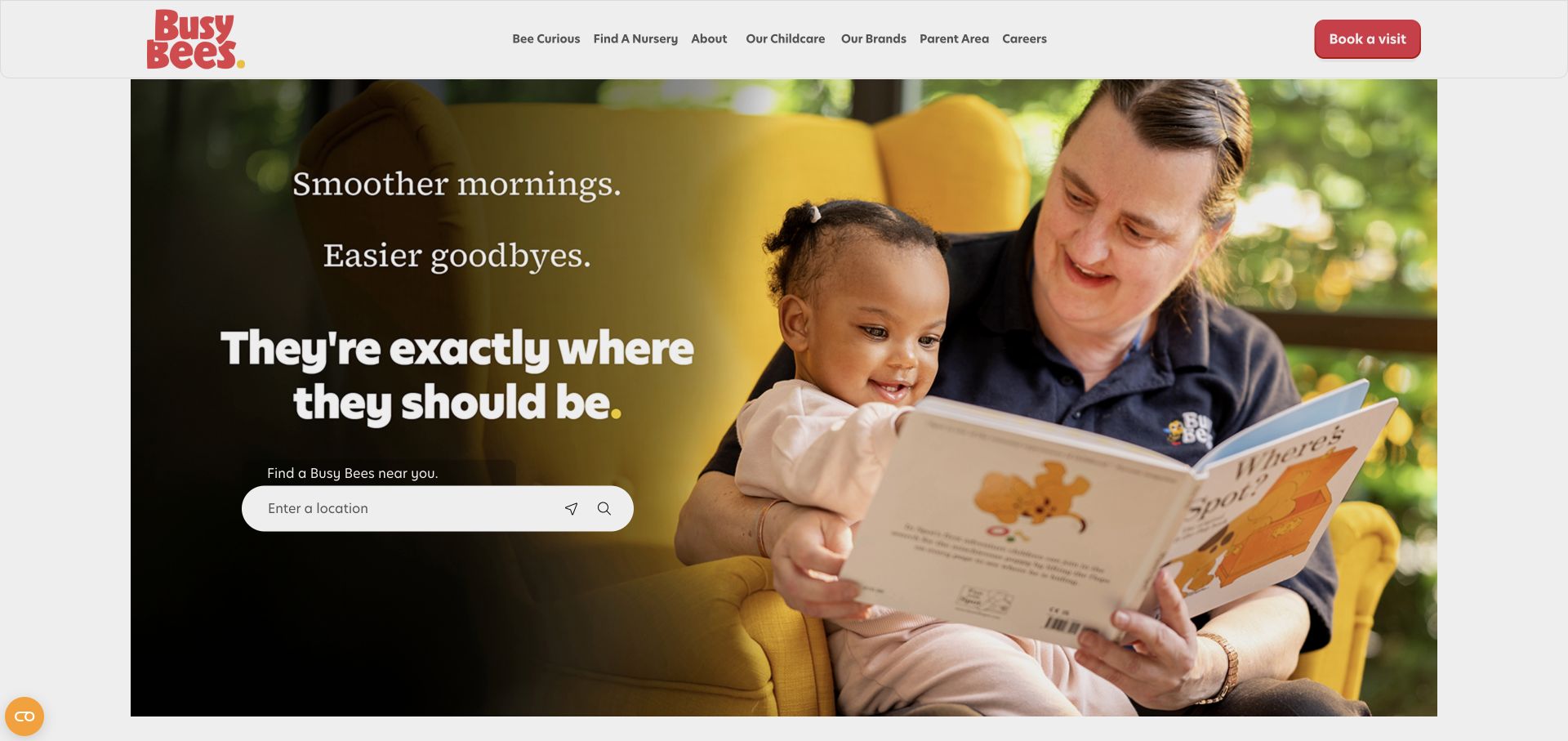
Busy Bees uses a compact white header with a red logo and visit-booking action. A large photograph fills the hero, with a darkened area on the left supporting the headline and location field. The finder includes recognizable location and search icons, while the navigation exposes nursery discovery, childcare information, parent resources, and careers. The page is useful for placing a practical task inside an emotional campaign without adding a separate large form card. The review concerns that arrangement rather than validating the service claims in the headline.
What you can learn
Keep the location label explicit when using icon-led controls. A visually simple search field still needs to explain what the visitor should enter and distinguish manual entry from any optional current-location request.
Pros
The compact header leaves room for the main location-finding task.
The darkened photograph area gives the headline and search a clear visual zone.
Cons & considerations
Icon-only search and location controls need especially clear accessible naming during implementation.
The large image delays more specific program and fee information until later sections.
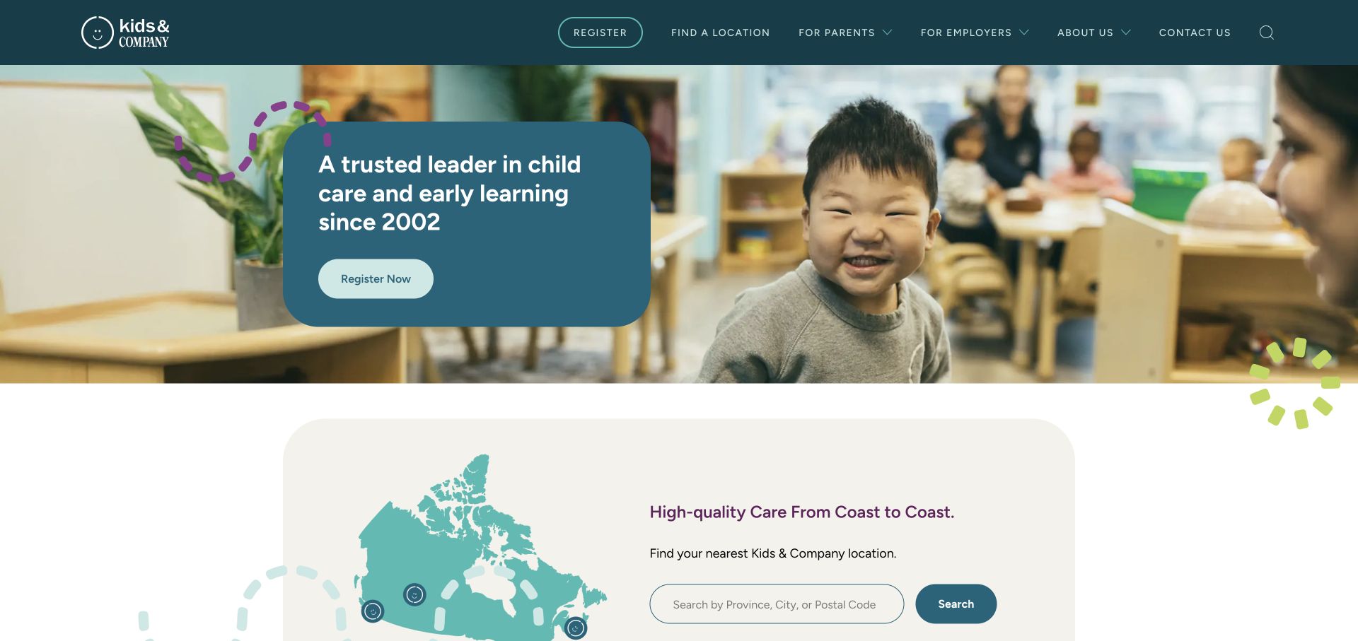
Kids & Company uses a dark teal header and a rounded blue message card over a classroom photograph. Registration is the hero’s main action, while a large map-and-search section begins immediately below. The navigation separates parent and employer information, with location discovery kept as its own route. Small illustrated marks soften the otherwise orderly layout. The page is useful for studying how a provider can connect a broad brand introduction with a geographic directory while also acknowledging a business audience.
What you can learn
Place location discovery close to registration. Families often need to establish whether a relevant center exists before they are ready for an enrollment conversation, so the transition between those tasks should be short and clearly labeled.
Pros
The map-and-search section makes geography visible immediately after the hero.
Parents and employers receive separately named navigation routes.
Cons & considerations
The main registration invitation appears before the visitor has selected a location.
The broad hero statement gives limited detail about age groups or local program differences.
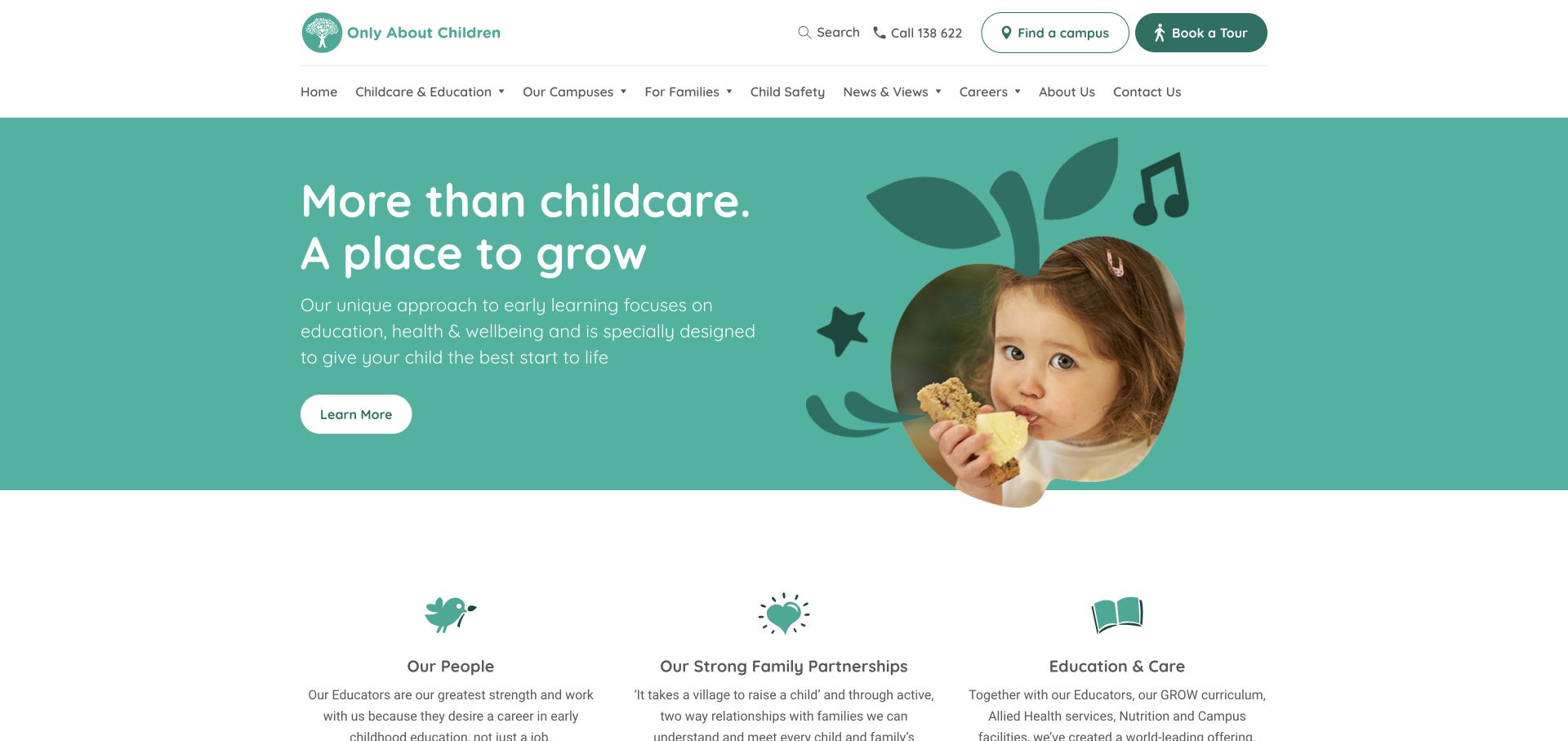
Only About Children uses teal and white with simple illustrations around a child photograph. A two-row header places phone contact, campus discovery, and tour booking above categories for education, campuses, families, safety information, news, careers, and company details. The hero’s learning action is followed by three explanatory columns. This is a useful reference for a provider whose site must support both discovery and ongoing family information. The visual language is gentle, while the header carries a relatively extensive set of practical destinations.
What you can learn
Distinguish direct tasks from information categories. Campus search and tour booking can occupy the utility layer, while education and family resources sit below, helping visitors choose between acting now and learning more.
Pros
Campus discovery and tour booking are clearly labeled in the upper utility row.
The illustrated teal hero has a consistent visual relationship to the explanatory icons below.
Cons & considerations
The two navigation rows expose many choices at once.
The generic learning action is less specific than the practical campus and tour routes above it.
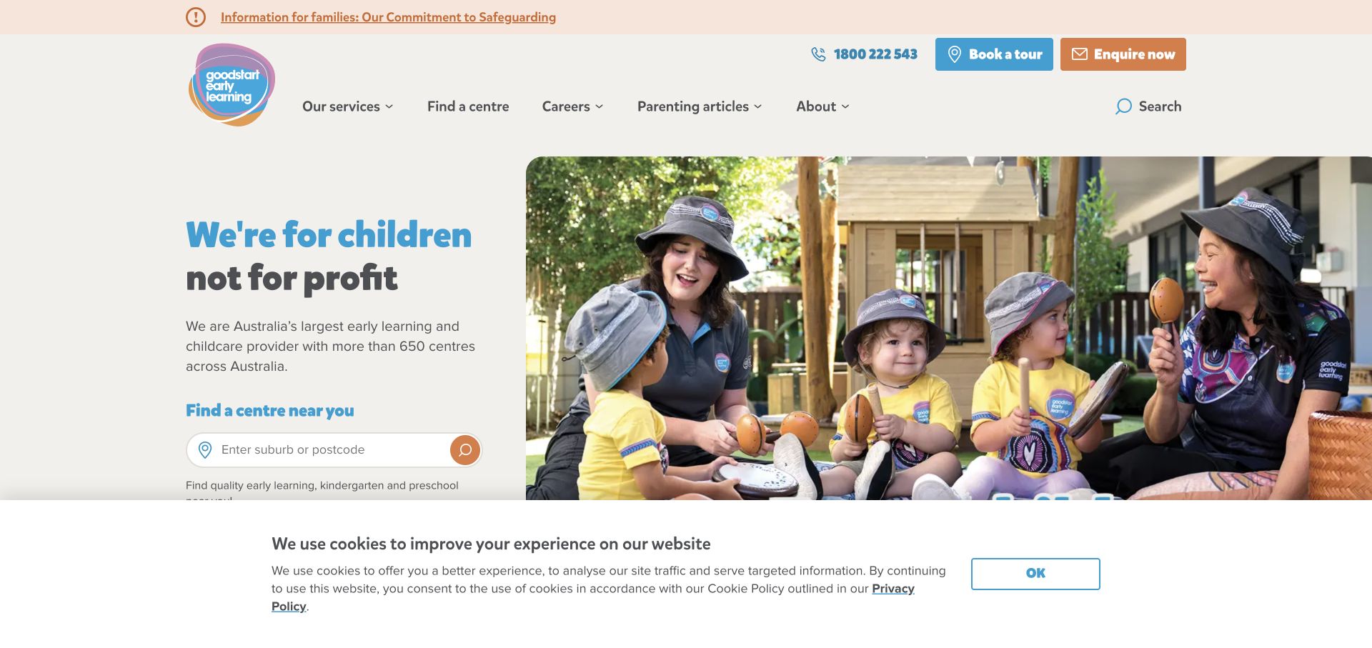
Goodstart uses a warm neutral background, blue headings, and orange accents around a split hero. A purpose-led statement occupies the left, with a suburb-or-postcode finder beneath it; a wide photograph of a group activity fills the right. Phone, tour, and inquiry actions appear above the navigation, and a family-information notice sits at the top. The page is useful for studying how a provider combines organizational positioning with immediate local discovery. The notice’s prominence is a navigation observation, not a verification of the underlying care claims.
What you can learn
Keep purpose statements connected to practical tasks. Families can understand the organization’s positioning while still seeing a direct location field and separate routes to ask a question or arrange a visit.
Pros
The suburb-or-postcode field provides a concrete local starting point.
Tour and inquiry actions are named separately rather than merged into a vague contact button.
Cons & considerations
The notice and multiple header rows consume a substantial part of the opening screen.
The consent banner in the captured state covers some content below the location field.
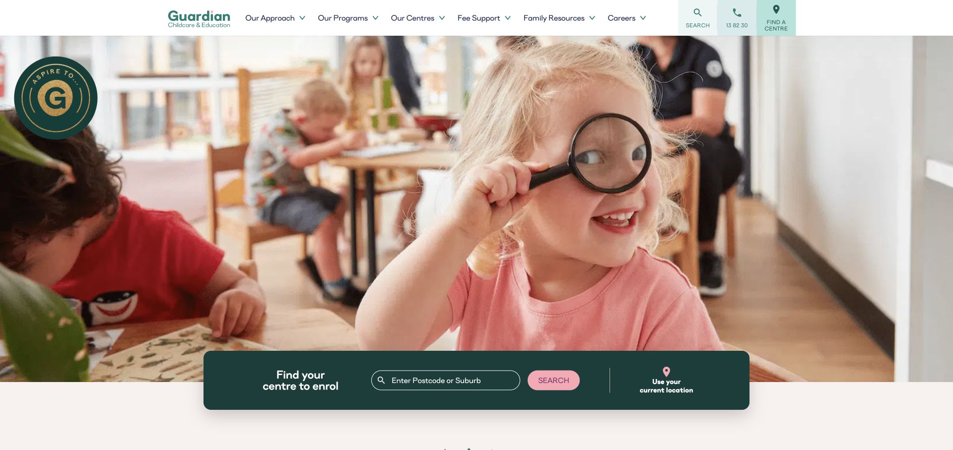
Guardian places a large classroom photograph beneath a compact white header, then overlaps the lower edge with a dark green location-finding bar. The bar supports postcode or suburb entry and presents current-location use as a separate option. The navigation exposes approach, programs, centers, fee support, family resources, and careers. The opening is useful as a design reference because the local task is prominent even though the hero contains little explanatory text. The broader organizational story begins below the image.
What you can learn
Make optional geolocation visibly separate from manual search. Visitors should understand that they can type a suburb or postcode without granting access to their current location, and the search label should explain the expected result.
Pros
The overlapping dark search bar remains visually distinct from the large photograph.
Fee support and family resources are explicit categories in the header.
Cons & considerations
The image-led opening supplies limited immediate information about ages or program formats.
The large photograph takes considerable space before the longer explanation begins.
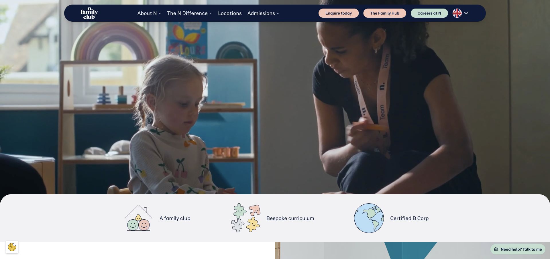
N Family Club uses a floating rounded navy header over a full-width nursery film. Location and admissions categories sit beside separate inquiry, family-hub, and careers actions, each using a soft accent color. A rounded strip of illustrated themes begins at the bottom of the hero, introducing the club concept, curriculum, and a certification label. The page is useful for studying a highly visual brand introduction whose practical routes are concentrated in the header. The review describes the presentation of those signals without treating them as evidence of childcare outcomes.
What you can learn
When the hero is almost entirely film, make the header’s task labels do more work. Prospective families, current families, and applicants should be able to recognize their route without waiting for the media to explain the organization.
Pros
Admissions, locations, and the family hub are named as distinct destinations.
The rounded header and illustrated strip create a coherent visual system around the film.
Cons & considerations
The opening contains little plain-language explanation of the service above the fold.
Several colored utility actions compete for attention within the compact floating header.
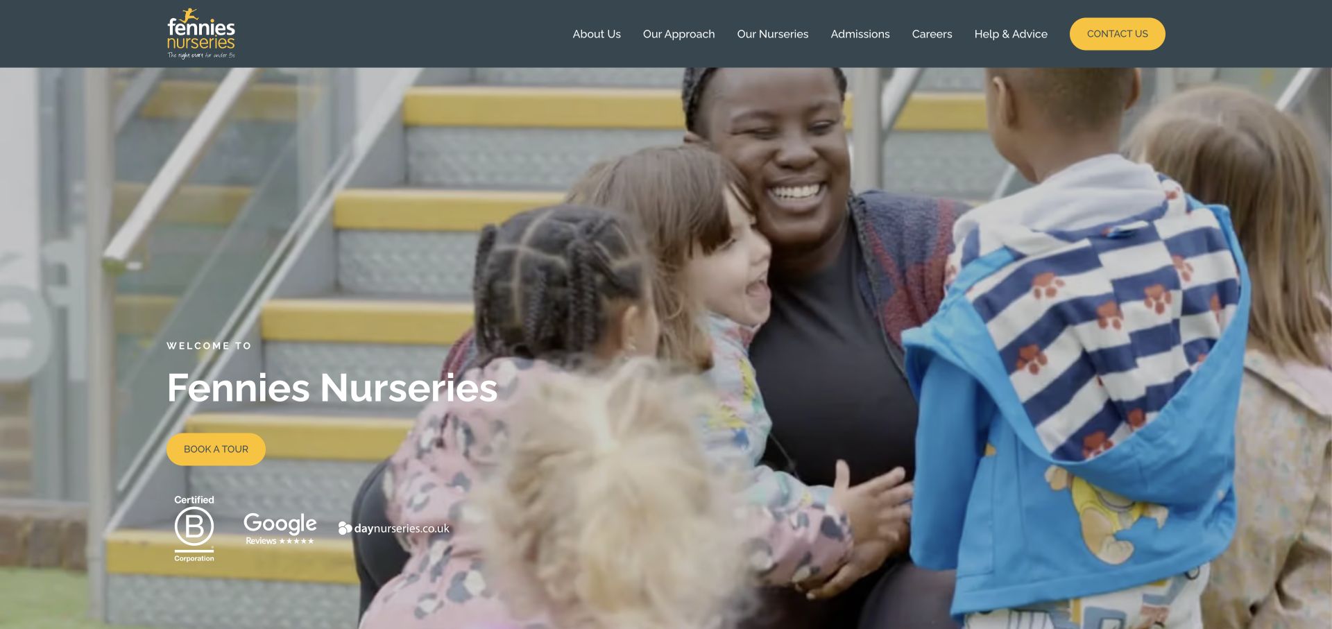
Fennies uses a dark slate header with yellow accents above a large nursery photograph. A short welcome, the nursery name, and a yellow tour-booking action occupy the left side of the image, with several recognition marks beneath. The page snapshot shows a later location finder with region filters and list or map views, followed by admissions content. This is a useful reference for a nursery group that keeps the opening simple while providing a more detailed directory further down the same page.
What you can learn
Connect the simple tour invitation to useful location discovery. A family should be able to identify the appropriate nursery before reaching a detailed inquiry, and list and map modes should offer equivalent practical information.
Pros
The yellow tour action stands out against the darkened photograph.
The later directory includes geographic filters and a list-view alternative to the map.
Cons & considerations
The opening view does not immediately expose the full location search.
Recognition marks occupy space that could otherwise explain the next step or program ages.
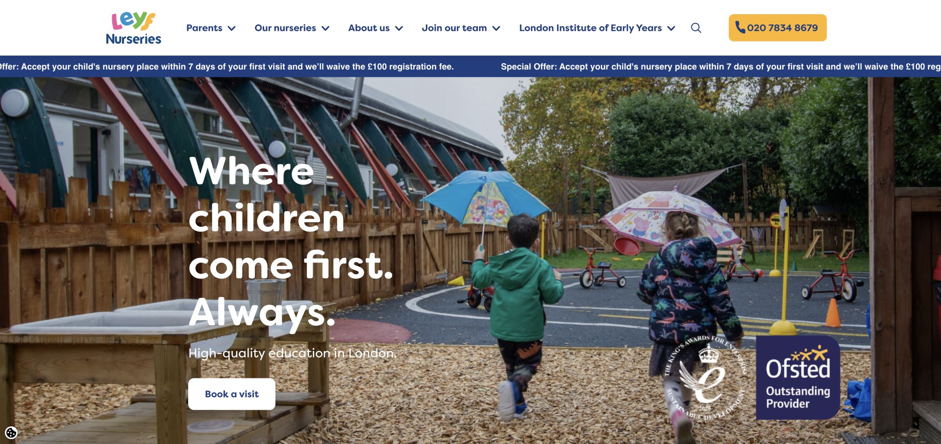
London Early Years Foundation uses a white header with colorful branding, navy labels, and a prominent phone action. A promotional strip sits above a large outdoor nursery photograph. The hero names the London context and presents a visit-booking action, while navigation separates parents, nurseries, organizational information, employment, and professional education. The page is useful for studying how a provider can communicate a regional focus while supporting several related audiences. The visible recognition graphics are part of the design; this review does not independently verify their claims.
What you can learn
Name the service geography early and keep the family task clear when a site also serves professionals. A visit action and nursery directory should remain easy to distinguish from recruitment or training information.
Pros
The London context helps visitors understand the geographic scope of the organization.
The visit action and phone route are both visible in the opening composition.
Cons & considerations
The promotional strip adds another moving or repeated message above the hero.
Several professional and organizational audiences share the main navigation with parents.
Plan the route from a family question to a local center
Define the information families need first
List the practical questions your public pages should answer: location, age groups, program format, opening hours, enrollment process, and how to ask about availability or fees. Decide which facts belong on the network homepage and which require an individual center page.
Create a consistent center page structure
Use a repeatable layout for addresses, contact routes, age groups, program descriptions, visit information, and relevant policies. Make ownership of updates clear so a local page stays useful when hours, staff contacts, or program details change.
Design an understandable inquiry step
Explain whether a button requests a tour, starts an enrollment conversation, or asks a general question. Collect only the information needed for that first response and show what happens next. Avoid making families complete a long form simply to discover basic location information.
The editing job behind the design
Support local content and family-facing workflows
A useful content model connects locations, age groups, programs, family resources, and inquiry destinations. Choose editing tools around who maintains each type of information. Network-wide campaign content and local center facts should be related without requiring every location to use identical promotional copy.
A locator, map, admissions form, family portal, and careers system may have separate responsibilities. Plan clear labels and handoffs between them, and provide a useful list view when a map is available. The examples do not infer technology from appearance, so unverified stack labels remain empty.
Our WordPress website examples offer a separate look at publishing approaches. A visible platform label is evidence for that named page, not a guarantee that the same system will suit your requirements.
Before the public launch
Childcare website design checklist
Show a clear location-finding route in the main navigation or hero.
Explain the geographic input expected by a search field.
Keep manual search available alongside optional current-location features.
Connect program names to understandable age ranges and descriptions.
Distinguish tour requests, enrollment inquiries, and general contact actions.
Give existing families a recognizable route to their resources or portal.
Separate family information from careers, employer, and franchise audiences.
Make center-specific contact and program information easy to maintain.
Review consent panels and promotional notices within the first-visit layout.
Provide text explanations alongside visual recognition marks and educational terminology.
Check the location journey on narrow screens and with keyboard navigation during implementation.
These checks are a project checklist, not a performance, legal, security, or accessibility certification. Test real journeys with the people responsible for the website before making claims about the result.
Sources & editorial method
How this collection was selected and reviewed
Inspected 25 distinct public childcare and nursery brand websites in Chrome on November 3, 2026, after the example count was fixed. Saved a direct browser screenshot and page snapshot for each selected source, with URL, capture time, dimensions, and attribution. Reviews address visible design, information structure, and navigation. No enrollment, inquiry, location-permission, or account forms were submitted.
Each example links to its actual source page. Screenshots are direct browser captures with their own capture dates; moving imagery, announcements and live designs can change. The notes describe observable design choices and conditional tradeoffs, not measured traffic, conversion results, service quality, or accessibility conformance.
Technology labels use public page metadata, asset evidence, or explicitly cited platform documentation. Platform documentation is not a complete current deployment audit. A component reference may be legacy or unused; it is not a complete backend inventory. Unknown stacks are omitted. These sites are editorial examples, not our client portfolio.
Written, Edited and Curated are separate editorial records, not timestamps advanced by a rebuild. Website designs and imagery belong to their owners. See our editorial standards or suggest a correction.
Questions worth asking
Childcare website design questions
What should a childcare homepage make easy to find?
Start with the relevant location and program information, then provide clear routes to contact or arrange a visit. The exact details depend on the organization, but families should understand where care is offered and which age groups or programs they can explore before completing an inquiry.
Should the main action be find a center or book a tour?
A center finder helps families establish local relevance first. A tour action can work when the location is already known, such as on an individual center page. If both appear on the homepage, make their relationship clear and avoid sending every visitor into the same unexplained form.
How can a childcare brand use playful visuals without confusing adults?
Keep practical labels direct. Illustrations, mascots, and bright colors can express the brand while age ranges, location fields, and action labels remain plain and predictable. Decorative elements should not compete with the information families need to make their next inquiry.
How should a network handle different programs at different locations?
Model programs and locations separately, then show their relationship clearly. A location finder can offer a program filter when the terms are understandable. Each center page should explain its own offering so the network-level campaign does not imply identical availability everywhere.
Do these examples establish that a provider is safe or suitable?
No. Website design is not evidence of care quality, safeguarding performance, educational outcomes, or suitability for a particular child. The reviews examine how pages communicate and organize information; they do not endorse providers or verify their operational claims.
Should a childcare website request current location automatically?
The interface should explain an optional location feature and retain a manual town or postcode route. A family can then choose how to search. The reviewed pages were observed without granting location permission, so no claim is made about the accuracy of their location results.
Use the visual references to improve the family’s path to relevant local information. A clear search, understandable program language, and a well-explained inquiry step are more useful than adding another decorative campaign panel.