Best Occupational Therapy Websites of 2026 (30 Real-World Examples)
Occupational therapy websites that explain daily-life support in practical terms
These 30 occupational therapy websites explore children’s services, adult support, visiting teams, assessment pages and the different journeys of families, individuals and professional referrers.
Occupational therapy can be difficult to describe in one short headline because practices work with different ages, settings and needs. A useful website does not solve that by listing every possible diagnosis. It explains the activities and service areas the actual team supports, identifies the audience and tells a visitor where an appointment or assessment can take place. Plain-language examples create orientation; they should not become a self-diagnostic tool.
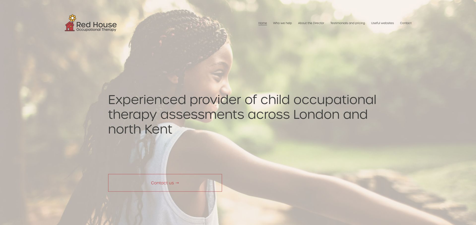
Red House Occupational Therapy is our Editors Choice for a focused local assessment presentation. The inspected homepage names children’s occupational-therapy assessments, London and north Kent, and home or school settings in direct language. Its warm restrained design supports that information rather than overwhelming it with an extensive promotional catalogue. This is an editorial website selection, not an evaluation of professional competence or clinical results.
The collection deliberately includes different operating models: small children’s practices, adult and lifespan services, mobile teams, larger allied-health organisations and professional consultancy businesses. The appropriate design depends on which model is real. A family looking for a first appointment should not have to interpret case-management procurement language, and a professional commissioner should not be forced through a generic parent enquiry form.
Before the examples
What makes good occupational therapy website design in 2026?
Explain the service through activities and setting
Describe the actual work in ordinary language alongside professional terms. Identify whether the practice supports children, adults, older people or specific audiences, then state clinic, home, school, workplace or remote arrangements accurately. The Royal College of Occupational Therapists’ public material is a useful reference for activity-focused language, but the practice must approve its own service scope.
Separate assessment, support and professional work
An assessment, a block of sessions, parent coaching, school consultation and a professional training enquiry may need different information. Give each a clear destination and explain what the first step involves. Do not make every visitor choose from a long list of technical labels before they can ask a question, and avoid presenting reports or funding decisions as guaranteed outcomes.
Make capacity and geography operationally accurate
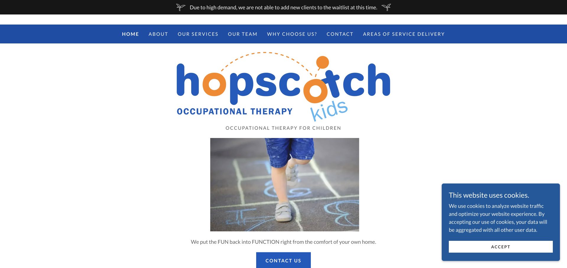
A mobile service needs a real travel boundary, not only a convenient-sounding headline. A multi-location service needs capacity information at the level where it changes. State whether referrals or waitlists are open and assign someone to maintain the notice. Hopscotch Kids Therapy’s visible closed-waitlist message illustrates why honest capacity belongs beside the contact action.
The collection · 30 examples
30 occupational therapy websites worth studying
Look beyond the visual style to the service model each page explains. The useful comparison is how a parent, adult, school or case manager finds the relevant route, understands the setting and knows what their first enquiry will do.
Red House Occupational Therapy uses warm cream tones, a quiet photographic background and a notably specific introductory heading. Visitors learn that the service concerns child occupational-therapy assessments in London and north Kent before encountering a lengthy condition catalogue. The following content explains home and school support in everyday terms such as handwriting, dressing and participation. That practical vocabulary is the strongest part of the page: it gives a parent several ways to recognise a relevant enquiry without claiming the website can assess their child. The modest navigation and direct contact action suit a focused independent service.
What you can learn
A small practice can communicate expertise through specificity rather than an oversized list of claims. Name the actual assessment service, geographic boundary and appointment settings, then explain everyday participation questions without turning the page into a diagnostic checklist.
Pros
The opening establishes service type and geographic coverage in a single understandable heading.
Practical activity examples make occupational therapy less abstract for a first-time parent.
Cons & considerations
Text over a pale photograph still needs contrast checks across different crops and screens.
A very quiet contact treatment can be overlooked by visitors scanning for the next step.
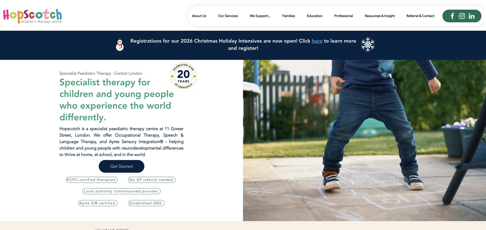
Hopscotch presents occupational therapy as one of three clearly named disciplines within a shared London clinic. The green-and-white layout pairs a direct introduction with an active child photograph and a small cluster of practical reassurance labels. Audience destinations for families, education and professionals remain distinct, which is particularly useful when the same clinic supports both individual sessions and commissioned work. The design gives the multidisciplinary arrangement a coherent identity rather than presenting disconnected mini-sites. Its extensive top navigation and seasonal notice also show how quickly a specialist service can become visually busy when every audience receives equal prominence.
What you can learn
Explain how occupational therapy fits within a multidisciplinary practice without making families decode professional boundaries. Give each discipline a clear description and route, while moving school commissioning and professional material into recognisable audience-specific destinations.
Pros
The service structure makes occupational therapy identifiable within the wider clinic offering.
Family, education and professional pathways support genuinely different reasons for visiting the site.
Cons & considerations
The number of navigation groups increases the initial decision load for new families.
Credential-style labels need linked explanations and should not substitute for substantive practitioner information.
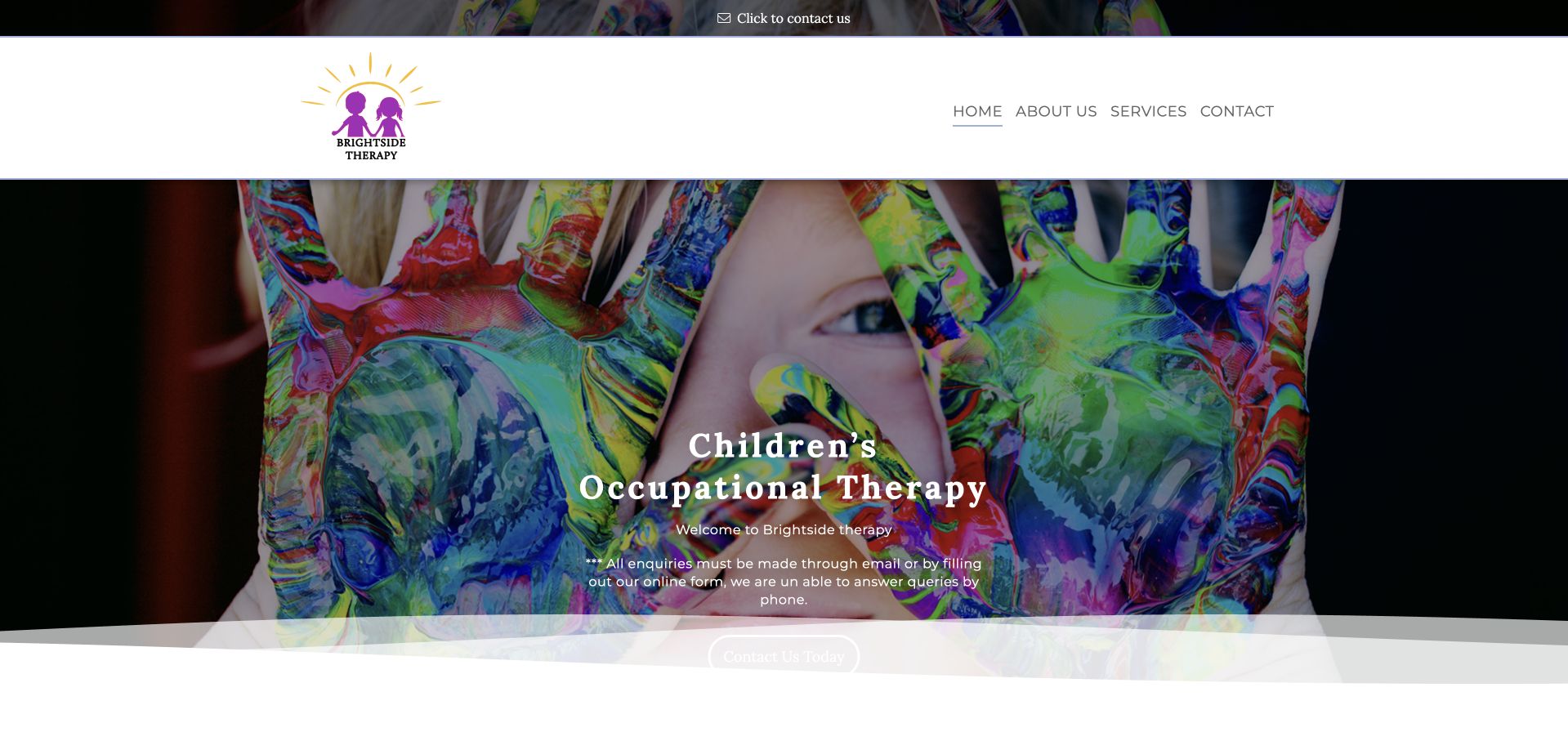
Brightside Therapy uses an expressive photograph of paint-covered hands to introduce children’s occupational therapy. The otherwise simple white navigation leaves the image and service title as the main visual statements. Introductory copy explains home and school work across London, followed by a plain-language explanation of occupational therapy. An unusually practical notice tells visitors that enquiries must be made by email or the online form rather than telephone. That operational honesty is more useful than displaying a phone number the practice cannot routinely answer.
What you can learn
Design the contact journey around how the practice actually operates. If telephone enquiries are not supported, say so near the first action and provide usable written alternatives, while keeping an accessible route for people who may need communication adjustments.
Pros
The paint photograph gives the children’s service a memorable and relevant visual identity.
The contact notice establishes realistic expectations instead of inviting an unavailable communication route.
Cons & considerations
A large image delays the fuller explanation of who the service supports and where.
The operational notice and introductory text need careful hierarchy to remain easy to find.
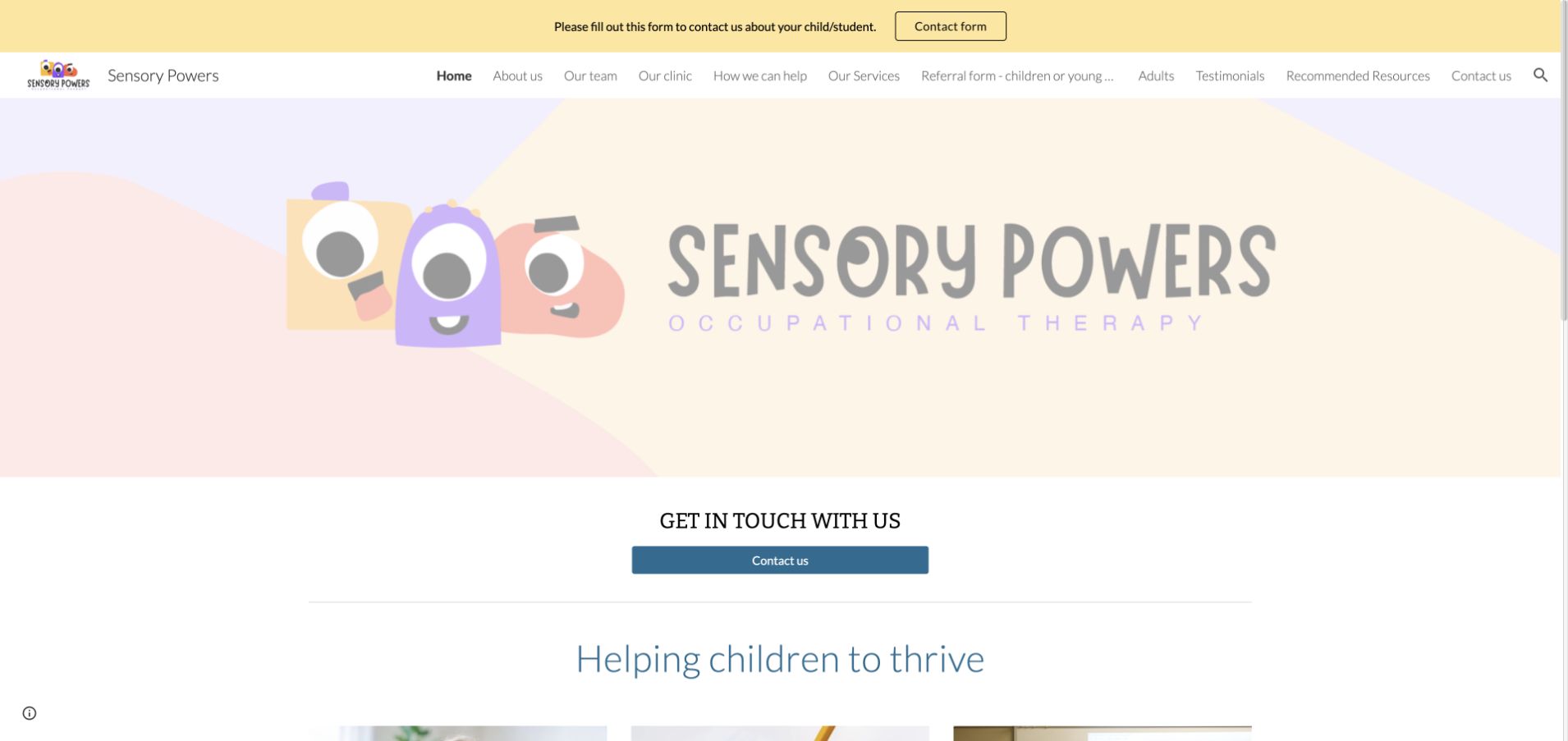
Sensory Powers uses a pastel illustrated identity and a concise contact action, followed by three service categories: assessment, intervention and training. Those labels create a useful distinction between an individual family enquiry and work with schools or other organisations. The introductory text identifies a London paediatric service and describes the audiences it supports. The design is friendly without turning the service catalogue into a collection of unrelated promotions. Some headings and accessibility controls add visual and semantic complexity, so the straightforward three-part structure needs to remain usable with keyboard navigation, zoom and assistive technology.
What you can learn
Assessment, ongoing support and professional training are different visitor tasks. Give them separate explanations and destinations, then describe who each route is for rather than assuming that a parent and a commissioning organisation understand the same service terminology.
Pros
The three service categories provide a simple framework for a broad specialist offering.
Pastel illustrations create an approachable identity without depending entirely on generic clinical photography.
Cons & considerations
Long explanatory headings can become difficult to scan when several are displayed together.
Additional controls around headings need testing so they do not obscure a clear semantic reading order.
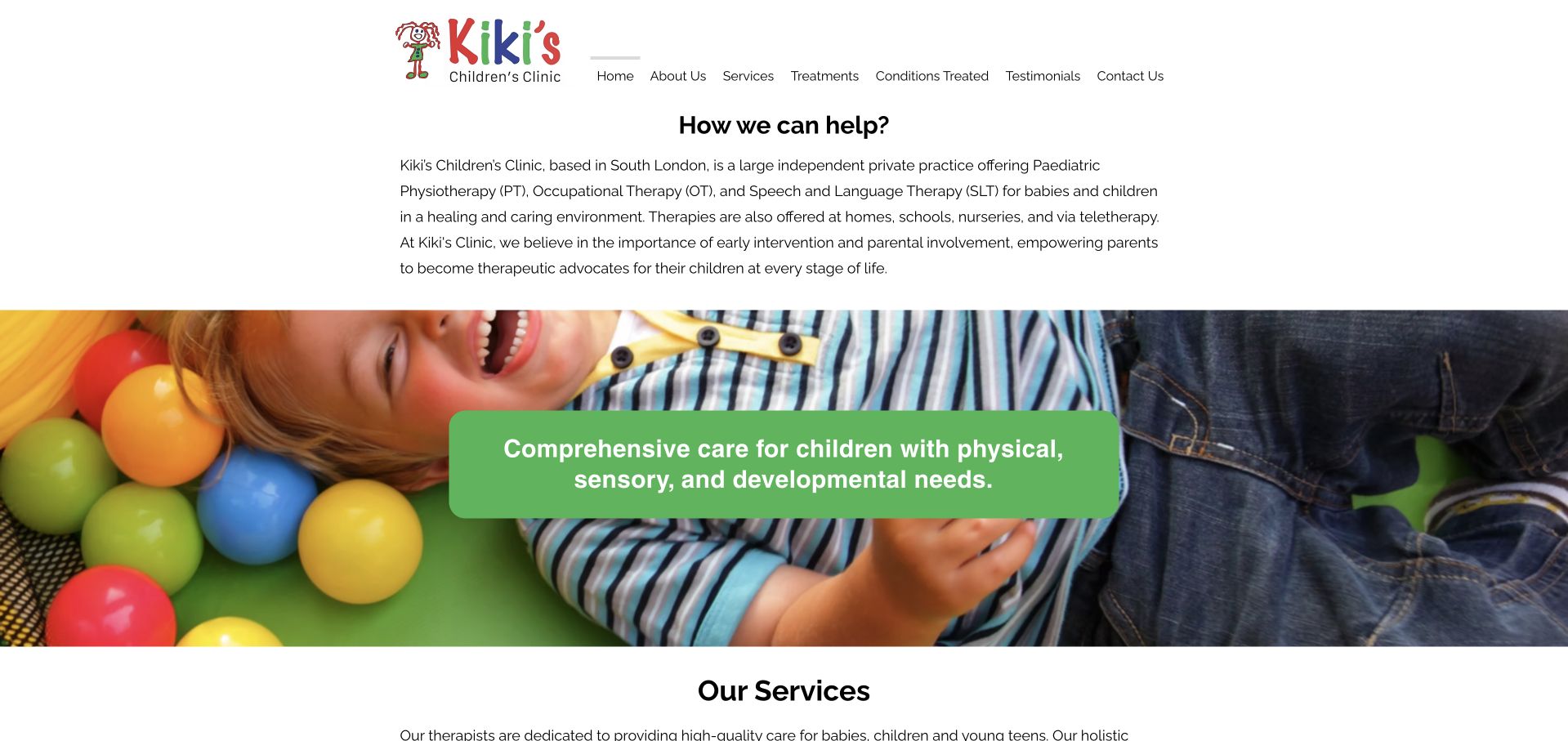
Kiki’s Children’s Clinic starts with a written orientation to its South-London practice before presenting a broad child photograph and service collection. Occupational therapy receives a short explanation focused on day-to-day living rather than only a list of professional techniques. Physiotherapy and speech therapy appear alongside it, each with its own detail route. This helps a family understand that the clinic contains several disciplines without requiring them to arrive knowing the correct professional label. The opening text is comparatively small, however, and carries important information about age range, appointment settings and the practice’s scope.
What you can learn
Explain occupational therapy through participation in everyday activities, then show how it differs from neighbouring disciplines. Keep the clinic’s age range and appointment settings prominent enough that visitors do not have to search small introductory paragraphs for essential service-fit information.
Pros
Short service explanations help distinguish occupational therapy from the clinic’s other disciplines.
The opening identifies multiple appointment settings rather than assuming every session takes place in clinic.
Cons & considerations
Essential scope information is delivered in relatively small text above the main photograph.
A broad visual statement occupies substantial space before the individual occupational-therapy destination.
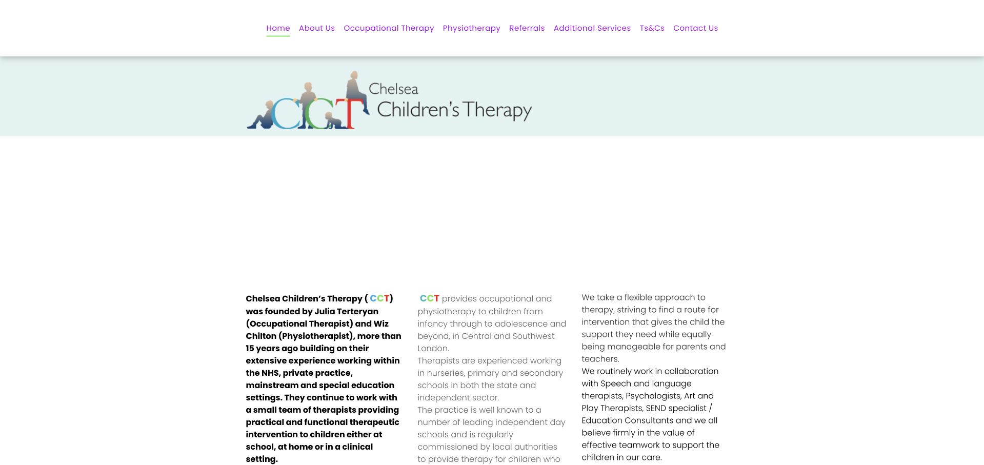
Chelsea Children’s Therapy uses a restrained pale-blue identity and a compact, text-led introduction. The page names its occupational-therapy and physiotherapy founders, describes the small team and explains work across home, school and clinic settings. That level of organisational detail gives visitors useful context without requiring a promotional video or a large intake form. The site is especially relevant as an example of communicating a collaborative school-facing practice. Its narrow text columns and substantial introductory prose feel denser than more contemporary examples, making the content hierarchy and reading experience important areas to study rather than copy unchanged.
What you can learn
A small team’s founders and working settings are useful information, not just biography material. Bring them into the introduction, but break long explanations into headings for families, schools and other referrers so each visitor can find their relevant pathway quickly.
Pros
Named founders make the multidisciplinary team structure concrete rather than anonymous.
The introduction explains the different settings in which the practice works with children.
Cons & considerations
Dense columns and lengthy prose require more reading effort than a clearly segmented service overview.
The subdued visual hierarchy can make practical contact and next-step information less immediately prominent.
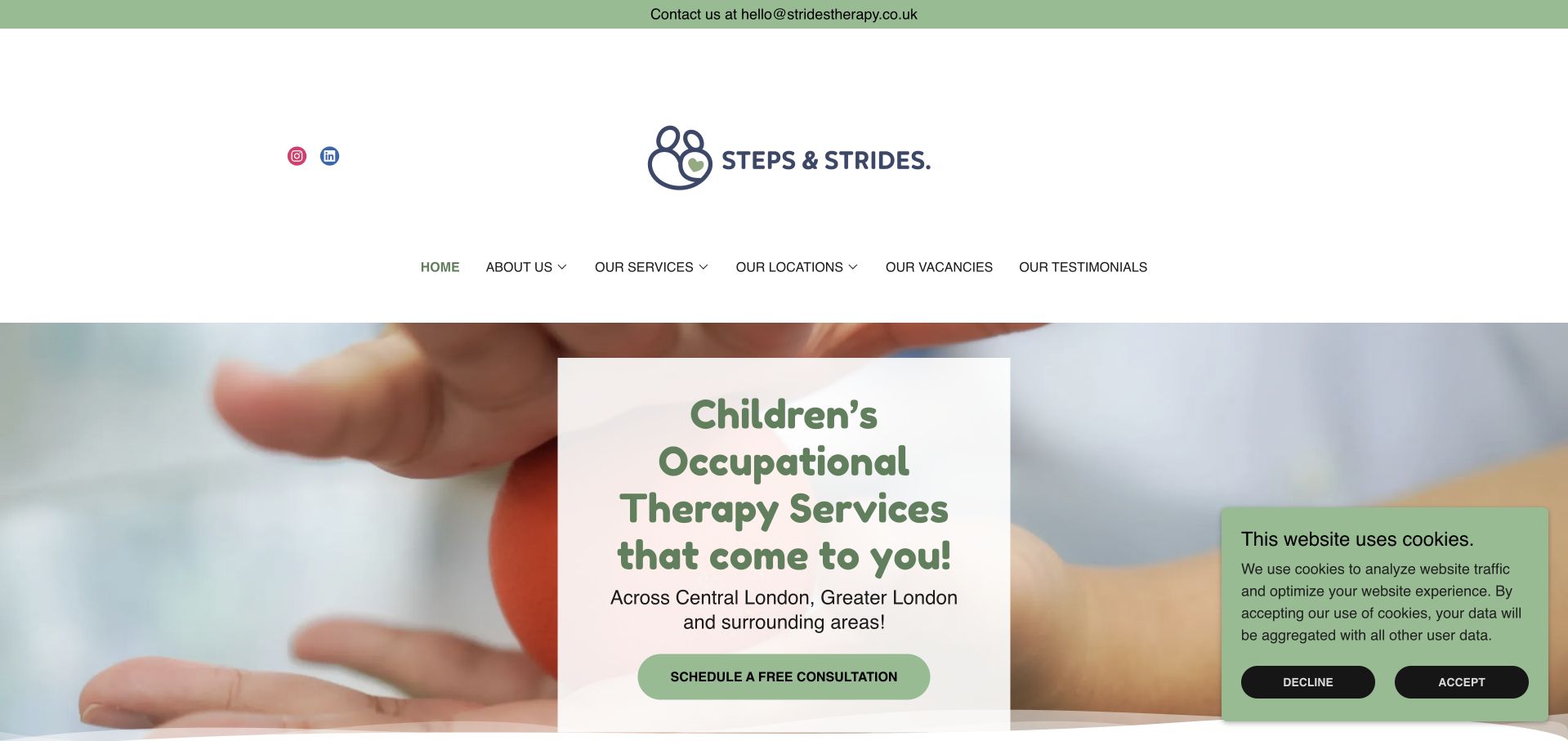
Steps & Strides uses a soft green identity and a central white panel over a child-focused photograph. The opening proposition makes the visiting nature of the occupational-therapy service clear, while surrounding navigation separates services, locations and the team. The page then introduces its paediatric focus and approach in more detail. This is a useful pattern for services whose practical advantage is where support happens: delivery format is part of the main message rather than hidden in an FAQ. The tradeoff is that large image panels, a detailed menu and cookie controls can crowd a fairly simple initial task.
What you can learn
If the service comes to the child, say that plainly near the first contact action. Follow it with precise coverage and scheduling information, and avoid implying that every home, school or geographic area can be accommodated in the same way.
Pros
The visiting-service proposition is visible in the opening rather than buried in supporting copy.
Separate service and location navigation gives practical logistics a recognisable destination.
Cons & considerations
The layered image, central panel and additional notices create several competing visual regions.
Coverage and appointment availability still need specific detail beyond a general promise to travel.
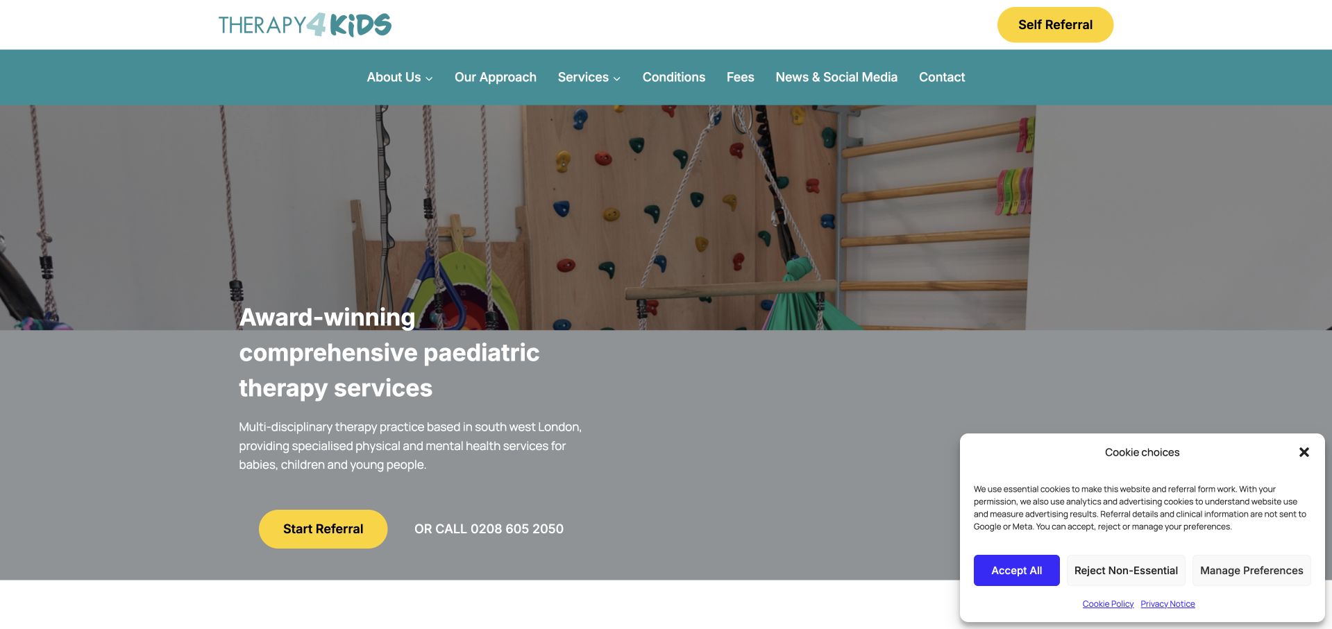
Therapy4Kids uses a real therapy-space photograph beneath a teal navigation band and bright yellow referral actions. Occupational therapy is named in the service collection alongside other disciplines, while fees and contact information remain available in the primary navigation. This gives the page a useful balance between a broad practice introduction and practical research tasks. The actual environment helps visitors picture a setting that could otherwise feel unfamiliar. Because the offering is extensive, the structure depends on clear grouping and service-specific detail pages; the homepage cannot explain every assessment pathway without becoming an overwhelming referral directory.
What you can learn
Use the homepage to orient families, not to reproduce every clinical detail. Give occupational therapy a clear service destination, make fees easy to locate and explain what happens after a referral before asking for substantial personal or health information.
Pros
The therapy-space photograph makes the setting more tangible than an abstract illustration.
Fees and a telephone alternative are visible alongside the prominent referral route.
Cons & considerations
The broad service inventory needs strong grouping to avoid a demanding first-time browsing experience.
A cookie-choice panel occupies part of the first view and adds another interaction before referral.
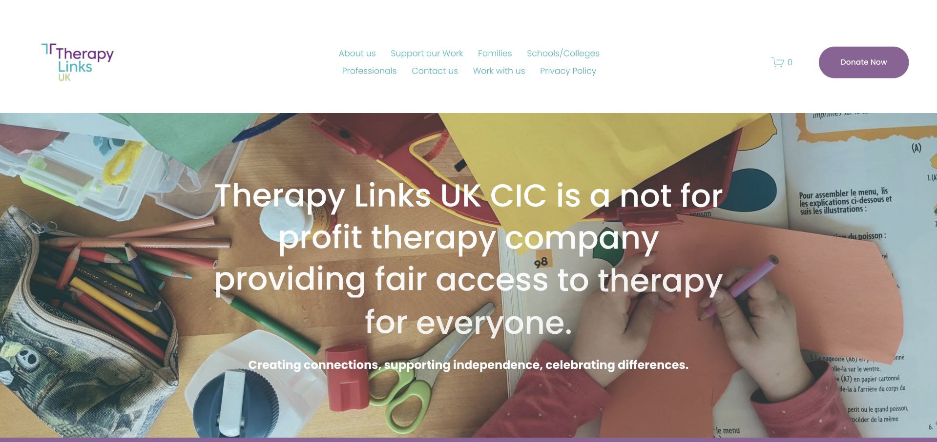
Therapy Links UK introduces its not-for-profit purpose over a colourful child-activity photograph, then explains its multidisciplinary service scope. Occupational therapy appears within a clearly named set of disciplines rather than being implied through a general “support” label. The navigation distinguishes families, education and professional visitors, while donation and organisational material have separate roles. This is useful for studying a service whose mission affects how visitors understand access. The prominent mission statement is not itself a complete eligibility explanation, so fee arrangements, availability and referral criteria need their own carefully maintained detail rather than relying on the emotional opening.
What you can learn
Connect a community organisation’s mission to practical access information. State who can enquire, how affordability arrangements work and which service route applies, while keeping donations and professional commissioning separate from a family’s attempt to understand occupational therapy.
Pros
The mission-led opening clearly distinguishes the organisation from a conventional private-practice presentation.
Named disciplines and audience pathways make the breadth of services more understandable.
Cons & considerations
A large mission statement delays the finer details of eligibility and appointment arrangements.
Families need clear terms behind access statements rather than assuming every service is available on identical conditions.
Hopscotch Kids Therapy combines a playful multicoloured logo with a straightforward introduction to occupational therapy delivered in children’s homes. A conspicuous notice at the top states that new clients cannot currently be added to the waitlist. That message is an important design feature, not an obstacle to remove for conversion purposes: it prevents the otherwise welcoming contact route from implying immediate availability. The page then explains everyday skills and service areas in more detail.
What you can learn
Treat capacity as core service information. Keep referral and waitlist notices current, explain what contact is still useful for, and avoid leaving an unrestricted booking-style action beside a message that the practice cannot currently accept new clients.
Pros
The capacity notice prevents visitors from assuming the service is currently accepting new referrals.
Home-based delivery is stated directly rather than left to photographs or a vague convenience claim.
Cons & considerations
A general contact action can be ambiguous when the waitlist is closed.
The oversized logo and opening image delay more specific service-area and appointment information.
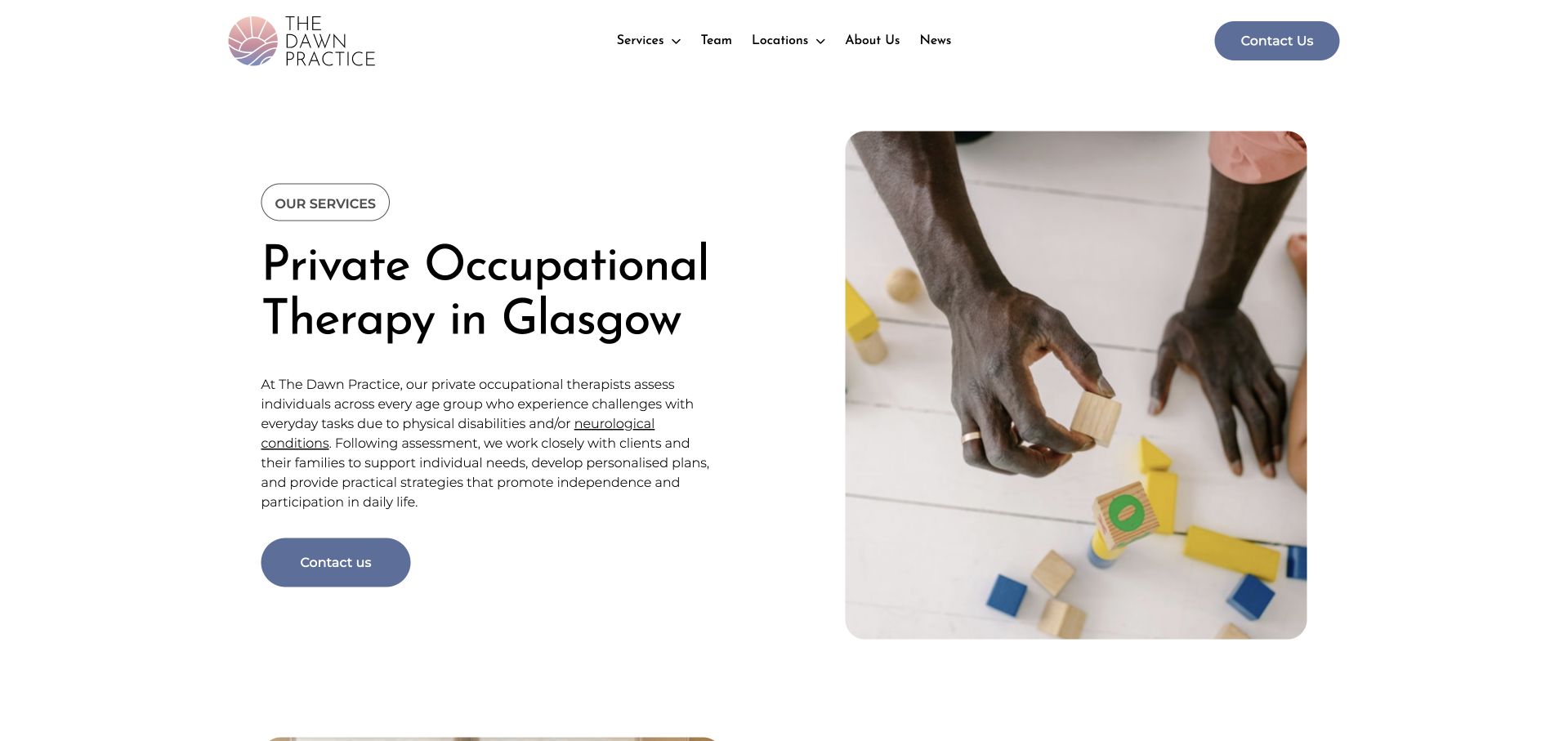
The Dawn Practice gives occupational therapy a dedicated service page with a large descriptive heading, restrained pink-and-blue branding and a paired activity photograph. The page moves from an introduction into what an appointment may cover and then a numbered process. This is a useful structure for a service that some visitors may know only by name. Team and location links remain available in the compact header, while contact actions recur after explanatory content.
What you can learn
Give occupational therapy enough room to explain its process without turning the landing page into a clinical textbook. Separate service scope, appointment expectations, fees and contact instructions, and review all reused FAQ wording for relevance to the specific discipline.
Pros
The dedicated title and service page make occupational therapy identifiable within the wider clinic.
A staged process helps visitors picture an unfamiliar appointment before making contact.
Cons & considerations
Long explanatory sections need careful editing to preserve a clear reading hierarchy.
Shared practice templates require regular review so neighbouring services’ wording does not leak into the page.
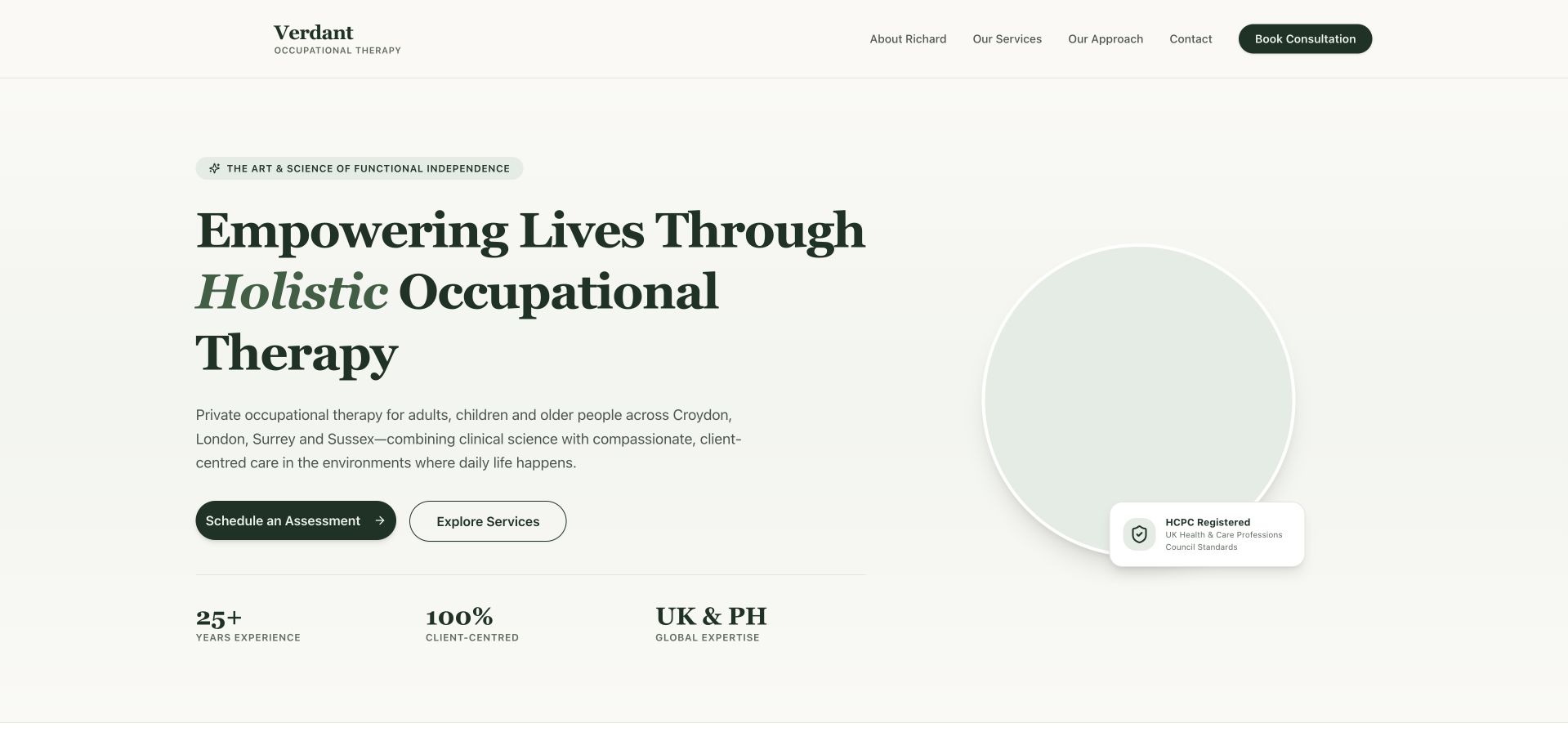
Verdant OT uses cream backgrounds, dark green actions and large serif typography to establish a quieter identity than many children-only therapy sites. The opening explicitly names adults, children and older people, along with its regional coverage. Beneath it, tabs organise adult rehabilitation, children’s rehabilitation, older-adult support, home adaptations and assessments. That categorisation is useful for a practice spanning several life stages. The homepage also displays prominent experience and approach statistics, which remain self-published claims rather than independent evidence. The transferable design idea is the structured service taxonomy, not the assumption that polished metrics establish clinical quality.
What you can learn
When a practice spans several age groups, make those distinctions part of the information architecture. Give each service a persistent destination outside any tabbed interface, and explain professional credentials and claims rather than using statistics as decorative reassurance.
Pros
The opening describes both age groups and regional coverage in understandable language.
Service categories separate life-stage needs from practical work such as home adaptations.
Cons & considerations
Tabbed content can hide relevant services from visitors who do not explore every control.
Prominent experience and percentage-style claims need supporting context beyond their visual presentation.
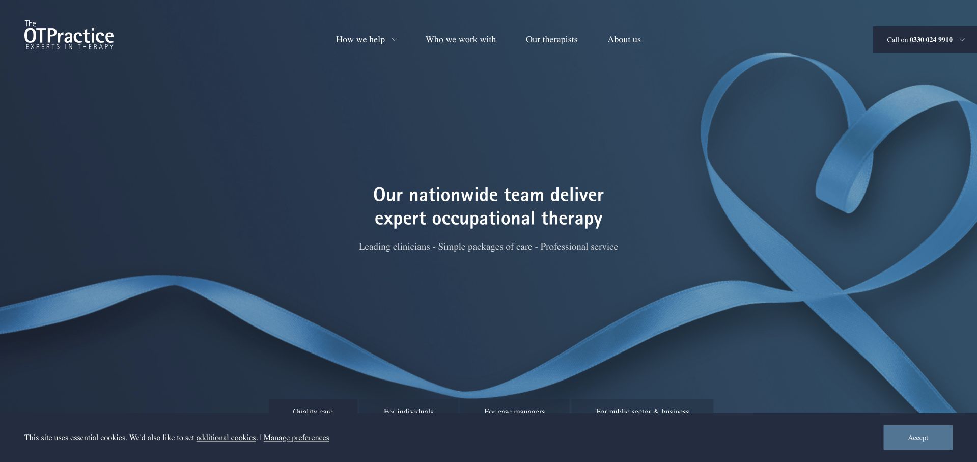
The OT Practice uses a dark-blue identity and a broad typographic hero to introduce its nationwide offering. More importantly, the page separates individuals, case managers and public-sector or business visitors into distinct routes. Professional resources and reports then support the commissioning audience without forcing a family to interpret that material first. The design demonstrates that occupational-therapy websites are not always simple clinic brochures: some must support procurement and ongoing professional relationships as well as personal enquiries.
What you can learn
Organise a mixed individual-and-professional service around visitor purpose, not only clinical categories. Give case-management resources a clear home, but ensure an individual can still find coverage, assessment arrangements and a relevant contact route without navigating commissioning language.
Pros
Distinct audience routes acknowledge materially different enquiry and commissioning journeys.
Professional resources add substance to the case-manager pathway rather than relying on generic partnership claims.
Cons & considerations
The broad organisational message can feel less specific to an individual’s immediate situation.
Large resource promotions may displace simpler service and access questions if ordering is not carefully maintained.
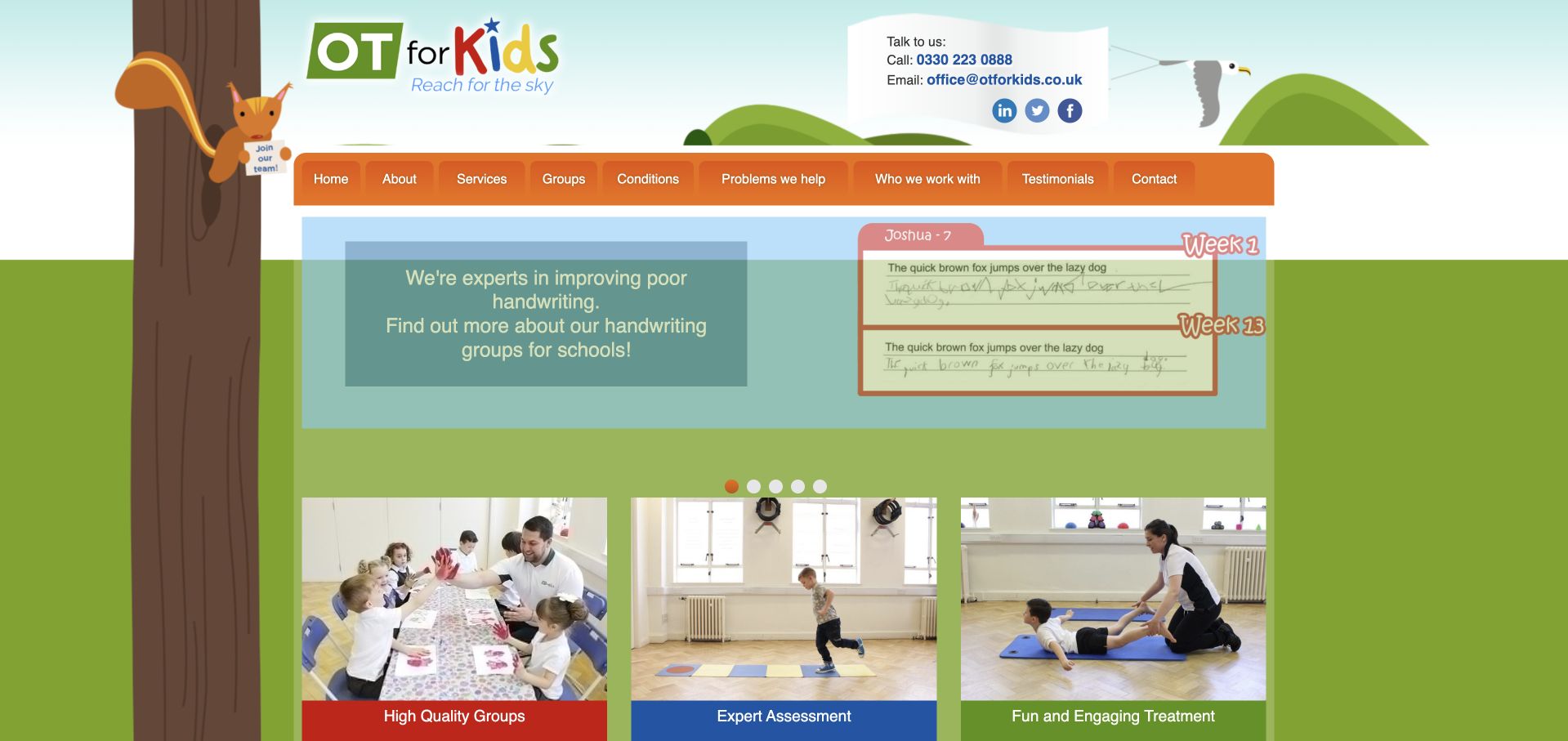
OT for Kids uses a colourful tree-and-landscape identity with an orange navigation bar and a visible school-oriented service catalogue. The page groups support around handwriting, fine motor skills, movement and concentration, using familiar activity examples beneath each title. This makes the offering easier to understand than a catalogue consisting only of professional assessment names. The presentation is visually busier and more traditional than several examples here, but the underlying content model remains useful. Group descriptions should guide an enquiry, not imply that a short list of behaviours establishes a diagnosis or determines which support a child needs.
What you can learn
Use recognisable school and daily-life activities to explain a programme, then clarify who assesses suitability and how a school or parent can enquire. Keep observational examples separate from diagnostic conclusions, and give programme dates, settings and participation arrangements a stable home.
Pros
The grouped activities make specialist services more understandable to nonclinical visitors.
School-focused programme routes support a different enquiry task from an individual clinic appointment.
Cons & considerations
Multiple colours and densely packed panels can make the page harder to scan.
Behaviour-style lists need careful framing so visitors do not mistake them for a self-diagnostic checklist.
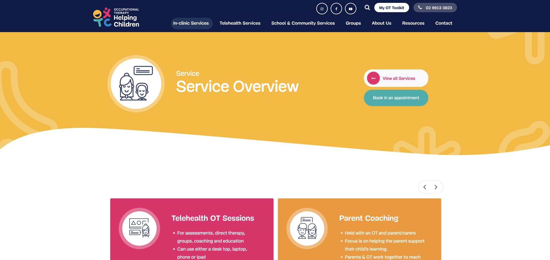
Occupational Therapy Helping Children’s service overview uses a broad yellow heading panel and strongly coloured cards to separate different ways of working. Parent coaching, individual sessions, telehealth and school-related services receive their own explanations rather than being compressed into one generic booking message. The illustrations are consistent with the playful brand and support recognition across the collection. This service page is more useful than a promotional-only homepage for comparing appointment formats. Its desktop navigation is crowded, however, and the carousel-style card arrangement means some routes may not be visible until the visitor explores the controls.
What you can learn
Separate service formats when they involve different participants or settings. Explain whether the session is for the child, parent, school or another professional, and keep a complete static service directory available so important routes are not hidden inside a carousel.
Pros
Colour-coded service cards distinguish parent coaching from direct and setting-based sessions.
Short descriptions explain practical differences instead of relying on service titles alone.
Cons & considerations
The dense desktop navigation needs responsive and zoom testing to prevent overlapping labels.
Carousel-dependent service discovery can conceal options from visitors who do not use the controls.
OTFC Group uses oversized black typography, warm neutral backgrounds and bright yellow decorative forms rather than a conventional clinical hero. The approach creates a distinctive identity while the supporting content identifies children’s occupational therapy and separates services from resources. Further cards introduce offerings such as parent education and sensory-room consultation. This breadth makes the site useful for studying how a specialist organisation can grow beyond one-to-one appointments without abandoning its core identity.
What you can learn
A distinctive visual language can carry a growing specialist brand, but the service directory must remain literal. Give education, consultation and appointments separate destinations, and explain the basis and date of any prominent impact measure rather than leaving it as an unexplained counter.
Pros
The typography and yellow graphic system create a recognisable identity beyond generic healthcare photography.
Separate services and resources routes accommodate several kinds of family and professional interest.
Cons & considerations
An abstract opening can delay clarity about the actual appointment service and its locations.
Impact counters need definitions and context before readers can understand what they measure.
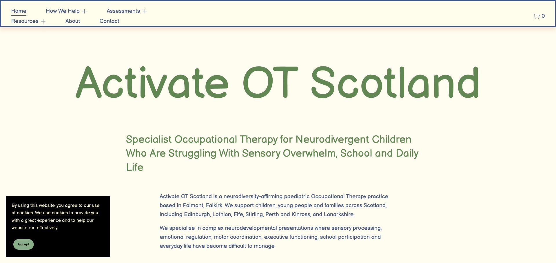
Activate OT Scotland uses a pale cream background, green typography and a text-led introduction to its specialist paediatric service. The first action is a parent consultation call, accompanied by an explanation of what that conversation is intended to establish. The page names its base and wider geographic coverage before moving into practical FAQs. This is a useful alternative to an unexplained “book now” button: the visitor is told what kind of interaction they are requesting.
What you can learn
Explain the purpose of an introductory call before asking someone to book it. Make clear whether it is an enquiry, screening discussion or appointment, and state the practice’s service and coverage limits without implying that a website can determine assessment suitability.
Pros
The first action includes an explanation of what the parent consultation call involves.
The opening names the practice base and coverage rather than leaving visitors to infer geography.
Cons & considerations
A long specialist heading places substantial reading demand on the first screen.
Text-heavy introductions need clear section structure and strong contrast rather than relying on friendly branding alone.
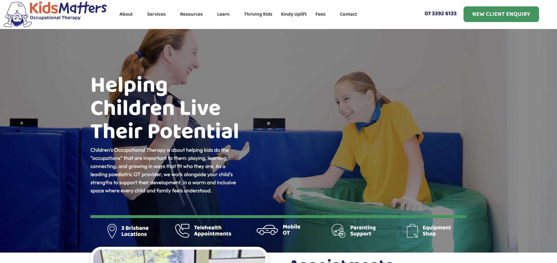
Kids Matters pairs a child-and-therapist photograph with a bold service introduction, then exposes practical routes for Brisbane locations, telehealth, mobile OT and parenting support. The page also publishes an availability notice naming particular locations instead of making an unqualified organisation-wide promise. That distinction is valuable for a service whose capacity may vary between offices. The green action colour and short labels create a recognisable system across the page. Because the site also includes an equipment shop, the navigation must keep clinical service enquiries distinct from purchasing and general educational browsing.
What you can learn
Publish availability at the level where it actually varies: location, service and appointment format. Give clinic, mobile and remote routes their own explanations, and do not let an equipment shop or general resource section distract from the clinical enquiry journey.
Pros
Distinct format and location routes help visitors identify a plausible way to access the service.
The availability notice names relevant offices instead of implying identical capacity across the organisation.
Cons & considerations
Several pathways and a shop increase the number of choices immediately below the introduction.
Availability statements require frequent maintenance to avoid misleading visitors after capacity changes.
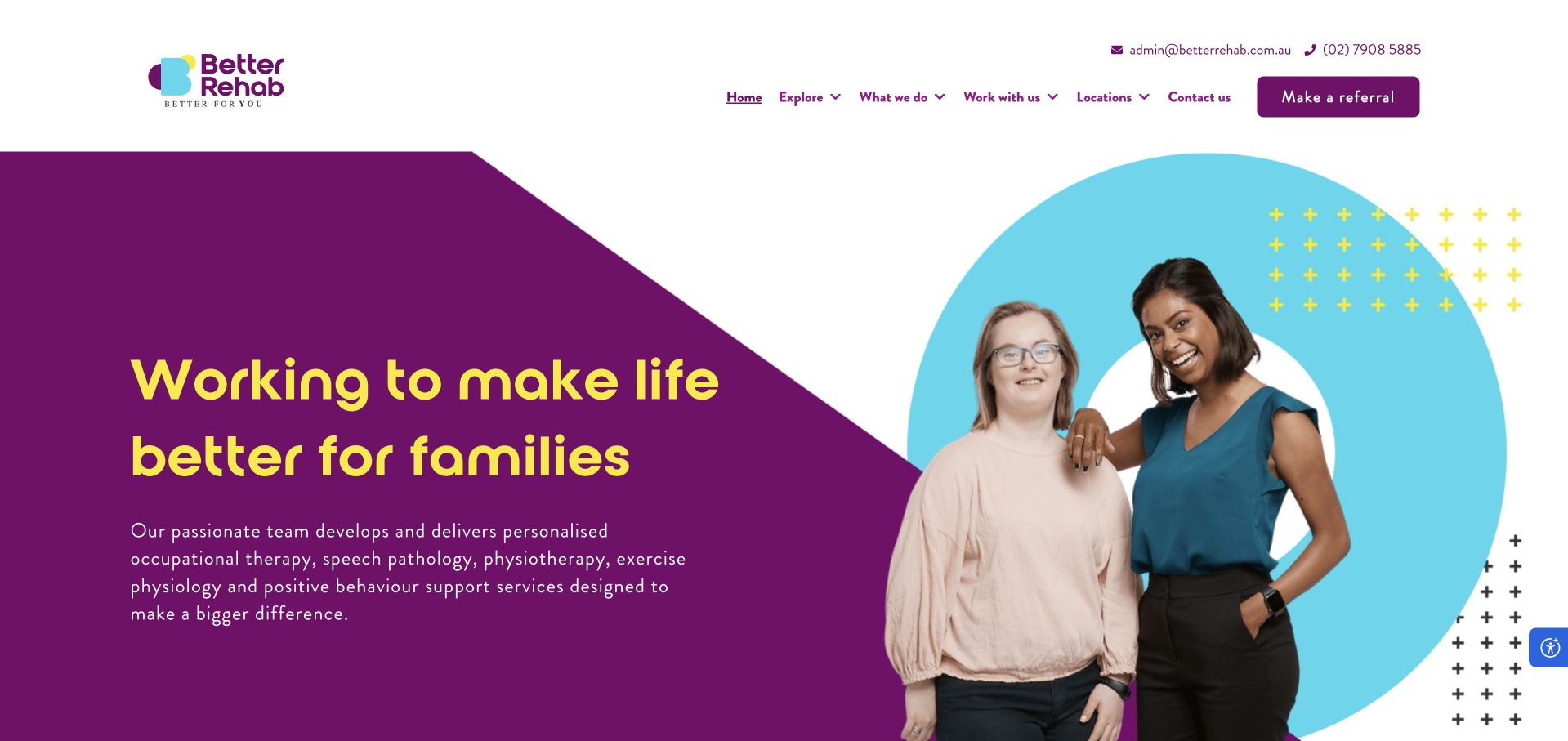
Better Rehab uses deep purple, turquoise shapes and a friendly portrait composition to introduce a broad allied-health organisation. Its animated headline is supported by written copy that names occupational therapy alongside speech pathology, physiotherapy and other services. The page also explains clinic, home and telehealth delivery rather than reducing the organisation to a location list. This is a useful example of a larger brand retaining a clear discipline vocabulary. The rotating words and highly expressive first screen create atmosphere, but important service and access details must remain stable for visitors using reduced motion, assistive technology or slower connections.
What you can learn
A broad allied-health brand should still name its individual disciplines in searchable, readable text. Keep service and delivery-format explanations stable outside animation, and provide direct occupational-therapy routes rather than assuming visitors will navigate a general organisational story.
Pros
Distinctive colour and portrait treatment make the organisation visually recognisable.
The supporting copy names disciplines and appointment settings rather than relying only on a broad wellbeing message.
Cons & considerations
Animated headline fragments introduce an additional accessibility and readability dependency.
The wide organisational offer can make an individual service feel less immediately specific without direct navigation.
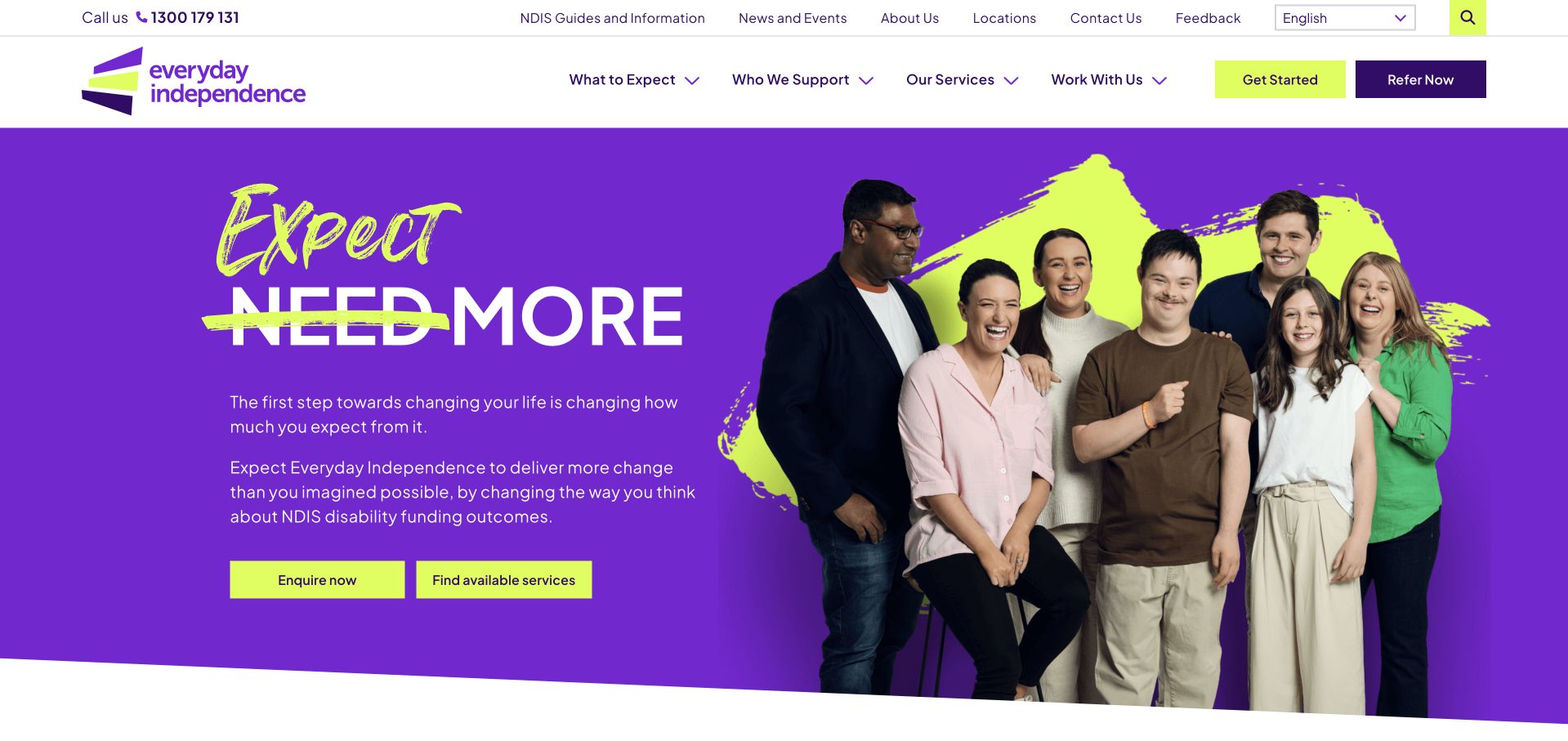
Everyday Independence uses a vivid purple-and-lime identity and a large group photograph to introduce its wider support organisation. Beneath the brand message, a prominent route helps visitors find available services, accompanied by a current-capacity notice. This is more useful than assuming that a national organisation can take every enquiry everywhere. Occupational therapy sits within a wider service system, so the page needs to connect the general introduction to specific disciplines and local options. Its optimistic language establishes a strong tone, but the practical value comes from giving visitors a way to investigate availability before starting a longer enquiry.
What you can learn
For a large service network, make capacity discovery a first-class task. Let visitors identify a relevant discipline and area before entering detailed personal information, and ensure that optimistic organisational messaging does not imply universal access or guaranteed individual outcomes.
Pros
The available-services route addresses a concrete question before a visitor completes a general enquiry.
A consistent purple-and-lime identity makes the broader service system visually coherent.
Cons & considerations
A large brand statement can delay the specific occupational-therapy explanation.
Capacity notices require clear dates and ongoing maintenance as local service availability changes.
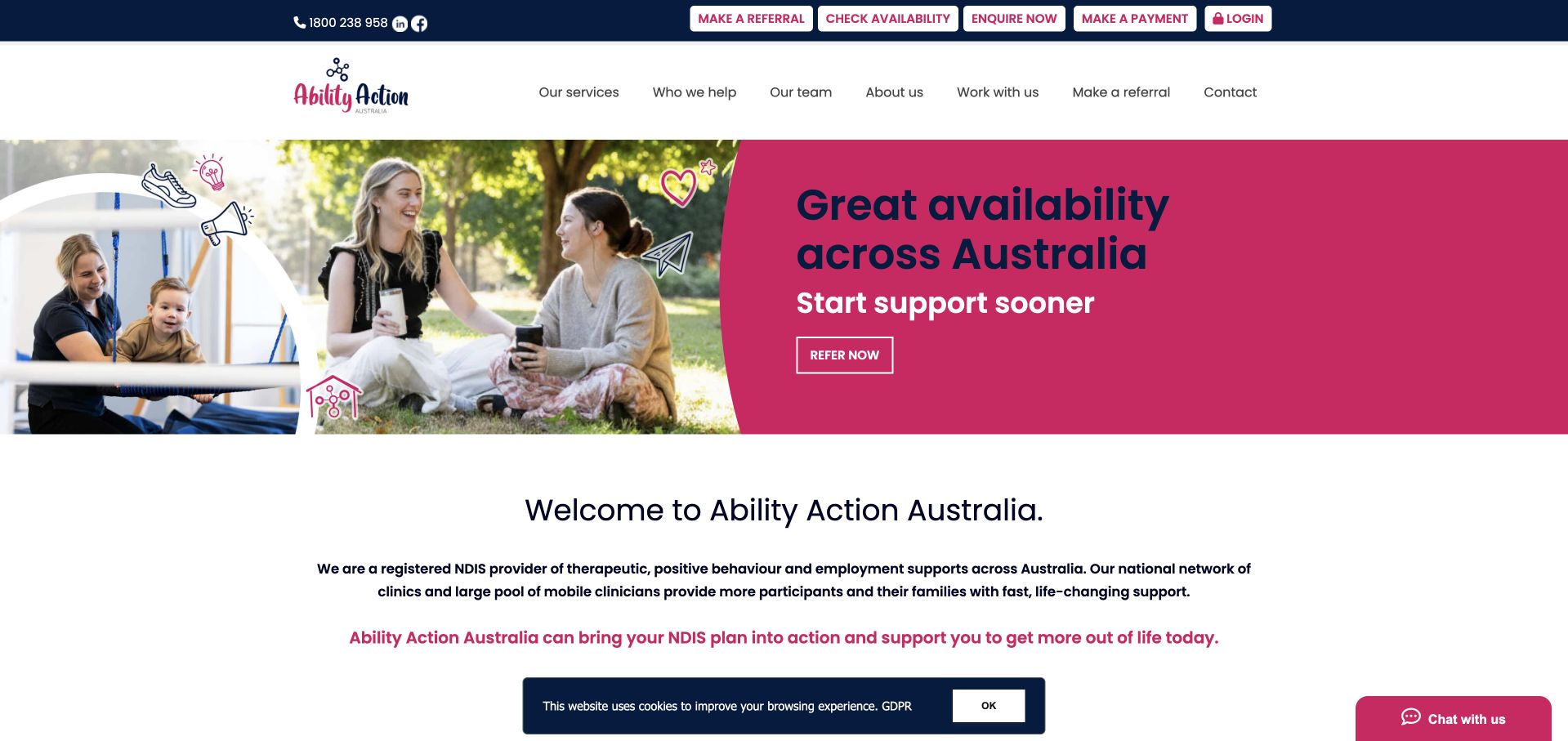
Ability Action Australia uses a bright magenta-and-white layout with several real-service photographs and a prominent availability message. The page then presents occupational therapy alongside other disciplines in a recognisable service collection. Each service has a short explanation and a separate detail route, which is more useful than expecting a visitor to understand a single broad support label. The design demonstrates how a larger provider can separate a quick access message from its wider catalogue. The main editorial responsibility is keeping availability and funding language specific enough that visitors do not assume every location, discipline or plan is supported identically.
What you can learn
Use the homepage to help visitors choose a discipline before sending them into a general referral process. Connect each service to current local availability and funding information, and avoid making broad access statements that require qualifications only visible much later.
Pros
Individual service cards make occupational therapy identifiable within the multi-disciplinary offer.
An access-focused opening addresses visitor urgency rather than presenting only organisational history.
Cons & considerations
Several promotional and access messages compete with the service catalogue for attention.
Broad availability language needs service- and location-specific detail to prevent mistaken assumptions.
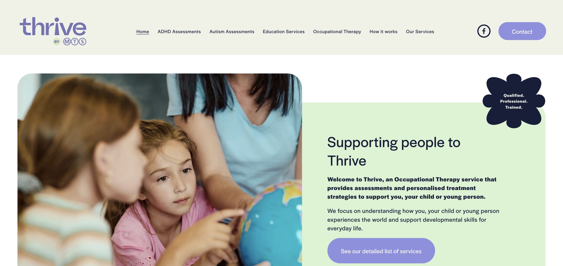
Thrive by MTS uses a pale green split layout, rounded shapes and a family-focused photograph to introduce its occupational-therapy service. A descriptive paragraph sits beside a direct link to the detailed service list, rather than making the visitor choose from a long first-screen form. Supporting sections explain the practice’s approach and wider assessment offering. The soft visual language creates an approachable identity, but the site also needs precise distinctions between occupational therapy, other assessments and education services. Generic professional reassurance is less useful than clearly explaining who provides each service and how an initial enquiry is handled.
What you can learn
A welcoming first screen should lead quickly to a precise service catalogue. Distinguish assessments from ongoing support and from education work, and explain the responsible professional and enquiry process for each rather than relying on broad words such as qualified or trained.
Pros
The split composition combines a human image with a readable introductory service explanation.
A direct service-list route accommodates visitors who want detail before contacting the practice.
Cons & considerations
Several neighbouring assessment offerings can blur the core occupational-therapy journey without clear grouping.
Broad professional reassurance needs substantive practitioner information and service-specific context.
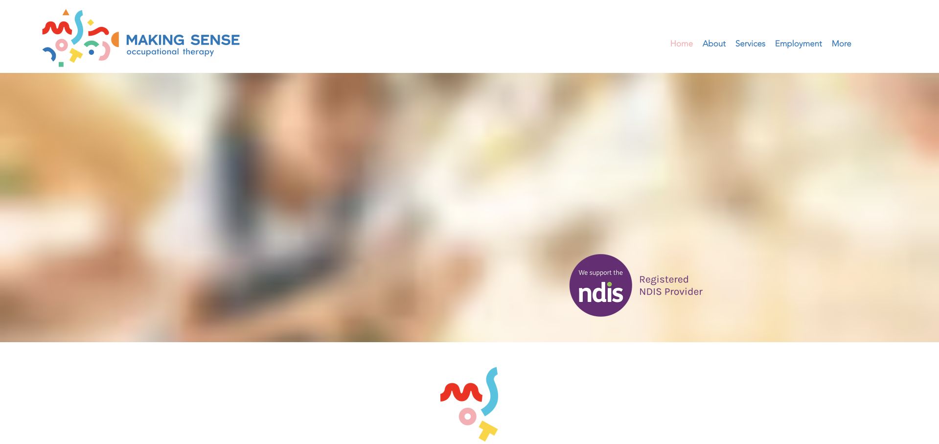
Making Sense Occupational Therapy uses a colourful identity and a straightforward page structure to introduce its South-Australian practice. The supporting copy explains home, education-setting and clinic delivery, then separates child and adult services into individual sections. That division matters because the concerns and enquiry routes of a parent may differ substantially from those of an adult seeking support. The page avoids requiring a long medical narrative at the first step. Its broad photographic opening and repeated general-purpose detail labels are less specific than the service structure itself, leaving room for clearer action wording and a stronger first-screen explanation.
What you can learn
When a practice serves children and adults, let visitors choose the relevant pathway early. Describe appointment settings in text and give detail links descriptive labels, so people do not have to infer the destination from an image or a repeated “more information” button.
Pros
Separate child and adult sections acknowledge genuinely different browsing needs.
Written setting information explains that support is not limited to a single clinic environment.
Cons & considerations
A broad image-led opening delays the more useful age-group distinctions.
Repeated generic detail-link labels offer less context when scanned independently or read by assistive technology.
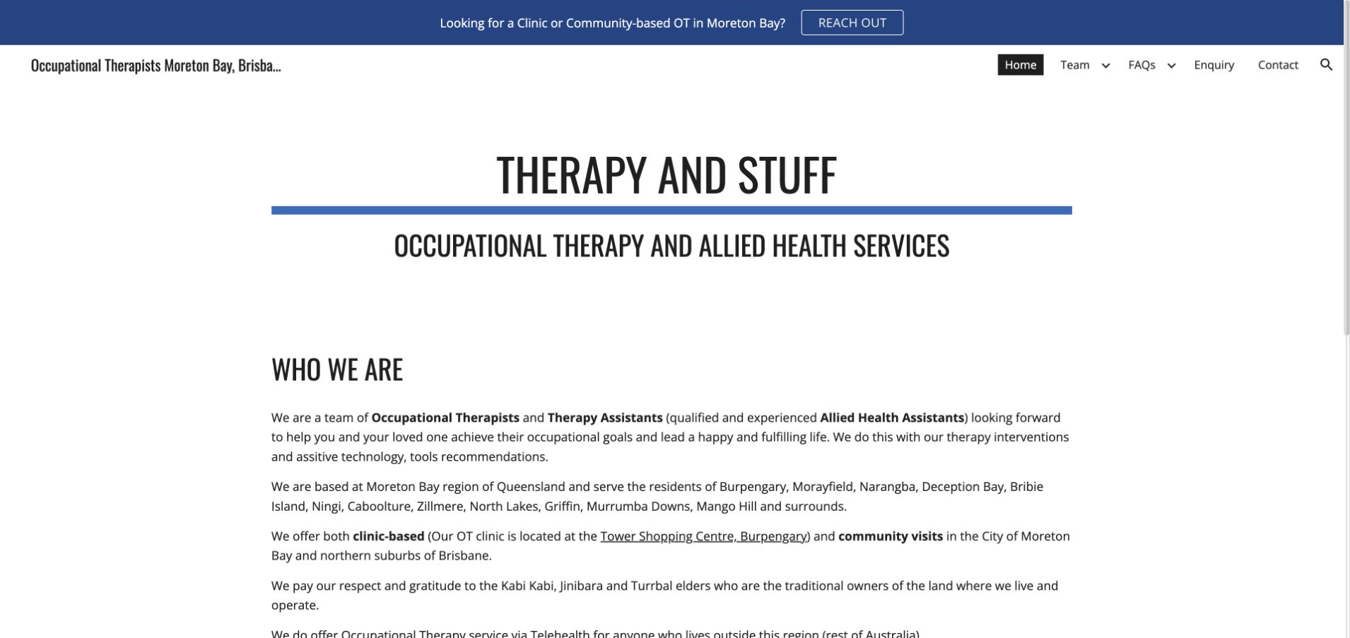
Therapy and Stuff uses a restrained blue-and-white identity and leads with a clear service title rather than a full-screen image. The following “who we are” section explains the occupational-therapy and assistant team, the Moreton Bay coverage area and the distinction between clinic, community and telehealth work. These details make the page useful for a visitor deciding whether to enquire, even though the visual treatment is relatively simple. The text is lengthy and some wording needs editorial polish, illustrating the difference between having useful information and presenting it in an easily scanned hierarchy.
What you can learn
A simple practice website can be effective when it answers concrete questions about people, place and delivery. Break the local introduction into short headings, distinguish professional roles clearly and edit the copy carefully so practical information is not buried inside a long opening paragraph.
Pros
The service title makes the practice’s discipline understandable without interpreting a brand slogan.
The regional and delivery-setting explanations help visitors judge whether an enquiry is appropriate.
Cons & considerations
Long paragraphs make useful local details harder to extract quickly.
Inconsistent wording and small editorial errors can weaken an otherwise clear and practical introduction.
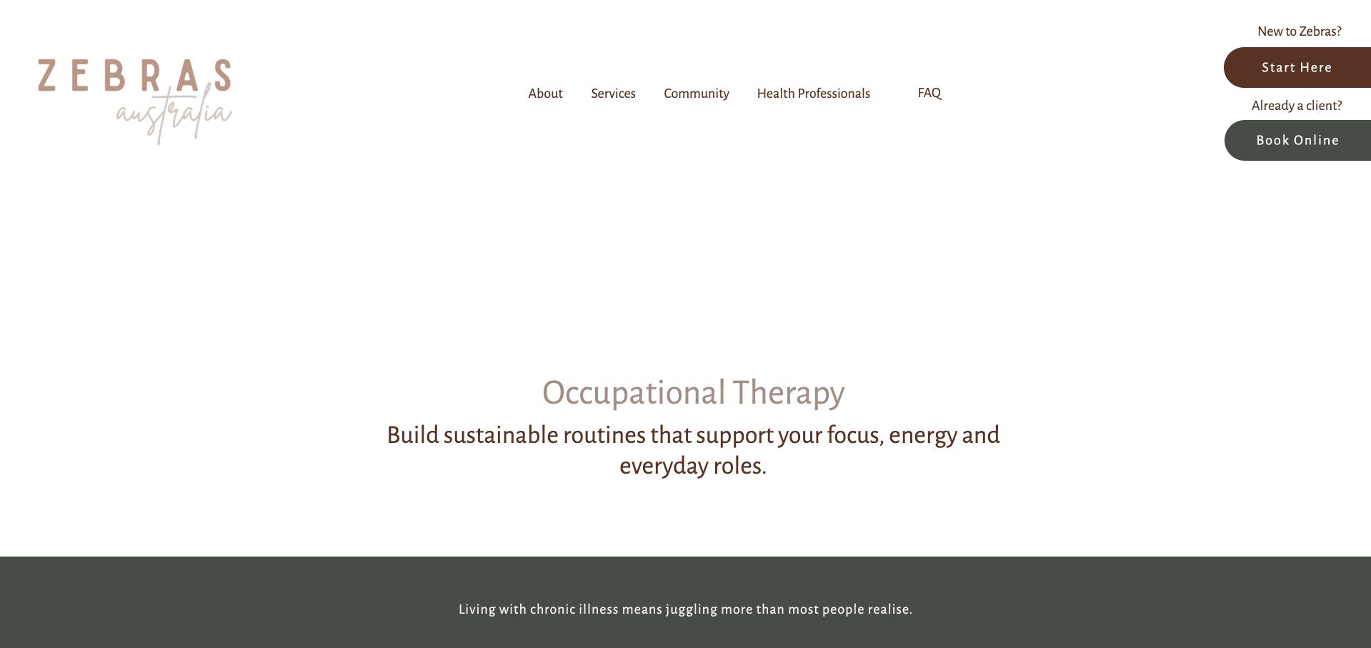
Zebras Australia’s occupational-therapy page uses generous white space, muted green actions and a service-specific introduction. The main message focuses on daily routines, energy, work and other roles rather than opening with a long diagnostic list. This gives the page a more functional frame, which suits a discipline that can be unfamiliar to new visitors. The wider navigation keeps the organisation’s other offerings available without replacing the focused page.
What you can learn
Describe occupational therapy through the activities and roles a visitor wants to understand, while avoiding the implication that a website can assess their situation. Keep the service introduction focused and divide longer explanations into practical questions about format, eligibility and the first appointment.
Pros
The page gives occupational therapy its own focused destination within the wider organisation.
Daily-life language offers an alternative to an intimidating catalogue of diagnostic labels.
Cons & considerations
The sparse first screen postpones much of the explanation below the opening view.
Lengthy introductory text requires strong subheadings and readable line lengths to support scanning.
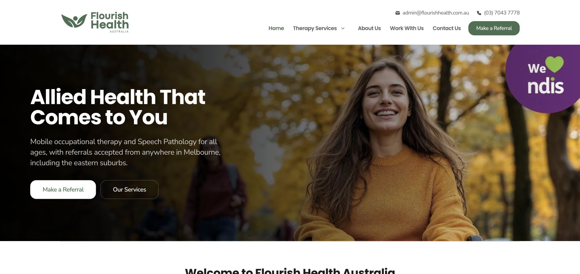
Flourish Health Australia makes its delivery model the first message: allied health that comes to the visitor. A warm outdoor portrait and dark green branding support that statement, while the copy explicitly names occupational therapy, speech pathology and Melbourne coverage. Separate referral and service actions provide a simple hierarchy. Further explanations distinguish home, telehealth and community work and introduce funding-related context. This is a useful example of making access format part of the value proposition. The page still needs to avoid implying unrestricted geographic coverage, and its credential-style labels should lead to meaningful explanations rather than function only as reassurance badges.
What you can learn
If mobile support is central to the service, explain it before discussing broad practice philosophy. State actual coverage, appointment formats and referral arrangements, then separate verified professional information from marketing labels so visitors understand what each statement means.
Pros
The opening clearly names the mobile model instead of leaving appointment settings ambiguous.
Referral and service-detail actions accommodate both ready referrers and visitors still researching.
Cons & considerations
Broad geographic wording needs precise coverage and capacity information behind it.
Credential-style interface elements require clear context and should not imply independent quality verification.
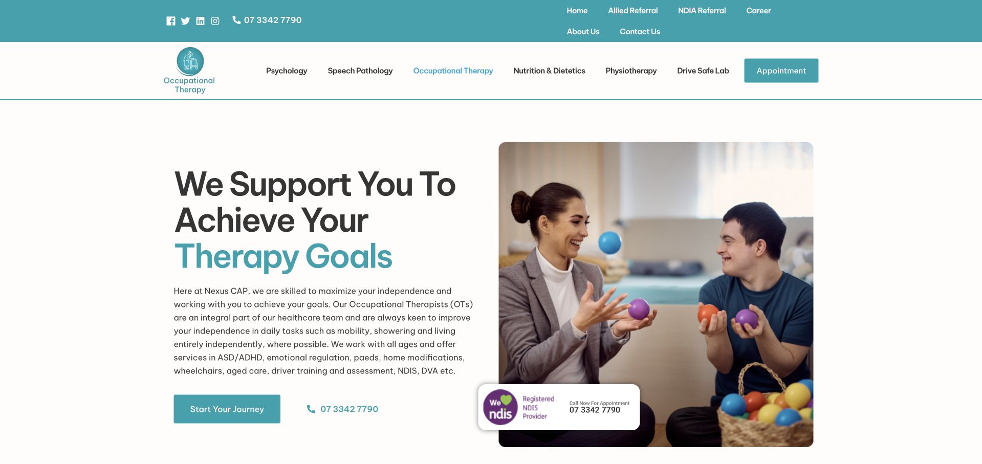
Nexus CAP’s occupational-therapy page uses turquoise branding, a split introduction and a therapist-and-child image. The copy names the discipline and outlines several functional service areas, while a direct telephone route sits alongside the main enquiry action. This gives occupational therapy a recognisable landing page within a larger healthcare offering. The practical challenge is breadth: children’s support, home modifications and other work appear close together, so a visitor needs clearer pathways into the relevant category rather than one enormous general explanation.
What you can learn
Give a broad occupational-therapy service its own landing page, then divide the work into understandable categories. Make telephone and written enquiry options visible, and explain local visiting arrangements instead of assuming that a general service list establishes availability for every visitor.
Pros
A dedicated page makes the occupational-therapy route easier to recognise within the larger practice.
Telephone and enquiry actions offer alternatives without requiring a long first-screen form.
Cons & considerations
A very broad list of services can make individual visitor pathways difficult to distinguish.
Experience and rating claims need context rather than serving as substitutes for practical service information.
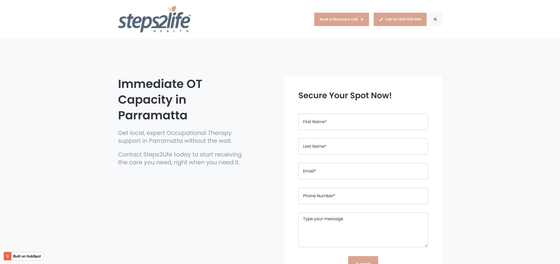
Steps2Life’s occupational-therapy page uses a pale background, restrained peach actions and a two-column introduction with a compact enquiry form. The headline names Parramatta and foregrounds current capacity, making the page’s local purpose clear. Supporting sections then describe appointment formats, language options and service categories. This is a useful example of a campaign-style landing page rather than a general organisational homepage. The immediacy of the form creates an additional responsibility: visitors need clear expectations about response, privacy and what not to include, while availability claims must be updated when capacity changes.
What you can learn
A local landing page can be focused without turning every visit into an immediate data-collection exercise. Explain the enquiry’s next step, keep sensitive clinical details out of a generic message field and give time-sensitive capacity statements a clear maintenance process.
Pros
The heading names the local service area instead of relying on a general practice brand.
Supporting sections explain delivery formats and communication options beyond the initial form.
Cons & considerations
An immediate message field needs clear guidance about sensitive personal or health information.
Urgent availability language can become misleading quickly if it is not actively maintained.
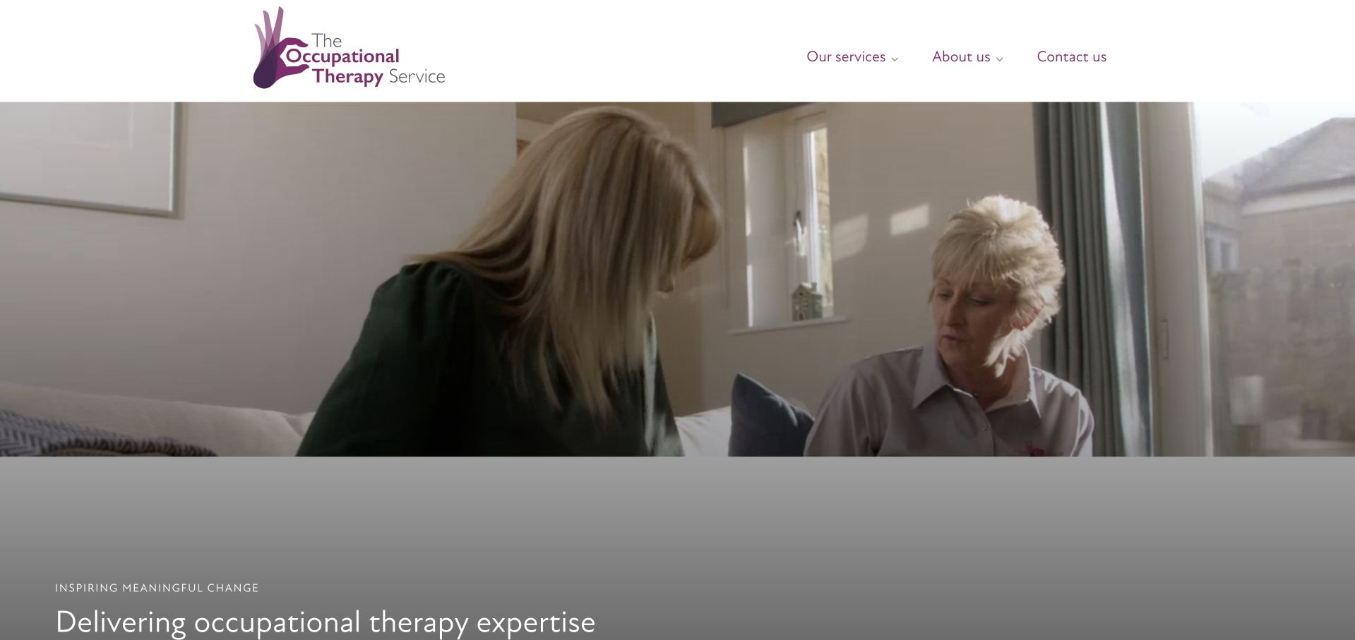
The Occupational Therapy Service uses a real consultation photograph and a restrained pale-grey presentation to introduce its expertise. The page then explains four business areas, including private-sector work, public and voluntary-sector work, training and consultancy. That structure is useful because not every visitor is seeking a personal appointment; some are commissioning advice, education or product-related expertise. The organisation’s approach receives substantive explanation rather than a row of unexplained logos. The tradeoff is that a broad professional audience can dominate the opening, so an individual looking for an assessment needs an obvious route through the same framework.
What you can learn
When an OT organisation serves clinical and professional markets, make those business areas explicit. Give individuals a plainly labelled assessment route, and use separate commissioning pages to explain deliverables, professional roles and enquiry requirements without overloading the family-facing journey.
Pros
The four-part structure acknowledges different forms of occupational-therapy work beyond appointments.
A real consultation image supports the service explanation without relying on abstract medical symbolism.
Cons & considerations
Professional terminology can make the first screen less immediately useful to an individual visitor.
Broad expertise statements need direct links to specific deliverables and practical access information.
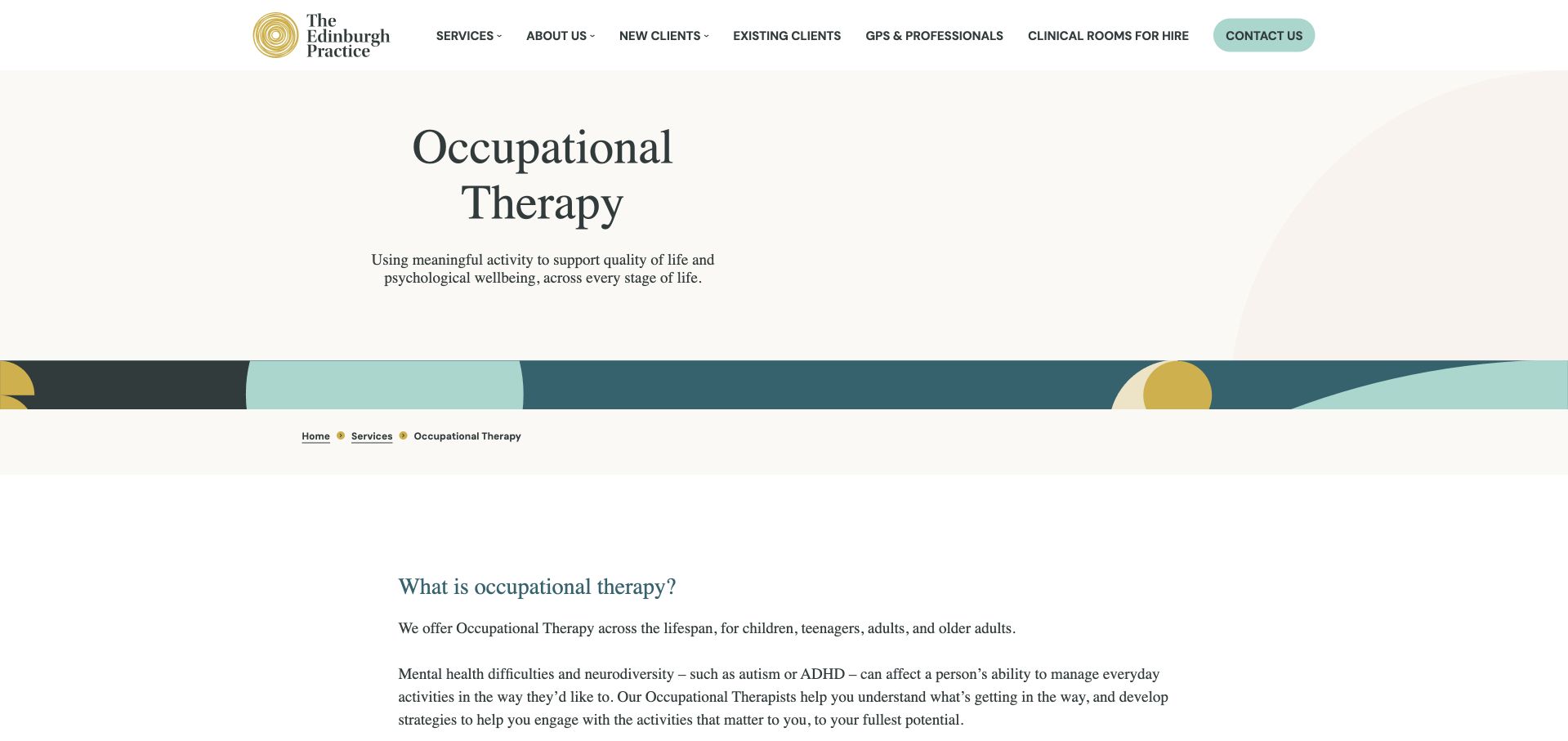
The Edinburgh Practice uses a restrained white layout with muted green accents and a clear occupational-therapy title. The service page explains support across life stages, then lists practical areas such as daily activities, routines, memory, fatigue and work. Further sections distinguish particular assessment offerings rather than leaving all services inside a general contact invitation. This gives the discipline meaningful editorial space within a wider practice website. The presentation is heavily text-led, however, so the page’s usefulness depends on clear subheadings, concise lists and prominent practical information rather than expecting every visitor to read the complete explanation in sequence.
What you can learn
A substantial service page should explain occupational therapy through practical activities and clearly separated assessment types. Keep fees, appointment format and next steps close to each offer, and avoid making one long general page carry every audience’s information without clear navigation.
Pros
The page explains functional areas rather than assuming visitors already understand the discipline.
Separate assessment sections create a clearer structure within a broad service offering.
Cons & considerations
Long text-led sections can feel demanding without a concise overview or jump navigation.
Important practical appointment information needs stronger prominence than surrounding explanatory prose.
Kegan is a freelance web designer and developer with 15+ years of experience helping businesses turn complicated website requirements into clear, maintainable digital experiences. He works directly with clients from planning and design through development, launch, and ongoing support.
For occupational therapy website design, his development approach focuses on service-format and eligibility information, practitioner introductions, location and access details, referral guidance, and careful appointment-system handoffs. The scope can be a targeted improvement or a complete custom build, with responsive layouts, thoughtful content structure, and integrations chosen around the people using and maintaining the site.
Show 3 other occupational therapy website designersHide other occupational therapy website designers
Map service areas, age groups, referral sources, appointment settings and the practical outputs the organisation provides. Separate direct clinical work from training, consultancy or product-related services. The OT Practice and The Occupational Therapy Service show why professional audiences may need a different route from individuals, while children’s clinics need a clear family-facing introduction.
Give each assessment or appointment a useful description
Explain who can enquire, how the first contact is handled, where the work takes place and where fee information can be found. Define reports or follow-up arrangements without promising the outcome of an education, funding or legal process. Keep the language reviewed by the responsible professionals and distinguish their service from the decisions made by other organisations.
Treat access information as real content
Publish accurate information about physical entry, facilities, travel and communication arrangements for each location. Do not add a universal accessibility claim based on a photograph or an automated website scan. Offer a way to ask about adjustments and provide usable written alternatives to telephone-only contact. Test forms and supporting documents, not just the public homepage.
Keep the initial enquiry proportionate
Decide what information is genuinely required to route a request. A public message box should not silently become a place for detailed health histories, education documents or reports. Explain what not to include and how later sensitive material is collected through an appropriately reviewed process. Keep tracking, notifications and retention within the practice’s approved data-handling design.
The editing job behind the design
Support an editable service directory and a safe information handoff
A clear service taxonomy, age or audience pathways, practitioner profiles, locations and current referral notices matter more than an elaborate animated hero. Keep essential information available as text outside images and carousels. Make it easy to update capacity and fees, and ensure a school or professional resource does not become the default landing page for every visitor.
Choose enquiry and referral tools by examining the actual workflow: fields, storage, staff access, vendor arrangements, notifications and deletion processes. A content platform or booking product does not automatically establish privacy or accessibility. Requirements vary by jurisdiction and circumstances, so obtain appropriate review for the practice rather than copying another clinic’s setup. Use test data during development and avoid sending sensitive form content into analytics or advertising systems.
Our WordPress website examples offer a separate look at publishing approaches. A visible platform label is evidence for that named page, not a guarantee that the same system will suit your requirements.
Before the public launch
Occupational therapy website planning checklist
Name the ages and audiences actually served.
Describe everyday activity and participation areas in plain language.
Separate direct appointments, assessments, coaching and professional work.
State the real clinic, visiting and remote arrangements.
Publish mobile travel boundaries and relevant location details.
Explain referral requirements and the first contact process.
Keep capacity and waitlist notices current.
Make fee information and report scope easy to find.
Avoid implying guaranteed funding, education or legal outcomes.
Provide accurate physical and communication-access information.
Keep sensitive reports out of a generic public enquiry field.
Test forms, documents and external handoffs with accessibility in mind.
These checks are a project checklist, not a performance, legal, security, or accessibility certification. Test real journeys with the people responsible for the website before making claims about the result.
Sources & editorial method
How this collection was selected and reviewed
The 30-example target was saved before this research began and was not rerolled to fit the available material. The editorial team directly inspected the official public pages, captured them in a normal browser and recorded actual capture URLs, timestamps and image dimensions. Blank loading frames, challenge pages, broken destinations and unrelated content were excluded or replaced. Reviews concern observable website presentation, navigation and information, not the competence of a occupational therapy provider, clinical outcomes, safety, appointment availability or accessibility conformance. Commercial claims, testimonials and badges remain the source organisation’s statements, not independent verification. Technology labels require public source evidence and do not establish a complete backend inventory. No appointments, accounts, enquiries, screenings or private intake forms were completed. Website imagery and trademarks belong to their owners.
Each example links to its actual source page. Screenshots are direct browser captures with their own capture dates; moving imagery, announcements and live designs can change. The notes describe observable design choices and conditional tradeoffs, not measured traffic, conversion results, service quality, or accessibility conformance.
Technology labels use public page metadata, asset evidence, or explicitly cited platform documentation. Platform documentation is not a complete current deployment audit. A component reference may be legacy or unused; it is not a complete backend inventory. Unknown stacks are omitted. These sites are editorial examples, not our client portfolio.
Written, Edited and Curated are separate editorial records, not timestamps advanced by a rebuild. Website designs and imagery belong to their owners. See our editorial standards or suggest a correction.
Questions worth asking
Occupational Therapy website design questions
How should a website explain occupational therapy to someone unfamiliar with it?
Use the practice’s actual areas of work and everyday activity examples, with professional terms explained where needed. Identify ages, settings and appointment types. Do not turn the explanation into a diagnostic checklist or imply that every occupational therapist offers every service shown elsewhere in the collection.
Should children’s and adult services have separate pages?
Yes, when both are offered and the scope or enquiry journey differs. A parent, an adult and a professional referrer may need different information. Keep the shared practice identity, but give each route clear service descriptions, practitioner context, appointment settings and contact instructions.
What belongs on an assessment page?
Explain the intended audience, the purpose of the service, the initial contact route, where it takes place, fee information and any report or follow-up arrangements the practice can accurately describe. Avoid promising an external funding, education or legal decision. The responsible professionals should approve the wording.
How can a mobile OT service describe its coverage?
Name the actual region and explain any travel, setting or availability limits. Distinguish clinic, home, school and remote work rather than implying they are interchangeable. Give visitors a simple way to check their location without requiring a detailed health history merely to establish whether the team can attend.
Is an accessibility badge enough for this type of website?
No. Treat accessibility as part of the content, navigation, forms, documents and complete enquiry journey. Use appropriate testing and specialist review. A badge, overlay or automated result does not establish that every person can use the website or that the physical clinic meets their access needs.
A strong occupational therapy website makes the service model understandable: who it supports, which everyday activities it addresses, where it works and what the first enquiry means.