Best Bathroom Remodeler Websites of 2026 (24 Real-World Examples)
Bathroom remodeling websites that explain fit, process and room-specific work
Bathroom website design needs to connect inspiring rooms with practical project questions. These examples show how remodelers can make service scope, local coverage and the assessment journey clear without treating a bathroom as a collection of fixtures alone.
A bathroom visitor may be considering new finishes, a different layout, improved storage or a room that better supports changing household needs. The website should help them describe those goals without requiring them to decide technical solutions. Explain what the company assesses and delivers, and make bathroom-specific work discoverable even when the wider practice also designs kitchens and whole homes.
The examples include bathroom specialists, kitchen-and-bath brands and broader design-build practices. Captured homepages sometimes show another room; the reviews identify that limitation instead of mislabelling the image. This is an editorial comparison of public website presentation, not a verification of construction, accessibility outcomes, technical compliance or the quality of an individual contractor’s service.
Before the examples
What makes good bathroom remodeler website design in 2026?
Give bathrooms a genuine service destination
A bathroom link should lead to useful room-specific information, not a kitchen page with a changed heading. Explain the scope the business undertakes and show relevant projects. Make clear whether it supplies products, replaces selected elements, coordinates a full room remodel or works only as part of larger home projects.
Present useful room evidence without overclaiming
Show enough of a bathroom to understand its arrangement, with detail images where they explain a decision. Captions should identify the broad brief and actual contribution. A photograph cannot establish concealed construction quality, waterproofing, structural suitability or accessibility compliance, so keep those claims tied to the relevant professional assessment and documentation.
Make an essential-room project feel understandable
Explain the sequence around enquiry, assessment, design decisions and project coordination. Homeowners may be concerned about using the house during work, so describe how those questions are discussed without promising a universal timetable. A clearly explained conversation is more useful than a button that merely says transform your bathroom.
The collection · 24 examples
24 bathroom remodeler websites worth studying
Compare the bathroom routes, project context and first-contact explanation. A coherent company brand matters, but the room-specific information is what helps a homeowner decide whether to begin a conversation.
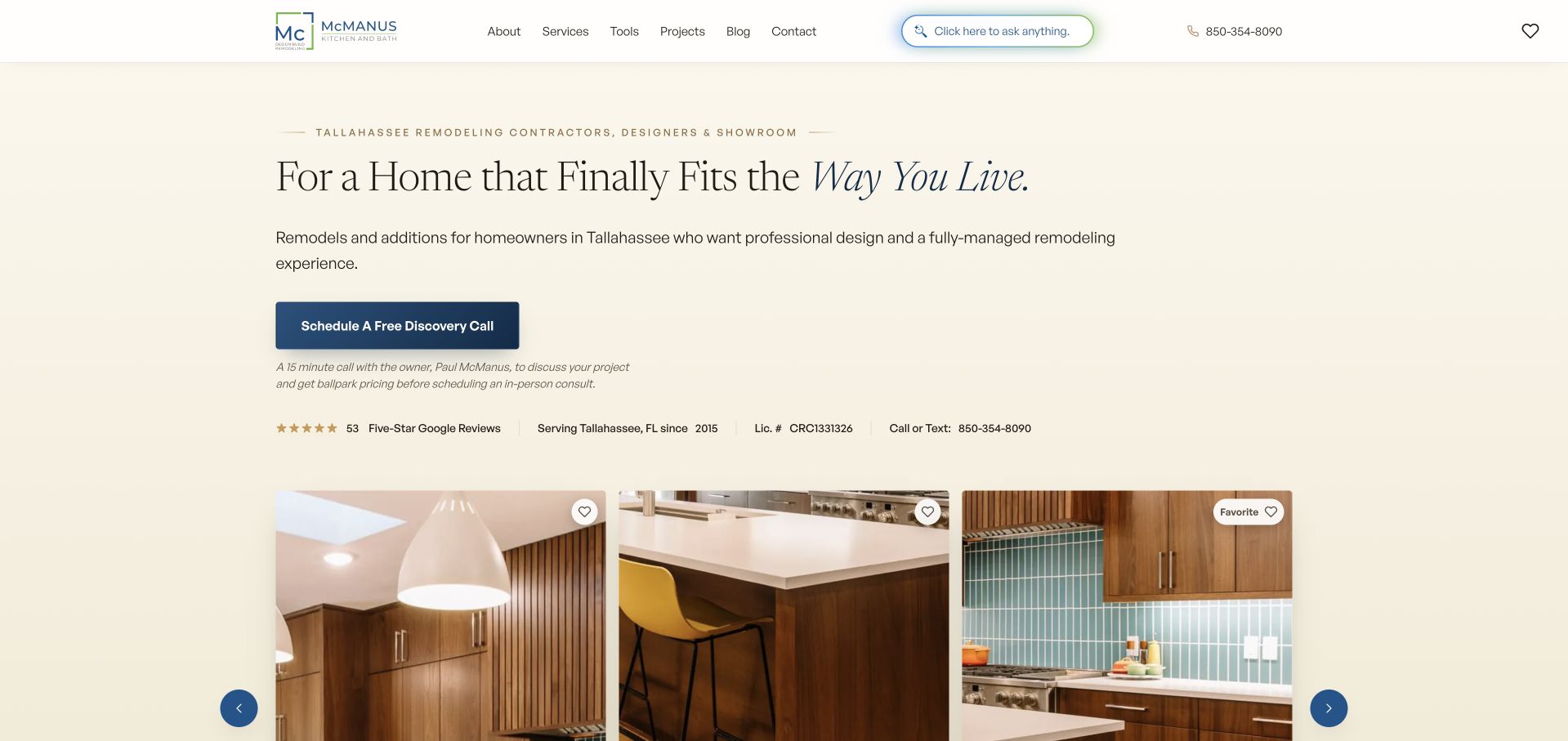
McManus Kitchen and Bath gives bathroom remodeling a named service route within a cream-and-navy design-build website. The homepage explains the first discovery call with owner Paul McManus, including its short format and purpose before an in-person consultation. That matters for bathrooms because an attractive vanity image does not answer questions about layout, scope or the disruption of work in an occupied home. Tallahassee coverage and the broader full-service model are stated directly. Cost, process and aging-in-place information provide further research routes, while completed-room imagery supports the explanation rather than becoming the entire offer.
What you can learn
Use the first contact step to establish what needs assessment, not to imply that a bathroom can be specified from a photograph. Explain who will talk to the homeowner, what information is useful and how the design discussion develops. Accessibility-related aspirations should lead to project-specific professional assessment rather than promises inferred from a gallery.
Pros
The named discovery-call explanation makes the initial bathroom enquiry unusually concrete.
Bathroom, cost and aging-in-place routes acknowledge different homeowner research needs.
Cons & considerations
The broad kitchen-and-bath offer still requires a clear bathroom-specific project collection.
The long page presents many content layers before a reader has explored every service.
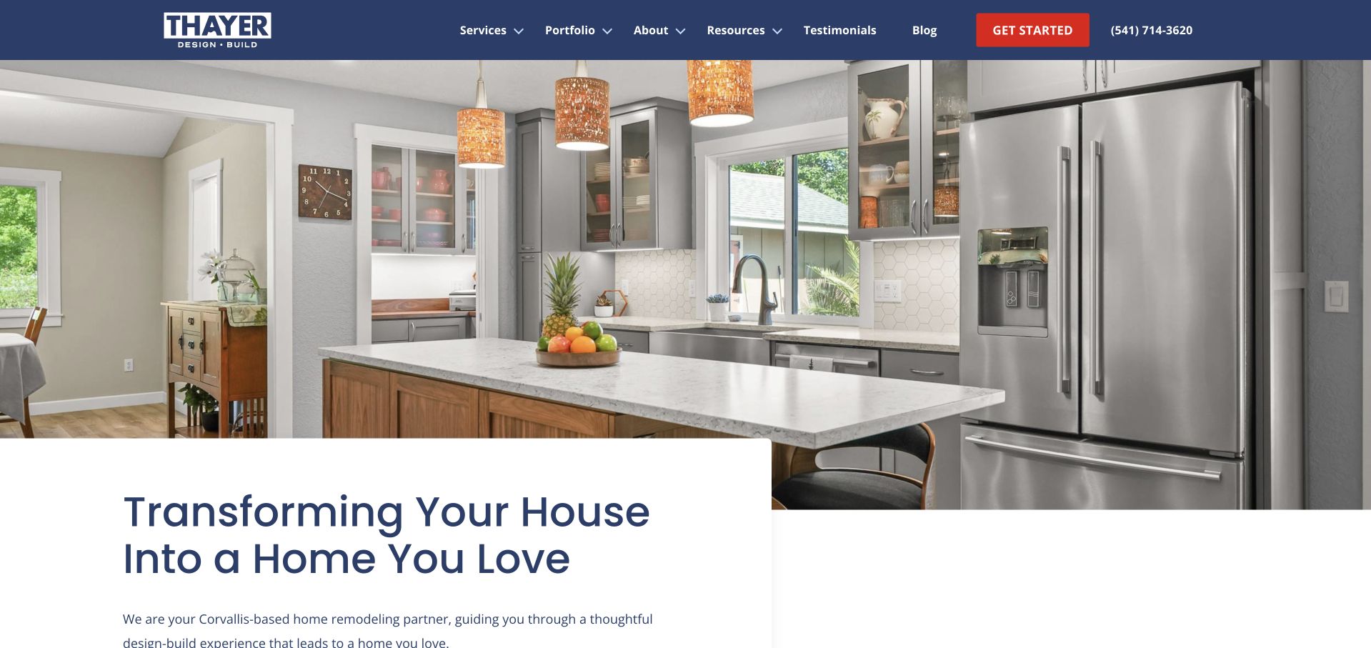
Thayer Design Build’s homepage uses a large kitchen image, navy navigation and a white regional introduction, but its service structure gives bathroom remodeling an explicit destination. That distinction is important: the opening image communicates the practice’s style without pretending to be a bathroom project. Portfolio and process routes help visitors investigate how the company works, while Corvallis-area information establishes geographic relevance. The official about page describes a family-owned regional remodeler. For a bathroom website brief, this is a useful example of a broader contractor identity that can support focused room pages without requiring a different visual brand for each service.
What you can learn
Maintain one coherent company identity, then make bathroom-specific information easy to reach. A useful room page should distinguish a refresh from a layout-changing remodel and explain the planning conversation, project constraints and documented work. Do not require bathroom visitors to browse an entire kitchen-heavy gallery before they can establish relevance.
Pros
Bathroom remodeling is a plainly named service rather than an inferred capability.
Regional copy and a process route help qualify the initial homeowner enquiry.
Cons & considerations
The kitchen-led homepage does not supply immediate bathroom-specific visual evidence.
Broad remodeling navigation needs room-level project organisation to avoid extra searching.
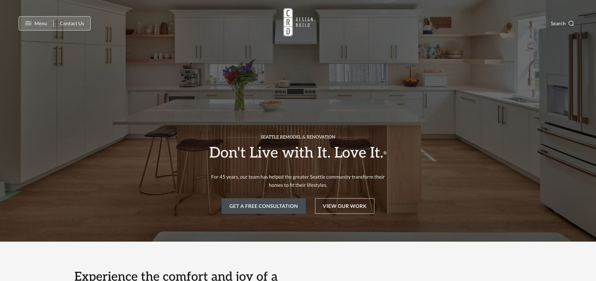
CRD Design Build introduces its practice through warm residential photography and two equally understandable actions: inspect the work or begin a conversation. Bathrooms sit within the wider service offer rather than receiving a separate identity in the opening hero. The restrained header, centred logo and white outlined controls keep the page visually calm. That presentation is useful for a bathroom project because it lets visitors research design sensibility before sharing private home details. Its limitation is that a general room photograph provides only indirect evidence, so the bathroom route must carry its own scope, projects and practical planning information.
What you can learn
Give bathroom prospects a focused collection with enough context to compare layouts, storage, bathing arrangements and the company’s role. A conversation action should remain available, but it need not gate access to completed work. Make the difference between inspiration and a project-specific assessment explicit before discussing suitability or cost.
Pros
Work and conversation routes offer useful alternatives for different levels of visitor readiness.
The calm visual hierarchy avoids burying the portfolio behind an immediate lead form.
Cons & considerations
The general residential opening requires an extra step to reach bathroom-specific evidence.
White outlined controls need dependable contrast over the project photography.
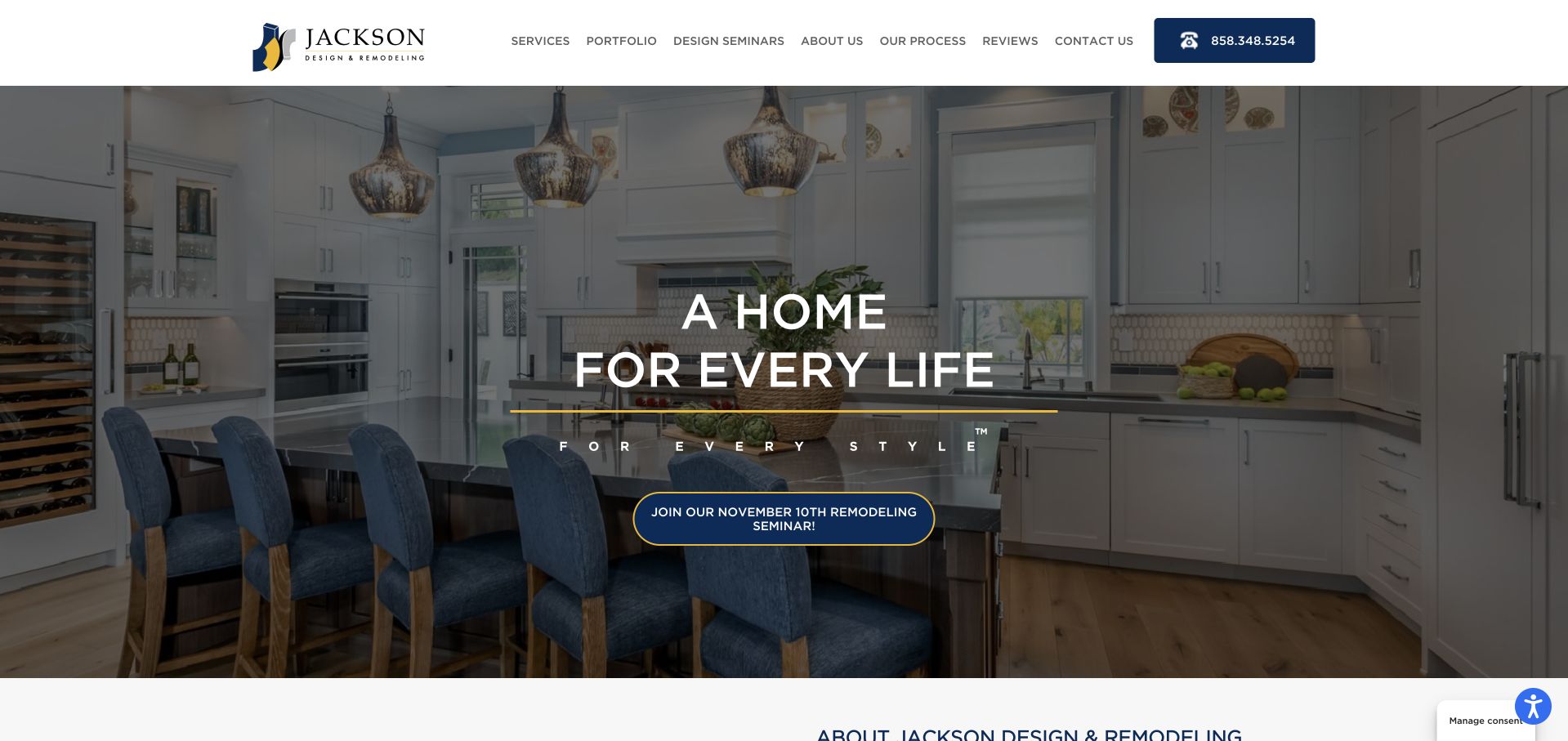
Jackson Design and Remodeling combines a traditional white-and-navy header with expansive room photography and a visible educational seminar route. Bathroom work is part of the broader design-build offer, while project and learning destinations support visitors who are not yet ready to describe a full brief. The opening kitchen image is useful as a brand introduction but should not be confused with direct evidence of bathroom design. For this category, the stronger transferable idea is a research path that helps people understand the remodeling process before committing to a conversation about a private and frequently essential room in their home.
What you can learn
Bathroom planning content should answer practical questions about the sequence, decisions and assessment required, not just showcase fixtures. If offering a seminar, state its subject and format clearly and let visitors reach bathroom projects independently. Avoid suggesting that attending an educational session or viewing a project establishes the right design solution for another property.
Pros
An educational route gives early-stage bathroom prospects an alternative to immediate consultation.
The broader project navigation can support comparison across different room and home types.
Cons & considerations
Kitchen-led opening imagery does not immediately demonstrate the bathroom service.
The extensive navigation may require careful room-specific signposting for new visitors.
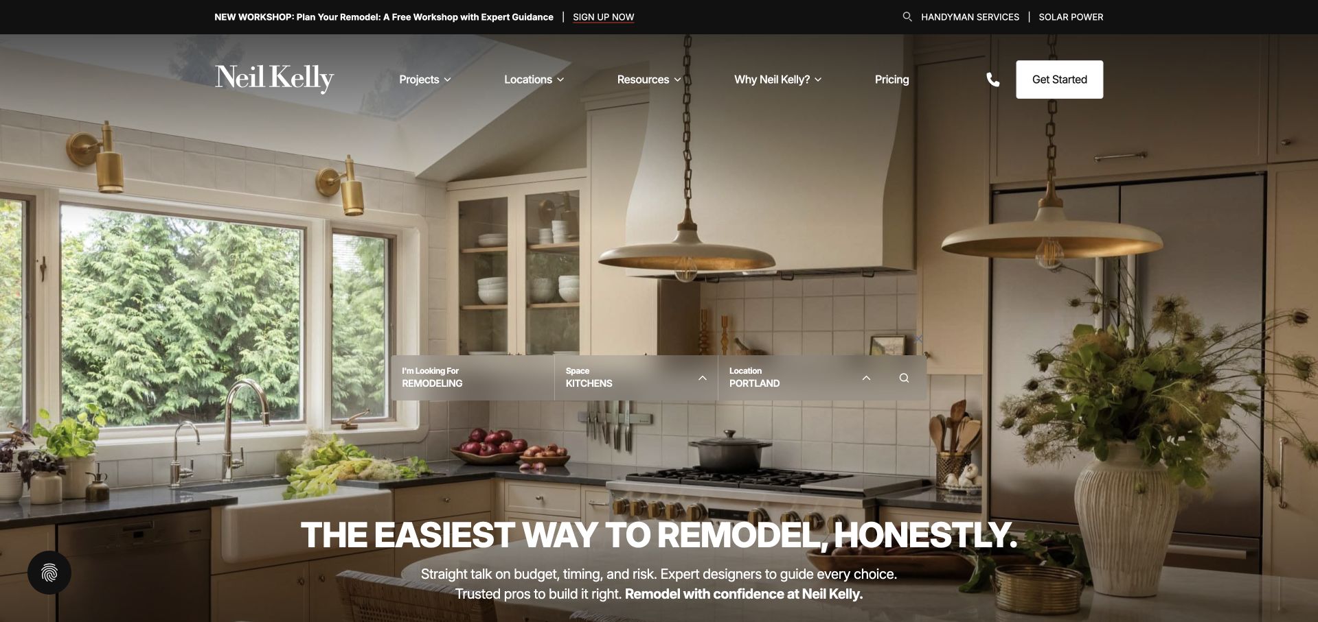
Neil Kelly’s opening project-search panel separates the kind of work, space and location. That structure is especially useful for bathroom research, where a visitor may want a comparable room rather than the most dramatic whole-house project. Pricing and resource links remain visible in the header, while workshop information offers a separate learning route. The captured homepage happens to show a kitchen, so the search and bathroom navigation carry the category relevance. The main service language acknowledges budget, timing and risk, giving the design presentation a more practical foundation than a gallery of finishes alone.
What you can learn
Use project filters only when the underlying records contain enough information to make them meaningful. A bathroom example should explain the existing room, layout or scope changes and the company’s contribution, with honest limits around cost comparisons. Do not let a room filter imply that two visually similar bathrooms involve the same construction conditions or investment.
Pros
Space and location choices can narrow a broad portfolio to more relevant bathroom work.
Pricing and workshop routes recognise practical research needs beyond visual inspiration.
Cons & considerations
The floating search interface competes with the underlying project image and headline.
The initial kitchen photograph means bathroom visitors depend on navigation to establish fit.
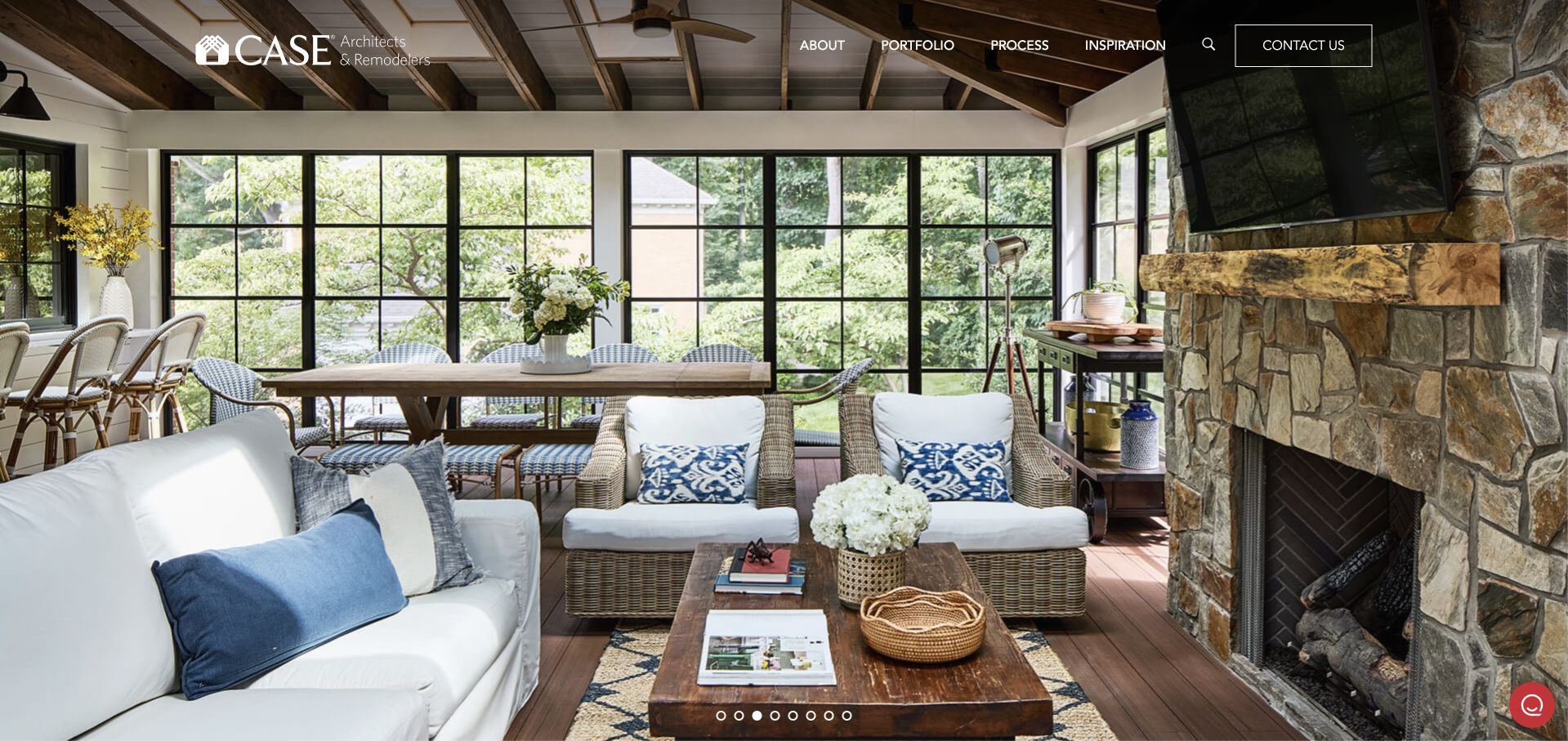
Case Architects & Remodelers gives the opening screen to a bright architectural interior with restrained white navigation. The page communicates a design-led residential practice rather than a fixture retailer or one-day bath replacement offer. Bathroom work is reached through the broader service and project structure, which can be effective when a bathroom forms part of a larger renovation. The spacious image treatment is worth studying for its visual confidence, but it contains little immediate written explanation. A visitor needs the following pages to establish bathroom scope, service region and the relationship between the company’s architectural and construction roles.
What you can learn
A photograph-first brand still needs explicit room-level information. For bathrooms, show how circulation, privacy, storage and existing conditions shaped a documented project without turning the portfolio into technical installation advice. Keep a clear contact route and explain which decisions require an in-person assessment rather than allowing a polished image to suggest an instantly transferable solution.
Pros
The architectural photography gives a strong sense of the broader residential design approach.
A unified practice identity can connect bathroom work with surrounding home renovations.
Cons & considerations
The initial screen provides limited bathroom-specific service or project information.
Pale photography and white navigation require careful contrast and focus-state design.
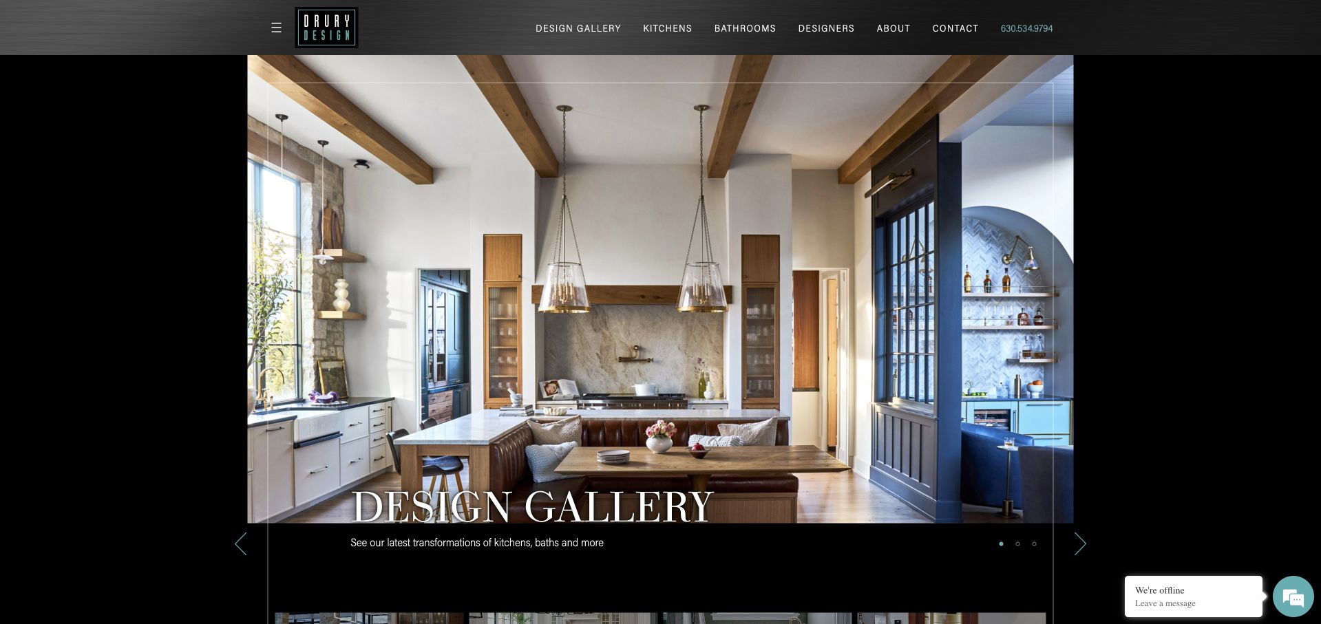
Drury Design’s dark gallery frame makes its room photography the main subject, while Bathrooms appears as a direct navigation choice beside Kitchens. Designer and company routes add context about the people behind the work. The captured opening shows a kitchen, but the explicit bathroom destination prevents visitors from having to infer that capability from a broad interiors claim. Black framing, small turquoise accents and restrained typography create a coherent editorial identity across the categories. The design is useful for how it separates room browsing and designer research, although the first screen still favours atmosphere over practical bathroom-planning detail.
What you can learn
Give each room category a genuine portfolio, not a keyword variation on the same gallery. Bathroom projects should identify the design brief and the company’s role, with captions that help readers understand the space beyond a selected vanity or tile. Designer profiles can add accountability when they connect to specific, accurately credited work.
Pros
A plainly named Bathrooms destination makes the category immediately discoverable from the header.
Designer information supports a more accountable project story than anonymous room imagery.
Cons & considerations
The opening kitchen slide is not direct visual evidence for the bathroom category.
Small slide and navigation controls need clear sizing against the black frame.
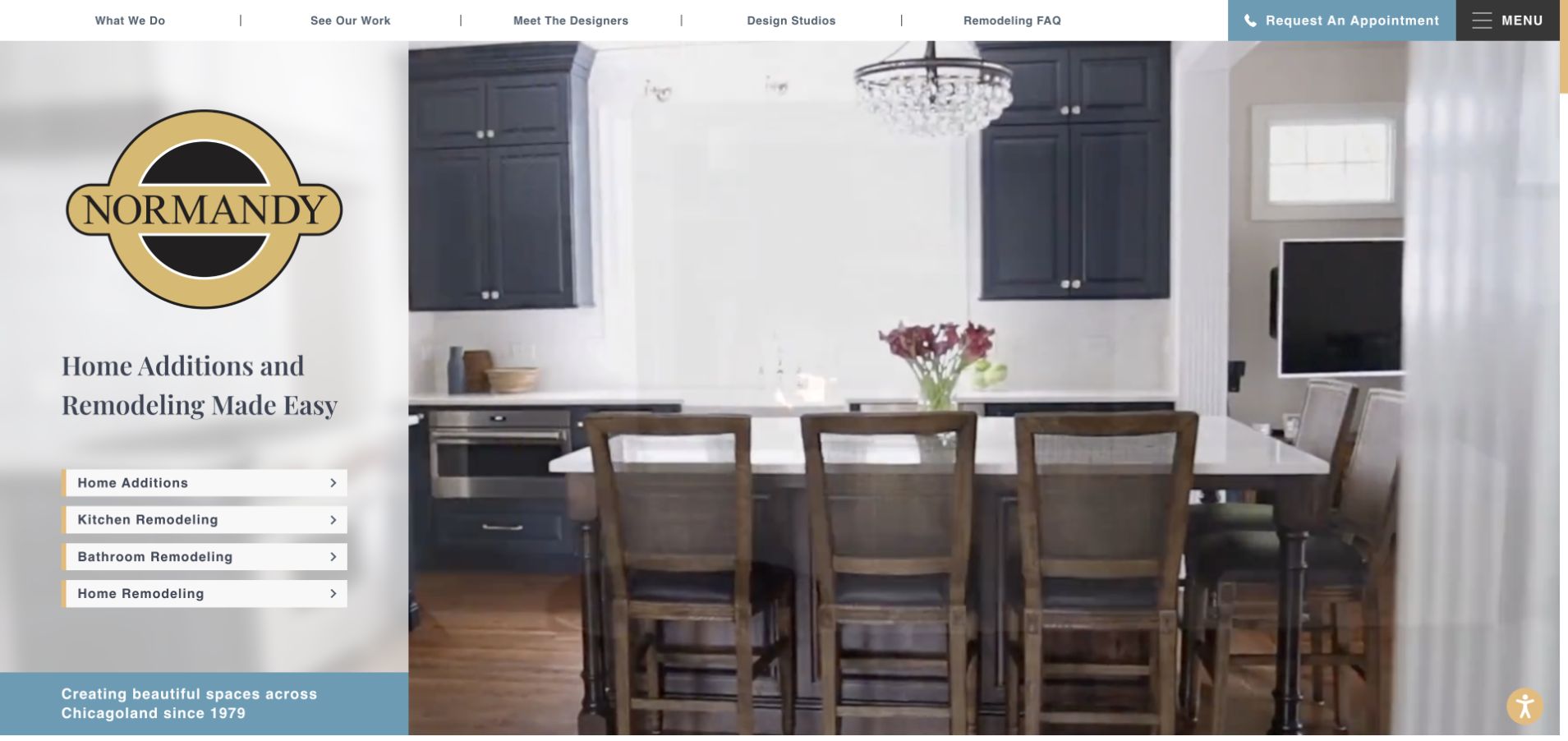
Normandy places Bathroom Remodeling in a fixed list of four service choices on the left of its hero. The list remains visible while room photographs occupy the right, so the bathroom route does not depend on the current slide. The black-and-gold logo, white panel and pale blue appointment treatment create a traditional regional contractor identity. This is particularly useful for a multi-service practice: the visitor can distinguish a bathroom project from a kitchen, addition or whole-home enquiry before opening a large menu. The oversized brand mark is memorable, though it leaves relatively little space for explaining how those services differ.
What you can learn
Keep the service taxonomy stable even when the inspiration imagery changes. A bathroom destination should quickly explain the work the company assesses and show comparable projects. Distinguish the initial appointment from a construction commitment, and give visitors enough information to decide whether a focused bathroom remodel fits the wider design-build practice.
Pros
Bathroom remodeling is visible as a direct service choice in the opening panel.
A stable text area preserves navigation while the project imagery rotates.
Cons & considerations
The large logo takes space that could explain process or service coverage.
Multiple appointment and navigation elements add visual weight above the project choices.
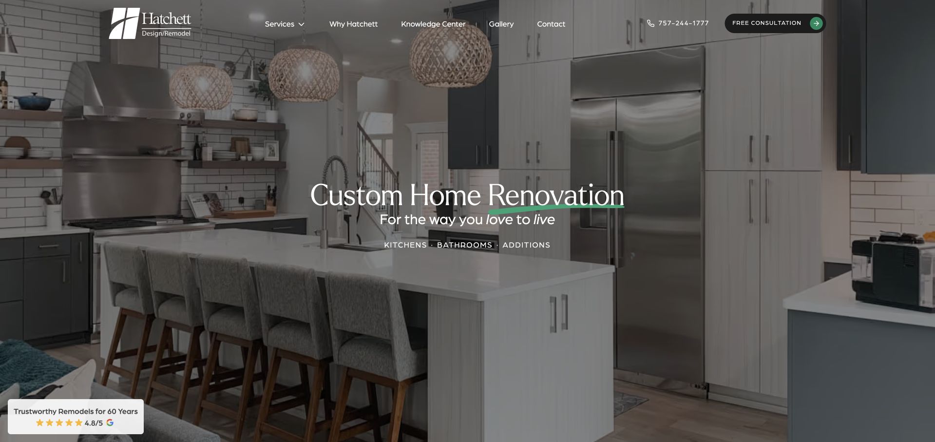
Hatchett Design Remodel places kitchens, bathrooms and additions within a restrained image-led presentation. The dark kitchen hero, white serif headline and mint accent establish the company’s visual tone, while the service labels make the broader offer explicit. A consultation action is available without a large form immediately covering the photograph. For bathroom research, the useful feature is that the category is named rather than left to implication. The captured homepage remains a general practice introduction, so its next layer must supply bathroom-specific photographs, scope explanations and a credible account of the design-build process.
What you can learn
Use a coherent visual identity across service pages, but make the questions and evidence specific to bathrooms. Explain whether the work involves a straightforward update, a changed layout or a larger home project, and show what the company actually designed and built. A broad lifestyle promise should lead to practical information rather than repeat unchanged across every room page.
Pros
The opening service labels explicitly acknowledge bathroom remodeling within the practice.
The restrained palette gives the image and consultation action a clear hierarchy.
Cons & considerations
Kitchen-led imagery means the first screen does not directly demonstrate bathroom work.
Broad brand language needs stronger room-specific qualification on the service destination.
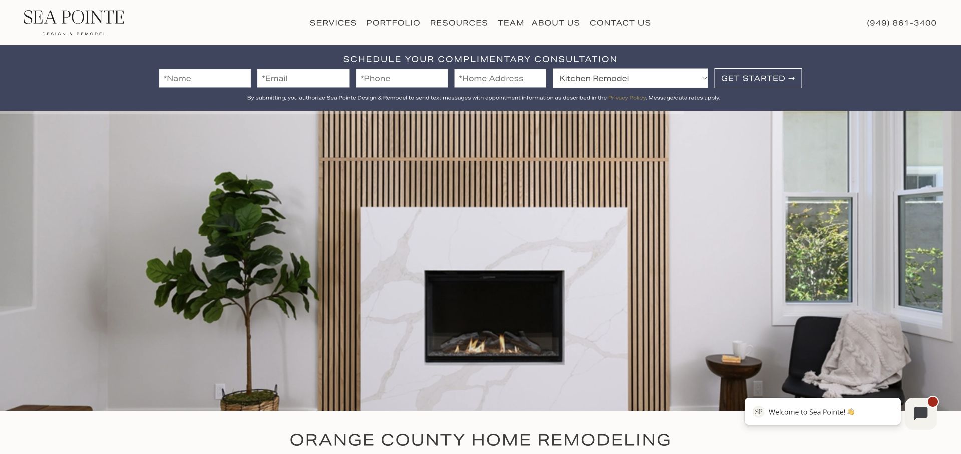
Sea Pointe’s purple consultation strip appears before the main project imagery and asks for contact details, property address and service interest. That places bathroom enquiries within an explicit routing mechanism rather than an unstructured message box. The white header offers service and project research, so the lead-first opening is not the only path through the website. The composition is useful for studying a deliberate conversion-first approach, but it also highlights an important tradeoff for bathroom prospects: they are asked for personal property information before most of the project evidence and process explanation has been presented.
What you can learn
If a bathroom form appears early, explain why each detail is needed and what the homeowner will receive next. Service selection should route the conversation rather than imply a diagnosis or quote. Preserve an equally obvious route to bathroom projects and planning information for visitors who want to understand the company before providing an address or telephone number.
Pros
Service selection can make an incoming bathroom enquiry more useful to the team.
The purple form area is clearly distinguished from the site’s white navigation.
Cons & considerations
The enquiry strip requests several personal details before substantial project research.
The lead-first composition can distract from the room imagery meant to support trust.
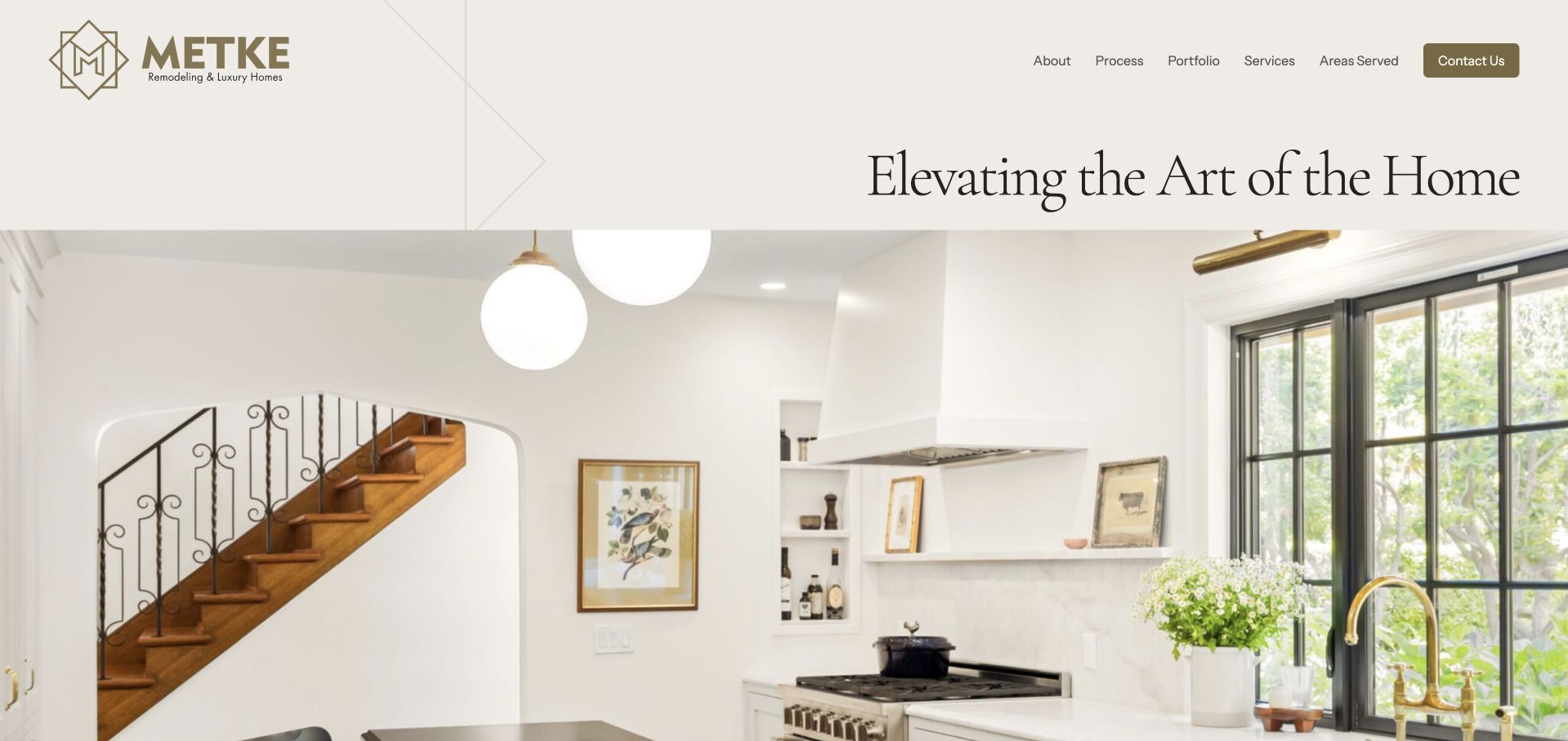
Metke’s cream-and-gold identity and expansive kitchen photograph introduce a luxury residential practice rather than an isolated bathroom product. The large serif language and prominent wordmark make the page feel editorial, with services and project information available through the broader navigation. Bathroom work belongs to that wider home context. This is useful for studying how a practice can present a consistent design sensibility across rooms, but the opening image should not be treated as bathroom-specific proof. The bathroom route needs its own project stories, service boundaries and practical explanation of the initial assessment and design process.
What you can learn
Connect a bathroom to the rest of the home through documented projects, not just a shared colour palette. Explain privacy, storage, room relationships and the homeowner’s brief in ordinary language while leaving technical suitability to professional assessment. Luxury positioning becomes more convincing when readers can identify the actual scope and design decisions behind an image.
Pros
The consistent cream-and-gold treatment supports a coherent whole-home design identity.
Architectural-scale photography communicates the broader residential context of room projects.
Cons & considerations
The kitchen-led opening requires an extra step to reach direct bathroom evidence.
Large brand typography postpones practical scope and project-fit information.
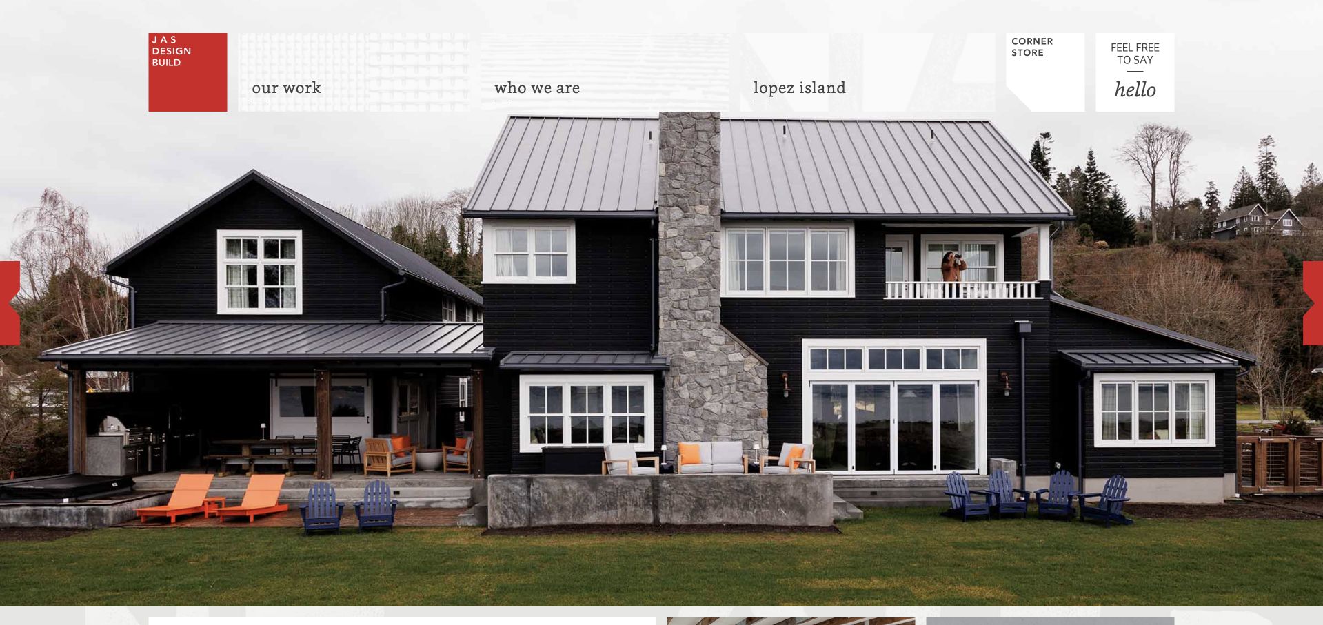
JAS Design Build uses a red block wordmark, small serif navigation and playful tab-like utility links over large residential photography. The homepage’s concise service list explicitly includes bathrooms as well as kitchens, additions and cabinetry. Project names give the portfolio an editorial voice rather than a catalogue of repetitive service keywords. That personality is useful for a bathroom practice wanting to feel human and design-led. The tradeoff is findability: the captured opening shows a whole house, so a visitor interested in a bathroom needs descriptive project labels or room-level navigation to locate relevant work without guessing.
What you can learn
A memorable project name should be accompanied by practical context. For bathrooms, include room type, scope and a brief account of the design priorities so readers can compare work without decoding a poetic title. Keep the company’s friendly tone, but make the route from inspiration to a project conversation clear and proportionate.
Pros
The distinctive red identity avoids relying on generic luxury-contractor styling.
The service list names bathrooms directly within the design-build offer.
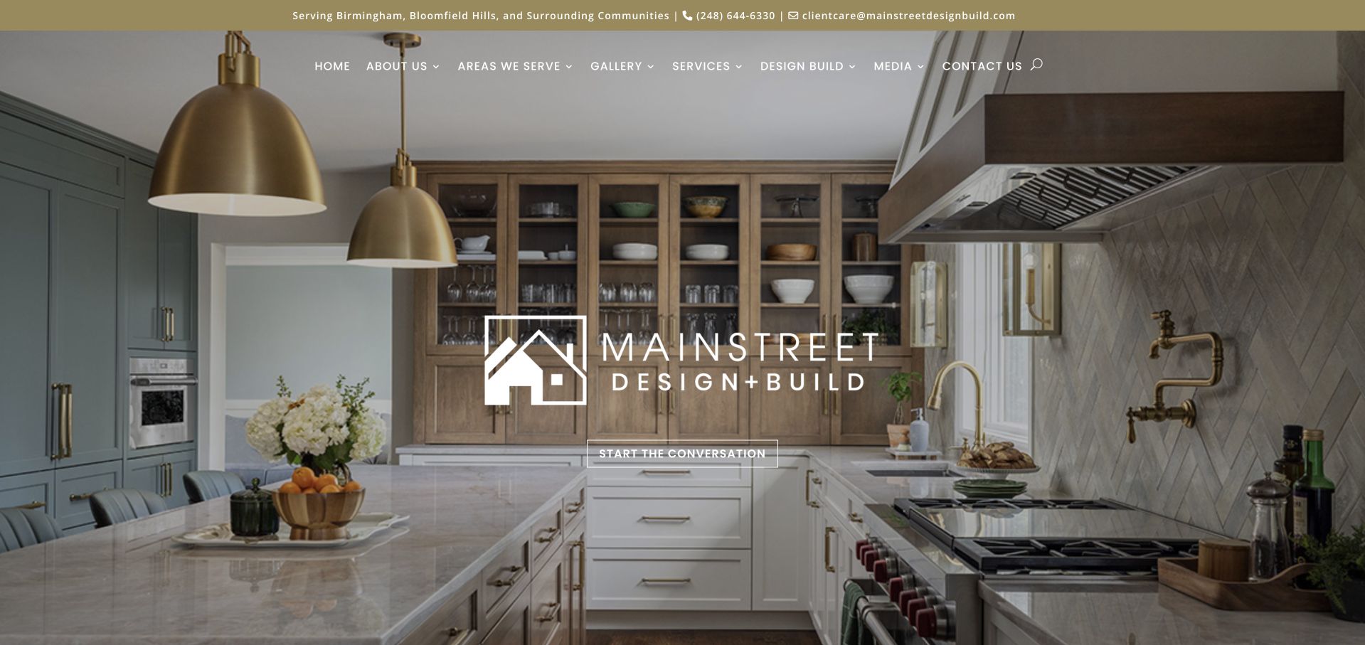
MainStreet Design Build centres its wordmark above a warm residential photograph and uses one outlined conversation action in the hero. Regional information appears in the utility area, while services and completed work have separate navigation routes. Bathroom remodeling is part of a larger practice, so the opening is more about the company’s overall residential sensibility than a single room. The calm action language is useful for homeowners who are still defining their bathroom brief. It also creates a responsibility for the destination page to explain what the conversation covers rather than letting a friendly label conceal an unclear sales process.
What you can learn
A bathroom discovery conversation should establish goals, location, scope and the information needed for assessment. Tell readers what to expect and what they do not need to have solved already. Pair the contact route with relevant bathroom projects so a homeowner can explain the kind of room, storage or layout question they want to discuss.
Pros
The single conversation action creates a calm alternative to an immediate multi-field form.
Regional information helps visitors qualify whether the local practice is relevant.
Cons & considerations
The opening room image does not provide direct bathroom-specific visual evidence.
Broad service navigation needs a focused bathroom destination to avoid unnecessary browsing.
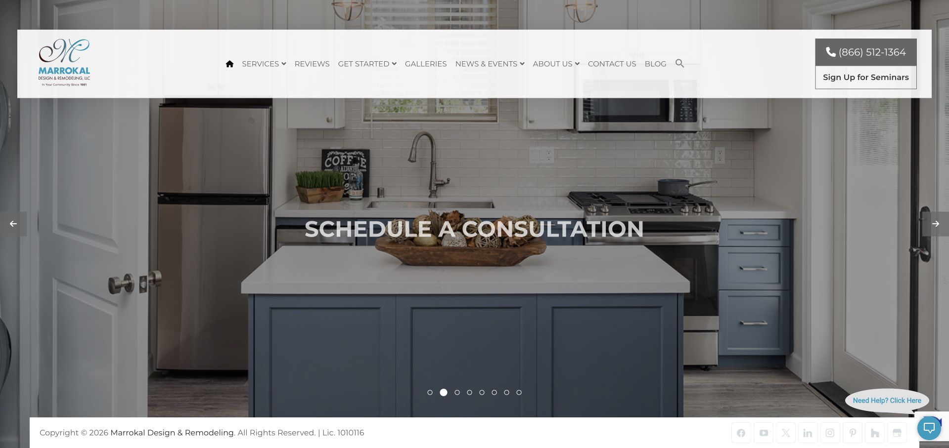
Marrokal’s floating white header includes telephone and seminar information above a large residential image. A central consultation action gives the page a clear direction, while project and service routes let visitors investigate the wider design-build practice. Bathroom work is part of that broader offer rather than the sole subject of the homepage. The design is useful for the distinction between learning and beginning a project discussion, especially when bathroom prospects may be unsure how much change their room requires. The expansive imagery establishes atmosphere, but it leaves practical bathroom scope and process questions to the following pages.
What you can learn
Keep educational resources and project consultations distinct. A bathroom-planning resource should explain the decisions and assessment involved, while a consultation should state its purpose and next steps. Support both with accurately captioned room projects, and avoid allowing a broad craftsmanship statement to stand in for the specific work the business will evaluate or coordinate.
Pros
Seminar and consultation routes offer different levels of engagement for bathroom prospects.
The large image gives the residential work a clear visual role before detailed content.
Cons & considerations
The floating header and utilities occupy substantial space in the opening view.
Bathroom-specific evidence and scope are not established by the general hero alone.
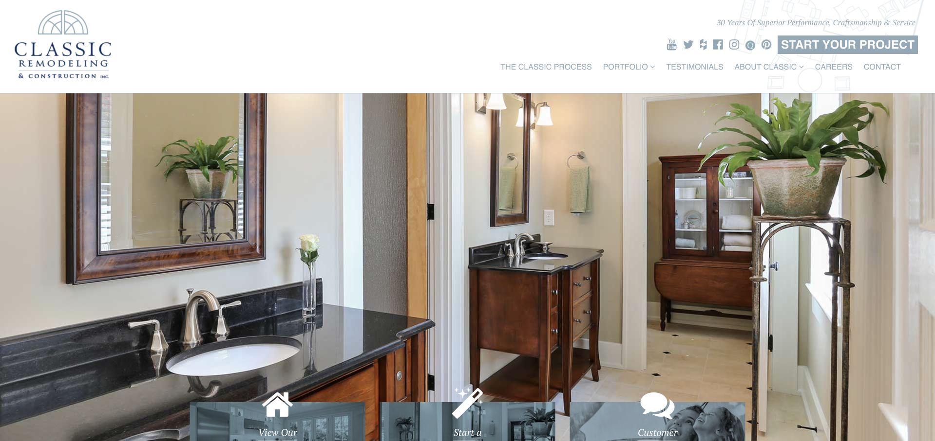
Classic Remodeling’s captured opening uses a large bathroom photograph beneath a tall white header. The room provides immediate visual context for bathroom research, while floating action tiles give readers recognisable ways to continue. Work, company and review routes are separated in the navigation, supporting a research journey beyond the first image. The traditional logo and practical site structure feel appropriate to a regional remodeling practice rather than a fixture shop. The presentation is worth studying for this direct room relevance, although the many small social links and large identity area compete with the project itself for the first screen’s attention.
What you can learn
When the opening image is already bathroom-specific, use the surrounding text to add information the photograph cannot show: the brief, scope, location and company responsibilities. Keep contact and portfolio routes obvious, but avoid treating a finished room image as proof of concealed construction quality, technical compliance or suitability for another home.
Pros
The captured bathroom image gives the category immediate visual relevance.
Separate project and review routes let visitors continue researching before enquiring.
Cons & considerations
The tall header reduces the amount of bathroom imagery visible above the fold.
Numerous small social icons add activity without explaining the room’s project scope.
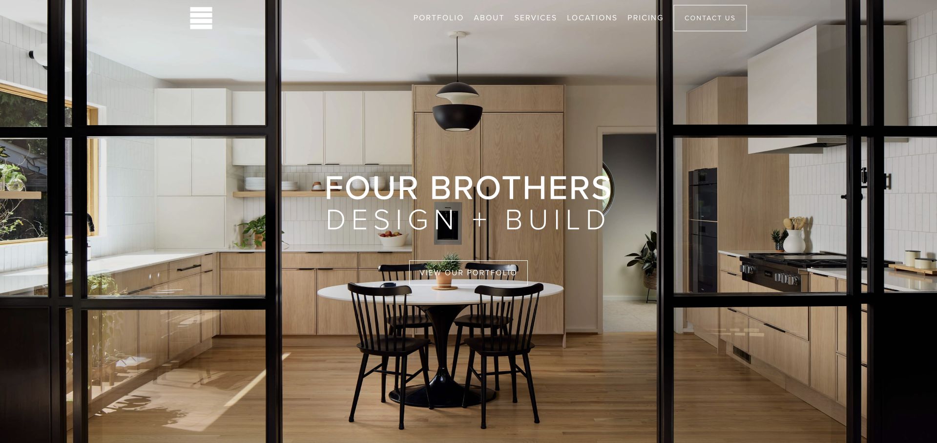
Four Brothers’ homepage uses a strongly composed kitchen photograph and a central portfolio action, with services, locations and pricing visible in the upper navigation. Bathroom work belongs to the wider Washington DC design-build practice, so the value for this guide is the research structure rather than the subject of the first image. The architecture’s own black framing creates visual order without extra website decoration. A bathroom visitor can move into relevant work or planning information, provided those routes are clearly organised. The minimal opening is visually confident but supplies limited immediate detail about bathroom scope, constraints or the first assessment.
What you can learn
A bathroom portfolio should identify comparable project conditions, not simply group every room photograph under one attractive gallery. Keep price guidance connected to assumptions and scope, and explain when a bathroom is part of a larger renovation. The best transferable lesson is to expose practical research routes alongside the imagery rather than gate them behind a consultation.
Pros
Pricing and locations are accessible beside the main portfolio and service navigation.
The restrained composition gives project photography a coherent architectural presentation.
Cons & considerations
The opening kitchen photograph does not directly demonstrate the bathroom service.
White overlaid text can be difficult to read against glass and light interior surfaces.
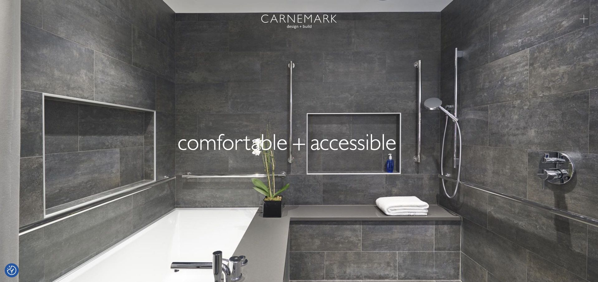
CARNEMARK’s captured homepage uses a monochrome bathroom scene with a compact wordmark and minimal navigation control. Short paired words form the editorial message, leaving the room’s materials and arrangement to carry much of the first impression. The image is directly relevant to bathroom design, unlike the kitchen-led openings used by many multi-service practices. That restraint can create a strong identity, but it also leaves scope, location and process largely outside the first screen. The site is a useful reference for editing visual clutter while reminding designers that a quiet presentation still needs accessible, descriptive routes into the work.
What you can learn
Let a bathroom photograph establish atmosphere, then add a concise project account that explains the room and design brief. Terms such as accessible should be supported by the actual documented scope and professional context, not inferred from visual style alone. Ensure a minimal menu remains understandable to keyboard, mobile and first-time visitors.
Pros
The bathroom scene provides immediate category relevance without decorative trade-site imagery.
The restrained identity leaves room for materials and spatial relationships to read clearly.
Cons & considerations
The initial view contains little explicit geographic or service-process information.
A minimal menu icon needs a clear label and strong interaction states to stay discoverable.
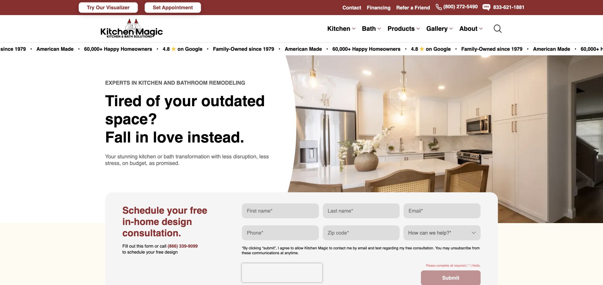
Kitchen Magic’s homepage is strongly kitchen-led, using red branding, a split hero and a floating consultation form. Its navigation and service information also identify bathroom work, making it a relevant example of a specialist brand extending beyond its namesake category. The captured image should therefore be read as a company-level introduction, not as a bathroom case study. Visualiser and appointment utilities provide practical research routes, while the early form makes the desired contact action clear. The central design challenge is explaining the bathroom offer precisely enough that readers do not assume every kitchen service or promotional claim transfers unchanged to another room.
What you can learn
When a brand name suggests one room but the business serves another, clarify the second offer in plain language. A bathroom destination should state its own scope, options and process rather than inheriting kitchen copy. Preserve the distinction between replacement products, cosmetic changes and a more extensive remodel so enquiries arrive with realistic expectations.
Pros
The existing service structure makes the bathroom offer discoverable despite the kitchen-specific brand.
A clear appointment route provides an obvious next step for contact-ready visitors.
Cons & considerations
The opening kitchen imagery provides no direct visual evidence of bathroom projects.
The dense combination of promotions and lead capture can overshadow service-scope explanation.
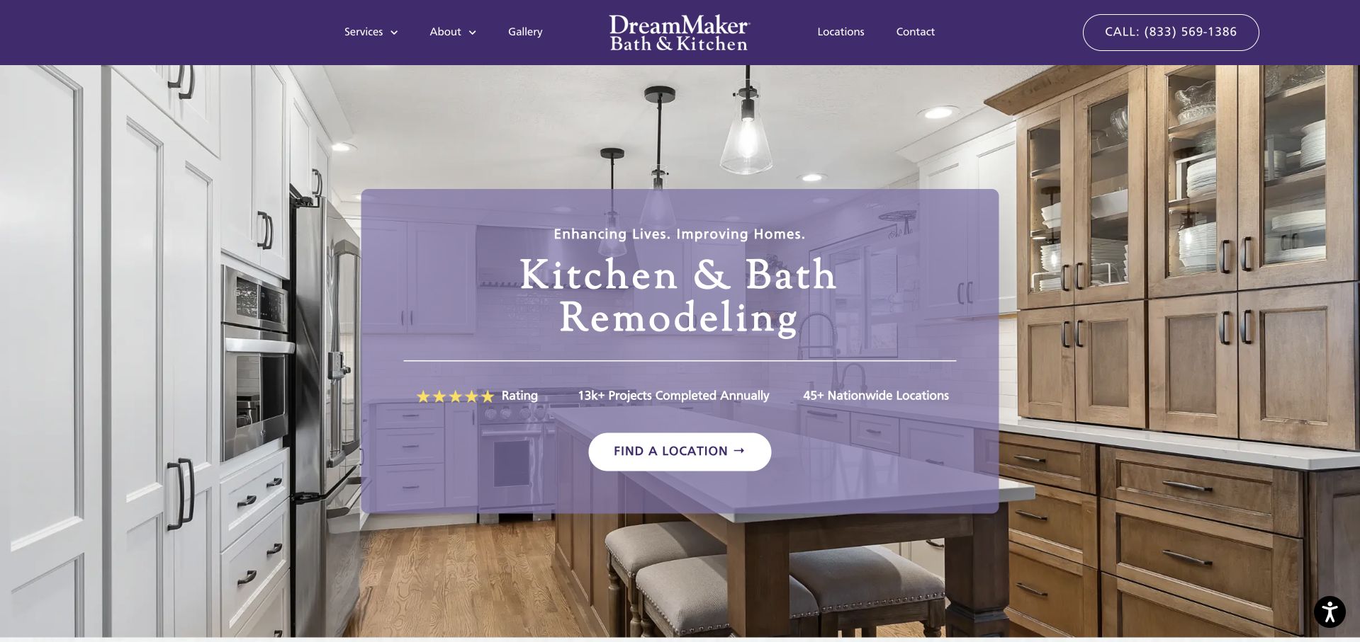
DreamMaker Bath & Kitchen makes both room categories part of its identity, then uses a purple image treatment and location-oriented action to introduce the network. The captured homepage shows a kitchen, but bath work is explicit in the brand and service structure. Process information and local routing are more useful than the broad central promise alone. This makes the site a good reference for a network-level bathroom introduction, provided visitors can reach the relevant operator without losing their selected room category. Numerical proof claims appear in the presentation and need to be understood as the company’s own statements rather than independent service ratings.
What you can learn
Keep national brand information separate from the local team responsible for assessing and delivering a bathroom project. Explain which services and processes apply at the chosen location, and preserve bathroom context through that journey. A consistent identity helps recognition, but it should not imply that project scope, availability or experience are identical across every operator.
Pros
Bath work is explicit in the business identity rather than an implied extension of kitchens.
Local routing acknowledges the geographic nature of assessment and project delivery.
Cons & considerations
The kitchen-led hero delays direct bathroom project evidence until further navigation.
Network-wide claims require clear scope before visitors compare local providers.
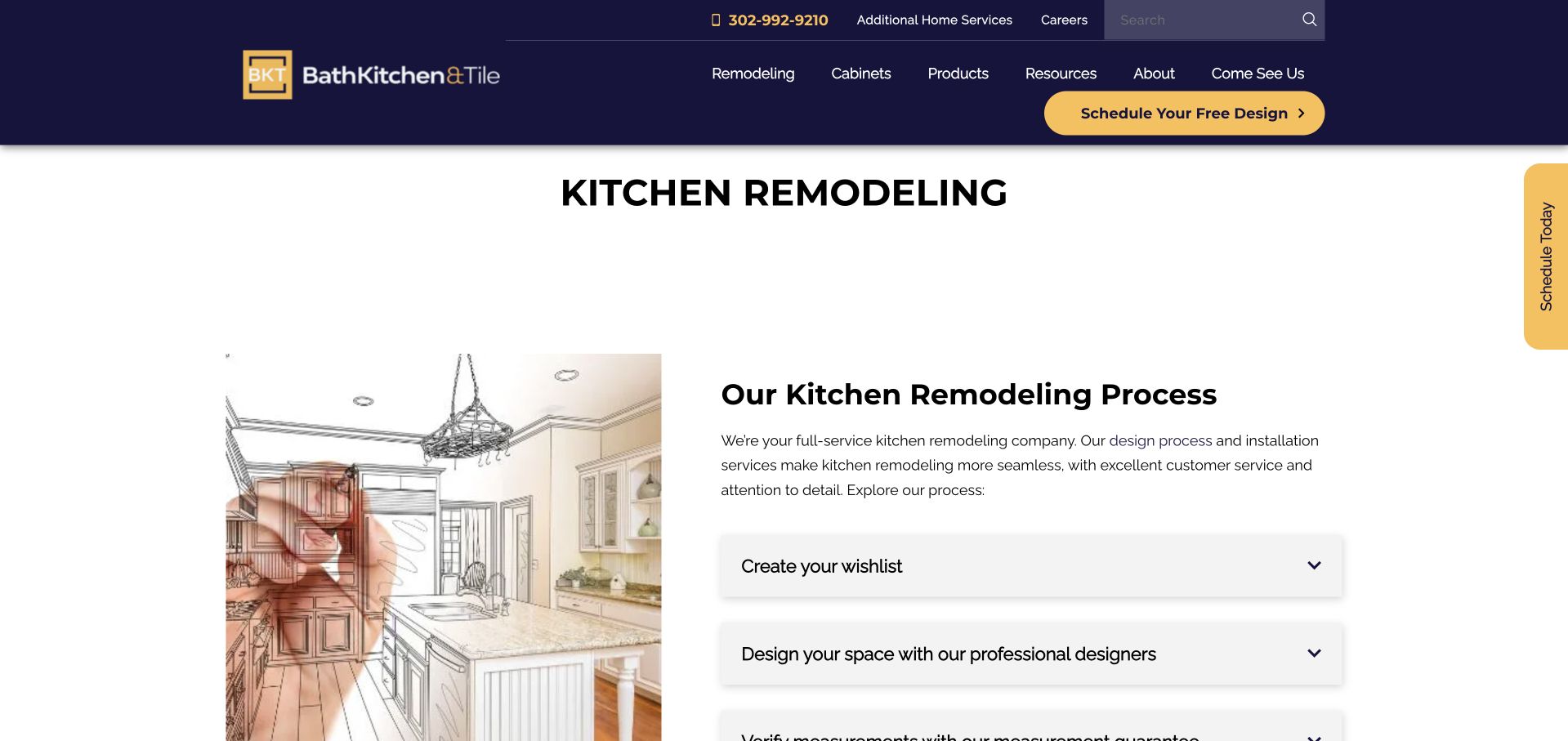
Bath Kitchen & Tile uses navy-and-gold branding, clear remodeling navigation and a visible design-appointment action. Its service structure includes bathroom remodeling alongside kitchens, cabinetry and product research. The captured service-page view explains the kitchen process through an illustration and accordions, so it is not presented here as a bathroom project image. Its broader design lesson is the separation of process, products and in-person research. A bathroom visitor should be able to understand the company’s role without mistaking a supplier catalogue for a complete design-and-construction commitment or assuming every displayed product includes installation.
What you can learn
Create a dedicated bathroom process explanation with room-specific questions and real completed work. Show how product choices relate to design, measuring and assessment, while clarifying who coordinates the installation. A showroom appointment can be a useful next step when the page explains its purpose and does not imply that choosing finishes completes the planning needed for a remodel.
Pros
Remodeling, products and showroom destinations are visibly different research routes.
The design-appointment action is easy to locate within the consistent navy-and-gold header.
Cons & considerations
The captured kitchen-process page is indirect evidence for the separate bathroom service.
Accordion-based explanations require interaction before readers can evaluate the full sequence.
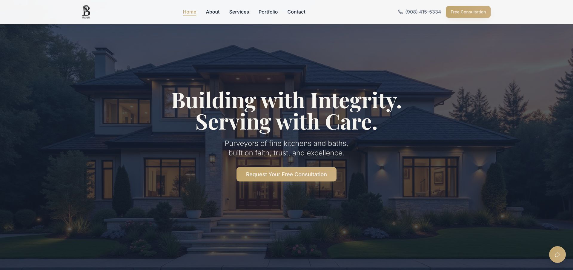
Belvedere Design Build uses an evening exterior image, white serif text and a gold consultation button to introduce its residential practice. The overall tone is calm and aspirational rather than promotional. Bathrooms sit within the broader design-build service structure, so the opening serves as a brand introduction rather than a room-specific claim. This is useful for studying a consistent identity across multiple services, but a bathroom prospect needs to move quickly into relevant work and planning information. The central visual strength is atmosphere; the practical information must come from the service pages and accurately described projects.
What you can learn
Translate values into observable process details. For bathroom work, explain how the initial brief, room assessment, design decisions and project coordination fit together, without promising technical outcomes from an image. A dedicated bathroom collection should make the relevant rooms easy to find and identify the actual scope rather than relying on the general residential identity.
Pros
The restrained dark-and-gold palette gives the consultation action a clear visual role.
A coherent company identity can connect bathroom work with broader residential renovations.
Cons & considerations
The exterior opening provides no direct view of a completed bathroom.
Broad values language needs specific service and process detail to support a project enquiry.
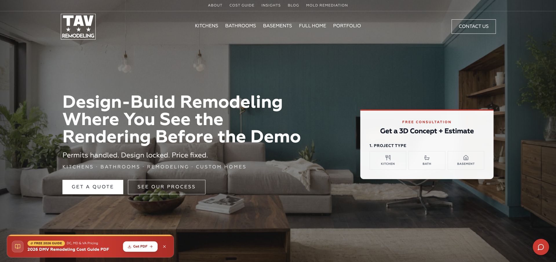
TAV Remodeling pairs a large interior photograph with a visible project-type panel on the right. The interface begins by asking what the visitor is considering, rather than immediately presenting a long undifferentiated contact form. Bathroom work sits within the broader service offer, alongside other residential project types. The transparent header and white text create a contemporary appearance, while the choice panel gives the page a practical function beyond inspiration. For a bathroom brief, the useful idea is early scope routing, though it should remain easy to bypass when someone simply wants to inspect work, coverage or process information first.
What you can learn
Bathroom enquiries benefit from knowing whether the visitor is considering a focused room project or a wider renovation. Ask that question only when it changes the next step, and explain what information is needed later. Avoid turning a preliminary selection into a promised price, technical assessment or automatic assumption about the condition of the existing room.
Pros
The project-type panel gives the first conversation more structure than a generic message box.
A clear visual separation distinguishes the choice interface from the underlying project photograph.
Cons & considerations
The panel obscures part of the room imagery that establishes design context.
Transparent navigation and white text need dependable contrast over the background image.
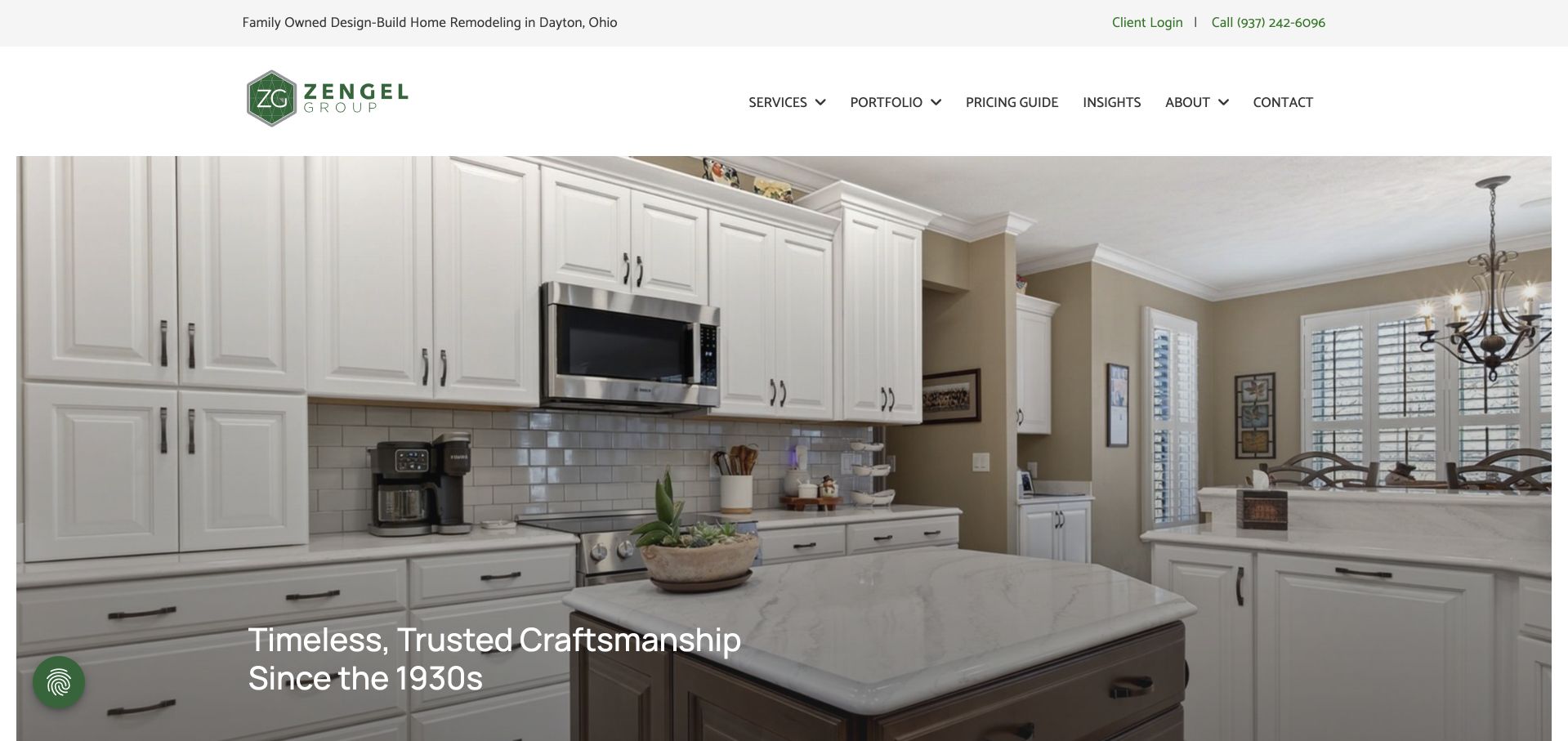
Zengel Group’s captured opening shows a bathroom beneath a white header and green geometric logo. A short heritage statement overlays the image, while the utility strip names the Dayton-area family-owned practice and separates existing-client login from new-project research. The navigation includes a pricing guide, services and a portfolio, which is useful for bathroom prospects comparing the scale of their plans. The room image gives the category direct visual relevance, but the broader company story remains central. It is worth studying for the relationship between local identity, project photography and accessible planning information rather than a purely aspirational bathroom gallery.
What you can learn
Support a bathroom image with enough context to distinguish a finish update from a more extensive room change. A pricing guide should explain scope and assumptions, while project pages describe the company’s role and the homeowner’s brief. Keep client utilities available without confusing them with the next step for someone enquiring about a new bathroom.
Pros
The captured bathroom photograph gives the category immediate visual relevance.
Pricing and regional information provide practical research context alongside the portfolio.
Cons & considerations
The broad heritage statement gives limited detail about the particular bathroom shown.
Rotating general-project imagery may change the category relevance of the homepage on another visit.
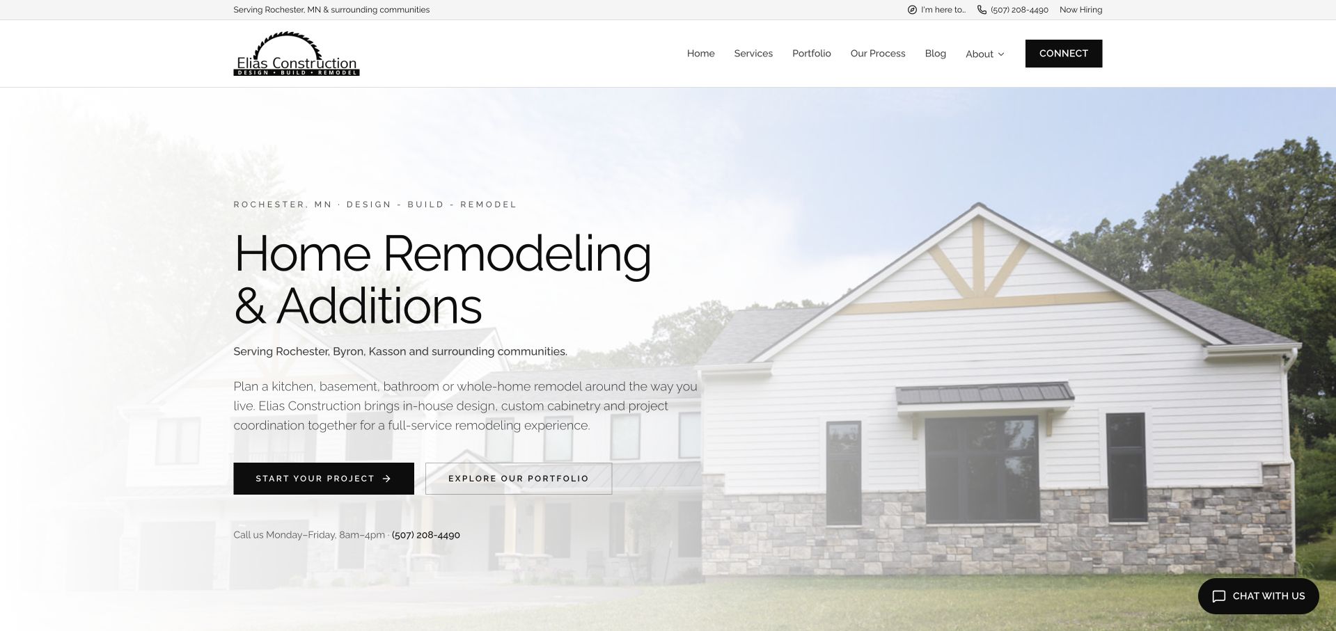
Elias Construction’s cream-and-black homepage describes design, custom cabinetry and project coordination within a regional remodeling offer. Bathrooms are explicitly named in the opening supporting copy, and Rochester-area coverage appears both above and within the hero. The main photograph shows a house rather than a bathroom, so service and portfolio routes carry the category relevance. An optional audience-choice dialog distinguishes prospects, current clients, business partners and job seekers. That is a useful organisational idea for a growing local practice, although the dialog can interrupt research before the visitor has seen the work or understood the service boundaries.
What you can learn
Give bathroom prospects a direct route to relevant projects and a clear description of the first assessment. Existing clients and business partners need different information, but those routes should not force every reader through an audience-selection gate. Keep the local coverage statement and contact expectations easy to find after the dialog is dismissed.
Pros
Bathroom work, design and coordination are explicitly included in the opening explanation.
Regional coverage and weekday phone information help qualify an initial enquiry.
Cons & considerations
The exterior hero supplies limited bathroom-specific visual evidence before further navigation.
The initial audience dialog adds a layer of interaction before portfolio research.
Kegan is a freelance web designer and developer with 15+ years of experience helping businesses turn complicated website requirements into clear, maintainable digital experiences. He works directly with clients from planning and design through development, launch, and ongoing support.
For bathroom remodeler website design, his development approach focuses on renovation examples, scope and material information, accessible layouts, and consultation journeys. The scope can be a targeted improvement or a complete custom build, with responsive layouts, thoughtful content structure, and integrations chosen around the people using and maintaining the site.
Show 3 other bathroom remodeler website designersHide other bathroom remodeler website designers
Build a bathroom website brief around the room and the household
Define the service in ordinary language
List the types of bathroom projects the company actually assesses and identify where design, products, construction and specialist work fit. Keep this explanation descriptive rather than offering technical installation instructions. If the practice focuses on larger renovations, say so. If the initial conversation is about selected replacements rather than a complete room, make that distinction visible before the visitor submits personal property details.
Document projects with privacy and context
A bathroom is a private space, so secure permission for images and avoid publishing unnecessary household details. Record broad location, scope, original goals and collaborator credits. Show the room clearly without using a wide-angle view to imply more space than exists. Describe the decisions that can be observed, and keep sensitive assessment information out of public case studies unless specifically approved.
Explain what happens after the enquiry
Name the first contact format and the information needed to check region and scope. Let visitors say they are unsure about the precise solution. Explain what an assessment will help determine and distinguish early discussion from a final proposal. Separate existing-client support from new projects so a person with a current bathroom job does not need to restart the sales process to reach the right team.
The editing job behind the design
Choose technology for maintainable room projects and a reliable enquiry
Bathroom content should have its own service and project records while sharing the broader practice’s team, location and process information. This avoids copying the same company biography into every room page. Editors should be able to add a properly captioned bathroom, update coverage and revise contact expectations without changing layout code or duplicating a whole page.
Test galleries and forms with the actual bathroom photographs, long labels and error messages. Provide descriptive controls, useful text alternatives and a clear route when an image or third-party widget fails. A public technology signal cannot prove how private project files, customer details or scheduling are managed; those requirements need separate decisions in the implementation brief.
Our WordPress website examples offer a separate look at publishing approaches. A visible platform label is evidence for that named page, not a guarantee that the same system will suit your requirements.
Before the public launch
Bathroom remodeler website brief checklist
State the bathroom services genuinely offered and their relationship to broader home work.
Distinguish product supply, selected replacement and a complete room remodel.
Name the real service region before asking for a property address.
Give bathroom projects their own discoverable collection and descriptive titles.
Explain the broad brief, scope and the company’s actual role in each project.
Record permission and credits for images of private household rooms.
Use honest room views and captions rather than implying unverified space or outcomes.
Explain the first conversation and what requires professional project-specific assessment.
Keep accessibility aspirations separate from claims of technical or regulatory compliance.
Describe how household-use and timing questions are addressed without universal promises.
Test mobile galleries, form labels, keyboard access and clear error recovery.
Maintain separate current-client support and keep contact expectations up to date.
These checks are a project checklist, not a performance, legal, security, or accessibility certification. Test real journeys with the people responsible for the website before making claims about the result.
Sources & editorial method
How this collection was selected and reviewed
The linked official public pages were inspected and captured directly. McManus’s official homepage documents its Tallahassee service area, owner-led discovery call and bathroom offering, supporting the local editorial selection. Reviews distinguish the captured image from the broader service context. The W3C image guidance supports meaningful descriptions. Selection does not certify bathroom construction, accessibility, performance or complete technology stacks.
Each example links to its actual source page. Screenshots are direct browser captures with their own capture dates; moving imagery, announcements and live designs can change. The notes describe observable design choices and conditional tradeoffs, not measured traffic, conversion results, service quality, or accessibility conformance.
Technology labels use public page metadata, asset evidence, or explicitly cited platform documentation. Platform documentation is not a complete current deployment audit. A component reference may be legacy or unused; it is not a complete backend inventory. Unknown stacks are omitted. These sites are editorial examples, not our client portfolio.
Written, Edited and Curated are separate editorial records, not timestamps advanced by a rebuild. Website designs and imagery belong to their owners. See our editorial standards or suggest a correction.
Questions worth asking
Bathroom Remodeler website design questions
Can the homepage show a kitchen if the business also remodels bathrooms?
Yes, as a company-level introduction, provided bathroom work has a clear route and its own evidence. Do not label a kitchen image as a bathroom project or expect readers to infer the service. A focused bathroom page should explain the relevant scope, process and completed rooms.
Should a bathroom form ask users to choose the technical solution?
No. Ask about goals, location and broad scope in language a homeowner can answer. Leave technical suitability to the appropriate assessment. Allow uncertainty and explain what will happen next rather than making people select a construction method simply to submit an initial enquiry.
What makes bathroom project photos useful?
Show the room arrangement and selected details with accurate captions, permission and the company’s contribution. Explain the brief and observable design decisions. Photography is inspiration and context; it cannot independently prove waterproofing, hidden work, structural suitability or compliance for another property.
How should aging-in-place or accessibility content be handled?
Describe the questions the team can discuss and the qualified assessment involved. Avoid inferring accessibility from a room’s appearance or promising one universal design solution. Keep public project descriptions accurate and distinguish a homeowner’s goals from verified technical outcomes or regulatory claims.
Should a small bathroom company publish pricing?
Planning context can be useful when its scope, assumptions and limitations are clear. Distinguish a preliminary discussion from a project-specific proposal. A visually similar room may have different existing conditions, so avoid implying that a gallery photograph or short form can establish a reliable final cost.
A strong bathroom website explains the service, shows relevant work honestly and makes the assessment journey understandable. Keep the homeowner’s room and questions central to the design brief.