Best Kitchen Remodeler Websites of 2026 (29 Real-World Examples)
Kitchen remodeling websites that connect project inspiration and planning
A kitchen remodeling website should help a homeowner understand more than cabinet style. These examples show different ways to present design responsibility, regional coverage, project evidence and the first conversation about a substantial change to a home.
A kitchen brief may involve new cabinetry, a changed layout, connected living space or a wider home renovation. Those are different service questions. A useful website explains the company’s actual role before asking a visitor to choose finishes or complete a detailed form. It should make the distinction between a design-build remodeler, cabinet specialist and broader home builder understandable.
The collection includes regional practices, specialist kitchen businesses and larger networks. Some homepages show whole houses or other rooms; those are identified as company-level introductions rather than mislabelled kitchen projects. Reviews concern the public website’s presentation and research journey, not independently verified construction quality, price competitiveness or project outcomes.
Before the examples
What makes good kitchen remodeler website design in 2026?
Show what the company actually designs and builds
Explain whether the service includes design, cabinetry, construction management or a documented combination. A cabinet supplier’s contribution is not the same as a complete remodel. Use plain service descriptions and project captions that identify the actual scope, especially when photographs include rooms or landscape work delivered by several professionals.
Make project research informative
Organise kitchens by useful context rather than aesthetic labels alone. A short account of the starting room, the client’s priorities and the changes made helps a visitor assess relevance. Keep beautiful photography, but connect it to facts. Before-and-after views are useful when accurately labelled and not altered to exaggerate the transformation.
Explain the first planning conversation
Name the purpose and format of the initial call or consultation. Tell homeowners what information is helpful and what they do not need to have solved already. Distinguish early budget discussion from a project quote, and explain that photographs or an online form cannot resolve all the conditions that require assessment.
The collection · 29 examples
29 kitchen remodeler websites worth studying
Study how these sites qualify a project and organise the work, not just how they style a kitchen photograph. The most useful pattern is the one your team can support with accurate information and a reliable process.
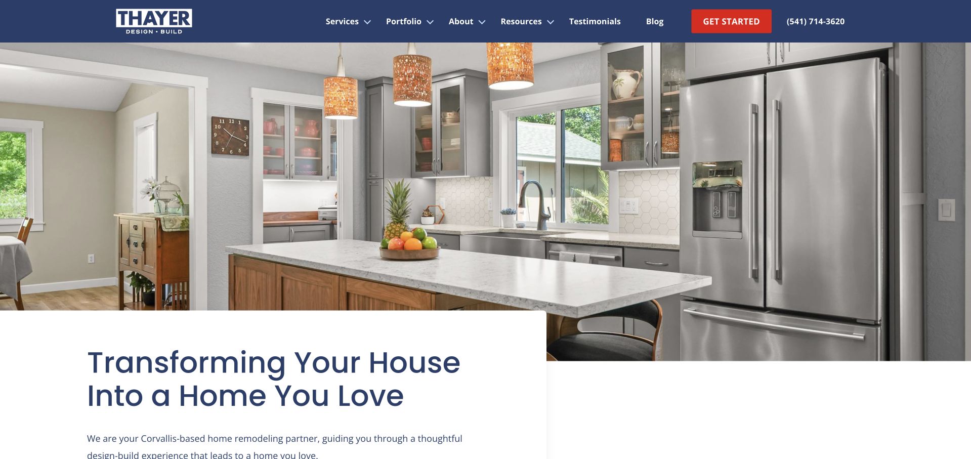
Thayer Design Build uses a navy-and-red navigation treatment above a large kitchen photograph. A white introductory panel overlaps the image and names the Corvallis-area remodeling offer rather than relying on the photograph to establish location. The service menu separates kitchens, bathrooms, additions and broader home work, while portfolio and process routes support research before contact. The company’s official about page describes a family-owned regional business. The website’s strength is this combination of warm project imagery and a service structure a homeowner can understand without knowing construction terminology.
What you can learn
An attractive kitchen should introduce a useful project story, not stand in for one. Explain the starting problem, how the layout changed and what the company designed or built. Local scope and a readable process route help a visitor decide whether an enquiry makes sense before sharing detailed plans or budget information.
Pros
The regional opening connects the project image to a geographically relevant service.
Portfolio and process destinations give visitors alternatives to an immediate consultation.
Cons & considerations
The large photograph delays much of the practical introduction until the overlapping panel.
Several remodeling categories require clear differentiation once readers leave the homepage.
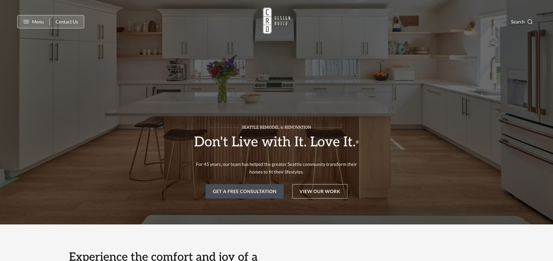
CRD Design Build fills the opening with a warm timber kitchen, placing a restrained white headline and two outlined actions over the image. One action invites a conversation; the other lets the visitor inspect the work first. The logo is centred while navigation is comparatively compact, giving the project photograph room to communicate atmosphere. Lower service content identifies kitchens within the broader design-build offer. The page is worth studying for its refusal to make every visitor start with a lead form, though the minimal opening leaves practical questions such as location and project fit to supporting content.
What you can learn
Let serious kitchen buyers browse relevant projects before asking them to book. A portfolio route should lead to informative case studies with layout, scope and design context, not only a larger version of the hero photograph. Keep the consultation action available without making it the only visible way to learn about the company.
Pros
Portfolio and conversation actions acknowledge two different levels of visitor readiness.
The restrained overlay allows the timber kitchen to remain the dominant visual.
Cons & considerations
White outlined controls need reliable contrast over every image or video frame.
The opening relies on supporting content to explain geography and project parameters.
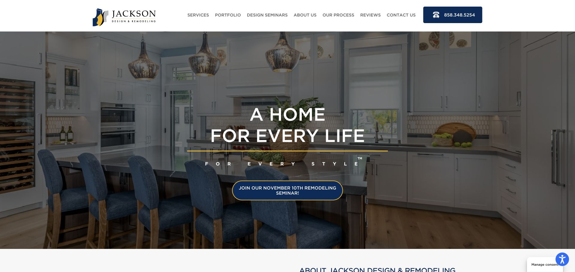
Jackson Design and Remodeling combines a white header, navy telephone details and a large symmetrical kitchen photograph. The opening message is centred over the room, with a seminar action offering a lower-commitment research step. The broad navigation supports project browsing, design information and consultation rather than treating every visitor as ready to begin construction. The kitchen image shows the relationship between cabinetry, island, lighting and surrounding space, giving readers more context than a cabinet-door close-up. The page’s strongest idea is the educational route, which can help a homeowner understand a substantial remodeling process before starting a project discussion.
What you can learn
A seminar or learning resource should answer genuine planning questions, including scope, investment assumptions and the design-build sequence. Make its format, date and purpose clear, and preserve a direct route for people who already want to discuss a kitchen. Education works as useful content when it is not just another name for a sales appointment.
Pros
The educational action offers an alternative to an immediate project consultation.
A complete kitchen scene helps readers assess spatial and material relationships.
Cons & considerations
The broad navigation can feel dense before a newcomer understands the service model.
Large image-led messaging postpones specific project-fit information until later content.
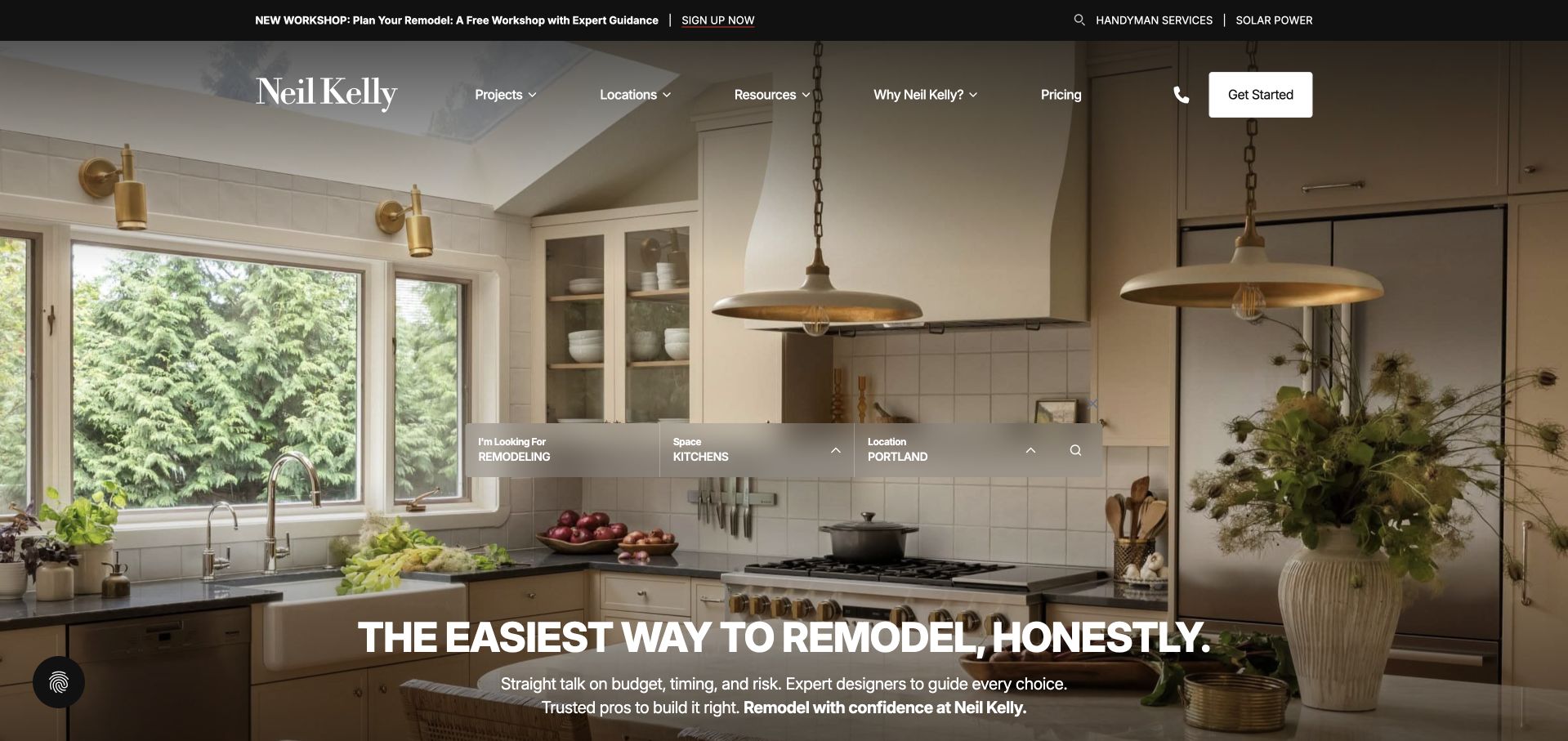
Neil Kelly places a project-search interface directly over a kitchen photograph, with choices for service, space and location. That is a more useful organising idea than a gallery whose thumbnails all look similar. The header provides pricing, resources, locations and a clear getting-started action, while a workshop announcement occupies a thin utility strip. The opening copy acknowledges budget, timing and risk rather than describing kitchens only in aesthetic terms. The result connects inspiration to the practical questions surrounding a remodel, although the floating search bar and promotional messages add several interface elements to the same photograph.
What you can learn
Structure a kitchen portfolio so a visitor can find work comparable to their own situation. Space type and geography are useful starting filters when they lead to accurate project records. Pricing information should explain assumptions and scope rather than suggest that an image or filter selection can establish a reliable project-specific quote.
Pros
The project-search controls distinguish room type and location within the portfolio.
Pricing and workshop routes recognise that visitors need planning information before contact.
Cons & considerations
The floating search panel competes with the kitchen photograph and hero message.
Workshop and utility content increase the amount of information above the main introduction.
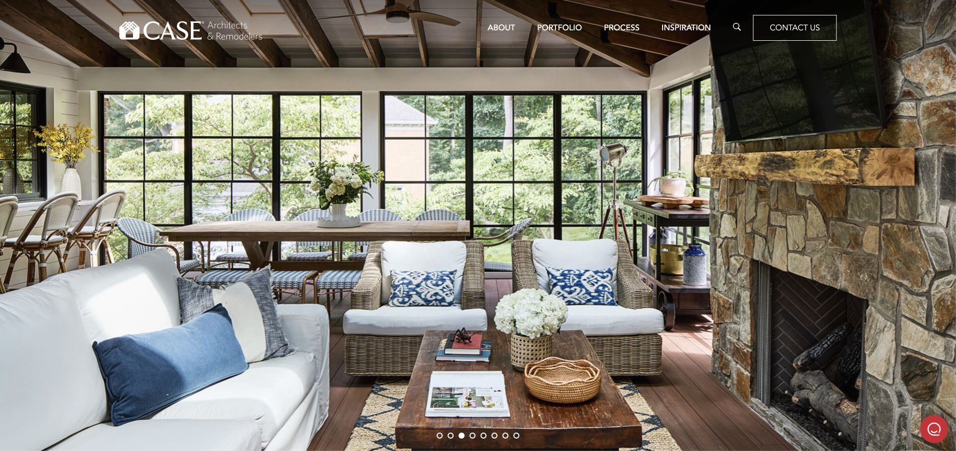
Case Architects & Remodelers gives a bright architectural interior nearly the full opening screen, with a restrained white logo and small navigation over it. The image communicates the relationship between rooms rather than isolating a single cabinet finish. Service and project navigation then places kitchen work within a broader home-remodeling practice. This is a confident photography-first approach, useful for companies with strong original project assets. It is less immediately explanatory than a text-led hero, so coverage, project scale and the difference between design and construction need to become clear as the visitor moves beyond the first image.
What you can learn
If a kitchen project changes how the house works, show the connection to nearby rooms and explain it in the case study. An image-led homepage still needs a stable written service description that remains useful when an image fails, motion is reduced or a reader arrives directly on a project page from search.
Pros
The architectural photograph demonstrates room relationships instead of only surface selections.
A restrained header gives the project imagery a clear, uninterrupted visual role.
Cons & considerations
The first screen contains limited written explanation of the service or coverage.
White navigation needs careful contrast when the background photograph is pale.
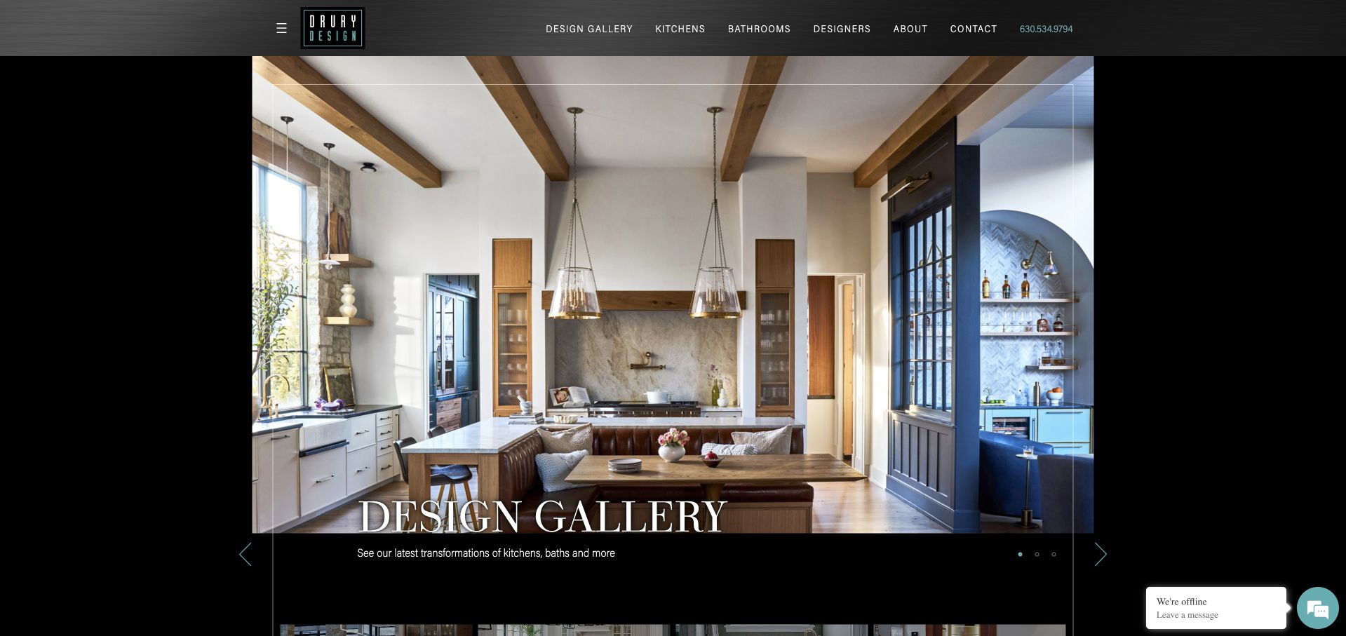
Drury Design uses a black gallery-like frame, a narrow turquoise-accented logo and a large inset kitchen photograph. A short Design Gallery label and description appear at the lower edge, connecting the opening directly to completed transformations. Kitchens, bathrooms, designers and company information are plainly named in the header. The inset photograph leaves enough room for the cabinetry, island, beams and lighting to read as one composition, rather than cropping the project into an abstract texture. The page feels closer to an interior-design portfolio than a generic contractor landing page, with the gallery providing the main first impression.
What you can learn
Treat kitchen photographs as designed compositions with enough context to understand the layout. Connect them to a project record that credits the designer, identifies the scope and explains the client’s priorities. A dark frame can unify varied projects, but text, controls and keyboard focus still need clear contrast rather than becoming decorative hairlines around the images.
Pros
The gallery opening makes completed work the immediate subject of the page.
Separate kitchen, bath and designer routes help visitors explore different types of evidence.
Cons & considerations
Large photography delays process and project-fit information until subsequent sections.
Small navigation and slide controls need careful sizing against the dark frame.
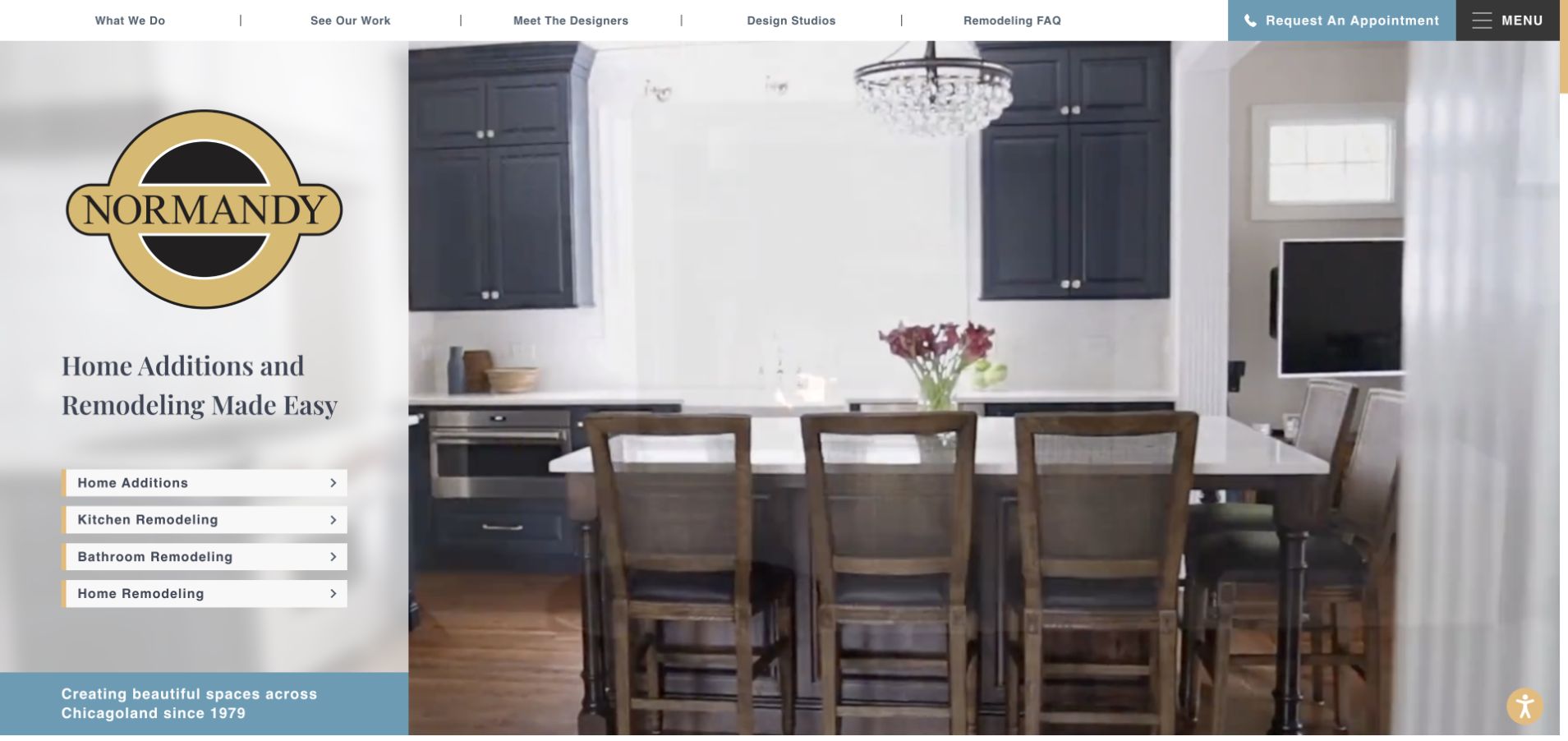
Normandy Remodeling keeps a substantial white panel on the left of its hero, with the company’s black-and-gold mark, a short remodeling statement and four service links. The right side carries the room photography. Kitchen remodeling is a direct choice rather than a category hidden inside a menu, and bathroom, additions and wider home work remain visibly separate. A blue appointment strip and utility navigation add practical routes above. This layout is useful for studying how to preserve stable service choices while project images change, although the oversized logo consumes space that could otherwise explain the service process.
What you can learn
Put the project types people recognise beside the imagery that inspires them. A kitchen visitor should not have to decode a general home-improvement category. Follow the choice with kitchen-specific projects, process and cost context, while making clear which parts of a larger renovation are included in the company’s design-build role.
Pros
Kitchen, bathroom, addition and whole-home routes are visible without opening a menu.
The stable text panel prevents service navigation from changing with the photographs.
Cons & considerations
The very large brand mark reduces space for practical introductory information.
Several upper navigation and appointment elements compete with the first service choice.
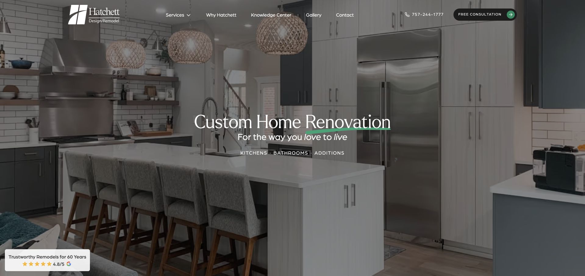
Hatchett Design Remodel uses a darkened kitchen photograph, a white italic-serif headline and a subtle mint accent to create a composed opening. The transparent navigation keeps the image dominant, while the service statement separates kitchens, bathrooms and additions. A consultation action gives the page a recognisable next step without a large form covering the room. The design is useful for how it combines a sophisticated project image with plain service categories. Its limitation is familiar to image-led trade sites: broad improvement language does not by itself establish whether a homeowner’s project, location or budget is a suitable fit.
What you can learn
A polished kitchen image should be followed by clear operating facts. Name the service region, explain the design and construction stages, and show comparable projects with concise scope notes. Use the visual identity to make that information pleasant to read, not to replace it with a string of aspirational adjectives.
Pros
The mint accent and serif headline create a distinct, consistent visual tone.
Kitchen, bath and addition services are named directly in the opening presentation.
Cons & considerations
The dark photograph needs careful text positioning to preserve visible kitchen detail.
The broad headline provides less practical qualification than the subsequent content must supply.
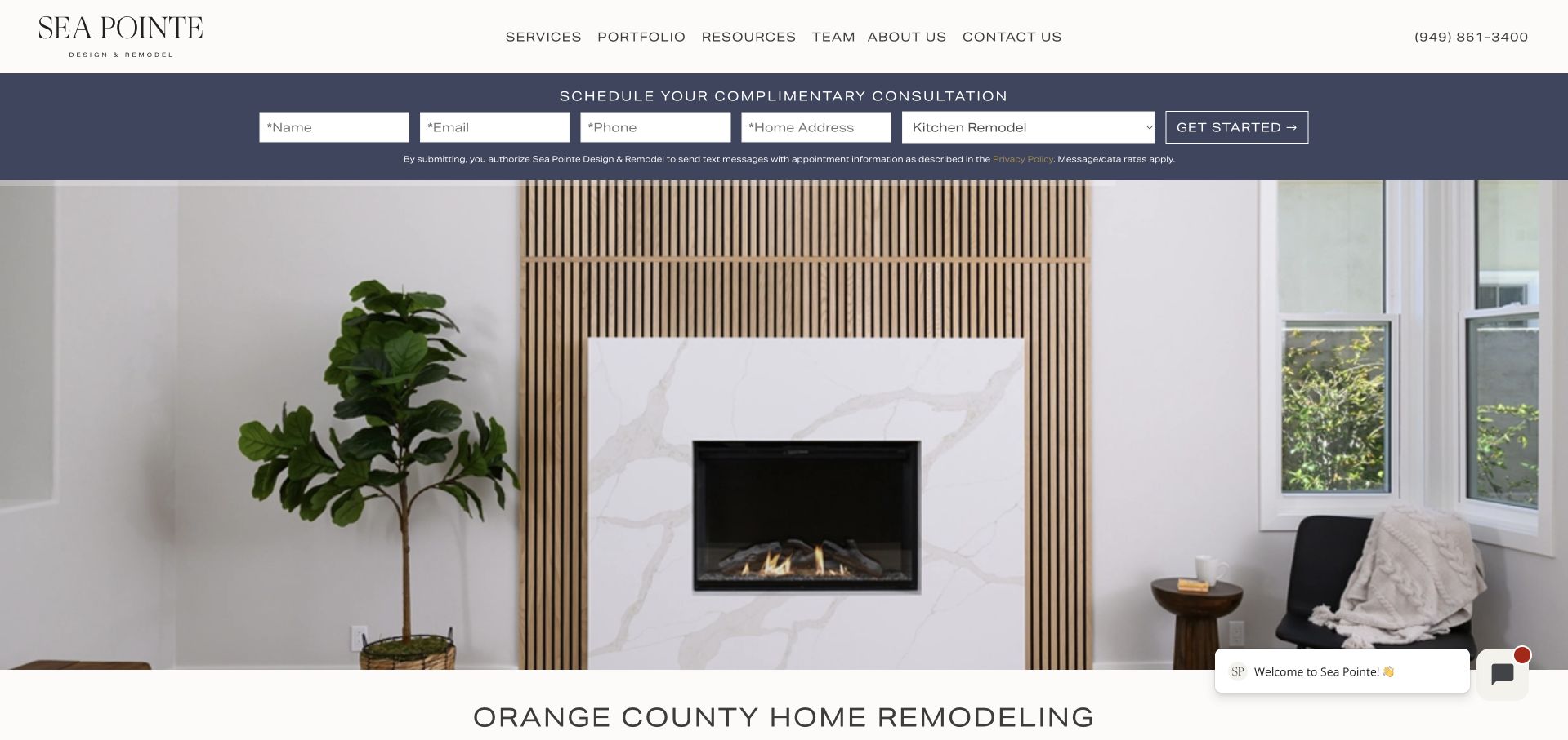
Sea Pointe places a purple consultation form directly below a white logo-and-navigation header. Name, email, phone, address and service choices appear before the large project media. That makes the desired conversion unmistakable and shows the information the company uses to route a conversation. The service menu distinguishes kitchen and bathroom remodeling from larger home projects, while work and planning content provide further context lower down. The design is worth studying as a deliberate lead-first alternative to a portfolio-led opening, not as proof that requesting more fields before inspiration is the right choice for every remodeling company.
What you can learn
Choose whether the page is primarily for research or for a returning visitor ready to enquire. An early consultation form needs a clear explanation of what happens next and why each field is required. Keep kitchen projects and process information accessible so an unfamiliar visitor can assess relevance before disclosing a property address or project details.
Pros
The consultation form makes the next step and requested information immediately clear.
A distinct purple treatment separates the enquiry area from the white site navigation.
Cons & considerations
The form arrives before most project evidence or detailed service explanation.
Several personal-information fields create more commitment than a simple initial discovery action.
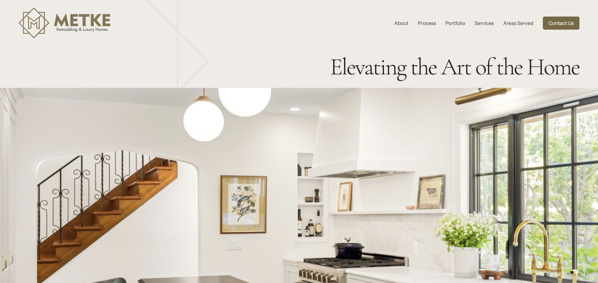
Metke uses a cream-and-gold identity, a prominent wordmark and a full-width kitchen photograph to establish a luxury residential tone. Large serif language sits beside the imagery rather than adopting a conventional checklist-and-quote layout. The work is presented as part of a broader custom-home and remodeling practice, with service information available in separate routes. The photograph gives substantial attention to the room’s scale, cabinetry and connected spaces, so the opening reads as an architectural portfolio. This is a useful reference for visual restraint, while also showing the need to give practical project qualification enough prominence beneath an expansive brand presentation.
What you can learn
A high-end kitchen website can communicate material and spatial quality without using extravagant copy in every paragraph. Pair the imagery with specific project narratives, location information and a clear explanation of design responsibility. Readers should be able to distinguish a new custom home from a remodeled kitchen and understand which service they are enquiring about.
Pros
The cream-and-gold palette supports the warm architectural photography without competing colours.
Kitchen imagery is shown with enough context to understand the surrounding home.
Cons & considerations
Large brand typography postpones some of the practical service information.
A broad luxury-home offer requires careful separation of remodeling and new-build enquiries.
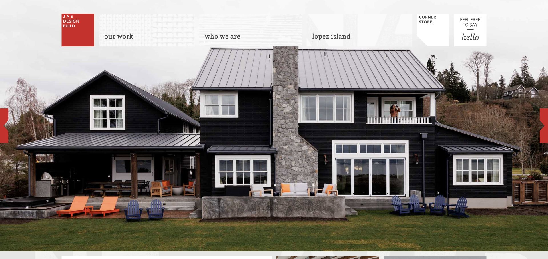
JAS Design Build combines a red rectangular wordmark with a large house photograph, small serif navigation and playful paper-like utility tabs. Project photography is central, but the brand does not rely on the generic black-and-gold treatment common among remodelers. The homepage names kitchens, bathrooms, cabinetry, additions and broader residential work in a concise service list. Its gallery uses individual project titles rather than only repeating service keywords, giving the portfolio an editorial character. This makes the site a useful study in personality, although a visitor seeking only a kitchen needs a clear path through the broader home-project collection.
What you can learn
A kitchen portfolio can have a distinctive voice without making service scope obscure. Use memorable project names together with descriptive labels, locations and room types so visitors can find relevant work. Personal tone is most useful when it makes the company approachable while leaving the design-build responsibilities and initial enquiry process clear.
Pros
The red mark and editorial navigation create a recognisable alternative to generic trade styling.
A concise service list explicitly includes kitchens and custom cabinetry among broader projects.
Cons & considerations
Whole-home imagery can delay the kitchen-specific evidence some search visitors want.
Poetic project titles need descriptive context to support scanning and search discovery.
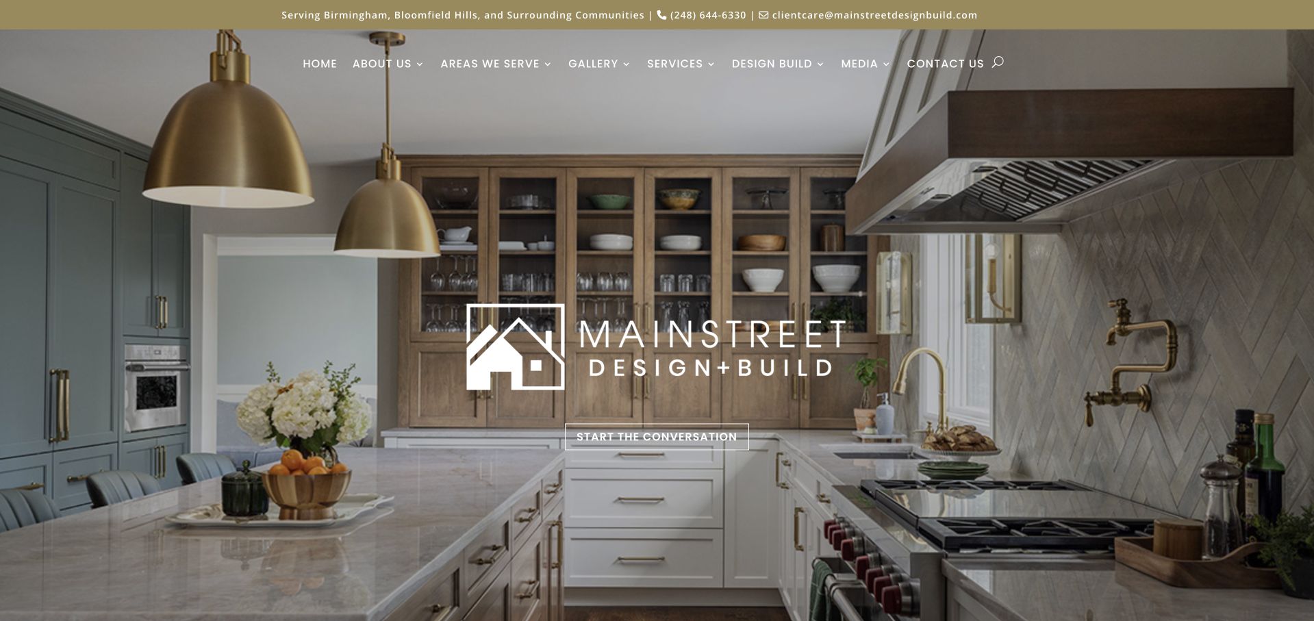
MainStreet Design Build centres its wordmark in a white header above a warm kitchen photograph. A single outlined conversation action sits over the image, giving the opening a calmer tone than a large estimate form. Regional information appears in the upper utility area, while project and service navigation supports deeper browsing. The imagery gives the island, cabinetry and connected interior equal attention, so the kitchen is presented as a lived-in space rather than a product display. The design works best as an invitation to explore a regional practice, with detailed kitchen scope and process needing to follow in the supporting pages.
What you can learn
A conversation-based action can suit complex kitchen work if the page explains what that conversation covers. Tell visitors whether they will discuss location, goals, timeline or investment before asking them to prepare drawings. Keep project browsing close to the contact route so people can establish a shared reference point for the first discussion.
Pros
A single outlined action keeps the opening focused without covering the project photograph.
Regional information helps distinguish the local practice from a nationwide service network.
Cons & considerations
The large image offers little room for practical project-fit details in the first screen.
Broad service navigation needs a strong kitchen landing page for focused search visitors.
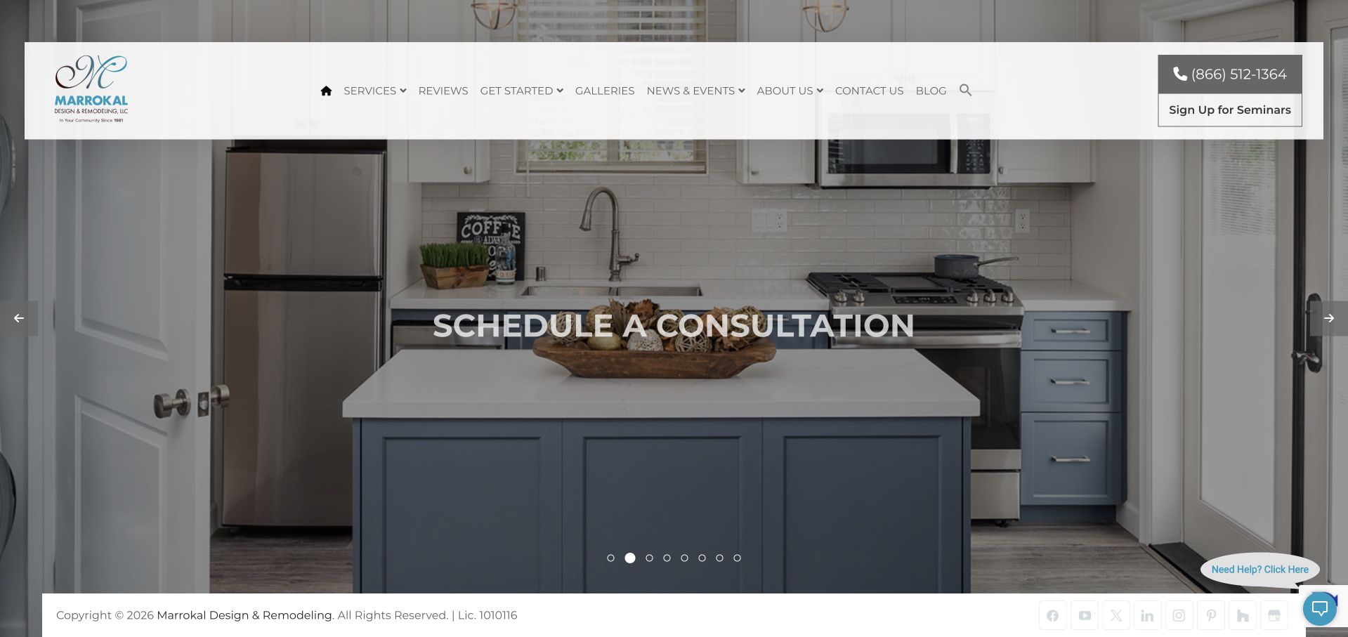
Marrokal gives its room photography most of the first screen, framed by a floating white navigation block with phone and seminar information. The central headline and consultation action communicate a broad remodeling proposition rather than a cabinet-specific offer. Kitchen projects belong to a wider design-build practice, and the navigation provides routes for work, services and learning. The opening is visually expansive, leaving room proportions and finishes easy to inspect. Its practical tradeoff is that several secondary header choices appear before a new reader has learned how the company manages a kitchen project or which locations it serves.
What you can learn
When the portfolio is the first impression, make the next layer explain how the work happens. Kitchen case studies should identify layout changes, project scope and the role of design rather than repeating a general craftsmanship claim. A seminar route can support early research, provided it stays distinct from booking a project consultation.
Pros
Expansive room photography gives readers an immediate sense of the project style.
Consultation and seminar routes acknowledge different stages of homeowner readiness.
Cons & considerations
The large floating header and utilities reduce the available image and reading space.
The broad opening does not immediately distinguish kitchen-specific work from whole-home remodeling.
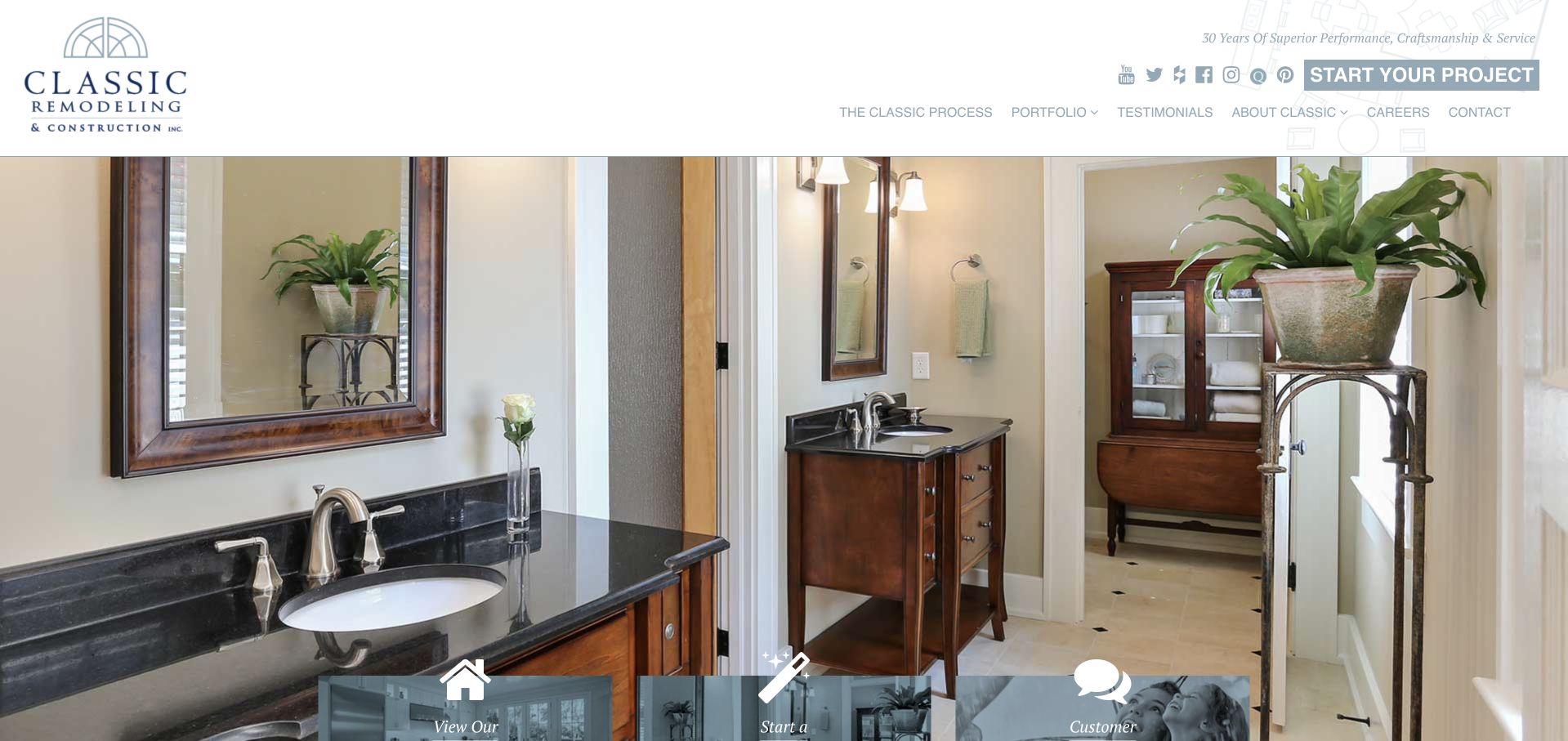
Classic Remodeling combines a large white header and company mark with a full-width residential project photograph. Three floating action tiles at the bottom of the image create obvious routes into the service offer. The navigation separates work, company information and reviews rather than relying entirely on the hero message. Kitchens appear within a broader remodeling practice, so the site is useful for studying how a contractor can present several room categories under one identity. The design is straightforward, although the tall header and numerous small social links make the initial screen busier than the project imagery itself requires.
What you can learn
Use a few meaningful action tiles to move readers from inspiration into service detail. For kitchen work, link to a specific collection and explain the design-build scope before asking for a general home-remodeling enquiry. Social channels are secondary research options; they should not crowd the project title, location, process or principal contact route.
Pros
The floating action tiles give the image-led opening recognisable next steps.
Separate work and review routes support research before a consultation is requested.
Cons & considerations
The tall header takes substantial space away from the first project photograph.
A row of small social links adds visual activity without explaining the kitchen service.
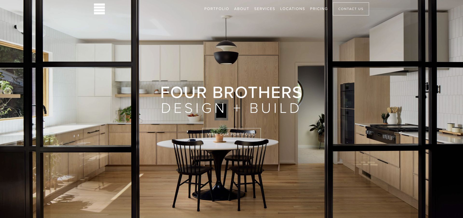
Four Brothers Design + Build uses black window frames within its kitchen photograph to create a natural visual grid. The white wordmark and one outlined portfolio button sit centrally, while a compact navigation includes services, locations and pricing. The composition is memorable because the architecture itself organises the image rather than decorative shapes added by the website. Kitchen work is part of a broader Washington DC design-build practice, and the visible pricing route acknowledges a practical research need. The opening is still primarily visual, so readers must continue to the project and service pages for scope, constraints and process details.
What you can learn
Choose photographs whose composition leaves a readable place for text instead of placing the same overlay on every image. Then connect the portfolio action to informative kitchen stories with layout context and real project scope. Pricing guidance should make its assumptions visible; a photogenic room alone cannot establish what another homeowner’s remodel will cost.
Pros
The architectural framing creates a distinctive hero without additional graphic clutter.
Locations and pricing are visible alongside the portfolio and service routes.
Cons & considerations
White lettering over glass and light cabinetry needs careful contrast throughout transitions.
The first screen gives little explanation of the company’s kitchen process or project fit.
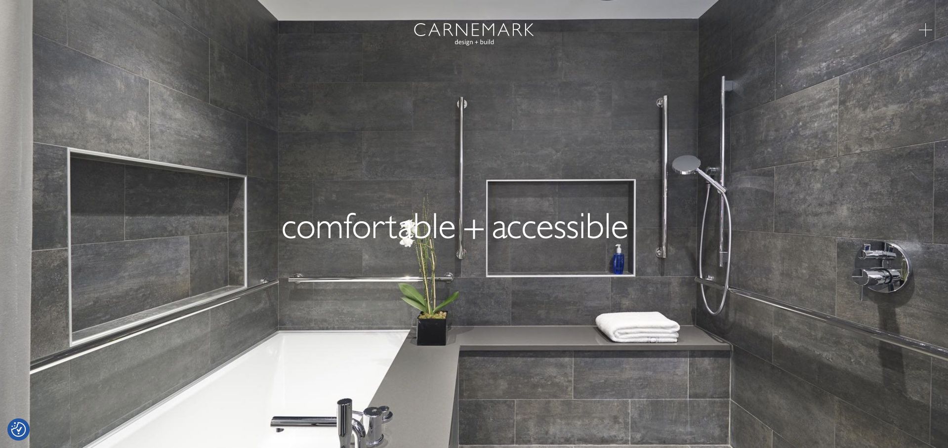
CARNEMARK design + build opens with a monochrome architectural photograph, a compact upper wordmark and a restrained menu control. Short paired words provide the visible editorial voice rather than a long service pitch. The site’s navigation separates work, approach and company information, placing kitchen remodeling within a wider residential design practice. It is useful for studying how much identity can come from an image, type scale and editing rather than a long list of badges. The same minimalism means the opening offers limited immediate qualification for a visitor seeking a kitchen contractor in a particular area.
What you can learn
Minimal navigation should simplify the presentation, not remove essential service facts. A kitchen project page can stay visually quiet while explaining the existing layout, intended changes and the company’s responsibilities. Use descriptive captions and straightforward links so visitors do not have to infer kitchen expertise from a photograph of another room or a general design statement.
Pros
A restrained wordmark and image treatment create a coherent architectural identity.
The work and process routes support a portfolio-led account of the design-build practice.
Cons & considerations
The opening provides little explicit kitchen or geographic information for a new visitor.
Minimal menu controls need clear labels and visible focus states to stay discoverable.
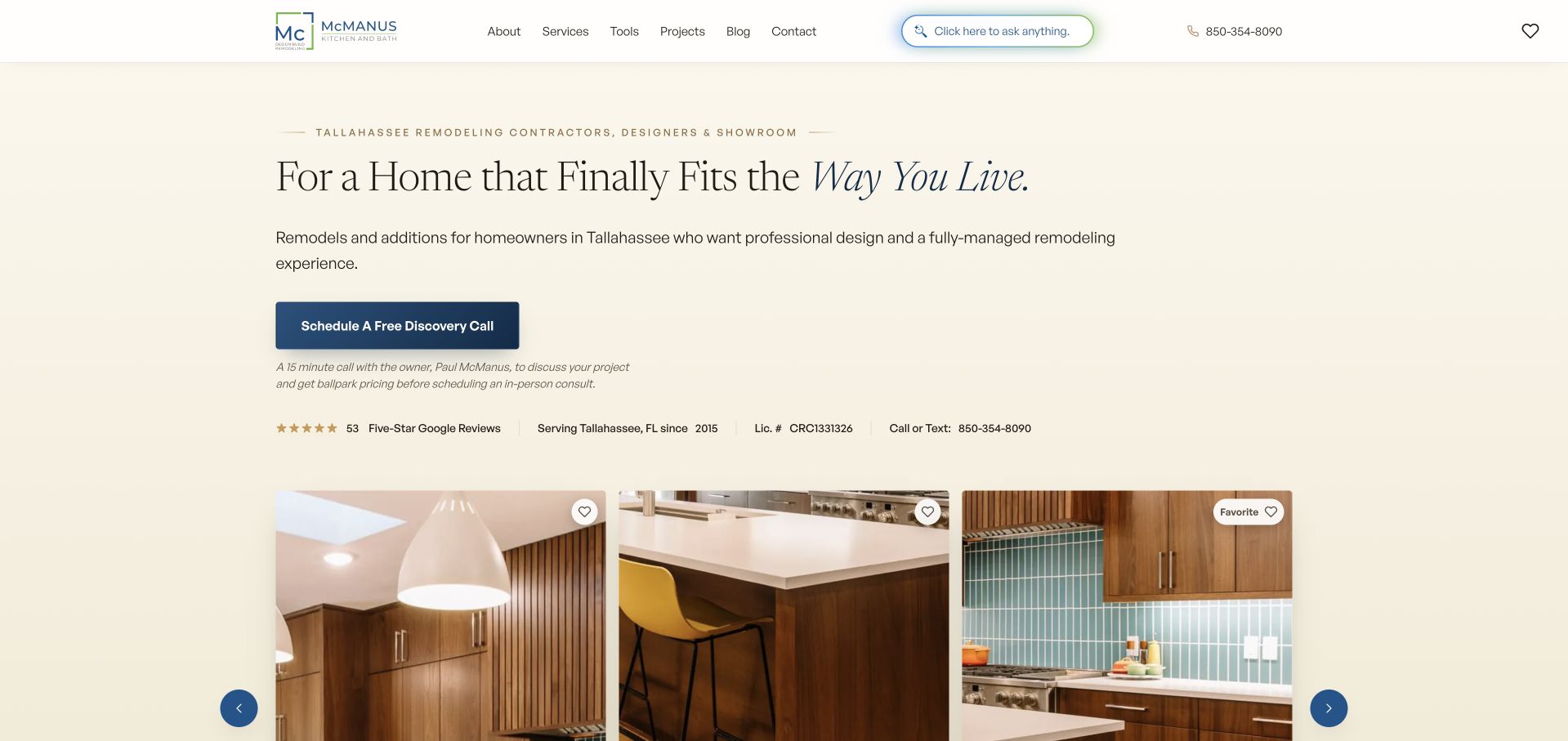
McManus Kitchen and Bath combines cream backgrounds, navy actions and a substantial serif headline with photographs of completed rooms. More distinctive than the palette is the explanation of the initial discovery call: it names owner Paul McManus, states its short format and explains that the conversation covers the project and ballpark pricing before an in-person consultation. Tallahassee coverage and the design-build model are stated directly. Kitchen, bath, addition and cost routes are available above. The presentation makes the service feel approachable without pretending a complex kitchen can be priced accurately from an inspirational photograph alone.
What you can learn
Explain what happens after the button. Naming the person, purpose and approximate format of a first conversation reduces ambiguity more effectively than simply labelling it free. Keep ballpark information distinct from a project quote, and support the conversation with clear kitchen projects, process detail and an honest statement of the work the company is suited to undertake.
Pros
The discovery-call explanation makes the next step more concrete than a generic contact action.
Local coverage and kitchen-related cost information are visible within the main research routes.
Cons & considerations
Several layers of navigation and supporting content make the complete page relatively long.
Heart-style project controls need understandable labels so their function is clear.
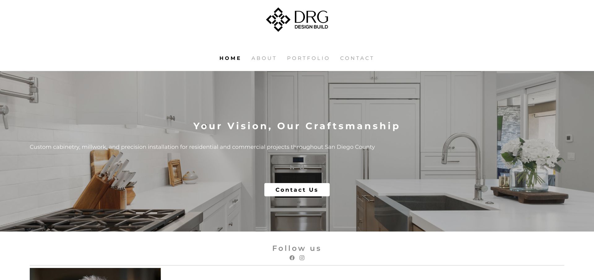
DRG’s current homepage presents cabinets and millwork with a large company mark, widely spaced navigation and a kitchen photograph behind the opening statement. The copy and owner introduction frame the business around custom cabinetry rather than implying that every visible room is a full general-contracting project. A photograph of the owner gives the later story an identifiable person. This makes the site useful as a specialist counterpoint to the full-service remodelers in the collection. Its generous brand treatment is visually clear, though the size of the logo and navigation can postpone practical information about the particular cabinet services available.
What you can learn
Describe the company’s actual contribution to a kitchen. Cabinet design, fabrication and installation are different from managing structural, plumbing and whole-room construction work. The portfolio should identify those boundaries so a homeowner understands who else may be involved, while project images demonstrate the joinery and storage details the specialist can genuinely discuss.
Pros
The cabinetry-and-millwork positioning gives the kitchen imagery a specific service context.
An identifiable owner introduction adds useful human context beyond the company mark.
Cons & considerations
The oversized identity and widely spaced navigation consume much of the opening area.
The distinction between cabinetry scope and a complete kitchen remodel needs explicit explanation.
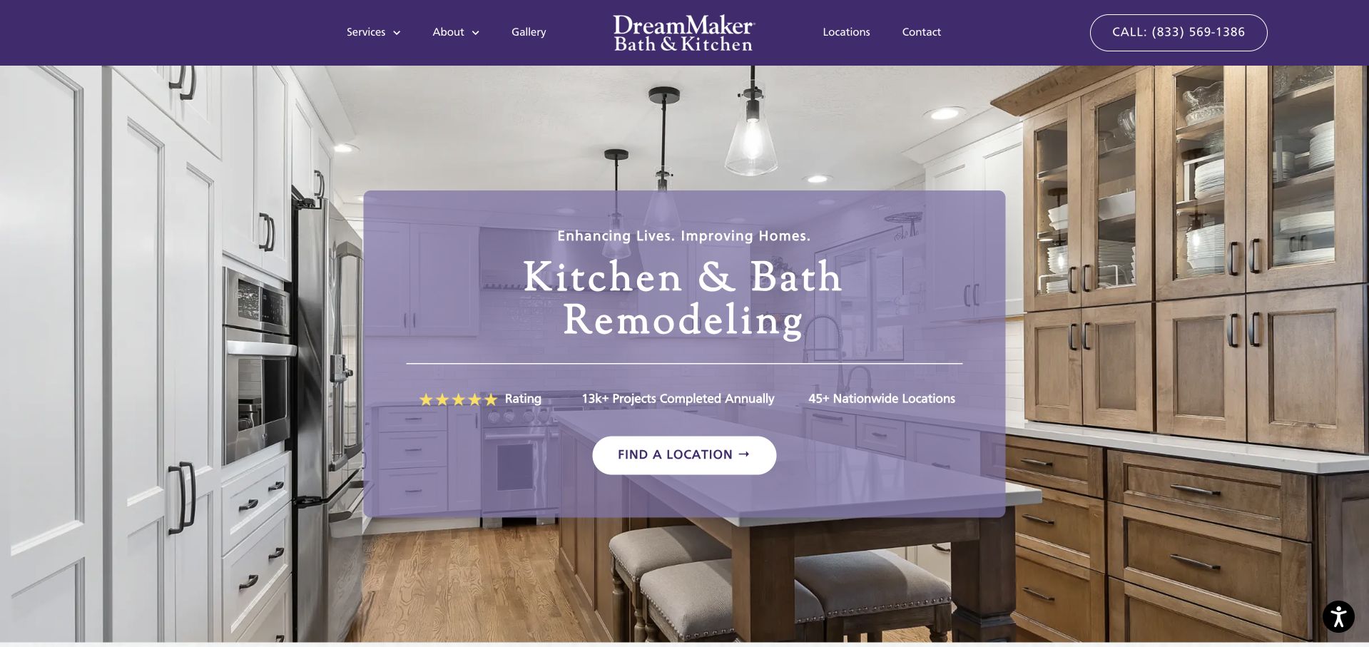
DreamMaker Bath & Kitchen uses a purple identity and a translucent overlay across a large kitchen image. A central white headline introduces the broader remodeling promise, with a location-oriented action leading toward a local team. The site names kitchens and baths rather than presenting an unspecified home-service offer, while process and company content support the network-level introduction. Several numerical claims appear as a visual proof strip; these are the company’s own presentation and not independent measurements in this guide. The design is useful for its consistent palette and explicit local routing, with practical project detail delegated to the relevant service and location pages.
What you can learn
A network homepage should help readers reach the operator responsible for their project, not blur the national brand with a local contractor. Preserve kitchen-service context when visitors choose a location and explain which process information applies across the network. Claims and experience figures need clear scope so they are not accidentally read as the record of every individual location.
Pros
The consistent purple treatment connects navigation, project imagery and the main action.
Location routing acknowledges that kitchen projects are delivered by geographically relevant teams.
Cons & considerations
The broad opening promise provides limited detail about an individual kitchen project.
Network-wide numerical claims require clear attribution and scope to avoid misleading comparisons.
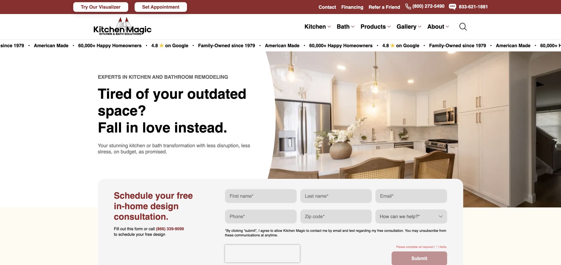
Kitchen Magic divides its opening between bold text and a bright kitchen photograph, with a pale consultation card floating over the lower portion. Red branding and a visible appointment action make the enquiry route unmistakable. Visualiser, service and company navigation provide research options above, while the product proposition emphasises kitchen transformation rather than generic home construction. The layout is useful for studying how a focused specialist can combine an offer, example work and a short form in one screen. Its density also demonstrates the tradeoff: a visitor is asked to make contact while still learning which type of kitchen work is appropriate.
What you can learn
Explain the difference between refacing, replacement and a larger remodel before treating them as interchangeable solutions. Each has different scope and planning implications. A consultation form should help route that question, not imply that a single promotional headline or kitchen photograph establishes the right approach for an unseen home.
Pros
The split layout keeps the main service proposition readable beside the kitchen image.
Research utilities such as the visualiser remain available above the enquiry area.
Cons & considerations
The floating consultation form covers part of the visual project evidence.
Promotion, service copy and lead capture compete within a relatively dense first screen.
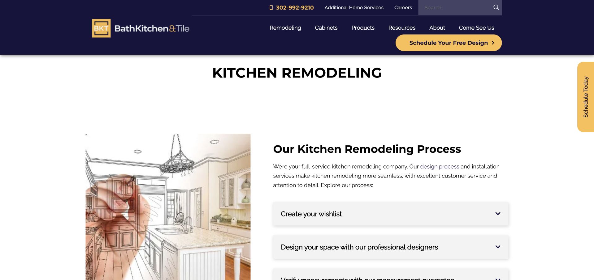
Bath Kitchen & Tile’s kitchen-remodeling page places a clear service heading above a split layout: an illustrated kitchen on the left and a series of process accordions on the right. The first visible steps cover creating a wish list and designing with the company’s team. Navy and gold branding carries through the header, including a distinct design-appointment action. This is a captured service-page view rather than the homepage. It is particularly useful for examining how a company can explain the sequence around a kitchen before presenting more product choices, while keeping product and showroom navigation available above.
What you can learn
A process page should tell readers what they need to prepare and what the company will do next. Use meaningful step labels, readable expanded content and a clear distinction between design appointments and construction commitments. An illustrated room can support the explanation, but completed-project photographs and scope notes should establish how that process translates into actual kitchen work.
Pros
The process steps are directly relevant to beginning a kitchen design conversation.
The split layout separates the illustration from the practical sequence and action.
Cons & considerations
Closed accordions require interaction before readers can assess the full process explanation.
The opening illustration provides less evidence of completed work than a documented project.
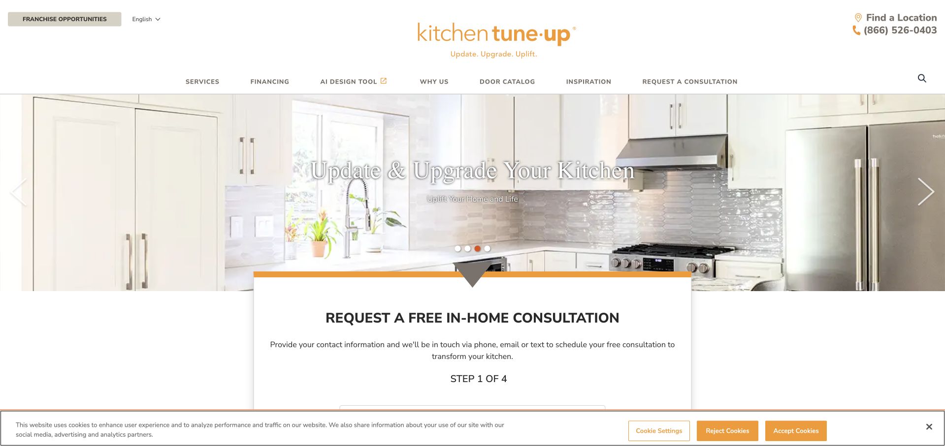
Kitchen Tune-Up centres its brand in a white-and-gold header above a full kitchen photograph. Thin serif lettering and a floating consultation panel give the opening a softer tone than a conventional contractor checklist. The first contact route begins with location information, acknowledging the role of a nearby franchise. The broader navigation offers kitchen-service and project research rather than treating a renovation as a single product purchase. The image makes cabinet style and room context visible together. The design’s useful idea is a focused category identity, although visitors still need clear explanations of the different services and what each does or does not include.
What you can learn
Kitchen improvement is a spectrum, so name the options precisely and give each a real scope description. A postcode field is only a routing step; explain whether the following conversation concerns refinishing, refacing, cabinet changes or a broader remodel. Preserve the visitor’s service choice when moving from the national brand to a local provider.
Pros
A focused kitchen identity makes the category clear before the visitor opens a menu.
Location-based routing acknowledges that consultation and service availability are local decisions.
Cons & considerations
The floating consultation panel covers some of the room and cabinetry photograph.
Thin overlaid type can lose clarity against light kitchen surfaces and details.
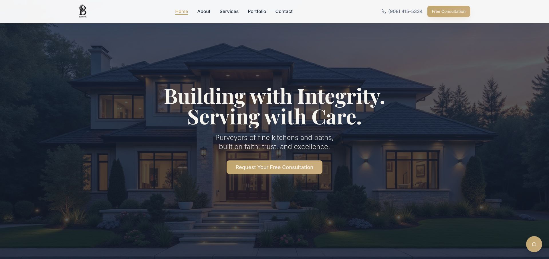
Belvedere Design Build uses a night-time house photograph, white serif headline and gold consultation action to establish a composed residential identity. The navigation is restrained, and the darker image gives the central message a calm stage. Kitchen work appears as part of a broader design-build service rather than as a standalone cabinet product. This makes the site a useful reference for communicating the atmosphere of a practice, but it also means a kitchen-search visitor needs a quick route to the relevant rooms and process. The visual language carries confidence; the supporting content must carry the actual evidence of project fit.
What you can learn
When a homepage leads with the whole property, create a clear kitchen path that narrows the subject. Explain layout, cabinetry, construction coordination and the relationship to adjacent rooms through specific projects. A values-led headline becomes more useful when it is paired with observable process details and an honest description of the work the business takes on.
Pros
The dark image and gold action create a clear, restrained visual hierarchy.
A consistent residential identity connects kitchen work to the wider design-build practice.
Cons & considerations
The opening exterior photograph does not directly demonstrate a completed kitchen.
Broad values language delays practical scope, coverage and process information.
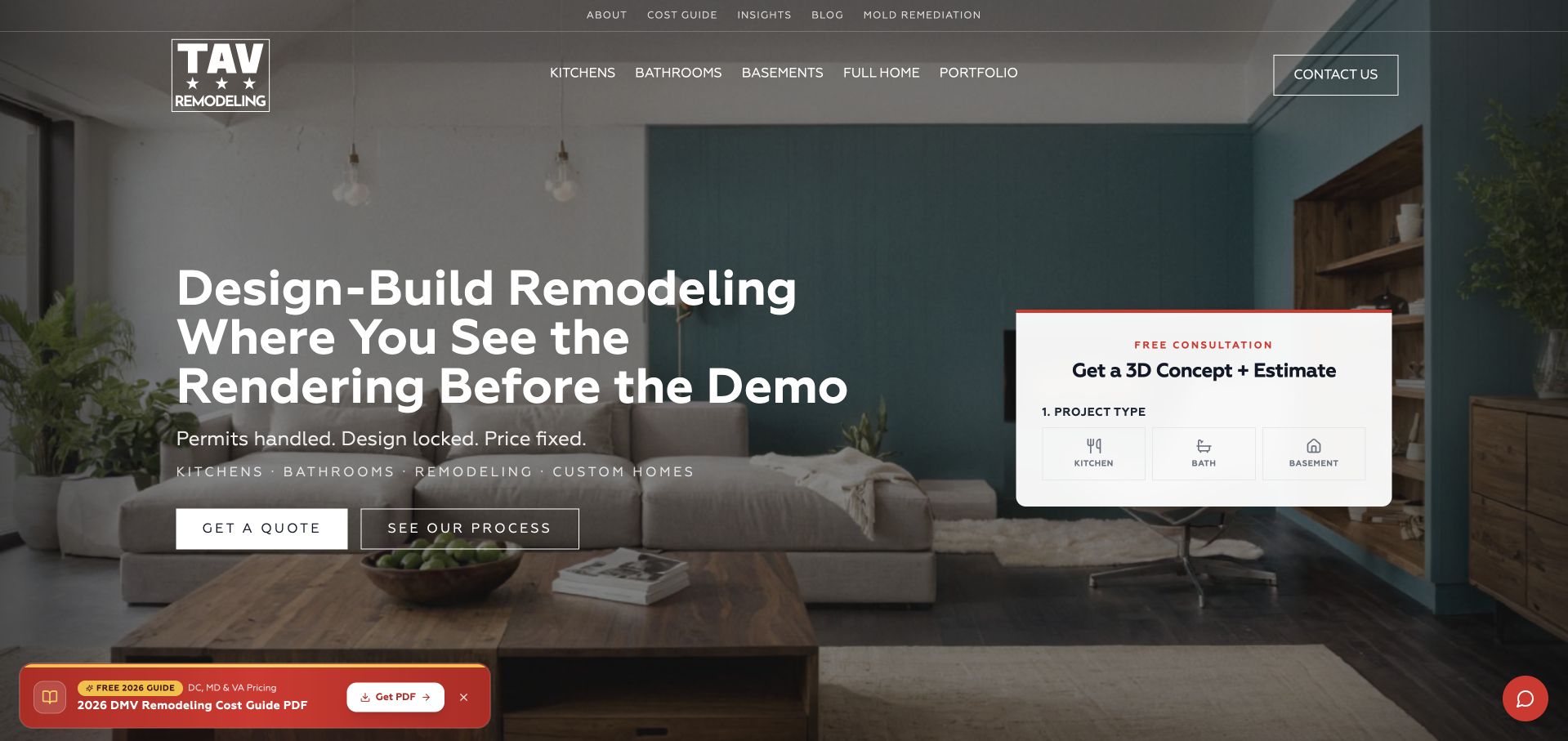
TAV Remodeling places a bright interior photograph behind a large white project message, then uses a separate panel on the right to ask what kind of work the visitor is considering. The project-type choices are visual and specific enough to begin routing an enquiry before a long form appears. A transparent header carries the main navigation and contact utilities. For a kitchen guide, the useful idea is this early distinction between a room remodel and wider home work. The composition is more functional than a purely image-led portfolio, though several overlaid panels require careful hierarchy to avoid obscuring the room.
What you can learn
Ask a project-scope question when it genuinely changes the next step. Kitchen remodeling, additions and whole-home work may need different information and expectations. Let users change their answer and continue browsing without a forced submission, and explain what the company needs to learn before discussing a realistic design and construction plan.
Pros
The visible project-type choices make the initial enquiry more specific than a generic contact form.
A large room photograph keeps the design-build offer connected to tangible residential work.
Cons & considerations
The choice panel covers part of the image and competes with the main headline.
Several transparent header elements need strong contrast against the changing room background.
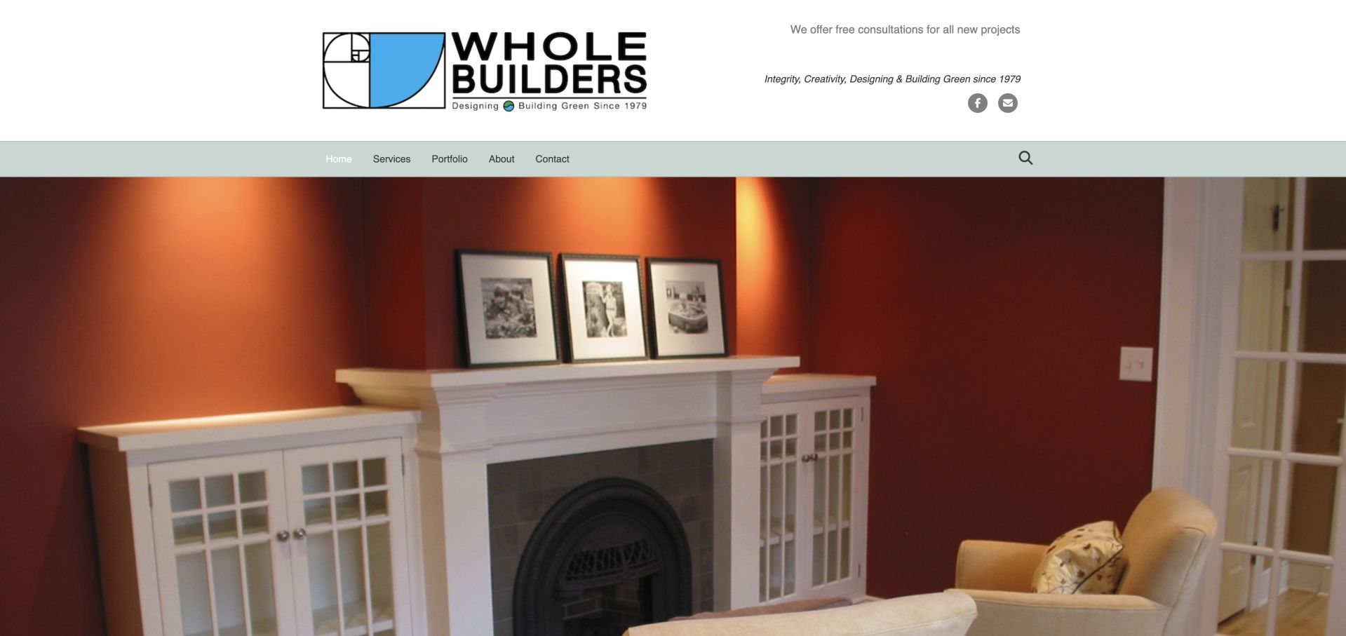
Whole Builders uses an unusually prominent geometric craft-style mark and a muted green navigation band above a warm interior photograph. The identity feels closer to a local building practice than a product retailer. Service categories include kitchens alongside broader home work, and project navigation gives readers a route into completed spaces. The generous header creates a recognisable brand presence, but it also takes room away from the project and introductory explanation. The site is worth studying for the combination of a distinctive mark and practical service categories, while demonstrating why every project and contact destination should be checked carefully before launch.
What you can learn
A memorable company identity should support an understandable kitchen portfolio. Keep service labels direct and make each linked project destination reliable, with a descriptive title and a clear route back to the relevant collection. Avoid leaving staging-domain links in public navigation, because a visually finished homepage is not enough if the research journey breaks after the first click.
Pros
The geometric mark and muted green band give the local practice a distinctive visual identity.
Kitchen work is placed within a readable set of broader remodeling services.
Cons & considerations
The large identity area reduces the visible project and explanatory content above the fold.
Some observed destinations referenced a staging host, making link hygiene an important caution.
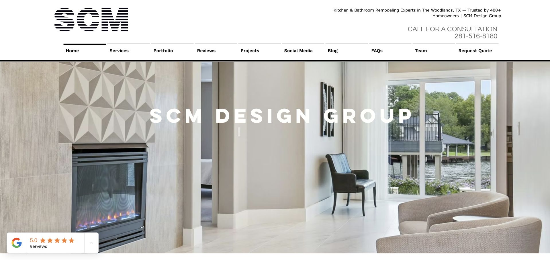
SCM Design Group combines a white header, small utility details and a large interior photograph with widely spaced brand lettering. The phone number is visible before the main image, and the company’s regional identity is part of the upper presentation. The room photograph gives a sense of the broader residential environment rather than isolating one kitchen finish. Project and service navigation let a visitor narrow the subject after the initial impression. The site is useful for its confident image scale, while showing how easily multiple utility rows and large lettering can postpone the practical explanation a kitchen prospect may need.
What you can learn
Use full-room photography to show how a kitchen belongs to the house, then add descriptive project records that identify the actual work. Contact prominence is helpful only when visitors can also establish region, scope and process. Keep the brand lettering readable without allowing it to become a substitute for a plain description of the kitchen services offered.
Pros
Telephone and regional information provide practical context above the large project photograph.
The room image shows the kitchen within a broader residential composition.
Cons & considerations
Several utility rows make the header tall compared with its core navigation.
Large brand lettering provides less project-specific information than a descriptive kitchen introduction.
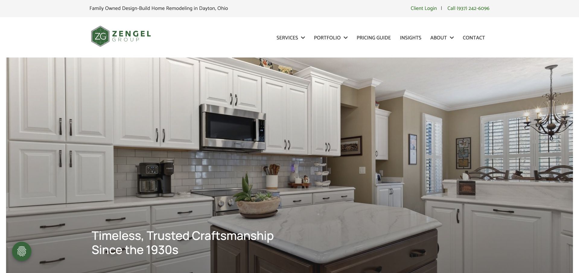
Zengel Group uses a green geometric logo, a white navigation area and a broad project photograph with a restrained white headline. The utility strip identifies a Dayton-area family-owned practice and gives existing customers a separate login route. A pricing guide has a prominent place in the navigation, which is useful for kitchen prospects who are still deciding whether their plans are realistic. Services and portfolio remain distinct rather than being folded into a single gallery. The presentation balances a traditional business story with practical research, although the rotating project image means the homepage may show another room when someone arrives looking specifically for kitchens.
What you can learn
A pricing guide should help define a kitchen project, not promise a universal number. Explain scope, assumptions and what remains unknown until design and assessment. Keep customer-login tasks separate from new enquiries, and provide a stable kitchen collection so search visitors do not depend on whichever image happens to be active in a general homepage carousel.
Pros
The visible pricing-guide route acknowledges an important early kitchen-planning question.
Regional and existing-client utilities establish useful context without a long introductory paragraph.
Cons & considerations
A rotating whole-home portfolio may not immediately show the kitchen category being researched.
The legacy headline is broad and needs specific project detail further down.
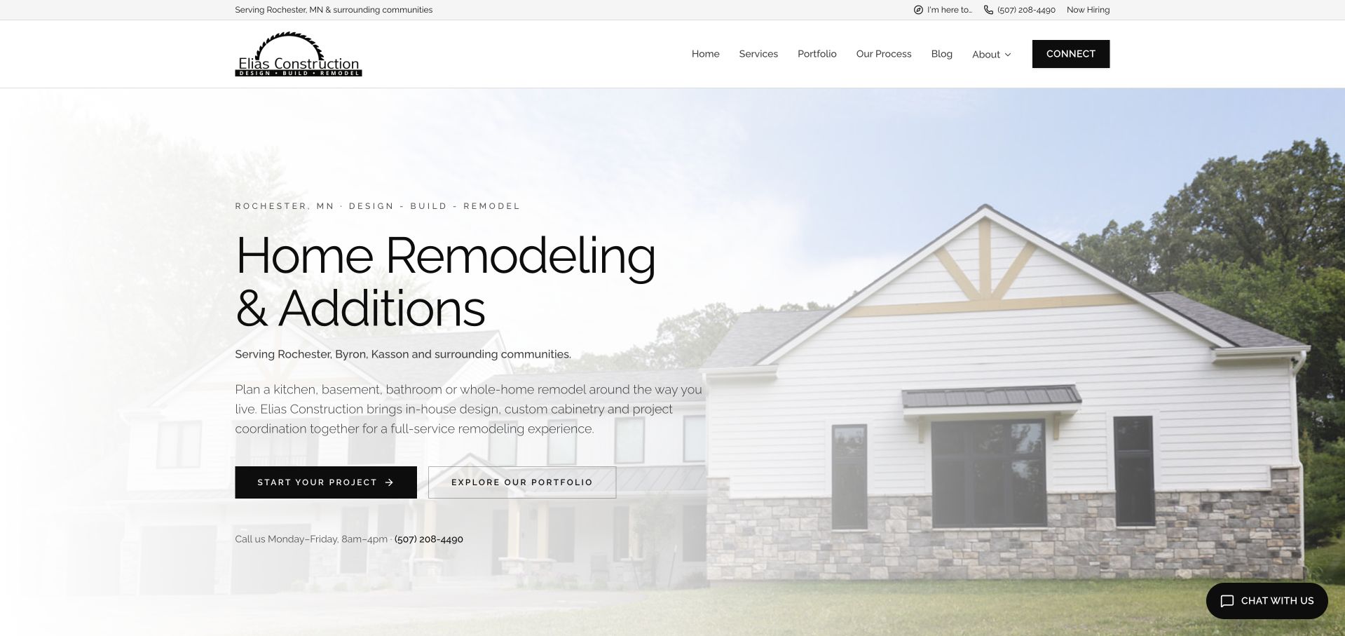
Elias Construction uses a minimal cream-and-black identity over a softly faded house photograph. The opening names home remodeling and additions, then explicitly mentions kitchens, bathrooms, cabinetry and project coordination in the supporting explanation. Rochester-area coverage is visible in both the utility strip and main copy. A solid project-start button is paired with a portfolio route, and weekday phone information appears below. The website also offers an initial audience-choice dialog, distinguishing project prospects, current clients, business partners and job seekers. Once dismissed, the main page is notably direct about what the company does and where it works.
What you can learn
Describe the design-build offer in ordinary language and give different audiences appropriate routes. A kitchen prospect needs a project discussion, while a current client or subcontractor may need something else. Keep that routing optional and easy to dismiss so it does not become a barrier to exploring work, process or service-area information.
Pros
The opening explicitly connects kitchen work with design and coordination services.
Coverage and contact-hour information make the local service context easy to establish.
Cons & considerations
The initial audience-choice dialog can interrupt visitors before they inspect the portfolio.
The faded exterior hero provides less kitchen-specific visual evidence than a room project.
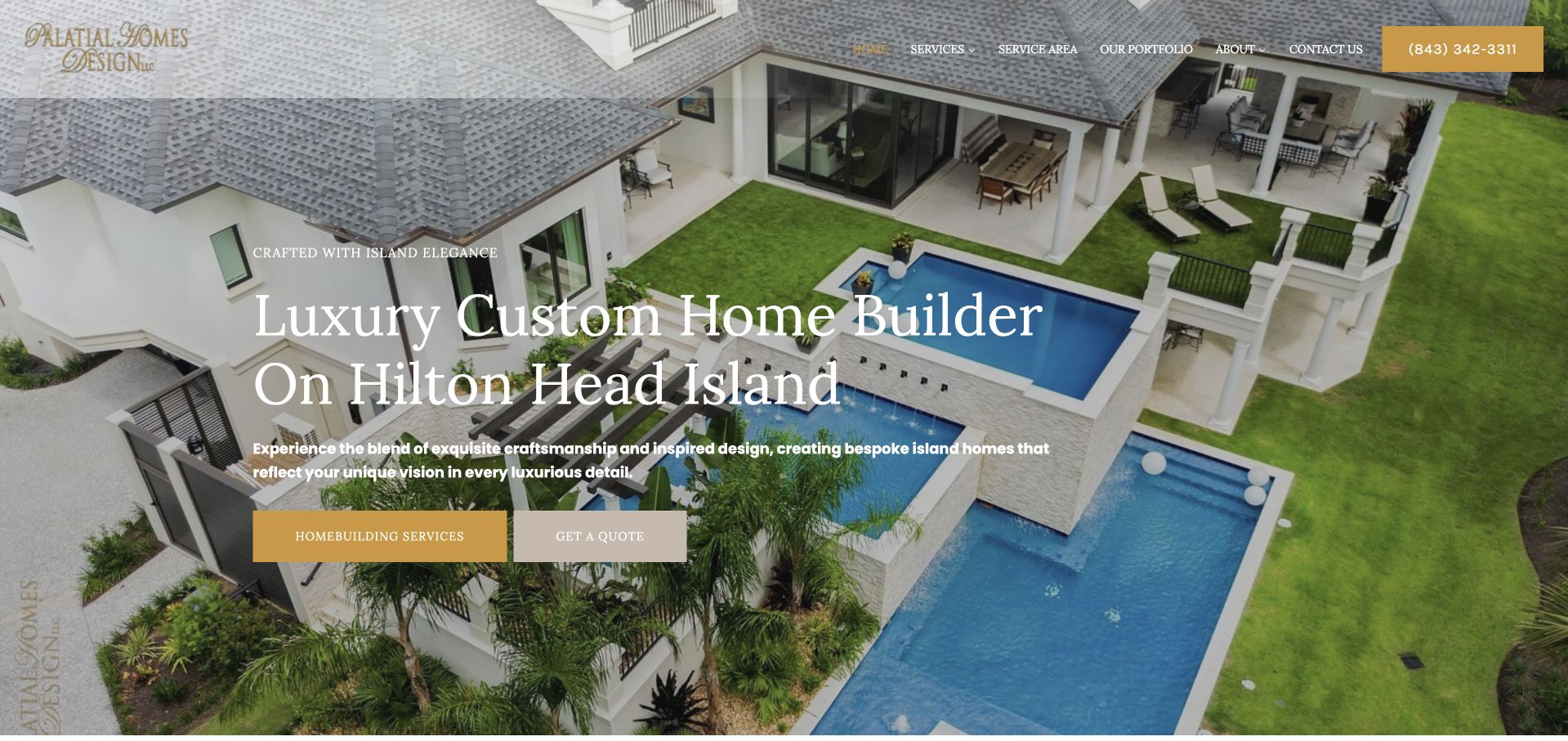
Palatial Homes Design uses a large aerial property image, white serif text and gold accents to establish a high-end residential identity. Its hero includes a regional description and two separate actions for service research and an estimate conversation. The broad property view demonstrates the scale of the surrounding home but does not itself establish the scope of a kitchen project. Navigation supports moving into more specific work and company information. The design is useful for studying how a luxury practice can keep contact options visible without filling the opening with forms, while reminding designers that category-specific evidence still needs a clear place.
What you can learn
Let the main brand communicate the wider practice, then create a kitchen route with real room photographs and descriptive scope notes. Explain whether the company designs, builds, supplies cabinetry or coordinates all of those tasks. An impressive property image should support that explanation, not imply authorship of work or services that the business has not actually documented.
Pros
The regional description gives practical context to the otherwise aspirational property image.
Separate service and estimate actions support both research and contact-ready visitors.
Cons & considerations
The opening exterior image does not directly demonstrate a kitchen remodeling project.
Large luxury-brand messaging delays detailed service and project-fit information.
Kegan is a freelance web designer and developer with 15+ years of experience helping businesses turn complicated website requirements into clear, maintainable digital experiences. He works directly with clients from planning and design through development, launch, and ongoing support.
For kitchen remodeler website design, his development approach focuses on project case studies, design-build process explanations, service areas, and consultation requests. The scope can be a targeted improvement or a complete custom build, with responsive layouts, thoughtful content structure, and integrations chosen around the people using and maintaining the site.
Show 3 other kitchen remodeler website designersHide other kitchen remodeler website designers
Plan a kitchen remodeling website around scope, evidence and expectations
Create service boundaries before writing the sales copy
List the types of kitchen work the business undertakes and where other professionals or suppliers fit into the process. Identify the real service region and any project parameters the team can state honestly. A visitor should understand whether the conversation concerns cabinetry, a room remodel or a larger home project without decoding a broad luxury or craftsmanship headline.
Build project records that explain decisions
For each kitchen, save broad location, original priorities, scope, design contribution and image permissions. Describe a few decisions that a homeowner can understand: a changed room relationship, different storage or a revised island arrangement. Keep private addresses and client details out of public records unless expressly approved. Credit collaborators appropriately and avoid presenting supplier photographs as your own completed work.
Design the discovery journey with the team who answers it
Decide which initial details are needed to route a kitchen enquiry, such as region, broad scope, desired timing and contact preference. Explain how budget ranges are used and allow uncertainty where the visitor genuinely does not know. State the next step without promising an assessment or response time the team cannot maintain. Separate current-client support from new-project and trade-partner messages.
The editing job behind the design
Use structured content to maintain a credible kitchen portfolio
A practical content model includes projects, room types, services, locations, process stages, team members and planning resources. Relate those records so a kitchen can appear in a room collection and a regional page without copying the same narrative into multiple places. Test editing with real project assets and captions before committing to a platform or page-builder system.
Project photography should load efficiently and remain useful when cropped at different screen sizes. Give galleries descriptive controls and ensure a consultation form works without a third-party chat widget. The visible public stack does not reveal how a remodeler manages project documents, client communications or estimates, so those business needs require their own implementation brief.
Our WordPress website examples offer a separate look at publishing approaches. A visible platform label is evidence for that named page, not a guarantee that the same system will suit your requirements.
Before the public launch
Kitchen remodeler website brief checklist
State the actual design, cabinetry, construction and coordination services offered.
Distinguish a kitchen specialist from a broader remodeler or new-home builder.
Name the genuine service region near the opening and in the enquiry journey.
Give each kitchen project a descriptive title, broad location and concise scope.
Explain the original brief and a few meaningful decisions beyond finish selections.
Record photo permissions and accurately credit designers, builders, suppliers and photographers.
Provide process and cost context with clear assumptions rather than universal promises.
Describe the first call, consultation or assessment and what the homeowner should prepare.
Keep room-level portfolio browsing available without requiring a lead form.
Separate prospective, current-client, supplier and employment enquiries where appropriate.
Test gallery controls, keyboard focus, image contrast and mobile project navigation.
Assign maintenance responsibility for services, team information, resources and contact expectations.
These checks are a project checklist, not a performance, legal, security, or accessibility certification. Test real journeys with the people responsible for the website before making claims about the result.
Sources & editorial method
How this collection was selected and reviewed
We inspected the linked official public sites and directly captured their visible pages. Thayer’s official about page establishes its family-owned Corvallis-area context for the editorial opening selection. Reviews distinguish cabinet specialists and broader design-build practices where relevant. The W3C forms guidance supports clear enquiry design. The list is not an independent assessment of building work, pricing, licensing or private technology systems.
Each example links to its actual source page. Screenshots are direct browser captures with their own capture dates; moving imagery, announcements and live designs can change. The notes describe observable design choices and conditional tradeoffs, not measured traffic, conversion results, service quality, or accessibility conformance.
Technology labels use public page metadata, asset evidence, or explicitly cited platform documentation. Platform documentation is not a complete current deployment audit. A component reference may be legacy or unused; it is not a complete backend inventory. Unknown stacks are omitted. These sites are editorial examples, not our client portfolio.
Written, Edited and Curated are separate editorial records, not timestamps advanced by a rebuild. Website designs and imagery belong to their owners. See our editorial standards or suggest a correction.
Questions worth asking
Kitchen Remodeler website design questions
Should a kitchen remodeler lead with a form or a portfolio?
Choose according to the visitor’s task, but keep both research and contact possible. A contact-ready visitor needs an obvious next step; a newcomer needs service, location and project evidence first. A large form should not be the only way to learn whether the business undertakes the intended work.
How much detail belongs in a kitchen case study?
Explain the starting brief, broad scope and a handful of important design decisions, supported by accurate photographs. Distinguish the company’s contribution from collaborators’ work. Avoid publishing private household information, and do not imply that the cost or approach transfers unchanged to another home with different conditions.
Should kitchen cost information be public?
Useful context can help people plan if its assumptions and limitations are clear. Explain what a range includes, what may change and when assessment is needed. Do not label an early conversation or visualiser result as a reliable project quote, and maintain the information when the business changes its offering.
Do bathroom and kitchen services need separate pages?
Usually they answer sufficiently different questions to justify distinct content when both services are genuine. Keep the company identity and process consistent, but use room-specific projects, scope explanations and planning questions. Avoid repeating the same paragraphs with only the room name changed.
Can a kitchen site use photographs of whole homes?
Yes, as a clearly described company introduction or wider project context. A dedicated kitchen collection still needs relevant room evidence. Caption the company’s actual contribution and avoid implying that a dramatic property image proves responsibility for every part of the house or the surrounding landscape.
Define the kitchen service, document real work and explain the first conversation. Those foundations create a more useful brief than copying a luxury hero image or another remodeler’s claims.