Best Financial Advisor Websites of 2026 (29 Real-World Examples)
Make the people, service model, fees and next step clearer without promising financial outcomes.
A financial advisor website should make a sensitive professional relationship easier to evaluate. Visitors need to understand who the firm serves, what advice or management it provides, how the relationship is paid for and how to verify the people involved. A calm photograph or a confident trust statement cannot answer those questions by itself.
This collection includes local planning practices, national wealth firms and businesses with distinct membership or specialist-audience models. Compare the service and relationship information as carefully as the typography. A firm focused on a specific professional life stage may need a different opening from a family-office business. Do not copy another firm’s audience, fee wording or professional designations unless they accurately describe your own practice.
These are website-design reviews, not financial advice or recommendations to appoint an adviser. We have not assessed investment performance, verified every registration or tested private client portals. Lifestyle imagery is not proof that pictured people are clients. Ratings, business figures and testimonials require their own dates, scope and disclosures; none should be generalised into a promise about a future client’s experience.
Before the examples
What makes good financial advisor website design in 2026?
Explain the actual relationship
Distinguish planning, investment management, education, coaching and other services rather than calling all of them wealth advice. State the intended audience and any meaningful fit criteria. Explain how fees are described and where current detail can be found. A visitor should understand whether they are requesting an introductory conversation, a limited initial service or an ongoing paid relationship before submitting personal information.
Make people and verification easy to find
Show real professionals, current roles and the firm’s published identity. Provide relevant disclosure and verification routes without implying that registration or a designation guarantees results. For US investment-adviser research, the official Investment Adviser Public Disclosure service is a useful verification destination. The website should make the appropriate record easy to identify; this design collection does not perform that professional or regulatory assessment on the reader’s behalf.
Separate trust evidence from promises
Keep the date and definition near business figures, and retain the source and context for ratings or awards. Label representative photography honestly and obtain permission for client quotations. Do not turn retention, assets under management or a publication logo into an implied investment outcome. Different proof types deserve different explanations; a testimonial, an authored article and a regulatory disclosure are not interchangeable.
The collection · 29 examples
29 financial advisor websites worth studying
Study how these sites explain the service, people and first step. The first selection highlights a smaller regional practice, while the wider examples show contrasting audience, pricing, media and national-office approaches. The collection is an editorial design reference, not a ranking of advisers or an endorsement of financial services.
SK Wealth combines a blue identity, a quiet photographic opening and a literal financial-advisor label. The main message focuses on decisions and life intentions rather than showing a performance chart. A team action provides a human next step, while a separate utility bar distinguishes portfolio access, planning access and file transfer for existing clients. The supporting page explains planning and investment services and introduces the founder, giving the smaller regional business a recognisable person behind the brand. The opening film is softer and less specific than a real team portrait would be. Service terms and fee-related statements also need supporting detail rather than being treated as self-explanatory assurances.
What you can learn
Give a regional adviser a clear human route and keep existing-client systems separate from marketing enquiries. Explain planning, investment management and fees in ordinary language, while leaving detailed personal documents to an appropriate secure channel.
Pros
The team route makes a smaller regional firm feel like an identifiable working relationship.
Distinct portfolio, planning and file-transfer controls separate returning-client tasks from prospective enquiries.
Cons & considerations
A soft moving background provides less concrete evidence of the team than a direct portrait or working scene.
Fee and fiduciary language needs clear scope and supporting documentation rather than being used as a blanket trust badge.
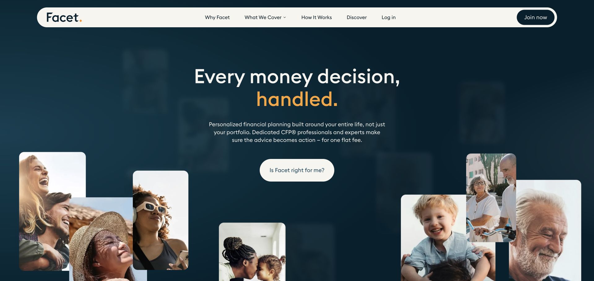
Facet uses a dark teal field, a short central proposition and a collage of people at different life stages. The supporting paragraph names financial planning, dedicated professionals and a flat-fee model, making the offer more concrete than a general lifestyle promise. A suitability-focused action is useful for visitors who are not ready to book an adviser immediately. Ratings appear with dates and a nearby disclosure route, acknowledging that recognition needs context. The collage remains representational rather than evidence that the pictured people are clients. A broad all-life proposition also needs detailed scope and pricing information so a visitor understands what the relationship includes and what remains outside it.
What you can learn
A life-centred financial homepage should still explain its service model before asking for commitment. Keep ratings connected to dates and disclosures, and distinguish representative lifestyle imagery from actual client testimonials or documented experiences.
Pros
The supporting copy names the planning relationship and fee model close to the main proposition.
Dated ratings and a disclosure route provide more context than unexplained stars or publication logos alone.
Cons & considerations
A large lifestyle collage should not be interpreted as evidence that pictured individuals are clients.
A broad planning promise requires clear scope, pricing and exclusions on the next pages.
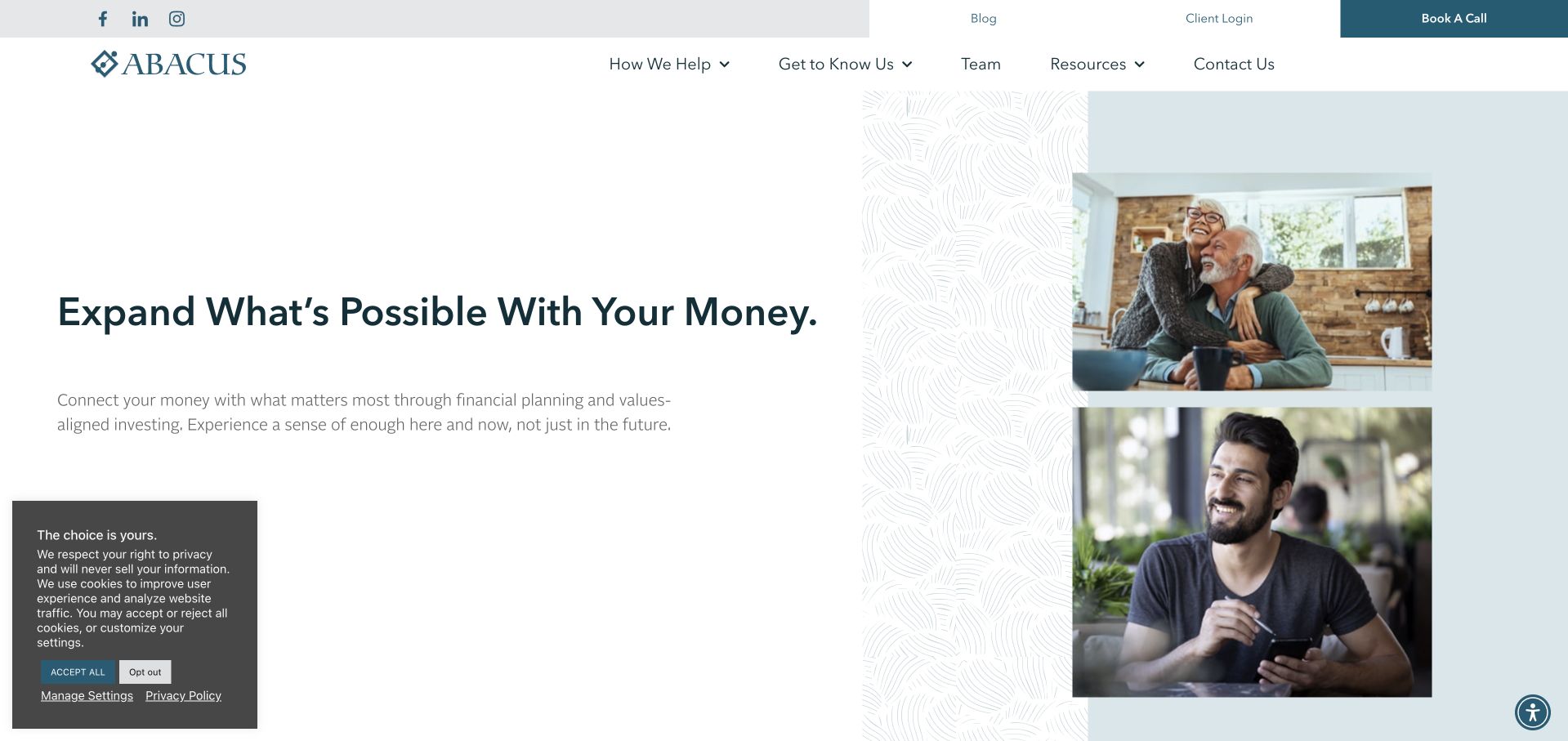
Abacus Wealth Partners uses a white and pale-blue opening with a substantial headline and a small group of lifestyle photographs. The text connects money with values and everyday decisions, while a simple get-started route provides the main action. Team and help-oriented navigation allow visitors to investigate the people and services before making contact. This is useful for a planning firm that wants to avoid presenting investment performance as its only story. The page’s spaciousness creates a calm tone, though the text can feel visually detached from the action on a large display. Values language also needs specific service explanations so that the relationship is understandable beyond a reassuring emotional proposition.
What you can learn
A values-led financial brand should connect its emotional message to concrete planning services and identifiable people. Use calm space deliberately, but keep the next step and the commercial relationship close enough that the opening does not become only atmosphere.
Pros
The written proposition gives financial planning a broader context than portfolio performance alone.
Team and help-oriented routes let visitors inspect people and service scope before starting an enquiry.
Cons & considerations
Very generous spacing can separate the main action from the proposition and lengthen the first task.
Values-based language requires specific service and fee information to make the advisory relationship concrete.
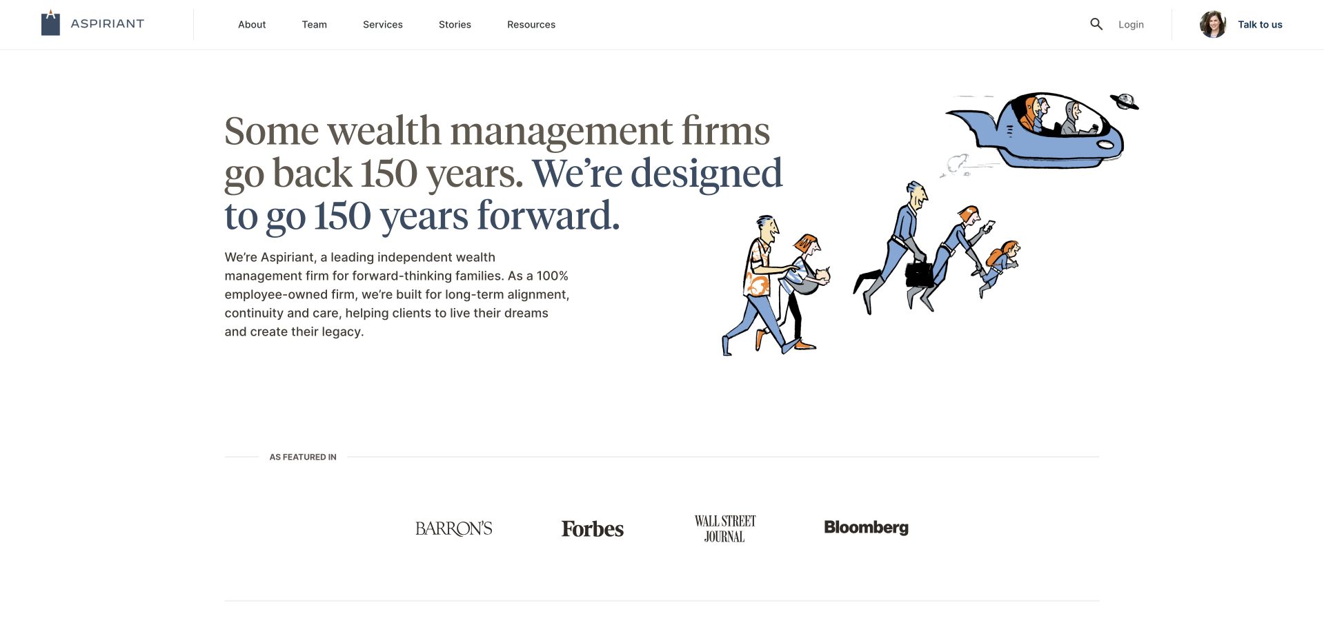
Aspiriant pairs a large serif introduction with a distinctive illustration of people moving from past to future. The image supports the multigenerational idea without looking like a conventional stock family portrait. A visible adviser headshot in the contact control adds a human counterpoint, while team, services, stories and resources remain separate navigation choices. The supporting copy explains the firm’s ownership model and broader wealth-management approach. This is useful as a study in presenting continuity through design, not as proof of future longevity. The very long headline needs careful editing on smaller screens, and the ownership and service claims still require current documentation and clear explanations of the client relationship.
What you can learn
An illustration can explain a multigenerational idea without implying that models are real clients. Pair the concept with identifiable people and current service information, and avoid treating a long-term brand promise as evidence of guaranteed continuity or results.
Pros
The original-style illustration supports the continuity theme without relying on a generic affluent-family photograph.
A visible adviser headshot makes the contact route feel more personal within a larger wealth-management identity.
Cons & considerations
The long serif headline creates a demanding line-length and mobile-wrapping challenge.
Ownership and longevity positioning need current supporting information rather than being read as guarantees.
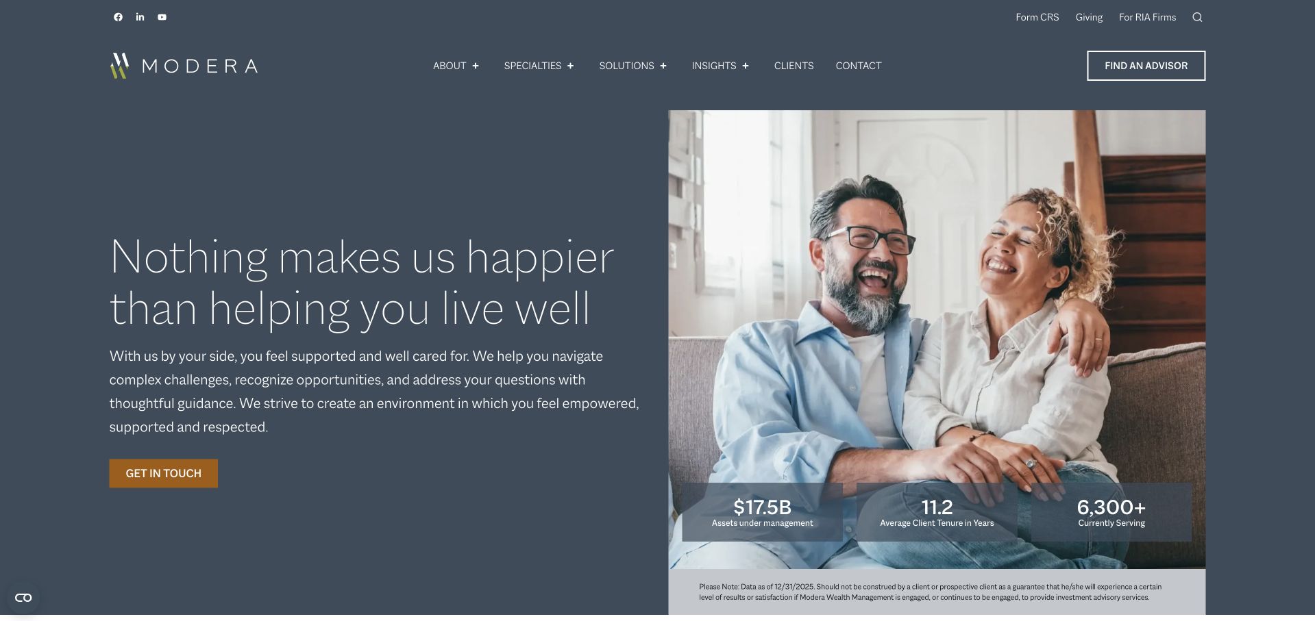
Modera uses a slate-blue field, restrained white type and a large lifestyle photograph to create a calm opening. The main action is simple, while a compact set of business figures sits over the image with a dated explanatory note nearby. That context is important: assets and client-tenure figures are not a promise about a future client’s experience. The header distinguishes specialties, solutions, insights and existing-client information, giving a broad advisory offer a useful structure. The emotional headline still needs a literal service explanation in the next layer. A visitor should not have to infer investment management, planning scope or fee arrangements from an image of a happy couple.
What you can learn
If a financial site uses business statistics, keep their date, definition and limitations close by. Let the figures support a clear service explanation rather than imply investment performance, satisfaction or suitability for every prospective client.
Pros
Business figures are presented with a visible date and explanatory context rather than as unsupported decorative counters.
Specialty, solution and existing-client routes provide a clear structure for a broad advisory relationship.
Cons & considerations
The emotional headline and lifestyle image do not independently explain the precise planning or investment service.
Thin light typography needs reliable contrast and readable sizing when the split layout stacks on mobile.
Ellevest uses a cream field, dark serif typography and a green action to create a quieter alternative to a conventional blue financial-services site. A short introduction explains the relationship in terms of goals and values, while wealth management, financial planning and team routes are explicit in the header. A real conversational scene follows beneath the text, keeping the written proposition separate from the photograph. The page also places context around client reviews rather than presenting quotations without explanation. This is useful for a firm balancing a personal voice with a professional service. The calm tone still needs clear commercial scope and should not make a values-led promise look like an assurance of a particular financial outcome.
What you can learn
Use a calm editorial identity to make an advisory service approachable, then name the service routes plainly. Keep review context close to quotations and explain scope and fees without relying on a reassuring tone alone.
Pros
The header distinguishes wealth management, financial planning and team discovery in clear language.
Text and conversational imagery occupy separate areas, preserving the readability of the main proposition.
Cons & considerations
A goals-and-values introduction needs specific service and commercial details before a visitor can judge fit.
Client quotations require their accompanying context and should not be generalised into expected financial outcomes.
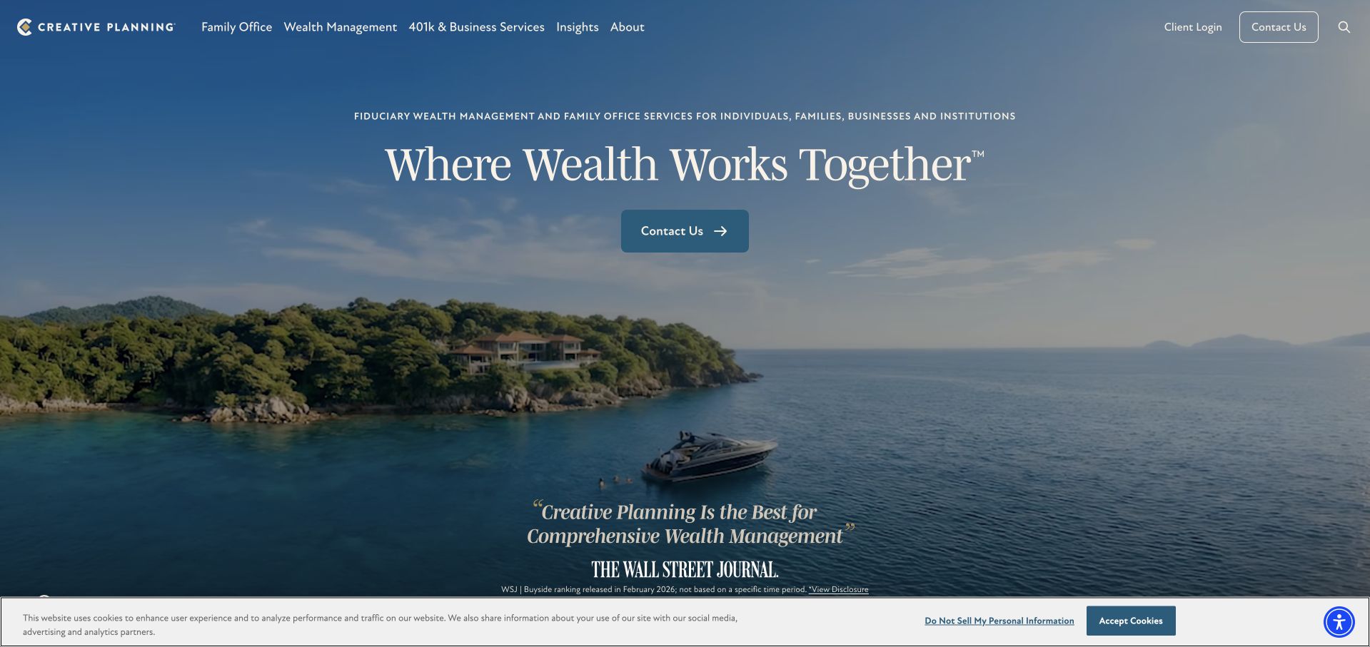
Creative Planning uses a broad coastal scene, an elegant central headline and a literal service description identifying wealth management and family-office audiences. A contact action is clear, while family office, wealth management and business-service navigation expose meaningful differences in the offer. Recognition appears prominently but with a nearby date and disclosure route. This is useful for studying how a large advisory brand can present several services as a coordinated relationship. The aspirational landscape does not explain the actual team or engagement. Prospective clients still need practical information about the services relevant to them, the legal entities involved and the commercial arrangement rather than assuming every service is included by default.
What you can learn
A coordinated wealth proposition should distinguish the services and entities behind it. Keep recognition connected to its date and methodology, and use the next layer to explain what is actually included in a particular client relationship.
Pros
The literal service line gives the aspirational landscape a concrete wealth-management and family-office context.
Prominent recognition retains a nearby disclosure route instead of appearing as an unexplained endorsement.
Cons & considerations
An affluent lifestyle scene does not provide evidence about the actual team or service a client would receive.
A broad coordinated offer needs explicit scope and entity information so visitors do not assume all capabilities are bundled.
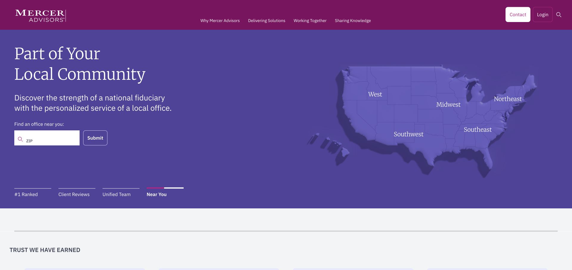
Mercer Advisors uses a purple and burgundy identity with a carousel that alternates recognition, team, review and location messages. The observed location view includes a US map and a ZIP-based office search, turning a national brand into a practical local-discovery task. A separate explanatory area carries the context for testimonials and rankings. This is useful because different proof types should not be compressed into one unexplained strip of logos. The changing feature can still make the first impression inconsistent, and office search needs to lead to current local people rather than only a generic form. National scale should not imply that every office provides the same service mix or relationship model.
What you can learn
For a national adviser, make local discovery a first-class task and keep different proof types properly contextualised. Carry office and adviser context into the enquiry rather than losing the user’s regional choice at the final form.
Pros
The map and ZIP search provide a practical route from a national identity to local office information.
Separate disclosure text recognises that rankings and client reviews require different kinds of context.
Cons & considerations
A rotating hero can make the first message inconsistent and hide a useful location task behind another slide.
A national brand needs clear local service and contact information rather than implying every office is interchangeable.
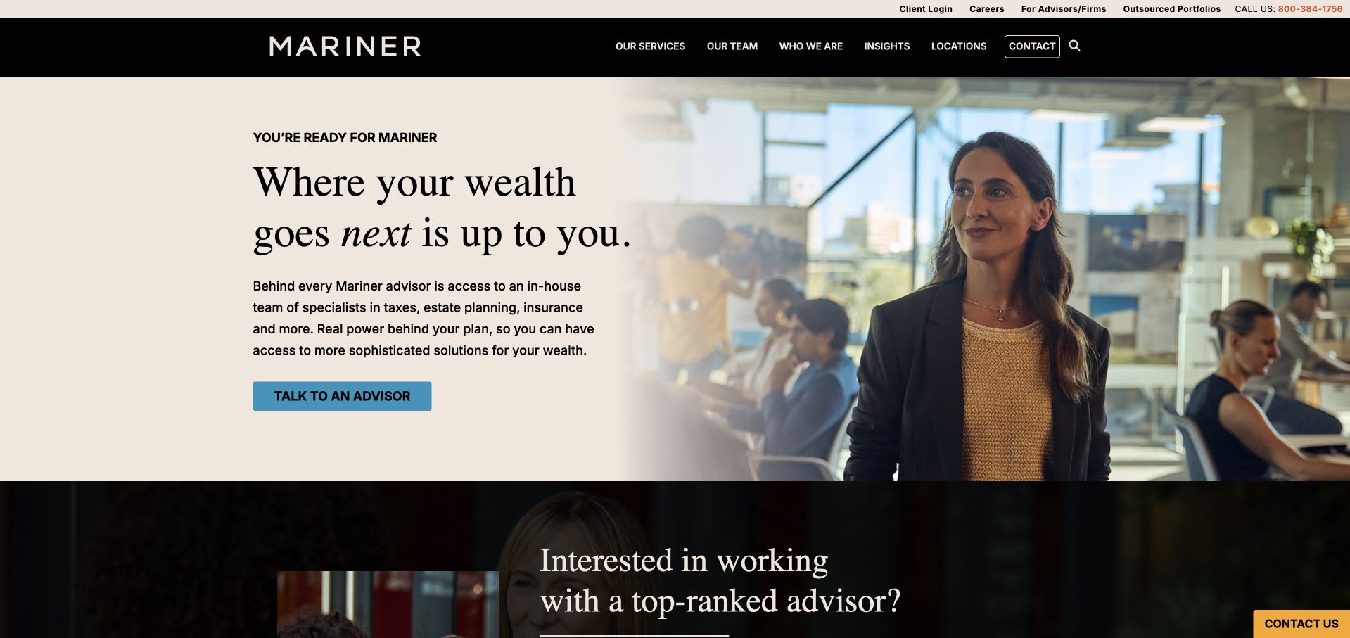
Mariner combines a warm neutral text panel with a large workplace photograph and a simple blue adviser-contact action. The supporting paragraph explains access to specialists in areas such as tax, estate planning and insurance, giving the broader wealth proposition some practical detail. The header separates services, team, company, insights and locations, while existing-client and adviser-business routes sit in a utility layer. This is useful for a firm with several audiences and a wider service network. It also creates a scope question: access to specialists does not necessarily mean every service is included in every engagement. Recognition material below the opening needs its definitions and dates preserved rather than being repeated as an independent quality judgement.
What you can learn
When a wealth firm promotes specialist access, explain how that access works within a client engagement. Separate prospect, existing-client and adviser-business tasks, and keep awards contextual rather than allowing them to imply service or performance guarantees.
Pros
The supporting paragraph names specialist areas instead of leaving the broader wealth promise entirely abstract.
Utility and primary navigation distinguish several audiences within a large advisory business.
Cons & considerations
Access to specialists needs clear scope and commercial explanations rather than an assumption that every service is bundled.
Aspirational recognition material requires its original context and should not substitute for practical engagement details.
EP Wealth Advisors puts a substantial written proposition beside a family photograph, using blue typography and an orange adviser action. Unlike a very short lifestyle slogan, the opening names planning, retirement, investment, estate and tax-related services. That makes the service breadth easier to recognise before entering the navigation. The same detail creates density: the hero includes a headline, a paragraph, several bullets and an action, so it needs careful editing on mobile. The family image is representational rather than evidence of a client relationship. Published business figures further down should retain their dates, definitions and disclosures rather than being interpreted as investment performance or suitability.
What you can learn
A detailed advisory introduction can help users understand scope, but prioritise the information rather than placing the whole service catalogue in the hero. Keep the photograph secondary and preserve the context around business figures and professional claims.
Pros
The opening names several planning dimensions instead of relying solely on an emotional wealth-management slogan.
The orange adviser action is visually distinct from the calmer blue text and imagery.
Cons & considerations
A headline, paragraph and multiple bullets make the opening dense and demanding on smaller screens.
Lifestyle imagery and business figures must not be mistaken for client evidence or promised financial outcomes.
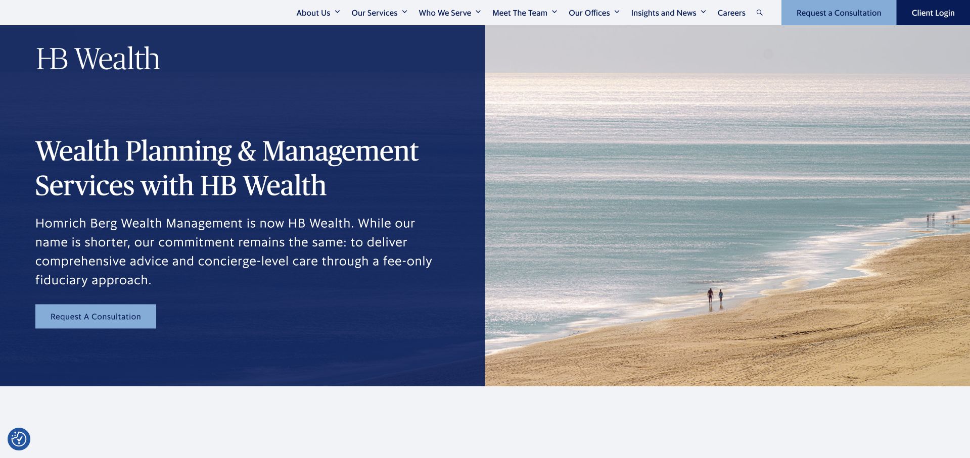
The former Homrich Berg destination now opens as HB Wealth, and the main paragraph explains the naming change directly. A navy text panel sits beside a quiet coastal image, with a consultation action close to the explanation. The header exposes services, audiences, team, offices and client login as separate tasks. This is useful as a continuity pattern: a returning visitor does not have to guess whether the old name and current site belong together. The calm landscape still contributes less practical information than the text. Rebrand messaging should also direct existing clients to current people and systems, and should not imply that every relationship, entity or service arrangement is unchanged without explanation.
What you can learn
Explain a financial-business rebrand where visitors first encounter the new identity. Preserve clear routes to people and client systems, and distinguish a naming update from any change in the actual advisory relationship or service scope.
Pros
The opening explicitly connects the older Homrich Berg name with the current HB Wealth identity.
Service, team, office and client-login navigation separates several important visitor tasks.
Cons & considerations
The coastal image adds atmosphere but little evidence about the people or services involved.
Continuity language needs current entity and relationship information rather than an assumption that all arrangements remain identical.
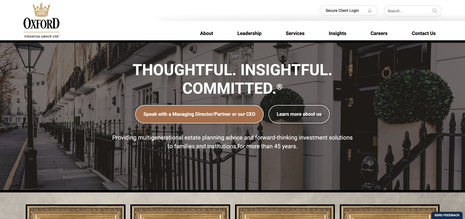
Oxford Financial Group uses a traditional crest-style identity, a large architectural streetscape and an unusually explicit invitation to speak with senior leadership. The supporting line identifies multigenerational planning and investment work for families and institutions, making the intended relationship clearer than the three-word values headline alone. A secure-client-login route is separate from the marketing navigation. This is useful for a firm whose prospective clients may be evaluating access and responsibility as well as a service list. The opening contact action is long, however, and the traditional imagery does not explain the delivery team. Published scale figures and long-history statements need dates and definitions rather than being used as proxies for future results.
What you can learn
If senior access is a genuine part of an advisory relationship, describe it clearly without making the action label unwieldy. Keep secure client tasks separate and support history and scale statements with current context and practical team information.
Pros
The senior-contact invitation makes access and responsibility unusually explicit in the opening view.
The service line identifies families and institutions rather than leaving the intended audience unspecified.
Cons & considerations
A very long primary action label can become awkward to scan and wrap on smaller screens.
Traditional imagery and scale statements do not explain the actual team, fees or scope of a future relationship.
Rebalance uses a dark teal photographic opening with a large serif life-stage message. The header provides services, company information and an adviser-meeting route, while the following sections distinguish wealth management, planning and specialised work. This is useful for showing an ongoing advisory relationship without making a portfolio chart the central design device. The emotional headline still needs the service structure beneath it to become practical. The site also demonstrates the friction of an early newsletter popup, which interrupted the first review view before a clean return capture. Visitors should be able to understand the relationship before being asked to subscribe, especially when they may be comparing sensitive financial-service decisions.
What you can learn
A life-stage proposition should lead quickly to concrete service and relationship information. Keep newsletter signup optional and secondary so that the main adviser-discovery task is not interrupted before the visitor has assessed fit.
Pros
Separate wealth-management, planning and specialist routes make the broader relationship easier to investigate.
The teal and serif visual system creates a calm identity without relying on investment charts.
Cons & considerations
The emotional opening needs clear scope and commercial detail to become useful for a real service comparison.
An early newsletter popup can interrupt research before a visitor has chosen to engage with the firm.
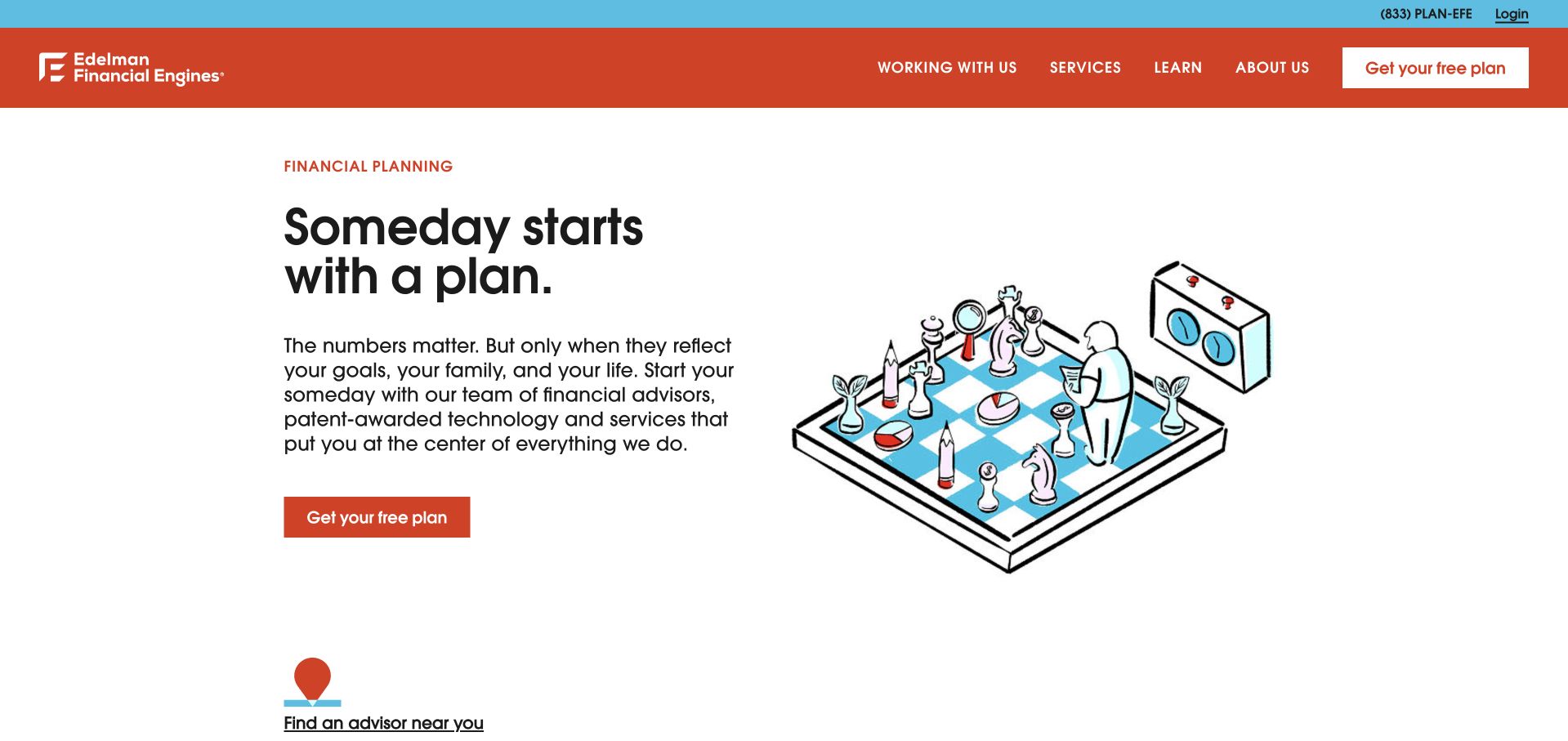
Edelman Financial Engines uses a white opening, strong red navigation and a simple illustrated planning scene. The headline and supporting paragraph focus on connecting numerical decisions with life goals, while a clearly labelled first-step action is repeated in the header and hero. A location route and expandable service information appear below, giving the broad proposition more structure. This is useful for making an advisory service feel less intimidating without relying on a luxury lifestyle photograph. The action’s promise needs a clear explanation of what happens next and what is included. A friendly illustration should not make a service comparison feel simpler than the actual scope, fees and relationship require.
What you can learn
Use approachable illustration to reduce visual intimidation, then explain the first step precisely. Visitors should understand whether they are requesting an introductory conversation, receiving a limited initial plan or beginning a paid ongoing relationship.
Pros
The illustrated scene communicates planning without implying that stock models are real clients.
A direct action and nearby location route provide practical alternatives to reading the entire homepage.
Cons & considerations
A first-step offer requires clear scope so a visitor understands what is included and what follows.
A broad approachable proposition still needs detailed service, fee and adviser information before a meaningful comparison.
The former Buckingham Strategic Wealth address now reaches Focus Partners. The reviewed homepage uses a dark navigation, large lifestyle imagery and a carousel of wealth-management, recognition and event messages. Adviser and location discovery are visible in the utility layer, helping a larger combined business retain practical routes to people. Recognition includes a nearby explanation of its date and basis rather than standing alone as an unexplained logo. This is useful as a consolidation pattern, but older references need explicit handling so visitors understand which current organisation they have reached. A moving feature also changes the first message, and neither an award nor a webinar explains the exact service relationship a new client would enter.
What you can learn
When older advisory brands consolidate, keep the current identity clear and maintain routes to relevant people and offices. Treat recognition and events as separate content types, with scope and dates preserved rather than used as general assurances of quality.
Pros
Adviser and location discovery give a larger combined brand practical routes to local people.
Recognition is accompanied by date and methodology context rather than appearing as a bare endorsement.
Cons & considerations
Visitors arriving from an older practice name need explicit continuity and current-entity information.
A carousel of events and recognition can delay a stable explanation of the actual advisory service.
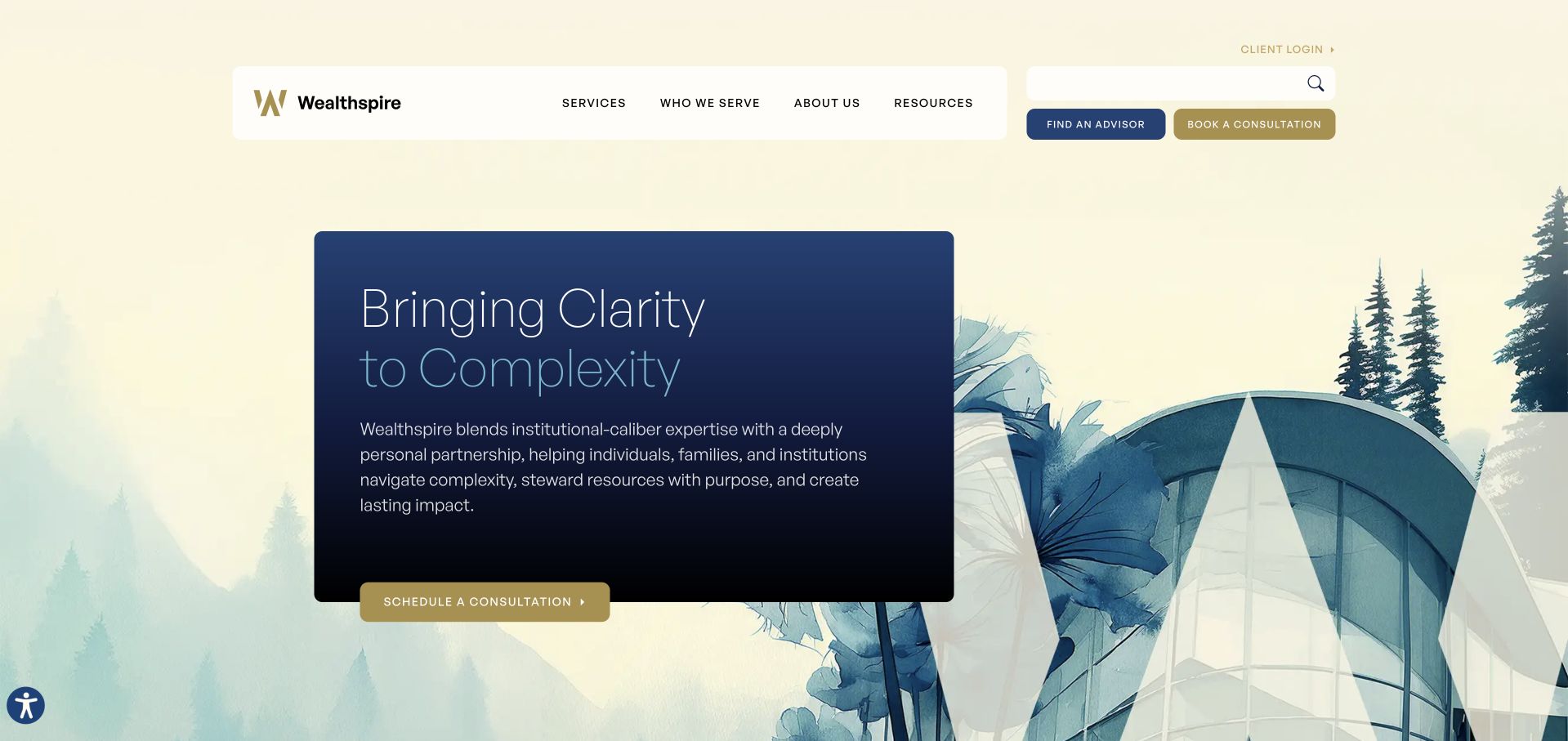
Wealthspire uses a pale illustrated landscape with geometric forms, a dark blue text panel and gold actions. The visual metaphor supports a clarity-led proposition, while the supporting paragraph identifies individuals, families and institutions as audiences. Adviser discovery, consultation booking and client login are distinct controls near the header. This is useful for a firm that needs to communicate both personal relationships and a substantial service structure. The illustration does not itself explain the advisory work, so the service catalogue must carry the practical detail. Several similarly important actions also need prioritisation, particularly on mobile, and a booking route should make clear what information is requested before a visitor leaves the page.
What you can learn
A complexity metaphor can create a distinctive financial brand when it is paired with literal service information. Keep adviser discovery, introductory booking and existing-client access separate, and explain the nature of the first conversation before collecting sensitive detail.
Pros
The illustrated landscape and geometric forms provide a recognisable alternative to conventional wealth-management stock photography.
Adviser discovery, consultation and client-login routes reflect three different visitor tasks.
Cons & considerations
The metaphor needs concrete service and fee explanations to become useful for evaluating an advisory relationship.
Several prominent header actions can compete unless the mobile hierarchy clearly prioritises each audience.
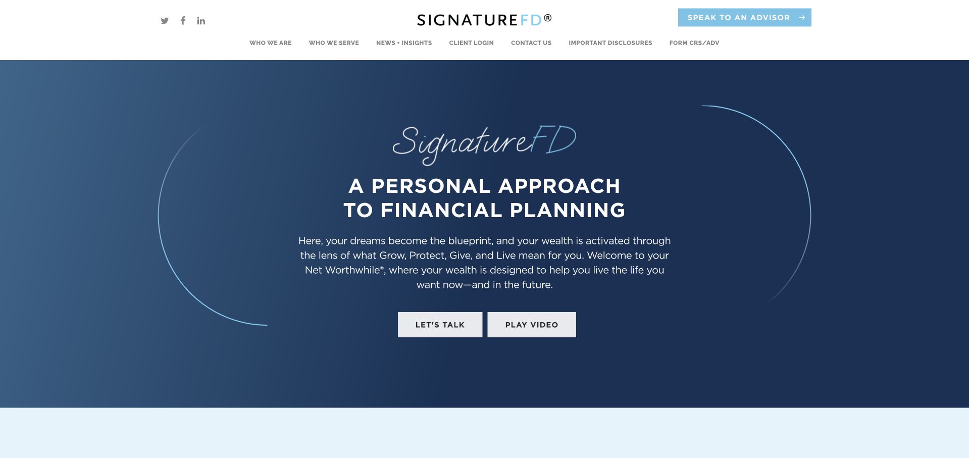
SignatureFD uses a dark blue field, a script identity and a literal personal-financial-planning headline. The supporting copy explains the firm’s organising philosophy, while clear conversation and video actions offer different levels of engagement. The broader navigation identifies audiences such as executives, health professionals and entrepreneurs, which helps make a broad planning offer more specific. This is useful for a regional firm whose clients have different decision contexts but share a common planning approach. The philosophy should not replace an explanation of service scope or fees. Published retention and asset figures also need their accompanying definitions and dates, and audience labels should lead to genuinely relevant information rather than near-identical pages.
What you can learn
A planning philosophy becomes useful when it helps explain different client situations. Connect audience pages to specific questions and service scope, and keep business statistics contextual rather than allowing them to imply future satisfaction or financial results.
Pros
The literal financial-planning headline anchors an expressive script identity in a recognisable service.
Audience-specific routes help prospective clients find a relevant professional or life context.
Cons & considerations
A named planning philosophy still needs concrete service and commercial explanations.
Audience pages require genuinely relevant detail, while published business statistics need clear definitions and dates.
Ritholtz Wealth Management uses a fast-moving transport scene, large white typography and yellow accents to create an energetic opening. The two main actions distinguish learning about the firm from talking to an adviser. A compact header keeps search and menu controls visible, while a small video player adds another editorial layer. The broader page names wealth management, planning and related services rather than leaving the identity entirely to media personality. This is useful for studying how an advisory business with an active public voice can connect commentary to services. The motion and floating media can also compete with reading, and confident tone should not be interpreted as evidence of investment performance.
What you can learn
An advisory firm’s media voice can support recognition, but the service proposition must remain understandable without watching a video. Provide motion controls, keep floating players unobtrusive and separate commentary from advice about an individual client’s situation.
Pros
Clear company and adviser actions give the energetic opening two understandable next steps.
The service layer connects a substantial public-media identity with identifiable advisory work.
Cons & considerations
Moving backgrounds and a floating video player can compete with reading and need reduced-motion and pause controls.
A confident public voice does not establish suitability or financial outcomes for an individual prospective client.
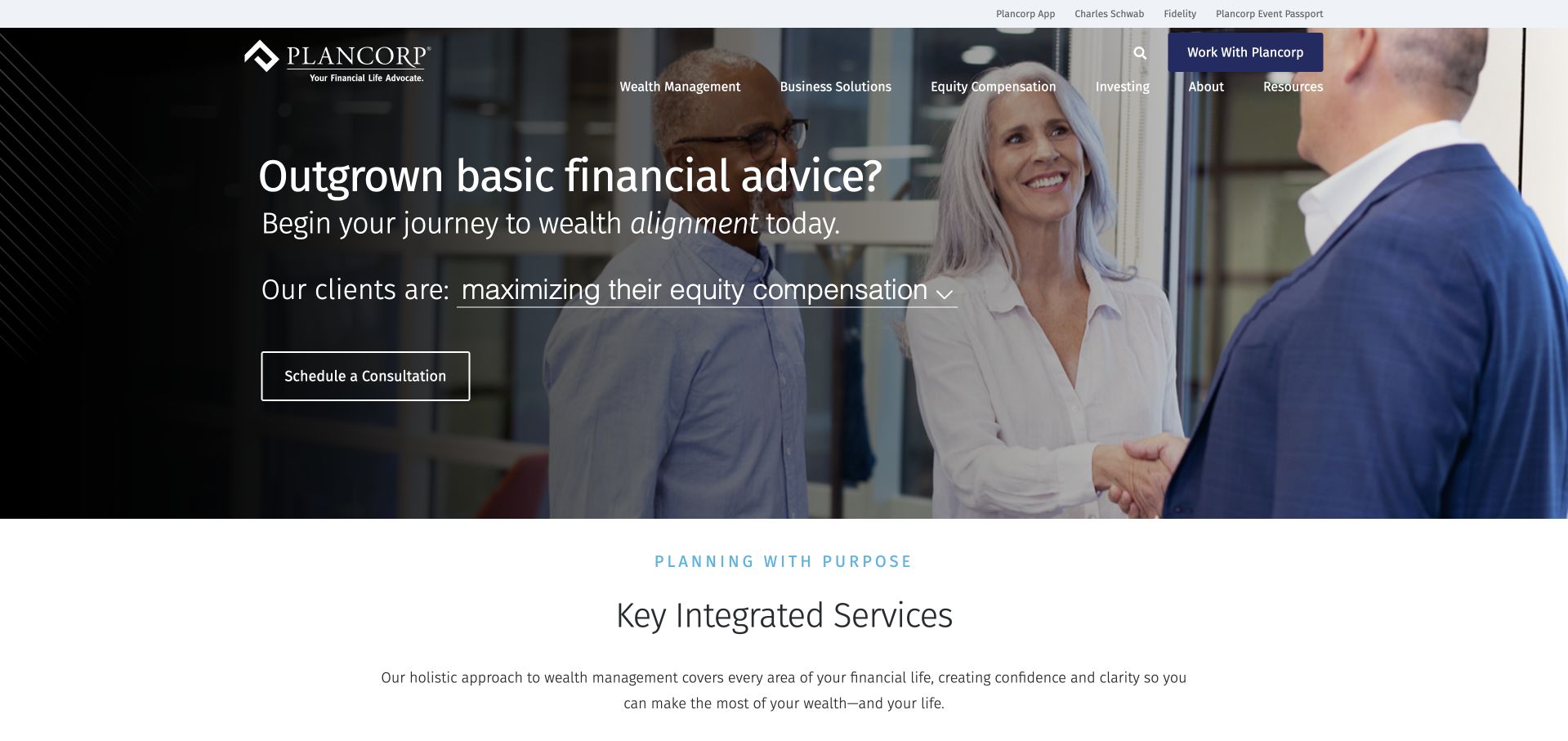
Plancorp opens with a direct question about outgrowing basic advice, paired with a real meeting scene and a clear consultation action. A changing client-situation line introduces specific contexts such as equity compensation, making the broader planning offer less abstract. The header separates wealth management, business solutions, investing and resources, while existing-client links sit above it. This is useful for a firm whose prospective clients may already have some financial knowledge but need coordination. The changing line must remain readable and should lead to genuine detail rather than a generic contact form. The proposition also needs to explain what complexity means in scope and fees, not simply imply that more services are always better.
What you can learn
Start with a recognisable planning situation, then connect it to an appropriate service and adviser. Keep the client-context selector useful without animation and explain the relationship’s scope instead of treating complexity as a reason for an unspecified engagement.
Pros
The opening question identifies a concrete stage in a prospective client’s research rather than only an emotional goal.
Existing-client systems are separated from the main service and consultation navigation.
Cons & considerations
Changing audience text needs a stable accessible state and a meaningful onward destination.
The complexity-led proposition requires clear service boundaries and fees so visitors can judge the relationship realistically.
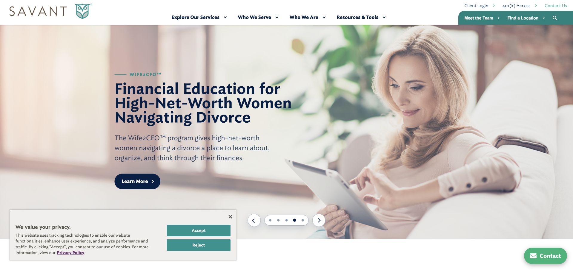
Savant’s observed feature focuses on a specific planning situation, using a calm lifestyle photograph, a substantial explanation and a direct learning action. The header separates services, audiences, resources and existing-client tasks, while team and location routes remain visible. This is useful because a large advisory firm can make a specialised programme discoverable without hiding the broader offer. The carousel means that the first message changes, however, so a visitor may not immediately encounter the situation relevant to them. The feature should also distinguish education from an individual advisory relationship. Business-scale figures below need their dates and definitions preserved rather than being treated as evidence that a particular programme suits everyone.
What you can learn
A specialist planning or education programme deserves its own clear explanation and audience context. Keep it connected to the broader service structure, and distinguish general education from personalised advice and an ongoing client relationship.
Pros
A specific life-situation feature is more concrete than a general promise about financial confidence.
Team, location, service and existing-client routes support practical discovery within a large advisory site.
Cons & considerations
A rotating feature can hide a relevant programme behind another message and needs predictable controls.
Educational content and advisory services require clear boundaries, while business figures need dated context.
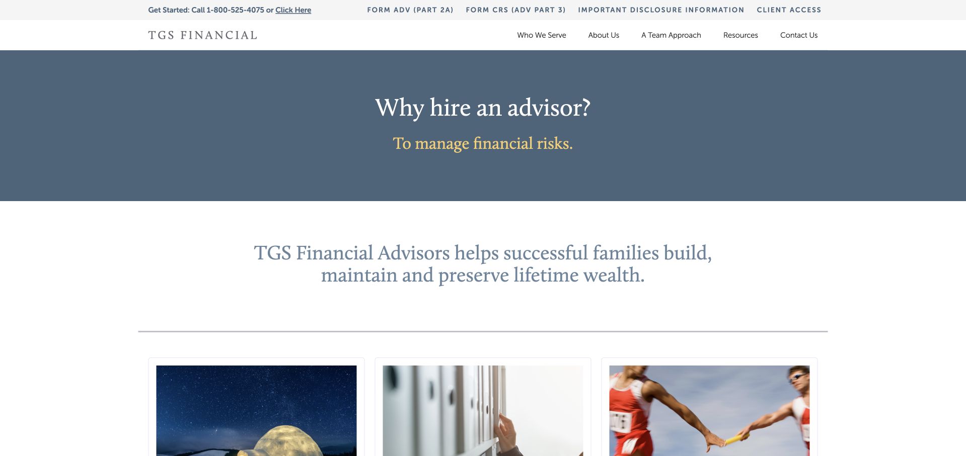
TGS Financial Advisors uses a restrained blue-grey field, serif typography and a direct question-and-answer opening. A literal family-wealth statement follows, then dated resource cards and audience routes explain who the firm serves. Disclosure documents and client access are unusually prominent in the utility navigation rather than being available only at the bottom of the site. This is useful for studying a less media-heavy financial homepage that still provides practical research material. The changing opening answer should not become a substitute for service scope, and dated resource cards need active editorial maintenance. An older article can remain useful, but its status and relevance should be clear rather than implying recent advice by placement alone.
What you can learn
A restrained advisory homepage can be useful when it makes services, audiences and disclosures easy to find. Maintain resource dates honestly and distinguish enduring educational material from current commentary or an individual client recommendation.
Pros
Disclosure documents and client access are visible in a dedicated utility layer.
A concise service statement and audience routes give the restrained visual identity practical structure.
Cons & considerations
A changing answer in the hero needs a readable stable state and should not replace service scope.
Dated resource cards need editorial review so prominent placement does not imply that older material was recently updated.
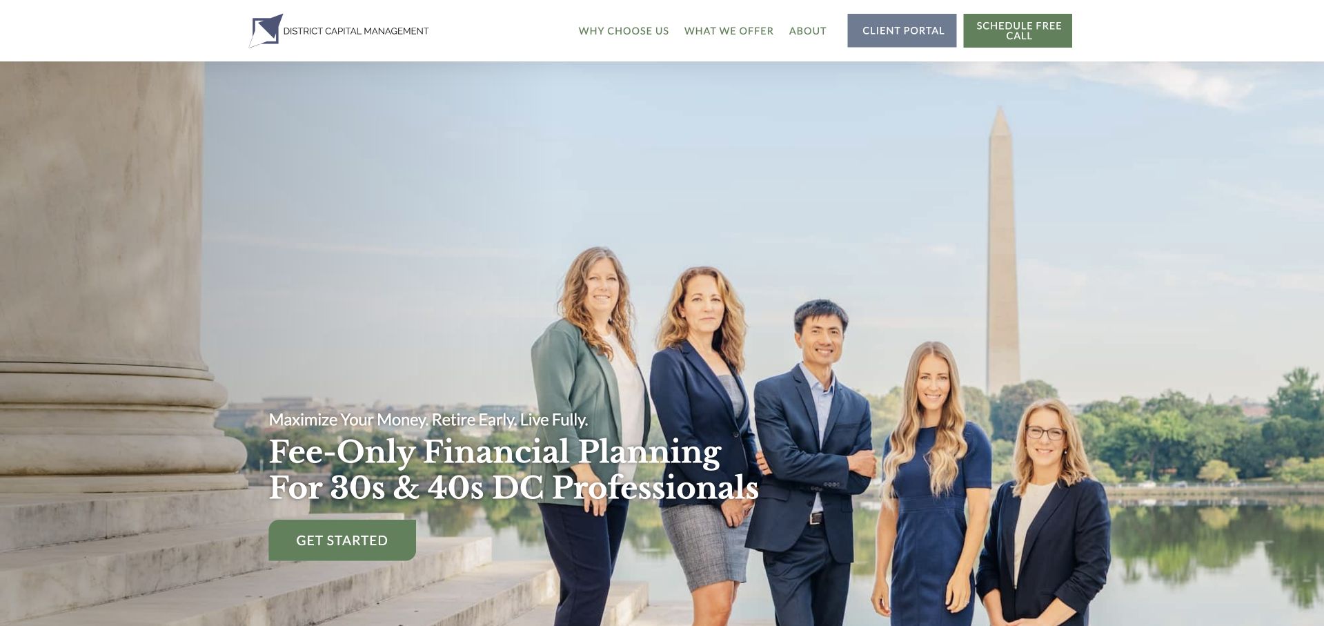
District Capital Management places a real team photograph in a recognisable Washington setting and uses a literal headline identifying fee-only planning for professionals in their thirties and forties. The audience is unusually specific, and the supporting page explains services, pricing routes, people and what the relationship includes. This makes the site useful as a study in qualification rather than trying to appeal to every possible wealth-management client. The opening still contains an aspirational early-retirement message, which should not be mistaken for an outcome promise. Detailed service and pricing information needs to remain current, with disclosures and professional verification separate from the design’s confident presentation.
What you can learn
A small planning firm can become clearer by naming a genuine audience and showing the actual team. Keep aspirations distinct from promises, and let transparent service and pricing information help visitors decide whether a conversation is appropriate.
Pros
The audience-qualified headline makes the intended planning relationship unusually clear before a visitor enquires.
A real team photograph and detailed service structure provide concrete evidence of the people and offer.
Cons & considerations
Early-retirement language needs clear boundaries so it is not interpreted as a guaranteed financial outcome.
Specific audience and pricing information requires regular maintenance as the firm’s services and commercial terms change.
Kendall Capital’s reviewed example is its public About Us page, selected because it offers a readable firm overview with a real team photograph. A cream and navy split layout pairs the people with a direct explanation of the advisory relationship and an explicit investable-asset fit statement. The utility bar keeps disclosure, client-login and telephone routes visible, while the body develops the approach through clearly labelled sections. This is useful for showing that client qualification can be stated plainly rather than hidden behind an enquiry. The page should not be mistaken for a homepage capture. Its commercial threshold and service descriptions also need current ownership and review so a clear explanation does not become outdated.
What you can learn
A firm-overview page can do important qualification work when it states audience, service and commercial fit directly. Show the real team, keep verification routes available and assign an owner to update thresholds and relationship information when they change.
Pros
The team photograph connects an otherwise abstract advisory proposition with identifiable people.
Explicit fit information helps visitors assess relevance before submitting an enquiry.
Cons & considerations
This is an About Us page rather than the homepage, so its context should remain clear in the collection.
Asset thresholds and service descriptions need active review so practical qualification information stays accurate.
Westmount Partners opens with a direct acknowledgement that its intended audience is busy, then presents a short numbered introduction to the firm. A quiet streetscape image and restrained orange accents support the text without turning the page into a luxury montage. Story, investing, planning, people and client routes are separate, while a messaging-fraud alert is visible in the header. This is useful because it recognises both attention and trust as design problems. The numbered narrative still needs a clear reading order and predictable controls, and published asset figures should retain dates and definitions. A personable tone cannot establish the suitability of an investment relationship for an individual visitor.
What you can learn
Edit a wealth-firm introduction around the questions a busy prospective client actually has. Keep fraud and verification information findable, and make a numbered narrative usable as ordinary linear content rather than a sequence that requires repeated interaction.
Pros
The concise numbered introduction makes a regional firm’s story more digestible than a long manifesto.
A visible messaging-fraud alert gives practical trust information a place near the main navigation.
Cons & considerations
Sequential story controls need a clear reading order and should not hide essential information behind repeated clicks.
Published scale figures and a personable voice do not replace current service, fee and relationship disclosures.
ATX Portfolio Advisors uses an aerial Austin bridge photograph with large outlined typography and a distinctive fee-positioning line. A conventional navigation exposes the adviser, investment approach, pricing and educational material, giving the visual opening practical routes. The local image establishes place without needing a generic family portrait. This is useful as a study in making an independent practice recognisable, but the unusual fee phrase needs a precise explanation of its terms and limitations. Outlined text over a detailed landscape also creates a substantial readability challenge. The current resource layer gives returning visitors material to explore, but commentary should remain clearly separated from personalised recommendations or expectations about investment outcomes.
What you can learn
A distinctive fee proposition should lead directly to a clear, current explanation of how charges work. Use local imagery for identity, but protect essential wording with readable contrast and keep general commentary separate from individual financial advice.
Pros
The Austin landscape gives the independent practice a concrete local identity.
Visible pricing and named-adviser routes offer practical ways to investigate the unusual commercial proposition.
Cons & considerations
Outlined typography over a detailed aerial photograph can be difficult to read across display sizes.
The distinctive fee phrase needs exact terms and limitations rather than being interpreted from the headline alone.
IntelliPlan Advisors uses a large sailing photograph and a short client-experience statement, then follows with a literal description of planning and investment-advisory services. The navigation is conventional, and a named professional profile appears close to the introduction rather than being buried in a large directory. Service cards provide routes into tax, estate and other planning topics. This is useful for a smaller firm because the people and service relationship are relatively easy to locate. The sailing image is atmospheric rather than evidence of the advisory process, and the broad personal-experience language needs concrete scope beneath it. Professional credentials and network relationships should remain clearly explained and current rather than functioning as unexplained trust symbols.
What you can learn
A small advisory site should make the named professional, service scope and commercial relationship easy to locate. Let lifestyle imagery support the tone, but use plain text and current documentation to explain what the adviser actually provides.
Pros
A named professional profile near the introduction makes the smaller practice feel identifiable and approachable.
Service cards provide direct routes into several planning topics without requiring a complex menu.
Cons & considerations
The sailing photograph adds atmosphere but little practical evidence about the advisory process.
Professional credentials and network relationships need current explanations rather than relying on familiar labels alone.
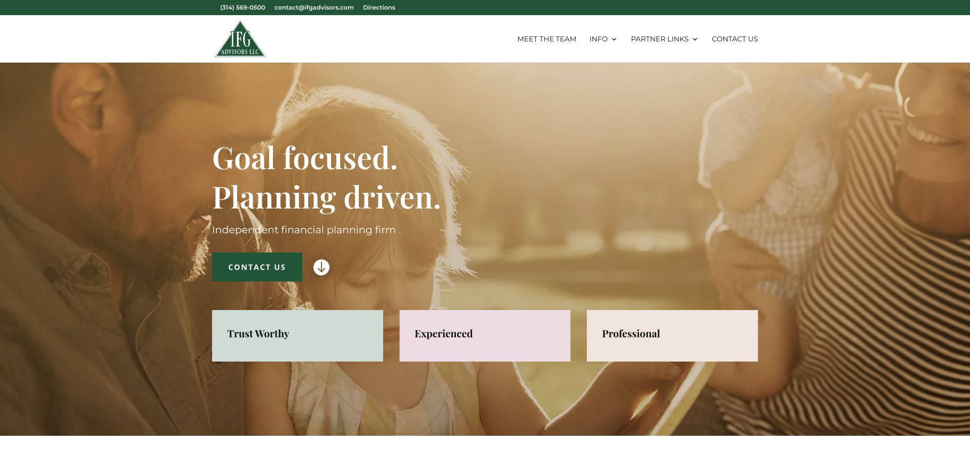
IFG Advisors uses a green identity, a warm family photograph and a concise planning-led headline. Public telephone and email information sit in a narrow utility bar, while a team route is prominent in the main navigation. The body uses a grid of planning topics and introduces named professionals, making the service more concrete than the three broad trust words in the hero. Partner-system links are grouped separately for returning clients. This is useful as a compact service-site structure, though the trust words themselves are generic and need evidence. Contact links also deserve functional testing: displayed telephone information and its destination should agree, not merely look plausible in the header.
What you can learn
A compact advisory site should connect its short proposition with real people, specific services and clearly separated client systems. Test the destinations behind contact controls as carefully as their visual appearance so a polished header leads to the intended channel.
Pros
Named team members and a planning-topic grid provide more concrete information beneath the concise opening.
Partner systems are presented as separate returning-client tasks rather than mixed into the marketing enquiry.
Cons & considerations
Generic trust words need supporting evidence and do not establish the suitability or quality of an advisory relationship.
Contact controls require destination testing so displayed phone or email information matches what the link actually opens.
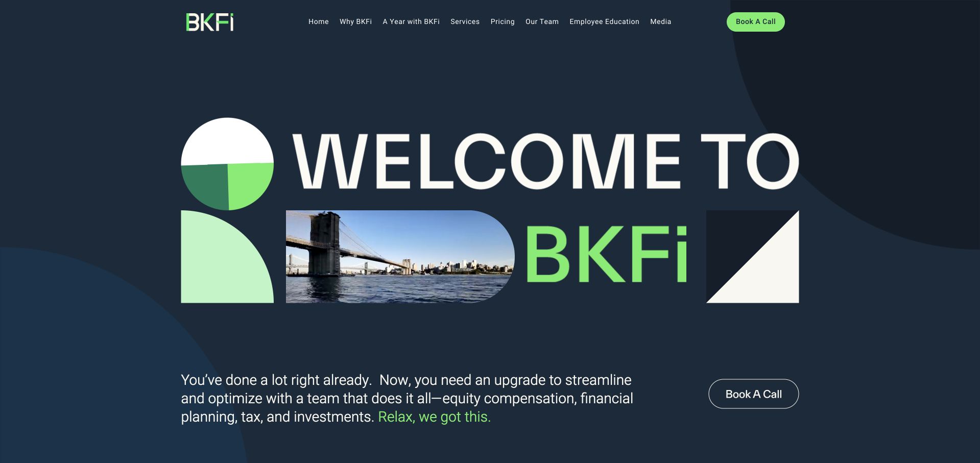
Brooklyn FI uses a dark blue field, bright green geometry and a local bridge image to create a distinctive identity. The supporting paragraph names equity compensation, tax, planning and investments, making the coordinated-service proposition more specific than the large welcome graphic alone. Pricing and team routes are visible, and a call action is available without requiring a long scroll. The following comparison structure explains the situations the firm is trying to address. This is useful for a practice with a clearly defined audience, but negative-versus-positive comparisons need restraint so they do not imply that every alternative adviser performs poorly. Coordination claims also need clear scope, responsibility and commercial details.
What you can learn
A coordinated planning proposition is stronger when it names the actual disciplines and gives visitors pricing and team information. Use comparisons to clarify client situations, not to make unsupported claims about competitors or guarantee that complexity disappears.
Pros
The supporting copy names concrete service dimensions such as equity compensation, tax and investments.
Visible pricing and team routes help visitors investigate the relationship before booking a call.
Cons & considerations
The large welcome graphic uses substantial space before the practical service explanation.
Before-and-after comparisons need careful wording so they do not imply universal competitor failures or guaranteed results.
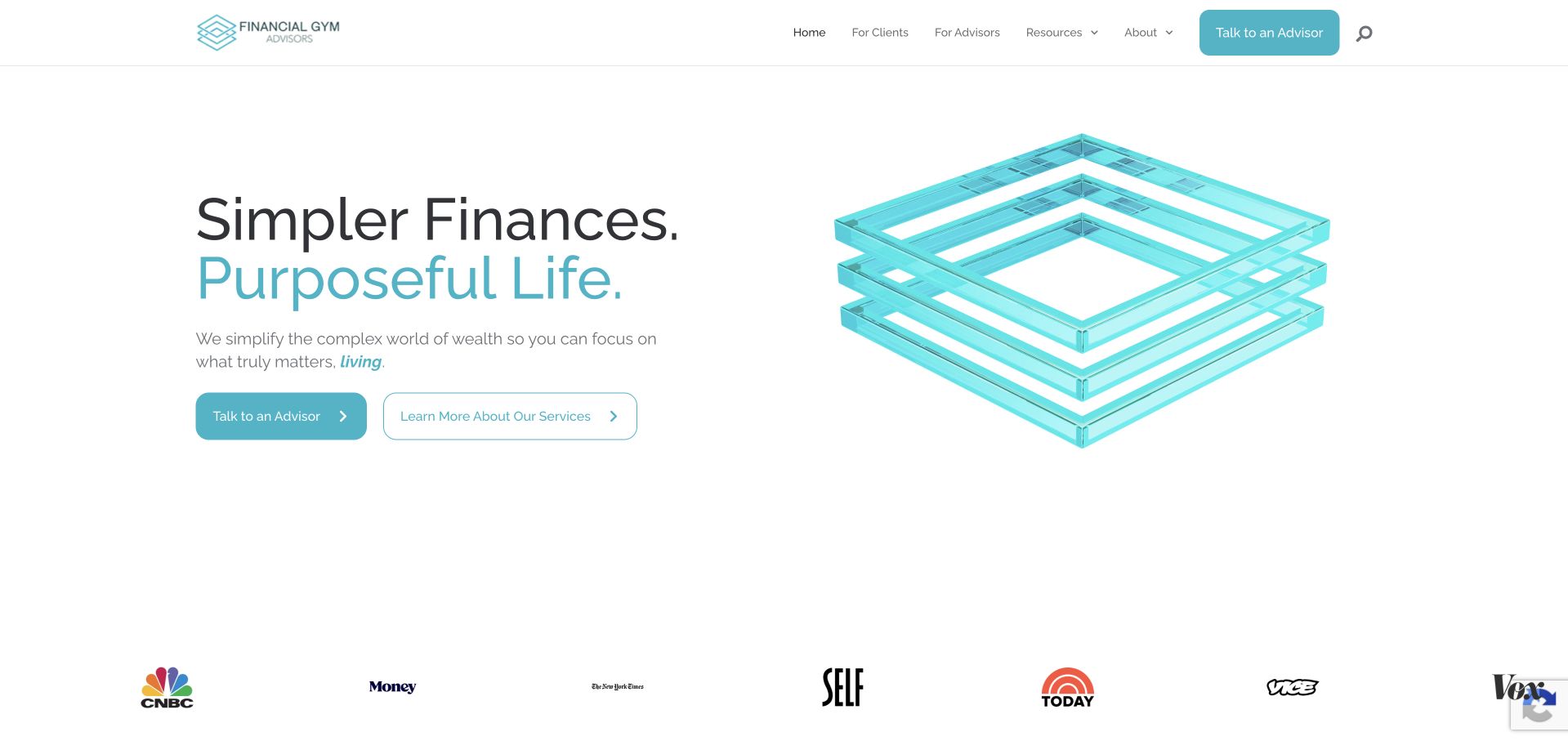
Financial Gym Advisors uses a bright white and turquoise opening with a geometric illustration and a concise planning proposition. The main actions distinguish talking to an adviser from learning about services, giving a visitor a lower-commitment alternative. Client and adviser audiences are visible in the header, while a publication-logo strip supplies another layer of brand context. The reviewed page is compact, so the opening has to carry much of the explanation. The geometric illustration is decorative rather than evidence of a method, and publication marks need relevant source context. A simple site should still make service scope, professional identity and the next step clear rather than relying on a reassuring phrase about simplifying finances.
What you can learn
A compact financial homepage should offer both a conversation route and a clear service-research route. Keep decorative imagery secondary, explain the current advisory identity and provide context for publication marks rather than treating them as blanket endorsements.
Pros
The two main actions distinguish an adviser conversation from learning about the service first.
A restrained turquoise and white system creates a recognisable identity without a heavy media opening.
Cons & considerations
The short homepage needs substantial linked service and professional information to support meaningful evaluation.
Geometric illustration and publication logos do not independently establish a method, client outcome or endorsement.
Kegan is a freelance web designer and developer with 15+ years of experience helping businesses turn complicated website requirements into clear, maintainable digital experiences. He works directly with clients from planning and design through development, launch, and ongoing support.
For financial advisor website design, his development approach focuses on audience-specific service information, accurate team credentials, accessible resources, and privacy-conscious inquiry handoffs. The scope can be a targeted improvement or a complete custom build, with responsive layouts, thoughtful content structure, and integrations chosen around the people using and maintaining the site.
Show 3 other financial advisor website designersHide other financial advisor website designers
Plan a financial advisor website around informed, proportionate enquiries
Write the fit and fee explanation first
Describe the audience, the service relationship and any material minimum or threshold in plain language. Explain where a visitor can find current fee information and what is discussed during an introductory call. Keep aspirational goals separate from promised results. Have the responsible compliance or professional reviewer approve the wording before publication, particularly when claims involve fiduciary status, independence, testimonials or recognition.
Keep public marketing separate from private client work
An initial form rarely needs account statements, identification numbers, exact holdings or tax documents. Ask for enough context to arrange a relevant conversation, explain who receives it and provide an appropriate secure process if detailed material is later needed. Existing clients should have clearly named portal and file-transfer routes so they do not send private instructions through a marketing form. Never imply that a public form is a channel for trades or urgent account changes.
Give every trust claim an editorial owner
Maintain a record of the date, source, permission and intended scope for awards, ratings, testimonials and business figures. Put supporting context close enough to be useful, not only in a distant generic footer. Review team and entity information after acquisitions or rebrands, and preserve an explanation for visitors arriving from an older name. Treat expired documents, outdated thresholds and broken verification links as important content defects, not minor cosmetic issues.
The editing job behind the design
Prioritise clear publishing and secure boundaries over decorative complexity
A suitable CMS should keep people, services, locations, disclosures and educational content distinct. Centralise recurring facts such as a firm name, office address or disclosure link so that an update does not require manually fixing dozens of pages. Store approval dates and review ownership where the editorial team can maintain them. Keep private portal functions separate from public marketing assets, with clear naming and no invented claims about security or compliance.
Test forms, navigation, text resizing and contrast with actual users and assistive-technology workflows. A calm visual identity can still be difficult to read if the type is thin or the disclosure text is tiny. The W3C source below supports the accessibility brief. A technology detected on a public page does not establish the security, suitability or complete architecture of a private planning or investment system.
Our WordPress website examples offer a separate look at publishing approaches. A visible platform label is evidence for that named page, not a guarantee that the same system will suit your requirements.
Before the public launch
Financial advisor website planning checklist
Name the actual service relationship and distinguish planning from investment management or education.
State the intended audience and any material client-fit criteria accurately.
Make current fee information and the introductory-call scope easy to find.
Show real professionals, current roles and the correct firm or entity identity.
Link relevant disclosures and appropriate official verification records.
Keep ratings, awards and business figures dated, defined and contextualised.
Obtain permission for testimonials and avoid implying typical or guaranteed results.
Do not present representative lifestyle models as verified clients.
Keep existing-client portals separate from marketing enquiry forms.
Avoid requesting account numbers, identity documents or detailed holdings in the first form.
Test readable text, contrast, keyboard navigation and useful form feedback.
Assign review ownership for disclosures, thresholds, people, rebrands and verification links.
These checks are a project checklist, not a performance, legal, security, or accessibility certification. Test real journeys with the people responsible for the website before making claims about the result.
Sources & editorial method
How this collection was selected and reviewed
We inspected public pages and made direct browser captures for the examples. Reviews concern visual hierarchy, service explanation and enquiry design, not financial suitability, performance or a regulatory audit. Primary company pages support observations; the official verification and accessibility links provide planning context. No private client system was accessed and no enquiry was submitted.
Each example links to its actual source page. Screenshots are direct browser captures with their own capture dates; moving imagery, announcements and live designs can change. The notes describe observable design choices and conditional tradeoffs, not measured traffic, conversion results, service quality, or accessibility conformance.
Technology labels use public page metadata, asset evidence, or explicitly cited platform documentation. Platform documentation is not a complete current deployment audit. A component reference may be legacy or unused; it is not a complete backend inventory. Unknown stacks are omitted. These sites are editorial examples, not our client portfolio.
Written, Edited and Curated are separate editorial records, not timestamps advanced by a rebuild. Website designs and imagery belong to their owners. See our editorial standards or suggest a correction.
Questions worth asking
Financial Advisor website design questions
Should a financial advisor show investment performance in the hero?
This is a design decision that requires careful professional and compliance review, not a generic conversion tactic. A clear explanation of service, audience, people and fees can be more useful for a first visit. Do not add performance claims merely to make a page look persuasive.
Are lifestyle photographs a problem?
They can establish tone, but they are not evidence of a client relationship or outcome. Do not imply that models are real clients. Pair atmosphere with practical information about the people, service and next step, and use approved real-team photography where it adds useful context.
How much should the initial contact form ask for?
Usually enough to identify the person, arrange contact and understand the broad service interest. Avoid collecting detailed financial documents or identifiers before explaining the process. Direct existing clients and sensitive files to appropriate named channels rather than a general marketing form.
Can an award or registration prove an adviser is right for someone?
No single website signal establishes individual suitability. Keep awards contextual and provide the relevant official verification information. This collection reviews design and does not recommend advisers, assess investments or certify professional standing.
What changes after a merger or rebrand?
Review the current entity name, people, service scope, client-system routes and disclosures. Explain the connection for visitors arriving from an older name rather than relying only on a redirect. Do not assume that continuity of branding means every relationship detail is unchanged.
The strongest financial advisor design makes the relationship clearer without making the outcome sound certain. Borrow readable hierarchy, real people and proportionate enquiry flows, then have the actual practice approve the service, fee and disclosure information it publishes.