Best Car Wash Websites of 2026 (16 Real-World Examples)
Real wash websites that make locations, packages, memberships and visiting details easier to understand.
A useful car wash website helps someone decide where to go, which wash fits the visit and what a membership will actually cost. These 16 examples show different ways to make those decisions clear.
Car wash customers often arrive with a practical question and little patience: is this location open, does it clean interiors, will my vehicle fit, and can I buy one wash without subscribing? A strong site answers those questions before asking for a phone number, app installation or payment.
This collection compares local operators and larger networks through their public interfaces. We study navigation, location context, package explanations, recurring-price clarity and the way a site connects digital decisions to a physical visit. The reviews describe observed design, not wash quality, vehicle safety or independently measured business performance.
Before the examples
What makes good car wash website design in 2026?
Put the visit in context
Keep location, opening hours, service format and vehicle restrictions near the main action. A beautiful campaign cannot compensate for sending a customer to a branch that lacks the service they need.
Make the comparison understandable
Separate single-wash prices from monthly charges, explain introductory periods and show meaningful package inclusions. Translate branded treatment names into useful differences rather than relying on a growing list of technical labels.
Support customers after enrollment
Give members a visible route to manage a plan, update a vehicle or find cancellation information. Existing customers should not have to begin another sales flow to complete routine account tasks.
The collection · 16 examples
16 car wash websites worth studying
The 16 properties below include single-site businesses, regional networks and larger operators. Each has a direct source capture and an original review. Similar business names are labeled geographically where needed; the three Waves properties are distinct websites and operators.
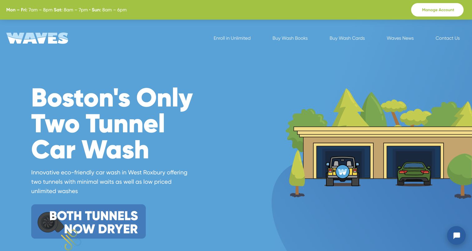
Waves in West Roxbury puts its two-tunnel proposition into a simple illustrated scene rather than a generic glossy-car photograph. Opening hours occupy a slim green strip, and account management stays visible beside them. The page then explains a preparation feature, compares three wash packages in a structured table and answers practical questions in expandable sections. The table identifies both included and excluded features, which is more useful than a sequence of unexplained package names. The local address and repeated hours close the page. The opening is not perfect: product terminology needs explanation, and the main navigation favors buying or enrolling before a first-time visitor has compared the wash options.
What you can learn
Make a local operational difference understandable, then support it with an ordinary comparison table. Pair package names with inclusions, preserve one-off choices, and put hours and address where customers can find them without beginning an enrollment.
Pros
Opening hours and account management are immediately accessible.
A structured table makes package differences easy to compare.
Cons & considerations
Specialist wash-product terms need plain-language supporting explanations.
Enrollment and purchasing dominate navigation before the comparison.
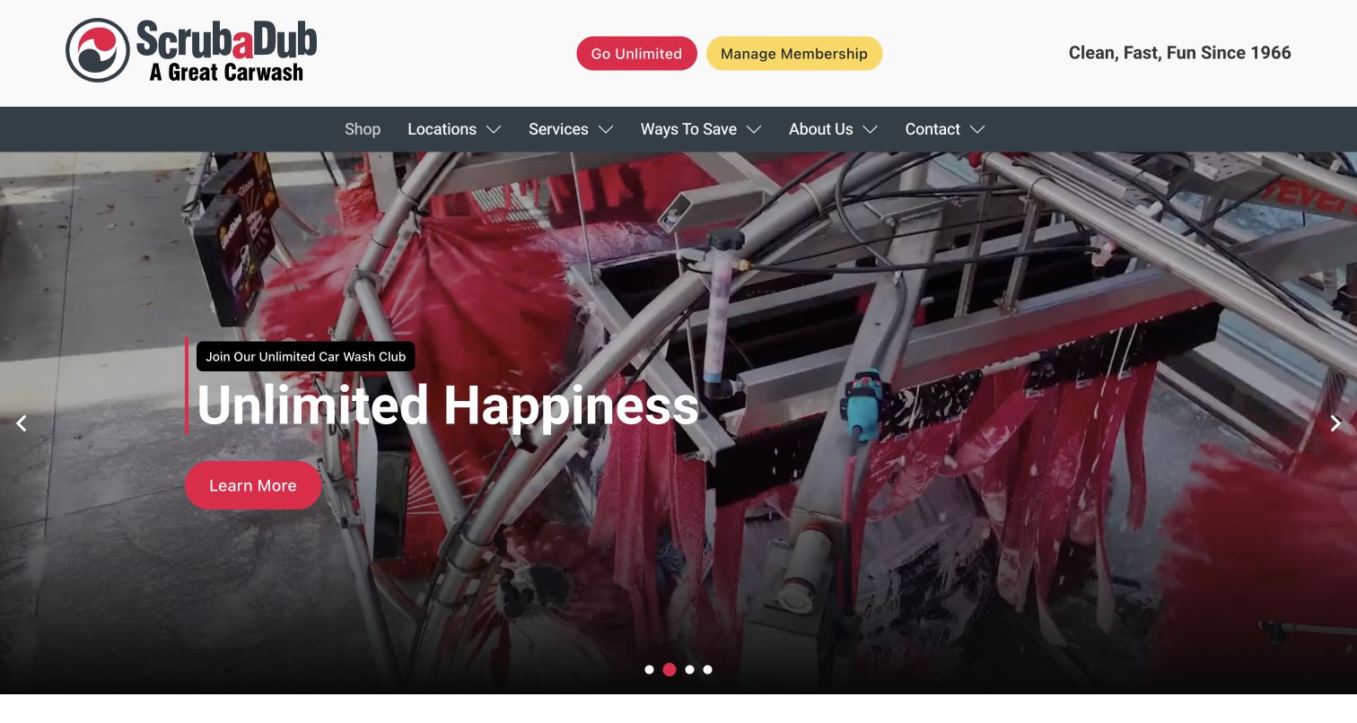
ScrubaDub gives joining and managing a membership different colors in the header, making two similar-looking customer tasks easy to distinguish. The captured carousel shows a real wash tunnel behind a large membership message, while the navigation keeps Locations and Services outside the campaign. Farther down, the page explains express, touchless, self-serve, interior and detailing options rather than treating every wash as the same product. A dedicated location search follows the service introduction. The family-business story supplies context, but the main practical strength is the separation of navigation from promotions. Several rotating themes compete for the opening, and exact service availability still requires a location-level check.
What you can learn
Give existing customers a direct management route that does not resemble a new purchase. Keep location and service links stable while seasonal promotions rotate, then show which service types each branch actually provides.
Pros
Joining and account management have clearly differentiated header buttons.
Service descriptions acknowledge several genuinely different wash experiences.
Cons & considerations
The rotating introduction changes the first message visitors encounter.
Exact branch services require another step beyond the homepage.
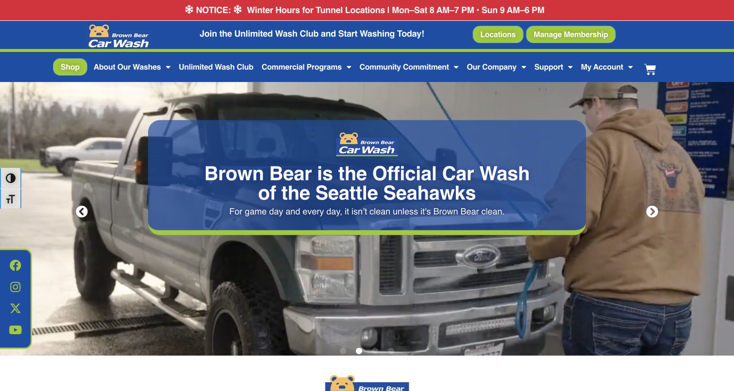
Brown Bear places winter tunnel hours above its main branding, so a practical operating detail is visible before the promotional carousel. Blue, lime and red create a highly recognizable frame, with separate Locations and Manage Membership buttons. The captured slide promotes a Seattle sports association over footage of a vehicle being prepared for washing. Below, the homepage distinguishes its wash formats and offers a location route. The useful pattern is the persistent operational notice, not the endorsement implied by the campaign. Navigation is dense, however: commercial programs, community activity, account access and shopping share the opening. Floating social and display controls add further visual competition.
What you can learn
Reserve a dependable place for seasonal hours or closures and state which service they affect. Let promotional slides change beneath that notice, while keeping the local address and wash-type information one clear step away.
Pros
Seasonal tunnel hours appear before the changing promotional content.
Location and membership management receive prominent independent buttons.
Cons & considerations
The broad navigation asks visitors to scan many competing choices.
Floating controls reduce space around the main service message.
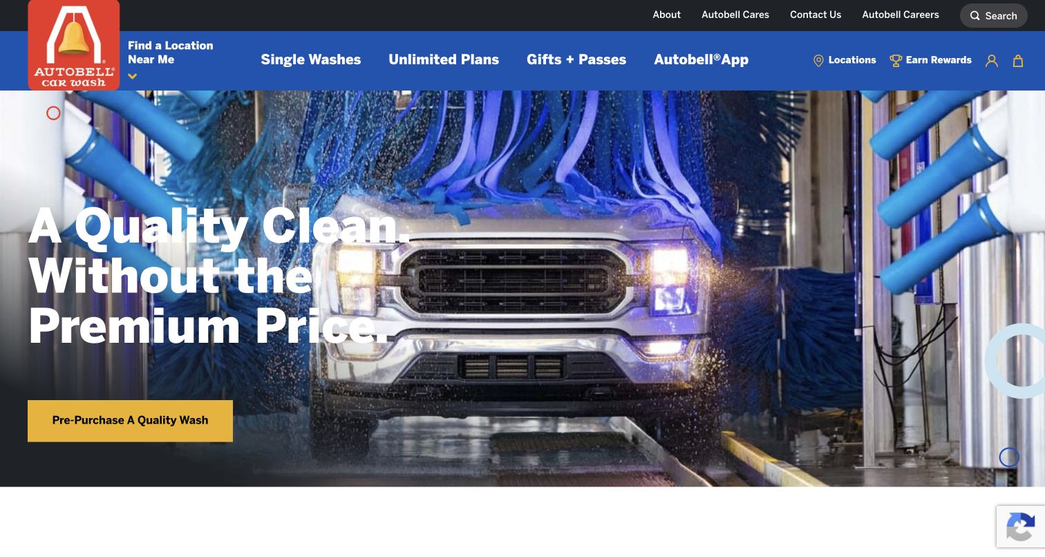
Autobell separates Single Washes, Unlimited Plans and Gifts + Passes across its main navigation. That vocabulary helps a first-time customer understand the available commitment levels before considering rewards or the app. The accepted capture follows declining optional cookies and shows a vehicle inside the wash tunnel, a bold value message and a yellow pre-purchase button. A location control remains near the logo, and a city or ZIP search appears below the opening. The design is useful for its explicit product grouping, although the large photographic hero postpones a direct price comparison. Its initial cookie dialog covered much of the page, a state preserved in the private research record.
What you can learn
Use purchase-frequency labels customers already understand. Keep one-off washing visible alongside subscriptions, provide location context before checkout, and ensure privacy choices can be completed without obscuring the site's basic service explanation.
Pros
Single washes, subscriptions and gift products have distinct labels.
Location discovery is available in both header and page content.
Cons & considerations
The initial privacy dialog obscures much of the opening view.
The hero emphasizes value before revealing a detailed price comparison.
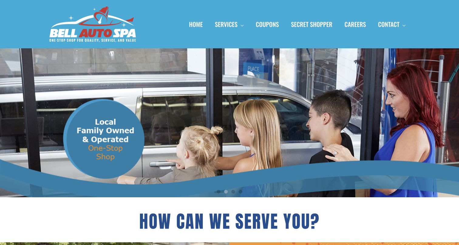
Bell Auto Spa uses a bright blue header and a family scene beside the wash tunnel to introduce its local identity. The rotating image carries a family-owned message, while the main navigation keeps Services, Coupons and Contact visible. Immediately below, a large service question leads into visual shortcuts for services, offers and unlimited plans. The written introduction explains a family-operated business with a waiting-area experience and additional automotive care. That gives the site a useful angle beyond an express tunnel alone. The opening still depends heavily on image-based messaging, and the prominent Secret Shopper and Careers items compete with the most common customer tasks.
What you can learn
If the experience includes waiting, detailing or maintenance, show that difference rather than borrowing a generic fast-wash slogan. Give prices and service scope a stable route, and place recruitment or research programs lower in the hierarchy.
Pros
The family scene gives the service a tangible local character.
The page connects washing with a broader set of care tasks.
Cons & considerations
Image-based carousel messages are less flexible than ordinary page text.
Secondary programs compete with service and contact navigation.
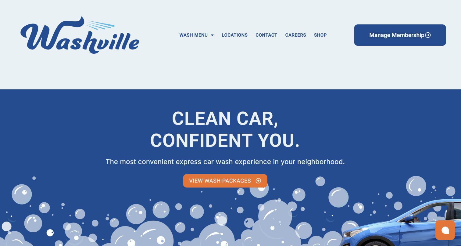
Washville uses an unusually spacious header, a pale background and a compact row of menu labels. The opening centers a short cleanliness message over blue bubble illustrations, with an orange View Wash Packages button providing the main next step. Manage Membership remains a separate, prominent control rather than being hidden in a general account menu. A location-finding section follows, then a short benefits list and customer quotations. This gives the homepage a clear rhythm without relying on a large carousel. The tradeoff is the amount of vertical space consumed by branding and the opening illustration: visitors must scroll for location context, and the actual package differences are on another page.
What you can learn
A concise homepage can work well when its primary doorway has a specific destination. Make the package comparison and location list easy to reach, and use illustration as supporting identity rather than the only explanation of the service.
Pros
The main package button has a clear and specific purpose.
Existing members receive a prominent independent management route.
Cons & considerations
The spacious header delays practical information below the opening.
Package inclusions and local details require further navigation.
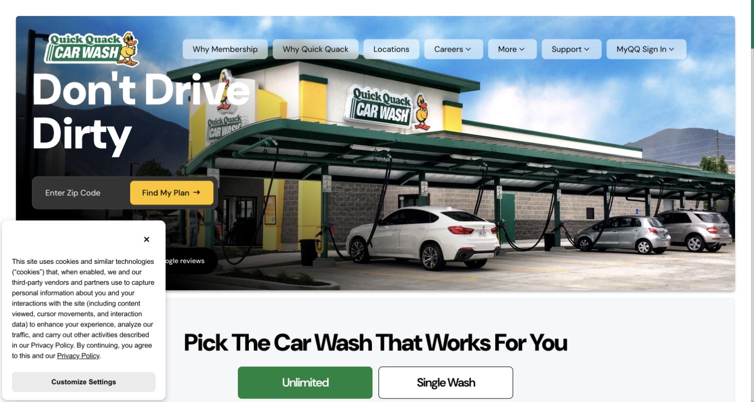
Quick Quack places a ZIP-code field directly over a photograph of a recognizable wash building and vacuum area. The yellow Find My Plan button establishes that the next step depends on location, while the header gives separate routes to membership information, company information and support. Below the hero, Unlimited and Single Wash appear as distinct options. The brand's duck identity makes the page recognizable without replacing those practical labels. This is a useful example of contextual plan discovery, but the introductory field asks for information before displaying local pricing. A privacy panel occupies the lower left of the captured view, and parts of the plan section populated after the initial page structure.
What you can learn
Explain why a location is needed before asking for it. Preserve a browse-all alternative and a clear single-wash route, and make sure the page still communicates its purpose while dynamic plan information is loading.
Pros
Real facility imagery makes the physical service easy to recognize.
Unlimited and single-wash choices are explicitly separated below the hero.
Cons & considerations
Local pricing is gated behind a location-selection step.
Privacy and delayed plan content complicate the first view.
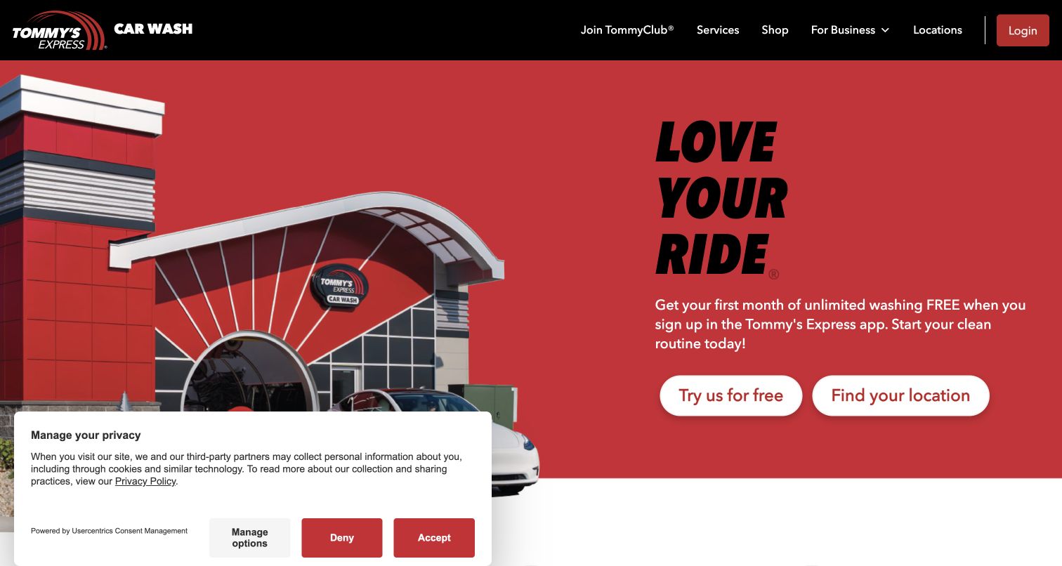
Tommy's Express pairs its recognizable arched building with a saturated red panel and a short stacked headline. Two large white buttons separate trying the service from finding a location. The header remains compact, with membership, services, business customers and locations clearly named. Below the opening, three short explanations connect the app to payments, plans and the visit itself, while account management receives its own section. The design succeeds at giving a physical service a consistent digital identity. Its opening promotion still needs careful qualification: an introductory offer is not the same as a permanent price, and app-centered language may leave occasional customers looking for an alternative route.
What you can learn
Use a strong brand color around a small number of meaningful actions. Explain what the app changes in the actual visit, then keep offer conditions and an occasional-use option easy to find without forcing installation.
Pros
Two prominent buttons separate discovery from the introductory offer.
The app is explained through practical visit and account tasks.
Cons & considerations
Introductory pricing needs terms beyond the opening campaign.
The emphasis on membership can overshadow occasional wash customers.
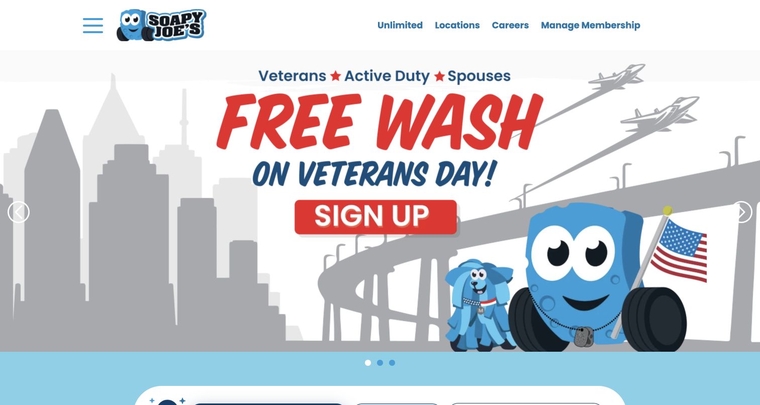
Soapy Joe's uses its cartoon vehicle mascot and blue palette consistently across the header and the captured Veterans Day campaign. The persistent navigation is concise: Unlimited, Locations, Careers and Manage Membership. Beneath the campaign, the page offers both ZIP search and a browse-all location control, then explains that plans depend on the selected wash. Those alternatives matter because a visitor can look for a branch without allowing automatic location access. The page also identifies amenities such as towels and vacuums. The large campaign image dominates the first screen, however, and the actual wash comparison remains unavailable until a location is chosen. The screenshot documents the dated promotion rather than guaranteeing its future availability.
What you can learn
Keep a manual location route beside automatic discovery. Seasonal artwork can add personality, but essential membership, pricing and branch information should remain reachable when a campaign changes or a visitor declines location access.
Pros
Manual ZIP and browse-all paths avoid requiring automatic location access.
Existing members have a clearly labeled management destination.
Cons & considerations
The campaign occupies most of the initial viewport.
Plan details require a location choice before comparison.
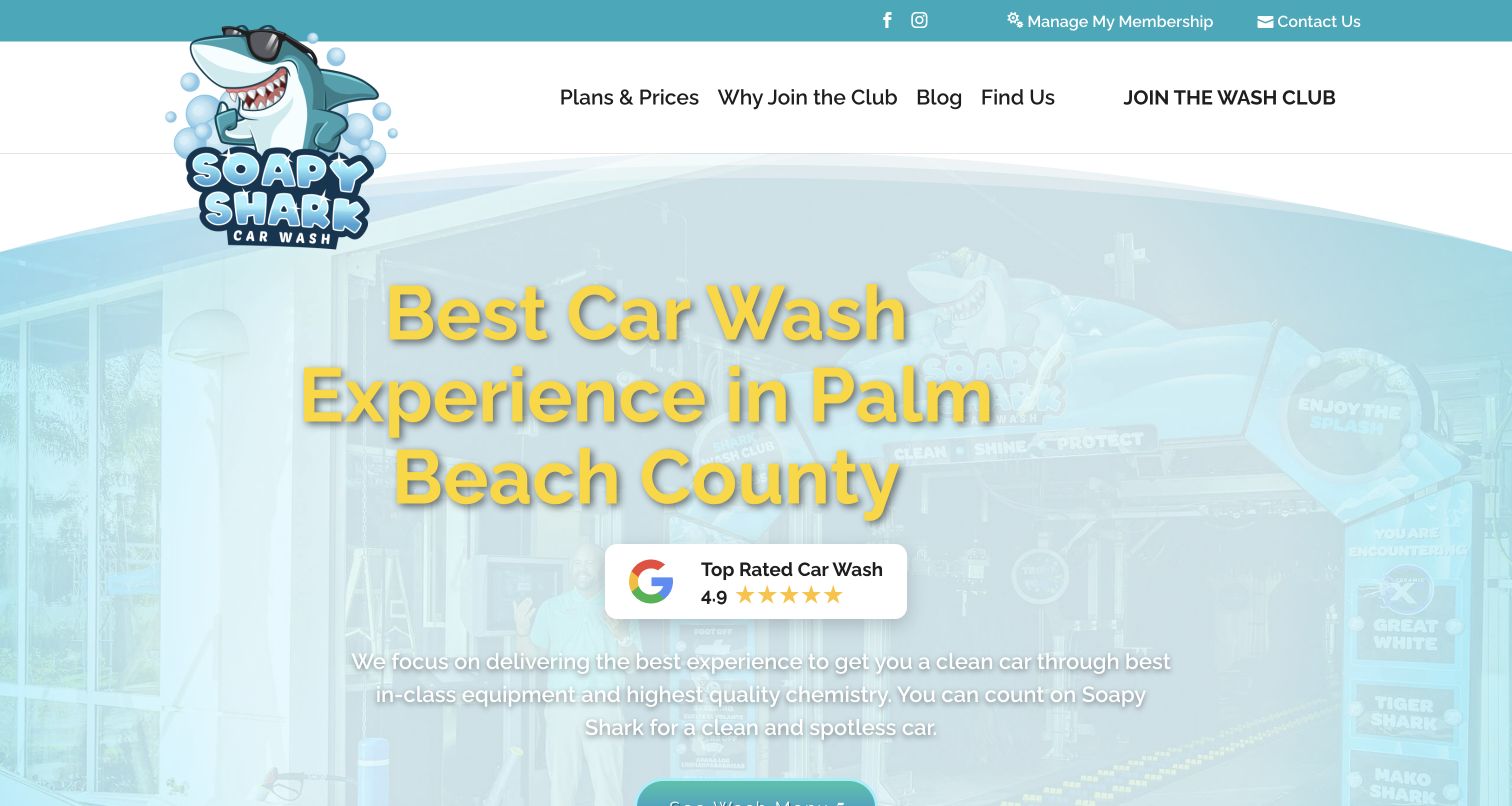
Soapy Shark carries its mascot through the logo and shark-themed package names, creating a coherent identity for its Palm Beach County locations. The navigation links directly to plans, club benefits and the location section. Below the opening, package cards separate introductory monthly prices, regular recurring prices and single-wash prices; that distinction is more informative than a single promotional number. Address and daily hours are presented for each location. The captured hero is less successful visually: pale imagery, yellow headline lettering and white copy reduce contrast. Its prominent rating and superlative claims are the business's own presentation, not findings independently established by this design review.
What you can learn
Use memorable tier names only alongside clear features and billing terms. Show the price after a promotion ends near the introductory amount, and test contrast over the actual background rather than judging text against a blank canvas.
Pros
Promotional, regular and single-wash prices are distinguished in cards.
Location addresses and opening hours are grouped by branch.
Cons & considerations
The pale hero background weakens contrast for key text.
Branded tier names need explanation before customers can compare them.
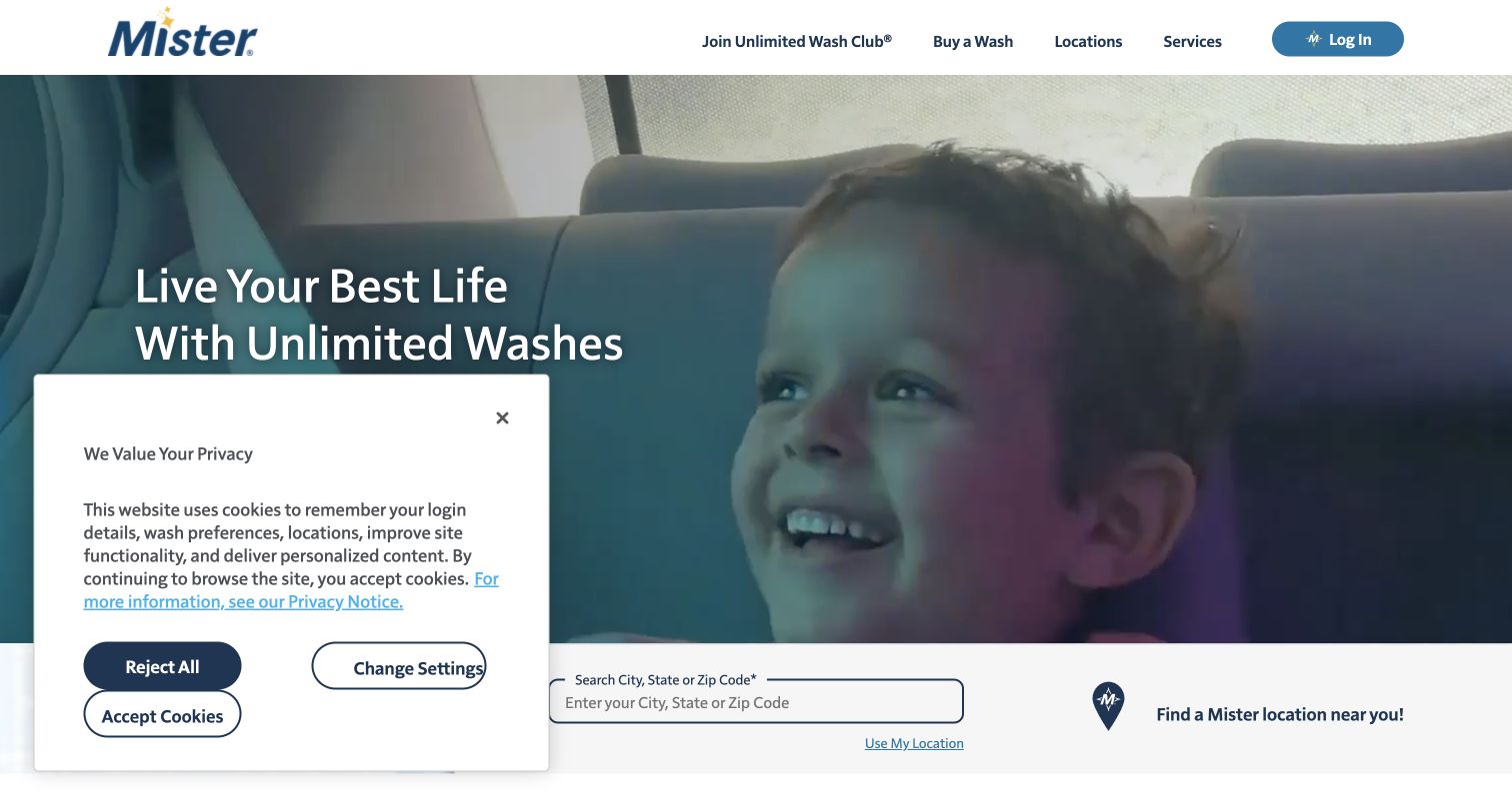
Mister keeps its header short, with membership, buying a wash, locations, services and login. A large video scene presents washing as part of everyday life, while a city, state or ZIP field beneath it provides the practical next step. Separate sections explain joining the club and buying a single wash, explicitly acknowledging visitors who are not ready to subscribe. Existing members receive an account route within the membership section as well as the header. This is useful task separation within a broad network site. The opening video and privacy notice compete for attention, and local service details remain dependent on the location choice rather than being visible immediately.
What you can learn
Let subscription and occasional customers recognize themselves in the page structure. Keep account access outside the sales flow, and connect location selection to clear service and price information rather than treating every branch as interchangeable.
Pros
One-off washing is explicitly acknowledged beside membership promotion.
Account access appears in both global and contextual navigation.
Cons & considerations
Video and the privacy notice compete with the main message.
Local service details require an additional location step.
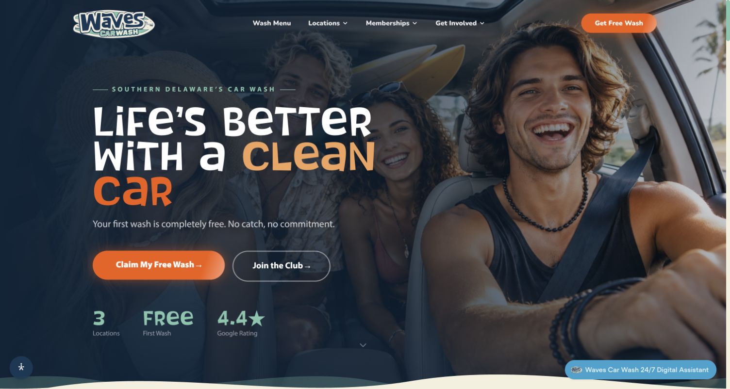
Waves in Delaware is a distinct operator from the similarly named Boston and Canadian examples. Its homepage uses a darkened family photograph, orange actions and a surf-inspired identity to introduce the region and a first-visit offer. A secondary club link sits beside the offer, while navigation separates wash menus, locations and memberships. Farther down, a three-step explanation describes the tunnel, included finishing equipment and the departure experience. Location links distinguish an operating branch from a forthcoming one. The design combines personality with useful service orientation, though promotional claims occupy much of the first screen and the chat prompt adds another moving point of attention. The exact conditions of the free-wash offer require further reading.
What you can learn
Explain a physical visit as a short sequence, especially when customers may not know what is included after the tunnel. Keep new-location status precise and place introductory-offer conditions near the corresponding action.
Pros
The page explains the visit through three understandable stages.
Location navigation distinguishes open and forthcoming branches.
Cons & considerations
Promotional claims dominate the opening before package details.
The introductory offer requires additional qualification beyond the hero.
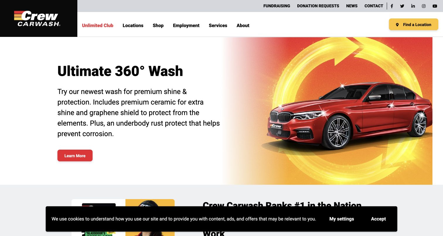
Crew places its newest wash treatment in a simple split layout: explanatory text on white beside a red car and circular yellow graphic. The product message is specific enough to introduce the differences between a basic wash and an added protection package, without making the header another campaign. Locations and the Unlimited Club remain persistent, and a yellow location button anchors the right side. Lower sections separate wash services, online shopping, employment and dated company news. The clean split makes the product easy to notice, although the technical treatment terms still need plain explanations. A cookie bar covers the lower edge of the captured screen, and the opening provides no immediate price comparison.
What you can learn
Use a campaign to introduce one meaningful service difference, with stable navigation around it. Translate treatment names into understandable inclusions, and let visitors compare packages or locate a branch without following the promotional story.
Pros
The split layout gives a single service message a clear hierarchy.
Location discovery remains prominent outside the product campaign.
Cons & considerations
Treatment terminology needs more explanation for unfamiliar customers.
The opening does not show package prices side by side.
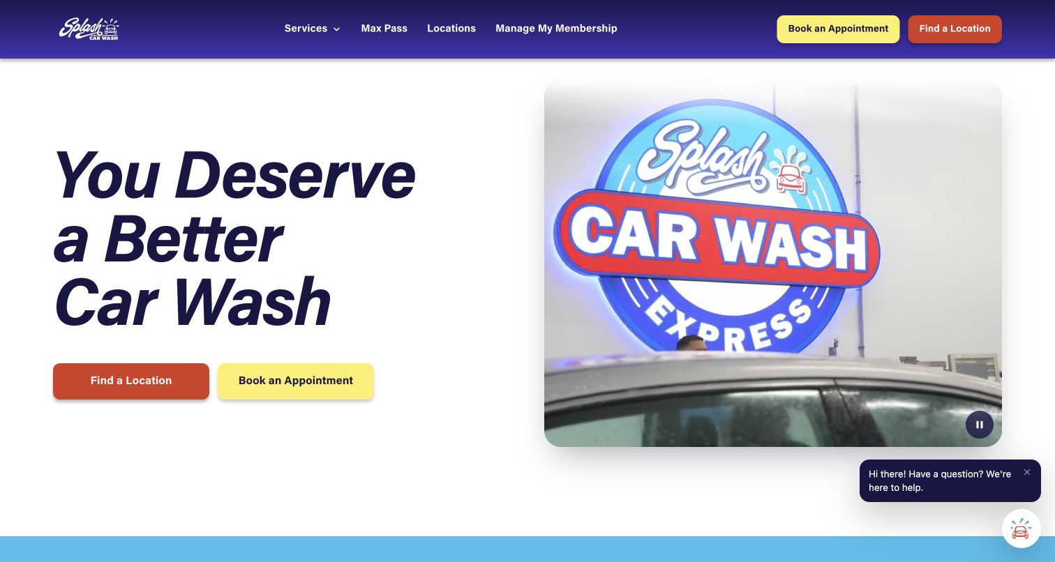
Splash gives Find a Location and Book an Appointment equal prominence in both the header and hero. That is a useful distinction for a business whose services include both quick washing and work that may need scheduling. The captured video panel shows the physical wash brand, while large dark type remains on a clean white background instead of overlapping the footage. A visible pause control gives the moving panel an alternative state. Further down, service cards name hand washing, express options and other care, making the breadth of the offer more concrete. The opening still relies on a broad quality claim, and the appointment destination is external, so users need clear service and location context before continuing.
What you can learn
Separate drop-in and appointment-based tasks early when they involve different preparation. Keep essential text outside moving imagery, provide a pause control, and explain what information an external booking system will require.
Pros
Location and appointment tasks have equally clear entry points.
Text remains readable beside video with a visible pause control.
Cons & considerations
The broad opening promise gives little service detail by itself.
External scheduling needs a well-explained transition and location context.
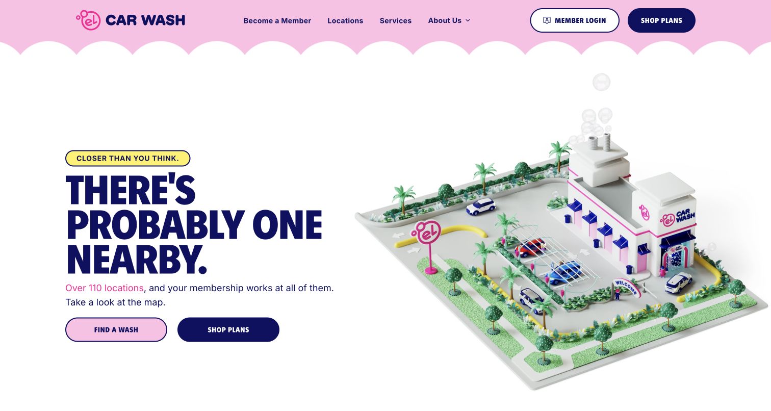
El Car Wash uses pink, navy and yellow with a small illustrated wash model to create a distinctive opening. In the captured carousel state, the message directs visitors to nearby locations and pairs Find a Wash with Shop Plans. Those same tasks remain available in the header, while Member Login is clearly separated from becoming a member. Below, the page distinguishes unlimited from single washes and exterior express from full service. That product vocabulary keeps the playful presentation useful. The carousel changes the first message, and exact branch capabilities still need verification on a location page. Large network and membership claims are displayed by the company; this review treats them as interface content rather than audited business statistics.
What you can learn
Personality works best when the core actions stay predictable. Repeat location and comparison routes across campaign states, distinguish member access from sign-up, and make service availability explicit before a customer travels.
Pros
Core location and plan actions recur in header and campaign.
Single washes and full-service distinctions receive explicit explanation.
Cons & considerations
The rotating opening changes the message seen on arrival.
Branch-specific services require a separate location check.
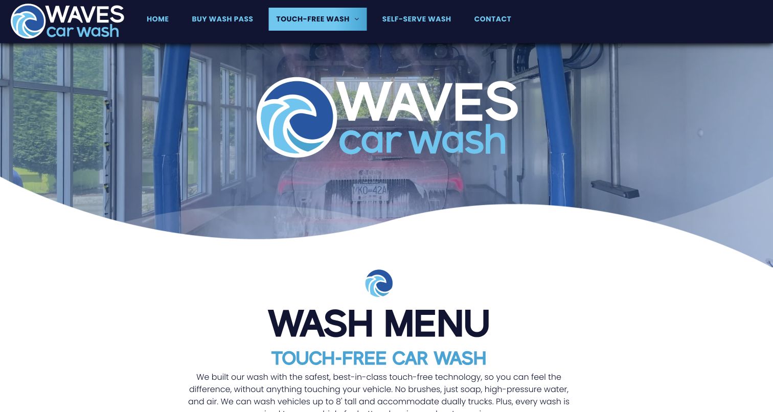
Waves in Nanaimo uses a dedicated touch-free page rather than relying solely on its homepage. The captured opening shows the wash equipment, a wave-shaped divider and a clear Wash Menu heading. Introductory text explains the absence of brushes and states vehicle-fit information before the package cards. Single-wash and monthly-pass prices are labeled separately, with added treatments grouped under each tier. Navigation preserves a separate self-serve route, so different wash formats are not collapsed into one ambiguous service. The page is useful for its specificity, although some treatment names remain technical and the large repeated logo takes space that could expose the comparison sooner. The design review does not verify the site's performance or safety claims.
What you can learn
A specialist service page should answer format and vehicle-fit questions before promoting a pass. Label recurring and one-off prices consistently, and translate named treatments into plain differences rather than assuming customers know the terminology.
Pros
Touch-free and self-serve formats have separate navigation routes.
Vehicle-fit information appears before the package comparison.
Cons & considerations
Repeated branding delays the practical comparison below the opening.
Technical treatment names need clearer customer-facing explanations.
Kegan is a freelance web designer and developer with 15+ years of experience helping businesses turn complicated website requirements into clear, maintainable digital experiences. He works directly with clients from planning and design through development, launch, and ongoing support.
For car wash website design, his development approach focuses on car wash websites that explain wash options, package inclusions, hours and locations with clear distinctions between one-off visits and memberships. The scope can be a targeted improvement or a complete custom build, with responsive layouts, thoughtful content structure, and integrations chosen around the people using and maintaining the site.
Show 3 other car wash website designersHide other car wash website designers
Begin with a small, maintained record for every operating location. It should contain a real address, directions link, telephone number, normal hours, temporary closures and the exact services available there. Separate express exterior, full service, hand wash, touch-free, self-serve and detailing where those distinctions are real. Customers should not need to infer the format from a photograph of equipment. Include vehicle-height or accessory restrictions only when the operator has supplied verified wording. Explain whether booking is needed and whether a visitor remains in the vehicle. For a network, decide which information belongs globally and which can vary by branch. A location page should preserve the selected branch when the customer proceeds to packages or booking. Avoid presenting one universal price when local prices differ. Give visitors a manual city or ZIP route as well as a browse-all directory; automatic location access should be optional. Keep operating branches separate from coming-soon locations and review that status when a new site opens. Assign a staff member to update holiday hours and weather closures. Finally, test the information against a real customer question: can someone identify the right entrance, service and opening time without contacting the business?
Build a comparison that explains the commitment
List the actual packages before designing promotional cards. For each one, identify its single-wash price, recurring price if applicable, included services, exclusions and any location limits. Distinguish a short introductory offer from the standard monthly charge in the same visual group. Avoid letting a large promotional number hide the later amount or the renewal cadence. If several packages build on one another, a compact table can make the differences easier to understand than repeating almost identical lists. Use ordinary words alongside branded wax, ceramic or protection names, and publish only service claims the operator can support. Show whether interior cleaning is included, optional or available only at selected branches. Membership information should explain the vehicle rule, how to manage the plan and where cancellation terms can be read before purchase. Keep a one-off wash route visible for occasional visitors. A gift card is another distinct product and needs its own redemption explanation. Review the comparison on a narrow screen without relying on color alone for included and excluded features. Let a customer compare without opening an account. Once the structure is clear, promotional artwork can add personality without carrying the burden of explaining the offer.
Treat the website as an ongoing operating tool
A car wash website changes with weather, hours, equipment, pricing and branch openings. Establish an editing routine before launch so those changes do not become emergency design work. Keep offer dates and membership terms in structured content that can be reviewed together, rather than embedding important prices only inside campaign images. Give each promotion a clear destination and an owner responsible for removing it when it ends. If the site links to an external membership or booking system, explain the transition and keep the chosen branch and service understandable. Test basic customer journeys without making real purchases or account changes during routine site checks. Confirm that telephone and directions links point to the right location, that a member can find management information, and that an unavailable booking service does not erase essential contact details. Use real facility photographs where possible, with readable text outside moving backgrounds and a way to pause automatic motion. Keep optional marketing collection separate from service information. Finally, maintain a short record of which pages were checked and what changed. The goal is a dependable place for practical answers, with enough personality to feel like the same business customers encounter at the wash.
The editing job behind the design
Choose technology that supports location and membership clarity
A content system should make branch hours, services and offers easy to maintain without editing a campaign image. Treat a wash menu, a location directory and an account portal as different information needs, even when one platform supplies several of them.
Public stack observations can reveal a builder, library, font or delivery service, but they do not prove how the payment terminal, membership database or wash equipment works. The broad audits below retain evidence scope and dates; unavailable scans remain unavailable rather than receiving guessed backend labels.
Keep external booking and membership transitions clear. Preserve accessible navigation and essential contact information when a third-party widget fails, and collect only the information needed for the task the visitor has chosen.
Our WordPress website examples offer a separate look at publishing approaches. A visible platform label is evidence for that named page, not a guarantee that the same system will suit your requirements.
Before the public launch
Car wash website planning checklist
Show the correct address, telephone and directions for every operating branch.
Publish normal hours and a maintained route for temporary changes.
Identify exterior, interior, touch-free, self-serve and detailing formats accurately.
Explain relevant vehicle-fit restrictions using verified operator information.
Keep a manual location search and a browse-all option available.
Separate single-wash prices from recurring membership charges.
Place post-promotion pricing and renewal cadence beside introductory offers.
Compare meaningful inclusions without relying only on branded treatment names.
Provide a visible route for existing members to manage their plan.
Keep cancellation and membership terms available before enrollment.
Use readable campaign text and pause controls for automatic motion.
Review location links, external booking transitions and expiring offers regularly.
These checks are a project checklist, not a performance, legal, security, or accessibility certification. Test real journeys with the people responsible for the website before making claims about the result.
Sources & editorial method
How this collection was selected and reviewed
The saved random target for this new industry guide is 16, and all 16 distinct public website properties were directly inspected and captured on November 10, 2026. Original reviews focus on visible design and information structure. Captures retain actual dimensions, timestamps, attribution and any noted source notices; one Autobell capture follows declining optional cookies. Waves West Roxbury was explicitly selected for its local positioning, visible hours, structured package comparison and practical FAQs after direct review. Editors Choice concerns website design and communication, not wash quality, safety, environmental performance or a customer rating. All exact source pages received a bounded broad technology-audit attempt; unavailable results and qualified observations remain in the underlying records. No forms, purchases, memberships or real account changes were submitted.
Each example links to its actual source page. Screenshots are direct browser captures with their own capture dates; moving imagery, announcements and live designs can change. The notes describe observable design choices and conditional tradeoffs, not measured traffic, conversion results, service quality, or accessibility conformance.
Technology labels use public page metadata, asset evidence, or explicitly cited platform documentation. Platform documentation is not a complete current deployment audit. A component reference may be legacy or unused; it is not a complete backend inventory. Unknown stacks are omitted. These sites are editorial examples, not our client portfolio.
Written, Edited and Curated are separate editorial records, not timestamps advanced by a rebuild. Website designs and imagery belong to their owners. See our editorial standards or suggest a correction.
Questions worth asking
Car Wash website design questions
What should a car wash homepage show first?
Start with the service format, a clear location route, opening information and the main customer task. A single-site business can show its address immediately; a network should help the visitor choose a branch before presenting location-dependent prices.
Should memberships be the only main action?
Keep one-off washing visible alongside subscriptions. Explain the recurring commitment and provide a separate management route for existing members so buying, comparing and account maintenance do not become one confusing flow.
How should wash packages be compared?
Use consistent labels for single and recurring prices, show included and excluded services, and explain specialist treatment names. If a promotion changes the first payment, place the later standard charge and renewal cadence nearby.
Does a car wash need online booking?
It depends on the service. Express washing may need directions and hours more than appointments, while detailing or other scheduled care may need a booking route. Explain which tasks require a reservation and preserve location context when linking to another system.
Do these examples verify the quality of a wash?
No. The guide evaluates public website design and communication. Screenshots and technology evidence do not establish cleaning results, vehicle safety, environmental performance or the accuracy of a business's promotional claims.
Borrow the clarity that fits your operation: a local hours strip, a useful package comparison, a dependable location directory or an obvious member-management route. Then maintain those details as carefully as the visual presentation.