A zoo website should connect animal interest with accurate visitor information. Hours, entry rules, habitat notices and accessible planning matter as much as an appealing animal photograph.
Zoo websites serve families, local members, tourists, teachers, researchers, donors and volunteers. Their needs overlap but are not identical. A person checking today’s last-entry time should not have to understand the institution’s conservation structure, while a teacher or supporter needs more than a ticket button. Clear audience routes let these purposes share one website.
These twenty-five examples show animal-led campaigns, free-admission introductions, detailed operational alerts, membership stories and practical visit hubs. Oakland Zoo is represented by its Glowfari event page and Zoo Atlanta by its visit-planning page. The reviews describe observed public design choices, not the quality of animal care, conservation outcomes, visitor satisfaction or accessibility certification. Dates, offers and schedules in captures are historical observations.
Before the examples
What makes good zoo website design in 2026?
Publish the exceptions that change a visit
Separate the zoo’s closing time from last admission, and state any member-specific entry rules. Name temporarily closed habitats, unavailable amenities and altered event hours with affected dates. Connect each notice to relevant planning and ticket pages so someone arriving through an event link sees the same information.
Give animal content an educational structure
Build species and habitat pages from approved information, with clear names, locations and learning context. Distinguish general species facts from statements about individual animals. Explain viewing limitations where appropriate and avoid implying that a photograph or birth announcement guarantees a particular animal will be visible during a visit.
Separate admission, membership and support
Explain what a day ticket covers, how reservations work, and which encounters or evening events require an additional booking. Give membership its own benefit and eligibility information. Keep donations, adoptions and volunteering understandable as different forms of support, with the institution’s approved descriptions of their purpose.
The collection · 25 examples
25 zoo websites worth studying
Study how each site keeps visit logistics visible during an animal or seasonal campaign. Compare the treatment of free admission, last entry, changing habitat access, membership, event tickets and the relationship between a visit and the zoo’s wider work.
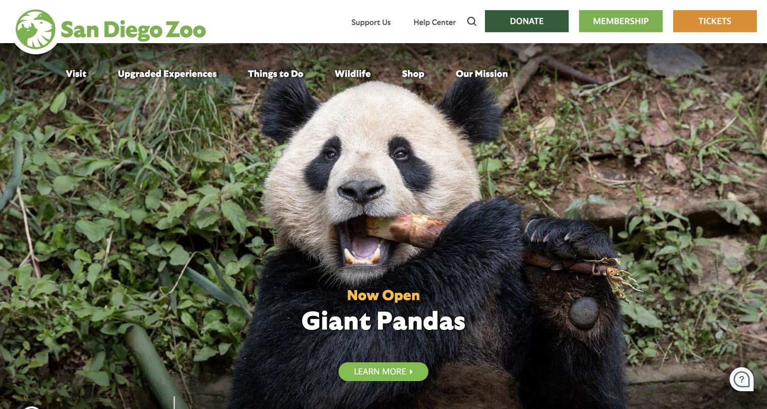
San Diego Zoo fills the opening view with a close photograph of a giant panda and a short announcement that the exhibit is open. A green Learn More button invites further exploration without putting every visit detail over the animal. The white header reserves different colored blocks for Donate, Membership and Tickets, while a second navigation row covers visiting, upgraded experiences, wildlife and the mission. The site balances a specific animal story with multiple ways to engage with the institution.
What you can learn
Let a flagship animal create interest, then distinguish learning about that animal from buying admission or supporting the organization. Keep those actions plainly named; an appealing photograph cannot explain the requirements or availability of a particular viewing experience.
Pros
The animal remains the clear visual subject while the campaign copy stays brief.
Ticket, membership and donation routes are visibly separate in the permanent header.
Cons & considerations
The tall hero places detailed trip preparation beyond the first screen.
A flagship-species campaign needs current viewing guidance on its destination page to manage visitor expectations.
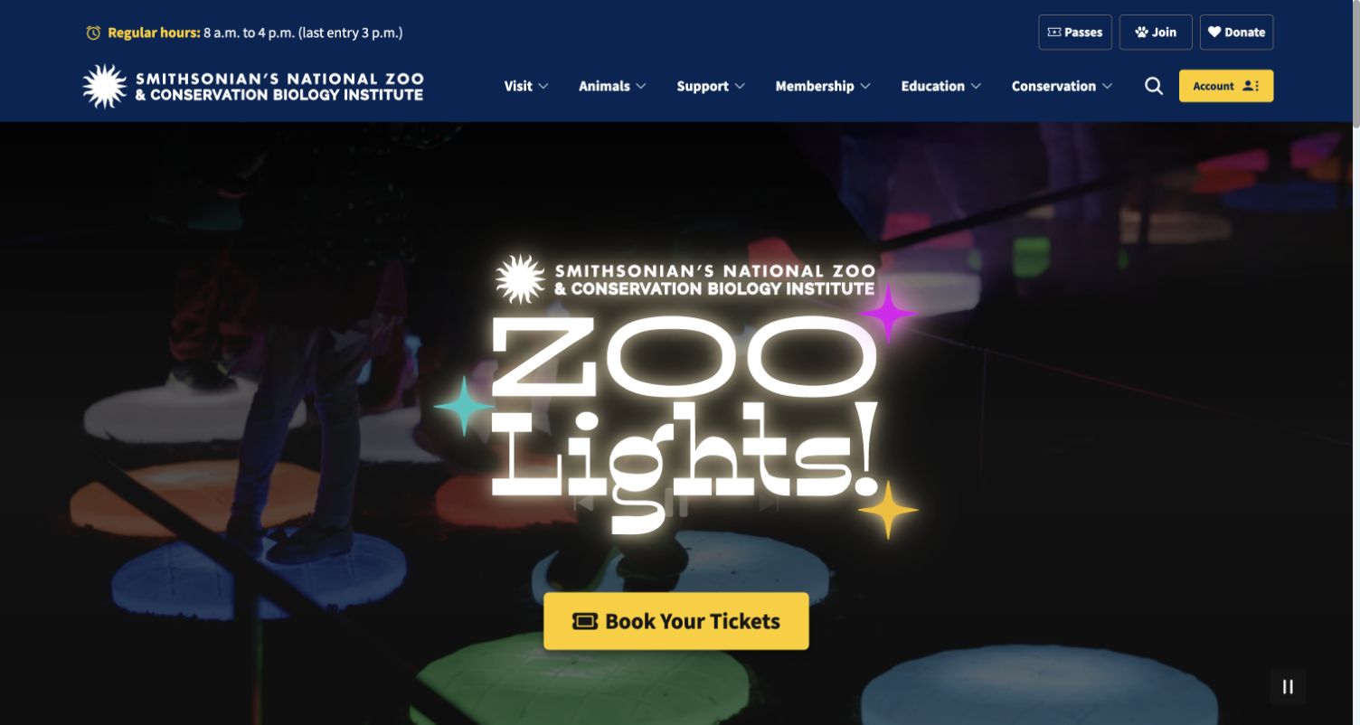
The Smithsonian’s National Zoo places regular hours and last-entry time in the top utility strip, beside Passes, Join and Donate. Its main navigation separates visiting, animals, support, membership, education and conservation. At the time reviewed, a large ZooLights video campaign and yellow Book Your Tickets action occupied the opening screen. Farther down, shortcuts distinguish hours, entry passes, parking and animal exhibits. The word choices reveal two potentially different transactions: ordinary entry passes and the prominently advertised evening event.
What you can learn
Make the admission model explicit whenever a special event has different booking rules from an ordinary visit. Preserve the regular hours and entry-pass route outside the event campaign, and label the event action with enough context to prevent a mistaken reservation.
Pros
Regular hours include a separate last-entry time, helping visitors plan arrival.
Permanent entry-pass and parking shortcuts remain available beneath the seasonal promotion.
Cons & considerations
The event’s generic Book Your Tickets wording requires surrounding context to distinguish it from daytime entry.
A large video campaign needs a useful still fallback and tested pause behavior.
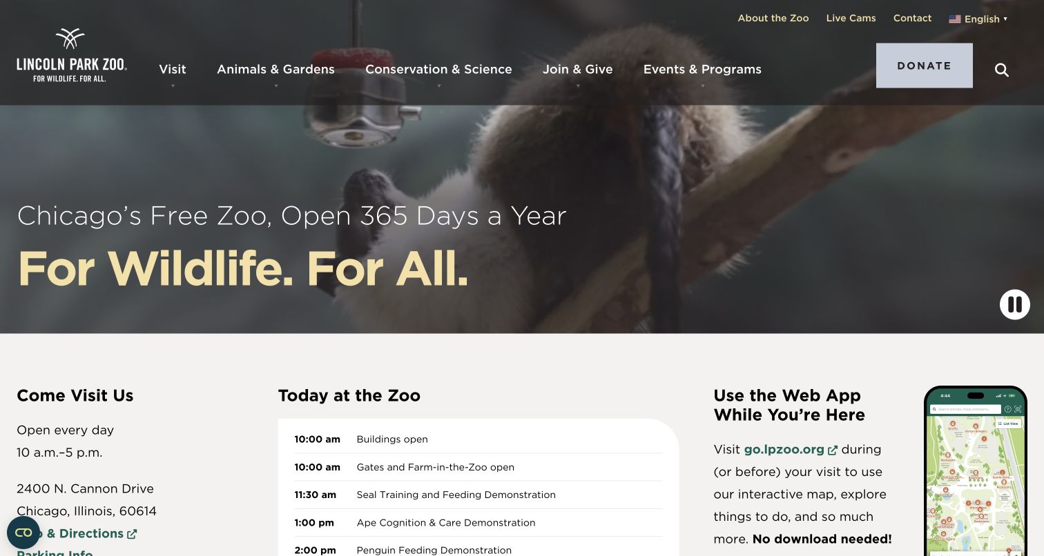
Lincoln Park Zoo states that it is Chicago’s free zoo and open every day before presenting its For Wildlife. For All. message. Animal footage establishes the setting, but the next section quickly provides hours, the street address, a Today at the Zoo schedule and a web-app introduction. The main navigation pairs Animals & Gardens with Conservation & Science and places Join & Give beside Events & Programs. This is a useful model for a zoo whose website must support a casual visit without forcing everyone through a ticket purchase.
What you can learn
Lead with the actual admission model, then make the day’s schedule and arrival details immediately useful. For free-entry venues, explain separately ticketed activities and events where relevant instead of allowing the general free-admission statement to imply that every experience is included.
Pros
The free-entry and year-round messages answer two common planning questions immediately.
The schedule and no-download web-app introduction connect advance planning with the on-site visit.
Cons & considerations
The combination of activities, gardens and scientific work needs clear pathways for different audiences.
A changing daily programme requires reliable editorial ownership so visitors do not plan around stale times.
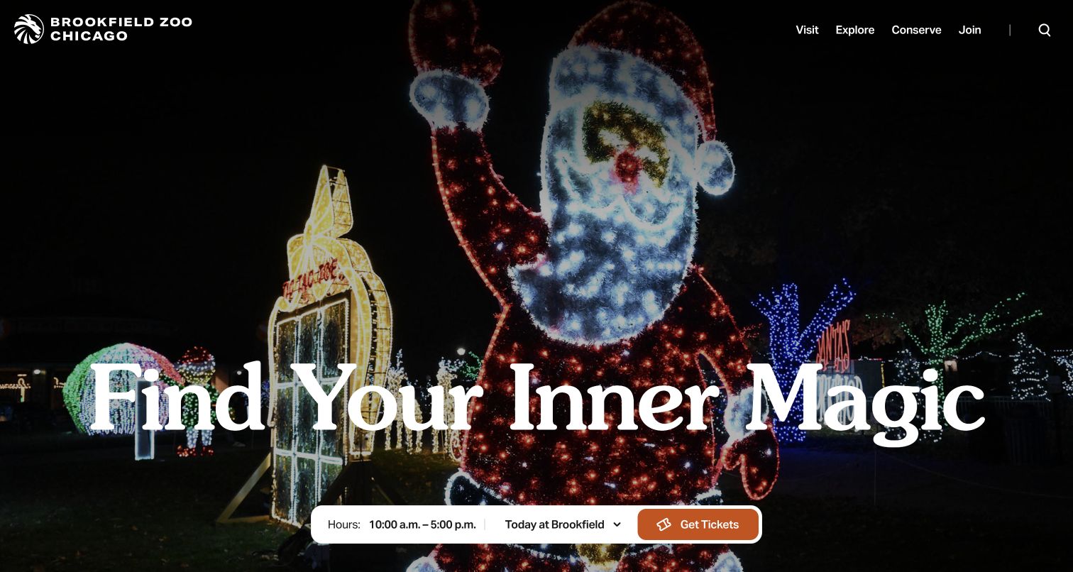
Brookfield Zoo Chicago pairs the Find Your Inner Magic headline with a full-screen photograph of holiday light displays. The main menu is unusually concise: Visit, Explore, Conserve and Join. Near the bottom of the hero, a white pill groups current hours, Today at Brookfield and an orange Get Tickets action. Below, the page moves into its conservation purpose and separate experience cards such as dolphin discovery, the carousel and giraffe feeding. The short menu and persistent planning cluster keep the opening composition relatively focused.
What you can learn
Give the visual campaign one supporting utility cluster containing hours, today’s programme and admission. Keep experience cards descriptive enough to distinguish included activities from optional encounters, and avoid letting an initial announcement obscure the same planning controls it is meant to support.
Pros
Hours and ticket access remain visible within the otherwise immersive opening view.
The four short main categories create a manageable starting point for a broad institution.
Cons & considerations
A seasonal promotion modal appeared during review and required dismissal before the main layout was clear.
Very broad menu labels rely on their expanded contents to explain education, accessibility and visitor logistics.
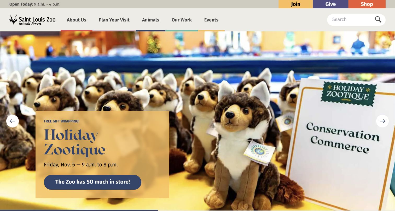
Saint Louis Zoo keeps Open Today, Join, Give and Shop above its main navigation. The reviewed carousel moved among seasonal lights, a holiday retail event, adoption and membership promotions; the saved image shows Holiday Zootique with its date and hours on a translucent gold panel. Plan Your Visit, Animals, Our Work and Events remain outside that rotating campaign area. The page demonstrates how one institution can present several fundraising and visitor stories while keeping the everyday zoo identity and opening time stable.
What you can learn
Build campaign components with separate fields for title, timing, explanation and action. Give each promotion a clear purpose and leave essential visit information outside the rotation, since a visitor may only see one slide before making a navigation choice.
Pros
The operating-hours link does not depend on whichever promotional slide happens to be visible.
The retail campaign includes a specific date and time rather than an undated seasonal slogan.
Cons & considerations
Several rotating promotions compete for attention and may be missed by visitors who do not wait.
Text on translucent panels needs contrast checks against every campaign photograph and crop.
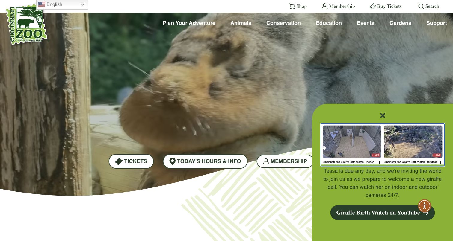
Cincinnati Zoo uses close animal footage beneath a navigation that includes both the zoo and its botanical-garden interests. Tickets, Today’s Hours & Info and Membership appear as large pill-shaped shortcuts over the lower hero. During this review, a green panel promoted a giraffe birth watch with links to indoor and outdoor cameras. That panel gives the site a timely editorial reason to return, although it competes with part of the main opening view. The underlying navigation also exposes maps, accessibility guidance and visitor FAQs within visit planning.
What you can learn
Treat timely animal news as an editorial layer with a clear path to learn more, while keeping operational information dependable. Distinguish a live camera invitation from a promise that a visitor will see a particular animal or event during an in-person visit.
Pros
Prominent hours and ticket shortcuts support a visitor who arrives with an immediate practical task.
The birth-watch panel connects animal news to a specific public viewing destination.
Cons & considerations
The large news panel overlaps the hero and reduces space available for the core visit controls.
Video, live-camera promotions and overlays require coordinated motion and keyboard testing.
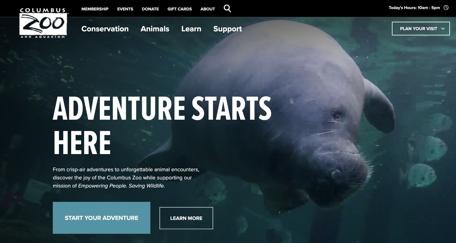
Columbus Zoo and Aquarium overlays its Adventure Starts Here message on a large manatee photograph. A short paragraph explicitly connects the visit invitation with the organization’s wildlife mission. Start Your Adventure and Learn More have different visual weights, while Today’s Hours remains in the upper black strip. The navigation prioritizes conservation, animals, learning and support, with Plan Your Visit set apart. Below the hero, direct links cover hours and rates, accessibility, preparation and directions. The page therefore moves from emotional interest to logistical questions in a clear sequence.
What you can learn
Connect the visitor invitation to the mission in a short explanatory sentence, then provide concrete planning links immediately afterward. Avoid making a broad adventure label the only route to rates; readers comparing practical details should be able to find those details by name.
Pros
The hero paragraph states why the institution connects visiting with conservation.
A dedicated planning row names accessibility and know-before-you-go information explicitly.
Cons & considerations
The initial action label is less specific than the hours-and-rates page it leads toward.
Mission and visit navigation need consistent terminology to prevent duplicate or overlapping routes.
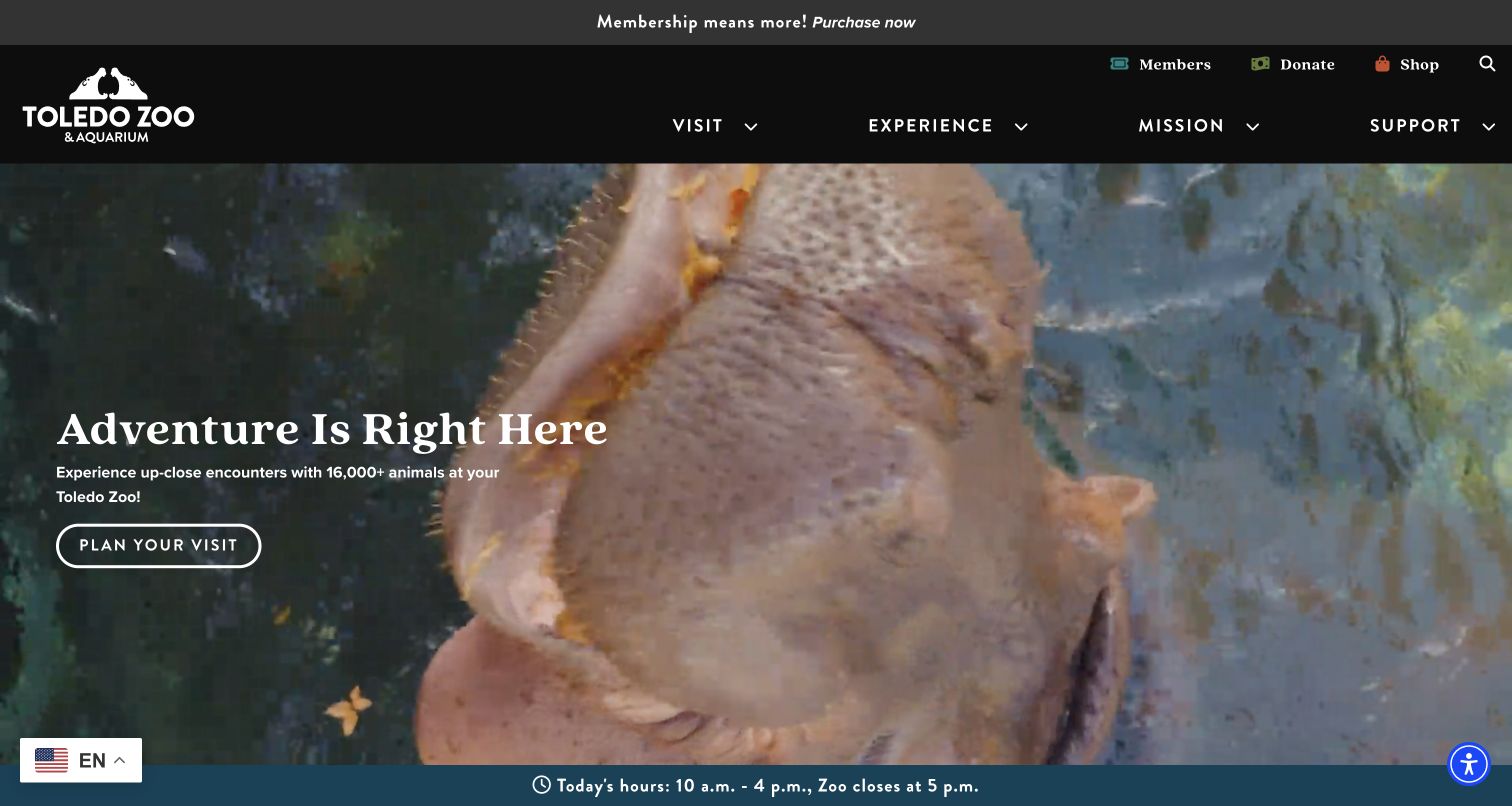
Toledo Zoo & Aquarium uses animal footage behind a short Adventure Is Right Here statement and a bordered Plan Your Visit button. Its main menu reduces the institution to Visit, Experience, Mission and Support, while membership, donations and shopping sit in a utility row. A blue strip along the bottom of the opening area distinguishes the listed entry hours from the later zoo closing time. Below, Know Before You Go introduces practical information. A membership promotion initially covered the hero and was dismissed for the saved capture.
What you can learn
Explain the difference between the last time guests can enter and the time the grounds close. Keep that distinction in plain text close to the main planning action, and use promotions sparingly so they do not conceal the operational facts first-time visitors need.
Pros
The hours strip explicitly distinguishes entry timing from the final closing time.
The short main menu keeps the initial navigation choices relatively manageable.
Cons & considerations
The initial membership overlay interrupted the first visit before practical information could be read.
The moving animal background needs contrast and reduced-motion checks around the white hero text.
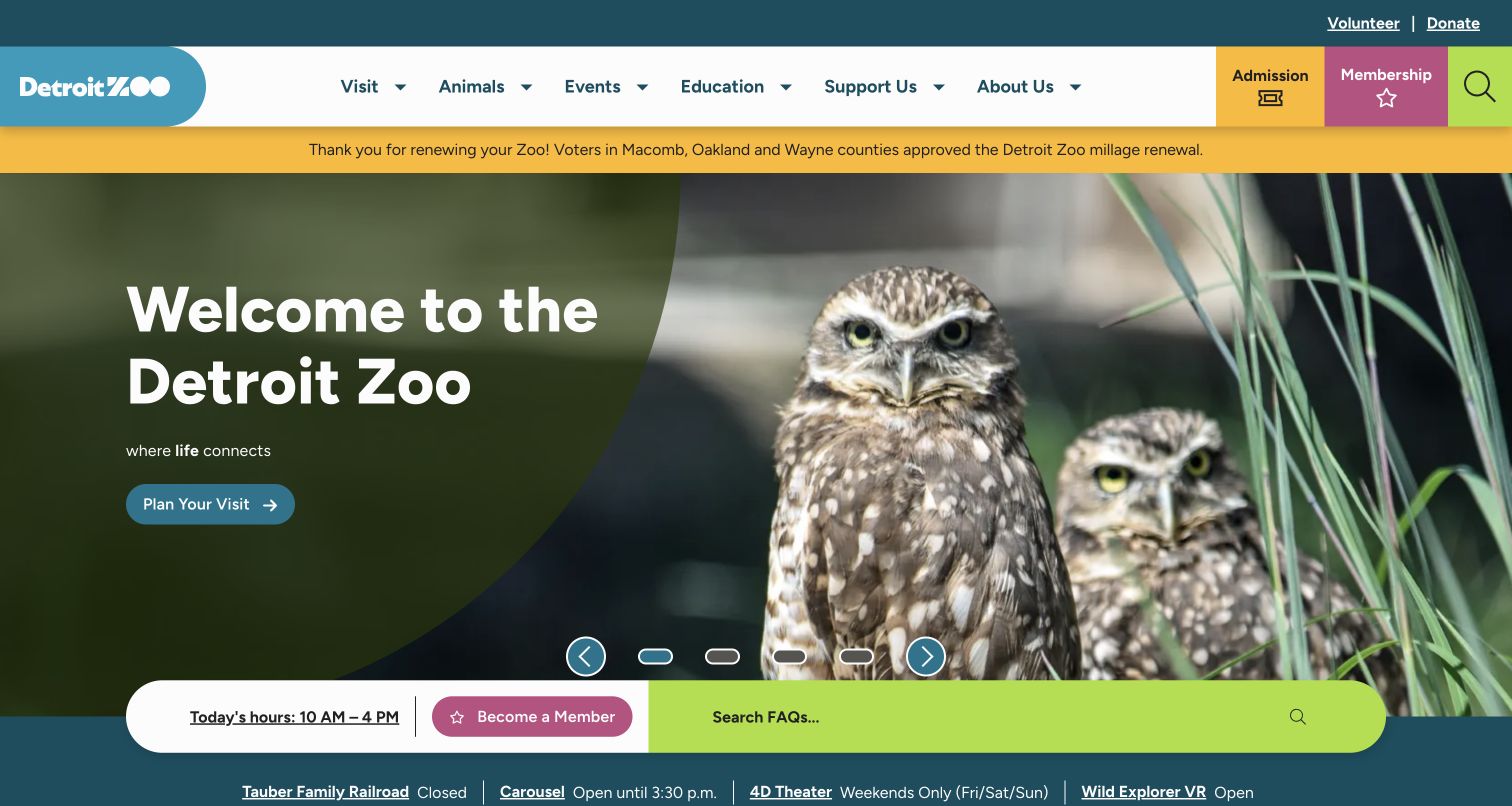
Detroit Zoo combines a friendly owl photograph with a large welcome message and a Plan Your Visit button. Color-coded admission and membership blocks sit in the header. More unusually, a long rounded bar beneath the hero groups today’s hours, membership and an FAQ search field. A further strip reports the status of specific amenities, including the railroad, carousel, theater and virtual-reality experience. The page acknowledges that being open does not mean every attraction or activity operates on the same schedule.
What you can learn
Publish amenity status at the same level of clarity as zoo-wide hours. A visitor planning around a train or scheduled show needs more than a general open badge; searchable answers can complement that information, but critical closures should remain visible without a search.
Pros
The amenity-status strip supports a more accurate plan than a single overall operating time.
The FAQ search is placed near the main visit decision rather than only in the footer.
Cons & considerations
Several horizontal information bars can crowd the opening layout on narrow screens.
The carousel and status feeds need coordinated updates so campaign promises do not conflict with operational notices.
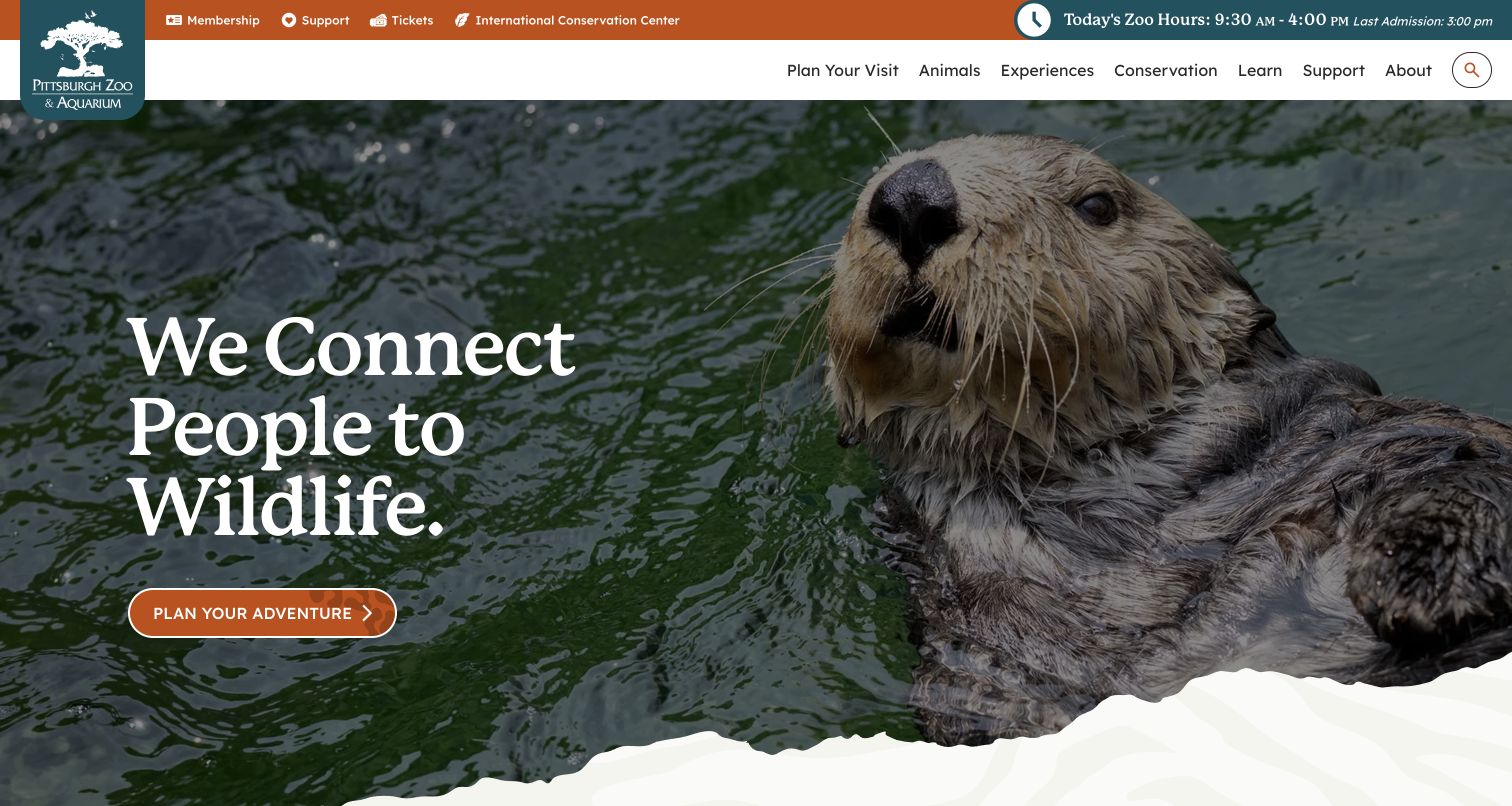
Pittsburgh Zoo & Aquarium uses a close sea-otter image and the We Connect People to Wildlife statement to introduce the destination. An orange Plan Your Adventure button provides one clear next step. The top utility strip includes both today’s zoo hours and the last-admission time, while separate navigation routes cover animals, experiences, conservation, learning and support. The treatment feels calmer than a multi-offer campaign page, with the animal photograph providing most of the visual character and a torn-paper edge leading into the content below.
What you can learn
A single well-chosen animal image can carry the opening identity when the surrounding text gives visitors a clear action. Pair that simplicity with precise arrival information, and make the combined zoo-and-aquarium scope clear in the ticket and planning details.
Pros
Closing and last-admission times are both visible in the persistent utility area.
One main planning action avoids competing ticket, event and package messages in the hero.
Cons & considerations
The broad adventure wording still requires a useful destination page that names concrete planning tasks.
Navigation text over or near detailed imagery should be checked across smaller viewport widths.
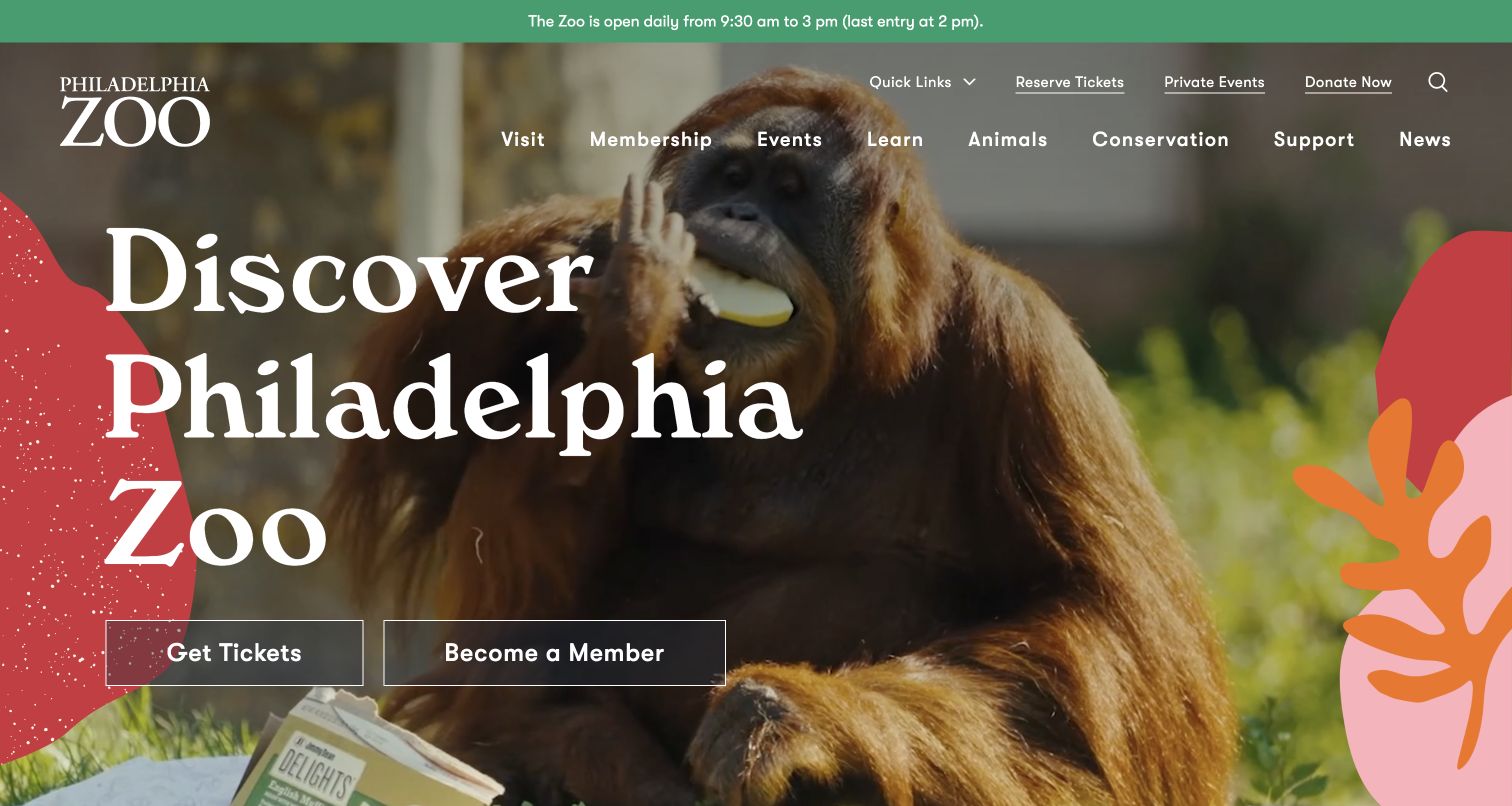
Philadelphia Zoo opens with a large orangutan photograph framed by warm abstract shapes and a prominent Discover Philadelphia Zoo title. Get Tickets and Become a Member sit side by side below the headline. A green strip states daily hours and last entry, while the header keeps visit, membership, events, learning, animals, conservation, support and news visible. Reserve Tickets, private events and donations occupy a separate utility row. The page uses its visual identity to create warmth without collapsing the distinction between a one-time visit and ongoing membership.
What you can learn
Present day admission and membership as different decisions with understandable destination pages. Preserve the arrival cutoff near the main navigation, and let expressive shapes support the animal image rather than carry information that visitors need to read or act on.
Pros
The two hero actions make the day-ticket versus membership distinction easy to see.
The top hours strip explicitly includes a last-entry cutoff.
Cons & considerations
The broad desktop navigation needs disciplined grouping when translated to mobile menus.
Large decorative shapes and headline text require deliberate image crops to keep the animal and actions visible.
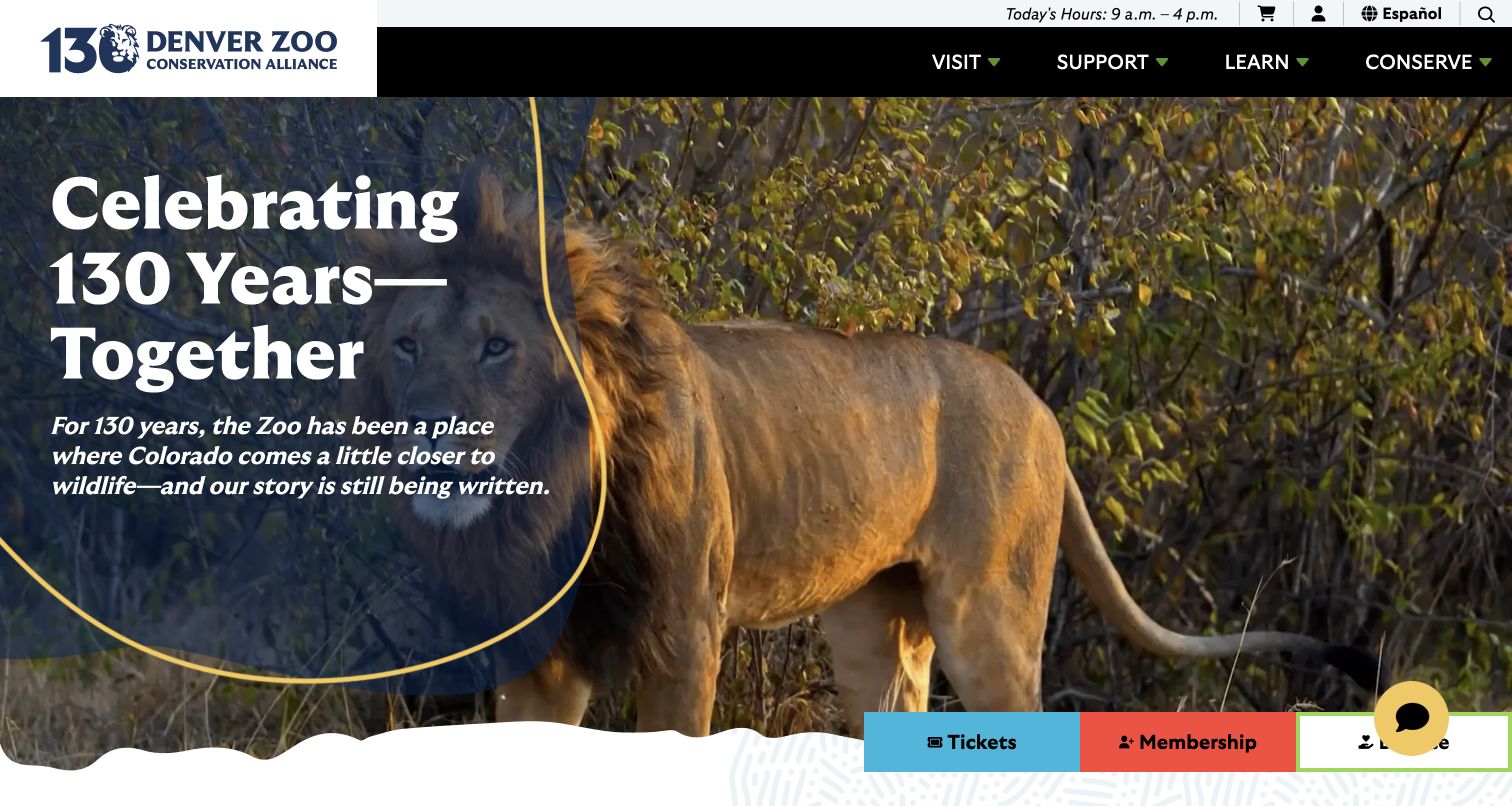
Denver Zoo Conservation Alliance presents its anniversary with a large lion photograph and a dark outlined text panel. The headline and paragraph frame the zoo as a shared Colorado story rather than only a collection of attractions. Today’s hours, account access and an Español route remain in the utility area, while Visit, Support, Learn and Conserve organize the main menu. Tickets, Membership and Donate reappear in a colored action strip at the bottom of the hero. The design connects institutional history to three distinct forms of participation.
What you can learn
An anniversary can provide a strong editorial theme, but it should still lead into recognizable visitor and supporter tasks. Keep language access and account tools independent of campaign imagery, and explain the actual programme or benefits behind each participation option.
Pros
The anniversary copy adds institutional context without replacing admission and membership actions.
An explicit Spanish-language route is visible alongside the practical utility controls.
Cons & considerations
The tall opening story can push current events and detailed planning farther down the page.
A chat control overlaps the lower action area, making small-screen collision testing important.
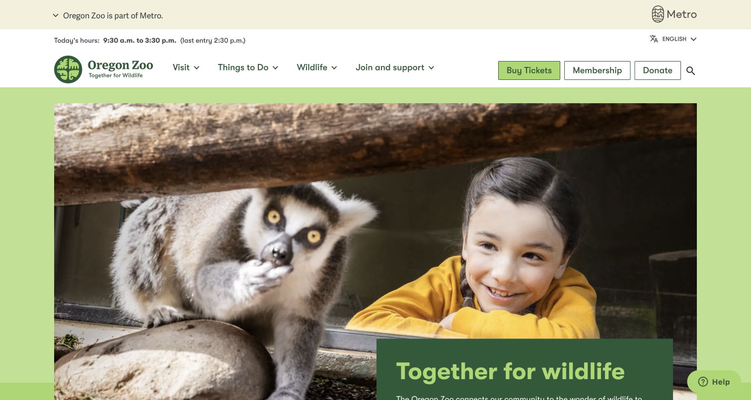
Oregon Zoo uses a cream-and-green palette and a contained photograph of a child watching a lemur. The image leads into a Together for wildlife text panel rather than carrying every message as an overlay. Above it, the page identifies the zoo as part of Metro and states today’s hours with a separate last-entry time. Visit, Things to Do, Wildlife and Join and support form a compact menu, while tickets, membership and donations are separate actions. The overall hierarchy emphasizes a community institution with practical entry information available before the story.
What you can learn
Use the institutional relationship and opening information to orient visitors, then explain the mission in a readable content block. A contained image can provide emotional interest while leaving the navigation and transaction choices on stable, high-contrast surfaces.
Pros
The last-entry time appears alongside the day’s hours in a consistent utility row.
The separation of image and text reduces dependence on readable text over photography.
Cons & considerations
The mission introduction extends below the first screen, so its action needs a clear continuation.
Community, wildlife and support content still needs targeted routes for teachers, members and first-time visitors.
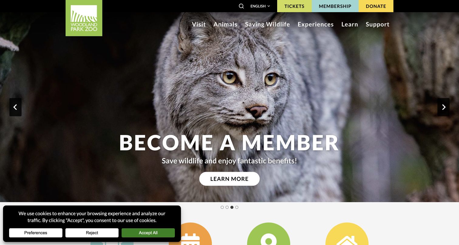
Woodland Park Zoo pairs a close lynx photograph with a Become a Member message that connects benefits with saving wildlife. Three colored blocks in the top bar distinguish Tickets, Membership and Donate. The main menu separates visiting, animals, saving wildlife, experiences, learning and support. Other observed slides promote Forest Trailhead and general visits, including a notice that ticket sales are online. The carousel therefore mixes programme discovery with attendance and support choices, while the permanent header preserves the underlying transaction routes.
What you can learn
Explain membership as a specific relationship with the institution, then provide clear benefit and booking details behind the campaign. Keep any online-only purchasing rule outside rotating content as well, because visitors may arrive on a slide that does not display it.
Pros
Tickets, membership and giving remain distinct even while the hero emphasizes one of them.
The wildlife-support language gives membership an institutional context beyond repeat admission.
Cons & considerations
Important purchase-channel information should not depend on visitors seeing a particular carousel slide.
A seasonal popup and cookie notice appeared during review, adding interruption before the main choices.
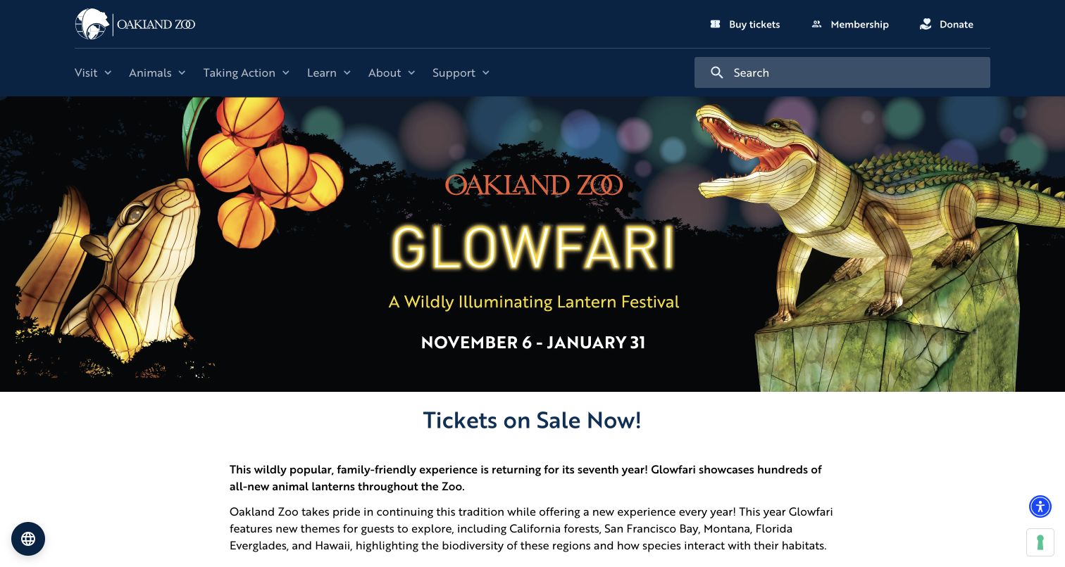
Oakland Zoo’s Glowfari page uses a wide illustrated lantern banner with a clearly printed event period, followed by a Tickets on Sale Now heading and a readable explanation of the experience. The text describes the changing regional themes and the relationship between species and habitats. The ordinary zoo header remains available with visiting, animals, learning, support and ticket routes. This source is the event detail page rather than the homepage, making it useful for studying how a promotional image becomes an explanation of what visitors will actually encounter.
What you can learn
Give a seasonal event a dedicated page with its own timing, experience description and admission rules. Keep essential facts in live text below the campaign art, and explicitly distinguish an evening event ticket from daytime zoo access before directing guests to purchase.
Pros
The campaign moves quickly into descriptive text about the event’s content and themes.
The permanent zoo navigation keeps broader visit information available from the event page.
Cons & considerations
The banner contains important dates as artwork, so an equivalent text presentation is valuable.
A ticket-sales headline needs nearby details on inclusions, times and changes to ordinary animal viewing.
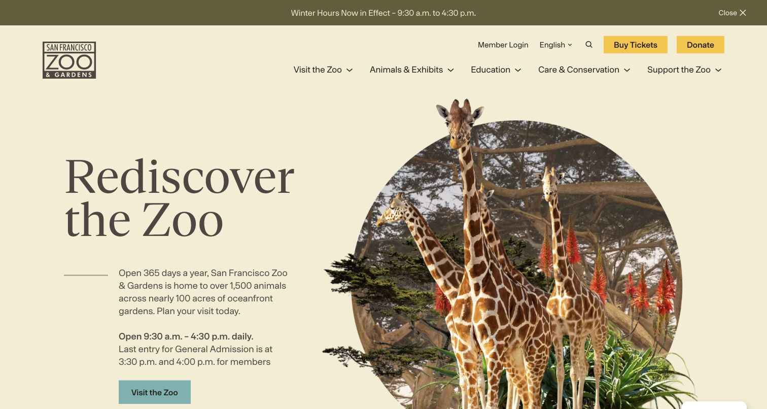
San Francisco Zoo & Gardens places Rediscover the Zoo on a calm cream background beside a circular giraffe photograph with animal cutouts extending beyond it. The accompanying text identifies the destination as an oceanfront zoo and gardens, then states daily hours and different last-entry times for general admission and members. A Visit the Zoo button follows immediately. The header provides clearly named visit, animals, education, care and conservation, and support categories. Unlike a full-screen video treatment, this opening gives operational text substantial space from the start.
What you can learn
Use the opening copy to answer the practical exceptions that affect arrival, especially when member and general-admission rules differ. A distinctive photographic composition can supply personality without forcing those details onto a moving or visually crowded background.
Pros
The hero explains separate entry cutoffs for members and ordinary ticket holders.
The cream text surface gives planning information a predictable reading area.
Cons & considerations
Several timing statements need a single editorial source so seasonal updates stay consistent.
The animal cutout and circular crop need careful responsive scaling to avoid crowding the text.
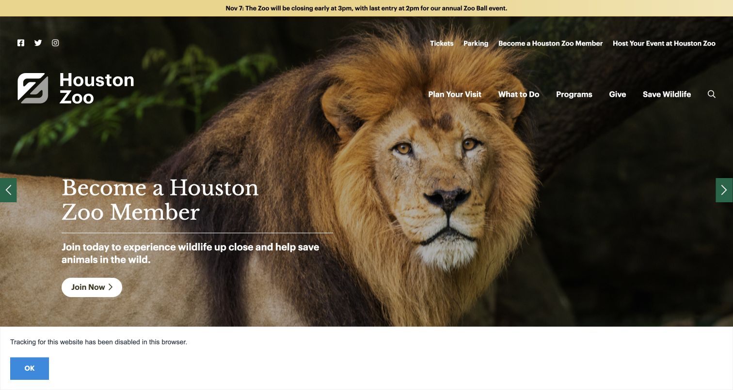
Houston Zoo presents large animal and visitor photographs through a rotating campaign area, with a membership message visible in the saved view. The page also promotes Zoo Lights and an adults-only wine event in the observed campaign sequence. Above everything, a narrow notice announces an upcoming early closure and its last-entry time. Tickets and parking have direct utility links, while the main navigation separates planning, activities, programmes, giving and wildlife work. The operational notice remains independent of the changing promotional story below it.
What you can learn
Keep exceptions to normal opening times above the campaign area and state the affected date clearly. When events have age limits or separate entry arrangements, make those conditions part of their own campaign text and detail pages rather than assuming every zoo event is suitable for the same audience.
Pros
The early-closure alert specifies both the date and the arrival cutoff.
Parking receives a direct utility link, reflecting a common practical concern before a visit.
Cons & considerations
The carousel mixes membership and event intentions, so each destination must retain clear context.
Navigation over large photographs needs contrast checks as images and responsive crops change.
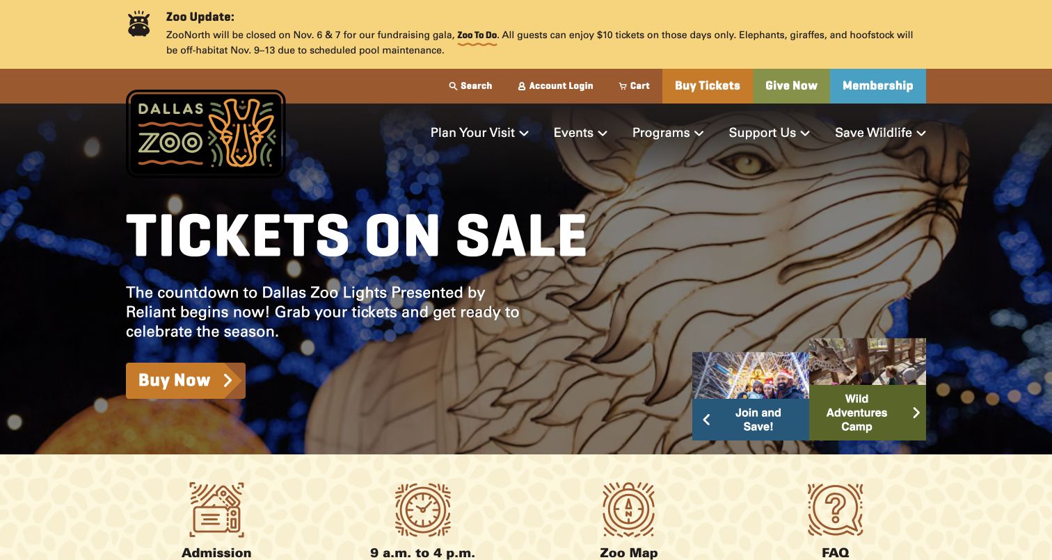
Dallas Zoo places a detailed Zoo Update above its navigation. The notice names an area closure for a fundraising event and identifies animals that will be off habitat during scheduled maintenance. Beneath it, colored ticket, giving and membership actions lead into a Zoo Lights campaign. A lower row offers admission, hours, the zoo map and FAQs. This is a particularly useful example of letting operational changes interrupt the sales story: a visitor sees what may affect the day before being asked to respond to the seasonal promotion.
What you can learn
Publish temporary limitations in concrete terms: the affected area or animals, the dates and the relevant alternative information. Keep those notices connected to ticket pages as well as the homepage so visitors arriving through a campaign link receive the same planning context.
Pros
The alert names affected areas and animals rather than using an unexplained general advisory.
Admission, map and FAQ shortcuts provide a practical continuation after the campaign.
Cons & considerations
A long update can become dense on mobile and benefits from concise structure and clear links.
Operational notices need an expiry process so resolved maintenance does not remain visible indefinitely.
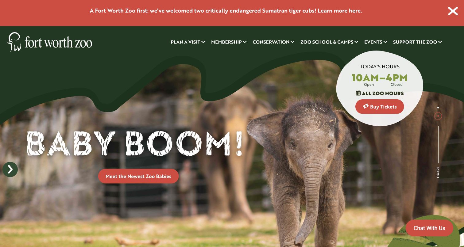
Fort Worth Zoo uses a playful Baby Boom campaign and a photograph of a young elephant beneath a dark-green header with an organic edge. A red announcement strip links to news about tiger cubs, while a large circular badge shows today’s hours, the full-hours link and Buy Tickets. The main menu also names Zoo School & Camps separately from events and conservation. The layout treats animal news as a reason to explore, but keeps daily timing in an unusually prominent and stable visual element.
What you can learn
Pair animal-news campaigns with accurate viewing information on their destination pages. A birth announcement is editorial news rather than a guarantee of visibility; the main website can encourage interest while the planning content explains what guests can reasonably expect.
Pros
The hours-and-ticket badge is conspicuous even against a visually active campaign.
School and camp programmes receive a dedicated navigation label rather than being hidden under generic events.
Cons & considerations
Large announcement and chat elements compete with the main campaign on shorter displays.
Animal-news imagery needs careful wording so visitors do not infer guaranteed access to young animals.
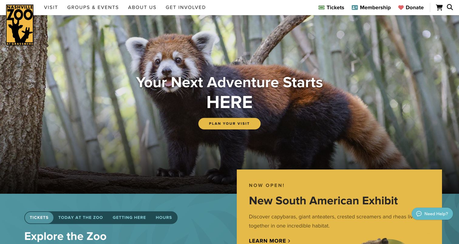
Nashville Zoo combines a red-panda hero and Plan Your Visit action with a yellow card announcing a new South American exhibit. The card names several species in the shared habitat, giving the announcement more substance than a simple New label. Alongside it, a blue planning section provides tabs for tickets, today at the zoo, getting here and hours. The ticket explanation states that prices vary by date and directs visitors to the relevant calendar. This arrangement connects a fresh reason to visit with practical trip and price selection.
What you can learn
Use an exhibit announcement to explain what is new, then place planning tasks close enough to act on that interest. When prices vary by date, say so before the purchase link and provide a calendar that preserves the selected day and ticket category clearly.
Pros
The new-habitat card names its subject and inhabitants rather than relying solely on an image.
The planning tabs group price, schedule and arrival questions into a recognizable local interface.
Cons & considerations
Tabbed content can hide important information unless labels and active states remain clear.
The large overlapping exhibit card needs responsive testing to avoid obscuring the primary visit action.
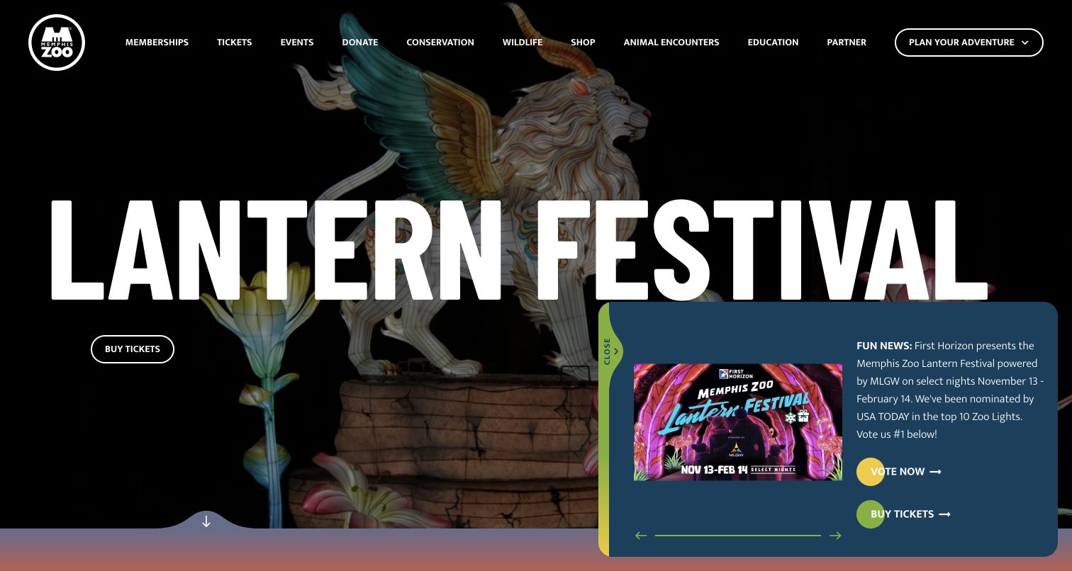
Memphis Zoo gives its Lantern Festival campaign a very large condensed headline over illuminated animal imagery. A small outlined Buy Tickets action sits beneath it, while Plan Your Adventure remains a separate control at the upper right. The long top menu includes memberships, tickets, events, conservation, wildlife, animal encounters and education. A lower-corner news panel repeats the festival with dates and additional actions. The page is visually emphatic, but also demonstrates how multiple promotions for the same event can compete with the main navigation.
What you can learn
Choose one primary event action and use supporting panels for information that genuinely adds context. Preserve a predictable planning control for ordinary visits, and make the distinction between general admission and a separately scheduled festival clear before visitors enter ticket selection.
Pros
The festival title and imagery establish the current campaign immediately.
A dedicated planning control remains separate from the event-specific ticket button.
Cons & considerations
The additional festival news panel repeats the campaign and occupies a substantial part of the opening view.
A long single-row menu requires careful reduction and grouping on smaller screens.
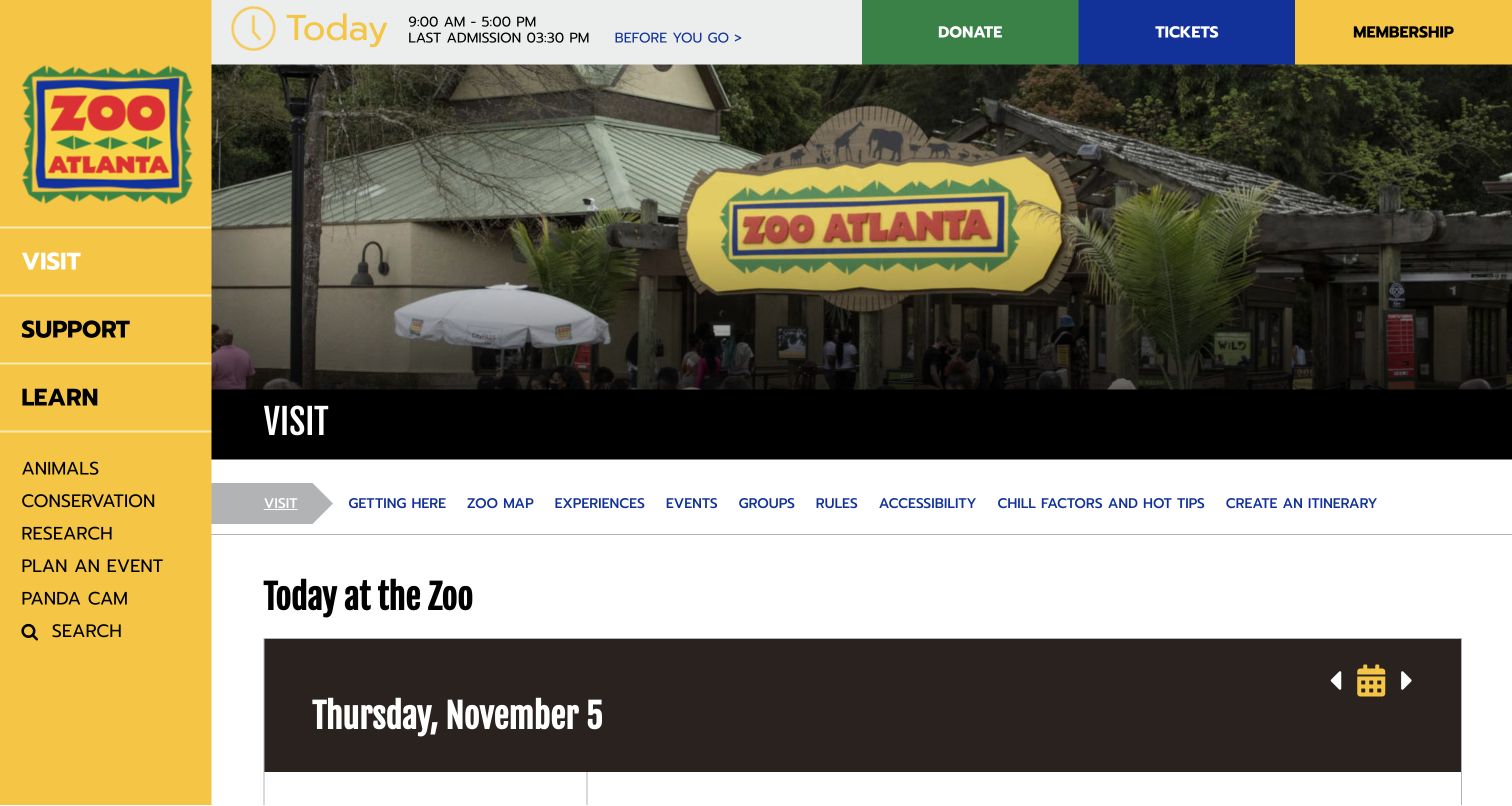
Zoo Atlanta’s visit page retains the strong yellow left navigation and a top strip with hours, last admission, donations, tickets and membership. A photograph of the entrance identifies the destination, followed by a horizontal set of planning links for getting here, the zoo map, experiences, rules, accessibility and creating an itinerary. The Today at the Zoo section begins with an explicit calendar date. Farther down, the page provides arrival, map and sensory-support content. This example focuses on a practical visit hub rather than the homepage campaign.
What you can learn
Make the visit hub the reliable home for operational information, then link campaigns into it when necessary. Display the date attached to a daily schedule and keep preparation, transport, accessibility and itinerary tools visibly grouped so a visitor can assemble a realistic day.
Pros
The local planning navigation names accessibility, rules and itinerary creation explicitly.
A dated daily schedule helps visitors understand which activities they are reviewing.
Cons & considerations
The persistent left rail and long local menu consume space that needs careful mobile adaptation.
Calendar and itinerary functions require clear empty, unavailable and changed-event states.
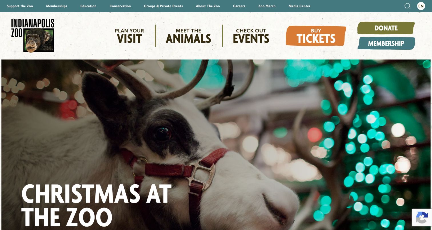
Indianapolis Zoo uses large navigation phrases such as Plan Your Visit, Meet the Animals and Check Out Events above its seasonal Christmas at the Zoo image. Buy Tickets, Donate and Membership are rendered as conspicuous colored blocks. A smaller utility row contains education, conservation, private events and institutional information. The page therefore places the ordinary visitor’s intentions above the organization’s wider programme structure. The saved view shows a reindeer photograph and an oversized event title, with the campaign continuing below the opening screen.
What you can learn
Use navigation language that describes the task visitors want to complete, then reserve a secondary level for organizational audiences. Give a seasonal hero enough date and admission context on its continuation so the event image does not become the only explanation of what is being offered.
Pros
The main navigation uses direct phrases that explain the destination of each section.
Colored blocks distinguish transactions from informational browsing choices.
Cons & considerations
A tall header and large hero leave limited first-screen space for detailed event information.
The many utility links need a clear mobile hierarchy to remain usable without overwhelming the menu.
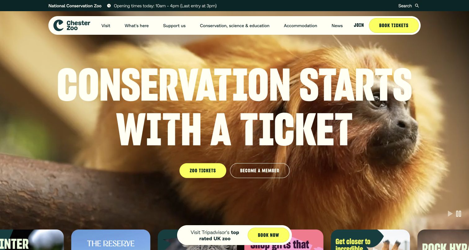
Chester Zoo overlays Conservation Starts With a Ticket on close animal footage, with separate Zoo Tickets and Become a Member actions. A thin top strip identifies the institution and states opening and last-entry times. The rounded navigation includes accommodation alongside visiting, discovering the zoo, supporting the charity and conservation, science and education. Campaign cards begin beneath the hero, and a small booking prompt remains near the bottom. The site makes admission part of its mission narrative while preserving a broader institutional and overnight-visit structure.
What you can learn
If attendance supports the mission, explain that relationship clearly and provide deeper evidence on conservation pages. Keep practical ticket information equally accessible, including the difference between a day visit, membership and accommodation, so a strong purpose statement does not replace product clarity.
Pros
The two principal actions distinguish a one-time ticket from continuing membership.
Opening and last-entry information stay visible above the campaign footage.
Cons & considerations
Repeated booking prompts can crowd the lower hero and compete with discovery cards.
A broad conservation claim needs substantive supporting content beyond the promotional headline.
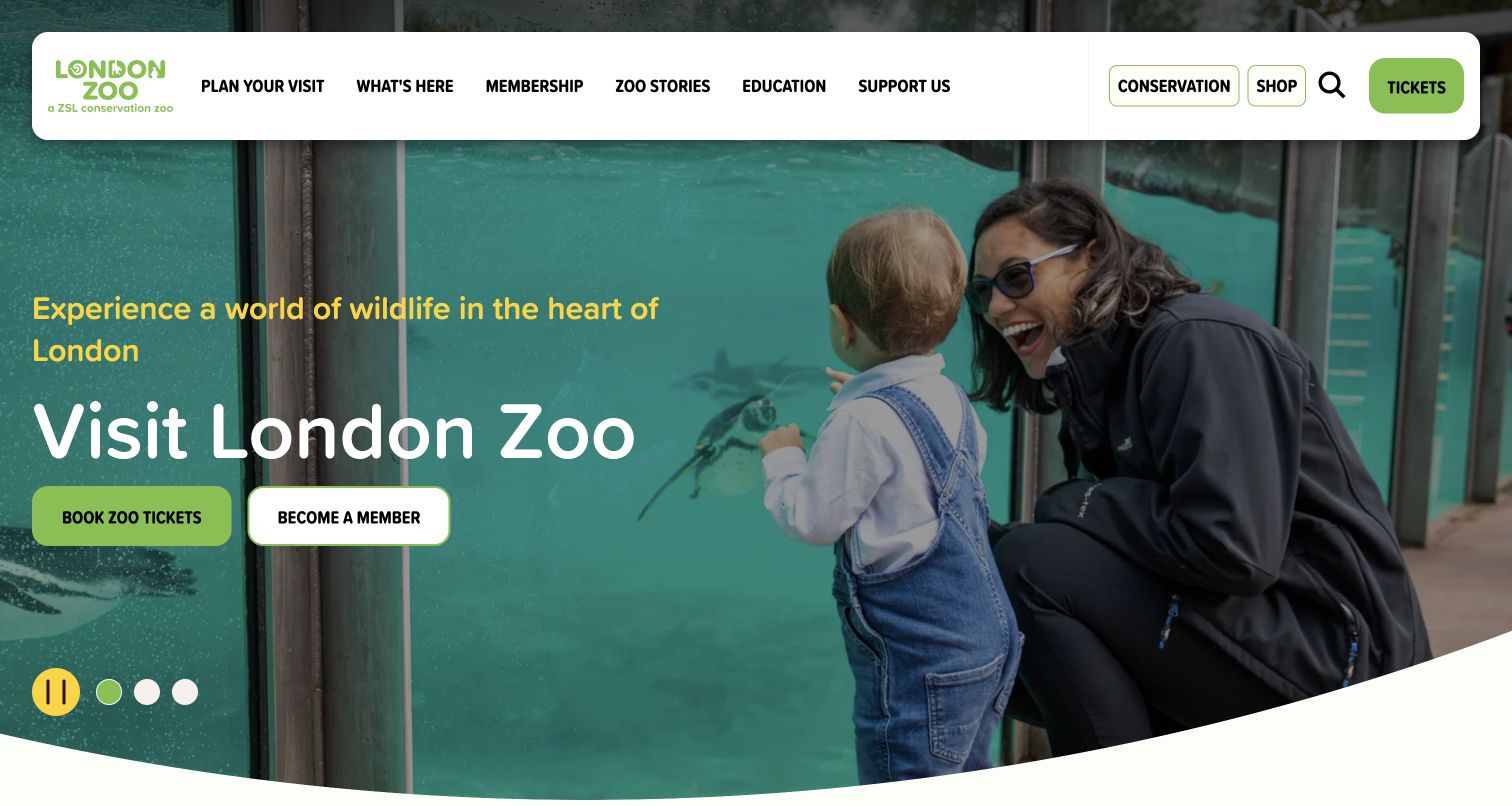
London Zoo uses a photograph of a family looking into a penguin habitat to introduce its location in the heart of London. A teal gradient supports the Visit London Zoo headline, with Book Zoo Tickets and Become a Member side by side. The rounded white navigation separates planning, what is here, membership, stories, education and support. Other observed slides introduce meeting Santa and additional zoo experiences. The opening image emphasizes the visitor’s perspective, making the relationship between people and the habitat part of the story.
What you can learn
Show how guests experience the destination without implying guaranteed animal behavior or encounters. Keep ordinary admission and optional experiences clearly separated, and provide a visible pause control when several different offers rotate through the same opening area.
Pros
The visitor-centered photograph makes the physical viewing experience easy to imagine.
Admission and membership remain distinct actions rather than being combined into one ambiguous booking route.
Cons & considerations
Seasonal experiences rotating beside general admission need explicit inclusion and booking explanations.
The large navigation panel and campaign text require careful spacing across narrower displays.
Map the visitor questions before organizing departments
Start with hours, admission, arrival, maps, food, accessibility and what is happening on the chosen day. Then create clear routes for schools, camps, members and supporters. Use familiar task labels in the main navigation and reserve internal programme names for pages that explain them.
Create one operational source of truth
Manage opening hours, last-entry times, special-event schedules and temporary closures in structured records with a responsible editor. Include effective and expiry dates. Reuse those records across the homepage, visit hub and ticket handoff so a seasonal campaign cannot contradict the practical planning information.
Connect learning and mission claims to evidence
Provide readable species information, programme descriptions and conservation project pages. Identify the organization’s role and the date of reported results. A broad support-wildlife headline should lead to specific work rather than being treated as proof of an outcome by itself.
Review realistic planning and support journeys
Check a first-time family visit, a member reservation, a teacher researching a class trip and a donor comparing support options. Test keyboard navigation, readable contrast, narrow screens and failed media. Verify external ticketing and donation handoffs without submitting real reservations, personal information or payments.
The editing job behind the design
Choose tools around reliable publishing and clear handoffs
A zoo’s content system needs to serve operational updates as well as storytelling. Structured calendars, dated notices, species records and programme pages should be easy for the responsible teams to maintain. Publicly observed website libraries or hosting services do not reveal the organization’s internal animal-management, membership or ticketing architecture.
Keep ticketing, membership, donations and event systems consistent in terminology and destination context. Explain when a visitor leaves the main site, preserve the selected product where supported and provide a useful route back. Media-rich pages should retain core information when optional video, chat or analytics scripts are unavailable.
Our WordPress website examples offer a separate look at publishing approaches. A visible platform label is evidence for that named page, not a guarantee that the same system will suit your requirements.
Before the public launch
Zoo website planning checklist
Display ordinary hours, last entry and special-date exceptions distinctly.
State whether entry is free, ticketed, reserved or subject to another published rule.
Keep membership admission requirements and benefits clearly explained.
Name temporary habitat and amenity changes with effective dates.
Provide practical arrival, parking, transit and map information.
Organize approved species and habitat content for learning as well as browsing.
Separate optional encounters and evening events from standard admission.
Give schools, camps and group organizers focused preparation pages.
Make accessibility guidance and a relevant assistance contact easy to locate.
Test forms and external handoffs without creating real bookings or donations.
These checks are a project checklist, not a performance, legal, security, or accessibility certification. Test real journeys with the people responsible for the website before making claims about the result.
Sources & editorial method
How this collection was selected and reviewed
The examples were reviewed on their official public websites and captured directly in a browser. Each review evaluates the visible content hierarchy, navigation and planning approach. A source-page audit does not establish animal welfare, scientific impact or complete accessibility. Capture dates, URLs and dimensions are retained with each example. Twenty-five distinct properties were selected; an additional Bronx Zoo candidate was excluded after its opening media did not render usefully in this session.
Each example links to its actual source page. Screenshots are direct browser captures with their own capture dates; moving imagery, announcements and live designs can change. The notes describe observable design choices and conditional tradeoffs, not measured traffic, conversion results, service quality, or accessibility conformance.
Technology labels use public page metadata, asset evidence, or explicitly cited platform documentation. Platform documentation is not a complete current deployment audit. A component reference may be legacy or unused; it is not a complete backend inventory. Unknown stacks are omitted. These sites are editorial examples, not our client portfolio.
Written, Edited and Curated are separate editorial records, not timestamps advanced by a rebuild. Website designs and imagery belong to their owners. See our editorial standards or suggest a correction.
Questions worth asking
Zoo website design questions
What should a zoo homepage explain immediately?
Identify the zoo, provide a clear route to planning and admission, and show current operating information. If entry is free or reservations are required, state that plainly. A campaign can provide the reason to visit, but it should not hide closures, last-entry times or important ticket distinctions.
How should animal births and new habitats be promoted?
Use accurate, approved descriptions and connect the announcement to a page that explains the context. State any relevant viewing arrangements without promising guaranteed sightings. Keep the news separate from operational notices so readers understand both what is new and how to plan a visit.
Should membership be the main call to action?
Membership can lead a campaign when its benefits are the subject, but ordinary admission should remain easy to find. Provide a clear comparison of membership eligibility, benefits and reservation requirements. Avoid assuming that a visitor buying a single day ticket has already decided to become a member.
How can conservation content be made useful?
Describe specific projects, the zoo’s role and the evidence behind reported outcomes. Give readers a route from a broad mission statement to deeper explanations, educational resources and support options. Keep dates and scope clear so older achievements are not mistaken for current activity.
What makes a good visit-planning hub?
Bring together dated schedules, arrival information, maps, accessibility guidance, rules, available experiences and relevant notices. Use clear local navigation so visitors can move among those tasks. Where a calendar or itinerary tool is used, provide understandable states for changed, unavailable or empty schedules.
Make the practical day dependable, then give animal learning and the institution’s purpose room to develop. Visitors should leave the website understanding both why they want to come and what they need to know before arrival.