Useful ecommerce design makes products easier to understand and purchase. A campaign photograph is only one part of that job.
A collector looking for a timed release, an office manager ordering a known packaging item, and someone choosing a subscription box have different questions. Start by identifying those questions. The right homepage might promote a campaign, introduce an unfamiliar product, or send a returning buyer directly to search.
These examples deliberately cross product categories. Compare their permanent shopping routes, treatment of temporary campaigns, and the information a new customer would still need. The observations concern visible presentation and public implementation evidence, not independently measured sales, checkout completion, or fulfillment performance.
Before the examples
What makes good ecommerce website design in 2026?
Make the product record do real work
Prepare representative product data before designing the cards: a long name, several variations, an unavailable option, a set with multiple components, dimensions, care, and delivery restrictions. Identify which fields customers actually compare. A beautiful grid cannot compensate for inconsistent size names or an unclear description of what is included.
Separate the campaign from the catalog
A promotion needs dates, eligible products, an owner, and a destination that remains useful when an item sells out. Keep categories, search, account access, and practical service information stable around it. Design an ordinary trading day as carefully as the launch or holiday campaign shown in the reference.
Give buying questions durable answers
Place delivery, returns, recurring charges, configuration limits, and support information where it can inform a decision. Do not treat reassurance badges as a replacement for actual terms. Describe how inquiries and order problems reach a person, and provide a useful alternative when an embedded service is unavailable.
The collection · 14 examples
14 ecommerce websites worth studying
Study a mix of subscriptions, configured products, specialist retail, cultural merchandise, and B2B purchasing. The best reference is the one that helps explain your buying problem—not necessarily the one selling a similar-looking object.
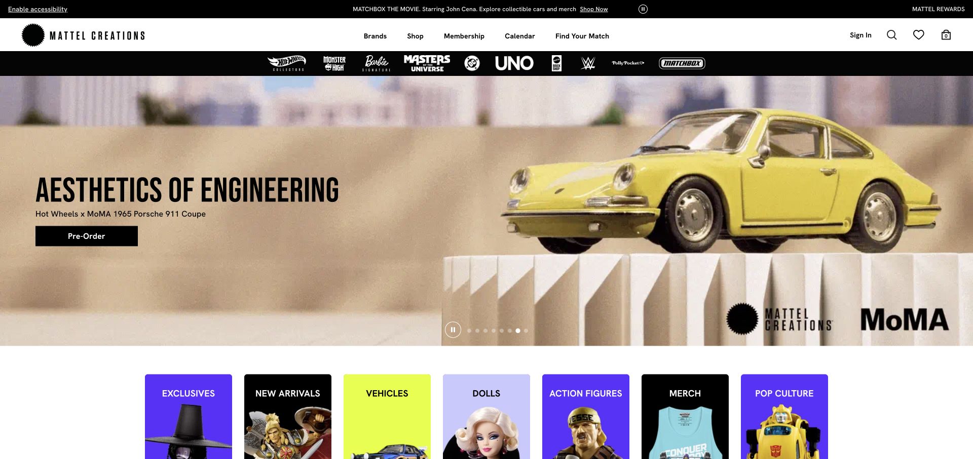
Mattel Creations makes a yellow collectible car the campaign lead, while the dark navigation and row of brand tiles explain that the store extends beyond this release. The composition treats the launch as an event without removing the wider catalog. Its category shortcuts are particularly important because a visitor may arrive looking for a particular toy universe rather than the featured object. The screenshot supports that merchandising observation, not an assessment of stock allocation or the checkout queue.
What you can learn
Plan a campaign slot and permanent discovery routes as separate pieces of the storefront. Give every launch a defined replacement date, an unavailable-product state, and a route back to its product family. A release should not leave the homepage dependent on one item remaining in stock.
Pros
Brand tiles provide another entry point beneath the dominant campaign.
The lead photograph makes the featured collectible immediately recognizable.
Cons & considerations
Launch-heavy imagery can overshadow products outside the current event.
Collectors still need availability and purchase rules explained beyond the opening image.
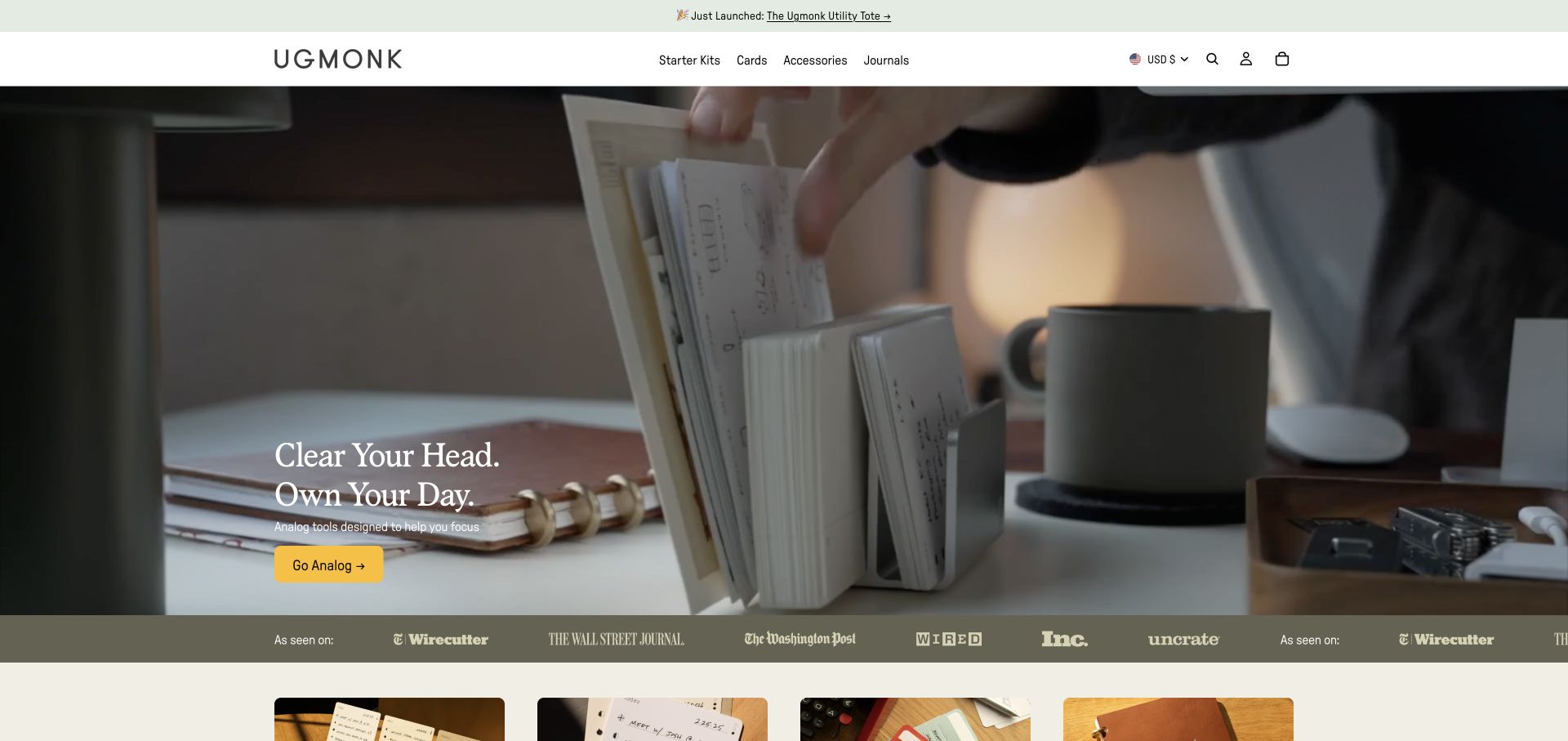
Ugmonk introduces its products through a composed desk scene rather than an isolated grid of objects. The light identity and restrained navigation leave the workspace itself to establish the visual argument. A small shopping action sits within the image, and the next product section begins below it. This is a useful ecommerce reference for products that are easier to understand together, although the photograph alone cannot explain dimensions, compatibility, or the price of the pictured combination.
What you can learn
Write down what each image is supposed to teach. A complete scene can introduce a collection, while individual product pages must explain which components are included and how they fit together. Keep a direct product route available for someone returning to buy one replacement part rather than discover the brand again.
Pros
The styled workspace gives related products a shared context.
A quiet header keeps the opening composition visually coherent.
Cons & considerations
Visitors may assume accessories in a scene are included unless product detail is explicit.
Subtle actions need careful contrast and small-screen testing over changing photographs.
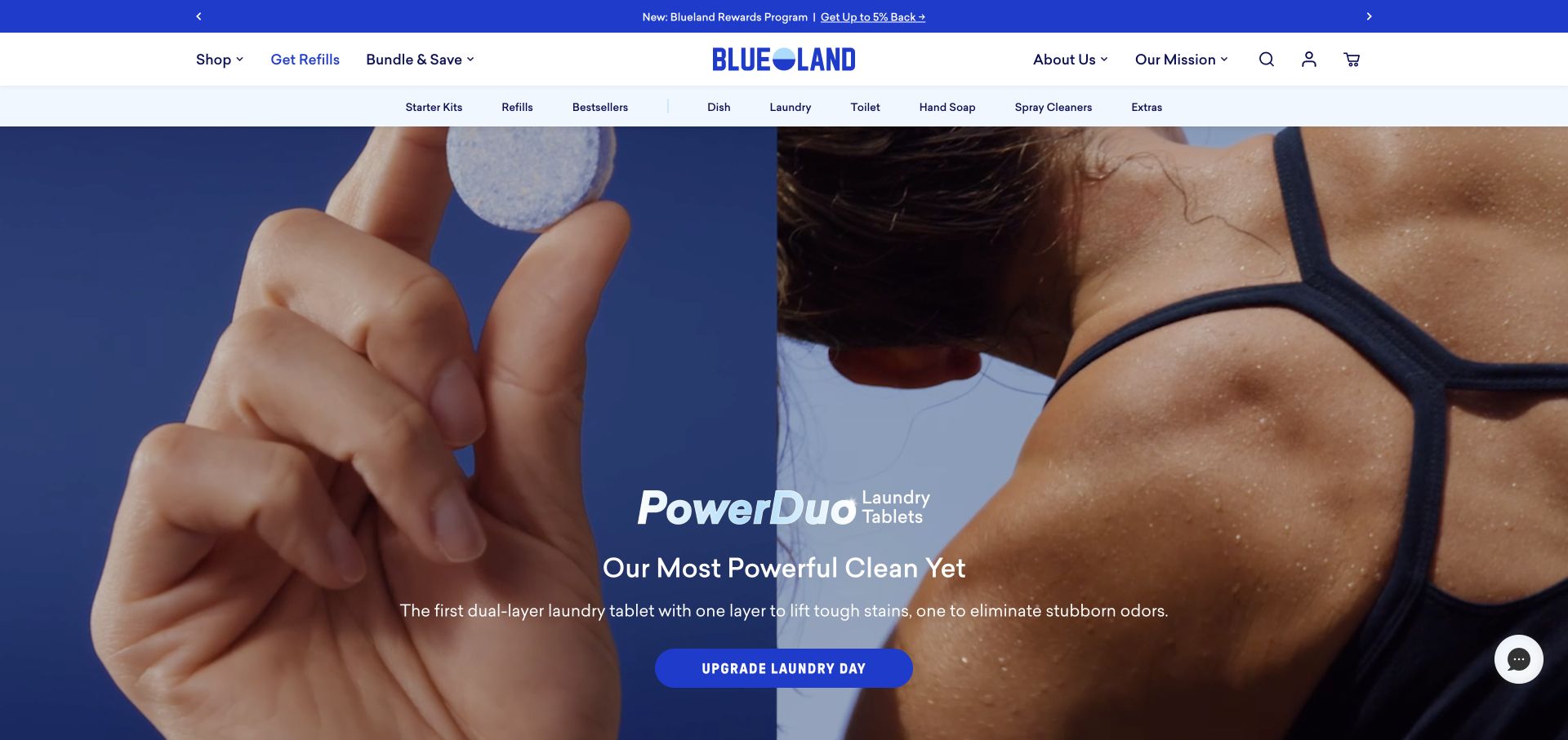
Blueland gives a person holding its cleaning tablets most of the opening view, with the package and task visible together. The lead message promotes a particular cleaning combination, while the product-focused navigation supplies a broader way into the store. This is more explanatory than showing an attractive kitchen alone: the viewer can connect the offer to an object they would use. The reference does not independently establish cleaning performance, environmental claims, or the terms of a subscription.
What you can learn
Pair a demonstration image with precise product information. Explain quantities, what must be bought once, what needs refilling, and whether the default purchase repeats. Let customers compare those arrangements without having to infer them from a promotional headline or a subscription badge.
Pros
The product is shown in a human hand, supplying useful scale.
The opening connects the featured offer with a concrete cleaning activity.
Cons & considerations
A campaign headline cannot replace clear quantities and purchase terms.
Product-benefit statements need substantiation and an owner responsible for updates.
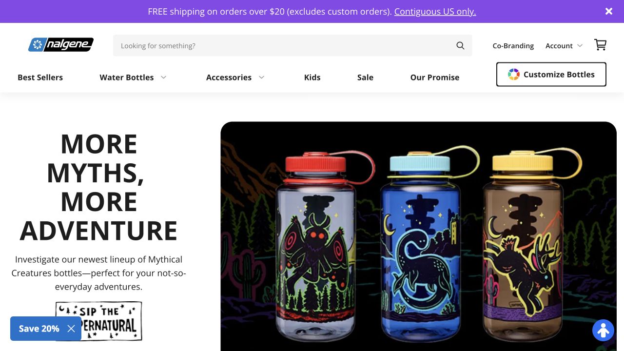
Nalgene places decorated bottles against a vivid campaign background and keeps the main product categories in a separate, light header. Its recognizable bottles carry much of the explanation, while the promotional strip and account tools occupy their own levels. The result is a useful contrast between a temporary collaboration and a stable product format. A new customer, however, still needs to discover capacity, lid differences, care instructions, and the distinction between a special graphic and a different bottle specification.
What you can learn
Keep campaign attributes separate from functional product attributes in the catalog. A new color or collaboration should not make the underlying size and closure options harder to compare. Give the merchandise team a repeatable way to retire a campaign without breaking its category or product links.
Pros
The repeated bottle shape makes the campaign easy to interpret.
Persistent category labels offer an alternative to the collaboration story.
Cons & considerations
Stacked promotional and navigation bands consume opening-screen space.
Decorative differences can conceal functional differences without a clear comparison structure.
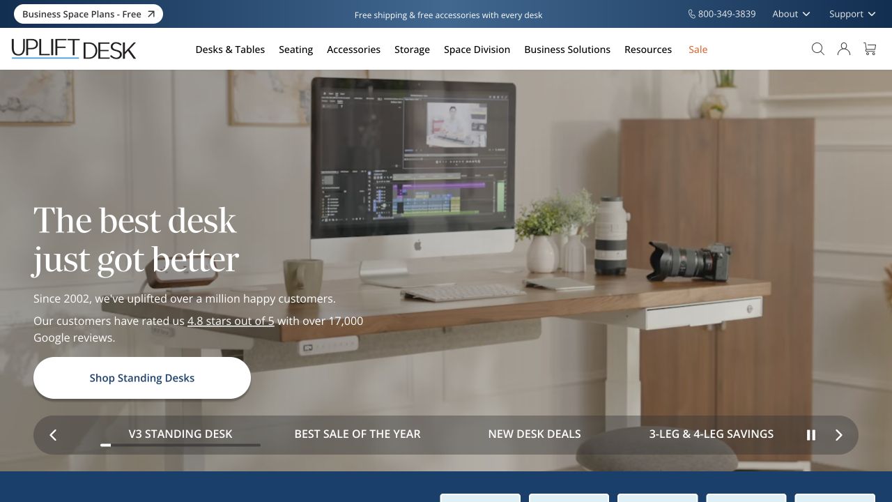
UPLIFT Desk puts a complete working environment behind its central shopping action. The header distinguishes standing desks from accessories and support, while the campaign presents the desk as the organizing product. This is helpful for a purchase that includes more decisions than a photograph can communicate. Desktop material, frame, dimensions, accessories, and delivery expectations belong in the later evaluation process; none of their actual selection behavior was tested in this homepage review.
What you can learn
Brief the configurator and the marketing homepage together, but do not make them perform the same job. The homepage can establish a use case. The configuration interface should expose the current selection, compatibility constraints, price changes, and an understandable recovery path after an invalid combination.
Pros
The workspace gives the central product a practical setting.
Separate accessory and support routes acknowledge needs beyond the first purchase.
Cons & considerations
An aspirational scene can leave the included components ambiguous.
A configuration-heavy catalog needs explicit states that a homepage capture cannot demonstrate.
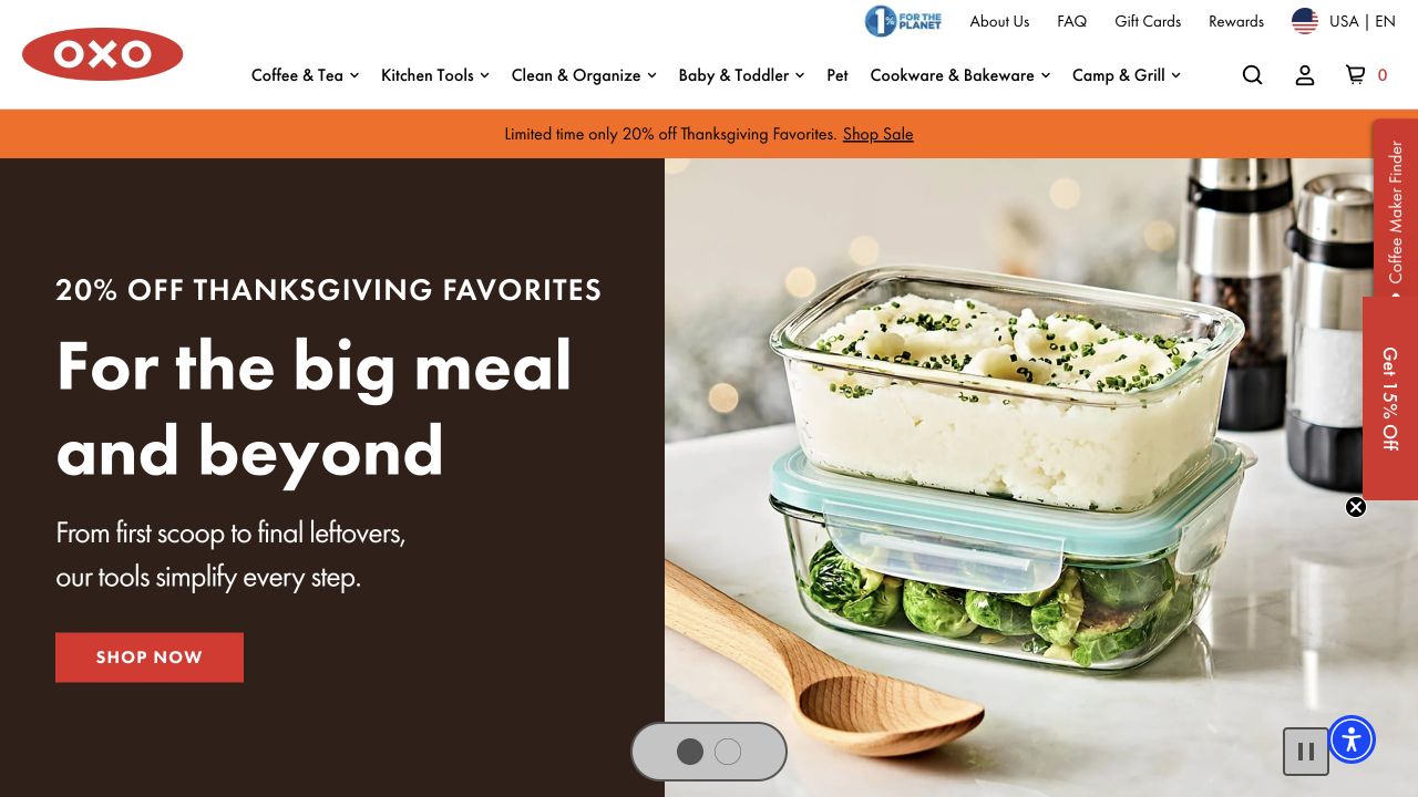
OXO uses a prepared meal and food-storage products to connect a seasonal promotion with an understandable kitchen task. Its red identity, shopping categories, and search remain above the photograph rather than disappearing into it. The campaign therefore has a clear setting inside a much larger household catalog. This is worth studying when the same store must serve someone browsing a holiday offer and someone who simply needs a particular tool or replacement item.
What you can learn
Maintain the task-based category structure while campaigns change. Give editors controlled space for a promotion, its dates, exclusions, and destination collection. Test the path from a campaign to a specific product with long names and unavailable variations, rather than judging only the attractiveness of the opening photograph.
Pros
The food scene makes the seasonal message tangible.
Persistent categories and search support purposeful shopping alongside browsing.
Cons & considerations
Promotional copy needs an obvious connection to actual eligible products.
Large lifestyle media still needs useful image descriptions and smaller-screen crops.
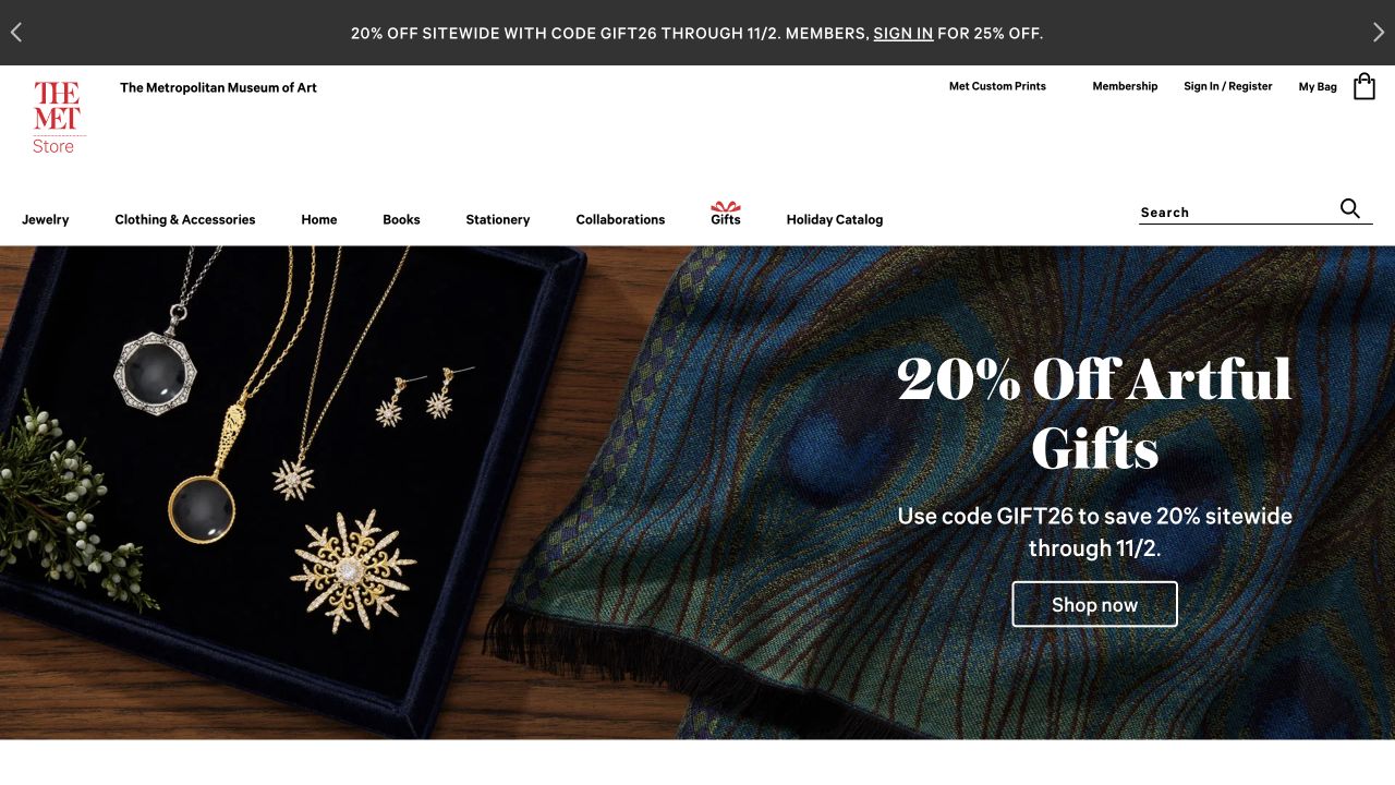
The Met Store pairs its museum identity with jewelry imagery and a clearly seasonal gifting message. A light navigation layer separates shopping categories, collections, and visitor utilities from the campaign image. The photograph gives the products an editorial setting, but the visible shopping action keeps the page recognizably transactional. For a cultural store, this balance matters: shoppers may care about the artwork or institution behind an object while still needing ordinary information about materials, delivery, and returns.
What you can learn
Model product provenance as useful product content rather than decorative brand language. Identify the relevant collection or artwork, permissions, materials, and dimensions where appropriate. Keep the practical purchase details beside that story so the educational context does not make a routine buying decision needlessly obscure.
Pros
The institution remains recognizable above the commercial campaign.
Category labels give a gift shopper a practical route beyond the featured image.
Cons & considerations
Cultural association does not itself explain a product’s construction or value.
Seasonal campaign details require maintenance after the shopping occasion passes.
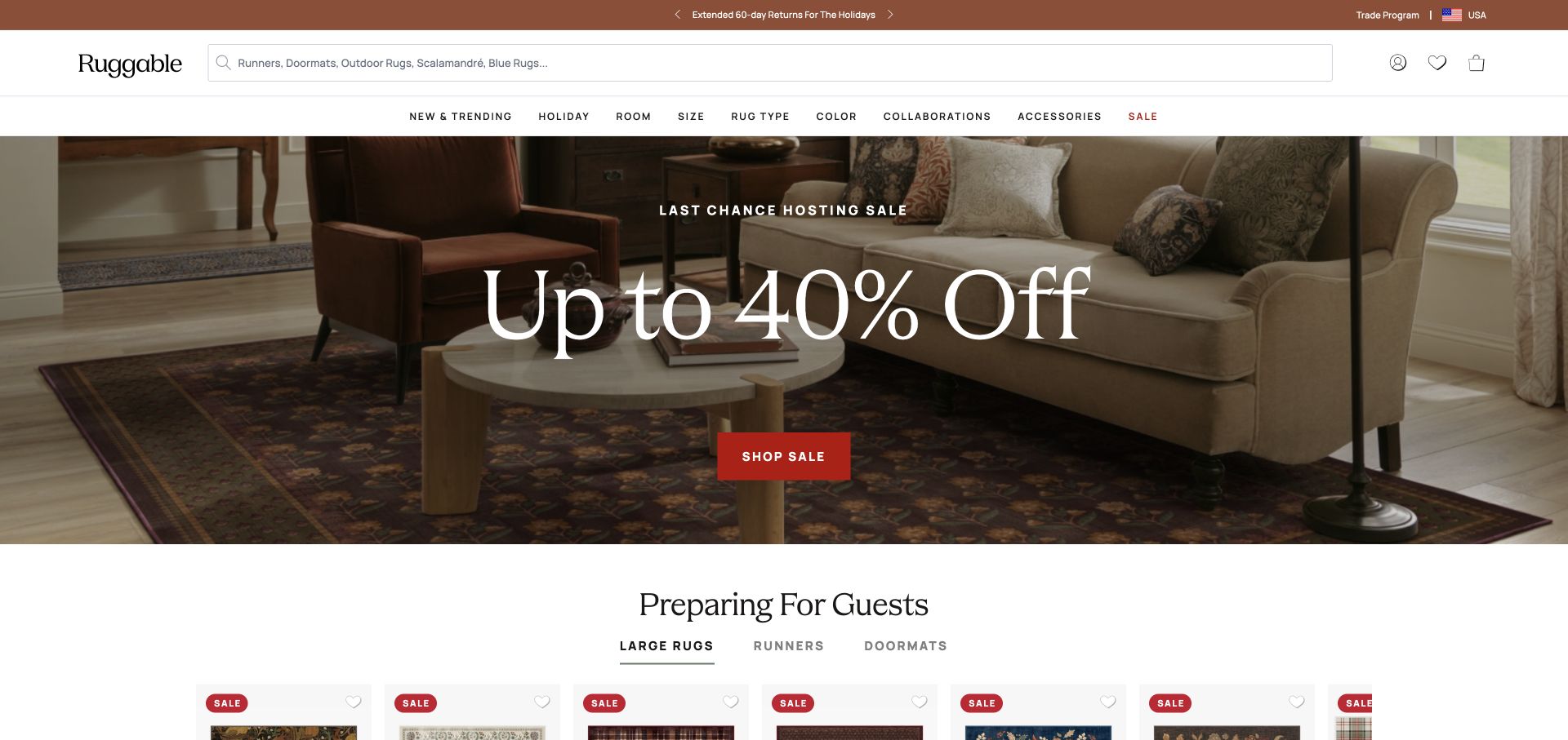
Ruggable leads with a furnished living room and a large discount message rather than a cutout image of a rug. The room demonstrates placement and atmosphere, while a lighter navigation bar separates category discovery from the promotion. This gives a home-goods buyer a quick reason to continue, but it does not resolve the more specific decisions that follow: room measurements, rug size, pile, care, and whether the pictured accessories are included.
What you can learn
Connect room photography to consistent size guidance and actual product records. A shopper should be able to identify the featured rug, compare appropriate sizes, and understand the offer without guessing which campaign image matches which variant. Keep promotional and regular pricing language reviewable by the merchandising team.
Pros
The room scene supplies context that an isolated product cannot.
The promotion has one visually clear shopping action.
Cons & considerations
A large discount can dominate the explanation of product differences.
Room photographs need dimensions and product identifiers to support confident comparison.
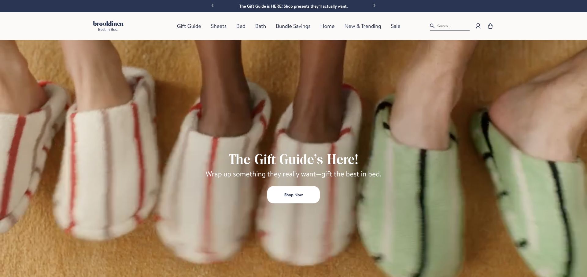
Brooklinen introduces a gift-oriented campaign with close-up, softly styled textiles. Its narrow header and familiar bedding categories make the product family clear even when the lead campaign is not a literal bed scene. The visual emphasis is on texture and presentation rather than a dense specification list. That can establish mood efficiently, but the subsequent product experience still needs to explain fabric, size, quantity, and the difference between an individual piece and a set.
What you can learn
Treat texture photography as an invitation, not a substitute for product data. Design comparison fields for materials and sizes before adding campaign modules. Give editors a way to feature a gift collection while keeping ordinary restocking routes easy to find for returning customers.
Pros
Close-up textile imagery communicates a distinct material-focused visual identity.
Persistent bedding navigation explains the catalog behind the seasonal story.
Cons & considerations
Soft, low-contrast imagery can make overlaid copy difficult to read.
Set contents and material differences need clearer treatment than a campaign image provides.
Yeti Cycles opens with a rider and a racing story rather than immediately presenting a row of bicycles. The large photograph communicates the activity and gives the brand a specific sporting context. A restrained header leaves the story room while retaining entry points into the product range. The useful ecommerce lesson is the connection between editorial credibility and equipment discovery, not an assumption that the featured result proves any particular bicycle is right for a visitor.
What you can learn
Link editorial stories to clearly identified equipment without making the story carry the full specification. Frame size, build options, availability, service, and dealer or purchase routes should have durable destinations. Distinguish sponsored sporting narratives from practical comparison information in the content model.
Pros
The opening photograph makes the intended activity immediately legible.
A clear editorial lead differentiates the brand from an anonymous product warehouse.
Cons & considerations
A racing story can delay access for a visitor looking for a specific model.
Technical fit and configuration questions need dedicated information beyond brand imagery.
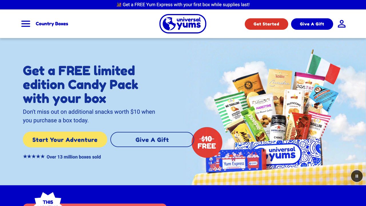
Universal Yums puts a snack box and its assorted contents beside a bright introductory offer. The visible navigation separates an ongoing adventure, gifting, and a snack shop, acknowledging that these are different purchase intentions. Showing the physical assortment helps explain what the service delivers without requiring a long opening paragraph. The screenshot cannot establish the subscription’s actual renewal, cancellation, shipping, or allergy-information experience, all of which matter independently of the friendly presentation.
What you can learn
Design recurring purchases, gifts, and one-off orders as distinct paths with explicit terms. Explain frequency, box contents, substitutions, delivery limits, and where relevant dietary information lives. A promotional addition should not obscure the continuing cost or the difference between a gift and a renewing account.
Pros
Visible box contents make an unfamiliar subscription format easier to understand.
Separate gift and shopping routes recognize more than one buying intention.
Cons & considerations
A prominent free-extra offer can distract from the continuing purchase terms.
Food content and delivery information need maintenance beyond the marketing campaign.
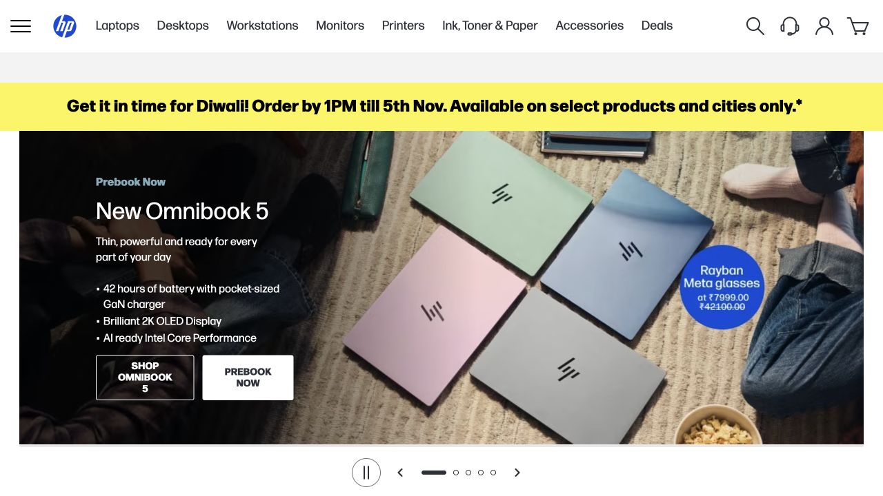
HP India’s store combines a colorful computer promotion with a conventional catalog header, search, and a route to printer supplies. The illustrated laptop range communicates a current campaign while the header retains useful category and support distinctions. This is an important ecommerce pattern for equipment that is researched before purchase and maintained afterward. The opening visual does not itself explain processor, memory, operating-system, warranty, or compatibility differences between the pictured machines.
What you can learn
Separate configuration facts from campaign language and make comparison fields consistent across models. Plan accessories and consumables as ongoing ownership journeys, not only cross-sell slots. Review regional prices, available configurations, service terms, and stock with the team that actually operates that market’s store.
Pros
Search and category navigation provide practical alternatives to the current promotion.
A visible supplies route acknowledges customers who already own a product.
Cons & considerations
Several promotional messages can compete with the basic task of comparing models.
Regional configurations and service promises need precise, maintained product records.
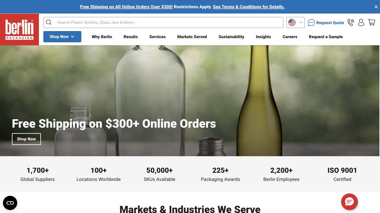
Berlin Packaging keeps a search field, category navigation, account access, and a quick-order route above a bottle-led campaign. Below the lead image, numeric service statements and an industry section begin to broaden the proposition beyond an individual item. The design recognizes that business buyers may arrive with a known product, an application, or a sourcing question. The displayed quantities and service claims remain the company’s statements; this review does not independently verify them.
What you can learn
Interview both repeat purchasers and first-time specifiers. Give known-item buyers a short route to exact references, while application-led pages explain material, closure, minimum quantities, and relevant constraints. Keep account-specific pricing and ordering workflows distinct from the public catalog’s educational job.
Pros
Search and quick order are visible alongside ordinary category browsing.
The transition into industries provides an application-led route into the catalog.
Cons & considerations
Dense utility and promotional bands can overwhelm a first-time visitor.
Business ordering details cannot be inferred from the presence of a quick-order link.
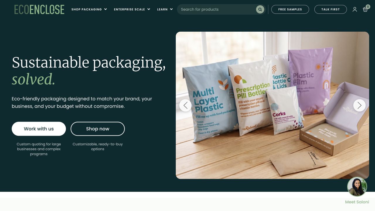
EcoEnclose leads with branded mailers and packaging materials, accompanied by a concise proposition and separate work-with-us and shopping actions. The dark green frame makes the product samples stand out, while the navigation distinguishes products, customization, and learning. This is a useful reference for a catalog where a buyer’s material decision may depend on questions that do not fit into a product title. The opening environmental positioning is the company’s claim, not an independently assessed result.
What you can learn
Connect educational content to specific selection decisions: format, dimensions, quantities, printing, and the destination’s actual disposal arrangements. Explain which statements apply to which product. Keep a direct ordering route for informed repeat buyers instead of requiring them to reread the introductory sustainability story.
Pros
Physical examples make the packaging proposition concrete.
Separate learning and customization routes support more complex buying questions.
Cons & considerations
Broad environmental language needs product-specific evidence and qualifications.
Two equal-weight opening actions can leave an unfamiliar buyer unsure where to begin.
Plan the transaction before polishing the campaign
Map several genuine buying journeys
Walk through discovery, comparison, selection, bag, checkout, confirmation, and support using realistic products. Include someone who knows an exact reference, someone comparing alternatives, and someone buying a gift. Record where account, payment, shipping, and inventory systems take ownership rather than drawing one uninterrupted mock checkout.
Create a controlled merchandising library
Decide which sections editors can reuse, which fields are mandatory, how a campaign is previewed, and what happens when imagery is missing. Test a very long promotion and one with no discount. Document how to remove an expired offer without deleting useful products or leaving old links pointing nowhere.
Rehearse exceptions with the operations team
Use the appropriate test environment for unavailable stock, invalid addresses, rejected payments, partial orders, cancellation, and returns. Verify which messages the customer and staff receive. Keep testing records separate from real customer information and obtain the business’s approval for prices, taxes, policies, and delivery promises.
The editing job behind the design
Choose the commerce model before the frontend
A hosted commerce platform, a maintained CMS store, and a separate frontend each create a different operating model. Compare catalog complexity, payments, regional selling, editing, inventory, and support responsibilities before selecting the stack. A large reference brand’s implementation is not evidence that a smaller shop needs the same architecture.
Inventory every app and integration by purpose, data exchanged, cost owner, and removal consequences. A public storefront can expose a commerce runtime or an image service without revealing checkout, fulfillment, or the organization’s wider systems. The technology lists distinguish those observed references from earlier documentation and dependencies.
Our WordPress website examples offer a separate look at publishing approaches. A visible platform label is evidence for that named page, not a guarantee that the same system will suit your requirements.
Before the public launch
Ecommerce website launch checklist
Check long names, sets, variations, dimensions, and unavailable products with real catalog data.
Test search, category navigation, filtering, and an empty result on a phone.
Verify campaign dates, price qualifications, eligible products, and destination links.
Exercise payment and shipping exceptions through the appropriate test workflow.
Have the business approve delivery, returns, cancellation, and recurring-charge language.
Review form labels, keyboard focus, zoom, error messages, and responsive images.
Map old product and collection URLs and verify important redirects.
Assign owners for catalog updates, integrations, order notifications, and rollback.
These checks are a project checklist, not a performance, legal, security, or accessibility certification. Test real journeys with the people responsible for the website before making claims about the result.
Sources & editorial method
How this collection was selected and reviewed
We selected official storefronts with different buying and merchandising problems, using direct, dated browser captures already held by the library. Existing capture dates are preserved. New category-specific observations were checked against those images and official public sites; no purchase, account, or checkout flow was completed.
Each example links to its actual source page. Screenshots are direct browser captures with their own capture dates; moving imagery, announcements and live designs can change. The notes describe observable design choices and conditional tradeoffs, not measured traffic, conversion results, service quality, or accessibility conformance.
Technology labels use public page metadata, asset evidence, or explicitly cited platform documentation. Platform documentation is not a complete current deployment audit. A component reference may be legacy or unused; it is not a complete backend inventory. Unknown stacks are omitted. These sites are editorial examples, not our client portfolio.
Written, Edited and Curated are separate editorial records, not timestamps advanced by a rebuild. Website designs and imagery belong to their owners. See our editorial standards or suggest a correction.
Questions worth asking
Ecommerce website design questions
Should I copy a successful brand’s homepage?
Borrow a specific idea you can explain, such as a clear gift route or a persistent product category. Build the actual structure around your products, customer questions, content capacity, and operating model. The reviews do not establish which design produced another company’s results.
How many products should be on the homepage?
Enough to provide useful routes without turning the opening into an unstructured warehouse. A small specialist catalog may need a product explanation; a large store may need strong search and categories. Test the proposed hierarchy with actual customer tasks rather than choosing an arbitrary number.
Do I need a custom or headless storefront?
Only when a specific requirement and a maintainable ownership model justify it. Compare the requirement with the capabilities of a supported theme or platform first. A separate frontend introduces deployment, preview, caching, and integration responsibilities that should have named owners.
Can these examples prove a store converts well?
No. They illustrate visible composition, content, and scoped technology evidence. Sales, usability, accessibility conformance, and fulfillment performance need their own testing and evidence. A polished reference is a starting point for a brief, not a measured business benchmark.
Borrow a clearer way to explain or discover a product. Then test it with your own catalog and the people responsible for delivering what the site promises.