Best PrestaShop Websites of 2026 (20 Real-World Examples)
Twenty real storefronts with direct screenshots, original design reviews and property-specific PrestaShop evidence, including explicitly historical implementations.
A useful PrestaShop store helps people understand a product, choose the right variation and see what happens next. Attractive imagery matters, but the catalog needs dependable names, categories and practical information behind it. These examples show different ways to combine a recognizable brand with the everyday work of finding, comparing and buying products.
Begin with the decisions your customers need to make. A sewing-machine shopper may need a useful distinction between capabilities; a jewelry buyer may compare materials and sizes; a trade customer may need a product reference before a brand story. The homepage, category structure and product pages should support those different decisions with consistent information. A store becomes harder to maintain when essential facts are scattered between promotional banners, descriptions and separate spreadsheets.
The collection opens with Singer France, ČD Fanshop, Obut, Le Chocolat Alain Ducasse and Ocarat. The evidence applies to those named storefronts: ČD Fanshop is a railway merchandise shop, not a train-ticketing platform. Official vendor cases from different years describe particular implementations and sometimes future plans. They do not establish that every current storefront uses the same PrestaShop version, theme, hosting arrangement or payment system. Mon Lit Cabane’s planned Enterprise move is not treated as a completed upgrade.
Before the examples
What makes good PrestaShop website development in 2026?
Separate a product’s choices from its descriptive facts
PrestaShop distinguishes attributes used to create product combinations from features that describe a product across those combinations. Use that distinction to clarify the customer’s decision. A selectable size or finish should not be buried in prose, while a fixed specification should not appear to be an option. Agree on names, units and required values before importing a large catalog. Consistency makes product comparison more useful and reduces the editorial work needed to correct the same fact in several places.
PrestaShop themes define the storefront’s layouts, templates, styling and browser-side behavior. Choose the presentation around the catalog and audience, rather than asking the catalog to fit an attractive demonstration. Check long product names, uneven image proportions, unavailable variations and empty search results. A brand can be expressive in its photography and typography while keeping price, options, delivery information and the next action predictable. Confirm the theme’s compatibility with the actual store version before committing to its design.
Modules extend or adapt PrestaShop’s behavior. Write down the requirement each proposed module solves, the information it uses and who maintains it. Several extensions addressing the same task can produce an interface that feels inconsistent and an upgrade process that is difficult to explain. Evaluate the full customer journey with the chosen theme and modules together. The presence of an integration in another merchant’s case study is a reference to investigate, not evidence that it will fit your store unchanged.
The twenty storefronts are reviewed as specific public properties, with original screenshots and collection-specific observations. Their PrestaShop associations come from cited vendor cases and any separately recorded public evidence. A historical case remains historical, and a planned migration is not converted into a current platform claim. The reading order begins with five recognizable brands or organizations and then explores specialist catalogs and different merchandising approaches.
We start with five recognizable brands or organizations: Singer France, ČD Fanshop, Obut, Le Chocolat Alain Ducasse, Ocarat. Each attribution applies to the named website property, not every product or website belonging to its organization. This is a curated reading sequence, not a measured ranking.
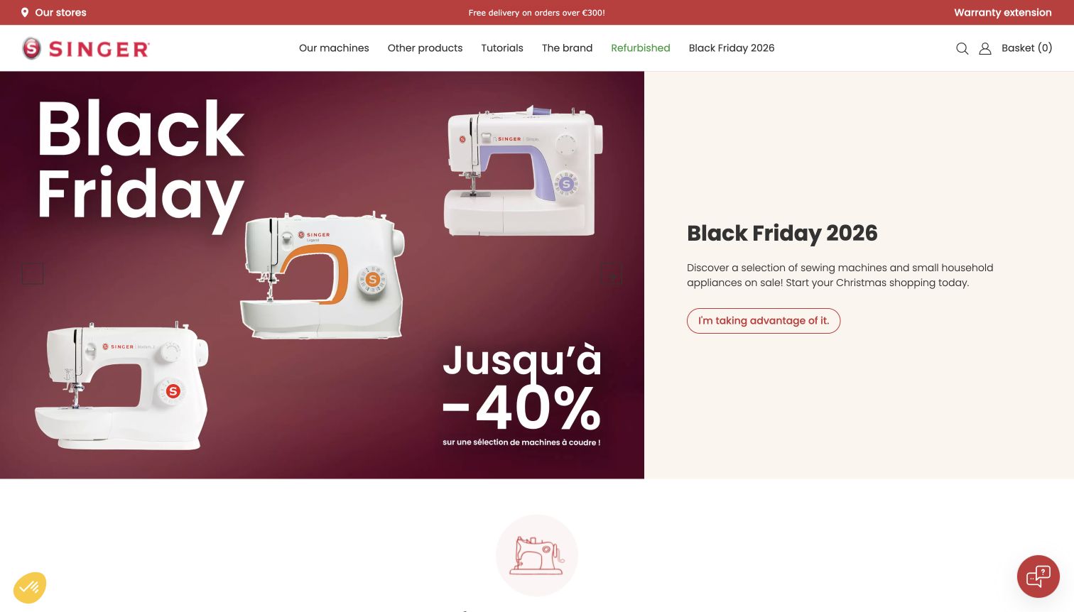
Singer France combines its recognizable red wordmark with a restrained white header and a burgundy seasonal promotion. The sewing machine occupies a large, clear product photograph, while the offer and next step sit in a separate text area. Navigation retains routes into machines, accessories and sewing support rather than reducing the whole site to the campaign. PrestaShop’s 2023 case documents this French online store following its launch the previous year; it does not establish the technology of every international Singer property.
What you can learn
Let a recognizable product carry the opening image, then use navigation to support different levels of expertise. A sale can be prominent without removing the routes that help beginners understand the range or existing owners find compatible accessories.
Pros
The split composition gives the product and promotional message distinct, easily identifiable roles.
The established brand color connects the campaign to the broader store identity without excessive decoration.
Cons & considerations
Seasonal pricing should not become the only explanation of how competing machine models differ.
Large promotional imagery leaves practical comparison information to later sections and dedicated product pages.
Platform source: Official PrestaShop case: Singer France (2023-10-09). The French Singer online store, documented following its 2022 launch; not every international Singer property. Documented storefront association from an official PrestaShop case, reviewed November 10, 2026. The case describes its own publication period, not a fresh inspection of the entire current commerce backend. No current version, private system or completed future upgrade is inferred. The screenshot is direct design evidence; the bounded source audit is recorded separately. Platform evidence is separate from the direct website screenshot and is not a complete current infrastructure audit.
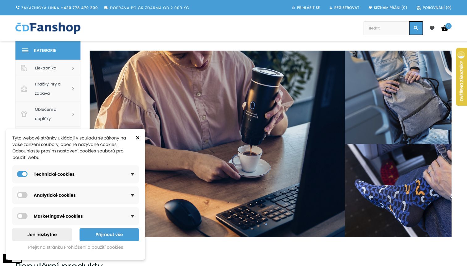
ČD Fanshop applies the Czech railway’s identity to a public merchandise catalog, using a compact header, a vertical category rail and prominent lifestyle product imagery. Coffee and travel-related merchandise make the store’s purpose concrete without relying on the railway name alone. The captured page includes a privacy panel over part of the lower left, which is part of the observed experience. The official PrestaShop case and České dráhy’s own announcement concern this fanshop specifically, not train tickets, timetables or operational railway systems.
What you can learn
Give a subsidiary retail property an explicit purpose even when the parent organization is widely recognized. Distinct product categories and relevant photography help visitors understand that they are browsing merchandise rather than entering the organization’s primary service.
Pros
The side navigation creates a stable catalog structure beside the larger campaign imagery.
Railway-associated products connect the visual identity with something visitors can immediately recognize and browse.
Cons & considerations
A persistent privacy panel can obscure the first categories or supporting details until a choice is made.
Parent-brand links should remain clearly labeled so customers do not confuse merchandise help with travel support.
Platform source: Official PrestaShop case: ČD Fanshop (2024-11-14). The České dráhy merchandise shop at cd.cz/fanshop; not the national railway’s ticketing, timetable or operational systems. Documented storefront association from an official PrestaShop case, reviewed November 10, 2026. The case describes its own publication period, not a fresh inspection of the entire current commerce backend. No current version, private system or completed future upgrade is inferred. The screenshot is direct design evidence; the bounded source audit is recorded separately. Platform evidence is separate from the direct website screenshot and is not a complete current infrastructure audit.
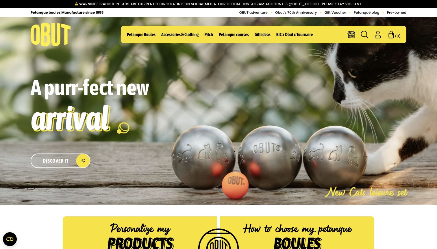
Obut’s captured English storefront frames an engraved pétanque boule with a warm, playful illustration and generous white space. A yellow navigation treatment carries the brand identity across the top, while customization and product-selection cards begin below the main feature. The result gives a highly specific product category an approachable introduction. PrestaShop’s 2025 case documents the public consumer shop alongside a separate business project; this review concerns only the visible consumer property and does not inspect private trade ordering.
What you can learn
A specialist catalog does not need to start with technical specifications alone. Use one memorable product treatment to invite exploration, then provide clearly separated routes for choosing a standard item, understanding differences and personalizing an order.
Pros
The restrained yellow accent gives navigation and featured content a recognizable shared identity.
The large product image makes engraving and personalization understandable before detailed configuration is required.
Cons & considerations
Playful campaign art should still leave a clear path to size, weight and suitability information.
Customization claims need product-level explanations of options and constraints beyond the opening promotional frame.
Platform source: Official PrestaShop case: Obut (2025-08-01). The public Obut consumer shop, captured in its English locale; not the separate private B2B experience. Documented storefront association from an official PrestaShop case, reviewed November 10, 2026. The case describes its own publication period, not a fresh inspection of the entire current commerce backend. No current version, private system or completed future upgrade is inferred. The screenshot is direct design evidence; the bounded source audit is recorded separately. Platform evidence is separate from the direct website screenshot and is not a complete current infrastructure audit.
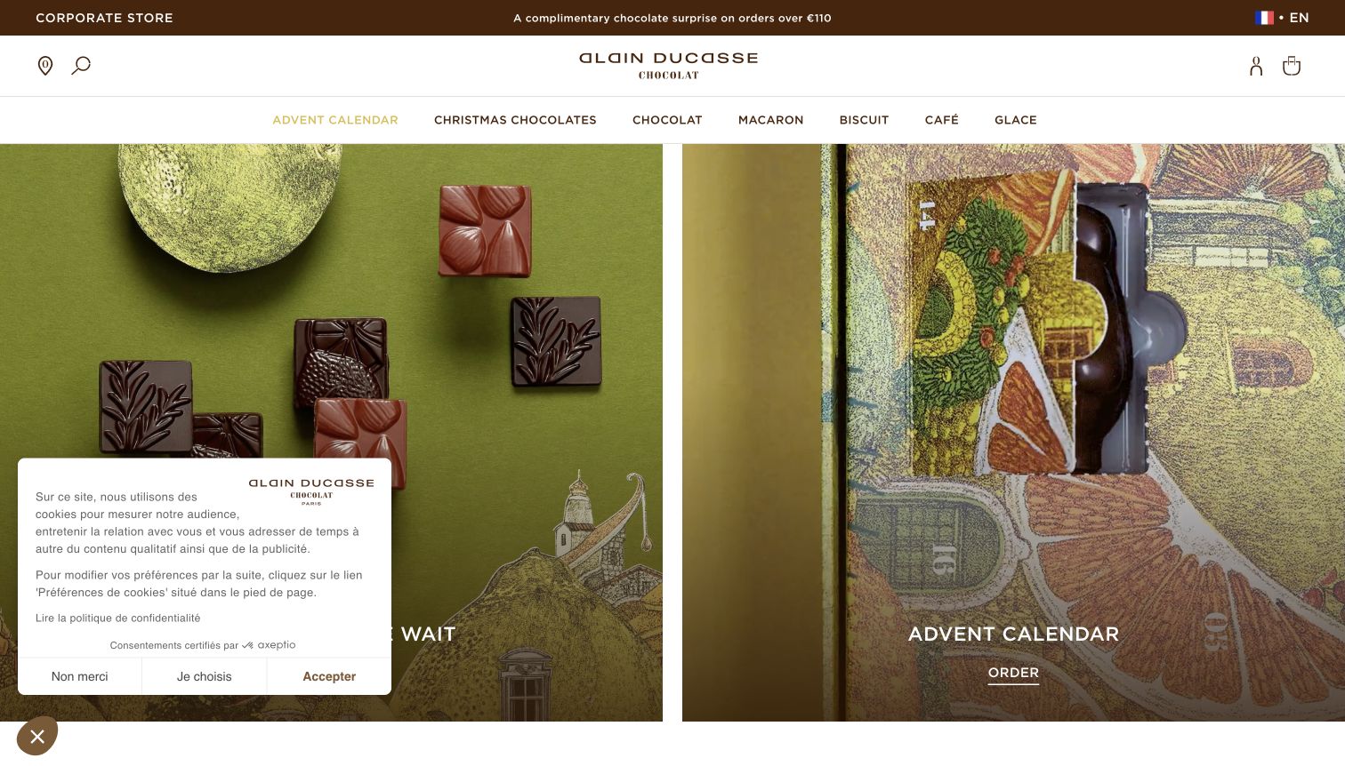
Le Chocolat Alain Ducasse uses close, textured chocolate photography to establish a strong sensory identity. The captured seasonal feature divides its space between rich product images rather than crowding every surface with labels. A compact header keeps the brand and shop navigation legible above the photography. A small privacy panel covers the lower left in this direct capture. The vendor’s 2021 case describes an earlier PrestaShop redesign of this chocolate store; it does not identify the current version or the technology of unrelated Ducasse restaurants.
What you can learn
Let material, texture and packaging do some of the work of explaining a premium product. Keep the surrounding interface calm, and place clear category routes around the imagery so the experience remains useful to visitors shopping for a specific occasion.
Pros
Detailed product photography communicates the visual character of the offering more directly than broad luxury language.
The restrained header creates separation between the enduring brand identity and a temporary seasonal campaign.
Cons & considerations
Large photographic areas can postpone practical details such as contents, delivery destinations and allergens.
The opening privacy panel competes with part of the campaign until the visitor resolves it.
Platform source: Official PrestaShop case: Le Chocolat Alain Ducasse (2021-10-08). The public chocolate shop documented in the 2020–2021 redesign, not every Alain Ducasse hospitality property. Documented storefront association from an official PrestaShop case, reviewed November 10, 2026. The case describes its own publication period, not a fresh inspection of the entire current commerce backend. No current version, private system or completed future upgrade is inferred. The screenshot is direct design evidence; the bounded source audit is recorded separately. Platform evidence is separate from the direct website screenshot and is not a complete current infrastructure audit.
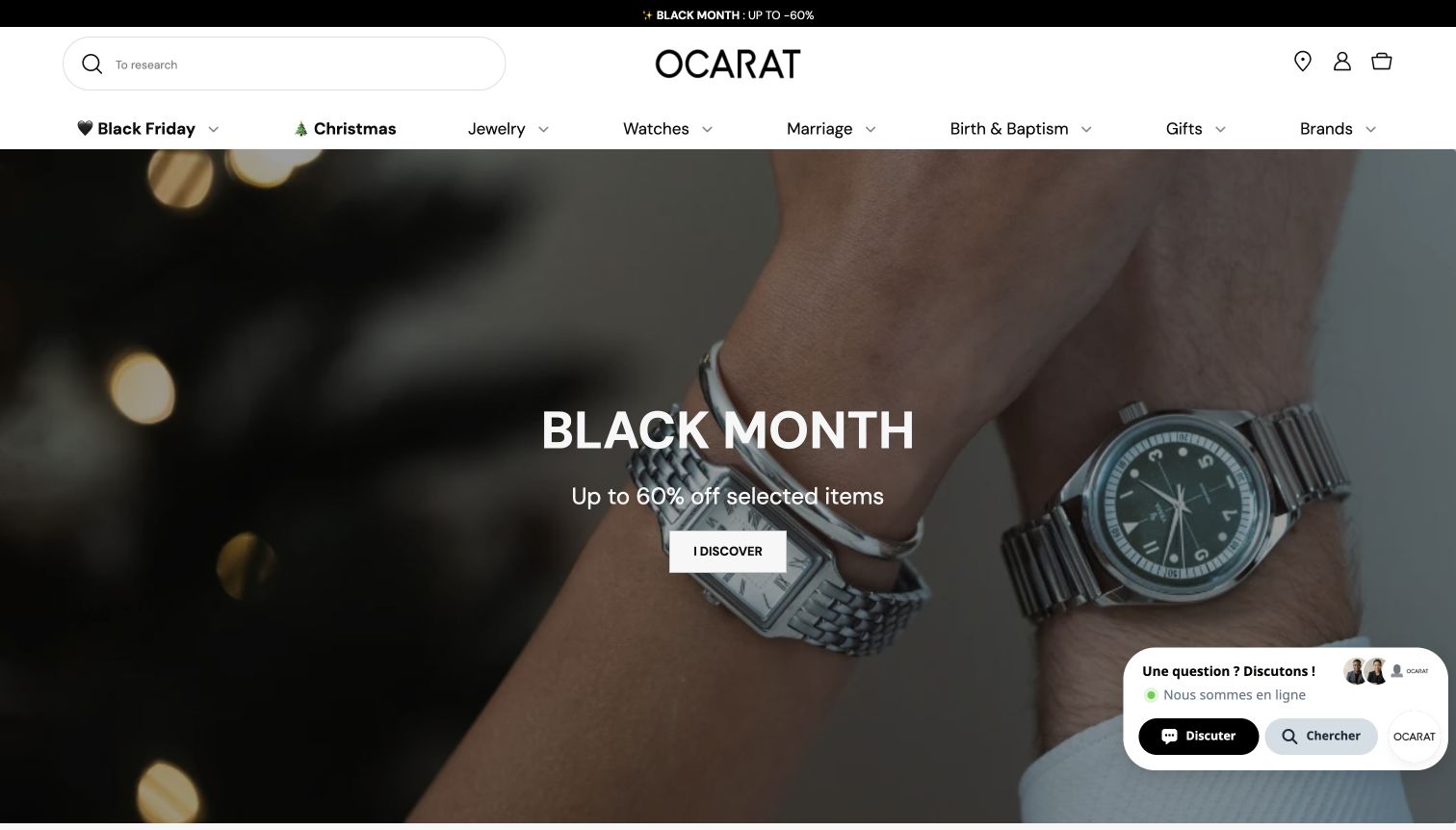
Ocarat opens with a close-up watch photograph and a bold seasonal campaign, while a wide white header preserves search and jewelry-category navigation. The treatment makes the promotion feel like part of a specialist store instead of a detached advertising landing page. Occasion-based routes give shoppers another way into the assortment besides knowing a brand or product type. PrestaShop’s 2025 founder interview documents the Ocarat store’s platform relationship and substantial catalog; those vendor-reported business figures are not independent performance measurements here.
What you can learn
For a broad specialist inventory, make search and category structure permanent while allowing the feature area to change. Visitors browsing for inspiration and customers who already know the item they want should both have an obvious starting point.
Pros
The close-up product image gives the campaign a concrete visual subject with recognizable detail.
Persistent search and category navigation provide alternatives to following the current promotional offer.
Cons & considerations
A dominant sale message can overshadow craftsmanship or product differences for less price-driven visitors.
Dense category and occasion menus require careful naming to avoid creating several indistinguishable routes into the same inventory.
Platform source: Official PrestaShop case: Ocarat (2025-05-28). The public Ocarat jewelry and watch store described by its founder in the vendor case. Documented storefront association from an official PrestaShop case, reviewed November 10, 2026. The case describes its own publication period, not a fresh inspection of the entire current commerce backend. No current version, private system or completed future upgrade is inferred. The screenshot is direct design evidence; the bounded source audit is recorded separately. Platform evidence is separate from the direct website screenshot and is not a complete current infrastructure audit.
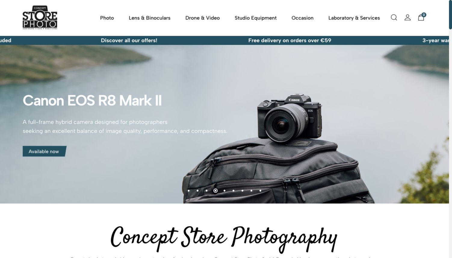
Concept Store Photo’s homepage combines teal navigation and an offer strip with a large camera campaign. The header makes room for equipment categories alongside used products, laboratory services and other specialist destinations. This broader structure matters because photography customers may arrive needing advice or an ongoing service rather than a new camera. The 2026 PrestaShop case describes the public store following a completed migration from WooCommerce. It supports that specific storefront association, without proving the implementation of every connected inventory or physical-store system.
What you can learn
Organize a technical retailer around the complete customer activity, not only product types. Keep equipment discovery prominent, but make useful services and alternative buying routes visible enough that returning customers can find them without starting from the campaign.
Pros
The teal navigation creates a clear boundary between catalog controls and the large promotional photograph.
Service and used-equipment routes broaden the page’s usefulness beyond shoppers responding to a new-product launch.
Cons & considerations
Several specialist menu labels may need explanatory landing pages for first-time photography buyers.
A manufacturer-led campaign can dominate the opening unless the retailer’s own service proposition remains easy to find.
Platform source: Official PrestaShop case: Concept Store Photo (2026-06-09). The public photography equipment store, documented after a completed WooCommerce to PrestaShop migration. Documented storefront association from an official PrestaShop case, reviewed November 10, 2026. The case describes its own publication period, not a fresh inspection of the entire current commerce backend. No current version, private system or completed future upgrade is inferred. The screenshot is direct design evidence; the bounded source audit is recorded separately. Platform evidence is separate from the direct website screenshot and is not a complete current infrastructure audit.
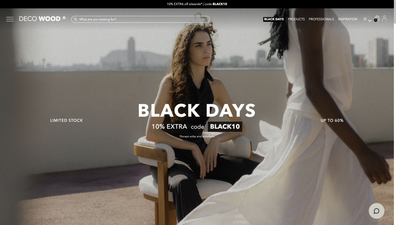
Decowood’s captured Spanish storefront gives most of the opening to a furnished interior and a large seasonal sale treatment. The thin white navigation and overlay controls keep the room photograph visually continuous, allowing materials and composition to establish the brand’s aesthetic. Search and product routes sit within that frame rather than in a heavy separate panel. PrestaShop’s 2026 case documents this consumer furniture store; its separate professional portal is outside the reviewed property and is not counted as another example.
What you can learn
When the product is part of a room or larger setting, show that context before isolating every item. A minimal interface can preserve the atmosphere, provided search, categories and the route from inspiration to a specific product remain recognizable.
Pros
The interior image demonstrates relationships between products, materials and space in one coherent composition.
The limited navigation treatment avoids competing visually with a detailed room photograph.
Cons & considerations
White controls placed over changing imagery need reliable contrast across every campaign crop.
A large sale headline can make dimensions, materials and delivery information feel remote until a product page is reached.
Visible tech stack
Earlier / documented evidence
PrestaShop
Platform source: Official PrestaShop case: Decowood (2026-05-27). The public consumer furniture store, captured in its Spanish locale; not its separate B2B portal. Documented storefront association from an official PrestaShop case, reviewed November 10, 2026. The case describes its own publication period, not a fresh inspection of the entire current commerce backend. No current version, private system or completed future upgrade is inferred. The screenshot is direct design evidence; the bounded source audit is recorded separately. Platform evidence is separate from the direct website screenshot and is not a complete current infrastructure audit.
Identity by Father & Sons opens with a wide photograph of coordinated professional clothing beneath a spacious, restrained header. The people and garments communicate the category more effectively than an abstract corporate illustration would. A distinct private-space route separates returning organizational customers from the public catalog, while the visible categories allow a newcomer to understand the offering first. The vendor’s 2026 case documents the public store and private catalog model, but this review covers only the accessible storefront and does not claim that a planned upgrade has already occurred.
What you can learn
For business-oriented retail, explain the visible product range before asking visitors to enter an account workflow. Separate public discovery from customer-specific ordering so the homepage can serve new buyers without revealing or implying access to private arrangements.
Pros
The group image puts the clothing in a recognizable professional context instead of showing disconnected product thumbnails.
The private-area label distinguishes an existing-customer task from ordinary public browsing.
Cons & considerations
A broad professional image still needs detailed category pages to explain fit, fabrics and available variations.
The privacy banner visible in the capture competes with part of the introductory composition.
Visible tech stack
Earlier / documented evidence
PrestaShop
Platform source: Official PrestaShop case: Identity by Father & Sons (2026-04-20). The public uniform and workwear store. Private company catalogs were not accessed; the planned version upgrade is not asserted as completed. Documented storefront association from an official PrestaShop case, reviewed November 10, 2026. The case describes its own publication period, not a fresh inspection of the entire current commerce backend. No current version, private system or completed future upgrade is inferred. The screenshot is direct design evidence; the bounded source audit is recorded separately. Platform evidence is separate from the direct website screenshot and is not a complete current infrastructure audit.
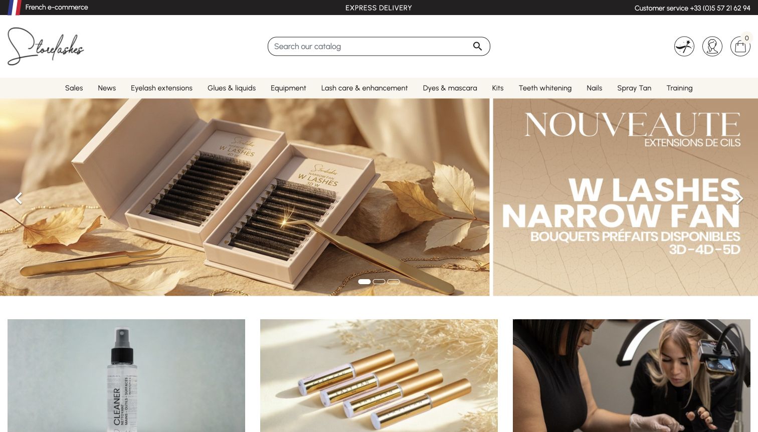
Store Lashes uses a cream and gold product feature to introduce a professional beauty assortment. A broad navigation row distinguishes product categories, kits and training, with supporting cards beginning beneath the campaign. That arrangement presents a retail range and an educational context without placing every option into the hero. PrestaShop’s 2026 case identifies this store and discusses business purchasing features. The screenshot documents the public presentation only; account eligibility, financing decisions and checkout behavior were not tested or inferred from the design.
What you can learn
A professional catalog can benefit from an inviting visual introduction while still requiring precise category language. Use the campaign to establish identity, then make consumables, equipment, starter collections and training distinct destinations that correspond to different purchasing needs.
Pros
The consistent cream and gold treatment creates a recognizable connection between imagery and interface accents.
Separate training and product routes acknowledge that some visitors need guidance before selecting supplies.
Cons & considerations
A wide category row can become difficult to scan when several neighboring terms sound similar.
Professional-use products need clear suitability information on deeper pages rather than relying on attractive packaging alone.
Platform source: Official PrestaShop case: Store Lashes (2026-03-17). The public professional lash-products store described in the vendor case; no account, financing or checkout behavior was tested. Documented storefront association from an official PrestaShop case, reviewed November 10, 2026. The case describes its own publication period, not a fresh inspection of the entire current commerce backend. No current version, private system or completed future upgrade is inferred. The screenshot is direct design evidence; the bounded source audit is recorded separately. Platform evidence is separate from the direct website screenshot and is not a complete current infrastructure audit.
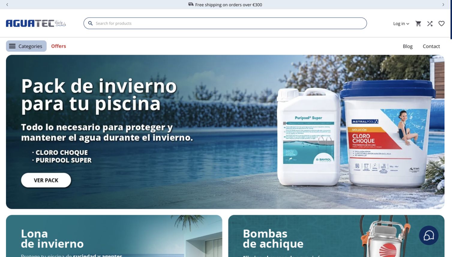
Aguatec Piscinas combines a broad catalog search with blue navigation and a rounded seasonal pool-maintenance feature. The captured campaign focuses on winter treatment, giving a technical assortment a concrete reason to browse at that moment. Categories and customer-support routes remain visible around the promotion instead of being displaced by it. PrestaShop’s 2026 case documents the public store after its 2025 migration. This is evidence for the named retail property, not verification of private stock systems or the outcome of any treatment product.
What you can learn
Use a seasonal task to organize a technical promotion, then preserve permanent routes for customers who arrive with a different problem. Search, recognizable categories and help destinations let a campaign become an entry point without becoming the only way through the catalog.
Pros
The blue palette connects the navigation and campaign to the store’s pool-related subject matter.
The task-specific feature is more concrete than a broad claim about having everything for the garden.
Cons & considerations
Maintenance promotions should lead to clear product instructions rather than imply that one treatment suits every pool.
A large technical inventory needs consistent category naming to keep search and menu browsing aligned.
Platform source: Official PrestaShop case: Aguatec Piscinas (2026-02-27). The public pool-products store documented after its 2025 platform migration. Documented storefront association from an official PrestaShop case, reviewed November 10, 2026. The case describes its own publication period, not a fresh inspection of the entire current commerce backend. No current version, private system or completed future upgrade is inferred. The screenshot is direct design evidence; the bounded source audit is recorded separately. Platform evidence is separate from the direct website screenshot and is not a complete current infrastructure audit.
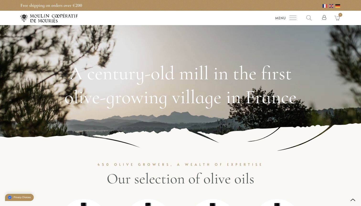
Moulin coopératif de Mouriès begins with a landscape and mill image, large serif lettering and an organic lower edge that leads toward the olive-oil offering. The restrained header leaves room for the place itself to establish context. This is a different retail rhythm from a page dominated by discounts or product grids: origin becomes the opening explanation. PrestaShop’s 2026 case documents the cooperative’s public shop after its 2025 migration; the current capture does not independently establish production methods or the platform’s present version.
What you can learn
If origin is central to the product, introduce the setting with a specific image and a concise statement. Follow that atmosphere with clear shopping routes so the story helps people understand the offering instead of delaying the practical information they need.
Pros
The landscape gives the cooperative a concrete sense of place rather than a generic food-brand backdrop.
The curved transition softens the move from the opening image into the shopping content below.
Cons & considerations
Large display lettering over detailed scenery needs careful contrast and crop control.
An origin-led introduction still needs readily available product sizes, ingredients and delivery information further into the store.
Platform source: Official PrestaShop case: Moulin coopératif de Mouriès (2026-02-26). The olive-oil cooperative’s public shop, documented following its 2025 migration. Documented storefront association from an official PrestaShop case, reviewed November 10, 2026. The case describes its own publication period, not a fresh inspection of the entire current commerce backend. No current version, private system or completed future upgrade is inferred. The screenshot is direct design evidence; the bounded source audit is recorded separately. Platform evidence is separate from the direct website screenshot and is not a complete current infrastructure audit.
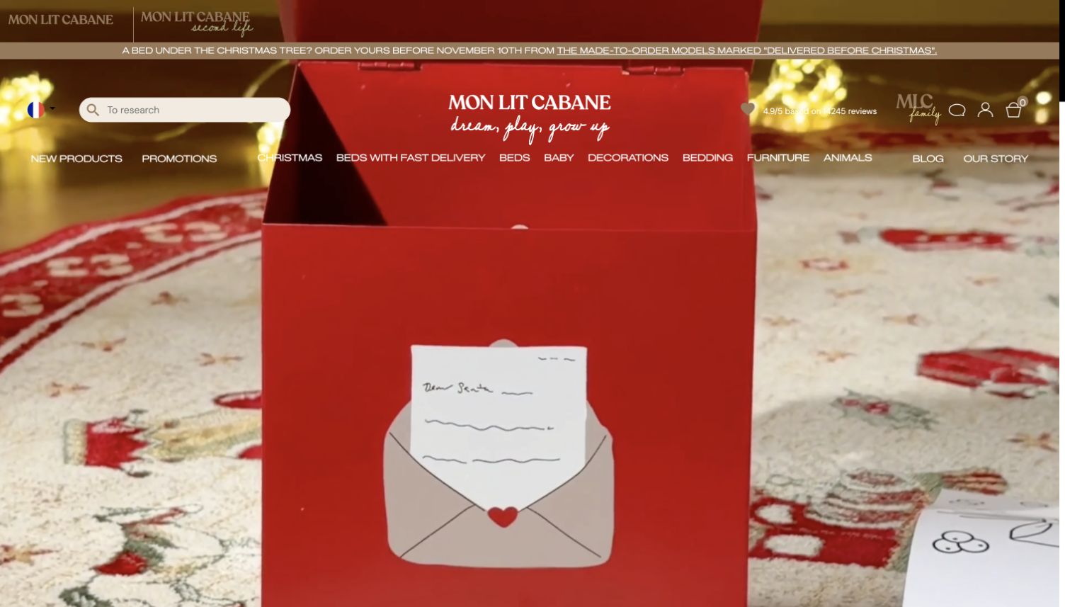
Mon Lit Cabane’s captured storefront places a seasonal family-oriented scene across the opening, with white navigation layered above and a restrained brand treatment. The image has more narrative character than a standard product grid, while the header provides direct routes to furniture categories and a second-life offering. The official 2026 case supports the shop’s established PrestaShop relationship. Its discussion of an Enterprise transition includes a future rollout, so this review does not present that transition as completed or infer a current edition from the screenshot.
What you can learn
An evocative opening can help a furniture brand show the setting in which its products belong. Keep product categories and practical alternatives visible around that scene, so visitors can move from a mood or occasion to a specific item without guessing.
Pros
The large seasonal scene establishes a consistent visual atmosphere before the catalog becomes more detailed.
The second-life route gives visitors a distinct alternative alongside the primary product range.
Cons & considerations
A moving or changing hero should not be the only place where an important offer is explained.
Furniture decisions still require dimensions, materials and assembly details beyond the emotional opening frame.
Visible tech stack
Earlier / documented evidence
PrestaShop
Platform source: Official PrestaShop case: Mon Lit Cabane (2026-02-11). The public furniture shop’s established PrestaShop association. The case’s Enterprise transition was described as planned; completion is not inferred. Documented storefront association from an official PrestaShop case, reviewed November 10, 2026. The case describes its own publication period, not a fresh inspection of the entire current commerce backend. No current version, private system or completed future upgrade is inferred. The screenshot is direct design evidence; the bounded source audit is recorded separately. Platform evidence is separate from the direct website screenshot and is not a complete current infrastructure audit.
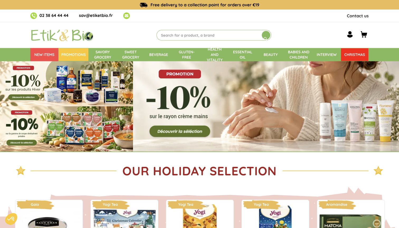
Etik & Bio uses a yellow service strip, a green catalog header and a prominent search field above a collection of differently sized promotional tiles. The layout gives seasonal selections room to stand out while retaining the familiar structure of a grocery store. Multiple product families can be introduced without forcing every promotion into one rotating feature. PrestaShop’s 2026 case describes the public shop’s platform history, including earlier upgrades. The guide does not treat a planned later version as an observed implementation or verify every product claim.
What you can learn
For an everyday catalog, make the directory and search tools dependable, then use a controlled tile hierarchy to surface changing selections. The largest promotion should have a clear reason for its prominence, while smaller cards remain useful routes rather than decorative filler.
Pros
Strong color bands distinguish service information, catalog navigation and the main promotional content.
The tile structure allows several shopping intentions to appear together without requiring a single campaign choice.
Cons & considerations
Many adjacent promotions can compete unless image styles and text lengths follow a consistent system.
Organic or dietary positioning needs product-level substantiation rather than reliance on the store’s overall visual identity.
Platform source: Official PrestaShop case: Etik & Bio (2026-01-27). The public organic-grocery shop, documented as using PrestaShop since 2020; planned future version upgrades are not current observations. Documented storefront association from an official PrestaShop case, reviewed November 10, 2026. The case describes its own publication period, not a fresh inspection of the entire current commerce backend. No current version, private system or completed future upgrade is inferred. The screenshot is direct design evidence; the bounded source audit is recorded separately. Platform evidence is separate from the direct website screenshot and is not a complete current infrastructure audit.
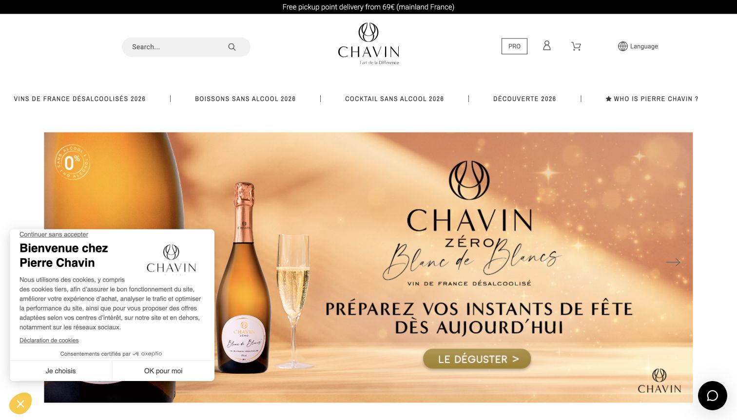
Maison Chavin’s public shop uses a light header and large bottle photography to introduce its non-alcoholic range. The restrained navigation gives product categories room to remain visible without overwhelming the central campaign. In the selected capture, a privacy panel occupies the lower left, while the product remains clearly visible to the right. PrestaShop’s 2026 case concerns shop.pierre-chavin.com specifically. That documentary relationship should not be extended to every Chavin brand property, nor does the image independently verify product composition or health-related claims.
What you can learn
A specialist category benefits from a precise identity and a focused visual subject. Let the product occupy enough space to be understood, but keep category labels and substantive product information close enough that the atmosphere does not substitute for explanation.
Pros
The pale interface and uncluttered bottle image give the opening a coherent premium presentation.
The visible navigation keeps the shop understandable even when a seasonal feature occupies most of the page.
Cons & considerations
A privacy panel can cover useful supporting content during the first visit.
Beverage descriptions need clear product-level ingredients and specifications rather than assumptions drawn from packaging or campaign photography.
Platform source: Official PrestaShop case: Maison Chavin (2026-01-05). The public non-alcoholic wine store at shop.pierre-chavin.com, not a blanket association for every brand property. Documented storefront association from an official PrestaShop case, reviewed November 10, 2026. The case describes its own publication period, not a fresh inspection of the entire current commerce backend. No current version, private system or completed future upgrade is inferred. The screenshot is direct design evidence; the bounded source audit is recorded separately. Platform evidence is separate from the direct website screenshot and is not a complete current infrastructure audit.
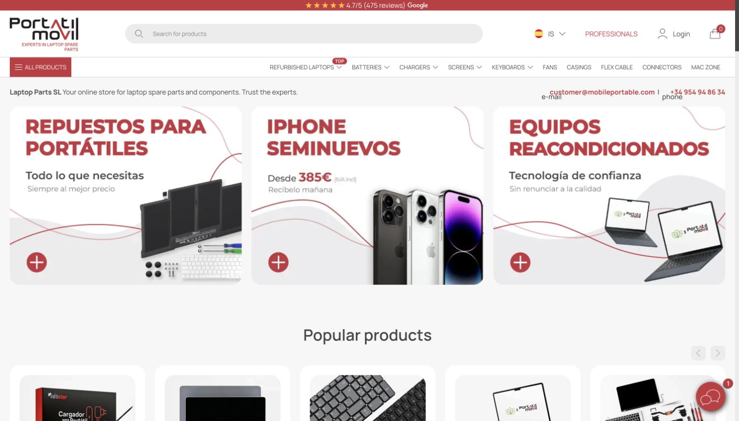
Portátil Móvil combines red and white catalog navigation with three substantial entry cards for replacement parts, refurbished phones and computers. The categories describe different customer tasks instead of treating every electronic item as part of one undifferentiated inventory. Product cards begin below, giving the introduction a practical continuation. PrestaShop’s 2025 migration case identifies the public store and describes a particular implementation at that time. This review does not infer the present version or claim that any part’s compatibility has been tested.
What you can learn
A technical retailer should separate the jobs customers are trying to complete before presenting individual products. Someone repairing a device needs a different path from someone replacing it, even when both journeys ultimately use the same commerce platform.
Pros
The three entry cards make the distinction between parts and complete devices easy to understand.
Consistent red accents connect the catalog controls with the retailer’s broader identity.
Cons & considerations
Replacement parts require precise compatibility information after the introductory category choice.
Refurbished-device listings need clear condition and warranty explanations that the opening cards alone cannot provide.
Platform source: Official PrestaShop case: Portátil Móvil (2025-11-24). The public electronics and spare-parts store after its documented migration; no present version number is inferred. Documented storefront association from an official PrestaShop case, reviewed November 10, 2026. The case describes its own publication period, not a fresh inspection of the entire current commerce backend. No current version, private system or completed future upgrade is inferred. The screenshot is direct design evidence; the bounded source audit is recorded separately. Platform evidence is separate from the direct website screenshot and is not a complete current infrastructure audit.
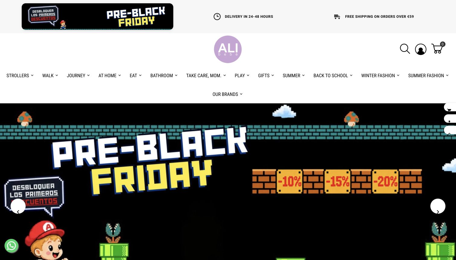
ALI Bebé’s homepage gives its pastel identity substantial white space above an extensive category navigation. The captured seasonal promotion uses a playful game-like visual treatment, contrasting with the calmer catalog frame. Categories organized around activities such as travel, feeding and care make the store’s breadth more concrete than a generic department list would. PrestaShop’s 2025 case identifies alibebe.es as a distinct baby-products shop; the company’s other retail properties are not counted here or automatically assigned the same implementation.
What you can learn
When a store carries many related products, use the customer’s everyday activities as organizing language. A campaign can add energy, but the permanent category system should remain recognizable to someone arriving with one immediate need rather than an interest in the promotion.
Pros
The spacious brand area establishes a friendly identity before the more detailed catalog navigation.
Activity-based categories give visitors useful starting points across a wide assortment.
Cons & considerations
A tall header consumes substantial opening space before individual products or detailed benefits appear.
Playful promotional graphics should remain secondary to clear product information, suitability guidance and practical purchase conditions.
Platform source: Official PrestaShop case: ALI Bebé (2025-07-10). Only the public alibebe.es baby-products store; the company’s other retail sites are not additional examples. Documented storefront association from an official PrestaShop case, reviewed November 10, 2026. The case describes its own publication period, not a fresh inspection of the entire current commerce backend. No current version, private system or completed future upgrade is inferred. The screenshot is direct design evidence; the bounded source audit is recorded separately. Platform evidence is separate from the direct website screenshot and is not a complete current infrastructure audit.
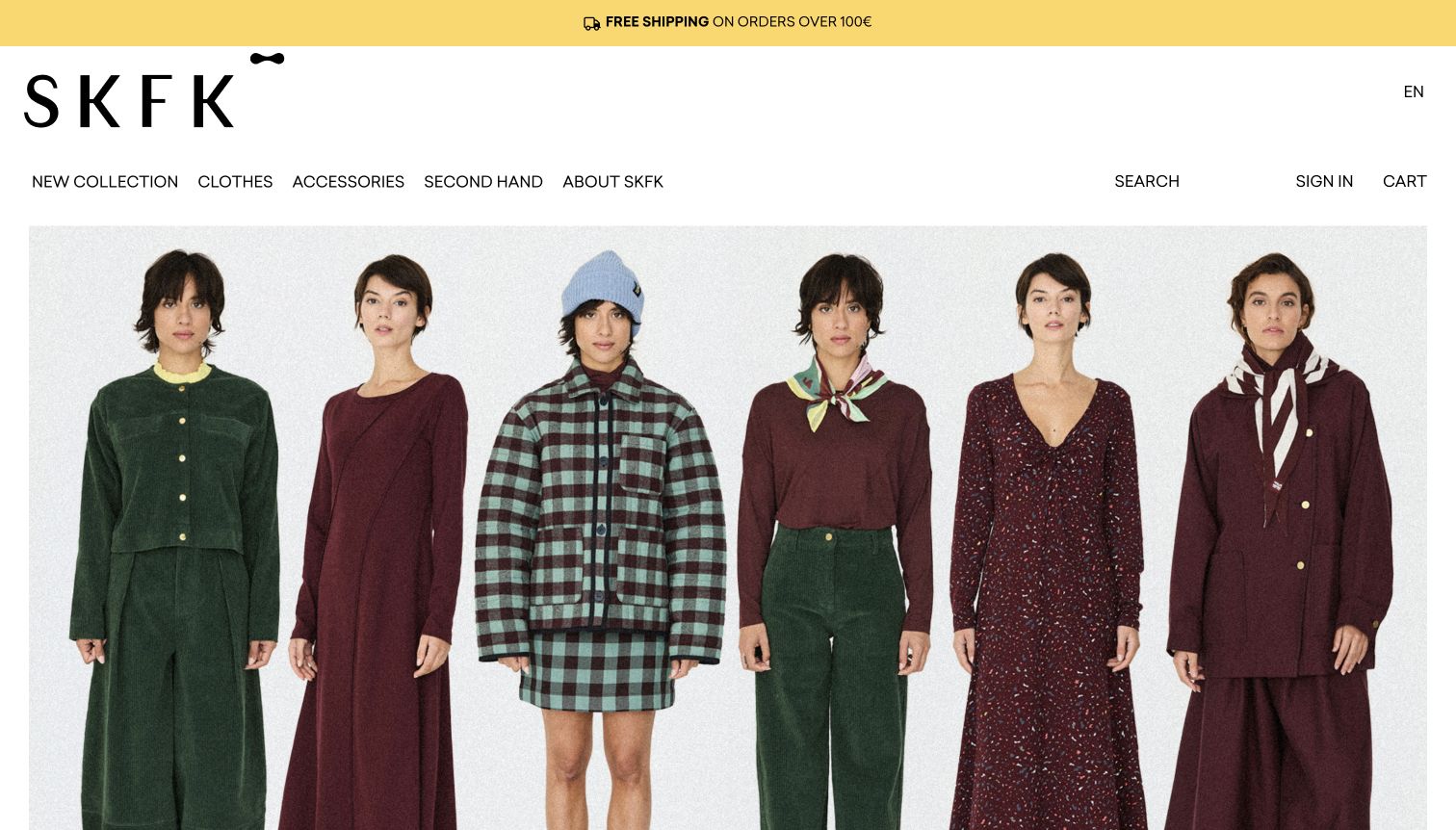
SKFK’s captured English storefront places a very large black wordmark above a restrained navigation and a full-width fashion image. A thin yellow service strip supplies a separate layer of practical information without interrupting the main photograph. The hierarchy is confident and simple: identity, navigation, collection. PrestaShop’s 2024 case documents the public fashion store following a 2023 migration. That association does not independently verify sustainability claims, describe every present component or extend to a separate resale service linked from the brand’s wider offering.
What you can learn
A strong wordmark and a small set of navigation choices can create a clear frame for expressive collection photography. Keep practical shopping information in a distinct layer, then let product and category pages carry the detail that the opening image intentionally leaves out.
Pros
The oversized identity makes the store recognizable without adding a long introductory statement.
The limited header treatment leaves the collection photograph visually continuous and easy to read.
Cons & considerations
A large brand treatment uses vertical space that returning shoppers may prefer for product discovery.
Ethical positioning requires accessible supporting information rather than being assumed from the brand name or styling.
Platform source: Official PrestaShop case: SKFK (2024-12-04). The public SKFK fashion shop following its documented 2023 migration; separate resale services are excluded. Documented storefront association from an official PrestaShop case, reviewed November 10, 2026. The case describes its own publication period, not a fresh inspection of the entire current commerce backend. No current version, private system or completed future upgrade is inferred. The screenshot is direct design evidence; the bounded source audit is recorded separately. Platform evidence is separate from the direct website screenshot and is not a complete current infrastructure audit.
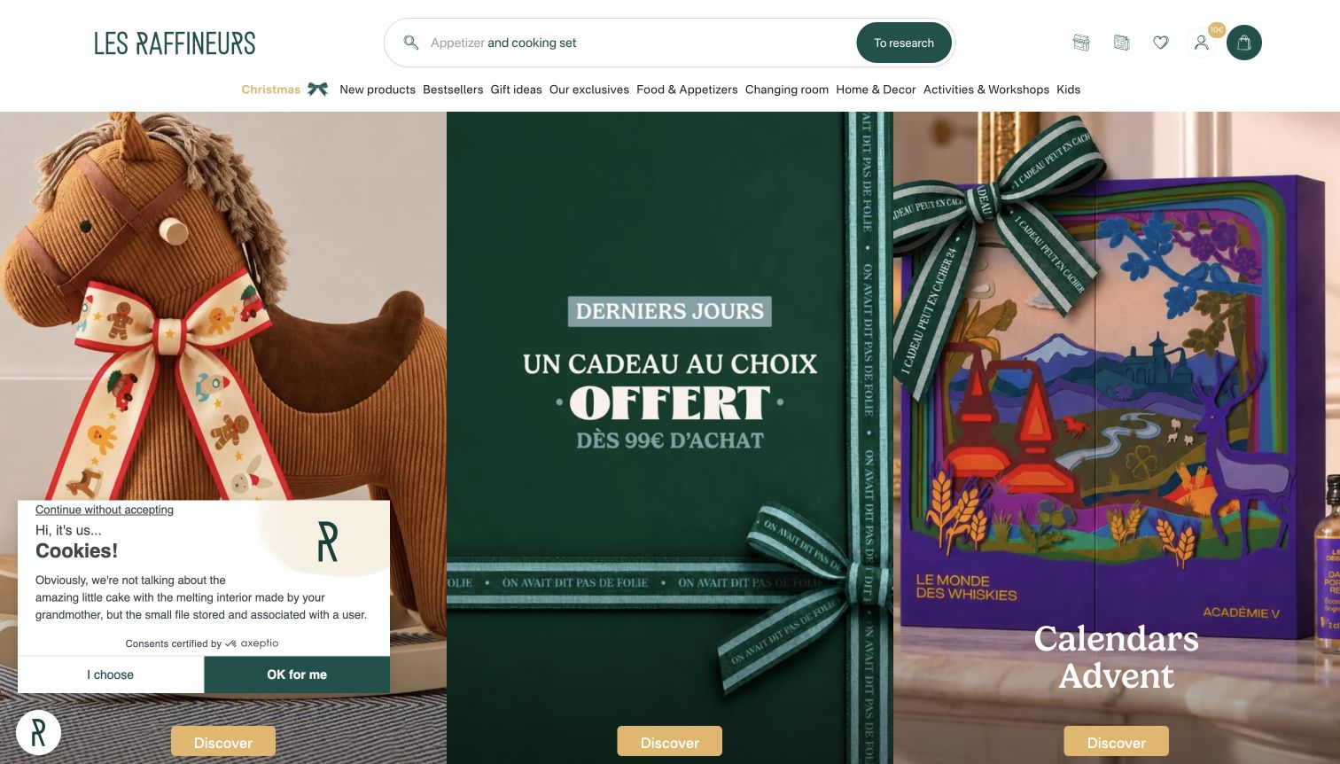
Les Raffineurs pairs a deep green identity with a broad search field and navigation organized around gifts and occasions. Three prominent seasonal cards give the opening several concrete destinations while preserving a coherent visual rhythm. This is useful for shoppers who know whom they are buying for but have not chosen an item. A privacy panel remains visible in the lower left of the capture. The official 2021 case documents an earlier PrestaShop integration; it is not proof that every marketing component remains unchanged today.
What you can learn
A gift store should offer routes based on the decision a shopper has already made, such as an occasion or recipient. Use a manageable number of distinct cards to turn that partial intention into a useful first choice without requiring a precise search query.
Pros
The card layout presents several gift directions together instead of hiding them behind a changing carousel.
Search remains prominent for visitors who already know a product or brand.
Cons & considerations
Seasonal cards need clear labels so attractive imagery does not become the only clue to their destinations.
The first-visit privacy panel obscures part of the opening and adds an extra decision before browsing.
Platform source: Official PrestaShop case: Les Raffineurs (2021-04-16). The public Les Raffineurs gift store described in an earlier PrestaShop integration case, not proof of every current marketing component. Documented storefront association from an official PrestaShop case, reviewed November 10, 2026. The case describes its own publication period, not a fresh inspection of the entire current commerce backend. No current version, private system or completed future upgrade is inferred. The screenshot is direct design evidence; the bounded source audit is recorded separately. Platform evidence is separate from the direct website screenshot and is not a complete current infrastructure audit.
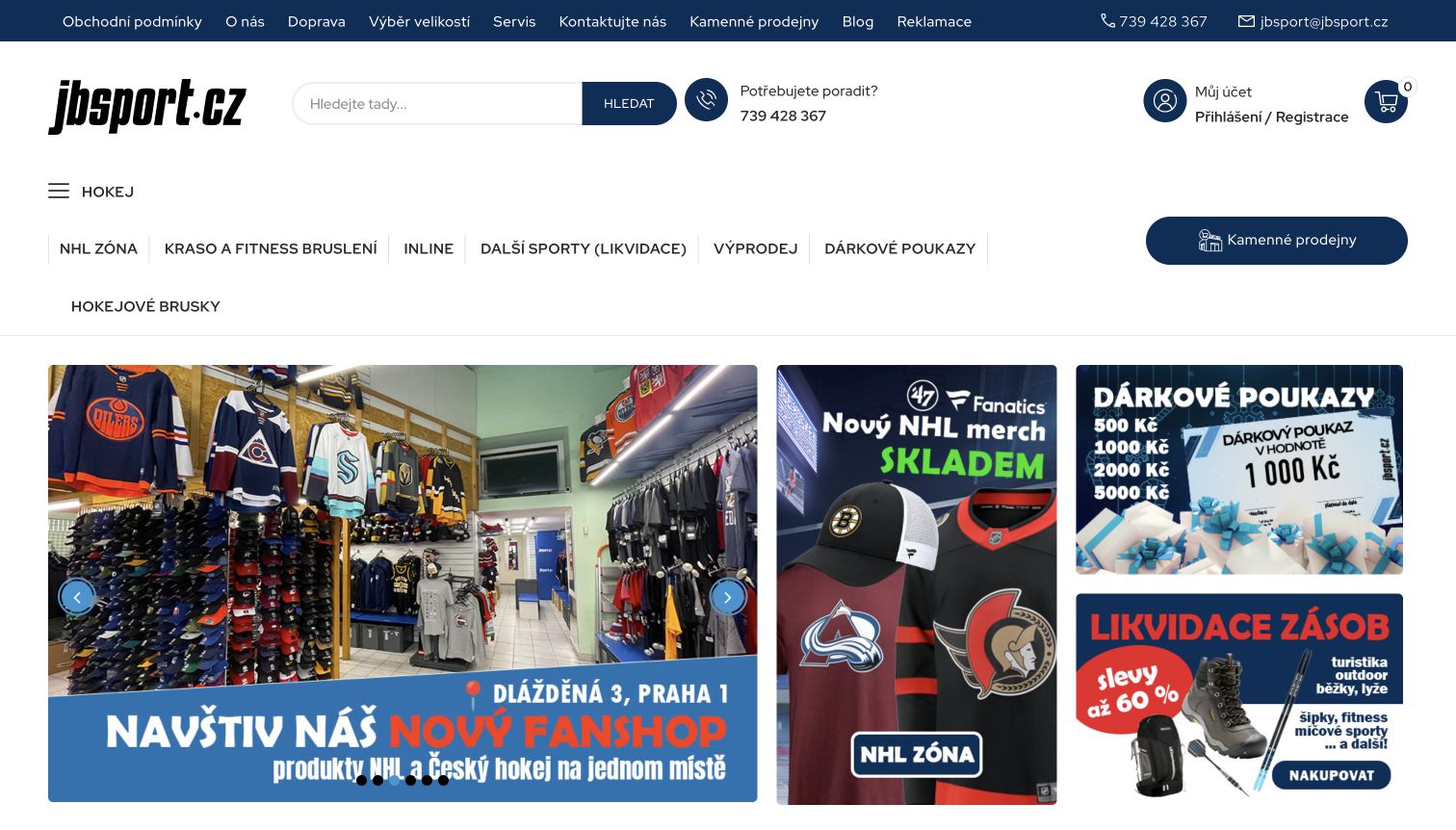
JB Sport’s captured homepage uses navy navigation, a large search field and a prominent help route above a grid of sports promotions. The main card shows a physical fan shop, while adjacent cards introduce NHL merchandise, gift vouchers and a clearance selection. This gives the catalog both a local retail context and several immediate shopping directions. PrestaShop’s case and Ecomail’s primary implementation account identify jbsport.cz and a completed migration. Their reported sales outcomes are not treated as independently measured results in this review.
What you can learn
For a specialist retailer, show the real-world store or community context alongside clear online categories. Keep search and help prominent so customers with a precise equipment need can bypass promotional browsing and reach a more suitable path.
Pros
The physical-store photograph gives the business a concrete setting beyond isolated merchandise images.
Different card sizes create a readable hierarchy among several simultaneous promotions.
Cons & considerations
The tall navigation area can delay the first product selection for visitors with smaller screens.
Equipment categories need clear sizing and compatibility guidance after the initial promotional or menu choice.
Platform source: Official PrestaShop case: JB Sport (2024-11-14). The public jbsport.cz sporting-goods shop, independently linked by Ecomail’s completed-migration case. Documented storefront association from an official PrestaShop case, reviewed November 10, 2026. The case describes its own publication period, not a fresh inspection of the entire current commerce backend. No current version, private system or completed future upgrade is inferred. The screenshot is direct design evidence; the bounded source audit is recorded separately. Platform evidence is separate from the direct website screenshot and is not a complete current infrastructure audit.
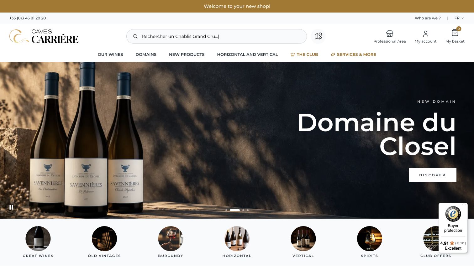
Caves Carrière places a broad search field and compact category navigation above a full-width producer feature. The selected frame uses bottle photography, dramatic lighting and a simple discovery action, followed by circular shortcuts for catalog themes such as older vintages and regions. The composition makes room for both browsing and specific knowledge. PrestaShop’s 2023 case documents the public shop’s earlier platform and hosting relationship. The separate professional site is excluded, and the current capture does not establish every backend component or validate wine-quality claims.
What you can learn
A specialist catalog can introduce one producer or collection editorially while still offering structured routes for experienced buyers. Keep search, regions and recurring catalog themes visible around the feature so the page serves precise intent as well as discovery.
Pros
The large producer image provides a coherent visual focus above the more detailed catalog structure.
Circular shortcuts give important themes a second entry point beneath the primary navigation.
Cons & considerations
Specialist terms may need explanatory destination pages for customers unfamiliar with the category.
Large promotional photography can postpone practical product details such as bottle size, availability and delivery conditions.
Platform source: Official PrestaShop case: Caves Carrière (2023-11-30). The public www.caves-carriere.fr wine shop in the earlier vendor hosting case; old.caves-carriere.fr and its separate B2B site are excluded. Documented storefront association from an official PrestaShop case, reviewed November 10, 2026. The case describes its own publication period, not a fresh inspection of the entire current commerce backend. No current version, private system or completed future upgrade is inferred. The screenshot is direct design evidence; the bounded source audit is recorded separately. Platform evidence is separate from the direct website screenshot and is not a complete current infrastructure audit.
Kegan has 15+ years of experience working with small businesses, Fortune 500 companies, and everything in between. No development job is too big or too small: he brings the same hands-on attention to a focused improvement, a complete website, or a custom application.
For PrestaShop projects, he can help with responsive interfaces, reusable components, custom functionality, API connections, and performance-minded implementation. He works directly with clients on scope, design, implementation, testing, and handover, with an emphasis on clear communication and a system that remains practical to maintain after launch.
Show 3 other PrestaShop developersHide other PrestaShop developers
Choose a PrestaShop approach around the catalog and team
A focused brand store
A compact catalog gives each product more room for explanation. Start with the questions that determine a purchase: what the item is for, how it differs from alternatives, which variation is appropriate and what arrives with it. Use photography to answer some of those questions rather than relying entirely on decoration. Keep the category structure small enough to understand, and make promotion changes possible without changing the product’s essential facts or permanent destination.
A specialist or broad product catalog
A larger assortment needs consistent product data before it needs more homepage sections. Establish useful categories, references and comparison fields, then decide where a buyer benefits from search, filters or guided explanations. Avoid giving every field equal prominence. Some information belongs on a result card; other details become useful only after a product is selected. Assign responsibility for supplier updates and explain how the team handles a missing specification, discontinued item or incomplete photograph set.
Several storefronts with deliberate shared responsibilities
PrestaShop’s multistore feature can manage multiple storefronts from one back office. That can be relevant to separate brands, domains or B2B and B2C presentations. Before choosing it, document which catalog records, settings and workflows should be shared and which must remain independent. The staff should understand the store context in which an edit applies. A shared administration area can reduce duplication, but only when the boundaries match how the business actually operates.
Plan the product data, integrations and daily store work
Define the catalog’s source of truth
Map where product names, references, images, stock and prices originate. If another system supplies part of the information, name the owner of each field and the direction of every update. PrestaShop documents a Webservice API for authorized external tools to work with shop data; an API’s existence does not resolve conflicting records or delayed synchronization. Give integrations a clear failure policy and a way for staff to identify information that needs attention.
Make fulfillment information part of the product experience
A product page is incomplete if shoppers cannot understand the relevant delivery choices and restrictions. PrestaShop’s carrier setup represents shipping providers and their applicable ranges, fees and timing information. Decide which details can be stated early and which depend on the destination or basket. Use real product weights, dimensions and service rules during configuration. Keep promotional delivery messages consistent with the operational settings, and assign an owner to investigate a mismatch.
Plan maintenance as part of the original implementation
Record the store version, theme, modules and custom changes with their support responsibilities. PrestaShop’s documentation distinguishes updates from migrations and discusses compatibility when changing major versions. Choose the path after checking the actual installation, rather than assuming that a case study’s earlier version describes the present store. Keep backups and a recovery procedure, rehearse important changes in an appropriate test environment and verify the public store after release. Routine maintenance should have an owner before the initial project is considered complete.
Ask the actual team to carry out its routine job: publish a realistic update, correct a mistake, preview a narrow screen, and identify who owns an integration failure. For a library or frontend framework, also ask who maintains the content source and deployment. A polished screenshot does not answer those operational questions.
Beyond the screenshot
PrestaShop store planning checklist
Name the exact storefront and documentary scope behind every technology reference.
Distinguish historical implementations, current source observations and future plans.
Separate selectable attributes from fixed product features.
Use consistent product references, units, category names and image requirements.
Identify who owns descriptions, prices, stock and fulfillment information.
Design useful category, search, product-detail and empty-result states.
Check long titles, missing photographs and unavailable combinations with realistic catalog data.
Keep delivery and return explanations consistent with the store’s actual operating rules.
Give each module a documented purpose, compatible version and maintenance owner.
Define the sharing boundaries before adopting a multistore structure.
Document integration failures, backup restoration and responsibilities after handover.
Check keyboard use, narrow-screen reading and essential customer journeys in an appropriate test environment.
Verify canonical pages, product assets and important public behavior after release.
Test with real content, a keyboard, a small screen, slow or failed requests, and the people who will maintain the system. These are planning checks, not an accessibility, security, performance, or search-ranking certification.
Sources & editorial method
How this PrestaShop collection was reviewed
This collection examines twenty distinct public storefronts, with direct captures made on November 10, 2026 and exact capture provenance retained per example. Official PrestaShop vendor cases provide property-specific documentary associations from different publication years. These sources are not presented as fresh inspections of every current backend, version, theme or module. The ČD example is its merchandise shop; Identity by Father & Sons is the public uniform store; Maison Chavin is its named shop property. Mon Lit Cabane’s planned Enterprise upgrade is kept separate from completed work described in its case. Broad source-audit records preserve observed technologies, original dates and any partial, unavailable or access-restricted outcomes without guessed additions. Some storefront text was automatically translated by the browser; screenshots and reviews reflect that observed state, with local capture notes retained. The research did not create accounts, submit forms or orders, test checkout, or measure conversion, security, performance or accessibility conformance. Vendor-reported results remain attributed claims, not independent measurements. Versioned official documentation informs the planning advice; it does not assign that version to the examples.
Every image is an unmodified capture from the actual website, with its source and capture date. Some captures are reused from our shared catalog; their dates remain the original capture dates. None comes from a vendor gallery or a generated reconstruction. Moving imagery and live content can change.
Technology attribution uses public page assets or metadata, official platform documentation, or a cited first-party project case study. Documentary and framework-relationship evidence is identified where used; it is not a complete current backend inventory. A CMS image CDN alone does not establish a full CMS deployment. A library’s presence does not prove which individual controls use it, and a platform label does not establish AI authorship.
The composition notes, lessons, pros and tradeoffs are original editorial observations. We have not measured conversion, traffic, security, performance or accessibility conformance. Website owners retain their brands and imagery; these examples are not our client portfolio. Written, Edited and Curated are independent records, not dates advanced by a build. See our editorial standards or suggest a correction.
Questions worth asking
PrestaShop website development FAQs
Does every example currently run the same PrestaShop version?
No. The evidence describes specific storefront projects and, where available, current public-source signals. Vendor cases from different years do not establish a shared present version or configuration. Historical implementations and planned upgrades retain their original qualifications.
What is the difference between a product attribute and a feature?
In PrestaShop’s catalog model, attributes support product combinations such as selectable size or color. Features describe characteristics that remain fixed across those combinations. The right classification depends on the product and should match the choices the customer actually makes.
Should the theme be selected before the catalog is organized?
Understand the catalog and buying decisions first. The theme should present useful categories, product information and variations clearly. Test candidate layouts with real products, long names and imperfect images instead of relying only on polished demonstration content.
When is multistore worth considering?
Consider it when several storefronts have a deliberate need for shared administration while retaining defined differences, such as brand, domain or audience. Map the shared and independent responsibilities before choosing the structure. Multiple languages or a second promotion alone do not explain the operating model.
How many modules does a good store need?
There is no useful universal target. Each module should solve a named requirement, work with the store’s actual version and theme, and have a maintenance owner. Evaluate the combined customer journey rather than treating a long extension list as evidence of a better store.
Does a vendor success story prove present checkout or hosting details?
It supports only the project, time and scope that it describes. It does not establish every present payment service, hosting component or checkout behavior. This collection reviewed public storefronts without submitting orders or testing private account and transaction systems.
What should be included in a PrestaShop handover?
Include the catalog rules, data owners, theme and module inventory, integration responsibilities, maintenance plan and recovery procedure. Staff should be able to perform ordinary updates and identify who handles an unsuccessful synchronization or release. Keep the documentation aligned with the actual installed version.
Borrow the decisions that help someone understand and choose a product. Build the catalog, presentation and operating responsibilities together so the store remains useful when its assortment, promotions and team change.