Best Astra Websites of 2026 (20 Real-World Examples)
A WordPress theme is a starting system for the site—not a substitute for a clear content model and an agreed editing workflow.
Astra examples can be useful without looking alike. Study the pages and customer tasks, then decide how the theme, WordPress editor and any additional tools will share responsibility for the design.
Astra is a WordPress theme, while page builders, content plugins and optional Astra Pro functionality are separate parts of an implementation. A visible theme asset can support a property-specific association without revealing which paid package the owner uses or who designed the page. The collection should preserve those boundaries instead of treating the theme name as a complete description of the website.
Before choosing a demo, write down the site’s recurring content and the actions visitors need to take. A professional practice, publication and shop can require different templates even when each uses Astra. The useful question is whether the proposed implementation makes those tasks and routine updates manageable—not whether a screenshot resembles a popular starter layout.
Before the examples
What makes good Astra website development in 2026?
Give each design setting an owner
Define where typography, colors, spacing and reusable components are controlled. Astra’s documentation distinguishes global theme settings from page-builder overrides. Without an agreed system, an editor can change the theme palette and still find that individual pages retain unrelated local colors. Demonstrate a global change on several representative templates before approving the design.
Record which settings are safe for ordinary editors and which should remain part of the implementation. A shared heading style should not require opening every page to repair it. Keep exceptions intentional and documented, especially when landing pages use a different header or content width. The goal is predictable editing rather than the largest possible collection of controls.
Design the ordinary content before the dramatic homepage
Use real service text, a long article title, a small image and a page without a featured image in the prototype. A theme can provide a useful visual framework while the content model still needs careful work. Decide how headings, related content, author information and calls to action behave when the ideal demonstration material is absent.
Keep the main reading experience comfortable and recognizable. Astra offers global typography controls, but selecting a font family does not establish readable line lengths, appropriate heading hierarchy or sufficient contrast. Test the design with the site’s actual language and longer text. Check that a localized page or an editor’s routine update does not depend on carefully chosen line breaks.
Specify the header, mobile menu, utility links and footer together. A polished desktop menu can still leave a phone user unable to find a service or close an expanded panel. Test pointer, keyboard and touch behavior, including focus visibility and the relationship between a sticky header and in-page links. A builder’s available component does not remove the need to check the completed interaction.
Give the footer an actual purpose: useful destinations, contact context and relevant policy links. Avoid repeating the whole main menu merely to fill a large area. Astra documents header and footer building separately, making it useful to decide which shared elements belong in those systems and which are page content that editors can change independently.
Compare the named public properties as design references while keeping the supported Astra association scoped to each example. A theme signature does not identify every plugin, the current license tier, private account behavior or the complete editing process.
We start with five recognizable brands or organizations: Tetra Tech, Guidepost Montessori, National Ability Center, Parametrix, MIT SCRAM. Each attribution applies to the named website property, not every product or website belonging to its organization. This is a curated reading sequence, not a measured ranking.
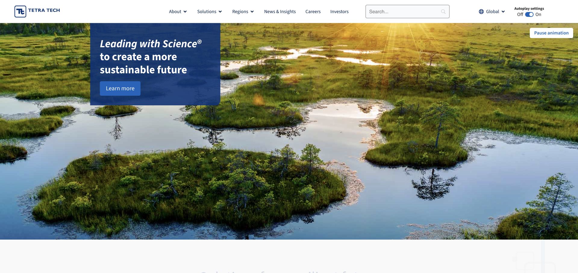
Tetra Tech uses a wide wetland photograph and a small blue message panel instead of a full-screen paragraph. A pause control is visible, while the header separates company, solutions, regions, news, careers and investors. The composition gives the environmental setting room without asking the image to carry the entire explanation. This is a broad consulting group rather than a template for a small ecological practice. Its useful pattern combines a concise introduction, explicit media control and stable navigation as the featured scene changes.
What you can learn
Use environmental imagery as context, then give each technical discipline a precise destination. Keep motion optional and make the role of the consultant explicit in project stories. A broad science-led statement should lead to evidence and scope, not be treated as proof of a particular result.
Pros
A bounded blue panel gives the short introductory message a reliable contrast background.
The visible pause control recognizes that a moving landscape is not useful or comfortable for every visitor.
Cons & considerations
The broad introduction leaves a new client to find the specific service and regional team elsewhere.
Scenic environmental imagery needs role and project context before it can support a technical claim.
Platform source: WordPress.org Showcase. Linked stylesheet matches Astra. Exact public source-page reference: https://www.tetratech.com/. This is an observed component association, not proof of private configuration, a paid plan, measured results or complete architecture. Platform evidence is separate from the direct website screenshot and is not a complete current infrastructure audit.
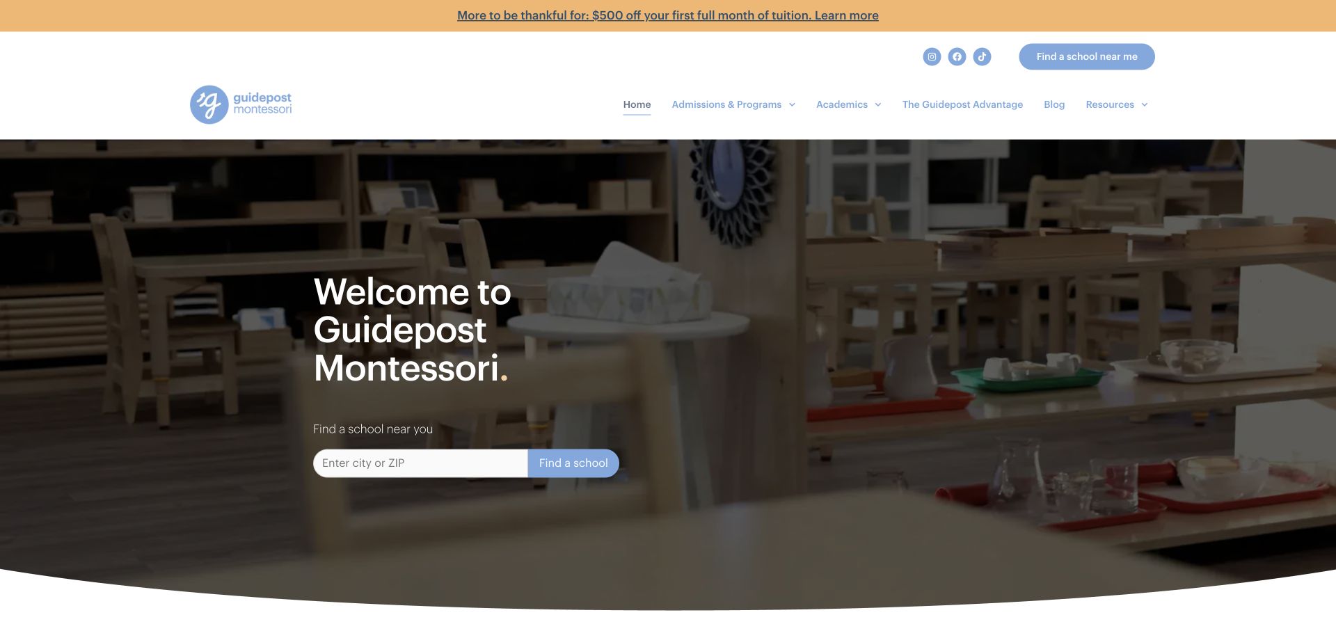
Guidepost Montessori uses a simple welcome headline over a darkened classroom image, with a city-or-ZIP school finder directly beneath it. The white header includes admissions and programs, academics, resources, and a separate school-finding action. A promotional strip sits above the header. The page is useful as a reference for reducing the hero to identity and location discovery: the more detailed explanation of the organization begins below, leaving the first screen centered on finding the relevant school.
What you can learn
A minimal hero can work when the next task is concrete. If the opening does little more than introduce the name, make the location finder explicit and ensure program information is available nearby for families who need context first.
Pros
The city-or-ZIP field has a clear label and a directly adjacent action.
Admissions and programs are named in the main navigation rather than hidden in a generic about section.
Cons & considerations
The simple welcome provides little immediate explanation of ages or program formats.
The promotional strip adds another message before the core location task.
Platform source: WordPress.org Showcase. Linked stylesheet matches Astra. Exact public source-page reference: https://guidepostmontessori.com/. This is an observed component association, not proof of private configuration, a paid plan, measured results or complete architecture. Platform evidence is separate from the direct website screenshot and is not a complete current infrastructure audit.
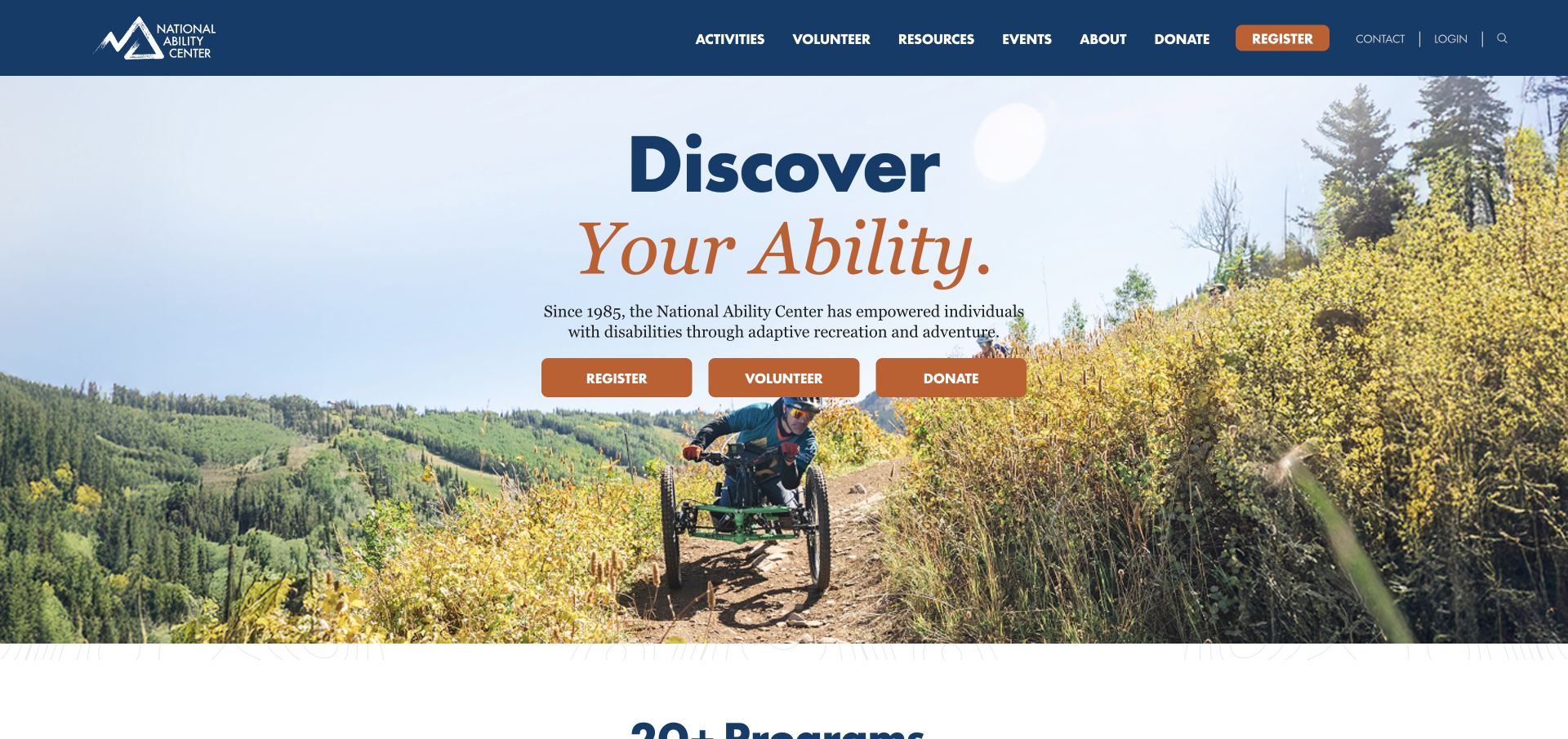
The National Ability Center places a short adaptive recreation explanation above separate Register, Volunteer and Donate buttons. Its large background image shows outdoor participation, while the next section introduces a range of named activities. Contact and login are kept in a smaller utility area rather than mixed into the main introductory sentence.
What you can learn
Use an explicit three-way task split when an organisation depends on several audiences. Pair it with a plain explanation so the buttons do not require prior knowledge. A shared introductory image can connect the audiences emotionally, but each action needs its own explanation of commitment. Volunteering, donating and joining an activity should not begin with interchangeable instructions. Carry that distinction into the next page, including practical program details and a way to ask about a participant’s requirements without assuming a particular activity is suitable.
Pros
Register, Volunteer and Donate are visually distinct choices.
Named activity descriptions extend the introductory image.
Cons & considerations
Direct account registration should be preceded by enough program information.
Text placed over changing photography requires reliable contrast.
Platform source: WordPress.org Showcase. Linked stylesheet matches Astra. Exact public source-page reference: https://nationalabilitycenter.org/. This is an observed component association, not proof of private configuration, a paid plan, measured results or complete architecture. Platform evidence is separate from the direct website screenshot and is not a complete current infrastructure audit.
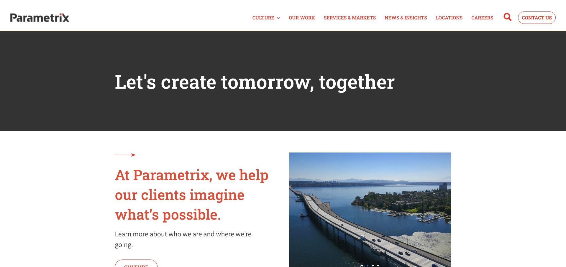
Parametrix uses a restrained white header and dark introductory strip, then moves into a serif company statement beside a project image. Navigation separates culture, work, services and markets, news, locations and contact. Rather than asking a large hero photograph to explain the entire practice, the page introduces the brand briefly and lets the next section begin the explanation. This is a multidisciplinary consulting example. Study the pacing between its short opening and more specific work and service destinations, not a claim that one homepage describes every discipline.
What you can learn
A compact introduction can improve reading flow when it is followed quickly by concrete service and project context. Keep culture content distinct from client-facing scope, explain the environmental role within multidisciplinary projects and provide location-specific contact information rather than relying on a single corporate inquiry.
Pros
The compact opening leaves room for the explanatory company section to appear early.
Work, services and markets provide practical routes alongside culture and careers content.
Cons & considerations
A general tomorrow-oriented statement is not specific enough to guide an environmental inquiry on its own.
A broad services-and-markets grouping needs careful organization to avoid mixing client sectors with technical disciplines.
Platform source: WordPress.org Showcase. Linked stylesheet matches Astra. Exact public source-page reference: https://www.parametrix.com/. This is an observed component association, not proof of private configuration, a paid plan, measured results or complete architecture. Platform evidence is separate from the direct website screenshot and is not a complete current infrastructure audit.
MIT SCRAM gives a specialist research project a public identity. The header separates projects, research, events, participation and people, while a distinct login link leads toward a separate service. The opening names secure cyber risk measurement and modeling over a dark photographic background, then introduces the mission in a contrasting burgundy section. Further down, a chronological list connects research activity to papers, conference material and summaries. This makes the page useful as a public explanation and record of work, even for visitors who do not need the associated application. The ACF association is documented for this research property and does not establish the technology of the linked secure computing system.
What you can learn
Give a technical project both a mission and a publication trail. Separate the public explanation from application access, and make research outputs understandable through dates, types and descriptive link labels.
Pros
The main heading states the research subject without requiring visitors to decode the acronym.
Chronological entries connect project activity to concrete papers and supporting documents.
Cons & considerations
The timeline mixes several document types within relatively dense blocks of text.
The broad technology photograph provides atmosphere but little explanation of the research method.
Platform source: WordPress.org Showcase. Linked stylesheet matches Astra. Exact public source-page reference: https://scram.mit.edu/. This is an observed component association, not proof of private configuration, a paid plan, measured results or complete architecture. Platform evidence is separate from the direct website screenshot and is not a complete current infrastructure audit.
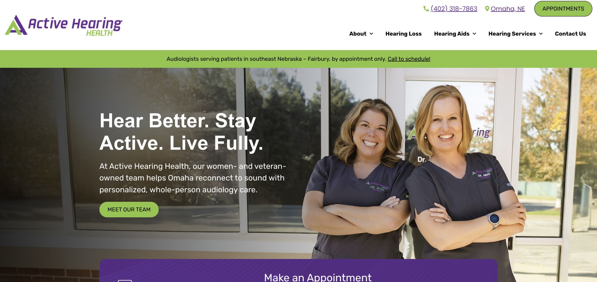
Active Hearing Health uses lime-green accents, a darkened environment photograph and a separate clinician group image. The opening connects its brand to everyday activity, while supporting text names the doctors and introduces the Omaha practice. Clear service navigation and an appointment route keep the page from becoming only a lifestyle statement. The dual-image composition is particularly useful for studying how a practice can show both people and context without one generic full-screen portrait. Its strong outcome-oriented language still needs balanced service information nearby, and the multiple visual panels require careful mobile ordering.
What you can learn
Use lifestyle language as an introduction, then promptly name the clinicians, location and actual services. Make the reading order work when image panels stack on mobile, and keep written contact options available alongside the appointment action.
Pros
The clinician group gives the lifestyle-oriented brand a concrete human reference.
Service navigation and local context provide useful detail beyond the opening slogan.
Cons & considerations
Multiple image panels require deliberate mobile reading order and contrast testing.
Outcome-oriented language should not replace an explanation of assessment, suitability and individual service limits.
Platform source: WordPress.org Showcase. Linked stylesheet matches Astra. Exact public source-page reference: https://activehearinghealth.com/. This is an observed component association, not proof of private configuration, a paid plan, measured results or complete architecture. Platform evidence is separate from the direct website screenshot and is not a complete current infrastructure audit.
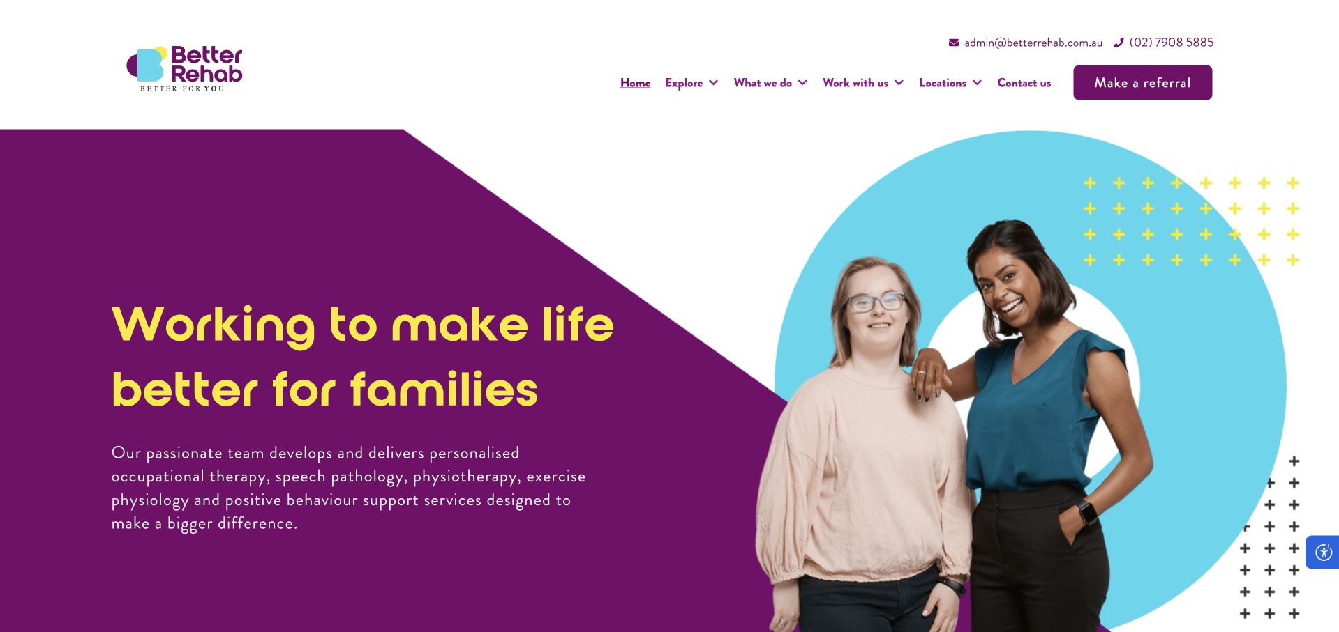
Better Rehab uses deep purple, turquoise shapes and a friendly portrait composition to introduce a broad allied-health organisation. Its animated headline is supported by written copy that names occupational therapy alongside speech pathology, physiotherapy and other services. The page also explains clinic, home and telehealth delivery rather than reducing the organisation to a location list. This is a useful example of a larger brand retaining a clear discipline vocabulary. The rotating words and highly expressive first screen create atmosphere, but important service and access details must remain stable for visitors using reduced motion, assistive technology or slower connections.
What you can learn
A broad allied-health brand should still name its individual disciplines in searchable, readable text. Keep service and delivery-format explanations stable outside animation, and provide direct occupational-therapy routes rather than assuming visitors will navigate a general organisational story.
Pros
Distinctive colour and portrait treatment make the organisation visually recognisable.
The supporting copy names disciplines and appointment settings rather than relying only on a broad wellbeing message.
Cons & considerations
Animated headline fragments introduce an additional accessibility and readability dependency.
The wide organisational offer can make an individual service feel less immediately specific without direct navigation.
Platform source: WordPress.org Showcase. Linked script matches Astra. Exact public source-page reference: https://betterrehab.com.au/. This is an observed component association, not proof of private configuration, a paid plan, measured results or complete architecture. Platform evidence is separate from the direct website screenshot and is not a complete current infrastructure audit.
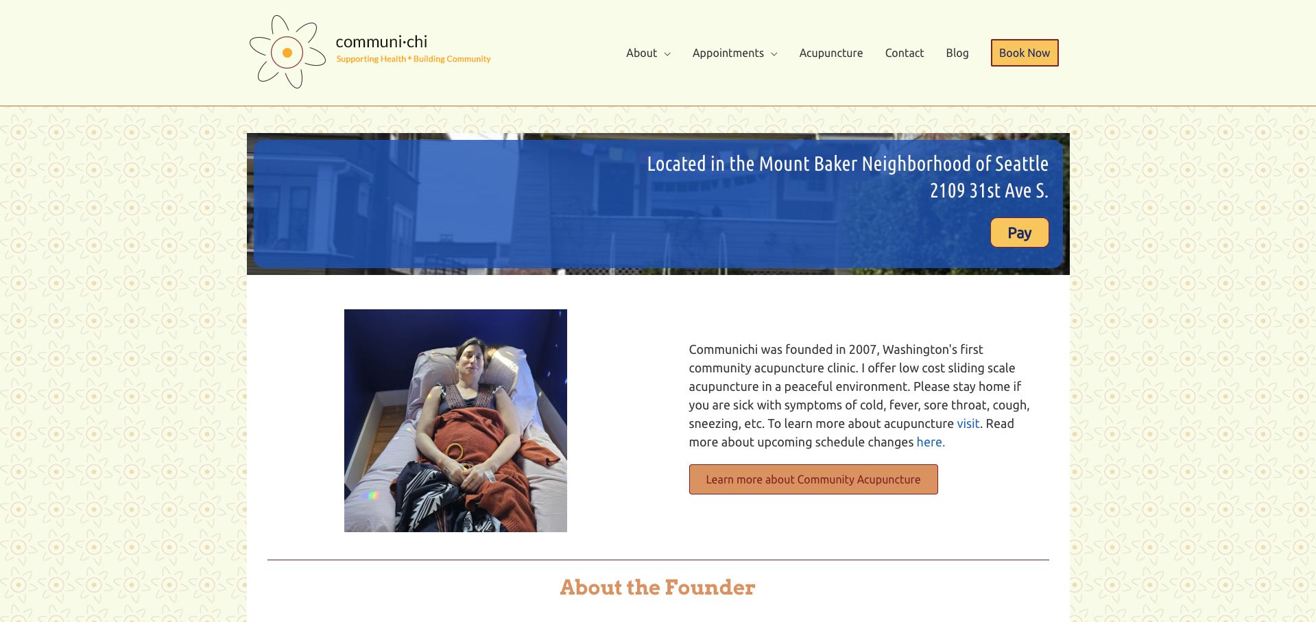
CommuniChi introduces the Mount Baker location with a clear address strip and a photograph of the treatment chairs. That image does real explanatory work: a visitor can understand the shared setting before reading the definition of community acupuncture. A warm floral background, restrained blue panels and orange actions keep the small practice personal rather than institutional. The founder introduction and first-visit forms give the page a useful human and operational sequence. Its main weakness is consistency. The sliding-scale section and later mission copy display different price floors, making the reader determine which statement is current. The design pattern is worth borrowing, but the conflicting amounts need a single maintained source.
What you can learn
Use a real room photograph to explain the service format, then keep fees and preparation instructions synchronized wherever they appear.
Pros
Treatment-chair photography makes the shared setting tangible.
First-visit paperwork is identified within the homepage.
Cons & considerations
Different fee references appear within the same page.
The lengthy mission and blog area can distract from booking.
Platform source: WordPress.org Showcase. Linked stylesheet matches Astra. Exact public source-page reference: https://communichi.org/. This is an observed component association, not proof of private configuration, a paid plan, measured results or complete architecture. Platform evidence is separate from the direct website screenshot and is not a complete current infrastructure audit.
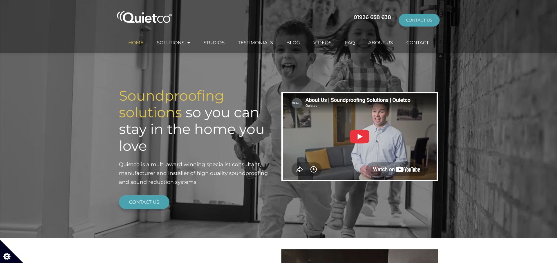
Quietco begins with the understandable benefit of staying in a home the owner loves. Family imagery, turquoise and yellow branding, and an introductory video make the service less abstract. The site explicitly describes consultancy, manufacture and installation, while neighbour noise, environmental noise and considerate noise-makers are separate contexts. A DIY course and scorecard sit alongside the installed-service offer rather than being its only explanation.
What you can learn
Translate the service into the household decision behind the enquiry, then clarify how the company helps. Keep a paid installation, a self-guided course and an initial assessment distinct so visitors understand which route they are choosing. The visible Astra theme assets support the theme association, but they do not establish which template settings, paid extensions or optimization choices produced the presentation.
Pros
The opening benefit is understandable without acoustic terminology.
Consulting, manufacturing and installation responsibilities are made explicit.
Cons & considerations
A course and installed-service offer need consistently clear boundaries to avoid unsuitable enquiries.
The introductory video needs captions and an equivalent text explanation when playback is unavailable.
Platform source: WordPress.org Showcase. Linked stylesheet matches Astra. Exact public source-page reference: https://quietco.uk/. This is an observed component association, not proof of private configuration, a paid plan, measured results or complete architecture. Platform evidence is separate from the direct website screenshot and is not a complete current infrastructure audit.
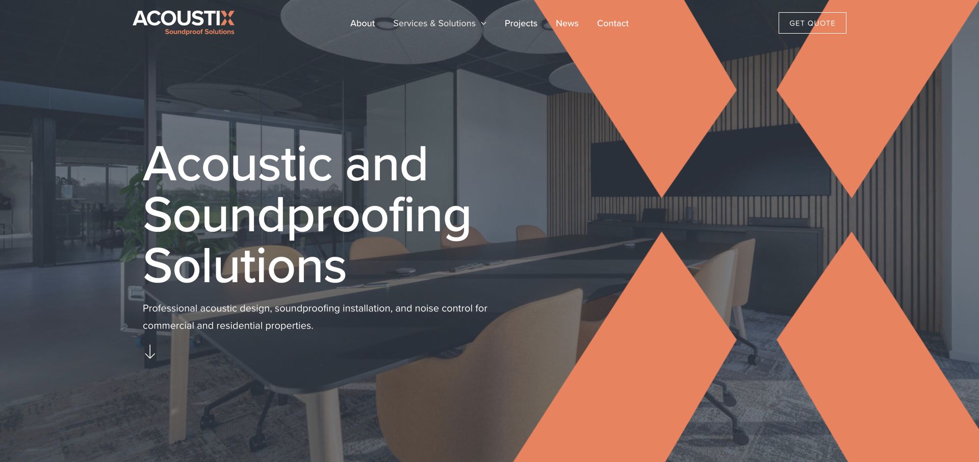
Acoustix combines a conspicuous orange identity with a photographed meeting-room ceiling. Design, installation and testing are explicitly described, with soundproofing, testing and design as separate service routes. The site states a nationwide commercial scope but a residential radius around Leeds, a useful distinction before someone requests a quotation. School, professional-office and entertainment cases connect the categories to actual project contexts.
What you can learn
Explain where each service is available before inviting an enquiry. A national commercial offer and a local residential service can coexist, but their boundaries should be as visible as the product categories. The visible Astra theme assets support the theme association, but they do not establish which template settings, paid extensions or optimization choices produced the presentation.
Pros
Commercial and residential service coverage are differentiated.
Specific sector cases support the design, installation and testing structure.
Cons & considerations
A large brand graphic over an image can compete with the service explanation.
Testing and installation pages need to distinguish measured results, design targets and company claims.
Platform source: WordPress.org Showcase. Linked stylesheet matches Astra. Exact public source-page reference: https://www.acoustixsolutions.co.uk/. This is an observed component association, not proof of private configuration, a paid plan, measured results or complete architecture. Platform evidence is separate from the direct website screenshot and is not a complete current infrastructure audit.
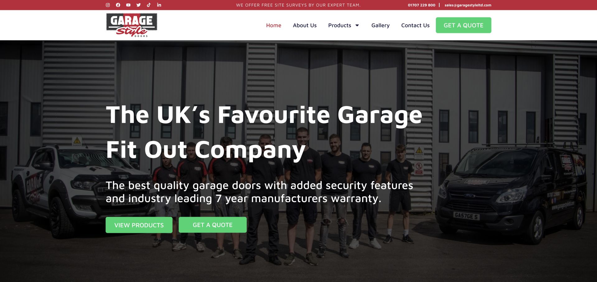
Garage Style places its team and branded vehicles outside the workshop behind a bold white introduction. Green buttons contrast with the red utility strip and black-and-white header. The headline identifies a broader garage fit-out business rather than only a door installer, and the supporting line names doors, security and a manufacturer-warranty message. Product browsing and quotations have separate actions, while the header stays compact. The real team photograph is the strongest transferable feature: it gives the company a recognisable identity without an anonymous lifestyle image. The broad superlative in the headline, however, provides less useful information than a clear location and specific project scope would.
What you can learn
When a garage business does more than doors, name the wider scope accurately and show the people behind it. Avoid letting a sweeping popularity claim replace service boundaries, product distinctions or a concrete explanation of the fitting process.
Pros
The team and service vehicles make the business recognisable.
Products and quotation requests have separate hero actions.
Cons & considerations
The headline’s superlative is less informative than a service-and-location statement.
The wider fit-out offer needs clear boundaries on subsequent product pages.
Platform source: WordPress.org Showcase. Linked stylesheet matches Astra. Exact public source-page reference: https://garagestyledoors.com/. This is an observed component association, not proof of private configuration, a paid plan, measured results or complete architecture. Platform evidence is separate from the direct website screenshot and is not a complete current infrastructure audit.
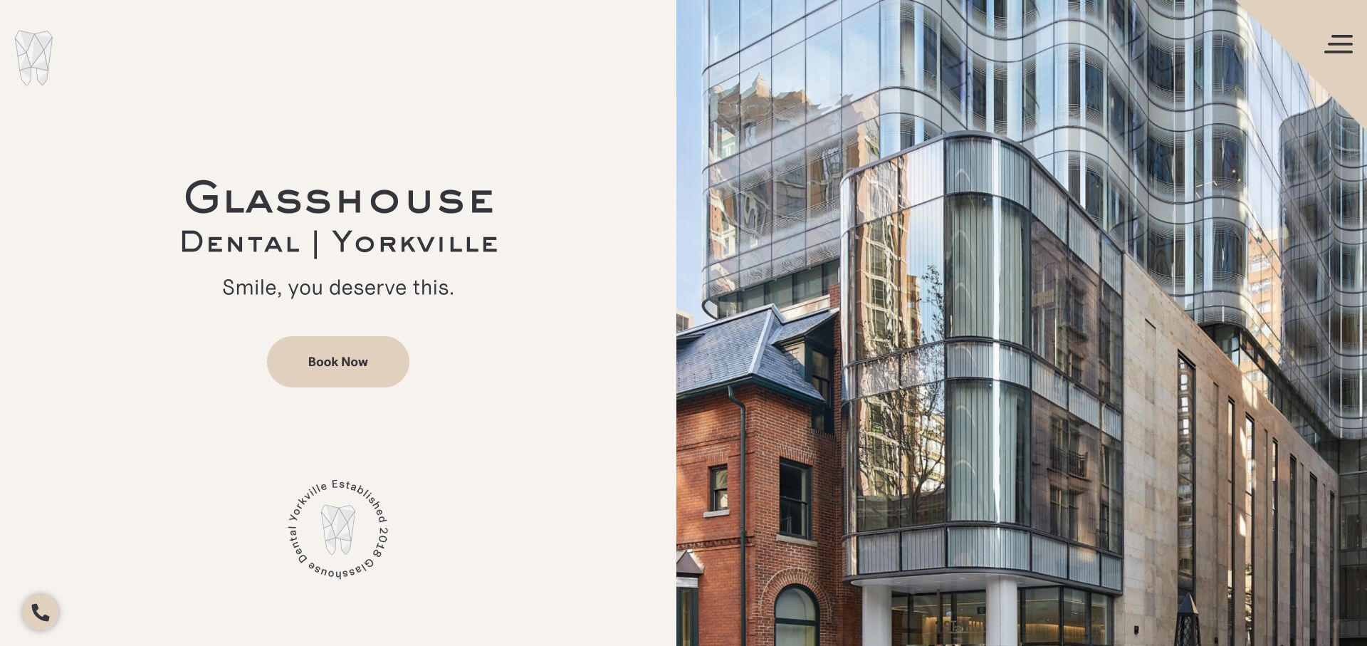
Glasshouse divides the opening into a calm cream text panel and an equally large architectural photograph. The practice name and Yorkville location are prominent on the left, followed by one short line and a rounded booking button. A small geometric tooth mark, circular establishment seal, and tucked-away menu add brand details without creating another full navigation row. The glass facade in the photograph makes the practice’s name feel connected to a real place rather than a decorative naming exercise.
What you can learn
A distinctive location can be a useful recognition cue for a dental studio. Show it clearly, but pair the visual with enough practical context to help someone identify the entrance, understand the services, and arrange a visit. Architectural identity should support wayfinding, not replace patient information.
Pros
The split layout keeps the booking text readable independently of the detailed building photograph.
The location is included directly in the main title treatment.
Cons & considerations
A collapsed menu hides service and patient-information routes even on a wide desktop screen.
The architectural image does not show the treatment environment or introduce the clinical team.
Platform source: WordPress.org Showcase. Linked stylesheet matches Astra. Exact public source-page reference: https://glasshousedental.com/. This is an observed component association, not proof of private configuration, a paid plan, measured results or complete architecture. Platform evidence is separate from the direct website screenshot and is not a complete current infrastructure audit.
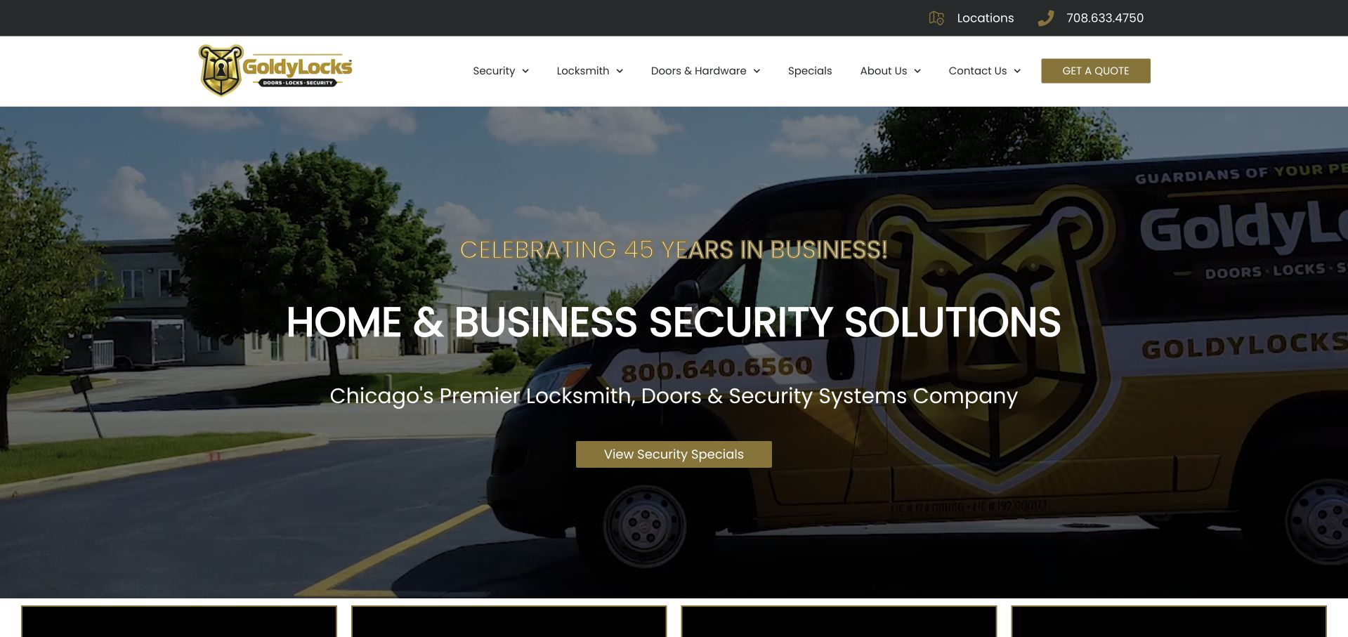
Goldy Locks places a large branded vehicle behind a home-and-business security headline. White text sits over a darkened photograph, with a muted gold action matching the header and company mark. The navigation separates security, locksmith work, doors and hardware, specials, company information, and contact. This is useful for studying a broader catalog that cannot be explained by an emergency locksmith label alone. The service vehicle links the visual presentation to the actual brand, while the category names give visitors a way to investigate their particular need. The page's anniversary and qualification statements are company claims, not an independent evaluation of its products, installations, or service outcomes.
What you can learn
Use catalog distinctions that reflect how the business handles real inquiries. Keep locksmith, door, and security-system work clearly described, and avoid implying that a broad security headline establishes suitability for a particular property's risks.
Pros
The vehicle photograph gives the wider service catalog a company-specific visual anchor.
Navigation categories distinguish locks, doors, and other security products.
Cons & considerations
A broad security headline needs concrete scope information close beneath it.
Text over vehicle graphics requires careful contrast and responsive cropping.
Platform source: WordPress.org Showcase. Linked stylesheet matches Astra. Exact public source-page reference: https://goldylocksinc.com/. This is an observed component association, not proof of private configuration, a paid plan, measured results or complete architecture. Platform evidence is separate from the direct website screenshot and is not a complete current infrastructure audit.
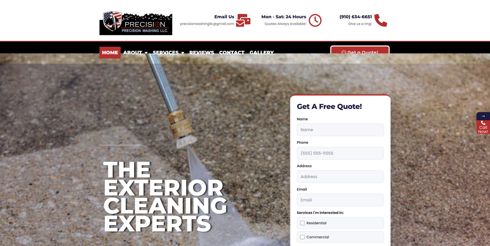
Precision uses a close view of surface-cleaning work behind large white text, with a tall white quote form on the right. Red and black header details carry telephone and operating information above the scene. The design makes the intended first task unmistakable: describe a project or contact the company. The page balances an action-oriented website with visual detail of the work. The form's solid background helps separate inputs from the photograph, but its length also consumes substantial space. Visible work imagery should not be treated as a technical instruction, proof of safety, or evidence that a pictured method is appropriate for every exterior surface.
What you can learn
Keep the initial inquiry proportionate to the actual next step. A visitor should understand whether the form requests a callback or estimate discussion, and required fields should not imply that scope, price, timing, or suitability has already been agreed.
Pros
A solid white form provides a distinct surface for project information.
The photograph relates directly to exterior-cleaning work rather than generic lifestyle imagery.
Cons & considerations
The tall form competes with the introductory service explanation.
Busy work imagery requires deliberate contrast behind the large and small text.
Platform source: WordPress.org Showcase. Linked script matches Astra. Exact public source-page reference: https://precisionwashingllc.com/. This is an observed component association, not proof of private configuration, a paid plan, measured results or complete architecture. Platform evidence is separate from the direct website screenshot and is not a complete current infrastructure audit.
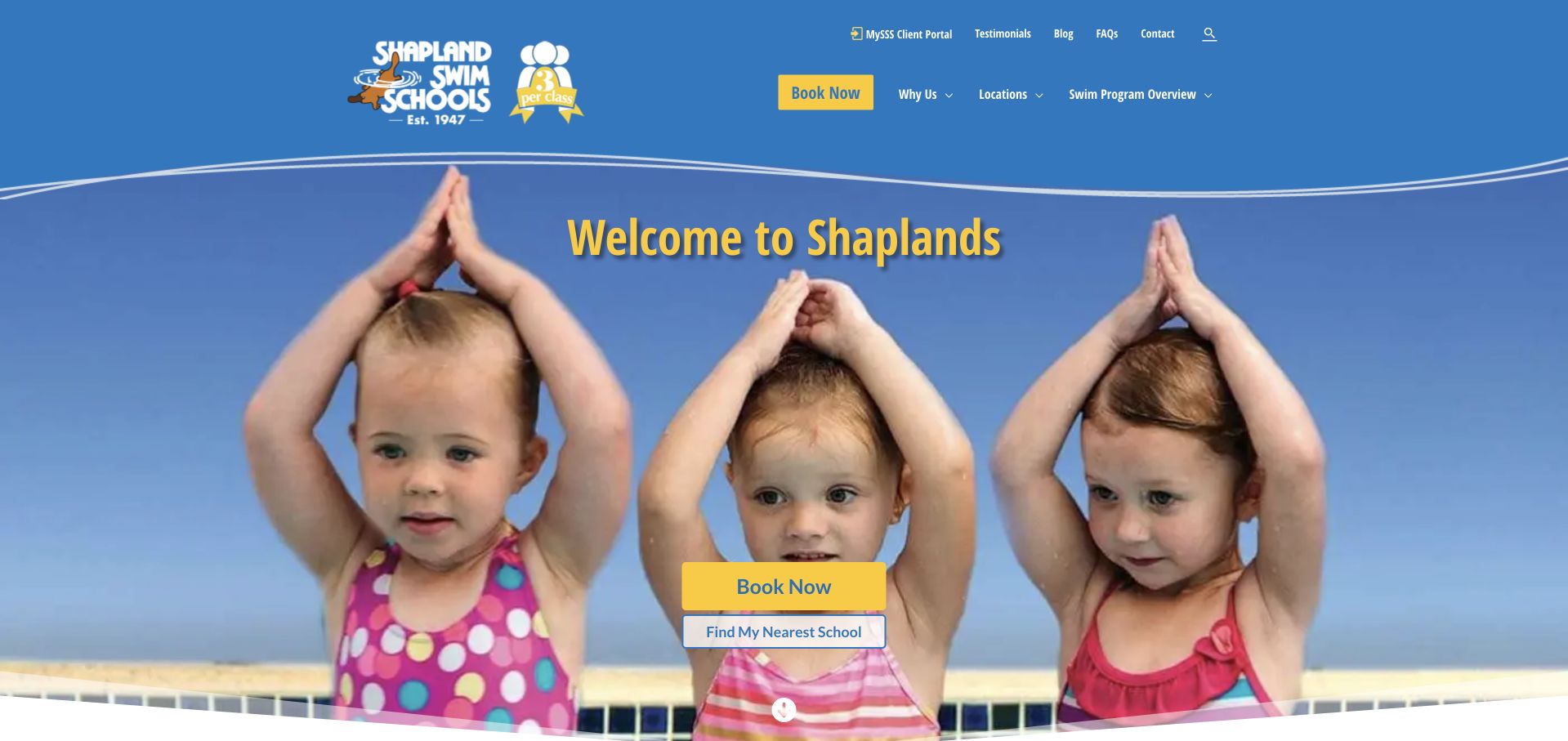
Shapland places a three-per-class emblem beside its logo, making group size part of the identity before the visitor reads the body. Blue and yellow styling surrounds a photograph of three children, reinforcing that visual message. Booking and finding a nearby school are offered together, while a later benefit list explains makeups, viewing facilities, and the pool environment. Programs progress from home preparation and babies through later learning stages. The opening headline is only a welcome, so it misses an opportunity to explain the offer more directly. Some teaching-history references also shift between generations, leaving a detail that would benefit from consistent editing.
What you can learn
A concrete service distinction, such as class size, can be more memorable than a generic slogan. Repeat it consistently across imagery and program facts, then connect the promise to a local school's actual lesson information.
Pros
The three-student format is visible beside the logo.
Booking and location discovery appear together.
Cons & considerations
The welcome headline provides little practical information.
Teaching-history references would benefit from consistent wording.
Platform source: WordPress.org Showcase. Linked stylesheet matches Astra. Exact public source-page reference: https://www.shapland.com.au/. This is an observed component association, not proof of private configuration, a paid plan, measured results or complete architecture. Platform evidence is separate from the direct website screenshot and is not a complete current infrastructure audit.
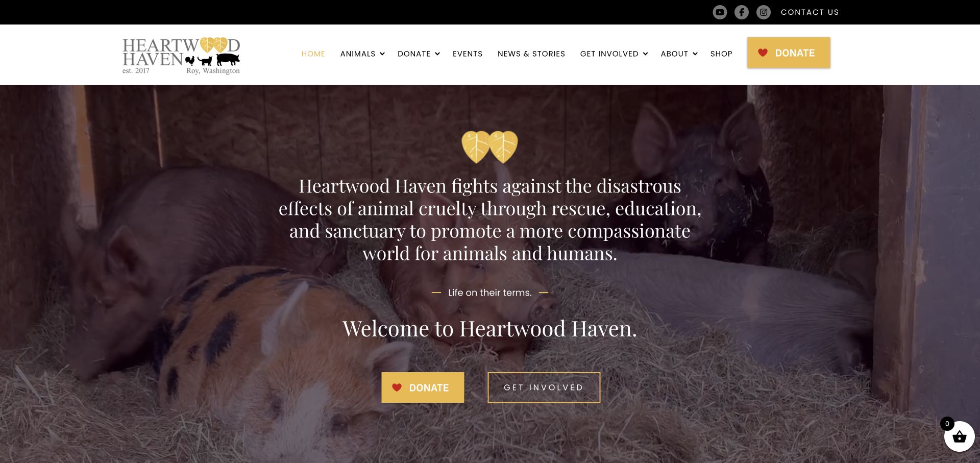
Heartwood Haven combines a warm yellow accent with a full-width photograph of pigs resting together. Its long mission statement stays over the photograph, followed by distinct Donate and Get Involved actions. Below, rescue, rehabilitation and education become separate explanations, while individual animal stories, adoption listings and support options extend the introductory invitation.
What you can learn
Pair an emotionally specific photograph with recognisable support actions. Separate volunteering, sponsorship, adoption and tours instead of expecting one donation button to answer every visitor’s question. Maintain practical explanations of eligibility, timing and the commitment involved in each route. A resident’s story can introduce the mission, but someone planning to help still needs to understand what happens after clicking. Keep those instructions useful when a particular appeal or featured animal changes.
Pros
Donate and Get Involved offer different levels of commitment.
Individual animal stories connect the broad mission with identifiable residents.
Cons & considerations
The opening mission statement needs careful line lengths on smaller screens.
Repeated donation links should not make practical visit and adoption information secondary.
Platform source: WordPress.org Showcase. Linked stylesheet matches Astra. Exact public source-page reference: https://heartwoodhaven.org/. This is an observed component association, not proof of private configuration, a paid plan, measured results or complete architecture. Platform evidence is separate from the direct website screenshot and is not a complete current infrastructure audit.
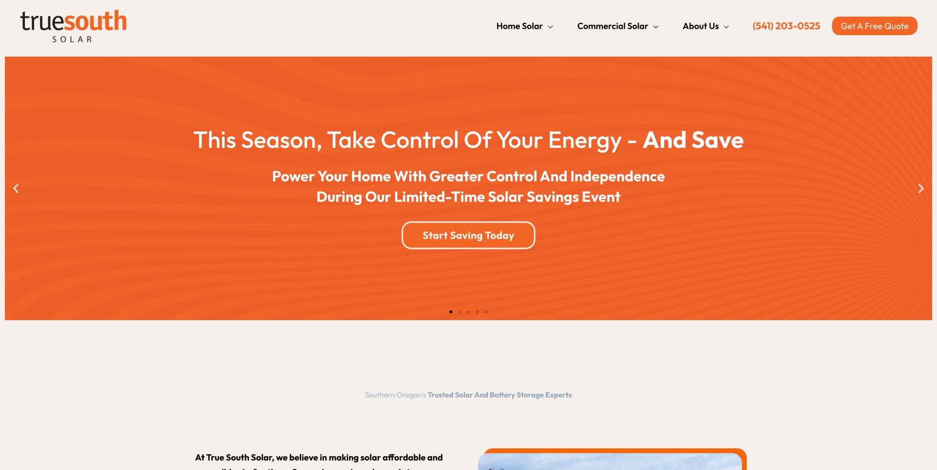
True South Solar uses an orange campaign slide in a multi-slide hero, with separate home-solar and commercial-solar navigation above it. Other slides address backup power, company identity and business installations. This lets one page hold several campaigns, but essential positioning should not depend on seeing a particular slide. The stable service navigation is valuable precisely because the promotional area changes. A visitor arriving on a backup-power slide can still locate residential or business services without waiting through the sequence. The carousel adds campaign flexibility, but it also increases the number of messages competing for a short first visit.
What you can learn
Keep core service and geographic information outside a rotating campaign area. If a carousel promotes limited-time savings, ensure dates and terms remain available independently of the active slide. Treat each slide as optional supporting content, not the only location of an essential fact. Test controls, motion preferences and the availability of offer details outside the animation.
Platform source: WordPress.org Showcase. Linked stylesheet matches Astra. Exact public source-page reference: https://truesouthsolar.net/. This is an observed component association, not proof of private configuration, a paid plan, measured results or complete architecture. Platform evidence is separate from the direct website screenshot and is not a complete current infrastructure audit.
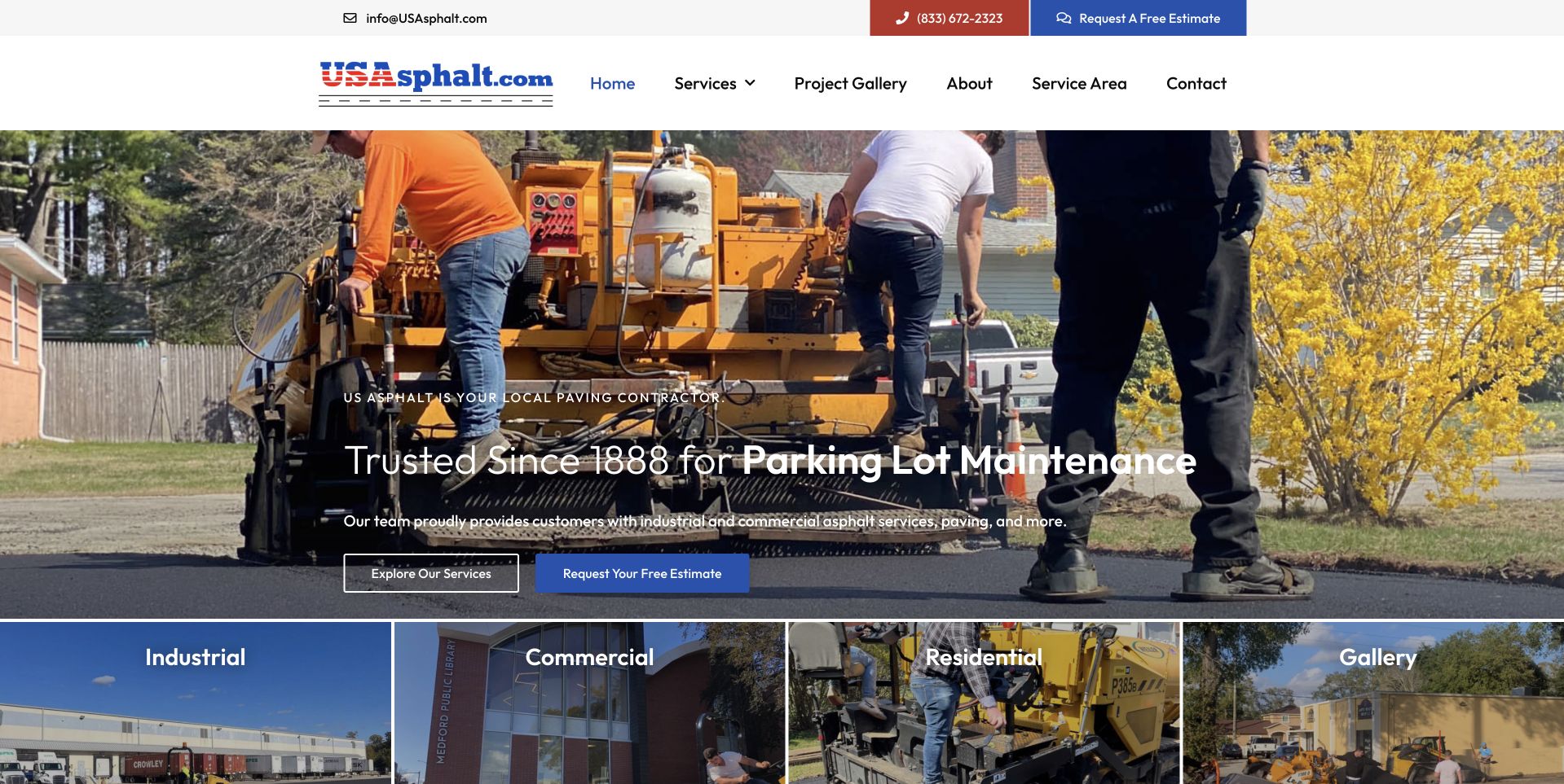
US Asphalt uses a broad photograph of people and paving equipment, with a compact introductory overlay near the bottom. Blue actions separate service exploration from an estimate request. A row of image categories follows, identifying industrial, commercial, residential, and gallery routes. This is useful for studying a contractor site that lets visitors choose their project context rather than treating every inquiry identically. The upper header keeps telephone and quote access visible. Historic and service claims remain the business's presentation, not independent verification of continuity, qualifications, construction quality, or the conditions and arrangements that would apply to a particular property.
What you can learn
Give different property audiences meaningful destinations only where their questions differ. Keep company-history claims accurate and project photographs attributable, while making a quote request clearly the start of a discussion rather than a promise of suitability or price.
Pros
The audience-image row makes several project contexts visible near the opening.
Service browsing and estimate actions are separately labeled.
Cons & considerations
Text low on a detailed work image needs reliable contrast.
Broad audience categories need useful specific content rather than interchangeable destinations.
Platform source: WordPress.org Showcase. Linked stylesheet matches Astra. Exact public source-page reference: https://usasphalt.com/. This is an observed component association, not proof of private configuration, a paid plan, measured results or complete architecture. Platform evidence is separate from the direct website screenshot and is not a complete current infrastructure audit.
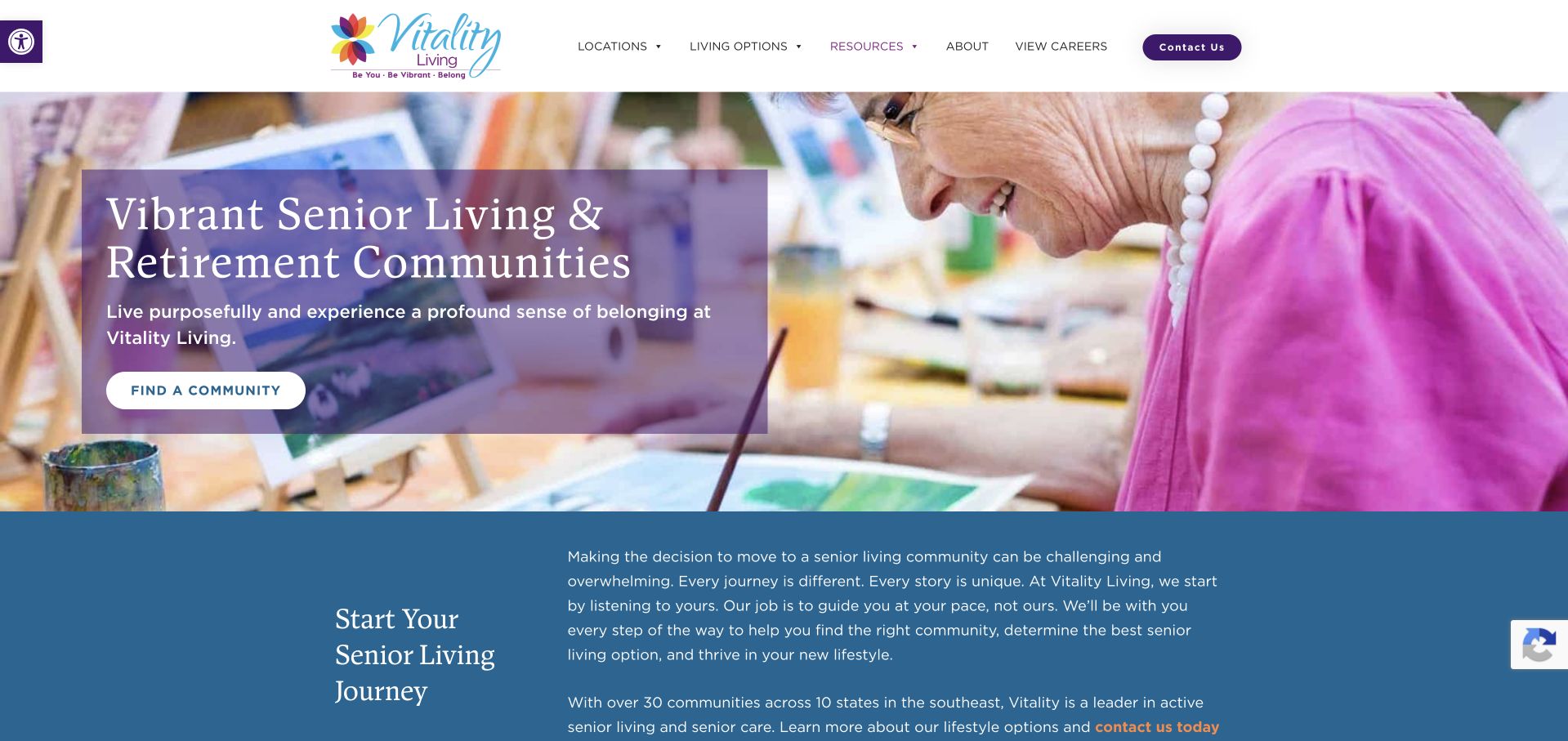
Vitality uses a colourful activity photograph and a purple text treatment to introduce its retirement communities. A community-finding action appears within the hero, followed by a blue section that begins explaining the decision process. The photograph offers a concrete activity rather than a generic building exterior, while the lower explanatory section gives the page a more considered rhythm. The design should still avoid implying that a selected activity scene represents every property or resident. The opening is strongest when it leads to clear local information about spaces, living options and visits, rather than treating vibrant imagery as a substitute for those details.
What you can learn
Let activity photography introduce the tone, then provide practical information for a considered choice. Keep local programme descriptions specific and avoid presenting a single lively scene as a universal resident experience.
Pros
The activity-focused image gives the brand a concrete visual subject rather than an abstract promise.
An explanatory section follows the hero instead of moving directly into an enquiry form.
Cons & considerations
A busy colourful image needs careful text positioning and responsive cropping to remain readable.
A network-wide activity presentation needs local context before visitors can compare actual community offerings.
Platform source: WordPress.org Showcase. Linked stylesheet matches Astra. Exact public source-page reference: https://www.vitalityseniorliving.com/. This is an observed component association, not proof of private configuration, a paid plan, measured results or complete architecture. Platform evidence is separate from the direct website screenshot and is not a complete current infrastructure audit.
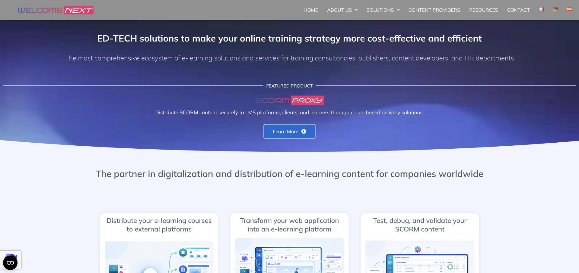
WelcomeNext presents a specialist learning-technology business through its services and organizational proposition. The corporate format helps explain what the company does before a visitor encounters an individual learning environment. It is useful for studying a vendor’s public communication, but evaluating the experience of a learner requires a different surface with course content, progress states, and actual interaction details. Documented association checked November 8, 2026: Oracle’s WelcomeNext customer case study documents MySQL HeatWave on OCI supporting its e-learning solutions.
What you can learn
Connect the HeatWave association to the e-learning solutions described in Oracle’s case. A managed database service can support those products without determining the visual design of this corporate site; do not infer the implementation or learning effectiveness of every customer deployment.
Pros
A specialist vendor introduction gives business audiences context before asking them to inspect individual learning products.
Service-oriented organization can accommodate several organizational education needs within one recognizable public company presence.
Cons & considerations
Corporate capability language offers limited evidence about the day-to-day experience inside a particular learning environment.
The public vendor site does not independently demonstrate database performance or educational outcomes for its customers.
Platform source: WordPress.org Showcase. Linked stylesheet matches Astra. Exact public source-page reference: https://welcomenext.com/. This is an observed component association, not proof of private configuration, a paid plan, measured results or complete architecture. Platform evidence is separate from the direct website screenshot and is not a complete current infrastructure audit.
Kegan has 15+ years of experience working with small businesses, Fortune 500 companies, and everything in between. No development job is too big or too small: he brings the same hands-on attention to a focused improvement, a complete website, or a custom application.
For Astra projects, he can help with reusable WordPress templates, theme and editor ownership, responsive content structures, publishing workflows and maintainable handover. He works directly with clients on scope, design, implementation, testing, and handover, with an emphasis on clear communication and a system that remains practical to maintain after launch.
Show 3 other Astra developersHide other Astra developers
Choose an Astra implementation around the people who will maintain it
Use theme settings and the WordPress editor for a focused site
Begin with the smallest combination that can support the content and visitor tasks. Prototype the header, a normal page, an article, an archive and the footer before adding specialist tools. Ask the actual editor to change a heading, replace an image and publish a new page. Identify the places where they need a reusable pattern rather than a new layout decision.
A simpler setup still needs design judgment and testing. Document the difference between a global theme setting and a page-level content change. Keep the plugin inventory understandable and avoid installing a tool for a single effect that can be achieved within the agreed system. Judge the approach against realistic maintenance needs, not a promise that a particular theme automatically makes every site fast or accessible.
Add a page builder when its workflow has a defined benefit
A team may prefer a particular visual editor or need layout controls beyond its chosen basic workflow. Demonstrate the requirement with representative content before committing to an additional builder. Decide whether templates, forms, headers and individual sections belong to the theme, the builder or another plugin, and test the points where those responsibilities meet.
Do not assume that an Astra example proves a particular builder is required. Public theme evidence and public builder evidence are separate observations. If a builder is selected, budget for its license where applicable, update compatibility and editor training. Check that global colors, typography and responsive settings do not split into competing systems that make a future brand adjustment unexpectedly expensive.
Use custom development for a specific requirement, not for novelty
A project may need a content relationship, integration or interaction that configuration alone cannot provide cleanly. Define that requirement in terms of a user task and decide whether it belongs in a theme customization, a small site-specific plugin or a separately maintained service. Keep the business behavior distinct from presentation when that improves portability and ownership.
Astra’s child-theme documentation explains why direct parent-theme file changes are vulnerable to updates. Use a deliberate extension approach and version control rather than collecting undocumented snippets in several dashboards. A child theme does not make custom code maintenance-free; the team still needs an update test, a rollback plan and someone responsible for compatibility when WordPress or related plugins change.
Turn the theme choice into an editable and testable website brief
Define the content types and template boundaries
List the information the site publishes repeatedly: services, articles, people, locations, products or projects. Decide which records need structured fields and which can remain ordinary pages. A reusable template is useful when it preserves a consistent relationship among those fields; it is less useful when every page is an unrelated visual composition that only its original designer understands.
Agree the page types and their edge cases before producing all the content. Include empty archives, long navigation labels, missing images and older posts without the latest fields. Decide how breadcrumbs, related links and metadata work across the site. Preserve existing useful URLs during a redesign and prepare explicit redirects for genuine changes rather than allowing imported demo slugs to dictate the public structure.
Audit the theme, optional modules and plugin responsibilities
Create an inventory that distinguishes WordPress, Astra, any Astra Pro functionality, the editor or builder, and the plugins responsible for forms, search, commerce or other features. Verify the current feature and license requirements from official documentation when scoping the project. The presence of an Astra asset on another site does not establish that the same features are available in the free theme or that a particular subscription is active.
Test the actual combination on staging with representative content. Optimize images and avoid loading unnecessary effects, but measure performance rather than promising it from a theme’s marketing label. Check essential content with optional scripts unavailable. Review form errors, menu states and typography at narrower widths, not only the desktop homepage used to approve the initial visual direction.
Ask an editor to create a page from the intended starting point, update a global detail and correct an old article. Watch where they become unsure whether they are changing one page or the whole site. Improve the controls and write a short operating guide around those real tasks. An implementation is not fully handed over merely because the owner has an administrator account.
Rehearse a staging update, a backup restoration and the recovery of an accidentally changed template. Record the owners of hosting, domain, licenses and code, with access kept in the appropriate secure systems. Set a review rhythm for WordPress, the theme and plugins, and identify who investigates a failure. Keep claims about search visibility, accessibility and conversion separate from the choice of theme; each needs its own evidence and testing.
A useful handover demonstration
Ask the actual team to carry out its routine job: publish a realistic update, correct a mistake, preview a narrow screen, and identify who owns an integration failure. For a library or frontend framework, also ask who maintains the content source and deployment. A polished screenshot does not answer those operational questions.
Beyond the screenshot
Before launching an Astra website
Identify WordPress, theme, builder, optional module and plugin responsibilities.
Verify current feature and license requirements rather than inferring a paid plan.
Define global typography, colors and intentional page-level exceptions.
Prototype ordinary pages, articles, archives and awkward content cases.
Test desktop and mobile menus with keyboard and touch.
Make header, footer and in-page navigation work together.
Review images, script loading and measured performance on representative pages.
Test forms, validation, confirmations and unavailable optional services.
Preserve useful URLs and verify necessary redirects and metadata.
Rehearse editor tasks, staging updates, backups and rollback.
Document custom-code ownership and avoid editing parent-theme files directly.
Test with real content, a keyboard, a small screen, slow or failed requests, and the people who will maintain the system. These are planning checks, not an accessibility, security, performance, or search-ranking certification.
Sources & editorial method
How this Astra collection was reviewed
The examples use genuine public-property captures and exact-page Astra evidence reviewed separately from this planning copy. A public theme reference establishes only the supported association; it does not prove a license tier, designer identity, complete plugin inventory or the site’s operational results. Official Astra documentation supports product-specific implementation statements. The collection is an editorial reference rather than a measured ranking or performance endorsement.
Every image is an unmodified capture from the actual website, with its source and capture date. Some captures are reused from our shared catalog; their dates remain the original capture dates. None comes from a vendor gallery or a generated reconstruction. Moving imagery and live content can change.
Technology attribution uses public page assets or metadata, official platform documentation, or a cited first-party project case study. Documentary and framework-relationship evidence is identified where used; it is not a complete current backend inventory. A CMS image CDN alone does not establish a full CMS deployment. A library’s presence does not prove which individual controls use it, and a platform label does not establish AI authorship.
The composition notes, lessons, pros and tradeoffs are original editorial observations. We have not measured conversion, traffic, security, performance or accessibility conformance. Website owners retain their brands and imagery; these examples are not our client portfolio. Written, Edited and Curated are independent records, not dates advanced by a build. See our editorial standards or suggest a correction.
Questions worth asking
Astra website development FAQs
Does an Astra signature mean the whole site came from a starter template?
No. It can support a theme association without showing how the design was produced. The site may use custom styling, WordPress content, an additional builder or other tools. Do not infer a template, author or complete implementation from the theme name alone.
Do all examples require Astra Pro?
The public examples do not establish that. Optional features and license requirements need to be checked against the current product documentation for the intended implementation. A visible component is not proof of a particular paid plan.
Can editors safely change the entire design?
That depends on the controls, permissions and templates provided. Demonstrate real editing tasks in a prototype and distinguish global settings from page content. The theme’s flexibility alone does not define an appropriate workflow for the organization.
Does using Astra guarantee a fast or accessible website?
No. Content, imagery, plugins, custom code and implementation decisions all matter. Measure representative pages and test the finished interactions. A theme name is not a substitute for performance or accessibility verification.
Borrow a useful content or navigation pattern, then prove that the chosen Astra setup supports your pages, your editors and a maintainable update process.