Best Opera Company Websites of 2026 (17 Real-World Examples)
Real opera company websites that turn theatrical imagery into clear routes to productions, tickets and a first visit.
An opera homepage has to introduce the experience and answer practical questions. These examples show how companies connect a production's visual identity with dates, venues, ticket choices and help for audiences who may never have attended before.
Opera companies have unusually rich material for a website: performances, paintings, costumes, artists and distinctive venues. The difficult decision is what to place around that material. A visitor still needs to identify the production, understand the format, find the right date and know where the ticket action leads. The reviewed sites solve that problem with different combinations of campaign panels, event cards, season strips and visitor guides.
This collection includes regional companies, touring organisations and seasonal festivals. Some reviewed homepages also promote dance, film, education or venue events, and those formats remain explicitly distinguished in the reviews. The purpose is to study website decisions, not to rank artistic achievement, endorse ticket sellers or infer measured commercial results from an attractive page.
Before the examples
What makes good opera company website design in 2026?
Make the production understandable before the purchase
Put the title, format, performance dates and venue near a specific next action. A visitor should be able to distinguish a staged opera, a streamed film, a guest dance programme and a fundraising event without decoding campaign imagery.
Offer a route for the first-time visitor
Pair ticket buying with useful orientation. Name the questions the guide answers, such as arrival, dress, accessibility, surtitles or interval arrangements, and publish only details confirmed by the company and venue.
Keep the season visible outside the carousel
A feature can focus attention on one production, but other dates and programmes need a stable list or calendar. Label slide controls meaningfully and avoid making people wait through rotation to discover the next event.
Maintain dates and availability consistently
Use shared production records for the homepage, calendar and detail pages. Review sale-status messages and relative wording such as tonight or this week whenever a campaign changes, rather than leaving conflicting announcements in separate sections.
The collection · 17 examples
17 opera company websites worth studying
These 17 public homepages were directly reviewed and captured. Opera Santa Barbara is the explicit Editors Choice for its concise pairing of cultural imagery with an event brief and clear season, archive and support routes. The other examples offer distinct approaches and practical tradeoffs, not a ranked order of artistic quality.
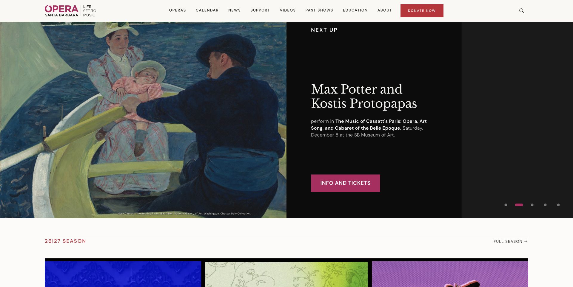
Opera Santa Barbara pairs a large painting with a dark event panel in the captured carousel. The title, short explanation, date and ticket action stay together, while the white header separates operas, calendar, education and support. Below, a broad season strip moves into news, video and the performance archive. The page treats opera as an ongoing local cultural programme rather than a single sales announcement. Distinct box-office information in the footer also explains the handoff to the venue. The rotating feature makes each announcement spacious, although readers must discover the other slides to see the whole set.
What you can learn
Give every featured event a complete miniature brief: what it is, when it happens and where the next link leads. Keep archives and local partnerships discoverable without allowing them to obscure current ticket information.
Pros
The split composition gives the artwork room without placing small details over it.
Season, archive and support routes describe different visitor intentions clearly.
Cons & considerations
Carousel rotation divides the announcements across several states.
Venue box-office details sit much deeper than the first ticket action.
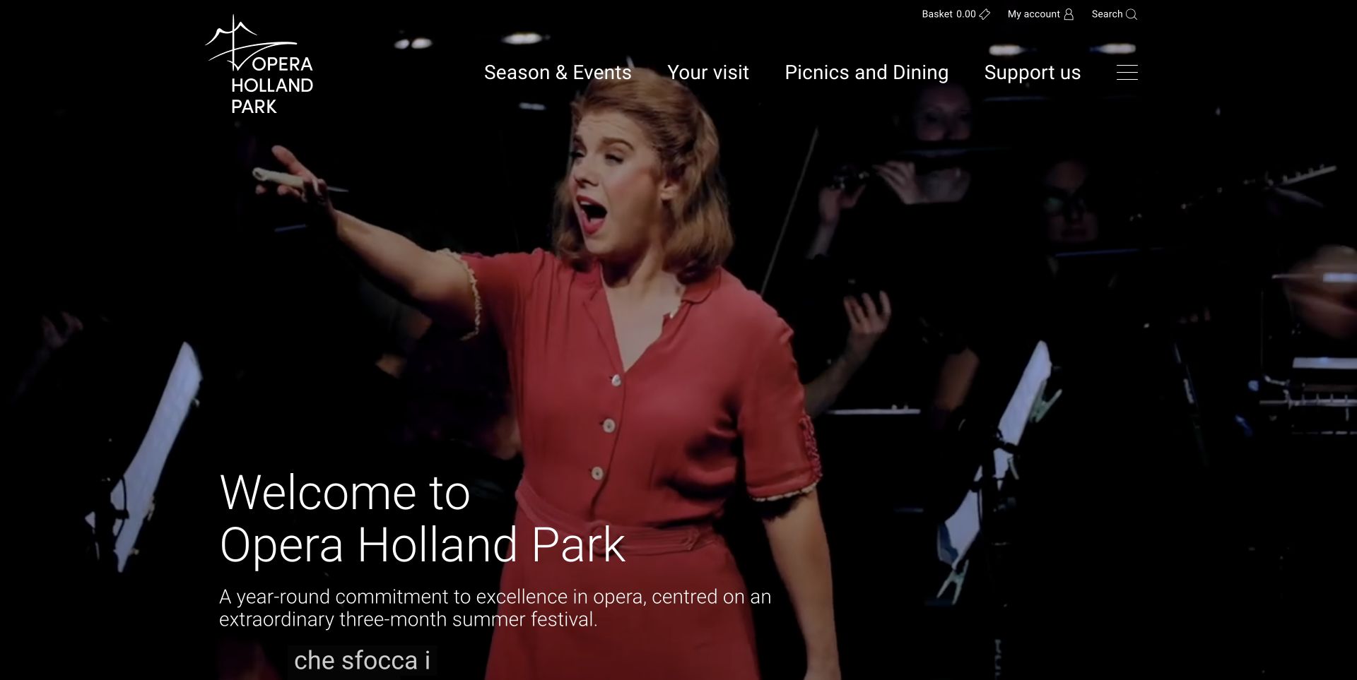
Opera Holland Park opens with a full-width moving performance backdrop and unusually generous welcome typography. White navigation puts the season, visit planning, picnics and support directly above the image. That choice connects the theatrical event to the practical experience of attending an open-air venue. Further down, the homepage separates production announcements, news and dated community concerts into distinct cards. It also explains access, seating and ticket schemes through clearly named links. The captured background is a real frame of the website's video, not a replacement promotional still. Motion adds atmosphere but makes the contrast behind small navigation labels vary as the footage changes.
What you can learn
Use an atmospheric opening to establish the place, then give first-time visitors explicit routes to travel, seating, access and food information. Keep meaningful show and date information available outside a moving background.
Pros
Picnic and visit links acknowledge the particular needs of this venue.
Dated community events show activity beyond the main festival.
Cons & considerations
The large introductory screen delays the next specific production listing.
Video subtitles and changing imagery compete with the welcome text.
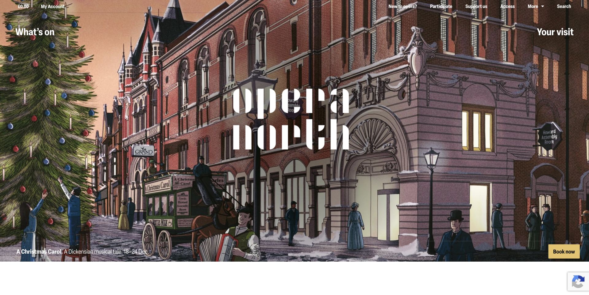
Opera North's captured homepage uses a theatrical street illustration behind its large stencil-like wordmark. What’s on and Your visit occupy opposite sides of the header, while the current campaign includes a compact date line and a contrasting booking button. The content below is more practical: cards expose production dates, venue information and the kind of performance before the reader opens a detail page. Separate links for new audiences, younger visitors and accessible season guides support different planning needs. The opening is visually memorable, but the wordmark receives substantially more space than the title of the promoted show.
What you can learn
Pair expressive campaign art with a predictable event-card structure. For a touring programme, show dates and venues early, and keep visitor assistance visible alongside the programme rather than relying on a general help page.
Pros
Event cards combine the title with dates, venue context and performance type.
New-to-opera and access links make useful audience paths explicit.
Cons & considerations
The campaign title is small relative to the central identity.
Several programme and venue sections create a long homepage to scan.
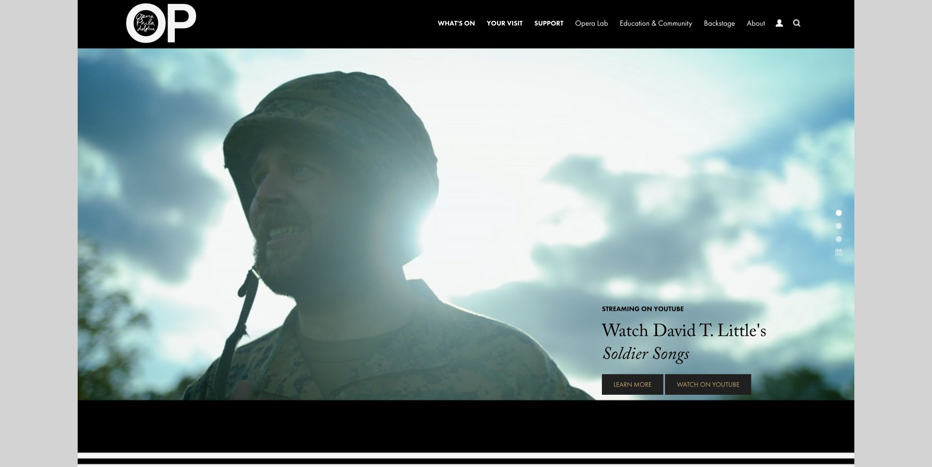
Opera Philadelphia gives a film still most of the opening screen, with a compact streaming label and two distinct actions in its lower corner. The black masthead keeps the identity and primary sections consistent above changing promotional imagery. Below the carousel, stage productions and other events have separate lists with dates and venues. That separation helps a reader distinguish a performance from a talk or gathering without interpreting the artwork alone. The page also introduces its ticket programme and visitor information through named destinations. The captured slide promotes a digital opera film; it should not be mistaken for a photograph of the company's venue or a current live performance.
What you can learn
Make the format of a featured experience explicit before the action. Use different labels for watching, learning and buying, then organise live productions and supporting events into readily comparable date-led lists.
Pros
Streaming and information actions communicate different next steps.
Stage and event lists preserve dates and venue names outside the carousel.
Cons & considerations
Small corner text competes with a very large image.
The extensive navigation needs careful grouping to stay approachable.
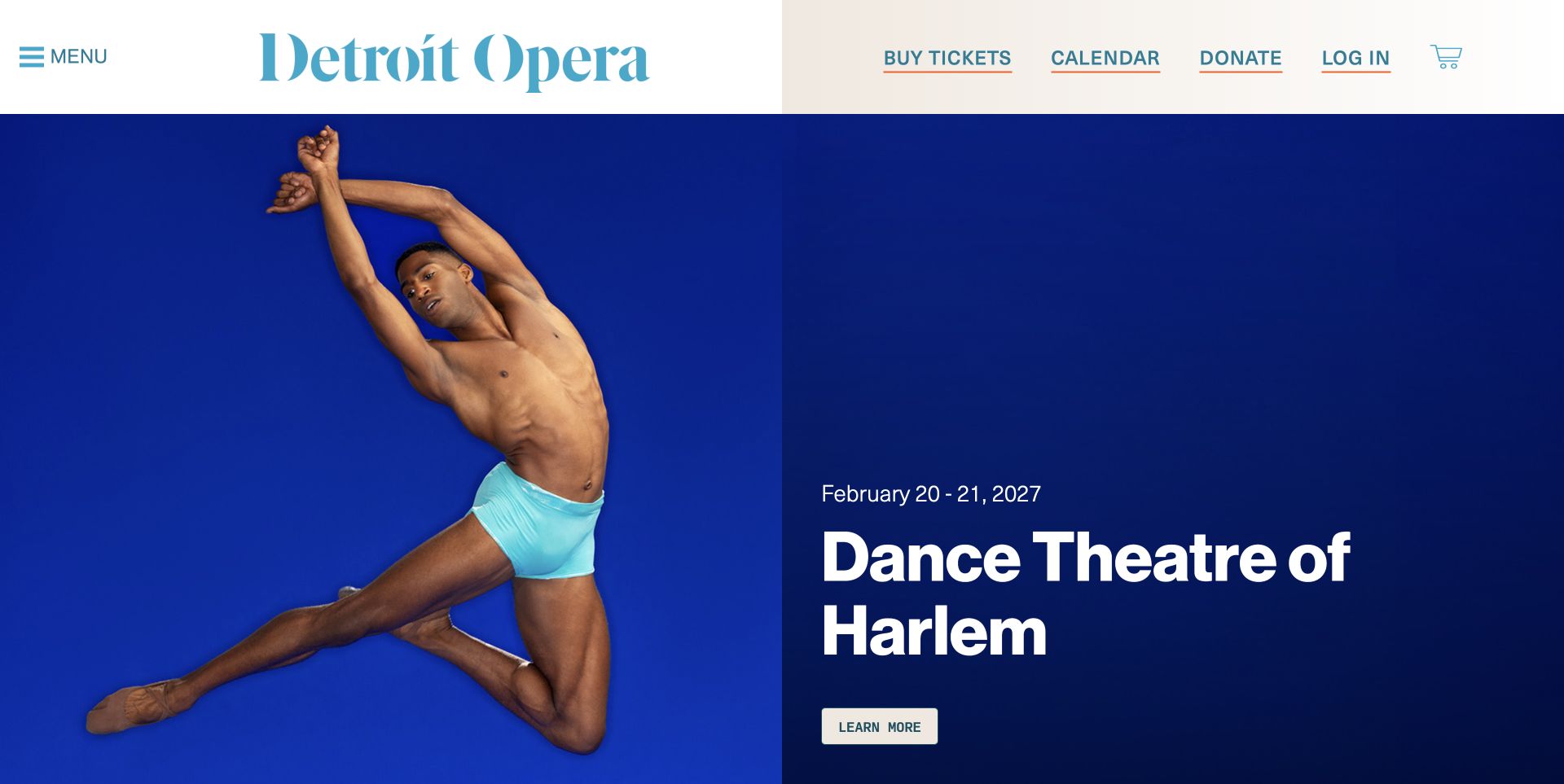
Detroit Opera's light header keeps ticket buying, the calendar, giving and account access visible beside the large blue wordmark. The captured carousel features Dance Theatre of Harlem against a saturated blue background, with the date and title grouped next to a single information action. The homepage then separates upcoming opera and dance, other opera-house presentations and featured events through an in-page section menu. This is a useful distinction for a company whose venue hosts several kinds of programme. Practical visit links, parking and accessibility sit within the main navigation. The selected campaign demonstrates the venue's dance presentation, not an opera production, and the review preserves that distinction.
What you can learn
Keep essential ticket utilities stable while campaign imagery changes. Label programme categories clearly so a visitor can distinguish the producing company, its guest presentations and building-related events without knowing the organisation beforehand.
Pros
Prominent calendar and ticket links remain outside the campaign panel.
Section anchors divide a varied programme into understandable groups.
Cons & considerations
Much of the detailed navigation is behind the menu control.
Large campaign panels require substantial scrolling to compare several events.
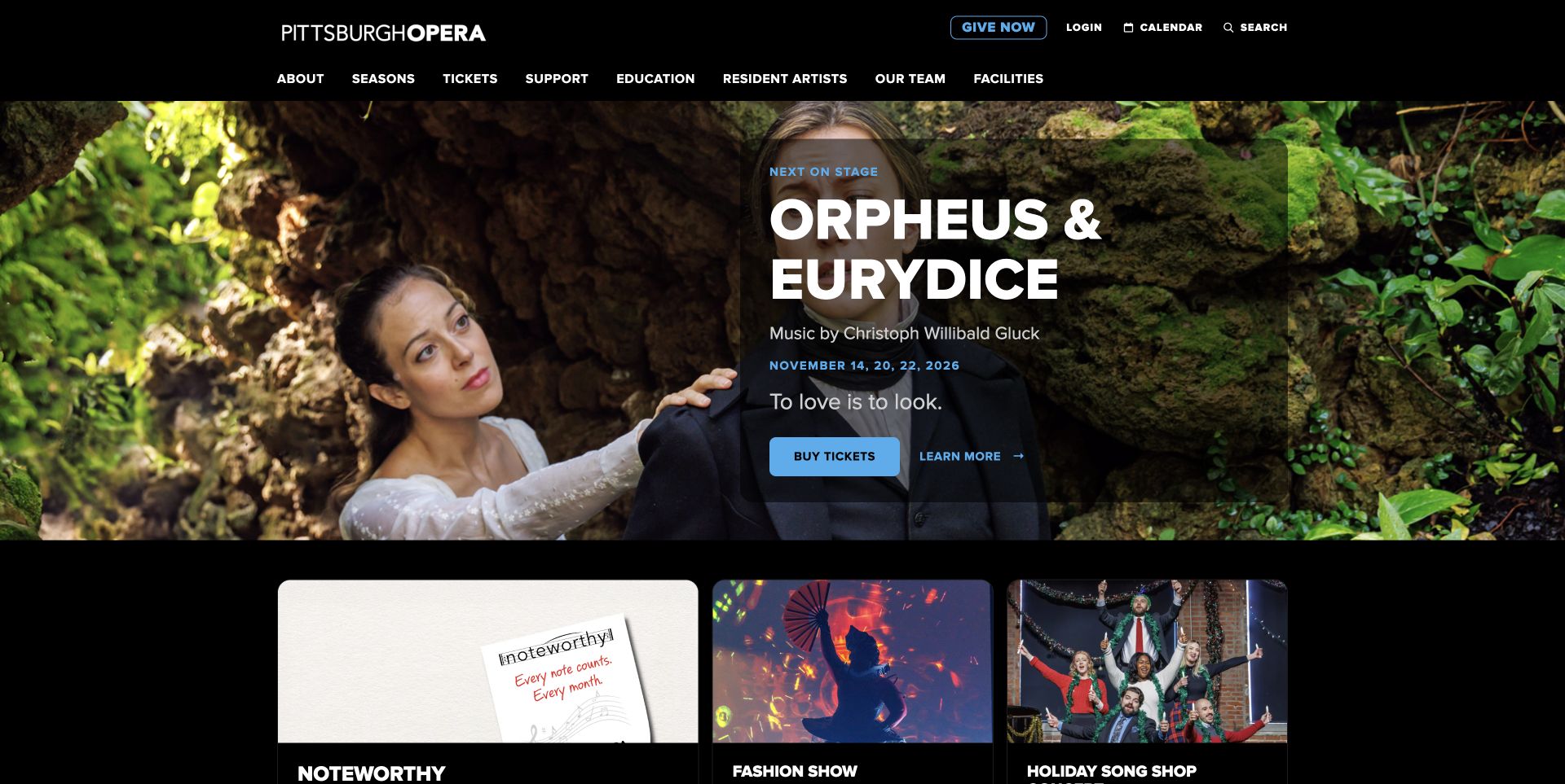
Pittsburgh Opera places its next production in a dark translucent panel over theatrical photography. The title, composer, performance dates and short premise appear together, with a filled ticket button and a quieter information link. A compact black header separates general navigation from calendar, account and giving utilities. Below the opening, spotlight cards introduce fundraising and community events, followed by a dedicated visit-planning section. Parking, accessibility, ticket policies, opera questions and childcare all receive explicit destinations. This structure makes the practical side of attending easier to find, although the dense two-level header and several secondary campaigns add competing options.
What you can learn
Treat the next production as a complete decision card rather than a title over a photograph. Bring common attendance questions into a visible planning section, especially when the company performs at several venues or welcomes unfamiliar audiences.
Pros
Composer and exact performance dates are available before opening a detail page.
The visit section names concrete needs rather than a generic information destination.
Cons & considerations
The text panel covers a substantial part of the campaign photograph.
Giving and promotional cards interrupt the path from the hero to the full season.
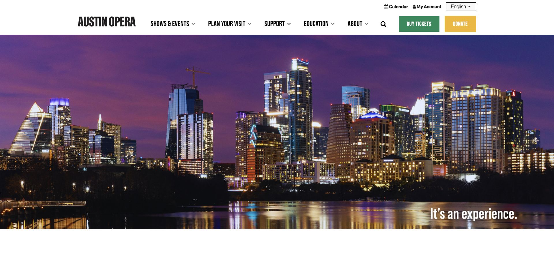
Austin Opera pairs a white navigation bar with a broad moving hero; the captured frame shows the city skyline at dusk. Condensed lettering gives the masthead a strong visual identity, while green ticket and yellow donation buttons remain outside the changing footage. The homepage content supplies production dates, venue details and a separate introduction to the new performance centre. Calendar, account and language controls sit in a smaller utility row. The site therefore connects the organisation to its city while still exposing practical routes. The opening frame itself carries little show information, so visitors rely on the ticket button or further reading to identify the next performance.
What you can learn
Keep important actions independent of a cinematic or rotating introduction. When a company operates in several spaces, name the venue alongside each event and explain venue changes separately from the main season promotion.
Pros
Ticket buying and donations use distinct labels and contrasting colours.
Contact information distinguishes general questions from ticketing support.
Cons & considerations
The moving introduction can show a city scene without the next production details.
Multiple venue and fundraising announcements lengthen the route to a season comparison.
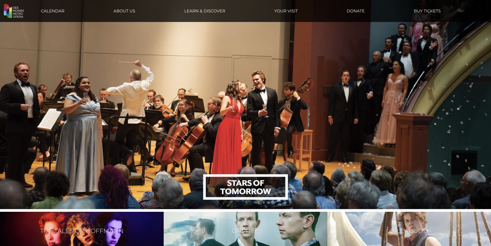
Des Moines Metro Opera gives its performance photography the full width of the opening, with a restrained transparent navigation bar and an outlined feature label. The captured slide shows singers and musicians in the same space as the audience. Directly below, three production tiles begin the transition from atmosphere to the next season. The remainder separates upcoming event dates, newsroom stories and further programme links. Performance and administrative addresses are distinguished in the footer, a useful detail for visitors travelling to a seasonal venue. Quoted press coverage occupies its own section, but those endorsements are presented by the company and are not independent findings of this design review.
What you can learn
Let real performance photographs communicate the scale and setting, then put the complete repertory within easy reach. Keep the performance address distinct from the office and give upcoming events a consistent date-and-time pattern.
Pros
The production strip offers several choices without requiring carousel interaction.
Event listings include day, date and time in a predictable order.
Cons & considerations
The large photographic opening contains limited practical production information.
Small navigation text sits over changing background tones.
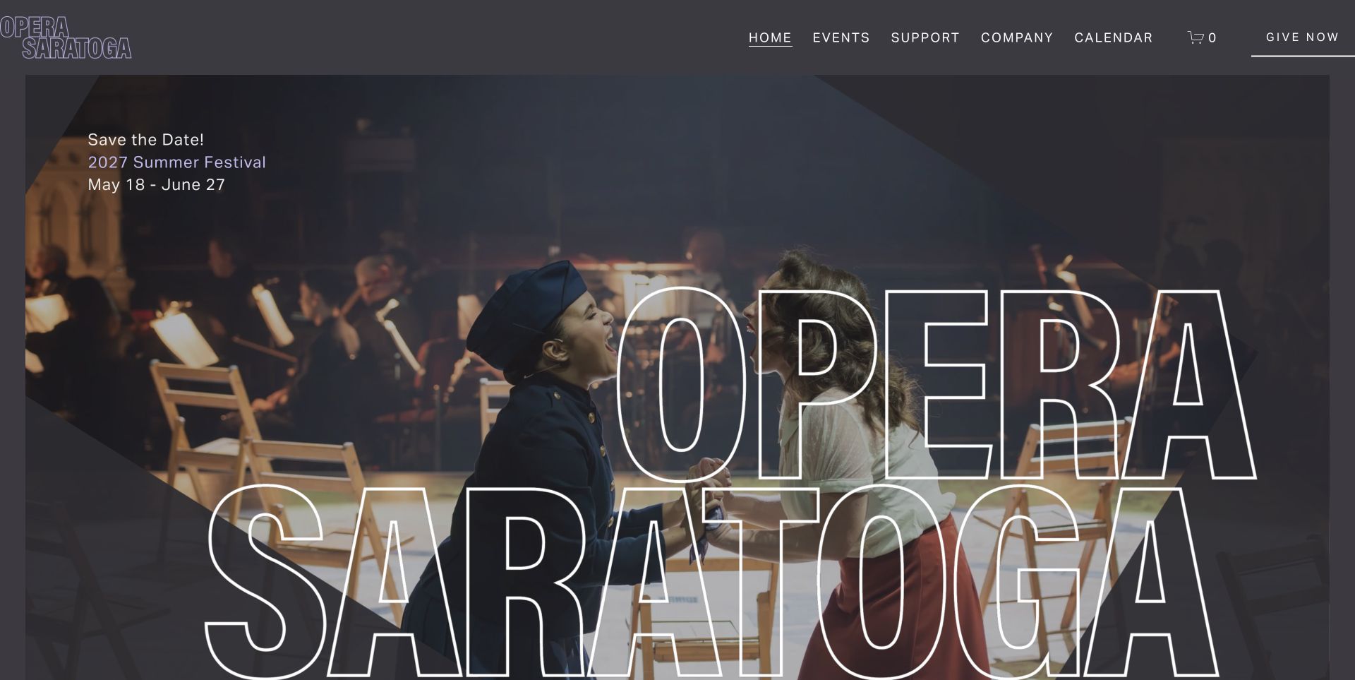
Opera Saratoga overlays enormous outlined lettering on a performance photograph, creating an unmistakable branded opening. A smaller block in the upper corner supplies the next summer festival dates. The charcoal header keeps a short set of sections, calendar access and a giving action visible above the image. Further down, a separate carousel carries individual events, while corporate sponsorship and individual gifts receive different destinations. Practical travel links appear in the footer alongside artist opportunities and hosting information. The page is strongest as a festival announcement: its scale and restrained palette feel cohesive, but the large identity postpones the details of individual productions.
What you can learn
A festival announcement should expose the date range immediately, even when the opening is primarily visual. Follow it with a browsable programme and practical travel links, and distinguish different forms of support with precise labels.
Pros
Festival dates are independent text rather than buried inside the photograph.
Corporate and individual support paths are separated clearly.
Cons & considerations
The oversized wordmark dominates the first screen over programme details.
Parking and accommodation links require reaching the footer.
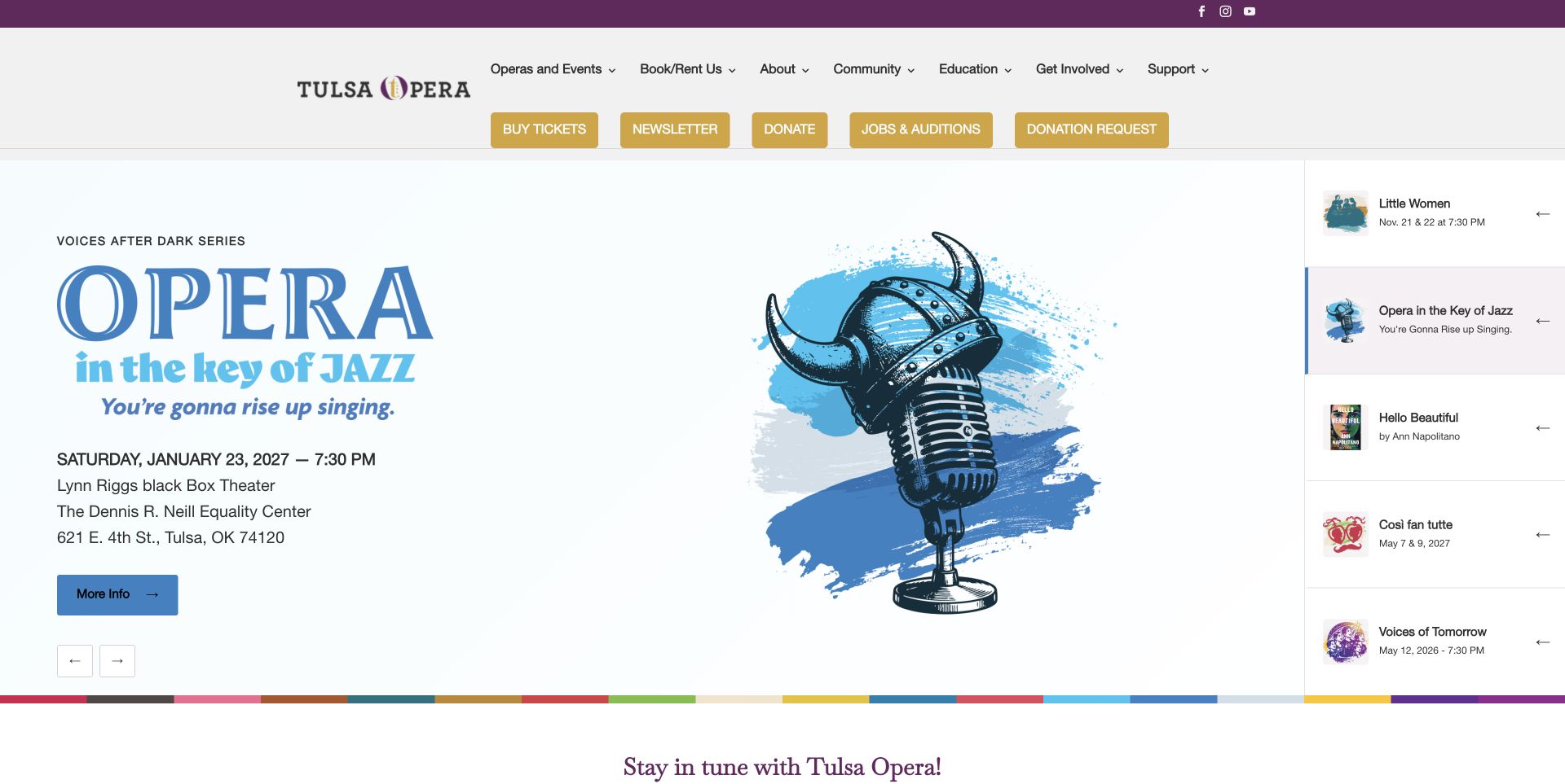
Tulsa Opera keeps a vertical list of named promotions beside the large active slide. In the captured view, the jazz programme combines illustrated artwork with its date, time, venue and address; neighbouring entries remain visible as selectable alternatives. This is more informative than a row of anonymous carousel dots. Below, the homepage introduces community activity, booking the company and educational touring before the footer. The header contains both section navigation and a row of utility buttons. Those routes make many services discoverable, although giving, jobs, newsletter signup and tickets receive similar visual emphasis. One neighbouring date in the captured index predates the current season and would benefit from editorial checking.
What you can learn
Give carousel alternatives readable names and useful dates so visitors can choose without waiting. Keep the event brief complete, and maintain old promotional entries as carefully as the currently featured slide.
Pros
The labelled slide index exposes several events at once.
The active promotion includes a concrete venue address beside the action.
Cons & considerations
Five similarly styled utility buttons compete for attention in the header.
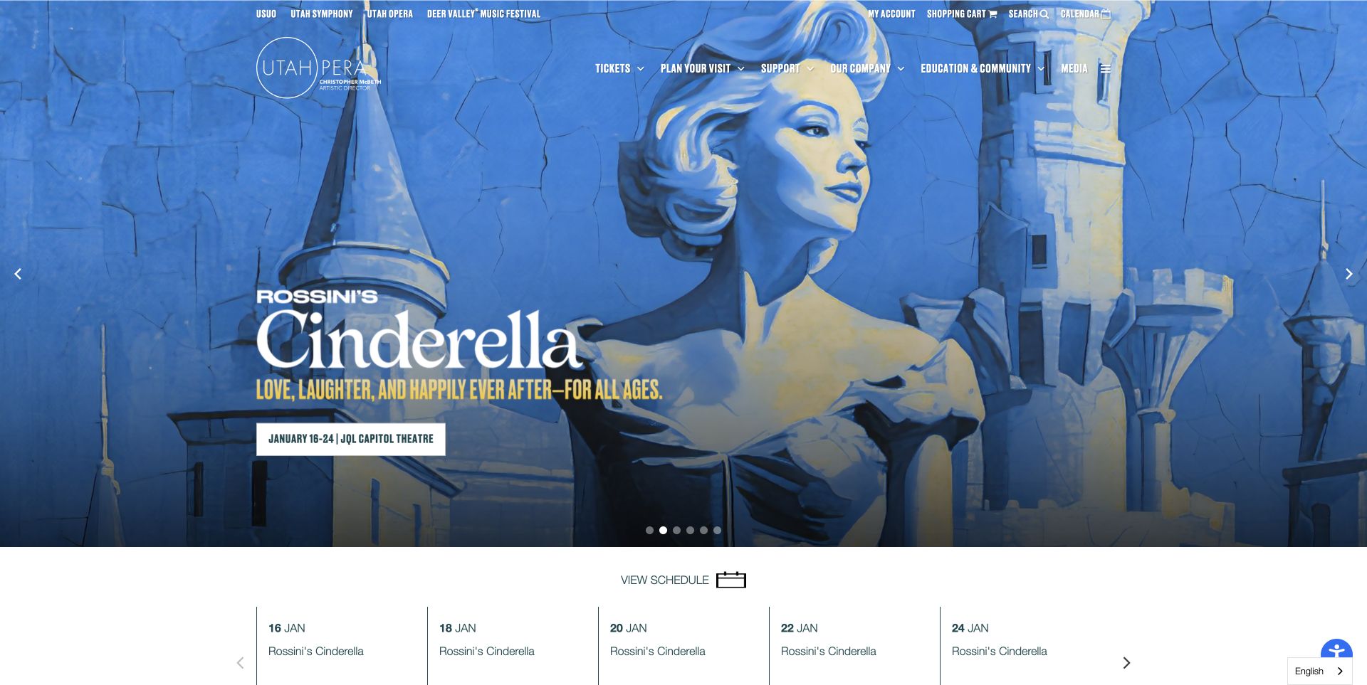
Utah Opera uses a saturated blue Cinderella campaign to make the current production immediately recognisable. Dates, venue and the main action sit within the artwork, while a narrow strip below begins the rest of the season. The header distinguishes the opera identity from related institutional destinations and keeps account and ticket utilities available. Production cards provide separate routes to information and purchasing, rather than making an unfamiliar visitor commit immediately. The page is useful for studying how a strong campaign can coexist with a repeated season structure. An initially displayed transport promotion was closed using its normal control before this unobstructed capture.
What you can learn
Keep campaign artwork expressive, but repeat the essential date, location and next-step structure across the season. When several arts organisations share services, make the current organisation unmistakable before sending someone into account or ticketing destinations.
Pros
The blue campaign has a clear title and practical attendance details.
Separate detail and ticket actions support different levels of visitor readiness.
Cons & considerations
Several institutional and utility links compete in the header.
A promotional popup initially interrupted the production introduction.
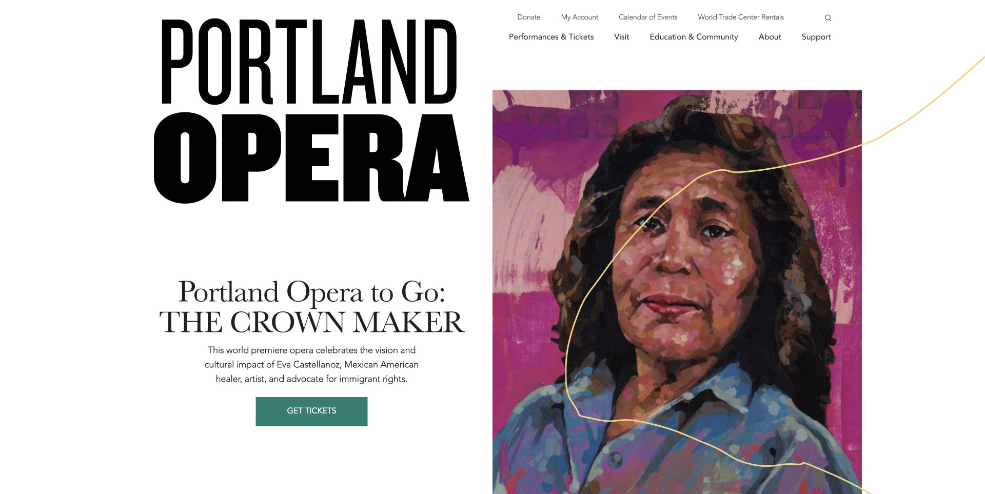
Portland Opera sets an oversized black wordmark against a generous white background, with a painted portrait occupying the other half of the opening. The Crown Maker introduction and ticket link sit beneath the identity rather than over the painting. This gives the artwork an unusually calm presentation and lets the production's subject carry much of the character. The page continues into a giving campaign, venue rental and other organisational routes, while the artist credit appears further down. Primary navigation and a smaller utility row divide institutional information from visitor actions. The opening is distinctive, although the large identity consumes space that could expose more immediate performance details.
What you can learn
Treat significant artwork as editorial content with room and attribution. Keep production dates and ticket information close enough that the visual story does not require visitors to search elsewhere for the practical invitation.
Pros
The white layout gives the portrait a clear visual role.
The production introduction remains readable without covering the artwork.
Cons & considerations
The large wordmark pushes supporting production information lower.
The artwork credit is separated from the first view of the image.
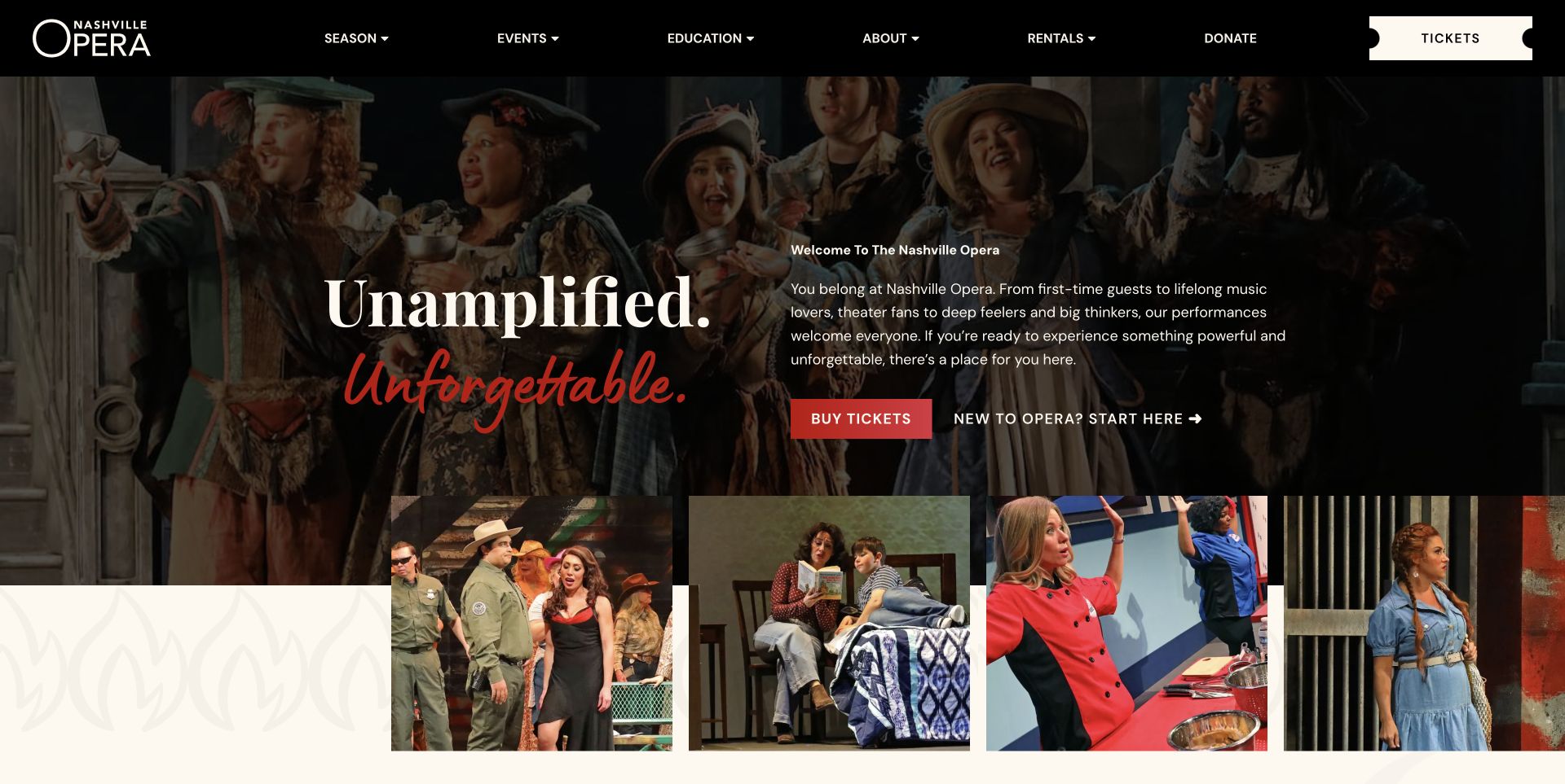
Nashville Opera places a welcoming paragraph beside a large two-style headline over performance photography. A red Buy Tickets button sits next to an equally visible New to Opera route, acknowledging that some readers need orientation before choosing a show. The black header uses a ticket-shaped action, and a row of varied performance photographs overlaps the opening section below. Further down, a featured production has its own dates and explanation, followed by news, education and giving content. The introduction makes audience inclusion concrete through an actual destination, although the first screen gives more space to the company promise than to the next production's schedule.
What you can learn
Give the hesitant visitor a useful alternative beside the main purchase action. A clear first-visit guide can explain expectations without slowing down people who already know the show they want to attend.
Pros
The first-time visitor route is visible in the main introduction.
The ticket action remains recognisable in both the header and opening section.
Cons & considerations
Current performance dates are below the general welcome.
Long news and memorial content adds substantial depth to the homepage.
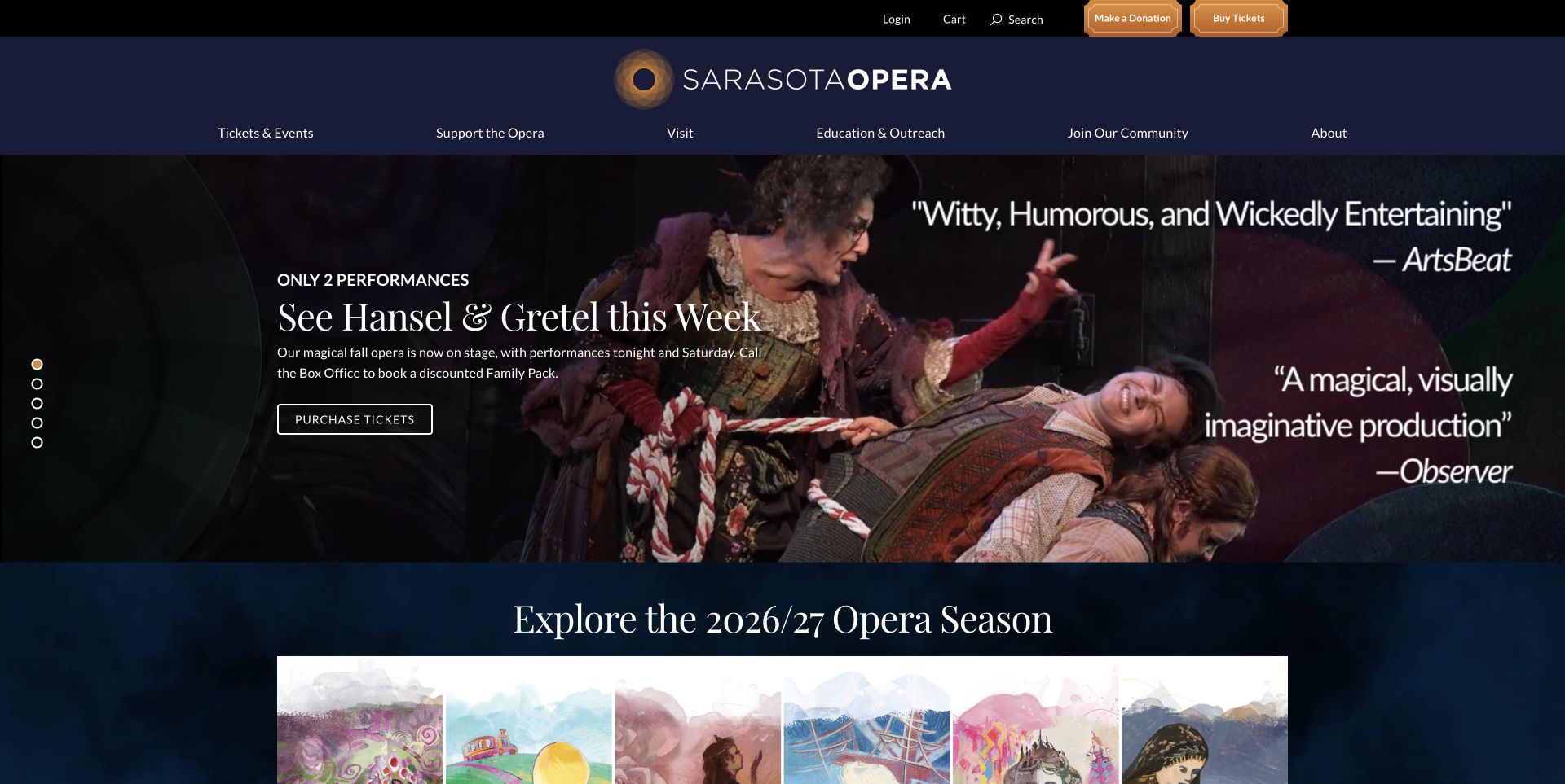
Sarasota Opera's captured slide combines a production photograph with a short urgency message, explanatory text and a purchase button. The navy header centres the company identity between a utility row and six clearly named sections. Below the campaign, illustrated season artwork introduces the wider programme, followed by a date-led upcoming-events carousel. The homepage also distinguishes flexible packages, the mobile app, fundraising and community participation. A family-ticket offer explicitly directs readers to the box office, making that service dependency visible. The promoted show is easy to recognise, but phrases such as tonight and this week need frequent editing to remain accurate after the performance dates pass.
What you can learn
Connect time-sensitive campaign language to a reliable publishing schedule. Pair a featured production with a browseable season and make phone-only offers explicit before visitors enter a ticketing journey that cannot fulfil them.
Pros
The current performance has a short explanation and direct action.
Date and time information appears in the broader event listings.
Cons & considerations
Multiple rotating areas divide information across different states.
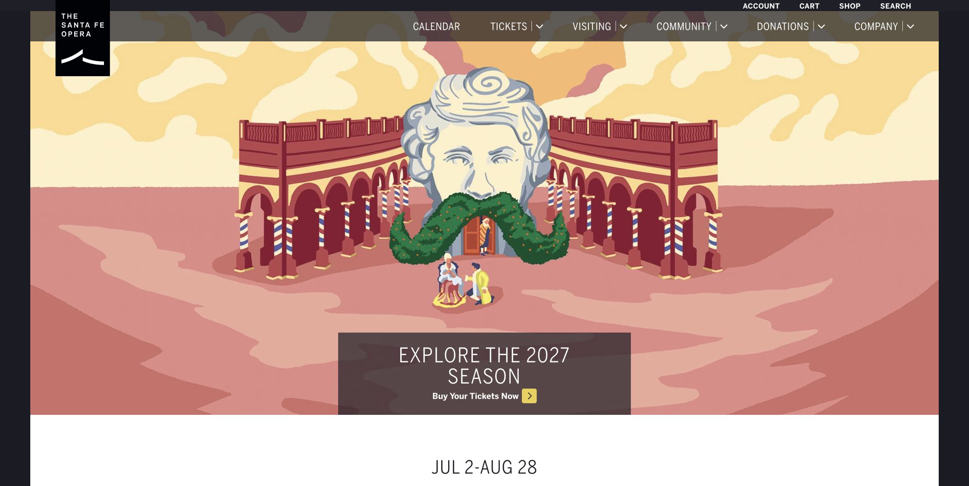
Santa Fe Opera uses a large illustrated scene as the season's visual introduction, with one compact invitation to explore and buy. A translucent navigation strip keeps calendar, tickets, visiting, community and donations above the artwork. Immediately below, a plain season date range leads into production cards with individual performance periods. The page then separates special ticket opportunities, group attendance and visit enhancements before introducing the organisation's history and mission. This sequence supports both show selection and the practical planning of a destination visit. The artwork is memorable, although its height means specific titles and dates begin beyond most of the opening viewport.
What you can learn
Present a festival as a coherent season before breaking it into individual productions. Put the overall travel window near the introduction, then give each production its own dates and keep visitor logistics connected to ticket choices.
Pros
The season range and production periods are distinctly presented.
Group and visit-planning routes are separate from institutional information.
Cons & considerations
The tall illustration delays comparison of individual productions.
Translucent navigation shares its background with detailed campaign artwork.
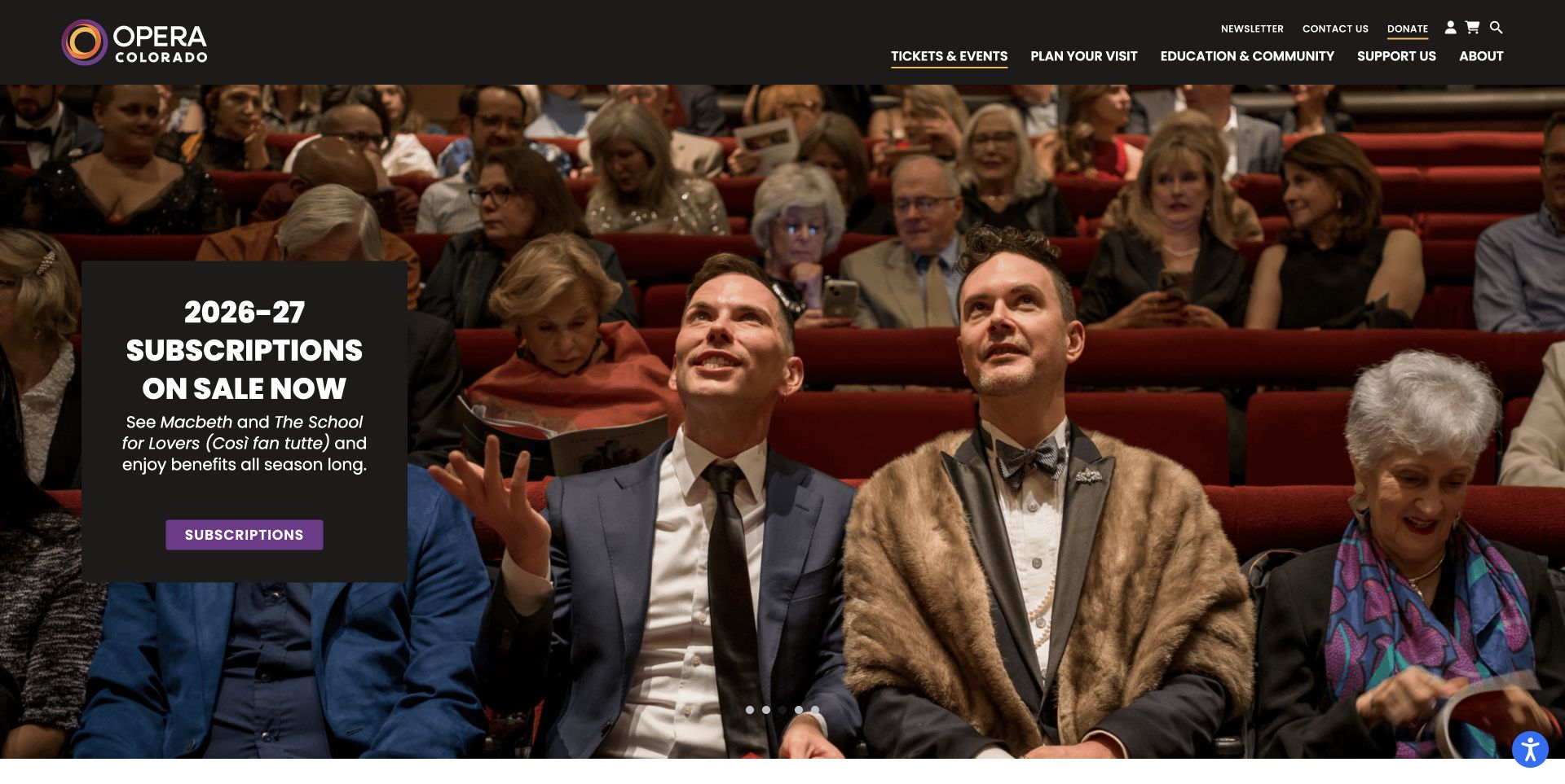
Opera Colorado's captured slide shows patrons in the auditorium behind a dark subscription panel. The panel names the included productions and offers a contrasting purple action, presenting the audience experience rather than only a staged scene. The black header separates contact, donation and account utilities from the main programme and visit navigation. Other homepage features introduce ticket options, packages, a younger-audience group and editorial updates. The footer distinguishes the opera centre from the main performance venue and separates administration from patron services. Those distinctions help practical planning, though the large rotating campaign requires visitors to move beyond the first panel to compare the available routes.
What you can learn
Explain a subscription through its actual programme and visitor benefit, then keep single-show and visit information easy to reach. Label office and performance addresses separately so institutional contact information does not become an accidental travel instruction.
Pros
The subscription panel names the productions behind its offer.
Venue and administrative addresses have distinct labels.
Cons & considerations
The first campaign occupies nearly the full screen.
Several supporting cards repeat the generic Learn more action label.
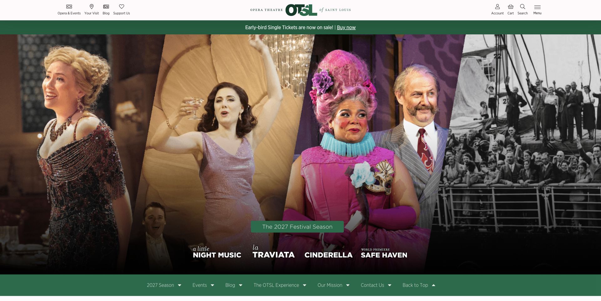
Opera Theatre of Saint Louis introduces its festival through a full-width montage with four production names along the lower edge. A green ticket announcement sits above, while a matching section menu below lets readers jump to the season, events, news and visitor experience. Production cards expose date ranges and combined information-and-ticket actions. The later visit section explicitly links to picnics, gardens and box-office help, describing the experience beyond the stage. There is a useful separation between festival productions and community programming. However, the reviewed page's sale announcement and a lower sentence about a future single-ticket launch are not fully aligned, showing the maintenance cost of repeating status copy.
What you can learn
Use section navigation to organise a long festival homepage, and maintain ticket availability in one consistent source. Distinct programme groups and named visit services help readers plan without turning every secondary activity into a competing hero.
Pros
In-page links provide a clear map of the long homepage.
Picnic, garden and box-office destinations make the visit tangible.
Kegan is a freelance web designer and developer with 15+ years of experience helping businesses turn complicated website requirements into clear, maintainable digital experiences. He works directly with clients from planning and design through development, launch, and ongoing support.
For opera company website design, his development approach focuses on production and season navigation, performance dates and venues, first-visit guidance, official ticket handoffs, and clear support and education journeys. The scope can be a targeted improvement or a complete custom build, with responsive layouts, thoughtful content structure, and integrations chosen around the people using and maintaining the site.
Show 3 other opera company website designersHide other opera company website designers
Plan an opera company website around attending, exploring and supporting
Define the production record before designing the campaign
Start with the facts each production needs: a stable title, performance format, confirmed dates, venue, short premise, relevant creative credits and official ticket destination. Treat the campaign artwork as a companion to this information. A poster may express the mood beautifully while still being the wrong place to store a date that appears in several parts of the website.
Separate a production from its individual performances. One production can have several dates, matinees or venues, and a festival can run several works over the same period. Readers should be able to compare the available occasions without reopening the same description repeatedly. Keep any availability status tied to the relevant performance rather than assuming an entire run is on sale or sold out.
Decide how records change after the final date. The programme may remain useful as an archive, but its main action should no longer imply that tickets are available. Preserve historical production information and photography while making the distinction between current, announced and past work obvious. That editorial lifecycle should be part of the publishing setup from the beginning.
Design a welcome that leads somewhere useful
A welcoming sentence is most useful when it connects to practical help. Nashville Opera places a first-time route beside its ticket action; Pittsburgh gives named destinations to attendance questions. Use this idea to identify what someone unfamiliar with the company needs before booking, then give those questions a clear destination instead of burying them in institutional copy.
Confirm the details with the people who operate the venue and box office. Arrival guidance, accessibility arrangements, language support and seating information can vary by performance or location. A general statement about the company should not silently become a promise about every event. Link to current, specific information and provide a contact route when the answer depends on individual circumstances.
Keep this orientation available without interrupting experienced visitors. Subscribers may want an immediate calendar or account link, while a new audience member may want a short explanation of the work. Both routes can be prominent if their labels are precise. Avoid forcing everyone through a promotional modal before they can reach the programme.
Connect the season to the place
For an open-air festival or destination venue, the setting is part of the visit. Opera Holland Park's picnic route and Saint Louis's garden links show how practical services can sit alongside the performance programme. Identify which extras are genuinely available and distinguish optional enhancements from information necessary to attend, such as directions and accessible arrival arrangements.
Show the difference between an administrative office, a rehearsal centre and a performance location. Opera Colorado labels its addresses separately, while several companies direct tickets through a venue's box office. Put the relevant venue on the production or performance record and explain the official ticketing handoff before a visitor leaves the main site. Do not require knowledge of the organisation's internal structure.
For touring or multi-venue programmes, keep location visible in the event list itself. Dates alone are insufficient when a visitor could reasonably choose the wrong city or building. Use consistent place names across cards, calendars and detail pages, with verified directions linked from the appropriate destination rather than a generic address in the footer.
Make expressive imagery dependable across changing content
Choose an image treatment that works with the information it must support. Santa Barbara separates artwork and copy; Santa Fe uses a compact text panel over illustration; Portland gives a painting its own space. These are different editorial choices. The appropriate solution depends on the actual crop, visual detail and amount of production information, not on a fixed rule that every arts site needs full-screen video.
When using motion or a carousel, keep essential content outside its changing state. Provide pause and reduced-motion behaviour, make controls understandable, and check text contrast over every scene. A stable date-and-title strip can preserve the practical invitation even when a photograph changes. A meaningful fallback should remain when the media is unavailable or slow to load.
Review content maintenance as part of the design. A large festival homepage may repeat a season announcement in the hero, cards and supporting paragraph. Give those repetitions a shared source or a clear review responsibility so a new ticket-sale notice does not coexist with an expired future-tense promise. Keep image credits and format labels close enough to avoid misrepresenting a film still, illustration or guest performance.
The editing job behind the design
Choose tools for the programme and the people maintaining it
Compare content systems around reusable production, performance, venue and artist records. Staff should be able to update a date or official ticket link without editing several unrelated layouts. Campaign design can remain flexible while the underlying facts have predictable fields and review responsibilities.
Treat ticketing, donations, rentals and education registration as distinct journeys even when they share a visual identity. Label external handoffs, retain usable text links and test the public navigation without placing orders or submitting forms. A logo or recognisable provider name alone does not establish that the entire transaction journey is suitable for your audience.
The technology stacks below come from bounded public-source audit attempts. They describe visible evidence and its scope, not private backends or a complete inventory. Blocked observations remain unresolved. Choose tools based on verified integration needs, editorial maintainability and accessibility requirements rather than copying a platform inferred from a visually similar website.
Our WordPress website examples offer a separate look at publishing approaches. A visible platform label is evidence for that named page, not a guarantee that the same system will suit your requirements.
Before the public launch
Opera company website planning checklist
Give each production a stable record separate from its individual performance dates.
State whether an experience is staged opera, film, dance, education or another event.
Keep dates and venue names readable outside campaign artwork.
Label single tickets, subscriptions, donations and information actions distinctly.
Provide a specific first-visit route near the main programme.
Verify arrival, access and language information for the relevant venue.
Distinguish performance addresses from offices and rehearsal centres.
Explain official ticketing handoffs before visitors leave the main site.
Retain a stable season list outside rotating campaign slides.
Provide meaningful controls, pause behaviour and motion alternatives.
Keep optional promotional overlays dismissible through normal controls.
Review repeated sale-status messages and retire relative-date copy on time.
These checks are a project checklist, not a performance, legal, security, or accessibility certification. Test real journeys with the people responsible for the website before making claims about the result.
Sources & editorial method
How this collection was selected and reviewed
The original random target of 17 was saved before research. Every included public homepage was inspected directly and captured with the real browser, without an open obstructing popup. Optional consent was rejected where controls allowed it. Normal close controls dismissed notices on Austin Opera and Utah Opera; earlier obstructed captures remain private. Boston Lyric Opera was held because a safe consent dismissal was not verified. Opera Omaha was held after two obstructed capture attempts and was not retried. Each included page received the standard bounded broad technology-audit attempt, with access limits and unsuccessful observations retained honestly. Opera Santa Barbara's explicit selection recognises the observed website's information design, not artistic quality, service quality or ticketing performance. Campaigns and dates describe the source at observation time and may change.
Each example links to its actual source page. Screenshots are direct browser captures with their own capture dates; moving imagery, announcements and live designs can change. The notes describe observable design choices and conditional tradeoffs, not measured traffic, conversion results, service quality, or accessibility conformance.
Technology labels use public page metadata, asset evidence, or explicitly cited platform documentation. Platform documentation is not a complete current deployment audit. A component reference may be legacy or unused; it is not a complete backend inventory. Unknown stacks are omitted. These sites are editorial examples, not our client portfolio.
Written, Edited and Curated are separate editorial records, not timestamps advanced by a rebuild. Website designs and imagery belong to their owners. See our editorial standards or suggest a correction.
Questions worth asking
Opera Company website design questions
What should an opera company homepage show first?
A clear current production or season invitation, with readable dates, venue context and an appropriate next action. If the feature is a film, guest presentation or fundraising event, label that format so visitors do not mistake it for a staged opera.
How can a website help someone attending opera for the first time?
Give first-time visitors a visible route to verified arrival, venue and performance information beside the main ticket path. Explain unfamiliar terms and offer a box-office contact for questions that depend on the individual event or visitor.
Should an opera homepage use a video or carousel?
Only when it adds useful context and remains controllable. Essential titles, dates and actions should also exist outside the moving content. A strong still image or illustration can provide a clearer and simpler opening.
How should a festival show several productions?
Present the overall season date range, then use consistent cards or a calendar for each production's performance dates. Keep location visible where venues differ and distinguish a single ticket from a multi-production package.
Why is Opera Santa Barbara the Editors Choice?
Its reviewed homepage pairs cultural imagery with a concise event brief and gives season, archive and support content distinct routes. This is an editorial website-design selection based on direct review, not an endorsement of artistic quality or a claim about measured outcomes.
Begin with accurate production records and a useful invitation to attend. Then choose imagery, typography and motion that help the visitor understand the work, the occasion and the next step.