Best Farm Equipment Manufacturer Websites of 2026 (31 Real-World Examples)
Farm equipment website examples that connect machines, dealers and ownership
A farm equipment website has to explain what a machine can do, help a buyer narrow the range and remain useful after delivery. These examples show how manufacturers organize product families, dealer routes, attachments, manuals and support around that longer relationship.
A buyer rarely evaluates a tractor or implement in isolation. The work, existing equipment, power requirements, crop, operating window and local support all affect the shortlist. A website cannot replace a dealer or a field demonstration, but it can make those conversations more informed. The most useful product architecture connects model information with applications, compatibility and the resources an owner will need later.
This collection examines public manufacturer and regional product pages, from broad equipment groups to specialist implement brands. The reviews concern visible design, navigation and content organization. They do not test machines, validate performance or financing claims, confirm local inventory, or certify accessibility. Campaigns and product ranges can change, so each capture records the page as observed on its stated date.
Before the examples
What makes good farm equipment manufacturer website design in 2026?
Help visitors identify the right equipment family
Offer paths by agricultural operation as well as by product name. A buyer may know they need to prepare a seedbed or move forage before knowing the manufacturer's series labels. Explain the main differences between adjacent families with a small, consistent set of relevant specifications.
Make compatibility concrete
Attachments, implements and precision tools depend on the equipment around them. Put supported power ranges, interfaces and model relationships beside the product information. Distinguish confirmed matches from general application guidance and identify who can resolve uncertain combinations.
Give ownership tasks equal clarity
Manuals, parts, maintenance and service should be reachable through plain labels. Let owners use model and serial identifiers where necessary, and explain why those identifiers matter. Avoid making someone browse current sales campaigns to find information about an older machine.
Preserve context through the dealer handoff
Tell visitors whether a dealer route concerns sales, parts, service or demonstrations. Carry the chosen region, machine and configuration into the next step where practical. Explain what remains subject to dealer confirmation instead of implying that a catalog listing proves local availability.
The thirty examples below compare broad manufacturer homepages, specialist implement brands, regional distributor gateways and a category-level catalog. Each review identifies a visible pattern and the design tradeoff to examine before applying it to another equipment business.
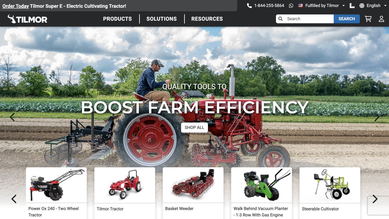
Tilmor combines working-field imagery with visible product thumbnails and a choice of product, solution and resource routes. The machinery is shown in a particular growing context rather than as an abstract industrial catalogue, giving the specialist range a practical and approachable introduction.
What you can learn
Connect the equipment to the job before presenting every specification. Solution routes and recognizable product images can help visitors narrow the range, provided the technical details remain easy to reach. A focused equipment maker can organize around farm tasks and product families instead of copying the immense dealer-and-finance navigation of a multinational machinery manufacturer.
Pros
Working-field imagery explains the context of the equipment.
Product and solution routes support different stages of a buying decision.
Cons & considerations
Promotional strips and rotating imagery can crowd a narrow first screen.
Compatibility, safety and pricing need precise product-level information.
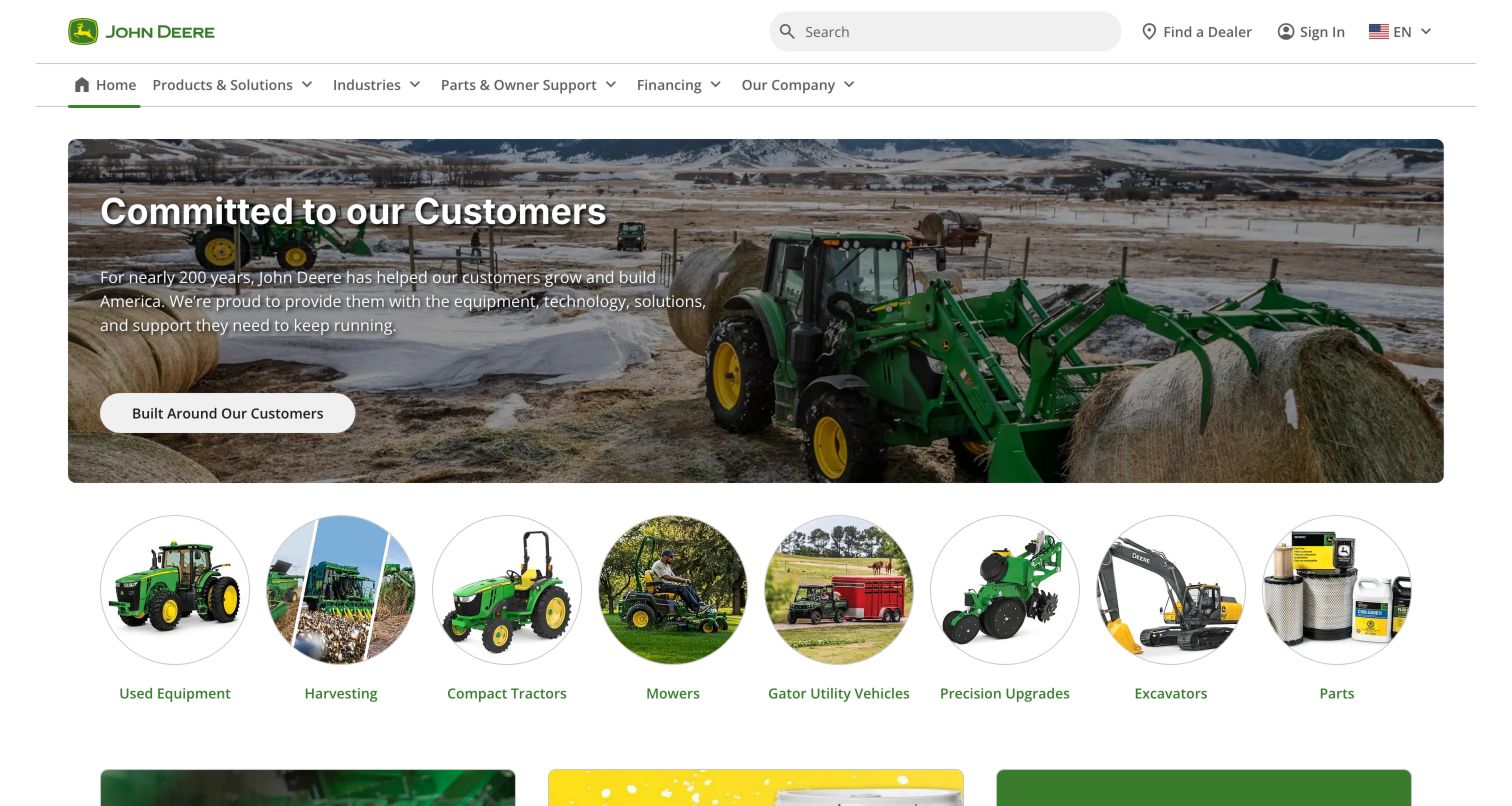
John Deere gives its broad catalog a clear white header with a large search field, a dealer route and separate product, industry, support and financing labels. The captured winter farming photograph presents a customer relationship message, while the circular category images beneath it bring the visitor back to equipment choices. Used equipment, harvesting, compact tractors, precision upgrades and parts are visibly different entry points. This is useful for a manufacturer whose audience includes first-time buyers and people maintaining machines already in service. The lower-page maintenance and how-to content reinforces that ownership continues well after the initial dealer inquiry. The breadth is an advantage only if the product and industry paths remain understandable together.
What you can learn
Borrow the separation between buying, operating and maintaining equipment. Give search a prominent place, but provide recognizable category pictures and plain names for visitors who cannot yet supply a model number.
Pros
Search is conspicuous beside the main brand identity.
Parts and owner support receive a dedicated navigation route.
Cons & considerations
The customer campaign takes space before a specific machine choice.
Overlapping product and industry paths need consistent naming and cross-links.
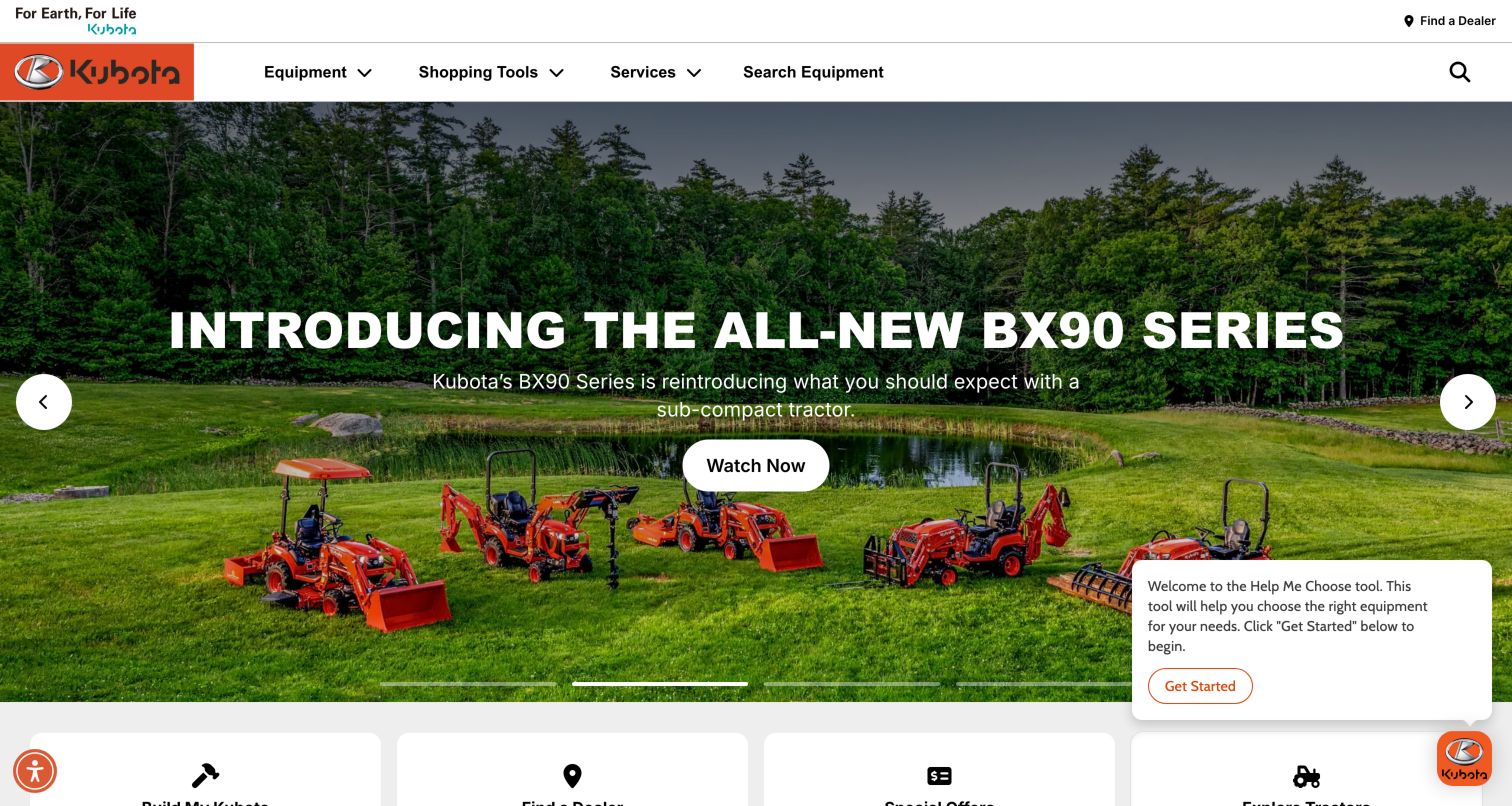
Kubota uses orange identity marks against a restrained white navigation bar, leaving the equipment photographs to carry most of the color. The final capture shows a subcompact tractor launch with several machines arranged across a lawn, a short explanatory line and a Watch Now button. Equipment, Shopping Tools and Services divide the top-level choices, while search and Find a Dealer remain visible. A Help Me Choose prompt introduces guided selection without replacing the ordinary category route. Below the hero, large task tiles begin the path toward configuration, offers and dealers. This combines a campaign opening with practical shopping tools, although the floating chooser competes with the image and lower content.
What you can learn
Offer a guided path for buyers unfamiliar with tractor categories, alongside direct model browsing for experienced owners. Make the guide easy to dismiss and keep product specifications available without completing a questionnaire.
Pros
The top-level labels distinguish products, shopping and service.
Equipment appears in a recognizable property setting.
Cons & considerations
The chooser panel occupies part of the lower-right content area.
A video-led first action may be slower than reading a comparison table.
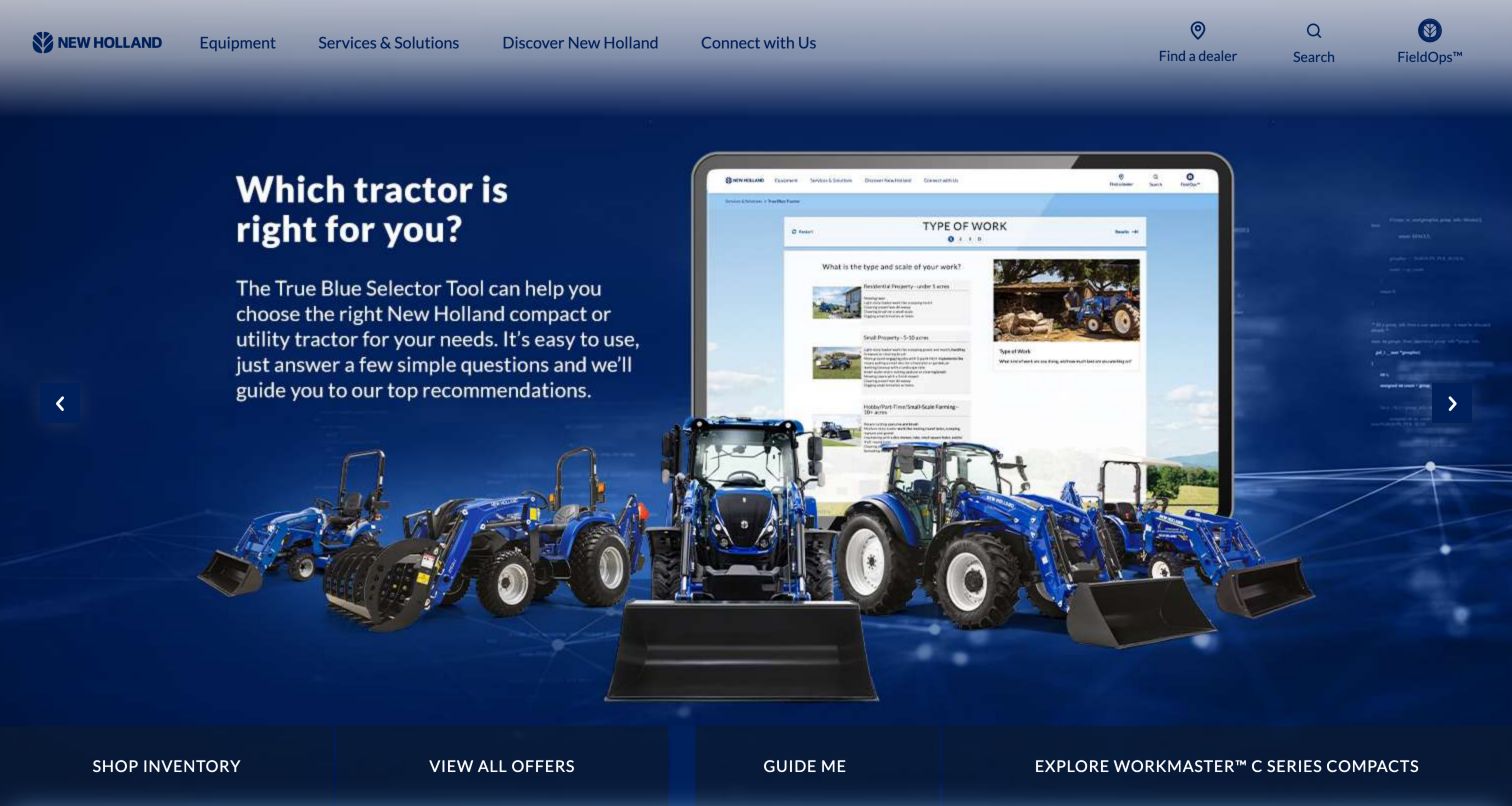
New Holland's captured homepage makes a specific buying uncertainty visible: which tractor suits the visitor's work. The blue hero combines a device mockup of its selector with a row of tractors, making the relationship between the question and product range easy to read. Below it, a dark task strip offers inventory, offers, guidance and a named compact series. The white header separates Equipment from Services & Solutions and retains dealer, search and FieldOps shortcuts. That structure accommodates both shoppers and operators. The selector promotion is more concrete than a general brand slogan, although its substantial text is embedded in a visually busy composition with several competing machines.
What you can learn
Describe selection tools in the language of work, acreage and use cases before asking people to identify a series. Keep inventory and direct product browsing equally visible for visitors who already know what they need.
Pros
The opening explains the purpose of the selection tool.
Dealer and operator shortcuts stay distinct from campaign content.
Cons & considerations
The hero has several visual elements competing for attention.
The rotating campaign means the selector may not be the first view every time.
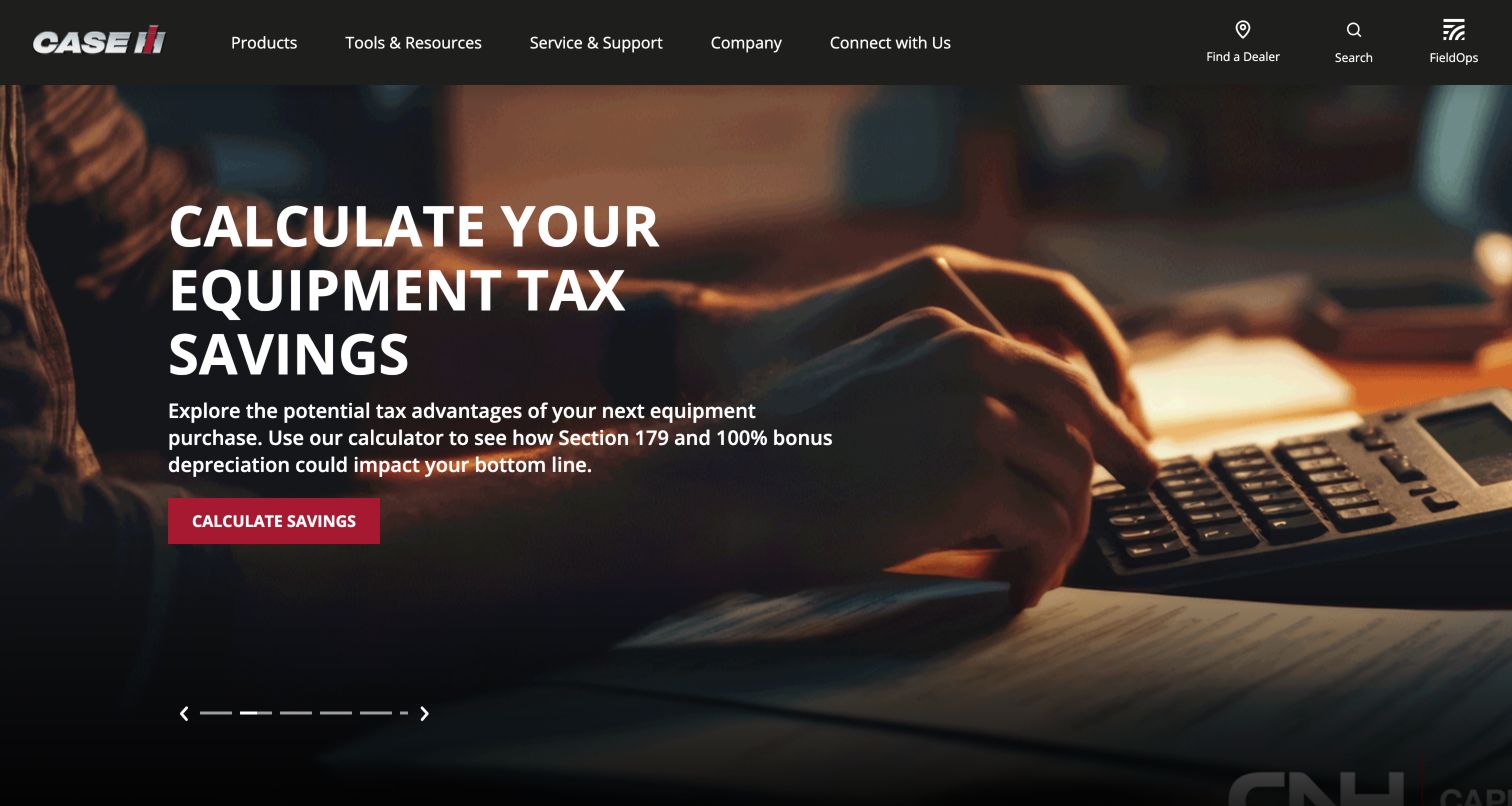
Case IH uses a black header, red identity and direct labels for Products, Tools & Resources, Service & Support and Company. The captured campaign promotes an equipment tax-savings calculator with a large calculator photograph and a red action button. This review concerns how that tool is presented, rather than validating any financial outcome. Elsewhere in the observed navigation, comparison specifications, Build & Price, compatibility information and manuals give shoppers several ways to reduce uncertainty before speaking to a dealer. The structure recognizes that equipment evaluation is more involved than selecting a picture. Its main tradeoff is that a financial campaign occupies the first screen while the physical equipment range sits behind navigation.
What you can learn
Put evaluation resources near the catalog and label their scope clearly. A comparison tool, configurator and ownership manual solve different problems; each should explain what it can answer and when a dealer must confirm the details.
Pros
Tools and ownership support are visible as separate main sections.
Dealer and search routes remain present above the campaign.
Cons & considerations
The calculator promotion is not an immediate equipment overview.
Financial tools need current assumptions and clearly stated limits.
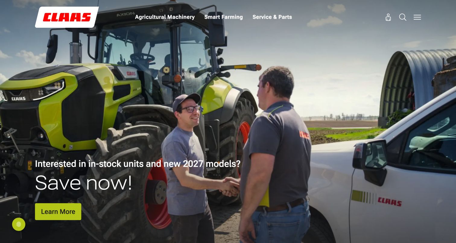
CLAAS places a dealer and customer conversation at the center of its opening photograph, with a tractor providing the agricultural context. A compact menu separates Agricultural Machinery, Smart Farming and Service & Parts, while a bright lime button anchors the promotional message. The restrained white header and angled logo panel leave substantial room for the image. Observed quick links include a configurator, dealers, jobs and partner portals, so the homepage serves several audiences beyond a new-machine shopper. The example is useful for showing that local support can be part of the brand story. Its compact navigation also means the surrounding utility icons and their accessible labels must do meaningful work.
What you can learn
Use people and equipment together when dealer support is a central differentiator. Pair that story with an explicit inventory or product route, and give every icon a meaningful label in the active language.
Pros
The photograph gives a human context to the dealer relationship.
Three primary categories make the menu easy to scan.
Cons & considerations
The inventory promotion can date more quickly than the underlying product pages.
Some observed accessibility labels used technical translation keys and merit review.
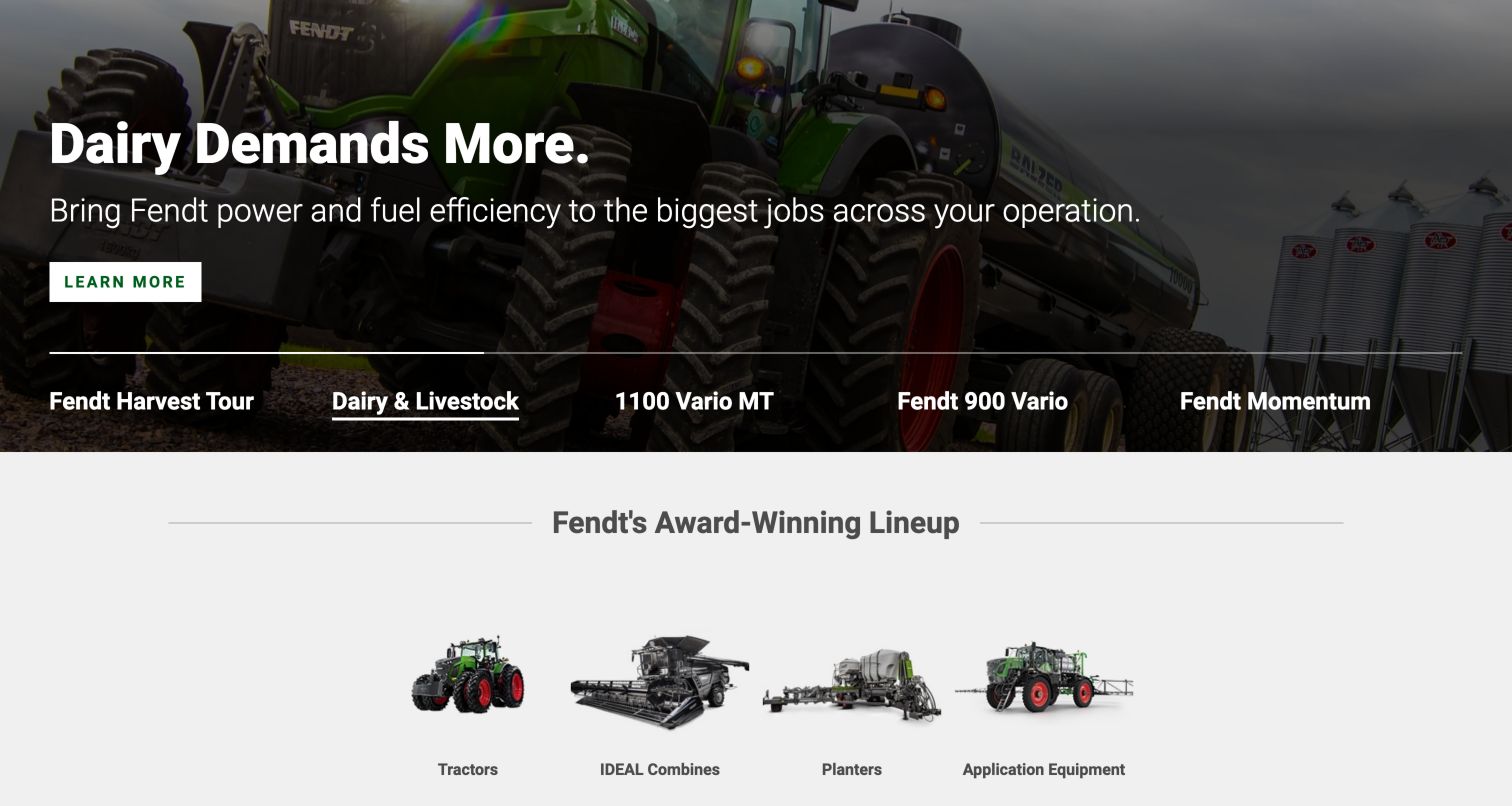
Fendt's homepage presents campaigns as named tabs rather than anonymous dots. Dairy & Livestock, the harvest tour and named tractor families tell visitors what they will see before switching. The captured dairy slide pairs a large tractor photograph with a short headline and a single Learn More action; the equipment lineup immediately below shows tractors, combines, a planter and a sprayer as cutout images. The separate header observed above provides Parts & Service, Technologies, Financing and Customer Stories alongside Products. This is a useful balance between operational context and product taxonomy. The carousel still changes the first impression over time, and broad performance language needs supporting detail on the destination pages.
What you can learn
When a campaign carousel is necessary, name each slide by its subject and expose a pause control. Follow the campaign with a stable product overview so the visitor does not have to wait for the relevant machine.
Pros
Text tabs explain the subjects of alternate campaigns.
Product silhouettes create a recognizable overview below the hero.
Cons & considerations
The large campaign remains a substantial step before specifications.
Claims about efficiency require conditions and supporting product information.
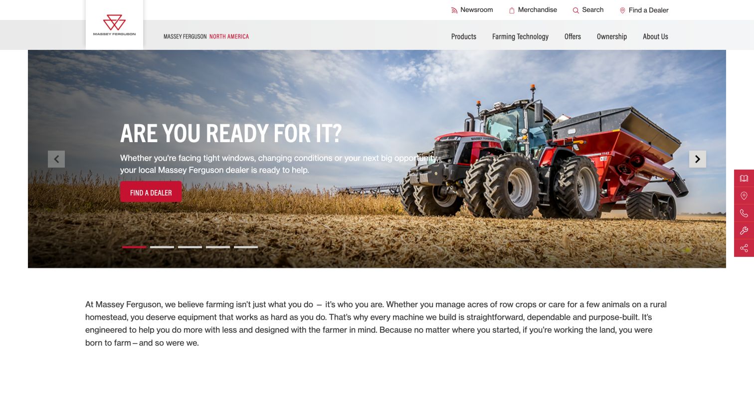
Massey Ferguson frames a red tractor at work inside a wide, inset hero rather than stretching the photograph to every page edge. The white and pale-gray header uses a vertical logo block, a small utility row and a focused navigation set: Products, Farming Technology, Offers, Ownership and About Us. The photographed field and short message about changing conditions lead to a direct Find a Dealer button. A persistent red utility rail provides additional shortcuts along the right edge. The opening paragraph beneath the image broadens the audience from crop farms to smaller rural properties. This gives the site a useful relationship between field context and support, while keeping the product range one step deeper.
What you can learn
Connect dealer contact to a concrete operating situation and retain a separate ownership route. Utility rails should complement ordinary text navigation, with clear names and sufficient spacing for touch and keyboard users.
Pros
Ownership has a clear place beside shopping-oriented sections.
The dealer call to action matches the local sales model.
Cons & considerations
The floating utility rail adds another navigation layer to understand.
The first screen does not yet distinguish model sizes or applications.
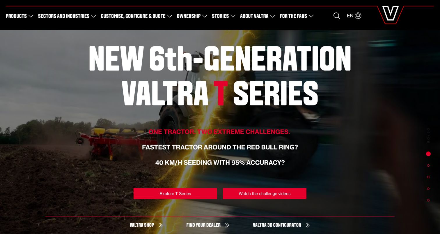
Valtra's visual identity is deliberately forceful: a black navigation bar, thin red lines, a large outlined V and oversized condensed white type. The captured launch campaign places a tractor challenge story above two red actions, one for the series and one for videos. Practical shortcuts to the shop, dealer and 3D configurator remain at the bottom of the hero. The main navigation also separates Sectors and Industries, customization, Ownership and Stories. That arrangement acknowledges that the same tractor can be evaluated by application, options or existing ownership needs. The design is memorable, but the dramatic campaign typography and promotional questions demand more attention than a quiet specification-led opening would.
What you can learn
Make customization a clear pathway with a defined next step, rather than a vague feature buried inside product pages. Keep model information accessible beside launch videos and explain what a configuration does and does not quote.
Pros
Configuration and ownership are explicit navigation choices.
The branded palette consistently separates actions from background imagery.
Cons & considerations
The large display headline can crowd smaller viewing areas.
Campaign performance questions need evidence and operating conditions on linked pages.
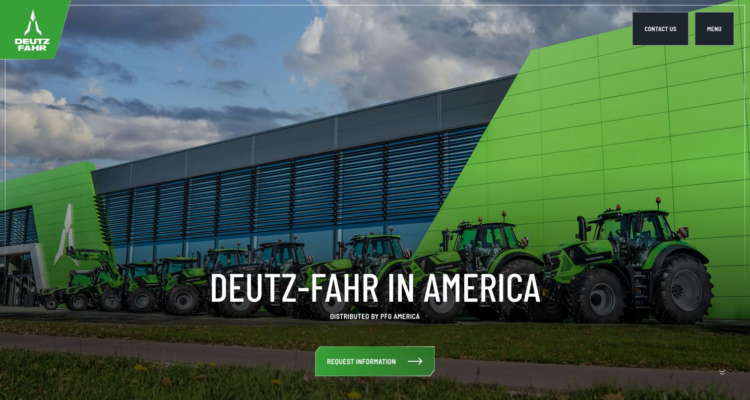
The DEUTZ-FAHR America page is a regional handoff rather than a full machinery catalog. A wide photograph of a branded building and green tractors establishes the product identity, while the short text explicitly names PFG America as distributor. The small header leaves Contact and Menu at the upper right and a request-information path near the lower edge. The observed page links onward to the distributor's website, making the organizational boundary visible. That restraint is valuable when a global corporate property cannot answer local availability and support questions itself. It also creates an extra step for visitors expecting a model comparison or dealer map immediately on arrival.
What you can learn
If the regional site is a gateway, say who operates the next destination and what the visitor will find there. Preserve region and product context across the handoff instead of sending every inquiry to an undifferentiated homepage.
Pros
Distributor identity is stated in the main message.
The uncluttered page makes the regional purpose apparent.
Cons & considerations
Product specifications require a further destination.
The small set of controls offers limited help for comparing equipment here.
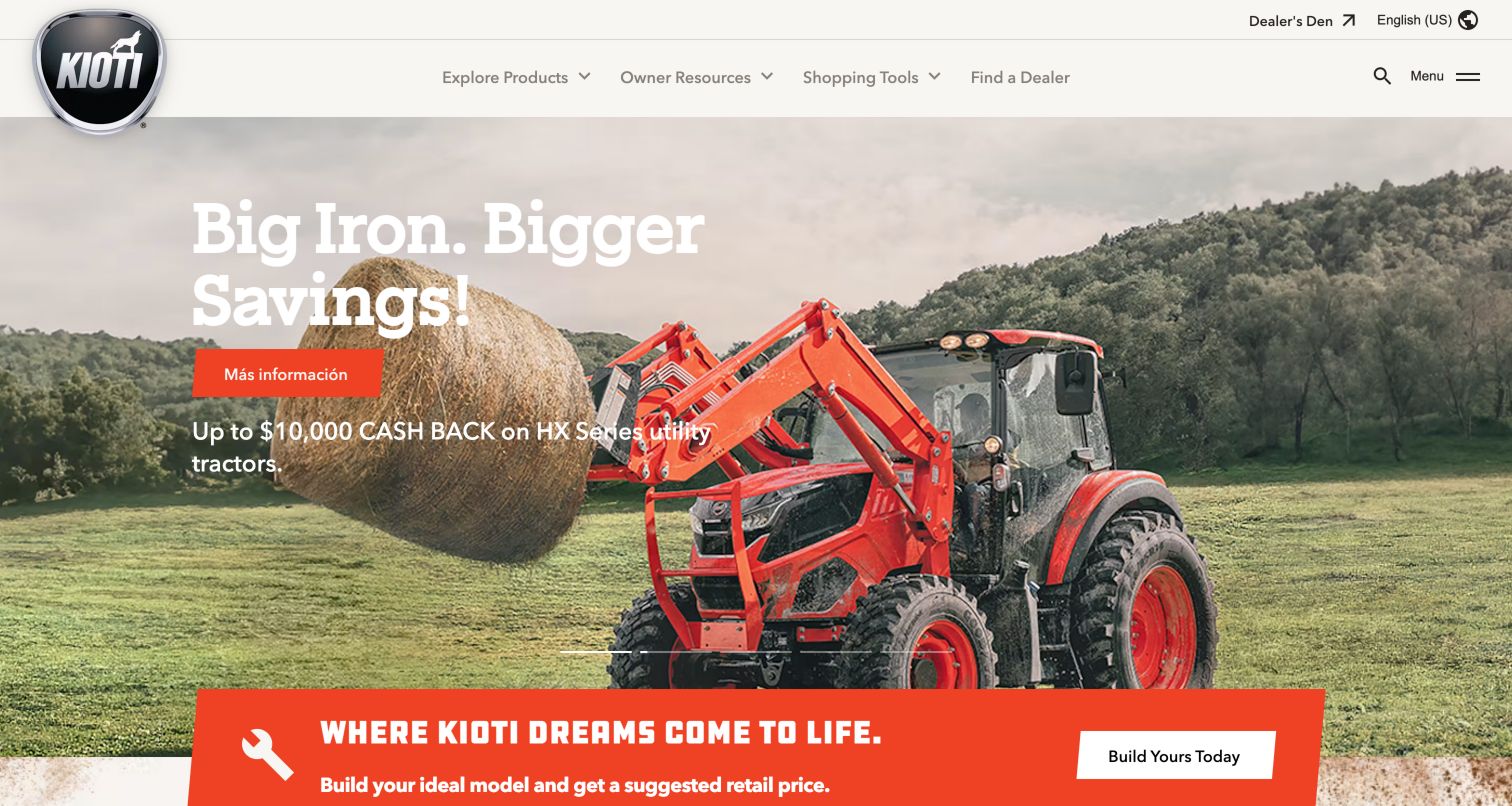
KIOTI pairs a cream-colored navigation bar with black identity and an orange campaign button. The captured tractor-and-hay photograph provides an immediately agricultural setting, while the main menu uses three broad task groups: Explore Products, Owner Resources and Shopping Tools. A dealer route is separated at the right. The next section introduces building a model, helping the visitor move from an offer into a more concrete equipment choice. One visible inconsistency is the Spanish action label in the otherwise English campaign view. The page still communicates its general purpose, but that mixed-language control shows how localized promotion assets can weaken an otherwise orderly navigation system.
What you can learn
Organize the entry points around exploration, evaluation and ownership, then audit campaign assets in each locale. Check button text, image copy and destination language together so a promotion does not interrupt an otherwise consistent journey.
Pros
The broad menu labels describe understandable visitor tasks.
A configuration section follows the promotional opening.
Cons & considerations
The captured campaign action used a different language from surrounding content.
Offer-led messaging can defer the explanation of model differences.
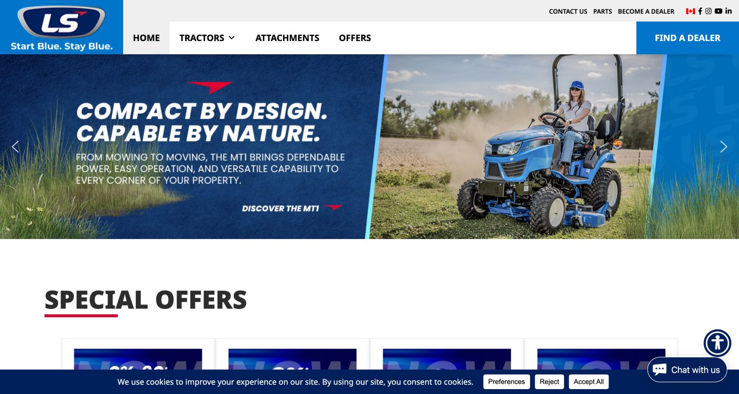
LS Tractor makes its primary choices unusually direct: Tractors, Attachments, Offers and a conspicuous dealer button. The blue-and-white identity is echoed by a split hero showing a compact tractor in use and a large capability statement. Smaller utility links handle parts, contact and becoming a dealer, leaving the main navigation comparatively short. The next section begins with special offers rather than a long corporate introduction. This is a useful example for a manufacturer with a narrower range than the multi-industry groups in this collection. Its simplicity comes with a tradeoff: much of the opening message is carried by campaign imagery, so model sizing and attachment compatibility still need clear supporting pages.
What you can learn
Use a short primary menu when the assortment allows it, and keep attachments visible alongside tractors. Ensure promotional image text has an equivalent readable explanation and that each model leads to its compatible implements and ownership resources.
Pros
The main navigation gives tractors and attachments separate entries.
The dealer action is visually distinct from ordinary links.
Cons & considerations
Campaign artwork can be harder to adapt across small screens.
A chat control and cookie strip occupy parts of the lower viewport.
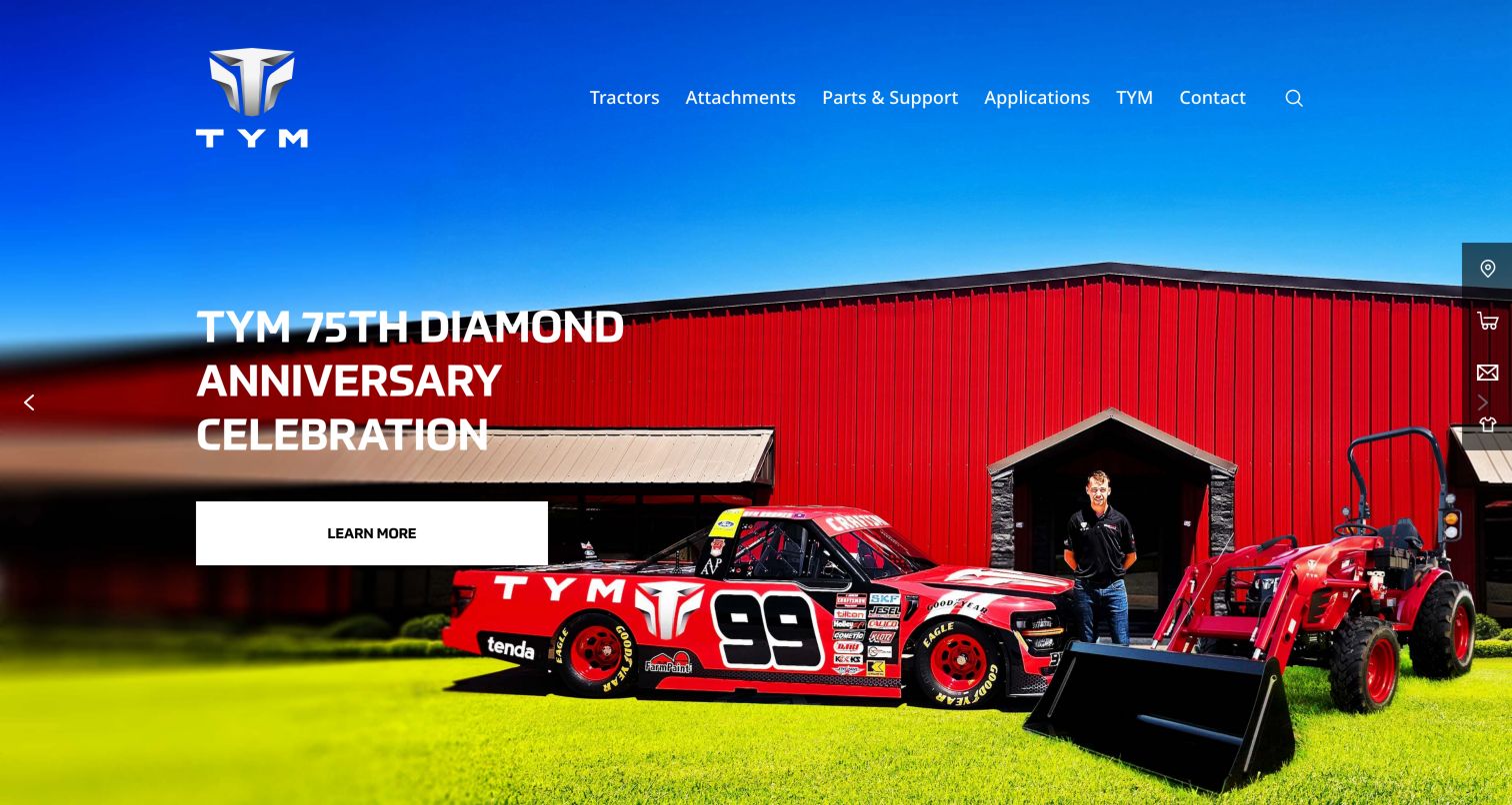
TYM's North American property uses a light navigation treatment over a broad rural photograph. The observed anniversary promotion includes a barn, vehicles and a tractor, with a short heading and restrained white button. Above it, Tractors, Attachments, Parts & Support and Applications separate important kinds of intent. The product navigation identifies numbered series with horsepower ranges, offering a more precise way to distinguish machines than photography alone. That combination is useful for buyers who arrive with an application but not a model name. The campaign establishes a celebratory brand tone, while the structured series information carries the more practical burden of helping someone narrow the range.
What you can learn
Pair application-led discovery with measurable product groupings such as power ranges. Keep those ranges consistently named across navigation, comparison pages and dealer inquiries, and avoid making a seasonal campaign the only route into the catalog.
Pros
Series labels include useful power-range context.
Parts and support are clearly separated from new equipment.
Cons & considerations
The anniversary scene gives several objects equal visual attention.
Detailed comparison still requires moving beyond the first screen.
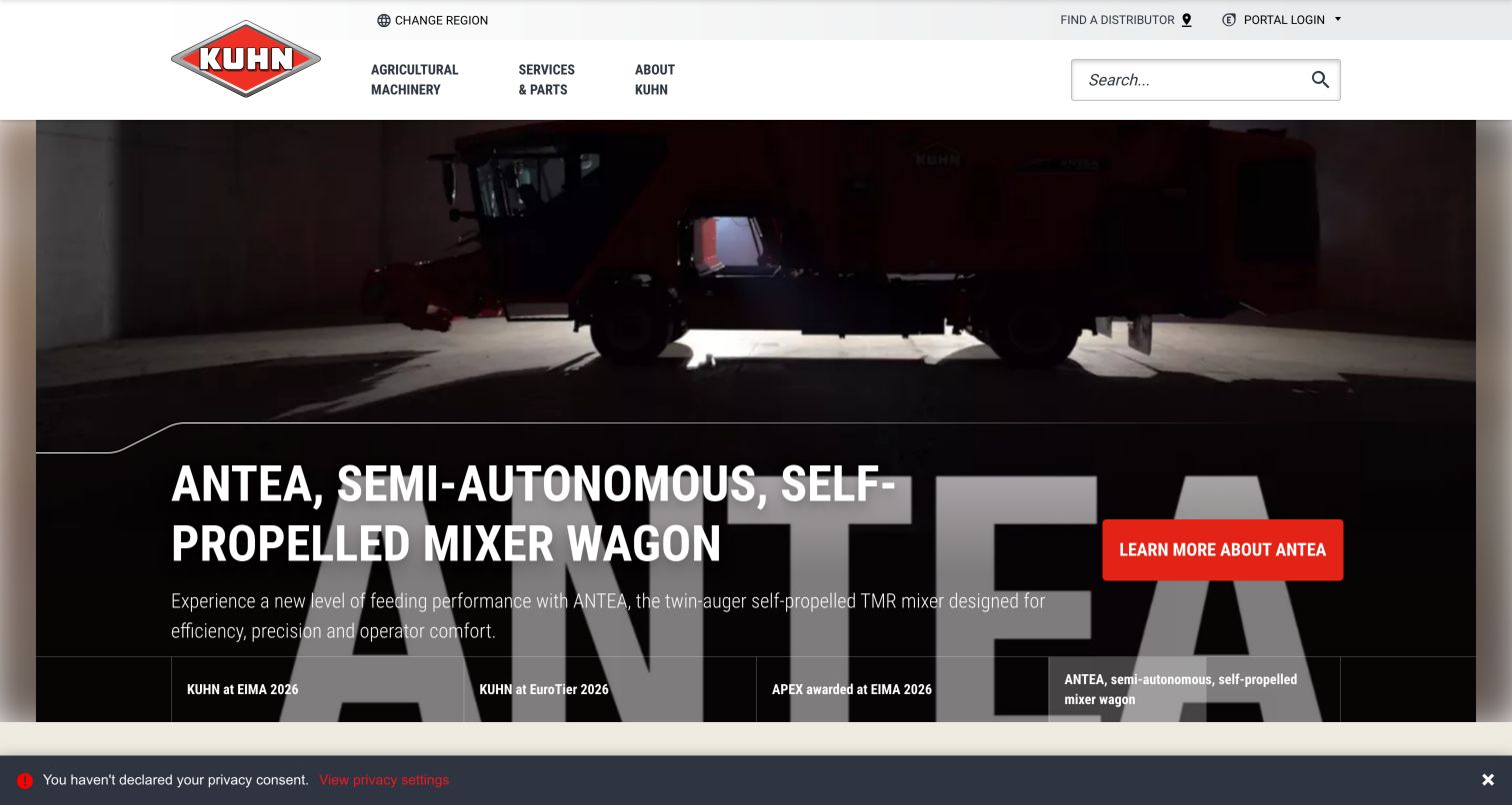
KUHN keeps the main header focused on Agricultural Machinery, Services & Parts and About KUHN, with a large visible search field and smaller distributor, region and portal controls. The final captured campaign promotes a mixer wagon using a dark product photograph, large white copy and a red action. Named tabs along the bottom expose the other event and product subjects. Further down, the page divides machinery into crop and livestock contexts and points to MyKUHN manuals and spare-parts catalogs. This gives a large assortment a relatively calm top-level structure. The small privacy reminder remains visible at the bottom of the capture and illustrates how site chrome can compete with an already substantial hero.
What you can learn
Keep broad catalog entry points few, then expose meaningful agricultural categories one level below. Provide separate, plainly labeled distributor and owner-resource paths so service information does not disappear inside a campaign-led homepage.
Pros
Search is visible without opening an icon-only panel.
Named campaign tabs reveal the alternative subjects.
Cons & considerations
The campaign occupies most of the initial viewport.
Region and privacy interfaces add friction before the content is fully visible.
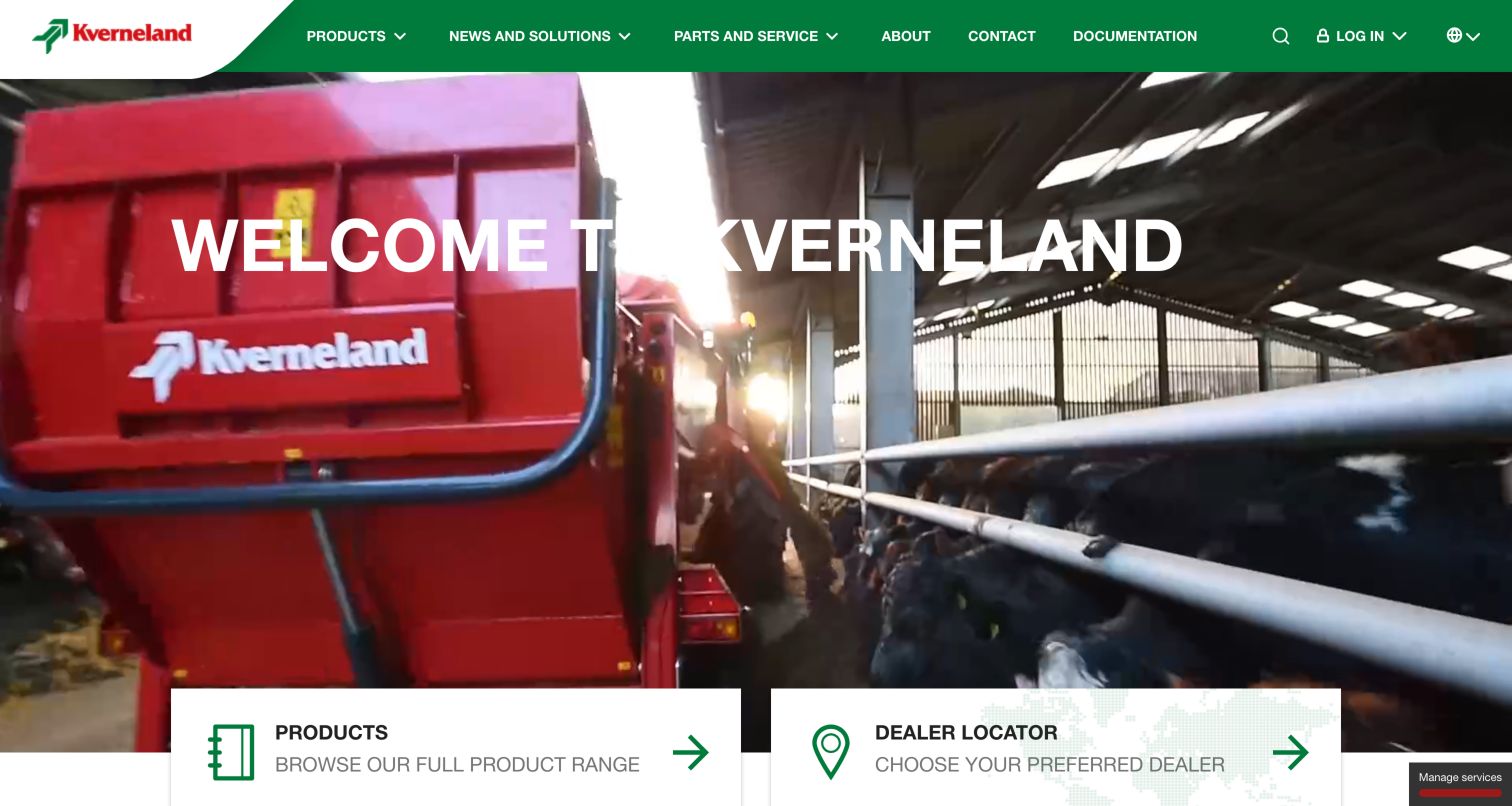
Kverneland combines a green branded header with an agricultural video opening and large paths into products and dealer discovery. The menu includes Products, News & Solutions, Parts & Service, About, Contact and Documentation, so practical reference material is visible rather than hidden in a corporate footer. A welcome message sits over the moving imagery, while the task cards provide a more stable next step. The observed site also links a download center and customer portal. This makes the homepage useful both as an introduction and as a recurring resource. The main design challenge is maintaining readable text and predictable controls while the background changes, particularly when the viewer wants a document rather than a story.
What you can learn
Use a small number of prominent task cards to anchor a video-led opening. Keep documentation discoverable in ordinary navigation and ensure the same route works when motion is paused or media cannot load.
Pros
Products and dealer discovery receive substantial visual prominence.
Documentation has an explicit navigation label.
Cons & considerations
Video backgrounds need contrast checks across different frames.
A general welcome message supplies less product detail than a category overview.
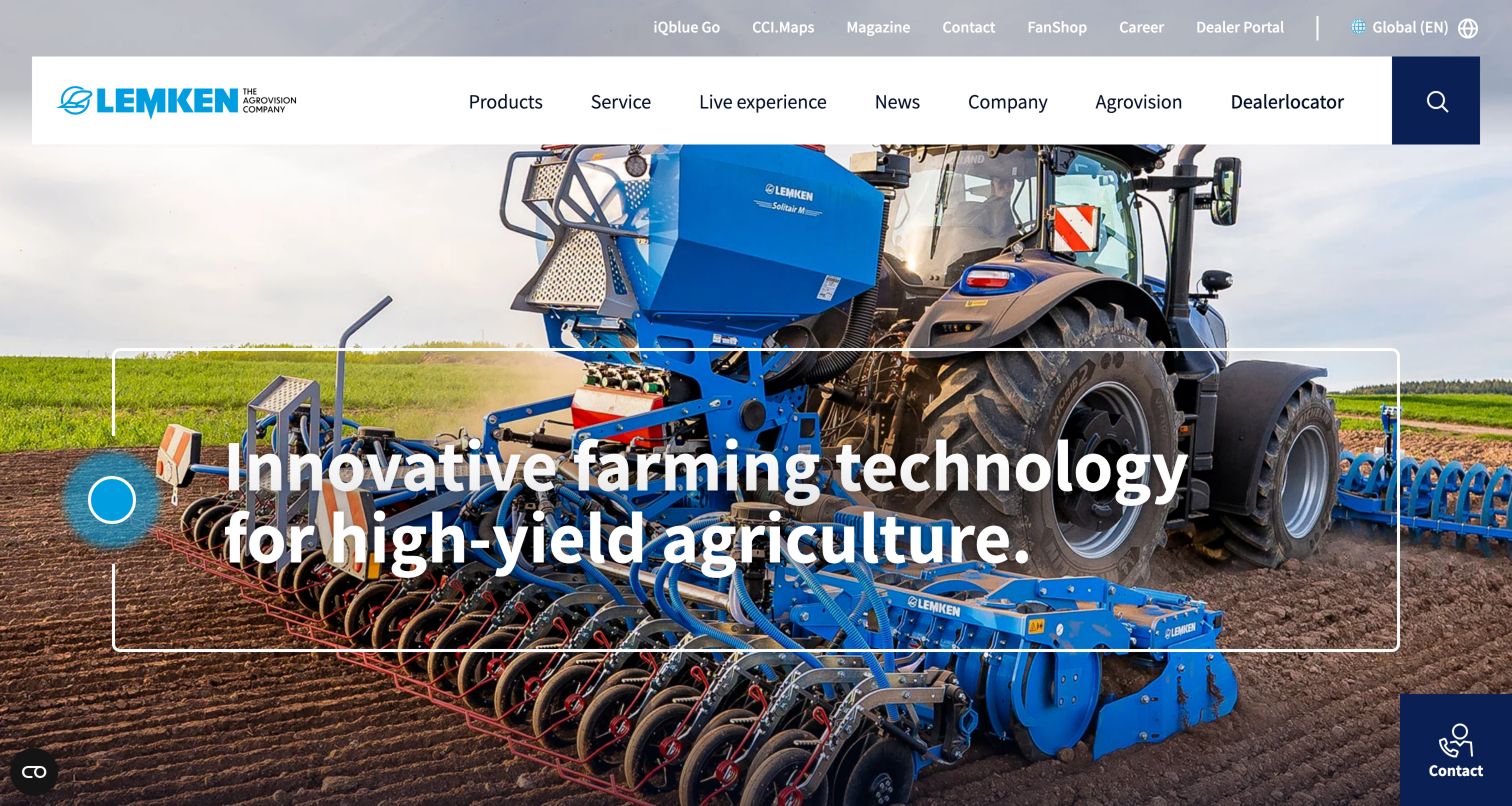
LEMKEN shows blue machinery working in a field beneath a generous white navigation bar. A large white headline and outlined frame reinforce the equipment photograph without adding several separate campaign buttons. The main menu includes Products, Service, Live Experience, News, Company and Agrovision, ending with a dealer locator and a dark search block. A smaller utility row exposes digital tools, the magazine, contact, careers and the dealer portal. That layered hierarchy gives both prospective buyers and existing users visible access points. The tradeoff is density: the page contains many labels before a visitor reaches a model, and the large headline crosses detailed machinery and field textures.
What you can learn
Separate frequently used owner utilities from the main product narrative, but test whether both navigation rows remain understandable together. Keep a direct dealer route and give text over machinery a reliable contrast treatment.
Pros
The dealer locator is a named main-navigation item.
Digital services and editorial resources have distinct utility links.
Cons & considerations
Two navigation rows create a considerable number of choices.
Large white text over detailed equipment imagery requires careful contrast testing.
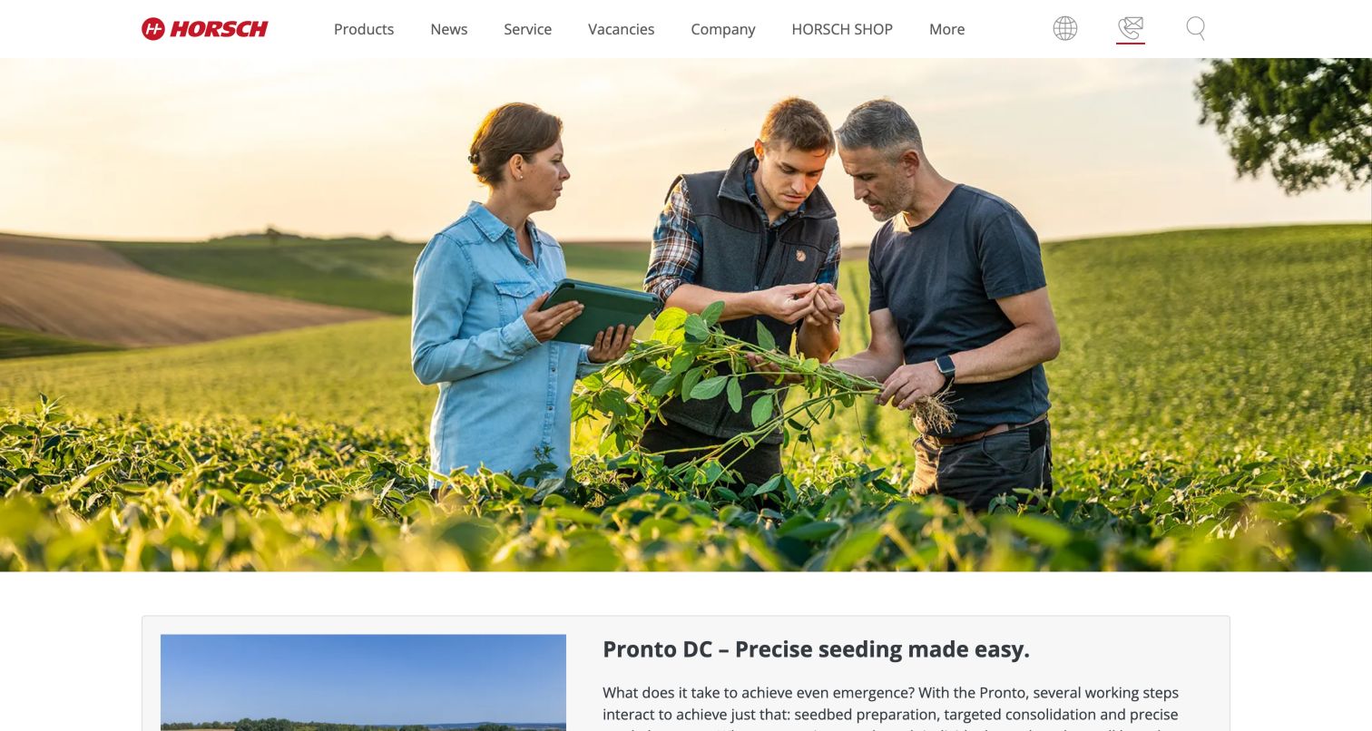
HORSCH opens with a quiet photograph of people examining a crop rather than a large sales slogan. The spacious white header and simple red wordmark leave the picture room to establish an agronomic setting. Products, News, Service, Vacancies and Company form the primary menu, with additional shop and utility controls. The next visible section introduces a named seeding product in a pale framed layout with explanatory copy, bringing the visitor from a broad farming context to a concrete machine. This approach can suit a brand whose differentiation depends on expertise and field knowledge. It also makes the first screen less explicit about the available equipment range or the fastest route to a local seller.
What you can learn
Use editorial photography to explain the manufacturer's point of view, then follow it promptly with specific products and applications. Keep urgent service and dealer tasks available even when the homepage begins with a quieter brand story.
Pros
The opening photograph connects the brand with crop knowledge.
The following section names a product and explains its purpose.
Cons & considerations
The hero itself gives little direction to a first-time shopper.
A dealer task is less prominent than the main editorial categories.
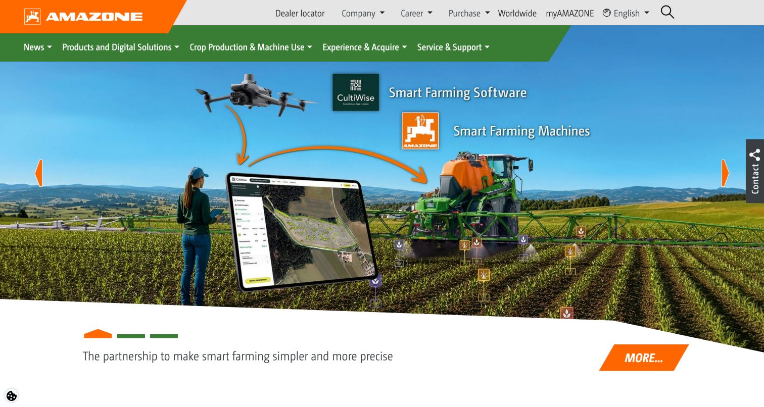
AMAZONE uses its orange-and-green identity in a deliberately technical opening. The captured graphic links field machinery, a drone and a tablet with directional marks, illustrating the idea of connected farming rather than relying solely on a beauty shot of equipment. A short partnership message and orange action sit below the diagram. The header separates practical utilities such as dealer information and the portal from the main navigation, with the angled orange logo acting as a strong anchor. This is a useful pattern when the product story includes both physical implements and digital services. The diagram communicates relationships, but it cannot by itself establish compatibility, data ownership or the performance of the illustrated workflow.
What you can learn
Use diagrams to explain how equipment and software relate, then link each relationship to specific supported products and requirements. Describe the meaning of arrows and connections in text so the story remains understandable without the graphic.
Pros
The opening makes the digital and physical product relationship visible.
The brand colors distinguish navigation and action elements.
Cons & considerations
The diagram needs supporting detail to explain actual compatibility.
A technical ecosystem story can delay direct access to an individual implement.
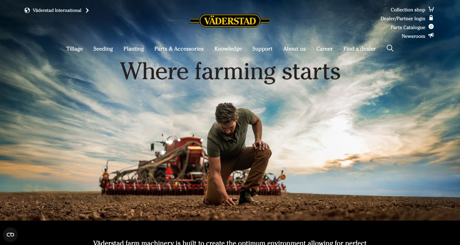
Väderstad places a person inspecting soil beneath a dramatic sky, with the yellow-and-black wordmark centered in a transparent navigation area. The short opening statement leaves the photograph to establish the agricultural context. Tillage, Seeding, Planting, Parts, Knowledge and Support are plain-language menu choices, with company and dealer functions also present. A dark introductory section and product category images continue below the hero. The useful lesson is the relationship between a simple product taxonomy and an emotional field photograph: visitors can appreciate the brand image without decoding invented category names. The transparent header does, however, place some navigation over variable photographic tones, and the first screen gives little specification-level detail.
What you can learn
Use the vocabulary farmers already apply to field operations as the catalog structure. Let imagery establish context, while keeping product categories, parts and dealer information available as stable text choices.
Pros
Tillage, seeding and planting are clear category labels.
Knowledge and support extend the site beyond initial sales.
Cons & considerations
Transparent navigation needs contrast validation over the changing imagery.
The opening does not yet explain differences between individual machines.
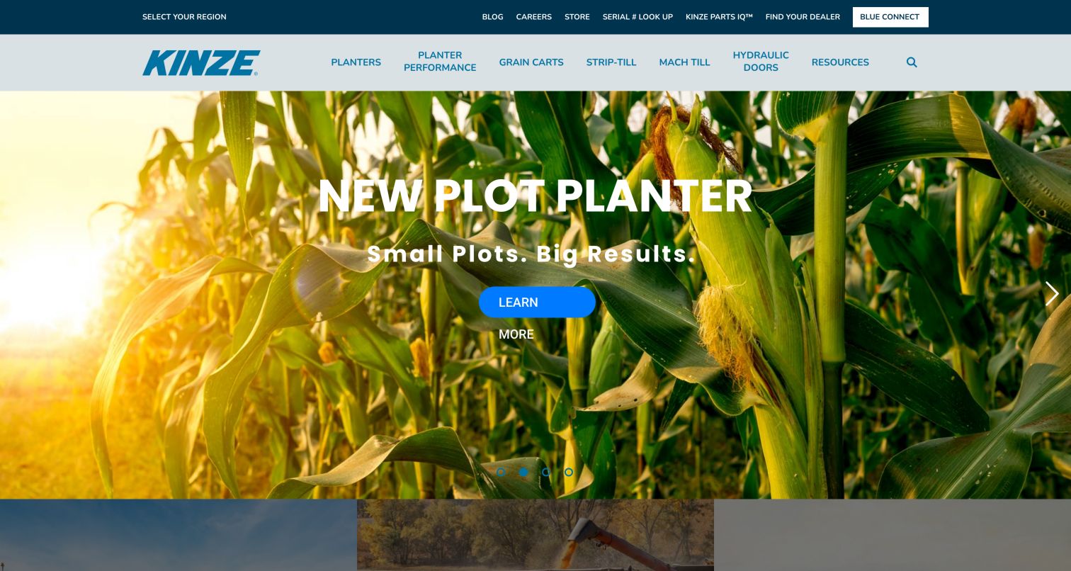
Kinze uses a blue utility strip above a pale main menu to separate owner and business functions from product families. Serial lookup, Parts IQ and dealer access appear in the upper layer; Planters, Grain Carts, Strip Till, Mach Till and other product groups occupy the main row. The captured cornfield campaign announces a plot planter with a short headline, followed by product category cards. This arrangement recognizes the specialist vocabulary of its audience and gives returning owners useful shortcuts. It also shows the burden of maintaining a dense header: several independent tools compete for space, and the captured Learn More control wraps awkwardly around its compact blue button treatment.
What you can learn
Preserve model and serial-number utilities as first-class owner tasks, while keeping the product taxonomy readable to new buyers. Test real campaign text inside buttons so a narrow design token does not break a simple action.
Pros
Owner tools are visible in the utility navigation.
The main product families use concrete equipment names.
Cons & considerations
The two-row header contains many competing destinations.
The captured campaign button had an awkward wrapped label.
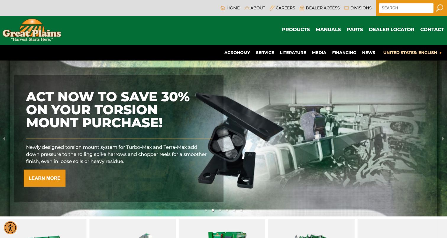
Great Plains uses green, gold and white to organize a compact but information-rich header. Products, Manuals, Parts, Dealer and Contact are immediately available, while a secondary row adds agronomy, service, literature, media and financing topics. The captured hero promotes a component-related offer using a close-up photograph, a dark text panel and a gold action. This makes the site feel useful to an owner who needs information as well as to a shopper comparing equipment. The navigation is the most transferable feature: manuals and parts do not require guessing which corporate section contains them. The tradeoff is a busy three-level opening, with the promotional panel delaying the overall equipment picture.
What you can learn
Give manuals and parts explicit labels in the primary navigation when returning owners form a major audience. Separate technical reference documents from marketing literature, and keep model or serial context visible when a visitor moves between them.
Pros
Manuals and parts can be found without entering a broad support section.
The dark campaign panel keeps copy distinct from the close-up photograph.
Cons & considerations
Several navigation rows increase scanning effort.
The component offer is narrower than a first-time visitor's catalog needs.
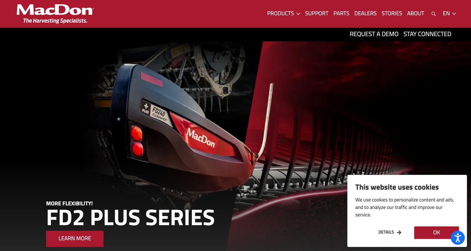
MacDon presents a dark, tightly cropped machine image beneath a red branded header. The FD2 Plus Series name and a short flexibility message receive the strongest hierarchy, with a red Learn More control leading into the product story. Products, Support, Parts and Dealers appear together in the main navigation, while Request a Demo and Stay Connected sit in a separate dark utility strip. That distinction is useful for specialist harvesting equipment, where seeing a machine operate can be part of evaluation. The opening is visually confident and focused, although the dramatic close-up offers less immediate context than a full machine in a field. A small cookie panel also occupies part of the captured lower-right area.
What you can learn
Keep demonstrations separate from general contact and explain what the inquiry will arrange. Pair launch photography with enough full-machine and application context that new visitors can understand the equipment before reading a model specification.
Pros
Parts, support and dealers are named main-navigation choices.
The demo route is visible outside the ordinary product menu.
Cons & considerations
The tight image crop requires existing product familiarity.
Floating privacy content can obscure part of the campaign image.
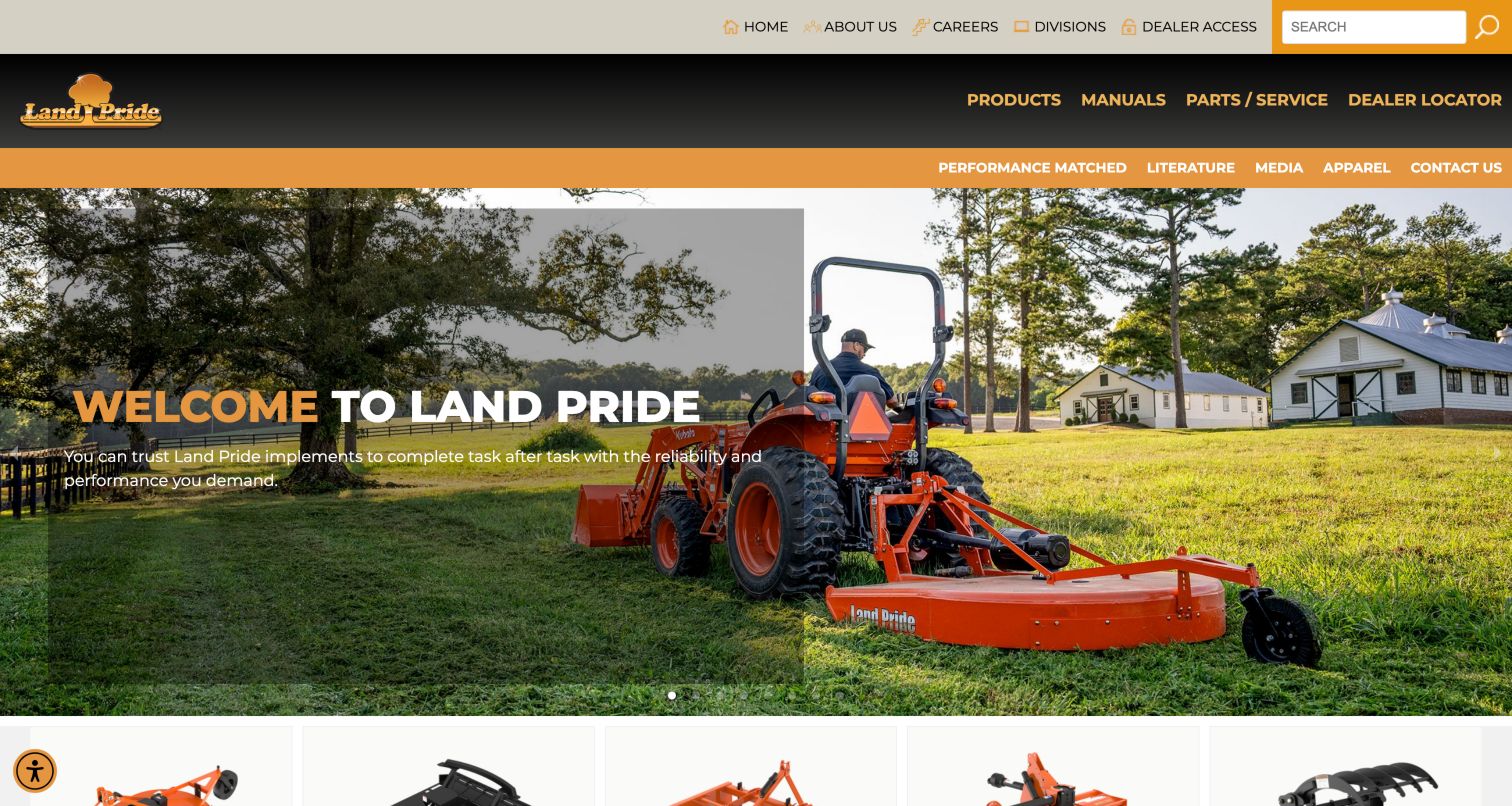
Land Pride combines a gold-and-gray identity with practical product, manual, parts and dealer navigation. The photographed tractor and mower place the attachment in a recognizable property-maintenance setting, while a simple welcome message leaves the machine visible. The observed performance-matched route is especially relevant to an attachment business: visitors need to know which equipment works together, not merely which implement looks appealing. Product cards below the opening lead toward the range without a lengthy corporate story. This is a useful example of aligning the website with an owner's actual constraint. The header still has several rows of choices, so the compatibility route needs a consistent name and position across product and support pages.
What you can learn
Treat attachment compatibility as a core catalog relationship. Show the relevant tractor or power requirements alongside product choices, preserve them in dealer inquiries and distinguish verified matches from broader application suggestions.
Pros
Manuals and parts are immediately visible in the navigation.
The equipment photograph explains the implement in use.
Cons & considerations
Multiple header rows can become crowded on smaller displays.
A general welcome headline adds little help with the first product choice.
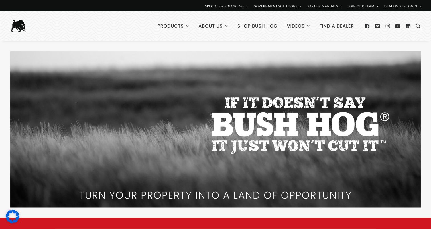
Bush Hog uses a bold, almost poster-like opening: a black-and-white field image, large slab-style lettering and a red accent strip. The small pig emblem anchors a light textured header, while a dark utility row exposes specials, government-related information, parts and dealer login. This gives the page a distinctive voice without filling the hero with several buttons. It is a useful study in brand recognition for an established equipment name, particularly when visitors may already know the product category. The same decision limits the information offered to someone arriving cold. The opening statement carries more brand attitude than machine detail, and product identification depends on the navigation and content that follow.
What you can learn
Use distinctive typography to make an established brand recognizable, but pair it with plain product categories and a clear dealer route. Ensure an unfamiliar visitor can understand what the manufacturer makes without relying on brand knowledge.
Pros
The monochrome photography and red accents create a consistent identity.
Parts and dealer utilities are visible above the main content.
Cons & considerations
The hero emphasizes the brand statement over a particular machine.
Large display lettering needs responsive checks for clipping and wrapping.
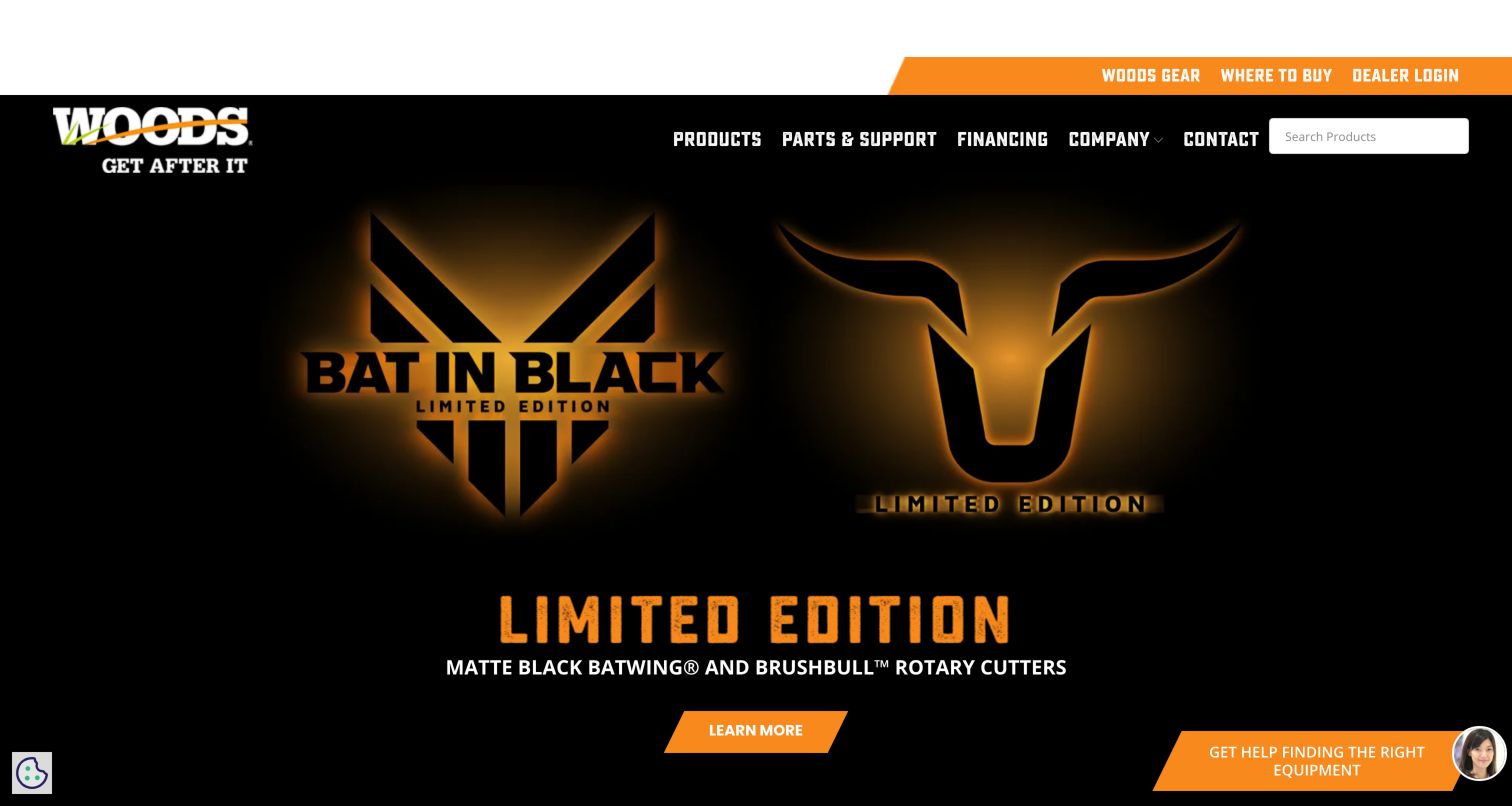
Woods Equipment uses angular black-and-orange navigation and condensed headings to create an assertive visual system. A visible product search sits alongside the menu, while Where to Buy and dealer login receive utility positions. The captured limited-edition launch uses dark imagery and glowing gold emblems, with an orange Learn More button and explanatory equipment copy below. This is a more stylized treatment than the field photographs common elsewhere in the collection. It can make a launch memorable, but the visual shorthand relies on supporting text to explain the actual rotary-cutter product. The persistent assistance control and dense header also need room around them so they do not compete with catalog or support tasks.
What you can learn
Let a special-edition campaign have its own personality while retaining the manufacturer's ordinary catalog search and buying route. Make the actual equipment category explicit near decorative launch artwork and keep service information easy to reach.
Pros
Product search is visible in the header.
Where to Buy is separated from dealer-only access.
Cons & considerations
The campaign artwork provides limited equipment detail at first glance.
Several utility and assistance elements compete at the screen edges.
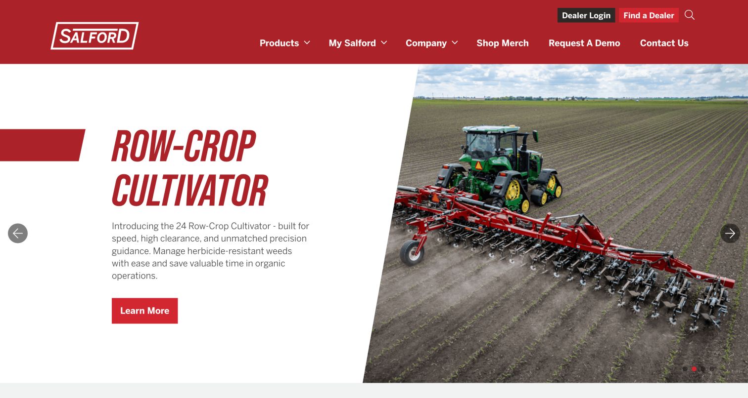
Salford's captured row-crop cultivator slide uses a clean split composition: a white text panel on the left and a broad field photograph on the right. The tall red headline establishes the equipment category, followed by a short explanation and a single red Learn More button. The photograph shows the implement behind a tractor and makes the working width and crop setting easier to understand than a cutout alone would. Above it, the red header includes Products, My Salford, Company and Request a Demo, with Find a Dealer in the utility row. This is a strong example of balancing product information and operational context, though the automatic carousel means the observed slide is only one possible entry view.
What you can learn
Give a new implement a plain category name, a concise application explanation and an image showing it working. Keep demo and dealer routes persistent across every campaign slide, and support promotional capability statements with detailed product information.
Pros
Text and photography occupy clearly separated areas.
The image gives the implement an understandable field context.
Cons & considerations
The carousel can replace this clear product explanation with another campaign.
The brief description cannot substitute for compatibility and specification detail.
Vermeer uses a yellow logo block and black navigation to divide Agriculture, Environmental and Infrastructure before listing Parts and Service. The captured hero promotes industrial-equipment financing, but the persistent industry labels give an agricultural visitor a route around that campaign. A dealer-finder strip directly below asks for industry, country and location, making the local-sales task prominent without requiring a separate menu search. Further down, Browse by Industry groups the larger assortment. This is useful for a company whose homepage has to serve buyers with very different work. The main challenge is relevance: a campaign for one market can occupy the entire opening even when another market's visitor has arrived from a farming search.
What you can learn
For a multi-market manufacturer, preserve clear industry routes and carry the selected industry into dealer discovery. Explain required location inputs and provide a useful fallback before asking a visitor to submit an inquiry.
Pros
Agriculture is an explicit primary-navigation category.
The dealer finder separates industry and country context.
Cons & considerations
The captured campaign concerns industrial financing rather than farm equipment.
The location form needs useful empty and unavailable-result states.
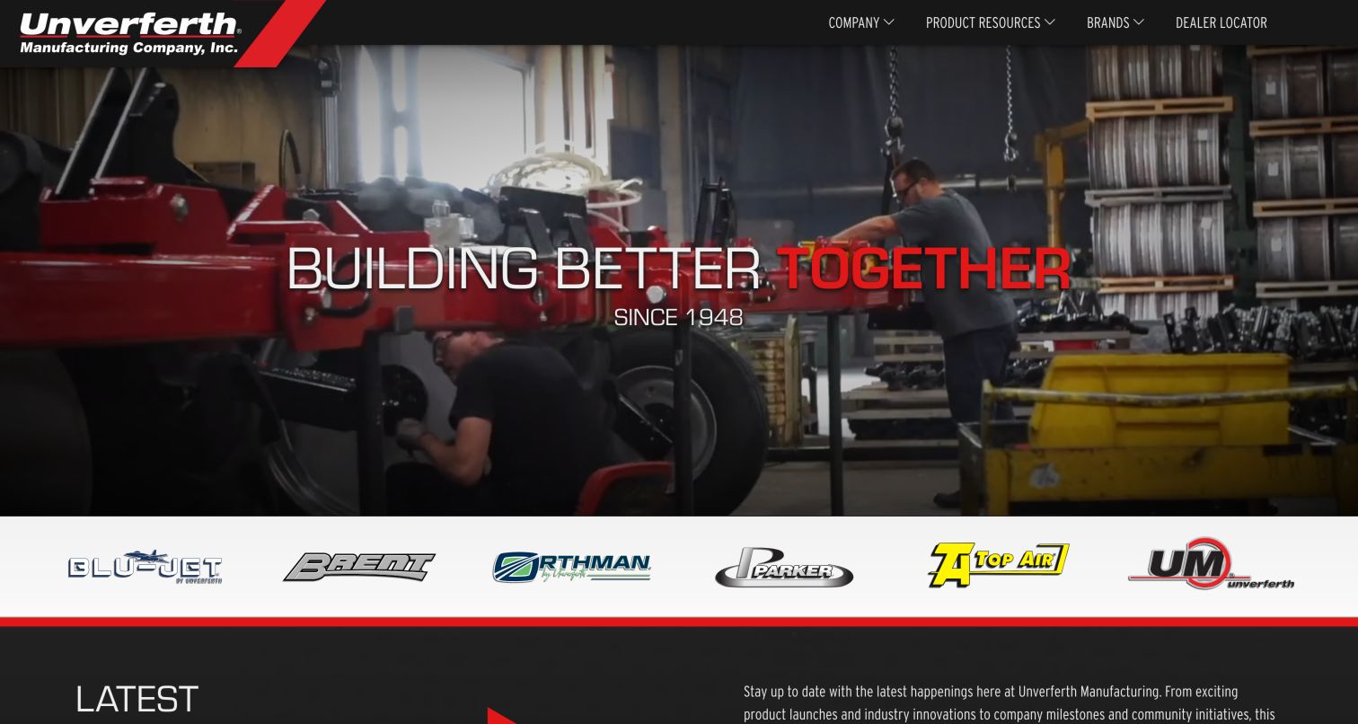
Unverferth's corporate homepage opens with a factory-floor scene and a large statement about building together. A dark header keeps Company, Product Resources, Brands and Dealer Locator as the main choices, while a horizontal strip of six genuine brand marks makes the portfolio visible beneath the hero. The observed Product Resources section includes operator manuals by brand and serial number, parts lookup, how-to videos and preseason checklists. This is a particularly useful example for a group website: it gives the parent organization a clear role without pretending every product belongs to one undifferentiated catalog. The corporate opening is less direct for a visitor who already knows the particular brand and implement they need.
What you can learn
Use a group homepage to explain the portfolio and share ownership resources. Label outbound brand destinations clearly and retain brand and serial-number context when people move between manuals, parts and the individual equipment sites.
Pros
The brand strip makes the portfolio tangible and navigable.
Product resources include specific owner tasks rather than a generic downloads label.
Cons & considerations
Factory storytelling precedes access to an individual machine.
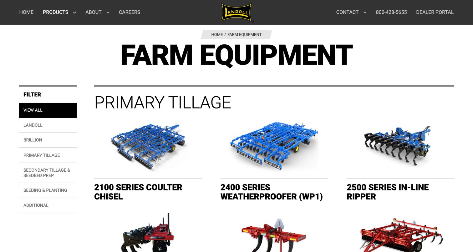
Landoll's farm-equipment page is a practical alternative to the campaign-led homepages in this collection. A large title and breadcrumb establish the section, while a left-side filter lists the two brands and field-operation categories. The main grid shows isolated equipment images with substantial model names underneath. Primary Tillage, Secondary Tillage & Seedbed Prep and Seeding & Planting provide useful agricultural groupings; a visitor can see several machines at once without waiting for a carousel. The black-and-white framework also allows the blue and red machinery to carry visual differentiation. The tradeoff is that the overview presents names and pictures more strongly than the key specification differences that might help someone compare adjacent models.
What you can learn
Organize implement catalogs by operation and make the active category clear. Add a small, consistent set of distinguishing specifications to cards when model names and photographs are insufficient, while keeping full comparison detail on the product pages.
Pros
Several products can be scanned within one stable grid.
Filters use recognizable agricultural operations and brand names.
Cons & considerations
Cards would benefit from concise specification differences.
Image and title links need clear accessible names and consistent activation areas.
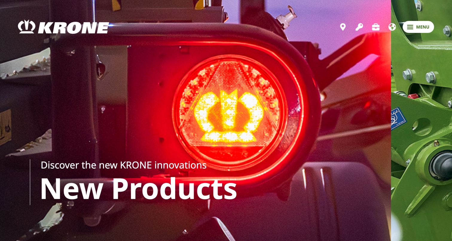
KRONE opens with an unusually close product detail: a red illuminated lamp incorporating the brand's crown mark, with a narrow neighboring image hinting at another campaign. The large New Products message and white wordmark sit over the photograph, while a compact menu button and several utility icons occupy the upper right. Below the immersive opening, the observed page lists concrete machinery categories such as mowers, tedders, rakes, balers and forage harvesters, and provides a sales-partner route. This creates a strong branded introduction without losing the eventual product taxonomy. The first screen nonetheless asks visitors to interpret icons and open a menu before seeing the full range, which may slow a task-focused returning owner.
What you can learn
Use immersive product imagery when it reveals a distinctive detail, but follow it with stable, plainly named categories. Label utility icons clearly and keep dealer and service tasks available without navigating a sequence of promotional panels.
Pros
The close-up uses an actual product detail to express the brand.
The page subsequently names specific harvesting equipment categories.
Cons & considerations
The compact menu conceals the range from the opening view.
Icon-only utilities require strong labels and recognizable meanings.
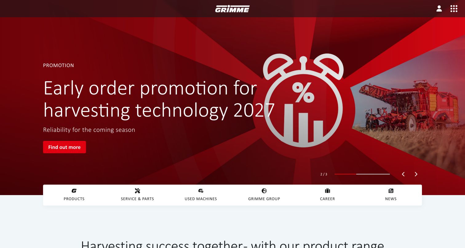
GRIMME uses a centered wordmark and a large red campaign area, then places a white task strip across the boundary into the page content. Products, Service & Parts, Used Machines, the group, careers and news are all named in that strip. The captured early-order promotion combines a clock graphic with a small harvesting scene and a single action. Further down, the site groups potato, beet and vegetable technology and points to a configurator and customer portal. This makes the homepage a junction between several parts of the equipment lifecycle, rather than only a brochure for new machines. The campaign is visually dominant, so the task strip does important work for visitors who arrive with another purpose.
What you can learn
Make the lifecycle routes visible together: new equipment, used machines, service and ownership tools. Clearly identify when each route moves to another property, and keep product family and regional context consistent across those destinations.
Pros
A stable task strip sits directly beneath the campaign.
Used machines have a distinct route beside new products and service.
Cons & considerations
The large promotion can overshadow the first product choice.
Several related properties require careful handoff and navigation consistency.
Kegan is a freelance web designer and developer with 15+ years of experience helping businesses turn complicated website requirements into clear, maintainable digital experiences. He works directly with clients from planning and design through development, launch, and ongoing support.
For farm equipment manufacturer website design, his development approach focuses on equipment comparisons, technical specifications, dealer discovery, and support resources. The scope can be a targeted improvement or a complete custom build, with responsive layouts, thoughtful content structure, and integrations chosen around the people using and maintaining the site.
Show 3 other farm equipment manufacturer website designersHide other farm equipment manufacturer website designers
Plan the journey from agricultural task to long-term ownership
Map the decisions before the model name
Interview sales and support teams about the questions buyers bring first: type of work, existing tractor, field conditions, operating width and transport constraints. Turn recurring questions into category explanations and comparison criteria. Keep specialist terminology, but define it where a first-time buyer needs help.
Build a product information model
Define families, models, variants, compatible attachments, downloadable documents and regional availability as related records. Give each specification an owner, unit and revision process. A reliable data model prevents the same product from showing inconsistent details in a card, comparison table and brochure.
Separate configuration from commitment
Explain whether a configurator creates a visual selection, an indicative price or a dealer inquiry. Show assumptions and dependencies before the handoff. Preserve the selected options in a readable summary, and make it easy to revise them without restarting the entire journey.
Design support for older equipment
Keep manuals and parts information organized by the identifiers owners actually have. Plan for discontinued models, superseded documents and replacement components. Display document language, applicability and revision clearly, with a service contact when the website cannot safely resolve a match.
Give regional routes an explicit boundary
A global manufacturer, national distributor and local dealer may each own part of the experience. Name those roles and explain the destination of external links. Keep region choices visible and avoid silently replacing a selected model with an unrelated regional homepage.
Test the catalog in realistic conditions
Review navigation, filters, comparison tables and downloads on desktop and mobile, including slower connections and large text. Test keyboard use, readable focus, image alternatives and the behavior of moving campaigns. Use test inquiries only; do not send real customer leads during interface verification.
The editing job behind the design
Choose a publishing system that can maintain equipment relationships
The publishing platform should support structured product records, regional variants, document revisions and relationships between machines and attachments. Assess how marketing pages draw from those records, how editors preview a regional change and how old model routes remain useful. A visually flexible page builder is only one part of this requirement.
Catalog search, dealer data, configuration and owner resources may come from separate systems. Define their boundaries, update ownership and fallback states before choosing integrations. Public technology observations can help identify visible services, but they do not reveal the complete private architecture or prove that another manufacturer's implementation is appropriate for your own catalog.
Our WordPress website examples offer a separate look at publishing approaches. A visible platform label is evidence for that named page, not a guarantee that the same system will suit your requirements.
Before the public launch
Farm equipment website planning checklist
Organize products by recognizable agricultural operation and family.
Explain series and model naming near the point of selection.
Use consistent units and specification labels across comparisons.
State attachment, implement and interface compatibility clearly.
Separate configuration summaries from confirmed dealer quotations.
Make sales, service, parts and demonstration routes distinguishable.
Preserve region and product context in distributor handoffs.
Provide manuals for relevant current and older equipment.
Label document language, applicability and revision.
Keep stable catalog routes available beside rotating campaigns.
Check keyboard operation, focus, text contrast and motion controls.
Define owners and review dates for product, dealer and support information.
These checks are a project checklist, not a performance, legal, security, or accessibility certification. Test real journeys with the people responsible for the website before making claims about the result.
Sources & editorial method
How this collection was selected and reviewed
Original selection: We reviewed the public official pages and captured the examples directly in a browser on November 5, 2026. Screenshots retain their actual page URL, capture date, dimensions and attribution. The selection follows the saved random target of thirty distinct website properties; related brands can share a corporate parent while operating separate public properties. Reviews describe the observed interface and public content, with separate evidence for any reported web technologies. No machinery was tested, no real inquiry was submitted and no performance, inventory, financing or accessibility certification is implied. On November 5, 2026, Tilmor was reviewed and added as Editors Choice in the first slot, bringing this collection to 31 examples. All earlier reviews and their original capture dates are retained. The badge is an editorial design selection, not a user-vote award or an endorsement of the organization’s services.
Each example links to its actual source page. Screenshots are direct browser captures with their own capture dates; moving imagery, announcements and live designs can change. The notes describe observable design choices and conditional tradeoffs, not measured traffic, conversion results, service quality, or accessibility conformance.
Technology labels use public page metadata, asset evidence, or explicitly cited platform documentation. Platform documentation is not a complete current deployment audit. A component reference may be legacy or unused; it is not a complete backend inventory. Unknown stacks are omitted. These sites are editorial examples, not our client portfolio.
Written, Edited and Curated are separate editorial records, not timestamps advanced by a rebuild. Website designs and imagery belong to their owners. See our editorial standards or suggest a correction.
What should a farm equipment manufacturer's homepage prioritize?
Give visitors a clear route into product families, dealer discovery and owner support. The exact order depends on the audience: a broad manufacturer may start with operations or industries, while a specialist can make a narrow equipment range immediately visible. Campaign content should leave those stable tasks easy to find.
Should equipment be organized by model or application?
Both routes can be useful. Experienced owners often arrive with a model identifier; new buyers may start with an agricultural task or an existing tractor. Connect the two views through consistent product records so the same machine has the same specifications and support information in either path.
How should a website handle attachment compatibility?
Publish the supported relationships and requirements maintained by the manufacturer, with enough model and regional context to avoid ambiguous matches. Distinguish a verified compatibility record from a general application suggestion. Provide a qualified support route when a combination needs individual confirmation.
Does every manufacturer need an online configurator?
A configurator is useful when it helps visitors understand meaningful options and produces a clear handoff. A well-structured comparison and specification system may be more valuable first. Define what the output represents, especially when pricing, inventory or fit still requires dealer confirmation.
How can the website support customers after purchase?
Make manuals, parts, service and maintenance information available through plain navigation and useful model or serial lookup. Keep older equipment records accessible, explain document applicability and provide a fallback contact when the public information cannot resolve the owner's question.
A useful farm equipment website helps visitors understand a machine in the context of their work and keeps that context intact through dealer contact and ownership. Start with dependable product relationships and support information, then use campaigns and imagery to make the range easier to understand.