Best Dermatology Websites of 2026 (30 Real-World Examples)
Dermatology websites that distinguish medical services, elective treatments and practical access
These 30 dermatology-related websites explore clinician-led practices, regional groups, specialist institutions and online services, with particular attention to clear service boundaries and responsible enquiry design.
Dermatology websites can combine medical appointments, surgical services, cosmetic consultations, retail products, research and online care. Those activities should not be presented as one interchangeable purchase. A useful site explains the organisation, the responsible professionals and the route relevant to the visitor, then makes location, appointment type and practical access easy to establish.
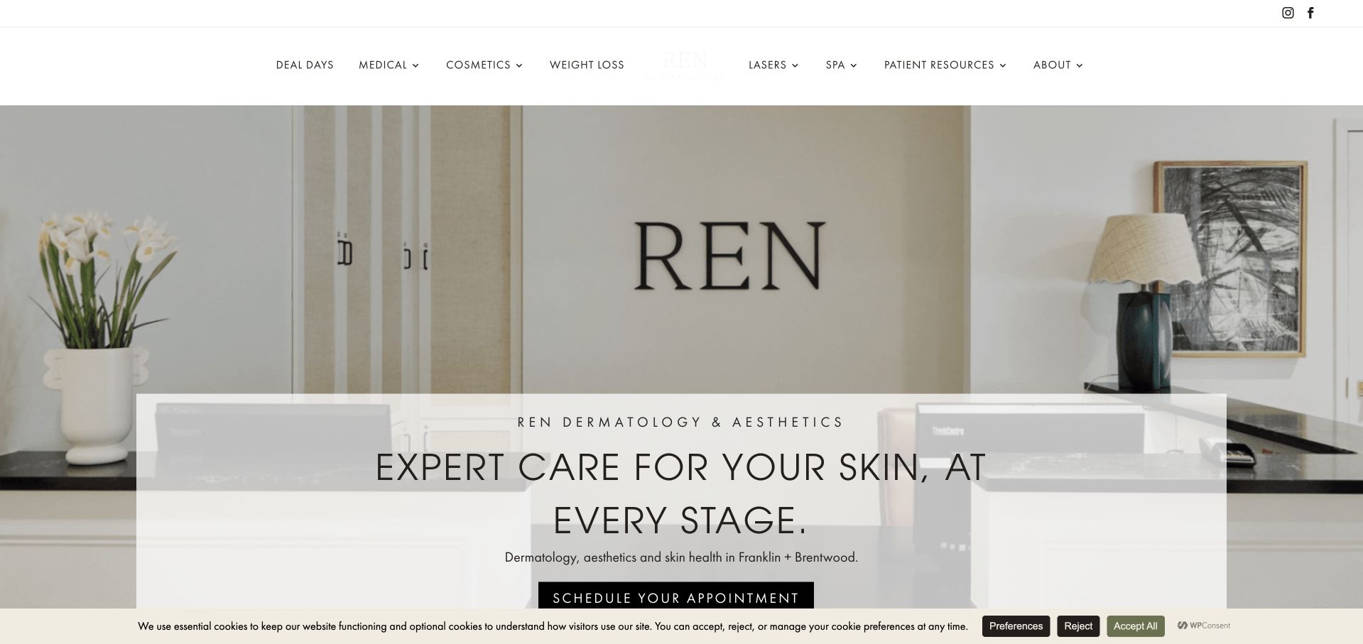
REN Dermatology is our Editors Choice for a restrained regional-practice identity grounded in an actual reception environment and clearly named service categories. The inspected page introduces Franklin and Brentwood and keeps medical and aesthetic interests recognisable within one brand. This recognises presentation and information design, not an independent assessment of care quality, clinical claims or individual suitability.
The collection includes consumer-facing online skincare services as contrasts to conventional clinics, not as equivalent models of care. Their account, subscription and professional-review journeys need different explanations. Likewise, a university-linked or not-for-profit institution may serve patients, researchers and clinicians through separate routes. Borrow the information architecture that matches the actual organisation rather than copying a fashionable skincare aesthetic wholesale.
Before the examples
What makes good dermatology website design in 2026?
Separate medical, cosmetic and retail intentions
Give each a descriptive destination and explain who provides the service. Product browsing, a cosmetic consultation and a medical appointment have different purposes. Do not let a monthly offer or celebrity campaign become the only visible description of an organisation that also provides clinical services. Keep existing-patient resources and secure portal access distinct from new enquiries.
Make professional roles and locations understandable
Use current named profiles with accurate roles and practice locations. A multidisciplinary group may include different kinds of professional; the interface should not imply identical credentials across every service. Attach each office to clear contact and access information. A prestige headline, device photograph or provider badge cannot replace substantive practitioner and appointment detail.
Treat remote care and image uploads as specific workflows
Explain how an online service operates, who reviews the information, relevant geographic limits and how an in-person next step is handled where appropriate. The AAD’s public telemedicine information makes clear that a dermatologist may need to see a patient in person. Do not invite sensitive photographs into a generic public contact form or imply that a website can determine the right format for every concern.
The collection · 30 examples
30 dermatology websites worth studying
Study how each page separates its service branches and what a visitor learns before clicking the first action. The visual style may be calm, editorial or campaign-led; the important question is whether the person can identify the correct clinical, elective or retail route.
REN Dermatology uses a quiet neutral palette, generous spacing and a photograph of its actual reception environment. The opening identifies dermatology and aesthetics in Franklin and Brentwood, while a translucent introductory panel keeps the main service message visible over the image. Supporting navigation separates medical services from other offerings, giving visitors more than a single undifferentiated appointment action. This is a useful regional-practice example because the physical setting and restrained typography work together without turning the first screen into a wall of device brands. Medical and aesthetic journeys still need clear distinctions beyond the shared brand presentation.
What you can learn
Use the practice environment to establish a recognisable setting, then separate medical and elective-service research into clear routes. Keep local information and appointment expectations easy to find, rather than asking a calm visual identity to communicate all the practical detail.
Pros
The reception photograph makes the regional practice tangible rather than relying on generic beauty imagery.
A restrained palette gives the service categories and navigation room to remain readable.
Cons & considerations
A translucent text panel needs contrast testing over every responsive image crop.
Medical, aesthetic and retail offerings require distinct explanations despite sharing one visual identity.
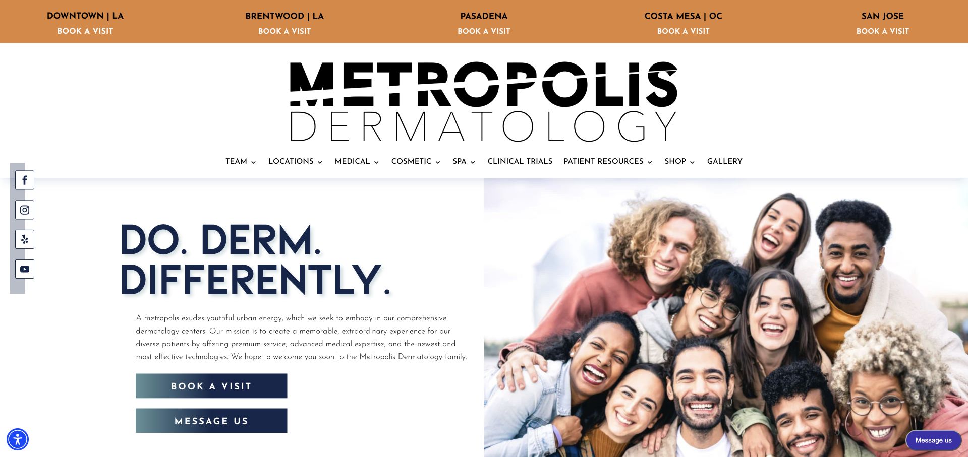
Metropolis Dermatology uses bold black typography, warm orange accents and a large group photograph to establish an energetic identity. The page feels deliberately more editorial than a conventional pale-blue healthcare template. A concise opening message and appointment action sit beside the people image, while the header handles locations and practice navigation. This is useful for studying how a larger practice can remain visually human. The expressive tone should not replace literal service information, and the group photograph still needs named profiles and location-specific detail so visitors understand who and where the organisation represents.
What you can learn
A memorable wordmark and bold headline can distinguish a practice, but pair them with clear service and location language. Use real people as an introduction, then provide meaningful clinician profiles and office-specific appointment information beyond the group image.
Pros
The bold typography and orange accent system create a recognisable identity across the opening.
Real team imagery gives the multi-location brand a human reference point.
Cons & considerations
A conceptual headline communicates less practical information than a descriptive service introduction.
Large group photography needs careful mobile cropping and accessible alternatives to convey the same context.
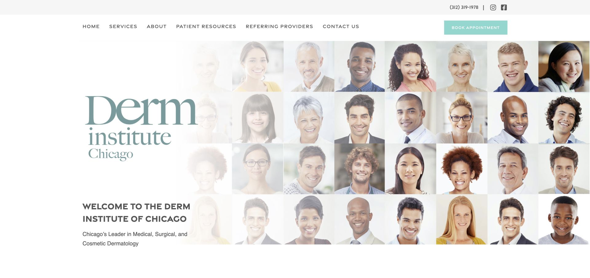
Derm Institute of Chicago uses a pale neutral layout, a large serif identity and a mosaic of clinician portraits. Instead of one dominant treatment photograph, the visual emphasis is on the people within the organisation. The following content separates medical, surgical and cosmetic services into recognisable categories. That is useful for a practice whose scope cannot be represented by a single promotional procedure. The mosaic is visually engaging, but visitors still need a way to connect an individual face to a name, role, location and appointment route rather than treating the image itself as a complete team directory.
What you can learn
A team mosaic can introduce scale without making the practice anonymous. Connect it to accessible named profiles and divide medical, surgical and cosmetic information into clear destinations, so visitors can research a service without confusing visual familiarity with professional suitability.
Pros
The portrait mosaic creates a people-led identity rather than a device-centred first impression.
Distinct service branches make the broader practice easier to understand.
Cons & considerations
Faces alone do not explain clinician roles, credentials or office availability.
Large visual areas can delay practical appointment and location information without a strong supporting hierarchy.
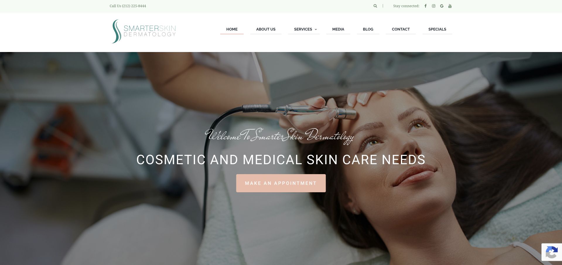
SmarterSkin Dermatology uses a clinical treatment photograph, a dark overlay and a restrained peach action to introduce its Tribeca practice. The opening names both medical and cosmetic skin care rather than presenting the organisation only as a beauty brand. Further content introduces the named dermatologist and separates treatments and packages into supporting destinations. This gives the practice a clear personal and local frame, although the broad introductory wording and large image postpone some of the more specific appointment information. Package and cosmetic material needs particular separation from medical enquiries so different visitor intentions do not become one sales journey.
What you can learn
If a practice combines medical and cosmetic services, name both clearly and give them separate research paths. Introduce the responsible clinician in substantive copy, and keep package promotions from obscuring practical information about medical appointments, referrals and access.
Pros
The opening makes the combined medical-and-cosmetic scope explicit.
A named clinician introduction supports the practice identity beyond the brand and treatment photograph.
Cons & considerations
The large image and broad heading delay more specific service and location details.
Packages and treatment promotions need clear separation from the medical appointment journey.
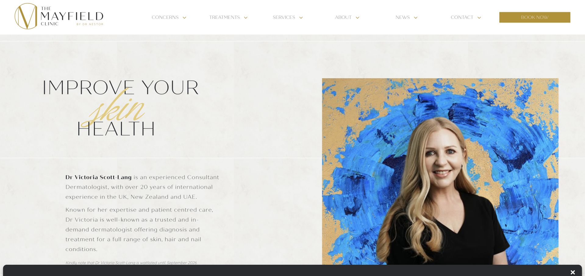
The Mayfield Clinic’s dermatology page uses a pale textured background, gold accents and a large portrait against colourful artwork. The supporting text names the dermatologist and explains the service within the wider clinic rather than leaving visitors to infer the professional role from the brand. This is useful for a multidisciplinary or aesthetics-led organisation: an individual service page can clarify who provides the medical discipline. The page is visually elegant, but widely spaced type and extensive biography copy demand careful readability testing.
What you can learn
Give a specialist clinician a dedicated service destination inside a broader clinic website. State their role clearly, distinguish dermatology from neighbouring services and maintain availability notices as carefully as the biography, particularly when an old waitlist date could confuse new visitors.
Pros
The named practitioner portrait and role make the dermatology service identifiable within the larger clinic.
A dedicated page gives the discipline more context than a small service-grid label.
Cons & considerations
Widely spaced, low-emphasis typography can make substantial biography text harder to read.
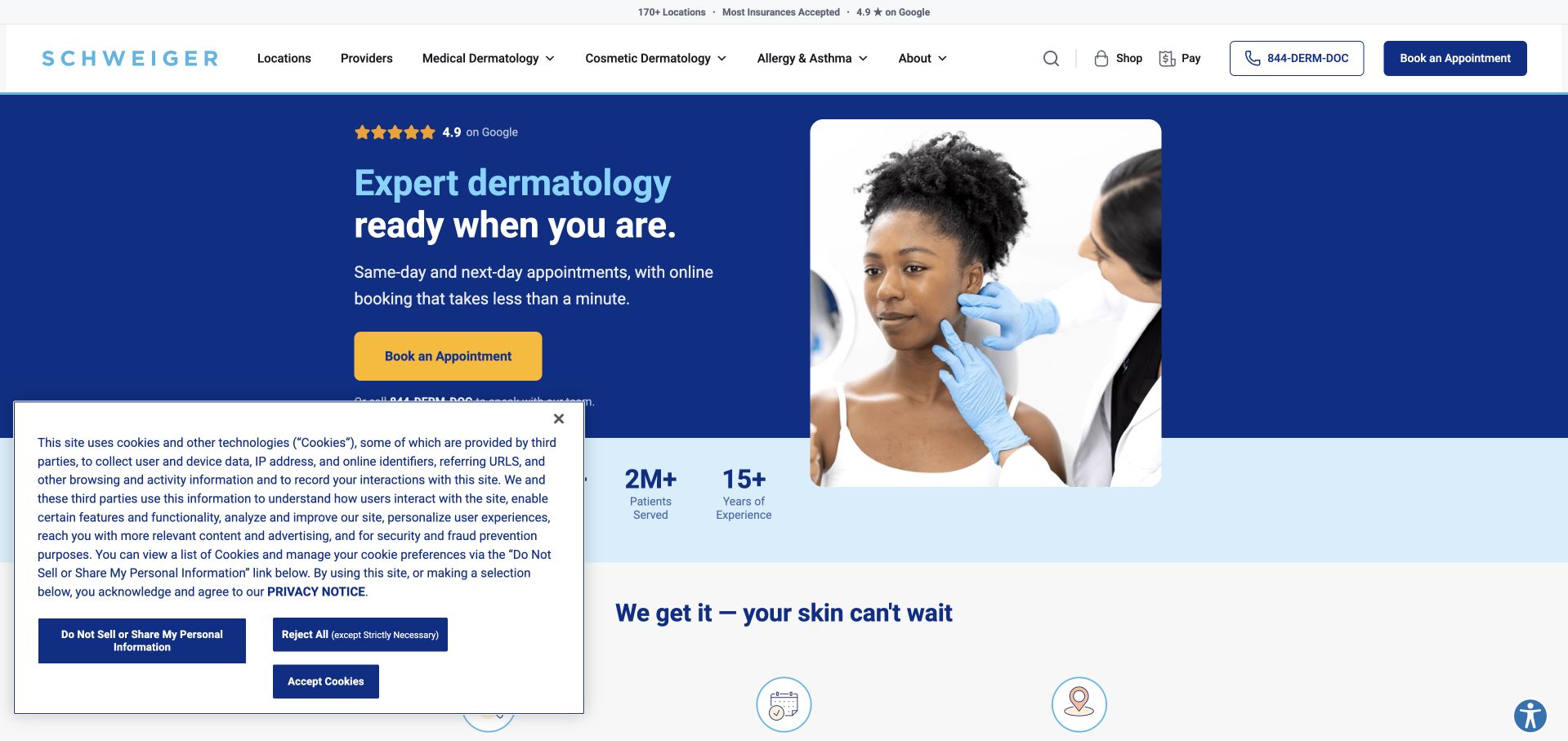
Schweiger uses a strong blue hero, a clinical photograph and a prominent appointment action. Supporting sections explain the service through a small set of access-related themes, including local care and appointment timing, followed by a provider-finding route. The structure recognises that a large healthcare brand is not enough on its own: visitors need a relevant clinician and location. This is useful for studying a network-scale service journey rather than a boutique-practice story. Availability language remains a live operational claim, and accessibility tooling should be treated as a supplement to sound page design rather than proof that every interaction is accessible.
What you can learn
For a large network, make provider and location discovery part of the primary journey. Keep availability statements specific and maintained, and test the underlying navigation, forms and reading order rather than assuming an added accessibility tool resolves every barrier.
Pros
The appointment action and provider-finding structure support a concrete next task.
A short thematic explanation is easier to scan than a long network-wide introduction.
Cons & considerations
Broad appointment-timing claims need local and service-specific qualification.
Additional privacy and accessibility controls can crowd the initial view if not carefully integrated.
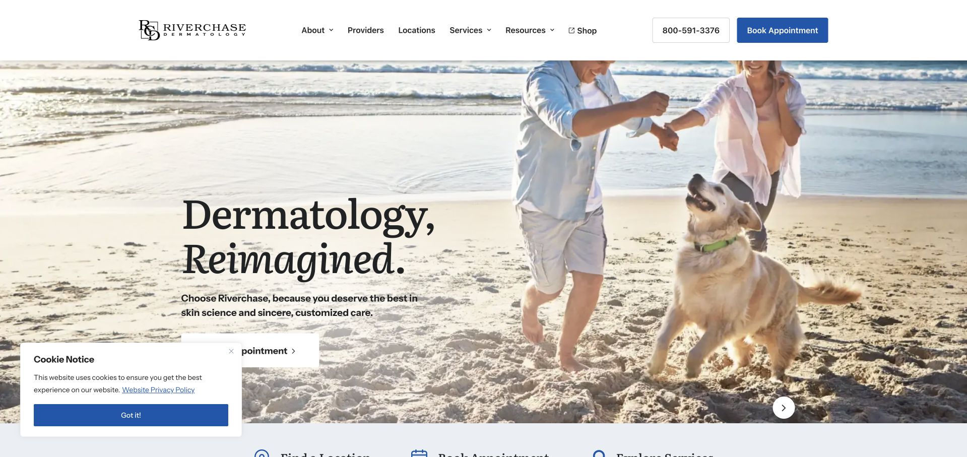
Riverchase Dermatology uses a broad lifestyle photograph, a restrained serif headline and a clear booking action. The opening is more atmospheric than procedural, while subsequent content introduces different service areas and the larger provider network. This gives the site room to present medical dermatology alongside other offerings without fitting every category into one crowded hero. The design is useful for studying how large photography can establish a tone, but the practical location and service-selection route must remain obvious. Rotating campaigns and seasonal messages also create maintenance work that a smaller static practice homepage may not require.
What you can learn
A lifestyle-led introduction should quickly hand off to a clear service and location directory. Keep appointment routes stable outside rotating campaigns, and make sure each promotion is relevant, current and distinct from information about medical assessment.
Pros
The restrained typography gives the large image a clear supporting rather than purely decorative role.
The wider service structure accommodates several categories within one regional brand.
Cons & considerations
Large lifestyle imagery supplies limited detail about an actual appointment or clinic environment.
Rotating and seasonal content needs active maintenance to avoid competing with essential service information.
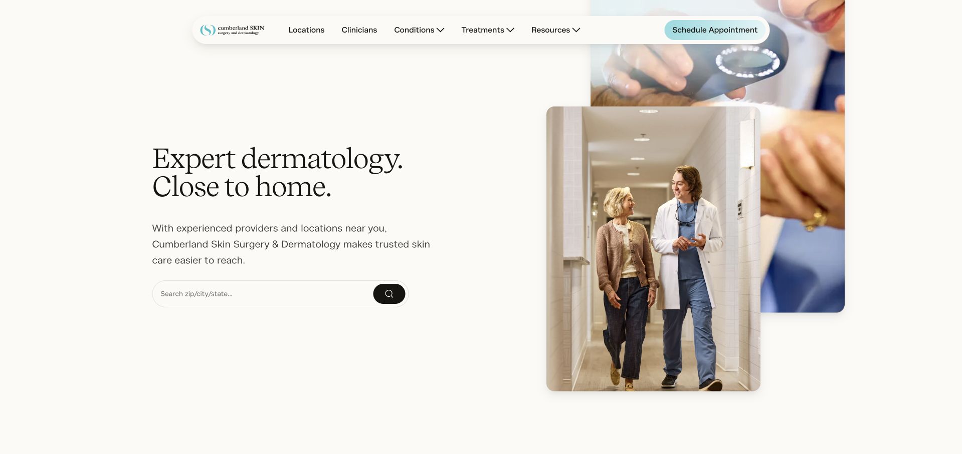
Cumberland Skin uses generous white space, a serif service statement and a small cluster of warm clinic photographs. The opening centres local access rather than a particular cosmetic procedure. Further content explains the broader medical and cosmetic offering and introduces the people behind the service. This makes the page useful for studying a restrained alternative to the full-screen promotional video. Its strongest feature is the relationship between a concise access message and subsequent provider detail. The broad “close to home” idea still needs a usable location finder and precise office information to become practical for an individual visitor.
What you can learn
A local-access message works only when visitors can quickly identify a relevant office and service. Pair a restrained introduction with a clear location directory, named provider profiles and appointment expectations, rather than relying on a broad convenience claim.
Pros
The spacious composition keeps the opening readable without an oversized promotional image.
Provider-oriented supporting content adds substance to the local-access positioning.
Cons & considerations
A broad convenience message does not establish which office is suitable for a particular enquiry.
Several small photographs need purposeful selection so they contribute context rather than visual clutter.
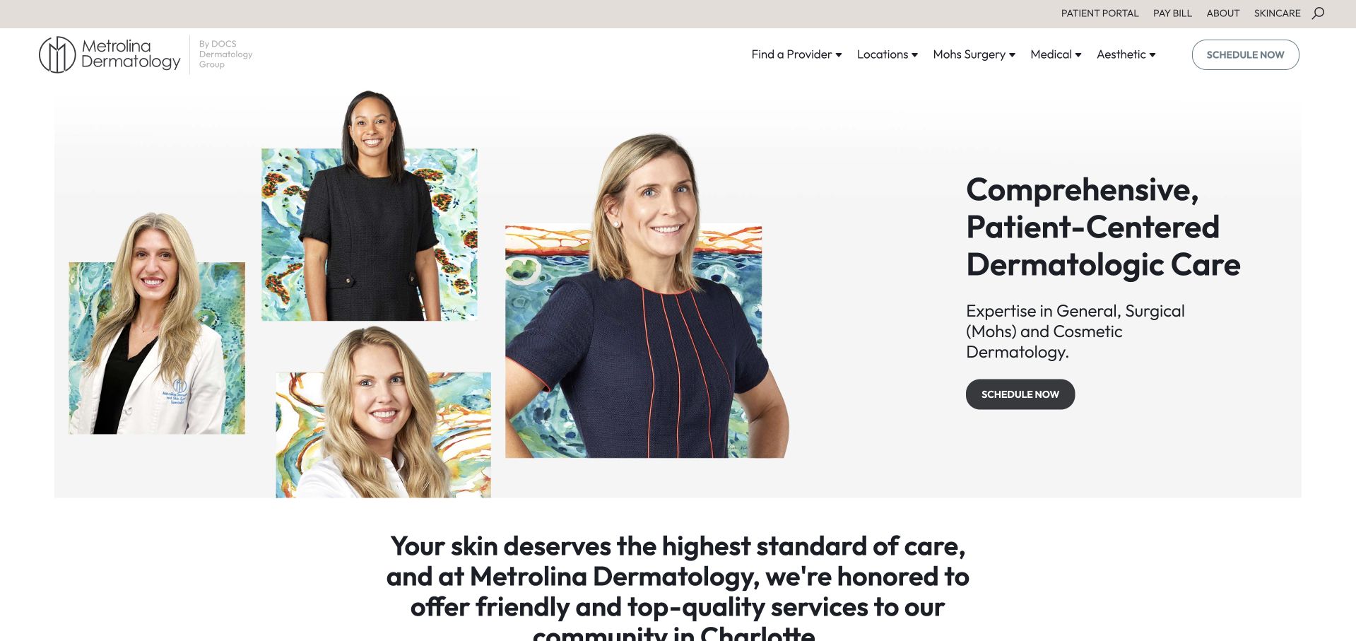
Metrolina Dermatology uses a white background, dark introductory typography and a collage of provider portraits. The main action remains distinct beside a concise service statement, while the supporting copy establishes the Charlotte community context. The image treatment makes the people in the practice more visible than a single device or procedure would. This is useful for studying a team-led introduction without an institutional feel. The page also gives substantial space to promise and testimonial material, so the practical service categories, clinician roles and appointment details need enough prominence to remain easy to locate.
What you can learn
A provider collage can humanise a practice when it links to meaningful profiles and clear service roles. Use testimonials as supporting material, not as a replacement for practical information about medical appointments, cosmetic consultations, location and access.
Pros
The portrait collage creates a recognisable team identity within a restrained layout.
A clear action beside the introduction gives the first screen an understandable next step.
Cons & considerations
Promise and testimonial sections can delay the concrete service information visitors need.
A group of portraits does not itself explain professional roles or individual appointment availability.
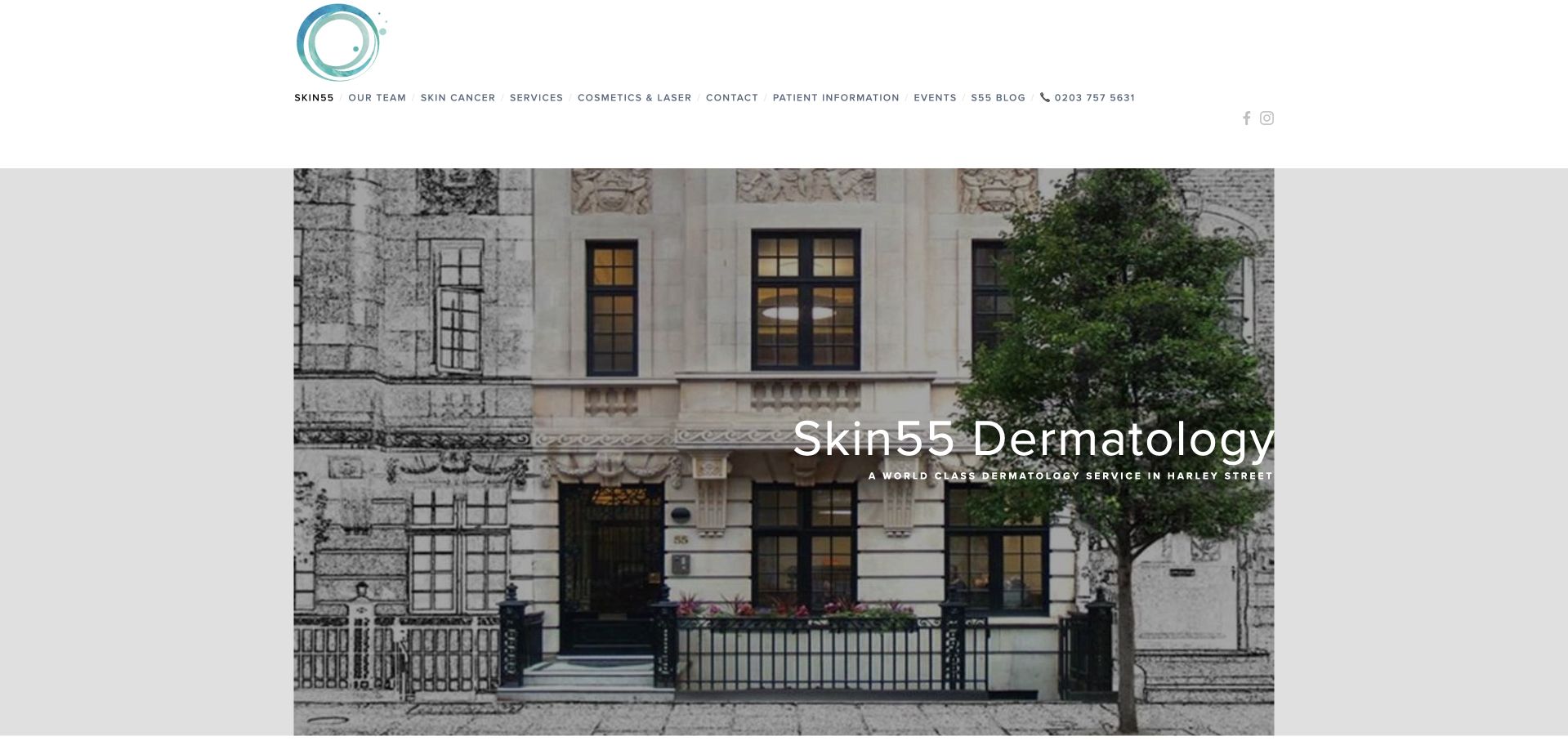
Skin55 Dermatology uses a photograph of its building frontage beneath a compact white navigation area. The practice name remains central over the image, with the fuller service explanation arriving below. This makes the location feel tangible rather than relying on an anonymous skincare portrait. Supporting copy describes the range of medical, surgical and aesthetic work, while booking information is stated directly. The design is useful for studying an understated premises-led introduction, but the opening needs descriptive text to explain what visitors can do there.
What you can learn
Use real building photography when it helps visitors recognise the clinic, but pair it with a literal service description and usable appointment route. Make the differences between medical, surgical and aesthetic enquiries clear before introducing extensive prestige or testimonial material.
Pros
The building image gives the practice a concrete physical identity.
The supporting content explains a broader service scope than the first photograph alone could convey.
Cons & considerations
A name-led hero delays the fuller explanation of services and appointment types.
Prestige wording and quotations need context rather than being treated as independent evidence of care quality.
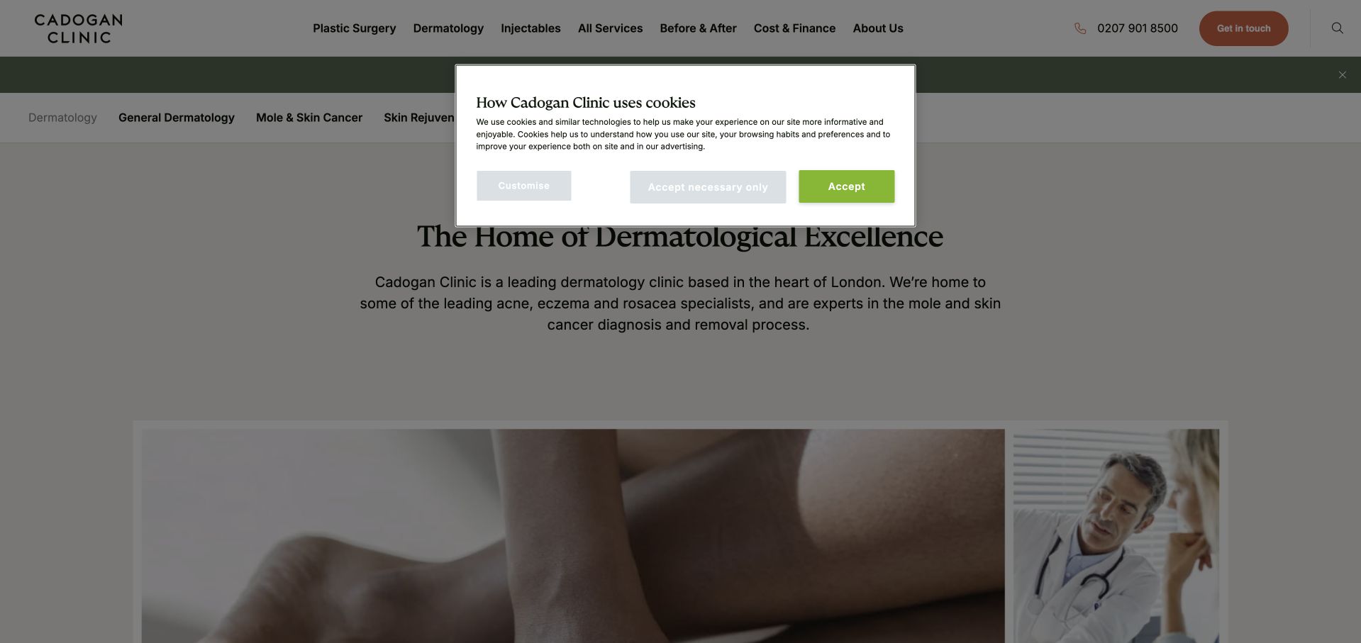
Cadogan Clinic’s dermatology page sits within a broader clinic navigation but gives the discipline its own heading and service explanation. The page introduces dermatological categories, clinicians and facilities rather than relying only on the organisation’s general brand. This is useful for a clinic where visitors could otherwise confuse dermatology with surgery or aesthetic services. The initial view includes a privacy notice over part of the content, illustrating why first-visit usability needs review in its real state.
What you can learn
A broad clinic should give dermatology a dedicated, clearly labelled service destination. Separate medical scope, responsible practitioners and appointment arrangements from wider promotional material, and review the first visit with privacy controls visible rather than assuming an unobstructed page.
Pros
Dermatology receives a substantive page rather than only a label in a general services menu.
The content creates routes into service categories and practitioner information within the wider clinic.
Cons & considerations
The initial privacy notice interrupts the first-view reading experience.
Awards and prestige-oriented headings need supporting context and should not displace practical service information.
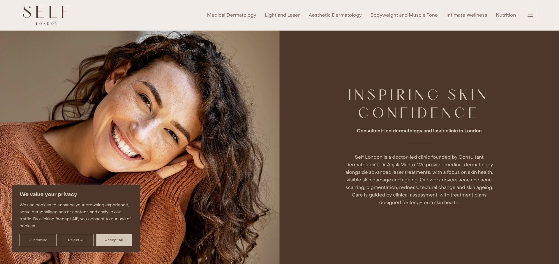
Self London uses a warm brown palette, large serif typography and a close-up portrait to create a distinctive first screen. The introductory copy names the consultant-led dermatology and laser service, identifies its founder and explains the relationship between medical care and elective treatments. That substance prevents the visual treatment from reading only as a beauty campaign. The navigation and booking route remain restrained, giving the opening a clear hierarchy. The design’s main challenge is balancing its editorial mood with practical appointment detail, especially when a cookie panel and long introductory explanation share the initial screen.
What you can learn
A distinctive visual mood can coexist with a clear medical-service identity. Name the responsible practitioner and separate medical dermatology from elective treatment research, then provide practical appointment, location and access details without requiring visitors to decode the brand language.
Pros
The warm palette and typography create a recognisable identity beyond conventional clinical blue.
The introduction names the clinician-led service rather than relying only on aesthetic imagery.
Cons & considerations
Large portrait-led art direction postpones some practical appointment information.
Privacy controls and substantial introductory copy compete for space in the first view.
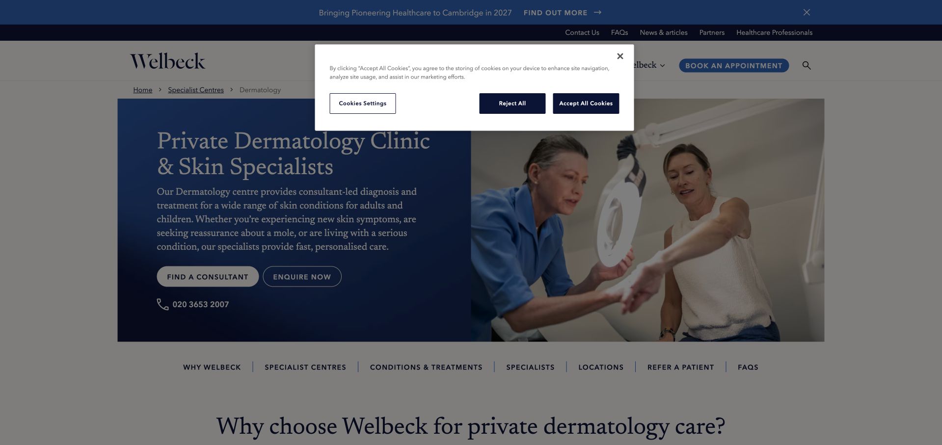
Welbeck’s dermatology page uses a blue introductory panel, a consultation photograph and a descriptive service heading. The content distinguishes dermatology from the wider healthcare organisation and explains both adult and paediatric scope. Supporting sections then introduce the department’s service areas and facilities. The page is useful for studying how to give one specialty a clear identity without detaching it from a larger network. The institutional header and first-visit controls add substantial visual overhead, however, so service selection and appointment information need to remain easy to find beneath the broader navigation and promotional messages.
What you can learn
Give each specialty its own literal heading and practical service summary within a multi-specialty site. Connect visitors to the relevant clinician and location, and avoid allowing network-wide announcements or facility claims to overshadow the specific appointment journey.
Pros
The descriptive heading identifies the dermatology department without requiring prior knowledge of the organisation.
A dedicated introduction explains service scope within the wider healthcare network.
Cons & considerations
Institutional navigation and announcements create a dense layer before the specialty content.
Facility and scale claims require context rather than being mistaken for individual suitability or quality evidence.
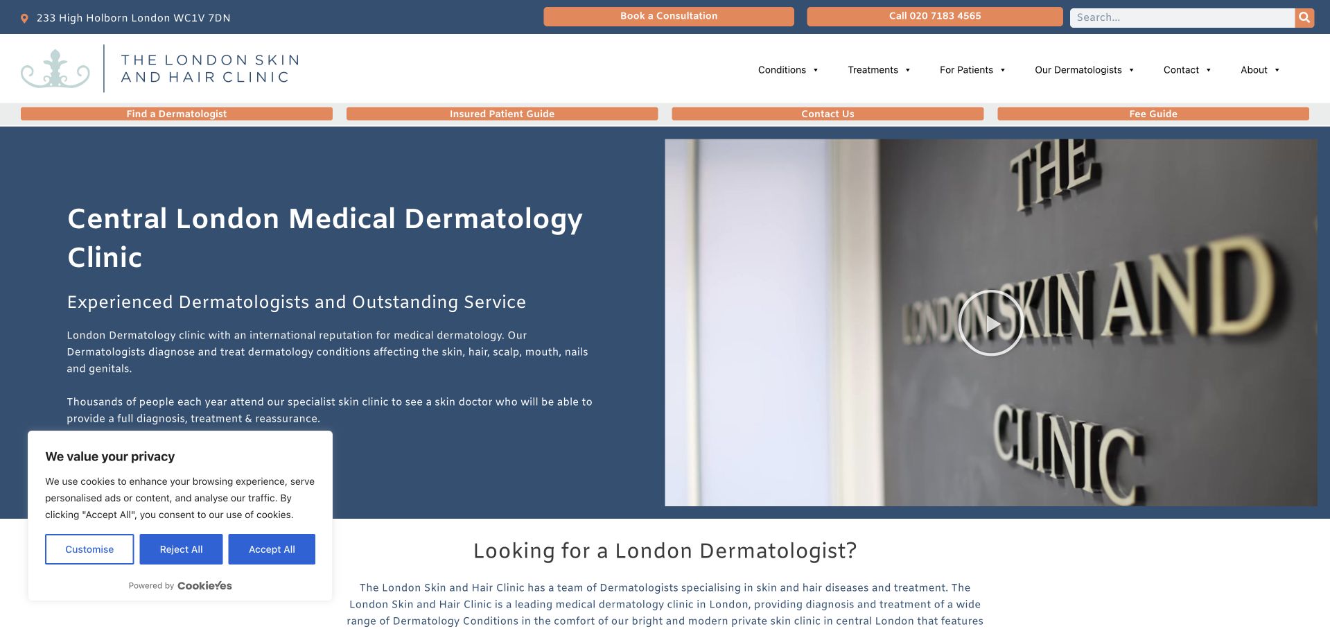
The London Skin and Hair Clinic uses a blue text panel beside a photograph of its reception signage. The opening explicitly names central-London medical dermatology, giving the service a clearer frame than a broad skincare slogan. Supporting copy explains the specialist scope, while booking and contact routes remain part of the header. This is useful for a clinic that wants its physical identity and medical discipline to be recognisable together. The page also includes a first-visit privacy panel, making the relationship between practical controls and the core content an important part of the design rather than an afterthought.
What you can learn
If the practice focuses on medical dermatology, state that plainly before presenting broader skincare imagery. Use real premises photography for recognition, then provide clear service categories, clinician information and contact options that remain usable when privacy controls are displayed.
Pros
The heading makes the medical specialty and central-London context explicit.
Reception imagery connects the service to an identifiable physical clinic.
Cons & considerations
A substantial introductory panel can feel dense without concise service categories underneath.
First-visit privacy controls occupy space that the main content hierarchy must account for.
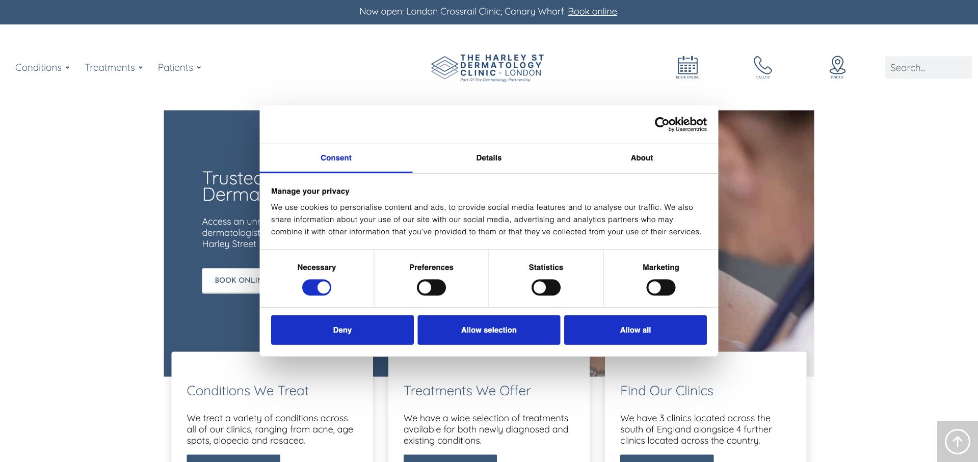
Harley Street Dermatology Clinic uses a blue-and-white identity with a clinical photograph and a strong introductory heading. Beneath it, separate panels guide visitors toward conditions, treatments and clinic finding. That structure is useful because people arrive with different levels of knowledge: some know a symptom or condition name, while others are researching a particular service or trying to find a location. The page sits within a broader clinic network, so the relevant local practitioner and appointment route need clear confirmation. Its first-visit privacy modal is visually prominent and demonstrates why real initial-state testing matters.
What you can learn
Give condition research, treatment research and location finding distinct routes. Explain the difference between educational information and an individual assessment, and make office-specific booking details easy to reach rather than assuming every clinic in a network offers the same arrangements.
Pros
The three-task structure accommodates different ways visitors begin researching a dermatology service.
A consistent visual system makes the network-style page easy to recognise.
Cons & considerations
The first-visit privacy modal interrupts the introductory content and needs careful interaction design.
A network-wide presentation requires additional clarity about local practitioners and appointment availability.
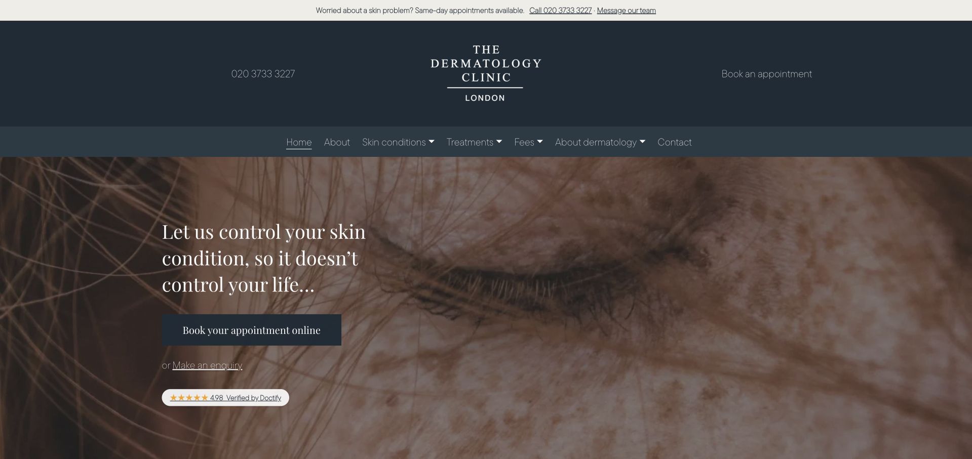
The Dermatology Clinic London uses a dark slate header, warm clinical imagery and a serif introductory statement. The presentation is quieter than a large service marketplace, with practice and patient information available through a compact navigation. Supporting content introduces the clinic and gives telephone contact substantial prominence. This is a useful reference for a specialist practice that wants to avoid a product-led first impression. The broad opening message still needs a literal service and location explanation nearby, and telephone-led contact should be complemented by an accessible written route rather than becoming the only practical way to enquire.
What you can learn
A restrained specialist site can remain focused without becoming vague. Put the discipline, location and responsible practitioner into readable supporting text, and give clear written and telephone contact options with an explanation of what happens after an enquiry.
Pros
The dark slate and warm imagery create a coherent identity without a crowded device catalogue.
A compact navigation keeps the practice presentation relatively focused.
Cons & considerations
A broad introductory statement communicates less practical detail than a descriptive service heading.
Prominent telephone contact needs a visible written alternative and clear response expectations.
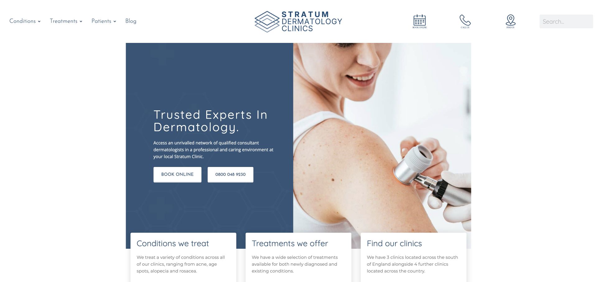
Stratum Clinics uses a blue-and-white introductory layout with a clinical image and three supporting routes for conditions, treatments and clinic finding. This makes the page more useful than a single generic booking invitation: a visitor can begin with the information they already know. The broader network context is visible in the wording and navigation, while the service categories have their own explanatory destinations. The template is relatively conventional, but the information architecture is transferable. Its success depends on whether local clinic pages clearly state practitioners, availability and appointment arrangements rather than repeating the same network-wide introduction.
What you can learn
Use a service directory to support different research starting points, then connect each route to relevant local information. Keep educational condition pages distinct from assessment advice, and ensure clinic pages contain real office-specific details rather than duplicated promotional copy.
Pros
Conditions, treatments and clinic finding are separated into understandable research tasks.
A consistent template gives a multi-location service a recognisable visual structure.
Cons & considerations
Network-wide language can feel impersonal without clear local practitioner information.
Repeated template sections need distinct local content to remain useful rather than interchangeable.
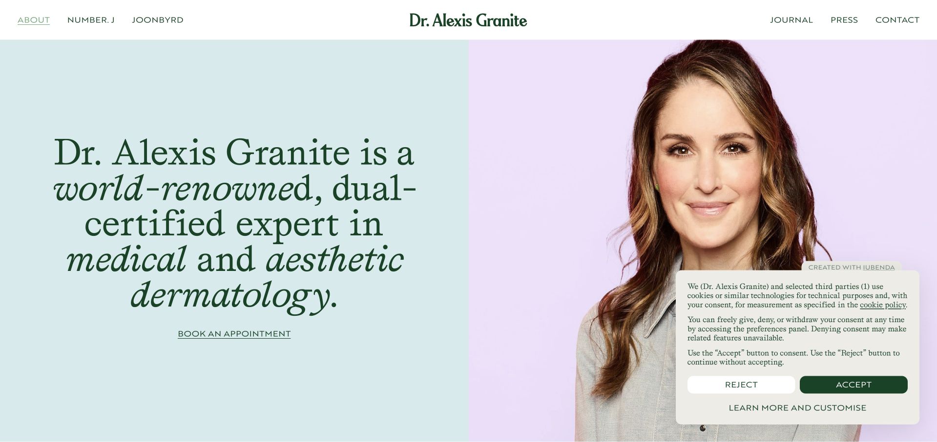
Dr Alexis Granite’s about page uses a large portrait, pastel split background and expressive green serif typography. The profile is unmistakably person-led, with navigation separating the clinic, product venture, journal and press material. An appointment link remains visible beneath the introduction rather than requiring visitors to discover the clinic through publicity content. This is useful for a clinician with several public roles: the website can acknowledge them without pretending they are one identical service. The large opening claim and portrait create strong recognition, but they need substantive, sourceable professional information and clear distinctions between clinical appointments and commercial products.
What you can learn
A personal professional site should make its different roles explicit. Separate clinical booking, editorial work and product businesses, and let the profile provide verifiable background rather than relying on prestige language or a large portrait to establish trust.
Pros
The portrait and typography create a highly recognisable personal identity.
Distinct navigation destinations help separate clinic, writing and product-related interests.
Cons & considerations
Prestige-oriented introductory claims need substantive supporting information.
A large privacy panel competes with the portrait and appointment link in the initial view.
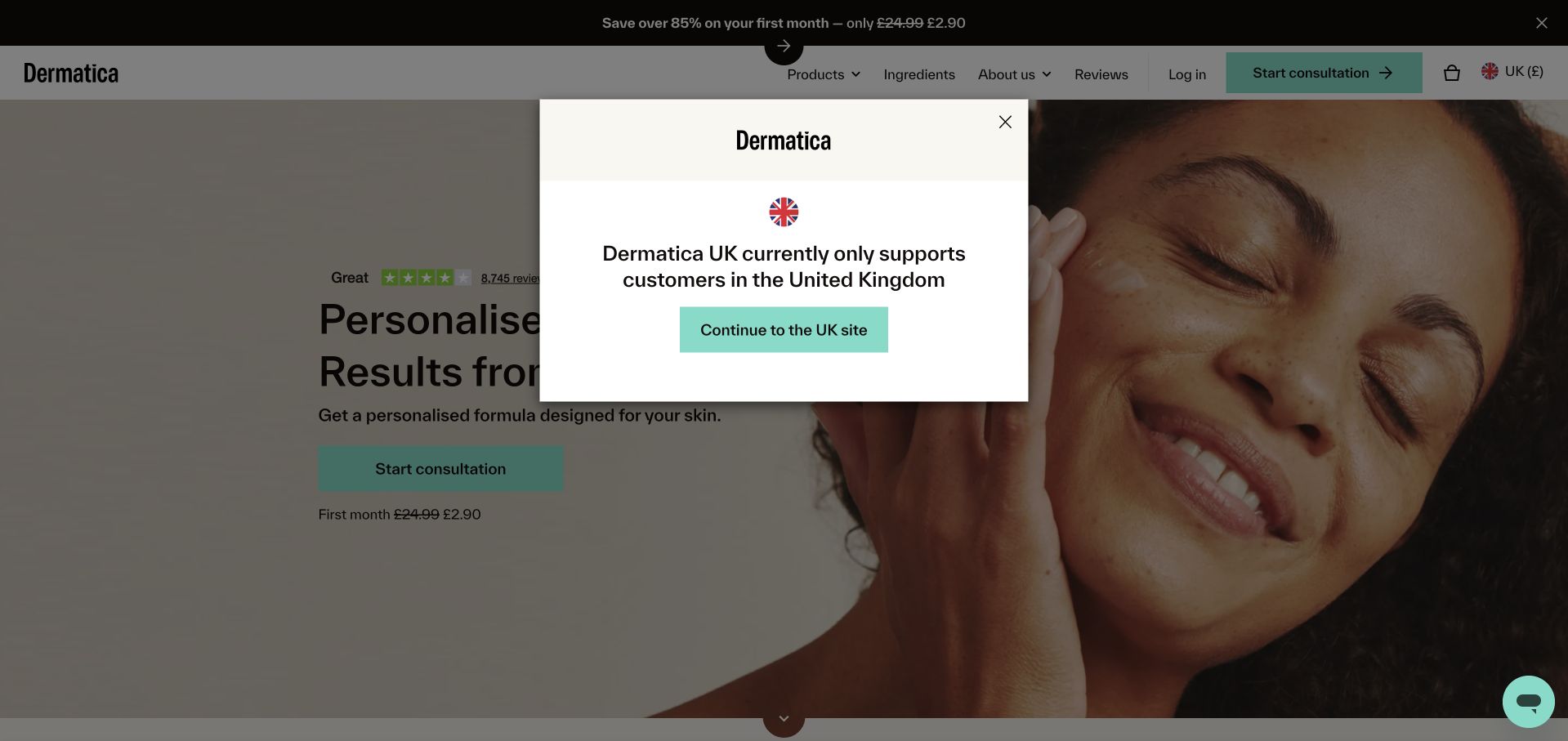
Dermatica uses a light split layout, a close-up skin photograph and a product-oriented introduction to personalised skincare. The first visit includes a regional-availability notice, demonstrating that an online service still has geographic boundaries. Supporting sections introduce the formula process, pricing and before-and-after material. This is useful for studying a remote-service journey rather than a conventional appointment clinic. Its outcome and time-based statements remain marketing claims, while assessment eligibility, prescriber involvement, subscription terms and privacy need their own clear explanations. Visitors should not have to infer those matters from the polish of the product presentation.
What you can learn
Remote services need explicit jurisdiction, eligibility and subscription information before collecting sensitive details. Separate product marketing from the clinical review process, explain who evaluates an enquiry and make cancellation, follow-up and secure information handling understandable before account creation.
Pros
The regional notice makes a real access constraint visible early in the visit.
A focused layout gives the product process a clear introductory hierarchy.
Cons & considerations
Outcome timing and before-and-after material require careful context and professional review.
A first-visit modal interrupts the service explanation and adds another step before visitors understand eligibility.
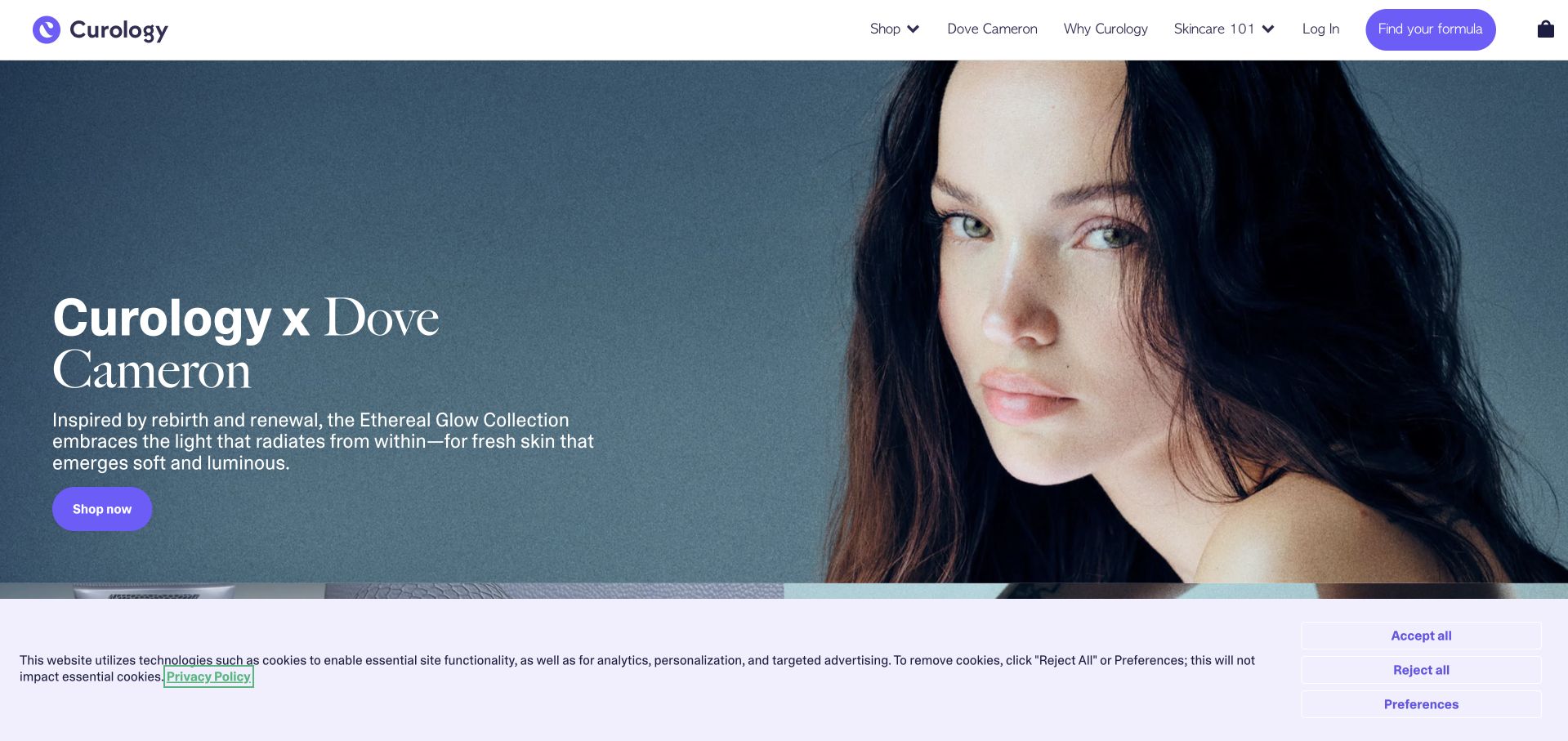
Curology’s captured homepage leads with a celebrity product campaign, a large portrait and soft purple actions. The navigation preserves separate routes to personalised care and the wider product offering, but the first screen is clearly retail-led. This makes the site useful as a contrast to a local dermatology practice: brand recognition and product browsing can dominate before a visitor learns about the care model. The design should be studied for its campaign hierarchy, not copied as a substitute for medical-service explanation. Prescription-related eligibility, professional review and ongoing terms need their own visible, understandable destinations.
What you can learn
When a brand combines consumer retail and prescription-related services, keep the journeys clearly distinct. Let campaigns have a defined place, but ensure visitors can understand eligibility, professional involvement and ongoing commitments without navigating through a celebrity product promotion.
Pros
The campaign has a clear visual hierarchy and a recognisable product-brand identity.
Separate navigation routes allow visitors to move beyond the featured retail collection.
Cons & considerations
A retail-led first screen can obscure the service model and clinical-review pathway.
Celebrity and product imagery provide little practical information about individual eligibility or care arrangements.
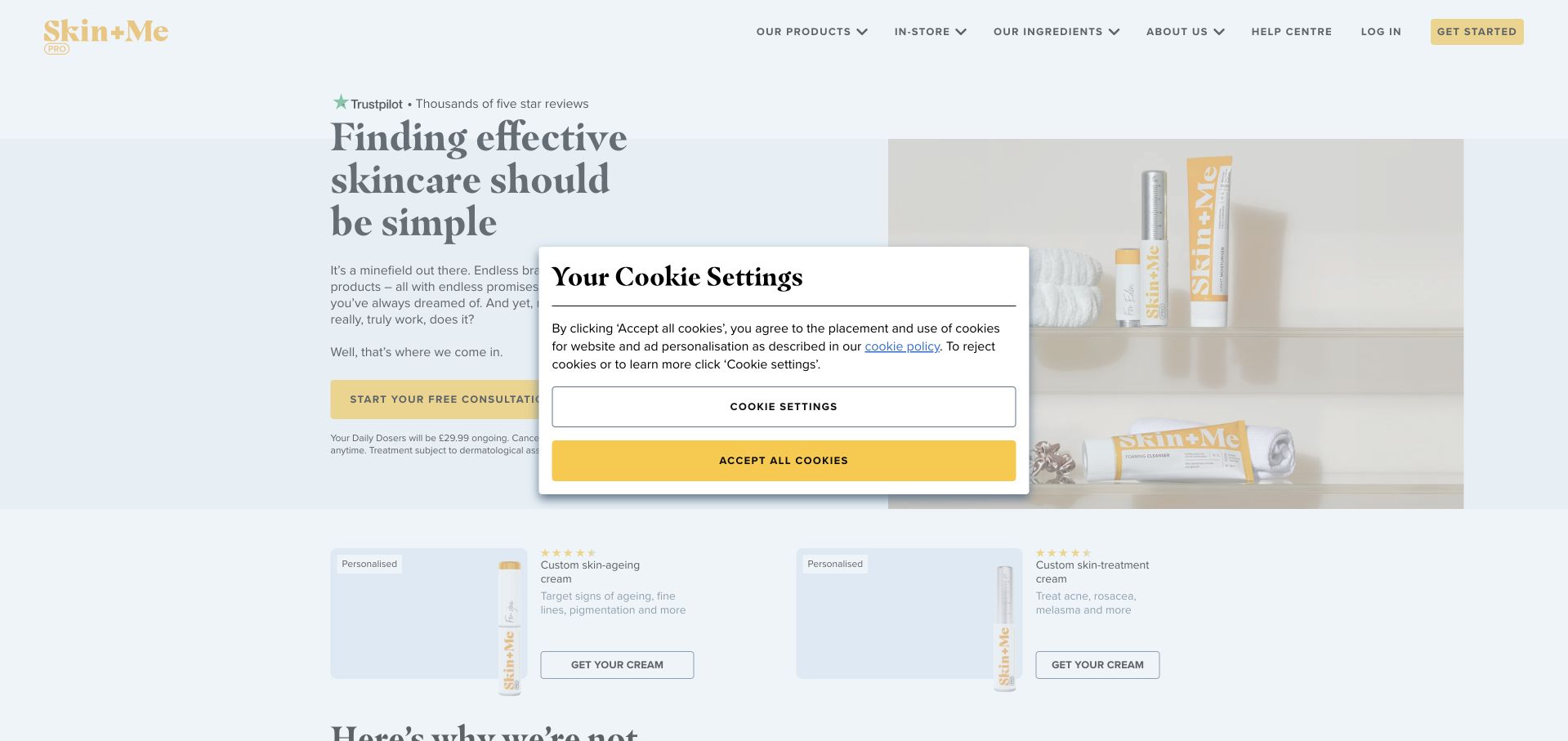
Skin + Me uses a pale neutral page, yellow actions and a concise introduction to its personalised skincare offer. The supporting layout separates age-related and treatment-oriented product routes rather than presenting every visitor with one identical path. A comparison-style section gives the proposition a familiar consumer structure. This is useful for studying how an online service reduces an extensive product story into a few understandable choices. The simplicity must not imply that visitors can determine clinical suitability themselves, and the care model, ongoing charges and use of sensitive information need clearer explanation than product-category labels alone can provide.
What you can learn
Use a small number of understandable pathways, but explain who reviews suitability and what an initial submission involves. Keep product comparison separate from medical claims, and make recurring costs, cancellation and privacy information available before the visitor commits to an account or plan.
Pros
A restrained layout makes the two broad visitor pathways easy to distinguish.
The comparison frame gives a complex proposition a familiar reading structure.
Cons & considerations
Product-category choices can oversimplify the professional review needed for individual suitability.
The initial cookie panel competes with the main explanation and action.
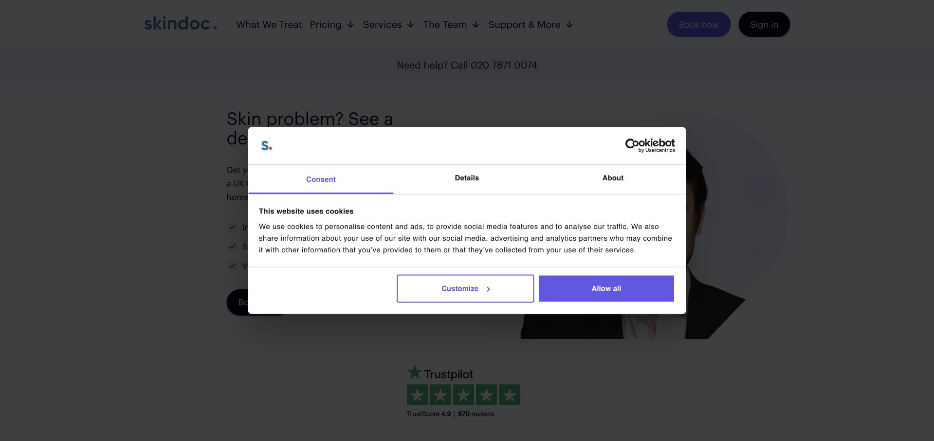
skindoc uses a white-and-blue layout and a direct heading about seeing a dermatologist online. The supporting sequence explains the consultation model and subsequent steps rather than assuming visitors understand how a remote service operates. A telephone support route is visible, while the main page keeps the online appointment proposition central. This is a useful reference for making delivery format explicit. The initial privacy modal is prominent, however, and the service’s scope, jurisdiction and limitations need to remain understandable without implying that every skin concern can be assessed or managed remotely.
What you can learn
State that a service is remote before asking for an account or images. Explain the review process, available support and situations outside the service’s scope, while routing sensitive information through an appropriately reviewed system rather than a generic contact form.
Pros
The opening makes the online delivery model explicit rather than leaving visitors to infer it.
A staged explanation helps clarify what follows the initial enquiry.
Cons & considerations
The first-visit privacy modal obstructs part of the service introduction.
Broad remote-care language needs clear scope and eligibility limitations rather than universal treatment implications.
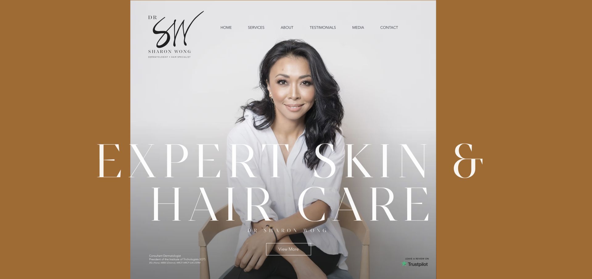
Dr Sharon Wong’s site uses a strong ochre background, a large practitioner portrait and oversized light typography to introduce skin and hair care. The professional name and role appear close to the visual identity, while a relatively compact navigation preserves service and contact routes. The design is useful for a practitioner whose specialist focus should be recognisable before visitors explore the detail pages. Its impact comes from a consistent portrait-and-type system rather than numerous product logos. The large opening also creates a practical obligation: service scope, appointment locations and contact expectations must be easy to find immediately afterwards.
What you can learn
A practitioner-led specialist site can use one strong visual system, but the supporting pages must explain the actual service. Name the professional role clearly, provide substantive background and make appointment locations and access routes more specific than the opening brand statement.
Pros
The portrait and ochre palette create a memorable personal professional identity.
The opening clearly links the practitioner’s name with the skin-and-hair focus.
Cons & considerations
Large display typography leaves limited room for practical appointment details in the first view.
Professional titles and specialist claims need sourceable supporting information beyond their visual treatment.
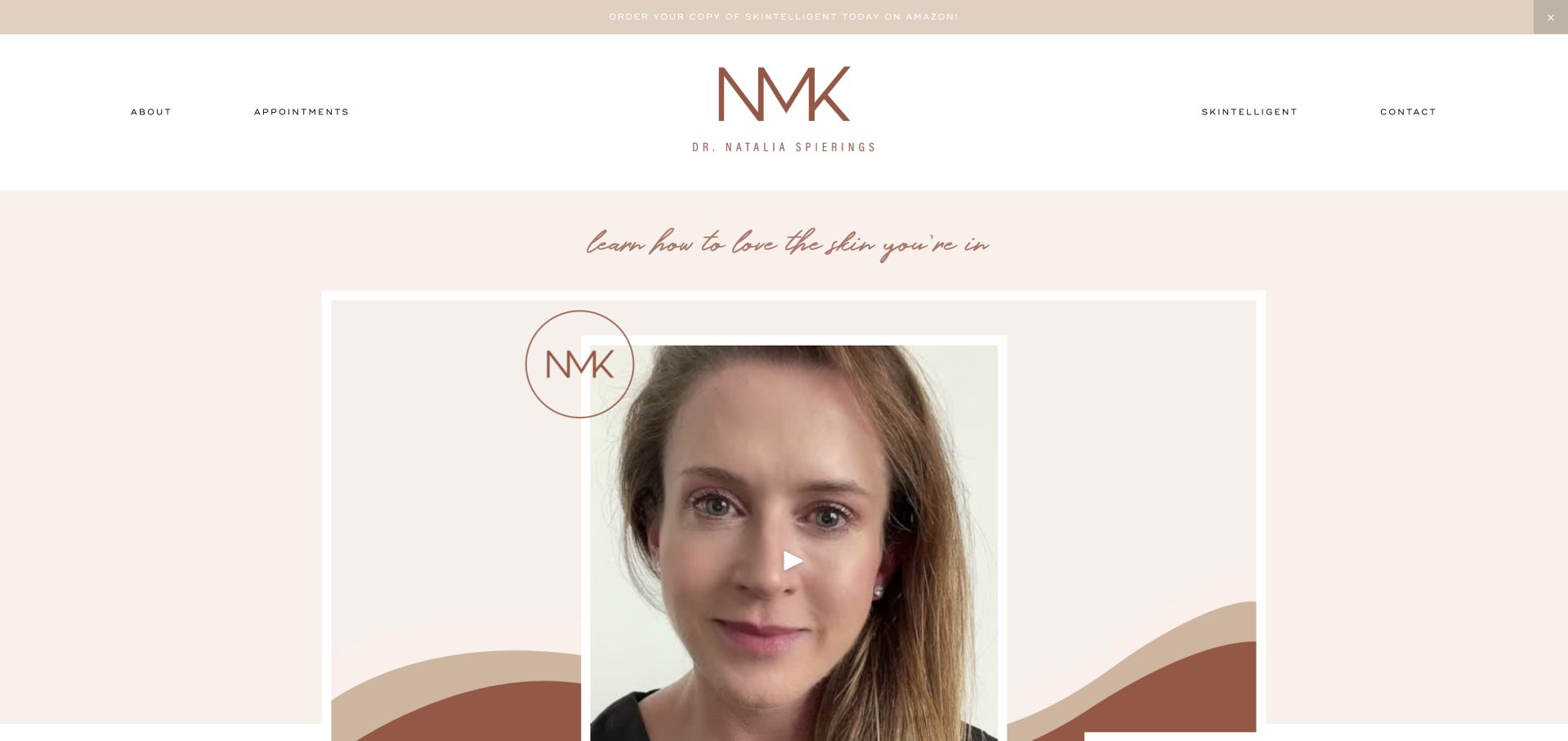
Dr Natalia Spierings’ site uses pale neutral colours, an individual portrait and a clear personal identity. The introduction explains the clinician’s role, while book and educational content receive distinct space within the broader page. This is useful for studying a professional website with more than one purpose: visitors may arrive to research the clinician, arrange an appointment or read public material. The personal tone is strong, but practical clinical information should remain easier to find than a publication promotion. Educational claims and product discussion also need appropriate review rather than being assumed to apply to an individual visitor’s situation.
What you can learn
Keep clinical appointments, professional biography and educational publishing as distinct tasks. Let visitors understand the clinician’s role and service arrangements without first navigating book promotions, and clearly separate general educational material from individual assessment or treatment advice.
Pros
The portrait and personal identity make the responsible clinician easy to recognise.
Educational publishing receives a place without being the only explanation of the practice.
Cons & considerations
Book promotions can compete with appointment information in the main browsing journey.
A strong personal voice needs clear boundaries between general education and individual clinical advice.
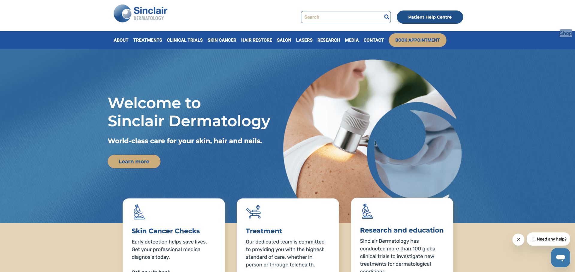
Sinclair Dermatology uses a blue-and-white identity, a concise welcome and a circular clinical image treatment. Immediately below, separate cards distinguish skin-cancer checks, treatment and research or education. This is useful for an organisation with several audiences: a patient seeking an appointment should not have to navigate professional teaching material to understand the service. The page’s structured categories make that distinction visible early. Broad prestige wording still needs practical supporting information, and research participation must remain clearly separate from ordinary clinical appointments so visitors do not assume the same eligibility or referral arrangements apply.
What you can learn
Separate patient services from professional education and research at the first useful navigation point. Give each route its own access information, and explain whether a visitor is seeking a routine appointment, professional resource or research-related enquiry before collecting personal details.
Pros
The three-part structure distinguishes clinical tasks from education and research browsing.
The restrained visual system keeps the introductory service categories easy to recognise.
Cons & considerations
Broad prestige language communicates less practical detail than clear appointment information.
Research and routine-care routes need explicit distinctions in eligibility and next steps.
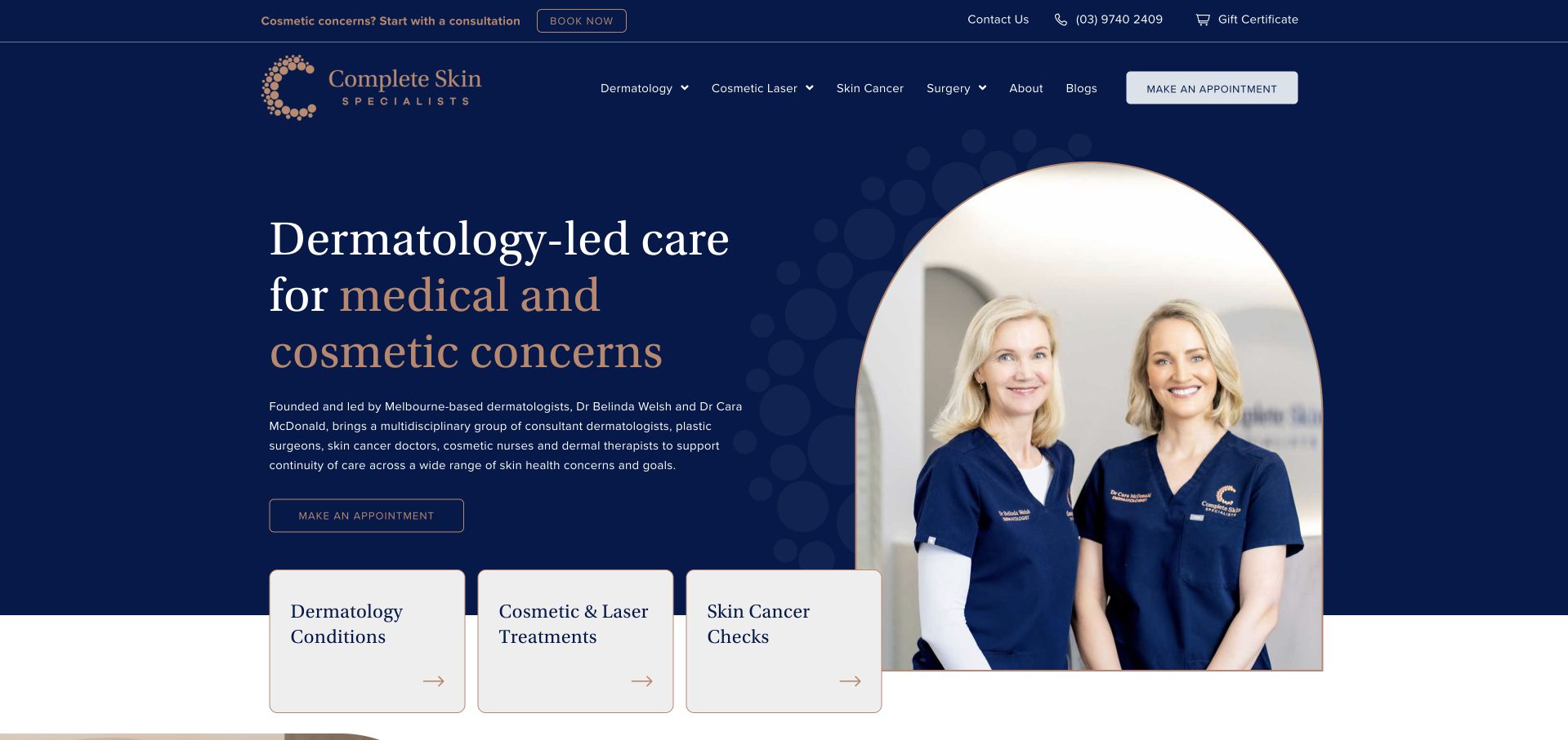
Complete Skin Specialists uses a dark-blue hero, a large serif heading and a portrait of its founding clinicians. Beneath the introduction, distinct cards separate dermatology conditions, cosmetic and laser treatments, and skin-cancer checks. The structure makes the integrated practice understandable without suggesting that every visitor follows one identical pathway. It is a useful example of combining a people-led identity with a literal service taxonomy. The broad multidisciplinary explanation is substantial, so the page needs concise practical links to appointment type, responsible clinician and location rather than expecting a new visitor to read the entire organisational introduction.
What you can learn
An integrated practice should still give medical, cosmetic and screening-related enquiries distinct routes. Introduce the people behind the organisation, then connect each service branch to clear appointment arrangements and role information instead of relying on one broad “book” destination.
Pros
The service cards provide an understandable structure across several related areas of work.
Named clinician imagery makes the integrated organisation more concrete than an anonymous brand.
Cons & considerations
A broad multidisciplinary introduction can become dense before practical appointment details appear.
Different professional roles need clear explanation so visitors do not assume identical credentials across every service.
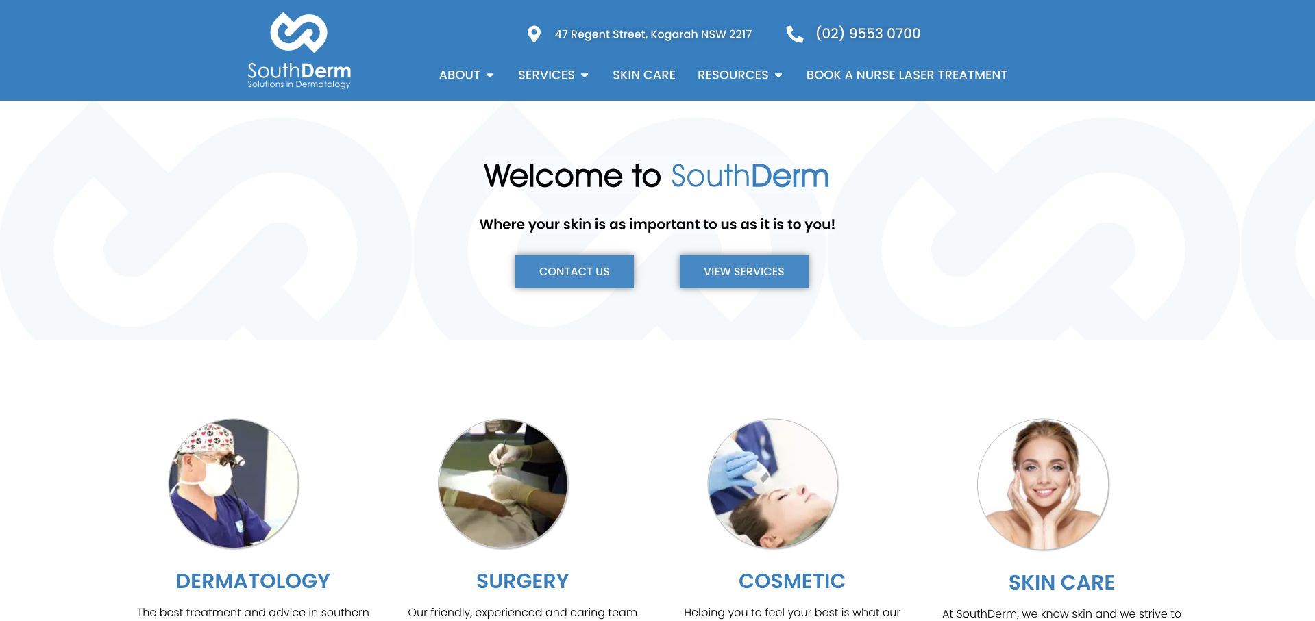
SouthDerm uses a clear blue-and-white identity and a modest welcome section rather than an enormous promotional hero. Four prominent service categories then distinguish dermatology, surgery, cosmetic work and skincare, each with its own image and explanation. This is a useful content model for a practice whose offer spans both medical and elective interests. The page gives visitors a way to choose a broad direction before reading detailed material.
What you can learn
Use a small, literal service directory when a practice spans several kinds of work. Explain the difference between medical assessment, procedures, elective consultations and retail skincare, and keep practical appointment information close to the relevant category rather than only in a shared footer.
Pros
The four service categories make a mixed offering easier to scan.
A restrained opening leaves more space for the service directory than a full-screen hero would.
Cons & considerations
The generic welcome statement communicates less than the practical category labels beneath it.
Medical and retail pathways need clear distinctions to avoid confusing different kinds of visitor intent.
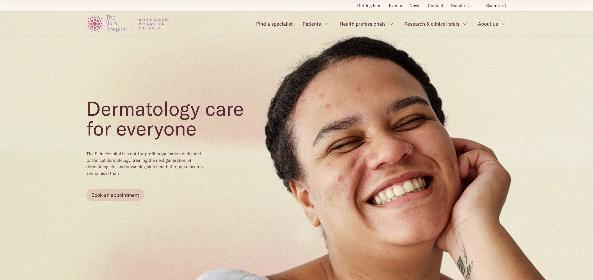
The Skin Hospital uses a warm close-up portrait, pale background and a direct dermatology introduction. Supporting copy identifies its not-for-profit role and explains that clinical services, clinician training and research all form part of the organisation. Further material introduces specific service developments with explanatory text rather than relying on device photographs alone. This is useful for studying how a larger specialist institution can remain approachable. The broad opening promise still needs concrete appointment and location routes, while imaging and research-related material should explain its scope without implying that a technology replaces an individual clinical examination.
What you can learn
Explain an institution’s different roles without blending them into one visitor journey. Give routine appointments, training and research separate destinations, and describe new clinical tools through their purpose and limitations rather than presenting technology as a guaranteed answer.
Pros
The warm portrait makes an institutional service feel approachable without obscuring the dermatology identity.
Supporting copy distinguishes clinical, education and research roles.
Cons & considerations
A broad inclusive headline needs practical appointment and location information nearby.
Technology-focused sections require clear scope so readers do not infer a substitute for clinical assessment.
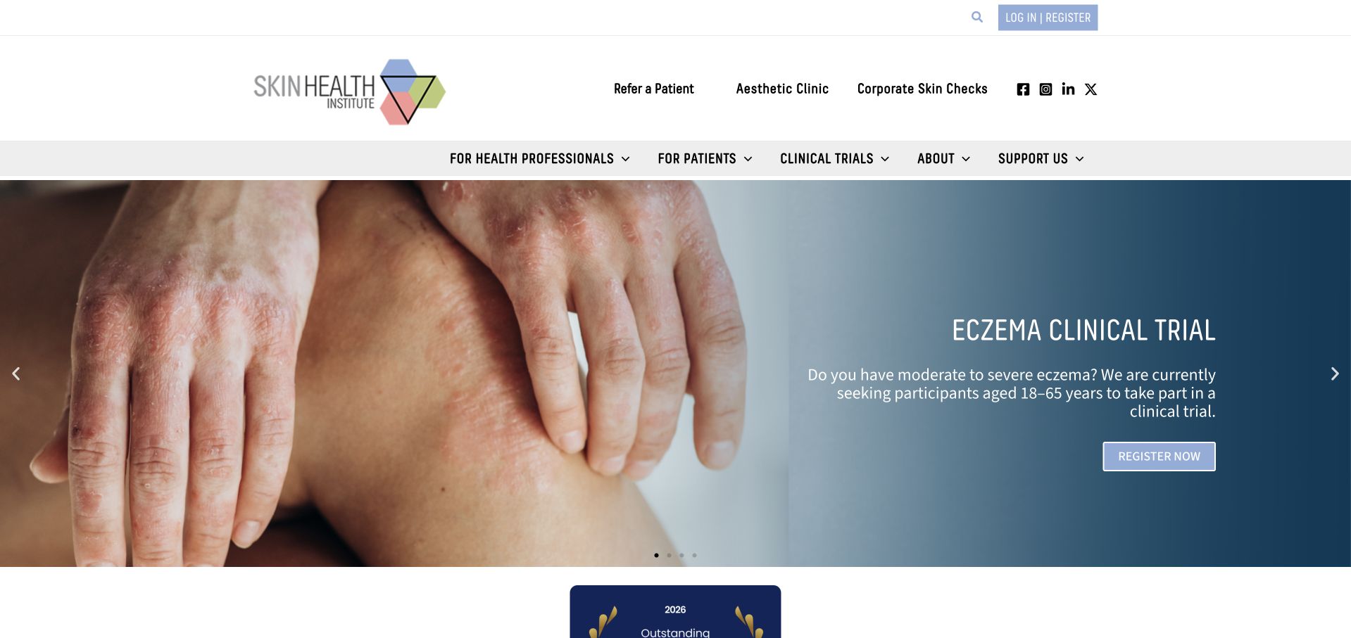
Skin Health Institute uses a conventional white header and a broad condition-related banner, with treatment, education and research as distinct organisational pillars. The supporting content explains the not-for-profit service and its different audiences rather than presenting only a consumer appointment funnel. This makes the site useful for studying a specialist institution with clinical and professional responsibilities. The rotating banner can foreground one trial or topic at a time, so essential patient information needs to remain available elsewhere. Strong institutional claims and research messages should be understood in their stated context rather than being treated as individual clinical advice.
What you can learn
Keep treatment, professional education and research participation visibly distinct. Use a stable patient-service route outside rotating banners, and give trial or study information its own eligibility and contact details so a general visitor does not mistake it for routine appointment guidance.
Pros
The three-pillar structure acknowledges different visitor tasks rather than forcing one conversion path.
The organisation’s not-for-profit context is explained in supporting copy.
Cons & considerations
A rotating condition or trial banner can obscure the broader service offer on first arrival.
Institutional prestige language needs concrete practical detail to support an individual appointment enquiry.
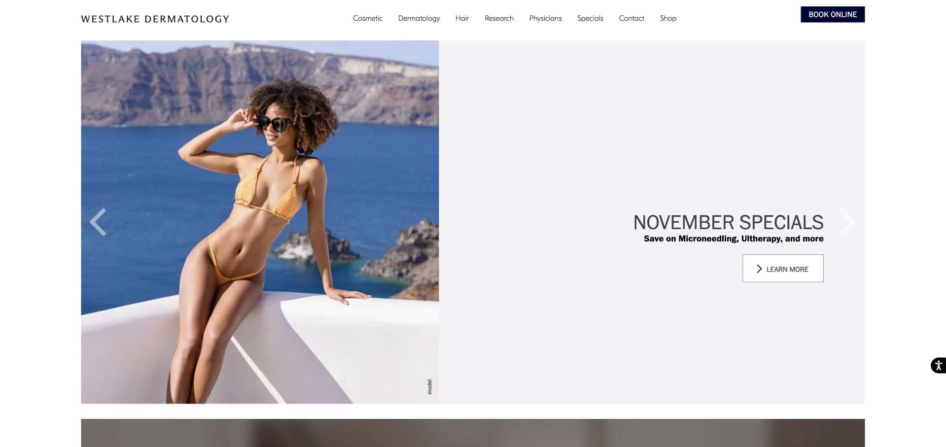
Westlake Dermatology uses a split photographic campaign area, restrained typography and a compact navigation to introduce its broader practice. The captured first screen foregrounds a monthly promotion, while other slides present skincare products and specific treatment information. This is useful as an example of a campaign-heavy service website rather than a quiet specialist brochure. Its success depends on the permanent structure around those promotions: visitors still need clear routes to medical dermatology, clinicians, locations and appointments. Seasonal offers and retail messages should not become the only visible explanation of an organisation that also provides medical services.
What you can learn
Treat campaigns as temporary layers over a stable medical-service structure. Keep clinician, location and appointment routes visible regardless of the active slide, and clearly separate retail offers and elective promotions from information about medical assessment and ongoing care.
Pros
The split layout gives individual campaigns a clear visual frame without replacing the main navigation.
The broader site can accommodate retail, cosmetic and medical interests within one recognisable brand.
Cons & considerations
A monthly promotion may give first-time visitors a retail-led impression of the wider practice.
Rotating content and dated offers require regular editorial maintenance and accessible alternatives.
Kegan is a freelance web designer and developer with 15+ years of experience helping businesses turn complicated website requirements into clear, maintainable digital experiences. He works directly with clients from planning and design through development, launch, and ongoing support.
For dermatology website design, his development approach focuses on clear clinician and location information, responsibly governed service content, practical appointment guidance, and careful patient-portal or inquiry handoffs. The scope can be a targeted improvement or a complete custom build, with responsive layouts, thoughtful content structure, and integrations chosen around the people using and maintaining the site.
Show 3 other dermatology website designersHide other dermatology website designers
Agree the distinction between services and products
Map medical dermatology, surgery, elective treatments, products, research and education as separate visitor tasks where they genuinely exist. Give each an owner for content accuracy. Complete Skin Specialists and SouthDerm illustrate different ways to make a mixed offer legible; Curology and Westlake show how retail or campaign content can dominate if the permanent service structure is not protected.
Create a maintainable clinician and office directory
Record current roles, office relationships, appointment types and official contact details. Keep biographies useful and sourceable rather than expanding them into unsupported superlatives. Give each location accurate arrival and access information, and provide a way to ask about adjustments without treating a broad accessibility statement as a substitute for real details.
Review photography, results and promotional claims
Use approved real practice imagery and accurately described illustrative material. Establish the practice’s process for consent, publication, removal and review of patient images. Keep before-and-after galleries and treatment claims in context, with professional oversight. A polished image comparison should not imply a typical or guaranteed result, and generated people should never be presented as actual patients or reviewers.
Map the entire sensitive-data journey
Trace public enquiries, appointment requests, later clinical history, image uploads, notifications and third-party scripts. Decide which system collects each category of information, who can access it and what is retained. HHS’s tracking guidance has a specific legal scope and notes a partially vacated portion; do not reduce privacy planning to a universal rule copied from a checklist. Obtain appropriate review for the organisation’s circumstances.
The editing job behind the design
Keep the marketing site understandable and the clinical handoff deliberate
An editable service catalogue, current clinician profiles, accurate offices and a clearly labelled portal often matter more than an elaborate campaign system. Keep appointment routes stable when promotions rotate. Optimise real images, avoid image-only treatment menus and ensure important explanations remain available when video or third-party widgets do not load.
Evaluate booking, telemedicine, upload and messaging tools as real data-handling systems, not as logos in a technology stack. Review configuration, access, vendor arrangements, retention and notifications with appropriate specialists. Separate public website analytics from sensitive form content and clinical documents. A platform label or security badge does not by itself establish privacy, clinical suitability or complete accessibility.
Our WordPress website examples offer a separate look at publishing approaches. A visible platform label is evidence for that named page, not a guarantee that the same system will suit your requirements.
Before the public launch
Dermatology website planning checklist
Separate medical, cosmetic, surgical and retail journeys where applicable.
Introduce responsible clinicians with accurate current roles.
Connect clinicians and services to real locations.
Explain appointment types and referral requirements.
Keep existing-patient resources and portal links recognisable.
Publish accurate fee or cost-information routes.
Maintain campaign and availability dates.
Use approved imagery with appropriate context and consent governance.
Professionally review treatment and results claims.
Explain remote-service scope and relevant access limits.
Route sensitive images and histories through reviewed systems.
Test privacy controls, forms, keyboard use and external handoffs.
These checks are a project checklist, not a performance, legal, security, or accessibility certification. Test real journeys with the people responsible for the website before making claims about the result.
Sources & editorial method
How this collection was selected and reviewed
The 30-example target was saved before this research began and was not rerolled to fit the available material. The editorial team directly inspected the official public pages, captured them in a normal browser and recorded actual capture URLs, timestamps and image dimensions. Blank loading frames, challenge pages, broken destinations and unrelated content were excluded or replaced. Reviews concern observable website presentation, navigation and information, not the competence of a dermatology provider, clinical outcomes, safety, appointment availability or accessibility conformance. Commercial claims, testimonials and badges remain the source organisation’s statements, not independent verification. Technology labels require public source evidence and do not establish a complete backend inventory. No appointments, accounts, enquiries, screenings or private intake forms were completed. Website imagery and trademarks belong to their owners.
Each example links to its actual source page. Screenshots are direct browser captures with their own capture dates; moving imagery, announcements and live designs can change. The notes describe observable design choices and conditional tradeoffs, not measured traffic, conversion results, service quality, or accessibility conformance.
Technology labels use public page metadata, asset evidence, or explicitly cited platform documentation. Platform documentation is not a complete current deployment audit. A component reference may be legacy or unused; it is not a complete backend inventory. Unknown stacks are omitted. These sites are editorial examples, not our client portfolio.
Written, Edited and Curated are separate editorial records, not timestamps advanced by a rebuild. Website designs and imagery belong to their owners. See our editorial standards or suggest a correction.
Questions worth asking
Dermatology website design questions
Should medical dermatology and cosmetic treatments share a homepage?
They can share a practice identity, but visitors need clear separate routes. Explain the service, responsible professional, appointment type and relevant information for each. Do not let product promotions or cosmetic imagery obscure the medical-service route or imply that every practitioner has the same role.
How should a practice handle before-and-after images?
Use the organisation’s professionally reviewed approval and consent process, with appropriate context and accurate descriptions. Do not imply that an illustrated result is guaranteed or typical for every person. Keep galleries separate from the practical information needed to arrange an assessment, and do not fabricate patient photographs or testimonials.
Can the ordinary contact form accept skin photographs?
Do not add an upload field without reviewing the clinical and information-handling workflow. Explain which system should receive images, who reviews them and what happens next. A general marketing form and email notification are not automatically appropriate for sensitive clinical material merely because the website uses HTTPS.
What should an online dermatology service explain before signup?
Its geographic scope, professional-review model, appointment or submission process, limitations, follow-up route and any recurring financial commitment. Make the distinction between retail products and clinical services clear. Do not imply that every concern can be resolved remotely or that a questionnaire itself establishes a diagnosis.
How can a larger clinic keep promotional content from taking over?
Maintain stable medical-service, clinician, location and appointment routes outside rotating campaigns. Give seasonal promotions an expiry and review process. A first-time visitor should still be able to understand the clinical organisation when the active slide happens to promote a product or elective offer.
A strong dermatology website is clear about the difference between care, elective services and commerce. Make the right route understandable before asking a visitor to share sensitive information.