Best Recruiter Websites of 2026 (30 Real-World Examples)
Separate candidate and employer tasks, keep real vacancies current and make every application route understandable.
A recruiter’s website is not one funnel. A candidate searching for a role, an employer preparing a brief and a senior executive researching a retained-search firm have different tasks. Good design makes those differences visible before asking anyone to upload a CV, register an account or describe a hiring problem.
The collection spans boutique creative recruiters, professional staffing groups and executive-search practices. Those models should not be collapsed into a single template. A vacancy-heavy staffing site may put role and location search at the top. A retained-search firm may lead with sector expertise and relevant consultants. The right opening depends on the work the business actually does, not on which competitor has the most dramatic film.
These reviews assess public design and information structure, not recruitment success, employer quality or an individual’s employment prospects. A homepage cannot establish that a role is still open or that a testimonial predicts another person’s experience. The practical design goal is honest discovery: clear audiences, current role information, understandable engagement models and a proportionate request for personal data.
Before the examples
What makes good recruiter website design in 2026?
Make the two main audiences unmistakable
Use literal labels such as finding a job and hiring talent. If general candidate registration is offered, distinguish it from applying to a specific vacancy. An employer brief should ask about a role and hiring context; a candidate form should explain what happens to their information. Do not mix both into a general sales form simply because they share a contact email behind the scenes.
Treat vacancy freshness as part of the interface
A role card needs meaningful title, location or remote context, employment type and an honest status. The detail page should carry the full description and application route. Decide who closes expired roles and how users are informed when a vacancy is no longer available. Google’s JobPosting documentation provides implementation requirements for eligible job pages; adding markup does not guarantee placement in search or replace accurate visible content.
Explain the engagement model
Permanent placement, interim support, executive search and managed consulting are different relationships. Give each a short scope and a relevant contact route. A boutique’s specialism and named consultants may be more useful than a long global-services directory. If a business broadens or rebrands, preserve candidate discovery and explain the current offer rather than assuming older references will remain self-explanatory.
The collection · 30 examples
30 recruiter websites worth studying
Use these examples to compare task clarity, not simply visual polish. Notice whether a candidate can find a real role, whether an employer understands the hiring service and whether a senior-search visitor can identify a relevant consultant. The first choice highlights a smaller creative specialist, while the wider collection shows contrasting recruitment models.
Tomorrow uses a huge lowercase wordmark, thin wavy stripes and a restrained set of opening controls to create a recognisable creative identity. The live destination is Tomorrow Worldwide, reflecting a broader regional presence than the older London address suggests. A jobs action and compact menu keep the initial screen simple; the fuller page then supplies role titles, locations and salary information. This is a useful separation between brand expression and practical job discovery. The risk is that a visitor unfamiliar with the firm may initially see a visual studio rather than a recruiter. The creative treatment needs the supporting role catalogue and employer information to make the purpose unambiguous.
What you can learn
A boutique recruiter can use an expressive identity if the job and employer paths remain immediately discoverable. Make role details concrete and keep geographic context current when the business expands or changes its name.
Pros
The large wordmark and distinctive striped field give a smaller creative recruiter a memorable visual identity.
The supporting jobs layer supplies practical role, location and salary context beyond the opening brand treatment.
Cons & considerations
The minimal first screen does not explain recruitment as directly as a literal service headline would.
A compact menu requires clear accessible labels and a reliable route for employers as well as candidates.
Major Players uses a pale peach field, oversized black typography and violet button treatments to create a confident creative-industry opening. Live-jobs and hiring actions are visible before the user explores the menu, which is useful for a two-sided recruitment business. Small country controls acknowledge that location matters to the experience. The central message carries more personality than functional job-search detail, leaving the supporting content to explain permanent, freelance and other talent services. This is a good example of a brand that does not need a stock meeting photograph to feel established. Its success still depends on the next layer being practical: job freshness, geography and employer briefs cannot be left to the mood of the hero.
What you can learn
Use personality to distinguish a creative recruiter, but put the two main audience decisions in plain view. A visitor should not need to understand the brand’s tone before finding either a real vacancy or the route to hire someone.
Pros
Visible live-jobs and hiring actions recognise the site’s two different audiences at the start.
A limited peach, black and violet system creates strong recognition without a complex photographic composition.
Cons & considerations
The large brand statement gives less space to immediate role filtering or a specific recruitment specialism.
Country controls and compact menus need explicit labels and predictable keyboard behaviour.
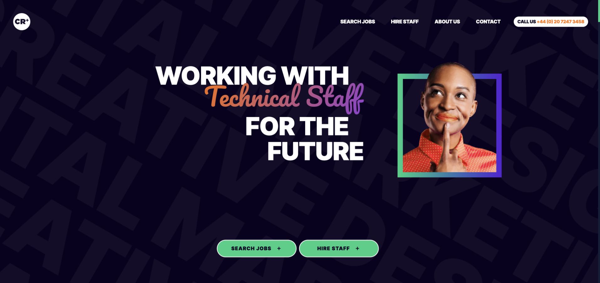
Creative Recruitment combines a dark patterned background with a multicolour portrait frame and a large changing role headline. Green job-search and hiring buttons provide the functional anchor beneath the more expressive visual treatment. The header exposes familiar company and recruitment routes, making the page easier to interpret than a purely brand-led opening. Showing different staff categories can communicate breadth, but only if the message remains readable when motion stops. The site also illustrates why promotional overlays need restraint: an initial salary-related popup interrupted the opening before being dismissed for this capture. A recruiter’s first job is to help the right audience reach relevant information, not require a preliminary marketing decision.
What you can learn
Keep the main audience actions stable even when a role headline changes. Give promotional downloads their own optional place, and make the default opening useful without motion, popups or an email capture step.
Pros
The job-search and hiring actions remain distinct beneath a visually expressive headline.
The portrait-frame motif makes the creative specialism feel more specific than a conventional corporate recruitment photograph.
Cons & considerations
Changing staff-category text needs a stable accessible equivalent and a reduced-motion treatment.
Early promotional popups can interrupt a candidate or employer before they have understood the service.
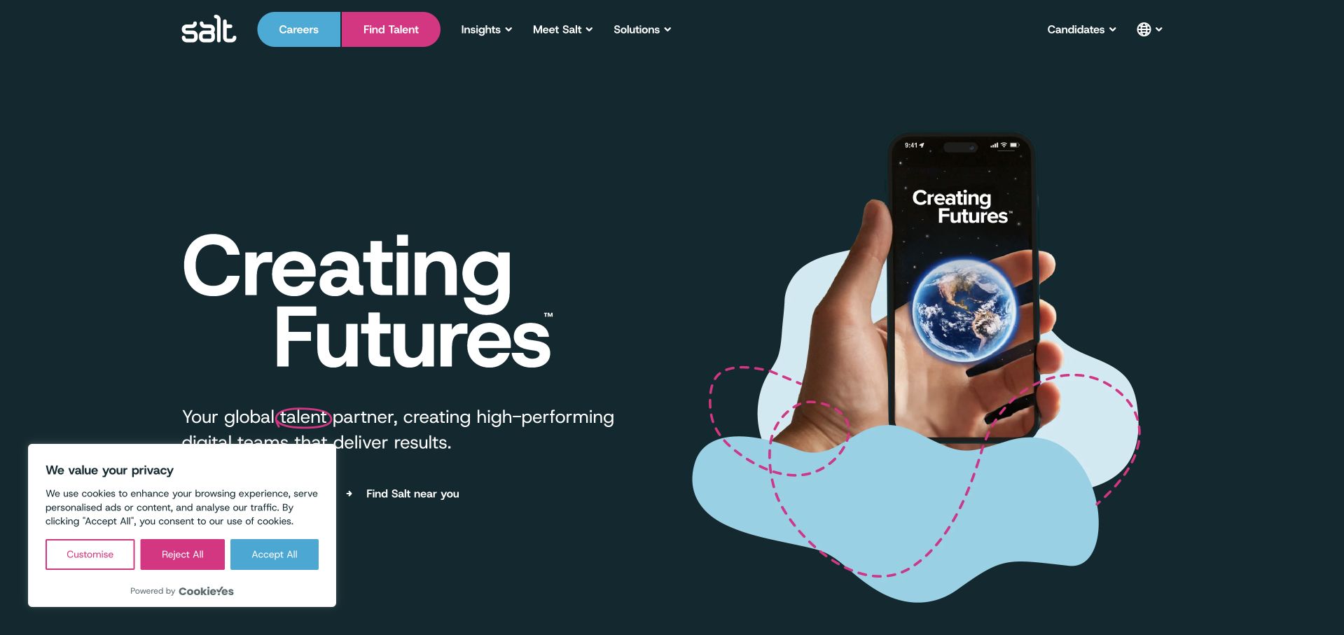
Salt uses a dark teal field, a large white statement and a playful phone-and-world illustration to make a global talent proposition feel approachable. Pink and blue audience actions distinguish career exploration from finding talent. Supporting copy makes the recruitment context explicit rather than asking the illustration to explain the business alone. The broader site then organises specialist disciplines and regions. This is useful for a firm whose work spans digital and technical roles but still needs a human identity. The global framing can become vague if local role availability and employer coverage are not close by. A bright illustration also needs a clear text alternative rather than carrying essential meaning by itself.
What you can learn
An illustration can express global digital recruitment without a generic office scene, provided the audience choices and specialisms are written clearly. Carry regional context into vacancy and employer pages so the international promise remains practical.
Pros
Distinct career and talent actions make the two main visitor intentions easy to identify.
The illustrated opening adds personality while the supporting copy states the recruitment purpose directly.
Cons & considerations
A broad global message needs local role and service information before it can qualify a real enquiry.
Decorative illustration and colour distinctions must not become the only way users understand the page’s choices.
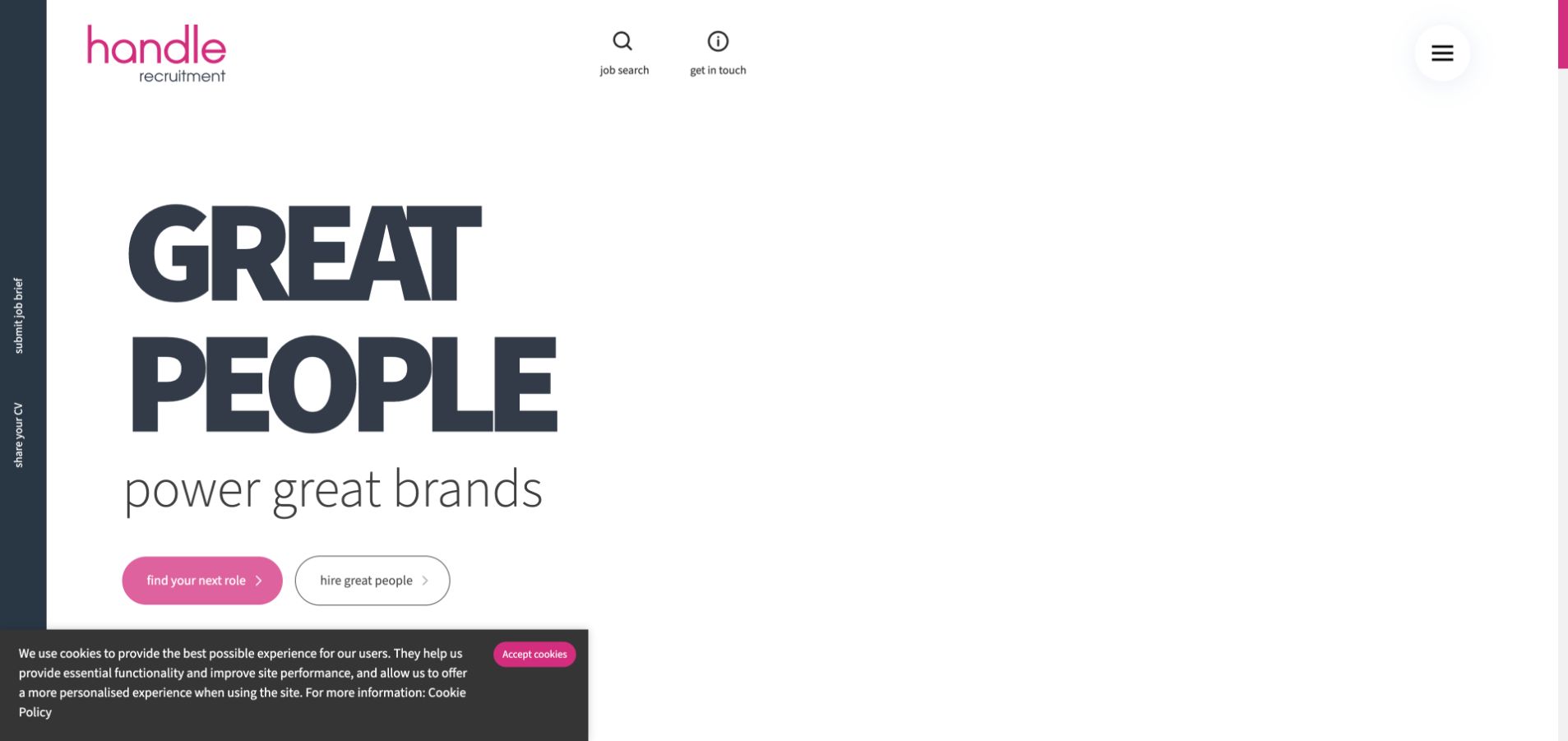
Handle uses a largely white opening with an oversized typographic message and pink-accented actions. The lack of a dominant stock photograph puts attention on the relationship between people and brands. Job search, contact and the main hiring choices sit alongside a persistent rail for sharing a CV or submitting a brief. That is a useful acknowledgement that candidates and employers arrive with different kinds of information. The unusually spare composition gives the brand room, but it also delays more concrete detail about sectors and available roles. Persistent edge controls must be tested carefully on smaller screens so they do not compete with content or obscure the normal reading and keyboard order.
What you can learn
Recruitment routes should reflect the different information each audience needs to provide. Keep CV submission separate from an employer brief, and make persistent controls genuinely helpful rather than another layer of visual navigation.
Pros
The typographic opening creates a strong identity without depending on a large generic team photograph.
Separate CV and brief routes recognise that candidate and employer enquiries require different workflows.
Cons & considerations
A very sparse first view postpones concrete sector and vacancy information for new visitors.
Persistent side controls can interfere with narrow-screen layouts and need careful focus-order and touch-target testing.
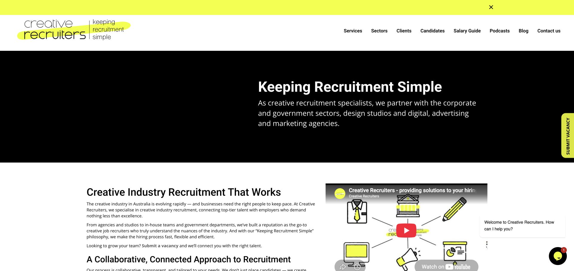
Creative Recruiters uses a bright yellow accent and an informal drawn identity to make its promise of simpler recruitment feel personal. The opening balances large type with supporting editorial and video material, rather than presenting a conventional corporate hero. The page distinguishes candidate and employer journeys and adds current content that can help explain the firm’s perspective. This is useful for a specialist business competing on familiarity and communication. The tradeoff is attention: an announcement strip, chat prompts and media can introduce several competing elements before a visitor has chosen a route. A friendly tone should reduce uncertainty, not make the practical vacancy or hiring action harder to find.
What you can learn
A conversational recruitment brand works best when the functional choices are equally plain. Edit announcement bars, chat and media so they support a job or hiring journey instead of competing with it at the top of the page.
Pros
The yellow accent and drawn identity make the specialist firm feel different from a generic recruitment template.
Editorial and video material provide another way to understand the business beyond the immediate commercial actions.
Cons & considerations
Announcement and chat treatments can compete with the core candidate and employer decisions.
An informal visual voice still needs clear role details, accessible forms and straightforward application expectations.
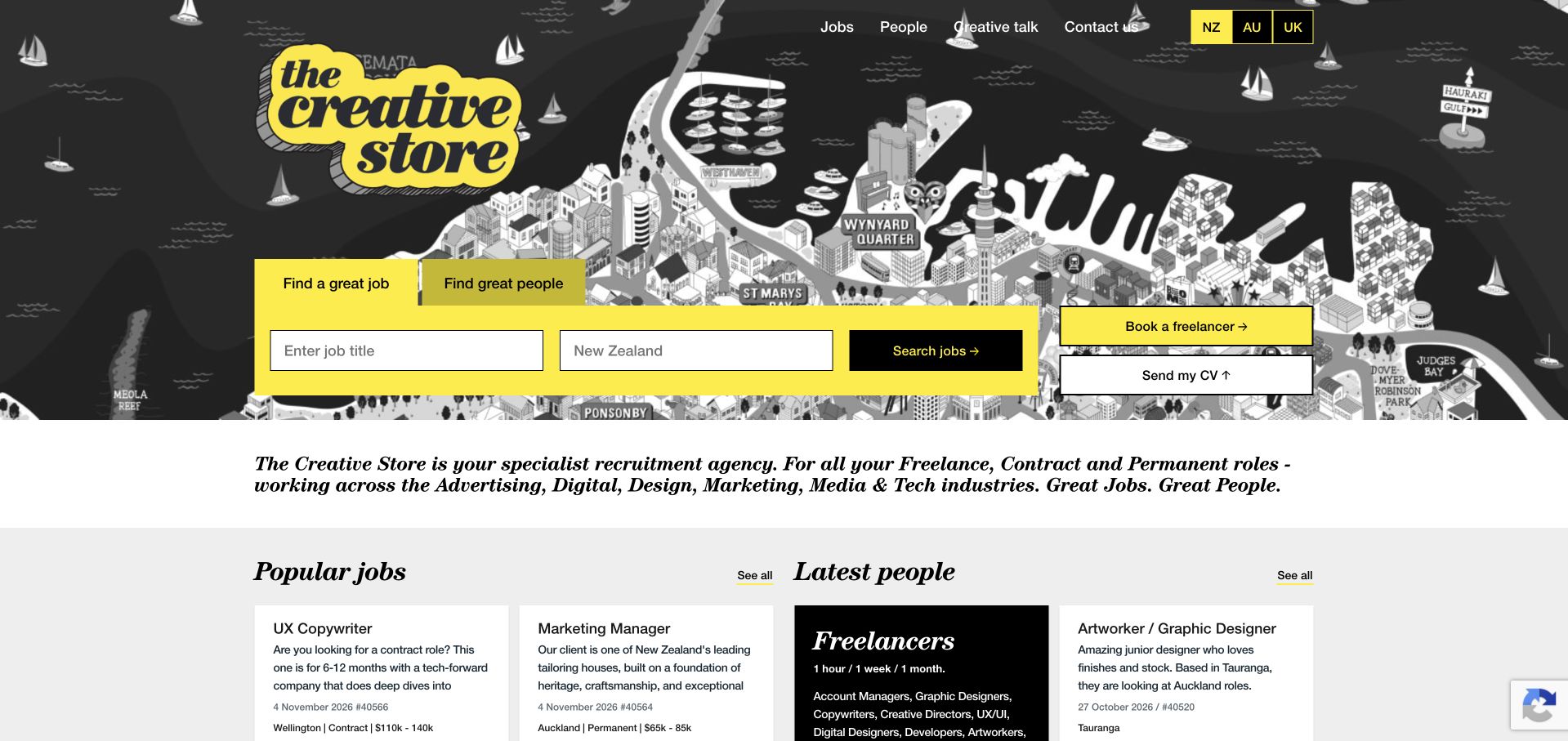
The Creative Store places a black-and-white Auckland illustration behind a bright yellow recruitment interface. The search area distinguishes finding a job from finding people, then provides concrete title and location fields. Additional freelancer and CV routes are visible without replacing the main search. Below, current jobs and available-people cards add role, date and other practical context. This is one of the more functional openings in the collection: the local illustration gives identity, while the interface immediately lets a user do the relevant task. The density needs careful management on mobile, and candidate availability or salary information must stay current rather than becoming a decorative catalogue of stale cards.
What you can learn
Let an active recruitment database shape the homepage around real tasks. Keep job and talent searches distinct, provide useful filters and assign clear ownership for expiry, availability and salary information after publication.
Pros
The two search modes directly reflect the different tasks of candidates and hiring clients.
A local illustrated backdrop gives personality without displacing practical role and location fields.
Cons & considerations
Several searches and secondary actions can become dense when arranged for a narrow mobile screen.
Job and available-talent cards require regular updates so dates and availability remain trustworthy.
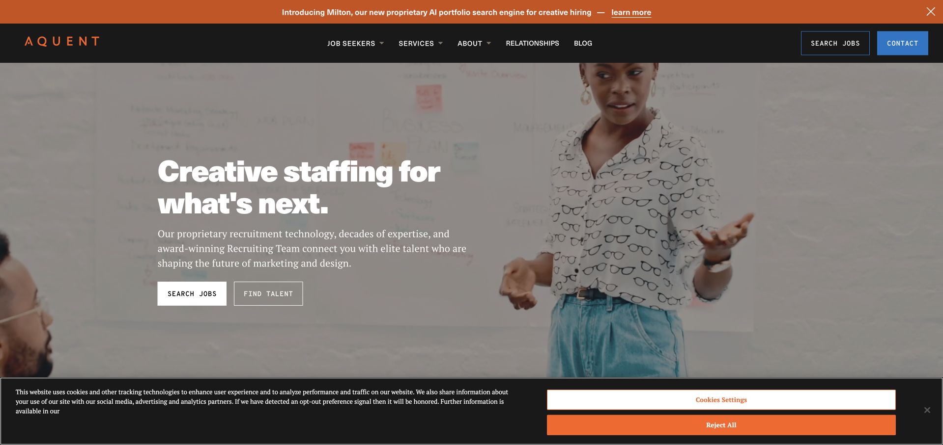
Aquent combines a dark and orange identity with a real team scene and a large, literal creative-staffing message. Job-search and talent-finding actions sit together beneath the introduction, making the two-sided purpose clear. The header supplies service and company routes, while a separate announcement layer introduces current business material. This balances a human visual identity with the practical vocabulary of recruitment. The hero remains a substantial media-led section, so its first-screen clarity depends on good contrast and a useful still image. A visitor arriving for a specific discipline or region still needs the next layer to narrow the offer, rather than treating the general creative-staffing statement as sufficient qualification.
What you can learn
A recruitment hero should identify the service and expose both primary audiences before adding a broader brand story. Keep specific disciplines, locations and engagement types within easy reach so the opening leads toward a relevant role or brief.
Pros
The service statement makes the recruitment purpose explicit rather than relying on imagery or a slogan alone.
Job and talent actions are presented together with clear differences in purpose.
Cons & considerations
A large moving team scene needs a strong static fallback, motion controls and reliable text contrast.
A broad creative-staffing proposition requires further qualification by discipline, geography and type of engagement.
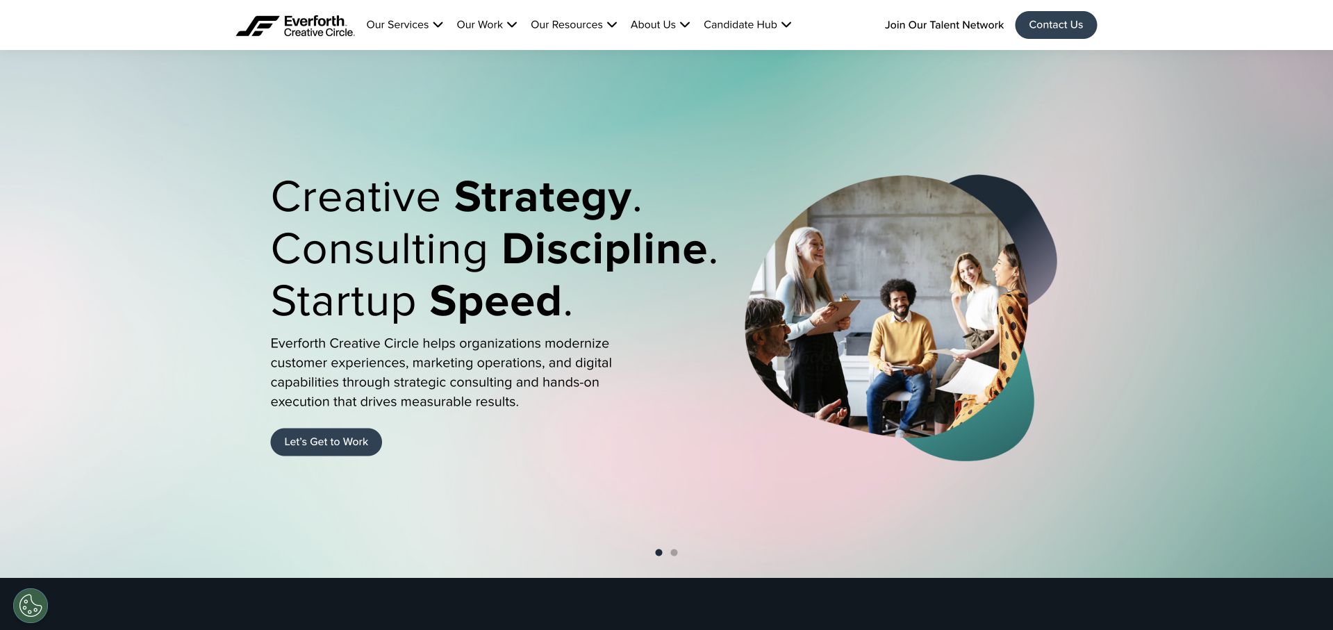
Everforth Creative Circle now opens with a strategy-and-consulting proposition rather than a simple vacancy-led headline. A pale green and pink field, strong black type and a rounded group photograph give the page a softer professional identity. Service and work navigation sit alongside a visible Candidate Hub and talent-network route, which helps preserve the recruitment side of the business. This is useful as a transition pattern: a firm can broaden its offer while still acknowledging existing audiences. The limitation is expectation. A candidate arriving from an older recruitment reference may need reassurance about where current roles live, while an employer needs to understand the distinction between staffing and a managed consulting engagement.
What you can learn
When a talent business adds consulting, explain the difference between hiring people and commissioning a delivered service. Preserve a clear candidate route and keep older brand references connected to the current offer without implying that every engagement model is unchanged.
Pros
The Candidate Hub remains visible even as the opening proposition shifts toward strategy and consulting.
A calm colour system and clearly separated text and image areas make the expanded offer readable.
Cons & considerations
Candidates arriving from older recruitment references may not immediately recognise the new consulting-led opening.
Staffing, talent networks and consulting need explicit scope distinctions so employers choose an appropriate enquiry route.
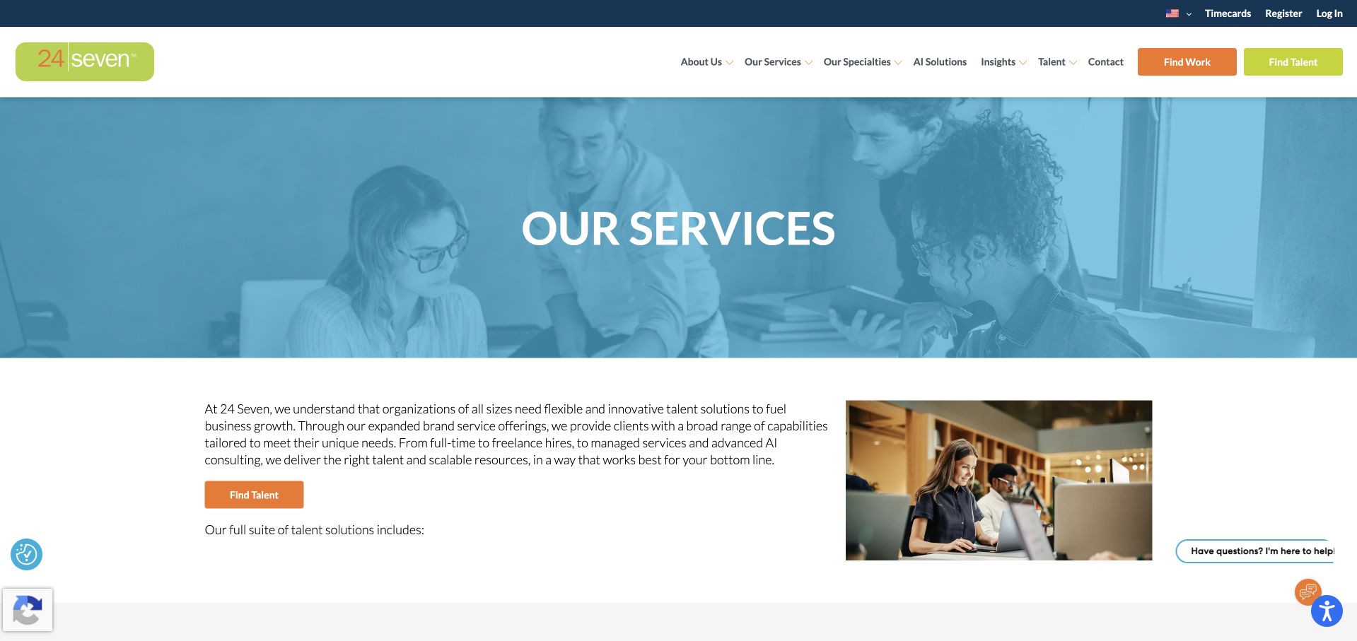
The reviewed 24 Seven example is its public services page, where a blue-tinted team photograph introduces a more detailed explanation of the offer. The opening paragraph and talent action lead into separate staffing and managed-service sections. Contract, contract-to-hire, direct hire and executive search are distinguished rather than compressed into a single promise about talent. This is useful for an employer who needs to understand which relationship fits a project. The page also keeps candidate and work-finding routes in the header, acknowledging the other audience without mixing its forms into the service explanation. The service overview is substantial, so clear headings and concise comparisons matter more than another decorative introduction.
What you can learn
Use a dedicated service page to explain the difference between staffing and managed delivery. Keep each engagement model concrete, preserve the candidate route and make a hiring enquiry relevant to the service the employer has just researched.
Pros
Separate staffing and managed-service sections make different commercial relationships more understandable.
Work-finding and candidate controls remain visible without replacing the employer-focused service explanation.
Cons & considerations
This capture is a dedicated services page rather than the homepage, so that context should remain clear.
A long catalogue of engagement models needs careful heading hierarchy and concise comparison to avoid overwhelming employers.
Celarity uses a large white list of engagement models against a slate-blue field, paired with a working-team image. Permanent search, interim support and talent advisory are not hidden beneath an abstract brand promise. Candidate and service actions appear together, while the curved lower edge softens an otherwise direct professional layout. This is useful for an employer who knows the kind of hiring support required but not the firm’s terminology. The long service headline can become a lot to absorb, however. Any highly visible guarantee or hiring claim needs its own conditions and explanation, and the page should make it easy to distinguish recruitment services from broader advice about a team or talent function.
What you can learn
Name the engagement models when they are an important buying decision. Give each a concise scope and next step, and keep conditions attached to guarantees rather than allowing an attractive headline to imply an unconditional result.
Pros
The opening makes several engagement models visible instead of hiding them within a general services menu.
Candidate and service actions create a practical bridge between a direct proposition and the next task.
Cons & considerations
A large list-style headline needs careful editing and wrapping to avoid overwhelming the opening view.
Guarantee and hiring claims require clear conditions and should not be read as evidence of future placement outcomes.
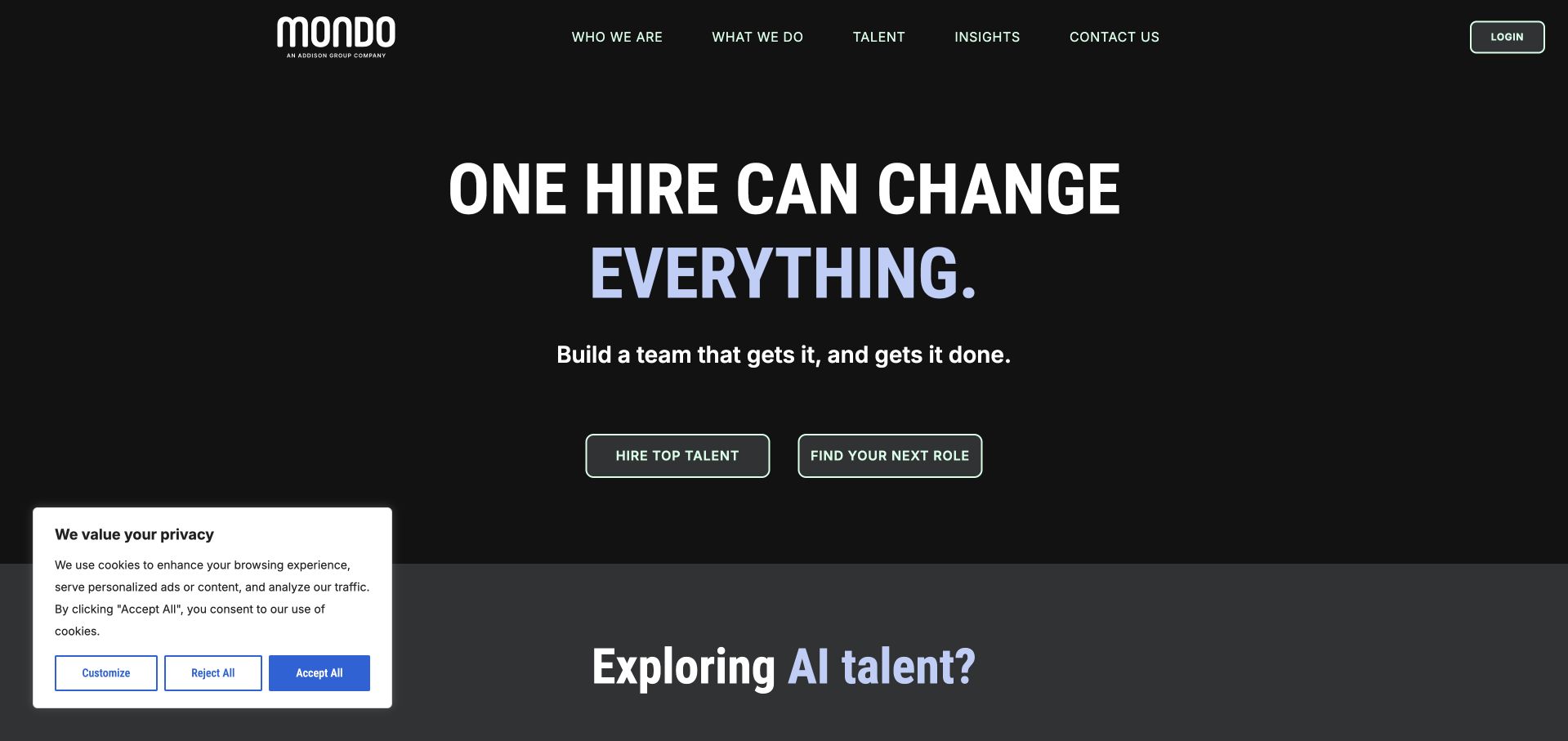
Mondo uses a nearly black canvas, very large white lettering and mint and lavender accents to create a forceful recruitment identity. The hero does not depend on a large office photograph; the main message, short explanation and two audience buttons carry the opening. Hiring and job-search routes are easy to identify, while service material expands into technical and AI-related recruitment below. This is a useful example of a text-led design that still feels energetic. The broad promise is deliberately dramatic, so the supporting pages need to supply the specifics: disciplines, engagement type, geography and what an employer or candidate can expect after making contact.
What you can learn
A bold text-first recruitment homepage can work when the actions remain literal and the supporting service structure is precise. Let the brand line create recognition, then use concrete role and engagement information to qualify the journey.
Pros
The limited dark, mint and lavender palette creates a distinctive identity without a heavy photographic hero.
Clear hiring and job-search buttons keep the two main audience paths visible beneath the large headline.
Cons & considerations
A dramatic hiring promise needs specific role and service evidence rather than being taken as an outcome guarantee.
Very large type and accent colours require careful contrast, line-length and responsive-layout checks.
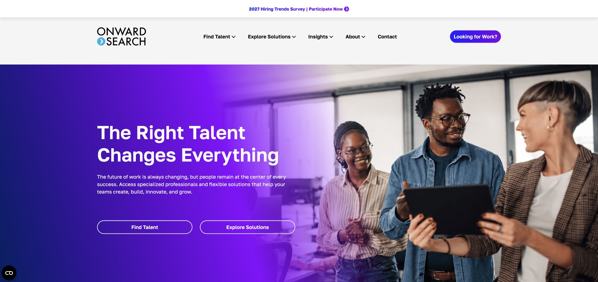
Onward Search combines a white header, purple identity and a split hero with a real team image. The text and image occupy distinct areas, making the central proposition more readable than a dense overlay on a photograph. Talent-finding and solution-exploration actions support different levels of employer readiness, while candidate routes remain part of the broader navigation. A current survey announcement adds an editorial layer above the main content. This is useful for a firm whose offer extends beyond individual placements, but it also creates several priorities in the first view. The announcement, consent interface and service actions should not make a visitor work harder to reach a current role or a relevant staffing brief.
What you can learn
Give specialist recruitment services and broader workforce solutions distinct explanations. Keep temporary announcements visually secondary, and make sure ordinary consent controls do not obscure the task a candidate or employer came to complete.
Pros
The split composition gives the service copy a stable, readable area alongside a human working scene.
Separate talent and solutions actions acknowledge different employer needs and levels of project definition.
Cons & considerations
Announcements and other opening-layer interfaces can crowd the core recruitment decisions.
Staffing and wider workforce solutions need clear scope distinctions to avoid an ambiguous employer journey.
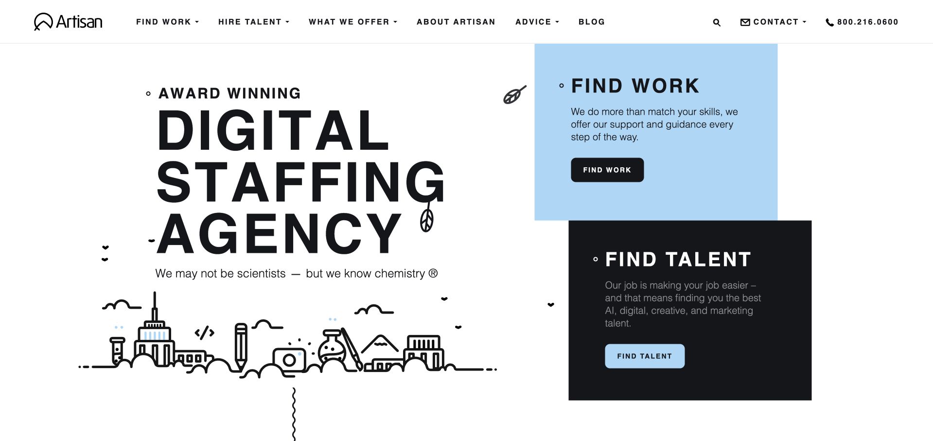
Artisan Talent uses a large condensed headline, spare line illustration and two oversized audience blocks. Find-work and find-talent choices dominate the right side rather than being secondary links in a menu. The result is immediately understandable as a two-sided staffing business, with a public telephone number and familiar navigation providing additional reassurance. The illustrated city scene adds personality without requiring a complex carousel. The visual hierarchy is strong, but the very condensed type and large black and blue blocks need careful testing at smaller sizes. A simple opening should still lead to detailed role information and employer service scope rather than making the audience selection the end of the explanation.
What you can learn
A recruitment homepage can be built around two large, unambiguous choices. Keep the visual identity light enough that role details, service scope and contact information remain easy to reach after the audience decision.
Pros
The large work and talent blocks make the site’s two main tasks clear without a preliminary menu interaction.
Simple line illustration adds character without displacing the practical recruitment choices.
Cons & considerations
Condensed typography can become difficult to read when scaled down or wrapped across narrow columns.
A very simple audience split still needs substantial downstream information about roles and employer engagement models.
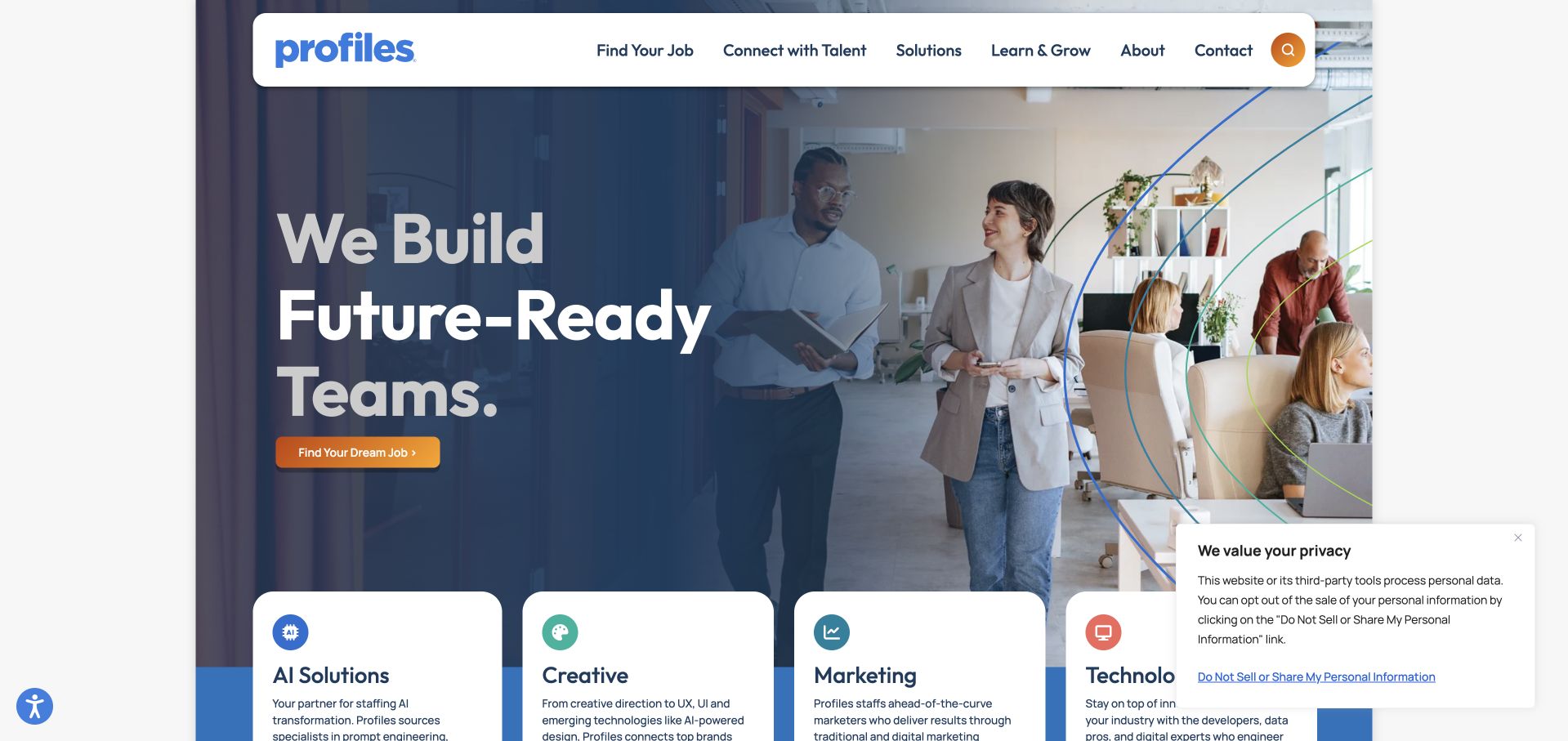
Profiles uses a floating white navigation bar over a large team scene, with a dark gradient protecting the opening text. An orange job action stands out, while curved colour lines give the image a recognisable brand treatment. The next layer introduces AI, creative, marketing and technology services as separate cards. That helps a broad talent firm avoid becoming a single undifferentiated staffing promise. The opening still gives more visual weight to one job-seeker action than to a detailed employer brief, so audience balance should be considered. Discipline cards also need concrete examples and clear engagement types rather than relying on fashionable category names to explain what the firm actually supplies.
What you can learn
Use a small discipline grid to make a broad recruitment offer navigable. Keep the candidate and employer journeys balanced, and explain the roles and engagement models behind broad categories such as AI or technology.
Pros
A protected text area keeps the main proposition readable over a substantial team photograph.
Distinct discipline cards help visitors narrow a broad talent offer without reading a long service paragraph.
Cons & considerations
The visual emphasis on one opening action needs to be balanced against the employer’s route to a relevant brief.
Broad discipline labels require role examples and scope details so they do not become empty category marketing.
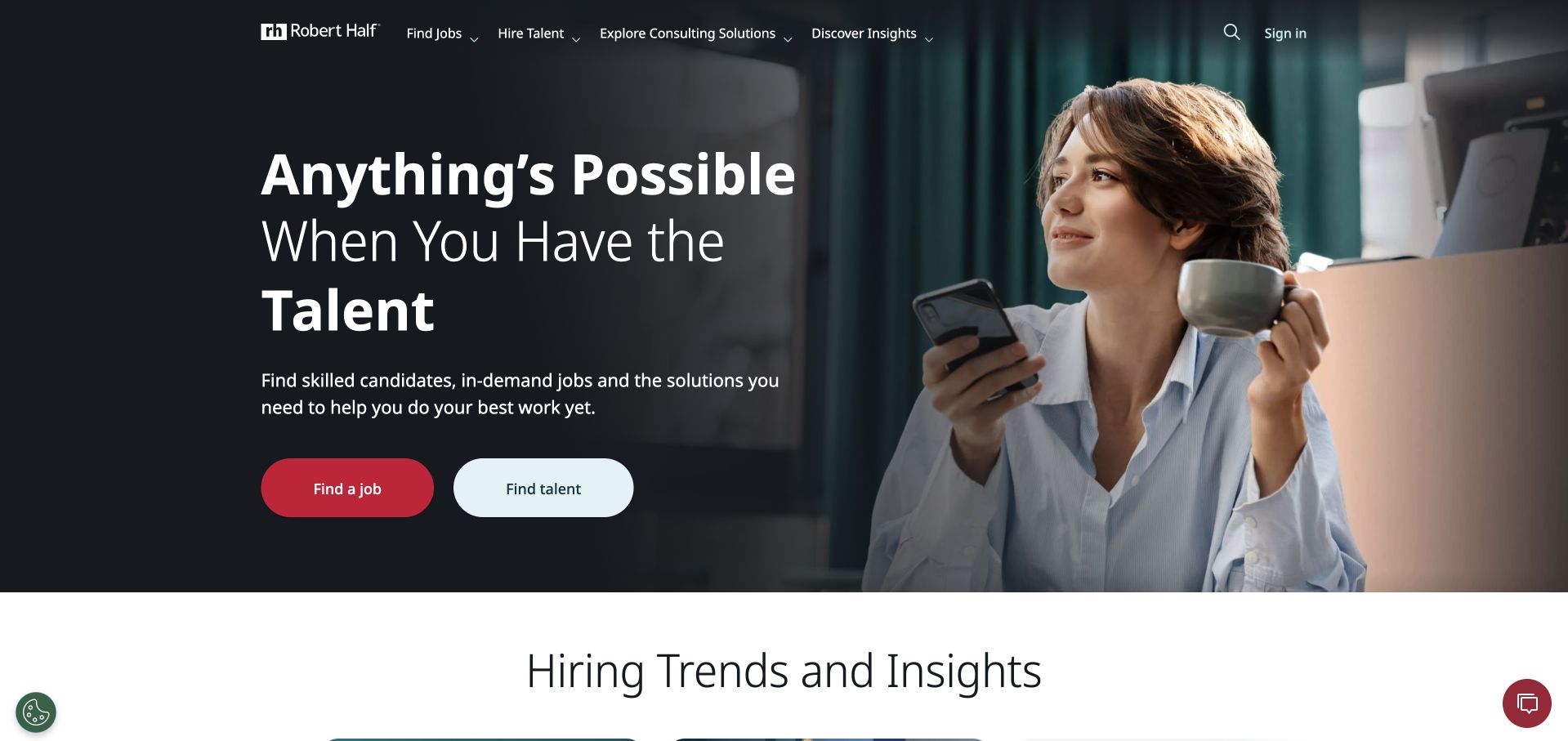
Robert Half pairs a dark photographic hero with a large, readable proposition and two plainly labelled actions: finding a job and finding talent. The header separates recruitment, consulting and insights, which is important for a business whose offer extends beyond placements. A human portrait keeps the opening approachable without carrying the whole explanation. The structure is useful because a large organisation can otherwise present a maze of sectors before a visitor has chosen an audience. The two-button opening is only the beginning, however. The next pages must preserve region, role and engagement context, and a consulting enquiry should not be treated as interchangeable with hiring an individual professional.
What you can learn
Use the opening to establish audience, then progressively narrow by location, discipline and engagement model. Keep consulting distinct from recruitment and preserve those choices as users move into search results or employer enquiries.
Pros
The two main actions use literal language that makes the candidate and employer split immediately understandable.
Separate consulting and insights navigation recognises a wider offer without crowding the hero with every service.
Cons & considerations
A simple opening can conceal a complex downstream journey unless audience and regional context are preserved.
The photographic hero still needs stable contrast, readable text and a useful presentation without large media assets.
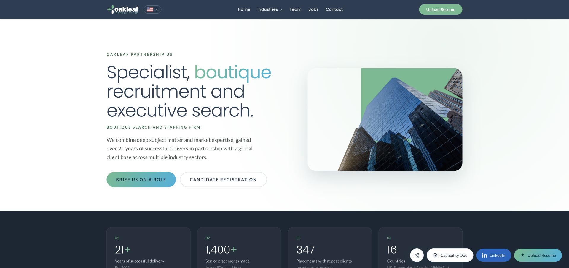
The reviewed Oakleaf Partnership destination is its US regional page. A pale background, mint and blue accents and a modest city photograph give the opening a calm professional character. The headline explicitly identifies boutique recruitment and executive search, while briefing a role and candidate registration appear as separate actions. Below, numbered capability sections explain corporate functions, executive search and interim support. This is useful for a visitor trying to distinguish a retained search from another staffing need. Published scale figures provide context but remain the firm’s own claims. The regional structure and multiple capabilities also require care so that a candidate or employer reaches the team and service appropriate to the actual location.
What you can learn
A specialist recruiter should explain the difference between executive search, interim support and other staffing services before collecting a brief. Keep regional context visible and separate candidate registration from an employer’s role requirements.
Pros
The literal boutique recruitment and executive-search headline makes the service clear without a long introduction.
Separate role-briefing and candidate-registration actions reflect genuinely different information needs.
Cons & considerations
Published scale and placement figures need dates and definitions rather than being interpreted as outcome guarantees.
A regional site needs clear onward ownership so users reach the right team for their market and engagement.
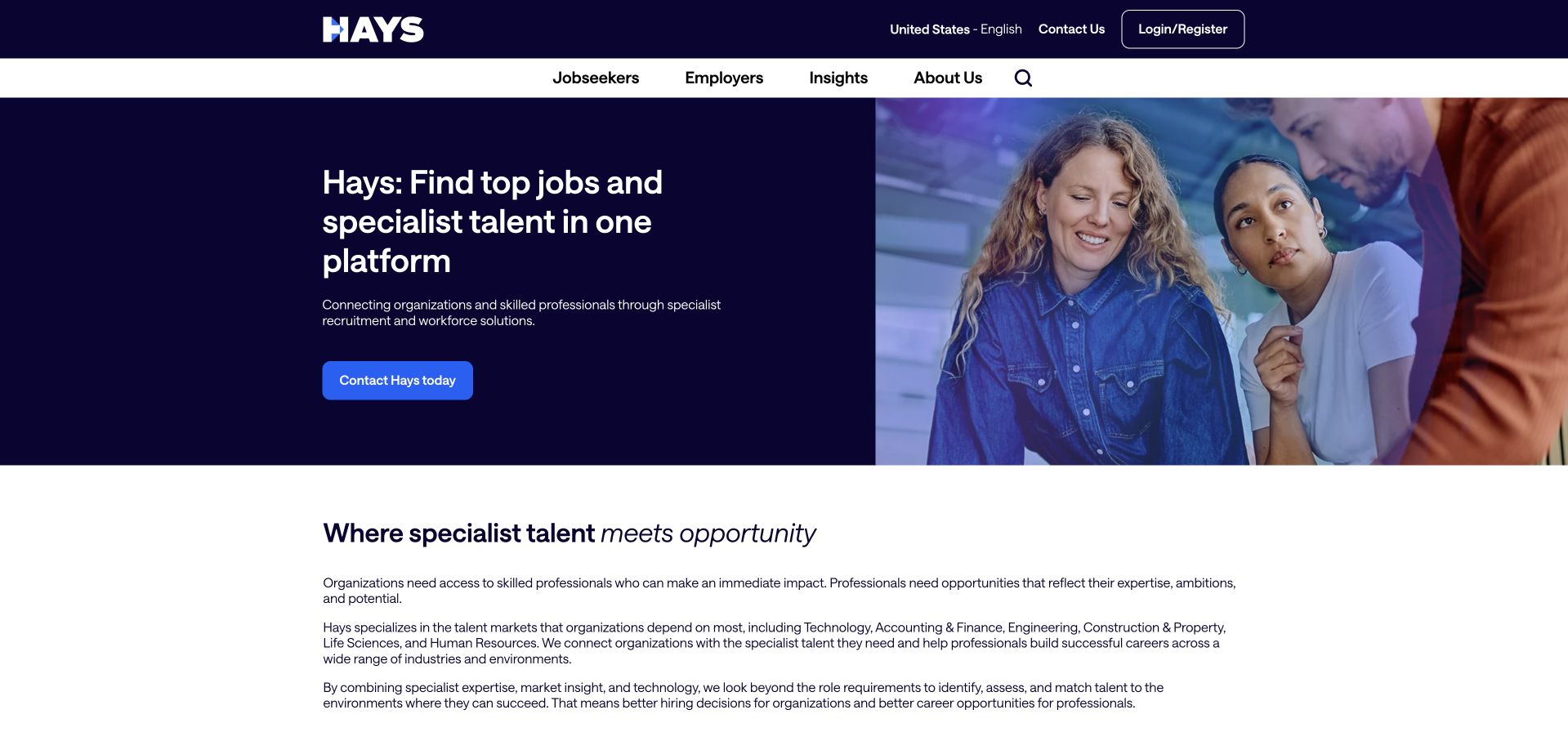
Hays uses a blue and navy split opening with a clear regional jobs-and-talent statement. A working-team photograph occupies the other half, while the white header exposes job-seeker and employer choices. The body develops the service catalogue and supporting resources rather than relying on a single dramatic claim. This is a practical structure for a recruitment business with a large role inventory: users can identify the audience and region before choosing a specialism. The breadth still needs careful progressive disclosure. A large recruiter can easily become a directory of repeated links, so the next step should narrow by a meaningful role, location or hiring requirement instead of presenting every possible destination at once.
What you can learn
Make audience and region explicit before a user enters a large vacancy or service catalogue. Use progressive filtering to narrow the journey and keep role information complete without turning the homepage into an exhaustive directory.
Pros
The regional jobs-and-talent statement gives a practical context to the broad staffing offer.
The split text-and-image layout preserves a readable proposition while retaining a human visual identity.
Cons & considerations
A large service and vacancy inventory can become repetitive without deliberate filtering and navigation hierarchy.
A broad opening still needs clear distinctions between job search, employer recruitment and related professional services.
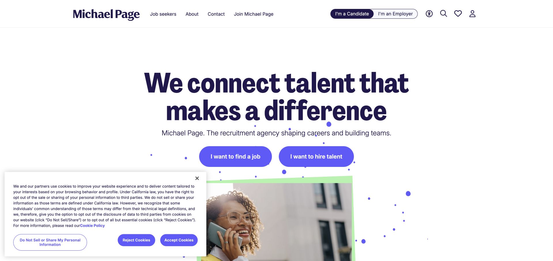
Michael Page uses a mostly white canvas, purple typography and a clear candidate-versus-employer switch in the header. A cropped portrait and lime decorative elements provide energy without overpowering the written proposition. The audience switch is a useful organising idea because it acknowledges that the same domain serves two very different research tasks. The quieter composition also gives search and supporting information room to develop below. The challenge is maintaining context after the switch: employers should see relevant recruitment services, while candidates should reach current roles with clear details. Decorative imagery cannot compensate for stale vacancies, vague locations or an application route that loses the selected role.
What you can learn
An audience switch can simplify a large recruitment site when each state has genuinely relevant content. Preserve the selected audience, region and role context throughout search, applications and employer enquiry forms.
Pros
The explicit audience switch makes the candidate and employer distinction visible without a crowded hero.
A restrained white and purple layout gives the proposition room while the portrait adds a human element.
Cons & considerations
Audience controls need a clear active state and predictable behaviour for keyboard and assistive-technology users.
The downstream experience must preserve audience and role context rather than returning users to a generic contact flow.
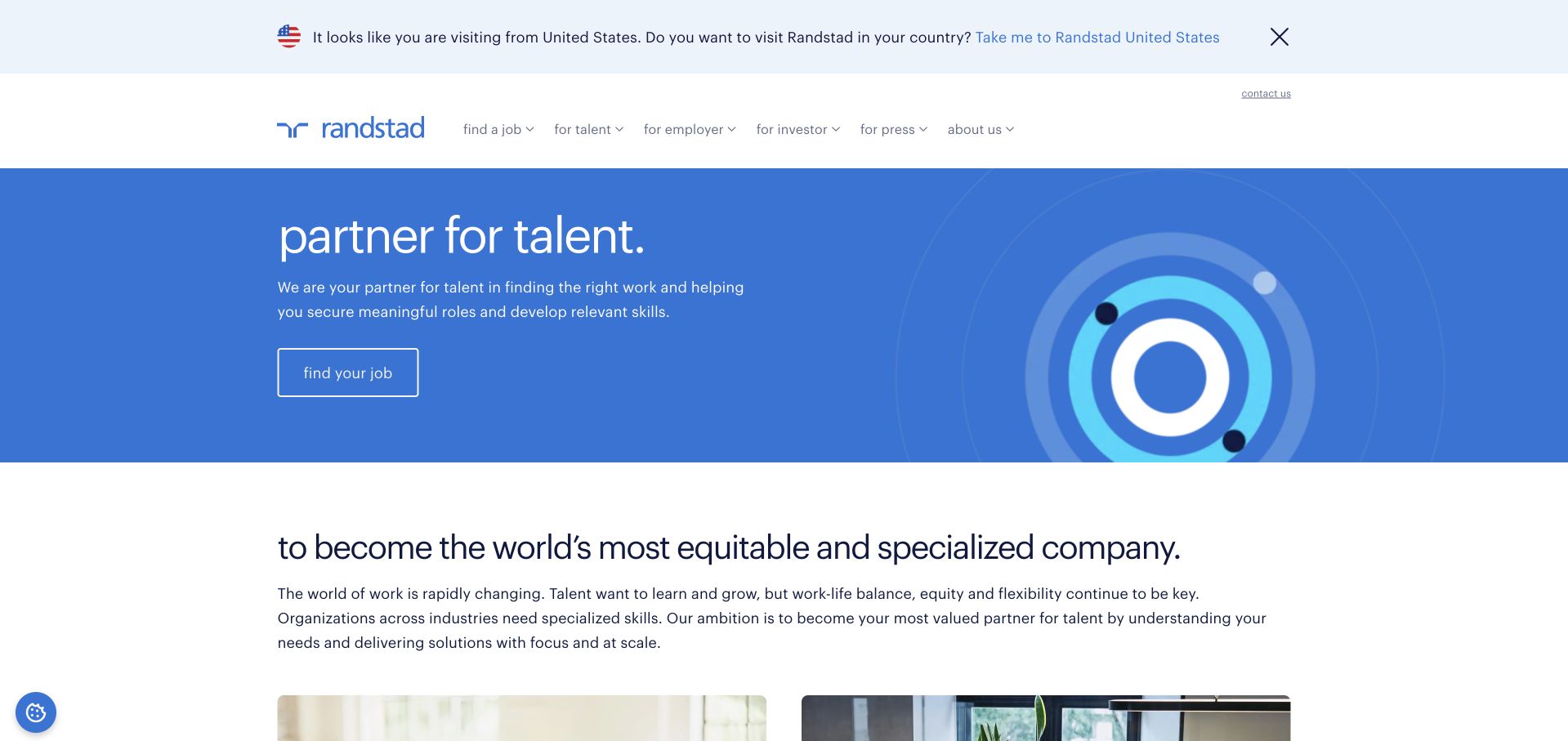
Randstad uses a blue illustrated hero and a short talent-oriented message, with a practical job action nearby. The header distinguishes talent, employer, investor and press audiences rather than mixing all corporate material into one menu. A country suggestion acknowledges that the global page may not be the best place for a local vacancy search. The simple target-like illustration is less literal than an office photograph, leaving the text to explain the recruitment purpose. This is useful for a global group, but it introduces a tension between corporate positioning and local tasks. Region prompts and promotional overlays should not obscure a candidate’s route to jobs or an employer’s route to the appropriate team.
What you can learn
A global recruitment homepage should help users reach the relevant country experience without trapping them in repeated prompts. Keep corporate audiences separate and make local job and hiring journeys more prominent than temporary promotional overlays.
Pros
Distinct stakeholder navigation separates recruitment tasks from investor and press information.
A country suggestion recognises that local roles and employer services need regional context.
Cons & considerations
Country prompts and promotional overlays can interrupt a straightforward vacancy or hiring task.
A broad global message needs a clear local handoff before it becomes useful for a specific role or brief.
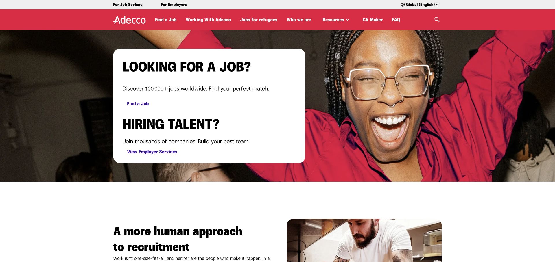
Adecco uses its red identity, a large human photograph and two white audience panels to explain the next step. Looking for work and hiring talent are treated as separate decisions within the same opening view. The header remains recognisable and practical, while the following content expands on the company’s approach. This is useful for a broad staffing business because the visitor does not need to understand every industry practice before moving forward. The simplicity also creates a responsibility downstream: each route must preserve region and intent and provide detailed, current information. A general staffing homepage should not imply that every visitor receives the same service or that a job-search route is an immediate application to a specific vacancy.
What you can learn
Use a simple audience split to reduce the first decision, then make the next page specific. Keep job discovery, candidate registration and an application to a named vacancy clearly distinct in both wording and workflow.
Pros
The two audience panels communicate the main recruitment choices quickly and in plain language.
A consistent red identity and human image make a broad staffing brand easy to recognise.
Cons & considerations
A very broad audience split needs region and service qualification immediately after the first click.
Candidate registration and applications must not be conflated simply because both involve submitting personal information.
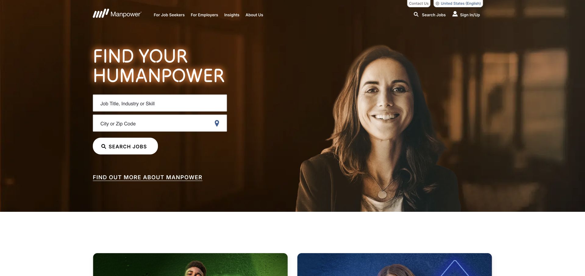
Manpower places job title or skill and location fields directly in the opening hero. A warm photographic background and a clear white search action make the task feel prominent rather than secondary to a corporate story. Employer and job-seeker routes remain available in the header, while a separate company-information link gives researchers another path. This is a good example of allowing the most common candidate task to shape the homepage. The search fields still need proper labels, useful suggestions and a meaningful empty state. A visually strong search cannot compensate for stale roles, ambiguous locations or results that lose the terms a user entered.
What you can learn
If vacancy discovery is the main task, give it a real interface at the top rather than a generic button. Carry query and location context into results, make empty states useful and keep the employer route available without confusing it with candidate search.
Pros
Role and location fields make the candidate’s practical task available immediately in the hero.
A high-contrast search button is easy to distinguish from the quieter company-information route.
Cons & considerations
Search fields need persistent accessible labels and usable error or empty-result states beyond their visual placeholders.
A candidate-focused opening must still provide a clear, separate route for employers seeking staffing support.
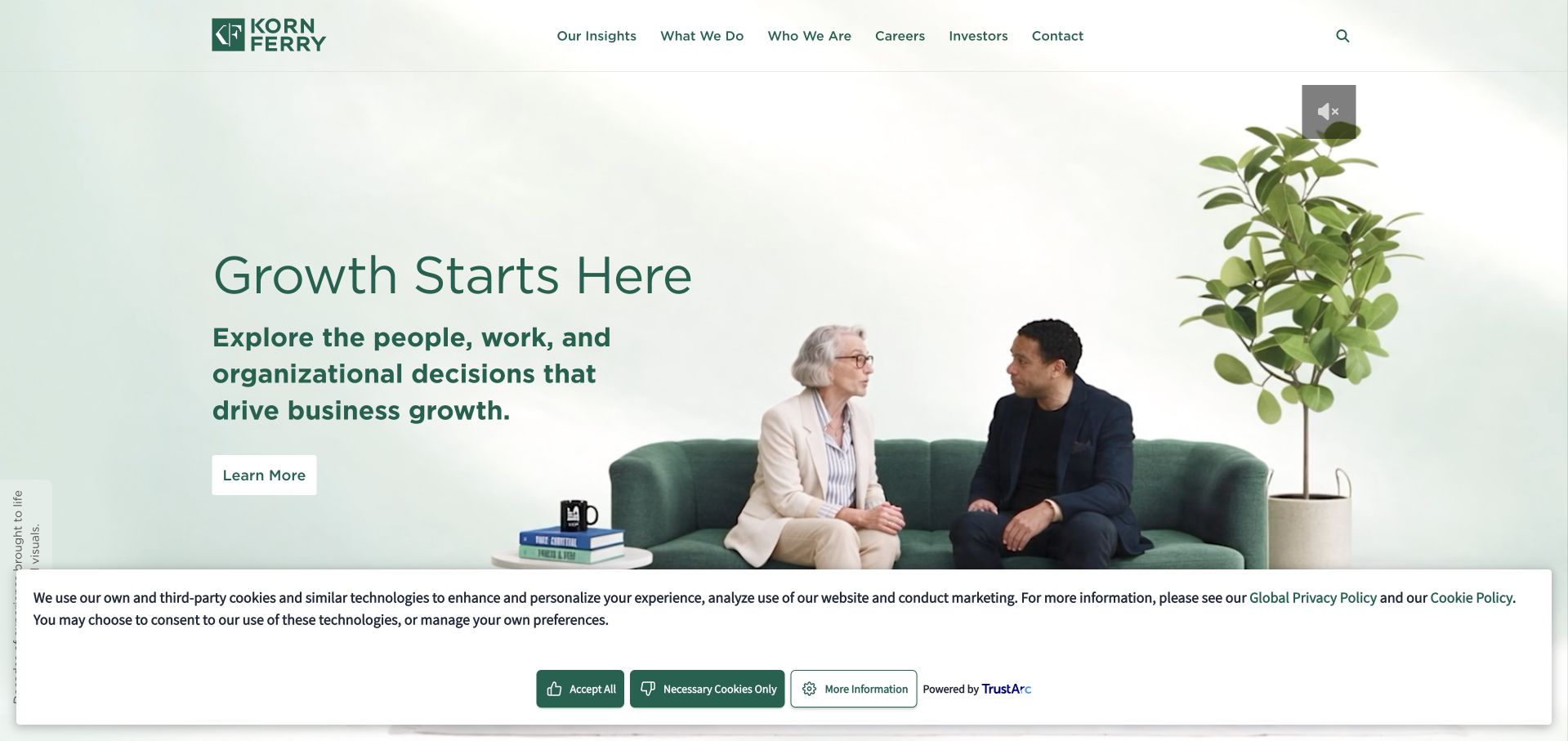
Korn Ferry uses a pale green opening and an expansive growth-oriented message to frame leadership and organisational services. The main navigation separates what the firm does, insights, company information and careers, reflecting a business broader than a conventional job board. The page also discloses the use of AI-generated visuals, an important detail when evaluating the human-looking imagery. This is useful as a study in professional-services positioning rather than a template for high-volume vacancy search. The opening needs supporting service explanations so visitors understand whether they are looking at executive search, leadership development or another advisory engagement. A broad growth promise should not be read as evidence of a placement or business outcome.
What you can learn
An executive-search business can present a broader advisory offer when each service has a clear scope. Disclose synthetic imagery where relevant and distinguish leadership consulting from recruitment instead of allowing one aspirational proposition to stand for both.
Pros
The service and insights structure supports a broader leadership business without pretending it is simply a vacancy board.
The visible synthetic-image disclosure gives readers important context about the presentation of people-like visuals.
Cons & considerations
The broad growth-led opening does not immediately explain the boundaries between search and consulting services.
An aspirational business message needs specific engagement descriptions and should not imply guaranteed leadership or commercial outcomes.
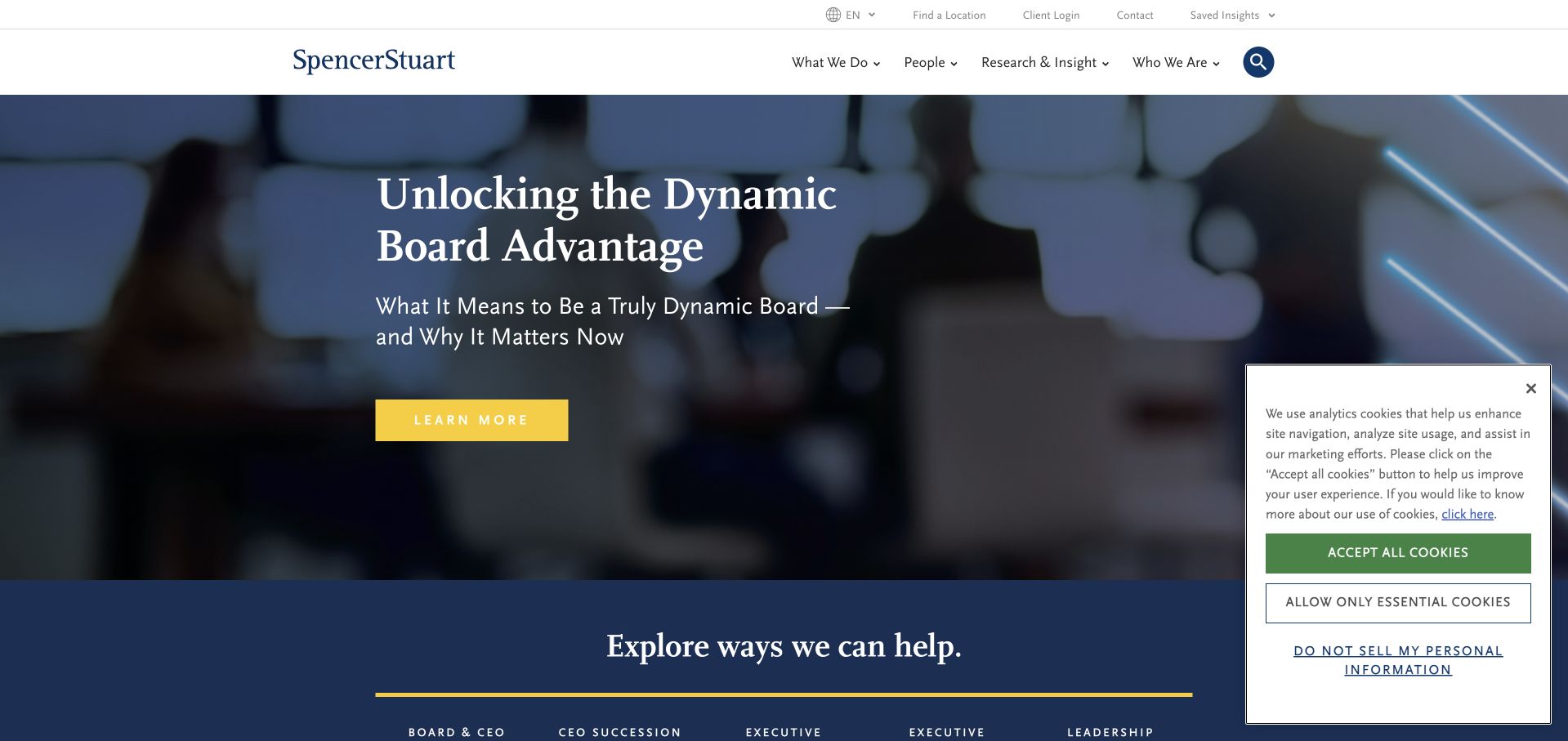
Spencer Stuart opens with a boardroom setting and an editorial feature about board effectiveness rather than a list of vacancies. Elegant serif typography, a dark blue field and a bright yellow action establish a restrained senior-audience tone. The wider navigation exposes executive-search and leadership services, keeping the commercial offer connected to the research material. This is useful for a retained-search practice whose clients may be exploring a leadership challenge before commissioning a search. It is less relevant as a model for a recruiter whose main audience needs immediate job filtering. The editorial feature should also have clear authorship and dates so that a polished research presentation does not become an unsupported authority claim.
What you can learn
Choose the opening task to match the recruitment model. For retained search, a relevant leadership question can be a credible entry point, provided the service scope, authorship and route to an appropriate adviser are easy to find.
Pros
The boardroom setting and editorial tone align the page with senior leadership and retained-search audiences.
Leadership research is connected to a visible professional-service structure rather than floating as unrelated content.
Cons & considerations
A thought-leadership hero is less useful for candidates seeking a quick list of current vacancies.
Research-led authority needs clear authorship, date and scope rather than relying on prestigious presentation alone.
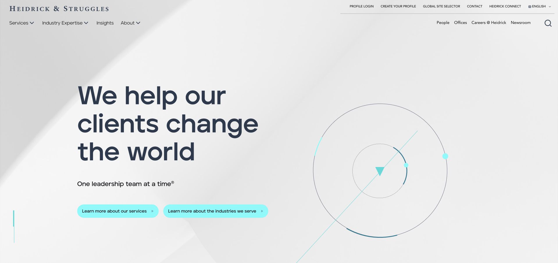
Heidrick & Struggles uses a pale opening, an abstract orbital illustration and a large blue statement to frame change and leadership. Two aqua actions provide a clearer next step than a single general contact invitation. The header exposes service and expertise routes alongside company information, while utility controls account for international and returning users. The composition is deliberately calm and spacious, appropriate to a more considered professional-services decision. Its abstract imagery does not explain a particular engagement, however. Search, interim leadership and advisory work need concrete descriptions, and candidates should not be forced through an employer-oriented enquiry simply because the main proposition addresses business leaders.
What you can learn
Keep an executive-services homepage calm, but make its engagement models concrete. Give employers and candidates appropriate routes and explain what a first conversation concerns before collecting detailed personal or organisational information.
Pros
The spacious text-and-illustration composition gives a senior-audience proposition a clear reading hierarchy.
Service and expertise navigation helps distinguish a broad leadership offer from a conventional vacancy board.
Cons & considerations
Abstract orbital imagery cannot explain the practical scope or deliverables of an executive engagement.
International and returning-user controls need careful hierarchy so they do not compete with first-time service discovery.
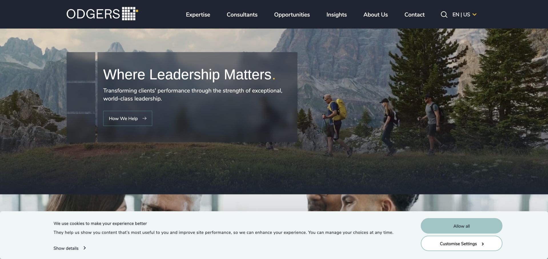
The reviewed Odgers page is the US regional destination. A dark header, outdoor team imagery and a substantial text panel introduce a leadership-oriented proposition, with a direct route to how the firm helps. The broader page includes sector and consultant material, which is particularly important in executive search: the relevant specialist matters more than a generic central form. The visual treatment feels more grounded than an abstract leadership diagram, but the opening still makes a broad promise. Visitors need to understand the exact search or advisory service and the regional team responsible. A regional label also needs to persist when moving into consultant profiles and contact routes.
What you can learn
Executive-search sites should make relevant consultants discoverable by sector and market. Use the regional opening to set context, then connect a leadership question with an identifiable team rather than treating every enquiry as interchangeable.
Pros
The regional destination gives a global search business a more concrete market context.
Consultant and sector discovery supports the relationship-based way many executive-search enquiries develop.
Cons & considerations
A broad leadership proposition needs specific search and advisory scope before a visitor can assess fit.
Regional context should remain visible across profiles and enquiry routes rather than disappearing after the homepage.
Ellwood Atfield opens with a large moving office scene masked through the firm’s initials, creating an unusually cinematic first view. The menu and contact control remain visible, but the literal explanation comes in the following section: the firm describes communications, policy and advocacy headhunting and then organises five practice areas. This is useful because a boutique can have a strong visual identity without pretending to serve every job market. The opening also demonstrates a tradeoff. A visitor must move past the visual introduction before understanding the niche, and the animation needs a useful static state. Published appointment figures are context, not an independent measure of search quality or future results.
What you can learn
A niche recruiter should explain its discipline and practices clearly even when the opening is highly expressive. Treat an animated identity as an introduction, not a gate, and preserve a direct route to the service and contact information.
Pros
The initials-based office film creates a distinctive identity for a specialised boutique practice.
The following copy names communications, policy and advocacy rather than relying on a broad recruitment label.
Cons & considerations
The cinematic first screen delays the literal service explanation for an unfamiliar visitor.
Large animated initials need an accessible static alternative and should not obstruct navigation or reduced-motion preferences.
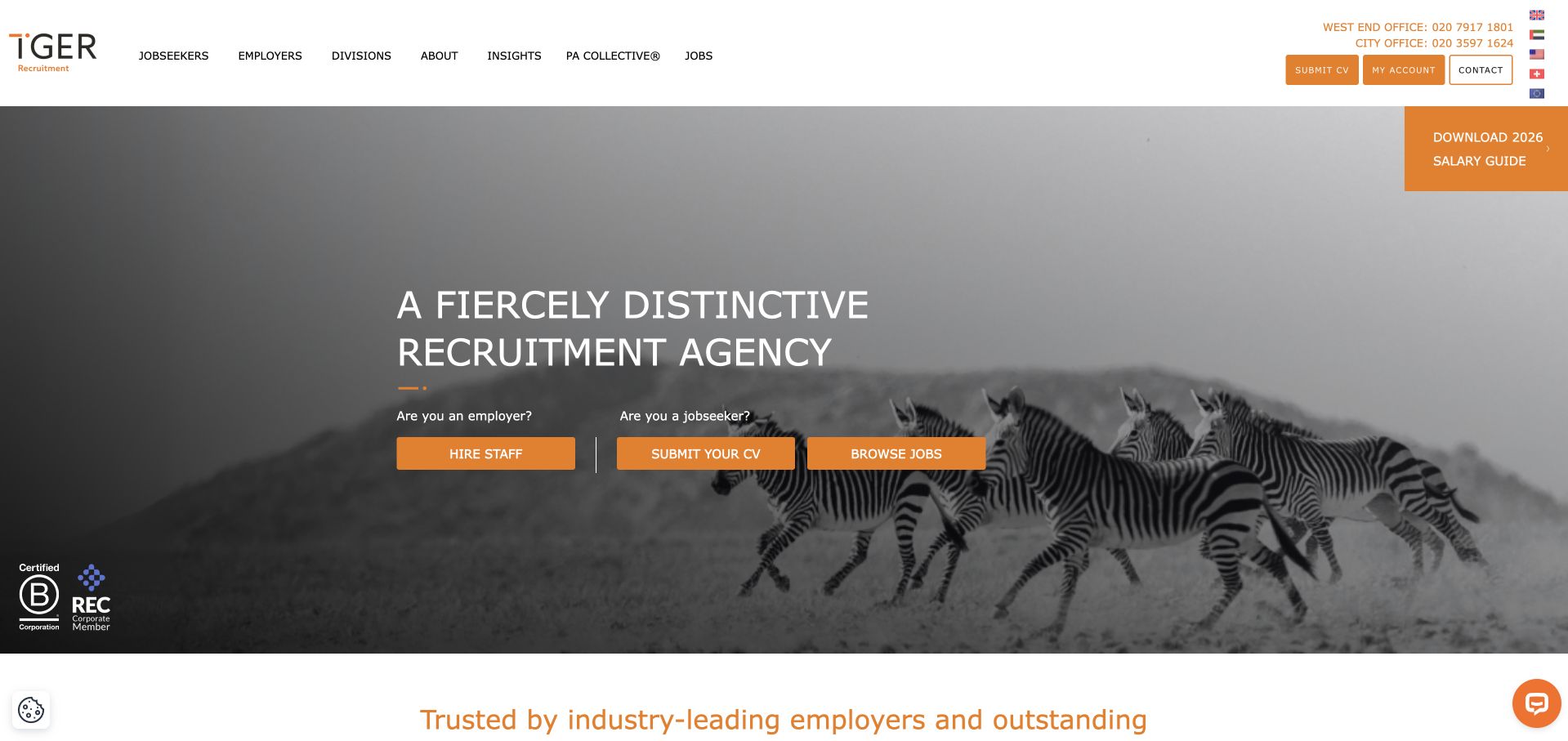
Tiger Recruitment uses a black-and-white zebra photograph to reinforce its distinctive brand language. The white headline and orange actions remain readable against the image, while separate labels distinguish hiring staff, submitting a CV and browsing jobs. That three-way structure is useful because candidate registration is not the same task as applying for a known vacancy. The header adds public contact and regional controls, giving a larger practice practical context. The metaphor is memorable, but it should not carry the service explanation alone. Role disciplines, markets and engagement models need to be clear in the supporting content, and the substantial header needs simplification when adapted to mobile.
What you can learn
Separate hiring, general candidate registration and browsing live vacancies when all three are important tasks. A memorable brand metaphor can support recognition, but literal role and market information should still qualify the next step.
Pros
Three distinct actions recognise the difference between employer enquiries, CV registration and vacancy browsing.
The monochrome animal photograph and orange accents create a recognisable brand system.
Cons & considerations
A metaphor-led headline requires supporting service information for visitors unfamiliar with the firm.
Telephone, country and navigation controls can create a dense header unless mobile priorities are clearly defined.
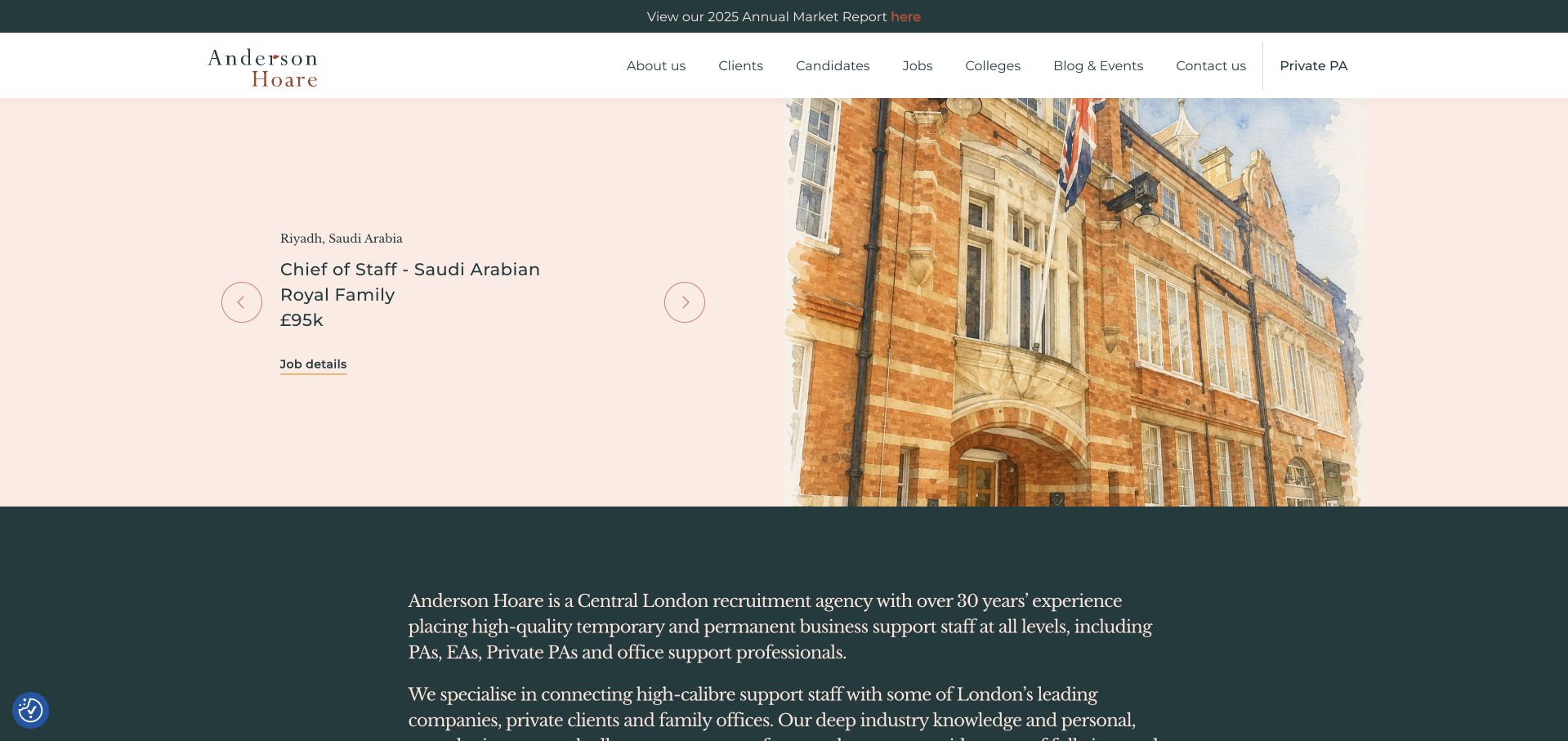
Anderson Hoare uses a cream field, a restrained serif identity and a London street illustration to create a quieter recruitment brand. Rather than opening only with a general promise, the page features a specific role with location, title and salary context. A job-detail action sits close to that information, while the company introduction follows in a contrasting green section. This makes an actual vacancy part of the evidence for the business. It also creates a maintenance obligation: a featured role must be removed or clearly updated when its status changes. The calm composition should not make practical controls too small, and a job feature still needs an obvious alternative for employers.
What you can learn
A boutique recruiter can use one well-specified role as a meaningful homepage feature. Assign an expiry and editorial owner to that slot, and preserve a clear employer route so the page does not become relevant only to one candidate profile.
Pros
Location, role and salary context make the opening more concrete than a generic recruitment slogan.
The restrained illustration and serif identity create a distinctive boutique tone without excessive visual complexity.
Cons & considerations
A featured vacancy becomes misleading if its status or availability is not actively maintained.
Small quiet controls need adequate contrast, touch targets and an equally discoverable employer journey.
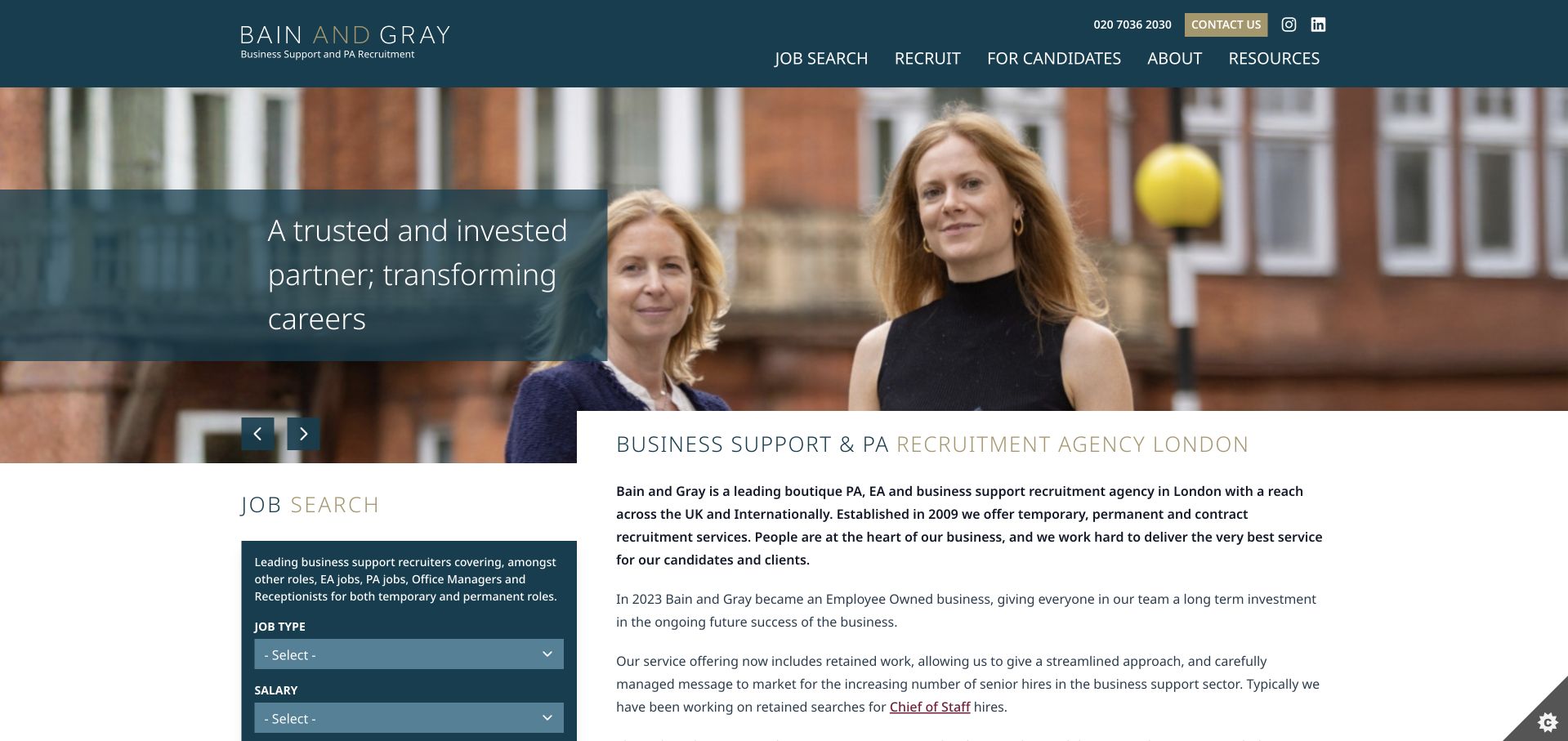
Bain and Gray combines a real people-led hero with a persistent regional and professional identity. Below the image, a compact job-search panel sits beside a substantial introduction to PA, EA and business-support recruitment. Employment type and salary choices help candidates narrow the catalogue, while separate candidate and client routes explain the relationship on either side. The company’s employee-owned background and named testimonials add context without needing to dominate the first screen. The main tradeoff is density: the introduction is long and the search panel contains several controls. Those elements should remain readable and useful when stacked on a phone, with current role data and clear labels.
What you can learn
A recruitment homepage can combine practical filters with a relationship-led introduction when each has its own space. Keep the written story concise, maintain vacancy data and make candidate and employer pathways distinct after the search area.
Pros
The adjacent search panel gives candidates a useful task while the main text explains the recruitment specialism.
Separate client and candidate routes support the different expectations and information needs of each audience.
Cons & considerations
A long introductory block can bury important service and engagement details within dense prose.
Salary and employment-type filters need accessible labels, useful empty states and regularly maintained vacancy data.
Kegan is a freelance web designer and developer with 15+ years of experience helping businesses turn complicated website requirements into clear, maintainable digital experiences. He works directly with clients from planning and design through development, launch, and ongoing support.
For recruiter website design, his development approach focuses on distinct candidate and employer journeys, specialist practice content, accessible job discovery, and ATS handoffs. The scope can be a targeted improvement or a complete custom build, with responsive layouts, thoughtful content structure, and integrations chosen around the people using and maintaining the site.
Show 3 other recruiter website designersHide other recruiter website designers
Plan the full recruitment journey, not only the homepage
Map role data from source to application
Identify the system that owns each vacancy and the fields that must remain consistent across cards, detail pages and applications. Preserve the selected role when the user moves to another platform. Avoid a generic CV-upload page that loses the job reference. Plan status changes, duplicate roles, expired URLs and useful empty states before designing filters. A clean search interface is only credible when the underlying inventory is maintained.
Write a useful employer brief
Ask about the role, location, engagement type, likely timing and the problem the employer is trying to solve. Explain whether the first conversation concerns a placement, a retained search or a wider talent programme. Make the relevant specialist visible where practical. Do not require sensitive personnel information or a complete internal hiring plan before the visitor understands who will receive it and what the next step means.
Design CV handling as a trust task
Explain the purpose of registration, the relationship to a named vacancy and where to find the privacy information. Keep optional marketing preferences distinct from necessary application steps. Tell users which file types are supported and provide meaningful errors without discarding their work. Test the entire handoff with non-sensitive sample data in an approved environment; a visually attractive form is not complete if it fails silently or creates ambiguous confirmations.
The editing job behind the design
Connect the ATS without surrendering the candidate experience
Choose a content and ATS integration around ownership of role data, not a logo list. The public site needs consistent identifiers, predictable role URLs, reliable expiry handling and a clear application handoff. A recruiter’s editorial CMS can own service pages and resources while the role system owns vacancy status, but the boundary must be deliberate. Avoid presenting a platform’s customer story as proof of the exact technology used by the marketing homepage.
Search, filtering and file controls need accessible labels and useful feedback. Preserve focus when results change, make the active audience and region clear, and provide a workable route when no matching roles exist. Use structured data only where it matches the visible individual vacancy and current implementation guidance. The sources below support accessibility and job-page planning; they do not certify that any example’s application journey or hiring process has been independently audited.
Our WordPress website examples offer a separate look at publishing approaches. A visible platform label is evidence for that named page, not a guarantee that the same system will suit your requirements.
Before the public launch
Recruiter website planning checklist
Distinguish job seekers, employers and any executive-search audience.
Separate candidate registration from applying to a named vacancy.
State the disciplines, markets and engagement models actually offered.
Give every live role a stable identifier and useful detail page.
Keep title, location, employment type and status consistent across systems.
Assign responsibility for closing expired roles and maintaining old URLs.
Preserve role context when applications move to another platform.
Explain CV handling and link relevant privacy information before upload.
Keep optional marketing choices separate from the application task.
Provide meaningful empty search results and file-validation errors.
Test audience switches, filters and forms with keyboard and mobile users.
Validate any JobPosting implementation against current official documentation.
These checks are a project checklist, not a performance, legal, security, or accessibility certification. Test real journeys with the people responsible for the website before making claims about the result.
Sources & editorial method
How this collection was selected and reviewed
The examples were inspected as public pages and recorded with direct browser captures. Reviews are original observations about audience structure, imagery and task design, not tests of hiring results or private applicant systems. Primary role-page and accessibility references inform the planning notes; no application, registration or contact form was submitted during research.
Each example links to its actual source page. Screenshots are direct browser captures with their own capture dates; moving imagery, announcements and live designs can change. The notes describe observable design choices and conditional tradeoffs, not measured traffic, conversion results, service quality, or accessibility conformance.
Technology labels use public page metadata, asset evidence, or explicitly cited platform documentation. Platform documentation is not a complete current deployment audit. A component reference may be legacy or unused; it is not a complete backend inventory. Unknown stacks are omitted. These sites are editorial examples, not our client portfolio.
Written, Edited and Curated are separate editorial records, not timestamps advanced by a rebuild. Website designs and imagery belong to their owners. See our editorial standards or suggest a correction.
Questions worth asking
Recruiter website design questions
Should a recruiter put job search in the hero?
When an active vacancy catalogue is a main task, it often makes sense. A retained executive-search practice may need a different opening focused on expertise and people. Choose from the actual recruitment model and user tasks rather than copying a large staffing group by default.
Is uploading a CV the same as applying for a job?
No. A general registration and an application to a specific vacancy have different meanings. Say which action the person is taking, preserve the job reference where applicable and explain what happens next. Do not imply an application was made if only a general profile was created.
How should expired vacancies be handled?
Plan the status, visible message and technical behaviour with the role-system owner. Stop presenting closed roles as available and provide a useful onward route. Keep search markup consistent with the current visible status and official guidance rather than leaving stale vacancy data online.
Do employers need a separate contact form?
They need a clearly distinct journey, even if the implementation shares components. Ask relevant role and engagement questions and route the brief to an appropriate team. Do not send employers into a candidate-registration workflow or candidates into a sales qualification form.
Can a recruitment site promise placement results through testimonials?
A testimonial describes a specific published experience, not a guarantee for every candidate or employer. Keep attribution and context, obtain permission and avoid turning a positive quotation into an unsupported prediction about future hiring or employment outcomes.
The strongest recruiter website makes an honest next step obvious. Keep brand personality, but make vacancies, hiring services and data handling more concrete than the slogan. A clear journey is more useful than another decorative talent carousel.