Best Coworking Space Websites of 2026 (23 Real-World Examples)
Coworking website examples that help people choose a place to work
A coworking website needs to explain the space, the people and the terms of access. These twenty-three examples compare practical membership choices with the photography and community stories that make a workspace distinctive.
Someone looking for a desk tomorrow has different questions from a team comparing private offices for the next year. A meeting organizer may not need a membership at all. Before arranging the homepage, identify those situations and decide which information each person needs before they can make a sensible next move. Location, access hours, noise expectations, included services and commitment length matter as much as the visual character of the room.
This collection includes independent local spaces, regional operators, international networks and clubs that incorporate coworking. The examples are selected for observable website decisions, not ranked by service quality or real-world productivity. A beautiful photograph does not establish reliable internet, an available desk or accessibility of the building. Treat the design ideas as hypotheses to adapt and test with your own visitors.
Before the examples
What makes good coworking space website design in 2026?
Separate the different reasons to visit
Give day workers, monthly members, office teams and meeting organizers distinct routes. Use ordinary terms before introducing branded membership names. Explain whether a booking requires an existing membership and whether a day pass provides a desk, lounge access or a private office.
Make location and access concrete
Name the neighborhood, building and entrance, then distinguish staffed hours from member access. Add transit, parking and physical-access information that applies to that property. A network-wide promise should not conceal differences between branches.
Show the work environment honestly
Photograph occupied workspaces, quiet areas, call booths and meeting rooms as well as decorative lounges. Explain the behavior expected in each area. State capacity, guest rules and included room allowances in text instead of expecting a photograph to answer those questions.
Make the commitment understandable
Put billing period, minimum term, notice period, taxes and meaningful limits next to the plan. Distinguish an introductory promotion from the ongoing rate. Availability, deposits and cancellation rules should become clear before a visitor is asked to pay or sign.
The collection · 23 examples
23 coworking space websites worth studying
The twenty-three official websites below illustrate different ways to connect workspace identity with a practical decision. Indie Desk is our Editors Choice for its clear day, monthly, event and tour paths, paired with concrete access and arrival information for a local independent space.
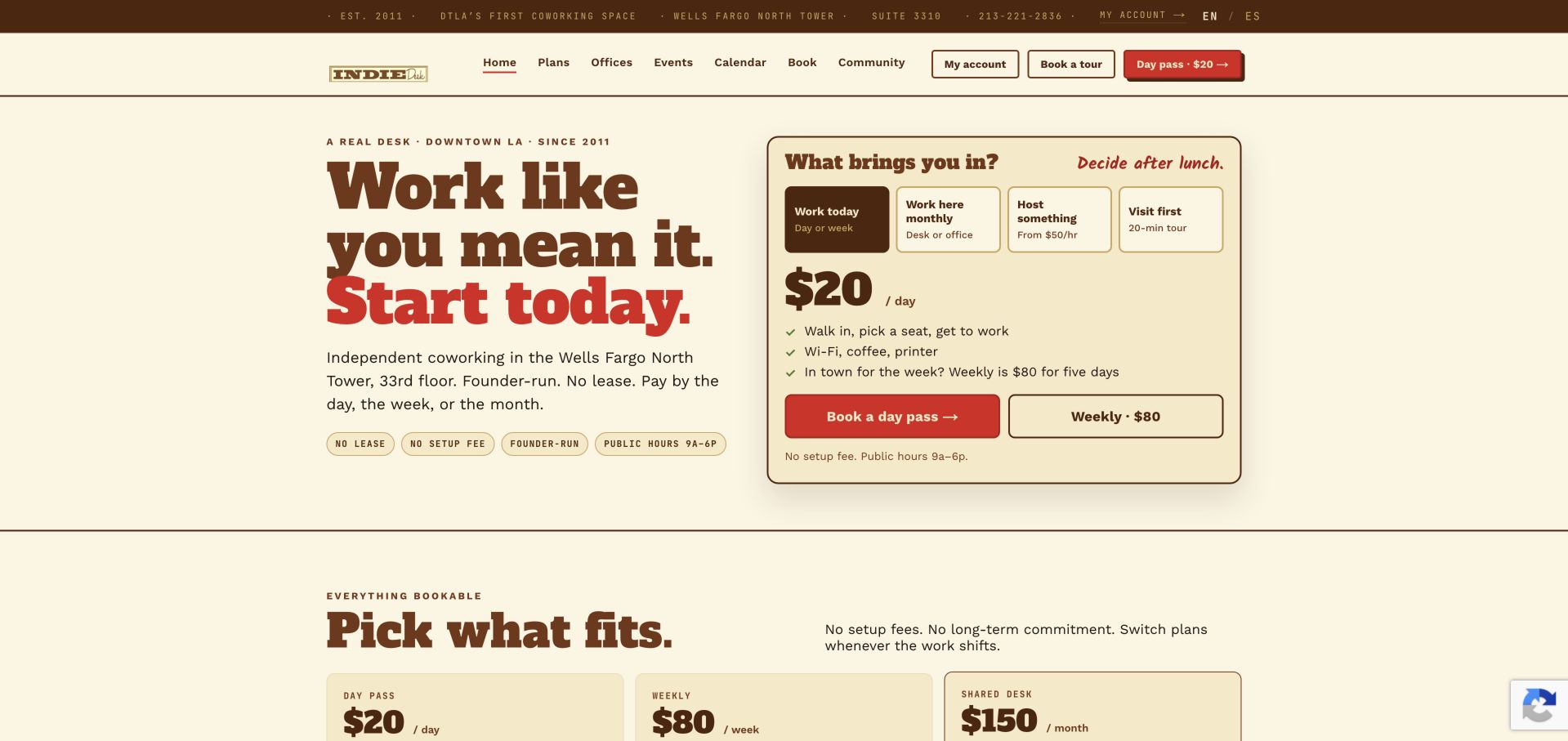
Indie Desk makes an unusually practical first impression. Its cream background, heavy brown lettering and red actions establish a recognizable identity, but the useful part is the decision panel beside the headline. Visitors can distinguish working today, working monthly, hosting something and visiting first before entering a longer sales journey. The initially visible day option names a price, included basics and public access hours. Below it, separate cards explain shared seating, a dedicated desk and a private office in everyday language. The location section then supplies the building, floor, parking entrance and nearby transit context. This is our Editors Choice because a local, independent operator has made the buying situation concrete without requiring an inquiry first. The tradeoff is density: many navigation items and purchase options need careful prioritization on a smaller display. Published rates remain time-sensitive, not promises made by this review.
What you can learn
Structure the homepage around duration and intent, then place access hours and inclusions beside the relevant price.
Pros
Day, monthly, event and tour journeys are visibly distinct.
Building and arrival details support the decision beyond the sales pitch.
Cons & considerations
Several header actions compete with the main decision panel.
Quoted prices and availability require ongoing editorial maintenance.
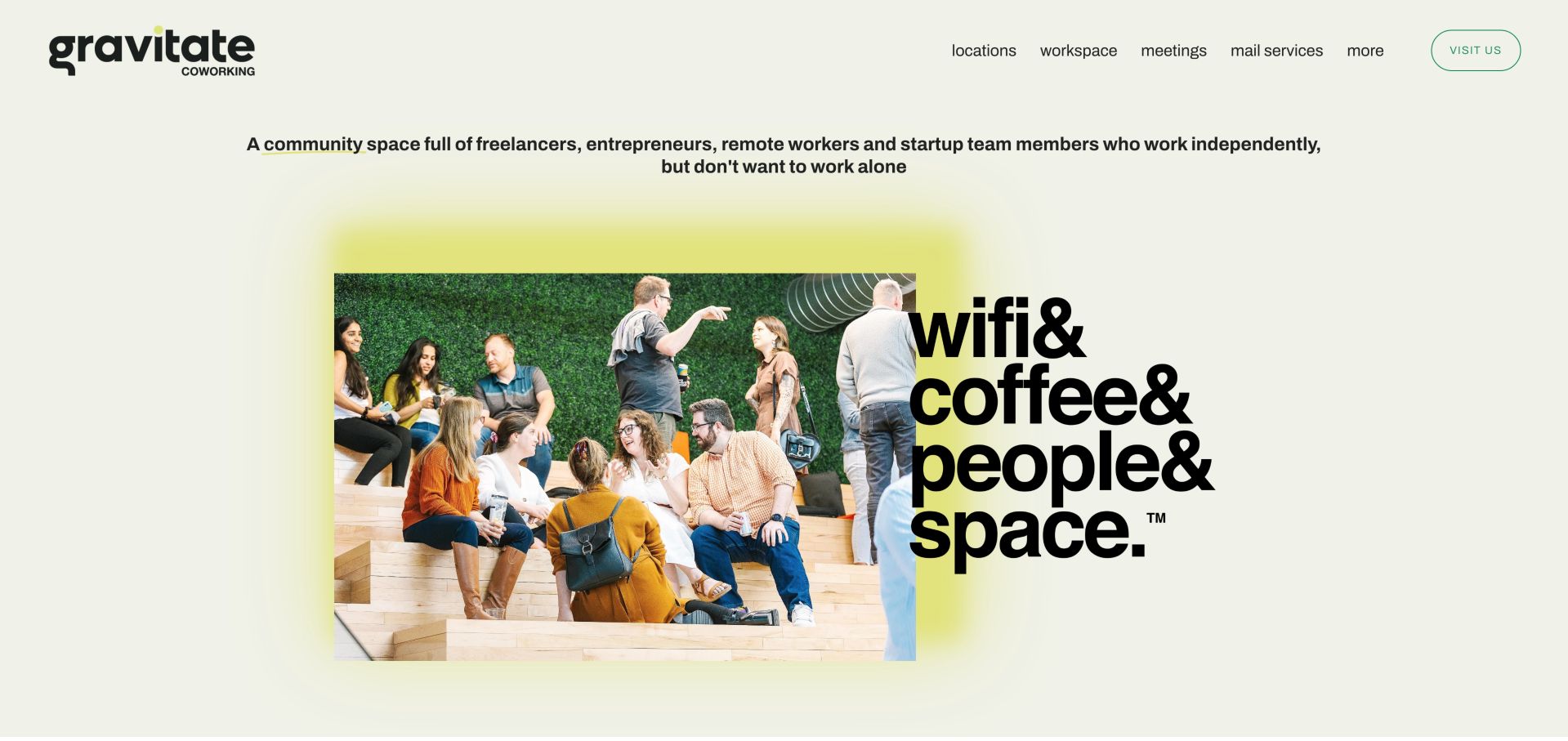
Gravitate explains its audience before it explains its inventory. The opening describes independent workers who still want company, then pairs a photograph of people talking on stepped seating with an oversized stacked slogan. The pale background and yellow-green glow make the composition memorable without making the navigation obscure. Workspace, meetings, locations and mail services remain ordinary words in the header, with a separate visit action. Farther down, photographs distinguish memberships, meeting rooms, day passes and private office suites. That progression is useful for an Iowa operator serving several local communities: belonging establishes the reason to consider the business, while the product routes give a visitor somewhere specific to go. The long testimonial carousel adds voices but also demands restraint. Designers borrowing this approach should preserve a fast route to hours, prices and an exact location rather than making every visitor consume the community story.
What you can learn
Show the people and work situations that define the community, then connect that identity to plainly named workspace products.
Pros
The opening states who the space is for.
Photographic product links distinguish desks, meetings and private suites.
Cons & considerations
Pricing and access rules are not part of the first screen.
A long testimonial sequence can become more persuasive volume than practical guidance.
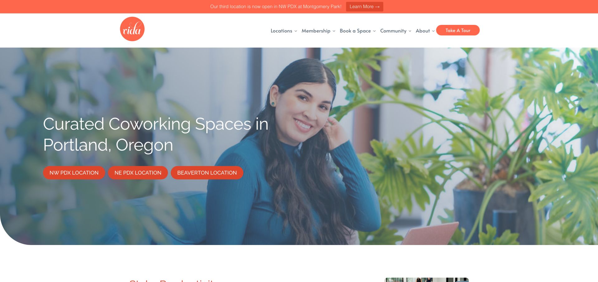
VIDA leads with a person working in a planted lounge rather than an empty office panorama. The coral navigation accents and three location buttons make Portland and Beaverton feel like a manageable local choice. A new-location notice has its own narrow strip above the main header, so it does not replace the fundamental offer. The lower page becomes much more specific: membership cards separate private offices, dedicated desks, open flex and part-time access, with different conference-room allowances and hours. Virtual coworking is described as a different product rather than quietly mixed into physical access. This combination of atmosphere and detail is worth studying because wellness and community claims become more credible when accompanied by concrete inclusions. There is also a maintenance lesson: the page announces three locations while some lower wording still refers to two. A growing network needs a shared location model and a review of older descriptive copy.
What you can learn
Pair the community story with a comparison of access, desk rights and room credits, and update every location reference when the network grows.
Pros
Location choices are visible in the opening image.
Membership cards explain meaningful differences in access and inclusions.
Cons & considerations
Some lower copy still refers to two locations after a third is announced.
The long page mixes physical, virtual and event products that require clear boundaries.
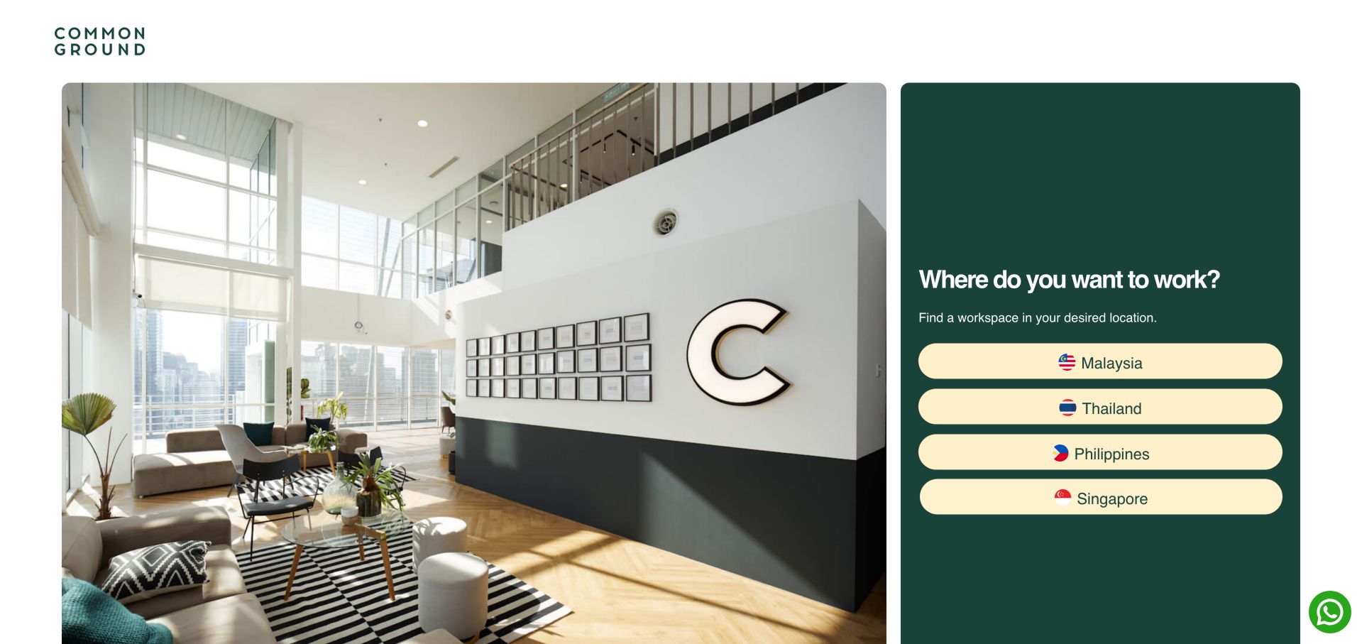
Common Ground uses its entry page as a geographic router. A large interior photograph occupies the left side while a dark green panel asks where the visitor wants to work. Four pale country buttons form an unmistakable next step, avoiding a premature comparison of products that may differ by market. The remainder of the page lists locations by country and city, with individual building names and tour actions. Coming-soon locations are labeled in the directory, an important distinction when a network is growing. This design is useful when the visitor's country determines currency, availability and local contact routes. Its limitation is the additional decision imposed on someone already looking for a particular desk or meeting room. The country entry should lead to durable, shareable location pages, and campaign rates should remain attached to their relevant market. The screenshot records the country gateway, not a tested booking or membership comparison.
What you can learn
Choose the geographic context first when it changes products and terms, then retain that context through every inquiry and booking route.
Pros
Country buttons make the first decision obvious.
Location listings identify cities and specific buildings.
Cons & considerations
Product comparison requires a further step beyond the gateway.
Growing location inventories need consistent coming-soon and availability labels.
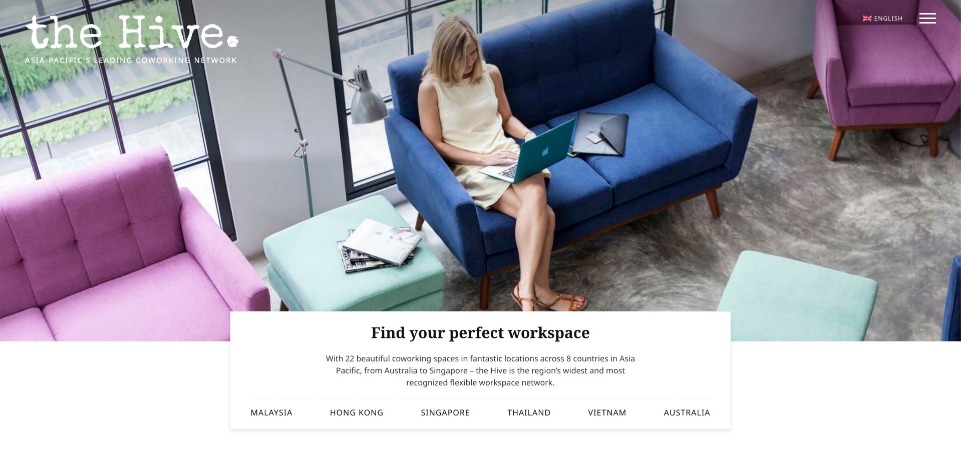
The Hive is an actual coworking network, and its homepage shows a different way to organize several markets. An expansive lounge photograph fills most of the opening, with the brand at the upper left and a compact menu at the upper right. A white panel overlapping the image introduces the network and offers country anchors. Lower sections describe individual properties in more detail, including neighborhood character, nearby stations and the kind of workspace available. This is more editorial than a bare location directory: a warehouse, a city-center tower and a garden-oriented location receive different descriptions. That variation can help visitors understand why two branches are not interchangeable. The cost is a long page with multiple carousels and a large amount of repeated tour navigation. Borrow the property-specific descriptions, but provide an equally clear direct list for someone who knows their destination and does not want to browse a sequence of slides.
What you can learn
Give each branch a concrete local distinction while keeping the network's location navigation predictable.
Pros
Property descriptions include neighborhood and workspace context.
Country anchors connect the emotional opening to practical browsing.
Cons & considerations
Multiple property carousels create a lengthy browsing journey.
The large photographic opening postpones plan and pricing information.
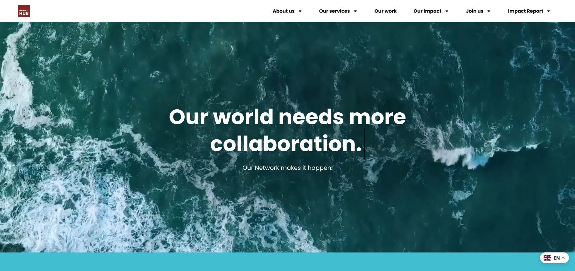
Impact Hub's global homepage is primarily a network and mission presentation rather than a desk storefront. Large white type over moving ocean imagery introduces connection and collaboration, while the navigation groups services, work, impact and participation. Farther down, a location map offers the route toward individual hubs, and stories describe programs and community activity. This makes it a useful contrast with a transactional coworking page: the organization is helping visitors understand an ecosystem, not merely choose a room. For a mission-led workspace, that wider explanation can clarify the value of joining before rates enter the conversation. It can also leave an immediate workspace seeker searching for the local practical details. The lesson is to separate network-level evidence from branch-level membership information. A global impact story should not be treated as proof of facilities, pricing or availability at a particular hub, and a map should have a usable text-based counterpart.
What you can learn
Keep the network mission and the local workspace journey connected but distinct, with an obvious route from the story to a specific hub.
Pros
Programs and stories give community claims visible context.
The location map connects the network to physical places.
Cons & considerations
The opening does not directly answer a desk-seeker's practical questions.
Moving imagery and a map need alternatives for visitors who cannot use them comfortably.
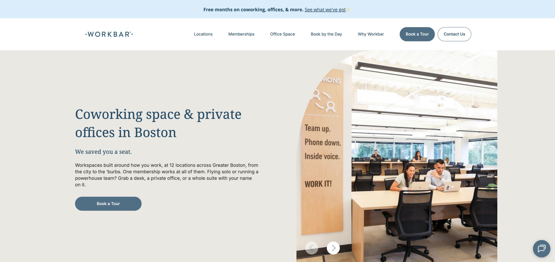
Workbar pairs a plain Boston coworking headline with a large photograph of an occupied workspace. The muted blue actions and restrained serif heading make the opening calmer than an amenity-heavy promotional collage. Its strongest content appears below: the website explains different areas for quiet work, collaborative conversation, café activity and calls. Those distinctions answer a real coworking concern that a generic promise of productivity cannot resolve. Memberships are also separated into individual, team, day-use and virtual-office options, with starting prices and clear links. A regional location list gives the network a practical geographic shape. During review, an offer modal appeared and was dismissed, illustrating how campaigns can interrupt an otherwise clear beginning. Designers should study the behavioral description of spaces more than the promotion. Explain where a video call belongs, what quiet means and whether the visitor can move between zones, then connect those rules to the plan they are considering.
What you can learn
Describe workspace zones by the behavior they support, not only by attractive room names or furniture photographs.
Pros
Activity-based zones answer noise and collaboration questions.
Individual, team and day-use products have separate entry points.
Cons & considerations
A promotional modal interrupted the first visit.
Starting prices still require location and plan qualification.
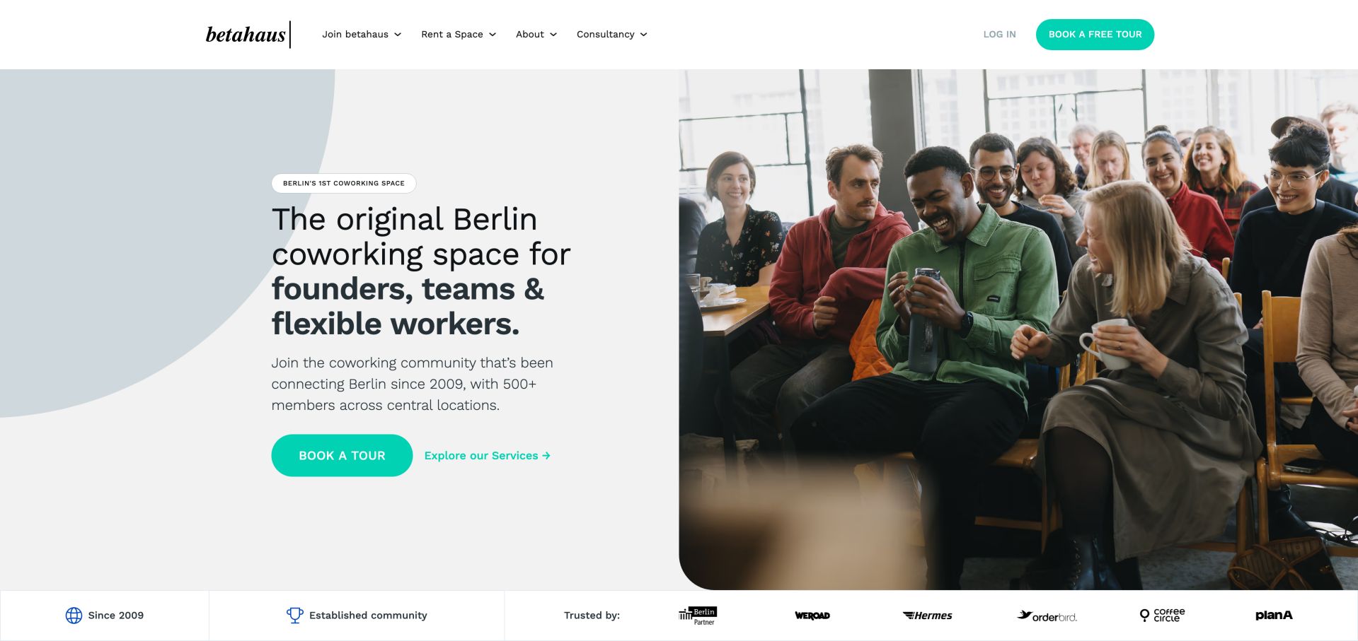
betahaus presents its Berlin identity with a split opening: a direct statement about founders, teams and flexible workers sits beside a lively group photograph. The turquoise tour action stands out against neutral panels, and an established-community strip leads into recognizable product categories. Coworking, private offices, event spaces and meeting rooms each receive an image and explanation rather than relying on a single vague membership link. The community proposition becomes more specific through a calendar, expert sessions and recurring breakfast gatherings. These are useful content objects because they show what participation might involve beyond renting a desk. The page also introduces consultancy and other European locations, creating a broader organizational picture but adding competing journeys. A smaller operator could borrow the event structure without borrowing the whole scale of the page. Keep upcoming dates accurate, archive past events clearly and separate attendance rules from membership marketing.
What you can learn
Turn community into visible recurring formats and dated events, while preserving straightforward workspace and tour routes.
Pros
The audience and Berlin location are stated immediately.
Recurring gatherings make the community offer more concrete.
Cons & considerations
Consultancy and international branches broaden an already long homepage.
Event content requires active maintenance to remain useful.
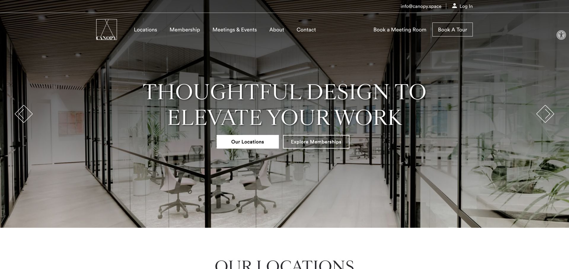
CANOPY lets its interiors carry the opening, using a darkened full-width photograph, large serif lettering and two centered routes to locations and memberships. The header separately exposes meeting-room booking and a tour, which matters because those visitors may not be evaluating the same product. Below the image, location cards include actual street addresses and distinct actions. The membership section is unusually helpful for a design-led brand: annual-day access, hybrid use, communal access, personal desks and private offices are described with starting prices or annual totals. This shows how a premium visual identity can coexist with practical qualification. The main risk is legibility across rotating photographs, especially where white navigation and thin outlines sit on detailed backgrounds. There is also a content-governance issue when some branches are marked coming soon. Preserve that status throughout booking and membership pages so beautiful imagery never implies that an unopened location is ready for immediate use.
What you can learn
Let the interiors establish character, but give every membership a concrete access allowance and each location an explicit operating status.
Pros
Location cards provide addresses and relevant actions.
Membership descriptions distinguish day allowances and dedicated space.
Cons & considerations
Thin white controls depend on sufficient contrast over each image.
Rotating hero content and upcoming branches require careful state management.
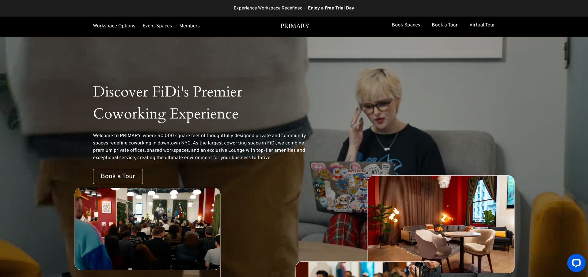
PRIMARY combines a moving background with smaller photographs of events and furnished interiors, creating several views of its downtown New York space within one opening. A dark header keeps workspace options, events, booking, tours and a virtual tour available above the imagery. The page then separates private offices from coworking in the Lounge and provides the Broadway address. This is useful for a single-location business whose value depends on how different parts of one building can be used. A virtual tour can complement that story, although this review did not run or evaluate the tour itself. The visual composition is busy, and a free-day offer modal appeared on the first visit before a later unobstructed capture. Designers should treat such promotions as secondary to understanding the space. Clear product labels, access conditions and a stable tour action need to survive both moving media and temporary offers.
What you can learn
Use photographs to distinguish work, meetings and events within the same building, then provide a stable route to inspect the space.
Pros
Booking and virtual-tour routes are visible in the header.
The page distinguishes private offices from lounge coworking.
Cons & considerations
Moving imagery and overlapping image cards compete for attention.
The first-visit offer modal can interrupt evaluation of the core service.
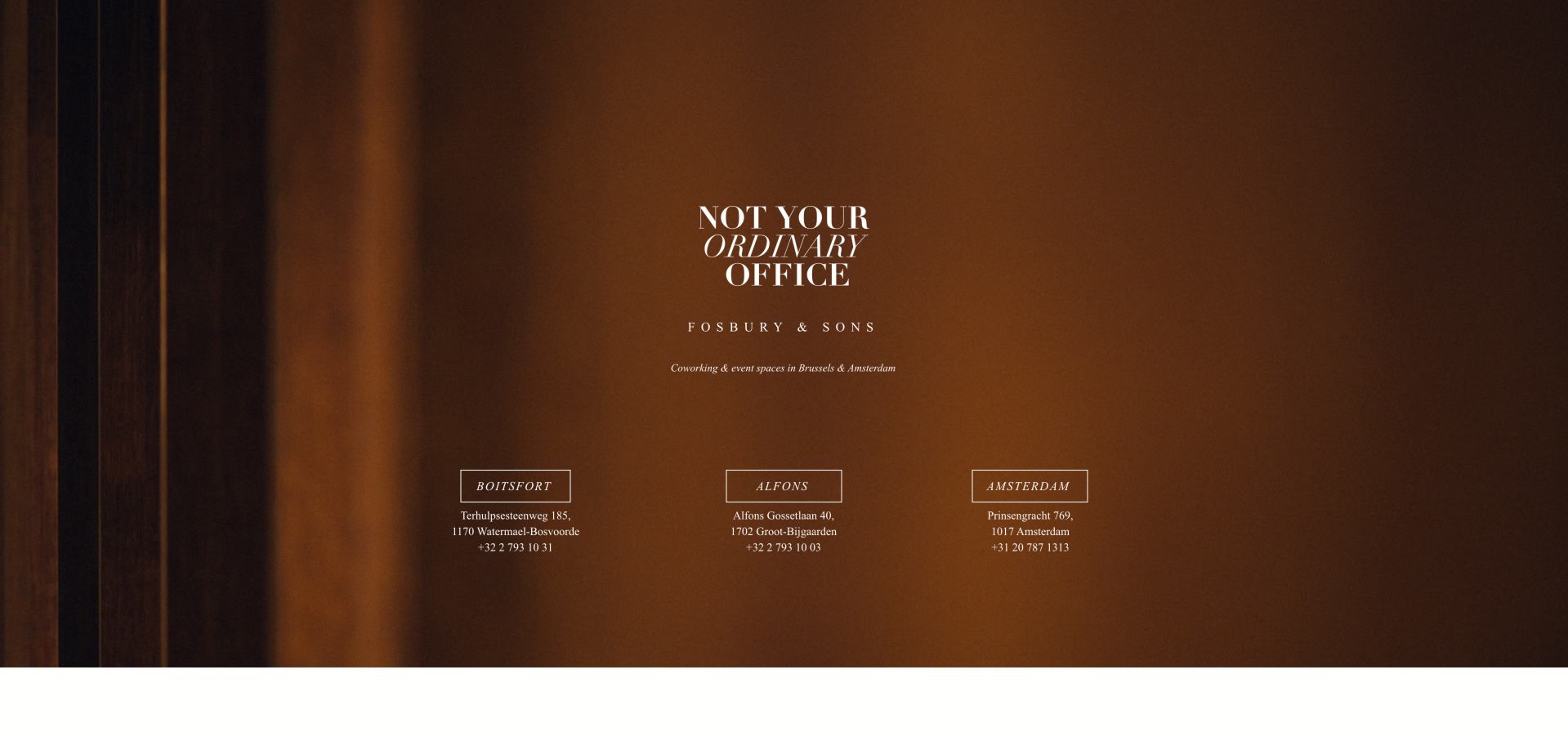
Fosbury & Sons takes the location gateway almost to its minimum. A warm brown photographic background holds a centered brand statement, a short explanation of coworking and event spaces, and three location columns. Each column includes a named destination, an address and a phone number. There is no elaborate product selector in the captured page, and the restrained serif typography makes the experience feel closer to a hospitality identity than a directory. That restraint is useful when individual locations maintain their own detailed websites: the group page can do one job well instead of duplicating every branch's information. The tradeoff is that a visitor cannot compare memberships, room capacity or access arrangements here. Even a minimal gateway needs enough context to explain which location serves which city, and links should make transitions to separate domains unsurprising. This example is about routing and brand continuity, not a complete coworking sales funnel.
What you can learn
Give a small group gateway a narrow purpose: identify the brand, distinguish locations and provide dependable local contact routes.
Pros
Three location choices are easy to scan.
Addresses and telephone numbers appear alongside the destinations.
Cons & considerations
No plan or facility comparison is available at the gateway.
Small text over imagery can become difficult to read on constrained screens.
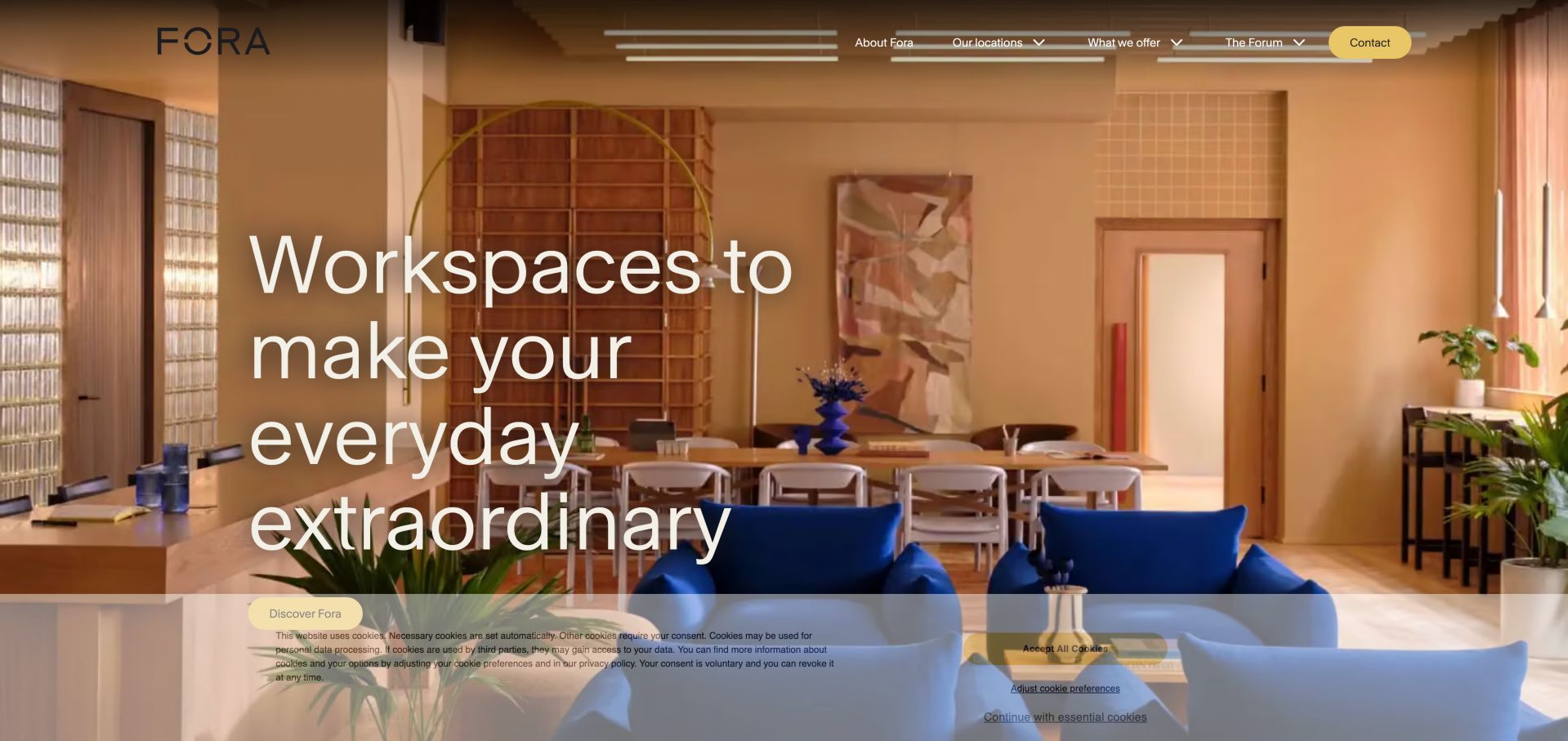
Fora's opening uses a large, warmly lit interior and an oversized statement about everyday work. The minimal upper navigation leaves much of the image unobstructed, while a yellow contact button supplies a consistent action. Lower on the page, the story becomes more useful: collaboration, focus, recharging, socializing and learning are presented as different activities supported by different spaces. A separate meeting-room introduction explicitly says that membership is not required, removing a common uncertainty for occasional visitors. Featured buildings include addresses, and the membership route is distinct from the editorial stories in The Forum. The design is worth studying for its sequencing from atmosphere to activities to actual properties. Its limitation is the distance between the aspirational opening and the information needed to compare a desk or office. A direct location or product action could serve visitors who already know their requirement without weakening the visual identity.
What you can learn
Translate hospitality language into specific workday activities and clearly state when non-members can book a service.
Pros
Meeting-room eligibility is stated explicitly.
Featured properties are paired with addresses rather than names alone.
Cons & considerations
The first action emphasizes brand discovery over workspace comparison.
Large photography and oversized text delay practical detail.
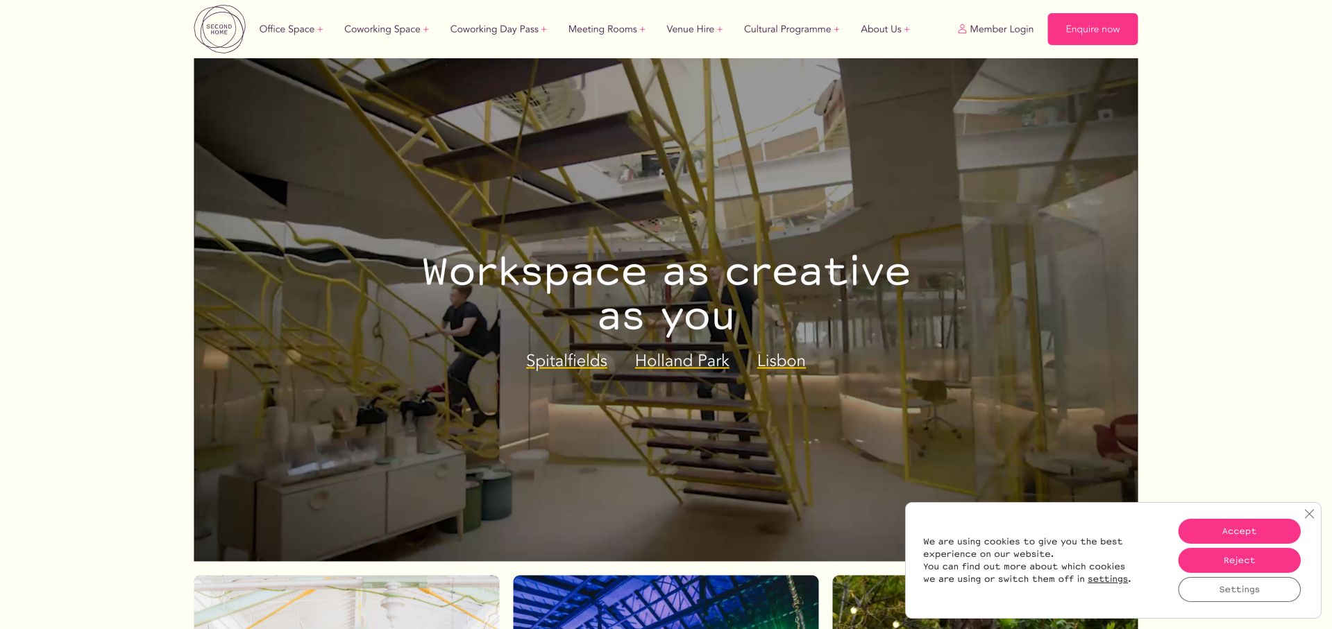
Second Home centers its creative-workspace promise over a bright, architecturally distinctive interior. The opening includes direct links to Spitalfields, Holland Park and Lisbon, so the brand statement is not a dead end. The upper navigation is more product-specific than the hero: offices, coworking, day passes, meeting rooms, venue hire and cultural programming are separate routes. Lower sections explain resident desks, roaming desks and day passes in short descriptions, giving the membership vocabulary practical meaning. Culture and community are presented as part of the offer rather than hidden in a corporate about page. This combination is valuable for a space whose architecture and events are important to its identity. The challenge is keeping the many combinations of location and product understandable. A London day pass, a Lisbon meeting and an office inquiry should retain their city, currency and access context rather than resetting the visitor to a generic enquiry.
What you can learn
Connect distinctive architecture to direct location links, then explain membership names in plain functional terms.
Pros
The hero provides three immediate location routes.
Resident, roaming and day-use options receive understandable descriptions.
Cons & considerations
The wide product navigation contains many competing choices.
City-specific prices and terms must remain clear through each journey.
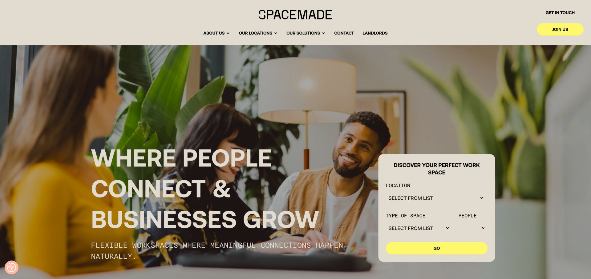
Spacemade pairs a people-focused photograph and a large community headline with a bounded workspace finder. Location, type of space and number of people are the three inputs, which is a sensible starting set for a visitor whose needs are more specific than a brand story. Bright yellow actions stand out against the neutral header and image. Below, neighborhood-oriented locations and separate private-office, coworking, meeting and event categories explain the breadth of the network. The FAQ section is particularly relevant: it addresses visits, cancellation, pets and access to other branches rather than only repeating promotional claims. This makes the page useful as a planning reference even though the finder was not submitted during review. A key design responsibility is to preserve the selected criteria after the visitor leaves the homepage. Different plan rights, including cross-location access, should remain attached to the selected membership rather than implied by the network as a whole.
What you can learn
Ask for location, space type and team size early, then carry those choices into detailed options and eligibility rules.
Pros
The finder translates an abstract search into three concrete criteria.
FAQs cover real membership restrictions and practical questions.
Cons & considerations
The network has many named properties and nested choices to organize.
Cross-location privileges can be misunderstood if detached from the qualifying plan.
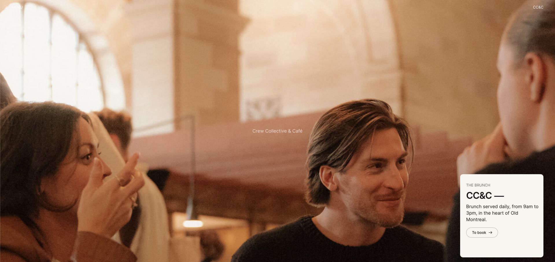
Crew Collective & Café must explain several businesses within the same Montreal setting. The captured homepage opens with atmospheric people imagery and a small brunch promotion, while the broader navigation divides Crew, Collective and Coffee. Below that, conference rooms, day passes and membership receive distinct routes, and the page identifies the heritage building and street address. This is a useful example of a hybrid destination where a café visitor, an event organizer and a monthly member do not share the same permissions or expectations. The brand language is deliberately experiential, but the internal category names require interpretation before a newcomer knows where to click. Designers should not assume that a public café seat is equivalent to a reserved workspace or that all guests have member access. Keep those differences explicit, use direct booking labels and make the hours for each service easy to find without relying solely on an external map listing.
What you can learn
Give café, event and coworking visitors separate service descriptions, access rules and booking destinations within one coherent brand.
Pros
Day passes, rooms and memberships are distinct lower-page routes.
The heritage location provides a memorable physical identity.
Cons & considerations
Brunch receives more initial prominence than coworking.
Brand-led category names require more interpretation than plain service labels.
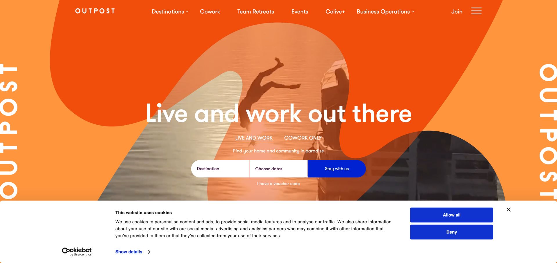
Outpost's bright orange opening makes a crucial product distinction before asking for a destination or dates: living and working is not the same purchase as coworking only. That separation is especially important for remote workers who may already have accommodation. The page then explains living, working and experiences as connected but different parts of the offer, with destination cards for Bali and Sri Lanka. Workspace descriptions identify collaboration areas, focused zones, meeting rooms and call booths rather than relying only on scenery. The design is useful for a destination business balancing travel inspiration with an actual place to work. Its risk is that accommodation promotions can dominate the desk journey, and different monthly offer figures on the same page can create uncertainty. Designers borrowing the approach should keep rates, inclusions, dates and currencies synchronized across promotional modules and explain exactly when coworking is bundled with a stay.
What you can learn
Distinguish a stay-plus-work package from workspace-only access before collecting dates, and keep every package inclusion synchronized.
Pros
The opening separates accommodation and coworking intent.
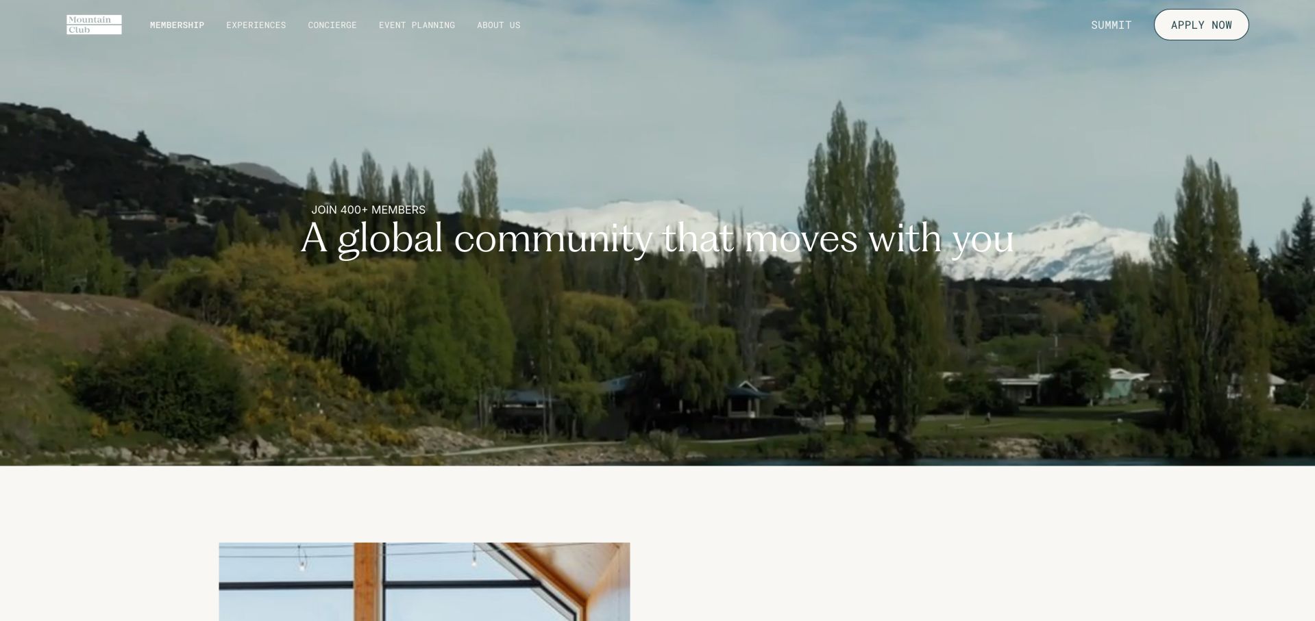
Mountain Club's membership page opens with a mountain landscape and a community statement, reflecting a broader club proposition rather than a conventional desk-rental offer. The useful detail arrives in the membership perks and FAQs. These explicitly describe hot desks, resident-desk options, meeting rooms and local locations, then distinguish included lounge time from paid day passes. The page also states that day passes are for members, an important restriction that would be easy to miss if the design relied only on generic workspace photography. This makes the example relevant to coworking businesses embedded in a hospitality or professional club. The design should be studied for how it manages eligibility, not treated as interchangeable with an open public coworking service. Its aspirational language and global benefits require considerable scrolling before practical workspace rules. A clear comparison of included rights, optional workspace plans and guest access would help visitors decide whether the club model suits them.
What you can learn
Explain the difference between club membership, included lounge access and optional workspace products before inviting a purchase inquiry.
Pros
FAQs disclose member-only day passes and facility eligibility.
Desk and meeting-room access are described within the wider membership.
Cons & considerations
Lifestyle benefits dominate before workspace conditions become visible.
Included access and paid add-ons need particularly clear comparison.
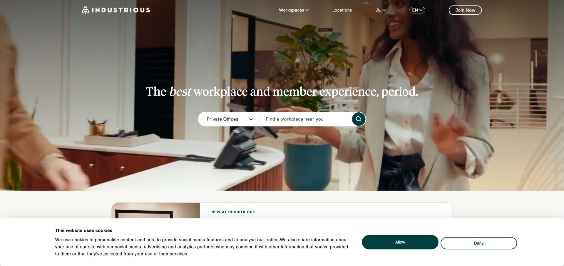
Industrious places a compact search control over workplace imagery, pairing a product selector with a location field. That is a more useful starting point for a large network than an undifferentiated contact button, because availability is inherently tied to both geography and workspace type. Lower cards separate coworking membership, office membership and meeting rooms, with short lists of inclusions and team context. A separate promotion for a specialized meeting experience demonstrates how new services can sit outside the core search rather than replace it. The page's strongest design idea is the progression from a broad promise to a constrained search and then explanatory product cards. The qualification is important: the search was inspected, not submitted, so this review does not establish result quality or inventory accuracy. Designers should ensure that the selected product persists in results, that empty locations have useful alternatives and that starting a membership remains distinct from reserving an occasional meeting room.
What you can learn
Make workspace type and location the first filters, and preserve them through results, availability and contact.
Pros
A compact search combines the two most important network-level criteria.
Product cards explain different membership and meeting use cases.
Cons & considerations
A default private-office selection may not match a coworking visitor's intent.
Search quality and actual availability cannot be judged from the opening alone.
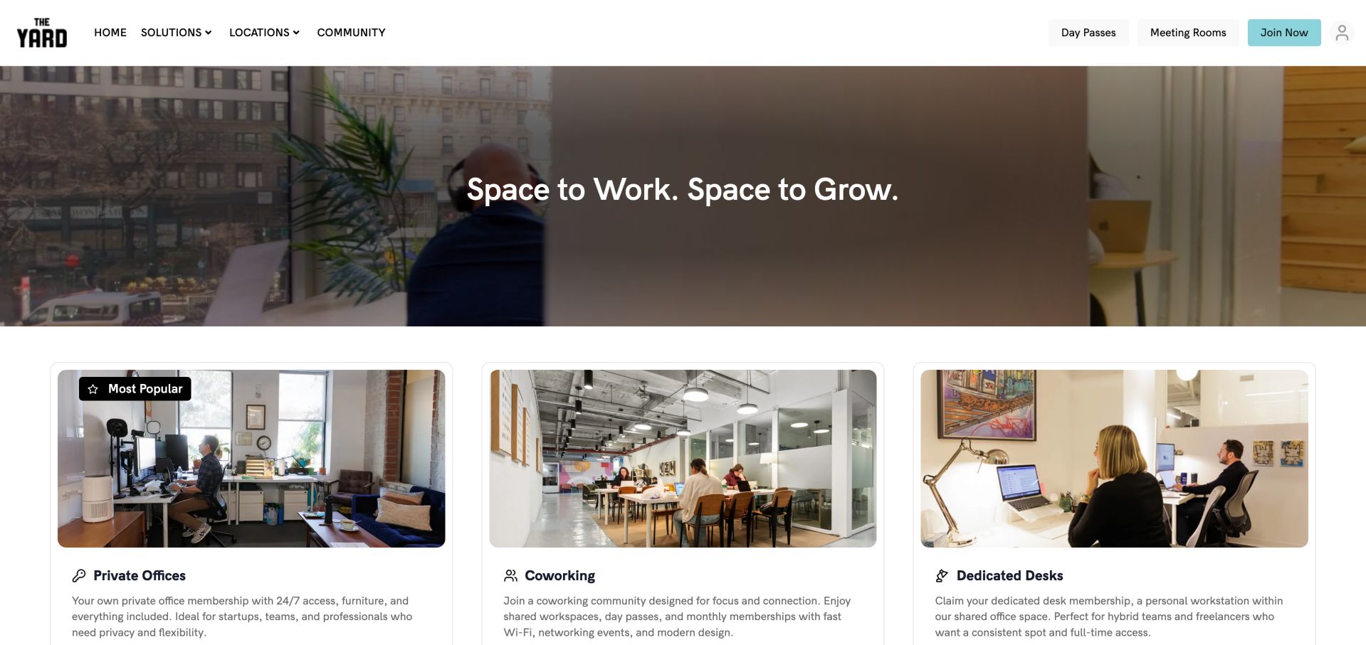
The Yard keeps its photographic headline area relatively shallow, allowing three product cards to become visible in the opening viewport. Private offices, coworking and dedicated desks each receive a different image and a short explanation. The header separately exposes day passes and meeting rooms, helping occasional users avoid a membership-oriented path. This is a useful contrast with pages that spend the entire first screen on atmosphere. The visitor begins comparing actual workspace categories almost immediately, and the cards make clear that a dedicated desk is a consistent personal workstation rather than interchangeable shared seating. Lower content adds a Brooklyn origin story and amenities such as art installations, on-site management and meeting rooms. The main tradeoff is that a single prominently displayed coworking price may appear broader than its eventual location or term conditions. Keep pricing qualification and local availability close to the relevant option, and avoid relying on a general brand promise to explain access.
What you can learn
Use a short hero to reveal the main workspace categories immediately, with separate header routes for day users and meeting organizers.
Pros
Core product cards appear early and use distinct images.
Day-pass and meeting-room visitors have direct navigation.
Cons & considerations
A single headline membership price needs location and term context.
Some benefits require plan-specific qualification rather than a universal claim.
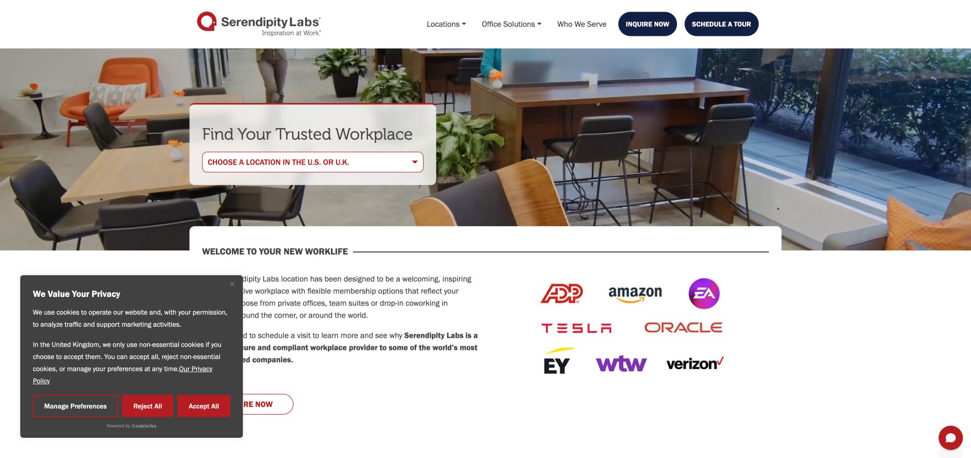
Serendipity Labs places a simple location selector in a white panel over a workspace photograph. The main navigation distinguishes locations, office solutions and the audiences served, while inquiry and tour actions remain clearly labeled. Below, the page introduces private offices, meeting rooms and coworking as separate membership or booking categories. Its content speaks more directly to organizational requirements than many lifestyle-oriented examples, discussing privacy, infrastructure and larger-team needs. Those are useful subjects for a business buyer, but a designer must distinguish describing a claim from independently proving it. This review does not validate the operator's security or compliance statements. The page also contains a long sequence of testimonials and press coverage, which can overwhelm the immediate comparison task. Borrow the straightforward geography-first entry and product separation, then make supporting evidence concise, current and appropriately scoped to the service a visitor is actually considering.
What you can learn
Give professional buyers a clear location and product route, with specific evidence behind operational claims rather than broad assurances.
Pros
Location choice is the dominant first action.
Tours and inquiries are separate, plainly labeled routes.
Cons & considerations
Long testimonial and press sections can dilute the comparison task.
Security and compliance claims require evidence beyond visual presentation.
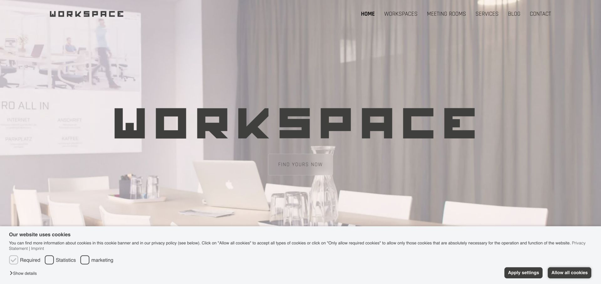
WORKSPACE Wels uses a large wordmark over a subdued interior image, with an uncomplicated navigation for workspaces, meeting rooms, services and contact. The opening is primarily visual, but the next content section makes the local offer concrete: furnished lockable offices and fixed desks in an open office are described separately, followed by numerical categories for offices, meeting rooms and desks. Those counts communicate the scale and mix of the property, although they should not be mistaken for live vacancy information. Coworker interviews add evidence of an actual local community without requiring an enormous testimonial carousel. The footer supplies the Wels address and direct contact details. For a smaller operator, this is a useful information model: identify the inventory, explain what is included and show the people who use it. The main caution is that a brand-led hero and mixed-language labels can delay understanding for a visitor who needs immediate pricing or availability.
What you can learn
Describe the actual inventory categories and distinguish the property's capacity from currently available spaces.
Pros
Office, meeting-room and fixed-desk categories explain the property's scale.
Local interviews connect the offer to recognizable member activity.
Cons & considerations
Inventory counts do not establish current availability.
The large brand-led opening provides little immediate pricing or access detail.
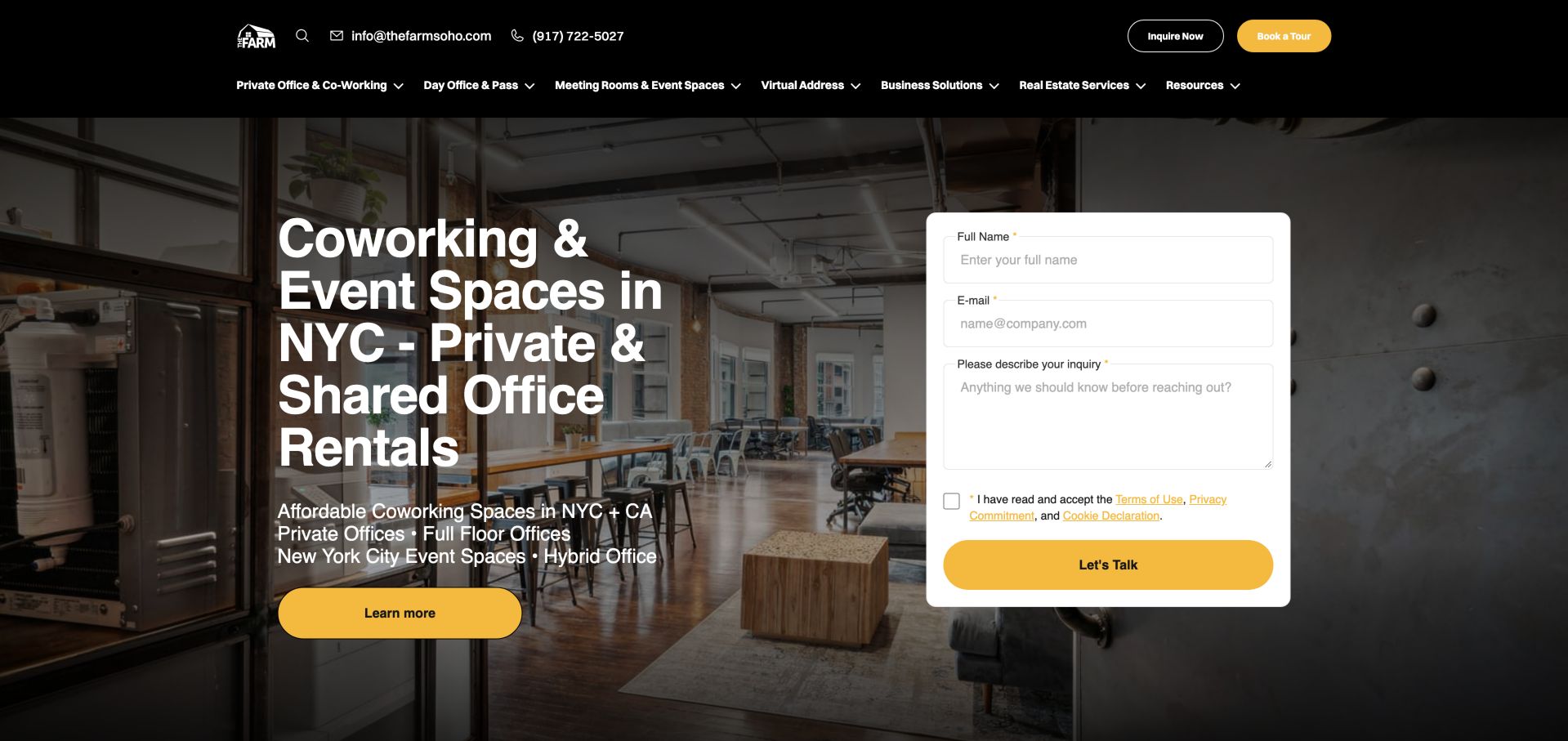
The Farm SoHo places an inquiry form beside a large coworking and office headline, using yellow actions against a dark header and loft photograph. This immediately serves someone ready to talk, while a separate learn-more route allows a visitor to keep researching. Lower on the page, a tabbed product catalog separates coworking, offices, day use, meetings and other services. Hot desks, dedicated desks and team arrangements carry starting prices and compact lists of inclusions, making that section more useful for comparison than the broader headline. The website also offers virtual addresses and business services, so its navigation has to manage much more than physical desks. This is the central design tradeoff: breadth can help an existing customer but complicate a first coworking visit. A short inquiry should not become the only route to practical information, and virtual address products must not imply the same physical access rights as a desk membership.
What you can learn
Keep a short inquiry available without hiding self-service product information, and separate workspace access from address and business-service products.
Pros
The product catalog gives concrete plan categories and starting prices.
Contact and tour routes remain visible alongside browsing.
Cons & considerations
The hero asks for personal details before much comparison context.
A broad service menu can obscure the simpler coworking journey.
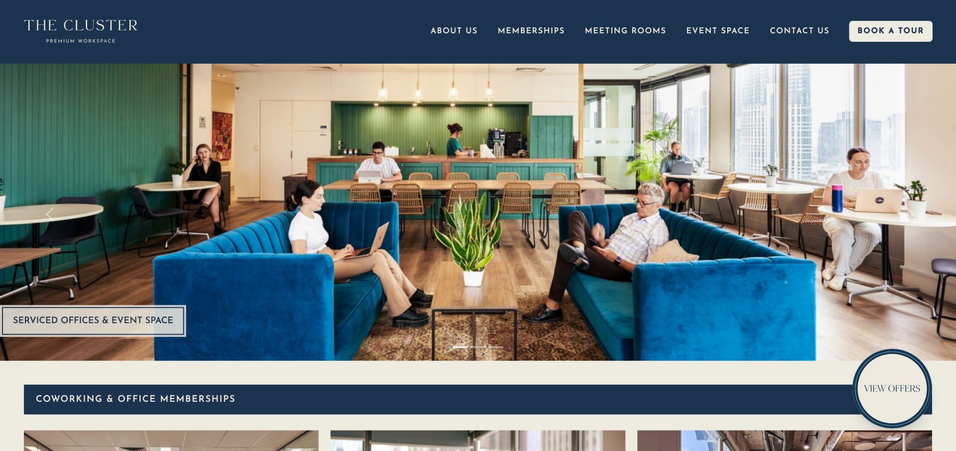
The Cluster uses a large photograph of people working across a lounge, tables and window seats, framed by a dark blue header and cream accents. A direct tour button remains visible, while the next section introduces private offices, dedicated desks and day passes. The page then adds meeting rooms, virtual offices and end-of-trip facilities, including bike parking, showers and storage. Those arrival details are valuable for a city-center workspace because the commute is part of the daily experience, not an unrelated amenity list. Melbourne location context and nearby stations further ground the offer. The site is presented as a distinct local brand, while its wider coworking-network affiliation should not be mistaken for independence. The main design limitation is that several product cards lead to the same membership destination. Clear anchors or an explicit comparison there would help preserve the visitor's intent and avoid making them identify the same product twice.
What you can learn
Show how people occupy the space and include commuting facilities, then preserve the chosen product when linking to a shared membership page.
Pros
Occupied-space photography demonstrates several working arrangements.
Bike, shower and transit information supports everyday practical decisions.
Cons & considerations
Several product routes converge on one membership page.
The large carousel needs clear controls and stable access to essential details.
Kegan is a freelance web designer and developer with 15+ years of experience helping businesses turn complicated website requirements into clear, maintainable digital experiences. He works directly with clients from planning and design through development, launch, and ongoing support.
For coworking space website design, his development approach focuses on workspace comparisons, membership information, meeting-room details, location discovery, and tour or booking-system handoffs. The scope can be a targeted improvement or a complete custom build, with responsive layouts, thoughtful content structure, and integrations chosen around the people using and maintaining the site.
Show 3 other coworking space website designersHide other coworking space website designers
Document how someone buys a day pass, compares a monthly desk, asks about a private office and books a meeting room. Record the minimum information needed for each decision and the point at which human help is useful. Do not force every journey into a generic contact form.
Build a location and product model
Record addresses, opening status, staffed hours, access hours, workspace types, room capacities and applicable plans per location. Use that information consistently in cards, search results, detail pages and booking tools. A coming-soon branch should never appear as immediately bookable merely because it shares a template.
Define plan rights precisely
Distinguish shared seating from a reserved desk, and physical access from a virtual address. Record day allowances, guest permissions, meeting credits, storage, printing limits and cross-location rights. Use the same definitions in marketing, checkout and member onboarding so a branded plan name cannot hide a material limitation.
Design the handoff to booking
Carry the selected location, product, date and team size into the next step. Tell visitors when they are leaving for a separate booking provider. Provide useful alternatives for unavailable dates or full offices, and separate an inquiry from a confirmed reservation.
Collect specific visual and community evidence
Commission photographs of real working situations with appropriate permissions. Show the desk and chair, lighting, meeting setup, call spaces and arrival route, not only the most decorative corner. Use current events and member stories to explain community without promising that every visitor will achieve the same outcome.
Assign ongoing ownership
Give a named team responsibility for prices, offers, availability, hours and location changes. Retire expired promotions and event dates. Review the entire site when opening a branch or changing a plan, including FAQs and third-party booking descriptions that may otherwise preserve outdated wording.
Test the difficult cases
Check keyboard navigation, enlarged text, mobile layouts, reduced motion and slow connections. Exercise no availability, invalid dates, expired offers and failed booking-provider states. Ask first-time visitors to distinguish a hot desk from a dedicated desk and a club day pass from public access without staff explanation.
The editing job behind the design
Choose technology that keeps location and membership facts consistent
A coworking site often combines a content platform, membership management, room booking, payments and member access. Start with the source of truth for each fact. Prices and availability should not be manually duplicated across several uncoordinated systems. Decide which product owns a reservation, how changes appear to the customer and what staff see when a booking fails.
Public technology observations identify exposed components, not the complete operational system behind a space. A booking link does not prove that inventory is synchronized, and an attractive search form does not demonstrate accessible results. Evaluate the actual integration, privacy behavior, error states and staff workflow before adopting a tool because another operator appears to use it.
Our WordPress website examples offer a separate look at publishing approaches. A visible platform label is evidence for that named page, not a guarantee that the same system will suit your requirements.
Before the public launch
Coworking website launch checklist
Day passes, monthly desks, private offices and meeting rooms have distinct, understandable routes.
Every location has an address, arrival instructions and an explicit opening status.
Staffed hours and member access hours are distinguished.
Shared seating, dedicated desks and private offices have clear definitions.
Prices show billing period, relevant taxes, term and introductory-offer conditions.
Plan details explain included meeting credits, guest access and cross-location rights.
Public booking eligibility is clear where a club or membership is required.
Photography shows real work areas and does not imply unverified availability.
Location and product selections survive the handoff into booking or inquiry.
Unavailable spaces and failed booking tools have useful alternatives.
Events, offers, testimonials and branch counts have an ongoing review process.
Forms, menus, carousels and maps are checked with keyboard and assistive technology.
Moving hero media has a readable static alternative and respects reduced-motion needs.
Virtual-address services are not presented as equivalent to physical workspace access.
These checks are a project checklist, not a performance, legal, security, or accessibility certification. Test real journeys with the people responsible for the website before making claims about the result.
Sources & editorial method
How this collection was selected and reviewed
We reviewed twenty-three distinct official coworking and workspace websites on November 6, 2026 UTC, during the November 5 Pacific editorial date. Each example has a direct browser screenshot and a source URL; Mountain Club is represented by its membership page. Reviews discuss visible layout, wording, product organization and practical information. We did not purchase memberships, submit inquiries, test booking completion, visit the buildings or conduct full accessibility and performance audits. Prices, offers, availability and access conditions can change. Network affiliations do not make these examples independent businesses, and inclusion is not a service-quality endorsement.
Each example links to its actual source page. Screenshots are direct browser captures with their own capture dates; moving imagery, announcements and live designs can change. The notes describe observable design choices and conditional tradeoffs, not measured traffic, conversion results, service quality, or accessibility conformance.
Technology labels use public page metadata, asset evidence, or explicitly cited platform documentation. Platform documentation is not a complete current deployment audit. A component reference may be legacy or unused; it is not a complete backend inventory. Unknown stacks are omitted. These sites are editorial examples, not our client portfolio.
Written, Edited and Curated are separate editorial records, not timestamps advanced by a rebuild. Website designs and imagery belong to their owners. See our editorial standards or suggest a correction.
Questions worth asking
Coworking Space website design questions
What should a coworking homepage show first?
Show where the space is, who it serves and how to reach the main products. A local operator may benefit from a direct day-pass or tour route. A large network may need location and workspace-type selection first. Keep monthly membership, private-office and meeting-room journeys distinguishable.
Should coworking prices be public?
Public prices can help visitors qualify a fit when the product is reasonably standardized. Show the billing period, tax treatment, included access and minimum commitment. If an office needs a quote, explain the factors that affect it and ask only for the information needed to respond usefully.
How do you explain hot desks and dedicated desks?
Describe the practical difference: whether someone chooses an available shared seat or has a reserved workstation, and what they can leave there. Then explain hours, storage, guests and meeting-room rights. Branded plan names can remain, but should not replace these definitions.
Can a members' club be included in coworking inspiration?
Yes, when it genuinely offers shared workspaces, desks or meeting facilities and the review explains the membership context. Do not assume a public day pass exists. Make the difference between included lounge use, paid workspace plans and guest eligibility explicit.
What makes a good location page?
Include a specific address, arrival instructions, hours, workspace types, relevant photographs, accessibility information and contact or booking routes. Show opening status and keep availability claims separate from the total number of desks or offices in the building.
Should the website lead with community or workspace features?
Both matter, but neither should obscure the next practical step. Photos of people, recurring events and specific member stories can explain the community. Pair them with clear plan rights, work-zone descriptions and ways to visit or book.
Do these examples prove that a design converts well?
No. The reviews identify visible patterns and tradeoffs, not measured conversion results. Use analytics, representative task testing and customer feedback to decide whether a pattern helps your own visitors. Real-world service, accessibility and operational claims require separate evidence.
A useful coworking website helps someone imagine a working day and understand what they are actually buying. Combine a distinctive sense of place with clear locations, access rules and product choices, then make the next step easy to follow.