Best GraphQL Websites of 2026 (20 Real-World Examples)
Twenty real public properties paired with explicitly scoped GraphQL product, framework and historical engineering evidence.
A useful GraphQL project begins with the information people need to complete a task. These examples combine actual public-page screenshots with documented API or engineering associations. Study the design decisions and follow the evidence links, while keeping the pictured website separate from the product or historical workload described by each source.
GraphQL is a language for describing API operations and the fields a client wants to receive. It does not prescribe a visual style, select a CMS or replace the team’s responsibility for data ownership. A polished homepage cannot establish a hidden backend. This collection therefore distinguishes visible design from documented technology associations instead of treating every screenshot as runtime proof.
The opening five references are GitHub, Shopify, Netflix DGS, Spotify and Meta. Their evidence has different scopes: a platform API, an admin integration API, a GraphQL framework, and two dated engineering accounts. The remaining examples include content systems, observability documentation, financial software and partner integrations. Some captures show marketing or help pages for the associated organization, rather than the API interface itself. The individual reviews identify those boundaries.
Before the examples
What makes good GraphQL website development in 2026?
Describe the screen before designing its query
List the information required for one complete task, then separate essential fields from optional detail. GraphQL queries select fields and can traverse related objects. Use that flexibility deliberately: a compact search result and a full detail screen should not automatically request the same data. Keep the design understandable when a secondary field is missing rather than assuming every response will be complete.
Make the evidence boundary part of the explanation
A product API, a supplier case study and a historical engineering article establish different things. Name the specific product or workload and retain the source date. Do not let a corporate logo turn a narrow association into a claim about every property the company owns. The same discipline helps project teams describe exactly which application an integration will change.
Design useful partial and failed states
A GraphQL response can contain both useful data and field errors. Decide which information can remain visible, which actions must be disabled and how the user can recover. Avoid replacing an entire workspace with a generic failure message when only optional detail is missing. Equally, do not present a write as successful merely because the transport returned a response.
These twenty reviews describe the saved public captures, not private account flows. Their technology sources establish explicit product, framework, supplier-documented or historical associations. Screenshot dates and prior broad-audit dates remain unchanged. Contentful and Intuit retain unavailable broad audits, and Intuit’s GraphQL association relies on indexed official documentation whose full script-rendered body was not available to the text reader.
We start with five recognizable brands or organizations: GitHub, Shopify, Netflix DGS, Spotify, Meta. Each attribution applies to the named website property, not every product or website belonging to its organization. This is a curated reading sequence, not a measured ranking.
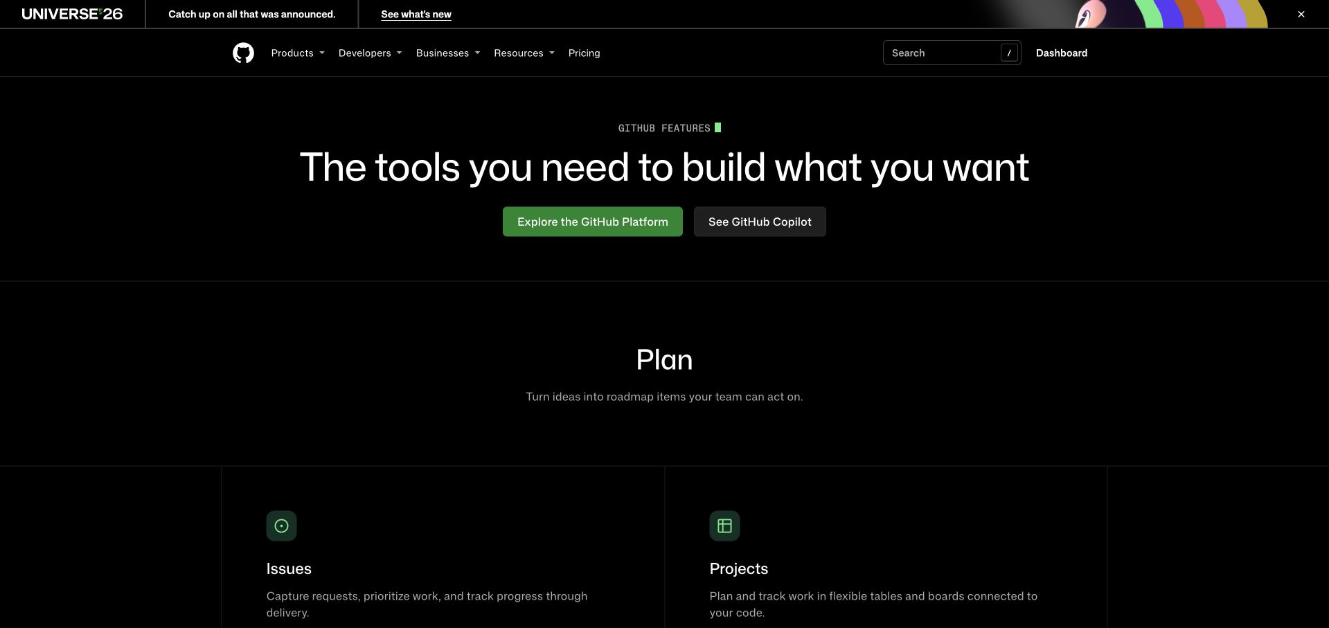
GitHub’s captured Features page moves from a broad centered promise into a clearly labeled planning section. Issues and Projects sit in separate bordered columns, turning a large platform into recognizable tasks. The dark surface, restrained green accents and two distinct introductory actions establish a hierarchy without requiring a product demonstration. Its official GraphQL documentation verifies the platform API for integrators; that association does not explain how this marketing page renders. The useful design reference is the sequence from platform overview to specific units of work, with product navigation still available above.
What you can learn
Plan an API product’s public journey around decisions a visitor can recognize. Introduce the overall capability, then expose meaningful resources and workflows in smaller groups. Keep the marketing vocabulary close enough to documentation labels that a prospective integrator can continue learning without translating every term.
Pros
Task names make a broad platform easier to scan.
Two introductory actions have visibly different emphasis.
Cons & considerations
Large introductory spacing delays the detailed feature inventory.
The event banner adds another competing destination above navigation.
Platform source: Official source: scoped GraphQL association. GitHub documents its GraphQL platform API for integrators. This is product API evidence, not proof of the captured Features page’s rendering stack. Platform evidence is separate from the direct website screenshot and is not a complete current infrastructure audit.
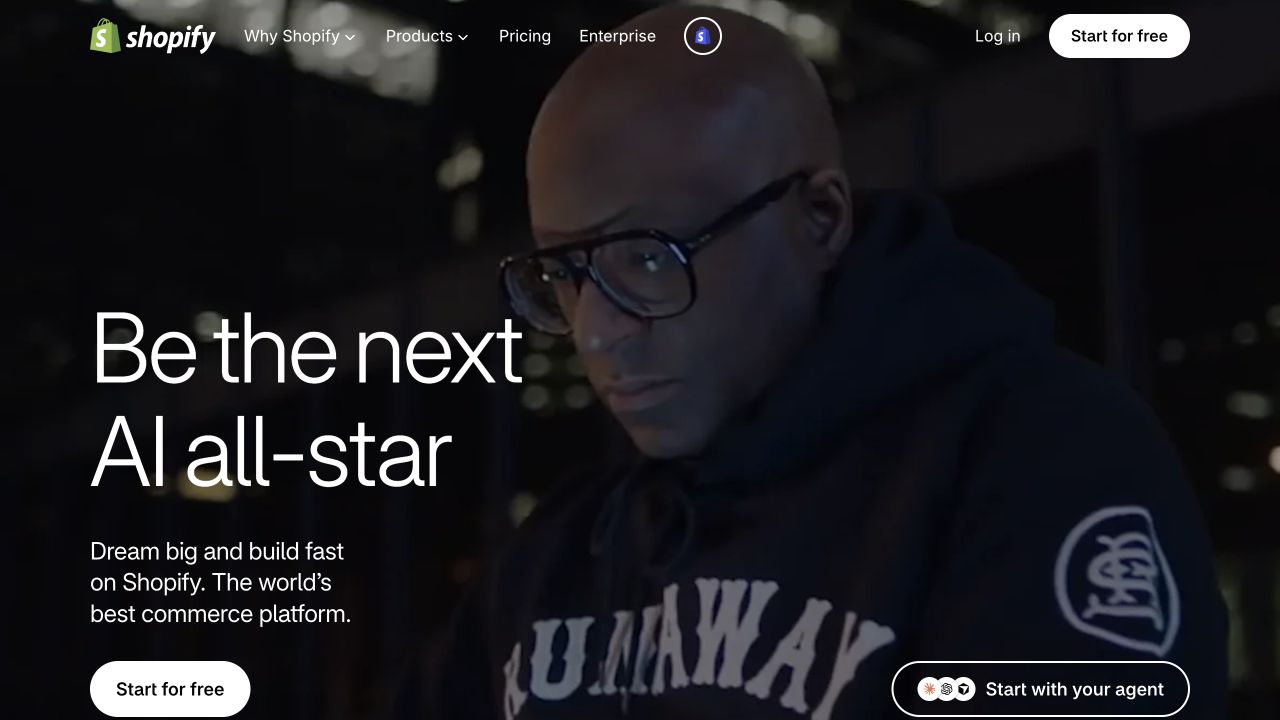
Shopify’s saved homepage gives a photographic hero most of the screen and places its short campaign statement against the darker left side. A white signup control repeats in the header, while an outlined agent action occupies the opposite lower corner. The composition introduces a commercial ambition before explaining the platform. GraphQL is independently documented in Shopify’s Admin API; neither this photograph nor the campaign layout proves the homepage uses that API. For developers, the reference shows how an integration-heavy business can keep its first public message accessible to people who are choosing an outcome.
What you can learn
Keep a merchant’s first decision simple, then provide a separate route to API requirements, authentication and operating limits. A strong campaign page can coexist with detailed technical documentation. Do not force both audiences through a hero crowded with endpoint names, schema concepts and implementation options.
Pros
The primary signup action remains easy to locate.
Photography gives the campaign a recognizable human subject.
Cons & considerations
The opening view offers little concrete integration detail.
Several competing entry points require clear destinations after the click.
Platform source: Official source: scoped GraphQL association. Shopify documents the GraphQL Admin API for apps and integrations. This establishes that product API, not the implementation of this marketing homepage or every Shopify storefront. Platform evidence is separate from the direct website screenshot and is not a complete current infrastructure audit.
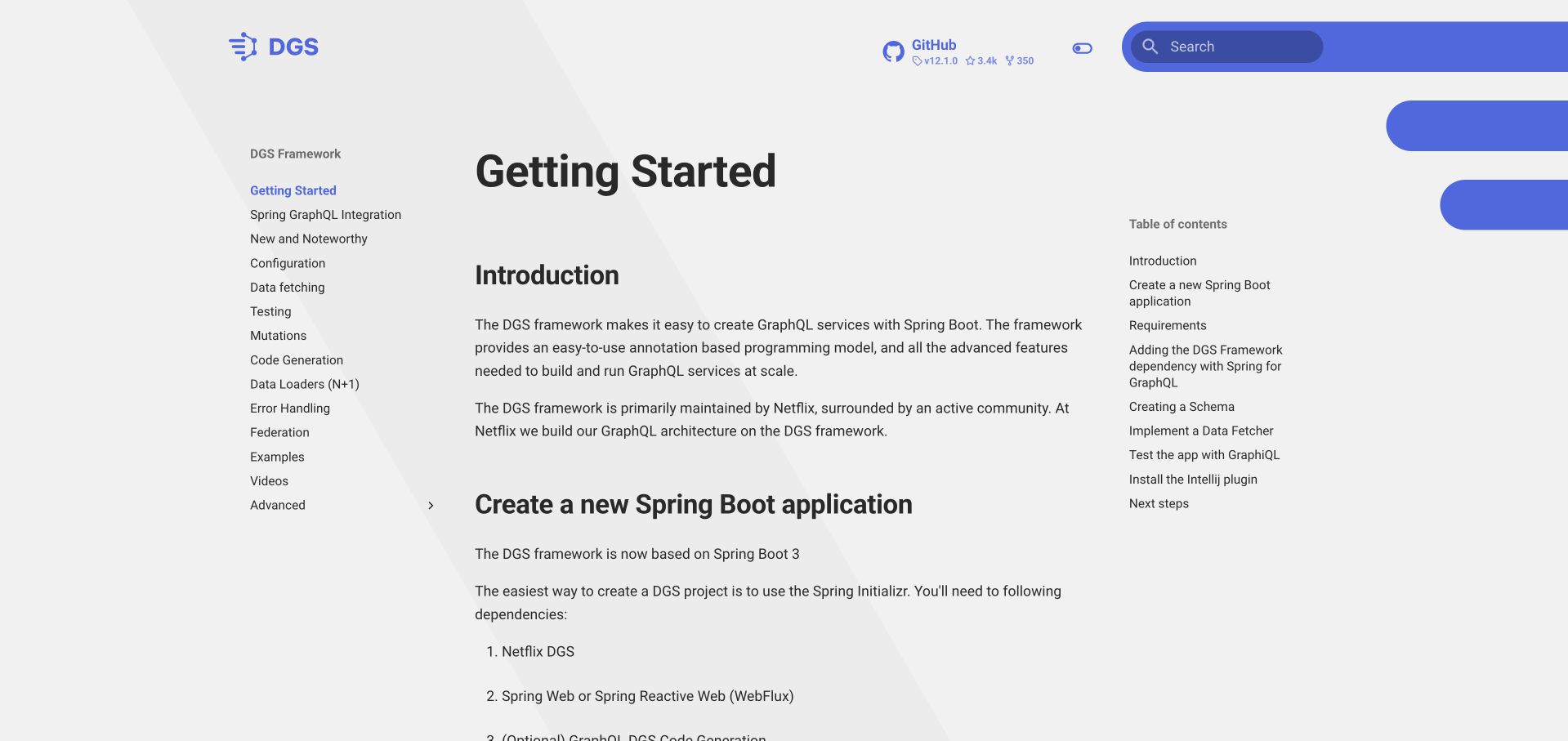
Netflix DGS opens directly into a getting-started document, with a topic tree on the left and a local contents list on the right. The central column explains the framework before listing the Spring Boot setup sequence. Blue accents identify navigation and search without overwhelming the reading surface. Unlike a generic corporate screenshot, this property directly documents a GraphQL framework: Netflix’s repository identifies DGS and links these docs. That evidence still does not establish how every Netflix application is implemented. The page is useful for studying how technical orientation and practical next steps can share one focused screen.
What you can learn
Give new integrators a short, ordered path and let experienced readers jump to exact topics. Keep global navigation distinct from the current article’s steps. Put prerequisites before commands, and explain which result confirms that a first implementation works before introducing advanced architecture choices.
Pros
Global topics and local steps occupy distinct columns.
The introduction makes the framework’s purpose immediately legible.
Cons & considerations
Three columns can demand careful adaptation on small displays.
A lengthy topic list may overwhelm an entirely new developer.
Platform source: Official source: scoped GraphQL association. Netflix’s official DGS repository identifies its GraphQL server framework for Java and Spring Boot and links this documentation property. This is a framework association, not a claim about Netflix streaming clients. Platform evidence is separate from the direct website screenshot and is not a complete current infrastructure audit.
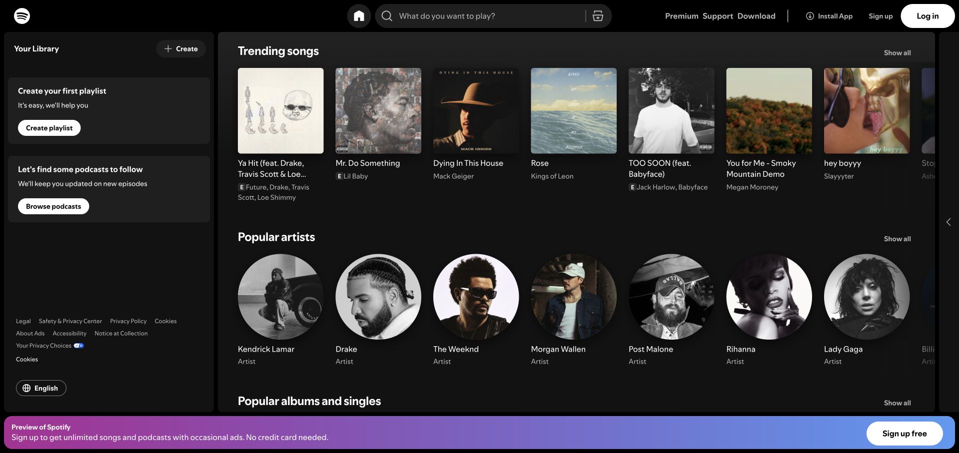
Spotify’s captured public player separates a persistent library panel from rows of songs and artists. Square artwork and circular portraits distinguish content types without needing an extra legend, while search remains prominent in the top bar. A colored signup strip occupies the bottom edge, leaving the main catalog visible. Spotify’s 2021 engineering account describes GraphQL within its shared web and desktop architecture; this is dated application evidence, not a new inspection of every request in the screenshot. The visual lesson is how repeated data cards can support exploration while keeping personal workspace controls in a predictable place.
What you can learn
Design the browsing states before deciding how to fetch their data. Specify which fields a card actually needs, how missing artwork behaves, and what remains usable without signing in. Keep loading, empty results and account prompts from changing the location of the visitor’s main controls.
Pros
Artwork shapes help distinguish songs from artists.
Search and library controls retain stable, separate positions.
Cons & considerations
Horizontal rows can hide additional content beyond the viewport.
The signup strip reduces the height available for browsing.
Platform source: Official source: scoped GraphQL association. Spotify’s 2021 engineering account describes GraphQL in its shared Web Player and desktop architecture. This is a historical application association, not a fresh runtime verification of the captured interface. Platform evidence is separate from the direct website screenshot and is not a complete current infrastructure audit.
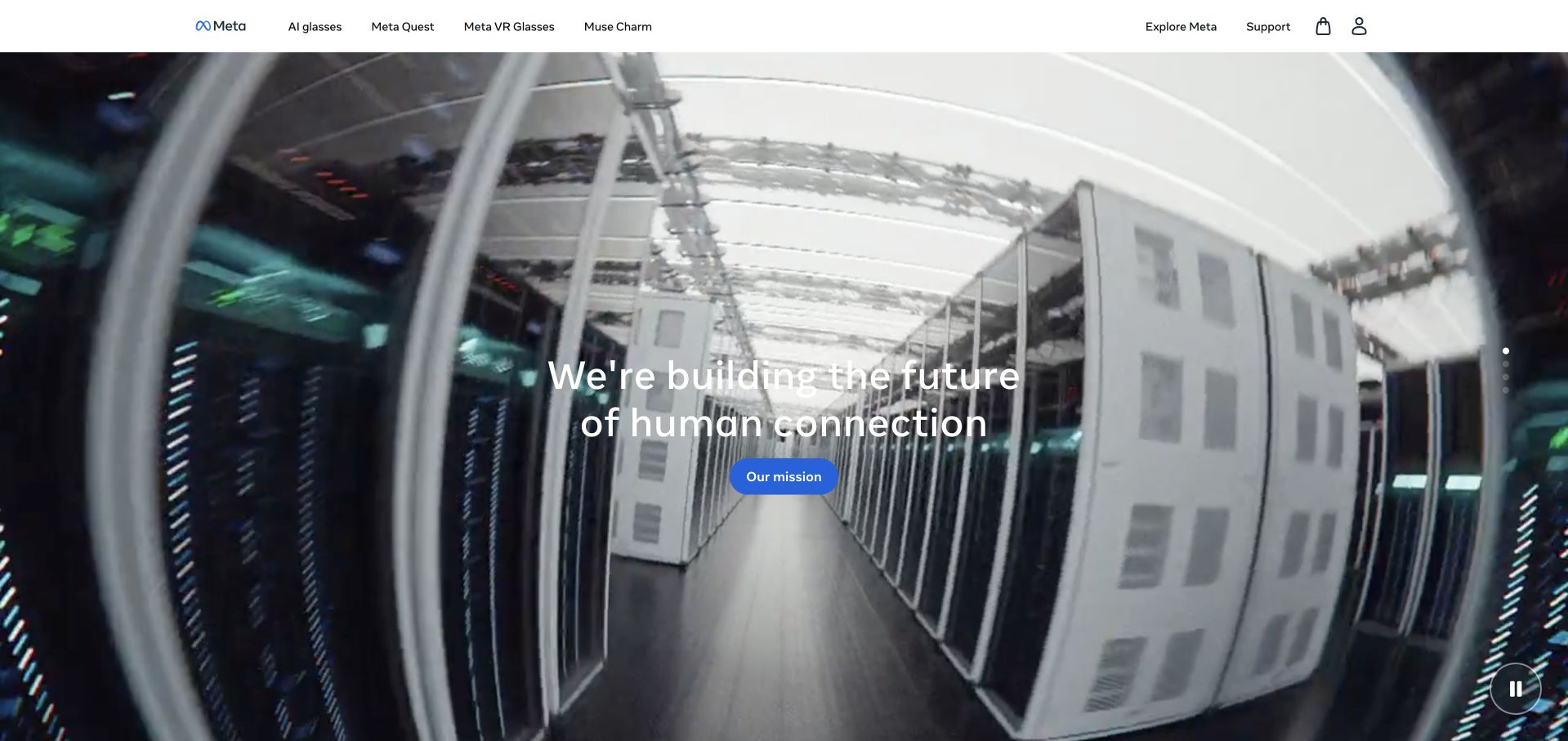
Meta’s corporate capture places a short mission statement over a full-width infrastructure scene. The header remains white and compact, while a blue action and visible pause control sit over the hero. Small slide indicators suggest additional scenes without filling the page with competing cards. The relevant GraphQL evidence comes from Facebook’s 2015 account of mobile News Feed data fetching, not this corporate page. Keeping those scopes separate makes the example useful: the screenshot illustrates brand communication, while the engineering source establishes a historical application association rather than a current implementation claim about Meta’s public website.
What you can learn
When presenting a technical organization, decide whether the first page should explain its mission, products or developer platform. Give that choice a clear next action. Provide a separate engineering route for readers who need implementation evidence, and avoid using infrastructure imagery as a substitute for an architectural explanation.
Pros
One primary action keeps the hero’s purpose clear.
A visible pause control acknowledges motion as optional.
Cons & considerations
Large imagery leaves little room for product detail.
White text over changing scenes requires consistently careful contrast.
Platform source: Official source: scoped GraphQL association. Facebook’s 2015 engineering account describes GraphQL for mobile News Feed data fetching. This historical association concerns Facebook applications, not the current Meta corporate page shown here. Platform evidence is separate from the direct website screenshot and is not a complete current infrastructure audit.
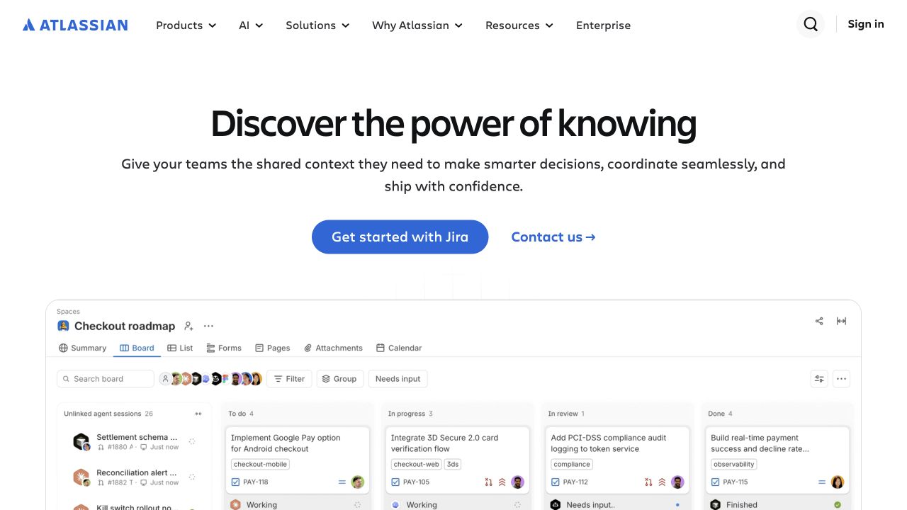
Atlassian’s saved homepage starts with a centered headline, a brief explanation and two routes: begin with Jira or contact the company. Below that introduction, a board interface gives the abstract teamwork message a concrete setting. Cards, status columns and navigation tabs become visible before the visitor reaches a long feature inventory. Atlassian’s documentation separately establishes its platform GraphQL gateway for cross-product data; it does not prove the marketing page uses that gateway. The design is useful because it connects a broad portfolio message to one understandable work surface without making the hero itself a complex application.
What you can learn
Use a representative interface to clarify a platform promise, but select a workflow your intended audience can recognize. In a GraphQL project, map the visible entities and relationships before designing a shared schema. Keep the sales introduction concise and move detailed permissions and integration constraints into a discoverable technical path.
Pros
The board makes an otherwise abstract promise tangible.
Self-service and sales-assisted routes are visually distinct.
Cons & considerations
Small interface labels may be difficult to read at narrow widths.
The general headline needs the supporting product example to become specific.
Platform source: Official source: scoped GraphQL association. Atlassian documents a platform GraphQL gateway for cross-product data. This is platform API evidence, not an attribution of the captured corporate website’s visible controls. Platform evidence is separate from the direct website screenshot and is not a complete current infrastructure audit.
Cloudflare’s captured homepage uses a large orange panel to concentrate attention on one platform message and a single introductory action. The white navigation bar separates products, resources and pricing from login, sales and an urgent assistance route. Its clear color boundary makes the main message easy to locate even though the business spans many services. The GraphQL evidence is specific: Cloudflare documents its Analytics API and dashboard analytics. That does not make GraphQL the rendering layer of the public homepage or the underlying edge network. The design reference is its separation of general discovery from specialist or urgent routes.
What you can learn
Keep a technical product’s primary journey understandable before exposing its entire service catalog. For an analytics interface, define the metrics, dimensions, empty states and permissions that each view needs. Treat the API as one part of that experience rather than expecting a query language to determine the page structure.
Pros
A strong surface boundary makes the main action easy to find.
Urgent assistance is separated from ordinary product exploration.
Cons & considerations
The large hero postpones concrete examples of individual services.
Broad platform language requires supporting detail further into the journey.
Platform source: Official source: scoped GraphQL association. Cloudflare documents its GraphQL Analytics API for analytics data and dashboards. This does not establish GraphQL as the rendering technology of its public marketing homepage or edge network. Platform evidence is separate from the direct website screenshot and is not a complete current infrastructure audit.
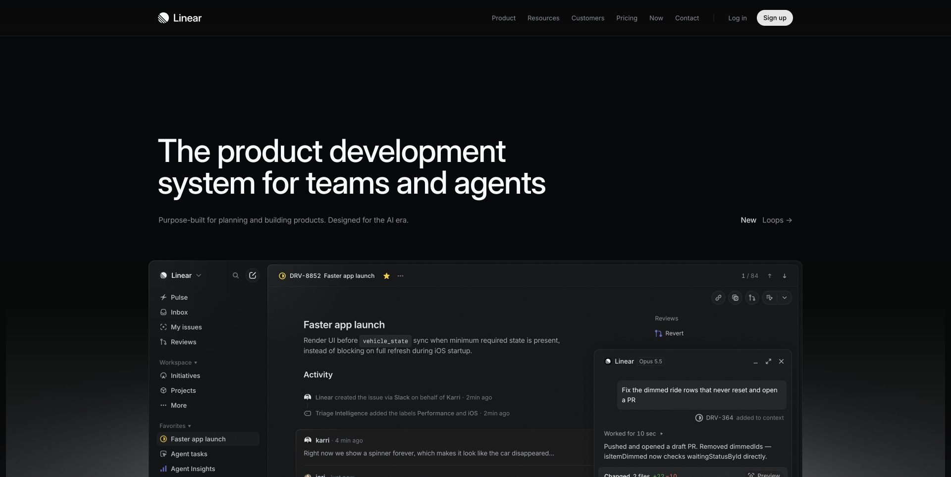
Linear’s saved marketing page combines a large left-aligned statement with a dark, detailed workspace preview below it. The interface image shows an issue, activity and related navigation instead of a purely decorative illustration. A compact header keeps product, resources and pricing available while signup receives a light treatment. Linear’s documentation identifies its public GraphQL API as the same API used for its applications; it does not attribute every marketing interaction to that API. The composition is useful for comparing a product’s vocabulary with the objects and relationships a development team must support behind a visible workflow.
What you can learn
Start with one complete task and describe the data required by each interface state. An issue detail view needs different information from a compact list row. Keep that distinction in the design and query plan, and specify how partial failures appear without discarding useful information already on screen.
Pros
The workspace preview supplies concrete context beneath the headline.
A restrained palette gives the signup control clear emphasis.
Cons & considerations
Fine interface details can become illegible when scaled down.
The large introductory area delays the first practical explanation.
Platform source: Official source: scoped GraphQL association. Linear documents a public GraphQL API shared with its own applications. The product API association is verified; the captured marketing homepage’s individual interactions are not attributed to it. Platform evidence is separate from the direct website screenshot and is not a complete current infrastructure audit.
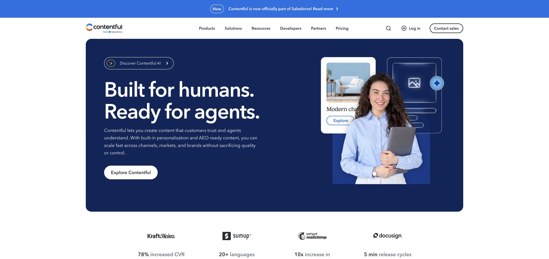
Contentful’s capture places a navy hero inside a bounded white page, pairing a large statement with a composed panel of a person and content imagery. Navigation gives developers an explicit route alongside products, solutions and partners. Customer references begin immediately below the hero, creating a transition from introduction to supporting material. Its documentation verifies a read-only GraphQL Content API whose schema follows a space’s content model. That capability does not prove the marketing homepage queries it. The earlier broad page audit was unavailable, and the example retains that limitation rather than presenting a new complete stack inspection.
What you can learn
Model the content an editor must maintain before choosing a page composition. Define reusable entries, relationships and preview behavior, then give designers realistic records to work with. A GraphQL content API can expose those relationships, but the editorial workflow still needs understandable field names and clear publishing responsibilities.
Pros
Developers have a visible route in the main navigation.
The bounded hero distinguishes introduction from customer material.
Cons & considerations
The image composition explains less than a working content example would.
Broad claims need concrete editorial scenarios deeper in the site.
Platform source: Official source: scoped GraphQL association. Contentful documents its read-only GraphQL Content API with a schema derived from a space’s content model. This is a product capability, not proof that its marketing homepage uses that API. The prior broad source-page audit remains unavailable. Platform evidence is separate from the direct website screenshot and is not a complete current infrastructure audit.
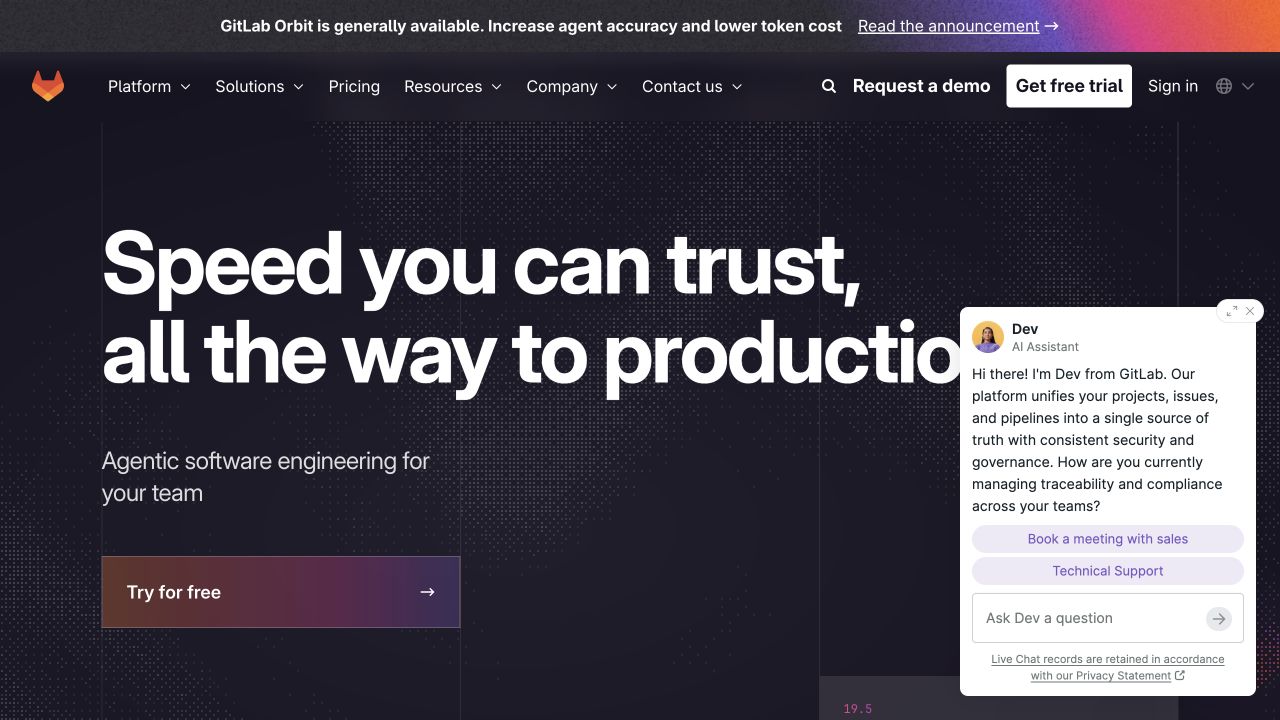
GitLab’s captured marketing page uses a large white headline on a dark background and a colored trial action beneath it. The top navigation distinguishes platform, resources and company information, while a separate announcement strip promotes a release. An open assistant panel occupies the right side and overlaps part of the hero, making the tradeoff between assistance and reading space visible. GitLab’s official documentation verifies its product GraphQL API; the screenshot does not identify the marketing site’s data layer. This example is useful for examining how several independently reasonable interface elements can compete when they appear at the same time.
What you can learn
Evaluate the whole screen when adding an assistant, promotion or signup prompt. Reserve space for the primary message and make dismissal obvious. For a developer platform, keep a direct route to API documentation available even when commercial acquisition and conversational assistance receive prominent treatment.
Pros
Trial and demo routes are easy to distinguish.
The dark hero gives the main typography strong visual emphasis.
Cons & considerations
The assistant panel obscures part of the introductory content.
Announcement, navigation and chat all compete for attention.
Platform source: Official source: scoped GraphQL association. GitLab documents its GraphQL API across GitLab.com, Self-Managed and Dedicated offerings. This product API association does not identify the runtime of the captured public marketing page. Platform evidence is separate from the direct website screenshot and is not a complete current infrastructure audit.
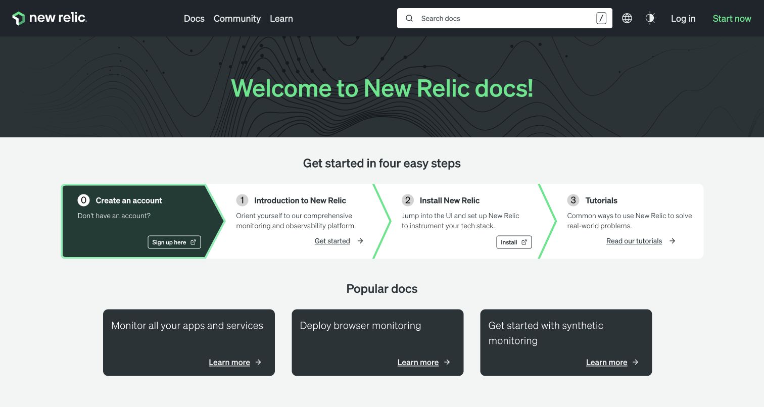
New Relic’s documentation homepage gives search a prominent position in the header and presents a four-part starting sequence below its welcome banner. Account creation, orientation, installation and tutorials are separate steps, followed by cards for common documentation needs. The restrained green accents make sequence and selection visible without turning the page into a sales presentation. NerdGraph is independently documented as New Relic’s GraphQL API for data queries and selected configuration tasks, not data ingestion. The capture shows the documentation entrance rather than an authenticated monitoring dashboard, so the API association should not be mistaken for a frontend implementation claim.
What you can learn
Give an API newcomer a short path from orientation to a meaningful result. Separate setup requirements from reference material, and keep search available for returning users. Explain the limits of the API early so someone does not build an ingestion workflow around a query and configuration interface.
Pros
The starting sequence makes prerequisites easy to understand.
Popular documentation cards support common return visits.
Cons & considerations
A numbered path can appear mandatory to experienced users.
General onboarding still needs a clear route to specific API references.
Platform source: Official source: scoped GraphQL association. New Relic documents NerdGraph, its GraphQL API for querying data and selected configuration operations. This does not identify the documentation website’s frontend; NerdGraph is not its data ingestion API. Platform evidence is separate from the direct website screenshot and is not a complete current infrastructure audit.
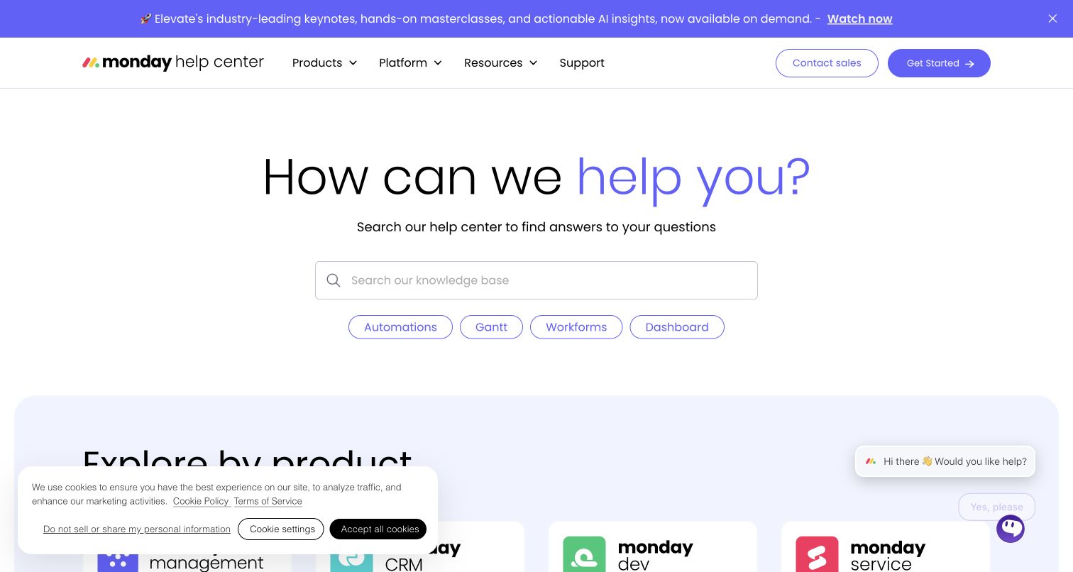
The monday.com Help Center centers its opening view on a wide search field and a short invitation to ask for help. Four topic chips supply examples of useful search vocabulary, and product cards begin below the fold. The saved capture also includes a cookie panel and a chat invitation, both of which take space away from the lower content. monday.com’s official documentation verifies a GraphQL platform API; this separate support property is a design reference, not proof that the help center is implemented with that API. Its strongest lesson is how searchable content and product-based browsing can complement one another.
What you can learn
Let users describe a problem in their own words, then offer a small set of recognizable alternatives. In an API-backed support experience, define which content relationships improve results before adding filters. Check the combined footprint of privacy controls and support prompts so they do not hide the fallback browsing route.
Pros
Search is unmistakably the primary action in the opening view.
Topic chips reveal useful vocabulary without a long menu.
Cons & considerations
Cookie and chat panels compete with the lower product section.
Marketing navigation adds choices unrelated to an immediate support task.
Platform source: Official source: scoped GraphQL association. monday.com documents its GraphQL platform API. The screenshot shows its separate help center as a public design reference; the evidence concerns the product API, not the help center’s implementation. Platform evidence is separate from the direct website screenshot and is not a complete current infrastructure audit.
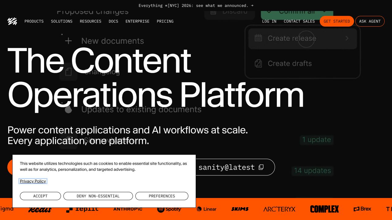
Sanity’s saved homepage uses oversized type, a black background and an orange accent to establish its product identity. A command-style control gives the technical audience a recognizable entry point, while documentation remains visible in the header. The capture preserves a cookie panel over part of the lower hero, so it also reveals the space needed for privacy choices. Sanity’s official documentation establishes deployable GraphQL APIs for Content Lake alongside GROQ; this is a product capability rather than a claim about the marketing page. The design is useful for studying how a developer-oriented brand can feel confident without an elaborate introductory diagram.
What you can learn
Make a technical entry point recognizable and explain what happens after it. For content systems, test a representative schema and editorial task before committing to a query interface. Keep setup, content modeling and ongoing publishing responsibilities separate enough that developers and editors can find the guidance relevant to them.
Pros
Large typography creates a strong and recognizable hierarchy.
Documentation and a command-style action address technical readers directly.
Cons & considerations
The oversized headline pushes supporting detail below the first view.
The privacy panel overlaps an important part of the action area.
Platform source: Official source: scoped GraphQL association. Sanity documents deployable GraphQL APIs for querying Content Lake content. This is an offered product API alongside GROQ, not proof that the captured marketing homepage uses GraphQL. Platform evidence is separate from the direct website screenshot and is not a complete current infrastructure audit.
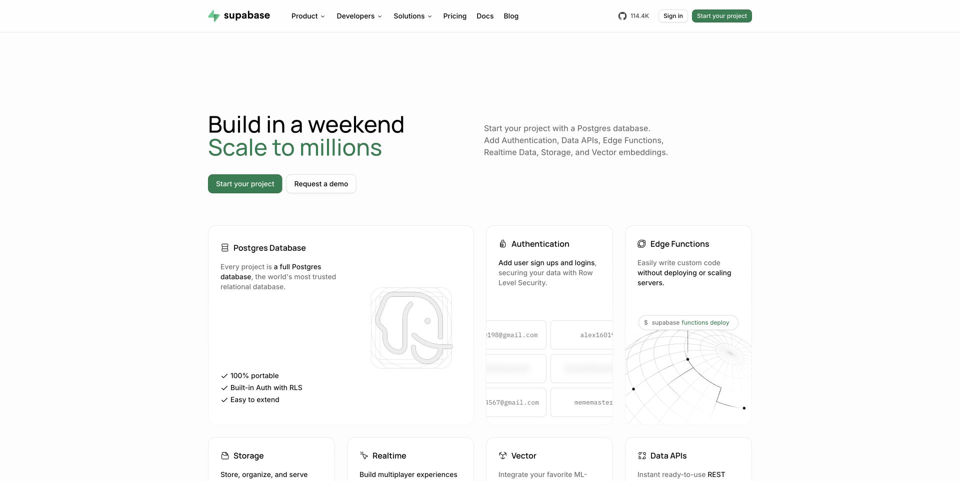
Supabase’s capture places a concise introduction above a grid of product capabilities. Database, authentication and edge functions receive individual cards, while storage, realtime and other services begin beneath them. The white background and restrained green emphasis make the page feel approachable despite the breadth of the offering. Its official documentation verifies a GraphQL API generated from Postgres schemas through pg_graphql. That evidence does not identify the marketing homepage’s data layer or mean every project enables the capability automatically. The reference is useful because it shows how a technical system can be explained through understandable responsibilities before exposing detailed configuration.
What you can learn
Organize a platform introduction around what each component owns. When planning GraphQL, identify where authentication, authorization, data storage and execution belong instead of presenting one API as a replacement for every layer. Give each responsibility a concrete example and document the connections that a project team must maintain.
Pros
Capability cards turn a broad platform into manageable parts.
Self-service and demonstration actions support different evaluation styles.
Cons & considerations
The many cards need clear prioritization as the catalog expands.
A simple introduction can conceal substantial setup and policy decisions.
Platform source: Official source: scoped GraphQL association. Supabase documents GraphQL APIs generated from Postgres schemas through pg_graphql. This establishes a product capability, not the marketing homepage’s data layer or automatic enablement in every project. Platform evidence is separate from the direct website screenshot and is not a complete current infrastructure audit.
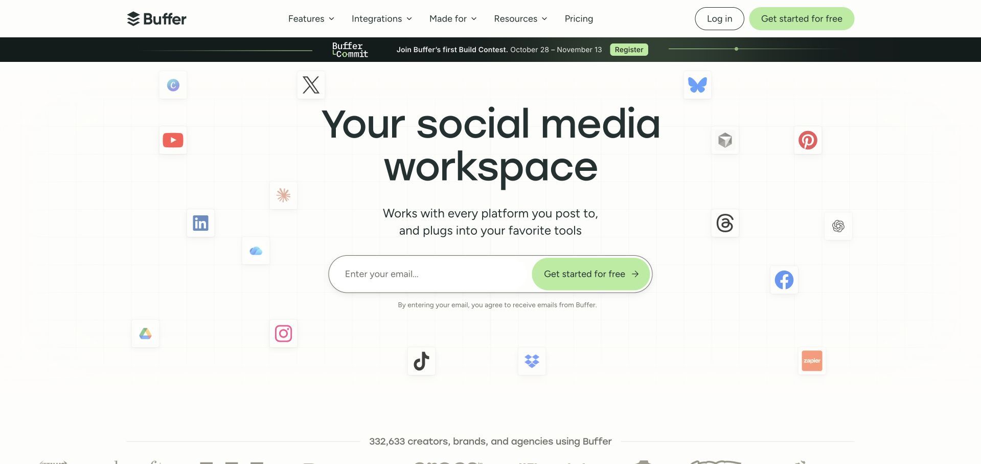
Buffer’s saved homepage arranges recognizable service icons around a centered statement and an email signup control. A light grid creates structure without competing with the main content, while the green action repeats the tone of the header signup button. The visual arrangement suggests a product that connects several publishing destinations. The Guild’s case study separately documents Buffer’s public GraphQL API built from its internal schema; it does not establish the marketing page’s implementation. This distinction matters because integration logos communicate product context, while actual API capabilities require documentation. The example is useful for studying a concise introduction to a connected workflow.
What you can learn
Use familiar integration marks to establish context, then provide exact information about what each connection supports. Plan the data and permission boundaries behind the workflow before designing a universal action. Keep signup expectations visible, and make technical documentation discoverable for visitors evaluating an integration rather than opening an account.
Pros
One central action gives the composition a clear destination.
Surrounding service icons explain the product’s broader context.
Cons & considerations
The icon field cannot communicate individual integration limitations.
The email-first path may be premature for a technical evaluator.
Platform source: Supplier case study: scoped GraphQL association. The Guild’s Buffer case study documents a public GraphQL API derived from Buffer’s internal application schema. This is a supplier-documented product association, not proof about the captured marketing homepage. Platform evidence is separate from the direct website screenshot and is not a complete current infrastructure audit.
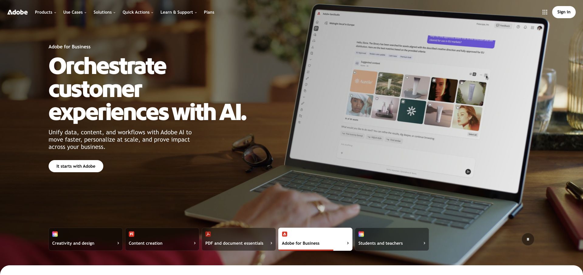
Adobe’s captured homepage places a business-oriented message over a photograph of a laptop showing a product interface. Along the lower edge, a row of audience and product-family cards offers alternatives such as creativity, documents and education. The selected business card has a stronger light treatment, making the current context visible. GraphQL is documented specifically for Adobe Commerce and Magento Open Source; that evidence does not cover the pictured product, the corporate homepage or every Adobe service. The public design reference is the way a large portfolio offers a coherent brand introduction while allowing a visitor to choose a more relevant branch.
What you can learn
Keep product boundaries clear in both navigation and technical claims. A capability offered by one product should not appear to describe the entire organization. When presenting an API integration, name the exact service, intended user and supported workflow before discussing the broader benefits of the platform.
Pros
Audience cards give the visitor concrete alternatives to the current campaign.
A visible product interface grounds the otherwise broad business message.
Cons & considerations
Large background imagery can compete with detailed explanatory text.
A portfolio-level introduction requires another step to reach implementation guidance.
Platform source: Official source: scoped GraphQL association. Adobe documents the GraphQL API offered by Adobe Commerce and Magento Open Source. This specific product capability does not establish GraphQL use across Adobe’s corporate site or other products. Platform evidence is separate from the direct website screenshot and is not a complete current infrastructure audit.
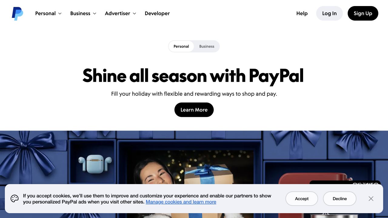
PayPal’s saved homepage uses a compact personal/business switch above a centered seasonal message and a single learn-more action. The navigation also offers a developer route, while the lower image introduces the campaign without crowding the headline. A wide cookie panel remains visible at the bottom of the capture. PayPal’s October 2018 engineering account documents GraphQL adoption in Checkout; this historical workload evidence does not verify the current homepage or every payment flow. The design reference is its audience separation and controlled opening hierarchy, not an assessment of financial suitability, checkout performance or present implementation details.
What you can learn
Establish the visitor’s role before presenting a complex product catalog. For payment-related interfaces, model the states and permissions of the actual task, and keep errors understandable without implying a transaction succeeded. Use historical architecture accounts as background, then verify current integration documentation before making a production choice.
Pros
The personal/business distinction is available before the main action.
A dedicated developer route supports a separate technical journey.
Cons & considerations
The campaign message postpones concrete product and integration detail.
The wide privacy panel obscures part of the supporting imagery.
Platform source: Official source: scoped GraphQL association. PayPal’s October 2018 engineering account documents GraphQL adoption in Checkout. This historical workload association does not verify the current public homepage, every payment flow or current performance. Platform evidence is separate from the direct website screenshot and is not a complete current infrastructure audit.
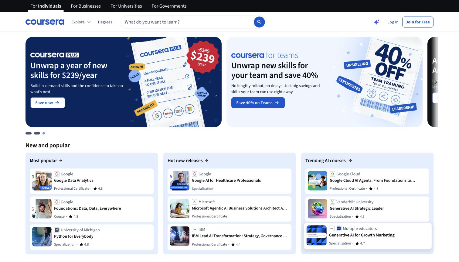
Coursera’s captured homepage combines audience tabs, a prominent learning search and promotional cards with grouped course lists. Provider names and compact course information repeat within the lists, while categories such as popular and trending offer alternatives to an exact search. The result gives visitors several ways to begin without requiring a choice of qualification first. Coursera’s 2019 engineering account describes GraphQL serving its web and mobile clients; that dated account does not establish today’s homepage runtime. The useful design reference is the relationship between a large catalog, repeated metadata and the small decisions a learner makes while browsing.
What you can learn
Specify which information lets a visitor compare results before choosing the data shape for a catalog. Keep provider, subject and course type consistent across cards, and make promotional content distinguishable from ordinary results. Design an honest empty state and a route back to browsing when an exact search fails.
Pros
Search and grouped lists support different discovery habits.
Repeated metadata helps visitors compare several learning options.
Cons & considerations
Large promotional cards can dominate the first screen.
Several audience and content routes may compete for a new visitor’s attention.
Platform source: Official source: scoped GraphQL association. Coursera’s August 2019 engineering account documents a GraphQL gateway serving web and mobile clients. This is historical application evidence, not a current runtime inspection of the captured homepage. Platform evidence is separate from the direct website screenshot and is not a complete current infrastructure audit.
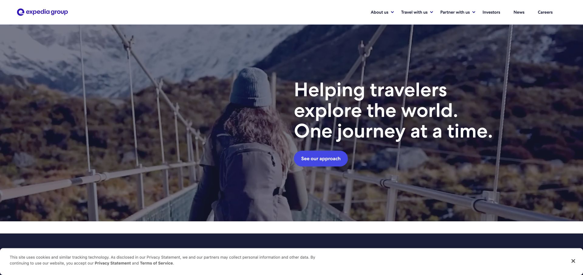
Expedia Group’s saved corporate page uses a full-width travel scene behind a short statement and a single action. A white header separates traveler, partner, investor and career routes, giving the broader organization a clear public structure. A privacy notice occupies the bottom edge of the screenshot. The GraphQL evidence concerns Expedia Group’s lodging connectivity APIs, including property and reservation operations; it does not identify the corporate page’s rendering stack or every consumer booking flow. The example is useful for examining how a complex travel business can present one clear brand story while preserving routes for audiences with very different operational needs.
What you can learn
Separate the inspirational introduction from the detailed work a partner must perform. For a travel integration, define ownership of property data, reservation state and errors before choosing the interface shape. Make the partner path explicit so a technical evaluator does not have to infer it from consumer-facing campaign language.
Pros
Audience routes distinguish partnership needs from traveler discovery.
One hero action keeps the introductory message focused.
Cons & considerations
The opening scene conveys little about operational requirements.
The privacy notice reduces space for the next content section.
Platform source: Official source: scoped GraphQL association. Expedia Group documents GraphQL capabilities in its lodging connectivity APIs, including property and reservation operations. This evidence concerns partner integrations, not the corporate marketing site shown in the capture. Platform evidence is separate from the direct website screenshot and is not a complete current infrastructure audit.
Intuit’s captured homepage keeps a row of familiar product brands above the main corporate navigation. A large human-centered hero and short assistance-oriented statement introduce the parent company, while products and support remain visible routes. The saved screenshot also includes a privacy notice across the bottom. Indexed official Intuit documentation identifies GraphQL in selected QuickBooks Online APIs, but its script-rendered page did not expose a full body to the text reader. The earlier broad homepage audit was unavailable. Those limits are retained: the evidence supports a narrow product association, not the corporate homepage’s implementation or every product shown in its header.
What you can learn
Show the relationship between a parent organization and its products without blurring their capabilities. For an integration project, continue from the corporate introduction to the exact product documentation and access requirements. Treat missing inspection evidence as unknown, and keep architectural promises narrower than the brand’s overall marketing language.
Pros
Product identities are visible before the broad corporate message.
Support has an explicit place in the main navigation.
Cons & considerations
The hero offers little detail about individual API capabilities.
The privacy notice competes with the supporting introductory text.
Platform source: Official source: scoped GraphQL association. Intuit’s indexed official documentation identifies GraphQL in selected QuickBooks Online APIs. This product association is narrower than the corporate homepage; its script-rendered documentation did not expose a full body to the text reader. The prior broad source-page audit remains unavailable. Platform evidence is separate from the direct website screenshot and is not a complete current infrastructure audit.
Kegan has 15+ years of experience working with small businesses, Fortune 500 companies, and everything in between. No development job is too big or too small: he brings the same hands-on attention to a focused improvement, a complete website, or a custom application.
For GraphQL projects, he can help with responsive interfaces, reusable components, custom functionality, API connections, and performance-minded implementation. He works directly with clients on scope, design, implementation, testing, and handover, with an emphasis on clear communication and a system that remains practical to maintain after launch.
Show 3 other GraphQL developersHide other GraphQL developers
Choose an integration boundary the team can maintain
Consume an existing product API
Start with the exact product documentation, access requirements and available operations. Write one representative user journey and identify the data needed at each step. Keep the provider’s API vocabulary behind a clear interface for the visitor. Before committing to a design, confirm that the required data is actually available to the account and integration you intend to operate; a general marketing page cannot establish that access.
Introduce a focused application API
Choose a bounded workflow rather than exposing every database table at once. Agree which team owns the schema, which service owns the underlying records and how changes will be communicated. A small implementation is easier to evaluate when it has a clear purpose: one detail view, a searchable catalog or a work queue with explicit permissions. Expand only after the first task is understandable and maintainable.
Connect content models to several presentation surfaces
A content API can serve different pages and applications, but the editorial model still needs to make sense to the people maintaining it. Define meaningful entries and relationships before creating a large family of visual components. Use actual content to test preview, missing references and publishing responsibility. Avoid treating an API choice as a substitute for deciding who can change important copy and when it becomes public.
From references to requirements
Plan the data contract and the visitor journey together
Create a state inventory with realistic records
For each screen, record the initial state, loading state, complete result, empty result and recoverable failure. Include long names, unavailable images, deleted records and a user who lacks permission for some information. Review these cases with the person responsible for content or operations. A realistic inventory is more useful than a prototype that only contains attractive sample records and successful responses.
Budget work and permissions before launch
GraphQL’s security guidance discusses layered demand controls, including pagination, depth or breadth limits and query complexity. Choose controls suited to the application and enforce authorization in the trusted server-side path. A typed schema does not grant a caller permission to see a record. Keep private credentials outside public bundles, and decide how resource limits appear to a legitimate user who encounters them.
Document who reviews schema changes, who maintains client operations and who investigates a broken workflow. Include a representative handover exercise: change a field, publish a content update or recover from an unavailable dependency in a safe test environment. Decide how older clients continue working during a transition. The operational arrangement matters as much as the elegance of the first implementation.
A useful handover demonstration
Ask the actual team to carry out its routine job: publish a realistic update, correct a mistake, preview a narrow screen, and identify who owns an integration failure. For a library or frontend framework, also ask who maintains the content source and deployment. A polished screenshot does not answer those operational questions.
Beyond the screenshot
GraphQL website planning checklist
Name the exact product, property or workload covered by the technology evidence.
Define one visitor task and the minimum information needed to complete it.
Map list, detail, empty, loading and partial-error states with realistic records.
Confirm API access and supported operations in the current product documentation.
Assign ownership for schema changes, content updates and client maintenance.
Keep authorization and private credentials in the trusted server-side path.
Set appropriate pagination and request-resource limits before launch.
Make unsuccessful writes and interrupted requests clear to the user.
Preserve meaningful URLs, readable labels and predictable navigation.
Test the complete workflow and document a safe release and recovery process.
Test with real content, a keyboard, a small screen, slow or failed requests, and the people who will maintain the system. These are planning checks, not an accessibility, security, performance, or search-ranking certification.
Sources & editorial method
How this GraphQL collection was reviewed
This collection contains twenty distinct public website properties, each with a genuine direct browser screenshot, source URL, dimensions, attribution and original capture date. The images were inspected again for collection-specific reviews on November 9, 2026, America/Los_Angeles. GraphQL evidence was checked in public primary documentation, first-party engineering accounts or The Guild’s Buffer case study. The sources describe specific APIs, frameworks or historical workloads; they do not establish a universal homepage implementation. Spotify, Meta, PayPal and Coursera retain explicitly historical scopes. Intuit’s indexed official documentation supports a narrow QuickBooks association, with the full page-body limitation disclosed. Existing broad audit attempts remain intact, including unavailable results for Contentful and Intuit. No private API requests, account actions, transactions or performance measurements were performed. The reviews assess visible composition and practical design choices, not service quality, conversion results or accessibility certification.
Every image is an unmodified capture from the actual website, with its source and capture date. Some captures are reused from our shared catalog; their dates remain the original capture dates. None comes from a vendor gallery or a generated reconstruction. Moving imagery and live content can change.
Technology attribution uses public page assets or metadata, official platform documentation, or a cited first-party project case study. Documentary and framework-relationship evidence is identified where used; it is not a complete current backend inventory. A CMS image CDN alone does not establish a full CMS deployment. A library’s presence does not prove which individual controls use it, and a platform label does not establish AI authorship.
The composition notes, lessons, pros and tradeoffs are original editorial observations. We have not measured conversion, traffic, security, performance or accessibility conformance. Website owners retain their brands and imagery; these examples are not our client portfolio. Written, Edited and Curated are independent records, not dates advanced by a build. See our editorial standards or suggest a correction.
Questions worth asking
GraphQL website development FAQs
Does every pictured website run its public page on GraphQL?
No. Each example states the supported scope. Some sources document a product API or framework, while others describe a dated internal or application workload. A marketing or support-page capture is a design reference and is not, by itself, proof of its runtime.
What does GraphQL change about a website’s appearance?
It does not prescribe an appearance. It describes API operations and requested fields. Layout, typography, navigation, content and accessible interaction remain design and implementation decisions. Begin with the task and the information needed to complete it.
Can a GraphQL response contain both data and errors?
Yes. Field execution can return partial data alongside errors. A client should distinguish usable information from missing or failed fields and present an appropriate recovery path. A response alone is not proof that a requested write succeeded.
Does a typed schema replace authorization or resource limits?
No. A schema describes available types and operations. The implementation still needs authorization and suitable controls on request work. Review the official security guidance and the specific product’s operating limits before deployment.
Are older engineering articles current implementation proof?
No. They establish the implementation described at the time. The reviews retain those historical qualifications rather than treating an older publication as a fresh inspection of a company’s entire current stack.
Why reuse an existing screenshot?
A verified capture can support new collection-specific design analysis without pretending it was taken again. Its original date, source, dimensions and attribution remain visible. Reuse does not refresh the screenshot or the separate technology-audit observation.
Borrow a clear information structure and an understandable recovery path. Choose GraphQL when its documented capabilities fit the task and the team can maintain the complete integration.